DESIGN REFERENCE
ブルーファーム株式会社|地域をつなぐイラストとデザイン
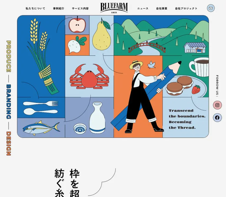
地域の産業や食を描いたイラストのパネル構成が印象的なデザイン会社の企業サイト。鮮やかな青、淡い黄色のボタン、縁取り文字を用い、スマートフォンでは主役のイラストを再構成しています。
オリジナルサイトを見るBLUEFARM — Style Reference
A regional design practice illustrated as a mosaic of food, landscape, people, and connecting threads.
Website: bluefarm.co.jp Original URL: https://bluefarm.co.jp/ Final URL: https://bluefarm.co.jp/ Theme: light canvas with saturated blue sections and pastel accents; no theme selector was observed. Inspected: September 13, 2026, at 02:44:48.850 JST; the supplied retrieval timestamp is September 12, 2026, at 17:44:48.850 UTC. Viewports: 1440 × 1000 desktop and 390 × 844 mobile, in CSS pixels. Scope: the current corporate homepage: persistent navigation, illustrated opening composition, company introduction, work carousel and index, service links, member introduction, news, company businesses, ongoing projects, and footer. Visual captures show the desktop opening, member panel, and footer, plus the mobile opening and footer. Rendered text and selected computed element records extend coverage to the intervening sections.
BLUEFARM combines a clear corporate information hierarchy with an unusually expressive illustrated identity. Fine black contours connect a large agricultural and culinary mosaic to circular social icons, outlined English headings, and broad pill-shaped links. Saturated blue establishes the main section rhythm; pale yellow makes navigation actions easy to recognize. The surrounding canvas is a quiet, very light gray.
The opening illustration is the visual centerpiece. Rice, fruit, seafood, tableware, a rural landscape, and a person carrying an enormous blue pencil occupy adjoining rectangular panels. Curving lines cross the panel boundaries like threads. On mobile, the landscape moves to the top and the person becomes the dominant left-hand figure in a taller arrangement. This is a deliberately recomposed illustration, not simply the desktop board reduced to phone width.
The homepage continues as a substantial corporate and portfolio directory. Its identity depends on preserving both the distinctive artwork and the useful structure of work, services, people, news, and business information.
How to Read This Reference
- Measured means a value appears in the supplied computed-style or element-rectangle evidence. Measurements are reported in CSS pixels and occasionally rounded for readability.
- Calculated means a relationship was derived from those measurements, such as the work grid gap or a media-slot aspect ratio.
- Visual estimate means a proportion, color, outline, or shape was assessed from the original-page captures without pixel sampling or a corresponding computed declaration.
- Recommended means an implementation choice for a new build. Breakpoints, replacement asset organization, accessible enhancements, and the Quick Start are recommendations unless explicitly identified otherwise.
- Token names beginning with
--bf-are reference aliases, not recovered source variables. - The computed font stacks establish declared families. They do not independently prove which font supplied every rendered glyph.
- Mobile menu descendants appear in the DOM evidence, but the supplied screenshots show the menu closed. Their presence and nonzero rectangles do not establish a visible open-menu state.
Tokens — Colors
Default Palette
| Name | Value | Reference token | Evidence and role |
|---|---|---|---|
| Paper Gray | #f4f4f4 |
--bf-paper |
Measured body background at both viewports; also measured on the mobile header. Provides the quiet canvas around the artwork and footer. |
| Black Ink | #000000 |
--bf-ink |
Measured primary text color. Visually repeated in illustration contours, button edges, icons, and the wordmark. |
| White | #ffffff |
--bf-white |
Measured English section-heading color. The member panel also appears white in the capture, although its background declaration was not included. |
| Farm Blue | #136fb8 |
--bf-blue |
Measured background of SERVICE, MEMBER, and OUR PROJECT. Large, continuous fields rather than small isolated accents. |
| Pale Blue | #bed8eb |
--bf-pale-blue |
Measured OTHER BUSINESS background and mobile navigation contact surface. Similar pale blues occur in the artwork and visible contact controls, but those individual fills were not measured. |
| Grain Yellow | #e8db80 |
--bf-yellow |
Measured fill of the About, work-index, member, news-index, and business website links. The main navigational action color. |
Illustration and Icon Accents
These are visual estimates for adaptation, not measured source colors. Use original authorized artwork to preserve its exact palette.
| Name | Approximate value | Reference token | Visible use |
|---|---|---|---|
| Apricot Orange | ≈ #f18148 |
--bf-orange |
Large panel behind the pencil-carrying figure; turnip panel; DESIGN rail lettering. |
| Deep Green | ≈ #199780 |
--bf-green |
Foreground hills and the café-food panel. |
| Soft Mint | ≈ #96cda5 |
--bf-mint |
Alternating hills and slender triangular trees. |
| Muted Periwinkle | ≈ #8ca2c6 |
--bf-periwinkle |
Apple, fish, and sake-related panel backgrounds; roof details. |
| Dusty Pink | ≈ #e7b0b2 |
--bf-pink |
Instagram circles. |
| Vermilion | ≈ #e75245 |
--bf-red |
Crab, bridge, and small food details. |
Color behavior: the page alternates broad solid section backgrounds with relatively restrained text and controls. Black outlines unify both saturated and pastel areas. Preserve the relationship between a strong blue field, pale yellow action, and black contour; assigning a new bright color to every component would weaken that relationship.
The supplied custom-property list contains numerous standard WordPress colors, gradients, and shadows. Their availability is not evidence that the visible design uses them. They are not included in this reference palette.
Tokens — Typography
Japanese Body and Interface Text
Measured source stack:
'Zen Kaku Gothic New', '游ゴシック', 'Yu Gothic', '游ゴシック体',
YuGothic, 'ヒラギノ角ゴ Pro W3', 'Hiragino Kaku Gothic Pro',
'メイリオ', Meiryo, 'MS Pゴシック', 'MS PGothic', Arial, serif
The Japanese typography is open, legible, and strongly weighted where it carries hierarchy. Navigation uses compact bold labels. Paragraphs use more generous line spacing, especially in the company introduction and member panel. Tracking generally follows 0.05em, with larger tracking in the desktop introduction.
English Section Headings
Measured source family: Montserrat, sans-serif.
Weight: 700.
Tracking: 0.1em in the sampled section headings.
WORKS and SERVICE form the largest heading tier. MEMBER, NEWS, OTHER BUSINESS, and OUR PROJECT use a smaller tier. NEWS is visibly white-filled with a fine black outline. The sampled properties establish the shared family and white text color of the other English headings, but do not include their text-stroke declarations. Applying the same outline throughout a new implementation is a visual adaptation, not a recovered universal CSS rule.
Wordmark and Illustration Lettering
The BLUEFARM wordmark has tall, compressed serif lettering and an arched underline. Treat it as a supplied brand asset; no editable logo font was identified.
The hero phrase, “Transcend the boundaries. Becoming the Thread.”, uses heavy serif lettering associated with the artwork. Its font family and live-text implementation are not established by the evidence. A generic bold serif can support new supplementary copy, but should not replace the wordmark or be presented as the original hero font.
The introduction contains a graphical heading whose extracted H2 text is empty. Its large element rectangle does not establish the size or font of the lettering inside that graphic.
Type Scale
| Role | Desktop measurement | Mobile measurement | Weight and tracking |
|---|---|---|---|
| Root font size | 10px |
10.4px |
Conversion context, not body text size |
| Body | 16px / 25.6px |
14.56px / 23.296px |
400; 0.05em |
| Desktop primary navigation | 14px / 14px |
Hidden in the supplied mobile capture | 700; 0.7px |
| Mobile menu primary links, DOM only | Not applicable | 16.64px / 26.624px |
700; 1.664px; visible open state unverified |
| Company introduction paragraphs | 20px / 40px |
14.56px / 24.752px |
700; desktop 2px, mobile 0.728px |
| WORKS and SERVICE | 80px; approximately 97px element height |
52px; approximately 63px element height |
Montserrat 700; 0.1em |
| MEMBER and NEWS | 60px; approximately 73px element height |
41.6px; approximately 50px element height |
Montserrat 700; 0.1em |
| OTHER BUSINESS | 60px, single line |
41.6px / 41.6px, two lines |
Montserrat 700; 0.1em |
| Work-item heading | 20px / 40px |
20.8px / 41.6px |
700; 0.01em |
| Work taxonomy links | 14px, normal line height |
12.48px, normal line height |
400; 0.05em |
| Member statement | 38px / 57px |
20.8px / 29.12px |
700; desktop normal tracking, mobile 0.52px |
| Member body | 18px / 32.4px |
14.56px / 24.752px |
400; 0.05em |
| Business introduction | 18px / 32.4px |
14.56px / 24.752px |
500; 0.05em |
| Business-item heading | 26px / 39px |
20.8px / 29.12px |
700; 0.05em |
| Business-item body | 16px / 25.6px |
14.56px / 23.296px |
400; 0.05em |
Button anchors often have a computed inherited size of 16px and weight 400, while their visible labels look larger and bold. Child-label styles were not supplied. Do not treat the anchor's inherited font properties as a complete measurement of the visible button label.
Tokens — Spacing & Shapes
Sizing Model
The root is measured at 10px on desktop and 10.4px on the inspected phone. Many mobile dimensions are multiples of 10.4px: 20.8px, 31.2px, 41.6px, and 62.4px.
This is consistent with a scaled spacing system, but the original root-size formula and breakpoints were not provided. The Quick Start uses an explicit adaptation unit instead of changing the document's root font size.
Spacing Scale
| Use | Desktop | Mobile | Status |
|---|---|---|---|
| Header padding | 15px |
14.56px |
Measured |
| Standard main-content side inset | 123px at 1440px |
About 31.2px at 390px |
Measured from repeated content rectangles |
| Wider mobile section inset | Not a universal desktop rule | About 14.56px |
Measured on service links and selected section wrappers |
| Work-grid column gap | 30px |
Single column | Calculated from adjacent work-item rectangles |
| Work-grid row separation | About 60px after the first row's tags |
About 31.2px after tags |
Calculated; heading wrapping changes subsequent heights |
| Business media-to-text gap | 60px |
Text follows media by about 10.4px |
Calculated |
| About section top padding | 160px |
104px |
Measured |
| WORKS section padding | 160px 0 100px |
83.2px 0 62.4px |
Measured |
| SERVICE section padding | 100px 0 |
62.4px 0 |
Measured |
| MEMBER bottom padding | 80px |
62.4px |
Measured |
| NEWS section padding | 80px 0 100px |
41.6px 0 |
Measured |
| OTHER BUSINESS padding | 100px 0 140px |
52px 0 83.2px |
Measured |
Border Radius and Linework
| Element | Value | Evidence |
|---|---|---|
| Standard yellow navigation pill | 30px desktop; 31.2px mobile |
Measured |
| Large desktop work-index pill | 40px |
Measured; 80px high |
| Business media link | 30px desktop; 20.8px mobile |
Measured on the link wrapper |
| Mobile featured-work wrapper | 31.2px |
Measured; desktop wrapper reports 0px |
| Hero board outer corners | Approximately 30px at both captured sizes |
Visual estimate |
| Desktop member information panel | Approximately 40px |
Visual estimate |
| Social icons | Circular | Visually verified; the circle may be part of the icon asset rather than the anchor border |
| Illustration and control contours | Approximately 1px at the displayed scale |
Visual estimate; source stroke widths were not supplied |
Use generous rounding on large containers and pills, while preserving the rectangular internal divisions of the opening mosaic. Thin contours provide definition without a shadow-based elevation system.
Layout Measurements
| Element | Desktop, 1440 × 1000 | Mobile, 390 × 844 | Evidence |
|---|---|---|---|
| Header | 1440 × 81px |
390 × 83.17px |
Measured |
| Header wordmark link | 134 × 51px |
111.27 × 42.03px |
Measured |
| Header contact icon | 40 × 40px |
37.44 × 37.44px |
Measured |
| Desktop side social icons | 46 × 46px, with 20px vertical separation |
Absent from side margins | Measured desktop; mobile visual observation |
| Mobile menu circle | Not present in the desktop capture | Approximately 54 × 54px |
Visual estimate |
| Hero board | Approximately 1260 × 807px, starting at x≈90 |
Approximately 361 × 620px, starting at x≈14.55 |
Visual estimate, corroborated by the following main-element position |
| Standard work content width | Approximately 1194px |
Approximately 327.66px |
Calculated from repeated item positions |
| Work lead-link slot | 377.98 × 252px |
327.66 × 218.39px |
Measured; approximately 3:2 |
| Featured-work wrapper | 1020 × 422–423px |
369.19 × 515.92px |
Measured |
| Service link slot | 577 × 382.63px |
360.91 × 236.61px |
Measured |
| Member statement column | 494px wide |
298.5px wide |
Measured |
| Member body column | 464px wide |
298.5px wide |
Measured |
| Business media link | 474 × 318px |
323.48 × 217.02px |
Measured |
| Business text column | 540px |
323.48px |
Measured |
| Document height | About 12,306.16px |
About 15,160.16px |
Measured at capture time; content-dependent |
Components
Persistent Header
Role: maintain identity and access to the site's main destinations throughout a long homepage.
The desktop header places three links to the left of a centered wordmark: 私たちについて, 事例紹介, and サービス内容. To the right are ニュース, 自社事業, 自社プロジェクト, and a circular envelope link. The wordmark is centered at approximately x=720 in the 1440px viewport. The nearest text groups begin about 80px away from either side of its link box.
The mobile header changes the hierarchy: the logo moves to the left, followed by Facebook, Instagram, contact, and a larger black menu circle at the right. It retains an approximately 83px height. The three colored utility circles measure about 37.44px each, while the menu is visibly larger.
The header remains at the top in the supplied scrolled captures. This supports persistent positioning, but the sampled properties do not distinguish the exact fixed/sticky implementation. At desktop entry its computed background is transparent; the mobile header background is measured Paper Gray.
Desktop Side Rails
Role: keep the three disciplines and social channels visible without adding another horizontal navigation row.
The left rail reads PRODUCE, BRANDING, and DESIGN downward. Each word uses colored fill, a fine black outline, and a short black separator rule. The fills correspond visually to yellow, blue, and orange. Lettering is approximately 28px, estimated from the captures.
The right rail reads FORROW US : in the source interface, followed by pink Instagram and pale-blue Facebook circles. Their measured link boxes are 46px square at x=1372, with a 20px gap between them.
Both rails remain in consistent viewport positions across the desktop captures. They sit over changing section backgrounds, so the black outline is important for maintaining definition. Neither rail appears along the sides of the phone layout; social access is retained in the mobile header and footer.
Illustrated Opening Board
Role: express the connection between regional resources and creative production before the explanatory content begins.
The desktop board nearly fills the width between the side rails. A fine dark perimeter and approximately 30px rounded corners contain a dense arrangement of rectangular panels. Internal panels meet directly without gutters.
Its major zones are:
- Left column: a tall rice bundle, with cutlery and a fish stacked beneath it.
- Center-left column: apple and turnip panels beside a pear; a broad crab panel below; sake vessels at the bottom.
- Upper right: a landscape containing green hills, a pale river, red bridge, trees, and a small building.
- Lower center-right: a person in black overalls carrying an oversized blue pencil across an orange field.
- Right edge: a cup and sandwich-like sweets above the heavy serif English phrase.
The pencil and its figure cross internal boundaries. Curved thread-like lines also traverse adjacent panels. If rebuilding the illustration from separate assets, clip at the outside board rather than automatically clipping every panel; internal clipping would sever these deliberate overlaps.
The board is visual identity rather than a visible menu of independently labeled interactive tiles. No evidence establishes clicks, hover actions, or navigation on the individual illustrated objects.
Company Introduction
Role: explain the business after the illustrated opening.
The desktop introduction pairs a large graphical heading region on the left with three bold paragraphs on the right. The right text column is 480px wide and uses 20px / 40px type with 2px tracking. Paragraph blocks are separated by approximately 30px. The yellow About link aligns with the right edge of this column and measures 306 × 60px.
At mobile width, the graphical heading is followed by the paragraphs in a single 327.63px column. Text changes to 14.56px / 24.752px. The About link expands to about 327.59 × 62.39px.
The graphical heading's source asset and complete lettering were not supplied. Preserve its role and generous space without guessing its full text from a partial capture.
Section Heading Pair
Role: make a long page easy to scan in Japanese while using English labels as graphic landmarks.
Place a smaller Japanese label above a large English heading. The English label uses Montserrat Bold with wide tracking. Alignment varies deliberately: WORKS and MEMBER are centered; SERVICE and NEWS begin at the main content edge; OTHER BUSINESS is centered; OUR PROJECT is left aligned in the desktop measurements.
The visible NEWS treatment has white interiors and thin black contours, linking text to the illustration's linework. On mobile, OTHER BUSINESS and OUR PROJECT break into two lines. Do not force long English labels into a single line by shrinking them excessively.
Featured-Work Carousel
Role: promote three selected case studies before the regular work index.
The rendered data contains three distinct featured projects, repeated across a horizontal track. The desktop wrappers are 1020px wide with 40px 60px padding and flex layout. Their text column is approximately 333.52px wide. Repeated slides and offscreen x coordinates support a carousel structure, not eight unique featured projects.
On mobile, each wrapper becomes a block layout, about 369.19px wide, with 31.2px 20.8px padding and 31.2px radius. The inner text width is about 327.59px. The sequence contains a Pickup marker, project identity, excerpt, and discipline tags.
Three pagination buttons and two arrow buttons are present. Arrow boxes measure 40px on desktop and 35.36px on mobile. Pagination button rectangles are much smaller, around 12 × 8px on desktop and 12 × 6.31px on mobile; these records do not establish the size of any additional interactive wrapper.
Autoplay, swipe behavior, wrapping rules, selected-state appearance, and slide timing were not tested. Do not convert captured track offsets into permanent page margins.
Work Index Item
Role: provide a direct, categorized portfolio index.
The desktop index has three columns of approximately 377.98px, separated by 30px. Nine entries appear in the supplied content. Each item comprises a 3:2 lead-link slot carrying a discipline label, an H3 project title, and separate taxonomy links such as WEB, パッケージ, or ロゴ.
Titles use 20px / 40px desktop and 20.8px / 41.6px mobile. Taxonomy links are smaller and regular weight. Long titles retain their extra line rather than being forced into a fixed single-line label; one sampled desktop title and two mobile titles occupy two lines.
At 390px the grid becomes a single column, with approximately 327.66 × 218.39px lead-link slots. The work-index button changes from a centered 584 × 80px desktop pill to a 327.59 × 62.39px mobile pill.
The individual portfolio images were not included in the visible section captures or identified by asset URL. The geometry is established; their exact image treatment is not.
Service Directory
Role: link to four explanations of the company's service model.
SERVICE sits on Farm Blue. Four large linked regions form two columns and two rows on desktop. The first row starts at x=123 and x=732; each region measures 577 × 382.63px. The row separation is approximately 30px.
The phone uses one column of 360.91 × 236.61px link regions, with about 20.8px between them. This section uses the wider mobile inset of about 14.56px, rather than the work index's 31.2px inset.
Destinations are /service/#point01 through /service/#point04. These are links to service-page sections, not evidence of an accordion on the homepage. The supplied records do not establish the complete illustration, border, or child-label styling inside each service region.
Member Introduction Panel
Role: explain the flexible project team and provide access to member information.
This is the strongest photographed section visible in the supplied captures. A wide team photograph sits above a large white panel that overlaps its lower edge. Farm Blue continues beneath and around the panel.
In the desktop capture, the panel begins around x=123 and spans approximately 1194px. Its corners are about 40px and its inner horizontal insets are about 80px, both visual estimates. The left side contains the two-line statement プロジェクトに合わせて、最適なメンバーをアサイン。 and a looping pencil illustration below. The right side contains a paragraph and a yellow member-list pill aligned toward the right.
The measured statement is 494px wide at 38px / 57px. The body is 464px wide at 18px / 32.4px. The CTA is 306 × 60px.
Mobile measurements establish a stacked layout: statement and body share a 298.5px width at x=45.75. The statement becomes 20.8px / 29.12px; the body becomes 14.56px / 24.752px. The button is approximately 283.91 × 62.39px. Space remains between the heading and body, but a mobile capture of that panel was not supplied, so the exact decorative placement is unverified.
The member CTA links to /about/. The footer separately exposes /about/#member.
News Directory
Role: demonstrate ongoing activity through dated posts.
NEWS returns to the Paper Gray canvas. The heading has an adjacent yellow index link rather than a full-width call to action. That link measures 218 × 46px on desktop and about 148.72 × 39.52px on mobile.
Four article links appear in the supplied data. Each includes a category, title, and date. Desktop uses two columns of 582px, with a calculated 30px gap. The link wrappers use flex layout and vary from approximately 204px to 220px high.
On mobile, they use block layout in one 327.66px column, with content-dependent heights of roughly 302–348px and about 31.2px between entries. The dates and titles are confirmed; exact thumbnail content and the internal category styling are not visually documented.
Company Business Row
Role: describe the company's own operations beyond client work.
OTHER BUSINESS uses a Pale Blue background. A centered introductory paragraph precedes rows for Local Innovation School, BLUE FARM CAFE, BLUE FARM KITCHIN, BLUE FARM ONLINE SHOP, and BLUEFARM FOOD SERVICE, preserving the source names.
Desktop rows pair a 474 × 318px media-link region with a 540px text column, separated by 60px. The media link has a measured 30px radius. Text contains a 26px bold heading, body copy, and, where supplied, a compact yellow WEBサイト pill. Some rows include a social icon beside that pill. A website control is not evidenced for every business.
Mobile rows stack the approximately 323.48 × 217.02px media region above the same-width text column. The media radius becomes 20.8px, headings become 20.8px, and website pills measure approximately 179.91 × 37.44px. The media link starts around x=35.34, so this is not precisely the same inset as the work grid.
Ongoing Project Directory
Role: distinguish continuing regional initiatives from individual work entries and company operations.
OUR PROJECT returns to Farm Blue. Its desktop introductory paragraph is measured white, at 18px / 32.4px. Four project links follow: 旬房米, たまつくり商店街, みやぎヌーボー, and MIYAGI STYLE.
Desktop links form two columns. Each sampled wrapper is 577 × 495.78px, with approximately 30px horizontal and 40px vertical gaps. The content combines a project name and descriptive text.
The mobile text extraction confirms the same projects and a two-line English section heading, but the supplied mobile element records stop before this section's geometry. A single-column mobile directory is a recommendation, not a verified measurement.
Landscape Footer
Role: close the page by returning to the illustrated regional setting and providing complete navigation.
A full-width landscape reprises the hills, bridge, river, bird, and small building from the opening. It has no enclosing rounded board at this location. Below it, the page returns to Paper Gray.
The desktop footer places the brand and company details on the left, with About, Service, and other primary destinations grouped to the right. The measured footer wordmark link is 156 × 58.92px. Instagram and Facebook circles sit next to it. A pale-blue contact pill appears below the company name and address. Copyright is centered near the bottom.
The mobile footer places the logo and social circles on one row, company details below, then a nearly full-width contact pill. About and Service remain as two navigation columns. The remaining four primary destinations form a further two-column group; copyright stays centered. The visible footer has approximately 31px horizontal insets.
The original footer identifies the operator as ブルーファーム株式会社 and supplies its Miyagi address. No production-credit text is established by the inspected homepage evidence.
Observed destination discrepancy: the footer link labeled お問い合わせ points to https://maps.app.goo.gl/NpTfYDyD48vmbqi36, while the header contact icon points to /contact/. The destination was not opened. A new implementation should explicitly verify the intended contact destination rather than copying this inconsistency automatically.
Tokens — Motion & Interaction
| Element or treatment | Supplied evidence | What can be concluded |
|---|---|---|
| Header and ordinary links | Transition reported as 0.3s |
A transition duration is declared; the changed properties and visible states were not exercised. |
| Introduction graphical heading | 0.8s cubic-bezier(0.215, 0.61, 0.355, 1) |
A slower eased transition is declared. Start/end geometry and trigger remain unknown. |
| Introduction paragraphs | Same 0.8s easing, 0.25s delay |
Delayed sequencing is defined. |
| Introduction CTA | Same 0.8s easing, 0.5s delay |
The CTA is scheduled after the introduction text. |
| Member statement | Same 0.8s easing, no listed delay |
Shares the longer transition family. |
| Member paragraph | Same easing, 0.5s delay |
A later stage in the member sequence. |
| Member CTA | Same easing, 0.75s delay |
The latest sampled member transition. |
| Featured-work carousel | Repeated horizontal slides, three pagination buttons, two arrows | Carousel structure is supported; autoplay, drag, looping behavior, and timing are unverified. |
| Header and side rails on scroll | Same viewport placement in separated captures | Persistent placement is visually supported; exact positioning code is not supplied. |
| Mobile menu | Closed menu circle visible; navigation links in DOM | The affordance and destinations exist; open appearance, focus handling, and transition are unverified. |
| Hero illustration | Settled still captures only | No specific waving, drawing, floating, or parallax animation can be asserted. |
The sampled elements report animation: none. This does not prove the whole site is static: JavaScript, descendants, graphical assets, or unreported pseudo-elements can behave independently.
Capture readiness included document loading, image decoding, and stability checks, with finite animation waits. Perpetual animations were temporarily paused during those checks and then resumed. These procedures do not establish the complete visible motion sequence or delayed interactive states.
Recommended adaptation: use the measured 300ms and 800ms timing families sparingly. Keep content visible by default; add entrance effects only as progressive enhancement. Any opacity changes, translation distances, hover inversions, or menu slides must be treated as new implementation choices.
Surfaces
| Layer | Appearance | Structural role |
|---|---|---|
| Page canvas | Measured #f4f4f4 |
Quiet background for identity, work, news, and footer content |
| Blue section field | Measured #136fb8 |
Connects services and members; returns for ongoing projects |
| Pale-blue section field | Measured #bed8eb |
Separates the company's own businesses from adjacent content |
| Member information panel | Visually white, broadly rounded | Provides a readable text surface overlapping photography |
| Main navigation pill | Measured #e8db80; visible fine dark edge |
Repeated index and detail navigation |
| Contact pill | Pale-blue appearance; matching fill measured on mobile navigation contact | A distinct contact-oriented variant |
| Social control | Pastel circle with a dark symbol and contour | Compact recognizable utility access |
| Illustration board | Flat adjoining color panels with fine contours | Dense visual storytelling within one rounded perimeter |
The visible design uses edges, flat fields, and overlap to separate layers. No general shadow, glass, gradient, or glossy surface system is established by the supplied captures.
Imagery
The illustration vocabulary is rooted in local production: rice, seafood, fruit, vegetables, sake, café food, a bridge, hills, and a small building. A creative worker and giant pencil connect these subjects to the design practice. Shapes are simplified but specific, with flat fills, thin black contours, and little modeled shading.
The character's black overalls provide a strong silhouette against orange. The diagonal blue pencil introduces direction across a largely orthogonal panel arrangement. The curved thread motif softens that geometry and visually connects neighboring scenes. Those three elements—silhouette, diagonal pencil, and crossing curves—matter as much as the palette.
The team photograph introduces real people and a timber interior. Its visible portion retains natural photographic color. It is not converted into the illustrated palette. For additional photography in a new implementation, real makers, places, materials, and finished work are a suitable recommendation; the exact offscreen portfolio photography cannot be determined from this evidence.
Keep illustration edges smooth. Nothing in the supplied captures calls for pixelated rendering, halftones, heavy grain, or simulated paper distress.
Observed Asset References
No image source URLs, filenames, or intrinsic asset dimensions were supplied. The following is an asset inventory by visible role, not a recovered file manifest.
| Asset role | Evidence | Implementation implication |
|---|---|---|
| BLUEFARM wordmark | Desktop/mobile header and footer | Reuse an authorized brand asset; do not approximate it with a condensed font. |
| Desktop opening illustration | Complete desktop opening capture | Preserve the broad mosaic and cross-panel overlaps. |
| Mobile opening illustration | Complete mobile opening capture | Supply a dedicated composition or deliberate layer rearrangement. |
| Hills, river, bridge, and building | Opening and footer captures | Maintain consistent landscape forms across both placements. |
| Pencil and looping line | Desktop member-panel capture | Use a fine decorative line with the same pencil vocabulary as the hero. |
| Team photograph | Desktop member-panel capture | Preserve its photographic role and intentional overlap with the white panel. |
| Social, envelope, and arrow symbols | Header, side rails, buttons, and footer | Retain simple dark symbols, pastel circles, and fine outlines. |
A <picture> element with distinct desktop and mobile artwork is a practical recommendation. The evidence does not establish whether the original uses that method, background images, SVG composition, or another asset structure.
Layout & Responsive Behavior
Page Rhythm
The content sequence is stable across the supplied desktop and mobile text evidence:
- Illustrated opening and company introduction.
- Featured works and the regular work index.
- Service directory and member introduction on a continuous blue field.
- News on the light canvas.
- Company businesses on pale blue.
- Ongoing projects on blue.
- Landscape and corporate footer.
The approximately 12,306px desktop document becomes approximately 15,160px on mobile. This increase follows stacking and text wrapping; neither value should become an implementation height constraint.
Hero Art Direction
| Region | Desktop capture | Mobile capture |
|---|---|---|
| Overall board | Approximately 1260 × 807px, landscape |
Approximately 361 × 620px, portrait |
| Landscape | Upper-right span | Full-width top band, approximately 148px high |
| Person and pencil | Lower center-right | Dominant left half below the landscape |
| Cup, sweets, and phrase | Rightmost stacked regions | Right half beside the person |
| Cutlery and fish | Lower-left regions | Bottom-left stack |
| Apple, turnip, and pear | Upper center-left | Bottom-right grouping |
| Rice, crab, and sake vessels | Visible | Not visible within the complete mobile board |
The mobile board finishes around y=703, and the introduction's graphical heading starts around y=807. That measured 104px top padding preserves a substantial pause after the dense illustration.
Content Reflow
The work grid changes from three columns to one. Service links change from two columns to one and use a wider mobile wrapper than the work grid. Featured work changes from a horizontal flex arrangement inside each slide to a vertical block. Business rows stack media above text. The member statement and body stack into a shared narrow column.
Body text becomes smaller on mobile, while work-item titles are slightly larger in CSS pixels: 20.8px versus 20px. Preserve this hierarchy rather than applying one uniform scale factor to every font.
The footer retains two columns for its navigation groups on mobile. It does not collapse every link into one long list or hide the full sitemap behind an accordion in the supplied capture.
Responsive Limits
Only 1440px and 390px widths were inspected. The source breakpoints, tablet behavior, extreme narrow-width behavior, orientation changes, zoom behavior, and safe-area handling were not supplied.
The footer captures show different visible slices of its landscape beneath the persistent header. The visible mobile strip is not a measurement of the landscape asset's complete height.
Do’s and Don’ts
Do
- Preserve the relationship between blue section fields, pale yellow navigation pills, and fine black contours.
- Use the measured
#f4f4f4canvas to give the colorful illustration room to breathe. - Keep Japanese text in the verified Gothic stack and English section labels in Montserrat Bold.
- Treat the wordmark and hero lettering as distinct graphic assets.
- Recompose the opening artwork for mobile, retaining the person, pencil, landscape, food, and compact bottom panels.
- Allow selected illustration layers to cross panel boundaries inside the outer rounded board.
- Retain the different content widths used by the work index, service directory, and member text.
- Keep project titles, taxonomy links, dates, and corporate navigation useful and readable.
- Preserve the photograph-and-white-panel overlap in the member section.
- Repeat the landscape at the footer to connect the end of the page with its beginning.
Don’t
- Don't reduce the homepage to a single conversion block and discard its portfolio and corporate directory structure.
- Don't scale the entire desktop illustration down as the mobile solution.
- Don't give every illustrated tile its own gutter, shadow, or rounded border.
- Don't replace the distinctive artwork with generic agricultural icons or unrelated stock illustrations.
- Don't infer illustration animation or parallax from still images.
- Don't use the raw WordPress preset list as the site's active design system.
- Don't apply a universal pastel card treatment to sections whose child surfaces were not documented.
- Don't interpret carousel clones as additional unique projects.
- Don't assume the mobile menu was opened or tested because its descendants appear in the DOM.
- Don't copy the footer contact destination without checking its intended purpose.
Recommended Implementation Additions
These are recommendations for a new implementation, not verified features of the original site:
- Give icon links accessible names and provide a clearly named menu button with an accurate expanded state.
- Ensure the closed mobile menu is removed from keyboard navigation; manage focus and Escape behavior when it opens.
- Keep the apparent 37–40px icon circles if desired, but provide comfortably sized touch targets, preferably at least 44px.
- Give carousel arrows and pagination meaningful labels and usable hit areas. If autoplay is added, provide a pause mechanism and respect reduced-motion preferences.
- Expose the meaningful hero message and company-introduction heading in accessible text. Empty text extraction alone is not proof that the original lacks alternatives, so verify the accessibility tree separately.
- Treat purely decorative thread lines and repeated landscape decoration as decorative for assistive technology.
- Preserve a dark visible focus indicator on light surfaces and a contrasting indicator on blue surfaces.
- Check small-text contrast on saturated backgrounds, especially where black text appears over blue.
- Reserve image dimensions and load the appropriate mobile or desktop hero composition to avoid layout shifts and unnecessary image transfer.
- Verify contact and fragment destinations, and allow persistent-header clearance for anchor navigation.
- Keep reveal content readable if JavaScript fails or reduced motion is requested.
Agent Prompt Guide
Quick Color Reference
- Canvas:
#f4f4f4. - Main text and contours:
#000000. - Strong section background:
#136fb8. - Business section and contact-family pale blue:
#bed8eb. - Main navigation pills:
#e8db80. - Section-title interiors:
#ffffff, with a fine dark contour where reproducing the visible outline treatment. - Illustration accents: orange, green, mint, periwinkle, pink, and red; exact values require the artwork, while the approximate tokens above support adaptation.
Overall Prompt
“Create a corporate homepage for a regional design and branding practice, using BLUEFARM's observed visual principles. Build on a very light gray canvas with black text, saturated blue section fields, pale-blue business content, and pale-yellow outlined navigation pills. Use Zen Kaku Gothic New for Japanese interface text and Montserrat Bold with generous tracking for English section labels. Open with a large rounded illustration board containing adjoining flat-color panels of local food, landscape, and a creative worker carrying an oversized blue pencil. Let the pencil and fine thread curves cross internal panel boundaries. Provide a dedicated portrait composition on mobile. Continue with featured works, a portfolio index, service links, a photographed member introduction overlapping a white rounded panel, news, company businesses, ongoing projects, and a landscape footer. Use the supplied authorized artwork; keep undocumented interactions explicitly separate from measured visual behavior.”
Example Component Prompts
- Opening illustration: “Compose a broad rounded board with thin black contours and no internal gutters. Place rice at the left, fruit and seafood in smaller center panels, a green rural landscape across the upper right, and a person carrying a diagonal blue pencil across an orange lower panel. Add sparse thread-like curves that cross boundaries. Use flat colors and smooth edges.”
- Mobile art direction: “Create a 361:620 portrait counterpart to the desktop illustration. Put the landscape across the top, the pencil-carrying figure below on the left, food and serif lettering on the right, and cutlery, fish, apple, turnip, and pear at the bottom. Preserve a single rounded outer perimeter and omit the desktop-only rice, crab, and sake regions from this arrangement.”
- Member panel: “Place a broad natural-color team photograph over a blue section. Overlap its lower edge with a white panel with approximately 40px corners. Use a bold two-line Japanese statement on the left, a fine looping pencil drawing beneath it, and an 18px paragraph with a yellow 306 × 60px navigation pill on the right. Stack these regions on mobile.”
- Portfolio index: “Use three desktop columns of approximately 378px with 30px gaps. Give each item a 3:2 lead-media slot, a bold Japanese project title, and small separate discipline links. Use one approximately 328px column on a 390px phone, preserving natural two-line titles.”
- Footer: “Repeat the site's hills, river, red bridge, and small building as a full-width landscape above a light-gray corporate footer. Group the wordmark, pastel social circles, company details, and pale-blue contact pill at the left on desktop. Retain two navigation columns beneath the company block on mobile, followed by four primary links and centered copyright.”
Quick Start
CSS Custom Properties
This is a usable adaptation scaffold, not the original stylesheet. Exact core colors and key endpoint sizes come from the supplied evidence. The illustration accent colors, --bf-u interpolation, 1280/1024/768px breakpoints, layout maximums, hover treatment, and reveal translation are recommendations. The document root can retain its normal font size.
The header expects .bf-nav-left, .bf-brand, .bf-nav-right, and .bf-mobile-tools inside .bf-header-inner. The hero expects an authorized art-directed <picture>. The member panel groups a statement/decorative region and a body/CTA region. Use actual links and buttons; CSS alone does not implement the carousel or mobile menu.
:root {
  /* Measured core palette */
  --bf-paper: #f4f4f4;
  --bf-ink: #000000;
  --bf-white: #ffffff;
  --bf-blue: #136fb8;
  --bf-pale-blue: #bed8eb;
  --bf-yellow: #e8db80;

  /* Visual estimates for supplementary artwork */
  --bf-orange: #f18148;
  --bf-green: #199780;
  --bf-mint: #96cda5;
  --bf-periwinkle: #8ca2c6;
  --bf-pink: #e7b0b2;
  --bf-red: #e75245;

  /* Declared source families */
  --bf-font-body: 'Zen Kaku Gothic New', '游ゴシック', 'Yu Gothic',
    '游ゴシック体', YuGothic, 'ヒラギノ角ゴ Pro W3',
    'Hiragino Kaku Gothic Pro', 'メイリオ', Meiryo,
    'MS Pゴシック', 'MS PGothic', Arial, serif;
  --bf-font-heading: Montserrat, sans-serif;

  /* Adaptation unit; does not alter the root font size */
  --bf-u: 10px;
  --bf-edge: 90px;
  --bf-content-max: 1194px;
  --bf-hero-max: 1260px;
  --bf-rule: 1px;
  --bf-radius-board: 30px;
  --bf-radius-panel: 40px;
  --bf-header-offset: 81px;

  /* Measured transition families */
  --bf-duration-ui: 300ms;
  --bf-duration-reveal: 800ms;
  --bf-ease-reveal: cubic-bezier(0.215, 0.61, 0.355, 1);
}

* { box-sizing: border-box; }

body {
  margin: 0;
  color: var(--bf-ink);
  background: var(--bf-paper);
  font-family: var(--bf-font-body);
  font-size: calc(1.6 * var(--bf-u));
  line-height: 1.6;
  letter-spacing: 0.05em;
}

button, input, textarea, select { font: inherit; }
button { cursor: pointer; }
a { color: inherit; }
img { display: block; max-width: 100%; height: auto; }

.bf-container {
  width: min(var(--bf-content-max), calc(100% - 2 * var(--bf-edge)));
  margin-inline: auto;
}

/* Sticky is an adaptation of the observed persistent header. */
.bf-header {
  position: sticky;
  top: 0;
  z-index: 40;
  min-height: 81px;
  padding: 15px;
  background: var(--bf-paper);
}

.bf-header-inner {
  display: grid;
  grid-template-columns: minmax(0, 1fr) 134px minmax(0, 1fr);
  align-items: center;
  gap: 80px;
  width: min(1260px, calc(100% - 90px));
  margin-inline: auto;
}

.bf-brand { display: block; }
.bf-brand img { width: 100%; }

.bf-nav-left, .bf-nav-right {
  display: flex;
  align-items: center;
  gap: 50px;
  white-space: nowrap;
}
.bf-nav-left { justify-content: flex-end; }
.bf-nav-right { justify-content: flex-start; }
.bf-header nav a {
  font-size: 14px;
  font-weight: 700;
  line-height: 1;
  text-decoration: none;
}

.bf-mobile-tools { display: none; }

.bf-icon-link {
  position: relative;
  display: inline-grid;
  place-items: center;
  flex: 0 0 auto;
  width: 40px;
  aspect-ratio: 1;
  border: var(--bf-rule) solid var(--bf-ink);
  border-radius: 50%;
  background: var(--bf-pale-blue);
  text-decoration: none;
}
.bf-icon-link--instagram { background: var(--bf-pink); }
.bf-icon-link > :is(img, svg) { width: 20px; height: 20px; }

/* Use these shells with bare symbols, not already-circled assets. */
.bf-menu-button {
  display: grid;
  place-items: center;
  flex: 0 0 auto;
  width: calc(5.2 * var(--bf-u));
  aspect-ratio: 1;
  padding: 0;
  border: 0;
  border-radius: 50%;
  color: var(--bf-white);
  background: var(--bf-ink);
}

.bf-hero {
  width: min(var(--bf-hero-max), calc(100% - 2 * var(--bf-edge)));
  margin-inline: auto;
  aspect-ratio: 1260 / 807;
  overflow: hidden;
  border: var(--bf-rule) solid var(--bf-ink);
  border-radius: var(--bf-radius-board);
}
.bf-hero picture { display: block; width: 100%; height: 100%; }
.bf-hero img { width: 100%; height: 100%; object-fit: contain; }

.bf-section { padding-block: 100px; }
.bf-section--blue { background: var(--bf-blue); }
.bf-section--business {
  padding-block: 100px 140px;
  background: var(--bf-pale-blue);
}
.bf-section--works { padding-block: 160px 100px; }
.bf-section--news { padding-block: 80px 100px; }

.bf-section-label {
  margin: 0 0 10px;
  font-size: calc(2 * var(--bf-u));
  font-weight: 700;
}
.bf-section-title {
  margin: 0;
  font-family: var(--bf-font-heading);
  font-size: calc(6 * var(--bf-u));
  font-weight: 700;
  line-height: 1.2;
  letter-spacing: 0.1em;
  overflow-wrap: anywhere;
}
.bf-section-title--large { font-size: calc(8 * var(--bf-u)); }

/* Adapt the visible NEWS outline; retain readable fallback text. */
@supports (-webkit-text-stroke: 1px black) {
  .bf-section-title {
    color: var(--bf-white);
    -webkit-text-stroke: 1px var(--bf-ink);
    paint-order: stroke fill;
  }
}

.bf-pill {
  display: inline-flex;
  align-items: center;
  justify-content: center;
  gap: 24px;
  width: 306px;
  max-width: 100%;
  min-height: 60px;
  padding: 12px 20px;
  border: var(--bf-rule) solid var(--bf-ink);
  border-radius: 999px;
  color: var(--bf-ink);
  background: var(--bf-yellow);
  font-size: 20px;
  font-weight: 700;
  line-height: 1.4;
  text-decoration: none;
}
.bf-pill--wide { width: 584px; min-height: 80px; }
.bf-pill--contact { background: var(--bf-pale-blue); }
.bf-pill--small {
  width: 173px;
  min-height: 36px;
  padding-block: 5px;
  gap: 10px;
  font-size: 16px;
}

.bf-work-grid {
  display: grid;
  grid-template-columns: repeat(3, minmax(0, 1fr));
  gap: 60px 30px;
}
.bf-work-media { display: block; aspect-ratio: 3 / 2; }
.bf-work-media img { width: 100%; height: 100%; object-fit: cover; }
.bf-work-title {
  margin: 10px 0 0;
  font-size: calc(2 * var(--bf-u));
  font-weight: 700;
  line-height: 2;
  letter-spacing: 0.01em;
}
.bf-work-tags {
  display: flex;
  flex-wrap: wrap;
  gap: 6px 20px;
  margin-top: 10px;
  font-size: calc(1.4 * var(--bf-u));
}

.bf-service-grid, .bf-project-grid {
  display: grid;
  grid-template-columns: repeat(2, minmax(0, 1fr));
  gap: 30px;
}

.bf-member-panel {
  position: relative;
  margin-top: -100px;
  padding: 80px;
  border-radius: var(--bf-radius-panel);
  background: var(--bf-white);
  display: grid;
  grid-template-columns: minmax(0, 494fr) minmax(0, 464fr);
  gap: 76px;
}
.bf-member-title {
  margin: 0;
  font-size: calc(3.8 * var(--bf-u));
  font-weight: 700;
  line-height: 1.5;
  letter-spacing: normal;
}
.bf-member-copy {
  margin: 0 0 40px;
  font-size: calc(1.8 * var(--bf-u));
  line-height: 1.8;
}
.bf-member-action { display: flex; justify-content: flex-end; }

.bf-business-row {
  display: grid;
  grid-template-columns: minmax(0, 474fr) minmax(0, 540fr);
  align-items: center;
  gap: 60px;
  padding-inline: 60px;
}
.bf-business-row + .bf-business-row { margin-top: 100px; }
.bf-business-media {
  display: block;
  overflow: hidden;
  aspect-ratio: 474 / 318;
  border-radius: 30px;
}
.bf-business-media img { width: 100%; height: 100%; object-fit: cover; }
.bf-business-title { margin: 0 0 20px; font-size: 26px; line-height: 1.5; }
.bf-business-actions {
  display: flex;
  justify-content: flex-end;
  align-items: center;
  gap: 20px;
}

.bf-landscape img { width: 100%; height: auto; }
.bf-footer-body {
  display: grid;
  grid-template-columns: 306px minmax(0, 1fr);
  gap: 120px;
  width: min(1068px, calc(100% - 2 * var(--bf-edge)));
  margin-inline: auto;
  padding-top: 80px;
}
.bf-footer-nav {
  display: grid;
  grid-template-columns: 1fr 1.5fr 1fr;
  gap: 40px;
}
.bf-footer-nav a { display: block; margin-bottom: 20px; text-decoration: none; }
.bf-footer-quick { display: grid; align-content: start; }
.bf-copyright { margin: 60px 0 0; padding-bottom: 30px; text-align: center; }

/* Recommended interaction feedback, not a recovered hover state. */
@media (hover: hover) {
  .bf-pill:hover, .bf-footer-nav a:hover {
    text-decoration: underline;
    text-underline-offset: 4px;
  }
}
:where(a, button):focus-visible {
  outline: 3px solid var(--bf-ink);
  outline-offset: 4px;
}
.bf-section--blue :where(a, button):focus-visible {
  outline-color: var(--bf-white);
}
[id] { scroll-margin-top: calc(var(--bf-header-offset) + 20px); }

/* Optional progressive enhancement; content is visible by default. */
.bf-reveal {
  transition:
    opacity var(--bf-duration-reveal) var(--bf-ease-reveal),
    transform var(--bf-duration-reveal) var(--bf-ease-reveal);
  transition-delay: var(--bf-delay, 0ms);
}
.bf-reveal[data-entering='true'] { opacity: 0; transform: translateY(16px); }

/* Recommended navigation breakpoint; original threshold unknown. */
@media (max-width: 1280px) {
  .bf-header-inner { display: flex; width: 100%; gap: 16px; }
  .bf-header .bf-brand { width: calc(10.7 * var(--bf-u)); margin-right: auto; }
  .bf-nav-left, .bf-nav-right, .bf-side-rail { display: none; }
  .bf-mobile-tools { display: flex; align-items: center; gap: var(--bf-u); }
  .bf-mobile-tools .bf-icon-link { width: calc(3.6 * var(--bf-u)); }
}

/* Recommended intermediate layout, not an inspected tablet state. */
@media (min-width: 769px) and (max-width: 1024px) {
  :root { --bf-edge: 40px; }
  .bf-work-grid { grid-template-columns: repeat(2, minmax(0, 1fr)); }
  .bf-member-panel { padding: 40px; gap: 40px; }
  .bf-business-row { gap: 30px; padding-inline: 0; }
  .bf-footer-body { grid-template-columns: 1fr; gap: 40px; }
}

/* Matches key measurements at 390px; interpolation is an adaptation. */
@media (max-width: 768px) {
  :root {
    --bf-u: clamp(9px, calc(100vw / 37.5), 11px);
    --bf-edge: calc(3 * var(--bf-u));
    --bf-header-offset: calc(8 * var(--bf-u));
  }
  body { font-size: calc(1.4 * var(--bf-u)); }
  .bf-header { min-height: 0; padding: calc(1.4 * var(--bf-u)); }
  .bf-hero {
    width: calc(100% - 2.8 * var(--bf-u));
    aspect-ratio: 361 / 620;
  }
  .bf-section { padding-block: calc(6 * var(--bf-u)); }
  .bf-section--works { padding-block: calc(8 * var(--bf-u)) calc(6 * var(--bf-u)); }
  .bf-section--news { padding-block: calc(4 * var(--bf-u)); }
  .bf-section--business { padding-block: calc(5 * var(--bf-u)) calc(8 * var(--bf-u)); }
  .bf-section-title { font-size: calc(4 * var(--bf-u)); line-height: 1; }
  .bf-section-title--large { font-size: calc(5 * var(--bf-u)); }
  .bf-section-label { font-size: calc(1.6 * var(--bf-u)); }
  .bf-pill, .bf-pill--wide {
    width: 100%;
    min-height: calc(6 * var(--bf-u));
    font-size: calc(1.8 * var(--bf-u));
    gap: calc(2 * var(--bf-u));
  }
  .bf-pill--small {
    width: calc(17.3 * var(--bf-u));
    min-height: calc(3.6 * var(--bf-u));
    font-size: calc(1.4 * var(--bf-u));
  }
  .bf-work-grid, .bf-service-grid, .bf-project-grid { grid-template-columns: 1fr; }
  .bf-work-grid { gap: calc(3 * var(--bf-u)); }
  .bf-work-tags { font-size: calc(1.2 * var(--bf-u)); }
  .bf-service-grid {
    width: calc(100% - 2.8 * var(--bf-u));
    margin-inline: auto;
    gap: calc(2 * var(--bf-u));
  }
  .bf-member-panel {
    grid-template-columns: 1fr;
    gap: calc(3 * var(--bf-u));
    width: calc(100% - 2.8 * var(--bf-u));
    margin-top: -40px;
    padding: calc(3 * var(--bf-u));
    border-radius: 30px;
  }
  .bf-member-title {
    font-size: calc(2 * var(--bf-u));
    line-height: 1.4;
    letter-spacing: 0.025em;
  }
  .bf-member-copy { font-size: calc(1.4 * var(--bf-u)); line-height: 1.7; }
  .bf-business-row { grid-template-columns: 1fr; gap: var(--bf-u); padding-inline: 0; }
  .bf-business-row + .bf-business-row { margin-top: calc(8 * var(--bf-u)); }
  .bf-business-media { border-radius: calc(2 * var(--bf-u)); }
  .bf-business-title { margin-bottom: var(--bf-u); font-size: calc(2 * var(--bf-u)); line-height: 1.4; }
  .bf-footer-body {
    grid-template-columns: 1fr;
    gap: calc(4 * var(--bf-u));
    padding-top: calc(3 * var(--bf-u));
  }
  .bf-footer-nav { grid-template-columns: repeat(2, minmax(0, 1fr)); gap: calc(2 * var(--bf-u)); }
  .bf-footer-quick { grid-column: 1 / -1; grid-template-columns: repeat(2, minmax(0, 1fr)); gap: 20px; }
  .bf-copyright { margin-top: calc(4 * var(--bf-u)); }
}

@media (prefers-reduced-motion: reduce) {
  .bf-reveal { transition: none; }
  .bf-reveal[data-entering='true'] { opacity: 1; transform: none; }
}
Supply the fonts separately if they are available for the implementation. The stylesheet declares the measured families but does not invent font-file URLs. Likewise, the hero needs separate artwork sources: object-fit cannot transform the desktop mosaic into the observed mobile composition.
The Quick Start intentionally leaves decorative drawing, the exact mobile member-panel spacing, carousel behavior, and menu behavior to their own implementation. Its media cropping rules are recommendations for new content; use uncropped assets where their content requires it.
Tailwind v4 Token Mapping
Optional aliases for a project already using Tailwind v4. This does not imply that the original website uses Tailwind. Define the custom properties above first.
@theme inline {
  --color-farm-paper: var(--bf-paper);
  --color-farm-ink: var(--bf-ink);
  --color-farm-blue: var(--bf-blue);
  --color-farm-pale-blue: var(--bf-pale-blue);
  --color-farm-yellow: var(--bf-yellow);
  --font-farm-body: var(--bf-font-body);
  --font-farm-heading: var(--bf-font-heading);
  --spacing-farm-unit: var(--bf-u);
  --radius-farm-board: var(--bf-radius-board);
  --radius-farm-panel: var(--bf-radius-panel);
}
Sources & Evidence
- Inspected original and final page: BLUEFARM. Both URLs are
https://bluefarm.co.jp/; the supplied HTTP status is200and the rendered page title isブルーファーム株式会社. - Capture timestamp:
2026-09-12T17:44:48.850Z, equivalent to September 13, 2026, at 02:44:48.850 JST. Separate timestamps for individual scroll positions were not supplied. - Desktop evidence: three 1440 × 1000 original-page captures covering the opening, member introduction, and footer; rendered text, links, computed typography, backgrounds, transition declarations, and selected element rectangles across the homepage.
- Mobile evidence: two 390 × 844 original-page captures covering the opening and footer; rendered text, links, and selected computed element records. The mobile rectangle list ends during the business directory, so later section geometry is not fully documented.
- Navigation evidence: href values on the inspected homepage establish page and fragment destinations. Their destination pages were not inspected, and successful clicks or resulting states are not claimed.
- Inspection limitations: no additional browsing, command execution, asset retrieval, file inspection, or interaction testing was performed for this reference. Hover states, an opened menu, carousel operation, exact asset formats, graphical font identities, source breakpoints, and complete animation sequences remain unverified.
This reference describes the current homepage represented by the supplied original-page evidence. Measured endpoints, visual estimates, calculated relationships, and recommended implementation choices are identified separately throughout.
# BLUEFARM — Style Reference

> A regional design practice illustrated as a mosaic of food, landscape, people, and connecting threads.

**Website:** [bluefarm.co.jp](https://bluefarm.co.jp/)
**Original URL:** https://bluefarm.co.jp/
**Final URL:** https://bluefarm.co.jp/
**Theme:** light canvas with saturated blue sections and pastel accents; no theme selector was observed.
**Inspected:** September 13, 2026, at 02:44:48.850 JST; the supplied retrieval timestamp is September 12, 2026, at 17:44:48.850 UTC.
**Viewports:** 1440 × 1000 desktop and 390 × 844 mobile, in CSS pixels.
**Scope:** the current corporate homepage: persistent navigation, illustrated opening composition, company introduction, work carousel and index, service links, member introduction, news, company businesses, ongoing projects, and footer. Visual captures show the desktop opening, member panel, and footer, plus the mobile opening and footer. Rendered text and selected computed element records extend coverage to the intervening sections.

BLUEFARM combines a clear corporate information hierarchy with an unusually expressive illustrated identity. Fine black contours connect a large agricultural and culinary mosaic to circular social icons, outlined English headings, and broad pill-shaped links. Saturated blue establishes the main section rhythm; pale yellow makes navigation actions easy to recognize. The surrounding canvas is a quiet, very light gray.

The opening illustration is the visual centerpiece. Rice, fruit, seafood, tableware, a rural landscape, and a person carrying an enormous blue pencil occupy adjoining rectangular panels. Curving lines cross the panel boundaries like threads. On mobile, the landscape moves to the top and the person becomes the dominant left-hand figure in a taller arrangement. This is a deliberately recomposed illustration, not simply the desktop board reduced to phone width.

The homepage continues as a substantial corporate and portfolio directory. Its identity depends on preserving both the distinctive artwork and the useful structure of work, services, people, news, and business information.

## How to Read This Reference

- **Measured** means a value appears in the supplied computed-style or element-rectangle evidence. Measurements are reported in CSS pixels and occasionally rounded for readability.
- **Calculated** means a relationship was derived from those measurements, such as the work grid gap or a media-slot aspect ratio.
- **Visual estimate** means a proportion, color, outline, or shape was assessed from the original-page captures without pixel sampling or a corresponding computed declaration.
- **Recommended** means an implementation choice for a new build. Breakpoints, replacement asset organization, accessible enhancements, and the Quick Start are recommendations unless explicitly identified otherwise.
- Token names beginning with `--bf-` are reference aliases, not recovered source variables.
- The computed font stacks establish declared families. They do not independently prove which font supplied every rendered glyph.
- Mobile menu descendants appear in the DOM evidence, but the supplied screenshots show the menu closed. Their presence and nonzero rectangles do not establish a visible open-menu state.

## Tokens — Colors

### Default Palette

| Name | Value | Reference token | Evidence and role |
| --- | --- | --- | --- |
| Paper Gray | `#f4f4f4` | `--bf-paper` | Measured body background at both viewports; also measured on the mobile header. Provides the quiet canvas around the artwork and footer. |
| Black Ink | `#000000` | `--bf-ink` | Measured primary text color. Visually repeated in illustration contours, button edges, icons, and the wordmark. |
| White | `#ffffff` | `--bf-white` | Measured English section-heading color. The member panel also appears white in the capture, although its background declaration was not included. |
| Farm Blue | `#136fb8` | `--bf-blue` | Measured background of SERVICE, MEMBER, and OUR PROJECT. Large, continuous fields rather than small isolated accents. |
| Pale Blue | `#bed8eb` | `--bf-pale-blue` | Measured OTHER BUSINESS background and mobile navigation contact surface. Similar pale blues occur in the artwork and visible contact controls, but those individual fills were not measured. |
| Grain Yellow | `#e8db80` | `--bf-yellow` | Measured fill of the About, work-index, member, news-index, and business website links. The main navigational action color. |

### Illustration and Icon Accents

These are **visual estimates for adaptation**, not measured source colors. Use original authorized artwork to preserve its exact palette.

| Name | Approximate value | Reference token | Visible use |
| --- | --- | --- | --- |
| Apricot Orange | `≈ #f18148` | `--bf-orange` | Large panel behind the pencil-carrying figure; turnip panel; DESIGN rail lettering. |
| Deep Green | `≈ #199780` | `--bf-green` | Foreground hills and the café-food panel. |
| Soft Mint | `≈ #96cda5` | `--bf-mint` | Alternating hills and slender triangular trees. |
| Muted Periwinkle | `≈ #8ca2c6` | `--bf-periwinkle` | Apple, fish, and sake-related panel backgrounds; roof details. |
| Dusty Pink | `≈ #e7b0b2` | `--bf-pink` | Instagram circles. |
| Vermilion | `≈ #e75245` | `--bf-red` | Crab, bridge, and small food details. |

**Color behavior:** the page alternates broad solid section backgrounds with relatively restrained text and controls. Black outlines unify both saturated and pastel areas. Preserve the relationship between a strong blue field, pale yellow action, and black contour; assigning a new bright color to every component would weaken that relationship.

The supplied custom-property list contains numerous standard WordPress colors, gradients, and shadows. Their availability is not evidence that the visible design uses them. They are not included in this reference palette.

## Tokens — Typography

### Japanese Body and Interface Text

**Measured source stack:**

```css
'Zen Kaku Gothic New', '游ゴシック', 'Yu Gothic', '游ゴシック体',
YuGothic, 'ヒラギノ角ゴ Pro W3', 'Hiragino Kaku Gothic Pro',
'メイリオ', Meiryo, 'MS Pゴシック', 'MS PGothic', Arial, serif
```

The Japanese typography is open, legible, and strongly weighted where it carries hierarchy. Navigation uses compact bold labels. Paragraphs use more generous line spacing, especially in the company introduction and member panel. Tracking generally follows `0.05em`, with larger tracking in the desktop introduction.

### English Section Headings

**Measured source family:** `Montserrat, sans-serif`.

**Weight:** `700`.

**Tracking:** `0.1em` in the sampled section headings.

WORKS and SERVICE form the largest heading tier. MEMBER, NEWS, OTHER BUSINESS, and OUR PROJECT use a smaller tier. NEWS is visibly white-filled with a fine black outline. The sampled properties establish the shared family and white text color of the other English headings, but do not include their text-stroke declarations. Applying the same outline throughout a new implementation is a visual adaptation, not a recovered universal CSS rule.

### Wordmark and Illustration Lettering

The BLUEFARM wordmark has tall, compressed serif lettering and an arched underline. Treat it as a supplied brand asset; no editable logo font was identified.

The hero phrase, “Transcend the boundaries. Becoming the Thread.”, uses heavy serif lettering associated with the artwork. Its font family and live-text implementation are not established by the evidence. A generic bold serif can support new supplementary copy, but should not replace the wordmark or be presented as the original hero font.

The introduction contains a graphical heading whose extracted H2 text is empty. Its large element rectangle does not establish the size or font of the lettering inside that graphic.

### Type Scale

| Role | Desktop measurement | Mobile measurement | Weight and tracking |
| --- | --- | --- | --- |
| Root font size | `10px` | `10.4px` | Conversion context, not body text size |
| Body | `16px / 25.6px` | `14.56px / 23.296px` | `400`; `0.05em` |
| Desktop primary navigation | `14px / 14px` | Hidden in the supplied mobile capture | `700`; `0.7px` |
| Mobile menu primary links, DOM only | Not applicable | `16.64px / 26.624px` | `700`; `1.664px`; visible open state unverified |
| Company introduction paragraphs | `20px / 40px` | `14.56px / 24.752px` | `700`; desktop `2px`, mobile `0.728px` |
| WORKS and SERVICE | `80px`; approximately `97px` element height | `52px`; approximately `63px` element height | Montserrat `700`; `0.1em` |
| MEMBER and NEWS | `60px`; approximately `73px` element height | `41.6px`; approximately `50px` element height | Montserrat `700`; `0.1em` |
| OTHER BUSINESS | `60px`, single line | `41.6px / 41.6px`, two lines | Montserrat `700`; `0.1em` |
| Work-item heading | `20px / 40px` | `20.8px / 41.6px` | `700`; `0.01em` |
| Work taxonomy links | `14px`, normal line height | `12.48px`, normal line height | `400`; `0.05em` |
| Member statement | `38px / 57px` | `20.8px / 29.12px` | `700`; desktop normal tracking, mobile `0.52px` |
| Member body | `18px / 32.4px` | `14.56px / 24.752px` | `400`; `0.05em` |
| Business introduction | `18px / 32.4px` | `14.56px / 24.752px` | `500`; `0.05em` |
| Business-item heading | `26px / 39px` | `20.8px / 29.12px` | `700`; `0.05em` |
| Business-item body | `16px / 25.6px` | `14.56px / 23.296px` | `400`; `0.05em` |

Button anchors often have a computed inherited size of `16px` and weight `400`, while their visible labels look larger and bold. Child-label styles were not supplied. Do not treat the anchor's inherited font properties as a complete measurement of the visible button label.

## Tokens — Spacing & Shapes

### Sizing Model

The root is measured at `10px` on desktop and `10.4px` on the inspected phone. Many mobile dimensions are multiples of `10.4px`: `20.8px`, `31.2px`, `41.6px`, and `62.4px`.

This is consistent with a scaled spacing system, but the original root-size formula and breakpoints were not provided. The Quick Start uses an explicit adaptation unit instead of changing the document's root font size.

### Spacing Scale

| Use | Desktop | Mobile | Status |
| --- | --- | --- | --- |
| Header padding | `15px` | `14.56px` | Measured |
| Standard main-content side inset | `123px` at 1440px | About `31.2px` at 390px | Measured from repeated content rectangles |
| Wider mobile section inset | Not a universal desktop rule | About `14.56px` | Measured on service links and selected section wrappers |
| Work-grid column gap | `30px` | Single column | Calculated from adjacent work-item rectangles |
| Work-grid row separation | About `60px` after the first row's tags | About `31.2px` after tags | Calculated; heading wrapping changes subsequent heights |
| Business media-to-text gap | `60px` | Text follows media by about `10.4px` | Calculated |
| About section top padding | `160px` | `104px` | Measured |
| WORKS section padding | `160px 0 100px` | `83.2px 0 62.4px` | Measured |
| SERVICE section padding | `100px 0` | `62.4px 0` | Measured |
| MEMBER bottom padding | `80px` | `62.4px` | Measured |
| NEWS section padding | `80px 0 100px` | `41.6px 0` | Measured |
| OTHER BUSINESS padding | `100px 0 140px` | `52px 0 83.2px` | Measured |

### Border Radius and Linework

| Element | Value | Evidence |
| --- | --- | --- |
| Standard yellow navigation pill | `30px` desktop; `31.2px` mobile | Measured |
| Large desktop work-index pill | `40px` | Measured; `80px` high |
| Business media link | `30px` desktop; `20.8px` mobile | Measured on the link wrapper |
| Mobile featured-work wrapper | `31.2px` | Measured; desktop wrapper reports `0px` |
| Hero board outer corners | Approximately `30px` at both captured sizes | Visual estimate |
| Desktop member information panel | Approximately `40px` | Visual estimate |
| Social icons | Circular | Visually verified; the circle may be part of the icon asset rather than the anchor border |
| Illustration and control contours | Approximately `1px` at the displayed scale | Visual estimate; source stroke widths were not supplied |

Use generous rounding on large containers and pills, while preserving the rectangular internal divisions of the opening mosaic. Thin contours provide definition without a shadow-based elevation system.

### Layout Measurements

| Element | Desktop, 1440 × 1000 | Mobile, 390 × 844 | Evidence |
| --- | --- | --- | --- |
| Header | `1440 × 81px` | `390 × 83.17px` | Measured |
| Header wordmark link | `134 × 51px` | `111.27 × 42.03px` | Measured |
| Header contact icon | `40 × 40px` | `37.44 × 37.44px` | Measured |
| Desktop side social icons | `46 × 46px`, with `20px` vertical separation | Absent from side margins | Measured desktop; mobile visual observation |
| Mobile menu circle | Not present in the desktop capture | Approximately `54 × 54px` | Visual estimate |
| Hero board | Approximately `1260 × 807px`, starting at x≈90 | Approximately `361 × 620px`, starting at x≈14.55 | Visual estimate, corroborated by the following main-element position |
| Standard work content width | Approximately `1194px` | Approximately `327.66px` | Calculated from repeated item positions |
| Work lead-link slot | `377.98 × 252px` | `327.66 × 218.39px` | Measured; approximately `3:2` |
| Featured-work wrapper | `1020 × 422–423px` | `369.19 × 515.92px` | Measured |
| Service link slot | `577 × 382.63px` | `360.91 × 236.61px` | Measured |
| Member statement column | `494px` wide | `298.5px` wide | Measured |
| Member body column | `464px` wide | `298.5px` wide | Measured |
| Business media link | `474 × 318px` | `323.48 × 217.02px` | Measured |
| Business text column | `540px` | `323.48px` | Measured |
| Document height | About `12,306.16px` | About `15,160.16px` | Measured at capture time; content-dependent |

## Components

### Persistent Header

**Role:** maintain identity and access to the site's main destinations throughout a long homepage.

The desktop header places three links to the left of a centered wordmark: `私たちについて`, `事例紹介`, and `サービス内容`. To the right are `ニュース`, `自社事業`, `自社プロジェクト`, and a circular envelope link. The wordmark is centered at approximately x=720 in the 1440px viewport. The nearest text groups begin about `80px` away from either side of its link box.

The mobile header changes the hierarchy: the logo moves to the left, followed by Facebook, Instagram, contact, and a larger black menu circle at the right. It retains an approximately 83px height. The three colored utility circles measure about 37.44px each, while the menu is visibly larger.

The header remains at the top in the supplied scrolled captures. This supports persistent positioning, but the sampled properties do not distinguish the exact fixed/sticky implementation. At desktop entry its computed background is transparent; the mobile header background is measured Paper Gray.

### Desktop Side Rails

**Role:** keep the three disciplines and social channels visible without adding another horizontal navigation row.

The left rail reads `PRODUCE`, `BRANDING`, and `DESIGN` downward. Each word uses colored fill, a fine black outline, and a short black separator rule. The fills correspond visually to yellow, blue, and orange. Lettering is approximately 28px, estimated from the captures.

The right rail reads `FORROW US :` in the source interface, followed by pink Instagram and pale-blue Facebook circles. Their measured link boxes are 46px square at x=1372, with a 20px gap between them.

Both rails remain in consistent viewport positions across the desktop captures. They sit over changing section backgrounds, so the black outline is important for maintaining definition. Neither rail appears along the sides of the phone layout; social access is retained in the mobile header and footer.

### Illustrated Opening Board

**Role:** express the connection between regional resources and creative production before the explanatory content begins.

The desktop board nearly fills the width between the side rails. A fine dark perimeter and approximately 30px rounded corners contain a dense arrangement of rectangular panels. Internal panels meet directly without gutters.

Its major zones are:

1. **Left column:** a tall rice bundle, with cutlery and a fish stacked beneath it.
2. **Center-left column:** apple and turnip panels beside a pear; a broad crab panel below; sake vessels at the bottom.
3. **Upper right:** a landscape containing green hills, a pale river, red bridge, trees, and a small building.
4. **Lower center-right:** a person in black overalls carrying an oversized blue pencil across an orange field.
5. **Right edge:** a cup and sandwich-like sweets above the heavy serif English phrase.

The pencil and its figure cross internal boundaries. Curved thread-like lines also traverse adjacent panels. If rebuilding the illustration from separate assets, clip at the outside board rather than automatically clipping every panel; internal clipping would sever these deliberate overlaps.

The board is visual identity rather than a visible menu of independently labeled interactive tiles. No evidence establishes clicks, hover actions, or navigation on the individual illustrated objects.

### Company Introduction

**Role:** explain the business after the illustrated opening.

The desktop introduction pairs a large graphical heading region on the left with three bold paragraphs on the right. The right text column is `480px` wide and uses `20px / 40px` type with `2px` tracking. Paragraph blocks are separated by approximately 30px. The yellow About link aligns with the right edge of this column and measures `306 × 60px`.

At mobile width, the graphical heading is followed by the paragraphs in a single `327.63px` column. Text changes to `14.56px / 24.752px`. The About link expands to about `327.59 × 62.39px`.

The graphical heading's source asset and complete lettering were not supplied. Preserve its role and generous space without guessing its full text from a partial capture.

### Section Heading Pair

**Role:** make a long page easy to scan in Japanese while using English labels as graphic landmarks.

Place a smaller Japanese label above a large English heading. The English label uses Montserrat Bold with wide tracking. Alignment varies deliberately: WORKS and MEMBER are centered; SERVICE and NEWS begin at the main content edge; OTHER BUSINESS is centered; OUR PROJECT is left aligned in the desktop measurements.

The visible NEWS treatment has white interiors and thin black contours, linking text to the illustration's linework. On mobile, OTHER BUSINESS and OUR PROJECT break into two lines. Do not force long English labels into a single line by shrinking them excessively.

### Featured-Work Carousel

**Role:** promote three selected case studies before the regular work index.

The rendered data contains three distinct featured projects, repeated across a horizontal track. The desktop wrappers are `1020px` wide with `40px 60px` padding and flex layout. Their text column is approximately `333.52px` wide. Repeated slides and offscreen x coordinates support a carousel structure, not eight unique featured projects.

On mobile, each wrapper becomes a block layout, about `369.19px` wide, with `31.2px 20.8px` padding and `31.2px` radius. The inner text width is about `327.59px`. The sequence contains a Pickup marker, project identity, excerpt, and discipline tags.

Three pagination buttons and two arrow buttons are present. Arrow boxes measure `40px` on desktop and `35.36px` on mobile. Pagination button rectangles are much smaller, around `12 × 8px` on desktop and `12 × 6.31px` on mobile; these records do not establish the size of any additional interactive wrapper.

Autoplay, swipe behavior, wrapping rules, selected-state appearance, and slide timing were not tested. Do not convert captured track offsets into permanent page margins.

### Work Index Item

**Role:** provide a direct, categorized portfolio index.

The desktop index has three columns of approximately `377.98px`, separated by `30px`. Nine entries appear in the supplied content. Each item comprises a `3:2` lead-link slot carrying a discipline label, an H3 project title, and separate taxonomy links such as `WEB`, `パッケージ`, or `ロゴ`.

Titles use `20px / 40px` desktop and `20.8px / 41.6px` mobile. Taxonomy links are smaller and regular weight. Long titles retain their extra line rather than being forced into a fixed single-line label; one sampled desktop title and two mobile titles occupy two lines.

At 390px the grid becomes a single column, with approximately `327.66 × 218.39px` lead-link slots. The work-index button changes from a centered `584 × 80px` desktop pill to a `327.59 × 62.39px` mobile pill.

The individual portfolio images were not included in the visible section captures or identified by asset URL. The geometry is established; their exact image treatment is not.

### Service Directory

**Role:** link to four explanations of the company's service model.

SERVICE sits on Farm Blue. Four large linked regions form two columns and two rows on desktop. The first row starts at x=123 and x=732; each region measures `577 × 382.63px`. The row separation is approximately 30px.

The phone uses one column of `360.91 × 236.61px` link regions, with about `20.8px` between them. This section uses the wider mobile inset of about `14.56px`, rather than the work index's 31.2px inset.

Destinations are `/service/#point01` through `/service/#point04`. These are links to service-page sections, not evidence of an accordion on the homepage. The supplied records do not establish the complete illustration, border, or child-label styling inside each service region.

### Member Introduction Panel

**Role:** explain the flexible project team and provide access to member information.

This is the strongest photographed section visible in the supplied captures. A wide team photograph sits above a large white panel that overlaps its lower edge. Farm Blue continues beneath and around the panel.

In the desktop capture, the panel begins around x=123 and spans approximately 1194px. Its corners are about 40px and its inner horizontal insets are about 80px, both visual estimates. The left side contains the two-line statement `プロジェクトに合わせて、最適なメンバーをアサイン。` and a looping pencil illustration below. The right side contains a paragraph and a yellow member-list pill aligned toward the right.

The measured statement is `494px` wide at `38px / 57px`. The body is `464px` wide at `18px / 32.4px`. The CTA is `306 × 60px`.

Mobile measurements establish a stacked layout: statement and body share a `298.5px` width at x=45.75. The statement becomes `20.8px / 29.12px`; the body becomes `14.56px / 24.752px`. The button is approximately `283.91 × 62.39px`. Space remains between the heading and body, but a mobile capture of that panel was not supplied, so the exact decorative placement is unverified.

The member CTA links to `/about/`. The footer separately exposes `/about/#member`.

### News Directory

**Role:** demonstrate ongoing activity through dated posts.

NEWS returns to the Paper Gray canvas. The heading has an adjacent yellow index link rather than a full-width call to action. That link measures `218 × 46px` on desktop and about `148.72 × 39.52px` on mobile.

Four article links appear in the supplied data. Each includes a category, title, and date. Desktop uses two columns of `582px`, with a calculated 30px gap. The link wrappers use flex layout and vary from approximately 204px to 220px high.

On mobile, they use block layout in one `327.66px` column, with content-dependent heights of roughly 302–348px and about 31.2px between entries. The dates and titles are confirmed; exact thumbnail content and the internal category styling are not visually documented.

### Company Business Row

**Role:** describe the company's own operations beyond client work.

OTHER BUSINESS uses a Pale Blue background. A centered introductory paragraph precedes rows for Local Innovation School, BLUE FARM CAFE, BLUE FARM KITCHIN, BLUE FARM ONLINE SHOP, and BLUEFARM FOOD SERVICE, preserving the source names.

Desktop rows pair a `474 × 318px` media-link region with a `540px` text column, separated by `60px`. The media link has a measured 30px radius. Text contains a `26px` bold heading, body copy, and, where supplied, a compact yellow `WEBサイト` pill. Some rows include a social icon beside that pill. A website control is not evidenced for every business.

Mobile rows stack the approximately `323.48 × 217.02px` media region above the same-width text column. The media radius becomes `20.8px`, headings become `20.8px`, and website pills measure approximately `179.91 × 37.44px`. The media link starts around x=35.34, so this is not precisely the same inset as the work grid.

### Ongoing Project Directory

**Role:** distinguish continuing regional initiatives from individual work entries and company operations.

OUR PROJECT returns to Farm Blue. Its desktop introductory paragraph is measured white, at `18px / 32.4px`. Four project links follow: `旬房米`, `たまつくり商店街`, `みやぎヌーボー`, and MIYAGI STYLE.

Desktop links form two columns. Each sampled wrapper is `577 × 495.78px`, with approximately 30px horizontal and 40px vertical gaps. The content combines a project name and descriptive text.

The mobile text extraction confirms the same projects and a two-line English section heading, but the supplied mobile element records stop before this section's geometry. A single-column mobile directory is a recommendation, not a verified measurement.

### Landscape Footer

**Role:** close the page by returning to the illustrated regional setting and providing complete navigation.

A full-width landscape reprises the hills, bridge, river, bird, and small building from the opening. It has no enclosing rounded board at this location. Below it, the page returns to Paper Gray.

The desktop footer places the brand and company details on the left, with About, Service, and other primary destinations grouped to the right. The measured footer wordmark link is `156 × 58.92px`. Instagram and Facebook circles sit next to it. A pale-blue contact pill appears below the company name and address. Copyright is centered near the bottom.

The mobile footer places the logo and social circles on one row, company details below, then a nearly full-width contact pill. About and Service remain as two navigation columns. The remaining four primary destinations form a further two-column group; copyright stays centered. The visible footer has approximately 31px horizontal insets.

The original footer identifies the operator as `ブルーファーム株式会社` and supplies its Miyagi address. No production-credit text is established by the inspected homepage evidence.

**Observed destination discrepancy:** the footer link labeled `お問い合わせ` points to `https://maps.app.goo.gl/NpTfYDyD48vmbqi36`, while the header contact icon points to `/contact/`. The destination was not opened. A new implementation should explicitly verify the intended contact destination rather than copying this inconsistency automatically.

## Tokens — Motion & Interaction

| Element or treatment | Supplied evidence | What can be concluded |
| --- | --- | --- |
| Header and ordinary links | Transition reported as `0.3s` | A transition duration is declared; the changed properties and visible states were not exercised. |
| Introduction graphical heading | `0.8s cubic-bezier(0.215, 0.61, 0.355, 1)` | A slower eased transition is declared. Start/end geometry and trigger remain unknown. |
| Introduction paragraphs | Same `0.8s` easing, `0.25s` delay | Delayed sequencing is defined. |
| Introduction CTA | Same `0.8s` easing, `0.5s` delay | The CTA is scheduled after the introduction text. |
| Member statement | Same `0.8s` easing, no listed delay | Shares the longer transition family. |
| Member paragraph | Same easing, `0.5s` delay | A later stage in the member sequence. |
| Member CTA | Same easing, `0.75s` delay | The latest sampled member transition. |
| Featured-work carousel | Repeated horizontal slides, three pagination buttons, two arrows | Carousel structure is supported; autoplay, drag, looping behavior, and timing are unverified. |
| Header and side rails on scroll | Same viewport placement in separated captures | Persistent placement is visually supported; exact positioning code is not supplied. |
| Mobile menu | Closed menu circle visible; navigation links in DOM | The affordance and destinations exist; open appearance, focus handling, and transition are unverified. |
| Hero illustration | Settled still captures only | No specific waving, drawing, floating, or parallax animation can be asserted. |

The sampled elements report `animation: none`. This does not prove the whole site is static: JavaScript, descendants, graphical assets, or unreported pseudo-elements can behave independently.

Capture readiness included document loading, image decoding, and stability checks, with finite animation waits. Perpetual animations were temporarily paused during those checks and then resumed. These procedures do not establish the complete visible motion sequence or delayed interactive states.

**Recommended adaptation:** use the measured 300ms and 800ms timing families sparingly. Keep content visible by default; add entrance effects only as progressive enhancement. Any opacity changes, translation distances, hover inversions, or menu slides must be treated as new implementation choices.

## Surfaces

| Layer | Appearance | Structural role |
| --- | --- | --- |
| Page canvas | Measured `#f4f4f4` | Quiet background for identity, work, news, and footer content |
| Blue section field | Measured `#136fb8` | Connects services and members; returns for ongoing projects |
| Pale-blue section field | Measured `#bed8eb` | Separates the company's own businesses from adjacent content |
| Member information panel | Visually white, broadly rounded | Provides a readable text surface overlapping photography |
| Main navigation pill | Measured `#e8db80`; visible fine dark edge | Repeated index and detail navigation |
| Contact pill | Pale-blue appearance; matching fill measured on mobile navigation contact | A distinct contact-oriented variant |
| Social control | Pastel circle with a dark symbol and contour | Compact recognizable utility access |
| Illustration board | Flat adjoining color panels with fine contours | Dense visual storytelling within one rounded perimeter |

The visible design uses edges, flat fields, and overlap to separate layers. No general shadow, glass, gradient, or glossy surface system is established by the supplied captures.

## Imagery

The illustration vocabulary is rooted in local production: rice, seafood, fruit, vegetables, sake, café food, a bridge, hills, and a small building. A creative worker and giant pencil connect these subjects to the design practice. Shapes are simplified but specific, with flat fills, thin black contours, and little modeled shading.

The character's black overalls provide a strong silhouette against orange. The diagonal blue pencil introduces direction across a largely orthogonal panel arrangement. The curved thread motif softens that geometry and visually connects neighboring scenes. Those three elements—silhouette, diagonal pencil, and crossing curves—matter as much as the palette.

The team photograph introduces real people and a timber interior. Its visible portion retains natural photographic color. It is not converted into the illustrated palette. For additional photography in a new implementation, real makers, places, materials, and finished work are a suitable recommendation; the exact offscreen portfolio photography cannot be determined from this evidence.

Keep illustration edges smooth. Nothing in the supplied captures calls for pixelated rendering, halftones, heavy grain, or simulated paper distress.

### Observed Asset References

No image source URLs, filenames, or intrinsic asset dimensions were supplied. The following is an asset inventory by visible role, not a recovered file manifest.

| Asset role | Evidence | Implementation implication |
| --- | --- | --- |
| BLUEFARM wordmark | Desktop/mobile header and footer | Reuse an authorized brand asset; do not approximate it with a condensed font. |
| Desktop opening illustration | Complete desktop opening capture | Preserve the broad mosaic and cross-panel overlaps. |
| Mobile opening illustration | Complete mobile opening capture | Supply a dedicated composition or deliberate layer rearrangement. |
| Hills, river, bridge, and building | Opening and footer captures | Maintain consistent landscape forms across both placements. |
| Pencil and looping line | Desktop member-panel capture | Use a fine decorative line with the same pencil vocabulary as the hero. |
| Team photograph | Desktop member-panel capture | Preserve its photographic role and intentional overlap with the white panel. |
| Social, envelope, and arrow symbols | Header, side rails, buttons, and footer | Retain simple dark symbols, pastel circles, and fine outlines. |

A `<picture>` element with distinct desktop and mobile artwork is a practical recommendation. The evidence does not establish whether the original uses that method, background images, SVG composition, or another asset structure.

## Layout & Responsive Behavior

### Page Rhythm

The content sequence is stable across the supplied desktop and mobile text evidence:

1. Illustrated opening and company introduction.
2. Featured works and the regular work index.
3. Service directory and member introduction on a continuous blue field.
4. News on the light canvas.
5. Company businesses on pale blue.
6. Ongoing projects on blue.
7. Landscape and corporate footer.

The approximately 12,306px desktop document becomes approximately 15,160px on mobile. This increase follows stacking and text wrapping; neither value should become an implementation height constraint.

### Hero Art Direction

| Region | Desktop capture | Mobile capture |
| --- | --- | --- |
| Overall board | Approximately `1260 × 807px`, landscape | Approximately `361 × 620px`, portrait |
| Landscape | Upper-right span | Full-width top band, approximately 148px high |
| Person and pencil | Lower center-right | Dominant left half below the landscape |
| Cup, sweets, and phrase | Rightmost stacked regions | Right half beside the person |
| Cutlery and fish | Lower-left regions | Bottom-left stack |
| Apple, turnip, and pear | Upper center-left | Bottom-right grouping |
| Rice, crab, and sake vessels | Visible | Not visible within the complete mobile board |

The mobile board finishes around y=703, and the introduction's graphical heading starts around y=807. That measured 104px top padding preserves a substantial pause after the dense illustration.

### Content Reflow

The work grid changes from three columns to one. Service links change from two columns to one and use a wider mobile wrapper than the work grid. Featured work changes from a horizontal flex arrangement inside each slide to a vertical block. Business rows stack media above text. The member statement and body stack into a shared narrow column.

Body text becomes smaller on mobile, while work-item titles are slightly larger in CSS pixels: 20.8px versus 20px. Preserve this hierarchy rather than applying one uniform scale factor to every font.

The footer retains two columns for its navigation groups on mobile. It does not collapse every link into one long list or hide the full sitemap behind an accordion in the supplied capture.

### Responsive Limits

Only 1440px and 390px widths were inspected. The source breakpoints, tablet behavior, extreme narrow-width behavior, orientation changes, zoom behavior, and safe-area handling were not supplied.

The footer captures show different visible slices of its landscape beneath the persistent header. The visible mobile strip is not a measurement of the landscape asset's complete height.

## Do’s and Don’ts

### Do

- Preserve the relationship between blue section fields, pale yellow navigation pills, and fine black contours.
- Use the measured `#f4f4f4` canvas to give the colorful illustration room to breathe.
- Keep Japanese text in the verified Gothic stack and English section labels in Montserrat Bold.
- Treat the wordmark and hero lettering as distinct graphic assets.
- Recompose the opening artwork for mobile, retaining the person, pencil, landscape, food, and compact bottom panels.
- Allow selected illustration layers to cross panel boundaries inside the outer rounded board.
- Retain the different content widths used by the work index, service directory, and member text.
- Keep project titles, taxonomy links, dates, and corporate navigation useful and readable.
- Preserve the photograph-and-white-panel overlap in the member section.
- Repeat the landscape at the footer to connect the end of the page with its beginning.

### Don’t

- Don't reduce the homepage to a single conversion block and discard its portfolio and corporate directory structure.
- Don't scale the entire desktop illustration down as the mobile solution.
- Don't give every illustrated tile its own gutter, shadow, or rounded border.
- Don't replace the distinctive artwork with generic agricultural icons or unrelated stock illustrations.
- Don't infer illustration animation or parallax from still images.
- Don't use the raw WordPress preset list as the site's active design system.
- Don't apply a universal pastel card treatment to sections whose child surfaces were not documented.
- Don't interpret carousel clones as additional unique projects.
- Don't assume the mobile menu was opened or tested because its descendants appear in the DOM.
- Don't copy the footer contact destination without checking its intended purpose.

## Recommended Implementation Additions

These are recommendations for a new implementation, not verified features of the original site:

- Give icon links accessible names and provide a clearly named menu button with an accurate expanded state.
- Ensure the closed mobile menu is removed from keyboard navigation; manage focus and Escape behavior when it opens.
- Keep the apparent 37–40px icon circles if desired, but provide comfortably sized touch targets, preferably at least 44px.
- Give carousel arrows and pagination meaningful labels and usable hit areas. If autoplay is added, provide a pause mechanism and respect reduced-motion preferences.
- Expose the meaningful hero message and company-introduction heading in accessible text. Empty text extraction alone is not proof that the original lacks alternatives, so verify the accessibility tree separately.
- Treat purely decorative thread lines and repeated landscape decoration as decorative for assistive technology.
- Preserve a dark visible focus indicator on light surfaces and a contrasting indicator on blue surfaces.
- Check small-text contrast on saturated backgrounds, especially where black text appears over blue.
- Reserve image dimensions and load the appropriate mobile or desktop hero composition to avoid layout shifts and unnecessary image transfer.
- Verify contact and fragment destinations, and allow persistent-header clearance for anchor navigation.
- Keep reveal content readable if JavaScript fails or reduced motion is requested.

## Agent Prompt Guide

### Quick Color Reference

- Canvas: `#f4f4f4`.
- Main text and contours: `#000000`.
- Strong section background: `#136fb8`.
- Business section and contact-family pale blue: `#bed8eb`.
- Main navigation pills: `#e8db80`.
- Section-title interiors: `#ffffff`, with a fine dark contour where reproducing the visible outline treatment.
- Illustration accents: orange, green, mint, periwinkle, pink, and red; exact values require the artwork, while the approximate tokens above support adaptation.

### Overall Prompt

“Create a corporate homepage for a regional design and branding practice, using BLUEFARM's observed visual principles. Build on a very light gray canvas with black text, saturated blue section fields, pale-blue business content, and pale-yellow outlined navigation pills. Use Zen Kaku Gothic New for Japanese interface text and Montserrat Bold with generous tracking for English section labels. Open with a large rounded illustration board containing adjoining flat-color panels of local food, landscape, and a creative worker carrying an oversized blue pencil. Let the pencil and fine thread curves cross internal panel boundaries. Provide a dedicated portrait composition on mobile. Continue with featured works, a portfolio index, service links, a photographed member introduction overlapping a white rounded panel, news, company businesses, ongoing projects, and a landscape footer. Use the supplied authorized artwork; keep undocumented interactions explicitly separate from measured visual behavior.”

### Example Component Prompts

1. **Opening illustration:** “Compose a broad rounded board with thin black contours and no internal gutters. Place rice at the left, fruit and seafood in smaller center panels, a green rural landscape across the upper right, and a person carrying a diagonal blue pencil across an orange lower panel. Add sparse thread-like curves that cross boundaries. Use flat colors and smooth edges.”
2. **Mobile art direction:** “Create a 361:620 portrait counterpart to the desktop illustration. Put the landscape across the top, the pencil-carrying figure below on the left, food and serif lettering on the right, and cutlery, fish, apple, turnip, and pear at the bottom. Preserve a single rounded outer perimeter and omit the desktop-only rice, crab, and sake regions from this arrangement.”
3. **Member panel:** “Place a broad natural-color team photograph over a blue section. Overlap its lower edge with a white panel with approximately 40px corners. Use a bold two-line Japanese statement on the left, a fine looping pencil drawing beneath it, and an 18px paragraph with a yellow 306 × 60px navigation pill on the right. Stack these regions on mobile.”
4. **Portfolio index:** “Use three desktop columns of approximately 378px with 30px gaps. Give each item a 3:2 lead-media slot, a bold Japanese project title, and small separate discipline links. Use one approximately 328px column on a 390px phone, preserving natural two-line titles.”
5. **Footer:** “Repeat the site's hills, river, red bridge, and small building as a full-width landscape above a light-gray corporate footer. Group the wordmark, pastel social circles, company details, and pale-blue contact pill at the left on desktop. Retain two navigation columns beneath the company block on mobile, followed by four primary links and centered copyright.”

## Quick Start

### CSS Custom Properties

This is a usable adaptation scaffold, not the original stylesheet. Exact core colors and key endpoint sizes come from the supplied evidence. The illustration accent colors, `--bf-u` interpolation, 1280/1024/768px breakpoints, layout maximums, hover treatment, and reveal translation are recommendations. The document root can retain its normal font size.

The header expects `.bf-nav-left`, `.bf-brand`, `.bf-nav-right`, and `.bf-mobile-tools` inside `.bf-header-inner`. The hero expects an authorized art-directed `<picture>`. The member panel groups a statement/decorative region and a body/CTA region. Use actual links and buttons; CSS alone does not implement the carousel or mobile menu.

```css
:root {
  /* Measured core palette */
  --bf-paper: #f4f4f4;
  --bf-ink: #000000;
  --bf-white: #ffffff;
  --bf-blue: #136fb8;
  --bf-pale-blue: #bed8eb;
  --bf-yellow: #e8db80;

  /* Visual estimates for supplementary artwork */
  --bf-orange: #f18148;
  --bf-green: #199780;
  --bf-mint: #96cda5;
  --bf-periwinkle: #8ca2c6;
  --bf-pink: #e7b0b2;
  --bf-red: #e75245;

  /* Declared source families */
  --bf-font-body: 'Zen Kaku Gothic New', '游ゴシック', 'Yu Gothic',
    '游ゴシック体', YuGothic, 'ヒラギノ角ゴ Pro W3',
    'Hiragino Kaku Gothic Pro', 'メイリオ', Meiryo,
    'MS Pゴシック', 'MS PGothic', Arial, serif;
  --bf-font-heading: Montserrat, sans-serif;

  /* Adaptation unit; does not alter the root font size */
  --bf-u: 10px;
  --bf-edge: 90px;
  --bf-content-max: 1194px;
  --bf-hero-max: 1260px;
  --bf-rule: 1px;
  --bf-radius-board: 30px;
  --bf-radius-panel: 40px;
  --bf-header-offset: 81px;

  /* Measured transition families */
  --bf-duration-ui: 300ms;
  --bf-duration-reveal: 800ms;
  --bf-ease-reveal: cubic-bezier(0.215, 0.61, 0.355, 1);
}

* { box-sizing: border-box; }

body {
  margin: 0;
  color: var(--bf-ink);
  background: var(--bf-paper);
  font-family: var(--bf-font-body);
  font-size: calc(1.6 * var(--bf-u));
  line-height: 1.6;
  letter-spacing: 0.05em;
}

button, input, textarea, select { font: inherit; }
button { cursor: pointer; }
a { color: inherit; }
img { display: block; max-width: 100%; height: auto; }

.bf-container {
  width: min(var(--bf-content-max), calc(100% - 2 * var(--bf-edge)));
  margin-inline: auto;
}

/* Sticky is an adaptation of the observed persistent header. */
.bf-header {
  position: sticky;
  top: 0;
  z-index: 40;
  min-height: 81px;
  padding: 15px;
  background: var(--bf-paper);
}

.bf-header-inner {
  display: grid;
  grid-template-columns: minmax(0, 1fr) 134px minmax(0, 1fr);
  align-items: center;
  gap: 80px;
  width: min(1260px, calc(100% - 90px));
  margin-inline: auto;
}

.bf-brand { display: block; }
.bf-brand img { width: 100%; }

.bf-nav-left, .bf-nav-right {
  display: flex;
  align-items: center;
  gap: 50px;
  white-space: nowrap;
}
.bf-nav-left { justify-content: flex-end; }
.bf-nav-right { justify-content: flex-start; }
.bf-header nav a {
  font-size: 14px;
  font-weight: 700;
  line-height: 1;
  text-decoration: none;
}

.bf-mobile-tools { display: none; }

.bf-icon-link {
  position: relative;
  display: inline-grid;
  place-items: center;
  flex: 0 0 auto;
  width: 40px;
  aspect-ratio: 1;
  border: var(--bf-rule) solid var(--bf-ink);
  border-radius: 50%;
  background: var(--bf-pale-blue);
  text-decoration: none;
}
.bf-icon-link--instagram { background: var(--bf-pink); }
.bf-icon-link > :is(img, svg) { width: 20px; height: 20px; }

/* Use these shells with bare symbols, not already-circled assets. */
.bf-menu-button {
  display: grid;
  place-items: center;
  flex: 0 0 auto;
  width: calc(5.2 * var(--bf-u));
  aspect-ratio: 1;
  padding: 0;
  border: 0;
  border-radius: 50%;
  color: var(--bf-white);
  background: var(--bf-ink);
}

.bf-hero {
  width: min(var(--bf-hero-max), calc(100% - 2 * var(--bf-edge)));
  margin-inline: auto;
  aspect-ratio: 1260 / 807;
  overflow: hidden;
  border: var(--bf-rule) solid var(--bf-ink);
  border-radius: var(--bf-radius-board);
}
.bf-hero picture { display: block; width: 100%; height: 100%; }
.bf-hero img { width: 100%; height: 100%; object-fit: contain; }

.bf-section { padding-block: 100px; }
.bf-section--blue { background: var(--bf-blue); }
.bf-section--business {
  padding-block: 100px 140px;
  background: var(--bf-pale-blue);
}
.bf-section--works { padding-block: 160px 100px; }
.bf-section--news { padding-block: 80px 100px; }

.bf-section-label {
  margin: 0 0 10px;
  font-size: calc(2 * var(--bf-u));
  font-weight: 700;
}
.bf-section-title {
  margin: 0;
  font-family: var(--bf-font-heading);
  font-size: calc(6 * var(--bf-u));
  font-weight: 700;
  line-height: 1.2;
  letter-spacing: 0.1em;
  overflow-wrap: anywhere;
}
.bf-section-title--large { font-size: calc(8 * var(--bf-u)); }

/* Adapt the visible NEWS outline; retain readable fallback text. */
@supports (-webkit-text-stroke: 1px black) {
  .bf-section-title {
    color: var(--bf-white);
    -webkit-text-stroke: 1px var(--bf-ink);
    paint-order: stroke fill;
  }
}

.bf-pill {
  display: inline-flex;
  align-items: center;
  justify-content: center;
  gap: 24px;
  width: 306px;
  max-width: 100%;
  min-height: 60px;
  padding: 12px 20px;
  border: var(--bf-rule) solid var(--bf-ink);
  border-radius: 999px;
  color: var(--bf-ink);
  background: var(--bf-yellow);
  font-size: 20px;
  font-weight: 700;
  line-height: 1.4;
  text-decoration: none;
}
.bf-pill--wide { width: 584px; min-height: 80px; }
.bf-pill--contact { background: var(--bf-pale-blue); }
.bf-pill--small {
  width: 173px;
  min-height: 36px;
  padding-block: 5px;
  gap: 10px;
  font-size: 16px;
}

.bf-work-grid {
  display: grid;
  grid-template-columns: repeat(3, minmax(0, 1fr));
  gap: 60px 30px;
}
.bf-work-media { display: block; aspect-ratio: 3 / 2; }
.bf-work-media img { width: 100%; height: 100%; object-fit: cover; }
.bf-work-title {
  margin: 10px 0 0;
  font-size: calc(2 * var(--bf-u));
  font-weight: 700;
  line-height: 2;
  letter-spacing: 0.01em;
}
.bf-work-tags {
  display: flex;
  flex-wrap: wrap;
  gap: 6px 20px;
  margin-top: 10px;
  font-size: calc(1.4 * var(--bf-u));
}

.bf-service-grid, .bf-project-grid {
  display: grid;
  grid-template-columns: repeat(2, minmax(0, 1fr));
  gap: 30px;
}

.bf-member-panel {
  position: relative;
  margin-top: -100px;
  padding: 80px;
  border-radius: var(--bf-radius-panel);
  background: var(--bf-white);
  display: grid;
  grid-template-columns: minmax(0, 494fr) minmax(0, 464fr);
  gap: 76px;
}
.bf-member-title {
  margin: 0;
  font-size: calc(3.8 * var(--bf-u));
  font-weight: 700;
  line-height: 1.5;
  letter-spacing: normal;
}
.bf-member-copy {
  margin: 0 0 40px;
  font-size: calc(1.8 * var(--bf-u));
  line-height: 1.8;
}
.bf-member-action { display: flex; justify-content: flex-end; }

.bf-business-row {
  display: grid;
  grid-template-columns: minmax(0, 474fr) minmax(0, 540fr);
  align-items: center;
  gap: 60px;
  padding-inline: 60px;
}
.bf-business-row + .bf-business-row { margin-top: 100px; }
.bf-business-media {
  display: block;
  overflow: hidden;
  aspect-ratio: 474 / 318;
  border-radius: 30px;
}
.bf-business-media img { width: 100%; height: 100%; object-fit: cover; }
.bf-business-title { margin: 0 0 20px; font-size: 26px; line-height: 1.5; }
.bf-business-actions {
  display: flex;
  justify-content: flex-end;
  align-items: center;
  gap: 20px;
}

.bf-landscape img { width: 100%; height: auto; }
.bf-footer-body {
  display: grid;
  grid-template-columns: 306px minmax(0, 1fr);
  gap: 120px;
  width: min(1068px, calc(100% - 2 * var(--bf-edge)));
  margin-inline: auto;
  padding-top: 80px;
}
.bf-footer-nav {
  display: grid;
  grid-template-columns: 1fr 1.5fr 1fr;
  gap: 40px;
}
.bf-footer-nav a { display: block; margin-bottom: 20px; text-decoration: none; }
.bf-footer-quick { display: grid; align-content: start; }
.bf-copyright { margin: 60px 0 0; padding-bottom: 30px; text-align: center; }

/* Recommended interaction feedback, not a recovered hover state. */
@media (hover: hover) {
  .bf-pill:hover, .bf-footer-nav a:hover {
    text-decoration: underline;
    text-underline-offset: 4px;
  }
}
:where(a, button):focus-visible {
  outline: 3px solid var(--bf-ink);
  outline-offset: 4px;
}
.bf-section--blue :where(a, button):focus-visible {
  outline-color: var(--bf-white);
}
[id] { scroll-margin-top: calc(var(--bf-header-offset) + 20px); }

/* Optional progressive enhancement; content is visible by default. */
.bf-reveal {
  transition:
    opacity var(--bf-duration-reveal) var(--bf-ease-reveal),
    transform var(--bf-duration-reveal) var(--bf-ease-reveal);
  transition-delay: var(--bf-delay, 0ms);
}
.bf-reveal[data-entering='true'] { opacity: 0; transform: translateY(16px); }

/* Recommended navigation breakpoint; original threshold unknown. */
@media (max-width: 1280px) {
  .bf-header-inner { display: flex; width: 100%; gap: 16px; }
  .bf-header .bf-brand { width: calc(10.7 * var(--bf-u)); margin-right: auto; }
  .bf-nav-left, .bf-nav-right, .bf-side-rail { display: none; }
  .bf-mobile-tools { display: flex; align-items: center; gap: var(--bf-u); }
  .bf-mobile-tools .bf-icon-link { width: calc(3.6 * var(--bf-u)); }
}

/* Recommended intermediate layout, not an inspected tablet state. */
@media (min-width: 769px) and (max-width: 1024px) {
  :root { --bf-edge: 40px; }
  .bf-work-grid { grid-template-columns: repeat(2, minmax(0, 1fr)); }
  .bf-member-panel { padding: 40px; gap: 40px; }
  .bf-business-row { gap: 30px; padding-inline: 0; }
  .bf-footer-body { grid-template-columns: 1fr; gap: 40px; }
}

/* Matches key measurements at 390px; interpolation is an adaptation. */
@media (max-width: 768px) {
  :root {
    --bf-u: clamp(9px, calc(100vw / 37.5), 11px);
    --bf-edge: calc(3 * var(--bf-u));
    --bf-header-offset: calc(8 * var(--bf-u));
  }
  body { font-size: calc(1.4 * var(--bf-u)); }
  .bf-header { min-height: 0; padding: calc(1.4 * var(--bf-u)); }
  .bf-hero {
    width: calc(100% - 2.8 * var(--bf-u));
    aspect-ratio: 361 / 620;
  }
  .bf-section { padding-block: calc(6 * var(--bf-u)); }
  .bf-section--works { padding-block: calc(8 * var(--bf-u)) calc(6 * var(--bf-u)); }
  .bf-section--news { padding-block: calc(4 * var(--bf-u)); }
  .bf-section--business { padding-block: calc(5 * var(--bf-u)) calc(8 * var(--bf-u)); }
  .bf-section-title { font-size: calc(4 * var(--bf-u)); line-height: 1; }
  .bf-section-title--large { font-size: calc(5 * var(--bf-u)); }
  .bf-section-label { font-size: calc(1.6 * var(--bf-u)); }
  .bf-pill, .bf-pill--wide {
    width: 100%;
    min-height: calc(6 * var(--bf-u));
    font-size: calc(1.8 * var(--bf-u));
    gap: calc(2 * var(--bf-u));
  }
  .bf-pill--small {
    width: calc(17.3 * var(--bf-u));
    min-height: calc(3.6 * var(--bf-u));
    font-size: calc(1.4 * var(--bf-u));
  }
  .bf-work-grid, .bf-service-grid, .bf-project-grid { grid-template-columns: 1fr; }
  .bf-work-grid { gap: calc(3 * var(--bf-u)); }
  .bf-work-tags { font-size: calc(1.2 * var(--bf-u)); }
  .bf-service-grid {
    width: calc(100% - 2.8 * var(--bf-u));
    margin-inline: auto;
    gap: calc(2 * var(--bf-u));
  }
  .bf-member-panel {
    grid-template-columns: 1fr;
    gap: calc(3 * var(--bf-u));
    width: calc(100% - 2.8 * var(--bf-u));
    margin-top: -40px;
    padding: calc(3 * var(--bf-u));
    border-radius: 30px;
  }
  .bf-member-title {
    font-size: calc(2 * var(--bf-u));
    line-height: 1.4;
    letter-spacing: 0.025em;
  }
  .bf-member-copy { font-size: calc(1.4 * var(--bf-u)); line-height: 1.7; }
  .bf-business-row { grid-template-columns: 1fr; gap: var(--bf-u); padding-inline: 0; }
  .bf-business-row + .bf-business-row { margin-top: calc(8 * var(--bf-u)); }
  .bf-business-media { border-radius: calc(2 * var(--bf-u)); }
  .bf-business-title { margin-bottom: var(--bf-u); font-size: calc(2 * var(--bf-u)); line-height: 1.4; }
  .bf-footer-body {
    grid-template-columns: 1fr;
    gap: calc(4 * var(--bf-u));
    padding-top: calc(3 * var(--bf-u));
  }
  .bf-footer-nav { grid-template-columns: repeat(2, minmax(0, 1fr)); gap: calc(2 * var(--bf-u)); }
  .bf-footer-quick { grid-column: 1 / -1; grid-template-columns: repeat(2, minmax(0, 1fr)); gap: 20px; }
  .bf-copyright { margin-top: calc(4 * var(--bf-u)); }
}

@media (prefers-reduced-motion: reduce) {
  .bf-reveal { transition: none; }
  .bf-reveal[data-entering='true'] { opacity: 1; transform: none; }
}
```

Supply the fonts separately if they are available for the implementation. The stylesheet declares the measured families but does not invent font-file URLs. Likewise, the hero needs separate artwork sources: `object-fit` cannot transform the desktop mosaic into the observed mobile composition.

The Quick Start intentionally leaves decorative drawing, the exact mobile member-panel spacing, carousel behavior, and menu behavior to their own implementation. Its media cropping rules are recommendations for new content; use uncropped assets where their content requires it.

### Tailwind v4 Token Mapping

Optional aliases for a project already using Tailwind v4. This does not imply that the original website uses Tailwind. Define the custom properties above first.

```css
@theme inline {
  --color-farm-paper: var(--bf-paper);
  --color-farm-ink: var(--bf-ink);
  --color-farm-blue: var(--bf-blue);
  --color-farm-pale-blue: var(--bf-pale-blue);
  --color-farm-yellow: var(--bf-yellow);
  --font-farm-body: var(--bf-font-body);
  --font-farm-heading: var(--bf-font-heading);
  --spacing-farm-unit: var(--bf-u);
  --radius-farm-board: var(--bf-radius-board);
  --radius-farm-panel: var(--bf-radius-panel);
}
```

## Sources & Evidence

- **Inspected original and final page:** [BLUEFARM](https://bluefarm.co.jp/). Both URLs are `https://bluefarm.co.jp/`; the supplied HTTP status is `200` and the rendered page title is `ブルーファーム株式会社`.
- **Capture timestamp:** `2026-09-12T17:44:48.850Z`, equivalent to September 13, 2026, at 02:44:48.850 JST. Separate timestamps for individual scroll positions were not supplied.
- **Desktop evidence:** three 1440 × 1000 original-page captures covering the opening, member introduction, and footer; rendered text, links, computed typography, backgrounds, transition declarations, and selected element rectangles across the homepage.
- **Mobile evidence:** two 390 × 844 original-page captures covering the opening and footer; rendered text, links, and selected computed element records. The mobile rectangle list ends during the business directory, so later section geometry is not fully documented.
- **Navigation evidence:** href values on the inspected homepage establish page and fragment destinations. Their destination pages were not inspected, and successful clicks or resulting states are not claimed.
- **Inspection limitations:** no additional browsing, command execution, asset retrieval, file inspection, or interaction testing was performed for this reference. Hover states, an opened menu, carousel operation, exact asset formats, graphical font identities, source breakpoints, and complete animation sequences remain unverified.

This reference describes the current homepage represented by the supplied original-page evidence. Measured endpoints, visual estimates, calculated relationships, and recommended implementation choices are identified separately throughout.