DESIGN REFERENCE
1:09(いちき)ポートフォリオ
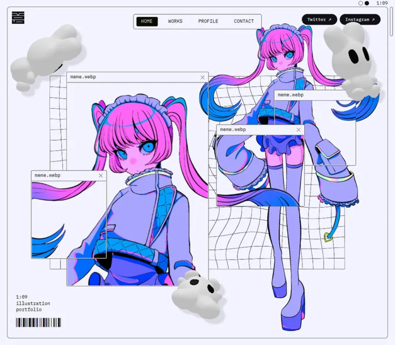
淡いラベンダーの画面に蛍光色のキャラクター、ファイルウィンドウ、白い3Dマスコットを重ねたイラストレーターのポートフォリオ。等幅フォントと細い罫線でデジタルな世界観を構成しています。
オリジナルサイトを見る1:09 Portfolio — Style Reference
A fluorescent character collage inside a pale lavender desktop.
Website / original URL: 109ichiki.com Final URL: https://109ichiki.com/ Theme: light lavender in the supplied captures; alternate appearance states were not exercised. Inspected: September 13, 2026, 02:01 JST — September 12, 2026, 17:01 UTC. Viewports: 1440 × 1000 desktop and 390 × 844 mobile, in CSS pixels. Scope: the current portfolio homepage. Visual evidence covers its opening composition across three desktop frames and two mobile frames. Rendered DOM evidence additionally covers Event, Works categories, Pickup Works, Profile, and the footer. Linked destination pages and open interaction states were not inspected.
The page pairs restrained computer-interface chrome with intensely colored character artwork. A nearly white lavender canvas, thin gray outlines, IBM Plex Mono labels, a compact emblem, and a barcode establish the surrounding system. Neon pink hair, blue accents, violet clothing, distorted wireframe geometry, and softly shaded white mascots supply the visual energy.
The opening composition is deliberately asymmetric on desktop: an enlarged character portrait occupies the left, a full-body character extends down the right, and smaller file windows interrupt both views. On mobile, the composition changes to one central character with two overlapping windows. Small navigation and identity elements occupy the perimeter, leaving the artwork at the center of attention.
This is illustrator 1:09’s portfolio homepage. Its rendered content continues into an event schedule, four practice categories, six selected work links, a profile, and social and shop destinations. The opening image scene is the first part of that larger portfolio structure.
How to Read This Reference
- Measured values are supplied computed styles, custom properties, and element rectangles. The root font size is 16px in both inspected viewports, so source rem values can be converted directly.
- Visual estimates describe screenshot geometry, artwork colors, border widths, and shapes where the relevant computed property was not supplied. Approximate values are marked with
≈. - Declared tokens establish values present in the page, but do not prove that every token is visibly used or that every named component was opened.
- DOM-only observations identify lower-page content and measured layout. No lower-page screenshot was supplied, so its imagery, complete surfaces, and transition states remain unverified.
- Implementation recommendations are adaptations for a new build. The CSS and prompts below are not recovered source code.
- Motion evidence comes from differences between captures and a small number of computed animation declarations. Timing, trajectories, and interaction outcomes cannot be recovered from those frames alone.
Tokens — Colors
Interface Palette
These values are directly supported by the supplied custom properties and, where indicated, computed element colors.
| Name | Value | Source token | Role and evidence |
|---|---|---|---|
| Lavender Paper | #f3f3ff |
--color-bg, --color-white-2 |
Computed body background; pale text on social pills; visually shared by the canvas and file-window surfaces |
| Near-black Ink | #101016 |
--color-text, --color-black-2 |
Computed body text and social-pill backgrounds; principal interface contrast |
| Graphite Rule | #565656 |
--color-border, --color-black-3 |
Declared border color; consistent with the fine gray frame and window outlines |
| Utility Gray | #a4a4a4 |
--color-white-3 |
Declared secondary gray; its specific visible application was not isolated |
| White | #ffffff |
--color-white-1 |
Computed Works-category labels and time-like status text |
| Black | #000000 |
--color-black-1 |
Declared utility black; do not replace the measured main ink with this value globally |
The canvas is subtly violet, rather than neutral white. Preserve that tint across the large background and window surfaces so the character colors feel embedded in one environment.
Artwork Palette
These are visual approximations, not measured stylesheet values or pixel samples. They describe the supplied artwork and should not become a second, competing button-color system.
| Name | Approximate value | Visible use |
|---|---|---|
| Fluorescent Pink | ≈ #ff66f2 |
Hair, skin accents, and bright costume details |
| Soft Electric Violet | ≈ #aba2ff |
Jacket, sleeves, stockings, and broad costume areas |
| Electric Blue | ≈ #009fff |
Eyes, hair tips, straps, and sharp accent regions |
| Shaded Mascot Gray | ≈ #c8c8c8 |
Midtones on the white sculptural mascots; their appearance includes lighter highlights and darker shading |
Small lime and iridescent accents also appear in the costume. They are details within the character rendering, not verified semantic interface tokens.
Appearance Controls
Two small circular buttons sit beside the top-right 1:09 label. One has a paper fill and the other an ink fill. Their presence and dimensions are measured; their click outcomes were not supplied. An alternate palette or theme-switching mechanism must therefore remain unverified.
Tokens — Typography
Monospace Interface
- Source family:
IBM Plex Monothrough--font-ibm. - Computed general stack:
'IBM Plex Mono', 'Hiragino Kaku Gothic ProN', 'Hiragino Sans', sans-serif. - Observed weight:
400throughout the sampled interface, including section headings. - Observed tracking:
normalon sampled elements. - Role: navigation, file titles, the three-line identity label, section headings, category labels, status text, and credits.
The consistent regular weight matters. Hierarchy comes from size, placement, capitalization, and surrounding space rather than a heavy display face.
Japanese Text
The source declares 'Hiragino Kaku Gothic ProN', 'Hiragino Sans' through --font-ja. Japanese paragraphs use the combined interface stack, with a measured line-height ratio of 1.75. Preserve the comfortable leading even though the body size is compact.
Barcode Detail
The source declares 'Libre Barcode 128', system-ui through --font-barcode. Its size token is 48px on desktop and 36px on mobile. The visible bars occupy a smaller vertical area than those font-size values; font size is not equivalent to visible glyph height.
The barcode accompanies the identity label at the lower left. Its encoded value and any functional scanning purpose were not verified.
Type Scale
Values below are computed unless marked as token-only. Desktop and mobile represent the two supplied endpoints, not a verified interpolation formula.
| Role | Desktop size / line height | Mobile size / line height | Evidence or source token |
|---|---|---|---|
| Japanese/general body | 14 / 24.5px |
12.5 / 21.875px |
--font-size-base-ja |
| Navigation / English utility text | 15 / 26.25px |
13 / 22.75px |
--font-size-base-en; mobile navigation boxes exist in the DOM |
| Opening identity H1 | 15 / 20.25px |
13 / 17.55px |
Computed; three lines at 1.35 leading |
| File-window title | 15 / 26.25px |
10 / 17.5px |
Computed H2; additional 1px bottom padding |
| Event / Works / Profile H2 | 57 / 99.75px |
42 / 73.5px |
--font-size-h2 |
| Works-category heading | 19 / 33.25px |
15 / 26.25px |
--font-size-h3 |
| Profile name | 34.2 / 59.85px |
28 / 49px |
--font-size-large |
| Social-pill label | 14 / 24.5px |
12.5 / 21.875px |
Computed |
| Footer credits | 12 / 21px |
10 / 17.5px |
--font-size-small |
| Top-right identity stamp | 13 / 15.6px |
12 / 14.4px |
Computed |
| Barcode | 48px |
36px |
Token-only: --font-size-barcode |
| Medium size | 24.4px |
20px |
Token-only: --font-size-medium; specific use not isolated |
Some lower-page windows have transformed rectangles consistent with approximately 0.8× scaling. For example, an 18px desktop close control has a 14.4px rendered rectangle in a category window. Keep computed font sizes and transformed visual dimensions separate when reproducing those stacks.
Tokens — Spacing & Shapes
Spacing Scale
The page combines rem-based typography and content spacing with pixel-based outside margins. It does not use one uniform spacing increment for every element.
| Use | Desktop | Mobile | Evidence |
|---|---|---|---|
| Outside frame inset | 20px |
15px |
Source --padding-outside; visible frame alignment |
| Inner content padding | 56px |
14px |
Source --padding-content |
| Section text left edge | 76px |
29px |
Measured; outside inset plus inner padding |
| Event / Works top padding | 97.5px |
60px |
Computed section padding |
| Logo inset inside frame | 15px |
15px |
Calculated from measured logo and frame positions |
| Social-link gap | 7.5px horizontal |
7.5px vertical |
Calculated from measured link rectangles |
| Pickup row height | 97.5px |
80px |
Measured link rectangles |
| Rounded “view more” padding | 16px 32px |
12px 24px |
Computed |
| Declared grid columns | 12 |
6 |
Source --grid-columns |
| Declared cell parameter | 38.8889px |
30px |
Source --cell-size; its complete application is not exposed |
The cell parameter is not the same as the content-grid track width. Desktop Pickup Works uses twelve tracks of approximately 107.33px inside a 1288px content region.
Border Radius
| Element | Value | Evidence |
|---|---|---|
| Outer frame | ≈ 9px desktop; ≈ 6px mobile |
Visual estimate |
| Desktop navigation enclosure | ≈ 6px |
Visual estimate |
| File windows | ≈ 2px |
Visual estimate; almost square |
| Mobile menu button | 4px |
Computed |
| Social pills | 1000px desktop; 844px mobile |
Computed; both create fully rounded ends |
| “View all” / “More” links | 50% |
Computed; produces an oval rather than a fixed-radius capsule |
| Top circular buttons | 50% |
Computed |
Window and frame rules appear approximately 1px thick. The supplied records include the border-color token but not those elements’ computed border widths.
Opening Layout Measurements
Coordinates are relative to the viewport’s upper-left corner. Rows marked approximate are read visually from the current captures.
| Element | Desktop at 1440 × 1000 | Mobile at 390 × 844 |
|---|---|---|
| Outer frame | ≈ (20, 20), 1400 × 960px |
≈ (15, 15), 360 × 814px |
| Logo link | (35, 35), 40 × 39.02px |
(30, 30), 32 × 31.22px |
| Navigation enclosure | ≈ (517, 43), 407 × 48px |
Not visible in the closed-menu captures |
| Warped grid | ≈ (182, 229), 1075 × 543px |
≈ (70, 150), 250 × 464px |
| Enlarged portrait window | ≈ (236, 210), 518 × 620px |
Not visible |
| Small left hair window | ≈ (106, 470), 240 × 280px |
Not visible |
| Upper-right window | ≈ (1045, 260), 260 × 240px |
≈ (156, 218), 207 × 187px |
| Lower overlapping window | ≈ (838, 360), 280 × 260px |
≈ (31, 353), 208 × 187px |
| Identity H1 | (48, 839.25), 142.56 × 60.75px |
(29, 724.36), 106.92 × 52.64px |
| Mobile menu control | Not visible | (321, 775), 40 × 40px |
These proportions are useful reconstruction targets at the inspected sizes. The original breakpoint and intermediate positioning formulas were not supplied.
Components
Outer Frame and Status Strip
Role: gives the portfolio a contained, screen-like boundary.
A thin rounded rectangle sits 20px inside the desktop viewport and 15px inside the mobile viewport. Its fill is visually continuous with the surrounding page. A narrow scroll indicator sits to the right, outside the main frame. At the top right, two tiny circles precede the 1:09 stamp.
The circle buttons measure 12 × 12px on desktop and 10 × 10px on mobile. The stamp uses 13px desktop and 12px mobile type. Treat the stamp as displayed identity text; the evidence does not establish that it functions as a clock.
The boundary stays in the same place across the supplied opening frames. A fixed frame is a suitable implementation adaptation, but the original positioning declaration was not included.
Brand Mark
Role: compact identity and a home destination.
A near-square dark emblem with fine pale internal linework occupies the upper-left corner. The home anchor is 40px wide on desktop and 32px on mobile. Its position remains 15px inside the outer frame in both layouts.
Use an authorized version of the emblem when available. Its internal drawing should remain artwork; the supplied evidence does not establish a font or reusable icon name for it.
Desktop Navigation
Role: direct access to the homepage, works, profile, and contact pages.
A centered, lightly rounded enclosure contains HOME, WORKS, PROFILE, and CONTACT. Labels are small regular monospace text with generous space between items. The selected HOME area appears as a compact dark rectangle with pale lettering.
The navigation is visually independent of the logo on the left and the social links on the right. Center it against the viewport rather than against the remaining space between those groups.
The supplied links establish these destinations:
- Home:
/ - Works:
/works/ - Profile:
/profile/ - Contact:
/contact/
The sampled HOME anchor reports ink-colored text despite the visible inverted selection treatment. Its computed text color alone therefore does not describe the complete active-tab appearance. Hover, focus, and route-transition results were not captured.
Social Pills
Role: direct external access without dominating the artwork.
Twitter and Instagram use near-black capsules with pale text and a small northeast-pointing arrow. Desktop dimensions are approximately 112.59 × 34.19px and 129.39 × 34.19px, separated by 7.5px near the upper-right edge.
On mobile they become a right-aligned vertical pair near the bottom of the opening composition. Twitter measures 100.75 × 30.75px at (260.25, 690); Instagram measures 115.75 × 30.75px at (245.25, 728.25).
Retain the visible label Twitter when documenting the current UI, even though its destination is on x.com. Whether external links open a new browsing context was not supplied.
Opening Identity and Barcode
Role: names the creator and the type of site in a small perimeter label.
The H1 is a regular monospace stack:
1:09
illustration
portfolio
It sits at the lower left, followed by a barcode. Desktop type is 15px with 20.25px leading; mobile type is 13px with 17.55px leading. This modest H1 is an important part of the hierarchy: the artwork supplies the large visual scale.
Keep the barcode compact and aligned to the text block. Do not treat it as a primary navigation control without additional evidence.
Character Stage and Warped Grid
Role: establishes the illustrator’s visual world before the content sections begin.
The main character has oversized blue eyes, long pink-to-blue twin tails, lavender clothing, dark outlines, and small reflective color accents. Its full-body view extends from near the top of the scene almost to the bottom of the frame. A thin, irregular wireframe rectangle sits behind it.
On desktop the full-body figure occupies the right side while a much larger portrait crop fills the left window. On mobile the full-body figure moves to the center and carries most of the composition by itself.
The wireframe has uneven, bowed lines and local distortion. A perfectly regular CSS grid would miss this feature. An authored SVG, raster asset, or a separately rendered mesh can provide the distortion in a new implementation; the original rendering method is not identified by the supplied evidence.
File-Window Collage
Role: turns views of the character into overlapping digital objects.
Each window has:
- An almost square outer rectangle with a fine graphite rule.
- A pale title bar continuous with the page palette.
- A left-aligned
meme.webpheading. - A small cross-shaped button at the right.
- A clipped character view beneath the title bar.
Title bars are approximately 33px high on desktop and 25px on mobile. Desktop close-button rectangles measure 18 × 18px; mobile ones measure 12 × 12px. These are observed visual/control dimensions, not recommended minimum touch targets.
Four windows are visible on desktop. Their contents range from a large face close-up to narrow hair and costume fragments. On mobile, two windows remain visually present over the central figure. The reduced count creates enough open area for the face, extended sleeves, and legs to remain readable.
The smaller windows behave compositionally like registered views into the character scene. For a new build, use deliberately prepared crops or matched scene projections. Arbitrarily placing the same full image inside every rectangle will lose the alignment and scale relationships.
The cross icons are real button elements in the supplied DOM, but closing, restoration, dragging, and resize behavior were not exercised.
Floating Mochiusa Mascots
Role: supplies soft depth and motion over the otherwise flat interface.
Three white, rounded mascots are visible in the desktop scenes. Their lobed bodies, short ear-like protrusions, dark oval eyes, and soft shadows contrast with the character’s sharp colored outlines. Their positions and orientations change between frames, including rotations that expose or hide the eyes.
On mobile, mascots move near the top and bottom edges and are sometimes partially clipped by the viewport. Their staging is not a scaled copy of the desktop arrangement.
Keep shadows attached to the mascots rather than adding a generic elevation shadow to every window. A single fixed sprite can match one moment, but it cannot reproduce the changing silhouettes visible across the supplied frames. The original page’s footer independently credits a 3D contribution for mochiusa; model files, renderer, lighting settings, and motion code were not supplied.
Mobile Menu Control
Role: compact access to navigation when the desktop enclosure is absent.
A 40 × 40px outlined square with a 4px radius sits at (321, 775) in the mobile capture. Three thin horizontal strokes form its icon. Its computed opacity and transform transitions both use 400ms with cubic-bezier(0.16, 1, 0.3, 1).
Navigation links remain in the mobile DOM, including measured boxes arranged in two columns, but they are not visible in the closed-menu screenshots. Those boxes do not establish the open panel’s appearance, visibility rules, or focus behavior.
Event Section — DOM Evidence
Role: lists scheduled exhibitions and events.
The section begins at y = 980px on desktop and y = 829px on mobile. It contains a large Event heading, two short Japanese paragraphs, a Twitter link, a parenthesized schedule label, and three date-range entries.
Section titles use 57px desktop and 42px mobile monospace type. Introductory text begins at x = 76px and x = 29px respectively. The event-title positions repeat approximately every 116.66px on desktop and every 90px on mobile; full row wrappers and divider styling were not sampled.
The listed dates are in 2025. They are current-page content at the capture date, not evidence that the site is unavailable, and should not be described as upcoming relative to the 2026 inspection.
Works Category Presentation — DOM Evidence
Role: explains four areas of practice and links to filtered work lists.
The section contains WORKS CATEGORY, a numbered list of Illustration, MV-Illustration, Event, and Goods, a play/pause-like status label, a time-like display, and overlapping windows titled category_01 through category_04.
The category windows contain Japanese descriptions and compact dark links to the relevant filtered Works URLs. Their sampled positions are offset by 10px in both axes, creating a stack. Their rectangles are consistent with an approximately 0.8 scale factor at the captured state.
The category index and time-like labels compute to white. Their enclosing visual backdrop was not supplied in a screenshot, so white labels alone do not prove a particular background image or color.
The measured category section is 7200px high on desktop and 6118px on mobile. This establishes a long presentation region, but does not independently verify pinning, scroll scrubbing, automatic playback, or a particular animation library.
Pickup Works Rows — DOM Evidence
Role: offers a concise index of six selected projects.
Each project is a full-width anchor inside the outer content boundary. Desktop rows measure 1400 × 97.5px with 56px horizontal padding and twelve equal interior tracks. Mobile rows measure 360 × 80px with 14px horizontal padding.
The desktop rendered text includes a project title plus category and work-type labels. Mobile rendered text exposes the project titles without those metadata labels, although the anchor text extraction still contains them. This supports a simplified visible mobile row while retaining richer underlying content.
The mobile computed grid is more specific than the global six-column token: it exposes six tracks of approximately 49.08px plus a 37.52px track. The supplied evidence does not identify the exact child responsible for the additional track.
A centered すべて見る link follows the rows. It measures approximately 153.22 × 58.5px on desktop and 127.88 × 47.88px on mobile, with a computed 50% radius.
Profile and Image Stack — DOM Evidence
Role: introduces the illustrator and links to the full profile.
The current profile identifies 1:09 as a freelance illustrator working mainly in Tokyo, with interests spanning fluorescent character illustration, event participation, plush toys, apparel, and goods.
Desktop Profile uses a twelve-column grid. The sampled copy region is 588px wide, beginning at x = 76px. On mobile the section computes to display: block, and its copy occupies the 332px interior width. The final paragraph wraps to two lines there.
The section includes repeated profile.jpg windows: twelve rendered title entries on desktop and six on mobile. Desktop title positions form two runs with roughly 30px horizontal and 20px vertical offsets. The mobile run uses approximately 20px horizontal and 16px vertical offsets. Image contents and stack interactions were not visually supplied.
The もっと見る link shares the rounded “view more” geometry used below the selected works.
Footer — DOM Evidence
Role: provides social destinations, shop access, and explicit credits.
The footer’s measured height equals the viewport height: 1000px on desktop and 844px on mobile. Its visible text includes Twitter, Instagram, BOOTH, and (c) 1:09 ichiki.
Desktop social links are arranged horizontally near the lower left; mobile links stack vertically. Credits sit toward the lower right in 12px desktop or 10px mobile monospace text.
The inspected original page explicitly credits Web: @bokoko33, 3D(mochiusa): @nirohsy, and 3D(meme-chan): @bokoko33. These are the roles supported by the original page. The evidence does not establish additional responsibilities or legal names.
Tokens — Motion & Interaction
| Treatment | Evidence | What can be concluded |
|---|---|---|
| Mascot movement and rotation | Different positions and silhouettes across desktop and mobile frames | The scene contains changing mascot states; duration, path, easing, and trigger are unknown |
| Main character animation | Similar pose across supplied frames | Animated character deformation is not established by these images |
| Warped grid | Irregular geometry visible behind the character | Distortion is confirmed; its animation behavior is unverified |
| Mobile menu-control transition | opacity 0.4s cubic-bezier(0.16, 1, 0.3, 1), transform 0.4s cubic-bezier(0.16, 1, 0.3, 1) |
A transition is defined on the control; the open menu was not observed |
| General transform token | --duration-base-transform: .4s |
Declared shared timing, not proof that every component uses it |
| General transform easing | cubic-bezier(.16, 1, .3, 1) |
Declared through transform and expo aliases |
| Additional easing | cubic-bezier(.22, 1, .36, 1) |
Declared --ease-out-quint; a specific visible use was not isolated |
| Material timing | .15s ease-out |
Declared base material tokens |
| Hover material timing | --duration-hover-material: 0s |
Social-link transition strings contain no nonzero duration; a slow hover fade is not evidenced |
| Works play/pause-like label | 1s steps(1) infinite _tick_1fs6u_1 |
A repeating stepped animation is defined; its keyframe properties and control semantics are not supplied |
| Main opacity transition | opacity 0.001s linear |
Near-instant opacity transition is defined; this is not evidence of a long page reveal |
| Works time-like display | 00.00.06.76 desktop; 00.00.09.29 mobile |
Different sampled values exist; they do not prove a relationship with scroll position or media playback |
| Window cross buttons | Button elements and visible cross glyphs | Closing, dragging, resizing, and restoring windows remain unverified |
For an adaptation, concentrate continuous motion in the mascots and preserve stable reading positions for navigation and body copy. Any chosen drift period, rotation speed, pointer response, or pause behavior should be documented as a new implementation decision.
Surfaces
| Layer | Appearance | Purpose |
|---|---|---|
| Canvas | Solid #f3f3ff |
Quiet background across the opening scene |
| Outer chrome | Thin graphite frame, compact emblem, tiny status details | Defines the perimeter and computer-interface character |
| File windows | Pale surfaces, fine outlines, narrow title bars | Frames image fragments without heavy elevation |
| Selected navigation / social links | Small near-black filled regions with pale lettering | Local interaction emphasis |
| Wireframe | Thin distorted lines over the pale field | Spatial structure behind the character |
| Character rendering | Saturated pink, violet, and blue with dark contours | Main identity and visual focus |
| Mascots | White-gray shading with soft displaced shadows | Depth, softness, and movement |
| Lower-page category labels | Computed white text | Contrasting labels; enclosing rendered surface remains unverified |
There is no visible general card-shadow system in the opening composition. Most edges remain flat; the mascots carry the soft depth.
The source declares stack levels for header 1000, outer frame 2000, hamburger menu 6000, scrollbar 10000, modal 11000, loading 99999, and the 109 element 999999. These numbers describe declared priorities, not a complete map of effective stacking contexts. Modal and loading tokens do not establish captured modal or loading designs.
Imagery
The character artwork combines anime proportions, crisp dark outlines, fluorescent accents, and pale violet clothing. Long curling twin tails and extended sleeves create a wide silhouette, while the stockings and platform shoes establish a tall vertical axis. The enlarged portrait crop on desktop emphasizes the face and eye color.
Image windows repeat parts of that visual world at different scales. Their composition depends on intentional cropping: a face close-up, a strand of hair, a costume fragment, and a full-body view should feel related without becoming identical thumbnails.
The white mascots have smooth, softly shaded volume and minimal black facial details. Keep their material appearance distinct from the outlined character. A wireframe backdrop provides a third texture: sparse geometric lines against a flat pale field.
The original page credits 3D work for both mochiusa and meme-chan. That supports a 3D production contribution, but the supplied observation contains no model URLs, shaders, canvas inspection, or renderer identification. Describe the visible character as an illustrated or cel-shaded rendering without assigning a specific runtime technology.
Observed Asset References
The evidence supplies displayed labels, not verified image or model resource paths.
| Reference | Evidence | Use |
|---|---|---|
meme.webp |
Visible file-window title and rendered H2 text | Character-view windows |
category_01–category_04 |
Rendered window titles | Works-category description stack |
profile.jpg |
Repeated rendered window titles | Profile image-window stack |
| Brand emblem | Visible linked graphic | Upper-left home identity |
| Mochiusa mascots | Visible changing forms and original-page credit | Foreground depth and motion |
| Warped wireframe | Visible graphic | Character-stage backdrop |
| Libre Barcode 128 | Declared font family | Lower-left barcode treatment |
Do not assume that /meme.webp or /profile.jpg is a fetchable asset URL simply because those strings appear in title bars. No actual image src, font-file, or model paths were included.
Layout & Responsive Behavior
Desktop Composition
At 1440 × 1000, the 20px frame inset leaves a 1400px-wide inner boundary. Navigation occupies the top center, the emblem anchors the upper left, and social pills sit at the upper right. The image stage overlaps freely through the middle, while the small identity block and barcode occupy the lower left.
The enlarged portrait window and full-body figure form two unequal focal regions. Smaller windows bridge those regions and create deliberate interruptions. The wireframe sits behind the character and windows; white mascots move in front of them.
Mobile Recomposition
At 390 × 844, the outside inset falls to 15px and the content inset falls from 56px to 14px. The desktop navigation enclosure is absent from the closed state, and a square menu button appears at the lower right.
The large left portrait window and narrow hair window are no longer visible. Two similarly sized windows remain over the central full-body character. The mesh changes from a wide horizontal field to a narrow, tall rectangle. Social links move to a vertical pair above the menu area, while the identity and barcode remain at the lower left.
This is a change in composition, not uniform scaling. Preserve the face, long silhouette, and relationship between the two windows when adapting to intermediate widths.
Lower-Page Layout
The DOM establishes the following changes:
- Section heading sizes decrease from 57px to 42px.
- General body size decreases from 14px to 12.5px while keeping 1.75 leading.
- The global grid token changes from twelve columns to six.
- Pickup Works remains a vertical list, with row height decreasing from 97.5px to 80px.
- Pickup metadata is absent from the mobile rendered-text summary.
- Profile changes from a grid layout to block flow.
- Rendered Profile window-title count decreases from twelve to six.
- Footer social links change from a horizontal group to a vertical stack.
Scroll Geometry and Limits
The reported document height equals the viewport height in both observations, while the main element measures approximately 11091.27px on desktop and 9877.75px on mobile. The footer begins at those respective positions and adds another viewport-height region.
Those rectangles demonstrate substantial content beyond the first view. They also mean that the reported document height cannot be used as the total content length. The supplied evidence is insufficient to identify whether the page uses a particular internal scroller, transformed content container, or scroll-management library.
No tablet viewport, landscape phone, browser zoom, safe-area behavior, or keyboard-navigation sequence was supplied. The exact responsive breakpoint remains unknown.
Do’s and Don’ts
Do
- Keep the measured lavender canvas
#f3f3ffand near-black ink#101016. - Use IBM Plex Mono at regular weight for the interface, with the observed Japanese fallback stack.
- Let the character imagery carry the largest scale while keeping the opening identity label small.
- Build file windows from thin outlines, narrow title bars, explicit filename labels, and carefully prepared image crops.
- Preserve the desktop relationship between the enlarged portrait and full-body figure.
- Recompose mobile around the central figure and two visible windows.
- Keep bright pink, violet, and blue concentrated in the artwork.
- Reserve soft shadows for the mascots and other genuinely volumetric imagery.
- Retain the event, work-index, profile, and footer hierarchy when extending the homepage.
- Distinguish defined transitions from interactions actually observed.
Don’t
- Don’t replace the opening identity with a large generic marketing headline.
- Don’t turn every work or image into a spacious rounded card with a shadow.
- Don’t use a perfectly regular grid as a substitute for the warped wireframe.
- Don’t stretch the character or independently crop every window without preserving their visual relationship.
- Don’t fit all four desktop windows onto the phone by shrinking them uniformly.
- Don’t convert the entire interface into fluorescent button fills.
- Don’t identify the small
1:09stamp as a live clock without evidence. - Don’t promise draggable or closable windows based only on their appearance.
- Don’t assume the two circular buttons prove a verified dark theme.
- Don’t infer asset URLs from displayed filenames or playback behavior from time-like text.
Recommended Implementation Additions
These are recommendations for a new implementation, not verified original features:
- Provide a visible pause control and honor reduced-motion preferences for continuous mascot movement. A CSS media query alone will not stop an animation loop running in a renderer.
- Keep navigation, contact access, and work links usable if the animated scene fails to load.
- Give icon-only controls explicit accessible names. The supplied text extraction does not include their accessible-name computation.
- Expand close and appearance-control hit areas to approximately 44px while preserving the small visible glyphs. The measured 10–18px controls are too small to use as a general touch-target recommendation.
- Implement the mobile menu with an announced expanded state, predictable keyboard focus, Escape dismissal, and a reliable route back to content.
- If window closing is implemented, provide a discoverable restoration action. If windows are decorative, avoid presenting inert close buttons as working controls.
- Use meaningful alternative text for the primary artwork and suppress redundant announcements for duplicate decorative crops.
- Offer comfortable reading sizes for long Japanese copy and very small mobile credits, especially at browser zoom.
- Preserve natural scrolling in the basic experience. Introduce any extended or pinned presentation only after keyboard, touch, and reduced-motion behavior are tested.
- Give the barcode an appropriate decorative treatment unless an actual encoded function is intentionally provided.
Agent Prompt Guide
Quick Color Reference
- Canvas and window surfaces: measured
#f3f3ff. - Text and dark pills: measured
#101016. - Fine rules: source token
#565656. - Character pink: approximate
#ff66f2. - Character violet: approximate
#aba2ff. - Character blue: approximate
#009fff. - Depth: soft gray shading and shadows on white mascots; flat interface surfaces elsewhere.
Overall Prompt
“Create an illustrator portfolio homepage inspired by the current 1:09 Portfolio. Use a pale lavender canvas #f3f3ff, near-black text #101016, thin graphite rules, and regular IBM Plex Mono interface labels with Japanese sans-serif fallbacks. Place a compact emblem at the upper left, a centered four-item desktop navigation enclosure, dark social pills at the upper right, and a small three-line identity label with a barcode at the lower left. Compose authorized fluorescent character artwork as a full-body figure on the right and an enlarged portrait window on the left, with two smaller file windows and a warped wireframe behind them. Use narrow filename title bars and small cross glyphs. Add softly shaded white mascots as the foreground depth layer. On mobile, center the full-body character, show two overlapping windows, move social links to the lower right, and provide a compact bottom-right menu button. Continue into Event, Works categories, selected-work rows, Profile, and a credited footer. Treat unverified motion and control behavior as new implementation decisions.”
Example Component Prompts
- File window: “Build an almost square-cornered lavender image window with a 1px graphite outline, a compact monospace
meme.webptitle, and a cross icon at the right of a narrow title bar. Clip an authorized character crop below it. Keep the window flat and provide a larger accessible hit area if the close control is functional.” - Desktop perimeter: “At a 1440 × 1000 reference size, use an approximately 20px inset rounded frame, a 40px emblem near the upper left, a centered navigation enclosure around 407 × 48px, and dark Twitter and Instagram capsules at the upper right. Preserve broad open lavender space around the artwork.”
- Mobile scene: “For a 390 × 844 reference size, use a 15px inset frame, a central tall character, a narrow warped grid, and two approximately 208 × 187px file windows. Leave the face visible above the upper window. Place the three-line identity and barcode at lower left, stacked social pills at lower right, and a 40px square menu control below them.”
- Selected-work index: “Create a vertical list of full-width project links with regular monospace and Japanese text. Use approximately 97.5px rows and 56px inner horizontal padding on desktop, then 80px rows and 14px padding on mobile. Simplify secondary metadata on mobile. End with a compact oval
すべて見るlink. Treat exact column assignments and divider styling as implementation choices.” - Mascot layer: “Create a small number of white, softly shaded mascot forms with minimal black oval eyes. Keep them visually distinct from the fluorescent outlined character. Allow gentle position and orientation changes with a static reduced-motion alternative. Choose and document motion timing independently; no original duration is established.”
Quick Start
CSS Custom Properties
This is an implementation adaptation using the measured palette, font stack, type endpoints, and spacing values. Frame/window radii, scene percentages, and the 48rem breakpoint are recommendations based on the supplied screenshots, not recovered source rules.
The expected window anatomy is .art-window > .window-bar + .window-media, with .window-title and a button containing an SVG cross inside the title bar. Supply authorized character crops, a wireframe graphic, an emblem, and mascot assets separately. The displayed filenames do not identify download paths.
:root {
  /* Measured interface colors */
  --paper: #f3f3ff;
  --ink: #101016;
  --rule: #565656;
  --muted: #a4a4a4;
  --white: #fff;

  /* Observed family names; font files must be supplied separately */
  --font-ui: 'IBM Plex Mono', 'Hiragino Kaku Gothic ProN',
    'Hiragino Sans', sans-serif;
  --font-barcode: 'Libre Barcode 128', system-ui;

  /* Measured desktop endpoints at a 16px root */
  --text-body: 0.875rem;
  --text-en: 0.9375rem;
  --text-small: 0.75rem;
  --text-window: 0.9375rem;
  --text-h2: 3.5625rem;
  --text-h3: 1.1875rem;
  --text-large: 2.1375rem;
  --barcode-size: 3rem;
  --leading-body: 1.75;
  --outside: 20px;
  --content-inset: 3.5rem;
  --section-space: 97.5px;
  --row-height: 97.5px;
  --grid-columns: 12;

  /* Source timing tokens */
  --material-duration: 150ms;
  --hover-duration: 0s;
  --transform-duration: 400ms;
  --transform-ease: cubic-bezier(0.16, 1, 0.3, 1);

  /* Estimated geometry for this adaptation */
  --frame-radius: 9px;
  --window-radius: 2px;
  --window-bar-height: 33px;
  --close-glyph: 18px;
  --barcode-line: 30px;
}

* {
  box-sizing: border-box;
}

body {
  margin: 0;
  background: var(--paper);
  color: var(--ink);
  font-family: var(--font-ui);
  font-size: var(--text-body);
  font-weight: 400;
  line-height: var(--leading-body);
}

button,
a {
  -webkit-tap-highlight-color: transparent;
}

button {
  font: inherit;
  color: inherit;
}

/* Recommended fixed perimeter; normal document flow remains available. */
.portfolio-frame {
  position: fixed;
  inset: var(--outside);
  z-index: 2000;
  border: 1px solid var(--rule);
  border-radius: var(--frame-radius);
  pointer-events: none;
}

.portfolio-hero {
  position: relative;
  min-height: calc(100svh - var(--outside));
}

.hero-stage {
  position: absolute;
  inset: 0 0 auto;
  height: 100svh;
  overflow: clip;
  isolation: isolate;
  pointer-events: none;
}

.brandmark {
  position: absolute;
  z-index: 1000;
  top: calc(var(--outside) + 15px);
  left: calc(var(--outside) + 15px);
  width: 40px;
}

.brandmark img {
  display: block;
  width: 100%;
  height: auto;
}

.primary-nav {
  position: absolute;
  z-index: 1000;
  top: 43px;
  left: 50%;
  display: flex;
  gap: 18px;
  padding: 8px;
  transform: translateX(-50%);
  border: 1px solid var(--rule);
  border-radius: 6px;
  background: var(--paper);
}

.primary-nav a {
  display: flex;
  align-items: center;
  min-height: 30px;
  padding-inline: 16px;
  border-radius: 3px;
  color: var(--ink);
  font-size: var(--text-en);
  line-height: 1.75;
  text-decoration: none;
  text-transform: uppercase;
}

/* Recommended semantic expression of the observed selected appearance. */
.primary-nav a[aria-current='page'] {
  background: var(--ink);
  color: var(--paper);
}

.hero-socials {
  position: absolute;
  z-index: 1000;
  top: 42.5px;
  right: 42.5px;
  display: flex;
  gap: 7.5px;
}

.social-link {
  display: inline-flex;
  align-items: center;
  justify-content: center;
  gap: 7px;
  min-height: 34.1875px;
  padding-inline: 17px;
  border: 1px solid var(--ink);
  border-radius: 1000px;
  background: var(--ink);
  color: var(--paper);
  line-height: 1;
  text-decoration: none;
  transition:
    background-color var(--hover-duration) ease-out,
    color var(--hover-duration) ease-out;
}

.hero-signature {
  position: absolute;
  z-index: 10;
  left: 48px;
  bottom: 34px;
}

.hero-title {
  margin: 0;
  font-size: var(--text-en);
  font-weight: 400;
  line-height: 1.35;
}

.hero-barcode {
  display: block;
  margin-top: 16px;
  font-family: var(--font-barcode);
  font-size: var(--barcode-size);
  font-weight: 400;
  line-height: var(--barcode-line);
}

/* Screenshot-based desktop composition; adjust to asset bounds. */
.wireframe {
  position: absolute;
  z-index: 0;
  left: 12.64%;
  top: 22.9%;
  width: 74.65%;
  height: 54.3%;
}

.character {
  position: absolute;
  z-index: 1;
  left: 55.2%;
  top: 6.8%;
  width: 36.8%;
  height: 89%;
  object-fit: contain;
}

.art-window {
  position: absolute;
  z-index: 2;
  display: grid;
  grid-template-rows: var(--window-bar-height) minmax(0, 1fr);
  border: 1px solid var(--rule);
  border-radius: var(--window-radius);
  background: var(--paper);
  pointer-events: auto;
}

.window-bar {
  position: relative;
  z-index: 1;
  display: flex;
  align-items: center;
  justify-content: space-between;
  gap: 8px;
  padding-inline: 11px;
  border-bottom: 1px solid var(--rule);
  background: var(--paper);
  border-radius: var(--window-radius) var(--window-radius) 0 0;
}

.window-title {
  min-width: 0;
  margin: 0;
  overflow: hidden;
  font-size: var(--text-window);
  font-weight: 400;
  line-height: 1.75;
  text-overflow: ellipsis;
  white-space: nowrap;
}

/* Recommended enlarged target around the small observed glyph. */
.window-close {
  display: grid;
  flex: 0 0 44px;
  place-items: center;
  width: 44px;
  height: 44px;
  margin-inline-end: -12px;
  padding: 0;
  border: 0;
  background: transparent;
  cursor: pointer;
}

.window-close svg {
  width: var(--close-glyph);
  height: var(--close-glyph);
  fill: none;
  stroke: var(--rule);
  stroke-width: 1;
}

.window-media {
  min-height: 0;
  overflow: hidden;
}

.window-media img {
  display: block;
  width: 100%;
  height: 100%;
  object-fit: cover;
  object-position: var(--crop-position, center);
}

.window-portrait {
  left: 16.39%;
  top: 21%;
  width: 36%;
  height: 62%;
}

.window-hair {
  z-index: 3;
  left: 7.39%;
  top: 47%;
  width: 16.67%;
  height: 28%;
}

.window-upper {
  left: 72.6%;
  top: 26%;
  width: 18.06%;
  height: 24%;
}

.window-lower {
  z-index: 4;
  left: 58.2%;
  top: 36%;
  width: 19.44%;
  height: 26%;
}

.mascot-layer {
  position: absolute;
  inset: 0;
  z-index: 5;
  pointer-events: none;
}

.menu-toggle {
  display: none;
}

.portfolio-section {
  padding: var(--section-space) var(--outside);
}

.section-intro {
  padding-inline: var(--content-inset);
}

.section-heading {
  margin: 0;
  font-size: var(--text-h2);
  font-weight: 400;
  line-height: 1.75;
}

.section-intro p {
  margin: 0;
}

/* Recommended child spans and divider; source spans were not supplied. */
.work-row {
  display: grid;
  grid-template-columns: repeat(12, minmax(0, 1fr));
  align-items: center;
  min-height: var(--row-height);
  padding-inline: var(--content-inset);
  border-bottom: 1px solid var(--rule);
  color: inherit;
  text-decoration: none;
}

.work-title {
  grid-column: span 8;
  min-width: 0;
}

.work-meta {
  grid-column: span 3;
}

.work-arrow {
  justify-self: end;
}

.more-link {
  display: inline-grid;
  place-items: center;
  padding: 16px 32px;
  border: 1px solid var(--rule);
  border-radius: 50%;
  color: inherit;
  text-decoration: none;
}

/* Recommended focus treatment. */
a:focus-visible,
button:focus-visible {
  outline: 2px solid var(--ink);
  outline-offset: 4px;
}

/* Chosen adaptation breakpoint; the original breakpoint is unknown. */
@media (max-width: 48rem) {
  :root {
    --text-body: 0.78125rem;
    --text-en: 0.8125rem;
    --text-small: 0.625rem;
    --text-window: 0.625rem;
    --text-h2: 2.625rem;
    --text-h3: 0.9375rem;
    --text-large: 1.75rem;
    --barcode-size: 2.25rem;
    --outside: 15px;
    --content-inset: 0.875rem;
    --section-space: 60px;
    --row-height: 80px;
    --grid-columns: 6;
    --frame-radius: 6px;
    --window-bar-height: 25px;
    --close-glyph: 12px;
    --barcode-line: 22px;
  }

  .brandmark {
    width: 32px;
  }

  .primary-nav {
    display: none;
  }

  .hero-socials {
    top: auto;
    right: 29px;
    bottom: 70px;
    flex-direction: column;
    align-items: flex-end;
  }

  .social-link {
    min-height: 30.75px;
  }

  .hero-signature {
    left: 29px;
    bottom: 14px;
  }

  .wireframe {
    left: 17.95%;
    top: 17.77%;
    width: 64.1%;
    height: 55%;
  }

  .character {
    left: 7.4%;
    top: 16.8%;
    width: 84%;
    height: 66.7%;
  }

  .window-portrait,
  .window-hair {
    display: none;
  }

  .window-upper {
    left: 40.08%;
    top: 25.83%;
    width: 53.08%;
    height: 22.16%;
  }

  .window-lower {
    left: 8.1%;
    top: 41.87%;
    width: 53.08%;
    height: 22.16%;
  }

  .window-bar {
    padding-inline: 6px;
  }

  .menu-toggle {
    position: fixed;
    z-index: 6000;
    right: 29px;
    bottom: 29px;
    display: grid;
    place-items: center;
    width: 40px;
    height: 40px;
    padding: 0;
    border: 1px solid var(--rule);
    border-radius: 4px;
    background: var(--paper);
    transition:
      opacity var(--transform-duration) var(--transform-ease),
      transform var(--transform-duration) var(--transform-ease);
  }

  /* Simplified adaptation of the measured mobile row. */
  .work-row {
    grid-template-columns: minmax(0, 1fr) auto;
  }

  .work-title {
    grid-column: auto;
  }

  .work-meta {
    display: none;
  }

  .more-link {
    padding: 12px 24px;
  }
}

/* Apply the same preference to any renderer-driven animation in code. */
@media (prefers-reduced-motion: reduce) {
  .mascot-layer *,
  .hero-stage [data-animated] {
    animation: none !important;
  }

  .menu-toggle {
    transition: none;
  }
}
The stage percentages approximate the two inspected compositions and require adjustment for the transparent bounds of the chosen assets. Add a height-aware arrangement for short landscape viewports before production. Closing, mobile-menu state, asset loading, and mascot animation require application behavior beyond this CSS.
Tailwind v4 Token Mapping
Optional aliases for a project already using Tailwind v4. This does not identify the original site’s framework. Define the properties above first.
@theme inline {
  --color-paper: var(--paper);
  --color-ink: var(--ink);
  --color-rule: var(--rule);
  --color-muted: var(--muted);

  --font-interface: var(--font-ui);
  --font-barcode-display: var(--font-barcode);

  --text-body: var(--text-body);
  --text-utility: var(--text-en);
  --text-caption: var(--text-small);
  --text-file: var(--text-window);
  --text-section: var(--text-h2);
  --text-profile-name: var(--text-large);

  --spacing-outside: var(--outside);
  --spacing-content: var(--content-inset);
  --spacing-section: var(--section-space);
  --spacing-work-row: var(--row-height);

  --radius-frame: var(--frame-radius);
  --radius-file: var(--window-radius);
}
Sources & Evidence
- Original and final website: https://109ichiki.com/. The supplied observation reports HTTP 200, an unchanged final URL, and the title
1:09 Portfolio. - Capture timestamp:
2026-09-12T17:01:17.389Z, equivalent to September 13, 2026, 02:01:17.389 JST. - Visual coverage: three desktop captures at 1440 × 1000 and two mobile captures at 390 × 844. These show the opening composition and different mascot states.
- Rendered evidence: page text, original-page link destinations, computed element styles and rectangles, and custom properties for both viewports. This supports the measured typography, interface colors, spacing endpoints, lower-page content structure, and original-page footer credits.
- Readiness scope: the supplied browser process observed the initial page for at least five seconds and waited for load, visible-image decoding, and sampled layout/text stability within bounded time limits. Perpetual animation was temporarily paused during readiness checks and resumed afterward. SharedWorkers and service workers were disabled.
- Inspection limits: no lower-section screenshots, open mobile menu, activated appearance controls, window manipulation, hover sequence, focus sequence, or linked destination pages were supplied. No image-resource URLs, animation source, model files, or complete stylesheet were included. Delayed content and unexercised interactions remain unverified.
This reference describes the currently supplied homepage evidence. Measured values, visual estimates, and implementation recommendations are kept separate throughout.
# 1:09 Portfolio — Style Reference

> A fluorescent character collage inside a pale lavender desktop.

**Website / original URL:** [109ichiki.com](https://109ichiki.com/)
**Final URL:** [https://109ichiki.com/](https://109ichiki.com/)
**Theme:** light lavender in the supplied captures; alternate appearance states were not exercised.
**Inspected:** September 13, 2026, 02:01 JST — September 12, 2026, 17:01 UTC.
**Viewports:** 1440 × 1000 desktop and 390 × 844 mobile, in CSS pixels.
**Scope:** the current portfolio homepage. Visual evidence covers its opening composition across three desktop frames and two mobile frames. Rendered DOM evidence additionally covers Event, Works categories, Pickup Works, Profile, and the footer. Linked destination pages and open interaction states were not inspected.

The page pairs restrained computer-interface chrome with intensely colored character artwork. A nearly white lavender canvas, thin gray outlines, IBM Plex Mono labels, a compact emblem, and a barcode establish the surrounding system. Neon pink hair, blue accents, violet clothing, distorted wireframe geometry, and softly shaded white mascots supply the visual energy.

The opening composition is deliberately asymmetric on desktop: an enlarged character portrait occupies the left, a full-body character extends down the right, and smaller file windows interrupt both views. On mobile, the composition changes to one central character with two overlapping windows. Small navigation and identity elements occupy the perimeter, leaving the artwork at the center of attention.

This is illustrator 1:09’s portfolio homepage. Its rendered content continues into an event schedule, four practice categories, six selected work links, a profile, and social and shop destinations. The opening image scene is the first part of that larger portfolio structure.

## How to Read This Reference

- **Measured values** are supplied computed styles, custom properties, and element rectangles. The root font size is 16px in both inspected viewports, so source rem values can be converted directly.
- **Visual estimates** describe screenshot geometry, artwork colors, border widths, and shapes where the relevant computed property was not supplied. Approximate values are marked with `≈`.
- **Declared tokens** establish values present in the page, but do not prove that every token is visibly used or that every named component was opened.
- **DOM-only observations** identify lower-page content and measured layout. No lower-page screenshot was supplied, so its imagery, complete surfaces, and transition states remain unverified.
- **Implementation recommendations** are adaptations for a new build. The CSS and prompts below are not recovered source code.
- **Motion evidence** comes from differences between captures and a small number of computed animation declarations. Timing, trajectories, and interaction outcomes cannot be recovered from those frames alone.

## Tokens — Colors

### Interface Palette

These values are directly supported by the supplied custom properties and, where indicated, computed element colors.

| Name | Value | Source token | Role and evidence |
| --- | --- | --- | --- |
| Lavender Paper | `#f3f3ff` | `--color-bg`, `--color-white-2` | Computed body background; pale text on social pills; visually shared by the canvas and file-window surfaces |
| Near-black Ink | `#101016` | `--color-text`, `--color-black-2` | Computed body text and social-pill backgrounds; principal interface contrast |
| Graphite Rule | `#565656` | `--color-border`, `--color-black-3` | Declared border color; consistent with the fine gray frame and window outlines |
| Utility Gray | `#a4a4a4` | `--color-white-3` | Declared secondary gray; its specific visible application was not isolated |
| White | `#ffffff` | `--color-white-1` | Computed Works-category labels and time-like status text |
| Black | `#000000` | `--color-black-1` | Declared utility black; do not replace the measured main ink with this value globally |

The canvas is subtly violet, rather than neutral white. Preserve that tint across the large background and window surfaces so the character colors feel embedded in one environment.

### Artwork Palette

These are **visual approximations**, not measured stylesheet values or pixel samples. They describe the supplied artwork and should not become a second, competing button-color system.

| Name | Approximate value | Visible use |
| --- | --- | --- |
| Fluorescent Pink | `≈ #ff66f2` | Hair, skin accents, and bright costume details |
| Soft Electric Violet | `≈ #aba2ff` | Jacket, sleeves, stockings, and broad costume areas |
| Electric Blue | `≈ #009fff` | Eyes, hair tips, straps, and sharp accent regions |
| Shaded Mascot Gray | `≈ #c8c8c8` | Midtones on the white sculptural mascots; their appearance includes lighter highlights and darker shading |

Small lime and iridescent accents also appear in the costume. They are details within the character rendering, not verified semantic interface tokens.

### Appearance Controls

Two small circular buttons sit beside the top-right `1:09` label. One has a paper fill and the other an ink fill. Their presence and dimensions are measured; their click outcomes were not supplied. An alternate palette or theme-switching mechanism must therefore remain unverified.

## Tokens — Typography

### Monospace Interface

- **Source family:** `IBM Plex Mono` through `--font-ibm`.
- **Computed general stack:** `'IBM Plex Mono', 'Hiragino Kaku Gothic ProN', 'Hiragino Sans', sans-serif`.
- **Observed weight:** `400` throughout the sampled interface, including section headings.
- **Observed tracking:** `normal` on sampled elements.
- **Role:** navigation, file titles, the three-line identity label, section headings, category labels, status text, and credits.

The consistent regular weight matters. Hierarchy comes from size, placement, capitalization, and surrounding space rather than a heavy display face.

### Japanese Text

The source declares `'Hiragino Kaku Gothic ProN', 'Hiragino Sans'` through `--font-ja`. Japanese paragraphs use the combined interface stack, with a measured line-height ratio of `1.75`. Preserve the comfortable leading even though the body size is compact.

### Barcode Detail

The source declares `'Libre Barcode 128', system-ui` through `--font-barcode`. Its size token is 48px on desktop and 36px on mobile. The visible bars occupy a smaller vertical area than those font-size values; font size is not equivalent to visible glyph height.

The barcode accompanies the identity label at the lower left. Its encoded value and any functional scanning purpose were not verified.

### Type Scale

Values below are computed unless marked as token-only. Desktop and mobile represent the two supplied endpoints, not a verified interpolation formula.

| Role | Desktop size / line height | Mobile size / line height | Evidence or source token |
| --- | --- | --- | --- |
| Japanese/general body | `14 / 24.5px` | `12.5 / 21.875px` | `--font-size-base-ja` |
| Navigation / English utility text | `15 / 26.25px` | `13 / 22.75px` | `--font-size-base-en`; mobile navigation boxes exist in the DOM |
| Opening identity H1 | `15 / 20.25px` | `13 / 17.55px` | Computed; three lines at `1.35` leading |
| File-window title | `15 / 26.25px` | `10 / 17.5px` | Computed H2; additional 1px bottom padding |
| Event / Works / Profile H2 | `57 / 99.75px` | `42 / 73.5px` | `--font-size-h2` |
| Works-category heading | `19 / 33.25px` | `15 / 26.25px` | `--font-size-h3` |
| Profile name | `34.2 / 59.85px` | `28 / 49px` | `--font-size-large` |
| Social-pill label | `14 / 24.5px` | `12.5 / 21.875px` | Computed |
| Footer credits | `12 / 21px` | `10 / 17.5px` | `--font-size-small` |
| Top-right identity stamp | `13 / 15.6px` | `12 / 14.4px` | Computed |
| Barcode | `48px` | `36px` | Token-only: `--font-size-barcode` |
| Medium size | `24.4px` | `20px` | Token-only: `--font-size-medium`; specific use not isolated |

Some lower-page windows have transformed rectangles consistent with approximately `0.8×` scaling. For example, an 18px desktop close control has a 14.4px rendered rectangle in a category window. Keep computed font sizes and transformed visual dimensions separate when reproducing those stacks.

## Tokens — Spacing & Shapes

### Spacing Scale

The page combines rem-based typography and content spacing with pixel-based outside margins. It does not use one uniform spacing increment for every element.

| Use | Desktop | Mobile | Evidence |
| --- | --- | --- | --- |
| Outside frame inset | `20px` | `15px` | Source `--padding-outside`; visible frame alignment |
| Inner content padding | `56px` | `14px` | Source `--padding-content` |
| Section text left edge | `76px` | `29px` | Measured; outside inset plus inner padding |
| Event / Works top padding | `97.5px` | `60px` | Computed section padding |
| Logo inset inside frame | `15px` | `15px` | Calculated from measured logo and frame positions |
| Social-link gap | `7.5px` horizontal | `7.5px` vertical | Calculated from measured link rectangles |
| Pickup row height | `97.5px` | `80px` | Measured link rectangles |
| Rounded “view more” padding | `16px 32px` | `12px 24px` | Computed |
| Declared grid columns | `12` | `6` | Source `--grid-columns` |
| Declared cell parameter | `38.8889px` | `30px` | Source `--cell-size`; its complete application is not exposed |

The cell parameter is not the same as the content-grid track width. Desktop Pickup Works uses twelve tracks of approximately 107.33px inside a 1288px content region.

### Border Radius

| Element | Value | Evidence |
| --- | --- | --- |
| Outer frame | `≈ 9px` desktop; `≈ 6px` mobile | Visual estimate |
| Desktop navigation enclosure | `≈ 6px` | Visual estimate |
| File windows | `≈ 2px` | Visual estimate; almost square |
| Mobile menu button | `4px` | Computed |
| Social pills | `1000px` desktop; `844px` mobile | Computed; both create fully rounded ends |
| “View all” / “More” links | `50%` | Computed; produces an oval rather than a fixed-radius capsule |
| Top circular buttons | `50%` | Computed |

Window and frame rules appear approximately 1px thick. The supplied records include the border-color token but not those elements’ computed border widths.

### Opening Layout Measurements

Coordinates are relative to the viewport’s upper-left corner. Rows marked approximate are read visually from the current captures.

| Element | Desktop at 1440 × 1000 | Mobile at 390 × 844 |
| --- | --- | --- |
| Outer frame | `≈ (20, 20), 1400 × 960px` | `≈ (15, 15), 360 × 814px` |
| Logo link | `(35, 35), 40 × 39.02px` | `(30, 30), 32 × 31.22px` |
| Navigation enclosure | `≈ (517, 43), 407 × 48px` | Not visible in the closed-menu captures |
| Warped grid | `≈ (182, 229), 1075 × 543px` | `≈ (70, 150), 250 × 464px` |
| Enlarged portrait window | `≈ (236, 210), 518 × 620px` | Not visible |
| Small left hair window | `≈ (106, 470), 240 × 280px` | Not visible |
| Upper-right window | `≈ (1045, 260), 260 × 240px` | `≈ (156, 218), 207 × 187px` |
| Lower overlapping window | `≈ (838, 360), 280 × 260px` | `≈ (31, 353), 208 × 187px` |
| Identity H1 | `(48, 839.25), 142.56 × 60.75px` | `(29, 724.36), 106.92 × 52.64px` |
| Mobile menu control | Not visible | `(321, 775), 40 × 40px` |

These proportions are useful reconstruction targets at the inspected sizes. The original breakpoint and intermediate positioning formulas were not supplied.

## Components

### Outer Frame and Status Strip

**Role:** gives the portfolio a contained, screen-like boundary.

A thin rounded rectangle sits 20px inside the desktop viewport and 15px inside the mobile viewport. Its fill is visually continuous with the surrounding page. A narrow scroll indicator sits to the right, outside the main frame. At the top right, two tiny circles precede the `1:09` stamp.

The circle buttons measure 12 × 12px on desktop and 10 × 10px on mobile. The stamp uses 13px desktop and 12px mobile type. Treat the stamp as displayed identity text; the evidence does not establish that it functions as a clock.

The boundary stays in the same place across the supplied opening frames. A fixed frame is a suitable implementation adaptation, but the original positioning declaration was not included.

### Brand Mark

**Role:** compact identity and a home destination.

A near-square dark emblem with fine pale internal linework occupies the upper-left corner. The home anchor is 40px wide on desktop and 32px on mobile. Its position remains 15px inside the outer frame in both layouts.

Use an authorized version of the emblem when available. Its internal drawing should remain artwork; the supplied evidence does not establish a font or reusable icon name for it.

### Desktop Navigation

**Role:** direct access to the homepage, works, profile, and contact pages.

A centered, lightly rounded enclosure contains `HOME`, `WORKS`, `PROFILE`, and `CONTACT`. Labels are small regular monospace text with generous space between items. The selected HOME area appears as a compact dark rectangle with pale lettering.

The navigation is visually independent of the logo on the left and the social links on the right. Center it against the viewport rather than against the remaining space between those groups.

The supplied links establish these destinations:

- Home: `/`
- Works: `/works/`
- Profile: `/profile/`
- Contact: `/contact/`

The sampled HOME anchor reports ink-colored text despite the visible inverted selection treatment. Its computed text color alone therefore does not describe the complete active-tab appearance. Hover, focus, and route-transition results were not captured.

### Social Pills

**Role:** direct external access without dominating the artwork.

Twitter and Instagram use near-black capsules with pale text and a small northeast-pointing arrow. Desktop dimensions are approximately 112.59 × 34.19px and 129.39 × 34.19px, separated by 7.5px near the upper-right edge.

On mobile they become a right-aligned vertical pair near the bottom of the opening composition. Twitter measures 100.75 × 30.75px at `(260.25, 690)`; Instagram measures 115.75 × 30.75px at `(245.25, 728.25)`.

Retain the visible label `Twitter` when documenting the current UI, even though its destination is on x.com. Whether external links open a new browsing context was not supplied.

### Opening Identity and Barcode

**Role:** names the creator and the type of site in a small perimeter label.

The H1 is a regular monospace stack:

`1:09`
`illustration`
`portfolio`

It sits at the lower left, followed by a barcode. Desktop type is 15px with 20.25px leading; mobile type is 13px with 17.55px leading. This modest H1 is an important part of the hierarchy: the artwork supplies the large visual scale.

Keep the barcode compact and aligned to the text block. Do not treat it as a primary navigation control without additional evidence.

### Character Stage and Warped Grid

**Role:** establishes the illustrator’s visual world before the content sections begin.

The main character has oversized blue eyes, long pink-to-blue twin tails, lavender clothing, dark outlines, and small reflective color accents. Its full-body view extends from near the top of the scene almost to the bottom of the frame. A thin, irregular wireframe rectangle sits behind it.

On desktop the full-body figure occupies the right side while a much larger portrait crop fills the left window. On mobile the full-body figure moves to the center and carries most of the composition by itself.

The wireframe has uneven, bowed lines and local distortion. A perfectly regular CSS grid would miss this feature. An authored SVG, raster asset, or a separately rendered mesh can provide the distortion in a new implementation; the original rendering method is not identified by the supplied evidence.

### File-Window Collage

**Role:** turns views of the character into overlapping digital objects.

Each window has:

1. An almost square outer rectangle with a fine graphite rule.
2. A pale title bar continuous with the page palette.
3. A left-aligned `meme.webp` heading.
4. A small cross-shaped button at the right.
5. A clipped character view beneath the title bar.

Title bars are approximately 33px high on desktop and 25px on mobile. Desktop close-button rectangles measure 18 × 18px; mobile ones measure 12 × 12px. These are observed visual/control dimensions, not recommended minimum touch targets.

Four windows are visible on desktop. Their contents range from a large face close-up to narrow hair and costume fragments. On mobile, two windows remain visually present over the central figure. The reduced count creates enough open area for the face, extended sleeves, and legs to remain readable.

The smaller windows behave compositionally like registered views into the character scene. For a new build, use deliberately prepared crops or matched scene projections. Arbitrarily placing the same full image inside every rectangle will lose the alignment and scale relationships.

The cross icons are real button elements in the supplied DOM, but closing, restoration, dragging, and resize behavior were not exercised.

### Floating Mochiusa Mascots

**Role:** supplies soft depth and motion over the otherwise flat interface.

Three white, rounded mascots are visible in the desktop scenes. Their lobed bodies, short ear-like protrusions, dark oval eyes, and soft shadows contrast with the character’s sharp colored outlines. Their positions and orientations change between frames, including rotations that expose or hide the eyes.

On mobile, mascots move near the top and bottom edges and are sometimes partially clipped by the viewport. Their staging is not a scaled copy of the desktop arrangement.

Keep shadows attached to the mascots rather than adding a generic elevation shadow to every window. A single fixed sprite can match one moment, but it cannot reproduce the changing silhouettes visible across the supplied frames. The original page’s footer independently credits a 3D contribution for `mochiusa`; model files, renderer, lighting settings, and motion code were not supplied.

### Mobile Menu Control

**Role:** compact access to navigation when the desktop enclosure is absent.

A 40 × 40px outlined square with a 4px radius sits at `(321, 775)` in the mobile capture. Three thin horizontal strokes form its icon. Its computed opacity and transform transitions both use 400ms with `cubic-bezier(0.16, 1, 0.3, 1)`.

Navigation links remain in the mobile DOM, including measured boxes arranged in two columns, but they are not visible in the closed-menu screenshots. Those boxes do not establish the open panel’s appearance, visibility rules, or focus behavior.

### Event Section — DOM Evidence

**Role:** lists scheduled exhibitions and events.

The section begins at y = 980px on desktop and y = 829px on mobile. It contains a large Event heading, two short Japanese paragraphs, a Twitter link, a parenthesized schedule label, and three date-range entries.

Section titles use 57px desktop and 42px mobile monospace type. Introductory text begins at x = 76px and x = 29px respectively. The event-title positions repeat approximately every 116.66px on desktop and every 90px on mobile; full row wrappers and divider styling were not sampled.

The listed dates are in 2025. They are current-page content at the capture date, not evidence that the site is unavailable, and should not be described as upcoming relative to the 2026 inspection.

### Works Category Presentation — DOM Evidence

**Role:** explains four areas of practice and links to filtered work lists.

The section contains `WORKS CATEGORY`, a numbered list of Illustration, MV-Illustration, Event, and Goods, a play/pause-like status label, a time-like display, and overlapping windows titled `category_01` through `category_04`.

The category windows contain Japanese descriptions and compact dark links to the relevant filtered Works URLs. Their sampled positions are offset by 10px in both axes, creating a stack. Their rectangles are consistent with an approximately 0.8 scale factor at the captured state.

The category index and time-like labels compute to white. Their enclosing visual backdrop was not supplied in a screenshot, so white labels alone do not prove a particular background image or color.

The measured category section is 7200px high on desktop and 6118px on mobile. This establishes a long presentation region, but does not independently verify pinning, scroll scrubbing, automatic playback, or a particular animation library.

### Pickup Works Rows — DOM Evidence

**Role:** offers a concise index of six selected projects.

Each project is a full-width anchor inside the outer content boundary. Desktop rows measure 1400 × 97.5px with 56px horizontal padding and twelve equal interior tracks. Mobile rows measure 360 × 80px with 14px horizontal padding.

The desktop rendered text includes a project title plus category and work-type labels. Mobile rendered text exposes the project titles without those metadata labels, although the anchor text extraction still contains them. This supports a simplified visible mobile row while retaining richer underlying content.

The mobile computed grid is more specific than the global six-column token: it exposes six tracks of approximately 49.08px plus a 37.52px track. The supplied evidence does not identify the exact child responsible for the additional track.

A centered `すべて見る` link follows the rows. It measures approximately 153.22 × 58.5px on desktop and 127.88 × 47.88px on mobile, with a computed 50% radius.

### Profile and Image Stack — DOM Evidence

**Role:** introduces the illustrator and links to the full profile.

The current profile identifies 1:09 as a freelance illustrator working mainly in Tokyo, with interests spanning fluorescent character illustration, event participation, plush toys, apparel, and goods.

Desktop Profile uses a twelve-column grid. The sampled copy region is 588px wide, beginning at x = 76px. On mobile the section computes to `display: block`, and its copy occupies the 332px interior width. The final paragraph wraps to two lines there.

The section includes repeated `profile.jpg` windows: twelve rendered title entries on desktop and six on mobile. Desktop title positions form two runs with roughly 30px horizontal and 20px vertical offsets. The mobile run uses approximately 20px horizontal and 16px vertical offsets. Image contents and stack interactions were not visually supplied.

The `もっと見る` link shares the rounded “view more” geometry used below the selected works.

### Footer — DOM Evidence

**Role:** provides social destinations, shop access, and explicit credits.

The footer’s measured height equals the viewport height: 1000px on desktop and 844px on mobile. Its visible text includes Twitter, Instagram, BOOTH, and `(c) 1:09 ichiki`.

Desktop social links are arranged horizontally near the lower left; mobile links stack vertically. Credits sit toward the lower right in 12px desktop or 10px mobile monospace text.

The inspected original page explicitly credits `Web: @bokoko33`, `3D(mochiusa): @nirohsy`, and `3D(meme-chan): @bokoko33`. These are the roles supported by the original page. The evidence does not establish additional responsibilities or legal names.

## Tokens — Motion & Interaction

| Treatment | Evidence | What can be concluded |
| --- | --- | --- |
| Mascot movement and rotation | Different positions and silhouettes across desktop and mobile frames | The scene contains changing mascot states; duration, path, easing, and trigger are unknown |
| Main character animation | Similar pose across supplied frames | Animated character deformation is not established by these images |
| Warped grid | Irregular geometry visible behind the character | Distortion is confirmed; its animation behavior is unverified |
| Mobile menu-control transition | `opacity 0.4s cubic-bezier(0.16, 1, 0.3, 1), transform 0.4s cubic-bezier(0.16, 1, 0.3, 1)` | A transition is defined on the control; the open menu was not observed |
| General transform token | `--duration-base-transform: .4s` | Declared shared timing, not proof that every component uses it |
| General transform easing | `cubic-bezier(.16, 1, .3, 1)` | Declared through transform and expo aliases |
| Additional easing | `cubic-bezier(.22, 1, .36, 1)` | Declared `--ease-out-quint`; a specific visible use was not isolated |
| Material timing | `.15s ease-out` | Declared base material tokens |
| Hover material timing | `--duration-hover-material: 0s` | Social-link transition strings contain no nonzero duration; a slow hover fade is not evidenced |
| Works play/pause-like label | `1s steps(1) infinite _tick_1fs6u_1` | A repeating stepped animation is defined; its keyframe properties and control semantics are not supplied |
| Main opacity transition | `opacity 0.001s linear` | Near-instant opacity transition is defined; this is not evidence of a long page reveal |
| Works time-like display | `00.00.06.76` desktop; `00.00.09.29` mobile | Different sampled values exist; they do not prove a relationship with scroll position or media playback |
| Window cross buttons | Button elements and visible cross glyphs | Closing, dragging, resizing, and restoring windows remain unverified |

For an adaptation, concentrate continuous motion in the mascots and preserve stable reading positions for navigation and body copy. Any chosen drift period, rotation speed, pointer response, or pause behavior should be documented as a new implementation decision.

## Surfaces

| Layer | Appearance | Purpose |
| --- | --- | --- |
| Canvas | Solid `#f3f3ff` | Quiet background across the opening scene |
| Outer chrome | Thin graphite frame, compact emblem, tiny status details | Defines the perimeter and computer-interface character |
| File windows | Pale surfaces, fine outlines, narrow title bars | Frames image fragments without heavy elevation |
| Selected navigation / social links | Small near-black filled regions with pale lettering | Local interaction emphasis |
| Wireframe | Thin distorted lines over the pale field | Spatial structure behind the character |
| Character rendering | Saturated pink, violet, and blue with dark contours | Main identity and visual focus |
| Mascots | White-gray shading with soft displaced shadows | Depth, softness, and movement |
| Lower-page category labels | Computed white text | Contrasting labels; enclosing rendered surface remains unverified |

There is no visible general card-shadow system in the opening composition. Most edges remain flat; the mascots carry the soft depth.

The source declares stack levels for header `1000`, outer frame `2000`, hamburger menu `6000`, scrollbar `10000`, modal `11000`, loading `99999`, and the `109` element `999999`. These numbers describe declared priorities, not a complete map of effective stacking contexts. Modal and loading tokens do not establish captured modal or loading designs.

## Imagery

The character artwork combines anime proportions, crisp dark outlines, fluorescent accents, and pale violet clothing. Long curling twin tails and extended sleeves create a wide silhouette, while the stockings and platform shoes establish a tall vertical axis. The enlarged portrait crop on desktop emphasizes the face and eye color.

Image windows repeat parts of that visual world at different scales. Their composition depends on intentional cropping: a face close-up, a strand of hair, a costume fragment, and a full-body view should feel related without becoming identical thumbnails.

The white mascots have smooth, softly shaded volume and minimal black facial details. Keep their material appearance distinct from the outlined character. A wireframe backdrop provides a third texture: sparse geometric lines against a flat pale field.

The original page credits 3D work for both `mochiusa` and `meme-chan`. That supports a 3D production contribution, but the supplied observation contains no model URLs, shaders, canvas inspection, or renderer identification. Describe the visible character as an illustrated or cel-shaded rendering without assigning a specific runtime technology.

### Observed Asset References

The evidence supplies **displayed labels**, not verified image or model resource paths.

| Reference | Evidence | Use |
| --- | --- | --- |
| `meme.webp` | Visible file-window title and rendered H2 text | Character-view windows |
| `category_01`–`category_04` | Rendered window titles | Works-category description stack |
| `profile.jpg` | Repeated rendered window titles | Profile image-window stack |
| Brand emblem | Visible linked graphic | Upper-left home identity |
| Mochiusa mascots | Visible changing forms and original-page credit | Foreground depth and motion |
| Warped wireframe | Visible graphic | Character-stage backdrop |
| Libre Barcode 128 | Declared font family | Lower-left barcode treatment |

Do not assume that `/meme.webp` or `/profile.jpg` is a fetchable asset URL simply because those strings appear in title bars. No actual image `src`, font-file, or model paths were included.

## Layout & Responsive Behavior

### Desktop Composition

At 1440 × 1000, the 20px frame inset leaves a 1400px-wide inner boundary. Navigation occupies the top center, the emblem anchors the upper left, and social pills sit at the upper right. The image stage overlaps freely through the middle, while the small identity block and barcode occupy the lower left.

The enlarged portrait window and full-body figure form two unequal focal regions. Smaller windows bridge those regions and create deliberate interruptions. The wireframe sits behind the character and windows; white mascots move in front of them.

### Mobile Recomposition

At 390 × 844, the outside inset falls to 15px and the content inset falls from 56px to 14px. The desktop navigation enclosure is absent from the closed state, and a square menu button appears at the lower right.

The large left portrait window and narrow hair window are no longer visible. Two similarly sized windows remain over the central full-body character. The mesh changes from a wide horizontal field to a narrow, tall rectangle. Social links move to a vertical pair above the menu area, while the identity and barcode remain at the lower left.

This is a change in composition, not uniform scaling. Preserve the face, long silhouette, and relationship between the two windows when adapting to intermediate widths.

### Lower-Page Layout

The DOM establishes the following changes:

- Section heading sizes decrease from 57px to 42px.
- General body size decreases from 14px to 12.5px while keeping 1.75 leading.
- The global grid token changes from twelve columns to six.
- Pickup Works remains a vertical list, with row height decreasing from 97.5px to 80px.
- Pickup metadata is absent from the mobile rendered-text summary.
- Profile changes from a grid layout to block flow.
- Rendered Profile window-title count decreases from twelve to six.
- Footer social links change from a horizontal group to a vertical stack.

### Scroll Geometry and Limits

The reported document height equals the viewport height in both observations, while the main element measures approximately 11091.27px on desktop and 9877.75px on mobile. The footer begins at those respective positions and adds another viewport-height region.

Those rectangles demonstrate substantial content beyond the first view. They also mean that the reported document height cannot be used as the total content length. The supplied evidence is insufficient to identify whether the page uses a particular internal scroller, transformed content container, or scroll-management library.

No tablet viewport, landscape phone, browser zoom, safe-area behavior, or keyboard-navigation sequence was supplied. The exact responsive breakpoint remains unknown.

## Do’s and Don’ts

### Do

- Keep the measured lavender canvas `#f3f3ff` and near-black ink `#101016`.
- Use IBM Plex Mono at regular weight for the interface, with the observed Japanese fallback stack.
- Let the character imagery carry the largest scale while keeping the opening identity label small.
- Build file windows from thin outlines, narrow title bars, explicit filename labels, and carefully prepared image crops.
- Preserve the desktop relationship between the enlarged portrait and full-body figure.
- Recompose mobile around the central figure and two visible windows.
- Keep bright pink, violet, and blue concentrated in the artwork.
- Reserve soft shadows for the mascots and other genuinely volumetric imagery.
- Retain the event, work-index, profile, and footer hierarchy when extending the homepage.
- Distinguish defined transitions from interactions actually observed.

### Don’t

- Don’t replace the opening identity with a large generic marketing headline.
- Don’t turn every work or image into a spacious rounded card with a shadow.
- Don’t use a perfectly regular grid as a substitute for the warped wireframe.
- Don’t stretch the character or independently crop every window without preserving their visual relationship.
- Don’t fit all four desktop windows onto the phone by shrinking them uniformly.
- Don’t convert the entire interface into fluorescent button fills.
- Don’t identify the small `1:09` stamp as a live clock without evidence.
- Don’t promise draggable or closable windows based only on their appearance.
- Don’t assume the two circular buttons prove a verified dark theme.
- Don’t infer asset URLs from displayed filenames or playback behavior from time-like text.

## Recommended Implementation Additions

These are recommendations for a new implementation, not verified original features:

- Provide a visible pause control and honor reduced-motion preferences for continuous mascot movement. A CSS media query alone will not stop an animation loop running in a renderer.
- Keep navigation, contact access, and work links usable if the animated scene fails to load.
- Give icon-only controls explicit accessible names. The supplied text extraction does not include their accessible-name computation.
- Expand close and appearance-control hit areas to approximately 44px while preserving the small visible glyphs. The measured 10–18px controls are too small to use as a general touch-target recommendation.
- Implement the mobile menu with an announced expanded state, predictable keyboard focus, Escape dismissal, and a reliable route back to content.
- If window closing is implemented, provide a discoverable restoration action. If windows are decorative, avoid presenting inert close buttons as working controls.
- Use meaningful alternative text for the primary artwork and suppress redundant announcements for duplicate decorative crops.
- Offer comfortable reading sizes for long Japanese copy and very small mobile credits, especially at browser zoom.
- Preserve natural scrolling in the basic experience. Introduce any extended or pinned presentation only after keyboard, touch, and reduced-motion behavior are tested.
- Give the barcode an appropriate decorative treatment unless an actual encoded function is intentionally provided.

## Agent Prompt Guide

### Quick Color Reference

- Canvas and window surfaces: measured `#f3f3ff`.
- Text and dark pills: measured `#101016`.
- Fine rules: source token `#565656`.
- Character pink: approximate `#ff66f2`.
- Character violet: approximate `#aba2ff`.
- Character blue: approximate `#009fff`.
- Depth: soft gray shading and shadows on white mascots; flat interface surfaces elsewhere.

### Overall Prompt

“Create an illustrator portfolio homepage inspired by the current 1:09 Portfolio. Use a pale lavender canvas `#f3f3ff`, near-black text `#101016`, thin graphite rules, and regular IBM Plex Mono interface labels with Japanese sans-serif fallbacks. Place a compact emblem at the upper left, a centered four-item desktop navigation enclosure, dark social pills at the upper right, and a small three-line identity label with a barcode at the lower left. Compose authorized fluorescent character artwork as a full-body figure on the right and an enlarged portrait window on the left, with two smaller file windows and a warped wireframe behind them. Use narrow filename title bars and small cross glyphs. Add softly shaded white mascots as the foreground depth layer. On mobile, center the full-body character, show two overlapping windows, move social links to the lower right, and provide a compact bottom-right menu button. Continue into Event, Works categories, selected-work rows, Profile, and a credited footer. Treat unverified motion and control behavior as new implementation decisions.”

### Example Component Prompts

1. **File window:** “Build an almost square-cornered lavender image window with a 1px graphite outline, a compact monospace `meme.webp` title, and a cross icon at the right of a narrow title bar. Clip an authorized character crop below it. Keep the window flat and provide a larger accessible hit area if the close control is functional.”
2. **Desktop perimeter:** “At a 1440 × 1000 reference size, use an approximately 20px inset rounded frame, a 40px emblem near the upper left, a centered navigation enclosure around 407 × 48px, and dark Twitter and Instagram capsules at the upper right. Preserve broad open lavender space around the artwork.”
3. **Mobile scene:** “For a 390 × 844 reference size, use a 15px inset frame, a central tall character, a narrow warped grid, and two approximately 208 × 187px file windows. Leave the face visible above the upper window. Place the three-line identity and barcode at lower left, stacked social pills at lower right, and a 40px square menu control below them.”
4. **Selected-work index:** “Create a vertical list of full-width project links with regular monospace and Japanese text. Use approximately 97.5px rows and 56px inner horizontal padding on desktop, then 80px rows and 14px padding on mobile. Simplify secondary metadata on mobile. End with a compact oval `すべて見る` link. Treat exact column assignments and divider styling as implementation choices.”
5. **Mascot layer:** “Create a small number of white, softly shaded mascot forms with minimal black oval eyes. Keep them visually distinct from the fluorescent outlined character. Allow gentle position and orientation changes with a static reduced-motion alternative. Choose and document motion timing independently; no original duration is established.”

## Quick Start

### CSS Custom Properties

This is an implementation adaptation using the measured palette, font stack, type endpoints, and spacing values. Frame/window radii, scene percentages, and the 48rem breakpoint are **recommendations based on the supplied screenshots**, not recovered source rules.

The expected window anatomy is `.art-window > .window-bar + .window-media`, with `.window-title` and a button containing an SVG cross inside the title bar. Supply authorized character crops, a wireframe graphic, an emblem, and mascot assets separately. The displayed filenames do not identify download paths.

```css
:root {
  /* Measured interface colors */
  --paper: #f3f3ff;
  --ink: #101016;
  --rule: #565656;
  --muted: #a4a4a4;
  --white: #fff;

  /* Observed family names; font files must be supplied separately */
  --font-ui: 'IBM Plex Mono', 'Hiragino Kaku Gothic ProN',
    'Hiragino Sans', sans-serif;
  --font-barcode: 'Libre Barcode 128', system-ui;

  /* Measured desktop endpoints at a 16px root */
  --text-body: 0.875rem;
  --text-en: 0.9375rem;
  --text-small: 0.75rem;
  --text-window: 0.9375rem;
  --text-h2: 3.5625rem;
  --text-h3: 1.1875rem;
  --text-large: 2.1375rem;
  --barcode-size: 3rem;
  --leading-body: 1.75;
  --outside: 20px;
  --content-inset: 3.5rem;
  --section-space: 97.5px;
  --row-height: 97.5px;
  --grid-columns: 12;

  /* Source timing tokens */
  --material-duration: 150ms;
  --hover-duration: 0s;
  --transform-duration: 400ms;
  --transform-ease: cubic-bezier(0.16, 1, 0.3, 1);

  /* Estimated geometry for this adaptation */
  --frame-radius: 9px;
  --window-radius: 2px;
  --window-bar-height: 33px;
  --close-glyph: 18px;
  --barcode-line: 30px;
}

* {
  box-sizing: border-box;
}

body {
  margin: 0;
  background: var(--paper);
  color: var(--ink);
  font-family: var(--font-ui);
  font-size: var(--text-body);
  font-weight: 400;
  line-height: var(--leading-body);
}

button,
a {
  -webkit-tap-highlight-color: transparent;
}

button {
  font: inherit;
  color: inherit;
}

/* Recommended fixed perimeter; normal document flow remains available. */
.portfolio-frame {
  position: fixed;
  inset: var(--outside);
  z-index: 2000;
  border: 1px solid var(--rule);
  border-radius: var(--frame-radius);
  pointer-events: none;
}

.portfolio-hero {
  position: relative;
  min-height: calc(100svh - var(--outside));
}

.hero-stage {
  position: absolute;
  inset: 0 0 auto;
  height: 100svh;
  overflow: clip;
  isolation: isolate;
  pointer-events: none;
}

.brandmark {
  position: absolute;
  z-index: 1000;
  top: calc(var(--outside) + 15px);
  left: calc(var(--outside) + 15px);
  width: 40px;
}

.brandmark img {
  display: block;
  width: 100%;
  height: auto;
}

.primary-nav {
  position: absolute;
  z-index: 1000;
  top: 43px;
  left: 50%;
  display: flex;
  gap: 18px;
  padding: 8px;
  transform: translateX(-50%);
  border: 1px solid var(--rule);
  border-radius: 6px;
  background: var(--paper);
}

.primary-nav a {
  display: flex;
  align-items: center;
  min-height: 30px;
  padding-inline: 16px;
  border-radius: 3px;
  color: var(--ink);
  font-size: var(--text-en);
  line-height: 1.75;
  text-decoration: none;
  text-transform: uppercase;
}

/* Recommended semantic expression of the observed selected appearance. */
.primary-nav a[aria-current='page'] {
  background: var(--ink);
  color: var(--paper);
}

.hero-socials {
  position: absolute;
  z-index: 1000;
  top: 42.5px;
  right: 42.5px;
  display: flex;
  gap: 7.5px;
}

.social-link {
  display: inline-flex;
  align-items: center;
  justify-content: center;
  gap: 7px;
  min-height: 34.1875px;
  padding-inline: 17px;
  border: 1px solid var(--ink);
  border-radius: 1000px;
  background: var(--ink);
  color: var(--paper);
  line-height: 1;
  text-decoration: none;
  transition:
    background-color var(--hover-duration) ease-out,
    color var(--hover-duration) ease-out;
}

.hero-signature {
  position: absolute;
  z-index: 10;
  left: 48px;
  bottom: 34px;
}

.hero-title {
  margin: 0;
  font-size: var(--text-en);
  font-weight: 400;
  line-height: 1.35;
}

.hero-barcode {
  display: block;
  margin-top: 16px;
  font-family: var(--font-barcode);
  font-size: var(--barcode-size);
  font-weight: 400;
  line-height: var(--barcode-line);
}

/* Screenshot-based desktop composition; adjust to asset bounds. */
.wireframe {
  position: absolute;
  z-index: 0;
  left: 12.64%;
  top: 22.9%;
  width: 74.65%;
  height: 54.3%;
}

.character {
  position: absolute;
  z-index: 1;
  left: 55.2%;
  top: 6.8%;
  width: 36.8%;
  height: 89%;
  object-fit: contain;
}

.art-window {
  position: absolute;
  z-index: 2;
  display: grid;
  grid-template-rows: var(--window-bar-height) minmax(0, 1fr);
  border: 1px solid var(--rule);
  border-radius: var(--window-radius);
  background: var(--paper);
  pointer-events: auto;
}

.window-bar {
  position: relative;
  z-index: 1;
  display: flex;
  align-items: center;
  justify-content: space-between;
  gap: 8px;
  padding-inline: 11px;
  border-bottom: 1px solid var(--rule);
  background: var(--paper);
  border-radius: var(--window-radius) var(--window-radius) 0 0;
}

.window-title {
  min-width: 0;
  margin: 0;
  overflow: hidden;
  font-size: var(--text-window);
  font-weight: 400;
  line-height: 1.75;
  text-overflow: ellipsis;
  white-space: nowrap;
}

/* Recommended enlarged target around the small observed glyph. */
.window-close {
  display: grid;
  flex: 0 0 44px;
  place-items: center;
  width: 44px;
  height: 44px;
  margin-inline-end: -12px;
  padding: 0;
  border: 0;
  background: transparent;
  cursor: pointer;
}

.window-close svg {
  width: var(--close-glyph);
  height: var(--close-glyph);
  fill: none;
  stroke: var(--rule);
  stroke-width: 1;
}

.window-media {
  min-height: 0;
  overflow: hidden;
}

.window-media img {
  display: block;
  width: 100%;
  height: 100%;
  object-fit: cover;
  object-position: var(--crop-position, center);
}

.window-portrait {
  left: 16.39%;
  top: 21%;
  width: 36%;
  height: 62%;
}

.window-hair {
  z-index: 3;
  left: 7.39%;
  top: 47%;
  width: 16.67%;
  height: 28%;
}

.window-upper {
  left: 72.6%;
  top: 26%;
  width: 18.06%;
  height: 24%;
}

.window-lower {
  z-index: 4;
  left: 58.2%;
  top: 36%;
  width: 19.44%;
  height: 26%;
}

.mascot-layer {
  position: absolute;
  inset: 0;
  z-index: 5;
  pointer-events: none;
}

.menu-toggle {
  display: none;
}

.portfolio-section {
  padding: var(--section-space) var(--outside);
}

.section-intro {
  padding-inline: var(--content-inset);
}

.section-heading {
  margin: 0;
  font-size: var(--text-h2);
  font-weight: 400;
  line-height: 1.75;
}

.section-intro p {
  margin: 0;
}

/* Recommended child spans and divider; source spans were not supplied. */
.work-row {
  display: grid;
  grid-template-columns: repeat(12, minmax(0, 1fr));
  align-items: center;
  min-height: var(--row-height);
  padding-inline: var(--content-inset);
  border-bottom: 1px solid var(--rule);
  color: inherit;
  text-decoration: none;
}

.work-title {
  grid-column: span 8;
  min-width: 0;
}

.work-meta {
  grid-column: span 3;
}

.work-arrow {
  justify-self: end;
}

.more-link {
  display: inline-grid;
  place-items: center;
  padding: 16px 32px;
  border: 1px solid var(--rule);
  border-radius: 50%;
  color: inherit;
  text-decoration: none;
}

/* Recommended focus treatment. */
a:focus-visible,
button:focus-visible {
  outline: 2px solid var(--ink);
  outline-offset: 4px;
}

/* Chosen adaptation breakpoint; the original breakpoint is unknown. */
@media (max-width: 48rem) {
  :root {
    --text-body: 0.78125rem;
    --text-en: 0.8125rem;
    --text-small: 0.625rem;
    --text-window: 0.625rem;
    --text-h2: 2.625rem;
    --text-h3: 0.9375rem;
    --text-large: 1.75rem;
    --barcode-size: 2.25rem;
    --outside: 15px;
    --content-inset: 0.875rem;
    --section-space: 60px;
    --row-height: 80px;
    --grid-columns: 6;
    --frame-radius: 6px;
    --window-bar-height: 25px;
    --close-glyph: 12px;
    --barcode-line: 22px;
  }

  .brandmark {
    width: 32px;
  }

  .primary-nav {
    display: none;
  }

  .hero-socials {
    top: auto;
    right: 29px;
    bottom: 70px;
    flex-direction: column;
    align-items: flex-end;
  }

  .social-link {
    min-height: 30.75px;
  }

  .hero-signature {
    left: 29px;
    bottom: 14px;
  }

  .wireframe {
    left: 17.95%;
    top: 17.77%;
    width: 64.1%;
    height: 55%;
  }

  .character {
    left: 7.4%;
    top: 16.8%;
    width: 84%;
    height: 66.7%;
  }

  .window-portrait,
  .window-hair {
    display: none;
  }

  .window-upper {
    left: 40.08%;
    top: 25.83%;
    width: 53.08%;
    height: 22.16%;
  }

  .window-lower {
    left: 8.1%;
    top: 41.87%;
    width: 53.08%;
    height: 22.16%;
  }

  .window-bar {
    padding-inline: 6px;
  }

  .menu-toggle {
    position: fixed;
    z-index: 6000;
    right: 29px;
    bottom: 29px;
    display: grid;
    place-items: center;
    width: 40px;
    height: 40px;
    padding: 0;
    border: 1px solid var(--rule);
    border-radius: 4px;
    background: var(--paper);
    transition:
      opacity var(--transform-duration) var(--transform-ease),
      transform var(--transform-duration) var(--transform-ease);
  }

  /* Simplified adaptation of the measured mobile row. */
  .work-row {
    grid-template-columns: minmax(0, 1fr) auto;
  }

  .work-title {
    grid-column: auto;
  }

  .work-meta {
    display: none;
  }

  .more-link {
    padding: 12px 24px;
  }
}

/* Apply the same preference to any renderer-driven animation in code. */
@media (prefers-reduced-motion: reduce) {
  .mascot-layer *,
  .hero-stage [data-animated] {
    animation: none !important;
  }

  .menu-toggle {
    transition: none;
  }
}
```

The stage percentages approximate the two inspected compositions and require adjustment for the transparent bounds of the chosen assets. Add a height-aware arrangement for short landscape viewports before production. Closing, mobile-menu state, asset loading, and mascot animation require application behavior beyond this CSS.

### Tailwind v4 Token Mapping

Optional aliases for a project already using Tailwind v4. This does not identify the original site’s framework. Define the properties above first.

```css
@theme inline {
  --color-paper: var(--paper);
  --color-ink: var(--ink);
  --color-rule: var(--rule);
  --color-muted: var(--muted);

  --font-interface: var(--font-ui);
  --font-barcode-display: var(--font-barcode);

  --text-body: var(--text-body);
  --text-utility: var(--text-en);
  --text-caption: var(--text-small);
  --text-file: var(--text-window);
  --text-section: var(--text-h2);
  --text-profile-name: var(--text-large);

  --spacing-outside: var(--outside);
  --spacing-content: var(--content-inset);
  --spacing-section: var(--section-space);
  --spacing-work-row: var(--row-height);

  --radius-frame: var(--frame-radius);
  --radius-file: var(--window-radius);
}
```

## Sources & Evidence

- **Original and final website:** [https://109ichiki.com/](https://109ichiki.com/). The supplied observation reports HTTP 200, an unchanged final URL, and the title `1:09 Portfolio`.
- **Capture timestamp:** `2026-09-12T17:01:17.389Z`, equivalent to September 13, 2026, 02:01:17.389 JST.
- **Visual coverage:** three desktop captures at 1440 × 1000 and two mobile captures at 390 × 844. These show the opening composition and different mascot states.
- **Rendered evidence:** page text, original-page link destinations, computed element styles and rectangles, and custom properties for both viewports. This supports the measured typography, interface colors, spacing endpoints, lower-page content structure, and original-page footer credits.
- **Readiness scope:** the supplied browser process observed the initial page for at least five seconds and waited for load, visible-image decoding, and sampled layout/text stability within bounded time limits. Perpetual animation was temporarily paused during readiness checks and resumed afterward. SharedWorkers and service workers were disabled.
- **Inspection limits:** no lower-section screenshots, open mobile menu, activated appearance controls, window manipulation, hover sequence, focus sequence, or linked destination pages were supplied. No image-resource URLs, animation source, model files, or complete stylesheet were included. Delayed content and unexercised interactions remain unverified.

This reference describes the currently supplied homepage evidence. Measured values, visual estimates, and implementation recommendations are kept separate throughout.