DESIGN REFERENCE
MULTiPLE Inc.(マルチプル)|共創型Web制作支援
等高線と淡い紙の質感、星形モチーフ、大きな余白が特徴の企業サイト。明朝調のグラフィック見出しと非対称の実績紹介を組み合わせ、モバイルでは縦方向の構成に切り替えています。
オリジナルサイトを見るMULTiPLE Inc. — Style Reference
A spacious project-design company website drawn like a quiet topographic map, with printed lettering and small windows onto the world.
Website: multiple.work Original URL: https://multiple.work/ Final URL: https://multiple.work/ Theme: light, with pale textured fields and a dark gray contact/recruitment surround Inspected: September 12, 2026, at 14:42:41.591 UTC / 23:42:41.591 JST Viewports: 1440 × 1000 desktop and 390 × 844 mobile, in CSS pixels Scope: the current corporate homepage, including the opening composition, service narrative, project showcase, About section, editorial link region, contact/download/recruitment area, and footer. Visual coverage comprises three desktop captures and two mobile captures; supplied rendered DOM measurements extend across the homepage. Linked pages and open interaction states were not inspected.
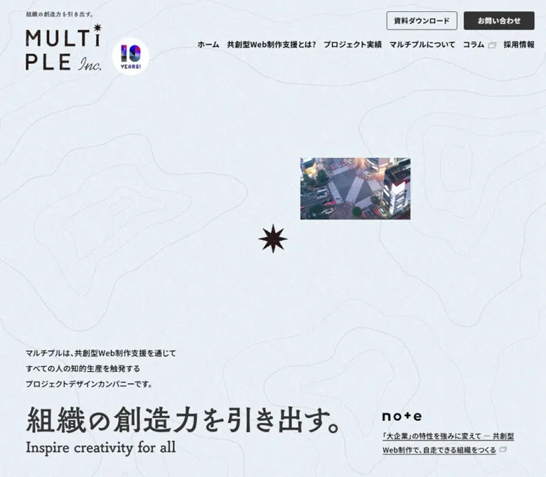
MULTiPLE presents its collaborative Web production and project-design practice through restraint and deliberate imbalance. A small photograph floats above a large Japanese statement, an irregular starburst supplies a recognizable marker, and faint contour lines spread across a pale, grainy desktop canvas. The imagery stays small enough that the surrounding space becomes an active part of the composition.
The typography has two distinct jobs. Most live interface text uses the declared Noto Sans JP stack, with medium-weight paragraphs and bold navigation and section titles. The visible brand and hero statement have a more printed character: textured uppercase lettering, a script suffix, Japanese Mincho-like strokes, and an English serif line. These graphic treatments should not be confused with the computed font styles of their containers.
This is a substantial corporate homepage with service, project, company, editorial, recruitment, and contact pathways. Its reusable design logic lies in the relationship between broad empty fields, offset content, modest rectangular actions, and recognizable graphic assets.
How to Read This Reference
- Measured values come directly from the supplied rendered DOM and computed-style records. Tables generally round geometry to two decimal places while retaining useful typography precision.
- Visual estimates describe the supplied current-page screenshots. Estimated colors are not pixel samples; estimated lettering sizes are not recovered font declarations.
- Calculated values are simple relationships derived from measured rectangles, such as image aspect ratios or gaps.
- Recommendations describe a new implementation. The CSS and proposed breakpoints below are adaptations, not recovered source rules.
- All custom property names introduced here are descriptive aliases unless explicitly identified as observed source properties.
- Desktop and mobile observations are separate states. Two viewport samples do not establish the original interpolation formulas or exact breakpoints.
- Nonzero DOM rectangles do not prove that an element was visible. This matters particularly for the closed mobile navigation subtree.
Tokens — Colors
Default Palette
| Name | Value | Suggested token | Role and evidence |
|---|---|---|---|
| White | #ffffff |
--color-page |
Measured body background and contact/download panel backgrounds; visibly dominant on mobile and in the footer |
| Text Black | #000000 |
--color-text |
Measured navigation, paragraph, heading, and ordinary link color |
| Action Charcoal | #333333 |
--color-action |
Measured filled CTA background and mobile Menu text color |
| Metadata Gray | #666666 |
--color-muted |
Measured project hashtag color |
| Support Gray | #5f5f5f |
--color-support |
Measured background of the contact/download/recruitment section |
| Pale Map Paper | Approximately #eaf0f4 |
--color-paper |
Visual estimate for the light blue-gray textured desktop fields; not a measured flat fill |
| Contour Gray | Approximately #cfd7dc |
--color-contour |
Visual estimate for fine topographic lines on the light field |
| Printed Brand Ink | Approximately #292320 |
--color-brand |
Visual estimate for the warm, nearly black logo and starburst artwork |
| Quiet Image Rule | Approximately #cccccc |
--color-rule |
Visual estimate for the thin project-image borders |
| Subdued Previous Arrow | rgba(16, 16, 16, 0.3) |
--color-control-subdued |
Measured first carousel button color; its disabled attribute was not supplied |
The pale desktop background is a composite visual surface. Its fine white grain and gray contours cannot be reproduced accurately by setting one background hex value. Treat Pale Map Paper as an approximation beneath approved texture and linework assets.
The colorful project artwork is content, not an expanded UI palette. The pink and cyan artwork for the first project and the orange device-screen graphics for the second project should not become category-button colors.
Theme Presets
No user-selectable theme or dark-mode state is evidenced. The gray support area is a local section treatment within the light homepage.
The supplied custom-property inventory contains WordPress preset colors, gradients, and shadows, plus --swiper-theme-color: #007aff. Their presence does not establish visible use. In particular, the project controls appear monochrome, and the page does not exhibit a general blue-accent or preset-shadow system.
Tokens — Typography
Live Japanese Interface and Body Text
- Observed computed stack:
'Noto Sans JP', sans-serif, sans-serif. - Weights:
500for body copy, client names, metadata, and many footer links;700for primary navigation, project titles, large section labels, and CTA text. - Desktop body:
16px / 32px, with0.56pxtracking. - Mobile body:
14.041px / 24.5718px, with0.491435pxtracking. - Calculated base tracking: both body samples correspond to approximately
0.035em. Smaller and larger descendants commonly inherit the resulting pixel spacing rather than recalculating it from their own font size. - Implementation alias:
--font-body: 'Noto Sans JP', sans-serif.
The medium body weight and generous line spacing keep the text substantial against the very open layout. Avoid replacing all paragraph text with an unusually light weight.
Menu Utility Label
The visible mobile Menu button declares urw-din, sans-serif, at 12px, weight 500, and 21px line height. This is direct evidence for that control only. It does not establish the font used by every English label elsewhere on the page, nor does a computed family declaration prove which font file rendered successfully.
Graphic Brand and Hero Lettering
The stacked MULTiPLE wordmark combines irregular printed uppercase letters, an offset starburst, and a script Inc. suffix. The hero statement reads 組織の創造力を引き出す。, accompanied by Inspire creativity for all.
The visible Japanese statement has Mincho-like contrast and terminals; the English line is serif. Their exact font names and asset formats are not supplied. The H1 has an empty extracted text string, while its computed font size equals the surrounding body size. Those values describe the container and must not be reported as the size or family of the visible headline artwork.
For close reproduction, use authorized graphic lockups with separate desktop and mobile compositions. For an adaptation using live text, choose a suitable Japanese serif and an English serif deliberately, and label that choice as new typography.
Type Scale
| Role | Desktop measured value | Mobile measured value | Weight / interpretation |
|---|---|---|---|
| Base body | 16 / 32px |
14.041 / 24.5718px |
500 |
| Hero introduction | 16 / 32px |
14.041 / 28.082px |
500; mobile introduction retains approximately double leading |
| Primary navigation | 16 / 32px |
15 / 26.25px in navigation subtree |
700; mobile open appearance unverified |
| Header CTA | 14 / 21px |
15 / 22.5px in navigation subtree |
700 |
| Main section H2 | 40 / 60px |
25.199 / 37.7985px |
700; smaller English child labels are separate |
| Service title | 50 / 75px |
25.365 / 38.0475px |
700 |
| Service lead sentence | 25 / 50px |
16.115 / 28.2013px |
500 |
| Service/About paragraphs | 19.964 / 39.928px |
14.084 / 24.647px |
500 |
| About statement | 32 / 48px |
20.207 / 30.3105px |
700 |
| Project title | 19.968 / 29.952px |
15.033 / 22.5495px |
700 |
| Project client | 14 / 28px |
14 / 24.5px |
500 |
| Project hashtags | 12 / 18px |
12 / 18px |
500, gray |
| Main CTA label | 16 / 24px |
14.041 / 21.0615px |
700 |
| Hero editorial link | 14 / 28px |
14 / 24.5px |
500 |
| Contact/download/recruitment H2 | 35 / 52.5px |
25.166 / 37.749px |
700 |
| Footer company name | 18 / 36px |
18 / 31.5px |
700 |
| Footer navigation | 14.932 / 29.864px |
12 / 21px |
500; mobile links also have vertical padding |
Visual estimates, not computed font sizes: the hero Japanese lettering appears roughly 70–76px tall in typographic scale on desktop and 38–42px on mobile. The English serif line appears around 38–40px and 21–23px respectively. These estimates are useful for a live-text adaptation, not for identifying the source fonts.
Tokens — Spacing & Shapes
Root size: measured HTML font size is 16px at both inspected viewports. The fractional mobile body values do not imply a smaller root.
Density: exceptionally open at the hero and section transitions; moderately dense inside project captions, navigation, and footer link groups.
Spacing Scale
| Use | Desktop | Mobile | Evidence |
|---|---|---|---|
| Header top inset | 24px |
Approximately 20.08px |
Measured |
| Hero left inset | 66px |
20.64px |
Measured |
| Ordinary section left edge | 32px for heading container; text commonly starts at 72px |
25.11px |
Measured; desktop heading reserves a marker gutter |
| Main navigation link gap | 32px |
Not applicable to closed state | Calculated from adjacent desktop link rectangles |
| Hero introduction/lockup separation | 32px |
21.05px |
Calculated; order reverses on mobile |
| Editorial teaser internal gap | 16px |
16px |
Measured grid gap |
| Project-image horizontal gap | 40px |
Projects stack | Calculated |
| Image-to-client gap | 25px |
Approximately 18.06px |
Calculated |
| Client-to-project-title gap | 14px |
14px |
Calculated |
| Project-title-to-tags gap | 12px |
12px |
Calculated |
| Hashtag horizontal gap | 10px |
10px |
Calculated |
| Service section vertical padding | Approximately 99.94px |
Approximately 50.69px |
Measured |
| About section vertical padding | Approximately 199.99px |
Approximately 81.65px |
Measured |
| Support-band vertical padding | 95px |
Approximately 25.51px |
Measured |
| Footer vertical padding | 70px 0 50px |
Approximately 40.40px 0 59.83px |
Measured |
There is no evidence of one universal spacing increment. Use semantic distances for header, narrative, project captions, and support panels instead of forcing all values onto a rigid eight-pixel scale.
Border Radius
| Element | Observed value / appearance |
|---|---|
| Header CTAs | Measured 4px |
| Main filled CTAs | Measured 3px |
| Project imagery | Visually square corners |
| Contact/download panels | Measured 0px |
| Navigation and footer links | Measured 0px |
| Starburst | Graphic silhouette, not a rounded control container |
Layout Measurements
| Element | Desktop | Mobile |
|---|---|---|
| Document height | 7546.80px |
7617.08px |
| Header bounds | 1440 × 179.95px |
390 × 128.73px |
| Header logo link | 170.94 × 131.95px |
114.75 × 88.58px |
| Hero H1 bounds | 824 × 132.94px |
285.06 × 141.52px |
| Hero editorial block | 320 × 96.86px |
348.72 × 49px |
| Service paragraph column | 470px |
339.78px |
| Leading project image | 523.19 × 392.39px |
339.78 × 254.83px |
| Other visible project images | 382.39 × 286.78px |
339.78 × 254.83px |
| About text column | 543px |
307.78px |
| Main service CTA | 470 × 58px |
339.78 × 51.13px |
| Contact/download panel, each | 669.5 × 239.5px |
365.75 × 241.78px |
| Footer | 645.11px high |
1267.81px high |
Project images calculate to a consistent 4:3 ratio. The leading desktop image is approximately 1.368× the width of its neighbors; it is not merely a taller image in an equal-width grid.
Components
Brand Header
Role: establish identity while exposing the site's main corporate pathways.
The transparent desktop header overlays the opening field. Its logo link begins at (66, 24) and occupies roughly 171 × 132px. The small Japanese strapline sits above the two-line wordmark within the visual identity area.
Six primary text links run across the top, followed by two compact actions. Navigation uses bold 16px Noto Sans JP with 32px line boxes. The two actions are both approximately 142.33 × 37px: an outlined 資料ダウンロード link and a charcoal お問い合わせ link. Their corners are only 4px rounded. The right edge of the final action sits 24px from the viewport edge.
On mobile, the logo shrinks to approximately 115 × 89px at a 20px inset. The horizontal navigation is absent from the visible closed state. An irregular starburst sits above the word Menu at the upper right.
Mobile Menu Control and Navigation Evidence
Role: retain access to navigation without occupying the narrow opening composition.
The measured button is at (331.73, 20), with bounds 33.23 × 49.80px. It remains in the same upper-right viewport area in both the opening and footer captures, consistent with a persistent menu control. The supplied styles do not include its position property, so the exact implementation is unknown.
The rendered navigation subtree contains six 56.25px-high rows, followed by two side-by-side CTA rectangles and social links. These are layout measurements, not an observed open menu. No screenshot establishes the menu background, opening direction, star rotation, close state, overlay opacity, or focus behavior.
Recommended implementation: keep the visible mark compact but provide at least a 44px-wide touch target. Use an actual button with an accessible name, aria-expanded, and aria-controls. Implement an open state only from a deliberate specification; do not present an invented animation as a recovered feature.
Opening Hero Composition
Role: communicate the brand statement through scale, placement, and negative space.
The desktop screenshot has four anchors:
- The brand/navigation assembly at the top.
- A small landscape photograph near
(792, 299), visually about275 × 155px. - An irregular dark starburst centered around
(720, 500), visually about 66px across. - The introduction and graphic statement near the bottom left, balanced by an editorial teaser at the lower right.
The photograph is a small rectangular window, without a surrounding card or caption. It occupies roughly one fifth of the viewport width. Its small scale is essential: enlarging it into a conventional hero banner would remove the unusual spatial balance.
The desktop introduction begins at y = 689.06px and occupies three 32px lines. The H1 graphic begins at y = 817.06px, separated by 32px. The graphic combines the Japanese statement and English serif support line in a wide lockup.
On mobile, the opening photograph shows a mountain scene rather than the desktop urban intersection. It sits near x = 215px, around y = 388–391px, and is visually about 102px wide. The central starburst is approximately 44px across near y = 479px. Different subjects across captures do not establish a slideshow, video, or content-change trigger.
The mobile H1 begins at y = 576.13px and uses a taller composition. The introduction follows at y = 738.69px. Thus, the visible order is headline, then introduction, reversing the desktop arrangement. The opening mobile field is white in the supplied capture; the desktop contour texture should not be forced into that observed state.
Hero Editorial Teaser
Role: connect the brand statement to an active editorial channel.
On desktop, the teaser occupies a 320px-wide column at x = 1054px, aligned to the bottom of the hero lockup. Its note mark sits above an underlined two-line article title, with a 16px grid gap. Article text is 14px / 28px.
On mobile, it moves beneath the introduction, beginning at y = 853.36px, just below the first 844px viewport. It becomes a horizontal grid: 63px 269.72px, separated by 16px. The article text remains 14px and changes to 24.5px leading.
Preserve the underlined editorial-link treatment and external-link indicator. This is a small reading pathway, not a colored promotional banner.
Section Heading System
Role: orient the long page through a repeated, understated marker.
The visible Project heading pairs a small starburst and English kicker with a larger bold Japanese heading beneath it. Desktop H2 containers use 40px type and 60px leading for the main hierarchy, with 40px of left padding to reserve marker space. The English Project line appears approximately 20px in the screenshot; its individual computed style is not supplied.
On mobile, the main section-heading size is approximately 25.2px with 37.8px leading, and the marker gutter shrinks to approximately 25.2px. Maintain the distinction between the small English orientation label and the larger Japanese title. Do not apply the H2 container's 40px computed style indiscriminately to every child.
Service Narrative
Role: explain the collaborative production approach before presenting work.
The section introduces 共創型Web制作支援 and 「Stand By You™」, followed by the lead sentence 「つくる」から「ともに考える」へ。 and three substantial paragraphs.
On desktop, the service title starts at x = 72px, while the prose occupies a centered 470px column at x = 485px. The title uses 50px / 75px; the paragraphs use approximately 20px / 40px. This contrast between a broad title area and a narrow reading column creates an editorial rhythm without enclosing the text in a card.
The filled CTA follows the prose at the same 470px width. On mobile, the title and prose share an approximately 340px-wide column at a 25px inset. Body copy reduces to roughly 14.08px / 24.65px.
A substantial measured interval exists between the mobile prose and the CTA. The supplied screenshots do not show that interval, and the element excerpt omits visual assets there. Do not assume it is empty or invent the missing illustration.
Filled Arrow CTA
Role: make section-level navigation easy to locate without introducing a bright accent.
The recurring action is a charcoal rectangle with white bold text, a fine right-pointing arrow, and a 3px radius. Desktop measured padding is 16px 64px 16px 20px; label typography is 16px / 24px; overall height is 58px.
Mobile measured padding is approximately 14.04px 56.16px 14.04px 17.55px; text is approximately 14.04px / 21.06px; height is 51.13px. Extra right padding reserves space for the arrow rather than centering the label across the entire rectangle.
Widths depend on context: the service CTA fills its prose column, while the desktop project-list CTA is approximately 292px wide and aligned toward the right. Mobile project and service CTAs expand to their approximately 340px content width.
The source defines 300ms background and color transitions. The supplied evidence does not reveal their endpoint colors.
Project Showcase
Role: demonstrate the company's work through large, varied project artwork and compact case-study metadata.
The desktop view is an unequal horizontal showcase. Three images are visible, with a fourth project beginning beyond the right viewport edge. The first image starts at x = 32px and is approximately 523px wide. Subsequent images are approximately 382px wide, separated by 40px gaps. All maintain a 4:3 ratio.
Each project consists of:
- A square-cornered image link with a fine neutral border.
- An inset information area below the image.
- A medium-weight client name.
- A bold project title linking to the same case study.
- Separate gray hashtag links to category archives.
The leading caption is inset 120px from its image's left edge. Neighboring captions are inset approximately 55.92px. This creates a staggered rhythm even though the images share a top alignment. The first caption begins lower because its image is larger.
The current visible artwork includes the pink-and-cyan 季の入口 composition, a desktop/mobile device presentation for KDDI, and a typographic CINRA Inspiring Awards graphic. The supplied DOM also contains an OM Solar project beyond the desktop right edge.
The light grain field begins below the image tops and is visually inset approximately 75px from the left edge in the desktop project capture. The artwork overlaps white and textured ground. Cards have no enclosing rounded surface or drop shadow.
Two thin arrow controls sit above the rail at approximately x = 1238px and 1328px, each 40 × 41px. The left arrow is subdued in the captured state. Clicking, dragging, looping, and autoplay were not exercised.
On mobile, three projects are represented in a vertical list. Their images become equal at approximately 340 × 255px, and every caption has approximately 30.31px of left indentation. The desktop fourth project is absent from the supplied mobile text/link evidence; its availability in other mobile states is unverified.
Implementation detail: keep category links outside the case-study anchor. A single anchor wrapping both the project and independently linked hashtags would create invalid nested links.
About Section
Role: explain the company's collaborative posture through a second, more asymmetric narrative composition.
Desktop measurements place the section label on the left and the principal text column at x = 825px, with a width of 543px. The statement uses 32px / 48px, followed by approximately 20px / 40px paragraphs and a compact filled action.
Mobile measurements place the section label at the standard 25px inset, while the statement and paragraph sit at x = 41.11px in a narrower 307.78px column. The paragraph begins substantially below the statement, indicating intervening layout space whose visual contents are not documented by the supplied captures.
The in-section link labeled マルチプルについて詳しく知る resolves to /service in the supplied DOM. Header and footer About links resolve to /about-us. Record that distinction faithfully and validate the intended destination when adapting the component.
Editorial Link Region
Role: provide a separate entry point into the company's note content.
The DOM records an image-like heading container and a link labeled noteの記事一覧を見る. On desktop, the CTA sits toward the right; on mobile, the heading container is centered at a measured width of 145px, and the CTA remains right aligned within the section.
No supplied screenshot shows this entire region, and the excerpt does not establish populated article cards. Do not invent a feed layout, article count, or loading behavior.
Contact, Download, and Recruitment Area
Role: group the main business and recruitment destinations before the footer.
A measured #5f5f5f band holds a light panel assembly inset from the left and flush to the viewport's right edge. Desktop Contact and Download panels begin at x = 100px and 770.5px; each is 669.5px wide, with a calculated 1px separation. Their 239.5px height accommodates a small English label, a bold Japanese heading, and short support copy.
The recruitment panel continues below. The desktop screenshot shows descriptive text on the left, a workspace photograph in the middle, and a filled application action on the right. The photo has a pale blue offset backing with a slight visible slant. This is a flat graphic layer, not a soft shadow.
The application action points to /contact?kind=3. A smaller external recruitment-platform link appears below it.
On mobile, Contact and Download stack vertically. Their panels begin at x = 24.25px and extend to the right edge, retaining approximately 242px of height each. Recruitment continues as a taller vertical composition; the application button remains 290px wide. The support band's asymmetric left reveal survives the responsive change.
Footer and Closing Brand Composition
Role: combine practical company information with a final, spacious identity statement.
The original footer names the company as 株式会社マルチプル and displays its Shibuya address. On desktop, that information starts near x = 100px. Two navigation columns occupy the right side, beginning near x = 984px and 1207px.
The note, X, and Instagram links sit below the navigation. Measured desktop icon bounds are approximately 55.5 × 12px for note and 20 × 20px for the other two, with 32px inter-item gaps.
Farther down, a small Japanese/English brand statement sits over a faint contour cluster at the lower left. A larger textured wordmark sits at the lower right, beside the copyright. There is no heavy footer rule or enclosing card.
On mobile, company information comes first, followed by two compact navigation columns and the social row. The note mark grows to approximately 83.77 × 18.11px, while X and Instagram are approximately 24.16px square.
The final mobile capture then gives the wordmark a large standalone area: visually about 305–310px wide, followed by a right-aligned copyright. The small contour-backed statement appears below it. The footer is approximately 1268px tall on mobile versus 645px on desktop; it is a deliberate closing composition rather than a tightly compressed utility strip.
Tokens — Motion & Interaction
| Treatment | Supplied evidence | What can be concluded |
|---|---|---|
| Header and main CTA color changes | background 0.3s, color 0.3s |
A 300ms transition is defined; hover/focus endpoint colors were not captured |
| Navigation/footer link animation | 0.3s ease-out forwards hide-bg-line |
A named 300ms animation is assigned; its keyframes and trigger were not supplied |
| Project navigation | Two visible arrow buttons and horizontally offset project rectangles | A carousel-like desktop arrangement exists; its operation and timing remain unverified |
| Mobile menu | Button visible in opening and footer captures | Persistent access is visually supported; open/close motion is unknown |
| Hero imagery | Urban scene on desktop, mountain scene on mobile | Different visual states exist; media type, cycling, and cause of change are unknown |
| Hero scroll structure | Desktop hero bounds overlap the following service section | Unusual scroll/layout allocation is measured; pinning, parallax, and scrub behavior are not established |
Many elements report transition: all without an accompanying nonzero duration. That alone is not evidence of visible animated transitions.
The capture process waited for document load, finite animation/layout stability, and visible image decoding within stated limits. Perpetual animations were paused during readiness checks and resumed afterward. The resulting still images do not establish a complete motion sequence.
Recommended adaptation: begin with a stable static composition and short 300ms color feedback. Add hero movement, carousel transitions, or a menu animation only when its behavior is deliberately specified. Respect reduced-motion preferences and retain all navigation in the static state.
Surfaces
| Layer | Appearance | Purpose |
|---|---|---|
| Base page | White | Main mobile field, narrative regions, and footer |
| Desktop opening field | Pale blue-gray grain with faint contour lines | Establishes the terrain metaphor without obscuring content |
| Project backing field | Pale grain beneath overlapping imagery | Connects the project rail to the broader visual identity |
| Support surround | Medium-dark gray with visible contour linework | Separates business and recruitment actions from the narrative |
| Support panels | White and pale textured rectangular areas | Groups actionable content without rounded-card styling |
| Filled action | Charcoal with white lettering and a fine arrow | Consistent navigation emphasis |
| Recruitment photo backing | Flat pale blue shape, offset and slightly slanted | Adds a physical, assembled quality |
| Footer contour accent | Very light lines localized behind the closing statement | Repeats the opening motif at reduced scale |
There is no observed general elevation system. Separation comes from white space, field changes, image edges, and overlapping flat layers.
Imagery
The imagery combines three scales: a tiny hero photograph, substantial 4:3 project artwork, and enlarged brand graphics. Keep those roles distinct.
The hero photographs show real environments: an overhead urban intersection on desktop and a mountain landscape on mobile. Their colors remain natural. They are not visibly duotoned, masked into circles, or treated as full-bleed background media.
Project artwork retains each client's visual identity. The first visible work has a tactile pink-and-cyan composition on a warm field; the second uses device mockups and orange graphics; the third is a sparse black-on-white typographic mark. Preserve this variation rather than forcing every project into an identical photographic treatment.
The wordmark's uneven ink texture and script suffix carry much of the brand character. The starburst is similarly irregular. Use approved artwork where possible; a generic asterisk or a clean geometric logo will change the result.
Observed Asset References
No image source URLs, filenames, SVG paths, or media manifests were included in the supplied evidence. The references below identify visible assets by role rather than inventing paths.
| Asset role | Observed appearance | Dimensions / limitation |
|---|---|---|
| Header identity | Stacked textured wordmark with strapline and star | Link bounds measured at 170.94 × 131.95px desktop and 114.75 × 88.58px mobile |
| Hero statement | Japanese Mincho-like lettering plus English serif support line | H1 bounds measured; font identity and asset format unknown |
| Desktop hero photograph | Overhead urban intersection | Visually approximately 275 × 155px |
| Mobile hero photograph | Mountain ridge | Visually approximately 102px wide |
| Project artwork | Three visible client-specific compositions | Measured 4:3 presentation |
| Recruitment photograph | Bright working space with desk, devices, and shelving | Visible in desktop lower-page capture; asset dimensions not supplied |
| Contour and grain artwork | Fine terrain-like lines and pale paper texture | Visible on selected surfaces; implementation and source paths unknown |
| Footer identity | Large textured wordmark and separate small statement | Mobile wordmark visibly expands beyond its header size |
For project thumbnails, retain the complete supplied artwork within the measured 4:3 frame when possible. Use cropping only for photographic content whose composition supports it.
Layout & Responsive Behavior
Observed Changes
| Concern | Desktop at 1440px | Mobile at 390px |
|---|---|---|
| Primary navigation | Six text links plus two actions | Closed state shows logo and star/Menu control |
| Opening surface | Pale textured contours | White in the supplied initial capture |
| Hero text order | Introduction above wide statement | Taller statement above introduction |
| Hero editorial teaser | Lower-right vertical block | Horizontal mark/title block below introduction |
| Projects | Unequal horizontal arrangement with fourth item offscreen | Three equal-width entries stacked vertically |
| Project caption inset | 120px for lead, approximately 56px for others | Approximately 30px for all represented entries |
| Service prose | Centered 470px column | Approximately 340px column with 25px side margins |
| About prose | Right-hand 543px column | Approximately 308px inset column |
| Contact/download | Two adjacent panels | Vertically stacked panels |
| Footer | Company information left, utilities right | Information and utilities above a large standalone wordmark |
Hero Geometry Limitation
The desktop hero-related section reports a height of 3032px, while the service section starts at document y = 2032px. Their recorded bounds therefore overlap by 1000px. This is not a simple sequence of a 3032px block followed by a normal service block.
On mobile, the hero ends at approximately y = 934.36px, exactly where the service section begins. That is a materially different layout structure.
Do not copy the desktop 3032px height as an unexplained spacer. The supplied evidence does not identify whether the original uses pinning, positioned layers, or another mechanism. The Quick Start below reproduces the visible opening arrangement as a static layout and explicitly does not reconstruct that scroll system.
Responsive Implementation Guidance
The original breakpoints and fluid formulas were not supplied. Fractional computed values support precise observations at the two sampled widths, but they are insufficient to recover the source CSS.
For an adaptation, use a compact navigation mode before the full desktop link row becomes crowded. A proposed 88rem threshold accommodates the measured 1440px header; it is a recommendation. A separate 48rem content breakpoint can switch projects and support panels to their mobile stacks.
Retain the different horizontal systems: approximately 21px for the mobile hero, 25px for ordinary mobile sections, additional indentation inside project captions, and the asymmetric left reveal around support panels. Making every element share one universal gutter would flatten the composition.
Keep content reachable when text wraps or grows. In particular, avoid fixed-height text boxes for the hero statement, project titles, and contact-panel descriptions.
Do’s and Don’ts
Do
- Preserve the small hero photograph and the large surrounding field.
- Keep the starburst irregular and consistent across identity, menu, and section markers.
- Use black and charcoal for interface emphasis; let project artwork carry saturated color.
- Distinguish live sans-serif text from the graphic serif statement and textured wordmark.
- Keep project images at 4:3 and preserve the unequal desktop widths.
- Indent project metadata beneath the images, with a larger inset for the leading desktop item.
- Reverse the introduction/headline order on mobile as observed.
- Use shallow 3–4px CTA corners, thin arrows, and flat surfaces.
- Preserve the mobile footer's large wordmark and generous closing space.
- Treat the current white mobile hero as an observed state, even though desktop uses a map texture.
Don’t
- Don't enlarge the small hero image into a full-width banner.
- Don't turn all projects into equal rounded cards with shadows.
- Don't convert project hashtags into colorful pills.
- Don't claim the graphic H1 uses the container's 16px Noto Sans JP style.
- Don't infer video autoplay, rotating stars, parallax, or carousel timing from still captures.
- Don't treat hidden mobile navigation rectangles as an inspected open menu.
- Don't use the WordPress preset gradients or Swiper blue as brand tokens without visible evidence.
- Don't hardcode the unusual desktop hero wrapper height as an ordinary blank section.
- Don't force desktop texture coverage onto the mobile screenshot state.
- Don't invent asset paths, missing article cards, or uninspected section imagery.
Recommended Implementation Additions
These are recommendations for a new implementation, not verified original features:
- Verify the accessible name of the graphic H1 and logo links. Empty extracted text does not by itself establish whether image alternatives or accessible labels exist.
- Enlarge the mobile Menu hit area while retaining the small visible starburst.
- Give carousel arrows descriptive names and expose actual unavailable states with native button semantics.
- Make project-image and title links keyboard accessible, with category links as separate siblings.
- Provide a visible focus indicator on pale fields and charcoal controls.
- Label note, X, and Instagram links accessibly while preserving their recognizable artwork.
- Test the measured 12–14px mobile text with zoom and user font settings. Increasing long-form mobile prose toward 16px is a readability option, with corresponding layout adjustments.
- Reserve image dimensions to reduce layout shifts and use responsive sources for the 4:3 project artwork.
- Use decorative contour layers that ignore pointer events and remain outside the accessibility tree.
- Verify the differing About-link destinations before reusing that navigation pattern.
- Provide reduced-motion behavior if animation is added; keep a complete static experience available.
Agent Prompt Guide
Quick Color Reference
- Page and footer: measured
#ffffff. - Main live text: measured
#000000. - Filled actions: measured
#333333with white text. - Project metadata: measured
#666666. - Support surround: measured
#5f5f5f. - Pale textured field: approximate
#eaf0f4, combined with grain and contour assets. - Brand artwork: warm near-black appearance; preserve approved artwork rather than recoloring it from an estimated sample.
Overall Prompt
“Create a corporate homepage for a collaborative project-design practice inspired by the current MULTiPLE composition. Use white and pale blue-gray paper fields, extremely faint topographic contours, an irregular dark starburst, and a textured stacked wordmark. Place a small landscape photograph slightly right of center in a spacious opening field. Anchor a large Japanese serif-style graphic statement and English serif line near the lower left, supported by medium-weight Japanese sans-serif body copy. Build an unequal desktop project showcase with square 4:3 images, a larger leading item, and captions indented beneath the artwork. Use charcoal rectangular arrow links with only 3px corner rounding. On mobile, show a persistent star/Menu control, place the statement before the introduction, stack projects vertically, and give the closing wordmark substantial space. Treat exact graphic assets and motion behavior as separately supplied requirements.”
Example Component Prompts
- Hero: “At 1440 × 1000, compose a pale contour-map field with a small landscape image near x 792/y 299, an irregular star near the viewport center, and an 824px-wide graphic statement at the lower left. Put a three-line introduction above the statement and a 320px editorial teaser at the lower right. Keep the photograph small and the field open.”
- Project showcase: “Create a flat horizontal showcase with a 523px-wide first 4:3 image, subsequent 382px-wide images, and 40px gaps at the desktop reference width. Indent the first caption by 120px and the others by about 56px. Stack client, bold title, and gray 12px hashtag links. Switch to equal-width vertical entries on mobile.”
- Section action: “Create a 58px-high charcoal navigation link with 16px bold white text, 3px corners, generous right padding, and a fine right arrow. Use a 51px-high mobile version. Keep the label left aligned and reserve the right side for the arrow.”
- Support area: “Use a medium-gray contour background around a panel assembly that is inset on the left and flush right. Place two white business panels side by side on desktop, followed by a pale recruitment panel containing copy, a workspace photo with flat offset backing, and an application action. Stack the panels on mobile.”
- Footer: “Build a spacious white footer with company information at left and two utility-link columns at right. Place monochrome social marks beneath the links, a small contour-backed statement at lower left, and a large textured wordmark at lower right. On mobile, move the wordmark below the utilities and place the small statement last.”
Quick Start
CSS Custom Properties
This is a static, responsive adaptation of the observed component relationships. It uses a normal 16px root. It does not reconstruct the unverified desktop scroll allocation, implement a menu, or supply carousel JavaScript.
Provide approved logo and headline assets through responsive images. The hero H1 should contain a desktop/mobile graphic lockup with an accessible name. Supply optional grain and contour images through the image tokens; their default none values produce usable flat-color surfaces without broken asset requests. No original image paths are implied.
Suggested anatomy: a header containing a brand link, desktop navigation, and Menu button; a hero containing a media image, decorative star, copy group, and editorial link; project articles containing separate image/title links and sibling category links; and support panels followed by a two-part footer.
:root {
  /* Measured colors */
  --color-page: #fff;
  --color-text: #000;
  --color-action: #333;
  --color-muted: #666;
  --color-support: #5f5f5f;

  /* Visual approximations */
  --color-paper: #eaf0f4;
  --color-contour: #cfd7dc;
  --color-brand: #292320;
  --color-rule: #ccc;

  /* Supply approved images; these are adaptation slots. */
  --texture-grain: none;
  --texture-contours: none;

  --font-body: 'Noto Sans JP', sans-serif;
  --font-menu: urw-din, sans-serif;
  --text-body: 16px;
  --text-section: 40px;
  --text-project: 19.968px;
  --tracking-ui: 0.56px;
  --leading-body: 2;
  --hero-inset: 66px;
  --section-inset: 32px;
  --radius-action: 3px;
  --radius-header-action: 4px;
  --motion-color: 300ms;

  /* Approximate decorative silhouette, not original artwork. */
  --star-shape: polygon(
    50% 0%, 60% 31%, 82% 16%, 71% 40%,
    100% 50%, 71% 60%, 84% 83%, 60% 71%,
    50% 100%, 40% 71%, 16% 84%, 30% 60%,
    0% 50%, 31% 40%, 17% 17%, 40% 31%
  );
}

* { box-sizing: border-box; }
html { font-size: 16px; }
body {
  margin: 0;
  color: var(--color-text);
  background: var(--color-page);
  font-family: var(--font-body);
  font-size: var(--text-body);
  font-weight: 500;
  line-height: var(--leading-body);
  letter-spacing: var(--tracking-ui);
}
a { color: inherit; }
button { font: inherit; }
img { display: block; max-width: 100%; height: auto; }
:focus-visible { outline: 2px solid currentColor; outline-offset: 5px; }

.paper-field {
  background-color: var(--color-paper);
  background-image: var(--texture-grain), var(--texture-contours);
  background-size: 180px 180px, cover;
}
.star {
  display: block;
  aspect-ratio: 1;
  background: var(--color-brand);
  clip-path: var(--star-shape);
}

.site-header {
  position: absolute;
  z-index: 10;
  inset: 0 0 auto;
  display: flex;
  align-items: flex-start;
  justify-content: space-between;
  padding: 24px 24px 24px var(--hero-inset);
}
.brand { display: block; width: 170.94px; flex: none; }
.brand img { width: 100%; }
.desktop-nav { display: none; align-items: flex-start; gap: 21px; }
.nav-links { display: flex; gap: 32px; }
.nav-links a { font-weight: 700; text-decoration: none; }
.header-actions { display: flex; gap: 14px; }
.header-action {
  display: grid;
  place-items: center;
  min-width: 142.33px;
  min-height: 37px;
  padding: 7px 14px;
  border: 1px solid var(--color-action);
  border-radius: var(--radius-header-action);
  font-size: 14px;
  font-weight: 700;
  line-height: 21px;
  text-decoration: none;
}
.header-action.is-filled {
  color: #fff;
  background: var(--color-action);
}
.menu-toggle {
  position: fixed;
  z-index: 30;
  top: 20px;
  right: 20px;
  display: grid;
  justify-items: center;
  min-width: 44px;
  min-height: 50px;
  padding: 0;
  border: 0;
  color: var(--color-action);
  background: transparent;
  font: 500 12px/21px var(--font-menu);
  cursor: pointer;
}
.menu-toggle .star { width: 29px; }

/* Static opening state; original desktop scroll behavior is unknown. */
.hero { position: relative; min-height: 100svh; }
.hero-media {
  position: absolute;
  left: 55%;
  top: 29.9svh;
  width: 19.1%;
  aspect-ratio: 16 / 9;
  object-fit: cover;
}
.hero-star {
  position: absolute;
  left: 50%;
  top: 50svh;
  width: 66px;
  transform: translate(-50%, -50%);
}
.hero-copy {
  position: absolute;
  left: var(--hero-inset);
  bottom: 50px;
  display: flex;
  flex-direction: column;
  gap: 32px;
  width: min(824px, calc(100% - 132px));
}
.hero-intro { order: 0; margin: 0; line-height: 2; }
.hero-title { order: 1; margin: 0; line-height: 1; }
.hero-title img { width: 100%; }
.hero-note {
  position: absolute;
  right: var(--hero-inset);
  bottom: 50px;
  display: grid;
  gap: 16px;
  width: 320px;
  font-size: 14px;
  line-height: 28px;
  text-underline-offset: 4px;
}
.hero-note-mark { width: 78px; }
.hero-note p { margin: 0; }

.section { padding-block: 100px; }
.section-inner { margin-inline: var(--section-inset) 72px; }
.section-heading {
  position: relative;
  margin: 0 0 32px;
  padding-left: 40px;
  font-size: var(--text-section);
  font-weight: 700;
  line-height: 1.5;
}
.section-heading .star {
  position: absolute;
  top: 7px;
  left: 12px;
  width: 18px;
}
.section-kicker {
  display: block;
  font-size: 20px;
  font-weight: 400;
  line-height: 27px;
}
.service-title { margin: 75px 0 100px; font-size: 50px; line-height: 1.5; }
.service-prose { width: min(470px, calc(100% - 50px)); margin-inline: auto; }
.service-prose p { font-size: 19.964px; line-height: 2; }
.service-prose .service-lead { font-size: 25px; }

.cta {
  position: relative;
  display: flex;
  align-items: center;
  min-height: 58px;
  padding: 16px 64px 16px 20px;
  border: 1px solid var(--color-action);
  border-radius: var(--radius-action);
  color: #fff;
  background: var(--color-action);
  font-size: 16px;
  font-weight: 700;
  line-height: 24px;
  text-decoration: none;
  transition: background var(--motion-color), color var(--motion-color);
}
.arrow {
  position: relative;
  display: inline-block;
  width: 22px;
  height: 22px;
}
.arrow::before {
  content: '';
  position: absolute;
  top: 50%;
  inset-inline: 0;
  border-top: 1px solid currentColor;
}
.arrow::after {
  content: '';
  position: absolute;
  top: 4px;
  right: 1px;
  width: 14px;
  height: 14px;
  border-top: 1px solid currentColor;
  border-right: 1px solid currentColor;
  transform: rotate(45deg);
}
.cta .arrow { position: absolute; right: 20px; opacity: 0.7; }

/* Native scrolling is the CSS-only fallback for the desktop showcase. */
.project-track {
  display: flex;
  align-items: flex-start;
  gap: 40px;
  overflow-x: auto;
  padding: 0 40px 32px 32px;
  scroll-snap-type: x proximity;
}
.project-card {
  flex: 0 0 clamp(300px, 26.555vw, 382.39px);
  min-width: 0;
  scroll-snap-align: start;
}
.project-card:first-child {
  flex-basis: clamp(380px, 36.333vw, 523.19px);
}
.project-image {
  display: block;
  aspect-ratio: 4 / 3;
  border: 1px solid var(--color-rule);
  background: #fff;
}
.project-image img { width: 100%; height: 100%; object-fit: contain; }
.project-info { margin-top: 25px; padding-left: 55.92px; }
.project-card:first-child .project-info { padding-left: 120px; }
.project-client { margin: 0; font-size: 14px; line-height: 2; }
.project-title {
  margin: 14px 0 12px;
  font-size: var(--text-project);
  font-weight: 700;
  line-height: 1.5;
}
.project-title a { text-decoration: none; }
.project-tags { display: flex; flex-wrap: wrap; gap: 5px 10px; }
.project-tags a {
  color: var(--color-muted);
  font-size: 12px;
  line-height: 18px;
  text-decoration: none;
}

.about-layout {
  display: grid;
  grid-template-columns: minmax(0, 1fr) 543px;
  gap: 64px;
  margin-inline: 32px 72px;
}
.about-copy h3 { font-size: 32px; line-height: 1.5; }
.about-copy p { font-size: 19.964px; line-height: 2; }

.support-band {
  padding-block: 95px;
  background: var(--color-support) var(--texture-contours) center / cover;
}
.support-panels {
  display: grid;
  grid-template-columns: repeat(2, minmax(0, 1fr));
  gap: 1px;
  margin-left: 100px;
}
.support-panel {
  min-height: 239.5px;
  padding: 40px 90px;
  background: #fff;
  text-decoration: none;
}
.support-panel h2 { margin: 0 0 16px; font-size: 35px; line-height: 1.5; }
.support-panel p { margin: 0; }
.recruit-panel { grid-column: 1 / -1; background-color: var(--color-paper); }

.site-footer { padding: 70px 100px 50px; }
.footer-top, .footer-bottom {
  display: grid;
  grid-template-columns: minmax(0, 1fr) 356px;
  gap: 0;
}
.footer-nav { display: grid; grid-template-columns: 1.34fr 1fr; gap: 44px; }
.footer-nav a { display: block; font-size: 14.932px; line-height: 2; text-decoration: none; }
.footer-social { display: flex; align-items: center; gap: 32px; margin-top: 40px; }
.footer-bottom { align-items: end; margin-top: 130px; }
.footer-brand { width: 240px; }
.footer-copyright { margin-top: 16px; font-size: 12px; text-align: right; }
.footer-tagline { max-width: 260px; }

/* Recommended feedback, not a verified original hover endpoint. */
@media (hover: hover) {
  .cta:hover, .header-action.is-filled:hover { color: #333; background: #fff; }
  .nav-links a:hover, .footer-nav a:hover { text-decoration: underline; text-underline-offset: 5px; }
}

/* Recommended navigation threshold, not a recovered source breakpoint. */
@media (min-width: 88rem) {
  .desktop-nav { display: flex; }
  .menu-toggle { display: none; }
}

/* Recommended intermediate layout to prevent hero text collisions. */
@media (min-width: 48rem) and (max-width: 74.99rem) {
  .hero-copy { width: min(65vw, 824px); }
  .hero-note { width: 24vw; right: 24px; }
  .about-layout { grid-template-columns: 1fr 1fr; gap: 40px; }
  .support-panel { padding-inline: 40px; }
}

/* Mobile values match or closely round the 390px observations. */
@media (max-width: 47.99rem) {
  :root {
    --text-body: 14.041px;
    --text-section: 25.199px;
    --text-project: 15.033px;
    --tracking-ui: 0.491435px;
    --leading-body: 1.75;
    --hero-inset: 20.64px;
    --section-inset: 25.11px;
  }
  .site-header { padding: 20.08px var(--hero-inset); }
  .brand { width: 114.75px; }
  .hero {
    display: grid;
    gap: 30.4px;
    min-height: 0;
    padding: clamp(28rem, 68.26svh, 40rem) var(--hero-inset) 32px;
    background: #fff;
  }
  .hero-media { top: 46svh; left: 55.1%; width: 26.15%; }
  .hero-star { top: 56.75svh; width: 44px; }
  .hero-copy { position: static; width: auto; gap: 21.05px; }
  .hero-title { order: 0; width: min(285.06px, 100%); }
  .hero-intro { order: 1; }
  .hero-note {
    position: static;
    width: auto;
    grid-template-columns: 63px minmax(0, 1fr);
    gap: 16px;
    line-height: 24.5px;
  }
  .hero-note-mark { width: 63px; }
  .section { padding-block: 50.69px; }
  .section-inner { margin-inline: var(--section-inset); }
  .section-heading { padding-left: 25.2px; margin-bottom: 28px; }
  .section-heading .star { left: 0; width: 15px; }
  .section-kicker { font-size: 16px; line-height: 21px; }
  .service-title { margin-block: 76px 50px; font-size: 25.365px; }
  .service-prose { width: calc(100% - 50.22px); }
  .service-prose p, .about-copy p { font-size: 14.084px; line-height: 1.75; }
  .service-prose .service-lead { font-size: 16.115px; }
  .cta {
    min-height: 51.13px;
    padding: 14.041px 56.164px 14.041px 17.551px;
    font-size: 14.041px;
    line-height: 21.0615px;
  }
  .project-track {
    display: grid;
    gap: 66px;
    overflow: visible;
    padding: 0 var(--section-inset);
    scroll-snap-type: none;
  }
  .project-info, .project-card:first-child .project-info {
    margin-top: 18.06px;
    padding-left: 30.31px;
  }
  .project-client { line-height: 1.75; }
  .about-layout { display: block; margin-inline: var(--section-inset); }
  .about-copy { margin-inline: 16px; }
  .about-copy h3 { font-size: 20.207px; }
  .support-band { padding-block: 25.51px; }
  .support-panels { grid-template-columns: 1fr; margin-left: 24.25px; }
  .support-panel { min-height: 241.78px; padding: 32px 25px 25px 50px; }
  .support-panel h2 { font-size: 25.166px; }
  .site-footer { padding: 40.4px var(--section-inset) 59.83px; }
  .footer-top, .footer-bottom { grid-template-columns: 1fr; }
  .footer-nav { margin-top: 70px; gap: 30px; }
  .footer-nav a { padding-block: 6px; font-size: 12px; line-height: 21px; }
  .footer-social { gap: 24.16px; }
  .footer-bottom { margin-top: 240px; gap: 110px; }
  .footer-signature { order: 0; }
  .footer-brand { width: min(310px, 100%); }
  .footer-copyright { margin-top: 56px; }
  .footer-tagline { order: 1; max-width: 180px; }
}

@media (prefers-reduced-motion: reduce) {
  .cta, .header-action { transition: none; }
  .project-track { scroll-behavior: auto; }
}
The CSS intentionally leaves image-dependent service/About compositions to the integrator. Do not fill undocumented visual intervals with invented imagery merely to match an overall page height. For the optional desktop rail arrows, add operational behavior and state management before exposing the buttons.
Tailwind v4 Token Mapping
Optional aliases for a project already using Tailwind v4. This does not imply that the original website uses Tailwind. Define the custom properties above first; the component-specific offsets still require their layout rules.
@theme inline {
  --color-page: #fff;
  --color-ink: #000;
  --color-action: #333;
  --color-muted: #666;
  --color-support: #5f5f5f;
  --color-map-paper: #eaf0f4;

  --font-body: 'Noto Sans JP', sans-serif;
  --font-menu: urw-din, sans-serif;

  --text-copy: var(--text-body);
  --text-section-title: var(--text-section);
  --text-project-title: var(--text-project);
  --text-metadata: 12px;

  --spacing-hero-gutter: var(--hero-inset);
  --spacing-section-gutter: var(--section-inset);
  --spacing-project-gap: 40px;
  --spacing-prose-width: 470px;

  --radius-action: 3px;
  --radius-header-action: 4px;
}
Sources & Evidence
- Original and final website: https://multiple.work/. Both supplied URLs are identical, with HTTP status 200. The page title identifies MULTiPLE as a Tokyo/Shibuya direction and project-design company.
- Capture timestamp: September 12, 2026, 14:42:41.591 UTC, equivalent to 23:42:41.591 JST.
- Desktop evidence: 1440 × 1000 CSS-pixel viewport; opening hero/header, project showcase, and recruitment/footer captures; rendered document height approximately 7546.80px.
- Mobile evidence: 390 × 844 CSS-pixel viewport; opening and lower-footer captures; rendered document height approximately 7617.08px. Additional section geometry comes from the supplied mobile DOM record rather than full visual coverage.
- Computed evidence: element rectangles, text, link destinations, declared font stacks, sizes, weights, line heights, tracking, padding, colors, radii, selected transitions, animation names, and custom properties supplied with the rendered page observations.
- Observed traversal: the supplied inspection process traversed intermediate scroll positions and waited for settled layout/image states within its documented time limits. This does not prove that every delayed asset or interactive state was captured.
- Limitations: no independent browsing or file access was performed for this reference. Menu opening, project-arrow operation, hover endpoints, media playback, scroll-driven animation, destination pages, forms, and linked documents were not inspected. Image source URLs, full stylesheet rules, animation keyframes, exact breakpoints, and production-credit evidence were not supplied by the inspected original page.
This reference describes the current homepage evidenced by the supplied captures and rendered measurements. Visual estimates and implementation recommendations are identified separately from measured source values.
# MULTiPLE Inc. — Style Reference

> A spacious project-design company website drawn like a quiet topographic map, with printed lettering and small windows onto the world.

**Website:** [multiple.work](https://multiple.work/)
**Original URL:** https://multiple.work/
**Final URL:** https://multiple.work/
**Theme:** light, with pale textured fields and a dark gray contact/recruitment surround
**Inspected:** September 12, 2026, at 14:42:41.591 UTC / 23:42:41.591 JST
**Viewports:** 1440 × 1000 desktop and 390 × 844 mobile, in CSS pixels
**Scope:** the current corporate homepage, including the opening composition, service narrative, project showcase, About section, editorial link region, contact/download/recruitment area, and footer. Visual coverage comprises three desktop captures and two mobile captures; supplied rendered DOM measurements extend across the homepage. Linked pages and open interaction states were not inspected.

MULTiPLE presents its collaborative Web production and project-design practice through restraint and deliberate imbalance. A small photograph floats above a large Japanese statement, an irregular starburst supplies a recognizable marker, and faint contour lines spread across a pale, grainy desktop canvas. The imagery stays small enough that the surrounding space becomes an active part of the composition.

The typography has two distinct jobs. Most live interface text uses the declared Noto Sans JP stack, with medium-weight paragraphs and bold navigation and section titles. The visible brand and hero statement have a more printed character: textured uppercase lettering, a script suffix, Japanese Mincho-like strokes, and an English serif line. These graphic treatments should not be confused with the computed font styles of their containers.

This is a substantial corporate homepage with service, project, company, editorial, recruitment, and contact pathways. Its reusable design logic lies in the relationship between broad empty fields, offset content, modest rectangular actions, and recognizable graphic assets.

## How to Read This Reference

- **Measured** values come directly from the supplied rendered DOM and computed-style records. Tables generally round geometry to two decimal places while retaining useful typography precision.
- **Visual estimates** describe the supplied current-page screenshots. Estimated colors are not pixel samples; estimated lettering sizes are not recovered font declarations.
- **Calculated** values are simple relationships derived from measured rectangles, such as image aspect ratios or gaps.
- **Recommendations** describe a new implementation. The CSS and proposed breakpoints below are adaptations, not recovered source rules.
- All custom property names introduced here are descriptive aliases unless explicitly identified as observed source properties.
- Desktop and mobile observations are separate states. Two viewport samples do not establish the original interpolation formulas or exact breakpoints.
- Nonzero DOM rectangles do not prove that an element was visible. This matters particularly for the closed mobile navigation subtree.

## Tokens — Colors

### Default Palette

| Name | Value | Suggested token | Role and evidence |
| --- | --- | --- | --- |
| White | `#ffffff` | `--color-page` | Measured body background and contact/download panel backgrounds; visibly dominant on mobile and in the footer |
| Text Black | `#000000` | `--color-text` | Measured navigation, paragraph, heading, and ordinary link color |
| Action Charcoal | `#333333` | `--color-action` | Measured filled CTA background and mobile Menu text color |
| Metadata Gray | `#666666` | `--color-muted` | Measured project hashtag color |
| Support Gray | `#5f5f5f` | `--color-support` | Measured background of the contact/download/recruitment section |
| Pale Map Paper | Approximately `#eaf0f4` | `--color-paper` | Visual estimate for the light blue-gray textured desktop fields; not a measured flat fill |
| Contour Gray | Approximately `#cfd7dc` | `--color-contour` | Visual estimate for fine topographic lines on the light field |
| Printed Brand Ink | Approximately `#292320` | `--color-brand` | Visual estimate for the warm, nearly black logo and starburst artwork |
| Quiet Image Rule | Approximately `#cccccc` | `--color-rule` | Visual estimate for the thin project-image borders |
| Subdued Previous Arrow | `rgba(16, 16, 16, 0.3)` | `--color-control-subdued` | Measured first carousel button color; its disabled attribute was not supplied |

The pale desktop background is a composite visual surface. Its fine white grain and gray contours cannot be reproduced accurately by setting one background hex value. Treat Pale Map Paper as an approximation beneath approved texture and linework assets.

The colorful project artwork is content, not an expanded UI palette. The pink and cyan artwork for the first project and the orange device-screen graphics for the second project should not become category-button colors.

### Theme Presets

No user-selectable theme or dark-mode state is evidenced. The gray support area is a local section treatment within the light homepage.

The supplied custom-property inventory contains WordPress preset colors, gradients, and shadows, plus `--swiper-theme-color: #007aff`. Their presence does not establish visible use. In particular, the project controls appear monochrome, and the page does not exhibit a general blue-accent or preset-shadow system.

## Tokens — Typography

### Live Japanese Interface and Body Text

- **Observed computed stack:** `'Noto Sans JP', sans-serif, sans-serif`.
- **Weights:** `500` for body copy, client names, metadata, and many footer links; `700` for primary navigation, project titles, large section labels, and CTA text.
- **Desktop body:** `16px / 32px`, with `0.56px` tracking.
- **Mobile body:** `14.041px / 24.5718px`, with `0.491435px` tracking.
- **Calculated base tracking:** both body samples correspond to approximately `0.035em`. Smaller and larger descendants commonly inherit the resulting pixel spacing rather than recalculating it from their own font size.
- **Implementation alias:** `--font-body: 'Noto Sans JP', sans-serif`.

The medium body weight and generous line spacing keep the text substantial against the very open layout. Avoid replacing all paragraph text with an unusually light weight.

### Menu Utility Label

The visible mobile Menu button declares `urw-din, sans-serif`, at `12px`, weight `500`, and `21px` line height. This is direct evidence for that control only. It does not establish the font used by every English label elsewhere on the page, nor does a computed family declaration prove which font file rendered successfully.

### Graphic Brand and Hero Lettering

The stacked MULTiPLE wordmark combines irregular printed uppercase letters, an offset starburst, and a script `Inc.` suffix. The hero statement reads `組織の創造力を引き出す。`, accompanied by `Inspire creativity for all`.

The visible Japanese statement has Mincho-like contrast and terminals; the English line is serif. Their exact font names and asset formats are not supplied. The H1 has an empty extracted text string, while its computed font size equals the surrounding body size. Those values describe the container and must not be reported as the size or family of the visible headline artwork.

For close reproduction, use authorized graphic lockups with separate desktop and mobile compositions. For an adaptation using live text, choose a suitable Japanese serif and an English serif deliberately, and label that choice as new typography.

### Type Scale

| Role | Desktop measured value | Mobile measured value | Weight / interpretation |
| --- | --- | --- | --- |
| Base body | `16 / 32px` | `14.041 / 24.5718px` | `500` |
| Hero introduction | `16 / 32px` | `14.041 / 28.082px` | `500`; mobile introduction retains approximately double leading |
| Primary navigation | `16 / 32px` | `15 / 26.25px` in navigation subtree | `700`; mobile open appearance unverified |
| Header CTA | `14 / 21px` | `15 / 22.5px` in navigation subtree | `700` |
| Main section H2 | `40 / 60px` | `25.199 / 37.7985px` | `700`; smaller English child labels are separate |
| Service title | `50 / 75px` | `25.365 / 38.0475px` | `700` |
| Service lead sentence | `25 / 50px` | `16.115 / 28.2013px` | `500` |
| Service/About paragraphs | `19.964 / 39.928px` | `14.084 / 24.647px` | `500` |
| About statement | `32 / 48px` | `20.207 / 30.3105px` | `700` |
| Project title | `19.968 / 29.952px` | `15.033 / 22.5495px` | `700` |
| Project client | `14 / 28px` | `14 / 24.5px` | `500` |
| Project hashtags | `12 / 18px` | `12 / 18px` | `500`, gray |
| Main CTA label | `16 / 24px` | `14.041 / 21.0615px` | `700` |
| Hero editorial link | `14 / 28px` | `14 / 24.5px` | `500` |
| Contact/download/recruitment H2 | `35 / 52.5px` | `25.166 / 37.749px` | `700` |
| Footer company name | `18 / 36px` | `18 / 31.5px` | `700` |
| Footer navigation | `14.932 / 29.864px` | `12 / 21px` | `500`; mobile links also have vertical padding |

**Visual estimates, not computed font sizes:** the hero Japanese lettering appears roughly 70–76px tall in typographic scale on desktop and 38–42px on mobile. The English serif line appears around 38–40px and 21–23px respectively. These estimates are useful for a live-text adaptation, not for identifying the source fonts.

## Tokens — Spacing & Shapes

**Root size:** measured HTML font size is `16px` at both inspected viewports. The fractional mobile body values do not imply a smaller root.

**Density:** exceptionally open at the hero and section transitions; moderately dense inside project captions, navigation, and footer link groups.

### Spacing Scale

| Use | Desktop | Mobile | Evidence |
| --- | --- | --- | --- |
| Header top inset | `24px` | Approximately `20.08px` | Measured |
| Hero left inset | `66px` | `20.64px` | Measured |
| Ordinary section left edge | `32px` for heading container; text commonly starts at `72px` | `25.11px` | Measured; desktop heading reserves a marker gutter |
| Main navigation link gap | `32px` | Not applicable to closed state | Calculated from adjacent desktop link rectangles |
| Hero introduction/lockup separation | `32px` | `21.05px` | Calculated; order reverses on mobile |
| Editorial teaser internal gap | `16px` | `16px` | Measured grid gap |
| Project-image horizontal gap | `40px` | Projects stack | Calculated |
| Image-to-client gap | `25px` | Approximately `18.06px` | Calculated |
| Client-to-project-title gap | `14px` | `14px` | Calculated |
| Project-title-to-tags gap | `12px` | `12px` | Calculated |
| Hashtag horizontal gap | `10px` | `10px` | Calculated |
| Service section vertical padding | Approximately `99.94px` | Approximately `50.69px` | Measured |
| About section vertical padding | Approximately `199.99px` | Approximately `81.65px` | Measured |
| Support-band vertical padding | `95px` | Approximately `25.51px` | Measured |
| Footer vertical padding | `70px 0 50px` | Approximately `40.40px 0 59.83px` | Measured |

There is no evidence of one universal spacing increment. Use semantic distances for header, narrative, project captions, and support panels instead of forcing all values onto a rigid eight-pixel scale.

### Border Radius

| Element | Observed value / appearance |
| --- | --- |
| Header CTAs | Measured `4px` |
| Main filled CTAs | Measured `3px` |
| Project imagery | Visually square corners |
| Contact/download panels | Measured `0px` |
| Navigation and footer links | Measured `0px` |
| Starburst | Graphic silhouette, not a rounded control container |

### Layout Measurements

| Element | Desktop | Mobile |
| --- | --- | --- |
| Document height | `7546.80px` | `7617.08px` |
| Header bounds | `1440 × 179.95px` | `390 × 128.73px` |
| Header logo link | `170.94 × 131.95px` | `114.75 × 88.58px` |
| Hero H1 bounds | `824 × 132.94px` | `285.06 × 141.52px` |
| Hero editorial block | `320 × 96.86px` | `348.72 × 49px` |
| Service paragraph column | `470px` | `339.78px` |
| Leading project image | `523.19 × 392.39px` | `339.78 × 254.83px` |
| Other visible project images | `382.39 × 286.78px` | `339.78 × 254.83px` |
| About text column | `543px` | `307.78px` |
| Main service CTA | `470 × 58px` | `339.78 × 51.13px` |
| Contact/download panel, each | `669.5 × 239.5px` | `365.75 × 241.78px` |
| Footer | `645.11px` high | `1267.81px` high |

Project images calculate to a consistent `4:3` ratio. The leading desktop image is approximately `1.368×` the width of its neighbors; it is not merely a taller image in an equal-width grid.

## Components

### Brand Header

**Role:** establish identity while exposing the site's main corporate pathways.

The transparent desktop header overlays the opening field. Its logo link begins at `(66, 24)` and occupies roughly `171 × 132px`. The small Japanese strapline sits above the two-line wordmark within the visual identity area.

Six primary text links run across the top, followed by two compact actions. Navigation uses bold 16px Noto Sans JP with 32px line boxes. The two actions are both approximately `142.33 × 37px`: an outlined `資料ダウンロード` link and a charcoal `お問い合わせ` link. Their corners are only 4px rounded. The right edge of the final action sits 24px from the viewport edge.

On mobile, the logo shrinks to approximately `115 × 89px` at a 20px inset. The horizontal navigation is absent from the visible closed state. An irregular starburst sits above the word Menu at the upper right.

### Mobile Menu Control and Navigation Evidence

**Role:** retain access to navigation without occupying the narrow opening composition.

The measured button is at `(331.73, 20)`, with bounds `33.23 × 49.80px`. It remains in the same upper-right viewport area in both the opening and footer captures, consistent with a persistent menu control. The supplied styles do not include its `position` property, so the exact implementation is unknown.

The rendered navigation subtree contains six 56.25px-high rows, followed by two side-by-side CTA rectangles and social links. These are layout measurements, not an observed open menu. No screenshot establishes the menu background, opening direction, star rotation, close state, overlay opacity, or focus behavior.

**Recommended implementation:** keep the visible mark compact but provide at least a 44px-wide touch target. Use an actual button with an accessible name, `aria-expanded`, and `aria-controls`. Implement an open state only from a deliberate specification; do not present an invented animation as a recovered feature.

### Opening Hero Composition

**Role:** communicate the brand statement through scale, placement, and negative space.

The desktop screenshot has four anchors:

1. The brand/navigation assembly at the top.
2. A small landscape photograph near `(792, 299)`, visually about `275 × 155px`.
3. An irregular dark starburst centered around `(720, 500)`, visually about 66px across.
4. The introduction and graphic statement near the bottom left, balanced by an editorial teaser at the lower right.

The photograph is a small rectangular window, without a surrounding card or caption. It occupies roughly one fifth of the viewport width. Its small scale is essential: enlarging it into a conventional hero banner would remove the unusual spatial balance.

The desktop introduction begins at `y = 689.06px` and occupies three 32px lines. The H1 graphic begins at `y = 817.06px`, separated by 32px. The graphic combines the Japanese statement and English serif support line in a wide lockup.

On mobile, the opening photograph shows a mountain scene rather than the desktop urban intersection. It sits near `x = 215px`, around `y = 388–391px`, and is visually about 102px wide. The central starburst is approximately 44px across near `y = 479px`. Different subjects across captures do not establish a slideshow, video, or content-change trigger.

The mobile H1 begins at `y = 576.13px` and uses a taller composition. The introduction follows at `y = 738.69px`. Thus, the visible order is **headline, then introduction**, reversing the desktop arrangement. The opening mobile field is white in the supplied capture; the desktop contour texture should not be forced into that observed state.

### Hero Editorial Teaser

**Role:** connect the brand statement to an active editorial channel.

On desktop, the teaser occupies a 320px-wide column at `x = 1054px`, aligned to the bottom of the hero lockup. Its note mark sits above an underlined two-line article title, with a 16px grid gap. Article text is `14px / 28px`.

On mobile, it moves beneath the introduction, beginning at `y = 853.36px`, just below the first 844px viewport. It becomes a horizontal grid: `63px 269.72px`, separated by 16px. The article text remains 14px and changes to 24.5px leading.

Preserve the underlined editorial-link treatment and external-link indicator. This is a small reading pathway, not a colored promotional banner.

### Section Heading System

**Role:** orient the long page through a repeated, understated marker.

The visible Project heading pairs a small starburst and English kicker with a larger bold Japanese heading beneath it. Desktop H2 containers use 40px type and 60px leading for the main hierarchy, with 40px of left padding to reserve marker space. The English Project line appears approximately 20px in the screenshot; its individual computed style is not supplied.

On mobile, the main section-heading size is approximately 25.2px with 37.8px leading, and the marker gutter shrinks to approximately 25.2px. Maintain the distinction between the small English orientation label and the larger Japanese title. Do not apply the H2 container's 40px computed style indiscriminately to every child.

### Service Narrative

**Role:** explain the collaborative production approach before presenting work.

The section introduces `共創型Web制作支援` and `「Stand By You™」`, followed by the lead sentence `「つくる」から「ともに考える」へ。` and three substantial paragraphs.

On desktop, the service title starts at `x = 72px`, while the prose occupies a centered 470px column at `x = 485px`. The title uses `50px / 75px`; the paragraphs use approximately `20px / 40px`. This contrast between a broad title area and a narrow reading column creates an editorial rhythm without enclosing the text in a card.

The filled CTA follows the prose at the same 470px width. On mobile, the title and prose share an approximately 340px-wide column at a 25px inset. Body copy reduces to roughly `14.08px / 24.65px`.

A substantial measured interval exists between the mobile prose and the CTA. The supplied screenshots do not show that interval, and the element excerpt omits visual assets there. Do not assume it is empty or invent the missing illustration.

### Filled Arrow CTA

**Role:** make section-level navigation easy to locate without introducing a bright accent.

The recurring action is a charcoal rectangle with white bold text, a fine right-pointing arrow, and a 3px radius. Desktop measured padding is `16px 64px 16px 20px`; label typography is `16px / 24px`; overall height is 58px.

Mobile measured padding is approximately `14.04px 56.16px 14.04px 17.55px`; text is approximately `14.04px / 21.06px`; height is 51.13px. Extra right padding reserves space for the arrow rather than centering the label across the entire rectangle.

Widths depend on context: the service CTA fills its prose column, while the desktop project-list CTA is approximately 292px wide and aligned toward the right. Mobile project and service CTAs expand to their approximately 340px content width.

The source defines 300ms background and color transitions. The supplied evidence does not reveal their endpoint colors.

### Project Showcase

**Role:** demonstrate the company's work through large, varied project artwork and compact case-study metadata.

The desktop view is an unequal horizontal showcase. Three images are visible, with a fourth project beginning beyond the right viewport edge. The first image starts at `x = 32px` and is approximately 523px wide. Subsequent images are approximately 382px wide, separated by 40px gaps. All maintain a 4:3 ratio.

Each project consists of:

1. A square-cornered image link with a fine neutral border.
2. An inset information area below the image.
3. A medium-weight client name.
4. A bold project title linking to the same case study.
5. Separate gray hashtag links to category archives.

The leading caption is inset 120px from its image's left edge. Neighboring captions are inset approximately 55.92px. This creates a staggered rhythm even though the images share a top alignment. The first caption begins lower because its image is larger.

The current visible artwork includes the pink-and-cyan `季の入口` composition, a desktop/mobile device presentation for KDDI, and a typographic CINRA Inspiring Awards graphic. The supplied DOM also contains an OM Solar project beyond the desktop right edge.

The light grain field begins below the image tops and is visually inset approximately 75px from the left edge in the desktop project capture. The artwork overlaps white and textured ground. Cards have no enclosing rounded surface or drop shadow.

Two thin arrow controls sit above the rail at approximately `x = 1238px` and `1328px`, each `40 × 41px`. The left arrow is subdued in the captured state. Clicking, dragging, looping, and autoplay were not exercised.

On mobile, three projects are represented in a vertical list. Their images become equal at approximately `340 × 255px`, and every caption has approximately 30.31px of left indentation. The desktop fourth project is absent from the supplied mobile text/link evidence; its availability in other mobile states is unverified.

**Implementation detail:** keep category links outside the case-study anchor. A single anchor wrapping both the project and independently linked hashtags would create invalid nested links.

### About Section

**Role:** explain the company's collaborative posture through a second, more asymmetric narrative composition.

Desktop measurements place the section label on the left and the principal text column at `x = 825px`, with a width of 543px. The statement uses `32px / 48px`, followed by approximately `20px / 40px` paragraphs and a compact filled action.

Mobile measurements place the section label at the standard 25px inset, while the statement and paragraph sit at `x = 41.11px` in a narrower 307.78px column. The paragraph begins substantially below the statement, indicating intervening layout space whose visual contents are not documented by the supplied captures.

The in-section link labeled `マルチプルについて詳しく知る` resolves to `/service` in the supplied DOM. Header and footer About links resolve to `/about-us`. Record that distinction faithfully and validate the intended destination when adapting the component.

### Editorial Link Region

**Role:** provide a separate entry point into the company's note content.

The DOM records an image-like heading container and a link labeled `noteの記事一覧を見る`. On desktop, the CTA sits toward the right; on mobile, the heading container is centered at a measured width of 145px, and the CTA remains right aligned within the section.

No supplied screenshot shows this entire region, and the excerpt does not establish populated article cards. Do not invent a feed layout, article count, or loading behavior.

### Contact, Download, and Recruitment Area

**Role:** group the main business and recruitment destinations before the footer.

A measured `#5f5f5f` band holds a light panel assembly inset from the left and flush to the viewport's right edge. Desktop Contact and Download panels begin at `x = 100px` and `770.5px`; each is 669.5px wide, with a calculated 1px separation. Their 239.5px height accommodates a small English label, a bold Japanese heading, and short support copy.

The recruitment panel continues below. The desktop screenshot shows descriptive text on the left, a workspace photograph in the middle, and a filled application action on the right. The photo has a pale blue offset backing with a slight visible slant. This is a flat graphic layer, not a soft shadow.

The application action points to `/contact?kind=3`. A smaller external recruitment-platform link appears below it.

On mobile, Contact and Download stack vertically. Their panels begin at `x = 24.25px` and extend to the right edge, retaining approximately 242px of height each. Recruitment continues as a taller vertical composition; the application button remains 290px wide. The support band's asymmetric left reveal survives the responsive change.

### Footer and Closing Brand Composition

**Role:** combine practical company information with a final, spacious identity statement.

The original footer names the company as `株式会社マルチプル` and displays its Shibuya address. On desktop, that information starts near `x = 100px`. Two navigation columns occupy the right side, beginning near `x = 984px` and `1207px`.

The note, X, and Instagram links sit below the navigation. Measured desktop icon bounds are approximately `55.5 × 12px` for note and `20 × 20px` for the other two, with 32px inter-item gaps.

Farther down, a small Japanese/English brand statement sits over a faint contour cluster at the lower left. A larger textured wordmark sits at the lower right, beside the copyright. There is no heavy footer rule or enclosing card.

On mobile, company information comes first, followed by two compact navigation columns and the social row. The note mark grows to approximately `83.77 × 18.11px`, while X and Instagram are approximately 24.16px square.

The final mobile capture then gives the wordmark a large standalone area: visually about 305–310px wide, followed by a right-aligned copyright. The small contour-backed statement appears below it. The footer is approximately 1268px tall on mobile versus 645px on desktop; it is a deliberate closing composition rather than a tightly compressed utility strip.

## Tokens — Motion & Interaction

| Treatment | Supplied evidence | What can be concluded |
| --- | --- | --- |
| Header and main CTA color changes | `background 0.3s, color 0.3s` | A 300ms transition is defined; hover/focus endpoint colors were not captured |
| Navigation/footer link animation | `0.3s ease-out forwards hide-bg-line` | A named 300ms animation is assigned; its keyframes and trigger were not supplied |
| Project navigation | Two visible arrow buttons and horizontally offset project rectangles | A carousel-like desktop arrangement exists; its operation and timing remain unverified |
| Mobile menu | Button visible in opening and footer captures | Persistent access is visually supported; open/close motion is unknown |
| Hero imagery | Urban scene on desktop, mountain scene on mobile | Different visual states exist; media type, cycling, and cause of change are unknown |
| Hero scroll structure | Desktop hero bounds overlap the following service section | Unusual scroll/layout allocation is measured; pinning, parallax, and scrub behavior are not established |

Many elements report `transition: all` without an accompanying nonzero duration. That alone is not evidence of visible animated transitions.

The capture process waited for document load, finite animation/layout stability, and visible image decoding within stated limits. Perpetual animations were paused during readiness checks and resumed afterward. The resulting still images do not establish a complete motion sequence.

**Recommended adaptation:** begin with a stable static composition and short 300ms color feedback. Add hero movement, carousel transitions, or a menu animation only when its behavior is deliberately specified. Respect reduced-motion preferences and retain all navigation in the static state.

## Surfaces

| Layer | Appearance | Purpose |
| --- | --- | --- |
| Base page | White | Main mobile field, narrative regions, and footer |
| Desktop opening field | Pale blue-gray grain with faint contour lines | Establishes the terrain metaphor without obscuring content |
| Project backing field | Pale grain beneath overlapping imagery | Connects the project rail to the broader visual identity |
| Support surround | Medium-dark gray with visible contour linework | Separates business and recruitment actions from the narrative |
| Support panels | White and pale textured rectangular areas | Groups actionable content without rounded-card styling |
| Filled action | Charcoal with white lettering and a fine arrow | Consistent navigation emphasis |
| Recruitment photo backing | Flat pale blue shape, offset and slightly slanted | Adds a physical, assembled quality |
| Footer contour accent | Very light lines localized behind the closing statement | Repeats the opening motif at reduced scale |

There is no observed general elevation system. Separation comes from white space, field changes, image edges, and overlapping flat layers.

## Imagery

The imagery combines three scales: a tiny hero photograph, substantial 4:3 project artwork, and enlarged brand graphics. Keep those roles distinct.

The hero photographs show real environments: an overhead urban intersection on desktop and a mountain landscape on mobile. Their colors remain natural. They are not visibly duotoned, masked into circles, or treated as full-bleed background media.

Project artwork retains each client's visual identity. The first visible work has a tactile pink-and-cyan composition on a warm field; the second uses device mockups and orange graphics; the third is a sparse black-on-white typographic mark. Preserve this variation rather than forcing every project into an identical photographic treatment.

The wordmark's uneven ink texture and script suffix carry much of the brand character. The starburst is similarly irregular. Use approved artwork where possible; a generic asterisk or a clean geometric logo will change the result.

### Observed Asset References

No image source URLs, filenames, SVG paths, or media manifests were included in the supplied evidence. The references below identify visible assets by role rather than inventing paths.

| Asset role | Observed appearance | Dimensions / limitation |
| --- | --- | --- |
| Header identity | Stacked textured wordmark with strapline and star | Link bounds measured at `170.94 × 131.95px` desktop and `114.75 × 88.58px` mobile |
| Hero statement | Japanese Mincho-like lettering plus English serif support line | H1 bounds measured; font identity and asset format unknown |
| Desktop hero photograph | Overhead urban intersection | Visually approximately `275 × 155px` |
| Mobile hero photograph | Mountain ridge | Visually approximately 102px wide |
| Project artwork | Three visible client-specific compositions | Measured 4:3 presentation |
| Recruitment photograph | Bright working space with desk, devices, and shelving | Visible in desktop lower-page capture; asset dimensions not supplied |
| Contour and grain artwork | Fine terrain-like lines and pale paper texture | Visible on selected surfaces; implementation and source paths unknown |
| Footer identity | Large textured wordmark and separate small statement | Mobile wordmark visibly expands beyond its header size |

For project thumbnails, retain the complete supplied artwork within the measured 4:3 frame when possible. Use cropping only for photographic content whose composition supports it.

## Layout & Responsive Behavior

### Observed Changes

| Concern | Desktop at 1440px | Mobile at 390px |
| --- | --- | --- |
| Primary navigation | Six text links plus two actions | Closed state shows logo and star/Menu control |
| Opening surface | Pale textured contours | White in the supplied initial capture |
| Hero text order | Introduction above wide statement | Taller statement above introduction |
| Hero editorial teaser | Lower-right vertical block | Horizontal mark/title block below introduction |
| Projects | Unequal horizontal arrangement with fourth item offscreen | Three equal-width entries stacked vertically |
| Project caption inset | 120px for lead, approximately 56px for others | Approximately 30px for all represented entries |
| Service prose | Centered 470px column | Approximately 340px column with 25px side margins |
| About prose | Right-hand 543px column | Approximately 308px inset column |
| Contact/download | Two adjacent panels | Vertically stacked panels |
| Footer | Company information left, utilities right | Information and utilities above a large standalone wordmark |

### Hero Geometry Limitation

The desktop hero-related section reports a height of 3032px, while the service section starts at document `y = 2032px`. Their recorded bounds therefore overlap by 1000px. This is not a simple sequence of a 3032px block followed by a normal service block.

On mobile, the hero ends at approximately `y = 934.36px`, exactly where the service section begins. That is a materially different layout structure.

Do not copy the desktop 3032px height as an unexplained spacer. The supplied evidence does not identify whether the original uses pinning, positioned layers, or another mechanism. The Quick Start below reproduces the visible opening arrangement as a static layout and explicitly does not reconstruct that scroll system.

### Responsive Implementation Guidance

The original breakpoints and fluid formulas were not supplied. Fractional computed values support precise observations at the two sampled widths, but they are insufficient to recover the source CSS.

For an adaptation, use a compact navigation mode before the full desktop link row becomes crowded. A proposed 88rem threshold accommodates the measured 1440px header; it is a recommendation. A separate 48rem content breakpoint can switch projects and support panels to their mobile stacks.

Retain the different horizontal systems: approximately 21px for the mobile hero, 25px for ordinary mobile sections, additional indentation inside project captions, and the asymmetric left reveal around support panels. Making every element share one universal gutter would flatten the composition.

Keep content reachable when text wraps or grows. In particular, avoid fixed-height text boxes for the hero statement, project titles, and contact-panel descriptions.

## Do’s and Don’ts

### Do

- Preserve the small hero photograph and the large surrounding field.
- Keep the starburst irregular and consistent across identity, menu, and section markers.
- Use black and charcoal for interface emphasis; let project artwork carry saturated color.
- Distinguish live sans-serif text from the graphic serif statement and textured wordmark.
- Keep project images at 4:3 and preserve the unequal desktop widths.
- Indent project metadata beneath the images, with a larger inset for the leading desktop item.
- Reverse the introduction/headline order on mobile as observed.
- Use shallow 3–4px CTA corners, thin arrows, and flat surfaces.
- Preserve the mobile footer's large wordmark and generous closing space.
- Treat the current white mobile hero as an observed state, even though desktop uses a map texture.

### Don’t

- Don't enlarge the small hero image into a full-width banner.
- Don't turn all projects into equal rounded cards with shadows.
- Don't convert project hashtags into colorful pills.
- Don't claim the graphic H1 uses the container's 16px Noto Sans JP style.
- Don't infer video autoplay, rotating stars, parallax, or carousel timing from still captures.
- Don't treat hidden mobile navigation rectangles as an inspected open menu.
- Don't use the WordPress preset gradients or Swiper blue as brand tokens without visible evidence.
- Don't hardcode the unusual desktop hero wrapper height as an ordinary blank section.
- Don't force desktop texture coverage onto the mobile screenshot state.
- Don't invent asset paths, missing article cards, or uninspected section imagery.

## Recommended Implementation Additions

These are recommendations for a new implementation, not verified original features:

- Verify the accessible name of the graphic H1 and logo links. Empty extracted text does not by itself establish whether image alternatives or accessible labels exist.
- Enlarge the mobile Menu hit area while retaining the small visible starburst.
- Give carousel arrows descriptive names and expose actual unavailable states with native button semantics.
- Make project-image and title links keyboard accessible, with category links as separate siblings.
- Provide a visible focus indicator on pale fields and charcoal controls.
- Label note, X, and Instagram links accessibly while preserving their recognizable artwork.
- Test the measured 12–14px mobile text with zoom and user font settings. Increasing long-form mobile prose toward 16px is a readability option, with corresponding layout adjustments.
- Reserve image dimensions to reduce layout shifts and use responsive sources for the 4:3 project artwork.
- Use decorative contour layers that ignore pointer events and remain outside the accessibility tree.
- Verify the differing About-link destinations before reusing that navigation pattern.
- Provide reduced-motion behavior if animation is added; keep a complete static experience available.

## Agent Prompt Guide

### Quick Color Reference

- Page and footer: measured `#ffffff`.
- Main live text: measured `#000000`.
- Filled actions: measured `#333333` with white text.
- Project metadata: measured `#666666`.
- Support surround: measured `#5f5f5f`.
- Pale textured field: approximate `#eaf0f4`, combined with grain and contour assets.
- Brand artwork: warm near-black appearance; preserve approved artwork rather than recoloring it from an estimated sample.

### Overall Prompt

“Create a corporate homepage for a collaborative project-design practice inspired by the current MULTiPLE composition. Use white and pale blue-gray paper fields, extremely faint topographic contours, an irregular dark starburst, and a textured stacked wordmark. Place a small landscape photograph slightly right of center in a spacious opening field. Anchor a large Japanese serif-style graphic statement and English serif line near the lower left, supported by medium-weight Japanese sans-serif body copy. Build an unequal desktop project showcase with square 4:3 images, a larger leading item, and captions indented beneath the artwork. Use charcoal rectangular arrow links with only 3px corner rounding. On mobile, show a persistent star/Menu control, place the statement before the introduction, stack projects vertically, and give the closing wordmark substantial space. Treat exact graphic assets and motion behavior as separately supplied requirements.”

### Example Component Prompts

1. **Hero:** “At 1440 × 1000, compose a pale contour-map field with a small landscape image near x 792/y 299, an irregular star near the viewport center, and an 824px-wide graphic statement at the lower left. Put a three-line introduction above the statement and a 320px editorial teaser at the lower right. Keep the photograph small and the field open.”
2. **Project showcase:** “Create a flat horizontal showcase with a 523px-wide first 4:3 image, subsequent 382px-wide images, and 40px gaps at the desktop reference width. Indent the first caption by 120px and the others by about 56px. Stack client, bold title, and gray 12px hashtag links. Switch to equal-width vertical entries on mobile.”
3. **Section action:** “Create a 58px-high charcoal navigation link with 16px bold white text, 3px corners, generous right padding, and a fine right arrow. Use a 51px-high mobile version. Keep the label left aligned and reserve the right side for the arrow.”
4. **Support area:** “Use a medium-gray contour background around a panel assembly that is inset on the left and flush right. Place two white business panels side by side on desktop, followed by a pale recruitment panel containing copy, a workspace photo with flat offset backing, and an application action. Stack the panels on mobile.”
5. **Footer:** “Build a spacious white footer with company information at left and two utility-link columns at right. Place monochrome social marks beneath the links, a small contour-backed statement at lower left, and a large textured wordmark at lower right. On mobile, move the wordmark below the utilities and place the small statement last.”

## Quick Start

### CSS Custom Properties

This is a static, responsive adaptation of the observed component relationships. It uses a normal 16px root. It does not reconstruct the unverified desktop scroll allocation, implement a menu, or supply carousel JavaScript.

Provide approved logo and headline assets through responsive images. The hero H1 should contain a desktop/mobile graphic lockup with an accessible name. Supply optional grain and contour images through the image tokens; their default `none` values produce usable flat-color surfaces without broken asset requests. No original image paths are implied.

Suggested anatomy: a header containing a brand link, desktop navigation, and Menu button; a hero containing a media image, decorative star, copy group, and editorial link; project articles containing separate image/title links and sibling category links; and support panels followed by a two-part footer.

```css
:root {
  /* Measured colors */
  --color-page: #fff;
  --color-text: #000;
  --color-action: #333;
  --color-muted: #666;
  --color-support: #5f5f5f;

  /* Visual approximations */
  --color-paper: #eaf0f4;
  --color-contour: #cfd7dc;
  --color-brand: #292320;
  --color-rule: #ccc;

  /* Supply approved images; these are adaptation slots. */
  --texture-grain: none;
  --texture-contours: none;

  --font-body: 'Noto Sans JP', sans-serif;
  --font-menu: urw-din, sans-serif;
  --text-body: 16px;
  --text-section: 40px;
  --text-project: 19.968px;
  --tracking-ui: 0.56px;
  --leading-body: 2;
  --hero-inset: 66px;
  --section-inset: 32px;
  --radius-action: 3px;
  --radius-header-action: 4px;
  --motion-color: 300ms;

  /* Approximate decorative silhouette, not original artwork. */
  --star-shape: polygon(
    50% 0%, 60% 31%, 82% 16%, 71% 40%,
    100% 50%, 71% 60%, 84% 83%, 60% 71%,
    50% 100%, 40% 71%, 16% 84%, 30% 60%,
    0% 50%, 31% 40%, 17% 17%, 40% 31%
  );
}

* { box-sizing: border-box; }
html { font-size: 16px; }
body {
  margin: 0;
  color: var(--color-text);
  background: var(--color-page);
  font-family: var(--font-body);
  font-size: var(--text-body);
  font-weight: 500;
  line-height: var(--leading-body);
  letter-spacing: var(--tracking-ui);
}
a { color: inherit; }
button { font: inherit; }
img { display: block; max-width: 100%; height: auto; }
:focus-visible { outline: 2px solid currentColor; outline-offset: 5px; }

.paper-field {
  background-color: var(--color-paper);
  background-image: var(--texture-grain), var(--texture-contours);
  background-size: 180px 180px, cover;
}
.star {
  display: block;
  aspect-ratio: 1;
  background: var(--color-brand);
  clip-path: var(--star-shape);
}

.site-header {
  position: absolute;
  z-index: 10;
  inset: 0 0 auto;
  display: flex;
  align-items: flex-start;
  justify-content: space-between;
  padding: 24px 24px 24px var(--hero-inset);
}
.brand { display: block; width: 170.94px; flex: none; }
.brand img { width: 100%; }
.desktop-nav { display: none; align-items: flex-start; gap: 21px; }
.nav-links { display: flex; gap: 32px; }
.nav-links a { font-weight: 700; text-decoration: none; }
.header-actions { display: flex; gap: 14px; }
.header-action {
  display: grid;
  place-items: center;
  min-width: 142.33px;
  min-height: 37px;
  padding: 7px 14px;
  border: 1px solid var(--color-action);
  border-radius: var(--radius-header-action);
  font-size: 14px;
  font-weight: 700;
  line-height: 21px;
  text-decoration: none;
}
.header-action.is-filled {
  color: #fff;
  background: var(--color-action);
}
.menu-toggle {
  position: fixed;
  z-index: 30;
  top: 20px;
  right: 20px;
  display: grid;
  justify-items: center;
  min-width: 44px;
  min-height: 50px;
  padding: 0;
  border: 0;
  color: var(--color-action);
  background: transparent;
  font: 500 12px/21px var(--font-menu);
  cursor: pointer;
}
.menu-toggle .star { width: 29px; }

/* Static opening state; original desktop scroll behavior is unknown. */
.hero { position: relative; min-height: 100svh; }
.hero-media {
  position: absolute;
  left: 55%;
  top: 29.9svh;
  width: 19.1%;
  aspect-ratio: 16 / 9;
  object-fit: cover;
}
.hero-star {
  position: absolute;
  left: 50%;
  top: 50svh;
  width: 66px;
  transform: translate(-50%, -50%);
}
.hero-copy {
  position: absolute;
  left: var(--hero-inset);
  bottom: 50px;
  display: flex;
  flex-direction: column;
  gap: 32px;
  width: min(824px, calc(100% - 132px));
}
.hero-intro { order: 0; margin: 0; line-height: 2; }
.hero-title { order: 1; margin: 0; line-height: 1; }
.hero-title img { width: 100%; }
.hero-note {
  position: absolute;
  right: var(--hero-inset);
  bottom: 50px;
  display: grid;
  gap: 16px;
  width: 320px;
  font-size: 14px;
  line-height: 28px;
  text-underline-offset: 4px;
}
.hero-note-mark { width: 78px; }
.hero-note p { margin: 0; }

.section { padding-block: 100px; }
.section-inner { margin-inline: var(--section-inset) 72px; }
.section-heading {
  position: relative;
  margin: 0 0 32px;
  padding-left: 40px;
  font-size: var(--text-section);
  font-weight: 700;
  line-height: 1.5;
}
.section-heading .star {
  position: absolute;
  top: 7px;
  left: 12px;
  width: 18px;
}
.section-kicker {
  display: block;
  font-size: 20px;
  font-weight: 400;
  line-height: 27px;
}
.service-title { margin: 75px 0 100px; font-size: 50px; line-height: 1.5; }
.service-prose { width: min(470px, calc(100% - 50px)); margin-inline: auto; }
.service-prose p { font-size: 19.964px; line-height: 2; }
.service-prose .service-lead { font-size: 25px; }

.cta {
  position: relative;
  display: flex;
  align-items: center;
  min-height: 58px;
  padding: 16px 64px 16px 20px;
  border: 1px solid var(--color-action);
  border-radius: var(--radius-action);
  color: #fff;
  background: var(--color-action);
  font-size: 16px;
  font-weight: 700;
  line-height: 24px;
  text-decoration: none;
  transition: background var(--motion-color), color var(--motion-color);
}
.arrow {
  position: relative;
  display: inline-block;
  width: 22px;
  height: 22px;
}
.arrow::before {
  content: '';
  position: absolute;
  top: 50%;
  inset-inline: 0;
  border-top: 1px solid currentColor;
}
.arrow::after {
  content: '';
  position: absolute;
  top: 4px;
  right: 1px;
  width: 14px;
  height: 14px;
  border-top: 1px solid currentColor;
  border-right: 1px solid currentColor;
  transform: rotate(45deg);
}
.cta .arrow { position: absolute; right: 20px; opacity: 0.7; }

/* Native scrolling is the CSS-only fallback for the desktop showcase. */
.project-track {
  display: flex;
  align-items: flex-start;
  gap: 40px;
  overflow-x: auto;
  padding: 0 40px 32px 32px;
  scroll-snap-type: x proximity;
}
.project-card {
  flex: 0 0 clamp(300px, 26.555vw, 382.39px);
  min-width: 0;
  scroll-snap-align: start;
}
.project-card:first-child {
  flex-basis: clamp(380px, 36.333vw, 523.19px);
}
.project-image {
  display: block;
  aspect-ratio: 4 / 3;
  border: 1px solid var(--color-rule);
  background: #fff;
}
.project-image img { width: 100%; height: 100%; object-fit: contain; }
.project-info { margin-top: 25px; padding-left: 55.92px; }
.project-card:first-child .project-info { padding-left: 120px; }
.project-client { margin: 0; font-size: 14px; line-height: 2; }
.project-title {
  margin: 14px 0 12px;
  font-size: var(--text-project);
  font-weight: 700;
  line-height: 1.5;
}
.project-title a { text-decoration: none; }
.project-tags { display: flex; flex-wrap: wrap; gap: 5px 10px; }
.project-tags a {
  color: var(--color-muted);
  font-size: 12px;
  line-height: 18px;
  text-decoration: none;
}

.about-layout {
  display: grid;
  grid-template-columns: minmax(0, 1fr) 543px;
  gap: 64px;
  margin-inline: 32px 72px;
}
.about-copy h3 { font-size: 32px; line-height: 1.5; }
.about-copy p { font-size: 19.964px; line-height: 2; }

.support-band {
  padding-block: 95px;
  background: var(--color-support) var(--texture-contours) center / cover;
}
.support-panels {
  display: grid;
  grid-template-columns: repeat(2, minmax(0, 1fr));
  gap: 1px;
  margin-left: 100px;
}
.support-panel {
  min-height: 239.5px;
  padding: 40px 90px;
  background: #fff;
  text-decoration: none;
}
.support-panel h2 { margin: 0 0 16px; font-size: 35px; line-height: 1.5; }
.support-panel p { margin: 0; }
.recruit-panel { grid-column: 1 / -1; background-color: var(--color-paper); }

.site-footer { padding: 70px 100px 50px; }
.footer-top, .footer-bottom {
  display: grid;
  grid-template-columns: minmax(0, 1fr) 356px;
  gap: 0;
}
.footer-nav { display: grid; grid-template-columns: 1.34fr 1fr; gap: 44px; }
.footer-nav a { display: block; font-size: 14.932px; line-height: 2; text-decoration: none; }
.footer-social { display: flex; align-items: center; gap: 32px; margin-top: 40px; }
.footer-bottom { align-items: end; margin-top: 130px; }
.footer-brand { width: 240px; }
.footer-copyright { margin-top: 16px; font-size: 12px; text-align: right; }
.footer-tagline { max-width: 260px; }

/* Recommended feedback, not a verified original hover endpoint. */
@media (hover: hover) {
  .cta:hover, .header-action.is-filled:hover { color: #333; background: #fff; }
  .nav-links a:hover, .footer-nav a:hover { text-decoration: underline; text-underline-offset: 5px; }
}

/* Recommended navigation threshold, not a recovered source breakpoint. */
@media (min-width: 88rem) {
  .desktop-nav { display: flex; }
  .menu-toggle { display: none; }
}

/* Recommended intermediate layout to prevent hero text collisions. */
@media (min-width: 48rem) and (max-width: 74.99rem) {
  .hero-copy { width: min(65vw, 824px); }
  .hero-note { width: 24vw; right: 24px; }
  .about-layout { grid-template-columns: 1fr 1fr; gap: 40px; }
  .support-panel { padding-inline: 40px; }
}

/* Mobile values match or closely round the 390px observations. */
@media (max-width: 47.99rem) {
  :root {
    --text-body: 14.041px;
    --text-section: 25.199px;
    --text-project: 15.033px;
    --tracking-ui: 0.491435px;
    --leading-body: 1.75;
    --hero-inset: 20.64px;
    --section-inset: 25.11px;
  }
  .site-header { padding: 20.08px var(--hero-inset); }
  .brand { width: 114.75px; }
  .hero {
    display: grid;
    gap: 30.4px;
    min-height: 0;
    padding: clamp(28rem, 68.26svh, 40rem) var(--hero-inset) 32px;
    background: #fff;
  }
  .hero-media { top: 46svh; left: 55.1%; width: 26.15%; }
  .hero-star { top: 56.75svh; width: 44px; }
  .hero-copy { position: static; width: auto; gap: 21.05px; }
  .hero-title { order: 0; width: min(285.06px, 100%); }
  .hero-intro { order: 1; }
  .hero-note {
    position: static;
    width: auto;
    grid-template-columns: 63px minmax(0, 1fr);
    gap: 16px;
    line-height: 24.5px;
  }
  .hero-note-mark { width: 63px; }
  .section { padding-block: 50.69px; }
  .section-inner { margin-inline: var(--section-inset); }
  .section-heading { padding-left: 25.2px; margin-bottom: 28px; }
  .section-heading .star { left: 0; width: 15px; }
  .section-kicker { font-size: 16px; line-height: 21px; }
  .service-title { margin-block: 76px 50px; font-size: 25.365px; }
  .service-prose { width: calc(100% - 50.22px); }
  .service-prose p, .about-copy p { font-size: 14.084px; line-height: 1.75; }
  .service-prose .service-lead { font-size: 16.115px; }
  .cta {
    min-height: 51.13px;
    padding: 14.041px 56.164px 14.041px 17.551px;
    font-size: 14.041px;
    line-height: 21.0615px;
  }
  .project-track {
    display: grid;
    gap: 66px;
    overflow: visible;
    padding: 0 var(--section-inset);
    scroll-snap-type: none;
  }
  .project-info, .project-card:first-child .project-info {
    margin-top: 18.06px;
    padding-left: 30.31px;
  }
  .project-client { line-height: 1.75; }
  .about-layout { display: block; margin-inline: var(--section-inset); }
  .about-copy { margin-inline: 16px; }
  .about-copy h3 { font-size: 20.207px; }
  .support-band { padding-block: 25.51px; }
  .support-panels { grid-template-columns: 1fr; margin-left: 24.25px; }
  .support-panel { min-height: 241.78px; padding: 32px 25px 25px 50px; }
  .support-panel h2 { font-size: 25.166px; }
  .site-footer { padding: 40.4px var(--section-inset) 59.83px; }
  .footer-top, .footer-bottom { grid-template-columns: 1fr; }
  .footer-nav { margin-top: 70px; gap: 30px; }
  .footer-nav a { padding-block: 6px; font-size: 12px; line-height: 21px; }
  .footer-social { gap: 24.16px; }
  .footer-bottom { margin-top: 240px; gap: 110px; }
  .footer-signature { order: 0; }
  .footer-brand { width: min(310px, 100%); }
  .footer-copyright { margin-top: 56px; }
  .footer-tagline { order: 1; max-width: 180px; }
}

@media (prefers-reduced-motion: reduce) {
  .cta, .header-action { transition: none; }
  .project-track { scroll-behavior: auto; }
}
```

The CSS intentionally leaves image-dependent service/About compositions to the integrator. Do not fill undocumented visual intervals with invented imagery merely to match an overall page height. For the optional desktop rail arrows, add operational behavior and state management before exposing the buttons.

### Tailwind v4 Token Mapping

Optional aliases for a project already using Tailwind v4. This does not imply that the original website uses Tailwind. Define the custom properties above first; the component-specific offsets still require their layout rules.

```css
@theme inline {
  --color-page: #fff;
  --color-ink: #000;
  --color-action: #333;
  --color-muted: #666;
  --color-support: #5f5f5f;
  --color-map-paper: #eaf0f4;

  --font-body: 'Noto Sans JP', sans-serif;
  --font-menu: urw-din, sans-serif;

  --text-copy: var(--text-body);
  --text-section-title: var(--text-section);
  --text-project-title: var(--text-project);
  --text-metadata: 12px;

  --spacing-hero-gutter: var(--hero-inset);
  --spacing-section-gutter: var(--section-inset);
  --spacing-project-gap: 40px;
  --spacing-prose-width: 470px;

  --radius-action: 3px;
  --radius-header-action: 4px;
}
```

## Sources & Evidence

- **Original and final website:** [https://multiple.work/](https://multiple.work/). Both supplied URLs are identical, with HTTP status 200. The page title identifies MULTiPLE as a Tokyo/Shibuya direction and project-design company.
- **Capture timestamp:** September 12, 2026, 14:42:41.591 UTC, equivalent to 23:42:41.591 JST.
- **Desktop evidence:** 1440 × 1000 CSS-pixel viewport; opening hero/header, project showcase, and recruitment/footer captures; rendered document height approximately 7546.80px.
- **Mobile evidence:** 390 × 844 CSS-pixel viewport; opening and lower-footer captures; rendered document height approximately 7617.08px. Additional section geometry comes from the supplied mobile DOM record rather than full visual coverage.
- **Computed evidence:** element rectangles, text, link destinations, declared font stacks, sizes, weights, line heights, tracking, padding, colors, radii, selected transitions, animation names, and custom properties supplied with the rendered page observations.
- **Observed traversal:** the supplied inspection process traversed intermediate scroll positions and waited for settled layout/image states within its documented time limits. This does not prove that every delayed asset or interactive state was captured.
- **Limitations:** no independent browsing or file access was performed for this reference. Menu opening, project-arrow operation, hover endpoints, media playback, scroll-driven animation, destination pages, forms, and linked documents were not inspected. Image source URLs, full stylesheet rules, animation keyframes, exact breakpoints, and production-credit evidence were not supplied by the inspected original page.

This reference describes the current homepage evidenced by the supplied captures and rendered measurements. Visual estimates and implementation recommendations are identified separately from measured source values.