DESIGN REFERENCE
seee|全画面ビジュアルのポートフォリオ
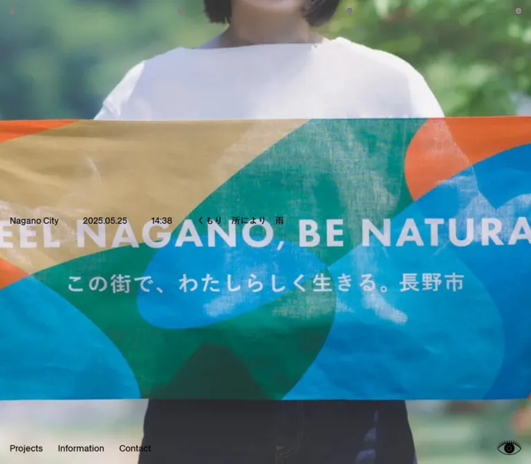
画面いっぱいの作品ビジュアルに、四隅へ広がるロゴ、長野市の日時・天気、下端の小さなナビゲーションを重ねたサイト。PCのモノクロ写真とモバイルの鮮やかなイラストを、控えめな文字組みが引き立てます。
オリジナルサイトを見るseee — Style Reference
Edge-to-edge project imagery framed by a dispersed wordmark and small local-time utilities.
Original URL: https://www.seee.ooo/
Final URL: https://www.seee.ooo/
Theme: image-led, with black utility text, a transparent interface, and a white underlying document; no selectable theme was verified.
Inspected: September 13, 2026, Japan Standard Time. The supplied evidence was retrieved at 2026-09-12T17:28:02.529Z, equivalent to September 13 at 02:28:02.529 JST.
Viewports: desktop 1440 × 1000 and mobile 390 × 844 CSS pixels.
Scope: the current homepage, including its full-screen visual, distributed home-link wordmark, location/date/time/weather display, three navigation links, and eye-shaped button. Linked pages and button outcomes were not inspected.
The homepage presents work at the scale of the browser window. Its interface occupies very little of that window: four separated letters along the top, a compact status display near the middle, three text links at the lower left, and an eye symbol at the lower right. There is no visible headline-and-CTA composition or sequence of promotional sections. The observed structure is a full-viewport project showcase and navigation entry point.
The desktop capture uses a tightly cropped monochrome photograph of two people leaning toward the center. The mobile capture uses a saturated green composition containing illustrated figures and large printed lettering. Across these different visuals, the small, regular-weight interface remains consistent. Preserve that relationship between expansive imagery and restrained navigation when adapting the design.
How to Read This Reference
- Measured values come from the supplied rendered DOM, computed styles, element rectangles, and viewport dimensions. They were not independently remeasured through a new browser session.
- Calculated values are derived from those rectangles, such as navigation gaps and bottom clearances.
- Visual estimates describe screenshot positions, image colors, and cropping where corresponding element measurements were not supplied.
- Recommended values are implementation choices for the reusable starter. They are not claims about the original stylesheet.
- Named tokens are descriptive implementation aliases. The supplied custom-property list contains utility-framework variables, but no verified semantic brand-token system.
- Three desktop captures show the same visible composition; two mobile captures show the same mobile composition. They do not establish additional screens or interaction states.
- Different artwork appears at the two viewports. This does not establish whether selection depends on screen size, elapsed time, randomization, or another mechanism.
Tokens — Colors
Default Palette
The stable interface palette is neutral. Most visible color comes from the project image.
| Name | Value | Suggested token | Evidence and role |
|---|---|---|---|
| Utility Black | #000000 |
--color-ui |
Measured on the body, main region, navigation links, and eye button. |
| Document White | #ffffff |
--color-root |
Measured HTML background. The full-screen image covers this surface in the supplied captures. |
| Wordmark Source White | #ffffff |
--color-wordmark-source |
Measured on the H1 and home link; the visible letters do not appear uniformly white. |
| Clear Surface | transparent |
--surface-clear |
Measured backgrounds of the body, main region, wordmark, navigation links, and button. |
Computed color and visible color differ at the wordmark. Its measured H1 and link color is white, while the screenshots show letters becoming dark, pale, or colored against different image regions. Compositing or descendant styling could explain this, but no blend-mode property or letter-level styles were supplied. A white mix-blend-mode: difference wordmark is a useful approximation for a new implementation, not a verified source rule.
The utility-framework ring color present in the custom-property dump is not evidence of a visible blue brand accent. No blue focus ring or branded blue control was captured.
Image Palette — Visual Estimates
These approximate colors describe the supplied current-page artwork. They are not measured CSS tokens or persistent interface accents.
| Image color | Approximate value | Observed use |
|---|---|---|
| Light photographic gray | #cccccc |
Broad light areas of the desktop photograph. |
| Charcoal | #292929 |
Clothing and deep shadows in the desktop photograph. |
| Saturated green | #14854b |
Dominant tiled and printed areas of the mobile artwork. |
| Pale blue | #c5d9e4 |
Illustrated shirts and light areas in the mobile artwork. |
| Lavender | #b69bd9 |
Small illustrated details in the mobile artwork. |
| Yellow green | #d5df86 |
Printed details on the illustrated clothing. |
Keep these colors inside the imagery. The captures do not support green navigation, lavender buttons, or a general multicolor component system.
Theme Presets
No theme presets, swatches, or confirmed theme-switching behavior were provided. The eye-shaped button has an unverified function and should not be described as a theme toggle.
Tokens — Typography
Primary Interface Sans Serif
Measured computed stack:
font-family: __antiqueLegacy_738cae,
  __antiqueLegacy_Fallback_738cae,
  sans-serif;
These are generated family identifiers, not portable font names for another project. They identify the stack applied to the sampled body, main region, wordmark, links, and button. The evidence does not establish a reusable font-file URL, license, or complete public family specification.
The visible interface is a restrained sans serif with regular weight, normal tracking, and no dramatic distinction between navigation and status text. Location, date, and time read as ordinary interface text rather than badges or a separate monospace instrument panel.
A source-text fragment contains an @font-face declaration named Ishii Gothic M. No sampled forecast element proves that this face is applied to the visible Japanese text. Do not assign it to the weather display as a confirmed finding, or infer bold weather text from the face declaration.
Distributed Wordmark
The wordmark is an H1 containing one home link. Its four visible letters are distributed across almost the entire viewport width. Measured letter spacing is normal; the large separation is a layout effect, not evidence of an enormous tracking value.
For an adaptation, use four spans inside a full-width flex link with justify-content: space-between. Preserve a single accessible name, seee, for the link.
Artwork Typography
Large serif letters, vertical Japanese writing, and printed marks belong to the background artwork. They are absent from the supplied page-text extraction. They should not become HTML display headings or new entries in the interface type scale.
Type Scale
| Role | Desktop | Mobile | Weight | Evidence |
|---|---|---|---|---|
| HTML root | 16px / 24px |
16px / 24px |
400 |
Measured. This is not the visible body scale. |
| Body and main region | 18px / 27px |
15px / 22.5px |
400 |
Measured. |
| Navigation links | 18px / 27px |
15px / 22.5px |
400 |
Measured individually. |
| Eye-button inherited text | 18px / 27px |
15px / 22.5px |
400 |
Measured, although no text is visible inside the button. |
| Wordmark H1 and link | 20px / 20px |
18px / 18px |
400 |
Measured. |
| Location, date, time, weather | Approximately the main-region scale | Approximately the main-region scale | Visually regular | Parent typography measured; individual text-node styles not supplied. |
All sampled elements report normal letter spacing. The Japanese forecast contains full-width spaces in its actual text; those spaces should not be mistaken for a measured tracking token.
The mobile interface scale is five sixths of the desktop body scale. The wordmark decreases less, from 20px to 18px. Avoid shrinking every element by one universal percentage.
Tokens — Spacing & Shapes
Layout character: nearly empty interface chrome over visually dense media. Spacing character: small edge insets, broad separation between wordmark letters, and deliberate gaps between compact text groups.
Spacing Scale
| Use | Desktop | Mobile | Status |
|---|---|---|---|
| Horizontal edge inset | 20px |
10px |
Measured from wordmark, navigation, and eye-button rectangles. |
| H1 top padding | 8px |
8px |
Measured. |
| Home-link top padding | 4px |
4px |
Measured. |
| Gap between navigation links | 31px |
30px |
Calculated from link rectangles. |
| Navigation line-box bottom clearance | 20px |
20px |
Calculated. |
| Eye-button bottom clearance | 12px |
12px |
Calculated. |
| Gap between location/date/time items | Approximately 50px |
Approximately 30px |
Visual estimate; the status-item rectangles were not supplied. |
| Gap before the second weather row | Not applicable in the captured desktop row | Approximately 10px between line boxes |
Visual estimate. |
The measured navigation gap differs slightly between the two viewports. Preserve these endpoint values when targeting a close reproduction; the underlying responsive formula is unknown.
Border Radius
| Element | Observed treatment |
|---|---|
| H1 and home link | 0px measured radius; transparent. |
| Main region | 0px measured radius; transparent. |
| Navigation links | 0px measured radius; unboxed text. |
| Eye button | 0px measured radius; transparent rectangular button box around an eye-shaped graphic. |
| Full-screen visual | No visible rounded framing. |
The curved eye drawing is icon geometry, not a rounded-button surface. No card, panel, pill, border-divider, or shadow-elevation system appears in the captured homepage.
Layout Measurements
| Element | Desktop at 1440 × 1000 | Mobile at 390 × 844 |
|---|---|---|
| Document height | 1000px |
844px |
| Main rectangle | (0, 0), 1440 × 1000px |
(0, 0), 390 × 844px |
| H1 rectangle | (20, 0), 1400 × 32px |
(10, 0), 370 × 30px |
| Home-link rectangle | (20, 8), 1400 × 24px |
(10, 8), 370 × 22px |
| Projects link | (20, 953), 68.27 × 27px |
(10, 801.5), 56.89 × 22.5px |
| Information link | (119.27, 953), 95.53 × 27px |
(96.89, 801.5), 79.61 × 22.5px |
| Contact link | (245.80, 953), 65.41 × 27px |
(206.5, 801.5), 54.5 × 22.5px |
| Eye-button rectangle | (1369, 948), 51 × 40px |
(340, 801), 40 × 31px |
Coordinates above describe element boxes, not the exact ink bounds of glyphs or the eye drawing. The apparent viewport anchoring is clear, but the source positioning properties were not included; fixed versus absolute positioning is not established.
Components
Full-Viewport Image Stage
Role: gives the selected visual almost the entire screen and establishes the page's character before the user navigates.
The image reaches all four edges in both supplied viewport sizes. Header text, status information, navigation, and the eye symbol sit over the image without opaque backing strips. The document height equals the viewport height in both observations, so there is no evidenced stack of homepage sections below this composition.
The desktop photograph crops both figures at the browser boundaries. The mobile artwork also crops aggressively, including large lettering at the top and a figure at the right. A full-size media element using object-fit: cover is a practical reconstruction technique. Its use in the original source was not measured.
The image stage's element type, source URL, intrinsic dimensions, and click behavior were not supplied. Do not assume that it is a video, a linked project cover, or a timed carousel.
Distributed Home-Link Wordmark
Role: maintains identity while leaving the center of the image open.
The measured hierarchy is H1 → anchor, with the anchor pointing to https://www.seee.ooo/. One s and three e letters appear across the top, with the first and final letters close to the side insets.
Use a full-width link rather than four unrelated navigation controls. On desktop it spans 1400px inside 20px side insets; on mobile it spans 370px inside 10px insets. Its modest type size is essential: the breadth comes from distribution, not an oversized font.
The H1 contributes 8px of top padding and its link contributes another 4px. A zero-margin H1 with those nested paddings reproduces the measured 32px desktop and 30px mobile total heights when paired with the corresponding line heights.
The visible image-dependent letter colors are distinctive. Keep the compositing implementation explicitly provisional until letter-level styles are available.
Location, Date, Time, and Weather
Role: places the image in a specific local and temporal context.
The captured content is:
Nagano City2026.09.1302:27くもり 所により 夜のはじめ頃 まで 雨
On desktop, these read as one horizontal status band. Approximate text-start positions are x = 20px for the location, 170px for the date, 309px for the time, and 407px for the forecast. Visible glyphs sit around y = 470–484px, slightly above the viewport midpoint.
On mobile, the first three items remain together, starting at approximately x = 10px, 124px, and 230px. The forecast moves to a second row beginning at the same 10px left inset. The two rows sit around y = 398–410px and y = 430–442px, straddling the vertical midpoint.
These status coordinates are screenshot estimates. Only the enclosing main region's rectangle and typography were measured.
The date uses dotted year-month-day formatting, and the clock uses hours and minutes. The evidence does not show a clock tick, weather refresh, data provider, or user-adjustable location. Describe them as displayed date, time, and weather rather than verified live services.
Bottom Navigation
Role: provides direct entry to the site's three named areas.
| Label | Observed destination |
|---|---|
| Projects | https://www.seee.ooo/projects |
| Information | https://www.seee.ooo/information |
| Contact | https://www.seee.ooo/contact |
All three links remain visible at 390px width. The captured mobile layout does not replace them with a menu button.
The links are regular-weight black text with no captured underline, enclosing shape, divider, or filled action treatment. Their line boxes end 20px above the viewport bottom at both sizes. Desktop gaps are 31px; mobile gaps are 30px.
Keep the links grouped at the left. The large remaining width before the eye control is part of the composition, rather than a reason to distribute these links evenly across the screen.
The destinations are verified as rendered hrefs, but their pages and transition behavior were not inspected.
Eye-Shaped Button
Role: a visible utility affordance whose action remains unverified.
A small black eye drawing appears at the lower right. It has an outlined eye contour, lashes, and a circular interior. The surrounding button is transparent and has no measured corner radius.
Its measured box is 51 × 40px on desktop and 40 × 31px on mobile. The right inset follows the wordmark and navigation edge system: 20px desktop and 10px mobile. Its box ends 12px above the viewport bottom, slightly lower than the navigation line boxes.
The rendered record identifies a button with empty text content. It does not expose enough accessibility information to determine whether an accessible name exists. No click, hover, open/closed-eye state, or resulting panel was supplied.
Do not assign this button an invented theme, visibility, playback, or slideshow function. For a new implementation, define its actual action before selecting its accessible label and state model.
Tokens — Motion & Interaction
| Treatment | Supplied evidence | What can be concluded |
|---|---|---|
| Main-region opacity | opacity 0.15s cubic-bezier(0.4, 0, 0.2, 1) |
A 150ms opacity transition is declared. Its trigger and visible before/after states were not supplied. |
| Sampled CSS animations | animation: none on sampled elements |
No animation was reported on those elements. Unsampled descendants and media remain outside this finding. |
| Other transition records | Serialized as all without a duration in the supplied record |
No usable timing or specific hover effect can be inferred. |
| Desktop versus mobile visual | Different artwork is visible | The homepage can be observed with different visuals; the selection mechanism is unknown. |
| Home and navigation links | Valid rendered hrefs | Navigation affordances are present; route-transition effects were not exercised. |
| Eye button | Button rectangle and visible graphic | A button is present; its action and state changes are unverified. |
The capture process included at least five seconds of initial observation and its stated image, layout, and animation settling checks. Perpetual animations were paused during readiness checks and then resumed. This process does not establish a complete motion sequence or prove that the image stage is static.
The repeated captures do not show an additional state at either viewport. Do not add parallax, cursor-following eyes, image crossfades, swipe gestures, or a particular slideshow interval as source findings.
Reusable motion token: --motion-opacity: 150ms cubic-bezier(0.4, 0, 0.2, 1). Use it only where the adaptation has a defined opacity state change. A reduced-motion override is a recommended addition.
Surfaces
| Layer | Appearance | Purpose |
|---|---|---|
| Underlying document | Measured white HTML background | Fallback canvas underneath the full-screen visual. |
| Image stage | Edge-to-edge photograph or artwork | Carries almost all visible texture, color, and visual emphasis. |
| Wordmark | Transparent surroundings; white computed text with varying visible appearance | Identity across the upper edge. |
| Status band | Black text directly on the visual | Local context near the middle. |
| Navigation | Black text directly on the visual | Lower-left route access. |
| Eye utility | Black drawing inside a transparent button box | Lower-right utility affordance. |
No opaque header, footer bar, card grid, glass panel, decorative gradient, or general elevation treatment is visible. Separation comes from position and scale. Some text overlaps detailed artwork, so the current visual restraint also introduces a contrast concern to address when reusing the pattern.
Imagery
Desktop Photograph
The desktop composition is monochrome and closely cropped. A person wearing a cap with extended fabric occupies the left side; another person wearing a knit cap, glasses, and strapped workwear occupies the right. Their inward-facing posture creates an open region near the center while clothing and equipment supply dense texture around it.
Preserve the large human scale, asymmetry, visible fabric detail, and crop beyond the viewport edges. Avoid shrinking this kind of image into a centered framed photograph. The evidence does not establish whether its monochrome appearance is baked into the asset or produced by CSS.
Small white printed lettering remains visible near the left side. Treat it as part of the image, not a second website wordmark or an interface caption.
Mobile Illustrated Artwork
The mobile visual is dominated by green tiles and printed poster imagery. Illustrated figures wear pale blue shirts and denim shorts; lavender and yellow-green details provide small accents. Large white serif lettering is cropped at the top, and a dark vertical strip contains Japanese writing.
A smaller rectangular printed composition appears within the larger image. This is artwork within the background, not evidence of a nested HTML card or overlay panel. Preserve its raster texture and embedded lettering when using the original asset with permission.
The desktop and mobile images demonstrate that the interface can frame both restrained photography and saturated illustration. Do not apply a global grayscale filter to every image or force every project into one palette.
Observed Asset References
| Visible asset | Evidence available | Limitation |
|---|---|---|
| Desktop monochrome photograph | Three supplied 1440 × 1000 current-page captures | No original media URL, file dimensions, or media-element styles were supplied. |
| Mobile green illustrated composition | Two supplied 390 × 844 current-page captures | No original media URL or responsive-selection rule was supplied. |
| Eye graphic | Visible in both viewport sizes; surrounding button measured | Asset format and internal drawing bounds are unknown. |
| Wordmark | Rendered text and H1/link measurements | No separate logo-image asset is evidenced. |
Use normally rendered photographic and illustrated assets. Pixelated scaling, vector tracing, and synthetic texture overlays are not supported by these captures. Image identity must come from an appropriate authorized asset; CSS alone reproduces only the interface frame.
Layout & Responsive Behavior
The two observed viewports preserve the same compositional anchors: a full-width top wordmark, a left-aligned central status block, a left-aligned bottom navigation group, and a lower-right eye symbol. Responsive changes are concentrated in type size, edge clearance, button dimensions, and status wrapping.
| Relationship | Desktop observation | Mobile observation |
|---|---|---|
| Page extent | One 1440 × 1000 viewport | One 390 × 844 viewport |
| Horizontal inset | 20px | 10px |
| Interface type | 18px | 15px |
| Wordmark type | 20px | 18px |
| Status structure | Location, date, time, and weather on one row | Location, date, and time above a separate weather row |
| Navigation | Three inline text links | Same three inline text links |
| Eye button | 51 × 40px | 40 × 31px |
| Main visual | Monochrome photograph | Green illustrated artwork |
The source breakpoint was not supplied. A 768px breakpoint is a reasonable starter choice, explicitly recommended rather than measured. The evidence also does not establish whether intermediate sizes use stepped or fluid typography.
The full-bleed crops suggest a cover-like presentation, but the different images prevent a direct comparison of one asset's desktop and mobile crop. Support focal-point adjustment for each selected image, and verify important subjects at the target viewport instead of assuming that centered cropping always works.
The supplied document heights equal their viewport heights. This supports a single-screen presentation in the observed states, but does not prove the source uses scroll locking or that every possible state remains one screen tall.
Safe-area handling, landscape phones, browser-toolbar resizing, text zoom, and exceptionally long weather strings were not tested. The starter includes safe-area and dynamic-viewport recommendations. Smaller or zoomed layouts should permit wrapping or scrolling when necessary to keep controls reachable.
Do’s and Don’ts
Do
- Let the selected work occupy the entire viewport.
- Keep the interface small, regular-weight, and visually unboxed.
- Distribute the four wordmark letters across one full-width home link.
- Preserve the measured 20px desktop and 10px mobile horizontal insets.
- Keep Projects, Information, and Contact together at the lower left.
- Retain the date/time/location grouping and separate the mobile forecast onto its own row.
- Treat the image as the source of color, texture, and large printed typography.
- Distinguish the wordmark's measured white color from its image-dependent visible appearance.
- Validate image crops and text contrast separately for each selected visual.
- Keep untested interactions explicitly unresolved in implementation planning.
Don’t
- Don't convert the homepage into a conventional sequence of hero, feature, testimonial, and conversion sections.
- Don't add a large marketing heading over the image.
- Don't turn the navigation into rounded pills or distribute its three links across the entire footer.
- Don't recreate wordmark distribution using extreme letter spacing.
- Don't promote green from the mobile image into a permanent button color.
- Don't treat lettering inside the artwork as HTML interface text.
- Don't infer automatic playback or responsive art direction solely from the two different captured images.
- Don't invent an action for the eye button.
- Don't describe the source blend mode, image element type, or media timing as verified.
- Don't copy generated font-family identifiers into a new project and expect the fonts to load.
Recommended Implementation Additions
These are recommendations for a new implementation, not verified features of the original homepage:
- Contrast: test status text and navigation against every image. Prefer an appropriate crop or a calmer image region; introduce a restrained local backing only where essential to readability.
- Keyboard access: retain semantic links and a visible focus indicator. Give the distributed wordmark one accessible name and hide its individually rendered letter spans from duplicate announcement.
- Eye control: define a real action and matching accessible name before rendering an interactive version. The source record does not establish that action or whether the current button lacks a name.
- Touch targets: enlarge interactive hit areas toward at least 44 × 44px without enlarging the visible typography. Check that expanded areas do not overlap neighboring links.
- Time and weather: use semantic
timeelements where appropriate. Define update cadence, timezone, failure handling, and weather data requirements independently; none were verified here. - Media alternatives: provide meaningful alternative text when the project image communicates content. Decorative duplicates within a composite image should not become separate accessibility nodes.
- Motion: if the new product introduces automatic changes or moving media, provide suitable pause and reduced-motion behavior. Do not add those behaviors merely to imitate an unverified effect.
- Responsive resilience: test safe areas, short landscape screens, 200% text zoom, and longer forecast strings. Permit content growth when a single-viewport arrangement would obscure controls.
Agent Prompt Guide
Quick Color Reference
- Utility text and eye artwork: measured
#000000. - Underlying document: measured
#ffffff. - Header, status, navigation, and button surfaces: transparent.
- Wordmark: measured source white with varying rendered colors; exact compositing unverified.
- Desktop image: light gray and charcoal photographic values.
- Mobile image: green with pale blue, lavender, and yellow-green details; these are image colors, not UI accents.
- Primary navigation treatment: plain text links with no captured filled CTA.
Overall Prompt
“Create a full-viewport project-showcase homepage inspired by the observed seee interface. Use one edge-to-edge authorized project image, a tiny regular-weight sans-serif interface, and no opaque header or footer strip. Spread the four letters of a single home-link wordmark across the top using flex layout. Place location, dotted date, time, and weather near the vertical midpoint. Keep Projects, Information, and Contact together at the bottom left. Use 20px horizontal insets and 18px interface text at 1440 × 1000; use 10px insets and 15px text at 390 × 844. On mobile, move the weather below the location/date/time row while keeping all three navigation links visible. Let the artwork carry visual density and color. Treat wordmark blending, media selection, and the eye utility's action as implementation decisions that require explicit definition.”
Example Component Prompts
- Wordmark: “Create one full-width home link containing four visually separated letters, s e e e. Use regular sans-serif text at 20px desktop and 18px mobile, normal tracking, and space-between distribution. Apply 20px desktop or 10px mobile side insets. Preserve a single accessible name.”
- Status block: “Overlay small black location, date, time, and forecast text directly on a project image. Keep one horizontal row on desktop. On a 390px phone, retain the first three items in one row and place the forecast on the next row. Use 18px/27px desktop and 15px/22.5px mobile as the starting scale.”
- Bottom navigation: “Place Projects, Information, and Contact at the lower left as plain regular-weight text links. Use approximately 30px gaps and a 20px clearance below their line boxes. Keep the group left aligned on mobile and desktop, with no enclosing panel.”
- Image stage: “Fill the viewport with a tightly cropped project image. Preserve natural photographic or printed texture, and allow subjects and artwork lettering to extend beyond the screen edges. Adjust focal points per asset. Do not add interface headings to imitate text already embedded in the artwork.”
- Utility slot: “Reserve the lower-right position for a transparent eye-shaped utility control, using a 51 × 40px desktop visual box or 40 × 31px mobile box and a 12px bottom clearance. Implement the button only after its actual action and accessible name have been defined.”
Quick Start
CSS Custom Properties
This is a reusable approximation of the observed shell, not extracted source CSS. Exact endpoint sizes and clearances come from the supplied measurements. The status offsets, status gaps, 768px breakpoint, cover behavior, safe-area support, and difference blending are recommended approximations.
The starter uses a system sans-serif fallback. Load an appropriately licensed face separately if available, then verify text widths and wrapping. The generated source family identifiers are not included because they cannot load a font in another project by themselves.
:root {
  /* Measured interface colors */
  --color-root: #ffffff;
  --color-ui: #000000;
  --color-wordmark-source: #ffffff;

  /* Recommended portable fallback, not a source font identification */
  --font-ui: ui-sans-serif, system-ui, sans-serif;
  --weight-ui: 400;

  /* Measured desktop typography */
  --ui-size: 18px;
  --ui-leading: 1.5;
  --brand-size: 20px;

  /* Measured or rectangle-derived desktop geometry */
  --edge: 20px;
  --brand-outer-top: 8px;
  --brand-inner-top: 4px;
  --nav-gap: 31px;
  --nav-bottom: 20px;
  --eye-width: 51px;
  --eye-height: 40px;
  --eye-bottom: 12px;

  /* Screenshot-based approximations */
  --status-gap: 50px;
  --status-offset: 36px;
  --forecast-row-gap: 10px;

  /* Recommended media and viewport handling */
  --media-position: 50% 50%;
  --safe-top: env(safe-area-inset-top, 0px);
  --safe-bottom: env(safe-area-inset-bottom, 0px);

  /* Measured main-region transition */
  --motion-opacity: 150ms cubic-bezier(0.4, 0, 0.2, 1);
}

* {
  box-sizing: border-box;
}

html,
body {
  margin: 0;
  background: var(--color-root);
}

body {
  color: var(--color-ui);
  font-family: var(--font-ui);
  font-size: var(--ui-size);
  font-weight: var(--weight-ui);
  line-height: var(--ui-leading);
}

.seee-shell {
  position: relative;
  isolation: isolate;
  width: 100%;
  height: 100vh;
  height: 100dvh;
  min-height: 100svh;
  background: var(--color-root);
}

.seee-main {
  position: absolute;
  inset: 0;
  transition: opacity var(--motion-opacity);
}

.seee-visual {
  position: absolute;
  inset: 0;
  display: block;
  width: 100%;
  height: 100%;
  object-fit: cover;
  object-position: var(--media-position);
}

.seee-wordmark {
  position: absolute;
  z-index: 2;
  top: var(--safe-top);
  right: var(--edge);
  left: var(--edge);
  margin: 0;
  padding-top: var(--brand-outer-top);
  color: var(--color-wordmark-source);
  font-size: var(--brand-size);
  font-weight: var(--weight-ui);
  line-height: 1;

  /* Approximation; the original blend mode was not supplied */
  mix-blend-mode: difference;
}

.seee-wordmark a {
  display: flex;
  justify-content: space-between;
  padding-top: var(--brand-inner-top);
  color: inherit;
  text-decoration: none;
}

.seee-status {
  position: absolute;
  z-index: 1;
  top: calc(50% - var(--status-offset));
  right: var(--edge);
  left: var(--edge);
  display: flex;
  align-items: baseline;
  gap: var(--status-gap);
}

.seee-place-time {
  display: flex;
  flex: none;
  align-items: baseline;
  gap: var(--status-gap);
}

.seee-place-time > * {
  white-space: nowrap;
}

.seee-weather {
  min-width: 0;
  margin: 0;
  overflow-wrap: anywhere;
}

.seee-nav {
  position: absolute;
  z-index: 2;
  bottom: calc(var(--nav-bottom) + var(--safe-bottom));
  left: var(--edge);
  display: flex;
  flex-wrap: wrap;
  column-gap: var(--nav-gap);
  row-gap: 8px;
  max-width: calc(
    100% - 2 * var(--edge) - var(--eye-width) - 20px
  );
}

.seee-nav a {
  display: block;
  color: var(--color-ui);
  text-decoration: none;
}

/* Add only when a real action and accessible name are defined */
.seee-eye-button {
  position: absolute;
  z-index: 2;
  right: var(--edge);
  bottom: calc(var(--eye-bottom) + var(--safe-bottom));
  display: flex;
  align-items: center;
  justify-content: center;
  width: var(--eye-width);
  height: var(--eye-height);
  margin: 0;
  padding: 0;
  border: 0;
  border-radius: 0;
  color: var(--color-ui);
  background: transparent;
  font: inherit;
  cursor: pointer;
}

.seee-eye-button > svg,
.seee-eye-button > img {
  display: block;
  max-width: 100%;
  max-height: 100%;
}

/* Recommended invisible expansion of the eye hit area */
.seee-eye-button::after {
  content: '';
  position: absolute;
  top: 50%;
  left: 50%;
  width: max(100%, 44px);
  height: max(100%, 44px);
  transform: translate(-50%, -50%);
}

/* Recommended focus treatment; validate against each image */
.seee-shell :is(a, button):focus-visible {
  outline: 2px solid currentColor;
  outline-offset: 4px;
}

/* Recommended breakpoint; only the two endpoint layouts were measured */
@media (max-width: 767px) {
  :root {
    --ui-size: 15px;
    --brand-size: 18px;
    --edge: 10px;
    --nav-gap: 30px;
    --eye-width: 40px;
    --eye-height: 31px;
    --status-gap: 30px;
    --status-offset: 29px;
  }

  .seee-status {
    flex-direction: column;
    align-items: flex-start;
    gap: var(--forecast-row-gap);
  }
}

/* Recommended fallback for short windows: allow page scrolling */
@media (max-height: 480px) {
  .seee-shell {
    min-height: 480px;
  }
}

/* Recommended accessibility addition */
@media (prefers-reduced-motion: reduce) {
  .seee-main {
    transition: none;
  }
}
Minimal Markup
This adaptation structure supports the CSS above. Replace the example image path and alternative text with an authorized asset and an accurate description. The path below is a placeholder, not an observed original-site asset. The eye button requires a separately defined action and is therefore not instantiated in this markup.
<div class="seee-shell">
  <main class="seee-main">
    <img
      class="seee-visual"
      src="/media/your-project-image.webp"
      alt="Replace with an accurate description of the selected work"
      fetchpriority="high"
    >

    <div class="seee-status">
      <div class="seee-place-time">
        <span>Nagano City</span>
        <time datetime="2026-09-13">2026.09.13</time>
        <time datetime="2026-09-13T02:27:00+09:00">02:27</time>
      </div>
      <p class="seee-weather">
        くもり 所により 夜のはじめ頃 まで 雨
      </p>
    </div>
  </main>

  <h1 class="seee-wordmark">
    <a href="/" aria-label="seee">
      <span aria-hidden="true">s</span>
      <span aria-hidden="true">e</span>
      <span aria-hidden="true">e</span>
      <span aria-hidden="true">e</span>
    </a>
  </h1>

  <nav class="seee-nav" aria-label="Primary">
    <a href="/projects">Projects</a>
    <a href="/information">Information</a>
    <a href="/contact">Contact</a>
  </nav>
</div>
The example date and forecast reproduce captured content for layout testing. They are static examples, not a live clock or weather integration. Check link widths with the actual chosen font, and verify layout growth under text zoom before production use.
Tailwind v4 Token Mapping
Optional aliases for an adaptation that already uses Tailwind v4. The original evidence contains --tw-* properties, but does not verify a framework version. Define the custom properties above before using this mapping.
@theme inline {
  --color-canvas: var(--color-root);
  --color-ink: var(--color-ui);
  --color-wordmark: var(--color-wordmark-source);

  --font-interface: var(--font-ui);
  --text-interface: var(--ui-size);
  --text-wordmark: var(--brand-size);

  --spacing-edge: var(--edge);
  --spacing-nav: var(--nav-gap);
  --spacing-status: var(--status-gap);

  --radius-flat: 0px;
}
Sources & Evidence
- Inspected original and final website: https://www.seee.ooo/. Both URLs are identical in the supplied observation; the recorded HTTP status is 200 and the rendered page title is
seee. - Inspection date: September 13, 2026 JST. Evidence retrieval timestamp:
2026-09-12T17:28:02.529Z. The page itself displayed2026.09.13and02:27in the captured state. - Desktop evidence: three supplied current-page captures at 1440 × 1000, plus rendered text, links, computed styles, and element rectangles. Recorded document height: 1000px.
- Mobile evidence: two supplied current-page captures at 390 × 844, plus the same categories of rendered evidence. Recorded document height: 844px.
- Measured properties: root/body typography and colors; wordmark geometry, padding, and typography; main-region geometry and opacity transition; individual navigation link geometry; eye-button geometry; transparent backgrounds and zero border radii on sampled elements.
- Visible destinations only:
/projects,/information, and/contact. Their hrefs were supplied, but their page contents and navigation outcomes were not inspected. - Interaction limitations: no supplied eye-button activation, hover result, focus state, media-control action, or frame-by-frame transition sequence. The capture readiness checks do not establish semantic completeness or explain media selection.
- Environment limitations: shared workers and service workers were disabled during the supplied inspection. Offline behavior, worker-dependent behavior, delayed content, and unexercised states remain unverified.
- Asset limitations: no original image URLs, intrinsic media sizes, letter-level compositing styles, or complete portable font definitions were supplied. Image colors and status positions are explicitly labeled visual estimates.
This reference describes the current captured homepage. The CSS, markup, accessibility guidance, and optional framework mapping are reusable recommendations whose unmeasured choices are identified above.
# seee — Style Reference

> Edge-to-edge project imagery framed by a dispersed wordmark and small local-time utilities.

**Original URL:** [https://www.seee.ooo/](https://www.seee.ooo/)
**Final URL:** [https://www.seee.ooo/](https://www.seee.ooo/)
**Theme:** image-led, with black utility text, a transparent interface, and a white underlying document; no selectable theme was verified.
**Inspected:** September 13, 2026, Japan Standard Time. The supplied evidence was retrieved at `2026-09-12T17:28:02.529Z`, equivalent to September 13 at 02:28:02.529 JST.
**Viewports:** desktop `1440 × 1000` and mobile `390 × 844` CSS pixels.
**Scope:** the current homepage, including its full-screen visual, distributed home-link wordmark, location/date/time/weather display, three navigation links, and eye-shaped button. Linked pages and button outcomes were not inspected.

The homepage presents work at the scale of the browser window. Its interface occupies very little of that window: four separated letters along the top, a compact status display near the middle, three text links at the lower left, and an eye symbol at the lower right. There is no visible headline-and-CTA composition or sequence of promotional sections. The observed structure is a full-viewport project showcase and navigation entry point.

The desktop capture uses a tightly cropped monochrome photograph of two people leaning toward the center. The mobile capture uses a saturated green composition containing illustrated figures and large printed lettering. Across these different visuals, the small, regular-weight interface remains consistent. Preserve that relationship between expansive imagery and restrained navigation when adapting the design.

## How to Read This Reference

- **Measured values** come from the supplied rendered DOM, computed styles, element rectangles, and viewport dimensions. They were not independently remeasured through a new browser session.
- **Calculated values** are derived from those rectangles, such as navigation gaps and bottom clearances.
- **Visual estimates** describe screenshot positions, image colors, and cropping where corresponding element measurements were not supplied.
- **Recommended values** are implementation choices for the reusable starter. They are not claims about the original stylesheet.
- **Named tokens** are descriptive implementation aliases. The supplied custom-property list contains utility-framework variables, but no verified semantic brand-token system.
- Three desktop captures show the same visible composition; two mobile captures show the same mobile composition. They do not establish additional screens or interaction states.
- Different artwork appears at the two viewports. This does not establish whether selection depends on screen size, elapsed time, randomization, or another mechanism.

## Tokens — Colors

### Default Palette

The stable interface palette is neutral. Most visible color comes from the project image.

| Name | Value | Suggested token | Evidence and role |
| --- | --- | --- | --- |
| Utility Black | `#000000` | `--color-ui` | Measured on the body, main region, navigation links, and eye button. |
| Document White | `#ffffff` | `--color-root` | Measured HTML background. The full-screen image covers this surface in the supplied captures. |
| Wordmark Source White | `#ffffff` | `--color-wordmark-source` | Measured on the H1 and home link; the visible letters do not appear uniformly white. |
| Clear Surface | `transparent` | `--surface-clear` | Measured backgrounds of the body, main region, wordmark, navigation links, and button. |

**Computed color and visible color differ at the wordmark.** Its measured H1 and link color is white, while the screenshots show letters becoming dark, pale, or colored against different image regions. Compositing or descendant styling could explain this, but no blend-mode property or letter-level styles were supplied. A white `mix-blend-mode: difference` wordmark is a useful approximation for a new implementation, not a verified source rule.

The utility-framework ring color present in the custom-property dump is not evidence of a visible blue brand accent. No blue focus ring or branded blue control was captured.

### Image Palette — Visual Estimates

These approximate colors describe the supplied current-page artwork. They are not measured CSS tokens or persistent interface accents.

| Image color | Approximate value | Observed use |
| --- | --- | --- |
| Light photographic gray | `#cccccc` | Broad light areas of the desktop photograph. |
| Charcoal | `#292929` | Clothing and deep shadows in the desktop photograph. |
| Saturated green | `#14854b` | Dominant tiled and printed areas of the mobile artwork. |
| Pale blue | `#c5d9e4` | Illustrated shirts and light areas in the mobile artwork. |
| Lavender | `#b69bd9` | Small illustrated details in the mobile artwork. |
| Yellow green | `#d5df86` | Printed details on the illustrated clothing. |

Keep these colors inside the imagery. The captures do not support green navigation, lavender buttons, or a general multicolor component system.

### Theme Presets

No theme presets, swatches, or confirmed theme-switching behavior were provided. The eye-shaped button has an unverified function and should not be described as a theme toggle.

## Tokens — Typography

### Primary Interface Sans Serif

**Measured computed stack:**

```css
font-family: __antiqueLegacy_738cae,
  __antiqueLegacy_Fallback_738cae,
  sans-serif;
```

These are generated family identifiers, not portable font names for another project. They identify the stack applied to the sampled body, main region, wordmark, links, and button. The evidence does not establish a reusable font-file URL, license, or complete public family specification.

The visible interface is a restrained sans serif with regular weight, normal tracking, and no dramatic distinction between navigation and status text. Location, date, and time read as ordinary interface text rather than badges or a separate monospace instrument panel.

A source-text fragment contains an `@font-face` declaration named `Ishii Gothic M`. No sampled forecast element proves that this face is applied to the visible Japanese text. Do not assign it to the weather display as a confirmed finding, or infer bold weather text from the face declaration.

### Distributed Wordmark

The wordmark is an H1 containing one home link. Its four visible letters are distributed across almost the entire viewport width. Measured letter spacing is `normal`; the large separation is a layout effect, not evidence of an enormous tracking value.

For an adaptation, use four spans inside a full-width flex link with `justify-content: space-between`. Preserve a single accessible name, `seee`, for the link.

### Artwork Typography

Large serif letters, vertical Japanese writing, and printed marks belong to the background artwork. They are absent from the supplied page-text extraction. They should not become HTML display headings or new entries in the interface type scale.

### Type Scale

| Role | Desktop | Mobile | Weight | Evidence |
| --- | --- | --- | --- | --- |
| HTML root | `16px / 24px` | `16px / 24px` | `400` | Measured. This is not the visible body scale. |
| Body and main region | `18px / 27px` | `15px / 22.5px` | `400` | Measured. |
| Navigation links | `18px / 27px` | `15px / 22.5px` | `400` | Measured individually. |
| Eye-button inherited text | `18px / 27px` | `15px / 22.5px` | `400` | Measured, although no text is visible inside the button. |
| Wordmark H1 and link | `20px / 20px` | `18px / 18px` | `400` | Measured. |
| Location, date, time, weather | Approximately the main-region scale | Approximately the main-region scale | Visually regular | Parent typography measured; individual text-node styles not supplied. |

All sampled elements report normal letter spacing. The Japanese forecast contains full-width spaces in its actual text; those spaces should not be mistaken for a measured tracking token.

The mobile interface scale is five sixths of the desktop body scale. The wordmark decreases less, from 20px to 18px. Avoid shrinking every element by one universal percentage.

## Tokens — Spacing & Shapes

**Layout character:** nearly empty interface chrome over visually dense media.
**Spacing character:** small edge insets, broad separation between wordmark letters, and deliberate gaps between compact text groups.

### Spacing Scale

| Use | Desktop | Mobile | Status |
| --- | --- | --- | --- |
| Horizontal edge inset | `20px` | `10px` | Measured from wordmark, navigation, and eye-button rectangles. |
| H1 top padding | `8px` | `8px` | Measured. |
| Home-link top padding | `4px` | `4px` | Measured. |
| Gap between navigation links | `31px` | `30px` | Calculated from link rectangles. |
| Navigation line-box bottom clearance | `20px` | `20px` | Calculated. |
| Eye-button bottom clearance | `12px` | `12px` | Calculated. |
| Gap between location/date/time items | Approximately `50px` | Approximately `30px` | Visual estimate; the status-item rectangles were not supplied. |
| Gap before the second weather row | Not applicable in the captured desktop row | Approximately `10px` between line boxes | Visual estimate. |

The measured navigation gap differs slightly between the two viewports. Preserve these endpoint values when targeting a close reproduction; the underlying responsive formula is unknown.

### Border Radius

| Element | Observed treatment |
| --- | --- |
| H1 and home link | `0px` measured radius; transparent. |
| Main region | `0px` measured radius; transparent. |
| Navigation links | `0px` measured radius; unboxed text. |
| Eye button | `0px` measured radius; transparent rectangular button box around an eye-shaped graphic. |
| Full-screen visual | No visible rounded framing. |

The curved eye drawing is icon geometry, not a rounded-button surface. No card, panel, pill, border-divider, or shadow-elevation system appears in the captured homepage.

### Layout Measurements

| Element | Desktop at 1440 × 1000 | Mobile at 390 × 844 |
| --- | --- | --- |
| Document height | `1000px` | `844px` |
| Main rectangle | `(0, 0)`, `1440 × 1000px` | `(0, 0)`, `390 × 844px` |
| H1 rectangle | `(20, 0)`, `1400 × 32px` | `(10, 0)`, `370 × 30px` |
| Home-link rectangle | `(20, 8)`, `1400 × 24px` | `(10, 8)`, `370 × 22px` |
| Projects link | `(20, 953)`, `68.27 × 27px` | `(10, 801.5)`, `56.89 × 22.5px` |
| Information link | `(119.27, 953)`, `95.53 × 27px` | `(96.89, 801.5)`, `79.61 × 22.5px` |
| Contact link | `(245.80, 953)`, `65.41 × 27px` | `(206.5, 801.5)`, `54.5 × 22.5px` |
| Eye-button rectangle | `(1369, 948)`, `51 × 40px` | `(340, 801)`, `40 × 31px` |

Coordinates above describe element boxes, not the exact ink bounds of glyphs or the eye drawing. The apparent viewport anchoring is clear, but the source positioning properties were not included; fixed versus absolute positioning is not established.

## Components

### Full-Viewport Image Stage

**Role:** gives the selected visual almost the entire screen and establishes the page's character before the user navigates.

The image reaches all four edges in both supplied viewport sizes. Header text, status information, navigation, and the eye symbol sit over the image without opaque backing strips. The document height equals the viewport height in both observations, so there is no evidenced stack of homepage sections below this composition.

The desktop photograph crops both figures at the browser boundaries. The mobile artwork also crops aggressively, including large lettering at the top and a figure at the right. A full-size media element using `object-fit: cover` is a practical reconstruction technique. Its use in the original source was not measured.

The image stage's element type, source URL, intrinsic dimensions, and click behavior were not supplied. Do not assume that it is a video, a linked project cover, or a timed carousel.

### Distributed Home-Link Wordmark

**Role:** maintains identity while leaving the center of the image open.

The measured hierarchy is H1 → anchor, with the anchor pointing to `https://www.seee.ooo/`. One `s` and three `e` letters appear across the top, with the first and final letters close to the side insets.

Use a full-width link rather than four unrelated navigation controls. On desktop it spans 1400px inside 20px side insets; on mobile it spans 370px inside 10px insets. Its modest type size is essential: the breadth comes from distribution, not an oversized font.

The H1 contributes 8px of top padding and its link contributes another 4px. A zero-margin H1 with those nested paddings reproduces the measured 32px desktop and 30px mobile total heights when paired with the corresponding line heights.

The visible image-dependent letter colors are distinctive. Keep the compositing implementation explicitly provisional until letter-level styles are available.

### Location, Date, Time, and Weather

**Role:** places the image in a specific local and temporal context.

The captured content is:

- `Nagano City`
- `2026.09.13`
- `02:27`
- `くもり 所により 夜のはじめ頃 まで 雨`

On desktop, these read as one horizontal status band. Approximate text-start positions are x = 20px for the location, 170px for the date, 309px for the time, and 407px for the forecast. Visible glyphs sit around y = 470–484px, slightly above the viewport midpoint.

On mobile, the first three items remain together, starting at approximately x = 10px, 124px, and 230px. The forecast moves to a second row beginning at the same 10px left inset. The two rows sit around y = 398–410px and y = 430–442px, straddling the vertical midpoint.

These status coordinates are screenshot estimates. Only the enclosing main region's rectangle and typography were measured.

The date uses dotted year-month-day formatting, and the clock uses hours and minutes. The evidence does not show a clock tick, weather refresh, data provider, or user-adjustable location. Describe them as displayed date, time, and weather rather than verified live services.

### Bottom Navigation

**Role:** provides direct entry to the site's three named areas.

| Label | Observed destination |
| --- | --- |
| Projects | `https://www.seee.ooo/projects` |
| Information | `https://www.seee.ooo/information` |
| Contact | `https://www.seee.ooo/contact` |

All three links remain visible at 390px width. The captured mobile layout does not replace them with a menu button.

The links are regular-weight black text with no captured underline, enclosing shape, divider, or filled action treatment. Their line boxes end 20px above the viewport bottom at both sizes. Desktop gaps are 31px; mobile gaps are 30px.

Keep the links grouped at the left. The large remaining width before the eye control is part of the composition, rather than a reason to distribute these links evenly across the screen.

The destinations are verified as rendered hrefs, but their pages and transition behavior were not inspected.

### Eye-Shaped Button

**Role:** a visible utility affordance whose action remains unverified.

A small black eye drawing appears at the lower right. It has an outlined eye contour, lashes, and a circular interior. The surrounding button is transparent and has no measured corner radius.

Its measured box is 51 × 40px on desktop and 40 × 31px on mobile. The right inset follows the wordmark and navigation edge system: 20px desktop and 10px mobile. Its box ends 12px above the viewport bottom, slightly lower than the navigation line boxes.

The rendered record identifies a button with empty text content. It does not expose enough accessibility information to determine whether an accessible name exists. No click, hover, open/closed-eye state, or resulting panel was supplied.

Do not assign this button an invented theme, visibility, playback, or slideshow function. For a new implementation, define its actual action before selecting its accessible label and state model.

## Tokens — Motion & Interaction

| Treatment | Supplied evidence | What can be concluded |
| --- | --- | --- |
| Main-region opacity | `opacity 0.15s cubic-bezier(0.4, 0, 0.2, 1)` | A 150ms opacity transition is declared. Its trigger and visible before/after states were not supplied. |
| Sampled CSS animations | `animation: none` on sampled elements | No animation was reported on those elements. Unsampled descendants and media remain outside this finding. |
| Other transition records | Serialized as `all` without a duration in the supplied record | No usable timing or specific hover effect can be inferred. |
| Desktop versus mobile visual | Different artwork is visible | The homepage can be observed with different visuals; the selection mechanism is unknown. |
| Home and navigation links | Valid rendered hrefs | Navigation affordances are present; route-transition effects were not exercised. |
| Eye button | Button rectangle and visible graphic | A button is present; its action and state changes are unverified. |

The capture process included at least five seconds of initial observation and its stated image, layout, and animation settling checks. Perpetual animations were paused during readiness checks and then resumed. This process does not establish a complete motion sequence or prove that the image stage is static.

The repeated captures do not show an additional state at either viewport. Do not add parallax, cursor-following eyes, image crossfades, swipe gestures, or a particular slideshow interval as source findings.

**Reusable motion token:** `--motion-opacity: 150ms cubic-bezier(0.4, 0, 0.2, 1)`. Use it only where the adaptation has a defined opacity state change. A reduced-motion override is a recommended addition.

## Surfaces

| Layer | Appearance | Purpose |
| --- | --- | --- |
| Underlying document | Measured white HTML background | Fallback canvas underneath the full-screen visual. |
| Image stage | Edge-to-edge photograph or artwork | Carries almost all visible texture, color, and visual emphasis. |
| Wordmark | Transparent surroundings; white computed text with varying visible appearance | Identity across the upper edge. |
| Status band | Black text directly on the visual | Local context near the middle. |
| Navigation | Black text directly on the visual | Lower-left route access. |
| Eye utility | Black drawing inside a transparent button box | Lower-right utility affordance. |

No opaque header, footer bar, card grid, glass panel, decorative gradient, or general elevation treatment is visible. Separation comes from position and scale. Some text overlaps detailed artwork, so the current visual restraint also introduces a contrast concern to address when reusing the pattern.

## Imagery

### Desktop Photograph

The desktop composition is monochrome and closely cropped. A person wearing a cap with extended fabric occupies the left side; another person wearing a knit cap, glasses, and strapped workwear occupies the right. Their inward-facing posture creates an open region near the center while clothing and equipment supply dense texture around it.

Preserve the large human scale, asymmetry, visible fabric detail, and crop beyond the viewport edges. Avoid shrinking this kind of image into a centered framed photograph. The evidence does not establish whether its monochrome appearance is baked into the asset or produced by CSS.

Small white printed lettering remains visible near the left side. Treat it as part of the image, not a second website wordmark or an interface caption.

### Mobile Illustrated Artwork

The mobile visual is dominated by green tiles and printed poster imagery. Illustrated figures wear pale blue shirts and denim shorts; lavender and yellow-green details provide small accents. Large white serif lettering is cropped at the top, and a dark vertical strip contains Japanese writing.

A smaller rectangular printed composition appears within the larger image. This is artwork within the background, not evidence of a nested HTML card or overlay panel. Preserve its raster texture and embedded lettering when using the original asset with permission.

The desktop and mobile images demonstrate that the interface can frame both restrained photography and saturated illustration. Do not apply a global grayscale filter to every image or force every project into one palette.

### Observed Asset References

| Visible asset | Evidence available | Limitation |
| --- | --- | --- |
| Desktop monochrome photograph | Three supplied 1440 × 1000 current-page captures | No original media URL, file dimensions, or media-element styles were supplied. |
| Mobile green illustrated composition | Two supplied 390 × 844 current-page captures | No original media URL or responsive-selection rule was supplied. |
| Eye graphic | Visible in both viewport sizes; surrounding button measured | Asset format and internal drawing bounds are unknown. |
| Wordmark | Rendered text and H1/link measurements | No separate logo-image asset is evidenced. |

Use normally rendered photographic and illustrated assets. Pixelated scaling, vector tracing, and synthetic texture overlays are not supported by these captures. Image identity must come from an appropriate authorized asset; CSS alone reproduces only the interface frame.

## Layout & Responsive Behavior

The two observed viewports preserve the same compositional anchors: a full-width top wordmark, a left-aligned central status block, a left-aligned bottom navigation group, and a lower-right eye symbol. Responsive changes are concentrated in type size, edge clearance, button dimensions, and status wrapping.

| Relationship | Desktop observation | Mobile observation |
| --- | --- | --- |
| Page extent | One 1440 × 1000 viewport | One 390 × 844 viewport |
| Horizontal inset | 20px | 10px |
| Interface type | 18px | 15px |
| Wordmark type | 20px | 18px |
| Status structure | Location, date, time, and weather on one row | Location, date, and time above a separate weather row |
| Navigation | Three inline text links | Same three inline text links |
| Eye button | 51 × 40px | 40 × 31px |
| Main visual | Monochrome photograph | Green illustrated artwork |

The source breakpoint was not supplied. A 768px breakpoint is a reasonable starter choice, explicitly recommended rather than measured. The evidence also does not establish whether intermediate sizes use stepped or fluid typography.

The full-bleed crops suggest a cover-like presentation, but the different images prevent a direct comparison of one asset's desktop and mobile crop. Support focal-point adjustment for each selected image, and verify important subjects at the target viewport instead of assuming that centered cropping always works.

The supplied document heights equal their viewport heights. This supports a single-screen presentation in the observed states, but does not prove the source uses scroll locking or that every possible state remains one screen tall.

Safe-area handling, landscape phones, browser-toolbar resizing, text zoom, and exceptionally long weather strings were not tested. The starter includes safe-area and dynamic-viewport recommendations. Smaller or zoomed layouts should permit wrapping or scrolling when necessary to keep controls reachable.

## Do’s and Don’ts

### Do

- Let the selected work occupy the entire viewport.
- Keep the interface small, regular-weight, and visually unboxed.
- Distribute the four wordmark letters across one full-width home link.
- Preserve the measured 20px desktop and 10px mobile horizontal insets.
- Keep Projects, Information, and Contact together at the lower left.
- Retain the date/time/location grouping and separate the mobile forecast onto its own row.
- Treat the image as the source of color, texture, and large printed typography.
- Distinguish the wordmark's measured white color from its image-dependent visible appearance.
- Validate image crops and text contrast separately for each selected visual.
- Keep untested interactions explicitly unresolved in implementation planning.

### Don’t

- Don't convert the homepage into a conventional sequence of hero, feature, testimonial, and conversion sections.
- Don't add a large marketing heading over the image.
- Don't turn the navigation into rounded pills or distribute its three links across the entire footer.
- Don't recreate wordmark distribution using extreme letter spacing.
- Don't promote green from the mobile image into a permanent button color.
- Don't treat lettering inside the artwork as HTML interface text.
- Don't infer automatic playback or responsive art direction solely from the two different captured images.
- Don't invent an action for the eye button.
- Don't describe the source blend mode, image element type, or media timing as verified.
- Don't copy generated font-family identifiers into a new project and expect the fonts to load.

## Recommended Implementation Additions

These are recommendations for a new implementation, not verified features of the original homepage:

- **Contrast:** test status text and navigation against every image. Prefer an appropriate crop or a calmer image region; introduce a restrained local backing only where essential to readability.
- **Keyboard access:** retain semantic links and a visible focus indicator. Give the distributed wordmark one accessible name and hide its individually rendered letter spans from duplicate announcement.
- **Eye control:** define a real action and matching accessible name before rendering an interactive version. The source record does not establish that action or whether the current button lacks a name.
- **Touch targets:** enlarge interactive hit areas toward at least 44 × 44px without enlarging the visible typography. Check that expanded areas do not overlap neighboring links.
- **Time and weather:** use semantic `time` elements where appropriate. Define update cadence, timezone, failure handling, and weather data requirements independently; none were verified here.
- **Media alternatives:** provide meaningful alternative text when the project image communicates content. Decorative duplicates within a composite image should not become separate accessibility nodes.
- **Motion:** if the new product introduces automatic changes or moving media, provide suitable pause and reduced-motion behavior. Do not add those behaviors merely to imitate an unverified effect.
- **Responsive resilience:** test safe areas, short landscape screens, 200% text zoom, and longer forecast strings. Permit content growth when a single-viewport arrangement would obscure controls.

## Agent Prompt Guide

### Quick Color Reference

- Utility text and eye artwork: measured `#000000`.
- Underlying document: measured `#ffffff`.
- Header, status, navigation, and button surfaces: transparent.
- Wordmark: measured source white with varying rendered colors; exact compositing unverified.
- Desktop image: light gray and charcoal photographic values.
- Mobile image: green with pale blue, lavender, and yellow-green details; these are image colors, not UI accents.
- Primary navigation treatment: plain text links with no captured filled CTA.

### Overall Prompt

“Create a full-viewport project-showcase homepage inspired by the observed seee interface. Use one edge-to-edge authorized project image, a tiny regular-weight sans-serif interface, and no opaque header or footer strip. Spread the four letters of a single home-link wordmark across the top using flex layout. Place location, dotted date, time, and weather near the vertical midpoint. Keep Projects, Information, and Contact together at the bottom left. Use 20px horizontal insets and 18px interface text at 1440 × 1000; use 10px insets and 15px text at 390 × 844. On mobile, move the weather below the location/date/time row while keeping all three navigation links visible. Let the artwork carry visual density and color. Treat wordmark blending, media selection, and the eye utility's action as implementation decisions that require explicit definition.”

### Example Component Prompts

1. **Wordmark:** “Create one full-width home link containing four visually separated letters, s e e e. Use regular sans-serif text at 20px desktop and 18px mobile, normal tracking, and space-between distribution. Apply 20px desktop or 10px mobile side insets. Preserve a single accessible name.”
2. **Status block:** “Overlay small black location, date, time, and forecast text directly on a project image. Keep one horizontal row on desktop. On a 390px phone, retain the first three items in one row and place the forecast on the next row. Use 18px/27px desktop and 15px/22.5px mobile as the starting scale.”
3. **Bottom navigation:** “Place Projects, Information, and Contact at the lower left as plain regular-weight text links. Use approximately 30px gaps and a 20px clearance below their line boxes. Keep the group left aligned on mobile and desktop, with no enclosing panel.”
4. **Image stage:** “Fill the viewport with a tightly cropped project image. Preserve natural photographic or printed texture, and allow subjects and artwork lettering to extend beyond the screen edges. Adjust focal points per asset. Do not add interface headings to imitate text already embedded in the artwork.”
5. **Utility slot:** “Reserve the lower-right position for a transparent eye-shaped utility control, using a 51 × 40px desktop visual box or 40 × 31px mobile box and a 12px bottom clearance. Implement the button only after its actual action and accessible name have been defined.”

## Quick Start

### CSS Custom Properties

This is a reusable approximation of the observed shell, not extracted source CSS. Exact endpoint sizes and clearances come from the supplied measurements. The status offsets, status gaps, 768px breakpoint, cover behavior, safe-area support, and difference blending are recommended approximations.

The starter uses a system sans-serif fallback. Load an appropriately licensed face separately if available, then verify text widths and wrapping. The generated source family identifiers are not included because they cannot load a font in another project by themselves.

```css
:root {
  /* Measured interface colors */
  --color-root: #ffffff;
  --color-ui: #000000;
  --color-wordmark-source: #ffffff;

  /* Recommended portable fallback, not a source font identification */
  --font-ui: ui-sans-serif, system-ui, sans-serif;
  --weight-ui: 400;

  /* Measured desktop typography */
  --ui-size: 18px;
  --ui-leading: 1.5;
  --brand-size: 20px;

  /* Measured or rectangle-derived desktop geometry */
  --edge: 20px;
  --brand-outer-top: 8px;
  --brand-inner-top: 4px;
  --nav-gap: 31px;
  --nav-bottom: 20px;
  --eye-width: 51px;
  --eye-height: 40px;
  --eye-bottom: 12px;

  /* Screenshot-based approximations */
  --status-gap: 50px;
  --status-offset: 36px;
  --forecast-row-gap: 10px;

  /* Recommended media and viewport handling */
  --media-position: 50% 50%;
  --safe-top: env(safe-area-inset-top, 0px);
  --safe-bottom: env(safe-area-inset-bottom, 0px);

  /* Measured main-region transition */
  --motion-opacity: 150ms cubic-bezier(0.4, 0, 0.2, 1);
}

* {
  box-sizing: border-box;
}

html,
body {
  margin: 0;
  background: var(--color-root);
}

body {
  color: var(--color-ui);
  font-family: var(--font-ui);
  font-size: var(--ui-size);
  font-weight: var(--weight-ui);
  line-height: var(--ui-leading);
}

.seee-shell {
  position: relative;
  isolation: isolate;
  width: 100%;
  height: 100vh;
  height: 100dvh;
  min-height: 100svh;
  background: var(--color-root);
}

.seee-main {
  position: absolute;
  inset: 0;
  transition: opacity var(--motion-opacity);
}

.seee-visual {
  position: absolute;
  inset: 0;
  display: block;
  width: 100%;
  height: 100%;
  object-fit: cover;
  object-position: var(--media-position);
}

.seee-wordmark {
  position: absolute;
  z-index: 2;
  top: var(--safe-top);
  right: var(--edge);
  left: var(--edge);
  margin: 0;
  padding-top: var(--brand-outer-top);
  color: var(--color-wordmark-source);
  font-size: var(--brand-size);
  font-weight: var(--weight-ui);
  line-height: 1;

  /* Approximation; the original blend mode was not supplied */
  mix-blend-mode: difference;
}

.seee-wordmark a {
  display: flex;
  justify-content: space-between;
  padding-top: var(--brand-inner-top);
  color: inherit;
  text-decoration: none;
}

.seee-status {
  position: absolute;
  z-index: 1;
  top: calc(50% - var(--status-offset));
  right: var(--edge);
  left: var(--edge);
  display: flex;
  align-items: baseline;
  gap: var(--status-gap);
}

.seee-place-time {
  display: flex;
  flex: none;
  align-items: baseline;
  gap: var(--status-gap);
}

.seee-place-time > * {
  white-space: nowrap;
}

.seee-weather {
  min-width: 0;
  margin: 0;
  overflow-wrap: anywhere;
}

.seee-nav {
  position: absolute;
  z-index: 2;
  bottom: calc(var(--nav-bottom) + var(--safe-bottom));
  left: var(--edge);
  display: flex;
  flex-wrap: wrap;
  column-gap: var(--nav-gap);
  row-gap: 8px;
  max-width: calc(
    100% - 2 * var(--edge) - var(--eye-width) - 20px
  );
}

.seee-nav a {
  display: block;
  color: var(--color-ui);
  text-decoration: none;
}

/* Add only when a real action and accessible name are defined */
.seee-eye-button {
  position: absolute;
  z-index: 2;
  right: var(--edge);
  bottom: calc(var(--eye-bottom) + var(--safe-bottom));
  display: flex;
  align-items: center;
  justify-content: center;
  width: var(--eye-width);
  height: var(--eye-height);
  margin: 0;
  padding: 0;
  border: 0;
  border-radius: 0;
  color: var(--color-ui);
  background: transparent;
  font: inherit;
  cursor: pointer;
}

.seee-eye-button > svg,
.seee-eye-button > img {
  display: block;
  max-width: 100%;
  max-height: 100%;
}

/* Recommended invisible expansion of the eye hit area */
.seee-eye-button::after {
  content: '';
  position: absolute;
  top: 50%;
  left: 50%;
  width: max(100%, 44px);
  height: max(100%, 44px);
  transform: translate(-50%, -50%);
}

/* Recommended focus treatment; validate against each image */
.seee-shell :is(a, button):focus-visible {
  outline: 2px solid currentColor;
  outline-offset: 4px;
}

/* Recommended breakpoint; only the two endpoint layouts were measured */
@media (max-width: 767px) {
  :root {
    --ui-size: 15px;
    --brand-size: 18px;
    --edge: 10px;
    --nav-gap: 30px;
    --eye-width: 40px;
    --eye-height: 31px;
    --status-gap: 30px;
    --status-offset: 29px;
  }

  .seee-status {
    flex-direction: column;
    align-items: flex-start;
    gap: var(--forecast-row-gap);
  }
}

/* Recommended fallback for short windows: allow page scrolling */
@media (max-height: 480px) {
  .seee-shell {
    min-height: 480px;
  }
}

/* Recommended accessibility addition */
@media (prefers-reduced-motion: reduce) {
  .seee-main {
    transition: none;
  }
}
```

### Minimal Markup

This adaptation structure supports the CSS above. Replace the example image path and alternative text with an authorized asset and an accurate description. The path below is a placeholder, not an observed original-site asset. The eye button requires a separately defined action and is therefore not instantiated in this markup.

```html
<div class="seee-shell">
  <main class="seee-main">
    <img
      class="seee-visual"
      src="/media/your-project-image.webp"
      alt="Replace with an accurate description of the selected work"
      fetchpriority="high"
    >

    <div class="seee-status">
      <div class="seee-place-time">
        <span>Nagano City</span>
        <time datetime="2026-09-13">2026.09.13</time>
        <time datetime="2026-09-13T02:27:00+09:00">02:27</time>
      </div>
      <p class="seee-weather">
        くもり 所により 夜のはじめ頃 まで 雨
      </p>
    </div>
  </main>

  <h1 class="seee-wordmark">
    <a href="/" aria-label="seee">
      <span aria-hidden="true">s</span>
      <span aria-hidden="true">e</span>
      <span aria-hidden="true">e</span>
      <span aria-hidden="true">e</span>
    </a>
  </h1>

  <nav class="seee-nav" aria-label="Primary">
    <a href="/projects">Projects</a>
    <a href="/information">Information</a>
    <a href="/contact">Contact</a>
  </nav>
</div>
```

The example date and forecast reproduce captured content for layout testing. They are static examples, not a live clock or weather integration. Check link widths with the actual chosen font, and verify layout growth under text zoom before production use.

### Tailwind v4 Token Mapping

Optional aliases for an adaptation that already uses Tailwind v4. The original evidence contains `--tw-*` properties, but does not verify a framework version. Define the custom properties above before using this mapping.

```css
@theme inline {
  --color-canvas: var(--color-root);
  --color-ink: var(--color-ui);
  --color-wordmark: var(--color-wordmark-source);

  --font-interface: var(--font-ui);
  --text-interface: var(--ui-size);
  --text-wordmark: var(--brand-size);

  --spacing-edge: var(--edge);
  --spacing-nav: var(--nav-gap);
  --spacing-status: var(--status-gap);

  --radius-flat: 0px;
}
```

## Sources & Evidence

- **Inspected original and final website:** [https://www.seee.ooo/](https://www.seee.ooo/). Both URLs are identical in the supplied observation; the recorded HTTP status is 200 and the rendered page title is `seee`.
- **Inspection date:** September 13, 2026 JST. Evidence retrieval timestamp: `2026-09-12T17:28:02.529Z`. The page itself displayed `2026.09.13` and `02:27` in the captured state.
- **Desktop evidence:** three supplied current-page captures at 1440 × 1000, plus rendered text, links, computed styles, and element rectangles. Recorded document height: 1000px.
- **Mobile evidence:** two supplied current-page captures at 390 × 844, plus the same categories of rendered evidence. Recorded document height: 844px.
- **Measured properties:** root/body typography and colors; wordmark geometry, padding, and typography; main-region geometry and opacity transition; individual navigation link geometry; eye-button geometry; transparent backgrounds and zero border radii on sampled elements.
- **Visible destinations only:** `/projects`, `/information`, and `/contact`. Their hrefs were supplied, but their page contents and navigation outcomes were not inspected.
- **Interaction limitations:** no supplied eye-button activation, hover result, focus state, media-control action, or frame-by-frame transition sequence. The capture readiness checks do not establish semantic completeness or explain media selection.
- **Environment limitations:** shared workers and service workers were disabled during the supplied inspection. Offline behavior, worker-dependent behavior, delayed content, and unexercised states remain unverified.
- **Asset limitations:** no original image URLs, intrinsic media sizes, letter-level compositing styles, or complete portable font definitions were supplied. Image colors and status positions are explicitly labeled visual estimates.

This reference describes the current captured homepage. The CSS, markup, accessibility guidance, and optional framework mapping are reusable recommendations whose unmeasured choices are identified above.