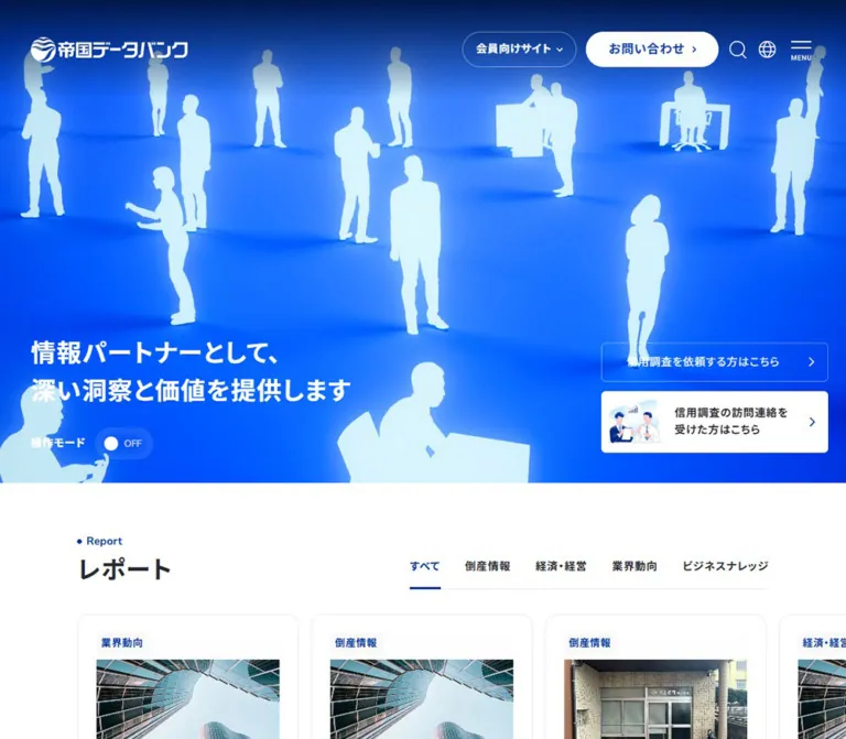
DESIGN REFERENCE
帝国データバンク|企業情報と信用調査のコーポレートサイト
鮮やかな青と金色の立体ビジュアルに、情報量の多いナビゲーション、レポートのカルーセル、端正なニュース一覧を組み合わせた企業サイト。
オリジナルサイトを見るTEIKOKU DATABANK — Style Reference
A luminous blue data stage above a carefully organized corporate information portal.
Original URL: https://www.tdb.co.jp/ Final URL: https://www.tdb.co.jp/ Theme: light content surfaces, a saturated blue hero, and a charcoal footer. No selectable theme was verified. Inspected: September 13, 2026, at 04:18:31 JST; supplied retrieval timestamp: September 12, 2026, at 19:18:31.447 UTC. Viewports: 1440 × 1000 desktop and 390 × 844 mobile, in CSS pixels. Scope: supplied current-page captures of the desktop hero, news/seminar area, and footer; mobile hero and footer; rendered text, links, computed styles, and sampled element geometry. Mobile DOM measurements additionally cover reports, enterprise search, services, case studies, and the first news row. Later business, recruitment, and contact sections are supported primarily by rendered text.
TEIKOKU DATABANK combines a dramatic opening image with the practical structure of a large business information website. Deep blue establishes identity, while a reflective gold assembly of geometric forms supplies the main visual event. The headline remains relatively modest. Two task-specific credit investigation links occupy their own corner of the hero, leaving the central image largely uninterrupted on desktop.
Below the opening scene, the design becomes restrained: white and pale gray sections, blue category labels, bold Japanese sans-serif headings, rounded editorial cards, and broad lists separated by fine rules. Its hierarchy serves several audiences at once: report readers, service buyers, companies contacted for investigations, members, and prospective employees. Preserve that breadth when adapting the design.
How to Read This Reference
- Measured means a value appears in the supplied computed styles or element rectangles. Measurements describe the captured state, including any transforms affecting its geometry.
- Derived means arithmetic using measured values, such as the gap between adjacent cards.
- Estimated means a visual approximation from the current-page screenshots. Estimated colors are not sampled source declarations.
- Recommended means implementation guidance for a new build. Suggested breakpoints, accessibility behavior, and the starter CSS are not claims about the original implementation.
- All named tokens below are implementation aliases. The evidence does not expose a complete set of semantic brand variables.
- DOM presence does not establish visibility. Navigation subtrees contain overlapping and zero-height rectangles even though the corresponding panels are closed in the screenshots.
- The original page was already inspected by the supplied browser collection. No additional browsing, interaction testing, or asset inspection was performed for this reference.
Tokens — Colors
Default Palette
| Name | Value | Suggested token | Role and evidence |
|---|---|---|---|
| Corporate Blue | #00339e |
--tdb-blue |
Measured hero section background, links, selected report category, and notice text |
| White | #ffffff |
--tdb-white |
Measured reversed text and filled hero/header action surfaces; visually dominant content canvas |
| Main Ink | #26282d |
--tdb-ink |
Measured body text and editorial headings |
| Secondary Ink | #6f6f6f |
--tdb-muted |
Measured report summaries; use for subordinate information |
| Notice Blue | #e6ebf5 |
--tdb-notice |
Measured background of the notice immediately below the hero |
| Section Gray | #f8f8f8 |
--tdb-section |
Measured case-study background; the seminar surface looks similarly pale but its exact fill was not supplied |
| Card Frame | #e9e9e9 |
--tdb-rule |
Measured report and case-study outer-link background, combined with 1px padding |
| Footer Charcoal | Approximately #1e2023 |
--tdb-footer |
Estimated from desktop and mobile footer captures |
| Hero Navy | Approximately #001744 |
--tdb-hero-navy |
Estimated upper and peripheral shading within the hero image |
| Electric Blue | Approximately #0048e8 |
--tdb-hero-glow |
Estimated luminous regions of the hero; an imagery color rather than the measured section fill |
| Metallic Gold | Approximately #d8bd68 |
--tdb-gold |
Estimated midtone of the central 3D imagery |
| Gold Highlight | Approximately #fff4b3 |
--tdb-gold-light |
Estimated bright facets; highlights also approach white |
The small floating seminar creative adds a red label against its blue artwork. This is a local promotional accent, not evidence of a general red action color.
Color Behavior
The header changes its visible treatment between the opening scene and scrolled content. At the top, the logo, navigation, and utility icons appear white over blue. In the supplied scrolled captures, the header has a white surface, blue logo, dark navigation, and a blue contact pill with white lettering.
Some sampled outer anchors report white text on a white background even though their visible inner captions are blue or charcoal. The inner elements were not included in those samples. Reproduce the visible foreground/background relationship rather than applying the outer anchor's inherited color to all descendants.
Runtime properties include --swiper-theme-color: #007aff and generic --tw-* values. These do not establish the site's brand blue, visible focus color, or complete component styling.
Tokens — Typography
Declared Font Stack
Measured body and component stack: "Nunito Sans", "Noto Sans JP", sans-serif.
The computed declaration supports a Latin/Japanese sans-serif pairing. It does not independently confirm which font file supplied every glyph or whether all requested fonts loaded. The inspected language links also explicitly declare "Nunito Sans", sans-serif.
Use the existing logo artwork for the wordmark. Its lettering is not an ordinary heading that should be recreated by typing the company name in the body font.
Type Scale
| Role | Size / line height | Weight | Tracking | Evidence |
|---|---|---|---|---|
| Body baseline | 16px / 24px |
400 |
Normal | Measured at both viewports |
| Desktop primary navigation | 16px / 28.8px |
700 |
0.64px, or 0.04em |
Measured |
| Desktop dense service navigation | 12px / 21.6px |
400, headings 700 |
Commonly 0.72px, or 0.06em |
Measured DOM subtree; closed-panel appearance unverified |
| Desktop report navigation | 14px / 19.6px |
400, headings 700 |
0.56px, or 0.04em |
Measured DOM subtree |
| Mobile navigation group labels | 14px / 19.6px |
700 |
Normal | Measured menu subtree; not a footer measurement |
| Mobile hero statement | 24px / 36.96px |
700 |
0.96px, or 0.04em |
Measured |
| Desktop hero statement | Approximately 32px / 49px |
Visually bold | Approximately 0.04em |
Screenshot estimate |
| Mobile section heading | 24px / 36.96px |
700 |
0.96px, or 0.04em |
Measured report, service, case-study, and news headings |
| Desktop seminar heading | Approximately 32px |
Visually bold | Not measured | Screenshot estimate |
| Report and service title | 16px / 28px |
700 |
0.32px, or 0.02em |
Measured mobile DOM |
| Report summary | 13px / 23.4px |
400 |
0.78px, or 0.06em |
Measured mobile DOM |
| Report category tab | 13px / 23.4px |
700 |
0.78px, or 0.06em |
Measured mobile DOM |
| Small editorial link | 13px / 23.4px |
400 |
0.78px, or 0.06em |
Measured mobile DOM |
| Mobile notice heading | 14px / 22.4px |
700 |
1.12px, or 0.08em |
Measured |
| Mobile notice body | 13px / 20.8px |
400 |
1.04px, or 0.08em |
Measured |
| Desktop list title | Approximately 16px |
Visually bold | Not measured | Screenshot estimate |
| Footer links | Approximately 13–14px desktop |
Regular | Slightly open | Screenshot estimate |
| Footer legal text | Approximately 11–12px |
Regular | Slightly open | Screenshot estimate |
The English section label is secondary to its Japanese heading. In the seminar capture, a small blue dot precedes “Seminar,” followed by a larger, dark セミナー heading. This is an orientation device, not a competing display headline.
The captured hero statement is a paragraph element. A new implementation can preserve its appearance while using an appropriate page-level heading for document semantics.
Tokens — Spacing & Shapes
Base: conventional CSS pixels with a measured 16px root size. Density: generous section spacing around compact labels and information-rich cards.
Spacing Scale
| Value | Application | Evidence |
|---|---|---|
1px |
Report and case-study outer frame padding | Measured |
4px |
Report title-to-summary gap; desktop navigation vertical padding | Derived / measured |
6px |
Desktop navigation label-to-chevron gap; notice heading-to-body gap | Measured / derived |
8px |
Small text-link icon gaps | Measured |
10px |
Mobile hero action internal gap and horizontal padding | Measured |
12px |
Gap between mobile hero actions; request-link vertical padding | Derived / measured |
16px |
Report card gap and case-study card gap | Derived |
20px |
Mobile page gutter, notice vertical padding, first news-row vertical padding | Measured |
24px |
Mobile section-heading-to-content gap; inner card inset excluding its 1px frame | Derived |
32px |
Service card gap; report category gap | Derived |
40px |
Desktop header/hero left inset; mobile service-section top padding | Measured |
64px |
Mobile report top padding and case-study/news vertical section padding | Measured |
80px |
Mobile service-section bottom padding | Measured |
Approximately 100px |
Desktop news and footer side margins | Screenshot estimate |
Border Radius
| Element | Value | Evidence |
|---|---|---|
| Report and case-study card wrapper | 16px |
Measured |
| Hero investigation links | 6px |
Measured mobile DOM |
| Member and contact pills | 9999px |
Measured |
| Report category edge controls | 9999px, within 40 × 40px boxes |
Measured mobile DOM |
| News rows and footer sections | Square, rule-separated | Screenshot observation |
| Promotional banner | Small rounded corners | Screenshot observation; exact radius unverified |
Layout Measurements
| Element | Desktop: 1440 × 1000 | Mobile: 390 × 844 | Status |
|---|---|---|---|
| Document height | 8088.56px |
8236.95px |
Measured; content-dependent snapshot values |
| Opening header | 128px high |
80px high |
Measured |
| Scrolled header | Approximately 80px high |
Approximately 80px high |
Screenshot observation |
| Hero | Approximately 800px high |
675.1875px high |
Desktop estimate; mobile measured |
| Main editorial container | Approximately 1240px wide |
350px wide |
Desktop estimate; mobile measured |
| Logo anchor | 208 × 87px, at x=40 |
208 × 87px, at x=20 |
Measured anchor boxes, not visible logo dimensions |
| Visible logo artwork | Approximately 204 × 32px |
Approximately 157 × 25px |
Screenshot estimates |
| Header member pill | 148 × 46px |
Not visible in opening header | Measured desktop |
| Header contact pill | 172.23 × 46px |
Not visible in opening header | Measured desktop |
| Hero request link | Approximately 294 × 51px |
240 × 49.406px |
Desktop estimate; mobile measured |
| Hero visitor link | Approximately 294 × 80px |
240 × 64px |
Desktop estimate; mobile measured |
| Report card | Not geometrically sampled | 287 × 372.906px for the first cards |
Measured mobile DOM |
| Service card | Not geometrically sampled | 284.688px wide; first three 391.5px high |
Measured mobile DOM |
| Case-study card | Not geometrically sampled | 320px wide, variable height |
Measured mobile DOM |
| First news row | Approximately 107px for visible desktop rows |
350 × 99.203px |
Desktop estimate; mobile measured |
| Mobile footer category row | — | Approximately 74–75px high |
Screenshot estimate |
Do not reproduce the 87px logo anchor as the visible logo height. The screenshots show substantially smaller artwork within that box.
Components
Persistent Header
Role: identity, primary navigation, member access, contact, and utilities.
At desktop width, place the logo at a 40px left inset. A large flexible gap separates it from five compact navigation links: サービス, レポート, 会社案内, 採用情報, and お知らせ. Each has a small downward chevron. Follow these with an outlined member pill, a filled contact pill, search, language, and a menu control.
The top-state member pill is transparent with a fine light outline. The contact pill is white with a visibly blue caption. Scrolled captures reverse this emphasis onto a white header: the contact pill becomes blue and the logo becomes blue. A faint lower edge separates the header from content.
The header remains visible in the supplied scrolled captures. Fixed versus sticky positioning and the exact change threshold were not supplied.
On mobile, the visible composition simplifies to a small logo at x=20 and the menu control at the right. The menu button has a measured 36 × 36px box at x=334, y=24. A search anchor is also present in the DOM at x=293, but its icon is not discernible in the opening screenshot. Treat that as a visibility limitation rather than proof that search is absent from the mobile interface.
Navigation Taxonomy
Role: expose a large service and information architecture without putting every destination into the header row.
The desktop DOM contains separate purpose-based and product-lineup navigation structures. Purpose groups include market/company understanding, risk, analysis, data management, policy support, and company promotion. Product groups include research, data collection, web services/tools, support, reports, and PR.
The mobile DOM exposes shorter top-level groups and nested links. This supports a responsive simplification of the navigation hierarchy. The supplied screenshots do not show an opened main menu, and no activation sequence was recorded. Do not infer hover-only opening, overlay dimensions, focus behavior, or accordion animation from these hidden subtree measurements.
Hero Scene and Statement
Role: establish a distinctive information-and-analysis identity before the dense content begins.
The current desktop image centers an irregular gold assembly of triangular and curved forms against saturated blue. Reflections range from muted metallic gold to yellow-white. A soft luminous field separates the object from darker blue edges. Faint data-like labels sit around it but remain visually subordinate.
On desktop, the statement sits at the lower left, with the operation-mode control beneath it. The two credit investigation links sit at the lower right. The artwork occupies the central field between these text groups.
On mobile, the object becomes much larger relative to the viewport and is cropped at the side. The headline overlays the image near the vertical center:
- Measured headline rectangle:
x=20,y=300.640625,311.4375 × 73.90625px. - Derived headline center:
337.59375px, exactly half the measured hero height. - Measured headline typography:
24px, weight700,36.96pxline height,0.04emtracking.
Preserve the two-line source statement when using the original copy: 情報パートナーとして、 / 深い洞察と価値を提供します.
The desktop screenshot visibly includes 操作モード with an OFF state. Its effect was not exercised. It must not be described as a verified animation-pause, accessibility, audio, or reduced-motion switch.
Credit Investigation Action Pair
Role: distinguish companies requesting an investigation from companies contacted for an investigation.
The first link, 信用調査を依頼する方はこちら, is a transparent blue-field rectangle with a thin light border and right chevron. The second, 信用調査の訪問連絡を受けた方はこちら, is a white rectangle with a small blue-toned illustration at left, a dark two-line caption, and a blue right chevron.
At 390px width, both links are 240px wide and align to x=130, leaving a 20px right margin. They are separated by exactly 12px. The visitor link ends 20px above the hero boundary. The request link uses measured 13px / 23.4px text and 12px 10px padding; the visitor link is 64px high.
These are specific audience routes, separate from the global contact action. Keep both descriptions readable instead of reducing them to identical short labels.
Organizational Notice
Role: place a current corporate message prominently between the hero and regular editorial content.
The notice is a full-width pale blue band with blue text and square edges. It contains a bold heading, explanatory copy, and a corporate signature. Its content is time-sensitive.
At mobile width, the section begins at y=675.1875, is 257.1875px high, and uses 20px vertical padding. The inner text width is 350px. The heading uses 14px / 22.4px, while the body uses 13px / 20.8px; both have 0.08em tracking.
Keep the notice in document flow so its height can respond to editorial changes. Do not hardcode the observed disaster message, signature placement, or total height into a reusable template.
Section Heading
Role: provide consistent landmarks throughout a long page.
Stack a small English label above a larger Japanese heading. A blue dot precedes the English label in the visible seminar section. Align the whole unit to the content gutter. On mobile, the measured main heading is 24px / 36.96px, bold, with 0.04em tracking.
Common labels in the rendered page include Report, Service, Case Study, Information, Seminar, Our Business, Recruitment, and Contact. Allow long Japanese headings to wrap: the mobile service heading occupies two lines.
Report Category Strip and Card Rail
Role: expose current research and reporting through a compact horizontal collection.
The mobile category strip contains five labels. The selected すべて label is blue, while the remaining labels use dark ink. Each has 16px bottom padding. Adjacent category boxes are separated by 32px. The final label extends beyond the 390px viewport, establishing that the strip does not simply wrap into several rows in this captured state.
Two 40 × 40px circular button boxes with an 80%-white background are present near its left and right edges. Their actual visibility, disabled states, and operation were not tested.
The report cards begin at x=20, x=323, and x=626, giving a measured 287px width and derived 16px gap. The first cards share a height of approximately 372.91px. Their outer anchors use a gray background, 1px padding, 16px corners, and a defined box-shadow transition.
Card anatomy is category, an upper content/media region, bold report title, muted summary, and date. The first title sits 25px inside the outer left edge: a 1px frame plus a derived 24px inner inset. Its text region is 237px wide. Several title boxes are 56px high, corresponding to two 28px lines; the summary region is 52px high. The exact image dimensions and text-clamping rules were not supplied.
A right-aligned すべてのレポートを見る link follows the rail. Filter results, dragging, arrow behavior, and autoplay remain unverified. The category anchors' captured homepage URLs alone do not explain their JavaScript behavior.
Enterprise Search Entry
Role: bridge editorial browsing and company lookup.
The mobile DOM places a TDB企業サーチ section between reports and services. Its heading uses 16px / 28px, weight 700, and 0.02em tracking. The section is approximately 191.5px high and includes a right-aligned explanatory link to the company-search destination.
The supplied element sample does not establish the intervening visual content or an input-field layout. Preserve the search destination and explanatory hierarchy without inventing a homepage search form.
Service Rail
Role: translate business needs into service entry points.
Each linked item groups a category, a problem statement, and 詳しく見る. The four observed purposes concern company information, market analysis, credit investigation, and data management.
At mobile width, the first item is 284.6875px wide. Successive items begin at x=20, 336.6875, 653.375, and 970.0625, establishing a 32px gap. This spacing is twice the report-card gap.
The first three items are 391.5px high; the longer fourth item is 419.5px high. The outer anchors are transparent and square-cornered, unlike the framed report cards. A substantial upper region precedes the problem statement, but its artwork is not identified by the supplied evidence.
Below the rail, a centered pill links to purpose-based service discovery. Its measured mobile size is approximately 303.11 × 68px. A simpler service-list link follows beneath it.
Case-Study Rail
Role: present practical examples and interviews on a separate editorial surface.
The section uses the measured #f8f8f8 background with 64px vertical padding on mobile. Its cards use the same 1px gray outer frame, 16px corner radius, and shadow-transition family as report cards.
Mobile cards are 320px wide with a 16px gap. In the supplied geometry, the Orbis example is centered at x=35, with neighboring cards at x=-301 and x=371. This supports a centered horizontal-rail layout. It does not establish how that position was reached or whether autoplay is enabled.
Heights vary with content, approximately 274.55–372.05px in the sampled set. Preserve room for long interview titles and organization names. A large centered pill beneath the rail leads to the full interview collection.
News and Seminar Rows
Role: make frequently updated information easy to scan without the visual weight of cards.
The desktop screenshot shows full-width rows within an approximately 1240px container. Each row stacks a small metadata line above a bold title and places a blue chevron at the far right. The metadata combines a gray date with blue category or topic text. Thin gray horizontal rules divide entries.
News sits on white. The seminar section begins on a very pale gray surface and repeats the same list language beneath its bilingual heading. Topic labels remain inline text rather than multicolored filled badges.
Visible desktop rows are approximately 107px high. The measured first mobile news link is 350px wide and 99.203px high, with 20px 0 padding and a 40px flex gap. Longer titles and multiple metadata labels should increase row height naturally.
Business, Recruitment, and Contact Sections
Role: connect the information portal to the company's broader identity and business routes.
Rendered text confirms three business areas: credit investigation, data services, and management support. The desktop text includes 01, 02, and 03 labels; the mobile text exposes 01 near the first business area. This difference is insufficient to establish a tab system, slider, or scroll-driven transition.
Recruitment and contact sections follow, each with explanatory copy and a destination link. Their exact imagery, grid, section colors, and interactive behavior are outside the supplied visual coverage. Treat these sections as confirmed content requirements rather than fully measured visual patterns.
Sitemap Footer
Role: expose the site's breadth and provide dependable secondary navigation.
The desktop footer is a large charcoal field. Its upper band contains a reversed logo at left and contact/material-request links toward the right. A fine dark-gray rule separates that band from six navigation columns: services, reports, company information, recruitment, news, and member sites.
Column widths follow their content. The company-information column is particularly long, with indented business-area links. External member links carry small overlapping-square symbols. A second rule separates navigation from legal links and copyright.
The mobile capture shows six collapsed category rows, each about 74–75px high, with a bold label at the left and a thin plus symbol near the right edge. Legal links then stack vertically with generous spacing. Expansion was not exercised, so the screenshot establishes the collapsed appearance but not the opening behavior.
The mobile footer capture does not cover every part of the footer. It does not prove that the upper brand/contact band has been removed.
Floating Seminar Promotion
Role: maintain a secondary promotional entry while browsing.
A small blue seminar creative remains near the lower-right corner in multiple captures. It contains a red category tab, compact white text, a prominent date/time, small white capsules, and a dark circular close affordance. Several offset edges behind the front panel create a stacked-card appearance.
The front panel is approximately 220 × 124px on desktop and 176 × 100px on mobile, with additional stacked edges above it. Its position is approximately 24px from the right and 20px from the bottom. Repeated viewport-relative placement supports persistent positioning; the actual CSS positioning declaration was not supplied.
On mobile, it visibly covers part of the organizational notice and footer content. Dismissal and any rotation between creatives were not tested. A new implementation should address this obstruction while retaining a clearly secondary promotional role.
Tokens — Motion & Interaction
Defined Transitions
| Target | Supplied value | What is established |
|---|---|---|
| Header | opacity 0.3s cubic-bezier(0.4, 0, 0.2, 1) |
An opacity transition is defined; trigger and full state sequence are unverified |
| Member pill | opacity 0.3s cubic-bezier(0.4, 0, 0.2, 1) |
Defined opacity feedback |
| Contact and large pill links | Color, background, border, decoration, fill, and stroke over 0.5s cubic-bezier(0.4, 0, 0.2, 1) |
Defined color-property transitions; exact hover endpoint not supplied |
| Small editorial links | Color-related properties over 0.2s cubic-bezier(0.4, 0, 0.2, 1) |
Defined short feedback |
| Many navigation links | color 0.3s |
Defined text-color transition |
| Report and case-study cards | box-shadow 0.5s cubic-bezier(0.4, 0, 0.2, 1) |
Shadow can transition; shadow magnitude and activation were not supplied |
| Service titles | color 0.3s |
Defined title-color feedback |
| Mobile hero statement | opacity 0.3s cubic-bezier(0.4, 0, 0.2, 1) |
Defined opacity transition |
| Category edge controls | opacity 0.3s cubic-bezier(0.4, 0, 0.2, 1) |
Defined opacity transition |
| First mobile news row | 0.3s |
A transition is reported without a specific property or observed endpoint |
Motion Evidence and Limits
The hero images establish a three-dimensional visual treatment. Desktop and mobile show different arrangements or views of the gold object. Because these are separate viewport captures rather than a timestamped sequence at one viewport, they do not establish continuous rotation, morphing, pointer response, loop duration, or rendering technology.
Likewise, horizontal card coordinates establish rails, not swipe physics or autoplay. Some farther offscreen report cards have slightly scaled and shifted rectangles; their cause is not established and should not become an invented animation specification.
Many sampled elements report animation: none. This does not rule out animation on descendants, media, a canvas, or JavaScript-driven transforms. Conversely, the collection's general animation-readiness procedure is not proof that any particular effect exists on this page.
For an adaptation, use the measured 200–500ms transition family for restrained interface feedback. Choose hero animation only after obtaining suitable assets and defining its behavior separately.
Surfaces
| Surface | Treatment | Function |
|---|---|---|
| Opening scene | Deep blue with luminous imagery and white interface elements | Brand recognition |
| Scrolled header | White with blue branding and a faint lower edge | Persistent orientation |
| Organizational notice | Flat pale blue with blue text | High-priority editorial message |
| Main editorial sections | White canvas | Reading and service discovery |
| Case-study section | Flat #f8f8f8 |
Separate a related content collection |
| Report/case outer frame | #e9e9e9, 1px padding, 16px corners |
Bound individual linked items |
| News/seminar entries | Unboxed rows with fine dividers | Dense, scannable updates |
| Hero visitor route | White, 6px corners, small illustration | Audience-specific assistance |
| Footer | Charcoal with light text and subtle rules | Extensive secondary navigation |
| Floating promotion | Dense blue graphic with stacked edges | Secondary campaign visibility |
There is no evidence for a universal elevated-card system. Some card wrappers define shadow transitions, while news rows, service wrappers, notices, and footer groups rely on spacing, background changes, and rules.
Imagery
The primary image language is glossy, abstract, and geometric. Triangular facets, curved segments, deep cavities, and bright reflections give the central gold assembly substantial depth. Blue illumination surrounds it, while a soft navy perimeter keeps the opening field coherent with the white header controls.
The mobile crop is intentionally forceful: the object occupies most of the hero width and sits behind the statement. Preserve this change in relative scale rather than shrinking the entire desktop composition into a phone-sized rectangle.
Supporting imagery is more practical. The visitor-investigation route uses a small blue-and-white illustration of people and business information. The seminar promotion uses tightly composed graphic artwork, compact typography, and a red label. Neither treatment should replace the central hero's metallic character.
The current captures do not reveal the actual report, service, or case-study image files. Their supplied geometry leaves upper content regions, but specific photography subjects must not be inferred from that space.
Observed Asset References
No image src, CSS image URL, 3D model path, or media manifest was included in the evidence. The following is a role inventory, not an asset download list.
| Asset role | Observed appearance | Path availability |
|---|---|---|
| Corporate wordmark | White over the hero, blue over the scrolled header, light in the desktop footer | Not supplied |
| Hero artwork | Reflective gold geometric assembly within a luminous blue field | Not supplied |
| Investigation visitor illustration | Small blue-and-white business illustration inside a white link | Not supplied |
| Seminar creative | Blue rectangular artwork with red label, date/time, and white capsules | Not supplied |
| Interface symbols | Search, globe, menu lines, chevrons, plus, external-link squares, and close mark | Asset format and paths not supplied |
Use authorized original assets when available. A CSS gradient can approximate the background field, but it cannot reproduce the reflective object or brand wordmark.
Layout & Responsive Behavior
Opening Composition
Both inspected hero heights are consistent with approximately 80% of the viewport height: about 800px at a 1000px desktop viewport and 675.1875px at an 844px mobile viewport. This is an inferred relationship, not a supplied CSS formula.
Desktop separates the statement, central imagery, and action pair horizontally. Mobile retains a tall visual field, centers the statement vertically, and places the two 240px actions against the lower-right edge. The operation-mode control is not visible in the mobile capture.
The opening header changes from a measured 128px on desktop to 80px on mobile. The full desktop navigation is replaced by a compact visible header. The precise breakpoint is unknown.
Content Rails
The mobile layout preserves horizontal collections rather than stacking every item:
| Collection | Mobile item width | Gap | Captured alignment |
|---|---|---|---|
| Reports | 287px |
16px |
First card starts at the 20px gutter |
| Services | 284.6875px |
32px |
First card starts at the 20px gutter |
| Case studies | 320px |
16px |
One card centered with 35px side clearance |
These distinctions matter. A single global carousel width and gap would flatten the observed rhythm. Exact desktop card widths and visible counts are not established by the supplied current-page screenshots.
Reading Sections and Footer
Mobile text sections use a consistent 20px gutter and 350px content width. The measured 64px vertical section padding remains generous despite the smaller screen. Headings wrap as needed, while information rows remain broad tap targets.
Desktop news and footer content align to an estimated 1240px container with 100px side margins. The footer's six columns become tall collapsed categories on mobile. Its legal links switch from a horizontal desktop grouping to a vertical list.
The document heights are similar despite the narrow mobile viewport, partly because several collections remain horizontal and the footer is visually collapsed. They are capture-specific values, not dimensions to reproduce.
Recommended breakpoint: use approximately 75rem for switching the dense desktop header and footer layout, then validate intermediate widths. Only the 1440px and 390px endpoints were inspected.
Do’s and Don’ts
Do
- Use measured
#00339eas the primary interface blue. - Keep gold concentrated in the opening artwork.
- Preserve the distinction between the visual hero and the restrained information sections.
- Use the declared Nunito Sans / Noto Sans JP stack with clear regular and bold weights.
- Keep the two investigation routes explicit and visually distinct.
- Pair small English section labels with prominent Japanese headings.
- Preserve 16px corners for editorial cards and 6px corners for hero task links.
- Keep report, service, and case-study rail dimensions distinct.
- Use broad rule-separated rows for news and seminars.
- Retain the extensive navigation hierarchy and responsive footer grouping.
- Allow current notices and long Japanese titles to determine their own height.
Don’t
- Don’t reduce the portal to a single conversion funnel.
- Don’t use gold for every button or introduce several unrelated category colors.
- Don’t replace all information rows with large rounded cards.
- Don’t reproduce the logo anchor's 87px height as visible artwork height.
- Don’t assume closed navigation DOM rectangles describe an opened menu.
- Don’t claim the operation-mode control pauses motion without testing it.
- Don’t invent hero rotation speed, hover scaling, carousel autoplay, or transition endpoints.
- Don’t infer report photography or service illustrations from unsampled media regions.
- Don’t freeze the current organizational notice into permanent page copy.
- Don’t allow a persistent promotion to make notice text or legal links inaccessible.
Recommended Implementation Additions
These are recommendations for a new implementation, not verified features of the original page:
- Give search, language, menu, carousel arrows, and promotion dismissal explicit accessible names. Retain the visible MENU caption where appropriate.
- Increase small icon hit areas to at least 44px without enlarging their visible glyphs.
- Use a meaningful page-level heading and preserve the section heading hierarchy.
- Implement mobile footer disclosures with native details/summary or buttons that synchronize
aria-expanded,aria-controls, and panel visibility. - If report filtering updates content in place, define accessible selection semantics and announce the result change. Use ordinary links when navigation is the intended action.
- Make horizontal rails keyboard reachable and provide a usable alternative to dragging. Scroll snapping is a possible adaptation, not an observed source rule.
- Check white headline contrast against the brightest gold frames. Add a local blue scrim or adjust the crop if needed.
- Supply a static hero fallback and respect reduced-motion preferences. CSS alone does not pause video or JavaScript rendering.
- Give the seminar promotion a reliable dismiss control. On small screens, consider an inline placement or compact presentation that does not cover editorial content.
- Reserve media dimensions before loading and defer below-the-fold media where appropriate. Performance behavior was not measured.
- Verify header crowding, long Japanese labels, zoom, and footer expansion at intermediate widths.
Agent Prompt Guide
Quick Color Reference
- Primary interface blue:
#00339e, measured. - Main text:
#26282d, measured. - Secondary text:
#6f6f6f, measured. - Notice surface:
#e6ebf5, measured. - Case-study surface:
#f8f8f8, measured. - Card frame:
#e9e9e9, measured. - Footer: approximately
#1e2023, estimated. - Hero imagery: deep navy, electric blue, and metallic gold; exact image colors vary.
- Header actions: white over the blue hero, blue emphasis over the white scrolled header.
Overall Prompt
“Create a Japanese corporate information portal inspired by the current TEIKOKU DATABANK page. Use corporate blue #00339e, white content surfaces, charcoal text #26282d, and a dark sitemap footer. Build a tall blue opening scene with authorized reflective gold geometric artwork, a modest two-line Japanese statement, and two distinct credit-investigation routes at the lower right. Use Nunito Sans and Noto Sans JP, small English section labels, bold Japanese headings, rounded editorial card rails, and full-width rule-separated news and seminar rows. Preserve extensive service discovery and member navigation. On a 390px viewport, use 20px gutters, 24px headings, horizontally arranged content collections, and collapsed footer groups. Treat hero motion and untested interactions as separate implementation decisions.”
Example Component Prompts
- Header: “Build a persistent corporate header with a white logo and navigation over a blue opening scene. Include five compact category links, an outlined member pill, a filled contact pill, and utility icons. Add a white scrolled state with blue branding. At phone width, simplify the visible header to the compact brand and menu treatment; keep all navigation accessible.”
- Hero routes: “Place two 240px-wide links at the lower right of a mobile blue hero, 20px from the edge and 12px apart. The first is a 6px-radius outlined request link. The second is a 64px-high white link with a small business illustration, a dark two-line visitor caption, and a blue chevron.”
- Report rail: “Create a mobile report rail with 287px-wide cards and 16px gaps. Use a 1px #e9e9e9 frame, 16px corners, a blue category label, an authorized media region, bold 16px titles, muted 13px summaries, and dates. Place a separate horizontal category strip above it. Do not assume autoplay.”
- News rows: “Create an approximately 1240px desktop news container with generous margins. Each linked row has a gray date and inline blue categories above a bold dark title, a blue chevron at the far right, and a fine bottom rule. Let titles and metadata wrap naturally on mobile.”
- Footer: “Build a charcoal footer with a reversed corporate logo, contact routes, six content-led navigation columns, understated external-link symbols, and a ruled legal area. On mobile, show full-width category disclosures around 74px high with plus symbols and vertically stacked legal links. Provide working keyboard disclosure behavior.”
Quick Start
CSS Custom Properties
This is a reusable adaptation, not recovered source CSS. It combines measured tokens with estimated desktop geometry and a recommended 75rem breakpoint. The hero gradient, white card interiors, 16:9 media ratio, optional text clamping, focus treatment, and scroll snapping are implementation choices.
Use a .tdb-site root, .content-width wrappers, and the component classes below. Report links contain .report-card-inner, a category, a media element, title, summary, and date. The host application must manage the header's .is-scrolled state and implement menus, filtering, disclosure state, and promotion dismissal. No image URL is invented here.
:root {
  /* Measured colors */
  --tdb-blue: #00339e;
  --tdb-white: #ffffff;
  --tdb-ink: #26282d;
  --tdb-muted: #6f6f6f;
  --tdb-notice: #e6ebf5;
  --tdb-section: #f8f8f8;
  --tdb-rule: #e9e9e9;

  /* Estimated imagery and footer colors */
  --tdb-footer: #1e2023;
  --tdb-hero-navy: #001744;
  --tdb-hero-glow: #0048e8;
  --tdb-gold: #d8bd68;

  /* Declared source stack; load fonts separately */
  --tdb-font: 'Nunito Sans', 'Noto Sans JP', sans-serif;
  --tdb-body-size: 16px;
  --tdb-small-size: 13px;
  --tdb-title-size: 24px;
  --tdb-leading-body: 1.5;
  --tdb-leading-title: 1.54;
  --tdb-leading-card: 1.75;
  --tdb-leading-small: 1.8;

  /* Measured mobile proportions and estimated desktop container */
  --tdb-gutter: 20px;
  --tdb-content-max: 1240px;
  --tdb-section-space: 64px;
  --tdb-card-radius: 16px;
  --tdb-task-radius: 6px;
  --tdb-pill-radius: 9999px;
  --tdb-report-width: 287px;
  --tdb-service-width: 284.6875px;
  --tdb-case-width: 320px;
  --tdb-header-height: 80px;

  /* Measured transition family */
  --tdb-ease: cubic-bezier(0.4, 0, 0.2, 1);
  --tdb-motion-fast: 200ms;
  --tdb-motion-normal: 300ms;
  --tdb-motion-long: 500ms;
}

* { box-sizing: border-box; }
body { margin: 0; }

.tdb-site {
  color: var(--tdb-ink);
  background: var(--tdb-white);
  font-family: var(--tdb-font);
  font-size: var(--tdb-body-size);
  line-height: var(--tdb-leading-body);
}

.tdb-site button { font: inherit; }
.tdb-site img { display: block; max-inline-size: 100%; }
.tdb-site a { color: inherit; }

.content-width {
  inline-size: min(
    var(--tdb-content-max),
    calc(100% - 2 * var(--tdb-gutter))
  );
  margin-inline: auto;
}

.site-header {
  position: fixed;
  inset: 0 0 auto;
  z-index: 50;
  display: flex;
  align-items: center;
  gap: 14px;
  block-size: var(--tdb-header-height);
  padding-inline: var(--tdb-gutter);
  color: var(--tdb-white);
  background: transparent;
  transition: opacity var(--tdb-motion-normal) var(--tdb-ease);
}

.site-header.is-scrolled {
  --tdb-header-height: 80px;
  color: var(--tdb-ink);
  background: var(--tdb-white);
  border-bottom: 1px solid var(--tdb-rule);
}

.brand { flex: 0 0 auto; inline-size: 160px; }
.brand img { inline-size: 100%; block-size: auto; }
.desktop-navigation,
.desktop-utilities { display: none; }
.menu-button { margin-inline-start: auto; }

/* Recommended hit area, larger than sampled icon boxes */
.icon-button {
  display: inline-grid;
  place-items: center;
  min-inline-size: 44px;
  min-block-size: 44px;
  padding: 0;
  border: 0;
  color: inherit;
  background: transparent;
  cursor: pointer;
}

.pill {
  display: inline-flex;
  align-items: center;
  justify-content: center;
  gap: 8px;
  min-block-size: 46px;
  padding: 8px 24px;
  border: 1px solid currentColor;
  border-radius: var(--tdb-pill-radius);
  font-weight: 700;
  text-decoration: none;
  transition:
    color var(--tdb-motion-long) var(--tdb-ease),
    background-color var(--tdb-motion-long) var(--tdb-ease),
    border-color var(--tdb-motion-long) var(--tdb-ease);
}

.pill--contact {
  color: var(--tdb-blue);
  background: var(--tdb-white);
  border-color: var(--tdb-white);
}

.is-scrolled .pill--contact {
  color: var(--tdb-white);
  background: var(--tdb-blue);
  border-color: var(--tdb-blue);
}

.hero {
  position: relative;
  isolation: isolate;
  min-block-size: 80vh;
  min-block-size: 80svh;
  overflow: hidden;
  color: var(--tdb-white);
  background: var(--tdb-blue);
}

/* Recommended background approximation; supply actual artwork separately */
.hero-media {
  position: absolute;
  inset: 0;
  z-index: -1;
  background: radial-gradient(
    ellipse at 50% 45%,
    var(--tdb-hero-glow) 0%,
    var(--tdb-blue) 58%,
    var(--tdb-hero-navy) 100%
  );
}

.hero-media > img,
.hero-media > video,
.hero-media > canvas {
  inline-size: 100%;
  block-size: 100%;
  object-fit: cover;
}

.hero-copy {
  position: absolute;
  inset-inline-start: 20px;
  inset-block-start: 50%;
  transform: translateY(-50%);
  max-inline-size: calc(100% - 40px);
  margin: 0;
  font-size: 24px;
  font-weight: 700;
  line-height: 1.54;
  letter-spacing: 0.04em;
}

.hero-copy > span { display: block; }

.hero-actions {
  position: absolute;
  inset-inline-end: 20px;
  inset-block-end: 20px;
  display: grid;
  gap: 12px;
  inline-size: min(240px, calc(100% - 40px));
}

.hero-task {
  display: flex;
  align-items: center;
  gap: 10px;
  min-inline-size: 0;
  border-radius: var(--tdb-task-radius);
  text-decoration: none;
}

.hero-task--request {
  padding: 12px 10px;
  border: 1px solid rgb(255 255 255 / 35%);
  font-size: 13px;
  line-height: 1.8;
  letter-spacing: 0.06em;
}

.hero-task--visitor {
  min-block-size: 64px;
  padding-inline-end: 10px;
  color: var(--tdb-ink);
  background: var(--tdb-white);
  font-size: 13px;
  font-weight: 700;
}

.hero-task--visitor img {
  flex: 0 0 64px;
  inline-size: 64px;
  block-size: 64px;
  object-fit: contain;
}

.chevron {
  flex: 0 0 auto;
  inline-size: 7px;
  block-size: 7px;
  margin-inline-start: auto;
  border-top: 1.5px solid currentColor;
  border-right: 1.5px solid currentColor;
  transform: rotate(45deg);
}

.hero-task--visitor .chevron { color: var(--tdb-blue); }

.notice {
  padding-block: 20px;
  color: var(--tdb-blue);
  background: var(--tdb-notice);
}

.notice h2 {
  margin: 0 0 6px;
  font-size: 14px;
  line-height: 1.6;
  letter-spacing: 0.08em;
}

.notice p {
  margin: 0;
  font-size: 13px;
  line-height: 1.6;
  letter-spacing: 0.08em;
}

.content-section { padding-block: var(--tdb-section-space); }
.content-section--muted { background: var(--tdb-section); }

.section-label {
  display: flex;
  align-items: center;
  gap: 6px;
  margin: 0 0 4px;
  color: var(--tdb-blue);
  font-size: 13px;
  font-weight: 700;
}

.section-label::before {
  content: '';
  inline-size: 6px;
  block-size: 6px;
  border-radius: 50%;
  background: currentColor;
}

.section-title {
  margin: 0 0 24px;
  font-size: var(--tdb-title-size);
  font-weight: 700;
  line-height: var(--tdb-leading-title);
  letter-spacing: 0.04em;
}

.category-strip {
  display: flex;
  gap: 32px;
  overflow-x: auto;
  margin-block-end: 32px;
}

.category-strip > a,
.category-strip > button {
  flex: 0 0 auto;
  padding: 0 0 16px;
  border: 0;
  border-bottom: 2px solid transparent;
  background: transparent;
  font-size: 13px;
  font-weight: 700;
  line-height: 1.8;
  letter-spacing: 0.06em;
  text-decoration: none;
}

/* Apply the matching semantic state in the host application */
.category-strip .is-active {
  color: var(--tdb-blue);
  border-bottom-color: currentColor;
}

.rail {
  --rail-width: var(--tdb-report-width);
  display: grid;
  grid-auto-flow: column;
  grid-auto-columns: min(var(--rail-width), calc(100vw - 40px));
  gap: 16px;
  align-items: start;
  overflow-x: auto;
  padding-block: 1px 12px;
  scroll-snap-type: x proximity;
  scroll-padding-inline: 1px;
}

.rail > * { scroll-snap-align: start; }
.service-rail { --rail-width: var(--tdb-service-width); gap: 32px; }
.case-rail { --rail-width: var(--tdb-case-width); }
.case-rail > * { scroll-snap-align: center; }

.report-card {
  display: block;
  min-inline-size: 0;
  padding: 1px;
  overflow: hidden;
  border-radius: var(--tdb-card-radius);
  background: var(--tdb-rule);
  text-decoration: none;
  transition: box-shadow var(--tdb-motion-long) var(--tdb-ease);
}

/* White interior and media ratio are recommended reconstruction choices */
.report-card-inner {
  padding: 24px;
  border-radius: calc(var(--tdb-card-radius) - 1px);
  background: var(--tdb-white);
}

.report-category {
  margin: 0 0 12px;
  color: var(--tdb-blue);
  font-size: 13px;
  font-weight: 700;
  line-height: 1.8;
}

.report-media {
  inline-size: 100%;
  aspect-ratio: 16 / 9;
  margin-block-end: 16px;
  object-fit: cover;
}

.report-title,
.service-title {
  margin: 0;
  font-size: 16px;
  font-weight: 700;
  line-height: 1.75;
  letter-spacing: 0.02em;
}

.report-title { min-block-size: 56px; }

.report-summary {
  min-block-size: 52px;
  margin: 4px 0 0;
  color: var(--tdb-muted);
  font-size: 13px;
  line-height: 1.8;
  letter-spacing: 0.06em;
}

.report-date {
  display: block;
  margin-block-start: 4px;
  color: var(--tdb-muted);
  font-size: 13px;
  line-height: 1.8;
}

/* Optional: retain full titles and summaries in the underlying document */
.clamp-two {
  display: -webkit-box;
  -webkit-box-orient: vertical;
  -webkit-line-clamp: 2;
  overflow: hidden;
}

.service-card {
  display: grid;
  gap: 12px;
  color: var(--tdb-ink);
  text-decoration: none;
}

.editorial-link {
  display: flex;
  align-items: center;
  gap: 8px;
  inline-size: fit-content;
  margin: 20px 0 0 auto;
  color: var(--tdb-blue);
  font-size: 13px;
  line-height: 1.8;
  letter-spacing: 0.06em;
  text-decoration: none;
}

.news-list { margin: 0; padding: 0; list-style: none; }
.news-list > li { border-bottom: 1px solid var(--tdb-rule); }

.news-row {
  display: flex;
  align-items: center;
  gap: 40px;
  padding-block: 20px;
  text-decoration: none;
}

.news-row-content { min-inline-size: 0; }

.news-meta {
  display: flex;
  flex-wrap: wrap;
  gap: 4px 8px;
  margin-block-end: 8px;
  color: var(--tdb-blue);
  font-size: 13px;
  line-height: 1.8;
}

.news-meta time { color: var(--tdb-muted); }
.news-title { margin: 0; font-size: 16px; font-weight: 700; }
.news-row > .chevron { color: var(--tdb-blue); }

.site-footer {
  padding-block: 48px;
  color: #e5e5e5;
  background: var(--tdb-footer);
}

.footer-grid { display: grid; }
.footer-group { border-bottom: 1px solid rgb(255 255 255 / 12%); }

.footer-trigger {
  display: flex;
  align-items: center;
  justify-content: space-between;
  inline-size: 100%;
  min-block-size: 74px;
  padding: 0;
  border: 0;
  color: inherit;
  background: transparent;
  font-size: 14px;
  font-weight: 700;
  text-align: start;
}

.footer-links {
  display: grid;
  gap: 10px;
  margin: 0;
  padding: 0 0 24px;
  list-style: none;
  font-size: 13px;
  line-height: 1.6;
}

.footer-links[hidden] { display: none; }
.footer-links a { text-decoration: none; }

.footer-legal {
  display: flex;
  flex-direction: column;
  gap: 20px;
  padding-block-start: 48px;
  font-size: 11px;
}

/* Recommended visible keyboard focus */
.tdb-site :focus-visible {
  outline: 3px solid var(--tdb-blue);
  outline-offset: 4px;
}

.hero :focus-visible,
.site-footer :focus-visible { outline-color: var(--tdb-white); }

/* Recommended breakpoint; only endpoint viewports were inspected */
@media (min-width: 75rem) {
  :root { --tdb-header-height: 128px; --tdb-title-size: 32px; }
  .site-header { padding-inline: 40px; }
  .brand { inline-size: 208px; }
  .desktop-navigation { display: flex; gap: 14px; margin-inline-start: auto; }
  .desktop-utilities { display: flex; align-items: center; gap: 12px; }
  .desktop-navigation a {
    padding-block: 4px;
    font-size: 16px;
    font-weight: 700;
    line-height: 1.8;
    letter-spacing: 0.04em;
    text-decoration: none;
  }
  .menu-button { margin-inline-start: 0; }
  .hero-copy {
    inset-inline-start: 40px;
    inset-block-start: auto;
    inset-block-end: 96px;
    transform: none;
    font-size: 32px;
  }
  .hero-actions {
    inset-inline-end: 24px;
    inset-block-end: 40px;
    inline-size: 294px;
  }
  .hero-task--request { font-size: 14px; }
  .hero-task--visitor { min-block-size: 80px; font-size: 14px; }
  .hero-task--visitor img { flex-basis: 80px; inline-size: 80px; block-size: 80px; }
  .news-row { padding-block: 24px; }
  .footer-grid {
    grid-template-columns: 0.95fr 0.85fr 1.1fr 1.25fr 0.95fr 1.3fr;
    gap: 32px;
  }
  .footer-group { border: 0; }
  .footer-trigger { min-block-size: 56px; }
  .footer-plus { display: none; }
  .footer-legal { flex-direction: row; border-top: 1px solid rgb(255 255 255 / 12%); }
}

/* Media playback and JavaScript rendering need separate reduced-motion handling */
@media (prefers-reduced-motion: reduce) {
  .site-header,
  .pill,
  .report-card { transition: none; }
  .hero-media { animation: none; }
  .rail { scroll-behavior: auto; scroll-snap-type: none; }
}
For the footer, initialize desktop panels as visible and mobile panels as collapsed, then synchronize the trigger state with the hidden attribute. Preserve the user's choices between clicks. The CSS intentionally does not invent a disclosure animation.
The starter leaves card heights content-driven and does not implement a floating promotion. If a promotion is added, validate dismissal and unobstructed content access at the supplied mobile viewport.
Tailwind v4 Token Mapping
Optional mapping for a project that already uses Tailwind v4. This is an adaptation, not a claim about the original framework version. Define the custom properties above first.
@theme inline {
  --color-tdb-blue: var(--tdb-blue);
  --color-tdb-ink: var(--tdb-ink);
  --color-tdb-muted: var(--tdb-muted);
  --color-tdb-notice: var(--tdb-notice);
  --color-tdb-section: var(--tdb-section);
  --color-tdb-rule: var(--tdb-rule);
  --color-tdb-footer: var(--tdb-footer);

  --font-corporate: var(--tdb-font);
  --text-editorial-small: 13px;
  --text-editorial-title: 16px;
  --text-section-title: var(--tdb-title-size);

  --spacing-page-gutter: var(--tdb-gutter);
  --spacing-section: var(--tdb-section-space);
  --spacing-report-card: var(--tdb-report-width);
  --spacing-service-card: var(--tdb-service-width);
  --spacing-case-card: var(--tdb-case-width);

  --radius-editorial-card: var(--tdb-card-radius);
  --radius-task-link: var(--tdb-task-radius);
  --radius-corporate-pill: var(--tdb-pill-radius);
}
Sources & Evidence
- Inspected original and final page: https://www.tdb.co.jp/. The supplied response reports HTTP 200 with no URL change. The page title, corporate signature, and footer copyright identify TEIKOKU DATABANK, LTD.
- Capture time:
2026-09-12T19:18:31.447Z, equivalent to September 13, 2026, 04:18:31.447 JST. This is the supplied collection timestamp, not a separate timestamp for each screenshot. - Desktop visual evidence: three current-page captures at 1440 × 1000 showing the opening hero, a news/seminar position, and the footer.
- Mobile visual evidence: two current-page captures at 390 × 844 showing the opening hero/notice and the lower footer.
- Rendered DOM and computed styles: supplied samples at both viewport sizes. These establish the declared font stacks, exact interface colors, selected geometry, card frames, spacing, and transition declarations used in the measured tables.
- Observed states: initial and scrolled page positions, header appearance changes, horizontal card positions, selected report-category styling, collapsed mobile footer appearance, and repeated lower-right promotional placement. No control activation sequence was supplied.
- Collection limitations: initial observation lasted at least five seconds. Readiness checks waited for document loading, finite motion, sampled layout/text stability, and image decoding within bounded time limits. Perpetual animations were temporarily paused during readiness checks and then resumed. Scrolling traversed intermediate positions. These procedures do not prove that delayed content or unexercised controls are complete.
- Unverified details: exact hero asset/rendering technology, temporal motion, loaded font files, image paths, desktop card dimensions, intermediate breakpoints, open-menu layouts, filtering results, carousel controls, disclosure expansion, promotion dismissal, keyboard behavior, and reduced-motion support. SharedWorkers and service workers were disabled during collection.
This reference describes the supplied current-page evidence. Screenshot estimates, inferred relationships, and implementation recommendations are labeled separately from measured values.
# TEIKOKU DATABANK — Style Reference

> A luminous blue data stage above a carefully organized corporate information portal.

**Original URL:** [https://www.tdb.co.jp/](https://www.tdb.co.jp/)
**Final URL:** [https://www.tdb.co.jp/](https://www.tdb.co.jp/)
**Theme:** light content surfaces, a saturated blue hero, and a charcoal footer. No selectable theme was verified.
**Inspected:** September 13, 2026, at 04:18:31 JST; supplied retrieval timestamp: September 12, 2026, at 19:18:31.447 UTC.
**Viewports:** 1440 × 1000 desktop and 390 × 844 mobile, in CSS pixels.
**Scope:** supplied current-page captures of the desktop hero, news/seminar area, and footer; mobile hero and footer; rendered text, links, computed styles, and sampled element geometry. Mobile DOM measurements additionally cover reports, enterprise search, services, case studies, and the first news row. Later business, recruitment, and contact sections are supported primarily by rendered text.

TEIKOKU DATABANK combines a dramatic opening image with the practical structure of a large business information website. Deep blue establishes identity, while a reflective gold assembly of geometric forms supplies the main visual event. The headline remains relatively modest. Two task-specific credit investigation links occupy their own corner of the hero, leaving the central image largely uninterrupted on desktop.

Below the opening scene, the design becomes restrained: white and pale gray sections, blue category labels, bold Japanese sans-serif headings, rounded editorial cards, and broad lists separated by fine rules. Its hierarchy serves several audiences at once: report readers, service buyers, companies contacted for investigations, members, and prospective employees. Preserve that breadth when adapting the design.

## How to Read This Reference

- **Measured** means a value appears in the supplied computed styles or element rectangles. Measurements describe the captured state, including any transforms affecting its geometry.
- **Derived** means arithmetic using measured values, such as the gap between adjacent cards.
- **Estimated** means a visual approximation from the current-page screenshots. Estimated colors are not sampled source declarations.
- **Recommended** means implementation guidance for a new build. Suggested breakpoints, accessibility behavior, and the starter CSS are not claims about the original implementation.
- All named tokens below are implementation aliases. The evidence does not expose a complete set of semantic brand variables.
- DOM presence does not establish visibility. Navigation subtrees contain overlapping and zero-height rectangles even though the corresponding panels are closed in the screenshots.
- The original page was already inspected by the supplied browser collection. No additional browsing, interaction testing, or asset inspection was performed for this reference.

## Tokens — Colors

### Default Palette

| Name | Value | Suggested token | Role and evidence |
| --- | --- | --- | --- |
| Corporate Blue | `#00339e` | `--tdb-blue` | Measured hero section background, links, selected report category, and notice text |
| White | `#ffffff` | `--tdb-white` | Measured reversed text and filled hero/header action surfaces; visually dominant content canvas |
| Main Ink | `#26282d` | `--tdb-ink` | Measured body text and editorial headings |
| Secondary Ink | `#6f6f6f` | `--tdb-muted` | Measured report summaries; use for subordinate information |
| Notice Blue | `#e6ebf5` | `--tdb-notice` | Measured background of the notice immediately below the hero |
| Section Gray | `#f8f8f8` | `--tdb-section` | Measured case-study background; the seminar surface looks similarly pale but its exact fill was not supplied |
| Card Frame | `#e9e9e9` | `--tdb-rule` | Measured report and case-study outer-link background, combined with 1px padding |
| Footer Charcoal | Approximately `#1e2023` | `--tdb-footer` | Estimated from desktop and mobile footer captures |
| Hero Navy | Approximately `#001744` | `--tdb-hero-navy` | Estimated upper and peripheral shading within the hero image |
| Electric Blue | Approximately `#0048e8` | `--tdb-hero-glow` | Estimated luminous regions of the hero; an imagery color rather than the measured section fill |
| Metallic Gold | Approximately `#d8bd68` | `--tdb-gold` | Estimated midtone of the central 3D imagery |
| Gold Highlight | Approximately `#fff4b3` | `--tdb-gold-light` | Estimated bright facets; highlights also approach white |

The small floating seminar creative adds a red label against its blue artwork. This is a local promotional accent, not evidence of a general red action color.

### Color Behavior

The header changes its visible treatment between the opening scene and scrolled content. At the top, the logo, navigation, and utility icons appear white over blue. In the supplied scrolled captures, the header has a white surface, blue logo, dark navigation, and a blue contact pill with white lettering.

Some sampled outer anchors report white text on a white background even though their visible inner captions are blue or charcoal. The inner elements were not included in those samples. Reproduce the visible foreground/background relationship rather than applying the outer anchor's inherited color to all descendants.

Runtime properties include `--swiper-theme-color: #007aff` and generic `--tw-*` values. These do not establish the site's brand blue, visible focus color, or complete component styling.

## Tokens — Typography

### Declared Font Stack

**Measured body and component stack:** `"Nunito Sans", "Noto Sans JP", sans-serif`.

The computed declaration supports a Latin/Japanese sans-serif pairing. It does not independently confirm which font file supplied every glyph or whether all requested fonts loaded. The inspected language links also explicitly declare `"Nunito Sans", sans-serif`.

Use the existing logo artwork for the wordmark. Its lettering is not an ordinary heading that should be recreated by typing the company name in the body font.

### Type Scale

| Role | Size / line height | Weight | Tracking | Evidence |
| --- | --- | --- | --- | --- |
| Body baseline | `16px / 24px` | `400` | Normal | Measured at both viewports |
| Desktop primary navigation | `16px / 28.8px` | `700` | `0.64px`, or `0.04em` | Measured |
| Desktop dense service navigation | `12px / 21.6px` | `400`, headings `700` | Commonly `0.72px`, or `0.06em` | Measured DOM subtree; closed-panel appearance unverified |
| Desktop report navigation | `14px / 19.6px` | `400`, headings `700` | `0.56px`, or `0.04em` | Measured DOM subtree |
| Mobile navigation group labels | `14px / 19.6px` | `700` | Normal | Measured menu subtree; not a footer measurement |
| Mobile hero statement | `24px / 36.96px` | `700` | `0.96px`, or `0.04em` | Measured |
| Desktop hero statement | Approximately `32px / 49px` | Visually bold | Approximately `0.04em` | Screenshot estimate |
| Mobile section heading | `24px / 36.96px` | `700` | `0.96px`, or `0.04em` | Measured report, service, case-study, and news headings |
| Desktop seminar heading | Approximately `32px` | Visually bold | Not measured | Screenshot estimate |
| Report and service title | `16px / 28px` | `700` | `0.32px`, or `0.02em` | Measured mobile DOM |
| Report summary | `13px / 23.4px` | `400` | `0.78px`, or `0.06em` | Measured mobile DOM |
| Report category tab | `13px / 23.4px` | `700` | `0.78px`, or `0.06em` | Measured mobile DOM |
| Small editorial link | `13px / 23.4px` | `400` | `0.78px`, or `0.06em` | Measured mobile DOM |
| Mobile notice heading | `14px / 22.4px` | `700` | `1.12px`, or `0.08em` | Measured |
| Mobile notice body | `13px / 20.8px` | `400` | `1.04px`, or `0.08em` | Measured |
| Desktop list title | Approximately `16px` | Visually bold | Not measured | Screenshot estimate |
| Footer links | Approximately `13–14px` desktop | Regular | Slightly open | Screenshot estimate |
| Footer legal text | Approximately `11–12px` | Regular | Slightly open | Screenshot estimate |

The English section label is secondary to its Japanese heading. In the seminar capture, a small blue dot precedes “Seminar,” followed by a larger, dark `セミナー` heading. This is an orientation device, not a competing display headline.

The captured hero statement is a paragraph element. A new implementation can preserve its appearance while using an appropriate page-level heading for document semantics.

## Tokens — Spacing & Shapes

**Base:** conventional CSS pixels with a measured 16px root size.
**Density:** generous section spacing around compact labels and information-rich cards.

### Spacing Scale

| Value | Application | Evidence |
| --- | --- | --- |
| `1px` | Report and case-study outer frame padding | Measured |
| `4px` | Report title-to-summary gap; desktop navigation vertical padding | Derived / measured |
| `6px` | Desktop navigation label-to-chevron gap; notice heading-to-body gap | Measured / derived |
| `8px` | Small text-link icon gaps | Measured |
| `10px` | Mobile hero action internal gap and horizontal padding | Measured |
| `12px` | Gap between mobile hero actions; request-link vertical padding | Derived / measured |
| `16px` | Report card gap and case-study card gap | Derived |
| `20px` | Mobile page gutter, notice vertical padding, first news-row vertical padding | Measured |
| `24px` | Mobile section-heading-to-content gap; inner card inset excluding its 1px frame | Derived |
| `32px` | Service card gap; report category gap | Derived |
| `40px` | Desktop header/hero left inset; mobile service-section top padding | Measured |
| `64px` | Mobile report top padding and case-study/news vertical section padding | Measured |
| `80px` | Mobile service-section bottom padding | Measured |
| Approximately `100px` | Desktop news and footer side margins | Screenshot estimate |

### Border Radius

| Element | Value | Evidence |
| --- | --- | --- |
| Report and case-study card wrapper | `16px` | Measured |
| Hero investigation links | `6px` | Measured mobile DOM |
| Member and contact pills | `9999px` | Measured |
| Report category edge controls | `9999px`, within `40 × 40px` boxes | Measured mobile DOM |
| News rows and footer sections | Square, rule-separated | Screenshot observation |
| Promotional banner | Small rounded corners | Screenshot observation; exact radius unverified |

### Layout Measurements

| Element | Desktop: 1440 × 1000 | Mobile: 390 × 844 | Status |
| --- | --- | --- | --- |
| Document height | `8088.56px` | `8236.95px` | Measured; content-dependent snapshot values |
| Opening header | `128px` high | `80px` high | Measured |
| Scrolled header | Approximately `80px` high | Approximately `80px` high | Screenshot observation |
| Hero | Approximately `800px` high | `675.1875px` high | Desktop estimate; mobile measured |
| Main editorial container | Approximately `1240px` wide | `350px` wide | Desktop estimate; mobile measured |
| Logo anchor | `208 × 87px`, at `x=40` | `208 × 87px`, at `x=20` | Measured anchor boxes, not visible logo dimensions |
| Visible logo artwork | Approximately `204 × 32px` | Approximately `157 × 25px` | Screenshot estimates |
| Header member pill | `148 × 46px` | Not visible in opening header | Measured desktop |
| Header contact pill | `172.23 × 46px` | Not visible in opening header | Measured desktop |
| Hero request link | Approximately `294 × 51px` | `240 × 49.406px` | Desktop estimate; mobile measured |
| Hero visitor link | Approximately `294 × 80px` | `240 × 64px` | Desktop estimate; mobile measured |
| Report card | Not geometrically sampled | `287 × 372.906px` for the first cards | Measured mobile DOM |
| Service card | Not geometrically sampled | `284.688px` wide; first three `391.5px` high | Measured mobile DOM |
| Case-study card | Not geometrically sampled | `320px` wide, variable height | Measured mobile DOM |
| First news row | Approximately `107px` for visible desktop rows | `350 × 99.203px` | Desktop estimate; mobile measured |
| Mobile footer category row | — | Approximately `74–75px` high | Screenshot estimate |

Do not reproduce the 87px logo anchor as the visible logo height. The screenshots show substantially smaller artwork within that box.

## Components

### Persistent Header

**Role:** identity, primary navigation, member access, contact, and utilities.

At desktop width, place the logo at a 40px left inset. A large flexible gap separates it from five compact navigation links: `サービス`, `レポート`, `会社案内`, `採用情報`, and `お知らせ`. Each has a small downward chevron. Follow these with an outlined member pill, a filled contact pill, search, language, and a menu control.

The top-state member pill is transparent with a fine light outline. The contact pill is white with a visibly blue caption. Scrolled captures reverse this emphasis onto a white header: the contact pill becomes blue and the logo becomes blue. A faint lower edge separates the header from content.

The header remains visible in the supplied scrolled captures. Fixed versus sticky positioning and the exact change threshold were not supplied.

On mobile, the visible composition simplifies to a small logo at `x=20` and the menu control at the right. The menu button has a measured `36 × 36px` box at `x=334, y=24`. A search anchor is also present in the DOM at `x=293`, but its icon is not discernible in the opening screenshot. Treat that as a visibility limitation rather than proof that search is absent from the mobile interface.

### Navigation Taxonomy

**Role:** expose a large service and information architecture without putting every destination into the header row.

The desktop DOM contains separate purpose-based and product-lineup navigation structures. Purpose groups include market/company understanding, risk, analysis, data management, policy support, and company promotion. Product groups include research, data collection, web services/tools, support, reports, and PR.

The mobile DOM exposes shorter top-level groups and nested links. This supports a responsive simplification of the navigation hierarchy. The supplied screenshots do not show an opened main menu, and no activation sequence was recorded. Do not infer hover-only opening, overlay dimensions, focus behavior, or accordion animation from these hidden subtree measurements.

### Hero Scene and Statement

**Role:** establish a distinctive information-and-analysis identity before the dense content begins.

The current desktop image centers an irregular gold assembly of triangular and curved forms against saturated blue. Reflections range from muted metallic gold to yellow-white. A soft luminous field separates the object from darker blue edges. Faint data-like labels sit around it but remain visually subordinate.

On desktop, the statement sits at the lower left, with the operation-mode control beneath it. The two credit investigation links sit at the lower right. The artwork occupies the central field between these text groups.

On mobile, the object becomes much larger relative to the viewport and is cropped at the side. The headline overlays the image near the vertical center:

- Measured headline rectangle: `x=20`, `y=300.640625`, `311.4375 × 73.90625px`.
- Derived headline center: `337.59375px`, exactly half the measured hero height.
- Measured headline typography: `24px`, weight `700`, `36.96px` line height, `0.04em` tracking.

Preserve the two-line source statement when using the original copy: `情報パートナーとして、` / `深い洞察と価値を提供します`.

The desktop screenshot visibly includes `操作モード` with an `OFF` state. Its effect was not exercised. It must not be described as a verified animation-pause, accessibility, audio, or reduced-motion switch.

### Credit Investigation Action Pair

**Role:** distinguish companies requesting an investigation from companies contacted for an investigation.

The first link, `信用調査を依頼する方はこちら`, is a transparent blue-field rectangle with a thin light border and right chevron. The second, `信用調査の訪問連絡を受けた方はこちら`, is a white rectangle with a small blue-toned illustration at left, a dark two-line caption, and a blue right chevron.

At 390px width, both links are 240px wide and align to `x=130`, leaving a 20px right margin. They are separated by exactly 12px. The visitor link ends 20px above the hero boundary. The request link uses measured `13px / 23.4px` text and `12px 10px` padding; the visitor link is 64px high.

These are specific audience routes, separate from the global contact action. Keep both descriptions readable instead of reducing them to identical short labels.

### Organizational Notice

**Role:** place a current corporate message prominently between the hero and regular editorial content.

The notice is a full-width pale blue band with blue text and square edges. It contains a bold heading, explanatory copy, and a corporate signature. Its content is time-sensitive.

At mobile width, the section begins at `y=675.1875`, is `257.1875px` high, and uses 20px vertical padding. The inner text width is 350px. The heading uses `14px / 22.4px`, while the body uses `13px / 20.8px`; both have `0.08em` tracking.

Keep the notice in document flow so its height can respond to editorial changes. Do not hardcode the observed disaster message, signature placement, or total height into a reusable template.

### Section Heading

**Role:** provide consistent landmarks throughout a long page.

Stack a small English label above a larger Japanese heading. A blue dot precedes the English label in the visible seminar section. Align the whole unit to the content gutter. On mobile, the measured main heading is `24px / 36.96px`, bold, with `0.04em` tracking.

Common labels in the rendered page include Report, Service, Case Study, Information, Seminar, Our Business, Recruitment, and Contact. Allow long Japanese headings to wrap: the mobile service heading occupies two lines.

### Report Category Strip and Card Rail

**Role:** expose current research and reporting through a compact horizontal collection.

The mobile category strip contains five labels. The selected `すべて` label is blue, while the remaining labels use dark ink. Each has 16px bottom padding. Adjacent category boxes are separated by 32px. The final label extends beyond the 390px viewport, establishing that the strip does not simply wrap into several rows in this captured state.

Two `40 × 40px` circular button boxes with an 80%-white background are present near its left and right edges. Their actual visibility, disabled states, and operation were not tested.

The report cards begin at `x=20`, `x=323`, and `x=626`, giving a measured 287px width and derived 16px gap. The first cards share a height of approximately 372.91px. Their outer anchors use a gray background, 1px padding, 16px corners, and a defined box-shadow transition.

Card anatomy is category, an upper content/media region, bold report title, muted summary, and date. The first title sits 25px inside the outer left edge: a 1px frame plus a derived 24px inner inset. Its text region is 237px wide. Several title boxes are 56px high, corresponding to two 28px lines; the summary region is 52px high. The exact image dimensions and text-clamping rules were not supplied.

A right-aligned `すべてのレポートを見る` link follows the rail. Filter results, dragging, arrow behavior, and autoplay remain unverified. The category anchors' captured homepage URLs alone do not explain their JavaScript behavior.

### Enterprise Search Entry

**Role:** bridge editorial browsing and company lookup.

The mobile DOM places a `TDB企業サーチ` section between reports and services. Its heading uses `16px / 28px`, weight `700`, and `0.02em` tracking. The section is approximately 191.5px high and includes a right-aligned explanatory link to the company-search destination.

The supplied element sample does not establish the intervening visual content or an input-field layout. Preserve the search destination and explanatory hierarchy without inventing a homepage search form.

### Service Rail

**Role:** translate business needs into service entry points.

Each linked item groups a category, a problem statement, and `詳しく見る`. The four observed purposes concern company information, market analysis, credit investigation, and data management.

At mobile width, the first item is `284.6875px` wide. Successive items begin at `x=20`, `336.6875`, `653.375`, and `970.0625`, establishing a 32px gap. This spacing is twice the report-card gap.

The first three items are 391.5px high; the longer fourth item is 419.5px high. The outer anchors are transparent and square-cornered, unlike the framed report cards. A substantial upper region precedes the problem statement, but its artwork is not identified by the supplied evidence.

Below the rail, a centered pill links to purpose-based service discovery. Its measured mobile size is approximately `303.11 × 68px`. A simpler service-list link follows beneath it.

### Case-Study Rail

**Role:** present practical examples and interviews on a separate editorial surface.

The section uses the measured `#f8f8f8` background with 64px vertical padding on mobile. Its cards use the same 1px gray outer frame, 16px corner radius, and shadow-transition family as report cards.

Mobile cards are 320px wide with a 16px gap. In the supplied geometry, the Orbis example is centered at `x=35`, with neighboring cards at `x=-301` and `x=371`. This supports a centered horizontal-rail layout. It does not establish how that position was reached or whether autoplay is enabled.

Heights vary with content, approximately 274.55–372.05px in the sampled set. Preserve room for long interview titles and organization names. A large centered pill beneath the rail leads to the full interview collection.

### News and Seminar Rows

**Role:** make frequently updated information easy to scan without the visual weight of cards.

The desktop screenshot shows full-width rows within an approximately 1240px container. Each row stacks a small metadata line above a bold title and places a blue chevron at the far right. The metadata combines a gray date with blue category or topic text. Thin gray horizontal rules divide entries.

News sits on white. The seminar section begins on a very pale gray surface and repeats the same list language beneath its bilingual heading. Topic labels remain inline text rather than multicolored filled badges.

Visible desktop rows are approximately 107px high. The measured first mobile news link is 350px wide and 99.203px high, with `20px 0` padding and a 40px flex gap. Longer titles and multiple metadata labels should increase row height naturally.

### Business, Recruitment, and Contact Sections

**Role:** connect the information portal to the company's broader identity and business routes.

Rendered text confirms three business areas: credit investigation, data services, and management support. The desktop text includes `01`, `02`, and `03` labels; the mobile text exposes `01` near the first business area. This difference is insufficient to establish a tab system, slider, or scroll-driven transition.

Recruitment and contact sections follow, each with explanatory copy and a destination link. Their exact imagery, grid, section colors, and interactive behavior are outside the supplied visual coverage. Treat these sections as confirmed content requirements rather than fully measured visual patterns.

### Sitemap Footer

**Role:** expose the site's breadth and provide dependable secondary navigation.

The desktop footer is a large charcoal field. Its upper band contains a reversed logo at left and contact/material-request links toward the right. A fine dark-gray rule separates that band from six navigation columns: services, reports, company information, recruitment, news, and member sites.

Column widths follow their content. The company-information column is particularly long, with indented business-area links. External member links carry small overlapping-square symbols. A second rule separates navigation from legal links and copyright.

The mobile capture shows six collapsed category rows, each about 74–75px high, with a bold label at the left and a thin plus symbol near the right edge. Legal links then stack vertically with generous spacing. Expansion was not exercised, so the screenshot establishes the collapsed appearance but not the opening behavior.

The mobile footer capture does not cover every part of the footer. It does not prove that the upper brand/contact band has been removed.

### Floating Seminar Promotion

**Role:** maintain a secondary promotional entry while browsing.

A small blue seminar creative remains near the lower-right corner in multiple captures. It contains a red category tab, compact white text, a prominent date/time, small white capsules, and a dark circular close affordance. Several offset edges behind the front panel create a stacked-card appearance.

The front panel is approximately `220 × 124px` on desktop and `176 × 100px` on mobile, with additional stacked edges above it. Its position is approximately 24px from the right and 20px from the bottom. Repeated viewport-relative placement supports persistent positioning; the actual CSS positioning declaration was not supplied.

On mobile, it visibly covers part of the organizational notice and footer content. Dismissal and any rotation between creatives were not tested. A new implementation should address this obstruction while retaining a clearly secondary promotional role.

## Tokens — Motion & Interaction

### Defined Transitions

| Target | Supplied value | What is established |
| --- | --- | --- |
| Header | `opacity 0.3s cubic-bezier(0.4, 0, 0.2, 1)` | An opacity transition is defined; trigger and full state sequence are unverified |
| Member pill | `opacity 0.3s cubic-bezier(0.4, 0, 0.2, 1)` | Defined opacity feedback |
| Contact and large pill links | Color, background, border, decoration, fill, and stroke over `0.5s cubic-bezier(0.4, 0, 0.2, 1)` | Defined color-property transitions; exact hover endpoint not supplied |
| Small editorial links | Color-related properties over `0.2s cubic-bezier(0.4, 0, 0.2, 1)` | Defined short feedback |
| Many navigation links | `color 0.3s` | Defined text-color transition |
| Report and case-study cards | `box-shadow 0.5s cubic-bezier(0.4, 0, 0.2, 1)` | Shadow can transition; shadow magnitude and activation were not supplied |
| Service titles | `color 0.3s` | Defined title-color feedback |
| Mobile hero statement | `opacity 0.3s cubic-bezier(0.4, 0, 0.2, 1)` | Defined opacity transition |
| Category edge controls | `opacity 0.3s cubic-bezier(0.4, 0, 0.2, 1)` | Defined opacity transition |
| First mobile news row | `0.3s` | A transition is reported without a specific property or observed endpoint |

### Motion Evidence and Limits

The hero images establish a three-dimensional visual treatment. Desktop and mobile show different arrangements or views of the gold object. Because these are separate viewport captures rather than a timestamped sequence at one viewport, they do not establish continuous rotation, morphing, pointer response, loop duration, or rendering technology.

Likewise, horizontal card coordinates establish rails, not swipe physics or autoplay. Some farther offscreen report cards have slightly scaled and shifted rectangles; their cause is not established and should not become an invented animation specification.

Many sampled elements report `animation: none`. This does not rule out animation on descendants, media, a canvas, or JavaScript-driven transforms. Conversely, the collection's general animation-readiness procedure is not proof that any particular effect exists on this page.

For an adaptation, use the measured 200–500ms transition family for restrained interface feedback. Choose hero animation only after obtaining suitable assets and defining its behavior separately.

## Surfaces

| Surface | Treatment | Function |
| --- | --- | --- |
| Opening scene | Deep blue with luminous imagery and white interface elements | Brand recognition |
| Scrolled header | White with blue branding and a faint lower edge | Persistent orientation |
| Organizational notice | Flat pale blue with blue text | High-priority editorial message |
| Main editorial sections | White canvas | Reading and service discovery |
| Case-study section | Flat `#f8f8f8` | Separate a related content collection |
| Report/case outer frame | `#e9e9e9`, 1px padding, 16px corners | Bound individual linked items |
| News/seminar entries | Unboxed rows with fine dividers | Dense, scannable updates |
| Hero visitor route | White, 6px corners, small illustration | Audience-specific assistance |
| Footer | Charcoal with light text and subtle rules | Extensive secondary navigation |
| Floating promotion | Dense blue graphic with stacked edges | Secondary campaign visibility |

There is no evidence for a universal elevated-card system. Some card wrappers define shadow transitions, while news rows, service wrappers, notices, and footer groups rely on spacing, background changes, and rules.

## Imagery

The primary image language is glossy, abstract, and geometric. Triangular facets, curved segments, deep cavities, and bright reflections give the central gold assembly substantial depth. Blue illumination surrounds it, while a soft navy perimeter keeps the opening field coherent with the white header controls.

The mobile crop is intentionally forceful: the object occupies most of the hero width and sits behind the statement. Preserve this change in relative scale rather than shrinking the entire desktop composition into a phone-sized rectangle.

Supporting imagery is more practical. The visitor-investigation route uses a small blue-and-white illustration of people and business information. The seminar promotion uses tightly composed graphic artwork, compact typography, and a red label. Neither treatment should replace the central hero's metallic character.

The current captures do not reveal the actual report, service, or case-study image files. Their supplied geometry leaves upper content regions, but specific photography subjects must not be inferred from that space.

### Observed Asset References

No image `src`, CSS image URL, 3D model path, or media manifest was included in the evidence. The following is a role inventory, not an asset download list.

| Asset role | Observed appearance | Path availability |
| --- | --- | --- |
| Corporate wordmark | White over the hero, blue over the scrolled header, light in the desktop footer | Not supplied |
| Hero artwork | Reflective gold geometric assembly within a luminous blue field | Not supplied |
| Investigation visitor illustration | Small blue-and-white business illustration inside a white link | Not supplied |
| Seminar creative | Blue rectangular artwork with red label, date/time, and white capsules | Not supplied |
| Interface symbols | Search, globe, menu lines, chevrons, plus, external-link squares, and close mark | Asset format and paths not supplied |

Use authorized original assets when available. A CSS gradient can approximate the background field, but it cannot reproduce the reflective object or brand wordmark.

## Layout & Responsive Behavior

### Opening Composition

Both inspected hero heights are consistent with approximately 80% of the viewport height: about 800px at a 1000px desktop viewport and 675.1875px at an 844px mobile viewport. This is an inferred relationship, not a supplied CSS formula.

Desktop separates the statement, central imagery, and action pair horizontally. Mobile retains a tall visual field, centers the statement vertically, and places the two 240px actions against the lower-right edge. The operation-mode control is not visible in the mobile capture.

The opening header changes from a measured 128px on desktop to 80px on mobile. The full desktop navigation is replaced by a compact visible header. The precise breakpoint is unknown.

### Content Rails

The mobile layout preserves horizontal collections rather than stacking every item:

| Collection | Mobile item width | Gap | Captured alignment |
| --- | --- | --- | --- |
| Reports | `287px` | `16px` | First card starts at the 20px gutter |
| Services | `284.6875px` | `32px` | First card starts at the 20px gutter |
| Case studies | `320px` | `16px` | One card centered with 35px side clearance |

These distinctions matter. A single global carousel width and gap would flatten the observed rhythm. Exact desktop card widths and visible counts are not established by the supplied current-page screenshots.

### Reading Sections and Footer

Mobile text sections use a consistent 20px gutter and 350px content width. The measured 64px vertical section padding remains generous despite the smaller screen. Headings wrap as needed, while information rows remain broad tap targets.

Desktop news and footer content align to an estimated 1240px container with 100px side margins. The footer's six columns become tall collapsed categories on mobile. Its legal links switch from a horizontal desktop grouping to a vertical list.

The document heights are similar despite the narrow mobile viewport, partly because several collections remain horizontal and the footer is visually collapsed. They are capture-specific values, not dimensions to reproduce.

**Recommended breakpoint:** use approximately `75rem` for switching the dense desktop header and footer layout, then validate intermediate widths. Only the 1440px and 390px endpoints were inspected.

## Do’s and Don’ts

### Do

- Use measured `#00339e` as the primary interface blue.
- Keep gold concentrated in the opening artwork.
- Preserve the distinction between the visual hero and the restrained information sections.
- Use the declared Nunito Sans / Noto Sans JP stack with clear regular and bold weights.
- Keep the two investigation routes explicit and visually distinct.
- Pair small English section labels with prominent Japanese headings.
- Preserve 16px corners for editorial cards and 6px corners for hero task links.
- Keep report, service, and case-study rail dimensions distinct.
- Use broad rule-separated rows for news and seminars.
- Retain the extensive navigation hierarchy and responsive footer grouping.
- Allow current notices and long Japanese titles to determine their own height.

### Don’t

- Don’t reduce the portal to a single conversion funnel.
- Don’t use gold for every button or introduce several unrelated category colors.
- Don’t replace all information rows with large rounded cards.
- Don’t reproduce the logo anchor's 87px height as visible artwork height.
- Don’t assume closed navigation DOM rectangles describe an opened menu.
- Don’t claim the operation-mode control pauses motion without testing it.
- Don’t invent hero rotation speed, hover scaling, carousel autoplay, or transition endpoints.
- Don’t infer report photography or service illustrations from unsampled media regions.
- Don’t freeze the current organizational notice into permanent page copy.
- Don’t allow a persistent promotion to make notice text or legal links inaccessible.

## Recommended Implementation Additions

These are recommendations for a new implementation, not verified features of the original page:

- Give search, language, menu, carousel arrows, and promotion dismissal explicit accessible names. Retain the visible MENU caption where appropriate.
- Increase small icon hit areas to at least 44px without enlarging their visible glyphs.
- Use a meaningful page-level heading and preserve the section heading hierarchy.
- Implement mobile footer disclosures with native details/summary or buttons that synchronize `aria-expanded`, `aria-controls`, and panel visibility.
- If report filtering updates content in place, define accessible selection semantics and announce the result change. Use ordinary links when navigation is the intended action.
- Make horizontal rails keyboard reachable and provide a usable alternative to dragging. Scroll snapping is a possible adaptation, not an observed source rule.
- Check white headline contrast against the brightest gold frames. Add a local blue scrim or adjust the crop if needed.
- Supply a static hero fallback and respect reduced-motion preferences. CSS alone does not pause video or JavaScript rendering.
- Give the seminar promotion a reliable dismiss control. On small screens, consider an inline placement or compact presentation that does not cover editorial content.
- Reserve media dimensions before loading and defer below-the-fold media where appropriate. Performance behavior was not measured.
- Verify header crowding, long Japanese labels, zoom, and footer expansion at intermediate widths.

## Agent Prompt Guide

### Quick Color Reference

- Primary interface blue: `#00339e`, measured.
- Main text: `#26282d`, measured.
- Secondary text: `#6f6f6f`, measured.
- Notice surface: `#e6ebf5`, measured.
- Case-study surface: `#f8f8f8`, measured.
- Card frame: `#e9e9e9`, measured.
- Footer: approximately `#1e2023`, estimated.
- Hero imagery: deep navy, electric blue, and metallic gold; exact image colors vary.
- Header actions: white over the blue hero, blue emphasis over the white scrolled header.

### Overall Prompt

“Create a Japanese corporate information portal inspired by the current TEIKOKU DATABANK page. Use corporate blue #00339e, white content surfaces, charcoal text #26282d, and a dark sitemap footer. Build a tall blue opening scene with authorized reflective gold geometric artwork, a modest two-line Japanese statement, and two distinct credit-investigation routes at the lower right. Use Nunito Sans and Noto Sans JP, small English section labels, bold Japanese headings, rounded editorial card rails, and full-width rule-separated news and seminar rows. Preserve extensive service discovery and member navigation. On a 390px viewport, use 20px gutters, 24px headings, horizontally arranged content collections, and collapsed footer groups. Treat hero motion and untested interactions as separate implementation decisions.”

### Example Component Prompts

1. **Header:** “Build a persistent corporate header with a white logo and navigation over a blue opening scene. Include five compact category links, an outlined member pill, a filled contact pill, and utility icons. Add a white scrolled state with blue branding. At phone width, simplify the visible header to the compact brand and menu treatment; keep all navigation accessible.”
2. **Hero routes:** “Place two 240px-wide links at the lower right of a mobile blue hero, 20px from the edge and 12px apart. The first is a 6px-radius outlined request link. The second is a 64px-high white link with a small business illustration, a dark two-line visitor caption, and a blue chevron.”
3. **Report rail:** “Create a mobile report rail with 287px-wide cards and 16px gaps. Use a 1px #e9e9e9 frame, 16px corners, a blue category label, an authorized media region, bold 16px titles, muted 13px summaries, and dates. Place a separate horizontal category strip above it. Do not assume autoplay.”
4. **News rows:** “Create an approximately 1240px desktop news container with generous margins. Each linked row has a gray date and inline blue categories above a bold dark title, a blue chevron at the far right, and a fine bottom rule. Let titles and metadata wrap naturally on mobile.”
5. **Footer:** “Build a charcoal footer with a reversed corporate logo, contact routes, six content-led navigation columns, understated external-link symbols, and a ruled legal area. On mobile, show full-width category disclosures around 74px high with plus symbols and vertically stacked legal links. Provide working keyboard disclosure behavior.”

## Quick Start

### CSS Custom Properties

This is a reusable adaptation, not recovered source CSS. It combines measured tokens with estimated desktop geometry and a recommended `75rem` breakpoint. The hero gradient, white card interiors, 16:9 media ratio, optional text clamping, focus treatment, and scroll snapping are implementation choices.

Use a `.tdb-site` root, `.content-width` wrappers, and the component classes below. Report links contain `.report-card-inner`, a category, a media element, title, summary, and date. The host application must manage the header's `.is-scrolled` state and implement menus, filtering, disclosure state, and promotion dismissal. No image URL is invented here.

```css
:root {
  /* Measured colors */
  --tdb-blue: #00339e;
  --tdb-white: #ffffff;
  --tdb-ink: #26282d;
  --tdb-muted: #6f6f6f;
  --tdb-notice: #e6ebf5;
  --tdb-section: #f8f8f8;
  --tdb-rule: #e9e9e9;

  /* Estimated imagery and footer colors */
  --tdb-footer: #1e2023;
  --tdb-hero-navy: #001744;
  --tdb-hero-glow: #0048e8;
  --tdb-gold: #d8bd68;

  /* Declared source stack; load fonts separately */
  --tdb-font: 'Nunito Sans', 'Noto Sans JP', sans-serif;
  --tdb-body-size: 16px;
  --tdb-small-size: 13px;
  --tdb-title-size: 24px;
  --tdb-leading-body: 1.5;
  --tdb-leading-title: 1.54;
  --tdb-leading-card: 1.75;
  --tdb-leading-small: 1.8;

  /* Measured mobile proportions and estimated desktop container */
  --tdb-gutter: 20px;
  --tdb-content-max: 1240px;
  --tdb-section-space: 64px;
  --tdb-card-radius: 16px;
  --tdb-task-radius: 6px;
  --tdb-pill-radius: 9999px;
  --tdb-report-width: 287px;
  --tdb-service-width: 284.6875px;
  --tdb-case-width: 320px;
  --tdb-header-height: 80px;

  /* Measured transition family */
  --tdb-ease: cubic-bezier(0.4, 0, 0.2, 1);
  --tdb-motion-fast: 200ms;
  --tdb-motion-normal: 300ms;
  --tdb-motion-long: 500ms;
}

* { box-sizing: border-box; }
body { margin: 0; }

.tdb-site {
  color: var(--tdb-ink);
  background: var(--tdb-white);
  font-family: var(--tdb-font);
  font-size: var(--tdb-body-size);
  line-height: var(--tdb-leading-body);
}

.tdb-site button { font: inherit; }
.tdb-site img { display: block; max-inline-size: 100%; }
.tdb-site a { color: inherit; }

.content-width {
  inline-size: min(
    var(--tdb-content-max),
    calc(100% - 2 * var(--tdb-gutter))
  );
  margin-inline: auto;
}

.site-header {
  position: fixed;
  inset: 0 0 auto;
  z-index: 50;
  display: flex;
  align-items: center;
  gap: 14px;
  block-size: var(--tdb-header-height);
  padding-inline: var(--tdb-gutter);
  color: var(--tdb-white);
  background: transparent;
  transition: opacity var(--tdb-motion-normal) var(--tdb-ease);
}

.site-header.is-scrolled {
  --tdb-header-height: 80px;
  color: var(--tdb-ink);
  background: var(--tdb-white);
  border-bottom: 1px solid var(--tdb-rule);
}

.brand { flex: 0 0 auto; inline-size: 160px; }
.brand img { inline-size: 100%; block-size: auto; }
.desktop-navigation,
.desktop-utilities { display: none; }
.menu-button { margin-inline-start: auto; }

/* Recommended hit area, larger than sampled icon boxes */
.icon-button {
  display: inline-grid;
  place-items: center;
  min-inline-size: 44px;
  min-block-size: 44px;
  padding: 0;
  border: 0;
  color: inherit;
  background: transparent;
  cursor: pointer;
}

.pill {
  display: inline-flex;
  align-items: center;
  justify-content: center;
  gap: 8px;
  min-block-size: 46px;
  padding: 8px 24px;
  border: 1px solid currentColor;
  border-radius: var(--tdb-pill-radius);
  font-weight: 700;
  text-decoration: none;
  transition:
    color var(--tdb-motion-long) var(--tdb-ease),
    background-color var(--tdb-motion-long) var(--tdb-ease),
    border-color var(--tdb-motion-long) var(--tdb-ease);
}

.pill--contact {
  color: var(--tdb-blue);
  background: var(--tdb-white);
  border-color: var(--tdb-white);
}

.is-scrolled .pill--contact {
  color: var(--tdb-white);
  background: var(--tdb-blue);
  border-color: var(--tdb-blue);
}

.hero {
  position: relative;
  isolation: isolate;
  min-block-size: 80vh;
  min-block-size: 80svh;
  overflow: hidden;
  color: var(--tdb-white);
  background: var(--tdb-blue);
}

/* Recommended background approximation; supply actual artwork separately */
.hero-media {
  position: absolute;
  inset: 0;
  z-index: -1;
  background: radial-gradient(
    ellipse at 50% 45%,
    var(--tdb-hero-glow) 0%,
    var(--tdb-blue) 58%,
    var(--tdb-hero-navy) 100%
  );
}

.hero-media > img,
.hero-media > video,
.hero-media > canvas {
  inline-size: 100%;
  block-size: 100%;
  object-fit: cover;
}

.hero-copy {
  position: absolute;
  inset-inline-start: 20px;
  inset-block-start: 50%;
  transform: translateY(-50%);
  max-inline-size: calc(100% - 40px);
  margin: 0;
  font-size: 24px;
  font-weight: 700;
  line-height: 1.54;
  letter-spacing: 0.04em;
}

.hero-copy > span { display: block; }

.hero-actions {
  position: absolute;
  inset-inline-end: 20px;
  inset-block-end: 20px;
  display: grid;
  gap: 12px;
  inline-size: min(240px, calc(100% - 40px));
}

.hero-task {
  display: flex;
  align-items: center;
  gap: 10px;
  min-inline-size: 0;
  border-radius: var(--tdb-task-radius);
  text-decoration: none;
}

.hero-task--request {
  padding: 12px 10px;
  border: 1px solid rgb(255 255 255 / 35%);
  font-size: 13px;
  line-height: 1.8;
  letter-spacing: 0.06em;
}

.hero-task--visitor {
  min-block-size: 64px;
  padding-inline-end: 10px;
  color: var(--tdb-ink);
  background: var(--tdb-white);
  font-size: 13px;
  font-weight: 700;
}

.hero-task--visitor img {
  flex: 0 0 64px;
  inline-size: 64px;
  block-size: 64px;
  object-fit: contain;
}

.chevron {
  flex: 0 0 auto;
  inline-size: 7px;
  block-size: 7px;
  margin-inline-start: auto;
  border-top: 1.5px solid currentColor;
  border-right: 1.5px solid currentColor;
  transform: rotate(45deg);
}

.hero-task--visitor .chevron { color: var(--tdb-blue); }

.notice {
  padding-block: 20px;
  color: var(--tdb-blue);
  background: var(--tdb-notice);
}

.notice h2 {
  margin: 0 0 6px;
  font-size: 14px;
  line-height: 1.6;
  letter-spacing: 0.08em;
}

.notice p {
  margin: 0;
  font-size: 13px;
  line-height: 1.6;
  letter-spacing: 0.08em;
}

.content-section { padding-block: var(--tdb-section-space); }
.content-section--muted { background: var(--tdb-section); }

.section-label {
  display: flex;
  align-items: center;
  gap: 6px;
  margin: 0 0 4px;
  color: var(--tdb-blue);
  font-size: 13px;
  font-weight: 700;
}

.section-label::before {
  content: '';
  inline-size: 6px;
  block-size: 6px;
  border-radius: 50%;
  background: currentColor;
}

.section-title {
  margin: 0 0 24px;
  font-size: var(--tdb-title-size);
  font-weight: 700;
  line-height: var(--tdb-leading-title);
  letter-spacing: 0.04em;
}

.category-strip {
  display: flex;
  gap: 32px;
  overflow-x: auto;
  margin-block-end: 32px;
}

.category-strip > a,
.category-strip > button {
  flex: 0 0 auto;
  padding: 0 0 16px;
  border: 0;
  border-bottom: 2px solid transparent;
  background: transparent;
  font-size: 13px;
  font-weight: 700;
  line-height: 1.8;
  letter-spacing: 0.06em;
  text-decoration: none;
}

/* Apply the matching semantic state in the host application */
.category-strip .is-active {
  color: var(--tdb-blue);
  border-bottom-color: currentColor;
}

.rail {
  --rail-width: var(--tdb-report-width);
  display: grid;
  grid-auto-flow: column;
  grid-auto-columns: min(var(--rail-width), calc(100vw - 40px));
  gap: 16px;
  align-items: start;
  overflow-x: auto;
  padding-block: 1px 12px;
  scroll-snap-type: x proximity;
  scroll-padding-inline: 1px;
}

.rail > * { scroll-snap-align: start; }
.service-rail { --rail-width: var(--tdb-service-width); gap: 32px; }
.case-rail { --rail-width: var(--tdb-case-width); }
.case-rail > * { scroll-snap-align: center; }

.report-card {
  display: block;
  min-inline-size: 0;
  padding: 1px;
  overflow: hidden;
  border-radius: var(--tdb-card-radius);
  background: var(--tdb-rule);
  text-decoration: none;
  transition: box-shadow var(--tdb-motion-long) var(--tdb-ease);
}

/* White interior and media ratio are recommended reconstruction choices */
.report-card-inner {
  padding: 24px;
  border-radius: calc(var(--tdb-card-radius) - 1px);
  background: var(--tdb-white);
}

.report-category {
  margin: 0 0 12px;
  color: var(--tdb-blue);
  font-size: 13px;
  font-weight: 700;
  line-height: 1.8;
}

.report-media {
  inline-size: 100%;
  aspect-ratio: 16 / 9;
  margin-block-end: 16px;
  object-fit: cover;
}

.report-title,
.service-title {
  margin: 0;
  font-size: 16px;
  font-weight: 700;
  line-height: 1.75;
  letter-spacing: 0.02em;
}

.report-title { min-block-size: 56px; }

.report-summary {
  min-block-size: 52px;
  margin: 4px 0 0;
  color: var(--tdb-muted);
  font-size: 13px;
  line-height: 1.8;
  letter-spacing: 0.06em;
}

.report-date {
  display: block;
  margin-block-start: 4px;
  color: var(--tdb-muted);
  font-size: 13px;
  line-height: 1.8;
}

/* Optional: retain full titles and summaries in the underlying document */
.clamp-two {
  display: -webkit-box;
  -webkit-box-orient: vertical;
  -webkit-line-clamp: 2;
  overflow: hidden;
}

.service-card {
  display: grid;
  gap: 12px;
  color: var(--tdb-ink);
  text-decoration: none;
}

.editorial-link {
  display: flex;
  align-items: center;
  gap: 8px;
  inline-size: fit-content;
  margin: 20px 0 0 auto;
  color: var(--tdb-blue);
  font-size: 13px;
  line-height: 1.8;
  letter-spacing: 0.06em;
  text-decoration: none;
}

.news-list { margin: 0; padding: 0; list-style: none; }
.news-list > li { border-bottom: 1px solid var(--tdb-rule); }

.news-row {
  display: flex;
  align-items: center;
  gap: 40px;
  padding-block: 20px;
  text-decoration: none;
}

.news-row-content { min-inline-size: 0; }

.news-meta {
  display: flex;
  flex-wrap: wrap;
  gap: 4px 8px;
  margin-block-end: 8px;
  color: var(--tdb-blue);
  font-size: 13px;
  line-height: 1.8;
}

.news-meta time { color: var(--tdb-muted); }
.news-title { margin: 0; font-size: 16px; font-weight: 700; }
.news-row > .chevron { color: var(--tdb-blue); }

.site-footer {
  padding-block: 48px;
  color: #e5e5e5;
  background: var(--tdb-footer);
}

.footer-grid { display: grid; }
.footer-group { border-bottom: 1px solid rgb(255 255 255 / 12%); }

.footer-trigger {
  display: flex;
  align-items: center;
  justify-content: space-between;
  inline-size: 100%;
  min-block-size: 74px;
  padding: 0;
  border: 0;
  color: inherit;
  background: transparent;
  font-size: 14px;
  font-weight: 700;
  text-align: start;
}

.footer-links {
  display: grid;
  gap: 10px;
  margin: 0;
  padding: 0 0 24px;
  list-style: none;
  font-size: 13px;
  line-height: 1.6;
}

.footer-links[hidden] { display: none; }
.footer-links a { text-decoration: none; }

.footer-legal {
  display: flex;
  flex-direction: column;
  gap: 20px;
  padding-block-start: 48px;
  font-size: 11px;
}

/* Recommended visible keyboard focus */
.tdb-site :focus-visible {
  outline: 3px solid var(--tdb-blue);
  outline-offset: 4px;
}

.hero :focus-visible,
.site-footer :focus-visible { outline-color: var(--tdb-white); }

/* Recommended breakpoint; only endpoint viewports were inspected */
@media (min-width: 75rem) {
  :root { --tdb-header-height: 128px; --tdb-title-size: 32px; }
  .site-header { padding-inline: 40px; }
  .brand { inline-size: 208px; }
  .desktop-navigation { display: flex; gap: 14px; margin-inline-start: auto; }
  .desktop-utilities { display: flex; align-items: center; gap: 12px; }
  .desktop-navigation a {
    padding-block: 4px;
    font-size: 16px;
    font-weight: 700;
    line-height: 1.8;
    letter-spacing: 0.04em;
    text-decoration: none;
  }
  .menu-button { margin-inline-start: 0; }
  .hero-copy {
    inset-inline-start: 40px;
    inset-block-start: auto;
    inset-block-end: 96px;
    transform: none;
    font-size: 32px;
  }
  .hero-actions {
    inset-inline-end: 24px;
    inset-block-end: 40px;
    inline-size: 294px;
  }
  .hero-task--request { font-size: 14px; }
  .hero-task--visitor { min-block-size: 80px; font-size: 14px; }
  .hero-task--visitor img { flex-basis: 80px; inline-size: 80px; block-size: 80px; }
  .news-row { padding-block: 24px; }
  .footer-grid {
    grid-template-columns: 0.95fr 0.85fr 1.1fr 1.25fr 0.95fr 1.3fr;
    gap: 32px;
  }
  .footer-group { border: 0; }
  .footer-trigger { min-block-size: 56px; }
  .footer-plus { display: none; }
  .footer-legal { flex-direction: row; border-top: 1px solid rgb(255 255 255 / 12%); }
}

/* Media playback and JavaScript rendering need separate reduced-motion handling */
@media (prefers-reduced-motion: reduce) {
  .site-header,
  .pill,
  .report-card { transition: none; }
  .hero-media { animation: none; }
  .rail { scroll-behavior: auto; scroll-snap-type: none; }
}
```

For the footer, initialize desktop panels as visible and mobile panels as collapsed, then synchronize the trigger state with the `hidden` attribute. Preserve the user's choices between clicks. The CSS intentionally does not invent a disclosure animation.

The starter leaves card heights content-driven and does not implement a floating promotion. If a promotion is added, validate dismissal and unobstructed content access at the supplied mobile viewport.

### Tailwind v4 Token Mapping

Optional mapping for a project that already uses Tailwind v4. This is an adaptation, not a claim about the original framework version. Define the custom properties above first.

```css
@theme inline {
  --color-tdb-blue: var(--tdb-blue);
  --color-tdb-ink: var(--tdb-ink);
  --color-tdb-muted: var(--tdb-muted);
  --color-tdb-notice: var(--tdb-notice);
  --color-tdb-section: var(--tdb-section);
  --color-tdb-rule: var(--tdb-rule);
  --color-tdb-footer: var(--tdb-footer);

  --font-corporate: var(--tdb-font);
  --text-editorial-small: 13px;
  --text-editorial-title: 16px;
  --text-section-title: var(--tdb-title-size);

  --spacing-page-gutter: var(--tdb-gutter);
  --spacing-section: var(--tdb-section-space);
  --spacing-report-card: var(--tdb-report-width);
  --spacing-service-card: var(--tdb-service-width);
  --spacing-case-card: var(--tdb-case-width);

  --radius-editorial-card: var(--tdb-card-radius);
  --radius-task-link: var(--tdb-task-radius);
  --radius-corporate-pill: var(--tdb-pill-radius);
}
```

## Sources & Evidence

- **Inspected original and final page:** [https://www.tdb.co.jp/](https://www.tdb.co.jp/). The supplied response reports HTTP 200 with no URL change. The page title, corporate signature, and footer copyright identify TEIKOKU DATABANK, LTD.
- **Capture time:** `2026-09-12T19:18:31.447Z`, equivalent to September 13, 2026, 04:18:31.447 JST. This is the supplied collection timestamp, not a separate timestamp for each screenshot.
- **Desktop visual evidence:** three current-page captures at 1440 × 1000 showing the opening hero, a news/seminar position, and the footer.
- **Mobile visual evidence:** two current-page captures at 390 × 844 showing the opening hero/notice and the lower footer.
- **Rendered DOM and computed styles:** supplied samples at both viewport sizes. These establish the declared font stacks, exact interface colors, selected geometry, card frames, spacing, and transition declarations used in the measured tables.
- **Observed states:** initial and scrolled page positions, header appearance changes, horizontal card positions, selected report-category styling, collapsed mobile footer appearance, and repeated lower-right promotional placement. No control activation sequence was supplied.
- **Collection limitations:** initial observation lasted at least five seconds. Readiness checks waited for document loading, finite motion, sampled layout/text stability, and image decoding within bounded time limits. Perpetual animations were temporarily paused during readiness checks and then resumed. Scrolling traversed intermediate positions. These procedures do not prove that delayed content or unexercised controls are complete.
- **Unverified details:** exact hero asset/rendering technology, temporal motion, loaded font files, image paths, desktop card dimensions, intermediate breakpoints, open-menu layouts, filtering results, carousel controls, disclosure expansion, promotion dismissal, keyboard behavior, and reduced-motion support. SharedWorkers and service workers were disabled during collection.

This reference describes the supplied current-page evidence. Screenshot estimates, inferred relationships, and implementation recommendations are labeled separately from measured values.