DESIGN REFERENCE
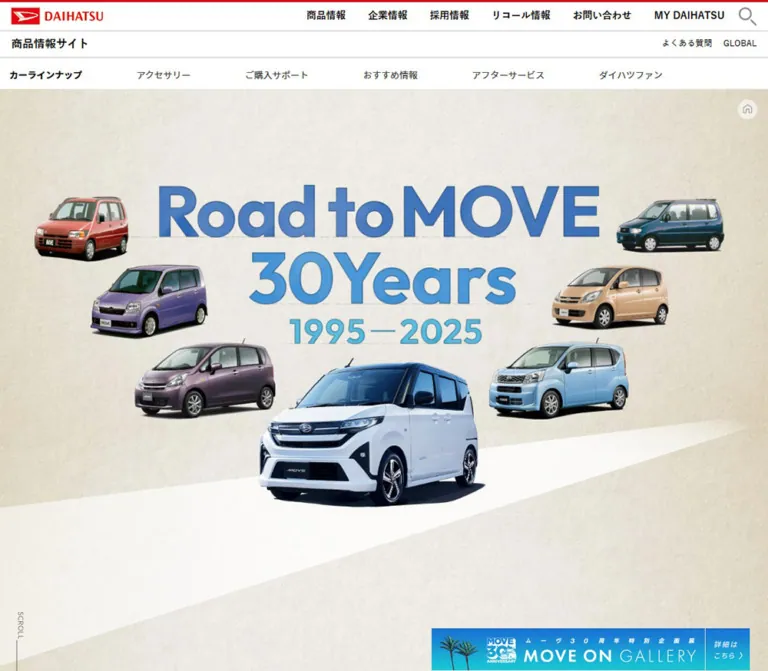
ダイハツ ムーヴ30周年「Road to MOVE 30Years」
生成りの紙の質感に、歴代ムーヴの切り抜き写真とカタログを重ねた30周年ヒストリーページ。大きな年号、世代別カラー、横長の年表ナビゲーションが特徴。
オリジナルサイトを見るRoad to MOVE 30Years — Style Reference
Seven generations of a compact car arranged as a paper archive, with a white road connecting past and present.
Website / Original URL: daihatsu.co.jp/lineup/move/special/history/ Final URL: Same history page Theme: light, textured paper with generation-specific accents. Inspected: September 12, 2026. Supplied browser evidence retrieved at 14:04:58.675 UTC / 23:04:58.675 JST. Viewports: 1440 × 1000 and 390 × 844 CSS pixels. Scope: the current MOVE anniversary history feature within Daihatsu’s product information website. Evidence includes three desktop captures, two mobile captures, rendered text, links, and sampled computed styles. Visual coverage includes the opening composition, the 1998 chapter, and desktop/mobile ending states; DOM coverage includes all seven generations.
The page presents a product history as an illustrated exhibition. A warm, fibrous paper texture covers the canvas. Large blue title graphics, oversized year numerals, isolated vehicle photographs, and tilted catalog pages provide its structure. A broad white road cuts diagonally through the paper and gives the vehicles a shared ground plane.
Desktop chapters combine a narrow editorial column on the left with a much larger vehicle-and-catalog composition on the right. A small rounded timeline provides chronological orientation. On mobile, years become centered landmarks and the imagery and narrative occupy a long vertical sequence. This is an anniversary content experience: its principal activity is exploring the lineage of MOVE.
How to Read This Reference
- Measured values come from the supplied computed styles and element rectangles. Tables round most measurements to two decimals.
- Visual estimates describe the supplied original-page screenshots. Estimated hexadecimal colors are practical approximations, not pixel samples or recovered CSS declarations.
- Recommendations describe a new implementation. Breakpoints, reusable variables, accessibility improvements, and starter CSS are not claims about the original source.
- Token names are descriptive aliases. The supplied custom-property collection was empty; no original variable names were established.
- State matters: several desktop chapter headings share almost identical viewport coordinates in the DOM evidence. Some mobile elements have bounds but are absent from the corresponding image. Do not interpret every rectangle as a simultaneously visible block in ordinary document flow.
- Historical vehicles and catalog pages are content displayed by the current website. This reference does not reconstruct older versions of the website.
Tokens — Colors
Default Palette
| Name | Value | Suggested token | Role and evidence |
|---|---|---|---|
| Archive Paper | approximately #e9e6da |
--color-paper |
Estimated base beneath the visible cream and gray paper fibers; the real surface varies spatially |
| Road White | approximately #faf9f6 |
--color-road |
Estimated diagonal road surface, brighter and more uniform than the surrounding paper |
| Narrative Ink | #2c2c2c |
--color-ink |
Measured generation paragraph color: rgb(44, 44, 44) |
| Introduction Blue | #0c66ba |
--color-intro |
Measured introductory paragraph color |
| Hero Deep Blue | approximately #4178b7 |
--color-hero-blue |
Estimated upper title lettering; the graphic also includes lighter blues and fine edge detail |
| Timeline Blue | approximately #4d9fdd |
--color-timeline |
Estimated bar color in the 2025 ending captures |
| Timeline Muted Blue | approximately #82a6bb |
--color-timeline-muted |
Estimated 1998 timeline surface |
| Reversed White | #ffffff |
--color-white |
Measured timeline and footer link text |
| Footer Gray | approximately #777777 |
--color-footer |
Estimated visible footer band; the sampled footer element itself reports a transparent background |
| Return-Control Gray | #a3a3a4 |
--color-return |
Measured mobile return-control background |
| Corporate Text | #2f2f2f |
--color-corporate-ink |
Measured global header/footer inherited text color; individual links can override it |
The root and many sampled containers report transparent backgrounds. This does not describe the final paper surface: imagery and unsampled layers contribute to the visible result. Likewise, the gray footer band is visibly present even though the sampled footer background is transparent.
The mobile corporate header has a bright red top rule and logo. Their exact colors were not supplied. Keep that corporate branding localized to the global shell; the history feature has its own paper-and-blue identity.
Generation Accents
These values are measured colors of the generation labels. They are content-specific accents, not selectable themes.
| Year | Generation | Measured label color | Suggested token |
|---|---|---|---|
| 1995 | First generation | #ed5239 |
--era-1995 |
| 1998 | Second generation | #6a93b0 |
--era-1998 |
| 2002 | Third generation | #8280bb |
--era-2002 |
| 2006 | Fourth generation | #e4ab6a |
--era-2006 |
| 2010 | Fifth generation | #ad7d99 |
--era-2010 |
| 2014 | Sixth generation | #61a7d8 |
--era-2014 |
| 2025 | Seventh generation | #1b81c8 |
--era-2025 |
The 1998 screenshot visually coordinates the year artwork, generation label, MOVE wordmark, and timeline through related muted blues. The 2025 capture uses a brighter blue family. Exact equality between label colors, image pixels, and navigation fills is not established.
Tokens — Typography
Japanese Editorial Text
- Measured feature family:
'Noto Sans JP', sans-serif. - Body weight:
400. - Introductory paragraph weight:
500. - Generation label weight:
700. - Character: clean Japanese sans-serif text with unusually generous body leading and modest positive tracking.
- Role: supplies calm, readable explanation beneath the much larger year graphics.
The page root reports 'Noto Sans Japanese', sans-serif at 14px, while feature elements use the separate 'Noto Sans JP' declaration. Preserve this distinction when documenting the source. A computed family declaration does not independently confirm which font file rendered every glyph.
Timeline Labels
- Measured mobile family:
Outfit, sans-serif. - Size:
14.04px. - Weight:
300for inactive links and600for the sampled active link. - Tracking:
0.8424px, equivalent to0.06em. - Role: light, compact Latin numerals with a clear weight change for the current chapter.
The desktop timeline looks consistent with this treatment, but its font was not independently included in the supplied element samples. Do not extend the Outfit attribution to the large hero or year artwork.
Corporate Navigation and Footer
The global shell uses the measured stack 游ゴシック体, YuGothic, 游ゴシック, 'Yu Gothic', メイリオ, sans-serif. Header links use weights up to 700; footer links use 500. The lower desktop product-navigation row also includes the 'Noto Sans Japanese' declaration.
Graphic Titles and Year Numerals
The opening title reads Road to MOVE 30Years with 1995—2025 below it. Its heavy blue lettering has fine outlines or edge shading and changes color between lines. The year headings combine a small tracked YEAR caption with very large numerals.
The supplied H1 and year H2 text fields are empty despite visible graphics. Treat these as graphic heading treatments whose asset format and lettering family remain unverified. Their computed inherited font sizes do not describe the visible letter size.
Type Scale
| Role | Desktop | Mobile | Weight / tracking | Evidence |
|---|---|---|---|---|
| Page root | 14px |
14px |
400 |
Computed |
| Introduction | 23.23px / 52.28px |
17.34px / 42.47px |
500, approximately 0.09em |
Computed; mobile layout bounds require caution |
| Generation label | 28.69px / 28.69px |
17.84px / 17.84px |
700 |
Computed |
| Chapter subheading | approximately 20px / 30px |
Not visually established | Visually bold | Desktop 1998 screenshot estimate |
| Narrative paragraph | 15.40px / 30.02px |
13.89px / 25.98px |
400, 0.06em |
Computed |
| Footnotes | approximately 10–11px |
Not visually established | Regular | Desktop 1998 screenshot estimate |
| Timeline label | approximately 14px |
14.04px |
Mobile 300 / active 600, 0.06em |
Desktop estimate; mobile computed |
| SHARE caption | approximately 20px |
approximately 19px |
Bold, visibly tracked | Screenshot estimate |
| Footer links | 14px / 25.2px |
13px / 23.4px |
500 |
Computed |
| Corporate desktop links | 14px / 25.2px |
Replaced by icon controls | 700 |
Computed |
Desktop narrative leading is approximately 1.95; mobile leading is approximately 1.87. These ratios are calculated from the supplied values. They are useful implementation targets without implying a recovered source formula.
Tokens — Spacing & Shapes
Spatial character: broad exhibition space around dense, narrow text; overlapping photographic objects rather than boxed content.
No source spacing scale or breakpoint formula was supplied. A recommended working scale is 4, 8, 12, 20, 30, 40, 56, 96px, with viewport-relative positioning reserved for large artwork compositions.
Layout Measurements
| Element | Desktop: 1440 × 1000 | Mobile: 390 × 844 | Status |
|---|---|---|---|
| Document height | 6827.95px |
13629.41px |
Measured |
| Narrative left edge | 85.95px |
30.22px |
Measured |
| Narrative width | 362.72px |
329.69px |
Measured |
| Narrative bottom padding | 53.89px |
0px |
Measured |
| Introduction width | 797.81px |
625.39px, extending beyond viewport |
Measured; mobile value is not a recommended reading width |
| 1998 year-heading box | 381.91 × 170.95px |
284.70 × 113.98px |
Measured graphic container |
| Hero H1 box | 901.80 × 358.44px |
331.67 × 96px |
Measured container; mobile title not visible in supplied opening image |
| Timeline bar | approximately 610 × 30px |
approximately 370 × 30px |
Screenshot estimate |
| Inactive timeline link padding | Not supplied | 5.616px 7.8624px |
Measured |
| Corporate header row | 42px high |
52.27px high, beginning below a 3px top rule |
Measured; desktop value excludes other navigation rows |
| Footer band | 78.38px high |
72.78px high |
Measured |
The desktop narrative begins at approximately 5.97% of viewport width and occupies 25.19%. On mobile it begins at approximately 7.75% and occupies 84.54%. These are calculations from the inspected endpoints, not proof of percentage-based source CSS.
Shapes and Edges
| Element | Treatment | Evidence |
|---|---|---|
| Catalog pages | Square corners, irregular rotations | Visible |
| Timeline | Fully rounded capsule, about 30px high | Visible |
| Home control | Pale circular disc, roughly 36–37px across | Visual estimate; outer link rectangles differ |
| Image expansion marks | Small white circles with corner-style symbols, roughly 18–20px | Visual estimate |
| Share controls | Blue circles, approximately 40px desktop and 42px mobile | Visual estimate supported by link widths |
| Mobile return control | 43 × 27px, 3px radius, 5px padding |
Computed |
| Vehicle silhouettes | Natural cutout edges and photographic ground shadows | Visible |
| Road | Large tapering polygon without a border | Visible |
There is no observed general card-radius or elevation system. Catalogs retain their physical page boundaries; vehicles supply their own photographic depth.
Components
Corporate Site Header
Role: connects the feature to the wider Daihatsu website.
The desktop DOM contains the Daihatsu brand link, corporate utilities, a product-information row, and six product-navigation categories. In the sampled desktop state, these elements are above the viewport: the main header begins around y = -206px. Their absence from the opening desktop screenshot therefore does not establish that the feature removes the corporate shell.
The mobile opening capture shows a compact white header with a red top rule, the brand at left, and search and hamburger symbols at right. The measured search icon box is 26 × 27px; the menu icon box is 30 × 26px. The source link labels include サイト内検索 and メニューを開く.
Open menu and search states were not captured. Reproduce their visible closed anatomy without inventing drawer contents or search behavior.
Opening History Composition
Role: introduces the anniversary and makes the seven-generation relationship immediately visible.
The desktop composition places the large blue title near the upper center, surrounds it with six earlier vehicles, and gives the newest white-and-dark-blue vehicle the largest foreground position. Earlier cars form three approximate pairs: red and dark teal above, purple and gold around the middle, and mauve and light blue below. Their transparent silhouettes remain separated by generous paper space.
The current car occupies roughly 420px of width in the desktop screenshot; the earlier cars are approximately 175–265px wide. These are visual estimates including varying amounts of photographic shadow. The title and vehicles form one exhibition composition rather than independent cards.
A white road widens toward the lower-left foreground and tapers toward the right edge. Its angle creates direction without adding arrows or a large primary button.
Mobile limitation: the opening capture shows a large blank upper area, a cropped row of four earlier cars, two cars below, and the newest car in the foreground. The desktop title is not visible, although the mobile DOM reports an H1 rectangle. The evidence cannot determine whether this is a reveal state, a rendering issue, or another condition. A new implementation should keep the title reliably available rather than intentionally reproduce the blank state.
Introductory Statement
Role: explains why the reader is moving through the archive.
The rendered copy introduces MOVE’s continuing evolution and the connection between its first and seventh generations. Desktop text is arranged in four lines within an approximately 798px-wide region. It uses medium-weight blue Japanese type with more than double line spacing.
The mobile text extraction supplies seven lines. Its sampled rectangle is wider than the viewport and begins at a negative x-coordinate. The visual state of that introduction was not captured clearly enough to establish intended clipping or alignment. For reuse, preserve the relaxed blue editorial treatment while fitting the text inside a readable mobile column.
Generation Chapter
Role: combines a date, product identity, historical explanation, and period visual material.
The repeated anatomy is:
- A graphic year heading containing
YEARand large numerals. - A colored generation label, such as
2代目MOVE. - A short, bold Japanese chapter subheading.
- Narrative paragraphs with occasional emphasized phrases.
- Smaller notes where factual qualifications are required.
- A large vehicle cutout and surrounding catalog images.
- A period-specific MOVE wordmark within the composition.
In the 1998 desktop capture, the left text column begins about 86px from the viewport edge and is about 363px wide. The year occupies its upper portion; the generation label sits immediately below. The bold subheading begins around y = 311px in the screenshot, followed by dense but generously led text.
A dark teal vehicle dominates the right side, visually extending beneath the surrounding catalog material. Approximate visible vehicle bounds are 580px wide and 285px high. The catalogs occupy the upper center, upper right, right edge, and lower right. A pale road crosses behind the vehicle and text region.
Selected body phrases in the 1998 screenshot appear bold with a pale blue highlight. Their exact markup and fill color were not sampled. Treat that emphasis as a restrained editorial detail, not a system of colorful badges.
The DOM contains narrative content for all seven chapters. Only the 1998 desktop arrangement and part of the 2025 mobile arrangement received direct visual coverage.
Archive Catalog Image
Role: brings the visual language of each vehicle’s original promotional material into the current page.
Use the whole catalog cover or spread with its printed photographs, typography, white margins, and page proportions intact. The captured sheets overlap at differing scales and rotate approximately 3–12 degrees in either direction. Those angle ranges are visual estimates; exact transforms were not supplied.
Small white circular expansion marks appear near image corners. Their placement makes the catalogs look inspectable without adding a button panel beneath each image.
The evidence establishes an expansion affordance, but not its outcome. No enlarged image, modal, gallery controls, backdrop, dismissal behavior, or animation was captured. An enlargement dialog in a new build is a recommended completion of the affordance, not a verified reproduction.
Chronological Timeline
Role: provides compact chapter access and position awareness.
The desktop bar contains TOP, a thin divider, and the seven years: 1995, 1998, 2002, 2006, 2010, 2014, and 2025. It is approximately 610px wide, centered, and about 30px high. In the 1998 screenshot it sits around y = 941px, leaving roughly 29px below it.
The mobile bar contains the seven years without the visible desktop TOP item. It spans approximately 370px, leaving 10px side margins at a 390px viewport. The mobile DOM confirms native destinations from #y1995 through #y2025.
The current year is heavier and has a small white triangular notch along the lower edge. The sampled active mobile link uses weight 600; inactive links use 300. The active link’s rectangle is also taller than the others, but the transform responsible was not provided.
The bar’s vertical position changes between captured states. It appears much higher in the desktop ending capture and above the share area in the mobile ending capture. A single permanently fixed bottom bar would not reproduce all supplied states. Exact pinning, release thresholds, and desktop click handling remain unverified.
Floating Wayfinding Controls
Role: offers lightweight navigation without occupying a full feature header.
A pale circular house symbol remains near the upper-right corner of the feature in the captures. Its original-page link points to the MOVE special page, not the corporate homepage.
At the lower left, a small vertical SCROLL label sits above a thin vertical line. The desktop label is approximately 30px from the left edge; the mobile version is around 20px from the edge. It is a visual cue; no separate interaction was verified.
Mobile also shows a small gray return control near the lower-right corner. Its measured rectangle is 43 × 27px with a 3px radius. The link destination is #; the resulting scroll behavior was not exercised.
Share Area and Legal Footer
Role: closes the history feature and exposes basic sharing and legal navigation.
A centered blue SHARE label sits above circular Facebook and X symbols. The approximate icon-circle diameters are 40px on desktop and 42px on mobile. Measured link widths are 39.61px and 41.88px respectively; inline link heights should not be mistaken for the painted circle diameter.
The two controls have roughly 14px of horizontal separation on desktop and 17px on mobile. Their supplied links resolve to #; actual share destinations, popups, and handlers were not inspected.
Below them, a full-width medium-gray footer contains プライバシーポリシー and サイトのご利用について, followed by © DAIHATSU MOTOR CO., LTD.. Text is white and centered. The measured footer is approximately 78px high on desktop and 73px on mobile.
The desktop terminal image contains substantial empty paper above the timeline. The mobile terminal image still shows the 2025 year, catalogs, and MOVE wordmark. These captures establish different visible ending states, not the intentional removal of the seventh-generation narrative.
Tokens — Motion & Interaction
| Treatment | Evidence | What can be concluded |
|---|---|---|
| Desktop corporate text links | transition: color 0.3s |
A 300ms color transition is declared; endpoint colors were not supplied |
| Desktop search link | transition: opacity 0.3s |
A 300ms opacity transition is declared |
| Footer links | transition: opacity 0.3s |
A 300ms opacity transition is declared |
| Sampled feature headings and paragraphs | animation: none; transition serialization often all |
No CSS keyframe animation is reported for those sampled elements in that state |
| Chapter presentation | Repeated desktop chapter coordinates and different visible chapter captures | Consistent with a layered or staged presentation; implementation and timing are unknown |
| Timeline current state | 1998 and 2025 selected in different screenshots; active mobile weight measured | Current-chapter styling exists; activation thresholds and update mechanism are unknown |
| Catalog expansion symbols | Visible in desktop and mobile screenshots | Suggest image inspection; resulting interaction is unverified |
| Mobile title visibility | H1 bounds supplied, title absent from opening screenshot | Content readiness or presentation uncertainty; no reveal duration can be inferred |
| Share, menu, and return controls | Visible controls and link evidence | Opened or activated states were not supplied |
A transition value serialized only as all does not establish a visible animation or its duration. Likewise, animation: none on sampled elements does not rule out JavaScript animation, transforms on ancestors, or motion on unsampled descendants.
The capture process waited for visible finite motion and layout stability within time limits. It also temporarily paused perpetual animations during readiness checks. These precautions do not establish complete reveal choreography.
Recommended adaptation: keep the full history available in normal document flow first. Add chapter staging only after keyboard navigation, anchor arrival, text visibility, and reduced-motion behavior work reliably. Short 180–300ms opacity or emphasis transitions are reasonable additions; they are not measured original chapter timings.
Surfaces
| Layer | Appearance | Purpose |
|---|---|---|
| Main canvas | Warm, fibrous paper with slight tonal variation | Unifies modern product photography and historical printed material |
| Road | Broad, bright, tapering white shape | Connects compositions and grounds the cars |
| Vehicle imagery | Isolated photographs with natural contact shadows | Provides the main depth and product focus |
| Catalog material | Rectangular printed pages at varied angles | Supplies period context and visual density |
| Timeline | Flat colored capsule with white type | Concentrates navigation into one compact object |
| Utility controls | Pale or blue circles; small gray return button | Keeps controls recognizable with little visual weight |
| Footer | Flat medium-gray band with white text | Separates the corporate legal ending from the exhibition canvas |
Depth comes primarily from object overlap, photograph shadows, and tilted paper. There is no evidence for a reusable stack of elevated cards or blurred glass panels.
Imagery
The opening combines seven clean vehicle cutouts with a title graphic and a textured background. Earlier models appear at smaller sizes around the current vehicle, making the chronology legible before the reader reaches the timeline. Retain recognizable vehicle proportions, paint colors, wheel shapes, and photographic shadows.
Chapter imagery is more archival. Brochure covers, open spreads, technical layouts, and period MOVE marks retain their original typography and image treatment. The current website places these artifacts on a common paper canvas; it does not restyle every historical document into the same visual system.
In the 1998 desktop capture, the car and catalog images remain sharp while the paper texture is quiet. In the 2025 mobile capture, the angled black catalog spread, a lighter spread below it, and a large slanted MOVE wordmark form a vertical collage. A faint vehicle is visible behind them, but its opacity and state are not established.
Use transparent vehicle assets where available and preserve the full silhouette with object-fit: contain. Keep catalog proportions intact. Extra CSS shadows can double the photographic shadow and make objects appear to float.
Observed Asset References
Actual image URLs, filenames, formats, intrinsic dimensions, and responsive source sets were not exposed in the supplied evidence.
| Asset group | Established use | Limits |
|---|---|---|
| Anniversary title graphic | Large blue opening identity with 1995–2025 date range | Lettering family and asset format unknown |
| Seven vehicle cutouts | Opening lineage composition | Exact files and alpha handling unknown |
| Chapter vehicle images | Large generation-specific product focus | Direct visual inspection is strongest for 1998 |
| Year graphics | Oversized dates with small YEAR caption | Graphic container dimensions measured; glyph font unknown |
| Catalog covers and spreads | Rotated archival collage | Expansion outcomes and full-resolution sources unverified |
| MOVE wordmarks | Period identity within chapter compositions | Preserve as authorized artwork rather than retyping |
| Paper background | Continuous cream texture | Tile size, repeat mode, and image source unknown |
| Utility and social symbols | Home, expansion, Facebook, X, and return controls | Icon library or asset implementation unknown |
For a new implementation, obtain authorized images or use clearly identified substitutes. The CSS shell alone cannot reproduce the identity carried by the vehicles, catalog pages, and graphic lettering.
Layout & Responsive Behavior
| Relationship | Desktop observation | Mobile observation |
|---|---|---|
| Global shell | Multiple navigation rows exist above the sampled feature viewport | Compact logo/search/menu header visible at the opening |
| Opening imagery | Six earlier cars surround the title and current foreground car | Earlier cars form compact rows, with partial edge cropping |
| Chapter heading | Large year aligned with a left editorial column | Centered year graphic and generation label |
| Narrative | Approximately 363px-wide left column | Approximately 330px-wide centered column |
| Catalog imagery | Large overlap composition to the right of the narrative | Vertically arranged, overlapping material across the available width |
| Timeline | Approximately 610px wide with TOP entry | Approximately 370px wide, seven years, no visible TOP entry |
| Ending | Large paper area above timeline, share, and footer | 2025 artwork remains above timeline and share area |
| Document length | Approximately 6828px | Approximately 13629px |
The mobile document is approximately twice as tall as the desktop document. Its body column remains about 91% of the desktop column’s width even though the viewport is only about 27% as wide. This preserves a similar Japanese reading measure while moving imagery and text into a vertical sequence.
In the mobile DOM, the first narrative paragraph of each chapter begins approximately 766px below its generation label. That interval includes other chapter content and presentation space; it is not evidence for a literal empty spacer. Do not reproduce it by inserting a fixed blank block.
Desktop chapter headings repeatedly occupy approximately y = 52–57px, while mobile year headings have progressively increasing document coordinates. This supports substantially different chapter organization at the two endpoints. Exact positioning rules, scroll controllers, and breakpoints were not supplied.
Only these two viewport sizes were inspected. Tablet, landscape-phone, ultrawide, browser zoom, and intermediate reflow behavior remain unverified. A breakpoint around 900px is used in the starter below as a recommendation, not an extracted source value.
Do’s and Don’ts
Do
- Build the main atmosphere from textured cream paper and a bright white road.
- Preserve the seven-car hierarchy, with the newest vehicle largest in the opening.
- Use the measured generation colors for chapter identity.
- Keep Japanese narrative text narrow, positively tracked, and generously led.
- Treat title lettering, year graphics, and MOVE marks as artwork unless their source fonts are established.
- Compose catalogs at different sizes and angles while protecting their printed content.
- Make the current timeline year visibly distinct through weight and a small marker.
- Recompose the archive vertically on mobile while retaining readable body text.
- Keep corporate navigation and legal information visually consistent with the supplied shell.
- Make all essential content available independently of reveal timing.
Don’t
- Don’t replace the historical sequence with a feature-card or pricing layout.
- Don’t crop vehicle silhouettes into uniform rectangles.
- Don’t assign Outfit to the large graphic titles without evidence.
- Don’t assume the label accent is the exact color of every related image and surface.
- Don’t add rounded frames and large shadows around every catalog page.
- Don’t reproduce the missing mobile title or terminal blank area as confirmed design requirements.
- Don’t force the timeline to remain fixed over the footer in every state.
- Don’t infer a lightbox, carousel, animation library, or parallax speed from expansion symbols and still images.
- Don’t scale the desktop stage down wholesale to fit a phone.
Recommended Implementation Additions
These are recommendations for a new implementation, not verified original features:
- Provide semantic text equivalents for the anniversary title and year graphics. Use a meaningful heading hierarchy and avoid duplicating image alt text with adjacent accessible headings.
- Implement year navigation as real hash links and expose the active link with
aria-current='location'. Offset anchor arrival so headings remain visible beneath any persistent controls. - Give home, catalog expansion, social, menu, search, and return controls explicit accessible names. Enlarge small visual controls to approximately 44px hit areas without unnecessarily enlarging their symbols.
- If catalogs open in a dialog, support keyboard activation, a labeled close button, Escape dismissal, focus containment, and focus return.
- Offer a reduced-motion mode that immediately presents complete chapters. Essential text should not depend on scroll velocity, delayed opacity changes, or animation completion.
- Keep mobile body text at least as readable as the measured approximately 14px treatment; consider 15–16px after testing real Japanese copy and device zoom.
- Test white timeline text against each actual rendered fill. Some pale chapter colors may require a darker navigation shade while the year artwork retains its original accent.
- Give imagery intrinsic dimensions and load later chapter assets progressively. Avoid layout shifts that change anchor destinations or timeline state.
- Clip decorative overflow within the artwork region, while allowing document text and focused controls to remain accessible.
Agent Prompt Guide
Quick Color Reference
- Paper base: approximately
#e9e6da, with a supplied paper texture. - Road: approximately
#faf9f6. - Narrative: measured
#2c2c2c. - Introduction: measured
#0c66ba. - Current-generation label: measured
#1b81c8. - 1998 label: measured
#6a93b0. - Timeline in the current-generation ending: approximately
#4d9fdd, with white text. - Footer: approximately
#777777, with white text. - Other generation accents:
#ed5239,#8280bb,#e4ab6a,#ad7d99, and#61a7d8.
Overall Prompt
“Create an automotive anniversary history feature inspired by Road to MOVE 30Years. Use a warm fibrous paper canvas, a broad white diagonal road, approved blue anniversary lettering, and seven isolated vehicle photographs. Make the latest vehicle the largest foreground object. Present each generation with oversized year artwork, a generation-colored label, a narrow Japanese narrative column, and an overlapping collage of vehicle and catalog images. Use Noto Sans JP for narrative text, approximately 15.4px with 30px leading on desktop, and Outfit for compact timeline numerals. Place the timeline in a rounded capsule with a heavier current year and a small white notch. Recompose the chapters vertically on mobile. Keep essential content visible without animation and preserve the historical artwork’s proportions.”
Example Component Prompts
- Opening composition: “Arrange six earlier vehicle cutouts around a large blue anniversary title on cream paper. Position the current white-and-dark-blue vehicle largest at the lower center. Add a white road widening toward the lower-left foreground. Use the authorized title graphic and preserve natural vehicle shadows.”
- 1998 chapter: “At a 1440px desktop width, place a roughly 363px editorial column about 86px from the left edge. Use large 1998 artwork and a muted blue
2代目MOVElabel in#6a93b0. Set narrative text in Noto Sans JP at approximately 15.4px/30px. Place a large teal vehicle and four differently rotated catalog images on the right, with small white expansion marks.” - Timeline: “Create a centered blue capsule about 610px wide on desktop and 370px at a 390px mobile viewport. Include seven year links, with an additional TOP item on desktop. Use small white Outfit numerals, light inactive weights, a semibold current year, and a white lower-edge notch. Keep native hash navigation and visible keyboard focus.”
- Mobile chapter: “Center the year artwork above the generation label, arrange authorized vehicle and brochure imagery vertically with controlled overlap, and follow with a roughly 330px-wide Japanese text column. Keep all text visible in the static state. Maintain the paper texture, generation accent, compact timeline, and centered share ending.”
Quick Start
CSS Custom Properties
This is a reusable visual scaffold, not recovered source CSS. Exact body typography and chapter colors come from the DOM. Paper, road, timeline, and footer colors are approximations. The 900px breakpoint, static chapter flow, accessible target sizes, and fallback year typography are recommendations.
Load authorized font files and image assets separately. Set --paper-texture to an authorized url(...); without it, the starter uses a solid paper fallback. Replace the text year fallback with the approved graphic when visual fidelity is required.
:root {
  /* Measured text colors and generation accents */
  --color-ink: #2c2c2c;
  --color-intro: #0c66ba;
  --era-1995: #ed5239;
  --era-1998: #6a93b0;
  --era-2002: #8280bb;
  --era-2006: #e4ab6a;
  --era-2010: #ad7d99;
  --era-2014: #61a7d8;
  --era-2025: #1b81c8;

  /* Estimated visual surface colors */
  --color-paper: #e9e6da;
  --color-road: #faf9f6;
  --color-timeline: #4d9fdd;
  --color-footer: #777777;
  --color-white: #fff;
  --paper-texture: none;

  /* Observed family declarations */
  --font-body: 'Noto Sans JP', sans-serif;
  --font-latin: Outfit, sans-serif;
  --font-corporate: YuGothic, 'Yu Gothic', Meiryo, sans-serif;

  /* Mobile endpoint values */
  --text-body: 13.8938px;
  --leading-body: 1.87;
  --text-generation: 17.8425px;
  --tracking-body: 0.06em;
  --page-gutter: 7.75vw;

  /* Recommended reusable geometry */
  --space-small: 12px;
  --space-medium: 30px;
  --space-large: 56px;
  --radius-pill: 999px;
  --timeline-width: 610px;
  --safe-bottom: env(safe-area-inset-bottom, 0px);
}

* {
  box-sizing: border-box;
}

.move-history {
  color: var(--color-ink);
  background-color: var(--color-paper);
  background-image: var(--paper-texture);
  font-family: var(--font-body);
}

.move-history img {
  display: block;
  max-inline-size: 100%;
  block-size: auto;
}

[data-era='1995'] { --era: var(--era-1995); }
[data-era='1998'] { --era: var(--era-1998); }
[data-era='2002'] { --era: var(--era-2002); }
[data-era='2006'] { --era: var(--era-2006); }
[data-era='2010'] { --era: var(--era-2010); }
[data-era='2014'] { --era: var(--era-2014); }
[data-era='2025'] { --era: var(--era-2025); }

.history-hero,
.generation-stage {
  position: relative;
  isolation: isolate;
}

/* An approximation of the road motif, not its original geometry. */
.history-hero::before,
.generation-stage::before {
  content: '';
  position: absolute;
  z-index: -1;
  inset: 0;
  background: var(--color-road);
  clip-path: polygon(0 82%, 100% 65%, 100% 67%, 26% 100%, 0 100%);
  pointer-events: none;
}

.history-hero {
  min-block-size: 100svh;
  padding-block-start: 40px;
}

.hero-title {
  inline-size: min(85%, 902px);
  margin: 0 auto;
}

/* Use approved title artwork inside the semantic H1. */
.hero-title img {
  inline-size: 100%;
}

.hero-vehicles {
  position: relative;
  min-block-size: 460px;
  overflow: clip;
}

.hero-vehicle {
  position: absolute;
  object-fit: contain;
}

.hero-vehicle[data-era='1995'] { width: 19%; left: -1%; top: 28%; }
.hero-vehicle[data-era='1998'] { width: 25%; left: 23%; top: 28%; }
.hero-vehicle[data-era='2002'] { width: 23%; left: 52%; top: 28%; }
.hero-vehicle[data-era='2006'] { width: 24%; left: 79%; top: 28%; }
.hero-vehicle[data-era='2010'] { width: 35%; left: 10%; top: 44%; }
.hero-vehicle[data-era='2014'] { width: 35%; left: 53%; top: 44%; }
.hero-vehicle[data-era='2025'] { width: 56%; left: 18%; top: 62%; }

.history-intro {
  max-inline-size: 798px;
  margin: 80px auto;
  padding-inline: var(--page-gutter);
  color: var(--color-intro);
  font-size: 17.3358px;
  font-weight: 500;
  line-height: 2.45;
  letter-spacing: 0.09em;
}

.generation-stage {
  display: grid;
  grid-template-areas: 'heading' 'gallery' 'copy';
  gap: 30px;
  padding: 30px var(--page-gutter) 80px;
  scroll-margin-block-start: 70px;
}

.chapter-heading {
  grid-area: heading;
  text-align: center;
}

.year-kicker {
  margin: 0;
  color: var(--era);
  font-family: var(--font-latin);
  font-size: 16px;
  letter-spacing: 0.2em;
}

/* Accessible text fallback; the original graphic font is unknown. */
.year-fallback {
  margin: 0;
  color: var(--era);
  font-family: var(--font-latin);
  font-size: clamp(80px, 28vw, 114px);
  font-weight: 700;
  line-height: 0.95;
  letter-spacing: -0.04em;
}

.year-art {
  inline-size: min(100%, 285px);
  margin-inline: auto;
}

.generation-label {
  margin: 12px 0 0;
  color: var(--era);
  font-size: var(--text-generation);
  font-weight: 700;
  line-height: 1;
}

.chapter-copy {
  grid-area: copy;
  min-inline-size: 0;
}

.chapter-copy h4 {
  margin: 0 0 12px;
  font-size: 20px;
  line-height: 1.5;
}

.chapter-copy p {
  margin: 0;
  font-size: var(--text-body);
  font-weight: 400;
  line-height: var(--leading-body);
  letter-spacing: var(--tracking-body);
}

.chapter-copy strong {
  font-weight: 700;
}

/* Slightly enlarged notes are a readability recommendation. */
.chapter-copy .chapter-note {
  margin-block-start: 12px;
  font-size: 12px;
  line-height: 1.8;
}

.archive-collage {
  grid-area: gallery;
  position: relative;
  min-inline-size: 0;
  min-block-size: 520px;
  isolation: isolate;
}

.chapter-vehicle {
  position: absolute;
  inset: 24% auto auto 0;
  inline-size: 100%;
  object-fit: contain;
}

.catalog-sheet {
  position: absolute;
  z-index: 2;
  inset-block-start: var(--sheet-top, 0);
  inset-inline-start: var(--sheet-left, 20%);
  inline-size: var(--sheet-width, 72%);
  margin: 0;
  transform: rotate(var(--sheet-angle, 10deg));
}

.catalog-sheet img {
  inline-size: 100%;
  border-radius: 0;
  object-fit: contain;
}

/* Larger hit area around a visually small expansion symbol. */
.catalog-expand {
  position: absolute;
  inset: -16px -16px auto auto;
  display: grid;
  place-items: center;
  inline-size: 44px;
  block-size: 44px;
  padding: 0;
  border: 0;
  background: transparent;
  cursor: pointer;
}

.catalog-expand > span {
  display: grid;
  place-items: center;
  inline-size: 20px;
  block-size: 20px;
  border-radius: 50%;
  color: #777;
  background: white;
}

/* Normal flow is intentional in this static starter. */
.timeline {
  display: flex;
  inline-size: min(var(--timeline-width), calc(100% - 20px));
  margin: 24px auto;
  overflow-x: auto;
  border-radius: var(--radius-pill);
  background: var(--color-timeline);
  scrollbar-width: thin;
}

.timeline a {
  position: relative;
  flex: 1 0 auto;
  padding: 5.616px 7.8624px;
  color: var(--color-white);
  font-family: var(--font-latin);
  font-size: 14.04px;
  font-weight: 300;
  line-height: 18px;
  letter-spacing: 0.06em;
  text-align: center;
  text-decoration: none;
}

.timeline a[aria-current='location'] {
  font-weight: 600;
}

.timeline a[aria-current='location']::after {
  content: '';
  position: absolute;
  inset: auto auto 0 50%;
  width: 0;
  height: 0;
  border-inline: 5px solid transparent;
  border-bottom: 5px solid white;
  transform: translateX(-50%);
}

.timeline .timeline-top {
  display: none;
}

.share-area {
  padding: 90px 20px 28px;
  color: var(--era-2025);
  text-align: center;
}

.share-title {
  margin: 0 0 12px;
  font-size: 20px;
  font-weight: 700;
  letter-spacing: 0.1em;
}

.share-links {
  display: flex;
  justify-content: center;
  gap: 17px;
}

.share-links a {
  display: grid;
  place-items: center;
  inline-size: 44px;
  block-size: 44px;
  border-radius: 50%;
  color: white;
  background: var(--color-timeline);
}

.history-footer {
  padding: 12px 20px calc(12px + var(--safe-bottom));
  color: white;
  background: var(--color-footer);
  font-family: var(--font-corporate);
  font-size: 13px;
  line-height: 1.8;
  text-align: center;
}

.history-footer nav {
  display: flex;
  flex-wrap: wrap;
  justify-content: center;
  gap: 4px 24px;
}

.history-footer a {
  color: inherit;
  text-decoration: none;
  transition: opacity 300ms;
}

.history-footer p {
  margin: 0;
}

.move-history :focus-visible {
  outline: 3px solid var(--color-intro);
  outline-offset: 4px;
}

.timeline a:focus-visible {
  outline: 2px solid white;
  outline-offset: -3px;
  background: var(--color-intro);
}

@media (min-width: 900px) {
  .move-history {
    --text-body: 15.3965px;
    --leading-body: 1.95;
    --text-generation: 28.6934px;
    --page-gutter: 6vw;
  }

  .history-hero {
    padding-block-start: 22vh;
  }

  .hero-title {
    inline-size: min(63vw, 902px);
  }

  .hero-vehicles {
    position: absolute;
    inset: 0;
    min-block-size: 0;
  }

  .hero-vehicle[data-era='1995'] { width: 13%; left: 5%; top: 24%; }
  .hero-vehicle[data-era='1998'] { width: 14%; left: 80%; top: 25%; }
  .hero-vehicle[data-era='2002'] { width: 16%; left: 12%; top: 37%; }
  .hero-vehicle[data-era='2006'] { width: 16%; left: 72%; top: 37%; }
  .hero-vehicle[data-era='2010'] { width: 19%; left: 18%; top: 51%; }
  .hero-vehicle[data-era='2014'] { width: 19%; left: 64%; top: 51%; }
  .hero-vehicle[data-era='2025'] { width: 29%; left: 34%; top: 54%; }

  .history-intro {
    padding-inline: 0;
    font-size: 23.2347px;
    line-height: 2.25;
  }

  .generation-stage {
    grid-template-columns: minmax(0, 25.2vw) minmax(0, 1fr);
    grid-template-rows: auto 1fr;
    grid-template-areas: 'heading gallery' 'copy gallery';
    column-gap: 2.8vw;
    row-gap: 36px;
    min-block-size: 100svh;
    padding: 56px 4vw 100px 6vw;
  }

  .chapter-heading {
    text-align: left;
  }

  .year-fallback {
    font-size: 174px;
  }

  .year-art {
    max-inline-size: none;
    inline-size: 382px;
    margin-inline: 0;
  }

  .chapter-copy {
    padding-block-end: 53.8877px;
  }

  .archive-collage {
    min-block-size: 720px;
  }

  .chapter-vehicle {
    inset-block-start: 45%;
    inline-size: 68%;
  }

  .timeline .timeline-top {
    display: block;
    border-inline-end: 1px solid rgb(255 255 255 / 70%);
  }

  .history-footer {
    font-size: 14px;
  }
}

@media (hover: hover) {
  .history-footer a:hover {
    opacity: 0.75;
  }
}

@media (prefers-reduced-motion: reduce) {
  .move-history *,
  .move-history *::before,
  .move-history *::after {
    animation: none !important;
    transition: none !important;
    scroll-behavior: auto !important;
  }
}
The gallery uses --sheet-top, --sheet-left, --sheet-width, and --sheet-angle on individual catalog figures. Set them per image and breakpoint; a single arrangement will not suit every cover and spread. The hero positions are compositional approximations, not measured source transforms.
A chapter can use the following semantic skeleton. Insert authorized imagery in the gallery and replace the abbreviated example paragraph with the complete approved copy. Repeat the section for each year, retaining unique IDs.
<section class='generation-stage' id='y1998' data-era='1998'>
  <header class='chapter-heading'>
    <p class='year-kicker' aria-hidden='true'>YEAR</p>
    <h2 class='year-fallback'>1998</h2>
    <h3 class='generation-label'>2代目MOVE</h3>
  </header>

  <div class='archive-collage'>
    <!-- Insert the authorized vehicle image and catalog figures here. -->
    <!-- Expansion controls require a separately implemented dialog. -->
  </div>

  <div class='chapter-copy'>
    <h4>環境配慮と性能向上を両立した<br>2代目ムーヴの登場</h4>
    <p>2代目ムーヴは1998年10月に登場し、低公害・低燃費・省資源を達成。</p>
  </div>
</section>

<nav class='timeline' aria-label='MOVE history by year'>
  <a class='timeline-top' href='#history-start'>TOP</a>
  <a href='#y1995'>1995</a>
  <a href='#y1998' aria-current='location'>1998</a>
  <a href='#y2002'>2002</a>
  <a href='#y2006'>2006</a>
  <a href='#y2010'>2010</a>
  <a href='#y2014'>2014</a>
  <a href='#y2025'>2025</a>
</nav>
The starter keeps the timeline in normal flow. A separate controller may update aria-current, pin navigation within the history region, and release it before the share ending. Neither that controller nor the original animation choreography can be recovered from the supplied stills and computed-style excerpts.
Tailwind v4 Token Mapping
Optional aliases for projects already using Tailwind v4. This does not imply that the original website uses Tailwind. Define the properties above first.
@theme inline {
  --color-paper: var(--color-paper);
  --color-road: var(--color-road);
  --color-history-ink: var(--color-ink);
  --color-history-intro: var(--color-intro);
  --color-history-blue: var(--era-2025);
  --color-history-1998: var(--era-1998);

  --font-history: var(--font-body);
  --font-timeline: var(--font-latin);

  --text-history-body: var(--text-body);
  --text-generation-label: var(--text-generation);
  --spacing-history-gutter: var(--page-gutter);
  --radius-history-pill: 999px;
}
Sources & Evidence
- Original and final page: Road to MOVE 30Years. The supplied browser report records HTTP 200 and identical original/final URLs.
- Inspection timestamp: September 12, 2026, at
2026-09-12T14:04:58.675Z. This is the supplied evidence retrieval time, not a publication date. - Desktop visual evidence: three 1440 × 1000 captures covering the opening vehicle composition, the 1998 chapter, and the terminal share/footer state.
- Mobile visual evidence: two 390 × 844 captures covering the opening and the 2025/terminal composition.
- Rendered evidence: page title, all seven chapter narratives, link destinations, document heights, sampled element rectangles, font declarations, colors, spacing, transitions, and animation serialization.
- Original-page identity evidence: Daihatsu branding, original-domain navigation, and the visible
© DAIHATSU MOTOR CO., LTD.footer. No production-credit names appear in the supplied original-page evidence. - Observed linked destinations: the feature home control points to MOVE Special; the legal footer links to Privacy, Site Terms, and Copyright. These destinations were present in the rendered page evidence and were not separately inspected for this reference.
The supplied capture process included at least five seconds of initial observation, readiness checks with a 15-second overall limit, a five-second pending-image limit, and intermediate scrolling with up to ten seconds allowed per position. Perpetual animations were temporarily paused during readiness checks and resumed afterward. SharedWorkers and service workers were disabled.
No additional browsing, command execution, or file inspection was performed for this reference. Source stylesheet files, asset URLs, animation timelines, expanded-image states, menu/search states, keyboard behavior, and intermediate responsive widths were not supplied. The absent mobile opening title, oversized mobile introduction bounds, and sparse desktop terminal state remain explicit presentation uncertainties.
# Road to MOVE 30Years — Style Reference

> Seven generations of a compact car arranged as a paper archive, with a white road connecting past and present.

**Website / Original URL:** [daihatsu.co.jp/lineup/move/special/history/](https://www.daihatsu.co.jp/lineup/move/special/history/)
**Final URL:** [Same history page](https://www.daihatsu.co.jp/lineup/move/special/history/)
**Theme:** light, textured paper with generation-specific accents.
**Inspected:** September 12, 2026. Supplied browser evidence retrieved at 14:04:58.675 UTC / 23:04:58.675 JST.
**Viewports:** 1440 × 1000 and 390 × 844 CSS pixels.
**Scope:** the current MOVE anniversary history feature within Daihatsu’s product information website. Evidence includes three desktop captures, two mobile captures, rendered text, links, and sampled computed styles. Visual coverage includes the opening composition, the 1998 chapter, and desktop/mobile ending states; DOM coverage includes all seven generations.

The page presents a product history as an illustrated exhibition. A warm, fibrous paper texture covers the canvas. Large blue title graphics, oversized year numerals, isolated vehicle photographs, and tilted catalog pages provide its structure. A broad white road cuts diagonally through the paper and gives the vehicles a shared ground plane.

Desktop chapters combine a narrow editorial column on the left with a much larger vehicle-and-catalog composition on the right. A small rounded timeline provides chronological orientation. On mobile, years become centered landmarks and the imagery and narrative occupy a long vertical sequence. This is an anniversary content experience: its principal activity is exploring the lineage of MOVE.

## How to Read This Reference

- **Measured values** come from the supplied computed styles and element rectangles. Tables round most measurements to two decimals.
- **Visual estimates** describe the supplied original-page screenshots. Estimated hexadecimal colors are practical approximations, not pixel samples or recovered CSS declarations.
- **Recommendations** describe a new implementation. Breakpoints, reusable variables, accessibility improvements, and starter CSS are not claims about the original source.
- **Token names** are descriptive aliases. The supplied custom-property collection was empty; no original variable names were established.
- **State matters:** several desktop chapter headings share almost identical viewport coordinates in the DOM evidence. Some mobile elements have bounds but are absent from the corresponding image. Do not interpret every rectangle as a simultaneously visible block in ordinary document flow.
- Historical vehicles and catalog pages are content displayed by the current website. This reference does not reconstruct older versions of the website.

## Tokens — Colors

### Default Palette

| Name | Value | Suggested token | Role and evidence |
| --- | --- | --- | --- |
| Archive Paper | approximately `#e9e6da` | `--color-paper` | Estimated base beneath the visible cream and gray paper fibers; the real surface varies spatially |
| Road White | approximately `#faf9f6` | `--color-road` | Estimated diagonal road surface, brighter and more uniform than the surrounding paper |
| Narrative Ink | `#2c2c2c` | `--color-ink` | Measured generation paragraph color: `rgb(44, 44, 44)` |
| Introduction Blue | `#0c66ba` | `--color-intro` | Measured introductory paragraph color |
| Hero Deep Blue | approximately `#4178b7` | `--color-hero-blue` | Estimated upper title lettering; the graphic also includes lighter blues and fine edge detail |
| Timeline Blue | approximately `#4d9fdd` | `--color-timeline` | Estimated bar color in the 2025 ending captures |
| Timeline Muted Blue | approximately `#82a6bb` | `--color-timeline-muted` | Estimated 1998 timeline surface |
| Reversed White | `#ffffff` | `--color-white` | Measured timeline and footer link text |
| Footer Gray | approximately `#777777` | `--color-footer` | Estimated visible footer band; the sampled footer element itself reports a transparent background |
| Return-Control Gray | `#a3a3a4` | `--color-return` | Measured mobile return-control background |
| Corporate Text | `#2f2f2f` | `--color-corporate-ink` | Measured global header/footer inherited text color; individual links can override it |

The root and many sampled containers report transparent backgrounds. This does not describe the final paper surface: imagery and unsampled layers contribute to the visible result. Likewise, the gray footer band is visibly present even though the sampled `footer` background is transparent.

The mobile corporate header has a bright red top rule and logo. Their exact colors were not supplied. Keep that corporate branding localized to the global shell; the history feature has its own paper-and-blue identity.

### Generation Accents

These values are measured colors of the generation labels. They are content-specific accents, not selectable themes.

| Year | Generation | Measured label color | Suggested token |
| --- | --- | --- | --- |
| 1995 | First generation | `#ed5239` | `--era-1995` |
| 1998 | Second generation | `#6a93b0` | `--era-1998` |
| 2002 | Third generation | `#8280bb` | `--era-2002` |
| 2006 | Fourth generation | `#e4ab6a` | `--era-2006` |
| 2010 | Fifth generation | `#ad7d99` | `--era-2010` |
| 2014 | Sixth generation | `#61a7d8` | `--era-2014` |
| 2025 | Seventh generation | `#1b81c8` | `--era-2025` |

The 1998 screenshot visually coordinates the year artwork, generation label, MOVE wordmark, and timeline through related muted blues. The 2025 capture uses a brighter blue family. Exact equality between label colors, image pixels, and navigation fills is not established.

## Tokens — Typography

### Japanese Editorial Text

- **Measured feature family:** `'Noto Sans JP', sans-serif`.
- **Body weight:** `400`.
- **Introductory paragraph weight:** `500`.
- **Generation label weight:** `700`.
- **Character:** clean Japanese sans-serif text with unusually generous body leading and modest positive tracking.
- **Role:** supplies calm, readable explanation beneath the much larger year graphics.

The page root reports `'Noto Sans Japanese', sans-serif` at `14px`, while feature elements use the separate `'Noto Sans JP'` declaration. Preserve this distinction when documenting the source. A computed family declaration does not independently confirm which font file rendered every glyph.

### Timeline Labels

- **Measured mobile family:** `Outfit, sans-serif`.
- **Size:** `14.04px`.
- **Weight:** `300` for inactive links and `600` for the sampled active link.
- **Tracking:** `0.8424px`, equivalent to `0.06em`.
- **Role:** light, compact Latin numerals with a clear weight change for the current chapter.

The desktop timeline looks consistent with this treatment, but its font was not independently included in the supplied element samples. Do not extend the Outfit attribution to the large hero or year artwork.

### Corporate Navigation and Footer

The global shell uses the measured stack `游ゴシック体, YuGothic, 游ゴシック, 'Yu Gothic', メイリオ, sans-serif`. Header links use weights up to `700`; footer links use `500`. The lower desktop product-navigation row also includes the `'Noto Sans Japanese'` declaration.

### Graphic Titles and Year Numerals

The opening title reads `Road to MOVE 30Years` with `1995—2025` below it. Its heavy blue lettering has fine outlines or edge shading and changes color between lines. The year headings combine a small tracked `YEAR` caption with very large numerals.

The supplied H1 and year H2 text fields are empty despite visible graphics. Treat these as graphic heading treatments whose asset format and lettering family remain unverified. Their computed inherited font sizes do not describe the visible letter size.

### Type Scale

| Role | Desktop | Mobile | Weight / tracking | Evidence |
| --- | --- | --- | --- | --- |
| Page root | `14px` | `14px` | `400` | Computed |
| Introduction | `23.23px / 52.28px` | `17.34px / 42.47px` | `500`, approximately `0.09em` | Computed; mobile layout bounds require caution |
| Generation label | `28.69px / 28.69px` | `17.84px / 17.84px` | `700` | Computed |
| Chapter subheading | approximately `20px / 30px` | Not visually established | Visually bold | Desktop 1998 screenshot estimate |
| Narrative paragraph | `15.40px / 30.02px` | `13.89px / 25.98px` | `400`, `0.06em` | Computed |
| Footnotes | approximately `10–11px` | Not visually established | Regular | Desktop 1998 screenshot estimate |
| Timeline label | approximately `14px` | `14.04px` | Mobile `300` / active `600`, `0.06em` | Desktop estimate; mobile computed |
| SHARE caption | approximately `20px` | approximately `19px` | Bold, visibly tracked | Screenshot estimate |
| Footer links | `14px / 25.2px` | `13px / 23.4px` | `500` | Computed |
| Corporate desktop links | `14px / 25.2px` | Replaced by icon controls | `700` | Computed |

Desktop narrative leading is approximately `1.95`; mobile leading is approximately `1.87`. These ratios are calculated from the supplied values. They are useful implementation targets without implying a recovered source formula.

## Tokens — Spacing & Shapes

**Spatial character:** broad exhibition space around dense, narrow text; overlapping photographic objects rather than boxed content.

No source spacing scale or breakpoint formula was supplied. A recommended working scale is `4, 8, 12, 20, 30, 40, 56, 96px`, with viewport-relative positioning reserved for large artwork compositions.

### Layout Measurements

| Element | Desktop: 1440 × 1000 | Mobile: 390 × 844 | Status |
| --- | --- | --- | --- |
| Document height | `6827.95px` | `13629.41px` | Measured |
| Narrative left edge | `85.95px` | `30.22px` | Measured |
| Narrative width | `362.72px` | `329.69px` | Measured |
| Narrative bottom padding | `53.89px` | `0px` | Measured |
| Introduction width | `797.81px` | `625.39px`, extending beyond viewport | Measured; mobile value is not a recommended reading width |
| 1998 year-heading box | `381.91 × 170.95px` | `284.70 × 113.98px` | Measured graphic container |
| Hero H1 box | `901.80 × 358.44px` | `331.67 × 96px` | Measured container; mobile title not visible in supplied opening image |
| Timeline bar | approximately `610 × 30px` | approximately `370 × 30px` | Screenshot estimate |
| Inactive timeline link padding | Not supplied | `5.616px 7.8624px` | Measured |
| Corporate header row | `42px` high | `52.27px` high, beginning below a 3px top rule | Measured; desktop value excludes other navigation rows |
| Footer band | `78.38px` high | `72.78px` high | Measured |

The desktop narrative begins at approximately `5.97%` of viewport width and occupies `25.19%`. On mobile it begins at approximately `7.75%` and occupies `84.54%`. These are calculations from the inspected endpoints, not proof of percentage-based source CSS.

### Shapes and Edges

| Element | Treatment | Evidence |
| --- | --- | --- |
| Catalog pages | Square corners, irregular rotations | Visible |
| Timeline | Fully rounded capsule, about 30px high | Visible |
| Home control | Pale circular disc, roughly 36–37px across | Visual estimate; outer link rectangles differ |
| Image expansion marks | Small white circles with corner-style symbols, roughly 18–20px | Visual estimate |
| Share controls | Blue circles, approximately 40px desktop and 42px mobile | Visual estimate supported by link widths |
| Mobile return control | `43 × 27px`, `3px` radius, `5px` padding | Computed |
| Vehicle silhouettes | Natural cutout edges and photographic ground shadows | Visible |
| Road | Large tapering polygon without a border | Visible |

There is no observed general card-radius or elevation system. Catalogs retain their physical page boundaries; vehicles supply their own photographic depth.

## Components

### Corporate Site Header

**Role:** connects the feature to the wider Daihatsu website.

The desktop DOM contains the Daihatsu brand link, corporate utilities, a product-information row, and six product-navigation categories. In the sampled desktop state, these elements are above the viewport: the main header begins around `y = -206px`. Their absence from the opening desktop screenshot therefore does not establish that the feature removes the corporate shell.

The mobile opening capture shows a compact white header with a red top rule, the brand at left, and search and hamburger symbols at right. The measured search icon box is `26 × 27px`; the menu icon box is `30 × 26px`. The source link labels include `サイト内検索` and `メニューを開く`.

Open menu and search states were not captured. Reproduce their visible closed anatomy without inventing drawer contents or search behavior.

### Opening History Composition

**Role:** introduces the anniversary and makes the seven-generation relationship immediately visible.

The desktop composition places the large blue title near the upper center, surrounds it with six earlier vehicles, and gives the newest white-and-dark-blue vehicle the largest foreground position. Earlier cars form three approximate pairs: red and dark teal above, purple and gold around the middle, and mauve and light blue below. Their transparent silhouettes remain separated by generous paper space.

The current car occupies roughly 420px of width in the desktop screenshot; the earlier cars are approximately 175–265px wide. These are visual estimates including varying amounts of photographic shadow. The title and vehicles form one exhibition composition rather than independent cards.

A white road widens toward the lower-left foreground and tapers toward the right edge. Its angle creates direction without adding arrows or a large primary button.

**Mobile limitation:** the opening capture shows a large blank upper area, a cropped row of four earlier cars, two cars below, and the newest car in the foreground. The desktop title is not visible, although the mobile DOM reports an H1 rectangle. The evidence cannot determine whether this is a reveal state, a rendering issue, or another condition. A new implementation should keep the title reliably available rather than intentionally reproduce the blank state.

### Introductory Statement

**Role:** explains why the reader is moving through the archive.

The rendered copy introduces MOVE’s continuing evolution and the connection between its first and seventh generations. Desktop text is arranged in four lines within an approximately 798px-wide region. It uses medium-weight blue Japanese type with more than double line spacing.

The mobile text extraction supplies seven lines. Its sampled rectangle is wider than the viewport and begins at a negative x-coordinate. The visual state of that introduction was not captured clearly enough to establish intended clipping or alignment. For reuse, preserve the relaxed blue editorial treatment while fitting the text inside a readable mobile column.

### Generation Chapter

**Role:** combines a date, product identity, historical explanation, and period visual material.

The repeated anatomy is:

1. A graphic year heading containing `YEAR` and large numerals.
2. A colored generation label, such as `2代目MOVE`.
3. A short, bold Japanese chapter subheading.
4. Narrative paragraphs with occasional emphasized phrases.
5. Smaller notes where factual qualifications are required.
6. A large vehicle cutout and surrounding catalog images.
7. A period-specific MOVE wordmark within the composition.

In the 1998 desktop capture, the left text column begins about 86px from the viewport edge and is about 363px wide. The year occupies its upper portion; the generation label sits immediately below. The bold subheading begins around `y = 311px` in the screenshot, followed by dense but generously led text.

A dark teal vehicle dominates the right side, visually extending beneath the surrounding catalog material. Approximate visible vehicle bounds are 580px wide and 285px high. The catalogs occupy the upper center, upper right, right edge, and lower right. A pale road crosses behind the vehicle and text region.

Selected body phrases in the 1998 screenshot appear bold with a pale blue highlight. Their exact markup and fill color were not sampled. Treat that emphasis as a restrained editorial detail, not a system of colorful badges.

The DOM contains narrative content for all seven chapters. Only the 1998 desktop arrangement and part of the 2025 mobile arrangement received direct visual coverage.

### Archive Catalog Image

**Role:** brings the visual language of each vehicle’s original promotional material into the current page.

Use the whole catalog cover or spread with its printed photographs, typography, white margins, and page proportions intact. The captured sheets overlap at differing scales and rotate approximately 3–12 degrees in either direction. Those angle ranges are visual estimates; exact transforms were not supplied.

Small white circular expansion marks appear near image corners. Their placement makes the catalogs look inspectable without adding a button panel beneath each image.

The evidence establishes an expansion affordance, but not its outcome. No enlarged image, modal, gallery controls, backdrop, dismissal behavior, or animation was captured. An enlargement dialog in a new build is a recommended completion of the affordance, not a verified reproduction.

### Chronological Timeline

**Role:** provides compact chapter access and position awareness.

The desktop bar contains `TOP`, a thin divider, and the seven years: 1995, 1998, 2002, 2006, 2010, 2014, and 2025. It is approximately 610px wide, centered, and about 30px high. In the 1998 screenshot it sits around `y = 941px`, leaving roughly 29px below it.

The mobile bar contains the seven years without the visible desktop `TOP` item. It spans approximately 370px, leaving 10px side margins at a 390px viewport. The mobile DOM confirms native destinations from `#y1995` through `#y2025`.

The current year is heavier and has a small white triangular notch along the lower edge. The sampled active mobile link uses weight `600`; inactive links use `300`. The active link’s rectangle is also taller than the others, but the transform responsible was not provided.

The bar’s vertical position changes between captured states. It appears much higher in the desktop ending capture and above the share area in the mobile ending capture. A single permanently fixed bottom bar would not reproduce all supplied states. Exact pinning, release thresholds, and desktop click handling remain unverified.

### Floating Wayfinding Controls

**Role:** offers lightweight navigation without occupying a full feature header.

A pale circular house symbol remains near the upper-right corner of the feature in the captures. Its original-page link points to [the MOVE special page](https://www.daihatsu.co.jp/lineup/move/special/), not the corporate homepage.

At the lower left, a small vertical `SCROLL` label sits above a thin vertical line. The desktop label is approximately 30px from the left edge; the mobile version is around 20px from the edge. It is a visual cue; no separate interaction was verified.

Mobile also shows a small gray return control near the lower-right corner. Its measured rectangle is `43 × 27px` with a `3px` radius. The link destination is `#`; the resulting scroll behavior was not exercised.

### Share Area and Legal Footer

**Role:** closes the history feature and exposes basic sharing and legal navigation.

A centered blue `SHARE` label sits above circular Facebook and X symbols. The approximate icon-circle diameters are 40px on desktop and 42px on mobile. Measured link widths are `39.61px` and `41.88px` respectively; inline link heights should not be mistaken for the painted circle diameter.

The two controls have roughly 14px of horizontal separation on desktop and 17px on mobile. Their supplied links resolve to `#`; actual share destinations, popups, and handlers were not inspected.

Below them, a full-width medium-gray footer contains `プライバシーポリシー` and `サイトのご利用について`, followed by `© DAIHATSU MOTOR CO., LTD.`. Text is white and centered. The measured footer is approximately 78px high on desktop and 73px on mobile.

The desktop terminal image contains substantial empty paper above the timeline. The mobile terminal image still shows the 2025 year, catalogs, and MOVE wordmark. These captures establish different visible ending states, not the intentional removal of the seventh-generation narrative.

## Tokens — Motion & Interaction

| Treatment | Evidence | What can be concluded |
| --- | --- | --- |
| Desktop corporate text links | `transition: color 0.3s` | A 300ms color transition is declared; endpoint colors were not supplied |
| Desktop search link | `transition: opacity 0.3s` | A 300ms opacity transition is declared |
| Footer links | `transition: opacity 0.3s` | A 300ms opacity transition is declared |
| Sampled feature headings and paragraphs | `animation: none`; transition serialization often `all` | No CSS keyframe animation is reported for those sampled elements in that state |
| Chapter presentation | Repeated desktop chapter coordinates and different visible chapter captures | Consistent with a layered or staged presentation; implementation and timing are unknown |
| Timeline current state | 1998 and 2025 selected in different screenshots; active mobile weight measured | Current-chapter styling exists; activation thresholds and update mechanism are unknown |
| Catalog expansion symbols | Visible in desktop and mobile screenshots | Suggest image inspection; resulting interaction is unverified |
| Mobile title visibility | H1 bounds supplied, title absent from opening screenshot | Content readiness or presentation uncertainty; no reveal duration can be inferred |
| Share, menu, and return controls | Visible controls and link evidence | Opened or activated states were not supplied |

A transition value serialized only as `all` does not establish a visible animation or its duration. Likewise, `animation: none` on sampled elements does not rule out JavaScript animation, transforms on ancestors, or motion on unsampled descendants.

The capture process waited for visible finite motion and layout stability within time limits. It also temporarily paused perpetual animations during readiness checks. These precautions do not establish complete reveal choreography.

**Recommended adaptation:** keep the full history available in normal document flow first. Add chapter staging only after keyboard navigation, anchor arrival, text visibility, and reduced-motion behavior work reliably. Short 180–300ms opacity or emphasis transitions are reasonable additions; they are not measured original chapter timings.

## Surfaces

| Layer | Appearance | Purpose |
| --- | --- | --- |
| Main canvas | Warm, fibrous paper with slight tonal variation | Unifies modern product photography and historical printed material |
| Road | Broad, bright, tapering white shape | Connects compositions and grounds the cars |
| Vehicle imagery | Isolated photographs with natural contact shadows | Provides the main depth and product focus |
| Catalog material | Rectangular printed pages at varied angles | Supplies period context and visual density |
| Timeline | Flat colored capsule with white type | Concentrates navigation into one compact object |
| Utility controls | Pale or blue circles; small gray return button | Keeps controls recognizable with little visual weight |
| Footer | Flat medium-gray band with white text | Separates the corporate legal ending from the exhibition canvas |

Depth comes primarily from object overlap, photograph shadows, and tilted paper. There is no evidence for a reusable stack of elevated cards or blurred glass panels.

## Imagery

The opening combines seven clean vehicle cutouts with a title graphic and a textured background. Earlier models appear at smaller sizes around the current vehicle, making the chronology legible before the reader reaches the timeline. Retain recognizable vehicle proportions, paint colors, wheel shapes, and photographic shadows.

Chapter imagery is more archival. Brochure covers, open spreads, technical layouts, and period MOVE marks retain their original typography and image treatment. The current website places these artifacts on a common paper canvas; it does not restyle every historical document into the same visual system.

In the 1998 desktop capture, the car and catalog images remain sharp while the paper texture is quiet. In the 2025 mobile capture, the angled black catalog spread, a lighter spread below it, and a large slanted MOVE wordmark form a vertical collage. A faint vehicle is visible behind them, but its opacity and state are not established.

Use transparent vehicle assets where available and preserve the full silhouette with `object-fit: contain`. Keep catalog proportions intact. Extra CSS shadows can double the photographic shadow and make objects appear to float.

### Observed Asset References

Actual image URLs, filenames, formats, intrinsic dimensions, and responsive source sets were not exposed in the supplied evidence.

| Asset group | Established use | Limits |
| --- | --- | --- |
| Anniversary title graphic | Large blue opening identity with 1995–2025 date range | Lettering family and asset format unknown |
| Seven vehicle cutouts | Opening lineage composition | Exact files and alpha handling unknown |
| Chapter vehicle images | Large generation-specific product focus | Direct visual inspection is strongest for 1998 |
| Year graphics | Oversized dates with small YEAR caption | Graphic container dimensions measured; glyph font unknown |
| Catalog covers and spreads | Rotated archival collage | Expansion outcomes and full-resolution sources unverified |
| MOVE wordmarks | Period identity within chapter compositions | Preserve as authorized artwork rather than retyping |
| Paper background | Continuous cream texture | Tile size, repeat mode, and image source unknown |
| Utility and social symbols | Home, expansion, Facebook, X, and return controls | Icon library or asset implementation unknown |

For a new implementation, obtain authorized images or use clearly identified substitutes. The CSS shell alone cannot reproduce the identity carried by the vehicles, catalog pages, and graphic lettering.

## Layout & Responsive Behavior

| Relationship | Desktop observation | Mobile observation |
| --- | --- | --- |
| Global shell | Multiple navigation rows exist above the sampled feature viewport | Compact logo/search/menu header visible at the opening |
| Opening imagery | Six earlier cars surround the title and current foreground car | Earlier cars form compact rows, with partial edge cropping |
| Chapter heading | Large year aligned with a left editorial column | Centered year graphic and generation label |
| Narrative | Approximately 363px-wide left column | Approximately 330px-wide centered column |
| Catalog imagery | Large overlap composition to the right of the narrative | Vertically arranged, overlapping material across the available width |
| Timeline | Approximately 610px wide with TOP entry | Approximately 370px wide, seven years, no visible TOP entry |
| Ending | Large paper area above timeline, share, and footer | 2025 artwork remains above timeline and share area |
| Document length | Approximately 6828px | Approximately 13629px |

The mobile document is approximately twice as tall as the desktop document. Its body column remains about 91% of the desktop column’s width even though the viewport is only about 27% as wide. This preserves a similar Japanese reading measure while moving imagery and text into a vertical sequence.

In the mobile DOM, the first narrative paragraph of each chapter begins approximately 766px below its generation label. That interval includes other chapter content and presentation space; it is not evidence for a literal empty spacer. Do not reproduce it by inserting a fixed blank block.

Desktop chapter headings repeatedly occupy approximately `y = 52–57px`, while mobile year headings have progressively increasing document coordinates. This supports substantially different chapter organization at the two endpoints. Exact positioning rules, scroll controllers, and breakpoints were not supplied.

Only these two viewport sizes were inspected. Tablet, landscape-phone, ultrawide, browser zoom, and intermediate reflow behavior remain unverified. A breakpoint around 900px is used in the starter below as a recommendation, not an extracted source value.

## Do’s and Don’ts

### Do

- Build the main atmosphere from textured cream paper and a bright white road.
- Preserve the seven-car hierarchy, with the newest vehicle largest in the opening.
- Use the measured generation colors for chapter identity.
- Keep Japanese narrative text narrow, positively tracked, and generously led.
- Treat title lettering, year graphics, and MOVE marks as artwork unless their source fonts are established.
- Compose catalogs at different sizes and angles while protecting their printed content.
- Make the current timeline year visibly distinct through weight and a small marker.
- Recompose the archive vertically on mobile while retaining readable body text.
- Keep corporate navigation and legal information visually consistent with the supplied shell.
- Make all essential content available independently of reveal timing.

### Don’t

- Don’t replace the historical sequence with a feature-card or pricing layout.
- Don’t crop vehicle silhouettes into uniform rectangles.
- Don’t assign Outfit to the large graphic titles without evidence.
- Don’t assume the label accent is the exact color of every related image and surface.
- Don’t add rounded frames and large shadows around every catalog page.
- Don’t reproduce the missing mobile title or terminal blank area as confirmed design requirements.
- Don’t force the timeline to remain fixed over the footer in every state.
- Don’t infer a lightbox, carousel, animation library, or parallax speed from expansion symbols and still images.
- Don’t scale the desktop stage down wholesale to fit a phone.

## Recommended Implementation Additions

These are recommendations for a new implementation, not verified original features:

- Provide semantic text equivalents for the anniversary title and year graphics. Use a meaningful heading hierarchy and avoid duplicating image alt text with adjacent accessible headings.
- Implement year navigation as real hash links and expose the active link with `aria-current='location'`. Offset anchor arrival so headings remain visible beneath any persistent controls.
- Give home, catalog expansion, social, menu, search, and return controls explicit accessible names. Enlarge small visual controls to approximately 44px hit areas without unnecessarily enlarging their symbols.
- If catalogs open in a dialog, support keyboard activation, a labeled close button, Escape dismissal, focus containment, and focus return.
- Offer a reduced-motion mode that immediately presents complete chapters. Essential text should not depend on scroll velocity, delayed opacity changes, or animation completion.
- Keep mobile body text at least as readable as the measured approximately 14px treatment; consider 15–16px after testing real Japanese copy and device zoom.
- Test white timeline text against each actual rendered fill. Some pale chapter colors may require a darker navigation shade while the year artwork retains its original accent.
- Give imagery intrinsic dimensions and load later chapter assets progressively. Avoid layout shifts that change anchor destinations or timeline state.
- Clip decorative overflow within the artwork region, while allowing document text and focused controls to remain accessible.

## Agent Prompt Guide

### Quick Color Reference

- Paper base: approximately `#e9e6da`, with a supplied paper texture.
- Road: approximately `#faf9f6`.
- Narrative: measured `#2c2c2c`.
- Introduction: measured `#0c66ba`.
- Current-generation label: measured `#1b81c8`.
- 1998 label: measured `#6a93b0`.
- Timeline in the current-generation ending: approximately `#4d9fdd`, with white text.
- Footer: approximately `#777777`, with white text.
- Other generation accents: `#ed5239`, `#8280bb`, `#e4ab6a`, `#ad7d99`, and `#61a7d8`.

### Overall Prompt

“Create an automotive anniversary history feature inspired by Road to MOVE 30Years. Use a warm fibrous paper canvas, a broad white diagonal road, approved blue anniversary lettering, and seven isolated vehicle photographs. Make the latest vehicle the largest foreground object. Present each generation with oversized year artwork, a generation-colored label, a narrow Japanese narrative column, and an overlapping collage of vehicle and catalog images. Use Noto Sans JP for narrative text, approximately 15.4px with 30px leading on desktop, and Outfit for compact timeline numerals. Place the timeline in a rounded capsule with a heavier current year and a small white notch. Recompose the chapters vertically on mobile. Keep essential content visible without animation and preserve the historical artwork’s proportions.”

### Example Component Prompts

1. **Opening composition:** “Arrange six earlier vehicle cutouts around a large blue anniversary title on cream paper. Position the current white-and-dark-blue vehicle largest at the lower center. Add a white road widening toward the lower-left foreground. Use the authorized title graphic and preserve natural vehicle shadows.”
2. **1998 chapter:** “At a 1440px desktop width, place a roughly 363px editorial column about 86px from the left edge. Use large 1998 artwork and a muted blue `2代目MOVE` label in `#6a93b0`. Set narrative text in Noto Sans JP at approximately 15.4px/30px. Place a large teal vehicle and four differently rotated catalog images on the right, with small white expansion marks.”
3. **Timeline:** “Create a centered blue capsule about 610px wide on desktop and 370px at a 390px mobile viewport. Include seven year links, with an additional TOP item on desktop. Use small white Outfit numerals, light inactive weights, a semibold current year, and a white lower-edge notch. Keep native hash navigation and visible keyboard focus.”
4. **Mobile chapter:** “Center the year artwork above the generation label, arrange authorized vehicle and brochure imagery vertically with controlled overlap, and follow with a roughly 330px-wide Japanese text column. Keep all text visible in the static state. Maintain the paper texture, generation accent, compact timeline, and centered share ending.”

## Quick Start

### CSS Custom Properties

This is a reusable visual scaffold, not recovered source CSS. Exact body typography and chapter colors come from the DOM. Paper, road, timeline, and footer colors are approximations. The 900px breakpoint, static chapter flow, accessible target sizes, and fallback year typography are recommendations.

Load authorized font files and image assets separately. Set `--paper-texture` to an authorized `url(...)`; without it, the starter uses a solid paper fallback. Replace the text year fallback with the approved graphic when visual fidelity is required.

```css
:root {
  /* Measured text colors and generation accents */
  --color-ink: #2c2c2c;
  --color-intro: #0c66ba;
  --era-1995: #ed5239;
  --era-1998: #6a93b0;
  --era-2002: #8280bb;
  --era-2006: #e4ab6a;
  --era-2010: #ad7d99;
  --era-2014: #61a7d8;
  --era-2025: #1b81c8;

  /* Estimated visual surface colors */
  --color-paper: #e9e6da;
  --color-road: #faf9f6;
  --color-timeline: #4d9fdd;
  --color-footer: #777777;
  --color-white: #fff;
  --paper-texture: none;

  /* Observed family declarations */
  --font-body: 'Noto Sans JP', sans-serif;
  --font-latin: Outfit, sans-serif;
  --font-corporate: YuGothic, 'Yu Gothic', Meiryo, sans-serif;

  /* Mobile endpoint values */
  --text-body: 13.8938px;
  --leading-body: 1.87;
  --text-generation: 17.8425px;
  --tracking-body: 0.06em;
  --page-gutter: 7.75vw;

  /* Recommended reusable geometry */
  --space-small: 12px;
  --space-medium: 30px;
  --space-large: 56px;
  --radius-pill: 999px;
  --timeline-width: 610px;
  --safe-bottom: env(safe-area-inset-bottom, 0px);
}

* {
  box-sizing: border-box;
}

.move-history {
  color: var(--color-ink);
  background-color: var(--color-paper);
  background-image: var(--paper-texture);
  font-family: var(--font-body);
}

.move-history img {
  display: block;
  max-inline-size: 100%;
  block-size: auto;
}

[data-era='1995'] { --era: var(--era-1995); }
[data-era='1998'] { --era: var(--era-1998); }
[data-era='2002'] { --era: var(--era-2002); }
[data-era='2006'] { --era: var(--era-2006); }
[data-era='2010'] { --era: var(--era-2010); }
[data-era='2014'] { --era: var(--era-2014); }
[data-era='2025'] { --era: var(--era-2025); }

.history-hero,
.generation-stage {
  position: relative;
  isolation: isolate;
}

/* An approximation of the road motif, not its original geometry. */
.history-hero::before,
.generation-stage::before {
  content: '';
  position: absolute;
  z-index: -1;
  inset: 0;
  background: var(--color-road);
  clip-path: polygon(0 82%, 100% 65%, 100% 67%, 26% 100%, 0 100%);
  pointer-events: none;
}

.history-hero {
  min-block-size: 100svh;
  padding-block-start: 40px;
}

.hero-title {
  inline-size: min(85%, 902px);
  margin: 0 auto;
}

/* Use approved title artwork inside the semantic H1. */
.hero-title img {
  inline-size: 100%;
}

.hero-vehicles {
  position: relative;
  min-block-size: 460px;
  overflow: clip;
}

.hero-vehicle {
  position: absolute;
  object-fit: contain;
}

.hero-vehicle[data-era='1995'] { width: 19%; left: -1%; top: 28%; }
.hero-vehicle[data-era='1998'] { width: 25%; left: 23%; top: 28%; }
.hero-vehicle[data-era='2002'] { width: 23%; left: 52%; top: 28%; }
.hero-vehicle[data-era='2006'] { width: 24%; left: 79%; top: 28%; }
.hero-vehicle[data-era='2010'] { width: 35%; left: 10%; top: 44%; }
.hero-vehicle[data-era='2014'] { width: 35%; left: 53%; top: 44%; }
.hero-vehicle[data-era='2025'] { width: 56%; left: 18%; top: 62%; }

.history-intro {
  max-inline-size: 798px;
  margin: 80px auto;
  padding-inline: var(--page-gutter);
  color: var(--color-intro);
  font-size: 17.3358px;
  font-weight: 500;
  line-height: 2.45;
  letter-spacing: 0.09em;
}

.generation-stage {
  display: grid;
  grid-template-areas: 'heading' 'gallery' 'copy';
  gap: 30px;
  padding: 30px var(--page-gutter) 80px;
  scroll-margin-block-start: 70px;
}

.chapter-heading {
  grid-area: heading;
  text-align: center;
}

.year-kicker {
  margin: 0;
  color: var(--era);
  font-family: var(--font-latin);
  font-size: 16px;
  letter-spacing: 0.2em;
}

/* Accessible text fallback; the original graphic font is unknown. */
.year-fallback {
  margin: 0;
  color: var(--era);
  font-family: var(--font-latin);
  font-size: clamp(80px, 28vw, 114px);
  font-weight: 700;
  line-height: 0.95;
  letter-spacing: -0.04em;
}

.year-art {
  inline-size: min(100%, 285px);
  margin-inline: auto;
}

.generation-label {
  margin: 12px 0 0;
  color: var(--era);
  font-size: var(--text-generation);
  font-weight: 700;
  line-height: 1;
}

.chapter-copy {
  grid-area: copy;
  min-inline-size: 0;
}

.chapter-copy h4 {
  margin: 0 0 12px;
  font-size: 20px;
  line-height: 1.5;
}

.chapter-copy p {
  margin: 0;
  font-size: var(--text-body);
  font-weight: 400;
  line-height: var(--leading-body);
  letter-spacing: var(--tracking-body);
}

.chapter-copy strong {
  font-weight: 700;
}

/* Slightly enlarged notes are a readability recommendation. */
.chapter-copy .chapter-note {
  margin-block-start: 12px;
  font-size: 12px;
  line-height: 1.8;
}

.archive-collage {
  grid-area: gallery;
  position: relative;
  min-inline-size: 0;
  min-block-size: 520px;
  isolation: isolate;
}

.chapter-vehicle {
  position: absolute;
  inset: 24% auto auto 0;
  inline-size: 100%;
  object-fit: contain;
}

.catalog-sheet {
  position: absolute;
  z-index: 2;
  inset-block-start: var(--sheet-top, 0);
  inset-inline-start: var(--sheet-left, 20%);
  inline-size: var(--sheet-width, 72%);
  margin: 0;
  transform: rotate(var(--sheet-angle, 10deg));
}

.catalog-sheet img {
  inline-size: 100%;
  border-radius: 0;
  object-fit: contain;
}

/* Larger hit area around a visually small expansion symbol. */
.catalog-expand {
  position: absolute;
  inset: -16px -16px auto auto;
  display: grid;
  place-items: center;
  inline-size: 44px;
  block-size: 44px;
  padding: 0;
  border: 0;
  background: transparent;
  cursor: pointer;
}

.catalog-expand > span {
  display: grid;
  place-items: center;
  inline-size: 20px;
  block-size: 20px;
  border-radius: 50%;
  color: #777;
  background: white;
}

/* Normal flow is intentional in this static starter. */
.timeline {
  display: flex;
  inline-size: min(var(--timeline-width), calc(100% - 20px));
  margin: 24px auto;
  overflow-x: auto;
  border-radius: var(--radius-pill);
  background: var(--color-timeline);
  scrollbar-width: thin;
}

.timeline a {
  position: relative;
  flex: 1 0 auto;
  padding: 5.616px 7.8624px;
  color: var(--color-white);
  font-family: var(--font-latin);
  font-size: 14.04px;
  font-weight: 300;
  line-height: 18px;
  letter-spacing: 0.06em;
  text-align: center;
  text-decoration: none;
}

.timeline a[aria-current='location'] {
  font-weight: 600;
}

.timeline a[aria-current='location']::after {
  content: '';
  position: absolute;
  inset: auto auto 0 50%;
  width: 0;
  height: 0;
  border-inline: 5px solid transparent;
  border-bottom: 5px solid white;
  transform: translateX(-50%);
}

.timeline .timeline-top {
  display: none;
}

.share-area {
  padding: 90px 20px 28px;
  color: var(--era-2025);
  text-align: center;
}

.share-title {
  margin: 0 0 12px;
  font-size: 20px;
  font-weight: 700;
  letter-spacing: 0.1em;
}

.share-links {
  display: flex;
  justify-content: center;
  gap: 17px;
}

.share-links a {
  display: grid;
  place-items: center;
  inline-size: 44px;
  block-size: 44px;
  border-radius: 50%;
  color: white;
  background: var(--color-timeline);
}

.history-footer {
  padding: 12px 20px calc(12px + var(--safe-bottom));
  color: white;
  background: var(--color-footer);
  font-family: var(--font-corporate);
  font-size: 13px;
  line-height: 1.8;
  text-align: center;
}

.history-footer nav {
  display: flex;
  flex-wrap: wrap;
  justify-content: center;
  gap: 4px 24px;
}

.history-footer a {
  color: inherit;
  text-decoration: none;
  transition: opacity 300ms;
}

.history-footer p {
  margin: 0;
}

.move-history :focus-visible {
  outline: 3px solid var(--color-intro);
  outline-offset: 4px;
}

.timeline a:focus-visible {
  outline: 2px solid white;
  outline-offset: -3px;
  background: var(--color-intro);
}

@media (min-width: 900px) {
  .move-history {
    --text-body: 15.3965px;
    --leading-body: 1.95;
    --text-generation: 28.6934px;
    --page-gutter: 6vw;
  }

  .history-hero {
    padding-block-start: 22vh;
  }

  .hero-title {
    inline-size: min(63vw, 902px);
  }

  .hero-vehicles {
    position: absolute;
    inset: 0;
    min-block-size: 0;
  }

  .hero-vehicle[data-era='1995'] { width: 13%; left: 5%; top: 24%; }
  .hero-vehicle[data-era='1998'] { width: 14%; left: 80%; top: 25%; }
  .hero-vehicle[data-era='2002'] { width: 16%; left: 12%; top: 37%; }
  .hero-vehicle[data-era='2006'] { width: 16%; left: 72%; top: 37%; }
  .hero-vehicle[data-era='2010'] { width: 19%; left: 18%; top: 51%; }
  .hero-vehicle[data-era='2014'] { width: 19%; left: 64%; top: 51%; }
  .hero-vehicle[data-era='2025'] { width: 29%; left: 34%; top: 54%; }

  .history-intro {
    padding-inline: 0;
    font-size: 23.2347px;
    line-height: 2.25;
  }

  .generation-stage {
    grid-template-columns: minmax(0, 25.2vw) minmax(0, 1fr);
    grid-template-rows: auto 1fr;
    grid-template-areas: 'heading gallery' 'copy gallery';
    column-gap: 2.8vw;
    row-gap: 36px;
    min-block-size: 100svh;
    padding: 56px 4vw 100px 6vw;
  }

  .chapter-heading {
    text-align: left;
  }

  .year-fallback {
    font-size: 174px;
  }

  .year-art {
    max-inline-size: none;
    inline-size: 382px;
    margin-inline: 0;
  }

  .chapter-copy {
    padding-block-end: 53.8877px;
  }

  .archive-collage {
    min-block-size: 720px;
  }

  .chapter-vehicle {
    inset-block-start: 45%;
    inline-size: 68%;
  }

  .timeline .timeline-top {
    display: block;
    border-inline-end: 1px solid rgb(255 255 255 / 70%);
  }

  .history-footer {
    font-size: 14px;
  }
}

@media (hover: hover) {
  .history-footer a:hover {
    opacity: 0.75;
  }
}

@media (prefers-reduced-motion: reduce) {
  .move-history *,
  .move-history *::before,
  .move-history *::after {
    animation: none !important;
    transition: none !important;
    scroll-behavior: auto !important;
  }
}
```

The gallery uses `--sheet-top`, `--sheet-left`, `--sheet-width`, and `--sheet-angle` on individual catalog figures. Set them per image and breakpoint; a single arrangement will not suit every cover and spread. The hero positions are compositional approximations, not measured source transforms.

A chapter can use the following semantic skeleton. Insert authorized imagery in the gallery and replace the abbreviated example paragraph with the complete approved copy. Repeat the section for each year, retaining unique IDs.

```html
<section class='generation-stage' id='y1998' data-era='1998'>
  <header class='chapter-heading'>
    <p class='year-kicker' aria-hidden='true'>YEAR</p>
    <h2 class='year-fallback'>1998</h2>
    <h3 class='generation-label'>2代目MOVE</h3>
  </header>

  <div class='archive-collage'>
    <!-- Insert the authorized vehicle image and catalog figures here. -->
    <!-- Expansion controls require a separately implemented dialog. -->
  </div>

  <div class='chapter-copy'>
    <h4>環境配慮と性能向上を両立した<br>2代目ムーヴの登場</h4>
    <p>2代目ムーヴは1998年10月に登場し、低公害・低燃費・省資源を達成。</p>
  </div>
</section>

<nav class='timeline' aria-label='MOVE history by year'>
  <a class='timeline-top' href='#history-start'>TOP</a>
  <a href='#y1995'>1995</a>
  <a href='#y1998' aria-current='location'>1998</a>
  <a href='#y2002'>2002</a>
  <a href='#y2006'>2006</a>
  <a href='#y2010'>2010</a>
  <a href='#y2014'>2014</a>
  <a href='#y2025'>2025</a>
</nav>
```

The starter keeps the timeline in normal flow. A separate controller may update `aria-current`, pin navigation within the history region, and release it before the share ending. Neither that controller nor the original animation choreography can be recovered from the supplied stills and computed-style excerpts.

### Tailwind v4 Token Mapping

Optional aliases for projects already using Tailwind v4. This does not imply that the original website uses Tailwind. Define the properties above first.

```css
@theme inline {
  --color-paper: var(--color-paper);
  --color-road: var(--color-road);
  --color-history-ink: var(--color-ink);
  --color-history-intro: var(--color-intro);
  --color-history-blue: var(--era-2025);
  --color-history-1998: var(--era-1998);

  --font-history: var(--font-body);
  --font-timeline: var(--font-latin);

  --text-history-body: var(--text-body);
  --text-generation-label: var(--text-generation);
  --spacing-history-gutter: var(--page-gutter);
  --radius-history-pill: 999px;
}
```

## Sources & Evidence

- **Original and final page:** [Road to MOVE 30Years](https://www.daihatsu.co.jp/lineup/move/special/history/). The supplied browser report records HTTP 200 and identical original/final URLs.
- **Inspection timestamp:** September 12, 2026, at `2026-09-12T14:04:58.675Z`. This is the supplied evidence retrieval time, not a publication date.
- **Desktop visual evidence:** three 1440 × 1000 captures covering the opening vehicle composition, the 1998 chapter, and the terminal share/footer state.
- **Mobile visual evidence:** two 390 × 844 captures covering the opening and the 2025/terminal composition.
- **Rendered evidence:** page title, all seven chapter narratives, link destinations, document heights, sampled element rectangles, font declarations, colors, spacing, transitions, and animation serialization.
- **Original-page identity evidence:** Daihatsu branding, original-domain navigation, and the visible `© DAIHATSU MOTOR CO., LTD.` footer. No production-credit names appear in the supplied original-page evidence.
- **Observed linked destinations:** the feature home control points to [MOVE Special](https://www.daihatsu.co.jp/lineup/move/special/); the legal footer links to [Privacy](https://www.daihatsu.co.jp/privacy/index.htm), [Site Terms](https://www.daihatsu.co.jp/site/index.htm), and [Copyright](https://www.daihatsu.co.jp/copyright/index.htm). These destinations were present in the rendered page evidence and were not separately inspected for this reference.

The supplied capture process included at least five seconds of initial observation, readiness checks with a 15-second overall limit, a five-second pending-image limit, and intermediate scrolling with up to ten seconds allowed per position. Perpetual animations were temporarily paused during readiness checks and resumed afterward. SharedWorkers and service workers were disabled.

No additional browsing, command execution, or file inspection was performed for this reference. Source stylesheet files, asset URLs, animation timelines, expanded-image states, menu/search states, keyboard behavior, and intermediate responsive widths were not supplied. The absent mobile opening title, oversized mobile introduction bounds, and sparse desktop terminal state remain explicit presentation uncertainties.