
DESIGN REFERENCE
神戸ヤクルト販売 ヤクルトレディ採用サイト
自然光の人物写真と広い余白を、白・濃紺・コーラルでまとめた採用サイト。仕事紹介やスタッフの声を丁寧に配置し、スマートフォンでは募集要項とエントリーを画面下部に固定。
オリジナルサイトを見るKobe Yakult Lady Recruitment — Style Reference
Everyday work, photographed with care, framed by navy text and coral invitations.
Website / original URL: kobe-yl.jp
Final URL: https://kobe-yl.jp/
Theme: light; white canvas, deep navy typography, coral actions
Inspected: September 12, 2026, through the supplied browser capture session. Evidence timestamp: 2026-09-12T06:33:45.600Z, equivalent to 15:33:45.600 JST.
Viewports: desktop 1440 × 1000 and mobile 390 × 844 CSS pixels.
Scope: the current recruitment homepage, including its opening view, work information, interview and news structures, recruitment links, entry invitation, and footer. Visual coverage consists of three desktop captures and two mobile captures; rendered DOM evidence covers additional homepage sections. Linked pages, forms, and expanded navigation were not inspected.
This is a recruitment hub for 神戸ヤクルト販売株式会社. It combines practical job information with staff stories, news, company information, and several routes toward application. Its defining relationship is between expansive workplace photography and restrained navigation: a large image establishes the human context, while small navy labels and coral pill buttons keep the next steps clear.
The visual tone is calm and approachable. White space is generous, Japanese copy has open tracking and comfortable line spacing, and photographs show people preparing products, receiving guidance, and working together. The red brand mark remains distinct from the softer coral used for actions. On mobile, the composition becomes more intimate through a close photographic crop, a compact menu button, and two persistent recruitment actions near the bottom edge.
How to Read This Reference
- Measured means a value appears in the supplied computed styles or element rectangles. Rectangle values are rounded where excessive precision would not help implementation.
- Visual estimate means a proportion, color impression, or dimension was judged from an attached capture. It is not a recovered stylesheet declaration.
- Calculated means a value was derived from supplied measurements, such as a column gap or an alpha color composited over white.
- Recommended identifies implementation guidance, including the CSS adaptation below. It does not describe verified original behavior.
- Token aliases introduced here are descriptive. Original custom-property names are explicitly identified.
- A computed font-family stack establishes the declared family order, not successful loading of every named font or the exact face used for each glyph.
- The supplied element records do not include every image, child span, pseudo-element, or positioning rule. Transparent parent backgrounds and inherited heading sizes should not be mistaken for the complete rendered appearance.
Tokens — Colors
Core Palette
| Name | Value | Source / suggested alias | Role and evidence |
|---|---|---|---|
| White Canvas | #ffffff |
Source --color-bg, --background-color, --color-white; alias --canvas |
Measured body background; dominant page surface |
| Deep Navy | #062035 |
Source --color; alias --ink |
Measured text, recruitment button fill, and mobile menu fill |
| Coral Action | #f68883 |
Source --color-submit-bg, --link-color; alias --coral |
Measured entry and detail-button backgrounds; active featured-story dot |
| Sky Accent | #7ec5ed |
Source --color-secondary, --link-hover-color; alias --sky |
Declared secondary and hover color; not a dominant visible fill in the supplied captures |
| Recruitment Tile Tint | rgba(6, 32, 53, 0.06) |
Measured footer recruitment-link background; alias --surface-soft |
Very pale navy tint behind the tile copy |
| Tile Tint on White | Approximately #f0f2f3 |
Calculated opaque equivalent | Useful when alpha compositing is undesirable |
| Muted Navy | rgba(6, 32, 53, 0.4) |
Source --color-base-40; alias --text-muted |
Measured copyright color |
Navy supplies nearly all structural contrast. Coral marks an invitation to proceed, while white remains the dominant surface. The logo's saturated red belongs to the brand artwork; its exact asset color was not recovered as a UI token.
Supporting Colors and State Tokens
| Value | Evidence | Appropriate interpretation |
|---|---|---|
rgba(6, 32, 53, 0.1) |
Source --color-base-10 |
Available pale navy token; suitable for the fine rules seen in the captures, although individual border colors were not supplied |
rgba(6, 32, 53, 0.3) |
Source --color-base-30 |
Available intermediate navy tint |
rgba(6, 32, 53, 0.5) |
Source --color-base-50 |
Available stronger muted navy |
rgba(255, 255, 255, 0.7) and 0.8 |
Source --color-white-70 and --color-white-80 |
Available translucent white tokens; the featured-story panel looks translucent, but its exact compositing rule is unverified |
rgb(244, 132, 128) / #f48480 |
Source --color-submit-bg-hover-rgb |
Declared submit-hover color; an activated hover state was not captured |
Generic editor color, gradient, and shadow presets also appear in the supplied properties. They are not evidence that the visible design uses those presets. No alternate theme or dark-mode control was observed.
Tokens — Typography
Declared Families
The body declares Roboto, followed by Zen Kaku Gothic New, yakuhanjp, and system sans-serif fallbacks. This supports a clean Latin/Japanese pairing: compact English navigation titles alongside relatively open Japanese text.
The supplied Japanese family token begins with Zen Kaku Gothic New. The longer fallback sequence includes Apple system fonts, Helvetica Neue, Hiragino families, Yu Gothic, Verdana, Meiryo, and M+ 1p. The Quick Start uses a shortened version of this declared stack.
Source weight tokens are:
--font-normal: 400--font-medium: 500--font-bold: 600
The design therefore relies on regular, medium, and semibold rather than exceptionally heavy display lettering. The Times value on the root HTML element is superseded by the body stack and should not become the page's visual font.
Type Scale
Values below are computed CSS sizes and line heights, unless marked as estimates.
| Role | Desktop size / line height | Mobile size / line height | Weight | Tracking / qualification |
|---|---|---|---|---|
| Body default | 17 / 27.2px |
15 / 24px |
400 |
0.85px desktop, 0.75px mobile; both equal 0.05em at body size |
| Work-description paragraphs | 17 / 30.6px |
15 / 27px |
400 |
1.8 line height |
| Introductory paragraphs | 16 / 32px |
15.069 / 30.138px |
500 |
Approximately 2 line height |
| Introductory heading | 27.008 / 37.811px |
20.576 / 28.806px |
600 |
0.03em |
| Section-heading parent | 26 / 41.6px |
24 / 38.4px |
600 |
Child English/Japanese styles were not separately measured |
| Work-topic heading | 24 / 38.4px |
19.407 / 31.051px |
600 |
Inherits page tracking |
| Interview title | 21.008 / 33.613px |
17.307 / 27.691px |
600 |
White foreground in the sampled DOM |
| News-card title | 16 / 25.6px |
15.069 / 24.110px |
600 |
Separate bottom padding contributes to the title element's rectangle |
| Desktop navigation | 14 / 22.4px |
Replaced by menu control | 600 |
Most links have 0.85px tracking |
| CTA label | 14 / 22.4px |
14 / 22.4px |
500 |
Inherits desktop/mobile tracking |
| Featured-story title | 14 / 22.4px |
Not visible | 600 |
Two-line title area |
| Footer topic link | 14 / 22.4px |
12.177 / 19.483px |
500 |
Smaller than body copy |
| Footer recruitment badge | 12 / 19.2px |
10 / 16px |
600 |
White pill behind navy text |
| Copyright | 13.008 / 20.813px |
12.061 / 19.298px |
400 |
Normal tracking; muted navy |
| Large English footer link | About 32px |
About 24px |
Visually medium | Screenshot estimate; parent link styles do not establish child size |
Graphic Lettering and Bilingual Labels
The hero visibly reads 健康を届ける、 and 地域とつながる on two lines. Its lettering is light in appearance and widely spaced, approximately 38–40px on desktop and 26–28px on mobile. These are visual estimates.
The sampled hero H1 has an empty extracted text value. Its parent font sizes of 32px and 26px do not prove the rendered lettering's font or size. The title may be supplied through an unrecorded graphic or child structure; its mechanism is unverified.
Footer navigation pairs a small muted Japanese descriptor with a much larger English destination, such as How we work, Crosstalk, and Entry. Keep those two levels distinct. Repeated words in the DOM extraction do not mean duplicate labels should appear visibly or be announced twice.
Tokens — Spacing & Shapes
Spacing Scale
This is a spacious editorial layout with compact controls. Its measured values do not establish a universal eight-pixel spacing system.
| Use | Desktop | Mobile | Evidence |
|---|---|---|---|
| Main content side gutter | 75px |
20px |
Measured content rectangles |
| Initial header brand inset | 30px |
18px |
Measured link position |
| Scrolled header outer inset | About 20px |
About 10px |
Visual estimates from scrolled captures |
| Desktop work-column gap | 75px |
Columns no longer side by side | Calculated from text and photographed column positions |
| Work heading to paragraph | 40px |
About 21.56px |
Calculated from DOM rectangles |
| Work paragraph to CTA | 60px |
About 41.56px |
Calculated from DOM rectangles |
| Introductory paragraph gap | 20px |
20px |
Calculated from consecutive rectangles |
| Work-section top padding | 130px |
65.549px |
Computed padding |
| Intro-section top padding | 200px |
200px |
Computed padding |
| News-card horizontal gap | 20px |
20px |
Calculated from consecutive card positions |
| Footer column gap | 15px |
15px |
Calculated from link-column rectangles |
| Mobile action-pair gap | — | 14px |
Calculated from CTA rectangles |
| Mobile action bottom clearance | — | 24px |
Calculated: 844 − 820 |
Use the large gaps to distinguish topics and give photographs room. Preserve the smaller, consistent spacing inside controls so the interface remains easy to scan.
Border Radius
| Element | Value | Status |
|---|---|---|
| Primary and detail pills | 44px |
Computed |
| Corporate-site outline link | 45px |
Computed |
| Footer recruitment badge | 40px |
Computed |
| Mobile menu button | 5px |
Computed |
| News card | 20px |
Computed |
| Entry invitation | 20px desktop; 15px mobile |
Computed |
| Hero and work photographs | Approximately 10px |
Visual estimate |
| Footer recruitment tile outer clipping | Approximately 10px |
Visual estimate; the sampled link itself reports 0px radius |
| Featured-story panel | Approximately 6px |
Visual estimate; clipping may belong to an unrecorded wrapper |
| Arrow discs and pagination marks | Circular | Visible; pagination buttons explicitly use 50% |
Layout Measurements
| Element | Desktop | Mobile |
|---|---|---|
| Document height | 13229.92px |
12530.86px |
| Initial header | 1440 × 75px |
390 × 61px |
| Initial brand-link box | 291.20 × 32px |
120.61 × 41.89px |
| Main content width | 1290px |
350px |
| Work text column | 795px |
350px |
| Visible training photograph | Approximately 420 × 382px |
No mobile middle-section capture supplied |
| Header recruitment CTA | 140 × 46px |
Bottom placement: 140 × 46px |
| Header entry CTA | 153 × 46px |
Bottom placement: 142.75 × 46px |
| Standard detail CTA | 170 × 52px |
150 × 46px |
| Featured-story link | 202 × 238.31px |
Absent from the supplied visible mobile evidence |
| Interview card width | 363.33px |
309.88px |
| News card | 367 × 493.45px |
285 × 424.25px |
| Footer recruitment tile | 390 × 211.81px |
350 × 190.09px |
| Corporate-site link | 264.66 × 52.09px |
245.75 × 49.5px |
The news-card dimensions describe sampled content, not a recommended fixed text height. Allow longer titles and text resizing to expand a new implementation.
Components
Persistent Header
Role: identify the recruitment site and keep its major destinations available.
The desktop opening header is a 75px band. A red brand mark and the Japanese recruitment descriptor occupy the left; navigation and two pill CTAs occupy the right. The brand link uses a measured 16px internal gap. Navigation labels are 14px, semibold, and navy.
The navigation includes a 「ヤクルトレディ」を知る button with a visible plus sign, interview access, crosstalk, and company information. The DOM also contains five related work-topic destinations. Their expanded presentation and opening behavior were not exercised.
In the desktop middle and footer captures, the header appears as a white floating rectangle inset approximately 20px from the viewport edges, with a fine border and small corners. Its continued presence is visible evidence of persistence across scroll positions; the exact scroll threshold and positioning implementation were not supplied.
On mobile, the descriptor sits above a smaller brand mark. A navy 37 × 37px menu button sits at x = 335px, with 5px corners and three fine white lines. Its supplied accessible text is メニューを開閉する. The opening header measures 61px high; the 65px header custom property should not override that observed measurement.
Recruitment and Entry Pills
Role: distinguish reviewing job requirements from beginning an application.
The pair uses the same anatomy: a navy or coral capsule, a medium-weight white Japanese label, and a small white circular arrow disc at the right. The disc is visually about 28–30px on desktop and 22–24px on mobile; its child rectangle was not supplied.
Desktop header pills use measured padding of 7px 11px 7px 22px, a 10px gap, and 44px radius. Standard section buttons are taller at 52px, with 10px 11px 10px 20px padding.
On mobile, the two recruitment actions occupy a centered group approximately 296.75px wide. They appear at the same bottom position in both the hero and footer captures, supporting persistent viewport placement. A soft shadow is visible around the pair on the white footer; its blur and offset were not measured.
The routes are explicit links: 募集要項 leads to /recruitments/, and エントリー leads to /entry/. The destination pages were not opened.
Photographic Hero
Role: establish the work through a person and a real task.
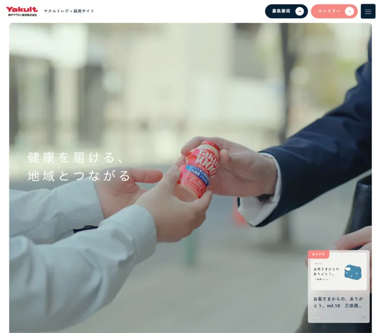
The desktop image starts around x = 30px, y = 75px and spans about 1380px. It shows a uniformed worker handling packaged products, with daylight and workplace notices behind her. The image looks subdued compared with the brighter supporting photographs, allowing white copy to sit over it.
The two-line message begins near x = 104px, around the vertical middle of the initial desktop viewport. It is left aligned and intentionally modest relative to the image area.
On mobile, the image still begins around y = 75px, with a 30px left inset and a crop that reaches the right viewport edge. The worker becomes a close portrait; much of the surrounding workplace disappears. The headline moves to the lower left, above the bottom action pair. Its visible contrast is lower in the supplied mobile frame; the exact opacity or animation state is unknown.
The desktop hero section has a measured document height of 2000px, while mobile uses 844px. That difference must not be interpreted as proof of a particular pinning or scroll-animation technique. The Quick Start supplies an explicitly static, viewport-sized adaptation.
Featured-Story Preview
Role: offer a small editorial entry point without displacing the hero.
At desktop, a pale panel sits at the lower right of the hero. Its measured link box is 202 × 238.31px, with 8px 9px 10px padding. Anatomy includes:
- A coral
おすすめtab overlapping the upper-left area. - A light illustrated thumbnail, about
184pxwide. - A navy title occupying roughly two lines at
14px / 22.4px. - Three tiny pagination dots near the lower left.
- A small outlined circular arrow near the lower right.
The three story links share the same sampled rectangle. Three 4 × 4px pagination buttons sit on a 10px pitch, and the third is coral in the supplied state. This supports a slide-based component, but autoplay, timing, and manual switching were not tested.
The visible desktop image shows the article identified as vol.10. Keep this preview subordinate to the photograph. It is not visible in the supplied mobile capture or mobile visible-link extraction.
Introductory Statement
Role: explain the work's community purpose before presenting practical details.
The introduction contains one medium-sized heading and three paragraphs. Desktop text occupies a 557.5px column beginning at x = 727.5px. Its measured 16px medium-weight copy has 32px line height, producing a deliberate reading rhythm.
On mobile, the text becomes a 350px column at x = 20px, using approximately 15.07px / 30.14px. The introductory section is much shorter than on desktop: approximately 1260px rather than 3000px.
The supplied screenshots do not show this complete section, so its image arrangement and any scroll choreography remain unverified. The typography and text geometry are directly supported by the DOM.
Bilingual Section Heading
Role: create a repeated landmark for each major content area.
The homepage uses English identifiers such as How we work, Interview, Recruitments, and Blog & News alongside Japanese explanations. These are grouped heading components rather than unrelated decorative words.
The measured heading parents use 26px desktop and 24px mobile at weight 600. Nested type sizing is not included in the element sample. Preserve the hierarchy seen in the footer—quiet Japanese descriptor, stronger English destination—without assuming every section uses identical child sizes.
Several heading parents declare opacity and transform transitions. Their exact initial offset, delay, and trigger are not supplied.
Work-Information Row
Role: explain one practical topic and link to a more detailed section.
Five topics cover numerical information, a typical day, starting work, training and support, and frequently asked questions. On desktop, each is a broad text-and-photo composition: 795px for text, approximately 75px of separation, and a photograph approximately 420px wide on the right.
The supplied middle capture shows two examples. One photograph depicts two colleagues discussing a device outdoors; the other shows a training conversation in a bright room. Both have gently rounded corners.
The text anatomy is consistent: a 24px semibold heading, 40px of measured space before the paragraph, a comfortably spaced paragraph, and a coral 詳しく知る pill after another 60px. Thin rules divide the text column. They stop before the photograph column rather than enclosing the entire row in a card.
Mobile text expands to the full 350px content width. Topic headings shrink to approximately 19.41px, body text to 15px / 27px, and detail buttons to 150 × 46px. The DOM indicates a much taller, vertically arranged section, but the mobile image order was not visually captured. Placing each image above its explanation is a recommendation in the Quick Start, not a verified source rule.
Crosstalk Feature
Role: introduce a longer conversation about support and working conditions.
The feature is one linked region containing an English identifier, a Japanese heading, and an explanatory paragraph. It measures approximately 1290 × 404.20px on desktop and 350 × 526.72px on mobile.
The desktop heading begins 70px inside the link's left boundary. The mobile heading begins 20px inside it and 30px below its top. These measurements support a padded editorial feature rather than another small detail button.
The destination is /crosstalk/. The supplied screenshots do not establish its complete imagery, background treatment, or hover appearance.
Staff Interview Cards
Role: let applicants explore personal experiences through individual stories.
Four linked stories are present. Each includes a starting-year label and a Japanese quotation-style title. Desktop rectangles place three cards across a 1190px inner area, with approximately 50px gaps; the fourth begins the next row. Each card is about 363.33px wide.
On mobile, the cards form one column approximately 309.88px wide, inset about 40.06px. The title size changes from approximately 21.01px to 17.31px.
The sampled text foreground is white. The section parent also reports a white background, so those parent properties alone do not establish the final composite surface. No supplied screenshot shows this section. Do not infer a specific navy panel, image overlay, or background effect from these records. A new implementation needs an explicitly contrasting surface appropriate to its chosen imagery.
Recruitment Information Section
Role: introduce the requirements page with a short explanation.
This section combines a bilingual heading, medium-weight copy, and a coral 募集要項を見る button. Desktop text occupies 625px; mobile uses the standard 350px content column.
The desktop section has measured padding of 140px above and 170px below. Mobile retains substantial breathing room, approximately 112.39px above and 105.55px below. Preserve this transition space between staff stories and the next material.
Blog and News Rail
Role: make ongoing community stories available from the homepage.
Six article links are present. Their desktop rectangles form a horizontal sequence of 367px cards separated by 20px; the fourth begins beyond most of the main content width. On mobile, cards become 285px wide with the same 20px gap, exposing the start of the next card within the viewport.
This geometry supports a horizontal rail. It does not prove drag, swipe, autoplay, or arrow behavior.
Each card contains article artwork, date/category information, and a semibold title; the first three also have an おすすめ label. The sampled card radius is 20px. Desktop padding is 47px 30px 30px; mobile padding is approximately 47px 18.04px 20.81px.
The title element includes substantial bottom padding—90px desktop and about 57.79px mobile. Its rectangle therefore includes reserved space, not unusually tall text leading. A coral detail link follows the rail and is aligned toward the right of the content area.
Entry Invitation
Role: provide a broad final invitation before the footer.
The entire Join Our Team block links to /entry/. Its desktop rectangle is approximately 1370 × 431.45px, inset 35px from each side, with 20px radius and 120px 90px 100px padding.
A portion of its coral surface is visible above the footer in the desktop capture, with a faint grain-like texture. The texture's asset or rendering method was not supplied.
On mobile, the link is 350 × 395.34px, with 15px radius and approximately 90px 25.55px 18px padding. Its heading and explanatory copy are white in the measured styles. Avoid converting this whole linked region into a panel containing nested interactive buttons.
Footer Navigation and Recruitment Tile
Role: combine a site map, a final recruitment reminder, and company contact information.
Desktop uses a centered 1200px area: three 390px columns separated by 15px. The first contains How we work and five subordinate topic links. The second stacks the remaining major destinations. The third contains a recruitment tile, an outlined corporate-site link, the brand lockup, and contact information.
The recruitment tile divides into equal image and copy halves. Its photograph places three staff members low against a large pale-blue sky. The copy half uses a pale navy tint, a small white recruitment badge, a centered two-line message, and a fine circular arrow near the lower right. The tile measures 390 × 211.81px on desktop and 350 × 190.09px on mobile.
The corporate-site link has a thin outline, pill geometry, navy text, and a small external-link symbol. The rendered footer provides the company address, telephone number, privacy-policy link, and copyright. An external-link symbol does not establish that the link opens a new tab.
Mobile preserves two navigation columns of 167.5px, then places the recruitment/contact block across the full 350px width. The privacy policy and copyright become separate left-aligned rows below a full-width rule. The bottom CTA pair remains visible over the footer view.
Tokens — Motion & Interaction
| Treatment | Supplied value or observation | What is established |
|---|---|---|
| Section-heading reveal styling | Opacity and transform, 1s cubic-bezier(.165, .84, .44, 1) |
CSS-defined transition; initial displacement, trigger, and staggering unverified |
| Recruitment paragraph reveal styling | Same 1s opacity/transform transition |
Declared on the sampled paragraph |
| Work-topic navigation color | 0.4s cubic-bezier(.39, .575, .565, 1) |
Color transition declared; activated state not captured |
| Interview title decoration | Background size, 0.4s cubic-bezier(.165, .84, .44, 1) |
Decoration animation supported; exact line or background geometry unknown |
| Entry invitation and footer recruitment tile | Opacity, 0.3s cubic-bezier(.165, .84, .44, 1) |
Declared feedback transition; endpoint opacity unknown |
| Corporate-site link | Background color and color, 0.3s cubic-bezier(.165, .84, .44, 1) |
Two-color transition declared |
| Featured-story dots | Transform, 0.2s linear |
Declared transform transition; resulting scale unknown |
| Header persistence | Header remains at the viewport top in scrolled captures | Persistent presentation observed; threshold and CSS positioning not supplied |
| Mobile recruitment actions | Same bottom placement in opening and footer captures | Persistent viewport placement supported by screenshots |
| Featured-story switching | Three overlapping story links and three pagination buttons | Slide structure supported; switching and autoplay untested |
| News navigation | Horizontally advancing card rectangles | Rail layout supported; input behavior untested |
The captured hero is photographic, but the evidence does not establish whether its underlying medium is a still image, video, or another sequence. Playback, audio, loop duration, and media controls are unverified.
Likewise, animation: none on sampled elements does not prove the whole site is static. Transitions, script-driven transforms, child elements, and media can operate independently. The capture process waited for visible finite motion and stability, but it did not exercise every interaction.
For a related implementation, use the measured gentle easing and restrained fades. Add reduced-motion behavior, keep content visible if enhancement scripts fail, and avoid introducing unsupported parallax or spring animations as if they were original features.
Surfaces
| Layer | Appearance | Evidence / implementation implication |
|---|---|---|
| Page canvas | Solid white | Measured |
| Initial header | White-looking band above photography | Screenshot-supported; sampled outer header background is transparent |
| Scrolled header | White inset rectangle with fine border | Visually observed; internal surface styles not supplied |
| Hero | Subdued workplace photograph with white lettering | Visually observed; overlay recipe unknown |
| Work information | White space, thin rules, rounded photographs | Visually observed |
| Featured-story panel | Pale translucent-looking surface | Visually observed; exact alpha and wrapper radius unmeasured |
| News cards | Rounded 20px link boxes |
Geometry measured; complete border/background composition not visually supplied |
| Footer recruitment tile | Pale navy tint beside a sky photograph | Background measured; image split visible |
| Entry invitation | Coral field with faint visible texture | Partial desktop visual evidence; texture source unknown |
| Mobile action pair | Filled pills with soft surrounding shadow | Visually observed; shadow values unmeasured |
There is no evidence for a broad elevation hierarchy of shadowed cards. Most separation comes from whitespace, photography, fine rules, and selective rounded boundaries.
Imagery
Photography carries the site's identity. The observed scenes feel close to everyday work: handling product packs, discussing a device, receiving training, and standing with colleagues. Uniforms and actual workplace objects give the images specificity.
Use natural daylight, believable skin tones, quiet expressions, and compositions that communicate an activity. The supporting photographs are brighter than the subdued hero. Navy uniforms, red jackets, pale architectural surfaces, vegetation, and sky provide image color without requiring extra interface accents.
The hero needs a crop strategy of its own. Its desktop framing gives both the person and workplace context room; the mobile framing prioritizes the face and upper body. The footer image has a different purpose: its large sky area and low-positioned group should remain legible inside half of a small horizontal tile.
Observed Asset References
No original image, video, logo, or font-file URLs were included in the supplied evidence. The following inventory identifies visible assets without inventing paths.
| Asset | Supplied visual evidence | Reuse guidance |
|---|---|---|
| Red brand lockup | Desktop and mobile headers and footers | Use authorized artwork with its proportions intact; do not recreate the wordmark as ordinary text |
| Workplace hero | Opening desktop and mobile captures | Prepare independent crop positioning for wide and narrow layouts |
| Outdoor guidance photograph | Desktop middle capture | Retain the interaction between two people and the device |
| Training photograph | Desktop middle capture | Preserve the instructor, participant, and bright room context |
| Three-person sky photograph | Desktop and mobile footers | Keep people low in the frame and preserve the sky area |
| Featured article illustration | Desktop hero preview | Preserve the light editorial artwork and small illustrated object |
| Coral texture | Partial entry invitation above desktop footer | A subtle texture is visible; its exact source and pattern are unknown |
Use original assets only when authorized and available. The CSS can recreate spacing and control geometry, but unrelated stock photography will substantially change the reference's character.
Layout & Responsive Behavior
The desktop composition uses several nested widths rather than one universal container: a 1380px hero image, 1290px main content area, 1190px interview area, and 1200px footer grid. This controlled variation gives large imagery room while keeping reading and navigation aligned within narrower regions.
| Region | Desktop evidence | Mobile evidence |
|---|---|---|
| Header | Full navigation and two right-hand CTAs | Compact brand and menu control |
| Hero | Wide image, message near vertical center, small story preview at lower right | Close crop, message near bottom, persistent CTA pair |
| Introductory text | 557.5px right-side text column |
350px full content column |
| Work topics | Wide text column with right-side photography | Full-width text; substantially taller section; image order unverified |
| Interviews | Three cards across, fourth on next row | Four cards in one narrow column |
| News | 367px cards with 20px gaps |
285px cards with 20px gaps and a next-card preview |
| Footer | Three equal columns | Two navigation columns followed by a full-width recruitment/contact block |
| Legal information | Privacy left, copyright right | Stacked, left aligned |
The first two desktop sections occupy exactly 2000px and 3000px in the supplied rectangles—two and three times the inspected viewport height. On mobile they occupy 844px and approximately 1260px. These are measured outcomes, not recovered responsive formulas. They are consistent with a presentation that changes its scroll staging across devices, but the mechanics were not captured.
The work section grows from approximately 2954px to 4467px, and the interview section from approximately 1590px to 2230px. These expansions coexist with a shorter total mobile document because the opening sections contract so much.
One additional text-empty section measures 560px on desktop and approximately 486px on mobile. Its visual content is not identifiable from the supplied captures. Do not invent a decorative scene or treat it as a confirmed blank spacer.
Only the two stated viewport sizes were inspected. Breakpoints, tablet layouts, safe-area handling, landscape behavior, and text-zoom behavior remain unverified. The Quick Start's 1100px navigation breakpoint and 767px content breakpoint are recommendations.
Do’s and Don’ts
Do
- Keep white as the dominant surface and
#062035as the primary structural color. - Use
#f68883consistently for entry and detail actions. - Keep the brand's red artwork separate from the softer action palette.
- Choose photographs that show a recognizable task, conversation, or working relationship.
- Preserve the desktop relationship of a broad text column, substantial gap, and rounded supporting image.
- Use
400,500, and600weights with open Japanese tracking and generous paragraph leading. - Build each pill from a label and a small circular arrow disc.
- Retain both recruitment actions on mobile and reserve space for their persistent placement.
- Preserve the footer's bilingual hierarchy and two-column mobile site map.
- Treat news as a horizontal editorial sequence where supported by the measured geometry.
Don't
- Don't turn all information into a uniform grid of small promotional cards.
- Don't use the logo's saturated red for every button and background.
- Don't replace the natural workplace images with unrelated office stock photography.
- Don't enlarge every heading into oversized display type; the photographs carry the opening impact.
- Don't infer the actual hero lettering size from its empty H1's inherited font declaration.
- Don't reproduce duplicate extracted navigation strings as visible or accessible duplicate labels.
- Don't add heavy shadows, glass blur, or bright gradients throughout the page.
- Don't reproduce multi-viewport desktop section heights as empty space in a static adaptation.
- Don't claim video playback, autoplay, swipe controls, dropdown choreography, or parallax without further evidence.
- Don't let fixed actions obscure legal links, focused controls, or the last lines of content.
Recommended Implementation Additions
These are recommendations for a new implementation, not verified original features:
- Improve coral-button text contrast. White against the measured coral is approximately
2.4:1, calculated from the flat colors. Navy text on the same coral is approximately6.9:1. Use navy labels or a darker coral variant where normal-text contrast is required. The Quick Start includes an optional contrast class. - Give the mobile headline dependable contrast. Keep it fully readable over every chosen crop or media frame. A localized gradient is preferable to relying on an uncertain fade state.
- Preserve semantic navigation. Keep destination actions as links, use a button for the menu toggle, and maintain its expanded state and controlled-region relationship. Hide purely decorative arrows from assistive technology.
- Retain and verify the skip link. A link to
#contentexists in the original evidence. Ensure it becomes visible on keyboard focus and reaches an unobscured main-content target. - Expand small control hit areas. The menu's visible square is only
37px, and carousel dots are4px. Preserve their visual proportions while providing larger pointer targets. - Make carousel content reachable. If implementing slides, provide keyboard-operable controls, meaningful names, selected state, and a way to pause any automatic progression.
- Reserve fixed-control clearance. Include bottom safe-area allowance and enough document padding beneath mobile footer content. Give anchored sections a header-aware scroll margin.
- Keep content resilient. Respect reduced motion, leave text visible without animation scripts, and let cards grow for long titles or text zoom.
- Use responsive image sources. Supply suitable image resolutions, intrinsic dimensions, and crop-specific positioning. Prioritize the opening image and defer lower-page assets appropriately.
Agent Prompt Guide
Quick Color Reference
- Canvas and ordinary content surfaces:
#ffffff. - Main text, structural icons, menu, and recruitment button:
#062035. - Entry and detail actions:
#f68883. - Declared secondary/hover accent:
#7ec5ed; use sparingly. - Footer recruitment surface:
rgba(6, 32, 53, 0.06). - Copyright:
rgba(6, 32, 53, 0.4). - Brand red: supplied artwork, not an invented UI hex value.
Overall Prompt
“Create a Japanese recruitment homepage centered on everyday workplace photography. Use a white canvas, deep navy #062035 typography, and coral #f68883 pill actions with small white circular arrow discs. Pair Roboto and Zen Kaku Gothic New when available, using regular-to-semibold weights and relaxed Japanese line spacing. Build a compact desktop header above a large rounded workplace image. Follow it with generous text-and-photo work explanations, staff stories, a horizontal news rail, a broad entry invitation, and a bilingual site-map footer. On mobile, use a compact menu, a carefully repositioned photographic crop, and two persistent bottom recruitment links. Treat unverified motion and media behavior as optional enhancements.”
Example Component Prompts
- Work-information row: “Create a white desktop section within a 1290px content area. Place a 795px text column at left and a 420px rounded training photograph at right, separated by 75px. Use a 24px semibold Japanese heading, 17px text with 1.8 leading, a thin divider limited to the text column, and a 170 × 52px coral detail pill.”
- Mobile action pair: “Place two 46px-high recruitment pills near the bottom center of a 390px viewport, with a 14px gap and 24px minimum bottom clearance. Use navy for
募集要項and coral forエントリー, each ending in a small circular arrow. Add a restrained shadow and reserve content space beneath them.” - Footer recruitment tile: “Design a 350 × 190px tile split into equal halves. At left, show three colleagues low against a pale-blue sky. At right, use a very light navy tint, a small white recruitment badge, a centered two-line navy message, and a small outlined arrow near the lower right. Clip the outer corners gently.”
- News rail: “Create a horizontal sequence of 285px-wide mobile article cards with 20px gaps and 20px corners. Include artwork, date/category information, a compact recommendation label where appropriate, and a semibold Japanese title. Reveal part of the next card. Allow card height to expand and provide explicit accessible navigation.”
- Footer site map: “Use two mobile navigation columns with small muted Japanese descriptors above stronger English destination names. Put the work-topic list under the first destination. Below both columns, place a full-width recruitment tile, an outlined corporate-site link, the brand and contact block, and separated legal information.”
Quick Start
CSS Custom Properties
This is a reusable static adaptation, not recovered source CSS. It reproduces the measured palette, major dimensions, type endpoints, and recurring component anatomy. The breakpoints, crop positioning, hero overlay, photograph radii, footer English type sizes, and shadow values are recommendations or visual approximations.
It deliberately avoids copying the unverified desktop scroll staging. Font files and authorized images must be supplied separately. Apply .is-scrolled only through your own header-state implementation. The standard coral CTA retains the observed white label; add .cta--contrast for the recommended navy-label variant.
:root {
  /* Measured palette, exposed through implementation aliases. */
  --canvas: #ffffff;
  --ink: #062035;
  --coral: #f68883;
  --coral-hover: #f48480;
  --sky: #7ec5ed;
  --surface-soft: rgb(6 32 53 / 6%);
  --text-muted: rgb(6 32 53 / 40%);

  /* Recommended assignments using measured navy tint values. */
  --rule: rgb(6 32 53 / 10%);
  --rule-strong: rgb(6 32 53 / 30%);

  /* Shortened version of the declared family stack. */
  --font-site: Roboto, 'Zen Kaku Gothic New', yakuhanjp,
    -apple-system, BlinkMacSystemFont, 'Helvetica Neue',
    'Hiragino Sans', 'Yu Gothic', Meiryo, sans-serif;
  --weight-regular: 400;
  --weight-medium: 500;
  --weight-bold: 600;
  --body-size: 17px;
  --tracking: 0.85px;
  --topic-size: 24px;

  --header-height: 75px;
  --page-gutter: 75px;
  --content-max: 1290px;
  --footer-max: 1200px;
  --column-gap: 75px;
  --heading-gap: 40px;
  --action-gap: 60px;

  --radius-pill: 44px;
  --radius-card: 20px;
  --radius-image: 10px;
  --radius-menu: 5px;

  /* Measured easing and durations; usage is an adaptation. */
  --ease-out-quart: cubic-bezier(.165, .84, .44, 1);
  --ease-out-sine: cubic-bezier(.39, .575, .565, 1);
  --motion-feedback: 300ms var(--ease-out-quart);
  --motion-color: 400ms var(--ease-out-sine);
  --motion-reveal: 1000ms var(--ease-out-quart);
}

* { box-sizing: border-box; }

body {
  margin: 0;
  color: var(--ink);
  background: var(--canvas);
  font-family: var(--font-site);
  font-size: var(--body-size);
  font-weight: var(--weight-regular);
  line-height: 1.6;
  letter-spacing: var(--tracking);
}

img { display: block; max-width: 100%; }
button, input, select, textarea { font: inherit; }
a { color: inherit; }

.container {
  width: min(
    var(--content-max),
    calc(100% - var(--page-gutter) - var(--page-gutter))
  );
  margin-inline: auto;
}

:where(a, button, input, select, textarea):focus-visible {
  outline: 2px solid var(--ink);
  outline-offset: 4px;
}

[id] { scroll-margin-top: calc(var(--header-height) + 40px); }

.skip-link {
  position: fixed;
  z-index: 100;
  top: 12px;
  left: 20px;
  padding: 10px 16px;
  color: var(--ink);
  background: var(--canvas);
  transform: translateY(-180%);
}
.skip-link:focus { transform: none; }

.site-header {
  position: fixed;
  z-index: 50;
  top: 0;
  inset-inline: 0;
  display: flex;
  align-items: center;
  gap: 28px;
  height: var(--header-height);
  padding-inline: 30px;
  background: var(--canvas);
}

/* The modifier approximates the supplied scrolled captures. */
.site-header.is-scrolled {
  top: 20px;
  inset-inline: 20px;
  border: 1px solid var(--rule);
  border-radius: 4px;
}

.brand {
  display: inline-flex;
  align-items: center;
  gap: 16px;
  flex-shrink: 0;
  text-decoration: none;
}
.brand__logo { width: 105px; height: auto; }
.brand__label { font-size: 12px; font-weight: 500; }

.desktop-nav {
  display: flex;
  align-items: center;
  gap: 20px;
  margin-inline-start: auto;
  font-size: 14px;
  font-weight: 600;
}
.desktop-nav a {
  text-decoration: none;
  transition: color var(--motion-color);
}
.header-actions { display: flex; gap: 10px; }
.menu-toggle { display: none; }

.cta {
  display: inline-flex;
  align-items: center;
  justify-content: space-between;
  gap: 10px;
  min-height: 46px;
  padding: 7px 11px 7px 22px;
  border: 0;
  border-radius: var(--radius-pill);
  color: white;
  background: var(--ink);
  font-size: 14px;
  font-weight: 500;
  line-height: 1.6;
  text-decoration: none;
}
.cta--requirements { width: 140px; }
.cta--entry { width: 153px; }
.cta--coral { background: var(--coral); }
.cta--contrast { color: var(--ink); }
.cta--detail {
  width: 170px;
  min-height: 52px;
  padding: 10px 11px 10px 20px;
  gap: 5px;
  background: var(--coral);
}
.cta__arrow {
  display: grid;
  place-items: center;
  flex: 0 0 28px;
  width: 28px;
  height: 28px;
  border-radius: 50%;
  color: var(--ink);
  background: white;
  font-size: 14px;
  letter-spacing: 0;
}
.cta--coral .cta__arrow,
.cta--detail .cta__arrow { color: var(--coral); }
.cta--contrast .cta__arrow { color: var(--ink); }
.cta--detail .cta__arrow {
  flex-basis: 30px;
  width: 30px;
  height: 30px;
}

/* Static hero adaptation; no unverified pinning or media behavior. */
.hero {
  position: relative;
  min-height: calc(100svh - 75px);
  margin: 75px 30px 0;
  overflow: hidden;
  border-radius: var(--radius-image);
}
.hero__media {
  position: absolute;
  inset: 0;
  width: 100%;
  height: 100%;
  object-fit: cover;
  object-position: 50% 50%;
}
.hero__shade {
  position: absolute;
  inset: 0;
  background: linear-gradient(
    90deg, rgb(6 32 53 / 24%), rgb(6 32 53 / 8%)
  );
}
.hero__headline {
  position: absolute;
  top: 46%;
  left: 5.35%;
  margin: 0;
  transform: translateY(-50%);
  color: white;
  font-size: 40px;
  font-weight: 400;
  line-height: 1.5;
  letter-spacing: .2em;
}

.featured-story {
  position: absolute;
  right: 13px;
  bottom: 30px;
  width: 202px;
  min-height: 238px;
  padding: 8px 9px 10px;
  border-radius: 6px;
  background: rgb(255 255 255 / 80%);
  text-decoration: none;
}
.featured-story img {
  width: 100%;
  aspect-ratio: 3 / 2;
  object-fit: cover;
  border-radius: 5px;
}
.featured-story h3 {
  margin: 18px 9px 24px;
  font-size: 14px;
  font-weight: 600;
  line-height: 1.6;
}

.work-section { padding-top: 130px; }
.work-row {
  display: grid;
  grid-template-columns: minmax(0, 53fr) minmax(0, 28fr);
  gap: var(--column-gap);
  align-items: start;
  margin-block: 70px;
}
.work-copy {
  padding-block: 70px 30px;
  border-top: 1px solid var(--rule-strong);
}
.work-copy h3 {
  margin: 0 0 var(--heading-gap);
  font-size: var(--topic-size);
  font-weight: 600;
  line-height: 1.6;
}
.work-copy p {
  margin: 0 0 var(--action-gap);
  line-height: 1.8;
}
.work-photo {
  width: 100%;
  aspect-ratio: 420 / 382;
  object-fit: cover;
  border-radius: var(--radius-image);
}

/* Native horizontal scrolling is a recommended implementation. */
.news-rail {
  display: grid;
  grid-auto-flow: column;
  grid-auto-columns: 367px;
  gap: 20px;
  overflow-x: auto;
  overscroll-behavior-inline: contain;
  scroll-snap-type: x proximity;
  padding-block: 8px;
}
.news-card {
  min-width: 0;
  min-height: 493px;
  padding: 47px 30px 30px;
  border: 1px solid var(--rule);
  border-radius: var(--radius-card);
  scroll-snap-align: start;
  text-decoration: none;
}
.news-card h3 {
  margin-block: 20px 0;
  font-size: 16px;
  font-weight: 600;
  line-height: 1.6;
}

.join-panel {
  display: block;
  margin: 35px 35px 0;
  padding: 120px 90px 100px;
  border-radius: 20px;
  color: white;
  background: var(--coral);
  text-decoration: none;
}

.footer-grid {
  display: grid;
  grid-template-columns: repeat(3, minmax(0, 1fr));
  gap: 15px;
  width: min(var(--footer-max), calc(100% - 150px));
  margin-inline: auto;
  padding-block: 144px 120px;
}
.footer-destination {
  display: block;
  margin-bottom: 20px;
  text-decoration: none;
}
.footer-destination small {
  display: block;
  color: var(--text-muted);
  font-size: 11px;
}
.footer-destination strong {
  display: block;
  font-size: 32px;
  font-weight: 500;
  line-height: 1.2;
  letter-spacing: 0;
}

.recruit-tile {
  display: grid;
  grid-template-columns: repeat(2, minmax(0, 1fr));
  min-height: 212px;
  overflow: hidden;
  border-radius: 10px;
  background: var(--surface-soft);
  text-decoration: none;
}
.recruit-tile__photo {
  width: 100%;
  height: 100%;
  object-fit: cover;
  object-position: center bottom;
}
.recruit-tile__copy {
  display: grid;
  place-content: center;
  justify-items: center;
  gap: 20px;
  padding: 20px;
  text-align: center;
}
.recruit-tile__badge {
  padding: 4px 20px;
  border-radius: 40px;
  background: white;
  font-size: 12px;
  font-weight: 600;
}
.recruit-tile__copy h3 {
  margin: 0;
  font-size: 17px;
  font-weight: 600;
  line-height: 1.4;
}
.corporate-link {
  display: inline-flex;
  align-items: center;
  gap: 14px;
  margin-block: 35px;
  padding: 14px 38px;
  border: 1px solid var(--rule-strong);
  border-radius: 45px;
  font-weight: 500;
  text-decoration: none;
  transition: color var(--motion-feedback),
    background-color var(--motion-feedback);
}
.footer-legal {
  display: flex;
  justify-content: space-between;
  gap: 24px;
  padding: 55px max(20px, calc((100% - 1200px) / 2));
  border-top: 1px solid var(--rule);
  font-size: 13px;
}
.footer-legal p {
  margin: 0;
  color: var(--text-muted);
  letter-spacing: 0;
}
.mobile-actions { display: none; }

/* Transition hooks stay visible without JavaScript. */
.reveal {
  transition: opacity var(--motion-reveal),
    transform var(--motion-reveal);
}

@media (hover: hover) {
  .desktop-nav a:hover { color: var(--sky); }
  .corporate-link:hover {
    color: white;
    background: var(--ink);
  }
}

/* Recommended navigation breakpoint, not a recovered source value. */
@media (max-width: 1100px) {
  .desktop-nav, .header-actions { display: none; }
  .menu-toggle {
    position: relative;
    display: grid;
    place-content: center;
    gap: 4px;
    width: 37px;
    height: 37px;
    margin-inline-start: auto;
    padding: 0;
    border: 0;
    border-radius: var(--radius-menu);
    background: var(--ink);
  }
  .menu-toggle span {
    display: block;
    width: 16px;
    height: 1px;
    background: white;
  }
  .menu-toggle::after {
    position: absolute;
    inset: -4px;
    content: '';
  }
}

/* Recommended content breakpoint with measured mobile endpoints. */
@media (max-width: 767px) {
  :root {
    --body-size: 15px;
    --tracking: 0.75px;
    --topic-size: 19.407px;
    --header-height: 61px;
    --page-gutter: 20px;
    --heading-gap: 21.56px;
    --action-gap: 41.56px;
  }

  .site-header { padding-inline: 18px; }
  .site-header.is-scrolled {
    top: 10px;
    inset-inline: 10px;
    padding-inline: 10px;
  }
  .brand { flex-direction: column; align-items: flex-start; gap: 3px; }
  .brand__label { order: -1; font-size: 9px; }
  .brand__logo { width: 70px; }

  .hero {
    min-height: calc(100svh - 75px);
    margin: 75px 0 0 30px;
  }
  .hero__media { object-position: 43% center; }
  .hero__shade {
    background: linear-gradient(
      transparent 45%, rgb(6 32 53 / 48%)
    );
  }
  .hero__headline {
    top: auto;
    right: 12px;
    bottom: 104px;
    left: 0;
    transform: none;
    font-size: 26px;
    line-height: 1.5;
  }
  .featured-story { display: none; }

  .cta { padding: 10px 9px 10px 22px; gap: 12px; }
  .cta--entry { width: 142.75px; }
  .cta--detail { width: 150px; min-height: 46px; }
  .cta__arrow, .cta--detail .cta__arrow {
    flex-basis: 24px;
    width: 24px;
    height: 24px;
  }

  .work-section { padding-top: 65.55px; }
  .work-row { grid-template-columns: 1fr; gap: 28px; }
  .work-photo { order: -1; }
  .work-copy { padding: 0; border-top: 0; }

  .news-rail { grid-auto-columns: 285px; }
  .news-card {
    min-height: 424px;
    padding: 47px 18.04px 20.81px;
  }
  .news-card h3 { font-size: 15.069px; }

  .join-panel {
    min-height: 395px;
    margin: 0 20px;
    padding: 90px 25.55px 18px;
    border-radius: 15px;
  }
  .footer-grid {
    width: calc(100% - 40px);
    grid-template-columns: repeat(2, minmax(0, 1fr));
    row-gap: 64px;
    padding-block: 85px;
  }
  .footer-contact { grid-column: 1 / -1; }
  .footer-destination strong { font-size: 24px; }
  .recruit-tile { min-height: 190px; }
  .recruit-tile__badge { padding-inline: 12px; font-size: 10px; }
  .recruit-tile__copy h3 { font-size: 15px; }
  .corporate-link { margin-block: 26px 36px; }
  .footer-legal {
    flex-direction: column;
    padding: 40px 28px calc(100px + env(safe-area-inset-bottom, 0px));
    font-size: 12px;
  }

  .mobile-actions {
    position: fixed;
    z-index: 40;
    left: 50%;
    bottom: max(24px, env(safe-area-inset-bottom, 0px));
    display: flex;
    gap: 14px;
    width: max-content;
    transform: translateX(-50%);
  }
  .mobile-actions .cta {
    box-shadow: 0 6px 24px rgb(6 32 53 / 18%);
  }
}

@media (prefers-reduced-motion: reduce) {
  .reveal, .desktop-nav a, .corporate-link {
    transition: none;
  }
  .news-rail { scroll-snap-type: none; }
}
Minimal Component Markup
The image path below is an illustrative local replacement, not an observed source asset. This example uses the optional contrast treatment. Other recommended behavior, including menu state and carousel controls, requires separate implementation.
<section class='work-section container' aria-labelledby='work-heading'>
  <h2 id='work-heading'>How we work</h2>
  <article class='work-row'>
    <div class='work-copy'>
      <h3>研修とサポート体制</h3>
      <p>充実した研修とサポートがあるから、未経験でも安心。</p>
      <a class='cta cta--detail cta--contrast'
         href='/how-we-work#system'>
        <span>詳しく知る</span>
        <span class='cta__arrow' aria-hidden='true'>→</span>
      </a>
    </div>
    <img class='work-photo' src='/images/training.jpg'
         width='840' height='764' loading='lazy'
         alt='A colleague leading a training conversation in a bright room'>
  </article>
</section>

<nav class='mobile-actions' aria-label='Recruitment actions'>
  <a class='cta cta--requirements' href='/recruitments/'>
    <span>募集要項</span>
    <span class='cta__arrow' aria-hidden='true'>→</span>
  </a>
  <a class='cta cta--entry cta--coral cta--contrast' href='/entry/'>
    <span>エントリー</span>
    <span class='cta__arrow' aria-hidden='true'>→</span>
  </a>
</nav>
Tailwind v4 Token Mapping
Optional aliases for projects already using Tailwind v4. This is not evidence that the original site uses Tailwind. Define the custom properties above first.
@theme inline {
  --color-canvas: var(--canvas);
  --color-ink: var(--ink);
  --color-coral: var(--coral);
  --color-sky: var(--sky);
  --color-surface-soft: var(--surface-soft);
  --color-muted: var(--text-muted);

  --font-site: var(--font-site);

  --text-body: var(--body-size);
  --text-topic: var(--topic-size);
  --text-action: 14px;

  --spacing-page: var(--page-gutter);
  --spacing-column: var(--column-gap);
  --spacing-heading-gap: var(--heading-gap);
  --spacing-action-gap: var(--action-gap);

  --radius-pill: 44px;
  --radius-card: 20px;
  --radius-image: 10px;
  --radius-menu: 5px;
}
Sources & Evidence
- Inspected original and final website: https://kobe-yl.jp/. The supplied browser record reports HTTP
200and no URL change. - Capture session: September 12, 2026; evidence timestamp
2026-09-12T06:33:45.600Z. Desktop viewport1440 × 1000; mobile viewport390 × 844CSS pixels. - Visual evidence: three desktop captures showing the opening hero, two work-information rows, and footer; two mobile captures showing the opening hero and lower footer. Header and mobile CTA persistence are supported by their appearance at separated scroll positions.
- Rendered evidence: page title, visible text, link destinations, custom properties, sampled element rectangles, computed typography, backgrounds, padding, radii, and transition declarations at both viewports.
- Readiness context: the supplied inspection observed the initial page for at least five seconds and used load, image-decoding, finite-animation, and sampled-layout checks. Perpetual animations were temporarily paused during readiness checks and resumed. These checks do not establish that every delayed state or interaction was observed.
- Limitations: no independent browsing or additional file access was performed for this reference. No menu-opening, form, hover, carousel, media-playback, or linked-page interaction trace was supplied. Asset URLs, complete child/pseudo-element styling, exact breakpoints, and tablet behavior remain unverified. SharedWorkers and service workers were disabled during the supplied inspection.
This document describes the current homepage represented by the supplied original-page evidence. CSS adaptations, accessibility changes, and inferred layout conveniences are explicitly distinguished from measured source behavior.
# Kobe Yakult Lady Recruitment — Style Reference

> Everyday work, photographed with care, framed by navy text and coral invitations.

**Website / original URL:** [kobe-yl.jp](https://kobe-yl.jp/)
**Final URL:** [https://kobe-yl.jp/](https://kobe-yl.jp/)
**Theme:** light; white canvas, deep navy typography, coral actions
**Inspected:** September 12, 2026, through the supplied browser capture session. Evidence timestamp: `2026-09-12T06:33:45.600Z`, equivalent to 15:33:45.600 JST.
**Viewports:** desktop `1440 × 1000` and mobile `390 × 844` CSS pixels.
**Scope:** the current recruitment homepage, including its opening view, work information, interview and news structures, recruitment links, entry invitation, and footer. Visual coverage consists of three desktop captures and two mobile captures; rendered DOM evidence covers additional homepage sections. Linked pages, forms, and expanded navigation were not inspected.

This is a recruitment hub for 神戸ヤクルト販売株式会社. It combines practical job information with staff stories, news, company information, and several routes toward application. Its defining relationship is between expansive workplace photography and restrained navigation: a large image establishes the human context, while small navy labels and coral pill buttons keep the next steps clear.

The visual tone is calm and approachable. White space is generous, Japanese copy has open tracking and comfortable line spacing, and photographs show people preparing products, receiving guidance, and working together. The red brand mark remains distinct from the softer coral used for actions. On mobile, the composition becomes more intimate through a close photographic crop, a compact menu button, and two persistent recruitment actions near the bottom edge.

## How to Read This Reference

- **Measured** means a value appears in the supplied computed styles or element rectangles. Rectangle values are rounded where excessive precision would not help implementation.
- **Visual estimate** means a proportion, color impression, or dimension was judged from an attached capture. It is not a recovered stylesheet declaration.
- **Calculated** means a value was derived from supplied measurements, such as a column gap or an alpha color composited over white.
- **Recommended** identifies implementation guidance, including the CSS adaptation below. It does not describe verified original behavior.
- Token aliases introduced here are descriptive. Original custom-property names are explicitly identified.
- A computed font-family stack establishes the declared family order, not successful loading of every named font or the exact face used for each glyph.
- The supplied element records do not include every image, child span, pseudo-element, or positioning rule. Transparent parent backgrounds and inherited heading sizes should not be mistaken for the complete rendered appearance.

## Tokens — Colors

### Core Palette

| Name | Value | Source / suggested alias | Role and evidence |
| --- | --- | --- | --- |
| White Canvas | `#ffffff` | Source `--color-bg`, `--background-color`, `--color-white`; alias `--canvas` | Measured body background; dominant page surface |
| Deep Navy | `#062035` | Source `--color`; alias `--ink` | Measured text, recruitment button fill, and mobile menu fill |
| Coral Action | `#f68883` | Source `--color-submit-bg`, `--link-color`; alias `--coral` | Measured entry and detail-button backgrounds; active featured-story dot |
| Sky Accent | `#7ec5ed` | Source `--color-secondary`, `--link-hover-color`; alias `--sky` | Declared secondary and hover color; not a dominant visible fill in the supplied captures |
| Recruitment Tile Tint | `rgba(6, 32, 53, 0.06)` | Measured footer recruitment-link background; alias `--surface-soft` | Very pale navy tint behind the tile copy |
| Tile Tint on White | Approximately `#f0f2f3` | Calculated opaque equivalent | Useful when alpha compositing is undesirable |
| Muted Navy | `rgba(6, 32, 53, 0.4)` | Source `--color-base-40`; alias `--text-muted` | Measured copyright color |

Navy supplies nearly all structural contrast. Coral marks an invitation to proceed, while white remains the dominant surface. The logo's saturated red belongs to the brand artwork; its exact asset color was not recovered as a UI token.

### Supporting Colors and State Tokens

| Value | Evidence | Appropriate interpretation |
| --- | --- | --- |
| `rgba(6, 32, 53, 0.1)` | Source `--color-base-10` | Available pale navy token; suitable for the fine rules seen in the captures, although individual border colors were not supplied |
| `rgba(6, 32, 53, 0.3)` | Source `--color-base-30` | Available intermediate navy tint |
| `rgba(6, 32, 53, 0.5)` | Source `--color-base-50` | Available stronger muted navy |
| `rgba(255, 255, 255, 0.7)` and `0.8` | Source `--color-white-70` and `--color-white-80` | Available translucent white tokens; the featured-story panel looks translucent, but its exact compositing rule is unverified |
| `rgb(244, 132, 128)` / `#f48480` | Source `--color-submit-bg-hover-rgb` | Declared submit-hover color; an activated hover state was not captured |

Generic editor color, gradient, and shadow presets also appear in the supplied properties. They are not evidence that the visible design uses those presets. No alternate theme or dark-mode control was observed.

## Tokens — Typography

### Declared Families

The body declares **Roboto**, followed by **Zen Kaku Gothic New**, `yakuhanjp`, and system sans-serif fallbacks. This supports a clean Latin/Japanese pairing: compact English navigation titles alongside relatively open Japanese text.

The supplied Japanese family token begins with `Zen Kaku Gothic New`. The longer fallback sequence includes Apple system fonts, Helvetica Neue, Hiragino families, Yu Gothic, Verdana, Meiryo, and M+ 1p. The Quick Start uses a shortened version of this declared stack.

Source weight tokens are:

- `--font-normal: 400`
- `--font-medium: 500`
- `--font-bold: 600`

The design therefore relies on regular, medium, and semibold rather than exceptionally heavy display lettering. The `Times` value on the root HTML element is superseded by the body stack and should not become the page's visual font.

### Type Scale

Values below are computed CSS sizes and line heights, unless marked as estimates.

| Role | Desktop size / line height | Mobile size / line height | Weight | Tracking / qualification |
| --- | --- | --- | --- | --- |
| Body default | `17 / 27.2px` | `15 / 24px` | `400` | `0.85px` desktop, `0.75px` mobile; both equal `0.05em` at body size |
| Work-description paragraphs | `17 / 30.6px` | `15 / 27px` | `400` | `1.8` line height |
| Introductory paragraphs | `16 / 32px` | `15.069 / 30.138px` | `500` | Approximately `2` line height |
| Introductory heading | `27.008 / 37.811px` | `20.576 / 28.806px` | `600` | `0.03em` |
| Section-heading parent | `26 / 41.6px` | `24 / 38.4px` | `600` | Child English/Japanese styles were not separately measured |
| Work-topic heading | `24 / 38.4px` | `19.407 / 31.051px` | `600` | Inherits page tracking |
| Interview title | `21.008 / 33.613px` | `17.307 / 27.691px` | `600` | White foreground in the sampled DOM |
| News-card title | `16 / 25.6px` | `15.069 / 24.110px` | `600` | Separate bottom padding contributes to the title element's rectangle |
| Desktop navigation | `14 / 22.4px` | Replaced by menu control | `600` | Most links have `0.85px` tracking |
| CTA label | `14 / 22.4px` | `14 / 22.4px` | `500` | Inherits desktop/mobile tracking |
| Featured-story title | `14 / 22.4px` | Not visible | `600` | Two-line title area |
| Footer topic link | `14 / 22.4px` | `12.177 / 19.483px` | `500` | Smaller than body copy |
| Footer recruitment badge | `12 / 19.2px` | `10 / 16px` | `600` | White pill behind navy text |
| Copyright | `13.008 / 20.813px` | `12.061 / 19.298px` | `400` | Normal tracking; muted navy |
| Large English footer link | About `32px` | About `24px` | Visually medium | Screenshot estimate; parent link styles do not establish child size |

### Graphic Lettering and Bilingual Labels

The hero visibly reads `健康を届ける、` and `地域とつながる` on two lines. Its lettering is light in appearance and widely spaced, approximately `38–40px` on desktop and `26–28px` on mobile. These are visual estimates.

The sampled hero H1 has an empty extracted text value. Its parent font sizes of `32px` and `26px` do not prove the rendered lettering's font or size. The title may be supplied through an unrecorded graphic or child structure; its mechanism is unverified.

Footer navigation pairs a small muted Japanese descriptor with a much larger English destination, such as `How we work`, `Crosstalk`, and `Entry`. Keep those two levels distinct. Repeated words in the DOM extraction do not mean duplicate labels should appear visibly or be announced twice.

## Tokens — Spacing & Shapes

### Spacing Scale

This is a spacious editorial layout with compact controls. Its measured values do not establish a universal eight-pixel spacing system.

| Use | Desktop | Mobile | Evidence |
| --- | --- | --- | --- |
| Main content side gutter | `75px` | `20px` | Measured content rectangles |
| Initial header brand inset | `30px` | `18px` | Measured link position |
| Scrolled header outer inset | About `20px` | About `10px` | Visual estimates from scrolled captures |
| Desktop work-column gap | `75px` | Columns no longer side by side | Calculated from text and photographed column positions |
| Work heading to paragraph | `40px` | About `21.56px` | Calculated from DOM rectangles |
| Work paragraph to CTA | `60px` | About `41.56px` | Calculated from DOM rectangles |
| Introductory paragraph gap | `20px` | `20px` | Calculated from consecutive rectangles |
| Work-section top padding | `130px` | `65.549px` | Computed padding |
| Intro-section top padding | `200px` | `200px` | Computed padding |
| News-card horizontal gap | `20px` | `20px` | Calculated from consecutive card positions |
| Footer column gap | `15px` | `15px` | Calculated from link-column rectangles |
| Mobile action-pair gap | — | `14px` | Calculated from CTA rectangles |
| Mobile action bottom clearance | — | `24px` | Calculated: `844 − 820` |

Use the large gaps to distinguish topics and give photographs room. Preserve the smaller, consistent spacing inside controls so the interface remains easy to scan.

### Border Radius

| Element | Value | Status |
| --- | --- | --- |
| Primary and detail pills | `44px` | Computed |
| Corporate-site outline link | `45px` | Computed |
| Footer recruitment badge | `40px` | Computed |
| Mobile menu button | `5px` | Computed |
| News card | `20px` | Computed |
| Entry invitation | `20px` desktop; `15px` mobile | Computed |
| Hero and work photographs | Approximately `10px` | Visual estimate |
| Footer recruitment tile outer clipping | Approximately `10px` | Visual estimate; the sampled link itself reports `0px` radius |
| Featured-story panel | Approximately `6px` | Visual estimate; clipping may belong to an unrecorded wrapper |
| Arrow discs and pagination marks | Circular | Visible; pagination buttons explicitly use `50%` |

### Layout Measurements

| Element | Desktop | Mobile |
| --- | --- | --- |
| Document height | `13229.92px` | `12530.86px` |
| Initial header | `1440 × 75px` | `390 × 61px` |
| Initial brand-link box | `291.20 × 32px` | `120.61 × 41.89px` |
| Main content width | `1290px` | `350px` |
| Work text column | `795px` | `350px` |
| Visible training photograph | Approximately `420 × 382px` | No mobile middle-section capture supplied |
| Header recruitment CTA | `140 × 46px` | Bottom placement: `140 × 46px` |
| Header entry CTA | `153 × 46px` | Bottom placement: `142.75 × 46px` |
| Standard detail CTA | `170 × 52px` | `150 × 46px` |
| Featured-story link | `202 × 238.31px` | Absent from the supplied visible mobile evidence |
| Interview card width | `363.33px` | `309.88px` |
| News card | `367 × 493.45px` | `285 × 424.25px` |
| Footer recruitment tile | `390 × 211.81px` | `350 × 190.09px` |
| Corporate-site link | `264.66 × 52.09px` | `245.75 × 49.5px` |

The news-card dimensions describe sampled content, not a recommended fixed text height. Allow longer titles and text resizing to expand a new implementation.

## Components

### Persistent Header

**Role:** identify the recruitment site and keep its major destinations available.

The desktop opening header is a `75px` band. A red brand mark and the Japanese recruitment descriptor occupy the left; navigation and two pill CTAs occupy the right. The brand link uses a measured `16px` internal gap. Navigation labels are `14px`, semibold, and navy.

The navigation includes a `「ヤクルトレディ」を知る` button with a visible plus sign, interview access, crosstalk, and company information. The DOM also contains five related work-topic destinations. Their expanded presentation and opening behavior were not exercised.

In the desktop middle and footer captures, the header appears as a white floating rectangle inset approximately `20px` from the viewport edges, with a fine border and small corners. Its continued presence is visible evidence of persistence across scroll positions; the exact scroll threshold and positioning implementation were not supplied.

On mobile, the descriptor sits above a smaller brand mark. A navy `37 × 37px` menu button sits at `x = 335px`, with `5px` corners and three fine white lines. Its supplied accessible text is `メニューを開閉する`. The opening header measures `61px` high; the `65px` header custom property should not override that observed measurement.

### Recruitment and Entry Pills

**Role:** distinguish reviewing job requirements from beginning an application.

The pair uses the same anatomy: a navy or coral capsule, a medium-weight white Japanese label, and a small white circular arrow disc at the right. The disc is visually about `28–30px` on desktop and `22–24px` on mobile; its child rectangle was not supplied.

Desktop header pills use measured padding of `7px 11px 7px 22px`, a `10px` gap, and `44px` radius. Standard section buttons are taller at `52px`, with `10px 11px 10px 20px` padding.

On mobile, the two recruitment actions occupy a centered group approximately `296.75px` wide. They appear at the same bottom position in both the hero and footer captures, supporting persistent viewport placement. A soft shadow is visible around the pair on the white footer; its blur and offset were not measured.

The routes are explicit links: `募集要項` leads to `/recruitments/`, and `エントリー` leads to `/entry/`. The destination pages were not opened.

### Photographic Hero

**Role:** establish the work through a person and a real task.

The desktop image starts around `x = 30px`, `y = 75px` and spans about `1380px`. It shows a uniformed worker handling packaged products, with daylight and workplace notices behind her. The image looks subdued compared with the brighter supporting photographs, allowing white copy to sit over it.

The two-line message begins near `x = 104px`, around the vertical middle of the initial desktop viewport. It is left aligned and intentionally modest relative to the image area.

On mobile, the image still begins around `y = 75px`, with a `30px` left inset and a crop that reaches the right viewport edge. The worker becomes a close portrait; much of the surrounding workplace disappears. The headline moves to the lower left, above the bottom action pair. Its visible contrast is lower in the supplied mobile frame; the exact opacity or animation state is unknown.

The desktop hero section has a measured document height of `2000px`, while mobile uses `844px`. That difference must not be interpreted as proof of a particular pinning or scroll-animation technique. The Quick Start supplies an explicitly static, viewport-sized adaptation.

### Featured-Story Preview

**Role:** offer a small editorial entry point without displacing the hero.

At desktop, a pale panel sits at the lower right of the hero. Its measured link box is `202 × 238.31px`, with `8px 9px 10px` padding. Anatomy includes:

- A coral `おすすめ` tab overlapping the upper-left area.
- A light illustrated thumbnail, about `184px` wide.
- A navy title occupying roughly two lines at `14px / 22.4px`.
- Three tiny pagination dots near the lower left.
- A small outlined circular arrow near the lower right.

The three story links share the same sampled rectangle. Three `4 × 4px` pagination buttons sit on a `10px` pitch, and the third is coral in the supplied state. This supports a slide-based component, but autoplay, timing, and manual switching were not tested.

The visible desktop image shows the article identified as `vol.10`. Keep this preview subordinate to the photograph. It is not visible in the supplied mobile capture or mobile visible-link extraction.

### Introductory Statement

**Role:** explain the work's community purpose before presenting practical details.

The introduction contains one medium-sized heading and three paragraphs. Desktop text occupies a `557.5px` column beginning at `x = 727.5px`. Its measured `16px` medium-weight copy has `32px` line height, producing a deliberate reading rhythm.

On mobile, the text becomes a `350px` column at `x = 20px`, using approximately `15.07px / 30.14px`. The introductory section is much shorter than on desktop: approximately `1260px` rather than `3000px`.

The supplied screenshots do not show this complete section, so its image arrangement and any scroll choreography remain unverified. The typography and text geometry are directly supported by the DOM.

### Bilingual Section Heading

**Role:** create a repeated landmark for each major content area.

The homepage uses English identifiers such as `How we work`, `Interview`, `Recruitments`, and `Blog & News` alongside Japanese explanations. These are grouped heading components rather than unrelated decorative words.

The measured heading parents use `26px` desktop and `24px` mobile at weight `600`. Nested type sizing is not included in the element sample. Preserve the hierarchy seen in the footer—quiet Japanese descriptor, stronger English destination—without assuming every section uses identical child sizes.

Several heading parents declare opacity and transform transitions. Their exact initial offset, delay, and trigger are not supplied.

### Work-Information Row

**Role:** explain one practical topic and link to a more detailed section.

Five topics cover numerical information, a typical day, starting work, training and support, and frequently asked questions. On desktop, each is a broad text-and-photo composition: `795px` for text, approximately `75px` of separation, and a photograph approximately `420px` wide on the right.

The supplied middle capture shows two examples. One photograph depicts two colleagues discussing a device outdoors; the other shows a training conversation in a bright room. Both have gently rounded corners.

The text anatomy is consistent: a `24px` semibold heading, `40px` of measured space before the paragraph, a comfortably spaced paragraph, and a coral `詳しく知る` pill after another `60px`. Thin rules divide the text column. They stop before the photograph column rather than enclosing the entire row in a card.

Mobile text expands to the full `350px` content width. Topic headings shrink to approximately `19.41px`, body text to `15px / 27px`, and detail buttons to `150 × 46px`. The DOM indicates a much taller, vertically arranged section, but the mobile image order was not visually captured. Placing each image above its explanation is a recommendation in the Quick Start, not a verified source rule.

### Crosstalk Feature

**Role:** introduce a longer conversation about support and working conditions.

The feature is one linked region containing an English identifier, a Japanese heading, and an explanatory paragraph. It measures approximately `1290 × 404.20px` on desktop and `350 × 526.72px` on mobile.

The desktop heading begins `70px` inside the link's left boundary. The mobile heading begins `20px` inside it and `30px` below its top. These measurements support a padded editorial feature rather than another small detail button.

The destination is `/crosstalk/`. The supplied screenshots do not establish its complete imagery, background treatment, or hover appearance.

### Staff Interview Cards

**Role:** let applicants explore personal experiences through individual stories.

Four linked stories are present. Each includes a starting-year label and a Japanese quotation-style title. Desktop rectangles place three cards across a `1190px` inner area, with approximately `50px` gaps; the fourth begins the next row. Each card is about `363.33px` wide.

On mobile, the cards form one column approximately `309.88px` wide, inset about `40.06px`. The title size changes from approximately `21.01px` to `17.31px`.

The sampled text foreground is white. The section parent also reports a white background, so those parent properties alone do not establish the final composite surface. No supplied screenshot shows this section. Do not infer a specific navy panel, image overlay, or background effect from these records. A new implementation needs an explicitly contrasting surface appropriate to its chosen imagery.

### Recruitment Information Section

**Role:** introduce the requirements page with a short explanation.

This section combines a bilingual heading, medium-weight copy, and a coral `募集要項を見る` button. Desktop text occupies `625px`; mobile uses the standard `350px` content column.

The desktop section has measured padding of `140px` above and `170px` below. Mobile retains substantial breathing room, approximately `112.39px` above and `105.55px` below. Preserve this transition space between staff stories and the next material.

### Blog and News Rail

**Role:** make ongoing community stories available from the homepage.

Six article links are present. Their desktop rectangles form a horizontal sequence of `367px` cards separated by `20px`; the fourth begins beyond most of the main content width. On mobile, cards become `285px` wide with the same `20px` gap, exposing the start of the next card within the viewport.

This geometry supports a horizontal rail. It does not prove drag, swipe, autoplay, or arrow behavior.

Each card contains article artwork, date/category information, and a semibold title; the first three also have an `おすすめ` label. The sampled card radius is `20px`. Desktop padding is `47px 30px 30px`; mobile padding is approximately `47px 18.04px 20.81px`.

The title element includes substantial bottom padding—`90px` desktop and about `57.79px` mobile. Its rectangle therefore includes reserved space, not unusually tall text leading. A coral detail link follows the rail and is aligned toward the right of the content area.

### Entry Invitation

**Role:** provide a broad final invitation before the footer.

The entire `Join Our Team` block links to `/entry/`. Its desktop rectangle is approximately `1370 × 431.45px`, inset `35px` from each side, with `20px` radius and `120px 90px 100px` padding.

A portion of its coral surface is visible above the footer in the desktop capture, with a faint grain-like texture. The texture's asset or rendering method was not supplied.

On mobile, the link is `350 × 395.34px`, with `15px` radius and approximately `90px 25.55px 18px` padding. Its heading and explanatory copy are white in the measured styles. Avoid converting this whole linked region into a panel containing nested interactive buttons.

### Footer Navigation and Recruitment Tile

**Role:** combine a site map, a final recruitment reminder, and company contact information.

Desktop uses a centered `1200px` area: three `390px` columns separated by `15px`. The first contains `How we work` and five subordinate topic links. The second stacks the remaining major destinations. The third contains a recruitment tile, an outlined corporate-site link, the brand lockup, and contact information.

The recruitment tile divides into equal image and copy halves. Its photograph places three staff members low against a large pale-blue sky. The copy half uses a pale navy tint, a small white recruitment badge, a centered two-line message, and a fine circular arrow near the lower right. The tile measures `390 × 211.81px` on desktop and `350 × 190.09px` on mobile.

The corporate-site link has a thin outline, pill geometry, navy text, and a small external-link symbol. The rendered footer provides the company address, telephone number, privacy-policy link, and copyright. An external-link symbol does not establish that the link opens a new tab.

Mobile preserves two navigation columns of `167.5px`, then places the recruitment/contact block across the full `350px` width. The privacy policy and copyright become separate left-aligned rows below a full-width rule. The bottom CTA pair remains visible over the footer view.

## Tokens — Motion & Interaction

| Treatment | Supplied value or observation | What is established |
| --- | --- | --- |
| Section-heading reveal styling | Opacity and transform, `1s cubic-bezier(.165, .84, .44, 1)` | CSS-defined transition; initial displacement, trigger, and staggering unverified |
| Recruitment paragraph reveal styling | Same `1s` opacity/transform transition | Declared on the sampled paragraph |
| Work-topic navigation color | `0.4s cubic-bezier(.39, .575, .565, 1)` | Color transition declared; activated state not captured |
| Interview title decoration | Background size, `0.4s cubic-bezier(.165, .84, .44, 1)` | Decoration animation supported; exact line or background geometry unknown |
| Entry invitation and footer recruitment tile | Opacity, `0.3s cubic-bezier(.165, .84, .44, 1)` | Declared feedback transition; endpoint opacity unknown |
| Corporate-site link | Background color and color, `0.3s cubic-bezier(.165, .84, .44, 1)` | Two-color transition declared |
| Featured-story dots | Transform, `0.2s linear` | Declared transform transition; resulting scale unknown |
| Header persistence | Header remains at the viewport top in scrolled captures | Persistent presentation observed; threshold and CSS positioning not supplied |
| Mobile recruitment actions | Same bottom placement in opening and footer captures | Persistent viewport placement supported by screenshots |
| Featured-story switching | Three overlapping story links and three pagination buttons | Slide structure supported; switching and autoplay untested |
| News navigation | Horizontally advancing card rectangles | Rail layout supported; input behavior untested |

The captured hero is photographic, but the evidence does not establish whether its underlying medium is a still image, video, or another sequence. Playback, audio, loop duration, and media controls are unverified.

Likewise, `animation: none` on sampled elements does not prove the whole site is static. Transitions, script-driven transforms, child elements, and media can operate independently. The capture process waited for visible finite motion and stability, but it did not exercise every interaction.

For a related implementation, use the measured gentle easing and restrained fades. Add reduced-motion behavior, keep content visible if enhancement scripts fail, and avoid introducing unsupported parallax or spring animations as if they were original features.

## Surfaces

| Layer | Appearance | Evidence / implementation implication |
| --- | --- | --- |
| Page canvas | Solid white | Measured |
| Initial header | White-looking band above photography | Screenshot-supported; sampled outer header background is transparent |
| Scrolled header | White inset rectangle with fine border | Visually observed; internal surface styles not supplied |
| Hero | Subdued workplace photograph with white lettering | Visually observed; overlay recipe unknown |
| Work information | White space, thin rules, rounded photographs | Visually observed |
| Featured-story panel | Pale translucent-looking surface | Visually observed; exact alpha and wrapper radius unmeasured |
| News cards | Rounded `20px` link boxes | Geometry measured; complete border/background composition not visually supplied |
| Footer recruitment tile | Pale navy tint beside a sky photograph | Background measured; image split visible |
| Entry invitation | Coral field with faint visible texture | Partial desktop visual evidence; texture source unknown |
| Mobile action pair | Filled pills with soft surrounding shadow | Visually observed; shadow values unmeasured |

There is no evidence for a broad elevation hierarchy of shadowed cards. Most separation comes from whitespace, photography, fine rules, and selective rounded boundaries.

## Imagery

Photography carries the site's identity. The observed scenes feel close to everyday work: handling product packs, discussing a device, receiving training, and standing with colleagues. Uniforms and actual workplace objects give the images specificity.

Use natural daylight, believable skin tones, quiet expressions, and compositions that communicate an activity. The supporting photographs are brighter than the subdued hero. Navy uniforms, red jackets, pale architectural surfaces, vegetation, and sky provide image color without requiring extra interface accents.

The hero needs a crop strategy of its own. Its desktop framing gives both the person and workplace context room; the mobile framing prioritizes the face and upper body. The footer image has a different purpose: its large sky area and low-positioned group should remain legible inside half of a small horizontal tile.

### Observed Asset References

No original image, video, logo, or font-file URLs were included in the supplied evidence. The following inventory identifies visible assets without inventing paths.

| Asset | Supplied visual evidence | Reuse guidance |
| --- | --- | --- |
| Red brand lockup | Desktop and mobile headers and footers | Use authorized artwork with its proportions intact; do not recreate the wordmark as ordinary text |
| Workplace hero | Opening desktop and mobile captures | Prepare independent crop positioning for wide and narrow layouts |
| Outdoor guidance photograph | Desktop middle capture | Retain the interaction between two people and the device |
| Training photograph | Desktop middle capture | Preserve the instructor, participant, and bright room context |
| Three-person sky photograph | Desktop and mobile footers | Keep people low in the frame and preserve the sky area |
| Featured article illustration | Desktop hero preview | Preserve the light editorial artwork and small illustrated object |
| Coral texture | Partial entry invitation above desktop footer | A subtle texture is visible; its exact source and pattern are unknown |

Use original assets only when authorized and available. The CSS can recreate spacing and control geometry, but unrelated stock photography will substantially change the reference's character.

## Layout & Responsive Behavior

The desktop composition uses several nested widths rather than one universal container: a `1380px` hero image, `1290px` main content area, `1190px` interview area, and `1200px` footer grid. This controlled variation gives large imagery room while keeping reading and navigation aligned within narrower regions.

| Region | Desktop evidence | Mobile evidence |
| --- | --- | --- |
| Header | Full navigation and two right-hand CTAs | Compact brand and menu control |
| Hero | Wide image, message near vertical center, small story preview at lower right | Close crop, message near bottom, persistent CTA pair |
| Introductory text | `557.5px` right-side text column | `350px` full content column |
| Work topics | Wide text column with right-side photography | Full-width text; substantially taller section; image order unverified |
| Interviews | Three cards across, fourth on next row | Four cards in one narrow column |
| News | `367px` cards with `20px` gaps | `285px` cards with `20px` gaps and a next-card preview |
| Footer | Three equal columns | Two navigation columns followed by a full-width recruitment/contact block |
| Legal information | Privacy left, copyright right | Stacked, left aligned |

The first two desktop sections occupy exactly `2000px` and `3000px` in the supplied rectangles—two and three times the inspected viewport height. On mobile they occupy `844px` and approximately `1260px`. These are measured outcomes, not recovered responsive formulas. They are consistent with a presentation that changes its scroll staging across devices, but the mechanics were not captured.

The work section grows from approximately `2954px` to `4467px`, and the interview section from approximately `1590px` to `2230px`. These expansions coexist with a shorter total mobile document because the opening sections contract so much.

One additional text-empty section measures `560px` on desktop and approximately `486px` on mobile. Its visual content is not identifiable from the supplied captures. Do not invent a decorative scene or treat it as a confirmed blank spacer.

Only the two stated viewport sizes were inspected. Breakpoints, tablet layouts, safe-area handling, landscape behavior, and text-zoom behavior remain unverified. The Quick Start's `1100px` navigation breakpoint and `767px` content breakpoint are recommendations.

## Do’s and Don’ts

### Do

- Keep white as the dominant surface and `#062035` as the primary structural color.
- Use `#f68883` consistently for entry and detail actions.
- Keep the brand's red artwork separate from the softer action palette.
- Choose photographs that show a recognizable task, conversation, or working relationship.
- Preserve the desktop relationship of a broad text column, substantial gap, and rounded supporting image.
- Use `400`, `500`, and `600` weights with open Japanese tracking and generous paragraph leading.
- Build each pill from a label and a small circular arrow disc.
- Retain both recruitment actions on mobile and reserve space for their persistent placement.
- Preserve the footer's bilingual hierarchy and two-column mobile site map.
- Treat news as a horizontal editorial sequence where supported by the measured geometry.

### Don't

- Don't turn all information into a uniform grid of small promotional cards.
- Don't use the logo's saturated red for every button and background.
- Don't replace the natural workplace images with unrelated office stock photography.
- Don't enlarge every heading into oversized display type; the photographs carry the opening impact.
- Don't infer the actual hero lettering size from its empty H1's inherited font declaration.
- Don't reproduce duplicate extracted navigation strings as visible or accessible duplicate labels.
- Don't add heavy shadows, glass blur, or bright gradients throughout the page.
- Don't reproduce multi-viewport desktop section heights as empty space in a static adaptation.
- Don't claim video playback, autoplay, swipe controls, dropdown choreography, or parallax without further evidence.
- Don't let fixed actions obscure legal links, focused controls, or the last lines of content.

## Recommended Implementation Additions

These are recommendations for a new implementation, not verified original features:

- **Improve coral-button text contrast.** White against the measured coral is approximately `2.4:1`, calculated from the flat colors. Navy text on the same coral is approximately `6.9:1`. Use navy labels or a darker coral variant where normal-text contrast is required. The Quick Start includes an optional contrast class.
- **Give the mobile headline dependable contrast.** Keep it fully readable over every chosen crop or media frame. A localized gradient is preferable to relying on an uncertain fade state.
- **Preserve semantic navigation.** Keep destination actions as links, use a button for the menu toggle, and maintain its expanded state and controlled-region relationship. Hide purely decorative arrows from assistive technology.
- **Retain and verify the skip link.** A link to `#content` exists in the original evidence. Ensure it becomes visible on keyboard focus and reaches an unobscured main-content target.
- **Expand small control hit areas.** The menu's visible square is only `37px`, and carousel dots are `4px`. Preserve their visual proportions while providing larger pointer targets.
- **Make carousel content reachable.** If implementing slides, provide keyboard-operable controls, meaningful names, selected state, and a way to pause any automatic progression.
- **Reserve fixed-control clearance.** Include bottom safe-area allowance and enough document padding beneath mobile footer content. Give anchored sections a header-aware scroll margin.
- **Keep content resilient.** Respect reduced motion, leave text visible without animation scripts, and let cards grow for long titles or text zoom.
- **Use responsive image sources.** Supply suitable image resolutions, intrinsic dimensions, and crop-specific positioning. Prioritize the opening image and defer lower-page assets appropriately.

## Agent Prompt Guide

### Quick Color Reference

- Canvas and ordinary content surfaces: `#ffffff`.
- Main text, structural icons, menu, and recruitment button: `#062035`.
- Entry and detail actions: `#f68883`.
- Declared secondary/hover accent: `#7ec5ed`; use sparingly.
- Footer recruitment surface: `rgba(6, 32, 53, 0.06)`.
- Copyright: `rgba(6, 32, 53, 0.4)`.
- Brand red: supplied artwork, not an invented UI hex value.

### Overall Prompt

“Create a Japanese recruitment homepage centered on everyday workplace photography. Use a white canvas, deep navy `#062035` typography, and coral `#f68883` pill actions with small white circular arrow discs. Pair Roboto and Zen Kaku Gothic New when available, using regular-to-semibold weights and relaxed Japanese line spacing. Build a compact desktop header above a large rounded workplace image. Follow it with generous text-and-photo work explanations, staff stories, a horizontal news rail, a broad entry invitation, and a bilingual site-map footer. On mobile, use a compact menu, a carefully repositioned photographic crop, and two persistent bottom recruitment links. Treat unverified motion and media behavior as optional enhancements.”

### Example Component Prompts

1. **Work-information row:** “Create a white desktop section within a 1290px content area. Place a 795px text column at left and a 420px rounded training photograph at right, separated by 75px. Use a 24px semibold Japanese heading, 17px text with 1.8 leading, a thin divider limited to the text column, and a 170 × 52px coral detail pill.”
2. **Mobile action pair:** “Place two 46px-high recruitment pills near the bottom center of a 390px viewport, with a 14px gap and 24px minimum bottom clearance. Use navy for `募集要項` and coral for `エントリー`, each ending in a small circular arrow. Add a restrained shadow and reserve content space beneath them.”
3. **Footer recruitment tile:** “Design a 350 × 190px tile split into equal halves. At left, show three colleagues low against a pale-blue sky. At right, use a very light navy tint, a small white recruitment badge, a centered two-line navy message, and a small outlined arrow near the lower right. Clip the outer corners gently.”
4. **News rail:** “Create a horizontal sequence of 285px-wide mobile article cards with 20px gaps and 20px corners. Include artwork, date/category information, a compact recommendation label where appropriate, and a semibold Japanese title. Reveal part of the next card. Allow card height to expand and provide explicit accessible navigation.”
5. **Footer site map:** “Use two mobile navigation columns with small muted Japanese descriptors above stronger English destination names. Put the work-topic list under the first destination. Below both columns, place a full-width recruitment tile, an outlined corporate-site link, the brand and contact block, and separated legal information.”

## Quick Start

### CSS Custom Properties

This is a reusable static adaptation, not recovered source CSS. It reproduces the measured palette, major dimensions, type endpoints, and recurring component anatomy. The breakpoints, crop positioning, hero overlay, photograph radii, footer English type sizes, and shadow values are recommendations or visual approximations.

It deliberately avoids copying the unverified desktop scroll staging. Font files and authorized images must be supplied separately. Apply `.is-scrolled` only through your own header-state implementation. The standard coral CTA retains the observed white label; add `.cta--contrast` for the recommended navy-label variant.

```css
:root {
  /* Measured palette, exposed through implementation aliases. */
  --canvas: #ffffff;
  --ink: #062035;
  --coral: #f68883;
  --coral-hover: #f48480;
  --sky: #7ec5ed;
  --surface-soft: rgb(6 32 53 / 6%);
  --text-muted: rgb(6 32 53 / 40%);

  /* Recommended assignments using measured navy tint values. */
  --rule: rgb(6 32 53 / 10%);
  --rule-strong: rgb(6 32 53 / 30%);

  /* Shortened version of the declared family stack. */
  --font-site: Roboto, 'Zen Kaku Gothic New', yakuhanjp,
    -apple-system, BlinkMacSystemFont, 'Helvetica Neue',
    'Hiragino Sans', 'Yu Gothic', Meiryo, sans-serif;
  --weight-regular: 400;
  --weight-medium: 500;
  --weight-bold: 600;
  --body-size: 17px;
  --tracking: 0.85px;
  --topic-size: 24px;

  --header-height: 75px;
  --page-gutter: 75px;
  --content-max: 1290px;
  --footer-max: 1200px;
  --column-gap: 75px;
  --heading-gap: 40px;
  --action-gap: 60px;

  --radius-pill: 44px;
  --radius-card: 20px;
  --radius-image: 10px;
  --radius-menu: 5px;

  /* Measured easing and durations; usage is an adaptation. */
  --ease-out-quart: cubic-bezier(.165, .84, .44, 1);
  --ease-out-sine: cubic-bezier(.39, .575, .565, 1);
  --motion-feedback: 300ms var(--ease-out-quart);
  --motion-color: 400ms var(--ease-out-sine);
  --motion-reveal: 1000ms var(--ease-out-quart);
}

* { box-sizing: border-box; }

body {
  margin: 0;
  color: var(--ink);
  background: var(--canvas);
  font-family: var(--font-site);
  font-size: var(--body-size);
  font-weight: var(--weight-regular);
  line-height: 1.6;
  letter-spacing: var(--tracking);
}

img { display: block; max-width: 100%; }
button, input, select, textarea { font: inherit; }
a { color: inherit; }

.container {
  width: min(
    var(--content-max),
    calc(100% - var(--page-gutter) - var(--page-gutter))
  );
  margin-inline: auto;
}

:where(a, button, input, select, textarea):focus-visible {
  outline: 2px solid var(--ink);
  outline-offset: 4px;
}

[id] { scroll-margin-top: calc(var(--header-height) + 40px); }

.skip-link {
  position: fixed;
  z-index: 100;
  top: 12px;
  left: 20px;
  padding: 10px 16px;
  color: var(--ink);
  background: var(--canvas);
  transform: translateY(-180%);
}
.skip-link:focus { transform: none; }

.site-header {
  position: fixed;
  z-index: 50;
  top: 0;
  inset-inline: 0;
  display: flex;
  align-items: center;
  gap: 28px;
  height: var(--header-height);
  padding-inline: 30px;
  background: var(--canvas);
}

/* The modifier approximates the supplied scrolled captures. */
.site-header.is-scrolled {
  top: 20px;
  inset-inline: 20px;
  border: 1px solid var(--rule);
  border-radius: 4px;
}

.brand {
  display: inline-flex;
  align-items: center;
  gap: 16px;
  flex-shrink: 0;
  text-decoration: none;
}
.brand__logo { width: 105px; height: auto; }
.brand__label { font-size: 12px; font-weight: 500; }

.desktop-nav {
  display: flex;
  align-items: center;
  gap: 20px;
  margin-inline-start: auto;
  font-size: 14px;
  font-weight: 600;
}
.desktop-nav a {
  text-decoration: none;
  transition: color var(--motion-color);
}
.header-actions { display: flex; gap: 10px; }
.menu-toggle { display: none; }

.cta {
  display: inline-flex;
  align-items: center;
  justify-content: space-between;
  gap: 10px;
  min-height: 46px;
  padding: 7px 11px 7px 22px;
  border: 0;
  border-radius: var(--radius-pill);
  color: white;
  background: var(--ink);
  font-size: 14px;
  font-weight: 500;
  line-height: 1.6;
  text-decoration: none;
}
.cta--requirements { width: 140px; }
.cta--entry { width: 153px; }
.cta--coral { background: var(--coral); }
.cta--contrast { color: var(--ink); }
.cta--detail {
  width: 170px;
  min-height: 52px;
  padding: 10px 11px 10px 20px;
  gap: 5px;
  background: var(--coral);
}
.cta__arrow {
  display: grid;
  place-items: center;
  flex: 0 0 28px;
  width: 28px;
  height: 28px;
  border-radius: 50%;
  color: var(--ink);
  background: white;
  font-size: 14px;
  letter-spacing: 0;
}
.cta--coral .cta__arrow,
.cta--detail .cta__arrow { color: var(--coral); }
.cta--contrast .cta__arrow { color: var(--ink); }
.cta--detail .cta__arrow {
  flex-basis: 30px;
  width: 30px;
  height: 30px;
}

/* Static hero adaptation; no unverified pinning or media behavior. */
.hero {
  position: relative;
  min-height: calc(100svh - 75px);
  margin: 75px 30px 0;
  overflow: hidden;
  border-radius: var(--radius-image);
}
.hero__media {
  position: absolute;
  inset: 0;
  width: 100%;
  height: 100%;
  object-fit: cover;
  object-position: 50% 50%;
}
.hero__shade {
  position: absolute;
  inset: 0;
  background: linear-gradient(
    90deg, rgb(6 32 53 / 24%), rgb(6 32 53 / 8%)
  );
}
.hero__headline {
  position: absolute;
  top: 46%;
  left: 5.35%;
  margin: 0;
  transform: translateY(-50%);
  color: white;
  font-size: 40px;
  font-weight: 400;
  line-height: 1.5;
  letter-spacing: .2em;
}

.featured-story {
  position: absolute;
  right: 13px;
  bottom: 30px;
  width: 202px;
  min-height: 238px;
  padding: 8px 9px 10px;
  border-radius: 6px;
  background: rgb(255 255 255 / 80%);
  text-decoration: none;
}
.featured-story img {
  width: 100%;
  aspect-ratio: 3 / 2;
  object-fit: cover;
  border-radius: 5px;
}
.featured-story h3 {
  margin: 18px 9px 24px;
  font-size: 14px;
  font-weight: 600;
  line-height: 1.6;
}

.work-section { padding-top: 130px; }
.work-row {
  display: grid;
  grid-template-columns: minmax(0, 53fr) minmax(0, 28fr);
  gap: var(--column-gap);
  align-items: start;
  margin-block: 70px;
}
.work-copy {
  padding-block: 70px 30px;
  border-top: 1px solid var(--rule-strong);
}
.work-copy h3 {
  margin: 0 0 var(--heading-gap);
  font-size: var(--topic-size);
  font-weight: 600;
  line-height: 1.6;
}
.work-copy p {
  margin: 0 0 var(--action-gap);
  line-height: 1.8;
}
.work-photo {
  width: 100%;
  aspect-ratio: 420 / 382;
  object-fit: cover;
  border-radius: var(--radius-image);
}

/* Native horizontal scrolling is a recommended implementation. */
.news-rail {
  display: grid;
  grid-auto-flow: column;
  grid-auto-columns: 367px;
  gap: 20px;
  overflow-x: auto;
  overscroll-behavior-inline: contain;
  scroll-snap-type: x proximity;
  padding-block: 8px;
}
.news-card {
  min-width: 0;
  min-height: 493px;
  padding: 47px 30px 30px;
  border: 1px solid var(--rule);
  border-radius: var(--radius-card);
  scroll-snap-align: start;
  text-decoration: none;
}
.news-card h3 {
  margin-block: 20px 0;
  font-size: 16px;
  font-weight: 600;
  line-height: 1.6;
}

.join-panel {
  display: block;
  margin: 35px 35px 0;
  padding: 120px 90px 100px;
  border-radius: 20px;
  color: white;
  background: var(--coral);
  text-decoration: none;
}

.footer-grid {
  display: grid;
  grid-template-columns: repeat(3, minmax(0, 1fr));
  gap: 15px;
  width: min(var(--footer-max), calc(100% - 150px));
  margin-inline: auto;
  padding-block: 144px 120px;
}
.footer-destination {
  display: block;
  margin-bottom: 20px;
  text-decoration: none;
}
.footer-destination small {
  display: block;
  color: var(--text-muted);
  font-size: 11px;
}
.footer-destination strong {
  display: block;
  font-size: 32px;
  font-weight: 500;
  line-height: 1.2;
  letter-spacing: 0;
}

.recruit-tile {
  display: grid;
  grid-template-columns: repeat(2, minmax(0, 1fr));
  min-height: 212px;
  overflow: hidden;
  border-radius: 10px;
  background: var(--surface-soft);
  text-decoration: none;
}
.recruit-tile__photo {
  width: 100%;
  height: 100%;
  object-fit: cover;
  object-position: center bottom;
}
.recruit-tile__copy {
  display: grid;
  place-content: center;
  justify-items: center;
  gap: 20px;
  padding: 20px;
  text-align: center;
}
.recruit-tile__badge {
  padding: 4px 20px;
  border-radius: 40px;
  background: white;
  font-size: 12px;
  font-weight: 600;
}
.recruit-tile__copy h3 {
  margin: 0;
  font-size: 17px;
  font-weight: 600;
  line-height: 1.4;
}
.corporate-link {
  display: inline-flex;
  align-items: center;
  gap: 14px;
  margin-block: 35px;
  padding: 14px 38px;
  border: 1px solid var(--rule-strong);
  border-radius: 45px;
  font-weight: 500;
  text-decoration: none;
  transition: color var(--motion-feedback),
    background-color var(--motion-feedback);
}
.footer-legal {
  display: flex;
  justify-content: space-between;
  gap: 24px;
  padding: 55px max(20px, calc((100% - 1200px) / 2));
  border-top: 1px solid var(--rule);
  font-size: 13px;
}
.footer-legal p {
  margin: 0;
  color: var(--text-muted);
  letter-spacing: 0;
}
.mobile-actions { display: none; }

/* Transition hooks stay visible without JavaScript. */
.reveal {
  transition: opacity var(--motion-reveal),
    transform var(--motion-reveal);
}

@media (hover: hover) {
  .desktop-nav a:hover { color: var(--sky); }
  .corporate-link:hover {
    color: white;
    background: var(--ink);
  }
}

/* Recommended navigation breakpoint, not a recovered source value. */
@media (max-width: 1100px) {
  .desktop-nav, .header-actions { display: none; }
  .menu-toggle {
    position: relative;
    display: grid;
    place-content: center;
    gap: 4px;
    width: 37px;
    height: 37px;
    margin-inline-start: auto;
    padding: 0;
    border: 0;
    border-radius: var(--radius-menu);
    background: var(--ink);
  }
  .menu-toggle span {
    display: block;
    width: 16px;
    height: 1px;
    background: white;
  }
  .menu-toggle::after {
    position: absolute;
    inset: -4px;
    content: '';
  }
}

/* Recommended content breakpoint with measured mobile endpoints. */
@media (max-width: 767px) {
  :root {
    --body-size: 15px;
    --tracking: 0.75px;
    --topic-size: 19.407px;
    --header-height: 61px;
    --page-gutter: 20px;
    --heading-gap: 21.56px;
    --action-gap: 41.56px;
  }

  .site-header { padding-inline: 18px; }
  .site-header.is-scrolled {
    top: 10px;
    inset-inline: 10px;
    padding-inline: 10px;
  }
  .brand { flex-direction: column; align-items: flex-start; gap: 3px; }
  .brand__label { order: -1; font-size: 9px; }
  .brand__logo { width: 70px; }

  .hero {
    min-height: calc(100svh - 75px);
    margin: 75px 0 0 30px;
  }
  .hero__media { object-position: 43% center; }
  .hero__shade {
    background: linear-gradient(
      transparent 45%, rgb(6 32 53 / 48%)
    );
  }
  .hero__headline {
    top: auto;
    right: 12px;
    bottom: 104px;
    left: 0;
    transform: none;
    font-size: 26px;
    line-height: 1.5;
  }
  .featured-story { display: none; }

  .cta { padding: 10px 9px 10px 22px; gap: 12px; }
  .cta--entry { width: 142.75px; }
  .cta--detail { width: 150px; min-height: 46px; }
  .cta__arrow, .cta--detail .cta__arrow {
    flex-basis: 24px;
    width: 24px;
    height: 24px;
  }

  .work-section { padding-top: 65.55px; }
  .work-row { grid-template-columns: 1fr; gap: 28px; }
  .work-photo { order: -1; }
  .work-copy { padding: 0; border-top: 0; }

  .news-rail { grid-auto-columns: 285px; }
  .news-card {
    min-height: 424px;
    padding: 47px 18.04px 20.81px;
  }
  .news-card h3 { font-size: 15.069px; }

  .join-panel {
    min-height: 395px;
    margin: 0 20px;
    padding: 90px 25.55px 18px;
    border-radius: 15px;
  }
  .footer-grid {
    width: calc(100% - 40px);
    grid-template-columns: repeat(2, minmax(0, 1fr));
    row-gap: 64px;
    padding-block: 85px;
  }
  .footer-contact { grid-column: 1 / -1; }
  .footer-destination strong { font-size: 24px; }
  .recruit-tile { min-height: 190px; }
  .recruit-tile__badge { padding-inline: 12px; font-size: 10px; }
  .recruit-tile__copy h3 { font-size: 15px; }
  .corporate-link { margin-block: 26px 36px; }
  .footer-legal {
    flex-direction: column;
    padding: 40px 28px calc(100px + env(safe-area-inset-bottom, 0px));
    font-size: 12px;
  }

  .mobile-actions {
    position: fixed;
    z-index: 40;
    left: 50%;
    bottom: max(24px, env(safe-area-inset-bottom, 0px));
    display: flex;
    gap: 14px;
    width: max-content;
    transform: translateX(-50%);
  }
  .mobile-actions .cta {
    box-shadow: 0 6px 24px rgb(6 32 53 / 18%);
  }
}

@media (prefers-reduced-motion: reduce) {
  .reveal, .desktop-nav a, .corporate-link {
    transition: none;
  }
  .news-rail { scroll-snap-type: none; }
}
```

### Minimal Component Markup

The image path below is an illustrative local replacement, not an observed source asset. This example uses the optional contrast treatment. Other recommended behavior, including menu state and carousel controls, requires separate implementation.

```html
<section class='work-section container' aria-labelledby='work-heading'>
  <h2 id='work-heading'>How we work</h2>
  <article class='work-row'>
    <div class='work-copy'>
      <h3>研修とサポート体制</h3>
      <p>充実した研修とサポートがあるから、未経験でも安心。</p>
      <a class='cta cta--detail cta--contrast'
         href='/how-we-work#system'>
        <span>詳しく知る</span>
        <span class='cta__arrow' aria-hidden='true'>→</span>
      </a>
    </div>
    <img class='work-photo' src='/images/training.jpg'
         width='840' height='764' loading='lazy'
         alt='A colleague leading a training conversation in a bright room'>
  </article>
</section>

<nav class='mobile-actions' aria-label='Recruitment actions'>
  <a class='cta cta--requirements' href='/recruitments/'>
    <span>募集要項</span>
    <span class='cta__arrow' aria-hidden='true'>→</span>
  </a>
  <a class='cta cta--entry cta--coral cta--contrast' href='/entry/'>
    <span>エントリー</span>
    <span class='cta__arrow' aria-hidden='true'>→</span>
  </a>
</nav>
```

### Tailwind v4 Token Mapping

Optional aliases for projects already using Tailwind v4. This is not evidence that the original site uses Tailwind. Define the custom properties above first.

```css
@theme inline {
  --color-canvas: var(--canvas);
  --color-ink: var(--ink);
  --color-coral: var(--coral);
  --color-sky: var(--sky);
  --color-surface-soft: var(--surface-soft);
  --color-muted: var(--text-muted);

  --font-site: var(--font-site);

  --text-body: var(--body-size);
  --text-topic: var(--topic-size);
  --text-action: 14px;

  --spacing-page: var(--page-gutter);
  --spacing-column: var(--column-gap);
  --spacing-heading-gap: var(--heading-gap);
  --spacing-action-gap: var(--action-gap);

  --radius-pill: 44px;
  --radius-card: 20px;
  --radius-image: 10px;
  --radius-menu: 5px;
}
```

## Sources & Evidence

- **Inspected original and final website:** [https://kobe-yl.jp/](https://kobe-yl.jp/). The supplied browser record reports HTTP `200` and no URL change.
- **Capture session:** September 12, 2026; evidence timestamp `2026-09-12T06:33:45.600Z`. Desktop viewport `1440 × 1000`; mobile viewport `390 × 844` CSS pixels.
- **Visual evidence:** three desktop captures showing the opening hero, two work-information rows, and footer; two mobile captures showing the opening hero and lower footer. Header and mobile CTA persistence are supported by their appearance at separated scroll positions.
- **Rendered evidence:** page title, visible text, link destinations, custom properties, sampled element rectangles, computed typography, backgrounds, padding, radii, and transition declarations at both viewports.
- **Readiness context:** the supplied inspection observed the initial page for at least five seconds and used load, image-decoding, finite-animation, and sampled-layout checks. Perpetual animations were temporarily paused during readiness checks and resumed. These checks do not establish that every delayed state or interaction was observed.
- **Limitations:** no independent browsing or additional file access was performed for this reference. No menu-opening, form, hover, carousel, media-playback, or linked-page interaction trace was supplied. Asset URLs, complete child/pseudo-element styling, exact breakpoints, and tablet behavior remain unverified. SharedWorkers and service workers were disabled during the supplied inspection.

This document describes the current homepage represented by the supplied original-page evidence. CSS adaptations, accessibility changes, and inferred layout conveniences are explicitly distinguished from measured source behavior.