DESIGN REFERENCE
IYB.|手仕事と素材感を伝える家具ブランドサイト
温かみのあるグレーの背景に明朝体と欧文セリフ体を組み合わせた家具ブランドサイト。大きな室内写真、左右を入れ替えた編集的な構成、余白の広い商品紹介が特徴です。
オリジナルサイトを見るIYB. — Style Reference
Quiet furniture photography, fine serif typography, and generous space on warm gray paper.
Website: IYB.
Original URL: https://iyb.jp/
Final URL: https://iyb.jp/
Page title: IYB.
Theme: a light, warm gray interface with black typography and subdued photographic color.
Inspected: September 12, 2026, using the supplied browser evidence retrieved at 2026-09-12T08:07:39.636Z — 17:07:39.636 JST.
Viewports: 1440 × 1000 desktop and 390 × 844 mobile, in CSS pixels.
Scope: the current Japanese homepage: opening imagery and navigation, two editorial brand sections, selected products, closing upholstery imagery, and the footer. Three desktop captures and two mobile captures supplement rendered DOM measurements. Linked pages, documents, the English edition, and the expanded mobile menu were not inspected.
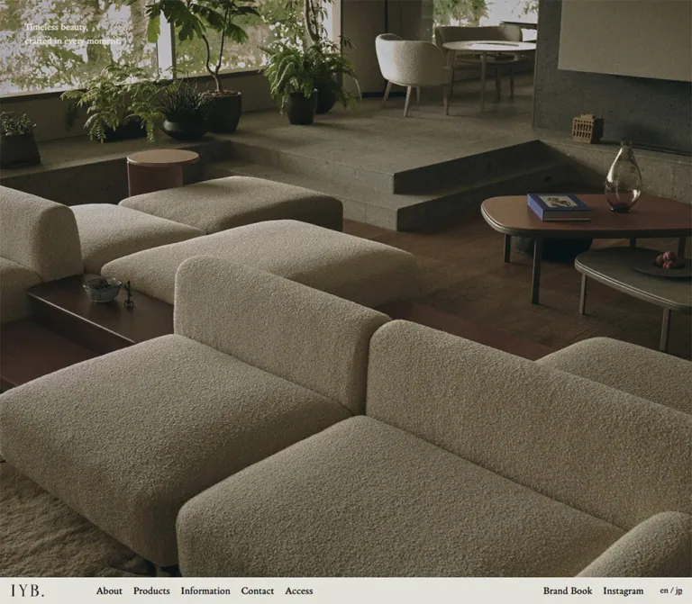
IYB. presents bespoke furniture through the atmosphere of inhabited rooms and the detail of making. A nearly full-screen photograph establishes the material world before the visitor reaches the body of the page. Small, pale serif copy sits in its upper-left corner. A shallow navigation strip completes the first viewport, then appears at the top in the supplied scrolled views.
The rest of the homepage reads like a furniture catalog with editorial interludes. Narrow Japanese text blocks alternate sides on desktop, large media areas carry the visual weight, and selected products sit in a restrained horizontal row. The background remains consistent from navigation to footer. Hierarchy comes from scale, alignment, typography, and empty space; colored panels and decorative containers play little part.
How to Read This Reference
- Measured values come from the supplied rendered DOM, computed styles, custom properties, and element rectangles. Decimal values below are rounded for readability.
- Visually observed details come from the original-page captures. Screenshot coordinates describe the visible crop, not necessarily the full element or source asset.
- Calculated values are explicitly identified. They explain relationships between measurements without claiming access to the underlying CSS rules.
- Estimated details are visual approximations where the evidence does not include a computed value.
- Recommended additions and the Quick Start are implementation guidance. They do not establish original behavior, breakpoints, asset ratios, or accessibility support.
- The document describes a brand homepage with product discovery and company information. Its structure should remain appropriate to that purpose.
Tokens — Colors
Default Palette
| Name | Value | Source / implementation token | Role and evidence |
|---|---|---|---|
| Warm Gray Paper | #e2e1da |
Source --iyb-bgc; alias --color-paper |
Measured HTML, main, hero backing, and footer background; the dominant visible interface surface |
| Black Ink | #000000 |
Source --iyb-txc; alias --color-ink |
Measured text color for navigation, headings, body copy, product information, and footer links |
| Quiet Border | rgba(0,0,0,0.2) |
Source --iyb-bdc; alias --color-rule |
Available source border token; its presence does not establish which unsampled elements use it |
| Reversed Paper Text | #e2e1da |
Reuse --color-paper |
Measured color of the two-line hero statement over photography |
| Muted Footer Labels | Exact composite not established | No verified separate color token | Labels appear gray in the captures, although their computed text color is black; opacity or another compositing mechanism was not supplied |
Normal alpha compositing of the Quiet Border over Warm Gray Paper produces approximately #b5b4ae. This is a calculation, not a sampled screenshot color.
The supplied custom properties also include --swiper-theme-color: #007aff. No blue interface accent is visible in the supplied captures. Keep it out of the visual palette; a library-related variable does not prove a visible control style.
Color Behavior
The interface uses one continuous paper field. Photographs introduce cream upholstery, dark timber, gray stone, olive foliage, and brown shadows. These belong to the imagery rather than a set of UI category colors.
The navigation looks paper-colored in the screenshots, but the measured outer HEADER has a transparent background. Its visible backing may belong to another layer. The Quick Start applies paper directly to the navigation to reproduce the appearance without claiming the original layer structure.
No alternate color theme or theme selector was observed.
Tokens — Typography
Legitima — English Navigation and Editorial Labels
- Measured family:
legitima. - Measured weight:
500. - Roles: desktop navigation, language selector, hero statement, narrow section markers, Products heading, product names and categories, and the About and All Products links.
- Character: an understated serif with enough personality to carry the interface at modest sizes.
- Implementation alias:
--font-latin: 'legitima', serif.
Ten Mincho Text — Japanese Copy and Footer Links
- Measured family:
ten-mincho-text. - Measured weight:
400. - Roles: Japanese editorial headings and paragraphs, company details, copyright, and the footer's English navigation links.
- Character: fine Mincho strokes and generous leading give the copy a book-like rhythm.
- Implementation alias:
--font-body: 'ten-mincho-text', serif.
Do not assume every English string uses Legitima. The measured footer links inherit Ten Mincho Text.
Special Gothic — Footer Group Labels
- Measured family:
special-gothic. - Measured weight:
400. - Roles: Home, Customer Care, Contact, and Company captions.
- Tracking: approximately
0.01em. - Implementation alias:
--font-utility: 'special-gothic', sans-serif.
These small sans-serif captions are the main typographic exception to the serif system.
Wordmark and Emblem
The header's IYB. wordmark is a graphic identity element. Its measured heading and home link contain no text. The desktop link box is 60 × 23px; the mobile box is approximately 52.05 × 19.95px. Those boxes do not establish a wordmark font size or font family.
The footer uses a separate small, gestural black emblem. Preserve the supplied identity artwork when available; ordinary typed letters and a generic decorative icon will not reproduce these marks.
Type Scale
Sizes are CSS pixels at the inspected viewports. Each entry lists font size / line height.
| Role | Family / weight | Desktop | Mobile | Notes |
|---|---|---|---|---|
| Root size | Ten Mincho Text / 400 | 16px |
14.5116px |
Measured root scaling |
| Body default | Ten Mincho Text / 400 | 15 / 28px |
13.60 / 26.30px |
Individual editorial paragraphs override this |
| Primary navigation | Legitima / 500 | 19 / 23px |
Hidden in closed navigation | Normal tracking |
| Language selector | Legitima / 500 | 16 / 19px |
14.51 / 17.23px |
Compact en / jp treatment |
| Hero statement | Legitima / 500 | 18 / 25px |
12.70 / 16.33px |
Two short lines |
| Editorial heading | Ten Mincho Text / 400 | 20 / 34px |
17.23 / 30.84px |
Two-line headings, regular weight |
| Editorial paragraph | Ten Mincho Text / 400 | 14 / 25px |
13.60 / 27.21px |
Mobile leading is proportionally more open |
| Narrow section marker | Legitima / 500 | 16 / 16px |
11.79 / 11.79px |
Tall, narrow measured boxes |
| About IYB. link | Legitima / 500 | 15 / 18px |
16.33 / 20.86px |
Mobile size increases relative to the paragraph |
| Products heading | Legitima / 500 | 30 / 37px |
18.14 / 21.77px |
Strong desktop-to-mobile scale change |
| Product name | Legitima / 500 | 18 / 23px |
14.51 / 17.23px |
Includes the Japanese name in parentheses |
| Product category | Legitima / 500 | 14 / 16.33px |
10.88 / 12.70px |
Compact secondary line |
| All Products | Legitima / 500 | 16 / 30.77px |
15.42 / 18.14px |
Measured link boxes have separate heights |
| Footer group label | Special Gothic / 400 | 11 / 14px |
9.98 / 12.70px |
0.01em tracking |
| Footer main link | Ten Mincho Text / 400 | 14 / 25px |
12.70 / 22.67px |
No large or bold footer headings |
| Footer subcategory | Ten Mincho Text / 400 | 13 / 23px |
11.79 / 21.77px |
Approximately 0.01em tracking |
| Company details | Ten Mincho Text / 400 | 13 / 23px |
11.79 / 20.86px |
Approximately 0.01em tracking |
| Copyright | Ten Mincho Text / 400 | 14 / 25px |
12.70 / 22.67px |
Right aligned in the captures |
The hierarchy stays restrained. The largest measured textual heading is Products at 30px on desktop. The homepage does not depend on oversized sales copy or heavy heading weights.
Tokens — Spacing & Shapes
Scaling and Units
The source header token is --iyb-hdh: 3.0625rem at both widths. At the measured roots, this corresponds to 49px on desktop and approximately 44.44px on mobile, matching the header rectangles after browser rounding.
The mobile root is arithmetically consistent with 16 × 390 / 430 = 14.5116px. That relationship does not establish the original root formula, reference width, clamp limits, or breakpoint. The Quick Start uses a clearly labeled fitted unit instead of claiming to reproduce undisclosed source rules.
Other supplied variables include --vw: 14.4px and --vh: 10px on desktop, and --vw: 3.9px and --vh: 8.44px on mobile. These equal one percent of the inspected viewport dimensions. Variables named --svh and --dvh contain 100svh and 100dvh, but the evidence does not show every place they are used.
Spacing Scale
| Relationship | Desktop measurement | Mobile measurement | Interpretation |
|---|---|---|---|
| Navigation logo left inset | 20px |
13.59px |
Shallow edge spacing |
| Primary navigation link gaps | 20px |
Not applicable | Calculated from adjacent link rectangles |
| Hero statement left inset | 45px |
18.13px |
Separate from the navigation gutter |
| Hero statement first line top | 37px |
24.48px |
Measured paragraph box |
| Editorial text width | 380px |
312.95px |
Deliberately narrow reading measure |
| Editorial heading-to-body gap | 24px |
26.30px |
Calculated from the supplied rectangles |
| Bespoke paragraph gap | 19px |
20.86px |
Calculated between paragraph boxes |
| Last paragraph-to-About-link gap | 34px |
34.45px |
Maintains breathing room around the text link |
| Product rail left inset | 15px |
13.59px |
Close to the viewport edge |
| Product rail item gap | 22.5px |
13.59px |
Calculated from item positions and widths |
| Products section top padding | 167px |
69.84px |
Measured computed padding |
| Products section bottom padding | 150px |
99.77px |
Measured computed padding |
| Footer start to group labels | 60px |
63.48px |
Generous separation before navigation |
A single universal container would erase the design's alignment changes. Hero copy, editorial text, product tiles, the closing image, and footer columns each use distinct insets.
Border Radius and Surface Geometry
| Element | Evidence | Guidance |
|---|---|---|
| Main page and editorial content | Sampled boxes have 0px radius |
Keep structural surfaces square |
| Photographic regions | Visually square corners | Do not introduce rounded image cards |
| Product tiles | Unboxed appearance | Let the image and caption define each item |
| All Products link | 90px desktop radius; 81.63px mobile |
Effectively a full pill for the measured shallow height |
| Menu symbol | Two short horizontal strokes, visually observed | Keep the visible icon simple; its full button box was not measured |
The All Products link is a local rounded exception. Its border width and style were not supplied, so an outlined pill is a recommended implementation choice rather than a measured fact.
Layout Measurements
| Element | Desktop: 1440 × 1000 | Mobile: 390 × 844 |
|---|---|---|
| Document height | 4717.69px |
4341.39px |
| Opening media/header region | 1440 × 951px |
390 × 799.55px |
| Navigation strip | 1440 × 49px, initially at y = 951px |
390 × 44.44px, initially at y ≈ 799.55px |
| Main content start | y = 1000px |
y ≈ 843.98px |
| First editorial text left edge | x = 1003.75px |
x = 27.19px |
| Bespoke text left edge | x = 56.25px |
x = 27.19px |
| Product item width | 264px |
163.27px |
| All Products link | 320 × 36px, centered |
290.22 × 35.36px, centered |
| Footer height | 483.5px |
656.55px |
| Footer emblem | 24 × 37.36px |
19.95 × 31.06px |
The product anchors are inline elements, and their returned rectangles do not neatly contain every descendant line box. Use the verified widths, positions, and typography; do not derive an exact photo ratio or complete tile height from those anchor rectangles alone.
Components
Opening Photographic Hero
Role: establish the furniture's atmosphere, scale, and material quality.
The opening image spans the viewport width and occupies the viewport height minus the navigation strip. At desktop it shows a broad room with pale textured modular seating, dark low tables, foliage, and stone steps. The mobile capture shows a dining arrangement with a round timber table, contrasting chairs, and a softly lit wall.
The only overlaid statement is:
Timeless beauty,
crafted in every moment.
Keep this statement small, left aligned, and paper-colored. Its desktop origin is approximately (45, 37); on mobile it is (18.13, 24.48). It sits directly on the image without a visible badge or panel.
The differing desktop and mobile subjects could result from responsive art direction, different media states, or capture timing. The supplied evidence does not identify the mechanism. A recreation can deliberately select matching compositions, but should not claim an observed slideshow or breakpoint-driven asset switch.
Navigation Strip
Role: persistent brand identity and access to the main site sections.
Desktop anatomy, from left to right:
- Graphic IYB. home link at
x = 20px. - About, Products, Information, Contact, and Access, starting at
x = 188pxwith 20px gaps. - Brand Book and Instagram toward the right.
- A compact
en / jpselector at the far right.
The strip is only 49px high. English links use Legitima at 19px/23px and weight 500. Brand Book points to a document; Instagram points off-site; en links to /en/. The active jp text was not present as a separate link in the supplied link collection.
In the initial screenshots, navigation sits immediately below the hero at the viewport's bottom edge. In scrolled screenshots, the same strip appears at the top. This supports a sticky-looking scroll behavior. A normal-flow navigation element with position: sticky; top: 0 is a practical adaptation; the original positioning code and exact transition threshold were not supplied.
On mobile, the wordmark remains left aligned. The language selector and a two-stroke menu symbol occupy the right side. The desktop link groups disappear from the closed header. No expanded menu layout or opening animation is established by the evidence.
About Editorial Section
Role: introduce the brand's relationship to furniture and everyday living.
The DOM identifies the heading as:
美しく時を刻む家具
かけがえのない居場所
On desktop, the text is a 380px-wide column near the right edge, starting at x = 1003.75px. Its right edge leaves 56.25px of outer clearance. The heading uses regular Mincho at 20px/34px; the paragraph below uses 14px/25px.
A narrow About IYB. marker has a 16 × 73.69px rectangle near the right edge. Its geometry supports a vertical-format editorial label, although the exact writing-mode or transform rule was not included.
On mobile, the copy moves to x ≈ 27.19px with a width of approximately 312.95px. The marker remains near the right edge at x ≈ 364.61px. The body uses almost twice-the-font-size leading: approximately 13.60px/27.21px.
The first editorial section's full visual composition is not shown in the supplied middle capture. Its text placement is DOM-supported; the complete media bounds are unverified.
Bespoke Editorial Section
Role: explain the value of individual craftsmanship and customization.
This section reverses the desktop text position. The 380px text column begins at x = 56.25px, while the supplied desktop capture shows a large media region on the right beginning at x = 720px and ending near x = 1425px.
Its copy anatomy is:
- A two-line heading,
手仕事がつくる価値andBespoke Furniture の提案. - Two substantial Japanese paragraphs.
- A small, underlined About IYB. link.
The heading-to-body gap is 24px. The paragraph gap is 19px, and the link follows the second paragraph after 34px. These small but deliberate separations keep the long text readable without introducing containers.
The visible media area is muted gray and olive, with soft shadow-like forms. Its full height extends beyond the visible crop. The evidence does not establish whether the softness belongs to the source image, a moving frame, or an applied effect; do not reproduce it as a verified CSS blur.
The IYB. Bespoke marker is positioned on the left in the desktop DOM and on the right in the mobile DOM. Both mobile editorial text blocks share the same left inset and width. The About link grows to approximately 16.33px on mobile even though the surrounding copy remains smaller.
Selected Product Rail
Role: introduce individual products and provide routes into the catalog.
The Products heading sits close to the left edge. On desktop, it uses 30px/37px Legitima. Beneath it, four items occupy one row:
| Product label | Secondary line | Observed destination |
|---|---|---|
| HITOU(ヒトウ) | Cantilever table | /products/hitou-cantilever-table/ |
| FLOCK(フロック) | Side table | /products/flock-side-table/ |
| TAILOR(テーラー) | Side table | /products/tailor-side-table/ |
| HITOU(ヒトウ) | Side table | /products/hitou-side-table/ |
Each item consists of photographic media followed by a product name and a smaller category line. There are no visible colored badges, price blocks, cart controls, or raised card surfaces in the supplied evidence.
Desktop item left edges are 15, 301.5, 588, and 874.5px; every item is 264px wide. The fourth ends at 1138.5px, leaving substantial unused space to the right. Do not stretch the four items into equal full-width columns.
Mobile item left edges are approximately 13.59, 190.45, 367.31, and 544.17px. All share the same vertical position. The geometry places two full items and about 22.7px of the third within the viewport. This is a horizontal rail, not a two-by-two mobile grid.
Horizontal navigation behavior was not exercised. Native horizontal scrolling is a recommended implementation, not proof that the original uses a particular swipe library, snapping rule, or autoplay setting.
All Products Link
Role: provide one quiet route to the complete product catalog.
The measured desktop box is 320 × 36px at x = 560px, centered in the 1440px viewport. Mobile measures approximately 290.22 × 35.36px at x = 49.89px.
Its background is transparent in the sampled state, text is black, and the large radius gives it pill geometry. A measured transition targets background and color over 300ms with the site's custom easing curve. The destination colors of a hover or focus state were not supplied.
Keep the link shallow and restrained. The Quick Start adds a fine outline and paper/ink hover inversion as explicit recommendations.
Closing Craft Media
Role: connect the finished furniture to the work that makes it.
A large close-up of upholstery work precedes the footer. The visible content includes a fastening tool, a padded board, fabric, and a worker's hands. Its restrained tonal range connects with the warm interiors above.
The desktop capture shows the image inset about 20px from each side, giving a visible width of approximately 1400px. On mobile the visible crop reaches both edges. The top of this region is already outside the final scrolled viewport; the visible crop height must not be treated as the original media height or aspect ratio.
The evidence does not include media URLs, playback controls, or a timed sequence. Describe it as craft media or an image region without assuming video playback.
Footer Directory
Role: provide complete navigation, customer information, and company identification.
Desktop uses a small emblem on the far left and four text groups:
- Home: About, Products, indented product/material categories, and Information.
- Customer Care: Privacy Policy, Quality Assurance, Price List, Products List, and Brand Book.
- Contact: Access, Contact, and Instagram.
- Company: the company name, address, telephone and fax details, and an underlined company-information link with a small external-link symbol.
The group labels begin at approximately x = 382.25, 632.25, 882.25, and 1132.25px. The first three label boxes are 250px wide. All labels begin 60px below the footer's top. Small sans-serif labels sit above serif content with no enclosing panels.
The current homepage explicitly identifies 株式会社イヨベ工芸社 in the Company group and links 会社情報はこちら to https://www.iyobe.com/about/profile-history/. This operator identification is supported by the inspected homepage itself.
Mobile preserves a distinctive three-part composition: emblem at approximately x = 22.67px, stacked navigation groups at x = 99.75px, and Company at x = 225.81px. Home, Customer Care, and Contact stack in the middle column while Company stays near the top of the right column. Address and telephone text wrap naturally. The footer does not simply become one full-width vertical list.
Copyright sits well below the directory and aligns to the right. The footer grows from 483.5px tall on desktop to approximately 656.55px on mobile.
Tokens — Motion & Interaction
| Treatment | Evidence | What can safely be reproduced |
|---|---|---|
| Shared easing | Measured --iyb-ease: cubic-bezier(0.65, 0, 0.35, 1) |
Use this curve for restrained transitions in an adaptation |
| All Products color/background change | Measured 0.3s transitions on both properties |
Duration and easing are established; endpoint colors are not |
| Navigation position while scrolling | Bottom of initial viewport; top in scrolled captures | Reproduce the observed positions with a sticky navigation pattern |
| Mobile menu | Closed two-stroke symbol is visible | The control's appearance is supported; expanded layout and animation are unverified |
| Product rail | Items continue beyond the mobile viewport in one row | Preserve horizontal structure; swipe, snapping, arrows, and autoplay are unverified |
| Hero media changes | Different subjects in desktop and mobile captures | No reliable timing, sequence, or switching mechanism can be inferred |
| Craft media | One captured visual state | Playback, looping, and duration are unverified |
Most sampled text elements report animation: none. This does not establish that their containing media or unsampled layers are static. Likewise, a returned transition value of all without an accompanying duration or demonstrated state change is not useful motion evidence.
The supplied capture process waited for document loading, finite animation completion where applicable, layout/text stability, and visible image decoding within bounded time limits. Perpetual animations were paused during readiness checks and resumed afterward. The images therefore document settled sampled states rather than a complete motion study.
Recommended motion direction: preserve the measured 300ms easing for modest interaction feedback. Avoid introducing large parallax shifts, springy card elevation, or constant media movement without a functional reason. If moving imagery is implemented, provide reduced-motion behavior and appropriate playback controls.
Surfaces
| Surface | Observed appearance | Implementation guidance |
|---|---|---|
| Main canvas | Solid #e2e1da |
Maintain continuity between sections |
| Navigation backing | Same apparent paper color | Use a solid backing once it occupies the top of the viewport |
| Editorial content | Text directly on paper | Separate content with placement and whitespace |
| Product items | Images and captions without visible card containers | Keep corners square and avoid elevation |
| All Products link | Transparent shallow link with pill radius | A fine rule is an optional adaptation |
| Footer | Same paper as the body | Preserve the directory structure and large lower whitespace |
| Hero text area | Pale text directly on photography | Choose a crop with enough local contrast |
No general shadow-based elevation system is visible. The contrast between photographic depth and a flat interface is a defining relationship.
Imagery
Photographic Direction
The interiors feel quiet and materially specific. Upholstery texture, wood grain, stone surfaces, glass reflections, and foliage remain visible. Light is soft and directional; shadows are deep enough to give the furniture weight. Colors are muted, with warm neutrals and olive tones carrying most of the scene.
Desktop photography emphasizes a room-scale composition with layered furniture in the foreground and architectural depth behind it. The phone image uses a vertical composition in which the table, chairs, wall opening, and ceiling remain legible. Matching the subject's placement to the crop matters more than applying a generic dark overlay.
The closing craft close-up changes scale from inhabited space to material detail. Preserve that sequence: finished atmosphere, editorial explanation, individual products, and evidence of making.
Observed Asset References
No original image, video, logo, or icon asset URLs were included in the supplied DOM evidence. The following references identify visual roles rather than downloadable files.
| Visual | Original-page evidence | Reuse consideration |
|---|---|---|
| Modular seating interior | Desktop opening capture | Wide composition with pale textured seating and dark tables |
| Dining interior | Mobile opening capture | Vertical composition with a round table and contrasting chairs |
| Soft gray-olive media field | Desktop Bespoke capture | Captured appearance only; effect and media type unknown |
| Product media | Upper portions visible in the desktop middle capture; item links in DOM | Source dimensions and exact aspect ratios unavailable |
| Upholstery close-up | Desktop and mobile closing captures | Allow responsive cropping without hiding the making process |
| IYB. wordmark | Desktop and mobile navigation | Use the identity asset when available |
| Gestural emblem | Desktop and mobile footer | Keep its small scale and generous surrounding space |
The CSS below supplies a layout shell, not replacement furniture photography or identity artwork. Load appropriately authorized assets and preserve their natural texture; no pixelation or decorative image filters are indicated by this design.
Layout & Responsive Behavior
Page Sequence
The measured document order is opening media, navigation at the first viewport boundary, editorial content, selected products, closing craft media, and footer. Initial main-content positions confirm that the hero and navigation together occupy approximately one viewport at both inspected sizes.
Desktop editorial text alternates from right to left. Mobile brings both text blocks into the same narrow reading column while retaining slim section markers near the right edge. This is a structural change, not a uniform shrink of the desktop composition.
Responsive Changes
| System | Desktop observation | Mobile observation |
|---|---|---|
| Navigation | Wordmark, five main links, secondary links, language | Wordmark, language, closed menu symbol |
| Hero copy | 18 / 25px, inset 45px left |
12.70 / 16.33px, inset 18.13px left |
| Editorial copy | Alternating 380px columns near outer edges | Shared 312.95px column at 27.19px left |
| Editorial markers | About on right; Bespoke on left | Both near the right edge |
| Japanese body leading | 25px at a 14px size |
27.21px at a 13.60px size |
| Products heading | 30px |
18.14px |
| Product rail | Four 264px items with unused space to the right | 163.27px items continue beyond viewport width |
| All Products | 320px wide | Approximately 290.22px wide |
| Closing media | About 20px horizontal inset | Edge-to-edge visible crop |
| Footer | Emblem plus four text groups across | Emblem, stacked navigation column, company column |
Only two viewport widths are established. The exact breakpoint, tablet treatment, landscape layout, safe-area handling, and browser-toolbar response were not supplied. Any implementation should test these conditions rather than extrapolate a complete responsive system from two samples.
The mobile editorial media arrangement is not fully documented by screenshots or media element rectangles. The Quick Start uses text followed by media as a recommended adaptation. Likewise, native horizontal overflow for products is an implementation choice informed by the measured rail geometry.
Do’s and Don’ts
Do
- Keep the main paper color exact at
#e2e1daand use black for primary typography. - Preserve the distinct roles of Legitima, Ten Mincho Text, and the small Special Gothic footer captions.
- Let the opening photograph occupy nearly the entire first viewport.
- Keep the hero statement small and precisely placed.
- Position navigation below the opening image, with a top-aligned state during scrolling.
- Preserve the alternating desktop editorial alignment and narrow text measure.
- Increase relative line spacing for Japanese paragraphs on mobile.
- Keep product tiles at their own widths instead of stretching four items across the entire desktop.
- Retain the mobile product rail and the footer's side-by-side company column.
- Use actual identity artwork and materially convincing photography.
- Keep ordinary content square and flat, with the shallow All Products pill as a local exception.
Don’t
- Don’t replace the homepage with a large headline, a bright conversion button, and generic feature cards.
- Don’t treat the library blue variable as a visible brand accent.
- Don’t substitute bold sans-serif typography throughout the interface.
- Don’t collapse all page regions into one centered container width.
- Don’t convert the mobile product rail into a two-by-two grid.
- Don’t add rounded photo corners, floating cards, or heavy shadows.
- Don’t assume the two hero subjects prove an autoplay carousel.
- Don’t implement a blur effect solely because one captured media region looks soft.
- Don’t copy the original numeric rem values into a differently scaled root without conversion.
- Don’t infer exact image ratios from partial screenshots or inline anchor rectangles.
- Don’t invent an expanded menu design and present it as observed behavior.
Recommended Implementation Additions
These are recommendations for a new implementation, not verified original features:
- Give the graphic home link a clear accessible name and meaningful identity text for assistive technology.
- Implement the mobile menu symbol as a button with an accessible name,
aria-expanded, and a relationship to its controlled region. Support Escape and reliable focus return if it opens an overlay. - Provide keyboard-visible focus states for navigation, product links, document links, and the All Products control.
- Keep compact visuals while making important touch targets approximately 44px high or larger where practical.
- Review the roughly 10–11px mobile utility and category text. A larger minimum may improve readability even if it slightly departs from the capture.
- Use a darker muted caption color where necessary for readable contrast. The Quick Start's
#66665fis a recommended value, not an observed token. - Provide meaningful image alternatives, and avoid placing essential product information only inside photographs.
- If the product rail scrolls, make it operable without dragging and avoid page-level horizontal overflow.
- Preserve focal points with deliberate mobile crops. If moving media is added, respect reduced-motion preferences and avoid forced audible playback.
- Reserve media dimensions to limit layout shifts. Load the opening visual promptly and defer lower-page imagery when appropriate.
- Test the sticky header with anchor navigation, zoom, small landscape screens, and device safe areas.
Agent Prompt Guide
Quick Color Reference
- Main page and surfaces:
#e2e1da. - Primary text and identity marks:
#000000. - Hero statement:
#e2e1daover photography. - Available source border token:
rgba(0,0,0,0.2). - Recommended accessible muted caption:
#66665f; this is an addition. - Photographic palette: cream upholstery, brown timber, gray stone, muted olive foliage, and deep natural shadows.
- Avoid introducing an unrelated saturated CTA color.
Overall Prompt
“Create a Japanese bespoke-furniture brand homepage informed by IYB.'s current visual language. Use a continuous warm gray canvas, #e2e1da, with black text. Pair fine Japanese Mincho copy with modest English serif navigation and product labels. Open with room-scale furniture photography occupying the viewport minus a shallow navigation strip. Put a small two-line statement at the upper left. Place navigation below the photograph and let it remain at the top during later scrolling. Use alternating desktop editorial sections with narrow text columns and large square-cornered media areas, then a horizontal row of fixed-width product tiles and a quiet centered catalog link. End with an upholstery close-up and a spacious directory footer. On mobile, retain the product rail and keep company information beside the stacked footer navigation. Do not invent autoplay, menu animation, or media effects as existing behavior.”
Example Component Prompts
- Navigation: “Build a 49px-high warm gray navigation strip with a small graphic wordmark at left, 19px serif section links beginning well to its right, and document, social, and language links aligned toward the right edge. At phone width, use an approximately 44.4px strip with the wordmark, language selector, and a two-line menu symbol. Keep the surface flat.”
- Bespoke editorial section: “Create a wide two-part editorial section with a 380px Japanese Mincho text column near the left edge and a large photographic region on the right. Use a regular 20px heading with 34px leading, 14px paragraphs with 25px leading, and an underlined serif About link. Keep generous empty space and no card container.”
- Product rail: “Create four quiet furniture product links in one row. At 1440px, use 264px items, 22.5px gaps, and a 15px left inset; leave the remaining width empty. Place a serif product name and smaller category under each square-cornered image. At 390px, use approximately 163px items with 13.6px gaps so the next item continues beyond the viewport.”
- Footer: “Build a paper-colored directory footer with a small black emblem, tiny muted sans-serif group labels, and fine serif links. Desktop has Home, Customer Care, Contact, and Company across the page. Mobile stacks the first three groups in a middle column while Company stays to their right. Keep copyright low and right aligned.”
- Photography brief: “Photograph tactile furniture in a quiet architectural interior with soft directional daylight, subdued olive and brown tones, pale textured upholstery, and visible material detail. Compose a wide room view and a separate coherent vertical crop. Include a close-up of upholstery work for the closing section. Keep the image treatment natural and restrained.”
Quick Start
CSS Custom Properties
This is an implementation adaptation, not a recovered stylesheet. It preserves the measured palette, font roles, key desktop dimensions, and the captured mobile proportions while keeping a conventional root size.
The local --u equals 1px at a default 16px root on desktop. Its mobile formula is fitted to the supplied 390px capture and includes a recommended minimum. The 767px breakpoint, editorial section heights, media aspect ratios, mobile media stacking, button outline, and hover endpoints are recommendations. Exact source asset ratios and breakpoints remain unknown.
Load the named fonts only when available and appropriately licensed; the fallback families remain usable. No font files or identity assets are bundled here.
Expected structure: .hero, then .site-nav, then a main element containing .story sections, .products, and .closing-media, followed by .site-footer. The navigation has .brand, .nav-links, and .nav-tools children. Footer groups use the explicit classes shown below to preserve mobile placement.
:root {
  /* Measured colors and easing, exposed through reusable aliases. */
  --color-paper: #e2e1da;
  --color-ink: #000000;
  --color-rule: rgba(0, 0, 0, 0.2);
  --ease-iyb: cubic-bezier(0.65, 0, 0.35, 1);

  /* Recommended darker caption color; not a measured source token. */
  --color-muted: #66665f;

  --font-latin: 'legitima', serif;
  --font-body: 'ten-mincho-text', serif;
  --font-utility: 'special-gothic', sans-serif;

  /* Keep the document root conventional; scale local dimensions only. */
  --u: 0.0625rem;
  --nav-height: calc(49 * var(--u));
  --page-inset: calc(15 * var(--u));
  --story-inset: clamp(2rem, 3.90625vw, 5rem);
  --story-width: 23.75rem;
  --card-width: calc(264 * var(--u));
  --card-gap: calc(22.5 * var(--u));
}

* { box-sizing: border-box; }
html { font-size: 100%; }
body {
  margin: 0;
  background: var(--color-paper);
  color: var(--color-ink);
  font-family: var(--font-body);
  font-size: calc(15 * var(--u));
  line-height: calc(28 * var(--u));
}

a { color: inherit; }
button { font: inherit; }
figure { margin: 0; }

.hero {
  position: relative;
  height: calc(100vh - var(--nav-height));
  height: calc(100svh - var(--nav-height));
  overflow: hidden;
  background: var(--color-paper);
}
.hero__media,
.hero__media img,
.hero__media video {
  position: absolute;
  inset: 0;
  width: 100%;
  height: 100%;
}
.hero__media img,
.hero__media video { object-fit: cover; }
.hero__tagline {
  position: absolute;
  z-index: 1;
  top: calc(37 * var(--u));
  left: calc(45 * var(--u));
  margin: 0;
  color: var(--color-paper);
  font-family: var(--font-latin);
  font-size: calc(18 * var(--u));
  font-weight: 500;
  line-height: calc(25 * var(--u));
}
.hero__tagline p { margin: 0; }

/* Place after the hero in normal document flow. */
.site-nav {
  position: sticky;
  top: 0;
  z-index: 20;
  display: grid;
  grid-template-columns: calc(168 * var(--u)) minmax(0, 1fr) auto;
  align-items: center;
  height: var(--nav-height);
  padding-inline: calc(20 * var(--u));
  background: var(--color-paper);
}
.brand { display: block; width: calc(60 * var(--u)); }
.brand img,
.brand svg { display: block; width: 100%; height: auto; }
.nav-links,
.nav-tools,
.nav-secondary {
  display: flex;
  align-items: center;
  gap: calc(20 * var(--u));
}
.site-nav a {
  font-family: var(--font-latin);
  font-size: calc(19 * var(--u));
  font-weight: 500;
  line-height: calc(23 * var(--u));
  text-decoration: none;
  white-space: nowrap;
}
.language,
.site-nav .language a {
  font-family: var(--font-latin);
  font-size: calc(16 * var(--u));
  font-weight: 500;
  line-height: calc(19 * var(--u));
}
.menu-toggle { display: none; }

/* Recommended section height; media geometry was not fully supplied. */
.story {
  position: relative;
  display: grid;
  grid-template-columns: repeat(2, minmax(0, 1fr));
  align-items: end;
  min-height: clamp(38rem, 53.65vw, 54rem);
}
.story__copy {
  grid-column: 2;
  grid-row: 1;
  justify-self: end;
  width: min(var(--story-width), calc(100% - 4.5rem));
  margin: 0 var(--story-inset) var(--story-inset) 0;
}
.story--copy-left .story__copy {
  grid-column: 1;
  justify-self: start;
  margin-inline: var(--story-inset) 0;
}
.story__copy h2 {
  margin: 0 0 calc(24 * var(--u));
  font-size: calc(20 * var(--u));
  font-weight: 400;
  line-height: calc(34 * var(--u));
}
.story__copy p {
  margin: 0;
  font-size: calc(14 * var(--u));
  line-height: calc(25 * var(--u));
}
.story__copy p + p { margin-top: calc(19 * var(--u)); }
.story__link {
  display: inline-block;
  margin-top: calc(34 * var(--u));
  font-family: var(--font-latin);
  font-size: calc(15 * var(--u));
  font-weight: 500;
  line-height: calc(18 * var(--u));
  text-underline-offset: 0.15em;
}
.story__media {
  position: relative;
  grid-column: 1;
  grid-row: 1;
  align-self: stretch;
  margin-inline: var(--page-inset) 0;
  overflow: hidden;
}
.story--copy-left .story__media {
  grid-column: 2;
  margin-inline: 0 var(--page-inset);
}
.story__media img {
  position: absolute;
  inset: 0;
  width: 100%;
  height: 100%;
  object-fit: cover;
}
.story__marker {
  position: absolute;
  top: calc(40 * var(--u));
  right: calc(18.75 * var(--u));
  margin: 0;
  writing-mode: vertical-rl;
  font-family: var(--font-latin);
  font-size: calc(16 * var(--u));
  font-weight: 500;
  line-height: 1;
}
.story--copy-left .story__marker {
  right: auto;
  left: calc(18.75 * var(--u));
}

.products { padding-block: calc(167 * var(--u)) calc(150 * var(--u)); }
.products__title {
  margin: 0 0 calc(25 * var(--u));
  padding-inline: var(--page-inset);
  font-family: var(--font-latin);
  font-size: calc(30 * var(--u));
  font-weight: 500;
  line-height: calc(37 * var(--u));
}
.product-rail {
  display: flex;
  gap: var(--card-gap);
  overflow-x: auto;
  padding-inline: var(--page-inset);
  padding-bottom: 0.5rem;
}
.product-card {
  display: block;
  flex: 0 0 var(--card-width);
  min-width: 0;
  font-family: var(--font-latin);
  font-weight: 500;
  text-decoration: none;
}
.product-card img {
  display: block;
  width: 100%;
  aspect-ratio: 3 / 4; /* Recommended placeholder ratio; verify real assets. */
  object-fit: cover;
  border-radius: 0;
}
.product-card h3 {
  margin: calc(12 * var(--u)) 0 0;
  font-size: calc(18 * var(--u));
  font-weight: 500;
  line-height: calc(23 * var(--u));
}
.product-card p {
  margin: 0;
  font-size: calc(14 * var(--u));
  line-height: calc(16.3333 * var(--u));
}
.all-products {
  display: grid;
  place-items: center;
  width: min(calc(320 * var(--u)), calc(100% - 2rem));
  min-height: calc(36 * var(--u));
  margin: calc(120 * var(--u)) auto 0;
  border: 1px solid var(--color-rule); /* Recommended outline. */
  border-radius: calc(90 * var(--u));
  background: transparent;
  color: var(--color-ink);
  font-family: var(--font-latin);
  font-size: calc(16 * var(--u));
  font-weight: 500;
  text-decoration: none;
  transition: background 300ms var(--ease-iyb), color 300ms var(--ease-iyb);
}
@media (hover: hover) {
  /* Recommended endpoints; only the source timing was measured. */
  .all-products:hover {
    background: var(--color-ink);
    color: var(--color-paper);
  }
}

.closing-media { margin-inline: calc(20 * var(--u)); }
.closing-media img {
  display: block;
  width: 100%;
  aspect-ratio: 2 / 1; /* Recommended crop, not a source measurement. */
  object-fit: cover;
}

.site-footer {
  display: flex;
  flex-direction: column;
  min-height: 483.5px;
  padding: 60px 4.0625vw 30px;
  background: var(--color-paper);
}
.footer-grid {
  display: grid;
  grid-template-columns: minmax(0, 1.295fr) repeat(4, minmax(0, 1fr));
  align-items: start;
}
.footer__mark img,
.footer__mark svg {
  display: block;
  width: 24px;
  height: auto;
}
.footer__label {
  margin: 0 0 16px;
  color: var(--color-muted);
  font-family: var(--font-utility);
  font-size: 11px;
  font-weight: 400;
  line-height: 14px;
  letter-spacing: 0.01em;
}
.footer__group ul { margin: 0; padding: 0; list-style: none; }
.footer__group a {
  display: table;
  font-size: 14px;
  line-height: 25px;
  text-decoration: none;
}
.footer__group .footer__subnav { padding-left: 9px; }
.footer__subnav a { font-size: 13px; line-height: 23px; }
.footer__company p:not(.footer__label) {
  margin: 0 0 7px;
  font-size: 13px;
  line-height: 23px;
  letter-spacing: 0.01em;
}
.footer__company a { text-underline-offset: 0.2em; }
.footer__copyright {
  margin: auto 0 0;
  padding-top: 60px;
  text-align: right;
  font-size: 14px;
  line-height: 25px;
}

/* Recommended accessibility additions. */
:where(a, button):focus-visible {
  outline: 2px solid var(--color-ink);
  outline-offset: 4px;
}
[id] { scroll-margin-top: calc(var(--nav-height) + 1rem); }

@media (max-width: 767px) {
  :root {
    /* Fitted to the captured mobile scale; the lower bound is an addition. */
    --u: clamp(0.055rem, 0.232558vw, 0.0625rem);
    --card-width: calc(180 * var(--u));
    --card-gap: calc(15 * var(--u));
  }
  body { line-height: calc(29 * var(--u)); }
  .hero__tagline {
    top: calc(27 * var(--u));
    left: calc(20 * var(--u));
    font-size: calc(14 * var(--u));
    line-height: calc(18 * var(--u));
  }
  .site-nav {
    grid-template-columns: minmax(0, 1fr) auto;
    padding-inline: var(--page-inset);
  }
  .brand { width: calc(57.4 * var(--u)); }
  .nav-links,
  .nav-secondary { display: none; }
  .nav-tools { gap: calc(8 * var(--u)); }
  .menu-toggle {
    display: grid;
    place-content: center;
    gap: 4px;
    width: 44px;
    height: 44px;
    padding: 0;
    border: 0;
    background: transparent;
    color: inherit;
    cursor: pointer;
  }
  .menu-toggle::before,
  .menu-toggle::after {
    content: '';
    display: block;
    width: calc(25 * var(--u));
    height: 1px;
    background: currentColor;
  }
  .story {
    display: flex;
    flex-direction: column;
    align-items: stretch;
    min-height: 0;
  }
  .story .story__copy {
    width: auto;
    margin: 0;
    padding: calc(107 * var(--u)) calc(55 * var(--u)) 0 calc(30 * var(--u));
  }
  .story__copy h2 {
    margin-bottom: calc(29 * var(--u));
    font-size: calc(19 * var(--u));
    line-height: calc(34 * var(--u));
  }
  .story__copy p {
    font-size: calc(15 * var(--u));
    line-height: calc(30 * var(--u));
  }
  .story__copy p + p { margin-top: calc(23 * var(--u)); }
  .story__link {
    margin-top: calc(38 * var(--u));
    font-size: calc(18 * var(--u));
    line-height: calc(23 * var(--u));
  }
  .story .story__marker {
    top: calc(30 * var(--u));
    right: calc(15 * var(--u));
    left: auto;
    font-size: calc(13 * var(--u));
  }
  .story .story__media {
    margin: calc(40 * var(--u)) var(--page-inset) 0;
    aspect-ratio: 1 / 1; /* Recommended mobile media arrangement. */
  }
  .products { padding-block: calc(77 * var(--u)) calc(110 * var(--u)); }
  .products__title {
    margin-bottom: calc(11 * var(--u));
    font-size: calc(20 * var(--u));
    line-height: calc(24 * var(--u));
  }
  .product-card h3 {
    font-size: calc(16 * var(--u));
    line-height: calc(19 * var(--u));
  }
  .product-card p {
    font-size: calc(12 * var(--u));
    line-height: calc(14 * var(--u));
  }
  .all-products {
    min-height: calc(39 * var(--u));
    margin-top: calc(72 * var(--u));
    font-size: calc(17 * var(--u));
    line-height: calc(20 * var(--u));
  }
  .closing-media { margin-inline: 0; }
  .closing-media img { aspect-ratio: 4 / 3; }
  .site-footer {
    min-height: 0;
    padding: calc(70 * var(--u)) calc(20 * var(--u)) calc(20 * var(--u)) calc(25 * var(--u));
  }
  .footer-grid {
    grid-template-columns: calc(85 * var(--u)) calc(139 * var(--u)) minmax(0, 1fr);
    row-gap: calc(26 * var(--u));
  }
  .footer__mark { grid-column: 1; grid-row: 1; }
  .footer__home { grid-column: 2; grid-row: 1; }
  .footer__care { grid-column: 2; grid-row: 2; }
  .footer__contact { grid-column: 2; grid-row: 3; }
  .footer__company { grid-column: 3; grid-row: 1 / span 3; }
  .footer__mark img,
  .footer__mark svg { width: calc(22 * var(--u)); }
  .footer__label {
    margin-bottom: calc(8 * var(--u));
    font-size: calc(11 * var(--u));
    line-height: calc(14 * var(--u));
  }
  .footer__group a {
    margin-bottom: calc(6 * var(--u));
    font-size: calc(14 * var(--u));
    line-height: calc(25 * var(--u));
  }
  .footer__subnav a {
    margin-bottom: 0;
    font-size: calc(13 * var(--u));
    line-height: calc(24 * var(--u));
  }
  .footer__company p:not(.footer__label) {
    font-size: calc(13 * var(--u));
    line-height: calc(23 * var(--u));
    overflow-wrap: anywhere;
  }
  .footer__copyright {
    margin-top: calc(66 * var(--u));
    padding-top: 0;
    font-size: calc(14 * var(--u));
    line-height: calc(25 * var(--u));
  }
}

@media (prefers-reduced-motion: reduce) {
  .all-products { transition: none; }
}
The CSS does not supply mobile menu state management, a media sequence, or product carousel controls. Implement those only as needed, using the interaction and accessibility recommendations above. Before treating the adaptation as a visual reproduction, replace the provisional media ratios and verify actual assets, font loading, and intermediate viewport behavior.
Tailwind v4 Token Mapping
Optional aliases for a project already using Tailwind v4. They do not imply that the original website uses Tailwind. Define the Quick Start properties before using dimensions based on --u.
@theme inline {
  --color-paper: #e2e1da;
  --color-ink: #000000;
  --color-rule: rgba(0, 0, 0, 0.2);
  --color-muted: #66665f; /* Recommended addition. */

  --font-editorial: 'legitima', serif;
  --font-body: 'ten-mincho-text', serif;
  --font-utility: 'special-gothic', sans-serif;

  --spacing-nav: var(--nav-height);
  --spacing-page: var(--page-inset);
  --spacing-product: var(--card-width);
  --spacing-product-gap: var(--card-gap);

  --radius-catalog-link: calc(90 * var(--u));
  --ease-editorial: cubic-bezier(0.65, 0, 0.35, 1);
}
Sources & Evidence
- Original and final website: https://iyb.jp/. The supplied browser result reports HTTP 200, identical original and final URLs, and the page title IYB.
- Capture date: September 12, 2026. Supplied retrieval timestamp:
2026-09-12T08:07:39.636Z. - Desktop evidence: 1440 × 1000 CSS-pixel viewport; original-page captures of the opening state, a Bespoke/content position, and the closing media/footer. Measured document height: approximately 4717.69px.
- Mobile evidence: 390 × 844 CSS-pixel viewport; original-page captures of the opening state and closing media/footer. Measured document height: approximately 4341.39px.
- Rendered evidence: page text, link destinations, selected element rectangles, computed font/color/spacing/transition values, and the supplied CSS custom properties. This supports typography, layout measurements, the product rail geometry, and the footer's operator identification.
- Interaction scope: scrolling is represented by the supplied captures. No click-through inspection, expanded menu test, hover endpoint capture, keyboard test, or timed media sequence was supplied.
- Inspection limits: only two viewport widths were measured. Image/video source URLs, complete stylesheets, media dimensions, exact breakpoints, and most interaction state rules were unavailable. Readiness checks were bounded and do not prove that all delayed content had appeared. SharedWorkers and service workers were disabled during the supplied inspection.
All original-site findings above come from the supplied current-page evidence. Calculations, visual estimates, implementation choices, and recommended additions are identified separately.
# IYB. — Style Reference

> Quiet furniture photography, fine serif typography, and generous space on warm gray paper.

**Website:** [IYB.](https://iyb.jp/)
**Original URL:** https://iyb.jp/
**Final URL:** https://iyb.jp/
**Page title:** IYB.
**Theme:** a light, warm gray interface with black typography and subdued photographic color.
**Inspected:** September 12, 2026, using the supplied browser evidence retrieved at `2026-09-12T08:07:39.636Z` — 17:07:39.636 JST.
**Viewports:** 1440 × 1000 desktop and 390 × 844 mobile, in CSS pixels.
**Scope:** the current Japanese homepage: opening imagery and navigation, two editorial brand sections, selected products, closing upholstery imagery, and the footer. Three desktop captures and two mobile captures supplement rendered DOM measurements. Linked pages, documents, the English edition, and the expanded mobile menu were not inspected.

IYB. presents bespoke furniture through the atmosphere of inhabited rooms and the detail of making. A nearly full-screen photograph establishes the material world before the visitor reaches the body of the page. Small, pale serif copy sits in its upper-left corner. A shallow navigation strip completes the first viewport, then appears at the top in the supplied scrolled views.

The rest of the homepage reads like a furniture catalog with editorial interludes. Narrow Japanese text blocks alternate sides on desktop, large media areas carry the visual weight, and selected products sit in a restrained horizontal row. The background remains consistent from navigation to footer. Hierarchy comes from scale, alignment, typography, and empty space; colored panels and decorative containers play little part.

## How to Read This Reference

- **Measured** values come from the supplied rendered DOM, computed styles, custom properties, and element rectangles. Decimal values below are rounded for readability.
- **Visually observed** details come from the original-page captures. Screenshot coordinates describe the visible crop, not necessarily the full element or source asset.
- **Calculated** values are explicitly identified. They explain relationships between measurements without claiming access to the underlying CSS rules.
- **Estimated** details are visual approximations where the evidence does not include a computed value.
- **Recommended** additions and the Quick Start are implementation guidance. They do not establish original behavior, breakpoints, asset ratios, or accessibility support.
- The document describes a brand homepage with product discovery and company information. Its structure should remain appropriate to that purpose.

## Tokens — Colors

### Default Palette

| Name | Value | Source / implementation token | Role and evidence |
| --- | --- | --- | --- |
| Warm Gray Paper | `#e2e1da` | Source `--iyb-bgc`; alias `--color-paper` | Measured HTML, main, hero backing, and footer background; the dominant visible interface surface |
| Black Ink | `#000000` | Source `--iyb-txc`; alias `--color-ink` | Measured text color for navigation, headings, body copy, product information, and footer links |
| Quiet Border | `rgba(0,0,0,0.2)` | Source `--iyb-bdc`; alias `--color-rule` | Available source border token; its presence does not establish which unsampled elements use it |
| Reversed Paper Text | `#e2e1da` | Reuse `--color-paper` | Measured color of the two-line hero statement over photography |
| Muted Footer Labels | Exact composite not established | No verified separate color token | Labels appear gray in the captures, although their computed text color is black; opacity or another compositing mechanism was not supplied |

Normal alpha compositing of the Quiet Border over Warm Gray Paper produces approximately `#b5b4ae`. This is a calculation, not a sampled screenshot color.

The supplied custom properties also include `--swiper-theme-color: #007aff`. No blue interface accent is visible in the supplied captures. Keep it out of the visual palette; a library-related variable does not prove a visible control style.

### Color Behavior

The interface uses one continuous paper field. Photographs introduce cream upholstery, dark timber, gray stone, olive foliage, and brown shadows. These belong to the imagery rather than a set of UI category colors.

The navigation looks paper-colored in the screenshots, but the measured outer `HEADER` has a transparent background. Its visible backing may belong to another layer. The Quick Start applies paper directly to the navigation to reproduce the appearance without claiming the original layer structure.

No alternate color theme or theme selector was observed.

## Tokens — Typography

### Legitima — English Navigation and Editorial Labels

- **Measured family:** `legitima`.
- **Measured weight:** `500`.
- **Roles:** desktop navigation, language selector, hero statement, narrow section markers, Products heading, product names and categories, and the About and All Products links.
- **Character:** an understated serif with enough personality to carry the interface at modest sizes.
- **Implementation alias:** `--font-latin: 'legitima', serif`.

### Ten Mincho Text — Japanese Copy and Footer Links

- **Measured family:** `ten-mincho-text`.
- **Measured weight:** `400`.
- **Roles:** Japanese editorial headings and paragraphs, company details, copyright, and the footer's English navigation links.
- **Character:** fine Mincho strokes and generous leading give the copy a book-like rhythm.
- **Implementation alias:** `--font-body: 'ten-mincho-text', serif`.

Do not assume every English string uses Legitima. The measured footer links inherit Ten Mincho Text.

### Special Gothic — Footer Group Labels

- **Measured family:** `special-gothic`.
- **Measured weight:** `400`.
- **Roles:** Home, Customer Care, Contact, and Company captions.
- **Tracking:** approximately `0.01em`.
- **Implementation alias:** `--font-utility: 'special-gothic', sans-serif`.

These small sans-serif captions are the main typographic exception to the serif system.

### Wordmark and Emblem

The header's IYB. wordmark is a graphic identity element. Its measured heading and home link contain no text. The desktop link box is `60 × 23px`; the mobile box is approximately `52.05 × 19.95px`. Those boxes do not establish a wordmark font size or font family.

The footer uses a separate small, gestural black emblem. Preserve the supplied identity artwork when available; ordinary typed letters and a generic decorative icon will not reproduce these marks.

### Type Scale

Sizes are CSS pixels at the inspected viewports. Each entry lists **font size / line height**.

| Role | Family / weight | Desktop | Mobile | Notes |
| --- | --- | --- | --- | --- |
| Root size | Ten Mincho Text / 400 | `16px` | `14.5116px` | Measured root scaling |
| Body default | Ten Mincho Text / 400 | `15 / 28px` | `13.60 / 26.30px` | Individual editorial paragraphs override this |
| Primary navigation | Legitima / 500 | `19 / 23px` | Hidden in closed navigation | Normal tracking |
| Language selector | Legitima / 500 | `16 / 19px` | `14.51 / 17.23px` | Compact `en / jp` treatment |
| Hero statement | Legitima / 500 | `18 / 25px` | `12.70 / 16.33px` | Two short lines |
| Editorial heading | Ten Mincho Text / 400 | `20 / 34px` | `17.23 / 30.84px` | Two-line headings, regular weight |
| Editorial paragraph | Ten Mincho Text / 400 | `14 / 25px` | `13.60 / 27.21px` | Mobile leading is proportionally more open |
| Narrow section marker | Legitima / 500 | `16 / 16px` | `11.79 / 11.79px` | Tall, narrow measured boxes |
| About IYB. link | Legitima / 500 | `15 / 18px` | `16.33 / 20.86px` | Mobile size increases relative to the paragraph |
| Products heading | Legitima / 500 | `30 / 37px` | `18.14 / 21.77px` | Strong desktop-to-mobile scale change |
| Product name | Legitima / 500 | `18 / 23px` | `14.51 / 17.23px` | Includes the Japanese name in parentheses |
| Product category | Legitima / 500 | `14 / 16.33px` | `10.88 / 12.70px` | Compact secondary line |
| All Products | Legitima / 500 | `16 / 30.77px` | `15.42 / 18.14px` | Measured link boxes have separate heights |
| Footer group label | Special Gothic / 400 | `11 / 14px` | `9.98 / 12.70px` | `0.01em` tracking |
| Footer main link | Ten Mincho Text / 400 | `14 / 25px` | `12.70 / 22.67px` | No large or bold footer headings |
| Footer subcategory | Ten Mincho Text / 400 | `13 / 23px` | `11.79 / 21.77px` | Approximately `0.01em` tracking |
| Company details | Ten Mincho Text / 400 | `13 / 23px` | `11.79 / 20.86px` | Approximately `0.01em` tracking |
| Copyright | Ten Mincho Text / 400 | `14 / 25px` | `12.70 / 22.67px` | Right aligned in the captures |

The hierarchy stays restrained. The largest measured textual heading is Products at 30px on desktop. The homepage does not depend on oversized sales copy or heavy heading weights.

## Tokens — Spacing & Shapes

### Scaling and Units

The source header token is `--iyb-hdh: 3.0625rem` at both widths. At the measured roots, this corresponds to 49px on desktop and approximately 44.44px on mobile, matching the header rectangles after browser rounding.

The mobile root is arithmetically consistent with `16 × 390 / 430 = 14.5116px`. That relationship does **not** establish the original root formula, reference width, clamp limits, or breakpoint. The Quick Start uses a clearly labeled fitted unit instead of claiming to reproduce undisclosed source rules.

Other supplied variables include `--vw: 14.4px` and `--vh: 10px` on desktop, and `--vw: 3.9px` and `--vh: 8.44px` on mobile. These equal one percent of the inspected viewport dimensions. Variables named `--svh` and `--dvh` contain `100svh` and `100dvh`, but the evidence does not show every place they are used.

### Spacing Scale

| Relationship | Desktop measurement | Mobile measurement | Interpretation |
| --- | --- | --- | --- |
| Navigation logo left inset | `20px` | `13.59px` | Shallow edge spacing |
| Primary navigation link gaps | `20px` | Not applicable | Calculated from adjacent link rectangles |
| Hero statement left inset | `45px` | `18.13px` | Separate from the navigation gutter |
| Hero statement first line top | `37px` | `24.48px` | Measured paragraph box |
| Editorial text width | `380px` | `312.95px` | Deliberately narrow reading measure |
| Editorial heading-to-body gap | `24px` | `26.30px` | Calculated from the supplied rectangles |
| Bespoke paragraph gap | `19px` | `20.86px` | Calculated between paragraph boxes |
| Last paragraph-to-About-link gap | `34px` | `34.45px` | Maintains breathing room around the text link |
| Product rail left inset | `15px` | `13.59px` | Close to the viewport edge |
| Product rail item gap | `22.5px` | `13.59px` | Calculated from item positions and widths |
| Products section top padding | `167px` | `69.84px` | Measured computed padding |
| Products section bottom padding | `150px` | `99.77px` | Measured computed padding |
| Footer start to group labels | `60px` | `63.48px` | Generous separation before navigation |

A single universal container would erase the design's alignment changes. Hero copy, editorial text, product tiles, the closing image, and footer columns each use distinct insets.

### Border Radius and Surface Geometry

| Element | Evidence | Guidance |
| --- | --- | --- |
| Main page and editorial content | Sampled boxes have `0px` radius | Keep structural surfaces square |
| Photographic regions | Visually square corners | Do not introduce rounded image cards |
| Product tiles | Unboxed appearance | Let the image and caption define each item |
| All Products link | `90px` desktop radius; `81.63px` mobile | Effectively a full pill for the measured shallow height |
| Menu symbol | Two short horizontal strokes, visually observed | Keep the visible icon simple; its full button box was not measured |

The All Products link is a local rounded exception. Its border width and style were not supplied, so an outlined pill is a recommended implementation choice rather than a measured fact.

### Layout Measurements

| Element | Desktop: 1440 × 1000 | Mobile: 390 × 844 |
| --- | --- | --- |
| Document height | `4717.69px` | `4341.39px` |
| Opening media/header region | `1440 × 951px` | `390 × 799.55px` |
| Navigation strip | `1440 × 49px`, initially at `y = 951px` | `390 × 44.44px`, initially at `y ≈ 799.55px` |
| Main content start | `y = 1000px` | `y ≈ 843.98px` |
| First editorial text left edge | `x = 1003.75px` | `x = 27.19px` |
| Bespoke text left edge | `x = 56.25px` | `x = 27.19px` |
| Product item width | `264px` | `163.27px` |
| All Products link | `320 × 36px`, centered | `290.22 × 35.36px`, centered |
| Footer height | `483.5px` | `656.55px` |
| Footer emblem | `24 × 37.36px` | `19.95 × 31.06px` |

The product anchors are inline elements, and their returned rectangles do not neatly contain every descendant line box. Use the verified widths, positions, and typography; do not derive an exact photo ratio or complete tile height from those anchor rectangles alone.

## Components

### Opening Photographic Hero

**Role:** establish the furniture's atmosphere, scale, and material quality.

The opening image spans the viewport width and occupies the viewport height minus the navigation strip. At desktop it shows a broad room with pale textured modular seating, dark low tables, foliage, and stone steps. The mobile capture shows a dining arrangement with a round timber table, contrasting chairs, and a softly lit wall.

The only overlaid statement is:

> Timeless beauty,
> crafted in every moment.

Keep this statement small, left aligned, and paper-colored. Its desktop origin is approximately `(45, 37)`; on mobile it is `(18.13, 24.48)`. It sits directly on the image without a visible badge or panel.

The differing desktop and mobile subjects could result from responsive art direction, different media states, or capture timing. The supplied evidence does not identify the mechanism. A recreation can deliberately select matching compositions, but should not claim an observed slideshow or breakpoint-driven asset switch.

### Navigation Strip

**Role:** persistent brand identity and access to the main site sections.

Desktop anatomy, from left to right:

1. Graphic IYB. home link at `x = 20px`.
2. About, Products, Information, Contact, and Access, starting at `x = 188px` with 20px gaps.
3. Brand Book and Instagram toward the right.
4. A compact `en / jp` selector at the far right.

The strip is only 49px high. English links use Legitima at 19px/23px and weight 500. Brand Book points to a document; Instagram points off-site; `en` links to `/en/`. The active `jp` text was not present as a separate link in the supplied link collection.

In the initial screenshots, navigation sits immediately below the hero at the viewport's bottom edge. In scrolled screenshots, the same strip appears at the top. This supports a sticky-looking scroll behavior. A normal-flow navigation element with `position: sticky; top: 0` is a practical adaptation; the original positioning code and exact transition threshold were not supplied.

On mobile, the wordmark remains left aligned. The language selector and a two-stroke menu symbol occupy the right side. The desktop link groups disappear from the closed header. No expanded menu layout or opening animation is established by the evidence.

### About Editorial Section

**Role:** introduce the brand's relationship to furniture and everyday living.

The DOM identifies the heading as:

> 美しく時を刻む家具
> かけがえのない居場所

On desktop, the text is a 380px-wide column near the right edge, starting at `x = 1003.75px`. Its right edge leaves 56.25px of outer clearance. The heading uses regular Mincho at 20px/34px; the paragraph below uses 14px/25px.

A narrow About IYB. marker has a `16 × 73.69px` rectangle near the right edge. Its geometry supports a vertical-format editorial label, although the exact writing-mode or transform rule was not included.

On mobile, the copy moves to `x ≈ 27.19px` with a width of approximately 312.95px. The marker remains near the right edge at `x ≈ 364.61px`. The body uses almost twice-the-font-size leading: approximately 13.60px/27.21px.

The first editorial section's full visual composition is not shown in the supplied middle capture. Its text placement is DOM-supported; the complete media bounds are unverified.

### Bespoke Editorial Section

**Role:** explain the value of individual craftsmanship and customization.

This section reverses the desktop text position. The 380px text column begins at `x = 56.25px`, while the supplied desktop capture shows a large media region on the right beginning at `x = 720px` and ending near `x = 1425px`.

Its copy anatomy is:

- A two-line heading, `手仕事がつくる価値` and `Bespoke Furniture の提案`.
- Two substantial Japanese paragraphs.
- A small, underlined About IYB. link.

The heading-to-body gap is 24px. The paragraph gap is 19px, and the link follows the second paragraph after 34px. These small but deliberate separations keep the long text readable without introducing containers.

The visible media area is muted gray and olive, with soft shadow-like forms. Its full height extends beyond the visible crop. The evidence does not establish whether the softness belongs to the source image, a moving frame, or an applied effect; do not reproduce it as a verified CSS blur.

The IYB. Bespoke marker is positioned on the left in the desktop DOM and on the right in the mobile DOM. Both mobile editorial text blocks share the same left inset and width. The About link grows to approximately 16.33px on mobile even though the surrounding copy remains smaller.

### Selected Product Rail

**Role:** introduce individual products and provide routes into the catalog.

The Products heading sits close to the left edge. On desktop, it uses 30px/37px Legitima. Beneath it, four items occupy one row:

| Product label | Secondary line | Observed destination |
| --- | --- | --- |
| HITOU(ヒトウ) | Cantilever table | `/products/hitou-cantilever-table/` |
| FLOCK(フロック) | Side table | `/products/flock-side-table/` |
| TAILOR(テーラー) | Side table | `/products/tailor-side-table/` |
| HITOU(ヒトウ) | Side table | `/products/hitou-side-table/` |

Each item consists of photographic media followed by a product name and a smaller category line. There are no visible colored badges, price blocks, cart controls, or raised card surfaces in the supplied evidence.

Desktop item left edges are `15`, `301.5`, `588`, and `874.5px`; every item is 264px wide. The fourth ends at `1138.5px`, leaving substantial unused space to the right. Do not stretch the four items into equal full-width columns.

Mobile item left edges are approximately `13.59`, `190.45`, `367.31`, and `544.17px`. All share the same vertical position. The geometry places two full items and about 22.7px of the third within the viewport. This is a horizontal rail, not a two-by-two mobile grid.

Horizontal navigation behavior was not exercised. Native horizontal scrolling is a recommended implementation, not proof that the original uses a particular swipe library, snapping rule, or autoplay setting.

### All Products Link

**Role:** provide one quiet route to the complete product catalog.

The measured desktop box is `320 × 36px` at `x = 560px`, centered in the 1440px viewport. Mobile measures approximately `290.22 × 35.36px` at `x = 49.89px`.

Its background is transparent in the sampled state, text is black, and the large radius gives it pill geometry. A measured transition targets background and color over 300ms with the site's custom easing curve. The destination colors of a hover or focus state were not supplied.

Keep the link shallow and restrained. The Quick Start adds a fine outline and paper/ink hover inversion as explicit recommendations.

### Closing Craft Media

**Role:** connect the finished furniture to the work that makes it.

A large close-up of upholstery work precedes the footer. The visible content includes a fastening tool, a padded board, fabric, and a worker's hands. Its restrained tonal range connects with the warm interiors above.

The desktop capture shows the image inset about 20px from each side, giving a visible width of approximately 1400px. On mobile the visible crop reaches both edges. The top of this region is already outside the final scrolled viewport; the visible crop height must not be treated as the original media height or aspect ratio.

The evidence does not include media URLs, playback controls, or a timed sequence. Describe it as craft media or an image region without assuming video playback.

### Footer Directory

**Role:** provide complete navigation, customer information, and company identification.

Desktop uses a small emblem on the far left and four text groups:

- **Home:** About, Products, indented product/material categories, and Information.
- **Customer Care:** Privacy Policy, Quality Assurance, Price List, Products List, and Brand Book.
- **Contact:** Access, Contact, and Instagram.
- **Company:** the company name, address, telephone and fax details, and an underlined company-information link with a small external-link symbol.

The group labels begin at approximately `x = 382.25`, `632.25`, `882.25`, and `1132.25px`. The first three label boxes are 250px wide. All labels begin 60px below the footer's top. Small sans-serif labels sit above serif content with no enclosing panels.

The current homepage explicitly identifies `株式会社イヨベ工芸社` in the Company group and links `会社情報はこちら` to `https://www.iyobe.com/about/profile-history/`. This operator identification is supported by the inspected homepage itself.

Mobile preserves a distinctive three-part composition: emblem at approximately `x = 22.67px`, stacked navigation groups at `x = 99.75px`, and Company at `x = 225.81px`. Home, Customer Care, and Contact stack in the middle column while Company stays near the top of the right column. Address and telephone text wrap naturally. The footer does not simply become one full-width vertical list.

Copyright sits well below the directory and aligns to the right. The footer grows from 483.5px tall on desktop to approximately 656.55px on mobile.

## Tokens — Motion & Interaction

| Treatment | Evidence | What can safely be reproduced |
| --- | --- | --- |
| Shared easing | Measured `--iyb-ease: cubic-bezier(0.65, 0, 0.35, 1)` | Use this curve for restrained transitions in an adaptation |
| All Products color/background change | Measured `0.3s` transitions on both properties | Duration and easing are established; endpoint colors are not |
| Navigation position while scrolling | Bottom of initial viewport; top in scrolled captures | Reproduce the observed positions with a sticky navigation pattern |
| Mobile menu | Closed two-stroke symbol is visible | The control's appearance is supported; expanded layout and animation are unverified |
| Product rail | Items continue beyond the mobile viewport in one row | Preserve horizontal structure; swipe, snapping, arrows, and autoplay are unverified |
| Hero media changes | Different subjects in desktop and mobile captures | No reliable timing, sequence, or switching mechanism can be inferred |
| Craft media | One captured visual state | Playback, looping, and duration are unverified |

Most sampled text elements report `animation: none`. This does not establish that their containing media or unsampled layers are static. Likewise, a returned transition value of `all` without an accompanying duration or demonstrated state change is not useful motion evidence.

The supplied capture process waited for document loading, finite animation completion where applicable, layout/text stability, and visible image decoding within bounded time limits. Perpetual animations were paused during readiness checks and resumed afterward. The images therefore document settled sampled states rather than a complete motion study.

**Recommended motion direction:** preserve the measured 300ms easing for modest interaction feedback. Avoid introducing large parallax shifts, springy card elevation, or constant media movement without a functional reason. If moving imagery is implemented, provide reduced-motion behavior and appropriate playback controls.

## Surfaces

| Surface | Observed appearance | Implementation guidance |
| --- | --- | --- |
| Main canvas | Solid `#e2e1da` | Maintain continuity between sections |
| Navigation backing | Same apparent paper color | Use a solid backing once it occupies the top of the viewport |
| Editorial content | Text directly on paper | Separate content with placement and whitespace |
| Product items | Images and captions without visible card containers | Keep corners square and avoid elevation |
| All Products link | Transparent shallow link with pill radius | A fine rule is an optional adaptation |
| Footer | Same paper as the body | Preserve the directory structure and large lower whitespace |
| Hero text area | Pale text directly on photography | Choose a crop with enough local contrast |

No general shadow-based elevation system is visible. The contrast between photographic depth and a flat interface is a defining relationship.

## Imagery

### Photographic Direction

The interiors feel quiet and materially specific. Upholstery texture, wood grain, stone surfaces, glass reflections, and foliage remain visible. Light is soft and directional; shadows are deep enough to give the furniture weight. Colors are muted, with warm neutrals and olive tones carrying most of the scene.

Desktop photography emphasizes a room-scale composition with layered furniture in the foreground and architectural depth behind it. The phone image uses a vertical composition in which the table, chairs, wall opening, and ceiling remain legible. Matching the subject's placement to the crop matters more than applying a generic dark overlay.

The closing craft close-up changes scale from inhabited space to material detail. Preserve that sequence: finished atmosphere, editorial explanation, individual products, and evidence of making.

### Observed Asset References

No original image, video, logo, or icon asset URLs were included in the supplied DOM evidence. The following references identify visual roles rather than downloadable files.

| Visual | Original-page evidence | Reuse consideration |
| --- | --- | --- |
| Modular seating interior | Desktop opening capture | Wide composition with pale textured seating and dark tables |
| Dining interior | Mobile opening capture | Vertical composition with a round table and contrasting chairs |
| Soft gray-olive media field | Desktop Bespoke capture | Captured appearance only; effect and media type unknown |
| Product media | Upper portions visible in the desktop middle capture; item links in DOM | Source dimensions and exact aspect ratios unavailable |
| Upholstery close-up | Desktop and mobile closing captures | Allow responsive cropping without hiding the making process |
| IYB. wordmark | Desktop and mobile navigation | Use the identity asset when available |
| Gestural emblem | Desktop and mobile footer | Keep its small scale and generous surrounding space |

The CSS below supplies a layout shell, not replacement furniture photography or identity artwork. Load appropriately authorized assets and preserve their natural texture; no pixelation or decorative image filters are indicated by this design.

## Layout & Responsive Behavior

### Page Sequence

The measured document order is opening media, navigation at the first viewport boundary, editorial content, selected products, closing craft media, and footer. Initial main-content positions confirm that the hero and navigation together occupy approximately one viewport at both inspected sizes.

Desktop editorial text alternates from right to left. Mobile brings both text blocks into the same narrow reading column while retaining slim section markers near the right edge. This is a structural change, not a uniform shrink of the desktop composition.

### Responsive Changes

| System | Desktop observation | Mobile observation |
| --- | --- | --- |
| Navigation | Wordmark, five main links, secondary links, language | Wordmark, language, closed menu symbol |
| Hero copy | `18 / 25px`, inset 45px left | `12.70 / 16.33px`, inset 18.13px left |
| Editorial copy | Alternating 380px columns near outer edges | Shared 312.95px column at 27.19px left |
| Editorial markers | About on right; Bespoke on left | Both near the right edge |
| Japanese body leading | `25px` at a 14px size | `27.21px` at a 13.60px size |
| Products heading | `30px` | `18.14px` |
| Product rail | Four 264px items with unused space to the right | 163.27px items continue beyond viewport width |
| All Products | 320px wide | Approximately 290.22px wide |
| Closing media | About 20px horizontal inset | Edge-to-edge visible crop |
| Footer | Emblem plus four text groups across | Emblem, stacked navigation column, company column |

Only two viewport widths are established. The exact breakpoint, tablet treatment, landscape layout, safe-area handling, and browser-toolbar response were not supplied. Any implementation should test these conditions rather than extrapolate a complete responsive system from two samples.

The mobile editorial media arrangement is not fully documented by screenshots or media element rectangles. The Quick Start uses text followed by media as a recommended adaptation. Likewise, native horizontal overflow for products is an implementation choice informed by the measured rail geometry.

## Do’s and Don’ts

### Do

- Keep the main paper color exact at `#e2e1da` and use black for primary typography.
- Preserve the distinct roles of Legitima, Ten Mincho Text, and the small Special Gothic footer captions.
- Let the opening photograph occupy nearly the entire first viewport.
- Keep the hero statement small and precisely placed.
- Position navigation below the opening image, with a top-aligned state during scrolling.
- Preserve the alternating desktop editorial alignment and narrow text measure.
- Increase relative line spacing for Japanese paragraphs on mobile.
- Keep product tiles at their own widths instead of stretching four items across the entire desktop.
- Retain the mobile product rail and the footer's side-by-side company column.
- Use actual identity artwork and materially convincing photography.
- Keep ordinary content square and flat, with the shallow All Products pill as a local exception.

### Don’t

- Don’t replace the homepage with a large headline, a bright conversion button, and generic feature cards.
- Don’t treat the library blue variable as a visible brand accent.
- Don’t substitute bold sans-serif typography throughout the interface.
- Don’t collapse all page regions into one centered container width.
- Don’t convert the mobile product rail into a two-by-two grid.
- Don’t add rounded photo corners, floating cards, or heavy shadows.
- Don’t assume the two hero subjects prove an autoplay carousel.
- Don’t implement a blur effect solely because one captured media region looks soft.
- Don’t copy the original numeric rem values into a differently scaled root without conversion.
- Don’t infer exact image ratios from partial screenshots or inline anchor rectangles.
- Don’t invent an expanded menu design and present it as observed behavior.

## Recommended Implementation Additions

These are recommendations for a new implementation, not verified original features:

- Give the graphic home link a clear accessible name and meaningful identity text for assistive technology.
- Implement the mobile menu symbol as a button with an accessible name, `aria-expanded`, and a relationship to its controlled region. Support Escape and reliable focus return if it opens an overlay.
- Provide keyboard-visible focus states for navigation, product links, document links, and the All Products control.
- Keep compact visuals while making important touch targets approximately 44px high or larger where practical.
- Review the roughly 10–11px mobile utility and category text. A larger minimum may improve readability even if it slightly departs from the capture.
- Use a darker muted caption color where necessary for readable contrast. The Quick Start's `#66665f` is a recommended value, not an observed token.
- Provide meaningful image alternatives, and avoid placing essential product information only inside photographs.
- If the product rail scrolls, make it operable without dragging and avoid page-level horizontal overflow.
- Preserve focal points with deliberate mobile crops. If moving media is added, respect reduced-motion preferences and avoid forced audible playback.
- Reserve media dimensions to limit layout shifts. Load the opening visual promptly and defer lower-page imagery when appropriate.
- Test the sticky header with anchor navigation, zoom, small landscape screens, and device safe areas.

## Agent Prompt Guide

### Quick Color Reference

- Main page and surfaces: `#e2e1da`.
- Primary text and identity marks: `#000000`.
- Hero statement: `#e2e1da` over photography.
- Available source border token: `rgba(0,0,0,0.2)`.
- Recommended accessible muted caption: `#66665f`; this is an addition.
- Photographic palette: cream upholstery, brown timber, gray stone, muted olive foliage, and deep natural shadows.
- Avoid introducing an unrelated saturated CTA color.

### Overall Prompt

“Create a Japanese bespoke-furniture brand homepage informed by IYB.'s current visual language. Use a continuous warm gray canvas, `#e2e1da`, with black text. Pair fine Japanese Mincho copy with modest English serif navigation and product labels. Open with room-scale furniture photography occupying the viewport minus a shallow navigation strip. Put a small two-line statement at the upper left. Place navigation below the photograph and let it remain at the top during later scrolling. Use alternating desktop editorial sections with narrow text columns and large square-cornered media areas, then a horizontal row of fixed-width product tiles and a quiet centered catalog link. End with an upholstery close-up and a spacious directory footer. On mobile, retain the product rail and keep company information beside the stacked footer navigation. Do not invent autoplay, menu animation, or media effects as existing behavior.”

### Example Component Prompts

1. **Navigation:** “Build a 49px-high warm gray navigation strip with a small graphic wordmark at left, 19px serif section links beginning well to its right, and document, social, and language links aligned toward the right edge. At phone width, use an approximately 44.4px strip with the wordmark, language selector, and a two-line menu symbol. Keep the surface flat.”
2. **Bespoke editorial section:** “Create a wide two-part editorial section with a 380px Japanese Mincho text column near the left edge and a large photographic region on the right. Use a regular 20px heading with 34px leading, 14px paragraphs with 25px leading, and an underlined serif About link. Keep generous empty space and no card container.”
3. **Product rail:** “Create four quiet furniture product links in one row. At 1440px, use 264px items, 22.5px gaps, and a 15px left inset; leave the remaining width empty. Place a serif product name and smaller category under each square-cornered image. At 390px, use approximately 163px items with 13.6px gaps so the next item continues beyond the viewport.”
4. **Footer:** “Build a paper-colored directory footer with a small black emblem, tiny muted sans-serif group labels, and fine serif links. Desktop has Home, Customer Care, Contact, and Company across the page. Mobile stacks the first three groups in a middle column while Company stays to their right. Keep copyright low and right aligned.”
5. **Photography brief:** “Photograph tactile furniture in a quiet architectural interior with soft directional daylight, subdued olive and brown tones, pale textured upholstery, and visible material detail. Compose a wide room view and a separate coherent vertical crop. Include a close-up of upholstery work for the closing section. Keep the image treatment natural and restrained.”

## Quick Start

### CSS Custom Properties

This is an implementation adaptation, not a recovered stylesheet. It preserves the measured palette, font roles, key desktop dimensions, and the captured mobile proportions while keeping a conventional root size.

The local `--u` equals 1px at a default 16px root on desktop. Its mobile formula is fitted to the supplied 390px capture and includes a recommended minimum. The 767px breakpoint, editorial section heights, media aspect ratios, mobile media stacking, button outline, and hover endpoints are recommendations. Exact source asset ratios and breakpoints remain unknown.

Load the named fonts only when available and appropriately licensed; the fallback families remain usable. No font files or identity assets are bundled here.

Expected structure: `.hero`, then `.site-nav`, then a main element containing `.story` sections, `.products`, and `.closing-media`, followed by `.site-footer`. The navigation has `.brand`, `.nav-links`, and `.nav-tools` children. Footer groups use the explicit classes shown below to preserve mobile placement.

```css
:root {
  /* Measured colors and easing, exposed through reusable aliases. */
  --color-paper: #e2e1da;
  --color-ink: #000000;
  --color-rule: rgba(0, 0, 0, 0.2);
  --ease-iyb: cubic-bezier(0.65, 0, 0.35, 1);

  /* Recommended darker caption color; not a measured source token. */
  --color-muted: #66665f;

  --font-latin: 'legitima', serif;
  --font-body: 'ten-mincho-text', serif;
  --font-utility: 'special-gothic', sans-serif;

  /* Keep the document root conventional; scale local dimensions only. */
  --u: 0.0625rem;
  --nav-height: calc(49 * var(--u));
  --page-inset: calc(15 * var(--u));
  --story-inset: clamp(2rem, 3.90625vw, 5rem);
  --story-width: 23.75rem;
  --card-width: calc(264 * var(--u));
  --card-gap: calc(22.5 * var(--u));
}

* { box-sizing: border-box; }
html { font-size: 100%; }
body {
  margin: 0;
  background: var(--color-paper);
  color: var(--color-ink);
  font-family: var(--font-body);
  font-size: calc(15 * var(--u));
  line-height: calc(28 * var(--u));
}

a { color: inherit; }
button { font: inherit; }
figure { margin: 0; }

.hero {
  position: relative;
  height: calc(100vh - var(--nav-height));
  height: calc(100svh - var(--nav-height));
  overflow: hidden;
  background: var(--color-paper);
}
.hero__media,
.hero__media img,
.hero__media video {
  position: absolute;
  inset: 0;
  width: 100%;
  height: 100%;
}
.hero__media img,
.hero__media video { object-fit: cover; }
.hero__tagline {
  position: absolute;
  z-index: 1;
  top: calc(37 * var(--u));
  left: calc(45 * var(--u));
  margin: 0;
  color: var(--color-paper);
  font-family: var(--font-latin);
  font-size: calc(18 * var(--u));
  font-weight: 500;
  line-height: calc(25 * var(--u));
}
.hero__tagline p { margin: 0; }

/* Place after the hero in normal document flow. */
.site-nav {
  position: sticky;
  top: 0;
  z-index: 20;
  display: grid;
  grid-template-columns: calc(168 * var(--u)) minmax(0, 1fr) auto;
  align-items: center;
  height: var(--nav-height);
  padding-inline: calc(20 * var(--u));
  background: var(--color-paper);
}
.brand { display: block; width: calc(60 * var(--u)); }
.brand img,
.brand svg { display: block; width: 100%; height: auto; }
.nav-links,
.nav-tools,
.nav-secondary {
  display: flex;
  align-items: center;
  gap: calc(20 * var(--u));
}
.site-nav a {
  font-family: var(--font-latin);
  font-size: calc(19 * var(--u));
  font-weight: 500;
  line-height: calc(23 * var(--u));
  text-decoration: none;
  white-space: nowrap;
}
.language,
.site-nav .language a {
  font-family: var(--font-latin);
  font-size: calc(16 * var(--u));
  font-weight: 500;
  line-height: calc(19 * var(--u));
}
.menu-toggle { display: none; }

/* Recommended section height; media geometry was not fully supplied. */
.story {
  position: relative;
  display: grid;
  grid-template-columns: repeat(2, minmax(0, 1fr));
  align-items: end;
  min-height: clamp(38rem, 53.65vw, 54rem);
}
.story__copy {
  grid-column: 2;
  grid-row: 1;
  justify-self: end;
  width: min(var(--story-width), calc(100% - 4.5rem));
  margin: 0 var(--story-inset) var(--story-inset) 0;
}
.story--copy-left .story__copy {
  grid-column: 1;
  justify-self: start;
  margin-inline: var(--story-inset) 0;
}
.story__copy h2 {
  margin: 0 0 calc(24 * var(--u));
  font-size: calc(20 * var(--u));
  font-weight: 400;
  line-height: calc(34 * var(--u));
}
.story__copy p {
  margin: 0;
  font-size: calc(14 * var(--u));
  line-height: calc(25 * var(--u));
}
.story__copy p + p { margin-top: calc(19 * var(--u)); }
.story__link {
  display: inline-block;
  margin-top: calc(34 * var(--u));
  font-family: var(--font-latin);
  font-size: calc(15 * var(--u));
  font-weight: 500;
  line-height: calc(18 * var(--u));
  text-underline-offset: 0.15em;
}
.story__media {
  position: relative;
  grid-column: 1;
  grid-row: 1;
  align-self: stretch;
  margin-inline: var(--page-inset) 0;
  overflow: hidden;
}
.story--copy-left .story__media {
  grid-column: 2;
  margin-inline: 0 var(--page-inset);
}
.story__media img {
  position: absolute;
  inset: 0;
  width: 100%;
  height: 100%;
  object-fit: cover;
}
.story__marker {
  position: absolute;
  top: calc(40 * var(--u));
  right: calc(18.75 * var(--u));
  margin: 0;
  writing-mode: vertical-rl;
  font-family: var(--font-latin);
  font-size: calc(16 * var(--u));
  font-weight: 500;
  line-height: 1;
}
.story--copy-left .story__marker {
  right: auto;
  left: calc(18.75 * var(--u));
}

.products { padding-block: calc(167 * var(--u)) calc(150 * var(--u)); }
.products__title {
  margin: 0 0 calc(25 * var(--u));
  padding-inline: var(--page-inset);
  font-family: var(--font-latin);
  font-size: calc(30 * var(--u));
  font-weight: 500;
  line-height: calc(37 * var(--u));
}
.product-rail {
  display: flex;
  gap: var(--card-gap);
  overflow-x: auto;
  padding-inline: var(--page-inset);
  padding-bottom: 0.5rem;
}
.product-card {
  display: block;
  flex: 0 0 var(--card-width);
  min-width: 0;
  font-family: var(--font-latin);
  font-weight: 500;
  text-decoration: none;
}
.product-card img {
  display: block;
  width: 100%;
  aspect-ratio: 3 / 4; /* Recommended placeholder ratio; verify real assets. */
  object-fit: cover;
  border-radius: 0;
}
.product-card h3 {
  margin: calc(12 * var(--u)) 0 0;
  font-size: calc(18 * var(--u));
  font-weight: 500;
  line-height: calc(23 * var(--u));
}
.product-card p {
  margin: 0;
  font-size: calc(14 * var(--u));
  line-height: calc(16.3333 * var(--u));
}
.all-products {
  display: grid;
  place-items: center;
  width: min(calc(320 * var(--u)), calc(100% - 2rem));
  min-height: calc(36 * var(--u));
  margin: calc(120 * var(--u)) auto 0;
  border: 1px solid var(--color-rule); /* Recommended outline. */
  border-radius: calc(90 * var(--u));
  background: transparent;
  color: var(--color-ink);
  font-family: var(--font-latin);
  font-size: calc(16 * var(--u));
  font-weight: 500;
  text-decoration: none;
  transition: background 300ms var(--ease-iyb), color 300ms var(--ease-iyb);
}
@media (hover: hover) {
  /* Recommended endpoints; only the source timing was measured. */
  .all-products:hover {
    background: var(--color-ink);
    color: var(--color-paper);
  }
}

.closing-media { margin-inline: calc(20 * var(--u)); }
.closing-media img {
  display: block;
  width: 100%;
  aspect-ratio: 2 / 1; /* Recommended crop, not a source measurement. */
  object-fit: cover;
}

.site-footer {
  display: flex;
  flex-direction: column;
  min-height: 483.5px;
  padding: 60px 4.0625vw 30px;
  background: var(--color-paper);
}
.footer-grid {
  display: grid;
  grid-template-columns: minmax(0, 1.295fr) repeat(4, minmax(0, 1fr));
  align-items: start;
}
.footer__mark img,
.footer__mark svg {
  display: block;
  width: 24px;
  height: auto;
}
.footer__label {
  margin: 0 0 16px;
  color: var(--color-muted);
  font-family: var(--font-utility);
  font-size: 11px;
  font-weight: 400;
  line-height: 14px;
  letter-spacing: 0.01em;
}
.footer__group ul { margin: 0; padding: 0; list-style: none; }
.footer__group a {
  display: table;
  font-size: 14px;
  line-height: 25px;
  text-decoration: none;
}
.footer__group .footer__subnav { padding-left: 9px; }
.footer__subnav a { font-size: 13px; line-height: 23px; }
.footer__company p:not(.footer__label) {
  margin: 0 0 7px;
  font-size: 13px;
  line-height: 23px;
  letter-spacing: 0.01em;
}
.footer__company a { text-underline-offset: 0.2em; }
.footer__copyright {
  margin: auto 0 0;
  padding-top: 60px;
  text-align: right;
  font-size: 14px;
  line-height: 25px;
}

/* Recommended accessibility additions. */
:where(a, button):focus-visible {
  outline: 2px solid var(--color-ink);
  outline-offset: 4px;
}
[id] { scroll-margin-top: calc(var(--nav-height) + 1rem); }

@media (max-width: 767px) {
  :root {
    /* Fitted to the captured mobile scale; the lower bound is an addition. */
    --u: clamp(0.055rem, 0.232558vw, 0.0625rem);
    --card-width: calc(180 * var(--u));
    --card-gap: calc(15 * var(--u));
  }
  body { line-height: calc(29 * var(--u)); }
  .hero__tagline {
    top: calc(27 * var(--u));
    left: calc(20 * var(--u));
    font-size: calc(14 * var(--u));
    line-height: calc(18 * var(--u));
  }
  .site-nav {
    grid-template-columns: minmax(0, 1fr) auto;
    padding-inline: var(--page-inset);
  }
  .brand { width: calc(57.4 * var(--u)); }
  .nav-links,
  .nav-secondary { display: none; }
  .nav-tools { gap: calc(8 * var(--u)); }
  .menu-toggle {
    display: grid;
    place-content: center;
    gap: 4px;
    width: 44px;
    height: 44px;
    padding: 0;
    border: 0;
    background: transparent;
    color: inherit;
    cursor: pointer;
  }
  .menu-toggle::before,
  .menu-toggle::after {
    content: '';
    display: block;
    width: calc(25 * var(--u));
    height: 1px;
    background: currentColor;
  }
  .story {
    display: flex;
    flex-direction: column;
    align-items: stretch;
    min-height: 0;
  }
  .story .story__copy {
    width: auto;
    margin: 0;
    padding: calc(107 * var(--u)) calc(55 * var(--u)) 0 calc(30 * var(--u));
  }
  .story__copy h2 {
    margin-bottom: calc(29 * var(--u));
    font-size: calc(19 * var(--u));
    line-height: calc(34 * var(--u));
  }
  .story__copy p {
    font-size: calc(15 * var(--u));
    line-height: calc(30 * var(--u));
  }
  .story__copy p + p { margin-top: calc(23 * var(--u)); }
  .story__link {
    margin-top: calc(38 * var(--u));
    font-size: calc(18 * var(--u));
    line-height: calc(23 * var(--u));
  }
  .story .story__marker {
    top: calc(30 * var(--u));
    right: calc(15 * var(--u));
    left: auto;
    font-size: calc(13 * var(--u));
  }
  .story .story__media {
    margin: calc(40 * var(--u)) var(--page-inset) 0;
    aspect-ratio: 1 / 1; /* Recommended mobile media arrangement. */
  }
  .products { padding-block: calc(77 * var(--u)) calc(110 * var(--u)); }
  .products__title {
    margin-bottom: calc(11 * var(--u));
    font-size: calc(20 * var(--u));
    line-height: calc(24 * var(--u));
  }
  .product-card h3 {
    font-size: calc(16 * var(--u));
    line-height: calc(19 * var(--u));
  }
  .product-card p {
    font-size: calc(12 * var(--u));
    line-height: calc(14 * var(--u));
  }
  .all-products {
    min-height: calc(39 * var(--u));
    margin-top: calc(72 * var(--u));
    font-size: calc(17 * var(--u));
    line-height: calc(20 * var(--u));
  }
  .closing-media { margin-inline: 0; }
  .closing-media img { aspect-ratio: 4 / 3; }
  .site-footer {
    min-height: 0;
    padding: calc(70 * var(--u)) calc(20 * var(--u)) calc(20 * var(--u)) calc(25 * var(--u));
  }
  .footer-grid {
    grid-template-columns: calc(85 * var(--u)) calc(139 * var(--u)) minmax(0, 1fr);
    row-gap: calc(26 * var(--u));
  }
  .footer__mark { grid-column: 1; grid-row: 1; }
  .footer__home { grid-column: 2; grid-row: 1; }
  .footer__care { grid-column: 2; grid-row: 2; }
  .footer__contact { grid-column: 2; grid-row: 3; }
  .footer__company { grid-column: 3; grid-row: 1 / span 3; }
  .footer__mark img,
  .footer__mark svg { width: calc(22 * var(--u)); }
  .footer__label {
    margin-bottom: calc(8 * var(--u));
    font-size: calc(11 * var(--u));
    line-height: calc(14 * var(--u));
  }
  .footer__group a {
    margin-bottom: calc(6 * var(--u));
    font-size: calc(14 * var(--u));
    line-height: calc(25 * var(--u));
  }
  .footer__subnav a {
    margin-bottom: 0;
    font-size: calc(13 * var(--u));
    line-height: calc(24 * var(--u));
  }
  .footer__company p:not(.footer__label) {
    font-size: calc(13 * var(--u));
    line-height: calc(23 * var(--u));
    overflow-wrap: anywhere;
  }
  .footer__copyright {
    margin-top: calc(66 * var(--u));
    padding-top: 0;
    font-size: calc(14 * var(--u));
    line-height: calc(25 * var(--u));
  }
}

@media (prefers-reduced-motion: reduce) {
  .all-products { transition: none; }
}
```

The CSS does not supply mobile menu state management, a media sequence, or product carousel controls. Implement those only as needed, using the interaction and accessibility recommendations above. Before treating the adaptation as a visual reproduction, replace the provisional media ratios and verify actual assets, font loading, and intermediate viewport behavior.

### Tailwind v4 Token Mapping

Optional aliases for a project already using Tailwind v4. They do not imply that the original website uses Tailwind. Define the Quick Start properties before using dimensions based on `--u`.

```css
@theme inline {
  --color-paper: #e2e1da;
  --color-ink: #000000;
  --color-rule: rgba(0, 0, 0, 0.2);
  --color-muted: #66665f; /* Recommended addition. */

  --font-editorial: 'legitima', serif;
  --font-body: 'ten-mincho-text', serif;
  --font-utility: 'special-gothic', sans-serif;

  --spacing-nav: var(--nav-height);
  --spacing-page: var(--page-inset);
  --spacing-product: var(--card-width);
  --spacing-product-gap: var(--card-gap);

  --radius-catalog-link: calc(90 * var(--u));
  --ease-editorial: cubic-bezier(0.65, 0, 0.35, 1);
}
```

## Sources & Evidence

- **Original and final website:** [https://iyb.jp/](https://iyb.jp/). The supplied browser result reports HTTP 200, identical original and final URLs, and the page title IYB.
- **Capture date:** September 12, 2026. Supplied retrieval timestamp: `2026-09-12T08:07:39.636Z`.
- **Desktop evidence:** 1440 × 1000 CSS-pixel viewport; original-page captures of the opening state, a Bespoke/content position, and the closing media/footer. Measured document height: approximately 4717.69px.
- **Mobile evidence:** 390 × 844 CSS-pixel viewport; original-page captures of the opening state and closing media/footer. Measured document height: approximately 4341.39px.
- **Rendered evidence:** page text, link destinations, selected element rectangles, computed font/color/spacing/transition values, and the supplied CSS custom properties. This supports typography, layout measurements, the product rail geometry, and the footer's operator identification.
- **Interaction scope:** scrolling is represented by the supplied captures. No click-through inspection, expanded menu test, hover endpoint capture, keyboard test, or timed media sequence was supplied.
- **Inspection limits:** only two viewport widths were measured. Image/video source URLs, complete stylesheets, media dimensions, exact breakpoints, and most interaction state rules were unavailable. Readiness checks were bounded and do not prove that all delayed content had appeared. SharedWorkers and service workers were disabled during the supplied inspection.

All original-site findings above come from the supplied current-page evidence. Calculations, visual estimates, implementation choices, and recommended additions are identified separately.