
DESIGN REFERENCE
IMAYO(今与)公式サイト
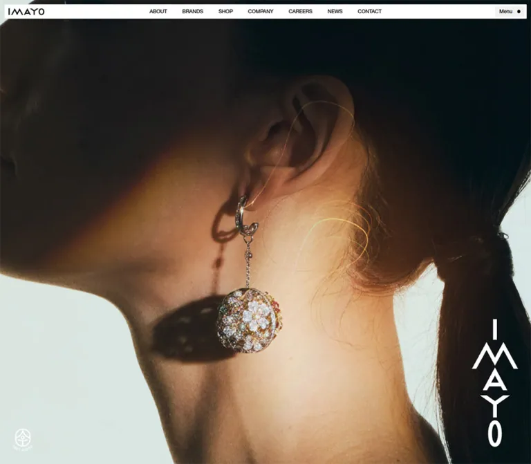
薄いナビゲーションバー、大きな人物写真、明朝系の見出し、黒い矩形リンクで構成するジュエリーメゾンの公式サイト。ブランド紹介や企業情報を展開し、閲覧時はコラボレーション告知を中央に表示。
オリジナルサイトを見るIMAYO — Style Reference
A narrow monochrome navigation strip above expansive portrait imagery, with precise editorial columns and a vivid campaign insert.
Original URL: https://imayo.co.jp/ Final URL: https://imayo.co.jp/ Page title: IMAYO Official Website Theme: monochrome interface, photographic opening, black action links, and a deep charcoal footer; the captured state includes a blue campaign overlay. Inspected: September 12, 2026, from supplied browser evidence retrieved at 07:56:03.415 UTC / 16:56:03.415 JST. Viewports: 1440 × 1000 and 390 × 844 CSS pixels; three desktop and two mobile captures. Scope: the current Japanese corporate homepage, its visible campaign overlay and header, and rendered DOM measurements for the introduction, brands, company information, careers, newsroom, promotional links, footer, and menu content. Destination pages were not inspected.
IMAYO presents a jewelry maison through restrained interface typography and large photographic space. The opening captures place closely cropped portrait imagery behind a thin, inset navigation bar. English utility labels remain small; the main Japanese introductory heading uses a declared serif stack. The lower-page DOM shows narrow reading columns, edge-to-edge brand tiles, flat black links, and a substantial dark footer.
The immediate captured experience is dominated by a Shohei Ohtani × IMAYO collaboration graphic. A white frame holds this colorful landscape artwork at the center of the viewport, with a small Close control just above its upper-right corner. The underlying page is strongly blurred and dimmed, while the navigation remains comparatively sharp. This campaign treatment is a distinct layer within a corporate homepage, not the identity of the entire site.
How to Read This Reference
- Measured means a supplied computed style, custom property, or rendered element rectangle. Measurements below are rounded where appropriate; all coordinates refer to the supplied snapshot, not a universal layout rule.
- Calculated means arithmetic based on those measurements, such as column gaps or viewport proportions. A matching formula is not automatically the original CSS declaration.
- Estimated means a visual approximation from the screenshots. Blur strength, some image colors, the visible logo width, and the header strip's outer dimensions belong to this category.
- DOM-only identifies content or geometry that is available in the evidence but obscured in the attached images. All screenshots retain the campaign overlay. The menu was not shown open, and lower sections cannot be visually evaluated without that obstruction.
- Recommended identifies adaptation choices, accessibility additions, and Quick Start code. These are not claims about the site's implementation.
- Font-family declarations establish the requested stack. They do not establish which font supplied every rendered glyph or whether every named webfont loaded.
Tokens — Colors
Default Palette
The source exposes a compact neutral palette. Names beginning with --col- below are actual supplied custom properties; other names are descriptive aliases.
| Name | Measured value | Source token | Role and evidence |
|---|---|---|---|
| Black | #000000 |
--col-black |
Computed text color throughout the light-content DOM; background of primary rectangular links |
| White | #ffffff |
--col-white |
Campaign frame and Close control backgrounds; primary-link text and most footer links |
| Deep charcoal | #141414 |
--col-deep |
Computed footer background at both viewports |
| Light gray | #f1f1f1 |
--col-light |
Computed Menu button background at both viewports |
| Secondary gray | #999999 |
--col-gray |
Footer's inherited color and the current Home entry in menu/footer measurements |
| Standard dark rule | rgba(0,0,0,.2) |
--col-border, --col-underline |
Declared border and underline colors; not independently mapped to every visible rule |
| Light dark rule | rgba(0,0,0,.1) |
--col-border-light |
Declared low-contrast separator color |
| Dark-surface rule | #373737 |
--col-border-dark |
Declared solid dark border color |
| Light-on-dark rule | rgba(255,255,255,.2) |
--col-border-white |
Declared translucent white border color |
| Image tint | rgba(39,39,39,.1) |
--col-bg-img |
Declared image-background treatment; its precise application was not supplied |
The source also declares --col-error: #ff4c4c. No error state is shown. Keep this as a reserved functional color rather than treating it as a brand accent.
Campaign and Photographic Color
The collaboration artwork contains deep navy, brighter stadium blues, white lettering and uniform areas, and small red details. A representative navy around #0b355e is an estimate for discussion, not a sampled source token. It belongs to the supplied artwork rather than to navigation, buttons, or the page's general color system.
The portraits introduce warm skin tones, dark clothing or background fields, and pale gray-green areas. Their colors vary between captures and are modified by the overlay. Do not derive an exact base-site palette from these blurred composites.
Overlay Compositing
The screenshot header looks pale gray, while its Menu button has a measured underlying fill of #f1f1f1. This illustrates the difference between computed component colors and their appearance through the campaign state. The header wrapper's undimmed fill and the backdrop's exact opacity were not supplied.
For a new implementation, a black veil around 18% opacity and approximately 12px of blur on the page-content layer provide a reasonable starting approximation. Both values are recommendations, not measurements. Keep the header outside the blur layer if reproducing its relative sharpness.
Tokens — Typography
Interface and Body Stack
Declared stack: YakuHanJPs, helvetica-neue-lt-pro, kozuka-gothic-pr6n, 游ゴシック, "Yu Gothic", sans-serif.
This stack is used by the main body, header utilities, section labels, newsroom rows, black action links, and footer. Most measured text has weight 400; English section labels use 500. Letter spacing is reported as normal throughout the sampled elements. Avoid adding broad luxury-style tracking by default.
The measured body size changes from 13.9968px on desktop to 12px on mobile. Its line height remains approximately 1.7. The source formula responsible for that change was not supplied.
Editorial Serif Stack
Declared stack: adobe-garamond-pro, kozuka-mincho-pr6n, serif.
The introductory Japanese heading and menu's Japanese navigation entries use this stack at weight 400. It introduces a quieter editorial register without turning every component into serif typography. Preserve the distinction between serif narrative/menu text and sans-serif interface structure.
Wordmarks and Artwork Lettering
The IMAYO header mark is visually a custom wordmark. Its link box is measured, but its asset path and intrinsic image dimensions are unavailable. Do not recreate it by typing IMAYO in the body font.
The campaign's condensed headline, collaboration lettering, signature, and insignia are part of the raster artwork. Their font families were not identified and should not become inferred interface font tokens.
Type Scale
| Role | Desktop size / line height | Mobile size / line height | Weight | Evidence |
|---|---|---|---|---|
| Main body and newsroom | 13.9968 / 23.7946px |
12 / 20.4px |
400 |
Computed |
| Header navigation and language | 12 / 20.4px |
11 / 18.7px for language |
400 |
Desktop navigation is absent from the mobile header |
| Menu button | 12 / 20.4px |
11 / 18.7px |
400 |
Computed |
| Introductory serif heading | 30 / 51px |
22 / 37.4px |
400 |
Computed H2 |
| English section labels | 15 / 25.5px |
15 / 25.5px |
500 |
BRANDS, company, careers, and NEWSROOM |
| Main introductory and store links | 13.9968 / 23.7946px |
12 / 20.4px |
400 |
Computed |
| Company/careers body and links | 12 / 20.4px |
11 / 18.7px |
400 |
Computed |
| Menu navigation entries | 16 / 27.2px |
16 / 27.2px |
400 |
Serif; DOM-only menu geometry |
| Menu legal links | 9.9936 / 16.9891px |
13 / 22.1px |
400 |
Mobile menu legal text becomes larger |
| Footer navigation | 13.9968 / 23.7946px |
12 / 20.4px |
400 |
Computed |
| Footer legal links | 9.9936 / 16.9891px |
9 / 15.3px |
400 |
Computed |
| Campaign Close control | 12 / 20.4px |
11 / 18.7px |
400 |
Computed |
The heading scale is restrained. The visual impact comes from photography, framing, and section proportions rather than an oversized marketing headline.
Tokens — Spacing & Shapes
Source Grid and Base Spacing
| Source property | Declaration | At 1440px wide | At 390px wide |
|---|---|---|---|
--grid |
calc(100vw / 8) |
180px |
48.75px |
--gw |
calc(100vw / 48) |
30px |
8.125px |
--m |
10px |
10px |
10px |
--margin |
20px |
20px |
20px |
--space-header |
calc(4em + 10px*2) |
Depends on its use-site font size | Depends on its use-site font size |
Do not equate --space-header with the visible bar height. The strip is approximately 34px tall on desktop and 32px on mobile; the variable may reserve space elsewhere, and its application is not shown.
Measured Spacing Relationships
| Use | Desktop | Mobile | Interpretation |
|---|---|---|---|
| Header outside inset | About 10px |
About 10px |
Screenshot estimate |
| Header link padding | 5px 18px |
Main links hidden | Computed desktop navigation |
| Menu horizontal padding | 10px |
10px |
Computed |
| Menu label-to-symbol gap | 12px |
11px |
Computed |
| Main brand tile gaps | 10px |
2px horizontally and vertically |
Calculated from adjacent rectangles |
| Intro heading-to-paragraph gap | About 38px |
24px |
Calculated from measured bounds |
| Intro paragraph-to-link gap | About 46px |
48px |
Calculated from measured bounds |
| Brand grid-to-store-link gap | About 42px |
36px |
Calculated |
| News row vertical padding | 27.9936px |
24px |
Computed; approximately two body ems |
| Promotional banner gap | 10px horizontal |
10px vertical |
Calculated |
| Campaign frame padding | 4px |
4px |
Computed |
| Close control-to-frame gap | 4px |
4px |
Calculated |
Border Radius and Geometry
| Element | Measured treatment |
|---|---|
| Main action links | 0px radius |
| Sampled brand links and newsroom rows | 0px radius |
| Menu button | 2px radius |
| Campaign frame | 2px radius, white fill, 4px padding |
| Close control | 2px radius |
| Menu symbol | Small filled circular dot visible in screenshots; exact dimensions unavailable |
The site does not establish a rounded-card system. Its dominant shapes are image rectangles, flat horizontal controls, and thin utility surfaces.
Layout Measurements
| Element | Desktop | Mobile |
|---|---|---|
| Introductory copy column | 422px wide at x=874 |
292.5px wide at x=48.75 |
| BRANDS / NEWSROOM header | 720px wide at x=360 |
292.5px wide at x=48.75 |
| Main brand tile | 352.5 × 475.19px |
194 × 258.66px |
| Intro/store action link | 251.94 × 60.39px |
216 × 58.69px |
| Company/careers copy column | Two 305px columns |
One 292.5px column per panel |
| News list row width | 720px |
350px |
| News date/title columns | 180px / 540px |
96px / 254px |
| Lower promotional banner | 540 × 246.73px |
350 × 159.92px |
| Campaign outer frame | 588 × 334.91px |
358 × 205.27px |
The desktop brand-link rectangle is slightly taller than an exact 3:4 box; mobile is effectively 3:4. Because the actual image elements were not measured, do not treat the entire link rectangle as an intrinsic image dimension.
Components
Inset Global Header
Role: provide identity, principal destinations, language choice, and menu access without competing with the imagery.
The visible strip sits roughly 10px inside the viewport edges. The IMAYO wordmark is at left; seven desktop navigation links form a centered group: ABOUT, BRANDS, SHOP, COMPANY, CAREERS, NEWS, and CONTACT. JA and EN appear near the right, followed by a slightly darker Menu button and a black dot.
The desktop navigation occupies approximately x=429.88–1010.13, centered on the 1440px viewport. Each link is 34px tall with 5px 18px padding and 12px type. The Menu button measures 69.44 × 24px.
On mobile, the seven main links disappear. The wordmark, JA, EN, and Menu remain on one line; the Menu button becomes 65.33 × 22px. The logo link box remains 180px wide in the DOM, even though the visible artwork is much smaller: approximately 85px wide on desktop and 56px on mobile. Those artwork widths are screenshot estimates, not link measurements.
The header remains visible in all supplied captures. Its exact sticky/fixed implementation, scrolling transitions, and interaction while the campaign is open were not established.
Opening Visual Stage
Role: establish the brand through a large photographic field.
The first section measures exactly one inspected viewport: 1440 × 1000px or 390 × 844px. Screenshots show substantial portrait crops behind the campaign. Mobile preserves the large-scale crop instead of fitting the complete desktop composition into a narrow screen.
The supplied DOM extract contains no opening-section text and no media asset inventory. This does not prove that the section has no image-embedded lettering, video, or other media layers. The media format, playback behavior, source dimensions, and focal-point rules remain unverified.
Campaign Overlay
Role: foreground the 2025–2026 collaboration announcement and its destination.
The frame is centered on the viewport itself. Desktop bounds are x=426, y=332.55, with a center at (720, 500). Mobile bounds are x=16, y=319.37, with a center at (195, 422).
Its anatomy is unusually economical:
- A blurred and dimmed underlying page.
- A white, 2px-radius frame with 4px padding.
- A landscape campaign image containing the athlete, collaboration branding, and legal details.
- A separate-looking white Close control above the upper-right edge, paired with a black cross.
The image area calculates to approximately 580 × 326.91px on desktop and 350 × 197.27px on mobile, or about 1.774:1. It scales proportionally without the obvious portrait recropping used by the opening visual.
A recommended width rule of min(588px, calc(100vw - 32px)) reproduces both observed outer widths. This is a fitted adaptation, not a supplied source declaration.
The campaign anchor points to https://imayo-boutique.jp/shop/pg/1imayo-SHOHEI-OHTANI. The extract reports both an anchor containing the text Close and a separate button measurement. That extraction does not establish the exact nesting or event handling. Closing, backdrop dismissal, Escape behavior, scroll locking, focus management, and repeat-visit persistence were not tested.
Expanded Menu Content — DOM-Only
Role: offer a broader navigation surface containing corporate destinations and brand shortcuts.
On desktop, four portrait-shaped brand-link boxes appear in the DOM at y=116, starting at x=20, with dimensions 207.5 × 276.47px and 10px gaps. Two Japanese navigation columns begin at x=920 and x=1158. Primary entries use the 16px serif stack; legal and social links sit beneath them.
On mobile, the eight principal Japanese links form one 252.5px-wide column at x=68.75, beginning at y=90.75. Legal and social links follow. Four smaller brand previews sit below at y=503.78, each 86 × 114.66px, separated by 2px gaps.
This is distinct from the main brand section, which becomes a two-by-two grid on mobile. These menu rectangles may exist while their parent is hidden or occluded. No open-menu screenshot or toggle interaction is supplied, so its surface, entrance animation, and visible layering should not be reconstructed as verified observations.
Introductory Story
Role: explain the maison's history and approach before presenting individual brands.
The source heading is “今に、未来に、輝きを与える”. It is followed by a Japanese paragraph describing more than 160 years of jewelry manufacture and sales, then a black “今与について” link.
On desktop, the copy occupies a 422px column on the right side of a 1000px-tall section. The measured H2 begins at x=874, y=1263.33; the column ends at x=1296, leaving a 144px right margin. The heading is 30px regular serif, followed by roughly 14px sans-serif body text.
On mobile, the section starts immediately after the 844px opening stage. Text is centered within a 75vw column: 292.5px wide with 48.75px margins. The heading becomes 22px, body text 12px, and the 216px-wide link is centered beneath it. The section's total height becomes 749.47px rather than remaining a full viewport.
The unseen left side of the desktop section cannot be described as a specific photograph or illustration from the provided measurements alone.
Rectangular Action Link
Role: provide a clear transition into the About, Shop, Company, and Careers destinations.
Use a black rectangular surface, white regular-weight text, square corners, and measured padding of 10px 20px 10px 10px. Main About and Shop links are approximately 252 × 60px on desktop and 216 × 59px on mobile. Their widths are consistent with 18 body ems, although that source width declaration was not supplied.
Company and Careers links fill their local columns: 305px on desktop and 292.5px on mobile. These use smaller text than the main About and Shop links.
The child-icon geometry and hover backgrounds were not recorded. Do not invent a prominent circular arrow, pill shape, or elevation effect as part of the measured anatomy.
Section Heading Row
Role: align a compact English section identifier with a Japanese destination link.
BRANDS pairs with “ブランド一覧”; NEWSROOM pairs with “全ての記事”. The label is 15px, weight 500, at both viewports. The destination uses the body size: about 14px on desktop and 12px on mobile.
Both desktop heading rows use a centered 720px container, or 50vw. Mobile uses a centered 292.5px container, or 75vw. Their children are distributed to opposite ends. Preserve this narrow editorial alignment even where the image grid or news list extends wider.
Some desktop child bounds are displaced 10px relative to their parent header. Since transforms are not included in the evidence fields, treat these as snapshot positions rather than adding unexplained permanent offsets to a new layout.
Brand Gallery
Role: give kagayoi, Hyacca, ICHAROI, and SHINCA equal prominence and link to their boutique categories.
The desktop section has four equal-width linked tiles across the full 1440px viewport. Tile widths are 352.5px, with 10px gaps and no outside horizontal margin. The section header remains much narrower above them.
Mobile changes to two columns and two rows. Each tile is 194px wide and approximately 258.66px tall, with 2px seams. Brand order is preserved: kagayoi and Hyacca first, ICHAROI and SHINCA second. A centered black “店舗案内” link follows.
The link boxes and destinations are measured, but the lower-page artwork is not available unobstructed. Specific product arrangements, logo placement inside each tile, hover crops, and image filters remain unverified.
Company Information and Careers
Role: present institutional history and recruitment as adjacent parts of the organization.
The combined desktop region is 1500px tall. Its text panels occupy two 305px columns at x=740 and x=1095, a calculated 50px gap. Their headings share a vertical position, as do their paragraphs and black links. This creates a paired composition within the right half of the page, not two full-width cards.
Each panel includes an English heading, a Japanese label in the rendered text, a short paragraph, and a destination link. Paragraphs use 12px / 20.4px on desktop.
Mobile stacks Company Information before Careers in the same 75vw reading column used by the introduction. Paragraphs reduce to 11px / 18.7px; links span the 292.5px column. There is approximately 90px between the end of the Company link and the Careers heading.
The mobile parent section has a measured black background while descendant text is also reported as black on transparent backgrounds. Intermediate surfaces or effects were not included in the extract. This is insufficient evidence to claim intentional black-on-black content. A new implementation should establish an explicit readable text surface.
Newsroom List
Role: present recent announcements in a structured editorial list.
Three dated articles appear in the supplied DOM: August 28, August 27, and July 3, 2026. Each row is a linked two-column grid, with the date separated from the Japanese title. The destinations are external press-release URLs; they were not opened during this analysis.
Desktop rows are centered at 720px wide. The grid is exactly 180px 540px, and vertical padding is approximately 28px. The first two measured row heights are 127.36px; the shorter third title produces a 103.56px row.
Mobile expands the list beyond its section-heading alignment: rows have 20px outer margins and a 350px width. Crucially, the date remains beside the title in 96px 254px columns. The list does not become a date-above-title stack. Vertical padding is 24px; title wrapping accounts for the different row heights.
Successive rectangles leave 1px between rows, consistent with a thin separator. The exact painted separator was not exposed, so a 1px neutral rule is an appropriate adaptation rather than an independently verified border measurement.
Lower Promotional Links
Role: retain access to special campaigns farther down the homepage.
Two linked banner rectangles follow the news list. Desktop presents them side by side at 540 × 246.73px, with a 10px gap and 175px outside margins. Mobile stacks them at 350 × 159.92px, with 20px side margins and a 10px vertical gap.
Their aspect ratio is approximately 2.189:1, substantially wider than the opening campaign overlay. One points to the collaboration destination; the other points to /special/jda25/. These are destination URLs, not image asset paths. The second banner's visual content was not independently visible.
Deep Footer
Role: close the page with comprehensive navigation, brand links, policies, social destinations, and identity.
The footer has a measured #141414 background. Most links are white; the inherited text and current Home entry are #999. Its text contains Site menu, Our brands, the four brand names, privacy and terms links, social destinations, and the copyright “© Imayo & Co.,Ltd. All Rights Reserved.”
Desktop footer height is 1000px. Site navigation begins at x=20, and brand links at approximately x=214, both using 180px-wide link boxes. A tall brand-link container at the right measures 108 × 297px; its actual asset was not supplied.
Mobile retains side-by-side site and brand navigation groups, each about 108.66px wide. The tall brand-link container becomes 48.75 × 134.06px and sits farther down on the right. Legal links stack vertically at the lower left. The footer measures 892.75px tall, slightly more than the inspected mobile viewport.
Tokens — Motion & Interaction
| Treatment | Supplied value or observation | What can be concluded |
|---|---|---|
| Header, menu, and footer link color | 0.8s cubic-bezier(.175,0,.035,1) |
A defined slow color transition; target hover/focus colors were not supplied |
| Desktop section destination links | 0.6s cubic-bezier(.39,-.190,.095,1) on color |
Defined easing and duration; endpoint appearance unverified |
| Several mobile text elements | Opacity and transform, each 3s cubic-bezier(.175,0,.035,1) |
Reveal-capable transitions exist; trigger, offset, and delay were not recorded |
| Split-animation duration token | --usg-split-s: 1.2s |
Declared duration; no specific split sequence independently observed |
| Split-animation easing token | cubic-bezier(.32,.94,.6,1) |
Declared easing only |
| Mask easing | cubic-bezier(0,.030,0,1.000) |
Declared as --ease-mask; exact mask choreography unavailable |
| Additional easing tokens | --ease-i: cubic-bezier(.865,0,.740,1); --ease-o and --ease-io as above |
Source vocabulary, not proof that each token drives a visible component |
| Background differences across captures | Portrait framing and dark fields differ while the campaign remains centered | State differences are visible; they do not isolate a video, slideshow, or scroll animation |
| Sampled element animations | Generally reported as none |
Does not rule out media playback, transitions, pseudo-elements, or unlisted animated descendants |
Many elements report only transition: all, without a useful duration in the supplied summary. Do not assign them a fabricated timing.
The browser notes describe an initial observation lasting at least five seconds, readiness checks, and scroll traversal. They do not provide a click log for Close or Menu, a media timeline, or individual screenshot scroll offsets. Autoplay, sound, parallax, sticky scene transitions, and dismissal persistence remain unverified.
For reuse, preserve the slow, controlled easing vocabulary. Apply long three-second reveals only as progressive enhancement, and keep essential content available without animation.
Surfaces
| Layer | Appearance | Evidence and implementation implication |
|---|---|---|
| Opening visual | Large photographic field | Visible through blur; media type and original crop rules unknown |
| Header | Thin inset pale strip with black controls | Screenshot appearance; wrapper fill not measured |
| Editorial content | Black text and neutral interface elements | Text styles measured; many section backgrounds are transparent in the extract |
| Main action | Flat black rectangle with white text | Direct computed values |
| Brand gallery | Adjacent square-cornered linked rectangles | Geometry measured; unobstructed artwork unavailable |
| Campaign separation | Blur plus darkening | Visually observed; strength, stacking, and CSS mechanism unknown |
| Campaign frame and Close | White, compact, 2px radius | Direct computed values |
| Footer | Deep charcoal with white and gray text | Direct computed values |
There is no evidence for a general card-shadow elevation system. Use geometry, monochrome contrast, and image boundaries to establish hierarchy. The campaign blur should remain a specific overlay treatment rather than becoming translucent glass styling throughout the page.
Imagery
The visible opening imagery uses close portrait crops: face, neck, shoulder, and surrounding dark or pale fields occupy much of the screen. The crop is atmospheric and large relative to the navigation. Fine jewelry details and original sharpness cannot be evaluated reliably through the campaign blur.
The campaign uses a different visual register: a pitching figure, stadium-blue background, white collaboration lettering, and embedded legal marks. Keep it as a complete supplied artwork with proportional scaling. Do not extract its blue into every button or reproduce its condensed lettering as the homepage's heading style.
Main brand links use portrait proportions, while the lower promotional links are much wider landscape formats. These placements need separately suitable assets; blindly reusing the overlay image in the lower banner ratio would require cropping or distortion.
Observed Asset References
No image src, video URL, font-file URL, or intrinsic asset dimensions were included in the supplied evidence. The following inventory records what is known without inventing filenames.
| Visual asset | Observed placement | Asset-reference limitation |
|---|---|---|
| IMAYO wordmark | Header, linked to the homepage | Visible mark; source file unavailable |
| Opening portrait media | Viewport-sized first section | Visible through blur; format and URL unavailable |
| Collaboration artwork | Centered campaign frame | Anchor destination known; image URL unavailable |
| Four brand visuals | Main gallery and menu-link boxes | Dimensions and boutique destinations known; individual images not visually inspectable |
| Two lower banners | After newsroom | Link destinations and rectangles known; image URLs unavailable |
| Tall footer identity asset | Right side of footer DOM | Link-container dimensions known; source file unavailable |
Use authorized brand and campaign assets when implementing an exact reproduction. For a new brand, preserve the composition and interface relationships while commissioning appropriate original photography and artwork.
Layout & Responsive Behavior
Page Sequence
These heights are measured snapshot results, not recommended fixed heights.
| Region | Desktop top / height | Mobile top / height |
|---|---|---|
| Opening visual | 0 / 1000px |
0 / 844px |
| Introduction | 1000 / 1000px |
844 / 749.47px |
| Brands | 2000 / 952.95px |
1593.47 / 963.50px |
| Company and careers | 2952.95 / 1500px |
2556.97 / 1087.63px |
| News and promotional links | 4452.95 / 1258.64px |
3644.59 / 1145.09px |
| Footer | 5711.59 / 1000px |
4789.69 / 892.75px |
| Total document | 6711.59px |
5682.44px |
Responsive Rules Supported by the Evidence
- Header: seven desktop navigation links are removed from the visible mobile bar. Language controls and Menu remain available.
- Editorial alignment: section headings change from a centered 50vw desktop column to a centered 75vw mobile column.
- Introduction: a right-side desktop copy column becomes a centered mobile column, with a smaller serif heading and centered action link.
- Main brand gallery: four columns with 10px gaps become two columns with 2px gaps.
- Menu brand previews: the separate menu preview strip retains four columns on mobile. Do not confuse it with the main gallery.
- Company and careers: paired desktop text columns become vertically stacked mobile panels.
- Newsroom: date/title columns remain side by side. Mobile rows use wider outer alignment than their section heading.
- Lower banners: two horizontal banners become a vertical stack with the same 10px gap.
- Campaign: a capped desktop frame becomes nearly full-width on mobile, retaining 16px side clearance and viewport-centered placement.
Only two viewport widths were inspected. The actual CSS breakpoint, intermediate tablet behavior, landscape layout, safe-area handling, zoom behavior, and browser-chrome adjustments were not supplied. Choose breakpoints by testing content fit; do not present an invented breakpoint as source evidence.
Do’s and Don’ts
Do
- Keep the corporate homepage's full sequence: introduction, brands, company, careers, news, promotions, and footer.
- Let the photography establish scale while navigation stays compact.
- Pair the declared serif heading style with a restrained sans-serif interface.
- Preserve regular font weights and normal tracking as the baseline.
- Use black rectangular action links with white text and square corners.
- Keep narrow editorial headings above wider image and list structures.
- Preserve the four-to-two-column change in the main brand gallery.
- Retain separate date and title columns in mobile news rows.
- Keep the campaign image proportional, with a 4px white frame and a small upper-right Close control.
- Treat source colors and overlay-modified screenshot colors as different evidence types.
- Label menu, lower-section imagery, and untested interactions according to their evidence limits.
Don't
- Don't reduce this homepage to the campaign graphic or rebuild it as a single-purpose landing page.
- Don't turn the campaign's blue into the global interface accent.
- Don't add oversized headlines, pill buttons, rounded card grids, or arbitrary shadows.
- Don't stretch the header wordmark to match its much wider anchor box.
- Don't claim that changing screenshot backgrounds prove a particular video or slideshow implementation.
- Don't infer visible menu behavior solely from its DOM rectangles.
- Don't replace the mobile newsroom with stacked cards if preserving the observed layout.
- Don't force the approximately 2.189:1 lower banners into the overlay's approximately 1.774:1 ratio.
- Don't reproduce black text over a black section merely because intermediate surfaces were absent from the extract.
- Don't hardcode the measured document height or assume every section remains viewport-height on phones.
Recommended Implementation Additions
These are recommendations for a new implementation, not verified features of the original:
- Implement the campaign as a semantic dialog with an accessible name, keyboard dismissal, deliberate focus handling, and a Close button separate from its destination link.
- Keep compact visual controls while providing larger touch targets. The observed Close and Menu surfaces are only about 19–24px tall.
- Provide useful accessible names for the logo, campaign link, brand tiles, language controls, and social links. Empty extracted link text does not by itself prove that the original lacks an accessible name.
- Make the background inert while a blocking dialog is open, and restore normal scrolling and focus after dismissal.
- Keep readable content visible when scripts fail; reveal animations should enhance an already usable document.
- Provide reduced-motion behavior. If opening media is video, offer an appropriate static or paused alternative and explicit control where needed.
- Consider larger mobile reading text than the observed 11–12px, allowing content-driven section heights and additional wrapping.
- Test the header at intermediate widths before navigation collides with the language controls.
- Reserve intrinsic image dimensions and preserve aspect ratios to avoid layout shifts.
- Establish explicit text surfaces in layered sections and verify contrast in their final composited state.
Agent Prompt Guide
Quick Color Reference
- Main interface ink and action fills:
#000000. - Reversed action text and campaign frame:
#ffffff. - Menu surface:
#f1f1f1. - Footer:
#141414, with white links and#999999secondary text. - Fine separators: source neutral border tokens, generally black or white at 10–20% opacity.
- Campaign blue: artwork-specific; no exact site-wide blue token was observed.
- Overlay blur and dimming: visible effects with unmeasured parameters; tune separately from the neutral palette.
Overall Prompt
“Create a Japanese jewelry maison corporate homepage inspired by the observed IMAYO layout. Use a thin navigation strip inset 10px from the viewport, a custom brand mark at left, compact English desktop links, and JA/EN plus a small Menu control at right. Begin with a viewport-sized photographic field. Follow with a restrained serif Japanese introduction, narrow editorial headings, four edge-to-edge brand tiles, paired company and careers information, a dated newsroom list, two promotional banners, and a deep charcoal footer. Use regular sans-serif body text, black rectangular links, square image corners, and generous section spacing. On mobile, hide the desktop link group, use 75vw editorial columns, change the main brand gallery to two columns, stack the company panels and banners, and keep news dates beside their titles. Treat any campaign dialog as a separate optional layer.”
Example Component Prompts
- Header: “Build a compact pale header strip with 10px outer clearance. Center seven small English navigation links on desktop; place a supplied wordmark at left and JA, EN, and a lightly filled Menu button at right. Use 12px desktop utilities and 11px mobile utilities. Hide the seven-link group on narrow screens.”
- Introduction: “Create a regular-weight serif heading above a compact sans-serif Japanese paragraph and a square black destination link. At 1440px, place a roughly 422px copy column toward the right with a 144px right margin. At 390px, center a 292.5px column and a 216px action link. Let content determine the height.”
- Brand gallery: “Place a narrow BRANDS heading row above four equal linked portrait tiles spanning the desktop width with 10px gaps. At 390px, switch to a two-by-two grid with 194px tiles and 2px seams. Add a centered black store-location link below. Use supplied brand imagery.”
- Newsroom: “Build a centered 720px desktop news list with 180px date and 540px title columns. On a 390px phone, use 20px side margins and 96px date plus 254px title columns. Keep long Japanese titles wrapping beside the date. Use thin neutral separators and generous vertical padding.”
- Campaign dialog: “Center a supplied landscape campaign image in a white frame with 4px padding and a 2px radius. Cap the outer width at 588px and retain 16px mobile side clearance. Put a compact Close × button 4px above the frame, aligned right. Blur the page content while keeping the header comparatively sharp. Treat blur strength and backdrop opacity as adjustable approximations.”
- Footer: “Create a substantial
#141414footer with separate site and brand navigation groups, white links, gray secondary labels, small legal links, social destinations, and a supplied tall identity asset on the right. Preserve generous empty space and avoid rounded containers.”
Quick Start
CSS Custom Properties
This is a reusable adaptation, not extracted production CSS. It reproduces key measured widths and relationships at the two inspected sizes. The 1100px and 760px breakpoints, explicit light reading surfaces, blur amount, backdrop opacity, safe-area accommodations, and dialog behavior are recommendations. Font names come from the supplied computed stacks; font files and licenses are not included.
The page should contain a .site-header and a .page-content wrapper holding the main content and footer. Keep the campaign dialog outside .page-content so it is not blurred with the page. Asset paths in the example markup are placeholders.
:root {
  /* Measured source colors */
  --color-ink: #000;
  --color-white: #fff;
  --color-light: #f1f1f1;
  --color-deep: #141414;
  --color-muted: #999;
  --color-rule: rgb(0 0 0 / 20%);
  --color-rule-light: rgb(0 0 0 / 10%);
  --color-rule-reverse: rgb(255 255 255 / 20%);

  /* Declared source font stacks; assets are not bundled */
  --font-sans: YakuHanJPs, helvetica-neue-lt-pro,
    kozuka-gothic-pr6n, '游ゴシック', 'Yu Gothic', sans-serif;
  --font-serif: adobe-garamond-pro, kozuka-mincho-pr6n, serif;

  /* Rounded desktop measurements */
  --text-body: 14px;
  --text-utility: 12px;
  --text-section: 15px;
  --text-story: 30px;
  --text-panel: 12px;
  --leading: 1.7;

  /* Source grid and reusable dimensions */
  --grid: calc(100vw / 8);
  --grid-fine: calc(100vw / 48);
  --space-small: 10px;
  --space-page: 20px;
  --editorial-width: 50vw;
  --brand-gap: 10px;
  --action-height: 60.4px;
  --radius-utility: 2px;
  --campaign-max: 588px;
  --campaign-frame: 4px;

  /* Source easing; overlay values are recommended approximations */
  --ease-out: cubic-bezier(.175, 0, .035, 1);
  --ease-in-out: cubic-bezier(.39, -.19, .095, 1);
  --motion-link: 800ms var(--ease-out);
  --motion-reveal: 3s var(--ease-out);
  --overlay-shade: rgb(0 0 0 / 18%);
  --overlay-blur: 12px;
}

* { box-sizing: border-box; }

body {
  margin: 0;
  color: var(--color-ink);
  background: var(--color-white);
  font: 400 var(--text-body) / var(--leading) var(--font-sans);
}

button, input, select, textarea { font: inherit; }
button, a { -webkit-tap-highlight-color: transparent; }
a { color: inherit; }
img { max-width: 100%; }

.site-header {
  /* Fixed positioning is an adaptation of the persistent appearance. */
  position: fixed;
  z-index: 20;
  top: max(10px, env(safe-area-inset-top, 0px));
  inset-inline: 10px;
  height: 34px;
  padding-inline: 5px;
  display: flex;
  align-items: center;
  background: var(--color-white);
  color: var(--color-ink);
  font-size: var(--text-utility);
}

.brand-link {
  display: block;
  width: 180px;
  padding-inline: 5px;
  flex-shrink: 0;
}

.brand-link img {
  display: block;
  width: 85px; /* Screenshot estimate for visible artwork. */
  height: auto;
}

.primary-nav {
  position: absolute;
  left: 50%;
  transform: translateX(-50%);
  display: flex;
}

.primary-nav a {
  display: flex;
  align-items: center;
  height: 34px;
  padding: 5px 18px;
  text-decoration: none;
  transition: color var(--motion-link);
}

.header-tools,
.language-links,
.menu-button {
  display: flex;
  align-items: center;
}

.header-tools { margin-left: auto; gap: 62.5px; }
.language-links { gap: 18px; }
.language-links a { text-decoration: none; }

.menu-button {
  height: 2em;
  gap: 1em;
  padding: 0 10px;
  border: 0;
  border-radius: var(--radius-utility);
  background: var(--color-light);
  color: inherit;
  cursor: pointer;
}

.menu-dot {
  width: .6em;
  height: .6em;
  border-radius: 50%;
  background: currentColor;
}

.hero {
  position: relative;
  min-height: 100svh;
  overflow: hidden;
}

.hero-media {
  position: absolute;
  inset: 0;
  width: 100%;
  height: 100%;
  object-fit: cover;
  object-position: var(--hero-focus, 50% 50%);
}

.story {
  min-height: 100svh;
  display: flex;
  align-items: center;
  padding-block: 96px;
}

.story-copy {
  /* Fitted to the measured 422px column at 1440px. */
  width: calc(30vw - 10px);
  margin-left: auto;
  margin-right: 10vw;
}

.story-title {
  margin: 0 0 38px;
  font: 400 var(--text-story) / 1.7 var(--font-serif);
}

.story-copy p { margin: 0; }
.story-copy .action-link { margin-top: 46px; }

.action-link {
  display: inline-flex;
  align-items: center;
  justify-content: space-between;
  width: 18em;
  max-width: 100%;
  min-height: var(--action-height);
  padding: 10px 20px 10px 10px;
  border-radius: 0;
  color: var(--color-white);
  background: var(--color-ink);
  text-decoration: none;
}

.section-heading {
  width: var(--editorial-width);
  margin-inline: auto;
  display: flex;
  align-items: center;
  justify-content: space-between;
  gap: 1em;
}

.section-heading h2,
.corporate-panel h2 {
  margin: 0;
  font-size: var(--text-section);
  font-weight: 500;
  line-height: 1.7;
}

.section-heading a {
  text-decoration: none;
  transition: color 600ms var(--ease-in-out);
}

.brands { padding-block: 6em 16em; }
.brands .section-heading { margin-bottom: 3em; }

.brand-grid {
  display: grid;
  grid-template-columns: repeat(4, minmax(0, 1fr));
  gap: var(--brand-gap);
}

.brand-tile { display: block; min-width: 0; }
.brand-tile img {
  display: block;
  width: 100%;
  aspect-ratio: 3 / 4;
  object-fit: cover;
}

.brand-action { margin-top: 3em; text-align: center; }

.corporate-panels {
  /* Content geometry only; unseen surrounding imagery is not invented. */
  width: calc(50% - 60px);
  margin-left: calc(50% + 20px);
  display: grid;
  grid-template-columns: repeat(2, minmax(0, 1fr));
  gap: 50px;
  padding-block: 96px;
}

.corporate-panel {
  min-width: 0;
  color: var(--color-ink);
  background: var(--color-white);
  font-size: var(--text-panel);
}

.corporate-panel p { margin-block: 24px 28px; }
.corporate-panel .action-link { width: 100%; }

.newsroom { padding-block: 12em; }
.news-list { width: 50vw; margin: 4em auto 0; }

.news-row {
  display: grid;
  grid-template-columns: var(--grid) minmax(0, 1fr);
  padding-block: 2em;
  border-bottom: 1px solid var(--color-rule-light);
  text-decoration: none;
}

.news-row:first-child {
  border-top: 1px solid var(--color-rule-light);
}

.news-row time { white-space: nowrap; }
.news-row .news-title { min-width: 0; overflow-wrap: anywhere; }

.promo-grid {
  width: calc(75vw + 10px);
  margin: 12em auto 0;
  display: grid;
  grid-template-columns: repeat(2, minmax(0, 1fr));
  gap: 10px;
}

.promo-grid a { display: block; }
.promo-grid img { display: block; width: 100%; height: auto; }

.site-footer {
  min-height: 100svh;
  padding: 12vw 20px 36px;
  background: var(--color-deep);
  color: var(--color-muted);
}

.footer-navigation { display: flex; gap: 1em; }
.footer-navigation section { width: var(--grid); }
.footer-navigation a {
  display: block;
  color: var(--color-white);
  text-decoration: none;
  transition: color var(--motion-link);
}

.footer-navigation [aria-current='page'] {
  color: var(--color-muted);
}

.footer-legal { margin-top: 8em; font-size: 10px; }
.footer-legal a { color: var(--color-white); }

/* A dialog is separate from both header and blurred page content. */
body[data-campaign-open='true'] { overflow: hidden; }
body[data-campaign-open='true'] .page-content {
  filter: blur(var(--overlay-blur));
}

.campaign-dialog {
  position: fixed;
  inset: 0;
  width: min(
    var(--campaign-max),
    calc(100vw - 32px),
    calc((100dvh - 72px) * 1.77)
  );
  height: fit-content;
  max-width: none;
  max-height: none;
  margin: auto;
  padding: 0;
  border: 0;
  overflow: visible;
  background: transparent;
  color: var(--color-ink);
}

.campaign-dialog::backdrop { background: var(--overlay-shade); }

.campaign-artwork {
  display: block;
  padding: var(--campaign-frame);
  border-radius: var(--radius-utility);
  background: var(--color-white);
}

.campaign-artwork img {
  display: block;
  width: 100%;
  height: auto;
}

.campaign-close {
  position: absolute;
  right: 0;
  bottom: calc(100% + 4px);
  display: flex;
  align-items: center;
  gap: .5em;
  padding: .05em .75em 0;
  border: 0;
  border-radius: var(--radius-utility);
  background: var(--color-white);
  color: var(--color-ink);
  font-size: var(--text-utility);
  line-height: 1.7;
  cursor: pointer;
}

/* Recommended focus treatment; not an observed source style. */
:where(a, button):focus-visible {
  outline: 2px solid currentColor;
  outline-offset: 4px;
}

.action-link:focus-visible { outline-color: var(--color-ink); }

/* Recommended navigation breakpoint; the original is unknown. */
@media (max-width: 1100px) {
  .primary-nav { display: none; }
  .header-tools { gap: 33px; }
}

/* Recommended content breakpoint; endpoint geometry is measured. */
@media (max-width: 760px) {
  :root {
    --text-body: 12px;
    --text-utility: 11px;
    --text-story: 22px;
    --text-panel: 11px;
    --editorial-width: 75vw;
    --brand-gap: 2px;
    --action-height: 58.7px;
  }

  .site-header { height: 32px; }
  .brand-link img { width: 56px; }
  .language-links { gap: 16.5px; }

  .story { min-height: auto; padding-block: 96px; }
  .story-copy { width: 75vw; margin-inline: auto; }
  .story-title { margin-bottom: 24px; }
  .story-copy .action-link {
    display: flex;
    margin: 48px auto 0;
  }

  .brands { padding-block: 12em; }
  .brand-grid { grid-template-columns: repeat(2, minmax(0, 1fr)); }

  .corporate-panels {
    width: 75vw;
    margin-inline: auto;
    grid-template-columns: minmax(0, 1fr);
    gap: 90px;
  }

  .newsroom { padding-block: 8em; }
  .news-list { width: calc(100% - 40px); margin-top: 3em; }
  .news-row { grid-template-columns: 8em minmax(0, 1fr); }

  .promo-grid {
    width: calc(100% - 40px);
    grid-template-columns: minmax(0, 1fr);
  }

  .site-footer { padding-top: var(--grid); }
  .footer-navigation section { width: calc((100vw - 64px) / 3); }
  .footer-legal { font-size: 9px; }
}

/* Essential content stays visible; no hidden reveal state is required. */
@media (prefers-reduced-motion: reduce) {
  .primary-nav a,
  .section-heading a,
  .footer-navigation a {
    transition: none;
  }
  html { scroll-behavior: auto; }
}
The brand-image 3 / 4 ratio is a practical approximation supported by the mobile tile measurements. The lower promotional images should use appropriately composed assets near the observed 2.189:1 ratio. Neither rule establishes an original asset's native dimensions.
Campaign Markup and Behavior
This example uses a native dialog and separates the Close button from the linked artwork. It opens the campaign to reproduce the captured state. No repeat-visit storage policy is included because the original policy is unknown.
<dialog class='campaign-dialog' id='campaign'
        aria-label='IMAYO collaboration announcement'>
  <a class='campaign-artwork'
     href='https://imayo-boutique.jp/shop/pg/1imayo-SHOHEI-OHTANI'>
    <!-- Replace with an authorized image; this is not a source asset path. -->
    <img src='/assets/your-campaign-image.jpg'
         alt='Shohei Ohtani × IMAYO official collaboration, 2025–2026 edition'>
  </a>
  <button class='campaign-close' type='button'
          data-campaign-close autofocus aria-label='Close campaign'>
    Close <span aria-hidden='true'>×</span>
  </button>
</dialog>
// Recommended behavior; the original interaction was not tested.
const campaign = document.querySelector('#campaign');
const closeCampaign = campaign.querySelector('[data-campaign-close]');

function openCampaign() {
  if (campaign.open) return;
  campaign.showModal();
  document.body.dataset.campaignOpen = 'true';
}

closeCampaign.addEventListener('click', () => campaign.close());
campaign.addEventListener('close', () => {
  delete document.body.dataset.campaignOpen;
});

openCampaign();
For production, verify focus placement after an automatically opened dialog closes, enlarge touch hit areas, and test short landscape screens. If hero media is animated, reduced-motion support must also control that media; removing CSS transitions alone is insufficient.
Tailwind v4 Token Mapping
Optional aliases for a project already using Tailwind v4. This does not imply that the original website uses Tailwind. Define the custom properties above first.
@theme inline {
  --color-imayo-ink: var(--color-ink);
  --color-imayo-white: var(--color-white);
  --color-imayo-light: var(--color-light);
  --color-imayo-deep: var(--color-deep);
  --color-imayo-muted: var(--color-muted);
  --color-imayo-rule: var(--color-rule);

  --font-imayo-sans: var(--font-sans);
  --font-imayo-serif: var(--font-serif);

  --text-imayo-body: var(--text-body);
  --text-imayo-utility: var(--text-utility);
  --text-imayo-section: var(--text-section);
  --text-imayo-story: var(--text-story);
  --text-imayo-panel: var(--text-panel);

  --spacing-imayo-grid: var(--grid);
  --spacing-imayo-inset: 20px;
  --spacing-imayo-seam: var(--brand-gap);
  --radius-imayo-utility: 2px;
  --ease-imayo-out: var(--ease-out);
}
Sources & Evidence
- IMAYO Official Website: original and final URL are identical. The supplied browser observation reports HTTP 200 and retrieval on September 12, 2026 at 07:56:03.415 UTC.
- Desktop evidence: three attached captures at 1440 × 1000, plus rendered text, links, custom properties, computed typography, transitions, backgrounds, and element rectangles. Measured document height: 6711.59px.
- Mobile evidence: two attached captures at 390 × 844 with the equivalent DOM/style evidence. Measured document height: 5682.44px.
- Visible state: the collaboration overlay remains open in every image. Its artwork, frame, Close control, header, and obscured background fields are the principal visual evidence.
- DOM scope: the extract includes the full homepage content sequence and menu-link geometry. Offscreen, hidden, transformed, or occluded nodes can still have rectangles, so those measurements are not proof that every node was visibly presented at capture time.
- Capture procedure: the supplied notes describe document, image, layout, and finite-animation readiness checks; an initial observation of at least five seconds; temporary pauses of perpetual animations during checks; and scroll traversal. SharedWorkers and service workers were disabled.
- Limitations: no additional browsing, file inspection, or interaction was performed for this analysis. No explicit Close/Menu click results, hover endpoints, media sources, complete asset inventory, actual breakpoint declarations, or unoccluded lower-page screenshots were supplied. Intermediate widths and destination pages remain uninspected.
This reference describes the current evidence at the original website URL. Measurements, screenshot estimates, DOM-only findings, and recommended implementation choices are intentionally distinguished.
# IMAYO — Style Reference

> A narrow monochrome navigation strip above expansive portrait imagery, with precise editorial columns and a vivid campaign insert.

**Original URL:** [https://imayo.co.jp/](https://imayo.co.jp/)
**Final URL:** [https://imayo.co.jp/](https://imayo.co.jp/)
**Page title:** IMAYO Official Website
**Theme:** monochrome interface, photographic opening, black action links, and a deep charcoal footer; the captured state includes a blue campaign overlay.
**Inspected:** September 12, 2026, from supplied browser evidence retrieved at 07:56:03.415 UTC / 16:56:03.415 JST.
**Viewports:** 1440 × 1000 and 390 × 844 CSS pixels; three desktop and two mobile captures.
**Scope:** the current Japanese corporate homepage, its visible campaign overlay and header, and rendered DOM measurements for the introduction, brands, company information, careers, newsroom, promotional links, footer, and menu content. Destination pages were not inspected.

IMAYO presents a jewelry maison through restrained interface typography and large photographic space. The opening captures place closely cropped portrait imagery behind a thin, inset navigation bar. English utility labels remain small; the main Japanese introductory heading uses a declared serif stack. The lower-page DOM shows narrow reading columns, edge-to-edge brand tiles, flat black links, and a substantial dark footer.

The immediate captured experience is dominated by a Shohei Ohtani × IMAYO collaboration graphic. A white frame holds this colorful landscape artwork at the center of the viewport, with a small Close control just above its upper-right corner. The underlying page is strongly blurred and dimmed, while the navigation remains comparatively sharp. This campaign treatment is a distinct layer within a corporate homepage, not the identity of the entire site.

## How to Read This Reference

- **Measured** means a supplied computed style, custom property, or rendered element rectangle. Measurements below are rounded where appropriate; all coordinates refer to the supplied snapshot, not a universal layout rule.
- **Calculated** means arithmetic based on those measurements, such as column gaps or viewport proportions. A matching formula is not automatically the original CSS declaration.
- **Estimated** means a visual approximation from the screenshots. Blur strength, some image colors, the visible logo width, and the header strip's outer dimensions belong to this category.
- **DOM-only** identifies content or geometry that is available in the evidence but obscured in the attached images. All screenshots retain the campaign overlay. The menu was not shown open, and lower sections cannot be visually evaluated without that obstruction.
- **Recommended** identifies adaptation choices, accessibility additions, and Quick Start code. These are not claims about the site's implementation.
- Font-family declarations establish the requested stack. They do not establish which font supplied every rendered glyph or whether every named webfont loaded.

## Tokens — Colors

### Default Palette

The source exposes a compact neutral palette. Names beginning with `--col-` below are actual supplied custom properties; other names are descriptive aliases.

| Name | Measured value | Source token | Role and evidence |
| --- | --- | --- | --- |
| Black | `#000000` | `--col-black` | Computed text color throughout the light-content DOM; background of primary rectangular links |
| White | `#ffffff` | `--col-white` | Campaign frame and Close control backgrounds; primary-link text and most footer links |
| Deep charcoal | `#141414` | `--col-deep` | Computed footer background at both viewports |
| Light gray | `#f1f1f1` | `--col-light` | Computed Menu button background at both viewports |
| Secondary gray | `#999999` | `--col-gray` | Footer's inherited color and the current Home entry in menu/footer measurements |
| Standard dark rule | `rgba(0,0,0,.2)` | `--col-border`, `--col-underline` | Declared border and underline colors; not independently mapped to every visible rule |
| Light dark rule | `rgba(0,0,0,.1)` | `--col-border-light` | Declared low-contrast separator color |
| Dark-surface rule | `#373737` | `--col-border-dark` | Declared solid dark border color |
| Light-on-dark rule | `rgba(255,255,255,.2)` | `--col-border-white` | Declared translucent white border color |
| Image tint | `rgba(39,39,39,.1)` | `--col-bg-img` | Declared image-background treatment; its precise application was not supplied |

The source also declares `--col-error: #ff4c4c`. No error state is shown. Keep this as a reserved functional color rather than treating it as a brand accent.

### Campaign and Photographic Color

The collaboration artwork contains deep navy, brighter stadium blues, white lettering and uniform areas, and small red details. A representative navy around `#0b355e` is an **estimate for discussion**, not a sampled source token. It belongs to the supplied artwork rather than to navigation, buttons, or the page's general color system.

The portraits introduce warm skin tones, dark clothing or background fields, and pale gray-green areas. Their colors vary between captures and are modified by the overlay. Do not derive an exact base-site palette from these blurred composites.

### Overlay Compositing

The screenshot header looks pale gray, while its Menu button has a measured underlying fill of `#f1f1f1`. This illustrates the difference between computed component colors and their appearance through the campaign state. The header wrapper's undimmed fill and the backdrop's exact opacity were not supplied.

For a new implementation, a black veil around 18% opacity and approximately 12px of blur on the page-content layer provide a reasonable starting approximation. Both values are **recommendations**, not measurements. Keep the header outside the blur layer if reproducing its relative sharpness.

## Tokens — Typography

### Interface and Body Stack

**Declared stack:** `YakuHanJPs, helvetica-neue-lt-pro, kozuka-gothic-pr6n, 游ゴシック, "Yu Gothic", sans-serif`.

This stack is used by the main body, header utilities, section labels, newsroom rows, black action links, and footer. Most measured text has weight `400`; English section labels use `500`. Letter spacing is reported as `normal` throughout the sampled elements. Avoid adding broad luxury-style tracking by default.

The measured body size changes from `13.9968px` on desktop to `12px` on mobile. Its line height remains approximately `1.7`. The source formula responsible for that change was not supplied.

### Editorial Serif Stack

**Declared stack:** `adobe-garamond-pro, kozuka-mincho-pr6n, serif`.

The introductory Japanese heading and menu's Japanese navigation entries use this stack at weight `400`. It introduces a quieter editorial register without turning every component into serif typography. Preserve the distinction between serif narrative/menu text and sans-serif interface structure.

### Wordmarks and Artwork Lettering

The IMAYO header mark is visually a custom wordmark. Its link box is measured, but its asset path and intrinsic image dimensions are unavailable. Do not recreate it by typing IMAYO in the body font.

The campaign's condensed headline, collaboration lettering, signature, and insignia are part of the raster artwork. Their font families were not identified and should not become inferred interface font tokens.

### Type Scale

| Role | Desktop size / line height | Mobile size / line height | Weight | Evidence |
| --- | --- | --- | --- | --- |
| Main body and newsroom | `13.9968 / 23.7946px` | `12 / 20.4px` | `400` | Computed |
| Header navigation and language | `12 / 20.4px` | `11 / 18.7px` for language | `400` | Desktop navigation is absent from the mobile header |
| Menu button | `12 / 20.4px` | `11 / 18.7px` | `400` | Computed |
| Introductory serif heading | `30 / 51px` | `22 / 37.4px` | `400` | Computed H2 |
| English section labels | `15 / 25.5px` | `15 / 25.5px` | `500` | BRANDS, company, careers, and NEWSROOM |
| Main introductory and store links | `13.9968 / 23.7946px` | `12 / 20.4px` | `400` | Computed |
| Company/careers body and links | `12 / 20.4px` | `11 / 18.7px` | `400` | Computed |
| Menu navigation entries | `16 / 27.2px` | `16 / 27.2px` | `400` | Serif; DOM-only menu geometry |
| Menu legal links | `9.9936 / 16.9891px` | `13 / 22.1px` | `400` | Mobile menu legal text becomes larger |
| Footer navigation | `13.9968 / 23.7946px` | `12 / 20.4px` | `400` | Computed |
| Footer legal links | `9.9936 / 16.9891px` | `9 / 15.3px` | `400` | Computed |
| Campaign Close control | `12 / 20.4px` | `11 / 18.7px` | `400` | Computed |

The heading scale is restrained. The visual impact comes from photography, framing, and section proportions rather than an oversized marketing headline.

## Tokens — Spacing & Shapes

### Source Grid and Base Spacing

| Source property | Declaration | At 1440px wide | At 390px wide |
| --- | --- | --- | --- |
| `--grid` | `calc(100vw / 8)` | `180px` | `48.75px` |
| `--gw` | `calc(100vw / 48)` | `30px` | `8.125px` |
| `--m` | `10px` | `10px` | `10px` |
| `--margin` | `20px` | `20px` | `20px` |
| `--space-header` | `calc(4em + 10px*2)` | Depends on its use-site font size | Depends on its use-site font size |

Do not equate `--space-header` with the visible bar height. The strip is approximately 34px tall on desktop and 32px on mobile; the variable may reserve space elsewhere, and its application is not shown.

### Measured Spacing Relationships

| Use | Desktop | Mobile | Interpretation |
| --- | --- | --- | --- |
| Header outside inset | About `10px` | About `10px` | Screenshot estimate |
| Header link padding | `5px 18px` | Main links hidden | Computed desktop navigation |
| Menu horizontal padding | `10px` | `10px` | Computed |
| Menu label-to-symbol gap | `12px` | `11px` | Computed |
| Main brand tile gaps | `10px` | `2px` horizontally and vertically | Calculated from adjacent rectangles |
| Intro heading-to-paragraph gap | About `38px` | `24px` | Calculated from measured bounds |
| Intro paragraph-to-link gap | About `46px` | `48px` | Calculated from measured bounds |
| Brand grid-to-store-link gap | About `42px` | `36px` | Calculated |
| News row vertical padding | `27.9936px` | `24px` | Computed; approximately two body ems |
| Promotional banner gap | `10px` horizontal | `10px` vertical | Calculated |
| Campaign frame padding | `4px` | `4px` | Computed |
| Close control-to-frame gap | `4px` | `4px` | Calculated |

### Border Radius and Geometry

| Element | Measured treatment |
| --- | --- |
| Main action links | `0px` radius |
| Sampled brand links and newsroom rows | `0px` radius |
| Menu button | `2px` radius |
| Campaign frame | `2px` radius, white fill, `4px` padding |
| Close control | `2px` radius |
| Menu symbol | Small filled circular dot visible in screenshots; exact dimensions unavailable |

The site does not establish a rounded-card system. Its dominant shapes are image rectangles, flat horizontal controls, and thin utility surfaces.

### Layout Measurements

| Element | Desktop | Mobile |
| --- | --- | --- |
| Introductory copy column | `422px` wide at `x=874` | `292.5px` wide at `x=48.75` |
| BRANDS / NEWSROOM header | `720px` wide at `x=360` | `292.5px` wide at `x=48.75` |
| Main brand tile | `352.5 × 475.19px` | `194 × 258.66px` |
| Intro/store action link | `251.94 × 60.39px` | `216 × 58.69px` |
| Company/careers copy column | Two `305px` columns | One `292.5px` column per panel |
| News list row width | `720px` | `350px` |
| News date/title columns | `180px / 540px` | `96px / 254px` |
| Lower promotional banner | `540 × 246.73px` | `350 × 159.92px` |
| Campaign outer frame | `588 × 334.91px` | `358 × 205.27px` |

The desktop brand-link rectangle is slightly taller than an exact 3:4 box; mobile is effectively 3:4. Because the actual image elements were not measured, do not treat the entire link rectangle as an intrinsic image dimension.

## Components

### Inset Global Header

**Role:** provide identity, principal destinations, language choice, and menu access without competing with the imagery.

The visible strip sits roughly 10px inside the viewport edges. The IMAYO wordmark is at left; seven desktop navigation links form a centered group: ABOUT, BRANDS, SHOP, COMPANY, CAREERS, NEWS, and CONTACT. JA and EN appear near the right, followed by a slightly darker Menu button and a black dot.

The desktop navigation occupies approximately `x=429.88–1010.13`, centered on the 1440px viewport. Each link is 34px tall with `5px 18px` padding and 12px type. The Menu button measures `69.44 × 24px`.

On mobile, the seven main links disappear. The wordmark, JA, EN, and Menu remain on one line; the Menu button becomes `65.33 × 22px`. The logo link box remains 180px wide in the DOM, even though the visible artwork is much smaller: approximately 85px wide on desktop and 56px on mobile. Those artwork widths are screenshot estimates, not link measurements.

The header remains visible in all supplied captures. Its exact sticky/fixed implementation, scrolling transitions, and interaction while the campaign is open were not established.

### Opening Visual Stage

**Role:** establish the brand through a large photographic field.

The first section measures exactly one inspected viewport: `1440 × 1000px` or `390 × 844px`. Screenshots show substantial portrait crops behind the campaign. Mobile preserves the large-scale crop instead of fitting the complete desktop composition into a narrow screen.

The supplied DOM extract contains no opening-section text and no media asset inventory. This does not prove that the section has no image-embedded lettering, video, or other media layers. The media format, playback behavior, source dimensions, and focal-point rules remain unverified.

### Campaign Overlay

**Role:** foreground the 2025–2026 collaboration announcement and its destination.

The frame is centered on the viewport itself. Desktop bounds are `x=426`, `y=332.55`, with a center at `(720, 500)`. Mobile bounds are `x=16`, `y=319.37`, with a center at `(195, 422)`.

Its anatomy is unusually economical:

1. A blurred and dimmed underlying page.
2. A white, 2px-radius frame with 4px padding.
3. A landscape campaign image containing the athlete, collaboration branding, and legal details.
4. A separate-looking white Close control above the upper-right edge, paired with a black cross.

The image area calculates to approximately `580 × 326.91px` on desktop and `350 × 197.27px` on mobile, or about `1.774:1`. It scales proportionally without the obvious portrait recropping used by the opening visual.

A recommended width rule of `min(588px, calc(100vw - 32px))` reproduces both observed outer widths. This is a fitted adaptation, not a supplied source declaration.

The campaign anchor points to `https://imayo-boutique.jp/shop/pg/1imayo-SHOHEI-OHTANI`. The extract reports both an anchor containing the text Close and a separate button measurement. That extraction does not establish the exact nesting or event handling. Closing, backdrop dismissal, Escape behavior, scroll locking, focus management, and repeat-visit persistence were not tested.

### Expanded Menu Content — DOM-Only

**Role:** offer a broader navigation surface containing corporate destinations and brand shortcuts.

On desktop, four portrait-shaped brand-link boxes appear in the DOM at `y=116`, starting at `x=20`, with dimensions `207.5 × 276.47px` and 10px gaps. Two Japanese navigation columns begin at `x=920` and `x=1158`. Primary entries use the 16px serif stack; legal and social links sit beneath them.

On mobile, the eight principal Japanese links form one `252.5px`-wide column at `x=68.75`, beginning at `y=90.75`. Legal and social links follow. Four smaller brand previews sit below at `y=503.78`, each `86 × 114.66px`, separated by 2px gaps.

This is distinct from the main brand section, which becomes a two-by-two grid on mobile. These menu rectangles may exist while their parent is hidden or occluded. No open-menu screenshot or toggle interaction is supplied, so its surface, entrance animation, and visible layering should not be reconstructed as verified observations.

### Introductory Story

**Role:** explain the maison's history and approach before presenting individual brands.

The source heading is “今に、未来に、輝きを与える”. It is followed by a Japanese paragraph describing more than 160 years of jewelry manufacture and sales, then a black “今与について” link.

On desktop, the copy occupies a 422px column on the right side of a 1000px-tall section. The measured H2 begins at `x=874`, `y=1263.33`; the column ends at `x=1296`, leaving a 144px right margin. The heading is 30px regular serif, followed by roughly 14px sans-serif body text.

On mobile, the section starts immediately after the 844px opening stage. Text is centered within a 75vw column: `292.5px` wide with `48.75px` margins. The heading becomes 22px, body text 12px, and the 216px-wide link is centered beneath it. The section's total height becomes `749.47px` rather than remaining a full viewport.

The unseen left side of the desktop section cannot be described as a specific photograph or illustration from the provided measurements alone.

### Rectangular Action Link

**Role:** provide a clear transition into the About, Shop, Company, and Careers destinations.

Use a black rectangular surface, white regular-weight text, square corners, and measured padding of `10px 20px 10px 10px`. Main About and Shop links are approximately `252 × 60px` on desktop and `216 × 59px` on mobile. Their widths are consistent with 18 body ems, although that source width declaration was not supplied.

Company and Careers links fill their local columns: 305px on desktop and 292.5px on mobile. These use smaller text than the main About and Shop links.

The child-icon geometry and hover backgrounds were not recorded. Do not invent a prominent circular arrow, pill shape, or elevation effect as part of the measured anatomy.

### Section Heading Row

**Role:** align a compact English section identifier with a Japanese destination link.

BRANDS pairs with “ブランド一覧”; NEWSROOM pairs with “全ての記事”. The label is 15px, weight 500, at both viewports. The destination uses the body size: about 14px on desktop and 12px on mobile.

Both desktop heading rows use a centered 720px container, or 50vw. Mobile uses a centered 292.5px container, or 75vw. Their children are distributed to opposite ends. Preserve this narrow editorial alignment even where the image grid or news list extends wider.

Some desktop child bounds are displaced 10px relative to their parent header. Since transforms are not included in the evidence fields, treat these as snapshot positions rather than adding unexplained permanent offsets to a new layout.

### Brand Gallery

**Role:** give kagayoi, Hyacca, ICHAROI, and SHINCA equal prominence and link to their boutique categories.

The desktop section has four equal-width linked tiles across the full 1440px viewport. Tile widths are 352.5px, with 10px gaps and no outside horizontal margin. The section header remains much narrower above them.

Mobile changes to two columns and two rows. Each tile is 194px wide and approximately 258.66px tall, with 2px seams. Brand order is preserved: kagayoi and Hyacca first, ICHAROI and SHINCA second. A centered black “店舗案内” link follows.

The link boxes and destinations are measured, but the lower-page artwork is not available unobstructed. Specific product arrangements, logo placement inside each tile, hover crops, and image filters remain unverified.

### Company Information and Careers

**Role:** present institutional history and recruitment as adjacent parts of the organization.

The combined desktop region is 1500px tall. Its text panels occupy two 305px columns at `x=740` and `x=1095`, a calculated 50px gap. Their headings share a vertical position, as do their paragraphs and black links. This creates a paired composition within the right half of the page, not two full-width cards.

Each panel includes an English heading, a Japanese label in the rendered text, a short paragraph, and a destination link. Paragraphs use `12px / 20.4px` on desktop.

Mobile stacks Company Information before Careers in the same 75vw reading column used by the introduction. Paragraphs reduce to `11px / 18.7px`; links span the 292.5px column. There is approximately 90px between the end of the Company link and the Careers heading.

The mobile parent section has a measured black background while descendant text is also reported as black on transparent backgrounds. Intermediate surfaces or effects were not included in the extract. This is insufficient evidence to claim intentional black-on-black content. A new implementation should establish an explicit readable text surface.

### Newsroom List

**Role:** present recent announcements in a structured editorial list.

Three dated articles appear in the supplied DOM: August 28, August 27, and July 3, 2026. Each row is a linked two-column grid, with the date separated from the Japanese title. The destinations are external press-release URLs; they were not opened during this analysis.

Desktop rows are centered at 720px wide. The grid is exactly `180px 540px`, and vertical padding is approximately 28px. The first two measured row heights are 127.36px; the shorter third title produces a 103.56px row.

Mobile expands the list beyond its section-heading alignment: rows have 20px outer margins and a 350px width. Crucially, the date remains beside the title in `96px 254px` columns. The list does not become a date-above-title stack. Vertical padding is 24px; title wrapping accounts for the different row heights.

Successive rectangles leave 1px between rows, consistent with a thin separator. The exact painted separator was not exposed, so a 1px neutral rule is an appropriate adaptation rather than an independently verified border measurement.

### Lower Promotional Links

**Role:** retain access to special campaigns farther down the homepage.

Two linked banner rectangles follow the news list. Desktop presents them side by side at `540 × 246.73px`, with a 10px gap and 175px outside margins. Mobile stacks them at `350 × 159.92px`, with 20px side margins and a 10px vertical gap.

Their aspect ratio is approximately `2.189:1`, substantially wider than the opening campaign overlay. One points to the collaboration destination; the other points to `/special/jda25/`. These are destination URLs, not image asset paths. The second banner's visual content was not independently visible.

### Deep Footer

**Role:** close the page with comprehensive navigation, brand links, policies, social destinations, and identity.

The footer has a measured `#141414` background. Most links are white; the inherited text and current Home entry are `#999`. Its text contains Site menu, Our brands, the four brand names, privacy and terms links, social destinations, and the copyright “© Imayo & Co.,Ltd. All Rights Reserved.”

Desktop footer height is 1000px. Site navigation begins at `x=20`, and brand links at approximately `x=214`, both using 180px-wide link boxes. A tall brand-link container at the right measures `108 × 297px`; its actual asset was not supplied.

Mobile retains side-by-side site and brand navigation groups, each about 108.66px wide. The tall brand-link container becomes `48.75 × 134.06px` and sits farther down on the right. Legal links stack vertically at the lower left. The footer measures 892.75px tall, slightly more than the inspected mobile viewport.

## Tokens — Motion & Interaction

| Treatment | Supplied value or observation | What can be concluded |
| --- | --- | --- |
| Header, menu, and footer link color | `0.8s cubic-bezier(.175,0,.035,1)` | A defined slow color transition; target hover/focus colors were not supplied |
| Desktop section destination links | `0.6s cubic-bezier(.39,-.190,.095,1)` on color | Defined easing and duration; endpoint appearance unverified |
| Several mobile text elements | Opacity and transform, each `3s cubic-bezier(.175,0,.035,1)` | Reveal-capable transitions exist; trigger, offset, and delay were not recorded |
| Split-animation duration token | `--usg-split-s: 1.2s` | Declared duration; no specific split sequence independently observed |
| Split-animation easing token | `cubic-bezier(.32,.94,.6,1)` | Declared easing only |
| Mask easing | `cubic-bezier(0,.030,0,1.000)` | Declared as `--ease-mask`; exact mask choreography unavailable |
| Additional easing tokens | `--ease-i: cubic-bezier(.865,0,.740,1)`; `--ease-o` and `--ease-io` as above | Source vocabulary, not proof that each token drives a visible component |
| Background differences across captures | Portrait framing and dark fields differ while the campaign remains centered | State differences are visible; they do not isolate a video, slideshow, or scroll animation |
| Sampled element animations | Generally reported as `none` | Does not rule out media playback, transitions, pseudo-elements, or unlisted animated descendants |

Many elements report only `transition: all`, without a useful duration in the supplied summary. Do not assign them a fabricated timing.

The browser notes describe an initial observation lasting at least five seconds, readiness checks, and scroll traversal. They do not provide a click log for Close or Menu, a media timeline, or individual screenshot scroll offsets. Autoplay, sound, parallax, sticky scene transitions, and dismissal persistence remain unverified.

For reuse, preserve the slow, controlled easing vocabulary. Apply long three-second reveals only as progressive enhancement, and keep essential content available without animation.

## Surfaces

| Layer | Appearance | Evidence and implementation implication |
| --- | --- | --- |
| Opening visual | Large photographic field | Visible through blur; media type and original crop rules unknown |
| Header | Thin inset pale strip with black controls | Screenshot appearance; wrapper fill not measured |
| Editorial content | Black text and neutral interface elements | Text styles measured; many section backgrounds are transparent in the extract |
| Main action | Flat black rectangle with white text | Direct computed values |
| Brand gallery | Adjacent square-cornered linked rectangles | Geometry measured; unobstructed artwork unavailable |
| Campaign separation | Blur plus darkening | Visually observed; strength, stacking, and CSS mechanism unknown |
| Campaign frame and Close | White, compact, 2px radius | Direct computed values |
| Footer | Deep charcoal with white and gray text | Direct computed values |

There is no evidence for a general card-shadow elevation system. Use geometry, monochrome contrast, and image boundaries to establish hierarchy. The campaign blur should remain a specific overlay treatment rather than becoming translucent glass styling throughout the page.

## Imagery

The visible opening imagery uses close portrait crops: face, neck, shoulder, and surrounding dark or pale fields occupy much of the screen. The crop is atmospheric and large relative to the navigation. Fine jewelry details and original sharpness cannot be evaluated reliably through the campaign blur.

The campaign uses a different visual register: a pitching figure, stadium-blue background, white collaboration lettering, and embedded legal marks. Keep it as a complete supplied artwork with proportional scaling. Do not extract its blue into every button or reproduce its condensed lettering as the homepage's heading style.

Main brand links use portrait proportions, while the lower promotional links are much wider landscape formats. These placements need separately suitable assets; blindly reusing the overlay image in the lower banner ratio would require cropping or distortion.

### Observed Asset References

No image `src`, video URL, font-file URL, or intrinsic asset dimensions were included in the supplied evidence. The following inventory records what is known without inventing filenames.

| Visual asset | Observed placement | Asset-reference limitation |
| --- | --- | --- |
| IMAYO wordmark | Header, linked to the homepage | Visible mark; source file unavailable |
| Opening portrait media | Viewport-sized first section | Visible through blur; format and URL unavailable |
| Collaboration artwork | Centered campaign frame | Anchor destination known; image URL unavailable |
| Four brand visuals | Main gallery and menu-link boxes | Dimensions and boutique destinations known; individual images not visually inspectable |
| Two lower banners | After newsroom | Link destinations and rectangles known; image URLs unavailable |
| Tall footer identity asset | Right side of footer DOM | Link-container dimensions known; source file unavailable |

Use authorized brand and campaign assets when implementing an exact reproduction. For a new brand, preserve the composition and interface relationships while commissioning appropriate original photography and artwork.

## Layout & Responsive Behavior

### Page Sequence

These heights are measured snapshot results, not recommended fixed heights.

| Region | Desktop top / height | Mobile top / height |
| --- | --- | --- |
| Opening visual | `0 / 1000px` | `0 / 844px` |
| Introduction | `1000 / 1000px` | `844 / 749.47px` |
| Brands | `2000 / 952.95px` | `1593.47 / 963.50px` |
| Company and careers | `2952.95 / 1500px` | `2556.97 / 1087.63px` |
| News and promotional links | `4452.95 / 1258.64px` | `3644.59 / 1145.09px` |
| Footer | `5711.59 / 1000px` | `4789.69 / 892.75px` |
| Total document | `6711.59px` | `5682.44px` |

### Responsive Rules Supported by the Evidence

- **Header:** seven desktop navigation links are removed from the visible mobile bar. Language controls and Menu remain available.
- **Editorial alignment:** section headings change from a centered 50vw desktop column to a centered 75vw mobile column.
- **Introduction:** a right-side desktop copy column becomes a centered mobile column, with a smaller serif heading and centered action link.
- **Main brand gallery:** four columns with 10px gaps become two columns with 2px gaps.
- **Menu brand previews:** the separate menu preview strip retains four columns on mobile. Do not confuse it with the main gallery.
- **Company and careers:** paired desktop text columns become vertically stacked mobile panels.
- **Newsroom:** date/title columns remain side by side. Mobile rows use wider outer alignment than their section heading.
- **Lower banners:** two horizontal banners become a vertical stack with the same 10px gap.
- **Campaign:** a capped desktop frame becomes nearly full-width on mobile, retaining 16px side clearance and viewport-centered placement.

Only two viewport widths were inspected. The actual CSS breakpoint, intermediate tablet behavior, landscape layout, safe-area handling, zoom behavior, and browser-chrome adjustments were not supplied. Choose breakpoints by testing content fit; do not present an invented breakpoint as source evidence.

## Do’s and Don’ts

### Do

- Keep the corporate homepage's full sequence: introduction, brands, company, careers, news, promotions, and footer.
- Let the photography establish scale while navigation stays compact.
- Pair the declared serif heading style with a restrained sans-serif interface.
- Preserve regular font weights and normal tracking as the baseline.
- Use black rectangular action links with white text and square corners.
- Keep narrow editorial headings above wider image and list structures.
- Preserve the four-to-two-column change in the main brand gallery.
- Retain separate date and title columns in mobile news rows.
- Keep the campaign image proportional, with a 4px white frame and a small upper-right Close control.
- Treat source colors and overlay-modified screenshot colors as different evidence types.
- Label menu, lower-section imagery, and untested interactions according to their evidence limits.

### Don't

- Don't reduce this homepage to the campaign graphic or rebuild it as a single-purpose landing page.
- Don't turn the campaign's blue into the global interface accent.
- Don't add oversized headlines, pill buttons, rounded card grids, or arbitrary shadows.
- Don't stretch the header wordmark to match its much wider anchor box.
- Don't claim that changing screenshot backgrounds prove a particular video or slideshow implementation.
- Don't infer visible menu behavior solely from its DOM rectangles.
- Don't replace the mobile newsroom with stacked cards if preserving the observed layout.
- Don't force the approximately 2.189:1 lower banners into the overlay's approximately 1.774:1 ratio.
- Don't reproduce black text over a black section merely because intermediate surfaces were absent from the extract.
- Don't hardcode the measured document height or assume every section remains viewport-height on phones.

## Recommended Implementation Additions

These are recommendations for a new implementation, not verified features of the original:

- Implement the campaign as a semantic dialog with an accessible name, keyboard dismissal, deliberate focus handling, and a Close button separate from its destination link.
- Keep compact visual controls while providing larger touch targets. The observed Close and Menu surfaces are only about 19–24px tall.
- Provide useful accessible names for the logo, campaign link, brand tiles, language controls, and social links. Empty extracted link text does not by itself prove that the original lacks an accessible name.
- Make the background inert while a blocking dialog is open, and restore normal scrolling and focus after dismissal.
- Keep readable content visible when scripts fail; reveal animations should enhance an already usable document.
- Provide reduced-motion behavior. If opening media is video, offer an appropriate static or paused alternative and explicit control where needed.
- Consider larger mobile reading text than the observed 11–12px, allowing content-driven section heights and additional wrapping.
- Test the header at intermediate widths before navigation collides with the language controls.
- Reserve intrinsic image dimensions and preserve aspect ratios to avoid layout shifts.
- Establish explicit text surfaces in layered sections and verify contrast in their final composited state.

## Agent Prompt Guide

### Quick Color Reference

- Main interface ink and action fills: `#000000`.
- Reversed action text and campaign frame: `#ffffff`.
- Menu surface: `#f1f1f1`.
- Footer: `#141414`, with white links and `#999999` secondary text.
- Fine separators: source neutral border tokens, generally black or white at 10–20% opacity.
- Campaign blue: artwork-specific; no exact site-wide blue token was observed.
- Overlay blur and dimming: visible effects with unmeasured parameters; tune separately from the neutral palette.

### Overall Prompt

“Create a Japanese jewelry maison corporate homepage inspired by the observed IMAYO layout. Use a thin navigation strip inset 10px from the viewport, a custom brand mark at left, compact English desktop links, and JA/EN plus a small Menu control at right. Begin with a viewport-sized photographic field. Follow with a restrained serif Japanese introduction, narrow editorial headings, four edge-to-edge brand tiles, paired company and careers information, a dated newsroom list, two promotional banners, and a deep charcoal footer. Use regular sans-serif body text, black rectangular links, square image corners, and generous section spacing. On mobile, hide the desktop link group, use 75vw editorial columns, change the main brand gallery to two columns, stack the company panels and banners, and keep news dates beside their titles. Treat any campaign dialog as a separate optional layer.”

### Example Component Prompts

1. **Header:** “Build a compact pale header strip with 10px outer clearance. Center seven small English navigation links on desktop; place a supplied wordmark at left and JA, EN, and a lightly filled Menu button at right. Use 12px desktop utilities and 11px mobile utilities. Hide the seven-link group on narrow screens.”
2. **Introduction:** “Create a regular-weight serif heading above a compact sans-serif Japanese paragraph and a square black destination link. At 1440px, place a roughly 422px copy column toward the right with a 144px right margin. At 390px, center a 292.5px column and a 216px action link. Let content determine the height.”
3. **Brand gallery:** “Place a narrow BRANDS heading row above four equal linked portrait tiles spanning the desktop width with 10px gaps. At 390px, switch to a two-by-two grid with 194px tiles and 2px seams. Add a centered black store-location link below. Use supplied brand imagery.”
4. **Newsroom:** “Build a centered 720px desktop news list with 180px date and 540px title columns. On a 390px phone, use 20px side margins and 96px date plus 254px title columns. Keep long Japanese titles wrapping beside the date. Use thin neutral separators and generous vertical padding.”
5. **Campaign dialog:** “Center a supplied landscape campaign image in a white frame with 4px padding and a 2px radius. Cap the outer width at 588px and retain 16px mobile side clearance. Put a compact Close × button 4px above the frame, aligned right. Blur the page content while keeping the header comparatively sharp. Treat blur strength and backdrop opacity as adjustable approximations.”
6. **Footer:** “Create a substantial `#141414` footer with separate site and brand navigation groups, white links, gray secondary labels, small legal links, social destinations, and a supplied tall identity asset on the right. Preserve generous empty space and avoid rounded containers.”

## Quick Start

### CSS Custom Properties

This is a reusable adaptation, not extracted production CSS. It reproduces key measured widths and relationships at the two inspected sizes. The 1100px and 760px breakpoints, explicit light reading surfaces, blur amount, backdrop opacity, safe-area accommodations, and dialog behavior are recommendations. Font names come from the supplied computed stacks; font files and licenses are not included.

The page should contain a `.site-header` and a `.page-content` wrapper holding the main content and footer. Keep the campaign dialog outside `.page-content` so it is not blurred with the page. Asset paths in the example markup are placeholders.

```css
:root {
  /* Measured source colors */
  --color-ink: #000;
  --color-white: #fff;
  --color-light: #f1f1f1;
  --color-deep: #141414;
  --color-muted: #999;
  --color-rule: rgb(0 0 0 / 20%);
  --color-rule-light: rgb(0 0 0 / 10%);
  --color-rule-reverse: rgb(255 255 255 / 20%);

  /* Declared source font stacks; assets are not bundled */
  --font-sans: YakuHanJPs, helvetica-neue-lt-pro,
    kozuka-gothic-pr6n, '游ゴシック', 'Yu Gothic', sans-serif;
  --font-serif: adobe-garamond-pro, kozuka-mincho-pr6n, serif;

  /* Rounded desktop measurements */
  --text-body: 14px;
  --text-utility: 12px;
  --text-section: 15px;
  --text-story: 30px;
  --text-panel: 12px;
  --leading: 1.7;

  /* Source grid and reusable dimensions */
  --grid: calc(100vw / 8);
  --grid-fine: calc(100vw / 48);
  --space-small: 10px;
  --space-page: 20px;
  --editorial-width: 50vw;
  --brand-gap: 10px;
  --action-height: 60.4px;
  --radius-utility: 2px;
  --campaign-max: 588px;
  --campaign-frame: 4px;

  /* Source easing; overlay values are recommended approximations */
  --ease-out: cubic-bezier(.175, 0, .035, 1);
  --ease-in-out: cubic-bezier(.39, -.19, .095, 1);
  --motion-link: 800ms var(--ease-out);
  --motion-reveal: 3s var(--ease-out);
  --overlay-shade: rgb(0 0 0 / 18%);
  --overlay-blur: 12px;
}

* { box-sizing: border-box; }

body {
  margin: 0;
  color: var(--color-ink);
  background: var(--color-white);
  font: 400 var(--text-body) / var(--leading) var(--font-sans);
}

button, input, select, textarea { font: inherit; }
button, a { -webkit-tap-highlight-color: transparent; }
a { color: inherit; }
img { max-width: 100%; }

.site-header {
  /* Fixed positioning is an adaptation of the persistent appearance. */
  position: fixed;
  z-index: 20;
  top: max(10px, env(safe-area-inset-top, 0px));
  inset-inline: 10px;
  height: 34px;
  padding-inline: 5px;
  display: flex;
  align-items: center;
  background: var(--color-white);
  color: var(--color-ink);
  font-size: var(--text-utility);
}

.brand-link {
  display: block;
  width: 180px;
  padding-inline: 5px;
  flex-shrink: 0;
}

.brand-link img {
  display: block;
  width: 85px; /* Screenshot estimate for visible artwork. */
  height: auto;
}

.primary-nav {
  position: absolute;
  left: 50%;
  transform: translateX(-50%);
  display: flex;
}

.primary-nav a {
  display: flex;
  align-items: center;
  height: 34px;
  padding: 5px 18px;
  text-decoration: none;
  transition: color var(--motion-link);
}

.header-tools,
.language-links,
.menu-button {
  display: flex;
  align-items: center;
}

.header-tools { margin-left: auto; gap: 62.5px; }
.language-links { gap: 18px; }
.language-links a { text-decoration: none; }

.menu-button {
  height: 2em;
  gap: 1em;
  padding: 0 10px;
  border: 0;
  border-radius: var(--radius-utility);
  background: var(--color-light);
  color: inherit;
  cursor: pointer;
}

.menu-dot {
  width: .6em;
  height: .6em;
  border-radius: 50%;
  background: currentColor;
}

.hero {
  position: relative;
  min-height: 100svh;
  overflow: hidden;
}

.hero-media {
  position: absolute;
  inset: 0;
  width: 100%;
  height: 100%;
  object-fit: cover;
  object-position: var(--hero-focus, 50% 50%);
}

.story {
  min-height: 100svh;
  display: flex;
  align-items: center;
  padding-block: 96px;
}

.story-copy {
  /* Fitted to the measured 422px column at 1440px. */
  width: calc(30vw - 10px);
  margin-left: auto;
  margin-right: 10vw;
}

.story-title {
  margin: 0 0 38px;
  font: 400 var(--text-story) / 1.7 var(--font-serif);
}

.story-copy p { margin: 0; }
.story-copy .action-link { margin-top: 46px; }

.action-link {
  display: inline-flex;
  align-items: center;
  justify-content: space-between;
  width: 18em;
  max-width: 100%;
  min-height: var(--action-height);
  padding: 10px 20px 10px 10px;
  border-radius: 0;
  color: var(--color-white);
  background: var(--color-ink);
  text-decoration: none;
}

.section-heading {
  width: var(--editorial-width);
  margin-inline: auto;
  display: flex;
  align-items: center;
  justify-content: space-between;
  gap: 1em;
}

.section-heading h2,
.corporate-panel h2 {
  margin: 0;
  font-size: var(--text-section);
  font-weight: 500;
  line-height: 1.7;
}

.section-heading a {
  text-decoration: none;
  transition: color 600ms var(--ease-in-out);
}

.brands { padding-block: 6em 16em; }
.brands .section-heading { margin-bottom: 3em; }

.brand-grid {
  display: grid;
  grid-template-columns: repeat(4, minmax(0, 1fr));
  gap: var(--brand-gap);
}

.brand-tile { display: block; min-width: 0; }
.brand-tile img {
  display: block;
  width: 100%;
  aspect-ratio: 3 / 4;
  object-fit: cover;
}

.brand-action { margin-top: 3em; text-align: center; }

.corporate-panels {
  /* Content geometry only; unseen surrounding imagery is not invented. */
  width: calc(50% - 60px);
  margin-left: calc(50% + 20px);
  display: grid;
  grid-template-columns: repeat(2, minmax(0, 1fr));
  gap: 50px;
  padding-block: 96px;
}

.corporate-panel {
  min-width: 0;
  color: var(--color-ink);
  background: var(--color-white);
  font-size: var(--text-panel);
}

.corporate-panel p { margin-block: 24px 28px; }
.corporate-panel .action-link { width: 100%; }

.newsroom { padding-block: 12em; }
.news-list { width: 50vw; margin: 4em auto 0; }

.news-row {
  display: grid;
  grid-template-columns: var(--grid) minmax(0, 1fr);
  padding-block: 2em;
  border-bottom: 1px solid var(--color-rule-light);
  text-decoration: none;
}

.news-row:first-child {
  border-top: 1px solid var(--color-rule-light);
}

.news-row time { white-space: nowrap; }
.news-row .news-title { min-width: 0; overflow-wrap: anywhere; }

.promo-grid {
  width: calc(75vw + 10px);
  margin: 12em auto 0;
  display: grid;
  grid-template-columns: repeat(2, minmax(0, 1fr));
  gap: 10px;
}

.promo-grid a { display: block; }
.promo-grid img { display: block; width: 100%; height: auto; }

.site-footer {
  min-height: 100svh;
  padding: 12vw 20px 36px;
  background: var(--color-deep);
  color: var(--color-muted);
}

.footer-navigation { display: flex; gap: 1em; }
.footer-navigation section { width: var(--grid); }
.footer-navigation a {
  display: block;
  color: var(--color-white);
  text-decoration: none;
  transition: color var(--motion-link);
}

.footer-navigation [aria-current='page'] {
  color: var(--color-muted);
}

.footer-legal { margin-top: 8em; font-size: 10px; }
.footer-legal a { color: var(--color-white); }

/* A dialog is separate from both header and blurred page content. */
body[data-campaign-open='true'] { overflow: hidden; }
body[data-campaign-open='true'] .page-content {
  filter: blur(var(--overlay-blur));
}

.campaign-dialog {
  position: fixed;
  inset: 0;
  width: min(
    var(--campaign-max),
    calc(100vw - 32px),
    calc((100dvh - 72px) * 1.77)
  );
  height: fit-content;
  max-width: none;
  max-height: none;
  margin: auto;
  padding: 0;
  border: 0;
  overflow: visible;
  background: transparent;
  color: var(--color-ink);
}

.campaign-dialog::backdrop { background: var(--overlay-shade); }

.campaign-artwork {
  display: block;
  padding: var(--campaign-frame);
  border-radius: var(--radius-utility);
  background: var(--color-white);
}

.campaign-artwork img {
  display: block;
  width: 100%;
  height: auto;
}

.campaign-close {
  position: absolute;
  right: 0;
  bottom: calc(100% + 4px);
  display: flex;
  align-items: center;
  gap: .5em;
  padding: .05em .75em 0;
  border: 0;
  border-radius: var(--radius-utility);
  background: var(--color-white);
  color: var(--color-ink);
  font-size: var(--text-utility);
  line-height: 1.7;
  cursor: pointer;
}

/* Recommended focus treatment; not an observed source style. */
:where(a, button):focus-visible {
  outline: 2px solid currentColor;
  outline-offset: 4px;
}

.action-link:focus-visible { outline-color: var(--color-ink); }

/* Recommended navigation breakpoint; the original is unknown. */
@media (max-width: 1100px) {
  .primary-nav { display: none; }
  .header-tools { gap: 33px; }
}

/* Recommended content breakpoint; endpoint geometry is measured. */
@media (max-width: 760px) {
  :root {
    --text-body: 12px;
    --text-utility: 11px;
    --text-story: 22px;
    --text-panel: 11px;
    --editorial-width: 75vw;
    --brand-gap: 2px;
    --action-height: 58.7px;
  }

  .site-header { height: 32px; }
  .brand-link img { width: 56px; }
  .language-links { gap: 16.5px; }

  .story { min-height: auto; padding-block: 96px; }
  .story-copy { width: 75vw; margin-inline: auto; }
  .story-title { margin-bottom: 24px; }
  .story-copy .action-link {
    display: flex;
    margin: 48px auto 0;
  }

  .brands { padding-block: 12em; }
  .brand-grid { grid-template-columns: repeat(2, minmax(0, 1fr)); }

  .corporate-panels {
    width: 75vw;
    margin-inline: auto;
    grid-template-columns: minmax(0, 1fr);
    gap: 90px;
  }

  .newsroom { padding-block: 8em; }
  .news-list { width: calc(100% - 40px); margin-top: 3em; }
  .news-row { grid-template-columns: 8em minmax(0, 1fr); }

  .promo-grid {
    width: calc(100% - 40px);
    grid-template-columns: minmax(0, 1fr);
  }

  .site-footer { padding-top: var(--grid); }
  .footer-navigation section { width: calc((100vw - 64px) / 3); }
  .footer-legal { font-size: 9px; }
}

/* Essential content stays visible; no hidden reveal state is required. */
@media (prefers-reduced-motion: reduce) {
  .primary-nav a,
  .section-heading a,
  .footer-navigation a {
    transition: none;
  }
  html { scroll-behavior: auto; }
}
```

The brand-image `3 / 4` ratio is a practical approximation supported by the mobile tile measurements. The lower promotional images should use appropriately composed assets near the observed `2.189:1` ratio. Neither rule establishes an original asset's native dimensions.

### Campaign Markup and Behavior

This example uses a native dialog and separates the Close button from the linked artwork. It opens the campaign to reproduce the captured state. No repeat-visit storage policy is included because the original policy is unknown.

```html
<dialog class='campaign-dialog' id='campaign'
        aria-label='IMAYO collaboration announcement'>
  <a class='campaign-artwork'
     href='https://imayo-boutique.jp/shop/pg/1imayo-SHOHEI-OHTANI'>
    <!-- Replace with an authorized image; this is not a source asset path. -->
    <img src='/assets/your-campaign-image.jpg'
         alt='Shohei Ohtani × IMAYO official collaboration, 2025–2026 edition'>
  </a>
  <button class='campaign-close' type='button'
          data-campaign-close autofocus aria-label='Close campaign'>
    Close <span aria-hidden='true'>×</span>
  </button>
</dialog>
```

```js
// Recommended behavior; the original interaction was not tested.
const campaign = document.querySelector('#campaign');
const closeCampaign = campaign.querySelector('[data-campaign-close]');

function openCampaign() {
  if (campaign.open) return;
  campaign.showModal();
  document.body.dataset.campaignOpen = 'true';
}

closeCampaign.addEventListener('click', () => campaign.close());
campaign.addEventListener('close', () => {
  delete document.body.dataset.campaignOpen;
});

openCampaign();
```

For production, verify focus placement after an automatically opened dialog closes, enlarge touch hit areas, and test short landscape screens. If hero media is animated, reduced-motion support must also control that media; removing CSS transitions alone is insufficient.

### Tailwind v4 Token Mapping

Optional aliases for a project already using Tailwind v4. This does not imply that the original website uses Tailwind. Define the custom properties above first.

```css
@theme inline {
  --color-imayo-ink: var(--color-ink);
  --color-imayo-white: var(--color-white);
  --color-imayo-light: var(--color-light);
  --color-imayo-deep: var(--color-deep);
  --color-imayo-muted: var(--color-muted);
  --color-imayo-rule: var(--color-rule);

  --font-imayo-sans: var(--font-sans);
  --font-imayo-serif: var(--font-serif);

  --text-imayo-body: var(--text-body);
  --text-imayo-utility: var(--text-utility);
  --text-imayo-section: var(--text-section);
  --text-imayo-story: var(--text-story);
  --text-imayo-panel: var(--text-panel);

  --spacing-imayo-grid: var(--grid);
  --spacing-imayo-inset: 20px;
  --spacing-imayo-seam: var(--brand-gap);
  --radius-imayo-utility: 2px;
  --ease-imayo-out: var(--ease-out);
}
```

## Sources & Evidence

- [IMAYO Official Website](https://imayo.co.jp/): original and final URL are identical. The supplied browser observation reports HTTP 200 and retrieval on September 12, 2026 at 07:56:03.415 UTC.
- **Desktop evidence:** three attached captures at 1440 × 1000, plus rendered text, links, custom properties, computed typography, transitions, backgrounds, and element rectangles. Measured document height: 6711.59px.
- **Mobile evidence:** two attached captures at 390 × 844 with the equivalent DOM/style evidence. Measured document height: 5682.44px.
- **Visible state:** the collaboration overlay remains open in every image. Its artwork, frame, Close control, header, and obscured background fields are the principal visual evidence.
- **DOM scope:** the extract includes the full homepage content sequence and menu-link geometry. Offscreen, hidden, transformed, or occluded nodes can still have rectangles, so those measurements are not proof that every node was visibly presented at capture time.
- **Capture procedure:** the supplied notes describe document, image, layout, and finite-animation readiness checks; an initial observation of at least five seconds; temporary pauses of perpetual animations during checks; and scroll traversal. SharedWorkers and service workers were disabled.
- **Limitations:** no additional browsing, file inspection, or interaction was performed for this analysis. No explicit Close/Menu click results, hover endpoints, media sources, complete asset inventory, actual breakpoint declarations, or unoccluded lower-page screenshots were supplied. Intermediate widths and destination pages remain uninspected.

This reference describes the current evidence at the original website URL. Measurements, screenshot estimates, DOM-only findings, and recommended implementation choices are intentionally distinguished.