
DESIGN REFERENCE
コクヨ 新卒採用サイト | KOKUYO RECRUITING
大胆な日本語タイポグラフィにモノクロの人物写真と赤い三角形を重ねた採用サイト。広い余白、明朝体の見出し、横並びの社員紹介が特徴。
オリジナルサイトを見るKOKUYO RECRUITING — Style Reference
Monumental black lettering, people absorbed in making things, and a sharp red wedge across a white recruitment journal.
Website: recruit.kokuyo.com Original URL: https://recruit.kokuyo.com/ Final URL: https://recruit.kokuyo.com/ Theme: predominantly white, with black typography, red accents, a solid red footer, and dark recruitment controls. Inspected: September 12, 2026. The supplied evidence was retrieved at 07:17:41.920 UTC / 16:17:41.920 JST. Viewports: desktop 1440 × 1000 CSS pixels; mobile 390 × 844 CSS pixels. Scope: the current recruitment homepage: opening composition, introduction text, employee rail, six project stories, business and job links, CEO message, HR information, recruitment links, and footer. Visual captures cover the desktop opening, project stories 03–05, desktop closing area, mobile opening, and mobile footer. Other homepage regions are supported by rendered DOM measurements and text. Linked detail pages and opened navigation states were not inspected.
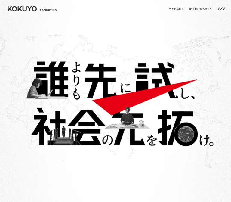
KOKUYO’s recruitment homepage combines a poster-like opening with an editorial directory of people, projects, and employment information. The opening places very heavy Japanese characters over a faint world map. Small monochrome cutouts occupy the lettering: a person working at a laptop, someone ascending stairs, a maker at a table, and a globe. A large red triangular wedge cuts diagonally through the composition.
Below that opening, the typography becomes lighter and more literary. Large Japanese headings use the declared Mincho-oriented stack, while small red English labels organize the page. Project stories pair oversized statements and photographic cutouts with narrow descriptive columns. Broad white intervals give each subject room to stand alone. The footer gathers the site’s routes into a saturated red field, retaining the same thin arrows and working-person imagery.
This is a recruitment homepage with multiple exploration paths. Preserve its relationship between expressive brand artwork, editorial browsing, and practical applicant navigation.
How to Read This Reference
- Measured values come from the supplied rendered element rectangles and computed styles. They describe the recorded viewport and state.
- Declared values come from exported CSS custom properties. A declared token does not establish which elements use it.
- Visual estimates describe dimensions or treatments visible in the captures where a corresponding computed style was not supplied.
- Calculated values are arithmetic derived from recorded measurements.
- Recommendations describe a reusable implementation. They are not claims about the original website’s code or behavior.
- Font stacks are recorded declarations. The evidence does not independently establish the font file used for every glyph.
- The CSS Quick Start uses new component selectors. Its breakpoint, accessible additions, and illustrative collage geometry are explicitly proposed adaptations.
Tokens — Colors
Default Palette
| Name | Value | Source token or evidence | Role and confidence |
|---|---|---|---|
| White canvas | #ffffff |
--color-bg, --color-white; computed body background |
Measured main page background |
| Main ink | #202020 |
--color-black; computed body and section-title color |
Measured text color; also measured on mobile utility backgrounds |
| Recruitment red | #e60012 |
--color-red; computed section labels and MORE PEOPLE background |
Measured navigation accent; the same red family visually defines wedges and footer |
| Heading gray | #333333 |
--color-black-heading |
Declared token; do not substitute it for section titles measured as #202020 |
| Secondary gray | #555555 |
--color-gray |
Declared secondary color; element assignment was not established |
| Pale gray surface | #f0f0f0 |
--color-gray-bg; computed employee tags |
Measured tag background; visually consistent with the legal footer strip |
| Fine line gray | #d9d9d9 |
--color-gray-line |
Declared rule color; individual project-divider strokes were not measured |
| Artwork black | Approximately #000000 |
Opening capture | Visual estimate for the heaviest hero lettering; separate from ordinary text ink |
The hierarchy is unusually disciplined: white supplies the space, black supplies the reading structure, and red supplies direction. Red appears in small section labels, compact reading controls, triangular artwork, and one large closing field. The captured project rows retain white backgrounds.
A source variable named --blend-mode contains exclusion. Its element assignments were not supplied. Some utility wrappers have dark computed text colors while their visible labels appear white on mobile. Child graphics or other rendering layers may account for that difference. Use the captures to describe the final appearance; do not apply an exclusion blend to the entire implementation based on the variable alone.
Color Distribution
| Region | Visible balance | Reuse rule |
|---|---|---|
| Opening | White field, faint gray geography, heavy black artwork, one dominant red wedge | Keep the map and texture subordinate to the statement |
| Project stories | White, charcoal text, grayscale cutouts, red labels and wedges | Repeat the palette while varying the composition |
| Employee tags | Pale gray with dark text | Treat tags as quiet browsing metadata |
| Recruitment links | Dark rectangles with white labels and thin arrows | Use stronger fill for practical destinations |
| Footer | Full red field, white navigation, monochrome maker cutout | Let the closing section carry the largest uninterrupted color area |
No alternate theme control is established by the supplied evidence.
Tokens — Typography
Editorial Japanese and Mixed-Script Copy
- Declared stack:
gotham, ten-mincho-antique, sans-serif. - Source variables: both
--font-minchoand--font-encontain this stack. - Measured weight:
300on sampled Japanese section titles, introductory paragraphs, and CEO copy. - Character: light, expressive Japanese forms with generous line spacing and restrained tracking.
- Role: gives the longer recruitment narrative an editorial voice beneath the forceful opening artwork.
Keep the source family identifiers as recorded. Font resource URLs and loading declarations were not supplied. If those faces are unavailable in a new project, choose an explicitly documented fallback rather than claiming a visual match.
English Section Labels
- Declared stack:
gothamfollowed by the site’s Japanese device sans-serif stack. - Source variable:
--font-en-only. - Measured treatment:
12px, weight700,14pxline height,0.48pxtracking, red. - Examples:
PEOPLE,PROJECT STORY,BUSINESS DOMAIN & JOB,CEO MESSAGE, andHR STANCE.
These labels are small navigational headings. The larger Japanese statement carries the emotional emphasis beneath or beside them.
Device Sans-Serif
The body and sampled employee tags use a device stack beginning with Yu Gothic and its alternate family names, followed by Hiragino Kaku Gothic ProN, Hiragino Sans, and sans-serif.
The body computes to 16px / 24px, weight 400. Employee tags use weight 500. The root element’s browser-default Times declaration does not describe the visible application typography because the body overrides it.
Wordmark and Opening Lettering
The KOKUYO wordmark and opening headline should be treated as identity artwork. Their appearance cannot be reproduced by assigning the editorial font stack to an ordinary heading.
The opening quote, 誰よりも先に試し、社会の先を拓け。, uses enormous black characters, smaller connecting characters, inserted photographs, and a red wedge. Preserve that deliberately composed hierarchy and provide an accessible text equivalent.
Type Scale
| Role | Desktop | Mobile | Weight / tracking | Evidence |
|---|---|---|---|---|
| Body default | 16px / 24px |
16px / 24px |
400, normal tracking |
Computed body styles |
| English section label | 12px / 14px |
12px / 14px |
700, 0.04em |
Computed H2 styles |
| Large Japanese section statement | 50px / 72px |
30px / 45px |
300, 0.05em |
Computed paragraph styles |
| Section introduction | 16px / 24px |
14px / 21px |
300, 0.05em |
Computed paragraph styles |
| Layered opening introduction | 20px / 45px |
16px / 36px |
300, 0.05em |
Computed styles; visibility sequence unverified |
| Employee keyword | 14px / 20px |
10px / 15px |
500, normal tracking |
Computed tag styles |
| Project poster statement | Approximately 40px / 60px |
Not measured | Light editorial appearance | Desktop visual estimate |
| Project short title | Approximately 20px |
Not measured | Regular/light appearance | Desktop visual estimate |
| Project summary | Approximately 14px / 24px |
Absent from rendered mobile text | Light editorial appearance | Desktop visual estimate and mobile text comparison |
| Footer navigation | Approximately 18px |
Approximately 16px |
Tracked English labels | Visual estimate |
| Legal text | Approximately 12–14px |
Approximately 12px |
Compact sans-serif | Visual estimate |
The desktop utility wrappers report 16px text with a 0px line height for MYPAGE and INTERNSHIP. These wrapper values should not be used as a literal text recipe: their measured rectangles and visible label shapes indicate additional internal rendering.
Tokens — Spacing & Shapes
Root size: measured 16px at both viewports.
Main content width: declared 1080px, confirmed by desktop section bounds.
Base horizontal insets: declared 40px desktop and 20px mobile.
Shape language: square corners, thin straight rules, long hairline arrows, and sharply tapered triangles.
Spacing Scale
| Use | Value | Confidence |
|---|---|---|
| Mobile utility separators | 1px each |
Calculated from adjacent control rectangles |
| Employee tag gap | 5px horizontally and between visible tag rows |
Calculated from sampled rectangles |
| Mobile label-to-title interval | 8px |
Calculated from section-header rectangles |
| Standard introductory top inset | 20px |
Computed paragraph padding |
| Mobile page inset | 20px |
Declared and measured |
| Desktop page inset token | 40px |
Declared |
| Desktop heading-to-description inset | 40px left, 16px top |
Computed on side-by-side section introductions |
| Mobile introduction-to-content interval | 60px in sampled People, Project, and Business regions |
Calculated from rectangles |
| Desktop title line box | 72px |
Measured |
| Large section spacing | 100–190px |
Computed section top padding |
Section Top Padding
| Section | Desktop | Mobile |
|---|---|---|
| People | 120px |
100px |
| Project Story | 100px |
120px |
| Business Domain & Job | 150px |
120px |
| CEO Message | 150px |
100px |
| HR Stance | 190px |
120px |
Mobile spacing is not a uniform reduction of desktop spacing. The Project Story section, for example, receives more top padding on mobile.
Border Radius and Rules
| Element | Treatment | Evidence |
|---|---|---|
| Employee tags | 0px radius |
Computed |
| MORE PEOPLE control | 0px radius |
Computed |
| Sampled project and information links | 0px radius |
Computed |
| Recruitment destination bars | Square, dark rectangles | Captured appearance |
| Footer applicant links | Square, thin white outlines | Captured appearance |
| Project separators | Fine solid horizontal lines | Captured appearance; exact stroke color unmeasured |
| Directional artwork | Asymmetric triangular wedge | Captured appearance |
No general shadow or rounded-card elevation system is visible in the supplied captures.
Layout Measurements
| Element | Desktop | Mobile | Evidence |
|---|---|---|---|
| Document height | 7816px |
8007.56px, reported as 8008px |
Rendered DOM |
| Main element height | 7019px |
6622.56px |
Rendered DOM |
| Standard content column | 1080px, x = 180px |
350px, x = 20px |
Rendered DOM |
| Header logo link | 159 × 28px, x = 40px, y = 33px |
148 × 26.06px, x = 20px, y = 30px |
Rendered DOM |
| Menu button | 42 × 43px |
45 × 45px |
Rendered DOM |
| Employee item link | 270 × 598px |
270 × 530px |
Rendered DOM |
| Employee rail controls | 35 × 35px each |
30 × 30px each |
Rendered DOM |
| MORE PEOPLE | 200 × 35px |
175 × 31px |
Rendered DOM |
| Project row | 1080px wide; first 341px high, others 313px |
350px wide; 171–201px high |
Rendered DOM |
| Business / Job link | 540 × 492px each |
390 × 383.22px each |
Rendered DOM |
| CEO feature link | 1160 × 500px, with 40px side padding |
390 × 500px, with 20px side padding |
Rendered DOM |
| HR Message link | 540 × 492px |
390 × 413.22px |
Rendered DOM |
| Recruitment destination bar | Approximately 530 × 80px |
Not measured | Desktop visual estimate |
| Footer maker cutout | Approximately 280px wide |
Approximately 280px wide |
Visual estimate |
The content margin at desktop is calculated as (1440 − 1080) / 2 = 180px. It is distinct from the 40px page-padding token used by other regions.
Components
Global Identity and Desktop Utilities
Role: establish identity and keep applicant destinations within reach.
At the opening, the wordmark sits near the top-left corner with a small RECRUITING descriptor aligned beside it. MYPAGE, INTERNSHIP, and a three-slash menu symbol occupy the top-right corner. The desktop presentation has no visible enclosing header panel, border, or shadow.
The sampled header wrapper has zero height. Its child coordinates and the captures establish the visible arrangement; the wrapper is not evidence of a conventional fixed-height bar.
The top-right utilities remain visible at similar viewport coordinates in the supplied scrolled desktop captures. The logo is visible in the opening capture and absent from the lower desktop captures. A persistent utility treatment is supported visually, but the exact logo visibility rule was not supplied.
MYPAGE is a button in the rendered DOM. INTERNSHIP is a link to an external internship site. Preserve this distinction; the MYPAGE button’s opened state was not inspected.
Mobile Utility Dock
Role: move applicant utilities to the lower edge while preserving space for the opening composition.
At 390 × 844, the dock occupies y = 799–844px, matching the declared --sp-nav-height: 45px.
Its measured horizontal anatomy is:
- MYPAGE:
171.5pxwide. - Separator:
1px. - INTERNSHIP:
171.5pxwide. - Separator:
1px. - Menu:
45pxwide.
The visible surface is charcoal with white labels and a white three-slash symbol. The two text destinations share the available space, while the menu has a square slot.
The dock is absent from the supplied final mobile footer capture. Its footer-related visibility or positioning rule remains unverified. A new implementation must decide that behavior deliberately and reserve enough space for any fixed controls.
Opening Typographic Collage
Role: communicate experimentation, forward movement, and the scale of the organization.
The opening contains four visually distinct layers:
- A white field with fine grain concentrated around its edges.
- A very faint world map.
- Oversized black Japanese lettering with smaller connecting characters.
- Monochrome working-person cutouts, a globe, and a large red wedge integrated with the lettering.
The desktop composition’s visible ink bounds are approximately 1040 × 470px, starting near x = 230px, y = 280px. On mobile, the lettering and inserts occupy approximately 315 × 145px, near x = 45px, y = 334px. These are visual estimates, not native asset dimensions.
Mobile retains the complete statement as a compact central composition. It also reframes the map around Asia and Oceania, with substantial empty space above and below the lettering. Shrinking the entire desktop screenshot would not reproduce this relationship.
Use authorized artwork or a carefully art-directed equivalent. A single text block cannot reproduce the differing character scales, photographic insertions, and controlled overlaps. Keep a text equivalent available even when the display composition is an image.
Opening Introduction Layer
Role: expand the short statement into a recruitment manifesto.
The rendered DOM includes eight introductory paragraphs about taking the first step, forming hypotheses, working through challenges, and becoming a next-generation leader.
The sampled copy has a 540px desktop column and a 300px mobile column. It uses white text, the editorial stack, and very open leading: 20px / 45px desktop and 16px / 36px mobile. The mobile text introduces additional line breaks and paragraph spacing.
These paragraphs are not visibly presented as ordinary reading text in the supplied opening screenshots. Their computed presence does not establish their reveal order, backdrop, or relationship to the hero’s animation. For a static adaptation, place the manifesto in a clearly readable section rather than reproducing white text without its verified rendering context.
Section Introduction
Role: combine a compact category label with a larger editorial statement.
The recurring anatomy is a red English label, a light Japanese statement, and a short introduction. Desktop People, Business, and HR headers place the statement at left and supporting copy at right. Project Story uses a wider statement with its description beneath it.
The large Japanese text is optically shifted slightly left of the common content edge: approximately 3–4px in sampled desktop sections and 1–2px on mobile. This small adjustment aligns the visible character edge rather than only the element box.
On mobile, the parts stack inside a 350px column. The label remains 12px, the statement becomes 30px / 45px, and the introduction becomes 14px / 21px. Project and HR statements wrap across two lines.
In a new implementation, retain a logical heading hierarchy even though the source’s large editorial statements are sampled as paragraphs beneath H2 category labels.
Employee Rail and Keyword Tags
Role: let applicants explore individual perspectives and recurring working values.
The DOM contains 25 numbered employee entries. Their content includes a personal statement, organizational division, job or course, name, and three linked keywords. MORE PEOPLE leads to the employee directory; keyword links lead to query-based directory URLs.
The recorded geometry establishes a horizontal sequence. Desktop item links begin at x = 180px, then 450px, 720px, and 990px, each 270px wide. Later entries extend far beyond the viewport. Mobile keeps the same 270px width and starts at x = 0px, then 270px and 540px. It does not become a vertical list in the supplied DOM.
The item height changes from 598px to 530px. The first sampled tag begins 20px inside its desktop item link and 40px inside its mobile item link. This internal spacing changes independently of the card width.
Tags are small, rectangular pale-gray links. Desktop padding is 1px 6px 1px 18px; mobile padding is 1px 6px 2px 14px. The larger left inset is measured, but the supplied evidence does not identify its internal marker.
Two adjacent rail buttons appear beneath the entries, with MORE PEOPLE aligned toward the right of the content column. Their navigation effects, dragging, looping, and autoplay were not exercised. Detailed employee image crops are also outside the supplied visual captures.
Implementation recommendation: keep profile navigation and keyword links as separate interactive elements. Avoid nesting keyword links inside a full-card anchor.
Project Story Row
Role: turn a project into a compact editorial poster and route to its full story.
The entire recorded row is a link. It combines a broad composition at left with a narrow information column at right. In the desktop project capture, the right column begins near x = 990px and ends at x = 1260px, giving it approximately 270px. The left composition occupies roughly 750px, with about 60px between the two regions. These internal widths are visual estimates consistent with the measured 1080px row.
The left composition contains a large Japanese statement, a monochrome photographic cutout, and a red triangular wedge behind the subject. The image can overlap the heading’s visual territory. There is no separate photo card or rounded frame.
The right column stacks:
- A small red PROJECT STORY number.
- A short Japanese project title.
- A compact summary paragraph.
- A red READ rectangle with a fine white arrow.
The READ control is visually about 200 × 35px and aligns with the row’s bottom rule. It is a visual action inside the larger link, not evidence of a second nested destination.
Stories 03–05 demonstrate purposeful variation: two people inspecting an office chair, a person examining a small product at a desk, and a laptop user viewed from behind. Each red wedge points or tilts differently while preserving the same visual vocabulary.
Rows after the first have measured 313px link heights and begin 350px apart on desktop, giving 37px between link boxes. Mobile row heights vary from 171px to 201px, with 55px between consecutive link boxes.
The mobile rendered text omits the long summaries but retains the statement, project number, short title, and READ label. The summaries remain in the extracted link text, so they are not necessarily removed from the document. The exact mobile collage arrangement is unverified because no mobile project capture was supplied.
Business and Job Links
Role: connect editorial interest to the organization’s work and career options.
Business Domain and Job are two adjacent 540px links inside the desktop content width. Each is 492px tall. Their text anatomy includes an English label, a Japanese title, and a short explanation.
On mobile, each becomes a full-width 390px block, stacked vertically and approximately 383.22px tall. Their outer bounds extend beyond the inset section heading. Preserve the distinction between the full-width content panels and their more narrowly inset text.
The supplied evidence establishes geometry and copy. It does not support a detailed description of the image treatment in these panels.
CEO Message Feature
Role: give a leadership message a larger, separate editorial position.
The linked feature measures 1160 × 500px on desktop, extending 40px beyond each side of the standard content column. Its text returns to the shared x = 180px alignment through 40px internal padding.
The category label, two-line Japanese heading, description, and READ action occupy the left portion. The sampled desktop text column is 540px wide. On mobile, the feature becomes 390px wide, retains its 500px height, and uses 20px horizontal padding.
The constant height is measured at the two supplied viewports. Image placement and any motion inside the feature were not visually documented.
HR Links and Recruitment Destinations
Role: move from culture and working conditions to practical application information.
HR Message and Employee Benefits appear as paired desktop links. Their visible lower text regions use red English labels, modest Japanese titles, and short supporting paragraphs. The mobile HR Message link becomes full width and grows taller than the Business and Job links because its content wraps differently.
Below them, RECRUIT INFO introduces two dark horizontal bars: 採用情報 and Q&A. In the desktop capture, each is approximately 530 × 80px, with a 20px gap. White text sits toward the left; a thin white arrow sits near the right edge.
About 150px of white space separates the bars’ lower edges from the red footer in the supplied desktop capture. This pause makes the practical links legible without crowding the closing navigation.
Red Footer and Legal Strip
Role: provide a complete navigation map and applicant entry points.
The desktop footer is a broad red field, approximately 361px tall in the captured closing view. A white KOKUYO mark sits at left above a small dark RECRUITING descriptor and three white-outline applicant links. The captured labels include 28卒エントリー, 28卒MYPAGE, and INTERNSHIP.
To the right, navigation forms three columns. Its source order is visible in the mobile version: TOP, PEOPLE, PROJECT STORY, CEO MESSAGE, HR MESSAGE, business, jobs, benefits, recruitment, and Q&A. A single list laid out in three columns can preserve this order when it becomes one column on mobile.
Links use thin arrows with long horizontal shafts. Instagram has its own small icon and label. A monochrome maker and a table of tools rise from the footer’s lower-right edge.
On mobile, applicant links are approximately 310px wide within 40px side margins. Navigation becomes one left-aligned column with roughly 46px between link starts. The maker cutout remains approximately 280px wide, taking a much larger share of the phone width than on desktop. Reserve an intentional illustration zone rather than shrinking it in proportion to the desktop layout.
A pale-gray legal strip follows the red field. Desktop places legal links at left and copyright at right. Mobile places the compact legal links above the copyright, using about 20px horizontal inset. The captured strip is approximately 80px tall on desktop and 99px on mobile.
Tokens — Motion & Interaction
| Treatment | Recorded value or behavior | What is established |
|---|---|---|
| Selected mobile section labels | opacity 0.8s cubic-bezier(0.165, 0.84, 0.44, 1) and matching transform transition |
Computed transition declarations |
| Corresponding Japanese statements | Same duration and easing, 0.05s delay |
Computed stagger |
| Corresponding introductions | Same duration and easing, 0.1s delay |
Computed stagger |
| Employee keyword links | opacity 0.3s |
Property and duration; endpoint and trigger unverified |
| Desktop MYPAGE and INTERNSHIP wrappers | opacity 0.3s |
Property and duration; activated states unverified |
| Employee rail buttons | opacity 0.2s |
Property and duration; navigation result unverified |
| Main content | opacity 0.2s |
Declaration only; page-transition trigger unverified |
| Desktop utilities across scroll captures | Similar top-right viewport placement | Persistent placement is visually supported |
| Opening collage and map | Static captured frames | No verified movement path, duration, or sequence |
| Employee rail | Horizontal item positions and two controls | Layout and controls, without verified autoplay or drag behavior |
| Menu and MYPAGE | Button elements present | Opened content and dismissal behavior uninspected |
The measured reveal easing suggests a long deceleration, with label, statement, and introduction separated by short delays. Starting transform distances and triggering conditions were not supplied. A fade with a small vertical translation is a reasonable adaptation, but the translation must be labeled as a recommendation.
Many sampled elements report animation: none, and some report only transition: all. Neither establishes that the entire site is static. Descendant graphics, pseudo-elements, JavaScript-driven transforms, and states outside the samples may behave differently.
The capture process waited for layout and visible image stability and accounted for finite animations. Perpetual animations were temporarily paused during readiness checks and then resumed. These are settled observations, not a recording of the complete motion design.
Declared Layer Order
| Source variable | Value |
|---|---|
--z-index-base-content |
1000 |
--z-index-header |
6000 |
--z-index-header-nav |
7000 |
--z-index-global-menu |
8000 |
--z-index-global-menu-button |
8500 |
--z-index-modal |
9000 |
--z-index-status-bar |
9500 |
These declarations show a planned layering hierarchy. They do not establish the appearance or behavior of an opened menu, modal, or status bar.
Surfaces
| Surface | Appearance | Purpose |
|---|---|---|
| Opening field | White with faint geographic linework and edge grain | Gives the typographic collage scale and atmosphere |
| Editorial canvas | Plain white | Supports long reading intervals and repeated story compositions |
| Employee keyword | Flat pale gray rectangle | Groups browsing metadata without competing with the person’s statement |
| Reading action | Compact red rectangle with white label and arrow | Marks a route into deeper content |
| Recruitment destination | Wide charcoal rectangle | Gives practical information a clear, strong target |
| Mobile utilities | Charcoal dock with fine white divisions | Separates applicant navigation from the artwork |
| Footer | Solid red | Consolidates navigation and recruitment entry points |
| Legal strip | Pale gray | Separates policy information from the red navigation field |
Depth comes from overlap, scale, and contrast. The cutouts can project across typographic regions while the UI surfaces remain flat.
Imagery
The defining photographs show people doing something specific: inspecting a chair, examining a device, using a laptop, or working among tools. Hands, working posture, objects, and the surrounding work surface are meaningful parts of the composition.
In the captured hero, projects, and footer, photography is monochrome and cut away from its original background. Preserve the irregular silhouette of people and objects. Retaining a table edge or chair base helps the cutout sit convincingly against a rule or section boundary.
The red wedges are flat, crisp geometry. Their asymmetry and long tips create direction without requiring additional icons. Vary their position behind each subject. Avoid applying an identical centered triangle to every story.
The map is environmental linework rather than an information visualization. Its low contrast allows large black lettering to dominate. The opening’s fine grain is also local atmosphere; the captured project rows use clean white space.
Observed Asset References
No original image src URLs, native dimensions, or asset filenames were included in the supplied export. The references below identify visible subjects rather than inventing file paths.
| Asset or subject | Evidence region | Treatment |
|---|---|---|
| KOKUYO wordmark | Desktop/mobile opening and desktop footer | Dark on white; white on red |
| Main Japanese statement | Desktop and mobile opening | Composite typography with embedded imagery |
| World map | Desktop and mobile opening | Faint linework with different viewport framing |
| Laptop worker, stairs, maker, globe | Opening | Small monochrome insertions among black characters |
| Chair development scene | Project Story 03 | Two people and a chair, cut out over a red wedge |
| Small-product development scene | Project Story 04 | Person and worktable, cut out over a red wedge |
| Laptop user from behind | Project Story 05 | Monochrome seated figure with a red wedge |
| Maker and tool-covered table | Desktop/mobile footer | Large cutout anchored to the red field’s lower edge |
| Three-slash menu mark | Desktop utilities and mobile dock | Compact diagonal strokes |
| Link arrows | Project, recruitment, and footer controls | Long thin shaft with a small arrowhead |
Use appropriately authorized photography and identity assets. Do not apply pixelated image rendering: the observed treatment depends on photographic detail, clean cutout edges, and fine print-like texture.
Layout & Responsive Behavior
The homepage alternates several deliberate widths. Standard desktop headings and stories use 1080px; the employee sequence extends horizontally beyond that alignment; the CEO feature expands to 1160px; and the footer has its own broad composition. Mobile keeps ordinary headings inset by 20px while selected information panels become full width.
| Relationship | Desktop evidence | Mobile evidence |
|---|---|---|
| Identity and utilities | Logo upper left; utilities upper right | Logo upper left; utilities at the bottom in the opening state |
| Opening | Large central statement over a broad map | Compact complete statement with taller geographic framing |
| Section introductions | Several title/description pairs sit side by side | Label, statement, and description stack |
| Employee rail | Fixed 270px items, beginning at the content edge |
Fixed 270px items, beginning at the viewport edge |
| Project stories | Large poster composition plus descriptive column | Shorter rows; summary paragraphs absent from rendered text |
| Business and Job | Two 540px links side by side |
Two full-width links stacked |
| CEO feature | 1160px outer width, 500px height |
Full phone width, still 500px high |
| Footer navigation | Three visual columns | One column in source reading order |
| Legal information | Links and copyright spread horizontally | Links followed by copyright |
The mobile document is approximately 192px taller overall, even though its main element is approximately 396px shorter. Compact project stories are balanced by stacked information panels and a taller closing area. Document height alone is therefore a poor guide to the responsive strategy.
Only the 1440px and 390px layouts were supplied. The original breakpoint, tablet behavior, landscape arrangement, safe-area handling, and browser-chrome response are not established. Intermediate widths should be tested in a new implementation rather than inferred as exact source behavior.
Do’s and Don’ts
Do
- Build around white, charcoal
#202020, and red#e60012. - Preserve the opening’s different character scales and integrated photographic details.
- Pair light Japanese editorial statements with small bold red English labels.
- Keep the desktop content rhythm broad, with measured
100–190pxsection insets. - Use square controls, quiet gray tags, thin rules, and long fine arrows.
- Preserve a horizontal employee sequence at both supplied viewport sizes.
- Compose each project image, headline, and wedge as a coordinated unit.
- Distinguish full-width mobile panels from inset section introductions.
- Keep applicant navigation easy to find and preserve the footer’s complete site map.
- Treat mobile summary omission and footer-dock visibility as specific behaviors that need deliberate implementation decisions.
Don’t
- Don’t collapse the homepage’s employee, project, and practical-information routes into one conversion sequence.
- Don’t render the hero statement as a single generic oversized font block.
- Don’t place every cutout inside a rounded thumbnail card.
- Don’t add shadows, glossy gradients, or colorful category pills to the flat editorial surfaces.
- Don’t shrink the entire desktop hero or footer proportionally to obtain the mobile layout.
- Don’t turn the employee rail into a desktop grid based only on the number of records.
- Don’t assume every section uses the heading-gray token; sampled large statements use main ink.
- Don’t infer flying wedges, globe rotation, autoplay, or menu transitions from static artwork.
- Don’t reproduce white introduction text without establishing its background and visibility context.
- Don’t treat parent utility font metrics as the exact typography of internal labels or graphics.
Recommended Implementation Additions
These are recommendations for a new implementation, not verified features of the original site:
- Give the opening artwork a concise text equivalent and mark purely decorative map and wedge layers as hidden from assistive technology.
- Provide visible focus indicators on full-row links, applicant controls, tags, and footer navigation.
- Preserve separate profile and keyword links without nested interactive elements.
- Give menu and rail buttons explicit accessible names. Implement expanded state, focus handling, and dismissal only after defining their actual behavior.
- Increase the effective hit areas of the measured
30pxrail controls and very small mobile tags. Consider larger mobile tag text than the observed10px. - Preserve the
45pxvisual mobile dock while accounting for device safe areas and ensuring it cannot cover the final reachable content. - Keep essential content visible when animation initialization fails. Add reveal classes only after enhancement is ready.
- Honor reduced-motion preferences and avoid making an animated introduction the only route to the recruitment message.
- Use a logical heading hierarchy, and give repeated READ links a project-specific accessible name.
- Test decorative overlaps with longer text, font fallbacks, text zoom, and intermediate screen widths.
Agent Prompt Guide
Quick Color Reference
- Main canvas:
#ffffff. - Reading text and dark controls:
#202020. - Labels, reading actions, wedges, and footer:
#e60012. - Employee tags and legal-surface approximation:
#f0f0f0. - Declared fine-rule token:
#d9d9d9. - Opening artwork: visually near-black with very faint gray geography.
- Corners: square. Separation: whitespace, thin lines, and changes in fill.
Overall Prompt
“Create an editorial recruitment homepage inspired by the supplied KOKUYO reference. Use a white canvas, charcoal text, and red #e60012. Open with an art-directed Japanese typographic collage: very heavy black characters, smaller connecting characters, monochrome people at work, a faint world map, and one long asymmetric red wedge. Follow with small red English section labels, light Japanese editorial headings, a horizontal employee rail, six spacious project-story rows, business and job links, leadership and HR information, and practical recruitment destinations. On desktop, use a 1080px reading grid; on mobile, use 20px text insets, stacked information panels, and bottom applicant utilities. Close with a red footer, thin white arrows, outlined applicant links, and a maker cutout. Keep measured observations separate from proposed interactions.”
Example Component Prompts
- Opening: “Compose the exact source quote
誰よりも先に試し、社会の先を拓け。as graphic typography with a small number of grayscale working-person inserts and one sharp red wedge. Keep the full statement visible on a 390px phone within a compact central group. Art-direct the map separately for the tall viewport. Do not invent an animation sequence.” - Project row: “Create a square-edged, 1080px-wide linked story row. Give roughly 750px to a light Japanese statement overlapping a monochrome work scene, followed by a 60px separation and a 270px information column. Stack a red story number, short title, summary, and a 200 × 35px red READ treatment with a hairline arrow. Add one fine bottom rule.”
- Employee rail: “Use a horizontal sequence of 270px employee entries with a statement, division, role, name, and three quiet gray keyword links. Preserve fixed item width on mobile and provide separate profile and keyword targets. Add keyboard-operable rail controls as an explicit implementation enhancement.”
- Section introduction: “Place a 12px bold red English label above a light Japanese statement at 50px / 72px. Where space allows, align a 16px / 24px introduction beside it with 40px separation. On a phone, stack the parts and use 30px / 45px for the statement and 14px / 21px for the introduction.”
- Footer: “Build a red navigation field with white KOKUYO identity artwork, three square outlined applicant links, and one navigation list displayed in three desktop columns and one mobile column. Use thin 40px arrows and a monochrome maker at a tool-covered table along the bottom-right edge. Follow it with a pale-gray legal strip.”
Quick Start
CSS Custom Properties
This is an implementation starter, not recovered source CSS. Colors, core type sizes, content widths, and selected dimensions come from the supplied evidence. The 1000px layout breakpoint, project poster geometry, 12px mobile tag text, persistent dock policy, and optional 16px reveal offset are recommendations. The project headline and footer dimensions use labeled visual estimates.
The starter expects authorized artwork to be supplied separately. It does not reproduce the uninspected opening sequence, menu, MYPAGE panel, or employee-rail controls. It uses explicit visible colors rather than inferring a global blend-mode system.
:root {
  /* Source-derived palette */
  --color-paper: #fff;
  --color-ink: #202020;
  --color-red: #e60012;
  --color-heading: #333;
  --color-muted: #555;
  --color-soft: #f0f0f0;
  --color-line: #d9d9d9;

  /* Recorded editorial stack; normalized device fallback stack */
  --font-editorial: gotham, ten-mincho-antique, sans-serif;
  --font-device: 'Yu Gothic', YuGothic,
    'Hiragino Kaku Gothic ProN', 'Hiragino Sans', sans-serif;
  --font-label: gotham, var(--font-device);

  --text-label: 12px;
  --text-section: 50px;
  --leading-section: 72px;
  --text-intro: 16px;
  --leading-intro: 24px;
  --tracking-label: 0.04em;
  --tracking-editorial: 0.05em;

  --content-width: 1080px;
  --gutter: 40px;
  --person-width: 270px;
  --dock-height: 45px;
  --safe-bottom: env(safe-area-inset-bottom, 0px);
  --rule: 1px;
  --radius: 0;

  /* Durations and reveal easing recorded in computed styles */
  --motion-link: 300ms;
  --motion-control: 200ms;
  --motion-reveal: 800ms;
  --ease-reveal: cubic-bezier(0.165, 0.84, 0.44, 1);

  /* Source-declared layer values */
  --layer-header: 6000;
  --layer-utilities: 7000;
}

* {
  box-sizing: border-box;
}

body {
  margin: 0;
  color: var(--color-ink);
  background: var(--color-paper);
  font: 400 16px / 1.5 var(--font-device);
}

img {
  display: block;
  max-width: 100%;
}

button,
a {
  -webkit-tap-highlight-color: transparent;
}

button {
  font: inherit;
}

.container {
  width: min(
    var(--content-width),
    calc(100% - var(--gutter) - var(--gutter))
  );
  margin-inline: auto;
}

.section {
  padding-top: var(--section-space, 150px);
}

.section--people { --section-space: 120px; }
.section--projects { --section-space: 100px; }
.section--hr { --section-space: 190px; }

.section-heading {
  display: grid;
  grid-template-columns: max-content minmax(0, 1fr);
  grid-template-areas: 'label label' 'title intro';
  align-items: start;
}

.eyebrow {
  margin: 0;
  color: var(--color-red);
  font: 700 var(--text-label) / 14px var(--font-label);
  letter-spacing: var(--tracking-label);
}

.section-heading > .eyebrow {
  grid-area: label;
}

.section-title {
  grid-area: title;
  margin: 0 0 0 -3px;
  font: 300 var(--text-section) / var(--leading-section)
    var(--font-editorial);
  letter-spacing: var(--tracking-editorial);
}

.section-intro {
  grid-area: intro;
  margin: 0;
  padding: 16px 0 0 40px;
  font: 300 var(--text-intro) / var(--leading-intro)
    var(--font-editorial);
  letter-spacing: var(--tracking-editorial);
}

.section-heading--stack {
  grid-template-columns: minmax(0, 1fr);
  grid-template-areas: 'label' 'title' 'intro';
}

.section-heading--stack .section-intro {
  padding: 20px 0 0;
}

/* Opening artwork and map are supplied separately. */
.site-brand {
  position: absolute;
  top: 33px;
  left: 40px;
  z-index: var(--layer-header);
  display: flex;
  align-items: end;
  gap: 15px;
}

.site-brand__logo {
  width: 159px;
  height: auto;
}

.site-brand__descriptor {
  font: 700 12px / 1 var(--font-label);
  letter-spacing: 0.05em;
}

.header-utilities {
  position: fixed;
  top: 25px;
  right: 30px;
  z-index: var(--layer-utilities);
  display: flex;
  align-items: center;
  gap: 30px;
}

.header-utilities > a,
.header-utilities > button {
  display: flex;
  align-items: center;
  justify-content: center;
  min-height: 43px;
  padding: 0;
  border: 0;
  border-radius: 0;
  color: var(--color-ink);
  background: transparent;
  font: 700 16px / 1 var(--font-label);
  letter-spacing: 0.05em;
  text-decoration: none;
}

.header-utilities .menu-toggle {
  width: 42px;
}

.hero {
  position: relative;
  display: grid;
  place-items: center;
  min-height: 100vh;
  min-height: 100svh;
  overflow: hidden;
  isolation: isolate;
}

.hero-map {
  position: absolute;
  inset: 0;
  z-index: -1;
  width: 100%;
  height: 100%;
  object-fit: cover;
  pointer-events: none;
}

.hero-art {
  width: min(1040px, calc(100% - 80px));
  margin: 0;
}

.hero-art img {
  width: 100%;
  height: auto;
}

/* Native horizontal scrolling is a recommended rail implementation. */
.people-rail {
  display: flex;
  margin-top: 64px;
  padding-inline: max(0px, calc((100% - 1080px) / 2));
  overflow-x: auto;
}

.person-card {
  flex: 0 0 var(--person-width);
  min-width: 0;
  min-height: 598px;
}

.person-tags {
  display: flex;
  flex-wrap: wrap;
  gap: 5px;
  padding-inline: 20px;
}

.person-tag {
  display: inline-block;
  padding: 1px 6px 1px 18px;
  color: var(--color-ink);
  background: var(--color-soft);
  font: 500 14px / 20px var(--font-device);
  text-decoration: none;
}

/* Desktop poster columns are based on visual estimates. */
.project-row {
  display: grid;
  grid-template-columns: minmax(0, 750fr) minmax(0, 270fr);
  gap: 60px;
  min-height: 313px;
  border-bottom: var(--rule) solid var(--color-line);
  color: inherit;
  text-decoration: none;
}

.project-row + .project-row {
  margin-top: 37px;
}

.story-poster {
  position: relative;
  min-width: 0;
  min-height: 313px;
  padding-top: 64px;
  isolation: isolate;
}

.story-headline {
  position: relative;
  z-index: 2;
  max-width: 480px;
  margin: 0;
  font: 300 40px / 1.5 var(--font-editorial);
  letter-spacing: 0.05em;
}

.story-photo {
  position: absolute;
  right: 0;
  bottom: 0;
  z-index: 1;
  width: 56%;
  max-height: 90%;
  object-fit: contain;
  object-position: center bottom;
}

.story-wedge {
  position: absolute;
  top: 30%;
  right: 4%;
  z-index: 0;
  width: 52%;
  height: 100px;
  background: var(--color-red);
  clip-path: var(--wedge-shape, polygon(0 58%, 100% 0, 19% 100%));
  transform: rotate(var(--wedge-angle, 0deg));
  pointer-events: none;
}

.story-details {
  display: flex;
  flex-direction: column;
  min-width: 0;
  padding-top: 60px;
}

.story-name {
  margin: 7px 0 24px;
  font: 300 20px / 1.5 var(--font-editorial);
}

.story-summary {
  margin: 0 0 24px;
  font: 300 14px / 24px var(--font-editorial);
}

.read-cta {
  display: flex;
  align-items: center;
  justify-content: space-between;
  width: 200px;
  max-width: 100%;
  min-height: 35px;
  margin-top: auto;
  margin-left: auto;
  padding: 8px 10px 8px 20px;
  color: #fff;
  background: var(--color-red);
  font: 700 14px / 19px var(--font-label);
  letter-spacing: 0.04em;
}

.arrow {
  position: relative;
  display: inline-block;
  flex: 0 0 40px;
  width: 40px;
  height: 1px;
  background: currentColor;
}

.arrow::after {
  content: '';
  position: absolute;
  right: 0;
  top: -2px;
  width: 5px;
  height: 5px;
  border-top: 1px solid currentColor;
  border-right: 1px solid currentColor;
  transform: rotate(45deg);
}

.info-grid {
  display: grid;
  grid-template-columns: repeat(2, minmax(0, 1fr));
}

.info-panel {
  display: grid;
  min-width: 0;
  color: inherit;
  text-decoration: none;
}

.info-panel__copy {
  padding: 20px;
}

.recruit-grid {
  display: grid;
  grid-template-columns: repeat(2, minmax(0, 1fr));
  gap: 20px;
  margin-top: 30px;
}

.recruit-link {
  display: flex;
  align-items: center;
  justify-content: space-between;
  min-height: 80px;
  padding: 20px 25px;
  color: #fff;
  background: var(--color-ink);
  font: 400 20px / 1.5 var(--font-device);
  text-decoration: none;
}

.site-footer {
  position: relative;
  margin-top: 150px;
  overflow: hidden;
  color: #fff;
  background: var(--color-red);
}

.footer-inner {
  position: relative;
  width: min(1140px, calc(100% - 80px));
  margin-inline: auto;
  padding-block: 70px;
  display: grid;
  grid-template-columns: 260px minmax(0, 1fr);
  gap: 40px;
}

.footer-nav {
  position: relative;
  z-index: 1;
  display: grid;
  grid-template-columns: repeat(3, minmax(0, 1fr));
  align-content: start;
  gap: 24px 30px;
  margin: 0;
  padding: 0 0 60px;
  list-style: none;
}

.footer-nav a {
  display: inline-flex;
  align-items: center;
  gap: 20px;
  color: inherit;
  font: 500 18px / 22px var(--font-label);
  letter-spacing: 0.08em;
  text-decoration: none;
}

.footer-applicant-link {
  display: flex;
  align-items: center;
  justify-content: center;
  width: 160px;
  min-height: 37px;
  margin-top: 5px;
  border: 1px solid currentColor;
  color: inherit;
  font: 700 14px / 20px var(--font-label);
  text-decoration: none;
}

.footer-art {
  position: absolute;
  right: 0;
  bottom: 0;
  width: 280px;
  pointer-events: none;
}

.legal-strip {
  padding: 28px var(--gutter);
  color: var(--color-ink);
  background: var(--color-soft);
  font: 500 12px / 20px var(--font-device);
}

.legal-inner {
  display: flex;
  justify-content: space-between;
  gap: 20px;
}

/* Recommended focus treatment with a contrasting outer ring. */
a:focus-visible,
button:focus-visible {
  outline: 2px solid var(--color-ink);
  outline-offset: 3px;
  box-shadow: 0 0 0 5px #fff;
}

/* Proposed hover endpoint; source only establishes opacity timing. */
@media (hover: hover) {
  .person-tag,
  .footer-nav a {
    transition: opacity var(--motion-link);
  }

  .person-tag:hover,
  .footer-nav a:hover {
    opacity: 0.7;
  }
}

/* Optional enhancement: add is-pending only after initialization. */
.reveal {
  opacity: 1;
  transform: none;
  transition:
    opacity var(--motion-reveal) var(--ease-reveal),
    transform var(--motion-reveal) var(--ease-reveal);
  transition-delay: var(--reveal-delay, 0ms);
}

.reveal.is-pending {
  opacity: 0;
  transform: translateY(16px);
}

.reveal--title { --reveal-delay: 50ms; }
.reveal--intro { --reveal-delay: 100ms; }

/* Proposed breakpoint; the original breakpoint was not supplied. */
@media (max-width: 1000px) {
  :root {
    --gutter: 20px;
    --text-section: 30px;
    --leading-section: 45px;
    --text-intro: 14px;
    --leading-intro: 21px;
  }

  body {
    padding-bottom: calc(var(--dock-height) + var(--safe-bottom));
  }

  .section { --section-space: 120px; }
  .section--people { --section-space: 100px; }

  .section-heading {
    grid-template-columns: minmax(0, 1fr);
    grid-template-areas: 'label' 'title' 'intro';
  }

  .section-title {
    margin-top: 8px;
    margin-left: -2px;
  }

  .section-intro {
    padding: 20px 0 0;
  }

  .site-brand {
    top: 30px;
    left: 20px;
    gap: 12px;
  }

  .site-brand__logo { width: 148px; }

  .header-utilities {
    inset: auto 0 0;
    display: grid;
    grid-template-columns: minmax(0, 1fr) minmax(0, 1fr) 45px;
    gap: 1px;
    padding-bottom: var(--safe-bottom);
    background: var(--color-ink);
  }

  .header-utilities::before {
    content: '';
    position: absolute;
    inset: 0 0 var(--safe-bottom);
    z-index: -1;
    background: #fff;
  }

  .header-utilities > a,
  .header-utilities > button {
    min-height: var(--dock-height);
    color: #fff;
    background: var(--color-ink);
    font-size: 14px;
  }

  .header-utilities .menu-toggle { width: 45px; }

  .hero {
    min-height: calc(100svh - var(--dock-height) - var(--safe-bottom));
  }

  .hero-art {
    width: min(320px, calc(100% - 40px));
  }

  .people-rail {
    margin-top: 60px;
    padding-inline: 0;
  }

  .person-card { min-height: 530px; }
  .person-tags { padding-inline: 40px; }

  .person-tag {
    /* Recommended larger text than the observed mobile 10px. */
    padding: 2px 6px 2px 14px;
    font-size: 12px;
    line-height: 18px;
  }

  /* Proposed mobile composition; no project image capture was supplied. */
  .project-row {
    grid-template-columns: minmax(0, 1fr);
    gap: 12px;
    min-height: 0;
  }

  .project-row + .project-row { margin-top: 55px; }
  .story-poster { min-height: 160px; padding-top: 0; }
  .story-headline { max-width: 75%; font-size: 24px; line-height: 1.5; }
  .story-photo { width: 48%; }
  .story-wedge { height: 60px; }
  .story-details { padding-top: 0; }
  .story-name { margin: 6px 0 12px; font-size: 18px; }
  .story-summary { display: none; }
  .read-cta { width: 175px; min-height: 35px; }

  .info-grid {
    width: 100%;
    grid-template-columns: minmax(0, 1fr);
  }

  .recruit-grid { grid-template-columns: minmax(0, 1fr); }

  .footer-inner {
    width: calc(100% - 80px);
    grid-template-columns: minmax(0, 1fr);
    gap: 45px;
    padding-block: 50px 160px;
  }

  .footer-applicant-link { width: 100%; }

  .footer-nav {
    grid-template-columns: minmax(0, 1fr);
    gap: 24px;
    padding-bottom: 0;
  }

  .footer-nav a { font-size: 16px; }
  .footer-art { right: -20px; max-width: calc(100% + 20px); }
  .legal-inner { flex-direction: column; gap: 10px; }
}

@media (prefers-reduced-motion: reduce) {
  .reveal,
  .reveal.is-pending {
    opacity: 1;
    transform: none;
    transition: none;
  }

  .person-tag,
  .footer-nav a {
    transition: none;
  }
}
Example Project Markup
This example uses recorded source labels and an excerpt of the project summary. Insert an authorized cutout where indicated. The wedge geometry is an adaptation. READ is a span inside the single project link, avoiding nested controls.
<div class='container'>
  <a class='project-row'
     href='https://recruit.kokuyo.com/project/3/'
     aria-labelledby='story-ing-title'>
    <div class='story-poster'>
      <h3 class='story-headline' id='story-ing-title'>
        さらば、<br>予定調和のイスづくり。
      </h3>
      <span class='story-wedge' aria-hidden='true'></span>
      <!-- Insert an authorized transparent image with class story-photo. -->
    </div>
    <div class='story-details'>
      <p class='eyebrow'>PROJECT STORY 03</p>
      <p class='story-name'>ingシリーズ</p>
      <p class='story-summary'>
        座りながら体を動かすことができる画期的なオフィスチェア“ing”。
      </p>
      <span class='read-cta'>
        READ <span class='arrow' aria-hidden='true'></span>
      </span>
    </div>
  </a>
</div>
Tailwind v4 Token Mapping
Optional aliases for a project already using Tailwind v4. This does not identify the original site’s framework. Define the custom properties above first.
@theme inline {
  --color-paper: #fff;
  --color-ink: #202020;
  --color-signal: #e60012;
  --color-soft: #f0f0f0;
  --color-rule: #d9d9d9;

  --font-editorial: gotham, ten-mincho-antique, sans-serif;
  --font-utility: gotham, 'Yu Gothic', YuGothic,
    'Hiragino Kaku Gothic ProN', 'Hiragino Sans', sans-serif;

  --text-eyebrow: 12px;
  --text-editorial-title: var(--text-section);
  --text-editorial-title--line-height: var(--leading-section);
  --text-editorial-copy: var(--text-intro);
  --text-editorial-copy--line-height: var(--leading-intro);

  --spacing-page: var(--gutter);
  --spacing-person: 270px;
  --spacing-dock: 45px;
  --radius-flat: 0px;
}
Sources & Evidence
- Inspected original and final homepage: KOKUYO RECRUITING. Both URLs are identical in the supplied record, which reports HTTP
200and the titleコクヨ 新卒採用サイト | KOKUYO RECRUITING. - Evidence retrieval: September 12, 2026, at
07:17:41.920Z/16:17:41.920 JST. Individual screenshot timestamps were not supplied. - Desktop evidence:
1440 × 1000CSS-pixel viewport,7816pxdocument height, three supplied captures showing the opening, project stories 03–05, and closing recruitment/footer area. - Mobile evidence:
390 × 844CSS-pixel viewport, approximately8008pxdocument height, two supplied captures showing the opening and final footer area. - Rendered DOM evidence: homepage text, recorded link destinations, element rectangles, computed typography, colors, padding, transitions, and exported CSS custom properties at both viewports. Linked destinations were recorded rather than visited for this analysis.
- Capture conditions: the supplied process observed the initial page for at least five seconds and waited for load, finite animation readiness, layout/text stability, and visible image decoding within bounded limits. Scrolling traversed intermediate positions. SharedWorkers and service workers were disabled during inspection.
- Limitations: no menu or MYPAGE open state, rail-control result, hover/focus sequence, complete animation recording, font resource manifest, original image URL inventory, or intermediate-width capture was supplied. Mobile project composition and several information-panel images are supported only partially by DOM evidence. No additional browsing or file inspection was performed for this reference.
This document describes the supplied current homepage evidence. Computed values, visual estimates, and implementation recommendations are kept distinct throughout.
# KOKUYO RECRUITING — Style Reference

> Monumental black lettering, people absorbed in making things, and a sharp red wedge across a white recruitment journal.

**Website:** [recruit.kokuyo.com](https://recruit.kokuyo.com/)
**Original URL:** https://recruit.kokuyo.com/
**Final URL:** https://recruit.kokuyo.com/
**Theme:** predominantly white, with black typography, red accents, a solid red footer, and dark recruitment controls.
**Inspected:** September 12, 2026. The supplied evidence was retrieved at 07:17:41.920 UTC / 16:17:41.920 JST.
**Viewports:** desktop 1440 × 1000 CSS pixels; mobile 390 × 844 CSS pixels.
**Scope:** the current recruitment homepage: opening composition, introduction text, employee rail, six project stories, business and job links, CEO message, HR information, recruitment links, and footer. Visual captures cover the desktop opening, project stories 03–05, desktop closing area, mobile opening, and mobile footer. Other homepage regions are supported by rendered DOM measurements and text. Linked detail pages and opened navigation states were not inspected.

KOKUYO’s recruitment homepage combines a poster-like opening with an editorial directory of people, projects, and employment information. The opening places very heavy Japanese characters over a faint world map. Small monochrome cutouts occupy the lettering: a person working at a laptop, someone ascending stairs, a maker at a table, and a globe. A large red triangular wedge cuts diagonally through the composition.

Below that opening, the typography becomes lighter and more literary. Large Japanese headings use the declared Mincho-oriented stack, while small red English labels organize the page. Project stories pair oversized statements and photographic cutouts with narrow descriptive columns. Broad white intervals give each subject room to stand alone. The footer gathers the site’s routes into a saturated red field, retaining the same thin arrows and working-person imagery.

This is a recruitment homepage with multiple exploration paths. Preserve its relationship between expressive brand artwork, editorial browsing, and practical applicant navigation.

## How to Read This Reference

- **Measured** values come from the supplied rendered element rectangles and computed styles. They describe the recorded viewport and state.
- **Declared** values come from exported CSS custom properties. A declared token does not establish which elements use it.
- **Visual estimates** describe dimensions or treatments visible in the captures where a corresponding computed style was not supplied.
- **Calculated** values are arithmetic derived from recorded measurements.
- **Recommendations** describe a reusable implementation. They are not claims about the original website’s code or behavior.
- Font stacks are recorded declarations. The evidence does not independently establish the font file used for every glyph.
- The CSS Quick Start uses new component selectors. Its breakpoint, accessible additions, and illustrative collage geometry are explicitly proposed adaptations.

## Tokens — Colors

### Default Palette

| Name | Value | Source token or evidence | Role and confidence |
| --- | --- | --- | --- |
| White canvas | `#ffffff` | `--color-bg`, `--color-white`; computed body background | Measured main page background |
| Main ink | `#202020` | `--color-black`; computed body and section-title color | Measured text color; also measured on mobile utility backgrounds |
| Recruitment red | `#e60012` | `--color-red`; computed section labels and MORE PEOPLE background | Measured navigation accent; the same red family visually defines wedges and footer |
| Heading gray | `#333333` | `--color-black-heading` | Declared token; do not substitute it for section titles measured as `#202020` |
| Secondary gray | `#555555` | `--color-gray` | Declared secondary color; element assignment was not established |
| Pale gray surface | `#f0f0f0` | `--color-gray-bg`; computed employee tags | Measured tag background; visually consistent with the legal footer strip |
| Fine line gray | `#d9d9d9` | `--color-gray-line` | Declared rule color; individual project-divider strokes were not measured |
| Artwork black | Approximately `#000000` | Opening capture | Visual estimate for the heaviest hero lettering; separate from ordinary text ink |

The hierarchy is unusually disciplined: white supplies the space, black supplies the reading structure, and red supplies direction. Red appears in small section labels, compact reading controls, triangular artwork, and one large closing field. The captured project rows retain white backgrounds.

A source variable named `--blend-mode` contains `exclusion`. Its element assignments were not supplied. Some utility wrappers have dark computed text colors while their visible labels appear white on mobile. Child graphics or other rendering layers may account for that difference. Use the captures to describe the final appearance; do not apply an exclusion blend to the entire implementation based on the variable alone.

### Color Distribution

| Region | Visible balance | Reuse rule |
| --- | --- | --- |
| Opening | White field, faint gray geography, heavy black artwork, one dominant red wedge | Keep the map and texture subordinate to the statement |
| Project stories | White, charcoal text, grayscale cutouts, red labels and wedges | Repeat the palette while varying the composition |
| Employee tags | Pale gray with dark text | Treat tags as quiet browsing metadata |
| Recruitment links | Dark rectangles with white labels and thin arrows | Use stronger fill for practical destinations |
| Footer | Full red field, white navigation, monochrome maker cutout | Let the closing section carry the largest uninterrupted color area |

No alternate theme control is established by the supplied evidence.

## Tokens — Typography

### Editorial Japanese and Mixed-Script Copy

- **Declared stack:** `gotham, ten-mincho-antique, sans-serif`.
- **Source variables:** both `--font-mincho` and `--font-en` contain this stack.
- **Measured weight:** `300` on sampled Japanese section titles, introductory paragraphs, and CEO copy.
- **Character:** light, expressive Japanese forms with generous line spacing and restrained tracking.
- **Role:** gives the longer recruitment narrative an editorial voice beneath the forceful opening artwork.

Keep the source family identifiers as recorded. Font resource URLs and loading declarations were not supplied. If those faces are unavailable in a new project, choose an explicitly documented fallback rather than claiming a visual match.

### English Section Labels

- **Declared stack:** `gotham` followed by the site’s Japanese device sans-serif stack.
- **Source variable:** `--font-en-only`.
- **Measured treatment:** `12px`, weight `700`, `14px` line height, `0.48px` tracking, red.
- **Examples:** `PEOPLE`, `PROJECT STORY`, `BUSINESS DOMAIN & JOB`, `CEO MESSAGE`, and `HR STANCE`.

These labels are small navigational headings. The larger Japanese statement carries the emotional emphasis beneath or beside them.

### Device Sans-Serif

The body and sampled employee tags use a device stack beginning with Yu Gothic and its alternate family names, followed by Hiragino Kaku Gothic ProN, Hiragino Sans, and `sans-serif`.

The body computes to `16px / 24px`, weight `400`. Employee tags use weight `500`. The root element’s browser-default Times declaration does not describe the visible application typography because the body overrides it.

### Wordmark and Opening Lettering

The KOKUYO wordmark and opening headline should be treated as identity artwork. Their appearance cannot be reproduced by assigning the editorial font stack to an ordinary heading.

The opening quote, `誰よりも先に試し、社会の先を拓け。`, uses enormous black characters, smaller connecting characters, inserted photographs, and a red wedge. Preserve that deliberately composed hierarchy and provide an accessible text equivalent.

### Type Scale

| Role | Desktop | Mobile | Weight / tracking | Evidence |
| --- | --- | --- | --- | --- |
| Body default | `16px / 24px` | `16px / 24px` | `400`, normal tracking | Computed body styles |
| English section label | `12px / 14px` | `12px / 14px` | `700`, `0.04em` | Computed H2 styles |
| Large Japanese section statement | `50px / 72px` | `30px / 45px` | `300`, `0.05em` | Computed paragraph styles |
| Section introduction | `16px / 24px` | `14px / 21px` | `300`, `0.05em` | Computed paragraph styles |
| Layered opening introduction | `20px / 45px` | `16px / 36px` | `300`, `0.05em` | Computed styles; visibility sequence unverified |
| Employee keyword | `14px / 20px` | `10px / 15px` | `500`, normal tracking | Computed tag styles |
| Project poster statement | Approximately `40px / 60px` | Not measured | Light editorial appearance | Desktop visual estimate |
| Project short title | Approximately `20px` | Not measured | Regular/light appearance | Desktop visual estimate |
| Project summary | Approximately `14px / 24px` | Absent from rendered mobile text | Light editorial appearance | Desktop visual estimate and mobile text comparison |
| Footer navigation | Approximately `18px` | Approximately `16px` | Tracked English labels | Visual estimate |
| Legal text | Approximately `12–14px` | Approximately `12px` | Compact sans-serif | Visual estimate |

The desktop utility wrappers report `16px` text with a `0px` line height for MYPAGE and INTERNSHIP. These wrapper values should not be used as a literal text recipe: their measured rectangles and visible label shapes indicate additional internal rendering.

## Tokens — Spacing & Shapes

**Root size:** measured `16px` at both viewports.
**Main content width:** declared `1080px`, confirmed by desktop section bounds.
**Base horizontal insets:** declared `40px` desktop and `20px` mobile.
**Shape language:** square corners, thin straight rules, long hairline arrows, and sharply tapered triangles.

### Spacing Scale

| Use | Value | Confidence |
| --- | --- | --- |
| Mobile utility separators | `1px` each | Calculated from adjacent control rectangles |
| Employee tag gap | `5px` horizontally and between visible tag rows | Calculated from sampled rectangles |
| Mobile label-to-title interval | `8px` | Calculated from section-header rectangles |
| Standard introductory top inset | `20px` | Computed paragraph padding |
| Mobile page inset | `20px` | Declared and measured |
| Desktop page inset token | `40px` | Declared |
| Desktop heading-to-description inset | `40px` left, `16px` top | Computed on side-by-side section introductions |
| Mobile introduction-to-content interval | `60px` in sampled People, Project, and Business regions | Calculated from rectangles |
| Desktop title line box | `72px` | Measured |
| Large section spacing | `100–190px` | Computed section top padding |

### Section Top Padding

| Section | Desktop | Mobile |
| --- | --- | --- |
| People | `120px` | `100px` |
| Project Story | `100px` | `120px` |
| Business Domain & Job | `150px` | `120px` |
| CEO Message | `150px` | `100px` |
| HR Stance | `190px` | `120px` |

Mobile spacing is not a uniform reduction of desktop spacing. The Project Story section, for example, receives more top padding on mobile.

### Border Radius and Rules

| Element | Treatment | Evidence |
| --- | --- | --- |
| Employee tags | `0px` radius | Computed |
| MORE PEOPLE control | `0px` radius | Computed |
| Sampled project and information links | `0px` radius | Computed |
| Recruitment destination bars | Square, dark rectangles | Captured appearance |
| Footer applicant links | Square, thin white outlines | Captured appearance |
| Project separators | Fine solid horizontal lines | Captured appearance; exact stroke color unmeasured |
| Directional artwork | Asymmetric triangular wedge | Captured appearance |

No general shadow or rounded-card elevation system is visible in the supplied captures.

### Layout Measurements

| Element | Desktop | Mobile | Evidence |
| --- | --- | --- | --- |
| Document height | `7816px` | `8007.56px`, reported as `8008px` | Rendered DOM |
| Main element height | `7019px` | `6622.56px` | Rendered DOM |
| Standard content column | `1080px`, x = `180px` | `350px`, x = `20px` | Rendered DOM |
| Header logo link | `159 × 28px`, x = `40px`, y = `33px` | `148 × 26.06px`, x = `20px`, y = `30px` | Rendered DOM |
| Menu button | `42 × 43px` | `45 × 45px` | Rendered DOM |
| Employee item link | `270 × 598px` | `270 × 530px` | Rendered DOM |
| Employee rail controls | `35 × 35px` each | `30 × 30px` each | Rendered DOM |
| MORE PEOPLE | `200 × 35px` | `175 × 31px` | Rendered DOM |
| Project row | `1080px` wide; first `341px` high, others `313px` | `350px` wide; `171–201px` high | Rendered DOM |
| Business / Job link | `540 × 492px` each | `390 × 383.22px` each | Rendered DOM |
| CEO feature link | `1160 × 500px`, with `40px` side padding | `390 × 500px`, with `20px` side padding | Rendered DOM |
| HR Message link | `540 × 492px` | `390 × 413.22px` | Rendered DOM |
| Recruitment destination bar | Approximately `530 × 80px` | Not measured | Desktop visual estimate |
| Footer maker cutout | Approximately `280px` wide | Approximately `280px` wide | Visual estimate |

The content margin at desktop is calculated as `(1440 − 1080) / 2 = 180px`. It is distinct from the `40px` page-padding token used by other regions.

## Components

### Global Identity and Desktop Utilities

**Role:** establish identity and keep applicant destinations within reach.

At the opening, the wordmark sits near the top-left corner with a small RECRUITING descriptor aligned beside it. MYPAGE, INTERNSHIP, and a three-slash menu symbol occupy the top-right corner. The desktop presentation has no visible enclosing header panel, border, or shadow.

The sampled header wrapper has zero height. Its child coordinates and the captures establish the visible arrangement; the wrapper is not evidence of a conventional fixed-height bar.

The top-right utilities remain visible at similar viewport coordinates in the supplied scrolled desktop captures. The logo is visible in the opening capture and absent from the lower desktop captures. A persistent utility treatment is supported visually, but the exact logo visibility rule was not supplied.

MYPAGE is a button in the rendered DOM. INTERNSHIP is a link to an external internship site. Preserve this distinction; the MYPAGE button’s opened state was not inspected.

### Mobile Utility Dock

**Role:** move applicant utilities to the lower edge while preserving space for the opening composition.

At 390 × 844, the dock occupies y = `799–844px`, matching the declared `--sp-nav-height: 45px`.

Its measured horizontal anatomy is:

- MYPAGE: `171.5px` wide.
- Separator: `1px`.
- INTERNSHIP: `171.5px` wide.
- Separator: `1px`.
- Menu: `45px` wide.

The visible surface is charcoal with white labels and a white three-slash symbol. The two text destinations share the available space, while the menu has a square slot.

The dock is absent from the supplied final mobile footer capture. Its footer-related visibility or positioning rule remains unverified. A new implementation must decide that behavior deliberately and reserve enough space for any fixed controls.

### Opening Typographic Collage

**Role:** communicate experimentation, forward movement, and the scale of the organization.

The opening contains four visually distinct layers:

1. A white field with fine grain concentrated around its edges.
2. A very faint world map.
3. Oversized black Japanese lettering with smaller connecting characters.
4. Monochrome working-person cutouts, a globe, and a large red wedge integrated with the lettering.

The desktop composition’s visible ink bounds are approximately `1040 × 470px`, starting near x = `230px`, y = `280px`. On mobile, the lettering and inserts occupy approximately `315 × 145px`, near x = `45px`, y = `334px`. These are visual estimates, not native asset dimensions.

Mobile retains the complete statement as a compact central composition. It also reframes the map around Asia and Oceania, with substantial empty space above and below the lettering. Shrinking the entire desktop screenshot would not reproduce this relationship.

Use authorized artwork or a carefully art-directed equivalent. A single text block cannot reproduce the differing character scales, photographic insertions, and controlled overlaps. Keep a text equivalent available even when the display composition is an image.

### Opening Introduction Layer

**Role:** expand the short statement into a recruitment manifesto.

The rendered DOM includes eight introductory paragraphs about taking the first step, forming hypotheses, working through challenges, and becoming a next-generation leader.

The sampled copy has a `540px` desktop column and a `300px` mobile column. It uses white text, the editorial stack, and very open leading: `20px / 45px` desktop and `16px / 36px` mobile. The mobile text introduces additional line breaks and paragraph spacing.

These paragraphs are not visibly presented as ordinary reading text in the supplied opening screenshots. Their computed presence does not establish their reveal order, backdrop, or relationship to the hero’s animation. For a static adaptation, place the manifesto in a clearly readable section rather than reproducing white text without its verified rendering context.

### Section Introduction

**Role:** combine a compact category label with a larger editorial statement.

The recurring anatomy is a red English label, a light Japanese statement, and a short introduction. Desktop People, Business, and HR headers place the statement at left and supporting copy at right. Project Story uses a wider statement with its description beneath it.

The large Japanese text is optically shifted slightly left of the common content edge: approximately `3–4px` in sampled desktop sections and `1–2px` on mobile. This small adjustment aligns the visible character edge rather than only the element box.

On mobile, the parts stack inside a `350px` column. The label remains `12px`, the statement becomes `30px / 45px`, and the introduction becomes `14px / 21px`. Project and HR statements wrap across two lines.

In a new implementation, retain a logical heading hierarchy even though the source’s large editorial statements are sampled as paragraphs beneath H2 category labels.

### Employee Rail and Keyword Tags

**Role:** let applicants explore individual perspectives and recurring working values.

The DOM contains 25 numbered employee entries. Their content includes a personal statement, organizational division, job or course, name, and three linked keywords. MORE PEOPLE leads to the employee directory; keyword links lead to query-based directory URLs.

The recorded geometry establishes a horizontal sequence. Desktop item links begin at x = `180px`, then `450px`, `720px`, and `990px`, each `270px` wide. Later entries extend far beyond the viewport. Mobile keeps the same `270px` width and starts at x = `0px`, then `270px` and `540px`. It does not become a vertical list in the supplied DOM.

The item height changes from `598px` to `530px`. The first sampled tag begins `20px` inside its desktop item link and `40px` inside its mobile item link. This internal spacing changes independently of the card width.

Tags are small, rectangular pale-gray links. Desktop padding is `1px 6px 1px 18px`; mobile padding is `1px 6px 2px 14px`. The larger left inset is measured, but the supplied evidence does not identify its internal marker.

Two adjacent rail buttons appear beneath the entries, with MORE PEOPLE aligned toward the right of the content column. Their navigation effects, dragging, looping, and autoplay were not exercised. Detailed employee image crops are also outside the supplied visual captures.

**Implementation recommendation:** keep profile navigation and keyword links as separate interactive elements. Avoid nesting keyword links inside a full-card anchor.

### Project Story Row

**Role:** turn a project into a compact editorial poster and route to its full story.

The entire recorded row is a link. It combines a broad composition at left with a narrow information column at right. In the desktop project capture, the right column begins near x = `990px` and ends at x = `1260px`, giving it approximately `270px`. The left composition occupies roughly `750px`, with about `60px` between the two regions. These internal widths are visual estimates consistent with the measured `1080px` row.

The left composition contains a large Japanese statement, a monochrome photographic cutout, and a red triangular wedge behind the subject. The image can overlap the heading’s visual territory. There is no separate photo card or rounded frame.

The right column stacks:

- A small red PROJECT STORY number.
- A short Japanese project title.
- A compact summary paragraph.
- A red READ rectangle with a fine white arrow.

The READ control is visually about `200 × 35px` and aligns with the row’s bottom rule. It is a visual action inside the larger link, not evidence of a second nested destination.

Stories 03–05 demonstrate purposeful variation: two people inspecting an office chair, a person examining a small product at a desk, and a laptop user viewed from behind. Each red wedge points or tilts differently while preserving the same visual vocabulary.

Rows after the first have measured `313px` link heights and begin `350px` apart on desktop, giving `37px` between link boxes. Mobile row heights vary from `171px` to `201px`, with `55px` between consecutive link boxes.

The mobile rendered text omits the long summaries but retains the statement, project number, short title, and READ label. The summaries remain in the extracted link text, so they are not necessarily removed from the document. The exact mobile collage arrangement is unverified because no mobile project capture was supplied.

### Business and Job Links

**Role:** connect editorial interest to the organization’s work and career options.

Business Domain and Job are two adjacent `540px` links inside the desktop content width. Each is `492px` tall. Their text anatomy includes an English label, a Japanese title, and a short explanation.

On mobile, each becomes a full-width `390px` block, stacked vertically and approximately `383.22px` tall. Their outer bounds extend beyond the inset section heading. Preserve the distinction between the full-width content panels and their more narrowly inset text.

The supplied evidence establishes geometry and copy. It does not support a detailed description of the image treatment in these panels.

### CEO Message Feature

**Role:** give a leadership message a larger, separate editorial position.

The linked feature measures `1160 × 500px` on desktop, extending `40px` beyond each side of the standard content column. Its text returns to the shared x = `180px` alignment through `40px` internal padding.

The category label, two-line Japanese heading, description, and READ action occupy the left portion. The sampled desktop text column is `540px` wide. On mobile, the feature becomes `390px` wide, retains its `500px` height, and uses `20px` horizontal padding.

The constant height is measured at the two supplied viewports. Image placement and any motion inside the feature were not visually documented.

### HR Links and Recruitment Destinations

**Role:** move from culture and working conditions to practical application information.

HR Message and Employee Benefits appear as paired desktop links. Their visible lower text regions use red English labels, modest Japanese titles, and short supporting paragraphs. The mobile HR Message link becomes full width and grows taller than the Business and Job links because its content wraps differently.

Below them, RECRUIT INFO introduces two dark horizontal bars: `採用情報` and `Q&A`. In the desktop capture, each is approximately `530 × 80px`, with a `20px` gap. White text sits toward the left; a thin white arrow sits near the right edge.

About `150px` of white space separates the bars’ lower edges from the red footer in the supplied desktop capture. This pause makes the practical links legible without crowding the closing navigation.

### Red Footer and Legal Strip

**Role:** provide a complete navigation map and applicant entry points.

The desktop footer is a broad red field, approximately `361px` tall in the captured closing view. A white KOKUYO mark sits at left above a small dark RECRUITING descriptor and three white-outline applicant links. The captured labels include `28卒エントリー`, `28卒MYPAGE`, and INTERNSHIP.

To the right, navigation forms three columns. Its source order is visible in the mobile version: TOP, PEOPLE, PROJECT STORY, CEO MESSAGE, HR MESSAGE, business, jobs, benefits, recruitment, and Q&A. A single list laid out in three columns can preserve this order when it becomes one column on mobile.

Links use thin arrows with long horizontal shafts. Instagram has its own small icon and label. A monochrome maker and a table of tools rise from the footer’s lower-right edge.

On mobile, applicant links are approximately `310px` wide within `40px` side margins. Navigation becomes one left-aligned column with roughly `46px` between link starts. The maker cutout remains approximately `280px` wide, taking a much larger share of the phone width than on desktop. Reserve an intentional illustration zone rather than shrinking it in proportion to the desktop layout.

A pale-gray legal strip follows the red field. Desktop places legal links at left and copyright at right. Mobile places the compact legal links above the copyright, using about `20px` horizontal inset. The captured strip is approximately `80px` tall on desktop and `99px` on mobile.

## Tokens — Motion & Interaction

| Treatment | Recorded value or behavior | What is established |
| --- | --- | --- |
| Selected mobile section labels | `opacity 0.8s cubic-bezier(0.165, 0.84, 0.44, 1)` and matching transform transition | Computed transition declarations |
| Corresponding Japanese statements | Same duration and easing, `0.05s` delay | Computed stagger |
| Corresponding introductions | Same duration and easing, `0.1s` delay | Computed stagger |
| Employee keyword links | `opacity 0.3s` | Property and duration; endpoint and trigger unverified |
| Desktop MYPAGE and INTERNSHIP wrappers | `opacity 0.3s` | Property and duration; activated states unverified |
| Employee rail buttons | `opacity 0.2s` | Property and duration; navigation result unverified |
| Main content | `opacity 0.2s` | Declaration only; page-transition trigger unverified |
| Desktop utilities across scroll captures | Similar top-right viewport placement | Persistent placement is visually supported |
| Opening collage and map | Static captured frames | No verified movement path, duration, or sequence |
| Employee rail | Horizontal item positions and two controls | Layout and controls, without verified autoplay or drag behavior |
| Menu and MYPAGE | Button elements present | Opened content and dismissal behavior uninspected |

The measured reveal easing suggests a long deceleration, with label, statement, and introduction separated by short delays. Starting transform distances and triggering conditions were not supplied. A fade with a small vertical translation is a reasonable adaptation, but the translation must be labeled as a recommendation.

Many sampled elements report `animation: none`, and some report only `transition: all`. Neither establishes that the entire site is static. Descendant graphics, pseudo-elements, JavaScript-driven transforms, and states outside the samples may behave differently.

The capture process waited for layout and visible image stability and accounted for finite animations. Perpetual animations were temporarily paused during readiness checks and then resumed. These are settled observations, not a recording of the complete motion design.

### Declared Layer Order

| Source variable | Value |
| --- | --- |
| `--z-index-base-content` | `1000` |
| `--z-index-header` | `6000` |
| `--z-index-header-nav` | `7000` |
| `--z-index-global-menu` | `8000` |
| `--z-index-global-menu-button` | `8500` |
| `--z-index-modal` | `9000` |
| `--z-index-status-bar` | `9500` |

These declarations show a planned layering hierarchy. They do not establish the appearance or behavior of an opened menu, modal, or status bar.

## Surfaces

| Surface | Appearance | Purpose |
| --- | --- | --- |
| Opening field | White with faint geographic linework and edge grain | Gives the typographic collage scale and atmosphere |
| Editorial canvas | Plain white | Supports long reading intervals and repeated story compositions |
| Employee keyword | Flat pale gray rectangle | Groups browsing metadata without competing with the person’s statement |
| Reading action | Compact red rectangle with white label and arrow | Marks a route into deeper content |
| Recruitment destination | Wide charcoal rectangle | Gives practical information a clear, strong target |
| Mobile utilities | Charcoal dock with fine white divisions | Separates applicant navigation from the artwork |
| Footer | Solid red | Consolidates navigation and recruitment entry points |
| Legal strip | Pale gray | Separates policy information from the red navigation field |

Depth comes from overlap, scale, and contrast. The cutouts can project across typographic regions while the UI surfaces remain flat.

## Imagery

The defining photographs show people doing something specific: inspecting a chair, examining a device, using a laptop, or working among tools. Hands, working posture, objects, and the surrounding work surface are meaningful parts of the composition.

In the captured hero, projects, and footer, photography is monochrome and cut away from its original background. Preserve the irregular silhouette of people and objects. Retaining a table edge or chair base helps the cutout sit convincingly against a rule or section boundary.

The red wedges are flat, crisp geometry. Their asymmetry and long tips create direction without requiring additional icons. Vary their position behind each subject. Avoid applying an identical centered triangle to every story.

The map is environmental linework rather than an information visualization. Its low contrast allows large black lettering to dominate. The opening’s fine grain is also local atmosphere; the captured project rows use clean white space.

### Observed Asset References

No original image `src` URLs, native dimensions, or asset filenames were included in the supplied export. The references below identify visible subjects rather than inventing file paths.

| Asset or subject | Evidence region | Treatment |
| --- | --- | --- |
| KOKUYO wordmark | Desktop/mobile opening and desktop footer | Dark on white; white on red |
| Main Japanese statement | Desktop and mobile opening | Composite typography with embedded imagery |
| World map | Desktop and mobile opening | Faint linework with different viewport framing |
| Laptop worker, stairs, maker, globe | Opening | Small monochrome insertions among black characters |
| Chair development scene | Project Story 03 | Two people and a chair, cut out over a red wedge |
| Small-product development scene | Project Story 04 | Person and worktable, cut out over a red wedge |
| Laptop user from behind | Project Story 05 | Monochrome seated figure with a red wedge |
| Maker and tool-covered table | Desktop/mobile footer | Large cutout anchored to the red field’s lower edge |
| Three-slash menu mark | Desktop utilities and mobile dock | Compact diagonal strokes |
| Link arrows | Project, recruitment, and footer controls | Long thin shaft with a small arrowhead |

Use appropriately authorized photography and identity assets. Do not apply pixelated image rendering: the observed treatment depends on photographic detail, clean cutout edges, and fine print-like texture.

## Layout & Responsive Behavior

The homepage alternates several deliberate widths. Standard desktop headings and stories use `1080px`; the employee sequence extends horizontally beyond that alignment; the CEO feature expands to `1160px`; and the footer has its own broad composition. Mobile keeps ordinary headings inset by `20px` while selected information panels become full width.

| Relationship | Desktop evidence | Mobile evidence |
| --- | --- | --- |
| Identity and utilities | Logo upper left; utilities upper right | Logo upper left; utilities at the bottom in the opening state |
| Opening | Large central statement over a broad map | Compact complete statement with taller geographic framing |
| Section introductions | Several title/description pairs sit side by side | Label, statement, and description stack |
| Employee rail | Fixed `270px` items, beginning at the content edge | Fixed `270px` items, beginning at the viewport edge |
| Project stories | Large poster composition plus descriptive column | Shorter rows; summary paragraphs absent from rendered text |
| Business and Job | Two `540px` links side by side | Two full-width links stacked |
| CEO feature | `1160px` outer width, `500px` height | Full phone width, still `500px` high |
| Footer navigation | Three visual columns | One column in source reading order |
| Legal information | Links and copyright spread horizontally | Links followed by copyright |

The mobile document is approximately `192px` taller overall, even though its main element is approximately `396px` shorter. Compact project stories are balanced by stacked information panels and a taller closing area. Document height alone is therefore a poor guide to the responsive strategy.

Only the 1440px and 390px layouts were supplied. The original breakpoint, tablet behavior, landscape arrangement, safe-area handling, and browser-chrome response are not established. Intermediate widths should be tested in a new implementation rather than inferred as exact source behavior.

## Do’s and Don’ts

### Do

- Build around white, charcoal `#202020`, and red `#e60012`.
- Preserve the opening’s different character scales and integrated photographic details.
- Pair light Japanese editorial statements with small bold red English labels.
- Keep the desktop content rhythm broad, with measured `100–190px` section insets.
- Use square controls, quiet gray tags, thin rules, and long fine arrows.
- Preserve a horizontal employee sequence at both supplied viewport sizes.
- Compose each project image, headline, and wedge as a coordinated unit.
- Distinguish full-width mobile panels from inset section introductions.
- Keep applicant navigation easy to find and preserve the footer’s complete site map.
- Treat mobile summary omission and footer-dock visibility as specific behaviors that need deliberate implementation decisions.

### Don’t

- Don’t collapse the homepage’s employee, project, and practical-information routes into one conversion sequence.
- Don’t render the hero statement as a single generic oversized font block.
- Don’t place every cutout inside a rounded thumbnail card.
- Don’t add shadows, glossy gradients, or colorful category pills to the flat editorial surfaces.
- Don’t shrink the entire desktop hero or footer proportionally to obtain the mobile layout.
- Don’t turn the employee rail into a desktop grid based only on the number of records.
- Don’t assume every section uses the heading-gray token; sampled large statements use main ink.
- Don’t infer flying wedges, globe rotation, autoplay, or menu transitions from static artwork.
- Don’t reproduce white introduction text without establishing its background and visibility context.
- Don’t treat parent utility font metrics as the exact typography of internal labels or graphics.

## Recommended Implementation Additions

These are recommendations for a new implementation, not verified features of the original site:

- Give the opening artwork a concise text equivalent and mark purely decorative map and wedge layers as hidden from assistive technology.
- Provide visible focus indicators on full-row links, applicant controls, tags, and footer navigation.
- Preserve separate profile and keyword links without nested interactive elements.
- Give menu and rail buttons explicit accessible names. Implement expanded state, focus handling, and dismissal only after defining their actual behavior.
- Increase the effective hit areas of the measured `30px` rail controls and very small mobile tags. Consider larger mobile tag text than the observed `10px`.
- Preserve the `45px` visual mobile dock while accounting for device safe areas and ensuring it cannot cover the final reachable content.
- Keep essential content visible when animation initialization fails. Add reveal classes only after enhancement is ready.
- Honor reduced-motion preferences and avoid making an animated introduction the only route to the recruitment message.
- Use a logical heading hierarchy, and give repeated READ links a project-specific accessible name.
- Test decorative overlaps with longer text, font fallbacks, text zoom, and intermediate screen widths.

## Agent Prompt Guide

### Quick Color Reference

- Main canvas: `#ffffff`.
- Reading text and dark controls: `#202020`.
- Labels, reading actions, wedges, and footer: `#e60012`.
- Employee tags and legal-surface approximation: `#f0f0f0`.
- Declared fine-rule token: `#d9d9d9`.
- Opening artwork: visually near-black with very faint gray geography.
- Corners: square. Separation: whitespace, thin lines, and changes in fill.

### Overall Prompt

“Create an editorial recruitment homepage inspired by the supplied KOKUYO reference. Use a white canvas, charcoal text, and red `#e60012`. Open with an art-directed Japanese typographic collage: very heavy black characters, smaller connecting characters, monochrome people at work, a faint world map, and one long asymmetric red wedge. Follow with small red English section labels, light Japanese editorial headings, a horizontal employee rail, six spacious project-story rows, business and job links, leadership and HR information, and practical recruitment destinations. On desktop, use a 1080px reading grid; on mobile, use 20px text insets, stacked information panels, and bottom applicant utilities. Close with a red footer, thin white arrows, outlined applicant links, and a maker cutout. Keep measured observations separate from proposed interactions.”

### Example Component Prompts

1. **Opening:** “Compose the exact source quote `誰よりも先に試し、社会の先を拓け。` as graphic typography with a small number of grayscale working-person inserts and one sharp red wedge. Keep the full statement visible on a 390px phone within a compact central group. Art-direct the map separately for the tall viewport. Do not invent an animation sequence.”
2. **Project row:** “Create a square-edged, 1080px-wide linked story row. Give roughly 750px to a light Japanese statement overlapping a monochrome work scene, followed by a 60px separation and a 270px information column. Stack a red story number, short title, summary, and a 200 × 35px red READ treatment with a hairline arrow. Add one fine bottom rule.”
3. **Employee rail:** “Use a horizontal sequence of 270px employee entries with a statement, division, role, name, and three quiet gray keyword links. Preserve fixed item width on mobile and provide separate profile and keyword targets. Add keyboard-operable rail controls as an explicit implementation enhancement.”
4. **Section introduction:** “Place a 12px bold red English label above a light Japanese statement at 50px / 72px. Where space allows, align a 16px / 24px introduction beside it with 40px separation. On a phone, stack the parts and use 30px / 45px for the statement and 14px / 21px for the introduction.”
5. **Footer:** “Build a red navigation field with white KOKUYO identity artwork, three square outlined applicant links, and one navigation list displayed in three desktop columns and one mobile column. Use thin 40px arrows and a monochrome maker at a tool-covered table along the bottom-right edge. Follow it with a pale-gray legal strip.”

## Quick Start

### CSS Custom Properties

This is an implementation starter, not recovered source CSS. Colors, core type sizes, content widths, and selected dimensions come from the supplied evidence. The `1000px` layout breakpoint, project poster geometry, `12px` mobile tag text, persistent dock policy, and optional `16px` reveal offset are recommendations. The project headline and footer dimensions use labeled visual estimates.

The starter expects authorized artwork to be supplied separately. It does not reproduce the uninspected opening sequence, menu, MYPAGE panel, or employee-rail controls. It uses explicit visible colors rather than inferring a global blend-mode system.

```css
:root {
  /* Source-derived palette */
  --color-paper: #fff;
  --color-ink: #202020;
  --color-red: #e60012;
  --color-heading: #333;
  --color-muted: #555;
  --color-soft: #f0f0f0;
  --color-line: #d9d9d9;

  /* Recorded editorial stack; normalized device fallback stack */
  --font-editorial: gotham, ten-mincho-antique, sans-serif;
  --font-device: 'Yu Gothic', YuGothic,
    'Hiragino Kaku Gothic ProN', 'Hiragino Sans', sans-serif;
  --font-label: gotham, var(--font-device);

  --text-label: 12px;
  --text-section: 50px;
  --leading-section: 72px;
  --text-intro: 16px;
  --leading-intro: 24px;
  --tracking-label: 0.04em;
  --tracking-editorial: 0.05em;

  --content-width: 1080px;
  --gutter: 40px;
  --person-width: 270px;
  --dock-height: 45px;
  --safe-bottom: env(safe-area-inset-bottom, 0px);
  --rule: 1px;
  --radius: 0;

  /* Durations and reveal easing recorded in computed styles */
  --motion-link: 300ms;
  --motion-control: 200ms;
  --motion-reveal: 800ms;
  --ease-reveal: cubic-bezier(0.165, 0.84, 0.44, 1);

  /* Source-declared layer values */
  --layer-header: 6000;
  --layer-utilities: 7000;
}

* {
  box-sizing: border-box;
}

body {
  margin: 0;
  color: var(--color-ink);
  background: var(--color-paper);
  font: 400 16px / 1.5 var(--font-device);
}

img {
  display: block;
  max-width: 100%;
}

button,
a {
  -webkit-tap-highlight-color: transparent;
}

button {
  font: inherit;
}

.container {
  width: min(
    var(--content-width),
    calc(100% - var(--gutter) - var(--gutter))
  );
  margin-inline: auto;
}

.section {
  padding-top: var(--section-space, 150px);
}

.section--people { --section-space: 120px; }
.section--projects { --section-space: 100px; }
.section--hr { --section-space: 190px; }

.section-heading {
  display: grid;
  grid-template-columns: max-content minmax(0, 1fr);
  grid-template-areas: 'label label' 'title intro';
  align-items: start;
}

.eyebrow {
  margin: 0;
  color: var(--color-red);
  font: 700 var(--text-label) / 14px var(--font-label);
  letter-spacing: var(--tracking-label);
}

.section-heading > .eyebrow {
  grid-area: label;
}

.section-title {
  grid-area: title;
  margin: 0 0 0 -3px;
  font: 300 var(--text-section) / var(--leading-section)
    var(--font-editorial);
  letter-spacing: var(--tracking-editorial);
}

.section-intro {
  grid-area: intro;
  margin: 0;
  padding: 16px 0 0 40px;
  font: 300 var(--text-intro) / var(--leading-intro)
    var(--font-editorial);
  letter-spacing: var(--tracking-editorial);
}

.section-heading--stack {
  grid-template-columns: minmax(0, 1fr);
  grid-template-areas: 'label' 'title' 'intro';
}

.section-heading--stack .section-intro {
  padding: 20px 0 0;
}

/* Opening artwork and map are supplied separately. */
.site-brand {
  position: absolute;
  top: 33px;
  left: 40px;
  z-index: var(--layer-header);
  display: flex;
  align-items: end;
  gap: 15px;
}

.site-brand__logo {
  width: 159px;
  height: auto;
}

.site-brand__descriptor {
  font: 700 12px / 1 var(--font-label);
  letter-spacing: 0.05em;
}

.header-utilities {
  position: fixed;
  top: 25px;
  right: 30px;
  z-index: var(--layer-utilities);
  display: flex;
  align-items: center;
  gap: 30px;
}

.header-utilities > a,
.header-utilities > button {
  display: flex;
  align-items: center;
  justify-content: center;
  min-height: 43px;
  padding: 0;
  border: 0;
  border-radius: 0;
  color: var(--color-ink);
  background: transparent;
  font: 700 16px / 1 var(--font-label);
  letter-spacing: 0.05em;
  text-decoration: none;
}

.header-utilities .menu-toggle {
  width: 42px;
}

.hero {
  position: relative;
  display: grid;
  place-items: center;
  min-height: 100vh;
  min-height: 100svh;
  overflow: hidden;
  isolation: isolate;
}

.hero-map {
  position: absolute;
  inset: 0;
  z-index: -1;
  width: 100%;
  height: 100%;
  object-fit: cover;
  pointer-events: none;
}

.hero-art {
  width: min(1040px, calc(100% - 80px));
  margin: 0;
}

.hero-art img {
  width: 100%;
  height: auto;
}

/* Native horizontal scrolling is a recommended rail implementation. */
.people-rail {
  display: flex;
  margin-top: 64px;
  padding-inline: max(0px, calc((100% - 1080px) / 2));
  overflow-x: auto;
}

.person-card {
  flex: 0 0 var(--person-width);
  min-width: 0;
  min-height: 598px;
}

.person-tags {
  display: flex;
  flex-wrap: wrap;
  gap: 5px;
  padding-inline: 20px;
}

.person-tag {
  display: inline-block;
  padding: 1px 6px 1px 18px;
  color: var(--color-ink);
  background: var(--color-soft);
  font: 500 14px / 20px var(--font-device);
  text-decoration: none;
}

/* Desktop poster columns are based on visual estimates. */
.project-row {
  display: grid;
  grid-template-columns: minmax(0, 750fr) minmax(0, 270fr);
  gap: 60px;
  min-height: 313px;
  border-bottom: var(--rule) solid var(--color-line);
  color: inherit;
  text-decoration: none;
}

.project-row + .project-row {
  margin-top: 37px;
}

.story-poster {
  position: relative;
  min-width: 0;
  min-height: 313px;
  padding-top: 64px;
  isolation: isolate;
}

.story-headline {
  position: relative;
  z-index: 2;
  max-width: 480px;
  margin: 0;
  font: 300 40px / 1.5 var(--font-editorial);
  letter-spacing: 0.05em;
}

.story-photo {
  position: absolute;
  right: 0;
  bottom: 0;
  z-index: 1;
  width: 56%;
  max-height: 90%;
  object-fit: contain;
  object-position: center bottom;
}

.story-wedge {
  position: absolute;
  top: 30%;
  right: 4%;
  z-index: 0;
  width: 52%;
  height: 100px;
  background: var(--color-red);
  clip-path: var(--wedge-shape, polygon(0 58%, 100% 0, 19% 100%));
  transform: rotate(var(--wedge-angle, 0deg));
  pointer-events: none;
}

.story-details {
  display: flex;
  flex-direction: column;
  min-width: 0;
  padding-top: 60px;
}

.story-name {
  margin: 7px 0 24px;
  font: 300 20px / 1.5 var(--font-editorial);
}

.story-summary {
  margin: 0 0 24px;
  font: 300 14px / 24px var(--font-editorial);
}

.read-cta {
  display: flex;
  align-items: center;
  justify-content: space-between;
  width: 200px;
  max-width: 100%;
  min-height: 35px;
  margin-top: auto;
  margin-left: auto;
  padding: 8px 10px 8px 20px;
  color: #fff;
  background: var(--color-red);
  font: 700 14px / 19px var(--font-label);
  letter-spacing: 0.04em;
}

.arrow {
  position: relative;
  display: inline-block;
  flex: 0 0 40px;
  width: 40px;
  height: 1px;
  background: currentColor;
}

.arrow::after {
  content: '';
  position: absolute;
  right: 0;
  top: -2px;
  width: 5px;
  height: 5px;
  border-top: 1px solid currentColor;
  border-right: 1px solid currentColor;
  transform: rotate(45deg);
}

.info-grid {
  display: grid;
  grid-template-columns: repeat(2, minmax(0, 1fr));
}

.info-panel {
  display: grid;
  min-width: 0;
  color: inherit;
  text-decoration: none;
}

.info-panel__copy {
  padding: 20px;
}

.recruit-grid {
  display: grid;
  grid-template-columns: repeat(2, minmax(0, 1fr));
  gap: 20px;
  margin-top: 30px;
}

.recruit-link {
  display: flex;
  align-items: center;
  justify-content: space-between;
  min-height: 80px;
  padding: 20px 25px;
  color: #fff;
  background: var(--color-ink);
  font: 400 20px / 1.5 var(--font-device);
  text-decoration: none;
}

.site-footer {
  position: relative;
  margin-top: 150px;
  overflow: hidden;
  color: #fff;
  background: var(--color-red);
}

.footer-inner {
  position: relative;
  width: min(1140px, calc(100% - 80px));
  margin-inline: auto;
  padding-block: 70px;
  display: grid;
  grid-template-columns: 260px minmax(0, 1fr);
  gap: 40px;
}

.footer-nav {
  position: relative;
  z-index: 1;
  display: grid;
  grid-template-columns: repeat(3, minmax(0, 1fr));
  align-content: start;
  gap: 24px 30px;
  margin: 0;
  padding: 0 0 60px;
  list-style: none;
}

.footer-nav a {
  display: inline-flex;
  align-items: center;
  gap: 20px;
  color: inherit;
  font: 500 18px / 22px var(--font-label);
  letter-spacing: 0.08em;
  text-decoration: none;
}

.footer-applicant-link {
  display: flex;
  align-items: center;
  justify-content: center;
  width: 160px;
  min-height: 37px;
  margin-top: 5px;
  border: 1px solid currentColor;
  color: inherit;
  font: 700 14px / 20px var(--font-label);
  text-decoration: none;
}

.footer-art {
  position: absolute;
  right: 0;
  bottom: 0;
  width: 280px;
  pointer-events: none;
}

.legal-strip {
  padding: 28px var(--gutter);
  color: var(--color-ink);
  background: var(--color-soft);
  font: 500 12px / 20px var(--font-device);
}

.legal-inner {
  display: flex;
  justify-content: space-between;
  gap: 20px;
}

/* Recommended focus treatment with a contrasting outer ring. */
a:focus-visible,
button:focus-visible {
  outline: 2px solid var(--color-ink);
  outline-offset: 3px;
  box-shadow: 0 0 0 5px #fff;
}

/* Proposed hover endpoint; source only establishes opacity timing. */
@media (hover: hover) {
  .person-tag,
  .footer-nav a {
    transition: opacity var(--motion-link);
  }

  .person-tag:hover,
  .footer-nav a:hover {
    opacity: 0.7;
  }
}

/* Optional enhancement: add is-pending only after initialization. */
.reveal {
  opacity: 1;
  transform: none;
  transition:
    opacity var(--motion-reveal) var(--ease-reveal),
    transform var(--motion-reveal) var(--ease-reveal);
  transition-delay: var(--reveal-delay, 0ms);
}

.reveal.is-pending {
  opacity: 0;
  transform: translateY(16px);
}

.reveal--title { --reveal-delay: 50ms; }
.reveal--intro { --reveal-delay: 100ms; }

/* Proposed breakpoint; the original breakpoint was not supplied. */
@media (max-width: 1000px) {
  :root {
    --gutter: 20px;
    --text-section: 30px;
    --leading-section: 45px;
    --text-intro: 14px;
    --leading-intro: 21px;
  }

  body {
    padding-bottom: calc(var(--dock-height) + var(--safe-bottom));
  }

  .section { --section-space: 120px; }
  .section--people { --section-space: 100px; }

  .section-heading {
    grid-template-columns: minmax(0, 1fr);
    grid-template-areas: 'label' 'title' 'intro';
  }

  .section-title {
    margin-top: 8px;
    margin-left: -2px;
  }

  .section-intro {
    padding: 20px 0 0;
  }

  .site-brand {
    top: 30px;
    left: 20px;
    gap: 12px;
  }

  .site-brand__logo { width: 148px; }

  .header-utilities {
    inset: auto 0 0;
    display: grid;
    grid-template-columns: minmax(0, 1fr) minmax(0, 1fr) 45px;
    gap: 1px;
    padding-bottom: var(--safe-bottom);
    background: var(--color-ink);
  }

  .header-utilities::before {
    content: '';
    position: absolute;
    inset: 0 0 var(--safe-bottom);
    z-index: -1;
    background: #fff;
  }

  .header-utilities > a,
  .header-utilities > button {
    min-height: var(--dock-height);
    color: #fff;
    background: var(--color-ink);
    font-size: 14px;
  }

  .header-utilities .menu-toggle { width: 45px; }

  .hero {
    min-height: calc(100svh - var(--dock-height) - var(--safe-bottom));
  }

  .hero-art {
    width: min(320px, calc(100% - 40px));
  }

  .people-rail {
    margin-top: 60px;
    padding-inline: 0;
  }

  .person-card { min-height: 530px; }
  .person-tags { padding-inline: 40px; }

  .person-tag {
    /* Recommended larger text than the observed mobile 10px. */
    padding: 2px 6px 2px 14px;
    font-size: 12px;
    line-height: 18px;
  }

  /* Proposed mobile composition; no project image capture was supplied. */
  .project-row {
    grid-template-columns: minmax(0, 1fr);
    gap: 12px;
    min-height: 0;
  }

  .project-row + .project-row { margin-top: 55px; }
  .story-poster { min-height: 160px; padding-top: 0; }
  .story-headline { max-width: 75%; font-size: 24px; line-height: 1.5; }
  .story-photo { width: 48%; }
  .story-wedge { height: 60px; }
  .story-details { padding-top: 0; }
  .story-name { margin: 6px 0 12px; font-size: 18px; }
  .story-summary { display: none; }
  .read-cta { width: 175px; min-height: 35px; }

  .info-grid {
    width: 100%;
    grid-template-columns: minmax(0, 1fr);
  }

  .recruit-grid { grid-template-columns: minmax(0, 1fr); }

  .footer-inner {
    width: calc(100% - 80px);
    grid-template-columns: minmax(0, 1fr);
    gap: 45px;
    padding-block: 50px 160px;
  }

  .footer-applicant-link { width: 100%; }

  .footer-nav {
    grid-template-columns: minmax(0, 1fr);
    gap: 24px;
    padding-bottom: 0;
  }

  .footer-nav a { font-size: 16px; }
  .footer-art { right: -20px; max-width: calc(100% + 20px); }
  .legal-inner { flex-direction: column; gap: 10px; }
}

@media (prefers-reduced-motion: reduce) {
  .reveal,
  .reveal.is-pending {
    opacity: 1;
    transform: none;
    transition: none;
  }

  .person-tag,
  .footer-nav a {
    transition: none;
  }
}
```

### Example Project Markup

This example uses recorded source labels and an excerpt of the project summary. Insert an authorized cutout where indicated. The wedge geometry is an adaptation. READ is a span inside the single project link, avoiding nested controls.

```html
<div class='container'>
  <a class='project-row'
     href='https://recruit.kokuyo.com/project/3/'
     aria-labelledby='story-ing-title'>
    <div class='story-poster'>
      <h3 class='story-headline' id='story-ing-title'>
        さらば、<br>予定調和のイスづくり。
      </h3>
      <span class='story-wedge' aria-hidden='true'></span>
      <!-- Insert an authorized transparent image with class story-photo. -->
    </div>
    <div class='story-details'>
      <p class='eyebrow'>PROJECT STORY 03</p>
      <p class='story-name'>ingシリーズ</p>
      <p class='story-summary'>
        座りながら体を動かすことができる画期的なオフィスチェア“ing”。
      </p>
      <span class='read-cta'>
        READ <span class='arrow' aria-hidden='true'></span>
      </span>
    </div>
  </a>
</div>
```

### Tailwind v4 Token Mapping

Optional aliases for a project already using Tailwind v4. This does not identify the original site’s framework. Define the custom properties above first.

```css
@theme inline {
  --color-paper: #fff;
  --color-ink: #202020;
  --color-signal: #e60012;
  --color-soft: #f0f0f0;
  --color-rule: #d9d9d9;

  --font-editorial: gotham, ten-mincho-antique, sans-serif;
  --font-utility: gotham, 'Yu Gothic', YuGothic,
    'Hiragino Kaku Gothic ProN', 'Hiragino Sans', sans-serif;

  --text-eyebrow: 12px;
  --text-editorial-title: var(--text-section);
  --text-editorial-title--line-height: var(--leading-section);
  --text-editorial-copy: var(--text-intro);
  --text-editorial-copy--line-height: var(--leading-intro);

  --spacing-page: var(--gutter);
  --spacing-person: 270px;
  --spacing-dock: 45px;
  --radius-flat: 0px;
}
```

## Sources & Evidence

- **Inspected original and final homepage:** [KOKUYO RECRUITING](https://recruit.kokuyo.com/). Both URLs are identical in the supplied record, which reports HTTP `200` and the title `コクヨ 新卒採用サイト | KOKUYO RECRUITING`.
- **Evidence retrieval:** September 12, 2026, at `07:17:41.920Z` / `16:17:41.920 JST`. Individual screenshot timestamps were not supplied.
- **Desktop evidence:** `1440 × 1000` CSS-pixel viewport, `7816px` document height, three supplied captures showing the opening, project stories 03–05, and closing recruitment/footer area.
- **Mobile evidence:** `390 × 844` CSS-pixel viewport, approximately `8008px` document height, two supplied captures showing the opening and final footer area.
- **Rendered DOM evidence:** homepage text, recorded link destinations, element rectangles, computed typography, colors, padding, transitions, and exported CSS custom properties at both viewports. Linked destinations were recorded rather than visited for this analysis.
- **Capture conditions:** the supplied process observed the initial page for at least five seconds and waited for load, finite animation readiness, layout/text stability, and visible image decoding within bounded limits. Scrolling traversed intermediate positions. SharedWorkers and service workers were disabled during inspection.
- **Limitations:** no menu or MYPAGE open state, rail-control result, hover/focus sequence, complete animation recording, font resource manifest, original image URL inventory, or intermediate-width capture was supplied. Mobile project composition and several information-panel images are supported only partially by DOM evidence. No additional browsing or file inspection was performed for this reference.

This document describes the supplied current homepage evidence. Computed values, visual estimates, and implementation recommendations are kept distinct throughout.