DESIGN REFERENCE
軽井沢365|愛犬と泊まるプライベートヴィラ
森に囲まれたヴィラの大画面写真と青緑の質感ある背景を軸に、控えめな和英タイポグラフィ、非対称の余白、ゴールドの予約導線で構成した宿泊施設サイト。
オリジナルサイトを見るKaruizawa 365 — Style Reference
A woodland villa retreat expressed through expansive photography, deep teal grain, and quiet bilingual details.
Original URL: karuizawa365.jp
Final URL: karuizawa365.jp
Theme: off-white editorial sections, dark teal feature and footer sections, and full-bleed photographic surfaces. No selectable theme was verified.
Inspected: September 12, 2026. Supplied capture-record timestamp: 2026-09-12T11:20:03.910Z, equivalent to 20:20:03.910 JST.
Viewports: 1440 × 1000 and 390 × 844 CSS pixels.
Scope: the current homepage, supported by rendered DOM and computed-style samples across its length. Visual captures show the desktop opening, Dog Friendly feature, and footer; mobile captures show the opening and lower footer. Concept, villa-list, news, and other mobile feature details have DOM evidence but incomplete visual coverage. Linked pages, expanded menus, and booking flows were not inspected.
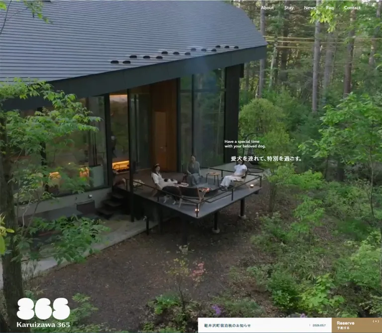
Karuizawa 365 is a hospitality homepage and villa-discovery hub. It introduces the retreat concept, presents five villas, explains dog-friendly amenities and interior experiences, publishes news, and connects visitors to property details and reservations. The opening relies on the setting itself: a dark-roofed villa almost enveloped by trees, with small white copy suspended over the architecture. A distinctive, rounded 365 logo supplies the strongest graphic shape.
The page alternates photographic immersion with carefully spaced information. Dark teal brings the forest atmosphere into the interface; a fine grain gives large colored fields a tactile finish. English navigation and headings sit beside smaller Japanese descriptions, while reservation controls use a restrained tan-gold fill. Square edges, small markers, thin rules, and broad empty areas keep the experience calm despite its extensive content.
How to Read This Reference
- Measured means a value appears in the supplied DOM geometry or computed styles. Measurements belong to the sampled viewport and state.
- Visual estimate means a proportion, color, or size is inferred from a supplied current-page screenshot. These values were not programmatically sampled from pixels.
- Calculated means a relationship is derived from measured values, such as the gap between two button rectangles.
- Recommended means implementation guidance for a new project. Breakpoints, accessible enhancements, and the Quick Start are adaptations unless explicitly identified as measured.
- Token names below are descriptive aliases. The supplied custom-property extraction was empty; it does not establish that the original stylesheet has no custom properties.
- Sampled parent typography does not necessarily describe nested labels or graphic logos. Likewise, an element's transparent background does not describe the complete painted surface behind it.
- Offscreen coordinates and duplicated text are preserved implementation evidence. They should not be interpreted as fifteen distinct villas or multiple simultaneously visible hero slogans.
Tokens — Colors
Default Palette
| Name | Value | Evidence | Suggested token | Role |
|---|---|---|---|---|
| Deep Teal | #1f444f / rgb(31, 68, 79) |
Measured body text color | --color-ink |
Main text on pale sections; also a close visual match for the dark feature and footer fields |
| Soft White | #f8f9f9 / rgb(248, 249, 249) |
Measured body and notice backgrounds; measured feature and footer-link text | --color-paper |
Editorial canvas, notice strip, reversed text, and pale terminal panels |
| Reservation Gold | Approximately #aa8d60 |
Visual estimate | --color-reserve |
Compact reservation tab at the lower right |
| Photo Shade | rgb(31 68 79 / 20%) |
Recommended approximation | --photo-shade |
Optional darkening over replacement photography to support white text |
| Quiet Reverse Rule | rgb(248 249 249 / 45%) |
Recommended approximation | --rule-reverse |
Fine dividers and outlined controls on teal |
| Contact Wash | rgb(248 249 249 / 4%) |
Recommended approximation of the visible lighter panel | --surface-contact |
Subtle separation around footer contact details |
The exact teal value is confirmed for text. The feature and footer backgrounds visually belong to the same color family, but their complete background paint was not isolated in the supplied computed-style sample. Using the measured ink color as their base is a practical adaptation.
Color Behavior
Soft white and teal exchange foreground and background roles as the visitor moves through the page. This is an editorial section treatment; there is no evidence of a user-controlled light/dark switch.
The opening navigation and logo appear white over the photograph even where a sampled ancestor reports teal text. Descendant styles, graphic fills, or compositing may explain the difference; the exact mechanism is unverified. Reproduce the visible foreground color without assuming the parent color is the final rendered result.
Natural greens, roof blue-gray, warm interior neutrals, and timber tones come from photography. Keep them within the images rather than expanding them into a large UI palette. The gold reservation tab remains a small, consistent accent.
The original photo-darkening method is unknown. A replacement image may need a scrim, but an already graded image should not automatically receive another heavy tint.
Tokens — Typography
Primary Japanese and Interface Stack
- Measured family:
fot-cezanne-pron, sans-serif. - Measured base:
13px, weight500, line height13px, letter spacing1.04px. - Role: body inheritance, navigation anchors, descriptive paragraphs, and many action wrappers.
- Character: compact, clear Japanese text with deliberate tracking and generous paragraph leading.
- Implementation alias:
--font-main: fot-cezanne-pron, sans-serif.
This is a reported CSS family, not independent proof that every glyph was rendered by the named webfont. Font files, licensing, loading status, and fallback behavior were not inspected.
Latin Contact and Legal Details
- Measured family:
REM, sans-serifon the footer email address, legal links, and copyright. - Measured weights:
500for email and legal links;400for copyright. - Tracking: consistently equivalent to
0.02emon these sampled elements. - Implementation alias:
--font-latin: REM, sans-serif.
Do not extrapolate this finding into a claim that every English heading uses REM. The provided samples do not establish that.
Graphic Identity
The 365 mark is a graphic with rounded, stacked lobes and an accompanying Karuizawa 365 wordmark. Its silhouette is essential. The hero H1 reports 26px typography, but the visible logo occupies a measured 173 × 96px desktop box and 144 × 80px mobile box. Those graphic dimensions, rather than the H1 font size, describe its appearance.
Use an authorized logo asset or appropriate supplied variant. Ordinary text set to a heavy font will not reproduce the mark.
Type Scale
| Role | Desktop | Mobile | Weight / tracking | Evidence and interpretation |
|---|---|---|---|---|
| Base interface and navigation anchor | 13px / 13px |
13px / 13px |
500; 1.04px |
Measured; visible descendants may vary |
| Section H2 wrapper | 19.5px / 19.5px |
Same | 400; 1.04px |
Measured wrapper; bilingual heading box is 36px tall |
| Concept paragraph | 16px / 28.8px |
15px / 27px |
500; 1.04px |
Measured; line-height ratio is 1.8 |
| Villa introduction | 14px / 25.2px |
13px / 23.4px |
500; 1.04px |
Measured |
| Feature paragraph | 14px / 25.2px |
13px / 23.4px |
500; 1.04px |
Measured |
| News title paragraph | 14px / 22.4px |
13px / 20.8px |
400; 1.04px |
Measured actual paragraph inside H3 |
| Villa and terminal H3 wrapper | 15.21px / 15.21px |
Same | 400; 1.04px |
Measured wrapper; not a reliable size for every nested English title |
| Footer email | 14px / 14px |
Same | REM 500; 0.28px |
Measured |
| Footer legal links | 12px / 12px |
Same | REM 500; 0.24px |
Measured |
| Copyright | 11px / 22px |
Same | REM 400; 0.22px |
Measured |
| Hero English statement | About 12–13px / 14px |
Similar | Visually regular | Visual estimate |
| Hero Japanese statement | About 18px / 26px |
Similar | Visually regular | Visual estimate |
| Dog Friendly Japanese heading | About 20px / 32px |
Not visually inspected | Visually regular | Desktop visual estimate |
| Large terminal English labels | About 28px |
Not visually inspected | Visually medium | Desktop visual estimate; larger than the sampled parent declaration |
The source HTML root reports 10px, while the body reports 13px. The Quick Start uses explicit pixel tokens so it can coexist with a conventional application root. Do not copy source-like rem numbers into a 16px-root project without conversion.
The repeated 1.04px tracking remains the same computed pixel amount across several text sizes. Using 0.08em everywhere would change that relationship as type size changes.
Tokens — Spacing & Shapes
Density: very open at section scale, compact at control scale. Base system: no single source spacing unit was established. Repeated distances provide useful aliases, but they do not prove an underlying eight-point grid.
Spacing Scale
| Use | Desktop | Mobile | Evidence |
|---|---|---|---|
| Standard section-title inset | 64px |
32px |
Measured |
| Hero logo left inset | 64px |
20px |
Measured; intentionally different from the mobile section gutter |
| Concept text left edge | 175.83px |
52px |
Measured |
| Villa-introduction left edge | 174.20px |
91px |
Measured |
| Feature paragraph left edge | 263.06px |
64px |
Measured |
| Concept top padding | 100px |
100px |
Measured |
| Feature-heading top offset within section | 120px |
80px |
Calculated from measured rectangles |
| Gap between concept actions | 8px horizontally |
6px vertically |
Calculated |
| Gap between villa actions | About 5.88px horizontally |
6px vertically |
Calculated |
| Feature paragraph to View More | 80px |
20px |
Calculated from paragraph and link boxes |
| Gap between terminal panels | 24px horizontally |
20px vertically |
Calculated |
| Terminal-panel section top padding | 160px |
80px |
Measured |
These nested insets are part of the composition. A mobile section heading at 32px, concept copy at 52px, and villa introduction at 91px create distinct levels of indentation. Preserve the hierarchy while allowing narrower screens and longer translations to remain readable.
Border Radius and Linework
| Element | Appearance | Evidence |
|---|---|---|
| Reservation tab and sampled links | Square corners; 0px radius |
Measured |
| Feature photograph and promotional banner | Square image boundaries | Visual observation |
| Footer reservation panel | Fine dotted outline | Visual observation; exact border declaration unavailable |
| Navigation separators | Short, fine vertical strokes | Visual observation |
| Terminal-panel markers | Tiny square marks near panel edges | Visual observation |
| Promotional close control | Circular teal field with a white cross | Visual observation; about 30px visible diameter |
| General elevation | Flat surfaces without prominent card shadows | Visual observation within captured regions |
Roundness is concentrated in the logo and the promotional close control. It is not a general card or button treatment.
Layout Measurements
| Element | Desktop, 1440 × 1000 | Mobile, 390 × 844 | Evidence |
|---|---|---|---|
| Document height | 9608.78px |
9268.06px |
Measured |
| Opening section | 1440 × 1000px |
390 × 844px |
Measured |
| Hero logo | 173 × 96px, at (64, 885) |
144 × 80px, at (20, 681) |
Measured |
| Opening notice | 436 × 49px, at (840, 950) |
390 × 57px, at (0, 786) |
Measured |
| Opening reservation tab | 164 × 49px, at (1276, 950) |
164 × 49px, at (226, 736) |
Measured |
| Concept paragraph width | 614.47px |
306px |
Measured |
| Concept action | 264 × 74px |
306 × 68px |
Measured |
| View All Villas action | 310 × 82px |
267 × 72px |
Measured |
| Villa information width | 365.34px |
286.91px |
Measured title region |
| Individual villa action | 179.73 × 82px |
286.91 × 72px |
Measured |
| Feature paragraph width | 400px |
304px |
Measured |
| Feature front photograph | About 504 × 706px |
Not visually inspected | Desktop visual estimate |
| Terminal panel | 644 × 295px |
326 × 192px |
Measured |
| Footer, including upper utility area | 1440 × 702px |
390 × 1358px |
Measured |
| Footer reservation panel | 422 × 82px |
326 × 77px |
Measured |
| Promotional banner | About 402 × 216px |
Linked image region 251.5 × 151.56px |
Desktop visual estimate; mobile DOM measurement |
Treat full-section heights as descriptions of the inspected layout, not hardcoded requirements. Text length, media behavior, and viewport height can change them.
Components
Opening Photographic Hero
Role: establish place, atmosphere, and brand identity before detailed information.
The desktop photograph fills the viewport. The roof runs across most of the upper half, while glazing, terrace furniture, tree trunks, and dense foliage create depth below. White copy sits to the right of center, over a darker portion of the building. The logo anchors the lower left and the notice/reservation assembly anchors the lower right.
The English statement is split into two short lines: “Have a special time / with your beloved dog.” The Japanese line, “愛犬を連れて、特別を過ごす。”, begins about 20px farther right. On desktop, the English text begins around x847 and y422. On mobile, it begins around x32 and y355, retaining the approximately 42%-of-viewport vertical placement while moving to the left.
The phone capture shows a much tighter roof-and-foliage composition. Its photographic area ends above the full-width notice. Preserve meaningful focal points when preparing portrait media; the exact source cropping or media-selection strategy is unknown.
The DOM contains duplicate hero text strings. The screenshot shows one readable composition. Do not reproduce those duplicates as additional visible copy.
Opening Navigation
Role: provide light, immediately available access to the main site areas.
The opening navigation contains About, Stay, Guide, News, and Faq. It sits at y18 in both measured viewports. The desktop links occupy the upper-right region; the phone retains the full five-item horizontal row. Short vertical separators make the navigation feel typeset rather than boxed.
Individual measured link text boxes are only about 16–17px tall. Their visual compactness should be preserved, but the actual interactive area should be enlarged in a new implementation.
About, Guide, News, and Faq have ordinary destination URLs in the supplied link evidence. Stay has no resolved href in the sampled element. Its expanded state and activation behavior were not recorded.
Scrolled Header
Role: retain a compact brand anchor and menu access away from the opening.
The desktop feature capture shows a white logo at the upper left, approximately 130px wide, and a two-line menu glyph at the upper right. The pale terminal area instead shows a teal logo. The menu's dark rectangular background is visible against the pale region.
The menu glyph is roughly 40px wide inside an approximately 88px-wide corner area. Header position and palette visibly differ between opening and scrolled captures. The trigger threshold, transition sequence, and expanded menu are unverified.
Implement these as explicit header states. Do not derive the exact state machine from the presence of duplicate navigation or hidden text in the DOM.
Notice and Reservation Dock
Role: combine a current operational message with a persistent reservation entry point.
On desktop, the notice is a 436px-wide soft-white strip beside a 164px-wide gold tab. Both are approximately 50px tall. The notice places the announcement at left and a small date at right. The tab stacks Reserve above “予約する” and includes a small directional detail near its far edge.
At the inspected date, the notice reads “【予約受付一時停止期間 延長のお知らせ】” and links to /news/1296. This is current operational content, not a permanent brand tagline.
On mobile, the assembly changes arrangement: the 164px reservation tab occupies the right side of the row above a full-width, approximately 58px notice strip. The tab itself does not stretch to full width.
A gold reservation tab also appears at the lower right in the desktop feature capture. A separate sampled reservation element sits just below the initial viewport. These observations support more than one display state; they do not establish that every instance is simultaneously visible.
General Reserve controls have empty or fragment destinations in the supplied extraction. Their activation result was not inspected. Property-specific Reserve links do expose external booking URLs.
Concept Introduction
Role: explain the retreat proposition and route visitors to background and stay guidance.
The DOM identifies a bilingual Our Concept heading, the English statement “Make family time / together / more special.”, several Japanese paragraphs, and paired About and Stay Guide actions.
The desktop paragraph starts well inside the section-title gutter, at x175.83, and uses 16px / 28.8px type. Its deliberate short lines create a spacious reading rhythm. On mobile, it becomes 15px / 27px in a 306px-wide region beginning at x52.
The desktop actions sit side by side in 264 × 74px boxes. On mobile, they stack as 306 × 68px boxes with a 6px gap. This is a structural responsive change, not proportional shrinking.
The supplied current screenshots do not fully expose this section's imagery or English display typography. Preserve the measured text and action relationships without inventing its missing visual composition.
Villa Browser
Role: help visitors compare properties and choose between more information and booking.
The unique content set contains five villas:
| Property | Building + terrace | Maximum stated guests | Recommended guests |
|---|---|---|---|
| River Side Villa Happudai | 170 + 50m² |
12 | 4–10 |
| Forest Terrace Happudai | 114 + 31m² |
9 | 4–6 |
| Forest Garden Happudai | 116 + 40m² |
8 | 4–6 |
| Play Garden Ohinata | 110 + 30m² |
7 | 4–6 |
| Tree nest Happudai | 78 + 15m² |
5 | 2–4 |
Each entry includes an English property name, a Japanese name, building/terrace area, plot area, guest capacity, recommended group size, bedroom configuration, View More, and Reserve. Keep capacity and recommended occupancy distinct.
The extraction repeats the same five entries three times and places many copies far outside the viewport. Successive corresponding title positions are 1115px apart on desktop and 338px apart on mobile. This is consistent with a looping horizontal slider structure; it does not identify its library or prove autoplay or swipe behavior.
Two small desktop buttons are present near the browsing area, each with a measured 12 × 15px box. Their accessible names and actual click results were not supplied.
Desktop entry actions share one row. Mobile actions span the measured information width and stack with a 6px gap. Detail links lead to individual /stay/ pages; property reservation links lead to CHILLNN plan pages. The destination pages themselves were not inspected.
The current captures do not establish the villa media dimensions or exact card surface. Do not invent a rounded-card grid around this DOM evidence.
Feature Story Panel
Role: connect the accommodation to specific experiences: Dog Friendly, Interior, and Stove / Fire pit.
The desktop Dog Friendly capture is the clearest expression of the interior design system. A full teal field with fine grain surrounds a compact text block on the left and a tall photograph on the right. The image shows a dog resting on a pale sofa; slight offsets reveal other rectangular image edges behind it.
The anatomy is:
- A tiny open-circle marker and English category label, slightly outdented from the main copy.
- A two-line Japanese heading.
- A 400px-wide paragraph at
14px / 25.2px. - A small View More text link, separated from the paragraph by a measured 80px gap.
- A portrait image around 504 × 706px, with square corners.
- A small vertical 01 / 02 / 03 index near the image's lower-left side; a short stroke accompanies 01 in the capture.
The paragraph begins at x263.06. The front image begins around x867, leaving substantial negative space between text and photography. Avoid making both columns equally wide or vertically crowding the copy.
Desktop feature descriptions are sampled exactly 1000px apart within a 4100px-tall section. The mobile feature section is about 2525px tall; text columns are 304px wide, and the paragraph-to-link gap reduces to 20px. The numbered index is absent from the supplied mobile text extraction.
These differences support a distinct mobile arrangement. A pinned desktop sequence is plausible, but its exact scroll mechanics and image transitions were not demonstrated. A normal stacked mobile presentation is the recommended implementation baseline.
News and Social Follow Area
Role: communicate operational updates and provide ongoing brand contact.
The desktop News heading sits in the outer left gutter while the entries begin at x398. Each entry combines a date and linked Japanese title; the first title begins at x621. The first two measured link regions are about 121px tall, with 32px gaps between entries.
On mobile, the heading and list share the 32px section gutter. Entry width becomes 326px. Titles begin 90px inside the row, at x122, and can wrap at 13px / 20.8px. Measured link regions are approximately 197–209px tall. Their full internal visual content was not captured, so these heights should not be treated as proof of a specific thumbnail layout.
A View All link follows the entries. The subsequent social area includes a short invitation and Instagram and LINE destinations. White text confirms a reversed surface treatment for its message, although the complete section appearance is not shown in the supplied captures.
FAQ and Reservation Panels
Role: give two clear final routes before the footer.
Desktop uses two equal 644 × 295px interaction regions separated by 24px, inside 64px page gutters. Each centers an English label above a small Japanese subtitle. The visible pale surface is open and largely unboxed, with tiny square markers as details.
Mobile stacks the panels at 326 × 192px with a 20px gap. The section's top padding reduces from 160px to 80px.
The FAQ destination is verified as a link. The general reservation panel's resulting interface is not verified. The English labels appear larger than their sampled H3 wrapper declaration, so do not set every nested label to 15.21px.
Split Footer
Role: close the page with practical navigation and a return to the villa atmosphere.
The desktop footer divides into a teal information half and a photographic half, each about 720px wide. The left half contains five bilingual navigation rows, Instagram and LINE icons, a dotted-outline Reserve panel, and a subtly lighter Contact Us panel. Legal links and a small copyright line sit near the lower edge.
The navigation text region begins at x181 and is 422px wide. Rows recur at 40px vertical intervals. The reservation panel uses the same 422px width and an 82px height. Contact details place telephone and email alongside one another on desktop; the email is visibly underlined.
The right half reprises the villa photograph, English/Japanese statement, and white logo. Its visible image region is approximately 665px tall. This repetition provides a visual ending tied to the opening scene.
On mobile, the information area precedes a full-width photograph about 600px tall. Navigation and reservation controls use 326px widths inside 32px gutters. Contact information stacks; legal links wrap into two rows; the copyright is right aligned in the capture. The combined footer grows to a measured 1358px.
The visible copyright is “© andbold 2022”. Its year is footer content, not the inspection date or evidence of a production date.
Floating Promotional Banner
Role: advertise the LINE friend-addition campaign.
The banner combines a lifestyle photograph of a person and dog by a window with white strips containing “【限定キャンペーン】” and “友だち追加で5000円OFF”. It has a thin pale edge and a teal circular close control overlapping the upper-right corner.
On desktop, the visible banner is approximately 402 × 216px, placed about 20px from the right and 90px from the bottom. On mobile, its linked image region is measured at 251.5 × 151.56px, beginning at x127.5 and y601.44. The visible banner therefore occupies roughly two thirds of the phone width.
It appears over both the feature and footer captures and over the mobile opening. It is absent from the first desktop opening capture. This establishes different captured visibility states, but not a specific delay, scroll threshold, or session rule.
The mobile banner visibly covers part of the logo and reservation tab. In the footer it again covers portions of the photograph and brand area. Record this as observed interference, not a desirable spacing rule. The close affordance is visible; dismissal and persistence were not tested. The mobile DOM exposes a LINE campaign link, but that destination was not opened.
Tokens — Motion & Interaction
| Element or treatment | Supplied evidence | What can be concluded |
|---|---|---|
| Logo home link | 0.5s cubic-bezier(0.19, 1, 0.22, 1) |
Measured transition timing; triggering state and animated property were not established |
| Opening notice link | 0.8s cubic-bezier(0.19, 1, 0.22, 1) |
Measured transition timing |
| Desktop footer navigation and social links | 0.8s cubic-bezier(0.19, 1, 0.22, 1) |
A consistent easing family is declared on these links |
| Desktop terminal-panel H3 elements | 1s cubic-bezier(0.19, 1, 0.22, 1) |
Measured desktop transition declaration |
| Several mobile counterparts | transition: all in the supplied record |
No positive duration is documented by that value alone |
| Sampled element animations | animation: none |
No CSS keyframe animation is reported for those particular sampled elements |
| Hero imagery | Different compositions across current captures | Media changes or different crops are plausible; video playback, loop duration, sound, and source format are unverified |
| Villa browser | Repeated offscreen groups and controls | Slider structure is supported; drag, autoplay, timing, and wrap behavior are unverified |
| Feature sequence | Tall desktop section, spaced descriptions, image stack, numeric index | A staged presentation is supported; pinning and scroll-linked transition details remain unverified |
| Promotional banner | Present in several captures, absent in one | Conditional visibility is observed; appearance and dismissal rules remain unverified |
The declared cubic-bezier curve moves strongly toward its endpoint early and then settles. It is a useful source-derived easing token for an adaptation, but it does not justify inventing hover zooms, image parallax, or page-transition choreography.
The capture process waited for finite motion and layout stability, temporarily paused perpetual animations during readiness checks, and then resumed them. Static frames cannot establish motion speed or complete interaction behavior. JavaScript motion, media playback, and pseudo-element effects may exist outside the sampled element declarations.
Recommended motion approach: keep interface feedback restrained, use the observed easing family where appropriate, and keep all information available without scroll choreography. Add reduced-motion behavior and explicit media controls if moving footage is introduced.
Surfaces
| Layer | Appearance | Purpose |
|---|---|---|
| Editorial canvas | Soft white with teal text | Concept, property information, news, and terminal routes |
| Feature field | Deep teal with fine visible grain | Immersive experience descriptions and portrait photography |
| Opening and closing media | Full-bleed woodland architecture with pale overlaid details | Establish place and repeat the brand atmosphere |
| Reservation tab | Flat tan-gold rectangle | Small but persistent booking emphasis |
| Footer contact panel | Slightly lighter teal rectangle | Group practical contact details without strong elevation |
| Promotional overlay | Square photograph, pale text strips, circular close control | Campaign communication above the page |
| Utility linework | Fine separators, dotted outline, tiny square or circular markers | Organize content with minimal visual mass |
The texture is visible across large teal fields. Its actual asset, scale, and compositing method were not supplied. It should read as fine grain, not a large repeating pattern or a strong paper illustration.
There is no prominent rounded-card or shadow hierarchy in the photographed feature and footer regions. Separation comes from color fields, image boundaries, whitespace, and small rules.
Imagery
Architecture, forest vegetation, and life with a dog carry the emotional content. The opening favors a high viewpoint with a broad roof plane and foliage in front of the building. The feature image shifts to a close domestic moment: a dog on a pale sofa, with restrained interior objects around it. The campaign uses a person seen from behind beside a dog and a large window.
The current captures have cool, shaded greens and blue-gray roofing, balanced by cream upholstery and warm interior materials. Preserve this relationship between outdoor coolness and indoor warmth. Avoid treating the photographs as interchangeable scenic backgrounds: the built space, dog-friendly use, and relationship to the forest are the subject.
Use square image boundaries and natural photographic detail. The grain belongs to the colored interface fields; there is no evidence for pixelated rendering, halftone conversion, or heavy decorative framing around the photos.
Observed Asset References
No original image, video, logo, or texture file URLs were included in the supplied evidence. The references below identify observed uses rather than invented filenames.
| Asset role | Current evidence | Implementation note |
|---|---|---|
| 365 brand mark | Desktop and mobile opening; scrolled header; footer | Preserve the graphic silhouette and light/dark variants |
| Opening architectural media | Desktop opening and mobile opening | Prepare a portrait composition with meaningful focal placement; media format unverified |
| Dog Friendly photograph | Desktop feature capture | Tall crop of a dog on a pale sofa; source aspect ratio unknown |
| Offset feature images | Narrow rectangular edges behind the front image | Preserve the subtle stacked relationship only when suitable imagery is available |
| Footer architectural media | Desktop and mobile footer | Adapt the crop for a half-width desktop panel and full-width phone panel |
| Campaign artwork | Desktop feature/footer and mobile opening/footer | Keep campaign wording accessible outside the bitmap |
| Teal grain | Feature and footer fields | Use a restrained texture; original file and blend settings unknown |
| Social and directional icons | Footer, text links, reservation controls | Keep them small and visually simple; asset format unverified |
Layout & Responsive Behavior
The page follows a long editorial sequence: opening, concept, villa discovery, three feature stories, news, social follow information, FAQ/reservation routes, and footer. It combines brand storytelling with practical property selection.
Observed Changes Between Viewports
| Relationship | Desktop | Mobile |
|---|---|---|
| Opening navigation | Five links in the upper right | Same five links retained in a horizontal row |
| Hero statement | Right of center | Left aligned, with the Japanese line still indented |
| Notice and reservation | Adjacent at the lower right | Reservation above a full-width notice |
| Concept actions | Two columns | One stacked column |
| Villa actions | Two buttons in one row | Two full-width stacked buttons |
| Feature paragraph | 400px wide; 80px before link | 304px wide; 20px before link |
| Feature section | 4100px tall | About 2525px tall |
| News | Heading and list occupy separate horizontal regions | Heading above list; compact date/title relationship retained |
| FAQ and reservation | Two equal side-by-side panels | Two equal stacked panels |
| Footer | Information and photo in equal halves | Information followed by full-width photo |
| Campaign | Lower-right overlay | Smaller overlay with substantial content overlap |
The concept section grows from about 2109px to 2768px while the feature section becomes shorter. The footer nearly doubles in height. These changes explain why the total mobile page remains slightly shorter despite having more stacked content.
Only two widths were supplied. No exact breakpoint, tablet layout, landscape behavior, or viewport-height formula was recovered. The Quick Start uses 767px as a recommended breakpoint, not an observed source value.
Keep asymmetry deliberate. On desktop, text often starts farther inside the page than the section label. On mobile, preserve a smaller version of that hierarchy without forcing every region to the same inset. Test long English translations, Japanese wrapping, browser text enlargement, and short viewport heights.
The supplied mobile footer capture also shows header/logo graphics intruding into the upper contact area. Its exact state mechanism was not isolated. Fixed elements should be checked against the complete phone page, especially when the campaign is present.
Do’s and Don’ts
Do
- Use measured soft white
#f8f9f9and teal#1f444fas the core interface pair. - Let woodland architecture and dog-friendly living carry the visual impact.
- Preserve the rounded 365 graphic alongside square controls and photographs.
- Keep the opening copy small, with the Japanese line slightly indented beneath the English statement.
- Retain the fine grain in large teal regions.
- Preserve bilingual label hierarchy and generous Japanese paragraph leading.
- Use nested insets to separate section labels, editorial copy, and actions.
- Keep property facts, detail links, and reservation links clearly associated with each villa.
- Stack the measured action pairs and terminal panels on mobile.
- Keep operational notices editable and visible near reservation entry points.
- Use explicit state handling for the scrolled header and promotional banner.
Don’t
- Don’t enlarge the opening slogan into a dominant oversized headline.
- Don’t replace the logo with ordinary rounded text.
- Don’t wrap every content region in a rounded, elevated card.
- Don’t spread the reservation gold across headings, borders, and unrelated components.
- Don’t treat offscreen repeated villa entries as additional properties.
- Don’t assume the whole page uses REM because it is measured in footer utilities.
- Don’t use a sampled parent font size as the visible size of every nested label.
- Don’t invent autoplay, parallax, menu contents, or booking-modal behavior.
- Don’t hardcode the captured document height or reproduce blank stage space without its corresponding behavior.
- Don’t preserve promotional overlap at the expense of reservation access, brand visibility, or readable contact details.
- Don’t describe missing image paths or estimated colors as recovered source assets or exact tokens.
Recommended Implementation Additions
These are recommendations for a new implementation, not verified original-site features:
- Give the menu, slider controls, close button, and directional icon links accessible names. Expand compact visual controls to at least 44 × 44px interaction areas where practical.
- Use a button for controls that open an interface and a real link for navigation. Replace empty or placeholder hrefs with intentional behavior.
- Give a looping villa browser one canonical accessible set of entries. Remove inactive clones from keyboard navigation and the accessibility tree without hiding the active content.
- Preserve a visible focus indicator on pale, teal, gold, and photographic surfaces.
- Verify reservation-label contrast against the actual painted gold. The estimated gold/soft-white combination may be insufficient for small text; adjust the fill or text color after measurement.
- Move the campaign into document flow on phones, or manage its position so it cannot cover the booking tab or essential content. Keep dismissal keyboard-operable and clearly visible.
- Include the campaign offer as accessible text. An image-only link should not be the only way to discover its purpose.
- Provide reduced-motion and static alternatives for any media or staged scrolling. CSS alone cannot pause a video; application logic must handle playback.
- Keep page content accessible if a slider or scroll controller fails to initialize.
- Supply properly sized responsive images, reserve their layout space, and defer below-the-fold media where appropriate. Load the opening media deliberately so a large blank hero does not become the first experience.
Agent Prompt Guide
Quick Color Reference
- Editorial background and reversed text: measured
#f8f9f9. - Editorial text: measured
#1f444f. - Feature/footer background: use
#1f444fas a close adaptation, with restrained fine grain. - Reservation tab: approximately
#aa8d60; confirm or adjust contrast in production. - Contact grouping: a very subtle pale wash over teal.
- Photography: shaded forest greens, blue-gray roofing, pale upholstery, and warm interior materials.
Overall Prompt
“Create a hospitality brand homepage for private woodland villas where guests can stay with their dogs. Use a full-viewport architectural photograph, small white English and Japanese copy right of center on desktop, and a distinctive supplied logo at the lower left. Pair soft white #f8f9f9 with deep teal #1f444f, adding fine grain to the teal feature and footer sections. Use compact bilingual labels, generous Japanese paragraph leading, square controls, thin separators, and deliberate asymmetric insets. Include a five-property browser with practical accommodation facts, three experience stories, news, FAQ and reservation routes, and a split information/photograph footer. Stack actions and footer regions on phones. Keep the reservation accent a small tan-gold rectangle and prevent promotional overlays from obstructing content.”
Example Component Prompts
- Opening: “Compose a full-screen woodland villa photograph with a broad roof plane and foliage depth. Place a small two-line English statement around 42% down the frame, followed by a slightly indented Japanese sentence. Anchor the supplied white brand graphic at lower left and a compact notice/reservation assembly at lower right. On a phone, move copy to the left and place the notice below the reservation row.”
- Feature story: “Build a deep teal, finely grained desktop section with a 400px copy column beginning well inside the left gutter and a tall square-cornered photograph at right. Use a tiny marked English category label, a restrained two-line Japanese heading, 14px text with 25.2px leading, and a small View More link with generous separation. Show a discreet vertical three-item index only when its behavior is implemented.”
- Villa information: “Present one villa with English and Japanese names, building and terrace area, plot area, occupancy, recommended group size, and bedrooms. Add separate View More and Reserve actions. Put the actions in one row on desktop and stack them with a small gap on mobile. Keep the content accessible without a slider.”
- Terminal routes: “Create two spacious soft-white interaction panels for FAQ and reservations, with centered English labels and smaller Japanese subtitles. Use tiny corner marks and square geometry. Size them equally side by side on desktop and stack them inside 32px phone gutters.”
- Footer: “Split the desktop footer into a grained teal information half and an architectural photograph half. Group bilingual navigation, small social icons, a dotted reservation outline, a subtly lighter contact panel, and compact legal links on the left. Reprise the short brand statement and white logo over the photo. On mobile, place the photograph after all contact and legal information.”
- Campaign adaptation: “Create a square-cornered lifestyle campaign image with accessible offer text and a circular close control. Use a lower-right overlay on wide screens only when it clears essential controls. Place it in normal flow on phones while retaining its compact visual character.”
Quick Start
CSS Custom Properties
This is an implementation scaffold, not recovered original CSS. It preserves the measured core colors, type relationships, control widths, and major responsive changes. Hero copy sizes, gold, image treatment, and the breakpoint are approximations or recommendations.
Use a .villa-site wrapper. A .hero contains .hero-media, .hero-nav, .hero-copy, .hero-brand, and .hero-dock. The dock contains .notice and .reserve-tab. A .feature-panel contains .feature-copy and .feature-photo. A .footer-grid contains .footer-info and .footer-photo. Place the optional .campaign in a sensible document location because this adaptation makes it flow normally on phones.
Provide authorized logo and image assets and load the reported fonts only when available and appropriately licensed. The grain below is a synthetic SVG approximation, not an original asset. Header-state logic, booking behavior, carousel behavior, media playback, and campaign dismissal require separate implementation.
:root {
  /* Measured colors and reported font stacks */
  --color-paper: #f8f9f9;
  --color-ink: #1f444f;
  --font-main: fot-cezanne-pron, sans-serif;
  --font-latin: REM, sans-serif;
  --text-ui: 13px;
  --text-body: 14px;
  --text-concept: 16px;
  --leading-body: 1.8;
  --tracking-main: 1.04px;

  /* Visual approximations and recommended treatments */
  --color-reserve: #aa8d60;
  --photo-shade: rgb(31 68 79 / 20%);
  --surface-contact: rgb(248 249 249 / 4%);
  --rule-reverse: rgb(248 249 249 / 45%);
  --grain-image: url("data:image/svg+xml,%3Csvg xmlns='http://www.w3.org/2000/svg' width='128' height='128'%3E%3Cfilter id='n'%3E%3CfeTurbulence type='fractalNoise' baseFrequency='.8' numOctaves='3' stitchTiles='stitch'/%3E%3C/filter%3E%3Crect width='100%25' height='100%25' opacity='.12' filter='url(%23n)'/%3E%3C/svg%3E");

  /* Desktop measurements and reusable aliases */
  --page-gutter: 64px;
  --concept-indent: 112px;
  --reserve-width: 164px;
  --dock-height: 50px;
  --notice-width: 436px;
  --radius-panel: 0;
  --ease-settle: cubic-bezier(0.19, 1, 0.22, 1);
}

.villa-site,
.villa-site *,
.villa-site *::before,
.villa-site *::after {
  box-sizing: border-box;
}

.villa-site {
  color: var(--color-ink);
  background: var(--color-paper);
  font-family: var(--font-main);
  font-size: var(--text-ui);
  font-weight: 500;
  line-height: 1;
  letter-spacing: var(--tracking-main);
}

.villa-site [hidden] { display: none !important; }
.villa-site img { display: block; max-width: 100%; }
.villa-site a { color: inherit; }
.villa-site button { font: inherit; letter-spacing: inherit; }
.villa-site p { line-height: var(--leading-body); }

.section-shell {
  margin-inline: var(--page-gutter);
}

.grain-surface {
  color: var(--color-paper);
  background-color: var(--color-ink);
  background-image: var(--grain-image);
}

.hero {
  position: relative;
  isolation: isolate;
  height: 100vh;
  height: 100svh;
  min-height: 600px;
  color: var(--color-paper);
  background: var(--color-ink);
}

.hero-media,
.hero::after {
  position: absolute;
  inset: 0;
  width: 100%;
  height: 100%;
}

.hero-media {
  object-fit: cover;
  object-position: center;
  z-index: 0;
}

.hero::after {
  content: '';
  background: var(--photo-shade);
  pointer-events: none;
  z-index: 1;
}

.hero-nav,
.hero-copy,
.hero-brand,
.hero-dock {
  position: absolute;
  z-index: 2;
}

.hero-nav {
  top: 18px;
  right: calc(var(--page-gutter) + 14px);
  display: flex;
  align-items: center;
  gap: 34px;
}

.hero-nav a {
  position: relative;
  padding-bottom: 3px;
  font-size: 13px;
  line-height: 13px;
  text-decoration: none;
}

/* Expanded invisible hit area preserves the compact lettering. */
.hero-nav a::before {
  content: '';
  position: absolute;
  inset: -14px -8px;
}

.hero-nav a + a::after {
  content: '';
  position: absolute;
  left: -17px;
  top: 4px;
  height: 6px;
  border-left: 1px solid rgb(248 249 249 / 55%);
}

.hero-copy {
  top: 42%;
  left: 58.8%;
  max-width: 340px;
}

.hero-copy .en,
.footer-photo .en {
  margin: 0;
  font-size: 12px;
  line-height: 1.2;
  letter-spacing: 0.25px;
}

.hero-copy .jp,
.footer-photo .jp {
  margin: 24px 0 0 20px;
  font-size: 18px;
  line-height: 1.5;
}

.hero-brand {
  left: var(--page-gutter);
  bottom: 19px;
  width: 173px;
}

.hero-brand img,
.header-brand img {
  width: 100%;
  height: auto;
}

.hero-dock {
  right: 0;
  bottom: 0;
  display: flex;
  align-items: stretch;
}

.notice {
  display: flex;
  align-items: center;
  justify-content: space-between;
  gap: 16px;
  width: var(--notice-width);
  min-height: var(--dock-height);
  padding: 10px 20px;
  color: var(--color-ink) !important;
  background: var(--color-paper);
  text-decoration: none;
}

.notice-title {
  min-width: 0;
  font-size: 11px;
  line-height: 1.5;
}

.notice time {
  flex: none;
  font-size: 9px;
  letter-spacing: 0;
}

.reserve-tab {
  display: flex;
  align-items: center;
  justify-content: space-between;
  width: var(--reserve-width);
  min-height: var(--dock-height);
  padding: 10px 20px 10px 17px;
  border: 0;
  border-radius: 0;
  color: var(--color-paper) !important;
  background: var(--color-reserve);
  text-decoration: none;
  cursor: pointer;
}

.action-label {
  display: grid;
  gap: 4px;
}

.action-label strong {
  font-size: 14px;
  font-weight: 500;
  line-height: 1.1;
}

.action-label small {
  font-size: 10px;
  line-height: 1.2;
}

/* Optional higher-contrast adaptation of the reservation fill. */
.reserve-tab[data-contrast='enhanced'] {
  background: #806640;
}

/* Application logic must toggle this separate scrolled-header state. */
.site-header {
  position: fixed;
  top: 15px;
  left: var(--page-gutter);
  z-index: 30;
  color: var(--color-paper);
}

.site-header[data-tone='ink'] { color: var(--color-ink); }
.header-brand { display: block; width: 130px; }

.menu-button {
  position: fixed;
  top: 0;
  right: 0;
  display: grid;
  place-content: center;
  gap: 4px;
  width: 88px;
  min-height: 44px;
  border: 0;
  color: var(--color-paper);
  background: var(--color-ink);
  cursor: pointer;
}

.menu-button::before,
.menu-button::after {
  content: '';
  width: 40px;
  border-top: 1px solid currentColor;
}

.concept { padding-block: 100px; }

.section-title {
  margin: 0;
  font-size: 19.5px;
  font-weight: 400;
  line-height: 1;
}

.concept-copy {
  max-width: 615px;
  margin-left: var(--concept-indent);
  font-size: var(--text-concept);
  line-height: 1.8;
}

.action-pair {
  display: grid;
  grid-template-columns: repeat(2, minmax(0, 1fr));
  gap: 8px;
}

.concept-actions { max-width: 536px; }

/* Dotted outlines adapt the observed footer treatment. */
.outline-action {
  display: flex;
  align-items: center;
  justify-content: space-between;
  min-width: 0;
  min-height: 82px;
  padding: 20px 25px;
  border: 1px dotted currentColor;
  border-radius: var(--radius-panel);
  text-decoration: none;
}

.concept-actions .outline-action { min-height: 74px; }
.villa-actions { max-width: 365.34px; gap: 6px; }

.feature-panel {
  display: grid;
  grid-template-columns: minmax(0, 400px) minmax(0, 504px);
  align-items: center;
  justify-content: space-between;
  gap: 64px;
  min-height: 100svh;
  padding: 150px var(--page-gutter) 140px
    clamp(64px, 18.27vw, 263px);
}

.feature-copy { min-width: 0; }

.feature-kicker {
  margin: 0 0 52px -20px;
  font-size: 11px;
  line-height: 1.4;
}

.feature-copy h3 {
  margin: 0 0 24px;
  font-size: 20px;
  font-weight: 400;
  line-height: 1.6;
}

.feature-copy p {
  margin: 0;
  font-size: var(--text-body);
  line-height: 1.8;
}

.feature-copy .text-link { margin-top: 80px; }

.text-link {
  display: inline-flex;
  align-items: center;
  gap: 12px;
  min-height: 44px;
  font-size: 13px;
  text-decoration: none;
  transition: opacity 0.8s var(--ease-settle);
}

.feature-photo {
  margin: 0;
  aspect-ratio: 5 / 7;
  overflow: hidden;
}

.feature-photo img {
  width: 100%;
  height: 100%;
  object-fit: cover;
}

.terminal-routes {
  display: grid;
  grid-template-columns: repeat(2, minmax(0, 1fr));
  gap: 24px;
  padding-top: 160px;
}

.terminal-route {
  display: grid;
  align-content: center;
  justify-items: center;
  gap: 8px;
  min-height: 295px;
  text-decoration: none;
}

.terminal-route strong {
  font-size: 28px;
  font-weight: 500;
  line-height: 1;
}

.terminal-route small { font-size: 12px; }

.footer-grid {
  display: grid;
  grid-template-columns: repeat(2, minmax(0, 1fr));
}

.footer-info {
  min-width: 0;
  padding: 140px 8.1vw 24px 12.57vw;
}

.footer-nav {
  display: grid;
  gap: 22px;
  margin-bottom: 28px;
}

.footer-nav a {
  line-height: 18px;
  text-decoration: none;
}

.contact-panel {
  margin-top: 20px;
  padding: 24px;
  background: var(--surface-contact);
}

.contact-panel a { overflow-wrap: anywhere; }

.footer-legal,
.contact-panel a {
  font-family: var(--font-latin);
  letter-spacing: 0.02em;
}

.footer-legal {
  display: flex;
  flex-wrap: wrap;
  gap: 12px 24px;
  margin-top: 48px;
  font-size: 12px;
  line-height: 1.5;
}

.footer-photo {
  position: relative;
  isolation: isolate;
  min-height: 665px;
  overflow: hidden;
  color: var(--color-paper);
  background: var(--color-ink);
}

.footer-photo > img {
  position: absolute;
  inset: 0;
  z-index: -2;
  width: 100%;
  height: 100%;
  object-fit: cover;
}

.footer-photo::before {
  content: '';
  position: absolute;
  inset: 0;
  z-index: -1;
  background: var(--photo-shade);
}

.footer-photo-copy {
  position: absolute;
  top: 44%;
  left: 17%;
  right: 24px;
}

.footer-brand {
  position: absolute;
  right: 64px;
  bottom: 32px;
  width: 144px;
}

.campaign {
  position: fixed;
  right: 20px;
  bottom: calc(90px + env(safe-area-inset-bottom, 0px));
  z-index: 40;
  width: min(402px, calc(100vw - 40px));
  border: 1px solid var(--color-paper);
}

.campaign img { width: 100%; height: auto; }

.campaign-close {
  position: absolute;
  top: -14px;
  right: -10px;
  display: grid;
  place-items: center;
  width: 44px;
  height: 44px;
  border: 0;
  border-radius: 50%;
  color: var(--color-paper);
  background: var(--color-ink);
  font-size: 24px;
  cursor: pointer;
}

/* Recommended feedback; the original hover endpoint was not supplied. */
@media (hover: hover) {
  .text-link:hover { opacity: 0.72; }
}

/* Recommended breakpoint, not a recovered source media query. */
@media (max-width: 767px) {
  :root {
    --page-gutter: 32px;
    --concept-indent: 20px;
    --text-body: 13px;
    --text-concept: 15px;
  }

  .hero-nav {
    right: 32px;
    gap: clamp(16px, 8.72vw, 34px);
  }

  .hero-copy {
    left: 32px;
    right: 20px;
    max-width: none;
  }

  .hero-brand { left: 20px; bottom: 83px; width: 144px; }

  .hero-dock {
    display: grid;
    grid-template-columns: minmax(0, 1fr) var(--reserve-width);
    width: 100%;
  }

  .hero-dock .reserve-tab { grid-column: 2; grid-row: 1; }

  .hero-dock .notice {
    grid-column: 1 / -1;
    grid-row: 2;
    width: 100%;
    min-height: 58px;
  }

  .notice { gap: 12px; }
  .concept-copy { max-width: none; }
  .action-pair { grid-template-columns: minmax(0, 1fr); gap: 6px; }
  .concept-actions .outline-action { min-height: 68px; }
  .villa-actions { max-width: none; }
  .villa-actions .outline-action { min-height: 72px; }

  .feature-panel {
    grid-template-columns: minmax(0, 1fr);
    gap: 40px;
    min-height: auto;
    padding: 80px 22px 80px 64px;
  }

  .feature-copy .text-link { margin-top: 20px; }
  .feature-photo { width: 100%; }

  .terminal-routes {
    grid-template-columns: minmax(0, 1fr);
    gap: 20px;
    padding-top: 80px;
  }

  .terminal-route { min-height: 192px; }
  .footer-grid { grid-template-columns: minmax(0, 1fr); }
  .footer-info { padding: 80px 32px 24px; }
  .footer-photo { min-height: 600px; }
  .footer-photo-copy { left: 32px; }
  .footer-brand { right: 32px; }

  /* Intentional improvement over the captured mobile overlap. */
  .campaign {
    position: relative;
    right: auto;
    bottom: auto;
    width: min(252px, calc(100% - 64px));
    margin: 24px 32px 24px auto;
  }
}

/* Recommended focus treatment for both pale and dark surfaces. */
.villa-site :focus-visible {
  outline: 2px solid var(--color-paper);
  outline-offset: 3px;
  box-shadow: 0 0 0 5px var(--color-ink);
}

@media (prefers-reduced-motion: reduce) {
  .villa-site *,
  .villa-site *::before,
  .villa-site *::after {
    animation: none !important;
    transition: none !important;
    scroll-behavior: auto !important;
  }
}
The feature scaffold uses ordinary document flow. It does not emulate an unverified pinned sequence. The original campaign's mobile overlap is intentionally replaced with an in-flow treatment. Other intermediate sections can use the measured typography, gutters, and action primitives without inventing unavailable media layouts.
Tailwind v4 Token Mapping
Optional mapping for a project already using Tailwind v4. This is an implementation convenience, not evidence that the original site uses Tailwind. Define the custom properties above first.
@theme inline {
  --color-villa-paper: var(--color-paper);
  --color-villa-ink: var(--color-ink);
  --color-villa-reserve: var(--color-reserve);

  --font-villa: var(--font-main);
  --font-villa-latin: var(--font-latin);

  --text-villa-ui: var(--text-ui);
  --text-villa-body: var(--text-body);
  --text-villa-concept: var(--text-concept);

  --spacing-villa-gutter: var(--page-gutter);
  --spacing-villa-reserve: var(--reserve-width);
  --spacing-villa-dock: var(--dock-height);
  --radius-villa-panel: 0px;
  --ease-villa-settle: var(--ease-settle);
}
Sources & Evidence
- Inspected original and final website: https://karuizawa365.jp/. Both URLs are identical in the supplied record; HTTP status is 200. The page title is “愛犬を連れて、特別を過ごす。|軽井沢365”.
- Capture record: September 12, 2026,
11:20:03.910 UTC. Individual per-image timestamps were not supplied. - Desktop evidence: 1440 × 1000 CSS-pixel viewport; current-page opening, Dog Friendly feature, and terminal/footer captures; rendered DOM text, links, geometry, and computed-style samples. Measured document height:
9608.78px. - Mobile evidence: 390 × 844 CSS-pixel viewport; current-page opening and lower-footer captures; rendered DOM text, links, geometry, and computed-style samples. Measured document height:
9268.06px. - Current notice: the homepage renders a September 12, 2026 announcement linking to the reservation-pause extension notice. Its destination is recorded as a link; the article was not independently inspected.
- Observation procedure: the supplied browser process waited for document load, finite visible or potentially revealing animations, sampled layout/text stability, and image decoding, subject to documented time limits. It traversed intermediate scroll positions. SharedWorkers and service workers were disabled during inspection.
- Interaction limits: no supplied click results establish menu expansion, general Reserve behavior, campaign dismissal, villa navigation, or booking completion. Moving-media format, autoplay, sound, exact scroll mechanics, hover endpoints, and reduced-motion support remain unverified.
- Resource limits: no original media URLs, font files, complete stylesheet, or JavaScript implementation were provided. Estimates and recommended CSS are labeled accordingly. No additional browsing, command execution, or file inspection was performed for this reference.
This document describes the current homepage represented by the supplied evidence. The CSS is a reusable adaptation with explicitly identified accessibility and mobile-layout improvements.
# Karuizawa 365 — Style Reference

> A woodland villa retreat expressed through expansive photography, deep teal grain, and quiet bilingual details.

**Original URL:** [karuizawa365.jp](https://karuizawa365.jp/)
**Final URL:** [karuizawa365.jp](https://karuizawa365.jp/)
**Theme:** off-white editorial sections, dark teal feature and footer sections, and full-bleed photographic surfaces. No selectable theme was verified.
**Inspected:** September 12, 2026. Supplied capture-record timestamp: `2026-09-12T11:20:03.910Z`, equivalent to 20:20:03.910 JST.
**Viewports:** 1440 × 1000 and 390 × 844 CSS pixels.
**Scope:** the current homepage, supported by rendered DOM and computed-style samples across its length. Visual captures show the desktop opening, Dog Friendly feature, and footer; mobile captures show the opening and lower footer. Concept, villa-list, news, and other mobile feature details have DOM evidence but incomplete visual coverage. Linked pages, expanded menus, and booking flows were not inspected.

Karuizawa 365 is a hospitality homepage and villa-discovery hub. It introduces the retreat concept, presents five villas, explains dog-friendly amenities and interior experiences, publishes news, and connects visitors to property details and reservations. The opening relies on the setting itself: a dark-roofed villa almost enveloped by trees, with small white copy suspended over the architecture. A distinctive, rounded 365 logo supplies the strongest graphic shape.

The page alternates photographic immersion with carefully spaced information. Dark teal brings the forest atmosphere into the interface; a fine grain gives large colored fields a tactile finish. English navigation and headings sit beside smaller Japanese descriptions, while reservation controls use a restrained tan-gold fill. Square edges, small markers, thin rules, and broad empty areas keep the experience calm despite its extensive content.

## How to Read This Reference

- **Measured** means a value appears in the supplied DOM geometry or computed styles. Measurements belong to the sampled viewport and state.
- **Visual estimate** means a proportion, color, or size is inferred from a supplied current-page screenshot. These values were not programmatically sampled from pixels.
- **Calculated** means a relationship is derived from measured values, such as the gap between two button rectangles.
- **Recommended** means implementation guidance for a new project. Breakpoints, accessible enhancements, and the Quick Start are adaptations unless explicitly identified as measured.
- Token names below are descriptive aliases. The supplied custom-property extraction was empty; it does not establish that the original stylesheet has no custom properties.
- Sampled parent typography does not necessarily describe nested labels or graphic logos. Likewise, an element's transparent background does not describe the complete painted surface behind it.
- Offscreen coordinates and duplicated text are preserved implementation evidence. They should not be interpreted as fifteen distinct villas or multiple simultaneously visible hero slogans.

## Tokens — Colors

### Default Palette

| Name | Value | Evidence | Suggested token | Role |
| --- | --- | --- | --- | --- |
| Deep Teal | `#1f444f` / `rgb(31, 68, 79)` | Measured body text color | `--color-ink` | Main text on pale sections; also a close visual match for the dark feature and footer fields |
| Soft White | `#f8f9f9` / `rgb(248, 249, 249)` | Measured body and notice backgrounds; measured feature and footer-link text | `--color-paper` | Editorial canvas, notice strip, reversed text, and pale terminal panels |
| Reservation Gold | Approximately `#aa8d60` | Visual estimate | `--color-reserve` | Compact reservation tab at the lower right |
| Photo Shade | `rgb(31 68 79 / 20%)` | Recommended approximation | `--photo-shade` | Optional darkening over replacement photography to support white text |
| Quiet Reverse Rule | `rgb(248 249 249 / 45%)` | Recommended approximation | `--rule-reverse` | Fine dividers and outlined controls on teal |
| Contact Wash | `rgb(248 249 249 / 4%)` | Recommended approximation of the visible lighter panel | `--surface-contact` | Subtle separation around footer contact details |

The exact teal value is confirmed for text. The feature and footer backgrounds visually belong to the same color family, but their complete background paint was not isolated in the supplied computed-style sample. Using the measured ink color as their base is a practical adaptation.

### Color Behavior

Soft white and teal exchange foreground and background roles as the visitor moves through the page. This is an editorial section treatment; there is no evidence of a user-controlled light/dark switch.

The opening navigation and logo appear white over the photograph even where a sampled ancestor reports teal text. Descendant styles, graphic fills, or compositing may explain the difference; the exact mechanism is unverified. Reproduce the visible foreground color without assuming the parent color is the final rendered result.

Natural greens, roof blue-gray, warm interior neutrals, and timber tones come from photography. Keep them within the images rather than expanding them into a large UI palette. The gold reservation tab remains a small, consistent accent.

The original photo-darkening method is unknown. A replacement image may need a scrim, but an already graded image should not automatically receive another heavy tint.

## Tokens — Typography

### Primary Japanese and Interface Stack

- **Measured family:** `fot-cezanne-pron, sans-serif`.
- **Measured base:** `13px`, weight `500`, line height `13px`, letter spacing `1.04px`.
- **Role:** body inheritance, navigation anchors, descriptive paragraphs, and many action wrappers.
- **Character:** compact, clear Japanese text with deliberate tracking and generous paragraph leading.
- **Implementation alias:** `--font-main: fot-cezanne-pron, sans-serif`.

This is a reported CSS family, not independent proof that every glyph was rendered by the named webfont. Font files, licensing, loading status, and fallback behavior were not inspected.

### Latin Contact and Legal Details

- **Measured family:** `REM, sans-serif` on the footer email address, legal links, and copyright.
- **Measured weights:** `500` for email and legal links; `400` for copyright.
- **Tracking:** consistently equivalent to `0.02em` on these sampled elements.
- **Implementation alias:** `--font-latin: REM, sans-serif`.

Do not extrapolate this finding into a claim that every English heading uses REM. The provided samples do not establish that.

### Graphic Identity

The 365 mark is a graphic with rounded, stacked lobes and an accompanying Karuizawa 365 wordmark. Its silhouette is essential. The hero H1 reports `26px` typography, but the visible logo occupies a measured `173 × 96px` desktop box and `144 × 80px` mobile box. Those graphic dimensions, rather than the H1 font size, describe its appearance.

Use an authorized logo asset or appropriate supplied variant. Ordinary text set to a heavy font will not reproduce the mark.

### Type Scale

| Role | Desktop | Mobile | Weight / tracking | Evidence and interpretation |
| --- | --- | --- | --- | --- |
| Base interface and navigation anchor | `13px / 13px` | `13px / 13px` | `500`; `1.04px` | Measured; visible descendants may vary |
| Section H2 wrapper | `19.5px / 19.5px` | Same | `400`; `1.04px` | Measured wrapper; bilingual heading box is 36px tall |
| Concept paragraph | `16px / 28.8px` | `15px / 27px` | `500`; `1.04px` | Measured; line-height ratio is 1.8 |
| Villa introduction | `14px / 25.2px` | `13px / 23.4px` | `500`; `1.04px` | Measured |
| Feature paragraph | `14px / 25.2px` | `13px / 23.4px` | `500`; `1.04px` | Measured |
| News title paragraph | `14px / 22.4px` | `13px / 20.8px` | `400`; `1.04px` | Measured actual paragraph inside H3 |
| Villa and terminal H3 wrapper | `15.21px / 15.21px` | Same | `400`; `1.04px` | Measured wrapper; not a reliable size for every nested English title |
| Footer email | `14px / 14px` | Same | REM `500`; `0.28px` | Measured |
| Footer legal links | `12px / 12px` | Same | REM `500`; `0.24px` | Measured |
| Copyright | `11px / 22px` | Same | REM `400`; `0.22px` | Measured |
| Hero English statement | About `12–13px / 14px` | Similar | Visually regular | Visual estimate |
| Hero Japanese statement | About `18px / 26px` | Similar | Visually regular | Visual estimate |
| Dog Friendly Japanese heading | About `20px / 32px` | Not visually inspected | Visually regular | Desktop visual estimate |
| Large terminal English labels | About `28px` | Not visually inspected | Visually medium | Desktop visual estimate; larger than the sampled parent declaration |

The source HTML root reports `10px`, while the body reports `13px`. The Quick Start uses explicit pixel tokens so it can coexist with a conventional application root. Do not copy source-like rem numbers into a 16px-root project without conversion.

The repeated `1.04px` tracking remains the same computed pixel amount across several text sizes. Using `0.08em` everywhere would change that relationship as type size changes.

## Tokens — Spacing & Shapes

**Density:** very open at section scale, compact at control scale.
**Base system:** no single source spacing unit was established. Repeated distances provide useful aliases, but they do not prove an underlying eight-point grid.

### Spacing Scale

| Use | Desktop | Mobile | Evidence |
| --- | --- | --- | --- |
| Standard section-title inset | `64px` | `32px` | Measured |
| Hero logo left inset | `64px` | `20px` | Measured; intentionally different from the mobile section gutter |
| Concept text left edge | `175.83px` | `52px` | Measured |
| Villa-introduction left edge | `174.20px` | `91px` | Measured |
| Feature paragraph left edge | `263.06px` | `64px` | Measured |
| Concept top padding | `100px` | `100px` | Measured |
| Feature-heading top offset within section | `120px` | `80px` | Calculated from measured rectangles |
| Gap between concept actions | `8px` horizontally | `6px` vertically | Calculated |
| Gap between villa actions | About `5.88px` horizontally | `6px` vertically | Calculated |
| Feature paragraph to View More | `80px` | `20px` | Calculated from paragraph and link boxes |
| Gap between terminal panels | `24px` horizontally | `20px` vertically | Calculated |
| Terminal-panel section top padding | `160px` | `80px` | Measured |

These nested insets are part of the composition. A mobile section heading at 32px, concept copy at 52px, and villa introduction at 91px create distinct levels of indentation. Preserve the hierarchy while allowing narrower screens and longer translations to remain readable.

### Border Radius and Linework

| Element | Appearance | Evidence |
| --- | --- | --- |
| Reservation tab and sampled links | Square corners; `0px` radius | Measured |
| Feature photograph and promotional banner | Square image boundaries | Visual observation |
| Footer reservation panel | Fine dotted outline | Visual observation; exact border declaration unavailable |
| Navigation separators | Short, fine vertical strokes | Visual observation |
| Terminal-panel markers | Tiny square marks near panel edges | Visual observation |
| Promotional close control | Circular teal field with a white cross | Visual observation; about 30px visible diameter |
| General elevation | Flat surfaces without prominent card shadows | Visual observation within captured regions |

Roundness is concentrated in the logo and the promotional close control. It is not a general card or button treatment.

### Layout Measurements

| Element | Desktop, 1440 × 1000 | Mobile, 390 × 844 | Evidence |
| --- | --- | --- | --- |
| Document height | `9608.78px` | `9268.06px` | Measured |
| Opening section | `1440 × 1000px` | `390 × 844px` | Measured |
| Hero logo | `173 × 96px`, at `(64, 885)` | `144 × 80px`, at `(20, 681)` | Measured |
| Opening notice | `436 × 49px`, at `(840, 950)` | `390 × 57px`, at `(0, 786)` | Measured |
| Opening reservation tab | `164 × 49px`, at `(1276, 950)` | `164 × 49px`, at `(226, 736)` | Measured |
| Concept paragraph width | `614.47px` | `306px` | Measured |
| Concept action | `264 × 74px` | `306 × 68px` | Measured |
| View All Villas action | `310 × 82px` | `267 × 72px` | Measured |
| Villa information width | `365.34px` | `286.91px` | Measured title region |
| Individual villa action | `179.73 × 82px` | `286.91 × 72px` | Measured |
| Feature paragraph width | `400px` | `304px` | Measured |
| Feature front photograph | About `504 × 706px` | Not visually inspected | Desktop visual estimate |
| Terminal panel | `644 × 295px` | `326 × 192px` | Measured |
| Footer, including upper utility area | `1440 × 702px` | `390 × 1358px` | Measured |
| Footer reservation panel | `422 × 82px` | `326 × 77px` | Measured |
| Promotional banner | About `402 × 216px` | Linked image region `251.5 × 151.56px` | Desktop visual estimate; mobile DOM measurement |

Treat full-section heights as descriptions of the inspected layout, not hardcoded requirements. Text length, media behavior, and viewport height can change them.

## Components

### Opening Photographic Hero

**Role:** establish place, atmosphere, and brand identity before detailed information.

The desktop photograph fills the viewport. The roof runs across most of the upper half, while glazing, terrace furniture, tree trunks, and dense foliage create depth below. White copy sits to the right of center, over a darker portion of the building. The logo anchors the lower left and the notice/reservation assembly anchors the lower right.

The English statement is split into two short lines: “Have a special time / with your beloved dog.” The Japanese line, “愛犬を連れて、特別を過ごす。”, begins about 20px farther right. On desktop, the English text begins around x847 and y422. On mobile, it begins around x32 and y355, retaining the approximately 42%-of-viewport vertical placement while moving to the left.

The phone capture shows a much tighter roof-and-foliage composition. Its photographic area ends above the full-width notice. Preserve meaningful focal points when preparing portrait media; the exact source cropping or media-selection strategy is unknown.

The DOM contains duplicate hero text strings. The screenshot shows one readable composition. Do not reproduce those duplicates as additional visible copy.

### Opening Navigation

**Role:** provide light, immediately available access to the main site areas.

The opening navigation contains About, Stay, Guide, News, and Faq. It sits at y18 in both measured viewports. The desktop links occupy the upper-right region; the phone retains the full five-item horizontal row. Short vertical separators make the navigation feel typeset rather than boxed.

Individual measured link text boxes are only about 16–17px tall. Their visual compactness should be preserved, but the actual interactive area should be enlarged in a new implementation.

About, Guide, News, and Faq have ordinary destination URLs in the supplied link evidence. Stay has no resolved href in the sampled element. Its expanded state and activation behavior were not recorded.

### Scrolled Header

**Role:** retain a compact brand anchor and menu access away from the opening.

The desktop feature capture shows a white logo at the upper left, approximately 130px wide, and a two-line menu glyph at the upper right. The pale terminal area instead shows a teal logo. The menu's dark rectangular background is visible against the pale region.

The menu glyph is roughly 40px wide inside an approximately 88px-wide corner area. Header position and palette visibly differ between opening and scrolled captures. The trigger threshold, transition sequence, and expanded menu are unverified.

Implement these as explicit header states. Do not derive the exact state machine from the presence of duplicate navigation or hidden text in the DOM.

### Notice and Reservation Dock

**Role:** combine a current operational message with a persistent reservation entry point.

On desktop, the notice is a 436px-wide soft-white strip beside a 164px-wide gold tab. Both are approximately 50px tall. The notice places the announcement at left and a small date at right. The tab stacks Reserve above “予約する” and includes a small directional detail near its far edge.

At the inspected date, the notice reads “【予約受付一時停止期間 延長のお知らせ】” and links to `/news/1296`. This is current operational content, not a permanent brand tagline.

On mobile, the assembly changes arrangement: the 164px reservation tab occupies the right side of the row above a full-width, approximately 58px notice strip. The tab itself does not stretch to full width.

A gold reservation tab also appears at the lower right in the desktop feature capture. A separate sampled reservation element sits just below the initial viewport. These observations support more than one display state; they do not establish that every instance is simultaneously visible.

General Reserve controls have empty or fragment destinations in the supplied extraction. Their activation result was not inspected. Property-specific Reserve links do expose external booking URLs.

### Concept Introduction

**Role:** explain the retreat proposition and route visitors to background and stay guidance.

The DOM identifies a bilingual Our Concept heading, the English statement “Make family time / together / more special.”, several Japanese paragraphs, and paired About and Stay Guide actions.

The desktop paragraph starts well inside the section-title gutter, at x175.83, and uses `16px / 28.8px` type. Its deliberate short lines create a spacious reading rhythm. On mobile, it becomes `15px / 27px` in a 306px-wide region beginning at x52.

The desktop actions sit side by side in 264 × 74px boxes. On mobile, they stack as 306 × 68px boxes with a 6px gap. This is a structural responsive change, not proportional shrinking.

The supplied current screenshots do not fully expose this section's imagery or English display typography. Preserve the measured text and action relationships without inventing its missing visual composition.

### Villa Browser

**Role:** help visitors compare properties and choose between more information and booking.

The unique content set contains five villas:

| Property | Building + terrace | Maximum stated guests | Recommended guests |
| --- | --- | --- | --- |
| River Side Villa Happudai | `170 + 50m²` | 12 | 4–10 |
| Forest Terrace Happudai | `114 + 31m²` | 9 | 4–6 |
| Forest Garden Happudai | `116 + 40m²` | 8 | 4–6 |
| Play Garden Ohinata | `110 + 30m²` | 7 | 4–6 |
| Tree nest Happudai | `78 + 15m²` | 5 | 2–4 |

Each entry includes an English property name, a Japanese name, building/terrace area, plot area, guest capacity, recommended group size, bedroom configuration, View More, and Reserve. Keep capacity and recommended occupancy distinct.

The extraction repeats the same five entries three times and places many copies far outside the viewport. Successive corresponding title positions are 1115px apart on desktop and 338px apart on mobile. This is consistent with a looping horizontal slider structure; it does not identify its library or prove autoplay or swipe behavior.

Two small desktop buttons are present near the browsing area, each with a measured 12 × 15px box. Their accessible names and actual click results were not supplied.

Desktop entry actions share one row. Mobile actions span the measured information width and stack with a 6px gap. Detail links lead to individual `/stay/` pages; property reservation links lead to CHILLNN plan pages. The destination pages themselves were not inspected.

The current captures do not establish the villa media dimensions or exact card surface. Do not invent a rounded-card grid around this DOM evidence.

### Feature Story Panel

**Role:** connect the accommodation to specific experiences: Dog Friendly, Interior, and Stove / Fire pit.

The desktop Dog Friendly capture is the clearest expression of the interior design system. A full teal field with fine grain surrounds a compact text block on the left and a tall photograph on the right. The image shows a dog resting on a pale sofa; slight offsets reveal other rectangular image edges behind it.

The anatomy is:

1. A tiny open-circle marker and English category label, slightly outdented from the main copy.
2. A two-line Japanese heading.
3. A 400px-wide paragraph at `14px / 25.2px`.
4. A small View More text link, separated from the paragraph by a measured 80px gap.
5. A portrait image around 504 × 706px, with square corners.
6. A small vertical 01 / 02 / 03 index near the image's lower-left side; a short stroke accompanies 01 in the capture.

The paragraph begins at x263.06. The front image begins around x867, leaving substantial negative space between text and photography. Avoid making both columns equally wide or vertically crowding the copy.

Desktop feature descriptions are sampled exactly 1000px apart within a 4100px-tall section. The mobile feature section is about 2525px tall; text columns are 304px wide, and the paragraph-to-link gap reduces to 20px. The numbered index is absent from the supplied mobile text extraction.

These differences support a distinct mobile arrangement. A pinned desktop sequence is plausible, but its exact scroll mechanics and image transitions were not demonstrated. A normal stacked mobile presentation is the recommended implementation baseline.

### News and Social Follow Area

**Role:** communicate operational updates and provide ongoing brand contact.

The desktop News heading sits in the outer left gutter while the entries begin at x398. Each entry combines a date and linked Japanese title; the first title begins at x621. The first two measured link regions are about 121px tall, with 32px gaps between entries.

On mobile, the heading and list share the 32px section gutter. Entry width becomes 326px. Titles begin 90px inside the row, at x122, and can wrap at `13px / 20.8px`. Measured link regions are approximately 197–209px tall. Their full internal visual content was not captured, so these heights should not be treated as proof of a specific thumbnail layout.

A View All link follows the entries. The subsequent social area includes a short invitation and Instagram and LINE destinations. White text confirms a reversed surface treatment for its message, although the complete section appearance is not shown in the supplied captures.

### FAQ and Reservation Panels

**Role:** give two clear final routes before the footer.

Desktop uses two equal 644 × 295px interaction regions separated by 24px, inside 64px page gutters. Each centers an English label above a small Japanese subtitle. The visible pale surface is open and largely unboxed, with tiny square markers as details.

Mobile stacks the panels at 326 × 192px with a 20px gap. The section's top padding reduces from 160px to 80px.

The FAQ destination is verified as a link. The general reservation panel's resulting interface is not verified. The English labels appear larger than their sampled H3 wrapper declaration, so do not set every nested label to 15.21px.

### Split Footer

**Role:** close the page with practical navigation and a return to the villa atmosphere.

The desktop footer divides into a teal information half and a photographic half, each about 720px wide. The left half contains five bilingual navigation rows, Instagram and LINE icons, a dotted-outline Reserve panel, and a subtly lighter Contact Us panel. Legal links and a small copyright line sit near the lower edge.

The navigation text region begins at x181 and is 422px wide. Rows recur at 40px vertical intervals. The reservation panel uses the same 422px width and an 82px height. Contact details place telephone and email alongside one another on desktop; the email is visibly underlined.

The right half reprises the villa photograph, English/Japanese statement, and white logo. Its visible image region is approximately 665px tall. This repetition provides a visual ending tied to the opening scene.

On mobile, the information area precedes a full-width photograph about 600px tall. Navigation and reservation controls use 326px widths inside 32px gutters. Contact information stacks; legal links wrap into two rows; the copyright is right aligned in the capture. The combined footer grows to a measured 1358px.

The visible copyright is “© andbold 2022”. Its year is footer content, not the inspection date or evidence of a production date.

### Floating Promotional Banner

**Role:** advertise the LINE friend-addition campaign.

The banner combines a lifestyle photograph of a person and dog by a window with white strips containing “【限定キャンペーン】” and “友だち追加で5000円OFF”. It has a thin pale edge and a teal circular close control overlapping the upper-right corner.

On desktop, the visible banner is approximately 402 × 216px, placed about 20px from the right and 90px from the bottom. On mobile, its linked image region is measured at 251.5 × 151.56px, beginning at x127.5 and y601.44. The visible banner therefore occupies roughly two thirds of the phone width.

It appears over both the feature and footer captures and over the mobile opening. It is absent from the first desktop opening capture. This establishes different captured visibility states, but not a specific delay, scroll threshold, or session rule.

The mobile banner visibly covers part of the logo and reservation tab. In the footer it again covers portions of the photograph and brand area. Record this as observed interference, not a desirable spacing rule. The close affordance is visible; dismissal and persistence were not tested. The mobile DOM exposes a LINE campaign link, but that destination was not opened.

## Tokens — Motion & Interaction

| Element or treatment | Supplied evidence | What can be concluded |
| --- | --- | --- |
| Logo home link | `0.5s cubic-bezier(0.19, 1, 0.22, 1)` | Measured transition timing; triggering state and animated property were not established |
| Opening notice link | `0.8s cubic-bezier(0.19, 1, 0.22, 1)` | Measured transition timing |
| Desktop footer navigation and social links | `0.8s cubic-bezier(0.19, 1, 0.22, 1)` | A consistent easing family is declared on these links |
| Desktop terminal-panel H3 elements | `1s cubic-bezier(0.19, 1, 0.22, 1)` | Measured desktop transition declaration |
| Several mobile counterparts | `transition: all` in the supplied record | No positive duration is documented by that value alone |
| Sampled element animations | `animation: none` | No CSS keyframe animation is reported for those particular sampled elements |
| Hero imagery | Different compositions across current captures | Media changes or different crops are plausible; video playback, loop duration, sound, and source format are unverified |
| Villa browser | Repeated offscreen groups and controls | Slider structure is supported; drag, autoplay, timing, and wrap behavior are unverified |
| Feature sequence | Tall desktop section, spaced descriptions, image stack, numeric index | A staged presentation is supported; pinning and scroll-linked transition details remain unverified |
| Promotional banner | Present in several captures, absent in one | Conditional visibility is observed; appearance and dismissal rules remain unverified |

The declared cubic-bezier curve moves strongly toward its endpoint early and then settles. It is a useful source-derived easing token for an adaptation, but it does not justify inventing hover zooms, image parallax, or page-transition choreography.

The capture process waited for finite motion and layout stability, temporarily paused perpetual animations during readiness checks, and then resumed them. Static frames cannot establish motion speed or complete interaction behavior. JavaScript motion, media playback, and pseudo-element effects may exist outside the sampled element declarations.

**Recommended motion approach:** keep interface feedback restrained, use the observed easing family where appropriate, and keep all information available without scroll choreography. Add reduced-motion behavior and explicit media controls if moving footage is introduced.

## Surfaces

| Layer | Appearance | Purpose |
| --- | --- | --- |
| Editorial canvas | Soft white with teal text | Concept, property information, news, and terminal routes |
| Feature field | Deep teal with fine visible grain | Immersive experience descriptions and portrait photography |
| Opening and closing media | Full-bleed woodland architecture with pale overlaid details | Establish place and repeat the brand atmosphere |
| Reservation tab | Flat tan-gold rectangle | Small but persistent booking emphasis |
| Footer contact panel | Slightly lighter teal rectangle | Group practical contact details without strong elevation |
| Promotional overlay | Square photograph, pale text strips, circular close control | Campaign communication above the page |
| Utility linework | Fine separators, dotted outline, tiny square or circular markers | Organize content with minimal visual mass |

The texture is visible across large teal fields. Its actual asset, scale, and compositing method were not supplied. It should read as fine grain, not a large repeating pattern or a strong paper illustration.

There is no prominent rounded-card or shadow hierarchy in the photographed feature and footer regions. Separation comes from color fields, image boundaries, whitespace, and small rules.

## Imagery

Architecture, forest vegetation, and life with a dog carry the emotional content. The opening favors a high viewpoint with a broad roof plane and foliage in front of the building. The feature image shifts to a close domestic moment: a dog on a pale sofa, with restrained interior objects around it. The campaign uses a person seen from behind beside a dog and a large window.

The current captures have cool, shaded greens and blue-gray roofing, balanced by cream upholstery and warm interior materials. Preserve this relationship between outdoor coolness and indoor warmth. Avoid treating the photographs as interchangeable scenic backgrounds: the built space, dog-friendly use, and relationship to the forest are the subject.

Use square image boundaries and natural photographic detail. The grain belongs to the colored interface fields; there is no evidence for pixelated rendering, halftone conversion, or heavy decorative framing around the photos.

### Observed Asset References

No original image, video, logo, or texture file URLs were included in the supplied evidence. The references below identify observed uses rather than invented filenames.

| Asset role | Current evidence | Implementation note |
| --- | --- | --- |
| 365 brand mark | Desktop and mobile opening; scrolled header; footer | Preserve the graphic silhouette and light/dark variants |
| Opening architectural media | Desktop opening and mobile opening | Prepare a portrait composition with meaningful focal placement; media format unverified |
| Dog Friendly photograph | Desktop feature capture | Tall crop of a dog on a pale sofa; source aspect ratio unknown |
| Offset feature images | Narrow rectangular edges behind the front image | Preserve the subtle stacked relationship only when suitable imagery is available |
| Footer architectural media | Desktop and mobile footer | Adapt the crop for a half-width desktop panel and full-width phone panel |
| Campaign artwork | Desktop feature/footer and mobile opening/footer | Keep campaign wording accessible outside the bitmap |
| Teal grain | Feature and footer fields | Use a restrained texture; original file and blend settings unknown |
| Social and directional icons | Footer, text links, reservation controls | Keep them small and visually simple; asset format unverified |

## Layout & Responsive Behavior

The page follows a long editorial sequence: opening, concept, villa discovery, three feature stories, news, social follow information, FAQ/reservation routes, and footer. It combines brand storytelling with practical property selection.

### Observed Changes Between Viewports

| Relationship | Desktop | Mobile |
| --- | --- | --- |
| Opening navigation | Five links in the upper right | Same five links retained in a horizontal row |
| Hero statement | Right of center | Left aligned, with the Japanese line still indented |
| Notice and reservation | Adjacent at the lower right | Reservation above a full-width notice |
| Concept actions | Two columns | One stacked column |
| Villa actions | Two buttons in one row | Two full-width stacked buttons |
| Feature paragraph | 400px wide; 80px before link | 304px wide; 20px before link |
| Feature section | 4100px tall | About 2525px tall |
| News | Heading and list occupy separate horizontal regions | Heading above list; compact date/title relationship retained |
| FAQ and reservation | Two equal side-by-side panels | Two equal stacked panels |
| Footer | Information and photo in equal halves | Information followed by full-width photo |
| Campaign | Lower-right overlay | Smaller overlay with substantial content overlap |

The concept section grows from about 2109px to 2768px while the feature section becomes shorter. The footer nearly doubles in height. These changes explain why the total mobile page remains slightly shorter despite having more stacked content.

Only two widths were supplied. No exact breakpoint, tablet layout, landscape behavior, or viewport-height formula was recovered. The Quick Start uses 767px as a recommended breakpoint, not an observed source value.

Keep asymmetry deliberate. On desktop, text often starts farther inside the page than the section label. On mobile, preserve a smaller version of that hierarchy without forcing every region to the same inset. Test long English translations, Japanese wrapping, browser text enlargement, and short viewport heights.

The supplied mobile footer capture also shows header/logo graphics intruding into the upper contact area. Its exact state mechanism was not isolated. Fixed elements should be checked against the complete phone page, especially when the campaign is present.

## Do’s and Don’ts

### Do

- Use measured soft white `#f8f9f9` and teal `#1f444f` as the core interface pair.
- Let woodland architecture and dog-friendly living carry the visual impact.
- Preserve the rounded 365 graphic alongside square controls and photographs.
- Keep the opening copy small, with the Japanese line slightly indented beneath the English statement.
- Retain the fine grain in large teal regions.
- Preserve bilingual label hierarchy and generous Japanese paragraph leading.
- Use nested insets to separate section labels, editorial copy, and actions.
- Keep property facts, detail links, and reservation links clearly associated with each villa.
- Stack the measured action pairs and terminal panels on mobile.
- Keep operational notices editable and visible near reservation entry points.
- Use explicit state handling for the scrolled header and promotional banner.

### Don’t

- Don’t enlarge the opening slogan into a dominant oversized headline.
- Don’t replace the logo with ordinary rounded text.
- Don’t wrap every content region in a rounded, elevated card.
- Don’t spread the reservation gold across headings, borders, and unrelated components.
- Don’t treat offscreen repeated villa entries as additional properties.
- Don’t assume the whole page uses REM because it is measured in footer utilities.
- Don’t use a sampled parent font size as the visible size of every nested label.
- Don’t invent autoplay, parallax, menu contents, or booking-modal behavior.
- Don’t hardcode the captured document height or reproduce blank stage space without its corresponding behavior.
- Don’t preserve promotional overlap at the expense of reservation access, brand visibility, or readable contact details.
- Don’t describe missing image paths or estimated colors as recovered source assets or exact tokens.

## Recommended Implementation Additions

These are recommendations for a new implementation, not verified original-site features:

- Give the menu, slider controls, close button, and directional icon links accessible names. Expand compact visual controls to at least 44 × 44px interaction areas where practical.
- Use a button for controls that open an interface and a real link for navigation. Replace empty or placeholder hrefs with intentional behavior.
- Give a looping villa browser one canonical accessible set of entries. Remove inactive clones from keyboard navigation and the accessibility tree without hiding the active content.
- Preserve a visible focus indicator on pale, teal, gold, and photographic surfaces.
- Verify reservation-label contrast against the actual painted gold. The estimated gold/soft-white combination may be insufficient for small text; adjust the fill or text color after measurement.
- Move the campaign into document flow on phones, or manage its position so it cannot cover the booking tab or essential content. Keep dismissal keyboard-operable and clearly visible.
- Include the campaign offer as accessible text. An image-only link should not be the only way to discover its purpose.
- Provide reduced-motion and static alternatives for any media or staged scrolling. CSS alone cannot pause a video; application logic must handle playback.
- Keep page content accessible if a slider or scroll controller fails to initialize.
- Supply properly sized responsive images, reserve their layout space, and defer below-the-fold media where appropriate. Load the opening media deliberately so a large blank hero does not become the first experience.

## Agent Prompt Guide

### Quick Color Reference

- Editorial background and reversed text: measured `#f8f9f9`.
- Editorial text: measured `#1f444f`.
- Feature/footer background: use `#1f444f` as a close adaptation, with restrained fine grain.
- Reservation tab: approximately `#aa8d60`; confirm or adjust contrast in production.
- Contact grouping: a very subtle pale wash over teal.
- Photography: shaded forest greens, blue-gray roofing, pale upholstery, and warm interior materials.

### Overall Prompt

“Create a hospitality brand homepage for private woodland villas where guests can stay with their dogs. Use a full-viewport architectural photograph, small white English and Japanese copy right of center on desktop, and a distinctive supplied logo at the lower left. Pair soft white #f8f9f9 with deep teal #1f444f, adding fine grain to the teal feature and footer sections. Use compact bilingual labels, generous Japanese paragraph leading, square controls, thin separators, and deliberate asymmetric insets. Include a five-property browser with practical accommodation facts, three experience stories, news, FAQ and reservation routes, and a split information/photograph footer. Stack actions and footer regions on phones. Keep the reservation accent a small tan-gold rectangle and prevent promotional overlays from obstructing content.”

### Example Component Prompts

1. **Opening:** “Compose a full-screen woodland villa photograph with a broad roof plane and foliage depth. Place a small two-line English statement around 42% down the frame, followed by a slightly indented Japanese sentence. Anchor the supplied white brand graphic at lower left and a compact notice/reservation assembly at lower right. On a phone, move copy to the left and place the notice below the reservation row.”
2. **Feature story:** “Build a deep teal, finely grained desktop section with a 400px copy column beginning well inside the left gutter and a tall square-cornered photograph at right. Use a tiny marked English category label, a restrained two-line Japanese heading, 14px text with 25.2px leading, and a small View More link with generous separation. Show a discreet vertical three-item index only when its behavior is implemented.”
3. **Villa information:** “Present one villa with English and Japanese names, building and terrace area, plot area, occupancy, recommended group size, and bedrooms. Add separate View More and Reserve actions. Put the actions in one row on desktop and stack them with a small gap on mobile. Keep the content accessible without a slider.”
4. **Terminal routes:** “Create two spacious soft-white interaction panels for FAQ and reservations, with centered English labels and smaller Japanese subtitles. Use tiny corner marks and square geometry. Size them equally side by side on desktop and stack them inside 32px phone gutters.”
5. **Footer:** “Split the desktop footer into a grained teal information half and an architectural photograph half. Group bilingual navigation, small social icons, a dotted reservation outline, a subtly lighter contact panel, and compact legal links on the left. Reprise the short brand statement and white logo over the photo. On mobile, place the photograph after all contact and legal information.”
6. **Campaign adaptation:** “Create a square-cornered lifestyle campaign image with accessible offer text and a circular close control. Use a lower-right overlay on wide screens only when it clears essential controls. Place it in normal flow on phones while retaining its compact visual character.”

## Quick Start

### CSS Custom Properties

This is an implementation scaffold, not recovered original CSS. It preserves the measured core colors, type relationships, control widths, and major responsive changes. Hero copy sizes, gold, image treatment, and the breakpoint are approximations or recommendations.

Use a `.villa-site` wrapper. A `.hero` contains `.hero-media`, `.hero-nav`, `.hero-copy`, `.hero-brand`, and `.hero-dock`. The dock contains `.notice` and `.reserve-tab`. A `.feature-panel` contains `.feature-copy` and `.feature-photo`. A `.footer-grid` contains `.footer-info` and `.footer-photo`. Place the optional `.campaign` in a sensible document location because this adaptation makes it flow normally on phones.

Provide authorized logo and image assets and load the reported fonts only when available and appropriately licensed. The grain below is a synthetic SVG approximation, not an original asset. Header-state logic, booking behavior, carousel behavior, media playback, and campaign dismissal require separate implementation.

```css
:root {
  /* Measured colors and reported font stacks */
  --color-paper: #f8f9f9;
  --color-ink: #1f444f;
  --font-main: fot-cezanne-pron, sans-serif;
  --font-latin: REM, sans-serif;
  --text-ui: 13px;
  --text-body: 14px;
  --text-concept: 16px;
  --leading-body: 1.8;
  --tracking-main: 1.04px;

  /* Visual approximations and recommended treatments */
  --color-reserve: #aa8d60;
  --photo-shade: rgb(31 68 79 / 20%);
  --surface-contact: rgb(248 249 249 / 4%);
  --rule-reverse: rgb(248 249 249 / 45%);
  --grain-image: url("data:image/svg+xml,%3Csvg xmlns='http://www.w3.org/2000/svg' width='128' height='128'%3E%3Cfilter id='n'%3E%3CfeTurbulence type='fractalNoise' baseFrequency='.8' numOctaves='3' stitchTiles='stitch'/%3E%3C/filter%3E%3Crect width='100%25' height='100%25' opacity='.12' filter='url(%23n)'/%3E%3C/svg%3E");

  /* Desktop measurements and reusable aliases */
  --page-gutter: 64px;
  --concept-indent: 112px;
  --reserve-width: 164px;
  --dock-height: 50px;
  --notice-width: 436px;
  --radius-panel: 0;
  --ease-settle: cubic-bezier(0.19, 1, 0.22, 1);
}

.villa-site,
.villa-site *,
.villa-site *::before,
.villa-site *::after {
  box-sizing: border-box;
}

.villa-site {
  color: var(--color-ink);
  background: var(--color-paper);
  font-family: var(--font-main);
  font-size: var(--text-ui);
  font-weight: 500;
  line-height: 1;
  letter-spacing: var(--tracking-main);
}

.villa-site [hidden] { display: none !important; }
.villa-site img { display: block; max-width: 100%; }
.villa-site a { color: inherit; }
.villa-site button { font: inherit; letter-spacing: inherit; }
.villa-site p { line-height: var(--leading-body); }

.section-shell {
  margin-inline: var(--page-gutter);
}

.grain-surface {
  color: var(--color-paper);
  background-color: var(--color-ink);
  background-image: var(--grain-image);
}

.hero {
  position: relative;
  isolation: isolate;
  height: 100vh;
  height: 100svh;
  min-height: 600px;
  color: var(--color-paper);
  background: var(--color-ink);
}

.hero-media,
.hero::after {
  position: absolute;
  inset: 0;
  width: 100%;
  height: 100%;
}

.hero-media {
  object-fit: cover;
  object-position: center;
  z-index: 0;
}

.hero::after {
  content: '';
  background: var(--photo-shade);
  pointer-events: none;
  z-index: 1;
}

.hero-nav,
.hero-copy,
.hero-brand,
.hero-dock {
  position: absolute;
  z-index: 2;
}

.hero-nav {
  top: 18px;
  right: calc(var(--page-gutter) + 14px);
  display: flex;
  align-items: center;
  gap: 34px;
}

.hero-nav a {
  position: relative;
  padding-bottom: 3px;
  font-size: 13px;
  line-height: 13px;
  text-decoration: none;
}

/* Expanded invisible hit area preserves the compact lettering. */
.hero-nav a::before {
  content: '';
  position: absolute;
  inset: -14px -8px;
}

.hero-nav a + a::after {
  content: '';
  position: absolute;
  left: -17px;
  top: 4px;
  height: 6px;
  border-left: 1px solid rgb(248 249 249 / 55%);
}

.hero-copy {
  top: 42%;
  left: 58.8%;
  max-width: 340px;
}

.hero-copy .en,
.footer-photo .en {
  margin: 0;
  font-size: 12px;
  line-height: 1.2;
  letter-spacing: 0.25px;
}

.hero-copy .jp,
.footer-photo .jp {
  margin: 24px 0 0 20px;
  font-size: 18px;
  line-height: 1.5;
}

.hero-brand {
  left: var(--page-gutter);
  bottom: 19px;
  width: 173px;
}

.hero-brand img,
.header-brand img {
  width: 100%;
  height: auto;
}

.hero-dock {
  right: 0;
  bottom: 0;
  display: flex;
  align-items: stretch;
}

.notice {
  display: flex;
  align-items: center;
  justify-content: space-between;
  gap: 16px;
  width: var(--notice-width);
  min-height: var(--dock-height);
  padding: 10px 20px;
  color: var(--color-ink) !important;
  background: var(--color-paper);
  text-decoration: none;
}

.notice-title {
  min-width: 0;
  font-size: 11px;
  line-height: 1.5;
}

.notice time {
  flex: none;
  font-size: 9px;
  letter-spacing: 0;
}

.reserve-tab {
  display: flex;
  align-items: center;
  justify-content: space-between;
  width: var(--reserve-width);
  min-height: var(--dock-height);
  padding: 10px 20px 10px 17px;
  border: 0;
  border-radius: 0;
  color: var(--color-paper) !important;
  background: var(--color-reserve);
  text-decoration: none;
  cursor: pointer;
}

.action-label {
  display: grid;
  gap: 4px;
}

.action-label strong {
  font-size: 14px;
  font-weight: 500;
  line-height: 1.1;
}

.action-label small {
  font-size: 10px;
  line-height: 1.2;
}

/* Optional higher-contrast adaptation of the reservation fill. */
.reserve-tab[data-contrast='enhanced'] {
  background: #806640;
}

/* Application logic must toggle this separate scrolled-header state. */
.site-header {
  position: fixed;
  top: 15px;
  left: var(--page-gutter);
  z-index: 30;
  color: var(--color-paper);
}

.site-header[data-tone='ink'] { color: var(--color-ink); }
.header-brand { display: block; width: 130px; }

.menu-button {
  position: fixed;
  top: 0;
  right: 0;
  display: grid;
  place-content: center;
  gap: 4px;
  width: 88px;
  min-height: 44px;
  border: 0;
  color: var(--color-paper);
  background: var(--color-ink);
  cursor: pointer;
}

.menu-button::before,
.menu-button::after {
  content: '';
  width: 40px;
  border-top: 1px solid currentColor;
}

.concept { padding-block: 100px; }

.section-title {
  margin: 0;
  font-size: 19.5px;
  font-weight: 400;
  line-height: 1;
}

.concept-copy {
  max-width: 615px;
  margin-left: var(--concept-indent);
  font-size: var(--text-concept);
  line-height: 1.8;
}

.action-pair {
  display: grid;
  grid-template-columns: repeat(2, minmax(0, 1fr));
  gap: 8px;
}

.concept-actions { max-width: 536px; }

/* Dotted outlines adapt the observed footer treatment. */
.outline-action {
  display: flex;
  align-items: center;
  justify-content: space-between;
  min-width: 0;
  min-height: 82px;
  padding: 20px 25px;
  border: 1px dotted currentColor;
  border-radius: var(--radius-panel);
  text-decoration: none;
}

.concept-actions .outline-action { min-height: 74px; }
.villa-actions { max-width: 365.34px; gap: 6px; }

.feature-panel {
  display: grid;
  grid-template-columns: minmax(0, 400px) minmax(0, 504px);
  align-items: center;
  justify-content: space-between;
  gap: 64px;
  min-height: 100svh;
  padding: 150px var(--page-gutter) 140px
    clamp(64px, 18.27vw, 263px);
}

.feature-copy { min-width: 0; }

.feature-kicker {
  margin: 0 0 52px -20px;
  font-size: 11px;
  line-height: 1.4;
}

.feature-copy h3 {
  margin: 0 0 24px;
  font-size: 20px;
  font-weight: 400;
  line-height: 1.6;
}

.feature-copy p {
  margin: 0;
  font-size: var(--text-body);
  line-height: 1.8;
}

.feature-copy .text-link { margin-top: 80px; }

.text-link {
  display: inline-flex;
  align-items: center;
  gap: 12px;
  min-height: 44px;
  font-size: 13px;
  text-decoration: none;
  transition: opacity 0.8s var(--ease-settle);
}

.feature-photo {
  margin: 0;
  aspect-ratio: 5 / 7;
  overflow: hidden;
}

.feature-photo img {
  width: 100%;
  height: 100%;
  object-fit: cover;
}

.terminal-routes {
  display: grid;
  grid-template-columns: repeat(2, minmax(0, 1fr));
  gap: 24px;
  padding-top: 160px;
}

.terminal-route {
  display: grid;
  align-content: center;
  justify-items: center;
  gap: 8px;
  min-height: 295px;
  text-decoration: none;
}

.terminal-route strong {
  font-size: 28px;
  font-weight: 500;
  line-height: 1;
}

.terminal-route small { font-size: 12px; }

.footer-grid {
  display: grid;
  grid-template-columns: repeat(2, minmax(0, 1fr));
}

.footer-info {
  min-width: 0;
  padding: 140px 8.1vw 24px 12.57vw;
}

.footer-nav {
  display: grid;
  gap: 22px;
  margin-bottom: 28px;
}

.footer-nav a {
  line-height: 18px;
  text-decoration: none;
}

.contact-panel {
  margin-top: 20px;
  padding: 24px;
  background: var(--surface-contact);
}

.contact-panel a { overflow-wrap: anywhere; }

.footer-legal,
.contact-panel a {
  font-family: var(--font-latin);
  letter-spacing: 0.02em;
}

.footer-legal {
  display: flex;
  flex-wrap: wrap;
  gap: 12px 24px;
  margin-top: 48px;
  font-size: 12px;
  line-height: 1.5;
}

.footer-photo {
  position: relative;
  isolation: isolate;
  min-height: 665px;
  overflow: hidden;
  color: var(--color-paper);
  background: var(--color-ink);
}

.footer-photo > img {
  position: absolute;
  inset: 0;
  z-index: -2;
  width: 100%;
  height: 100%;
  object-fit: cover;
}

.footer-photo::before {
  content: '';
  position: absolute;
  inset: 0;
  z-index: -1;
  background: var(--photo-shade);
}

.footer-photo-copy {
  position: absolute;
  top: 44%;
  left: 17%;
  right: 24px;
}

.footer-brand {
  position: absolute;
  right: 64px;
  bottom: 32px;
  width: 144px;
}

.campaign {
  position: fixed;
  right: 20px;
  bottom: calc(90px + env(safe-area-inset-bottom, 0px));
  z-index: 40;
  width: min(402px, calc(100vw - 40px));
  border: 1px solid var(--color-paper);
}

.campaign img { width: 100%; height: auto; }

.campaign-close {
  position: absolute;
  top: -14px;
  right: -10px;
  display: grid;
  place-items: center;
  width: 44px;
  height: 44px;
  border: 0;
  border-radius: 50%;
  color: var(--color-paper);
  background: var(--color-ink);
  font-size: 24px;
  cursor: pointer;
}

/* Recommended feedback; the original hover endpoint was not supplied. */
@media (hover: hover) {
  .text-link:hover { opacity: 0.72; }
}

/* Recommended breakpoint, not a recovered source media query. */
@media (max-width: 767px) {
  :root {
    --page-gutter: 32px;
    --concept-indent: 20px;
    --text-body: 13px;
    --text-concept: 15px;
  }

  .hero-nav {
    right: 32px;
    gap: clamp(16px, 8.72vw, 34px);
  }

  .hero-copy {
    left: 32px;
    right: 20px;
    max-width: none;
  }

  .hero-brand { left: 20px; bottom: 83px; width: 144px; }

  .hero-dock {
    display: grid;
    grid-template-columns: minmax(0, 1fr) var(--reserve-width);
    width: 100%;
  }

  .hero-dock .reserve-tab { grid-column: 2; grid-row: 1; }

  .hero-dock .notice {
    grid-column: 1 / -1;
    grid-row: 2;
    width: 100%;
    min-height: 58px;
  }

  .notice { gap: 12px; }
  .concept-copy { max-width: none; }
  .action-pair { grid-template-columns: minmax(0, 1fr); gap: 6px; }
  .concept-actions .outline-action { min-height: 68px; }
  .villa-actions { max-width: none; }
  .villa-actions .outline-action { min-height: 72px; }

  .feature-panel {
    grid-template-columns: minmax(0, 1fr);
    gap: 40px;
    min-height: auto;
    padding: 80px 22px 80px 64px;
  }

  .feature-copy .text-link { margin-top: 20px; }
  .feature-photo { width: 100%; }

  .terminal-routes {
    grid-template-columns: minmax(0, 1fr);
    gap: 20px;
    padding-top: 80px;
  }

  .terminal-route { min-height: 192px; }
  .footer-grid { grid-template-columns: minmax(0, 1fr); }
  .footer-info { padding: 80px 32px 24px; }
  .footer-photo { min-height: 600px; }
  .footer-photo-copy { left: 32px; }
  .footer-brand { right: 32px; }

  /* Intentional improvement over the captured mobile overlap. */
  .campaign {
    position: relative;
    right: auto;
    bottom: auto;
    width: min(252px, calc(100% - 64px));
    margin: 24px 32px 24px auto;
  }
}

/* Recommended focus treatment for both pale and dark surfaces. */
.villa-site :focus-visible {
  outline: 2px solid var(--color-paper);
  outline-offset: 3px;
  box-shadow: 0 0 0 5px var(--color-ink);
}

@media (prefers-reduced-motion: reduce) {
  .villa-site *,
  .villa-site *::before,
  .villa-site *::after {
    animation: none !important;
    transition: none !important;
    scroll-behavior: auto !important;
  }
}
```

The feature scaffold uses ordinary document flow. It does not emulate an unverified pinned sequence. The original campaign's mobile overlap is intentionally replaced with an in-flow treatment. Other intermediate sections can use the measured typography, gutters, and action primitives without inventing unavailable media layouts.

### Tailwind v4 Token Mapping

Optional mapping for a project already using Tailwind v4. This is an implementation convenience, not evidence that the original site uses Tailwind. Define the custom properties above first.

```css
@theme inline {
  --color-villa-paper: var(--color-paper);
  --color-villa-ink: var(--color-ink);
  --color-villa-reserve: var(--color-reserve);

  --font-villa: var(--font-main);
  --font-villa-latin: var(--font-latin);

  --text-villa-ui: var(--text-ui);
  --text-villa-body: var(--text-body);
  --text-villa-concept: var(--text-concept);

  --spacing-villa-gutter: var(--page-gutter);
  --spacing-villa-reserve: var(--reserve-width);
  --spacing-villa-dock: var(--dock-height);
  --radius-villa-panel: 0px;
  --ease-villa-settle: var(--ease-settle);
}
```

## Sources & Evidence

- **Inspected original and final website:** [https://karuizawa365.jp/](https://karuizawa365.jp/). Both URLs are identical in the supplied record; HTTP status is 200. The page title is “愛犬を連れて、特別を過ごす。|軽井沢365”.
- **Capture record:** September 12, 2026, `11:20:03.910 UTC`. Individual per-image timestamps were not supplied.
- **Desktop evidence:** 1440 × 1000 CSS-pixel viewport; current-page opening, Dog Friendly feature, and terminal/footer captures; rendered DOM text, links, geometry, and computed-style samples. Measured document height: `9608.78px`.
- **Mobile evidence:** 390 × 844 CSS-pixel viewport; current-page opening and lower-footer captures; rendered DOM text, links, geometry, and computed-style samples. Measured document height: `9268.06px`.
- **Current notice:** the homepage renders a September 12, 2026 announcement linking to [the reservation-pause extension notice](https://karuizawa365.jp/news/1296). Its destination is recorded as a link; the article was not independently inspected.
- **Observation procedure:** the supplied browser process waited for document load, finite visible or potentially revealing animations, sampled layout/text stability, and image decoding, subject to documented time limits. It traversed intermediate scroll positions. SharedWorkers and service workers were disabled during inspection.
- **Interaction limits:** no supplied click results establish menu expansion, general Reserve behavior, campaign dismissal, villa navigation, or booking completion. Moving-media format, autoplay, sound, exact scroll mechanics, hover endpoints, and reduced-motion support remain unverified.
- **Resource limits:** no original media URLs, font files, complete stylesheet, or JavaScript implementation were provided. Estimates and recommended CSS are labeled accordingly. No additional browsing, command execution, or file inspection was performed for this reference.

This document describes the current homepage represented by the supplied evidence. The CSS is a reusable adaptation with explicitly identified accessibility and mobile-layout improvements.