
DESIGN REFERENCE
桔梗が丘整骨院 TRAUM
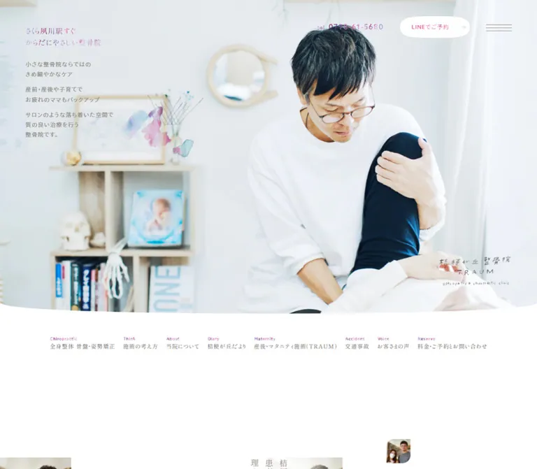
明るい施術写真と広い余白を軸に、繊細な明朝体、温かなグレー、水彩装飾、ピンクから紫のグラデーションを組み合わせた整骨院サイト。
オリジナルサイトを見る桔梗が丘整骨院 TRAUM — Style Reference
A neighborhood clinic expressed through daylight photography, quiet typography, and small watercolor gestures.
Original URL: https://kikyougaoka.com/
Final URL: https://kikyougaoka.com/
Theme: light; white and pale warm surfaces with gray text and pink–violet accents.
Inspected: September 12, 2026. Supplied browser retrieval: 2026-09-12T12:17:05.686Z, or 21:17:05.686 JST.
Viewports: desktop 1440 × 1000 CSS pixels; mobile 390 × 844 CSS pixels.
Scope: the current clinic homepage, using three desktop captures, two mobile captures, rendered text, link destinations, element geometry, computed styles, and selected custom properties. The desktop images show the opening view, one feature-section state, and the footer. The first mobile image shows the opening composition; the second shows persistent controls over an otherwise almost blank viewport. Linked pages and opened interactive states were not inspected.
This is a substantial clinic website with treatment information, announcements, recommendations, fees, editorial content, access details, and reservation routes. Its homepage introduces that wider information architecture through an unusually spacious photographic presentation.
The principal visual relationship is between a bright treatment photograph and very restrained interface details. White clothing, curtains, pale wood, and soft interior light occupy most of the opening screen. Small Japanese text sits in carefully reserved areas. Warm gray replaces hard black, while pink and violet appear in letterforms, tiny English navigation labels, watercolor decorations, and occasional highlighted text strips.
The page continues through large intervals of empty space, modest Mincho headings, narrow paragraphs, and organic image masks. Contact controls remain visible across the supplied scroll states. On mobile, the composition is deliberately rearranged: the brand sits over the practitioner’s white shirt, the descriptive paragraphs move below the photograph, and LINE booking moves to the bottom-right corner.
How to Read This Reference
- Measured means a value supplied by the rendered DOM or computed-style evidence. Pixel values are CSS pixels unless otherwise stated.
- Calculated means arithmetic derived from supplied measurements, such as the gap between two element bounds.
- Estimated means a visual approximation from the current-page screenshots. Estimated hexadecimal colors were not obtained through pixel sampling.
- Recommended means an implementation choice for reuse, including the CSS below. It is not a recovered source declaration.
- Token names are descriptive aliases. The original page’s relevant custom properties are identified explicitly where available.
- DOM presence does not prove visibility. The evidence contains menu and reservation-panel content that is absent from the screenshots, as well as transformed elements with unusual bounds.
- Computed font stacks identify declared families; font files, actual fallback usage, and licensing were not independently inspected.
Tokens — Colors
Default Palette
| Name | Value | Suggested token | Evidence and role |
|---|---|---|---|
| White canvas | #FFFFFF |
--color-canvas |
Measured body background in both initial viewport snapshots; also the visible opening-page surface |
| Warm gray text | #8F8B81 |
--color-text |
Measured rgb(143, 139, 129) on body text, many headings, and utilities |
| Stronger gray | #666666 |
--color-text-strong |
Measured on navigation links, announcement titles, and selected utility links |
| Rose accent | #D866A1 |
--color-rose |
Measured rgb(216, 102, 161) on professional-role captions in the recommendation section |
| Warm blush field | Approximately #FCF8F5 |
--color-warm-surface |
Estimated from the feature-section capture; a large, almost-white warm field |
| Pale footer gray | Approximately #F8F8F8 |
--color-footer |
Estimated from the desktop footer capture |
| Hairline gray | Approximately #E4E1DD |
--color-rule |
Estimated from the reservation outline and footer separators |
| Lavender | Approximately #AE8AD6 |
--color-lavender |
Estimated from colored letterforms and small navigation overlines |
| Highlight rose | Approximately #B65390 |
--color-highlight-start |
Estimated left side of the first feature’s filled text strips |
| Highlight violet-blue | Approximately #5B69B5 |
--color-highlight-end |
Estimated right side of those strips |
| LINE green | Approximately #06C755 |
--color-line |
Estimated appearance of the small mobile LINE mark; confined to that service identity |
Accent Behavior
The opening heading, telephone number, and footer brand have multicolored letterforms. Several corresponding elements report a transparent computed text color even though their text is visible in the captures. The supplied properties do not include the complete paint mechanism, background images, or pseudo-element styles. Background clipping is a useful implementation approximation, not a verified recovery of the original technique.
The first feature uses a stronger treatment: three separate lines of white Mincho text on short rose-to-blue gradient strips. Each strip hugs its own text width. This is a heading emphasis device, not a full-width banner or a general button style.
Keep the main canvas neutral. Large gradient surfaces would change the visual balance. The saturated green mobile mark remains a recognizable booking-service cue rather than becoming the site’s overall action color.
The custom-property collection includes numerous WordPress palette presets, administrative colors, shadow presets, and a blue slider-library token. Their presence does not establish their use in the visible design. There is no evidence of a user-selectable theme system.
Tokens — Typography
Japanese Body — ryo-gothic-plusn
- Measured stack:
ryo-gothic-plusn, sans-serif. - Typical weight:
400; announcement titles use300. - Desktop body:
14.7584px, line height26.5652px, tracking1.47584px. - Mobile body:
13.5px, line height24.3px, tracking1.35px. - Relationship: body line height is
1.8; body tracking is0.1em.
The appearance is light and open, supported by deliberate line breaks and short paragraph groups. Preserve those groups instead of converting the opening introduction into a dense paragraph.
Japanese Headings and Navigation — shippori-mincho
- Measured stack:
shippori-mincho, serif. - Typical section-heading weight:
300. - Opening message weight:
500. - Navigation weight:
400. - Character: fine strokes and quiet editorial hierarchy, with headings usually around 17–23px rather than oversized display text.
Most headings inherit the body’s pixel tracking. Do not automatically apply 0.1em at every heading size: that would spread the larger text more than the measurements indicate.
The linked H1 wraps the brand presentation. Its computed font does not identify the lettering inside the visible hand-drawn logo artwork.
Latin Utilities — azo-sans-web
- Measured stack:
azo-sans-web, sans-serif. - Confirmed roles: telephone numbers, button wrappers, Romanized names, and reservation/review utilities.
- Typical weight:
400. - The tiny English labels above the desktop navigation appear delicate and tracked; their individual child styles were not supplied, so their exact size and family remain visually estimated.
Type Scale
| Role | Desktop size / line height | Mobile size / line height | Weight | Evidence |
|---|---|---|---|---|
| Body copy | 14.7584 / 26.5652px |
13.5 / 24.3px |
400 | Measured |
| Opening message | 18.9751 / 30.3602px |
16 / 25.6px |
500 | Measured |
| Major section heading | 23.1918 / 41.7452px |
18 / 32.4px |
300 | Measured on announcements and treatment introduction |
| Feature-section heading | 21.0835 / 33.7335px |
17 / 27.2px |
300 | Measured |
| Feature statement | 21.0835 / 33.7335px |
16 / 25.6px |
300 | Measured; decorated line boxes add geometry |
| Treatment title | 18.9751 / 30.3602px |
16 / 25.6px |
300 | Measured |
| Japanese opening navigation | 14.7584 / 23.6135px |
Not present in the mobile opening | 400 | Measured desktop links |
| Menu links | 15.8126 / 25.3001px |
15 / 24px |
400 | Measured DOM; menu not visually opened |
| Header telephone | 18.9751px / normal |
14px / normal |
400 | Measured; tracking 1.89751px / 1.4px |
| Button wrapper text | 13.3333px / normal |
13.3333px / normal |
400 | Measured; inner artwork may affect visible label appearance |
| Romanized professional name | 12.6501 / 18.9751px |
12 / 18px |
400 | Measured |
| Contact supporting copy | 12.6501 / 22.7701px |
11 / 19.8px |
400 | Measured in the mid-page contact block |
| English navigation overline | Approximately 10px |
Not established | Light appearance | Desktop screenshot estimate |
The HTML root reports 105.417px on desktop and 100px on mobile. These are source scaling conventions, not recommended reading sizes. The underlying responsive formula was not supplied. The Quick Start uses conventional document sizing and explicit component tokens instead of copying unknown rem expressions.
Tokens — Spacing & Shapes
Spacing Scale
There is no verified universal spacing scale. The following recurring measurements are more useful than inventing one.
| Relationship | Desktop | Mobile | Status |
|---|---|---|---|
| Opening message left inset | 67.453px |
25px |
Measured |
| Standard wide content start | 140.203px |
Usually 25px |
Measured examples |
| Narrow treatment/feature copy inset | Varies with composition | 50px |
Measured mobile examples |
| Gap between opening paragraphs | Approximately 13.7px |
13px |
Calculated from bounds |
| Desktop utility-control gap | 42.156px |
Controls distributed across screen | Calculated |
| Desktop opening-nav gap | Approximately 20.438px |
Opening row absent | Calculated |
| Announcement row padding | 31.6252px |
30px |
Measured |
| Announcement section top padding | 147.584px |
80px |
Measured |
| Feature-section vertical padding | 105.417px |
66px |
Measured |
| Review utility horizontal gap | Approximately 35.83px |
20px |
Calculated |
| Review utility vertical gap | One row | 16px |
Calculated |
| Features-to-treatment section gap | Approximately 263.53px |
130px |
Calculated from section bounds |
The broad intervals are part of the design. They give small text and photographs room to establish a calm rhythm. They should remain content-driven; the total document height is not a reusable spacing token.
Border Radius
| Element | Visible geometry | Implementation interpretation |
|---|---|---|
| Hero photograph | Full-width image with a shallow curved lower edge | Estimated curve depth: about 30px desktop and 6–8px mobile |
| Desktop reservation control | White, elongated oval with a fine outline | Recommended approximation: a large pill radius |
| First feature photograph | Tall, softly irregular rounded silhouette | Estimated mask, not a standard rounded rectangle |
| Feature number | Thin irregular circular outline | Approximately 75 × 72px in the desktop feature capture |
| Highlight strips | Small-radius rectangles sized per text line | Approximately 3px radius |
| Footer and announcement structure | Straight fine rules | No rounded-card system |
Sampled button wrappers report border-radius: 0px, despite the visible oval reservation outline. The visible contour therefore cannot be reconstructed from that wrapper property alone. It may belong to another rendered layer; that layer was not included in the evidence.
Layout Measurements
| Element | Desktop 1440 × 1000 |
Mobile 390 × 844 |
Evidence |
|---|---|---|---|
| Hero section/image region | 1440 × 841.219px |
390 × 550px |
Measured section bounds; mobile text extends below this region |
| Opening message box | 233.359px wide at 67.453, 67.453 |
213.578px wide at 25, 468 |
Measured |
| First introductory paragraph | Starts at y=157.656px |
Starts at y=580.188px |
Measured |
| Brand H1 box | 192.906 × 81.156px at 1179.641, 669.391 |
120 × 77px at 135, 236.5 |
Measured |
| Header utility region | 505.922 × 62.016px at 866.625, 42.156 |
340 × 30px at 25, 18 |
Measured |
| Header telephone box | 175.031 × 24px |
132.063 × 18px |
Measured |
| Reservation control | 186.578 × 62.016px |
78.938 × 31px at 286.063, 788 |
Measured |
| Menu button box | 60 × 40px |
60 × 30px |
Measured |
| Wide content container | 1159.578px |
Common utility width 340px |
Measured examples |
| Feature paragraph | 274.078px |
290px |
Measured |
| First feature photograph | Approximately 351 × 527px |
Not visually established | Desktop screenshot estimate |
| Review utility tile | Approximately 263 × 105.406px |
160 × 100px |
Measured |
| Standard secondary button | 186.578 × 62.016px |
130 × 49px |
Measured |
Components
Persistent Contact Header
Role: keep telephone access, reservations, and navigation close at hand throughout a long page.
Desktop presents three objects at the upper right: a tracked telephone number, the white LINEでご予約 oval, and a three-line menu icon. The group begins about 867px from the left and retains about 67px of right clearance. The header has no visible full-width background strip in the opening capture.
The same controls occupy the same upper-right area in the desktop feature and footer captures, supporting a persistent-position interpretation. The exact positioning declaration was not supplied.
The telephone has colored letterforms and a smaller tel prefix. The reservation control pairs pink text with a faint right arrow. The menu uses three exceptionally thin, approximately 60px-wide horizontal lines rather than a compact square icon.
On mobile, the phone sits at the upper left and the menu at the upper right. The LINE control becomes a separate bottom-right element with a two-line caption and green speech-bubble mark. Its measured right and bottom clearances are both 25px.
Photographic Hero and Introduction
Role: introduce the clinic through a real treatment scene and a concise statement of care.
The desktop photograph fills the width and approximately 84% of the inspected viewport height. The practitioner and patient occupy the center-right, leaving a pale interior area on the left for text. The visible room includes light shelving, books, anatomical objects, framed artwork, and a circular mirror. These details make the photograph feel specific to the clinic.
The message さくら夙川駅すぐ / からだにやさしい整骨院 sits near the upper-left corner in lightly colored Mincho text. Below it are three short paragraph groups. The text is small relative to the photograph and does not compete with the treatment gesture.
The brand lockup sits near the photograph’s lower-right corner on desktop. On mobile, its linked H1 box moves to the center of the photograph, over the practitioner’s white shirt. It is an independent page element, not evidence that the logo is printed on the photographed clothing.
Mobile uses a much tighter portrait crop. The opening message moves close to the bottom of the image, while the three descriptive paragraphs sit on white below it. Preserve the person’s face, hands, and patient relationship when adjusting this crop.
Bilingual Navigation Row
Role: expose the site’s main information categories without adding heavy header chrome.
Eight text links form a single desktop row below the photograph. Each has a tiny colored English overline above a larger gray Japanese label. The observed order is Chiropractic, Maternity, Think, About, Voice, Diary, Accident, and Reserve.
The row begins around x=140px, with link boxes starting around y=894px. Content width varies naturally with the Japanese labels. There are no visible card backgrounds or vertical separators.
The same eight-category structure returns in the footer. The opening row is absent from the supplied mobile opening and mobile link sequence at that location. Do not compress all eight items into a miniature phone-width row.
Announcement List
Role: communicate current operational notices.
Desktop DOM geometry shows a two-column composition: a heading region approximately 421.656px wide and a notice list approximately 737.922px wide. Four dated links are present. Each desktop item is a flex row with approximately 31.625px padding, a compact date, and a longer announcement title.
Mobile changes each item to block layout, putting the date above the title. Measured row heights vary from approximately 106px to 127px as titles wrap. The section begins below the opening copy; its heading lies beyond the first mobile viewport.
These structures and dimensions are measured, but the supplied screenshots do not show a complete announcement list. Its full visual decoration should not be invented from the bounds alone.
Professional Recommendation Display
Role: introduce endorsements and a route to more detail.
The DOM contains six distinct professional profiles, repeated in the document structure. Each combines a professional-role caption, a recommendation statement, and a Romanized name. Professional-role text uses the measured rose #D866A1; names use Azo Sans at approximately 12–13px.
Element bounds show a full-size central item with progressively scaled neighboring items. Repeated records, offscreen positions, and autochange-related variables suggest a looping presentation. The supplied evidence does not establish its navigation controls, gesture support, exact movement path, or verified autoplay behavior.
A More control links to the recommendation anchor on the About page. The professional recommendations are publisher-provided content, not independently verified clinical findings.
Editorial Explanation and Interview Entry
Role: explain the clinic’s approach and introduce patient interviews.
The rendered content alternates modest Mincho headings with widely spaced paragraph groups. One introductory heading has an unusually narrow, tall box consistent with a vertical editorial arrangement; its exact writing-mode declaration was not supplied.
Later text explicitly tells visitors that a PLAY button opens interview videos. This establishes the intended entry point, but no playback interaction, player chrome, sound behavior, or modal state was captured.
For reuse, preserve the quiet copy scale and generous section intervals. A working video experience requires separate implementation and verification.
Clinic Details and Review/Reservation Utilities
Role: reconnect the long narrative to practical contact information.
The mid-page content repeats the clinic name, address, telephone number, booking explanation, and Instagram link. Four utility links follow: a coupon service, LINE booking, a review destination, and a directory service.
Measured desktop utility boxes form four columns, each approximately 263 × 105px. Mobile uses a clear two-by-two arrangement of 160 × 100px boxes with 20px horizontal and 16px vertical gaps.
Only the geometry and linked content are established for these tiles; their complete image and border treatments are not visible in the supplied captures. Retain distinct destination labels rather than treating every link as an identical reservation action.
Three-Feature Section
Role: present three differentiators in a spacious photographic sequence.
The desktop screenshot shows the first feature against a warm, almost-white field. A centered section heading sits above an approximately 351 × 527px portrait image. The image has a softly irregular outline. A thin outlined 01 badge overlaps its upper-left area.
The first text group sits well to the left of the photograph, around x=158px, and lower than the image’s top. Its three-line statement uses short gradient strips with white Mincho text. The paragraph beneath is only about 274px wide. A loose watercolor-and-pencil ornament appears below the text area. Much of the right side remains empty.
All three feature statements occur in the DOM. Desktop text positions alternate between the left and right sides, while mobile text groups generally use a 50px inset and 290px paragraph width. The feature section’s measured height is approximately 3616px desktop and 2004px mobile.
Those dimensions and the captured composition indicate a long, staged section. They do not prove sticky pinning, scroll scrubbing, parallax, or any particular sequencing algorithm. Reproduce the visible relationships before adding such behavior.
Treatment Pair
Role: lead into general treatment and maternity-specific information.
Desktop contains two linked treatment panels, each 720px wide, spanning the full viewport together. Their measured link regions are approximately 548px high. The maternity panel begins about 84px lower than the general-treatment panel, creating an intentional stagger.
Each treatment is accompanied by a Mincho title, descriptive body copy, and an English secondary button. Mobile stacks the panels at full width. Copy uses 50px side insets, and secondary buttons measure 130 × 49px.
The maternity image/title link points to the homepage hash, while its separate Maternity button points to /maternity/. This is a measured destination inconsistency, not a verified interaction outcome. A reused component should give both intended entry points a deliberate destination.
Fees, Blog, and Customer Voice
Role: provide decision-making details and ongoing editorial material near the end of the homepage.
The rendered fee section includes treatment descriptions, durations, tax-inclusive amounts, an introductory plan, and supporting notes. Mobile price paragraphs use Mincho at 15px / 27px. The fee section expands from approximately 834px desktop to 1560px mobile, consistent with increased wrapping and vertical arrangement.
The blog contains five linked entries with timestamps and titles; the first is older than several following entries. Do not assume a purely reverse-chronological feed. A customer-voice introduction and link follow.
These sections are represented by text and partial computed geometry, not full supplied screenshots. Their exact row decoration, image ratios, and desktop pricing alignment remain unverified. Prices and promotional limits are time-sensitive content rather than reusable design tokens.
Footer
Role: finish with navigation, clinic identity, access information, and opening hours.
The desktop footer uses a very pale gray field and an approximately 1160px centered content region. The bilingual navigation comes first, followed by a fine horizontal rule.
Below the rule, clinic details occupy the left column and the hours table occupies the right. The brand uses delicate pink–violet letterforms with a small Latin subtitle. Address lines, telephone, and booking guidance have generous vertical separation.
The hours table uses restrained rules and simple weekday symbols. Short exceptions sit beneath Tuesday, Thursday, and Saturday entries. Below the table are final-acceptance and holiday notes. A second wide rule separates the main information from Instagram at the lower left and a small tracked copyright line at the lower right.
The mobile DOM retains the same information and introduces additional line breaks in time annotations. No complete mobile footer is visible, so its final column arrangement is not established by screenshots.
Menu and Reservation Panel — DOM Evidence Only
The menu’s desktop DOM arranges major groups at approximately four horizontal starting positions. Mobile places utility links vertically, then uses category labels at x=25px and associated sublinks starting at x=161px. A mobile-only Trouble shortcut also appears in the menu evidence.
The reservation-related DOM contains a pre-booking heading, explanatory copy, a list, and a Close control. Desktop text refers to adding a LINE friend by code. Mobile includes a Reserve link to a LINE add-friend URL.
These records establish content and candidate structure. They do not establish an opened menu or dialog’s background, entrance animation, focus behavior, dismissal rules, or QR artwork. The visible LINE trigger uses javascript:void(0);; activation was not exercised.
Tokens — Motion & Interaction
| Treatment | Supplied value or evidence | What can be concluded |
|---|---|---|
| Body background transition | background-color 0.4s cubic-bezier(0.65, 0, 0.35, 1) |
A background-color transition is defined; its trigger was not established |
| General link opacity | opacity 0.5s cubic-bezier(0.65, 0, 0.35, 1) |
Opacity feedback is available; the target opacity and exercised hover state are unknown |
| Navigation color | color 0.1s cubic-bezier(0.65, 0, 0.35, 1) |
A short color transition is defined |
| Hero brand | Transform and opacity, 3s, same easing |
A slow brand transition is defined; travel distance and trigger are not supplied |
| Active recommendation captions | Transform and opacity, 1s, with 0.8s delay |
Delayed caption transitions appear in computed styles |
| Autochange custom properties | Source --autochange-duration: 1500ms; --autochange-delay: 1500ms |
Exact variables exist; their application and effective cycle length are unverified |
| Persistent utilities | Stable screen placement across captures | Supports a persistent-position implementation |
| Telephone link | tel:0798-61-5680 |
Telephone destination is established; no call was initiated |
| Video entry | Rendered PLAY instruction | Intended video activation is described; playback was not tested |
| Menu and LINE booking | Visible triggers plus additional DOM content | Open states and event behavior are unverified |
Most sampled elements report animation: none. That does not rule out CSS transitions, script-driven transforms, or motion on unsampled descendants.
The supplied capture process waited for document readiness, image decoding, and sampled layout/text stability, with bounded time limits. It also paused perpetual animations during readiness checks and resumed them afterward. This supports inspection of settled frames but does not provide a motion recording or prove every delayed element appeared.
For reuse, favor slow, understated opacity and position changes around imagery. Keep essential text visible before enhancement. Avoid inferring spring motion, continuous parallax, or a fixed autoplay cadence from isolated transformed bounds.
Surfaces
| Layer | Appearance | Role |
|---|---|---|
| Main canvas | White | Supports photography and long intervals of negative space |
| Hero | Bright full-bleed photograph, shallow curved lower edge | Primary visual identity |
| Feature field | Almost-white warm blush | Creates a subtle tonal pause around the portrait composition |
| Footer | Very pale gray | Separates practical information without a dark closing block |
| Reservation control | White oval, fine neutral outline, pink label | Visible utility without heavy visual weight |
| Feature heading strips | Rose-to-violet-blue fill, white text | Local emphasis within a sparse composition |
| Dividers | Thin neutral rules | Organize footer and information regions |
| Decorative layer | Translucent watercolor marks and loose gray linework | Adds handmade softness |
The visible surfaces do not establish a shadow-based elevation system. Depth comes primarily from photography, tonal changes, image masks, and overlap. The warm feature field could be a section surface or a page background state; the supplied initial computed styles do not resolve that distinction.
Imagery
Use high-key, natural-light photography of the actual practitioner, patient interaction, and clinic interior. Preserve believable skin tones and the detail of hands and posture. The pale room is part of the composition, providing visual space for text and continuity with the white canvas.
The opening photograph should feel observational rather than posed as a generic medical advertisement. The feature portrait shows the practitioner explaining an anatomical model to another person, extending the sense of conversation and individual attention.
Supporting ornament is small and irregular: diluted pink and lavender paint, a trace of blue, and loose pencil-like loops. Keep substantial empty space around these marks. They function as occasional gestures, not a repeating background texture.
The brand lockup combines small Japanese lettering, widely spaced TRAUM, and a fine Latin subtitle. Preserve authorized artwork where available. A normal font substitution cannot reliably reproduce its drawn letterforms.
Observed Asset References
The supplied evidence contains no source paths or image URLs for the visual assets below. These are identifiable visual requirements, not a downloadable asset manifest.
| Asset | Current-page evidence | Reuse guidance |
|---|---|---|
| Main treatment photograph | Desktop and mobile opening captures | Provide responsive crops that retain face, hands, and patient context |
| Explanation portrait | First desktop feature state | Use a tall organic mask; avoid cutting off the explanatory gesture |
| Clinic brand lockup | Desktop lower-right and mobile centered H1 presentation | Use a separate accessible brand element, not flattened hero text |
| Watercolor/line ornament | Opening and feature imagery | Keep transparent edges and irregular shape |
| LINE mark | Mobile bottom-right booking control | Use an appropriate authorized service asset |
| Instagram mark | Desktop footer | Keep its small service-identity role |
Image formats, native dimensions, source-set definitions, compression settings, and alternative text were not supplied. No particular asset filename or CDN path is established.
Layout & Responsive Behavior
Desktop
The opening combines a full-width image with two inset systems: approximately 67px for floating hero/header details and 140px for the wide content container. Small text, large photographic regions, and broad vertical gaps create the page’s rhythm.
Not every section uses the same grid. Announcements divide heading and list; recommendations use transformed items; features place narrow copy beside a central portrait; treatment panels span two half-width columns; review utilities form four columns; the footer pairs clinic details and hours.
Mobile
| Area | Observed change at 390 × 844 |
|---|---|
| Hero photograph | Becomes a 390 × 550px portrait composition |
| Brand | Moves from the lower right to a centered 120 × 77px box |
| Opening message | Moves to x=25px, near the image’s lower edge |
| Introductory paragraphs | Move below the image, beginning around y=580px |
| Telephone and menu | Spread across the top with 25px side clearances |
| LINE booking | Moves to the bottom right, separate from the top controls |
| Opening navigation | No longer appears below the hero |
| Announcements | Date and title stack vertically |
| Review utilities | Change from four columns to two columns |
| Features | Text groups use narrower vertical composition and 50px side insets |
| Treatment panels | Stack at full viewport width |
| Secondary buttons | Reduce from approximately 187 × 62px to 130 × 49px |
| Body text | Reduces modestly from 14.7584px to 13.5px |
The exact breakpoint and intermediate-width rules were not supplied. The Quick Start’s 48rem breakpoint is a recommendation. Wrapping and flexible widths are needed above it; the desktop composition should not simply be scaled down proportionally.
Capture Limitations
The second mobile image is almost entirely white apart from the persistent telephone, menu, and LINE controls. Its scroll offset and the cause of missing visible content are not supplied. It does not establish an intentionally empty section, a loading screen, or a specific rendering failure.
There is also a height discrepancy: the mobile snapshot summary reports a document height of 17548px, while its HTML and body rectangles report approximately 15511.375px. Desktop bounds are approximately 17547.531px, consistent with its rounded summary. Consequently, the final mobile scroll extent is uncertain.
Use the populated mobile opening and measured responsive element changes as evidence. Do not reproduce the blank frame or add fixed-height filler to match a disputed document total.
Do’s and Don’ts
Do
- Lead with bright, specific clinic photography and preserve the treatment gesture.
- Keep the principal text warm gray, with stronger gray for selected links and information.
- Pair light Mincho headings with airy Gothic body copy and restrained Latin utilities.
- Preserve the desktop hero’s shallow curved lower edge.
- Give the mobile photograph its own crop and move descriptive copy below it.
- Keep the brand independent from the photograph so its placement can change.
- Use gradient text and short highlight strips selectively.
- Preserve narrow feature paragraphs and the space surrounding organic portrait masks.
- Keep telephone and booking access available throughout the long page.
- Retain practical navigation, announcements, fees, and opening hours as distinct information structures.
- Treat measurements from hidden or transformed DOM elements cautiously.
Don’t
- Don’t replace the small opening message with an oversized bold headline.
- Don’t turn every section into a uniform rounded-card grid.
- Don’t fill empty areas with decorative gradients or repeated watercolor textures.
- Don’t use hospital blue or LINE green as an invented primary site palette.
- Don’t treat transparent computed text as proof that visible gradient lettering is missing.
- Don’t interpret a zero-radius button wrapper as the visible reservation contour.
- Don’t substitute a generic logo font for the drawn brand artwork and claim equivalence.
- Don’t assume a carousel’s controls, swipe support, or autoplay timing from repeated DOM items.
- Don’t copy the source’s large root font size into an unrelated application.
- Don’t reproduce the unexplained blank mobile capture as intended content.
- Don’t present the site’s rankings, treatment claims, or time-sensitive prices as independently verified facts.
Recommended Implementation Additions
These are recommendations for a new implementation, not verified features of the inspected website:
- Increase reading contrast where needed. Use the measured
#666666for essential instructions and consider a larger mobile reading size while retaining generous line height. - Give the mobile menu and LINE control at least a
44pxinteractive height. Their observed layout boxes are only30pxand31pxhigh respectively. - Provide visible keyboard focus and explicit names for icon-only controls. A telephone action should be a direct
tel:anchor. - Use one semantic interactive element per control. Do not copy the observed button-and-anchor wrapper pattern as nested interactive HTML.
- Keep gradient text readable when background clipping, custom fonts, or decorative assets are unavailable.
- Implement menu and booking panels with explicit expanded state, appropriate dialog semantics where applicable, focus management, and keyboard dismissal. Their content should remain scrollable on short screens.
- Reveal essential content by default. Add scroll-triggered enhancement only after initialization succeeds, and support reduced motion.
- Preserve complete text labels for schedule exceptions, with proper table headers and an explanation of symbols.
- Resolve the maternity panel’s homepage-hash destination deliberately; its corresponding detail page is already present in the link evidence.
- Supply intrinsic image dimensions and suitable responsive sources. Keep the opening photograph available promptly and reserve image space to reduce layout shifts.
- Test the lower mobile page and final scroll boundary explicitly because the supplied evidence does not establish their complete rendering.
Agent Prompt Guide
Quick Color Reference
- Main page: measured white
#FFFFFF. - Body text: measured warm gray
#8F8B81. - Stronger information/link text: measured
#666666. - Professional-role accent: measured rose
#D866A1. - Warm feature field: estimated
#FCF8F5. - Footer field: estimated
#F8F8F8. - Feature-strip gradient: estimated
#B65390to#5B69B5. - Fine rules: estimated
#E4E1DD. - Primary booking appearance: a white outlined oval with a pink label on desktop; a small caption and green LINE mark on mobile.
Overall Prompt
“Create a Japanese neighborhood clinic homepage inspired by the current 桔梗が丘整骨院 TRAUM presentation. Use high-key treatment photography, white and almost-white warm surfaces, warm gray body text, light Mincho headings, and small tracked Latin utilities. Keep headings modest and paragraphs narrow. Build a full-width photographic opening with a shallow curved lower edge, introductory copy at the upper left, and a small independent brand lockup at the lower right. Keep telephone, LINE booking, and a three-line menu visible. Continue with announcements, professional recommendations, airy feature compositions with organic portrait masks, treatment information, fees, editorial links, and a ruled contact-and-hours footer. On mobile, use a portrait hero crop, center the brand over the photograph, move body copy below the image, and place LINE booking at the bottom right. Treat exact gradient stops and the mobile feature-image arrangement as implementation choices rather than recovered source values.”
Example Component Prompts
- Hero: “Use a bright real-clinic treatment photograph across a 1440px desktop canvas, approximately 841px high. Reserve the pale left side for a small two-line Mincho message and three short gray paragraph groups. Place a compact brand mark at the lower right and finish the image with a shallow curved bottom edge. Recompose at 390px width with a 550px-tall photo, centered brand, and paragraphs below the image.”
- Feature composition: “On an almost-white warm field, place a tall softly irregular portrait near the center. Put a thin outlined 01 marker beside its upper-left edge. Position narrow copy well to the left, lower than the portrait’s top. Use three separate white-text gradient strips for the statement, a light gray body paragraph, and one small watercolor-and-pencil ornament below.”
- Contact controls: “Create a delicate persistent desktop utility group containing a pink–violet telephone number, a white outlined oval labeled LINEでご予約, and three 60px hairlines for the menu. On mobile, separate phone and menu across the top and move LINE booking to the bottom right. Add accessible hit areas without increasing the apparent icon weight.”
- Footer: “Use a very pale gray footer with a centered 1160px content region, bilingual text navigation, and fine horizontal rules. Pair clinic name, address, and telephone on the left with a restrained weekday-hours table on the right. Finish with a small Instagram link and widely tracked copyright line. Avoid dark fills and card shadows.”
- Responsive notices: “Build a clinic announcement list with a quiet Mincho section title, dates, and linked notice titles. On desktop, give the heading about four elevenths of the container and the list seven elevenths. Use approximately 32px item padding. On mobile, stack date and title with about 30px padding and let longer titles determine row height.”
Quick Start
CSS Custom Properties
This is a recommended adaptation, not extracted source CSS. It preserves measured colors, typography, and representative geometry while approximating unmeasured gradients and contours. It keeps conventional document font sizing.
Expected component anatomy:
.clinic-herocontains.hero-mediawith an image, an independent.hero-brand, and.hero-introcontaining a heading and.hero-copy..clinic-headercontains.phone-link,.line-reserve, and.menu-toggle. The booking control contains.line-captionand an authorized.line-markasset..feature-rowcontains.feature-copyand.feature-media; the image wrapper contains.feature-index..site-navlinks contain a small.nav-enoverline and a Japanese label.
Load the named font families only when available and appropriately licensed. No source image files are bundled or implied. Mobile feature-image sizing, footer stacking, hover opacity, and the breakpoint below are recommendations.
:root {
  /* Measured colors */
  --color-canvas: #ffffff;
  --color-text: #8f8b81;
  --color-text-strong: #666666;
  --color-rose: #d866a1;

  /* Screenshot estimates */
  --color-warm-surface: #fcf8f5;
  --color-footer: #f8f8f8;
  --color-rule: #e4e1dd;
  --color-lavender: #ae8ad6;
  --color-highlight-start: #b65390;
  --color-highlight-end: #5b69b5;
  --gradient-text: linear-gradient(
    100deg, #ae8ad6, #b65390 58%, #d866a1
  );
  --gradient-highlight: linear-gradient(
    100deg, var(--color-highlight-start), var(--color-highlight-end)
  );

  /* Measured family declarations; fallbacks are retained */
  --font-body: 'ryo-gothic-plusn', sans-serif;
  --font-heading: 'shippori-mincho', serif;
  --font-latin: 'azo-sans-web', sans-serif;

  /* Recommended interpolation between inspected sizes */
  --text-body: clamp(13.5px, 1.025vw, 14.7584px);
  --text-heading: clamp(18px, 1.611vw, 23.1918px);
  --text-feature: clamp(17px, 1.464vw, 21.0835px);
  --tracking-copy: clamp(1.35px, 0.1025vw, 1.47584px);
  --leading-body: 1.8;

  /* Representative measured desktop geometry */
  --content-width: 1159.578px;
  --hero-inset: 4.68425%;
  --hero-height: min(58.418vw, 900px);
  --button-width: 186.578px;
  --button-height: 62.016px;
  --rule-width: 1px;

  /* Measured transition values */
  --ease-clinic: cubic-bezier(0.65, 0, 0.35, 1);
  --motion-link: 500ms var(--ease-clinic);
  --motion-color: 100ms var(--ease-clinic);
  --motion-background: 400ms var(--ease-clinic);
  --motion-brand: 3s var(--ease-clinic);
}

* {
  box-sizing: border-box;
}

.clinic-page {
  margin: 0;
  color: var(--color-text);
  background: var(--color-canvas);
  font-family: var(--font-body);
  font-size: var(--text-body);
  font-weight: 400;
  line-height: var(--leading-body);
  letter-spacing: var(--tracking-copy);
  transition: background-color var(--motion-background);
}

.clinic-page img {
  display: block;
  max-width: 100%;
}

.clinic-page a {
  color: inherit;
}

.clinic-container {
  width: min(var(--content-width), calc(100% - 50px));
  margin-inline: auto;
}

.section-title {
  margin: 0;
  font-family: var(--font-heading);
  font-size: var(--text-heading);
  font-weight: 300;
  line-height: 1.8;
}

/* Solid color remains available without clipping support. */
.gradient-text {
  color: var(--color-rose);
}

@supports ((background-clip: text) or (-webkit-background-clip: text)) {
  .gradient-text {
    background: var(--gradient-text);
    background-clip: text;
    -webkit-background-clip: text;
    color: transparent;
  }
}

.clinic-header {
  position: fixed;
  z-index: 20;
  top: 42.156px;
  right: var(--hero-inset);
  display: flex;
  align-items: center;
  gap: 42.156px;
}

.phone-link {
  flex: none;
  font-family: var(--font-latin);
  font-size: 18.9751px;
  line-height: 1.3;
  letter-spacing: 0.1em;
  text-decoration: none;
  white-space: nowrap;
}

.phone-link small {
  font-size: 0.6em;
}

.pill-link {
  display: inline-flex;
  align-items: center;
  justify-content: center;
  gap: 18px;
  min-width: var(--button-width);
  min-height: var(--button-height);
  padding: 12px 24px;
  border: var(--rule-width) solid var(--color-rule);
  border-radius: 999px;
  background: var(--color-canvas);
  color: var(--color-rose);
  font-family: var(--font-latin);
  font-size: 13.3333px;
  font-weight: 400;
  line-height: 1.4;
  letter-spacing: 0.1em;
  text-decoration: none;
  cursor: pointer;
  transition: opacity var(--motion-link);
}

.pill-link::after {
  content: '→';
  color: var(--color-text);
}

.line-mark {
  display: none;
}

.menu-toggle {
  display: grid;
  place-items: center;
  flex: none;
  width: 60px;
  min-height: 44px;
  padding: 0;
  border: 0;
  color: var(--color-text);
  background: transparent;
  cursor: pointer;
}

.menu-toggle > span {
  width: 60px;
  height: 1px;
  background: currentColor;
  box-shadow: 0 -7px currentColor, 0 7px currentColor;
}

.clinic-hero {
  position: relative;
  height: var(--hero-height);
}

.hero-media {
  position: absolute;
  inset: 0;
  overflow: hidden;
  border-radius: 0 0 50% 50% / 0 0 30px 30px;
}

.hero-media img {
  width: 100%;
  height: 100%;
  object-fit: cover;
  object-position: center;
}

.hero-brand {
  position: absolute;
  right: var(--hero-inset);
  bottom: 90.672px;
  width: 192.906px;
  margin: 0;
  transition:
    transform var(--motion-brand),
    opacity var(--motion-brand);
}

.hero-brand img {
  width: 100%;
  height: auto;
}

.hero-intro {
  position: absolute;
  top: 67.453px;
  left: var(--hero-inset);
  width: 233.359px;
}

.hero-intro h2 {
  margin: 0 0 29.516px;
  font-family: var(--font-heading);
  font-size: 18.9751px;
  font-weight: 500;
  line-height: 1.6;
}

.hero-copy p {
  margin: 0;
}

.hero-copy p + p {
  margin-top: 13.7px;
}

.site-nav {
  display: flex;
  flex-wrap: wrap;
  gap: 20.438px;
}

.site-nav--hero {
  margin-top: 52.703px;
}

.site-nav a {
  min-height: 47.25px;
  color: var(--color-text-strong);
  font-family: var(--font-heading);
  font-size: 14.7584px;
  line-height: 1.6;
  text-decoration: none;
  transition: color var(--motion-color);
}

.nav-en {
  display: block;
  color: var(--color-lavender);
  font-family: var(--font-latin);
  font-size: 10px;
  line-height: 1.6;
  letter-spacing: 0.1em;
}

.news-section {
  padding-top: 147.584px;
}

.news-grid {
  display: grid;
  grid-template-columns: minmax(0, 4fr) minmax(0, 7fr);
}

.news-row {
  display: grid;
  grid-template-columns: 86.234px minmax(0, 1fr);
  gap: 42.156px;
  padding: 31.6252px;
  border-top: 1px solid var(--color-rule);
  text-decoration: none;
  transition: opacity var(--motion-link);
}

.news-row:last-child {
  border-bottom: 1px solid var(--color-rule);
}

.news-row h3,
.news-row p {
  margin: 0;
  font-size: inherit;
}

.news-row h3 {
  color: var(--color-text-strong);
  font-weight: 300;
  line-height: 1.6;
}

.feature-section {
  padding: 105.417px 0 160px;
  background: var(--color-warm-surface);
}

.feature-section > .section-title {
  text-align: center;
  font-size: var(--text-feature);
  line-height: 1.6;
}

.feature-row {
  display: grid;
  grid-template-columns:
    minmax(0, 274px) minmax(0, 351px) minmax(0, 1fr);
  align-items: center;
  gap: clamp(24px, 7.778vw, 112px);
  width: min(1124px, calc(100% - 50px));
  margin: 44px auto 0;
}

.feature-copy {
  grid-column: 1;
  grid-row: 1;
  transform: translateY(42px);
}

.feature-copy h3 {
  margin: 0 0 19px;
  font-family: var(--font-heading);
  font-size: 21.0835px;
  font-weight: 300;
  line-height: 1.6;
}

.feature-copy p {
  margin: 0;
}

.highlight-line {
  display: table;
  margin-block: 3px;
  padding: 2px 8px;
  border-radius: 3px;
  color: #ffffff;
  background: var(--gradient-highlight);
}

.feature-media {
  position: relative;
  grid-column: 2;
  grid-row: 1;
  margin: 0;
}

.feature-media img {
  width: 100%;
  aspect-ratio: 351 / 527;
  object-fit: cover;
  border-radius: 46% 43% 44% 42% / 25% 26% 25% 27%;
}

.feature-index {
  position: absolute;
  top: 123px;
  left: -45px;
  display: grid;
  place-items: center;
  width: 75px;
  height: 72px;
  border: 1px solid #f4d6e3;
  border-radius: 50% 43% 48% 52%;
  color: var(--color-rose);
  font-family: var(--font-latin);
  font-size: 12px;
}

.review-grid {
  display: grid;
  grid-template-columns: repeat(4, minmax(0, 1fr));
  gap: 35.83px;
}

.review-tile {
  display: flex;
  align-items: center;
  min-height: 105.406px;
  padding: 21.0835px;
  text-decoration: none;
}

.treatment-grid {
  display: grid;
  grid-template-columns: repeat(2, minmax(0, 1fr));
}

.treatment-card:nth-child(2) {
  padding-top: 84.334px;
}

.clinic-footer {
  padding: 64px 0 200px;
  background: var(--color-footer);
}

.clinic-footer .site-nav {
  padding-bottom: 64px;
  border-bottom: 1px solid var(--color-rule);
}

.footer-info {
  display: grid;
  grid-template-columns: repeat(2, minmax(0, 1fr));
  gap: 24px;
  margin-top: 64px;
}

.hours-table {
  width: 100%;
  border-collapse: collapse;
  font-size: inherit;
}

.hours-table th,
.hours-table td {
  padding: 16px 6px;
  border-bottom: 1px solid var(--color-rule);
  font-weight: 400;
  text-align: center;
  vertical-align: top;
}

.hours-table th:first-child,
.hours-table td:first-child {
  padding-left: 0;
  text-align: left;
}

.hours-table small {
  display: block;
  font-size: 10px;
  letter-spacing: 0;
}

.footer-bottom {
  display: flex;
  justify-content: space-between;
  gap: 24px;
  margin-top: 60px;
  padding-top: 64px;
  border-top: 1px solid var(--color-rule);
  font-size: 11.6px;
}

.clinic-page :focus-visible {
  outline: 2px solid var(--color-text-strong);
  outline-offset: 5px;
}

@media (hover: hover) {
  .pill-link:hover,
  .news-row:hover {
    opacity: 0.78; /* Recommended target; source target is unknown. */
  }

  .site-nav a:hover {
    color: var(--color-rose);
  }
}

/* Recommended breakpoint; intermediate source rules were not supplied. */
@media (max-width: 48rem) {
  :root {
    --text-body: 13.5px;
    --text-heading: 18px;
    --text-feature: 17px;
    --tracking-copy: 1.35px;
    --button-width: 130px;
    --button-height: 49px;
  }

  .clinic-header {
    top: 11px;
    right: 25px;
    left: 25px;
    justify-content: space-between;
    gap: 20px;
  }

  .phone-link {
    display: inline-flex;
    align-items: center;
    min-height: 44px;
    font-size: 14px;
  }

  .line-reserve {
    position: fixed;
    right: 25px;
    bottom: calc(25px + env(safe-area-inset-bottom, 0px));
    gap: 8px;
    min-width: 79px;
    min-height: 44px;
    padding: 0;
    border: 0;
    border-radius: 0;
    background: transparent;
  }

  .line-reserve::after {
    display: none;
  }

  .line-caption {
    max-width: 40px;
    font-size: 11px;
    line-height: 1.4;
    text-align: center;
  }

  .line-mark {
    display: block;
    width: 33px;
    height: 33px;
    object-fit: contain;
  }

  .clinic-hero {
    height: auto;
    padding-bottom: 38px;
  }

  .hero-media {
    position: relative;
    height: 550px;
    border-radius: 0 0 50% 50% / 0 0 8px 8px;
  }

  .hero-media img {
    object-position: 60% center; /* Tune against the chosen photo. */
  }

  .hero-brand {
    top: 236.5px;
    right: auto;
    bottom: auto;
    left: 50%;
    width: 120px;
    transform: translateX(-50%);
  }

  .hero-intro {
    position: static;
    width: auto;
  }

  .hero-intro h2 {
    position: absolute;
    top: 468px;
    left: 25px;
    width: 213.578px;
    margin: 0;
    font-size: 16px;
  }

  .hero-copy {
    width: min(213.578px, calc(100% - 50px));
    margin: 30.188px 25px 0;
  }

  .hero-copy p + p {
    margin-top: 13px;
  }

  .site-nav--hero {
    display: none;
  }

  .news-section {
    padding-top: 80px;
  }

  .news-grid {
    grid-template-columns: minmax(0, 1fr);
    gap: 25px;
  }

  .news-row {
    display: block;
    padding: 30px;
  }

  .feature-section {
    padding-block: 66px;
  }

  .feature-row {
    display: flex;
    flex-direction: column;
    gap: 32px;
    width: calc(100% - 100px);
  }

  .feature-media {
    order: -1;
    width: min(220px, 100%);
  }

  .feature-index {
    top: 60px;
    left: -24px;
    width: 48px;
    height: 48px;
  }

  .feature-copy {
    width: 100%;
    transform: none;
  }

  .feature-copy h3 {
    font-size: 16px;
  }

  .review-grid {
    grid-template-columns: repeat(2, minmax(0, 1fr));
    gap: 16px 20px;
  }

  .review-tile {
    min-height: 100px;
    padding: 12px;
  }

  .treatment-grid,
  .footer-info {
    grid-template-columns: minmax(0, 1fr);
  }

  .treatment-card:nth-child(2) {
    padding-top: 0;
  }

  .clinic-footer .site-nav {
    display: grid;
    grid-template-columns: repeat(2, minmax(0, 1fr));
  }

  .footer-bottom {
    flex-direction: column;
  }
}

@media (prefers-reduced-motion: reduce) {
  .clinic-page,
  .clinic-page * {
    animation: none !important;
    transition: none !important;
    scroll-behavior: auto !important;
  }
}

@media (forced-colors: active) {
  .gradient-text {
    background: none;
    color: CanvasText;
  }
}
The CSS supplies a visual shell. It does not implement menu state, booking dialogs, interview playback, recommendation cycling, or scroll-triggered sequences. Keep the page usable without those enhancements and test each behavior separately.
Tailwind v4 Token Mapping
Optional aliases for a project already using Tailwind v4. Define the custom properties above first. This does not imply that the original site uses Tailwind.
@theme inline {
  --color-clinic-canvas: var(--color-canvas);
  --color-clinic-text: var(--color-text);
  --color-clinic-strong: var(--color-text-strong);
  --color-clinic-rose: var(--color-rose);
  --color-clinic-warm: var(--color-warm-surface);
  --color-clinic-rule: var(--color-rule);

  --font-clinic-body: var(--font-body);
  --font-clinic-heading: var(--font-heading);
  --font-clinic-latin: var(--font-latin);

  --text-clinic-body: var(--text-body);
  --text-clinic-heading: var(--text-heading);
  --text-clinic-feature: var(--text-feature);

  --spacing-clinic-gutter: 25px;
  --spacing-clinic-copy-inset: 50px;
  --radius-clinic-pill: 999px;
}
Sources & Evidence
- Inspected original and final page: https://kikyougaoka.com/. The supplied browser observation reports HTTP
200and no URL change. - Capture date: September 12, 2026; retrieval timestamp
2026-09-12T12:17:05.686Z. - Desktop evidence: three supplied
1440 × 1000captures showing the opening view, first feature composition, and footer; rendered text and sampled computed geometry across the homepage. - Mobile evidence: two supplied
390 × 844captures, one populated opening view and one nearly blank frame with persistent controls; rendered mobile text, links, and sampled computed geometry. - Computed-style evidence: body and heading font stacks, font sizes, weights, line heights, tracking, selected colors, element bounds, padding, transitions, and selected custom properties. This is a sampled record, not the complete stylesheet or a full asset inventory.
- Interaction evidence: supplied scroll-state captures, persistent control placement, link destinations, transition definitions, and DOM content associated with menu, booking, and video entry points. No menu opening, booking completion, telephone activation, video playback, or verified carousel-control operation was provided.
- Limits: image paths and font files were not supplied; several decorated layers were not sampled; transformed or hidden content complicates bounds; the second mobile frame and conflicting mobile height measurements prevent a complete lower-page visual assessment. External destinations and linked subpages were not visited for this reference.
This document describes the current homepage through the supplied original-page evidence. Estimates, responsive adaptations, accessibility improvements, and reusable CSS are explicitly distinguished from measured observations.
# 桔梗が丘整骨院 TRAUM — Style Reference

> A neighborhood clinic expressed through daylight photography, quiet typography, and small watercolor gestures.

**Original URL:** [https://kikyougaoka.com/](https://kikyougaoka.com/)
**Final URL:** [https://kikyougaoka.com/](https://kikyougaoka.com/)
**Theme:** light; white and pale warm surfaces with gray text and pink–violet accents.
**Inspected:** September 12, 2026. Supplied browser retrieval: `2026-09-12T12:17:05.686Z`, or 21:17:05.686 JST.
**Viewports:** desktop `1440 × 1000` CSS pixels; mobile `390 × 844` CSS pixels.
**Scope:** the current clinic homepage, using three desktop captures, two mobile captures, rendered text, link destinations, element geometry, computed styles, and selected custom properties. The desktop images show the opening view, one feature-section state, and the footer. The first mobile image shows the opening composition; the second shows persistent controls over an otherwise almost blank viewport. Linked pages and opened interactive states were not inspected.

This is a substantial clinic website with treatment information, announcements, recommendations, fees, editorial content, access details, and reservation routes. Its homepage introduces that wider information architecture through an unusually spacious photographic presentation.

The principal visual relationship is between a bright treatment photograph and very restrained interface details. White clothing, curtains, pale wood, and soft interior light occupy most of the opening screen. Small Japanese text sits in carefully reserved areas. Warm gray replaces hard black, while pink and violet appear in letterforms, tiny English navigation labels, watercolor decorations, and occasional highlighted text strips.

The page continues through large intervals of empty space, modest Mincho headings, narrow paragraphs, and organic image masks. Contact controls remain visible across the supplied scroll states. On mobile, the composition is deliberately rearranged: the brand sits over the practitioner’s white shirt, the descriptive paragraphs move below the photograph, and LINE booking moves to the bottom-right corner.

## How to Read This Reference

- **Measured** means a value supplied by the rendered DOM or computed-style evidence. Pixel values are CSS pixels unless otherwise stated.
- **Calculated** means arithmetic derived from supplied measurements, such as the gap between two element bounds.
- **Estimated** means a visual approximation from the current-page screenshots. Estimated hexadecimal colors were not obtained through pixel sampling.
- **Recommended** means an implementation choice for reuse, including the CSS below. It is not a recovered source declaration.
- Token names are descriptive aliases. The original page’s relevant custom properties are identified explicitly where available.
- DOM presence does not prove visibility. The evidence contains menu and reservation-panel content that is absent from the screenshots, as well as transformed elements with unusual bounds.
- Computed font stacks identify declared families; font files, actual fallback usage, and licensing were not independently inspected.

## Tokens — Colors

### Default Palette

| Name | Value | Suggested token | Evidence and role |
| --- | --- | --- | --- |
| White canvas | `#FFFFFF` | `--color-canvas` | Measured body background in both initial viewport snapshots; also the visible opening-page surface |
| Warm gray text | `#8F8B81` | `--color-text` | Measured `rgb(143, 139, 129)` on body text, many headings, and utilities |
| Stronger gray | `#666666` | `--color-text-strong` | Measured on navigation links, announcement titles, and selected utility links |
| Rose accent | `#D866A1` | `--color-rose` | Measured `rgb(216, 102, 161)` on professional-role captions in the recommendation section |
| Warm blush field | Approximately `#FCF8F5` | `--color-warm-surface` | Estimated from the feature-section capture; a large, almost-white warm field |
| Pale footer gray | Approximately `#F8F8F8` | `--color-footer` | Estimated from the desktop footer capture |
| Hairline gray | Approximately `#E4E1DD` | `--color-rule` | Estimated from the reservation outline and footer separators |
| Lavender | Approximately `#AE8AD6` | `--color-lavender` | Estimated from colored letterforms and small navigation overlines |
| Highlight rose | Approximately `#B65390` | `--color-highlight-start` | Estimated left side of the first feature’s filled text strips |
| Highlight violet-blue | Approximately `#5B69B5` | `--color-highlight-end` | Estimated right side of those strips |
| LINE green | Approximately `#06C755` | `--color-line` | Estimated appearance of the small mobile LINE mark; confined to that service identity |

### Accent Behavior

The opening heading, telephone number, and footer brand have multicolored letterforms. Several corresponding elements report a transparent computed text color even though their text is visible in the captures. The supplied properties do not include the complete paint mechanism, background images, or pseudo-element styles. Background clipping is a useful implementation approximation, not a verified recovery of the original technique.

The first feature uses a stronger treatment: three separate lines of white Mincho text on short rose-to-blue gradient strips. Each strip hugs its own text width. This is a heading emphasis device, not a full-width banner or a general button style.

Keep the main canvas neutral. Large gradient surfaces would change the visual balance. The saturated green mobile mark remains a recognizable booking-service cue rather than becoming the site’s overall action color.

The custom-property collection includes numerous WordPress palette presets, administrative colors, shadow presets, and a blue slider-library token. Their presence does not establish their use in the visible design. There is no evidence of a user-selectable theme system.

## Tokens — Typography

### Japanese Body — `ryo-gothic-plusn`

- **Measured stack:** `ryo-gothic-plusn, sans-serif`.
- **Typical weight:** `400`; announcement titles use `300`.
- **Desktop body:** `14.7584px`, line height `26.5652px`, tracking `1.47584px`.
- **Mobile body:** `13.5px`, line height `24.3px`, tracking `1.35px`.
- **Relationship:** body line height is `1.8`; body tracking is `0.1em`.

The appearance is light and open, supported by deliberate line breaks and short paragraph groups. Preserve those groups instead of converting the opening introduction into a dense paragraph.

### Japanese Headings and Navigation — `shippori-mincho`

- **Measured stack:** `shippori-mincho, serif`.
- **Typical section-heading weight:** `300`.
- **Opening message weight:** `500`.
- **Navigation weight:** `400`.
- **Character:** fine strokes and quiet editorial hierarchy, with headings usually around 17–23px rather than oversized display text.

Most headings inherit the body’s pixel tracking. Do not automatically apply `0.1em` at every heading size: that would spread the larger text more than the measurements indicate.

The linked H1 wraps the brand presentation. Its computed font does not identify the lettering inside the visible hand-drawn logo artwork.

### Latin Utilities — `azo-sans-web`

- **Measured stack:** `azo-sans-web, sans-serif`.
- **Confirmed roles:** telephone numbers, button wrappers, Romanized names, and reservation/review utilities.
- **Typical weight:** `400`.
- The tiny English labels above the desktop navigation appear delicate and tracked; their individual child styles were not supplied, so their exact size and family remain visually estimated.

### Type Scale

| Role | Desktop size / line height | Mobile size / line height | Weight | Evidence |
| --- | --- | --- | --- | --- |
| Body copy | `14.7584 / 26.5652px` | `13.5 / 24.3px` | 400 | Measured |
| Opening message | `18.9751 / 30.3602px` | `16 / 25.6px` | 500 | Measured |
| Major section heading | `23.1918 / 41.7452px` | `18 / 32.4px` | 300 | Measured on announcements and treatment introduction |
| Feature-section heading | `21.0835 / 33.7335px` | `17 / 27.2px` | 300 | Measured |
| Feature statement | `21.0835 / 33.7335px` | `16 / 25.6px` | 300 | Measured; decorated line boxes add geometry |
| Treatment title | `18.9751 / 30.3602px` | `16 / 25.6px` | 300 | Measured |
| Japanese opening navigation | `14.7584 / 23.6135px` | Not present in the mobile opening | 400 | Measured desktop links |
| Menu links | `15.8126 / 25.3001px` | `15 / 24px` | 400 | Measured DOM; menu not visually opened |
| Header telephone | `18.9751px / normal` | `14px / normal` | 400 | Measured; tracking `1.89751px` / `1.4px` |
| Button wrapper text | `13.3333px / normal` | `13.3333px / normal` | 400 | Measured; inner artwork may affect visible label appearance |
| Romanized professional name | `12.6501 / 18.9751px` | `12 / 18px` | 400 | Measured |
| Contact supporting copy | `12.6501 / 22.7701px` | `11 / 19.8px` | 400 | Measured in the mid-page contact block |
| English navigation overline | Approximately `10px` | Not established | Light appearance | Desktop screenshot estimate |

The HTML root reports `105.417px` on desktop and `100px` on mobile. These are source scaling conventions, not recommended reading sizes. The underlying responsive formula was not supplied. The Quick Start uses conventional document sizing and explicit component tokens instead of copying unknown `rem` expressions.

## Tokens — Spacing & Shapes

### Spacing Scale

There is no verified universal spacing scale. The following recurring measurements are more useful than inventing one.

| Relationship | Desktop | Mobile | Status |
| --- | --- | --- | --- |
| Opening message left inset | `67.453px` | `25px` | Measured |
| Standard wide content start | `140.203px` | Usually `25px` | Measured examples |
| Narrow treatment/feature copy inset | Varies with composition | `50px` | Measured mobile examples |
| Gap between opening paragraphs | Approximately `13.7px` | `13px` | Calculated from bounds |
| Desktop utility-control gap | `42.156px` | Controls distributed across screen | Calculated |
| Desktop opening-nav gap | Approximately `20.438px` | Opening row absent | Calculated |
| Announcement row padding | `31.6252px` | `30px` | Measured |
| Announcement section top padding | `147.584px` | `80px` | Measured |
| Feature-section vertical padding | `105.417px` | `66px` | Measured |
| Review utility horizontal gap | Approximately `35.83px` | `20px` | Calculated |
| Review utility vertical gap | One row | `16px` | Calculated |
| Features-to-treatment section gap | Approximately `263.53px` | `130px` | Calculated from section bounds |

The broad intervals are part of the design. They give small text and photographs room to establish a calm rhythm. They should remain content-driven; the total document height is not a reusable spacing token.

### Border Radius

| Element | Visible geometry | Implementation interpretation |
| --- | --- | --- |
| Hero photograph | Full-width image with a shallow curved lower edge | Estimated curve depth: about `30px` desktop and `6–8px` mobile |
| Desktop reservation control | White, elongated oval with a fine outline | Recommended approximation: a large pill radius |
| First feature photograph | Tall, softly irregular rounded silhouette | Estimated mask, not a standard rounded rectangle |
| Feature number | Thin irregular circular outline | Approximately `75 × 72px` in the desktop feature capture |
| Highlight strips | Small-radius rectangles sized per text line | Approximately `3px` radius |
| Footer and announcement structure | Straight fine rules | No rounded-card system |

Sampled button wrappers report `border-radius: 0px`, despite the visible oval reservation outline. The visible contour therefore cannot be reconstructed from that wrapper property alone. It may belong to another rendered layer; that layer was not included in the evidence.

### Layout Measurements

| Element | Desktop `1440 × 1000` | Mobile `390 × 844` | Evidence |
| --- | --- | --- | --- |
| Hero section/image region | `1440 × 841.219px` | `390 × 550px` | Measured section bounds; mobile text extends below this region |
| Opening message box | `233.359px` wide at `67.453, 67.453` | `213.578px` wide at `25, 468` | Measured |
| First introductory paragraph | Starts at `y=157.656px` | Starts at `y=580.188px` | Measured |
| Brand H1 box | `192.906 × 81.156px` at `1179.641, 669.391` | `120 × 77px` at `135, 236.5` | Measured |
| Header utility region | `505.922 × 62.016px` at `866.625, 42.156` | `340 × 30px` at `25, 18` | Measured |
| Header telephone box | `175.031 × 24px` | `132.063 × 18px` | Measured |
| Reservation control | `186.578 × 62.016px` | `78.938 × 31px` at `286.063, 788` | Measured |
| Menu button box | `60 × 40px` | `60 × 30px` | Measured |
| Wide content container | `1159.578px` | Common utility width `340px` | Measured examples |
| Feature paragraph | `274.078px` | `290px` | Measured |
| First feature photograph | Approximately `351 × 527px` | Not visually established | Desktop screenshot estimate |
| Review utility tile | Approximately `263 × 105.406px` | `160 × 100px` | Measured |
| Standard secondary button | `186.578 × 62.016px` | `130 × 49px` | Measured |

## Components

### Persistent Contact Header

**Role:** keep telephone access, reservations, and navigation close at hand throughout a long page.

Desktop presents three objects at the upper right: a tracked telephone number, the white `LINEでご予約` oval, and a three-line menu icon. The group begins about 867px from the left and retains about 67px of right clearance. The header has no visible full-width background strip in the opening capture.

The same controls occupy the same upper-right area in the desktop feature and footer captures, supporting a persistent-position interpretation. The exact positioning declaration was not supplied.

The telephone has colored letterforms and a smaller `tel` prefix. The reservation control pairs pink text with a faint right arrow. The menu uses three exceptionally thin, approximately 60px-wide horizontal lines rather than a compact square icon.

On mobile, the phone sits at the upper left and the menu at the upper right. The LINE control becomes a separate bottom-right element with a two-line caption and green speech-bubble mark. Its measured right and bottom clearances are both `25px`.

### Photographic Hero and Introduction

**Role:** introduce the clinic through a real treatment scene and a concise statement of care.

The desktop photograph fills the width and approximately 84% of the inspected viewport height. The practitioner and patient occupy the center-right, leaving a pale interior area on the left for text. The visible room includes light shelving, books, anatomical objects, framed artwork, and a circular mirror. These details make the photograph feel specific to the clinic.

The message `さくら夙川駅すぐ / からだにやさしい整骨院` sits near the upper-left corner in lightly colored Mincho text. Below it are three short paragraph groups. The text is small relative to the photograph and does not compete with the treatment gesture.

The brand lockup sits near the photograph’s lower-right corner on desktop. On mobile, its linked H1 box moves to the center of the photograph, over the practitioner’s white shirt. It is an independent page element, not evidence that the logo is printed on the photographed clothing.

Mobile uses a much tighter portrait crop. The opening message moves close to the bottom of the image, while the three descriptive paragraphs sit on white below it. Preserve the person’s face, hands, and patient relationship when adjusting this crop.

### Bilingual Navigation Row

**Role:** expose the site’s main information categories without adding heavy header chrome.

Eight text links form a single desktop row below the photograph. Each has a tiny colored English overline above a larger gray Japanese label. The observed order is Chiropractic, Maternity, Think, About, Voice, Diary, Accident, and Reserve.

The row begins around `x=140px`, with link boxes starting around `y=894px`. Content width varies naturally with the Japanese labels. There are no visible card backgrounds or vertical separators.

The same eight-category structure returns in the footer. The opening row is absent from the supplied mobile opening and mobile link sequence at that location. Do not compress all eight items into a miniature phone-width row.

### Announcement List

**Role:** communicate current operational notices.

Desktop DOM geometry shows a two-column composition: a heading region approximately `421.656px` wide and a notice list approximately `737.922px` wide. Four dated links are present. Each desktop item is a flex row with approximately `31.625px` padding, a compact date, and a longer announcement title.

Mobile changes each item to block layout, putting the date above the title. Measured row heights vary from approximately `106px` to `127px` as titles wrap. The section begins below the opening copy; its heading lies beyond the first mobile viewport.

These structures and dimensions are measured, but the supplied screenshots do not show a complete announcement list. Its full visual decoration should not be invented from the bounds alone.

### Professional Recommendation Display

**Role:** introduce endorsements and a route to more detail.

The DOM contains six distinct professional profiles, repeated in the document structure. Each combines a professional-role caption, a recommendation statement, and a Romanized name. Professional-role text uses the measured rose `#D866A1`; names use Azo Sans at approximately 12–13px.

Element bounds show a full-size central item with progressively scaled neighboring items. Repeated records, offscreen positions, and autochange-related variables suggest a looping presentation. The supplied evidence does not establish its navigation controls, gesture support, exact movement path, or verified autoplay behavior.

A `More` control links to the recommendation anchor on the About page. The professional recommendations are publisher-provided content, not independently verified clinical findings.

### Editorial Explanation and Interview Entry

**Role:** explain the clinic’s approach and introduce patient interviews.

The rendered content alternates modest Mincho headings with widely spaced paragraph groups. One introductory heading has an unusually narrow, tall box consistent with a vertical editorial arrangement; its exact writing-mode declaration was not supplied.

Later text explicitly tells visitors that a PLAY button opens interview videos. This establishes the intended entry point, but no playback interaction, player chrome, sound behavior, or modal state was captured.

For reuse, preserve the quiet copy scale and generous section intervals. A working video experience requires separate implementation and verification.

### Clinic Details and Review/Reservation Utilities

**Role:** reconnect the long narrative to practical contact information.

The mid-page content repeats the clinic name, address, telephone number, booking explanation, and Instagram link. Four utility links follow: a coupon service, LINE booking, a review destination, and a directory service.

Measured desktop utility boxes form four columns, each approximately `263 × 105px`. Mobile uses a clear two-by-two arrangement of `160 × 100px` boxes with `20px` horizontal and `16px` vertical gaps.

Only the geometry and linked content are established for these tiles; their complete image and border treatments are not visible in the supplied captures. Retain distinct destination labels rather than treating every link as an identical reservation action.

### Three-Feature Section

**Role:** present three differentiators in a spacious photographic sequence.

The desktop screenshot shows the first feature against a warm, almost-white field. A centered section heading sits above an approximately `351 × 527px` portrait image. The image has a softly irregular outline. A thin outlined `01` badge overlaps its upper-left area.

The first text group sits well to the left of the photograph, around `x=158px`, and lower than the image’s top. Its three-line statement uses short gradient strips with white Mincho text. The paragraph beneath is only about `274px` wide. A loose watercolor-and-pencil ornament appears below the text area. Much of the right side remains empty.

All three feature statements occur in the DOM. Desktop text positions alternate between the left and right sides, while mobile text groups generally use a `50px` inset and `290px` paragraph width. The feature section’s measured height is approximately `3616px` desktop and `2004px` mobile.

Those dimensions and the captured composition indicate a long, staged section. They do not prove sticky pinning, scroll scrubbing, parallax, or any particular sequencing algorithm. Reproduce the visible relationships before adding such behavior.

### Treatment Pair

**Role:** lead into general treatment and maternity-specific information.

Desktop contains two linked treatment panels, each `720px` wide, spanning the full viewport together. Their measured link regions are approximately `548px` high. The maternity panel begins about `84px` lower than the general-treatment panel, creating an intentional stagger.

Each treatment is accompanied by a Mincho title, descriptive body copy, and an English secondary button. Mobile stacks the panels at full width. Copy uses `50px` side insets, and secondary buttons measure `130 × 49px`.

The maternity image/title link points to the homepage hash, while its separate `Maternity` button points to `/maternity/`. This is a measured destination inconsistency, not a verified interaction outcome. A reused component should give both intended entry points a deliberate destination.

### Fees, Blog, and Customer Voice

**Role:** provide decision-making details and ongoing editorial material near the end of the homepage.

The rendered fee section includes treatment descriptions, durations, tax-inclusive amounts, an introductory plan, and supporting notes. Mobile price paragraphs use Mincho at `15px / 27px`. The fee section expands from approximately `834px` desktop to `1560px` mobile, consistent with increased wrapping and vertical arrangement.

The blog contains five linked entries with timestamps and titles; the first is older than several following entries. Do not assume a purely reverse-chronological feed. A customer-voice introduction and link follow.

These sections are represented by text and partial computed geometry, not full supplied screenshots. Their exact row decoration, image ratios, and desktop pricing alignment remain unverified. Prices and promotional limits are time-sensitive content rather than reusable design tokens.

### Footer

**Role:** finish with navigation, clinic identity, access information, and opening hours.

The desktop footer uses a very pale gray field and an approximately `1160px` centered content region. The bilingual navigation comes first, followed by a fine horizontal rule.

Below the rule, clinic details occupy the left column and the hours table occupies the right. The brand uses delicate pink–violet letterforms with a small Latin subtitle. Address lines, telephone, and booking guidance have generous vertical separation.

The hours table uses restrained rules and simple weekday symbols. Short exceptions sit beneath Tuesday, Thursday, and Saturday entries. Below the table are final-acceptance and holiday notes. A second wide rule separates the main information from Instagram at the lower left and a small tracked copyright line at the lower right.

The mobile DOM retains the same information and introduces additional line breaks in time annotations. No complete mobile footer is visible, so its final column arrangement is not established by screenshots.

### Menu and Reservation Panel — DOM Evidence Only

The menu’s desktop DOM arranges major groups at approximately four horizontal starting positions. Mobile places utility links vertically, then uses category labels at `x=25px` and associated sublinks starting at `x=161px`. A mobile-only `Trouble` shortcut also appears in the menu evidence.

The reservation-related DOM contains a pre-booking heading, explanatory copy, a list, and a Close control. Desktop text refers to adding a LINE friend by code. Mobile includes a `Reserve` link to a LINE add-friend URL.

These records establish content and candidate structure. They do not establish an opened menu or dialog’s background, entrance animation, focus behavior, dismissal rules, or QR artwork. The visible LINE trigger uses `javascript:void(0);`; activation was not exercised.

## Tokens — Motion & Interaction

| Treatment | Supplied value or evidence | What can be concluded |
| --- | --- | --- |
| Body background transition | `background-color 0.4s cubic-bezier(0.65, 0, 0.35, 1)` | A background-color transition is defined; its trigger was not established |
| General link opacity | `opacity 0.5s cubic-bezier(0.65, 0, 0.35, 1)` | Opacity feedback is available; the target opacity and exercised hover state are unknown |
| Navigation color | `color 0.1s cubic-bezier(0.65, 0, 0.35, 1)` | A short color transition is defined |
| Hero brand | Transform and opacity, `3s`, same easing | A slow brand transition is defined; travel distance and trigger are not supplied |
| Active recommendation captions | Transform and opacity, `1s`, with `0.8s` delay | Delayed caption transitions appear in computed styles |
| Autochange custom properties | Source `--autochange-duration: 1500ms`; `--autochange-delay: 1500ms` | Exact variables exist; their application and effective cycle length are unverified |
| Persistent utilities | Stable screen placement across captures | Supports a persistent-position implementation |
| Telephone link | `tel:0798-61-5680` | Telephone destination is established; no call was initiated |
| Video entry | Rendered PLAY instruction | Intended video activation is described; playback was not tested |
| Menu and LINE booking | Visible triggers plus additional DOM content | Open states and event behavior are unverified |

Most sampled elements report `animation: none`. That does not rule out CSS transitions, script-driven transforms, or motion on unsampled descendants.

The supplied capture process waited for document readiness, image decoding, and sampled layout/text stability, with bounded time limits. It also paused perpetual animations during readiness checks and resumed them afterward. This supports inspection of settled frames but does not provide a motion recording or prove every delayed element appeared.

For reuse, favor slow, understated opacity and position changes around imagery. Keep essential text visible before enhancement. Avoid inferring spring motion, continuous parallax, or a fixed autoplay cadence from isolated transformed bounds.

## Surfaces

| Layer | Appearance | Role |
| --- | --- | --- |
| Main canvas | White | Supports photography and long intervals of negative space |
| Hero | Bright full-bleed photograph, shallow curved lower edge | Primary visual identity |
| Feature field | Almost-white warm blush | Creates a subtle tonal pause around the portrait composition |
| Footer | Very pale gray | Separates practical information without a dark closing block |
| Reservation control | White oval, fine neutral outline, pink label | Visible utility without heavy visual weight |
| Feature heading strips | Rose-to-violet-blue fill, white text | Local emphasis within a sparse composition |
| Dividers | Thin neutral rules | Organize footer and information regions |
| Decorative layer | Translucent watercolor marks and loose gray linework | Adds handmade softness |

The visible surfaces do not establish a shadow-based elevation system. Depth comes primarily from photography, tonal changes, image masks, and overlap. The warm feature field could be a section surface or a page background state; the supplied initial computed styles do not resolve that distinction.

## Imagery

Use high-key, natural-light photography of the actual practitioner, patient interaction, and clinic interior. Preserve believable skin tones and the detail of hands and posture. The pale room is part of the composition, providing visual space for text and continuity with the white canvas.

The opening photograph should feel observational rather than posed as a generic medical advertisement. The feature portrait shows the practitioner explaining an anatomical model to another person, extending the sense of conversation and individual attention.

Supporting ornament is small and irregular: diluted pink and lavender paint, a trace of blue, and loose pencil-like loops. Keep substantial empty space around these marks. They function as occasional gestures, not a repeating background texture.

The brand lockup combines small Japanese lettering, widely spaced `TRAUM`, and a fine Latin subtitle. Preserve authorized artwork where available. A normal font substitution cannot reliably reproduce its drawn letterforms.

### Observed Asset References

The supplied evidence contains no source paths or image URLs for the visual assets below. These are identifiable visual requirements, not a downloadable asset manifest.

| Asset | Current-page evidence | Reuse guidance |
| --- | --- | --- |
| Main treatment photograph | Desktop and mobile opening captures | Provide responsive crops that retain face, hands, and patient context |
| Explanation portrait | First desktop feature state | Use a tall organic mask; avoid cutting off the explanatory gesture |
| Clinic brand lockup | Desktop lower-right and mobile centered H1 presentation | Use a separate accessible brand element, not flattened hero text |
| Watercolor/line ornament | Opening and feature imagery | Keep transparent edges and irregular shape |
| LINE mark | Mobile bottom-right booking control | Use an appropriate authorized service asset |
| Instagram mark | Desktop footer | Keep its small service-identity role |

Image formats, native dimensions, source-set definitions, compression settings, and alternative text were not supplied. No particular asset filename or CDN path is established.

## Layout & Responsive Behavior

### Desktop

The opening combines a full-width image with two inset systems: approximately `67px` for floating hero/header details and `140px` for the wide content container. Small text, large photographic regions, and broad vertical gaps create the page’s rhythm.

Not every section uses the same grid. Announcements divide heading and list; recommendations use transformed items; features place narrow copy beside a central portrait; treatment panels span two half-width columns; review utilities form four columns; the footer pairs clinic details and hours.

### Mobile

| Area | Observed change at `390 × 844` |
| --- | --- |
| Hero photograph | Becomes a `390 × 550px` portrait composition |
| Brand | Moves from the lower right to a centered `120 × 77px` box |
| Opening message | Moves to `x=25px`, near the image’s lower edge |
| Introductory paragraphs | Move below the image, beginning around `y=580px` |
| Telephone and menu | Spread across the top with `25px` side clearances |
| LINE booking | Moves to the bottom right, separate from the top controls |
| Opening navigation | No longer appears below the hero |
| Announcements | Date and title stack vertically |
| Review utilities | Change from four columns to two columns |
| Features | Text groups use narrower vertical composition and `50px` side insets |
| Treatment panels | Stack at full viewport width |
| Secondary buttons | Reduce from approximately `187 × 62px` to `130 × 49px` |
| Body text | Reduces modestly from `14.7584px` to `13.5px` |

The exact breakpoint and intermediate-width rules were not supplied. The Quick Start’s `48rem` breakpoint is a recommendation. Wrapping and flexible widths are needed above it; the desktop composition should not simply be scaled down proportionally.

### Capture Limitations

The second mobile image is almost entirely white apart from the persistent telephone, menu, and LINE controls. Its scroll offset and the cause of missing visible content are not supplied. It does not establish an intentionally empty section, a loading screen, or a specific rendering failure.

There is also a height discrepancy: the mobile snapshot summary reports a document height of `17548px`, while its HTML and body rectangles report approximately `15511.375px`. Desktop bounds are approximately `17547.531px`, consistent with its rounded summary. Consequently, the final mobile scroll extent is uncertain.

Use the populated mobile opening and measured responsive element changes as evidence. Do not reproduce the blank frame or add fixed-height filler to match a disputed document total.

## Do’s and Don’ts

### Do

- Lead with bright, specific clinic photography and preserve the treatment gesture.
- Keep the principal text warm gray, with stronger gray for selected links and information.
- Pair light Mincho headings with airy Gothic body copy and restrained Latin utilities.
- Preserve the desktop hero’s shallow curved lower edge.
- Give the mobile photograph its own crop and move descriptive copy below it.
- Keep the brand independent from the photograph so its placement can change.
- Use gradient text and short highlight strips selectively.
- Preserve narrow feature paragraphs and the space surrounding organic portrait masks.
- Keep telephone and booking access available throughout the long page.
- Retain practical navigation, announcements, fees, and opening hours as distinct information structures.
- Treat measurements from hidden or transformed DOM elements cautiously.

### Don’t

- Don’t replace the small opening message with an oversized bold headline.
- Don’t turn every section into a uniform rounded-card grid.
- Don’t fill empty areas with decorative gradients or repeated watercolor textures.
- Don’t use hospital blue or LINE green as an invented primary site palette.
- Don’t treat transparent computed text as proof that visible gradient lettering is missing.
- Don’t interpret a zero-radius button wrapper as the visible reservation contour.
- Don’t substitute a generic logo font for the drawn brand artwork and claim equivalence.
- Don’t assume a carousel’s controls, swipe support, or autoplay timing from repeated DOM items.
- Don’t copy the source’s large root font size into an unrelated application.
- Don’t reproduce the unexplained blank mobile capture as intended content.
- Don’t present the site’s rankings, treatment claims, or time-sensitive prices as independently verified facts.

## Recommended Implementation Additions

These are recommendations for a new implementation, not verified features of the inspected website:

- Increase reading contrast where needed. Use the measured `#666666` for essential instructions and consider a larger mobile reading size while retaining generous line height.
- Give the mobile menu and LINE control at least a `44px` interactive height. Their observed layout boxes are only `30px` and `31px` high respectively.
- Provide visible keyboard focus and explicit names for icon-only controls. A telephone action should be a direct `tel:` anchor.
- Use one semantic interactive element per control. Do not copy the observed button-and-anchor wrapper pattern as nested interactive HTML.
- Keep gradient text readable when background clipping, custom fonts, or decorative assets are unavailable.
- Implement menu and booking panels with explicit expanded state, appropriate dialog semantics where applicable, focus management, and keyboard dismissal. Their content should remain scrollable on short screens.
- Reveal essential content by default. Add scroll-triggered enhancement only after initialization succeeds, and support reduced motion.
- Preserve complete text labels for schedule exceptions, with proper table headers and an explanation of symbols.
- Resolve the maternity panel’s homepage-hash destination deliberately; its corresponding detail page is already present in the link evidence.
- Supply intrinsic image dimensions and suitable responsive sources. Keep the opening photograph available promptly and reserve image space to reduce layout shifts.
- Test the lower mobile page and final scroll boundary explicitly because the supplied evidence does not establish their complete rendering.

## Agent Prompt Guide

### Quick Color Reference

- Main page: measured white `#FFFFFF`.
- Body text: measured warm gray `#8F8B81`.
- Stronger information/link text: measured `#666666`.
- Professional-role accent: measured rose `#D866A1`.
- Warm feature field: estimated `#FCF8F5`.
- Footer field: estimated `#F8F8F8`.
- Feature-strip gradient: estimated `#B65390` to `#5B69B5`.
- Fine rules: estimated `#E4E1DD`.
- Primary booking appearance: a white outlined oval with a pink label on desktop; a small caption and green LINE mark on mobile.

### Overall Prompt

“Create a Japanese neighborhood clinic homepage inspired by the current 桔梗が丘整骨院 TRAUM presentation. Use high-key treatment photography, white and almost-white warm surfaces, warm gray body text, light Mincho headings, and small tracked Latin utilities. Keep headings modest and paragraphs narrow. Build a full-width photographic opening with a shallow curved lower edge, introductory copy at the upper left, and a small independent brand lockup at the lower right. Keep telephone, LINE booking, and a three-line menu visible. Continue with announcements, professional recommendations, airy feature compositions with organic portrait masks, treatment information, fees, editorial links, and a ruled contact-and-hours footer. On mobile, use a portrait hero crop, center the brand over the photograph, move body copy below the image, and place LINE booking at the bottom right. Treat exact gradient stops and the mobile feature-image arrangement as implementation choices rather than recovered source values.”

### Example Component Prompts

1. **Hero:** “Use a bright real-clinic treatment photograph across a 1440px desktop canvas, approximately 841px high. Reserve the pale left side for a small two-line Mincho message and three short gray paragraph groups. Place a compact brand mark at the lower right and finish the image with a shallow curved bottom edge. Recompose at 390px width with a 550px-tall photo, centered brand, and paragraphs below the image.”
2. **Feature composition:** “On an almost-white warm field, place a tall softly irregular portrait near the center. Put a thin outlined 01 marker beside its upper-left edge. Position narrow copy well to the left, lower than the portrait’s top. Use three separate white-text gradient strips for the statement, a light gray body paragraph, and one small watercolor-and-pencil ornament below.”
3. **Contact controls:** “Create a delicate persistent desktop utility group containing a pink–violet telephone number, a white outlined oval labeled LINEでご予約, and three 60px hairlines for the menu. On mobile, separate phone and menu across the top and move LINE booking to the bottom right. Add accessible hit areas without increasing the apparent icon weight.”
4. **Footer:** “Use a very pale gray footer with a centered 1160px content region, bilingual text navigation, and fine horizontal rules. Pair clinic name, address, and telephone on the left with a restrained weekday-hours table on the right. Finish with a small Instagram link and widely tracked copyright line. Avoid dark fills and card shadows.”
5. **Responsive notices:** “Build a clinic announcement list with a quiet Mincho section title, dates, and linked notice titles. On desktop, give the heading about four elevenths of the container and the list seven elevenths. Use approximately 32px item padding. On mobile, stack date and title with about 30px padding and let longer titles determine row height.”

## Quick Start

### CSS Custom Properties

This is a recommended adaptation, not extracted source CSS. It preserves measured colors, typography, and representative geometry while approximating unmeasured gradients and contours. It keeps conventional document font sizing.

Expected component anatomy:

- `.clinic-hero` contains `.hero-media` with an image, an independent `.hero-brand`, and `.hero-intro` containing a heading and `.hero-copy`.
- `.clinic-header` contains `.phone-link`, `.line-reserve`, and `.menu-toggle`. The booking control contains `.line-caption` and an authorized `.line-mark` asset.
- `.feature-row` contains `.feature-copy` and `.feature-media`; the image wrapper contains `.feature-index`.
- `.site-nav` links contain a small `.nav-en` overline and a Japanese label.

Load the named font families only when available and appropriately licensed. No source image files are bundled or implied. Mobile feature-image sizing, footer stacking, hover opacity, and the breakpoint below are recommendations.

```css
:root {
  /* Measured colors */
  --color-canvas: #ffffff;
  --color-text: #8f8b81;
  --color-text-strong: #666666;
  --color-rose: #d866a1;

  /* Screenshot estimates */
  --color-warm-surface: #fcf8f5;
  --color-footer: #f8f8f8;
  --color-rule: #e4e1dd;
  --color-lavender: #ae8ad6;
  --color-highlight-start: #b65390;
  --color-highlight-end: #5b69b5;
  --gradient-text: linear-gradient(
    100deg, #ae8ad6, #b65390 58%, #d866a1
  );
  --gradient-highlight: linear-gradient(
    100deg, var(--color-highlight-start), var(--color-highlight-end)
  );

  /* Measured family declarations; fallbacks are retained */
  --font-body: 'ryo-gothic-plusn', sans-serif;
  --font-heading: 'shippori-mincho', serif;
  --font-latin: 'azo-sans-web', sans-serif;

  /* Recommended interpolation between inspected sizes */
  --text-body: clamp(13.5px, 1.025vw, 14.7584px);
  --text-heading: clamp(18px, 1.611vw, 23.1918px);
  --text-feature: clamp(17px, 1.464vw, 21.0835px);
  --tracking-copy: clamp(1.35px, 0.1025vw, 1.47584px);
  --leading-body: 1.8;

  /* Representative measured desktop geometry */
  --content-width: 1159.578px;
  --hero-inset: 4.68425%;
  --hero-height: min(58.418vw, 900px);
  --button-width: 186.578px;
  --button-height: 62.016px;
  --rule-width: 1px;

  /* Measured transition values */
  --ease-clinic: cubic-bezier(0.65, 0, 0.35, 1);
  --motion-link: 500ms var(--ease-clinic);
  --motion-color: 100ms var(--ease-clinic);
  --motion-background: 400ms var(--ease-clinic);
  --motion-brand: 3s var(--ease-clinic);
}

* {
  box-sizing: border-box;
}

.clinic-page {
  margin: 0;
  color: var(--color-text);
  background: var(--color-canvas);
  font-family: var(--font-body);
  font-size: var(--text-body);
  font-weight: 400;
  line-height: var(--leading-body);
  letter-spacing: var(--tracking-copy);
  transition: background-color var(--motion-background);
}

.clinic-page img {
  display: block;
  max-width: 100%;
}

.clinic-page a {
  color: inherit;
}

.clinic-container {
  width: min(var(--content-width), calc(100% - 50px));
  margin-inline: auto;
}

.section-title {
  margin: 0;
  font-family: var(--font-heading);
  font-size: var(--text-heading);
  font-weight: 300;
  line-height: 1.8;
}

/* Solid color remains available without clipping support. */
.gradient-text {
  color: var(--color-rose);
}

@supports ((background-clip: text) or (-webkit-background-clip: text)) {
  .gradient-text {
    background: var(--gradient-text);
    background-clip: text;
    -webkit-background-clip: text;
    color: transparent;
  }
}

.clinic-header {
  position: fixed;
  z-index: 20;
  top: 42.156px;
  right: var(--hero-inset);
  display: flex;
  align-items: center;
  gap: 42.156px;
}

.phone-link {
  flex: none;
  font-family: var(--font-latin);
  font-size: 18.9751px;
  line-height: 1.3;
  letter-spacing: 0.1em;
  text-decoration: none;
  white-space: nowrap;
}

.phone-link small {
  font-size: 0.6em;
}

.pill-link {
  display: inline-flex;
  align-items: center;
  justify-content: center;
  gap: 18px;
  min-width: var(--button-width);
  min-height: var(--button-height);
  padding: 12px 24px;
  border: var(--rule-width) solid var(--color-rule);
  border-radius: 999px;
  background: var(--color-canvas);
  color: var(--color-rose);
  font-family: var(--font-latin);
  font-size: 13.3333px;
  font-weight: 400;
  line-height: 1.4;
  letter-spacing: 0.1em;
  text-decoration: none;
  cursor: pointer;
  transition: opacity var(--motion-link);
}

.pill-link::after {
  content: '→';
  color: var(--color-text);
}

.line-mark {
  display: none;
}

.menu-toggle {
  display: grid;
  place-items: center;
  flex: none;
  width: 60px;
  min-height: 44px;
  padding: 0;
  border: 0;
  color: var(--color-text);
  background: transparent;
  cursor: pointer;
}

.menu-toggle > span {
  width: 60px;
  height: 1px;
  background: currentColor;
  box-shadow: 0 -7px currentColor, 0 7px currentColor;
}

.clinic-hero {
  position: relative;
  height: var(--hero-height);
}

.hero-media {
  position: absolute;
  inset: 0;
  overflow: hidden;
  border-radius: 0 0 50% 50% / 0 0 30px 30px;
}

.hero-media img {
  width: 100%;
  height: 100%;
  object-fit: cover;
  object-position: center;
}

.hero-brand {
  position: absolute;
  right: var(--hero-inset);
  bottom: 90.672px;
  width: 192.906px;
  margin: 0;
  transition:
    transform var(--motion-brand),
    opacity var(--motion-brand);
}

.hero-brand img {
  width: 100%;
  height: auto;
}

.hero-intro {
  position: absolute;
  top: 67.453px;
  left: var(--hero-inset);
  width: 233.359px;
}

.hero-intro h2 {
  margin: 0 0 29.516px;
  font-family: var(--font-heading);
  font-size: 18.9751px;
  font-weight: 500;
  line-height: 1.6;
}

.hero-copy p {
  margin: 0;
}

.hero-copy p + p {
  margin-top: 13.7px;
}

.site-nav {
  display: flex;
  flex-wrap: wrap;
  gap: 20.438px;
}

.site-nav--hero {
  margin-top: 52.703px;
}

.site-nav a {
  min-height: 47.25px;
  color: var(--color-text-strong);
  font-family: var(--font-heading);
  font-size: 14.7584px;
  line-height: 1.6;
  text-decoration: none;
  transition: color var(--motion-color);
}

.nav-en {
  display: block;
  color: var(--color-lavender);
  font-family: var(--font-latin);
  font-size: 10px;
  line-height: 1.6;
  letter-spacing: 0.1em;
}

.news-section {
  padding-top: 147.584px;
}

.news-grid {
  display: grid;
  grid-template-columns: minmax(0, 4fr) minmax(0, 7fr);
}

.news-row {
  display: grid;
  grid-template-columns: 86.234px minmax(0, 1fr);
  gap: 42.156px;
  padding: 31.6252px;
  border-top: 1px solid var(--color-rule);
  text-decoration: none;
  transition: opacity var(--motion-link);
}

.news-row:last-child {
  border-bottom: 1px solid var(--color-rule);
}

.news-row h3,
.news-row p {
  margin: 0;
  font-size: inherit;
}

.news-row h3 {
  color: var(--color-text-strong);
  font-weight: 300;
  line-height: 1.6;
}

.feature-section {
  padding: 105.417px 0 160px;
  background: var(--color-warm-surface);
}

.feature-section > .section-title {
  text-align: center;
  font-size: var(--text-feature);
  line-height: 1.6;
}

.feature-row {
  display: grid;
  grid-template-columns:
    minmax(0, 274px) minmax(0, 351px) minmax(0, 1fr);
  align-items: center;
  gap: clamp(24px, 7.778vw, 112px);
  width: min(1124px, calc(100% - 50px));
  margin: 44px auto 0;
}

.feature-copy {
  grid-column: 1;
  grid-row: 1;
  transform: translateY(42px);
}

.feature-copy h3 {
  margin: 0 0 19px;
  font-family: var(--font-heading);
  font-size: 21.0835px;
  font-weight: 300;
  line-height: 1.6;
}

.feature-copy p {
  margin: 0;
}

.highlight-line {
  display: table;
  margin-block: 3px;
  padding: 2px 8px;
  border-radius: 3px;
  color: #ffffff;
  background: var(--gradient-highlight);
}

.feature-media {
  position: relative;
  grid-column: 2;
  grid-row: 1;
  margin: 0;
}

.feature-media img {
  width: 100%;
  aspect-ratio: 351 / 527;
  object-fit: cover;
  border-radius: 46% 43% 44% 42% / 25% 26% 25% 27%;
}

.feature-index {
  position: absolute;
  top: 123px;
  left: -45px;
  display: grid;
  place-items: center;
  width: 75px;
  height: 72px;
  border: 1px solid #f4d6e3;
  border-radius: 50% 43% 48% 52%;
  color: var(--color-rose);
  font-family: var(--font-latin);
  font-size: 12px;
}

.review-grid {
  display: grid;
  grid-template-columns: repeat(4, minmax(0, 1fr));
  gap: 35.83px;
}

.review-tile {
  display: flex;
  align-items: center;
  min-height: 105.406px;
  padding: 21.0835px;
  text-decoration: none;
}

.treatment-grid {
  display: grid;
  grid-template-columns: repeat(2, minmax(0, 1fr));
}

.treatment-card:nth-child(2) {
  padding-top: 84.334px;
}

.clinic-footer {
  padding: 64px 0 200px;
  background: var(--color-footer);
}

.clinic-footer .site-nav {
  padding-bottom: 64px;
  border-bottom: 1px solid var(--color-rule);
}

.footer-info {
  display: grid;
  grid-template-columns: repeat(2, minmax(0, 1fr));
  gap: 24px;
  margin-top: 64px;
}

.hours-table {
  width: 100%;
  border-collapse: collapse;
  font-size: inherit;
}

.hours-table th,
.hours-table td {
  padding: 16px 6px;
  border-bottom: 1px solid var(--color-rule);
  font-weight: 400;
  text-align: center;
  vertical-align: top;
}

.hours-table th:first-child,
.hours-table td:first-child {
  padding-left: 0;
  text-align: left;
}

.hours-table small {
  display: block;
  font-size: 10px;
  letter-spacing: 0;
}

.footer-bottom {
  display: flex;
  justify-content: space-between;
  gap: 24px;
  margin-top: 60px;
  padding-top: 64px;
  border-top: 1px solid var(--color-rule);
  font-size: 11.6px;
}

.clinic-page :focus-visible {
  outline: 2px solid var(--color-text-strong);
  outline-offset: 5px;
}

@media (hover: hover) {
  .pill-link:hover,
  .news-row:hover {
    opacity: 0.78; /* Recommended target; source target is unknown. */
  }

  .site-nav a:hover {
    color: var(--color-rose);
  }
}

/* Recommended breakpoint; intermediate source rules were not supplied. */
@media (max-width: 48rem) {
  :root {
    --text-body: 13.5px;
    --text-heading: 18px;
    --text-feature: 17px;
    --tracking-copy: 1.35px;
    --button-width: 130px;
    --button-height: 49px;
  }

  .clinic-header {
    top: 11px;
    right: 25px;
    left: 25px;
    justify-content: space-between;
    gap: 20px;
  }

  .phone-link {
    display: inline-flex;
    align-items: center;
    min-height: 44px;
    font-size: 14px;
  }

  .line-reserve {
    position: fixed;
    right: 25px;
    bottom: calc(25px + env(safe-area-inset-bottom, 0px));
    gap: 8px;
    min-width: 79px;
    min-height: 44px;
    padding: 0;
    border: 0;
    border-radius: 0;
    background: transparent;
  }

  .line-reserve::after {
    display: none;
  }

  .line-caption {
    max-width: 40px;
    font-size: 11px;
    line-height: 1.4;
    text-align: center;
  }

  .line-mark {
    display: block;
    width: 33px;
    height: 33px;
    object-fit: contain;
  }

  .clinic-hero {
    height: auto;
    padding-bottom: 38px;
  }

  .hero-media {
    position: relative;
    height: 550px;
    border-radius: 0 0 50% 50% / 0 0 8px 8px;
  }

  .hero-media img {
    object-position: 60% center; /* Tune against the chosen photo. */
  }

  .hero-brand {
    top: 236.5px;
    right: auto;
    bottom: auto;
    left: 50%;
    width: 120px;
    transform: translateX(-50%);
  }

  .hero-intro {
    position: static;
    width: auto;
  }

  .hero-intro h2 {
    position: absolute;
    top: 468px;
    left: 25px;
    width: 213.578px;
    margin: 0;
    font-size: 16px;
  }

  .hero-copy {
    width: min(213.578px, calc(100% - 50px));
    margin: 30.188px 25px 0;
  }

  .hero-copy p + p {
    margin-top: 13px;
  }

  .site-nav--hero {
    display: none;
  }

  .news-section {
    padding-top: 80px;
  }

  .news-grid {
    grid-template-columns: minmax(0, 1fr);
    gap: 25px;
  }

  .news-row {
    display: block;
    padding: 30px;
  }

  .feature-section {
    padding-block: 66px;
  }

  .feature-row {
    display: flex;
    flex-direction: column;
    gap: 32px;
    width: calc(100% - 100px);
  }

  .feature-media {
    order: -1;
    width: min(220px, 100%);
  }

  .feature-index {
    top: 60px;
    left: -24px;
    width: 48px;
    height: 48px;
  }

  .feature-copy {
    width: 100%;
    transform: none;
  }

  .feature-copy h3 {
    font-size: 16px;
  }

  .review-grid {
    grid-template-columns: repeat(2, minmax(0, 1fr));
    gap: 16px 20px;
  }

  .review-tile {
    min-height: 100px;
    padding: 12px;
  }

  .treatment-grid,
  .footer-info {
    grid-template-columns: minmax(0, 1fr);
  }

  .treatment-card:nth-child(2) {
    padding-top: 0;
  }

  .clinic-footer .site-nav {
    display: grid;
    grid-template-columns: repeat(2, minmax(0, 1fr));
  }

  .footer-bottom {
    flex-direction: column;
  }
}

@media (prefers-reduced-motion: reduce) {
  .clinic-page,
  .clinic-page * {
    animation: none !important;
    transition: none !important;
    scroll-behavior: auto !important;
  }
}

@media (forced-colors: active) {
  .gradient-text {
    background: none;
    color: CanvasText;
  }
}
```

The CSS supplies a visual shell. It does not implement menu state, booking dialogs, interview playback, recommendation cycling, or scroll-triggered sequences. Keep the page usable without those enhancements and test each behavior separately.

### Tailwind v4 Token Mapping

Optional aliases for a project already using Tailwind v4. Define the custom properties above first. This does not imply that the original site uses Tailwind.

```css
@theme inline {
  --color-clinic-canvas: var(--color-canvas);
  --color-clinic-text: var(--color-text);
  --color-clinic-strong: var(--color-text-strong);
  --color-clinic-rose: var(--color-rose);
  --color-clinic-warm: var(--color-warm-surface);
  --color-clinic-rule: var(--color-rule);

  --font-clinic-body: var(--font-body);
  --font-clinic-heading: var(--font-heading);
  --font-clinic-latin: var(--font-latin);

  --text-clinic-body: var(--text-body);
  --text-clinic-heading: var(--text-heading);
  --text-clinic-feature: var(--text-feature);

  --spacing-clinic-gutter: 25px;
  --spacing-clinic-copy-inset: 50px;
  --radius-clinic-pill: 999px;
}
```

## Sources & Evidence

- **Inspected original and final page:** [https://kikyougaoka.com/](https://kikyougaoka.com/). The supplied browser observation reports HTTP `200` and no URL change.
- **Capture date:** September 12, 2026; retrieval timestamp `2026-09-12T12:17:05.686Z`.
- **Desktop evidence:** three supplied `1440 × 1000` captures showing the opening view, first feature composition, and footer; rendered text and sampled computed geometry across the homepage.
- **Mobile evidence:** two supplied `390 × 844` captures, one populated opening view and one nearly blank frame with persistent controls; rendered mobile text, links, and sampled computed geometry.
- **Computed-style evidence:** body and heading font stacks, font sizes, weights, line heights, tracking, selected colors, element bounds, padding, transitions, and selected custom properties. This is a sampled record, not the complete stylesheet or a full asset inventory.
- **Interaction evidence:** supplied scroll-state captures, persistent control placement, link destinations, transition definitions, and DOM content associated with menu, booking, and video entry points. No menu opening, booking completion, telephone activation, video playback, or verified carousel-control operation was provided.
- **Limits:** image paths and font files were not supplied; several decorated layers were not sampled; transformed or hidden content complicates bounds; the second mobile frame and conflicting mobile height measurements prevent a complete lower-page visual assessment. External destinations and linked subpages were not visited for this reference.

This document describes the current homepage through the supplied original-page evidence. Estimates, responsive adaptations, accessibility improvements, and reusable CSS are explicitly distinguished from measured observations.