DESIGN REFERENCE
おまかせクルマ取引|メルカリびより
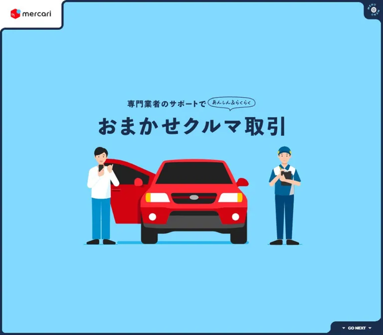
水色とネイビーの太いフレームに、赤い車と人物のイラストを組み合わせたサービス紹介ページ。極太の文字、役割別の配色、横長の取引フローで複雑な手続きを親しみやすく伝えています。
オリジナルサイトを見るMercari / Omakase Car Transactions — Style Reference
A bright automotive service guide framed in navy, with friendly illustrations and a transaction journey organized by responsibility.
Original URL: https://jp-news.mercari.com/more/car-sales/
Final URL: https://jp-news.mercari.com/more/car-sales
Page title: おまかせクルマ取引 | メルカリびより【公式サイト】
Theme: one observed palette, alternating sky blue, navy, and white sections, with colors assigned to transaction participants.
Inspected: September 13, 2026 at 03:22:16 JST; supplied retrieval timestamp: 2026-09-12T18:22:16.155Z.
Viewports: desktop 1440 × 1000 and mobile 390 × 844 CSS pixels.
Scope: supplied original-page captures of the desktop and mobile opening screen, an intermediate desktop transaction-flow state, and desktop/mobile notes and footer. Rendered DOM and computed-style evidence additionally cover the overview, three benefits, seller and purchaser content trees, seven transaction stages, product-search guidance, five Q&A pairs, and legal notes.
This is a dedicated service explainer within Mercari's official content site. Its character comes from a small number of assertive decisions: a thick navy perimeter, rounded cutouts for navigation, a large sky-blue opening field, extremely heavy Japanese typography, and a red car surrounded by approachable people. The illustration makes a complicated vehicle transaction feel understandable before the procedural content begins.
The rest of the page turns explanation into a sequence of diagrams. Oversized benefit numbers lead into role-specific service information, followed by a horizontal transaction board. Seller, specialist, and purchaser activities occupy consistent colored lanes. The final white footer returns to the broader Mercari identity through a saturated red download panel, store badges, site navigation, and legal links.
How to Read This Reference
- Measured means a value reported in the supplied rendered DOM or computed styles. Values are CSS pixels unless stated otherwise; fractional values are rounded for readability.
- Visual estimate means a dimension or appearance judged from an original-page screenshot. It is not a pixel sample or a recovered CSS declaration.
- Declared token means a custom property was supplied, but its use on a particular visible surface may be unverified.
- Recommendation means guidance for a new implementation. The Quick Start and agent prompts are adaptations, not recovered source code.
- The desktop and mobile DOM samples include content outside the viewport and both service-role content trees. Presence and geometry alone do not prove visibility or selection.
- Image-based lettering must be distinguished from ordinary text. The hero's computed
h1font size does not describe the lettering drawn inside its images. - No additional browsing, file inspection, menu activation, tab switching, or destination-page inspection was performed for this reference.
Tokens — Colors
Default Palette
| Name | Value | Token | Role and evidence |
|---|---|---|---|
| Sky Blue | #81d9ff |
Source --color-blue; alias --color-sky |
Measured hero, benefits, search, and FAQ section background; seller badges |
| Navy Ink | #1a2d4d |
Alias --color-ink |
Measured main text, service/flow section background, logo surround, and GO NEXT fill |
| White | #ffffff |
Source --color-white |
Measured reversed text, numbered flow circles, and help-link surface; visually present in flow cards and footer |
| Purchaser Coral | #ff5a5a |
Source --color-red; alias --color-purchaser |
Measured purchaser badges and purchaser fee label |
| Specialist Yellow | #ffdd4b |
Source --color-yellow-rgb: 255 221 75; alias --color-specialist |
Measured specialist badges |
| Purchaser Ink | #4d1a1a |
Source --color-dark-red |
Measured text in the purchaser content tree; selected purchaser appearance was not captured |
| Footer Text | #222222 |
Alias --color-footer-text |
Measured footer text color |
| Download Red | Approximately #ff0011 |
Recommended alias --color-download |
Visual approximation of the footer's saturated red panel; its computed fill was not supplied |
Sky blue and navy establish the page identity. Coral and yellow carry responsibility information. The download panel uses a visibly stronger red than the softer purchaser accent; these should remain separate semantic tokens.
The car illustration contains additional reds, black windows and tires, gray mechanical details, yellow lamps, and skin tones. Those are artwork colors, not a general-purpose UI palette.
Role Color System
| Participant | Source UI label | Badge treatment | Workflow lane appearance |
|---|---|---|---|
| Seller | 出品者 | Sky blue with navy text | Muted blue band across the upper activity row |
| Specialist | 専門業者 | Yellow with navy text | Muted ochre band across the middle activity row |
| Purchaser | 購入者 | Coral with white text | Muted wine-red band across the lower activity row |
The lane bands are visibly subdued compared with the badge fills. Their actual opacity or blending rules were not provided. For an adaptation, mixing each role color with navy at approximately equal proportions is a useful starting point; it is not a measured source formula.
The role name remains visible inside each activity card. Preserve this redundancy so that responsibility is conveyed by text as well as color.
Declared Supporting Colors
--color-light-pink: #ffefef and --color-light-yellow: #ffec9b are present in the supplied custom properties. Their precise visible applications are not established by the captures. Keep them available only when a component needs them; do not invent additional themed sections from these declarations.
The supplied styles also contain generic publishing-system gradients and shadow presets. Their availability is not evidence that they are used in this design.
Tokens — Typography
Japanese Content — Zen Kaku Gothic New
- Measured family:
'Zen Kaku Gothic New', sans-serif. - Declared imported weights:
400,700, and900. - Main roles: body copy, benefit headings, service descriptions, stage names, role badges, FAQ text, and notes.
- Character: broad, dense, emphatic Japanese lettering with a friendly geometric rhythm.
- Hierarchy:
900supplies most explanatory emphasis;700is common even in paragraphs. The page relies more on weight and scale than on light/regular contrasts.
The first benefit heading uses normal tracking. The second and third use tighter tracking: desktop -3.36px and -2.4px, equivalent to -0.07em and -0.05em. These are individual fitting decisions, not a reason to tighten all Japanese text.
English Labels and Numbers — Montserrat
- Measured family:
Montserrat, sans-serif. - Measured weight:
800. - Roles:
GO NEXT, benefit numerals, circular stage numbers, purchaser price, Q/A markers, andNOTES. - Character: heavy geometric numerals and compact utility lettering.
The large 01, 02, and 03 numbers work as graphic anchors. Smaller stage numbers use the same family inside white circles, tying the benefit section to the transaction diagram.
Hero and Section Lettering — Image Assets
The hero heading contains images, including the support line. Other section headings also use SVG assets. The visible title combines very heavy Japanese lettering with an outlined handwritten reassurance bubble, quoting あんしん&らくらく.
Do not infer a separate display font from that artwork. On desktop, the h1 container computes to 16px; its visible title is clearly much larger because the glyphs are rendered inside images. Preserve the asset treatment or explicitly describe a live-text replacement as an approximation.
Shared Footer — System Sans Serif
The footer changes to this measured stack:
'Yu Gothic', YuGothic, -apple-system, 'system-ui',
'Helvetica Neue', Verdana, Meiryo, 'M+ 1p', sans-serif
This transition is part of the page: the illustrated service content gives way to a quieter, conventional site footer. The handwritten メルカリびより wordmark remains a brand image.
Type Scale
Values below are computed text sizes and line heights, not estimated sizes of image lettering.
| Role | Desktop size / line height | Mobile size / line height | Weight | Notes |
|---|---|---|---|---|
| Body default | 16 / 25.6px |
14.56 / 23.30px |
400 |
Many content paragraphs override the weight |
| Overview statement | 26 / 51.48px |
16.64 / 32.95px |
900 |
Tracking 0.04em desktop, 0.02em mobile |
| Benefit number | 88 / 88px |
62.40 / 62.40px |
800 |
Montserrat; desktop tracking 0.04em |
| Benefit heading | 48 / 62.4px |
29.12 / 37.86px |
900 |
Heading-specific wrapping and tracking |
| Benefit paragraph | 18 / 28.8px |
14.56 / 23.30px |
700 |
Mobile tracking -0.02em |
| Service item title | 28 / 44.8px |
24.96 / 39.94px |
900 |
Strong relative scale on mobile |
| Service explanation | 16 / 28.8px |
13.52 / 24.34px |
700 |
Line-height ratio 1.8 |
| Service footnote | 12 / 19.2px |
11.44 / 18.30px |
700 |
Compact supporting detail |
| Fee section label | 22 / 22px |
16.64 / 16.64px |
900 |
Padding adds label height |
| Purchaser price | 60 / 60px |
37.44 / 37.44px |
800 |
Montserrat; purchaser DOM evidence |
| Usage heading | 92 / 147.2px |
41.60 / 66.56px |
900 |
Tall side-heading arrangement on desktop |
| Flow stage number | 36 / 57.6px |
28.08 / 44.93px |
800 |
Centered in a circular element |
| Flow stage title | 32 / 51.2px |
24.96 / 24.96px |
900 |
Additional vertical padding in both layouts |
| Flow role badge | 14 / 14px |
10.92 / 10.92px |
900 |
Small source label; enlarge in accessible adaptations |
| Flow description | 15 / 22.5px |
11.70 / 17.55px |
700 |
Particularly small in the mobile source |
| Search section heading | 64 / 89.6px |
34.84 / 48.78px |
900 |
Changes from narrow/tall to wide/horizontal |
| FAQ Q/A marker | 40 / 40px |
24.96 / 24.96px |
800 |
Montserrat |
| FAQ text | 20 / 28px |
13.52 / 18.93px |
900 |
Both question and answer are heavy |
| Notes heading | 63 / 63px |
37.44 / 37.44px |
900 |
Desktop tracking 0.08em |
| Navigation links | 13 / 20.8px |
10.40 / 16.64px |
900 |
Open menu was not captured |
| GO NEXT element | 16 / 25.6px |
14.56 / 23.30px |
800 |
Inner lettering may be further affected by descendants |
Root-Size Caution
The measured root font size is 10px on desktop and approximately 5.2px on mobile. The raw --font-size-base custom property changes from 16px to 28px, while the mobile body actually computes to 14.56px.
These values indicate a responsive scaling system, but the complete formulas were not supplied. The mobile root is numerically consistent with a 750-unit composition scaled to 390px; that relationship is an inference, not recovered source CSS. Components also change proportions independently, so applying one global scale would not reproduce the layout.
The Quick Start uses conventional root sizing and explicit component values.
Tokens — Spacing & Shapes
Density: expansive scenes and large section changes, with compact information inside the workflow cards.
Shape language: thick outlines, large rounded external corners, asymmetric corner tabs, circles, and rounded rectangles. Separation comes from solid color and edges rather than soft shadows.
Spacing and Geometry
| Element | Desktop | Mobile | Evidence |
|---|---|---|---|
| Main perimeter thickness | Approximately 8px |
Approximately 6px |
Visual estimate; nearby service insets measure 8px and 6.24px |
| Logo link outer box | 239 × 112px |
164.08 × 75.67px |
Measured |
| Logo surround corner | 20px lower-right |
15.6px lower-right |
Measured |
| Menu corner area | Approximately 72 × 72px |
Button 56.16 × 56.16px |
Desktop visual estimate; mobile measured |
| GO NEXT box | 197 × 52px |
153.39 × 40.55px |
Measured |
| GO NEXT corners | 20px upper-left |
15.6px both upper corners |
Measured |
| Hero top padding | 24px |
44.20px |
Measured |
| Hero section flex gap | 85px |
37.44px |
Measured layout gap; not the visible gap between artwork edges |
| Hero heading internal gap | 20px |
10.4px |
Measured |
| Benefit section padding | 75px 100px 120px |
57.20px 0 |
Measured |
| Service section inset | 46px 8px 8px |
23.92px 6.24px 6.24px |
Measured |
| Flow number circle | 60 × 60px |
46.80 × 46.80px |
Measured |
| Flow role badge | 80 × 30px |
62.39 × 23.39px |
Measured |
| Role badge corner | 12px lower-left |
9.36px lower-left |
Measured |
| Help link | 840 × 108px, radius 80px |
301.59 × 93.59px, radius 46.80px |
Measured |
| Footer padding | 80px |
41.60px |
Measured |
Workflow Geometry
The intermediate desktop screenshot makes the transaction board's anatomy especially clear:
| Part | Approximate visible measurement | Status |
|---|---|---|
| Stage outline | 428px wide and 660px high |
Visual estimate |
| Outline stroke | 8px |
Visual estimate |
| Gap between stage outlines | 20px |
Visual estimate |
| Stage-to-stage horizontal pitch | 448px |
Measured from consecutive stage-number positions |
| Activity lane | 164px high, separated by roughly 8px |
Visual estimate |
| White activity card | 372 × 144px |
Visual estimate |
| Card horizontal inset within lane | About 20px |
Visual estimate |
| Card text inset | About 24px |
Visual estimate |
| Card corner radius | About 12px |
Visual estimate |
| Description column | 324px |
Measured desktop text width |
Mobile stage-number positions advance by approximately 355.17px; description columns measure 249.63px. This confirms that the flow remains a horizontal composition in the mobile DOM, rather than becoming seven ordinary stacked cards.
Components
Viewport Frame and Corner Pockets
Role: hold the service page together as one illustrated environment.
A navy perimeter surrounds the viewport. On the opening screen, the white Mercari logo occupies a pocket at the upper left. The blue hero wraps around that pocket with rounded turns. At the upper right, a navy menu pocket interrupts the border; at the bottom, the navy next-section tab joins the perimeter.
The frame and menu corner remain visible in the supplied scrolled captures. The Mercari logo and GO NEXT tab are visible in the opening captures but absent from the supplied workflow/footer states. Their exact positioning and visibility logic were not provided.
The important geometry is the connection between surface and control. These elements appear cut into the frame, rather than floating above it. A plain rounded container with detached buttons would lose this relationship.
Mercari Identity Pocket
Role: provide recognizable brand identity and a link to Mercari.
The desktop logo asset declares 231 × 104px; its link measures 239 × 112px, allowing for the navy surround. The link destination is https://jp.mercari.com/.
The white pocket contains generous space around the logo. It is substantially wider than the menu pocket and creates an intentionally asymmetric upper edge. On mobile, it reduces to approximately 164 × 76px while retaining that asymmetry.
Menu Wheel and Section Navigation
Role: compact access to the page's main sections.
The closed control uses small circular MENU lettering around a wheel-like symbol. It sits within the navy upper-right pocket and remains visible over light and dark page sections.
Four navigation links are present in the DOM: おまかせクルマ取引, サービス内容, ご利用の流れ, and よくあるご質問, targeting #about, #service, #flow, and #faq respectively. Their initial rectangles extend beyond the right edge, consistent with navigation concealed in the closed state.
The expanded layout, opening trigger behavior, focus management, and wheel animation were not observed. Do not describe it as a verified drawer, overlay, or rotating button.
Opening Hero
Role: introduce the service through one immediately readable scene.
The hero measures exactly one captured viewport in both layouts: 1440 × 1000px and 390 × 844px. A supplied token declares --first-view-height: 100svh.
The composition has three layers: a support statement and handwritten reassurance bubble, the large service title, and a flat illustration of a red car with a customer and a uniformed specialist. The customer stands beside the open driver-side door; the specialist holds a clipboard. The figures and car share a ground line.
The desktop heading group measures 698 × 148.19px at approximately (371, 233.41). On mobile it becomes 277.16 × 201.30px at approximately (56.42, 240.48). The Japanese title changes from one broad line to two prominent lines, while the reassurance line and bubble also stack.
Visually, the combined car-and-people scene occupies roughly 820 × 372px on desktop and 365 × 197px on mobile. These are screenshot estimates. Mobile brings the people and car closer together and uses nearly the entire available width; it is not a uniform reduction of the desktop composition.
GO NEXT Tab
Role: advance from the opening scene to the service overview.
This is an anchor to #about, with navy fill and white Montserrat lettering. Desktop places it at the lower right, joined to the frame. Mobile centers it along the bottom and rounds both upper corners.
The link's measured desktop position is (1243, 948) in the 1440 × 1000 viewport. Mobile places it at approximately (118.30, 803.69). Its destination is verified; smooth scrolling, animation timing after activation, and automatic progression are not.
Service Overview
Role: summarize what the specialist handles.
The overview combines image-based heading elements with a strongly weighted paragraph. The copy explains document procedures, vehicle checks, collection, and delivery.
Desktop places the text block in the right half: 680px wide, starting at x = 700px. Mobile uses a centered block about 313.55px wide with approximately 38.22px side offsets. The paragraph expands from three desktop lines to five mobile lines while retaining a generous line-height ratio of approximately 1.98.
An SVG strip is present in the markup, but a filename containing slider is insufficient evidence of continuous movement. Its animation behavior remains unverified.
Three Benefit Scenes
Role: make the service promise concrete before presenting detailed procedure.
Each benefit combines a large blue Montserrat number, a heavy navy Japanese heading, supporting text, and associated imagery. The three themes are delegated logistics and paperwork, professional checks, and anonymous transactions.
The text blocks do not follow a uniform centered stack. Desktop block starts occur at x = 180, 660, and 380px, each with a measured 500px width. Mobile retains a deliberate left/right/left rhythm: approximately 44.20, 116.98, and 44.20px, with text widths of 228.80px.
The first mobile heading wraps to three lines. The numbers move close to the upper-right area of their text groups instead of remaining simple full-width rows. This staggered composition should survive responsive adaptation; flattening it into three identical tiles would remove much of the page's rhythm.
Detailed illustration bounds and enclosing surfaces for these scenes were not included in the supplied screenshots.
Seller / Purchaser Service Switch
Role: explain responsibilities and fees from each participant's perspective.
Two illustrated buttons are labeled 出品者 and 購入者. In the captured geometry, the seller button occupies approximately two thirds of the desktop row: 949.33px against 474.67px. Mobile uses a milder 226.52px to 151.02px split, approximately 60:40.
Both role-specific content trees are present in the DOM. The seller tree uses navy text and blue fee labels; the purchaser tree uses dark red text and coral fee labels. This establishes role-specific styling without proving that both trees were visible simultaneously.
The content anatomy is consistent: a service heading, three illustrated service explanations, a prominent fee block, and three usage steps. Desktop descriptions are arranged across three columns; their measured widths are 240px. Mobile places them sequentially in a 260px text column. Tall side-heading arrangements on desktop become headings above the content on mobile.
The captured seller content shows a 10% selling fee. The purchaser DOM includes ¥210,000(税込) with explanatory copy. These are source content values, not reusable design tokens.
Seven-Stage Transaction Board
Role: show who performs each action and when responsibility changes.
The board sits on a navy field. Each stage is a tall rounded rectangle with a thick white outline, an overlapping white numbered circle, and a centered white stage title. Three horizontal bands run through the stages in seller, specialist, and purchaser order.
White activity cards appear only where a participant has work to do. Each contains a bold action title, a compact paragraph, an optional document-help link, and a colored role badge attached to its upper-right corner. The badge's lower-left corner is rounded, connecting its geometry to the page's corner pockets.
| Stage | Source stage label | Activities represented in the supplied content |
|---|---|---|
| 1 | 取引開始 | Seller lists the vehicle; purchaser buys and sends documents |
| 2 | 輸送 | Seller books collection; specialist collects and transports the vehicle |
| 3 | 検査 | Specialist checks the vehicle |
| 4 | 確認 | Purchaser reviews the inspection result |
| 5 | 手続き | Specialist completes ownership-transfer procedures |
| 6 | 運送 | Specialist delivers; purchaser books the delivery date |
| 7 | 取引完了 | Seller evaluates; purchaser receives the vehicle and evaluates |
Empty lane cells are meaningful: they show that a participant has no listed action in that stage. Keep those spaces intact when preserving the matrix presentation.
The supplied desktop intermediate view shows stages 2, 3, and 4, with the next stage clipped at the right. A small dotted progress indicator with a wheel-like marker sits near the bottom center. Its exact input behavior and mapping to progress are unverified.
Product-Finding Guidance
Role: help visitors recognize eligible vehicles within Mercari.
Two guidance modules explain checking a product detail screen and filtering by category. Desktop places them on either side of a narrow, tall central heading. The heading's measured box is approximately 179 × 576px; the two module titles sit at the same vertical level.
Mobile changes the structure to a wide heading followed by the two modules in sequence. The heading measures approximately 313.48 × 97.56px, and the module titles are separated vertically by about 532px.
The section background is measured sky blue; guidance titles and paragraphs compute to white. An arch-shaped SVG is referenced in the DOM. The precise enclosing shape and image contents were not shown in the supplied visual captures, so these should not be reconstructed from the filename alone.
FAQ Conversation
Role: explain limitations and practical questions through a conversational layout.
Five question-and-answer pairs are present. The component uses Q/A markers in Montserrat, heavy Japanese text, and separate speech-bubble SVG details. Question text is navy; answer text is white. Question and answer groups have different horizontal positions.
On desktop, the marker and text are arranged side by side. On mobile, the marker appears above its text, and both use a roughly 203.83px text width. Mobile answer text starts slightly farther right than question text, preserving the conversational offset.
The supplied extraction contains all five answers. No toggle action was tested, so this reference does not characterize the FAQ as an accordion. Container fills and reveal behavior require further visual evidence.
Help Center Link
Role: provide a clear escalation path after the FAQ.
A large white pill with navy content follows a short support sentence. It measures 840 × 108px on desktop and 301.59 × 93.59px on mobile. Its destination is the car-service help category at https://help.jp.mercari.com/guide/categories/715/.
This is a much larger interaction target than the inline help links in the transaction cards. Preserve that distinction between contextual documentation and the general support destination.
Notes Section
Role: present service conditions and legal references in a quieter reading area.
The section uses a white surface, a large navy heading, and a list of dense but strongly weighted notes. A small Montserrat NOTES label occupies a narrow vertical area on desktop and becomes a horizontal subtitle below the heading on mobile.
Desktop note links begin around x = 390px, while the heading and English label align around x = 120px. Mobile brings the list into the main content column. Small circular arrow/play-like symbols identify linked statements in the screenshots.
The original page independently names and links the specialist service provider in this section. That is service information, not a website-production credit.
Download Panel and Shared Footer
Role: connect the service explanation to Mercari registration and the broader site.
The desktop red panel spans approximately 1280 × 185px inside the footer. It groups the app icon and copy on the left, two store badges in the middle, and a desktop registration link on the right. The badges and registration button use black surfaces with white lettering.
Mobile changes this to an approximately 306 × 272px panel. The app icon and introductory copy share the top row; the two store badges stack below. The desktop registration block is absent from both the mobile screenshot and mobile link inventory.
Below the panel, desktop shows breadcrumbs, the handwritten content-site wordmark, Service and More Mercari directory columns, social icons, legal links, and copyright. Mobile retains breadcrumbs, the wordmark, social links, wrapped legal links, and copyright while omitting the two directory columns from the supplied rendering.
The footer is visibly calmer than the service content: smaller dark-gray text, more conventional alignment, and less weight. Preserve this intentional transition.
Tokens — Motion & Interaction
Confirmed Transition Declarations
| Element | Supplied computed transition | What the evidence establishes |
|---|---|---|
| Mercari logo link | transform 0.7s cubic-bezier(0.215, 0.61, 0.355, 1) |
A transform transition is configured; its trigger and displacement are unverified |
| GO NEXT link | transform 0.7s cubic-bezier(0.215, 0.61, 0.355, 1) |
Same configured timing as the logo link |
| Seller / purchaser buttons | flex 0.5s cubic-bezier(0.215, 0.61, 0.355, 1) |
Width redistribution can transition through flex changes; no switch was exercised |
| Section navigation links | color 0.5s |
Color feedback is configured; resulting interaction colors were not captured |
| Help Center link | color 0.3s, background-color 0.3s |
Text and surface changes are configured; endpoint colors were not supplied |
The shared transform curve corresponds to the declared --ease-mercari-out. Other easing variables are available, but their presence does not establish usage.
Horizontal Flow and Scroll Evidence
The flow has a horizontal sequence in both DOM samples, and a supplied desktop capture shows a later portion of that sequence. Its section is unusually tall: approximately 4228.83px on desktop and 2428.97px on mobile. This is consistent with a staged horizontal journey that reserves substantial document space.
The evidence does not establish whether the original uses scroll-linked translation, pinning, native horizontal scrolling, dragging, or a combination. Do not assign a scroll library, animation duration, or snap formula to it.
Inspection Limits
The supplied capture process waited for document load, image decoding, sampled layout/text stability, and relevant finite animations. Initial observation lasted at least five seconds. Perpetual animations were temporarily paused during readiness checks and then resumed.
Most sampled elements report animation: none. That does not rule out animation on descendants, pseudo-elements, SVGs, or JavaScript-controlled transforms. Likewise, a bare transition: all without a nonzero duration is not evidence of visible motion.
Menu opening, purchaser selection, hover endpoints, FAQ interaction, wheel rotation, repeating strips, and reduced-motion behavior remain unverified. Any implementation of these behaviors should be documented as a new decision.
Surfaces
| Layer | Appearance | Function |
|---|---|---|
| Viewport perimeter | Thick navy edge with rounded turns | Persistent visual identity and framing |
| Opening and explanatory fields | Solid sky blue | Friendly, expansive setting for title and illustrations |
| Overview and notes | White page surface with navy content | Reading space between more graphic sections |
| Service and transaction environment | Solid navy | Strong section change and contrast for diagrams |
| Workflow lanes | Muted blue, ochre, and wine bands | Continuous responsibility alignment |
| Workflow activity cards | White rounded rectangles | Readable actions within the diagram |
| Role labels | Saturated blue, yellow, or coral | Participant identification |
| Help action | White pill on blue | Broad support destination |
| Download panel | Saturated red with white content | App and registration emphasis |
| Shared footer | White with dark-gray system text | Site-wide navigation and legal information |
There is no visible general elevation system in the supplied captures. Avoid introducing card shadows simply because generic shadow presets appear in the custom-property inventory.
Imagery
The primary visual language is clean, flat illustration. The opening car has a strong front-facing silhouette, black windows, broad red body panels, yellow lamps, and simplified gray details. The two people are recognizable through pose, clothing, and task: a customer with a phone and a uniformed specialist with a clipboard.
Use crisp edges and large color regions. There is no visible paper texture, grain, photographic treatment, or dimensional lighting in the hero. Do not pixelate SVGs or add a noisy overlay. The title's small hand-drawn bubble supplies enough irregularity against the otherwise orderly geometry.
The supporting asset vocabulary includes illustrated role buttons, decorative heading strips, arch shapes, and Q/A balloon details. These belong to the same explanatory world as the car scene. Official Mercari marks and app-store badges remain distinct branded assets.
Observed Asset References
All paths below are relative to https://jp-news.mercari.com/. Dimensions are declared image attributes, not necessarily rendered sizes. Asset directory dates do not establish a redesign or publication date.
| Asset | Observed path | Declared dimensions | Evidence-supported use |
|---|---|---|---|
| Mercari logo | wp-content/uploads/2026/03/common-logo_pc.svg |
231 × 104 |
Opening identity pocket |
| Hero support line | wp-content/uploads/2026/03/mv-mv_title_sub_01.svg |
344 × 33 |
Image-based hero heading |
| Overview strip | wp-content/uploads/2026/03/about-about_slider.svg |
861 × 72 |
Overview decoration; motion unverified |
| Overview heading | wp-content/uploads/2026/03/about-about_heading_01.svg |
538 × 56 |
Service-name heading artwork |
| Benefit side graphic | wp-content/uploads/2026/03/point-point_side.png |
36 × 4056 |
Narrow decorative asset |
| Benefit heading | wp-content/uploads/2026/03/point-point_heading.svg |
346 × 36 |
Section heading artwork |
| Seller button illustration | wp-content/uploads/2026/03/service-service_button_seller_pc.svg |
186 × 189 |
Seller role control |
| Purchaser button illustration | wp-content/uploads/2026/03/service-service_button_purchaser_pc.svg |
184 × 186 |
Purchaser role control |
| Flow heading | wp-content/uploads/2026/03/flow-flow_heading_pc.svg |
980 × 102 |
Transaction-flow heading |
| Search arch | wp-content/uploads/2026/03/search-search_arch01.svg |
176 × 168 |
Product-finding module decoration |
| FAQ heading strip | wp-content/uploads/2026/03/faq-faq_slider_pc.svg |
941 × 100 |
FAQ heading decoration; motion unverified |
| Q/A balloon details | wp-content/uploads/2026/03/faq-faq_balloon_q.svg, wp-content/uploads/2026/03/faq-faq_balloon_a.svg |
40 × 28 each |
FAQ conversation details |
| Help-link lettering | wp-content/uploads/2026/03/faq-faq_link.svg |
346 × 36 |
Help Center action artwork |
Complete paths for the car scene, main title lettering, footer wordmark, and store badges were not exposed in the supplied excerpts. Do not invent those filenames. Use suitable original assets when available, or create clearly identified replacement artwork for a new implementation.
Layout & Responsive Behavior
The page retains the same overall content order across both inspected widths. Responsive changes are substantial within sections: title artwork reflows, service columns stack, vertical headings become horizontal, and footer navigation reduces.
| Area | Desktop observation | Mobile observation |
|---|---|---|
| Opening screen | Full viewport; broad title above car scene | Full viewport; title wraps to two lines and scene uses almost all available width |
| Identity | Large upper-left logo pocket | Smaller pocket retains the asymmetric frame |
| Next-section action | Attached to lower-right edge | Centered along lower edge |
| Overview | 680px text block in right half |
Centered 313.55px text block |
| Benefits | Staggered 500px text blocks |
Staggered 228.80px text blocks; first heading gains a line |
| Role controls | Approximately 2:1 width ratio |
Approximately 3:2 width ratio |
| Service details | Three horizontal descriptions, each 240px wide |
Sequential descriptions in a 260px column |
| Usage steps | Three columns with tall side heading | Vertical sequence with heading above |
| Transaction flow | Several stages visible in a horizontal board | Horizontal sequence retained in DOM; smaller internal type |
| Product guidance | Two modules around a tall central heading | Wide heading followed by stacked modules |
| FAQ | Q/A marker beside text | Marker above text; conversational offset retained |
| Notes | Broad heading, narrow side label, indented list | Heading and English label above a compact list |
| Download panel | Identity, store badges, and registration arranged across | Identity at top; store badges stacked; registration omitted |
| Footer directories | Two link columns visible | Directory columns absent in supplied mobile rendering |
Section Heights
These are measured document-layout allocations, not recommended fixed heights.
| Section | Desktop | Mobile |
|---|---|---|
| Hero | 1000px |
844px |
| Overview | 665.66px |
804.77px |
| Benefits | 1891.84px |
2018.81px |
| Service details | 1983.56px |
3372.22px |
| Transaction flow | 4228.83px |
2428.97px |
| Product guidance | 884px |
1297.44px |
| FAQ | 2344.19px |
2316.97px |
| Notes | 635.16px |
678.63px |
| Footer | 767.78px |
641px |
| Reported document height | 14401px |
14403px |
The nearly equal total document heights conceal different allocations: mobile spends more vertical space on service descriptions and less on the transaction-flow section. Do not reproduce the total height with a fixed document dimension.
Declared breakpoint tokens include 768px, 1024px, and 1680px. The complete media-query rules were not supplied, so these values should not be treated as verified switch points for every component. Only the two stated viewports were inspected; tablet, landscape phone, browser zoom, and unusually short viewports remain untested.
Do’s and Don’ts
Do
- Preserve sky blue
#81d9ffand navy#1a2d4das the dominant pair. - Connect navigation pockets and the next-section tab to the perimeter geometry.
- Keep the red car, customer, and specialist readable as one scene.
- Treat the hero title and handwritten bubble as artwork where the source does.
- Use Zen Kaku Gothic New at heavy weights and Montserrat for numbers and English utility labels.
- Retain the left/right rhythm of benefit content at both widths.
- Keep seller, specialist, and purchaser colors consistent across badges and flow lanes.
- Preserve meaningful empty cells in the transaction diagram.
- Recompose the hero and footer for mobile rather than scaling the desktop screenshot.
- Keep legal notes and shared footer navigation visually quieter than the explanatory sections.
Don’t
- Don't replace the illustrated car scene with unrelated automotive photography.
- Don't turn every section into an identical rounded-card grid.
- Don't add glossy gradients, glass blur, or soft elevation shadows to the main design.
- Don't use the purchaser coral as a substitute for the stronger download-panel red.
- Don't recreate image lettering from the
h1container's computed font size. - Don't assume the purchaser DOM tree was the visible selected state.
- Don't remove empty workflow lanes merely to make the board denser.
- Don't force desktop side headings into narrow vertical columns on mobile.
- Don't describe an untested menu, FAQ, or scrolling mechanism as verified behavior.
- Don't copy the source's small mobile labels into a new product without checking readability and zoom behavior.
Recommended Implementation Additions
These are recommendations for a new implementation, not verified original features:
- Give the menu button a clear accessible name,
aria-expanded, and a relationship to its navigation region. Define keyboard focus behavior when implementing the open state. - Implement seller/purchaser switching with appropriate button or tab semantics. Keep inactive content out of the focus order and expose the selected role programmatically.
- Provide one meaningful page heading. If it consists of several image fragments, avoid repeated alternative text that announces the same title multiple times.
- Raise mobile workflow descriptions toward
14–16pxand expand the affected rows. The source measures11.7px; readability should take precedence over exact height matching in a new implementation. - Keep the transaction sequence available as an ordered text structure. A semantic table or linear alternative can explain responsibility when the visual matrix is difficult to navigate.
- If using horizontal navigation, provide discoverable keyboard access and a visible continuation cue. If implementing scroll-linked translation, offer an ordinary reading layout under reduced motion.
- Preserve at least a
44pxactivation area for compact controls. The source mobileGO NEXTbox measures about40.55pxhigh. - Check text/background contrast for small role badges, particularly white text on coral. The same role colors can remain decorative while text uses a more legible foreground.
- Allow text zoom to expand cards and legal notes. Avoid fixed heights that clip Japanese copy or translated content.
- Keep the fixed frame decorative and non-intercepting, and account for safe areas around navigation controls.
Agent Prompt Guide
Quick Color Reference
- Main explanatory field:
#81d9ff. - Frame, primary text, and transaction environment:
#1a2d4d. - Information cards and reversed details:
#ffffff. - Seller: blue badge with navy text.
- Specialist:
#ffdd4bbadge with navy text. - Purchaser:
#ff5a5abadge; original small labels use white text. - Purchaser content ink:
#4d1a1a. - Download panel: saturated red;
#ff0011is an implementation approximation. - Surface separation: outlines and solid fields, without an elevation system.
Overall Prompt
“Create an illustrated vehicle-service explainer using a sky-blue field #81d9ff, navy ink #1a2d4d, and a thick navy viewport frame. Integrate a white brand pocket into the upper-left corner, a compact wheel-themed menu control at the upper right, and an attached next-section tab at the bottom. Center an oversized Japanese service title above a flat red car, a customer, and a uniformed specialist. Use Zen Kaku Gothic New at weights 700 and 900, Montserrat 800 for numbers, and a small handwritten reassurance bubble. Continue with staggered benefit scenes, seller/purchaser service information, and a horizontal seven-stage board with seller, specialist, and purchaser lanes. End with white notes and a saturated red app-download panel. Recompose the hero, headings, columns, and footer for mobile. Treat unverified menu and scrolling behaviors as new implementation decisions.”
Example Component Prompts
- Hero: “Design a full-height sky-blue opening scene inside a thick navy border with rounded cutouts. Put a white Mercari identity pocket at the upper left and a navy wheel-menu pocket at the upper right. Place the title
おまかせクルマ取引above a flat red car with a customer on the left and a specialist holding a clipboard on the right. Use a two-line title and closer figure spacing on mobile.” - Benefit scene: “Combine a large blue Montserrat
01, a navy Japanese heading in weight 900, and a short bold paragraph. Use deliberate offset alignment and generous room for illustration. Alternate the next text block toward the opposite side; keep this rhythm on mobile.” - Role selector: “Create two illustrated role controls labeled
出品者and購入者. Give the emphasized role more width, using approximately 2:1 proportions on desktop and 3:2 on mobile. Associate seller content with navy and blue, purchaser content with dark red and coral. Implement accessible selection semantics.” - Transaction stage: “Build a tall navy stage with an approximately 8px white outline, 20px corners, an overlapping white numbered circle, and a white title. Continue blue, ochre, and wine-colored responsibility lanes through the board. Place white activity cards only in occupied cells, with a role badge attached at the upper right.”
- FAQ: “Arrange five question-and-answer pairs with heavy Japanese text, Montserrat Q/A markers, and small speech-bubble details. Offset questions and answers horizontally. On mobile, place each marker above its text. Keep answers readable without assuming an accordion interaction.”
- Download footer: “Place an official app icon and white download copy inside a saturated red rounded rectangle. Arrange two black store badges side by side on desktop and vertically on mobile. Add a desktop registration block, then a separate white footer with a handwritten brand mark, breadcrumbs, social links, and small legal links.”
Quick Start
CSS Custom Properties
This adaptation covers the defining frame, hero, transaction board, help link, and download area. It keeps a conventional root size. Load the confirmed font families separately: Zen Kaku Gothic New at 400/700/900 and Montserrat at 800.
Use a page wrapper .car-page; a .hero containing the brand link, .hero-stack, and next-section link; and a real .menu-wheel button. Inside .hero-stack, use an h1.hero-heading and a responsive .hero-art image or picture. The heading styles assume a composed title artwork group; its exact image files were not supplied.
For the board, use a labeled, keyboard-focusable .flow-viewport around an ordered .flow-track. Each .flow-step contains a number, stage heading, and three .flow-lane elements. Mark each lane and card badge with data-role='seller', data-role='specialist', or data-role='purchaser'.
The native horizontal scroller below is a recommended implementation choice, not a claim about the original mechanism. Mobile rows are deliberately enlarged to support 14px descriptions. Layered rounded boxes approximate the corner pockets; precise concave joins need suitable SVG or mask geometry.
:root {
  /* Measured palette, plus one visual approximation. */
  --color-sky: #81d9ff;
  --color-ink: #1a2d4d;
  --color-white: #fff;
  --color-seller: #81d9ff;
  --color-specialist: #ffdd4b;
  --color-purchaser: #ff5a5a;
  --color-purchaser-ink: #4d1a1a;
  --color-footer-text: #222;
  --color-download: #ff0011;

  --font-jp: 'Zen Kaku Gothic New', sans-serif;
  --font-en: Montserrat, sans-serif;
  --font-footer: 'Yu Gothic', YuGothic, -apple-system,
    'system-ui', 'Helvetica Neue', Verdana, Meiryo,
    'M+ 1p', sans-serif;

  --frame-width: 8px;
  --radius-frame: 22px;
  --radius-pocket: 20px;
  --radius-card: 12px;
  --content-inset: 80px;
  --stage-width: 428px;
  --stage-gap: 20px;
  --lane-height: 164px;
  --stage-number: 60px;

  --ease-mercari-out: cubic-bezier(0.215, 0.61, 0.355, 1);
  --motion-shell: 700ms var(--ease-mercari-out);
  --motion-role: 500ms var(--ease-mercari-out);
  --motion-feedback: 300ms ease;
}

* { box-sizing: border-box; }
body { margin: 0; }
button, a { -webkit-tap-highlight-color: transparent; }
button { font: inherit; }

.car-page {
  position: relative;
  overflow-x: clip;
  color: var(--color-ink);
  background: var(--color-white);
  font: 400 16px/1.6 var(--font-jp);
}

/* Decorative frame never intercepts pointer input. */
.car-page::after {
  content: '';
  position: fixed;
  inset: 0;
  z-index: 100;
  border: var(--frame-width) solid var(--color-ink);
  border-radius: var(--radius-frame);
  pointer-events: none;
}

.hero {
  position: relative;
  display: grid;
  place-items: center;
  min-height: 100vh;
  min-height: 100svh;
  padding: 24px 16px 0;
  background: var(--color-sky);
}

.hero-stack {
  display: grid;
  justify-items: center;
  gap: 38px; /* Optical approximation from the desktop capture. */
  width: min(100%, 1000px);
}

.hero-heading {
  width: min(100%, 698px);
  margin: 0;
}

.hero-art {
  display: block;
  width: min(100%, 822px);
  margin: 0;
}

.hero-heading img,
.hero-art img,
img.hero-art {
  display: block;
  width: 100%;
  height: auto;
}

img.hero-art { max-width: 822px; }

.brand-pocket {
  position: absolute;
  top: 0;
  left: 0;
  z-index: 110;
  display: block;
  width: 239px;
  height: 112px;
  padding: 0 8px 8px 0;
  border-radius: 0 0 var(--radius-pocket) 0;
  background: var(--color-ink);
  transition: transform var(--motion-shell);
}

.brand-pocket img {
  display: block;
  width: 100%;
  height: 100%;
  object-fit: contain;
  background: var(--color-white);
  border-bottom-right-radius: 12px;
}

.menu-wheel {
  position: fixed;
  top: 0;
  right: 0;
  z-index: 120;
  display: grid;
  place-items: center;
  width: 72px;
  height: 72px;
  padding: 12px;
  border: 0;
  border-bottom-left-radius: var(--radius-pocket);
  color: var(--color-sky);
  background: var(--color-ink);
  cursor: pointer;
}

.menu-wheel img,
.menu-wheel svg {
  display: block;
  width: 100%;
  height: auto;
}

.go-next {
  position: absolute;
  right: 0;
  bottom: 0;
  z-index: 110;
  display: grid;
  place-items: center;
  width: 197px;
  min-height: 52px;
  padding: 8px 16px;
  border-radius: var(--radius-pocket) 0 0 0;
  color: var(--color-white);
  background: var(--color-ink);
  font: 800 16px/1.6 var(--font-en);
  text-decoration: none;
  transition: transform var(--motion-shell);
}

/* Each role supplies its own semantic accent. */
[data-role='seller'] { --role-color: var(--color-seller); }
[data-role='specialist'] { --role-color: var(--color-specialist); }
[data-role='purchaser'] { --role-color: var(--color-purchaser); }

.flow {
  padding: 80px var(--frame-width);
  color: var(--color-white);
  background: var(--color-ink);
}

.flow-viewport {
  overflow-x: auto;
  overscroll-behavior-x: contain;
  scroll-snap-type: x proximity;
  scrollbar-color: var(--color-sky) var(--color-ink);
}

.flow-track {
  display: flex;
  gap: var(--stage-gap);
  width: max-content;
  margin: 0;
  padding: 32px 0 24px;
  list-style: none;
}

.flow-step {
  position: relative;
  display: grid;
  grid-template-rows: 127px repeat(3, var(--lane-height));
  row-gap: 8px;
  flex: 0 0 var(--stage-width);
  width: var(--stage-width);
  border: 8px solid var(--color-white);
  border-radius: 20px;
  scroll-snap-align: start;
}

.step-number {
  position: absolute;
  top: -30px;
  left: 50%;
  display: grid;
  place-items: center;
  width: var(--stage-number);
  height: var(--stage-number);
  margin: 0;
  border-radius: 50%;
  color: var(--color-ink);
  background: var(--color-white);
  font: 800 36px/1 var(--font-en);
  transform: translateX(-50%);
}

.step-heading {
  display: grid;
  place-items: center;
  margin: 0;
  padding: 24px 16px 0;
  font-size: 32px;
  font-weight: 900;
  line-height: 1.6;
}

.flow-lane {
  min-width: 0;
  padding: 9px 20px 11px;
  /* Recommended mixture; source lane opacity is unreported. */
  background: color-mix(in srgb, var(--role-color) 50%, var(--color-ink));
}

.flow-card {
  position: relative;
  height: 100%;
  padding: 14px 24px;
  border-radius: var(--radius-card);
  color: var(--color-ink);
  background: var(--color-white);
}

.flow-card h4 {
  margin: 0 0 8px;
  padding-right: 72px;
  font-size: 28px; /* Visual approximation of card action headings. */
  font-weight: 900;
  line-height: 1.3;
}

.flow-card p,
.flow-card a {
  margin: 0;
  font-size: 15px;
  font-weight: 700;
  line-height: 1.5;
}

.flow-card a { color: inherit; }

.role-badge {
  position: absolute;
  top: 0;
  right: 0;
  display: grid;
  place-items: center;
  width: 80px;
  min-height: 30px;
  padding: 4px;
  border-radius: 0 12px 0 12px;
  color: var(--color-ink);
  background: var(--role-color);
  font-size: 14px;
  font-weight: 900;
  line-height: 1;
}

/* Recommended dark text improves small purchaser-label contrast. */
.role-badge[data-role='purchaser'] {
  color: var(--color-purchaser-ink);
}

.help-link {
  display: flex;
  align-items: center;
  justify-content: center;
  gap: 24px;
  width: min(840px, calc(100% - 48px));
  min-height: 108px;
  margin-inline: auto;
  padding: 24px 36px;
  border-radius: 80px;
  color: var(--color-ink);
  background: var(--color-white);
  font-weight: 900;
  text-decoration: none;
  transition: color var(--motion-feedback),
    background-color var(--motion-feedback);
}

.site-footer {
  padding: var(--content-inset);
  color: var(--color-footer-text);
  background: var(--color-white);
  font-family: var(--font-footer);
}

.download-panel {
  display: grid;
  grid-template-columns: 1.2fr 1fr 0.8fr;
  align-items: center;
  gap: 32px;
  min-height: 185px;
  padding: 30px 40px;
  border-radius: 10px;
  color: var(--color-white);
  background: var(--color-download);
}

.download-brand {
  display: flex;
  align-items: center;
  gap: 30px;
}

.app-icon {
  display: block;
  flex: 0 0 auto;
  width: 100px;
  height: 100px;
  object-fit: contain;
}

.store-badges {
  display: flex;
  align-items: center;
  gap: 16px;
}

.store-badges img {
  display: block;
  width: 182px;
  max-width: 100%;
  height: auto;
}

.footer-bottom,
.footer-legal {
  display: flex;
  flex-wrap: wrap;
  align-items: center;
  gap: 20px;
}

.footer-bottom { margin-top: 40px; }
.footer-legal a { color: inherit; }

/* Recommended focus style remains visible on light and dark fields. */
.car-page :is(a, button, [tabindex]):focus-visible {
  outline: 3px solid var(--color-ink);
  outline-offset: 3px;
  box-shadow: 0 0 0 6px var(--color-white);
}

@media (max-width: 1023px) {
  .download-panel {
    grid-template-columns: 1fr;
    justify-items: center;
  }
}

@media (max-width: 767px) {
  :root {
    --frame-width: 6.24px;
    --radius-frame: 16px;
    --radius-pocket: 15.6px;
    --content-inset: 41.6px;
    --stage-width: 334px;
    --stage-gap: 21px;
    --stage-number: 46.8px;
    --lane-height: 180px; /* Enlarged for readable 14px body text. */
  }

  .car-page { font-size: 14.56px; }
  .hero { padding: 44.2px 8px 0; }
  .hero-stack { gap: 8px; }
  .hero-heading { width: min(277.16px, 100%); }
  .hero-art, img.hero-art { width: min(365px, 100%); }

  .brand-pocket {
    width: 164.08px;
    height: 75.67px;
    padding: 0 6.24px 6.24px 0;
  }

  .menu-wheel {
    width: 56.16px;
    height: 56.16px;
    padding: 10px;
  }

  .go-next {
    right: auto;
    left: 50%;
    width: 153.39px;
    min-height: 44px; /* Recommended increase from the measured 40.55px. */
    border-radius: 15.6px 15.6px 0 0;
    font-size: 14.56px;
    transform: translateX(-50%);
  }

  .flow { padding-block: 56px; }
  .flow-step {
    grid-template-rows: 102px repeat(3, var(--lane-height));
    border-width: 6.24px;
    border-radius: 16px;
    row-gap: 6.24px;
  }
  .step-number { top: -23.4px; font-size: 28.08px; }
  .step-heading { font-size: 24.96px; line-height: 1; }
  .flow-lane { padding: 9px 12px; }
  .flow-card { padding: 14px 20px; }
  .flow-card h4 { padding-right: 64px; font-size: 22px; }
  .flow-card p, .flow-card a { font-size: 14px; }
  .role-badge { width: 64px; min-height: 26px; font-size: 12px; }

  .help-link {
    width: min(301.59px, calc(100% - 48px));
    min-height: 93.6px;
    padding: 20px 24px;
    border-radius: 46.8px;
  }

  .download-panel { gap: 24px; padding: 20px; border-radius: 6px; }
  .download-brand { gap: 16px; }
  .app-icon { width: 64px; height: 64px; }
  .store-badges { flex-direction: column; gap: 20px; }
  .store-badges img { width: 150px; }
  .desktop-registration, .footer-directory { display: none; }
  .footer-bottom { flex-direction: column; gap: 32px; }
  .footer-legal { justify-content: center; gap: 12px; font-size: 12px; }
}

/* Recommended behavior; the original reduced-motion rules are unknown. */
@media (prefers-reduced-motion: reduce) {
  .brand-pocket, .go-next, .help-link { transition: none; }
  .flow-viewport { scroll-snap-type: none; scroll-behavior: auto; }
}
The CSS does not implement an expanded menu, tab-state management, or a scroll-linked animation. Supply those behaviors separately when required. Stage heights should be increased or made content-aware if copy grows; keep corresponding lane heights aligned across the board.
Tailwind v4 Token Mapping
Optional aliases for a project already using Tailwind v4. This does not imply that the original page uses Tailwind. Define the custom properties above first.
@theme inline {
  --color-sky: #81d9ff;
  --color-ink: #1a2d4d;
  --color-seller: #81d9ff;
  --color-specialist: #ffdd4b;
  --color-purchaser: #ff5a5a;
  --color-purchaser-ink: #4d1a1a;
  --color-download: #ff0011;

  --font-japanese: var(--font-jp);
  --font-numeric: var(--font-en);
  --font-shared-footer: var(--font-footer);

  --text-benefit-title: clamp(29.12px, 3.333vw, 48px);
  --text-benefit-number: clamp(62.4px, 6.111vw, 88px);
  --text-stage-title: clamp(24.96px, 2.222vw, 32px);

  --spacing-frame: var(--frame-width);
  --spacing-stage: var(--stage-width);
  --spacing-stage-gap: var(--stage-gap);
  --spacing-footer-inset: var(--content-inset);

  --radius-pocket: var(--radius-pocket-size, 20px);
  --radius-activity: 12px;
  --ease-mercari: cubic-bezier(0.215, 0.61, 0.355, 1);
}
The fluid typography formulas in this optional mapping are recommendations interpolating between measured endpoints. They are not the original site's scaling formulas.
Sources & Evidence
- Original page: https://jp-news.mercari.com/more/car-sales/.
- Final inspected page: https://jp-news.mercari.com/more/car-sales, reported HTTP
200. The trailing-slash change retains the same domain, service identity, and official page title. - Capture time: supplied retrieval timestamp
2026-09-12T18:22:16.155Z, equivalent to September 13, 2026 at 03:22:16 JST. - Desktop evidence:
1440 × 1000CSS pixels; opening capture, intermediate transaction-flow capture, notes/footer capture, rendered text and links, element rectangles, computed typography, colors, transitions, and custom properties. Reported document height:14401px. - Mobile evidence:
390 × 844CSS pixels; opening and notes/footer captures plus equivalent DOM and computed-style evidence. Reported document height:14403px. - Original-page destinations used only as link evidence: Mercari home, the four section anchors, document-help articles, the car-service help category, legal references, store-download links, and desktop registration. Destination pages were not opened for this analysis.
- Observed interaction scope: supplied scroll traversal reached a later horizontal-flow composition and the final page area. Anchor destinations and transition declarations are confirmed. Menu opening, role switching, hover endpoints, FAQ toggling, and the exact relationship between scrolling and horizontal movement were not exercised.
This reference describes the current page in the supplied inspection. Visual estimates, inferred relationships, declared-but-unverified tokens, and implementation recommendations are labeled separately. DOM rectangles may include transformed, concealed, or offscreen elements and should not be treated as proof of visibility. Font stacks establish configured families, not a per-glyph font-loading audit. No website-production attribution is established by the supplied original-page evidence.
# Mercari / Omakase Car Transactions — Style Reference

> A bright automotive service guide framed in navy, with friendly illustrations and a transaction journey organized by responsibility.

**Original URL:** [https://jp-news.mercari.com/more/car-sales/](https://jp-news.mercari.com/more/car-sales/)
**Final URL:** [https://jp-news.mercari.com/more/car-sales](https://jp-news.mercari.com/more/car-sales)
**Page title:** おまかせクルマ取引 | メルカリびより【公式サイト】
**Theme:** one observed palette, alternating sky blue, navy, and white sections, with colors assigned to transaction participants.
**Inspected:** September 13, 2026 at 03:22:16 JST; supplied retrieval timestamp: `2026-09-12T18:22:16.155Z`.
**Viewports:** desktop `1440 × 1000` and mobile `390 × 844` CSS pixels.
**Scope:** supplied original-page captures of the desktop and mobile opening screen, an intermediate desktop transaction-flow state, and desktop/mobile notes and footer. Rendered DOM and computed-style evidence additionally cover the overview, three benefits, seller and purchaser content trees, seven transaction stages, product-search guidance, five Q&A pairs, and legal notes.

This is a dedicated service explainer within Mercari's official content site. Its character comes from a small number of assertive decisions: a thick navy perimeter, rounded cutouts for navigation, a large sky-blue opening field, extremely heavy Japanese typography, and a red car surrounded by approachable people. The illustration makes a complicated vehicle transaction feel understandable before the procedural content begins.

The rest of the page turns explanation into a sequence of diagrams. Oversized benefit numbers lead into role-specific service information, followed by a horizontal transaction board. Seller, specialist, and purchaser activities occupy consistent colored lanes. The final white footer returns to the broader Mercari identity through a saturated red download panel, store badges, site navigation, and legal links.

## How to Read This Reference

- **Measured** means a value reported in the supplied rendered DOM or computed styles. Values are CSS pixels unless stated otherwise; fractional values are rounded for readability.
- **Visual estimate** means a dimension or appearance judged from an original-page screenshot. It is not a pixel sample or a recovered CSS declaration.
- **Declared token** means a custom property was supplied, but its use on a particular visible surface may be unverified.
- **Recommendation** means guidance for a new implementation. The Quick Start and agent prompts are adaptations, not recovered source code.
- The desktop and mobile DOM samples include content outside the viewport and both service-role content trees. Presence and geometry alone do not prove visibility or selection.
- Image-based lettering must be distinguished from ordinary text. The hero's computed `h1` font size does not describe the lettering drawn inside its images.
- No additional browsing, file inspection, menu activation, tab switching, or destination-page inspection was performed for this reference.

## Tokens — Colors

### Default Palette

| Name | Value | Token | Role and evidence |
| --- | --- | --- | --- |
| Sky Blue | `#81d9ff` | Source `--color-blue`; alias `--color-sky` | Measured hero, benefits, search, and FAQ section background; seller badges |
| Navy Ink | `#1a2d4d` | Alias `--color-ink` | Measured main text, service/flow section background, logo surround, and `GO NEXT` fill |
| White | `#ffffff` | Source `--color-white` | Measured reversed text, numbered flow circles, and help-link surface; visually present in flow cards and footer |
| Purchaser Coral | `#ff5a5a` | Source `--color-red`; alias `--color-purchaser` | Measured purchaser badges and purchaser fee label |
| Specialist Yellow | `#ffdd4b` | Source `--color-yellow-rgb: 255 221 75`; alias `--color-specialist` | Measured specialist badges |
| Purchaser Ink | `#4d1a1a` | Source `--color-dark-red` | Measured text in the purchaser content tree; selected purchaser appearance was not captured |
| Footer Text | `#222222` | Alias `--color-footer-text` | Measured footer text color |
| Download Red | Approximately `#ff0011` | Recommended alias `--color-download` | Visual approximation of the footer's saturated red panel; its computed fill was not supplied |

Sky blue and navy establish the page identity. Coral and yellow carry responsibility information. The download panel uses a visibly stronger red than the softer purchaser accent; these should remain separate semantic tokens.

The car illustration contains additional reds, black windows and tires, gray mechanical details, yellow lamps, and skin tones. Those are artwork colors, not a general-purpose UI palette.

### Role Color System

| Participant | Source UI label | Badge treatment | Workflow lane appearance |
| --- | --- | --- | --- |
| Seller | 出品者 | Sky blue with navy text | Muted blue band across the upper activity row |
| Specialist | 専門業者 | Yellow with navy text | Muted ochre band across the middle activity row |
| Purchaser | 購入者 | Coral with white text | Muted wine-red band across the lower activity row |

The lane bands are visibly subdued compared with the badge fills. Their actual opacity or blending rules were not provided. For an adaptation, mixing each role color with navy at approximately equal proportions is a useful starting point; it is not a measured source formula.

The role name remains visible inside each activity card. Preserve this redundancy so that responsibility is conveyed by text as well as color.

### Declared Supporting Colors

`--color-light-pink: #ffefef` and `--color-light-yellow: #ffec9b` are present in the supplied custom properties. Their precise visible applications are not established by the captures. Keep them available only when a component needs them; do not invent additional themed sections from these declarations.

The supplied styles also contain generic publishing-system gradients and shadow presets. Their availability is not evidence that they are used in this design.

## Tokens — Typography

### Japanese Content — Zen Kaku Gothic New

- **Measured family:** `'Zen Kaku Gothic New', sans-serif`.
- **Declared imported weights:** `400`, `700`, and `900`.
- **Main roles:** body copy, benefit headings, service descriptions, stage names, role badges, FAQ text, and notes.
- **Character:** broad, dense, emphatic Japanese lettering with a friendly geometric rhythm.
- **Hierarchy:** `900` supplies most explanatory emphasis; `700` is common even in paragraphs. The page relies more on weight and scale than on light/regular contrasts.

The first benefit heading uses normal tracking. The second and third use tighter tracking: desktop `-3.36px` and `-2.4px`, equivalent to `-0.07em` and `-0.05em`. These are individual fitting decisions, not a reason to tighten all Japanese text.

### English Labels and Numbers — Montserrat

- **Measured family:** `Montserrat, sans-serif`.
- **Measured weight:** `800`.
- **Roles:** `GO NEXT`, benefit numerals, circular stage numbers, purchaser price, Q/A markers, and `NOTES`.
- **Character:** heavy geometric numerals and compact utility lettering.

The large `01`, `02`, and `03` numbers work as graphic anchors. Smaller stage numbers use the same family inside white circles, tying the benefit section to the transaction diagram.

### Hero and Section Lettering — Image Assets

The hero heading contains images, including the support line. Other section headings also use SVG assets. The visible title combines very heavy Japanese lettering with an outlined handwritten reassurance bubble, quoting `あんしん&らくらく`.

Do not infer a separate display font from that artwork. On desktop, the `h1` container computes to `16px`; its visible title is clearly much larger because the glyphs are rendered inside images. Preserve the asset treatment or explicitly describe a live-text replacement as an approximation.

### Shared Footer — System Sans Serif

The footer changes to this measured stack:

```css
'Yu Gothic', YuGothic, -apple-system, 'system-ui',
'Helvetica Neue', Verdana, Meiryo, 'M+ 1p', sans-serif
```

This transition is part of the page: the illustrated service content gives way to a quieter, conventional site footer. The handwritten `メルカリびより` wordmark remains a brand image.

### Type Scale

Values below are computed text sizes and line heights, not estimated sizes of image lettering.

| Role | Desktop size / line height | Mobile size / line height | Weight | Notes |
| --- | --- | --- | --- | --- |
| Body default | `16 / 25.6px` | `14.56 / 23.30px` | `400` | Many content paragraphs override the weight |
| Overview statement | `26 / 51.48px` | `16.64 / 32.95px` | `900` | Tracking `0.04em` desktop, `0.02em` mobile |
| Benefit number | `88 / 88px` | `62.40 / 62.40px` | `800` | Montserrat; desktop tracking `0.04em` |
| Benefit heading | `48 / 62.4px` | `29.12 / 37.86px` | `900` | Heading-specific wrapping and tracking |
| Benefit paragraph | `18 / 28.8px` | `14.56 / 23.30px` | `700` | Mobile tracking `-0.02em` |
| Service item title | `28 / 44.8px` | `24.96 / 39.94px` | `900` | Strong relative scale on mobile |
| Service explanation | `16 / 28.8px` | `13.52 / 24.34px` | `700` | Line-height ratio `1.8` |
| Service footnote | `12 / 19.2px` | `11.44 / 18.30px` | `700` | Compact supporting detail |
| Fee section label | `22 / 22px` | `16.64 / 16.64px` | `900` | Padding adds label height |
| Purchaser price | `60 / 60px` | `37.44 / 37.44px` | `800` | Montserrat; purchaser DOM evidence |
| Usage heading | `92 / 147.2px` | `41.60 / 66.56px` | `900` | Tall side-heading arrangement on desktop |
| Flow stage number | `36 / 57.6px` | `28.08 / 44.93px` | `800` | Centered in a circular element |
| Flow stage title | `32 / 51.2px` | `24.96 / 24.96px` | `900` | Additional vertical padding in both layouts |
| Flow role badge | `14 / 14px` | `10.92 / 10.92px` | `900` | Small source label; enlarge in accessible adaptations |
| Flow description | `15 / 22.5px` | `11.70 / 17.55px` | `700` | Particularly small in the mobile source |
| Search section heading | `64 / 89.6px` | `34.84 / 48.78px` | `900` | Changes from narrow/tall to wide/horizontal |
| FAQ Q/A marker | `40 / 40px` | `24.96 / 24.96px` | `800` | Montserrat |
| FAQ text | `20 / 28px` | `13.52 / 18.93px` | `900` | Both question and answer are heavy |
| Notes heading | `63 / 63px` | `37.44 / 37.44px` | `900` | Desktop tracking `0.08em` |
| Navigation links | `13 / 20.8px` | `10.40 / 16.64px` | `900` | Open menu was not captured |
| GO NEXT element | `16 / 25.6px` | `14.56 / 23.30px` | `800` | Inner lettering may be further affected by descendants |

### Root-Size Caution

The measured root font size is `10px` on desktop and approximately `5.2px` on mobile. The raw `--font-size-base` custom property changes from `16px` to `28px`, while the mobile body actually computes to `14.56px`.

These values indicate a responsive scaling system, but the complete formulas were not supplied. The mobile root is numerically consistent with a 750-unit composition scaled to 390px; that relationship is an inference, not recovered source CSS. Components also change proportions independently, so applying one global scale would not reproduce the layout.

The Quick Start uses conventional root sizing and explicit component values.

## Tokens — Spacing & Shapes

**Density:** expansive scenes and large section changes, with compact information inside the workflow cards.

**Shape language:** thick outlines, large rounded external corners, asymmetric corner tabs, circles, and rounded rectangles. Separation comes from solid color and edges rather than soft shadows.

### Spacing and Geometry

| Element | Desktop | Mobile | Evidence |
| --- | --- | --- | --- |
| Main perimeter thickness | Approximately `8px` | Approximately `6px` | Visual estimate; nearby service insets measure `8px` and `6.24px` |
| Logo link outer box | `239 × 112px` | `164.08 × 75.67px` | Measured |
| Logo surround corner | `20px` lower-right | `15.6px` lower-right | Measured |
| Menu corner area | Approximately `72 × 72px` | Button `56.16 × 56.16px` | Desktop visual estimate; mobile measured |
| GO NEXT box | `197 × 52px` | `153.39 × 40.55px` | Measured |
| GO NEXT corners | `20px` upper-left | `15.6px` both upper corners | Measured |
| Hero top padding | `24px` | `44.20px` | Measured |
| Hero section flex gap | `85px` | `37.44px` | Measured layout gap; not the visible gap between artwork edges |
| Hero heading internal gap | `20px` | `10.4px` | Measured |
| Benefit section padding | `75px 100px 120px` | `57.20px 0` | Measured |
| Service section inset | `46px 8px 8px` | `23.92px 6.24px 6.24px` | Measured |
| Flow number circle | `60 × 60px` | `46.80 × 46.80px` | Measured |
| Flow role badge | `80 × 30px` | `62.39 × 23.39px` | Measured |
| Role badge corner | `12px` lower-left | `9.36px` lower-left | Measured |
| Help link | `840 × 108px`, radius `80px` | `301.59 × 93.59px`, radius `46.80px` | Measured |
| Footer padding | `80px` | `41.60px` | Measured |

### Workflow Geometry

The intermediate desktop screenshot makes the transaction board's anatomy especially clear:

| Part | Approximate visible measurement | Status |
| --- | --- | --- |
| Stage outline | `428px` wide and `660px` high | Visual estimate |
| Outline stroke | `8px` | Visual estimate |
| Gap between stage outlines | `20px` | Visual estimate |
| Stage-to-stage horizontal pitch | `448px` | Measured from consecutive stage-number positions |
| Activity lane | `164px` high, separated by roughly `8px` | Visual estimate |
| White activity card | `372 × 144px` | Visual estimate |
| Card horizontal inset within lane | About `20px` | Visual estimate |
| Card text inset | About `24px` | Visual estimate |
| Card corner radius | About `12px` | Visual estimate |
| Description column | `324px` | Measured desktop text width |

Mobile stage-number positions advance by approximately `355.17px`; description columns measure `249.63px`. This confirms that the flow remains a horizontal composition in the mobile DOM, rather than becoming seven ordinary stacked cards.

## Components

### Viewport Frame and Corner Pockets

**Role:** hold the service page together as one illustrated environment.

A navy perimeter surrounds the viewport. On the opening screen, the white Mercari logo occupies a pocket at the upper left. The blue hero wraps around that pocket with rounded turns. At the upper right, a navy menu pocket interrupts the border; at the bottom, the navy next-section tab joins the perimeter.

The frame and menu corner remain visible in the supplied scrolled captures. The Mercari logo and `GO NEXT` tab are visible in the opening captures but absent from the supplied workflow/footer states. Their exact positioning and visibility logic were not provided.

The important geometry is the connection between surface and control. These elements appear cut into the frame, rather than floating above it. A plain rounded container with detached buttons would lose this relationship.

### Mercari Identity Pocket

**Role:** provide recognizable brand identity and a link to Mercari.

The desktop logo asset declares `231 × 104px`; its link measures `239 × 112px`, allowing for the navy surround. The link destination is `https://jp.mercari.com/`.

The white pocket contains generous space around the logo. It is substantially wider than the menu pocket and creates an intentionally asymmetric upper edge. On mobile, it reduces to approximately `164 × 76px` while retaining that asymmetry.

### Menu Wheel and Section Navigation

**Role:** compact access to the page's main sections.

The closed control uses small circular `MENU` lettering around a wheel-like symbol. It sits within the navy upper-right pocket and remains visible over light and dark page sections.

Four navigation links are present in the DOM: `おまかせクルマ取引`, `サービス内容`, `ご利用の流れ`, and `よくあるご質問`, targeting `#about`, `#service`, `#flow`, and `#faq` respectively. Their initial rectangles extend beyond the right edge, consistent with navigation concealed in the closed state.

The expanded layout, opening trigger behavior, focus management, and wheel animation were not observed. Do not describe it as a verified drawer, overlay, or rotating button.

### Opening Hero

**Role:** introduce the service through one immediately readable scene.

The hero measures exactly one captured viewport in both layouts: `1440 × 1000px` and `390 × 844px`. A supplied token declares `--first-view-height: 100svh`.

The composition has three layers: a support statement and handwritten reassurance bubble, the large service title, and a flat illustration of a red car with a customer and a uniformed specialist. The customer stands beside the open driver-side door; the specialist holds a clipboard. The figures and car share a ground line.

The desktop heading group measures `698 × 148.19px` at approximately `(371, 233.41)`. On mobile it becomes `277.16 × 201.30px` at approximately `(56.42, 240.48)`. The Japanese title changes from one broad line to two prominent lines, while the reassurance line and bubble also stack.

Visually, the combined car-and-people scene occupies roughly `820 × 372px` on desktop and `365 × 197px` on mobile. These are screenshot estimates. Mobile brings the people and car closer together and uses nearly the entire available width; it is not a uniform reduction of the desktop composition.

### GO NEXT Tab

**Role:** advance from the opening scene to the service overview.

This is an anchor to `#about`, with navy fill and white Montserrat lettering. Desktop places it at the lower right, joined to the frame. Mobile centers it along the bottom and rounds both upper corners.

The link's measured desktop position is `(1243, 948)` in the `1440 × 1000` viewport. Mobile places it at approximately `(118.30, 803.69)`. Its destination is verified; smooth scrolling, animation timing after activation, and automatic progression are not.

### Service Overview

**Role:** summarize what the specialist handles.

The overview combines image-based heading elements with a strongly weighted paragraph. The copy explains document procedures, vehicle checks, collection, and delivery.

Desktop places the text block in the right half: `680px` wide, starting at `x = 700px`. Mobile uses a centered block about `313.55px` wide with approximately `38.22px` side offsets. The paragraph expands from three desktop lines to five mobile lines while retaining a generous line-height ratio of approximately `1.98`.

An SVG strip is present in the markup, but a filename containing `slider` is insufficient evidence of continuous movement. Its animation behavior remains unverified.

### Three Benefit Scenes

**Role:** make the service promise concrete before presenting detailed procedure.

Each benefit combines a large blue Montserrat number, a heavy navy Japanese heading, supporting text, and associated imagery. The three themes are delegated logistics and paperwork, professional checks, and anonymous transactions.

The text blocks do not follow a uniform centered stack. Desktop block starts occur at `x = 180`, `660`, and `380px`, each with a measured `500px` width. Mobile retains a deliberate left/right/left rhythm: approximately `44.20`, `116.98`, and `44.20px`, with text widths of `228.80px`.

The first mobile heading wraps to three lines. The numbers move close to the upper-right area of their text groups instead of remaining simple full-width rows. This staggered composition should survive responsive adaptation; flattening it into three identical tiles would remove much of the page's rhythm.

Detailed illustration bounds and enclosing surfaces for these scenes were not included in the supplied screenshots.

### Seller / Purchaser Service Switch

**Role:** explain responsibilities and fees from each participant's perspective.

Two illustrated buttons are labeled `出品者` and `購入者`. In the captured geometry, the seller button occupies approximately two thirds of the desktop row: `949.33px` against `474.67px`. Mobile uses a milder `226.52px` to `151.02px` split, approximately `60:40`.

Both role-specific content trees are present in the DOM. The seller tree uses navy text and blue fee labels; the purchaser tree uses dark red text and coral fee labels. This establishes role-specific styling without proving that both trees were visible simultaneously.

The content anatomy is consistent: a service heading, three illustrated service explanations, a prominent fee block, and three usage steps. Desktop descriptions are arranged across three columns; their measured widths are `240px`. Mobile places them sequentially in a `260px` text column. Tall side-heading arrangements on desktop become headings above the content on mobile.

The captured seller content shows a `10%` selling fee. The purchaser DOM includes `¥210,000(税込)` with explanatory copy. These are source content values, not reusable design tokens.

### Seven-Stage Transaction Board

**Role:** show who performs each action and when responsibility changes.

The board sits on a navy field. Each stage is a tall rounded rectangle with a thick white outline, an overlapping white numbered circle, and a centered white stage title. Three horizontal bands run through the stages in seller, specialist, and purchaser order.

White activity cards appear only where a participant has work to do. Each contains a bold action title, a compact paragraph, an optional document-help link, and a colored role badge attached to its upper-right corner. The badge's lower-left corner is rounded, connecting its geometry to the page's corner pockets.

| Stage | Source stage label | Activities represented in the supplied content |
| --- | --- | --- |
| 1 | 取引開始 | Seller lists the vehicle; purchaser buys and sends documents |
| 2 | 輸送 | Seller books collection; specialist collects and transports the vehicle |
| 3 | 検査 | Specialist checks the vehicle |
| 4 | 確認 | Purchaser reviews the inspection result |
| 5 | 手続き | Specialist completes ownership-transfer procedures |
| 6 | 運送 | Specialist delivers; purchaser books the delivery date |
| 7 | 取引完了 | Seller evaluates; purchaser receives the vehicle and evaluates |

Empty lane cells are meaningful: they show that a participant has no listed action in that stage. Keep those spaces intact when preserving the matrix presentation.

The supplied desktop intermediate view shows stages 2, 3, and 4, with the next stage clipped at the right. A small dotted progress indicator with a wheel-like marker sits near the bottom center. Its exact input behavior and mapping to progress are unverified.

### Product-Finding Guidance

**Role:** help visitors recognize eligible vehicles within Mercari.

Two guidance modules explain checking a product detail screen and filtering by category. Desktop places them on either side of a narrow, tall central heading. The heading's measured box is approximately `179 × 576px`; the two module titles sit at the same vertical level.

Mobile changes the structure to a wide heading followed by the two modules in sequence. The heading measures approximately `313.48 × 97.56px`, and the module titles are separated vertically by about `532px`.

The section background is measured sky blue; guidance titles and paragraphs compute to white. An arch-shaped SVG is referenced in the DOM. The precise enclosing shape and image contents were not shown in the supplied visual captures, so these should not be reconstructed from the filename alone.

### FAQ Conversation

**Role:** explain limitations and practical questions through a conversational layout.

Five question-and-answer pairs are present. The component uses Q/A markers in Montserrat, heavy Japanese text, and separate speech-bubble SVG details. Question text is navy; answer text is white. Question and answer groups have different horizontal positions.

On desktop, the marker and text are arranged side by side. On mobile, the marker appears above its text, and both use a roughly `203.83px` text width. Mobile answer text starts slightly farther right than question text, preserving the conversational offset.

The supplied extraction contains all five answers. No toggle action was tested, so this reference does not characterize the FAQ as an accordion. Container fills and reveal behavior require further visual evidence.

### Help Center Link

**Role:** provide a clear escalation path after the FAQ.

A large white pill with navy content follows a short support sentence. It measures `840 × 108px` on desktop and `301.59 × 93.59px` on mobile. Its destination is the car-service help category at `https://help.jp.mercari.com/guide/categories/715/`.

This is a much larger interaction target than the inline help links in the transaction cards. Preserve that distinction between contextual documentation and the general support destination.

### Notes Section

**Role:** present service conditions and legal references in a quieter reading area.

The section uses a white surface, a large navy heading, and a list of dense but strongly weighted notes. A small Montserrat `NOTES` label occupies a narrow vertical area on desktop and becomes a horizontal subtitle below the heading on mobile.

Desktop note links begin around `x = 390px`, while the heading and English label align around `x = 120px`. Mobile brings the list into the main content column. Small circular arrow/play-like symbols identify linked statements in the screenshots.

The original page independently names and links the specialist service provider in this section. That is service information, not a website-production credit.

### Download Panel and Shared Footer

**Role:** connect the service explanation to Mercari registration and the broader site.

The desktop red panel spans approximately `1280 × 185px` inside the footer. It groups the app icon and copy on the left, two store badges in the middle, and a desktop registration link on the right. The badges and registration button use black surfaces with white lettering.

Mobile changes this to an approximately `306 × 272px` panel. The app icon and introductory copy share the top row; the two store badges stack below. The desktop registration block is absent from both the mobile screenshot and mobile link inventory.

Below the panel, desktop shows breadcrumbs, the handwritten content-site wordmark, `Service` and `More Mercari` directory columns, social icons, legal links, and copyright. Mobile retains breadcrumbs, the wordmark, social links, wrapped legal links, and copyright while omitting the two directory columns from the supplied rendering.

The footer is visibly calmer than the service content: smaller dark-gray text, more conventional alignment, and less weight. Preserve this intentional transition.

## Tokens — Motion & Interaction

### Confirmed Transition Declarations

| Element | Supplied computed transition | What the evidence establishes |
| --- | --- | --- |
| Mercari logo link | `transform 0.7s cubic-bezier(0.215, 0.61, 0.355, 1)` | A transform transition is configured; its trigger and displacement are unverified |
| GO NEXT link | `transform 0.7s cubic-bezier(0.215, 0.61, 0.355, 1)` | Same configured timing as the logo link |
| Seller / purchaser buttons | `flex 0.5s cubic-bezier(0.215, 0.61, 0.355, 1)` | Width redistribution can transition through flex changes; no switch was exercised |
| Section navigation links | `color 0.5s` | Color feedback is configured; resulting interaction colors were not captured |
| Help Center link | `color 0.3s, background-color 0.3s` | Text and surface changes are configured; endpoint colors were not supplied |

The shared transform curve corresponds to the declared `--ease-mercari-out`. Other easing variables are available, but their presence does not establish usage.

### Horizontal Flow and Scroll Evidence

The flow has a horizontal sequence in both DOM samples, and a supplied desktop capture shows a later portion of that sequence. Its section is unusually tall: approximately `4228.83px` on desktop and `2428.97px` on mobile. This is consistent with a staged horizontal journey that reserves substantial document space.

The evidence does not establish whether the original uses scroll-linked translation, pinning, native horizontal scrolling, dragging, or a combination. Do not assign a scroll library, animation duration, or snap formula to it.

### Inspection Limits

The supplied capture process waited for document load, image decoding, sampled layout/text stability, and relevant finite animations. Initial observation lasted at least five seconds. Perpetual animations were temporarily paused during readiness checks and then resumed.

Most sampled elements report `animation: none`. That does not rule out animation on descendants, pseudo-elements, SVGs, or JavaScript-controlled transforms. Likewise, a bare `transition: all` without a nonzero duration is not evidence of visible motion.

Menu opening, purchaser selection, hover endpoints, FAQ interaction, wheel rotation, repeating strips, and reduced-motion behavior remain unverified. Any implementation of these behaviors should be documented as a new decision.

## Surfaces

| Layer | Appearance | Function |
| --- | --- | --- |
| Viewport perimeter | Thick navy edge with rounded turns | Persistent visual identity and framing |
| Opening and explanatory fields | Solid sky blue | Friendly, expansive setting for title and illustrations |
| Overview and notes | White page surface with navy content | Reading space between more graphic sections |
| Service and transaction environment | Solid navy | Strong section change and contrast for diagrams |
| Workflow lanes | Muted blue, ochre, and wine bands | Continuous responsibility alignment |
| Workflow activity cards | White rounded rectangles | Readable actions within the diagram |
| Role labels | Saturated blue, yellow, or coral | Participant identification |
| Help action | White pill on blue | Broad support destination |
| Download panel | Saturated red with white content | App and registration emphasis |
| Shared footer | White with dark-gray system text | Site-wide navigation and legal information |

There is no visible general elevation system in the supplied captures. Avoid introducing card shadows simply because generic shadow presets appear in the custom-property inventory.

## Imagery

The primary visual language is clean, flat illustration. The opening car has a strong front-facing silhouette, black windows, broad red body panels, yellow lamps, and simplified gray details. The two people are recognizable through pose, clothing, and task: a customer with a phone and a uniformed specialist with a clipboard.

Use crisp edges and large color regions. There is no visible paper texture, grain, photographic treatment, or dimensional lighting in the hero. Do not pixelate SVGs or add a noisy overlay. The title's small hand-drawn bubble supplies enough irregularity against the otherwise orderly geometry.

The supporting asset vocabulary includes illustrated role buttons, decorative heading strips, arch shapes, and Q/A balloon details. These belong to the same explanatory world as the car scene. Official Mercari marks and app-store badges remain distinct branded assets.

### Observed Asset References

All paths below are relative to `https://jp-news.mercari.com/`. Dimensions are declared image attributes, not necessarily rendered sizes. Asset directory dates do not establish a redesign or publication date.

| Asset | Observed path | Declared dimensions | Evidence-supported use |
| --- | --- | --- | --- |
| Mercari logo | `wp-content/uploads/2026/03/common-logo_pc.svg` | `231 × 104` | Opening identity pocket |
| Hero support line | `wp-content/uploads/2026/03/mv-mv_title_sub_01.svg` | `344 × 33` | Image-based hero heading |
| Overview strip | `wp-content/uploads/2026/03/about-about_slider.svg` | `861 × 72` | Overview decoration; motion unverified |
| Overview heading | `wp-content/uploads/2026/03/about-about_heading_01.svg` | `538 × 56` | Service-name heading artwork |
| Benefit side graphic | `wp-content/uploads/2026/03/point-point_side.png` | `36 × 4056` | Narrow decorative asset |
| Benefit heading | `wp-content/uploads/2026/03/point-point_heading.svg` | `346 × 36` | Section heading artwork |
| Seller button illustration | `wp-content/uploads/2026/03/service-service_button_seller_pc.svg` | `186 × 189` | Seller role control |
| Purchaser button illustration | `wp-content/uploads/2026/03/service-service_button_purchaser_pc.svg` | `184 × 186` | Purchaser role control |
| Flow heading | `wp-content/uploads/2026/03/flow-flow_heading_pc.svg` | `980 × 102` | Transaction-flow heading |
| Search arch | `wp-content/uploads/2026/03/search-search_arch01.svg` | `176 × 168` | Product-finding module decoration |
| FAQ heading strip | `wp-content/uploads/2026/03/faq-faq_slider_pc.svg` | `941 × 100` | FAQ heading decoration; motion unverified |
| Q/A balloon details | `wp-content/uploads/2026/03/faq-faq_balloon_q.svg`, `wp-content/uploads/2026/03/faq-faq_balloon_a.svg` | `40 × 28` each | FAQ conversation details |
| Help-link lettering | `wp-content/uploads/2026/03/faq-faq_link.svg` | `346 × 36` | Help Center action artwork |

Complete paths for the car scene, main title lettering, footer wordmark, and store badges were not exposed in the supplied excerpts. Do not invent those filenames. Use suitable original assets when available, or create clearly identified replacement artwork for a new implementation.

## Layout & Responsive Behavior

The page retains the same overall content order across both inspected widths. Responsive changes are substantial within sections: title artwork reflows, service columns stack, vertical headings become horizontal, and footer navigation reduces.

| Area | Desktop observation | Mobile observation |
| --- | --- | --- |
| Opening screen | Full viewport; broad title above car scene | Full viewport; title wraps to two lines and scene uses almost all available width |
| Identity | Large upper-left logo pocket | Smaller pocket retains the asymmetric frame |
| Next-section action | Attached to lower-right edge | Centered along lower edge |
| Overview | `680px` text block in right half | Centered `313.55px` text block |
| Benefits | Staggered `500px` text blocks | Staggered `228.80px` text blocks; first heading gains a line |
| Role controls | Approximately `2:1` width ratio | Approximately `3:2` width ratio |
| Service details | Three horizontal descriptions, each `240px` wide | Sequential descriptions in a `260px` column |
| Usage steps | Three columns with tall side heading | Vertical sequence with heading above |
| Transaction flow | Several stages visible in a horizontal board | Horizontal sequence retained in DOM; smaller internal type |
| Product guidance | Two modules around a tall central heading | Wide heading followed by stacked modules |
| FAQ | Q/A marker beside text | Marker above text; conversational offset retained |
| Notes | Broad heading, narrow side label, indented list | Heading and English label above a compact list |
| Download panel | Identity, store badges, and registration arranged across | Identity at top; store badges stacked; registration omitted |
| Footer directories | Two link columns visible | Directory columns absent in supplied mobile rendering |

### Section Heights

These are measured document-layout allocations, not recommended fixed heights.

| Section | Desktop | Mobile |
| --- | --- | --- |
| Hero | `1000px` | `844px` |
| Overview | `665.66px` | `804.77px` |
| Benefits | `1891.84px` | `2018.81px` |
| Service details | `1983.56px` | `3372.22px` |
| Transaction flow | `4228.83px` | `2428.97px` |
| Product guidance | `884px` | `1297.44px` |
| FAQ | `2344.19px` | `2316.97px` |
| Notes | `635.16px` | `678.63px` |
| Footer | `767.78px` | `641px` |
| Reported document height | `14401px` | `14403px` |

The nearly equal total document heights conceal different allocations: mobile spends more vertical space on service descriptions and less on the transaction-flow section. Do not reproduce the total height with a fixed document dimension.

Declared breakpoint tokens include `768px`, `1024px`, and `1680px`. The complete media-query rules were not supplied, so these values should not be treated as verified switch points for every component. Only the two stated viewports were inspected; tablet, landscape phone, browser zoom, and unusually short viewports remain untested.

## Do’s and Don’ts

### Do

- Preserve sky blue `#81d9ff` and navy `#1a2d4d` as the dominant pair.
- Connect navigation pockets and the next-section tab to the perimeter geometry.
- Keep the red car, customer, and specialist readable as one scene.
- Treat the hero title and handwritten bubble as artwork where the source does.
- Use Zen Kaku Gothic New at heavy weights and Montserrat for numbers and English utility labels.
- Retain the left/right rhythm of benefit content at both widths.
- Keep seller, specialist, and purchaser colors consistent across badges and flow lanes.
- Preserve meaningful empty cells in the transaction diagram.
- Recompose the hero and footer for mobile rather than scaling the desktop screenshot.
- Keep legal notes and shared footer navigation visually quieter than the explanatory sections.

### Don’t

- Don't replace the illustrated car scene with unrelated automotive photography.
- Don't turn every section into an identical rounded-card grid.
- Don't add glossy gradients, glass blur, or soft elevation shadows to the main design.
- Don't use the purchaser coral as a substitute for the stronger download-panel red.
- Don't recreate image lettering from the `h1` container's computed font size.
- Don't assume the purchaser DOM tree was the visible selected state.
- Don't remove empty workflow lanes merely to make the board denser.
- Don't force desktop side headings into narrow vertical columns on mobile.
- Don't describe an untested menu, FAQ, or scrolling mechanism as verified behavior.
- Don't copy the source's small mobile labels into a new product without checking readability and zoom behavior.

## Recommended Implementation Additions

These are recommendations for a new implementation, not verified original features:

- Give the menu button a clear accessible name, `aria-expanded`, and a relationship to its navigation region. Define keyboard focus behavior when implementing the open state.
- Implement seller/purchaser switching with appropriate button or tab semantics. Keep inactive content out of the focus order and expose the selected role programmatically.
- Provide one meaningful page heading. If it consists of several image fragments, avoid repeated alternative text that announces the same title multiple times.
- Raise mobile workflow descriptions toward `14–16px` and expand the affected rows. The source measures `11.7px`; readability should take precedence over exact height matching in a new implementation.
- Keep the transaction sequence available as an ordered text structure. A semantic table or linear alternative can explain responsibility when the visual matrix is difficult to navigate.
- If using horizontal navigation, provide discoverable keyboard access and a visible continuation cue. If implementing scroll-linked translation, offer an ordinary reading layout under reduced motion.
- Preserve at least a `44px` activation area for compact controls. The source mobile `GO NEXT` box measures about `40.55px` high.
- Check text/background contrast for small role badges, particularly white text on coral. The same role colors can remain decorative while text uses a more legible foreground.
- Allow text zoom to expand cards and legal notes. Avoid fixed heights that clip Japanese copy or translated content.
- Keep the fixed frame decorative and non-intercepting, and account for safe areas around navigation controls.

## Agent Prompt Guide

### Quick Color Reference

- Main explanatory field: `#81d9ff`.
- Frame, primary text, and transaction environment: `#1a2d4d`.
- Information cards and reversed details: `#ffffff`.
- Seller: blue badge with navy text.
- Specialist: `#ffdd4b` badge with navy text.
- Purchaser: `#ff5a5a` badge; original small labels use white text.
- Purchaser content ink: `#4d1a1a`.
- Download panel: saturated red; `#ff0011` is an implementation approximation.
- Surface separation: outlines and solid fields, without an elevation system.

### Overall Prompt

“Create an illustrated vehicle-service explainer using a sky-blue field `#81d9ff`, navy ink `#1a2d4d`, and a thick navy viewport frame. Integrate a white brand pocket into the upper-left corner, a compact wheel-themed menu control at the upper right, and an attached next-section tab at the bottom. Center an oversized Japanese service title above a flat red car, a customer, and a uniformed specialist. Use Zen Kaku Gothic New at weights 700 and 900, Montserrat 800 for numbers, and a small handwritten reassurance bubble. Continue with staggered benefit scenes, seller/purchaser service information, and a horizontal seven-stage board with seller, specialist, and purchaser lanes. End with white notes and a saturated red app-download panel. Recompose the hero, headings, columns, and footer for mobile. Treat unverified menu and scrolling behaviors as new implementation decisions.”

### Example Component Prompts

1. **Hero:** “Design a full-height sky-blue opening scene inside a thick navy border with rounded cutouts. Put a white Mercari identity pocket at the upper left and a navy wheel-menu pocket at the upper right. Place the title `おまかせクルマ取引` above a flat red car with a customer on the left and a specialist holding a clipboard on the right. Use a two-line title and closer figure spacing on mobile.”
2. **Benefit scene:** “Combine a large blue Montserrat `01`, a navy Japanese heading in weight 900, and a short bold paragraph. Use deliberate offset alignment and generous room for illustration. Alternate the next text block toward the opposite side; keep this rhythm on mobile.”
3. **Role selector:** “Create two illustrated role controls labeled `出品者` and `購入者`. Give the emphasized role more width, using approximately 2:1 proportions on desktop and 3:2 on mobile. Associate seller content with navy and blue, purchaser content with dark red and coral. Implement accessible selection semantics.”
4. **Transaction stage:** “Build a tall navy stage with an approximately 8px white outline, 20px corners, an overlapping white numbered circle, and a white title. Continue blue, ochre, and wine-colored responsibility lanes through the board. Place white activity cards only in occupied cells, with a role badge attached at the upper right.”
5. **FAQ:** “Arrange five question-and-answer pairs with heavy Japanese text, Montserrat Q/A markers, and small speech-bubble details. Offset questions and answers horizontally. On mobile, place each marker above its text. Keep answers readable without assuming an accordion interaction.”
6. **Download footer:** “Place an official app icon and white download copy inside a saturated red rounded rectangle. Arrange two black store badges side by side on desktop and vertically on mobile. Add a desktop registration block, then a separate white footer with a handwritten brand mark, breadcrumbs, social links, and small legal links.”

## Quick Start

### CSS Custom Properties

This adaptation covers the defining frame, hero, transaction board, help link, and download area. It keeps a conventional root size. Load the confirmed font families separately: Zen Kaku Gothic New at `400/700/900` and Montserrat at `800`.

Use a page wrapper `.car-page`; a `.hero` containing the brand link, `.hero-stack`, and next-section link; and a real `.menu-wheel` button. Inside `.hero-stack`, use an `h1.hero-heading` and a responsive `.hero-art` image or picture. The heading styles assume a composed title artwork group; its exact image files were not supplied.

For the board, use a labeled, keyboard-focusable `.flow-viewport` around an ordered `.flow-track`. Each `.flow-step` contains a number, stage heading, and three `.flow-lane` elements. Mark each lane and card badge with `data-role='seller'`, `data-role='specialist'`, or `data-role='purchaser'`.

The native horizontal scroller below is a recommended implementation choice, not a claim about the original mechanism. Mobile rows are deliberately enlarged to support `14px` descriptions. Layered rounded boxes approximate the corner pockets; precise concave joins need suitable SVG or mask geometry.

```css
:root {
  /* Measured palette, plus one visual approximation. */
  --color-sky: #81d9ff;
  --color-ink: #1a2d4d;
  --color-white: #fff;
  --color-seller: #81d9ff;
  --color-specialist: #ffdd4b;
  --color-purchaser: #ff5a5a;
  --color-purchaser-ink: #4d1a1a;
  --color-footer-text: #222;
  --color-download: #ff0011;

  --font-jp: 'Zen Kaku Gothic New', sans-serif;
  --font-en: Montserrat, sans-serif;
  --font-footer: 'Yu Gothic', YuGothic, -apple-system,
    'system-ui', 'Helvetica Neue', Verdana, Meiryo,
    'M+ 1p', sans-serif;

  --frame-width: 8px;
  --radius-frame: 22px;
  --radius-pocket: 20px;
  --radius-card: 12px;
  --content-inset: 80px;
  --stage-width: 428px;
  --stage-gap: 20px;
  --lane-height: 164px;
  --stage-number: 60px;

  --ease-mercari-out: cubic-bezier(0.215, 0.61, 0.355, 1);
  --motion-shell: 700ms var(--ease-mercari-out);
  --motion-role: 500ms var(--ease-mercari-out);
  --motion-feedback: 300ms ease;
}

* { box-sizing: border-box; }
body { margin: 0; }
button, a { -webkit-tap-highlight-color: transparent; }
button { font: inherit; }

.car-page {
  position: relative;
  overflow-x: clip;
  color: var(--color-ink);
  background: var(--color-white);
  font: 400 16px/1.6 var(--font-jp);
}

/* Decorative frame never intercepts pointer input. */
.car-page::after {
  content: '';
  position: fixed;
  inset: 0;
  z-index: 100;
  border: var(--frame-width) solid var(--color-ink);
  border-radius: var(--radius-frame);
  pointer-events: none;
}

.hero {
  position: relative;
  display: grid;
  place-items: center;
  min-height: 100vh;
  min-height: 100svh;
  padding: 24px 16px 0;
  background: var(--color-sky);
}

.hero-stack {
  display: grid;
  justify-items: center;
  gap: 38px; /* Optical approximation from the desktop capture. */
  width: min(100%, 1000px);
}

.hero-heading {
  width: min(100%, 698px);
  margin: 0;
}

.hero-art {
  display: block;
  width: min(100%, 822px);
  margin: 0;
}

.hero-heading img,
.hero-art img,
img.hero-art {
  display: block;
  width: 100%;
  height: auto;
}

img.hero-art { max-width: 822px; }

.brand-pocket {
  position: absolute;
  top: 0;
  left: 0;
  z-index: 110;
  display: block;
  width: 239px;
  height: 112px;
  padding: 0 8px 8px 0;
  border-radius: 0 0 var(--radius-pocket) 0;
  background: var(--color-ink);
  transition: transform var(--motion-shell);
}

.brand-pocket img {
  display: block;
  width: 100%;
  height: 100%;
  object-fit: contain;
  background: var(--color-white);
  border-bottom-right-radius: 12px;
}

.menu-wheel {
  position: fixed;
  top: 0;
  right: 0;
  z-index: 120;
  display: grid;
  place-items: center;
  width: 72px;
  height: 72px;
  padding: 12px;
  border: 0;
  border-bottom-left-radius: var(--radius-pocket);
  color: var(--color-sky);
  background: var(--color-ink);
  cursor: pointer;
}

.menu-wheel img,
.menu-wheel svg {
  display: block;
  width: 100%;
  height: auto;
}

.go-next {
  position: absolute;
  right: 0;
  bottom: 0;
  z-index: 110;
  display: grid;
  place-items: center;
  width: 197px;
  min-height: 52px;
  padding: 8px 16px;
  border-radius: var(--radius-pocket) 0 0 0;
  color: var(--color-white);
  background: var(--color-ink);
  font: 800 16px/1.6 var(--font-en);
  text-decoration: none;
  transition: transform var(--motion-shell);
}

/* Each role supplies its own semantic accent. */
[data-role='seller'] { --role-color: var(--color-seller); }
[data-role='specialist'] { --role-color: var(--color-specialist); }
[data-role='purchaser'] { --role-color: var(--color-purchaser); }

.flow {
  padding: 80px var(--frame-width);
  color: var(--color-white);
  background: var(--color-ink);
}

.flow-viewport {
  overflow-x: auto;
  overscroll-behavior-x: contain;
  scroll-snap-type: x proximity;
  scrollbar-color: var(--color-sky) var(--color-ink);
}

.flow-track {
  display: flex;
  gap: var(--stage-gap);
  width: max-content;
  margin: 0;
  padding: 32px 0 24px;
  list-style: none;
}

.flow-step {
  position: relative;
  display: grid;
  grid-template-rows: 127px repeat(3, var(--lane-height));
  row-gap: 8px;
  flex: 0 0 var(--stage-width);
  width: var(--stage-width);
  border: 8px solid var(--color-white);
  border-radius: 20px;
  scroll-snap-align: start;
}

.step-number {
  position: absolute;
  top: -30px;
  left: 50%;
  display: grid;
  place-items: center;
  width: var(--stage-number);
  height: var(--stage-number);
  margin: 0;
  border-radius: 50%;
  color: var(--color-ink);
  background: var(--color-white);
  font: 800 36px/1 var(--font-en);
  transform: translateX(-50%);
}

.step-heading {
  display: grid;
  place-items: center;
  margin: 0;
  padding: 24px 16px 0;
  font-size: 32px;
  font-weight: 900;
  line-height: 1.6;
}

.flow-lane {
  min-width: 0;
  padding: 9px 20px 11px;
  /* Recommended mixture; source lane opacity is unreported. */
  background: color-mix(in srgb, var(--role-color) 50%, var(--color-ink));
}

.flow-card {
  position: relative;
  height: 100%;
  padding: 14px 24px;
  border-radius: var(--radius-card);
  color: var(--color-ink);
  background: var(--color-white);
}

.flow-card h4 {
  margin: 0 0 8px;
  padding-right: 72px;
  font-size: 28px; /* Visual approximation of card action headings. */
  font-weight: 900;
  line-height: 1.3;
}

.flow-card p,
.flow-card a {
  margin: 0;
  font-size: 15px;
  font-weight: 700;
  line-height: 1.5;
}

.flow-card a { color: inherit; }

.role-badge {
  position: absolute;
  top: 0;
  right: 0;
  display: grid;
  place-items: center;
  width: 80px;
  min-height: 30px;
  padding: 4px;
  border-radius: 0 12px 0 12px;
  color: var(--color-ink);
  background: var(--role-color);
  font-size: 14px;
  font-weight: 900;
  line-height: 1;
}

/* Recommended dark text improves small purchaser-label contrast. */
.role-badge[data-role='purchaser'] {
  color: var(--color-purchaser-ink);
}

.help-link {
  display: flex;
  align-items: center;
  justify-content: center;
  gap: 24px;
  width: min(840px, calc(100% - 48px));
  min-height: 108px;
  margin-inline: auto;
  padding: 24px 36px;
  border-radius: 80px;
  color: var(--color-ink);
  background: var(--color-white);
  font-weight: 900;
  text-decoration: none;
  transition: color var(--motion-feedback),
    background-color var(--motion-feedback);
}

.site-footer {
  padding: var(--content-inset);
  color: var(--color-footer-text);
  background: var(--color-white);
  font-family: var(--font-footer);
}

.download-panel {
  display: grid;
  grid-template-columns: 1.2fr 1fr 0.8fr;
  align-items: center;
  gap: 32px;
  min-height: 185px;
  padding: 30px 40px;
  border-radius: 10px;
  color: var(--color-white);
  background: var(--color-download);
}

.download-brand {
  display: flex;
  align-items: center;
  gap: 30px;
}

.app-icon {
  display: block;
  flex: 0 0 auto;
  width: 100px;
  height: 100px;
  object-fit: contain;
}

.store-badges {
  display: flex;
  align-items: center;
  gap: 16px;
}

.store-badges img {
  display: block;
  width: 182px;
  max-width: 100%;
  height: auto;
}

.footer-bottom,
.footer-legal {
  display: flex;
  flex-wrap: wrap;
  align-items: center;
  gap: 20px;
}

.footer-bottom { margin-top: 40px; }
.footer-legal a { color: inherit; }

/* Recommended focus style remains visible on light and dark fields. */
.car-page :is(a, button, [tabindex]):focus-visible {
  outline: 3px solid var(--color-ink);
  outline-offset: 3px;
  box-shadow: 0 0 0 6px var(--color-white);
}

@media (max-width: 1023px) {
  .download-panel {
    grid-template-columns: 1fr;
    justify-items: center;
  }
}

@media (max-width: 767px) {
  :root {
    --frame-width: 6.24px;
    --radius-frame: 16px;
    --radius-pocket: 15.6px;
    --content-inset: 41.6px;
    --stage-width: 334px;
    --stage-gap: 21px;
    --stage-number: 46.8px;
    --lane-height: 180px; /* Enlarged for readable 14px body text. */
  }

  .car-page { font-size: 14.56px; }
  .hero { padding: 44.2px 8px 0; }
  .hero-stack { gap: 8px; }
  .hero-heading { width: min(277.16px, 100%); }
  .hero-art, img.hero-art { width: min(365px, 100%); }

  .brand-pocket {
    width: 164.08px;
    height: 75.67px;
    padding: 0 6.24px 6.24px 0;
  }

  .menu-wheel {
    width: 56.16px;
    height: 56.16px;
    padding: 10px;
  }

  .go-next {
    right: auto;
    left: 50%;
    width: 153.39px;
    min-height: 44px; /* Recommended increase from the measured 40.55px. */
    border-radius: 15.6px 15.6px 0 0;
    font-size: 14.56px;
    transform: translateX(-50%);
  }

  .flow { padding-block: 56px; }
  .flow-step {
    grid-template-rows: 102px repeat(3, var(--lane-height));
    border-width: 6.24px;
    border-radius: 16px;
    row-gap: 6.24px;
  }
  .step-number { top: -23.4px; font-size: 28.08px; }
  .step-heading { font-size: 24.96px; line-height: 1; }
  .flow-lane { padding: 9px 12px; }
  .flow-card { padding: 14px 20px; }
  .flow-card h4 { padding-right: 64px; font-size: 22px; }
  .flow-card p, .flow-card a { font-size: 14px; }
  .role-badge { width: 64px; min-height: 26px; font-size: 12px; }

  .help-link {
    width: min(301.59px, calc(100% - 48px));
    min-height: 93.6px;
    padding: 20px 24px;
    border-radius: 46.8px;
  }

  .download-panel { gap: 24px; padding: 20px; border-radius: 6px; }
  .download-brand { gap: 16px; }
  .app-icon { width: 64px; height: 64px; }
  .store-badges { flex-direction: column; gap: 20px; }
  .store-badges img { width: 150px; }
  .desktop-registration, .footer-directory { display: none; }
  .footer-bottom { flex-direction: column; gap: 32px; }
  .footer-legal { justify-content: center; gap: 12px; font-size: 12px; }
}

/* Recommended behavior; the original reduced-motion rules are unknown. */
@media (prefers-reduced-motion: reduce) {
  .brand-pocket, .go-next, .help-link { transition: none; }
  .flow-viewport { scroll-snap-type: none; scroll-behavior: auto; }
}
```

The CSS does not implement an expanded menu, tab-state management, or a scroll-linked animation. Supply those behaviors separately when required. Stage heights should be increased or made content-aware if copy grows; keep corresponding lane heights aligned across the board.

### Tailwind v4 Token Mapping

Optional aliases for a project already using Tailwind v4. This does not imply that the original page uses Tailwind. Define the custom properties above first.

```css
@theme inline {
  --color-sky: #81d9ff;
  --color-ink: #1a2d4d;
  --color-seller: #81d9ff;
  --color-specialist: #ffdd4b;
  --color-purchaser: #ff5a5a;
  --color-purchaser-ink: #4d1a1a;
  --color-download: #ff0011;

  --font-japanese: var(--font-jp);
  --font-numeric: var(--font-en);
  --font-shared-footer: var(--font-footer);

  --text-benefit-title: clamp(29.12px, 3.333vw, 48px);
  --text-benefit-number: clamp(62.4px, 6.111vw, 88px);
  --text-stage-title: clamp(24.96px, 2.222vw, 32px);

  --spacing-frame: var(--frame-width);
  --spacing-stage: var(--stage-width);
  --spacing-stage-gap: var(--stage-gap);
  --spacing-footer-inset: var(--content-inset);

  --radius-pocket: var(--radius-pocket-size, 20px);
  --radius-activity: 12px;
  --ease-mercari: cubic-bezier(0.215, 0.61, 0.355, 1);
}
```

The fluid typography formulas in this optional mapping are recommendations interpolating between measured endpoints. They are not the original site's scaling formulas.

## Sources & Evidence

- **Original page:** [https://jp-news.mercari.com/more/car-sales/](https://jp-news.mercari.com/more/car-sales/).
- **Final inspected page:** [https://jp-news.mercari.com/more/car-sales](https://jp-news.mercari.com/more/car-sales), reported HTTP `200`. The trailing-slash change retains the same domain, service identity, and official page title.
- **Capture time:** supplied retrieval timestamp `2026-09-12T18:22:16.155Z`, equivalent to September 13, 2026 at 03:22:16 JST.
- **Desktop evidence:** `1440 × 1000` CSS pixels; opening capture, intermediate transaction-flow capture, notes/footer capture, rendered text and links, element rectangles, computed typography, colors, transitions, and custom properties. Reported document height: `14401px`.
- **Mobile evidence:** `390 × 844` CSS pixels; opening and notes/footer captures plus equivalent DOM and computed-style evidence. Reported document height: `14403px`.
- **Original-page destinations used only as link evidence:** Mercari home, the four section anchors, document-help articles, the car-service help category, legal references, store-download links, and desktop registration. Destination pages were not opened for this analysis.
- **Observed interaction scope:** supplied scroll traversal reached a later horizontal-flow composition and the final page area. Anchor destinations and transition declarations are confirmed. Menu opening, role switching, hover endpoints, FAQ toggling, and the exact relationship between scrolling and horizontal movement were not exercised.

This reference describes the current page in the supplied inspection. Visual estimates, inferred relationships, declared-but-unverified tokens, and implementation recommendations are labeled separately. DOM rectangles may include transformed, concealed, or offscreen elements and should not be treated as proof of visibility. Font stacks establish configured families, not a per-glyph font-loading audit. No website-production attribution is established by the supplied original-page evidence.