DESIGN REFERENCE
Kimiko|イラストレーター・ウェブデザイナーのポートフォリオ
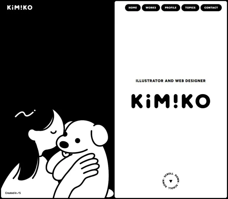
人物と犬の大きなイラスト、白黒の分割画面、丸みのあるロゴが印象的なポートフォリオ。角丸パネルと作品のコラージュを組み合わせ、スマートフォンでは縦に再構成しています。
オリジナルサイトを見るKimiko Portfolio — Style Reference
A monochrome illustrator’s portfolio: a character scene stays beside a scrolling stack of rounded white panels.
Website: kimiko-design.studio.site Original URL: https://kimiko-design.studio.site/ Final URL: https://kimiko-design.studio.site/ Theme: black canvas with white content panels; no theme selector was observed. Inspected: September 13, 2026, Japan Standard Time. The supplied observation timestamp is September 12, 2026, at 19:12:46.010 UTC, equivalent to September 13 at 04:12:46.010 JST. Viewports: 1440 × 1000 and 390 × 844 CSS pixels. Scope: the current portfolio homepage, including its opening composition, Works preview, Profile preview, latest topic, Contact strip, footer, and closed mobile header. Three desktop captures and two mobile captures accompany rendered DOM and computed-style samples. Linked pages and activated controls are outside the inspected scope.
Kimiko Portfolio combines a strict black-and-white framework with soft, humorous illustration. On desktop, a large drawing of a person holding a dog occupies the left half, with the figures anchored against the bottom edge and generous black space above. The right half contains the introduction and subsequent homepage sections. Small black navigation pills remain near the upper-right corner as the content changes beneath them.
The visual hierarchy depends on three distinct voices: rounded graphic lettering for identity and section labels, heavy Figtree for navigation and short headings, and compact Japanese body copy. Color appears mainly inside the Works artwork. Narrow black seams organize large white panels without adding shadows or decorative borders.
This is a portfolio homepage with routes to work, biography, news, and contact. Its reusable idea is the relationship between persistent illustration, open space, graphic lettering, and a compact sequence of content previews.
How to Read This Reference
- Measured means a value appears in the supplied rendered DOM or computed styles. Positions and dimensions use CSS pixels; longer decimal measurements are rounded for readability.
- Calculated means a relationship was derived from measured coordinates, such as the 6px gaps between desktop navigation pills.
- Estimated means a visual approximation from the current-page screenshots, especially for illustration bounds and graphic lettering.
- Recommended means an implementation choice for a new site. The Quick Start is an adaptation, not recovered source code.
- Named tokens are descriptive aliases unless explicitly identified as original custom properties.
- Interaction evidence is limited. Link destinations and button elements are available, but no menu opening, topic activation, work activation, or hover result was supplied.
The captures and DOM are separate samples. Some geometry differs: the mobile hero measures approximately 359.22px high in the DOM, although the supplied opening image shows a rounded lower edge near the viewport bottom. Preserve this discrepancy rather than treating every screenshot edge as a simultaneous DOM measurement.
Tokens — Colors
Default Palette
| Name | Value | Suggested token | Evidence and role |
|---|---|---|---|
| Canvas Black | #000000 |
--color-black |
Measured body background, dark sections, desktop navigation fills, and mobile menu fill; visually also used by illustration linework and graphic lettering |
| Panel White | #ffffff |
--color-white |
Measured introduction, Works, and Contact surfaces; measured reversed text on dark areas |
| Copyright Gray | #888888 |
--color-muted |
Measured copyright text at both viewports |
Use black and white as a reversible pair. The same black serves as the overall canvas, the seams between panels, the drawing’s outlines, and the button fill. White supplies both large surfaces and reversed content. This creates continuity between the illustration and the interface.
Artwork Accents
The desktop Works preview contains an electric-blue oval, yellow details, a warm red-orange block, teal, and photographic gray. These are observed artwork colors with unmeasured exact values. Keep them inside project imagery instead of promoting them into a general button or navigation palette.
Several sampled wrappers report #333333, while their visible text children explicitly report black or white. Use the child styles to describe the visible labels. Similarly, transparent --g-color-* properties do not establish a visible gradient system. The loading-related custom properties are not the settled page palette.
Selection Treatment
Rendered style text declares black selection with white text. It also declares white selection with black text for paragraphs under #bg-black. This is evidence of a defined selection treatment, not a separately exercised selection state.
Tokens — Typography
Figtree — Navigation and Short Text
- Measured family:
Figtree. - Original custom property:
--s-font-6e99ebd6: Figtree. - Weight 900: desktop navigation, section buttons, occupation line, profile name, latest-topic heading, and footer navigation.
- Weight 500: dates, social links, and copyright.
- Character: compact, clear sans-serif lettering with strong weight contrast and deliberate tracking on uppercase labels.
Japanese Body Copy
- Measured stack:
Figtree, 'Noto Sans JP'. - Original custom property:
--s-font-8b91ef7b: Figtree,'Noto Sans JP'. - Weight:
500in the sampled profile and topic text. - Body rhythm:
1.6line height for the biography and1.4for the news summary.
These are verified family declarations. No independent per-glyph font-loading audit was supplied. The generic fallbacks in the Quick Start are recommended additions.
Graphic Lettering — Identity and Section Names
The large KiM!KO identity, Works title, vertical Profile label, repeated Contact lettering, and footer wordmark visually use thick, rounded, irregularly shaped letters. Their particular font or construction method cannot be established from the supplied records.
The sampled h1 and section h2 elements have empty extracted text while lettering is clearly visible in the captures. Treat these as graphic content for reproduction purposes. Their wrapper font sizes of 32px and 24px do not measure the visible artwork. Use appropriate supplied graphics when available; keep meaningful heading text or accessible names alongside them.
Type Scale
| Role | Desktop | Mobile | Weight | Line height | Tracking |
|---|---|---|---|---|---|
| Desktop navigation | 12px | Replaced by menu control | 900 | normal; text box about 14px high |
0.08em |
| Mobile menu label | — | 12px | 900 | 12px | 0.02em |
| Occupation line | 18px | 13.26px | 900 | 1.6 |
0.06em |
| View More label | 14px | 13px | 900 | normal; boxes about 17px / 15px high |
0.08em |
| Profile name | 40px | 24px | 900 | normal; boxes 48px / 29px high |
Normal |
| Profile paragraph | 14px | 13px | 500 | 22.4px / 20.8px | 0.04em |
| New Topics heading | 18px | 20px | 900 | normal; boxes 22px / 24px high |
0.04em / 0.08em |
| Topic date | 13px | 13px | 500 | 18.2px | 0.04em |
| Topic summary | 12px | 12px | 500 | 16.8px | Normal |
| Footer navigation | 16px | 16px | 900 | normal; text boxes about 19px high |
0.08em |
| Social links | 14px | 14px | 500 | normal; text boxes about 17px high |
0.02em |
| Copyright | 10px | 10px | 500 | normal; box 12px high |
0.02em |
The mobile occupation size equals 3.4vw at 390px. That is a useful calculated correspondence, not proof of the original responsive formula. Also preserve the unusual increase in New Topics from 18px desktop to 20px mobile; the site does not simply shrink every label.
Graphic Dimensions
| Graphic | Desktop evidence | Mobile evidence |
|---|---|---|
| Header identity link | Measured 115 × 20px box | Measured 120 × 21.5px box |
| Main identity | Estimated visible artwork about 440 × 78px | Estimated visible artwork about 250 × 44px |
| Works heading | Measured heading wrapper 50px high | Measured heading wrapper 40px high |
| Vertical Profile heading | Measured wrapper 50 × 297px | Measured wrapper 32 × 190.08px |
| Footer identity | Estimated about 250 × 44px | Estimated about 225 × 40px |
Tokens — Spacing & Shapes
Density: very narrow outer seams, spacious panels, compact text groups.
The site has no single uniform spacing multiplier. Its identity comes from combining 5px structural gaps with much larger 24–60px content spacing.
Spacing Scale
| Use | Desktop | Mobile | Evidence |
|---|---|---|---|
| Outer horizontal inset | 5px | 5px | Measured panel coordinates |
| Main panel seams | 5px | 5px | Calculated from consecutive section bounds |
| Desktop navigation gap | 6px | — | Calculated from link bounds |
| Navigation’s effective horizontal text inset | 18px | — | Calculated from link and text coordinates |
| Intro panel padding | 16px | 50px vertical, 16px horizontal | Measured |
| Intro flex gap | 50px | 10px | Measured |
| Heading wrapper bottom padding | 120px | 60px | Measured; part of the hero’s vertical balance |
| Works heading-to-button gap | 50px | 40px | Measured |
| Profile content side inset | 50px | 24px | Calculated from content and panel boundaries |
| Profile name-to-copy gap | 20px | 16px | Calculated |
| Profile copy-to-button gap | 30px | 24px | Calculated |
| Latest-topic side inset | 50px | 24px | Calculated |
| Topic heading-to-row gap | 13px | 13px | Calculated |
| Date-to-summary gap | 12px | 10px | Calculated |
| Footer section padding | 110px 50px 50px | 100px 24px 60px | Measured |
| Footer major group gap | 50px | 50px | Measured |
| Footer navigation column gap | 24px | 16px | Calculated |
| Mobile footer navigation row gap | — | 10px | Calculated from 22px-high link boxes |
| Social link gap | 20px | 20px | Calculated |
Border Radius
| Element | Value | Status |
|---|---|---|
| Desktop introduction, Works, and Contact panels | 8px | Measured |
| Mobile introduction, Works, and Contact panels | 12px | Measured |
| Desktop navigation links | 48px | Measured; their 34px height produces a pill silhouette |
| Mobile menu button | 24px | Measured |
| View More visible fill | Fully rounded ends | Observed visually; inner fill radius was not sampled |
| Mobile white header plate | Approximately 12px | Estimated from screenshot |
| Topic and footer areas | 0px | Measured dark sections |
The View More anchor itself reports a transparent background and zero radius. Its visible black pill comes from content or styling inside that anchor. A single rounded anchor is a reasonable implementation simplification, but those inner visual properties should not be presented as the wrapper’s computed styles.
Layout Measurements
The desktop content column begins at x = 722.5px and measures 712.5px wide. A matching two-column calculation is (1440 − 10 − 5) / 2. Mobile panels begin at x = 5px and measure 380px wide.
| Section | Desktop document top / height | Mobile document top / height |
|---|---|---|
| Introduction | 5px / 1000px | 543.63px / 359.22px |
| Works | 1010px / 720px | 907.84px / 580px |
| Profile | 1735px / 420px | 1492.84px / 300px |
| Latest topic | 2155px / 122.19px | 1792.84px / 139.59px |
| Contact | 2282.19px / 140px | 1937.44px / 100px |
| Footer | 2427.19px / 375px | 2042.44px / 403px |
Measured document heights are approximately 2807.19px desktop and 2450.44px mobile. The Profile and topic sections meet without an additional 5px gap; most other major transitions retain the narrow seam.
Components
Desktop Illustration Scene
Role: gives the portfolio a persistent, personal visual anchor.
The left half is black, with a small white identity link near the upper-left corner and an oversized monochrome character drawing along the bottom. A person’s dark hair merges into the background. Their face, arm, and the dog become a connected white silhouette, separated by thick black contours. A small curved flourish floats above the person.
The scene remains effectively stationary across the desktop scroll captures while the right column advances. The precise positioning declaration is absent from the evidence; fixed and sticky techniques can both produce this relationship. The Quick Start uses a sticky scene as an implementation choice.
Keep the drawing broad and bottom-aligned. Its expressive face and dog should remain recognizable, while the body can meet the panel’s lower edge. The empty black area above is an intentional part of the composition.
Desktop Primary Navigation
Role: persistent access to the portfolio’s main routes.
Five black pills read HOME, WORKS, PROFILE, TOPICS, and CONTACT. They form a right-aligned row at y = 20px, ending 20px from the viewport’s right edge. The measured widths are approximately 75.83, 86.23, 91.84, 85.81, and 101.70px; every pill is 34px high. Gaps are 6px.
White Figtree labels use 12px, weight 900, and 0.08em tracking. The links point to /, /works, /profile, /topics, and /contact. These are page routes, not five homepage section anchors.
The header row remains visible in the supplied desktop scroll views. Hover appearance and active-route styling were not exercised.
Mobile Header
Role: retains identity and navigation access after the split layout collapses.
A measured 66px-high header wrapper contains a white rounded plate inset approximately 5px from the viewport edges. The plate is about 56px high. Inside it, a black identity mark sits at x = 29px, while an 80 × 34px black MENU button sits at x = 289px, y = 16px.
The plate remains at the top in both mobile captures. The extracted DOM includes MENU, CLOSE, and navigation labels, but only the closed MENU state is shown. The presence of CLOSE does not verify the expanded menu’s appearance, animation, focus behavior, or scroll locking.
Introduction Panel
Role: states the owner’s identity and profession with minimal copy.
A large white rounded panel contains the centered occupation line ILLUSTRATOR AND WEB DESIGNER, a much larger black graphic wordmark, and a circular scroll cue near the bottom.
On desktop, the occupation text box begins around y = 366.59px. The heading wrapper begins at y = 445.39px, measures 198px high, and includes 120px bottom padding. That padding helps shift the visible identity above the panel’s midpoint. The scroll link measures 82 × 80px at approximately x = 1037.75px, y = 845px.
On mobile, the illustration appears first and the introduction follows beneath it. The measured panel uses 50px vertical padding, smaller occupation text, a 10px flex gap, and a heading wrapper with 60px bottom padding. The scroll cue remains 82 × 80px rather than scaling down with the wordmark.
Circular Scroll Cue
Role: signals continuation beyond the introduction.
Repeated SCROLL DOWN lettering surrounds a small solid downward triangle. It appears as a compact circular graphic rather than a conventional outlined icon button. The supplied link targets /#scrolldown.
Rotation, looping duration, hover feedback, and the anchor’s scrolling behavior were not demonstrated. Reproduce the visible arrangement first; any continuous rotation is an additional implementation decision until further evidence establishes it.
Works Preview
Role: previews the variety of the portfolio and provides entry to the Works page.
A white rounded stage surrounds a central graphic WORKS heading and black VIEW MORE pill. Five separate artwork clusters sit around this center: a bear over a blue oval, a stack of colorful website cards, an app-like rounded icon, a circular illustrated portrait, and overlapping photographic cards.
The composition is asymmetrical. Individual objects vary in size, angle, shape, and vertical position. Some extend beyond the white panel’s upper or lower boundary. The center remains clear enough for the title and route link.
The desktop stage measures 712.5 × 720px. The heading wrapper is 50px high, followed by a 50px gap and a 180 × 54px link to /works. On mobile, the stage measures 380 × 580px; the heading wrapper is 40px high and the route link becomes 150 × 50px with a 40px gap above it.
Five image-only buttons appear in the mobile DOM. Their actions are unverified. Preserve the distinction between these buttons and the separate View More route link.
View More Pill
Role: links a homepage preview to its dedicated page.
The same visual treatment appears in Works and Profile: solid black capsule, centered uppercase white Figtree, weight 900, and 0.08em tracking. Desktop links measure 180 × 54px; mobile links measure 150 × 50px.
Works centers its link within the collage. Profile aligns its link with the biography’s left edge. This shared component helps unify two otherwise different section layouts.
Profile Preview
Role: introduces Kimiko through a short biography.
Two adjacent white panels sit on black, separated by a 5px seam. The narrow left rail contains the vertical graphic PROFILE label, reading upward. The larger right panel contains the name Kimiko, a short Japanese paragraph, and a View More link to /profile.
The desktop rail is approximately 150px wide, leaving about 557.5px for the biography panel. Its 50px side padding produces the measured 457.5px text width. The paragraph spans about two lines at 14px / 22.4px.
On mobile, the rail remains beside the biography rather than moving above it. It narrows to about 80px; the biography panel is about 295px wide, with 24px side padding and a measured 247px text width. The name becomes 24px and the biography occupies about four lines at 13px / 20.8px.
The original-page biography identifies Kimiko as an illustrator and web designer. It does not independently establish production responsibilities for the website.
Latest Topic
Role: adds a small current-information block between the biography and contact area.
This section returns to black with white text. NEW TOPICS appears in heavy Figtree with a small sparkle graphic. A single compact row places the date 2025.04.18 at left and a Japanese announcement at right.
The row is a button in the supplied DOM. No activation result was provided, so a dialog or destination should not be assumed. The displayed date belongs to the announcement, not the inspection.
On desktop, date and summary fit on one line. On mobile, the date remains in its own column while the summary wraps to two lines. The heading grows to 20px and increases its tracking, giving this small section a stronger presence on the narrow screen.
Contact Strip
Role: creates a broad, unmistakable route to contact.
A white rounded link spans the content column. Oversized black CONTACT lettering repeats horizontally with centered dot separators and is clipped at the left and right edges. The whole measured strip links to /contact.
Its height changes from 140px desktop to 100px mobile. The repeated lettering has the appearance of a marquee, but movement, direction, and speed were not verified. A static clipped repeat captures the evidenced design.
Footer and Page-Top Link
Role: closes the portfolio with identity, navigation, social destinations, and a return control.
The footer is black, with a centered white graphic identity above uppercase navigation. Social text links follow beneath, each paired with a small diagonal arrow. A quiet gray copyright line completes the center stack.
On desktop, the footer stays within the right column and all five navigation links occupy one row. On mobile, navigation wraps into HOME / WORKS / PROFILE on the first row and TOPICS / CONTACT on the second. Social links remain on one row.
A white pointing-hand graphic sits near the footer’s lower-right corner. Its link targets /#pagetop and measures 50 × 50px desktop and 46 × 46px mobile. The evidence places it within the footer; it does not establish a viewport-fixed control throughout the page.
Tokens — Motion & Interaction
Measured Transition Definitions
| Element or group | Supplied computed transition | What is established |
|---|---|---|
| General content and many links | 0.3s cubic-bezier(0.4, 0.4, 0, 1) |
A common transition timing is declared; the changed state is not shown |
| Desktop navigation wrappers | 0.3s cubic-bezier(1, 0, 0, 1) |
Navigation uses a distinct easing curve |
| Footer navigation wrappers | 0.2s cubic-bezier(0.4, 0.4, 0, 1) |
Shorter wrapper transition than most content |
| Mobile menu button | 0.4s cubic-bezier(0.4, 0.4, 0, 1) |
Button transition definition; menu expansion was not inspected |
| Five mobile work buttons | 0.3s cubic-bezier(0.445, 0.05, 0.55, 0.95) 0.2s |
Shared duration, easing, and delay; trigger and resulting transform are unknown |
| Body background | background 0.5s cubic-bezier(0.4, 0.4, 0, 1) |
Background transition declaration; no alternate theme was observed |
The long transition records also enumerate generated gradient properties. Their presence does not establish colorful gradients, continuous animation, or a particular visual effect.
Observed Behavior and Limits
| Feature | Evidence | Limit |
|---|---|---|
| Desktop scrolling | Right-hand sections change while the left scene remains effectively stationary | Exact fixed/sticky CSS is unavailable |
| Persistent navigation | Desktop pills and mobile header remain visible in supplied scroll captures | Intermediate widths were not captured |
| Route navigation | Rendered hrefs identify homepage, Works, Profile, Topics, and Contact routes | Destination pages were not inspected |
| Scroll and page-top controls | Hrefs contain #scrolldown and #pagetop |
Smooth scrolling and timing are unverified |
| Contact repeat | Repeated, clipped lettering is visible | Continuous movement is unverified |
| Illustration expression | The dog’s eye differs between desktop and mobile captures | Could reflect an asset variant or animation phase; no blink sequence is established |
| Mobile menu and image/topic buttons | Button elements and labels are present | Activated states are unverified |
Every sampled element reports animation: none. This does not rule out animation inside unsampled descendants, pseudo-elements, image files, or JavaScript. The captures are still images, not a motion recording.
Recommended motion policy: retain the measured short transition timings where useful, establish clear focus feedback, and leave decorative looping motion disabled until its behavior is intentionally specified. If loops are added, provide reduced-motion alternatives and pause controls where appropriate.
Surfaces
| Layer | Appearance | Purpose |
|---|---|---|
| Page canvas | Pure black | Joins the illustration background, panel seams, topic block, and footer |
| Main panels | Pure white, 8px desktop / 12px mobile corners | Frames identity, work previews, biography, and contact |
| Profile seam | 5px exposed black | Separates the title rail from biography content |
| Navigation and section actions | Black capsules with white labels | Compact, consistent navigation emphasis |
| Artwork objects | Irregular silhouettes and overlapping graphic rectangles | Introduces variety and limited color |
| Footer copyright | Small gray text on black | Provides a deliberately quiet final detail |
No decorative shadow, glass blur, or surface gradient is visible in the inspected states. The overlapping project cards create depth through their drawn boundaries and arrangement. Do not add a general elevation system to every panel.
Imagery
The main illustration uses broad white shapes, thick black contours, rounded line endings, minimal facial marks, and carefully connected negative space. Hair disappears into the black canvas, while the face and dog remain readable at a glance. Its affection and humor soften the rigid two-column desktop structure.
The Works graphics use a different scale of detail. Small website previews, illustration badges, an app-like icon, and photographic print pieces communicate varied work without lengthy descriptions. Black outlines and rounded edges connect these otherwise colorful objects to the monochrome shell.
Use smooth, high-resolution rendering for the main drawing and graphic lettering. A halftone texture appears within one project preview; it is part of that project’s imagery, not a global pixelation or texture rule.
Observed Asset References
No complete reusable asset URLs were supplied. The following names describe visual roles; they are not original filenames or downloadable paths.
| Asset role | Current-page appearance | Implementation guidance |
|---|---|---|
| Main character scene | Person holding a dog, with a small floating flourish | Preserve silhouette, facial features, and bottom anchoring |
| Identity variants | White mark on black; black mark on white | Use appropriate light/dark artwork without changing its letter shapes |
| Works graphic title | Rounded black lettering | Preserve as graphic lettering with a meaningful heading name |
| Profile graphic title | Narrow vertical lettering | Prepare a vertical asset or rotate an authorized horizontal version |
| Scroll cue | Circular lettering with a downward triangle | Preserve text geometry separately from any optional rotation |
| Bear and blue oval | White illustrated bear overlapping saturated blue | Keep the irregular silhouette and original accent colors |
| Website-card cluster | Overlapping previews with red-orange and teal details | Preserve layering and readable visual hierarchy |
| App-like icon | Rounded square, dark irregular center, yellow dot | Keep its outline and contained accent |
| Portrait badge | Circular black-and-white illustrated portrait | Preserve circular framing and expressive linework |
| Print-card cluster | Tilted photographic cards with a yellow line | Retain photography, texture, and overlap |
| Page-top hand | White pointing hand on black | Use a real anchor with an accessible name |
Where rotation or outlining is baked into an asset, avoid adding it again in CSS. The shell can be rebuilt with layout rules; the particular illustration and lettering require suitable artwork.
Layout & Responsive Behavior
Desktop Composition
At 1440px, the visual shell divides into two equal 712.5px columns separated by 5px, with 5px outer margins. The illustration occupies the left column. The right column holds the entire homepage sequence, including the footer.
The supplied desktop scroll states establish a persistent left scene and persistent upper navigation. The large document height supports ordinary page scrolling; an independently scrolling right-hand application pane is not established. A sticky left scene alongside a normally scrolling content column is a practical implementation.
Mobile Composition
At 390px, the layout becomes one 380px-wide column. The white mobile header stays above the page, the illustration fills the opening stage, and the introduction follows at a measured document position of approximately 543.63px.
The Works stage becomes shorter but keeps space for scattered graphics around its center. Mobile DOM measurements reveal five differently sized button boxes, rather than uniformly scaled project cards:
| Work-object box | Position relative to Works panel | Measured size |
|---|---|---|
| Upper-left | Left 20px; top −40px | 180 × 131.33px |
| Upper-right | Left 185px; top 50px | 175 × 131.92px |
| Lower-right | Left 247px; top 346.67px | 113 × 113.33px |
| Lower-left | Left 24px; top 365px | 105 × 105px |
| Bottom-center | Left 110px; top 425.27px | 160 × 174.73px |
The upper-left box extends above its panel, and the bottom-center box extends about 20px below it. Blanket clipping on every rounded panel would remove this measured overlap. The supplied mobile screenshots do not show the Works section itself, so its image arrangement is supported by DOM boxes rather than direct mobile visual inspection.
Profile retains its horizontal rail-and-biography relationship. The topic summary wraps alongside the date. Footer navigation becomes two centered rows, while its type remains 16px.
Breakpoints and Capture Differences
Rendered style text includes a max-width: 991px rule for responsive line breaks. It does not prove that 991px is also the exact breakpoint for the two-column layout or navigation replacement. The Quick Start adopts 991px as a recommended breakpoint, to be checked at intermediate widths.
The mobile intro’s measured bottom is approximately 902.84px, whereas the supplied image presents its rounded lower edge near the 844px viewport boundary. A smaller desktop hero-edge discrepancy also exists. Treat screenshot appearance and DOM dimensions as separate observations; do not infer a source height formula from either discrepancy.
Recommended validation: check the composition at 390px and 1440px first, then test around the chosen breakpoint, at narrower phone widths, and with enlarged text. Allow biography and news containers to grow rather than clipping copy to the measured sample heights.
Do’s and Don’ts
Do
- Preserve the pure black canvas and pure white panels.
- Keep the desktop illustration broad, low, and visually persistent beside the content.
- Maintain the 5px seams that connect the page into one composition.
- Use the supplied rounded lettering for identity and graphic section titles when available.
- Keep ordinary UI text in the measured Figtree and Japanese-copy stacks.
- Reserve saturated color for the work previews.
- Keep the Works center clear while allowing selected graphics to cross panel boundaries.
- Retain the vertical Profile rail on the inspected mobile layout.
- Preserve the mobile footer’s centered two-row navigation.
- Distinguish measured transition definitions from demonstrated motion.
Don’t
- Don’t replace the large drawing with a small portrait thumbnail.
- Don’t extend desktop content sections across both halves and erase the persistent illustration relationship.
- Don’t turn the Works composition into identical shadowed cards.
- Don’t make every panel, gap, and button use the same radius or spacing value.
- Don’t use the generic heading-wrapper font sizes as measurements of graphic lettering.
- Don’t recolor project artwork into monochrome merely because the shell is monochrome.
- Don’t shrink all mobile type uniformly; New Topics grows and footer labels retain their size.
- Don’t clip every rounded container, because the work objects intentionally overlap its edges.
- Don’t infer draggable objects, opening dialogs, looping rotation, or marquee speed from still captures.
- Don’t expose duplicated MENU/CLOSE or repeated graphic text as redundant accessible content.
Recommended Implementation Additions
These are recommendations for a new implementation, not verified original features:
- Give the graphic identity a meaningful
h1name and each graphic section title an accessible heading. - Label image-only home, scroll, contact, work, and page-top controls. Empty extracted text alone does not establish whether the original already has accessible names.
- Keep decorative copies of the Contact repeat hidden from assistive technology; expose one clear Contact link name.
- Implement the mobile menu with an accurate expanded state and controlled navigation region. If it becomes modal, add appropriate focus handling and dismissal behavior.
- Increase the effective touch targets of compact 34px controls where space permits. Preserve separation between neighboring targets.
- Provide a two-color focus indicator that remains visible on both black and white surfaces.
- Keep a usable static composition under reduced-motion preferences. Avoid requiring motion to reveal essential information.
- Preserve readable content at zoom and larger text sizes by treating measured section heights as minimums where copy is involved.
- Load Figtree weights 500 and 900 and the required Japanese text font deliberately; avoid unrelated font weights that add no visual value.
- Reserve intrinsic image space, prioritize the opening illustration, and defer appropriate below-the-fold assets.
Agent Prompt Guide
Quick Color Reference
- Canvas and dark sections:
#000000. - Main panels:
#ffffff. - Text: black on white, white on black.
- Copyright:
#888888on black. - Primary navigation and preview links: black capsules with white text.
- Accent colors: contained inside project artwork; exact accent values were not measured.
- Separation: exposed black seams and asset outlines, with no decorative panel shadow.
Overall Prompt
“Create an illustrator and web designer’s portfolio homepage with a pure black canvas and large white rounded panels. On desktop, use two equal columns with 5px outer margins and a 5px seam: keep a large monochrome character illustration bottom-aligned in the left column while introduction, Works, Profile, news, Contact, and footer flow down the right. Place compact black navigation pills at the upper right. Combine authorized rounded graphic lettering with heavy Figtree labels and compact Japanese body copy. Scatter five varied project graphics around the Works heading and its View More button, leaving the center readable. Keep a narrow vertical Profile label beside the biography. On mobile, use a persistent white header with a black menu pill, place the illustration above the introduction, and retain 5px seams with 12px panel corners. Keep colored accents inside project imagery and leave unverified decorative motion static.”
Example Component Prompts
- Illustration scene: “Build a black desktop scene with a small white identity mark near the top-left and a large, smooth monochrome drawing anchored to the bottom. Preserve broad white silhouettes, thick rounded black contours, and substantial black space above. Keep this scene visible beside the scrolling portfolio content.”
- Works stage: “Create a 720px-tall white panel with 8px corners, a centered graphic Works heading, and a 180 × 54px black View More pill beneath it. Arrange five differently shaped project graphics around the perimeter, including selective overlap beyond the panel. On the 390px reference layout, use a 580px stage, 12px corners, and a 150 × 50px action.”
- Profile preview: “Place two white panels on black with a 5px seam. Use a 150px vertical title rail beside a biography with 50px padding, a 40px heavy Figtree name, and compact Japanese copy. At the mobile reference size, retain the rail at about 80px, reduce content padding to 24px, and use a 24px name.”
- Mobile header: “Create a persistent 66px-high black header wrapper containing a white rounded plate inset 5px. Place a 120px-wide black identity graphic on the left and an 80 × 34px black MENU pill on the right. Implement any expanded state separately with accessible controls; only the closed visual state is specified.”
- Contact and footer: “Use a white rounded Contact link with oversized repeated black graphic lettering clipped at both edges. Follow it with a spacious black footer, centered white identity, heavy 16px navigation, small social text links, gray copyright, and a pointing-hand page-top link. Wrap mobile navigation into three links above two links.”
Quick Start
CSS Custom Properties
This CSS is a reusable, unexecuted adaptation. It uses measured colors, type values, seams, and component sizes. Sticky positioning, the 991px layout breakpoint, the mobile illustration-stage ratio, and simplified artwork placement are recommended implementation choices.
Expected anatomy: .portfolio contains .scene and .content. The content children are .intro, .works, .profile, .topics, .contact-strip, and .site-footer. Navigation and the mobile header may be siblings of the shell. The scene contains an image and desktop identity link; the intro contains an occupation paragraph, graphic h1, and scroll anchor. Works uses a central .works-core plus separately positioned image wrappers. Profile contains a title rail and biography body.
Supply suitable illustration and lettering assets through ordinary images or accessible inline graphics. The selectors below do not imply original filenames. Menu expansion and work/topic activation require separately implemented behavior. The Contact repeat is intentionally static.
:root {
  /* Measured palette and declared font families */
  --color-black: #000;
  --color-white: #fff;
  --color-muted: #888;
  --font-ui: 'Figtree', sans-serif;
  --font-copy: 'Figtree', 'Noto Sans JP', sans-serif;
  --weight-copy: 500;
  --weight-heavy: 900;

  /* Aliases for observed dimensions */
  --edge: 5px;
  --seam: 5px;
  --panel-radius: 8px;
  --content-inset: 50px;
  --profile-rail: 150px;
  --action-width: 180px;
  --action-height: 54px;
  --action-size: 14px;

  --ease-content: cubic-bezier(0.4, 0.4, 0, 1);
  --ease-nav: cubic-bezier(1, 0, 0, 1);
  --ease-work: cubic-bezier(0.445, 0.05, 0.55, 0.95);
  --motion-content: 300ms;
  --motion-footer: 200ms;
  --motion-menu: 400ms;
}

* { box-sizing: border-box; }
body {
  margin: 0;
  background: var(--color-black);
  color: var(--color-white);
  font-family: var(--font-copy);
  font-weight: var(--weight-copy);
}
a { color: inherit; text-decoration: none; }
button { font: inherit; cursor: pointer; }
img { display: block; }

.portfolio {
  display: grid;
  grid-template-columns: repeat(2, minmax(0, 1fr));
  align-items: start;
  gap: var(--seam);
  padding: var(--edge);
}
.content {
  display: flex;
  flex-direction: column;
  gap: var(--seam);
  min-width: 0;
}
.panel {
  color: var(--color-black);
  background: var(--color-white);
  border-radius: var(--panel-radius);
}

/* Recommended sticky implementation of the observed scene */
.scene {
  position: sticky;
  top: var(--edge);
  height: calc(100vh - 10px);
  height: calc(100svh - 10px);
  overflow: hidden;
  border-radius: var(--panel-radius);
  background: var(--color-black);
}
.scene-art {
  position: absolute;
  bottom: 0;
  left: 0;
  width: 100%;
  height: auto;
}
.desktop-logo {
  position: absolute;
  top: 20px;
  left: 20px;
  width: 115px;
  height: 20px;
  z-index: 1;
}
.desktop-logo img {
  width: 100%;
  height: 100%;
  object-fit: contain;
}

.desktop-nav {
  position: fixed;
  z-index: 20;
  top: 20px;
  right: 20px;
  display: flex;
  gap: 6px;
}
.nav-link,
.menu-button,
.pill {
  display: inline-flex;
  align-items: center;
  justify-content: center;
  border: 0;
  color: var(--color-white);
  background: var(--color-black);
  font-family: var(--font-ui);
  font-weight: var(--weight-heavy);
}
.nav-link {
  padding: 10px 18px;
  border-radius: 48px;
  font-size: 12px;
  line-height: 14px;
  letter-spacing: 0.08em;
  transition: opacity 300ms var(--ease-nav);
}
.mobile-header { display: none; }
.pill {
  width: var(--action-width);
  min-height: var(--action-height);
  border-radius: 999px;
  font-size: var(--action-size);
  line-height: 1.2;
  letter-spacing: 0.08em;
}

.intro {
  position: relative;
  display: flex;
  flex-direction: column;
  align-items: center;
  justify-content: center;
  gap: 50px;
  min-height: 100vh;
  padding: 16px;
  text-align: center;
}
.occupation {
  width: 100%;
  margin: 0;
  font-family: var(--font-ui);
  font-size: 18px;
  font-weight: var(--weight-heavy);
  line-height: 1.6;
  letter-spacing: 0.06em;
}
.hero-title {
  display: flex;
  align-items: center;
  justify-content: center;
  width: 100%;
  margin: 0;
  padding-bottom: 120px;
}
.hero-title img {
  width: min(440px, 100%);
  height: 78px;
  object-fit: contain;
}
.scroll-cue {
  position: absolute;
  bottom: 80px;
  left: 50%;
  width: 82px;
  height: 80px;
  transform: translateX(-50%);
}
.scroll-cue img { width: 100%; height: 100%; object-fit: contain; }

.works {
  position: relative;
  z-index: 1;
  min-height: 720px;
  isolation: isolate;
  /* Keep overflow visible for the overlapping artwork. */
}
.works-core {
  position: absolute;
  z-index: 2;
  top: calc(50% - 30px);
  inset-inline: 16px;
  display: flex;
  flex-direction: column;
  align-items: center;
  gap: 50px;
  transform: translateY(-50%);
}
.works-title { margin: 0; }
.works-title img { width: auto; max-width: 100%; height: 50px; }
.work-piece {
  position: absolute;
  z-index: 1;
  display: block;
  margin: 0;
  padding: 0;
  border: 0;
  background: transparent;
}
.work-piece img { width: 100%; height: auto; }

/* Estimated desktop placements; assets may include their own tilt. */
.work-piece--upper-left { width: 34%; top: -10px; left: 5%; }
.work-piece--upper-right { width: 33%; top: 40px; right: 4%; }
.work-piece--lower-left { width: 20%; top: 46%; left: 5%; }
.work-piece--lower-right { width: 20%; top: 60%; right: 7%; }
.work-piece--bottom { width: 30%; bottom: -28px; left: 19%; }

.profile {
  display: grid;
  grid-template-columns: var(--profile-rail) minmax(0, 1fr);
  gap: var(--seam);
  min-height: 420px;
}
.profile-rail,
.profile-body {
  color: var(--color-black);
  background: var(--color-white);
  border-radius: var(--panel-radius);
}
.profile-rail {
  display: grid;
  place-items: center;
  margin: 0;
}
.profile-rail img {
  width: 50px;
  height: 297px;
  object-fit: contain;
}
.profile-body {
  display: flex;
  flex-direction: column;
  align-items: flex-start;
  justify-content: center;
  min-width: 0;
  padding: var(--content-inset);
}
.profile-name {
  margin: 0 0 20px;
  font-family: var(--font-ui);
  font-size: 40px;
  font-weight: var(--weight-heavy);
  line-height: 1.2;
}
.profile-copy {
  margin: 0 0 30px;
  font-size: 14px;
  line-height: 1.6;
  letter-spacing: 0.04em;
}

.topics {
  margin-top: calc(-1 * var(--seam));
  padding: 36px var(--content-inset) 30px;
  background: var(--color-black);
}
.topics-heading {
  display: flex;
  align-items: center;
  gap: 6px;
  margin: 0 0 13px;
  font-family: var(--font-ui);
  font-size: 18px;
  font-weight: var(--weight-heavy);
  line-height: 22px;
  letter-spacing: 0.04em;
}
.topic-row {
  display: grid;
  grid-template-columns: auto minmax(0, 1fr);
  align-items: start;
  gap: 12px;
  max-width: 100%;
  padding: 0 0 3px;
  border: 0;
  color: var(--color-white);
  background: transparent;
  text-align: left;
}
.topic-date {
  font-family: var(--font-ui);
  font-size: 13px;
  line-height: 1.4;
  letter-spacing: 0.04em;
  white-space: nowrap;
}
.topic-summary { font-size: 12px; line-height: 1.4; }

.contact-strip {
  display: flex;
  align-items: center;
  height: 140px;
  overflow: hidden;
}
.contact-track {
  display: flex;
  flex: none;
  align-items: center;
  gap: 32px;
  width: max-content;
  /* Static repeat: no original loop timing was verified. */
}
.contact-track img { width: auto; height: 50px; }

.site-footer {
  position: relative;
  display: flex;
  flex-direction: column;
  align-items: center;
  gap: 50px;
  padding: 110px 50px 50px;
  background: var(--color-black);
}
.footer-brand { width: 250px; height: 44px; object-fit: contain; }
.footer-nav,
.social-links {
  display: flex;
  justify-content: center;
  align-items: center;
}
.footer-nav { flex-wrap: wrap; gap: 10px 24px; }
.footer-nav a {
  font-family: var(--font-ui);
  font-size: 16px;
  font-weight: var(--weight-heavy);
  line-height: 22px;
  letter-spacing: 0.08em;
}
.footer-meta {
  display: flex;
  flex-direction: column;
  align-items: center;
  gap: 20px;
}
.social-links { gap: 20px; }
.social-links a {
  font-family: var(--font-ui);
  font-size: 14px;
  line-height: 17px;
  letter-spacing: 0.02em;
}
.copyright {
  margin: 0;
  color: var(--color-muted);
  font-family: var(--font-ui);
  font-size: 10px;
  line-height: 12px;
  letter-spacing: 0.02em;
}
.page-top {
  position: absolute;
  right: 24px;
  bottom: 32px;
  width: 50px;
  height: 50px;
}
.page-top img { width: 100%; height: 100%; object-fit: contain; }

/* Recommended semantic support and focus treatment */
.sr-only {
  position: absolute;
  width: 1px;
  height: 1px;
  padding: 0;
  margin: -1px;
  overflow: hidden;
  clip-path: inset(50%);
  white-space: nowrap;
  border: 0;
}
:where(a, button):focus-visible {
  outline: 2px solid var(--color-white);
  outline-offset: 2px;
  box-shadow: 0 0 0 4px var(--color-black);
}
::selection { color: #fff; background: #000; }
.on-black ::selection { color: #000; background: #fff; }

/* Recommended breakpoint; exact source layout breakpoint is unknown. */
@media (max-width: 991px) {
  :root {
    --panel-radius: 12px;
    --content-inset: 24px;
    --profile-rail: 80px;
    --action-width: 150px;
    --action-height: 50px;
    --action-size: 13px;
  }
  .portfolio { grid-template-columns: minmax(0, 1fr); }
  .desktop-nav, .desktop-logo { display: none; }
  .mobile-header {
    position: fixed;
    z-index: 30;
    inset: 0 0 auto;
    display: block;
    height: 66px;
    padding: 5px;
    background: var(--color-black);
  }
  .mobile-bar {
    display: flex;
    align-items: center;
    justify-content: space-between;
    height: 56px;
    padding: 0 16px 0 24px;
    border-radius: 12px;
    color: var(--color-black);
    background: var(--color-white);
  }
  .mobile-logo img { width: 120px; height: 21.5px; object-fit: contain; }
  .menu-button {
    width: 80px;
    height: 34px;
    border-radius: 24px;
    font-size: 12px;
    line-height: 12px;
    letter-spacing: 0.02em;
  }
  .scene {
    position: relative;
    top: auto;
    height: auto;
    /* Approximation of the measured opening stage at 390px. */
    aspect-ratio: 380 / 534;
  }
  .intro { min-height: 0; padding: 50px 16px; gap: 10px; }
  .occupation { font-size: clamp(12px, 3.4vw, 18px); }
  .hero-title { padding-bottom: 60px; }
  .hero-title img { width: min(250px, 100%); height: 78px; }
  .scroll-cue { position: static; transform: none; }
  .works { min-height: 580px; }
  .works-core { top: calc(50% - 15px); gap: 40px; }
  .works-title img { height: 40px; }

  /* Mobile box placements derived from the supplied DOM. */
  .work-piece--upper-left {
    width: 47.368%; top: -40px; left: 20px;
  }
  .work-piece--upper-right {
    width: 46.053%; top: 50px; right: 20px;
  }
  .work-piece--lower-right {
    width: 29.737%; top: auto; bottom: 120px; right: 20px;
  }
  .work-piece--lower-left {
    width: 27.632%; top: auto; bottom: 110px; left: 24px;
  }
  .work-piece--bottom {
    width: 42.105%; bottom: -20px; left: 50%;
    transform: translateX(-50%);
  }
  .profile { min-height: 300px; }
  .profile-rail img { width: 32px; height: 190.08px; }
  .profile-name { font-size: 24px; margin-bottom: 16px; }
  .profile-copy { font-size: 13px; margin-bottom: 24px; }
  .topics-heading { font-size: 20px; line-height: 24px; letter-spacing: 0.08em; }
  .topic-row { width: 100%; gap: 10px; }
  .contact-strip { height: 100px; }
  .contact-track img { height: 34px; }
  .site-footer { padding: 100px 24px 60px; }
  .footer-brand { width: 225px; height: 40px; }
  .footer-nav { max-width: 260px; column-gap: 16px; }
  .page-top { right: 16px; bottom: 16px; width: 46px; height: 46px; }
  [id] { scroll-margin-top: 76px; }
}

/* Recommended reduced-motion baseline for any added effects. */
@media (prefers-reduced-motion: reduce) {
  html { scroll-behavior: auto; }
  .portfolio *,
  .portfolio *::before,
  .portfolio *::after,
  .desktop-nav *,
  .mobile-header * {
    animation: none !important;
    transition: none !important;
  }
}
The CSS preserves the observed mobile logo’s smaller visible artwork inside a taller heading image box. It also separates clipped surfaces, such as the Contact strip, from overflow-visible artwork stages. The mobile scene ratio is only a starting point for the supplied aspect ratio; test it with the actual illustration and at tablet widths.
Tailwind v4 Token Mapping
Optional aliases for an implementation that already uses Tailwind v4. The original evidence does not establish Tailwind usage. Define the custom properties above first.
@theme inline {
  --color-canvas: var(--color-black);
  --color-panel: var(--color-white);
  --color-copyright: var(--color-muted);
  --font-interface: var(--font-ui);
  --font-body: var(--font-copy);
  --font-weight-heavy: 900;
  --spacing-edge: var(--edge);
  --spacing-seam: var(--seam);
  --spacing-panel-inset: var(--content-inset);
  --spacing-profile-rail: var(--profile-rail);
  --radius-panel: var(--panel-radius);
  --radius-pill: 999px;
  --text-navigation: 12px;
  --text-action: var(--action-size);
  --text-footer: 16px;
  --ease-interface: var(--ease-content);
}
Sources & Evidence
- Inspected original and final website: Kimiko Portfolio. Both URLs are identical, and the supplied response status is HTTP 200.
- Observation timestamp:
2026-09-12T19:12:46.010Z, equivalent to September 13, 2026, at 04:12:46.010 JST. Individual screenshot timestamps were not separately supplied. - Desktop evidence: three current-page captures at 1440 × 1000, showing the opening, Works transition, and lower-page/footer composition; rendered DOM and computed styles record approximately 2807.19px document height.
- Mobile evidence: two current-page captures at 390 × 844, showing the opening and lower page; rendered DOM and computed styles record approximately 2450.44px document height and additional Works/Profile geometry.
- Measured evidence: element rectangles, backgrounds, text colors, font declarations, sizes, weights, line heights, tracking, padding, gaps, radii, transition definitions, custom properties, and rendered link destinations.
- Inspection process supplied with the evidence: initial observation lasted at least five seconds. Readiness checks considered document loading, finite animation settlement, layout/text stability, and visible-image decoding. Perpetual animations were temporarily paused during readiness checks and then resumed. These checks do not establish complete motion behavior or delayed-content completeness.
- Limitations: no independently performed browsing, no complete asset inventory, no accessibility-tree audit, no opened mobile menu, no activated topic/work controls, no recorded hover outcomes, and no inspection of linked pages. Intermediate breakpoints and continuous animation remain unverified. Quick Start CSS was not executed or visually tested.
This reference describes the current homepage evidenced by the supplied original-page captures and rendered measurements. Estimates, calculated relationships, and implementation recommendations are labeled separately from measured values.
# Kimiko Portfolio — Style Reference

> A monochrome illustrator’s portfolio: a character scene stays beside a scrolling stack of rounded white panels.

**Website:** [kimiko-design.studio.site](https://kimiko-design.studio.site/)
**Original URL:** https://kimiko-design.studio.site/
**Final URL:** https://kimiko-design.studio.site/
**Theme:** black canvas with white content panels; no theme selector was observed.
**Inspected:** September 13, 2026, Japan Standard Time. The supplied observation timestamp is September 12, 2026, at 19:12:46.010 UTC, equivalent to September 13 at 04:12:46.010 JST.
**Viewports:** 1440 × 1000 and 390 × 844 CSS pixels.
**Scope:** the current portfolio homepage, including its opening composition, Works preview, Profile preview, latest topic, Contact strip, footer, and closed mobile header. Three desktop captures and two mobile captures accompany rendered DOM and computed-style samples. Linked pages and activated controls are outside the inspected scope.

Kimiko Portfolio combines a strict black-and-white framework with soft, humorous illustration. On desktop, a large drawing of a person holding a dog occupies the left half, with the figures anchored against the bottom edge and generous black space above. The right half contains the introduction and subsequent homepage sections. Small black navigation pills remain near the upper-right corner as the content changes beneath them.

The visual hierarchy depends on three distinct voices: rounded graphic lettering for identity and section labels, heavy Figtree for navigation and short headings, and compact Japanese body copy. Color appears mainly inside the Works artwork. Narrow black seams organize large white panels without adding shadows or decorative borders.

This is a portfolio homepage with routes to work, biography, news, and contact. Its reusable idea is the relationship between persistent illustration, open space, graphic lettering, and a compact sequence of content previews.

## How to Read This Reference

- **Measured** means a value appears in the supplied rendered DOM or computed styles. Positions and dimensions use CSS pixels; longer decimal measurements are rounded for readability.
- **Calculated** means a relationship was derived from measured coordinates, such as the 6px gaps between desktop navigation pills.
- **Estimated** means a visual approximation from the current-page screenshots, especially for illustration bounds and graphic lettering.
- **Recommended** means an implementation choice for a new site. The Quick Start is an adaptation, not recovered source code.
- **Named tokens** are descriptive aliases unless explicitly identified as original custom properties.
- **Interaction evidence is limited.** Link destinations and button elements are available, but no menu opening, topic activation, work activation, or hover result was supplied.

The captures and DOM are separate samples. Some geometry differs: the mobile hero measures approximately 359.22px high in the DOM, although the supplied opening image shows a rounded lower edge near the viewport bottom. Preserve this discrepancy rather than treating every screenshot edge as a simultaneous DOM measurement.

## Tokens — Colors

### Default Palette

| Name | Value | Suggested token | Evidence and role |
| --- | --- | --- | --- |
| Canvas Black | `#000000` | `--color-black` | Measured body background, dark sections, desktop navigation fills, and mobile menu fill; visually also used by illustration linework and graphic lettering |
| Panel White | `#ffffff` | `--color-white` | Measured introduction, Works, and Contact surfaces; measured reversed text on dark areas |
| Copyright Gray | `#888888` | `--color-muted` | Measured copyright text at both viewports |

Use black and white as a reversible pair. The same black serves as the overall canvas, the seams between panels, the drawing’s outlines, and the button fill. White supplies both large surfaces and reversed content. This creates continuity between the illustration and the interface.

### Artwork Accents

The desktop Works preview contains an electric-blue oval, yellow details, a warm red-orange block, teal, and photographic gray. These are **observed artwork colors with unmeasured exact values**. Keep them inside project imagery instead of promoting them into a general button or navigation palette.

Several sampled wrappers report `#333333`, while their visible text children explicitly report black or white. Use the child styles to describe the visible labels. Similarly, transparent `--g-color-*` properties do not establish a visible gradient system. The loading-related custom properties are not the settled page palette.

### Selection Treatment

Rendered style text declares black selection with white text. It also declares white selection with black text for paragraphs under `#bg-black`. This is evidence of a defined selection treatment, not a separately exercised selection state.

## Tokens — Typography

### Figtree — Navigation and Short Text

- **Measured family:** `Figtree`.
- **Original custom property:** `--s-font-6e99ebd6: Figtree`.
- **Weight 900:** desktop navigation, section buttons, occupation line, profile name, latest-topic heading, and footer navigation.
- **Weight 500:** dates, social links, and copyright.
- **Character:** compact, clear sans-serif lettering with strong weight contrast and deliberate tracking on uppercase labels.

### Japanese Body Copy

- **Measured stack:** `Figtree, 'Noto Sans JP'`.
- **Original custom property:** `--s-font-8b91ef7b: Figtree,'Noto Sans JP'`.
- **Weight:** `500` in the sampled profile and topic text.
- **Body rhythm:** `1.6` line height for the biography and `1.4` for the news summary.

These are verified family declarations. No independent per-glyph font-loading audit was supplied. The generic fallbacks in the Quick Start are recommended additions.

### Graphic Lettering — Identity and Section Names

The large KiM!KO identity, Works title, vertical Profile label, repeated Contact lettering, and footer wordmark visually use thick, rounded, irregularly shaped letters. Their particular font or construction method cannot be established from the supplied records.

The sampled `h1` and section `h2` elements have empty extracted text while lettering is clearly visible in the captures. Treat these as graphic content for reproduction purposes. Their wrapper font sizes of 32px and 24px do **not** measure the visible artwork. Use appropriate supplied graphics when available; keep meaningful heading text or accessible names alongside them.

### Type Scale

| Role | Desktop | Mobile | Weight | Line height | Tracking |
| --- | --- | --- | --- | --- | --- |
| Desktop navigation | 12px | Replaced by menu control | 900 | `normal`; text box about 14px high | `0.08em` |
| Mobile menu label | — | 12px | 900 | 12px | `0.02em` |
| Occupation line | 18px | 13.26px | 900 | `1.6` | `0.06em` |
| View More label | 14px | 13px | 900 | `normal`; boxes about 17px / 15px high | `0.08em` |
| Profile name | 40px | 24px | 900 | `normal`; boxes 48px / 29px high | Normal |
| Profile paragraph | 14px | 13px | 500 | 22.4px / 20.8px | `0.04em` |
| New Topics heading | 18px | 20px | 900 | `normal`; boxes 22px / 24px high | `0.04em` / `0.08em` |
| Topic date | 13px | 13px | 500 | 18.2px | `0.04em` |
| Topic summary | 12px | 12px | 500 | 16.8px | Normal |
| Footer navigation | 16px | 16px | 900 | `normal`; text boxes about 19px high | `0.08em` |
| Social links | 14px | 14px | 500 | `normal`; text boxes about 17px high | `0.02em` |
| Copyright | 10px | 10px | 500 | `normal`; box 12px high | `0.02em` |

The mobile occupation size equals `3.4vw` at 390px. That is a useful calculated correspondence, not proof of the original responsive formula. Also preserve the unusual increase in New Topics from 18px desktop to 20px mobile; the site does not simply shrink every label.

### Graphic Dimensions

| Graphic | Desktop evidence | Mobile evidence |
| --- | --- | --- |
| Header identity link | Measured 115 × 20px box | Measured 120 × 21.5px box |
| Main identity | Estimated visible artwork about 440 × 78px | Estimated visible artwork about 250 × 44px |
| Works heading | Measured heading wrapper 50px high | Measured heading wrapper 40px high |
| Vertical Profile heading | Measured wrapper 50 × 297px | Measured wrapper 32 × 190.08px |
| Footer identity | Estimated about 250 × 44px | Estimated about 225 × 40px |

## Tokens — Spacing & Shapes

**Density:** very narrow outer seams, spacious panels, compact text groups.

The site has no single uniform spacing multiplier. Its identity comes from combining 5px structural gaps with much larger 24–60px content spacing.

### Spacing Scale

| Use | Desktop | Mobile | Evidence |
| --- | --- | --- | --- |
| Outer horizontal inset | 5px | 5px | Measured panel coordinates |
| Main panel seams | 5px | 5px | Calculated from consecutive section bounds |
| Desktop navigation gap | 6px | — | Calculated from link bounds |
| Navigation’s effective horizontal text inset | 18px | — | Calculated from link and text coordinates |
| Intro panel padding | 16px | 50px vertical, 16px horizontal | Measured |
| Intro flex gap | 50px | 10px | Measured |
| Heading wrapper bottom padding | 120px | 60px | Measured; part of the hero’s vertical balance |
| Works heading-to-button gap | 50px | 40px | Measured |
| Profile content side inset | 50px | 24px | Calculated from content and panel boundaries |
| Profile name-to-copy gap | 20px | 16px | Calculated |
| Profile copy-to-button gap | 30px | 24px | Calculated |
| Latest-topic side inset | 50px | 24px | Calculated |
| Topic heading-to-row gap | 13px | 13px | Calculated |
| Date-to-summary gap | 12px | 10px | Calculated |
| Footer section padding | 110px 50px 50px | 100px 24px 60px | Measured |
| Footer major group gap | 50px | 50px | Measured |
| Footer navigation column gap | 24px | 16px | Calculated |
| Mobile footer navigation row gap | — | 10px | Calculated from 22px-high link boxes |
| Social link gap | 20px | 20px | Calculated |

### Border Radius

| Element | Value | Status |
| --- | --- | --- |
| Desktop introduction, Works, and Contact panels | 8px | Measured |
| Mobile introduction, Works, and Contact panels | 12px | Measured |
| Desktop navigation links | 48px | Measured; their 34px height produces a pill silhouette |
| Mobile menu button | 24px | Measured |
| View More visible fill | Fully rounded ends | Observed visually; inner fill radius was not sampled |
| Mobile white header plate | Approximately 12px | Estimated from screenshot |
| Topic and footer areas | 0px | Measured dark sections |

The View More anchor itself reports a transparent background and zero radius. Its visible black pill comes from content or styling inside that anchor. A single rounded anchor is a reasonable implementation simplification, but those inner visual properties should not be presented as the wrapper’s computed styles.

### Layout Measurements

The desktop content column begins at `x = 722.5px` and measures `712.5px` wide. A matching two-column calculation is `(1440 − 10 − 5) / 2`. Mobile panels begin at `x = 5px` and measure `380px` wide.

| Section | Desktop document top / height | Mobile document top / height |
| --- | --- | --- |
| Introduction | 5px / 1000px | 543.63px / 359.22px |
| Works | 1010px / 720px | 907.84px / 580px |
| Profile | 1735px / 420px | 1492.84px / 300px |
| Latest topic | 2155px / 122.19px | 1792.84px / 139.59px |
| Contact | 2282.19px / 140px | 1937.44px / 100px |
| Footer | 2427.19px / 375px | 2042.44px / 403px |

Measured document heights are approximately **2807.19px desktop** and **2450.44px mobile**. The Profile and topic sections meet without an additional 5px gap; most other major transitions retain the narrow seam.

## Components

### Desktop Illustration Scene

**Role:** gives the portfolio a persistent, personal visual anchor.

The left half is black, with a small white identity link near the upper-left corner and an oversized monochrome character drawing along the bottom. A person’s dark hair merges into the background. Their face, arm, and the dog become a connected white silhouette, separated by thick black contours. A small curved flourish floats above the person.

The scene remains effectively stationary across the desktop scroll captures while the right column advances. The precise positioning declaration is absent from the evidence; fixed and sticky techniques can both produce this relationship. The Quick Start uses a sticky scene as an implementation choice.

Keep the drawing broad and bottom-aligned. Its expressive face and dog should remain recognizable, while the body can meet the panel’s lower edge. The empty black area above is an intentional part of the composition.

### Desktop Primary Navigation

**Role:** persistent access to the portfolio’s main routes.

Five black pills read HOME, WORKS, PROFILE, TOPICS, and CONTACT. They form a right-aligned row at `y = 20px`, ending 20px from the viewport’s right edge. The measured widths are approximately 75.83, 86.23, 91.84, 85.81, and 101.70px; every pill is 34px high. Gaps are 6px.

White Figtree labels use 12px, weight 900, and `0.08em` tracking. The links point to `/`, `/works`, `/profile`, `/topics`, and `/contact`. These are page routes, not five homepage section anchors.

The header row remains visible in the supplied desktop scroll views. Hover appearance and active-route styling were not exercised.

### Mobile Header

**Role:** retains identity and navigation access after the split layout collapses.

A measured 66px-high header wrapper contains a white rounded plate inset approximately 5px from the viewport edges. The plate is about 56px high. Inside it, a black identity mark sits at `x = 29px`, while an 80 × 34px black MENU button sits at `x = 289px`, `y = 16px`.

The plate remains at the top in both mobile captures. The extracted DOM includes MENU, CLOSE, and navigation labels, but only the closed MENU state is shown. The presence of CLOSE does not verify the expanded menu’s appearance, animation, focus behavior, or scroll locking.

### Introduction Panel

**Role:** states the owner’s identity and profession with minimal copy.

A large white rounded panel contains the centered occupation line ILLUSTRATOR AND WEB DESIGNER, a much larger black graphic wordmark, and a circular scroll cue near the bottom.

On desktop, the occupation text box begins around `y = 366.59px`. The heading wrapper begins at `y = 445.39px`, measures 198px high, and includes 120px bottom padding. That padding helps shift the visible identity above the panel’s midpoint. The scroll link measures 82 × 80px at approximately `x = 1037.75px`, `y = 845px`.

On mobile, the illustration appears first and the introduction follows beneath it. The measured panel uses 50px vertical padding, smaller occupation text, a 10px flex gap, and a heading wrapper with 60px bottom padding. The scroll cue remains 82 × 80px rather than scaling down with the wordmark.

### Circular Scroll Cue

**Role:** signals continuation beyond the introduction.

Repeated SCROLL DOWN lettering surrounds a small solid downward triangle. It appears as a compact circular graphic rather than a conventional outlined icon button. The supplied link targets `/#scrolldown`.

Rotation, looping duration, hover feedback, and the anchor’s scrolling behavior were not demonstrated. Reproduce the visible arrangement first; any continuous rotation is an additional implementation decision until further evidence establishes it.

### Works Preview

**Role:** previews the variety of the portfolio and provides entry to the Works page.

A white rounded stage surrounds a central graphic WORKS heading and black VIEW MORE pill. Five separate artwork clusters sit around this center: a bear over a blue oval, a stack of colorful website cards, an app-like rounded icon, a circular illustrated portrait, and overlapping photographic cards.

The composition is asymmetrical. Individual objects vary in size, angle, shape, and vertical position. Some extend beyond the white panel’s upper or lower boundary. The center remains clear enough for the title and route link.

The desktop stage measures 712.5 × 720px. The heading wrapper is 50px high, followed by a 50px gap and a 180 × 54px link to `/works`. On mobile, the stage measures 380 × 580px; the heading wrapper is 40px high and the route link becomes 150 × 50px with a 40px gap above it.

Five image-only buttons appear in the mobile DOM. Their actions are unverified. Preserve the distinction between these buttons and the separate View More route link.

### View More Pill

**Role:** links a homepage preview to its dedicated page.

The same visual treatment appears in Works and Profile: solid black capsule, centered uppercase white Figtree, weight 900, and `0.08em` tracking. Desktop links measure 180 × 54px; mobile links measure 150 × 50px.

Works centers its link within the collage. Profile aligns its link with the biography’s left edge. This shared component helps unify two otherwise different section layouts.

### Profile Preview

**Role:** introduces Kimiko through a short biography.

Two adjacent white panels sit on black, separated by a 5px seam. The narrow left rail contains the vertical graphic PROFILE label, reading upward. The larger right panel contains the name Kimiko, a short Japanese paragraph, and a View More link to `/profile`.

The desktop rail is approximately 150px wide, leaving about 557.5px for the biography panel. Its 50px side padding produces the measured 457.5px text width. The paragraph spans about two lines at 14px / 22.4px.

On mobile, the rail remains beside the biography rather than moving above it. It narrows to about 80px; the biography panel is about 295px wide, with 24px side padding and a measured 247px text width. The name becomes 24px and the biography occupies about four lines at 13px / 20.8px.

The original-page biography identifies Kimiko as an illustrator and web designer. It does not independently establish production responsibilities for the website.

### Latest Topic

**Role:** adds a small current-information block between the biography and contact area.

This section returns to black with white text. NEW TOPICS appears in heavy Figtree with a small sparkle graphic. A single compact row places the date `2025.04.18` at left and a Japanese announcement at right.

The row is a button in the supplied DOM. No activation result was provided, so a dialog or destination should not be assumed. The displayed date belongs to the announcement, not the inspection.

On desktop, date and summary fit on one line. On mobile, the date remains in its own column while the summary wraps to two lines. The heading grows to 20px and increases its tracking, giving this small section a stronger presence on the narrow screen.

### Contact Strip

**Role:** creates a broad, unmistakable route to contact.

A white rounded link spans the content column. Oversized black CONTACT lettering repeats horizontally with centered dot separators and is clipped at the left and right edges. The whole measured strip links to `/contact`.

Its height changes from 140px desktop to 100px mobile. The repeated lettering has the appearance of a marquee, but movement, direction, and speed were not verified. A static clipped repeat captures the evidenced design.

### Footer and Page-Top Link

**Role:** closes the portfolio with identity, navigation, social destinations, and a return control.

The footer is black, with a centered white graphic identity above uppercase navigation. Social text links follow beneath, each paired with a small diagonal arrow. A quiet gray copyright line completes the center stack.

On desktop, the footer stays within the right column and all five navigation links occupy one row. On mobile, navigation wraps into HOME / WORKS / PROFILE on the first row and TOPICS / CONTACT on the second. Social links remain on one row.

A white pointing-hand graphic sits near the footer’s lower-right corner. Its link targets `/#pagetop` and measures 50 × 50px desktop and 46 × 46px mobile. The evidence places it within the footer; it does not establish a viewport-fixed control throughout the page.

## Tokens — Motion & Interaction

### Measured Transition Definitions

| Element or group | Supplied computed transition | What is established |
| --- | --- | --- |
| General content and many links | `0.3s cubic-bezier(0.4, 0.4, 0, 1)` | A common transition timing is declared; the changed state is not shown |
| Desktop navigation wrappers | `0.3s cubic-bezier(1, 0, 0, 1)` | Navigation uses a distinct easing curve |
| Footer navigation wrappers | `0.2s cubic-bezier(0.4, 0.4, 0, 1)` | Shorter wrapper transition than most content |
| Mobile menu button | `0.4s cubic-bezier(0.4, 0.4, 0, 1)` | Button transition definition; menu expansion was not inspected |
| Five mobile work buttons | `0.3s cubic-bezier(0.445, 0.05, 0.55, 0.95) 0.2s` | Shared duration, easing, and delay; trigger and resulting transform are unknown |
| Body background | `background 0.5s cubic-bezier(0.4, 0.4, 0, 1)` | Background transition declaration; no alternate theme was observed |

The long transition records also enumerate generated gradient properties. Their presence does not establish colorful gradients, continuous animation, or a particular visual effect.

### Observed Behavior and Limits

| Feature | Evidence | Limit |
| --- | --- | --- |
| Desktop scrolling | Right-hand sections change while the left scene remains effectively stationary | Exact fixed/sticky CSS is unavailable |
| Persistent navigation | Desktop pills and mobile header remain visible in supplied scroll captures | Intermediate widths were not captured |
| Route navigation | Rendered hrefs identify homepage, Works, Profile, Topics, and Contact routes | Destination pages were not inspected |
| Scroll and page-top controls | Hrefs contain `#scrolldown` and `#pagetop` | Smooth scrolling and timing are unverified |
| Contact repeat | Repeated, clipped lettering is visible | Continuous movement is unverified |
| Illustration expression | The dog’s eye differs between desktop and mobile captures | Could reflect an asset variant or animation phase; no blink sequence is established |
| Mobile menu and image/topic buttons | Button elements and labels are present | Activated states are unverified |

Every sampled element reports `animation: none`. This does not rule out animation inside unsampled descendants, pseudo-elements, image files, or JavaScript. The captures are still images, not a motion recording.

**Recommended motion policy:** retain the measured short transition timings where useful, establish clear focus feedback, and leave decorative looping motion disabled until its behavior is intentionally specified. If loops are added, provide reduced-motion alternatives and pause controls where appropriate.

## Surfaces

| Layer | Appearance | Purpose |
| --- | --- | --- |
| Page canvas | Pure black | Joins the illustration background, panel seams, topic block, and footer |
| Main panels | Pure white, 8px desktop / 12px mobile corners | Frames identity, work previews, biography, and contact |
| Profile seam | 5px exposed black | Separates the title rail from biography content |
| Navigation and section actions | Black capsules with white labels | Compact, consistent navigation emphasis |
| Artwork objects | Irregular silhouettes and overlapping graphic rectangles | Introduces variety and limited color |
| Footer copyright | Small gray text on black | Provides a deliberately quiet final detail |

No decorative shadow, glass blur, or surface gradient is visible in the inspected states. The overlapping project cards create depth through their drawn boundaries and arrangement. Do not add a general elevation system to every panel.

## Imagery

The main illustration uses broad white shapes, thick black contours, rounded line endings, minimal facial marks, and carefully connected negative space. Hair disappears into the black canvas, while the face and dog remain readable at a glance. Its affection and humor soften the rigid two-column desktop structure.

The Works graphics use a different scale of detail. Small website previews, illustration badges, an app-like icon, and photographic print pieces communicate varied work without lengthy descriptions. Black outlines and rounded edges connect these otherwise colorful objects to the monochrome shell.

Use smooth, high-resolution rendering for the main drawing and graphic lettering. A halftone texture appears within one project preview; it is part of that project’s imagery, not a global pixelation or texture rule.

### Observed Asset References

No complete reusable asset URLs were supplied. The following names describe visual roles; they are not original filenames or downloadable paths.

| Asset role | Current-page appearance | Implementation guidance |
| --- | --- | --- |
| Main character scene | Person holding a dog, with a small floating flourish | Preserve silhouette, facial features, and bottom anchoring |
| Identity variants | White mark on black; black mark on white | Use appropriate light/dark artwork without changing its letter shapes |
| Works graphic title | Rounded black lettering | Preserve as graphic lettering with a meaningful heading name |
| Profile graphic title | Narrow vertical lettering | Prepare a vertical asset or rotate an authorized horizontal version |
| Scroll cue | Circular lettering with a downward triangle | Preserve text geometry separately from any optional rotation |
| Bear and blue oval | White illustrated bear overlapping saturated blue | Keep the irregular silhouette and original accent colors |
| Website-card cluster | Overlapping previews with red-orange and teal details | Preserve layering and readable visual hierarchy |
| App-like icon | Rounded square, dark irregular center, yellow dot | Keep its outline and contained accent |
| Portrait badge | Circular black-and-white illustrated portrait | Preserve circular framing and expressive linework |
| Print-card cluster | Tilted photographic cards with a yellow line | Retain photography, texture, and overlap |
| Page-top hand | White pointing hand on black | Use a real anchor with an accessible name |

Where rotation or outlining is baked into an asset, avoid adding it again in CSS. The shell can be rebuilt with layout rules; the particular illustration and lettering require suitable artwork.

## Layout & Responsive Behavior

### Desktop Composition

At 1440px, the visual shell divides into two equal 712.5px columns separated by 5px, with 5px outer margins. The illustration occupies the left column. The right column holds the entire homepage sequence, including the footer.

The supplied desktop scroll states establish a persistent left scene and persistent upper navigation. The large document height supports ordinary page scrolling; an independently scrolling right-hand application pane is not established. A sticky left scene alongside a normally scrolling content column is a practical implementation.

### Mobile Composition

At 390px, the layout becomes one 380px-wide column. The white mobile header stays above the page, the illustration fills the opening stage, and the introduction follows at a measured document position of approximately 543.63px.

The Works stage becomes shorter but keeps space for scattered graphics around its center. Mobile DOM measurements reveal five differently sized button boxes, rather than uniformly scaled project cards:

| Work-object box | Position relative to Works panel | Measured size |
| --- | --- | --- |
| Upper-left | Left 20px; top −40px | 180 × 131.33px |
| Upper-right | Left 185px; top 50px | 175 × 131.92px |
| Lower-right | Left 247px; top 346.67px | 113 × 113.33px |
| Lower-left | Left 24px; top 365px | 105 × 105px |
| Bottom-center | Left 110px; top 425.27px | 160 × 174.73px |

The upper-left box extends above its panel, and the bottom-center box extends about 20px below it. Blanket clipping on every rounded panel would remove this measured overlap. The supplied mobile screenshots do not show the Works section itself, so its image arrangement is supported by DOM boxes rather than direct mobile visual inspection.

Profile retains its horizontal rail-and-biography relationship. The topic summary wraps alongside the date. Footer navigation becomes two centered rows, while its type remains 16px.

### Breakpoints and Capture Differences

Rendered style text includes a `max-width: 991px` rule for responsive line breaks. It does not prove that 991px is also the exact breakpoint for the two-column layout or navigation replacement. The Quick Start adopts 991px as a **recommended breakpoint**, to be checked at intermediate widths.

The mobile intro’s measured bottom is approximately 902.84px, whereas the supplied image presents its rounded lower edge near the 844px viewport boundary. A smaller desktop hero-edge discrepancy also exists. Treat screenshot appearance and DOM dimensions as separate observations; do not infer a source height formula from either discrepancy.

**Recommended validation:** check the composition at 390px and 1440px first, then test around the chosen breakpoint, at narrower phone widths, and with enlarged text. Allow biography and news containers to grow rather than clipping copy to the measured sample heights.

## Do’s and Don’ts

### Do

- Preserve the pure black canvas and pure white panels.
- Keep the desktop illustration broad, low, and visually persistent beside the content.
- Maintain the 5px seams that connect the page into one composition.
- Use the supplied rounded lettering for identity and graphic section titles when available.
- Keep ordinary UI text in the measured Figtree and Japanese-copy stacks.
- Reserve saturated color for the work previews.
- Keep the Works center clear while allowing selected graphics to cross panel boundaries.
- Retain the vertical Profile rail on the inspected mobile layout.
- Preserve the mobile footer’s centered two-row navigation.
- Distinguish measured transition definitions from demonstrated motion.

### Don’t

- Don’t replace the large drawing with a small portrait thumbnail.
- Don’t extend desktop content sections across both halves and erase the persistent illustration relationship.
- Don’t turn the Works composition into identical shadowed cards.
- Don’t make every panel, gap, and button use the same radius or spacing value.
- Don’t use the generic heading-wrapper font sizes as measurements of graphic lettering.
- Don’t recolor project artwork into monochrome merely because the shell is monochrome.
- Don’t shrink all mobile type uniformly; New Topics grows and footer labels retain their size.
- Don’t clip every rounded container, because the work objects intentionally overlap its edges.
- Don’t infer draggable objects, opening dialogs, looping rotation, or marquee speed from still captures.
- Don’t expose duplicated MENU/CLOSE or repeated graphic text as redundant accessible content.

## Recommended Implementation Additions

These are recommendations for a new implementation, not verified original features:

- Give the graphic identity a meaningful `h1` name and each graphic section title an accessible heading.
- Label image-only home, scroll, contact, work, and page-top controls. Empty extracted text alone does not establish whether the original already has accessible names.
- Keep decorative copies of the Contact repeat hidden from assistive technology; expose one clear Contact link name.
- Implement the mobile menu with an accurate expanded state and controlled navigation region. If it becomes modal, add appropriate focus handling and dismissal behavior.
- Increase the effective touch targets of compact 34px controls where space permits. Preserve separation between neighboring targets.
- Provide a two-color focus indicator that remains visible on both black and white surfaces.
- Keep a usable static composition under reduced-motion preferences. Avoid requiring motion to reveal essential information.
- Preserve readable content at zoom and larger text sizes by treating measured section heights as minimums where copy is involved.
- Load Figtree weights 500 and 900 and the required Japanese text font deliberately; avoid unrelated font weights that add no visual value.
- Reserve intrinsic image space, prioritize the opening illustration, and defer appropriate below-the-fold assets.

## Agent Prompt Guide

### Quick Color Reference

- Canvas and dark sections: `#000000`.
- Main panels: `#ffffff`.
- Text: black on white, white on black.
- Copyright: `#888888` on black.
- Primary navigation and preview links: black capsules with white text.
- Accent colors: contained inside project artwork; exact accent values were not measured.
- Separation: exposed black seams and asset outlines, with no decorative panel shadow.

### Overall Prompt

“Create an illustrator and web designer’s portfolio homepage with a pure black canvas and large white rounded panels. On desktop, use two equal columns with 5px outer margins and a 5px seam: keep a large monochrome character illustration bottom-aligned in the left column while introduction, Works, Profile, news, Contact, and footer flow down the right. Place compact black navigation pills at the upper right. Combine authorized rounded graphic lettering with heavy Figtree labels and compact Japanese body copy. Scatter five varied project graphics around the Works heading and its View More button, leaving the center readable. Keep a narrow vertical Profile label beside the biography. On mobile, use a persistent white header with a black menu pill, place the illustration above the introduction, and retain 5px seams with 12px panel corners. Keep colored accents inside project imagery and leave unverified decorative motion static.”

### Example Component Prompts

1. **Illustration scene:** “Build a black desktop scene with a small white identity mark near the top-left and a large, smooth monochrome drawing anchored to the bottom. Preserve broad white silhouettes, thick rounded black contours, and substantial black space above. Keep this scene visible beside the scrolling portfolio content.”
2. **Works stage:** “Create a 720px-tall white panel with 8px corners, a centered graphic Works heading, and a 180 × 54px black View More pill beneath it. Arrange five differently shaped project graphics around the perimeter, including selective overlap beyond the panel. On the 390px reference layout, use a 580px stage, 12px corners, and a 150 × 50px action.”
3. **Profile preview:** “Place two white panels on black with a 5px seam. Use a 150px vertical title rail beside a biography with 50px padding, a 40px heavy Figtree name, and compact Japanese copy. At the mobile reference size, retain the rail at about 80px, reduce content padding to 24px, and use a 24px name.”
4. **Mobile header:** “Create a persistent 66px-high black header wrapper containing a white rounded plate inset 5px. Place a 120px-wide black identity graphic on the left and an 80 × 34px black MENU pill on the right. Implement any expanded state separately with accessible controls; only the closed visual state is specified.”
5. **Contact and footer:** “Use a white rounded Contact link with oversized repeated black graphic lettering clipped at both edges. Follow it with a spacious black footer, centered white identity, heavy 16px navigation, small social text links, gray copyright, and a pointing-hand page-top link. Wrap mobile navigation into three links above two links.”

## Quick Start

### CSS Custom Properties

This CSS is a reusable, unexecuted adaptation. It uses measured colors, type values, seams, and component sizes. Sticky positioning, the 991px layout breakpoint, the mobile illustration-stage ratio, and simplified artwork placement are recommended implementation choices.

**Expected anatomy:** `.portfolio` contains `.scene` and `.content`. The content children are `.intro`, `.works`, `.profile`, `.topics`, `.contact-strip`, and `.site-footer`. Navigation and the mobile header may be siblings of the shell. The scene contains an image and desktop identity link; the intro contains an occupation paragraph, graphic `h1`, and scroll anchor. Works uses a central `.works-core` plus separately positioned image wrappers. Profile contains a title rail and biography body.

Supply suitable illustration and lettering assets through ordinary images or accessible inline graphics. The selectors below do not imply original filenames. Menu expansion and work/topic activation require separately implemented behavior. The Contact repeat is intentionally static.

```css
:root {
  /* Measured palette and declared font families */
  --color-black: #000;
  --color-white: #fff;
  --color-muted: #888;
  --font-ui: 'Figtree', sans-serif;
  --font-copy: 'Figtree', 'Noto Sans JP', sans-serif;
  --weight-copy: 500;
  --weight-heavy: 900;

  /* Aliases for observed dimensions */
  --edge: 5px;
  --seam: 5px;
  --panel-radius: 8px;
  --content-inset: 50px;
  --profile-rail: 150px;
  --action-width: 180px;
  --action-height: 54px;
  --action-size: 14px;

  --ease-content: cubic-bezier(0.4, 0.4, 0, 1);
  --ease-nav: cubic-bezier(1, 0, 0, 1);
  --ease-work: cubic-bezier(0.445, 0.05, 0.55, 0.95);
  --motion-content: 300ms;
  --motion-footer: 200ms;
  --motion-menu: 400ms;
}

* { box-sizing: border-box; }
body {
  margin: 0;
  background: var(--color-black);
  color: var(--color-white);
  font-family: var(--font-copy);
  font-weight: var(--weight-copy);
}
a { color: inherit; text-decoration: none; }
button { font: inherit; cursor: pointer; }
img { display: block; }

.portfolio {
  display: grid;
  grid-template-columns: repeat(2, minmax(0, 1fr));
  align-items: start;
  gap: var(--seam);
  padding: var(--edge);
}
.content {
  display: flex;
  flex-direction: column;
  gap: var(--seam);
  min-width: 0;
}
.panel {
  color: var(--color-black);
  background: var(--color-white);
  border-radius: var(--panel-radius);
}

/* Recommended sticky implementation of the observed scene */
.scene {
  position: sticky;
  top: var(--edge);
  height: calc(100vh - 10px);
  height: calc(100svh - 10px);
  overflow: hidden;
  border-radius: var(--panel-radius);
  background: var(--color-black);
}
.scene-art {
  position: absolute;
  bottom: 0;
  left: 0;
  width: 100%;
  height: auto;
}
.desktop-logo {
  position: absolute;
  top: 20px;
  left: 20px;
  width: 115px;
  height: 20px;
  z-index: 1;
}
.desktop-logo img {
  width: 100%;
  height: 100%;
  object-fit: contain;
}

.desktop-nav {
  position: fixed;
  z-index: 20;
  top: 20px;
  right: 20px;
  display: flex;
  gap: 6px;
}
.nav-link,
.menu-button,
.pill {
  display: inline-flex;
  align-items: center;
  justify-content: center;
  border: 0;
  color: var(--color-white);
  background: var(--color-black);
  font-family: var(--font-ui);
  font-weight: var(--weight-heavy);
}
.nav-link {
  padding: 10px 18px;
  border-radius: 48px;
  font-size: 12px;
  line-height: 14px;
  letter-spacing: 0.08em;
  transition: opacity 300ms var(--ease-nav);
}
.mobile-header { display: none; }
.pill {
  width: var(--action-width);
  min-height: var(--action-height);
  border-radius: 999px;
  font-size: var(--action-size);
  line-height: 1.2;
  letter-spacing: 0.08em;
}

.intro {
  position: relative;
  display: flex;
  flex-direction: column;
  align-items: center;
  justify-content: center;
  gap: 50px;
  min-height: 100vh;
  padding: 16px;
  text-align: center;
}
.occupation {
  width: 100%;
  margin: 0;
  font-family: var(--font-ui);
  font-size: 18px;
  font-weight: var(--weight-heavy);
  line-height: 1.6;
  letter-spacing: 0.06em;
}
.hero-title {
  display: flex;
  align-items: center;
  justify-content: center;
  width: 100%;
  margin: 0;
  padding-bottom: 120px;
}
.hero-title img {
  width: min(440px, 100%);
  height: 78px;
  object-fit: contain;
}
.scroll-cue {
  position: absolute;
  bottom: 80px;
  left: 50%;
  width: 82px;
  height: 80px;
  transform: translateX(-50%);
}
.scroll-cue img { width: 100%; height: 100%; object-fit: contain; }

.works {
  position: relative;
  z-index: 1;
  min-height: 720px;
  isolation: isolate;
  /* Keep overflow visible for the overlapping artwork. */
}
.works-core {
  position: absolute;
  z-index: 2;
  top: calc(50% - 30px);
  inset-inline: 16px;
  display: flex;
  flex-direction: column;
  align-items: center;
  gap: 50px;
  transform: translateY(-50%);
}
.works-title { margin: 0; }
.works-title img { width: auto; max-width: 100%; height: 50px; }
.work-piece {
  position: absolute;
  z-index: 1;
  display: block;
  margin: 0;
  padding: 0;
  border: 0;
  background: transparent;
}
.work-piece img { width: 100%; height: auto; }

/* Estimated desktop placements; assets may include their own tilt. */
.work-piece--upper-left { width: 34%; top: -10px; left: 5%; }
.work-piece--upper-right { width: 33%; top: 40px; right: 4%; }
.work-piece--lower-left { width: 20%; top: 46%; left: 5%; }
.work-piece--lower-right { width: 20%; top: 60%; right: 7%; }
.work-piece--bottom { width: 30%; bottom: -28px; left: 19%; }

.profile {
  display: grid;
  grid-template-columns: var(--profile-rail) minmax(0, 1fr);
  gap: var(--seam);
  min-height: 420px;
}
.profile-rail,
.profile-body {
  color: var(--color-black);
  background: var(--color-white);
  border-radius: var(--panel-radius);
}
.profile-rail {
  display: grid;
  place-items: center;
  margin: 0;
}
.profile-rail img {
  width: 50px;
  height: 297px;
  object-fit: contain;
}
.profile-body {
  display: flex;
  flex-direction: column;
  align-items: flex-start;
  justify-content: center;
  min-width: 0;
  padding: var(--content-inset);
}
.profile-name {
  margin: 0 0 20px;
  font-family: var(--font-ui);
  font-size: 40px;
  font-weight: var(--weight-heavy);
  line-height: 1.2;
}
.profile-copy {
  margin: 0 0 30px;
  font-size: 14px;
  line-height: 1.6;
  letter-spacing: 0.04em;
}

.topics {
  margin-top: calc(-1 * var(--seam));
  padding: 36px var(--content-inset) 30px;
  background: var(--color-black);
}
.topics-heading {
  display: flex;
  align-items: center;
  gap: 6px;
  margin: 0 0 13px;
  font-family: var(--font-ui);
  font-size: 18px;
  font-weight: var(--weight-heavy);
  line-height: 22px;
  letter-spacing: 0.04em;
}
.topic-row {
  display: grid;
  grid-template-columns: auto minmax(0, 1fr);
  align-items: start;
  gap: 12px;
  max-width: 100%;
  padding: 0 0 3px;
  border: 0;
  color: var(--color-white);
  background: transparent;
  text-align: left;
}
.topic-date {
  font-family: var(--font-ui);
  font-size: 13px;
  line-height: 1.4;
  letter-spacing: 0.04em;
  white-space: nowrap;
}
.topic-summary { font-size: 12px; line-height: 1.4; }

.contact-strip {
  display: flex;
  align-items: center;
  height: 140px;
  overflow: hidden;
}
.contact-track {
  display: flex;
  flex: none;
  align-items: center;
  gap: 32px;
  width: max-content;
  /* Static repeat: no original loop timing was verified. */
}
.contact-track img { width: auto; height: 50px; }

.site-footer {
  position: relative;
  display: flex;
  flex-direction: column;
  align-items: center;
  gap: 50px;
  padding: 110px 50px 50px;
  background: var(--color-black);
}
.footer-brand { width: 250px; height: 44px; object-fit: contain; }
.footer-nav,
.social-links {
  display: flex;
  justify-content: center;
  align-items: center;
}
.footer-nav { flex-wrap: wrap; gap: 10px 24px; }
.footer-nav a {
  font-family: var(--font-ui);
  font-size: 16px;
  font-weight: var(--weight-heavy);
  line-height: 22px;
  letter-spacing: 0.08em;
}
.footer-meta {
  display: flex;
  flex-direction: column;
  align-items: center;
  gap: 20px;
}
.social-links { gap: 20px; }
.social-links a {
  font-family: var(--font-ui);
  font-size: 14px;
  line-height: 17px;
  letter-spacing: 0.02em;
}
.copyright {
  margin: 0;
  color: var(--color-muted);
  font-family: var(--font-ui);
  font-size: 10px;
  line-height: 12px;
  letter-spacing: 0.02em;
}
.page-top {
  position: absolute;
  right: 24px;
  bottom: 32px;
  width: 50px;
  height: 50px;
}
.page-top img { width: 100%; height: 100%; object-fit: contain; }

/* Recommended semantic support and focus treatment */
.sr-only {
  position: absolute;
  width: 1px;
  height: 1px;
  padding: 0;
  margin: -1px;
  overflow: hidden;
  clip-path: inset(50%);
  white-space: nowrap;
  border: 0;
}
:where(a, button):focus-visible {
  outline: 2px solid var(--color-white);
  outline-offset: 2px;
  box-shadow: 0 0 0 4px var(--color-black);
}
::selection { color: #fff; background: #000; }
.on-black ::selection { color: #000; background: #fff; }

/* Recommended breakpoint; exact source layout breakpoint is unknown. */
@media (max-width: 991px) {
  :root {
    --panel-radius: 12px;
    --content-inset: 24px;
    --profile-rail: 80px;
    --action-width: 150px;
    --action-height: 50px;
    --action-size: 13px;
  }
  .portfolio { grid-template-columns: minmax(0, 1fr); }
  .desktop-nav, .desktop-logo { display: none; }
  .mobile-header {
    position: fixed;
    z-index: 30;
    inset: 0 0 auto;
    display: block;
    height: 66px;
    padding: 5px;
    background: var(--color-black);
  }
  .mobile-bar {
    display: flex;
    align-items: center;
    justify-content: space-between;
    height: 56px;
    padding: 0 16px 0 24px;
    border-radius: 12px;
    color: var(--color-black);
    background: var(--color-white);
  }
  .mobile-logo img { width: 120px; height: 21.5px; object-fit: contain; }
  .menu-button {
    width: 80px;
    height: 34px;
    border-radius: 24px;
    font-size: 12px;
    line-height: 12px;
    letter-spacing: 0.02em;
  }
  .scene {
    position: relative;
    top: auto;
    height: auto;
    /* Approximation of the measured opening stage at 390px. */
    aspect-ratio: 380 / 534;
  }
  .intro { min-height: 0; padding: 50px 16px; gap: 10px; }
  .occupation { font-size: clamp(12px, 3.4vw, 18px); }
  .hero-title { padding-bottom: 60px; }
  .hero-title img { width: min(250px, 100%); height: 78px; }
  .scroll-cue { position: static; transform: none; }
  .works { min-height: 580px; }
  .works-core { top: calc(50% - 15px); gap: 40px; }
  .works-title img { height: 40px; }

  /* Mobile box placements derived from the supplied DOM. */
  .work-piece--upper-left {
    width: 47.368%; top: -40px; left: 20px;
  }
  .work-piece--upper-right {
    width: 46.053%; top: 50px; right: 20px;
  }
  .work-piece--lower-right {
    width: 29.737%; top: auto; bottom: 120px; right: 20px;
  }
  .work-piece--lower-left {
    width: 27.632%; top: auto; bottom: 110px; left: 24px;
  }
  .work-piece--bottom {
    width: 42.105%; bottom: -20px; left: 50%;
    transform: translateX(-50%);
  }
  .profile { min-height: 300px; }
  .profile-rail img { width: 32px; height: 190.08px; }
  .profile-name { font-size: 24px; margin-bottom: 16px; }
  .profile-copy { font-size: 13px; margin-bottom: 24px; }
  .topics-heading { font-size: 20px; line-height: 24px; letter-spacing: 0.08em; }
  .topic-row { width: 100%; gap: 10px; }
  .contact-strip { height: 100px; }
  .contact-track img { height: 34px; }
  .site-footer { padding: 100px 24px 60px; }
  .footer-brand { width: 225px; height: 40px; }
  .footer-nav { max-width: 260px; column-gap: 16px; }
  .page-top { right: 16px; bottom: 16px; width: 46px; height: 46px; }
  [id] { scroll-margin-top: 76px; }
}

/* Recommended reduced-motion baseline for any added effects. */
@media (prefers-reduced-motion: reduce) {
  html { scroll-behavior: auto; }
  .portfolio *,
  .portfolio *::before,
  .portfolio *::after,
  .desktop-nav *,
  .mobile-header * {
    animation: none !important;
    transition: none !important;
  }
}
```

The CSS preserves the observed mobile logo’s smaller visible artwork inside a taller heading image box. It also separates clipped surfaces, such as the Contact strip, from overflow-visible artwork stages. The mobile scene ratio is only a starting point for the supplied aspect ratio; test it with the actual illustration and at tablet widths.

### Tailwind v4 Token Mapping

Optional aliases for an implementation that already uses Tailwind v4. The original evidence does not establish Tailwind usage. Define the custom properties above first.

```css
@theme inline {
  --color-canvas: var(--color-black);
  --color-panel: var(--color-white);
  --color-copyright: var(--color-muted);
  --font-interface: var(--font-ui);
  --font-body: var(--font-copy);
  --font-weight-heavy: 900;
  --spacing-edge: var(--edge);
  --spacing-seam: var(--seam);
  --spacing-panel-inset: var(--content-inset);
  --spacing-profile-rail: var(--profile-rail);
  --radius-panel: var(--panel-radius);
  --radius-pill: 999px;
  --text-navigation: 12px;
  --text-action: var(--action-size);
  --text-footer: 16px;
  --ease-interface: var(--ease-content);
}
```

## Sources & Evidence

- **Inspected original and final website:** [Kimiko Portfolio](https://kimiko-design.studio.site/). Both URLs are identical, and the supplied response status is HTTP 200.
- **Observation timestamp:** `2026-09-12T19:12:46.010Z`, equivalent to September 13, 2026, at 04:12:46.010 JST. Individual screenshot timestamps were not separately supplied.
- **Desktop evidence:** three current-page captures at 1440 × 1000, showing the opening, Works transition, and lower-page/footer composition; rendered DOM and computed styles record approximately 2807.19px document height.
- **Mobile evidence:** two current-page captures at 390 × 844, showing the opening and lower page; rendered DOM and computed styles record approximately 2450.44px document height and additional Works/Profile geometry.
- **Measured evidence:** element rectangles, backgrounds, text colors, font declarations, sizes, weights, line heights, tracking, padding, gaps, radii, transition definitions, custom properties, and rendered link destinations.
- **Inspection process supplied with the evidence:** initial observation lasted at least five seconds. Readiness checks considered document loading, finite animation settlement, layout/text stability, and visible-image decoding. Perpetual animations were temporarily paused during readiness checks and then resumed. These checks do not establish complete motion behavior or delayed-content completeness.
- **Limitations:** no independently performed browsing, no complete asset inventory, no accessibility-tree audit, no opened mobile menu, no activated topic/work controls, no recorded hover outcomes, and no inspection of linked pages. Intermediate breakpoints and continuous animation remain unverified. Quick Start CSS was not executed or visually tested.

This reference describes the current homepage evidenced by the supplied original-page captures and rendered measurements. Estimates, calculated relationships, and implementation recommendations are labeled separately from measured values.