DESIGN REFERENCE
喰王(GAOU)|大食いを超えた究極のフードエンターテインメント
朱赤の漆器と銀白のロゴを主役に、札のコラージュ、荒い紙の質感、モノクロの選手写真を組み合わせたフードエンターテインメントの公式サイト。力強い筆文字と明朝体、巨大な英字見出しが特徴。
オリジナルサイトを見るGAOU / 喰王 — Style Reference
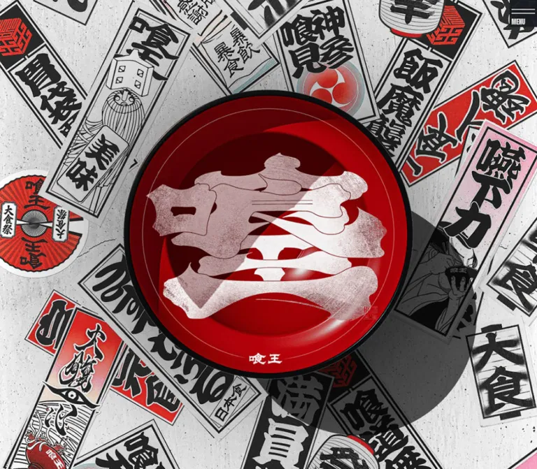
A vermilion lacquer bowl suspended over a wall of festival lettering, followed by torn paper, dark stages, and monumental names.
Website: gaou.knock.co.jp
Original URL: https://gaou.knock.co.jp/
Final URL: https://gaou.knock.co.jp/
Theme: alternating warm gray and charcoal sections, with saturated red concentrated in the opening artwork.
Inspected: September 12, 2026. Supplied retrieval timestamp: 2026-09-12T12:44:05.934Z, equivalent to 21:44:05.934 JST.
Viewports: desktop 1440 × 1000 and mobile 390 × 844 CSS pixels.
Scope: the current homepage: desktop and mobile opening compositions, the desktop video-to-fighter transition, footer layouts, and supplied rendered DOM measurements for the manifesto, sustainability copy, video links, fighter cards, and news entries. Linked destination pages and expanded navigation states were not inspected.
GAOU presents competitive eating as a dramatic entertainment event. Its opening composition is almost entirely artwork: a glossy red bowl, a large silver-white identity mark, overlapping Japanese placards, and a strong shadow falling toward the lower right. The small navigation sits above this dense scene without competing with the central object.
Below the opening, the design moves between distressed pale paper and deep charcoal. Bold Japanese Mincho text provides a measured editorial voice; monochrome fighter portraits provide the human focus. Oversized condensed English links turn the footer into another major visual composition. The reusable principle is the relationship between theatrical artwork, restrained interface controls, generous sectional spacing, and forceful typography.
This is a substantial event and content homepage with routes to profiles, information, news, and contact. Its approximately twelve-screen desktop document should be understood as a sequence of distinct scenes.
How to Read This Reference
- Measured means a value appears in the supplied rendered DOM or computed-style evidence. Measurements are CSS pixels unless stated otherwise.
- Derived means arithmetic based on those measurements, such as the space between adjacent cards.
- Estimated means a visual approximation from the supplied original-page screenshots. Estimated artwork dimensions and colors are not source declarations.
- Recommended means a proposed implementation choice. Breakpoints, unverified display typography, asset layering, and motion examples are explicitly treated this way.
- Named tokens are reusable aliases created for this document. The supplied evidence does not expose a complete source token system.
- The screenshots show selected positions in a long document. Text or components present only in the DOM are described with narrower visual claims.
- Repeated links and offscreen coordinates occur in the horizontal content tracks. They do not establish the number of unique entries or prove autoplay.
Tokens — Colors
Default Palette
| Name | Value | Token | Evidence and role |
|---|---|---|---|
| Warm Gray Paper | #DFDCD9 |
--color-paper |
Measured: body background at both viewports; manifesto and fighter-name text. The visible paper artwork varies around this base. |
| Stage Charcoal | #191C21 |
--color-ink |
Measured: manifesto section and fighter-card backgrounds; video date and title text on pale sections. |
| Lacquer Red | approximately #B00000 |
--color-lacquer |
Estimated representative color: the bowl contains darker recesses and much brighter highlights. This is a convenient accent alias, not a measured uniform fill. |
| Textured Near Black | approximately #08090A |
--color-stage-deep |
Estimated: deepest areas of the fighter-section texture. Use as an optional underlay beneath artwork. |
| Muted Footer Gray | approximately #858585 |
--color-muted |
Estimated: subdued copyright text. Verify contrast if reused for functional text. |
| Silver Identity | Image-dependent | No flat-color substitute | Observed artwork: fine lines, pale highlights, and dark incisions create a silver or engraved appearance. |
The body declaration references --token-2a3429a6-00ac-4e2b-9764-244f74e6eea4 with rgb(223, 220, 217) as its fallback. The computed background confirms the resulting paper color; the evidence does not establish whether the variable or its fallback supplied it.
Color hierarchy: red is overwhelmingly an artwork material. The surrounding interface relies on paper and charcoal. Small pink, muted blue-green, and red details appear inside the placard collage, but there is no evidence that they form a reusable UI status palette.
Some sampled anchor wrappers report browser blue while their visible children render branded artwork or explicitly styled text. Do not introduce blue links based on those wrapper values.
Theme Presets
No selectable color themes were evidenced. Pale and dark areas are different sections of the same page. Their changes in texture and contrast should remain tied to content and composition.
Tokens — Typography
Japanese Editorial Text
- Computed family:
'Shippori Mincho', 'Shippori Mincho Placeholder', serif. - Measured weights:
700for manifesto, sustainability copy, video titles, and fighter names;800for video dates. - Character: strong Mincho serifs, substantial strokes, and deliberate line spacing.
- Role: carries narrative, names, and event information without competing with the illustrated identity.
- Implementation alias:
--font-editorial: 'Shippori Mincho', serif.
The computed family declaration is established. A separate font-resource or resolved-glyph audit was not supplied. The placeholder family is part of the reported stack, not an additional font to reproduce.
Condensed English Display
The mobile MENU caption is measured as Anton, 'Anton Placeholder', sans-serif, weight 400, at 13px / 13px.
Footer links visibly use very tall, tightly condensed uppercase lettering. Their exact computed family and size are absent from the supplied element sample. Anton is a reasonable recommended implementation choice because it is independently evidenced elsewhere on the page; it is not a verified footer-font attribution.
Brush Navigation and Identity Artwork
Desktop labels such as TOP, 喰王について, ファイター紹介, and 最新情報 have an irregular brush appearance. Their anchors have empty extracted text, so the wrapper's 12px sans-serif declaration does not describe the visible lettering.
Treat the brush labels and the large identity mark as artwork unless actual font or asset evidence becomes available. Their outlines, internal textures, and distortions should not be approximated by selecting an arbitrary brush font.
Type Scale
| Role | Desktop | Mobile | Weight | Tracking | Status |
|---|---|---|---|---|---|
| Manifesto | 18px / 40.5px |
16px / 28px |
700 |
Normal | Measured |
| Sustainability copy | 16px / 32px |
14px / 24.5px |
700 |
Normal | Measured |
| Video date | 15px / 15px |
13px / 13px |
800 |
-0.02em |
Measured; tracking converted from pixel values |
| Video title | 20px / 30px |
16px / 24px |
700 |
-0.02em |
Measured |
| Fighter name | 24px / 33.6px |
22px / 30.8px |
700 |
-0.02em |
Measured |
| Mobile menu caption | Not shown | 13px / 13px |
400 |
Normal | Measured Anton |
| Footer English link | About 84–90px visible capital height |
About 40–44px visible capital height |
Visually heavy | Visually tight | Screenshot estimate; glyph height is not CSS font size |
| Footer Japanese subtitle | Approximately 18px |
Approximately 14–16px |
Visually bold | Slightly open appearance | Screenshot estimate |
For an adaptation, start the footer English text at 100px desktop and 48px mobile, then adjust using the actual loaded font. These are recommendations, not recovered source sizes.
The hierarchy depends on differences in character as much as size: graphic brush labels, readable Mincho text, and compressed English display lettering each have a distinct job.
Tokens — Spacing & Shapes
Density: compact controls and tightly grouped card information inside expansive illustrated sections. Geometry: square cards and controls, rectangular portrait frames, irregular paper boundaries, and one dominant circular bowl.
Spacing Scale
| Use | Desktop | Mobile | Evidence |
|---|---|---|---|
| Desktop navigation anchor padding | 2px 4px |
Not applicable | Measured |
| Desktop navigation gap | 24px |
Not applicable | Derived from anchor bounds |
| Manifesto section top padding | 200px |
64px |
Measured |
| Manifesto copy to detail link | 64px |
32px |
Derived |
| Sustainability copy to detail link | 64px |
32px |
Derived |
| Video-card internal flex gap | 24px |
16px |
Measured |
| Video-card horizontal gap | 32px |
32px |
Derived |
| Fighter-card horizontal gap | 16px |
16px |
Derived |
| Fighter-card padding | 24px 24px 40px |
16px |
Measured |
| Fighter image/name grouping gap | 24px |
24px |
Measured card flex gap |
| Footer side inset | Approximately 40px |
Approximately 20px |
Screenshot estimate |
The spacing forms a practical family of 16, 24, 32, 40, and 64px, with a separate 200px desktop scene inset. This is an extracted pattern, not proof of a source-wide spacing scale.
Border Radius
| Element | Treatment | Evidence |
|---|---|---|
| Fighter cards | 0 |
Measured |
| Video-link wrappers | 0 |
Measured |
| Carousel arrow buttons | 0 |
Measured |
| Desktop navigation anchors | 0 |
Measured |
| Portrait frame | Square, approximately 4px pale rule |
Screenshot estimate |
| Bowl | Circular artwork | Visual observation; not evidence of a CSS radius |
| Section boundary | Layered torn-paper contours | Visual observation |
Layout Measurements
| Element | Desktop 1440 × 1000 |
Mobile 390 × 844 |
Status |
|---|---|---|---|
| Document height | 12451.41px |
9566.63px |
Measured HTML bounds, rounded here |
| Desktop navigation group | 444px wide, starting at x = 498px |
Replaced visually by MENU control |
Group width derived |
| Desktop navigation top | Approximately 31px |
— | Measured anchor positions |
| Bowl diameter | Approximately 780px |
Approximately 450–455px, cropped laterally |
Screenshot estimate |
| Manifesto text column | 640px wide at x = 720px |
310px wide at x = 40px |
Measured |
| Sustainability text column | 470px wide at x = 134px |
350px wide at x = 20px |
Measured |
| About detail-link box | 403.19 × 66.08px |
195.30 × 32px |
Measured; visual content not sampled separately |
| Sustainability detail-link box | 399.5 × 65.47px |
220.5 × 36.14px |
Measured |
| Video-card width | 431.98px |
350px |
Measured |
| Video arrow target | 48 × 48px |
40 × 40px |
Measured |
| Fighter track viewport | 1408px wide at x = 16px |
358px wide at x = 16px |
Measured |
| Fighter card | 340 × 464.52px |
358 × 469.66px |
Measured |
| Fighter inner width | 292px |
326px |
Derived from card padding; consistent with measured name width |
| Mobile menu visual block | — | Approximately 56 × 56px at the upper right |
Screenshot estimate |
The desktop fighter fit is exact: 4 × 340 + 3 × 16 = 1408px. Mobile uses one 358px card inside 390 − 2 × 16px. Individual cards therefore become slightly wider on the inspected phone.
Components
Opening Artwork Stage
Role: establish identity and event intensity before introducing editorial content.
The desktop composition centers a nearly circular red bowl around (720, 500). It fills roughly 78% of the screenshot height and 54% of its width. A pale, finely textured identity mark occupies most of the bowl. Small supporting lettering, a red seal, curved highlights, and the thick black rim complete the object.
Behind it, elongated Japanese placards overlap at varied angles. Their black calligraphy and occasional color blocks create density around the perimeter. A large, directional shadow extends into the lower-right background. The visual depth is established by the artwork; no particular 3D engine or rendering technique is evidenced.
On mobile, the bowl remains centered around the middle of the screen but exceeds the viewport width. Its sides are intentionally cropped, while the upper and lower collage remain visible. This is an art-directed composition rather than a uniformly reduced desktop image.
Implementation recommendation: use authorized scene artwork. If separate assets exist, compose a full-bleed collage behind a centered bowl asset. If only a complete scene exists, use it as one image and avoid adding another bowl or duplicate shadow.
Desktop Primary Navigation
Role: persistent access to the homepage, About, Fighters, and News.
Four compact brush-like labels form a centered horizontal group. Measured anchor widths are 38, 116, 135, and 83px; gaps are 24px. Heights are approximately 22–23px, with 2px 4px padding.
The navigation remains near the top center in all three desktop captures. This supports a persistent-navigation observation, although the supplied computed properties do not identify its positioning mechanism.
Dark backing behind the pale lettering and a darker band near the top help it remain legible over the collage and pale sections. The backing may belong to child graphics or another layer: the sampled anchors themselves report transparent backgrounds.
Mobile Menu Trigger
Role: compact navigation entry point on narrow screens.
A dark square-like block occupies the upper-right corner. Two thin pale horizontal strokes sit above the condensed MENU caption. The caption's measured box starts at (338, 39) and is approximately 27.69 × 13px.
The trigger remains visible in the mobile footer capture. No open-menu state, close treatment, panel animation, focus management, or click result was supplied. The footer screenshot is not evidence that the menu was opened.
Manifesto Section
Role: explain the event's emotional premise.
The measured section uses a charcoal background with pale, bold Mincho text. Desktop copy sits in the right half of the page, beginning at x = 720px with a 640px width. Individual source lines such as 一皿一皿にドラマがある。 use 18px type with a spacious 40.5px line height.
At mobile width, most of those separate desktop lines become a flowing paragraph inside a 310px column with 40px side margins. Type becomes 16px / 28px. The final sentence remains a separate paragraph.
A linked graphical element follows the copy, with a measured gap of 64px desktop or 32px mobile. Its destination is /about. Its internal visual anatomy is not established by the supplied sample.
The section's top padding drops from 200px to 64px. Other illustrated content or spacing precedes the measured paragraph within the section, so this padding alone does not reproduce its full composition.
Sustainability Introduction
Role: connect the entertainment identity with the project's stated food-waste initiative.
The source copy describes using irregular produce and reports a reduction figure. Treat those statements as page content, not independently verified outcomes.
Desktop text occupies a 470px column aligned toward the left, at x = 134px. It uses 16px / 32px Mincho text. Mobile expands the column relative to the screen: 350px wide with 20px margins, using 14px / 24.5px.
A separate graphical link follows the paragraph. Its observed destination is /about#sustainabirity; retain that exact fragment when referring to the original link. The destination's appearance was not inspected.
Video Content Rail
Role: browse recorded matches and related event videos.
The rail contains linked entries with English-formatted dates and Japanese titles. Destinations are YouTube links. The supplied desktop transition capture shows the text ends of several entries and the arrows beneath them; their media areas are above that screenshot's visible region.
Cards measure approximately 432px wide on desktop and 350px on mobile, with 32px between consecutive entries. At the measured desktop position, the leading card starts around x = 104px, with further cards extending across and beyond the right edge. Mobile fits one card between 20px margins.
The date uses 15px desktop or 13px mobile, weight 800, with -0.02em tracking. Titles use 20px / 30px desktop or 16px / 24px mobile, weight 700, with the same tracking. The card's measured flex gap changes from 24px to 16px.
Thumbnail asset dimensions and aspect ratios are not supplied. A 16:9 media slot is a practical recommendation for an adaptation, not a measured original value.
Some long title rectangles extend beyond their sampled anchor rectangles. This does not establish visible clipping, but it is a reason to avoid copying a fixed card height. Let text determine height and verify that the whole visible entry remains clickable.
Carousel Arrow Controls
Role: visible directional controls associated with the horizontal content.
The desktop arrows appear as bold, slightly irregular black marks on the pale surface, with no circular container. Their button boxes are 48 × 48px. Measured positions are x = 104px and 252px, leaving 100px between the boxes.
Mobile video arrows measure 40 × 40px, at x = 105px and 245px. This centers their combined 180px span within the viewport while retaining the 100px internal gap.
The arrows are observed affordances. Their click effects, disabled states, hover styling, and swipe relationship were not exercised in the supplied evidence.
Torn-Paper Section Boundary
Role: change the scene from pale video content to the dark fighter stage.
Several irregular horizontal contours overlap like torn paper. Their colors step from pale gray through a darker gray into near black. The contours vary across the width rather than repeating as a regular wave.
Fine paper scratches continue through the pale area, with faint white illustrative strokes above the boundary. Beneath it, the dark texture creates a broad interval before the portrait cards enter.
Use a full-width graphic or an authored mask to reproduce this material edge. The CSS Quick Start includes a simplified polygon fallback only; it cannot reproduce the detailed torn fibers and illustrated texture.
Fighter Portrait Card
Role: introduce a participant and link to their profile.
The card is a square-cornered charcoal panel containing a monochrome portrait and a pale Mincho name beneath it. In the desktop screenshot, an inset pale rectangular frame surrounds each photograph. Faces and upper bodies are photographed against dark backgrounds; the treatment emphasizes individuals rather than food imagery.
Desktop anatomy:
- Outer box:
340 × 464.52px. - Padding:
24pxtop and sides,40pxbottom. - Inner width:
292px. - Content gap:
24px. - Name:
24px / 33.6px, weight700, tracking-0.02em.
Mobile anatomy:
- Outer box:
358 × 469.66px. - Padding:
16pxon all sides. - Inner width:
326px. - Content gap:
24px. - Name:
22px / 30.8px, weight700, tracking-0.02em.
Assuming a single portrait block followed by the name, subtracting padding, gap, and name height implies portrait slots of approximately 292 × 342.9px and 326 × 382.9px. Both suggest a width-to-height ratio near 0.8515. This is derived component arithmetic, not a measured image rectangle or native asset ratio.
The desktop rail fits four cards. Mobile presents one large card and has associated arrow-button evidence. Repeated profile links suggest a looping-track implementation, but its motion behavior is unverified.
Latest News Entries
Role: provide access to announcements and event updates.
The DOM establishes linked entries composed of a date, a parenthesized Japanese category, and a title. Examples include 喰王公式ルールブック and an event announcement. Four news entries appear in the desktop extraction and three in the mobile extraction.
The supplied screenshots do not show the news list closely, and no corresponding style measurements are included. Do not infer its exact row separators, thumbnail treatment, spacing, or typography from the video cards. Likewise, the differing entry counts do not prove an intentional responsive content rule.
Footer Navigation and Identity
Role: provide a broad site directory and finish with a second large brand composition.
Large uppercase English links are paired with smaller Japanese explanations. The observed sequence is TOP PAGE, ABOUT, FIGHTERS, SUSTAINABILITY, NEWS, SPONCER, and CONTACT.
On desktop, English and Japanese labels appear side by side. The last visible rows are positioned toward the left, while a very large silver identity mark occupies the lower-right area. The background is visually much flatter than the distressed fighter stage.
On mobile, each Japanese subtitle sits beneath its English label. The identity mark follows the link stack at nearly the available content width. The sitemap and subdued copyright line then appear below it, aligned left.
The source spelling is SPONCER. Preserve it when documenting the original UI; changing it to SPONSOR would be an editorial decision in a new implementation. Both sponsorship and contact links use the same mailto: destination. No contact form or submission flow was inspected.
The visible footer reads ©KNOCK All Rights Reserved.. This establishes the displayed copyright label only; the inspected homepage evidence does not provide named design or development credits.
Tokens — Motion & Interaction
| Feature | Evidence | What remains unverified |
|---|---|---|
| Persistent navigation | Navigation appears in the same upper-screen region across supplied scroll captures | Exact fixed/sticky implementation and any scroll-dependent transformation |
| Video carousel structure | Repeated entries, offscreen card coordinates, horizontal spacing, and paired buttons | Autoplay, direction, speed, easing, wrapping, dragging, and button results |
| Fighter carousel structure | Repeated profile links, horizontal card positions, and mobile button evidence | Whether movement is automatic, user-driven, or both |
| Opening artwork | A settled dimensional composition at both viewports | Intro sequence, rotation, pointer tracking, parallax, or scroll-linked animation |
| Mobile menu | Closed trigger visible in two captures | Opening behavior, overlay layout, transition, and keyboard operation |
| Sampled element animation | Many sampled wrappers report animation: none; transition shorthand is reported as all |
Ancestor animation, JavaScript-driven transforms, duration, and easing |
| Links | Homepage, internal routes, YouTube URLs, and mail links appear in the DOM | Destination-page behavior, new-tab behavior, and media playback |
A reported transition: all without timing details is not evidence of an active transition. Equally, animation: none on a card wrapper does not rule out motion on its track or parent.
The capture process waited for finite motion and layout stability, temporarily paused perpetual animations during readiness checks, and then resumed them. This is a capture procedure, not a catalogue of animations actually present on this page.
Recommended motion for an adaptation: begin with static artwork and manually navigable rails. If feedback is added, use restrained 120–180ms color or opacity changes. Introduce scene movement only after it is independently specified, and provide a reduced-motion mode and pause controls for any automatic track.
Surfaces
| Layer | Appearance | Function |
|---|---|---|
| Opening backdrop | Dense overlapping placards on a pale, marked surface | Establishes a Japanese festival and challenge atmosphere |
| Bowl | Glossy red material, dark rim, highlights, directional shadow | Main focal object |
| Identity mark | Pale engraved or finely lined texture with a small red seal | Distinctive brand shape |
| Editorial dark section | Measured charcoal with pale text | Supports manifesto and narrative |
| Video section | Pale distressed paper with dark text | Separates archive browsing from the dark portrait stage |
| Section edge | Multiple irregular gray paper contours | Connects contrasting scenes |
| Fighter stage | Near-black scratched texture | Frames monochrome photography |
| Fighter cards | Charcoal rectangular panels and pale portrait frames | Groups participant image and name |
| Footer | Visually flat charcoal | Gives oversized directory typography and the identity mark room to dominate |
There is no evidenced general elevation system. The bowl's dramatic shadow belongs to the scene artwork. Cards obtain separation through framing, tone, and spacing.
Imagery
The imagery combines the physical language of lacquerware, printed placards, worn paper, engraved lettering, and staged portrait photography.
The opening collage is crowded but organized around a clear central void occupied by the bowl. Placards vary in angle and scale. Their black lettering remains dominant even where red, pink, and muted blue-green details appear. Grain and surface damage help the fragments belong to the same environment.
The logo's fine internal lines and sweeping distortions are essential to its appearance. A plain white wordmark would lose the silver material effect. Preserve sufficient resolution for the desktop mark, and use ordinary smooth image rendering rather than pixelated scaling.
Fighter photography is monochrome, with dark clothing and backgrounds. Preserve face visibility and consistent portrait framing. If the original images are already monochrome, avoid adding a second heavy filter that compresses their tonal detail.
Observed Asset References
No image source URLs, asset filenames, or intrinsic image dimensions were included in the supplied evidence.
| Asset role | Observed evidence | Reuse guidance |
|---|---|---|
| Placard collage | Desktop and mobile opening captures | Obtain authorized artwork; provide mobile art direction where necessary |
| Red bowl and cast shadow | Both opening captures | Preserve lighting and shape; original asset separation is unknown |
| Silver identity mark and seal | Opening and footer captures | Reuse the actual graphic rather than typesetting an approximation |
| Brush navigation labels | Desktop captures | Preserve irregular silhouettes; raster versus vector format is unverified |
| Pale and dark paper textures | Desktop transition capture | Use large or carefully tiled textures without conspicuous repetition |
| Torn section edge | Desktop transition capture | Use an authored full-width edge or mask |
| Monochrome portraits | Desktop fighter capture | Keep faces and framing consistent; original asset paths are unavailable |
| Arrow graphics | Desktop transition capture | Preserve their visual weight; a simple text arrow is only a fallback |
The CSS below names asset slots through component classes. It does not invent original asset paths.
Layout & Responsive Behavior
Page Structure
The supplied document order establishes an opening region, manifesto, sustainability introduction, video content, fighter content, latest news, closing statement, and footer directory. These are content and visual chapters rather than a uniform series of cards.
The first measured manifesto section begins near document y = 2518px on desktop and 2381px on mobile. Those coordinates establish a substantial opening span. They do not prove that the first hero image itself has that height or that the opening uses a pinned animation.
Responsive Comparison
| Relationship | Desktop | Mobile |
|---|---|---|
| Opening focal object | Complete bowl with substantial side space | Bowl exceeds screen width and is cropped at both sides |
| Primary navigation | Four centered graphic labels | Corner menu trigger |
| Manifesto alignment | Right-side text column | Single column with 40px margins |
| Manifesto line treatment | Several deliberately separated lines | Flowing paragraph plus final sentence |
| Sustainability copy | Narrow left-side column | Nearly full content width with 20px margins |
| Video cards | Several entries across the viewport | One 350px entry within the content area |
| Fighter cards | Four 340px cards across |
One 358px card |
| Fighter padding | Larger frame and bottom space | Smaller padding around a larger inner portrait |
| Footer bilingual labels | English and Japanese on the same row | Japanese beneath English |
| Footer identity | Large and aligned toward the right | Full content-width graphic below navigation |
The exact breakpoint is absent from the supplied evidence. A 768px breakpoint in the Quick Start is a recommendation for interpolation between the two inspected endpoints, not a recovered source rule.
The mobile page remains long at approximately 9567px, or 11.3 inspected viewport heights. Avoid compressing all scenes simply because the screen is narrow. Preserve the strong artwork and the separation between content groups while reducing text and control spacing where measured.
Card widths and paragraph margins use different systems. Do not apply one global mobile gutter: manifesto copy uses 40px, sustainability and videos use 20px, and fighter tracks use 16px.
Do’s and Don’ts
Do
- Keep the measured paper
#DFDCD9and charcoal#191C21as the interface foundation. - Concentrate saturated red in the opening bowl and small identity details.
- Preserve the contrast between glossy focal artwork and distressed surrounding surfaces.
- Use the actual identity graphic and brush labels when authorized assets are available.
- Maintain bold Mincho typography with the measured line-height changes between viewports.
- Keep fighter portraits monochrome, rectangular, and generously framed.
- Preserve four-card desktop and one-card mobile fighter proportions.
- Use irregular layered paper contours between the pale archive and dark stage.
- Make the footer a major typographic composition with bilingual link pairs.
- Distinguish measured source behavior from new implementation decisions.
Don't
- Don't replace the central artwork with a generic text headline and large action button.
- Don't distribute bright red fills across every card and link.
- Don't turn portrait cards into rounded tiles with soft elevation shadows.
- Don't use the sampled wrapper font or browser-blue anchor color as the visible navigation style.
- Don't shrink the entire desktop hero uniformly to fit the phone width.
- Don't infer a parallax, WebGL, or autoplay implementation from still images.
- Don't duplicate repeated carousel entries as additional content records.
- Don't treat the footer capture as an opened mobile navigation panel.
- Don't replace the silver mark with plain white typesetting or blur away its internal texture.
- Don't give the full page a fixed viewport height; its content requires ordinary vertical access.
Recommended Implementation Additions
These are proposed improvements for a new implementation, not verified features of the inspected page:
- Give graphic navigation links accessible text names. Empty extracted text alone does not prove missing accessibility labels, so inspect the accessibility tree before diagnosing the original.
- Implement the menu trigger as a real button with
aria-expandedandaria-controls. Define focus behavior and an explicit close action for the eventual panel. - Use semantic links for video and fighter cards, with visible keyboard focus and complete clickable text areas.
- Keep decorative carousel clones out of the keyboard order and accessibility tree. Maintain one logical set of content records.
- Provide manual navigation and a pause option if rails move automatically. Preserve access to every entry with reduced motion enabled.
- Expand mobile arrow hit areas to at least
44 × 44pxwhile retaining the observed smaller graphic. - Use semantic
timeelements for dates rather than carrying over the sampled date headings as structural headings. - Reserve image dimensions to prevent layout shifts. Prioritize the opening artwork and defer below-the-fold portraits where appropriate.
- Verify pale text and focus indicators against the actual textured images, not only the flat token colors.
- Test long Japanese titles, text enlargement, and intermediate widths. Allow content heights to grow naturally.
Agent Prompt Guide
Quick Color Reference
- Main paper and reversed text:
#DFDCD9, measured. - Main charcoal and text on pale sections:
#191C21, measured. - Bowl accent approximation:
#B00000, estimated; the actual material has many tones. - Identity lettering: silver-white textured artwork, not a single fill.
- Portraits: monochrome on dark backgrounds.
- Section separation: torn gray contours and contrasting textures.
Overall Prompt
“Create an event and entertainment homepage inspired by GAOU's current visual language. Build an opening scene around a glossy vermilion bowl carrying a large silver textured identity mark, against overlapping Japanese placards and a strong directional shadow. Use warm gray #DFDCD9 and charcoal #191C21 for the interface. Follow with spacious editorial sections in bold Shippori Mincho, a pale video archive rail, a torn-paper transition, and framed monochrome participant portraits. Finish with oversized condensed English navigation paired with smaller Japanese labels and a large identity graphic. On mobile, crop the oversized bowl laterally, use a corner menu control, show one large portrait card, and stack footer subtitles below their English labels. Keep unverified motion out of the baseline implementation.”
Example Component Prompts
- Opening scene: “Compose a full-screen opening with a central lacquer-red bowl, an engraved silver identity graphic, and black calligraphic placards on distressed pale paper. Preserve a hard shadow toward the lower right. At 390px width, let the bowl extend beyond both sides while keeping its center visible. Use supplied artwork rather than generating the lettering with CSS.”
- Manifesto: “Create a charcoal editorial section with a 640px desktop text column aligned in the right half. Use Shippori Mincho at 18px, weight 700, and 40.5px line height. At 390px, use a 310px column with 40px side margins and 16px/28px type. Place the graphical detail link 64px below the copy on desktop and 32px below on mobile.”
- Fighter card: “Build a square charcoal profile card with a pale rectangular portrait frame, monochrome photograph, and bold Mincho name. Desktop: 340px width, 24px top/side padding, 40px bottom padding, 24px content gap, and 24px/33.6px name. Mobile: 358px width, 16px padding, the same content gap, and 22px/30.8px name.”
- Video rail: “Use horizontally arranged 432px desktop entries with 32px gaps, bold 15px dates, and 20px/30px Japanese titles on distressed warm gray. At 390px, use 350px entries, 13px dates, and 16px/24px titles. Add unboxed directional controls; use natural card heights for long titles.”
- Footer: “Create a flat charcoal directory with enormous pale condensed English links and smaller Mincho Japanese subtitles. Pair labels horizontally on desktop and stack them on mobile. Place a large silver identity image toward the desktop lower right and below the mobile link list. Leave clear space before the sitemap and subdued copyright text.”
Quick Start
CSS Custom Properties
This is a usable adaptation scaffold, not extracted production CSS. It keeps the measured content sizes and spacing, with recommended rules for the hero, footer, intermediate widths, focus, and manual horizontal scrolling.
Load authorized font files separately. Anton is verified for MENU; its footer use below is a recommendation. Supply project assets to the image elements: the hero example assumes separate collage and bowl slots, while the footer uses the identity image. Original asset separation is unknown.
Suggested anatomy:
.gaou-herocontains.gaou-hero__backdropand.gaou-hero__bowlimages..gaou-navcontains graphic links;.gaou-menucontains.gaou-menu__linesand.gaou-menu__caption..gaou-video-cardcontains a media image and a metadata group with a date and title..gaou-fighter-cardcontains a framed portrait and a name..gaou-footer-linkcontains.gaou-footer-enand.gaou-footer-jaspans.
:root {
  /* Measured interface colors */
  --color-paper: #dfdcd9;
  --color-ink: #191c21;

  /* Estimated appearance aliases */
  --color-lacquer: #b00000;
  --color-stage-deep: #08090a;
  --color-muted: #858585;

  /* Measured families; footer display use is recommended */
  --font-editorial: 'Shippori Mincho', serif;
  --font-display: 'Anton', sans-serif;

  --text-manifesto: 18px;
  --leading-manifesto: 2.25;
  --text-support: 16px;
  --leading-support: 2;
  --text-video: 20px;
  --text-date: 15px;
  --text-fighter: 24px;
  --tracking-content: -0.02em;

  --gap-track-video: 32px;
  --gap-track-fighter: 16px;
  --gap-card: 24px;
  --gap-detail-link: 64px;
  --section-top: 200px;
  --video-width: 432px;
  --fighter-width: 340px;
  --fighter-padding: 24px 24px 40px;
  --radius-card: 0px;

  /* Derived portrait-slot approximation */
  --portrait-ratio: 0.8515;

  /* Recommended values, not recovered source declarations */
  --text-footer: 100px;
  --portrait-rule: 4px;
  --feedback-duration: 150ms;
  --paper-texture: none;
  --dark-texture: none;
}

.gaou-site,
.gaou-site * {
  box-sizing: border-box;
}

.gaou-site {
  margin: 0;
  color: var(--color-ink);
  background: var(--color-paper);
  font-family: var(--font-editorial);
  font-weight: 700;
}

.gaou-site img {
  display: block;
  max-width: 100%;
  height: auto;
}

.gaou-site a {
  color: inherit;
}

.gaou-site button {
  font: inherit;
}

.gaou-paper {
  color: var(--color-ink);
  background-color: var(--color-paper);
  background-image: var(--paper-texture);
}

.gaou-dark {
  color: var(--color-paper);
  background-color: var(--color-ink);
}

/* Static opening-stage approximation */
.gaou-hero {
  position: relative;
  display: grid;
  place-items: center;
  min-height: 100vh;
  min-height: 100svh;
  overflow: hidden;
  isolation: isolate;
}

.gaou-hero__backdrop {
  position: absolute;
  inset: 0;
  width: 100%;
  height: 100% !important;
  object-fit: cover;
  z-index: -1;
}

.gaou-hero__bowl {
  width: min(78svh, 70vw);
  max-width: none !important;
  flex: none;
}

/* Persistent placement inferred from captures */
.gaou-nav {
  position: fixed;
  z-index: 20;
  top: 31px;
  left: 50%;
  display: flex;
  align-items: center;
  gap: 24px;
  transform: translateX(-50%);
}

.gaou-nav a {
  display: flex;
  align-items: center;
  padding: 2px 4px;
  color: var(--color-paper);
  text-decoration: none;
}

.gaou-nav img {
  width: auto;
  height: 19px;
}

.gaou-menu {
  display: none;
}

/* Reproduces the copy column, not the full illustrated section */
.gaou-manifesto {
  padding-top: var(--section-top);
}

.gaou-manifesto__copy {
  margin-inline: 50% 80px;
  font-size: var(--text-manifesto);
  line-height: var(--leading-manifesto);
}

.gaou-manifesto__copy p,
.gaou-sustainability__copy p {
  margin: 0;
}

.gaou-detail-link {
  display: block;
  width: min(100%, 403.19px);
  margin-top: var(--gap-detail-link);
}

.gaou-detail-link img {
  width: 100%;
}

.gaou-sustainability__copy {
  width: min(470px, calc(100% - 40px));
  margin-left: min(9.3056vw, 134px);
  font-size: var(--text-support);
  line-height: var(--leading-support);
}

.gaou-sustainability__copy .gaou-detail-link {
  width: min(100%, 399.5px);
}

/* Manual overflow is an accessible baseline, not proven source behavior */
.gaou-video-rail {
  display: flex;
  align-items: flex-start;
  gap: var(--gap-track-video);
  padding: 8px clamp(20px, 7.2222vw, 104px);
  overflow-x: auto;
  scroll-snap-type: x proximity;
}

.gaou-video-card {
  display: flex;
  flex: 0 0 var(--video-width);
  flex-direction: column;
  gap: var(--gap-card);
  min-width: 0;
  border-radius: 0;
  text-decoration: none;
  scroll-snap-align: start;
}

.gaou-video-card__media {
  width: 100%;
  aspect-ratio: 16 / 9; /* Recommended; source ratio unavailable */
  object-fit: cover;
}

.gaou-video-card__meta {
  display: grid;
  gap: 18px;
}

.gaou-video-card time {
  margin-left: 8px;
  font-size: var(--text-date);
  font-weight: 800;
  line-height: 1;
  letter-spacing: var(--tracking-content);
}

.gaou-video-card__title {
  margin: 0;
  font-size: var(--text-video);
  font-weight: 700;
  line-height: 1.5;
  letter-spacing: var(--tracking-content);
  overflow-wrap: anywhere;
}

.gaou-rail-controls {
  display: flex;
  gap: 100px;
  margin-top: 24px;
  padding-inline: clamp(20px, 7.2222vw, 104px);
}

.gaou-rail-control {
  display: grid;
  place-items: center;
  width: 48px;
  height: 48px;
  padding: 0;
  border: 0;
  border-radius: 0;
  color: inherit;
  background: transparent;
  cursor: pointer;
}

/* Simplified edge fallback; replace with authored paper artwork */
.gaou-torn-edge {
  position: relative;
  height: clamp(100px, 12vw, 180px);
  overflow: hidden;
  background: var(--color-paper);
}

.gaou-torn-edge::before,
.gaou-torn-edge::after {
  content: '';
  position: absolute;
  inset: 0;
  clip-path: polygon(
    0 44%, 7% 34%, 15% 38%, 24% 27%, 34% 36%,
    44% 47%, 55% 50%, 66% 43%, 76% 30%, 88% 25%,
    100% 20%, 100% 100%, 0 100%
  );
}

.gaou-torn-edge::before {
  background: #888785; /* Estimated intermediate paper tone */
}

.gaou-torn-edge::after {
  transform: translateY(32px);
  background: var(--color-stage-deep);
}

.gaou-fighters {
  color: var(--color-paper);
  background-color: var(--color-stage-deep);
  background-image: var(--dark-texture);
}

.gaou-fighter-rail {
  display: flex;
  align-items: flex-start;
  gap: var(--gap-track-fighter);
  padding: 8px 16px;
  overflow-x: auto;
  scroll-snap-type: x proximity;
}

.gaou-fighter-card {
  display: flex;
  flex: 0 0 var(--fighter-width);
  flex-direction: column;
  gap: 24px;
  min-width: 0;
  padding: var(--fighter-padding);
  border-radius: var(--radius-card);
  color: var(--color-paper);
  background: var(--color-ink);
  text-decoration: none;
  scroll-snap-align: start;
}

.gaou-fighter-card__portrait {
  width: 100%;
  aspect-ratio: var(--portrait-ratio);
  border: var(--portrait-rule) solid var(--color-paper);
  object-fit: cover;
  object-position: center top;
}

.gaou-fighter-card__name {
  margin: 0;
  font-size: var(--text-fighter);
  font-weight: 700;
  line-height: 1.4;
  letter-spacing: var(--tracking-content);
}

/* Footer typography and placement are screenshot-based adaptations */
.gaou-footer {
  position: relative;
  padding: 64px 40px;
  color: var(--color-paper);
  background: var(--color-ink);
}

.gaou-footer-nav {
  display: grid;
  justify-items: start;
}

.gaou-footer-link {
  display: flex;
  align-items: center;
  gap: 24px;
  max-width: 100%;
  text-decoration: none;
}

.gaou-footer-en {
  font-family: var(--font-display);
  font-size: var(--text-footer);
  font-weight: 400;
  line-height: 1.16;
}

.gaou-footer-ja {
  font-size: 18px;
  line-height: 1.4;
}

.gaou-footer-brand {
  width: 64%;
  max-width: 880px;
  margin: 40px 0 0 auto;
}

.gaou-footer-meta {
  position: absolute;
  left: 40px;
  bottom: 64px;
  display: grid;
  gap: 48px;
  font-size: 16px;
}

.gaou-footer-meta p {
  margin: 0;
  color: var(--color-muted);
}

/* Recommended interaction feedback */
.gaou-site a,
.gaou-site button {
  transition: opacity var(--feedback-duration) ease-out;
}

.gaou-site :focus-visible {
  outline: 2px solid currentColor;
  outline-offset: 4px;
}

@media (hover: hover) {
  .gaou-footer-link:hover,
  .gaou-video-card:hover {
    text-decoration: underline;
    text-underline-offset: 0.15em;
  }
}

/* Recommended breakpoint; only 390px and 1440px were inspected */
@media (max-width: 767px) {
  .gaou-site {
    --text-manifesto: 16px;
    --leading-manifesto: 1.75;
    --text-support: 14px;
    --leading-support: 1.75;
    --text-video: 16px;
    --text-date: 13px;
    --text-fighter: 22px;
    --text-footer: clamp(32px, 12.3077vw, 48px);
    --section-top: 64px;
    --gap-detail-link: 32px;
    --gap-card: 16px;
    --video-width: calc(100vw - 40px);
    --fighter-width: calc(100vw - 32px);
    --fighter-padding: 16px;
  }

  .gaou-hero__bowl {
    width: 116vw;
  }

  .gaou-nav {
    display: none;
  }

  .gaou-menu {
    position: fixed;
    z-index: 30;
    top: env(safe-area-inset-top, 0px);
    right: env(safe-area-inset-right, 0px);
    display: flex;
    flex-direction: column;
    align-items: flex-start;
    width: 56px;
    height: 56px;
    padding: 19px 4px 4px;
    border: 0;
    border-radius: 0;
    color: var(--color-paper);
    background: var(--color-ink);
    cursor: pointer;
  }

  .gaou-menu__lines {
    width: 48px;
    height: 10px;
    border-top: 2px solid currentColor;
    border-bottom: 2px solid currentColor;
  }

  .gaou-menu__caption {
    margin-top: 10px;
    font-family: var(--font-display);
    font-size: 13px;
    font-weight: 400;
    line-height: 1;
  }

  .gaou-manifesto__copy {
    margin-inline: 40px;
  }

  .gaou-detail-link {
    width: min(100%, 195.3px);
  }

  .gaou-sustainability__copy {
    width: auto;
    margin-inline: 20px;
  }

  .gaou-sustainability__copy .gaou-detail-link {
    width: min(100%, 220.5px);
  }

  .gaou-video-rail {
    padding-inline: 20px;
  }

  .gaou-video-card__meta {
    gap: 16px;
  }

  .gaou-video-card time {
    margin-left: 4px;
  }

  .gaou-rail-controls {
    justify-content: center;
    gap: 96px;
    padding-inline: 20px;
  }

  .gaou-rail-control {
    width: 44px; /* Recommended larger target; source is 40px */
    height: 44px;
  }

  .gaou-footer {
    padding: 64px 20px;
  }

  .gaou-footer-nav {
    gap: 12px;
  }

  .gaou-footer-link {
    flex-direction: column;
    align-items: flex-start;
    gap: 4px;
  }

  .gaou-footer-en {
    line-height: 1;
    overflow-wrap: anywhere;
  }

  .gaou-footer-ja {
    font-size: 16px;
    line-height: 1.25;
  }

  .gaou-footer-brand {
    width: 100%;
    margin-top: 64px;
  }

  .gaou-footer-meta {
    position: static;
    gap: 24px;
    margin-top: 40px;
  }
}

@media (prefers-reduced-motion: reduce) {
  .gaou-site *,
  .gaou-site *::before,
  .gaou-site *::after {
    animation: none !important;
    transition: none !important;
    scroll-behavior: auto !important;
  }
}
The rail CSS provides native horizontal access without cloned content. Arrow controllers and the mobile menu require separate behavioral implementation. The snippet does not claim to reproduce an unobserved menu or animation sequence. Test the scaffold at both inspected sizes and at intermediate widths once real assets and fonts are installed.
Tailwind v4 Token Mapping
Optional aliases for a project already using Tailwind v4. These map the adaptation's variables and are not evidence that the original site uses Tailwind.
@theme inline {
  --color-gaou-paper: var(--color-paper);
  --color-gaou-ink: var(--color-ink);
  --color-gaou-lacquer: var(--color-lacquer);
  --color-gaou-stage: var(--color-stage-deep);

  --font-gaou-editorial: var(--font-editorial);
  --font-gaou-display: var(--font-display);

  --text-gaou-manifesto: var(--text-manifesto);
  --text-gaou-support: var(--text-support);
  --text-gaou-video: var(--text-video);
  --text-gaou-date: var(--text-date);
  --text-gaou-fighter: var(--text-fighter);
  --text-gaou-footer: var(--text-footer);

  --spacing-gaou-video-gap: var(--gap-track-video);
  --spacing-gaou-fighter-gap: var(--gap-track-fighter);
  --spacing-gaou-detail-gap: var(--gap-detail-link);
  --radius-gaou-card: var(--radius-card);
}
Sources & Evidence
- Inspected original and final page: GAOU / 喰王. The supplied browser observation reports HTTP
200and identical original and final URLs. - Capture date: September 12, 2026; retrieval timestamp
2026-09-12T12:44:05.934Z. - Desktop evidence: three supplied
1440 × 1000captures showing the opening scene, video-to-fighter transition, and lower footer, plus rendered text, links, element rectangles, and computed styles. - Mobile evidence: two supplied
390 × 844captures showing the opening scene and lower footer, plus rendered text, links, element rectangles, and computed styles. - DOM coverage: detailed measurements support the manifesto, sustainability paragraph and links, video track, arrow targets, and first fighter track. News content and footer destinations are established by rendered text and links, with more limited style evidence.
- Interaction coverage: the capture process traversed the document and collected settled views. No explicit menu-opening, carousel-button, hover, keyboard, playback, or destination-navigation results were supplied.
- Inspection limitations: readiness checks used bounded waits for loading, motion, layout stability, and image decoding. Delayed content and unexercised interactions remain unverified. SharedWorkers and service workers were disabled during the supplied inspection.
- Asset and stylesheet limits: computed samples are available, but full stylesheets, image source paths, intrinsic image sizes, and a complete font-resource inventory are not. Screenshot estimates, derived arithmetic, and recommended CSS are labeled accordingly.
This reference describes the current homepage represented by the supplied original-page evidence. It does not reconstruct earlier designs or extend visual claims to linked pages that were not inspected.
# GAOU / 喰王 — Style Reference

> A vermilion lacquer bowl suspended over a wall of festival lettering, followed by torn paper, dark stages, and monumental names.

**Website:** [gaou.knock.co.jp](https://gaou.knock.co.jp/)
**Original URL:** https://gaou.knock.co.jp/
**Final URL:** https://gaou.knock.co.jp/
**Theme:** alternating warm gray and charcoal sections, with saturated red concentrated in the opening artwork.
**Inspected:** September 12, 2026. Supplied retrieval timestamp: `2026-09-12T12:44:05.934Z`, equivalent to 21:44:05.934 JST.
**Viewports:** desktop `1440 × 1000` and mobile `390 × 844` CSS pixels.
**Scope:** the current homepage: desktop and mobile opening compositions, the desktop video-to-fighter transition, footer layouts, and supplied rendered DOM measurements for the manifesto, sustainability copy, video links, fighter cards, and news entries. Linked destination pages and expanded navigation states were not inspected.

GAOU presents competitive eating as a dramatic entertainment event. Its opening composition is almost entirely artwork: a glossy red bowl, a large silver-white identity mark, overlapping Japanese placards, and a strong shadow falling toward the lower right. The small navigation sits above this dense scene without competing with the central object.

Below the opening, the design moves between distressed pale paper and deep charcoal. Bold Japanese Mincho text provides a measured editorial voice; monochrome fighter portraits provide the human focus. Oversized condensed English links turn the footer into another major visual composition. The reusable principle is the relationship between theatrical artwork, restrained interface controls, generous sectional spacing, and forceful typography.

This is a substantial event and content homepage with routes to profiles, information, news, and contact. Its approximately twelve-screen desktop document should be understood as a sequence of distinct scenes.

## How to Read This Reference

- **Measured** means a value appears in the supplied rendered DOM or computed-style evidence. Measurements are CSS pixels unless stated otherwise.
- **Derived** means arithmetic based on those measurements, such as the space between adjacent cards.
- **Estimated** means a visual approximation from the supplied original-page screenshots. Estimated artwork dimensions and colors are not source declarations.
- **Recommended** means a proposed implementation choice. Breakpoints, unverified display typography, asset layering, and motion examples are explicitly treated this way.
- **Named tokens** are reusable aliases created for this document. The supplied evidence does not expose a complete source token system.
- The screenshots show selected positions in a long document. Text or components present only in the DOM are described with narrower visual claims.
- Repeated links and offscreen coordinates occur in the horizontal content tracks. They do not establish the number of unique entries or prove autoplay.

## Tokens — Colors

### Default Palette

| Name | Value | Token | Evidence and role |
| --- | --- | --- | --- |
| Warm Gray Paper | `#DFDCD9` | `--color-paper` | **Measured:** body background at both viewports; manifesto and fighter-name text. The visible paper artwork varies around this base. |
| Stage Charcoal | `#191C21` | `--color-ink` | **Measured:** manifesto section and fighter-card backgrounds; video date and title text on pale sections. |
| Lacquer Red | approximately `#B00000` | `--color-lacquer` | **Estimated representative color:** the bowl contains darker recesses and much brighter highlights. This is a convenient accent alias, not a measured uniform fill. |
| Textured Near Black | approximately `#08090A` | `--color-stage-deep` | **Estimated:** deepest areas of the fighter-section texture. Use as an optional underlay beneath artwork. |
| Muted Footer Gray | approximately `#858585` | `--color-muted` | **Estimated:** subdued copyright text. Verify contrast if reused for functional text. |
| Silver Identity | Image-dependent | No flat-color substitute | **Observed artwork:** fine lines, pale highlights, and dark incisions create a silver or engraved appearance. |

The body declaration references `--token-2a3429a6-00ac-4e2b-9764-244f74e6eea4` with `rgb(223, 220, 217)` as its fallback. The computed background confirms the resulting paper color; the evidence does not establish whether the variable or its fallback supplied it.

**Color hierarchy:** red is overwhelmingly an artwork material. The surrounding interface relies on paper and charcoal. Small pink, muted blue-green, and red details appear inside the placard collage, but there is no evidence that they form a reusable UI status palette.

Some sampled anchor wrappers report browser blue while their visible children render branded artwork or explicitly styled text. Do not introduce blue links based on those wrapper values.

### Theme Presets

No selectable color themes were evidenced. Pale and dark areas are different sections of the same page. Their changes in texture and contrast should remain tied to content and composition.

## Tokens — Typography

### Japanese Editorial Text

- **Computed family:** `'Shippori Mincho', 'Shippori Mincho Placeholder', serif`.
- **Measured weights:** `700` for manifesto, sustainability copy, video titles, and fighter names; `800` for video dates.
- **Character:** strong Mincho serifs, substantial strokes, and deliberate line spacing.
- **Role:** carries narrative, names, and event information without competing with the illustrated identity.
- **Implementation alias:** `--font-editorial: 'Shippori Mincho', serif`.

The computed family declaration is established. A separate font-resource or resolved-glyph audit was not supplied. The placeholder family is part of the reported stack, not an additional font to reproduce.

### Condensed English Display

The mobile `MENU` caption is measured as `Anton, 'Anton Placeholder', sans-serif`, weight `400`, at `13px / 13px`.

Footer links visibly use very tall, tightly condensed uppercase lettering. Their exact computed family and size are absent from the supplied element sample. Anton is a reasonable **recommended implementation choice** because it is independently evidenced elsewhere on the page; it is not a verified footer-font attribution.

### Brush Navigation and Identity Artwork

Desktop labels such as `TOP`, `喰王について`, `ファイター紹介`, and `最新情報` have an irregular brush appearance. Their anchors have empty extracted text, so the wrapper's `12px sans-serif` declaration does not describe the visible lettering.

Treat the brush labels and the large identity mark as artwork unless actual font or asset evidence becomes available. Their outlines, internal textures, and distortions should not be approximated by selecting an arbitrary brush font.

### Type Scale

| Role | Desktop | Mobile | Weight | Tracking | Status |
| --- | --- | --- | --- | --- | --- |
| Manifesto | `18px / 40.5px` | `16px / 28px` | `700` | Normal | Measured |
| Sustainability copy | `16px / 32px` | `14px / 24.5px` | `700` | Normal | Measured |
| Video date | `15px / 15px` | `13px / 13px` | `800` | `-0.02em` | Measured; tracking converted from pixel values |
| Video title | `20px / 30px` | `16px / 24px` | `700` | `-0.02em` | Measured |
| Fighter name | `24px / 33.6px` | `22px / 30.8px` | `700` | `-0.02em` | Measured |
| Mobile menu caption | Not shown | `13px / 13px` | `400` | Normal | Measured Anton |
| Footer English link | About `84–90px` visible capital height | About `40–44px` visible capital height | Visually heavy | Visually tight | Screenshot estimate; glyph height is not CSS font size |
| Footer Japanese subtitle | Approximately `18px` | Approximately `14–16px` | Visually bold | Slightly open appearance | Screenshot estimate |

For an adaptation, start the footer English text at `100px` desktop and `48px` mobile, then adjust using the actual loaded font. These are recommendations, not recovered source sizes.

The hierarchy depends on differences in character as much as size: graphic brush labels, readable Mincho text, and compressed English display lettering each have a distinct job.

## Tokens — Spacing & Shapes

**Density:** compact controls and tightly grouped card information inside expansive illustrated sections.
**Geometry:** square cards and controls, rectangular portrait frames, irregular paper boundaries, and one dominant circular bowl.

### Spacing Scale

| Use | Desktop | Mobile | Evidence |
| --- | --- | --- | --- |
| Desktop navigation anchor padding | `2px 4px` | Not applicable | Measured |
| Desktop navigation gap | `24px` | Not applicable | Derived from anchor bounds |
| Manifesto section top padding | `200px` | `64px` | Measured |
| Manifesto copy to detail link | `64px` | `32px` | Derived |
| Sustainability copy to detail link | `64px` | `32px` | Derived |
| Video-card internal flex gap | `24px` | `16px` | Measured |
| Video-card horizontal gap | `32px` | `32px` | Derived |
| Fighter-card horizontal gap | `16px` | `16px` | Derived |
| Fighter-card padding | `24px 24px 40px` | `16px` | Measured |
| Fighter image/name grouping gap | `24px` | `24px` | Measured card flex gap |
| Footer side inset | Approximately `40px` | Approximately `20px` | Screenshot estimate |

The spacing forms a practical family of `16`, `24`, `32`, `40`, and `64px`, with a separate `200px` desktop scene inset. This is an extracted pattern, not proof of a source-wide spacing scale.

### Border Radius

| Element | Treatment | Evidence |
| --- | --- | --- |
| Fighter cards | `0` | Measured |
| Video-link wrappers | `0` | Measured |
| Carousel arrow buttons | `0` | Measured |
| Desktop navigation anchors | `0` | Measured |
| Portrait frame | Square, approximately `4px` pale rule | Screenshot estimate |
| Bowl | Circular artwork | Visual observation; not evidence of a CSS radius |
| Section boundary | Layered torn-paper contours | Visual observation |

### Layout Measurements

| Element | Desktop `1440 × 1000` | Mobile `390 × 844` | Status |
| --- | --- | --- | --- |
| Document height | `12451.41px` | `9566.63px` | Measured HTML bounds, rounded here |
| Desktop navigation group | `444px` wide, starting at `x = 498px` | Replaced visually by `MENU` control | Group width derived |
| Desktop navigation top | Approximately `31px` | — | Measured anchor positions |
| Bowl diameter | Approximately `780px` | Approximately `450–455px`, cropped laterally | Screenshot estimate |
| Manifesto text column | `640px` wide at `x = 720px` | `310px` wide at `x = 40px` | Measured |
| Sustainability text column | `470px` wide at `x = 134px` | `350px` wide at `x = 20px` | Measured |
| About detail-link box | `403.19 × 66.08px` | `195.30 × 32px` | Measured; visual content not sampled separately |
| Sustainability detail-link box | `399.5 × 65.47px` | `220.5 × 36.14px` | Measured |
| Video-card width | `431.98px` | `350px` | Measured |
| Video arrow target | `48 × 48px` | `40 × 40px` | Measured |
| Fighter track viewport | `1408px` wide at `x = 16px` | `358px` wide at `x = 16px` | Measured |
| Fighter card | `340 × 464.52px` | `358 × 469.66px` | Measured |
| Fighter inner width | `292px` | `326px` | Derived from card padding; consistent with measured name width |
| Mobile menu visual block | — | Approximately `56 × 56px` at the upper right | Screenshot estimate |

The desktop fighter fit is exact: `4 × 340 + 3 × 16 = 1408px`. Mobile uses one `358px` card inside `390 − 2 × 16px`. Individual cards therefore become slightly wider on the inspected phone.

## Components

### Opening Artwork Stage

**Role:** establish identity and event intensity before introducing editorial content.

The desktop composition centers a nearly circular red bowl around `(720, 500)`. It fills roughly 78% of the screenshot height and 54% of its width. A pale, finely textured identity mark occupies most of the bowl. Small supporting lettering, a red seal, curved highlights, and the thick black rim complete the object.

Behind it, elongated Japanese placards overlap at varied angles. Their black calligraphy and occasional color blocks create density around the perimeter. A large, directional shadow extends into the lower-right background. The visual depth is established by the artwork; no particular 3D engine or rendering technique is evidenced.

On mobile, the bowl remains centered around the middle of the screen but exceeds the viewport width. Its sides are intentionally cropped, while the upper and lower collage remain visible. This is an art-directed composition rather than a uniformly reduced desktop image.

**Implementation recommendation:** use authorized scene artwork. If separate assets exist, compose a full-bleed collage behind a centered bowl asset. If only a complete scene exists, use it as one image and avoid adding another bowl or duplicate shadow.

### Desktop Primary Navigation

**Role:** persistent access to the homepage, About, Fighters, and News.

Four compact brush-like labels form a centered horizontal group. Measured anchor widths are `38`, `116`, `135`, and `83px`; gaps are `24px`. Heights are approximately `22–23px`, with `2px 4px` padding.

The navigation remains near the top center in all three desktop captures. This supports a persistent-navigation observation, although the supplied computed properties do not identify its positioning mechanism.

Dark backing behind the pale lettering and a darker band near the top help it remain legible over the collage and pale sections. The backing may belong to child graphics or another layer: the sampled anchors themselves report transparent backgrounds.

### Mobile Menu Trigger

**Role:** compact navigation entry point on narrow screens.

A dark square-like block occupies the upper-right corner. Two thin pale horizontal strokes sit above the condensed `MENU` caption. The caption's measured box starts at `(338, 39)` and is approximately `27.69 × 13px`.

The trigger remains visible in the mobile footer capture. No open-menu state, close treatment, panel animation, focus management, or click result was supplied. The footer screenshot is not evidence that the menu was opened.

### Manifesto Section

**Role:** explain the event's emotional premise.

The measured section uses a charcoal background with pale, bold Mincho text. Desktop copy sits in the right half of the page, beginning at `x = 720px` with a `640px` width. Individual source lines such as `一皿一皿にドラマがある。` use `18px` type with a spacious `40.5px` line height.

At mobile width, most of those separate desktop lines become a flowing paragraph inside a `310px` column with `40px` side margins. Type becomes `16px / 28px`. The final sentence remains a separate paragraph.

A linked graphical element follows the copy, with a measured gap of `64px` desktop or `32px` mobile. Its destination is `/about`. Its internal visual anatomy is not established by the supplied sample.

The section's top padding drops from `200px` to `64px`. Other illustrated content or spacing precedes the measured paragraph within the section, so this padding alone does not reproduce its full composition.

### Sustainability Introduction

**Role:** connect the entertainment identity with the project's stated food-waste initiative.

The source copy describes using irregular produce and reports a reduction figure. Treat those statements as page content, not independently verified outcomes.

Desktop text occupies a `470px` column aligned toward the left, at `x = 134px`. It uses `16px / 32px` Mincho text. Mobile expands the column relative to the screen: `350px` wide with `20px` margins, using `14px / 24.5px`.

A separate graphical link follows the paragraph. Its observed destination is `/about#sustainabirity`; retain that exact fragment when referring to the original link. The destination's appearance was not inspected.

### Video Content Rail

**Role:** browse recorded matches and related event videos.

The rail contains linked entries with English-formatted dates and Japanese titles. Destinations are YouTube links. The supplied desktop transition capture shows the text ends of several entries and the arrows beneath them; their media areas are above that screenshot's visible region.

Cards measure approximately `432px` wide on desktop and `350px` on mobile, with `32px` between consecutive entries. At the measured desktop position, the leading card starts around `x = 104px`, with further cards extending across and beyond the right edge. Mobile fits one card between `20px` margins.

The date uses `15px` desktop or `13px` mobile, weight `800`, with `-0.02em` tracking. Titles use `20px / 30px` desktop or `16px / 24px` mobile, weight `700`, with the same tracking. The card's measured flex gap changes from `24px` to `16px`.

Thumbnail asset dimensions and aspect ratios are not supplied. A `16:9` media slot is a practical recommendation for an adaptation, not a measured original value.

Some long title rectangles extend beyond their sampled anchor rectangles. This does not establish visible clipping, but it is a reason to avoid copying a fixed card height. Let text determine height and verify that the whole visible entry remains clickable.

### Carousel Arrow Controls

**Role:** visible directional controls associated with the horizontal content.

The desktop arrows appear as bold, slightly irregular black marks on the pale surface, with no circular container. Their button boxes are `48 × 48px`. Measured positions are `x = 104px` and `252px`, leaving `100px` between the boxes.

Mobile video arrows measure `40 × 40px`, at `x = 105px` and `245px`. This centers their combined `180px` span within the viewport while retaining the `100px` internal gap.

The arrows are observed affordances. Their click effects, disabled states, hover styling, and swipe relationship were not exercised in the supplied evidence.

### Torn-Paper Section Boundary

**Role:** change the scene from pale video content to the dark fighter stage.

Several irregular horizontal contours overlap like torn paper. Their colors step from pale gray through a darker gray into near black. The contours vary across the width rather than repeating as a regular wave.

Fine paper scratches continue through the pale area, with faint white illustrative strokes above the boundary. Beneath it, the dark texture creates a broad interval before the portrait cards enter.

Use a full-width graphic or an authored mask to reproduce this material edge. The CSS Quick Start includes a simplified polygon fallback only; it cannot reproduce the detailed torn fibers and illustrated texture.

### Fighter Portrait Card

**Role:** introduce a participant and link to their profile.

The card is a square-cornered charcoal panel containing a monochrome portrait and a pale Mincho name beneath it. In the desktop screenshot, an inset pale rectangular frame surrounds each photograph. Faces and upper bodies are photographed against dark backgrounds; the treatment emphasizes individuals rather than food imagery.

Desktop anatomy:

- Outer box: `340 × 464.52px`.
- Padding: `24px` top and sides, `40px` bottom.
- Inner width: `292px`.
- Content gap: `24px`.
- Name: `24px / 33.6px`, weight `700`, tracking `-0.02em`.

Mobile anatomy:

- Outer box: `358 × 469.66px`.
- Padding: `16px` on all sides.
- Inner width: `326px`.
- Content gap: `24px`.
- Name: `22px / 30.8px`, weight `700`, tracking `-0.02em`.

Assuming a single portrait block followed by the name, subtracting padding, gap, and name height implies portrait slots of approximately `292 × 342.9px` and `326 × 382.9px`. Both suggest a width-to-height ratio near `0.8515`. This is **derived component arithmetic**, not a measured image rectangle or native asset ratio.

The desktop rail fits four cards. Mobile presents one large card and has associated arrow-button evidence. Repeated profile links suggest a looping-track implementation, but its motion behavior is unverified.

### Latest News Entries

**Role:** provide access to announcements and event updates.

The DOM establishes linked entries composed of a date, a parenthesized Japanese category, and a title. Examples include `喰王公式ルールブック` and an event announcement. Four news entries appear in the desktop extraction and three in the mobile extraction.

The supplied screenshots do not show the news list closely, and no corresponding style measurements are included. Do not infer its exact row separators, thumbnail treatment, spacing, or typography from the video cards. Likewise, the differing entry counts do not prove an intentional responsive content rule.

### Footer Navigation and Identity

**Role:** provide a broad site directory and finish with a second large brand composition.

Large uppercase English links are paired with smaller Japanese explanations. The observed sequence is `TOP PAGE`, `ABOUT`, `FIGHTERS`, `SUSTAINABILITY`, `NEWS`, `SPONCER`, and `CONTACT`.

On desktop, English and Japanese labels appear side by side. The last visible rows are positioned toward the left, while a very large silver identity mark occupies the lower-right area. The background is visually much flatter than the distressed fighter stage.

On mobile, each Japanese subtitle sits beneath its English label. The identity mark follows the link stack at nearly the available content width. The sitemap and subdued copyright line then appear below it, aligned left.

The source spelling is `SPONCER`. Preserve it when documenting the original UI; changing it to `SPONSOR` would be an editorial decision in a new implementation. Both sponsorship and contact links use the same `mailto:` destination. No contact form or submission flow was inspected.

The visible footer reads `©KNOCK All Rights Reserved.`. This establishes the displayed copyright label only; the inspected homepage evidence does not provide named design or development credits.

## Tokens — Motion & Interaction

| Feature | Evidence | What remains unverified |
| --- | --- | --- |
| Persistent navigation | Navigation appears in the same upper-screen region across supplied scroll captures | Exact fixed/sticky implementation and any scroll-dependent transformation |
| Video carousel structure | Repeated entries, offscreen card coordinates, horizontal spacing, and paired buttons | Autoplay, direction, speed, easing, wrapping, dragging, and button results |
| Fighter carousel structure | Repeated profile links, horizontal card positions, and mobile button evidence | Whether movement is automatic, user-driven, or both |
| Opening artwork | A settled dimensional composition at both viewports | Intro sequence, rotation, pointer tracking, parallax, or scroll-linked animation |
| Mobile menu | Closed trigger visible in two captures | Opening behavior, overlay layout, transition, and keyboard operation |
| Sampled element animation | Many sampled wrappers report `animation: none`; transition shorthand is reported as `all` | Ancestor animation, JavaScript-driven transforms, duration, and easing |
| Links | Homepage, internal routes, YouTube URLs, and mail links appear in the DOM | Destination-page behavior, new-tab behavior, and media playback |

A reported `transition: all` without timing details is not evidence of an active transition. Equally, `animation: none` on a card wrapper does not rule out motion on its track or parent.

The capture process waited for finite motion and layout stability, temporarily paused perpetual animations during readiness checks, and then resumed them. This is a capture procedure, not a catalogue of animations actually present on this page.

**Recommended motion for an adaptation:** begin with static artwork and manually navigable rails. If feedback is added, use restrained `120–180ms` color or opacity changes. Introduce scene movement only after it is independently specified, and provide a reduced-motion mode and pause controls for any automatic track.

## Surfaces

| Layer | Appearance | Function |
| --- | --- | --- |
| Opening backdrop | Dense overlapping placards on a pale, marked surface | Establishes a Japanese festival and challenge atmosphere |
| Bowl | Glossy red material, dark rim, highlights, directional shadow | Main focal object |
| Identity mark | Pale engraved or finely lined texture with a small red seal | Distinctive brand shape |
| Editorial dark section | Measured charcoal with pale text | Supports manifesto and narrative |
| Video section | Pale distressed paper with dark text | Separates archive browsing from the dark portrait stage |
| Section edge | Multiple irregular gray paper contours | Connects contrasting scenes |
| Fighter stage | Near-black scratched texture | Frames monochrome photography |
| Fighter cards | Charcoal rectangular panels and pale portrait frames | Groups participant image and name |
| Footer | Visually flat charcoal | Gives oversized directory typography and the identity mark room to dominate |

There is no evidenced general elevation system. The bowl's dramatic shadow belongs to the scene artwork. Cards obtain separation through framing, tone, and spacing.

## Imagery

The imagery combines the physical language of lacquerware, printed placards, worn paper, engraved lettering, and staged portrait photography.

The opening collage is crowded but organized around a clear central void occupied by the bowl. Placards vary in angle and scale. Their black lettering remains dominant even where red, pink, and muted blue-green details appear. Grain and surface damage help the fragments belong to the same environment.

The logo's fine internal lines and sweeping distortions are essential to its appearance. A plain white wordmark would lose the silver material effect. Preserve sufficient resolution for the desktop mark, and use ordinary smooth image rendering rather than pixelated scaling.

Fighter photography is monochrome, with dark clothing and backgrounds. Preserve face visibility and consistent portrait framing. If the original images are already monochrome, avoid adding a second heavy filter that compresses their tonal detail.

### Observed Asset References

No image source URLs, asset filenames, or intrinsic image dimensions were included in the supplied evidence.

| Asset role | Observed evidence | Reuse guidance |
| --- | --- | --- |
| Placard collage | Desktop and mobile opening captures | Obtain authorized artwork; provide mobile art direction where necessary |
| Red bowl and cast shadow | Both opening captures | Preserve lighting and shape; original asset separation is unknown |
| Silver identity mark and seal | Opening and footer captures | Reuse the actual graphic rather than typesetting an approximation |
| Brush navigation labels | Desktop captures | Preserve irregular silhouettes; raster versus vector format is unverified |
| Pale and dark paper textures | Desktop transition capture | Use large or carefully tiled textures without conspicuous repetition |
| Torn section edge | Desktop transition capture | Use an authored full-width edge or mask |
| Monochrome portraits | Desktop fighter capture | Keep faces and framing consistent; original asset paths are unavailable |
| Arrow graphics | Desktop transition capture | Preserve their visual weight; a simple text arrow is only a fallback |

The CSS below names asset slots through component classes. It does not invent original asset paths.

## Layout & Responsive Behavior

### Page Structure

The supplied document order establishes an opening region, manifesto, sustainability introduction, video content, fighter content, latest news, closing statement, and footer directory. These are content and visual chapters rather than a uniform series of cards.

The first measured manifesto section begins near document `y = 2518px` on desktop and `2381px` on mobile. Those coordinates establish a substantial opening span. They do not prove that the first hero image itself has that height or that the opening uses a pinned animation.

### Responsive Comparison

| Relationship | Desktop | Mobile |
| --- | --- | --- |
| Opening focal object | Complete bowl with substantial side space | Bowl exceeds screen width and is cropped at both sides |
| Primary navigation | Four centered graphic labels | Corner menu trigger |
| Manifesto alignment | Right-side text column | Single column with `40px` margins |
| Manifesto line treatment | Several deliberately separated lines | Flowing paragraph plus final sentence |
| Sustainability copy | Narrow left-side column | Nearly full content width with `20px` margins |
| Video cards | Several entries across the viewport | One `350px` entry within the content area |
| Fighter cards | Four `340px` cards across | One `358px` card |
| Fighter padding | Larger frame and bottom space | Smaller padding around a larger inner portrait |
| Footer bilingual labels | English and Japanese on the same row | Japanese beneath English |
| Footer identity | Large and aligned toward the right | Full content-width graphic below navigation |

The exact breakpoint is absent from the supplied evidence. A `768px` breakpoint in the Quick Start is a recommendation for interpolation between the two inspected endpoints, not a recovered source rule.

The mobile page remains long at approximately `9567px`, or 11.3 inspected viewport heights. Avoid compressing all scenes simply because the screen is narrow. Preserve the strong artwork and the separation between content groups while reducing text and control spacing where measured.

Card widths and paragraph margins use different systems. Do not apply one global mobile gutter: manifesto copy uses `40px`, sustainability and videos use `20px`, and fighter tracks use `16px`.

## Do’s and Don’ts

### Do

- Keep the measured paper `#DFDCD9` and charcoal `#191C21` as the interface foundation.
- Concentrate saturated red in the opening bowl and small identity details.
- Preserve the contrast between glossy focal artwork and distressed surrounding surfaces.
- Use the actual identity graphic and brush labels when authorized assets are available.
- Maintain bold Mincho typography with the measured line-height changes between viewports.
- Keep fighter portraits monochrome, rectangular, and generously framed.
- Preserve four-card desktop and one-card mobile fighter proportions.
- Use irregular layered paper contours between the pale archive and dark stage.
- Make the footer a major typographic composition with bilingual link pairs.
- Distinguish measured source behavior from new implementation decisions.

### Don't

- Don't replace the central artwork with a generic text headline and large action button.
- Don't distribute bright red fills across every card and link.
- Don't turn portrait cards into rounded tiles with soft elevation shadows.
- Don't use the sampled wrapper font or browser-blue anchor color as the visible navigation style.
- Don't shrink the entire desktop hero uniformly to fit the phone width.
- Don't infer a parallax, WebGL, or autoplay implementation from still images.
- Don't duplicate repeated carousel entries as additional content records.
- Don't treat the footer capture as an opened mobile navigation panel.
- Don't replace the silver mark with plain white typesetting or blur away its internal texture.
- Don't give the full page a fixed viewport height; its content requires ordinary vertical access.

## Recommended Implementation Additions

These are proposed improvements for a new implementation, not verified features of the inspected page:

- Give graphic navigation links accessible text names. Empty extracted text alone does not prove missing accessibility labels, so inspect the accessibility tree before diagnosing the original.
- Implement the menu trigger as a real button with `aria-expanded` and `aria-controls`. Define focus behavior and an explicit close action for the eventual panel.
- Use semantic links for video and fighter cards, with visible keyboard focus and complete clickable text areas.
- Keep decorative carousel clones out of the keyboard order and accessibility tree. Maintain one logical set of content records.
- Provide manual navigation and a pause option if rails move automatically. Preserve access to every entry with reduced motion enabled.
- Expand mobile arrow hit areas to at least `44 × 44px` while retaining the observed smaller graphic.
- Use semantic `time` elements for dates rather than carrying over the sampled date headings as structural headings.
- Reserve image dimensions to prevent layout shifts. Prioritize the opening artwork and defer below-the-fold portraits where appropriate.
- Verify pale text and focus indicators against the actual textured images, not only the flat token colors.
- Test long Japanese titles, text enlargement, and intermediate widths. Allow content heights to grow naturally.

## Agent Prompt Guide

### Quick Color Reference

- Main paper and reversed text: `#DFDCD9`, measured.
- Main charcoal and text on pale sections: `#191C21`, measured.
- Bowl accent approximation: `#B00000`, estimated; the actual material has many tones.
- Identity lettering: silver-white textured artwork, not a single fill.
- Portraits: monochrome on dark backgrounds.
- Section separation: torn gray contours and contrasting textures.

### Overall Prompt

“Create an event and entertainment homepage inspired by GAOU's current visual language. Build an opening scene around a glossy vermilion bowl carrying a large silver textured identity mark, against overlapping Japanese placards and a strong directional shadow. Use warm gray `#DFDCD9` and charcoal `#191C21` for the interface. Follow with spacious editorial sections in bold Shippori Mincho, a pale video archive rail, a torn-paper transition, and framed monochrome participant portraits. Finish with oversized condensed English navigation paired with smaller Japanese labels and a large identity graphic. On mobile, crop the oversized bowl laterally, use a corner menu control, show one large portrait card, and stack footer subtitles below their English labels. Keep unverified motion out of the baseline implementation.”

### Example Component Prompts

1. **Opening scene:** “Compose a full-screen opening with a central lacquer-red bowl, an engraved silver identity graphic, and black calligraphic placards on distressed pale paper. Preserve a hard shadow toward the lower right. At 390px width, let the bowl extend beyond both sides while keeping its center visible. Use supplied artwork rather than generating the lettering with CSS.”
2. **Manifesto:** “Create a charcoal editorial section with a 640px desktop text column aligned in the right half. Use Shippori Mincho at 18px, weight 700, and 40.5px line height. At 390px, use a 310px column with 40px side margins and 16px/28px type. Place the graphical detail link 64px below the copy on desktop and 32px below on mobile.”
3. **Fighter card:** “Build a square charcoal profile card with a pale rectangular portrait frame, monochrome photograph, and bold Mincho name. Desktop: 340px width, 24px top/side padding, 40px bottom padding, 24px content gap, and 24px/33.6px name. Mobile: 358px width, 16px padding, the same content gap, and 22px/30.8px name.”
4. **Video rail:** “Use horizontally arranged 432px desktop entries with 32px gaps, bold 15px dates, and 20px/30px Japanese titles on distressed warm gray. At 390px, use 350px entries, 13px dates, and 16px/24px titles. Add unboxed directional controls; use natural card heights for long titles.”
5. **Footer:** “Create a flat charcoal directory with enormous pale condensed English links and smaller Mincho Japanese subtitles. Pair labels horizontally on desktop and stack them on mobile. Place a large silver identity image toward the desktop lower right and below the mobile link list. Leave clear space before the sitemap and subdued copyright text.”

## Quick Start

### CSS Custom Properties

This is a usable adaptation scaffold, not extracted production CSS. It keeps the measured content sizes and spacing, with recommended rules for the hero, footer, intermediate widths, focus, and manual horizontal scrolling.

Load authorized font files separately. Anton is verified for `MENU`; its footer use below is a recommendation. Supply project assets to the image elements: the hero example assumes separate collage and bowl slots, while the footer uses the identity image. Original asset separation is unknown.

Suggested anatomy:

- `.gaou-hero` contains `.gaou-hero__backdrop` and `.gaou-hero__bowl` images.
- `.gaou-nav` contains graphic links; `.gaou-menu` contains `.gaou-menu__lines` and `.gaou-menu__caption`.
- `.gaou-video-card` contains a media image and a metadata group with a date and title.
- `.gaou-fighter-card` contains a framed portrait and a name.
- `.gaou-footer-link` contains `.gaou-footer-en` and `.gaou-footer-ja` spans.

```css
:root {
  /* Measured interface colors */
  --color-paper: #dfdcd9;
  --color-ink: #191c21;

  /* Estimated appearance aliases */
  --color-lacquer: #b00000;
  --color-stage-deep: #08090a;
  --color-muted: #858585;

  /* Measured families; footer display use is recommended */
  --font-editorial: 'Shippori Mincho', serif;
  --font-display: 'Anton', sans-serif;

  --text-manifesto: 18px;
  --leading-manifesto: 2.25;
  --text-support: 16px;
  --leading-support: 2;
  --text-video: 20px;
  --text-date: 15px;
  --text-fighter: 24px;
  --tracking-content: -0.02em;

  --gap-track-video: 32px;
  --gap-track-fighter: 16px;
  --gap-card: 24px;
  --gap-detail-link: 64px;
  --section-top: 200px;
  --video-width: 432px;
  --fighter-width: 340px;
  --fighter-padding: 24px 24px 40px;
  --radius-card: 0px;

  /* Derived portrait-slot approximation */
  --portrait-ratio: 0.8515;

  /* Recommended values, not recovered source declarations */
  --text-footer: 100px;
  --portrait-rule: 4px;
  --feedback-duration: 150ms;
  --paper-texture: none;
  --dark-texture: none;
}

.gaou-site,
.gaou-site * {
  box-sizing: border-box;
}

.gaou-site {
  margin: 0;
  color: var(--color-ink);
  background: var(--color-paper);
  font-family: var(--font-editorial);
  font-weight: 700;
}

.gaou-site img {
  display: block;
  max-width: 100%;
  height: auto;
}

.gaou-site a {
  color: inherit;
}

.gaou-site button {
  font: inherit;
}

.gaou-paper {
  color: var(--color-ink);
  background-color: var(--color-paper);
  background-image: var(--paper-texture);
}

.gaou-dark {
  color: var(--color-paper);
  background-color: var(--color-ink);
}

/* Static opening-stage approximation */
.gaou-hero {
  position: relative;
  display: grid;
  place-items: center;
  min-height: 100vh;
  min-height: 100svh;
  overflow: hidden;
  isolation: isolate;
}

.gaou-hero__backdrop {
  position: absolute;
  inset: 0;
  width: 100%;
  height: 100% !important;
  object-fit: cover;
  z-index: -1;
}

.gaou-hero__bowl {
  width: min(78svh, 70vw);
  max-width: none !important;
  flex: none;
}

/* Persistent placement inferred from captures */
.gaou-nav {
  position: fixed;
  z-index: 20;
  top: 31px;
  left: 50%;
  display: flex;
  align-items: center;
  gap: 24px;
  transform: translateX(-50%);
}

.gaou-nav a {
  display: flex;
  align-items: center;
  padding: 2px 4px;
  color: var(--color-paper);
  text-decoration: none;
}

.gaou-nav img {
  width: auto;
  height: 19px;
}

.gaou-menu {
  display: none;
}

/* Reproduces the copy column, not the full illustrated section */
.gaou-manifesto {
  padding-top: var(--section-top);
}

.gaou-manifesto__copy {
  margin-inline: 50% 80px;
  font-size: var(--text-manifesto);
  line-height: var(--leading-manifesto);
}

.gaou-manifesto__copy p,
.gaou-sustainability__copy p {
  margin: 0;
}

.gaou-detail-link {
  display: block;
  width: min(100%, 403.19px);
  margin-top: var(--gap-detail-link);
}

.gaou-detail-link img {
  width: 100%;
}

.gaou-sustainability__copy {
  width: min(470px, calc(100% - 40px));
  margin-left: min(9.3056vw, 134px);
  font-size: var(--text-support);
  line-height: var(--leading-support);
}

.gaou-sustainability__copy .gaou-detail-link {
  width: min(100%, 399.5px);
}

/* Manual overflow is an accessible baseline, not proven source behavior */
.gaou-video-rail {
  display: flex;
  align-items: flex-start;
  gap: var(--gap-track-video);
  padding: 8px clamp(20px, 7.2222vw, 104px);
  overflow-x: auto;
  scroll-snap-type: x proximity;
}

.gaou-video-card {
  display: flex;
  flex: 0 0 var(--video-width);
  flex-direction: column;
  gap: var(--gap-card);
  min-width: 0;
  border-radius: 0;
  text-decoration: none;
  scroll-snap-align: start;
}

.gaou-video-card__media {
  width: 100%;
  aspect-ratio: 16 / 9; /* Recommended; source ratio unavailable */
  object-fit: cover;
}

.gaou-video-card__meta {
  display: grid;
  gap: 18px;
}

.gaou-video-card time {
  margin-left: 8px;
  font-size: var(--text-date);
  font-weight: 800;
  line-height: 1;
  letter-spacing: var(--tracking-content);
}

.gaou-video-card__title {
  margin: 0;
  font-size: var(--text-video);
  font-weight: 700;
  line-height: 1.5;
  letter-spacing: var(--tracking-content);
  overflow-wrap: anywhere;
}

.gaou-rail-controls {
  display: flex;
  gap: 100px;
  margin-top: 24px;
  padding-inline: clamp(20px, 7.2222vw, 104px);
}

.gaou-rail-control {
  display: grid;
  place-items: center;
  width: 48px;
  height: 48px;
  padding: 0;
  border: 0;
  border-radius: 0;
  color: inherit;
  background: transparent;
  cursor: pointer;
}

/* Simplified edge fallback; replace with authored paper artwork */
.gaou-torn-edge {
  position: relative;
  height: clamp(100px, 12vw, 180px);
  overflow: hidden;
  background: var(--color-paper);
}

.gaou-torn-edge::before,
.gaou-torn-edge::after {
  content: '';
  position: absolute;
  inset: 0;
  clip-path: polygon(
    0 44%, 7% 34%, 15% 38%, 24% 27%, 34% 36%,
    44% 47%, 55% 50%, 66% 43%, 76% 30%, 88% 25%,
    100% 20%, 100% 100%, 0 100%
  );
}

.gaou-torn-edge::before {
  background: #888785; /* Estimated intermediate paper tone */
}

.gaou-torn-edge::after {
  transform: translateY(32px);
  background: var(--color-stage-deep);
}

.gaou-fighters {
  color: var(--color-paper);
  background-color: var(--color-stage-deep);
  background-image: var(--dark-texture);
}

.gaou-fighter-rail {
  display: flex;
  align-items: flex-start;
  gap: var(--gap-track-fighter);
  padding: 8px 16px;
  overflow-x: auto;
  scroll-snap-type: x proximity;
}

.gaou-fighter-card {
  display: flex;
  flex: 0 0 var(--fighter-width);
  flex-direction: column;
  gap: 24px;
  min-width: 0;
  padding: var(--fighter-padding);
  border-radius: var(--radius-card);
  color: var(--color-paper);
  background: var(--color-ink);
  text-decoration: none;
  scroll-snap-align: start;
}

.gaou-fighter-card__portrait {
  width: 100%;
  aspect-ratio: var(--portrait-ratio);
  border: var(--portrait-rule) solid var(--color-paper);
  object-fit: cover;
  object-position: center top;
}

.gaou-fighter-card__name {
  margin: 0;
  font-size: var(--text-fighter);
  font-weight: 700;
  line-height: 1.4;
  letter-spacing: var(--tracking-content);
}

/* Footer typography and placement are screenshot-based adaptations */
.gaou-footer {
  position: relative;
  padding: 64px 40px;
  color: var(--color-paper);
  background: var(--color-ink);
}

.gaou-footer-nav {
  display: grid;
  justify-items: start;
}

.gaou-footer-link {
  display: flex;
  align-items: center;
  gap: 24px;
  max-width: 100%;
  text-decoration: none;
}

.gaou-footer-en {
  font-family: var(--font-display);
  font-size: var(--text-footer);
  font-weight: 400;
  line-height: 1.16;
}

.gaou-footer-ja {
  font-size: 18px;
  line-height: 1.4;
}

.gaou-footer-brand {
  width: 64%;
  max-width: 880px;
  margin: 40px 0 0 auto;
}

.gaou-footer-meta {
  position: absolute;
  left: 40px;
  bottom: 64px;
  display: grid;
  gap: 48px;
  font-size: 16px;
}

.gaou-footer-meta p {
  margin: 0;
  color: var(--color-muted);
}

/* Recommended interaction feedback */
.gaou-site a,
.gaou-site button {
  transition: opacity var(--feedback-duration) ease-out;
}

.gaou-site :focus-visible {
  outline: 2px solid currentColor;
  outline-offset: 4px;
}

@media (hover: hover) {
  .gaou-footer-link:hover,
  .gaou-video-card:hover {
    text-decoration: underline;
    text-underline-offset: 0.15em;
  }
}

/* Recommended breakpoint; only 390px and 1440px were inspected */
@media (max-width: 767px) {
  .gaou-site {
    --text-manifesto: 16px;
    --leading-manifesto: 1.75;
    --text-support: 14px;
    --leading-support: 1.75;
    --text-video: 16px;
    --text-date: 13px;
    --text-fighter: 22px;
    --text-footer: clamp(32px, 12.3077vw, 48px);
    --section-top: 64px;
    --gap-detail-link: 32px;
    --gap-card: 16px;
    --video-width: calc(100vw - 40px);
    --fighter-width: calc(100vw - 32px);
    --fighter-padding: 16px;
  }

  .gaou-hero__bowl {
    width: 116vw;
  }

  .gaou-nav {
    display: none;
  }

  .gaou-menu {
    position: fixed;
    z-index: 30;
    top: env(safe-area-inset-top, 0px);
    right: env(safe-area-inset-right, 0px);
    display: flex;
    flex-direction: column;
    align-items: flex-start;
    width: 56px;
    height: 56px;
    padding: 19px 4px 4px;
    border: 0;
    border-radius: 0;
    color: var(--color-paper);
    background: var(--color-ink);
    cursor: pointer;
  }

  .gaou-menu__lines {
    width: 48px;
    height: 10px;
    border-top: 2px solid currentColor;
    border-bottom: 2px solid currentColor;
  }

  .gaou-menu__caption {
    margin-top: 10px;
    font-family: var(--font-display);
    font-size: 13px;
    font-weight: 400;
    line-height: 1;
  }

  .gaou-manifesto__copy {
    margin-inline: 40px;
  }

  .gaou-detail-link {
    width: min(100%, 195.3px);
  }

  .gaou-sustainability__copy {
    width: auto;
    margin-inline: 20px;
  }

  .gaou-sustainability__copy .gaou-detail-link {
    width: min(100%, 220.5px);
  }

  .gaou-video-rail {
    padding-inline: 20px;
  }

  .gaou-video-card__meta {
    gap: 16px;
  }

  .gaou-video-card time {
    margin-left: 4px;
  }

  .gaou-rail-controls {
    justify-content: center;
    gap: 96px;
    padding-inline: 20px;
  }

  .gaou-rail-control {
    width: 44px; /* Recommended larger target; source is 40px */
    height: 44px;
  }

  .gaou-footer {
    padding: 64px 20px;
  }

  .gaou-footer-nav {
    gap: 12px;
  }

  .gaou-footer-link {
    flex-direction: column;
    align-items: flex-start;
    gap: 4px;
  }

  .gaou-footer-en {
    line-height: 1;
    overflow-wrap: anywhere;
  }

  .gaou-footer-ja {
    font-size: 16px;
    line-height: 1.25;
  }

  .gaou-footer-brand {
    width: 100%;
    margin-top: 64px;
  }

  .gaou-footer-meta {
    position: static;
    gap: 24px;
    margin-top: 40px;
  }
}

@media (prefers-reduced-motion: reduce) {
  .gaou-site *,
  .gaou-site *::before,
  .gaou-site *::after {
    animation: none !important;
    transition: none !important;
    scroll-behavior: auto !important;
  }
}
```

The rail CSS provides native horizontal access without cloned content. Arrow controllers and the mobile menu require separate behavioral implementation. The snippet does not claim to reproduce an unobserved menu or animation sequence. Test the scaffold at both inspected sizes and at intermediate widths once real assets and fonts are installed.

### Tailwind v4 Token Mapping

Optional aliases for a project already using Tailwind v4. These map the adaptation's variables and are not evidence that the original site uses Tailwind.

```css
@theme inline {
  --color-gaou-paper: var(--color-paper);
  --color-gaou-ink: var(--color-ink);
  --color-gaou-lacquer: var(--color-lacquer);
  --color-gaou-stage: var(--color-stage-deep);

  --font-gaou-editorial: var(--font-editorial);
  --font-gaou-display: var(--font-display);

  --text-gaou-manifesto: var(--text-manifesto);
  --text-gaou-support: var(--text-support);
  --text-gaou-video: var(--text-video);
  --text-gaou-date: var(--text-date);
  --text-gaou-fighter: var(--text-fighter);
  --text-gaou-footer: var(--text-footer);

  --spacing-gaou-video-gap: var(--gap-track-video);
  --spacing-gaou-fighter-gap: var(--gap-track-fighter);
  --spacing-gaou-detail-gap: var(--gap-detail-link);
  --radius-gaou-card: var(--radius-card);
}
```

## Sources & Evidence

- **Inspected original and final page:** [GAOU / 喰王](https://gaou.knock.co.jp/). The supplied browser observation reports HTTP `200` and identical original and final URLs.
- **Capture date:** September 12, 2026; retrieval timestamp `2026-09-12T12:44:05.934Z`.
- **Desktop evidence:** three supplied `1440 × 1000` captures showing the opening scene, video-to-fighter transition, and lower footer, plus rendered text, links, element rectangles, and computed styles.
- **Mobile evidence:** two supplied `390 × 844` captures showing the opening scene and lower footer, plus rendered text, links, element rectangles, and computed styles.
- **DOM coverage:** detailed measurements support the manifesto, sustainability paragraph and links, video track, arrow targets, and first fighter track. News content and footer destinations are established by rendered text and links, with more limited style evidence.
- **Interaction coverage:** the capture process traversed the document and collected settled views. No explicit menu-opening, carousel-button, hover, keyboard, playback, or destination-navigation results were supplied.
- **Inspection limitations:** readiness checks used bounded waits for loading, motion, layout stability, and image decoding. Delayed content and unexercised interactions remain unverified. SharedWorkers and service workers were disabled during the supplied inspection.
- **Asset and stylesheet limits:** computed samples are available, but full stylesheets, image source paths, intrinsic image sizes, and a complete font-resource inventory are not. Screenshot estimates, derived arithmetic, and recommended CSS are labeled accordingly.

This reference describes the current homepage represented by the supplied original-page evidence. It does not reconstruct earlier designs or extend visual claims to linked pages that were not inspected.