
DESIGN REFERENCE
リンツデマッチャ|抹茶チョコレートの世界
淡いセージ色と深緑、明朝体、抹茶の接写を組み合わせた商品紹介ページ。ゆったりした素材の物語から、商品一覧や取扱店舗へつなぐ構成。
オリジナルサイトを見るLindt de Matcha — Style Reference
Powdery matcha imagery, fine green typography, and quiet gold branding on a pale sage canvas.
Original URL: https://www.lindt.jp/f/lindtdematcha
Final URL: https://www.lindt.jp/f/lindtdematcha
Theme: light; pale sage backgrounds with green editorial text and brown commerce text
Inspected: September 12, 2026, at 05:05:46.782 JST; supplied retrieval timestamp: September 11, 2026, at 20:05:46.782 UTC
Viewports: desktop 1440 × 1000 CSS pixels; mobile 390 × 844 CSS pixels
Scope: the current brand and product editorial page within the Lindt online shop. Evidence covers the opening visual, brand introduction, product ribbon, Matcha stories, Melt / Texture / Fresh product groups, Lineup and Gift catalogs, café store information, footer, and persistent promotional elements.
The page builds its identity through a close relationship between ingredients and typography. Saturated green powder and pale chocolate imagery provide the visual intensity. The surrounding interface is restrained: a soft sage field, slender Japanese Mincho text, large Optima section names, and a gold Lindt mark. Body copy has unusually generous leading, allowing dense Japanese product descriptions to feel deliberate and spacious.
The structure is a long editorial journey with shopping and store information near the end. Desktop layouts separate large imagery from narrow reading columns. Mobile layouts retain the same content hierarchy while changing the ingredient stories into a sequence and the catalog into two columns. A small white Menu control and persistent promotional elements occupy the viewport edges. The promotional artwork is visually distinct from the page’s core system and should be documented separately.
How to Read This Reference
- Measured values come from the supplied rendered DOM, computed styles, custom properties, and element rectangles. They describe the recorded states at the two inspected viewports.
- Derived values are calculations from those rectangles, such as column gaps and offsets. They do not establish the original CSS implementation.
- Visual estimates describe screenshot geometry or colors for which computed values were not supplied. Approximate hexadecimal colors are implementation aids, not pixel samples.
- Recommendations describe a reusable implementation. The CSS selectors, responsive breakpoint, static story fallback, and accessibility additions are proposed adaptations.
- The five supplied captures show desktop opening, ingredient-story, and footer views, plus mobile opening and footer views. Intermediate sections have substantial DOM evidence but limited photographic coverage.
- Recorded link destinations establish intended navigation. Menu opening, accordion expansion, carousel controls, promotional dismissal, and purchase flows were not exercised in the supplied evidence.
- The source root font size is 10px at both viewports. This reference reports CSS pixels directly; the Quick Start does not require changing a project’s root size.
Tokens — Colors
Default Palette
| Name | Value | Source or suggested token | Evidence and role |
|---|---|---|---|
| Sage canvas | #E8EFE6 |
Source --page-bg |
Measured body and major editorial-section background at both viewports |
| Matcha green | #005C2F |
Source --green |
Measured default body color, opening navigation, product-story titles, and utility controls |
| Editorial green | #0C522E |
Suggested --color-editorial |
Measured introduction copy, ingredient copy, and many section headings |
| Deep green | #034C28 |
Source --green-deep |
Declared custom property; specific visible assignments were not established |
| Chocolate brown | #38251A |
Suggested --color-commerce |
Measured catalog names, prices, and Back to Top link |
| Utility white | #FFFFFF |
Source --white |
Measured Menu button surface |
| Brand gold | Approximately #AA9B60 |
Suggested --color-brand-gold |
Visual estimate of the logo artwork; use the approved artwork to retain its actual color |
| Fine sage rule | Approximately #CCDCCD |
Suggested --color-rule |
Visual estimate of the regional store dividers |
| Muted green caption | Approximately #8DAA99 |
Suggested --color-muted |
Visual estimate of the small Lindt de Matcha label in the ingredient story |
| Store offer surface | Approximately #DFE6D9 |
Suggested --color-offer |
Visual estimate of the slightly darker store-only product panel |
The measured green roles are close in hue but distinct. Preserve the change to brown in commerce information: product names and prices feel warmer and quieter than the ingredient narrative.
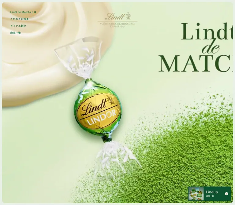
The hero section has a measured #DDDDDD background behind its media. This is a fallback surface, not the visible hero palette. The actual opening capture is dominated by green powder and a pale cream curved form on desktop; the mobile capture is almost entirely powder texture.
The supplied custom properties also include generic shop-platform colors, including blue links and prices. Those values do not describe the measured product prices or editorial links on this page. Prefer the rendered component values above.
Promotional Palette
The foreground promotion uses a light blue field, a burgundy oval, white lettering, and green foliage. Approximate visual references are #C7E0EB for the blue and #7F3037 for the burgundy. These colors belong to the promotional artwork. They are not evidence of an additional page theme or a general action-color system.
Tokens — Typography
Japanese Editorial Typography
Measured stack: YakuHanMP, 'Shippori Mincho', serif, also exposed through source --jp-font.
Japanese headings and paragraphs use a fine, literary Mincho treatment. The default body computes to weight 300, while principal narrative paragraphs use 400. Product-story descriptions and titles use 500; navigation commonly uses 600.
The stack is verified as a CSS declaration. Font files and per-glyph font resolution were not supplied, so do not assume every character was rendered by the same family. Retain the full stack when the corresponding fonts are available.
English Section Typography
Measured stack: Optima, serif, exposed through source --en-font.
Matcha, Melt, Texture, Fresh, Lineup, Store, Gift, and Store limited use this family. The large section names are regular weight, generally with a line height close to their font size. They establish hierarchy through size and open space rather than heavy weight.
Optima availability is environment-dependent. The supplied declaration falls back to serif; a replacement font should be treated as an explicit adaptation.
Brand Artwork and Utility Labels
The Lindt script mark is supplied visual artwork. The heading element around the opening mark has an empty extracted text value and a measured graphic-sized box. Its computed 28px heading font is not a specification for recreating the logo as ordinary text.
The Menu button itself computes to the Japanese editorial stack at 14px / 21px. Back to Top computes to Optima at 14px / 21px. Small social symbols are artwork or icons, not typographic substitutes for the brand mark.
Type Scale
Values below are measured CSS font size / line height. Tracking is shown separately where it materially defines the treatment.
| Role | Desktop | Mobile | Weight | Tracking or qualification |
|---|---|---|---|---|
| Default body and Menu | 14 / 21px |
14 / 21px |
300 |
Normal |
| Opening navigation | 14 / 14px |
Not visible in mobile opening | 600 |
0.16px |
| Introduction heading | 36 / 55.8px |
24 / 39.6px |
400 |
1.08px desktop; 2.4px mobile |
| Introduction prose | 17 / 37.4px |
14 / 30.8px |
400 |
0.5px desktop; 0.1px mobile |
| Matcha section name | 80 / 80px |
32 / 30.4px |
400 |
Optima; normal tracking |
| Ingredient-story heading | 30 / 48px |
24 / 40.8px |
400 |
2.4px desktop; normal mobile |
| Ingredient-story prose | 15 / 30px |
14 / 28px |
400 |
1.28px desktop; normal mobile |
| Product-section introduction | 40 / 72px |
24 / 43.2px |
400 |
3.2px desktop; -1px mobile |
| Melt / Texture / Fresh | 64 / 64px |
40 / 40px |
400 |
Optima |
| Taste-group Japanese subtitle | 24 / 38.4px |
20 / 30px |
400 |
-1px |
| Product-story title | 24 / 28.8px |
18 / 21.6px |
500 |
0.48px |
| Product-story description | 15 / 27px |
13 / 23.4px |
500 |
0.9px |
| Lineup / Store | 48 / 48px |
32 / 32px |
400 |
Optima |
| Catalog section caption | 14 / 22.4px |
12 / 19.2px |
400 |
1.12px |
| Gift | 32 / 32px |
24 / 24px |
400 |
Optima; additional bottom padding |
| Catalog product name | 17 / 27.2px |
12 / 20.64px |
400 |
1.02px; chocolate brown |
| Catalog price | 13 / 19.5px |
11 / 16.5px |
500 |
0.26px; chocolate brown |
| Store limited heading | 28 / 28px |
18 / 18px |
400 |
Optima |
| Store-only product name | 17 / 27.2px |
13 / 20.8px |
400 |
1.02px |
The source does not scale every role by one ratio. On mobile, Matcha becomes 32px, while the taste-group names remain larger at 40px. Preserve this hierarchy instead of shrinking all desktop text uniformly.
Tokens — Spacing & Shapes
The page combines precise local spacing with very large editorial pauses. There is no evidence of a single universal spacing unit. The important relationships are the narrow desktop outer frame, broad narrative padding, compact catalog gaps, and much larger separation before the footer identity.
Spacing Scale
| Application | Desktop | Mobile | Evidence |
|---|---|---|---|
| Main page padding | 10px |
0px |
Measured effective main padding |
| Introduction section padding | 200px 180px 180px |
120px 24px 80px |
Measured top / horizontal / bottom |
| Introduction paragraph gap | 20px |
20px |
Derived from consecutive paragraph rectangles |
| Ingredient heading bottom padding | 28px |
26px |
Measured |
| Product-story section padding | 235px 61px 150px |
108px 24px 130px |
Measured outer section |
| Melt and Texture group padding | 80px 0 210px |
0 0 130px |
Measured |
| Lineup section padding | 120px 62px 140px |
0 18px |
Measured |
| Catalog horizontal gap | 36px |
21px |
Derived from card positions |
| Catalog row gap | 48px |
24px |
Derived using the tallest preceding card |
| Mobile story-copy inset | — | 51px inside the 24px content inset |
Derived: story text starts at x = 75px |
| Store section top padding | 120px |
120px |
Measured |
| Store end to footer logo | 350px |
160px |
Derived from section and logo rectangles |
| Footer logo to social row | 55px |
28px |
Derived |
The source declares --page-padding: 8px on mobile, but the measured main padding is zero. A declared token does not prove that a particular component uses it.
Border Radius
| Element | Value | Evidence |
|---|---|---|
| Desktop hero | 18px |
Measured; matches source --radius |
| Mobile hero | 0px |
Measured, despite a declared mobile --radius: 14px |
| Menu button | 4px |
Measured at both viewports |
| Mobile ribbon-to-lineup link | 56px |
Measured radius on a 150 × 35px link |
| Store region rows | 0px |
Measured |
| Catalog link containers | 0px |
Measured |
| Region plus symbols | Circular, approximately 20px diameter |
Visual estimate |
| Sold out label | Capsule | Visible in the desktop store panel; exact radius unavailable |
| Promotion close control | Circular, approximately 30px diameter |
Visual estimate |
Layout Measurements
| Element | Desktop at 1440 × 1000 | Mobile at 390 × 844 |
|---|---|---|
| Recorded document height | Approximately 16,243px |
Approximately 14,056px |
| Hero rectangle | 1420 × 980px, at (10, 10) |
390 × 844px, at (0, 0) |
| Opening brand box | 210 × 81px, at (615, 64.75) |
140 × 54px, at (125, 40.75) |
| Menu button | 77 × 46px; 40px from top and right |
77 × 46px; 16px from top and right |
| Introduction reading column | 510px wide, starting at x = 740px |
342px wide, starting at x = 24px |
| Ingredient paragraph column | 420px wide, starting near x = 671.3px |
342px wide, starting at x = 24px |
| Taste-group label column | 320px wide, starting at x = 71px |
342px wide, starting at x = 24px |
| Product-story reading column | 306px wide, starting at x = 1063px |
291px wide, starting at x = 75px |
| Catalog content width | 1296px |
354px |
| Catalog card width | 408px |
166.5px |
| Regional store list width | 530px |
354px |
| Region button height | Approximately 48.7px, plus separating rule |
Approximately 48.8px, plus separating rule |
| Footer brand link | 209 × 80.6px |
180 × 69.4px |
| Social icon boxes | 20 × 20px |
18 × 18px |
Document heights are recorded-state measurements. They should not become fixed page heights in a new implementation.
Components
Opening Hero
Role: establish the brand through ingredient texture before introducing explanatory copy.
Desktop uses an almost full-screen media rectangle inside a 10px sage frame. Its 18px corners soften the otherwise expansive crop. The gold brand artwork sits near the top center. Four compact links form a vertical list at the upper left: Lindt de Matchaとは, こだわりの抹茶, アイテム紹介, and 商品一覧.
The opening navigation starts at approximately (54, 56) in viewport coordinates. Its 14px line boxes repeat every 37px, producing about 23px between links. There is no large explanatory headline visible over the opening media; the main Japanese introduction begins below it.
The desktop capture shows a broad pale curved form against granular green powder. The mobile capture shows a much tighter powder-filled composition. The mobile hero is edge-to-edge and square-cornered, and the logo becomes 140px wide. The difference establishes the importance of crop selection, but does not establish whether separate media files or different playback frames produced it.
Implementation recommendation: use an approved image or media asset with explicit desktop and mobile crop testing. Keep the logo as artwork and give the hero an accessible text identity independently of any embedded lettering.
Menu and Section Navigation
Role: provide navigation through a very long page.
In the scrolled captures, the Menu control is a small white rectangle with a soft shadow, two fine green horizontal strokes, and a text label. The button remains 77 × 46px on both viewports; only its edge offsets change.
The DOM exposes Menu and Close labels, primary section anchors, and seven product-story anchors. This supports a collapsible navigation component, but its expanded appearance was not captured. Some sampled links have narrow intermediate bounds even while the menu panel is not visible. Those rectangles are not a reliable specification for the open-menu layout.
The button is present in the DOM but is not visibly apparent in the supplied opening captures. Its exact appearance threshold or initial visibility logic is unverified.
Implementation recommendation: retain a button with aria-expanded and aria-controls, make the panel keyboard-operable, and restore focus when it closes. Match the measured trigger geometry; verify the expanded design separately.
Brand Introduction
Role: connect Swiss chocolate and Japanese matcha through measured, spacious prose.
Desktop places the text in a 510px column toward the right of the page. The heading uses two lines of 36px Mincho with 55.8px leading. Paragraphs use 17px text with 37.4px leading. The heading-to-first-paragraph separation is approximately 58px, followed by 20px paragraph gaps.
Mobile brings this block into a 342px column with 24px side insets. The heading becomes 24px, the body becomes 14px, and the heading-to-paragraph separation becomes approximately 28px. The large 120px top padding retains a deliberate pause after the immersive hero.
Preserve the line rhythm and clear paragraph groups. The evidence does not provide a visual specification for everything occupying the desktop area left of this text.
Product Ribbon
Role: introduce product forms and offer shortcuts before the ingredient narrative.
The DOM contains two repetitions of six linked items labeled 商品はこちら. Their rectangles extend beyond both viewport edges and have different widths, heights, and vertical offsets. Desktop examples include 383 × 380px, 416 × 300px, and 314 × 418px; corresponding mobile examples are approximately 202 × 202px, 221 × 160px, and 165 × 222px.
Derived horizontal gaps are 32px on desktop and approximately 12.7px on mobile. The arrangement is consistent with a repeated horizontal ribbon. Continuous movement, dragging, hover behavior, and loop timing are not established by the supplied snapshots.
Mobile also exposes a centered 150 × 35px link to #lineup, with a pill-shaped radius and the label 商品はこちら.
The ribbon uses dashed targets such as #product-1, while the menu uses targets such as #product1. Preserve or validate the actual anchor mapping; these names are not interchangeable.
Matcha Ingredient Stories
Role: give ingredients enough visual and reading space to carry the premium positioning.
The desktop screenshot presents a strong split composition. A tall photograph occupies roughly 589 × 976px at the left, beginning near the page’s 10px inset. Two shallow white bowls hold distinct piles of green matcha on a cool, pale surface. At the upper right, a small Japanese label accompanies the large 80px Matcha title. The reading content sits much lower in the right-hand area, leaving a broad open field above it.
The visible producer story has a muted Lindt de Matcha eyebrow, a 天空の抹茶® heading, the subheading 小柳津清一商店について, and a long paragraph. The paragraph column is measured at 420px wide with 15px / 30px type.
The desktop ingredient section reserves 6000px of document height. Several narrative blocks occupy similar coordinate bands in the DOM, while the screenshot shows one specific story state. This is consistent with staged or pinned storytelling. The supplied evidence does not establish pinning rules, scroll thresholds, transition sequencing, or the duration of any transition.
Mobile exposes three successive Matcha headings and narrative blocks at distinct document positions. The entire ingredient section measures approximately 4951.6px high. Headings use 32px English type and 24px Japanese type; paragraphs use 14px / 28px within 24px side insets.
Implementation recommendation: maintain three complete semantic stories. Use normal stacked panels as the baseline and add a desktop timeline only after its behavior has been independently specified. A 6000px empty spacer alone would not reproduce the observed composition.
Melt, Texture, and Fresh Product Stories
Role: organize products by sensory experience.
The sequence has three named groups:
- Melt: two chocolate products.
- Texture: three baked confectionery products.
- Fresh: a chocolate drink and a frozen dessert.
Desktop gives each group a 320px introductory column at the left. Its Optima heading is 64px, followed by a two-line Japanese statement at 24px / 38.4px. Individual product copy occupies a narrow 306px column near the right edge. The gap between these measured columns accommodates the product presentation; the supplied screenshots do not reveal every product image arrangement.
The measured product text has a clear hierarchy: occasional ingredient qualifier, 24px product title, then 15px / 27px description. Product titles can contain several intentional Japanese line breaks.
Mobile stacks the group introduction and product content. Individual descriptions begin at x = 75px, creating a distinctive 51px inset relative to the surrounding 24px content margin. The resulting copy width is 291px. Product names reduce to 18px, and descriptions to 13px / 23.4px.
Implementation recommendation: preserve the left label, image, and right copy relationship on wide screens. On mobile, retain a modest text indent while checking longer names and text enlargement. Do not infer a universal image crop from the text rectangles.
Lineup and Gift Catalog
Role: turn the editorial story into specific product destinations.
Each product entry is a block link containing a product visual, name, price, and availability or release annotation where applicable. The recorded catalog includes seven product links: four standard entries and three in Gift. Destinations use official /c/onlineshop/collection/… paths.
Desktop uses three equal 408px columns within a 1296px content area, with 36px horizontal gaps. Mobile uses two 166.5px columns within 354px, separated by 21px. The initial four products therefore occupy a three-plus-one arrangement on desktop and two-plus-two on mobile. Gift uses three desktop columns and wraps its third entry onto another mobile row.
Names and prices change from editorial green to #38251A. Desktop names use 17px, while mobile names use 12px; prices use 13px and 11px respectively. The measured link containers are square-cornered and unboxed. There is no evidence of a general elevated-card treatment.
Several entries show Sold out, and one shows 5/11 販売. These are recorded product states, not evidence that the page has been discontinued. Sold-out items retain link destinations in the DOM; disabled-link behavior was not verified.
The visible store-only Sold out label is a light rounded capsule. Its appearance can inform a status treatment, but exact catalog badge geometry was not supplied.
Regional Store List
Role: let visitors locate cafés carrying the relevant products.
The Store heading pairs 48px Optima with the smaller caption カフェ取扱店舗. Eight regional controls follow. Each row is a full-width button with its label at the left and a circular green plus at the right, separated by a pale one-pixel-looking rule.
The list is 530px wide on desktop. Buttons measure approximately 48.7px high and use 11px 0 13px padding with a 24px internal gap. On mobile the list spans 354px; padding becomes 12px 0 14px and the gap becomes 16px. The small plus symbol is nested inside a much larger row target.
Store names are available in the DOM, but no expanded state was captured. The number of simultaneously open regions, transition style, and keyboard behavior remain unverified.
Implementation recommendation: use real disclosure controls with associated panels and an exposed expanded state. Keep the entire row interactive and allow long store names to wrap naturally.
Store-Only Product Panel
Role: distinguish café products from the online catalog.
Desktop places this panel beside the regional list. The combined content area is 1080px wide: a 530px list, a derived 100px gap, and an approximately 450px panel. The panel’s content begins 16px inside its edge, with a measured 418px product-name width.
The visible anatomy is a Store limited heading, Japanese qualifier, product visual, two small pagination dots, product name, price, and Sold out status. The panel uses a subtly darker sage surface. Its screenshot dots are approximately 8px wide, with a dark active dot and a pale inactive dot.
Mobile places the offer before the regional list. Its inner text width becomes 322px, again consistent with 16px padding inside a 354px panel.
The desktop text snapshot exposes the chocolate drink at ¥1,200, while the mobile text snapshot exposes the frozen dessert at ¥890. Both names have overlapping element coordinates in their respective snapshots. These observations support a component with multiple slide states; they do not establish autoplay or a breakpoint-specific product substitution.
Footer Identity and Back to Top
Role: end the long page with a quiet brand signature.
A large uninterrupted sage field surrounds the centered gold mark. The desktop footer logo is 209px wide; the mobile footer logo is 180px wide, larger than the mobile hero logo. Three social links sit beneath it in a centered row: Instagram, X, and TikTok. Their measured boxes are 20px on desktop and 18px on mobile, with 20px gaps.
The logo begins approximately 350px after the desktop store section and 160px after the mobile store section. Social links follow the logo by 55px and 28px respectively. The small, muted copyright line creates another quiet layer below; its exact font size was not supplied.
Back to Top is an Optima link to #pagetop, presented vertically near the right edge with a fine extended line. The footer itself supplies the text © 2022,Lindt & Sprungli. All rights reserved. This is the displayed copyright string, not an inspection date or proof of when the current design was produced.
Persistent Product Shortcut and Promotion
Role: maintain access to products and display a separate promotional message.
Two overlapping elements appear at the lower right:
- A page-related image link to
#lineup, measured at approximately259.2 × 84pxon desktop and225 × 75.6pxon mobile. Its edge clearances are22pxdesktop and14pxmobile. - A foreground promotional image reading
リンツテナブルand Save the Chocolate, with a black circular close control. The artwork is approximately200 × 200pxin both captures.
The promotion begins near (1190, 795) in the desktop screenshot and (182, 639) on mobile. At 390px viewport width, its 200px artwork occupies approximately 51% of the screen width. It obscures most of the product shortcut and portions of the footer. The mobile close circle extends very close to, and appears partly beyond, the right edge.
This overlap is an observed current-page condition. Dismissal, persistence after closing, timing, and destination were not tested. A reusable adaptation should keep the close target fully inside the viewport and prevent simultaneous fixed elements from concealing essential controls.
Tokens — Motion & Interaction
Measured Transition Declarations
| Element | Recorded declaration | Evidence limit |
|---|---|---|
| Opening navigation link | opacity 0.25s |
Declaration measured; hover opacity endpoints not supplied |
| Product shortcut | transform 0.25s, opacity 0.25s |
Declaration measured; trigger and transform values unverified |
| Menu surface | background-color 0.48s cubic-bezier(0.22, 1, 0.36, 1) 1s |
Applies to the button surface, not a verified menu-panel entrance |
| Menu shadow | box-shadow 0.48s cubic-bezier(0.22, 1, 0.36, 1) 1s |
Same measured delay and easing |
| Primary menu links | padding-left 0.5s |
Open-panel interaction not exercised |
| Product menu links | opacity 0.5s |
End states not supplied |
| Mobile ribbon-to-lineup link | 0.6s |
Computed transition text supplied without useful property endpoints |
The page also has signs of stateful presentation: duplicated offscreen ribbon items, a large desktop ingredient-story section, and different visible store-product states. These are structural observations, not enough to specify animation timing.
The hero’s media format, playback duration, looping, audio, and autoplay behavior are unverified. A different image at another viewport may result from crop, responsive assets, or timing. Sampled elements reporting animation: none do not rule out animation on an unsampled parent, JavaScript-driven transforms, or moving media.
Recommended motion policy: keep utility feedback short and quiet, using opacity and limited transforms. Give any moving ribbon or hero an accessible pause/static alternative. Define the ingredient timeline separately from its readable content, and ensure every story remains available with reduced motion enabled.
Surfaces
| Layer | Appearance | Purpose |
|---|---|---|
| Page canvas | Flat #E8EFE6 |
Continuous editorial atmosphere |
| Opening media | Full-height crop; rounded only on desktop | Immediate ingredient impact |
| Narrative content | Same sage background; little visible boxing | Let photography, typography, and space define sections |
| Catalog links | Unboxed, square containers with brown metadata | Compact product browsing |
| Store offer | Slightly darker sage rectangle | Separate café-only products |
| Regional list | Transparent rows with fine pale rules | Organize disclosures without a heavy panel |
| Menu button | White, 4px radius, soft visible shadow |
Distinguish a floating utility control |
| Promotional artwork | Blue and burgundy image with a black close circle | Separate promotional communication |
The source declares --shadow: 0 10px 30px rgba(0, 0, 0, 0.12). A soft shadow is visible around the Menu button, but the supplied element record does not independently identify its exact box-shadow assignment. Use this declared value as an informed implementation choice, not as evidence that all surfaces use elevation.
Imagery
The primary image language is tactile food photography: finely milled powder, contrasting green grades, smooth pale forms, and restrained ceramic props. The ingredient photograph’s cool pale background gives the green powder clarity without introducing a loud interface color.
Preserve the distinction between two image roles. Opening imagery is an immersive crop in which texture can fill nearly the whole viewport. Ingredient photography is an editorial composition with identifiable objects and breathing room. Product catalog imagery must communicate the actual item and packaging clearly; the supplied screenshots do not establish the crop of every catalog image.
The gold mark provides the most traditional brand element. Its fine lettering, underline, and small supporting text should remain intact. Do not reproduce it using a loosely similar script font.
Observed Asset References
No image src, video src, font file URL, or artwork filename was supplied. The references below identify visible content without inventing asset paths.
| Visual | Evidence | Reuse guidance |
|---|---|---|
| Opening powder and pale curved form | Desktop opening capture | Obtain the approved original media; preserve texture and desktop framing |
| Powder-dominant opening crop | Mobile opening capture | Verify mobile framing independently |
| Two bowls of matcha | Desktop ingredient-story capture | Preserve the tall composition, ceramic whites, and distinct green powders |
| Gold Lindt artwork | Opening and footer captures | Use approved brand artwork; do not typeset a substitute |
| Store-only product visual | Partial desktop footer-area capture | Obtain the full image before specifying its crop |
| Product shortcut artwork | Partially visible at lower right in all captures | Link purpose is established by #lineup; full artwork details are obscured |
| Save the Chocolate promotion | Desktop and mobile captures | Treat as a separate promotional asset with its own lifecycle |
| Social symbols | Footer captures and original-page link destinations | Preserve Instagram, X, and TikTok recognition and provide accessible names |
Layout & Responsive Behavior
The desktop and mobile versions change both scale and composition.
| Area | Desktop observation | Mobile observation |
|---|---|---|
| Opening frame | 10px border of page color and 18px corners |
Full bleed and square corners |
| Opening navigation | Four visible upper-left links | Those links are absent from the opening capture |
| Menu | 40px top/right offsets in scrolled view |
16px top/right offsets; same button size |
| Introduction | Narrow right-hand reading column | Full editorial width inside 24px gutters |
| Ingredient stories | Tall split view with large reserved scroll area | Three successive story blocks in DOM order |
| Product stories | Separate group label and far-right copy columns | Stacked structure with indented product descriptions |
| Catalog | Three columns, 36px gap |
Two columns, 21px gap |
| Café information | Regional list beside store-only panel | Store-only panel before regional list |
| Footer | Smaller logo relative to page, very broad surrounding space | 180px logo and reduced but still generous spacing |
| Promotion | Small relative to viewport | Same approximate artwork size, much greater obstruction |
The desktop ingredient photograph occupies approximately 41.5% of the inner page width. Its text starts near 46.6% of the full viewport width, leaving a visible gutter between photograph and prose. This relationship is useful for an adaptation; an exact source grid declaration was not provided.
The product catalog calculations are firmer: (1296 − 2 × 36) / 3 = 408px on desktop and (354 − 21) / 2 = 166.5px on mobile. These reproduce the measured card widths.
Only 1440px and 390px viewport widths were inspected. Tablet composition, landscape mobile, breakpoint thresholds, browser chrome behavior, and text zoom remain unverified. The Quick Start uses a recommended 900px breakpoint, selected for the multi-column compositions; it is not a recovered source breakpoint.
Do’s and Don’ts
Do
- Keep the main canvas at measured
#E8EFE6and preserve the distinction between green editorial text and brown commerce text. - Use the declared Mincho and Optima stacks where available, with the measured role-specific sizes and leading.
- Let ingredient photography carry much of the visual impact.
- Keep the desktop opening frame thin and its corner treatment restrained.
- Retain generous space above and around ingredient copy.
- Preserve the Melt, Texture, and Fresh grouping and its two / three / two product structure.
- Use three catalog columns on wide screens and two at the inspected mobile width.
- Move the store-only panel before the regional list on mobile.
- Keep availability as readable text alongside product identity and price.
- Treat the foreground promotion as a separate layer with clear dismissal and collision handling.
Don’t
- Don’t turn the quiet editorial sections into a collection of elevated rounded cards.
- Don’t use generic shop-platform blue for prices when the rendered prices are brown.
- Don’t apply the declared mobile radius to the hero; its measured radius is zero.
- Don’t shrink every typography role by one common percentage.
- Don’t recreate the Lindt mark with an approximate script font.
- Don’t claim that video autoplay, ribbon looping, scroll pinning, or carousel timing was verified.
- Don’t hardcode a 6000px spacer without implementing and validating its associated story behavior.
- Don’t assume sold-out product links are disabled or that sold-out products make the page inactive.
- Don’t copy intermediate closed-menu rectangles as the intended expanded navigation layout.
- Don’t reproduce the mobile promotional overlap as a desirable interaction pattern.
Recommended Implementation Additions
These are recommendations for a new implementation, not verified features of the original page:
- Give the logo link, social links, image shortcut, and promotion close control explicit accessible names.
- Implement navigation and regional disclosures with keyboard support, visible focus, and state attributes connected to their panels.
- Keep all ingredient-story content in a meaningful reading order even when a desktop animation controls its visual presentation.
- Ensure text zoom can enlarge mobile product names and prices without clipping. The measured
12pxnames and11pxprices warrant particular testing. - Preserve product status text independently of imagery, and avoid communicating availability through reduced opacity alone.
- Give carousel controls descriptive labels and provide pause controls if automatic advancement is introduced.
- Serve suitable image sizes, reserve image dimensions, and provide an immediate hero poster if the approved asset is moving media.
- Keep fixed controls within safe-area boundaries and manage the product shortcut and promotion as one coordinated edge region.
- Validate essential text contrast over changing hero imagery, including the small gold mobile logo.
Agent Prompt Guide
The prompts below describe reusable adaptations. Interaction behavior that was not demonstrated by the supplied evidence must be specified and tested separately.
Quick Color Reference
- Main canvas:
#E8EFE6. - Default green:
#005C2F. - Editorial heading and paragraph green:
#0C522E. - Catalog names and prices:
#38251A. - Menu surface:
#FFFFFF. - Gold branding: use approved artwork; approximate visual reference
#AA9B60. - Dividers and store-offer backgrounds: subtle sage variations, not strong gray boxes.
- Promotional blue and burgundy belong to the promotional asset, not the general UI palette.
Overall Prompt
“Create a Japanese confectionery brand and product editorial page with a pale sage #E8EFE6 canvas, deep green Mincho text, regular Optima English section names, and approved gold brand artwork. Open with nearly full-viewport macro ingredient imagery, a centered top logo, and compact upper-left navigation on desktop. Follow with spacious brand prose, tall ingredient photography beside a narrow reading column, sensory product groups named Melt, Texture, and Fresh, and an unboxed product catalog with brown names and prices. Use three catalog columns on desktop and two on mobile. Place a regional store list beside a store-only offer on desktop, and put the offer first on mobile. Finish with a centered logo, small social icons, and a vertical Back to Top link. Keep all story content readable independently of any optional animation.”
Example Component Prompts
- Opening visual: “Build a 1440px desktop composition with a 10px sage outer frame, an 18px-radius media area, a 210px gold logo near the top center, and four compact 14px Mincho links at upper left. On a 390px phone, remove the outer frame and corner radius and reduce the logo to 140px. Test the powder texture crop independently at each size.”
- Ingredient story: “Pair a tall photograph of two shallow ceramic bowls of green matcha with an open sage text field. Put a regular 80px Optima Matcha heading toward the upper right and a 420px-wide Mincho narrative lower in that field. Use 30px Japanese headings and 15px text with 30px leading. Stack complete stories on mobile, using 24px side gutters and 14px / 28px prose.”
- Product group: “Create a sensory chapter with a 320px left label column, a large regular Optima group name, and a two-line Japanese subtitle. Present product imagery between the label area and a 306px right reading column. On mobile, stack the content and indent individual product descriptions 51px inside the main 24px gutter.”
- Catalog: “Use a flat sage product grid with square, unboxed links. Set three 408px desktop columns separated by 36px; at 390px use two 166.5px columns with 21px between them and 18px outer gutters. Put brown Mincho names and smaller prices beneath each image, and preserve explicit Sold out text.”
- Store and footer: “Build a fine-rule regional store list with full-width rows and small circular green plus symbols. Pair it with a subtly darker sage store-only product panel, then reorder the panel above the list on mobile. Leave generous space before a centered gold logo and three small social icons.”
Quick Start
CSS Custom Properties
This is a usable static adaptation of the measured visual system. Class names are implementation aliases. The 900px breakpoint, ingredient-panel fallback, image aspect ratios, and accessibility treatments are recommendations. Image files, font loading, menu state, disclosure state, and any animated timeline require separate implementation.
The ingredient panels use normal document flow as a readable baseline. The CSS does not attempt to reconstruct the unverified desktop story timeline. The promotional artwork is intentionally left as a separately managed component because its asset and behavior were not supplied.
:root {
  /* Measured page colors */
  --lindt-page: #e8efe6;
  --lindt-green: #005c2f;
  --lindt-editorial: #0c522e;
  --lindt-deep: #034c28;
  --lindt-commerce: #38251a;
  --lindt-white: #ffffff;

  /* Visual approximations for surfaces without computed colors */
  --lindt-rule: #ccdccd;
  --lindt-offer: #dfe6d9;
  --lindt-muted: #8daa99;

  /* Measured font stacks; load approved fonts separately */
  --lindt-font-jp: 'YakuHanMP', 'Shippori Mincho', serif;
  --lindt-font-en: 'Optima', serif;

  /* Measured geometry and declared shadow token */
  --lindt-frame: 10px;
  --lindt-hero-radius: 18px;
  --lindt-menu-radius: 4px;
  --lindt-shadow: 0 10px 30px rgb(0 0 0 / 12%);
  --lindt-catalog-gap: 36px;
  --lindt-catalog-row-gap: 48px;
  --lindt-utility-motion: 250ms;
}

.lindt-page,
.lindt-page * {
  box-sizing: border-box;
}

.lindt-page {
  padding: var(--lindt-frame);
  color: var(--lindt-green);
  background: var(--lindt-page);
  font: 300 14px / 1.5 var(--lindt-font-jp);
}

.lindt-page [hidden] {
  display: none !important;
}

.lindt-page img {
  display: block;
  max-width: 100%;
}

.lindt-page a {
  color: inherit;
}

.lindt-page :is(a, button):focus-visible {
  outline: 2px solid var(--lindt-deep);
  outline-offset: 4px;
}

.lindt-page [id] {
  scroll-margin-top: 100px;
}

.hero {
  position: relative;
  height: calc(100svh - 2 * var(--lindt-frame));
  overflow: hidden;
  border-radius: var(--lindt-hero-radius);
  background: #ddd;
}

.hero__media {
  position: absolute;
  inset: 0;
  width: 100%;
  height: 100%;
  object-fit: cover;
}

.hero__brand {
  position: absolute;
  top: 55px;
  left: 50%;
  width: 210px;
  margin: 0;
  transform: translateX(-50%);
}

.hero__nav {
  position: absolute;
  top: 46px;
  left: 44px;
  display: grid;
  gap: 23px;
}

.hero__nav a {
  font-size: 14px;
  font-weight: 600;
  line-height: 1;
  letter-spacing: 0.16px;
  text-decoration: none;
  transition: opacity var(--lindt-utility-motion);
}

.menu-trigger {
  position: fixed;
  z-index: 30;
  top: 40px;
  right: 40px;
  display: grid;
  place-content: center;
  width: 77px;
  height: 46px;
  padding: 0;
  border: 0;
  border-radius: var(--lindt-menu-radius);
  color: var(--lindt-green);
  background: var(--lindt-white);
  box-shadow: var(--lindt-shadow);
  font: 300 14px / 21px var(--lindt-font-jp);
  cursor: pointer;
}

.intro {
  padding: 200px 180px 180px;
}

.intro__copy {
  width: min(100%, 510px);
  margin-left: auto;
  color: var(--lindt-editorial);
}

.intro__copy h2 {
  margin: 0 0 58px;
  font-size: 36px;
  font-weight: 400;
  line-height: 1.55;
  letter-spacing: 1.08px;
}

.intro__copy p {
  margin: 0 0 20px;
  font-size: 17px;
  font-weight: 400;
  line-height: 2.2;
  letter-spacing: 0.5px;
}

/* Recommended static baseline for each complete ingredient story */
.matcha-story {
  display: grid;
  grid-template-columns: 41.5% minmax(0, 1fr);
  gap: 5.1%;
  min-height: calc(100svh - 20px);
  color: var(--lindt-editorial);
}

.matcha-story__visual {
  position: relative;
  min-height: 70svh;
  margin: 0;
}

.matcha-story__visual img {
  position: absolute;
  inset: 0;
  width: 100%;
  height: 100%;
  object-fit: cover;
}

.matcha-story__copy {
  display: flex;
  flex-direction: column;
  padding: 60px 72px 60px 0;
}

.matcha-story__label {
  margin: 0;
  text-align: right;
  font: 400 80px / 1 var(--lindt-font-en);
}

.matcha-story__text {
  max-width: 420px;
  margin-top: auto;
  padding-top: 64px;
}

.matcha-story__text h3 {
  margin: 0;
  padding-bottom: 28px;
  font-size: 30px;
  font-weight: 400;
  line-height: 1.6;
  letter-spacing: 2.4px;
}

.matcha-story__text p {
  margin: 10px 0 0;
  font-size: 15px;
  font-weight: 400;
  line-height: 2;
  letter-spacing: 1.28px;
}

.taste-sections {
  padding: 235px 61px 150px;
}

.taste-group {
  display: grid;
  grid-template-columns: 320px minmax(0, 1fr);
  gap: 32px;
  padding: 80px 0 210px;
}

.taste-group__heading {
  margin: 0 0 44px;
  color: var(--lindt-editorial);
  font: 400 64px / 1 var(--lindt-font-en);
}

.taste-group__subtitle {
  margin: 0;
  font-size: 24px;
  font-weight: 400;
  line-height: 1.6;
  letter-spacing: -1px;
}

.taste-products {
  display: grid;
  gap: 100px; /* Recommended separation between product stories */
}

.taste-product {
  display: grid;
  grid-template-columns: minmax(0, 1fr) 306px;
  gap: 32px;
  align-items: center;
}

.taste-product__image {
  width: 100%;
  height: auto;
  object-fit: contain;
}

.taste-product__copy h3 {
  margin: 0 0 19px;
  font-size: 24px;
  font-weight: 500;
  line-height: 1.2;
  letter-spacing: 0.48px;
}

.taste-product__copy p {
  margin: 0;
  color: var(--lindt-editorial);
  font-size: 15px;
  font-weight: 500;
  line-height: 1.8;
  letter-spacing: 0.9px;
}

.lineup {
  padding: 120px 62px 140px;
}

.section-heading {
  margin: 0;
  color: var(--lindt-editorial);
  font: 400 48px / 1 var(--lindt-font-en);
}

.section-caption {
  margin: 10px 0 0;
  color: var(--lindt-editorial);
  font-size: 14px;
  font-weight: 400;
  line-height: 1.6;
  letter-spacing: 1.12px;
}

.lineup__header {
  margin-bottom: 86px;
}

.product-grid {
  display: grid;
  grid-template-columns: repeat(3, minmax(0, 1fr));
  gap: var(--lindt-catalog-row-gap) var(--lindt-catalog-gap);
}

.product-card {
  display: block;
  min-width: 0;
  color: var(--lindt-commerce);
  text-decoration: none;
}

.product-card__image {
  width: 100%;
  aspect-ratio: 3 / 2; /* Recommended; image boxes were not supplied */
  object-fit: contain;
}

.product-card__name {
  margin: 16px 0 0;
  color: var(--lindt-commerce);
  font-size: 17px;
  font-weight: 400;
  line-height: 1.6;
  letter-spacing: 1.02px;
}

.product-card__price {
  margin: 1px 0 0;
  color: var(--lindt-commerce);
  font-size: 13px;
  font-weight: 500;
  line-height: 1.5;
  letter-spacing: 0.26px;
}

.availability {
  display: inline-block;
  margin-top: 8px;
  padding: 3px 12px;
  border-radius: 999px;
  color: var(--lindt-commerce);
  background: rgb(255 255 255 / 45%);
  font-family: var(--lindt-font-en);
}

.gift-heading {
  margin: 44px 0 56px;
  padding-bottom: 12px;
  border-bottom: 1px solid var(--lindt-rule);
  font: 400 32px / 1 var(--lindt-font-en);
}

.store {
  max-width: 1128px;
  margin-inline: auto;
  padding: 120px 24px 0;
}

.store__grid {
  display: grid;
  grid-template-columns: minmax(0, 530px) minmax(0, 450px);
  grid-template-areas: 'regions offer';
  gap: 100px;
  margin-top: 73px;
}

.store__regions {
  grid-area: regions;
}

.store__offer {
  grid-area: offer;
  min-width: 0;
  padding: 16px;
  background: var(--lindt-offer);
}

.region-toggle {
  display: flex;
  align-items: center;
  justify-content: space-between;
  gap: 24px;
  width: 100%;
  min-height: 49px;
  padding: 11px 0 13px;
  border: 0;
  border-bottom: 1px solid var(--lindt-rule);
  color: var(--lindt-green);
  background: transparent;
  font: inherit;
  text-align: left;
  cursor: pointer;
}

.region-icon {
  display: grid;
  flex: 0 0 20px;
  place-items: center;
  width: 20px;
  height: 20px;
  border-radius: 50%;
  color: var(--lindt-page);
  background: var(--lindt-green);
}

.lindt-footer {
  position: relative;
  padding: 350px 24px 170px;
  text-align: center;
}

.lindt-footer__brand {
  display: block;
  width: 209px;
  margin-inline: auto;
}

.social-links {
  display: flex;
  justify-content: center;
  gap: 20px;
  margin-top: 55px;
}

.social-links a {
  display: block;
  width: 20px;
  height: 20px;
  color: var(--lindt-commerce);
}

.back-to-top {
  position: absolute;
  right: 72px;
  bottom: 180px;
  color: var(--lindt-commerce);
  font: 300 14px / 21px var(--lindt-font-en);
  writing-mode: vertical-rl;
  text-decoration: none;
}

/* Recommended breakpoint; only 390px and 1440px were inspected */
@media (max-width: 900px) {
  .lindt-page {
    padding: 0;
  }

  .hero {
    height: 100svh;
    border-radius: 0;
  }

  .hero__brand {
    top: 41px;
    width: 140px;
  }

  .hero__nav {
    display: none;
  }

  .menu-trigger {
    top: max(16px, env(safe-area-inset-top, 0px));
    right: max(16px, env(safe-area-inset-right, 0px));
  }

  .intro {
    padding: 120px 24px 80px;
  }

  .intro__copy {
    width: 100%;
  }

  .intro__copy h2 {
    margin-bottom: 28px;
    font-size: 24px;
    line-height: 1.65;
    letter-spacing: 2.4px;
  }

  .intro__copy p {
    font-size: 14px;
    letter-spacing: 0.1px;
  }

  .matcha-story {
    display: block;
    min-height: 0;
    margin-bottom: 100px;
  }

  .matcha-story__visual {
    min-height: 0;
    aspect-ratio: 3 / 4; /* Recommended mobile photo proportion */
  }

  .matcha-story__copy {
    padding: 24px;
  }

  .matcha-story__label {
    font-size: 32px;
    line-height: 0.95;
  }

  .matcha-story__text {
    max-width: none;
    padding-top: 64px;
  }

  .matcha-story__text h3 {
    padding-bottom: 26px;
    font-size: 24px;
    line-height: 1.7;
    letter-spacing: normal;
  }

  .matcha-story__text p {
    font-size: 14px;
    letter-spacing: normal;
  }

  .taste-sections {
    padding: 108px 24px 130px;
  }

  .taste-group {
    display: block;
    padding: 0 0 130px;
  }

  .taste-group__heading {
    margin-bottom: 23px;
    font-size: 40px;
  }

  .taste-group__subtitle {
    font-size: 20px;
    line-height: 1.5;
  }

  .taste-products {
    gap: 64px;
    margin-top: 48px;
  }

  .taste-product {
    display: block;
  }

  .taste-product__copy {
    margin-top: 24px;
    margin-left: 51px;
  }

  .taste-product__copy h3 {
    margin-bottom: 13px;
    font-size: 18px;
  }

  .taste-product__copy p {
    font-size: 13px;
  }

  .lineup {
    padding: 0 18px;
  }

  .section-heading {
    font-size: 32px;
  }

  .section-caption {
    margin-top: 6px;
    font-size: 12px;
  }

  .lineup__header {
    margin-bottom: 74px;
  }

  .product-grid {
    grid-template-columns: repeat(2, minmax(0, 1fr));
    gap: 24px 21px;
  }

  .product-card__name {
    font-size: 12px;
    line-height: 1.72;
  }

  .product-card__price {
    font-size: 11px;
  }

  .gift-heading {
    font-size: 24px;
  }

  .store {
    padding: 120px 18px 0;
  }

  .store__grid {
    grid-template-columns: minmax(0, 1fr);
    grid-template-areas: 'offer' 'regions';
    gap: 40px;
    margin-top: 40px;
  }

  .region-toggle {
    gap: 16px;
    padding: 12px 0 14px;
  }

  .lindt-footer {
    padding: 160px 18px 140px;
  }

  .lindt-footer__brand {
    width: 180px;
  }

  .social-links {
    margin-top: 28px;
  }

  .social-links a {
    width: 18px;
    height: 18px;
  }

  .back-to-top {
    right: 18px;
    bottom: 150px;
  }
}

/* Recommended reduced-motion baseline for UI transitions */
@media (prefers-reduced-motion: reduce) {
  .lindt-page *,
  .lindt-page *::before,
  .lindt-page *::after {
    animation: none !important;
    transition: none !important;
    scroll-behavior: auto !important;
  }
}
Use a poster or explicit media control for reduced-motion handling of video; the CSS rule above only addresses CSS motion. Menu visibility and disclosure panels should be connected to real state, rather than inferred from these class names.
Tailwind v4 Token Mapping
Optional mapping for a project already using Tailwind v4. This is an adaptation and does not imply that the original page uses Tailwind. Define the custom properties above first.
@theme inline {
  --color-sage: var(--lindt-page);
  --color-matcha: var(--lindt-green);
  --color-editorial: var(--lindt-editorial);
  --color-commerce: var(--lindt-commerce);
  --color-sage-rule: var(--lindt-rule);
  --color-sage-offer: var(--lindt-offer);

  --font-editorial: var(--lindt-font-jp);
  --font-section: var(--lindt-font-en);

  --radius-hero: 18px;
  --radius-menu: 4px;
  --shadow-menu: var(--lindt-shadow);

  --spacing-editorial-gutter: 24px;
  --spacing-catalog-gutter: 18px;
  --spacing-story-indent: 51px;
}
Sources & Evidence
- Inspected original page: Lindt de Matcha. The supplied browser report records HTTP
200and an identical final URL. - Actual capture context: supplied retrieval timestamp
2026-09-11T20:05:46.782Z, equivalent to September 12, 2026, at 05:05:46.782 JST. Individual screenshot timestamps were not provided. - Visual evidence: three desktop captures at
1440 × 1000and two mobile captures at390 × 844, showing the opening, one desktop ingredient-story state, and the footer areas. - Rendered evidence: page text, anchor destinations, custom properties, computed typography, colors, padding, radii, transitions, and element rectangles for both viewports. The document heights were reported as approximately
16,243pxand14,056px. - Navigation evidence: original-page anchors include
#about,#matchaSection,#items,#lineup, product anchors, and#pagetop. Product destinations and social destinations were recorded from this page; those destination pages were not inspected for this reference. - Capture method: the supplied browser process observed the initial page for at least five seconds, waited for load and sampled visual stability within bounded timeouts, traversed intermediate scroll positions, and temporarily paused perpetual animations during readiness checks. These procedures do not prove that every delayed state or interaction was observed.
- Limitations: no expanded menu, expanded regional list, clicked carousel state, promotional dismissal, purchase flow, source media URL, or complete animation timeline was supplied. Only two viewport sizes were inspected. This reference analyzes the supplied current-page evidence without additional browsing or file access.
This document describes the current recorded page. Measured styles, derived geometry, screenshot estimates, and recommended implementation choices are identified separately throughout.
# Lindt de Matcha — Style Reference

> Powdery matcha imagery, fine green typography, and quiet gold branding on a pale sage canvas.

**Original URL:** [https://www.lindt.jp/f/lindtdematcha](https://www.lindt.jp/f/lindtdematcha)
**Final URL:** [https://www.lindt.jp/f/lindtdematcha](https://www.lindt.jp/f/lindtdematcha)
**Theme:** light; pale sage backgrounds with green editorial text and brown commerce text
**Inspected:** September 12, 2026, at 05:05:46.782 JST; supplied retrieval timestamp: September 11, 2026, at 20:05:46.782 UTC
**Viewports:** desktop 1440 × 1000 CSS pixels; mobile 390 × 844 CSS pixels
**Scope:** the current brand and product editorial page within the Lindt online shop. Evidence covers the opening visual, brand introduction, product ribbon, Matcha stories, Melt / Texture / Fresh product groups, Lineup and Gift catalogs, café store information, footer, and persistent promotional elements.

The page builds its identity through a close relationship between ingredients and typography. Saturated green powder and pale chocolate imagery provide the visual intensity. The surrounding interface is restrained: a soft sage field, slender Japanese Mincho text, large Optima section names, and a gold Lindt mark. Body copy has unusually generous leading, allowing dense Japanese product descriptions to feel deliberate and spacious.

The structure is a long editorial journey with shopping and store information near the end. Desktop layouts separate large imagery from narrow reading columns. Mobile layouts retain the same content hierarchy while changing the ingredient stories into a sequence and the catalog into two columns. A small white Menu control and persistent promotional elements occupy the viewport edges. The promotional artwork is visually distinct from the page’s core system and should be documented separately.

## How to Read This Reference

- **Measured** values come from the supplied rendered DOM, computed styles, custom properties, and element rectangles. They describe the recorded states at the two inspected viewports.
- **Derived** values are calculations from those rectangles, such as column gaps and offsets. They do not establish the original CSS implementation.
- **Visual estimates** describe screenshot geometry or colors for which computed values were not supplied. Approximate hexadecimal colors are implementation aids, not pixel samples.
- **Recommendations** describe a reusable implementation. The CSS selectors, responsive breakpoint, static story fallback, and accessibility additions are proposed adaptations.
- The five supplied captures show desktop opening, ingredient-story, and footer views, plus mobile opening and footer views. Intermediate sections have substantial DOM evidence but limited photographic coverage.
- Recorded link destinations establish intended navigation. Menu opening, accordion expansion, carousel controls, promotional dismissal, and purchase flows were not exercised in the supplied evidence.
- The source root font size is **10px** at both viewports. This reference reports CSS pixels directly; the Quick Start does not require changing a project’s root size.

## Tokens — Colors

### Default Palette

| Name | Value | Source or suggested token | Evidence and role |
| --- | --- | --- | --- |
| Sage canvas | `#E8EFE6` | Source `--page-bg` | Measured body and major editorial-section background at both viewports |
| Matcha green | `#005C2F` | Source `--green` | Measured default body color, opening navigation, product-story titles, and utility controls |
| Editorial green | `#0C522E` | Suggested `--color-editorial` | Measured introduction copy, ingredient copy, and many section headings |
| Deep green | `#034C28` | Source `--green-deep` | Declared custom property; specific visible assignments were not established |
| Chocolate brown | `#38251A` | Suggested `--color-commerce` | Measured catalog names, prices, and Back to Top link |
| Utility white | `#FFFFFF` | Source `--white` | Measured Menu button surface |
| Brand gold | Approximately `#AA9B60` | Suggested `--color-brand-gold` | Visual estimate of the logo artwork; use the approved artwork to retain its actual color |
| Fine sage rule | Approximately `#CCDCCD` | Suggested `--color-rule` | Visual estimate of the regional store dividers |
| Muted green caption | Approximately `#8DAA99` | Suggested `--color-muted` | Visual estimate of the small Lindt de Matcha label in the ingredient story |
| Store offer surface | Approximately `#DFE6D9` | Suggested `--color-offer` | Visual estimate of the slightly darker store-only product panel |

The measured green roles are close in hue but distinct. Preserve the change to brown in commerce information: product names and prices feel warmer and quieter than the ingredient narrative.

The hero section has a measured `#DDDDDD` background behind its media. This is a fallback surface, not the visible hero palette. The actual opening capture is dominated by green powder and a pale cream curved form on desktop; the mobile capture is almost entirely powder texture.

The supplied custom properties also include generic shop-platform colors, including blue links and prices. Those values do not describe the measured product prices or editorial links on this page. Prefer the rendered component values above.

### Promotional Palette

The foreground promotion uses a light blue field, a burgundy oval, white lettering, and green foliage. Approximate visual references are `#C7E0EB` for the blue and `#7F3037` for the burgundy. These colors belong to the promotional artwork. They are not evidence of an additional page theme or a general action-color system.

## Tokens — Typography

### Japanese Editorial Typography

**Measured stack:** `YakuHanMP, 'Shippori Mincho', serif`, also exposed through source `--jp-font`.

Japanese headings and paragraphs use a fine, literary Mincho treatment. The default body computes to weight `300`, while principal narrative paragraphs use `400`. Product-story descriptions and titles use `500`; navigation commonly uses `600`.

The stack is verified as a CSS declaration. Font files and per-glyph font resolution were not supplied, so do not assume every character was rendered by the same family. Retain the full stack when the corresponding fonts are available.

### English Section Typography

**Measured stack:** `Optima, serif`, exposed through source `--en-font`.

Matcha, Melt, Texture, Fresh, Lineup, Store, Gift, and Store limited use this family. The large section names are regular weight, generally with a line height close to their font size. They establish hierarchy through size and open space rather than heavy weight.

Optima availability is environment-dependent. The supplied declaration falls back to serif; a replacement font should be treated as an explicit adaptation.

### Brand Artwork and Utility Labels

The Lindt script mark is supplied visual artwork. The heading element around the opening mark has an empty extracted text value and a measured graphic-sized box. Its computed `28px` heading font is not a specification for recreating the logo as ordinary text.

The Menu button itself computes to the Japanese editorial stack at `14px / 21px`. Back to Top computes to Optima at `14px / 21px`. Small social symbols are artwork or icons, not typographic substitutes for the brand mark.

### Type Scale

Values below are measured CSS font size / line height. Tracking is shown separately where it materially defines the treatment.

| Role | Desktop | Mobile | Weight | Tracking or qualification |
| --- | --- | --- | --- | --- |
| Default body and Menu | `14 / 21px` | `14 / 21px` | `300` | Normal |
| Opening navigation | `14 / 14px` | Not visible in mobile opening | `600` | `0.16px` |
| Introduction heading | `36 / 55.8px` | `24 / 39.6px` | `400` | `1.08px` desktop; `2.4px` mobile |
| Introduction prose | `17 / 37.4px` | `14 / 30.8px` | `400` | `0.5px` desktop; `0.1px` mobile |
| Matcha section name | `80 / 80px` | `32 / 30.4px` | `400` | Optima; normal tracking |
| Ingredient-story heading | `30 / 48px` | `24 / 40.8px` | `400` | `2.4px` desktop; normal mobile |
| Ingredient-story prose | `15 / 30px` | `14 / 28px` | `400` | `1.28px` desktop; normal mobile |
| Product-section introduction | `40 / 72px` | `24 / 43.2px` | `400` | `3.2px` desktop; `-1px` mobile |
| Melt / Texture / Fresh | `64 / 64px` | `40 / 40px` | `400` | Optima |
| Taste-group Japanese subtitle | `24 / 38.4px` | `20 / 30px` | `400` | `-1px` |
| Product-story title | `24 / 28.8px` | `18 / 21.6px` | `500` | `0.48px` |
| Product-story description | `15 / 27px` | `13 / 23.4px` | `500` | `0.9px` |
| Lineup / Store | `48 / 48px` | `32 / 32px` | `400` | Optima |
| Catalog section caption | `14 / 22.4px` | `12 / 19.2px` | `400` | `1.12px` |
| Gift | `32 / 32px` | `24 / 24px` | `400` | Optima; additional bottom padding |
| Catalog product name | `17 / 27.2px` | `12 / 20.64px` | `400` | `1.02px`; chocolate brown |
| Catalog price | `13 / 19.5px` | `11 / 16.5px` | `500` | `0.26px`; chocolate brown |
| Store limited heading | `28 / 28px` | `18 / 18px` | `400` | Optima |
| Store-only product name | `17 / 27.2px` | `13 / 20.8px` | `400` | `1.02px` |

The source does not scale every role by one ratio. On mobile, Matcha becomes `32px`, while the taste-group names remain larger at `40px`. Preserve this hierarchy instead of shrinking all desktop text uniformly.

## Tokens — Spacing & Shapes

The page combines precise local spacing with very large editorial pauses. There is no evidence of a single universal spacing unit. The important relationships are the narrow desktop outer frame, broad narrative padding, compact catalog gaps, and much larger separation before the footer identity.

### Spacing Scale

| Application | Desktop | Mobile | Evidence |
| --- | --- | --- | --- |
| Main page padding | `10px` | `0px` | Measured effective main padding |
| Introduction section padding | `200px 180px 180px` | `120px 24px 80px` | Measured top / horizontal / bottom |
| Introduction paragraph gap | `20px` | `20px` | Derived from consecutive paragraph rectangles |
| Ingredient heading bottom padding | `28px` | `26px` | Measured |
| Product-story section padding | `235px 61px 150px` | `108px 24px 130px` | Measured outer section |
| Melt and Texture group padding | `80px 0 210px` | `0 0 130px` | Measured |
| Lineup section padding | `120px 62px 140px` | `0 18px` | Measured |
| Catalog horizontal gap | `36px` | `21px` | Derived from card positions |
| Catalog row gap | `48px` | `24px` | Derived using the tallest preceding card |
| Mobile story-copy inset | — | `51px` inside the `24px` content inset | Derived: story text starts at `x = 75px` |
| Store section top padding | `120px` | `120px` | Measured |
| Store end to footer logo | `350px` | `160px` | Derived from section and logo rectangles |
| Footer logo to social row | `55px` | `28px` | Derived |

The source declares `--page-padding: 8px` on mobile, but the measured main padding is zero. A declared token does not prove that a particular component uses it.

### Border Radius

| Element | Value | Evidence |
| --- | --- | --- |
| Desktop hero | `18px` | Measured; matches source `--radius` |
| Mobile hero | `0px` | Measured, despite a declared mobile `--radius: 14px` |
| Menu button | `4px` | Measured at both viewports |
| Mobile ribbon-to-lineup link | `56px` | Measured radius on a `150 × 35px` link |
| Store region rows | `0px` | Measured |
| Catalog link containers | `0px` | Measured |
| Region plus symbols | Circular, approximately `20px` diameter | Visual estimate |
| Sold out label | Capsule | Visible in the desktop store panel; exact radius unavailable |
| Promotion close control | Circular, approximately `30px` diameter | Visual estimate |

### Layout Measurements

| Element | Desktop at 1440 × 1000 | Mobile at 390 × 844 |
| --- | --- | --- |
| Recorded document height | Approximately `16,243px` | Approximately `14,056px` |
| Hero rectangle | `1420 × 980px`, at `(10, 10)` | `390 × 844px`, at `(0, 0)` |
| Opening brand box | `210 × 81px`, at `(615, 64.75)` | `140 × 54px`, at `(125, 40.75)` |
| Menu button | `77 × 46px`; `40px` from top and right | `77 × 46px`; `16px` from top and right |
| Introduction reading column | `510px` wide, starting at `x = 740px` | `342px` wide, starting at `x = 24px` |
| Ingredient paragraph column | `420px` wide, starting near `x = 671.3px` | `342px` wide, starting at `x = 24px` |
| Taste-group label column | `320px` wide, starting at `x = 71px` | `342px` wide, starting at `x = 24px` |
| Product-story reading column | `306px` wide, starting at `x = 1063px` | `291px` wide, starting at `x = 75px` |
| Catalog content width | `1296px` | `354px` |
| Catalog card width | `408px` | `166.5px` |
| Regional store list width | `530px` | `354px` |
| Region button height | Approximately `48.7px`, plus separating rule | Approximately `48.8px`, plus separating rule |
| Footer brand link | `209 × 80.6px` | `180 × 69.4px` |
| Social icon boxes | `20 × 20px` | `18 × 18px` |

Document heights are recorded-state measurements. They should not become fixed page heights in a new implementation.

## Components

### Opening Hero

**Role:** establish the brand through ingredient texture before introducing explanatory copy.

Desktop uses an almost full-screen media rectangle inside a `10px` sage frame. Its `18px` corners soften the otherwise expansive crop. The gold brand artwork sits near the top center. Four compact links form a vertical list at the upper left: `Lindt de Matchaとは`, `こだわりの抹茶`, `アイテム紹介`, and `商品一覧`.

The opening navigation starts at approximately `(54, 56)` in viewport coordinates. Its `14px` line boxes repeat every `37px`, producing about `23px` between links. There is no large explanatory headline visible over the opening media; the main Japanese introduction begins below it.

The desktop capture shows a broad pale curved form against granular green powder. The mobile capture shows a much tighter powder-filled composition. The mobile hero is edge-to-edge and square-cornered, and the logo becomes `140px` wide. The difference establishes the importance of crop selection, but does not establish whether separate media files or different playback frames produced it.

**Implementation recommendation:** use an approved image or media asset with explicit desktop and mobile crop testing. Keep the logo as artwork and give the hero an accessible text identity independently of any embedded lettering.

### Menu and Section Navigation

**Role:** provide navigation through a very long page.

In the scrolled captures, the Menu control is a small white rectangle with a soft shadow, two fine green horizontal strokes, and a text label. The button remains `77 × 46px` on both viewports; only its edge offsets change.

The DOM exposes Menu and Close labels, primary section anchors, and seven product-story anchors. This supports a collapsible navigation component, but its expanded appearance was not captured. Some sampled links have narrow intermediate bounds even while the menu panel is not visible. Those rectangles are not a reliable specification for the open-menu layout.

The button is present in the DOM but is not visibly apparent in the supplied opening captures. Its exact appearance threshold or initial visibility logic is unverified.

**Implementation recommendation:** retain a button with `aria-expanded` and `aria-controls`, make the panel keyboard-operable, and restore focus when it closes. Match the measured trigger geometry; verify the expanded design separately.

### Brand Introduction

**Role:** connect Swiss chocolate and Japanese matcha through measured, spacious prose.

Desktop places the text in a `510px` column toward the right of the page. The heading uses two lines of `36px` Mincho with `55.8px` leading. Paragraphs use `17px` text with `37.4px` leading. The heading-to-first-paragraph separation is approximately `58px`, followed by `20px` paragraph gaps.

Mobile brings this block into a `342px` column with `24px` side insets. The heading becomes `24px`, the body becomes `14px`, and the heading-to-paragraph separation becomes approximately `28px`. The large `120px` top padding retains a deliberate pause after the immersive hero.

Preserve the line rhythm and clear paragraph groups. The evidence does not provide a visual specification for everything occupying the desktop area left of this text.

### Product Ribbon

**Role:** introduce product forms and offer shortcuts before the ingredient narrative.

The DOM contains two repetitions of six linked items labeled `商品はこちら`. Their rectangles extend beyond both viewport edges and have different widths, heights, and vertical offsets. Desktop examples include `383 × 380px`, `416 × 300px`, and `314 × 418px`; corresponding mobile examples are approximately `202 × 202px`, `221 × 160px`, and `165 × 222px`.

Derived horizontal gaps are `32px` on desktop and approximately `12.7px` on mobile. The arrangement is consistent with a repeated horizontal ribbon. Continuous movement, dragging, hover behavior, and loop timing are not established by the supplied snapshots.

Mobile also exposes a centered `150 × 35px` link to `#lineup`, with a pill-shaped radius and the label `商品はこちら`.

The ribbon uses dashed targets such as `#product-1`, while the menu uses targets such as `#product1`. Preserve or validate the actual anchor mapping; these names are not interchangeable.

### Matcha Ingredient Stories

**Role:** give ingredients enough visual and reading space to carry the premium positioning.

The desktop screenshot presents a strong split composition. A tall photograph occupies roughly `589 × 976px` at the left, beginning near the page’s `10px` inset. Two shallow white bowls hold distinct piles of green matcha on a cool, pale surface. At the upper right, a small Japanese label accompanies the large `80px` Matcha title. The reading content sits much lower in the right-hand area, leaving a broad open field above it.

The visible producer story has a muted Lindt de Matcha eyebrow, a `天空の抹茶®` heading, the subheading `小柳津清一商店について`, and a long paragraph. The paragraph column is measured at `420px` wide with `15px / 30px` type.

The desktop ingredient section reserves **6000px** of document height. Several narrative blocks occupy similar coordinate bands in the DOM, while the screenshot shows one specific story state. This is consistent with staged or pinned storytelling. The supplied evidence does not establish pinning rules, scroll thresholds, transition sequencing, or the duration of any transition.

Mobile exposes three successive Matcha headings and narrative blocks at distinct document positions. The entire ingredient section measures approximately `4951.6px` high. Headings use `32px` English type and `24px` Japanese type; paragraphs use `14px / 28px` within `24px` side insets.

**Implementation recommendation:** maintain three complete semantic stories. Use normal stacked panels as the baseline and add a desktop timeline only after its behavior has been independently specified. A `6000px` empty spacer alone would not reproduce the observed composition.

### Melt, Texture, and Fresh Product Stories

**Role:** organize products by sensory experience.

The sequence has three named groups:

- **Melt:** two chocolate products.
- **Texture:** three baked confectionery products.
- **Fresh:** a chocolate drink and a frozen dessert.

Desktop gives each group a `320px` introductory column at the left. Its Optima heading is `64px`, followed by a two-line Japanese statement at `24px / 38.4px`. Individual product copy occupies a narrow `306px` column near the right edge. The gap between these measured columns accommodates the product presentation; the supplied screenshots do not reveal every product image arrangement.

The measured product text has a clear hierarchy: occasional ingredient qualifier, `24px` product title, then `15px / 27px` description. Product titles can contain several intentional Japanese line breaks.

Mobile stacks the group introduction and product content. Individual descriptions begin at `x = 75px`, creating a distinctive `51px` inset relative to the surrounding `24px` content margin. The resulting copy width is `291px`. Product names reduce to `18px`, and descriptions to `13px / 23.4px`.

**Implementation recommendation:** preserve the left label, image, and right copy relationship on wide screens. On mobile, retain a modest text indent while checking longer names and text enlargement. Do not infer a universal image crop from the text rectangles.

### Lineup and Gift Catalog

**Role:** turn the editorial story into specific product destinations.

Each product entry is a block link containing a product visual, name, price, and availability or release annotation where applicable. The recorded catalog includes seven product links: four standard entries and three in Gift. Destinations use official `/c/onlineshop/collection/…` paths.

Desktop uses three equal `408px` columns within a `1296px` content area, with `36px` horizontal gaps. Mobile uses two `166.5px` columns within `354px`, separated by `21px`. The initial four products therefore occupy a three-plus-one arrangement on desktop and two-plus-two on mobile. Gift uses three desktop columns and wraps its third entry onto another mobile row.

Names and prices change from editorial green to `#38251A`. Desktop names use `17px`, while mobile names use `12px`; prices use `13px` and `11px` respectively. The measured link containers are square-cornered and unboxed. There is no evidence of a general elevated-card treatment.

Several entries show Sold out, and one shows `5/11 販売`. These are recorded product states, not evidence that the page has been discontinued. Sold-out items retain link destinations in the DOM; disabled-link behavior was not verified.

The visible store-only Sold out label is a light rounded capsule. Its appearance can inform a status treatment, but exact catalog badge geometry was not supplied.

### Regional Store List

**Role:** let visitors locate cafés carrying the relevant products.

The Store heading pairs `48px` Optima with the smaller caption `カフェ取扱店舗`. Eight regional controls follow. Each row is a full-width button with its label at the left and a circular green plus at the right, separated by a pale one-pixel-looking rule.

The list is `530px` wide on desktop. Buttons measure approximately `48.7px` high and use `11px 0 13px` padding with a `24px` internal gap. On mobile the list spans `354px`; padding becomes `12px 0 14px` and the gap becomes `16px`. The small plus symbol is nested inside a much larger row target.

Store names are available in the DOM, but no expanded state was captured. The number of simultaneously open regions, transition style, and keyboard behavior remain unverified.

**Implementation recommendation:** use real disclosure controls with associated panels and an exposed expanded state. Keep the entire row interactive and allow long store names to wrap naturally.

### Store-Only Product Panel

**Role:** distinguish café products from the online catalog.

Desktop places this panel beside the regional list. The combined content area is `1080px` wide: a `530px` list, a derived `100px` gap, and an approximately `450px` panel. The panel’s content begins `16px` inside its edge, with a measured `418px` product-name width.

The visible anatomy is a Store limited heading, Japanese qualifier, product visual, two small pagination dots, product name, price, and Sold out status. The panel uses a subtly darker sage surface. Its screenshot dots are approximately `8px` wide, with a dark active dot and a pale inactive dot.

Mobile places the offer **before** the regional list. Its inner text width becomes `322px`, again consistent with `16px` padding inside a `354px` panel.

The desktop text snapshot exposes the chocolate drink at `¥1,200`, while the mobile text snapshot exposes the frozen dessert at `¥890`. Both names have overlapping element coordinates in their respective snapshots. These observations support a component with multiple slide states; they do not establish autoplay or a breakpoint-specific product substitution.

### Footer Identity and Back to Top

**Role:** end the long page with a quiet brand signature.

A large uninterrupted sage field surrounds the centered gold mark. The desktop footer logo is `209px` wide; the mobile footer logo is `180px` wide, larger than the mobile hero logo. Three social links sit beneath it in a centered row: Instagram, X, and TikTok. Their measured boxes are `20px` on desktop and `18px` on mobile, with `20px` gaps.

The logo begins approximately `350px` after the desktop store section and `160px` after the mobile store section. Social links follow the logo by `55px` and `28px` respectively. The small, muted copyright line creates another quiet layer below; its exact font size was not supplied.

Back to Top is an Optima link to `#pagetop`, presented vertically near the right edge with a fine extended line. The footer itself supplies the text `© 2022,Lindt & Sprungli. All rights reserved`. This is the displayed copyright string, not an inspection date or proof of when the current design was produced.

### Persistent Product Shortcut and Promotion

**Role:** maintain access to products and display a separate promotional message.

Two overlapping elements appear at the lower right:

1. A page-related image link to `#lineup`, measured at approximately `259.2 × 84px` on desktop and `225 × 75.6px` on mobile. Its edge clearances are `22px` desktop and `14px` mobile.
2. A foreground promotional image reading `リンツテナブル` and Save the Chocolate, with a black circular close control. The artwork is approximately `200 × 200px` in both captures.

The promotion begins near `(1190, 795)` in the desktop screenshot and `(182, 639)` on mobile. At `390px` viewport width, its `200px` artwork occupies approximately **51% of the screen width**. It obscures most of the product shortcut and portions of the footer. The mobile close circle extends very close to, and appears partly beyond, the right edge.

This overlap is an observed current-page condition. Dismissal, persistence after closing, timing, and destination were not tested. A reusable adaptation should keep the close target fully inside the viewport and prevent simultaneous fixed elements from concealing essential controls.

## Tokens — Motion & Interaction

### Measured Transition Declarations

| Element | Recorded declaration | Evidence limit |
| --- | --- | --- |
| Opening navigation link | `opacity 0.25s` | Declaration measured; hover opacity endpoints not supplied |
| Product shortcut | `transform 0.25s, opacity 0.25s` | Declaration measured; trigger and transform values unverified |
| Menu surface | `background-color 0.48s cubic-bezier(0.22, 1, 0.36, 1) 1s` | Applies to the button surface, not a verified menu-panel entrance |
| Menu shadow | `box-shadow 0.48s cubic-bezier(0.22, 1, 0.36, 1) 1s` | Same measured delay and easing |
| Primary menu links | `padding-left 0.5s` | Open-panel interaction not exercised |
| Product menu links | `opacity 0.5s` | End states not supplied |
| Mobile ribbon-to-lineup link | `0.6s` | Computed transition text supplied without useful property endpoints |

The page also has signs of stateful presentation: duplicated offscreen ribbon items, a large desktop ingredient-story section, and different visible store-product states. These are structural observations, not enough to specify animation timing.

The hero’s media format, playback duration, looping, audio, and autoplay behavior are unverified. A different image at another viewport may result from crop, responsive assets, or timing. Sampled elements reporting `animation: none` do not rule out animation on an unsampled parent, JavaScript-driven transforms, or moving media.

**Recommended motion policy:** keep utility feedback short and quiet, using opacity and limited transforms. Give any moving ribbon or hero an accessible pause/static alternative. Define the ingredient timeline separately from its readable content, and ensure every story remains available with reduced motion enabled.

## Surfaces

| Layer | Appearance | Purpose |
| --- | --- | --- |
| Page canvas | Flat `#E8EFE6` | Continuous editorial atmosphere |
| Opening media | Full-height crop; rounded only on desktop | Immediate ingredient impact |
| Narrative content | Same sage background; little visible boxing | Let photography, typography, and space define sections |
| Catalog links | Unboxed, square containers with brown metadata | Compact product browsing |
| Store offer | Slightly darker sage rectangle | Separate café-only products |
| Regional list | Transparent rows with fine pale rules | Organize disclosures without a heavy panel |
| Menu button | White, `4px` radius, soft visible shadow | Distinguish a floating utility control |
| Promotional artwork | Blue and burgundy image with a black close circle | Separate promotional communication |

The source declares `--shadow: 0 10px 30px rgba(0, 0, 0, 0.12)`. A soft shadow is visible around the Menu button, but the supplied element record does not independently identify its exact box-shadow assignment. Use this declared value as an informed implementation choice, not as evidence that all surfaces use elevation.

## Imagery

The primary image language is tactile food photography: finely milled powder, contrasting green grades, smooth pale forms, and restrained ceramic props. The ingredient photograph’s cool pale background gives the green powder clarity without introducing a loud interface color.

Preserve the distinction between two image roles. Opening imagery is an immersive crop in which texture can fill nearly the whole viewport. Ingredient photography is an editorial composition with identifiable objects and breathing room. Product catalog imagery must communicate the actual item and packaging clearly; the supplied screenshots do not establish the crop of every catalog image.

The gold mark provides the most traditional brand element. Its fine lettering, underline, and small supporting text should remain intact. Do not reproduce it using a loosely similar script font.

### Observed Asset References

No image `src`, video `src`, font file URL, or artwork filename was supplied. The references below identify visible content without inventing asset paths.

| Visual | Evidence | Reuse guidance |
| --- | --- | --- |
| Opening powder and pale curved form | Desktop opening capture | Obtain the approved original media; preserve texture and desktop framing |
| Powder-dominant opening crop | Mobile opening capture | Verify mobile framing independently |
| Two bowls of matcha | Desktop ingredient-story capture | Preserve the tall composition, ceramic whites, and distinct green powders |
| Gold Lindt artwork | Opening and footer captures | Use approved brand artwork; do not typeset a substitute |
| Store-only product visual | Partial desktop footer-area capture | Obtain the full image before specifying its crop |
| Product shortcut artwork | Partially visible at lower right in all captures | Link purpose is established by `#lineup`; full artwork details are obscured |
| Save the Chocolate promotion | Desktop and mobile captures | Treat as a separate promotional asset with its own lifecycle |
| Social symbols | Footer captures and original-page link destinations | Preserve Instagram, X, and TikTok recognition and provide accessible names |

## Layout & Responsive Behavior

The desktop and mobile versions change both scale and composition.

| Area | Desktop observation | Mobile observation |
| --- | --- | --- |
| Opening frame | `10px` border of page color and `18px` corners | Full bleed and square corners |
| Opening navigation | Four visible upper-left links | Those links are absent from the opening capture |
| Menu | `40px` top/right offsets in scrolled view | `16px` top/right offsets; same button size |
| Introduction | Narrow right-hand reading column | Full editorial width inside `24px` gutters |
| Ingredient stories | Tall split view with large reserved scroll area | Three successive story blocks in DOM order |
| Product stories | Separate group label and far-right copy columns | Stacked structure with indented product descriptions |
| Catalog | Three columns, `36px` gap | Two columns, `21px` gap |
| Café information | Regional list beside store-only panel | Store-only panel before regional list |
| Footer | Smaller logo relative to page, very broad surrounding space | `180px` logo and reduced but still generous spacing |
| Promotion | Small relative to viewport | Same approximate artwork size, much greater obstruction |

The desktop ingredient photograph occupies approximately 41.5% of the inner page width. Its text starts near 46.6% of the full viewport width, leaving a visible gutter between photograph and prose. This relationship is useful for an adaptation; an exact source grid declaration was not provided.

The product catalog calculations are firmer: `(1296 − 2 × 36) / 3 = 408px` on desktop and `(354 − 21) / 2 = 166.5px` on mobile. These reproduce the measured card widths.

Only 1440px and 390px viewport widths were inspected. Tablet composition, landscape mobile, breakpoint thresholds, browser chrome behavior, and text zoom remain unverified. The Quick Start uses a **recommended 900px breakpoint**, selected for the multi-column compositions; it is not a recovered source breakpoint.

## Do’s and Don’ts

### Do

- Keep the main canvas at measured `#E8EFE6` and preserve the distinction between green editorial text and brown commerce text.
- Use the declared Mincho and Optima stacks where available, with the measured role-specific sizes and leading.
- Let ingredient photography carry much of the visual impact.
- Keep the desktop opening frame thin and its corner treatment restrained.
- Retain generous space above and around ingredient copy.
- Preserve the Melt, Texture, and Fresh grouping and its two / three / two product structure.
- Use three catalog columns on wide screens and two at the inspected mobile width.
- Move the store-only panel before the regional list on mobile.
- Keep availability as readable text alongside product identity and price.
- Treat the foreground promotion as a separate layer with clear dismissal and collision handling.

### Don’t

- Don’t turn the quiet editorial sections into a collection of elevated rounded cards.
- Don’t use generic shop-platform blue for prices when the rendered prices are brown.
- Don’t apply the declared mobile radius to the hero; its measured radius is zero.
- Don’t shrink every typography role by one common percentage.
- Don’t recreate the Lindt mark with an approximate script font.
- Don’t claim that video autoplay, ribbon looping, scroll pinning, or carousel timing was verified.
- Don’t hardcode a 6000px spacer without implementing and validating its associated story behavior.
- Don’t assume sold-out product links are disabled or that sold-out products make the page inactive.
- Don’t copy intermediate closed-menu rectangles as the intended expanded navigation layout.
- Don’t reproduce the mobile promotional overlap as a desirable interaction pattern.

## Recommended Implementation Additions

These are recommendations for a new implementation, not verified features of the original page:

- Give the logo link, social links, image shortcut, and promotion close control explicit accessible names.
- Implement navigation and regional disclosures with keyboard support, visible focus, and state attributes connected to their panels.
- Keep all ingredient-story content in a meaningful reading order even when a desktop animation controls its visual presentation.
- Ensure text zoom can enlarge mobile product names and prices without clipping. The measured `12px` names and `11px` prices warrant particular testing.
- Preserve product status text independently of imagery, and avoid communicating availability through reduced opacity alone.
- Give carousel controls descriptive labels and provide pause controls if automatic advancement is introduced.
- Serve suitable image sizes, reserve image dimensions, and provide an immediate hero poster if the approved asset is moving media.
- Keep fixed controls within safe-area boundaries and manage the product shortcut and promotion as one coordinated edge region.
- Validate essential text contrast over changing hero imagery, including the small gold mobile logo.

## Agent Prompt Guide

The prompts below describe reusable adaptations. Interaction behavior that was not demonstrated by the supplied evidence must be specified and tested separately.

### Quick Color Reference

- Main canvas: `#E8EFE6`.
- Default green: `#005C2F`.
- Editorial heading and paragraph green: `#0C522E`.
- Catalog names and prices: `#38251A`.
- Menu surface: `#FFFFFF`.
- Gold branding: use approved artwork; approximate visual reference `#AA9B60`.
- Dividers and store-offer backgrounds: subtle sage variations, not strong gray boxes.
- Promotional blue and burgundy belong to the promotional asset, not the general UI palette.

### Overall Prompt

“Create a Japanese confectionery brand and product editorial page with a pale sage `#E8EFE6` canvas, deep green Mincho text, regular Optima English section names, and approved gold brand artwork. Open with nearly full-viewport macro ingredient imagery, a centered top logo, and compact upper-left navigation on desktop. Follow with spacious brand prose, tall ingredient photography beside a narrow reading column, sensory product groups named Melt, Texture, and Fresh, and an unboxed product catalog with brown names and prices. Use three catalog columns on desktop and two on mobile. Place a regional store list beside a store-only offer on desktop, and put the offer first on mobile. Finish with a centered logo, small social icons, and a vertical Back to Top link. Keep all story content readable independently of any optional animation.”

### Example Component Prompts

1. **Opening visual:** “Build a 1440px desktop composition with a 10px sage outer frame, an 18px-radius media area, a 210px gold logo near the top center, and four compact 14px Mincho links at upper left. On a 390px phone, remove the outer frame and corner radius and reduce the logo to 140px. Test the powder texture crop independently at each size.”
2. **Ingredient story:** “Pair a tall photograph of two shallow ceramic bowls of green matcha with an open sage text field. Put a regular 80px Optima Matcha heading toward the upper right and a 420px-wide Mincho narrative lower in that field. Use 30px Japanese headings and 15px text with 30px leading. Stack complete stories on mobile, using 24px side gutters and 14px / 28px prose.”
3. **Product group:** “Create a sensory chapter with a 320px left label column, a large regular Optima group name, and a two-line Japanese subtitle. Present product imagery between the label area and a 306px right reading column. On mobile, stack the content and indent individual product descriptions 51px inside the main 24px gutter.”
4. **Catalog:** “Use a flat sage product grid with square, unboxed links. Set three 408px desktop columns separated by 36px; at 390px use two 166.5px columns with 21px between them and 18px outer gutters. Put brown Mincho names and smaller prices beneath each image, and preserve explicit Sold out text.”
5. **Store and footer:** “Build a fine-rule regional store list with full-width rows and small circular green plus symbols. Pair it with a subtly darker sage store-only product panel, then reorder the panel above the list on mobile. Leave generous space before a centered gold logo and three small social icons.”

## Quick Start

### CSS Custom Properties

This is a usable static adaptation of the measured visual system. Class names are implementation aliases. The `900px` breakpoint, ingredient-panel fallback, image aspect ratios, and accessibility treatments are recommendations. Image files, font loading, menu state, disclosure state, and any animated timeline require separate implementation.

The ingredient panels use normal document flow as a readable baseline. The CSS does not attempt to reconstruct the unverified desktop story timeline. The promotional artwork is intentionally left as a separately managed component because its asset and behavior were not supplied.

```css
:root {
  /* Measured page colors */
  --lindt-page: #e8efe6;
  --lindt-green: #005c2f;
  --lindt-editorial: #0c522e;
  --lindt-deep: #034c28;
  --lindt-commerce: #38251a;
  --lindt-white: #ffffff;

  /* Visual approximations for surfaces without computed colors */
  --lindt-rule: #ccdccd;
  --lindt-offer: #dfe6d9;
  --lindt-muted: #8daa99;

  /* Measured font stacks; load approved fonts separately */
  --lindt-font-jp: 'YakuHanMP', 'Shippori Mincho', serif;
  --lindt-font-en: 'Optima', serif;

  /* Measured geometry and declared shadow token */
  --lindt-frame: 10px;
  --lindt-hero-radius: 18px;
  --lindt-menu-radius: 4px;
  --lindt-shadow: 0 10px 30px rgb(0 0 0 / 12%);
  --lindt-catalog-gap: 36px;
  --lindt-catalog-row-gap: 48px;
  --lindt-utility-motion: 250ms;
}

.lindt-page,
.lindt-page * {
  box-sizing: border-box;
}

.lindt-page {
  padding: var(--lindt-frame);
  color: var(--lindt-green);
  background: var(--lindt-page);
  font: 300 14px / 1.5 var(--lindt-font-jp);
}

.lindt-page [hidden] {
  display: none !important;
}

.lindt-page img {
  display: block;
  max-width: 100%;
}

.lindt-page a {
  color: inherit;
}

.lindt-page :is(a, button):focus-visible {
  outline: 2px solid var(--lindt-deep);
  outline-offset: 4px;
}

.lindt-page [id] {
  scroll-margin-top: 100px;
}

.hero {
  position: relative;
  height: calc(100svh - 2 * var(--lindt-frame));
  overflow: hidden;
  border-radius: var(--lindt-hero-radius);
  background: #ddd;
}

.hero__media {
  position: absolute;
  inset: 0;
  width: 100%;
  height: 100%;
  object-fit: cover;
}

.hero__brand {
  position: absolute;
  top: 55px;
  left: 50%;
  width: 210px;
  margin: 0;
  transform: translateX(-50%);
}

.hero__nav {
  position: absolute;
  top: 46px;
  left: 44px;
  display: grid;
  gap: 23px;
}

.hero__nav a {
  font-size: 14px;
  font-weight: 600;
  line-height: 1;
  letter-spacing: 0.16px;
  text-decoration: none;
  transition: opacity var(--lindt-utility-motion);
}

.menu-trigger {
  position: fixed;
  z-index: 30;
  top: 40px;
  right: 40px;
  display: grid;
  place-content: center;
  width: 77px;
  height: 46px;
  padding: 0;
  border: 0;
  border-radius: var(--lindt-menu-radius);
  color: var(--lindt-green);
  background: var(--lindt-white);
  box-shadow: var(--lindt-shadow);
  font: 300 14px / 21px var(--lindt-font-jp);
  cursor: pointer;
}

.intro {
  padding: 200px 180px 180px;
}

.intro__copy {
  width: min(100%, 510px);
  margin-left: auto;
  color: var(--lindt-editorial);
}

.intro__copy h2 {
  margin: 0 0 58px;
  font-size: 36px;
  font-weight: 400;
  line-height: 1.55;
  letter-spacing: 1.08px;
}

.intro__copy p {
  margin: 0 0 20px;
  font-size: 17px;
  font-weight: 400;
  line-height: 2.2;
  letter-spacing: 0.5px;
}

/* Recommended static baseline for each complete ingredient story */
.matcha-story {
  display: grid;
  grid-template-columns: 41.5% minmax(0, 1fr);
  gap: 5.1%;
  min-height: calc(100svh - 20px);
  color: var(--lindt-editorial);
}

.matcha-story__visual {
  position: relative;
  min-height: 70svh;
  margin: 0;
}

.matcha-story__visual img {
  position: absolute;
  inset: 0;
  width: 100%;
  height: 100%;
  object-fit: cover;
}

.matcha-story__copy {
  display: flex;
  flex-direction: column;
  padding: 60px 72px 60px 0;
}

.matcha-story__label {
  margin: 0;
  text-align: right;
  font: 400 80px / 1 var(--lindt-font-en);
}

.matcha-story__text {
  max-width: 420px;
  margin-top: auto;
  padding-top: 64px;
}

.matcha-story__text h3 {
  margin: 0;
  padding-bottom: 28px;
  font-size: 30px;
  font-weight: 400;
  line-height: 1.6;
  letter-spacing: 2.4px;
}

.matcha-story__text p {
  margin: 10px 0 0;
  font-size: 15px;
  font-weight: 400;
  line-height: 2;
  letter-spacing: 1.28px;
}

.taste-sections {
  padding: 235px 61px 150px;
}

.taste-group {
  display: grid;
  grid-template-columns: 320px minmax(0, 1fr);
  gap: 32px;
  padding: 80px 0 210px;
}

.taste-group__heading {
  margin: 0 0 44px;
  color: var(--lindt-editorial);
  font: 400 64px / 1 var(--lindt-font-en);
}

.taste-group__subtitle {
  margin: 0;
  font-size: 24px;
  font-weight: 400;
  line-height: 1.6;
  letter-spacing: -1px;
}

.taste-products {
  display: grid;
  gap: 100px; /* Recommended separation between product stories */
}

.taste-product {
  display: grid;
  grid-template-columns: minmax(0, 1fr) 306px;
  gap: 32px;
  align-items: center;
}

.taste-product__image {
  width: 100%;
  height: auto;
  object-fit: contain;
}

.taste-product__copy h3 {
  margin: 0 0 19px;
  font-size: 24px;
  font-weight: 500;
  line-height: 1.2;
  letter-spacing: 0.48px;
}

.taste-product__copy p {
  margin: 0;
  color: var(--lindt-editorial);
  font-size: 15px;
  font-weight: 500;
  line-height: 1.8;
  letter-spacing: 0.9px;
}

.lineup {
  padding: 120px 62px 140px;
}

.section-heading {
  margin: 0;
  color: var(--lindt-editorial);
  font: 400 48px / 1 var(--lindt-font-en);
}

.section-caption {
  margin: 10px 0 0;
  color: var(--lindt-editorial);
  font-size: 14px;
  font-weight: 400;
  line-height: 1.6;
  letter-spacing: 1.12px;
}

.lineup__header {
  margin-bottom: 86px;
}

.product-grid {
  display: grid;
  grid-template-columns: repeat(3, minmax(0, 1fr));
  gap: var(--lindt-catalog-row-gap) var(--lindt-catalog-gap);
}

.product-card {
  display: block;
  min-width: 0;
  color: var(--lindt-commerce);
  text-decoration: none;
}

.product-card__image {
  width: 100%;
  aspect-ratio: 3 / 2; /* Recommended; image boxes were not supplied */
  object-fit: contain;
}

.product-card__name {
  margin: 16px 0 0;
  color: var(--lindt-commerce);
  font-size: 17px;
  font-weight: 400;
  line-height: 1.6;
  letter-spacing: 1.02px;
}

.product-card__price {
  margin: 1px 0 0;
  color: var(--lindt-commerce);
  font-size: 13px;
  font-weight: 500;
  line-height: 1.5;
  letter-spacing: 0.26px;
}

.availability {
  display: inline-block;
  margin-top: 8px;
  padding: 3px 12px;
  border-radius: 999px;
  color: var(--lindt-commerce);
  background: rgb(255 255 255 / 45%);
  font-family: var(--lindt-font-en);
}

.gift-heading {
  margin: 44px 0 56px;
  padding-bottom: 12px;
  border-bottom: 1px solid var(--lindt-rule);
  font: 400 32px / 1 var(--lindt-font-en);
}

.store {
  max-width: 1128px;
  margin-inline: auto;
  padding: 120px 24px 0;
}

.store__grid {
  display: grid;
  grid-template-columns: minmax(0, 530px) minmax(0, 450px);
  grid-template-areas: 'regions offer';
  gap: 100px;
  margin-top: 73px;
}

.store__regions {
  grid-area: regions;
}

.store__offer {
  grid-area: offer;
  min-width: 0;
  padding: 16px;
  background: var(--lindt-offer);
}

.region-toggle {
  display: flex;
  align-items: center;
  justify-content: space-between;
  gap: 24px;
  width: 100%;
  min-height: 49px;
  padding: 11px 0 13px;
  border: 0;
  border-bottom: 1px solid var(--lindt-rule);
  color: var(--lindt-green);
  background: transparent;
  font: inherit;
  text-align: left;
  cursor: pointer;
}

.region-icon {
  display: grid;
  flex: 0 0 20px;
  place-items: center;
  width: 20px;
  height: 20px;
  border-radius: 50%;
  color: var(--lindt-page);
  background: var(--lindt-green);
}

.lindt-footer {
  position: relative;
  padding: 350px 24px 170px;
  text-align: center;
}

.lindt-footer__brand {
  display: block;
  width: 209px;
  margin-inline: auto;
}

.social-links {
  display: flex;
  justify-content: center;
  gap: 20px;
  margin-top: 55px;
}

.social-links a {
  display: block;
  width: 20px;
  height: 20px;
  color: var(--lindt-commerce);
}

.back-to-top {
  position: absolute;
  right: 72px;
  bottom: 180px;
  color: var(--lindt-commerce);
  font: 300 14px / 21px var(--lindt-font-en);
  writing-mode: vertical-rl;
  text-decoration: none;
}

/* Recommended breakpoint; only 390px and 1440px were inspected */
@media (max-width: 900px) {
  .lindt-page {
    padding: 0;
  }

  .hero {
    height: 100svh;
    border-radius: 0;
  }

  .hero__brand {
    top: 41px;
    width: 140px;
  }

  .hero__nav {
    display: none;
  }

  .menu-trigger {
    top: max(16px, env(safe-area-inset-top, 0px));
    right: max(16px, env(safe-area-inset-right, 0px));
  }

  .intro {
    padding: 120px 24px 80px;
  }

  .intro__copy {
    width: 100%;
  }

  .intro__copy h2 {
    margin-bottom: 28px;
    font-size: 24px;
    line-height: 1.65;
    letter-spacing: 2.4px;
  }

  .intro__copy p {
    font-size: 14px;
    letter-spacing: 0.1px;
  }

  .matcha-story {
    display: block;
    min-height: 0;
    margin-bottom: 100px;
  }

  .matcha-story__visual {
    min-height: 0;
    aspect-ratio: 3 / 4; /* Recommended mobile photo proportion */
  }

  .matcha-story__copy {
    padding: 24px;
  }

  .matcha-story__label {
    font-size: 32px;
    line-height: 0.95;
  }

  .matcha-story__text {
    max-width: none;
    padding-top: 64px;
  }

  .matcha-story__text h3 {
    padding-bottom: 26px;
    font-size: 24px;
    line-height: 1.7;
    letter-spacing: normal;
  }

  .matcha-story__text p {
    font-size: 14px;
    letter-spacing: normal;
  }

  .taste-sections {
    padding: 108px 24px 130px;
  }

  .taste-group {
    display: block;
    padding: 0 0 130px;
  }

  .taste-group__heading {
    margin-bottom: 23px;
    font-size: 40px;
  }

  .taste-group__subtitle {
    font-size: 20px;
    line-height: 1.5;
  }

  .taste-products {
    gap: 64px;
    margin-top: 48px;
  }

  .taste-product {
    display: block;
  }

  .taste-product__copy {
    margin-top: 24px;
    margin-left: 51px;
  }

  .taste-product__copy h3 {
    margin-bottom: 13px;
    font-size: 18px;
  }

  .taste-product__copy p {
    font-size: 13px;
  }

  .lineup {
    padding: 0 18px;
  }

  .section-heading {
    font-size: 32px;
  }

  .section-caption {
    margin-top: 6px;
    font-size: 12px;
  }

  .lineup__header {
    margin-bottom: 74px;
  }

  .product-grid {
    grid-template-columns: repeat(2, minmax(0, 1fr));
    gap: 24px 21px;
  }

  .product-card__name {
    font-size: 12px;
    line-height: 1.72;
  }

  .product-card__price {
    font-size: 11px;
  }

  .gift-heading {
    font-size: 24px;
  }

  .store {
    padding: 120px 18px 0;
  }

  .store__grid {
    grid-template-columns: minmax(0, 1fr);
    grid-template-areas: 'offer' 'regions';
    gap: 40px;
    margin-top: 40px;
  }

  .region-toggle {
    gap: 16px;
    padding: 12px 0 14px;
  }

  .lindt-footer {
    padding: 160px 18px 140px;
  }

  .lindt-footer__brand {
    width: 180px;
  }

  .social-links {
    margin-top: 28px;
  }

  .social-links a {
    width: 18px;
    height: 18px;
  }

  .back-to-top {
    right: 18px;
    bottom: 150px;
  }
}

/* Recommended reduced-motion baseline for UI transitions */
@media (prefers-reduced-motion: reduce) {
  .lindt-page *,
  .lindt-page *::before,
  .lindt-page *::after {
    animation: none !important;
    transition: none !important;
    scroll-behavior: auto !important;
  }
}
```

Use a poster or explicit media control for reduced-motion handling of video; the CSS rule above only addresses CSS motion. Menu visibility and disclosure panels should be connected to real state, rather than inferred from these class names.

### Tailwind v4 Token Mapping

Optional mapping for a project already using Tailwind v4. This is an adaptation and does not imply that the original page uses Tailwind. Define the custom properties above first.

```css
@theme inline {
  --color-sage: var(--lindt-page);
  --color-matcha: var(--lindt-green);
  --color-editorial: var(--lindt-editorial);
  --color-commerce: var(--lindt-commerce);
  --color-sage-rule: var(--lindt-rule);
  --color-sage-offer: var(--lindt-offer);

  --font-editorial: var(--lindt-font-jp);
  --font-section: var(--lindt-font-en);

  --radius-hero: 18px;
  --radius-menu: 4px;
  --shadow-menu: var(--lindt-shadow);

  --spacing-editorial-gutter: 24px;
  --spacing-catalog-gutter: 18px;
  --spacing-story-indent: 51px;
}
```

## Sources & Evidence

- **Inspected original page:** [Lindt de Matcha](https://www.lindt.jp/f/lindtdematcha). The supplied browser report records HTTP `200` and an identical final URL.
- **Actual capture context:** supplied retrieval timestamp `2026-09-11T20:05:46.782Z`, equivalent to September 12, 2026, at 05:05:46.782 JST. Individual screenshot timestamps were not provided.
- **Visual evidence:** three desktop captures at `1440 × 1000` and two mobile captures at `390 × 844`, showing the opening, one desktop ingredient-story state, and the footer areas.
- **Rendered evidence:** page text, anchor destinations, custom properties, computed typography, colors, padding, radii, transitions, and element rectangles for both viewports. The document heights were reported as approximately `16,243px` and `14,056px`.
- **Navigation evidence:** original-page anchors include `#about`, `#matchaSection`, `#items`, `#lineup`, product anchors, and `#pagetop`. Product destinations and social destinations were recorded from this page; those destination pages were not inspected for this reference.
- **Capture method:** the supplied browser process observed the initial page for at least five seconds, waited for load and sampled visual stability within bounded timeouts, traversed intermediate scroll positions, and temporarily paused perpetual animations during readiness checks. These procedures do not prove that every delayed state or interaction was observed.
- **Limitations:** no expanded menu, expanded regional list, clicked carousel state, promotional dismissal, purchase flow, source media URL, or complete animation timeline was supplied. Only two viewport sizes were inspected. This reference analyzes the supplied current-page evidence without additional browsing or file access.

This document describes the current recorded page. Measured styles, derived geometry, screenshot estimates, and recommended implementation choices are identified separately throughout.