DESIGN REFERENCE
京都天ぷら 天のめし
和紙の質感、墨絵の雲、提灯、縦書きの明朝体で世界観をつくる飲食店サイト。料理写真と日英併記のメニューを展開し、円形の予約導線と黒いフッターで構成を引き締めています。
オリジナルサイトを見るTEN NO MESHI — Style Reference
A restaurant stage framed by handmade paper, black ink, drifting cloud illustrations, and the warmth of freshly prepared food.
Website: tennomeshi.com
Original URL: https://tennomeshi.com/
Final URL: https://tennomeshi.com/
Theme: light paper surfaces with black graphics and a reversed black footer
Inspected: September 12, 2026, using the supplied browser evidence
Capture record: 2026-09-12T07:59:14.238Z, equivalent to 16:59:14.238 JST
Viewports: desktop 1440 × 1000 and mobile 390 × 844 CSS pixels
Scope: the current restaurant homepage, including its opening composition, introductory content, bilingual menu, social and news links, two store listings, reservation entry points, and footer. Visual evidence comprises three desktop captures and two mobile captures; additional menu and typography details come from the rendered DOM. Linked pages, booking flows, and an opened navigation panel were not inspected.
TEN NO MESHI combines a restrained black-and-paper interface with expressive restaurant imagery. The opening screen gives almost the entire viewport to a small, hand-drawn lantern. Related-brand and category emblems sit along the right edge. Further into the page, outlined clouds overlap warm cooking imagery and a textured paper field. Vertical Japanese copy and a brush-lettered identity sit beside tightly cropped food photography.
This is a complete restaurant website with practical menus, news, addresses, opening hours, and separate reservations for two locations. Its visual rhythm moves between theatrical presentation and information that resembles a printed menu. Preserve the unusually generous opening space, the distinction between artwork and typeset text, and the change from cream paper to a large black footer.
How to Read This Reference
- Measured means a value reported by the supplied rendered DOM or computed styles. Measurements use CSS pixels unless otherwise noted.
- Declared means a custom property or font stack was present in the evidence. A declaration alone does not prove that every component uses it.
- Calculated means arithmetic based on reported values, such as converting a viewport formula or subtracting two element positions.
- Estimated means a visual approximation from the supplied screenshots. Artwork dimensions, unreported footer typography, and diamond proportions fall into this category.
- Recommended means guidance for a new implementation. The CSS, breakpoint choice, accessibility additions, and suggested state handling are adaptations, not recovered source code.
The captures and DOM are complementary. Offscreen text can have a computed rectangle without being visible in a screenshot. A transition declaration establishes a timing value, but does not establish its trigger, complete animation path, or the appearance of an untested state.
Tokens — Colors
Default Palette
| Name | Value | Implementation alias / source | Evidence and role |
|---|---|---|---|
| Paper Base | #F2F3EC |
--paper |
Measured body background: rgb(242, 243, 236). The background beneath the textured presentation. |
| Black Ink | #000000 |
--ink / source --color--black |
Declared and measured on text. Visually used for linework, diamonds, and the large footer field. |
| White | #FFFFFF |
--white / source --color--white |
Declared. Visually used for reversed emblems and footer lettering. |
| Soft Black | #1C1C1C |
--ink-soft / source --color--dark_gray |
Declared. The dark circular controls visually resemble this value; their actual image pixels were not sampled. |
| Gray | #868686 |
--muted / source --color--gray |
Declared. Footer English captions appear gray, but their exact computed color was not supplied. |
| Brown | #716458 |
--brown-declared / source --color--brown |
Declared only. A specific visible component assignment was not established. |
The paper is not a uniform screenshot color. The opening looks almost white with fine grain, while the content area has more visible fibers and sparse warm flecks. Retain #F2F3EC as the measured underlying color and treat the texture as a separate asset layer.
Food supplies the strong warm colors: amber cooking imagery, orange salmon roe, golden batter, and brown utensils. These photographic colors do not establish an orange or gold interface accent. The main controls remain monochrome.
Palette Behavior
The black footer is a local surface inversion, not evidence of a selectable dark theme. White identity artwork and Japanese navigation sit on black, with quieter gray English captions.
The supplied custom properties also contain generic WordPress color, gradient, and shadow presets, plus a Swiper blue. Their presence does not make them part of the visible design system. No theme selector or general colored-card treatment was established.
Tokens — Typography
Japanese Editorial Text
Measured computed stack: "Shippori Mincho B1", serif.
The body uses weight 500, size 16px, line height 28.8px, and tracking 0.8px at both inspected widths. Japanese narrative text, menu names, prices, and several English course subtitles also use this family.
The Mincho letterforms provide fine contrast and a printed-menu character. Hierarchy comes from scale, spacing, and writing direction more than from heavy bold weights.
English Supporting Text
Measured computed stack: "Zen Kaku Gothic Antique", sans-serif.
English narrative translations and individual dish translations use weight 500. Typical tracking is 0.06em. This creates a clear supporting voice beneath the Japanese text.
Do not assign every English string to this sans-serif family. Course subtitles such as OMAKASE Special Course are measured in Shippori Mincho B1, while dish translations such as Mixed-seafood tempura use Zen Kaku Gothic Antique.
Identity and Illustrated Lettering
The lantern lettering, vertical restaurant identity, emblems, and SCROLL cue have an illustrated character. Their exact lettering construction and asset formats were not supplied. Treat them as artwork references rather than guessing a brush font.
The computed font stacks identify the declared families; font files and delivery configuration were not included.
Type Scale
All sizes and line heights in this table are measured. The desktop and mobile columns describe actual component values, not the results of applying one universal scale.
| Role | Desktop size / line height | Mobile size / line height | Tracking and family |
|---|---|---|---|
| Body default | 16 / 28.8px |
16 / 28.8px |
0.05em; Mincho, weight 500 |
| Introductory scene Japanese | 24 / 52.8px |
20 / 40px |
0.28em; Mincho |
| Introductory scene English | 13 / 20.02px |
13 / 20.02px |
0.06em; Gothic |
| Final introductory Japanese statement | 24 / 57.6px |
20 / 48px |
0.30em; Mincho |
| Final introductory English statement | 14 / 25.2px |
13 / 23.4px |
0.06em; Gothic |
| Main concept Japanese | 18 / 47.25px |
14 / 42px |
0.30em; Mincho |
| Main concept English | 15.75 / 22.5225px |
14 / 20.02px |
0.06em; Gothic |
| Vertical menu section label | 33.75 / 67.5px |
24 / 43.2px |
0.28em desktop, 0.30em mobile; Mincho |
| Japanese course title | 29.25 / 38.025px |
26 / 33.8px |
Normal tracking; Mincho |
| English course subtitle | 14.625 / 21.3525px |
13 / 18.98px |
0.06em; Mincho |
| Japanese dish name | 18 / 27px |
16 / 24px |
Normal tracking; Mincho |
| English dish translation | 14.625 / 21.3525px |
13 / 18.98px |
0.06em; Gothic |
| Course price | 29.25 / 41.6227px |
26 / 36.998px |
Normal tracking; Mincho |
| Lunch divider | 40.5 / 52.65px |
16 / 20.8px |
Weight 400; tracking 0.05em desktop, normal mobile |
A separate introductory すべてが極上 paragraph remains 24px with a 24px line height and 6.72px tracking at both widths. It is an exception to the other scene paragraphs.
For vertical Japanese text, line height controls the distance between columns. The main concept's 47.25px desktop line height and 42px mobile line height should not be interpreted as ordinary horizontal paragraph leading.
Tokens — Spacing & Shapes
Responsive Unit
The declared numeric properties switch between two design bases:
/* Declared desktop formula */
--16px: calc((16 / 1280) * 100vw);

/* Declared mobile formula */
--16px: calc((16 / 375) * 100vw);
For discussion, define 1u as viewport width / design base. This is a descriptive unit, not the site's root font size.
- At
1440pxwide, desktop1u = 1.125px. - At
390pxwide, mobile1u = 1.04px. - The exact breakpoint between these formula sets was not supplied.
| Declared token | Calculated at 1440px | Calculated at 390px |
|---|---|---|
--10px |
11.25px |
10.4px |
--13px |
14.625px |
13.52px |
--14px |
15.75px |
14.56px |
--16px |
18px |
16.64px |
--26px |
29.25px |
27.04px |
--30px |
33.75px |
31.2px |
--36px |
40.5px |
37.44px |
The system mixes fluid values and explicit component sizes. For example, the mobile course title is measured at 26px, not the 27.04px result of --26px. The mobile dish name is 16px, not 16.64px. Preserve these distinctions when adapting the design.
Spacing Scale
| Relationship | Desktop | Mobile | Evidence |
|---|---|---|---|
| Menu section top padding | 56.25px |
45px |
Measured |
| Menu section bottom padding | 112.5px |
54.6px |
Measured |
| Course title to English subtitle | About 6.75px |
4px |
Calculated from rectangles |
| English course subtitle to first dish | 33.75px |
22px |
Calculated |
| Dish-list inset from course title | 58.5px |
43px |
Calculated |
| Gap after a one-line bilingual dish pair | 22.5px |
10px |
Calculated for sampled rows |
| Typical one-line bilingual dish pitch | About 70.84px |
About 52.97px |
Calculated; wrapped translations increase height |
| First course price to next course row | 112.5px |
65px |
Calculated from sampled groups |
| Right edge clearance of opening badges | 56.25px |
15px |
Calculated |
| Vertical gap between opening category circles | About 27px |
About 9px |
Screenshot estimate |
This is not an eight-pixel spacing system. The page combines viewport-derived dimensions, fixed text sizes, and large compositional gaps.
Border Radius and Geometry
| Element | Evidence | Reuse guidance |
|---|---|---|
| Ordinary content blocks | Sampled paragraphs and sections have 0px radius |
Keep menu content unboxed and photographs square-cornered. |
| Upper related-brand link | Measured 9999px radius |
Use a circular interaction region around the outlined emblem. |
| Tonkatsu link | Measured 45% radius |
Preserve the irregular circular artwork; CSS rounding alone will not reproduce its edge. |
| Reservation link wrapper | Measured 0px radius despite circular visible artwork |
Distinguish the link box from the image silhouette. |
| Main navigation diamond | Approximately 125 × 85px desktop and 80 × 54px mobile |
A wide rhombus, not a rotated square with equal diagonals. |
| Store reservation arrow diamond | Approximately 58 × 39px desktop |
Repeat the same wide-diamond vocabulary at a smaller scale. |
There is no visible general-purpose shadow or rounded-card hierarchy in the supplied captures. Shape is concentrated in emblems, the lantern, cloud outlines, and diamond navigation marks.
Layout Measurements
| Element | Desktop | Mobile | Status |
|---|---|---|---|
| Document height | 31,020.08px |
27,176.19px |
Measured element bounds, rounded |
| Main element top | 13,308px |
13,230px |
Measured document coordinates |
| Main concept section height | 1,589.08px |
2,102.73px |
Measured |
| Menu section height | 4,096.67px |
4,907.73px |
Measured |
| Course content arrangement | Two adjacent 550.80px columns |
One 331.5px column |
Measured child positions and widths |
| Course content left edge | 169.20px |
29.25px |
Measured |
| Concept Japanese block | 378 × 394.66px |
336 × 291.20px |
Measured |
| Opening upper emblem | 162.5 × 162.5px |
67.59 × 67.59px |
Measured |
| Opening lantern artwork | About 106 × 400px |
About 106 × 400px |
Screenshot estimate |
| Scroll-label wrapper | 126.25 × 53.75px |
68.33 × 29.09px |
Measured; excludes the separate visible arrow |
| Reservation link box | 130 × 130px |
80 × 80px |
Measured; visibility depends on captured state |
| Black footer visible height | About 500px |
About 600px |
Screenshot estimate |
Document length and the large offset before main describe the captured page structure. They are not instructions to insert an empty 13,000px spacer in a new implementation.
Components
Opening Stage
Role: establishes the identity before the dense restaurant information begins.
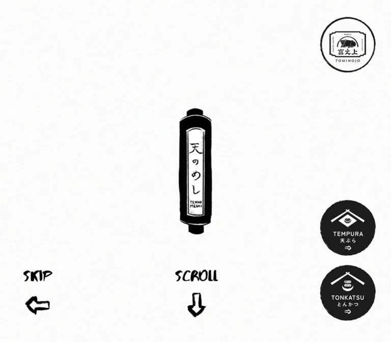
The captured opening is a nearly empty paper viewport. A narrow black lantern stands at the horizontal center, with an irregular silhouette, pale inset label, vertical 天のめし lettering, and small Latin lettering near the bottom of the label. A brush-style SCROLL graphic and a hand-drawn downward arrow sit below it.
The lantern is approximately the same physical size in both screenshots. On desktop it occupies about 7% of the viewport width; on mobile it occupies about 27%. This change in relative prominence is central to the responsive composition.
Estimated lantern bounds are around y = 300–701px on desktop and y = 180–581px on mobile. The mobile version sits above the exact vertical center, making room for the scroll cue and lower category controls.
The opening remained present in the supplied settled capture. There is no visible progress indicator or evidence establishing it as a transient loading screen. Treat it as an opening state without inventing a dismissal timer.
Right-Edge Brand and Category Controls
Role: provides access to related restaurant identities while preserving the open center.
An outlined circular TOMINOJO emblem occupies the upper right. Two filled irregular circles sit near the lower right: TEMPURA / 天ぷら and TONKATSU / とんかつ. Each category circle contains a white roof-like emblem, centered bilingual naming, and a small directional arrow.
The upper related-brand link and the tonkatsu link measure 162.5px square on desktop and approximately 67.6px square on mobile. Their right inset changes from 56.25px to 15px.
The DOM identifies the upper related-brand destination as https://tominojo.com/ and the tonkatsu destination as https://tonkatsu.tennomeshi.com/. The precise action of the visible tempura control was not established by the provided link inventory. Do not assign it an invented route.
The circles are artwork-led controls, not standard pills. Preserve the stacked internal composition and slight edge irregularity. Avoid shrinking the main lantern in direct proportion to these badges: the two elements scale differently in the captured layouts.
Introductory Narrative Scenes
Role: expands the food-entertainment concept before the conventional page sections.
The DOM contains several short Japanese statements paired with compact English translations. Their subjects include freshly prepared dishes, traditional pot rice, hospitality, and the restaurant experience. Japanese copy is tracked and vertical in character; English provides small horizontal supporting blocks.
Many of these elements have negative horizontal coordinates in the sampled DOM, with different desktop and mobile arrangements. Together with their nonzero transition durations, this supports a staged introductory composition. It does not establish the complete sequence, whether every scene is pinned, or exactly how scrolling maps to horizontal movement.
For a new implementation, keep each Japanese/English pair together as a coherent scene. If motion is added, first define a readable static sequence and then enhance it. Do not reproduce the sampled negative positions as permanent layout offsets.
Diamond Navigation Control
Role: compact navigation access in the later page captures.
A solid black, wide diamond sits near the upper-right corner. Two slim white marks resembling chopsticks form its central symbol. The desktop diamond is approximately 125px wide and 85px high; the mobile version is approximately 80px wide and 54px high.
The control stays visually separate from the paper, cooking imagery, and map beneath it. The same geometric family reappears beside the store reservation labels.
Only the closed control is visible. The supplied header has a zero-height layout box, and its text includes navigation labels, but the appearance and behavior of an opened menu are unverified. A fullscreen panel, drawer, close animation, or focus trap must not be described as observed.
Concept Section
Role: connects the theatrical introduction to the restaurant's food and hospitality proposition.
Large hand-drawn clouds overlap the transition from warm cooking imagery into fibrous paper. The clouds have thin, uneven black contours and pale interiors. They cross the boundary between media and page surface instead of staying inside a decorative card.
In the desktop capture, the main content places vertical Japanese copy toward the left-center, a vertical restaurant wordmark immediately to its right, and a large food photograph at the right edge. The photograph begins around x = 990px and continues below the screenshot. It shows salmon roe being placed onto a tempura preparation with a wooden spoon, emphasizing texture and service in progress.
The Japanese concept block measures 378px wide. Its 47.25px line height corresponds to eight vertical columns. The mobile block measures 336px wide with 42px line height, consistent with retaining the same eight-column arrangement at a smaller type size. The mobile concept section itself was not included as a screenshot, so its complete image arrangement remains unverified.
The English concept paragraph is horizontal and appears below the Japanese content in the DOM. On mobile it has a measured width of 327.59px, with approximately 31.2px margins. On desktop its outer box is 687.55px wide and includes 118.125px of right padding; the resulting content width is approximately 569.42px.
Menu Section and Course Block
Role: provides the complete dining offer as readable bilingual information.
The section begins with a vertical メニュー label. On desktop the label is centered at x = 686.25px; on mobile its box starts at x = 294.81px, placing it toward the right. This is a compositional repositioning, not merely a smaller centered heading.
The measured menu contains seven offerings: special, regular, and vegetable courses, followed by a lunch divider and four lunch offerings. The current prices range from ¥2,310 to ¥9,350, with tax wording displayed alongside the prices. These are captured content values, not permanent design tokens.
Each course has the following anatomy:
- A Japanese course title in Mincho.
- A smaller English course subtitle, also in Mincho.
- An indented list of Japanese dish names with Gothic English translations beneath them.
- A larger price aligned with the title's outer content area.
- A supplementary note where applicable, such as the vegetable course's egg-content notice.
On desktop, the first special and regular courses occupy adjacent 550.80px columns. Their titles begin at approximately x = 169.20px and x = 720px. On mobile, the courses form one column with a 331.5px width and 29.25px side margins.
The mobile special-course title wraps into two lines at 26px. Long dish names and translations also wrap naturally; the final sweet-potato item occupies two Japanese lines and two English lines in the sampled mobile layout. Avoid fixed-height dish rows.
The lunch divider changes substantially: its type is 40.5px on desktop and 16px on mobile. It introduces a menu subsection without becoming a promotional banner.
The course area was inspected through DOM measurements rather than a supplied menu screenshot. Its typography, columns, order, and spacing are supported; any unreported menu ornament or image placement is not.
Bilingual Dish Pair
Role: makes each menu item understandable without separating the two languages into different reading paths.
A Japanese line appears first, followed immediately by a smaller English line. The next dish is separated by whitespace. Japanese dish names use normal tracking; English translations use 0.06em.
At desktop, a typical pair consists of a 27px Japanese line box, a 21.35px English line box, and a 22.5px gap before the next item. At mobile these become 24px, approximately 18.97px, and 10px respectively.
Keep the indentation of the entire list: 58.5px desktop and 43px mobile relative to the course title. Do not independently center the translations or turn each dish into a separate card.
Social and News Areas
Role: connects the restaurant presentation to ongoing updates.
The rendered page includes a social invitation, Instagram and another social-platform link, followed by an おしらせ section with three dated news links. The newest captured entry is dated 2026.01.06 and announces the second location.
The evidence establishes the content and destinations but does not include a screenshot of these sections. Avoid inferring a social-image grid, carousel layout, or news-card styling.
There is a concrete responsive link discrepancy: desktop 一覧へ points to /news/, while the mobile link with the same label points to the homepage. Its order also changes from before the entries in the desktop extraction to after them in the mobile extraction. A new implementation should preserve a consistent archive destination and verify both layouts.
Store Listing
Role: turns the brand presentation into a practical visit and reservation decision.
The desktop screenshot shows two side-by-side location columns. Each has a map above its details, a Japanese store name, an English name beneath it, a thin horizontal rule, and aligned label/value rows for Address, Tel, and Open/Close. A wide black diamond with a small white chevron precedes the text reserve.
The two visible identities are the Gion main store and the Sanjo Kawaramachi store. Each has its own address, phone number, and external booking URL. Preserve that distinction when generating links or accessible labels.
Estimated desktop columns are about 574px wide, with an approximately 90px central gap and 101px outer margins. These are screenshot estimates rather than reported store-element rectangles.
The mobile footer capture shows a full-width map immediately above the black footer. The complete mobile ordering of both maps and their detail blocks was not captured; do not assume the desktop map-above-details arrangement survives unchanged.
Floating Reservation Badge
Role: keeps access to store selection visible during the desktop content sequence.
A dark circular badge contains a white roof emblem, ご予約はこちら, the smaller English Book Here, and a small arrow. It is visible over the food photograph and again over the desktop footer.
The desktop link box is 130px square at x = 1253.75px, y = 807.5px, giving 56.25px right clearance and 62.5px bottom clearance in the 1440 × 1000 viewport. Its href is https://tennomeshi.com/#store: it leads to the store section rather than selecting a branch immediately.
The mobile DOM reports an 80px square link at x = 295px, y = 728px, but the supplied mobile footer image does not show the badge. Its existence and bounds do not establish visibility in every phase. The exact display conditions remain unverified.
Black Footer
Role: closes the paper sequence with a strong, quiet identity field.
On desktop, the footer occupies roughly the lower half of the last capture. A tall white restaurant identity stands on the right. Five navigation groups extend leftward, with upright vertical Japanese labels and smaller gray English captions beside them. A rotated copyright line sits near the far-left edge.
The visible labels are トップ, おしらせ, 店舗情報, お問い合わせ, and SNS. Their English companions include top, news, store, contact, and link.
On mobile, the white identity is centered above the navigation. The five vertical navigation groups remain arranged across the width, while the copyright becomes horizontal and centered near the bottom. Small cloud fragments enter from the edges of the black field.
Estimated identity artwork widths are about 155px desktop and 100px mobile. The mobile footer uses approximately 50px of space above the identity and another substantial gap before the navigation. Keep the black area spacious; it is not a compressed utility strip.
Tokens — Motion & Interaction
Reported Transition Values
| Element group | Reported transition | What the evidence establishes |
|---|---|---|
| Related-brand and tonkatsu links | 0.3s |
A nonzero transition is defined; hover appearance and animated property were not captured. |
| Store-section reservation badge | 0.4s |
A transition is defined on the link; its exact visual response is unverified. |
| Most introductory Japanese/English scene paragraphs | 1.4s |
Longer transitions are associated with the staged narrative text. |
Introductory すべてが極上 paragraph |
0.8s |
A shorter text transition is defined. |
| Its paired English paragraph | 0.8s 0.2s |
A 0.8s transition with 0.2s delay is reported. |
| Many ordinary content elements | all |
This summary provides no positive duration; it is not evidence of visible animation. |
| Sampled element animation fields | none |
No CSS animation is reported on those sampled elements; descendants, pseudo-elements, scripts, and media are not ruled out. |
The supplied capture process waited for document and image readiness and sampled layout stability. It also temporarily paused perpetual animations during readiness checks before resuming them. These procedures help explain the settled frames but do not prove that all delayed states or interactions were observed.
The screenshots do not establish lantern bobbing, animated clouds, video autoplay, sound, a particular scroll-scrubbing algorithm, or a carousel gesture. The upper cooking imagery could be a still image or a media frame; its playback behavior is not supplied.
Navigation Evidence
| Entry point | Supported destination or behavior | Limit |
|---|---|---|
| Upper related-brand emblem | https://tominojo.com/ |
Destination not opened. |
| Tonkatsu emblem | https://tonkatsu.tennomeshi.com/ |
Destination not opened. |
| Circular reservation link | Homepage #store anchor |
Scroll result and easing not tested. |
Individual store reserve links |
Two distinct external booking URLs | Booking availability and completion not tested. |
| Footer news, store, and social links | #news, #store, and #instagram |
Anchor destinations reported; click outcomes not supplied. |
| Footer contact | An external contact-page URL | Does not independently establish a legal operator identity. |
| Diamond navigation control | Closed control visible | Open state and keyboard behavior unverified. |
For reuse, distinguish the slower presentation transitions from short control feedback. Do not apply 1.4s to ordinary buttons just because that duration appears on narrative text.
Surfaces
| Surface | Appearance | Purpose |
|---|---|---|
| Opening canvas | Near-white paper appearance with fine grain | Gives the lantern and edge emblems exceptional visual space. |
| Main content paper | Pale fibrous texture with sparse warm flecks | Connects narrative, menu, and store information to a printed material. |
| Cloud illustration | Pale interior with irregular black contour | Bridges imagery and content boundaries. |
| Food imagery | Full-color, close-cropped cooking and plating detail | Provides warmth, appetite, and human action. |
| Category and reservation emblems | Dark irregular circles with white artwork | Creates compact, recognizable navigation landmarks. |
| Navigation diamond | Solid black with white marks | Gives utility controls a geometric identity. |
| Footer | Flat black with white identity and gray supporting captions | Ends the page with strong contrast and ample space. |
| Maps | Conventional multicolor map interface | Supplies practical location information without being recolored into the brand palette. |
The pale surfaces rely on real texture and linework. A flat beige background alone loses much of the character, while a strong noise filter would compete with small text. Keep texture subtle enough that menu translations and addresses remain clear.
Imagery
The identity is built from three coordinated image types: handmade paper, monochrome illustrated marks, and full-color food photography.
Paper: visible fibers, irregular tonal variation, and small warm inclusions. The texture should read as material at normal scale, without a conspicuous repeated tile.
Illustration: a narrow lantern, brush lettering, roof-like restaurant emblems, rough circular edges, hand-drawn arrows, and large curling clouds. Preserve uneven strokes and hand-made contours. The clouds are compositional frames that cross section boundaries.
Photography: tightly framed food preparation rather than distant dining-room views in the supplied middle capture. The spoon, roe, batter, and dark utensil background create contrasting textures and depth. Retain natural color and directional light. Avoid converting all photography to monochrome merely because the interface is black and white.
Maps: the visible Google Maps interface retains its own colors and utility controls. It belongs to the practical information layer rather than the illustration system.
No image URLs, dimensions of original files, or media source paths were included. Do not invent asset filenames or assume an SVG, GIF, PNG, or video format from appearance alone.
Observed Asset References
| Asset or image group | Evidence location | Source path |
|---|---|---|
| Lantern identity artwork | Desktop and mobile opening captures | Not supplied |
| Brush-style scroll label and arrow | Desktop and mobile opening captures | Not supplied |
| Related-brand and category emblems | Opening captures | Not supplied |
| Paper texture and outlined clouds | Desktop concept capture; mobile footer fragments | Not supplied |
| Cooking and roe-plating imagery | Desktop middle capture | Not supplied |
| White vertical restaurant identity | Desktop and mobile footer captures | Not supplied |
| Circular reservation artwork | Desktop concept and footer captures | Not supplied |
Use authorized artwork when available. For an adaptation, commission or create original equivalents with the same compositional roles. Do not use image-rendering: pixelated: the visible character comes from brush contours and paper texture, not a verified pixel-art rendering system.
Layout & Responsive Behavior
The page is a long scrolling website. The header's measured layout height is zero, and edge controls occupy the visual layer over the content. This differs from a conventional horizontal navigation bar that reserves space at the top of every section.
| Relationship | Desktop observation | Mobile observation |
|---|---|---|
| Opening focal point | Small lantern within broad empty space | Lantern keeps approximately the same size and becomes much more prominent. |
| Opening edge emblems | Approximately 162.5px circles |
Approximately 67.6px circles with 15px right clearance. |
| Concept Japanese text | 18px type; 378px block width |
14px type; 336px block width. |
| Concept English text | Wider supporting paragraph | Approximately 84% viewport width, with natural multiline wrapping. |
| Menu section label | Centered vertical label | Vertical label positioned toward the right. |
| Course layout | Two columns | One column with 7.5% side margins. |
| Course headings | Typically one line in the sampled first row | Several titles wrap into two lines. |
| Lunch divider | Large 40.5px text |
Compact 16px text. |
| Store region | Two location columns with map strips above details | Final map spans the full viewport; complete block ordering unverified. |
| Footer identity | Right-aligned beside navigation | Centered above navigation. |
| Footer copyright | Rotated at the left | Horizontal and centered near the bottom. |
Although the mobile menu is taller than the desktop menu, the entire mobile document is shorter. The introduction and other sections therefore do not scale as a simple stacked version of the desktop page.
Only two viewport widths were supplied. Intermediate breakpoints, landscape behavior, browser zoom, safe-area handling, and very narrow devices remain unverified. The 768px breakpoint in the Quick Start is a recommended adaptation boundary, not an observed source breakpoint.
Do’s and Don’ts
Do
- Begin with a sparse paper composition and a distinctly narrow lantern.
- Keep the main palette close to paper, black, white, and restrained gray.
- Let natural food color provide warmth.
- Preserve the Mincho/Gothic distinction within bilingual content.
- Keep Japanese narrative text vertical and generously tracked where observed.
- Group each Japanese dish name directly with its English translation.
- Retain list indentation, clear prices, and natural wrapping on mobile.
- Use irregular circles and wide diamonds as recurring navigation shapes.
- Recompose the footer on mobile while preserving vertical navigation.
- Keep the two store identities and their booking destinations distinct.
Don’t
- Don't fill the opening whitespace with generic promotional copy or feature cards.
- Don't shrink every element using one viewport ratio.
- Don't replace the illustrated identity with an arbitrary brush font.
- Don't turn the menu into a grid of rounded, shadowed product cards.
- Don't promote photographic orange into a new interface action color.
- Don't apply pixelation, glossy gradients, or glass blur to the paper-and-ink system.
- Don't infer a complete animation sequence from isolated frames or offscreen rectangles.
- Don't invent an opened navigation design and describe it as observed.
- Don't hardcode the captured document height or introductory offset.
- Don't copy the mobile news archive destination discrepancy into a new implementation.
Recommended Implementation Additions
These are recommendations for a new implementation, not verified features of the original page:
- Use semantic headings for sections and course titles. Several supplied source labels are paragraph elements; their visual style can be retained with better document structure.
- Mark Japanese and English text with appropriate language attributes and preserve a logical reading order independent of vertical styling.
- Give image-led links and the diamond control explicit accessible names. Empty extracted link text alone does not prove that the original lacks alternative text.
- Provide a visible way to skip the long introduction and reach menus or store information.
- Supply a reduced-motion version that exposes narrative content without requiring a long animated traversal.
- Test fixed controls against text, maps, device safe areas, and footer links. The desktop reservation badge visibly overlaps other content; reserve sufficient clearance in an adaptation.
- Identify each branch in reservation-link labels and preserve the two separate booking destinations.
- Make the news archive link consistent across desktop and mobile.
- Give embedded maps descriptive titles and retain readable addresses and ordinary location links outside the map.
- Optimize large imagery and decorative assets separately. Keep essential menu text available regardless of animation or media readiness.
Agent Prompt Guide
Quick Color Reference
- Underlying page:
#F2F3ECwith an authorized paper texture. - Text, linework, diamonds, and footer:
#000000. - Dark circular control approximation:
#1C1C1C. - Reversed emblems and footer identity:
#FFFFFF. - Secondary footer-caption approximation:
#868686. - Warmth: natural food photography, without adding a colored button system.
Overall Prompt
“Create a Japanese restaurant homepage inspired by TEN NO MESHI's current paper-and-ink composition. Begin with a full-height, nearly empty textured-paper opening, a narrow hand-drawn lantern at the center, a brush-style scroll cue below, and related-brand/category emblems at the right edge. Continue into large outlined clouds overlapping warm cooking imagery, vertical Japanese concept copy, and close-up food photography. Use Shippori Mincho B1 for Japanese text, course headings, and prices, and Zen Kaku Gothic Antique for English narrative and dish translations. Present detailed bilingual courses in two unboxed desktop columns that become one column on mobile. Finish with two location listings, individual reservation links, and a spacious black footer with a white vertical identity and vertical navigation. Recompose the mobile layout rather than proportionally shrinking everything. Treat exact introductory motion and the opened navigation panel as separate design decisions because they are not fully established by the reference.”
Example Component Prompts
- Opening stage: “Use a pale paper viewport with an approximately 106 × 400px illustrated lantern at its horizontal center. Keep broad empty space. Place a brush-style SCROLL cue beneath it, an outlined brand emblem at the upper right, and two irregular dark category circles at the lower right. On a 390px phone, retain the lantern's approximate size while reducing the edge emblems to about 68px.”
- Concept composition: “Frame the boundary between warm food imagery and textured paper with large, thinly outlined curling clouds. Place eight columns of vertical Japanese copy beside a vertical restaurant identity, with a close-up plating photograph at the right. Use horizontal English supporting copy beneath the Japanese group. Preserve natural photographic color.”
- Course block: “Build an unboxed bilingual restaurant course: a 29.25px Mincho Japanese title, a 14.625px Mincho English subtitle, and an indented dish list. Pair each 18px Japanese dish name with a 14.625px Gothic translation. Use whitespace between pairs and a larger price below. At 390px, use a 331.5px column, 26px title, 16px Japanese dishes, and 13px translations with natural wrapping.”
- Store information: “Create a paper-based location block with a map, Japanese and English store names, a fine horizontal rule, and aligned Address, Tel, and Open/Close rows. Put a small white chevron inside a wide black diamond before the word reserve. Give each location its own reservation destination.”
- Footer: “Create a broad black footer with a tall white restaurant identity on the right and five vertical Japanese navigation groups extending leftward, each with a smaller gray English caption. On mobile, center the identity above the navigation and set the copyright horizontally near the bottom. Add only sparse paper-colored cloud fragments at the edges.”
Quick Start
CSS Custom Properties
This is a usable structural adaptation. The measured colors and font stacks are retained, while responsive bounds, the 768px breakpoint, focus treatment, and component selectors are recommendations. The CSS does not recreate an unverified scroll timeline or an opened menu.
Provide the font files and authorized artwork separately. --paper-image intentionally defaults to none; no original asset path was supplied. Put vertical Japanese copy into intentional lines with semantic text and line breaks. Use data-booking-visible="true" only when the reservation control should be shown; the source's exact visibility trigger is unknown.
:root {
  /* Measured colors and declared source palette */
  --paper: #f2f3ec;
  --ink: #000;
  --white: #fff;
  --ink-soft: #1c1c1c;
  --muted: #868686;
  --paper-image: none;

  /* Measured computed font stacks; font files are not bundled */
  --font-editorial: 'Shippori Mincho B1', serif;
  --font-support: 'Zen Kaku Gothic Antique', sans-serif;
  --weight-main: 500;

  /* Source-derived desktop unit with recommended size bounds */
  --u: calc(100vw / 1280);
  --text-course: clamp(26px, calc(26 * var(--u)), 36px);
  --text-dish: clamp(16px, calc(16 * var(--u)), 20px);
  --text-translation: clamp(13px, calc(13 * var(--u)), 16px);
  --text-section: clamp(24px, calc(30 * var(--u)), 40px);
  --text-concept: 18px;
  --leading-concept: 2.625;

  /* Adaptation values matching the supplied desktop composition */
  --edge: clamp(24px, 3.90625vw, 72px);
  --brand-size: clamp(112px, 11.28472vw, 180px);
  --brand-top: 50px;
  --category-bottom: 62.5px;
  --category-gap: 27.5px;
  --booking-size: 130px;
  --booking-bottom: 62.5px;
  --course-width: min(76.5%, 1224px);
  --course-indent: calc(52 * var(--u));
  --course-gap: calc(100 * var(--u));
  --dish-gap: calc(20 * var(--u));
  --rule: 1px;
}

* { box-sizing: border-box; }

body {
  margin: 0;
  color: var(--ink);
  background: var(--paper);
  font-family: var(--font-editorial);
  font-size: 16px;
  font-weight: var(--weight-main);
  line-height: 1.8;
  letter-spacing: 0.05em;
}

button, a { -webkit-tap-highlight-color: transparent; }
button { font: inherit; }
img { max-width: 100%; height: auto; }
a { color: inherit; }

.paper-surface {
  background-color: var(--paper);
  background-image: var(--paper-image);
}

.opening {
  position: relative;
  min-height: 100vh;
  min-height: 100svh;
  overflow: clip;
}

.opening__lantern {
  position: absolute;
  left: 50%;
  top: 50%;
  width: 106px;
  height: 400px;
  object-fit: contain;
  transform: translate(-50%, -50%);
}

.scroll-cue {
  position: absolute;
  left: 50%;
  top: 77.875%;
  width: 126.25px;
  margin: 0;
  transform: translateX(-50%);
}

.scroll-cue__label { display: block; width: 100%; }
.scroll-cue__arrow {
  display: block;
  width: 45%;
  margin: 17.5px auto 0;
}

.art-link { display: block; text-decoration: none; }
.art-link img { display: block; width: 100%; }

.gateway-brand {
  position: absolute;
  top: var(--brand-top);
  right: var(--edge);
  width: var(--brand-size);
  border-radius: 9999px;
}

.gateway-choices {
  position: absolute;
  right: var(--edge);
  bottom: var(--category-bottom);
  display: grid;
  gap: var(--category-gap);
  width: var(--brand-size);
}

.gateway-choices .art-link { border-radius: 45%; }

/* Recommended control geometry; provide a real accessible button. */
.menu-toggle {
  position: fixed;
  z-index: 30;
  top: max(30px, env(safe-area-inset-top, 0px));
  right: var(--edge);
  display: grid;
  place-items: center;
  width: 125px;
  height: 85px;
  padding: 0;
  border: 0;
  isolation: isolate;
  color: var(--white);
  background: transparent;
  cursor: pointer;
}

.menu-toggle::before {
  content: '';
  position: absolute;
  z-index: -1;
  inset: 0;
  background: var(--ink);
  clip-path: polygon(50% 0, 100% 50%, 50% 100%, 0 50%);
}

.menu-toggle__mark {
  position: relative;
  width: 44%;
  height: 12px;
}

.menu-toggle__mark::before,
.menu-toggle__mark::after {
  content: '';
  position: absolute;
  left: 0;
  width: 100%;
  height: 3px;
  background: currentColor;
}

.menu-toggle__mark::before { top: 3px; transform: rotate(-3deg); }
.menu-toggle__mark::after { top: 8px; transform: rotate(3deg); }

.booking-badge {
  position: fixed;
  z-index: 20;
  right: max(var(--edge), env(safe-area-inset-right, 0px));
  bottom: max(var(--booking-bottom), env(safe-area-inset-bottom, 0px));
  display: none;
  width: var(--booking-size);
  aspect-ratio: 1;
  border-radius: 50%;
  color: var(--white);
  background: var(--ink-soft);
  text-decoration: none;
}

[data-booking-visible='true'] .booking-badge { display: block; }
.booking-badge img { display: block; width: 100%; }

.concept { position: relative; isolation: isolate; }
.concept__layout {
  display: grid;
  grid-template-columns: minmax(0, 2fr) minmax(0, 1fr);
  gap: 7vw;
  align-items: start;
}

.concept__copy { min-width: 0; padding-block: 64px; }
.concept__japanese {
  width: max-content;
  margin: 0 auto;
  writing-mode: vertical-rl;
  text-orientation: mixed;
  font-size: var(--text-concept);
  line-height: var(--leading-concept);
  letter-spacing: 0.3em;
}

.concept__english {
  width: min(84%, 570px);
  margin: 40px auto 0;
  font-family: var(--font-support);
  font-size: clamp(14px, calc(14 * var(--u)), 17px);
  line-height: 1.43;
  letter-spacing: 0.06em;
}

.food-image { display: block; width: 100%; border-radius: 0; }
.decorative-cloud { pointer-events: none; }

.menu-section { padding-block: calc(50 * var(--u)) calc(100 * var(--u)); }
.section-label {
  width: max-content;
  margin: 0 auto 100px;
  writing-mode: vertical-rl;
  font-size: var(--text-section);
  font-weight: 500;
  line-height: 2;
  letter-spacing: 0.28em;
}

.course-grid {
  display: grid;
  grid-template-columns: repeat(2, minmax(0, 1fr));
  gap: var(--course-gap) 0;
  width: var(--course-width);
  margin-inline: auto;
}

.course { display: flex; flex-direction: column; min-width: 0; }
.course__name {
  margin: 0;
  font-size: var(--text-course);
  font-weight: 500;
  line-height: 1.3;
  letter-spacing: normal;
}

.course__translation {
  margin: calc(6 * var(--u)) 0 0;
  font-family: var(--font-editorial);
  font-size: var(--text-translation);
  line-height: 1.46;
  letter-spacing: 0.06em;
}

.dish-list {
  margin: calc(30 * var(--u)) 0 0;
  padding: 0 0 0 var(--course-indent);
  list-style: none;
}

.dish-list li + li { margin-top: var(--dish-gap); }
.dish__japanese {
  margin: 0;
  font-size: var(--text-dish);
  line-height: 1.5;
  letter-spacing: normal;
}

.dish__english {
  margin: 0;
  font-family: var(--font-support);
  font-size: var(--text-translation);
  line-height: 1.46;
  letter-spacing: 0.06em;
  overflow-wrap: break-word;
}

.course__price {
  margin: auto 0 0;
  padding: calc(20 * var(--u)) calc(30 * var(--u)) 0 0;
  font-size: var(--text-course);
  line-height: 1.423;
  letter-spacing: normal;
}

.course__note { font-size: 14px; line-height: 1.5; letter-spacing: normal; }
.lunch-divider {
  width: min(78.125%, 1250px);
  margin: 100px auto 60px;
  font-size: clamp(24px, calc(36 * var(--u)), 44px);
  font-weight: 400;
  line-height: 1.3;
}

.store-grid {
  display: grid;
  grid-template-columns: repeat(2, minmax(0, 1fr));
  gap: 6.25vw;
  width: min(86%, 1376px);
  margin-inline: auto;
}

.store__heading { margin-bottom: 18px; border-bottom: var(--rule) solid; }
.store__details {
  display: grid;
  grid-template-columns: 90px minmax(0, 1fr);
  gap: 12px 16px;
}

.store__details dt, .store__details dd { margin: 0; }
.reserve-link {
  display: inline-flex;
  align-items: center;
  gap: 14px;
  min-height: 44px;
  margin-top: 26px;
  font-size: 24px;
  text-decoration: none;
}

.reserve-link__diamond {
  display: grid;
  place-items: center;
  width: 58px;
  height: 39px;
  color: var(--white);
  background: var(--ink);
  clip-path: polygon(50% 0, 100% 50%, 50% 100%, 0 50%);
}

.site-footer {
  position: relative;
  display: grid;
  grid-template-columns: auto minmax(0, 1fr) 155px;
  align-items: center;
  gap: 60px;
  min-height: 500px;
  padding: 80px 7%;
  color: var(--white);
  background: var(--ink);
}

.site-footer__brand { grid-column: 3; grid-row: 1; width: 155px; }
.footer-nav {
  grid-column: 2;
  grid-row: 1;
  display: flex;
  flex-direction: row-reverse;
  justify-content: flex-start;
  gap: clamp(24px, 4.1667vw, 60px);
}

.footer-nav a {
  display: flex;
  align-items: flex-start;
  gap: 6px;
  text-decoration: none;
}

.footer-nav__japanese {
  writing-mode: vertical-rl;
  font-size: 28px;
  line-height: 1.2;
  letter-spacing: 0.15em;
}

.footer-nav__english {
  writing-mode: vertical-rl;
  color: var(--muted);
  font-size: 16px;
  line-height: 1.2;
}

.site-footer__copyright {
  grid-column: 1;
  grid-row: 1;
  writing-mode: vertical-rl;
  white-space: nowrap;
}

/* Recommended focus indicator for both paper and black surfaces. */
:where(a, button):focus-visible {
  outline: 2px solid var(--white);
  outline-offset: 2px;
  box-shadow: 0 0 0 4px var(--ink);
}

/* Recommended breakpoint; the original breakpoint was not supplied. */
@media (max-width: 768px) {
  :root {
    --u: calc(100vw / 375);
    --edge: 15px;
    --brand-size: 67.6px;
    --brand-top: 17.8px;
    --category-bottom: 78.2px;
    --category-gap: 9px;
    --booking-size: 80px;
    --booking-bottom: 36px;
    --text-course: 26px;
    --text-dish: 16px;
    --text-translation: 13px;
    --text-section: 24px;
    --text-concept: 14px;
    --leading-concept: 3;
    --course-width: 85%;
    --course-indent: 43px;
    --course-gap: 65px;
    --dish-gap: 10px;
  }

  .opening__lantern { top: 45%; }
  .scroll-cue { top: 76.48%; width: 68.33px; }
  .scroll-cue__arrow { margin-top: 11px; }
  .menu-toggle { top: 21px; width: 80px; height: 54px; }
  .concept__layout { grid-template-columns: 1fr; gap: 40px; }
  .concept__english { font-size: 14px; }
  .menu-section { padding-block: 45px 54.6px; }
  .section-label {
    margin-right: 13.33%;
    margin-left: auto;
    line-height: 1.8;
    letter-spacing: 0.3em;
  }
  .course-grid { grid-template-columns: 1fr; }
  .course__translation { margin-top: 4px; }
  .dish-list { margin-top: 22px; }
  .course__price { padding: 20px 0 0; }
  .lunch-divider { width: 85%; font-size: 16px; letter-spacing: normal; }
  .store-grid { grid-template-columns: 1fr; gap: 64px; width: 85%; }
  .store__details { grid-template-columns: 76px minmax(0, 1fr); gap: 12px; }
  .site-footer {
    display: flex;
    flex-direction: column;
    gap: 0;
    min-height: 600px;
    padding: 50px 8% 24px;
  }
  .site-footer__brand { width: 100px; }
  .footer-nav { justify-content: space-between; width: 100%; gap: 8px; margin-top: 56px; }
  .footer-nav__japanese { font-size: 22px; }
  .footer-nav__english { font-size: 13px; }
  .site-footer__copyright { margin-top: auto; padding-top: 60px; writing-mode: horizontal-tb; font-size: 12px; }
}

/* Recommended fallback for future presentation enhancements. */
@media (prefers-reduced-motion: reduce) {
  .narrative-scene {
    opacity: 1;
    transform: none;
    animation: none;
    transition: none;
  }
  html { scroll-behavior: auto; }
}
The example deliberately leaves cloud placement to the supplied artwork's proportions and keeps the mobile concept image order dependent on semantic markup. Those relationships were not fully measured. The mobile store grid is a recommended usable arrangement, not a claim about the original map/detail ordering.
Tailwind v4 Token Mapping
Optional aliases for an implementation that already uses Tailwind v4. This does not imply that the original site uses Tailwind. Define the custom properties above first.
@theme inline {
  --color-paper: var(--paper);
  --color-ink: var(--ink);
  --color-ink-soft: var(--ink-soft);
  --color-muted: var(--muted);
  --font-editorial: var(--font-editorial);
  --font-supporting: var(--font-support);
  --text-course-title: var(--text-course);
  --text-dish-name: var(--text-dish);
  --text-dish-translation: var(--text-translation);
  --text-section-label: var(--text-section);
  --spacing-course-indent: var(--course-indent);
  --spacing-course-gap: var(--course-gap);
  --spacing-dish-gap: var(--dish-gap);
}
When integrating these aliases, use a distinct backing variable for any identically named Tailwind font token to avoid a self-reference. For example, rename the root font variable to --site-font-editorial and map --font-editorial: var(--site-font-editorial).
Sources & Evidence
- Inspected original and final page: TEN NO MESHI. The supplied record reports HTTP
200with no URL change and the page titleTEN NO MESHI -天のめし-. - Capture date: September 12, 2026. Supplied retrieval timestamp:
2026-09-12T07:59:14.238Z. Individual screenshot timestamps were not provided. - Desktop visual evidence: three
1440 × 1000captures showing the opening, a concept/food-imagery section, and store details with the footer. - Mobile visual evidence: two
390 × 844captures showing the opening and the final map/footer region. - Rendered DOM and computed styles: supplied for both widths, including body colors, font stacks, custom properties, selected element rectangles, menu content, transition summaries, and link destinations.
- Interaction scope: scroll traversal is described in the supplied capture procedure. No opened navigation panel, hover sequence, completed reservation, social destination, or linked article inspection was supplied.
- Limitations: no original asset paths, complete stylesheet rules, animation timeline, video metadata, exact responsive breakpoint, or accessibility-tree inspection was provided. Menu geometry is supported by DOM measurements; uncaptured section styling is not reconstructed.
This reference describes the current supplied page evidence. Screenshot estimates, source declarations, calculated values, and recommended implementation choices are identified separately throughout.
# TEN NO MESHI — Style Reference

> A restaurant stage framed by handmade paper, black ink, drifting cloud illustrations, and the warmth of freshly prepared food.

**Website:** [tennomeshi.com](https://tennomeshi.com/)
**Original URL:** https://tennomeshi.com/
**Final URL:** https://tennomeshi.com/
**Theme:** light paper surfaces with black graphics and a reversed black footer
**Inspected:** September 12, 2026, using the supplied browser evidence
**Capture record:** `2026-09-12T07:59:14.238Z`, equivalent to 16:59:14.238 JST
**Viewports:** desktop `1440 × 1000` and mobile `390 × 844` CSS pixels
**Scope:** the current restaurant homepage, including its opening composition, introductory content, bilingual menu, social and news links, two store listings, reservation entry points, and footer. Visual evidence comprises three desktop captures and two mobile captures; additional menu and typography details come from the rendered DOM. Linked pages, booking flows, and an opened navigation panel were not inspected.

TEN NO MESHI combines a restrained black-and-paper interface with expressive restaurant imagery. The opening screen gives almost the entire viewport to a small, hand-drawn lantern. Related-brand and category emblems sit along the right edge. Further into the page, outlined clouds overlap warm cooking imagery and a textured paper field. Vertical Japanese copy and a brush-lettered identity sit beside tightly cropped food photography.

This is a complete restaurant website with practical menus, news, addresses, opening hours, and separate reservations for two locations. Its visual rhythm moves between theatrical presentation and information that resembles a printed menu. Preserve the unusually generous opening space, the distinction between artwork and typeset text, and the change from cream paper to a large black footer.

## How to Read This Reference

- **Measured** means a value reported by the supplied rendered DOM or computed styles. Measurements use CSS pixels unless otherwise noted.
- **Declared** means a custom property or font stack was present in the evidence. A declaration alone does not prove that every component uses it.
- **Calculated** means arithmetic based on reported values, such as converting a viewport formula or subtracting two element positions.
- **Estimated** means a visual approximation from the supplied screenshots. Artwork dimensions, unreported footer typography, and diamond proportions fall into this category.
- **Recommended** means guidance for a new implementation. The CSS, breakpoint choice, accessibility additions, and suggested state handling are adaptations, not recovered source code.

The captures and DOM are complementary. Offscreen text can have a computed rectangle without being visible in a screenshot. A transition declaration establishes a timing value, but does not establish its trigger, complete animation path, or the appearance of an untested state.

## Tokens — Colors

### Default Palette

| Name | Value | Implementation alias / source | Evidence and role |
| --- | --- | --- | --- |
| Paper Base | `#F2F3EC` | `--paper` | Measured body background: `rgb(242, 243, 236)`. The background beneath the textured presentation. |
| Black Ink | `#000000` | `--ink` / source `--color--black` | Declared and measured on text. Visually used for linework, diamonds, and the large footer field. |
| White | `#FFFFFF` | `--white` / source `--color--white` | Declared. Visually used for reversed emblems and footer lettering. |
| Soft Black | `#1C1C1C` | `--ink-soft` / source `--color--dark_gray` | Declared. The dark circular controls visually resemble this value; their actual image pixels were not sampled. |
| Gray | `#868686` | `--muted` / source `--color--gray` | Declared. Footer English captions appear gray, but their exact computed color was not supplied. |
| Brown | `#716458` | `--brown-declared` / source `--color--brown` | Declared only. A specific visible component assignment was not established. |

The paper is not a uniform screenshot color. The opening looks almost white with fine grain, while the content area has more visible fibers and sparse warm flecks. Retain `#F2F3EC` as the measured underlying color and treat the texture as a separate asset layer.

Food supplies the strong warm colors: amber cooking imagery, orange salmon roe, golden batter, and brown utensils. These photographic colors do not establish an orange or gold interface accent. The main controls remain monochrome.

### Palette Behavior

The black footer is a local surface inversion, not evidence of a selectable dark theme. White identity artwork and Japanese navigation sit on black, with quieter gray English captions.

The supplied custom properties also contain generic WordPress color, gradient, and shadow presets, plus a Swiper blue. Their presence does not make them part of the visible design system. No theme selector or general colored-card treatment was established.

## Tokens — Typography

### Japanese Editorial Text

**Measured computed stack:** `"Shippori Mincho B1", serif`.

The body uses weight `500`, size `16px`, line height `28.8px`, and tracking `0.8px` at both inspected widths. Japanese narrative text, menu names, prices, and several English course subtitles also use this family.

The Mincho letterforms provide fine contrast and a printed-menu character. Hierarchy comes from scale, spacing, and writing direction more than from heavy bold weights.

### English Supporting Text

**Measured computed stack:** `"Zen Kaku Gothic Antique", sans-serif`.

English narrative translations and individual dish translations use weight `500`. Typical tracking is `0.06em`. This creates a clear supporting voice beneath the Japanese text.

Do not assign every English string to this sans-serif family. Course subtitles such as `OMAKASE Special Course` are measured in Shippori Mincho B1, while dish translations such as `Mixed-seafood tempura` use Zen Kaku Gothic Antique.

### Identity and Illustrated Lettering

The lantern lettering, vertical restaurant identity, emblems, and `SCROLL` cue have an illustrated character. Their exact lettering construction and asset formats were not supplied. Treat them as artwork references rather than guessing a brush font.

The computed font stacks identify the declared families; font files and delivery configuration were not included.

### Type Scale

All sizes and line heights in this table are measured. The desktop and mobile columns describe actual component values, not the results of applying one universal scale.

| Role | Desktop size / line height | Mobile size / line height | Tracking and family |
| --- | --- | --- | --- |
| Body default | `16 / 28.8px` | `16 / 28.8px` | `0.05em`; Mincho, weight 500 |
| Introductory scene Japanese | `24 / 52.8px` | `20 / 40px` | `0.28em`; Mincho |
| Introductory scene English | `13 / 20.02px` | `13 / 20.02px` | `0.06em`; Gothic |
| Final introductory Japanese statement | `24 / 57.6px` | `20 / 48px` | `0.30em`; Mincho |
| Final introductory English statement | `14 / 25.2px` | `13 / 23.4px` | `0.06em`; Gothic |
| Main concept Japanese | `18 / 47.25px` | `14 / 42px` | `0.30em`; Mincho |
| Main concept English | `15.75 / 22.5225px` | `14 / 20.02px` | `0.06em`; Gothic |
| Vertical menu section label | `33.75 / 67.5px` | `24 / 43.2px` | `0.28em` desktop, `0.30em` mobile; Mincho |
| Japanese course title | `29.25 / 38.025px` | `26 / 33.8px` | Normal tracking; Mincho |
| English course subtitle | `14.625 / 21.3525px` | `13 / 18.98px` | `0.06em`; Mincho |
| Japanese dish name | `18 / 27px` | `16 / 24px` | Normal tracking; Mincho |
| English dish translation | `14.625 / 21.3525px` | `13 / 18.98px` | `0.06em`; Gothic |
| Course price | `29.25 / 41.6227px` | `26 / 36.998px` | Normal tracking; Mincho |
| Lunch divider | `40.5 / 52.65px` | `16 / 20.8px` | Weight 400; tracking `0.05em` desktop, normal mobile |

A separate introductory `すべてが極上` paragraph remains `24px` with a `24px` line height and `6.72px` tracking at both widths. It is an exception to the other scene paragraphs.

For vertical Japanese text, line height controls the distance between columns. The main concept's `47.25px` desktop line height and `42px` mobile line height should not be interpreted as ordinary horizontal paragraph leading.

## Tokens — Spacing & Shapes

### Responsive Unit

The declared numeric properties switch between two design bases:

```css
/* Declared desktop formula */
--16px: calc((16 / 1280) * 100vw);

/* Declared mobile formula */
--16px: calc((16 / 375) * 100vw);
```

For discussion, define **1u** as `viewport width / design base`. This is a descriptive unit, not the site's root font size.

- At `1440px` wide, desktop `1u = 1.125px`.
- At `390px` wide, mobile `1u = 1.04px`.
- The exact breakpoint between these formula sets was not supplied.

| Declared token | Calculated at 1440px | Calculated at 390px |
| --- | --- | --- |
| `--10px` | `11.25px` | `10.4px` |
| `--13px` | `14.625px` | `13.52px` |
| `--14px` | `15.75px` | `14.56px` |
| `--16px` | `18px` | `16.64px` |
| `--26px` | `29.25px` | `27.04px` |
| `--30px` | `33.75px` | `31.2px` |
| `--36px` | `40.5px` | `37.44px` |

**The system mixes fluid values and explicit component sizes.** For example, the mobile course title is measured at `26px`, not the `27.04px` result of `--26px`. The mobile dish name is `16px`, not `16.64px`. Preserve these distinctions when adapting the design.

### Spacing Scale

| Relationship | Desktop | Mobile | Evidence |
| --- | --- | --- | --- |
| Menu section top padding | `56.25px` | `45px` | Measured |
| Menu section bottom padding | `112.5px` | `54.6px` | Measured |
| Course title to English subtitle | About `6.75px` | `4px` | Calculated from rectangles |
| English course subtitle to first dish | `33.75px` | `22px` | Calculated |
| Dish-list inset from course title | `58.5px` | `43px` | Calculated |
| Gap after a one-line bilingual dish pair | `22.5px` | `10px` | Calculated for sampled rows |
| Typical one-line bilingual dish pitch | About `70.84px` | About `52.97px` | Calculated; wrapped translations increase height |
| First course price to next course row | `112.5px` | `65px` | Calculated from sampled groups |
| Right edge clearance of opening badges | `56.25px` | `15px` | Calculated |
| Vertical gap between opening category circles | About `27px` | About `9px` | Screenshot estimate |

This is not an eight-pixel spacing system. The page combines viewport-derived dimensions, fixed text sizes, and large compositional gaps.

### Border Radius and Geometry

| Element | Evidence | Reuse guidance |
| --- | --- | --- |
| Ordinary content blocks | Sampled paragraphs and sections have `0px` radius | Keep menu content unboxed and photographs square-cornered. |
| Upper related-brand link | Measured `9999px` radius | Use a circular interaction region around the outlined emblem. |
| Tonkatsu link | Measured `45%` radius | Preserve the irregular circular artwork; CSS rounding alone will not reproduce its edge. |
| Reservation link wrapper | Measured `0px` radius despite circular visible artwork | Distinguish the link box from the image silhouette. |
| Main navigation diamond | Approximately `125 × 85px` desktop and `80 × 54px` mobile | A wide rhombus, not a rotated square with equal diagonals. |
| Store reservation arrow diamond | Approximately `58 × 39px` desktop | Repeat the same wide-diamond vocabulary at a smaller scale. |

There is no visible general-purpose shadow or rounded-card hierarchy in the supplied captures. Shape is concentrated in emblems, the lantern, cloud outlines, and diamond navigation marks.

### Layout Measurements

| Element | Desktop | Mobile | Status |
| --- | --- | --- | --- |
| Document height | `31,020.08px` | `27,176.19px` | Measured element bounds, rounded |
| Main element top | `13,308px` | `13,230px` | Measured document coordinates |
| Main concept section height | `1,589.08px` | `2,102.73px` | Measured |
| Menu section height | `4,096.67px` | `4,907.73px` | Measured |
| Course content arrangement | Two adjacent `550.80px` columns | One `331.5px` column | Measured child positions and widths |
| Course content left edge | `169.20px` | `29.25px` | Measured |
| Concept Japanese block | `378 × 394.66px` | `336 × 291.20px` | Measured |
| Opening upper emblem | `162.5 × 162.5px` | `67.59 × 67.59px` | Measured |
| Opening lantern artwork | About `106 × 400px` | About `106 × 400px` | Screenshot estimate |
| Scroll-label wrapper | `126.25 × 53.75px` | `68.33 × 29.09px` | Measured; excludes the separate visible arrow |
| Reservation link box | `130 × 130px` | `80 × 80px` | Measured; visibility depends on captured state |
| Black footer visible height | About `500px` | About `600px` | Screenshot estimate |

Document length and the large offset before `main` describe the captured page structure. They are not instructions to insert an empty 13,000px spacer in a new implementation.

## Components

### Opening Stage

**Role:** establishes the identity before the dense restaurant information begins.

The captured opening is a nearly empty paper viewport. A narrow black lantern stands at the horizontal center, with an irregular silhouette, pale inset label, vertical `天のめし` lettering, and small Latin lettering near the bottom of the label. A brush-style `SCROLL` graphic and a hand-drawn downward arrow sit below it.

The lantern is approximately the same physical size in both screenshots. On desktop it occupies about `7%` of the viewport width; on mobile it occupies about `27%`. This change in relative prominence is central to the responsive composition.

Estimated lantern bounds are around `y = 300–701px` on desktop and `y = 180–581px` on mobile. The mobile version sits above the exact vertical center, making room for the scroll cue and lower category controls.

The opening remained present in the supplied settled capture. There is no visible progress indicator or evidence establishing it as a transient loading screen. Treat it as an opening state without inventing a dismissal timer.

### Right-Edge Brand and Category Controls

**Role:** provides access to related restaurant identities while preserving the open center.

An outlined circular `TOMINOJO` emblem occupies the upper right. Two filled irregular circles sit near the lower right: `TEMPURA / 天ぷら` and `TONKATSU / とんかつ`. Each category circle contains a white roof-like emblem, centered bilingual naming, and a small directional arrow.

The upper related-brand link and the tonkatsu link measure `162.5px` square on desktop and approximately `67.6px` square on mobile. Their right inset changes from `56.25px` to `15px`.

The DOM identifies the upper related-brand destination as `https://tominojo.com/` and the tonkatsu destination as `https://tonkatsu.tennomeshi.com/`. The precise action of the visible tempura control was not established by the provided link inventory. Do not assign it an invented route.

The circles are artwork-led controls, not standard pills. Preserve the stacked internal composition and slight edge irregularity. Avoid shrinking the main lantern in direct proportion to these badges: the two elements scale differently in the captured layouts.

### Introductory Narrative Scenes

**Role:** expands the food-entertainment concept before the conventional page sections.

The DOM contains several short Japanese statements paired with compact English translations. Their subjects include freshly prepared dishes, traditional pot rice, hospitality, and the restaurant experience. Japanese copy is tracked and vertical in character; English provides small horizontal supporting blocks.

Many of these elements have negative horizontal coordinates in the sampled DOM, with different desktop and mobile arrangements. Together with their nonzero transition durations, this supports a staged introductory composition. It does not establish the complete sequence, whether every scene is pinned, or exactly how scrolling maps to horizontal movement.

For a new implementation, keep each Japanese/English pair together as a coherent scene. If motion is added, first define a readable static sequence and then enhance it. Do not reproduce the sampled negative positions as permanent layout offsets.

### Diamond Navigation Control

**Role:** compact navigation access in the later page captures.

A solid black, wide diamond sits near the upper-right corner. Two slim white marks resembling chopsticks form its central symbol. The desktop diamond is approximately `125px` wide and `85px` high; the mobile version is approximately `80px` wide and `54px` high.

The control stays visually separate from the paper, cooking imagery, and map beneath it. The same geometric family reappears beside the store reservation labels.

Only the closed control is visible. The supplied header has a zero-height layout box, and its text includes navigation labels, but the appearance and behavior of an opened menu are unverified. A fullscreen panel, drawer, close animation, or focus trap must not be described as observed.

### Concept Section

**Role:** connects the theatrical introduction to the restaurant's food and hospitality proposition.

Large hand-drawn clouds overlap the transition from warm cooking imagery into fibrous paper. The clouds have thin, uneven black contours and pale interiors. They cross the boundary between media and page surface instead of staying inside a decorative card.

In the desktop capture, the main content places vertical Japanese copy toward the left-center, a vertical restaurant wordmark immediately to its right, and a large food photograph at the right edge. The photograph begins around `x = 990px` and continues below the screenshot. It shows salmon roe being placed onto a tempura preparation with a wooden spoon, emphasizing texture and service in progress.

The Japanese concept block measures `378px` wide. Its `47.25px` line height corresponds to eight vertical columns. The mobile block measures `336px` wide with `42px` line height, consistent with retaining the same eight-column arrangement at a smaller type size. The mobile concept section itself was not included as a screenshot, so its complete image arrangement remains unverified.

The English concept paragraph is horizontal and appears below the Japanese content in the DOM. On mobile it has a measured width of `327.59px`, with approximately `31.2px` margins. On desktop its outer box is `687.55px` wide and includes `118.125px` of right padding; the resulting content width is approximately `569.42px`.

### Menu Section and Course Block

**Role:** provides the complete dining offer as readable bilingual information.

The section begins with a vertical `メニュー` label. On desktop the label is centered at `x = 686.25px`; on mobile its box starts at `x = 294.81px`, placing it toward the right. This is a compositional repositioning, not merely a smaller centered heading.

The measured menu contains seven offerings: special, regular, and vegetable courses, followed by a lunch divider and four lunch offerings. The current prices range from `¥2,310` to `¥9,350`, with tax wording displayed alongside the prices. These are captured content values, not permanent design tokens.

Each course has the following anatomy:

1. A Japanese course title in Mincho.
2. A smaller English course subtitle, also in Mincho.
3. An indented list of Japanese dish names with Gothic English translations beneath them.
4. A larger price aligned with the title's outer content area.
5. A supplementary note where applicable, such as the vegetable course's egg-content notice.

On desktop, the first special and regular courses occupy adjacent `550.80px` columns. Their titles begin at approximately `x = 169.20px` and `x = 720px`. On mobile, the courses form one column with a `331.5px` width and `29.25px` side margins.

The mobile special-course title wraps into two lines at `26px`. Long dish names and translations also wrap naturally; the final sweet-potato item occupies two Japanese lines and two English lines in the sampled mobile layout. Avoid fixed-height dish rows.

The lunch divider changes substantially: its type is `40.5px` on desktop and `16px` on mobile. It introduces a menu subsection without becoming a promotional banner.

The course area was inspected through DOM measurements rather than a supplied menu screenshot. Its typography, columns, order, and spacing are supported; any unreported menu ornament or image placement is not.

### Bilingual Dish Pair

**Role:** makes each menu item understandable without separating the two languages into different reading paths.

A Japanese line appears first, followed immediately by a smaller English line. The next dish is separated by whitespace. Japanese dish names use normal tracking; English translations use `0.06em`.

At desktop, a typical pair consists of a `27px` Japanese line box, a `21.35px` English line box, and a `22.5px` gap before the next item. At mobile these become `24px`, approximately `18.97px`, and `10px` respectively.

Keep the indentation of the entire list: `58.5px` desktop and `43px` mobile relative to the course title. Do not independently center the translations or turn each dish into a separate card.

### Social and News Areas

**Role:** connects the restaurant presentation to ongoing updates.

The rendered page includes a social invitation, Instagram and another social-platform link, followed by an `おしらせ` section with three dated news links. The newest captured entry is dated `2026.01.06` and announces the second location.

The evidence establishes the content and destinations but does not include a screenshot of these sections. Avoid inferring a social-image grid, carousel layout, or news-card styling.

There is a concrete responsive link discrepancy: desktop `一覧へ` points to `/news/`, while the mobile link with the same label points to the homepage. Its order also changes from before the entries in the desktop extraction to after them in the mobile extraction. A new implementation should preserve a consistent archive destination and verify both layouts.

### Store Listing

**Role:** turns the brand presentation into a practical visit and reservation decision.

The desktop screenshot shows two side-by-side location columns. Each has a map above its details, a Japanese store name, an English name beneath it, a thin horizontal rule, and aligned label/value rows for `Address`, `Tel`, and `Open/Close`. A wide black diamond with a small white chevron precedes the text `reserve`.

The two visible identities are the Gion main store and the Sanjo Kawaramachi store. Each has its own address, phone number, and external booking URL. Preserve that distinction when generating links or accessible labels.

Estimated desktop columns are about `574px` wide, with an approximately `90px` central gap and `101px` outer margins. These are screenshot estimates rather than reported store-element rectangles.

The mobile footer capture shows a full-width map immediately above the black footer. The complete mobile ordering of both maps and their detail blocks was not captured; do not assume the desktop map-above-details arrangement survives unchanged.

### Floating Reservation Badge

**Role:** keeps access to store selection visible during the desktop content sequence.

A dark circular badge contains a white roof emblem, `ご予約はこちら`, the smaller English `Book Here`, and a small arrow. It is visible over the food photograph and again over the desktop footer.

The desktop link box is `130px` square at `x = 1253.75px`, `y = 807.5px`, giving `56.25px` right clearance and `62.5px` bottom clearance in the `1440 × 1000` viewport. Its href is `https://tennomeshi.com/#store`: it leads to the store section rather than selecting a branch immediately.

The mobile DOM reports an `80px` square link at `x = 295px`, `y = 728px`, but the supplied mobile footer image does not show the badge. Its existence and bounds do not establish visibility in every phase. The exact display conditions remain unverified.

### Black Footer

**Role:** closes the paper sequence with a strong, quiet identity field.

On desktop, the footer occupies roughly the lower half of the last capture. A tall white restaurant identity stands on the right. Five navigation groups extend leftward, with upright vertical Japanese labels and smaller gray English captions beside them. A rotated copyright line sits near the far-left edge.

The visible labels are `トップ`, `おしらせ`, `店舗情報`, `お問い合わせ`, and `SNS`. Their English companions include `top`, `news`, `store`, `contact`, and `link`.

On mobile, the white identity is centered above the navigation. The five vertical navigation groups remain arranged across the width, while the copyright becomes horizontal and centered near the bottom. Small cloud fragments enter from the edges of the black field.

Estimated identity artwork widths are about `155px` desktop and `100px` mobile. The mobile footer uses approximately `50px` of space above the identity and another substantial gap before the navigation. Keep the black area spacious; it is not a compressed utility strip.

## Tokens — Motion & Interaction

### Reported Transition Values

| Element group | Reported transition | What the evidence establishes |
| --- | --- | --- |
| Related-brand and tonkatsu links | `0.3s` | A nonzero transition is defined; hover appearance and animated property were not captured. |
| Store-section reservation badge | `0.4s` | A transition is defined on the link; its exact visual response is unverified. |
| Most introductory Japanese/English scene paragraphs | `1.4s` | Longer transitions are associated with the staged narrative text. |
| Introductory `すべてが極上` paragraph | `0.8s` | A shorter text transition is defined. |
| Its paired English paragraph | `0.8s 0.2s` | A `0.8s` transition with `0.2s` delay is reported. |
| Many ordinary content elements | `all` | This summary provides no positive duration; it is not evidence of visible animation. |
| Sampled element animation fields | `none` | No CSS animation is reported on those sampled elements; descendants, pseudo-elements, scripts, and media are not ruled out. |

The supplied capture process waited for document and image readiness and sampled layout stability. It also temporarily paused perpetual animations during readiness checks before resuming them. These procedures help explain the settled frames but do not prove that all delayed states or interactions were observed.

The screenshots do not establish lantern bobbing, animated clouds, video autoplay, sound, a particular scroll-scrubbing algorithm, or a carousel gesture. The upper cooking imagery could be a still image or a media frame; its playback behavior is not supplied.

### Navigation Evidence

| Entry point | Supported destination or behavior | Limit |
| --- | --- | --- |
| Upper related-brand emblem | `https://tominojo.com/` | Destination not opened. |
| Tonkatsu emblem | `https://tonkatsu.tennomeshi.com/` | Destination not opened. |
| Circular reservation link | Homepage `#store` anchor | Scroll result and easing not tested. |
| Individual store `reserve` links | Two distinct external booking URLs | Booking availability and completion not tested. |
| Footer news, store, and social links | `#news`, `#store`, and `#instagram` | Anchor destinations reported; click outcomes not supplied. |
| Footer contact | An external contact-page URL | Does not independently establish a legal operator identity. |
| Diamond navigation control | Closed control visible | Open state and keyboard behavior unverified. |

For reuse, distinguish the slower presentation transitions from short control feedback. Do not apply `1.4s` to ordinary buttons just because that duration appears on narrative text.

## Surfaces

| Surface | Appearance | Purpose |
| --- | --- | --- |
| Opening canvas | Near-white paper appearance with fine grain | Gives the lantern and edge emblems exceptional visual space. |
| Main content paper | Pale fibrous texture with sparse warm flecks | Connects narrative, menu, and store information to a printed material. |
| Cloud illustration | Pale interior with irregular black contour | Bridges imagery and content boundaries. |
| Food imagery | Full-color, close-cropped cooking and plating detail | Provides warmth, appetite, and human action. |
| Category and reservation emblems | Dark irregular circles with white artwork | Creates compact, recognizable navigation landmarks. |
| Navigation diamond | Solid black with white marks | Gives utility controls a geometric identity. |
| Footer | Flat black with white identity and gray supporting captions | Ends the page with strong contrast and ample space. |
| Maps | Conventional multicolor map interface | Supplies practical location information without being recolored into the brand palette. |

The pale surfaces rely on real texture and linework. A flat beige background alone loses much of the character, while a strong noise filter would compete with small text. Keep texture subtle enough that menu translations and addresses remain clear.

## Imagery

The identity is built from three coordinated image types: handmade paper, monochrome illustrated marks, and full-color food photography.

**Paper:** visible fibers, irregular tonal variation, and small warm inclusions. The texture should read as material at normal scale, without a conspicuous repeated tile.

**Illustration:** a narrow lantern, brush lettering, roof-like restaurant emblems, rough circular edges, hand-drawn arrows, and large curling clouds. Preserve uneven strokes and hand-made contours. The clouds are compositional frames that cross section boundaries.

**Photography:** tightly framed food preparation rather than distant dining-room views in the supplied middle capture. The spoon, roe, batter, and dark utensil background create contrasting textures and depth. Retain natural color and directional light. Avoid converting all photography to monochrome merely because the interface is black and white.

**Maps:** the visible Google Maps interface retains its own colors and utility controls. It belongs to the practical information layer rather than the illustration system.

No image URLs, dimensions of original files, or media source paths were included. Do not invent asset filenames or assume an SVG, GIF, PNG, or video format from appearance alone.

### Observed Asset References

| Asset or image group | Evidence location | Source path |
| --- | --- | --- |
| Lantern identity artwork | Desktop and mobile opening captures | Not supplied |
| Brush-style scroll label and arrow | Desktop and mobile opening captures | Not supplied |
| Related-brand and category emblems | Opening captures | Not supplied |
| Paper texture and outlined clouds | Desktop concept capture; mobile footer fragments | Not supplied |
| Cooking and roe-plating imagery | Desktop middle capture | Not supplied |
| White vertical restaurant identity | Desktop and mobile footer captures | Not supplied |
| Circular reservation artwork | Desktop concept and footer captures | Not supplied |

Use authorized artwork when available. For an adaptation, commission or create original equivalents with the same compositional roles. Do not use `image-rendering: pixelated`: the visible character comes from brush contours and paper texture, not a verified pixel-art rendering system.

## Layout & Responsive Behavior

The page is a long scrolling website. The header's measured layout height is zero, and edge controls occupy the visual layer over the content. This differs from a conventional horizontal navigation bar that reserves space at the top of every section.

| Relationship | Desktop observation | Mobile observation |
| --- | --- | --- |
| Opening focal point | Small lantern within broad empty space | Lantern keeps approximately the same size and becomes much more prominent. |
| Opening edge emblems | Approximately `162.5px` circles | Approximately `67.6px` circles with `15px` right clearance. |
| Concept Japanese text | `18px` type; `378px` block width | `14px` type; `336px` block width. |
| Concept English text | Wider supporting paragraph | Approximately `84%` viewport width, with natural multiline wrapping. |
| Menu section label | Centered vertical label | Vertical label positioned toward the right. |
| Course layout | Two columns | One column with `7.5%` side margins. |
| Course headings | Typically one line in the sampled first row | Several titles wrap into two lines. |
| Lunch divider | Large `40.5px` text | Compact `16px` text. |
| Store region | Two location columns with map strips above details | Final map spans the full viewport; complete block ordering unverified. |
| Footer identity | Right-aligned beside navigation | Centered above navigation. |
| Footer copyright | Rotated at the left | Horizontal and centered near the bottom. |

Although the mobile menu is taller than the desktop menu, the entire mobile document is shorter. The introduction and other sections therefore do not scale as a simple stacked version of the desktop page.

Only two viewport widths were supplied. Intermediate breakpoints, landscape behavior, browser zoom, safe-area handling, and very narrow devices remain unverified. The `768px` breakpoint in the Quick Start is a recommended adaptation boundary, not an observed source breakpoint.

## Do’s and Don’ts

### Do

- Begin with a sparse paper composition and a distinctly narrow lantern.
- Keep the main palette close to paper, black, white, and restrained gray.
- Let natural food color provide warmth.
- Preserve the Mincho/Gothic distinction within bilingual content.
- Keep Japanese narrative text vertical and generously tracked where observed.
- Group each Japanese dish name directly with its English translation.
- Retain list indentation, clear prices, and natural wrapping on mobile.
- Use irregular circles and wide diamonds as recurring navigation shapes.
- Recompose the footer on mobile while preserving vertical navigation.
- Keep the two store identities and their booking destinations distinct.

### Don’t

- Don't fill the opening whitespace with generic promotional copy or feature cards.
- Don't shrink every element using one viewport ratio.
- Don't replace the illustrated identity with an arbitrary brush font.
- Don't turn the menu into a grid of rounded, shadowed product cards.
- Don't promote photographic orange into a new interface action color.
- Don't apply pixelation, glossy gradients, or glass blur to the paper-and-ink system.
- Don't infer a complete animation sequence from isolated frames or offscreen rectangles.
- Don't invent an opened navigation design and describe it as observed.
- Don't hardcode the captured document height or introductory offset.
- Don't copy the mobile news archive destination discrepancy into a new implementation.

## Recommended Implementation Additions

These are recommendations for a new implementation, not verified features of the original page:

- Use semantic headings for sections and course titles. Several supplied source labels are paragraph elements; their visual style can be retained with better document structure.
- Mark Japanese and English text with appropriate language attributes and preserve a logical reading order independent of vertical styling.
- Give image-led links and the diamond control explicit accessible names. Empty extracted link text alone does not prove that the original lacks alternative text.
- Provide a visible way to skip the long introduction and reach menus or store information.
- Supply a reduced-motion version that exposes narrative content without requiring a long animated traversal.
- Test fixed controls against text, maps, device safe areas, and footer links. The desktop reservation badge visibly overlaps other content; reserve sufficient clearance in an adaptation.
- Identify each branch in reservation-link labels and preserve the two separate booking destinations.
- Make the news archive link consistent across desktop and mobile.
- Give embedded maps descriptive titles and retain readable addresses and ordinary location links outside the map.
- Optimize large imagery and decorative assets separately. Keep essential menu text available regardless of animation or media readiness.

## Agent Prompt Guide

### Quick Color Reference

- Underlying page: `#F2F3EC` with an authorized paper texture.
- Text, linework, diamonds, and footer: `#000000`.
- Dark circular control approximation: `#1C1C1C`.
- Reversed emblems and footer identity: `#FFFFFF`.
- Secondary footer-caption approximation: `#868686`.
- Warmth: natural food photography, without adding a colored button system.

### Overall Prompt

“Create a Japanese restaurant homepage inspired by TEN NO MESHI's current paper-and-ink composition. Begin with a full-height, nearly empty textured-paper opening, a narrow hand-drawn lantern at the center, a brush-style scroll cue below, and related-brand/category emblems at the right edge. Continue into large outlined clouds overlapping warm cooking imagery, vertical Japanese concept copy, and close-up food photography. Use Shippori Mincho B1 for Japanese text, course headings, and prices, and Zen Kaku Gothic Antique for English narrative and dish translations. Present detailed bilingual courses in two unboxed desktop columns that become one column on mobile. Finish with two location listings, individual reservation links, and a spacious black footer with a white vertical identity and vertical navigation. Recompose the mobile layout rather than proportionally shrinking everything. Treat exact introductory motion and the opened navigation panel as separate design decisions because they are not fully established by the reference.”

### Example Component Prompts

1. **Opening stage:** “Use a pale paper viewport with an approximately 106 × 400px illustrated lantern at its horizontal center. Keep broad empty space. Place a brush-style SCROLL cue beneath it, an outlined brand emblem at the upper right, and two irregular dark category circles at the lower right. On a 390px phone, retain the lantern's approximate size while reducing the edge emblems to about 68px.”
2. **Concept composition:** “Frame the boundary between warm food imagery and textured paper with large, thinly outlined curling clouds. Place eight columns of vertical Japanese copy beside a vertical restaurant identity, with a close-up plating photograph at the right. Use horizontal English supporting copy beneath the Japanese group. Preserve natural photographic color.”
3. **Course block:** “Build an unboxed bilingual restaurant course: a 29.25px Mincho Japanese title, a 14.625px Mincho English subtitle, and an indented dish list. Pair each 18px Japanese dish name with a 14.625px Gothic translation. Use whitespace between pairs and a larger price below. At 390px, use a 331.5px column, 26px title, 16px Japanese dishes, and 13px translations with natural wrapping.”
4. **Store information:** “Create a paper-based location block with a map, Japanese and English store names, a fine horizontal rule, and aligned Address, Tel, and Open/Close rows. Put a small white chevron inside a wide black diamond before the word reserve. Give each location its own reservation destination.”
5. **Footer:** “Create a broad black footer with a tall white restaurant identity on the right and five vertical Japanese navigation groups extending leftward, each with a smaller gray English caption. On mobile, center the identity above the navigation and set the copyright horizontally near the bottom. Add only sparse paper-colored cloud fragments at the edges.”

## Quick Start

### CSS Custom Properties

This is a usable structural adaptation. The measured colors and font stacks are retained, while responsive bounds, the `768px` breakpoint, focus treatment, and component selectors are recommendations. The CSS does not recreate an unverified scroll timeline or an opened menu.

Provide the font files and authorized artwork separately. `--paper-image` intentionally defaults to `none`; no original asset path was supplied. Put vertical Japanese copy into intentional lines with semantic text and line breaks. Use `data-booking-visible="true"` only when the reservation control should be shown; the source's exact visibility trigger is unknown.

```css
:root {
  /* Measured colors and declared source palette */
  --paper: #f2f3ec;
  --ink: #000;
  --white: #fff;
  --ink-soft: #1c1c1c;
  --muted: #868686;
  --paper-image: none;

  /* Measured computed font stacks; font files are not bundled */
  --font-editorial: 'Shippori Mincho B1', serif;
  --font-support: 'Zen Kaku Gothic Antique', sans-serif;
  --weight-main: 500;

  /* Source-derived desktop unit with recommended size bounds */
  --u: calc(100vw / 1280);
  --text-course: clamp(26px, calc(26 * var(--u)), 36px);
  --text-dish: clamp(16px, calc(16 * var(--u)), 20px);
  --text-translation: clamp(13px, calc(13 * var(--u)), 16px);
  --text-section: clamp(24px, calc(30 * var(--u)), 40px);
  --text-concept: 18px;
  --leading-concept: 2.625;

  /* Adaptation values matching the supplied desktop composition */
  --edge: clamp(24px, 3.90625vw, 72px);
  --brand-size: clamp(112px, 11.28472vw, 180px);
  --brand-top: 50px;
  --category-bottom: 62.5px;
  --category-gap: 27.5px;
  --booking-size: 130px;
  --booking-bottom: 62.5px;
  --course-width: min(76.5%, 1224px);
  --course-indent: calc(52 * var(--u));
  --course-gap: calc(100 * var(--u));
  --dish-gap: calc(20 * var(--u));
  --rule: 1px;
}

* { box-sizing: border-box; }

body {
  margin: 0;
  color: var(--ink);
  background: var(--paper);
  font-family: var(--font-editorial);
  font-size: 16px;
  font-weight: var(--weight-main);
  line-height: 1.8;
  letter-spacing: 0.05em;
}

button, a { -webkit-tap-highlight-color: transparent; }
button { font: inherit; }
img { max-width: 100%; height: auto; }
a { color: inherit; }

.paper-surface {
  background-color: var(--paper);
  background-image: var(--paper-image);
}

.opening {
  position: relative;
  min-height: 100vh;
  min-height: 100svh;
  overflow: clip;
}

.opening__lantern {
  position: absolute;
  left: 50%;
  top: 50%;
  width: 106px;
  height: 400px;
  object-fit: contain;
  transform: translate(-50%, -50%);
}

.scroll-cue {
  position: absolute;
  left: 50%;
  top: 77.875%;
  width: 126.25px;
  margin: 0;
  transform: translateX(-50%);
}

.scroll-cue__label { display: block; width: 100%; }
.scroll-cue__arrow {
  display: block;
  width: 45%;
  margin: 17.5px auto 0;
}

.art-link { display: block; text-decoration: none; }
.art-link img { display: block; width: 100%; }

.gateway-brand {
  position: absolute;
  top: var(--brand-top);
  right: var(--edge);
  width: var(--brand-size);
  border-radius: 9999px;
}

.gateway-choices {
  position: absolute;
  right: var(--edge);
  bottom: var(--category-bottom);
  display: grid;
  gap: var(--category-gap);
  width: var(--brand-size);
}

.gateway-choices .art-link { border-radius: 45%; }

/* Recommended control geometry; provide a real accessible button. */
.menu-toggle {
  position: fixed;
  z-index: 30;
  top: max(30px, env(safe-area-inset-top, 0px));
  right: var(--edge);
  display: grid;
  place-items: center;
  width: 125px;
  height: 85px;
  padding: 0;
  border: 0;
  isolation: isolate;
  color: var(--white);
  background: transparent;
  cursor: pointer;
}

.menu-toggle::before {
  content: '';
  position: absolute;
  z-index: -1;
  inset: 0;
  background: var(--ink);
  clip-path: polygon(50% 0, 100% 50%, 50% 100%, 0 50%);
}

.menu-toggle__mark {
  position: relative;
  width: 44%;
  height: 12px;
}

.menu-toggle__mark::before,
.menu-toggle__mark::after {
  content: '';
  position: absolute;
  left: 0;
  width: 100%;
  height: 3px;
  background: currentColor;
}

.menu-toggle__mark::before { top: 3px; transform: rotate(-3deg); }
.menu-toggle__mark::after { top: 8px; transform: rotate(3deg); }

.booking-badge {
  position: fixed;
  z-index: 20;
  right: max(var(--edge), env(safe-area-inset-right, 0px));
  bottom: max(var(--booking-bottom), env(safe-area-inset-bottom, 0px));
  display: none;
  width: var(--booking-size);
  aspect-ratio: 1;
  border-radius: 50%;
  color: var(--white);
  background: var(--ink-soft);
  text-decoration: none;
}

[data-booking-visible='true'] .booking-badge { display: block; }
.booking-badge img { display: block; width: 100%; }

.concept { position: relative; isolation: isolate; }
.concept__layout {
  display: grid;
  grid-template-columns: minmax(0, 2fr) minmax(0, 1fr);
  gap: 7vw;
  align-items: start;
}

.concept__copy { min-width: 0; padding-block: 64px; }
.concept__japanese {
  width: max-content;
  margin: 0 auto;
  writing-mode: vertical-rl;
  text-orientation: mixed;
  font-size: var(--text-concept);
  line-height: var(--leading-concept);
  letter-spacing: 0.3em;
}

.concept__english {
  width: min(84%, 570px);
  margin: 40px auto 0;
  font-family: var(--font-support);
  font-size: clamp(14px, calc(14 * var(--u)), 17px);
  line-height: 1.43;
  letter-spacing: 0.06em;
}

.food-image { display: block; width: 100%; border-radius: 0; }
.decorative-cloud { pointer-events: none; }

.menu-section { padding-block: calc(50 * var(--u)) calc(100 * var(--u)); }
.section-label {
  width: max-content;
  margin: 0 auto 100px;
  writing-mode: vertical-rl;
  font-size: var(--text-section);
  font-weight: 500;
  line-height: 2;
  letter-spacing: 0.28em;
}

.course-grid {
  display: grid;
  grid-template-columns: repeat(2, minmax(0, 1fr));
  gap: var(--course-gap) 0;
  width: var(--course-width);
  margin-inline: auto;
}

.course { display: flex; flex-direction: column; min-width: 0; }
.course__name {
  margin: 0;
  font-size: var(--text-course);
  font-weight: 500;
  line-height: 1.3;
  letter-spacing: normal;
}

.course__translation {
  margin: calc(6 * var(--u)) 0 0;
  font-family: var(--font-editorial);
  font-size: var(--text-translation);
  line-height: 1.46;
  letter-spacing: 0.06em;
}

.dish-list {
  margin: calc(30 * var(--u)) 0 0;
  padding: 0 0 0 var(--course-indent);
  list-style: none;
}

.dish-list li + li { margin-top: var(--dish-gap); }
.dish__japanese {
  margin: 0;
  font-size: var(--text-dish);
  line-height: 1.5;
  letter-spacing: normal;
}

.dish__english {
  margin: 0;
  font-family: var(--font-support);
  font-size: var(--text-translation);
  line-height: 1.46;
  letter-spacing: 0.06em;
  overflow-wrap: break-word;
}

.course__price {
  margin: auto 0 0;
  padding: calc(20 * var(--u)) calc(30 * var(--u)) 0 0;
  font-size: var(--text-course);
  line-height: 1.423;
  letter-spacing: normal;
}

.course__note { font-size: 14px; line-height: 1.5; letter-spacing: normal; }
.lunch-divider {
  width: min(78.125%, 1250px);
  margin: 100px auto 60px;
  font-size: clamp(24px, calc(36 * var(--u)), 44px);
  font-weight: 400;
  line-height: 1.3;
}

.store-grid {
  display: grid;
  grid-template-columns: repeat(2, minmax(0, 1fr));
  gap: 6.25vw;
  width: min(86%, 1376px);
  margin-inline: auto;
}

.store__heading { margin-bottom: 18px; border-bottom: var(--rule) solid; }
.store__details {
  display: grid;
  grid-template-columns: 90px minmax(0, 1fr);
  gap: 12px 16px;
}

.store__details dt, .store__details dd { margin: 0; }
.reserve-link {
  display: inline-flex;
  align-items: center;
  gap: 14px;
  min-height: 44px;
  margin-top: 26px;
  font-size: 24px;
  text-decoration: none;
}

.reserve-link__diamond {
  display: grid;
  place-items: center;
  width: 58px;
  height: 39px;
  color: var(--white);
  background: var(--ink);
  clip-path: polygon(50% 0, 100% 50%, 50% 100%, 0 50%);
}

.site-footer {
  position: relative;
  display: grid;
  grid-template-columns: auto minmax(0, 1fr) 155px;
  align-items: center;
  gap: 60px;
  min-height: 500px;
  padding: 80px 7%;
  color: var(--white);
  background: var(--ink);
}

.site-footer__brand { grid-column: 3; grid-row: 1; width: 155px; }
.footer-nav {
  grid-column: 2;
  grid-row: 1;
  display: flex;
  flex-direction: row-reverse;
  justify-content: flex-start;
  gap: clamp(24px, 4.1667vw, 60px);
}

.footer-nav a {
  display: flex;
  align-items: flex-start;
  gap: 6px;
  text-decoration: none;
}

.footer-nav__japanese {
  writing-mode: vertical-rl;
  font-size: 28px;
  line-height: 1.2;
  letter-spacing: 0.15em;
}

.footer-nav__english {
  writing-mode: vertical-rl;
  color: var(--muted);
  font-size: 16px;
  line-height: 1.2;
}

.site-footer__copyright {
  grid-column: 1;
  grid-row: 1;
  writing-mode: vertical-rl;
  white-space: nowrap;
}

/* Recommended focus indicator for both paper and black surfaces. */
:where(a, button):focus-visible {
  outline: 2px solid var(--white);
  outline-offset: 2px;
  box-shadow: 0 0 0 4px var(--ink);
}

/* Recommended breakpoint; the original breakpoint was not supplied. */
@media (max-width: 768px) {
  :root {
    --u: calc(100vw / 375);
    --edge: 15px;
    --brand-size: 67.6px;
    --brand-top: 17.8px;
    --category-bottom: 78.2px;
    --category-gap: 9px;
    --booking-size: 80px;
    --booking-bottom: 36px;
    --text-course: 26px;
    --text-dish: 16px;
    --text-translation: 13px;
    --text-section: 24px;
    --text-concept: 14px;
    --leading-concept: 3;
    --course-width: 85%;
    --course-indent: 43px;
    --course-gap: 65px;
    --dish-gap: 10px;
  }

  .opening__lantern { top: 45%; }
  .scroll-cue { top: 76.48%; width: 68.33px; }
  .scroll-cue__arrow { margin-top: 11px; }
  .menu-toggle { top: 21px; width: 80px; height: 54px; }
  .concept__layout { grid-template-columns: 1fr; gap: 40px; }
  .concept__english { font-size: 14px; }
  .menu-section { padding-block: 45px 54.6px; }
  .section-label {
    margin-right: 13.33%;
    margin-left: auto;
    line-height: 1.8;
    letter-spacing: 0.3em;
  }
  .course-grid { grid-template-columns: 1fr; }
  .course__translation { margin-top: 4px; }
  .dish-list { margin-top: 22px; }
  .course__price { padding: 20px 0 0; }
  .lunch-divider { width: 85%; font-size: 16px; letter-spacing: normal; }
  .store-grid { grid-template-columns: 1fr; gap: 64px; width: 85%; }
  .store__details { grid-template-columns: 76px minmax(0, 1fr); gap: 12px; }
  .site-footer {
    display: flex;
    flex-direction: column;
    gap: 0;
    min-height: 600px;
    padding: 50px 8% 24px;
  }
  .site-footer__brand { width: 100px; }
  .footer-nav { justify-content: space-between; width: 100%; gap: 8px; margin-top: 56px; }
  .footer-nav__japanese { font-size: 22px; }
  .footer-nav__english { font-size: 13px; }
  .site-footer__copyright { margin-top: auto; padding-top: 60px; writing-mode: horizontal-tb; font-size: 12px; }
}

/* Recommended fallback for future presentation enhancements. */
@media (prefers-reduced-motion: reduce) {
  .narrative-scene {
    opacity: 1;
    transform: none;
    animation: none;
    transition: none;
  }
  html { scroll-behavior: auto; }
}
```

The example deliberately leaves cloud placement to the supplied artwork's proportions and keeps the mobile concept image order dependent on semantic markup. Those relationships were not fully measured. The mobile store grid is a recommended usable arrangement, not a claim about the original map/detail ordering.

### Tailwind v4 Token Mapping

Optional aliases for an implementation that already uses Tailwind v4. This does not imply that the original site uses Tailwind. Define the custom properties above first.

```css
@theme inline {
  --color-paper: var(--paper);
  --color-ink: var(--ink);
  --color-ink-soft: var(--ink-soft);
  --color-muted: var(--muted);
  --font-editorial: var(--font-editorial);
  --font-supporting: var(--font-support);
  --text-course-title: var(--text-course);
  --text-dish-name: var(--text-dish);
  --text-dish-translation: var(--text-translation);
  --text-section-label: var(--text-section);
  --spacing-course-indent: var(--course-indent);
  --spacing-course-gap: var(--course-gap);
  --spacing-dish-gap: var(--dish-gap);
}
```

When integrating these aliases, use a distinct backing variable for any identically named Tailwind font token to avoid a self-reference. For example, rename the root font variable to `--site-font-editorial` and map `--font-editorial: var(--site-font-editorial)`.

## Sources & Evidence

- **Inspected original and final page:** [TEN NO MESHI](https://tennomeshi.com/). The supplied record reports HTTP `200` with no URL change and the page title `TEN NO MESHI -天のめし-`.
- **Capture date:** September 12, 2026. Supplied retrieval timestamp: `2026-09-12T07:59:14.238Z`. Individual screenshot timestamps were not provided.
- **Desktop visual evidence:** three `1440 × 1000` captures showing the opening, a concept/food-imagery section, and store details with the footer.
- **Mobile visual evidence:** two `390 × 844` captures showing the opening and the final map/footer region.
- **Rendered DOM and computed styles:** supplied for both widths, including body colors, font stacks, custom properties, selected element rectangles, menu content, transition summaries, and link destinations.
- **Interaction scope:** scroll traversal is described in the supplied capture procedure. No opened navigation panel, hover sequence, completed reservation, social destination, or linked article inspection was supplied.
- **Limitations:** no original asset paths, complete stylesheet rules, animation timeline, video metadata, exact responsive breakpoint, or accessibility-tree inspection was provided. Menu geometry is supported by DOM measurements; uncaptured section styling is not reconstructed.

This reference describes the current supplied page evidence. Screenshot estimates, source declarations, calculated values, and recommended implementation choices are identified separately throughout.