DESIGN REFERENCE
メゾンオルキデ公式サイト
大きなセリフ体ロゴと蘭の写真が印象的なヘアケアブランドサイト。白い導入部から濃紺の商品紹介へ展開し、整然とした商品グリッドとサロン検索への導線を備えています。
オリジナルサイトを見るMaison Orchidée — Style Reference
An oversized fashion wordmark above botanical still lifes, followed by a precise product catalog in deep navy.
Website / Original URL: www.b-exgroup.com/orchidee/ Final URL: www.b-exgroup.com/orchidee/ Theme: white opening and editorial content, followed by a navy product and footer environment; no theme selector was evidenced. Inspected: September 13, 2026, Japan Standard Time. The supplied evidence timestamp is September 12, 2026 at 19:00:50.057 UTC, equivalent to September 13 at 04:00:50.057 JST. Viewports: 1440 × 1000 desktop and 390 × 844 mobile, in CSS pixels. Scope: the current brand homepage: opening composition, About content and geometry, intermediate media controls, six-product catalog, brochure link, salon/contact panels, and social footer. Visual captures cover the opening, desktop catalog, and desktop/mobile footer. Other regions are documented only to the extent supported by the supplied DOM.
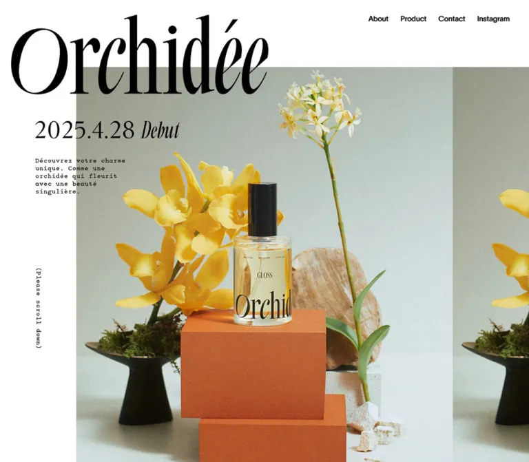
Maison Orchidée establishes its identity through a large black wordmark, sharply cropped photography, and carefully separated typographic roles. The opening photography places haircare bottles among orchids, stone, fabric, and geometric display blocks. Yellow flowers and warm photographic surfaces give the page its expressive color. The interface itself remains restrained: white, near-black, deep navy, and a lightly tinted navy panel.
The page is a brand homepage with an informational product catalog. Its structure supports learning about the brand, comparing products, locating a salon, and making an inquiry. The catalog supplies prices and product details, while the footer explains that the products are available through salons. No cart or checkout control appears in the supplied evidence.
The strongest reusable relationship is the transition from expressive imagery to orderly information: monumental logo, offset photographic opening, spacious brand copy, closely joined product cells, and two large service panels. Preserve that change in density when extending the design.
How to Read This Reference
- Measured values come from the supplied rendered element rectangles, computed styles, and custom properties. Measurements below are rounded where appropriate.
- Derived values are arithmetic based on those measurements, such as gaps between rectangles or the composite color of a translucent surface.
- Visual estimates describe screenshot appearance when the relevant element or property was not included in the DOM excerpt. These are not pixel samples.
- Recommendations describe a new implementation, including the CSS scaffold and accessibility additions. They are not claims about the original implementation.
- Font-family declarations establish the supplied CSS stacks. Font-file loading and the actual font used for every glyph were not independently verified.
- The screenshots show individual settled states. They do not establish a complete animation sequence, a carousel interval, hover behavior, or an opened disclosure state.
Tokens — Colors
Default Palette
| Name | Value | Token / source evidence | Role and confidence |
|---|---|---|---|
| White | #ffffff |
Alias --paper; source --rgb-color-bg: 255 255 255 |
Measured page background, product information surfaces, salon panel, and reversed button surface |
| Near-black | #0b0b0b |
Alias --ink; source --rgb-color-text: 11 11 11 |
Measured body text and product information text |
| Deep navy | #1b3345 |
Alias --navy; source --rgb-color-nv: 27 51 69 |
Measured footer background and filled salon button; visually also the catalog surround |
| Reversed white | #ffffff |
Source --rgb-color-text-inv: 255 255 255 |
Measured reversed content and footer icon color |
| Contact tint | rgb(255 255 255 / 10%) |
Measured Contact panel background | A translucent white layer over navy, without a separate opaque source color |
| Flattened contact tint | #324758 |
Derived alias --navy-panel-flat |
Rounded composite of 10% white over #1b3345; use only when an opaque equivalent is needed |
| Muted product notes | rgb(255 255 255 / 60%) |
Measured footnote text color | Small explanatory notes below the product grid |
| Packshot field | Approximately #f3f4f4 |
Visual-estimate alias --packshot-field |
Very pale gray behind isolated product photographs; may partly belong to the image assets |
| Fine divider | Approximately #d7dce0 |
Visual-estimate alias --divider |
Thin horizontal rules above product detail rows |
| Selection purple | #572cb4 |
Source --color-selection-bg: rgb(87 44 180) |
Declared text-selection background; selection was not exercised |
The selection color is not a general action accent. The main action treatment uses white and navy.
Photographic Color
Warm yellow, ochre, orange, pale stone, green foliage, and pink flowers appear inside the current opening photographs. They are image-dependent colors, not evidenced global UI tokens. Avoid assigning an exact brand-orange or brand-yellow value from these captures.
Rendered Color Versus Computed Color
Desktop navigation links report computed white text, yet appear black over the white opening and pale warm-toned over the navy sections. This indicates that the final visible result cannot be explained by the supplied link color alone. Ancestor styling, compositing, or another rendering treatment may be involved; the relevant properties were not supplied.
Preserve readable contrast over both regions. The Quick Start uses an explicit light/dark surface state as a recommendation; it does not claim to reproduce the original navigation color mechanism.
Tokens — Typography
English Interface
- Declared source stack:
TWK Lausanne, sans-serif. - Measured weight:
400on navigation, section labels, English product names, capacities, and category capsules. - Character: restrained sans-serif typography with regular weight and compact line boxes.
- Role: gives the photographic brand presentation a clear catalog structure.
- Implementation alias:
--font-en.
Use the declared font only when the required font files and usage rights are available. A generic sans-serif fallback will alter text widths, especially in the five-link mobile navigation.
Japanese Interface and Body Copy
The declared stack begins with Zen Kaku Gothic New, followed by Zen Kaku Gothic Antique, Noto Sans JP, Noto Sans CJK JP, and Noto Sans Japanese, then Japanese system-font fallbacks including Hiragino and Meiryo.
The body and Japanese product headings use measured weight 500. Most sampled letter-spacing values are normal. The openness of the layout comes primarily from line height and surrounding space, rather than exaggerated tracking.
Wordmark and Campaign Graphics
The visible Orchidée wordmark has high-contrast serif forms, thin hairlines, tall verticals, and sweeping curves. Its wrapper measures 700 × 218px on desktop and approximately 358.80 × 111.73px on mobile.
The sampled H1 contains no extracted text. Its computed 28px desktop font size does not explain the visible 218px-high artwork. Likewise, the campaign announcement and small French copy occupy text-empty paragraph wrappers. Treat these as graphic content for reconstruction purposes; their exact file formats and embedded typefaces were not supplied.
Do not invent a display-font name or rebuild the logo with an arbitrary serif font. The announcement uses serif lettering with an italic treatment for “debut,” while the small supporting copy has a typewriter-like appearance. These are visual descriptions, not identified font families.
Type Scale
Sizes below are measured unless explicitly marked as estimates. Values use a conventional pixel scale; the supplied HTML root is 16px.
| Role | Desktop size / line height | Mobile size / line height | Weight / notes |
|---|---|---|---|
| Navigation | 15px / 17px |
13px / 17px |
English, 400 |
| General Japanese body | 14px / 24px |
12px / 20px |
500 |
| About / Product section label | 18px / 20px |
13px / 14px |
English, 400 |
| About narrative | 15px / 50px |
12px / 35px |
Japanese, 500; unusually generous leading |
| English product name | 24px / 27px |
15px / 17px |
400 |
| Capacity line above packshot | 10px / 11px |
10px / 11px |
English, 400 |
| Japanese product name | 18px / 26px |
15px / 22px |
500 |
| Category capsule | 11px / 11px |
10px / 11px |
English, 400 |
| Product description | 14px / 24px |
12px / 20px |
Japanese, 500 |
| Detail-row label | 14px / 19.6px |
12px / 16.8px |
Japanese, 500 |
| Product footnotes | 11px / 15px |
10px / 15px |
White at 60% alpha |
| Footer explanatory copy | 13px / 24px |
11px / 18px |
Japanese, 500 |
| Footer English heading | Approximately 36px |
Approximately 24px |
Visual estimate; heading descendants were not sampled |
| Visible View Detail lettering | Approximately 20px |
Approximately 15px |
Visual estimate; sampled anchor styles are inherited parent values |
| Visible copyright lettering | Approximately 10px |
Approximately 10px |
Visual estimate; the sampled parent reports larger text |
Price wrappers use the general body size, but their measured row boxes are 20px high on desktop and 18px on mobile. Do not assume that every nested price or tax label shares the wrapper’s typography.
Tokens — Spacing & Shapes
Density: broad space around the opening and footer; compact, aligned details within the product catalog.
Geometry: square image regions, square product cells, square service panels, and rectangular buttons. Rounded forms are reserved for small category capsules, circular media controls, and the Instagram symbol.
Spacing Scale
| Use | Desktop | Mobile | Evidence |
|---|---|---|---|
| Standard section side inset | 40px |
20.80px |
Measured |
| Navigation link gap | 25px |
18px |
Derived from adjacent link rectangles |
| Product cell separation | 2px |
2px vertically |
Derived from card rectangles |
| Product content side inset | 50.42px |
31.19px |
Derived from card and text positions |
| Product name to capacity | 10px |
10px |
Derived vertical gap |
| Category capsule padding | 3px 9px 4px |
Same | Measured |
| About vertical padding | 100px |
80px |
Measured |
| Product section top padding | 100px |
80px |
Measured |
| Footer top / bottom padding | 120px / 40px |
100px / 30px |
Measured |
| Service panel padding | 90px 100px 70px |
55px 31.19px 30px |
Measured |
| Service panel gap | 10px horizontally |
20px vertically |
Derived |
| Service panels to social section | 250px |
120px |
Derived |
| Social label to icon target | 20px |
15px |
Measured flex gap |
| Social section to copyright box | 200px |
120px |
Derived |
These values form several scales, not a single universal spacing unit. The compact 2px catalog seams and 250px footer pause serve very different roles.
Border Radius
| Element | Value | Evidence |
|---|---|---|
| Product cell | 0 |
Measured |
| Service panel | 0 |
Measured |
| View Detail button | 0 |
Measured |
| Category capsule | 10px |
Measured; capsule height is 20px |
| Intermediate media control | 50% |
Measured |
The category capsule has a fine outline. A 1px border is consistent with its measured 20px height, 11px line height, and 7px combined vertical padding, and with the screenshot.
Layout Measurements
| Element | Desktop | Mobile |
|---|---|---|
| Document height | 7767.16px |
8448.97px |
| Header rectangle | 407.48 × 17px, at approximately x 992.52, y 30 |
390 × 50px, at x 0, y 0 |
| Wordmark wrapper | 700 × 218px, at approximately x 30, y 30 |
358.80 × 111.73px, at x 15.59, y 59 |
| Campaign announcement wrapper | 320 × 80.64px, at x 95.98, y 322 |
176.80 × 44.55px, at x 20.80, y 212.73 |
| Supporting campaign-copy wrapper | 186 × 77px |
148.72 × 61.56px |
| First product cell | 448.80 × 814.58px |
348.41 × 662px |
| Other product cell heights | 814.58px in the sampled desktop grid |
642px for the other five products |
| Product body text width | 347.95px |
286.03px |
| Brochure link | 800 × 70px |
348.41 × 70px |
| Salon panel | 675 × 458px |
348.41 × 301px |
| Contact panel | 675 × 458px |
348.41 × 319px |
| View Detail button | 475 × 70px |
286.03 × 64px |
| Instagram link target | 44 × 44px |
44 × 44px |
The desktop section-label and footer wrappers span 1360px. The three measured product cells and their seams span approximately 1350.39px, ending at x 1390.39. This leaves a slightly larger right margin than the 40px left margin. The original sizing formula was not supplied. The Quick Start uses equal columns across the full section wrapper, which makes each desktop cell approximately 3.2px wider than the measured sample.
Components
Persistent Navigation
Role: maintains access to the brand story, catalog, salon locator, contact destination, and Instagram.
Five unboxed text links appear in this order: About, Product, Salon Search, Contact, Instagram. Desktop places the row 30px from the top and 40px from the right. Mobile retains all five links in a 50px-high white strip; there is no hamburger menu in the supplied mobile view.
The header remains at the top in the scrolled captures. Persistent placement is visually supported, although the supplied properties do not distinguish the exact fixed or sticky implementation.
About and Product are same-page fragment links. Salon Search, Contact, and Instagram are navigation links. No clicked navigation state, smooth-scroll timing, or active-section indicator was supplied.
Opening Wordmark
Role: acts as the primary visual identity rather than a conventional text headline.
On desktop the wordmark begins near x 30 and fills 700px horizontally. The photograph begins around y 187, while the wordmark extends to y 248, creating approximately 61px of overlap in the captured composition.
On mobile the navigation precedes the logo. The wordmark spans approximately 92% of the viewport, with a 4% side inset. Its bottom is near y 171, and the image begins around y 193. This creates a different relationship: the logo sits above the media rather than substantially overlapping it.
Keep the original artwork’s proportions. Stretching its letterforms to fit a differently shaped box would change the identity.
Botanical Image Composition
Role: establishes the tactile, editorial character of the brand.
The desktop capture shows a large milk-product still life beginning around x 207, with a neighboring repeated photographic region and cropped portrait fragments. The image boundaries are hard rectangular cuts. The composition extends to the right edge rather than sitting inside a centered rounded container.
The mobile capture shows a gloss-oil bottle on orange blocks among orchids and stone. The main visible image begins around x 45; a narrow neighboring image strip remains visible at the right edge. The captured media area runs approximately from y 193 to y 773.
These captures show different image states. They establish the available photographic language and responsive framing, but do not establish whether the difference is caused by time, responsive asset selection, or both.
Campaign Announcement Plate
Role: adds the current release information without competing with the wordmark.
The current announcement reads “2nd line” and “2026.4.8 wed debut.” It sits above a short block of French supporting copy. A pale translucent rectangular plate extends across the white margin and photographic area, keeping the black lettering readable.
On desktop the announcement begins at x 95.98, substantially left of the photograph. Its supporting copy starts 40px below the announcement wrapper. On mobile the announcement begins at x 20.80, and the supporting-copy gap reduces to 22px.
The panel’s exact background alpha and any filtering were not supplied. A translucent white fill is an appropriate reconstruction recommendation; a blur effect is not verified.
Scroll Cue
Role: quietly indicates continuation beyond the opening.
The visible label is “(Please scroll down).” Desktop places it vertically along the left margin. Mobile moves it beneath the photograph, horizontally centered, with a measured wrapper of 130 × 10.95px at approximately y 803.
The source wrapper contains no extracted text. Its visible lettering should not be assigned the surrounding paragraph’s computed font without checking the actual graphic.
About Section
Role: explains the brand through the orchid metaphor and an emphasis on changing personal identity.
The section uses a small English label, a centered graphic wrapper, and three groups of Japanese narrative text. The graphic wrapper measures 342 × 98px on desktop and 244 × 69.91px on mobile; its content and asset path were not exposed.
The narrative’s measured 50px desktop and 35px mobile line heights create a slow reading rhythm. This spacing belongs to the brand story. Product descriptions use much tighter leading.
The supplied text includes mobile-specific line breaks. The paragraph rectangles span the section width and report display: flex, but the internal span layout was not included. Detailed text alignment and any line-by-line entrance behavior remain unverified.
Intermediate Media Controls
Role: two controls appear in the media interval between About and Product; their exact behavior is unverified.
The DOM reports a pair of circular, text-empty buttons with a 30% black background. Desktop controls are 60 × 60px with 20px edge offsets. Mobile controls are 44 × 44px with 10px offsets.
Their symmetric placement is consistent with media navigation, but no accessible labels, click results, slide count, or direction semantics were supplied. Do not describe these as tested previous/next controls.
Product Catalog
Role: supports product comparison while retaining a controlled, premium presentation.
The current catalog contains six entries in this order:
- Rich Milk.
- Care Oil.
- Care Oil 002.
- Gloss Oil.
- Gloss Oil 002.
- Tint Oil.
Desktop uses three columns and two rows. Mobile stacks all six products in the same reading order. The navy surrounding field shows through the 2px seams, making the cards read as connected catalog cells.
The first desktop row shares the same card height and aligned description/disclosure areas. Mobile allows the first product to be 20px taller because its description takes an additional line.
Product Cell Anatomy
Each cell has two distinct surfaces and a consistent information hierarchy:
- Pale photographic stage: English product name at the upper left, a small capacity line beneath it, and a centered pair of product packshots.
- White information area: Japanese product name and category capsules on the left, two price rows on the right.
- Benefit description: compact Japanese copy across the inner width.
- Detail rows: a plus symbol, Japanese label, and fine top rule for each disclosure affordance.
In the desktop screenshot, the pale stage occupies approximately 466px of the 815px card height. The DOM places the Japanese name approximately 499.58px below the card’s top. On mobile that name begins 389px below the top. The stage boundary itself was not directly sampled on mobile.
The imagery pairs a full-size product with its smaller version. Preserve transparent bottle edges, accurate package proportions, and adequate breathing room around both sizes. Use containment for packshots; cropping is appropriate for the opening still lifes, not for the product catalog.
Product Metadata and Category Capsules
Role: separates product identity, applicable use, and purchasing information without introducing colorful badges.
Japanese product names use slightly larger text than descriptions. Price rows align to the right and keep capacity, price, and tax notation together. The observed full-size price is ¥4,400 and the smaller size is ¥1,650. Rich Milk lists 100mL / 30mL; the oils list 100mL / 20mL.
The category capsules are small outlined labels: HAIR MILK, HAIR OIL, and, for the gloss products, BODY OIL. They are 20px high with a 10px radius. Adjacent capsules have a measured 2px gap.
These labels convey usage categories. They are not evidenced as filters or clickable controls.
Product Detail Rows
Role: provides access to longer fragrance and ingredient information.
The visible labels are “香りの特徴” and “成分情報.” In the desktop capture they appear as closed rows with plus symbols. Their label positions repeat at a measured 58px vertical interval on both viewports.
Long fragrance paragraphs exist in the supplied element data, but some of their rectangles extend beyond the visible closed-card bounds. That does not establish that the panels were open: descendants can retain layout rectangles while an ancestor clips them.
A transform transition is declared on the labels. The actual expansion mechanism, indicator transformation, open-state geometry, keyboard behavior, and whether multiple rows can be open together were not exercised.
Product Notes and Brochure Link
Role: separates qualification text and a downloadable reference from the product cards.
Three compact notes follow the catalog, using white text at 60% alpha and a 15px line height. A later white rectangular link labeled “パンフレットはこちら” measures 800 × 70px on desktop and fills the 348.41px mobile content width.
There is a substantial interval between the product notes and brochure link in the recorded document. No visual capture or complete element inventory of that interval was supplied. Its contents should not be invented or reconstructed from the gap alone.
The brochure destination is present in the DOM, but the document was not opened.
Salon Search and Contact Panels
Role: directs visitors to the two principal service destinations after product exploration.
Desktop places two 675px-wide panels side by side, with a 10px navy seam. The Salon Search panel is white with dark text and a navy button. The Contact panel uses 10% white over navy, white text, and a white button with dark text.
Each panel contains an English heading, Japanese subtitle, explanatory paragraph, and full-width View Detail button. Headings are centered; explanatory copy is left aligned. The button includes a small northeast arrow.
Desktop gives both explanatory paragraphs a measured 72px-high box, aligning the buttons even when the salon sentence occupies less visible space. Mobile lets the copy determine the panel height: the salon paragraph is 36px high and Contact is 54px high, producing 301px and 319px panels respectively.
The header and footer use different hostnames for equivalent destinations. Header links point to www.b-exgroup.com; footer View Detail links point to www.b-ex.inc. This is an observed link difference, not evidence that the destination pages are equivalent or currently reachable. Those destinations were not opened.
Social Footer
Role: closes the page with one secondary destination and a small ownership line.
A centered parenthesized Official Instagram label sits above a white outline Instagram symbol. The link target is 44 × 44px on both viewports, while the visible symbol is approximately 32px.
The navy space is deliberate: the social section begins 250px below the desktop service panels and 120px below them on mobile. Another 200px desktop or 120px mobile separates the social section from the copyright box.
The visible footer reads “2025 © b-ex inc.” Preserve that as observed content when documenting this capture; the year does not identify the inspection date.
Tokens — Motion & Interaction
| Element or behavior | Supplied evidence | What can be concluded |
|---|---|---|
| Detail-row label | transform 0.3s cubic-bezier(0, 0.55, 0.45, 1) |
A 300ms transform transition is declared; trigger and transform distance are unknown |
| Intermediate circular buttons | background-color 0.3s |
A 300ms background transition is declared; alternate color was not supplied |
| Persistent header | Remains at the top in scrolled desktop and mobile captures | Persistent placement is visible; implementation and color-change trigger are unverified |
| Opening imagery | Different photographs and arrangements across the supplied opening captures | Multiple visual states exist; movement direction, timing, autoplay, and loop behavior are unverified |
| About / Product links | Fragment destinations in rendered anchors | Anchor navigation is available; smooth scrolling is not established |
| Product details | Plus-marked closed rows and longer text in the DOM | Disclosure intent is visible; successful expansion was not tested |
| Brochure and service links | Rendered href values | Destination links exist; destination behavior was not tested |
| Other sampled elements | Frequently animation: none and a transition serialization of all |
This is not proof that the complete page has no animation, nor evidence of a meaningful transition duration |
The capture process waited for visible stability and image decoding within bounded time limits. It also paused perpetual animation during readiness checks and then resumed it. These precautions improve capture stability but do not replace a motion recording or interaction test.
For a new implementation, retain short, restrained feedback. A 300ms label or background transition is source-supported. Automated image movement, reveal choreography, and accordion height animation require separate design decisions and should be labeled as additions.
Surfaces
| Layer | Appearance | Purpose |
|---|---|---|
| Opening canvas | White | Gives the wordmark and photography space |
| Campaign plate | Pale translucent rectangle; alpha unmeasured | Maintains text readability across an image boundary |
| Editorial content | White with near-black text | Provides a quiet brand-story interval |
| Catalog surround | Deep navy | Frames the white product cells and reverses section labels |
| Product photographic stage | Very pale gray, visually estimated | Separates package photography from detailed information |
| Product information | White with fine rules | Supports precise comparison |
| Salon panel | White | Gives the salon locator strong contrast |
| Contact panel | 10% white over navy | Distinguishes a parallel destination without adding a new hue |
| Social footer | Uninterrupted navy | Creates a spacious closing region |
The supplied screenshots show no general drop-shadow system, glossy gradient treatment, or rounded-card elevation. Separation comes from color fields, seams, and image boundaries.
Imagery
Photography carries the decorative complexity. The current desktop opening combines a pale milk bottle, cream fabric, textured stone blocks, yellow-white orchids, and a warm backdrop. The current mobile opening shows a transparent gloss-oil bottle on orange geometric blocks, surrounded by orchids, rock, moss, and green stems. Cropped hair and portrait fragments add a human element to the desktop composition.
Preserve the physical qualities: glass reflections, matte or glossy caps, fabric folds, porous stone, delicate petals, and directional shadows. These are editorial still lifes rather than isolated product-on-gradient banners.
The catalog changes photographic purpose. It uses straightforward paired packshots on pale fields, allowing bottle color, cap shape, size, and label to remain legible. The dramatic serif lettering on the packaging connects the products to the opening wordmark.
Observed Asset References
The evidence did not expose image-source URLs or font-file URLs. The descriptions below identify visible asset roles without inventing filenames.
| Asset role | Available evidence | Implementation guidance |
|---|---|---|
| Orchidée wordmark | Current screenshots and measured H1 wrapper | Supply authorized original artwork with its intrinsic ratio |
| Campaign announcement | Current screenshots and measured paragraph wrapper | Preserve current release wording and graphic proportions |
| French supporting-copy graphic | Current screenshots and measured wrapper | Retain its compact texture; provide an accessible text equivalent |
| Botanical opening photography | Current desktop and mobile screenshots | Use art-directed crops and preserve the right-edge continuation |
| Portrait fragments | Current desktop opening screenshot | Keep intentional rectangular crops; exact sequencing is unknown |
| Product packshot pairs | Desktop catalog screenshot and product DOM | Contain complete packages and retain consistent relative scale |
| About graphic | Measured wrapper only | Content and filename were not exposed; do not substitute an invented source asset |
| Brochure | assets/images/pdf/orchidee_pamphlet.pdf, relative to the inspected page |
Link destination observed; contents not inspected |
| Instagram symbol | Current footer screenshots and 44px anchor rectangle | Use a recognizable outline symbol; original asset format unknown |
Do not use a screenshot of the complete interface as a replacement for semantic page structure. The imagery and graphic lettering should remain distinct assets within a responsive layout.
Layout & Responsive Behavior
Observed Changes
| Feature | Desktop at 1440 × 1000 | Mobile at 390 × 844 |
|---|---|---|
| Navigation | Compact transparent row at upper right | Full-width white 50px strip; all five links retained |
| Wordmark | 700px wide, overlaps photography | Approximately 92vw, above photography |
| Image left inset | Approximately 207px | Approximately 45px |
| Campaign information | 320px-wide announcement wrapper | 176.80px-wide announcement wrapper |
| Scroll cue | Vertical at left | Horizontal below the image |
| Standard content width | 1360px for headings and footer | 348.41px |
| Product arrangement | Three columns × two rows | One column × six rows |
| Product text | 14px body, 24px English title | 12px body, 15px English title |
| Service panels | Two columns, equal heights | Stacked, content-dependent heights |
| Closing whitespace | 250px then 200px intervals | 120px then 120px intervals |
Document Landmarks
These coordinates are measured landmarks for the supplied states, not fixed positioning instructions.
| Landmark | Desktop document y | Mobile document y |
|---|---|---|
| About section begins | 1400px |
1059px |
| Product section begins | 3230px |
2312.70px |
| First product begins | 3440px |
2486.70px |
| Product section ends | 5149.16px |
6436.70px |
| Brochure link begins | 6521.16px |
7275.97px |
| Footer begins | 6591.16px |
7345.97px |
The page should remain a normal vertical document. Do not absolutely position the catalog and footer at these recorded coordinates: text wrapping, font fallback, disclosure expansion, and viewport height can change downstream positions.
Only two widths were supplied. The original breakpoint, tablet layout, landscape behavior, safe-area handling, and behavior below 390px were not established. The Quick Start’s 768px breakpoint and extra narrow-screen navigation adjustment are implementation recommendations.
Do’s and Don’ts
Do
- Preserve the contrast between the oversized graphic logo and small regular-weight navigation.
- Use white, near-black, and deep navy as the structural palette.
- Let flowers, stone, fabric, and packaging supply the expressive colors.
- Keep the opening composition offset and visibly cropped at the right edge.
- Give the About narrative more leading than product descriptions.
- Join desktop product cells with narrow navy seams.
- Keep product names, prices, descriptions, and disclosure rows in a repeatable hierarchy.
- Show complete product packages using contained imagery.
- Retain all five navigation links in the evidenced mobile layout.
- Stack mobile service panels and allow their heights to follow their copy.
- Preserve the large, measured pauses around the social footer.
- Separate verified transition declarations from untested behavior.
Don’t
- Don’t replace the wordmark artwork with an arbitrarily chosen serif typeface.
- Don’t interpret the empty H1 wrapper’s computed font size as the visible logo size.
- Don’t turn photographic yellow or orange into an unsupported global CTA color.
- Don’t add large corner radii or floating shadows to the catalog.
- Don’t crop packshots in the same way as editorial still lifes.
- Don’t replace the mobile navigation with a hamburger without an explicit new design decision.
- Don’t treat category capsules as filters unless that behavior is intentionally added.
- Don’t claim that clipped detail text proves an expanded accordion state.
- Don’t infer a carousel interval, parallax effect, or autoplay sequence from still captures.
- Don’t fill undocumented page intervals with invented sections.
- Don’t reduce the page to a checkout funnel; its evidenced purchase guidance leads visitors to salons.
Recommended Implementation Additions
These are recommendations for a new implementation, not verified features of the original:
- Give the logo a meaningful accessible name. Text-empty wrappers alone do not reveal whether the original has an accessible equivalent.
- Provide readable text alternatives for campaign graphics, including release information.
- Implement product disclosures with native
detailselements or buttons witharia-expandedand associated panels. Preserve the 58px row rhythm in the closed state. - Allow expanded content to increase card and document height without clipping text or moving focus unexpectedly.
- Give icon-only media and Instagram links explicit accessible names. Decorative arrows should not be their only labels.
- Expand mobile navigation hit areas without changing the measured visual label positions.
- Add a visible focus outline on both white and navy surfaces and account for the persistent header when following fragment links.
- Test the small body, tax, footnote, and copyright lettering with zoom and larger text settings. Increase essential text where needed while retaining the hierarchy.
- If automated media movement is implemented, add a pause mechanism and a reduced-motion alternative.
- Verify both sets of service-link hostnames before publishing an adaptation.
- Supply properly sized responsive images and intrinsic dimensions. Load opening imagery promptly and defer noncritical lower-page media.
Agent Prompt Guide
Quick Color Reference
- Opening and product-information surfaces:
#ffffff. - Main text:
#0b0b0b. - Catalog surround, footer, and salon button:
#1b3345. - Contact panel:
rgb(255 255 255 / 10%)over navy, approximately#324758when flattened. - Product-stage gray: approximately
#f3f4f4, a visual estimate. - Secondary product notes: white at 60% alpha.
- Selection only: declared purple
#572cb4. - Warm yellow, orange, pink, and green: supplied by photography, not general UI accents.
Overall Prompt
“Create a Japanese haircare brand homepage inspired by the current Maison Orchidée reference. Begin with an oversized authorized black wordmark, a white canvas, five small English navigation links, and offset botanical still-life photography that continues beyond the right edge. Place a compact release graphic and supporting copy on a pale translucent rectangular plate. Follow with a spacious brand-story section, then a deep-navy product area containing six square white catalog cells. Use a three-column desktop grid and a single-column mobile stack, with English product names, paired packshots, Japanese descriptions, right-aligned prices, tiny outlined usage capsules, and plus-marked detail rows. Finish with white and tinted-navy salon/contact panels and a widely spaced centered Instagram footer. Use the declared English and Japanese font stacks when available. Do not invent animation timing or unidentified asset paths.”
Example Component Prompts
- Opening: “A white editorial opening with a 700 × 218px wordmark near the desktop top left, small regular sans-serif navigation at the top right, and botanical photography beginning around x 207 and y 187 at 1440px width. Overlap the logo and photograph. On a 390px phone, place a 92vw wordmark below a 50px navigation strip and move the scroll cue below the photograph. Use original graphic assets rather than guessed display fonts.”
- Product cell: “A square-cornered haircare catalog cell with a pale packshot stage above a white information block. Use a 24px English product title on desktop, a 10px capacity line, complete full-size and travel-size packshots, an 18px Japanese name, tiny outlined category capsules, two right-aligned price rows, 14px/24px description text, and two 58px detail rows. Use 2px navy seams between cells.”
- Service panels: “Two equal desktop panels on deep navy: a white Salon Search panel with a navy button and a 10%-white-tinted Contact panel with a white button. Center English headings and Japanese subtitles, left-align the explanation, and align the wide 70px-high buttons. Stack the panels on mobile, reduce buttons to 64px high, and let paragraph length determine panel height.”
- Product disclosure: “Create an accessible fragrance/ingredient disclosure with a fine top rule, a small plus indicator, a Japanese label, and a 58px closed row. A 300ms label transform uses cubic-bezier(0, 0.55, 0.45, 1). Treat the transform distance and opening behavior as new implementation choices, and let opened content flow naturally.”
- Photography brief: “Photograph haircare packaging among orchids, textured stone, draped fabric, and simple geometric blocks. Preserve realistic glass reflections and directional shadows. Produce both broad editorial crops and tall mobile crops. Separately create complete paired packshots on a very pale neutral field for catalog use.”
Quick Start
CSS Custom Properties
This is an implementation scaffold, not recovered source CSS. It uses measured palette values and type sizes, with explicit estimates for the packshot field and divider. The breakpoint, hero viewport formulas, focus treatment, disclosure semantics, and navigation surface state are recommendations.
Supply authorized wordmark, campaign, photography, and packshot assets. No asset URL or font-file path is invented here. The hero rules provide a still composition frame; they do not implement the original image sequencing.
Expected component structure:
.site-headercontains.site-navand five anchors..brand-herocontains.brand-wordmark,.hero-media,.campaign-plate, and.scroll-cue. Campaign graphics use.campaign-dateand.campaign-copy..product-cardcontains.product-visualand.product-body. The body contains.product-meta,.product-summary, and twodetailselements..product-metacontains the name/category group and.product-prices..site-footercontains.service-grid,.social-footer, and.copyright.
:root {
  /* Measured structural colors */
  --paper: #ffffff;
  --ink: #0b0b0b;
  --navy: #1b3345;
  --contact-overlay: rgb(255 255 255 / 10%);
  --muted-on-navy: rgb(255 255 255 / 60%);
  --selection: #572cb4;

  /* Derived or visually estimated colors */
  --navy-panel-flat: #324758;
  --packshot-field: #f3f4f4;
  --divider: #d7dce0;

  /* Source-declared families; font files must be supplied separately */
  --font-en: 'TWK Lausanne', sans-serif;
  --font-jp: 'Zen Kaku Gothic New', 'Zen Kaku Gothic Antique',
    'Noto Sans JP', 'Noto Sans CJK JP', 'Noto Sans Japanese',
    'Hiragino Kaku Gothic ProN', 'Hiragino Sans', Meiryo, sans-serif;

  --body-size: 14px;
  --body-leading: 24px;
  --nav-size: 15px;
  --section-size: 18px;
  --section-leading: 20px;
  --product-en-size: 24px;
  --product-en-leading: 27px;
  --product-jp-size: 18px;
  --product-jp-leading: 26px;
  --category-size: 11px;

  --page-gutter: 40px;
  --card-inset: 50.42px;
  --catalog-seam: 2px;
  --detail-row-height: 58px;
  --category-radius: 10px;
  --media-control-size: 60px;
  --hero-media-top: 187px;

  /* Declared timing; interaction endpoints below are recommendations */
  --label-motion: 300ms cubic-bezier(0, 0.55, 0.45, 1);
  --surface-motion: 300ms;
}

* { box-sizing: border-box; }

body {
  margin: 0;
  color: var(--ink);
  background: var(--paper);
  font-family: var(--font-jp);
  font-size: var(--body-size);
  font-weight: 500;
  line-height: var(--body-leading);
}

img { display: block; max-width: 100%; }
button, summary { font: inherit; }
a { color: inherit; }

::selection {
  color: var(--paper);
  background: var(--selection);
}

.page-container {
  margin-inline: var(--page-gutter);
}

.site-header {
  position: fixed;
  inset: 30px 40px auto auto;
  z-index: 20;
  color: var(--ink);
}

/* Set this state through application integration when over dark content. */
.site-header[data-surface='dark'] { color: var(--paper); }

.site-nav {
  display: flex;
  align-items: center;
  gap: 25px;
}

.site-nav a {
  display: block;
  font-family: var(--font-en);
  font-size: var(--nav-size);
  font-weight: 400;
  line-height: 17px;
  white-space: nowrap;
  text-decoration: none;
}

.brand-hero {
  position: relative;
  isolation: isolate;
  min-block-size: calc(100svh + 400px);
  padding-block-start: var(--hero-media-top);
  background: var(--paper);
}

.brand-wordmark {
  position: absolute;
  z-index: 2;
  inset: 30px auto auto 30px;
  inline-size: min(700px, 50vw);
  margin: 0;
}

.brand-wordmark img { inline-size: 100%; block-size: auto; }

/* Insert an art-directed composition; this rule does not animate it. */
.hero-media {
  margin-inline-start: 14.375vw;
  block-size: max(420px, calc(100svh - var(--hero-media-top)));
  overflow: hidden;
}

.hero-media > img {
  inline-size: 100%;
  block-size: 100%;
  object-fit: cover;
}

.campaign-plate {
  position: absolute;
  z-index: 3;
  inset-block-start: 302px;
  inset-inline-start: calc(6.666667vw - 20px);
  inline-size: 360px;
  padding: 20px;
  background: rgb(255 255 255 / 40%);
}

.campaign-date { inline-size: 100%; block-size: auto; }
.campaign-copy {
  inline-size: 186px;
  block-size: auto;
  margin-block-start: 40px;
}

.scroll-cue {
  position: absolute;
  inset-inline-start: 96px;
  inset-block-start: 650px;
  writing-mode: vertical-rl;
}

.about-section { padding-block: 100px; }

.section-label {
  margin: 0;
  font-family: var(--font-en);
  font-size: var(--section-size);
  font-weight: 400;
  line-height: var(--section-leading);
}

.about-copy p {
  margin-block: 30px 0;
  font-size: 15px;
  line-height: 50px;
}

.dark-region {
  color: var(--paper);
  background: var(--navy);
}

.product-section { padding-block-start: 100px; }

.product-grid {
  display: grid;
  grid-template-columns: repeat(3, minmax(0, 1fr));
  gap: var(--catalog-seam);
  margin-block-start: 90px;
}

.product-card {
  min-inline-size: 0;
  color: var(--ink);
  background: var(--paper);
  border-radius: 0;
}

.product-visual {
  min-block-size: 466px;
  padding: 40.53px var(--card-inset) 32px;
  background: var(--packshot-field);
}

.product-title-en {
  margin: 0;
  font-family: var(--font-en);
  font-size: var(--product-en-size);
  font-weight: 400;
  line-height: var(--product-en-leading);
}

.product-volume {
  margin: 10px 0 0;
  font-family: var(--font-en);
  font-size: 10px;
  font-weight: 400;
  line-height: 11px;
}

/* Tune this recommended box to the asset's native transparent margins. */
.product-packshot {
  inline-size: 100%;
  block-size: 320px;
  margin-block-start: 24px;
  object-fit: contain;
}

.product-body { padding: 34px var(--card-inset) 20px; }

.product-meta {
  display: grid;
  grid-template-columns: minmax(0, 1fr) auto;
  align-items: start;
  gap: 12px;
}

.product-name {
  margin: 0;
  font-size: var(--product-jp-size);
  font-weight: 500;
  line-height: var(--product-jp-leading);
}

.product-tags {
  display: flex;
  flex-wrap: wrap;
  gap: 2px;
  margin-block-start: 5px;
}

.product-tag {
  padding: 3px 9px 4px;
  border: 1px solid currentColor;
  border-radius: var(--category-radius);
  font-family: var(--font-en);
  font-size: var(--category-size);
  font-weight: 400;
  line-height: 11px;
}

.product-prices {
  margin: 5px 0 0;
  text-align: right;
}

.product-prices p {
  margin: 0;
  line-height: 20px;
  white-space: nowrap;
}

.product-summary {
  min-block-size: 72px;
  margin: 35px 0 20px;
}

/* Native disclosures are a recommended semantic implementation. */
.product-body details { border-block-start: 1px solid var(--divider); }

.product-body summary {
  display: flex;
  align-items: center;
  gap: 10px;
  min-block-size: calc(var(--detail-row-height) - 1px);
  list-style: none;
  cursor: pointer;
}

.product-body summary::-webkit-details-marker { display: none; }
.product-body summary::before { content: '+'; flex: 0 0 8px; }
.product-body details[open] > summary::before { content: '−'; }
.disclosure-label { transition: transform var(--label-motion); }
.detail-content { padding-block-end: 24px; }
.detail-content p { margin: 0; }

.product-notes {
  margin-block: 30px 0;
  color: var(--muted-on-navy);
  font-size: 11px;
  line-height: 15px;
}

.brochure-link {
  display: flex;
  align-items: center;
  justify-content: center;
  inline-size: min(800px, calc(100% - 2 * var(--page-gutter)));
  min-block-size: 70px;
  margin-inline: auto;
  color: var(--ink);
  background: var(--paper);
  text-decoration: none;
}

.media-control {
  display: grid;
  place-items: center;
  inline-size: var(--media-control-size);
  block-size: var(--media-control-size);
  padding: 0;
  border: 0;
  border-radius: 50%;
  background: rgb(0 0 0 / 30%);
  transition: background-color var(--surface-motion);
}

.site-footer {
  padding-block: 120px 40px;
  color: var(--paper);
  background: var(--navy);
}

.service-grid {
  display: grid;
  grid-template-columns: repeat(2, minmax(0, 1fr));
  gap: 10px;
}

.service-panel {
  display: flex;
  flex-direction: column;
  padding: 90px 100px 70px;
  color: var(--ink);
  background: var(--paper);
}

.service-panel--contact {
  color: var(--paper);
  background: var(--contact-overlay);
}

/* Heading values approximate the visible, unsampled descendants. */
.service-title {
  margin: 0;
  font: 400 36px/40px var(--font-en);
  text-align: center;
}

.service-subtitle {
  margin: 10px 0 0;
  font-size: 18px;
  line-height: 26px;
  text-align: center;
}

.service-copy {
  min-block-size: 72px;
  margin: 50px 0 30px;
  font-size: 13px;
  line-height: 24px;
}

.detail-link {
  display: flex;
  align-items: center;
  justify-content: center;
  gap: 12px;
  min-block-size: 70px;
  margin-block-start: auto;
  color: var(--paper);
  background: var(--navy);
  font: 400 20px/24px var(--font-en);
  text-decoration: none;
}

.service-panel--contact .detail-link {
  color: var(--ink);
  background: var(--paper);
}

.social-footer {
  display: flex;
  flex-direction: column;
  align-items: center;
  gap: 20px;
  margin-block-start: 250px;
}

.social-label { margin: 0; font: 400 18px/20px var(--font-en); }

.social-link {
  display: grid;
  place-items: center;
  inline-size: 44px;
  block-size: 44px;
}

.social-link svg { inline-size: 32px; block-size: 32px; }

.copyright {
  margin: 200px 0 0;
  color: var(--muted-on-navy);
  font-size: 10px;
  line-height: 24px;
  text-align: center;
}

/* Recommended focus and hover endpoints. */
:where(a, button, summary):focus-visible {
  outline: 2px solid currentColor;
  outline-offset: 4px;
}

#about, #product { scroll-margin-block-start: 80px; }

@media (hover: hover) {
  .product-body summary:hover .disclosure-label {
    transform: translateX(3px);
  }
  .media-control:hover { background: rgb(0 0 0 / 45%); }
}

/* Recommended breakpoint; only the two supplied endpoints were inspected. */
@media (max-width: 768px) {
  :root {
    --body-size: 12px;
    --body-leading: 20px;
    --nav-size: 13px;
    --section-size: 13px;
    --section-leading: 14px;
    --product-en-size: 15px;
    --product-en-leading: 17px;
    --product-jp-size: 15px;
    --product-jp-leading: 22px;
    --category-size: 10px;
    --page-gutter: 5.333333vw;
    --card-inset: 8vw;
    --media-control-size: 44px;
    --hero-media-top: calc(59px + 28.651429vw + 22px);
  }

  .site-header,
  .site-header[data-surface='dark'] {
    inset: 0 0 auto;
    display: flex;
    align-items: center;
    justify-content: center;
    block-size: 50px;
    color: var(--ink);
    background: var(--paper);
  }

  .site-nav { gap: 18px; }
  .site-nav a { padding-block: 13.5px; }

  .brand-hero { min-block-size: calc(100svh + 215px); }
  .brand-wordmark { inset: 59px auto auto 4vw; inline-size: 92vw; }

  .hero-media {
    margin-inline-start: 11.538462vw;
    block-size: max(400px, calc(100svh - 264px));
  }

  .campaign-plate {
    inset-block-start: var(--hero-media-top);
    inset-inline-start: 0;
    inline-size: 56vw;
    padding: 20px var(--page-gutter);
  }

  .campaign-copy { inline-size: 38.133333vw; margin-block-start: 22px; }

  .scroll-cue {
    inset-block-start: calc(100svh - 41px);
    inset-inline-start: 50%;
    transform: translateX(-50%);
    writing-mode: horizontal-tb;
  }

  .about-section { padding-block: 80px; }
  .about-copy p { margin-block-start: 20px; font-size: 12px; line-height: 35px; }
  .product-section { padding-block-start: 80px; }
  .product-grid { grid-template-columns: minmax(0, 1fr); margin-block-start: 80px; }
  .product-visual { min-block-size: 359px; padding: 31.19px var(--card-inset) 30px; }
  .product-packshot { block-size: 240px; margin-block-start: 20px; }
  .product-body { padding: 30px var(--card-inset) 10px; }
  .product-prices { margin-block-start: 3px; }
  .product-prices p { line-height: 18px; }
  .product-summary { min-block-size: 0; margin: 25px 0 15px; }
  .product-notes { margin-block-start: 20px; font-size: 10px; }

  .site-footer { padding-block: 100px 30px; }
  .service-grid { grid-template-columns: minmax(0, 1fr); gap: 20px; }
  .service-panel { padding: 55px var(--card-inset) 30px; }
  .service-title { font-size: 24px; line-height: 27px; }
  .service-subtitle { margin-block-start: 5px; font-size: 13px; line-height: 19px; }
  .service-copy { min-block-size: 0; margin: 40px 0 25px; font-size: 11px; line-height: 18px; }
  .detail-link { min-block-size: 64px; font-size: 15px; line-height: 20px; }
  .social-footer { margin-block-start: 120px; gap: 15px; }
  .social-label { font-size: 13px; line-height: 14px; }
  .copyright { margin-block-start: 120px; line-height: 20px; }
}

/* Additional narrow-screen behavior, not an observed source breakpoint. */
@media (max-width: 360px) {
  .site-nav { gap: 12px; }
  .site-nav a { font-size: 12px; }
}

@media (prefers-reduced-motion: reduce) {
  .disclosure-label,
  .media-control { transition: none; }
  .product-body summary:hover .disclosure-label { transform: none; }
}
The scaffold deliberately leaves undocumented media intervals to the application’s content structure. Image crops, native graphic dimensions, loaded fonts, and actual disclosure content must be checked together before treating the result as a close visual reproduction.
Tailwind v4 Token Mapping
Optional aliases for an implementation already using Tailwind v4. These do not imply that the original site uses Tailwind. Define the custom properties above first.
@theme inline {
  --color-brand-paper: var(--paper);
  --color-brand-ink: var(--ink);
  --color-brand-navy: var(--navy);
  --color-brand-panel: var(--navy-panel-flat);
  --color-product-field: var(--packshot-field);
  --color-product-divider: var(--divider);

  --font-brand-en: var(--font-en);
  --font-brand-jp: var(--font-jp);

  --text-brand-body: var(--body-size);
  --text-brand-nav: var(--nav-size);
  --text-product-title: var(--product-en-size);

  --spacing-page: var(--page-gutter);
  --spacing-card: var(--card-inset);
  --spacing-catalog-seam: var(--catalog-seam);
  --spacing-detail-row: var(--detail-row-height);
  --radius-category: var(--category-radius);
}
Sources & Evidence
- Inspected original and final page: Maison Orchidée official website. The supplied response status is HTTP 200, and the original and final URLs are identical.
- Evidence timestamp:
2026-09-12T19:00:50.057Z, corresponding to September 13, 2026 at 04:00:50.057 JST. This reference analyzes that supplied capture set; it does not claim a separate later visit. - Desktop evidence: 1440 × 1000 CSS-pixel opening, product-grid, and footer captures, plus rendered text, links, element rectangles, computed styles, and custom properties. Recorded document height: approximately 7767.16px.
- Mobile evidence: 390 × 844 CSS-pixel opening and footer captures, plus rendered text, links, element rectangles, computed styles, and custom properties. Recorded document height: approximately 8448.97px.
- On-page identity evidence: the official page title, Contact copy naming 株式会社b-ex, and the visible footer “2025 © b-ex inc.”
- Observed navigation: fragment links for About and Product; rendered links for salon search, contact, the brochure, and the official Instagram account. Link destinations were not opened or functionally tested for this analysis.
- Inspection limitations: no additional browsing, commands, asset retrieval, or file inspection was performed. No interaction trace, full stylesheet, image-source inventory, font-loading report, or tested expanded product-detail state was supplied. Missing visual intervals, motion sequencing, and intermediate responsive widths remain unverified.
All design observations in this document refer to the current original-page evidence. Measured tokens, derived calculations, visual estimates, and recommended implementation choices are identified separately.
# Maison Orchidée — Style Reference

> An oversized fashion wordmark above botanical still lifes, followed by a precise product catalog in deep navy.

**Website / Original URL:** [www.b-exgroup.com/orchidee/](https://www.b-exgroup.com/orchidee/)
**Final URL:** [www.b-exgroup.com/orchidee/](https://www.b-exgroup.com/orchidee/)
**Theme:** white opening and editorial content, followed by a navy product and footer environment; no theme selector was evidenced.
**Inspected:** September 13, 2026, Japan Standard Time. The supplied evidence timestamp is September 12, 2026 at 19:00:50.057 UTC, equivalent to September 13 at 04:00:50.057 JST.
**Viewports:** 1440 × 1000 desktop and 390 × 844 mobile, in CSS pixels.
**Scope:** the current brand homepage: opening composition, About content and geometry, intermediate media controls, six-product catalog, brochure link, salon/contact panels, and social footer. Visual captures cover the opening, desktop catalog, and desktop/mobile footer. Other regions are documented only to the extent supported by the supplied DOM.

Maison Orchidée establishes its identity through a large black wordmark, sharply cropped photography, and carefully separated typographic roles. The opening photography places haircare bottles among orchids, stone, fabric, and geometric display blocks. Yellow flowers and warm photographic surfaces give the page its expressive color. The interface itself remains restrained: white, near-black, deep navy, and a lightly tinted navy panel.

The page is a brand homepage with an informational product catalog. Its structure supports learning about the brand, comparing products, locating a salon, and making an inquiry. The catalog supplies prices and product details, while the footer explains that the products are available through salons. No cart or checkout control appears in the supplied evidence.

The strongest reusable relationship is the transition from expressive imagery to orderly information: monumental logo, offset photographic opening, spacious brand copy, closely joined product cells, and two large service panels. Preserve that change in density when extending the design.

## How to Read This Reference

- **Measured** values come from the supplied rendered element rectangles, computed styles, and custom properties. Measurements below are rounded where appropriate.
- **Derived** values are arithmetic based on those measurements, such as gaps between rectangles or the composite color of a translucent surface.
- **Visual estimates** describe screenshot appearance when the relevant element or property was not included in the DOM excerpt. These are not pixel samples.
- **Recommendations** describe a new implementation, including the CSS scaffold and accessibility additions. They are not claims about the original implementation.
- Font-family declarations establish the supplied CSS stacks. Font-file loading and the actual font used for every glyph were not independently verified.
- The screenshots show individual settled states. They do not establish a complete animation sequence, a carousel interval, hover behavior, or an opened disclosure state.

## Tokens — Colors

### Default Palette

| Name | Value | Token / source evidence | Role and confidence |
| --- | --- | --- | --- |
| White | `#ffffff` | Alias `--paper`; source `--rgb-color-bg: 255 255 255` | Measured page background, product information surfaces, salon panel, and reversed button surface |
| Near-black | `#0b0b0b` | Alias `--ink`; source `--rgb-color-text: 11 11 11` | Measured body text and product information text |
| Deep navy | `#1b3345` | Alias `--navy`; source `--rgb-color-nv: 27 51 69` | Measured footer background and filled salon button; visually also the catalog surround |
| Reversed white | `#ffffff` | Source `--rgb-color-text-inv: 255 255 255` | Measured reversed content and footer icon color |
| Contact tint | `rgb(255 255 255 / 10%)` | Measured Contact panel background | A translucent white layer over navy, without a separate opaque source color |
| Flattened contact tint | `#324758` | Derived alias `--navy-panel-flat` | Rounded composite of 10% white over `#1b3345`; use only when an opaque equivalent is needed |
| Muted product notes | `rgb(255 255 255 / 60%)` | Measured footnote text color | Small explanatory notes below the product grid |
| Packshot field | Approximately `#f3f4f4` | Visual-estimate alias `--packshot-field` | Very pale gray behind isolated product photographs; may partly belong to the image assets |
| Fine divider | Approximately `#d7dce0` | Visual-estimate alias `--divider` | Thin horizontal rules above product detail rows |
| Selection purple | `#572cb4` | Source `--color-selection-bg: rgb(87 44 180)` | Declared text-selection background; selection was not exercised |

The selection color is not a general action accent. The main action treatment uses white and navy.

### Photographic Color

Warm yellow, ochre, orange, pale stone, green foliage, and pink flowers appear inside the current opening photographs. They are image-dependent colors, not evidenced global UI tokens. Avoid assigning an exact brand-orange or brand-yellow value from these captures.

### Rendered Color Versus Computed Color

Desktop navigation links report computed white text, yet appear black over the white opening and pale warm-toned over the navy sections. This indicates that the final visible result cannot be explained by the supplied link color alone. Ancestor styling, compositing, or another rendering treatment may be involved; the relevant properties were not supplied.

Preserve readable contrast over both regions. The Quick Start uses an explicit light/dark surface state as a recommendation; it does not claim to reproduce the original navigation color mechanism.

## Tokens — Typography

### English Interface

- **Declared source stack:** `TWK Lausanne, sans-serif`.
- **Measured weight:** `400` on navigation, section labels, English product names, capacities, and category capsules.
- **Character:** restrained sans-serif typography with regular weight and compact line boxes.
- **Role:** gives the photographic brand presentation a clear catalog structure.
- **Implementation alias:** `--font-en`.

Use the declared font only when the required font files and usage rights are available. A generic sans-serif fallback will alter text widths, especially in the five-link mobile navigation.

### Japanese Interface and Body Copy

The declared stack begins with `Zen Kaku Gothic New`, followed by `Zen Kaku Gothic Antique`, `Noto Sans JP`, `Noto Sans CJK JP`, and `Noto Sans Japanese`, then Japanese system-font fallbacks including Hiragino and Meiryo.

The body and Japanese product headings use measured weight `500`. Most sampled letter-spacing values are `normal`. The openness of the layout comes primarily from line height and surrounding space, rather than exaggerated tracking.

### Wordmark and Campaign Graphics

The visible Orchidée wordmark has high-contrast serif forms, thin hairlines, tall verticals, and sweeping curves. Its wrapper measures 700 × 218px on desktop and approximately 358.80 × 111.73px on mobile.

The sampled H1 contains no extracted text. Its computed 28px desktop font size does **not** explain the visible 218px-high artwork. Likewise, the campaign announcement and small French copy occupy text-empty paragraph wrappers. Treat these as graphic content for reconstruction purposes; their exact file formats and embedded typefaces were not supplied.

Do not invent a display-font name or rebuild the logo with an arbitrary serif font. The announcement uses serif lettering with an italic treatment for “debut,” while the small supporting copy has a typewriter-like appearance. These are visual descriptions, not identified font families.

### Type Scale

Sizes below are measured unless explicitly marked as estimates. Values use a conventional pixel scale; the supplied HTML root is 16px.

| Role | Desktop size / line height | Mobile size / line height | Weight / notes |
| --- | --- | --- | --- |
| Navigation | `15px / 17px` | `13px / 17px` | English, `400` |
| General Japanese body | `14px / 24px` | `12px / 20px` | `500` |
| About / Product section label | `18px / 20px` | `13px / 14px` | English, `400` |
| About narrative | `15px / 50px` | `12px / 35px` | Japanese, `500`; unusually generous leading |
| English product name | `24px / 27px` | `15px / 17px` | `400` |
| Capacity line above packshot | `10px / 11px` | `10px / 11px` | English, `400` |
| Japanese product name | `18px / 26px` | `15px / 22px` | `500` |
| Category capsule | `11px / 11px` | `10px / 11px` | English, `400` |
| Product description | `14px / 24px` | `12px / 20px` | Japanese, `500` |
| Detail-row label | `14px / 19.6px` | `12px / 16.8px` | Japanese, `500` |
| Product footnotes | `11px / 15px` | `10px / 15px` | White at 60% alpha |
| Footer explanatory copy | `13px / 24px` | `11px / 18px` | Japanese, `500` |
| Footer English heading | Approximately `36px` | Approximately `24px` | Visual estimate; heading descendants were not sampled |
| Visible View Detail lettering | Approximately `20px` | Approximately `15px` | Visual estimate; sampled anchor styles are inherited parent values |
| Visible copyright lettering | Approximately `10px` | Approximately `10px` | Visual estimate; the sampled parent reports larger text |

Price wrappers use the general body size, but their measured row boxes are 20px high on desktop and 18px on mobile. Do not assume that every nested price or tax label shares the wrapper’s typography.

## Tokens — Spacing & Shapes

**Density:** broad space around the opening and footer; compact, aligned details within the product catalog.

**Geometry:** square image regions, square product cells, square service panels, and rectangular buttons. Rounded forms are reserved for small category capsules, circular media controls, and the Instagram symbol.

### Spacing Scale

| Use | Desktop | Mobile | Evidence |
| --- | --- | --- | --- |
| Standard section side inset | `40px` | `20.80px` | Measured |
| Navigation link gap | `25px` | `18px` | Derived from adjacent link rectangles |
| Product cell separation | `2px` | `2px` vertically | Derived from card rectangles |
| Product content side inset | `50.42px` | `31.19px` | Derived from card and text positions |
| Product name to capacity | `10px` | `10px` | Derived vertical gap |
| Category capsule padding | `3px 9px 4px` | Same | Measured |
| About vertical padding | `100px` | `80px` | Measured |
| Product section top padding | `100px` | `80px` | Measured |
| Footer top / bottom padding | `120px / 40px` | `100px / 30px` | Measured |
| Service panel padding | `90px 100px 70px` | `55px 31.19px 30px` | Measured |
| Service panel gap | `10px` horizontally | `20px` vertically | Derived |
| Service panels to social section | `250px` | `120px` | Derived |
| Social label to icon target | `20px` | `15px` | Measured flex gap |
| Social section to copyright box | `200px` | `120px` | Derived |

These values form several scales, not a single universal spacing unit. The compact 2px catalog seams and 250px footer pause serve very different roles.

### Border Radius

| Element | Value | Evidence |
| --- | --- | --- |
| Product cell | `0` | Measured |
| Service panel | `0` | Measured |
| View Detail button | `0` | Measured |
| Category capsule | `10px` | Measured; capsule height is 20px |
| Intermediate media control | `50%` | Measured |

The category capsule has a fine outline. A 1px border is consistent with its measured 20px height, 11px line height, and 7px combined vertical padding, and with the screenshot.

### Layout Measurements

| Element | Desktop | Mobile |
| --- | --- | --- |
| Document height | `7767.16px` | `8448.97px` |
| Header rectangle | `407.48 × 17px`, at approximately `x 992.52, y 30` | `390 × 50px`, at `x 0, y 0` |
| Wordmark wrapper | `700 × 218px`, at approximately `x 30, y 30` | `358.80 × 111.73px`, at `x 15.59, y 59` |
| Campaign announcement wrapper | `320 × 80.64px`, at `x 95.98, y 322` | `176.80 × 44.55px`, at `x 20.80, y 212.73` |
| Supporting campaign-copy wrapper | `186 × 77px` | `148.72 × 61.56px` |
| First product cell | `448.80 × 814.58px` | `348.41 × 662px` |
| Other product cell heights | `814.58px` in the sampled desktop grid | `642px` for the other five products |
| Product body text width | `347.95px` | `286.03px` |
| Brochure link | `800 × 70px` | `348.41 × 70px` |
| Salon panel | `675 × 458px` | `348.41 × 301px` |
| Contact panel | `675 × 458px` | `348.41 × 319px` |
| View Detail button | `475 × 70px` | `286.03 × 64px` |
| Instagram link target | `44 × 44px` | `44 × 44px` |

The desktop section-label and footer wrappers span 1360px. The three measured product cells and their seams span approximately 1350.39px, ending at x 1390.39. This leaves a slightly larger right margin than the 40px left margin. The original sizing formula was not supplied. The Quick Start uses equal columns across the full section wrapper, which makes each desktop cell approximately 3.2px wider than the measured sample.

## Components

### Persistent Navigation

**Role:** maintains access to the brand story, catalog, salon locator, contact destination, and Instagram.

Five unboxed text links appear in this order: About, Product, Salon Search, Contact, Instagram. Desktop places the row 30px from the top and 40px from the right. Mobile retains all five links in a 50px-high white strip; there is no hamburger menu in the supplied mobile view.

The header remains at the top in the scrolled captures. Persistent placement is visually supported, although the supplied properties do not distinguish the exact fixed or sticky implementation.

About and Product are same-page fragment links. Salon Search, Contact, and Instagram are navigation links. No clicked navigation state, smooth-scroll timing, or active-section indicator was supplied.

### Opening Wordmark

**Role:** acts as the primary visual identity rather than a conventional text headline.

On desktop the wordmark begins near x 30 and fills 700px horizontally. The photograph begins around y 187, while the wordmark extends to y 248, creating approximately 61px of overlap in the captured composition.

On mobile the navigation precedes the logo. The wordmark spans approximately 92% of the viewport, with a 4% side inset. Its bottom is near y 171, and the image begins around y 193. This creates a different relationship: the logo sits above the media rather than substantially overlapping it.

Keep the original artwork’s proportions. Stretching its letterforms to fit a differently shaped box would change the identity.

### Botanical Image Composition

**Role:** establishes the tactile, editorial character of the brand.

The desktop capture shows a large milk-product still life beginning around x 207, with a neighboring repeated photographic region and cropped portrait fragments. The image boundaries are hard rectangular cuts. The composition extends to the right edge rather than sitting inside a centered rounded container.

The mobile capture shows a gloss-oil bottle on orange blocks among orchids and stone. The main visible image begins around x 45; a narrow neighboring image strip remains visible at the right edge. The captured media area runs approximately from y 193 to y 773.

These captures show different image states. They establish the available photographic language and responsive framing, but do not establish whether the difference is caused by time, responsive asset selection, or both.

### Campaign Announcement Plate

**Role:** adds the current release information without competing with the wordmark.

The current announcement reads “2nd line” and “2026.4.8 wed debut.” It sits above a short block of French supporting copy. A pale translucent rectangular plate extends across the white margin and photographic area, keeping the black lettering readable.

On desktop the announcement begins at x 95.98, substantially left of the photograph. Its supporting copy starts 40px below the announcement wrapper. On mobile the announcement begins at x 20.80, and the supporting-copy gap reduces to 22px.

The panel’s exact background alpha and any filtering were not supplied. A translucent white fill is an appropriate reconstruction recommendation; a blur effect is not verified.

### Scroll Cue

**Role:** quietly indicates continuation beyond the opening.

The visible label is “(Please scroll down).” Desktop places it vertically along the left margin. Mobile moves it beneath the photograph, horizontally centered, with a measured wrapper of 130 × 10.95px at approximately y 803.

The source wrapper contains no extracted text. Its visible lettering should not be assigned the surrounding paragraph’s computed font without checking the actual graphic.

### About Section

**Role:** explains the brand through the orchid metaphor and an emphasis on changing personal identity.

The section uses a small English label, a centered graphic wrapper, and three groups of Japanese narrative text. The graphic wrapper measures 342 × 98px on desktop and 244 × 69.91px on mobile; its content and asset path were not exposed.

The narrative’s measured 50px desktop and 35px mobile line heights create a slow reading rhythm. This spacing belongs to the brand story. Product descriptions use much tighter leading.

The supplied text includes mobile-specific line breaks. The paragraph rectangles span the section width and report `display: flex`, but the internal span layout was not included. Detailed text alignment and any line-by-line entrance behavior remain unverified.

### Intermediate Media Controls

**Role:** two controls appear in the media interval between About and Product; their exact behavior is unverified.

The DOM reports a pair of circular, text-empty buttons with a 30% black background. Desktop controls are 60 × 60px with 20px edge offsets. Mobile controls are 44 × 44px with 10px offsets.

Their symmetric placement is consistent with media navigation, but no accessible labels, click results, slide count, or direction semantics were supplied. Do not describe these as tested previous/next controls.

### Product Catalog

**Role:** supports product comparison while retaining a controlled, premium presentation.

The current catalog contains six entries in this order:

1. Rich Milk.
2. Care Oil.
3. Care Oil 002.
4. Gloss Oil.
5. Gloss Oil 002.
6. Tint Oil.

Desktop uses three columns and two rows. Mobile stacks all six products in the same reading order. The navy surrounding field shows through the 2px seams, making the cards read as connected catalog cells.

The first desktop row shares the same card height and aligned description/disclosure areas. Mobile allows the first product to be 20px taller because its description takes an additional line.

### Product Cell Anatomy

Each cell has two distinct surfaces and a consistent information hierarchy:

1. **Pale photographic stage:** English product name at the upper left, a small capacity line beneath it, and a centered pair of product packshots.
2. **White information area:** Japanese product name and category capsules on the left, two price rows on the right.
3. **Benefit description:** compact Japanese copy across the inner width.
4. **Detail rows:** a plus symbol, Japanese label, and fine top rule for each disclosure affordance.

In the desktop screenshot, the pale stage occupies approximately 466px of the 815px card height. The DOM places the Japanese name approximately 499.58px below the card’s top. On mobile that name begins 389px below the top. The stage boundary itself was not directly sampled on mobile.

The imagery pairs a full-size product with its smaller version. Preserve transparent bottle edges, accurate package proportions, and adequate breathing room around both sizes. Use containment for packshots; cropping is appropriate for the opening still lifes, not for the product catalog.

### Product Metadata and Category Capsules

**Role:** separates product identity, applicable use, and purchasing information without introducing colorful badges.

Japanese product names use slightly larger text than descriptions. Price rows align to the right and keep capacity, price, and tax notation together. The observed full-size price is ¥4,400 and the smaller size is ¥1,650. Rich Milk lists 100mL / 30mL; the oils list 100mL / 20mL.

The category capsules are small outlined labels: HAIR MILK, HAIR OIL, and, for the gloss products, BODY OIL. They are 20px high with a 10px radius. Adjacent capsules have a measured 2px gap.

These labels convey usage categories. They are not evidenced as filters or clickable controls.

### Product Detail Rows

**Role:** provides access to longer fragrance and ingredient information.

The visible labels are “香りの特徴” and “成分情報.” In the desktop capture they appear as closed rows with plus symbols. Their label positions repeat at a measured 58px vertical interval on both viewports.

Long fragrance paragraphs exist in the supplied element data, but some of their rectangles extend beyond the visible closed-card bounds. That does not establish that the panels were open: descendants can retain layout rectangles while an ancestor clips them.

A transform transition is declared on the labels. The actual expansion mechanism, indicator transformation, open-state geometry, keyboard behavior, and whether multiple rows can be open together were not exercised.

### Product Notes and Brochure Link

**Role:** separates qualification text and a downloadable reference from the product cards.

Three compact notes follow the catalog, using white text at 60% alpha and a 15px line height. A later white rectangular link labeled “パンフレットはこちら” measures 800 × 70px on desktop and fills the 348.41px mobile content width.

There is a substantial interval between the product notes and brochure link in the recorded document. No visual capture or complete element inventory of that interval was supplied. Its contents should not be invented or reconstructed from the gap alone.

The brochure destination is present in the DOM, but the document was not opened.

### Salon Search and Contact Panels

**Role:** directs visitors to the two principal service destinations after product exploration.

Desktop places two 675px-wide panels side by side, with a 10px navy seam. The Salon Search panel is white with dark text and a navy button. The Contact panel uses 10% white over navy, white text, and a white button with dark text.

Each panel contains an English heading, Japanese subtitle, explanatory paragraph, and full-width View Detail button. Headings are centered; explanatory copy is left aligned. The button includes a small northeast arrow.

Desktop gives both explanatory paragraphs a measured 72px-high box, aligning the buttons even when the salon sentence occupies less visible space. Mobile lets the copy determine the panel height: the salon paragraph is 36px high and Contact is 54px high, producing 301px and 319px panels respectively.

The header and footer use different hostnames for equivalent destinations. Header links point to `www.b-exgroup.com`; footer View Detail links point to `www.b-ex.inc`. This is an observed link difference, not evidence that the destination pages are equivalent or currently reachable. Those destinations were not opened.

### Social Footer

**Role:** closes the page with one secondary destination and a small ownership line.

A centered parenthesized Official Instagram label sits above a white outline Instagram symbol. The link target is 44 × 44px on both viewports, while the visible symbol is approximately 32px.

The navy space is deliberate: the social section begins 250px below the desktop service panels and 120px below them on mobile. Another 200px desktop or 120px mobile separates the social section from the copyright box.

The visible footer reads “2025 © b-ex inc.” Preserve that as observed content when documenting this capture; the year does not identify the inspection date.

## Tokens — Motion & Interaction

| Element or behavior | Supplied evidence | What can be concluded |
| --- | --- | --- |
| Detail-row label | `transform 0.3s cubic-bezier(0, 0.55, 0.45, 1)` | A 300ms transform transition is declared; trigger and transform distance are unknown |
| Intermediate circular buttons | `background-color 0.3s` | A 300ms background transition is declared; alternate color was not supplied |
| Persistent header | Remains at the top in scrolled desktop and mobile captures | Persistent placement is visible; implementation and color-change trigger are unverified |
| Opening imagery | Different photographs and arrangements across the supplied opening captures | Multiple visual states exist; movement direction, timing, autoplay, and loop behavior are unverified |
| About / Product links | Fragment destinations in rendered anchors | Anchor navigation is available; smooth scrolling is not established |
| Product details | Plus-marked closed rows and longer text in the DOM | Disclosure intent is visible; successful expansion was not tested |
| Brochure and service links | Rendered href values | Destination links exist; destination behavior was not tested |
| Other sampled elements | Frequently `animation: none` and a transition serialization of `all` | This is not proof that the complete page has no animation, nor evidence of a meaningful transition duration |

The capture process waited for visible stability and image decoding within bounded time limits. It also paused perpetual animation during readiness checks and then resumed it. These precautions improve capture stability but do not replace a motion recording or interaction test.

For a new implementation, retain short, restrained feedback. A 300ms label or background transition is source-supported. Automated image movement, reveal choreography, and accordion height animation require separate design decisions and should be labeled as additions.

## Surfaces

| Layer | Appearance | Purpose |
| --- | --- | --- |
| Opening canvas | White | Gives the wordmark and photography space |
| Campaign plate | Pale translucent rectangle; alpha unmeasured | Maintains text readability across an image boundary |
| Editorial content | White with near-black text | Provides a quiet brand-story interval |
| Catalog surround | Deep navy | Frames the white product cells and reverses section labels |
| Product photographic stage | Very pale gray, visually estimated | Separates package photography from detailed information |
| Product information | White with fine rules | Supports precise comparison |
| Salon panel | White | Gives the salon locator strong contrast |
| Contact panel | 10% white over navy | Distinguishes a parallel destination without adding a new hue |
| Social footer | Uninterrupted navy | Creates a spacious closing region |

The supplied screenshots show no general drop-shadow system, glossy gradient treatment, or rounded-card elevation. Separation comes from color fields, seams, and image boundaries.

## Imagery

Photography carries the decorative complexity. The current desktop opening combines a pale milk bottle, cream fabric, textured stone blocks, yellow-white orchids, and a warm backdrop. The current mobile opening shows a transparent gloss-oil bottle on orange geometric blocks, surrounded by orchids, rock, moss, and green stems. Cropped hair and portrait fragments add a human element to the desktop composition.

Preserve the physical qualities: glass reflections, matte or glossy caps, fabric folds, porous stone, delicate petals, and directional shadows. These are editorial still lifes rather than isolated product-on-gradient banners.

The catalog changes photographic purpose. It uses straightforward paired packshots on pale fields, allowing bottle color, cap shape, size, and label to remain legible. The dramatic serif lettering on the packaging connects the products to the opening wordmark.

### Observed Asset References

The evidence did not expose image-source URLs or font-file URLs. The descriptions below identify visible asset roles without inventing filenames.

| Asset role | Available evidence | Implementation guidance |
| --- | --- | --- |
| Orchidée wordmark | Current screenshots and measured H1 wrapper | Supply authorized original artwork with its intrinsic ratio |
| Campaign announcement | Current screenshots and measured paragraph wrapper | Preserve current release wording and graphic proportions |
| French supporting-copy graphic | Current screenshots and measured wrapper | Retain its compact texture; provide an accessible text equivalent |
| Botanical opening photography | Current desktop and mobile screenshots | Use art-directed crops and preserve the right-edge continuation |
| Portrait fragments | Current desktop opening screenshot | Keep intentional rectangular crops; exact sequencing is unknown |
| Product packshot pairs | Desktop catalog screenshot and product DOM | Contain complete packages and retain consistent relative scale |
| About graphic | Measured wrapper only | Content and filename were not exposed; do not substitute an invented source asset |
| Brochure | `assets/images/pdf/orchidee_pamphlet.pdf`, relative to the inspected page | Link destination observed; contents not inspected |
| Instagram symbol | Current footer screenshots and 44px anchor rectangle | Use a recognizable outline symbol; original asset format unknown |

Do not use a screenshot of the complete interface as a replacement for semantic page structure. The imagery and graphic lettering should remain distinct assets within a responsive layout.

## Layout & Responsive Behavior

### Observed Changes

| Feature | Desktop at 1440 × 1000 | Mobile at 390 × 844 |
| --- | --- | --- |
| Navigation | Compact transparent row at upper right | Full-width white 50px strip; all five links retained |
| Wordmark | 700px wide, overlaps photography | Approximately 92vw, above photography |
| Image left inset | Approximately 207px | Approximately 45px |
| Campaign information | 320px-wide announcement wrapper | 176.80px-wide announcement wrapper |
| Scroll cue | Vertical at left | Horizontal below the image |
| Standard content width | 1360px for headings and footer | 348.41px |
| Product arrangement | Three columns × two rows | One column × six rows |
| Product text | 14px body, 24px English title | 12px body, 15px English title |
| Service panels | Two columns, equal heights | Stacked, content-dependent heights |
| Closing whitespace | 250px then 200px intervals | 120px then 120px intervals |

### Document Landmarks

These coordinates are measured landmarks for the supplied states, not fixed positioning instructions.

| Landmark | Desktop document y | Mobile document y |
| --- | --- | --- |
| About section begins | `1400px` | `1059px` |
| Product section begins | `3230px` | `2312.70px` |
| First product begins | `3440px` | `2486.70px` |
| Product section ends | `5149.16px` | `6436.70px` |
| Brochure link begins | `6521.16px` | `7275.97px` |
| Footer begins | `6591.16px` | `7345.97px` |

The page should remain a normal vertical document. Do not absolutely position the catalog and footer at these recorded coordinates: text wrapping, font fallback, disclosure expansion, and viewport height can change downstream positions.

Only two widths were supplied. The original breakpoint, tablet layout, landscape behavior, safe-area handling, and behavior below 390px were not established. The Quick Start’s 768px breakpoint and extra narrow-screen navigation adjustment are implementation recommendations.

## Do’s and Don’ts

### Do

- Preserve the contrast between the oversized graphic logo and small regular-weight navigation.
- Use white, near-black, and deep navy as the structural palette.
- Let flowers, stone, fabric, and packaging supply the expressive colors.
- Keep the opening composition offset and visibly cropped at the right edge.
- Give the About narrative more leading than product descriptions.
- Join desktop product cells with narrow navy seams.
- Keep product names, prices, descriptions, and disclosure rows in a repeatable hierarchy.
- Show complete product packages using contained imagery.
- Retain all five navigation links in the evidenced mobile layout.
- Stack mobile service panels and allow their heights to follow their copy.
- Preserve the large, measured pauses around the social footer.
- Separate verified transition declarations from untested behavior.

### Don’t

- Don’t replace the wordmark artwork with an arbitrarily chosen serif typeface.
- Don’t interpret the empty H1 wrapper’s computed font size as the visible logo size.
- Don’t turn photographic yellow or orange into an unsupported global CTA color.
- Don’t add large corner radii or floating shadows to the catalog.
- Don’t crop packshots in the same way as editorial still lifes.
- Don’t replace the mobile navigation with a hamburger without an explicit new design decision.
- Don’t treat category capsules as filters unless that behavior is intentionally added.
- Don’t claim that clipped detail text proves an expanded accordion state.
- Don’t infer a carousel interval, parallax effect, or autoplay sequence from still captures.
- Don’t fill undocumented page intervals with invented sections.
- Don’t reduce the page to a checkout funnel; its evidenced purchase guidance leads visitors to salons.

## Recommended Implementation Additions

These are recommendations for a new implementation, not verified features of the original:

- Give the logo a meaningful accessible name. Text-empty wrappers alone do not reveal whether the original has an accessible equivalent.
- Provide readable text alternatives for campaign graphics, including release information.
- Implement product disclosures with native `details` elements or buttons with `aria-expanded` and associated panels. Preserve the 58px row rhythm in the closed state.
- Allow expanded content to increase card and document height without clipping text or moving focus unexpectedly.
- Give icon-only media and Instagram links explicit accessible names. Decorative arrows should not be their only labels.
- Expand mobile navigation hit areas without changing the measured visual label positions.
- Add a visible focus outline on both white and navy surfaces and account for the persistent header when following fragment links.
- Test the small body, tax, footnote, and copyright lettering with zoom and larger text settings. Increase essential text where needed while retaining the hierarchy.
- If automated media movement is implemented, add a pause mechanism and a reduced-motion alternative.
- Verify both sets of service-link hostnames before publishing an adaptation.
- Supply properly sized responsive images and intrinsic dimensions. Load opening imagery promptly and defer noncritical lower-page media.

## Agent Prompt Guide

### Quick Color Reference

- Opening and product-information surfaces: `#ffffff`.
- Main text: `#0b0b0b`.
- Catalog surround, footer, and salon button: `#1b3345`.
- Contact panel: `rgb(255 255 255 / 10%)` over navy, approximately `#324758` when flattened.
- Product-stage gray: approximately `#f3f4f4`, a visual estimate.
- Secondary product notes: white at 60% alpha.
- Selection only: declared purple `#572cb4`.
- Warm yellow, orange, pink, and green: supplied by photography, not general UI accents.

### Overall Prompt

“Create a Japanese haircare brand homepage inspired by the current Maison Orchidée reference. Begin with an oversized authorized black wordmark, a white canvas, five small English navigation links, and offset botanical still-life photography that continues beyond the right edge. Place a compact release graphic and supporting copy on a pale translucent rectangular plate. Follow with a spacious brand-story section, then a deep-navy product area containing six square white catalog cells. Use a three-column desktop grid and a single-column mobile stack, with English product names, paired packshots, Japanese descriptions, right-aligned prices, tiny outlined usage capsules, and plus-marked detail rows. Finish with white and tinted-navy salon/contact panels and a widely spaced centered Instagram footer. Use the declared English and Japanese font stacks when available. Do not invent animation timing or unidentified asset paths.”

### Example Component Prompts

1. **Opening:** “A white editorial opening with a 700 × 218px wordmark near the desktop top left, small regular sans-serif navigation at the top right, and botanical photography beginning around x 207 and y 187 at 1440px width. Overlap the logo and photograph. On a 390px phone, place a 92vw wordmark below a 50px navigation strip and move the scroll cue below the photograph. Use original graphic assets rather than guessed display fonts.”
2. **Product cell:** “A square-cornered haircare catalog cell with a pale packshot stage above a white information block. Use a 24px English product title on desktop, a 10px capacity line, complete full-size and travel-size packshots, an 18px Japanese name, tiny outlined category capsules, two right-aligned price rows, 14px/24px description text, and two 58px detail rows. Use 2px navy seams between cells.”
3. **Service panels:** “Two equal desktop panels on deep navy: a white Salon Search panel with a navy button and a 10%-white-tinted Contact panel with a white button. Center English headings and Japanese subtitles, left-align the explanation, and align the wide 70px-high buttons. Stack the panels on mobile, reduce buttons to 64px high, and let paragraph length determine panel height.”
4. **Product disclosure:** “Create an accessible fragrance/ingredient disclosure with a fine top rule, a small plus indicator, a Japanese label, and a 58px closed row. A 300ms label transform uses cubic-bezier(0, 0.55, 0.45, 1). Treat the transform distance and opening behavior as new implementation choices, and let opened content flow naturally.”
5. **Photography brief:** “Photograph haircare packaging among orchids, textured stone, draped fabric, and simple geometric blocks. Preserve realistic glass reflections and directional shadows. Produce both broad editorial crops and tall mobile crops. Separately create complete paired packshots on a very pale neutral field for catalog use.”

## Quick Start

### CSS Custom Properties

This is an implementation scaffold, not recovered source CSS. It uses measured palette values and type sizes, with explicit estimates for the packshot field and divider. The breakpoint, hero viewport formulas, focus treatment, disclosure semantics, and navigation surface state are recommendations.

Supply authorized wordmark, campaign, photography, and packshot assets. No asset URL or font-file path is invented here. The hero rules provide a still composition frame; they do not implement the original image sequencing.

Expected component structure:

- `.site-header` contains `.site-nav` and five anchors.
- `.brand-hero` contains `.brand-wordmark`, `.hero-media`, `.campaign-plate`, and `.scroll-cue`. Campaign graphics use `.campaign-date` and `.campaign-copy`.
- `.product-card` contains `.product-visual` and `.product-body`. The body contains `.product-meta`, `.product-summary`, and two `details` elements.
- `.product-meta` contains the name/category group and `.product-prices`.
- `.site-footer` contains `.service-grid`, `.social-footer`, and `.copyright`.

```css
:root {
  /* Measured structural colors */
  --paper: #ffffff;
  --ink: #0b0b0b;
  --navy: #1b3345;
  --contact-overlay: rgb(255 255 255 / 10%);
  --muted-on-navy: rgb(255 255 255 / 60%);
  --selection: #572cb4;

  /* Derived or visually estimated colors */
  --navy-panel-flat: #324758;
  --packshot-field: #f3f4f4;
  --divider: #d7dce0;

  /* Source-declared families; font files must be supplied separately */
  --font-en: 'TWK Lausanne', sans-serif;
  --font-jp: 'Zen Kaku Gothic New', 'Zen Kaku Gothic Antique',
    'Noto Sans JP', 'Noto Sans CJK JP', 'Noto Sans Japanese',
    'Hiragino Kaku Gothic ProN', 'Hiragino Sans', Meiryo, sans-serif;

  --body-size: 14px;
  --body-leading: 24px;
  --nav-size: 15px;
  --section-size: 18px;
  --section-leading: 20px;
  --product-en-size: 24px;
  --product-en-leading: 27px;
  --product-jp-size: 18px;
  --product-jp-leading: 26px;
  --category-size: 11px;

  --page-gutter: 40px;
  --card-inset: 50.42px;
  --catalog-seam: 2px;
  --detail-row-height: 58px;
  --category-radius: 10px;
  --media-control-size: 60px;
  --hero-media-top: 187px;

  /* Declared timing; interaction endpoints below are recommendations */
  --label-motion: 300ms cubic-bezier(0, 0.55, 0.45, 1);
  --surface-motion: 300ms;
}

* { box-sizing: border-box; }

body {
  margin: 0;
  color: var(--ink);
  background: var(--paper);
  font-family: var(--font-jp);
  font-size: var(--body-size);
  font-weight: 500;
  line-height: var(--body-leading);
}

img { display: block; max-width: 100%; }
button, summary { font: inherit; }
a { color: inherit; }

::selection {
  color: var(--paper);
  background: var(--selection);
}

.page-container {
  margin-inline: var(--page-gutter);
}

.site-header {
  position: fixed;
  inset: 30px 40px auto auto;
  z-index: 20;
  color: var(--ink);
}

/* Set this state through application integration when over dark content. */
.site-header[data-surface='dark'] { color: var(--paper); }

.site-nav {
  display: flex;
  align-items: center;
  gap: 25px;
}

.site-nav a {
  display: block;
  font-family: var(--font-en);
  font-size: var(--nav-size);
  font-weight: 400;
  line-height: 17px;
  white-space: nowrap;
  text-decoration: none;
}

.brand-hero {
  position: relative;
  isolation: isolate;
  min-block-size: calc(100svh + 400px);
  padding-block-start: var(--hero-media-top);
  background: var(--paper);
}

.brand-wordmark {
  position: absolute;
  z-index: 2;
  inset: 30px auto auto 30px;
  inline-size: min(700px, 50vw);
  margin: 0;
}

.brand-wordmark img { inline-size: 100%; block-size: auto; }

/* Insert an art-directed composition; this rule does not animate it. */
.hero-media {
  margin-inline-start: 14.375vw;
  block-size: max(420px, calc(100svh - var(--hero-media-top)));
  overflow: hidden;
}

.hero-media > img {
  inline-size: 100%;
  block-size: 100%;
  object-fit: cover;
}

.campaign-plate {
  position: absolute;
  z-index: 3;
  inset-block-start: 302px;
  inset-inline-start: calc(6.666667vw - 20px);
  inline-size: 360px;
  padding: 20px;
  background: rgb(255 255 255 / 40%);
}

.campaign-date { inline-size: 100%; block-size: auto; }
.campaign-copy {
  inline-size: 186px;
  block-size: auto;
  margin-block-start: 40px;
}

.scroll-cue {
  position: absolute;
  inset-inline-start: 96px;
  inset-block-start: 650px;
  writing-mode: vertical-rl;
}

.about-section { padding-block: 100px; }

.section-label {
  margin: 0;
  font-family: var(--font-en);
  font-size: var(--section-size);
  font-weight: 400;
  line-height: var(--section-leading);
}

.about-copy p {
  margin-block: 30px 0;
  font-size: 15px;
  line-height: 50px;
}

.dark-region {
  color: var(--paper);
  background: var(--navy);
}

.product-section { padding-block-start: 100px; }

.product-grid {
  display: grid;
  grid-template-columns: repeat(3, minmax(0, 1fr));
  gap: var(--catalog-seam);
  margin-block-start: 90px;
}

.product-card {
  min-inline-size: 0;
  color: var(--ink);
  background: var(--paper);
  border-radius: 0;
}

.product-visual {
  min-block-size: 466px;
  padding: 40.53px var(--card-inset) 32px;
  background: var(--packshot-field);
}

.product-title-en {
  margin: 0;
  font-family: var(--font-en);
  font-size: var(--product-en-size);
  font-weight: 400;
  line-height: var(--product-en-leading);
}

.product-volume {
  margin: 10px 0 0;
  font-family: var(--font-en);
  font-size: 10px;
  font-weight: 400;
  line-height: 11px;
}

/* Tune this recommended box to the asset's native transparent margins. */
.product-packshot {
  inline-size: 100%;
  block-size: 320px;
  margin-block-start: 24px;
  object-fit: contain;
}

.product-body { padding: 34px var(--card-inset) 20px; }

.product-meta {
  display: grid;
  grid-template-columns: minmax(0, 1fr) auto;
  align-items: start;
  gap: 12px;
}

.product-name {
  margin: 0;
  font-size: var(--product-jp-size);
  font-weight: 500;
  line-height: var(--product-jp-leading);
}

.product-tags {
  display: flex;
  flex-wrap: wrap;
  gap: 2px;
  margin-block-start: 5px;
}

.product-tag {
  padding: 3px 9px 4px;
  border: 1px solid currentColor;
  border-radius: var(--category-radius);
  font-family: var(--font-en);
  font-size: var(--category-size);
  font-weight: 400;
  line-height: 11px;
}

.product-prices {
  margin: 5px 0 0;
  text-align: right;
}

.product-prices p {
  margin: 0;
  line-height: 20px;
  white-space: nowrap;
}

.product-summary {
  min-block-size: 72px;
  margin: 35px 0 20px;
}

/* Native disclosures are a recommended semantic implementation. */
.product-body details { border-block-start: 1px solid var(--divider); }

.product-body summary {
  display: flex;
  align-items: center;
  gap: 10px;
  min-block-size: calc(var(--detail-row-height) - 1px);
  list-style: none;
  cursor: pointer;
}

.product-body summary::-webkit-details-marker { display: none; }
.product-body summary::before { content: '+'; flex: 0 0 8px; }
.product-body details[open] > summary::before { content: '−'; }
.disclosure-label { transition: transform var(--label-motion); }
.detail-content { padding-block-end: 24px; }
.detail-content p { margin: 0; }

.product-notes {
  margin-block: 30px 0;
  color: var(--muted-on-navy);
  font-size: 11px;
  line-height: 15px;
}

.brochure-link {
  display: flex;
  align-items: center;
  justify-content: center;
  inline-size: min(800px, calc(100% - 2 * var(--page-gutter)));
  min-block-size: 70px;
  margin-inline: auto;
  color: var(--ink);
  background: var(--paper);
  text-decoration: none;
}

.media-control {
  display: grid;
  place-items: center;
  inline-size: var(--media-control-size);
  block-size: var(--media-control-size);
  padding: 0;
  border: 0;
  border-radius: 50%;
  background: rgb(0 0 0 / 30%);
  transition: background-color var(--surface-motion);
}

.site-footer {
  padding-block: 120px 40px;
  color: var(--paper);
  background: var(--navy);
}

.service-grid {
  display: grid;
  grid-template-columns: repeat(2, minmax(0, 1fr));
  gap: 10px;
}

.service-panel {
  display: flex;
  flex-direction: column;
  padding: 90px 100px 70px;
  color: var(--ink);
  background: var(--paper);
}

.service-panel--contact {
  color: var(--paper);
  background: var(--contact-overlay);
}

/* Heading values approximate the visible, unsampled descendants. */
.service-title {
  margin: 0;
  font: 400 36px/40px var(--font-en);
  text-align: center;
}

.service-subtitle {
  margin: 10px 0 0;
  font-size: 18px;
  line-height: 26px;
  text-align: center;
}

.service-copy {
  min-block-size: 72px;
  margin: 50px 0 30px;
  font-size: 13px;
  line-height: 24px;
}

.detail-link {
  display: flex;
  align-items: center;
  justify-content: center;
  gap: 12px;
  min-block-size: 70px;
  margin-block-start: auto;
  color: var(--paper);
  background: var(--navy);
  font: 400 20px/24px var(--font-en);
  text-decoration: none;
}

.service-panel--contact .detail-link {
  color: var(--ink);
  background: var(--paper);
}

.social-footer {
  display: flex;
  flex-direction: column;
  align-items: center;
  gap: 20px;
  margin-block-start: 250px;
}

.social-label { margin: 0; font: 400 18px/20px var(--font-en); }

.social-link {
  display: grid;
  place-items: center;
  inline-size: 44px;
  block-size: 44px;
}

.social-link svg { inline-size: 32px; block-size: 32px; }

.copyright {
  margin: 200px 0 0;
  color: var(--muted-on-navy);
  font-size: 10px;
  line-height: 24px;
  text-align: center;
}

/* Recommended focus and hover endpoints. */
:where(a, button, summary):focus-visible {
  outline: 2px solid currentColor;
  outline-offset: 4px;
}

#about, #product { scroll-margin-block-start: 80px; }

@media (hover: hover) {
  .product-body summary:hover .disclosure-label {
    transform: translateX(3px);
  }
  .media-control:hover { background: rgb(0 0 0 / 45%); }
}

/* Recommended breakpoint; only the two supplied endpoints were inspected. */
@media (max-width: 768px) {
  :root {
    --body-size: 12px;
    --body-leading: 20px;
    --nav-size: 13px;
    --section-size: 13px;
    --section-leading: 14px;
    --product-en-size: 15px;
    --product-en-leading: 17px;
    --product-jp-size: 15px;
    --product-jp-leading: 22px;
    --category-size: 10px;
    --page-gutter: 5.333333vw;
    --card-inset: 8vw;
    --media-control-size: 44px;
    --hero-media-top: calc(59px + 28.651429vw + 22px);
  }

  .site-header,
  .site-header[data-surface='dark'] {
    inset: 0 0 auto;
    display: flex;
    align-items: center;
    justify-content: center;
    block-size: 50px;
    color: var(--ink);
    background: var(--paper);
  }

  .site-nav { gap: 18px; }
  .site-nav a { padding-block: 13.5px; }

  .brand-hero { min-block-size: calc(100svh + 215px); }
  .brand-wordmark { inset: 59px auto auto 4vw; inline-size: 92vw; }

  .hero-media {
    margin-inline-start: 11.538462vw;
    block-size: max(400px, calc(100svh - 264px));
  }

  .campaign-plate {
    inset-block-start: var(--hero-media-top);
    inset-inline-start: 0;
    inline-size: 56vw;
    padding: 20px var(--page-gutter);
  }

  .campaign-copy { inline-size: 38.133333vw; margin-block-start: 22px; }

  .scroll-cue {
    inset-block-start: calc(100svh - 41px);
    inset-inline-start: 50%;
    transform: translateX(-50%);
    writing-mode: horizontal-tb;
  }

  .about-section { padding-block: 80px; }
  .about-copy p { margin-block-start: 20px; font-size: 12px; line-height: 35px; }
  .product-section { padding-block-start: 80px; }
  .product-grid { grid-template-columns: minmax(0, 1fr); margin-block-start: 80px; }
  .product-visual { min-block-size: 359px; padding: 31.19px var(--card-inset) 30px; }
  .product-packshot { block-size: 240px; margin-block-start: 20px; }
  .product-body { padding: 30px var(--card-inset) 10px; }
  .product-prices { margin-block-start: 3px; }
  .product-prices p { line-height: 18px; }
  .product-summary { min-block-size: 0; margin: 25px 0 15px; }
  .product-notes { margin-block-start: 20px; font-size: 10px; }

  .site-footer { padding-block: 100px 30px; }
  .service-grid { grid-template-columns: minmax(0, 1fr); gap: 20px; }
  .service-panel { padding: 55px var(--card-inset) 30px; }
  .service-title { font-size: 24px; line-height: 27px; }
  .service-subtitle { margin-block-start: 5px; font-size: 13px; line-height: 19px; }
  .service-copy { min-block-size: 0; margin: 40px 0 25px; font-size: 11px; line-height: 18px; }
  .detail-link { min-block-size: 64px; font-size: 15px; line-height: 20px; }
  .social-footer { margin-block-start: 120px; gap: 15px; }
  .social-label { font-size: 13px; line-height: 14px; }
  .copyright { margin-block-start: 120px; line-height: 20px; }
}

/* Additional narrow-screen behavior, not an observed source breakpoint. */
@media (max-width: 360px) {
  .site-nav { gap: 12px; }
  .site-nav a { font-size: 12px; }
}

@media (prefers-reduced-motion: reduce) {
  .disclosure-label,
  .media-control { transition: none; }
  .product-body summary:hover .disclosure-label { transform: none; }
}
```

The scaffold deliberately leaves undocumented media intervals to the application’s content structure. Image crops, native graphic dimensions, loaded fonts, and actual disclosure content must be checked together before treating the result as a close visual reproduction.

### Tailwind v4 Token Mapping

Optional aliases for an implementation already using Tailwind v4. These do not imply that the original site uses Tailwind. Define the custom properties above first.

```css
@theme inline {
  --color-brand-paper: var(--paper);
  --color-brand-ink: var(--ink);
  --color-brand-navy: var(--navy);
  --color-brand-panel: var(--navy-panel-flat);
  --color-product-field: var(--packshot-field);
  --color-product-divider: var(--divider);

  --font-brand-en: var(--font-en);
  --font-brand-jp: var(--font-jp);

  --text-brand-body: var(--body-size);
  --text-brand-nav: var(--nav-size);
  --text-product-title: var(--product-en-size);

  --spacing-page: var(--page-gutter);
  --spacing-card: var(--card-inset);
  --spacing-catalog-seam: var(--catalog-seam);
  --spacing-detail-row: var(--detail-row-height);
  --radius-category: var(--category-radius);
}
```

## Sources & Evidence

- **Inspected original and final page:** [Maison Orchidée official website](https://www.b-exgroup.com/orchidee/). The supplied response status is HTTP 200, and the original and final URLs are identical.
- **Evidence timestamp:** `2026-09-12T19:00:50.057Z`, corresponding to September 13, 2026 at 04:00:50.057 JST. This reference analyzes that supplied capture set; it does not claim a separate later visit.
- **Desktop evidence:** 1440 × 1000 CSS-pixel opening, product-grid, and footer captures, plus rendered text, links, element rectangles, computed styles, and custom properties. Recorded document height: approximately 7767.16px.
- **Mobile evidence:** 390 × 844 CSS-pixel opening and footer captures, plus rendered text, links, element rectangles, computed styles, and custom properties. Recorded document height: approximately 8448.97px.
- **On-page identity evidence:** the official page title, Contact copy naming 株式会社b-ex, and the visible footer “2025 © b-ex inc.”
- **Observed navigation:** fragment links for About and Product; rendered links for salon search, contact, the brochure, and the official Instagram account. Link destinations were not opened or functionally tested for this analysis.
- **Inspection limitations:** no additional browsing, commands, asset retrieval, or file inspection was performed. No interaction trace, full stylesheet, image-source inventory, font-loading report, or tested expanded product-detail state was supplied. Missing visual intervals, motion sequencing, and intermediate responsive widths remain unverified.

All design observations in this document refer to the current original-page evidence. Measured tokens, derived calculations, visual estimates, and recommended implementation choices are identified separately.