DESIGN REFERENCE
社会福祉法人 檸檬会 採用サイト
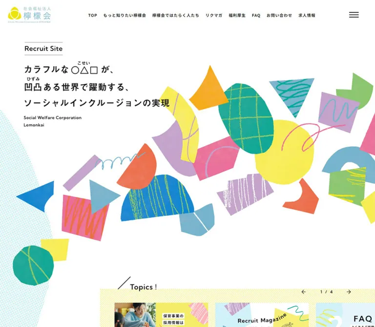
白い余白にカラフルな切り絵風の図形と手描き線を配した採用サイト。自然な人物写真、非対称のレイアウト、スマートフォンの縦書きコピーが特徴。
オリジナルサイトを見るLemonkai Recruitment — Style Reference
A spacious white canvas scattered with crayon-marked paper shapes, with everyday care brought into focus through photography.
Original URL: recruit.lemonkai.or.jp Final URL: recruit.lemonkai.or.jp Theme: light; white canvas, near-black typography, yellow identity accents, and multicolored artwork. Inspected: September 13, 2026, 02:02:41 JST — September 12, 2026, 17:02:41 UTC — according to the supplied browser record. Viewports: desktop 1440 × 1000 and mobile 390 × 844 CSS pixels. Scope: the current recruitment homepage. Visual evidence covers the desktop opening, a welfare project panel, the corporate-information banner and upper footer, plus the mobile opening and lower footer. Rendered DOM and computed styles additionally cover news, the manifesto, vision, four business introductions, employee and organization teasers, the recruitment magazine, contact links, and navigation structures. Linked pages and an opened menu were not inspected.
Lemonkai presents recruitment as an introduction to its people, values, and fields of work. It is a substantial homepage within a wider recruitment website, with routes to editorial content, organizational information, childcare recruitment, and external job listings.
The visual identity depends on a deliberate imbalance: compact black text and fine rules occupy a mostly white page, while irregular colored shapes spread beyond the edges of the composition. The artwork resembles cut paper decorated with crayon grids, scribbles, stripes, and dotted printing. Natural photographs supply human context without being enclosed in heavy cards.
Desktop sections stretch into broad editorial compositions. The mobile opening is separately arranged: the main Japanese statement becomes vertical, white strips protect each text column, and the collage travels down the screen. Preserve this change in composition when adapting the design.
How to Read This Reference
- Measured values come from supplied computed styles and element rectangles. They describe the recorded viewport and state, not necessarily a universal CSS rule.
- Visual estimates describe the supplied original-page screenshots. Approximate dimensions and artwork colors are explicitly identified; no pixel-sampling tool was used.
- Declared tokens are custom properties present in the evidence. Their names suggest roles, but a declaration alone does not prove that a visible element or interaction uses them.
- Recommendations are practical choices for a new implementation. The CSS classes and responsive breakpoints below are adaptations, not recovered source code.
- Element extraction includes 1 × 1 semantic headings, repeated text, and additional navigation structures. These must not be mistaken for the visible headline size, duplicated page sections, or an exercised menu state.
- One desktop banner has conflicting DOM and screenshot heights. That discrepancy is retained as a limitation rather than resolved through an invented explanation.
Tokens — Colors
Core Interface Palette
| Name | Value | Source evidence | Role |
|---|---|---|---|
| White canvas | #ffffff |
Declared --c-white; visible canvas and computed white secondary links |
Page, header, text-protection strips, and outlined link surfaces |
| Near-black ink | #111111 |
--c-black; computed body and link color |
Japanese copy, navigation, arrows, and utility linework |
| Fine-rule gray | #686868 |
Declared --c-line; fine gray rules visible |
Banner outlines, footer separators, and small control edges |
| Identity yellow | #eee20e |
--c-yellow; computed magazine category fill |
Small category stamps and the principal yellow identity accent |
| Soft yellow | #f9f39e |
--c-yellow-bg; computed organization-teaser heading fill |
Highlight behind the organization-information title |
| Supporting yellow | #f4ee67 |
Declared --c-yellow-main |
Available yellow token; a specific visible element assignment was not established |
| Muted blue | #74b3cc |
--c-light-blue; computed contact-form link fill |
Contact action and a supporting blue within the visual system |
| Pale blue | #e5f5fb |
--c-more-light-blue; computed employee-teaser background |
Larger, quiet panel behind employee content |
| Benefits blue | #b8dfee |
Computed benefits-title fill; mobile --c-blue-bg |
Rectangular highlight behind the benefits title |
| LINE green | #7bcb50 |
--c-line-green; computed LINE contact fill |
The second contact route |
| Category gray | #f1f1f1 |
Computed news-category background | Small, square-cornered news labels |
The body itself was recorded with a transparent background. The white canvas is visually established and supported by the white token; it should not be described as a measured opaque body declaration.
Declared Hover Palette
| Source property | Exact value | Evidence boundary |
|---|---|---|
--c-text-hover |
#909ba0 |
Declared text-hover color; hovered text was not captured |
--c-hover-blue |
#8fc9e0 |
Declared blue hover alternative |
--c-hover-green |
#87da5a |
Declared green hover alternative |
--c-hover-hoiku |
#eee20e |
Declared childcare-related hover color |
--c-hover-walfare |
#8cce6d |
Declared welfare-related hover color; source spelling retained |
--c-hover-village |
#8fc9e0 |
Declared village-related hover color |
These colors are suitable implementation references, but the supplied evidence does not establish every selector-to-token assignment.
Artwork Palette — Visual Approximations
The collage contains additional colors that were not supplied as matched computed declarations. The following hex values are recommended visual approximations, not measured asset colors.
| Color family | Approximation | Visible use |
|---|---|---|
| Turquoise | #13aa98 |
Large irregular ovals and loose scribbles |
| Pink | #ec6b9c |
Tilted quadrilaterals and curved strokes |
| Lavender | #bf9ec8 |
Paper fragments, broad curves, and striped shapes |
| Coral orange | #f16b4c |
Rounded fragments and angular cutouts |
| Golden orange | #f8ad0b |
A prominent triangular fragment |
Allow texture to vary these colors locally. A flat CSS swatch cannot reproduce the uneven fill, chalk marks, or paper edges.
The supplied custom-property inventory also contains generic CMS gradients and shadow presets. Their presence does not establish a visible gradient or elevation system on this page.
Tokens — Typography
Japanese Interface and Body Copy
Measured family: 'Noto Sans JP', sans-serif, also declared as --f-jp.
Although the body defaults to 16px / 400, much of the visible navigation, editorial text, and footer uses weight 600. The result is firm and readable without relying on very large type. Japanese section titles commonly use 0.1em tracking; body text uses approximately 0.04–0.06em.
English Editorial Labels
Measured family: 'Kumbh Sans', sans-serif, also declared as --f-en.
This family is recorded on labels including Information, Our Project, Recruit Magazine, Contact, and the English organization caption in the hero. Weight 600 and tracking 0.05em are consistent across these examples.
There are exceptions: Corporate Information is recorded in Noto Sans JP. Do not apply the English family indiscriminately to every Latin string.
The recorded font-family stacks establish the intended families. Font-file URLs and individual glyph fallback were not supplied.
Type Scale
Values below are measured unless marked otherwise. Sizes are ordinary CSS pixels; the root font size is 16px at both viewports.
| Role | Desktop size / line height | Mobile size / line height | Weight | Tracking |
|---|---|---|---|---|
| Primary navigation | 15 / 27px |
Not visibly rendered | 600 |
0.1em |
| Main section heading | 28 / 28px |
24 / 24px |
600 |
0.1em |
| Project section label | 26 / 26px, vertical |
24 / 24px, horizontal |
600 |
Desktop 0.15em; mobile 0.1em |
| English section label | Usually 14 / 14px |
Usually 13 / 13px |
600 |
0.05em |
| English hero caption | 14 / 19.6px |
13 / 19.5px |
600 |
0.05em |
| News introduction and titles | 15 / 27px |
14 / 25.2px |
600 |
0.06em |
| News category | 12 / 12px |
12 / 12px |
600 |
0.06em |
| Project eyebrow | 16 / 24px |
14 / 21px |
600 |
0.06em |
| Project description | 15 / 30px |
14 / 26.6px |
600 |
0.06em |
| Manifesto paragraph | 17.136 / 38.556px |
15 / 31.5px |
600 |
0.04em |
| Vision paragraph | 16 / 28.8px |
14 / 26.6px |
500 |
0.06em |
| Employee-teaser heading | 24.768 / 39.629px |
About 22 / 35.194px |
600 |
0.1em |
| Highlighted teaser heading | 22 / 22px |
18 / 18px |
600 |
0.1em |
| Magazine article title | 15 / 27px |
15 / 27px |
600 |
0.04em |
| Footer directory link | 15 / 27px |
15 / 27px |
600 |
Desktop 0.06em; mobile 0.04em |
The final desktop manifesto paragraph has a larger recorded line height of approximately 41.983px. Treat this as a local variation rather than changing the whole body-text system.
Graphic Headline and Wordmark
The visible hero statement uses the symbols ○△□, with the reading こせい, and 凹凸, with the reading ひずみ. Its graphic arrangement is part of the identity.
The associated semantic H3 has a 1 × 1px rectangle. Its recorded 16px font size does not measure the large visible statement. From the screenshots, the visible letter size is approximately 28–30px on desktop and 18–20px on mobile. Its exact font and graphic implementation cannot be established from the supplied element list.
Similarly, the Recruit Site wrapper does not establish the font of every visible child. Its visible label appears approximately 23px on desktop and 18px on mobile. Use these as reproduction estimates, or retain authorized original artwork.
Tokens — Spacing & Shapes
Density: generous between sections, compact within navigation and metadata. Geometry: square photography and content blocks, thin rules, restrained rounded links, and irregular decorative artwork.
Spacing Scale
| Value | Measured use | Reuse guidance |
|---|---|---|
4–5px |
Vertical padding in news labels | Small metadata details |
8px |
Gaps between mobile partner-link boxes | Closely related footer destinations |
12px |
Vertical padding on secondary links; several desktop footer row gaps | Compact controls and directory rhythm |
16px |
Mobile news-row gap and project-content gap | Default internal mobile spacing |
24px |
Topic-link gap at both viewports | Horizontal sequences |
32px |
Main mobile content inset; logo-to-text partner gap | Standard mobile gutter |
48px |
Desktop magazine middle-card offset; mobile teaser separation | Deliberate editorial variation |
64px |
Mobile vision-section bottom padding | Larger local separation |
128px |
Desktop gap from the project section to the following content section | Major section spacing |
160px |
Desktop DOM gap between the corporate section and footer | Spacious footer entrance; banner geometry varies across evidence |
192px |
Desktop gap before the recruitment magazine | A substantial editorial pause |
These examples do not prove that the source uses one universal spacing scale. For a new implementation, a practical scale is 4, 8, 12, 16, 24, 32, 48, 64, 96, 128, 160, 192px.
Border Radius and Rules
| Element | Evidence |
|---|---|
| News labels, article links, employee panel, photography | Recorded square corners, generally 0px radius |
| Secondary outlined links | Measured 18px radius; roughly 40–41px high |
| Desktop contact links | Measured 30px radius and 70px height |
| Mobile contact links | Measured 26px radius and 61px height |
| Corporate banner and footer rules | Approximately 1px visually; exact border width was not included in the element records |
| Decorative shapes | Uneven silhouettes; they are artwork, not a reusable border-radius system |
Layout Measurements
| Element | Desktop: 1440 × 1000 | Mobile: 390 × 844 | Status |
|---|---|---|---|
| Recorded document height | 11623.23px |
12624.48px |
DOM snapshot; not a permanent layout target |
| Main content wrapper | About 1257.11px, starting at x=91.44 |
Usually 326px, starting at x=32 |
Measured |
| Logo link | 144.91 × 54.33px, at 30.52, 22.83 |
158 × 59px, at 24, 24 |
Measured |
| Desktop top chrome | About 100px high |
Header flow box 83px |
Desktop visual estimate; mobile measured |
| Menu button box | 34 × 100px |
90 × 90px |
Measured; the visible three-line mark is smaller |
| Opening section including Topics | 1207.34px high, starting at y=0 |
873px high, starting at y=91 |
Measured |
| English organization caption | At 90.30, 395.16 |
At 21, 671.5 |
Measured |
| Topics heading wrapper | At 456.16, 918; 133.08 × 54px |
At 24, 744; 113.91 × 40px |
Measured |
| Topic link box | 357.28 × 152.34px |
214.66 × 128px |
Measured link bounds; image fitting unverified |
| Topic-link gap | 24px |
24px |
Calculated from neighboring rectangles |
| Project copy column | 331.48px, starting at x=864.70 |
326px within 32px gutters |
Measured |
| Welfare photograph | About 804 × 582px, flush left |
No mobile project screenshot supplied | Desktop screenshot estimate |
| Magazine article width | 281.84px |
326px |
Measured |
| Contact action | 411.41 × 70px |
278 × 61px |
Measured |
| Partner link | About 291.4 × 80px |
326 × 81px |
Measured |
| Social icon link box | 32 × 32px |
28 × 28px |
Measured |
The desktop wrapper corresponds to approximately 6.35% margins on either side. This is a calculation from the inspected width, not a recovered source formula.
Components
Persistent Navigation
Anatomy: logo link, eight primary text links, and a three-line menu button.
The desktop header is an unbordered white strip. The logo begins about 31px from the left edge; navigation starts around 304px. Links use 15px semibold Noto Sans JP, 27px line height, and unusually clear 1.5px tracking. The job-listing link is visually part of the navigation rather than a large filled button.
The logo, navigation, and menu stay at the top in all three desktop screenshots. On mobile, the navigation row disappears. The opening logo is slightly larger than its desktop counterpart, and the menu occupies a 90px square at the upper right.
The lower mobile footer screenshot still shows the menu button but no logo. This supports independently persistent mobile menu access; it does not support making the whole mobile header permanently visible.
The desktop HEADER element itself was recorded with zero height. Do not copy that as the visible header height: its children and screenshots establish the actual top chrome.
Recruitment Hero
Anatomy: outlined English label, graphic Japanese statement, independent English organization caption, and an oversized decorative collage.
On desktop, the text sits in the upper-left quadrant. Recruit Site is enclosed only by fine top and bottom rules, approximately 129px wide visually. The main statement occupies three horizontal lines, followed by a small English caption. Artwork spreads diagonally through the center and right, with fragments cropped at the viewport boundaries.
The composition contains circles, triangles, quadrilaterals, bent strips, incomplete rings, and loose lines. Shapes vary in scale and overlap without a uniform grid. Black text remains readable because its immediate surroundings are mostly white.
On mobile, the label moves to the upper right and the statement becomes three vertical columns read from right to left. Separate white strips extend behind the columns to different lengths. The collage is rearranged around them, with a large turquoise oval near the lower right. The English organization caption moves to the lower left and breaks into three lines.
For a new implementation, use separate desktop and mobile artwork compositions. Merely shrinking the desktop image will not reproduce the mobile balance.
Topics Rail
Anatomy: Topics ! heading with a diagonal slash, dotted yellow background, horizontal image links, previous/next arrows, and a 1 / 4 counter.
The desktop rail enters near the bottom of the opening viewport, with the dotted field beginning approximately 396px from the left edge. Its heading and banners are inset further. On mobile, the field begins at 24px, and the first complete link begins at 56px; part of the following link remains visible at the right.
Topic links measure approximately 357 × 152px on desktop and 215 × 128px on mobile. Their changed proportions are important: do not assume one fixed banner ratio across devices.
The DOM contains four distinct destinations: childcare recruitment, the recruitment magazine, FAQ, and job listings. Repeated links outside the viewport are consistent with a loop-capable carousel structure. Autoplay, looping behavior, dragging, and button results were not exercised.
Desktop arrow boxes appear above the banners, at y=965, while mobile arrow boxes appear below them, at y=946. Both measure only 14px square in the supplied DOM. Enlarging their interactive area is a recommended addition.
Bilingual Section Heading
Anatomy: a semibold Japanese heading and a smaller English descriptor.
Most sections use a 28px Japanese title and 14px English subtitle on desktop, reducing to 24px and 13px on mobile. The Japanese heading has 0.1em tracking; the English label has 0.05em.
Placement varies with the composition. Information and magazine labels sit beside content on desktop. Contact is centered. The project section uses a vertical title near the right edge on desktop, then returns to a conventional horizontal heading at the left on mobile.
Some extracted headings repeat their text. The screenshots do not justify displaying those duplicates as separate headings. The reason for the duplication was not established.
Information List
Anatomy: section-heading group, short introduction, three dated article links, and an outlined archive link.
At desktop size, the section spans approximately 1257px. A narrow introductory column starts at x=91.44; article rows start at x=375.16. Each row groups the date, a 128 × 21px gray category label, and a semibold title. The recorded row gap is approximately 23.76px.
On mobile, the heading and brief introduction share the top row. The three articles follow below. Date and category sit above a full-width title, which wraps naturally within 326px. Article titles reduce from 15 / 27px to 14 / 25.2px.
The archive link aligns right. It measures 222 × 41px on desktop and 206 × 40px on mobile, with an 18px radius. Keep this list typographic and compact; its role is timely information within a larger editorial page.
Manifesto and Vision
Anatomy: graphic heading, short paragraphs with intentional line breaks, separate vision statement, and surrounding visual space.
The manifesto introduces the source label ユニークがいい. Desktop paragraphs occupy a narrow column toward the right, approximately 355px wide. Their 17.136px semibold text uses more than twice that size in line height, producing a slow reading rhythm.
On mobile, the paragraphs move to the standard 32px gutter and use 15 / 31.5px. The four paragraph groups are separated by approximately 21px.
The vision paragraph is quieter: weight 500, 16 / 28.8px on desktop, and 14 / 26.6px on mobile. Its heading is represented by a 1 × 1 semantic element in the extraction. The supplied screenshots do not show these complete sections, so their detailed artwork arrangement should remain unspecified.
Business Introduction Panel
Anatomy: large photograph, small editorial eyebrow, prominent business title, short description, irregular decorative fragment, and a detail-link treatment. A separate bilingual section label identifies the sequence.
The desktop welfare screenshot establishes the main relationship: an approximately 804px wide photograph sits flush with the left edge, while a 331px copy column begins around x=865. The photograph shows a smiling person in conversation across a table, with soft daylight and an ordinary interior. The copy starts substantially lower than the photo's top, leaving a broad white area above it.
A coral fragment appears near the copy. The far-right section heading runs vertically. These offsets make the panel feel composed across a canvas rather than divided into equal cards.
Four business introductions are present in the DOM: childcare, disability welfare, the social-inclusion village project, and corporate headquarters. At the desktop snapshot, their shared section is 4000px high and the first two copy blocks begin exactly 1000px apart. This establishes viewport-sized spacing at the inspected height, but not a verified pinning or scroll-snap mechanism.
Mobile copy blocks use 32px side padding and a 16px internal gap. Image regions precede the copy in the recorded sequence, but exact mobile crops were not visually supplied. Keep mobile text in normal document flow and allow longer titles to grow.
Employee and Organization Teasers
Anatomy: employee introduction on a pale-blue rectangular panel, followed by organization-data and benefits links with colored title strips.
The employee panel is measured at approximately 485 × 349px on desktop and 326 × 395px on mobile. Its background is exactly #e5f5fb. The mobile title becomes two lines, with body content inset to approximately x=64 inside the panel beginning at x=32.
The organization and benefits teasers have unequal desktop widths of approximately 654px and 542px. Their headings sit on small yellow and blue rectangles, rather than filling the entire content region. On mobile, these links become sequential full-width sections with text inside the standard gutters.
Preserve the difference between a panel background and a title highlight. Converting all three links into identical rounded cards would remove a meaningful part of the hierarchy.
Recruitment Magazine
Anatomy: bilingual section label, three article links, image area, small yellow category stamp, date, title, and a right-aligned archive link.
Desktop article links are approximately 282px wide. The middle article starts 48px lower than the outer two, giving the row a modest stagger. Titles remain 15 / 27px and wrap according to content length.
On mobile, the articles become a vertical sequence of 326px links with 32px between their recorded boxes. Unlike news titles, magazine titles keep the desktop 15px size.
The category stamp is computed as yellow #eee20e, with 12px semibold text, 0.1em tracking, and 4px 8px padding. Its recorded location is near the right side of the image region. The supplied captures do not show the complete magazine section; exact image subjects and cropping should not be invented.
Secondary Detail Link
Anatomy: white rounded outline, short text label, and right-pointing arrow.
Visible examples use 詳しく見る; archive variants use longer labels. Recorded secondary links have an 18px radius and approximately 40–41px height. Desktop padding is 12px 32px; mobile horizontal padding reduces to 24px.
The corporate-banner example is approximately 175px wide visually. Its small black arrow is clear but does not dominate the label. Use thin edges and avoid shadows or oversized filled conversion styling for these secondary routes.
Where the whole surrounding component is already a link, render the visual detail treatment as a noninteractive child. Do not nest a second link inside it.
Contact Pair
Anatomy: centered bilingual heading and two large rounded links.
The form route uses #74b3cc; the LINE route uses #7bcb50. Both retain near-black text. Desktop buttons sit side by side with an approximately 35px gap, each measuring 411.41 × 70px with a 30px radius.
Mobile buttons stack at x=56, each 278 × 61px, with 16px between them and a 26px radius. The English subtitle also moves below the Japanese heading.
These are links to separate contact routes. No inline form, validation state, or completed messaging interaction was inspected.
Corporate Information Banner
Anatomy: fine rectangular border, bilingual title block, wide photograph, and a white outlined detail link.
The desktop screenshot shows the title at the left, a panoramic crop of children painting a globe through the center, and the detail link toward the right. The image is approximately 697px wide inside a banner approximately 1258 × 221px. It has square edges and no shadow.
Measurement conflict: the desktop DOM records the corresponding link as only 58px high. This does not match the visible banner. The cause and timing relationship are unverified. Use the screenshot to understand the visible composition, and do not hardcode the 58px record as the intended banner height.
The mobile DOM records a 326 × 430.22px link with centered heading content, 40px top padding, and 32px bottom padding. This supports a taller, stacked arrangement; its full mobile appearance was not supplied as a screenshot.
Footer Directory, Partners, and Social Links
Anatomy: recruitment sitemap, indented child links, external-destination symbols, related-site logos, social icons, and copyright text.
The desktop directory is arranged across three columns beginning around x=91, 415, and 899. Child links are indented by approximately 25px and grouped against fine vertical rules. Contact and privacy links have visible underlines in the desktop screenshot. A small black line drawing of a child watering flowers decorates the lower-right directory area.
The four related-site links form one desktop row. Each combines a distinct logo with text and a 32px gap. On mobile they form a single column, with 326px wide boxes and thin horizontal separators. The logos remain visually distinct; their colors are not normalized to one monochrome icon system.
Social links appear in the order X, Facebook, LINE, and Instagram. Their measured boxes are 32px on desktop and 28px on mobile, with 16px gaps. The mobile group is centered, followed by small centered copyright text. The visible copyright year is 2024; this is page content, not the capture date.
Menu — Evidence Boundary
A menu button is visible at both sizes, and the DOM contains another organized navigation structure with many of the footer destinations. No screenshot or interaction record establishes the opened menu's appearance, entrance direction, overlay treatment, focus behavior, or closing behavior.
Use the visible button and verified destinations as references. Any proposed menu overlay should be explicitly treated as a new implementation decision.
Tokens — Motion & Interaction
| Element or token | Recorded value | What it establishes |
|---|---|---|
| Desktop primary navigation | color 0.8s cubic-bezier(0.23, 1, 0.32, 1) |
A defined color transition; hovered result not captured |
| Desktop news links | color 0.5s cubic-bezier(0.165, 0.84, 0.44, 1) |
Defined text-color feedback |
| Desktop secondary links | background-color 0.5s cubic-bezier(0.165, 0.84, 0.44, 1) |
Defined surface-color feedback |
| Desktop contact links | Same 0.5s background-color transition |
Defined action-color feedback |
| Desktop footer and partner links | transform 0.5s cubic-bezier(0.165, 0.84, 0.44, 1) |
A transform transition; target direction and distance unverified |
--line-repeat |
16s |
A declared duration; no matched animation or trajectory supplied |
--ease-text-up |
cubic-bezier(.18, .06, .23, 1) |
Declared easing; no verified heading-reveal sequence |
| Topics controls | Two buttons and a 1 / 4 indicator |
Carousel affordance and current displayed count |
| Persistent chrome | Reappears in scrolled captures | Desktop header persistence and mobile menu persistence |
Most sampled elements report animation: none. This does not prove that artwork, pseudo-elements, descendants, or script-driven motion are static. Conversely, static differences between compositions do not establish a drift, bounce, or parallax animation.
The browser record describes an initial observation lasting at least five seconds, readiness checks, and scrolling through intermediate positions. It does not include verified menu clicks, carousel advancement, hover captures, or a motion timeline. Automatic sliding, touch dragging, project pinning, and text-reveal timing remain unverified.
Recommended adaptation: retain the measured desktop transition curves where useful. Add visible focus states, keep functional controls usable without animation, and give any newly introduced continuous decoration a reduced-motion alternative.
Surfaces
| Surface | Appearance | Purpose |
|---|---|---|
| Main canvas | White with broad empty regions | Holds varied artwork and photography together |
| Header | White, visually unbordered | Persistent navigation without heavy framing |
| Hero text backing | White strips on mobile | Keeps vertical copy legible over the collage |
| Topics field | Fine yellow dot texture on white | Separates a promotional rail while retaining lightness |
| Employee panel | Flat pale blue, square corners | Groups a substantial editorial teaser |
| Teaser title strips | Soft yellow or blue rectangles | Gives local emphasis without enclosing all content |
| News category | Small flat gray rectangle | Metadata distinction |
| Contact actions | Solid muted blue and green, rounded | Stronger functional emphasis |
| Corporate banner | Fine gray rectangle around image and text | A clear transition into organizational navigation |
| Footer | White, fine rules, varied logos | Dense destination mapping with little visual weight |
No general shadow-based elevation system is visible. Separation comes from whitespace, color patches, image edges, and thin rules.
Declared layer tokens run from --z-base: 1000 through logo, modal, header, desktop modal, and menu-button layers to --z-nursing-button: 1006. They establish a source stacking vocabulary, not proof that every named layer was visible or exercised.
Imagery
Collage Artwork
The opening uses irregular fragments that look cut from colored paper. Some have waxy crosshatching, some have loose scribbles, and others have sparse stripes or nearly solid fills. The texture remains visible inside the shapes. Broad circles and curved fragments sit beside sharp triangles and tilted rectangles.
The composition is intentionally uneven. Large forms anchor the center and lower areas, while small strokes connect the spaces between them. Some fragments leave the viewport entirely. Keep the decorative layer independently clipped so content remains within a stable reading width.
Avoid substituting a collection of mathematically perfect circles and polygons. CSS can approximate the layout, but the edge irregularity and drawn texture carry much of the character.
Photography
The supplied welfare image uses natural light, a conversational viewpoint, and a relaxed expression. The table and foreground figure create depth without a dramatic photographic effect. The corporate banner shows children painting a globe, with a broad crop that preserves the shared activity.
Use real, context-rich activity photography with clean color and soft daylight. Keep crops rectangular. Avoid tinted overlays that obscure faces or make every photograph match the decorative palette.
Supporting Illustration and Icons
A fine black drawing of a child watering flowers appears in the desktop footer. Its loose line quality complements the collage without repeating its full color density.
Interface arrows, the hamburger mark, and external-destination symbols are simple black linework. Related-site and social logos keep their individual identities and colors.
Observed Asset References
| Asset group | Evidence | Implementation guidance |
|---|---|---|
| Lemonkai logo | Visible in desktop and mobile header captures | Preserve its yellow emblem, pale-blue lettering, and original proportions |
| Desktop and mobile collage | Both original opening captures | Prepare distinct compositions for the two orientations |
| Graphic hero statement | Visible in both openings; semantic text present in DOM | Preserve symbol readings and vertical mobile arrangement |
| Welfare photograph | Desktop project capture | Maintain the conversational crop and natural light |
| Globe-painting photograph | Desktop corporate banner | Use a wide crop on desktop; plan a separate mobile crop |
| Footer child drawing | Desktop footer capture | Keep the fine, irregular black linework |
| Partner and social logos | Desktop/mobile footer evidence | Use authorized logo assets, not approximate replacements |
No asset URLs or filenames were supplied. This document therefore does not invent downloadable paths or identify unverified file formats.
Layout & Responsive Behavior
Desktop Composition
The page alternates between centered content wrappers and sections that reach the viewport edges. Standard content uses approximately 91px side margins at 1440px, while project photography can begin at the left edge. Copy columns often occupy only a fraction of the available width.
The opening is taller than the first viewport: Topics begins near its bottom and continues below it. Subsequent content combines a compact information list, a slowly paced manifesto, vision content, four large project introductions, smaller organization links, editorial articles, contact actions, and a substantial footer.
The project composition is especially asymmetric. The photograph occupies about 55.8% of the viewport width, the copy begins around 60%, and the section title occupies a narrow vertical area near the far right. These ratios are calculated from the inspected frame, not confirmed universal source rules.
Mobile Recomposition
The phone layout preserves the content sequence while changing its visual arrangement:
- Primary navigation is removed from the visible top row; the menu button remains available.
- The hero statement changes from horizontal lines to vertical columns, and the collage is separately arranged.
- The English organization caption moves below most of the headline artwork.
- Topics starts at a
24pxouter inset; normal reading sections use32pxgutters. - News metadata sits above article titles, while the section heading and brief introduction share a row.
- The project section heading becomes horizontal, and project copy spans the standard reading width.
- Organization teasers and magazine articles become sequential blocks.
- Contact links stack with a
16pxgap. - The footer directory becomes one column, followed by four separated partner rows and centered social links.
The magazine's three mobile articles are present in normal vertical sequence; they are not evidenced as a mobile carousel.
Scaling and Breakpoint Limits
The source declares --base-vw: 1512 on desktop and --base-vw: 390 on mobile. Some measured text sizes are fractional, consistent with responsive sizing. The formulas and exact media-query thresholds were not supplied, so these two values should not be used to invent a complete scaling system.
A desktop --max-width: 808px declaration is also present, but measured page wrappers exceed 1257px. It is not evidence for an 808px global page container.
Only two viewport widths were inspected. Tablet layouts, landscape phones, text zoom, and intermediate transition points remain unverified. The Quick Start uses recommended navigation and stacking thresholds of 1200px and 768px.
Do’s and Don’ts
Do
- Keep white space as a major part of the composition.
- Pair semibold Japanese typography with small, tracked English labels.
- Retain the distinction between exact interface colors and textured artwork colors.
- Compose the mobile hero independently, including its vertical text and staggered white backings.
- Preserve irregular edges, crayon marks, and varied fragment sizes.
- Use large rectangular photographs with human context and natural light.
- Offset project copy from the photograph rather than aligning every element to the same top edge.
- Keep title highlights small and rectangular.
- Use modest rounded outlines for secondary links and larger colored shapes for contact routes.
- Preserve the footer's directory hierarchy, varied partner logos, and fine separators.
Don't
- Don't turn every section into an equal-width rounded-card grid.
- Don't replace the collage with smooth gradients, glossy blobs, or uniform vector geometry.
- Don't spread bright artwork colors across all body text or every button.
- Don't use the hidden 1 × 1 heading's computed font size as the visible hero scale.
- Don't reduce the phone version to a scaled desktop screenshot.
- Don't force project descriptions into fixed heights that clip longer copy.
- Don't infer autoplay, parallax, pinning, or menu transitions from unexercised controls.
- Don't copy generic CMS shadow and gradient presets into the visible design system.
- Don't duplicate headings merely because the text extraction repeats them.
- Don't use the conflicting 58px desktop banner record as a definitive visual measurement.
Recommended Implementation Additions
These are recommendations for a new implementation, not verified features of the original page:
- Use a semantic heading with Japanese ruby annotations for the hero where feasible. If the visible statement remains artwork, provide one equivalent accessible text representation.
- Give decorative collage fragments empty alternatives or hide their layer from assistive technology. Give contextual photographs meaningful alternatives.
- Give icon-only menu, carousel, social, and external-route controls accessible names.
- Expand the
14pxcarousel arrow targets to at least44pxwithout enlarging the visible arrows proportionally. - Implement menu focus management, Escape-to-close, an accurate expanded state, and focus restoration when adding an overlay menu.
- If the Topics rail automatically advances, provide a pause control and stop automatic movement for reduced-motion preferences.
- Reserve image dimensions and responsive aspect ratios before decoding. Verify the corporate banner after its image and layout have settled.
- Keep links and paragraph content in normal flow on mobile, with no fixed height that prevents text zoom or localization.
- Preserve a strong keyboard focus outline on both white and colored surfaces. Test final text and focus contrast using the actual rendered colors.
- Ensure a large linked component contains only one interactive anchor; its detail pill can be a styled span.
Agent Prompt Guide
Quick Color Reference
- Canvas and text backings:
#ffffff. - Main text and line icons:
#111111. - Fine rules:
#686868. - Main yellow and magazine stamps:
#eee20e. - Organization title strip:
#f9f39e. - Employee panel:
#e5f5fb. - Benefits title strip:
#b8dfee. - Contact form:
#74b3cc. - LINE contact:
#7bcb50. - Collage: textured turquoise, pink, lavender, orange, blue, green, and yellow; additional hex approximations are not source measurements.
Overall Prompt
“Create a Japanese recruitment homepage inspired by Lemonkai's spacious editorial composition. Use a white canvas, near-black semibold Noto Sans JP text, small Kumbh Sans English labels, fine gray rules, and selective yellow, pale-blue, and green accents. Build an asymmetric opening with an outlined ‘Recruit Site’ label and irregular colored paper fragments covered in crayon grids and scribbles. On mobile, rearrange the artwork and turn the Japanese statement into three vertical columns on staggered white strips. Continue with compact dated news, a generous manifesto, large documentary photographs beside narrow project descriptions, employee and organization teasers, a staggered magazine row, two colored contact links, and an extensive footer directory. Keep the site navigable as a recruitment hub, with square photographs and restrained secondary link pills. Do not invent unverified animation behavior.”
Example Component Prompts
- Hero: “At 1440px, place a compact ruled English label and three horizontal lines of Japanese copy near the upper left. Spread irregular, textured paper fragments across the center and right. At 390px, use a separately composed collage and three right-to-left vertical text columns with individual white backings. Preserve ruby readings for
○△□and凹凸.” - Topics rail: “Create a yellow dotted field with a ‘Topics !’ heading and a thin diagonal slash. Show rectangular banner links with 24px gaps and a partial next item. Place arrows and a ‘1 / 4’ indicator above the desktop banners and below the mobile banners. Add accessible targets; automatic playback is a separate decision.”
- Project panel: “Use a large natural-light conversation photograph flush with the desktop's left edge. Place a narrow semibold Japanese description column lower down at the right, a small coral paper fragment nearby, and a vertical bilingual section label near the far edge. Stack image and copy in normal flow on mobile.”
- Information list: “Set a narrow bilingual section introduction beside three dated news links. Give each link a small gray rectangular category label and a semibold title. On mobile, put date and category above the full-width title and retain 32px reading gutters.”
- Magazine: “Arrange three square-cornered editorial links with small yellow category stamps, dates, and 15px semibold titles. Lower the middle desktop article by 48px. On mobile, use a normal vertical list with 326px-wide items and 32px gaps.”
- Footer: “Build an open white recruitment directory with indented sublinks and fine vertical rules. Follow it with four distinct partner-logo links. Stack those links with thin horizontal separators on mobile, then center the X, Facebook, LINE, and Instagram icons above small copyright text.”
Quick Start
CSS Custom Properties
This is an implementation adaptation using measured colors and type values, selected screenshot proportions, and explicitly recommended responsive behavior. It is not the original stylesheet. Font files and authorized artwork must be supplied separately; no asset URLs were available in the evidence.
The component classes assume ordinary semantic markup. A .hero-art picture contains separately prepared responsive artwork. .topics contains a heading, track, and controls. Project and article links should avoid nested interactive elements.
:root {
  /* Exact source colors and computed fills */
  --canvas: #ffffff;
  --ink: #111111;
  --rule: #686868;
  --yellow: #eee20e;
  --yellow-soft: #f9f39e;
  --yellow-main: #f4ee67;
  --blue: #74b3cc;
  --blue-pale: #e5f5fb;
  --blue-benefits: #b8dfee;
  --green: #7bcb50;
  --category-gray: #f1f1f1;
  --text-hover: #909ba0;
  --blue-hover: #8fc9e0;
  --green-hover: #87da5a;

  /* Recorded family stacks; load font files separately */
  --font-jp: 'Noto Sans JP', sans-serif;
  --font-en: 'Kumbh Sans', sans-serif;
  --weight-medium: 500;
  --weight-semibold: 600;
  --text-body: 15px;
  --text-section: 28px;
  --text-en: 14px;
  --leading-body: 2;
  --tracking-body: 0.06em;
  --tracking-title: 0.1em;

  /* Recommended layout aliases */
  --gutter: clamp(32px, 6.35vw, 112px);
  --space-small: 16px;
  --space-rail: 24px;
  --space-medium: 32px;
  --space-large: 64px;
  --space-section: 128px;
  --radius-link: 18px;
  --radius-contact: 30px;

  /* Measured desktop transition curves */
  --ease-link: cubic-bezier(0.165, 0.84, 0.44, 1);
  --ease-nav: cubic-bezier(0.23, 1, 0.32, 1);
  --motion-link: 500ms var(--ease-link);
  --motion-nav: 800ms var(--ease-nav);
}

* { box-sizing: border-box; }

.lemon-site {
  margin: 0;
  overflow-x: clip;
  color: var(--ink);
  background: var(--canvas);
  font-family: var(--font-jp);
}

.lemon-site img { display: block; max-width: 100%; }
.lemon-site button { font: inherit; color: inherit; }
.lemon-site a { color: inherit; }

.content-wrap { margin-inline: var(--gutter); }

.body-copy {
  margin: 0;
  font-size: var(--text-body);
  font-weight: var(--weight-semibold);
  line-height: var(--leading-body);
  letter-spacing: var(--tracking-body);
}

.section-title {
  margin: 0;
  font-size: var(--text-section);
  font-weight: var(--weight-semibold);
  line-height: 1;
  letter-spacing: var(--tracking-title);
}

.section-en {
  margin: 14px 0 0;
  font: 600 var(--text-en)/1 var(--font-en);
  letter-spacing: 0.05em;
}

/* Persistent desktop chrome; mobile logo remains in normal flow. */
.site-header {
  position: fixed;
  z-index: 1003;
  inset: 0 0 auto;
  height: 100px;
  background: var(--canvas);
}

.site-logo {
  position: absolute;
  top: 22.83px;
  left: 2.119vw;
  width: 144.91px;
}

.primary-nav {
  position: absolute;
  top: 36.5px;
  left: 21.117vw;
  display: flex;
  gap: 2.119vw;
  white-space: nowrap;
}

.primary-nav a {
  font-size: 15px;
  font-weight: 600;
  line-height: 27px;
  letter-spacing: 0.1em;
  text-decoration: none;
  transition: color var(--motion-nav);
}

.menu-toggle {
  position: fixed;
  z-index: 1005;
  top: 0;
  right: 3.68vw;
  display: grid;
  place-content: center;
  gap: 6px;
  width: 44px;
  height: 100px;
  padding: 0;
  border: 0;
  background: var(--canvas);
  cursor: pointer;
}

.menu-toggle span {
  width: 32px;
  height: 2px;
  background: currentColor;
}

/* Hero proportions are an adaptation of the supplied captures. */
.hero-stage {
  position: relative;
  isolation: isolate;
  height: clamp(720px, 63.75vw, 1040px);
}

.hero-art {
  position: absolute;
  z-index: -1;
  inset: 100px 0 0;
  overflow: hidden;
  pointer-events: none;
}

.hero-art img {
  width: 100%;
  height: 100%;
  object-fit: cover;
}

.hero-copy {
  position: absolute;
  top: 142px;
  left: var(--gutter);
}

.recruit-label {
  display: table;
  margin: 0;
  padding-block: 6px;
  border-block: 1px solid var(--rule);
  font: 600 23px/1.3 var(--font-en);
  letter-spacing: 0.03em;
}

.hero-title {
  display: flex;
  flex-direction: column;
  align-items: flex-start;
  margin: 20px 0 0;
  font-size: 28px;
  font-weight: 600;
  line-height: 1.8;
  letter-spacing: 0.1em;
}

.hero-line {
  display: block;
  width: max-content;
  max-width: 100%;
  background: var(--canvas);
}

.hero-title rt {
  font-size: 0.42em;
  letter-spacing: 0.02em;
}

.hero-caption {
  position: absolute;
  top: 395px;
  left: var(--gutter);
  margin: 0;
  font: 600 14px/1.4 var(--font-en);
  letter-spacing: 0.05em;
}

/* Native horizontal scrolling is a recommended functional baseline. */
.topics {
  position: relative;
  margin-left: 27.5vw;
}

.topics-heading {
  position: relative;
  height: 54px;
  margin: 0 0 0 60px;
  padding: 20px 0 0 42px;
  font: 600 24px/1.4 var(--font-en);
  letter-spacing: 0.04em;
}

.topics-heading::before {
  position: absolute;
  left: 0;
  bottom: 10px;
  width: 60px;
  border-top: 1.5px solid var(--ink);
  transform: rotate(-45deg);
  transform-origin: left center;
  content: '';
}

.topics-track {
  display: flex;
  gap: 24px;
  overflow-x: auto;
  margin-top: -12px;
  padding: 47px 56px 48px;
  scroll-snap-type: x proximity;
  background-color: var(--canvas);
  /* Approximation of the visible dot texture, not a source asset. */
  background-image: radial-gradient(var(--yellow) 0.7px, transparent 0.9px);
  background-size: 3px 3px;
}

.topic-card {
  flex: 0 0 clamp(280px, 24.811vw, 380px);
  aspect-ratio: 2.345;
  scroll-snap-align: start;
}

.topic-card img { width: 100%; height: 100%; object-fit: cover; }

.topics-controls {
  position: absolute;
  top: 32px;
  right: var(--gutter);
  display: flex;
  align-items: center;
  gap: 24px;
  font: 600 13px/1 var(--font-en);
}

.icon-button {
  display: grid;
  place-items: center;
  min-width: 44px;
  min-height: 44px;
  padding: 0;
  border: 0;
  background: transparent;
  cursor: pointer;
}

/* News: small introduction beside a broader list. */
.information {
  display: grid;
  grid-template-columns: 172px minmax(0, 1fr);
  gap: 112px;
  margin-block: 144px 64px;
}

.information-intro .body-copy { margin-top: 24px; line-height: 1.8; }

.news-row {
  display: grid;
  grid-template-columns: 72px 128px minmax(0, 1fr);
  align-items: center;
  gap: 24px;
  margin-bottom: 18px;
  padding-bottom: 20px;
  text-decoration: none;
  transition: color var(--motion-link);
}

.news-category {
  padding: 4px 0 5px;
  background: var(--category-gray);
  font-size: 12px;
  font-weight: 600;
  line-height: 12px;
  letter-spacing: 0.06em;
  text-align: center;
}

.news-title {
  margin: 0;
  font-size: 15px;
  font-weight: 600;
  line-height: 1.8;
  letter-spacing: 0.06em;
}

.pill-link {
  display: inline-flex;
  align-items: center;
  justify-content: center;
  gap: 16px;
  min-height: 41px;
  padding: 12px 32px;
  border: 1px solid var(--rule);
  border-radius: var(--radius-link);
  background: var(--canvas);
  font-size: 14px;
  font-weight: 600;
  line-height: 1;
  letter-spacing: 0.06em;
  text-decoration: none;
  transition: background-color var(--motion-link);
}

.archive-row { display: flex; justify-content: flex-end; margin-top: 24px; }

/* Content may exceed a viewport; minimum heights must not clip it. */
.project-panel {
  display: grid;
  grid-template-columns: 55.833% 23.02%;
  column-gap: 4.217%;
  align-items: end;
  min-height: 100svh;
  padding-block: 80px 61px;
}

.project-photo { align-self: center; margin: 0; }
.project-photo img { width: 100%; height: auto; }
.project-copy { display: grid; gap: 24px; }
.project-eyebrow { margin: 0; font-size: 16px; font-weight: 600; line-height: 1.5; }
.project-title { margin: 0; font-size: 28px; font-weight: 600; letter-spacing: 0.1em; }

.project-index {
  writing-mode: vertical-rl;
  font-size: 26px;
  font-weight: 600;
  letter-spacing: 0.15em;
}

.people-panel {
  max-width: 485px;
  padding: 64px 70px;
  background: var(--blue-pale);
}

.teaser-title {
  display: table;
  margin: 0 0 16px;
  padding: 6px 14px 10px;
  background: var(--yellow-soft);
  font-size: 22px;
  font-weight: 600;
  line-height: 1;
  letter-spacing: 0.1em;
}

.teaser-title--benefits { background: var(--blue-benefits); }

.magazine {
  display: grid;
  grid-template-columns: 154px minmax(0, 1fr);
  gap: min(11.44vw, 165px);
  margin-block: 192px 100px;
}

.magazine-grid {
  display: grid;
  grid-template-columns: repeat(3, minmax(0, 1fr));
  align-items: start;
  gap: 3.7vw;
}

.magazine-card { display: block; text-decoration: none; }
.magazine-card:nth-child(2) { margin-top: 48px; }
.magazine-media { position: relative; }
.magazine-media img { width: 100%; height: auto; }

.magazine-category {
  position: absolute;
  right: 0;
  bottom: -10px;
  padding: 4px 8px;
  background: var(--yellow);
  font-size: 12px;
  font-weight: 600;
  letter-spacing: 0.1em;
}

.magazine-date { display: block; margin-top: 32px; }
.magazine-title { margin: 12px 0 0; font-size: 15px; font-weight: 600; line-height: 1.8; letter-spacing: 0.04em; }

.contact { padding-block: 108px 128px; text-align: center; }
.contact-actions { display: flex; justify-content: center; gap: 35px; margin-top: 68px; }

.contact-link {
  display: flex;
  align-items: center;
  justify-content: center;
  gap: 16px;
  width: min(28.57vw, 440px);
  min-height: 70px;
  padding: 22px 16px;
  border-radius: var(--radius-contact);
  background: var(--blue);
  font-size: 16px;
  font-weight: 600;
  text-decoration: none;
  transition: background-color var(--motion-link);
}

.contact-link--line { background: var(--green); }

/* Desktop banner height follows the screenshot approximately. */
.corporate-banner {
  display: grid;
  grid-template-columns: 27.3% 55.4% 17.3%;
  align-items: center;
  min-height: 221px;
  border: 1px solid var(--rule);
  text-decoration: none;
}

.corporate-heading { padding: 32px clamp(24px, 6.1vw, 88px); }
.corporate-heading .section-en { font-family: var(--font-jp); }
.corporate-image { width: 100%; height: 220px; object-fit: cover; }
.corporate-action { justify-self: center; }

.site-footer { margin-top: 160px; padding-bottom: 36px; }
.footer-directory { display: grid; grid-template-columns: 1fr 1.5fr 1.5fr; gap: 48px; }
.footer-directory ul { margin: 0; padding: 0; list-style: none; }
.footer-directory li + li { margin-top: 12px; }
.footer-directory a { font-size: 15px; font-weight: 600; line-height: 27px; letter-spacing: 0.06em; text-decoration: none; }
.footer-directory .subnav { margin-block: 20px; padding-left: 24px; border-left: 1px solid var(--rule); }

.partner-links { display: grid; grid-template-columns: repeat(4, minmax(0, 1fr)); gap: 30px; margin-top: 126px; }
.partner-link { display: flex; align-items: center; gap: 32px; min-height: 80px; text-decoration: none; }
.partner-logo { display: grid; place-items: center; flex: 0 0 80px; }
.partner-logo img { max-height: 64px; object-fit: contain; }
.partner-label { font-size: 15px; font-weight: 600; line-height: 1.6; }
.social-links { display: flex; justify-content: flex-end; gap: 16px; margin-top: 25px; }
.social-links a { display: grid; place-items: center; min-width: 44px; min-height: 44px; }
.social-links img { width: 32px; height: 32px; }
.copyright { margin: 40px 0 0; font-size: 12px; line-height: 1.5; text-align: center; }

/* Recommended focus treatment, independent of hover. */
.lemon-site :focus-visible { outline: 2px solid var(--ink); outline-offset: 4px; }

@media (hover: hover) {
  .primary-nav a:hover, .news-row:hover { color: var(--text-hover); }
  .pill-link:hover { background: var(--yellow-soft); }
  .contact-link:hover { background: var(--blue-hover); }
  .contact-link--line:hover { background: var(--green-hover); }
}

/* Recommended thresholds; original breakpoints were not supplied. */
@media (max-width: 74.99rem) {
  .primary-nav { display: none; }
}

@media (max-width: 47.99rem) {
  :root {
    --gutter: 32px;
    --text-body: 14px;
    --text-section: 24px;
    --text-en: 13px;
    --leading-body: 1.9;
    --radius-contact: 26px;
  }

  .site-header { position: relative; height: 83px; }
  .site-logo { top: 24px; left: 24px; width: 158px; }
  .menu-toggle { right: 0; width: 90px; height: 90px; }

  .hero-stage { height: 653px; margin-top: 8px; }
  .hero-art { inset: 0; }
  .hero-copy { top: 0; right: 36px; left: auto; }
  .recruit-label { margin-left: auto; padding-block: 4px; font-size: 18px; }
  .hero-title { flex-direction: row-reverse; align-items: flex-start; margin-top: 16px; font-size: 18px; line-height: 1.35; letter-spacing: 0.08em; }
  .hero-line { writing-mode: vertical-rl; text-orientation: upright; max-width: none; padding: 0 4px 8px; white-space: nowrap; }
  .hero-caption { top: 580.5px; left: 21px; font-size: 13px; line-height: 1.5; }

  .topics { margin-left: 24px; }
  .topics-heading { height: 40px; margin-left: 0; padding-top: 10px; padding-left: 38px; font-size: 20px; }
  .topics-heading::before { bottom: 7px; width: 46px; }
  .topics-track { padding: 32px 32px 48px; }
  .topic-card { flex-basis: 55.04vw; aspect-ratio: 1.677; }
  .topics-controls { top: auto; right: 16px; bottom: 0; gap: 16px; }

  .information { grid-template-columns: 1fr; gap: 38px; margin-block: 106px 48px; }
  .information-intro { display: grid; grid-template-columns: 106px minmax(0, 1fr); gap: 27px; }
  .information-intro .body-copy { margin: 0; }
  .news-row { grid-template-columns: max-content 128px; gap: 16px; margin-bottom: 22px; }
  .news-title { grid-column: 1 / -1; font-size: 14px; }
  .pill-link { min-height: 40px; padding-inline: 24px; }

  .project-index { writing-mode: horizontal-tb; margin-inline: 32px; font-size: 24px; letter-spacing: 0.1em; }
  .project-panel { display: block; min-height: 0; padding-block: 48px; }
  .project-copy { gap: 16px; margin: 32px 32px 0; }
  .project-eyebrow { font-size: 14px; }
  .project-title { font-size: 24px; }
  .people-panel { max-width: none; margin-inline: 32px; padding: 56px 32px; }
  .teaser-title { padding: 6px 14px; font-size: 18px; }

  .magazine { display: block; margin-block: 123px 48px; }
  .magazine-grid { grid-template-columns: 1fr; gap: 32px; margin-top: 38px; }
  .magazine-card:nth-child(2) { margin-top: 0; }

  .contact { padding-block: 110px 126px; }
  .contact-actions { flex-direction: column; align-items: center; gap: 16px; margin-top: 94px; }
  .contact-link { width: calc(100% - 112px); min-height: 61px; font-size: 14px; }

  .corporate-banner { display: flex; flex-direction: column; min-height: 0; padding-block: 40px 32px; }
  .corporate-heading { padding: 0 24px 32px; text-align: center; }
  .corporate-image { height: auto; aspect-ratio: 1.8; object-fit: cover; }
  .corporate-action { margin-top: 24px; }

  .site-footer { margin-top: 48px; }
  .footer-directory { grid-template-columns: 1fr; gap: 32px; }
  .footer-directory a { letter-spacing: 0.04em; }
  .footer-directory .subnav { padding-left: 27px; }
  .partner-links { grid-template-columns: 1fr; gap: 8px; margin-top: 48px; }
  .partner-link { min-height: 81px; border-bottom: 1px solid var(--rule); }
  .social-links { justify-content: center; gap: 0; margin-top: 48px; }
  .social-links img { width: 28px; height: 28px; }
}

/* Recommended reduction for motion introduced by this adaptation. */
@media (prefers-reduced-motion: reduce) {
  .lemon-site *, .lemon-site *::before, .lemon-site *::after {
    animation: none !important;
    transition: none !important;
    scroll-behavior: auto !important;
  }
}
Hero Text Markup
This is a recommended live-text alternative to the visible graphic statement. It demonstrates ruby readings and mobile writing direction; it does not claim to reproduce the source's hidden-heading implementation.
<h1 class="hero-title">
  <span class="hero-line">カラフルな <ruby>○△□<rt>こせい</rt></ruby> が、</span>
  <span class="hero-line"><ruby>凹凸<rt>ひずみ</rt></ruby>ある世界で躍動する、</span>
  <span class="hero-line">ソーシャルインクルージョンの実現</span>
</h1>
Tailwind v4 Token Mapping
Optional mapping for an implementation already using Tailwind v4. This does not identify the original site's framework. Define the custom properties above first.
@theme inline {
  --color-canvas: var(--canvas);
  --color-ink: var(--ink);
  --color-rule: var(--rule);
  --color-brand-yellow: var(--yellow);
  --color-soft-yellow: var(--yellow-soft);
  --color-contact-blue: var(--blue);
  --color-panel-blue: var(--blue-pale);
  --color-benefits-blue: var(--blue-benefits);
  --color-contact-green: var(--green);

  --font-japanese: var(--font-jp);
  --font-english: var(--font-en);
  --text-editorial-body: var(--text-body);
  --text-editorial-heading: var(--text-section);
  --text-editorial-label: var(--text-en);

  --spacing-page-gutter: var(--gutter);
  --spacing-section-gap: var(--space-section);
  --radius-detail: var(--radius-link);
  --radius-contact-action: var(--radius-contact);
}
The CSS provides a reusable visual foundation. Menu state, carousel button behavior, authorized media, and any continuous motion require separate implementation. This adaptation was not executed or browser-tested.
Sources & Evidence
- Inspected original and final page: Lemonkai recruitment homepage. Both supplied URLs are identical; the browser record reports HTTP 200 and the title
社会福祉法人 檸檬会 採用サイト. - Capture record:
2026-09-12T17:02:41.160Z, corresponding to September 13, 2026, 02:02:41.160 JST. This is the supplied retrieval timestamp, not an independently performed browsing session. - Desktop evidence: 1440 × 1000 CSS pixels; original-page screenshots of the opening, welfare project panel, and corporate-information/footer region, plus rendered DOM rectangles and computed styles.
- Mobile evidence: 390 × 844 CSS pixels; original-page screenshots of the opening and lower footer, plus rendered DOM rectangles and computed styles throughout the homepage.
- Identity evidence: the original page's title, logo-associated text, and footer identify Social Welfare Corporation Lemonkai. The footer labels its linked organizational destination as the corporate site. No production credits were established from the inspected original-page evidence.
- Interaction scope: the supplied browser process observed the initial page and traversed scroll positions. It included document, animation-readiness, layout-stability, and image-decoding checks. It did not supply verified clicks, open-menu captures, carousel advancement, hover states, or a complete animation timeline.
- Inspection limits: shared workers and service workers were disabled. Readiness checks had time limits and do not prove delayed content or every interaction was complete. Exact asset paths, image formats, media queries, font-file loading, and unpictured section artwork were not supplied.
- Geometry limit: the desktop corporate-banner screenshot and DOM height differ. Document offsets and heights should be treated as state-specific records, with no invented explanation for that discrepancy.
This reference describes the current homepage represented by the supplied original-page evidence. Measured values, visual estimates, and implementation recommendations are deliberately distinguished throughout.
# Lemonkai Recruitment — Style Reference

> A spacious white canvas scattered with crayon-marked paper shapes, with everyday care brought into focus through photography.

**Original URL:** [recruit.lemonkai.or.jp](https://recruit.lemonkai.or.jp/)
**Final URL:** [recruit.lemonkai.or.jp](https://recruit.lemonkai.or.jp/)
**Theme:** light; white canvas, near-black typography, yellow identity accents, and multicolored artwork.
**Inspected:** September 13, 2026, 02:02:41 JST — September 12, 2026, 17:02:41 UTC — according to the supplied browser record.
**Viewports:** desktop 1440 × 1000 and mobile 390 × 844 CSS pixels.
**Scope:** the current recruitment homepage. Visual evidence covers the desktop opening, a welfare project panel, the corporate-information banner and upper footer, plus the mobile opening and lower footer. Rendered DOM and computed styles additionally cover news, the manifesto, vision, four business introductions, employee and organization teasers, the recruitment magazine, contact links, and navigation structures. Linked pages and an opened menu were not inspected.

Lemonkai presents recruitment as an introduction to its people, values, and fields of work. It is a substantial homepage within a wider recruitment website, with routes to editorial content, organizational information, childcare recruitment, and external job listings.

The visual identity depends on a deliberate imbalance: compact black text and fine rules occupy a mostly white page, while irregular colored shapes spread beyond the edges of the composition. The artwork resembles cut paper decorated with crayon grids, scribbles, stripes, and dotted printing. Natural photographs supply human context without being enclosed in heavy cards.

Desktop sections stretch into broad editorial compositions. The mobile opening is separately arranged: the main Japanese statement becomes vertical, white strips protect each text column, and the collage travels down the screen. Preserve this change in composition when adapting the design.

## How to Read This Reference

- **Measured** values come from supplied computed styles and element rectangles. They describe the recorded viewport and state, not necessarily a universal CSS rule.
- **Visual estimates** describe the supplied original-page screenshots. Approximate dimensions and artwork colors are explicitly identified; no pixel-sampling tool was used.
- **Declared tokens** are custom properties present in the evidence. Their names suggest roles, but a declaration alone does not prove that a visible element or interaction uses them.
- **Recommendations** are practical choices for a new implementation. The CSS classes and responsive breakpoints below are adaptations, not recovered source code.
- Element extraction includes 1 × 1 semantic headings, repeated text, and additional navigation structures. These must not be mistaken for the visible headline size, duplicated page sections, or an exercised menu state.
- One desktop banner has conflicting DOM and screenshot heights. That discrepancy is retained as a limitation rather than resolved through an invented explanation.

## Tokens — Colors

### Core Interface Palette

| Name | Value | Source evidence | Role |
| --- | --- | --- | --- |
| White canvas | `#ffffff` | Declared `--c-white`; visible canvas and computed white secondary links | Page, header, text-protection strips, and outlined link surfaces |
| Near-black ink | `#111111` | `--c-black`; computed body and link color | Japanese copy, navigation, arrows, and utility linework |
| Fine-rule gray | `#686868` | Declared `--c-line`; fine gray rules visible | Banner outlines, footer separators, and small control edges |
| Identity yellow | `#eee20e` | `--c-yellow`; computed magazine category fill | Small category stamps and the principal yellow identity accent |
| Soft yellow | `#f9f39e` | `--c-yellow-bg`; computed organization-teaser heading fill | Highlight behind the organization-information title |
| Supporting yellow | `#f4ee67` | Declared `--c-yellow-main` | Available yellow token; a specific visible element assignment was not established |
| Muted blue | `#74b3cc` | `--c-light-blue`; computed contact-form link fill | Contact action and a supporting blue within the visual system |
| Pale blue | `#e5f5fb` | `--c-more-light-blue`; computed employee-teaser background | Larger, quiet panel behind employee content |
| Benefits blue | `#b8dfee` | Computed benefits-title fill; mobile `--c-blue-bg` | Rectangular highlight behind the benefits title |
| LINE green | `#7bcb50` | `--c-line-green`; computed LINE contact fill | The second contact route |
| Category gray | `#f1f1f1` | Computed news-category background | Small, square-cornered news labels |

The body itself was recorded with a transparent background. The white canvas is visually established and supported by the white token; it should not be described as a measured opaque body declaration.

### Declared Hover Palette

| Source property | Exact value | Evidence boundary |
| --- | --- | --- |
| `--c-text-hover` | `#909ba0` | Declared text-hover color; hovered text was not captured |
| `--c-hover-blue` | `#8fc9e0` | Declared blue hover alternative |
| `--c-hover-green` | `#87da5a` | Declared green hover alternative |
| `--c-hover-hoiku` | `#eee20e` | Declared childcare-related hover color |
| `--c-hover-walfare` | `#8cce6d` | Declared welfare-related hover color; source spelling retained |
| `--c-hover-village` | `#8fc9e0` | Declared village-related hover color |

These colors are suitable implementation references, but the supplied evidence does not establish every selector-to-token assignment.

### Artwork Palette — Visual Approximations

The collage contains additional colors that were not supplied as matched computed declarations. The following hex values are **recommended visual approximations**, not measured asset colors.

| Color family | Approximation | Visible use |
| --- | --- | --- |
| Turquoise | `#13aa98` | Large irregular ovals and loose scribbles |
| Pink | `#ec6b9c` | Tilted quadrilaterals and curved strokes |
| Lavender | `#bf9ec8` | Paper fragments, broad curves, and striped shapes |
| Coral orange | `#f16b4c` | Rounded fragments and angular cutouts |
| Golden orange | `#f8ad0b` | A prominent triangular fragment |

Allow texture to vary these colors locally. A flat CSS swatch cannot reproduce the uneven fill, chalk marks, or paper edges.

The supplied custom-property inventory also contains generic CMS gradients and shadow presets. Their presence does not establish a visible gradient or elevation system on this page.

## Tokens — Typography

### Japanese Interface and Body Copy

**Measured family:** `'Noto Sans JP', sans-serif`, also declared as `--f-jp`.

Although the body defaults to `16px / 400`, much of the visible navigation, editorial text, and footer uses weight `600`. The result is firm and readable without relying on very large type. Japanese section titles commonly use `0.1em` tracking; body text uses approximately `0.04–0.06em`.

### English Editorial Labels

**Measured family:** `'Kumbh Sans', sans-serif`, also declared as `--f-en`.

This family is recorded on labels including `Information`, `Our Project`, `Recruit Magazine`, `Contact`, and the English organization caption in the hero. Weight `600` and tracking `0.05em` are consistent across these examples.

There are exceptions: `Corporate Information` is recorded in Noto Sans JP. Do not apply the English family indiscriminately to every Latin string.

The recorded font-family stacks establish the intended families. Font-file URLs and individual glyph fallback were not supplied.

### Type Scale

Values below are measured unless marked otherwise. Sizes are ordinary CSS pixels; the root font size is `16px` at both viewports.

| Role | Desktop size / line height | Mobile size / line height | Weight | Tracking |
| --- | --- | --- | --- | --- |
| Primary navigation | `15 / 27px` | Not visibly rendered | `600` | `0.1em` |
| Main section heading | `28 / 28px` | `24 / 24px` | `600` | `0.1em` |
| Project section label | `26 / 26px`, vertical | `24 / 24px`, horizontal | `600` | Desktop `0.15em`; mobile `0.1em` |
| English section label | Usually `14 / 14px` | Usually `13 / 13px` | `600` | `0.05em` |
| English hero caption | `14 / 19.6px` | `13 / 19.5px` | `600` | `0.05em` |
| News introduction and titles | `15 / 27px` | `14 / 25.2px` | `600` | `0.06em` |
| News category | `12 / 12px` | `12 / 12px` | `600` | `0.06em` |
| Project eyebrow | `16 / 24px` | `14 / 21px` | `600` | `0.06em` |
| Project description | `15 / 30px` | `14 / 26.6px` | `600` | `0.06em` |
| Manifesto paragraph | `17.136 / 38.556px` | `15 / 31.5px` | `600` | `0.04em` |
| Vision paragraph | `16 / 28.8px` | `14 / 26.6px` | `500` | `0.06em` |
| Employee-teaser heading | `24.768 / 39.629px` | About `22 / 35.194px` | `600` | `0.1em` |
| Highlighted teaser heading | `22 / 22px` | `18 / 18px` | `600` | `0.1em` |
| Magazine article title | `15 / 27px` | `15 / 27px` | `600` | `0.04em` |
| Footer directory link | `15 / 27px` | `15 / 27px` | `600` | Desktop `0.06em`; mobile `0.04em` |

The final desktop manifesto paragraph has a larger recorded line height of approximately `41.983px`. Treat this as a local variation rather than changing the whole body-text system.

### Graphic Headline and Wordmark

The visible hero statement uses the symbols `○△□`, with the reading `こせい`, and `凹凸`, with the reading `ひずみ`. Its graphic arrangement is part of the identity.

The associated semantic H3 has a `1 × 1px` rectangle. Its recorded `16px` font size does **not** measure the large visible statement. From the screenshots, the visible letter size is approximately `28–30px` on desktop and `18–20px` on mobile. Its exact font and graphic implementation cannot be established from the supplied element list.

Similarly, the `Recruit Site` wrapper does not establish the font of every visible child. Its visible label appears approximately `23px` on desktop and `18px` on mobile. Use these as reproduction estimates, or retain authorized original artwork.

## Tokens — Spacing & Shapes

**Density:** generous between sections, compact within navigation and metadata.
**Geometry:** square photography and content blocks, thin rules, restrained rounded links, and irregular decorative artwork.

### Spacing Scale

| Value | Measured use | Reuse guidance |
| --- | --- | --- |
| `4–5px` | Vertical padding in news labels | Small metadata details |
| `8px` | Gaps between mobile partner-link boxes | Closely related footer destinations |
| `12px` | Vertical padding on secondary links; several desktop footer row gaps | Compact controls and directory rhythm |
| `16px` | Mobile news-row gap and project-content gap | Default internal mobile spacing |
| `24px` | Topic-link gap at both viewports | Horizontal sequences |
| `32px` | Main mobile content inset; logo-to-text partner gap | Standard mobile gutter |
| `48px` | Desktop magazine middle-card offset; mobile teaser separation | Deliberate editorial variation |
| `64px` | Mobile vision-section bottom padding | Larger local separation |
| `128px` | Desktop gap from the project section to the following content section | Major section spacing |
| `160px` | Desktop DOM gap between the corporate section and footer | Spacious footer entrance; banner geometry varies across evidence |
| `192px` | Desktop gap before the recruitment magazine | A substantial editorial pause |

These examples do not prove that the source uses one universal spacing scale. For a new implementation, a practical scale is `4, 8, 12, 16, 24, 32, 48, 64, 96, 128, 160, 192px`.

### Border Radius and Rules

| Element | Evidence |
| --- | --- |
| News labels, article links, employee panel, photography | Recorded square corners, generally `0px` radius |
| Secondary outlined links | Measured `18px` radius; roughly `40–41px` high |
| Desktop contact links | Measured `30px` radius and `70px` height |
| Mobile contact links | Measured `26px` radius and `61px` height |
| Corporate banner and footer rules | Approximately `1px` visually; exact border width was not included in the element records |
| Decorative shapes | Uneven silhouettes; they are artwork, not a reusable border-radius system |

### Layout Measurements

| Element | Desktop: 1440 × 1000 | Mobile: 390 × 844 | Status |
| --- | --- | --- | --- |
| Recorded document height | `11623.23px` | `12624.48px` | DOM snapshot; not a permanent layout target |
| Main content wrapper | About `1257.11px`, starting at `x=91.44` | Usually `326px`, starting at `x=32` | Measured |
| Logo link | `144.91 × 54.33px`, at `30.52, 22.83` | `158 × 59px`, at `24, 24` | Measured |
| Desktop top chrome | About `100px` high | Header flow box `83px` | Desktop visual estimate; mobile measured |
| Menu button box | `34 × 100px` | `90 × 90px` | Measured; the visible three-line mark is smaller |
| Opening section including Topics | `1207.34px` high, starting at `y=0` | `873px` high, starting at `y=91` | Measured |
| English organization caption | At `90.30, 395.16` | At `21, 671.5` | Measured |
| Topics heading wrapper | At `456.16, 918`; `133.08 × 54px` | At `24, 744`; `113.91 × 40px` | Measured |
| Topic link box | `357.28 × 152.34px` | `214.66 × 128px` | Measured link bounds; image fitting unverified |
| Topic-link gap | `24px` | `24px` | Calculated from neighboring rectangles |
| Project copy column | `331.48px`, starting at `x=864.70` | `326px` within `32px` gutters | Measured |
| Welfare photograph | About `804 × 582px`, flush left | No mobile project screenshot supplied | Desktop screenshot estimate |
| Magazine article width | `281.84px` | `326px` | Measured |
| Contact action | `411.41 × 70px` | `278 × 61px` | Measured |
| Partner link | About `291.4 × 80px` | `326 × 81px` | Measured |
| Social icon link box | `32 × 32px` | `28 × 28px` | Measured |

The desktop wrapper corresponds to approximately `6.35%` margins on either side. This is a calculation from the inspected width, not a recovered source formula.

## Components

### Persistent Navigation

**Anatomy:** logo link, eight primary text links, and a three-line menu button.

The desktop header is an unbordered white strip. The logo begins about `31px` from the left edge; navigation starts around `304px`. Links use `15px` semibold Noto Sans JP, `27px` line height, and unusually clear `1.5px` tracking. The job-listing link is visually part of the navigation rather than a large filled button.

The logo, navigation, and menu stay at the top in all three desktop screenshots. On mobile, the navigation row disappears. The opening logo is slightly larger than its desktop counterpart, and the menu occupies a `90px` square at the upper right.

The lower mobile footer screenshot still shows the menu button but no logo. This supports independently persistent mobile menu access; it does not support making the whole mobile header permanently visible.

The desktop HEADER element itself was recorded with zero height. Do not copy that as the visible header height: its children and screenshots establish the actual top chrome.

### Recruitment Hero

**Anatomy:** outlined English label, graphic Japanese statement, independent English organization caption, and an oversized decorative collage.

On desktop, the text sits in the upper-left quadrant. `Recruit Site` is enclosed only by fine top and bottom rules, approximately `129px` wide visually. The main statement occupies three horizontal lines, followed by a small English caption. Artwork spreads diagonally through the center and right, with fragments cropped at the viewport boundaries.

The composition contains circles, triangles, quadrilaterals, bent strips, incomplete rings, and loose lines. Shapes vary in scale and overlap without a uniform grid. Black text remains readable because its immediate surroundings are mostly white.

On mobile, the label moves to the upper right and the statement becomes three vertical columns read from right to left. Separate white strips extend behind the columns to different lengths. The collage is rearranged around them, with a large turquoise oval near the lower right. The English organization caption moves to the lower left and breaks into three lines.

For a new implementation, use separate desktop and mobile artwork compositions. Merely shrinking the desktop image will not reproduce the mobile balance.

### Topics Rail

**Anatomy:** `Topics !` heading with a diagonal slash, dotted yellow background, horizontal image links, previous/next arrows, and a `1 / 4` counter.

The desktop rail enters near the bottom of the opening viewport, with the dotted field beginning approximately `396px` from the left edge. Its heading and banners are inset further. On mobile, the field begins at `24px`, and the first complete link begins at `56px`; part of the following link remains visible at the right.

Topic links measure approximately `357 × 152px` on desktop and `215 × 128px` on mobile. Their changed proportions are important: do not assume one fixed banner ratio across devices.

The DOM contains four distinct destinations: childcare recruitment, the recruitment magazine, FAQ, and job listings. Repeated links outside the viewport are consistent with a loop-capable carousel structure. Autoplay, looping behavior, dragging, and button results were not exercised.

Desktop arrow boxes appear above the banners, at `y=965`, while mobile arrow boxes appear below them, at `y=946`. Both measure only `14px` square in the supplied DOM. Enlarging their interactive area is a recommended addition.

### Bilingual Section Heading

**Anatomy:** a semibold Japanese heading and a smaller English descriptor.

Most sections use a `28px` Japanese title and `14px` English subtitle on desktop, reducing to `24px` and `13px` on mobile. The Japanese heading has `0.1em` tracking; the English label has `0.05em`.

Placement varies with the composition. Information and magazine labels sit beside content on desktop. Contact is centered. The project section uses a vertical title near the right edge on desktop, then returns to a conventional horizontal heading at the left on mobile.

Some extracted headings repeat their text. The screenshots do not justify displaying those duplicates as separate headings. The reason for the duplication was not established.

### Information List

**Anatomy:** section-heading group, short introduction, three dated article links, and an outlined archive link.

At desktop size, the section spans approximately `1257px`. A narrow introductory column starts at `x=91.44`; article rows start at `x=375.16`. Each row groups the date, a `128 × 21px` gray category label, and a semibold title. The recorded row gap is approximately `23.76px`.

On mobile, the heading and brief introduction share the top row. The three articles follow below. Date and category sit above a full-width title, which wraps naturally within `326px`. Article titles reduce from `15 / 27px` to `14 / 25.2px`.

The archive link aligns right. It measures `222 × 41px` on desktop and `206 × 40px` on mobile, with an `18px` radius. Keep this list typographic and compact; its role is timely information within a larger editorial page.

### Manifesto and Vision

**Anatomy:** graphic heading, short paragraphs with intentional line breaks, separate vision statement, and surrounding visual space.

The manifesto introduces the source label `ユニークがいい`. Desktop paragraphs occupy a narrow column toward the right, approximately `355px` wide. Their `17.136px` semibold text uses more than twice that size in line height, producing a slow reading rhythm.

On mobile, the paragraphs move to the standard `32px` gutter and use `15 / 31.5px`. The four paragraph groups are separated by approximately `21px`.

The vision paragraph is quieter: weight `500`, `16 / 28.8px` on desktop, and `14 / 26.6px` on mobile. Its heading is represented by a 1 × 1 semantic element in the extraction. The supplied screenshots do not show these complete sections, so their detailed artwork arrangement should remain unspecified.

### Business Introduction Panel

**Anatomy:** large photograph, small editorial eyebrow, prominent business title, short description, irregular decorative fragment, and a detail-link treatment. A separate bilingual section label identifies the sequence.

The desktop welfare screenshot establishes the main relationship: an approximately `804px` wide photograph sits flush with the left edge, while a `331px` copy column begins around `x=865`. The photograph shows a smiling person in conversation across a table, with soft daylight and an ordinary interior. The copy starts substantially lower than the photo's top, leaving a broad white area above it.

A coral fragment appears near the copy. The far-right section heading runs vertically. These offsets make the panel feel composed across a canvas rather than divided into equal cards.

Four business introductions are present in the DOM: childcare, disability welfare, the social-inclusion village project, and corporate headquarters. At the desktop snapshot, their shared section is `4000px` high and the first two copy blocks begin exactly `1000px` apart. This establishes viewport-sized spacing at the inspected height, but not a verified pinning or scroll-snap mechanism.

Mobile copy blocks use `32px` side padding and a `16px` internal gap. Image regions precede the copy in the recorded sequence, but exact mobile crops were not visually supplied. Keep mobile text in normal document flow and allow longer titles to grow.

### Employee and Organization Teasers

**Anatomy:** employee introduction on a pale-blue rectangular panel, followed by organization-data and benefits links with colored title strips.

The employee panel is measured at approximately `485 × 349px` on desktop and `326 × 395px` on mobile. Its background is exactly `#e5f5fb`. The mobile title becomes two lines, with body content inset to approximately `x=64` inside the panel beginning at `x=32`.

The organization and benefits teasers have unequal desktop widths of approximately `654px` and `542px`. Their headings sit on small yellow and blue rectangles, rather than filling the entire content region. On mobile, these links become sequential full-width sections with text inside the standard gutters.

Preserve the difference between a panel background and a title highlight. Converting all three links into identical rounded cards would remove a meaningful part of the hierarchy.

### Recruitment Magazine

**Anatomy:** bilingual section label, three article links, image area, small yellow category stamp, date, title, and a right-aligned archive link.

Desktop article links are approximately `282px` wide. The middle article starts `48px` lower than the outer two, giving the row a modest stagger. Titles remain `15 / 27px` and wrap according to content length.

On mobile, the articles become a vertical sequence of `326px` links with `32px` between their recorded boxes. Unlike news titles, magazine titles keep the desktop `15px` size.

The category stamp is computed as yellow `#eee20e`, with `12px` semibold text, `0.1em` tracking, and `4px 8px` padding. Its recorded location is near the right side of the image region. The supplied captures do not show the complete magazine section; exact image subjects and cropping should not be invented.

### Secondary Detail Link

**Anatomy:** white rounded outline, short text label, and right-pointing arrow.

Visible examples use `詳しく見る`; archive variants use longer labels. Recorded secondary links have an `18px` radius and approximately `40–41px` height. Desktop padding is `12px 32px`; mobile horizontal padding reduces to `24px`.

The corporate-banner example is approximately `175px` wide visually. Its small black arrow is clear but does not dominate the label. Use thin edges and avoid shadows or oversized filled conversion styling for these secondary routes.

Where the whole surrounding component is already a link, render the visual detail treatment as a noninteractive child. Do not nest a second link inside it.

### Contact Pair

**Anatomy:** centered bilingual heading and two large rounded links.

The form route uses `#74b3cc`; the LINE route uses `#7bcb50`. Both retain near-black text. Desktop buttons sit side by side with an approximately `35px` gap, each measuring `411.41 × 70px` with a `30px` radius.

Mobile buttons stack at `x=56`, each `278 × 61px`, with `16px` between them and a `26px` radius. The English subtitle also moves below the Japanese heading.

These are links to separate contact routes. No inline form, validation state, or completed messaging interaction was inspected.

### Corporate Information Banner

**Anatomy:** fine rectangular border, bilingual title block, wide photograph, and a white outlined detail link.

The desktop screenshot shows the title at the left, a panoramic crop of children painting a globe through the center, and the detail link toward the right. The image is approximately `697px` wide inside a banner approximately `1258 × 221px`. It has square edges and no shadow.

**Measurement conflict:** the desktop DOM records the corresponding link as only `58px` high. This does not match the visible banner. The cause and timing relationship are unverified. Use the screenshot to understand the visible composition, and do not hardcode the `58px` record as the intended banner height.

The mobile DOM records a `326 × 430.22px` link with centered heading content, `40px` top padding, and `32px` bottom padding. This supports a taller, stacked arrangement; its full mobile appearance was not supplied as a screenshot.

### Footer Directory, Partners, and Social Links

**Anatomy:** recruitment sitemap, indented child links, external-destination symbols, related-site logos, social icons, and copyright text.

The desktop directory is arranged across three columns beginning around `x=91`, `415`, and `899`. Child links are indented by approximately `25px` and grouped against fine vertical rules. Contact and privacy links have visible underlines in the desktop screenshot. A small black line drawing of a child watering flowers decorates the lower-right directory area.

The four related-site links form one desktop row. Each combines a distinct logo with text and a `32px` gap. On mobile they form a single column, with `326px` wide boxes and thin horizontal separators. The logos remain visually distinct; their colors are not normalized to one monochrome icon system.

Social links appear in the order X, Facebook, LINE, and Instagram. Their measured boxes are `32px` on desktop and `28px` on mobile, with `16px` gaps. The mobile group is centered, followed by small centered copyright text. The visible copyright year is 2024; this is page content, not the capture date.

### Menu — Evidence Boundary

A menu button is visible at both sizes, and the DOM contains another organized navigation structure with many of the footer destinations. No screenshot or interaction record establishes the opened menu's appearance, entrance direction, overlay treatment, focus behavior, or closing behavior.

Use the visible button and verified destinations as references. Any proposed menu overlay should be explicitly treated as a new implementation decision.

## Tokens — Motion & Interaction

| Element or token | Recorded value | What it establishes |
| --- | --- | --- |
| Desktop primary navigation | `color 0.8s cubic-bezier(0.23, 1, 0.32, 1)` | A defined color transition; hovered result not captured |
| Desktop news links | `color 0.5s cubic-bezier(0.165, 0.84, 0.44, 1)` | Defined text-color feedback |
| Desktop secondary links | `background-color 0.5s cubic-bezier(0.165, 0.84, 0.44, 1)` | Defined surface-color feedback |
| Desktop contact links | Same `0.5s` background-color transition | Defined action-color feedback |
| Desktop footer and partner links | `transform 0.5s cubic-bezier(0.165, 0.84, 0.44, 1)` | A transform transition; target direction and distance unverified |
| `--line-repeat` | `16s` | A declared duration; no matched animation or trajectory supplied |
| `--ease-text-up` | `cubic-bezier(.18, .06, .23, 1)` | Declared easing; no verified heading-reveal sequence |
| Topics controls | Two buttons and a `1 / 4` indicator | Carousel affordance and current displayed count |
| Persistent chrome | Reappears in scrolled captures | Desktop header persistence and mobile menu persistence |

Most sampled elements report `animation: none`. This does not prove that artwork, pseudo-elements, descendants, or script-driven motion are static. Conversely, static differences between compositions do not establish a drift, bounce, or parallax animation.

The browser record describes an initial observation lasting at least five seconds, readiness checks, and scrolling through intermediate positions. It does not include verified menu clicks, carousel advancement, hover captures, or a motion timeline. Automatic sliding, touch dragging, project pinning, and text-reveal timing remain unverified.

**Recommended adaptation:** retain the measured desktop transition curves where useful. Add visible focus states, keep functional controls usable without animation, and give any newly introduced continuous decoration a reduced-motion alternative.

## Surfaces

| Surface | Appearance | Purpose |
| --- | --- | --- |
| Main canvas | White with broad empty regions | Holds varied artwork and photography together |
| Header | White, visually unbordered | Persistent navigation without heavy framing |
| Hero text backing | White strips on mobile | Keeps vertical copy legible over the collage |
| Topics field | Fine yellow dot texture on white | Separates a promotional rail while retaining lightness |
| Employee panel | Flat pale blue, square corners | Groups a substantial editorial teaser |
| Teaser title strips | Soft yellow or blue rectangles | Gives local emphasis without enclosing all content |
| News category | Small flat gray rectangle | Metadata distinction |
| Contact actions | Solid muted blue and green, rounded | Stronger functional emphasis |
| Corporate banner | Fine gray rectangle around image and text | A clear transition into organizational navigation |
| Footer | White, fine rules, varied logos | Dense destination mapping with little visual weight |

No general shadow-based elevation system is visible. Separation comes from whitespace, color patches, image edges, and thin rules.

Declared layer tokens run from `--z-base: 1000` through logo, modal, header, desktop modal, and menu-button layers to `--z-nursing-button: 1006`. They establish a source stacking vocabulary, not proof that every named layer was visible or exercised.

## Imagery

### Collage Artwork

The opening uses irregular fragments that look cut from colored paper. Some have waxy crosshatching, some have loose scribbles, and others have sparse stripes or nearly solid fills. The texture remains visible inside the shapes. Broad circles and curved fragments sit beside sharp triangles and tilted rectangles.

The composition is intentionally uneven. Large forms anchor the center and lower areas, while small strokes connect the spaces between them. Some fragments leave the viewport entirely. Keep the decorative layer independently clipped so content remains within a stable reading width.

Avoid substituting a collection of mathematically perfect circles and polygons. CSS can approximate the layout, but the edge irregularity and drawn texture carry much of the character.

### Photography

The supplied welfare image uses natural light, a conversational viewpoint, and a relaxed expression. The table and foreground figure create depth without a dramatic photographic effect. The corporate banner shows children painting a globe, with a broad crop that preserves the shared activity.

Use real, context-rich activity photography with clean color and soft daylight. Keep crops rectangular. Avoid tinted overlays that obscure faces or make every photograph match the decorative palette.

### Supporting Illustration and Icons

A fine black drawing of a child watering flowers appears in the desktop footer. Its loose line quality complements the collage without repeating its full color density.

Interface arrows, the hamburger mark, and external-destination symbols are simple black linework. Related-site and social logos keep their individual identities and colors.

### Observed Asset References

| Asset group | Evidence | Implementation guidance |
| --- | --- | --- |
| Lemonkai logo | Visible in desktop and mobile header captures | Preserve its yellow emblem, pale-blue lettering, and original proportions |
| Desktop and mobile collage | Both original opening captures | Prepare distinct compositions for the two orientations |
| Graphic hero statement | Visible in both openings; semantic text present in DOM | Preserve symbol readings and vertical mobile arrangement |
| Welfare photograph | Desktop project capture | Maintain the conversational crop and natural light |
| Globe-painting photograph | Desktop corporate banner | Use a wide crop on desktop; plan a separate mobile crop |
| Footer child drawing | Desktop footer capture | Keep the fine, irregular black linework |
| Partner and social logos | Desktop/mobile footer evidence | Use authorized logo assets, not approximate replacements |

No asset URLs or filenames were supplied. This document therefore does not invent downloadable paths or identify unverified file formats.

## Layout & Responsive Behavior

### Desktop Composition

The page alternates between centered content wrappers and sections that reach the viewport edges. Standard content uses approximately `91px` side margins at 1440px, while project photography can begin at the left edge. Copy columns often occupy only a fraction of the available width.

The opening is taller than the first viewport: Topics begins near its bottom and continues below it. Subsequent content combines a compact information list, a slowly paced manifesto, vision content, four large project introductions, smaller organization links, editorial articles, contact actions, and a substantial footer.

The project composition is especially asymmetric. The photograph occupies about `55.8%` of the viewport width, the copy begins around `60%`, and the section title occupies a narrow vertical area near the far right. These ratios are calculated from the inspected frame, not confirmed universal source rules.

### Mobile Recomposition

The phone layout preserves the content sequence while changing its visual arrangement:

- Primary navigation is removed from the visible top row; the menu button remains available.
- The hero statement changes from horizontal lines to vertical columns, and the collage is separately arranged.
- The English organization caption moves below most of the headline artwork.
- Topics starts at a `24px` outer inset; normal reading sections use `32px` gutters.
- News metadata sits above article titles, while the section heading and brief introduction share a row.
- The project section heading becomes horizontal, and project copy spans the standard reading width.
- Organization teasers and magazine articles become sequential blocks.
- Contact links stack with a `16px` gap.
- The footer directory becomes one column, followed by four separated partner rows and centered social links.

The magazine's three mobile articles are present in normal vertical sequence; they are not evidenced as a mobile carousel.

### Scaling and Breakpoint Limits

The source declares `--base-vw: 1512` on desktop and `--base-vw: 390` on mobile. Some measured text sizes are fractional, consistent with responsive sizing. The formulas and exact media-query thresholds were not supplied, so these two values should not be used to invent a complete scaling system.

A desktop `--max-width: 808px` declaration is also present, but measured page wrappers exceed 1257px. It is not evidence for an 808px global page container.

Only two viewport widths were inspected. Tablet layouts, landscape phones, text zoom, and intermediate transition points remain unverified. The Quick Start uses recommended navigation and stacking thresholds of 1200px and 768px.

## Do’s and Don’ts

### Do

- Keep white space as a major part of the composition.
- Pair semibold Japanese typography with small, tracked English labels.
- Retain the distinction between exact interface colors and textured artwork colors.
- Compose the mobile hero independently, including its vertical text and staggered white backings.
- Preserve irregular edges, crayon marks, and varied fragment sizes.
- Use large rectangular photographs with human context and natural light.
- Offset project copy from the photograph rather than aligning every element to the same top edge.
- Keep title highlights small and rectangular.
- Use modest rounded outlines for secondary links and larger colored shapes for contact routes.
- Preserve the footer's directory hierarchy, varied partner logos, and fine separators.

### Don't

- Don't turn every section into an equal-width rounded-card grid.
- Don't replace the collage with smooth gradients, glossy blobs, or uniform vector geometry.
- Don't spread bright artwork colors across all body text or every button.
- Don't use the hidden 1 × 1 heading's computed font size as the visible hero scale.
- Don't reduce the phone version to a scaled desktop screenshot.
- Don't force project descriptions into fixed heights that clip longer copy.
- Don't infer autoplay, parallax, pinning, or menu transitions from unexercised controls.
- Don't copy generic CMS shadow and gradient presets into the visible design system.
- Don't duplicate headings merely because the text extraction repeats them.
- Don't use the conflicting 58px desktop banner record as a definitive visual measurement.

## Recommended Implementation Additions

These are recommendations for a new implementation, not verified features of the original page:

- Use a semantic heading with Japanese ruby annotations for the hero where feasible. If the visible statement remains artwork, provide one equivalent accessible text representation.
- Give decorative collage fragments empty alternatives or hide their layer from assistive technology. Give contextual photographs meaningful alternatives.
- Give icon-only menu, carousel, social, and external-route controls accessible names.
- Expand the `14px` carousel arrow targets to at least `44px` without enlarging the visible arrows proportionally.
- Implement menu focus management, Escape-to-close, an accurate expanded state, and focus restoration when adding an overlay menu.
- If the Topics rail automatically advances, provide a pause control and stop automatic movement for reduced-motion preferences.
- Reserve image dimensions and responsive aspect ratios before decoding. Verify the corporate banner after its image and layout have settled.
- Keep links and paragraph content in normal flow on mobile, with no fixed height that prevents text zoom or localization.
- Preserve a strong keyboard focus outline on both white and colored surfaces. Test final text and focus contrast using the actual rendered colors.
- Ensure a large linked component contains only one interactive anchor; its detail pill can be a styled span.

## Agent Prompt Guide

### Quick Color Reference

- Canvas and text backings: `#ffffff`.
- Main text and line icons: `#111111`.
- Fine rules: `#686868`.
- Main yellow and magazine stamps: `#eee20e`.
- Organization title strip: `#f9f39e`.
- Employee panel: `#e5f5fb`.
- Benefits title strip: `#b8dfee`.
- Contact form: `#74b3cc`.
- LINE contact: `#7bcb50`.
- Collage: textured turquoise, pink, lavender, orange, blue, green, and yellow; additional hex approximations are not source measurements.

### Overall Prompt

“Create a Japanese recruitment homepage inspired by Lemonkai's spacious editorial composition. Use a white canvas, near-black semibold Noto Sans JP text, small Kumbh Sans English labels, fine gray rules, and selective yellow, pale-blue, and green accents. Build an asymmetric opening with an outlined ‘Recruit Site’ label and irregular colored paper fragments covered in crayon grids and scribbles. On mobile, rearrange the artwork and turn the Japanese statement into three vertical columns on staggered white strips. Continue with compact dated news, a generous manifesto, large documentary photographs beside narrow project descriptions, employee and organization teasers, a staggered magazine row, two colored contact links, and an extensive footer directory. Keep the site navigable as a recruitment hub, with square photographs and restrained secondary link pills. Do not invent unverified animation behavior.”

### Example Component Prompts

1. **Hero:** “At 1440px, place a compact ruled English label and three horizontal lines of Japanese copy near the upper left. Spread irregular, textured paper fragments across the center and right. At 390px, use a separately composed collage and three right-to-left vertical text columns with individual white backings. Preserve ruby readings for `○△□` and `凹凸`.”
2. **Topics rail:** “Create a yellow dotted field with a ‘Topics !’ heading and a thin diagonal slash. Show rectangular banner links with 24px gaps and a partial next item. Place arrows and a ‘1 / 4’ indicator above the desktop banners and below the mobile banners. Add accessible targets; automatic playback is a separate decision.”
3. **Project panel:** “Use a large natural-light conversation photograph flush with the desktop's left edge. Place a narrow semibold Japanese description column lower down at the right, a small coral paper fragment nearby, and a vertical bilingual section label near the far edge. Stack image and copy in normal flow on mobile.”
4. **Information list:** “Set a narrow bilingual section introduction beside three dated news links. Give each link a small gray rectangular category label and a semibold title. On mobile, put date and category above the full-width title and retain 32px reading gutters.”
5. **Magazine:** “Arrange three square-cornered editorial links with small yellow category stamps, dates, and 15px semibold titles. Lower the middle desktop article by 48px. On mobile, use a normal vertical list with 326px-wide items and 32px gaps.”
6. **Footer:** “Build an open white recruitment directory with indented sublinks and fine vertical rules. Follow it with four distinct partner-logo links. Stack those links with thin horizontal separators on mobile, then center the X, Facebook, LINE, and Instagram icons above small copyright text.”

## Quick Start

### CSS Custom Properties

This is an implementation adaptation using measured colors and type values, selected screenshot proportions, and explicitly recommended responsive behavior. It is not the original stylesheet. Font files and authorized artwork must be supplied separately; no asset URLs were available in the evidence.

The component classes assume ordinary semantic markup. A `.hero-art` picture contains separately prepared responsive artwork. `.topics` contains a heading, track, and controls. Project and article links should avoid nested interactive elements.

```css
:root {
  /* Exact source colors and computed fills */
  --canvas: #ffffff;
  --ink: #111111;
  --rule: #686868;
  --yellow: #eee20e;
  --yellow-soft: #f9f39e;
  --yellow-main: #f4ee67;
  --blue: #74b3cc;
  --blue-pale: #e5f5fb;
  --blue-benefits: #b8dfee;
  --green: #7bcb50;
  --category-gray: #f1f1f1;
  --text-hover: #909ba0;
  --blue-hover: #8fc9e0;
  --green-hover: #87da5a;

  /* Recorded family stacks; load font files separately */
  --font-jp: 'Noto Sans JP', sans-serif;
  --font-en: 'Kumbh Sans', sans-serif;
  --weight-medium: 500;
  --weight-semibold: 600;
  --text-body: 15px;
  --text-section: 28px;
  --text-en: 14px;
  --leading-body: 2;
  --tracking-body: 0.06em;
  --tracking-title: 0.1em;

  /* Recommended layout aliases */
  --gutter: clamp(32px, 6.35vw, 112px);
  --space-small: 16px;
  --space-rail: 24px;
  --space-medium: 32px;
  --space-large: 64px;
  --space-section: 128px;
  --radius-link: 18px;
  --radius-contact: 30px;

  /* Measured desktop transition curves */
  --ease-link: cubic-bezier(0.165, 0.84, 0.44, 1);
  --ease-nav: cubic-bezier(0.23, 1, 0.32, 1);
  --motion-link: 500ms var(--ease-link);
  --motion-nav: 800ms var(--ease-nav);
}

* { box-sizing: border-box; }

.lemon-site {
  margin: 0;
  overflow-x: clip;
  color: var(--ink);
  background: var(--canvas);
  font-family: var(--font-jp);
}

.lemon-site img { display: block; max-width: 100%; }
.lemon-site button { font: inherit; color: inherit; }
.lemon-site a { color: inherit; }

.content-wrap { margin-inline: var(--gutter); }

.body-copy {
  margin: 0;
  font-size: var(--text-body);
  font-weight: var(--weight-semibold);
  line-height: var(--leading-body);
  letter-spacing: var(--tracking-body);
}

.section-title {
  margin: 0;
  font-size: var(--text-section);
  font-weight: var(--weight-semibold);
  line-height: 1;
  letter-spacing: var(--tracking-title);
}

.section-en {
  margin: 14px 0 0;
  font: 600 var(--text-en)/1 var(--font-en);
  letter-spacing: 0.05em;
}

/* Persistent desktop chrome; mobile logo remains in normal flow. */
.site-header {
  position: fixed;
  z-index: 1003;
  inset: 0 0 auto;
  height: 100px;
  background: var(--canvas);
}

.site-logo {
  position: absolute;
  top: 22.83px;
  left: 2.119vw;
  width: 144.91px;
}

.primary-nav {
  position: absolute;
  top: 36.5px;
  left: 21.117vw;
  display: flex;
  gap: 2.119vw;
  white-space: nowrap;
}

.primary-nav a {
  font-size: 15px;
  font-weight: 600;
  line-height: 27px;
  letter-spacing: 0.1em;
  text-decoration: none;
  transition: color var(--motion-nav);
}

.menu-toggle {
  position: fixed;
  z-index: 1005;
  top: 0;
  right: 3.68vw;
  display: grid;
  place-content: center;
  gap: 6px;
  width: 44px;
  height: 100px;
  padding: 0;
  border: 0;
  background: var(--canvas);
  cursor: pointer;
}

.menu-toggle span {
  width: 32px;
  height: 2px;
  background: currentColor;
}

/* Hero proportions are an adaptation of the supplied captures. */
.hero-stage {
  position: relative;
  isolation: isolate;
  height: clamp(720px, 63.75vw, 1040px);
}

.hero-art {
  position: absolute;
  z-index: -1;
  inset: 100px 0 0;
  overflow: hidden;
  pointer-events: none;
}

.hero-art img {
  width: 100%;
  height: 100%;
  object-fit: cover;
}

.hero-copy {
  position: absolute;
  top: 142px;
  left: var(--gutter);
}

.recruit-label {
  display: table;
  margin: 0;
  padding-block: 6px;
  border-block: 1px solid var(--rule);
  font: 600 23px/1.3 var(--font-en);
  letter-spacing: 0.03em;
}

.hero-title {
  display: flex;
  flex-direction: column;
  align-items: flex-start;
  margin: 20px 0 0;
  font-size: 28px;
  font-weight: 600;
  line-height: 1.8;
  letter-spacing: 0.1em;
}

.hero-line {
  display: block;
  width: max-content;
  max-width: 100%;
  background: var(--canvas);
}

.hero-title rt {
  font-size: 0.42em;
  letter-spacing: 0.02em;
}

.hero-caption {
  position: absolute;
  top: 395px;
  left: var(--gutter);
  margin: 0;
  font: 600 14px/1.4 var(--font-en);
  letter-spacing: 0.05em;
}

/* Native horizontal scrolling is a recommended functional baseline. */
.topics {
  position: relative;
  margin-left: 27.5vw;
}

.topics-heading {
  position: relative;
  height: 54px;
  margin: 0 0 0 60px;
  padding: 20px 0 0 42px;
  font: 600 24px/1.4 var(--font-en);
  letter-spacing: 0.04em;
}

.topics-heading::before {
  position: absolute;
  left: 0;
  bottom: 10px;
  width: 60px;
  border-top: 1.5px solid var(--ink);
  transform: rotate(-45deg);
  transform-origin: left center;
  content: '';
}

.topics-track {
  display: flex;
  gap: 24px;
  overflow-x: auto;
  margin-top: -12px;
  padding: 47px 56px 48px;
  scroll-snap-type: x proximity;
  background-color: var(--canvas);
  /* Approximation of the visible dot texture, not a source asset. */
  background-image: radial-gradient(var(--yellow) 0.7px, transparent 0.9px);
  background-size: 3px 3px;
}

.topic-card {
  flex: 0 0 clamp(280px, 24.811vw, 380px);
  aspect-ratio: 2.345;
  scroll-snap-align: start;
}

.topic-card img { width: 100%; height: 100%; object-fit: cover; }

.topics-controls {
  position: absolute;
  top: 32px;
  right: var(--gutter);
  display: flex;
  align-items: center;
  gap: 24px;
  font: 600 13px/1 var(--font-en);
}

.icon-button {
  display: grid;
  place-items: center;
  min-width: 44px;
  min-height: 44px;
  padding: 0;
  border: 0;
  background: transparent;
  cursor: pointer;
}

/* News: small introduction beside a broader list. */
.information {
  display: grid;
  grid-template-columns: 172px minmax(0, 1fr);
  gap: 112px;
  margin-block: 144px 64px;
}

.information-intro .body-copy { margin-top: 24px; line-height: 1.8; }

.news-row {
  display: grid;
  grid-template-columns: 72px 128px minmax(0, 1fr);
  align-items: center;
  gap: 24px;
  margin-bottom: 18px;
  padding-bottom: 20px;
  text-decoration: none;
  transition: color var(--motion-link);
}

.news-category {
  padding: 4px 0 5px;
  background: var(--category-gray);
  font-size: 12px;
  font-weight: 600;
  line-height: 12px;
  letter-spacing: 0.06em;
  text-align: center;
}

.news-title {
  margin: 0;
  font-size: 15px;
  font-weight: 600;
  line-height: 1.8;
  letter-spacing: 0.06em;
}

.pill-link {
  display: inline-flex;
  align-items: center;
  justify-content: center;
  gap: 16px;
  min-height: 41px;
  padding: 12px 32px;
  border: 1px solid var(--rule);
  border-radius: var(--radius-link);
  background: var(--canvas);
  font-size: 14px;
  font-weight: 600;
  line-height: 1;
  letter-spacing: 0.06em;
  text-decoration: none;
  transition: background-color var(--motion-link);
}

.archive-row { display: flex; justify-content: flex-end; margin-top: 24px; }

/* Content may exceed a viewport; minimum heights must not clip it. */
.project-panel {
  display: grid;
  grid-template-columns: 55.833% 23.02%;
  column-gap: 4.217%;
  align-items: end;
  min-height: 100svh;
  padding-block: 80px 61px;
}

.project-photo { align-self: center; margin: 0; }
.project-photo img { width: 100%; height: auto; }
.project-copy { display: grid; gap: 24px; }
.project-eyebrow { margin: 0; font-size: 16px; font-weight: 600; line-height: 1.5; }
.project-title { margin: 0; font-size: 28px; font-weight: 600; letter-spacing: 0.1em; }

.project-index {
  writing-mode: vertical-rl;
  font-size: 26px;
  font-weight: 600;
  letter-spacing: 0.15em;
}

.people-panel {
  max-width: 485px;
  padding: 64px 70px;
  background: var(--blue-pale);
}

.teaser-title {
  display: table;
  margin: 0 0 16px;
  padding: 6px 14px 10px;
  background: var(--yellow-soft);
  font-size: 22px;
  font-weight: 600;
  line-height: 1;
  letter-spacing: 0.1em;
}

.teaser-title--benefits { background: var(--blue-benefits); }

.magazine {
  display: grid;
  grid-template-columns: 154px minmax(0, 1fr);
  gap: min(11.44vw, 165px);
  margin-block: 192px 100px;
}

.magazine-grid {
  display: grid;
  grid-template-columns: repeat(3, minmax(0, 1fr));
  align-items: start;
  gap: 3.7vw;
}

.magazine-card { display: block; text-decoration: none; }
.magazine-card:nth-child(2) { margin-top: 48px; }
.magazine-media { position: relative; }
.magazine-media img { width: 100%; height: auto; }

.magazine-category {
  position: absolute;
  right: 0;
  bottom: -10px;
  padding: 4px 8px;
  background: var(--yellow);
  font-size: 12px;
  font-weight: 600;
  letter-spacing: 0.1em;
}

.magazine-date { display: block; margin-top: 32px; }
.magazine-title { margin: 12px 0 0; font-size: 15px; font-weight: 600; line-height: 1.8; letter-spacing: 0.04em; }

.contact { padding-block: 108px 128px; text-align: center; }
.contact-actions { display: flex; justify-content: center; gap: 35px; margin-top: 68px; }

.contact-link {
  display: flex;
  align-items: center;
  justify-content: center;
  gap: 16px;
  width: min(28.57vw, 440px);
  min-height: 70px;
  padding: 22px 16px;
  border-radius: var(--radius-contact);
  background: var(--blue);
  font-size: 16px;
  font-weight: 600;
  text-decoration: none;
  transition: background-color var(--motion-link);
}

.contact-link--line { background: var(--green); }

/* Desktop banner height follows the screenshot approximately. */
.corporate-banner {
  display: grid;
  grid-template-columns: 27.3% 55.4% 17.3%;
  align-items: center;
  min-height: 221px;
  border: 1px solid var(--rule);
  text-decoration: none;
}

.corporate-heading { padding: 32px clamp(24px, 6.1vw, 88px); }
.corporate-heading .section-en { font-family: var(--font-jp); }
.corporate-image { width: 100%; height: 220px; object-fit: cover; }
.corporate-action { justify-self: center; }

.site-footer { margin-top: 160px; padding-bottom: 36px; }
.footer-directory { display: grid; grid-template-columns: 1fr 1.5fr 1.5fr; gap: 48px; }
.footer-directory ul { margin: 0; padding: 0; list-style: none; }
.footer-directory li + li { margin-top: 12px; }
.footer-directory a { font-size: 15px; font-weight: 600; line-height: 27px; letter-spacing: 0.06em; text-decoration: none; }
.footer-directory .subnav { margin-block: 20px; padding-left: 24px; border-left: 1px solid var(--rule); }

.partner-links { display: grid; grid-template-columns: repeat(4, minmax(0, 1fr)); gap: 30px; margin-top: 126px; }
.partner-link { display: flex; align-items: center; gap: 32px; min-height: 80px; text-decoration: none; }
.partner-logo { display: grid; place-items: center; flex: 0 0 80px; }
.partner-logo img { max-height: 64px; object-fit: contain; }
.partner-label { font-size: 15px; font-weight: 600; line-height: 1.6; }
.social-links { display: flex; justify-content: flex-end; gap: 16px; margin-top: 25px; }
.social-links a { display: grid; place-items: center; min-width: 44px; min-height: 44px; }
.social-links img { width: 32px; height: 32px; }
.copyright { margin: 40px 0 0; font-size: 12px; line-height: 1.5; text-align: center; }

/* Recommended focus treatment, independent of hover. */
.lemon-site :focus-visible { outline: 2px solid var(--ink); outline-offset: 4px; }

@media (hover: hover) {
  .primary-nav a:hover, .news-row:hover { color: var(--text-hover); }
  .pill-link:hover { background: var(--yellow-soft); }
  .contact-link:hover { background: var(--blue-hover); }
  .contact-link--line:hover { background: var(--green-hover); }
}

/* Recommended thresholds; original breakpoints were not supplied. */
@media (max-width: 74.99rem) {
  .primary-nav { display: none; }
}

@media (max-width: 47.99rem) {
  :root {
    --gutter: 32px;
    --text-body: 14px;
    --text-section: 24px;
    --text-en: 13px;
    --leading-body: 1.9;
    --radius-contact: 26px;
  }

  .site-header { position: relative; height: 83px; }
  .site-logo { top: 24px; left: 24px; width: 158px; }
  .menu-toggle { right: 0; width: 90px; height: 90px; }

  .hero-stage { height: 653px; margin-top: 8px; }
  .hero-art { inset: 0; }
  .hero-copy { top: 0; right: 36px; left: auto; }
  .recruit-label { margin-left: auto; padding-block: 4px; font-size: 18px; }
  .hero-title { flex-direction: row-reverse; align-items: flex-start; margin-top: 16px; font-size: 18px; line-height: 1.35; letter-spacing: 0.08em; }
  .hero-line { writing-mode: vertical-rl; text-orientation: upright; max-width: none; padding: 0 4px 8px; white-space: nowrap; }
  .hero-caption { top: 580.5px; left: 21px; font-size: 13px; line-height: 1.5; }

  .topics { margin-left: 24px; }
  .topics-heading { height: 40px; margin-left: 0; padding-top: 10px; padding-left: 38px; font-size: 20px; }
  .topics-heading::before { bottom: 7px; width: 46px; }
  .topics-track { padding: 32px 32px 48px; }
  .topic-card { flex-basis: 55.04vw; aspect-ratio: 1.677; }
  .topics-controls { top: auto; right: 16px; bottom: 0; gap: 16px; }

  .information { grid-template-columns: 1fr; gap: 38px; margin-block: 106px 48px; }
  .information-intro { display: grid; grid-template-columns: 106px minmax(0, 1fr); gap: 27px; }
  .information-intro .body-copy { margin: 0; }
  .news-row { grid-template-columns: max-content 128px; gap: 16px; margin-bottom: 22px; }
  .news-title { grid-column: 1 / -1; font-size: 14px; }
  .pill-link { min-height: 40px; padding-inline: 24px; }

  .project-index { writing-mode: horizontal-tb; margin-inline: 32px; font-size: 24px; letter-spacing: 0.1em; }
  .project-panel { display: block; min-height: 0; padding-block: 48px; }
  .project-copy { gap: 16px; margin: 32px 32px 0; }
  .project-eyebrow { font-size: 14px; }
  .project-title { font-size: 24px; }
  .people-panel { max-width: none; margin-inline: 32px; padding: 56px 32px; }
  .teaser-title { padding: 6px 14px; font-size: 18px; }

  .magazine { display: block; margin-block: 123px 48px; }
  .magazine-grid { grid-template-columns: 1fr; gap: 32px; margin-top: 38px; }
  .magazine-card:nth-child(2) { margin-top: 0; }

  .contact { padding-block: 110px 126px; }
  .contact-actions { flex-direction: column; align-items: center; gap: 16px; margin-top: 94px; }
  .contact-link { width: calc(100% - 112px); min-height: 61px; font-size: 14px; }

  .corporate-banner { display: flex; flex-direction: column; min-height: 0; padding-block: 40px 32px; }
  .corporate-heading { padding: 0 24px 32px; text-align: center; }
  .corporate-image { height: auto; aspect-ratio: 1.8; object-fit: cover; }
  .corporate-action { margin-top: 24px; }

  .site-footer { margin-top: 48px; }
  .footer-directory { grid-template-columns: 1fr; gap: 32px; }
  .footer-directory a { letter-spacing: 0.04em; }
  .footer-directory .subnav { padding-left: 27px; }
  .partner-links { grid-template-columns: 1fr; gap: 8px; margin-top: 48px; }
  .partner-link { min-height: 81px; border-bottom: 1px solid var(--rule); }
  .social-links { justify-content: center; gap: 0; margin-top: 48px; }
  .social-links img { width: 28px; height: 28px; }
}

/* Recommended reduction for motion introduced by this adaptation. */
@media (prefers-reduced-motion: reduce) {
  .lemon-site *, .lemon-site *::before, .lemon-site *::after {
    animation: none !important;
    transition: none !important;
    scroll-behavior: auto !important;
  }
}
```

### Hero Text Markup

This is a recommended live-text alternative to the visible graphic statement. It demonstrates ruby readings and mobile writing direction; it does not claim to reproduce the source's hidden-heading implementation.

```html
<h1 class="hero-title">
  <span class="hero-line">カラフルな <ruby>○△□<rt>こせい</rt></ruby> が、</span>
  <span class="hero-line"><ruby>凹凸<rt>ひずみ</rt></ruby>ある世界で躍動する、</span>
  <span class="hero-line">ソーシャルインクルージョンの実現</span>
</h1>
```

### Tailwind v4 Token Mapping

Optional mapping for an implementation already using Tailwind v4. This does not identify the original site's framework. Define the custom properties above first.

```css
@theme inline {
  --color-canvas: var(--canvas);
  --color-ink: var(--ink);
  --color-rule: var(--rule);
  --color-brand-yellow: var(--yellow);
  --color-soft-yellow: var(--yellow-soft);
  --color-contact-blue: var(--blue);
  --color-panel-blue: var(--blue-pale);
  --color-benefits-blue: var(--blue-benefits);
  --color-contact-green: var(--green);

  --font-japanese: var(--font-jp);
  --font-english: var(--font-en);
  --text-editorial-body: var(--text-body);
  --text-editorial-heading: var(--text-section);
  --text-editorial-label: var(--text-en);

  --spacing-page-gutter: var(--gutter);
  --spacing-section-gap: var(--space-section);
  --radius-detail: var(--radius-link);
  --radius-contact-action: var(--radius-contact);
}
```

The CSS provides a reusable visual foundation. Menu state, carousel button behavior, authorized media, and any continuous motion require separate implementation. This adaptation was not executed or browser-tested.

## Sources & Evidence

- **Inspected original and final page:** [Lemonkai recruitment homepage](https://recruit.lemonkai.or.jp/). Both supplied URLs are identical; the browser record reports HTTP 200 and the title `社会福祉法人 檸檬会 採用サイト`.
- **Capture record:** `2026-09-12T17:02:41.160Z`, corresponding to September 13, 2026, 02:02:41.160 JST. This is the supplied retrieval timestamp, not an independently performed browsing session.
- **Desktop evidence:** 1440 × 1000 CSS pixels; original-page screenshots of the opening, welfare project panel, and corporate-information/footer region, plus rendered DOM rectangles and computed styles.
- **Mobile evidence:** 390 × 844 CSS pixels; original-page screenshots of the opening and lower footer, plus rendered DOM rectangles and computed styles throughout the homepage.
- **Identity evidence:** the original page's title, logo-associated text, and footer identify Social Welfare Corporation Lemonkai. The footer labels its linked organizational destination as the corporate site. No production credits were established from the inspected original-page evidence.
- **Interaction scope:** the supplied browser process observed the initial page and traversed scroll positions. It included document, animation-readiness, layout-stability, and image-decoding checks. It did not supply verified clicks, open-menu captures, carousel advancement, hover states, or a complete animation timeline.
- **Inspection limits:** shared workers and service workers were disabled. Readiness checks had time limits and do not prove delayed content or every interaction was complete. Exact asset paths, image formats, media queries, font-file loading, and unpictured section artwork were not supplied.
- **Geometry limit:** the desktop corporate-banner screenshot and DOM height differ. Document offsets and heights should be treated as state-specific records, with no invented explanation for that discrepancy.

This reference describes the current homepage represented by the supplied original-page evidence. Measured values, visual estimates, and implementation recommendations are deliberately distinguished throughout.