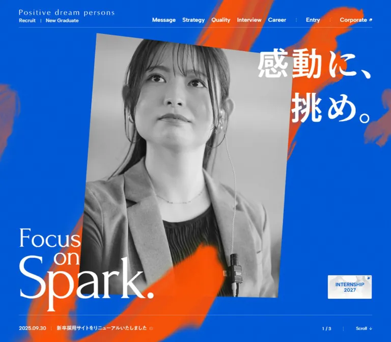
DESIGN REFERENCE
ポジティブドリームパーソンズ 採用サイト
鮮やかなブルーにオレンジの筆跡、モノクロの社員写真、大胆な和英タイポグラフィを重ねた採用サイト。事業紹介から社員インタビュー、キャリア支援までを長いスクロールで展開。
オリジナルサイトを見るPositive dream persons — Recruitment Style Reference
Electric blue, orange paint, and oversized white lettering turn employee portraits into a recruitment manifesto.
Website: recruit.positive.co.jp
Original URL: https://recruit.positive.co.jp/
Final URL: https://recruit.positive.co.jp/
Theme: saturated blue canvas, white editorial panels, orange painted accents, and monochrome hero photography.
Inspected: September 12, 2026; supplied browser evidence recorded at 2026-09-12T13:01:37.898Z / 22:01:37.898 JST.
Viewports: desktop 1440 × 1000 and mobile 390 × 844 CSS pixels.
Scope: the current recruitment homepage. Visual evidence covers the desktop hero, a desktop Cases state, the desktop footer and adjacent news content, the mobile hero, and the lower mobile footer. Rendered DOM and computed styles extend coverage through Message, Strategy, business activities, Impact, Cases, Quality, Interview, Career, recruitment entry routes, News, and the footer. Linked pages and application flows were not inspected.
Positive dream persons presents recruitment as an expression of personal ambition and hospitality. A continuous blue field connects an employee portrait composition, a large Japanese manifesto, business explanations, interviews, career support, and application routes. Orange brushwork introduces irregular edges and diagonal energy. Fine rules, compact navigation, and restrained outlined buttons keep the surrounding interface precise.
The visual hierarchy depends on three distinct typographic voices: expressive hero lettering, Forum serif section titles, and Japanese Gothic text supported by Albert Sans utilities. White panels provide pauses for denser business stories. Desktop layouts spread text and images across broad columns; mobile layouts change their arrangement while retaining large Japanese headlines and substantial vertical breathing room.
This is a long recruitment homepage with multiple content and navigation purposes. Its opening composition is one part of a much larger editorial sequence.
How to Read This Reference
- Measured values come from the supplied rendered DOM and computed styles. Units are CSS pixels unless stated otherwise.
- Visual estimates describe dimensions or treatments visible in the supplied current-page captures where an element-level measurement was unavailable.
- Derived values are arithmetic relationships between supplied measurements. They do not establish an undisclosed CSS formula.
- Recommendations describe a reusable implementation, including the CSS Quick Start. Breakpoints, fallback fonts, and accessibility improvements in that implementation are not verified source behavior.
- Source variables retain their original names when identified. Other token names are descriptive implementation aliases.
- The DOM and screenshots represent different capture moments. Transformed or offscreen rectangles must not be treated as ordinary layout boxes, and coordinates from different states should not be combined into a single frame.
- Only two viewport widths were inspected. Tablet behavior, intermediate breakpoints, open mobile navigation, hover outcomes, and complete animation sequences remain unverified.
Tokens — Colors
Default Palette
| Name | Value | Source / suggested alias | Role and evidence |
|---|---|---|---|
| Recruitment Blue | #005AD8 |
Source --blue; alias --brand-blue |
Measured body background and blue text inside business panels. The dominant page color. |
| Painted Orange | #F65109 |
Source --orange; alias --brand-orange |
Declared brand accent, visually corresponding to the broad orange brushwork. Individual painted pixels vary with texture and compositing. |
| White | #FFFFFF |
Source --white; alias --surface-white |
Measured reversed text; visually observed Cases and News surfaces. |
| Quiet White | rgba(255,255,255,.15) |
Source --white15 |
Available source alpha. Suitable for very subtle separators; exact component assignments were not supplied. |
| Rule White | rgba(255,255,255,.3) |
Source --white30 |
Available source alpha. A practical match for the fine rules visible on blue; this assignment is a recommendation. |
| Secondary White | rgba(255,255,255,.65) |
Source --white65 |
Available source alpha for subordinate details. Specific usage is not established by the sampled elements. |
| Charcoal | #1D2026 |
Source --black; alias --text-charcoal |
Declared dark text token. Dark text is visible in News, but its individual computed style was not supplied. |
The blue canvas has visible fine texture in the captures. Its computed base remains #005AD8; the texture should be treated as a separate visual layer. Likewise, muted orange and blue-gray areas around the hero are part of the painted or photographic treatment, rather than additional flat UI colors.
Declared Auxiliary Colors
--gray-dark: #606673 and --red: #BB0000 are present in the supplied custom properties. Neither has a clearly established primary role in the captured homepage. Keep them outside the core reconstruction palette unless a component requires them.
Numerous editor preset colors, gradients, shadows, and --swiper-theme-color also appear in the variable inventory. Their presence does not establish visible usage. The inspected design is organized around blue, white, orange, and photographic tones.
Tokens — Typography
Japanese Body and Editorial Headings
- Measured body family:
MFW-PA1GothicStdN-Regular. - Measured heading family:
MFW-PA1GothicStdN-Medium. - Computed weight: both families report
400in the sampled elements. The medium treatment comes from the named family; it should not automatically be converted to CSSfont-weight: 500. - Body character: clean Japanese Gothic forms, generous paragraph leading, and controlled tracking.
- Heading role: large Japanese statements carry the main meaning below smaller English section labels.
These are the exact reported family identifiers. Font files, licensing arrangements, and alternative commercial family names were not supplied.
Forum — English Editorial Titles
- Measured family:
Forum, serif. - Weight:
400. - Roles: Message, Strategy, Impact, Quality, Interview, Career, Cases, section numerals, and the later text rendering of
Focus on Spark.. - Character: light, elegant serif forms with a literary tone. Their relatively delicate strokes contrast with the scale of the Japanese statements.
Albert Sans — Navigation and Utilities
- Measured family:
"Albert Sans", sans-serif. - Weights:
500for header utilities and Scroll;600for primary navigation, service captions, and Romanized employee names. - Roles: compact navigation, English metadata, and small directional controls.
- Tracking: generally normal in the supplied samples.
Hero Lettering and Brand Mark
The visible Japanese hero slogan has pronounced stroke contrast and a more expressive appearance than the measured Japanese body copy. The large English composition stacks Focus, on, and Spark. with deliberate overlap. The wordmark uses widely spaced lettering above the recruitment descriptor.
The supplied hero H2 reports inherited 16px text across a viewport-sized box, and the brand H1 is a 1 × 1px element. These measurements do not describe the visible artwork. Its child-level typography or image implementation was not included. Do not use those parent measurements to identify the visible hero font or size.
For a new implementation, preserve approved lettering assets when available. A serif text approximation is acceptable as an explicitly approximate fallback.
Type Scale
All values in this table are measured. Tracking is normalized to em where the supplied pixel values establish the relationship.
| Role | Desktop size / line height | Mobile size / line height | Tracking and notes |
|---|---|---|---|
| Primary desktop navigation | 16 / 25.6px |
Open navigation not visually inspected | Albert Sans, weight 600 |
| Visible mobile Entry | — | 16 / 16px |
Albert Sans, weight 500 |
| Main English section title | 64 / 96px |
29.25 / 43.875px |
Forum; mobile 0.02em |
| Cases section title | 40 / 60px |
25.35 / 38.025px |
Forum |
| Main Japanese section headline | 50 / 75px |
35.1 / 52.65px |
0.05em; Interview and Career mobile leading is 56.16px |
| Message manifesto | 64 / 96px |
25.35 / 40.56px |
Desktop 0.01em; mobile 0.04em |
| Section subtitle | 20 / 48px |
15.6 / 37.44px |
Medium family, 0.05em |
| Introductory paragraph | 16 / 28.8px |
15.6 / 28.08px |
Desktop 0.05em; mobile 0.01em |
| Strategy panel paragraph | 16 / 28.8px |
13.65 / 24.57px |
0.05em |
| Cases paragraph | 14 / 22.4px |
12.675 / 24.0825px |
0.05em; mobile leading increases to 1.9 |
| Supporting Quality paragraph | 14 / 25.2px |
13.65 / 24.57px |
0.05em |
| Main Quality statement | 40 / 66px |
35.1 / 56.16px |
0.05em |
| Secondary Quality statement | 26 / 42.9px |
19.5 / 32.175px |
0.05em |
| Quality numeral | 32 / 32px |
21.45 / 21.45px |
Forum |
| Later English campaign line | 100 / 100px |
40.95 / 40.95px |
Forum; -0.02em desktop, -0.01em mobile |
| Later Japanese campaign line | 80 / 80px |
27.3 / 27.3px |
0.02em desktop, 0.05em mobile |
| Active interview name | 24 / 24px |
15.6 / 15.6px |
Medium family, 0.05em |
| Romanized interview name | 14 / 14px |
11.7 / 11.7px |
Albert Sans, weight 600 |
| Interview role | 12 / 18px |
11.7 / 17.55px |
0.05em |
| Hero news text | 14 / 14px |
13.65 / 21.84px |
Mobile tracking 0.06em |
| Scroll utility | 12 / 12px |
11.7 / 11.7px |
Albert Sans, weight 500 |
Hero visual estimates: the desktop Japanese lettering is approximately 110–125px in apparent display scale; the largest English word is approximately 220–240px. On mobile, the Japanese slogan appears around 50–56px and Spark. around 96–110px. These are screenshot-based estimates, not measured font declarations.
Tokens — Spacing & Shapes
Layout character: broad editorial spacing around dense, carefully led paragraphs. Small controls stay compact even when the surrounding typography becomes monumental.
Base unit: no universal source spacing unit was established. The page uses a conventional measured 16px root alongside many fractional mobile values.
Spacing Scale
| Use | Desktop | Mobile | Evidence |
|---|---|---|---|
| Main content inset | 70px |
15.59375px |
Measured section-title and paragraph positions |
| Main content width | 1300px |
358.796875px |
Measured at the inspected viewports |
| Hero news inset | 70px |
18.953125px |
Measured link rectangle |
| Strategy panel text inset within main alignment | 50px |
About 24.375px |
Derived from 120 − 70 and 39.96875 − 15.59375 |
| Header navigation gap | About 19.2px |
Navigation collapsed | Derived from adjacent link rectangles |
| Cases track pitch | 1240px |
Cases occupy successive vertical positions | Measured desktop metadata x-coordinate differences |
| Cases visible inter-panel gap | About 40px |
Not visually captured | Desktop screenshot estimate |
| Interview name to Romanized name | 12px |
About 9.75px |
Derived from active text rectangles |
| Standard outlined action height | 46px |
46px |
Measured across multiple action links |
| Footer content inset | About 70px |
About 47px |
Screenshot estimates; mobile footer has its own wider inset |
Section Breathing Room
| Section treatment | Desktop | Mobile | Status |
|---|---|---|---|
| Message title top padding | 144px |
106.275px |
Measured |
| Strategy top padding | 56px |
54.6px |
Measured |
| Business section top padding | 148px |
87.75px |
Measured |
| Quality top padding | 123px |
85.8px |
Measured |
| Interview top padding | 122px |
56.55px |
Measured |
| Career top padding | 175px |
107.25px |
Measured |
These differences create a varied editorial rhythm. A uniform section-padding token would simplify the design but would not reproduce its measured pacing.
Border Radius and Rules
| Element | Value | Evidence |
|---|---|---|
| Large Cases panel | Square corners | Visually observed |
| Hero portrait frame | Square corners | Visually observed |
| Outlined text actions | 3px radius |
Measured |
| Internship banner | Slight rounding, approximately 3px |
Visual estimate |
| Header, hero-bottom, and footer rules | Approximately 1px |
Visual estimate |
| Cases pagination marks | Small circles, approximately 6px |
Visual estimate |
| News category labels | Thin rectangular outlines with minimal rounding | Visually observed |
Layout Measurements
| Element | Desktop 1440 × 1000 |
Mobile 390 × 844 |
|---|---|---|
| Header height | 77px, measured |
62.390625px, measured |
| Hero section | 1440 × 1000px, measured |
390 × 844px, measured |
| Hero portrait | Approximately 575 × 720px before rotation |
Large, nearly full-width crop; original frame dimensions unavailable |
| Desktop portrait tilt | Approximately −3°, visual estimate |
Angled upper and lower edges remain visible |
| Internship link | 160 × 86px, measured |
120 × 64.5px, measured |
| Internship link position | x:1210, y:780 |
x:254, y:699.5625 |
| Visible Cases panel | Approximately 1200 × 600px, visual estimate |
No mobile Cases screenshot supplied |
| Active interview information width | 360px, measured |
351px, measured |
| Full document height | 25,291.96875px, measured |
26,391.140625px, measured |
Document and section heights may include animation staging or other layout mechanisms. They are observations of the captured state, not recommended fixed heights for a reconstruction.
Components
Recruitment Header
Role: establish identity and give direct access to the main recruitment sections.
A transparent header overlays the hero. On desktop, the identity sits at the left content edge and the navigation extends across the right side. The visible navigation sequence is Message, Strategy, Quality, Interview, Career, News, Entry, and Corporate. A fine white rule spans the inner width beneath the header.
The identity combines the spaced brand lettering with the smaller Recruit | New Graduate descriptor. Primary navigation uses Albert Sans at weight 600. Small dotted separators distinguish the Entry and Corporate utilities; Corporate includes a tiny external-link mark.
On mobile, the visible header retains the identity, an Entry link, and a white rectangular menu control with blue lines. Its left inset is approximately 4vw. The expanded navigation is not shown in the screenshots. Although its links and rectangles exist in the DOM, those measurements do not establish the appearance of an open menu.
The header has a measured transform transition. Its exact fixed, sticky, or scroll-hiding behavior was not established.
Full-Viewport Portrait Hero
Role: connect the recruitment message to a person before presenting detailed company information.
The desktop hero is a layered composition:
- A full blue canvas with fine visible texture.
- Broad orange paint marks crossing the background.
- A large monochrome employee portrait, centered and slightly rotated counterclockwise.
- Partial, softened, blue-tinted portraits entering from the far left and right.
- A strong orange diagonal stroke crossing in front of the central portrait.
- White Japanese lettering at the upper right and the oversized English campaign lockup at the lower left.
- A small internship banner and bottom utility row.
In the desktop capture, the central portrait occupies an approximate envelope from x:414–1027 and y:125–875. The face remains visually dominant despite overlapping typography and paint.
The headline quotes the actual UI copy 感動に、挑め。. Its two-line arrangement reaches into the image area. Focus on Spark. is composed as three tightly related elements rather than a standard paragraph with ordinary line spacing.
On mobile, the portrait becomes an immersive crop across almost the whole viewport width. The Japanese slogan stays at the upper right, while the English composition sits near the lower left. The counter moves under the header at the upper left. This is a recomposition of the scene, not a proportional reduction of the desktop frame.
Hero News and Progress Utilities
Role: provide current information and a route into the page without competing with the portrait.
The desktop bottom row sits below a fine rule, with a dated news link at the left and the 3 / 3 indicator plus Scroll at the right. The supplied headline links to the July 9, 2026 interview update.
On mobile, the news link occupies a separate bottom strip with a stable date and horizontally repeating headline text. Two copies of the headline have the measured animation 15s linear infinite kf-news-txt-sp. Scroll sits above that strip at the lower right.
The three-part hero counter establishes three available states. The screenshots do not establish autoplay timing, user controls, or the transition between portraits.
Internship Banner
Role: maintain a compact recruitment opportunity within the opening scene.
A small white photographic banner with blue INTERNSHIP 2028 lettering sits near the lower right. It includes a tiny external-link indicator and retains an aspect ratio of approximately 1.86:1 at both measured sizes.
The observed anchor points to the 2028 internship seminar listing. Its text extraction is empty, but that does not prove the absence of an accessible name because image alternatives were not included in the evidence.
Keep this as a distinct image link. Its small scale and pale imagery provide contrast with the energetic background.
Message Manifesto
Role: state the recruitment philosophy in a deliberately prominent reading experience.
The English section title introduces a large block of Japanese copy. On desktop, this manifesto is 64px with 96px leading and occupies a 1300px column. Mobile uses a separately arranged passage at 25.35px with 40.56px leading across approximately 359px.
The block concludes with a large Forum rendering of Focus on Spark., a Japanese campaign line, and a smaller supporting statement. These later text elements have measured fonts and sizes; their measurements should not be substituted for the separate hero artwork.
For reusable content, preserve the strong line rhythm while allowing language and text length to determine wrapping. The source includes viewport-specific line arrangements, so copying desktop hard breaks directly to mobile would be inappropriate.
Editorial Section Introduction
Role: provide a recurring hierarchy for Strategy, Interview, Career, and related business content.
The anatomy is an English serif label, a large Japanese statement, a smaller Japanese descriptor, and a supporting paragraph. On desktop, the headline group and paragraph often share a row. Strategy divides the 1300px inner width into approximately 548px and 752px; Interview and Career use approximately 690px and 610px.
On mobile, these elements occupy the same approximately 359px column in sequence. The Japanese headline remains larger than the English section title. Body copy retains generous 1.8 leading instead of becoming a compact caption.
Strategy Panels
Role: explain the four named elements VISION, PDPWAY, MISSION, and PROMISE.
Each entry includes a numbered label, a Japanese statement, explanatory copy, and an outlined 企業理念 link to the corporate About page. The sampled text is blue, consistent with the white panel treatment used for detailed business content.
Desktop text starts at x:120, giving a 50px inset from the main content edge. The four numbered labels are spaced 980px apart in the sampled desktop document. That pitch may include presentation staging and is not a measured card height.
On mobile, panel copy is approximately 310px wide and begins at x:39.96875. The 46px-high action is centered. The exact illustration treatment inside these panels was not supplied visually.
Business Activities and Impact
Role: relate recruitment to the company's range of work and the value delivered through it.
The DOM identifies six business categories: HOTEL, BANQUET, RESTAURANT, FLOWER, WEDDING, and CONSULTING. A small Albert Sans Our Service caption accompanies a compact two-column collection of links.
Desktop paragraphs in this section use a narrower 420px column. Diagram labels occupy an area to the right. On mobile, the business-diagram labels appear between the service links and Impact content in the document sequence.
The evidence establishes the diagram's labels and placement, but not its complete shapes, paths, or animation. A reconstruction should obtain those visual details before reproducing a specific diagram.
Cases Track and Split Panel
Role: demonstrate business value through four concrete categories: urban development, cultural heritage restoration, facility revitalization, and brand creation.
The supplied desktop capture shows the second case in a horizontal sequence. A Forum Cases heading sits above the track. Four small pagination dots align near the right; the second dot is orange in the captured state.
Each visible panel is approximately 1200px wide and 600px high, divided evenly between a white text surface and a full-height color photograph. The text side contains:
- A serif
Valuelabel and fraction, followed by a short rule and category label. - A two-line Japanese headline in blue.
- A compact paragraph with measured
14px / 22.4pxtypography. - A small blue outlined
詳しくはこちらaction.
The captured cultural heritage panel pairs this copy with an architectural photograph containing Osaka Castle and the adjacent historic building. The image reaches the panel edges, without a rounded frame or shadow.
Neighboring panels remain partially visible beyond the active panel, separated by approximately 40px. The DOM confirms four entries with a 1240px horizontal pitch on desktop.
Mobile changes the arrangement: the four case labels share the same x-position and occur at successive y-positions. This supports a vertically arranged case sequence. The supplied mobile evidence does not visually establish image order or any sticky presentation behavior. Do not impose the desktop horizontal track on mobile by default.
Outlined Text Action
Role: provide a consistent route from editorial content to a deeper page.
The shared action is compact, rectangular, and lightly rounded. Measured examples are 46px high with 3px corner radii. Width follows the label: the desktop Cases action is approximately 148px, while an active interview action is approximately 205px.
Use blue outlines and blue text on white, or white outlines and white text on blue. Directional and external-link marks remain small. The measured transition affects text color over 150ms; the final hover appearance was not captured.
Quality Modules
Role: explain service methods, skills development, and locally specific brand creation.
The first numbered module combines a larger Japanese statement and supporting prose with diagram labels positioned to the right on desktop. The following two modules form a measured desktop pair: each is approximately 608px wide, beginning at x:70 and x:762.
The mobile DOM places these modules sequentially at the main content inset. Secondary Japanese statements can occupy a narrow 160.875px text area while their explanatory paragraphs span the full content width. This suggests internal composition within each module rather than a uniform full-width text stack.
The blue-and-white diagram labeling is measured, but the complete diagram graphics are not visible in the supplied captures.
Employee Interview Sequence
Role: present individual employee stories with a clearly emphasized current entry.
Eight interview records are present. Each combines a quotation, Japanese name, Romanized name, joining year, role, and a link labeled インタビュー記事を読む.
The sampled active entry has a 360px information column on desktop and 351px on mobile. Neighboring information rectangles are approximately 30% of the active width: 108 / 360 and 105.3 / 351. Their reduced heights are consistent with a scaled presentation. These are transformed display measurements, not tiny underlying font sizes.
Names and metadata carry staggered clip-path transitions. This establishes an emphasis-and-reveal treatment, although the mechanism for selecting an employee, the full image layout, and the transition trigger were not exercised in the supplied evidence.
Career Support and Benefits
Role: move from employee stories to practical conditions for growth and employment.
The section follows the recurring English label, Japanese headline, descriptor, and introduction pattern. The content describes four career-support topics and ten benefits or support systems.
The first two desktop support blocks have approximately 500px text columns at x:180 and x:760. On mobile, the sampled block uses the full main content width. Supporting text is 14px / 25.2px on desktop and 13.65px / 24.57px on mobile.
Selected benefit entries include もっとくわしく links to specific sections of the work-style page. Preserve this distinction between explanatory entries and entries that provide a deeper destination. The full benefits layout is known from text, but was not supplied as a screenshot.
Recruitment Entry Area
Role: separate application routes by audience and year.
The current DOM includes 2028 and 2029 internship routes, a new-graduate area with a 2027 external application link and a direct form link, and a mid-career / part-time opportunities link. Wantedly and Instagram links precede this area.
A repeated Focus on Spark. sequence appears in the DOM. Its repetition is confirmed; a marquee speed or even continuous movement for this particular element is not established.
The visual arrangement of the full entry area was not captured. For reuse, make each audience and year explicit, and bind year labels to the matching destination. Keep the available paths distinct rather than combining them under an ambiguous single Entry action.
News Panel
Role: present dated recruitment updates near the end of the homepage.
The desktop footer capture includes the bottom of a broad white News surface. Its visible outer inset is approximately 20px, wider than the main 1300px editorial column. A visible row combines a small landscape thumbnail, thin outlined category labels, a Japanese title, and a date aligned toward the right.
The visible thumbnail is approximately 90 × 60px. Category labels are compact rectangles, and the text is dark on white. The current DOM contains two news items and an お知らせ一覧 link.
The mobile text order places the list link after the items, while the desktop extraction places it before them. This supports a responsive change in the list-link presentation, although a complete mobile News screenshot was not supplied.
Footer and Contact Block
Role: provide a clear final navigation, company, and recruitment-contact destination.
The desktop footer returns to uninterrupted blue. The brand sits at the left, while a vertical navigation list begins around x:840. Beneath a long horizontal rule, three small legal/company links sit left and Contact sits right. The contact block includes the office address, recruitment department, phone number and hours, and an outlined お問い合わせフォーム link.
The original page identifies Positive dream persons in its branding, recruitment contact text, and copyright. Corporate and Company site links point to the corporate domain. No production-credit claim is established by the original-page evidence.
Desktop Company site and copyright sit at the lower left, with Back to Top at the lower right. On mobile, navigation, legal links, and contact information form a vertical sequence with an approximately 47px inset. A full-width divider introduces a centered ending containing Back to Top, Company site, and copyright.
The mobile footer's generous inset is an important exception to the main page's approximately 16px gutter. The contact button is visually about 182 × 46px on mobile and 193 × 46px on desktop.
Tokens — Motion & Interaction
| Treatment | Supplied value or evidence | What can be concluded |
|---|---|---|
| Header transform | 0.4s cubic-bezier(0.215, 0.61, 0.355, 1) |
A transform transition is defined; its trigger and final positions are unverified. |
| Desktop internship banner | transform 0.5s cubic-bezier(0.165, 0.84, 0.44, 1) |
Transform easing is measured; hover or scroll behavior was not demonstrated. |
| Outlined action text | color 0.15s cubic-bezier(0.165, 0.84, 0.44, 1) |
Short color transition is defined; target colors were not supplied. |
| Active interview metadata | clip-path 0.5s cubic-bezier(0.23, 1, 0.32, 1) |
Defined reveal transition, with successive delays of 0.05s, 0.10s, 0.15s, and 0.20s. |
| Inactive interview metadata | clip-path 0.25s cubic-bezier(0.23, 1, 0.32, 1) |
A shorter alternate transition is defined. |
| Mobile hero news text | 15s linear infinite kf-news-txt-sp |
Confirmed perpetual animation declaration on duplicated headline text. |
| Hero state count | Three states; captured indicator 3 / 3 |
A multi-state presentation exists. Autoplay, interval, and transition type are unverified. |
| Desktop Cases | Horizontal entry positions and a captured second-case state | Horizontal presentation is established. Dragging, dot clicks, pinning, and scroll coupling are unverified. |
| Anchor navigation | Section hashes, Scroll to #message, Back to Top to #top |
Destinations are established. Smooth-scroll timing is unverified. |
| Brushwork | Layered painted marks visible in still captures | Appearance is established; a specific animation path or rendering technology is not. |
Duplicated navigation labels in the DOM may support layered text effects, but the evidence does not establish their visible transition. Likewise, a generic computed transition: all without timing should not be interpreted as a documented animation.
The capture procedure waited for finite motion and temporarily paused perpetual animations during readiness checks. Still captures and sampled declarations therefore provide only partial motion evidence. No mouse, keyboard, menu-opening, application-submission, or media-playback sequence was supplied.
Surfaces
| Layer | Appearance | Purpose |
|---|---|---|
| Page canvas | Saturated blue with fine visible texture | Connects the long editorial sequence |
| Painted accent | Irregular orange strokes, some overlapping imagery | Adds gesture and directional energy |
| Hero photography | Monochrome central portrait and softened blue-tinted edge portraits | Makes people the focal point |
| Detailed business panel | White with blue typography | Supports denser reading and color photography |
| News surface | White with dark text and outlined metadata | Provides a practical information layer |
| Utility control | Transparent fill, thin contrasting outline, 3px radius |
Keeps actions visible without introducing heavy blocks |
| Footer | Blue, white type, fine rules | Gives navigation and contact information a calm finish |
There is no visible general-purpose shadow elevation system. Separation comes from the blue/white switch, image boundaries, spacing, and rules. Painted texture belongs to the expressive background; it should not reduce the clarity of dense panel text.
Imagery
The opening imagery is editorial employee photography. The central subject is shown at a large scale with a serious, attentive expression, visible clothing texture, and a broad grayscale range. The portrait retains its rectangular frame and a small rotation, giving it the presence of a photographic print laid across the blue field.
Orange marks resemble loaded brushes: thick color, streaked edges, uneven transparency, and long diagonal gestures. Their irregularity is essential. A smooth orange gradient, rounded blob, or clean geometric stripe would produce a different visual language.
Business imagery changes to full color. The visible cultural heritage case uses architecture, sky, stone, greenery, and recognizable surroundings to support the story. Keep these images spatial and specific to the subject, with a clear focal structure at the panel's crop.
Small news and internship images are pale, compact supporting assets. Icons are minimal arrows, triangles, and tiny external-link marks. No icon library or original media URL was established by the supplied evidence.
Observed Asset References
Original asset paths were not included. The following identifies assets by their current-page evidence, not by invented filenames.
| Asset | Evidence location | Treatment |
|---|---|---|
| Central employee portrait | Desktop and mobile hero captures | Monochrome, large crop, angled frame |
| Partial surrounding portraits | Desktop hero capture | Cropped at viewport edges, softened and blue tinted |
| Orange painted marks | Desktop hero, mobile hero, desktop Cases capture | Large irregular strokes crossing the blue field |
| Cultural heritage photograph | Desktop Cases capture | Full-color architecture, approximately square panel half |
| Internship banner | Desktop and mobile hero captures | Pale background, blue lettering, small external-link indicator |
| News thumbnail | Desktop footer-adjacent News capture | Small landscape hospitality photograph |
| Brand lettering | Header and desktop footer captures | White, widely spaced wordmark with recruitment descriptor |
Use approved photography, branding, and painted artwork when available. CSS can reproduce the framing and layout, but does not supply the identity contained in those assets.
Layout & Responsive Behavior
Desktop Structure
The measured main column is 1300px wide at 1440px, leaving 70px on both sides. The hero fills the initial viewport, while subsequent sections participate in a long document. Repeated split introductions, narrow business paragraphs, wide white case panels, and paired support modules create changes in reading scale.
The Cases region has a measured section height of 5755px, substantially greater than the approximately 600px panel visible in its screenshot. This is compatible with presentation staging, but the exact mechanism was not supplied. Do not reproduce the difference as an unexplained fixed blank spacer.
Mobile Structure
The main content width is approximately 92vw, with 4vw side insets. Several measured type sizes correspond to simple viewport proportions at the inspected width:
| Measured mobile value | Derived relationship at 390px |
Interpretation |
|---|---|---|
15.6px main body |
4vw |
Useful scaling clue |
29.25px section title |
7.5vw |
Useful scaling clue |
35.1px Japanese headline |
9vw |
Useful scaling clue |
13.65px supporting text |
3.5vw |
Useful scaling clue |
12.675px Cases paragraph |
3.25vw |
Useful scaling clue |
These relationships were calculated from one mobile width. They do not prove the original formulas or their minimum and maximum values.
Component Changes
| Component | Desktop | Mobile |
|---|---|---|
| Header | Full navigation and utility links | Identity, Entry, and menu control |
| Hero portrait | Centered angled print with side portraits | Immersive full-width crop |
| Hero state indicator | Lower-right utility area | Upper left beneath the header |
| Hero news | Compact line below the image composition | Separate bottom strip with animated repeating text |
| Internship banner | 160 × 86px |
120 × 64.5px |
| Section introduction | Headline and prose in adjacent columns | Headline, subtitle, and prose in sequence |
| Strategy panel action | Left-aligned in sampled panel | Centered |
| Cases | Horizontal sequence of split panels | Vertically arranged entries in DOM |
| Interview information | Active 360px column |
Active 351px column and centered action |
| Footer | Two major columns and split bottom utilities | Stacked content, wider inset, centered final utilities |
Only the hero and lower footer were visually inspected on mobile. Other mobile layout observations come from the supplied DOM rectangles and content order. Mobile Cases image placement, complete diagrams, and expanded navigation require additional visual evidence before a pixel-faithful implementation.
Do’s and Don’ts
Do
- Use
#005AD8as the continuous page field and#F65109for the expressive painted accent. - Preserve the interaction between monochrome people, orange gesture, and oversized white lettering.
- Keep Forum section labels distinct from Albert Sans navigation and Japanese Gothic editorial copy.
- Retain the Japanese headline as the dominant meaning-bearing element in section introductions.
- Use white panels with blue text for dense business narratives.
- Keep large photographs square-cornered and edge-to-edge within their panels.
- Preserve small outlined actions, fine rules, and restrained external-link indicators.
- Recompose the mobile hero and move its counter, news strip, and banner deliberately.
- Give the mobile footer its observed wider inset and centered ending.
- Distinguish confirmed animation declarations from untested interaction behavior.
Don't
- Don't replace the portrait composition with a conventional centered headline and generic stock image.
- Don't use orange as the default fill for every application button; its strongest observed role is painted artwork.
- Don't flatten all typography into one sans-serif family or one weight.
- Don't interpret the hero H2's inherited
16pxas the visible headline size. - Don't use scaled inactive interview rectangles as the underlying font or button dimensions.
- Don't add rounded floating cards or soft shadows throughout the page.
- Don't force the desktop Cases track onto mobile when the supplied mobile layout is vertical.
- Don't invent autoplay intervals, draggable controls, scroll pinning, or brush animation from still images.
- Don't apply unused editor preset gradients simply because they appear in the custom-property inventory.
- Don't copy large document-height differences into fixed empty spacer elements.
- Don't let decorative paint intercept links or obscure keyboard focus.
Recommended Implementation Additions
These are recommendations for a new implementation, not verified features of the original site:
- Give the mobile menu an explicit accessible name, a
44pxminimum hit area,aria-expanded, and a managed focus sequence. - Provide a static, readable version of the mobile news headline and a way to pause continuous movement. Hide visual duplicate text from assistive technology.
- Respect reduced motion for news repetition, interview reveals, portrait changes, and any scroll-linked staging.
- Make case navigation keyboard-operable if a custom track is implemented. Enlarge pagination hit areas without enlarging the visible dots.
- Keep essential text readable over every portrait crop. A localized photographic scrim is preferable to obscuring the face with a large opaque box.
- Add a visible focus outline that works on both blue and white surfaces.
- Provide text equivalents for business and Quality diagrams. Measured mobile diagram labels reach
7.8pxand9.75px; a reusable implementation should avoid relying on text that small. - Consider a
14pxminimum for dense mobile case prose, preserving the generous line height. - Keep years and application URLs together in structured content so the 2027, 2028, and 2029 routes remain correctly associated.
- Reserve image dimensions, load the opening portrait promptly, and defer lower-page imagery without hiding editorial content behind animation readiness.
- Validate short screens, browser zoom, and larger text. Absolute hero placement needs a flow-based fallback when its elements no longer fit.
Agent Prompt Guide
Quick Color Reference
- Main field:
#005AD8. - Painted accent:
#F65109. - Reversed text and business surfaces:
#FFFFFF. - Dark News text: source charcoal
#1D2026is the recommended mapping. - Quiet dividers on blue: use the declared white alpha tokens;
rgba(255,255,255,.3)is a practical starting point. - Actions: thin contrasting outlines with approximately
3pxcorners and46pxheight.
Overall Prompt
“Create a long Japanese recruitment homepage inspired by the current Positive dream persons site. Use a continuous electric-blue canvas #005AD8, orange painted strokes #F65109, oversized white campaign lettering, and a slightly tilted monochrome employee portrait. Place the Japanese slogan at the upper right and an overlapping three-part English campaign composition at the lower left. Use Forum for English editorial section titles, Albert Sans for compact navigation, and the supplied Japanese Gothic families when available. Continue through a large manifesto, split section introductions, white business panels with blue text and color photography, an emphasized employee-interview sequence, career support, distinct application routes, News, and a spacious blue footer. On mobile, recompose the hero, stack editorial content and case entries, and give the footer a wider inset. Keep actions compact and outlined. Treat unverified motion as an implementation choice.”
Example Component Prompts
- Hero: “Build a viewport-height blue recruitment composition with an angled monochrome portrait, orange brushwork behind and in front of it, large white Japanese lettering at the upper right, and tightly overlapping serif campaign words at the lower left. Add a small pale internship banner and a fine-rule news strip. Reposition the counter beneath the mobile header.”
- Section introduction: “Use a light Forum English section label above a large Japanese Gothic statement and a smaller descriptor. At 1440px, align the headline group and supporting paragraph across a 1300px inner width. At 390px, stack them within approximately 359px while keeping 1.8 paragraph leading.”
- Cases panel: “Create a square-cornered white panel approximately 1200 × 600px on desktop, split between blue editorial copy and an edge-to-edge color architectural photograph. Include a Value fraction, category label, two-line Japanese headline, compact paragraph, and a 46px-high outlined link. Show neighboring desktop panels with a 40px gap; use vertical entries on mobile.”
- Interview information: “Create a prominent employee information block with a Japanese name, smaller Romanized name, joining year, role, and outlined article link. Use staggered 500ms clip reveals with 50ms increments as a source-informed option. Keep a fully readable static state for reduced motion.”
- Footer: “Create a blue footer with white brand lettering and a vertical navigation list in two broad desktop columns. Put legal links and recruitment contact information beneath a fine rule. On mobile, use approximately 12vw inner padding, then a full-width separator and centered Back to Top, Company site, and copyright.”
Quick Start
CSS Custom Properties
This is a recommended static foundation, not extracted source CSS. It reproduces the measured palette, important desktop dimensions, and mobile proportions while keeping a conventional root size. The 767px and 1100px breakpoints, width cap, hero lettering fallback, hover inversion, and native Cases scrolling are implementation choices. Mobile Cases copy is deliberately raised to 14px.
Load the named fonts only when available and authorized. No original font or image URLs were supplied. The hero expects approved portrait and transparent paint images; CSS supplies their placement, not the artwork.
:root {
  /* Measured source palette */
  --brand-blue: #005ad8;
  --brand-orange: #f65109;
  --surface-white: #fff;
  --text-charcoal: #1d2026;
  --white-15: rgb(255 255 255 / 15%);
  --white-30: rgb(255 255 255 / 30%);
  --white-65: rgb(255 255 255 / 65%);

  /* Reported families with recommended generic fallbacks */
  --font-jp: 'MFW-PA1GothicStdN-Regular', sans-serif;
  --font-jp-heading: 'MFW-PA1GothicStdN-Medium', sans-serif;
  --font-display: 'Forum', serif;
  --font-latin: 'Albert Sans', sans-serif;
  --font-hero-jp: serif;

  --type-section: 64px;
  --type-headline: 50px;
  --type-body: 16px;
  --type-detail: 14px;
  --body-tracking: 0.05em;
  --page-gutter: clamp(24px, 4.861111vw, 70px);
  --content-max: 1300px;
  --section-space: 144px;
  --action-height: 46px;
  --radius-action: 3px;

  --ease-header: cubic-bezier(0.215, 0.61, 0.355, 1);
  --ease-action: cubic-bezier(0.165, 0.84, 0.44, 1);
  --ease-reveal: cubic-bezier(0.23, 1, 0.32, 1);
}

* { box-sizing: border-box; }
body {
  margin: 0;
  color: var(--surface-white);
  background: var(--brand-blue);
  font-family: var(--font-jp);
  font-weight: 400;
  line-height: 1.8;
}
img { display: block; max-width: 100%; }
a { color: inherit; }
button { font: inherit; }
.wrap {
  width: calc(100% - 2 * var(--page-gutter));
  max-width: var(--content-max);
  margin-inline: auto;
}
.sr-only {
  position: absolute;
  width: 1px;
  height: 1px;
  padding: 0;
  overflow: hidden;
  clip-path: inset(50%);
  white-space: nowrap;
  border: 0;
}

/* Opening header; scroll hiding requires separate behavior. */
.site-header {
  position: absolute;
  inset: 0 0 auto;
  z-index: 10;
  font-family: var(--font-latin);
  transition: transform 400ms var(--ease-header);
}
.header-inner {
  display: flex;
  align-items: center;
  justify-content: space-between;
  gap: 24px;
  min-height: 77px;
  border-bottom: 1px solid var(--white-30);
}
.desktop-nav {
  display: flex;
  align-items: center;
  gap: 19.2px;
  font-size: 16px;
  font-weight: 600;
  line-height: 1.6;
}
.desktop-nav a { text-decoration: none; }
.mobile-actions { display: none; }
.menu-toggle {
  width: 44px;
  min-height: 44px;
  border: 0;
  border-radius: var(--radius-action);
  color: var(--brand-blue);
  background: var(--surface-white);
}

/* Approximate hero framing; lettering is not source-measured. */
.hero {
  position: relative;
  isolation: isolate;
  min-height: max(760px, 100svh);
  overflow: hidden;
}
.hero-portrait {
  position: absolute;
  z-index: 1;
  top: 50%;
  left: 50%;
  width: min(40vw, 576px);
  aspect-ratio: 4 / 5;
  object-fit: cover;
  filter: grayscale(1);
  transform: translate(-50%, -50%) rotate(-3deg);
}
.hero-paint {
  position: absolute;
  z-index: 2;
  inset: 0;
  width: 100%;
  height: 100%;
  object-fit: cover;
  pointer-events: none;
}
.hero-paint--back { z-index: 0; }
.hero-title {
  position: absolute;
  z-index: 3;
  top: 13%;
  right: var(--page-gutter);
  margin: 0;
  font-family: var(--font-hero-jp);
  font-size: clamp(70px, 8.333vw, 120px);
  font-weight: 400;
  line-height: 1.25;
  text-align: right;
}
.hero-wordmark {
  position: absolute;
  z-index: 3;
  bottom: 110px;
  left: var(--page-gutter);
  width: 620px;
  height: 280px;
  font-family: var(--font-display);
  line-height: 0.85;
  pointer-events: none;
}
.hero-wordmark span { position: absolute; }
.hero-focus { top: 0; left: 0; font-size: 100px; }
.hero-on { top: 75px; left: 125px; font-size: 80px; }
.hero-spark {
  top: 90px;
  left: 0;
  font-size: 240px;
  letter-spacing: -0.04em;
}
.internship-banner {
  position: absolute;
  z-index: 4;
  right: var(--page-gutter);
  bottom: 134px;
  width: 160px;
  aspect-ratio: 160 / 86;
  border-radius: var(--radius-action);
  overflow: hidden;
}
.internship-banner img {
  width: 100%;
  height: 100%;
  object-fit: cover;
}
.hero-news {
  position: absolute;
  z-index: 4;
  right: var(--page-gutter);
  bottom: 30px;
  left: var(--page-gutter);
  display: flex;
  align-items: center;
  gap: 24px;
  padding-top: 30px;
  padding-right: 200px;
  border-top: 1px solid var(--white-30);
  font-size: 14px;
  line-height: 16px;
}
.hero-news time { flex: none; }
.hero-news-text { min-width: 0; }
.hero-counter,
.hero-scroll {
  position: absolute;
  z-index: 5;
  bottom: 30px;
  font: 500 12px / 1 var(--font-latin);
}
.hero-counter { right: calc(var(--page-gutter) + 115px); }
.hero-scroll { right: var(--page-gutter); }

/* Recurring editorial hierarchy */
.editorial-section { padding-block: var(--section-space); }
.section-title {
  margin: 0 0 32px;
  font: 400 var(--type-section) / 1.5 var(--font-display);
}
.section-intro {
  display: grid;
  grid-template-columns: 53.08% 46.92%;
  align-items: end;
}
.section-intro > * { min-width: 0; }
.section-headline {
  margin: 0;
  font: 400 var(--type-headline) / 1.5 var(--font-jp-heading);
  letter-spacing: 0.05em;
}
.section-subtitle {
  margin: 0;
  font: 400 20px / 2.4 var(--font-jp-heading);
  letter-spacing: 0.05em;
}
.body-copy {
  margin: 0;
  font-size: var(--type-body);
  line-height: 1.8;
  letter-spacing: var(--body-tracking);
}
.manifesto {
  font: 400 64px / 1.5 var(--font-jp-heading);
  letter-spacing: 0.01em;
}
.outline-action {
  display: inline-flex;
  align-items: center;
  justify-content: center;
  gap: 14px;
  min-height: var(--action-height);
  padding: 10px 17px;
  border: 1px solid currentColor;
  border-radius: var(--radius-action);
  background: transparent;
  color: inherit;
  font-size: 14px;
  line-height: 1.5;
  text-decoration: none;
  transition: color 150ms var(--ease-action),
              background-color 150ms var(--ease-action);
}

/* Native scrolling is a recommended desktop track fallback. */
.cases-title { font-size: 40px; }
.case-track {
  display: flex;
  gap: 40px;
  overflow-x: auto;
  padding: 0 var(--page-gutter) 24px;
  scroll-snap-type: x proximity;
  scroll-padding-inline: var(--page-gutter);
}
.case-card {
  flex: 0 0 min(1200px, calc(100vw - 2 * var(--page-gutter)));
  display: grid;
  grid-template-columns: 1fr 1fr;
  min-height: 600px;
  color: var(--brand-blue);
  background: var(--surface-white);
  scroll-snap-align: start;
}
.case-copy { min-width: 0; padding: 44px 50px 40px; }
.case-label {
  margin: 0 0 22px;
  font: 400 32px / 1 var(--font-display);
}
.case-heading {
  margin: 0 0 24px;
  font: 400 26px / 1.5 var(--font-jp-heading);
}
.case-body {
  margin: 0 0 44px;
  font-size: 14px;
  line-height: 1.6;
  letter-spacing: 0.05em;
}
.case-image {
  width: 100%;
  height: 100%;
  min-height: 0;
  object-fit: cover;
}

/* Footer groups: brand/navigation, legal/contact, final utilities. */
.footer-main,
.footer-info {
  display: grid;
  grid-template-columns: 59.23% 40.77%;
}
.footer-main { padding-block: 110px 90px; }
.footer-info {
  padding-block: 46px 70px;
  border-top: 1px solid var(--white-30);
}
.footer-nav {
  display: grid;
  gap: 0;
  font: 600 24px / 1.6 var(--font-latin);
}
.footer-nav a { text-decoration: none; }
.footer-contact { font-size: 14px; line-height: 1.6; }
.footer-bottom {
  display: flex;
  justify-content: space-between;
  gap: 24px;
  padding-bottom: 70px;
  font-family: var(--font-latin);
}

/* Recommended feedback; final source hover states are unverified. */
a:focus-visible,
button:focus-visible {
  outline: 2px solid currentColor;
  outline-offset: 5px;
}
@media (hover: hover) {
  .case-card .outline-action:hover {
    color: var(--surface-white);
    background: var(--brand-blue);
    border-color: var(--brand-blue);
  }
}

/* Recommended navigation breakpoint, not an observed source value. */
@media (max-width: 1100px) {
  .desktop-nav { display: none; }
  .mobile-actions { display: flex; align-items: center; gap: 24px; }
}

@media (max-width: 767px) {
  :root {
    --page-gutter: 4vw;
    --type-section: clamp(28px, 7.5vw, 40px);
    --type-headline: clamp(32px, 9vw, 48px);
    --type-body: clamp(15.2px, 4vw, 16px);
    --body-tracking: 0.01em;
    --section-space: 88px;
  }
  .header-inner { min-height: 62.4px; }
  .hero { min-height: max(760px, 100svh); }
  .hero-portrait {
    inset: 74px 0 74px;
    width: 100%;
    height: calc(100% - 148px);
    aspect-ratio: auto;
    transform: none;
    clip-path: polygon(0 3%, 100% 0, 100% 97%, 0 100%);
  }
  .hero-title {
    top: 76px;
    right: 4vw;
    font-size: clamp(44px, 14vw, 56px);
  }
  .hero-wordmark {
    bottom: 74px;
    left: 4.86vw;
    width: 280px;
    height: 114px;
  }
  .hero-focus { top: 0; font-size: 44px; }
  .hero-on { top: 28px; left: 53px; font-size: 36px; }
  .hero-spark { top: 38px; font-size: 104px; }
  .internship-banner {
    right: 16px;
    bottom: 80px;
    width: 120px;
  }
  .hero-news {
    right: 4.86vw;
    bottom: 15px;
    left: 4.86vw;
    gap: 18px;
    padding-top: 14px;
    padding-right: 0;
    font-size: 13.65px;
    line-height: 1.6;
  }
  .hero-counter { top: 84px; bottom: auto; left: 4.86vw; right: auto; }
  .hero-scroll { right: 4.86vw; bottom: 60px; }
  .section-title { margin-bottom: 18px; letter-spacing: 0.02em; }
  .section-intro { grid-template-columns: 1fr; gap: 18px; }
  .section-subtitle { font-size: 15.6px; }
  .manifesto {
    font-size: clamp(24px, 6.5vw, 30px);
    line-height: 1.6;
    letter-spacing: 0.04em;
  }
  .cases-title { font-size: 25.35px; }
  .case-track { display: grid; gap: 32px; overflow: visible; padding: 0; }
  .case-card { grid-template-columns: 1fr; min-height: 0; }
  .case-copy { padding: 30px var(--page-gutter); }
  .case-body { font-size: 14px; line-height: 1.9; }
  .case-image { height: auto; aspect-ratio: 4 / 3; }
  .footer-main,
  .footer-info {
    width: 100%;
    grid-template-columns: 1fr;
    gap: 44px;
    padding-inline: 12vw;
  }
  .footer-main { padding-block: 80px 44px; }
  .footer-info { padding-block: 44px 48px; }
  .footer-nav { font-size: 28px; line-height: 1.4; }
  .footer-bottom {
    width: 100%;
    flex-direction: column;
    align-items: center;
    padding: 44px 12vw;
    border-top: 1px solid var(--white-30);
    text-align: center;
  }
}

@media (prefers-reduced-motion: reduce) {
  html { scroll-behavior: auto; }
  .site-header,
  .outline-action,
  .interview-info { transition: none; }
  .news-ticker,
  .hero-paint { animation: none; }
  .interview-info { clip-path: none; }
}
Use .case-copy and .case-image as the two children of .case-card. The mobile example places the copy before the image as an implementation fallback; the original mobile image order was not visually established. The hero wordmark expects .hero-focus, .hero-on, and .hero-spark spans. Keep real heading text accessible if these are replaced by artwork.
The code leaves the news headline static. Reintroducing the measured repeating treatment requires a clipped track, an assistive-technology-hidden duplicate, and a pause or reduced-motion alternative. Custom interview and case controllers, menu state, image loading, and short-screen hero adjustments require separate implementation.
Tailwind v4 Token Mapping
Optional aliases for a project already using Tailwind v4. Define the custom properties above first. This mapping does not identify the original site's framework.
@theme inline {
  --color-recruit-blue: var(--brand-blue);
  --color-painted-orange: var(--brand-orange);
  --color-panel-white: var(--surface-white);
  --color-news-charcoal: var(--text-charcoal);

  --font-editorial: var(--font-display);
  --font-utility: var(--font-latin);
  --font-japanese: var(--font-jp);
  --font-japanese-heading: var(--font-jp-heading);

  --text-section: var(--type-section);
  --text-headline: var(--type-headline);
  --text-copy: var(--type-body);
  --text-detail: var(--type-detail);

  --spacing-page-gutter: var(--page-gutter);
  --spacing-editorial-section: var(--section-space);
  --spacing-action-height: var(--action-height);
  --radius-action: 3px;
}
Sources & Evidence
- Positive dream persons recruitment homepage: original and final URL, HTTP
200, and rendered title採用情報 | Positive dream persons. This is the authority for the current-page findings. - Capture date: September 12, 2026, with the supplied observation recorded at
2026-09-12T13:01:37.898Z. This document analyzes that supplied inspection; it does not claim a separate live visit. - Desktop evidence:
1440 × 1000captures of the hero, a Cases state, and the footer with adjacent News content; rendered DOM, element rectangles, custom properties, and computed styles. - Mobile evidence:
390 × 844captures of the hero and lower footer; rendered DOM and computed styles for additional homepage sections. - Navigation evidence: the rendered homepage includes section hashes, interview links, work-style links, application destinations, News, contact, and corporate links. Their presence establishes destinations, not the appearance or behavior of those linked pages.
- Capture procedure: the supplied browser observation lasted at least five seconds initially and applied document-load, image-decoding, layout-stability, and finite-animation readiness checks. Scrolling traversed intermediate positions. Perpetual animations were temporarily paused during readiness checks and then resumed. SharedWorkers and service workers were disabled.
- Limits: no original media paths, complete stylesheet files, interaction recordings, expanded mobile menu capture, or linked-page inspection were supplied. Some sampled elements were transformed or offscreen. Delayed content and unexercised behavior may remain outside the evidence.
Measured values, screenshot estimates, arithmetic deductions, and implementation recommendations are identified separately throughout this reference.
# Positive dream persons — Recruitment Style Reference

> Electric blue, orange paint, and oversized white lettering turn employee portraits into a recruitment manifesto.

**Website:** [recruit.positive.co.jp](https://recruit.positive.co.jp/)
**Original URL:** https://recruit.positive.co.jp/
**Final URL:** https://recruit.positive.co.jp/
**Theme:** saturated blue canvas, white editorial panels, orange painted accents, and monochrome hero photography.
**Inspected:** September 12, 2026; supplied browser evidence recorded at `2026-09-12T13:01:37.898Z` / 22:01:37.898 JST.
**Viewports:** desktop `1440 × 1000` and mobile `390 × 844` CSS pixels.
**Scope:** the current recruitment homepage. Visual evidence covers the desktop hero, a desktop Cases state, the desktop footer and adjacent news content, the mobile hero, and the lower mobile footer. Rendered DOM and computed styles extend coverage through Message, Strategy, business activities, Impact, Cases, Quality, Interview, Career, recruitment entry routes, News, and the footer. Linked pages and application flows were not inspected.

Positive dream persons presents recruitment as an expression of personal ambition and hospitality. A continuous blue field connects an employee portrait composition, a large Japanese manifesto, business explanations, interviews, career support, and application routes. Orange brushwork introduces irregular edges and diagonal energy. Fine rules, compact navigation, and restrained outlined buttons keep the surrounding interface precise.

The visual hierarchy depends on three distinct typographic voices: expressive hero lettering, Forum serif section titles, and Japanese Gothic text supported by Albert Sans utilities. White panels provide pauses for denser business stories. Desktop layouts spread text and images across broad columns; mobile layouts change their arrangement while retaining large Japanese headlines and substantial vertical breathing room.

This is a long recruitment homepage with multiple content and navigation purposes. Its opening composition is one part of a much larger editorial sequence.

## How to Read This Reference

- **Measured** values come from the supplied rendered DOM and computed styles. Units are CSS pixels unless stated otherwise.
- **Visual estimates** describe dimensions or treatments visible in the supplied current-page captures where an element-level measurement was unavailable.
- **Derived** values are arithmetic relationships between supplied measurements. They do not establish an undisclosed CSS formula.
- **Recommendations** describe a reusable implementation, including the CSS Quick Start. Breakpoints, fallback fonts, and accessibility improvements in that implementation are not verified source behavior.
- **Source variables** retain their original names when identified. Other token names are descriptive implementation aliases.
- The DOM and screenshots represent different capture moments. Transformed or offscreen rectangles must not be treated as ordinary layout boxes, and coordinates from different states should not be combined into a single frame.
- Only two viewport widths were inspected. Tablet behavior, intermediate breakpoints, open mobile navigation, hover outcomes, and complete animation sequences remain unverified.

## Tokens — Colors

### Default Palette

| Name | Value | Source / suggested alias | Role and evidence |
| --- | --- | --- | --- |
| Recruitment Blue | `#005AD8` | Source `--blue`; alias `--brand-blue` | Measured body background and blue text inside business panels. The dominant page color. |
| Painted Orange | `#F65109` | Source `--orange`; alias `--brand-orange` | Declared brand accent, visually corresponding to the broad orange brushwork. Individual painted pixels vary with texture and compositing. |
| White | `#FFFFFF` | Source `--white`; alias `--surface-white` | Measured reversed text; visually observed Cases and News surfaces. |
| Quiet White | `rgba(255,255,255,.15)` | Source `--white15` | Available source alpha. Suitable for very subtle separators; exact component assignments were not supplied. |
| Rule White | `rgba(255,255,255,.3)` | Source `--white30` | Available source alpha. A practical match for the fine rules visible on blue; this assignment is a recommendation. |
| Secondary White | `rgba(255,255,255,.65)` | Source `--white65` | Available source alpha for subordinate details. Specific usage is not established by the sampled elements. |
| Charcoal | `#1D2026` | Source `--black`; alias `--text-charcoal` | Declared dark text token. Dark text is visible in News, but its individual computed style was not supplied. |

The blue canvas has visible fine texture in the captures. Its computed base remains `#005AD8`; the texture should be treated as a separate visual layer. Likewise, muted orange and blue-gray areas around the hero are part of the painted or photographic treatment, rather than additional flat UI colors.

### Declared Auxiliary Colors

`--gray-dark: #606673` and `--red: #BB0000` are present in the supplied custom properties. Neither has a clearly established primary role in the captured homepage. Keep them outside the core reconstruction palette unless a component requires them.

Numerous editor preset colors, gradients, shadows, and `--swiper-theme-color` also appear in the variable inventory. Their presence does not establish visible usage. The inspected design is organized around blue, white, orange, and photographic tones.

## Tokens — Typography

### Japanese Body and Editorial Headings

- **Measured body family:** `MFW-PA1GothicStdN-Regular`.
- **Measured heading family:** `MFW-PA1GothicStdN-Medium`.
- **Computed weight:** both families report `400` in the sampled elements. The medium treatment comes from the named family; it should not automatically be converted to CSS `font-weight: 500`.
- **Body character:** clean Japanese Gothic forms, generous paragraph leading, and controlled tracking.
- **Heading role:** large Japanese statements carry the main meaning below smaller English section labels.

These are the exact reported family identifiers. Font files, licensing arrangements, and alternative commercial family names were not supplied.

### Forum — English Editorial Titles

- **Measured family:** `Forum, serif`.
- **Weight:** `400`.
- **Roles:** Message, Strategy, Impact, Quality, Interview, Career, Cases, section numerals, and the later text rendering of `Focus on Spark.`.
- **Character:** light, elegant serif forms with a literary tone. Their relatively delicate strokes contrast with the scale of the Japanese statements.

### Albert Sans — Navigation and Utilities

- **Measured family:** `"Albert Sans", sans-serif`.
- **Weights:** `500` for header utilities and Scroll; `600` for primary navigation, service captions, and Romanized employee names.
- **Roles:** compact navigation, English metadata, and small directional controls.
- **Tracking:** generally normal in the supplied samples.

### Hero Lettering and Brand Mark

The visible Japanese hero slogan has pronounced stroke contrast and a more expressive appearance than the measured Japanese body copy. The large English composition stacks `Focus`, `on`, and `Spark.` with deliberate overlap. The wordmark uses widely spaced lettering above the recruitment descriptor.

The supplied hero H2 reports inherited `16px` text across a viewport-sized box, and the brand H1 is a `1 × 1px` element. These measurements do not describe the visible artwork. Its child-level typography or image implementation was not included. Do not use those parent measurements to identify the visible hero font or size.

For a new implementation, preserve approved lettering assets when available. A serif text approximation is acceptable as an explicitly approximate fallback.

### Type Scale

All values in this table are measured. Tracking is normalized to `em` where the supplied pixel values establish the relationship.

| Role | Desktop size / line height | Mobile size / line height | Tracking and notes |
| --- | --- | --- | --- |
| Primary desktop navigation | `16 / 25.6px` | Open navigation not visually inspected | Albert Sans, weight 600 |
| Visible mobile Entry | — | `16 / 16px` | Albert Sans, weight 500 |
| Main English section title | `64 / 96px` | `29.25 / 43.875px` | Forum; mobile `0.02em` |
| Cases section title | `40 / 60px` | `25.35 / 38.025px` | Forum |
| Main Japanese section headline | `50 / 75px` | `35.1 / 52.65px` | `0.05em`; Interview and Career mobile leading is `56.16px` |
| Message manifesto | `64 / 96px` | `25.35 / 40.56px` | Desktop `0.01em`; mobile `0.04em` |
| Section subtitle | `20 / 48px` | `15.6 / 37.44px` | Medium family, `0.05em` |
| Introductory paragraph | `16 / 28.8px` | `15.6 / 28.08px` | Desktop `0.05em`; mobile `0.01em` |
| Strategy panel paragraph | `16 / 28.8px` | `13.65 / 24.57px` | `0.05em` |
| Cases paragraph | `14 / 22.4px` | `12.675 / 24.0825px` | `0.05em`; mobile leading increases to `1.9` |
| Supporting Quality paragraph | `14 / 25.2px` | `13.65 / 24.57px` | `0.05em` |
| Main Quality statement | `40 / 66px` | `35.1 / 56.16px` | `0.05em` |
| Secondary Quality statement | `26 / 42.9px` | `19.5 / 32.175px` | `0.05em` |
| Quality numeral | `32 / 32px` | `21.45 / 21.45px` | Forum |
| Later English campaign line | `100 / 100px` | `40.95 / 40.95px` | Forum; `-0.02em` desktop, `-0.01em` mobile |
| Later Japanese campaign line | `80 / 80px` | `27.3 / 27.3px` | `0.02em` desktop, `0.05em` mobile |
| Active interview name | `24 / 24px` | `15.6 / 15.6px` | Medium family, `0.05em` |
| Romanized interview name | `14 / 14px` | `11.7 / 11.7px` | Albert Sans, weight 600 |
| Interview role | `12 / 18px` | `11.7 / 17.55px` | `0.05em` |
| Hero news text | `14 / 14px` | `13.65 / 21.84px` | Mobile tracking `0.06em` |
| Scroll utility | `12 / 12px` | `11.7 / 11.7px` | Albert Sans, weight 500 |

**Hero visual estimates:** the desktop Japanese lettering is approximately `110–125px` in apparent display scale; the largest English word is approximately `220–240px`. On mobile, the Japanese slogan appears around `50–56px` and `Spark.` around `96–110px`. These are screenshot-based estimates, not measured font declarations.

## Tokens — Spacing & Shapes

**Layout character:** broad editorial spacing around dense, carefully led paragraphs. Small controls stay compact even when the surrounding typography becomes monumental.

**Base unit:** no universal source spacing unit was established. The page uses a conventional measured `16px` root alongside many fractional mobile values.

### Spacing Scale

| Use | Desktop | Mobile | Evidence |
| --- | --- | --- | --- |
| Main content inset | `70px` | `15.59375px` | Measured section-title and paragraph positions |
| Main content width | `1300px` | `358.796875px` | Measured at the inspected viewports |
| Hero news inset | `70px` | `18.953125px` | Measured link rectangle |
| Strategy panel text inset within main alignment | `50px` | About `24.375px` | Derived from `120 − 70` and `39.96875 − 15.59375` |
| Header navigation gap | About `19.2px` | Navigation collapsed | Derived from adjacent link rectangles |
| Cases track pitch | `1240px` | Cases occupy successive vertical positions | Measured desktop metadata x-coordinate differences |
| Cases visible inter-panel gap | About `40px` | Not visually captured | Desktop screenshot estimate |
| Interview name to Romanized name | `12px` | About `9.75px` | Derived from active text rectangles |
| Standard outlined action height | `46px` | `46px` | Measured across multiple action links |
| Footer content inset | About `70px` | About `47px` | Screenshot estimates; mobile footer has its own wider inset |

### Section Breathing Room

| Section treatment | Desktop | Mobile | Status |
| --- | --- | --- | --- |
| Message title top padding | `144px` | `106.275px` | Measured |
| Strategy top padding | `56px` | `54.6px` | Measured |
| Business section top padding | `148px` | `87.75px` | Measured |
| Quality top padding | `123px` | `85.8px` | Measured |
| Interview top padding | `122px` | `56.55px` | Measured |
| Career top padding | `175px` | `107.25px` | Measured |

These differences create a varied editorial rhythm. A uniform section-padding token would simplify the design but would not reproduce its measured pacing.

### Border Radius and Rules

| Element | Value | Evidence |
| --- | --- | --- |
| Large Cases panel | Square corners | Visually observed |
| Hero portrait frame | Square corners | Visually observed |
| Outlined text actions | `3px` radius | Measured |
| Internship banner | Slight rounding, approximately `3px` | Visual estimate |
| Header, hero-bottom, and footer rules | Approximately `1px` | Visual estimate |
| Cases pagination marks | Small circles, approximately `6px` | Visual estimate |
| News category labels | Thin rectangular outlines with minimal rounding | Visually observed |

### Layout Measurements

| Element | Desktop `1440 × 1000` | Mobile `390 × 844` |
| --- | --- | --- |
| Header height | `77px`, measured | `62.390625px`, measured |
| Hero section | `1440 × 1000px`, measured | `390 × 844px`, measured |
| Hero portrait | Approximately `575 × 720px` before rotation | Large, nearly full-width crop; original frame dimensions unavailable |
| Desktop portrait tilt | Approximately `−3°`, visual estimate | Angled upper and lower edges remain visible |
| Internship link | `160 × 86px`, measured | `120 × 64.5px`, measured |
| Internship link position | `x:1210, y:780` | `x:254, y:699.5625` |
| Visible Cases panel | Approximately `1200 × 600px`, visual estimate | No mobile Cases screenshot supplied |
| Active interview information width | `360px`, measured | `351px`, measured |
| Full document height | `25,291.96875px`, measured | `26,391.140625px`, measured |

Document and section heights may include animation staging or other layout mechanisms. They are observations of the captured state, not recommended fixed heights for a reconstruction.

## Components

### Recruitment Header

**Role:** establish identity and give direct access to the main recruitment sections.

A transparent header overlays the hero. On desktop, the identity sits at the left content edge and the navigation extends across the right side. The visible navigation sequence is Message, Strategy, Quality, Interview, Career, News, Entry, and Corporate. A fine white rule spans the inner width beneath the header.

The identity combines the spaced brand lettering with the smaller `Recruit | New Graduate` descriptor. Primary navigation uses Albert Sans at weight 600. Small dotted separators distinguish the Entry and Corporate utilities; Corporate includes a tiny external-link mark.

On mobile, the visible header retains the identity, an Entry link, and a white rectangular menu control with blue lines. Its left inset is approximately `4vw`. The expanded navigation is not shown in the screenshots. Although its links and rectangles exist in the DOM, those measurements do not establish the appearance of an open menu.

The header has a measured transform transition. Its exact fixed, sticky, or scroll-hiding behavior was not established.

### Full-Viewport Portrait Hero

**Role:** connect the recruitment message to a person before presenting detailed company information.

The desktop hero is a layered composition:

1. A full blue canvas with fine visible texture.
2. Broad orange paint marks crossing the background.
3. A large monochrome employee portrait, centered and slightly rotated counterclockwise.
4. Partial, softened, blue-tinted portraits entering from the far left and right.
5. A strong orange diagonal stroke crossing in front of the central portrait.
6. White Japanese lettering at the upper right and the oversized English campaign lockup at the lower left.
7. A small internship banner and bottom utility row.

In the desktop capture, the central portrait occupies an approximate envelope from `x:414–1027` and `y:125–875`. The face remains visually dominant despite overlapping typography and paint.

The headline quotes the actual UI copy `感動に、挑め。`. Its two-line arrangement reaches into the image area. `Focus on Spark.` is composed as three tightly related elements rather than a standard paragraph with ordinary line spacing.

On mobile, the portrait becomes an immersive crop across almost the whole viewport width. The Japanese slogan stays at the upper right, while the English composition sits near the lower left. The counter moves under the header at the upper left. This is a recomposition of the scene, not a proportional reduction of the desktop frame.

### Hero News and Progress Utilities

**Role:** provide current information and a route into the page without competing with the portrait.

The desktop bottom row sits below a fine rule, with a dated news link at the left and the `3 / 3` indicator plus Scroll at the right. The supplied headline links to the July 9, 2026 interview update.

On mobile, the news link occupies a separate bottom strip with a stable date and horizontally repeating headline text. Two copies of the headline have the measured animation `15s linear infinite kf-news-txt-sp`. Scroll sits above that strip at the lower right.

The three-part hero counter establishes three available states. The screenshots do not establish autoplay timing, user controls, or the transition between portraits.

### Internship Banner

**Role:** maintain a compact recruitment opportunity within the opening scene.

A small white photographic banner with blue `INTERNSHIP 2028` lettering sits near the lower right. It includes a tiny external-link indicator and retains an aspect ratio of approximately `1.86:1` at both measured sizes.

The observed anchor points to the 2028 internship seminar listing. Its text extraction is empty, but that does not prove the absence of an accessible name because image alternatives were not included in the evidence.

Keep this as a distinct image link. Its small scale and pale imagery provide contrast with the energetic background.

### Message Manifesto

**Role:** state the recruitment philosophy in a deliberately prominent reading experience.

The English section title introduces a large block of Japanese copy. On desktop, this manifesto is `64px` with `96px` leading and occupies a `1300px` column. Mobile uses a separately arranged passage at `25.35px` with `40.56px` leading across approximately `359px`.

The block concludes with a large Forum rendering of `Focus on Spark.`, a Japanese campaign line, and a smaller supporting statement. These later text elements have measured fonts and sizes; their measurements should not be substituted for the separate hero artwork.

For reusable content, preserve the strong line rhythm while allowing language and text length to determine wrapping. The source includes viewport-specific line arrangements, so copying desktop hard breaks directly to mobile would be inappropriate.

### Editorial Section Introduction

**Role:** provide a recurring hierarchy for Strategy, Interview, Career, and related business content.

The anatomy is an English serif label, a large Japanese statement, a smaller Japanese descriptor, and a supporting paragraph. On desktop, the headline group and paragraph often share a row. Strategy divides the `1300px` inner width into approximately `548px` and `752px`; Interview and Career use approximately `690px` and `610px`.

On mobile, these elements occupy the same approximately `359px` column in sequence. The Japanese headline remains larger than the English section title. Body copy retains generous `1.8` leading instead of becoming a compact caption.

### Strategy Panels

**Role:** explain the four named elements VISION, PDPWAY, MISSION, and PROMISE.

Each entry includes a numbered label, a Japanese statement, explanatory copy, and an outlined `企業理念` link to the corporate About page. The sampled text is blue, consistent with the white panel treatment used for detailed business content.

Desktop text starts at `x:120`, giving a `50px` inset from the main content edge. The four numbered labels are spaced `980px` apart in the sampled desktop document. That pitch may include presentation staging and is not a measured card height.

On mobile, panel copy is approximately `310px` wide and begins at `x:39.96875`. The `46px`-high action is centered. The exact illustration treatment inside these panels was not supplied visually.

### Business Activities and Impact

**Role:** relate recruitment to the company's range of work and the value delivered through it.

The DOM identifies six business categories: HOTEL, BANQUET, RESTAURANT, FLOWER, WEDDING, and CONSULTING. A small Albert Sans `Our Service` caption accompanies a compact two-column collection of links.

Desktop paragraphs in this section use a narrower `420px` column. Diagram labels occupy an area to the right. On mobile, the business-diagram labels appear between the service links and Impact content in the document sequence.

The evidence establishes the diagram's labels and placement, but not its complete shapes, paths, or animation. A reconstruction should obtain those visual details before reproducing a specific diagram.

### Cases Track and Split Panel

**Role:** demonstrate business value through four concrete categories: urban development, cultural heritage restoration, facility revitalization, and brand creation.

The supplied desktop capture shows the second case in a horizontal sequence. A Forum Cases heading sits above the track. Four small pagination dots align near the right; the second dot is orange in the captured state.

Each visible panel is approximately `1200px` wide and `600px` high, divided evenly between a white text surface and a full-height color photograph. The text side contains:

- A serif `Value` label and fraction, followed by a short rule and category label.
- A two-line Japanese headline in blue.
- A compact paragraph with measured `14px / 22.4px` typography.
- A small blue outlined `詳しくはこちら` action.

The captured cultural heritage panel pairs this copy with an architectural photograph containing Osaka Castle and the adjacent historic building. The image reaches the panel edges, without a rounded frame or shadow.

Neighboring panels remain partially visible beyond the active panel, separated by approximately `40px`. The DOM confirms four entries with a `1240px` horizontal pitch on desktop.

Mobile changes the arrangement: the four case labels share the same x-position and occur at successive y-positions. This supports a vertically arranged case sequence. The supplied mobile evidence does not visually establish image order or any sticky presentation behavior. Do not impose the desktop horizontal track on mobile by default.

### Outlined Text Action

**Role:** provide a consistent route from editorial content to a deeper page.

The shared action is compact, rectangular, and lightly rounded. Measured examples are `46px` high with `3px` corner radii. Width follows the label: the desktop Cases action is approximately `148px`, while an active interview action is approximately `205px`.

Use blue outlines and blue text on white, or white outlines and white text on blue. Directional and external-link marks remain small. The measured transition affects text color over `150ms`; the final hover appearance was not captured.

### Quality Modules

**Role:** explain service methods, skills development, and locally specific brand creation.

The first numbered module combines a larger Japanese statement and supporting prose with diagram labels positioned to the right on desktop. The following two modules form a measured desktop pair: each is approximately `608px` wide, beginning at `x:70` and `x:762`.

The mobile DOM places these modules sequentially at the main content inset. Secondary Japanese statements can occupy a narrow `160.875px` text area while their explanatory paragraphs span the full content width. This suggests internal composition within each module rather than a uniform full-width text stack.

The blue-and-white diagram labeling is measured, but the complete diagram graphics are not visible in the supplied captures.

### Employee Interview Sequence

**Role:** present individual employee stories with a clearly emphasized current entry.

Eight interview records are present. Each combines a quotation, Japanese name, Romanized name, joining year, role, and a link labeled `インタビュー記事を読む`.

The sampled active entry has a `360px` information column on desktop and `351px` on mobile. Neighboring information rectangles are approximately `30%` of the active width: `108 / 360` and `105.3 / 351`. Their reduced heights are consistent with a scaled presentation. These are transformed display measurements, not tiny underlying font sizes.

Names and metadata carry staggered clip-path transitions. This establishes an emphasis-and-reveal treatment, although the mechanism for selecting an employee, the full image layout, and the transition trigger were not exercised in the supplied evidence.

### Career Support and Benefits

**Role:** move from employee stories to practical conditions for growth and employment.

The section follows the recurring English label, Japanese headline, descriptor, and introduction pattern. The content describes four career-support topics and ten benefits or support systems.

The first two desktop support blocks have approximately `500px` text columns at `x:180` and `x:760`. On mobile, the sampled block uses the full main content width. Supporting text is `14px / 25.2px` on desktop and `13.65px / 24.57px` on mobile.

Selected benefit entries include `もっとくわしく` links to specific sections of the work-style page. Preserve this distinction between explanatory entries and entries that provide a deeper destination. The full benefits layout is known from text, but was not supplied as a screenshot.

### Recruitment Entry Area

**Role:** separate application routes by audience and year.

The current DOM includes 2028 and 2029 internship routes, a new-graduate area with a 2027 external application link and a direct form link, and a mid-career / part-time opportunities link. Wantedly and Instagram links precede this area.

A repeated `Focus on Spark.` sequence appears in the DOM. Its repetition is confirmed; a marquee speed or even continuous movement for this particular element is not established.

The visual arrangement of the full entry area was not captured. For reuse, make each audience and year explicit, and bind year labels to the matching destination. Keep the available paths distinct rather than combining them under an ambiguous single Entry action.

### News Panel

**Role:** present dated recruitment updates near the end of the homepage.

The desktop footer capture includes the bottom of a broad white News surface. Its visible outer inset is approximately `20px`, wider than the main `1300px` editorial column. A visible row combines a small landscape thumbnail, thin outlined category labels, a Japanese title, and a date aligned toward the right.

The visible thumbnail is approximately `90 × 60px`. Category labels are compact rectangles, and the text is dark on white. The current DOM contains two news items and an `お知らせ一覧` link.

The mobile text order places the list link after the items, while the desktop extraction places it before them. This supports a responsive change in the list-link presentation, although a complete mobile News screenshot was not supplied.

### Footer and Contact Block

**Role:** provide a clear final navigation, company, and recruitment-contact destination.

The desktop footer returns to uninterrupted blue. The brand sits at the left, while a vertical navigation list begins around `x:840`. Beneath a long horizontal rule, three small legal/company links sit left and Contact sits right. The contact block includes the office address, recruitment department, phone number and hours, and an outlined `お問い合わせフォーム` link.

The original page identifies Positive dream persons in its branding, recruitment contact text, and copyright. Corporate and Company site links point to the corporate domain. No production-credit claim is established by the original-page evidence.

Desktop Company site and copyright sit at the lower left, with Back to Top at the lower right. On mobile, navigation, legal links, and contact information form a vertical sequence with an approximately `47px` inset. A full-width divider introduces a centered ending containing Back to Top, Company site, and copyright.

The mobile footer's generous inset is an important exception to the main page's approximately `16px` gutter. The contact button is visually about `182 × 46px` on mobile and `193 × 46px` on desktop.

## Tokens — Motion & Interaction

| Treatment | Supplied value or evidence | What can be concluded |
| --- | --- | --- |
| Header transform | `0.4s cubic-bezier(0.215, 0.61, 0.355, 1)` | A transform transition is defined; its trigger and final positions are unverified. |
| Desktop internship banner | `transform 0.5s cubic-bezier(0.165, 0.84, 0.44, 1)` | Transform easing is measured; hover or scroll behavior was not demonstrated. |
| Outlined action text | `color 0.15s cubic-bezier(0.165, 0.84, 0.44, 1)` | Short color transition is defined; target colors were not supplied. |
| Active interview metadata | `clip-path 0.5s cubic-bezier(0.23, 1, 0.32, 1)` | Defined reveal transition, with successive delays of `0.05s`, `0.10s`, `0.15s`, and `0.20s`. |
| Inactive interview metadata | `clip-path 0.25s cubic-bezier(0.23, 1, 0.32, 1)` | A shorter alternate transition is defined. |
| Mobile hero news text | `15s linear infinite kf-news-txt-sp` | Confirmed perpetual animation declaration on duplicated headline text. |
| Hero state count | Three states; captured indicator `3 / 3` | A multi-state presentation exists. Autoplay, interval, and transition type are unverified. |
| Desktop Cases | Horizontal entry positions and a captured second-case state | Horizontal presentation is established. Dragging, dot clicks, pinning, and scroll coupling are unverified. |
| Anchor navigation | Section hashes, Scroll to `#message`, Back to Top to `#top` | Destinations are established. Smooth-scroll timing is unverified. |
| Brushwork | Layered painted marks visible in still captures | Appearance is established; a specific animation path or rendering technology is not. |

Duplicated navigation labels in the DOM may support layered text effects, but the evidence does not establish their visible transition. Likewise, a generic computed `transition: all` without timing should not be interpreted as a documented animation.

The capture procedure waited for finite motion and temporarily paused perpetual animations during readiness checks. Still captures and sampled declarations therefore provide only partial motion evidence. No mouse, keyboard, menu-opening, application-submission, or media-playback sequence was supplied.

## Surfaces

| Layer | Appearance | Purpose |
| --- | --- | --- |
| Page canvas | Saturated blue with fine visible texture | Connects the long editorial sequence |
| Painted accent | Irregular orange strokes, some overlapping imagery | Adds gesture and directional energy |
| Hero photography | Monochrome central portrait and softened blue-tinted edge portraits | Makes people the focal point |
| Detailed business panel | White with blue typography | Supports denser reading and color photography |
| News surface | White with dark text and outlined metadata | Provides a practical information layer |
| Utility control | Transparent fill, thin contrasting outline, `3px` radius | Keeps actions visible without introducing heavy blocks |
| Footer | Blue, white type, fine rules | Gives navigation and contact information a calm finish |

There is no visible general-purpose shadow elevation system. Separation comes from the blue/white switch, image boundaries, spacing, and rules. Painted texture belongs to the expressive background; it should not reduce the clarity of dense panel text.

## Imagery

The opening imagery is editorial employee photography. The central subject is shown at a large scale with a serious, attentive expression, visible clothing texture, and a broad grayscale range. The portrait retains its rectangular frame and a small rotation, giving it the presence of a photographic print laid across the blue field.

Orange marks resemble loaded brushes: thick color, streaked edges, uneven transparency, and long diagonal gestures. Their irregularity is essential. A smooth orange gradient, rounded blob, or clean geometric stripe would produce a different visual language.

Business imagery changes to full color. The visible cultural heritage case uses architecture, sky, stone, greenery, and recognizable surroundings to support the story. Keep these images spatial and specific to the subject, with a clear focal structure at the panel's crop.

Small news and internship images are pale, compact supporting assets. Icons are minimal arrows, triangles, and tiny external-link marks. No icon library or original media URL was established by the supplied evidence.

### Observed Asset References

Original asset paths were not included. The following identifies assets by their current-page evidence, not by invented filenames.

| Asset | Evidence location | Treatment |
| --- | --- | --- |
| Central employee portrait | Desktop and mobile hero captures | Monochrome, large crop, angled frame |
| Partial surrounding portraits | Desktop hero capture | Cropped at viewport edges, softened and blue tinted |
| Orange painted marks | Desktop hero, mobile hero, desktop Cases capture | Large irregular strokes crossing the blue field |
| Cultural heritage photograph | Desktop Cases capture | Full-color architecture, approximately square panel half |
| Internship banner | Desktop and mobile hero captures | Pale background, blue lettering, small external-link indicator |
| News thumbnail | Desktop footer-adjacent News capture | Small landscape hospitality photograph |
| Brand lettering | Header and desktop footer captures | White, widely spaced wordmark with recruitment descriptor |

Use approved photography, branding, and painted artwork when available. CSS can reproduce the framing and layout, but does not supply the identity contained in those assets.

## Layout & Responsive Behavior

### Desktop Structure

The measured main column is `1300px` wide at `1440px`, leaving `70px` on both sides. The hero fills the initial viewport, while subsequent sections participate in a long document. Repeated split introductions, narrow business paragraphs, wide white case panels, and paired support modules create changes in reading scale.

The Cases region has a measured section height of `5755px`, substantially greater than the approximately `600px` panel visible in its screenshot. This is compatible with presentation staging, but the exact mechanism was not supplied. Do not reproduce the difference as an unexplained fixed blank spacer.

### Mobile Structure

The main content width is approximately `92vw`, with `4vw` side insets. Several measured type sizes correspond to simple viewport proportions at the inspected width:

| Measured mobile value | Derived relationship at `390px` | Interpretation |
| --- | --- | --- |
| `15.6px` main body | `4vw` | Useful scaling clue |
| `29.25px` section title | `7.5vw` | Useful scaling clue |
| `35.1px` Japanese headline | `9vw` | Useful scaling clue |
| `13.65px` supporting text | `3.5vw` | Useful scaling clue |
| `12.675px` Cases paragraph | `3.25vw` | Useful scaling clue |

These relationships were calculated from one mobile width. They do not prove the original formulas or their minimum and maximum values.

### Component Changes

| Component | Desktop | Mobile |
| --- | --- | --- |
| Header | Full navigation and utility links | Identity, Entry, and menu control |
| Hero portrait | Centered angled print with side portraits | Immersive full-width crop |
| Hero state indicator | Lower-right utility area | Upper left beneath the header |
| Hero news | Compact line below the image composition | Separate bottom strip with animated repeating text |
| Internship banner | `160 × 86px` | `120 × 64.5px` |
| Section introduction | Headline and prose in adjacent columns | Headline, subtitle, and prose in sequence |
| Strategy panel action | Left-aligned in sampled panel | Centered |
| Cases | Horizontal sequence of split panels | Vertically arranged entries in DOM |
| Interview information | Active `360px` column | Active `351px` column and centered action |
| Footer | Two major columns and split bottom utilities | Stacked content, wider inset, centered final utilities |

Only the hero and lower footer were visually inspected on mobile. Other mobile layout observations come from the supplied DOM rectangles and content order. Mobile Cases image placement, complete diagrams, and expanded navigation require additional visual evidence before a pixel-faithful implementation.

## Do’s and Don’ts

### Do

- Use `#005AD8` as the continuous page field and `#F65109` for the expressive painted accent.
- Preserve the interaction between monochrome people, orange gesture, and oversized white lettering.
- Keep Forum section labels distinct from Albert Sans navigation and Japanese Gothic editorial copy.
- Retain the Japanese headline as the dominant meaning-bearing element in section introductions.
- Use white panels with blue text for dense business narratives.
- Keep large photographs square-cornered and edge-to-edge within their panels.
- Preserve small outlined actions, fine rules, and restrained external-link indicators.
- Recompose the mobile hero and move its counter, news strip, and banner deliberately.
- Give the mobile footer its observed wider inset and centered ending.
- Distinguish confirmed animation declarations from untested interaction behavior.

### Don't

- Don't replace the portrait composition with a conventional centered headline and generic stock image.
- Don't use orange as the default fill for every application button; its strongest observed role is painted artwork.
- Don't flatten all typography into one sans-serif family or one weight.
- Don't interpret the hero H2's inherited `16px` as the visible headline size.
- Don't use scaled inactive interview rectangles as the underlying font or button dimensions.
- Don't add rounded floating cards or soft shadows throughout the page.
- Don't force the desktop Cases track onto mobile when the supplied mobile layout is vertical.
- Don't invent autoplay intervals, draggable controls, scroll pinning, or brush animation from still images.
- Don't apply unused editor preset gradients simply because they appear in the custom-property inventory.
- Don't copy large document-height differences into fixed empty spacer elements.
- Don't let decorative paint intercept links or obscure keyboard focus.

## Recommended Implementation Additions

These are recommendations for a new implementation, not verified features of the original site:

- Give the mobile menu an explicit accessible name, a `44px` minimum hit area, `aria-expanded`, and a managed focus sequence.
- Provide a static, readable version of the mobile news headline and a way to pause continuous movement. Hide visual duplicate text from assistive technology.
- Respect reduced motion for news repetition, interview reveals, portrait changes, and any scroll-linked staging.
- Make case navigation keyboard-operable if a custom track is implemented. Enlarge pagination hit areas without enlarging the visible dots.
- Keep essential text readable over every portrait crop. A localized photographic scrim is preferable to obscuring the face with a large opaque box.
- Add a visible focus outline that works on both blue and white surfaces.
- Provide text equivalents for business and Quality diagrams. Measured mobile diagram labels reach `7.8px` and `9.75px`; a reusable implementation should avoid relying on text that small.
- Consider a `14px` minimum for dense mobile case prose, preserving the generous line height.
- Keep years and application URLs together in structured content so the 2027, 2028, and 2029 routes remain correctly associated.
- Reserve image dimensions, load the opening portrait promptly, and defer lower-page imagery without hiding editorial content behind animation readiness.
- Validate short screens, browser zoom, and larger text. Absolute hero placement needs a flow-based fallback when its elements no longer fit.

## Agent Prompt Guide

### Quick Color Reference

- Main field: `#005AD8`.
- Painted accent: `#F65109`.
- Reversed text and business surfaces: `#FFFFFF`.
- Dark News text: source charcoal `#1D2026` is the recommended mapping.
- Quiet dividers on blue: use the declared white alpha tokens; `rgba(255,255,255,.3)` is a practical starting point.
- Actions: thin contrasting outlines with approximately `3px` corners and `46px` height.

### Overall Prompt

“Create a long Japanese recruitment homepage inspired by the current Positive dream persons site. Use a continuous electric-blue canvas `#005AD8`, orange painted strokes `#F65109`, oversized white campaign lettering, and a slightly tilted monochrome employee portrait. Place the Japanese slogan at the upper right and an overlapping three-part English campaign composition at the lower left. Use Forum for English editorial section titles, Albert Sans for compact navigation, and the supplied Japanese Gothic families when available. Continue through a large manifesto, split section introductions, white business panels with blue text and color photography, an emphasized employee-interview sequence, career support, distinct application routes, News, and a spacious blue footer. On mobile, recompose the hero, stack editorial content and case entries, and give the footer a wider inset. Keep actions compact and outlined. Treat unverified motion as an implementation choice.”

### Example Component Prompts

1. **Hero:** “Build a viewport-height blue recruitment composition with an angled monochrome portrait, orange brushwork behind and in front of it, large white Japanese lettering at the upper right, and tightly overlapping serif campaign words at the lower left. Add a small pale internship banner and a fine-rule news strip. Reposition the counter beneath the mobile header.”
2. **Section introduction:** “Use a light Forum English section label above a large Japanese Gothic statement and a smaller descriptor. At 1440px, align the headline group and supporting paragraph across a 1300px inner width. At 390px, stack them within approximately 359px while keeping 1.8 paragraph leading.”
3. **Cases panel:** “Create a square-cornered white panel approximately 1200 × 600px on desktop, split between blue editorial copy and an edge-to-edge color architectural photograph. Include a Value fraction, category label, two-line Japanese headline, compact paragraph, and a 46px-high outlined link. Show neighboring desktop panels with a 40px gap; use vertical entries on mobile.”
4. **Interview information:** “Create a prominent employee information block with a Japanese name, smaller Romanized name, joining year, role, and outlined article link. Use staggered 500ms clip reveals with 50ms increments as a source-informed option. Keep a fully readable static state for reduced motion.”
5. **Footer:** “Create a blue footer with white brand lettering and a vertical navigation list in two broad desktop columns. Put legal links and recruitment contact information beneath a fine rule. On mobile, use approximately 12vw inner padding, then a full-width separator and centered Back to Top, Company site, and copyright.”

## Quick Start

### CSS Custom Properties

This is a recommended static foundation, not extracted source CSS. It reproduces the measured palette, important desktop dimensions, and mobile proportions while keeping a conventional root size. The `767px` and `1100px` breakpoints, width cap, hero lettering fallback, hover inversion, and native Cases scrolling are implementation choices. Mobile Cases copy is deliberately raised to `14px`.

Load the named fonts only when available and authorized. No original font or image URLs were supplied. The hero expects approved portrait and transparent paint images; CSS supplies their placement, not the artwork.

```css
:root {
  /* Measured source palette */
  --brand-blue: #005ad8;
  --brand-orange: #f65109;
  --surface-white: #fff;
  --text-charcoal: #1d2026;
  --white-15: rgb(255 255 255 / 15%);
  --white-30: rgb(255 255 255 / 30%);
  --white-65: rgb(255 255 255 / 65%);

  /* Reported families with recommended generic fallbacks */
  --font-jp: 'MFW-PA1GothicStdN-Regular', sans-serif;
  --font-jp-heading: 'MFW-PA1GothicStdN-Medium', sans-serif;
  --font-display: 'Forum', serif;
  --font-latin: 'Albert Sans', sans-serif;
  --font-hero-jp: serif;

  --type-section: 64px;
  --type-headline: 50px;
  --type-body: 16px;
  --type-detail: 14px;
  --body-tracking: 0.05em;
  --page-gutter: clamp(24px, 4.861111vw, 70px);
  --content-max: 1300px;
  --section-space: 144px;
  --action-height: 46px;
  --radius-action: 3px;

  --ease-header: cubic-bezier(0.215, 0.61, 0.355, 1);
  --ease-action: cubic-bezier(0.165, 0.84, 0.44, 1);
  --ease-reveal: cubic-bezier(0.23, 1, 0.32, 1);
}

* { box-sizing: border-box; }
body {
  margin: 0;
  color: var(--surface-white);
  background: var(--brand-blue);
  font-family: var(--font-jp);
  font-weight: 400;
  line-height: 1.8;
}
img { display: block; max-width: 100%; }
a { color: inherit; }
button { font: inherit; }
.wrap {
  width: calc(100% - 2 * var(--page-gutter));
  max-width: var(--content-max);
  margin-inline: auto;
}
.sr-only {
  position: absolute;
  width: 1px;
  height: 1px;
  padding: 0;
  overflow: hidden;
  clip-path: inset(50%);
  white-space: nowrap;
  border: 0;
}

/* Opening header; scroll hiding requires separate behavior. */
.site-header {
  position: absolute;
  inset: 0 0 auto;
  z-index: 10;
  font-family: var(--font-latin);
  transition: transform 400ms var(--ease-header);
}
.header-inner {
  display: flex;
  align-items: center;
  justify-content: space-between;
  gap: 24px;
  min-height: 77px;
  border-bottom: 1px solid var(--white-30);
}
.desktop-nav {
  display: flex;
  align-items: center;
  gap: 19.2px;
  font-size: 16px;
  font-weight: 600;
  line-height: 1.6;
}
.desktop-nav a { text-decoration: none; }
.mobile-actions { display: none; }
.menu-toggle {
  width: 44px;
  min-height: 44px;
  border: 0;
  border-radius: var(--radius-action);
  color: var(--brand-blue);
  background: var(--surface-white);
}

/* Approximate hero framing; lettering is not source-measured. */
.hero {
  position: relative;
  isolation: isolate;
  min-height: max(760px, 100svh);
  overflow: hidden;
}
.hero-portrait {
  position: absolute;
  z-index: 1;
  top: 50%;
  left: 50%;
  width: min(40vw, 576px);
  aspect-ratio: 4 / 5;
  object-fit: cover;
  filter: grayscale(1);
  transform: translate(-50%, -50%) rotate(-3deg);
}
.hero-paint {
  position: absolute;
  z-index: 2;
  inset: 0;
  width: 100%;
  height: 100%;
  object-fit: cover;
  pointer-events: none;
}
.hero-paint--back { z-index: 0; }
.hero-title {
  position: absolute;
  z-index: 3;
  top: 13%;
  right: var(--page-gutter);
  margin: 0;
  font-family: var(--font-hero-jp);
  font-size: clamp(70px, 8.333vw, 120px);
  font-weight: 400;
  line-height: 1.25;
  text-align: right;
}
.hero-wordmark {
  position: absolute;
  z-index: 3;
  bottom: 110px;
  left: var(--page-gutter);
  width: 620px;
  height: 280px;
  font-family: var(--font-display);
  line-height: 0.85;
  pointer-events: none;
}
.hero-wordmark span { position: absolute; }
.hero-focus { top: 0; left: 0; font-size: 100px; }
.hero-on { top: 75px; left: 125px; font-size: 80px; }
.hero-spark {
  top: 90px;
  left: 0;
  font-size: 240px;
  letter-spacing: -0.04em;
}
.internship-banner {
  position: absolute;
  z-index: 4;
  right: var(--page-gutter);
  bottom: 134px;
  width: 160px;
  aspect-ratio: 160 / 86;
  border-radius: var(--radius-action);
  overflow: hidden;
}
.internship-banner img {
  width: 100%;
  height: 100%;
  object-fit: cover;
}
.hero-news {
  position: absolute;
  z-index: 4;
  right: var(--page-gutter);
  bottom: 30px;
  left: var(--page-gutter);
  display: flex;
  align-items: center;
  gap: 24px;
  padding-top: 30px;
  padding-right: 200px;
  border-top: 1px solid var(--white-30);
  font-size: 14px;
  line-height: 16px;
}
.hero-news time { flex: none; }
.hero-news-text { min-width: 0; }
.hero-counter,
.hero-scroll {
  position: absolute;
  z-index: 5;
  bottom: 30px;
  font: 500 12px / 1 var(--font-latin);
}
.hero-counter { right: calc(var(--page-gutter) + 115px); }
.hero-scroll { right: var(--page-gutter); }

/* Recurring editorial hierarchy */
.editorial-section { padding-block: var(--section-space); }
.section-title {
  margin: 0 0 32px;
  font: 400 var(--type-section) / 1.5 var(--font-display);
}
.section-intro {
  display: grid;
  grid-template-columns: 53.08% 46.92%;
  align-items: end;
}
.section-intro > * { min-width: 0; }
.section-headline {
  margin: 0;
  font: 400 var(--type-headline) / 1.5 var(--font-jp-heading);
  letter-spacing: 0.05em;
}
.section-subtitle {
  margin: 0;
  font: 400 20px / 2.4 var(--font-jp-heading);
  letter-spacing: 0.05em;
}
.body-copy {
  margin: 0;
  font-size: var(--type-body);
  line-height: 1.8;
  letter-spacing: var(--body-tracking);
}
.manifesto {
  font: 400 64px / 1.5 var(--font-jp-heading);
  letter-spacing: 0.01em;
}
.outline-action {
  display: inline-flex;
  align-items: center;
  justify-content: center;
  gap: 14px;
  min-height: var(--action-height);
  padding: 10px 17px;
  border: 1px solid currentColor;
  border-radius: var(--radius-action);
  background: transparent;
  color: inherit;
  font-size: 14px;
  line-height: 1.5;
  text-decoration: none;
  transition: color 150ms var(--ease-action),
              background-color 150ms var(--ease-action);
}

/* Native scrolling is a recommended desktop track fallback. */
.cases-title { font-size: 40px; }
.case-track {
  display: flex;
  gap: 40px;
  overflow-x: auto;
  padding: 0 var(--page-gutter) 24px;
  scroll-snap-type: x proximity;
  scroll-padding-inline: var(--page-gutter);
}
.case-card {
  flex: 0 0 min(1200px, calc(100vw - 2 * var(--page-gutter)));
  display: grid;
  grid-template-columns: 1fr 1fr;
  min-height: 600px;
  color: var(--brand-blue);
  background: var(--surface-white);
  scroll-snap-align: start;
}
.case-copy { min-width: 0; padding: 44px 50px 40px; }
.case-label {
  margin: 0 0 22px;
  font: 400 32px / 1 var(--font-display);
}
.case-heading {
  margin: 0 0 24px;
  font: 400 26px / 1.5 var(--font-jp-heading);
}
.case-body {
  margin: 0 0 44px;
  font-size: 14px;
  line-height: 1.6;
  letter-spacing: 0.05em;
}
.case-image {
  width: 100%;
  height: 100%;
  min-height: 0;
  object-fit: cover;
}

/* Footer groups: brand/navigation, legal/contact, final utilities. */
.footer-main,
.footer-info {
  display: grid;
  grid-template-columns: 59.23% 40.77%;
}
.footer-main { padding-block: 110px 90px; }
.footer-info {
  padding-block: 46px 70px;
  border-top: 1px solid var(--white-30);
}
.footer-nav {
  display: grid;
  gap: 0;
  font: 600 24px / 1.6 var(--font-latin);
}
.footer-nav a { text-decoration: none; }
.footer-contact { font-size: 14px; line-height: 1.6; }
.footer-bottom {
  display: flex;
  justify-content: space-between;
  gap: 24px;
  padding-bottom: 70px;
  font-family: var(--font-latin);
}

/* Recommended feedback; final source hover states are unverified. */
a:focus-visible,
button:focus-visible {
  outline: 2px solid currentColor;
  outline-offset: 5px;
}
@media (hover: hover) {
  .case-card .outline-action:hover {
    color: var(--surface-white);
    background: var(--brand-blue);
    border-color: var(--brand-blue);
  }
}

/* Recommended navigation breakpoint, not an observed source value. */
@media (max-width: 1100px) {
  .desktop-nav { display: none; }
  .mobile-actions { display: flex; align-items: center; gap: 24px; }
}

@media (max-width: 767px) {
  :root {
    --page-gutter: 4vw;
    --type-section: clamp(28px, 7.5vw, 40px);
    --type-headline: clamp(32px, 9vw, 48px);
    --type-body: clamp(15.2px, 4vw, 16px);
    --body-tracking: 0.01em;
    --section-space: 88px;
  }
  .header-inner { min-height: 62.4px; }
  .hero { min-height: max(760px, 100svh); }
  .hero-portrait {
    inset: 74px 0 74px;
    width: 100%;
    height: calc(100% - 148px);
    aspect-ratio: auto;
    transform: none;
    clip-path: polygon(0 3%, 100% 0, 100% 97%, 0 100%);
  }
  .hero-title {
    top: 76px;
    right: 4vw;
    font-size: clamp(44px, 14vw, 56px);
  }
  .hero-wordmark {
    bottom: 74px;
    left: 4.86vw;
    width: 280px;
    height: 114px;
  }
  .hero-focus { top: 0; font-size: 44px; }
  .hero-on { top: 28px; left: 53px; font-size: 36px; }
  .hero-spark { top: 38px; font-size: 104px; }
  .internship-banner {
    right: 16px;
    bottom: 80px;
    width: 120px;
  }
  .hero-news {
    right: 4.86vw;
    bottom: 15px;
    left: 4.86vw;
    gap: 18px;
    padding-top: 14px;
    padding-right: 0;
    font-size: 13.65px;
    line-height: 1.6;
  }
  .hero-counter { top: 84px; bottom: auto; left: 4.86vw; right: auto; }
  .hero-scroll { right: 4.86vw; bottom: 60px; }
  .section-title { margin-bottom: 18px; letter-spacing: 0.02em; }
  .section-intro { grid-template-columns: 1fr; gap: 18px; }
  .section-subtitle { font-size: 15.6px; }
  .manifesto {
    font-size: clamp(24px, 6.5vw, 30px);
    line-height: 1.6;
    letter-spacing: 0.04em;
  }
  .cases-title { font-size: 25.35px; }
  .case-track { display: grid; gap: 32px; overflow: visible; padding: 0; }
  .case-card { grid-template-columns: 1fr; min-height: 0; }
  .case-copy { padding: 30px var(--page-gutter); }
  .case-body { font-size: 14px; line-height: 1.9; }
  .case-image { height: auto; aspect-ratio: 4 / 3; }
  .footer-main,
  .footer-info {
    width: 100%;
    grid-template-columns: 1fr;
    gap: 44px;
    padding-inline: 12vw;
  }
  .footer-main { padding-block: 80px 44px; }
  .footer-info { padding-block: 44px 48px; }
  .footer-nav { font-size: 28px; line-height: 1.4; }
  .footer-bottom {
    width: 100%;
    flex-direction: column;
    align-items: center;
    padding: 44px 12vw;
    border-top: 1px solid var(--white-30);
    text-align: center;
  }
}

@media (prefers-reduced-motion: reduce) {
  html { scroll-behavior: auto; }
  .site-header,
  .outline-action,
  .interview-info { transition: none; }
  .news-ticker,
  .hero-paint { animation: none; }
  .interview-info { clip-path: none; }
}
```

Use `.case-copy` and `.case-image` as the two children of `.case-card`. The mobile example places the copy before the image as an implementation fallback; the original mobile image order was not visually established. The hero wordmark expects `.hero-focus`, `.hero-on`, and `.hero-spark` spans. Keep real heading text accessible if these are replaced by artwork.

The code leaves the news headline static. Reintroducing the measured repeating treatment requires a clipped track, an assistive-technology-hidden duplicate, and a pause or reduced-motion alternative. Custom interview and case controllers, menu state, image loading, and short-screen hero adjustments require separate implementation.

### Tailwind v4 Token Mapping

Optional aliases for a project already using Tailwind v4. Define the custom properties above first. This mapping does not identify the original site's framework.

```css
@theme inline {
  --color-recruit-blue: var(--brand-blue);
  --color-painted-orange: var(--brand-orange);
  --color-panel-white: var(--surface-white);
  --color-news-charcoal: var(--text-charcoal);

  --font-editorial: var(--font-display);
  --font-utility: var(--font-latin);
  --font-japanese: var(--font-jp);
  --font-japanese-heading: var(--font-jp-heading);

  --text-section: var(--type-section);
  --text-headline: var(--type-headline);
  --text-copy: var(--type-body);
  --text-detail: var(--type-detail);

  --spacing-page-gutter: var(--page-gutter);
  --spacing-editorial-section: var(--section-space);
  --spacing-action-height: var(--action-height);
  --radius-action: 3px;
}
```

## Sources & Evidence

- [Positive dream persons recruitment homepage](https://recruit.positive.co.jp/): original and final URL, HTTP `200`, and rendered title `採用情報 | Positive dream persons`. This is the authority for the current-page findings.
- **Capture date:** September 12, 2026, with the supplied observation recorded at `2026-09-12T13:01:37.898Z`. This document analyzes that supplied inspection; it does not claim a separate live visit.
- **Desktop evidence:** `1440 × 1000` captures of the hero, a Cases state, and the footer with adjacent News content; rendered DOM, element rectangles, custom properties, and computed styles.
- **Mobile evidence:** `390 × 844` captures of the hero and lower footer; rendered DOM and computed styles for additional homepage sections.
- **Navigation evidence:** the rendered homepage includes section hashes, interview links, work-style links, application destinations, News, contact, and corporate links. Their presence establishes destinations, not the appearance or behavior of those linked pages.
- **Capture procedure:** the supplied browser observation lasted at least five seconds initially and applied document-load, image-decoding, layout-stability, and finite-animation readiness checks. Scrolling traversed intermediate positions. Perpetual animations were temporarily paused during readiness checks and then resumed. SharedWorkers and service workers were disabled.
- **Limits:** no original media paths, complete stylesheet files, interaction recordings, expanded mobile menu capture, or linked-page inspection were supplied. Some sampled elements were transformed or offscreen. Delayed content and unexercised behavior may remain outside the evidence.

Measured values, screenshot estimates, arithmetic deductions, and implementation recommendations are identified separately throughout this reference.