DESIGN REFERENCE
unpis|イラスト作品が主役のポートフォリオ
大きくトリミングしたイラストと、PC3列・スマートフォン2列の可変高ギャラリーが特徴。淡いグレーの余白、丸みのある文字、円形アイコンが作品を引き立てるポートフォリオ。
オリジナルサイトを見るunpis — Style Reference
A quiet gallery shell for bright, thick-outlined illustrated worlds.
Website: unpis.net Original URL: https://unpis.net/ Final URL: https://unpis.net/ Theme: light in the inspected state; no alternative theme was demonstrated Inspected: September 12, 2026, at 14:18:28.198 UTC / 23:18:28.198 JST Viewports: desktop 1440 × 1000 CSS pixels; mobile 390 × 844 CSS pixels Scope: the current homepage, including the opening artwork, navigation, category and view controls, twelve initial project links, gallery ending, plus control, footer, and corner character. About, category destinations, project pages, and alternate list mode were not opened.
unpis presents an illustration portfolio through a deliberately restrained interface. Near-white space, black text, rounded letterforms, and small outlined circles form the shell. The artwork contributes almost all the color and visual complexity: thick black contours, soft human shapes, everyday objects, saturated backgrounds, and occasional visible paint texture.
The opening is an oversized artwork crop followed by navigation near the bottom of the first viewport. Below it, text categories introduce a gallery of independently stacked images. Desktop uses three columns; the inspected phone uses two. The final projects give way to substantial empty space, a small circular plus, a sparse footer, and an illustrated character near the lower-right corner. This is a portfolio browsing experience, with no visible marketing headline or conversion-oriented content sequence.
How to Read This Reference
- Measured values come from the supplied original-page DOM rectangles and computed styles. They describe the two inspected viewport states.
- Calculated values are arithmetic derived from those measurements, such as column widths, inter-item gaps, and letter spacing in em units.
- Visual estimates describe screenshot appearance where the relevant CSS or asset data was not supplied. Estimated artwork colors are not sampled or authoritative brand colors.
- Recommendations describe an implementation adaptation, including accessibility improvements and the Quick Start. They are not claims about the original code.
- Token names in this document are descriptive aliases. No reusable source design-token system was exposed in the supplied evidence.
- The screenshots establish appearance; button labels, links, and transition declarations establish available affordances. They do not establish the result of an untested click.
Tokens — Colors
Default Palette
| Name | Value | Suggested token | Evidence and role |
|---|---|---|---|
| Gallery Canvas | #f7f7f7 |
--color-canvas |
Measured HTML background; visible behind navigation, gallery gutters, and footer |
| Interface Ink | #000000 |
--color-ink |
Measured text color on navigation, controls, work links, and footer |
| Control White | #ffffff |
--color-control |
Measured background of the circular arrow and plus buttons |
The header and footer themselves compute to transparent backgrounds. They visually share the underlying canvas rather than forming separate colored panels. White circular buttons are subtly distinct from the slightly darker page surface.
Artwork Palette — Visual Estimates
| Name | Approximate value | Visible use |
|---|---|---|
| Painted Beige | #c9b9a2 |
Large textured field in the opening illustration |
| Vermilion | #ed3e2b |
Red clothing in the opening crop |
| Peach Pink | #ffb3a7 |
Faces, hands, and other soft forms |
| Poster Blue | #4b91c5 |
Several gallery backgrounds and objects |
| Pale Green | #b2d2b0 |
Botanical and illustrated background areas |
| Lemon Yellow | #fff36a |
Small objects, flowers, and clothing details |
These approximations describe the current artwork, not interface action colors. Retain the real colors within authorized image assets. Do not recolor every project to fit this small table or turn the opening red into a universal button fill.
No palette selector or verified theme change appears in the supplied evidence. A transition on the root background is insufficient evidence of a theme feature.
Tokens — Typography
Rounded Interface Stack
Measured family: Quicksand, 'Kosugi Maru', sans-serif.
The same declared stack appears throughout the sampled interface. Rounded Latin letterforms are visible in unpis, about, and the footer. The Japanese family is included in the computed stack, but the evidence does not independently establish which font file rendered each Japanese glyph.
The recurring interface weight is 600. Lowercase labels, circular counters, and softly rounded terminals echo the artwork without imitating its heavy black outlines. Typography remains functional: no oversized promotional headline appears in the captured opening.
Type Scale
| Role | Desktop | Mobile | Weight | Line height | Tracking |
|---|---|---|---|---|---|
| Identity and About links | 32px |
22px |
600 |
34px |
0.64px / 0.44px |
| Category links | 32px |
22px |
600 |
34px on links |
0.64px / 0.44px |
tile and list buttons |
32px |
22px |
600 |
34px |
0.64px / 0.44px |
| Copyright and social links | 32px |
22px |
600 |
34px |
0.64px / 0.44px |
DOM Click hint |
16px |
14px |
600 |
34px |
0.32px / 0.28px |
| Root and inherited body base | 10px |
10px |
400 |
Body: 10px |
Normal |
The interface tracking consistently calculates to 0.02em. The line height stays at 34px while the main type becomes smaller on mobile, giving phone labels more vertical breathing room relative to their letter height.
The Click hint exists in the DOM near the central arrow, but the supplied opening screenshots show an arrow rather than a persistent visible caption. Its reveal conditions were not established.
Do not use the inherited 10px work-link style as a recommended project-caption size. Project titles occur in the DOM, but their displayed caption treatment was not established in the image-led tile state. The inspected page also provides no reliable paragraph or article-heading scale for interior pages.
Implementation Note
The source root is 10px. The Quick Start uses explicit pixel tokens with a conventional browser root, avoiding accidental scaling when integrating these styles into another application. Font hosting and loaded font files were not inspected; provide the declared fonts through your project's approved font setup.
Tokens — Spacing & Shapes
The key relationship is narrow gallery insets inside wider text insets. Images reach closer to the viewport edges than navigation and footer text.
Spacing Scale
| Use | Desktop measurement | Mobile measurement | Suggested token |
|---|---|---|---|
| Gallery outside inset | 32px |
16px |
--gallery-inset |
| Horizontal gallery gap | Approximately 32px |
16px |
--gallery-gap |
| Vertical gap within a gallery column | 32px |
16px |
--gallery-gap |
| Header, category, and footer inset | 96px |
32px |
--text-inset |
| Horizontal gap between category labels | 20px |
14px |
--category-gap |
| Category row advance | 52px |
36px |
Reference measurement |
Gap between tile and list text boxes |
72px |
43px |
--mode-gap |
| Gap between social links | 20px |
14px |
--social-gap |
| Link vertical padding | 8px |
8px |
--link-padding-y |
| Final gallery bottom to plus-button top | 160px |
72px |
--more-gap |
| Plus-button bottom to copyright line box | 313px |
118px |
--footer-gap |
| Footer bottom padding | 235px |
142px |
--footer-bottom |
Category links are inline elements in the supplied measurements. Their reported fragment heights are 56px on desktop and 44px on mobile, while successive rows advance by 52px and 36px respectively. These are not separate block rows of those fragment heights. A replacement using non-overlapping flex items will produce a taller mobile filter area.
Border Radius and Linework
| Element | Evidence | Reuse guidance |
|---|---|---|
| Circular arrow | Measured border-radius: 50% |
Keep a true circle |
| Circular plus | Measured border-radius: 50% |
Keep a true circle |
| Text links and work-link wrappers | Measured 0px radius |
No rounded card shell |
| Image corners | Visually square or only minimally softened; image radius not supplied | Recommend 0–2px |
| Circle outline | Visually approximately 2–3px; border width not supplied |
Recommend 3px desktop and 2px mobile |
| Arrow and plus strokes | Visually approximately 2–3px |
Use simple rounded strokes; avoid a heavy filled icon |
There is no visible general shadow system, bordered card grid, or pill-shaped category treatment.
Layout Measurements
| Element | Desktop: 1440 × 1000 | Mobile: 390 × 844 |
|---|---|---|
| Opening artwork boundary | y = 856px |
y = 712px |
| Header element | y = 856px, height 130px |
y = 712px, height 109px |
| Identity link | x = 96px, y = 902px, height 50px |
x = 32px, y = 750px, height 50px |
| Arrow disc | 56 × 56px at x = 692px, y = 900px |
48 × 48px at x = 172px, y = 752px |
| First category row | y = 1145px |
y = 881px |
| First gallery row | y = 1333px |
Approximately y = 1107.97px |
| Gallery column width | Approximately 437.33px |
171px |
| Last gallery bottom | Approximately y = 3568.81px |
Approximately y = 2458.03px |
| Plus disc | 48 × 48px |
40 × 40px |
| Copyright line box | Approximately y = 4089.81px |
Approximately y = 2688.03px |
| Document height | Approximately 4359px |
Approximately 2864px |
The 144px desktop and 132px mobile areas between the artwork boundary and viewport bottom are visible remainders of the opening viewport, not measured header heights. Do not substitute them for the 130px and 109px header element measurements.
Components
Opening Artwork
Role: establishes the artist's visual world before visitors browse projects.
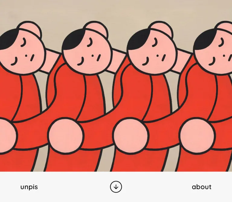
A full-width artwork field occupies most of the first viewport. In the current desktop capture, a large red-clothed figure is cut off along the left edge and bottom while textured beige fills most of the screen. On mobile, the visible red shape occupies the lower-left portion of a tall beige field.
The crop is intentionally spacious. There is no visible text overlay, gradient scrim, project-caption panel, or foreground CTA. Preserve the relationship between the off-edge figure and the empty painted ground.
The artwork element's intrinsic dimensions, media type, object-position, and animation implementation were not supplied. The screenshots establish the visible crop, but not an exact object-fit rule or playback sequence. A replacement needs independent focal-position tuning at each viewport.
Below-Artwork Navigation
Role: provides identity, a central directional affordance, and access to About.
The navigation consists of three spatial anchors: unpis at the left text inset, an outlined down-arrow circle near the exact viewport center, and about at the right text inset. It sits beneath the opening image rather than across its top.
Both text links use the main rounded type scale and 8px vertical padding. The circle is white against the near-white canvas, with black linework. The desktop evidence includes an additional overlapping transparent button rectangle of 80 × 64px; mobile shows 60 × 48px. The relationship between these button layers was not supplied, so it should not be reconstructed as two independent user actions.
The identity link targets the homepage. About targets /about/. The down arrow suggests movement toward the work collection, but its click result and scroll timing were not tested. Sticky-header behavior is also unverified.
Category Navigation
Role: exposes the breadth of the portfolio through plain text links.
The observed sequence is all, anime, artwork, book, communication, logo, original, other, package, and product.
On desktop, the first eight labels occupy the first row; package and product wrap to a second row. On mobile, the labels form three rows:
all,anime,artwork,bookcommunication,logo,originalother,package,product
These are real navigation links: all targets /works/, and category links target /works/category/.../. This establishes link destinations, not an in-place filtering mechanism.
Keep labels unboxed. The source defines short opacity and color transitions, but no activated or hover state was supplied. Do not invent colored category pills or a particular selected underline.
Tile / List Controls
Role: offers an alternative presentation of the work collection.
Two native buttons read tile and list, using the same type size, weight, and tracking as the category links. Their surfaces are transparent and their measured radius is zero.
On desktop, they occupy the right side of the category area, near its second row. On mobile, they move to a separate left-aligned row beneath the categories. The captured gallery is a tile presentation. The list layout, selected-state treatment, state persistence, and transition between modes were not exercised.
Work Gallery and Project Tile
Role: makes the artwork itself the principal navigation target.
Each visible tile is an image-led link without a separate card background, shadow, metadata panel, or consistently visible caption. Portrait, landscape, and nearly square compositions coexist. Preserve their individual proportions instead of cropping the entire collection to one aspect ratio.
The desktop gallery has three columns beginning at approximately x = 32, 501.34, and 970.67px. Mobile has two columns beginning at x = 16 and 203px. Items stack independently within each column.
The supplied item positions are consistent with cyclic distribution by source order, followed by independent vertical stacking. For example, desktop places items 1, 4, 7, and 10 in the first column; mobile places items 1, 3, 5, 7, 9, and 11 there. The original placement algorithm was not provided, but this positional behavior is more specific than a generic shortest-column masonry layout.
The extracted links contain the text seen, and the body includes bilingual project titles. Neither is visibly established as a persistent badge or caption in the supplied tile screenshots. Do not render twelve visible seen labels simply because that string occurs in the DOM.
Plus Control
Role: provides a continuation affordance after the initial gallery.
A white circular button with a black ring and plus glyph sits in a large area of empty canvas. Its measured disc is 48px on desktop and 40px on mobile. Desktop placement is exactly centered; the measured mobile disc center is x = 199px, approximately 4px right of the viewport center. A new implementation should normally center this deliberately rather than preserve an unexplained small offset.
The top gap after the longest gallery column is 160px on desktop and 72px on mobile. This breathing room is part of the composition, not leftover space to fill with a promotional block.
The plus suggests additional work, but its actual result is unverified. Do not claim pagination, a modal, or infinite scrolling without testing the action.
Corner Character
Role: adds a small illustrated presence near the lower-right viewport edge.
Current scrolled captures show a small human character at the lower right, including different poses across captures. The artwork is visually smaller than its sampled button box. That box measures 125 × 206px on desktop and 75 × 124px on mobile.
In the initial DOM snapshot, the button begins at x = 1440px or x = 390px, just outside the viewport. Later screenshots show the figure inside the visible area. A right transition is explicitly defined. Together, these support an offscreen-to-visible positioning treatment, but not a verified trigger or click action.
The character resembles an upward navigation affordance in the bottom screenshots, but a back-to-top result was not tested. Do not assume that its pose changes are produced by CSS keyframes, a particular sprite format, or a known loop duration.
Footer
Role: closes the page with identity and social destinations.
The footer contains © 2026 unpis., IG, and X. It uses the same rounded 600-weight type as the navigation rather than a small-print legal style.
On desktop, copyright aligns to x = 96px and the social group is centered around x = 720px. On mobile, copyright stays left at x = 32px while the social group moves to the right edge of the 326px text container. Social-link gaps shrink from 20px to 14px.
The destinations are Instagram at https://www.instagram.com/wa_unpis/ and X at https://x.com/unpispeace/. They were identified from rendered links, not visited.
The footer is part of the long document. Its 235px desktop and 142px mobile bottom padding leave room for the corner illustration and preserve a relaxed ending.
Tokens — Motion & Interaction
Defined Transitions
| Target | Measured declaration | What it establishes |
|---|---|---|
| Root canvas | Background and color, 0.1s cubic-bezier(0.215, 0.61, 0.355, 1) |
A short transition if those properties change; no theme behavior proven |
| Identity, About, social links | Color, 0.1s with the same curve |
Defined color feedback; target color and trigger unverified |
| Category and view controls | Color and opacity, 0.1s with the same curve |
Defined feedback properties; active and hover states unverified |
| Arrow disc | Width, height, margin, background, 0.1s with the same curve |
Geometry and fill may change between states |
| Plus disc | Border, width, height, margin, background, 0.1s; opacity, 0.5s, same curve |
Separate fast geometry and slower opacity transitions |
| Corner character button | Right position, 0.3s cubic-bezier(0.19, 1, 0.22, 1) |
A defined horizontal positioning transition |
Use --ease-ui: cubic-bezier(0.215, 0.61, 0.355, 1) and --ease-character: cubic-bezier(0.19, 1, 0.22, 1) as source-derived aliases.
Evidence and Limits
The supplied captures include different scroll positions and a corner figure that becomes visible in scrolled states. They do not include click outcomes for the arrow, plus, character, or view controls.
The sampled elements report animation: none. This does not rule out motion inside images, canvas rendering, unsampled descendants, or JavaScript-driven changes. A work URL containing gif likewise does not establish the displayed asset format or playback timing.
Capture preparation waited for document load, image decoding, and sampled layout stability. Perpetual animations were paused during readiness checks and then resumed. Consequently, these images are reliable references for the captured appearance, but not a temporal specification of the opening artwork or character behavior.
For adaptation, retain short, restrained interface feedback. Treat looping artwork, scroll-triggered entry, hover enlargement, and smooth scrolling as separate features requiring explicit implementation decisions and validation.
Surfaces
| Surface | Appearance | Purpose |
|---|---|---|
| Page canvas | Solid #f7f7f7 |
Unifies the long document and provides neutral image gutters |
| Header and footer | Transparent over the canvas | Maintains continuity without separate panels |
| Project tiles | Artwork rectangles without visible elevation | Allows each illustration to supply its own composition and color |
| Arrow and plus discs | White fill, black circular outline | Makes compact actions legible without a bright action color |
| Text controls | Black rounded type on transparent backgrounds | Keeps browsing tools secondary to the work |
| Corner character | Illustrated cutout with surrounding canvas | Adds personality without becoming a content card |
Separation comes from empty space and image boundaries. Avoid importing a generic surface hierarchy of raised cards, gray containers, and shadowed toolbars.
Imagery
The current work combines thick, slightly irregular black contours with softly rounded figures and objects. Visible subjects include candles, a cake slice, flowers in a vase, a hand holding a glass, a person beside a table, puppets, stacked everyday objects, and graphic New Year imagery. Some pieces are brightly colored; others use sparse monochrome linework or dense patterned shading.
The opening illustration includes a tactile painted surface. Preserve its texture and the intentional off-edge crop. Within the gallery, preserve the full visible compositions and their changing aspect ratios. The quieter shell should not introduce textures that compete with the artwork.
The small corner character belongs to the same illustrated world. A generic floating circular arrow would reproduce a possible function while losing this specific visual detail.
Do not apply image-rendering: pixelated: the current evidence shows smooth illustrative contours and paint texture, not an intentionally pixelated interface.
Observed Asset References
Image src values, intrinsic dimensions, and filenames were not included in the evidence. The following are project-link references associated with visible gallery content, not downloadable asset paths or independently inspected project pages.
| Visible content | Original-page link reference |
|---|---|
| Candles and cake against blue and green fields | The Fire in the Painting Never Goes Out |
| Two puppets seated at a table | Puppet Talks |
| Figure holding a wine glass beside a table | Project: osakenooishii |
| Tall arrangement of everyday objects beneath feet | Standing, Pressing the Ground |
Pale-green composition carrying the text Fly far away. |
2024 New Year work |
| Monochrome composition with a seated figure, horse, and turtle | Project: and-a |
Use authorized assets with known intrinsic dimensions. The interface can be reproduced in CSS, but the project's visual identity depends strongly on the artwork.
Layout & Responsive Behavior
Gallery Geometry
At the measured desktop width:
(1440 − 2 × 32 − 2 × 32) / 3 = 437.33px per column
At the measured mobile width:
(390 − 2 × 16 − 16) / 2 = 171px per column
The gallery uses almost the full available width. Text occupies a narrower region: 1248px on desktop and 326px on mobile. This produces two distinct alignment systems that should remain visible in a reproduction.
Reflow
Mobile retains two artwork columns instead of collapsing to a single stack. Images therefore remain part of a browsing field rather than becoming full-screen cards. Item assignment changes with the active column count, while each column retains independent vertical stacking.
Category labels wrap from two rows to three. The view controls move from the right side of the category area to their own row at the left. The footer socials change from centered placement to right alignment. These are structural changes, not uniform scaling.
The opening remains tall at both sizes, but the visible artwork crop changes. Do not scale the desktop screenshot down as a single composition. The navigation still spans left, center, and right anchors on the phone.
Unknown Responsive Rules
Only 1440px and 390px widths were inspected. The source breakpoint, tablet column count, intermediate type scaling, short-landscape behavior, maximum content width, and safe-area handling were not supplied.
The Quick Start uses a recommended 768px breakpoint and viewport-height arithmetic that reproduces the two observed opening boundaries. These are adaptation choices, not recovered source formulas.
Do’s and Don’ts
Do
- Keep the interface canvas at the measured
#f7f7f7, with black typography and white circular controls. - Use the observed rounded font stack and 600-weight interface labels.
- Preserve the oversized, off-edge opening artwork and its broad quiet field.
- Place the main navigation below the opening image.
- Maintain wider text insets than gallery insets.
- Preserve three desktop columns and two phone columns at the inspected sizes.
- Retain each project's proportions and independently stacked column rhythm.
- Keep category and view controls as plain text.
- Leave substantial space around the plus control and footer.
- Treat the corner illustration as a specific artwork component with its own bounds.
Don't
- Don't replace the portfolio structure with feature cards, testimonials, pricing, or a conversion funnel.
- Don't add a large headline over the opening artwork merely to fill its empty area.
- Don't turn artwork colors into competing interface action colors.
- Don't crop every gallery image into a square or force equal-height rows.
- Don't add large rounded corners, shadows, or card backgrounds around projects.
- Don't assume ordinary newspaper-style CSS columns preserve the observed item distribution.
- Don't present DOM-only
seentext as a verified visible badge. - Don't fabricate list-mode anatomy or claim that the plus loads more items.
- Don't infer an exact animation loop from still captures or a project slug.
- Don't reduce all footer text to tiny legal copy; its scale is part of the page's character.
Recommended Implementation Additions
These are recommendations for a new implementation, not verified features of the original:
- Give every icon-only button a specific accessible name. If the arrow scrolls to projects, use a name such as
View projects; assign the plus a name only after its actual action is defined. - Preserve project names in accessible link names and provide meaningful image alternatives. Avoid repeating a generic label for every work.
- Keep DOM order stable while arranging masonry visually. Verify keyboard navigation after the column count changes.
- Make the 40px mobile plus disc part of a target at least 44 × 44px. Expand the hit area without enlarging the visible circle.
- Use non-overlapping category targets on mobile, even if this slightly increases the captured filter area's height.
- Expose view-button selection with an appropriate state such as
aria-pressedwhen implementing the alternate layout. - Provide visible focus outlines, reduced-motion behavior, and a static alternative for any nonessential looping artwork you add.
- Reserve gallery image space using real intrinsic dimensions. Supply responsive image sizes suitable for approximately 437px desktop and 171px phone columns.
- If continuation is implemented, preserve focus and announce newly inserted projects without unexpectedly moving the user's scroll position.
Agent Prompt Guide
Quick Color Reference
- Page and shared surfaces:
#f7f7f7. - Text and control linework:
#000000. - Circular control fill:
#ffffff. - Opening-art approximation only: beige
#c9b9a2, vermilion#ed3e2b, peach#ffb3a7. - Gallery colors belong to individual images; do not impose a uniform tint.
- Structure comes from spacing and artwork edges, with no general shadow system.
Overall Prompt
“Create an illustration portfolio using a near-white #f7f7f7 canvas, black rounded interface type, and small white circular controls with black outlines. Begin with a tall, full-width crop of authorized artwork featuring a red-clothed figure partly outside the left edge against a textured beige field. Put lowercase identity and About links beneath the artwork, with a centered circular down arrow. Follow with plain text categories and tile/list controls, then an image-led gallery with three columns on a large desktop and two on a 390px phone. Use 32px desktop gallery gutters and 16px mobile gutters, while keeping text farther from the edges. Preserve varied image proportions and cyclic source-order distribution across columns. End with a small outlined plus, generous whitespace, large rounded copyright and social text, and a small illustrated corner character. Do not invent unverified interactions.”
Example Component Prompts
- Opening navigation: “A near-white navigation area directly below a large illustration. Place
unpisat the left,aboutat the right, and a white outlined down-arrow circle near the viewport center. Use Quicksand with the declared Kosugi Maru fallback, weight 600, 32px desktop type and 22px phone type, 34px line height, and 0.02em tracking.” - Gallery: “Create a portfolio gallery whose images retain their natural proportions. At 1440px, use three approximately 437.33px columns, 32px outside margins, and 32px gaps. At 390px, use two 171px columns, 16px outside margins, and 16px gaps. Distribute sequential items cyclically across columns and stack each column independently. No shadows, caption cards, or uniform square crops.”
- Category controls: “Use plain lowercase category links that wrap naturally. Keep the tile/list buttons at the right of the desktop filter area and move them to a separate left-aligned row on mobile. Avoid pills and colored fills. Implement navigation and selected states only from the product's defined behavior.”
- Gallery ending: “After the longest image column, leave 160px on desktop or 72px on mobile before a small white plus disc with a black outline. Use a 48px desktop disc and a 40px mobile disc with a larger invisible hit area. Keep the surrounding canvas empty.”
- Footer: “Use the same rounded 600-weight interface typography for copyright and social links. Align copyright to a 96px desktop inset, center the social group, and leave 235px beneath the text. On mobile, use 32px side insets, right-align the socials, and reduce bottom padding to 142px.”
- Motion: “Apply the measured 100ms interface easing only to explicitly defined color, opacity, or control states. A corner-character entry may use a 300ms right-position transition with cubic-bezier(0.19, 1, 0.22, 1). Provide reduced-motion behavior. Do not invent opening-art timing from a still image.”
Quick Start
CSS Custom Properties
This is an implementation adaptation, not extracted source code. It preserves the measured colors, type scale, gallery widths, and principal spacing relationships. The 768px breakpoint, opening-height formula, image focal position, 2–3px outlines, and fixed character placement are recommendations.
Use .work anchors as direct children of .works-grid, with each image carrying its real width and height attributes. Place category anchors inside .category-links and view buttons inside .view-controls. Font files and artwork must be supplied separately.
The category component below uses non-overlapping padded targets. It therefore creates a taller mobile category area than the original's measured 36px inline row advance. Exact document offsets will differ accordingly.
:root {
  /* Measured interface colors */
  --color-canvas: #f7f7f7;
  --color-ink: #000000;
  --color-control: #ffffff;

  /* Visual estimate used only before the opening image loads */
  --color-art-fallback: #c9b9a2;

  /* Measured typography, independent of the source 10px root */
  --font-interface: 'Quicksand', 'Kosugi Maru', sans-serif;
  --text-ui: 32px;
  --text-hint: 16px;
  --weight-ui: 600;
  --leading-ui: 34px;
  --tracking-ui: 0.02em;

  /* Measured desktop geometry */
  --columns: 3;
  --gallery-inset: 32px;
  --gallery-gap: 32px;
  --text-inset: 96px;
  --category-gap: 20px;
  --mode-gap: 72px;
  --social-gap: 20px;
  --header-height: 130px;
  --arrow-size: 56px;
  --more-size: 48px;
  --more-gap: 160px;
  --footer-gap: 313px;
  --footer-bottom: 235px;
  --character-width: 125px;
  --character-height: 206px;

  /* Adaptation choices fitted to the inspected opening */
  --opening-tail: 144px;
  --header-top-adjustment: 14px;
  --controls-top: 159px;
  --controls-bottom: 80px;
  --hero-position: 50% 50%;
  --control-stroke: 3px;
  --character-right: 16px;

  /* Measured transition curves */
  --ease-ui: cubic-bezier(0.215, 0.61, 0.355, 1);
  --ease-character: cubic-bezier(0.19, 1, 0.22, 1);
  --motion-ui: 100ms;
  --motion-character: 300ms;
}

* {
  box-sizing: border-box;
}

html {
  color: var(--color-ink);
  background: var(--color-canvas);
  font-family: var(--font-interface);
}

body {
  margin: 0;
}

button,
a {
  -webkit-tap-highlight-color: transparent;
}

button {
  color: inherit;
  font: inherit;
}

.opening-art {
  height: calc(100svh - var(--opening-tail));
  min-height: 300px;
  overflow: hidden;
  background: var(--color-art-fallback);
}

.opening-art img {
  display: block;
  width: 100%;
  height: 100%;
  object-fit: cover;
  object-position: var(--hero-position);
}

.site-header,
.filter-bar,
.site-footer {
  font-size: var(--text-ui);
  font-weight: var(--weight-ui);
  line-height: var(--leading-ui);
  letter-spacing: var(--tracking-ui);
}

.site-header {
  display: grid;
  grid-template-columns: 1fr auto 1fr;
  align-items: center;
  height: var(--header-height);
  padding: var(--header-top-adjustment) var(--text-inset) 0;
}

.site-header > :first-child {
  justify-self: start;
}

.site-header > :last-child {
  justify-self: end;
}

.text-link,
.view-controls button {
  display: inline-block;
  padding: 8px 0;
  border: 0;
  border-radius: 0;
  color: inherit;
  background: transparent;
  font: inherit;
  letter-spacing: inherit;
  text-decoration: none;
  cursor: pointer;
  transition:
    color var(--motion-ui) var(--ease-ui),
    opacity var(--motion-ui) var(--ease-ui);
}

.filter-bar {
  display: grid;
  grid-template-columns: minmax(0, 1fr) auto;
  align-items: end;
  gap: 64px;
  margin: var(--controls-top) var(--text-inset)
    var(--controls-bottom);
}

.category-links {
  display: flex;
  flex-wrap: wrap;
  column-gap: var(--category-gap);
  row-gap: 2px;
}

.category-links a {
  white-space: nowrap;
}

.view-controls {
  display: flex;
  gap: var(--mode-gap);
}

/* Ordinary grid is the usable fallback before enhancement. */
.works-grid {
  position: relative;
  display: grid;
  grid-template-columns: repeat(var(--columns), minmax(0, 1fr));
  align-items: start;
  gap: var(--gallery-gap);
  margin-inline: var(--gallery-inset);
}

.work {
  display: block;
  min-width: 0;
  color: inherit;
  text-decoration: none;
}

.work img {
  display: block;
  width: 100%;
  height: auto;
  border-radius: 0;
}

/* The optional script preserves DOM order while stacking columns. */
.works-grid[data-masonry='ready'] {
  display: block;
}

.works-grid[data-masonry='ready'] > .work {
  position: absolute;
  top: 0;
  left: 0;
  width: var(--work-width);
}

.round-control {
  --disc-size: var(--arrow-size);
  display: grid;
  place-items: center;
  min-width: 44px;
  min-height: 44px;
  padding: 0;
  border: 0;
  background: transparent;
  cursor: pointer;
}

.round-control__disc {
  display: grid;
  place-items: center;
  width: var(--disc-size);
  height: var(--disc-size);
  border: var(--control-stroke) solid currentColor;
  border-radius: 50%;
  background: var(--color-control);
  transition:
    width var(--motion-ui) var(--ease-ui),
    height var(--motion-ui) var(--ease-ui),
    background var(--motion-ui) var(--ease-ui);
}

.round-control svg {
  width: 24px;
  height: 24px;
  fill: none;
  stroke: currentColor;
  stroke-width: 2;
  stroke-linecap: round;
  stroke-linejoin: round;
}

.round-control--more {
  --disc-size: var(--more-size);
}

.more-row {
  display: flex;
  justify-content: center;
  margin-top: var(--more-gap);
}

.site-footer {
  position: relative;
  display: flex;
  justify-content: space-between;
  align-items: flex-start;
  margin: var(--footer-gap) var(--text-inset) 0;
  padding-bottom: var(--footer-bottom);
}

.site-footer p {
  margin: 0;
}

.social-links {
  position: absolute;
  left: 50%;
  display: flex;
  gap: var(--social-gap);
  margin-top: -8px;
  transform: translateX(-50%);
}

/* Recommended viewport-corner placement; action is defined separately. */
.character-control {
  position: fixed;
  right: var(--character-right);
  bottom: 0;
  width: var(--character-width);
  height: var(--character-height);
  padding: 0;
  border: 0;
  background: transparent;
  transition: right var(--motion-character) var(--ease-character);
}

.character-control img {
  display: block;
  width: 100%;
  height: 100%;
  object-fit: contain;
  object-position: center bottom;
}

/* Recommended accessible focus treatment. */
:where(a, button):focus-visible {
  outline: 2px solid var(--color-ink);
  outline-offset: 5px;
}

/* Recommended breakpoint; the original threshold is unknown. */
@media (max-width: 767px) {
  :root {
    --text-ui: 22px;
    --text-hint: 14px;
    --columns: 2;
    --gallery-inset: 16px;
    --gallery-gap: 16px;
    --text-inset: 32px;
    --category-gap: 14px;
    --mode-gap: 43px;
    --social-gap: 14px;
    --header-height: 109px;
    --arrow-size: 48px;
    --more-size: 40px;
    --more-gap: 72px;
    --footer-gap: 118px;
    --footer-bottom: 142px;
    --character-width: 75px;
    --character-height: 124px;
    --opening-tail: 132px;
    --header-top-adjustment: 19px;
    --controls-top: 60px;
    --controls-bottom: 31px;
    --control-stroke: 2px;
    --character-right: 12px;
  }

  .filter-bar {
    grid-template-columns: minmax(0, 1fr);
    gap: 28px;
  }

  .social-links {
    position: static;
    transform: none;
  }
}

/* Recommended behavior for the supplied interface transitions. */
@media (prefers-reduced-motion: reduce) {
  .text-link,
  .view-controls button,
  .round-control__disc,
  .character-control {
    transition: none;
  }
}
Use a single semantic button for each circle. For example, an implemented project-scroll action can use the following markup; its accessible name describes the action rather than the glyph:
<button class='round-control' type='button' aria-label='View projects'>
  <span class='round-control__disc' aria-hidden='true'>
    <svg viewBox='0 0 24 24'>
      <path d='M12 3v17M4 12l8 8 8-8'></path>
    </svg>
  </span>
</button>
Ordered Masonry Enhancement
This optional script reproduces the observed cyclic column assignment while preserving one ordered sequence of anchors in the DOM. It is a recommended implementation, not evidence that the original uses this algorithm. Run it after the gallery markup exists.
const gallery = document.querySelector('.works-grid');

if (gallery) {
  const cards = [...gallery.querySelectorAll(':scope > .work')];
  let frame;

  const layout = () => {
    const styles = getComputedStyle(gallery);
    const columns = Number(styles.getPropertyValue('--columns')) || 2;
    const gap = parseFloat(styles.getPropertyValue('--gallery-gap')) || 0;
    const width = (gallery.clientWidth - gap * (columns - 1)) / columns;
    if (width <= 0) return;

    gallery.style.setProperty('--work-width', `${width}px`);
    gallery.dataset.masonry = 'ready';

    const bottoms = Array(columns).fill(0);
    const heights = cards.map(card => card.getBoundingClientRect().height);

    cards.forEach((card, index) => {
      const column = index % columns;
      const x = column * (width + gap);
      const y = bottoms[column];
      card.style.transform = `translate(${x}px, ${y}px)`;
      bottoms[column] += heights[index] + gap;
    });

    const height = Math.max(0, ...bottoms) - (cards.length ? gap : 0);
    gallery.style.height = `${height}px`;
  };

  const schedule = () => {
    cancelAnimationFrame(frame);
    frame = requestAnimationFrame(layout);
  };

  const observer = new ResizeObserver(schedule);
  observer.observe(gallery);
  cards.forEach(card => observer.observe(card));
  gallery.querySelectorAll('img').forEach(img => {
    img.addEventListener('load', schedule);
    img.addEventListener('error', schedule);
  });
  document.fonts?.ready.then(schedule);
  schedule();
}
This handles the initial collection and responsive resizing. If a defined continuation action inserts more works, refresh the card collection and resize observers. Disconnect observers when removing the component in a client-side application. Alternate list mode, project loading, scroll actions, and artwork playback remain separate implementations.
Tailwind v4 Token Mapping
Optional aliases for a project already using Tailwind v4. This is not a claim that the inspected site uses Tailwind. Define the custom properties above first.
@theme inline {
  --color-canvas: #f7f7f7;
  --color-ink: #000000;
  --color-control: #ffffff;

  --font-interface: 'Quicksand', 'Kosugi Maru', sans-serif;
  --text-interface: var(--text-ui);
  --text-hint: var(--text-hint-size, 16px);

  --spacing-gallery-gap: var(--gallery-gap);
  --spacing-gallery-inset: var(--gallery-inset);
  --spacing-text-inset: var(--text-inset);
  --spacing-arrow: var(--arrow-size);
  --spacing-more: var(--more-size);

  --radius-work: 0px;
  --radius-disc: 9999px;
}
Sources & Evidence
- Current unpis homepage: original and final URL, reported HTTP 200, document title
unpis web, rendered homepage text, link destinations, DOM rectangles, and computed styles supplied for this inspection. - Capture time: September 12, 2026, 14:18:28.198 UTC / 23:18:28.198 JST.
- Desktop evidence: 1440 × 1000 CSS-pixel viewport; opening, intermediate gallery, and page-ending screenshots; reported document height approximately 4359px.
- Mobile evidence: 390 × 844 CSS-pixel viewport; opening and page-ending screenshots; reported document height approximately 2864px.
- Interaction scope: scrolling produced the supplied gallery and footer views. Arrow, plus, character, category navigation, About, project links, social links, and alternate view behavior were not exercised in the supplied evidence.
- Readiness limits: initial observation lasted at least five seconds. Capture preparation checked loading, image decoding, and sampled stability within bounded waits. These checks do not prove completeness of delayed content or establish animation timing.
- Implementation limits: no image source URLs, full stylesheet, breakpoint declarations, complete accessibility tree, or interaction handlers were supplied. Estimates and recommended code are identified separately from measured facts.
This reference describes the current homepage at the stated viewports and capture time. Interior-page layouts, additional gallery states, and behavior beyond the supplied observations remain unverified.
# unpis — Style Reference

> A quiet gallery shell for bright, thick-outlined illustrated worlds.

**Website:** [unpis.net](https://unpis.net/)
**Original URL:** https://unpis.net/
**Final URL:** https://unpis.net/
**Theme:** light in the inspected state; no alternative theme was demonstrated
**Inspected:** September 12, 2026, at 14:18:28.198 UTC / 23:18:28.198 JST
**Viewports:** desktop 1440 × 1000 CSS pixels; mobile 390 × 844 CSS pixels
**Scope:** the current homepage, including the opening artwork, navigation, category and view controls, twelve initial project links, gallery ending, plus control, footer, and corner character. About, category destinations, project pages, and alternate list mode were not opened.

unpis presents an illustration portfolio through a deliberately restrained interface. Near-white space, black text, rounded letterforms, and small outlined circles form the shell. The artwork contributes almost all the color and visual complexity: thick black contours, soft human shapes, everyday objects, saturated backgrounds, and occasional visible paint texture.

The opening is an oversized artwork crop followed by navigation near the bottom of the first viewport. Below it, text categories introduce a gallery of independently stacked images. Desktop uses three columns; the inspected phone uses two. The final projects give way to substantial empty space, a small circular plus, a sparse footer, and an illustrated character near the lower-right corner. This is a portfolio browsing experience, with no visible marketing headline or conversion-oriented content sequence.

## How to Read This Reference

- **Measured** values come from the supplied original-page DOM rectangles and computed styles. They describe the two inspected viewport states.
- **Calculated** values are arithmetic derived from those measurements, such as column widths, inter-item gaps, and letter spacing in em units.
- **Visual estimates** describe screenshot appearance where the relevant CSS or asset data was not supplied. Estimated artwork colors are not sampled or authoritative brand colors.
- **Recommendations** describe an implementation adaptation, including accessibility improvements and the Quick Start. They are not claims about the original code.
- Token names in this document are descriptive aliases. No reusable source design-token system was exposed in the supplied evidence.
- The screenshots establish appearance; button labels, links, and transition declarations establish available affordances. They do not establish the result of an untested click.

## Tokens — Colors

### Default Palette

| Name | Value | Suggested token | Evidence and role |
| --- | --- | --- | --- |
| Gallery Canvas | `#f7f7f7` | `--color-canvas` | Measured HTML background; visible behind navigation, gallery gutters, and footer |
| Interface Ink | `#000000` | `--color-ink` | Measured text color on navigation, controls, work links, and footer |
| Control White | `#ffffff` | `--color-control` | Measured background of the circular arrow and plus buttons |

The header and footer themselves compute to transparent backgrounds. They visually share the underlying canvas rather than forming separate colored panels. White circular buttons are subtly distinct from the slightly darker page surface.

### Artwork Palette — Visual Estimates

| Name | Approximate value | Visible use |
| --- | --- | --- |
| Painted Beige | `#c9b9a2` | Large textured field in the opening illustration |
| Vermilion | `#ed3e2b` | Red clothing in the opening crop |
| Peach Pink | `#ffb3a7` | Faces, hands, and other soft forms |
| Poster Blue | `#4b91c5` | Several gallery backgrounds and objects |
| Pale Green | `#b2d2b0` | Botanical and illustrated background areas |
| Lemon Yellow | `#fff36a` | Small objects, flowers, and clothing details |

These approximations describe the current artwork, not interface action colors. Retain the real colors within authorized image assets. Do not recolor every project to fit this small table or turn the opening red into a universal button fill.

No palette selector or verified theme change appears in the supplied evidence. A transition on the root background is insufficient evidence of a theme feature.

## Tokens — Typography

### Rounded Interface Stack

**Measured family:** `Quicksand, 'Kosugi Maru', sans-serif`.

The same declared stack appears throughout the sampled interface. Rounded Latin letterforms are visible in `unpis`, `about`, and the footer. The Japanese family is included in the computed stack, but the evidence does not independently establish which font file rendered each Japanese glyph.

The recurring interface weight is **600**. Lowercase labels, circular counters, and softly rounded terminals echo the artwork without imitating its heavy black outlines. Typography remains functional: no oversized promotional headline appears in the captured opening.

### Type Scale

| Role | Desktop | Mobile | Weight | Line height | Tracking |
| --- | --- | --- | --- | --- | --- |
| Identity and About links | `32px` | `22px` | `600` | `34px` | `0.64px` / `0.44px` |
| Category links | `32px` | `22px` | `600` | `34px` on links | `0.64px` / `0.44px` |
| `tile` and `list` buttons | `32px` | `22px` | `600` | `34px` | `0.64px` / `0.44px` |
| Copyright and social links | `32px` | `22px` | `600` | `34px` | `0.64px` / `0.44px` |
| DOM `Click` hint | `16px` | `14px` | `600` | `34px` | `0.32px` / `0.28px` |
| Root and inherited body base | `10px` | `10px` | `400` | Body: `10px` | Normal |

The interface tracking consistently calculates to **`0.02em`**. The line height stays at 34px while the main type becomes smaller on mobile, giving phone labels more vertical breathing room relative to their letter height.

The `Click` hint exists in the DOM near the central arrow, but the supplied opening screenshots show an arrow rather than a persistent visible caption. Its reveal conditions were not established.

Do not use the inherited 10px work-link style as a recommended project-caption size. Project titles occur in the DOM, but their displayed caption treatment was not established in the image-led tile state. The inspected page also provides no reliable paragraph or article-heading scale for interior pages.

### Implementation Note

The source root is 10px. The Quick Start uses explicit pixel tokens with a conventional browser root, avoiding accidental scaling when integrating these styles into another application. Font hosting and loaded font files were not inspected; provide the declared fonts through your project's approved font setup.

## Tokens — Spacing & Shapes

The key relationship is **narrow gallery insets inside wider text insets**. Images reach closer to the viewport edges than navigation and footer text.

### Spacing Scale

| Use | Desktop measurement | Mobile measurement | Suggested token |
| --- | --- | --- | --- |
| Gallery outside inset | `32px` | `16px` | `--gallery-inset` |
| Horizontal gallery gap | Approximately `32px` | `16px` | `--gallery-gap` |
| Vertical gap within a gallery column | `32px` | `16px` | `--gallery-gap` |
| Header, category, and footer inset | `96px` | `32px` | `--text-inset` |
| Horizontal gap between category labels | `20px` | `14px` | `--category-gap` |
| Category row advance | `52px` | `36px` | Reference measurement |
| Gap between `tile` and `list` text boxes | `72px` | `43px` | `--mode-gap` |
| Gap between social links | `20px` | `14px` | `--social-gap` |
| Link vertical padding | `8px` | `8px` | `--link-padding-y` |
| Final gallery bottom to plus-button top | `160px` | `72px` | `--more-gap` |
| Plus-button bottom to copyright line box | `313px` | `118px` | `--footer-gap` |
| Footer bottom padding | `235px` | `142px` | `--footer-bottom` |

Category links are inline elements in the supplied measurements. Their reported fragment heights are 56px on desktop and 44px on mobile, while successive rows advance by 52px and 36px respectively. These are not separate block rows of those fragment heights. A replacement using non-overlapping flex items will produce a taller mobile filter area.

### Border Radius and Linework

| Element | Evidence | Reuse guidance |
| --- | --- | --- |
| Circular arrow | Measured `border-radius: 50%` | Keep a true circle |
| Circular plus | Measured `border-radius: 50%` | Keep a true circle |
| Text links and work-link wrappers | Measured `0px` radius | No rounded card shell |
| Image corners | Visually square or only minimally softened; image radius not supplied | Recommend `0–2px` |
| Circle outline | Visually approximately `2–3px`; border width not supplied | Recommend `3px` desktop and `2px` mobile |
| Arrow and plus strokes | Visually approximately `2–3px` | Use simple rounded strokes; avoid a heavy filled icon |

There is no visible general shadow system, bordered card grid, or pill-shaped category treatment.

### Layout Measurements

| Element | Desktop: 1440 × 1000 | Mobile: 390 × 844 |
| --- | --- | --- |
| Opening artwork boundary | `y = 856px` | `y = 712px` |
| Header element | `y = 856px`, height `130px` | `y = 712px`, height `109px` |
| Identity link | `x = 96px`, `y = 902px`, height `50px` | `x = 32px`, `y = 750px`, height `50px` |
| Arrow disc | `56 × 56px` at `x = 692px`, `y = 900px` | `48 × 48px` at `x = 172px`, `y = 752px` |
| First category row | `y = 1145px` | `y = 881px` |
| First gallery row | `y = 1333px` | Approximately `y = 1107.97px` |
| Gallery column width | Approximately `437.33px` | `171px` |
| Last gallery bottom | Approximately `y = 3568.81px` | Approximately `y = 2458.03px` |
| Plus disc | `48 × 48px` | `40 × 40px` |
| Copyright line box | Approximately `y = 4089.81px` | Approximately `y = 2688.03px` |
| Document height | Approximately `4359px` | Approximately `2864px` |

The 144px desktop and 132px mobile areas between the artwork boundary and viewport bottom are **visible remainders of the opening viewport**, not measured header heights. Do not substitute them for the 130px and 109px header element measurements.

## Components

### Opening Artwork

**Role:** establishes the artist's visual world before visitors browse projects.

A full-width artwork field occupies most of the first viewport. In the current desktop capture, a large red-clothed figure is cut off along the left edge and bottom while textured beige fills most of the screen. On mobile, the visible red shape occupies the lower-left portion of a tall beige field.

The crop is intentionally spacious. There is no visible text overlay, gradient scrim, project-caption panel, or foreground CTA. Preserve the relationship between the off-edge figure and the empty painted ground.

The artwork element's intrinsic dimensions, media type, object-position, and animation implementation were not supplied. The screenshots establish the visible crop, but not an exact `object-fit` rule or playback sequence. A replacement needs independent focal-position tuning at each viewport.

### Below-Artwork Navigation

**Role:** provides identity, a central directional affordance, and access to About.

The navigation consists of three spatial anchors: `unpis` at the left text inset, an outlined down-arrow circle near the exact viewport center, and `about` at the right text inset. It sits beneath the opening image rather than across its top.

Both text links use the main rounded type scale and 8px vertical padding. The circle is white against the near-white canvas, with black linework. The desktop evidence includes an additional overlapping transparent button rectangle of 80 × 64px; mobile shows 60 × 48px. The relationship between these button layers was not supplied, so it should not be reconstructed as two independent user actions.

The identity link targets the homepage. About targets `/about/`. The down arrow suggests movement toward the work collection, but its click result and scroll timing were not tested. Sticky-header behavior is also unverified.

### Category Navigation

**Role:** exposes the breadth of the portfolio through plain text links.

The observed sequence is `all`, `anime`, `artwork`, `book`, `communication`, `logo`, `original`, `other`, `package`, and `product`.

On desktop, the first eight labels occupy the first row; `package` and `product` wrap to a second row. On mobile, the labels form three rows:

1. `all`, `anime`, `artwork`, `book`
2. `communication`, `logo`, `original`
3. `other`, `package`, `product`

These are real navigation links: `all` targets `/works/`, and category links target `/works/category/.../`. This establishes link destinations, not an in-place filtering mechanism.

Keep labels unboxed. The source defines short opacity and color transitions, but no activated or hover state was supplied. Do not invent colored category pills or a particular selected underline.

### Tile / List Controls

**Role:** offers an alternative presentation of the work collection.

Two native buttons read `tile` and `list`, using the same type size, weight, and tracking as the category links. Their surfaces are transparent and their measured radius is zero.

On desktop, they occupy the right side of the category area, near its second row. On mobile, they move to a separate left-aligned row beneath the categories. The captured gallery is a tile presentation. The list layout, selected-state treatment, state persistence, and transition between modes were not exercised.

### Work Gallery and Project Tile

**Role:** makes the artwork itself the principal navigation target.

Each visible tile is an image-led link without a separate card background, shadow, metadata panel, or consistently visible caption. Portrait, landscape, and nearly square compositions coexist. Preserve their individual proportions instead of cropping the entire collection to one aspect ratio.

The desktop gallery has three columns beginning at approximately x = 32, 501.34, and 970.67px. Mobile has two columns beginning at x = 16 and 203px. Items stack independently within each column.

The supplied item positions are consistent with **cyclic distribution by source order**, followed by independent vertical stacking. For example, desktop places items 1, 4, 7, and 10 in the first column; mobile places items 1, 3, 5, 7, 9, and 11 there. The original placement algorithm was not provided, but this positional behavior is more specific than a generic shortest-column masonry layout.

The extracted links contain the text `seen`, and the body includes bilingual project titles. Neither is visibly established as a persistent badge or caption in the supplied tile screenshots. Do not render twelve visible `seen` labels simply because that string occurs in the DOM.

### Plus Control

**Role:** provides a continuation affordance after the initial gallery.

A white circular button with a black ring and plus glyph sits in a large area of empty canvas. Its measured disc is 48px on desktop and 40px on mobile. Desktop placement is exactly centered; the measured mobile disc center is x = 199px, approximately 4px right of the viewport center. A new implementation should normally center this deliberately rather than preserve an unexplained small offset.

The top gap after the longest gallery column is 160px on desktop and 72px on mobile. This breathing room is part of the composition, not leftover space to fill with a promotional block.

The plus suggests additional work, but its actual result is unverified. Do not claim pagination, a modal, or infinite scrolling without testing the action.

### Corner Character

**Role:** adds a small illustrated presence near the lower-right viewport edge.

Current scrolled captures show a small human character at the lower right, including different poses across captures. The artwork is visually smaller than its sampled button box. That box measures 125 × 206px on desktop and 75 × 124px on mobile.

In the initial DOM snapshot, the button begins at x = 1440px or x = 390px, just outside the viewport. Later screenshots show the figure inside the visible area. A `right` transition is explicitly defined. Together, these support an offscreen-to-visible positioning treatment, but not a verified trigger or click action.

The character resembles an upward navigation affordance in the bottom screenshots, but a back-to-top result was not tested. Do not assume that its pose changes are produced by CSS keyframes, a particular sprite format, or a known loop duration.

### Footer

**Role:** closes the page with identity and social destinations.

The footer contains `© 2026 unpis.`, `IG`, and `X`. It uses the same rounded 600-weight type as the navigation rather than a small-print legal style.

On desktop, copyright aligns to x = 96px and the social group is centered around x = 720px. On mobile, copyright stays left at x = 32px while the social group moves to the right edge of the 326px text container. Social-link gaps shrink from 20px to 14px.

The destinations are Instagram at `https://www.instagram.com/wa_unpis/` and X at `https://x.com/unpispeace/`. They were identified from rendered links, not visited.

The footer is part of the long document. Its 235px desktop and 142px mobile bottom padding leave room for the corner illustration and preserve a relaxed ending.

## Tokens — Motion & Interaction

### Defined Transitions

| Target | Measured declaration | What it establishes |
| --- | --- | --- |
| Root canvas | Background and color, `0.1s cubic-bezier(0.215, 0.61, 0.355, 1)` | A short transition if those properties change; no theme behavior proven |
| Identity, About, social links | Color, `0.1s` with the same curve | Defined color feedback; target color and trigger unverified |
| Category and view controls | Color and opacity, `0.1s` with the same curve | Defined feedback properties; active and hover states unverified |
| Arrow disc | Width, height, margin, background, `0.1s` with the same curve | Geometry and fill may change between states |
| Plus disc | Border, width, height, margin, background, `0.1s`; opacity, `0.5s`, same curve | Separate fast geometry and slower opacity transitions |
| Corner character button | Right position, `0.3s cubic-bezier(0.19, 1, 0.22, 1)` | A defined horizontal positioning transition |

Use `--ease-ui: cubic-bezier(0.215, 0.61, 0.355, 1)` and `--ease-character: cubic-bezier(0.19, 1, 0.22, 1)` as source-derived aliases.

### Evidence and Limits

The supplied captures include different scroll positions and a corner figure that becomes visible in scrolled states. They do not include click outcomes for the arrow, plus, character, or view controls.

The sampled elements report `animation: none`. This does not rule out motion inside images, canvas rendering, unsampled descendants, or JavaScript-driven changes. A work URL containing `gif` likewise does not establish the displayed asset format or playback timing.

Capture preparation waited for document load, image decoding, and sampled layout stability. Perpetual animations were paused during readiness checks and then resumed. Consequently, these images are reliable references for the captured appearance, but not a temporal specification of the opening artwork or character behavior.

For adaptation, retain short, restrained interface feedback. Treat looping artwork, scroll-triggered entry, hover enlargement, and smooth scrolling as separate features requiring explicit implementation decisions and validation.

## Surfaces

| Surface | Appearance | Purpose |
| --- | --- | --- |
| Page canvas | Solid `#f7f7f7` | Unifies the long document and provides neutral image gutters |
| Header and footer | Transparent over the canvas | Maintains continuity without separate panels |
| Project tiles | Artwork rectangles without visible elevation | Allows each illustration to supply its own composition and color |
| Arrow and plus discs | White fill, black circular outline | Makes compact actions legible without a bright action color |
| Text controls | Black rounded type on transparent backgrounds | Keeps browsing tools secondary to the work |
| Corner character | Illustrated cutout with surrounding canvas | Adds personality without becoming a content card |

Separation comes from empty space and image boundaries. Avoid importing a generic surface hierarchy of raised cards, gray containers, and shadowed toolbars.

## Imagery

The current work combines thick, slightly irregular black contours with softly rounded figures and objects. Visible subjects include candles, a cake slice, flowers in a vase, a hand holding a glass, a person beside a table, puppets, stacked everyday objects, and graphic New Year imagery. Some pieces are brightly colored; others use sparse monochrome linework or dense patterned shading.

The opening illustration includes a tactile painted surface. Preserve its texture and the intentional off-edge crop. Within the gallery, preserve the full visible compositions and their changing aspect ratios. The quieter shell should not introduce textures that compete with the artwork.

The small corner character belongs to the same illustrated world. A generic floating circular arrow would reproduce a possible function while losing this specific visual detail.

Do not apply `image-rendering: pixelated`: the current evidence shows smooth illustrative contours and paint texture, not an intentionally pixelated interface.

### Observed Asset References

Image `src` values, intrinsic dimensions, and filenames were not included in the evidence. The following are **project-link references associated with visible gallery content**, not downloadable asset paths or independently inspected project pages.

| Visible content | Original-page link reference |
| --- | --- |
| Candles and cake against blue and green fields | [The Fire in the Painting Never Goes Out](https://unpis.net/works/the-fire-in-the-painting-never-goes-out/) |
| Two puppets seated at a table | [Puppet Talks](https://unpis.net/works/puppet-talks/) |
| Figure holding a wine glass beside a table | [Project: osakenooishii](https://unpis.net/works/osakenooishii/) |
| Tall arrangement of everyday objects beneath feet | [Standing, Pressing the Ground](https://unpis.net/works/standing-pressing-the-ground/) |
| Pale-green composition carrying the text `Fly far away.` | [2024 New Year work](https://unpis.net/works/2024nenga/) |
| Monochrome composition with a seated figure, horse, and turtle | [Project: and-a](https://unpis.net/works/and-a/) |

Use authorized assets with known intrinsic dimensions. The interface can be reproduced in CSS, but the project's visual identity depends strongly on the artwork.

## Layout & Responsive Behavior

### Gallery Geometry

At the measured desktop width:

`(1440 − 2 × 32 − 2 × 32) / 3 = 437.33px per column`

At the measured mobile width:

`(390 − 2 × 16 − 16) / 2 = 171px per column`

The gallery uses almost the full available width. Text occupies a narrower region: 1248px on desktop and 326px on mobile. This produces two distinct alignment systems that should remain visible in a reproduction.

### Reflow

Mobile retains two artwork columns instead of collapsing to a single stack. Images therefore remain part of a browsing field rather than becoming full-screen cards. Item assignment changes with the active column count, while each column retains independent vertical stacking.

Category labels wrap from two rows to three. The view controls move from the right side of the category area to their own row at the left. The footer socials change from centered placement to right alignment. These are structural changes, not uniform scaling.

The opening remains tall at both sizes, but the visible artwork crop changes. Do not scale the desktop screenshot down as a single composition. The navigation still spans left, center, and right anchors on the phone.

### Unknown Responsive Rules

Only 1440px and 390px widths were inspected. The source breakpoint, tablet column count, intermediate type scaling, short-landscape behavior, maximum content width, and safe-area handling were not supplied.

The Quick Start uses a **recommended 768px breakpoint** and viewport-height arithmetic that reproduces the two observed opening boundaries. These are adaptation choices, not recovered source formulas.

## Do’s and Don’ts

### Do

- Keep the interface canvas at the measured `#f7f7f7`, with black typography and white circular controls.
- Use the observed rounded font stack and 600-weight interface labels.
- Preserve the oversized, off-edge opening artwork and its broad quiet field.
- Place the main navigation below the opening image.
- Maintain wider text insets than gallery insets.
- Preserve three desktop columns and two phone columns at the inspected sizes.
- Retain each project's proportions and independently stacked column rhythm.
- Keep category and view controls as plain text.
- Leave substantial space around the plus control and footer.
- Treat the corner illustration as a specific artwork component with its own bounds.

### Don't

- Don't replace the portfolio structure with feature cards, testimonials, pricing, or a conversion funnel.
- Don't add a large headline over the opening artwork merely to fill its empty area.
- Don't turn artwork colors into competing interface action colors.
- Don't crop every gallery image into a square or force equal-height rows.
- Don't add large rounded corners, shadows, or card backgrounds around projects.
- Don't assume ordinary newspaper-style CSS columns preserve the observed item distribution.
- Don't present DOM-only `seen` text as a verified visible badge.
- Don't fabricate list-mode anatomy or claim that the plus loads more items.
- Don't infer an exact animation loop from still captures or a project slug.
- Don't reduce all footer text to tiny legal copy; its scale is part of the page's character.

## Recommended Implementation Additions

These are recommendations for a new implementation, not verified features of the original:

- Give every icon-only button a specific accessible name. If the arrow scrolls to projects, use a name such as `View projects`; assign the plus a name only after its actual action is defined.
- Preserve project names in accessible link names and provide meaningful image alternatives. Avoid repeating a generic label for every work.
- Keep DOM order stable while arranging masonry visually. Verify keyboard navigation after the column count changes.
- Make the 40px mobile plus disc part of a target at least 44 × 44px. Expand the hit area without enlarging the visible circle.
- Use non-overlapping category targets on mobile, even if this slightly increases the captured filter area's height.
- Expose view-button selection with an appropriate state such as `aria-pressed` when implementing the alternate layout.
- Provide visible focus outlines, reduced-motion behavior, and a static alternative for any nonessential looping artwork you add.
- Reserve gallery image space using real intrinsic dimensions. Supply responsive image sizes suitable for approximately 437px desktop and 171px phone columns.
- If continuation is implemented, preserve focus and announce newly inserted projects without unexpectedly moving the user's scroll position.

## Agent Prompt Guide

### Quick Color Reference

- Page and shared surfaces: `#f7f7f7`.
- Text and control linework: `#000000`.
- Circular control fill: `#ffffff`.
- Opening-art approximation only: beige `#c9b9a2`, vermilion `#ed3e2b`, peach `#ffb3a7`.
- Gallery colors belong to individual images; do not impose a uniform tint.
- Structure comes from spacing and artwork edges, with no general shadow system.

### Overall Prompt

“Create an illustration portfolio using a near-white `#f7f7f7` canvas, black rounded interface type, and small white circular controls with black outlines. Begin with a tall, full-width crop of authorized artwork featuring a red-clothed figure partly outside the left edge against a textured beige field. Put lowercase identity and About links beneath the artwork, with a centered circular down arrow. Follow with plain text categories and tile/list controls, then an image-led gallery with three columns on a large desktop and two on a 390px phone. Use 32px desktop gallery gutters and 16px mobile gutters, while keeping text farther from the edges. Preserve varied image proportions and cyclic source-order distribution across columns. End with a small outlined plus, generous whitespace, large rounded copyright and social text, and a small illustrated corner character. Do not invent unverified interactions.”

### Example Component Prompts

1. **Opening navigation:** “A near-white navigation area directly below a large illustration. Place `unpis` at the left, `about` at the right, and a white outlined down-arrow circle near the viewport center. Use Quicksand with the declared Kosugi Maru fallback, weight 600, 32px desktop type and 22px phone type, 34px line height, and 0.02em tracking.”
2. **Gallery:** “Create a portfolio gallery whose images retain their natural proportions. At 1440px, use three approximately 437.33px columns, 32px outside margins, and 32px gaps. At 390px, use two 171px columns, 16px outside margins, and 16px gaps. Distribute sequential items cyclically across columns and stack each column independently. No shadows, caption cards, or uniform square crops.”
3. **Category controls:** “Use plain lowercase category links that wrap naturally. Keep the tile/list buttons at the right of the desktop filter area and move them to a separate left-aligned row on mobile. Avoid pills and colored fills. Implement navigation and selected states only from the product's defined behavior.”
4. **Gallery ending:** “After the longest image column, leave 160px on desktop or 72px on mobile before a small white plus disc with a black outline. Use a 48px desktop disc and a 40px mobile disc with a larger invisible hit area. Keep the surrounding canvas empty.”
5. **Footer:** “Use the same rounded 600-weight interface typography for copyright and social links. Align copyright to a 96px desktop inset, center the social group, and leave 235px beneath the text. On mobile, use 32px side insets, right-align the socials, and reduce bottom padding to 142px.”
6. **Motion:** “Apply the measured 100ms interface easing only to explicitly defined color, opacity, or control states. A corner-character entry may use a 300ms right-position transition with cubic-bezier(0.19, 1, 0.22, 1). Provide reduced-motion behavior. Do not invent opening-art timing from a still image.”

## Quick Start

### CSS Custom Properties

This is an implementation adaptation, not extracted source code. It preserves the measured colors, type scale, gallery widths, and principal spacing relationships. The 768px breakpoint, opening-height formula, image focal position, 2–3px outlines, and fixed character placement are recommendations.

Use `.work` anchors as direct children of `.works-grid`, with each image carrying its real `width` and `height` attributes. Place category anchors inside `.category-links` and view buttons inside `.view-controls`. Font files and artwork must be supplied separately.

The category component below uses non-overlapping padded targets. It therefore creates a taller mobile category area than the original's measured 36px inline row advance. Exact document offsets will differ accordingly.

```css
:root {
  /* Measured interface colors */
  --color-canvas: #f7f7f7;
  --color-ink: #000000;
  --color-control: #ffffff;

  /* Visual estimate used only before the opening image loads */
  --color-art-fallback: #c9b9a2;

  /* Measured typography, independent of the source 10px root */
  --font-interface: 'Quicksand', 'Kosugi Maru', sans-serif;
  --text-ui: 32px;
  --text-hint: 16px;
  --weight-ui: 600;
  --leading-ui: 34px;
  --tracking-ui: 0.02em;

  /* Measured desktop geometry */
  --columns: 3;
  --gallery-inset: 32px;
  --gallery-gap: 32px;
  --text-inset: 96px;
  --category-gap: 20px;
  --mode-gap: 72px;
  --social-gap: 20px;
  --header-height: 130px;
  --arrow-size: 56px;
  --more-size: 48px;
  --more-gap: 160px;
  --footer-gap: 313px;
  --footer-bottom: 235px;
  --character-width: 125px;
  --character-height: 206px;

  /* Adaptation choices fitted to the inspected opening */
  --opening-tail: 144px;
  --header-top-adjustment: 14px;
  --controls-top: 159px;
  --controls-bottom: 80px;
  --hero-position: 50% 50%;
  --control-stroke: 3px;
  --character-right: 16px;

  /* Measured transition curves */
  --ease-ui: cubic-bezier(0.215, 0.61, 0.355, 1);
  --ease-character: cubic-bezier(0.19, 1, 0.22, 1);
  --motion-ui: 100ms;
  --motion-character: 300ms;
}

* {
  box-sizing: border-box;
}

html {
  color: var(--color-ink);
  background: var(--color-canvas);
  font-family: var(--font-interface);
}

body {
  margin: 0;
}

button,
a {
  -webkit-tap-highlight-color: transparent;
}

button {
  color: inherit;
  font: inherit;
}

.opening-art {
  height: calc(100svh - var(--opening-tail));
  min-height: 300px;
  overflow: hidden;
  background: var(--color-art-fallback);
}

.opening-art img {
  display: block;
  width: 100%;
  height: 100%;
  object-fit: cover;
  object-position: var(--hero-position);
}

.site-header,
.filter-bar,
.site-footer {
  font-size: var(--text-ui);
  font-weight: var(--weight-ui);
  line-height: var(--leading-ui);
  letter-spacing: var(--tracking-ui);
}

.site-header {
  display: grid;
  grid-template-columns: 1fr auto 1fr;
  align-items: center;
  height: var(--header-height);
  padding: var(--header-top-adjustment) var(--text-inset) 0;
}

.site-header > :first-child {
  justify-self: start;
}

.site-header > :last-child {
  justify-self: end;
}

.text-link,
.view-controls button {
  display: inline-block;
  padding: 8px 0;
  border: 0;
  border-radius: 0;
  color: inherit;
  background: transparent;
  font: inherit;
  letter-spacing: inherit;
  text-decoration: none;
  cursor: pointer;
  transition:
    color var(--motion-ui) var(--ease-ui),
    opacity var(--motion-ui) var(--ease-ui);
}

.filter-bar {
  display: grid;
  grid-template-columns: minmax(0, 1fr) auto;
  align-items: end;
  gap: 64px;
  margin: var(--controls-top) var(--text-inset)
    var(--controls-bottom);
}

.category-links {
  display: flex;
  flex-wrap: wrap;
  column-gap: var(--category-gap);
  row-gap: 2px;
}

.category-links a {
  white-space: nowrap;
}

.view-controls {
  display: flex;
  gap: var(--mode-gap);
}

/* Ordinary grid is the usable fallback before enhancement. */
.works-grid {
  position: relative;
  display: grid;
  grid-template-columns: repeat(var(--columns), minmax(0, 1fr));
  align-items: start;
  gap: var(--gallery-gap);
  margin-inline: var(--gallery-inset);
}

.work {
  display: block;
  min-width: 0;
  color: inherit;
  text-decoration: none;
}

.work img {
  display: block;
  width: 100%;
  height: auto;
  border-radius: 0;
}

/* The optional script preserves DOM order while stacking columns. */
.works-grid[data-masonry='ready'] {
  display: block;
}

.works-grid[data-masonry='ready'] > .work {
  position: absolute;
  top: 0;
  left: 0;
  width: var(--work-width);
}

.round-control {
  --disc-size: var(--arrow-size);
  display: grid;
  place-items: center;
  min-width: 44px;
  min-height: 44px;
  padding: 0;
  border: 0;
  background: transparent;
  cursor: pointer;
}

.round-control__disc {
  display: grid;
  place-items: center;
  width: var(--disc-size);
  height: var(--disc-size);
  border: var(--control-stroke) solid currentColor;
  border-radius: 50%;
  background: var(--color-control);
  transition:
    width var(--motion-ui) var(--ease-ui),
    height var(--motion-ui) var(--ease-ui),
    background var(--motion-ui) var(--ease-ui);
}

.round-control svg {
  width: 24px;
  height: 24px;
  fill: none;
  stroke: currentColor;
  stroke-width: 2;
  stroke-linecap: round;
  stroke-linejoin: round;
}

.round-control--more {
  --disc-size: var(--more-size);
}

.more-row {
  display: flex;
  justify-content: center;
  margin-top: var(--more-gap);
}

.site-footer {
  position: relative;
  display: flex;
  justify-content: space-between;
  align-items: flex-start;
  margin: var(--footer-gap) var(--text-inset) 0;
  padding-bottom: var(--footer-bottom);
}

.site-footer p {
  margin: 0;
}

.social-links {
  position: absolute;
  left: 50%;
  display: flex;
  gap: var(--social-gap);
  margin-top: -8px;
  transform: translateX(-50%);
}

/* Recommended viewport-corner placement; action is defined separately. */
.character-control {
  position: fixed;
  right: var(--character-right);
  bottom: 0;
  width: var(--character-width);
  height: var(--character-height);
  padding: 0;
  border: 0;
  background: transparent;
  transition: right var(--motion-character) var(--ease-character);
}

.character-control img {
  display: block;
  width: 100%;
  height: 100%;
  object-fit: contain;
  object-position: center bottom;
}

/* Recommended accessible focus treatment. */
:where(a, button):focus-visible {
  outline: 2px solid var(--color-ink);
  outline-offset: 5px;
}

/* Recommended breakpoint; the original threshold is unknown. */
@media (max-width: 767px) {
  :root {
    --text-ui: 22px;
    --text-hint: 14px;
    --columns: 2;
    --gallery-inset: 16px;
    --gallery-gap: 16px;
    --text-inset: 32px;
    --category-gap: 14px;
    --mode-gap: 43px;
    --social-gap: 14px;
    --header-height: 109px;
    --arrow-size: 48px;
    --more-size: 40px;
    --more-gap: 72px;
    --footer-gap: 118px;
    --footer-bottom: 142px;
    --character-width: 75px;
    --character-height: 124px;
    --opening-tail: 132px;
    --header-top-adjustment: 19px;
    --controls-top: 60px;
    --controls-bottom: 31px;
    --control-stroke: 2px;
    --character-right: 12px;
  }

  .filter-bar {
    grid-template-columns: minmax(0, 1fr);
    gap: 28px;
  }

  .social-links {
    position: static;
    transform: none;
  }
}

/* Recommended behavior for the supplied interface transitions. */
@media (prefers-reduced-motion: reduce) {
  .text-link,
  .view-controls button,
  .round-control__disc,
  .character-control {
    transition: none;
  }
}
```

Use a single semantic button for each circle. For example, an implemented project-scroll action can use the following markup; its accessible name describes the action rather than the glyph:

```html
<button class='round-control' type='button' aria-label='View projects'>
  <span class='round-control__disc' aria-hidden='true'>
    <svg viewBox='0 0 24 24'>
      <path d='M12 3v17M4 12l8 8 8-8'></path>
    </svg>
  </span>
</button>
```

### Ordered Masonry Enhancement

This optional script reproduces the observed cyclic column assignment while preserving one ordered sequence of anchors in the DOM. It is a recommended implementation, not evidence that the original uses this algorithm. Run it after the gallery markup exists.

```js
const gallery = document.querySelector('.works-grid');

if (gallery) {
  const cards = [...gallery.querySelectorAll(':scope > .work')];
  let frame;

  const layout = () => {
    const styles = getComputedStyle(gallery);
    const columns = Number(styles.getPropertyValue('--columns')) || 2;
    const gap = parseFloat(styles.getPropertyValue('--gallery-gap')) || 0;
    const width = (gallery.clientWidth - gap * (columns - 1)) / columns;
    if (width <= 0) return;

    gallery.style.setProperty('--work-width', `${width}px`);
    gallery.dataset.masonry = 'ready';

    const bottoms = Array(columns).fill(0);
    const heights = cards.map(card => card.getBoundingClientRect().height);

    cards.forEach((card, index) => {
      const column = index % columns;
      const x = column * (width + gap);
      const y = bottoms[column];
      card.style.transform = `translate(${x}px, ${y}px)`;
      bottoms[column] += heights[index] + gap;
    });

    const height = Math.max(0, ...bottoms) - (cards.length ? gap : 0);
    gallery.style.height = `${height}px`;
  };

  const schedule = () => {
    cancelAnimationFrame(frame);
    frame = requestAnimationFrame(layout);
  };

  const observer = new ResizeObserver(schedule);
  observer.observe(gallery);
  cards.forEach(card => observer.observe(card));
  gallery.querySelectorAll('img').forEach(img => {
    img.addEventListener('load', schedule);
    img.addEventListener('error', schedule);
  });
  document.fonts?.ready.then(schedule);
  schedule();
}
```

This handles the initial collection and responsive resizing. If a defined continuation action inserts more works, refresh the card collection and resize observers. Disconnect observers when removing the component in a client-side application. Alternate list mode, project loading, scroll actions, and artwork playback remain separate implementations.

### Tailwind v4 Token Mapping

Optional aliases for a project already using Tailwind v4. This is not a claim that the inspected site uses Tailwind. Define the custom properties above first.

```css
@theme inline {
  --color-canvas: #f7f7f7;
  --color-ink: #000000;
  --color-control: #ffffff;

  --font-interface: 'Quicksand', 'Kosugi Maru', sans-serif;
  --text-interface: var(--text-ui);
  --text-hint: var(--text-hint-size, 16px);

  --spacing-gallery-gap: var(--gallery-gap);
  --spacing-gallery-inset: var(--gallery-inset);
  --spacing-text-inset: var(--text-inset);
  --spacing-arrow: var(--arrow-size);
  --spacing-more: var(--more-size);

  --radius-work: 0px;
  --radius-disc: 9999px;
}
```

## Sources & Evidence

- [Current unpis homepage](https://unpis.net/): original and final URL, reported HTTP 200, document title `unpis web`, rendered homepage text, link destinations, DOM rectangles, and computed styles supplied for this inspection.
- **Capture time:** September 12, 2026, 14:18:28.198 UTC / 23:18:28.198 JST.
- **Desktop evidence:** 1440 × 1000 CSS-pixel viewport; opening, intermediate gallery, and page-ending screenshots; reported document height approximately 4359px.
- **Mobile evidence:** 390 × 844 CSS-pixel viewport; opening and page-ending screenshots; reported document height approximately 2864px.
- **Interaction scope:** scrolling produced the supplied gallery and footer views. Arrow, plus, character, category navigation, About, project links, social links, and alternate view behavior were not exercised in the supplied evidence.
- **Readiness limits:** initial observation lasted at least five seconds. Capture preparation checked loading, image decoding, and sampled stability within bounded waits. These checks do not prove completeness of delayed content or establish animation timing.
- **Implementation limits:** no image source URLs, full stylesheet, breakpoint declarations, complete accessibility tree, or interaction handlers were supplied. Estimates and recommended code are identified separately from measured facts.

This reference describes the current homepage at the stated viewports and capture time. Interior-page layouts, additional gallery states, and behavior beyond the supplied observations remain unverified.