DESIGN REFERENCE
NUTRAD(ニュートラッド)株式会社
白と濃紺の余白に大きなロゴとセリフ体を配し、工場の写真と日英の文章で家具づくりを伝えるコーポレートサイト。
オリジナルサイトを見るNUTRAD — Style Reference
Monumental lettering, quiet white space, and the machinery behind furniture.
Website: NUTRAD
Original URL: https://nutrad.co.jp/
Final URL: https://nutrad.co.jp/
Theme: white canvas with deep navy typography and photographic sections; no theme-switching behavior was inspected.
Inspected: September 13, 2026, at 01:46 JST. Supplied retrieval timestamp: 2026-09-12T16:46:17.486Z.
Viewports: desktop 1440 × 1000 and mobile 390 × 844 CSS pixels.
Scope: the current corporate homepage, including its opening composition, philosophy, brands, factory, services, company introduction, topics, business-client introduction and footer. Supplied screenshots visually document the desktop opening, a factory scene and footer, plus the mobile opening and footer. Other sections are documented through rendered DOM measurements and text. The open menu and linked destination pages were not inspected.
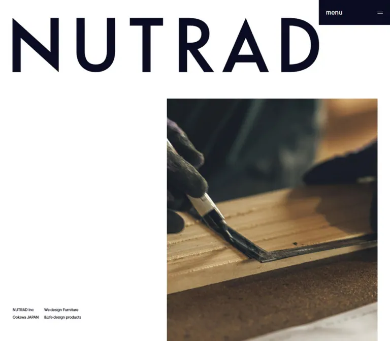
NUTRAD presents furniture manufacturing through an editorial composition built from scale, alignment and pauses. A large geometric wordmark occupies the opening white field. Industrial photography sits off to the right, while two tiny English captions anchor the opposite corner. The result makes manufacturing infrastructure part of the company's visual identity.
Large Cardo headings introduce the chapters beneath the opening. Japanese narrative copy alternates between a spacious serif treatment for philosophy and a measured sans-serif treatment for business information. English translations are much smaller. The footer repeats the wordmark above a precise arrangement of company details and navigation, giving the page a deliberate closing composition.
This is a long corporate homepage with several routes into the business. Preserve the distinction between identity, storytelling, services, news and contact information when adapting its design.
How to Read This Reference
- Measured values come from supplied rendered element rectangles, computed styles and custom properties. They describe the two recorded viewport states.
- Visual estimates come from the current-page screenshots and use approximately or
≈. They are not stylesheet declarations. - Calculated values follow the supplied grid formulas. The calculations can explain alignment without proving every element uses a particular grid class.
- Recommended values are implementation choices for a new project. The Quick Start is an adaptation, not recovered source code.
- Token names are descriptive aliases unless a source custom property is explicitly identified.
- DOM rectangles and screenshot positions were sampled during a page inspection with settling checks. Some footer rows differ slightly in vertical placement between the records. Use grid alignment and component dimensions as stronger evidence than a universal absolute y-coordinate.
- A computed font stack identifies the requested family. Font files and the actual font used for every glyph were not independently supplied.
Tokens — Colors
Default Palette
| Name | Value | Source / suggested token | Role and evidence |
|---|---|---|---|
| White Canvas | #ffffff |
Source --color-white; alias --color-paper |
White field visible in the opening, factory scene and footer; also the computed foreground of company-section text |
| Navy Ink | #090c22 |
Source --color-black; alias --color-ink |
Computed heading, paragraph and footer text color; desktop menu background and mobile menu foreground |
The source calls the navy token black, but its value is a very dark blue. Retain that distinction: pure black slightly changes the relationship between the typography and the muted industrial photographs.
The white page field is visually observed. The sampled body background itself is transparent, so this reference does not attribute the visible white surface to a specific body declaration.
Declared Colors Without a Verified Visible Role
| Source token | Value | Interpretation |
|---|---|---|
--color-bg |
#01001b |
A declared dark color; not the observed default canvas |
--color-gray-light |
#eeeeee |
Available neutral; component use not established |
--color-gray |
#c1c2c8 |
Available neutral; component use not established |
--color-gray-dark |
#a4a5a9 |
Available neutral; component use not established |
--color-red |
#ab1010 |
Available accent; no visible red action treatment established |
Do not promote these declarations into a multi-color interface palette. The supplied stylesheet also contains generic color, gradient and shadow presets that are not evidence of their use in the captured design.
Several ancestor elements report rgb(138, 43, 226) and an inherited serif stack. Those values do not describe the visible navy wordmark or the explicitly styled text descendants. There is no basis for introducing purple as a brand accent.
Tokens — Typography
Geometric Wordmark — Identity Asset
The visible NUTRAD mark has an angular N, a triangular A and widely spaced geometric capitals. Its character is distinct from the editorial serif headings.
The supplied evidence does not identify a font for this mark or provide its asset URL. Treat it as identity artwork. Do not use the zero-height H1's computed 16px font size to reconstruct the visible logo.
Visual estimate: the desktop opening mark occupies approximately 1120 × 200px, beginning near (46, 50). The mobile opening mark occupies approximately 358 × 64px, beginning near (16, 100).
Cardo — English Editorial Headings
- Source family:
"cardo", serifthrough--font-type-en-serif. - Measured weight:
400. - Roles: philosophy display words, OUR BRAND, FACTORY, service names, LABO & FACTORY and the business-client heading.
- Character: large traditional serif forms with a calm, architectural presence.
- Treatment: the rendered display text is uppercase, often broken into intentional short lines.
Use size and placement to create authority. Heavy bold weight is not needed.
TT Commons Pro — English Utility and Supporting Copy
- Source family:
"tt-commons-pro", sans-serifthrough--font-type-en-sans. - Measured weight:
500. - Roles: menu label, opening captions, small section labels, English translations, text links and copyright.
- Treatment: compact sizes, usually normal tracking; menu tracking is
0.02em.
The small English type creates a strong scale contrast against the logo and Cardo headings. It is an intentional supporting layer rather than a second large marketing headline.
Japanese Gothic — Business Copy and Footer
- Source family:
"dnp-shuei-gothic-gin-std", sans-serifthrough--font-type-ja. - Measured weight:
500. - Roles: brand and company descriptions, factory explanation, business-client copy, address information and footer navigation.
- Tracking: generally
0.05emfor narrative copy and0.06emfor footer information. - Leading: narrative copy uses
2; footer information uses1.5.
Japanese Mincho — Philosophy Narrative
- Source family:
"shippori-mincho-b1", serifthrough--font-type-ja-serif. - Measured weight:
400. - Role: the multi-paragraph philosophy statement.
- Tracking:
0.05em. - Leading:
2at both inspected widths.
This serif passage gives the philosophy a different reading tempo from the practical company information.
Type Scale
Sizes below are measured computed values. Size / leading pairs are in pixels.
| Role | Family / weight | Desktop | Mobile | Tracking |
|---|---|---|---|---|
| Philosophy display words | Cardo / 400 | 180 / 180 |
70 / 70 |
Normal |
| OUR BRAND | Cardo / 400 | 162 / 162 |
60 / 60 |
Normal |
| FACTORY | Cardo / 400 | 180 / 180 |
70 / 70 |
Normal |
| Service names; LABO & FACTORY | Cardo / 400 | 74 / 88.8 |
34 / 40.8 |
Normal |
| Business-client heading | Cardo / 400 | 66 / 79.2 |
52 / 62.4 |
Normal |
| Japanese philosophy | Japanese Mincho / 400 | 30 / 60 |
20 / 40 |
0.05em |
| Japanese business copy | Japanese Gothic / 500 | 18 / 36 |
16 / 32 |
0.05em |
| Japanese factory introduction | Japanese Gothic / 500 | 22 / 44 |
16 / 32 |
0.05em |
| English supporting copy | TT Commons Pro / 500 | 11 / 16.5 |
10 / 15 |
Normal |
| Opening captions | TT Commons Pro / 500 | 11 / 16.5 |
11 / 16.5 |
Normal |
| Small section labels | TT Commons Pro / 500 | 13 / 19.5 |
13 / 19.5 |
Normal |
| Text-link labels | TT Commons Pro / 500 | 18 / 27 |
16 / 24 |
Normal |
| Menu inner label | TT Commons Pro / 500 | 18 / 18 |
13 / 13 |
0.02em |
| Footer details and navigation | Japanese Gothic / 500 | 14 / 21 |
13 / 19.5 |
0.06em |
| Footer statement | Japanese Gothic / 500 | 16 / 32 |
14 / 28 |
0.02em |
| Copyright | TT Commons Pro / 500 | 13 / 19.5 |
13 / 19.5 |
Normal |
The FACTORY heading wrapper adds 20px top padding, producing measured box heights of 200px and 90px; that wrapper height is not its font size. Likewise, the desktop LABO & FACTORY heading has a much taller layout box than its two text lines. Do not interpret stretched element boxes as typographic leading.
Tokens — Spacing & Shapes
Grid System
The supplied custom properties define two different grid configurations.
| Measurement | Desktop, 1440px wide | Mobile, 390px wide |
|---|---|---|
| Grid columns | 12 |
4 |
| Outer inset | 46px |
16px |
| Gutter | 20px |
16px |
| Inner width including gutters | 1348px |
358px |
| One column, calculated | 94px |
77.5px |
| Column stride, calculated | 114px |
93.5px |
| Two-column span, calculated | 208px |
171px |
| Four-column span, calculated | 436px |
358px |
Observed source formulas: desktop inset is 100vw × 46 / 1440, and gutter is 100vw × 20 / 1440. Mobile inset and gutter both use 100vw × 16 / 390.
For viewport width V, column count N, inset M and gutter G:
column width = (V - 2M - (N - 1)G) / N
span width = n × column width + (n - 1)G
column start = M + (n - 1) × (column width + G)
The source breakpoint between these configurations is not supplied. The mobile custom-property collection still contains helpers for spans larger than four; their presence does not establish that those oversized helpers are used.
Spacing Measurements
| Use | Desktop | Mobile | Evidence |
|---|---|---|---|
| Section-label left padding | 12px |
12px |
Computed |
| Philosophy paragraph separation | 32px |
32px |
Calculated from adjacent text rectangles |
| Brand Japanese-to-English gap | 32px |
32px |
Calculated |
| Factory Japanese-to-English gap | 36px |
28px |
Calculated |
| Text-link bottom padding | 28px |
18px |
Computed |
| Topic-row separation | 30px |
30px |
Calculated |
| Footer logo-to-company-name gap | 90px |
90px |
Calculated |
| Footer navigation row pitch | 39px |
37px |
Calculated |
| OUR BRAND section top padding | 200px |
168.8px |
Computed |
| Factory section top padding | 250px |
180px |
Computed |
| Business-client section top / bottom padding | 200 / 150px |
168.8 / 100px |
Computed |
These values do not form a single small spacing scale. The page combines precise grid intervals with large chapter-specific pauses. Avoid replacing all section spacing with one repeated padding utility.
Border Radius and Edges
| Element | Observed treatment |
|---|---|
| Menu button | 0px radius; rectangular desktop fill |
| Opening and factory photographs | Visually square corners |
| Footer | Open white field without visible panel containers |
| Sampled sections and links | 0px radius on recorded elements |
There is no demonstrated card-elevation system. Image boundaries, typography and white space provide separation. Borders or arrows on text-link pseudo-elements were not included in the supplied computed-style selection.
Layout Measurements
| Element | Desktop | Mobile | Confidence |
|---|---|---|---|
| Menu button | (1240, 0), 200 × 70px |
(281, 0), 109 × 47px |
Measured |
| Compact home-link box | (46, 50), 170 × 30.17px |
(16, 22), 136 × 24.14px |
Measured; visibility varies by captured state |
| Opening wordmark | ≈ 1120 × 200px |
≈ 358 × 64px |
Visual estimate |
| Opening media | Left 616px, top ≈ 322px, width 778px; lower edge outside capture |
≈ (16, 281), 358 × 471px |
Visual estimate, with desktop width matching seven grid columns |
| Factory image in supplied scene | ≈ 664 × 664px, centered at x 388px |
Not visually supplied | Visual estimate |
| Factory heading | Width 914.81px |
Width 355.80px |
Measured |
| Standard text-link wrapper | 208 × 55px |
171 × 42px |
Measured |
| Footer wordmark box | 780 × 139.44px |
358 × 64px |
Measured |
| Company section | 1440 × 1000px |
390 × 844px |
Measured |
| Document height | 19306.70px |
15167.63px |
Measured |
Document heights describe these captured states, not fixed implementation targets.
Components
Persistent Menu Control and Compact Identity
Role: maintain a small navigation entry point while the content takes most of the viewport.
On desktop, the menu is a navy rectangle attached to the upper-right corner. The lowercase label sits at its left inset; a tiny two-stroke icon sits toward the right edge. The measured button is 200 × 70px, with 26px 20px padding, white text and no rounded corners.
On mobile, the same corner contains a transparent 109 × 47px button. Its visible label is uppercase MENU, set in navy at 13px, with 16px padding. This is a change in surface, capitalization and scale, not just a narrower desktop button.
The control remains in the upper-right corner across the supplied opening and footer captures. The desktop factory capture also shows a compact wordmark at the upper left. A compact home-link rectangle exists in both DOM samples, but it is not visibly present in every supplied state; do not display it over the large opening or footer mark merely because its rectangle is recorded.
The button DOM contains both menu and close letter groups. That establishes available label content, not the appearance, timing or accessibility behavior of an open navigation panel.
Opening Composition
Role: establish identity and connect the company to its manufacturing environment.
The desktop opening has three principal elements:
- A very large geometric wordmark near the top-left inset.
- A rectangular industrial image beginning at the sixth grid column, well below the wordmark.
- Two small English caption blocks near the bottom-left of the first viewport.
The first caption identifies NUTRAD Inc and Ookawa JAPAN. The second reads We design Furniture and &Life design products. Both use measured 11px TT Commons Pro. Their desktop x-coordinates are 46px and 160px, one grid stride apart.
The photograph shows reflective metal ductwork beneath a factory ceiling. Its cool, subdued green-gray tones supply most of the opening's color. The large empty area to its left is structural: it makes the small captions legible and lets the image feel deliberately placed.
On mobile, the reading order becomes large logo, two-column captions, then photograph. The captions occupy two 171px grid spans, starting at 16px and 203px. Their measured top is approximately 219.45px; the photograph starts about 20px below their 42px blocks. The image retains 16px side margins and uses a tall crop.
The desktop media's full height and native aspect ratio are not established by the opening screenshot. Do not infer a specific video, slideshow or looping sequence from this still frame.
Philosophy Chapter
Role: introduce the company's values with a slower reading rhythm.
A small PHILOSOPHY label precedes three centered display lines: THE, GENUINE and TOUCH. Cardo at 180px gives the desktop composition its scale; the mobile size is 70px.
The main Japanese statement uses Mincho rather than the business-copy Gothic. On desktop it occupies an eight-column width of 892px, beginning at x 274px. On mobile it spans the 358px inner width. The measured line height remains twice the font size: 60px desktop and 40px mobile.
The prose is divided into four groups with 32px separations. Mobile introduces an additional line break in the passage containing “そのものにしかない、”, preserving the intended cadence within the narrower measure.
A Philosophy link follows the narrative. The English supporting caption is computed navy on desktop and white on mobile. Its mobile placement indicates a different visual relationship to surrounding media, but that area was not included in the supplied screenshots.
Brand Introduction and Brand Links
Role: explain the company's ability to develop products and introduce its brands.
OUR BRAND uses two lines of Cardo at 162px desktop and 60px mobile. The desktop Japanese paragraph occupies five columns, 550px, at the left page inset. The English translation follows after 32px, with a much smaller 11px size. Both paragraphs become 358px wide on mobile; the English translation becomes 10px.
Two large Visit website anchors point to https://bond.ne.jp/ and https://dinasta.jp/. Their desktop outer rectangles are 616 × 800px, beginning at x 824px and reaching the right viewport edge, with 20px left padding. On mobile each recorded anchor is 390 × 360px, spanning the full viewport width.
These are measured link regions, not verified image dimensions. Their detailed artwork, internal label styling and hover endpoint are outside the supplied visual captures. Preserve the large linked regions without inventing rounded cards or product-thumbnail layouts.
Factory Display Scene
Role: give manufacturing equipment the visual prominence normally reserved for a finished product.
The supplied desktop scene centers an approximately 664px square photograph. The image shows translucent ribbed extraction hoses, machinery and warm backlighting. FACTORY sits across the photograph in navy Cardo, extending beyond both image edges.
The image aligns with a six-column span beginning at x 388px. The heading is approximately 915px wide and remains centered on the viewport. Its overhang is a defining relationship; containing the heading entirely inside the photograph would weaken the composition.
The DOM contains three copies of each FACTORY letter, while the screenshot shows one readable word. This is compatible with layered letter presentation, but the supplied evidence does not establish an animation sequence. Render one accessible heading; any decorative duplicates in an adaptation should be hidden from assistive technology.
The factory section is unusually long: approximately 5181.5px on desktop and 3855.1px on mobile in the recorded document. That establishes substantial vertical pacing. It does not, by itself, prove pinning, parallax or scroll-scrubbed media.
Factory Introduction and Location Information
Role: connect the photographic chapter to practical manufacturing information.
The source introduces production at a new factory in 2024, followed by an English translation and a LABO & FACTORY subheading with address and telephone information.
The Japanese introduction uses 22px / 44px Gothic on desktop and 16px / 32px on mobile. Explicit mobile line breaks turn the three-line desktop passage into six shorter lines. The LABO & FACTORY heading uses the same 74px desktop and 34px mobile scale as service headings.
The supplied screenshots do not show this information block, so its detailed image pairing and any decorative separators remain unverified.
Service Entries
Role: distinguish three business capabilities and provide routes to their details.
The recorded entries are BRAND DEVELOPMENT, OEM MANUFACTURING and CONTRACT SERVICE, paired with the Japanese labels “自社ブランド開発事業”, “OEM家具製造事業” and “コントラクト事業”.
On desktop, the small SERVICE label occupies the left region. Each two-line heading begins at x 388px and has a 1006px layout width. The corresponding View more link begins at x 1072px and spans 208px.
On mobile, the section label and headings start at x 16px and span 358px. Links move to the right-hand two-column span at x 203px, width 171px. Consecutive heading starts are approximately 697px apart on desktop and 618px apart on mobile.
This is a sequence of generously separated service entries. The selected DOM measurements do not establish the dimensions or subjects of intermediate imagery, so do not manufacture a uniform image-card anatomy around the headings.
Text-Link Pattern
Role: provide restrained onward navigation within editorial sections.
Philosophy, View more, View More and All topics share a measured flex-wrapper pattern: 208 × 55px on desktop and 171 × 42px on mobile. Labels use TT Commons Pro at 18px and 16px; bottom padding is 28px and 18px respectively.
The recorded backgrounds are transparent. Company links are computed white, while service and business-client links are navy. Some ancestor link colors are inherited values that cannot establish the final appearance of every descendant.
The evidence does not include the complete arrow or rule anatomy. The Quick Start adds a fine bottom rule as an explicitly recommended affordance, not a verified original detail.
Company Image Section
Role: combine a company statement with a full-viewport photographic surface.
The measured section equals the inspection viewport at both widths: 1440 × 1000px and 390 × 844px. Its serialized DOM includes a company image declaration with cover classes, and the text descendants are white.
Desktop copy occupies a 550px left-side measure. On mobile, the section label sits approximately 40px below the section start, while the Japanese statement, English translation and View more link occupy the lower portion. The mobile paragraphs use the full 358px inner width.
The exact photograph and any contrast scrim were not visually supplied. The evidence supports a cover-image section with white text, not a particular overlay opacity or gradient recipe.
Topics List
Role: provide compact dated updates without interrupting the editorial hierarchy.
Three dated links are present. The desktop list begins at x 730px and spans 664px; mobile rows begin at x 16px and span 358px. Each anchor uses a horizontal flex layout, with an internal gap of 20px desktop and 16px mobile.
The recorded row heights are 36, 72, 36px on desktop and 32, 64, 32px on mobile. The longer middle title wraps naturally. The gap between rows remains 30px at both sizes.
All topics aligns to the right-hand two-column span. The DOM also declares a 322 × 483px portrait image, but its displayed rectangle is not included in the selected measurements. Do not assign it a precise position from the text serialization alone.
Business-Client Introduction
Role: direct shops and corporate clients toward made-to-order furniture services.
The heading FOR / SHOP AND / COMPANY is a three-line Cardo composition. It uses 66px / 79.2px on desktop and remains relatively large at 52px / 62.4px on mobile.
Desktop Japanese copy occupies a four-column width of 436px at x 46px. A white English caption is measured in a separate 436px region at x 958px. On mobile, the English caption is positioned above the Japanese body even though it appears later in the serialized text. Flattened DOM text order is therefore not a complete description of this section's visual order.
The View More link is left aligned beneath the desktop copy, but moves to x 203px on mobile. Its recorded destination is the contract-service page.
Footer
Role: close the page with identity, direct contact details and a compact sitemap.
The footer repeats the large NUTRAD artwork on white. Its measured logo box is 780 × 139.44px on desktop and 358 × 64px on mobile. There is a 90px gap from that box to the company-name text.
The inspected footer identifies “ニュートラッド株式会社” and “NUTRAD Inc.”, followed by address, telephone/fax and email information. The phone and email use actual tel: and mailto: links.
Desktop information follows the underlying grid:
- Company name starts at x
46px, within a208pxregion. - Contact labels start at x
274px; values start at x388px. - Navigation columns begin at x
1072pxand1186px. - The closing statement sits at the lower left and copyright at the lower right.
Mobile changes the information order to company name, contact table, then navigation. Contact labels occupy one 77.5px column, and values begin at x 109.5px. The two navigation lists use the same x positions, 16px and 109.5px. They contain five links and three links respectively.
The closing statement “本物の手触りを、世界へ。” and copyright remain on opposite sides of the bottom row at the inspected mobile width. White space separates the groups; there are no visible enclosing contact cards or footer background panels.
Tokens — Motion & Interaction
Recorded Transition Values
| Treatment | Recorded value | What it establishes |
|---|---|---|
| Menu color-related properties | 0.15s cubic-bezier(0.4, 0, 0.2, 1) |
A short transition is assigned to color, background, border and related properties; endpoint appearance was not tested |
| Brand-link color-related properties | 0.6s cubic-bezier(0.29, 0.86, 0.51, 0.96) |
A slower transition is declared on both large brand anchors |
| Topic-link color-related properties | 0.6s cubic-bezier(0.29, 0.86, 0.51, 0.96) |
The same transition family is assigned to topic anchors |
Source --common-duration |
0.6s |
Shared timing token |
Source --common-duration-late |
0.8s |
Available timing token; component mapping unverified |
Source --base-duration / --base-delay |
2s / 1s |
Available timing values; no verified opening sequence |
Source --delay-increment |
0.3s |
Available stagger interval; affected elements unverified |
Source --navigation-ease |
cubic-bezier(0.13, 0.62, 0.41, 1.01) |
Navigation-named easing declaration; open-panel behavior unverified |
The sampled elements report animation: none. That does not prove the page is static: scripts, descendants, pseudo-elements or media can animate without appearing in those selected animation fields.
The capture process observed the page for at least five seconds and waited for finite motion, layout/text stability and visible image decoding within its limits. Perpetual animations were temporarily paused during readiness checks and resumed afterward. These are capture procedures, not a frame-by-frame motion record.
Unverified: menu opening and closing, hover endpoints, focus appearance, scroll-linked transformations, media playback, scene pinning, reduced-motion behavior and navigation transition outcomes. The repeated letter groups and differing visible logo states should not be converted into an invented animation specification.
Recommended adaptation: begin with a complete static composition. Add restrained color transitions using the observed timings, then introduce any reveal effects only after their purpose and reduced-motion behavior are defined.
Surfaces
| Layer | Appearance | Evidence |
|---|---|---|
| Main canvas | Continuous white field | Visible in all supplied current-page captures |
| Identity and text | Deep navy marks and text | Visible and supported by computed descendants |
| Desktop menu | Solid navy rectangle with white details | Visible and measured |
| Mobile menu | Transparent surface with navy details | Visible and measured |
| Opening and factory imagery | Square-cornered photographic rectangles | Visible |
| Company section | Cover-image declaration with white text | DOM-supported; exact visual treatment not supplied |
| Footer | White field shared by logo, contact information and navigation | Visible |
Avoid adding a general elevation hierarchy. This design separates content primarily through scale, positioning, contrast and blank space.
Imagery
The supplied current-page photographs focus on factory infrastructure. In the opening image, reflective metal ducts cross the frame against a subdued ceiling. In the factory scene, translucent ribbed hoses curve through warm backlight around machinery.
The contrast between these photographs matters. Cool metal and green-gray shadows establish precision; warm light and translucent materials reveal atmosphere and physical texture. Neither scene is presented as a bright isolated product cutout.
Image crops are assertive. The desktop opening photograph sits toward the right and continues below the visible viewport. The phone brings a tall crop into the main reading column. The factory scene uses a centered square with a heading that overhangs it.
Recommended image selection: use authentic manufacturing spaces, machinery, materials and process details with directional light and visible texture. Retain quieter areas where typography must remain readable. Do not apply the photographs' olive or gold tones as arbitrary UI fills.
Observed Asset References
Paths below appear in the supplied original-page DOM serialization and are relative to https://nutrad.co.jp/.
| Asset | Observed path | Evidence and limitation |
|---|---|---|
| Company image declaration | /wp-content/themes/theme/assets/images/pages/home/img_company-01.jpg |
Declared dimensions 1440 × 1000; cover classes present in serialized markup; exact photograph not visually supplied |
| Topics image declaration | /wp-content/themes/theme/assets/images/pages/home/pic_topics.jpg |
Declared dimensions 322 × 483; cover classes present; displayed position not measured |
The logo, opening media and factory-scene asset URLs were not supplied. These two references are not a complete asset inventory, and serialized image declarations should not be treated as proof that every fallback node is visible.
Layout & Responsive Behavior
The homepage remains a long vertical narrative at both widths. The desktop document is approximately 19.3 inspected viewport heights; mobile is approximately 18.0. These calculated ratios describe the page's broad pacing, not a recommendation to set fixed section heights.
Opening Recomposition
Desktop distributes identity, captions and media across the viewport. Mobile brings them into a sequential reading order while retaining the large logo and two-column captions. The opening photograph changes from a right-offset desktop region to the full inner mobile width.
Grid Changes
The source grid tokens change from twelve columns to four. Two-column text links therefore change from 208px to 171px. This shared relationship explains why service links, footer values and caption groups remain aligned even when their placement changes.
Some actual section wrappers retain twelve computed CSS grid tracks on mobile. The company and business-client sections each report twelve approximately 15.1562px tracks with 16px gaps, while their text spans the 358px inner width. Do not assume every wrapper changes to four tracks merely because the global sizing tokens do.
Type Rebalancing
Display type shrinks substantially, but utility text changes less. Philosophy drops from 180px to 70px; service headings drop from 74px to 34px; section labels remain 13px; opening captions remain 11px.
The business-client heading follows a different scale, changing from 66px to 52px. A single global font-size multiplier would not reproduce these relationships.
Content Width and Alignment
Desktop uses different text measures for different purposes: eight columns for philosophy, five for brand/company copy and four for the business-client introduction. Mobile generally uses the full inner width. Service links and several onward links move to the right-hand half-width span.
Footer Reordering
The footer changes from a horizontal company/contact/navigation arrangement to stacked groups. It keeps a two-column contact table and two navigation lists within that stack. Its closing statement and copyright still share a row at 390px.
Only these two viewport configurations were inspected. Tablet layouts, intermediate breakpoints, landscape phones, zoom behavior and very wide screens remain unverified. The Quick Start uses a recommended 64rem breakpoint to connect the known configurations.
Do’s and Don’ts
Do
- Keep the visible interface palette centered on white
#ffffffand navy#090c22. - Use identity artwork for the geometric wordmark and Cardo for editorial headings.
- Preserve the extreme scale contrast between display lettering and small English captions.
- Align desktop content to the measured twelve-column rhythm and mobile content to the four-column sizing system.
- Leave substantial white space beside photographs and between chapters.
- Let the FACTORY heading extend beyond its centered image.
- Use Japanese Mincho for the philosophy passage and Gothic for practical company information.
- Recompose the opening and footer on mobile instead of proportionally shrinking the desktop arrangement.
- Preserve genuine telephone, email and onward-navigation links.
- Keep unverified motion and asset details explicitly separate from observed design facts.
Don’t
- Don’t replace the opening with a conventional headline, subtitle and oversized conversion button.
- Don’t approximate the custom wordmark by assigning it the Cardo heading font.
- Don’t turn services, brand links and contact information into identical rounded cards.
- Don’t fill white space with badges, extra captions or decorative lines merely to increase density.
- Don’t treat unused red, gray, gradient or shadow declarations as visible design requirements.
- Don’t infer purple branding from inherited ancestor styles.
- Don’t assume repeated DOM letters must appear as repeated readable text.
- Don’t claim a video loop, WebGL scene, parallax effect or menu animation from still captures.
- Don’t hardcode the measured total document height as the page's required length.
- Don’t force desktop image ratios onto mobile where the supplied crop clearly changes.
Recommended Implementation Additions
These are recommendations for a new implementation, not verified original features:
- Give the home-link artwork an accessible name and maintain a meaningful heading hierarchy independent of the visual logo size.
- If letter layers are used decoratively, expose only one readable heading to assistive technology.
- Implement the menu with an explicit accessible name,
aria-expanded, keyboard operation and appropriate focus handling for its eventual panel type. - Provide a visible navy focus treatment on white surfaces and a suitable contrasting treatment over dark imagery.
- Keep English translations readable at zoom. The observed
10–11pxsizes may need a larger minimum when the translation is essential content. - Allow addresses and email strings to wrap without breaking the footer grid at narrow widths or increased text sizes.
- Use responsive image sources and reserve image space before loading. Preserve the photographed subject when choosing mobile crops.
- Make all substantive content available without animation, and respect reduced-motion preferences if reveals or media sequences are added.
- Make repeated View more links distinguishable through accessible context or labels while retaining the compact visible text.
Agent Prompt Guide
Quick Color Reference
- Main canvas and footer:
#ffffff. - Main text, wordmark and desktop menu fill:
#090c22. - Desktop menu label and company-section text: white.
- Mobile menu: navy label and icon on a transparent white-page surface.
- Photographic color: cool metal, muted green-gray shadows and localized warm light; do not convert these into extra interface accents.
Overall Prompt
“Create a long corporate homepage for a Japanese furniture manufacturer, inspired by the measured NUTRAD composition. Use a white canvas, deep navy #090c22, a large geometric wordmark asset, oversized regular Cardo headings, compact English utility text and generous Japanese line spacing. At 1440px, use twelve 94px columns with 20px gutters and 46px outer margins. Place the opening industrial photograph across the rightmost seven columns, with two tiny English caption blocks at the lower left. Introduce a centered square factory photograph with a serif FACTORY heading extending beyond both edges. Alternate spacious philosophy, brand, service and company chapters before a large wordmark footer. At 390px, use four 77.5px columns, 16px gutters and margins; stack the opening logo, two-column captions and tall photograph. Keep corners square and navigation restrained. Treat all unverified animation behavior as an implementation decision.”
Example Component Prompts
- Opening: “Build a white desktop opening with an approximately 1120px-wide geometric brand mark near the top-left, a 778px-wide industrial image beginning at x 616px, and two 11px English caption blocks at x 46px and 160px. On a 390px phone, place a 358px-wide mark above two equal caption columns and a tall 358px-wide photograph. Use navy ink and square image corners.”
- Factory scene: “Center a 664px square photograph of extraction hoses and machinery on a white 1440px canvas. Overlay FACTORY in regular Cardo at 180px, centered on the viewport and wider than the photograph. Keep the word readable as one heading. Do not invent a motion sequence.”
- Service entry: “Use a two-line uppercase Cardo service name at 74px with 1.2 leading, beginning at desktop grid column four. Add the Japanese business label and a restrained 208px-wide View more link toward the right. On mobile, use a 34px heading across the inner width and a 171px link aligned to the right.”
- Footer: “Create an open white footer with a large navy wordmark, followed by company name, a label/value contact table and two navigation lists. Use 14px Japanese Gothic on desktop and 13px on mobile with 0.06em tracking. Stack the information groups on mobile while preserving aligned label and value columns. Place a short Japanese statement at bottom left and copyright at bottom right.”
Quick Start
CSS Custom Properties
This CSS reproduces the main visual relationships at the supplied widths. The 64rem breakpoint, opening-height approximation, factory-title positioning, link rule and focus treatment are recommended adaptation choices. Font assets and the original wordmark are not bundled here. The desktop opening image uses its supplied asset's natural height because its full original crop was not established.
Expected structure: use .nutrad-hero.nutrad-grid with .hero-brand, .hero-meta containing two paragraphs, and .hero-media containing an image. Use .factory-stage with .factory-media and .factory-title. The footer contains .footer-brand, .footer-info.nutrad-grid with company/contact/navigation children, and .footer-bottom. The contact block contains a definition list; navigation contains two lists.
:root {
  /* Observed visible palette */
  --color-paper: #ffffff;
  --color-ink: #090c22;

  /* Observed requested font families */
  --font-display: 'cardo', serif;
  --font-en: 'tt-commons-pro', sans-serif;
  --font-ja: 'dnp-shuei-gothic-gin-std', sans-serif;
  --font-ja-editorial: 'shippori-mincho-b1', serif;

  /* Source-derived mobile grid formulas */
  --page-inset: calc(100vw * 16 / 390);
  --grid-gap: calc(100vw * 16 / 390);
  --columns: 4;
  --column: calc(
    (100vw - 2 * var(--page-inset)
      - (var(--columns) - 1) * var(--grid-gap))
    / var(--columns)
  );
  --span-2: calc(2 * var(--column) + var(--grid-gap));

  /* Measured mobile type sizes */
  --type-display: 70px;
  --type-brand: 60px;
  --type-service: 34px;
  --type-contract: 52px;
  --type-ja: 16px;
  --type-philosophy: 20px;
  --type-caption: 10px;
  --type-link: 16px;
  --type-footer: 13px;

  /* Recorded timings; no reveal sequence is implied */
  --duration-control: 150ms;
  --duration-common: 600ms;
  --ease-control: cubic-bezier(0.4, 0, 0.2, 1);
  --ease-common: cubic-bezier(0.29, 0.86, 0.51, 0.96);
}

.nutrad-site,
.nutrad-site * {
  box-sizing: border-box;
}

.nutrad-site {
  margin: 0;
  color: var(--color-ink);
  background: var(--color-paper);
  font-family: var(--font-ja);
  font-weight: 500;
}

.nutrad-site a {
  color: inherit;
}

.nutrad-site img {
  display: block;
  max-width: 100%;
}

.nutrad-grid {
  display: grid;
  grid-template-columns: repeat(var(--columns), minmax(0, 1fr));
  column-gap: var(--grid-gap);
  padding-inline: var(--page-inset);
}

.nutrad-grid > * {
  min-width: 0;
}

.menu-control {
  position: fixed;
  inset: 0 0 auto auto;
  z-index: 40;
  display: flex;
  align-items: center;
  justify-content: space-between;
  width: 109px;
  height: 47px;
  padding: 16px;
  border: 0;
  border-radius: 0;
  color: var(--color-ink);
  background: transparent;
  font: 500 13px / 1 var(--font-en);
  letter-spacing: 0.02em;
  text-transform: uppercase;
  cursor: pointer;
  transition:
    color var(--duration-control) var(--ease-control),
    background-color var(--duration-control) var(--ease-control);
}

.menu-icon {
  display: grid;
  gap: 3px;
  width: 11px;
}

.menu-icon::before,
.menu-icon::after {
  content: '';
  height: 1px;
  background: currentColor;
}

/* Approximation of the captured opening composition */
.nutrad-hero {
  position: relative;
  align-content: start;
  padding-top: 100px;
  padding-bottom: 89px;
}

.hero-brand {
  grid-column: 1 / -1;
  width: 100%;
  margin: 0;
}

.hero-brand img {
  width: 100%;
  height: auto;
}

.hero-meta {
  grid-column: 1 / -1;
  display: grid;
  grid-template-columns: repeat(2, minmax(0, 1fr));
  gap: var(--grid-gap);
  margin-top: 55px;
  font: 500 11px / 1.5 var(--font-en);
}

.hero-meta p {
  min-height: 42px;
  margin: 0;
}

.hero-media {
  grid-column: 1 / -1;
  aspect-ratio: 358 / 471;
  margin: 20px 0 0;
  overflow: hidden;
}

.hero-media img {
  width: 100%;
  height: 100%;
  object-fit: cover;
}

.section-kicker {
  margin: 0;
  padding-left: 12px;
  font: 500 13px / 1.5 var(--font-en);
  text-transform: uppercase;
}

.display-type,
.brand-title,
.service-title,
.contract-title {
  margin: 0;
  font-family: var(--font-display);
  font-weight: 400;
  text-transform: uppercase;
}

.display-type {
  font-size: var(--type-display);
  line-height: 1;
}

.brand-title {
  font-size: var(--type-brand);
  line-height: 1;
}

.service-title {
  font-size: var(--type-service);
  line-height: 1.2;
}

.contract-title {
  font-size: var(--type-contract);
  line-height: 1.2;
}

.ja-statement {
  margin: 0;
  font: 400 var(--type-philosophy) / 2 var(--font-ja-editorial);
  letter-spacing: 0.05em;
}

.ja-statement + .ja-statement {
  margin-top: 32px;
}

.ja-body {
  margin: 0;
  font: 500 var(--type-ja) / 2 var(--font-ja);
  letter-spacing: 0.05em;
}

.english-copy {
  margin: 0;
  font: 500 var(--type-caption) / 1.5 var(--font-en);
}

.ja-body + .english-copy {
  margin-top: 32px;
}

.cta-link {
  display: flex;
  align-items: flex-start;
  justify-content: space-between;
  width: var(--span-2);
  min-height: 42px;
  padding-bottom: 18px;
  color: inherit;
  background: transparent;
  font: 500 var(--type-link) / 1.5 var(--font-en);
  text-decoration: none;
  /* Recommended affordance; original rule anatomy is unverified */
  border-bottom: 1px solid currentColor;
}

.factory-stage {
  position: relative;
  isolation: isolate;
}

.factory-media {
  width: calc(100% - 2 * var(--page-inset));
  aspect-ratio: 1;
  margin: 0 auto;
}

.factory-media img {
  width: 100%;
  height: 100%;
  object-fit: cover;
}

.factory-title {
  position: absolute;
  top: 20%;
  left: 50%;
  z-index: 1;
  width: max-content;
  margin: 0;
  transform: translateX(-50%);
  font: 400 var(--type-display) / 1 var(--font-display);
  text-transform: uppercase;
}

/* Footer spacing approximates the sampled composition */
.nutrad-footer {
  padding-block: 160px 40px;
}

.footer-brand {
  width: calc(100% - 2 * var(--page-inset));
  margin-inline: var(--page-inset);
}

.footer-brand img {
  width: 100%;
  height: auto;
}

.footer-info {
  row-gap: 32px;
  margin-top: 90px;
  font: 500 var(--type-footer) / 1.5 var(--font-ja);
  letter-spacing: 0.06em;
}

.footer-company,
.footer-contact,
.footer-nav {
  grid-column: 1 / -1;
}

.footer-company p,
.footer-contact dl,
.footer-contact dt,
.footer-contact dd {
  margin: 0;
}

.footer-contact dl {
  display: grid;
  grid-template-columns: var(--column) minmax(0, 1fr);
  gap: 10px var(--grid-gap);
}

.footer-contact dd {
  min-width: 0;
  overflow-wrap: anywhere;
}

.footer-nav {
  display: grid;
  grid-template-columns: var(--column) minmax(0, 1fr);
  gap: var(--grid-gap);
  margin-top: 58px;
}

.footer-nav ul {
  display: grid;
  align-content: start;
  row-gap: 17.5px;
  margin: 0;
  padding: 0;
  list-style: none;
}

.footer-nav a {
  text-decoration: none;
}

.footer-bottom {
  display: flex;
  align-items: baseline;
  justify-content: space-between;
  flex-wrap: wrap;
  gap: 16px 24px;
  margin-top: 108px;
  padding-inline: var(--page-inset);
}

.footer-statement {
  margin: 0;
  font: 500 14px / 2 var(--font-ja);
  letter-spacing: 0.02em;
}

.footer-copyright {
  margin: 0;
  font: 500 13px / 1.5 var(--font-en);
}

/* Recommended breakpoint; the original threshold was not supplied */
@media (min-width: 64rem) {
  :root {
    --page-inset: calc(100vw * 46 / 1440);
    --grid-gap: calc(100vw * 20 / 1440);
    --columns: 12;
    --type-display: 180px;
    --type-brand: 162px;
    --type-service: 74px;
    --type-contract: 66px;
    --type-ja: 18px;
    --type-philosophy: 30px;
    --type-caption: 11px;
    --type-link: 18px;
    --type-footer: 14px;
  }

  .menu-control {
    width: 200px;
    height: 70px;
    padding: 26px 20px;
    color: var(--color-paper);
    background: var(--color-ink);
    font-size: 18px;
    text-transform: none;
  }

  .menu-icon {
    width: 15px;
  }

  .nutrad-hero {
    min-height: max(100svh, 109.1667vw);
    padding-top: 50px;
    padding-bottom: 0;
  }

  .hero-brand {
    width: calc(100vw * 1120 / 1440);
  }

  .hero-meta {
    position: absolute;
    top: calc(100svh - 100px);
    left: var(--page-inset);
    grid-template-columns: var(--column) auto;
    width: max-content;
    margin: 0;
  }

  .hero-media {
    grid-column: 6 / -1;
    aspect-ratio: auto;
    margin-top: 72px;
  }

  .hero-media img {
    height: auto;
  }

  .cta-link {
    min-height: 55px;
    padding-bottom: 28px;
  }

  .factory-media {
    width: calc(6 * var(--column) + 5 * var(--grid-gap));
  }

  .nutrad-footer {
    padding-block: 540px 65px;
  }

  .footer-brand {
    width: 780px;
    max-width: calc(100% - 2 * var(--page-inset));
  }

  .footer-company {
    grid-column: 1 / span 2;
  }

  .footer-contact {
    grid-column: 3 / span 5;
  }

  .footer-nav {
    grid-column: 10 / -1;
    margin-top: 0;
  }

  .footer-nav ul {
    row-gap: 18px;
  }

  .footer-bottom {
    margin-top: 248px;
  }

  .footer-statement {
    font-size: 16px;
  }
}

/* Recommended keyboard affordance */
.nutrad-site :focus-visible {
  outline: 2px solid var(--color-ink);
  outline-offset: 4px;
}

.on-dark :focus-visible {
  outline-color: var(--color-paper);
}

/* Recommended safeguard for effects added to this adaptation */
@media (prefers-reduced-motion: reduce) {
  .menu-control,
  .cta-link {
    transition: none;
  }

  .nutrad-site [data-reveal] {
    animation: none;
    transition: none;
    opacity: 1;
    transform: none;
  }
}
The factory's mobile square treatment is a recommended starting point because its mobile screenshot was not supplied. Review the composition with actual media before treating it as a faithful mobile reconstruction. The CSS intentionally provides no invented menu panel, media timeline or scroll animation.
Tailwind v4 Token Mapping
Optional integration for a project using Tailwind v4. Define the custom properties above first. This mapping is implementation guidance, not a claim about the original site's application architecture.
@theme inline {
  --color-paper: #ffffff;
  --color-ink: #090c22;

  --font-display: 'cardo', serif;
  --font-english: 'tt-commons-pro', sans-serif;
  --font-japanese: 'dnp-shuei-gothic-gin-std', sans-serif;
  --font-japanese-editorial: 'shippori-mincho-b1', serif;

  --text-display: var(--type-display);
  --text-brand: var(--type-brand);
  --text-service: var(--type-service);
  --text-contract: var(--type-contract);
  --text-caption: var(--type-caption);
  --text-link: var(--type-link);
  --text-footer: var(--type-footer);

  --spacing-page: var(--page-inset);
  --spacing-gutter: var(--grid-gap);
  --spacing-two-columns: var(--span-2);
  --radius-square: 0px;
}
Sources & Evidence
- NUTRAD homepage: both the original and final URL in the supplied inspection record; recorded HTTP status
200. - Capture time:
2026-09-12T16:46:17.486Z, corresponding to September 13, 2026, 01:46 JST. - Desktop evidence:
1440 × 1000viewport; supplied opening, factory-scene and footer screenshots; rendered homepage text, link destinations, element rectangles, computed typography, colors and custom properties. - Mobile evidence:
390 × 844viewport; supplied opening and footer screenshots; corresponding rendered DOM and computed-style measurements across the homepage. - Capture conditions: the supplied inspection reports an initial observation of at least five seconds, bounded waits for finite motion and layout/text stability, visible-image decoding checks and traversed scroll positions. Perpetual animations were paused during readiness checks and resumed afterward. SharedWorkers and service workers were disabled.
- Interaction evidence: anchor destinations, menu-button label groups and assigned transitions were recorded. No open-menu state, hover endpoint, successful link navigation, media controls or keyboard interaction result was supplied.
- Limitations: this document analyzes the supplied current-page evidence, not an additional browser session. Asset filenames are incomplete; unpictured sections rely on DOM evidence; exact breakpoints, motion timelines, image scrims and per-glyph font resolution remain unverified. Recommendations and approximation code are identified separately from measured original-page facts.
# NUTRAD — Style Reference

> Monumental lettering, quiet white space, and the machinery behind furniture.

**Website:** [NUTRAD](https://nutrad.co.jp/)
**Original URL:** https://nutrad.co.jp/
**Final URL:** https://nutrad.co.jp/
**Theme:** white canvas with deep navy typography and photographic sections; no theme-switching behavior was inspected.
**Inspected:** September 13, 2026, at 01:46 JST. Supplied retrieval timestamp: `2026-09-12T16:46:17.486Z`.
**Viewports:** desktop `1440 × 1000` and mobile `390 × 844` CSS pixels.
**Scope:** the current corporate homepage, including its opening composition, philosophy, brands, factory, services, company introduction, topics, business-client introduction and footer. Supplied screenshots visually document the desktop opening, a factory scene and footer, plus the mobile opening and footer. Other sections are documented through rendered DOM measurements and text. The open menu and linked destination pages were not inspected.

NUTRAD presents furniture manufacturing through an editorial composition built from scale, alignment and pauses. A large geometric wordmark occupies the opening white field. Industrial photography sits off to the right, while two tiny English captions anchor the opposite corner. The result makes manufacturing infrastructure part of the company's visual identity.

Large Cardo headings introduce the chapters beneath the opening. Japanese narrative copy alternates between a spacious serif treatment for philosophy and a measured sans-serif treatment for business information. English translations are much smaller. The footer repeats the wordmark above a precise arrangement of company details and navigation, giving the page a deliberate closing composition.

This is a long corporate homepage with several routes into the business. Preserve the distinction between identity, storytelling, services, news and contact information when adapting its design.

## How to Read This Reference

- **Measured** values come from supplied rendered element rectangles, computed styles and custom properties. They describe the two recorded viewport states.
- **Visual estimates** come from the current-page screenshots and use approximately or `≈`. They are not stylesheet declarations.
- **Calculated** values follow the supplied grid formulas. The calculations can explain alignment without proving every element uses a particular grid class.
- **Recommended** values are implementation choices for a new project. The Quick Start is an adaptation, not recovered source code.
- Token names are descriptive aliases unless a source custom property is explicitly identified.
- DOM rectangles and screenshot positions were sampled during a page inspection with settling checks. Some footer rows differ slightly in vertical placement between the records. Use grid alignment and component dimensions as stronger evidence than a universal absolute y-coordinate.
- A computed font stack identifies the requested family. Font files and the actual font used for every glyph were not independently supplied.

## Tokens — Colors

### Default Palette

| Name | Value | Source / suggested token | Role and evidence |
| --- | --- | --- | --- |
| White Canvas | `#ffffff` | Source `--color-white`; alias `--color-paper` | White field visible in the opening, factory scene and footer; also the computed foreground of company-section text |
| Navy Ink | `#090c22` | Source `--color-black`; alias `--color-ink` | Computed heading, paragraph and footer text color; desktop menu background and mobile menu foreground |

The source calls the navy token black, but its value is a very dark blue. Retain that distinction: pure black slightly changes the relationship between the typography and the muted industrial photographs.

The white page field is visually observed. The sampled body background itself is transparent, so this reference does not attribute the visible white surface to a specific body declaration.

### Declared Colors Without a Verified Visible Role

| Source token | Value | Interpretation |
| --- | --- | --- |
| `--color-bg` | `#01001b` | A declared dark color; not the observed default canvas |
| `--color-gray-light` | `#eeeeee` | Available neutral; component use not established |
| `--color-gray` | `#c1c2c8` | Available neutral; component use not established |
| `--color-gray-dark` | `#a4a5a9` | Available neutral; component use not established |
| `--color-red` | `#ab1010` | Available accent; no visible red action treatment established |

Do not promote these declarations into a multi-color interface palette. The supplied stylesheet also contains generic color, gradient and shadow presets that are not evidence of their use in the captured design.

Several ancestor elements report `rgb(138, 43, 226)` and an inherited serif stack. Those values do not describe the visible navy wordmark or the explicitly styled text descendants. There is no basis for introducing purple as a brand accent.

## Tokens — Typography

### Geometric Wordmark — Identity Asset

The visible NUTRAD mark has an angular N, a triangular A and widely spaced geometric capitals. Its character is distinct from the editorial serif headings.

The supplied evidence does not identify a font for this mark or provide its asset URL. Treat it as identity artwork. Do not use the zero-height H1's computed `16px` font size to reconstruct the visible logo.

**Visual estimate:** the desktop opening mark occupies approximately `1120 × 200px`, beginning near `(46, 50)`. The mobile opening mark occupies approximately `358 × 64px`, beginning near `(16, 100)`.

### Cardo — English Editorial Headings

- **Source family:** `"cardo", serif` through `--font-type-en-serif`.
- **Measured weight:** `400`.
- **Roles:** philosophy display words, OUR BRAND, FACTORY, service names, LABO & FACTORY and the business-client heading.
- **Character:** large traditional serif forms with a calm, architectural presence.
- **Treatment:** the rendered display text is uppercase, often broken into intentional short lines.

Use size and placement to create authority. Heavy bold weight is not needed.

### TT Commons Pro — English Utility and Supporting Copy

- **Source family:** `"tt-commons-pro", sans-serif` through `--font-type-en-sans`.
- **Measured weight:** `500`.
- **Roles:** menu label, opening captions, small section labels, English translations, text links and copyright.
- **Treatment:** compact sizes, usually normal tracking; menu tracking is `0.02em`.

The small English type creates a strong scale contrast against the logo and Cardo headings. It is an intentional supporting layer rather than a second large marketing headline.

### Japanese Gothic — Business Copy and Footer

- **Source family:** `"dnp-shuei-gothic-gin-std", sans-serif` through `--font-type-ja`.
- **Measured weight:** `500`.
- **Roles:** brand and company descriptions, factory explanation, business-client copy, address information and footer navigation.
- **Tracking:** generally `0.05em` for narrative copy and `0.06em` for footer information.
- **Leading:** narrative copy uses `2`; footer information uses `1.5`.

### Japanese Mincho — Philosophy Narrative

- **Source family:** `"shippori-mincho-b1", serif` through `--font-type-ja-serif`.
- **Measured weight:** `400`.
- **Role:** the multi-paragraph philosophy statement.
- **Tracking:** `0.05em`.
- **Leading:** `2` at both inspected widths.

This serif passage gives the philosophy a different reading tempo from the practical company information.

### Type Scale

Sizes below are measured computed values. Size / leading pairs are in pixels.

| Role | Family / weight | Desktop | Mobile | Tracking |
| --- | --- | --- | --- | --- |
| Philosophy display words | Cardo / 400 | `180 / 180` | `70 / 70` | Normal |
| OUR BRAND | Cardo / 400 | `162 / 162` | `60 / 60` | Normal |
| FACTORY | Cardo / 400 | `180 / 180` | `70 / 70` | Normal |
| Service names; LABO & FACTORY | Cardo / 400 | `74 / 88.8` | `34 / 40.8` | Normal |
| Business-client heading | Cardo / 400 | `66 / 79.2` | `52 / 62.4` | Normal |
| Japanese philosophy | Japanese Mincho / 400 | `30 / 60` | `20 / 40` | `0.05em` |
| Japanese business copy | Japanese Gothic / 500 | `18 / 36` | `16 / 32` | `0.05em` |
| Japanese factory introduction | Japanese Gothic / 500 | `22 / 44` | `16 / 32` | `0.05em` |
| English supporting copy | TT Commons Pro / 500 | `11 / 16.5` | `10 / 15` | Normal |
| Opening captions | TT Commons Pro / 500 | `11 / 16.5` | `11 / 16.5` | Normal |
| Small section labels | TT Commons Pro / 500 | `13 / 19.5` | `13 / 19.5` | Normal |
| Text-link labels | TT Commons Pro / 500 | `18 / 27` | `16 / 24` | Normal |
| Menu inner label | TT Commons Pro / 500 | `18 / 18` | `13 / 13` | `0.02em` |
| Footer details and navigation | Japanese Gothic / 500 | `14 / 21` | `13 / 19.5` | `0.06em` |
| Footer statement | Japanese Gothic / 500 | `16 / 32` | `14 / 28` | `0.02em` |
| Copyright | TT Commons Pro / 500 | `13 / 19.5` | `13 / 19.5` | Normal |

The FACTORY heading wrapper adds `20px` top padding, producing measured box heights of `200px` and `90px`; that wrapper height is not its font size. Likewise, the desktop LABO & FACTORY heading has a much taller layout box than its two text lines. Do not interpret stretched element boxes as typographic leading.

## Tokens — Spacing & Shapes

### Grid System

The supplied custom properties define two different grid configurations.

| Measurement | Desktop, 1440px wide | Mobile, 390px wide |
| --- | --- | --- |
| Grid columns | `12` | `4` |
| Outer inset | `46px` | `16px` |
| Gutter | `20px` | `16px` |
| Inner width including gutters | `1348px` | `358px` |
| One column, calculated | `94px` | `77.5px` |
| Column stride, calculated | `114px` | `93.5px` |
| Two-column span, calculated | `208px` | `171px` |
| Four-column span, calculated | `436px` | `358px` |

**Observed source formulas:** desktop inset is `100vw × 46 / 1440`, and gutter is `100vw × 20 / 1440`. Mobile inset and gutter both use `100vw × 16 / 390`.

For viewport width V, column count N, inset M and gutter G:

```text
column width = (V - 2M - (N - 1)G) / N
span width = n × column width + (n - 1)G
column start = M + (n - 1) × (column width + G)
```

The source breakpoint between these configurations is not supplied. The mobile custom-property collection still contains helpers for spans larger than four; their presence does not establish that those oversized helpers are used.

### Spacing Measurements

| Use | Desktop | Mobile | Evidence |
| --- | --- | --- | --- |
| Section-label left padding | `12px` | `12px` | Computed |
| Philosophy paragraph separation | `32px` | `32px` | Calculated from adjacent text rectangles |
| Brand Japanese-to-English gap | `32px` | `32px` | Calculated |
| Factory Japanese-to-English gap | `36px` | `28px` | Calculated |
| Text-link bottom padding | `28px` | `18px` | Computed |
| Topic-row separation | `30px` | `30px` | Calculated |
| Footer logo-to-company-name gap | `90px` | `90px` | Calculated |
| Footer navigation row pitch | `39px` | `37px` | Calculated |
| OUR BRAND section top padding | `200px` | `168.8px` | Computed |
| Factory section top padding | `250px` | `180px` | Computed |
| Business-client section top / bottom padding | `200 / 150px` | `168.8 / 100px` | Computed |

These values do not form a single small spacing scale. The page combines precise grid intervals with large chapter-specific pauses. Avoid replacing all section spacing with one repeated padding utility.

### Border Radius and Edges

| Element | Observed treatment |
| --- | --- |
| Menu button | `0px` radius; rectangular desktop fill |
| Opening and factory photographs | Visually square corners |
| Footer | Open white field without visible panel containers |
| Sampled sections and links | `0px` radius on recorded elements |

There is no demonstrated card-elevation system. Image boundaries, typography and white space provide separation. Borders or arrows on text-link pseudo-elements were not included in the supplied computed-style selection.

### Layout Measurements

| Element | Desktop | Mobile | Confidence |
| --- | --- | --- | --- |
| Menu button | `(1240, 0)`, `200 × 70px` | `(281, 0)`, `109 × 47px` | Measured |
| Compact home-link box | `(46, 50)`, `170 × 30.17px` | `(16, 22)`, `136 × 24.14px` | Measured; visibility varies by captured state |
| Opening wordmark | ≈ `1120 × 200px` | ≈ `358 × 64px` | Visual estimate |
| Opening media | Left `616px`, top ≈ `322px`, width `778px`; lower edge outside capture | ≈ `(16, 281)`, `358 × 471px` | Visual estimate, with desktop width matching seven grid columns |
| Factory image in supplied scene | ≈ `664 × 664px`, centered at x `388px` | Not visually supplied | Visual estimate |
| Factory heading | Width `914.81px` | Width `355.80px` | Measured |
| Standard text-link wrapper | `208 × 55px` | `171 × 42px` | Measured |
| Footer wordmark box | `780 × 139.44px` | `358 × 64px` | Measured |
| Company section | `1440 × 1000px` | `390 × 844px` | Measured |
| Document height | `19306.70px` | `15167.63px` | Measured |

Document heights describe these captured states, not fixed implementation targets.

## Components

### Persistent Menu Control and Compact Identity

**Role:** maintain a small navigation entry point while the content takes most of the viewport.

On desktop, the menu is a navy rectangle attached to the upper-right corner. The lowercase label sits at its left inset; a tiny two-stroke icon sits toward the right edge. The measured button is `200 × 70px`, with `26px 20px` padding, white text and no rounded corners.

On mobile, the same corner contains a transparent `109 × 47px` button. Its visible label is uppercase MENU, set in navy at `13px`, with `16px` padding. This is a change in surface, capitalization and scale, not just a narrower desktop button.

The control remains in the upper-right corner across the supplied opening and footer captures. The desktop factory capture also shows a compact wordmark at the upper left. A compact home-link rectangle exists in both DOM samples, but it is not visibly present in every supplied state; do not display it over the large opening or footer mark merely because its rectangle is recorded.

The button DOM contains both menu and close letter groups. That establishes available label content, not the appearance, timing or accessibility behavior of an open navigation panel.

### Opening Composition

**Role:** establish identity and connect the company to its manufacturing environment.

The desktop opening has three principal elements:

1. A very large geometric wordmark near the top-left inset.
2. A rectangular industrial image beginning at the sixth grid column, well below the wordmark.
3. Two small English caption blocks near the bottom-left of the first viewport.

The first caption identifies NUTRAD Inc and Ookawa JAPAN. The second reads We design Furniture and &Life design products. Both use measured `11px` TT Commons Pro. Their desktop x-coordinates are `46px` and `160px`, one grid stride apart.

The photograph shows reflective metal ductwork beneath a factory ceiling. Its cool, subdued green-gray tones supply most of the opening's color. The large empty area to its left is structural: it makes the small captions legible and lets the image feel deliberately placed.

On mobile, the reading order becomes large logo, two-column captions, then photograph. The captions occupy two `171px` grid spans, starting at `16px` and `203px`. Their measured top is approximately `219.45px`; the photograph starts about `20px` below their `42px` blocks. The image retains `16px` side margins and uses a tall crop.

The desktop media's full height and native aspect ratio are not established by the opening screenshot. Do not infer a specific video, slideshow or looping sequence from this still frame.

### Philosophy Chapter

**Role:** introduce the company's values with a slower reading rhythm.

A small PHILOSOPHY label precedes three centered display lines: THE, GENUINE and TOUCH. Cardo at `180px` gives the desktop composition its scale; the mobile size is `70px`.

The main Japanese statement uses Mincho rather than the business-copy Gothic. On desktop it occupies an eight-column width of `892px`, beginning at x `274px`. On mobile it spans the `358px` inner width. The measured line height remains twice the font size: `60px` desktop and `40px` mobile.

The prose is divided into four groups with `32px` separations. Mobile introduces an additional line break in the passage containing “そのものにしかない、”, preserving the intended cadence within the narrower measure.

A Philosophy link follows the narrative. The English supporting caption is computed navy on desktop and white on mobile. Its mobile placement indicates a different visual relationship to surrounding media, but that area was not included in the supplied screenshots.

### Brand Introduction and Brand Links

**Role:** explain the company's ability to develop products and introduce its brands.

OUR BRAND uses two lines of Cardo at `162px` desktop and `60px` mobile. The desktop Japanese paragraph occupies five columns, `550px`, at the left page inset. The English translation follows after `32px`, with a much smaller `11px` size. Both paragraphs become `358px` wide on mobile; the English translation becomes `10px`.

Two large Visit website anchors point to `https://bond.ne.jp/` and `https://dinasta.jp/`. Their desktop outer rectangles are `616 × 800px`, beginning at x `824px` and reaching the right viewport edge, with `20px` left padding. On mobile each recorded anchor is `390 × 360px`, spanning the full viewport width.

These are measured link regions, not verified image dimensions. Their detailed artwork, internal label styling and hover endpoint are outside the supplied visual captures. Preserve the large linked regions without inventing rounded cards or product-thumbnail layouts.

### Factory Display Scene

**Role:** give manufacturing equipment the visual prominence normally reserved for a finished product.

The supplied desktop scene centers an approximately `664px` square photograph. The image shows translucent ribbed extraction hoses, machinery and warm backlighting. FACTORY sits across the photograph in navy Cardo, extending beyond both image edges.

The image aligns with a six-column span beginning at x `388px`. The heading is approximately `915px` wide and remains centered on the viewport. Its overhang is a defining relationship; containing the heading entirely inside the photograph would weaken the composition.

The DOM contains three copies of each FACTORY letter, while the screenshot shows one readable word. This is compatible with layered letter presentation, but the supplied evidence does not establish an animation sequence. Render one accessible heading; any decorative duplicates in an adaptation should be hidden from assistive technology.

The factory section is unusually long: approximately `5181.5px` on desktop and `3855.1px` on mobile in the recorded document. That establishes substantial vertical pacing. It does not, by itself, prove pinning, parallax or scroll-scrubbed media.

### Factory Introduction and Location Information

**Role:** connect the photographic chapter to practical manufacturing information.

The source introduces production at a new factory in 2024, followed by an English translation and a LABO & FACTORY subheading with address and telephone information.

The Japanese introduction uses `22px / 44px` Gothic on desktop and `16px / 32px` on mobile. Explicit mobile line breaks turn the three-line desktop passage into six shorter lines. The LABO & FACTORY heading uses the same `74px` desktop and `34px` mobile scale as service headings.

The supplied screenshots do not show this information block, so its detailed image pairing and any decorative separators remain unverified.

### Service Entries

**Role:** distinguish three business capabilities and provide routes to their details.

The recorded entries are BRAND DEVELOPMENT, OEM MANUFACTURING and CONTRACT SERVICE, paired with the Japanese labels “自社ブランド開発事業”, “OEM家具製造事業” and “コントラクト事業”.

On desktop, the small SERVICE label occupies the left region. Each two-line heading begins at x `388px` and has a `1006px` layout width. The corresponding View more link begins at x `1072px` and spans `208px`.

On mobile, the section label and headings start at x `16px` and span `358px`. Links move to the right-hand two-column span at x `203px`, width `171px`. Consecutive heading starts are approximately `697px` apart on desktop and `618px` apart on mobile.

This is a sequence of generously separated service entries. The selected DOM measurements do not establish the dimensions or subjects of intermediate imagery, so do not manufacture a uniform image-card anatomy around the headings.

### Text-Link Pattern

**Role:** provide restrained onward navigation within editorial sections.

Philosophy, View more, View More and All topics share a measured flex-wrapper pattern: `208 × 55px` on desktop and `171 × 42px` on mobile. Labels use TT Commons Pro at `18px` and `16px`; bottom padding is `28px` and `18px` respectively.

The recorded backgrounds are transparent. Company links are computed white, while service and business-client links are navy. Some ancestor link colors are inherited values that cannot establish the final appearance of every descendant.

The evidence does not include the complete arrow or rule anatomy. The Quick Start adds a fine bottom rule as an explicitly recommended affordance, not a verified original detail.

### Company Image Section

**Role:** combine a company statement with a full-viewport photographic surface.

The measured section equals the inspection viewport at both widths: `1440 × 1000px` and `390 × 844px`. Its serialized DOM includes a company image declaration with cover classes, and the text descendants are white.

Desktop copy occupies a `550px` left-side measure. On mobile, the section label sits approximately `40px` below the section start, while the Japanese statement, English translation and View more link occupy the lower portion. The mobile paragraphs use the full `358px` inner width.

The exact photograph and any contrast scrim were not visually supplied. The evidence supports a cover-image section with white text, not a particular overlay opacity or gradient recipe.

### Topics List

**Role:** provide compact dated updates without interrupting the editorial hierarchy.

Three dated links are present. The desktop list begins at x `730px` and spans `664px`; mobile rows begin at x `16px` and span `358px`. Each anchor uses a horizontal flex layout, with an internal gap of `20px` desktop and `16px` mobile.

The recorded row heights are `36, 72, 36px` on desktop and `32, 64, 32px` on mobile. The longer middle title wraps naturally. The gap between rows remains `30px` at both sizes.

All topics aligns to the right-hand two-column span. The DOM also declares a `322 × 483px` portrait image, but its displayed rectangle is not included in the selected measurements. Do not assign it a precise position from the text serialization alone.

### Business-Client Introduction

**Role:** direct shops and corporate clients toward made-to-order furniture services.

The heading FOR / SHOP AND / COMPANY is a three-line Cardo composition. It uses `66px / 79.2px` on desktop and remains relatively large at `52px / 62.4px` on mobile.

Desktop Japanese copy occupies a four-column width of `436px` at x `46px`. A white English caption is measured in a separate `436px` region at x `958px`. On mobile, the English caption is positioned above the Japanese body even though it appears later in the serialized text. Flattened DOM text order is therefore not a complete description of this section's visual order.

The View More link is left aligned beneath the desktop copy, but moves to x `203px` on mobile. Its recorded destination is the contract-service page.

### Footer

**Role:** close the page with identity, direct contact details and a compact sitemap.

The footer repeats the large NUTRAD artwork on white. Its measured logo box is `780 × 139.44px` on desktop and `358 × 64px` on mobile. There is a `90px` gap from that box to the company-name text.

The inspected footer identifies “ニュートラッド株式会社” and “NUTRAD Inc.”, followed by address, telephone/fax and email information. The phone and email use actual `tel:` and `mailto:` links.

Desktop information follows the underlying grid:

- Company name starts at x `46px`, within a `208px` region.
- Contact labels start at x `274px`; values start at x `388px`.
- Navigation columns begin at x `1072px` and `1186px`.
- The closing statement sits at the lower left and copyright at the lower right.

Mobile changes the information order to company name, contact table, then navigation. Contact labels occupy one `77.5px` column, and values begin at x `109.5px`. The two navigation lists use the same x positions, `16px` and `109.5px`. They contain five links and three links respectively.

The closing statement “本物の手触りを、世界へ。” and copyright remain on opposite sides of the bottom row at the inspected mobile width. White space separates the groups; there are no visible enclosing contact cards or footer background panels.

## Tokens — Motion & Interaction

### Recorded Transition Values

| Treatment | Recorded value | What it establishes |
| --- | --- | --- |
| Menu color-related properties | `0.15s cubic-bezier(0.4, 0, 0.2, 1)` | A short transition is assigned to color, background, border and related properties; endpoint appearance was not tested |
| Brand-link color-related properties | `0.6s cubic-bezier(0.29, 0.86, 0.51, 0.96)` | A slower transition is declared on both large brand anchors |
| Topic-link color-related properties | `0.6s cubic-bezier(0.29, 0.86, 0.51, 0.96)` | The same transition family is assigned to topic anchors |
| Source `--common-duration` | `0.6s` | Shared timing token |
| Source `--common-duration-late` | `0.8s` | Available timing token; component mapping unverified |
| Source `--base-duration` / `--base-delay` | `2s` / `1s` | Available timing values; no verified opening sequence |
| Source `--delay-increment` | `0.3s` | Available stagger interval; affected elements unverified |
| Source `--navigation-ease` | `cubic-bezier(0.13, 0.62, 0.41, 1.01)` | Navigation-named easing declaration; open-panel behavior unverified |

The sampled elements report `animation: none`. That does not prove the page is static: scripts, descendants, pseudo-elements or media can animate without appearing in those selected animation fields.

The capture process observed the page for at least five seconds and waited for finite motion, layout/text stability and visible image decoding within its limits. Perpetual animations were temporarily paused during readiness checks and resumed afterward. These are capture procedures, not a frame-by-frame motion record.

**Unverified:** menu opening and closing, hover endpoints, focus appearance, scroll-linked transformations, media playback, scene pinning, reduced-motion behavior and navigation transition outcomes. The repeated letter groups and differing visible logo states should not be converted into an invented animation specification.

**Recommended adaptation:** begin with a complete static composition. Add restrained color transitions using the observed timings, then introduce any reveal effects only after their purpose and reduced-motion behavior are defined.

## Surfaces

| Layer | Appearance | Evidence |
| --- | --- | --- |
| Main canvas | Continuous white field | Visible in all supplied current-page captures |
| Identity and text | Deep navy marks and text | Visible and supported by computed descendants |
| Desktop menu | Solid navy rectangle with white details | Visible and measured |
| Mobile menu | Transparent surface with navy details | Visible and measured |
| Opening and factory imagery | Square-cornered photographic rectangles | Visible |
| Company section | Cover-image declaration with white text | DOM-supported; exact visual treatment not supplied |
| Footer | White field shared by logo, contact information and navigation | Visible |

Avoid adding a general elevation hierarchy. This design separates content primarily through scale, positioning, contrast and blank space.

## Imagery

The supplied current-page photographs focus on factory infrastructure. In the opening image, reflective metal ducts cross the frame against a subdued ceiling. In the factory scene, translucent ribbed hoses curve through warm backlight around machinery.

The contrast between these photographs matters. Cool metal and green-gray shadows establish precision; warm light and translucent materials reveal atmosphere and physical texture. Neither scene is presented as a bright isolated product cutout.

Image crops are assertive. The desktop opening photograph sits toward the right and continues below the visible viewport. The phone brings a tall crop into the main reading column. The factory scene uses a centered square with a heading that overhangs it.

**Recommended image selection:** use authentic manufacturing spaces, machinery, materials and process details with directional light and visible texture. Retain quieter areas where typography must remain readable. Do not apply the photographs' olive or gold tones as arbitrary UI fills.

### Observed Asset References

Paths below appear in the supplied original-page DOM serialization and are relative to `https://nutrad.co.jp/`.

| Asset | Observed path | Evidence and limitation |
| --- | --- | --- |
| Company image declaration | `/wp-content/themes/theme/assets/images/pages/home/img_company-01.jpg` | Declared dimensions `1440 × 1000`; cover classes present in serialized markup; exact photograph not visually supplied |
| Topics image declaration | `/wp-content/themes/theme/assets/images/pages/home/pic_topics.jpg` | Declared dimensions `322 × 483`; cover classes present; displayed position not measured |

The logo, opening media and factory-scene asset URLs were not supplied. These two references are not a complete asset inventory, and serialized image declarations should not be treated as proof that every fallback node is visible.

## Layout & Responsive Behavior

The homepage remains a long vertical narrative at both widths. The desktop document is approximately `19.3` inspected viewport heights; mobile is approximately `18.0`. These calculated ratios describe the page's broad pacing, not a recommendation to set fixed section heights.

### Opening Recomposition

Desktop distributes identity, captions and media across the viewport. Mobile brings them into a sequential reading order while retaining the large logo and two-column captions. The opening photograph changes from a right-offset desktop region to the full inner mobile width.

### Grid Changes

The source grid tokens change from twelve columns to four. Two-column text links therefore change from `208px` to `171px`. This shared relationship explains why service links, footer values and caption groups remain aligned even when their placement changes.

Some actual section wrappers retain twelve computed CSS grid tracks on mobile. The company and business-client sections each report twelve approximately `15.1562px` tracks with `16px` gaps, while their text spans the `358px` inner width. Do not assume every wrapper changes to four tracks merely because the global sizing tokens do.

### Type Rebalancing

Display type shrinks substantially, but utility text changes less. Philosophy drops from `180px` to `70px`; service headings drop from `74px` to `34px`; section labels remain `13px`; opening captions remain `11px`.

The business-client heading follows a different scale, changing from `66px` to `52px`. A single global font-size multiplier would not reproduce these relationships.

### Content Width and Alignment

Desktop uses different text measures for different purposes: eight columns for philosophy, five for brand/company copy and four for the business-client introduction. Mobile generally uses the full inner width. Service links and several onward links move to the right-hand half-width span.

### Footer Reordering

The footer changes from a horizontal company/contact/navigation arrangement to stacked groups. It keeps a two-column contact table and two navigation lists within that stack. Its closing statement and copyright still share a row at `390px`.

Only these two viewport configurations were inspected. Tablet layouts, intermediate breakpoints, landscape phones, zoom behavior and very wide screens remain unverified. The Quick Start uses a recommended `64rem` breakpoint to connect the known configurations.

## Do’s and Don’ts

### Do

- Keep the visible interface palette centered on white `#ffffff` and navy `#090c22`.
- Use identity artwork for the geometric wordmark and Cardo for editorial headings.
- Preserve the extreme scale contrast between display lettering and small English captions.
- Align desktop content to the measured twelve-column rhythm and mobile content to the four-column sizing system.
- Leave substantial white space beside photographs and between chapters.
- Let the FACTORY heading extend beyond its centered image.
- Use Japanese Mincho for the philosophy passage and Gothic for practical company information.
- Recompose the opening and footer on mobile instead of proportionally shrinking the desktop arrangement.
- Preserve genuine telephone, email and onward-navigation links.
- Keep unverified motion and asset details explicitly separate from observed design facts.

### Don’t

- Don’t replace the opening with a conventional headline, subtitle and oversized conversion button.
- Don’t approximate the custom wordmark by assigning it the Cardo heading font.
- Don’t turn services, brand links and contact information into identical rounded cards.
- Don’t fill white space with badges, extra captions or decorative lines merely to increase density.
- Don’t treat unused red, gray, gradient or shadow declarations as visible design requirements.
- Don’t infer purple branding from inherited ancestor styles.
- Don’t assume repeated DOM letters must appear as repeated readable text.
- Don’t claim a video loop, WebGL scene, parallax effect or menu animation from still captures.
- Don’t hardcode the measured total document height as the page's required length.
- Don’t force desktop image ratios onto mobile where the supplied crop clearly changes.

## Recommended Implementation Additions

These are recommendations for a new implementation, not verified original features:

- Give the home-link artwork an accessible name and maintain a meaningful heading hierarchy independent of the visual logo size.
- If letter layers are used decoratively, expose only one readable heading to assistive technology.
- Implement the menu with an explicit accessible name, `aria-expanded`, keyboard operation and appropriate focus handling for its eventual panel type.
- Provide a visible navy focus treatment on white surfaces and a suitable contrasting treatment over dark imagery.
- Keep English translations readable at zoom. The observed `10–11px` sizes may need a larger minimum when the translation is essential content.
- Allow addresses and email strings to wrap without breaking the footer grid at narrow widths or increased text sizes.
- Use responsive image sources and reserve image space before loading. Preserve the photographed subject when choosing mobile crops.
- Make all substantive content available without animation, and respect reduced-motion preferences if reveals or media sequences are added.
- Make repeated View more links distinguishable through accessible context or labels while retaining the compact visible text.

## Agent Prompt Guide

### Quick Color Reference

- Main canvas and footer: `#ffffff`.
- Main text, wordmark and desktop menu fill: `#090c22`.
- Desktop menu label and company-section text: white.
- Mobile menu: navy label and icon on a transparent white-page surface.
- Photographic color: cool metal, muted green-gray shadows and localized warm light; do not convert these into extra interface accents.

### Overall Prompt

“Create a long corporate homepage for a Japanese furniture manufacturer, inspired by the measured NUTRAD composition. Use a white canvas, deep navy `#090c22`, a large geometric wordmark asset, oversized regular Cardo headings, compact English utility text and generous Japanese line spacing. At 1440px, use twelve 94px columns with 20px gutters and 46px outer margins. Place the opening industrial photograph across the rightmost seven columns, with two tiny English caption blocks at the lower left. Introduce a centered square factory photograph with a serif FACTORY heading extending beyond both edges. Alternate spacious philosophy, brand, service and company chapters before a large wordmark footer. At 390px, use four 77.5px columns, 16px gutters and margins; stack the opening logo, two-column captions and tall photograph. Keep corners square and navigation restrained. Treat all unverified animation behavior as an implementation decision.”

### Example Component Prompts

1. **Opening:** “Build a white desktop opening with an approximately 1120px-wide geometric brand mark near the top-left, a 778px-wide industrial image beginning at x 616px, and two 11px English caption blocks at x 46px and 160px. On a 390px phone, place a 358px-wide mark above two equal caption columns and a tall 358px-wide photograph. Use navy ink and square image corners.”
2. **Factory scene:** “Center a 664px square photograph of extraction hoses and machinery on a white 1440px canvas. Overlay FACTORY in regular Cardo at 180px, centered on the viewport and wider than the photograph. Keep the word readable as one heading. Do not invent a motion sequence.”
3. **Service entry:** “Use a two-line uppercase Cardo service name at 74px with 1.2 leading, beginning at desktop grid column four. Add the Japanese business label and a restrained 208px-wide View more link toward the right. On mobile, use a 34px heading across the inner width and a 171px link aligned to the right.”
4. **Footer:** “Create an open white footer with a large navy wordmark, followed by company name, a label/value contact table and two navigation lists. Use 14px Japanese Gothic on desktop and 13px on mobile with 0.06em tracking. Stack the information groups on mobile while preserving aligned label and value columns. Place a short Japanese statement at bottom left and copyright at bottom right.”

## Quick Start

### CSS Custom Properties

This CSS reproduces the main visual relationships at the supplied widths. The `64rem` breakpoint, opening-height approximation, factory-title positioning, link rule and focus treatment are recommended adaptation choices. Font assets and the original wordmark are not bundled here. The desktop opening image uses its supplied asset's natural height because its full original crop was not established.

Expected structure: use `.nutrad-hero.nutrad-grid` with `.hero-brand`, `.hero-meta` containing two paragraphs, and `.hero-media` containing an image. Use `.factory-stage` with `.factory-media` and `.factory-title`. The footer contains `.footer-brand`, `.footer-info.nutrad-grid` with company/contact/navigation children, and `.footer-bottom`. The contact block contains a definition list; navigation contains two lists.

```css
:root {
  /* Observed visible palette */
  --color-paper: #ffffff;
  --color-ink: #090c22;

  /* Observed requested font families */
  --font-display: 'cardo', serif;
  --font-en: 'tt-commons-pro', sans-serif;
  --font-ja: 'dnp-shuei-gothic-gin-std', sans-serif;
  --font-ja-editorial: 'shippori-mincho-b1', serif;

  /* Source-derived mobile grid formulas */
  --page-inset: calc(100vw * 16 / 390);
  --grid-gap: calc(100vw * 16 / 390);
  --columns: 4;
  --column: calc(
    (100vw - 2 * var(--page-inset)
      - (var(--columns) - 1) * var(--grid-gap))
    / var(--columns)
  );
  --span-2: calc(2 * var(--column) + var(--grid-gap));

  /* Measured mobile type sizes */
  --type-display: 70px;
  --type-brand: 60px;
  --type-service: 34px;
  --type-contract: 52px;
  --type-ja: 16px;
  --type-philosophy: 20px;
  --type-caption: 10px;
  --type-link: 16px;
  --type-footer: 13px;

  /* Recorded timings; no reveal sequence is implied */
  --duration-control: 150ms;
  --duration-common: 600ms;
  --ease-control: cubic-bezier(0.4, 0, 0.2, 1);
  --ease-common: cubic-bezier(0.29, 0.86, 0.51, 0.96);
}

.nutrad-site,
.nutrad-site * {
  box-sizing: border-box;
}

.nutrad-site {
  margin: 0;
  color: var(--color-ink);
  background: var(--color-paper);
  font-family: var(--font-ja);
  font-weight: 500;
}

.nutrad-site a {
  color: inherit;
}

.nutrad-site img {
  display: block;
  max-width: 100%;
}

.nutrad-grid {
  display: grid;
  grid-template-columns: repeat(var(--columns), minmax(0, 1fr));
  column-gap: var(--grid-gap);
  padding-inline: var(--page-inset);
}

.nutrad-grid > * {
  min-width: 0;
}

.menu-control {
  position: fixed;
  inset: 0 0 auto auto;
  z-index: 40;
  display: flex;
  align-items: center;
  justify-content: space-between;
  width: 109px;
  height: 47px;
  padding: 16px;
  border: 0;
  border-radius: 0;
  color: var(--color-ink);
  background: transparent;
  font: 500 13px / 1 var(--font-en);
  letter-spacing: 0.02em;
  text-transform: uppercase;
  cursor: pointer;
  transition:
    color var(--duration-control) var(--ease-control),
    background-color var(--duration-control) var(--ease-control);
}

.menu-icon {
  display: grid;
  gap: 3px;
  width: 11px;
}

.menu-icon::before,
.menu-icon::after {
  content: '';
  height: 1px;
  background: currentColor;
}

/* Approximation of the captured opening composition */
.nutrad-hero {
  position: relative;
  align-content: start;
  padding-top: 100px;
  padding-bottom: 89px;
}

.hero-brand {
  grid-column: 1 / -1;
  width: 100%;
  margin: 0;
}

.hero-brand img {
  width: 100%;
  height: auto;
}

.hero-meta {
  grid-column: 1 / -1;
  display: grid;
  grid-template-columns: repeat(2, minmax(0, 1fr));
  gap: var(--grid-gap);
  margin-top: 55px;
  font: 500 11px / 1.5 var(--font-en);
}

.hero-meta p {
  min-height: 42px;
  margin: 0;
}

.hero-media {
  grid-column: 1 / -1;
  aspect-ratio: 358 / 471;
  margin: 20px 0 0;
  overflow: hidden;
}

.hero-media img {
  width: 100%;
  height: 100%;
  object-fit: cover;
}

.section-kicker {
  margin: 0;
  padding-left: 12px;
  font: 500 13px / 1.5 var(--font-en);
  text-transform: uppercase;
}

.display-type,
.brand-title,
.service-title,
.contract-title {
  margin: 0;
  font-family: var(--font-display);
  font-weight: 400;
  text-transform: uppercase;
}

.display-type {
  font-size: var(--type-display);
  line-height: 1;
}

.brand-title {
  font-size: var(--type-brand);
  line-height: 1;
}

.service-title {
  font-size: var(--type-service);
  line-height: 1.2;
}

.contract-title {
  font-size: var(--type-contract);
  line-height: 1.2;
}

.ja-statement {
  margin: 0;
  font: 400 var(--type-philosophy) / 2 var(--font-ja-editorial);
  letter-spacing: 0.05em;
}

.ja-statement + .ja-statement {
  margin-top: 32px;
}

.ja-body {
  margin: 0;
  font: 500 var(--type-ja) / 2 var(--font-ja);
  letter-spacing: 0.05em;
}

.english-copy {
  margin: 0;
  font: 500 var(--type-caption) / 1.5 var(--font-en);
}

.ja-body + .english-copy {
  margin-top: 32px;
}

.cta-link {
  display: flex;
  align-items: flex-start;
  justify-content: space-between;
  width: var(--span-2);
  min-height: 42px;
  padding-bottom: 18px;
  color: inherit;
  background: transparent;
  font: 500 var(--type-link) / 1.5 var(--font-en);
  text-decoration: none;
  /* Recommended affordance; original rule anatomy is unverified */
  border-bottom: 1px solid currentColor;
}

.factory-stage {
  position: relative;
  isolation: isolate;
}

.factory-media {
  width: calc(100% - 2 * var(--page-inset));
  aspect-ratio: 1;
  margin: 0 auto;
}

.factory-media img {
  width: 100%;
  height: 100%;
  object-fit: cover;
}

.factory-title {
  position: absolute;
  top: 20%;
  left: 50%;
  z-index: 1;
  width: max-content;
  margin: 0;
  transform: translateX(-50%);
  font: 400 var(--type-display) / 1 var(--font-display);
  text-transform: uppercase;
}

/* Footer spacing approximates the sampled composition */
.nutrad-footer {
  padding-block: 160px 40px;
}

.footer-brand {
  width: calc(100% - 2 * var(--page-inset));
  margin-inline: var(--page-inset);
}

.footer-brand img {
  width: 100%;
  height: auto;
}

.footer-info {
  row-gap: 32px;
  margin-top: 90px;
  font: 500 var(--type-footer) / 1.5 var(--font-ja);
  letter-spacing: 0.06em;
}

.footer-company,
.footer-contact,
.footer-nav {
  grid-column: 1 / -1;
}

.footer-company p,
.footer-contact dl,
.footer-contact dt,
.footer-contact dd {
  margin: 0;
}

.footer-contact dl {
  display: grid;
  grid-template-columns: var(--column) minmax(0, 1fr);
  gap: 10px var(--grid-gap);
}

.footer-contact dd {
  min-width: 0;
  overflow-wrap: anywhere;
}

.footer-nav {
  display: grid;
  grid-template-columns: var(--column) minmax(0, 1fr);
  gap: var(--grid-gap);
  margin-top: 58px;
}

.footer-nav ul {
  display: grid;
  align-content: start;
  row-gap: 17.5px;
  margin: 0;
  padding: 0;
  list-style: none;
}

.footer-nav a {
  text-decoration: none;
}

.footer-bottom {
  display: flex;
  align-items: baseline;
  justify-content: space-between;
  flex-wrap: wrap;
  gap: 16px 24px;
  margin-top: 108px;
  padding-inline: var(--page-inset);
}

.footer-statement {
  margin: 0;
  font: 500 14px / 2 var(--font-ja);
  letter-spacing: 0.02em;
}

.footer-copyright {
  margin: 0;
  font: 500 13px / 1.5 var(--font-en);
}

/* Recommended breakpoint; the original threshold was not supplied */
@media (min-width: 64rem) {
  :root {
    --page-inset: calc(100vw * 46 / 1440);
    --grid-gap: calc(100vw * 20 / 1440);
    --columns: 12;
    --type-display: 180px;
    --type-brand: 162px;
    --type-service: 74px;
    --type-contract: 66px;
    --type-ja: 18px;
    --type-philosophy: 30px;
    --type-caption: 11px;
    --type-link: 18px;
    --type-footer: 14px;
  }

  .menu-control {
    width: 200px;
    height: 70px;
    padding: 26px 20px;
    color: var(--color-paper);
    background: var(--color-ink);
    font-size: 18px;
    text-transform: none;
  }

  .menu-icon {
    width: 15px;
  }

  .nutrad-hero {
    min-height: max(100svh, 109.1667vw);
    padding-top: 50px;
    padding-bottom: 0;
  }

  .hero-brand {
    width: calc(100vw * 1120 / 1440);
  }

  .hero-meta {
    position: absolute;
    top: calc(100svh - 100px);
    left: var(--page-inset);
    grid-template-columns: var(--column) auto;
    width: max-content;
    margin: 0;
  }

  .hero-media {
    grid-column: 6 / -1;
    aspect-ratio: auto;
    margin-top: 72px;
  }

  .hero-media img {
    height: auto;
  }

  .cta-link {
    min-height: 55px;
    padding-bottom: 28px;
  }

  .factory-media {
    width: calc(6 * var(--column) + 5 * var(--grid-gap));
  }

  .nutrad-footer {
    padding-block: 540px 65px;
  }

  .footer-brand {
    width: 780px;
    max-width: calc(100% - 2 * var(--page-inset));
  }

  .footer-company {
    grid-column: 1 / span 2;
  }

  .footer-contact {
    grid-column: 3 / span 5;
  }

  .footer-nav {
    grid-column: 10 / -1;
    margin-top: 0;
  }

  .footer-nav ul {
    row-gap: 18px;
  }

  .footer-bottom {
    margin-top: 248px;
  }

  .footer-statement {
    font-size: 16px;
  }
}

/* Recommended keyboard affordance */
.nutrad-site :focus-visible {
  outline: 2px solid var(--color-ink);
  outline-offset: 4px;
}

.on-dark :focus-visible {
  outline-color: var(--color-paper);
}

/* Recommended safeguard for effects added to this adaptation */
@media (prefers-reduced-motion: reduce) {
  .menu-control,
  .cta-link {
    transition: none;
  }

  .nutrad-site [data-reveal] {
    animation: none;
    transition: none;
    opacity: 1;
    transform: none;
  }
}
```

The factory's mobile square treatment is a recommended starting point because its mobile screenshot was not supplied. Review the composition with actual media before treating it as a faithful mobile reconstruction. The CSS intentionally provides no invented menu panel, media timeline or scroll animation.

### Tailwind v4 Token Mapping

Optional integration for a project using Tailwind v4. Define the custom properties above first. This mapping is implementation guidance, not a claim about the original site's application architecture.

```css
@theme inline {
  --color-paper: #ffffff;
  --color-ink: #090c22;

  --font-display: 'cardo', serif;
  --font-english: 'tt-commons-pro', sans-serif;
  --font-japanese: 'dnp-shuei-gothic-gin-std', sans-serif;
  --font-japanese-editorial: 'shippori-mincho-b1', serif;

  --text-display: var(--type-display);
  --text-brand: var(--type-brand);
  --text-service: var(--type-service);
  --text-contract: var(--type-contract);
  --text-caption: var(--type-caption);
  --text-link: var(--type-link);
  --text-footer: var(--type-footer);

  --spacing-page: var(--page-inset);
  --spacing-gutter: var(--grid-gap);
  --spacing-two-columns: var(--span-2);
  --radius-square: 0px;
}
```

## Sources & Evidence

- [NUTRAD homepage](https://nutrad.co.jp/): both the original and final URL in the supplied inspection record; recorded HTTP status `200`.
- **Capture time:** `2026-09-12T16:46:17.486Z`, corresponding to September 13, 2026, 01:46 JST.
- **Desktop evidence:** `1440 × 1000` viewport; supplied opening, factory-scene and footer screenshots; rendered homepage text, link destinations, element rectangles, computed typography, colors and custom properties.
- **Mobile evidence:** `390 × 844` viewport; supplied opening and footer screenshots; corresponding rendered DOM and computed-style measurements across the homepage.
- **Capture conditions:** the supplied inspection reports an initial observation of at least five seconds, bounded waits for finite motion and layout/text stability, visible-image decoding checks and traversed scroll positions. Perpetual animations were paused during readiness checks and resumed afterward. SharedWorkers and service workers were disabled.
- **Interaction evidence:** anchor destinations, menu-button label groups and assigned transitions were recorded. No open-menu state, hover endpoint, successful link navigation, media controls or keyboard interaction result was supplied.
- **Limitations:** this document analyzes the supplied current-page evidence, not an additional browser session. Asset filenames are incomplete; unpictured sections rely on DOM evidence; exact breakpoints, motion timelines, image scrims and per-glyph font resolution remain unverified. Recommendations and approximation code are identified separately from measured original-page facts.