DESIGN REFERENCE
山人‑oga‑|秋田県・男鹿半島のリゾートホテル
海辺の人物写真と宿の景観を組み合わせた導入、白い余白と明朝体、縦書きのコピーが特徴のホテルサイト。料理の大判写真と岩肌のフッターで土地の魅力を伝え、スマートフォンでは写真を縦に重ねて予約導線を下部に配置。
オリジナルサイトを見る山人-oga- / YAMADO — Style Reference
A coastal retreat presented through expansive photographs, fine Japanese serif text, and unhurried white space.
Website: oga.yamado.co.jp Original URL: https://oga.yamado.co.jp/ Final URL: https://oga.yamado.co.jp/ Status: HTTP 200; the supplied record reports no redirect. Theme: white editorial surfaces, near-black typography, and an inverse photographic footer. Inspected: September 13, 2026, at 02:16 JST. The supplied capture timestamp is September 12, 2026, at 17:16:02.930 UTC. Viewports: 1440 × 1000 desktop and 390 × 844 mobile, in CSS pixels. Scope: the current resort hotel homepage. Visual evidence covers the opening composition and footer at both sizes, plus a desktop culinary photograph composition. Rendered DOM and computed styles additionally cover navigation, the introductory story, nature/cuisine/room sections, hotel information links, notices, and reservation areas. Linked pages and expanded interactive states were not inspected.
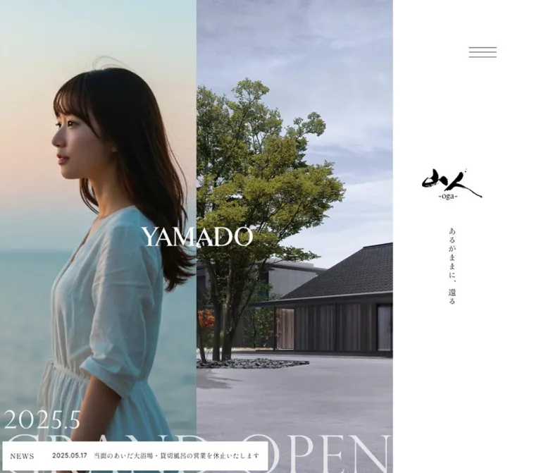
The homepage introduces a place before presenting its practical information. On desktop, two photographs occupy most of the opening viewport: a woman beside a quiet sea and an elevated view of the property at sunset. A white identity rail holds the brushwork logo, a three-line menu trigger, and the vertical phrase “あるがままに、還る”. A white YAMADO wordmark crosses the seam between the photographs.
The rest of the page alternates photographic immersion with spacious editorial passages. Regular-weight Japanese serif headings, unusually generous line height, and narrow copy columns provide a calm reading rhythm. Navigation, accommodation information, news, access, and reservations make this a full hotel website. Its photographic opening is one component of that larger information structure.
How to Read This Reference
- Measured means a supplied computed style or rendered bounding rectangle. Values are rounded for readability where appropriate.
- Visual estimate means a dimension or appearance read from the supplied captures. It is not a recovered CSS declaration.
- Calculated means arithmetic from measured dimensions, such as a column proportion or aspect ratio.
- Recommended means guidance for a new implementation. Breakpoints, accessibility improvements, and the starter CSS are explicitly adaptations.
- Named tokens are reference aliases unless identified as source custom properties.
- Visibility matters: navigation content has measurable DOM boxes although the captures show its closed state. The desktop header and reservation tab also have offscreen initial positions. These boxes must not be mistaken for visible opening content.
- Graphic lettering is separate from text: an empty heading wrapper can contain artwork. Its inherited font size does not establish the size or font of the visible lettering.
Tokens — Colors
Default Palette
| Name | Value | Suggested token | Evidence and role |
|---|---|---|---|
| White Canvas | #ffffff |
--color-canvas |
Measured body and header background; also the inverse footer text color |
| Editorial Ink | #111111 |
--color-ink |
Measured body text, Japanese headings, navigation, and filled navigation reservation button |
| Muted Sage Gray | #c8cfc7 |
--color-muted |
Measured Inter labels including Access and copyright; also navigation group headings |
| Dock Charcoal | #191f20 |
--color-dock-base |
RGB portion of the measured mobile reservation-bar background |
| Translucent Dock | rgba(25, 31, 32, 0.8) |
--color-dock |
Exact measured mobile reservation-bar fill |
| Booking Integration Black | #000000 |
source --tripla-theme-btn-color |
Declared integration token; not evidence for every control inside an unopened booking interface |
| Footer Shade | Approximately rgba(0, 0, 0, 0.55) |
--footer-shade |
Recommended starting overlay only; the actual darkening implementation was not supplied |
The interface contributes very little chromatic decoration. Pale blue water, peach evening light, dark vegetation, copper cookware, red sauce, and green ingredients belong to the photographs. They should not become a set of UI accent colors.
The muted sage gray is a supporting label color. In the footer it sits against a dark photograph. Its presence in the navigation DOM does not establish that low-contrast text on white is an intended accessible treatment.
Palette Behavior
No theme selector or dark-mode state was demonstrated. The footer is an inverse section within the white page, not evidence of a global dark theme.
The supplied custom properties include many WordPress color, gradient, and shadow presets, plus a Swiper blue. Their declaration does not establish visible use. Do not add blue controls, bright gradients, or preset shadows to the reference palette without component-level evidence.
Tokens — Typography
Japanese Editorial Text — Shippori Mincho B1
- Measured family:
'Shippori Mincho B1', serif. - Measured weight:
400throughout the sampled body text, Japanese section headings, navigation links, and action labels. - Character: fine strokes, visible serif detail, and a literary tone suited to the landscape-led presentation.
- Leading:
1.75for general interface text,2for introductory and feature prose, and1.4for the large feature headings. - Tracking: body and prose commonly use approximately
0.05em. Large headings inherit an absolute tracking value from their surrounding text; they do not have a measured0.05emheading-level value.
English Utility Text — Inter
- Measured family:
Inter, sans-serif. - Roles: Event and Contents navigation headings, Access labels, copyright, the navigation map label, and the desktop location label.
- Measured weight:
400. - Character: small and quiet; it distinguishes practical information from the Japanese editorial voice.
Numbered English Index Labels — Cormorant Garamond
- Measured family:
'Cormorant Garamond', serif. - Verified examples: the English labels accompanying items 01–05, including Onsen, Event, Facility, Restaurant, and Access.
- Measured weight:
400. - Role: adds a restrained classical accent to the hotel information index.
Logo and Display Artwork
The black and white brushwork logos are graphic marks. Preserve their proportions and stroke character using authorized artwork rather than approximating them with a Japanese font.
The YAMADO hero wordmark is visibly a contrasting Roman serif, but its actual font family is not established by the supplied text samples. Cormorant Garamond is confirmed elsewhere on the page; assigning it to the hero would be a recommended approximation, not a verified finding.
Several H2 wrappers expose little or no extracted text while retaining substantial dimensions. Do not derive their visible lettering size from the inherited 14–16px wrapper style.
Type Scale
All numeric pairs below are font size / line height in pixels.
| Role | Desktop | Mobile | Family and notes |
|---|---|---|---|
| General body and action labels | 15.7388 / 27.5429 |
14.0245 / 24.5429 |
Shippori Mincho B1; tracking 0.786939px / 0.701224px |
| Feature heading | 47.1265 / 65.9771 |
28.2694 / 39.5771 |
Shippori Mincho B1; weight 400; measured heading examples occupy two lines |
| Feature prose | 15.4776 / 30.9551 |
12.0490 / 24.0980 |
Shippori Mincho B1; tracking approximately 0.05em |
| Introductory prose | 17.3469 / 34.6939 |
13.0612 / 26.1224 |
Shippori Mincho B1; line height 2 |
| Navigation links | 15.6082 / 27.3143 |
13.0367 / 22.8143 |
Shippori Mincho B1 |
| Numbered English index labels | 15.6082 / 27.3143 |
13.0367 / 22.8143 |
Cormorant Garamond |
| Access and copyright | 13.6082 / 27.2163 |
11.0367 / 22.0735 |
Inter; address uses the same size with the Japanese serif |
| Navigation map label | 12.7388 / 22.2929 |
11.0245 / 19.2929 |
Inter; the footer link wrapper has a different inherited style |
| Hero YAMADO lettering | Approximately 60px high type scale |
Approximately 40px high type scale |
Visual estimate; exact font and text-versus-artwork implementation unknown |
Recommended readability adjustment: a new implementation can raise mobile feature prose from the measured 12.05px to at least 14px while retaining the generous line height. Allow sections to grow when this increases wrapping.
Tokens — Spacing & Shapes
Spacing Scale
Repeated measurements suggest a useful reference unit: approximately 18.6939px on desktop and 10.1224px on mobile. This is a descriptive grouping of observed values, not a recovered source variable or proof of the original fluid formula.
| Use | Desktop | Mobile | Evidence |
|---|---|---|---|
| Reference unit | 18.6939px |
10.1224px |
Recurs in padding and gaps |
| Header vertical padding | 28.0408px |
15.1837px |
Computed header styles |
| Standard text-section vertical padding | 93.4694px |
50.6122px |
Nature, cuisine, and room sections |
| Intro bottom / news vertical padding | 186.939px |
101.224px |
Computed section styles |
| Hotel overview top padding | 280.408px |
151.837px |
Computed section styles |
| Closing reservation-area vertical padding | 130.857px |
70.8571px |
Computed section styles |
| Inline action gap | 15.7388px |
14.0245px |
Measured inline-flex links |
| Outlined button padding | 15.7388px 31.4776px |
14.0245px 28.0490px |
Contact and navigation action measurements |
| Mobile main-content inset | — | 20.2344px |
Shared section left edge |
| Mobile navigation inset | — | 32.3918px |
Computed navigation-link padding |
Border Radius and Rules
| Element | Treatment | Evidence level |
|---|---|---|
| Header, editorial sections, major link tiles | Square corners | Measured border-radius: 0 |
| Contact and reservation buttons | Square corners | Measured radius; visible contact outline |
| Contact outline | Approximately 1px, white |
Visual estimate |
| Menu strokes | Approximately 1px |
Visual estimate |
| Assistance launcher | Approximately 80px circle |
Visual estimate from both viewport sizes |
| Assistance text bubble | Small corner radius, approximately 3–4px |
Visual estimate; confined to the assistance widget |
The hotel interface has no demonstrated card-shadow elevation system. Large photographs meet at hard edges, while white space and fine outlines establish hierarchy. The circular assistance launcher is a distinct utility element rather than a model for the rest of the components.
Layout Measurements
| Element | Desktop, 1440 × 1000 | Mobile, 390 × 844 |
|---|---|---|
| Document height | 14192.125px |
11878.578px |
| Opening section | 1440 × 1000px |
390 × 873.594px |
| Hero photograph layout | Approximately 570px + 570px columns |
Two stacked images, each approximately 390 × 307.7px |
| Hero identity area | Approximately 300px right rail |
White upper area approximately 258.3px tall |
| Persistent header | 107.5px high |
81.78125px high |
| Main editorial container | 1130.5px wide, left edge 154.75px |
349.531px wide, left edge 20.234px |
| Feature prose column | 560px wide, left edge 725.25px |
Full 349.531px content width |
| Main feature text section | 1000px high |
844px high |
| Standalone media block after introduction | 1440 × 810px |
390 × 219.375px |
| Large hotel information tile | Approximately 659.657 × 650.860px |
349.531 × 344.859px |
| News row | Approximately 771.516 × 179.986px |
349.531 × 127.719px |
| Contact button | 292.156 × 61px |
240.734 × 54.578px |
| Reservation control | 61 × 168.484px vertical tab |
390 × 52.578px bottom bar |
| Lower information footer | 761.984px high |
734.484px high |
The standalone media block is exactly 16:9 at both measured sizes. The large hotel information tiles are nearly square; forcing a strict square is an approximation.
Components
Opening Photographic Composition
Role: establishes atmosphere, location, and identity before the practical content.
Desktop anatomy:
- A full-height portrait photograph at the left.
- An equally wide landscape/property photograph beside it.
- A white identity rail at the right.
- A white YAMADO wordmark centered over the seam between the two photographs.
- A small menu trigger near the top of the white rail.
- The brushwork logo and vertical Japanese phrase below it.
The photograph columns occupy approximately 39.58% of the viewport each; the white rail occupies approximately 20.83%. These percentages are calculated from the capture, not recovered grid declarations.
The measured hero logo box is 133.031 × 68.438px, at approximately x: 1213.69px, y: 355.30px. The vertical phrase occupies a narrow box near x: 1272.20px, y: 489.16px. The identity group sits slightly left of the rail's geometric center.
On mobile, the white area moves above the images. The normal header supplies the logo at the upper left; the vertical phrase remains near the right edge below the menu. The woman and property photographs stack, and YAMADO crosses their horizontal boundary near y: 566px.
The mobile opening is about 30px taller than the captured viewport even before considering the fixed booking overlay. Do not force the entire composition into an arbitrary one-screen crop.
Persistent Header
Role: retains the logo and navigation access beyond the opening scene.
The desktop scrolled captures show a full-width white strip with the black logo at the left and a three-line menu at the right. The measured logo wrapper remains 100 × 51.438px on both devices. Its desktop position begins around x: 56.06px; mobile begins around x: 30.34px.
The source custom property --header-height is 107.5px on desktop and 81.78125px on mobile.
In the desktop initial DOM, the header is positioned at y: -107.5px, entirely above the viewport. It appears at the top in the scrolled photographs. Mobile shows the header at the top in both supplied captures. The exact scroll threshold and fixed-versus-sticky implementation were not supplied.
The visible menu strokes are approximately 66px wide on desktop and 36px wide on mobile. Those are artwork dimensions, not verified interactive target sizes.
Navigation Content
Role: provides access to the complete hotel website and related services.
The rendered desktop DOM contains three spatial groups: Event information at the left, Contents links near the center, and access/action information at the right. The Event group contains an empty-state message and an event-list link. This is navigation-associated content; it is not visible as a hero panel in the supplied opening capture.
The links cover nature, cuisine, restaurant, rooms, hot springs, facilities, access, notices, FAQ, recruitment, and contact. Separate actions lead to reservations and the online store. Social, map, and corporate links complete the utility group.
Mobile navigation links have full-width boxes approximately 50px high, with about 13px vertical and 32.39px horizontal padding. Reservation and store buttons become approximately 325.219 × 54.578px within the navigation inset.
No expanded-menu screenshot or activation sequence was supplied. Its opening direction, backdrop, scroll locking, focus behavior, and close animation remain unverified. The FAQ item exposes no navigable destination in the supplied link record; its actual action is also unknown.
Introductory Story
Role: shifts from visual arrival to the hotel's relationship with the peninsula.
This section follows the hero and uses considerably more breathing room than a typical paragraph block. Desktop section padding is approximately 93.47px above and 186.94px below. The prose uses 17.3469px / 2, with a measured text region about 584px wide. A narrow graphic heading container stands to its right.
The copy is poetic and deliberately broken into short statements. Preserve the authored rhythm where appropriate, but do not insert arbitrary line breaks solely to imitate the capture width.
On mobile, the heading container becomes horizontal and the prose occupies the shared 349.53px column. Text changes to 13.0612px / 2. The section measures about 620px tall, with 50.61px top and 101.22px bottom padding.
The orientation change is supported by the heading-container geometry. Its exact graphic content and internal construction are not recoverable from the extracted text.
Full-Bleed Media and Culinary Composition
Role: gives landscape, craft, and ingredients the scale normally assigned to large marketing headlines.
A standalone media block after the introduction measures 16:9 on both devices. Other large media areas are interleaved with the editorial sections; their complete internal structure is not exposed by the text samples.
The supplied desktop culinary capture shows an asymmetric, edge-to-edge image composition. A chef finishing a plated fish dish occupies approximately the left 1020px. The right 420px column contains a close view of fish above green shoots. The contact between images is a hard seam with no decorative gutter or corner radius.
These are visible crop measurements. The capture does not establish the full height or native aspect ratio of every image. It also does not establish whether the media are still images, video frames, or a changing sequence.
For reuse, maintain the contrast in scale: a large human action beside close ingredient details. Keep photography large enough to show hands, cookware, food texture, and natural light rather than reducing it to small feature thumbnails.
Nature, Cuisine, and Room Editorial Sections
Role: connects the atmospheric imagery to specific reasons to explore the hotel.
All three sections share a measured composition:
- A white section occupying one viewport height at each inspected size.
- A wide graphic heading region above the editorial text.
- A regular-weight, two-line Japanese heading.
- A paragraph with double line spacing.
- One compact inline link with an approximately one-em internal gap.
On desktop the shared container is 1130.5px wide, while the heading and prose sit in its right-hand 560px column. This leaves a substantial open region to the left. The layout is intentionally asymmetric rather than a centered heading-and-paragraph stack.
The principal Japanese heading is 47.1265px / 1.4. Prose is 15.4776px / 2. The actual links include “男鹿の自然について”, “山人-oga-でのお食事”, and “客室について”. They are text-scale navigation actions rather than oversized filled conversion buttons.
On mobile the content spans the main 349.53px column, with a 28.2694px / 1.4 heading and 12.049px / 2 prose. The recorded text sections still measure 844px high. For an adaptation, prefer a minimum height and allow overflow content to extend the section when text is enlarged or translated.
Hotel Information Index
Role: consolidates the secondary parts of the stay into a numbered exploration area.
The section begins with a hotel introduction. On desktop, its introductory column is about 340px wide at the left, while two large link tiles sit in a roughly 660px column at the right. These tiles correspond to Onsen and Event and carry inverse text near their lower portion.
The next three links—Facility, Restaurant, and Access—form a row of approximately 357.7px-wide horizontal components. Their measured flex gaps are about 28.69px.
On mobile, the introduction and large tiles share the main content width. The two large tiles stack directly against each other in the measured layout. The three smaller links also stack, with roughly 20.12px internal gaps and about 129px overall height each.
The numbered English labels use Cormorant Garamond. The original order and unequal tile sizes are important: this is not a uniform five-card grid. The specific imagery inside these links was not shown in the supplied captures and should not be invented as an observed finding.
News List
Role: presents timely operational information within the same quiet editorial system.
The desktop heading and list-link area sits at the left; the news list occupies a wider right column beginning around x: 513.73px. Four article links were present. Each contains month, day, year, and a Japanese headline.
Measured desktop rows are approximately 771.52px wide and 179.99px high, with about 33.04px vertical padding. Mobile rows fill the 349.53px main column and measure approximately 127.72px high, with about 20.18px vertical padding.
On mobile, “一覧へ” follows the articles. On desktop it appears in the left introductory area. Preserve this deliberate action placement when reproducing the responsive hierarchy.
The latest supplied entry is dated September 3, 2026. Its exact internal date typography, separators, and hover state were not visually captured. A date column and fine row separators are reasonable implementation recommendations, not verified details.
Reservation Controls
Role: keeps booking accessible during a long editorial visit.
Three reservation placements are evidenced:
- A filled rectangular button within navigation content.
- A persistent viewport-edge control.
- A larger closing reservation link area before the information footer.
The desktop edge control is a white, approximately 61 × 168.484px vertical tab with dark Japanese text and a small dot above the label. In the scrolled captures it sits near the right edge and vertical center. Its initial DOM position is outside the viewport, so it is not a permanently visible part of the desktop opening composition.
Mobile replaces the vertical tab with a full-width bottom bar. The measured background is rgba(25, 31, 32, 0.8), the height is 52.578px, and the label is aligned toward the right. The dot becomes a horizontal companion to “宿泊予約”.
The closing reservation section measures approximately 787.03px high on desktop and 583.59px on mobile. Its main link area is much larger than a conventional button. The full visual treatment of that area was not supplied, so its geometry should not be mistaken for a verified card shape.
The reservation links target the homepage with ?tripla_booking_widget_open=search. This establishes the link destination, not the appearance or behavior of the unopened search interface.
Rock-Texture Information Footer
Role: ends the page with location, contact, related destinations, and a final expression of the peninsula's geology.
A close photograph of striated rock fills the background. The upper visible strip is lighter and clearer; the information area below is darker and visibly softened. Whether this comes from asset processing, an overlay, a filter, or a combination is not established by the provided styles.
Desktop anatomy:
- Centered white brushwork logo, approximately 157px wide.
- A two-column contact area: Access, address, and map on the left; a thin outlined contact button on the right.
- A centered pair of Instagram and YouTube icons.
- Three underlined destination links in one horizontal row.
- A centered muted copyright line.
The footer address is “〒010-0531 秋田県男鹿市船川港台島字鵜ノ崎62-29”. The contact action reads “お問い合わせ”. The map destination is directly linked in the original page.
Mobile centers every group in a single column. The contact button becomes approximately 240.73px wide. The three destination links stack with roughly 25px gaps between their line boxes. The logo remains approximately 157px wide, making it proportionally more prominent than on desktop.
Keep the photograph as a continuous surface behind the information. Avoid splitting these footer groups into separate cards.
Assistance Widget
Role: offers a separate help entry point over the hotel page.
The visible widget consists of an approximately 80px white circular launcher with chat imagery, a narrow white prompt reading “Do you need any help?”, and a small close control. Its prompt is approximately 198px wide and 40px high in the captures.
On desktop it floats near the lower right. On mobile the group extends from near the left margin to a launcher around x: 225px, directly above the reservation dock. The widget visibly covers some underlying imagery and, in the footer capture, part of the copyright region.
Treat its placement as an integration constraint. The supplied evidence does not demonstrate opening the conversation, dismissing the prompt, keyboard behavior, or a successful chat flow.
Tokens — Motion & Interaction
The following values are declared transitions in the supplied computed styles. They are evidence of authored transition settings, not recordings of complete interactions.
| Target | Measured transition | What is established |
|---|---|---|
| Persistent header | 0.8s cubic-bezier(0.645, 0.045, 0.355, 1) |
Header transition setting; initial and scrolled visibility differ |
| General action links | 0.4s |
Duration exists; changed properties and hover appearance were not supplied |
| Introductory heading | Opacity/filter 0.4s cubic-bezier(0.39, 0.575, 0.565, 1); transform 1s cubic-bezier(0.215, 0.61, 0.355, 1) |
Separate treatment for visibility/filter and geometry |
| Introductory paragraph | Same durations with 0.4s delay |
A delayed companion treatment is declared |
| Main graphic section headings | Opacity/filter 0.6s with 0.2s delay; transform 1s with 0.2s delay |
Shared reveal settings across the main editorial sections |
| Navigation event paragraph | Opacity 0.4s; transform 0.4s, with the corresponding easing curves above |
A shorter content transition is declared |
Motion Interpretation
The evidence supports an interface designed for gradual reveals and a moving header state. It does not identify the initial translation distance, blur amount, scroll trigger, replay rules, or whether a reveal runs only once.
The sampled elements report animation: none. This does not prove the absence of video, JavaScript animation, or animation on unsampled descendants. Likewise, a transition shorthand containing only all does not prove a nonzero animation duration.
No carousel advancement, autoplay interval, parallax distance, menu opening sequence, or booking interaction was demonstrated. Swiper custom properties alone are insufficient evidence for a visible slider.
Recommended motion language: reuse the measured 400–1000ms timing range for restrained opacity and small-position changes. Keep essential content visible by default, and add progressive enhancement only when initialization succeeds. Provide a static reduced-motion path.
Surfaces
| Surface | Appearance | Function |
|---|---|---|
| Main canvas | Solid white | Separates rich photography from quiet text |
| Hero identity rail | Solid white beside edge-to-edge images | Gives the logo and vertical phrase protected space |
| Persistent header | Solid white, no demonstrated shadow | Keeps navigation legible over changing scenes |
| Editorial content | Same white as the canvas | Uses placement and spacing rather than card boundaries |
| Large media regions | Natural-color photography, hard edges | Supplies emotional and sensory detail |
| Information tiles | Large link regions with inverse text in the first two items | Organizes secondary hotel destinations |
| Footer | Darkened, softened rock photograph | Carries location and contact information in white |
| Desktop booking tab | White rectangle with dark details | Remains legible over photographs |
| Mobile booking dock | Translucent charcoal with white text | Provides a persistent lower-edge action |
| Assistance controls | White circle and small white prompt | A distinct floating utility layer |
Imagery
The image direction connects human stillness, coastal scale, material texture, and food preparation. The opening portrait uses soft evening light and a quiet horizon. The property view introduces buildings as part of a larger landscape. The culinary composition moves close enough to show craft through hands, sauce, fish, and cookware. The footer turns geological texture into a final environmental surface.
Preserve differences in photographic scale. A portrait, an elevated landscape, an ingredient close-up, and a rock detail should not all receive identical crops. Favor natural light and believable material color over a uniform branded tint.
Use responsive crops deliberately. The same opening subjects appear in narrow desktop columns and broad mobile panels. Keep faces, architectural edges, and food preparation inside the safe focal region at both proportions.
Observed Asset References
No original image, video, logo, or font-file URLs were included in the supplied evidence. These references identify visible subjects, not invented filenames.
| Visual | Capture evidence | Implementation implication |
|---|---|---|
| Woman beside the sea | Desktop and mobile opening captures | Needs different focal framing for a tall column and a wide panel |
| Property and coastline at sunset | Desktop and mobile opening captures | Retain the relationship between buildings, vegetation, and horizon |
| Chef finishing a fish dish | Desktop culinary capture | Use a dominant crop large enough to show hands and preparation |
| Fish and green shoots | Right side of desktop culinary capture | Secondary detail images support the larger cooking scene |
| Brushwork hotel logo | Opening, persistent header, and footer | Preserve authorized artwork; use black and white variants |
| Striated rock | Desktop and mobile footer captures | Use a high-resolution texture with stable text contrast |
| Map, envelope, and social symbols | Footer captures | Small monochrome symbols; original icon package is unknown |
Do not apply image-rendering: pixelated to this photography. Preserve smooth detail and sufficient image resolution for full-width display.
Layout & Responsive Behavior
Observed Transformations
| Area | Desktop | Mobile |
|---|---|---|
| Opening identity | Separate white right rail | White area above the photographs; header supplies the logo |
| Opening photographs | Equal side-by-side columns | Full-width vertical stack |
| YAMADO wordmark | Crosses the vertical photograph seam | Crosses the horizontal photograph seam |
| Persistent header | Offscreen in the initial DOM; visible in scrolled captures | Visible in both supplied states |
| Main editorial text | Right-aligned column within a wide container | Single column with approximately 20px side insets |
| Large section headings | Approximately 47px | Approximately 28px |
| Hotel information index | Intro at left, large tiles at right, three links below | All groups stack vertically |
| News list action | Beside the list in the heading area | Below the articles |
| Footer access/contact | Two columns | Centered vertical stack |
| Footer destination links | One horizontal row | Three separate rows |
| Reservation control | Vertical right-edge tab after the opening state | Full-width bottom dock |
The original media-query boundaries and fluid sizing formulas were not supplied. The two inspected endpoints demonstrate reflow, but they do not establish an exact tablet layout.
Both documents are approximately fourteen viewport heights long. This sustained length is central to the pacing: large images and spacious text scenes take turns. Avoid compressing the entire hierarchy into a short grid of feature cards.
The evidence does not establish a global scroll-snap system or scroll hijacking. Ordinary document scrolling with viewport-scale sections is an appropriate implementation starting point.
Recommended responsive strategy: choose a content-driven breakpoint around 60rem for the desktop rail and two-column editorial layout, then test intermediate widths. Keep prose widths bounded, use content-safe minimum heights, and reserve bottom space for the mobile booking dock. These are recommendations rather than recovered source rules.
Do’s and Don’ts
Do
- Keep the opening relationship between two photographs, the white identity area, and the seam-crossing wordmark.
- Recompose the hero into stacked photographs on mobile.
- Use Shippori Mincho B1 at regular weight for the Japanese editorial voice.
- Reserve Inter for quiet English utility information and Cormorant Garamond for the verified numbered index role.
- Preserve the near-black and white UI palette while letting photography carry color.
- Use substantial vertical spacing and approximately double leading for descriptive prose.
- Maintain the desktop feature text in the right half of the main container.
- Keep contact and booking geometry rectangular and restrained.
- Preserve the unequal hierarchy of two large information tiles and three smaller links.
- Treat the rock footer as one continuous photographic surface.
- Account for the reservation dock and assistance widget together on mobile.
- Separate declared transition settings from interactions that have actually been tested.
Don’t
- Don’t convert the homepage into a generic conversion funnel with repeated bright buttons.
- Don’t replace the brushwork logo with typed Japanese characters.
- Don’t assume the YAMADO wordmark uses a particular font merely because that font appears elsewhere.
- Don’t apply every WordPress preset color or shadow found in the custom-property record.
- Don’t turn the information index into five identical rounded cards.
- Don’t force all photographs into one crop ratio or cover faces with overlaid text.
- Don’t reproduce the desktop side rail as a narrow third column on a phone.
- Don’t shrink long mobile copy simply to preserve a fixed section height.
- Don’t claim a slider, video loop, parallax effect, or booking modal design without further evidence.
- Don’t treat offscreen initial controls as a visible layout defect.
- Don’t let floating utilities permanently conceal footer links or essential text.
Recommended Implementation Additions
These are improvements for a new implementation, not verified features of the original:
- Provide a semantic page heading and meaningful alternatives for logo and display artwork whose text may otherwise be absent from extraction.
- Give menu and assistance controls accessible names and at least 44px interactive targets, even when the visible artwork is smaller.
- Use a real navigation button with expanded state. If the menu behaves as a modal, implement focus containment, Escape dismissal, and focus return.
- Raise mobile prose and small address text where needed for readability. Preserve the visual rhythm by allowing additional height.
- Keep readable contrast over every footer crop. Apply darkening behind text without blurring the text itself.
- Add visible keyboard focus treatment to underlined footer links, photographic links, and reservation actions.
- Include safe-area padding in the bottom dock and sufficient page-end clearance for it.
- Reposition or collapse the help prompt so that it does not conceal copyright or other footer content.
- Deliver appropriately sized responsive images with explicit dimensions. Load below-the-fold photography lazily while prioritizing the opening visual assets.
- If media are animated, provide suitable pause and reduced-motion behavior. Do not infer or enable sound from the supplied captures.
- Keep booking integration behavior separate from its visual trigger, and verify focus and mobile viewport behavior when integrating the actual service.
Agent Prompt Guide
Quick Color Reference
- Canvas and header:
#ffffff. - Primary editorial text:
#111111. - Muted utility text:
#c8cfc7, mainly on the dark footer. - Mobile booking dock:
rgba(25, 31, 32, 0.8). - Footer: natural rock photography, darkened sufficiently for white text.
- Action treatment: small text links, thin rectangular outlines, or a monochrome booking control.
- Photographic color remains in the images; it is not a UI badge palette.
Overall Prompt
“Create a Japanese resort hotel homepage with the atmosphere of a quiet coastal retreat. At desktop width, devote approximately 79% of the opening viewport to two equal photographs: a person beside the sea and an elevated property landscape. Use the remaining right rail as a white identity area with a brushwork logo, a thin three-line menu, and a short vertical Japanese phrase. Place a restrained white Roman-serif wordmark across the photograph seam. Continue with large photographic scenes and spacious white editorial sections. Use regular Shippori Mincho B1 headings, double-spaced Japanese prose, small Inter utility labels, and a numbered secondary index using Cormorant Garamond. Finish with access and contact details over darkened rock photography. On mobile, move the identity area above stacked photographs and place booking in a translucent charcoal bottom dock.”
Example Component Prompts
- Opening composition: “Build a 1440px desktop hero with approximately 570px portrait and landscape image columns, followed by a 300px white identity rail. Cross the image seam with a white YAMADO-style wordmark. At 390px, use a tall white upper area and two stacked image panels. Treat exact display lettering as supplied artwork or an explicitly chosen approximation.”
- Editorial section: “Create a spacious white section with a maximum content width near 1130px. On desktop, place a two-line, regular-weight Japanese serif heading and a 560px prose column in the right half. Use approximately 47px heading text, 15.5px prose with 2× leading, and a quiet inline exploration link. On mobile, use one column and a 28px heading.”
- Culinary imagery: “Compose a full-width photographic region with roughly 71% devoted to hands finishing a plated dish and the remaining column devoted to two ingredient details. Use natural color, hard image seams, and no rounded corners. Adjust crops to protect the food and hand positions.”
- Hotel index: “Arrange two large, nearly square destination tiles and three smaller horizontal links. Pair a two-digit number with a small Cormorant Garamond English label and a Japanese destination name. Stack the groups on mobile while preserving their unequal emphasis.”
- Footer: “Place a white brushwork logo above access details and a thin outlined contact action on a darkened photograph of striated rock. Use two contact columns on desktop, centered stacking on mobile, tiny monochrome social icons, underlined destination links, and muted sage-gray utility labels.”
- Reservation control: “Use a narrow white vertical booking tab with a small dot and Japanese label on desktop after the opening scene. On mobile, use a full-width, approximately 53px charcoal bar with the dot and label aligned toward the right. Include safe-area clearance.”
Quick Start
CSS Custom Properties
This is a visual implementation starting point, not recovered source code. The fluid unit interpolates between the two measured spacing endpoints. The 60rem breakpoint, fallback hero lettering, footer shade, hover feedback, and readable mobile prose minimum are recommendations.
The surrounding document retains a conventional root font size. Load the named fonts through an authorized source; these declarations alone do not download font files.
:root {
  /* Measured interface colors */
  --color-canvas: #fff;
  --color-ink: #111;
  --color-muted: #c8cfc7;
  --color-dock: rgba(25, 31, 32, 0.8);
  --color-dock-base: #191f20;

  /* Verified family roles; hero lettering remains an approximation */
  --font-japanese: 'Shippori Mincho B1', serif;
  --font-utility: Inter, sans-serif;
  --font-index: 'Cormorant Garamond', serif;
  --font-hero-fallback: 'Cormorant Garamond', serif;

  /* Recommended interpolation through the measured endpoints */
  --u: clamp(10.1224px, calc(6.9387px + 0.816333vw), 18.6939px);
  --text-ui: clamp(14.0245px, calc(13.3878px + 0.163265vw), 15.7388px);
  --text-heading: clamp(28.2694px, calc(21.2653px + 1.79592vw), 47.1265px);
  --text-copy: clamp(14px, 1.075vw, 15.4776px);
  --text-small: clamp(12px, 0.945vw, 13.6082px);
  --tracking-ui: 0.05em;

  /* Measured geometry, with recommended limits between viewports */
  --content-max: 1130.5px;
  --gutter: 20.2344px;
  --header-height: 81.78125px;
  --booking-height: 52.578px;
  --hero-intro-height: 258.281px;
  --hero-panel-height: calc(100vw * 0.788862);
  --rule: 1px;
  --radius: 0;
  --safe-bottom: env(safe-area-inset-bottom, 0px);

  /* Source-derived timing; activation logic is application-specific */
  --ease-reveal: cubic-bezier(0.39, 0.575, 0.565, 1);
  --ease-move: cubic-bezier(0.215, 0.61, 0.355, 1);
  --ease-header: cubic-bezier(0.645, 0.045, 0.355, 1);
  --motion-link: 400ms;
  --motion-header: 800ms;

  /* Recommended layer ordering */
  --z-header: 30;
  --z-booking: 40;
  --z-assistance: 50;
}

* { box-sizing: border-box; }

body {
  margin: 0;
  color: var(--color-ink);
  background: var(--color-canvas);
  font-family: var(--font-japanese);
  font-size: var(--text-ui);
  font-weight: 400;
  line-height: 1.75;
  letter-spacing: var(--tracking-ui);
}

button, input, select { font: inherit; }
a { color: inherit; }
img { display: block; max-width: 100%; }

.oga-site {
  padding-bottom: calc(var(--booking-height) + var(--safe-bottom));
}

.container {
  width: min(calc(100% - 2 * var(--gutter)), var(--content-max));
  margin-inline: auto;
}

.site-header {
  position: fixed;
  inset: 0 0 auto;
  z-index: var(--z-header);
  display: flex;
  align-items: center;
  justify-content: space-between;
  height: var(--header-height);
  padding-inline: calc(3 * var(--u)) calc(2 * var(--u));
  background: var(--color-canvas);
  transition: transform var(--motion-header) var(--ease-header);
}

.site-logo { display: block; width: 100px; }
.site-logo img { width: 100%; height: auto; }

.menu-button {
  display: flex;
  flex-direction: column;
  justify-content: center;
  align-items: center;
  gap: 9px;
  width: 44px;
  height: 44px;
  padding: 0;
  border: 0;
  color: inherit;
  background: transparent;
  cursor: pointer;
}

.menu-button span {
  width: 36px;
  height: 1px;
  background: currentColor;
}

.hero {
  position: relative;
  display: grid;
  grid-template-columns: minmax(0, 1fr);
  grid-template-rows:
    var(--hero-intro-height)
    var(--hero-panel-height)
    var(--hero-panel-height);
}

.hero-identity {
  position: relative;
  grid-row: 1;
  background: var(--color-canvas);
}

.hero-identity-logo, .hero-menu { display: none; }

.hero-phrase {
  position: absolute;
  top: 101.22px;
  right: var(--gutter);
  margin: 0;
  writing-mode: vertical-rl;
  white-space: nowrap;
  font-size: var(--text-ui);
  line-height: 1;
}

.hero-media { min-width: 0; overflow: hidden; }
.hero-portrait { grid-row: 2; }
.hero-property { grid-row: 3; }

.hero-media img {
  width: 100%;
  height: 100%;
  object-fit: cover;
  object-position: var(--focal-position, center);
}

.hero-wordmark {
  position: absolute;
  z-index: 1;
  top: calc(var(--hero-intro-height) + var(--hero-panel-height));
  left: 50%;
  margin: 0;
  transform: translate(-50%, -50%);
  color: #fff;
  font-family: var(--font-hero-fallback);
  font-size: 40px;
  font-weight: 400;
  line-height: 1;
  letter-spacing: normal;
  pointer-events: none;
}

.editorial-section {
  display: flex;
  align-items: center;
  min-height: 100svh;
  padding-block: calc(5 * var(--u));
  background: var(--color-canvas);
}

.editorial-copy h2 {
  margin: 0 0 calc(2 * var(--u));
  font-size: var(--text-heading);
  font-weight: 400;
  line-height: 1.4;
  letter-spacing: calc(var(--text-ui) * 0.05);
}

.editorial-copy p {
  margin: 0 0 var(--u);
  font-size: var(--text-copy);
  line-height: 2;
}

.text-link, .outline-button {
  display: inline-flex;
  align-items: center;
  justify-content: center;
  gap: 1em;
  border-radius: 0;
  text-decoration: none;
  transition: opacity var(--motion-link) var(--ease-reveal);
}

.text-link { justify-content: flex-start; }

.outline-button {
  min-height: 54.578px;
  padding: 1em 2em;
  border: var(--rule) solid currentColor;
}

.media-wide { aspect-ratio: 16 / 9; overflow: hidden; }
.media-wide img { width: 100%; height: 100%; object-fit: cover; }

/* Recommended composition based on the desktop culinary capture */
.culinary-grid { display: grid; gap: 0; }
.culinary-details { display: grid; grid-template-rows: 1fr 1fr; }
.culinary-grid img { width: 100%; height: 100%; object-fit: cover; }

.booking-dock {
  position: fixed;
  inset: auto 0 0;
  z-index: var(--z-booking);
  display: flex;
  align-items: center;
  justify-content: flex-end;
  gap: 1em;
  min-height: calc(var(--booking-height) + var(--safe-bottom));
  padding: 14px 30px calc(14px + var(--safe-bottom));
  color: #fff;
  background: var(--color-dock);
  text-decoration: none;
}

.booking-dock::before {
  content: '';
  flex: none;
  width: 6px;
  height: 6px;
  border-radius: 50%;
  background: currentColor;
}

.site-footer {
  position: relative;
  isolation: isolate;
  padding-block: calc(10 * var(--u));
  color: #fff;
  background-color: var(--color-dock-base);
  background-image: var(--footer-photo, none);
  background-position: center;
  background-size: cover;
  text-align: center;
}

.site-footer::before {
  content: '';
  position: absolute;
  inset: 0;
  z-index: -1;
  /* Recommended shade; original overlay strength is unknown */
  background: rgba(0, 0, 0, 0.55);
}

.footer-inner {
  width: min(calc(100% - 48.25px), 812.3125px);
  margin-inline: auto;
}

.footer-logo {
  width: 157px;
  margin: 0 auto calc(4 * var(--u));
}

.footer-contact {
  display: grid;
  align-items: center;
  gap: calc(1.5 * var(--u));
}

.footer-contact .outline-button {
  width: min(100%, 240.734px);
  justify-self: center;
}

.footer-label, .footer-copyright {
  color: var(--color-muted);
  font-family: var(--font-utility);
  font-size: var(--text-small);
  line-height: 2;
}

.footer-address {
  font-size: var(--text-small);
  font-style: normal;
  line-height: 2;
}

.footer-socials, .footer-links {
  display: flex;
  align-items: center;
  justify-content: center;
}

.footer-socials {
  gap: 20px;
  margin-block: calc(4 * var(--u));
}

.footer-links { flex-direction: column; gap: calc(2.5 * var(--u)); }
.footer-links a { text-underline-offset: 0.25em; }
.footer-copyright { margin-top: calc(2 * var(--u)); }

/* Recommended progressive enhancement; content starts visible */
[data-reveal] {
  transition:
    opacity 400ms var(--ease-reveal),
    transform 1000ms var(--ease-move);
}

.reveal-ready [data-reveal].is-pending {
  opacity: 0;
  transform: translateY(16px);
}

@media (hover: hover) {
  .text-link:hover, .outline-button:hover { opacity: 0.7; }
}

:where(a, button, input, select):focus-visible {
  outline: 2px solid currentColor;
  outline-offset: 5px;
}

@media (min-width: 60rem) {
  :root { --header-height: 107.5px; }
  .oga-site { padding-bottom: 0; }

  .site-header { visibility: hidden; transform: translateY(-100%); }
  .is-scrolled .site-header { visibility: visible; transform: none; }
  .menu-button, .menu-button span { width: 66px; }

  .hero {
    grid-template-columns: 39.583333% 39.583333% 20.833334%;
    grid-template-rows: 100svh;
  }

  .hero-portrait { grid-area: 1 / 1; }
  .hero-property { grid-area: 1 / 2; }
  .hero-identity { grid-area: 1 / 3; }

  .hero-identity-logo {
    position: absolute;
    display: block;
    top: 35.53%;
    left: calc(50% - 10px);
    width: 133.031px;
    transform: translateX(-50%);
  }

  .hero-phrase {
    top: 48.916%;
    right: auto;
    left: calc(50% - 10px);
    transform: translateX(-50%);
  }

  .hero-menu {
    position: absolute;
    display: flex;
    top: 88px;
    left: 54%;
    transform: translateX(-50%);
  }

  .hero-wordmark { top: 50%; left: 39.583333%; font-size: 60px; }
  .editorial-copy { width: min(50%, 560px); margin-left: auto; }
  .culinary-grid { grid-template-columns: 17fr 7fr; }

  .booking-dock {
    inset: 50% 28px auto auto;
    display: none;
    justify-content: center;
    width: 61px;
    min-height: 168.484px;
    padding: 31.4776px 15.7388px;
    border: 1px solid var(--color-ink);
    transform: translateY(-50%);
    writing-mode: vertical-rl;
    color: var(--color-ink);
    background: #fff;
  }

  .is-scrolled .booking-dock { display: flex; }
  .site-footer { padding-block: calc(10 * var(--u)) calc(5 * var(--u)); }
  .footer-contact { grid-template-columns: 1fr 1fr; gap: 28.03px; text-align: left; }
  .footer-contact .outline-button { width: 292.156px; min-height: 61px; }
  .footer-links { flex-direction: row; gap: calc(2.5 * var(--u)); }
}

@media (prefers-reduced-motion: reduce) {
  .site-header, [data-reveal], .text-link, .outline-button {
    transition: none;
  }
  .reveal-ready [data-reveal].is-pending {
    opacity: 1;
    transform: none;
  }
}
Component Assembly
Use an .oga-site wrapper containing .site-header, a main element, .site-footer, and the .booking-dock link. The hero contains .hero-identity, .hero-portrait, .hero-property, and .hero-wordmark. Each media container holds its own responsive image.
Supply the original authorized logo artwork to .site-logo, .hero-identity-logo, and .footer-logo. Set --footer-photo to an authorized rock image URL. Set --focal-position per hero image after checking both crops.
Application code must manage .is-scrolled; revealing the desktop header and booking tab after the hero leaves the viewport is a recommended starting rule, not the verified original threshold. Menu buttons still require navigation behavior. The CSS does not implement booking search, chat, media playback, or a complete navigation overlay.
Only add .reveal-ready after a working observer has initialized. The sample 16px reveal offset and opacity hover treatment are recommendations; their values were not measured on the original page.
Tailwind v4 Token Mapping
Optional aliases for a project already using Tailwind v4. This is not evidence that the original site uses Tailwind. Define the custom properties above first.
@theme inline {
  --color-canvas: var(--color-canvas);
  --color-editorial-ink: var(--color-ink);
  --color-sage-muted: var(--color-muted);
  --color-booking-dock: var(--color-dock);

  --font-editorial: var(--font-japanese);
  --font-utility-label: var(--font-utility);
  --font-numbered-index: var(--font-index);

  --text-interface: var(--text-ui);
  --text-feature-heading: var(--text-heading);
  --text-feature-copy: var(--text-copy);
  --text-utility-small: var(--text-small);

  --spacing-rhythm: var(--u);
  --spacing-page-gutter: var(--gutter);
  --radius-flat: 0px;
}
When integrating this mapping, use a distinct alias such as --color-page: var(--color-canvas) if the build tool would otherwise emit a self-referencing declaration for the canvas token.
Sources & Evidence
- Inspected original and final page: https://oga.yamado.co.jp/. The supplied record reports HTTP 200 and the same original/final URL.
- Capture date: September 12, 2026, 17:16:02.930 UTC, equivalent to September 13, 2026, 02:16:02.930 JST. This is the supplied retrieval timestamp, not a separately performed visit.
- Desktop visual evidence: three supplied 1440 × 1000 captures showing the opening hero, a scrolled culinary composition, and the information footer.
- Mobile visual evidence: two supplied 390 × 844 captures showing the opening hero and information footer.
- Rendered DOM/computed-style evidence: both viewport records, including font stacks, colors, element geometry, padding, gaps, transition declarations, source custom properties, link destinations, and document height.
- Inspection procedure reported by the supplied record: at least five seconds of initial observation, readiness checks for loading, finite motion, layout stability, and visible image decoding, followed by scrolling through intermediate positions. Perpetual animations were temporarily paused during readiness checks and resumed. SharedWorkers and service workers were disabled.
- Behavioral limits: no demonstrated menu activation, FAQ action, hover sequence, booking search, chat conversation, media controls, or independently verified animation loop. Readiness checks do not establish semantic completeness or reveal every delayed state.
- Asset and implementation limits: original image/font file URLs, full stylesheets, pseudo-element styles, exact breakpoints, and graphic lettering internals were not supplied. The reference uses the provided evidence without additional browsing or file inspection.
This document describes the current captured homepage. Measured endpoints, visual estimates, and recommended implementation choices are identified separately throughout.
# 山人-oga- / YAMADO — Style Reference

> A coastal retreat presented through expansive photographs, fine Japanese serif text, and unhurried white space.

**Website:** [oga.yamado.co.jp](https://oga.yamado.co.jp/)
**Original URL:** https://oga.yamado.co.jp/
**Final URL:** https://oga.yamado.co.jp/
**Status:** HTTP 200; the supplied record reports no redirect.
**Theme:** white editorial surfaces, near-black typography, and an inverse photographic footer.
**Inspected:** September 13, 2026, at 02:16 JST. The supplied capture timestamp is September 12, 2026, at 17:16:02.930 UTC.
**Viewports:** 1440 × 1000 desktop and 390 × 844 mobile, in CSS pixels.
**Scope:** the current resort hotel homepage. Visual evidence covers the opening composition and footer at both sizes, plus a desktop culinary photograph composition. Rendered DOM and computed styles additionally cover navigation, the introductory story, nature/cuisine/room sections, hotel information links, notices, and reservation areas. Linked pages and expanded interactive states were not inspected.

The homepage introduces a place before presenting its practical information. On desktop, two photographs occupy most of the opening viewport: a woman beside a quiet sea and an elevated view of the property at sunset. A white identity rail holds the brushwork logo, a three-line menu trigger, and the vertical phrase “あるがままに、還る”. A white YAMADO wordmark crosses the seam between the photographs.

The rest of the page alternates photographic immersion with spacious editorial passages. Regular-weight Japanese serif headings, unusually generous line height, and narrow copy columns provide a calm reading rhythm. Navigation, accommodation information, news, access, and reservations make this a full hotel website. Its photographic opening is one component of that larger information structure.

## How to Read This Reference

- **Measured** means a supplied computed style or rendered bounding rectangle. Values are rounded for readability where appropriate.
- **Visual estimate** means a dimension or appearance read from the supplied captures. It is not a recovered CSS declaration.
- **Calculated** means arithmetic from measured dimensions, such as a column proportion or aspect ratio.
- **Recommended** means guidance for a new implementation. Breakpoints, accessibility improvements, and the starter CSS are explicitly adaptations.
- **Named tokens** are reference aliases unless identified as source custom properties.
- **Visibility matters:** navigation content has measurable DOM boxes although the captures show its closed state. The desktop header and reservation tab also have offscreen initial positions. These boxes must not be mistaken for visible opening content.
- **Graphic lettering is separate from text:** an empty heading wrapper can contain artwork. Its inherited font size does not establish the size or font of the visible lettering.

## Tokens — Colors

### Default Palette

| Name | Value | Suggested token | Evidence and role |
| --- | --- | --- | --- |
| White Canvas | `#ffffff` | `--color-canvas` | Measured body and header background; also the inverse footer text color |
| Editorial Ink | `#111111` | `--color-ink` | Measured body text, Japanese headings, navigation, and filled navigation reservation button |
| Muted Sage Gray | `#c8cfc7` | `--color-muted` | Measured Inter labels including Access and copyright; also navigation group headings |
| Dock Charcoal | `#191f20` | `--color-dock-base` | RGB portion of the measured mobile reservation-bar background |
| Translucent Dock | `rgba(25, 31, 32, 0.8)` | `--color-dock` | Exact measured mobile reservation-bar fill |
| Booking Integration Black | `#000000` | source `--tripla-theme-btn-color` | Declared integration token; not evidence for every control inside an unopened booking interface |
| Footer Shade | Approximately `rgba(0, 0, 0, 0.55)` | `--footer-shade` | Recommended starting overlay only; the actual darkening implementation was not supplied |

The interface contributes very little chromatic decoration. Pale blue water, peach evening light, dark vegetation, copper cookware, red sauce, and green ingredients belong to the photographs. They should not become a set of UI accent colors.

The muted sage gray is a supporting label color. In the footer it sits against a dark photograph. Its presence in the navigation DOM does not establish that low-contrast text on white is an intended accessible treatment.

### Palette Behavior

No theme selector or dark-mode state was demonstrated. The footer is an inverse section within the white page, not evidence of a global dark theme.

The supplied custom properties include many WordPress color, gradient, and shadow presets, plus a Swiper blue. Their declaration does not establish visible use. Do not add blue controls, bright gradients, or preset shadows to the reference palette without component-level evidence.

## Tokens — Typography

### Japanese Editorial Text — Shippori Mincho B1

- **Measured family:** `'Shippori Mincho B1', serif`.
- **Measured weight:** `400` throughout the sampled body text, Japanese section headings, navigation links, and action labels.
- **Character:** fine strokes, visible serif detail, and a literary tone suited to the landscape-led presentation.
- **Leading:** `1.75` for general interface text, `2` for introductory and feature prose, and `1.4` for the large feature headings.
- **Tracking:** body and prose commonly use approximately `0.05em`. Large headings inherit an absolute tracking value from their surrounding text; they do not have a measured `0.05em` heading-level value.

### English Utility Text — Inter

- **Measured family:** `Inter, sans-serif`.
- **Roles:** Event and Contents navigation headings, Access labels, copyright, the navigation map label, and the desktop location label.
- **Measured weight:** `400`.
- **Character:** small and quiet; it distinguishes practical information from the Japanese editorial voice.

### Numbered English Index Labels — Cormorant Garamond

- **Measured family:** `'Cormorant Garamond', serif`.
- **Verified examples:** the English labels accompanying items 01–05, including Onsen, Event, Facility, Restaurant, and Access.
- **Measured weight:** `400`.
- **Role:** adds a restrained classical accent to the hotel information index.

### Logo and Display Artwork

The black and white brushwork logos are graphic marks. Preserve their proportions and stroke character using authorized artwork rather than approximating them with a Japanese font.

The YAMADO hero wordmark is visibly a contrasting Roman serif, but its actual font family is not established by the supplied text samples. Cormorant Garamond is confirmed elsewhere on the page; assigning it to the hero would be a recommended approximation, not a verified finding.

Several H2 wrappers expose little or no extracted text while retaining substantial dimensions. Do not derive their visible lettering size from the inherited 14–16px wrapper style.

### Type Scale

All numeric pairs below are font size / line height in pixels.

| Role | Desktop | Mobile | Family and notes |
| --- | --- | --- | --- |
| General body and action labels | `15.7388 / 27.5429` | `14.0245 / 24.5429` | Shippori Mincho B1; tracking `0.786939px` / `0.701224px` |
| Feature heading | `47.1265 / 65.9771` | `28.2694 / 39.5771` | Shippori Mincho B1; weight 400; measured heading examples occupy two lines |
| Feature prose | `15.4776 / 30.9551` | `12.0490 / 24.0980` | Shippori Mincho B1; tracking approximately `0.05em` |
| Introductory prose | `17.3469 / 34.6939` | `13.0612 / 26.1224` | Shippori Mincho B1; line height 2 |
| Navigation links | `15.6082 / 27.3143` | `13.0367 / 22.8143` | Shippori Mincho B1 |
| Numbered English index labels | `15.6082 / 27.3143` | `13.0367 / 22.8143` | Cormorant Garamond |
| Access and copyright | `13.6082 / 27.2163` | `11.0367 / 22.0735` | Inter; address uses the same size with the Japanese serif |
| Navigation map label | `12.7388 / 22.2929` | `11.0245 / 19.2929` | Inter; the footer link wrapper has a different inherited style |
| Hero YAMADO lettering | Approximately `60px` high type scale | Approximately `40px` high type scale | Visual estimate; exact font and text-versus-artwork implementation unknown |

**Recommended readability adjustment:** a new implementation can raise mobile feature prose from the measured 12.05px to at least 14px while retaining the generous line height. Allow sections to grow when this increases wrapping.

## Tokens — Spacing & Shapes

### Spacing Scale

Repeated measurements suggest a useful reference unit: approximately **18.6939px on desktop** and **10.1224px on mobile**. This is a descriptive grouping of observed values, not a recovered source variable or proof of the original fluid formula.

| Use | Desktop | Mobile | Evidence |
| --- | --- | --- | --- |
| Reference unit | `18.6939px` | `10.1224px` | Recurs in padding and gaps |
| Header vertical padding | `28.0408px` | `15.1837px` | Computed header styles |
| Standard text-section vertical padding | `93.4694px` | `50.6122px` | Nature, cuisine, and room sections |
| Intro bottom / news vertical padding | `186.939px` | `101.224px` | Computed section styles |
| Hotel overview top padding | `280.408px` | `151.837px` | Computed section styles |
| Closing reservation-area vertical padding | `130.857px` | `70.8571px` | Computed section styles |
| Inline action gap | `15.7388px` | `14.0245px` | Measured inline-flex links |
| Outlined button padding | `15.7388px 31.4776px` | `14.0245px 28.0490px` | Contact and navigation action measurements |
| Mobile main-content inset | — | `20.2344px` | Shared section left edge |
| Mobile navigation inset | — | `32.3918px` | Computed navigation-link padding |

### Border Radius and Rules

| Element | Treatment | Evidence level |
| --- | --- | --- |
| Header, editorial sections, major link tiles | Square corners | Measured `border-radius: 0` |
| Contact and reservation buttons | Square corners | Measured radius; visible contact outline |
| Contact outline | Approximately `1px`, white | Visual estimate |
| Menu strokes | Approximately `1px` | Visual estimate |
| Assistance launcher | Approximately `80px` circle | Visual estimate from both viewport sizes |
| Assistance text bubble | Small corner radius, approximately `3–4px` | Visual estimate; confined to the assistance widget |

The hotel interface has no demonstrated card-shadow elevation system. Large photographs meet at hard edges, while white space and fine outlines establish hierarchy. The circular assistance launcher is a distinct utility element rather than a model for the rest of the components.

### Layout Measurements

| Element | Desktop, 1440 × 1000 | Mobile, 390 × 844 |
| --- | --- | --- |
| Document height | `14192.125px` | `11878.578px` |
| Opening section | `1440 × 1000px` | `390 × 873.594px` |
| Hero photograph layout | Approximately `570px + 570px` columns | Two stacked images, each approximately `390 × 307.7px` |
| Hero identity area | Approximately `300px` right rail | White upper area approximately `258.3px` tall |
| Persistent header | `107.5px` high | `81.78125px` high |
| Main editorial container | `1130.5px` wide, left edge `154.75px` | `349.531px` wide, left edge `20.234px` |
| Feature prose column | `560px` wide, left edge `725.25px` | Full `349.531px` content width |
| Main feature text section | `1000px` high | `844px` high |
| Standalone media block after introduction | `1440 × 810px` | `390 × 219.375px` |
| Large hotel information tile | Approximately `659.657 × 650.860px` | `349.531 × 344.859px` |
| News row | Approximately `771.516 × 179.986px` | `349.531 × 127.719px` |
| Contact button | `292.156 × 61px` | `240.734 × 54.578px` |
| Reservation control | `61 × 168.484px` vertical tab | `390 × 52.578px` bottom bar |
| Lower information footer | `761.984px` high | `734.484px` high |

The standalone media block is exactly 16:9 at both measured sizes. The large hotel information tiles are nearly square; forcing a strict square is an approximation.

## Components

### Opening Photographic Composition

**Role:** establishes atmosphere, location, and identity before the practical content.

Desktop anatomy:

1. A full-height portrait photograph at the left.
2. An equally wide landscape/property photograph beside it.
3. A white identity rail at the right.
4. A white YAMADO wordmark centered over the seam between the two photographs.
5. A small menu trigger near the top of the white rail.
6. The brushwork logo and vertical Japanese phrase below it.

The photograph columns occupy approximately 39.58% of the viewport each; the white rail occupies approximately 20.83%. These percentages are calculated from the capture, not recovered grid declarations.

The measured hero logo box is `133.031 × 68.438px`, at approximately `x: 1213.69px, y: 355.30px`. The vertical phrase occupies a narrow box near `x: 1272.20px, y: 489.16px`. The identity group sits slightly left of the rail's geometric center.

On mobile, the white area moves above the images. The normal header supplies the logo at the upper left; the vertical phrase remains near the right edge below the menu. The woman and property photographs stack, and YAMADO crosses their horizontal boundary near `y: 566px`.

The mobile opening is about 30px taller than the captured viewport even before considering the fixed booking overlay. Do not force the entire composition into an arbitrary one-screen crop.

### Persistent Header

**Role:** retains the logo and navigation access beyond the opening scene.

The desktop scrolled captures show a full-width white strip with the black logo at the left and a three-line menu at the right. The measured logo wrapper remains `100 × 51.438px` on both devices. Its desktop position begins around `x: 56.06px`; mobile begins around `x: 30.34px`.

The source custom property `--header-height` is `107.5px` on desktop and `81.78125px` on mobile.

In the desktop initial DOM, the header is positioned at `y: -107.5px`, entirely above the viewport. It appears at the top in the scrolled photographs. Mobile shows the header at the top in both supplied captures. The exact scroll threshold and fixed-versus-sticky implementation were not supplied.

The visible menu strokes are approximately 66px wide on desktop and 36px wide on mobile. Those are artwork dimensions, not verified interactive target sizes.

### Navigation Content

**Role:** provides access to the complete hotel website and related services.

The rendered desktop DOM contains three spatial groups: Event information at the left, Contents links near the center, and access/action information at the right. The Event group contains an empty-state message and an event-list link. This is navigation-associated content; it is not visible as a hero panel in the supplied opening capture.

The links cover nature, cuisine, restaurant, rooms, hot springs, facilities, access, notices, FAQ, recruitment, and contact. Separate actions lead to reservations and the online store. Social, map, and corporate links complete the utility group.

Mobile navigation links have full-width boxes approximately 50px high, with about 13px vertical and 32.39px horizontal padding. Reservation and store buttons become approximately `325.219 × 54.578px` within the navigation inset.

No expanded-menu screenshot or activation sequence was supplied. Its opening direction, backdrop, scroll locking, focus behavior, and close animation remain unverified. The FAQ item exposes no navigable destination in the supplied link record; its actual action is also unknown.

### Introductory Story

**Role:** shifts from visual arrival to the hotel's relationship with the peninsula.

This section follows the hero and uses considerably more breathing room than a typical paragraph block. Desktop section padding is approximately 93.47px above and 186.94px below. The prose uses `17.3469px / 2`, with a measured text region about 584px wide. A narrow graphic heading container stands to its right.

The copy is poetic and deliberately broken into short statements. Preserve the authored rhythm where appropriate, but do not insert arbitrary line breaks solely to imitate the capture width.

On mobile, the heading container becomes horizontal and the prose occupies the shared 349.53px column. Text changes to `13.0612px / 2`. The section measures about 620px tall, with 50.61px top and 101.22px bottom padding.

The orientation change is supported by the heading-container geometry. Its exact graphic content and internal construction are not recoverable from the extracted text.

### Full-Bleed Media and Culinary Composition

**Role:** gives landscape, craft, and ingredients the scale normally assigned to large marketing headlines.

A standalone media block after the introduction measures 16:9 on both devices. Other large media areas are interleaved with the editorial sections; their complete internal structure is not exposed by the text samples.

The supplied desktop culinary capture shows an asymmetric, edge-to-edge image composition. A chef finishing a plated fish dish occupies approximately the left 1020px. The right 420px column contains a close view of fish above green shoots. The contact between images is a hard seam with no decorative gutter or corner radius.

These are visible crop measurements. The capture does not establish the full height or native aspect ratio of every image. It also does not establish whether the media are still images, video frames, or a changing sequence.

For reuse, maintain the contrast in scale: a large human action beside close ingredient details. Keep photography large enough to show hands, cookware, food texture, and natural light rather than reducing it to small feature thumbnails.

### Nature, Cuisine, and Room Editorial Sections

**Role:** connects the atmospheric imagery to specific reasons to explore the hotel.

All three sections share a measured composition:

- A white section occupying one viewport height at each inspected size.
- A wide graphic heading region above the editorial text.
- A regular-weight, two-line Japanese heading.
- A paragraph with double line spacing.
- One compact inline link with an approximately one-em internal gap.

On desktop the shared container is 1130.5px wide, while the heading and prose sit in its right-hand 560px column. This leaves a substantial open region to the left. The layout is intentionally asymmetric rather than a centered heading-and-paragraph stack.

The principal Japanese heading is `47.1265px / 1.4`. Prose is `15.4776px / 2`. The actual links include “男鹿の自然について”, “山人-oga-でのお食事”, and “客室について”. They are text-scale navigation actions rather than oversized filled conversion buttons.

On mobile the content spans the main 349.53px column, with a `28.2694px / 1.4` heading and `12.049px / 2` prose. The recorded text sections still measure 844px high. For an adaptation, prefer a minimum height and allow overflow content to extend the section when text is enlarged or translated.

### Hotel Information Index

**Role:** consolidates the secondary parts of the stay into a numbered exploration area.

The section begins with a hotel introduction. On desktop, its introductory column is about 340px wide at the left, while two large link tiles sit in a roughly 660px column at the right. These tiles correspond to Onsen and Event and carry inverse text near their lower portion.

The next three links—Facility, Restaurant, and Access—form a row of approximately 357.7px-wide horizontal components. Their measured flex gaps are about 28.69px.

On mobile, the introduction and large tiles share the main content width. The two large tiles stack directly against each other in the measured layout. The three smaller links also stack, with roughly 20.12px internal gaps and about 129px overall height each.

The numbered English labels use Cormorant Garamond. The original order and unequal tile sizes are important: this is not a uniform five-card grid. The specific imagery inside these links was not shown in the supplied captures and should not be invented as an observed finding.

### News List

**Role:** presents timely operational information within the same quiet editorial system.

The desktop heading and list-link area sits at the left; the news list occupies a wider right column beginning around `x: 513.73px`. Four article links were present. Each contains month, day, year, and a Japanese headline.

Measured desktop rows are approximately 771.52px wide and 179.99px high, with about 33.04px vertical padding. Mobile rows fill the 349.53px main column and measure approximately 127.72px high, with about 20.18px vertical padding.

On mobile, “一覧へ” follows the articles. On desktop it appears in the left introductory area. Preserve this deliberate action placement when reproducing the responsive hierarchy.

The latest supplied entry is dated September 3, 2026. Its exact internal date typography, separators, and hover state were not visually captured. A date column and fine row separators are reasonable implementation recommendations, not verified details.

### Reservation Controls

**Role:** keeps booking accessible during a long editorial visit.

Three reservation placements are evidenced:

1. A filled rectangular button within navigation content.
2. A persistent viewport-edge control.
3. A larger closing reservation link area before the information footer.

The desktop edge control is a white, approximately `61 × 168.484px` vertical tab with dark Japanese text and a small dot above the label. In the scrolled captures it sits near the right edge and vertical center. Its initial DOM position is outside the viewport, so it is not a permanently visible part of the desktop opening composition.

Mobile replaces the vertical tab with a full-width bottom bar. The measured background is `rgba(25, 31, 32, 0.8)`, the height is `52.578px`, and the label is aligned toward the right. The dot becomes a horizontal companion to “宿泊予約”.

The closing reservation section measures approximately 787.03px high on desktop and 583.59px on mobile. Its main link area is much larger than a conventional button. The full visual treatment of that area was not supplied, so its geometry should not be mistaken for a verified card shape.

The reservation links target the homepage with `?tripla_booking_widget_open=search`. This establishes the link destination, not the appearance or behavior of the unopened search interface.

### Rock-Texture Information Footer

**Role:** ends the page with location, contact, related destinations, and a final expression of the peninsula's geology.

A close photograph of striated rock fills the background. The upper visible strip is lighter and clearer; the information area below is darker and visibly softened. Whether this comes from asset processing, an overlay, a filter, or a combination is not established by the provided styles.

Desktop anatomy:

- Centered white brushwork logo, approximately 157px wide.
- A two-column contact area: Access, address, and map on the left; a thin outlined contact button on the right.
- A centered pair of Instagram and YouTube icons.
- Three underlined destination links in one horizontal row.
- A centered muted copyright line.

The footer address is “〒010-0531 秋田県男鹿市船川港台島字鵜ノ崎62-29”. The contact action reads “お問い合わせ”. The map destination is directly linked in the original page.

Mobile centers every group in a single column. The contact button becomes approximately 240.73px wide. The three destination links stack with roughly 25px gaps between their line boxes. The logo remains approximately 157px wide, making it proportionally more prominent than on desktop.

Keep the photograph as a continuous surface behind the information. Avoid splitting these footer groups into separate cards.

### Assistance Widget

**Role:** offers a separate help entry point over the hotel page.

The visible widget consists of an approximately 80px white circular launcher with chat imagery, a narrow white prompt reading “Do you need any help?”, and a small close control. Its prompt is approximately 198px wide and 40px high in the captures.

On desktop it floats near the lower right. On mobile the group extends from near the left margin to a launcher around `x: 225px`, directly above the reservation dock. The widget visibly covers some underlying imagery and, in the footer capture, part of the copyright region.

Treat its placement as an integration constraint. The supplied evidence does not demonstrate opening the conversation, dismissing the prompt, keyboard behavior, or a successful chat flow.

## Tokens — Motion & Interaction

The following values are declared transitions in the supplied computed styles. They are evidence of authored transition settings, not recordings of complete interactions.

| Target | Measured transition | What is established |
| --- | --- | --- |
| Persistent header | `0.8s cubic-bezier(0.645, 0.045, 0.355, 1)` | Header transition setting; initial and scrolled visibility differ |
| General action links | `0.4s` | Duration exists; changed properties and hover appearance were not supplied |
| Introductory heading | Opacity/filter `0.4s cubic-bezier(0.39, 0.575, 0.565, 1)`; transform `1s cubic-bezier(0.215, 0.61, 0.355, 1)` | Separate treatment for visibility/filter and geometry |
| Introductory paragraph | Same durations with `0.4s` delay | A delayed companion treatment is declared |
| Main graphic section headings | Opacity/filter `0.6s` with `0.2s` delay; transform `1s` with `0.2s` delay | Shared reveal settings across the main editorial sections |
| Navigation event paragraph | Opacity `0.4s`; transform `0.4s`, with the corresponding easing curves above | A shorter content transition is declared |

### Motion Interpretation

The evidence supports an interface designed for gradual reveals and a moving header state. It does not identify the initial translation distance, blur amount, scroll trigger, replay rules, or whether a reveal runs only once.

The sampled elements report `animation: none`. This does not prove the absence of video, JavaScript animation, or animation on unsampled descendants. Likewise, a transition shorthand containing only `all` does not prove a nonzero animation duration.

No carousel advancement, autoplay interval, parallax distance, menu opening sequence, or booking interaction was demonstrated. Swiper custom properties alone are insufficient evidence for a visible slider.

**Recommended motion language:** reuse the measured 400–1000ms timing range for restrained opacity and small-position changes. Keep essential content visible by default, and add progressive enhancement only when initialization succeeds. Provide a static reduced-motion path.

## Surfaces

| Surface | Appearance | Function |
| --- | --- | --- |
| Main canvas | Solid white | Separates rich photography from quiet text |
| Hero identity rail | Solid white beside edge-to-edge images | Gives the logo and vertical phrase protected space |
| Persistent header | Solid white, no demonstrated shadow | Keeps navigation legible over changing scenes |
| Editorial content | Same white as the canvas | Uses placement and spacing rather than card boundaries |
| Large media regions | Natural-color photography, hard edges | Supplies emotional and sensory detail |
| Information tiles | Large link regions with inverse text in the first two items | Organizes secondary hotel destinations |
| Footer | Darkened, softened rock photograph | Carries location and contact information in white |
| Desktop booking tab | White rectangle with dark details | Remains legible over photographs |
| Mobile booking dock | Translucent charcoal with white text | Provides a persistent lower-edge action |
| Assistance controls | White circle and small white prompt | A distinct floating utility layer |

## Imagery

The image direction connects human stillness, coastal scale, material texture, and food preparation. The opening portrait uses soft evening light and a quiet horizon. The property view introduces buildings as part of a larger landscape. The culinary composition moves close enough to show craft through hands, sauce, fish, and cookware. The footer turns geological texture into a final environmental surface.

Preserve differences in photographic scale. A portrait, an elevated landscape, an ingredient close-up, and a rock detail should not all receive identical crops. Favor natural light and believable material color over a uniform branded tint.

Use responsive crops deliberately. The same opening subjects appear in narrow desktop columns and broad mobile panels. Keep faces, architectural edges, and food preparation inside the safe focal region at both proportions.

### Observed Asset References

No original image, video, logo, or font-file URLs were included in the supplied evidence. These references identify visible subjects, not invented filenames.

| Visual | Capture evidence | Implementation implication |
| --- | --- | --- |
| Woman beside the sea | Desktop and mobile opening captures | Needs different focal framing for a tall column and a wide panel |
| Property and coastline at sunset | Desktop and mobile opening captures | Retain the relationship between buildings, vegetation, and horizon |
| Chef finishing a fish dish | Desktop culinary capture | Use a dominant crop large enough to show hands and preparation |
| Fish and green shoots | Right side of desktop culinary capture | Secondary detail images support the larger cooking scene |
| Brushwork hotel logo | Opening, persistent header, and footer | Preserve authorized artwork; use black and white variants |
| Striated rock | Desktop and mobile footer captures | Use a high-resolution texture with stable text contrast |
| Map, envelope, and social symbols | Footer captures | Small monochrome symbols; original icon package is unknown |

Do not apply `image-rendering: pixelated` to this photography. Preserve smooth detail and sufficient image resolution for full-width display.

## Layout & Responsive Behavior

### Observed Transformations

| Area | Desktop | Mobile |
| --- | --- | --- |
| Opening identity | Separate white right rail | White area above the photographs; header supplies the logo |
| Opening photographs | Equal side-by-side columns | Full-width vertical stack |
| YAMADO wordmark | Crosses the vertical photograph seam | Crosses the horizontal photograph seam |
| Persistent header | Offscreen in the initial DOM; visible in scrolled captures | Visible in both supplied states |
| Main editorial text | Right-aligned column within a wide container | Single column with approximately 20px side insets |
| Large section headings | Approximately 47px | Approximately 28px |
| Hotel information index | Intro at left, large tiles at right, three links below | All groups stack vertically |
| News list action | Beside the list in the heading area | Below the articles |
| Footer access/contact | Two columns | Centered vertical stack |
| Footer destination links | One horizontal row | Three separate rows |
| Reservation control | Vertical right-edge tab after the opening state | Full-width bottom dock |

The original media-query boundaries and fluid sizing formulas were not supplied. The two inspected endpoints demonstrate reflow, but they do not establish an exact tablet layout.

Both documents are approximately fourteen viewport heights long. This sustained length is central to the pacing: large images and spacious text scenes take turns. Avoid compressing the entire hierarchy into a short grid of feature cards.

The evidence does not establish a global scroll-snap system or scroll hijacking. Ordinary document scrolling with viewport-scale sections is an appropriate implementation starting point.

**Recommended responsive strategy:** choose a content-driven breakpoint around 60rem for the desktop rail and two-column editorial layout, then test intermediate widths. Keep prose widths bounded, use content-safe minimum heights, and reserve bottom space for the mobile booking dock. These are recommendations rather than recovered source rules.

## Do’s and Don’ts

### Do

- Keep the opening relationship between two photographs, the white identity area, and the seam-crossing wordmark.
- Recompose the hero into stacked photographs on mobile.
- Use Shippori Mincho B1 at regular weight for the Japanese editorial voice.
- Reserve Inter for quiet English utility information and Cormorant Garamond for the verified numbered index role.
- Preserve the near-black and white UI palette while letting photography carry color.
- Use substantial vertical spacing and approximately double leading for descriptive prose.
- Maintain the desktop feature text in the right half of the main container.
- Keep contact and booking geometry rectangular and restrained.
- Preserve the unequal hierarchy of two large information tiles and three smaller links.
- Treat the rock footer as one continuous photographic surface.
- Account for the reservation dock and assistance widget together on mobile.
- Separate declared transition settings from interactions that have actually been tested.

### Don’t

- Don’t convert the homepage into a generic conversion funnel with repeated bright buttons.
- Don’t replace the brushwork logo with typed Japanese characters.
- Don’t assume the YAMADO wordmark uses a particular font merely because that font appears elsewhere.
- Don’t apply every WordPress preset color or shadow found in the custom-property record.
- Don’t turn the information index into five identical rounded cards.
- Don’t force all photographs into one crop ratio or cover faces with overlaid text.
- Don’t reproduce the desktop side rail as a narrow third column on a phone.
- Don’t shrink long mobile copy simply to preserve a fixed section height.
- Don’t claim a slider, video loop, parallax effect, or booking modal design without further evidence.
- Don’t treat offscreen initial controls as a visible layout defect.
- Don’t let floating utilities permanently conceal footer links or essential text.

## Recommended Implementation Additions

These are improvements for a new implementation, not verified features of the original:

- Provide a semantic page heading and meaningful alternatives for logo and display artwork whose text may otherwise be absent from extraction.
- Give menu and assistance controls accessible names and at least 44px interactive targets, even when the visible artwork is smaller.
- Use a real navigation button with expanded state. If the menu behaves as a modal, implement focus containment, Escape dismissal, and focus return.
- Raise mobile prose and small address text where needed for readability. Preserve the visual rhythm by allowing additional height.
- Keep readable contrast over every footer crop. Apply darkening behind text without blurring the text itself.
- Add visible keyboard focus treatment to underlined footer links, photographic links, and reservation actions.
- Include safe-area padding in the bottom dock and sufficient page-end clearance for it.
- Reposition or collapse the help prompt so that it does not conceal copyright or other footer content.
- Deliver appropriately sized responsive images with explicit dimensions. Load below-the-fold photography lazily while prioritizing the opening visual assets.
- If media are animated, provide suitable pause and reduced-motion behavior. Do not infer or enable sound from the supplied captures.
- Keep booking integration behavior separate from its visual trigger, and verify focus and mobile viewport behavior when integrating the actual service.

## Agent Prompt Guide

### Quick Color Reference

- Canvas and header: `#ffffff`.
- Primary editorial text: `#111111`.
- Muted utility text: `#c8cfc7`, mainly on the dark footer.
- Mobile booking dock: `rgba(25, 31, 32, 0.8)`.
- Footer: natural rock photography, darkened sufficiently for white text.
- Action treatment: small text links, thin rectangular outlines, or a monochrome booking control.
- Photographic color remains in the images; it is not a UI badge palette.

### Overall Prompt

“Create a Japanese resort hotel homepage with the atmosphere of a quiet coastal retreat. At desktop width, devote approximately 79% of the opening viewport to two equal photographs: a person beside the sea and an elevated property landscape. Use the remaining right rail as a white identity area with a brushwork logo, a thin three-line menu, and a short vertical Japanese phrase. Place a restrained white Roman-serif wordmark across the photograph seam. Continue with large photographic scenes and spacious white editorial sections. Use regular Shippori Mincho B1 headings, double-spaced Japanese prose, small Inter utility labels, and a numbered secondary index using Cormorant Garamond. Finish with access and contact details over darkened rock photography. On mobile, move the identity area above stacked photographs and place booking in a translucent charcoal bottom dock.”

### Example Component Prompts

1. **Opening composition:** “Build a 1440px desktop hero with approximately 570px portrait and landscape image columns, followed by a 300px white identity rail. Cross the image seam with a white YAMADO-style wordmark. At 390px, use a tall white upper area and two stacked image panels. Treat exact display lettering as supplied artwork or an explicitly chosen approximation.”
2. **Editorial section:** “Create a spacious white section with a maximum content width near 1130px. On desktop, place a two-line, regular-weight Japanese serif heading and a 560px prose column in the right half. Use approximately 47px heading text, 15.5px prose with 2× leading, and a quiet inline exploration link. On mobile, use one column and a 28px heading.”
3. **Culinary imagery:** “Compose a full-width photographic region with roughly 71% devoted to hands finishing a plated dish and the remaining column devoted to two ingredient details. Use natural color, hard image seams, and no rounded corners. Adjust crops to protect the food and hand positions.”
4. **Hotel index:** “Arrange two large, nearly square destination tiles and three smaller horizontal links. Pair a two-digit number with a small Cormorant Garamond English label and a Japanese destination name. Stack the groups on mobile while preserving their unequal emphasis.”
5. **Footer:** “Place a white brushwork logo above access details and a thin outlined contact action on a darkened photograph of striated rock. Use two contact columns on desktop, centered stacking on mobile, tiny monochrome social icons, underlined destination links, and muted sage-gray utility labels.”
6. **Reservation control:** “Use a narrow white vertical booking tab with a small dot and Japanese label on desktop after the opening scene. On mobile, use a full-width, approximately 53px charcoal bar with the dot and label aligned toward the right. Include safe-area clearance.”

## Quick Start

### CSS Custom Properties

This is a visual implementation starting point, not recovered source code. The fluid unit interpolates between the two measured spacing endpoints. The 60rem breakpoint, fallback hero lettering, footer shade, hover feedback, and readable mobile prose minimum are recommendations.

The surrounding document retains a conventional root font size. Load the named fonts through an authorized source; these declarations alone do not download font files.

```css
:root {
  /* Measured interface colors */
  --color-canvas: #fff;
  --color-ink: #111;
  --color-muted: #c8cfc7;
  --color-dock: rgba(25, 31, 32, 0.8);
  --color-dock-base: #191f20;

  /* Verified family roles; hero lettering remains an approximation */
  --font-japanese: 'Shippori Mincho B1', serif;
  --font-utility: Inter, sans-serif;
  --font-index: 'Cormorant Garamond', serif;
  --font-hero-fallback: 'Cormorant Garamond', serif;

  /* Recommended interpolation through the measured endpoints */
  --u: clamp(10.1224px, calc(6.9387px + 0.816333vw), 18.6939px);
  --text-ui: clamp(14.0245px, calc(13.3878px + 0.163265vw), 15.7388px);
  --text-heading: clamp(28.2694px, calc(21.2653px + 1.79592vw), 47.1265px);
  --text-copy: clamp(14px, 1.075vw, 15.4776px);
  --text-small: clamp(12px, 0.945vw, 13.6082px);
  --tracking-ui: 0.05em;

  /* Measured geometry, with recommended limits between viewports */
  --content-max: 1130.5px;
  --gutter: 20.2344px;
  --header-height: 81.78125px;
  --booking-height: 52.578px;
  --hero-intro-height: 258.281px;
  --hero-panel-height: calc(100vw * 0.788862);
  --rule: 1px;
  --radius: 0;
  --safe-bottom: env(safe-area-inset-bottom, 0px);

  /* Source-derived timing; activation logic is application-specific */
  --ease-reveal: cubic-bezier(0.39, 0.575, 0.565, 1);
  --ease-move: cubic-bezier(0.215, 0.61, 0.355, 1);
  --ease-header: cubic-bezier(0.645, 0.045, 0.355, 1);
  --motion-link: 400ms;
  --motion-header: 800ms;

  /* Recommended layer ordering */
  --z-header: 30;
  --z-booking: 40;
  --z-assistance: 50;
}

* { box-sizing: border-box; }

body {
  margin: 0;
  color: var(--color-ink);
  background: var(--color-canvas);
  font-family: var(--font-japanese);
  font-size: var(--text-ui);
  font-weight: 400;
  line-height: 1.75;
  letter-spacing: var(--tracking-ui);
}

button, input, select { font: inherit; }
a { color: inherit; }
img { display: block; max-width: 100%; }

.oga-site {
  padding-bottom: calc(var(--booking-height) + var(--safe-bottom));
}

.container {
  width: min(calc(100% - 2 * var(--gutter)), var(--content-max));
  margin-inline: auto;
}

.site-header {
  position: fixed;
  inset: 0 0 auto;
  z-index: var(--z-header);
  display: flex;
  align-items: center;
  justify-content: space-between;
  height: var(--header-height);
  padding-inline: calc(3 * var(--u)) calc(2 * var(--u));
  background: var(--color-canvas);
  transition: transform var(--motion-header) var(--ease-header);
}

.site-logo { display: block; width: 100px; }
.site-logo img { width: 100%; height: auto; }

.menu-button {
  display: flex;
  flex-direction: column;
  justify-content: center;
  align-items: center;
  gap: 9px;
  width: 44px;
  height: 44px;
  padding: 0;
  border: 0;
  color: inherit;
  background: transparent;
  cursor: pointer;
}

.menu-button span {
  width: 36px;
  height: 1px;
  background: currentColor;
}

.hero {
  position: relative;
  display: grid;
  grid-template-columns: minmax(0, 1fr);
  grid-template-rows:
    var(--hero-intro-height)
    var(--hero-panel-height)
    var(--hero-panel-height);
}

.hero-identity {
  position: relative;
  grid-row: 1;
  background: var(--color-canvas);
}

.hero-identity-logo, .hero-menu { display: none; }

.hero-phrase {
  position: absolute;
  top: 101.22px;
  right: var(--gutter);
  margin: 0;
  writing-mode: vertical-rl;
  white-space: nowrap;
  font-size: var(--text-ui);
  line-height: 1;
}

.hero-media { min-width: 0; overflow: hidden; }
.hero-portrait { grid-row: 2; }
.hero-property { grid-row: 3; }

.hero-media img {
  width: 100%;
  height: 100%;
  object-fit: cover;
  object-position: var(--focal-position, center);
}

.hero-wordmark {
  position: absolute;
  z-index: 1;
  top: calc(var(--hero-intro-height) + var(--hero-panel-height));
  left: 50%;
  margin: 0;
  transform: translate(-50%, -50%);
  color: #fff;
  font-family: var(--font-hero-fallback);
  font-size: 40px;
  font-weight: 400;
  line-height: 1;
  letter-spacing: normal;
  pointer-events: none;
}

.editorial-section {
  display: flex;
  align-items: center;
  min-height: 100svh;
  padding-block: calc(5 * var(--u));
  background: var(--color-canvas);
}

.editorial-copy h2 {
  margin: 0 0 calc(2 * var(--u));
  font-size: var(--text-heading);
  font-weight: 400;
  line-height: 1.4;
  letter-spacing: calc(var(--text-ui) * 0.05);
}

.editorial-copy p {
  margin: 0 0 var(--u);
  font-size: var(--text-copy);
  line-height: 2;
}

.text-link, .outline-button {
  display: inline-flex;
  align-items: center;
  justify-content: center;
  gap: 1em;
  border-radius: 0;
  text-decoration: none;
  transition: opacity var(--motion-link) var(--ease-reveal);
}

.text-link { justify-content: flex-start; }

.outline-button {
  min-height: 54.578px;
  padding: 1em 2em;
  border: var(--rule) solid currentColor;
}

.media-wide { aspect-ratio: 16 / 9; overflow: hidden; }
.media-wide img { width: 100%; height: 100%; object-fit: cover; }

/* Recommended composition based on the desktop culinary capture */
.culinary-grid { display: grid; gap: 0; }
.culinary-details { display: grid; grid-template-rows: 1fr 1fr; }
.culinary-grid img { width: 100%; height: 100%; object-fit: cover; }

.booking-dock {
  position: fixed;
  inset: auto 0 0;
  z-index: var(--z-booking);
  display: flex;
  align-items: center;
  justify-content: flex-end;
  gap: 1em;
  min-height: calc(var(--booking-height) + var(--safe-bottom));
  padding: 14px 30px calc(14px + var(--safe-bottom));
  color: #fff;
  background: var(--color-dock);
  text-decoration: none;
}

.booking-dock::before {
  content: '';
  flex: none;
  width: 6px;
  height: 6px;
  border-radius: 50%;
  background: currentColor;
}

.site-footer {
  position: relative;
  isolation: isolate;
  padding-block: calc(10 * var(--u));
  color: #fff;
  background-color: var(--color-dock-base);
  background-image: var(--footer-photo, none);
  background-position: center;
  background-size: cover;
  text-align: center;
}

.site-footer::before {
  content: '';
  position: absolute;
  inset: 0;
  z-index: -1;
  /* Recommended shade; original overlay strength is unknown */
  background: rgba(0, 0, 0, 0.55);
}

.footer-inner {
  width: min(calc(100% - 48.25px), 812.3125px);
  margin-inline: auto;
}

.footer-logo {
  width: 157px;
  margin: 0 auto calc(4 * var(--u));
}

.footer-contact {
  display: grid;
  align-items: center;
  gap: calc(1.5 * var(--u));
}

.footer-contact .outline-button {
  width: min(100%, 240.734px);
  justify-self: center;
}

.footer-label, .footer-copyright {
  color: var(--color-muted);
  font-family: var(--font-utility);
  font-size: var(--text-small);
  line-height: 2;
}

.footer-address {
  font-size: var(--text-small);
  font-style: normal;
  line-height: 2;
}

.footer-socials, .footer-links {
  display: flex;
  align-items: center;
  justify-content: center;
}

.footer-socials {
  gap: 20px;
  margin-block: calc(4 * var(--u));
}

.footer-links { flex-direction: column; gap: calc(2.5 * var(--u)); }
.footer-links a { text-underline-offset: 0.25em; }
.footer-copyright { margin-top: calc(2 * var(--u)); }

/* Recommended progressive enhancement; content starts visible */
[data-reveal] {
  transition:
    opacity 400ms var(--ease-reveal),
    transform 1000ms var(--ease-move);
}

.reveal-ready [data-reveal].is-pending {
  opacity: 0;
  transform: translateY(16px);
}

@media (hover: hover) {
  .text-link:hover, .outline-button:hover { opacity: 0.7; }
}

:where(a, button, input, select):focus-visible {
  outline: 2px solid currentColor;
  outline-offset: 5px;
}

@media (min-width: 60rem) {
  :root { --header-height: 107.5px; }
  .oga-site { padding-bottom: 0; }

  .site-header { visibility: hidden; transform: translateY(-100%); }
  .is-scrolled .site-header { visibility: visible; transform: none; }
  .menu-button, .menu-button span { width: 66px; }

  .hero {
    grid-template-columns: 39.583333% 39.583333% 20.833334%;
    grid-template-rows: 100svh;
  }

  .hero-portrait { grid-area: 1 / 1; }
  .hero-property { grid-area: 1 / 2; }
  .hero-identity { grid-area: 1 / 3; }

  .hero-identity-logo {
    position: absolute;
    display: block;
    top: 35.53%;
    left: calc(50% - 10px);
    width: 133.031px;
    transform: translateX(-50%);
  }

  .hero-phrase {
    top: 48.916%;
    right: auto;
    left: calc(50% - 10px);
    transform: translateX(-50%);
  }

  .hero-menu {
    position: absolute;
    display: flex;
    top: 88px;
    left: 54%;
    transform: translateX(-50%);
  }

  .hero-wordmark { top: 50%; left: 39.583333%; font-size: 60px; }
  .editorial-copy { width: min(50%, 560px); margin-left: auto; }
  .culinary-grid { grid-template-columns: 17fr 7fr; }

  .booking-dock {
    inset: 50% 28px auto auto;
    display: none;
    justify-content: center;
    width: 61px;
    min-height: 168.484px;
    padding: 31.4776px 15.7388px;
    border: 1px solid var(--color-ink);
    transform: translateY(-50%);
    writing-mode: vertical-rl;
    color: var(--color-ink);
    background: #fff;
  }

  .is-scrolled .booking-dock { display: flex; }
  .site-footer { padding-block: calc(10 * var(--u)) calc(5 * var(--u)); }
  .footer-contact { grid-template-columns: 1fr 1fr; gap: 28.03px; text-align: left; }
  .footer-contact .outline-button { width: 292.156px; min-height: 61px; }
  .footer-links { flex-direction: row; gap: calc(2.5 * var(--u)); }
}

@media (prefers-reduced-motion: reduce) {
  .site-header, [data-reveal], .text-link, .outline-button {
    transition: none;
  }
  .reveal-ready [data-reveal].is-pending {
    opacity: 1;
    transform: none;
  }
}
```

### Component Assembly

Use an `.oga-site` wrapper containing `.site-header`, a main element, `.site-footer`, and the `.booking-dock` link. The hero contains `.hero-identity`, `.hero-portrait`, `.hero-property`, and `.hero-wordmark`. Each media container holds its own responsive image.

Supply the original authorized logo artwork to `.site-logo`, `.hero-identity-logo`, and `.footer-logo`. Set `--footer-photo` to an authorized rock image URL. Set `--focal-position` per hero image after checking both crops.

Application code must manage `.is-scrolled`; revealing the desktop header and booking tab after the hero leaves the viewport is a recommended starting rule, not the verified original threshold. Menu buttons still require navigation behavior. The CSS does not implement booking search, chat, media playback, or a complete navigation overlay.

Only add `.reveal-ready` after a working observer has initialized. The sample 16px reveal offset and opacity hover treatment are recommendations; their values were not measured on the original page.

### Tailwind v4 Token Mapping

Optional aliases for a project already using Tailwind v4. This is not evidence that the original site uses Tailwind. Define the custom properties above first.

```css
@theme inline {
  --color-canvas: var(--color-canvas);
  --color-editorial-ink: var(--color-ink);
  --color-sage-muted: var(--color-muted);
  --color-booking-dock: var(--color-dock);

  --font-editorial: var(--font-japanese);
  --font-utility-label: var(--font-utility);
  --font-numbered-index: var(--font-index);

  --text-interface: var(--text-ui);
  --text-feature-heading: var(--text-heading);
  --text-feature-copy: var(--text-copy);
  --text-utility-small: var(--text-small);

  --spacing-rhythm: var(--u);
  --spacing-page-gutter: var(--gutter);
  --radius-flat: 0px;
}
```

When integrating this mapping, use a distinct alias such as `--color-page: var(--color-canvas)` if the build tool would otherwise emit a self-referencing declaration for the canvas token.

## Sources & Evidence

- **Inspected original and final page:** [https://oga.yamado.co.jp/](https://oga.yamado.co.jp/). The supplied record reports HTTP 200 and the same original/final URL.
- **Capture date:** September 12, 2026, 17:16:02.930 UTC, equivalent to September 13, 2026, 02:16:02.930 JST. This is the supplied retrieval timestamp, not a separately performed visit.
- **Desktop visual evidence:** three supplied 1440 × 1000 captures showing the opening hero, a scrolled culinary composition, and the information footer.
- **Mobile visual evidence:** two supplied 390 × 844 captures showing the opening hero and information footer.
- **Rendered DOM/computed-style evidence:** both viewport records, including font stacks, colors, element geometry, padding, gaps, transition declarations, source custom properties, link destinations, and document height.
- **Inspection procedure reported by the supplied record:** at least five seconds of initial observation, readiness checks for loading, finite motion, layout stability, and visible image decoding, followed by scrolling through intermediate positions. Perpetual animations were temporarily paused during readiness checks and resumed. SharedWorkers and service workers were disabled.
- **Behavioral limits:** no demonstrated menu activation, FAQ action, hover sequence, booking search, chat conversation, media controls, or independently verified animation loop. Readiness checks do not establish semantic completeness or reveal every delayed state.
- **Asset and implementation limits:** original image/font file URLs, full stylesheets, pseudo-element styles, exact breakpoints, and graphic lettering internals were not supplied. The reference uses the provided evidence without additional browsing or file inspection.

This document describes the current captured homepage. Measured endpoints, visual estimates, and recommended implementation choices are identified separately throughout.