DESIGN REFERENCE
カワサキグリーンエナジー株式会社
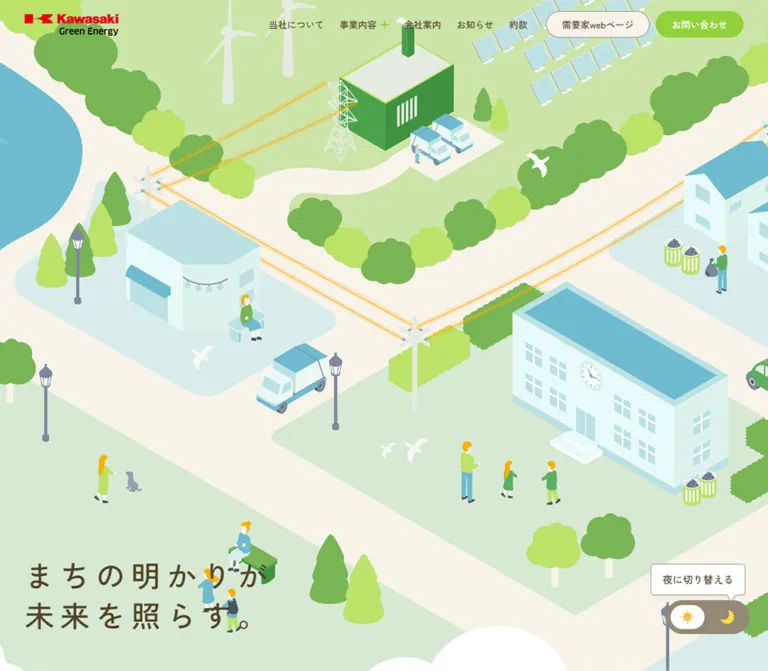
電力がつなぐ街をアイソメトリックイラストで表現。生成りとブラウン、鮮やかなグリーンを基調に、チャコール背景と丸角の事業カードで構成したコーポレートサイト。
オリジナルサイトを見るKawasaki Green Energy — Style Reference
A softly illustrated town makes the electricity network visible, framed by warm paper, brown typography, and bright green controls.
Website: kgen.co.jp Original URL: https://kgen.co.jp/ Final URL: https://kgen.co.jp/ Theme: a light daytime opening, cream content sections, and charcoal service/footer regions; a day/night control is visible, but its alternate state was not inspected. Inspected: September 12, 2026. Supplied browser evidence timestamp: 06:44:39.850 UTC / 15:44:39.850 JST. Viewports: desktop 1440 × 1000 and mobile 390 × 844 CSS pixels. Scope: the current Japanese corporate homepage. Visual evidence covers the desktop hero, a service-card scroll position, and footer; mobile evidence covers the hero and contact/footer. Rendered DOM and computed styles also cover News, the company introduction, all three services, and Company. Linked pages and interactive open states were not inspected.
Kawasaki Green Energy presents electricity as part of everyday civic life. The desktop opening is an expansive isometric town: schools, houses, industry, renewable generation, vehicles, trees, and people share one connected landscape. Fine amber power lines run diagonally through the composition. Cyan roofs and waterways balance several greens, while cream roads provide breathing room.
The surrounding interface is restrained. Brown Japanese text, rounded pill links, small leaf marks, and generous spacing keep the illustration approachable without making the business information feel informal. A charcoal service section introduces large white illustrated cards; the footer returns to charcoal with a substantial corporate directory. This is a long corporate homepage with news, service navigation, company information, and customer utilities.
The inspected original page identifies its operator as Kawasaki Green Energy, Ltd. through its company name, address, and copyright. The design reference concerns this current homepage only.
How to Read This Reference
- Measured means a value appears in the supplied rendered-element measurements or computed styles. Measurements are in CSS pixels unless stated otherwise.
- Declared means a custom property exists in the supplied evidence. Its presence does not establish which visible element uses it.
- Estimated means an appearance or dimension is judged from a screenshot, without a corresponding computed property.
- Recommended means implementation guidance for a new project. The CSS starter, its breakpoint, and its layout formulas are adaptations rather than recovered source code.
- Transformed rectangles need care. Service-card bounds differ between the DOM sample and the later service screenshot. These are state-dependent visual bounds, not dependable untransformed CSS widths.
- Capture completeness is limited. Most mobile hero artwork is absent from the supplied frame. The night state, menu opening, news filtering, hover endpoints, and exact scroll choreography remain unverified.
Tokens — Colors
Default Palette
| Name | Value | Evidence / suggested alias | Role |
|---|---|---|---|
| Warm Paper | #f7f3eb |
Measured body and section backgrounds; source --color-bg, --background-color |
Main canvas, light sections, portal pill, contact panel |
| Brown Ink | #514327 |
Measured body and link color; source --color |
Main Japanese text, hero copy, navigation, card text |
| Energy Green | #90d13b |
Measured contact-link fill; source --color-submit-bg, --link-color |
Main contact action, small green indicators, related interface accents |
| Charcoal | #4c4948 |
Measured service background; source --color-bg-dark; visually consistent with footer |
Dark section field separating white cards and pale typography |
| Card White | #ffffff |
Measured service-card fill and contact-link text; source --color-white |
Service cards, selected day-control insert, desktop bottom brand strip |
| Muted Light Text | rgba(247, 243, 235, .6) |
Measured secondary footer links; source --color-bg-60 |
Footer hierarchy below the main navigation headings |
| Soft Taupe | #968e7d |
Declared --color-base-light |
Available secondary neutral; visually resembles toggle and fine-outline tones, but those individual fills were not measured |
| Utility Amber | #faaf08 |
Declared --link-hover-color; matching secondary RGB declaration |
Available hover accent; visually related to the electrical lines and small yellow illustration details |
| Town Cyan | #6ebbcf |
Declared --color-tertiary |
Matches the illustration's cyan family; individual roof and river fills were not extracted |
| Lighter Paper | #faf8f4 |
Declared --color-bg-light |
Auxiliary light surface token; specific visible application is unverified |
| Paper Shade | #f0ede5 |
Declared --color-gray-F0 |
Auxiliary neutral; specific visible application is unverified |
The visible red belongs to the Kawasaki wordmark. Its exact color was not supplied as a measured logo value; preserve the approved logo artwork instead of assigning an invented red token.
The town contains additional pale greens, darker tree greens, and tinted cyan building faces. Those colors are visible within the artwork, but their exact values are unavailable. Energy Green is an interface accent, not a substitute for every green in the illustration.
The custom-property export also contains generic CMS color, gradient, and shadow presets. Their presence is not evidence that those treatments appear in this page's design.
Theme Presets
| State | Established evidence | Implementation boundary |
|---|---|---|
| Daytime opening | Desktop town artwork, pale terrain, brown heading, sun selected in the visible control | This is the only visually established hero state |
| Night option | Moon icon and the callout 夜に切り替える |
The intended action is evident; resulting artwork, colors, timing, and persistence are unverified |
| Charcoal service and footer | Visible dark regions within the same captured page | Treat these as section surfaces; they do not establish a global night-mode palette |
Do not derive a night design by applying Charcoal to the entire page and calling it a measured theme.
Tokens — Typography
Japanese Body and Headings
- Computed primary family:
Zen Kaku Gothic New. - Computed fallback sequence:
yakuhanjp, system UI families, Helvetica Neue, Hiragino families, Yu Gothic, Verdana, Meiryo, M+ 1p, and sans-serif. - Normal weight:
400, also declared as--font-normal. - Emphasis weight:
600, declared as--font-bold. The source's bold token is not700. - Base body:
16px / 25.6pxat both inspected widths. - Character: clean Japanese sans-serif with generous line spacing and moderately weighted headings.
These are computed font-family declarations. The supplied evidence does not independently confirm the font file used for every rendered glyph.
English Section Labels
The source declares --ff-en beginning with Plus Jakarta Sans, followed by the Japanese and system fallback stack. The desktop Service screenshot uses a large, light-looking English label above a much smaller Japanese label and green leaf.
The individual English span was not included in the measured element list. Its desktop size is visually estimated at approximately 60–64px. Do not mistake the measured 24px section-heading wrapper for the size of the visible English word.
Brand and Icons
The Kawasaki / Green Energy wordmark is artwork, not ordinary heading text. The desktop logo link is 152 × 35px; the mobile link is 118 × 27.16px.
The source declares Material Symbols Outlined as an icon-family token. The evidence does not establish that the leaf, sun, moon, or every navigation symbol uses that font. Reproduce their observed geometry or use approved assets rather than replacing them indiscriminately.
Type Scale
| Role | Desktop measured size / line height | Mobile measured size / line height | Weight / tracking |
|---|---|---|---|
| Base body | 16 / 25.6px |
16 / 25.6px |
400, normal tracking |
| Hero heading | 48 / 64.32px |
34 / 49.3px |
600; desktop 9.6px tracking, mobile 5.1px |
| Header contact link | 15 / 24px |
14 / 22.4px |
400 |
| Desktop navigation | 15 / 24px |
Replaced by compact header controls | 400 |
| Bilingual heading wrapper | 24 / 38.4px |
20 / 32px |
600; child spans can override these values |
| Company-introduction heading | 35.5622 / 67.5683px |
25 / 42.5px |
600 |
| Company-introduction paragraphs | 17.2504 / 34.5008px |
14 / 28px |
400 |
| Service introduction and Company paragraph | 16 / 32px |
14 / 28px |
400 |
| Service-card paragraph | 14.8126 / 28.144px |
14 / 26.6px |
400 |
| News headline link | 15 / 30px |
14 / 28px |
400 |
| News category chip | 14 / 14px |
12 / 12px |
400 |
| General outlined section link | 15.6251 / 25.0002px |
14 / 22.4px |
400 |
| Footer company name | 19.4378 / 31.1004px |
17 / 27.2px |
600 |
| Footer main navigation | 18 / 28.8px |
Not visible in the mobile footer | 600 |
| Footer secondary navigation | 16 / 25.6px |
Not visible in the mobile footer | 600 |
| Footer utility pills | 12 / 12px |
12 / 12px |
400 |
| Desktop policy links | 13 / 20.8px |
Not visible in the mobile footer | 400 |
Hero tracking is a defining token: 0.2em on desktop and 0.15em on mobile. Keep this expansive treatment confined to short display copy. Applying it to navigation or business paragraphs would reduce clarity.
Service-card titles appear approximately 26px in the desktop screenshot, and the green numerals approximately 40px. These are visual estimates, not exported font measurements.
Tokens — Spacing & Shapes
Density: spacious section composition with compact navigation and utility controls. Shape vocabulary: fully rounded pills, circular icon controls, 30px panel corners, and a mostly flat surface system.
Responsive Unit
The root is a conventional 16px in both supplied samples. Several desktop content values are fractional, while mobile values resolve to simpler integers. This suggests responsive sizing, but the underlying formulas and media queries were not supplied.
Use the measured endpoints as reference points. Do not invent a source-wide viewport unit or infer the exact breakpoint from two viewport samples.
Spacing Scale
| Use | Desktop | Mobile | Status |
|---|---|---|---|
| Header horizontal inset | 40px |
20px |
Measured logo positions; right controls align to matching margins |
| Main content side margin | 75px |
20px |
Measured across multiple sections |
| Standard News section vertical padding | 136.896px |
80px |
Computed |
| Service section vertical padding | 146.896px |
90px |
Computed |
| Company section vertical padding | 163.104px |
90px |
Computed |
| Bilingual heading internal gap | 15px |
15px |
Computed wrapper gap |
| Adjacent header action gap | 10px |
10px |
Derived from measured bounds |
| General section-link padding | 10px 45px 10px 25px |
Same | Computed; extra right space accommodates its directional treatment |
| Service-card padding | 60px 80px 40px |
80px 30px 60px |
Computed |
| Contact-panel padding | 100px 80px 200px |
60px 20px 200px |
Computed |
| Day/night control padding and gap | 8px padding, 10px gap |
Same | Computed |
| Mobile introduction paragraph gap | — | 20px |
Derived from consecutive paragraph bounds |
The unusually large 200px contact-panel bottom inset reserves room for illustration. It is a component-specific layout choice, not a general section-spacing token.
Border Radius
| Element | Measured value / appearance | Reuse guidance |
|---|---|---|
| Service cards | 30px |
Retain generous rounded corners on the large white panels |
| Contact panel | 30px |
Keep the same panel family across desktop and mobile |
| Header, section, and footer pills | 1000px desktop; often 844px mobile |
These resolve visually to capsules; use a large radius such as 999px |
| Mobile menu button | 844px on a 40 × 40px box |
Visually circular |
| Day/night control | Capsule | Separate rounded track and white selected insert |
| Toggle callout | Approximately 5–7px |
Screenshot estimate; much tighter than the service-card radius |
Layout Measurements
| Element | Desktop | Mobile |
|---|---|---|
| Header | 1440 × 80px |
390 × 66px |
| Main content span | 1290px, from x = 75 to 1365 |
350px, from x = 20 to 370 |
| Visible logo link | 152 × 35px |
118 × 27.16px |
| Contact link | 142 × 43px |
126 × 38px |
| Customer portal header link | 168.31 × 43px |
Not visible in header |
| Menu button | Not visible in desktop header capture | 40 × 40px, x = 330, y = 13 |
| Hero heading box | 403.20 × 128.63px, x = 40, y = 811.38 |
273.70 × 98.59px, x = 20, y = 635.41 |
| Day/night button | 136 × 55px, x = 1274, y = 885 |
118 × 48px, x = 252, y = 746 |
| Service introduction | 450px wide |
350px wide |
| Contact panel | 1290 × 481.19px |
350 × 427.39px |
| Total document height | 8925.95px |
7772.58px |
The mobile logo's heading wrapper measures 164px wide, but the actual logo link measures 118px. Use the link measurement when sizing the artwork.
Several source anchors use inline layout. Their reported rectangles do not behave like conventional block boxes whose height is simply line-height plus padding and borders. The starter below uses explicit header-control heights and inline-flex alignment to reproduce the visible proportions.
Components
Persistent Header
Role: maintain corporate identity, primary navigation, and contact access throughout the page.
The desktop header is 80px high, with the logo 40px from the left. Navigation begins at approximately x = 590, leaving a large open interval after the logo. The links are compact, brown, and visually unboxed. The business-content item carries a small green plus.
Two pills close the row: a cream, outlined 需要家webページ link and a filled green お問い合わせ link. Their measured separation is 10px. The contact pill is the strongest conventional action in the header.
The opening screenshot shows the town behind the header. Scrolled captures show a solid cream header above the service and footer regions. Its persistent visual placement is established by the captures; the underlying positioning rule and precise background-switch trigger were not exported.
The rendered desktop navigation text contains repeated labels, while the screenshots show one visible copy. This may support a layered presentation, but no rolling-text interaction was verified. A new implementation should expose each navigation label only once to assistive technology.
Mobile Header and Menu Trigger
Role: retain identity and the principal contact route in a narrow horizontal row.
At 390px wide, the header is 66px high with 20px side margins. The logo remains left, followed by a 126 × 38px green contact pill at x = 194 and a 40px circular menu button at x = 330. The menu has a cream fill, fine neutral outline, and three short horizontal strokes.
Desktop navigation and the customer portal pill are absent from the visible mobile header. The menu button has the supplied label メニューを開閉する. The DOM contains navigation content, but the open menu's appearance, focus behavior, and transition were not inspected.
The desktop business trigger is recorded with a javascript:void(0) destination. For reuse, implement a real disclosure button with an expanded state and controlled submenu; this is a recommendation rather than a claim about the source's semantics.
Illustrated Town Hero
Role: communicate local energy circulation before introducing business detail.
The desktop artwork fills the first viewport and extends beyond its edges. An isometric road system creates large diagonals rather than a centered scenic vignette. A river anchors the left edge; industrial and renewable-generation elements occupy the upper field; homes and a school extend across the right and lower field. Small people, birds, vehicles, and street furniture give the energy network a human scale.
The hero heading is an independent text layer in the lower-left corner:
まちの明かりが未来を照らす。
At desktop it ends 60px above the viewport bottom. Use 48px semibold type, 1.34 line-height, and 0.2em tracking. It has no enclosing panel, filled background, or oversized conversion button.
At mobile the heading uses 34px type, 1.45 line-height, and 0.15em tracking. Its box ends 110px above the viewport bottom. Preserve the two-line text from the DOM even though part of the second line is covered in the capture.
Mobile limitation: the supplied mobile hero shows only a thin strip of town artwork near the top, followed by a large cream area. The evidence cannot determine whether this is a rendering issue, delayed scene, or another state. It does not establish an intentionally empty mobile hero. A reusable implementation should provide a complete, independently framed mobile illustration or a dependable static fallback.
Day/Night Control and Callout
Role: offer a change to the illustrated scene's lighting state.
The lower-right control is a taupe-looking capsule with sun and moon symbols. The day side has a white rounded insert. The desktop button is 136 × 55px, 30px from the right and 60px from the bottom. Mobile uses 118 × 48px, 20px from the right and 50px from the bottom.
A small white speech-style callout above it reads 夜に切り替える. The callout uses brown text, a fine neutral edge, a downward pointer, and a slight shadow. This small utility hint is the clearest visible exception to the otherwise flat surface treatment.
In the mobile capture the callout overlaps the hero's second line. Document that collision as a limitation; do not reproduce it intentionally. In a new implementation, suppress or reposition the hint at narrow widths while keeping an accessible name on the control.
The alternate scene, transition duration, and persistence of the selected state were not exercised. The exported button text is empty; an accessibility-tree inspection would be needed to establish its actual accessible name.
Bilingual Section Heading
Role: provide a repeatable section identity with an English display label and a Japanese descriptor.
The Service screenshot shows a large English word above a smaller Japanese label, with a lime leaf beside the Japanese text. News, Company, and Contact use corresponding bilingual heading groups in the DOM. Wrapper gap is measured at 15px.
Use the leaf as a small recurring environmental signifier. Keep it subordinate to the words. The leaf's asset format and exact dimensions were not exported; its desktop appearance is approximately 16px.
For implementation, keep English and Japanese text in distinct spans within one semantic heading. The exact child typography is not fully measured, so use the visual estimates deliberately rather than applying the wrapper's computed size to every child.
News Section
Role: make current customer notices and corporate updates easy to scan.
Desktop DOM measurements establish an asymmetric arrangement: a 220px heading region begins at x = 75, while filters and the news area begin at x = 395. The outlined news-index link sits with the left-side heading rather than after the last row.
Four filter buttons are present on desktop: すべて, ニュースリリース, お客さまへのお知らせ, and 実績. The selected All button is brown with cream text. Buttons are 32px high, use 14px text, and have fully rounded ends. Their measured gap is 15px.
Rows contain a date, a rounded category link, and a headline link. Desktop headlines use 15px text with 30px line-height and reserve 75px on the right. The three current entries include one September 1, 2026 notice and two June 22, 2026 notices.
On mobile, metadata sits above the headline, which spans the 350px content width. Category chips shrink from 14px to 12px text; headline text becomes 14px with 28px line-height. The index link moves below the list.
The desktop filter buttons are absent from the mobile visible-text and element sample. Their alternate presentation, if any, is unverified. Filtering behavior and active-state changes were not tested.
Company Introduction
Role: connect the town metaphor to the company's energy services.
The section opens with a two-line Japanese statement, followed by three paragraphs describing manufacturing expertise, energy services, effective use of customer generation, and local electricity supply. An outlined About link provides the next route.
Desktop text occupies a 583px-wide region beginning at x = 85. The heading uses approximately 35.56px type with 67.57px line-height; paragraphs use approximately 17.25px with double line spacing. The About link aligns to the right edge of that text region.
Mobile becomes a 350px column with a 25px heading and 14px body. The first paragraph begins approximately 470px after the heading box ends. This establishes a substantial intervening region, but the supplied screenshots do not show its contents. Do not fill it with invented photography or claim a particular illustration layout. The mobile About link aligns left.
Service Section and Card Sequence
Role: explain three business lines through illustrated linked panels.
The charcoal field is a major change in visual rhythm. In the desktop service capture, a 450px introduction remains on the left while a large white card occupies the right. Three small vertical dots sit beyond the cards; the first appears green in this frame.
The first card is upright and approximately 648px wide in the screenshot. The following card overlaps its lower portion and is slightly tilted. This establishes a layered, scroll-position-dependent composition, but not its complete animation timeline or pinning mechanism.
Each service card is a full link containing:
- A prominent illustration in the upper region.
- A green two-digit number near the upper-right corner.
- A brown service title below the illustration.
- A paragraph of business explanation.
- Generous white space inside a 30px rounded panel.
| Service | Destination present in original DOM | Visual evidence |
|---|---|---|
電力小売事業 |
/retail/ |
Cyan-roofed industrial building connected by amber power lines |
電力の地産地消支援 |
/local/ |
Green industrial building linked toward a small house and person |
発電余力活用 |
/aggregation/ |
Title, description, link, padding, and panel style are established; illustration is not shown in the supplied captures |
Computed desktop card padding is 60px 80px 40px. Mobile changes this to 80px 30px 60px, maintaining a tall illustrated composition instead of simply shrinking every inset. Paragraph line-height stays generous at 1.9.
Geometry limitation: the DOM sample reports desktop card bounds near 749 × 725px, whereas the later screenshot shows a narrower upright card. Mobile transformed bounds extend from negative x positions to beyond the viewport. These bounds cannot establish the cards' resting width or prove page-level horizontal overflow. Do not hardcode 438–442px-wide mobile cards from those rectangles.
For reuse, first make all three service links readable in normal flow. Add overlap, progress indicators, or scroll pinning as an enhancement after their full behavior has been specified and tested.
Company Section
Role: explain the operator's presence and continuity of service.
The DOM contains the Company heading, Kobe office and Tokyo office labels, a paragraph about two operating locations, and an outlined company-information link.
Desktop paragraph width is approximately 429.81px and it sits toward the right of the main content span. Mobile places the paragraph and link in the standard 350px column. Section padding changes from approximately 163.10px to 90px.
No supplied screenshot isolates this section's media. The office labels alone do not establish photographs, maps, image crops, or a gallery interaction.
Contact Panel
Role: provide a broad, inviting route to the contact page near the end of the corporate journey.
This is one large link to /contact/, not an embedded form. Its cream background and 30px corners sit within the charcoal closing region. Desktop dimensions are 1290 × 481.19px; mobile dimensions are 350 × 427.39px.
The panel contains a bilingual heading, a short explanatory paragraph, a directional affordance, and a small town illustration. The mobile capture shows the lower illustration clearly: a cyan-roofed house, trees, people, a bench, and amber electrical connections. This reuses the hero's world at a much smaller scale.
The 200px bottom padding at both sizes reserves space for the artwork. Mobile text has an additional 20px inset inside the panel, putting it 40px from the viewport edge. Keep the panel as a single coherent link rather than nesting another interactive button inside it.
Corporate Footer
Role: consolidate corporate identity, detailed navigation, and external customer utilities.
Desktop uses a broad charcoal directory. The company name and address occupy the left; business navigation begins near x = 845; company and general navigation begin near x = 1157. This deliberately leaves a large open field between the address and navigation.
Primary links are cream, 18px, and semibold. Secondary links are 16px with 60%-opacity cream. Deeper retail links receive a 16px left inset and a small dash-like marker. Policy links appear at the lower-left, and customer-portal/group-site pills at the lower-right.
A separate white strip closes the desktop page, with the logo on the left and copyright on the right. It is approximately 115px high in the screenshot.
Mobile removes the visible directory and separate white brand strip. The company name, address, two small outline pills, and copyright remain on charcoal. The measured footer height falls from approximately 871.72px to 469.14px. The company name begins 80px below the contact panel's bottom.
Policy and directory content still appear in the raw DOM text, but not in the visible mobile footer evidence. If adapting this reduction, retain a discoverable route to essential policy and company links elsewhere in the navigation.
Tokens — Motion & Interaction
The supplied evidence records transition declarations and several settled scroll captures. It does not include click-by-click interaction results or the complete animation code.
| Treatment | Measured declaration or visual evidence | What can be concluded |
|---|---|---|
| Header navigation color | 0.3s cubic-bezier(.215, .61, .355, 1) |
A short color transition is defined; hover endpoint was not captured |
| Header utility pills | Height, border-color, background-color, and color use the same 0.3s curve |
Several properties can transition; this does not prove all change on hover |
| General section links and news chips | Border, background, and color use 0.3s with the same curve |
Consistent small-control timing |
| Hero heading color | 0.4s cubic-bezier(.215, .61, .355, 1) |
Color can change; the night-state value is unknown |
| News headline and footer-link opacity | 0.4s cubic-bezier(.215, .61, .355, 1) |
Opacity feedback is defined, but its endpoint is unverified |
| Footer utility pills | Background-color and color use the same 0.4s curve |
Slightly slower utility feedback |
| Section headings and selected paragraphs | Opacity and transform use 1.2s cubic-bezier(.165, .84, .44, 1) |
Reveal-style transitions are defined; trigger, distance, and stagger are unknown |
| News section background | 0.2s cubic-bezier(.215, .61, .355, 1) |
A short background transition is declared |
| Service-card layering | Upright first card and tilted, overlapping next card in the desktop capture | Layering is visible; timing, transform range, and scroll linkage are not measured |
| Header persistence | Header remains at the top across supplied scroll positions | Persistent placement is observed; exact CSS mechanism is unavailable |
| Day/night and mobile menu | Visible controls only | Resulting states and interaction timing remain unverified |
The two evidenced easing aliases are source --easeOutCubic and --easeOutQuart. They support a gentle deceleration rather than the stepped motion of a pixel-art interface.
Do not interpret a sampled animation: none as proof that the entire site is static. It applies only to those sampled elements and does not exclude JavaScript transforms, descendant animations, or animated assets. Similarly, a generic transition: all without an explicit duration does not establish a meaningful animation duration.
Surfaces
| Layer | Appearance | Purpose |
|---|---|---|
| Hero | Full-bleed illustrated town | Establish the energy-network narrative |
| Light content canvas | Warm Paper with Brown Ink | Support longer Japanese reading and compact news navigation |
| Scrolled header | Cream horizontal strip | Keep navigation readable over changing section colors |
| Service field | Solid Charcoal | Give the white illustrated panels strong separation |
| Service panel | White, 30px corners, no prominent shadow in the supplied frame | Contain one business explanation and route |
| Contact panel | Cream, 30px corners, miniature town illustration | Reintroduce warmth inside the dark closing region |
| Footer directory | Charcoal with two pale text strengths | Separate corporate navigation levels |
| Desktop brand strip | White with logo and small copyright | Finish with a clean corporate signature |
| Toggle callout | White, fine outline, slight shadow, pointer | Provide a local utility hint |
The page does not establish a general elevated-card system. Large-scale contrast, open space, and panel overlap do most of the organizational work. Avoid spreading the callout's small shadow across every component.
Imagery
The main artwork has a flat, vector-like isometric appearance. Actual file formats were not supplied. Buildings use simple planar faces, cyan roof slopes, and pale walls. Trees alternate between rounded clusters and tapered forms. People are small and minimally detailed, with green clothing and occasional yellow hair or accents.
The energy network is drawn as fine parallel amber lines, visibly crossing roads and connecting buildings. This is the most useful narrative motif to retain when creating related artwork: electricity becomes a continuous connection between industry and civic life.
There is no heavy outline around every object, photorealistic lighting, glossy 3D material, or dense texture in the supplied town scenes. Color differences between faces establish form. Human-scale details soften the industrial subject without turning the scene into a collection of unrelated decorative icons.
Observed Asset References
No image file URLs, filenames, or native dimensions were included in the original-page evidence. The following inventory identifies visual roles without inventing asset paths.
| Asset role | Evidence | Reuse guidance |
|---|---|---|
| Corporate wordmark | Desktop and mobile headers; desktop bottom strip | Use approved artwork and preserve its aspect ratio |
| Full town scene | Desktop opening capture | Maintain diagonal roads, continuous electricity lines, and mixed civic/industrial subjects |
| Retail-service illustration | Desktop service capture | Use a contained building composition with generous white space |
| Local-energy illustration | Partially visible second service card | Retain the relationship between generation and nearby community buildings |
| Third service illustration | Not visually supplied | Obtain an approved asset; do not infer its composition from the other two |
| Contact miniature | Mobile contact/footer capture | Reuse the same house, tree, people, and electrical-line vocabulary at small scale |
| Leaf marker | Service heading and partial Contact heading | Use a small, simple green accent rather than a large environmental badge |
| Sun, moon, and selected insert | Both opening captures | Preserve clear state distinction; night artwork remains unspecified |
| Company-section media | Office labels in DOM only | Image type, composition, and crops remain unverified |
CSS can reproduce the layout and controls. It cannot reproduce the identity-bearing town illustration by assembling generic stock icons. Use authorized original assets or commission a coherent replacement set with a consistent viewpoint and palette.
Layout & Responsive Behavior
The page is a long document rather than a fixed application shell. Its structure alternates reading sections with large scenic or illustrated regions, then closes with contact and corporate navigation.
Measured Page Structure
Positions below come from the supplied DOM snapshots. They describe those states, not immutable offsets to hardcode into a build.
| Region | Desktop top / height | Mobile top / height |
|---|---|---|
| Opening span before News | 0 / 1100px, derived |
0 / 944px, derived |
| News | 1100 / 659.78px |
944 / 775.78px |
| Section with no exported text | 1759.78 / 1000px |
1719.78 / 844px |
| Company introduction | 2759.78 / 907.41px |
2563.78 / 1119.02px |
| Services | 3667.19 / 2575.92px |
3682.80 / 2314.47px |
| Company | 6243.11 / 1217.38px |
5997.27 / 798.78px |
| Contact link panel | 7573.05 / 481.19px |
6876.05 / 427.39px |
| Footer | 8054.23 / 871.72px |
7303.44 / 469.14px |
News begins 100px beyond the first viewport bottom at both sampled sizes. The text-empty section after News is exactly one sampled viewport high. Its visual content was not captured, so an empty text export must not be described as an intentionally blank screen.
Desktop Composition
Use a 1290px-wide reference content span at 1440px. The header is slightly wider in its alignment, using 40px margins rather than 75px. This lets identity and utilities sit close to the edges while editorial content has more breathing room.
News uses a narrow left heading area and a wide right list. Services use a wider left introduction and a staged card area. The footer shifts navigation far to the right of the company address. These are different section compositions within one alignment system, not one universal two-column grid.
Mobile Composition
The standard content margin becomes 20px. News metadata moves above titles; introductory and company copy become full-width columns; general section links align left. Service cards retain substantial vertical padding and rounded corners.
The header retains the contact action and replaces the desktop navigation with a circular menu trigger. The footer becomes a short identity-and-utilities block, while the large contact panel remains prominent.
Only 1440px and 390px widths were inspected. Tablet behavior, landscape layouts, actual breakpoint locations, zoom behavior, and safe-area handling are unverified. The starter uses a recommended 1200px desktop breakpoint to leave enough room for the full navigation.
Do’s and Don’ts
Do
- Preserve the relationship between the town illustration and the company's local-energy services.
- Keep Warm Paper
#f7f3eb, Brown Ink#514327, Energy Green#90d13b, and Charcoal#4c4948as the main interface palette. - Keep the hero copy low and left, with its measured two-line structure and generous tracking.
- Use Zen Kaku Gothic New as the first Japanese font when appropriately available, with practical system fallbacks.
- Use semibold
600for emphasis rather than making all headings heavy. - Give long Japanese paragraphs approximately double line spacing where measured.
- Preserve white, illustrated service panels with 30px corners and generous internal space.
- Use fine amber electricity lines as a connection motif within coherent artwork.
- Retain separate routes for contact, the customer portal, service detail, and corporate information.
- Keep content readable before adding scroll-dependent transformations.
Don’t
- Don't turn the corporate homepage into a single conversion funnel that removes news or customer utilities.
- Don't replace the isometric town with unrelated stock photographs or a generic feature-icon grid.
- Don't use Energy Green for every tree, building, and background region.
- Don't mistake the charcoal service field for proof of the uninspected night theme.
- Don't turn transformed card bounding boxes into fixed mobile widths.
- Don't reproduce the mobile hero's missing artwork or the tooltip/headline collision as intentional layout rules.
- Don't apply the large hero tracking to paragraph text or compact navigation.
- Don't infer exact English child-span sizes from their heading wrapper's computed font size.
- Don't add glossy gradients, glass blur, or heavy shadows to the panel system.
- Don't invent office photography, image URLs, animation libraries, or day/night transitions.
Recommended Implementation Additions
These are recommendations for a new implementation, not verified features of the inspected page:
- Provide a fully rendered static mobile hero fallback. Essential text and navigation should remain visible if scene assets or animation initialization fail.
- Move or hide the day/night hint before it can overlap the heading. Keep the control itself discoverable and explicitly named.
- Review small white text on the bright green contact pill. Brown text on the same green is a practical higher-contrast alternative; verify final contrast in the implementation.
- Preserve the observed skip-link concept and ensure it becomes visible on keyboard focus and reaches a meaningful main-content target.
- Give the menu and service disclosure buttons explicit expanded states. Support keyboard opening, Escape, and sensible focus restoration.
- Ensure hidden duplicate navigation layers are not announced twice.
- Keep all service links usable without scroll pinning. Under reduced motion, remove tilting and overlapping transitions while preserving every paragraph and destination.
- Expand the effective target of the 40px mobile menu control without changing its visible circle or colliding with the contact link.
- Keep policy and corporate information reachable on mobile even when the footer directory is omitted.
- Test the actual responsive design at intermediate widths and with enlarged Japanese text. Do not hide page overflow merely to conceal a transformed-card defect.
- Give decorative town fragments empty alternatives where appropriate, while keeping business meaning in nearby real text. Confirm that the logo link has an accessible corporate name.
Agent Prompt Guide
Quick Color Reference
- Page and contact surface:
#f7f3eb. - Main text and ordinary navigation:
#514327. - Contact accent and small active markers:
#90d13b. - Service and footer field:
#4c4948. - Service cards and selected day insert:
#ffffff. - Supporting illustration families: cyan around
#6ebbcf, amber around#faaf08, and varied greens from approved artwork. - Footer secondary text:
rgba(247, 243, 235, .6). - Secondary neutral available in source:
#968e7d; individual control usage is not measured.
Overall Prompt
“Create a Japanese energy-company corporate homepage inspired by the supplied Kawasaki Green Energy reference. Use a full-viewport, flat isometric town illustration with cyan roofs, varied green trees, cream roads, tiny people, and fine amber electrical lines connecting industry to civic buildings. Place a two-line brown Japanese heading low on the left. Use a persistent logo-and-navigation header with a bright green contact pill, then a news list, spacious company introduction, charcoal service section with large white illustrated cards, company information, a rounded cream contact panel, and a corporate footer. Use Warm Paper #f7f3eb, Brown Ink #514327, Energy Green #90d13b, and Charcoal #4c4948. Set Japanese text in Zen Kaku Gothic New with 400 and 600 weights. Preserve readable normal-flow content before adding motion. Provide a complete mobile illustration and prevent utility hints from covering the heading. Do not invent an alternate night scene without supplied assets.”
Example Component Prompts
- Desktop header: “Build an 80px-high corporate header with 40px side insets, a 152 × 35px logo at left, compact 15px brown navigation toward the right, a cream outlined customer-portal pill, and a 142 × 43px green contact pill. Keep 10px between the two utility pills. Use a cream background over scrolled content.”
- Mobile hero: “At 390 × 844, retain a 66px header with a 118px-wide logo, a compact contact pill, and a 40px circular menu button. Use a properly framed isometric town image, with the two-line Japanese hero heading at 34px, 600 weight, 1.45 line-height, and 0.15em tracking. Keep the scene toggle clear of the text.”
- News area: “Create a cream corporate news section with a narrow desktop heading column and a wider dated list. Use small rounded category controls, brown active fill, 15px desktop headlines, and generous row spacing. On mobile put metadata above each 14px headline and place the index link beneath the list.”
- Service panel: “Create a large white service link with a 30px radius, a contained isometric energy illustration above the title, a green two-digit number at the upper-right, and brown explanatory copy at roughly 1.9 line-height. Place it on charcoal. Preserve normal-flow readability before introducing an optional overlapping scroll presentation.”
- Contact panel: “Create one large cream link on charcoal with 30px corners, a bilingual contact heading, short Japanese explanatory copy, and a miniature house-and-people illustration in a 200px lower illustration region. Keep the entire panel one accessible destination.”
- Footer: “Build a spacious charcoal corporate footer with a company identity block left and two navigation groups far right. Use cream main links and muted cream secondary links, small outline utility pills, and a separate white desktop logo strip. On mobile retain identity, utilities, and copyright in one charcoal column, with essential policies reachable elsewhere.”
Quick Start
CSS Custom Properties
This starter reproduces the principal measured colors, control sizes, typography endpoints, and panel insets. Its 1200px breakpoint, maximum-width rule, internal grids, English display sizes, artwork framing, and border treatments are recommended adaptations.
Use approved artwork and supply font files separately; no asset or font URLs were exported. The classes assume semantic links and buttons, separate English/Japanese heading spans, and a service-card anchor containing an illustration, number, title, and paragraph. Menu state, night artwork, filtering, and scroll choreography require separate implementation. Cards remain readable in normal flow, and reveal targets are visible by default.
:root {
  /* Measured interface colors */
  --paper: #f7f3eb;
  --ink: #514327;
  --lime: #90d13b;
  --charcoal: #4c4948;
  --white: #ffffff;
  --footer-muted: rgba(247, 243, 235, .6);

  /* Declared supporting colors; individual usage is not fully measured */
  --taupe: #968e7d;
  --cyan: #6ebbcf;
  --amber: #faaf08;

  /* Condensed versions of the observed font stacks */
  --font-ja: 'Zen Kaku Gothic New', yakuhanjp, -apple-system,
    BlinkMacSystemFont, 'Helvetica Neue', 'Hiragino Sans',
    'Yu Gothic', Meiryo, sans-serif;
  --font-en: 'Plus Jakarta Sans', var(--font-ja);
  --weight-normal: 400;
  --weight-emphasis: 600;

  /* Mobile measurement endpoints */
  --gutter: 20px;
  --header-inset: 20px;
  --header-height: 66px;
  --section-space: 80px;
  --hero-size: 34px;
  --hero-leading: 1.45;
  --hero-tracking: .15em;
  --body-copy: 14px;
  --radius-panel: 30px;
  --radius-pill: 999px;

  /* Measured easing and timing */
  --ease-ui: cubic-bezier(.215, .61, .355, 1);
  --ease-reveal: cubic-bezier(.165, .84, .44, 1);
  --duration-ui: 300ms;
  --duration-link: 400ms;
  --duration-reveal: 1200ms;
}

* { box-sizing: border-box; }

body {
  margin: 0;
  color: var(--ink);
  background: var(--paper);
  font-family: var(--font-ja);
  font-size: 16px;
  font-weight: var(--weight-normal);
  line-height: 1.6;
}

button, input, textarea { font: inherit; }
button { cursor: pointer; }
a { color: inherit; }
img { display: block; max-width: 100%; }

.wrap {
  width: calc(100% - 2 * var(--gutter));
  max-width: 1290px;
  margin-inline: auto;
}

:where(a, button, input, textarea):focus-visible {
  outline: 3px solid currentColor;
  outline-offset: 4px;
}

.skip-link {
  position: fixed;
  top: 12px;
  left: 20px;
  z-index: 100;
  padding: 10px 16px;
  color: var(--ink);
  background: var(--paper);
  transform: translateY(-200%);
}
.skip-link:focus { transform: none; }

/* Fixed placement is an adaptation of the persistent captures. */
.site-header {
  position: fixed;
  inset: 0 0 auto;
  z-index: 50;
  display: flex;
  align-items: center;
  gap: 10px;
  height: var(--header-height);
  padding-inline: var(--header-inset);
  background: transparent;
}
.site-header.is-scrolled { background: var(--paper); }
.site-brand { flex: none; margin-inline-end: auto; }
.site-brand img { width: 118px; height: auto; }
.desktop-nav { display: none; }
.header-actions { display: flex; align-items: center; gap: 10px; }

.pill {
  display: inline-flex;
  align-items: center;
  justify-content: center;
  width: fit-content;
  border: 1px solid var(--taupe);
  border-radius: var(--radius-pill);
  padding: 10px 25px;
  color: var(--ink);
  background: transparent;
  font-size: 14px;
  line-height: 1.6;
  text-decoration: none;
  transition: border-color var(--duration-ui) var(--ease-ui),
    background-color var(--duration-ui) var(--ease-ui),
    color var(--duration-ui) var(--ease-ui);
}
.pill--more { padding-inline-end: 45px; }
.pill--primary {
  border-color: var(--lime);
  color: var(--white);
  background: var(--lime);
}
/* Recommended higher-contrast alternative to the observed white label. */
.pill--primary[data-contrast='high'] { color: var(--ink); }
.header-action { height: 38px; padding: 0 20px; }
.header-portal { display: none; }

.menu-button {
  position: relative;
  display: grid;
  place-items: center;
  flex: none;
  width: 40px;
  height: 40px;
  padding: 0;
  border: 1px solid var(--taupe);
  border-radius: 50%;
  color: var(--ink);
  background: var(--paper);
}
/* Enlarge the effective target without enlarging the visible circle. */
.menu-button::before { content: ''; position: absolute; inset: -2px; }

.hero {
  position: relative;
  min-height: 100svh;
  margin-bottom: 100px;
  isolation: isolate;
}
.hero-art {
  position: absolute;
  inset: 0;
  z-index: -1;
  width: 100%;
  height: 100%;
  object-fit: cover;
}
/* Supply a separate mobile crop or scene where necessary. */
.hero-copy {
  position: absolute;
  left: 20px;
  bottom: 110px;
  margin: 0;
  font-size: var(--hero-size);
  font-weight: var(--weight-emphasis);
  line-height: var(--hero-leading);
  letter-spacing: var(--hero-tracking);
  transition: color var(--duration-link) var(--ease-ui);
}
.hero-copy > span { display: block; }

.scene-toggle {
  position: absolute;
  right: 20px;
  bottom: 50px;
  display: flex;
  align-items: center;
  gap: 10px;
  width: 118px;
  height: 48px;
  padding: 8px;
  border: 0;
  border-radius: var(--radius-pill);
  color: var(--ink);
  background: var(--taupe);
}
.scene-toggle__option {
  display: grid;
  place-items: center;
  flex: 1;
  height: 100%;
  border-radius: var(--radius-pill);
}
.scene-toggle__option[data-active='true'] { background: var(--white); }
/* Hide the visual hint on narrow layouts to prevent the observed collision. */
.scene-hint { display: none; }

.section { padding-block: var(--section-space); }
.section-title { display: flex; flex-direction: column; gap: 15px; margin: 0; }
/* English child size is an approximation, not an exported measurement. */
.section-title__en {
  font-family: var(--font-en);
  font-size: 40px;
  font-weight: 400;
  line-height: 1;
}
.section-title__ja {
  display: flex;
  align-items: center;
  gap: 14px;
  font-size: 16px;
}
.leaf {
  width: 16px;
  height: 16px;
  flex: none;
  border-radius: 100% 0 100% 0;
  background: var(--lime);
}
.copy { font-size: var(--body-copy); line-height: 2; }
.copy p { margin: 0 0 20px; }

.news-layout { display: grid; gap: 40px; }
.news-tabs { display: none; }
.news-list { margin: 0; padding: 0; list-style: none; }
.news-row {
  display: grid;
  grid-template-columns: 85px minmax(0, 1fr);
  align-items: start;
  gap: 15px;
  padding-block: 26px;
  border-bottom: 1px solid rgba(81, 67, 39, .2);
}
.news-date { font-family: var(--font-en); font-size: 12px; }
.news-chip {
  justify-self: start;
  padding: 5px 12px 6px;
  border: 1px solid var(--taupe);
  border-radius: var(--radius-pill);
  font-size: 12px;
  line-height: 1;
  text-decoration: none;
}
.news-link {
  grid-column: 1 / -1;
  min-width: 0;
  font-size: 14px;
  line-height: 2;
  text-decoration: none;
  overflow-wrap: anywhere;
  transition: opacity var(--duration-link) var(--ease-ui);
}

.about-title { font-size: 25px; font-weight: 600; line-height: 1.7; }
.service-section { padding-block: 90px; color: var(--paper); background: var(--charcoal); }
.service-layout { display: grid; gap: 60px; }
.service-copy .copy { margin-top: 40px; }
.service-list { display: grid; gap: 30px; min-width: 0; }
.service-card {
  position: relative;
  display: block;
  min-width: 0;
  padding: 80px 30px 60px;
  border-radius: var(--radius-panel);
  color: var(--ink);
  background: var(--white);
  text-decoration: none;
}
.service-card__art {
  width: 100%;
  aspect-ratio: 16 / 10;
  object-fit: contain;
}
.service-card__number {
  position: absolute;
  top: 28px;
  right: 30px;
  color: var(--lime);
  font-family: var(--font-en);
  font-size: 32px;
  line-height: 1;
}
.service-card__title { margin: 40px 0 24px; font-size: 22px; font-weight: 600; }
.service-card p { margin: 0; font-size: 14px; line-height: 1.9; }
.company-section { padding-block: 90px; }

.closing-region { padding-top: 80px; background: var(--charcoal); }
.contact-panel {
  position: relative;
  display: block;
  padding: 60px 20px 200px;
  border-radius: var(--radius-panel);
  color: var(--ink);
  background: var(--paper);
  text-decoration: none;
}
.contact-panel .copy { margin-top: 40px; }
.contact-panel__art {
  position: absolute;
  right: 30px;
  bottom: 40px;
  width: min(70%, 320px);
  height: 140px;
  object-fit: contain;
  pointer-events: none;
}

.site-footer { color: var(--paper); background: var(--charcoal); }
.footer-main { padding-block: 80px 60px; }
.footer-grid { display: grid; gap: 60px; }
.footer-company { margin: 0 0 20px; font-size: 17px; font-weight: 600; }
.footer-address { font-size: 14px; font-style: normal; line-height: 1.6; }
.footer-nav { display: none; }
.footer-utilities { display: flex; flex-wrap: wrap; gap: 10px; margin-top: 120px; }
.footer-utilities .pill { height: 33px; padding: 0 12.5px; color: var(--paper); font-size: 12px; line-height: 1; }
.footer-copy { margin-top: 30px; color: var(--footer-muted); font-size: 12px; }
.brand-strip { display: none; }

/* Transition targets stay visible until a separate enhancement controls them. */
.reveal {
  transition: opacity var(--duration-reveal) var(--ease-reveal),
    transform var(--duration-reveal) var(--ease-reveal);
}

/* Recommended breakpoint; the source media query was not supplied. */
@media (min-width: 75rem) {
  :root {
    --gutter: 75px;
    --header-inset: 40px;
    --header-height: 80px;
    --section-space: 136.896px;
    --hero-size: 48px;
    --hero-leading: 1.34;
    --hero-tracking: .2em;
    --body-copy: 16px;
  }

  .site-header { gap: 30px; }
  .site-brand img { width: 152px; }
  .desktop-nav { display: flex; align-items: center; gap: 35px; }
  .desktop-nav a { font-size: 15px; text-decoration: none; }
  .header-action { height: 43px; padding-inline: 25px; font-size: 15px; }
  .header-portal { display: inline-flex; background: var(--paper); }
  .menu-button { display: none; }
  .hero-copy { left: 40px; bottom: 60px; }
  .scene-toggle { right: 30px; bottom: 60px; width: 136px; height: 55px; }
  .scene-hint {
    position: absolute;
    right: 6px;
    bottom: calc(100% + 10px);
    display: block;
    width: 154px;
    padding: 14px 12px;
    border: 1px solid var(--taupe);
    border-radius: 6px;
    background: var(--white);
    box-shadow: 0 2px 3px rgba(0, 0, 0, .1);
    font-size: 16px;
    white-space: nowrap;
  }

  .section-title__en { font-size: 60px; }
  .pill--more { font-size: 15.6251px; }
  .news-layout { grid-template-columns: 220px minmax(0, 1fr); gap: 100px; }
  .news-tabs { display: flex; flex-wrap: wrap; gap: 15px; }
  .news-tab {
    padding: 8px 15px;
    border: 1px solid var(--taupe);
    border-radius: var(--radius-pill);
    color: var(--ink);
    background: transparent;
    font-size: 14px;
    line-height: 1;
  }
  .news-tab[aria-pressed='true'] { color: var(--paper); background: var(--ink); border-color: var(--ink); }
  .news-row { grid-template-columns: 80px 172px minmax(0, 1fr); gap: 25px; padding-block: 30px; }
  .news-chip { padding: 6px 15px 7px; font-size: 14px; }
  .news-link { grid-column: auto; padding-right: 75px; font-size: 15px; }
  .about-title { font-size: 35.5622px; line-height: 1.9; }
  .about-copy { max-width: 583px; font-size: 17.2504px; }

  .service-section { padding-block: 146.896px; }
  .service-layout { grid-template-columns: 450px minmax(0, 1fr); gap: 107px; }
  .service-card { width: min(100%, 648px); padding: 60px 80px 40px; }
  .service-card__number { top: 44px; right: 40px; font-size: 40px; }
  .service-card__title { font-size: 26px; }
  .service-card p { font-size: 14.8126px; }
  .company-section { padding-block: 163.104px; }

  .closing-region { padding-top: 112.5625px; }
  .contact-panel { padding: 100px 80px 200px; }
  .contact-panel__art { right: 80px; width: 320px; }
  .footer-main { padding-block: 129px 34px; }
  .footer-grid { grid-template-columns: minmax(0, 1fr) 212px 208px; gap: 100px; }
  .footer-company { font-size: 19.4378px; }
  .footer-nav { display: flex; flex-direction: column; align-items: start; gap: 20px; }
  .footer-nav a { font-size: 18px; font-weight: 600; text-decoration: none; }
  .footer-nav .secondary { color: var(--footer-muted); font-size: 16px; }
  .footer-utilities { justify-content: end; margin-top: 96px; }
  .footer-utilities .pill { height: 37px; padding-inline: 15px; }
  .footer-copy { display: none; }
  .brand-strip { display: block; color: var(--charcoal); background: var(--white); }
  .brand-strip .wrap { display: flex; align-items: center; justify-content: space-between; min-height: 115px; }
  .brand-strip img { width: 152px; }
  .brand-strip small { font-size: 13px; }
}

/* Recommended feedback; source hover endpoints were not inspected. */
@media (hover: hover) {
  .news-link:hover { opacity: .7; }
  .pill--more:hover { border-color: var(--ink); background: var(--ink); color: var(--paper); }
}

@media (prefers-reduced-motion: reduce) {
  .reveal, .pill, .hero-copy, .news-link { transition: none; }
  .reveal { opacity: 1; transform: none; }
  .service-card { transform: none; }
}
The starter intentionally leaves service progression as ordinary document flow. A production enhancement must separately define card transforms, stacking order, progress-dot semantics, and reduced-motion behavior. Do not estimate an entire scroll animation from the single overlapping-card frame.
Tailwind v4 Token Mapping
Optional aliases for a project already using Tailwind v4. This is not evidence that the original website uses Tailwind. Define the custom properties above first.
@theme inline {
  --color-paper: var(--paper);
  --color-ink: var(--ink);
  --color-energy: var(--lime);
  --color-charcoal: var(--charcoal);
  --color-town-cyan: var(--cyan);
  --color-utility-amber: var(--amber);
  --color-footer-muted: var(--footer-muted);

  --font-body: var(--font-ja);
  --font-display: var(--font-en);

  --text-hero: var(--hero-size);
  --text-copy: var(--body-copy);
  --text-utility: 0.75rem;

  --spacing-gutter: var(--gutter);
  --spacing-section: var(--section-space);
  --radius-panel: 30px;
  --radius-pill: 999px;
}
Sources & Evidence
- Inspected original and final website: https://kgen.co.jp/. The supplied record reports HTTP 200 with the original and final URLs identical.
- Inspection timestamp: September 12, 2026, 06:44:39.850 UTC / 15:44:39.850 JST. This is the supplied browser-record timestamp, not a separate browsing session performed for this document.
- Desktop visual evidence: three 1440 × 1000 captures showing the opening town scene, a service-card scroll position, and the footer.
- Mobile visual evidence: two 390 × 844 captures showing the opening state and contact/footer region.
- Rendered evidence: page text, original-page link destinations, custom properties, computed typography, colors, padding, border radii, transitions, and element rectangles at both viewport sizes.
- Original-page identity evidence: header wordmark, footer company name and address, and the copyright naming Kawasaki Green Energy, Ltd.
- Capture process: the supplied notes describe an initial observation of at least five seconds, bounded waits for layout/text stability and image decoding, and traversal through intermediate scroll positions. Perpetual animations were temporarily paused for readiness checks and resumed. SharedWorkers and service workers were disabled.
- Inspection limitations: most mobile hero artwork is absent from its capture; the cause is unknown. Exact image paths, native asset dimensions, font-file loading, intermediate breakpoints, night mode, menu-open states, filtering outcomes, hover endpoints, and full service-card motion were not established. No linked page was independently inspected for this reference.
All design claims above derive from the supplied current original-page captures and rendered evidence. Estimates and implementation recommendations are labeled separately from measured values.
# Kawasaki Green Energy — Style Reference

> A softly illustrated town makes the electricity network visible, framed by warm paper, brown typography, and bright green controls.

**Website:** [kgen.co.jp](https://kgen.co.jp/)
**Original URL:** https://kgen.co.jp/
**Final URL:** https://kgen.co.jp/
**Theme:** a light daytime opening, cream content sections, and charcoal service/footer regions; a day/night control is visible, but its alternate state was not inspected.
**Inspected:** September 12, 2026. Supplied browser evidence timestamp: 06:44:39.850 UTC / 15:44:39.850 JST.
**Viewports:** desktop 1440 × 1000 and mobile 390 × 844 CSS pixels.
**Scope:** the current Japanese corporate homepage. Visual evidence covers the desktop hero, a service-card scroll position, and footer; mobile evidence covers the hero and contact/footer. Rendered DOM and computed styles also cover News, the company introduction, all three services, and Company. Linked pages and interactive open states were not inspected.

Kawasaki Green Energy presents electricity as part of everyday civic life. The desktop opening is an expansive isometric town: schools, houses, industry, renewable generation, vehicles, trees, and people share one connected landscape. Fine amber power lines run diagonally through the composition. Cyan roofs and waterways balance several greens, while cream roads provide breathing room.

The surrounding interface is restrained. Brown Japanese text, rounded pill links, small leaf marks, and generous spacing keep the illustration approachable without making the business information feel informal. A charcoal service section introduces large white illustrated cards; the footer returns to charcoal with a substantial corporate directory. This is a long corporate homepage with news, service navigation, company information, and customer utilities.

The inspected original page identifies its operator as Kawasaki Green Energy, Ltd. through its company name, address, and copyright. The design reference concerns this current homepage only.

## How to Read This Reference

- **Measured** means a value appears in the supplied rendered-element measurements or computed styles. Measurements are in CSS pixels unless stated otherwise.
- **Declared** means a custom property exists in the supplied evidence. Its presence does not establish which visible element uses it.
- **Estimated** means an appearance or dimension is judged from a screenshot, without a corresponding computed property.
- **Recommended** means implementation guidance for a new project. The CSS starter, its breakpoint, and its layout formulas are adaptations rather than recovered source code.
- **Transformed rectangles need care.** Service-card bounds differ between the DOM sample and the later service screenshot. These are state-dependent visual bounds, not dependable untransformed CSS widths.
- **Capture completeness is limited.** Most mobile hero artwork is absent from the supplied frame. The night state, menu opening, news filtering, hover endpoints, and exact scroll choreography remain unverified.

## Tokens — Colors

### Default Palette

| Name | Value | Evidence / suggested alias | Role |
| --- | --- | --- | --- |
| Warm Paper | `#f7f3eb` | Measured body and section backgrounds; source `--color-bg`, `--background-color` | Main canvas, light sections, portal pill, contact panel |
| Brown Ink | `#514327` | Measured body and link color; source `--color` | Main Japanese text, hero copy, navigation, card text |
| Energy Green | `#90d13b` | Measured contact-link fill; source `--color-submit-bg`, `--link-color` | Main contact action, small green indicators, related interface accents |
| Charcoal | `#4c4948` | Measured service background; source `--color-bg-dark`; visually consistent with footer | Dark section field separating white cards and pale typography |
| Card White | `#ffffff` | Measured service-card fill and contact-link text; source `--color-white` | Service cards, selected day-control insert, desktop bottom brand strip |
| Muted Light Text | `rgba(247, 243, 235, .6)` | Measured secondary footer links; source `--color-bg-60` | Footer hierarchy below the main navigation headings |
| Soft Taupe | `#968e7d` | Declared `--color-base-light` | Available secondary neutral; visually resembles toggle and fine-outline tones, but those individual fills were not measured |
| Utility Amber | `#faaf08` | Declared `--link-hover-color`; matching secondary RGB declaration | Available hover accent; visually related to the electrical lines and small yellow illustration details |
| Town Cyan | `#6ebbcf` | Declared `--color-tertiary` | Matches the illustration's cyan family; individual roof and river fills were not extracted |
| Lighter Paper | `#faf8f4` | Declared `--color-bg-light` | Auxiliary light surface token; specific visible application is unverified |
| Paper Shade | `#f0ede5` | Declared `--color-gray-F0` | Auxiliary neutral; specific visible application is unverified |

The visible red belongs to the Kawasaki wordmark. Its exact color was not supplied as a measured logo value; preserve the approved logo artwork instead of assigning an invented red token.

The town contains additional pale greens, darker tree greens, and tinted cyan building faces. Those colors are visible within the artwork, but their exact values are unavailable. Energy Green is an interface accent, not a substitute for every green in the illustration.

The custom-property export also contains generic CMS color, gradient, and shadow presets. Their presence is not evidence that those treatments appear in this page's design.

### Theme Presets

| State | Established evidence | Implementation boundary |
| --- | --- | --- |
| Daytime opening | Desktop town artwork, pale terrain, brown heading, sun selected in the visible control | This is the only visually established hero state |
| Night option | Moon icon and the callout `夜に切り替える` | The intended action is evident; resulting artwork, colors, timing, and persistence are unverified |
| Charcoal service and footer | Visible dark regions within the same captured page | Treat these as section surfaces; they do not establish a global night-mode palette |

Do not derive a night design by applying Charcoal to the entire page and calling it a measured theme.

## Tokens — Typography

### Japanese Body and Headings

- **Computed primary family:** `Zen Kaku Gothic New`.
- **Computed fallback sequence:** `yakuhanjp`, system UI families, Helvetica Neue, Hiragino families, Yu Gothic, Verdana, Meiryo, M+ 1p, and sans-serif.
- **Normal weight:** `400`, also declared as `--font-normal`.
- **Emphasis weight:** `600`, declared as `--font-bold`. The source's bold token is not `700`.
- **Base body:** `16px / 25.6px` at both inspected widths.
- **Character:** clean Japanese sans-serif with generous line spacing and moderately weighted headings.

These are computed font-family declarations. The supplied evidence does not independently confirm the font file used for every rendered glyph.

### English Section Labels

The source declares `--ff-en` beginning with `Plus Jakarta Sans`, followed by the Japanese and system fallback stack. The desktop Service screenshot uses a large, light-looking English label above a much smaller Japanese label and green leaf.

The individual English span was not included in the measured element list. Its desktop size is visually estimated at approximately 60–64px. Do not mistake the measured `24px` section-heading wrapper for the size of the visible English word.

### Brand and Icons

The Kawasaki / Green Energy wordmark is artwork, not ordinary heading text. The desktop logo link is 152 × 35px; the mobile link is 118 × 27.16px.

The source declares `Material Symbols Outlined` as an icon-family token. The evidence does not establish that the leaf, sun, moon, or every navigation symbol uses that font. Reproduce their observed geometry or use approved assets rather than replacing them indiscriminately.

### Type Scale

| Role | Desktop measured size / line height | Mobile measured size / line height | Weight / tracking |
| --- | --- | --- | --- |
| Base body | `16 / 25.6px` | `16 / 25.6px` | `400`, normal tracking |
| Hero heading | `48 / 64.32px` | `34 / 49.3px` | `600`; desktop `9.6px` tracking, mobile `5.1px` |
| Header contact link | `15 / 24px` | `14 / 22.4px` | `400` |
| Desktop navigation | `15 / 24px` | Replaced by compact header controls | `400` |
| Bilingual heading wrapper | `24 / 38.4px` | `20 / 32px` | `600`; child spans can override these values |
| Company-introduction heading | `35.5622 / 67.5683px` | `25 / 42.5px` | `600` |
| Company-introduction paragraphs | `17.2504 / 34.5008px` | `14 / 28px` | `400` |
| Service introduction and Company paragraph | `16 / 32px` | `14 / 28px` | `400` |
| Service-card paragraph | `14.8126 / 28.144px` | `14 / 26.6px` | `400` |
| News headline link | `15 / 30px` | `14 / 28px` | `400` |
| News category chip | `14 / 14px` | `12 / 12px` | `400` |
| General outlined section link | `15.6251 / 25.0002px` | `14 / 22.4px` | `400` |
| Footer company name | `19.4378 / 31.1004px` | `17 / 27.2px` | `600` |
| Footer main navigation | `18 / 28.8px` | Not visible in the mobile footer | `600` |
| Footer secondary navigation | `16 / 25.6px` | Not visible in the mobile footer | `600` |
| Footer utility pills | `12 / 12px` | `12 / 12px` | `400` |
| Desktop policy links | `13 / 20.8px` | Not visible in the mobile footer | `400` |

Hero tracking is a defining token: `0.2em` on desktop and `0.15em` on mobile. Keep this expansive treatment confined to short display copy. Applying it to navigation or business paragraphs would reduce clarity.

Service-card titles appear approximately 26px in the desktop screenshot, and the green numerals approximately 40px. These are visual estimates, not exported font measurements.

## Tokens — Spacing & Shapes

**Density:** spacious section composition with compact navigation and utility controls.
**Shape vocabulary:** fully rounded pills, circular icon controls, 30px panel corners, and a mostly flat surface system.

### Responsive Unit

The root is a conventional `16px` in both supplied samples. Several desktop content values are fractional, while mobile values resolve to simpler integers. This suggests responsive sizing, but the underlying formulas and media queries were not supplied.

Use the measured endpoints as reference points. Do not invent a source-wide viewport unit or infer the exact breakpoint from two viewport samples.

### Spacing Scale

| Use | Desktop | Mobile | Status |
| --- | --- | --- | --- |
| Header horizontal inset | `40px` | `20px` | Measured logo positions; right controls align to matching margins |
| Main content side margin | `75px` | `20px` | Measured across multiple sections |
| Standard News section vertical padding | `136.896px` | `80px` | Computed |
| Service section vertical padding | `146.896px` | `90px` | Computed |
| Company section vertical padding | `163.104px` | `90px` | Computed |
| Bilingual heading internal gap | `15px` | `15px` | Computed wrapper gap |
| Adjacent header action gap | `10px` | `10px` | Derived from measured bounds |
| General section-link padding | `10px 45px 10px 25px` | Same | Computed; extra right space accommodates its directional treatment |
| Service-card padding | `60px 80px 40px` | `80px 30px 60px` | Computed |
| Contact-panel padding | `100px 80px 200px` | `60px 20px 200px` | Computed |
| Day/night control padding and gap | `8px` padding, `10px` gap | Same | Computed |
| Mobile introduction paragraph gap | — | `20px` | Derived from consecutive paragraph bounds |

The unusually large 200px contact-panel bottom inset reserves room for illustration. It is a component-specific layout choice, not a general section-spacing token.

### Border Radius

| Element | Measured value / appearance | Reuse guidance |
| --- | --- | --- |
| Service cards | `30px` | Retain generous rounded corners on the large white panels |
| Contact panel | `30px` | Keep the same panel family across desktop and mobile |
| Header, section, and footer pills | `1000px` desktop; often `844px` mobile | These resolve visually to capsules; use a large radius such as `999px` |
| Mobile menu button | `844px` on a `40 × 40px` box | Visually circular |
| Day/night control | Capsule | Separate rounded track and white selected insert |
| Toggle callout | Approximately `5–7px` | Screenshot estimate; much tighter than the service-card radius |

### Layout Measurements

| Element | Desktop | Mobile |
| --- | --- | --- |
| Header | `1440 × 80px` | `390 × 66px` |
| Main content span | `1290px`, from x = 75 to 1365 | `350px`, from x = 20 to 370 |
| Visible logo link | `152 × 35px` | `118 × 27.16px` |
| Contact link | `142 × 43px` | `126 × 38px` |
| Customer portal header link | `168.31 × 43px` | Not visible in header |
| Menu button | Not visible in desktop header capture | `40 × 40px`, x = 330, y = 13 |
| Hero heading box | `403.20 × 128.63px`, x = 40, y = 811.38 | `273.70 × 98.59px`, x = 20, y = 635.41 |
| Day/night button | `136 × 55px`, x = 1274, y = 885 | `118 × 48px`, x = 252, y = 746 |
| Service introduction | `450px` wide | `350px` wide |
| Contact panel | `1290 × 481.19px` | `350 × 427.39px` |
| Total document height | `8925.95px` | `7772.58px` |

The mobile logo's heading wrapper measures 164px wide, but the actual logo link measures 118px. Use the link measurement when sizing the artwork.

Several source anchors use inline layout. Their reported rectangles do not behave like conventional block boxes whose height is simply line-height plus padding and borders. The starter below uses explicit header-control heights and inline-flex alignment to reproduce the visible proportions.

## Components

### Persistent Header

**Role:** maintain corporate identity, primary navigation, and contact access throughout the page.

The desktop header is 80px high, with the logo 40px from the left. Navigation begins at approximately x = 590, leaving a large open interval after the logo. The links are compact, brown, and visually unboxed. The business-content item carries a small green plus.

Two pills close the row: a cream, outlined `需要家webページ` link and a filled green `お問い合わせ` link. Their measured separation is 10px. The contact pill is the strongest conventional action in the header.

The opening screenshot shows the town behind the header. Scrolled captures show a solid cream header above the service and footer regions. Its persistent visual placement is established by the captures; the underlying positioning rule and precise background-switch trigger were not exported.

The rendered desktop navigation text contains repeated labels, while the screenshots show one visible copy. This may support a layered presentation, but no rolling-text interaction was verified. A new implementation should expose each navigation label only once to assistive technology.

### Mobile Header and Menu Trigger

**Role:** retain identity and the principal contact route in a narrow horizontal row.

At 390px wide, the header is 66px high with 20px side margins. The logo remains left, followed by a 126 × 38px green contact pill at x = 194 and a 40px circular menu button at x = 330. The menu has a cream fill, fine neutral outline, and three short horizontal strokes.

Desktop navigation and the customer portal pill are absent from the visible mobile header. The menu button has the supplied label `メニューを開閉する`. The DOM contains navigation content, but the open menu's appearance, focus behavior, and transition were not inspected.

The desktop business trigger is recorded with a `javascript:void(0)` destination. For reuse, implement a real disclosure button with an expanded state and controlled submenu; this is a recommendation rather than a claim about the source's semantics.

### Illustrated Town Hero

**Role:** communicate local energy circulation before introducing business detail.

The desktop artwork fills the first viewport and extends beyond its edges. An isometric road system creates large diagonals rather than a centered scenic vignette. A river anchors the left edge; industrial and renewable-generation elements occupy the upper field; homes and a school extend across the right and lower field. Small people, birds, vehicles, and street furniture give the energy network a human scale.

The hero heading is an independent text layer in the lower-left corner:

`まちの明かりが`
`未来を照らす。`

At desktop it ends 60px above the viewport bottom. Use 48px semibold type, 1.34 line-height, and 0.2em tracking. It has no enclosing panel, filled background, or oversized conversion button.

At mobile the heading uses 34px type, 1.45 line-height, and 0.15em tracking. Its box ends 110px above the viewport bottom. Preserve the two-line text from the DOM even though part of the second line is covered in the capture.

**Mobile limitation:** the supplied mobile hero shows only a thin strip of town artwork near the top, followed by a large cream area. The evidence cannot determine whether this is a rendering issue, delayed scene, or another state. It does not establish an intentionally empty mobile hero. A reusable implementation should provide a complete, independently framed mobile illustration or a dependable static fallback.

### Day/Night Control and Callout

**Role:** offer a change to the illustrated scene's lighting state.

The lower-right control is a taupe-looking capsule with sun and moon symbols. The day side has a white rounded insert. The desktop button is 136 × 55px, 30px from the right and 60px from the bottom. Mobile uses 118 × 48px, 20px from the right and 50px from the bottom.

A small white speech-style callout above it reads `夜に切り替える`. The callout uses brown text, a fine neutral edge, a downward pointer, and a slight shadow. This small utility hint is the clearest visible exception to the otherwise flat surface treatment.

In the mobile capture the callout overlaps the hero's second line. Document that collision as a limitation; do not reproduce it intentionally. In a new implementation, suppress or reposition the hint at narrow widths while keeping an accessible name on the control.

The alternate scene, transition duration, and persistence of the selected state were not exercised. The exported button text is empty; an accessibility-tree inspection would be needed to establish its actual accessible name.

### Bilingual Section Heading

**Role:** provide a repeatable section identity with an English display label and a Japanese descriptor.

The Service screenshot shows a large English word above a smaller Japanese label, with a lime leaf beside the Japanese text. News, Company, and Contact use corresponding bilingual heading groups in the DOM. Wrapper gap is measured at 15px.

Use the leaf as a small recurring environmental signifier. Keep it subordinate to the words. The leaf's asset format and exact dimensions were not exported; its desktop appearance is approximately 16px.

For implementation, keep English and Japanese text in distinct spans within one semantic heading. The exact child typography is not fully measured, so use the visual estimates deliberately rather than applying the wrapper's computed size to every child.

### News Section

**Role:** make current customer notices and corporate updates easy to scan.

Desktop DOM measurements establish an asymmetric arrangement: a 220px heading region begins at x = 75, while filters and the news area begin at x = 395. The outlined news-index link sits with the left-side heading rather than after the last row.

Four filter buttons are present on desktop: `すべて`, `ニュースリリース`, `お客さまへのお知らせ`, and `実績`. The selected All button is brown with cream text. Buttons are 32px high, use 14px text, and have fully rounded ends. Their measured gap is 15px.

Rows contain a date, a rounded category link, and a headline link. Desktop headlines use 15px text with 30px line-height and reserve 75px on the right. The three current entries include one September 1, 2026 notice and two June 22, 2026 notices.

On mobile, metadata sits above the headline, which spans the 350px content width. Category chips shrink from 14px to 12px text; headline text becomes 14px with 28px line-height. The index link moves below the list.

The desktop filter buttons are absent from the mobile visible-text and element sample. Their alternate presentation, if any, is unverified. Filtering behavior and active-state changes were not tested.

### Company Introduction

**Role:** connect the town metaphor to the company's energy services.

The section opens with a two-line Japanese statement, followed by three paragraphs describing manufacturing expertise, energy services, effective use of customer generation, and local electricity supply. An outlined About link provides the next route.

Desktop text occupies a 583px-wide region beginning at x = 85. The heading uses approximately 35.56px type with 67.57px line-height; paragraphs use approximately 17.25px with double line spacing. The About link aligns to the right edge of that text region.

Mobile becomes a 350px column with a 25px heading and 14px body. The first paragraph begins approximately 470px after the heading box ends. This establishes a substantial intervening region, but the supplied screenshots do not show its contents. Do not fill it with invented photography or claim a particular illustration layout. The mobile About link aligns left.

### Service Section and Card Sequence

**Role:** explain three business lines through illustrated linked panels.

The charcoal field is a major change in visual rhythm. In the desktop service capture, a 450px introduction remains on the left while a large white card occupies the right. Three small vertical dots sit beyond the cards; the first appears green in this frame.

The first card is upright and approximately 648px wide in the screenshot. The following card overlaps its lower portion and is slightly tilted. This establishes a layered, scroll-position-dependent composition, but not its complete animation timeline or pinning mechanism.

Each service card is a full link containing:

1. A prominent illustration in the upper region.
2. A green two-digit number near the upper-right corner.
3. A brown service title below the illustration.
4. A paragraph of business explanation.
5. Generous white space inside a 30px rounded panel.

| Service | Destination present in original DOM | Visual evidence |
| --- | --- | --- |
| `電力小売事業` | `/retail/` | Cyan-roofed industrial building connected by amber power lines |
| `電力の地産地消支援` | `/local/` | Green industrial building linked toward a small house and person |
| `発電余力活用` | `/aggregation/` | Title, description, link, padding, and panel style are established; illustration is not shown in the supplied captures |

Computed desktop card padding is `60px 80px 40px`. Mobile changes this to `80px 30px 60px`, maintaining a tall illustrated composition instead of simply shrinking every inset. Paragraph line-height stays generous at 1.9.

**Geometry limitation:** the DOM sample reports desktop card bounds near 749 × 725px, whereas the later screenshot shows a narrower upright card. Mobile transformed bounds extend from negative x positions to beyond the viewport. These bounds cannot establish the cards' resting width or prove page-level horizontal overflow. Do not hardcode 438–442px-wide mobile cards from those rectangles.

For reuse, first make all three service links readable in normal flow. Add overlap, progress indicators, or scroll pinning as an enhancement after their full behavior has been specified and tested.

### Company Section

**Role:** explain the operator's presence and continuity of service.

The DOM contains the Company heading, `Kobe office` and `Tokyo office` labels, a paragraph about two operating locations, and an outlined company-information link.

Desktop paragraph width is approximately 429.81px and it sits toward the right of the main content span. Mobile places the paragraph and link in the standard 350px column. Section padding changes from approximately 163.10px to 90px.

No supplied screenshot isolates this section's media. The office labels alone do not establish photographs, maps, image crops, or a gallery interaction.

### Contact Panel

**Role:** provide a broad, inviting route to the contact page near the end of the corporate journey.

This is one large link to `/contact/`, not an embedded form. Its cream background and 30px corners sit within the charcoal closing region. Desktop dimensions are 1290 × 481.19px; mobile dimensions are 350 × 427.39px.

The panel contains a bilingual heading, a short explanatory paragraph, a directional affordance, and a small town illustration. The mobile capture shows the lower illustration clearly: a cyan-roofed house, trees, people, a bench, and amber electrical connections. This reuses the hero's world at a much smaller scale.

The 200px bottom padding at both sizes reserves space for the artwork. Mobile text has an additional 20px inset inside the panel, putting it 40px from the viewport edge. Keep the panel as a single coherent link rather than nesting another interactive button inside it.

### Corporate Footer

**Role:** consolidate corporate identity, detailed navigation, and external customer utilities.

Desktop uses a broad charcoal directory. The company name and address occupy the left; business navigation begins near x = 845; company and general navigation begin near x = 1157. This deliberately leaves a large open field between the address and navigation.

Primary links are cream, 18px, and semibold. Secondary links are 16px with 60%-opacity cream. Deeper retail links receive a 16px left inset and a small dash-like marker. Policy links appear at the lower-left, and customer-portal/group-site pills at the lower-right.

A separate white strip closes the desktop page, with the logo on the left and copyright on the right. It is approximately 115px high in the screenshot.

Mobile removes the visible directory and separate white brand strip. The company name, address, two small outline pills, and copyright remain on charcoal. The measured footer height falls from approximately 871.72px to 469.14px. The company name begins 80px below the contact panel's bottom.

Policy and directory content still appear in the raw DOM text, but not in the visible mobile footer evidence. If adapting this reduction, retain a discoverable route to essential policy and company links elsewhere in the navigation.

## Tokens — Motion & Interaction

The supplied evidence records transition declarations and several settled scroll captures. It does not include click-by-click interaction results or the complete animation code.

| Treatment | Measured declaration or visual evidence | What can be concluded |
| --- | --- | --- |
| Header navigation color | `0.3s cubic-bezier(.215, .61, .355, 1)` | A short color transition is defined; hover endpoint was not captured |
| Header utility pills | Height, border-color, background-color, and color use the same `0.3s` curve | Several properties can transition; this does not prove all change on hover |
| General section links and news chips | Border, background, and color use `0.3s` with the same curve | Consistent small-control timing |
| Hero heading color | `0.4s cubic-bezier(.215, .61, .355, 1)` | Color can change; the night-state value is unknown |
| News headline and footer-link opacity | `0.4s cubic-bezier(.215, .61, .355, 1)` | Opacity feedback is defined, but its endpoint is unverified |
| Footer utility pills | Background-color and color use the same `0.4s` curve | Slightly slower utility feedback |
| Section headings and selected paragraphs | Opacity and transform use `1.2s cubic-bezier(.165, .84, .44, 1)` | Reveal-style transitions are defined; trigger, distance, and stagger are unknown |
| News section background | `0.2s cubic-bezier(.215, .61, .355, 1)` | A short background transition is declared |
| Service-card layering | Upright first card and tilted, overlapping next card in the desktop capture | Layering is visible; timing, transform range, and scroll linkage are not measured |
| Header persistence | Header remains at the top across supplied scroll positions | Persistent placement is observed; exact CSS mechanism is unavailable |
| Day/night and mobile menu | Visible controls only | Resulting states and interaction timing remain unverified |

The two evidenced easing aliases are source `--easeOutCubic` and `--easeOutQuart`. They support a gentle deceleration rather than the stepped motion of a pixel-art interface.

Do not interpret a sampled `animation: none` as proof that the entire site is static. It applies only to those sampled elements and does not exclude JavaScript transforms, descendant animations, or animated assets. Similarly, a generic `transition: all` without an explicit duration does not establish a meaningful animation duration.

## Surfaces

| Layer | Appearance | Purpose |
| --- | --- | --- |
| Hero | Full-bleed illustrated town | Establish the energy-network narrative |
| Light content canvas | Warm Paper with Brown Ink | Support longer Japanese reading and compact news navigation |
| Scrolled header | Cream horizontal strip | Keep navigation readable over changing section colors |
| Service field | Solid Charcoal | Give the white illustrated panels strong separation |
| Service panel | White, 30px corners, no prominent shadow in the supplied frame | Contain one business explanation and route |
| Contact panel | Cream, 30px corners, miniature town illustration | Reintroduce warmth inside the dark closing region |
| Footer directory | Charcoal with two pale text strengths | Separate corporate navigation levels |
| Desktop brand strip | White with logo and small copyright | Finish with a clean corporate signature |
| Toggle callout | White, fine outline, slight shadow, pointer | Provide a local utility hint |

The page does not establish a general elevated-card system. Large-scale contrast, open space, and panel overlap do most of the organizational work. Avoid spreading the callout's small shadow across every component.

## Imagery

The main artwork has a flat, vector-like isometric appearance. Actual file formats were not supplied. Buildings use simple planar faces, cyan roof slopes, and pale walls. Trees alternate between rounded clusters and tapered forms. People are small and minimally detailed, with green clothing and occasional yellow hair or accents.

The energy network is drawn as fine parallel amber lines, visibly crossing roads and connecting buildings. This is the most useful narrative motif to retain when creating related artwork: electricity becomes a continuous connection between industry and civic life.

There is no heavy outline around every object, photorealistic lighting, glossy 3D material, or dense texture in the supplied town scenes. Color differences between faces establish form. Human-scale details soften the industrial subject without turning the scene into a collection of unrelated decorative icons.

### Observed Asset References

No image file URLs, filenames, or native dimensions were included in the original-page evidence. The following inventory identifies visual roles without inventing asset paths.

| Asset role | Evidence | Reuse guidance |
| --- | --- | --- |
| Corporate wordmark | Desktop and mobile headers; desktop bottom strip | Use approved artwork and preserve its aspect ratio |
| Full town scene | Desktop opening capture | Maintain diagonal roads, continuous electricity lines, and mixed civic/industrial subjects |
| Retail-service illustration | Desktop service capture | Use a contained building composition with generous white space |
| Local-energy illustration | Partially visible second service card | Retain the relationship between generation and nearby community buildings |
| Third service illustration | Not visually supplied | Obtain an approved asset; do not infer its composition from the other two |
| Contact miniature | Mobile contact/footer capture | Reuse the same house, tree, people, and electrical-line vocabulary at small scale |
| Leaf marker | Service heading and partial Contact heading | Use a small, simple green accent rather than a large environmental badge |
| Sun, moon, and selected insert | Both opening captures | Preserve clear state distinction; night artwork remains unspecified |
| Company-section media | Office labels in DOM only | Image type, composition, and crops remain unverified |

CSS can reproduce the layout and controls. It cannot reproduce the identity-bearing town illustration by assembling generic stock icons. Use authorized original assets or commission a coherent replacement set with a consistent viewpoint and palette.

## Layout & Responsive Behavior

The page is a long document rather than a fixed application shell. Its structure alternates reading sections with large scenic or illustrated regions, then closes with contact and corporate navigation.

### Measured Page Structure

Positions below come from the supplied DOM snapshots. They describe those states, not immutable offsets to hardcode into a build.

| Region | Desktop top / height | Mobile top / height |
| --- | --- | --- |
| Opening span before News | `0 / 1100px`, derived | `0 / 944px`, derived |
| News | `1100 / 659.78px` | `944 / 775.78px` |
| Section with no exported text | `1759.78 / 1000px` | `1719.78 / 844px` |
| Company introduction | `2759.78 / 907.41px` | `2563.78 / 1119.02px` |
| Services | `3667.19 / 2575.92px` | `3682.80 / 2314.47px` |
| Company | `6243.11 / 1217.38px` | `5997.27 / 798.78px` |
| Contact link panel | `7573.05 / 481.19px` | `6876.05 / 427.39px` |
| Footer | `8054.23 / 871.72px` | `7303.44 / 469.14px` |

News begins 100px beyond the first viewport bottom at both sampled sizes. The text-empty section after News is exactly one sampled viewport high. Its visual content was not captured, so an empty text export must not be described as an intentionally blank screen.

### Desktop Composition

Use a 1290px-wide reference content span at 1440px. The header is slightly wider in its alignment, using 40px margins rather than 75px. This lets identity and utilities sit close to the edges while editorial content has more breathing room.

News uses a narrow left heading area and a wide right list. Services use a wider left introduction and a staged card area. The footer shifts navigation far to the right of the company address. These are different section compositions within one alignment system, not one universal two-column grid.

### Mobile Composition

The standard content margin becomes 20px. News metadata moves above titles; introductory and company copy become full-width columns; general section links align left. Service cards retain substantial vertical padding and rounded corners.

The header retains the contact action and replaces the desktop navigation with a circular menu trigger. The footer becomes a short identity-and-utilities block, while the large contact panel remains prominent.

Only 1440px and 390px widths were inspected. Tablet behavior, landscape layouts, actual breakpoint locations, zoom behavior, and safe-area handling are unverified. The starter uses a recommended 1200px desktop breakpoint to leave enough room for the full navigation.

## Do’s and Don’ts

### Do

- Preserve the relationship between the town illustration and the company's local-energy services.
- Keep Warm Paper `#f7f3eb`, Brown Ink `#514327`, Energy Green `#90d13b`, and Charcoal `#4c4948` as the main interface palette.
- Keep the hero copy low and left, with its measured two-line structure and generous tracking.
- Use Zen Kaku Gothic New as the first Japanese font when appropriately available, with practical system fallbacks.
- Use semibold `600` for emphasis rather than making all headings heavy.
- Give long Japanese paragraphs approximately double line spacing where measured.
- Preserve white, illustrated service panels with 30px corners and generous internal space.
- Use fine amber electricity lines as a connection motif within coherent artwork.
- Retain separate routes for contact, the customer portal, service detail, and corporate information.
- Keep content readable before adding scroll-dependent transformations.

### Don’t

- Don't turn the corporate homepage into a single conversion funnel that removes news or customer utilities.
- Don't replace the isometric town with unrelated stock photographs or a generic feature-icon grid.
- Don't use Energy Green for every tree, building, and background region.
- Don't mistake the charcoal service field for proof of the uninspected night theme.
- Don't turn transformed card bounding boxes into fixed mobile widths.
- Don't reproduce the mobile hero's missing artwork or the tooltip/headline collision as intentional layout rules.
- Don't apply the large hero tracking to paragraph text or compact navigation.
- Don't infer exact English child-span sizes from their heading wrapper's computed font size.
- Don't add glossy gradients, glass blur, or heavy shadows to the panel system.
- Don't invent office photography, image URLs, animation libraries, or day/night transitions.

## Recommended Implementation Additions

These are recommendations for a new implementation, not verified features of the inspected page:

- Provide a fully rendered static mobile hero fallback. Essential text and navigation should remain visible if scene assets or animation initialization fail.
- Move or hide the day/night hint before it can overlap the heading. Keep the control itself discoverable and explicitly named.
- Review small white text on the bright green contact pill. Brown text on the same green is a practical higher-contrast alternative; verify final contrast in the implementation.
- Preserve the observed skip-link concept and ensure it becomes visible on keyboard focus and reaches a meaningful main-content target.
- Give the menu and service disclosure buttons explicit expanded states. Support keyboard opening, Escape, and sensible focus restoration.
- Ensure hidden duplicate navigation layers are not announced twice.
- Keep all service links usable without scroll pinning. Under reduced motion, remove tilting and overlapping transitions while preserving every paragraph and destination.
- Expand the effective target of the 40px mobile menu control without changing its visible circle or colliding with the contact link.
- Keep policy and corporate information reachable on mobile even when the footer directory is omitted.
- Test the actual responsive design at intermediate widths and with enlarged Japanese text. Do not hide page overflow merely to conceal a transformed-card defect.
- Give decorative town fragments empty alternatives where appropriate, while keeping business meaning in nearby real text. Confirm that the logo link has an accessible corporate name.

## Agent Prompt Guide

### Quick Color Reference

- Page and contact surface: `#f7f3eb`.
- Main text and ordinary navigation: `#514327`.
- Contact accent and small active markers: `#90d13b`.
- Service and footer field: `#4c4948`.
- Service cards and selected day insert: `#ffffff`.
- Supporting illustration families: cyan around `#6ebbcf`, amber around `#faaf08`, and varied greens from approved artwork.
- Footer secondary text: `rgba(247, 243, 235, .6)`.
- Secondary neutral available in source: `#968e7d`; individual control usage is not measured.

### Overall Prompt

“Create a Japanese energy-company corporate homepage inspired by the supplied Kawasaki Green Energy reference. Use a full-viewport, flat isometric town illustration with cyan roofs, varied green trees, cream roads, tiny people, and fine amber electrical lines connecting industry to civic buildings. Place a two-line brown Japanese heading low on the left. Use a persistent logo-and-navigation header with a bright green contact pill, then a news list, spacious company introduction, charcoal service section with large white illustrated cards, company information, a rounded cream contact panel, and a corporate footer. Use Warm Paper #f7f3eb, Brown Ink #514327, Energy Green #90d13b, and Charcoal #4c4948. Set Japanese text in Zen Kaku Gothic New with 400 and 600 weights. Preserve readable normal-flow content before adding motion. Provide a complete mobile illustration and prevent utility hints from covering the heading. Do not invent an alternate night scene without supplied assets.”

### Example Component Prompts

1. **Desktop header:** “Build an 80px-high corporate header with 40px side insets, a 152 × 35px logo at left, compact 15px brown navigation toward the right, a cream outlined customer-portal pill, and a 142 × 43px green contact pill. Keep 10px between the two utility pills. Use a cream background over scrolled content.”
2. **Mobile hero:** “At 390 × 844, retain a 66px header with a 118px-wide logo, a compact contact pill, and a 40px circular menu button. Use a properly framed isometric town image, with the two-line Japanese hero heading at 34px, 600 weight, 1.45 line-height, and 0.15em tracking. Keep the scene toggle clear of the text.”
3. **News area:** “Create a cream corporate news section with a narrow desktop heading column and a wider dated list. Use small rounded category controls, brown active fill, 15px desktop headlines, and generous row spacing. On mobile put metadata above each 14px headline and place the index link beneath the list.”
4. **Service panel:** “Create a large white service link with a 30px radius, a contained isometric energy illustration above the title, a green two-digit number at the upper-right, and brown explanatory copy at roughly 1.9 line-height. Place it on charcoal. Preserve normal-flow readability before introducing an optional overlapping scroll presentation.”
5. **Contact panel:** “Create one large cream link on charcoal with 30px corners, a bilingual contact heading, short Japanese explanatory copy, and a miniature house-and-people illustration in a 200px lower illustration region. Keep the entire panel one accessible destination.”
6. **Footer:** “Build a spacious charcoal corporate footer with a company identity block left and two navigation groups far right. Use cream main links and muted cream secondary links, small outline utility pills, and a separate white desktop logo strip. On mobile retain identity, utilities, and copyright in one charcoal column, with essential policies reachable elsewhere.”

## Quick Start

### CSS Custom Properties

This starter reproduces the principal measured colors, control sizes, typography endpoints, and panel insets. Its 1200px breakpoint, maximum-width rule, internal grids, English display sizes, artwork framing, and border treatments are recommended adaptations.

Use approved artwork and supply font files separately; no asset or font URLs were exported. The classes assume semantic links and buttons, separate English/Japanese heading spans, and a service-card anchor containing an illustration, number, title, and paragraph. Menu state, night artwork, filtering, and scroll choreography require separate implementation. Cards remain readable in normal flow, and reveal targets are visible by default.

```css
:root {
  /* Measured interface colors */
  --paper: #f7f3eb;
  --ink: #514327;
  --lime: #90d13b;
  --charcoal: #4c4948;
  --white: #ffffff;
  --footer-muted: rgba(247, 243, 235, .6);

  /* Declared supporting colors; individual usage is not fully measured */
  --taupe: #968e7d;
  --cyan: #6ebbcf;
  --amber: #faaf08;

  /* Condensed versions of the observed font stacks */
  --font-ja: 'Zen Kaku Gothic New', yakuhanjp, -apple-system,
    BlinkMacSystemFont, 'Helvetica Neue', 'Hiragino Sans',
    'Yu Gothic', Meiryo, sans-serif;
  --font-en: 'Plus Jakarta Sans', var(--font-ja);
  --weight-normal: 400;
  --weight-emphasis: 600;

  /* Mobile measurement endpoints */
  --gutter: 20px;
  --header-inset: 20px;
  --header-height: 66px;
  --section-space: 80px;
  --hero-size: 34px;
  --hero-leading: 1.45;
  --hero-tracking: .15em;
  --body-copy: 14px;
  --radius-panel: 30px;
  --radius-pill: 999px;

  /* Measured easing and timing */
  --ease-ui: cubic-bezier(.215, .61, .355, 1);
  --ease-reveal: cubic-bezier(.165, .84, .44, 1);
  --duration-ui: 300ms;
  --duration-link: 400ms;
  --duration-reveal: 1200ms;
}

* { box-sizing: border-box; }

body {
  margin: 0;
  color: var(--ink);
  background: var(--paper);
  font-family: var(--font-ja);
  font-size: 16px;
  font-weight: var(--weight-normal);
  line-height: 1.6;
}

button, input, textarea { font: inherit; }
button { cursor: pointer; }
a { color: inherit; }
img { display: block; max-width: 100%; }

.wrap {
  width: calc(100% - 2 * var(--gutter));
  max-width: 1290px;
  margin-inline: auto;
}

:where(a, button, input, textarea):focus-visible {
  outline: 3px solid currentColor;
  outline-offset: 4px;
}

.skip-link {
  position: fixed;
  top: 12px;
  left: 20px;
  z-index: 100;
  padding: 10px 16px;
  color: var(--ink);
  background: var(--paper);
  transform: translateY(-200%);
}
.skip-link:focus { transform: none; }

/* Fixed placement is an adaptation of the persistent captures. */
.site-header {
  position: fixed;
  inset: 0 0 auto;
  z-index: 50;
  display: flex;
  align-items: center;
  gap: 10px;
  height: var(--header-height);
  padding-inline: var(--header-inset);
  background: transparent;
}
.site-header.is-scrolled { background: var(--paper); }
.site-brand { flex: none; margin-inline-end: auto; }
.site-brand img { width: 118px; height: auto; }
.desktop-nav { display: none; }
.header-actions { display: flex; align-items: center; gap: 10px; }

.pill {
  display: inline-flex;
  align-items: center;
  justify-content: center;
  width: fit-content;
  border: 1px solid var(--taupe);
  border-radius: var(--radius-pill);
  padding: 10px 25px;
  color: var(--ink);
  background: transparent;
  font-size: 14px;
  line-height: 1.6;
  text-decoration: none;
  transition: border-color var(--duration-ui) var(--ease-ui),
    background-color var(--duration-ui) var(--ease-ui),
    color var(--duration-ui) var(--ease-ui);
}
.pill--more { padding-inline-end: 45px; }
.pill--primary {
  border-color: var(--lime);
  color: var(--white);
  background: var(--lime);
}
/* Recommended higher-contrast alternative to the observed white label. */
.pill--primary[data-contrast='high'] { color: var(--ink); }
.header-action { height: 38px; padding: 0 20px; }
.header-portal { display: none; }

.menu-button {
  position: relative;
  display: grid;
  place-items: center;
  flex: none;
  width: 40px;
  height: 40px;
  padding: 0;
  border: 1px solid var(--taupe);
  border-radius: 50%;
  color: var(--ink);
  background: var(--paper);
}
/* Enlarge the effective target without enlarging the visible circle. */
.menu-button::before { content: ''; position: absolute; inset: -2px; }

.hero {
  position: relative;
  min-height: 100svh;
  margin-bottom: 100px;
  isolation: isolate;
}
.hero-art {
  position: absolute;
  inset: 0;
  z-index: -1;
  width: 100%;
  height: 100%;
  object-fit: cover;
}
/* Supply a separate mobile crop or scene where necessary. */
.hero-copy {
  position: absolute;
  left: 20px;
  bottom: 110px;
  margin: 0;
  font-size: var(--hero-size);
  font-weight: var(--weight-emphasis);
  line-height: var(--hero-leading);
  letter-spacing: var(--hero-tracking);
  transition: color var(--duration-link) var(--ease-ui);
}
.hero-copy > span { display: block; }

.scene-toggle {
  position: absolute;
  right: 20px;
  bottom: 50px;
  display: flex;
  align-items: center;
  gap: 10px;
  width: 118px;
  height: 48px;
  padding: 8px;
  border: 0;
  border-radius: var(--radius-pill);
  color: var(--ink);
  background: var(--taupe);
}
.scene-toggle__option {
  display: grid;
  place-items: center;
  flex: 1;
  height: 100%;
  border-radius: var(--radius-pill);
}
.scene-toggle__option[data-active='true'] { background: var(--white); }
/* Hide the visual hint on narrow layouts to prevent the observed collision. */
.scene-hint { display: none; }

.section { padding-block: var(--section-space); }
.section-title { display: flex; flex-direction: column; gap: 15px; margin: 0; }
/* English child size is an approximation, not an exported measurement. */
.section-title__en {
  font-family: var(--font-en);
  font-size: 40px;
  font-weight: 400;
  line-height: 1;
}
.section-title__ja {
  display: flex;
  align-items: center;
  gap: 14px;
  font-size: 16px;
}
.leaf {
  width: 16px;
  height: 16px;
  flex: none;
  border-radius: 100% 0 100% 0;
  background: var(--lime);
}
.copy { font-size: var(--body-copy); line-height: 2; }
.copy p { margin: 0 0 20px; }

.news-layout { display: grid; gap: 40px; }
.news-tabs { display: none; }
.news-list { margin: 0; padding: 0; list-style: none; }
.news-row {
  display: grid;
  grid-template-columns: 85px minmax(0, 1fr);
  align-items: start;
  gap: 15px;
  padding-block: 26px;
  border-bottom: 1px solid rgba(81, 67, 39, .2);
}
.news-date { font-family: var(--font-en); font-size: 12px; }
.news-chip {
  justify-self: start;
  padding: 5px 12px 6px;
  border: 1px solid var(--taupe);
  border-radius: var(--radius-pill);
  font-size: 12px;
  line-height: 1;
  text-decoration: none;
}
.news-link {
  grid-column: 1 / -1;
  min-width: 0;
  font-size: 14px;
  line-height: 2;
  text-decoration: none;
  overflow-wrap: anywhere;
  transition: opacity var(--duration-link) var(--ease-ui);
}

.about-title { font-size: 25px; font-weight: 600; line-height: 1.7; }
.service-section { padding-block: 90px; color: var(--paper); background: var(--charcoal); }
.service-layout { display: grid; gap: 60px; }
.service-copy .copy { margin-top: 40px; }
.service-list { display: grid; gap: 30px; min-width: 0; }
.service-card {
  position: relative;
  display: block;
  min-width: 0;
  padding: 80px 30px 60px;
  border-radius: var(--radius-panel);
  color: var(--ink);
  background: var(--white);
  text-decoration: none;
}
.service-card__art {
  width: 100%;
  aspect-ratio: 16 / 10;
  object-fit: contain;
}
.service-card__number {
  position: absolute;
  top: 28px;
  right: 30px;
  color: var(--lime);
  font-family: var(--font-en);
  font-size: 32px;
  line-height: 1;
}
.service-card__title { margin: 40px 0 24px; font-size: 22px; font-weight: 600; }
.service-card p { margin: 0; font-size: 14px; line-height: 1.9; }
.company-section { padding-block: 90px; }

.closing-region { padding-top: 80px; background: var(--charcoal); }
.contact-panel {
  position: relative;
  display: block;
  padding: 60px 20px 200px;
  border-radius: var(--radius-panel);
  color: var(--ink);
  background: var(--paper);
  text-decoration: none;
}
.contact-panel .copy { margin-top: 40px; }
.contact-panel__art {
  position: absolute;
  right: 30px;
  bottom: 40px;
  width: min(70%, 320px);
  height: 140px;
  object-fit: contain;
  pointer-events: none;
}

.site-footer { color: var(--paper); background: var(--charcoal); }
.footer-main { padding-block: 80px 60px; }
.footer-grid { display: grid; gap: 60px; }
.footer-company { margin: 0 0 20px; font-size: 17px; font-weight: 600; }
.footer-address { font-size: 14px; font-style: normal; line-height: 1.6; }
.footer-nav { display: none; }
.footer-utilities { display: flex; flex-wrap: wrap; gap: 10px; margin-top: 120px; }
.footer-utilities .pill { height: 33px; padding: 0 12.5px; color: var(--paper); font-size: 12px; line-height: 1; }
.footer-copy { margin-top: 30px; color: var(--footer-muted); font-size: 12px; }
.brand-strip { display: none; }

/* Transition targets stay visible until a separate enhancement controls them. */
.reveal {
  transition: opacity var(--duration-reveal) var(--ease-reveal),
    transform var(--duration-reveal) var(--ease-reveal);
}

/* Recommended breakpoint; the source media query was not supplied. */
@media (min-width: 75rem) {
  :root {
    --gutter: 75px;
    --header-inset: 40px;
    --header-height: 80px;
    --section-space: 136.896px;
    --hero-size: 48px;
    --hero-leading: 1.34;
    --hero-tracking: .2em;
    --body-copy: 16px;
  }

  .site-header { gap: 30px; }
  .site-brand img { width: 152px; }
  .desktop-nav { display: flex; align-items: center; gap: 35px; }
  .desktop-nav a { font-size: 15px; text-decoration: none; }
  .header-action { height: 43px; padding-inline: 25px; font-size: 15px; }
  .header-portal { display: inline-flex; background: var(--paper); }
  .menu-button { display: none; }
  .hero-copy { left: 40px; bottom: 60px; }
  .scene-toggle { right: 30px; bottom: 60px; width: 136px; height: 55px; }
  .scene-hint {
    position: absolute;
    right: 6px;
    bottom: calc(100% + 10px);
    display: block;
    width: 154px;
    padding: 14px 12px;
    border: 1px solid var(--taupe);
    border-radius: 6px;
    background: var(--white);
    box-shadow: 0 2px 3px rgba(0, 0, 0, .1);
    font-size: 16px;
    white-space: nowrap;
  }

  .section-title__en { font-size: 60px; }
  .pill--more { font-size: 15.6251px; }
  .news-layout { grid-template-columns: 220px minmax(0, 1fr); gap: 100px; }
  .news-tabs { display: flex; flex-wrap: wrap; gap: 15px; }
  .news-tab {
    padding: 8px 15px;
    border: 1px solid var(--taupe);
    border-radius: var(--radius-pill);
    color: var(--ink);
    background: transparent;
    font-size: 14px;
    line-height: 1;
  }
  .news-tab[aria-pressed='true'] { color: var(--paper); background: var(--ink); border-color: var(--ink); }
  .news-row { grid-template-columns: 80px 172px minmax(0, 1fr); gap: 25px; padding-block: 30px; }
  .news-chip { padding: 6px 15px 7px; font-size: 14px; }
  .news-link { grid-column: auto; padding-right: 75px; font-size: 15px; }
  .about-title { font-size: 35.5622px; line-height: 1.9; }
  .about-copy { max-width: 583px; font-size: 17.2504px; }

  .service-section { padding-block: 146.896px; }
  .service-layout { grid-template-columns: 450px minmax(0, 1fr); gap: 107px; }
  .service-card { width: min(100%, 648px); padding: 60px 80px 40px; }
  .service-card__number { top: 44px; right: 40px; font-size: 40px; }
  .service-card__title { font-size: 26px; }
  .service-card p { font-size: 14.8126px; }
  .company-section { padding-block: 163.104px; }

  .closing-region { padding-top: 112.5625px; }
  .contact-panel { padding: 100px 80px 200px; }
  .contact-panel__art { right: 80px; width: 320px; }
  .footer-main { padding-block: 129px 34px; }
  .footer-grid { grid-template-columns: minmax(0, 1fr) 212px 208px; gap: 100px; }
  .footer-company { font-size: 19.4378px; }
  .footer-nav { display: flex; flex-direction: column; align-items: start; gap: 20px; }
  .footer-nav a { font-size: 18px; font-weight: 600; text-decoration: none; }
  .footer-nav .secondary { color: var(--footer-muted); font-size: 16px; }
  .footer-utilities { justify-content: end; margin-top: 96px; }
  .footer-utilities .pill { height: 37px; padding-inline: 15px; }
  .footer-copy { display: none; }
  .brand-strip { display: block; color: var(--charcoal); background: var(--white); }
  .brand-strip .wrap { display: flex; align-items: center; justify-content: space-between; min-height: 115px; }
  .brand-strip img { width: 152px; }
  .brand-strip small { font-size: 13px; }
}

/* Recommended feedback; source hover endpoints were not inspected. */
@media (hover: hover) {
  .news-link:hover { opacity: .7; }
  .pill--more:hover { border-color: var(--ink); background: var(--ink); color: var(--paper); }
}

@media (prefers-reduced-motion: reduce) {
  .reveal, .pill, .hero-copy, .news-link { transition: none; }
  .reveal { opacity: 1; transform: none; }
  .service-card { transform: none; }
}
```

The starter intentionally leaves service progression as ordinary document flow. A production enhancement must separately define card transforms, stacking order, progress-dot semantics, and reduced-motion behavior. Do not estimate an entire scroll animation from the single overlapping-card frame.

### Tailwind v4 Token Mapping

Optional aliases for a project already using Tailwind v4. This is not evidence that the original website uses Tailwind. Define the custom properties above first.

```css
@theme inline {
  --color-paper: var(--paper);
  --color-ink: var(--ink);
  --color-energy: var(--lime);
  --color-charcoal: var(--charcoal);
  --color-town-cyan: var(--cyan);
  --color-utility-amber: var(--amber);
  --color-footer-muted: var(--footer-muted);

  --font-body: var(--font-ja);
  --font-display: var(--font-en);

  --text-hero: var(--hero-size);
  --text-copy: var(--body-copy);
  --text-utility: 0.75rem;

  --spacing-gutter: var(--gutter);
  --spacing-section: var(--section-space);
  --radius-panel: 30px;
  --radius-pill: 999px;
}
```

## Sources & Evidence

- **Inspected original and final website:** [https://kgen.co.jp/](https://kgen.co.jp/). The supplied record reports HTTP 200 with the original and final URLs identical.
- **Inspection timestamp:** September 12, 2026, 06:44:39.850 UTC / 15:44:39.850 JST. This is the supplied browser-record timestamp, not a separate browsing session performed for this document.
- **Desktop visual evidence:** three 1440 × 1000 captures showing the opening town scene, a service-card scroll position, and the footer.
- **Mobile visual evidence:** two 390 × 844 captures showing the opening state and contact/footer region.
- **Rendered evidence:** page text, original-page link destinations, custom properties, computed typography, colors, padding, border radii, transitions, and element rectangles at both viewport sizes.
- **Original-page identity evidence:** header wordmark, footer company name and address, and the copyright naming Kawasaki Green Energy, Ltd.
- **Capture process:** the supplied notes describe an initial observation of at least five seconds, bounded waits for layout/text stability and image decoding, and traversal through intermediate scroll positions. Perpetual animations were temporarily paused for readiness checks and resumed. SharedWorkers and service workers were disabled.
- **Inspection limitations:** most mobile hero artwork is absent from its capture; the cause is unknown. Exact image paths, native asset dimensions, font-file loading, intermediate breakpoints, night mode, menu-open states, filtering outcomes, hover endpoints, and full service-card motion were not established. No linked page was independently inspected for this reference.

All design claims above derive from the supplied current original-page captures and rendered evidence. Estimates and implementation recommendations are labeled separately from measured values.