DESIGN REFERENCE
国民宿舎さんべ荘|緑とイラストで自然体の滞在を伝える公式サイト
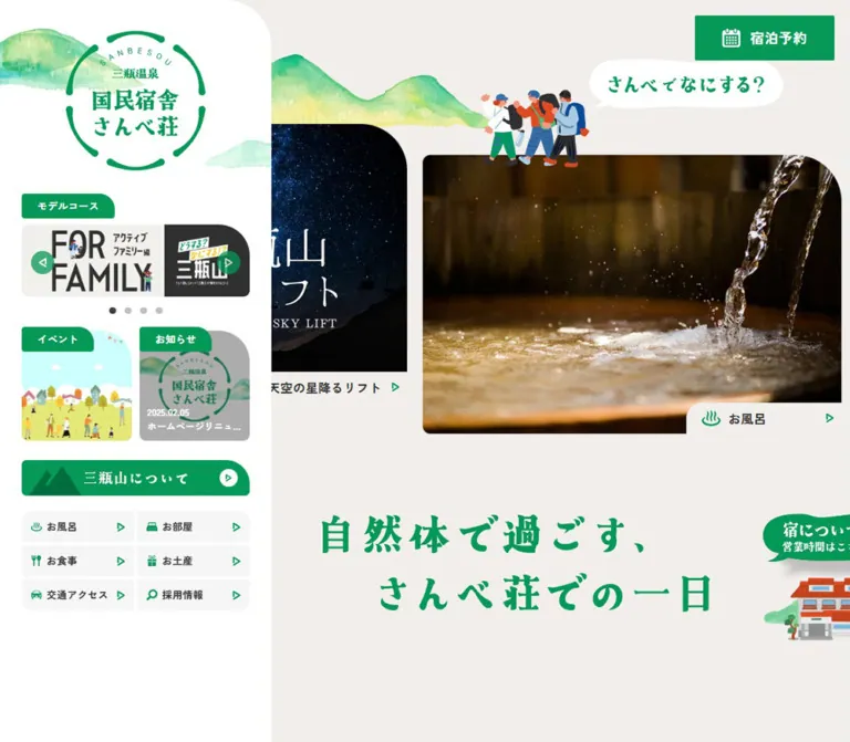
温かいグレーと鮮やかな緑を基調に、水彩の山並み、人物イラスト、風景写真を組み合わせた宿泊施設サイト。デスクトップのサイドナビと、モバイルの固定ナビが特徴。
オリジナルサイトを見るSanbe-sou — Style Reference
A mountain retreat presented through green signs, watercolor hills, illustrated travelers, and generous landscape photography.
Website: sanbe-sou.jp Original URL: https://www.sanbe-sou.jp/ Final URL: https://www.sanbe-sou.jp/ Theme: light, with a warm gray canvas, white structural surfaces, and green identity elements. Inspected: September 13, 2026, Japan Standard Time. The supplied retrieval timestamp is September 12, 2026 at 19:20:56.215 UTC, equivalent to September 13 at 04:20:56.215 JST. Viewports: desktop 1440 × 1000 and mobile 390 × 844 CSS pixels. Scope: the current hospitality homepage: desktop navigation rail, mobile header and bottom navigation, experience carousel, illustrated storytelling, promotional banners, news, DOM-listed operating information, reservation links, resource directory, footer, and visible floating utilities. Three desktop captures and two mobile captures provide visual evidence; the accompanying DOM provides additional measurements and content.
Sanbe-sou combines a practical accommodation directory with the atmosphere of an illustrated travel guide. The opening photographs promote mountain activities alongside the inn’s facilities. Green reservation buttons remain prominent while smaller links cover bathing, rooms, food, souvenirs, access, and recruitment. This is a broad facility homepage with several visitor journeys.
Its most distinctive relationship is between a dense white navigation rail and an expansive warm gray content area. Large photographs have one exaggerated rounded corner, small labels seem cut into their lower edges, and colorful travelers overlap the surrounding space. Watercolor hills soften the geometry. The main slogan, “自然体で過ごす、さんべ荘での一日,” uses expressive green lettering above a small illustrated building.
The mobile composition preserves these motifs while changing navigation substantially. A compact wordmark, stacked booking links, and a menu control replace the visible rail. Four facility shortcuts occupy the bottom edge. The captured booking and chat overlays cover a substantial portion of the mobile page; this is a current implementation condition that should be documented separately from the underlying design system.
How to Read This Reference
- Measured values come from the supplied rendered element rectangles, computed styles, or named custom properties.
- Calculated values are simple relationships derived from those measurements, such as aspect ratios and gaps.
- Estimated values describe screenshot geometry or appearance where a corresponding computed property was not supplied.
- Recommended values and behaviors belong to an adaptation. They are not claims about the original implementation.
- Token names beginning with
--sb-are implementation aliases introduced here. Original custom-property names are identified separately. - Carousel duplicates and off-canvas menu descendants remain present in the DOM evidence. Their coordinates do not establish that all those elements were simultaneously visible.
- Some image links have a measured inline-anchor height of only 24px. That is not the visible artwork height. Use the screenshots or actual image dimensions when available.
Tokens — Colors
Default Palette
| Name | Value | Alias / source | Evidence and role |
|---|---|---|---|
| Mountain Green | #059856 |
--sb-green / source --color-green |
Measured on reservation buttons and category tabs; also the dominant visible identity, icon, and rule color |
| Warm Canvas | #F1EEEC |
--sb-canvas |
Computed body background, rgb(241, 238, 236); surrounds photographs and illustrated scenes |
| White Surface | #FFFFFF |
--sb-white |
Measured on mobile navigation; visually consistent with the sidebar, resource section, and footer |
| Charcoal Text | #303030 |
--sb-ink / source --base-color |
Measured body and link text; keeps functional information distinct from decorative green lettering |
| Border Gray | #C9C5C1 |
--sb-border / source --color-bordergray |
Declared source token; its application to particular visible borders was not established |
| Pale Navigation Fill | approximately #F6F6F6 |
--sb-nav-fill |
Screenshot estimate for the desktop shortcut cells; not a sampled computed color |
White and warm gray perform different jobs. White gathers navigation and practical information into recognizable surfaces; warm gray carries the landscape and storytelling composition. Preserve that distinction instead of making every section white.
Supporting Source Variables
The source also declares --mc-green: #059857, a nearly identical green; --mc-bg: rgba(72,167,167,0.35); --color-yellow: #FBC400; and --color-red: #B80000. Their specific visible applications are not established by the supplied element sample. They should not automatically become additional primary UI colors.
Numerous platform palette, gradient, and shadow presets appear in the custom-property inventory. Their presence does not demonstrate that the homepage uses those treatments.
Floating Utility Colors
| Layer | Appearance | Evidence status |
|---|---|---|
| Estimate shortcut | Bright cyan circle, approximately #00B9E7, with a white calculator symbol |
Screenshot estimate |
| Booking offer | Saturated magenta, approximately #C2185B, with white copy and a white price row |
Screenshot estimate |
| Chat messages | Very light gray or white surfaces, dark gray text, soft shadows | Visually observed; exact colors and shadow values unavailable |
| Chat launcher | White circle with a dark outlined speech-bubble symbol | Visually observed |
These floating controls have their own visual vocabulary. Do not promote their cyan and magenta into the main site palette when adapting the hospitality design.
Tokens — Typography
Primary Text
- Computed family:
'Zen Kaku Gothic New', serif. - Root size:
16px; this site does not use the reference example’s miniature root-unit system. - Body weight:
400. - Common content emphasis:
700, including narrative copy, news dates, titles, and excerpts. - Tracking: generally
0.02em, measured as0.32pxat 16px and0.26pxat 13px. - Line height: the body itself reports
19.2px; many descendants report22.4px. Narrative paragraphs have more generous, explicit leading.
The named font is supported by computed-style evidence. Actual font-file loading and glyph fallback were not independently verified. The root element’s Times value does not identify the visible brand lettering.
Display Lettering
The circular emblem, compact mobile wordmark, and large green slogan have a strongly serifed, expressive appearance. Their strokes are more irregular and decorative than the functional text.
No corresponding display-font declaration was supplied. The large slogan is visible in the screenshot but absent from the extracted ordinary page text, suggesting an artwork-based treatment without proving its file format. Preserve supplied lettering artwork when available and authorized. A generic serif is only a fallback for a new implementation, not an identification of the original face.
Icons
Calendar, bath steam, bed, cutlery, gift, car, search, and triangular arrow symbols provide compact navigation cues. The source exposes Font Awesome 7 Free and Brands family variables, but the evidence does not map each visible icon to a particular glyph or asset. Match their function and visual weight without inventing a complete icon implementation.
Type Scale
All numeric entries below are measured unless marked estimated. Desktop and mobile values refer to the two supplied viewports.
| Role | Desktop | Mobile | Weight / tracking | Notes |
|---|---|---|---|---|
| Common body/link text | 16px / 22.4px |
16px / 22.4px |
400, 0.02em |
Some visible child labels override their anchor’s inherited values |
| Narrative paragraph | 16px / 32px |
14px / 25.2px |
700, 0.02em |
A quieter, spacious reading rhythm |
| Reservation links | 18px / 18px |
8px / 8px |
700, 0.02em |
The exceptionally small mobile type is an observation, not a recommendation |
| Sidebar category tabs | 13px / 18.2px |
13px / 18.2px |
700, 0.02em |
Mobile measurements belong to the off-canvas content |
| Sidebar news caption | 12px / 16.8px |
11px / 15.4px |
700, 0.02em |
White date and abbreviated title over imagery |
| Mobile bottom navigation | Not displayed in desktop captures | 14px / 19.6px |
700, 0.02em |
Four facility shortcuts |
| Main news date | 16px / 22.4px |
12px / 16.8px |
700, 0.02em |
Separate from the title |
| Main news title | 20px / 28px |
13px / 18.2px |
700, 0.02em |
Sampled title boxes include bottom padding |
| Main news excerpt | 16px / 22.4px |
12px / 16.8px |
700, 0.02em |
Sampled excerpt regions accommodate about two lines |
NEWS heading node |
16px / 22.4px |
16px / 22.4px |
400, 0.02em |
Its 46px desktop box is not a 46px font size |
| Large green slogan | Approximately 48–54px glyph scale |
Approximately 28–32px glyph scale |
Visually heavy | Screenshot estimate; may be artwork rather than live type |
Tokens — Spacing & Shapes
Density: compact navigation and utility text, contrasted with broad scenic sections and large intervals around illustrated compositions.
Recurring measured increments: 4px, 6px, 10px, 12px, 16px, 20px, 28px, 40px, and 100px. These observations do not establish a single formal source spacing scale.
Spacing Scale
| Use | Desktop | Mobile | Evidence |
|---|---|---|---|
| Sidebar horizontal inset | 28px |
28px inside off-canvas content |
Measured positions and widths |
| Sidebar shortcut grid gap | 4px |
4px |
Calculated from adjacent rectangles |
| Shortcut icon/text gap | 6px |
6px |
Computed |
| Paired sidebar promotion gap | 10px |
Layout differs | Calculated from desktop squares |
| Reservation button gap | 10px horizontally |
5px vertically |
Calculated |
| Reservation icon/text gap | 12px |
3px |
Computed |
| Experience-card gap | 20px |
16px |
Calculated from successive card positions |
| Experience-card vertical stagger | 40px |
0px |
Measured card tops |
| Main content inset | 65px within the 1090px main region |
14px |
Measured news heading positions |
| Experience-section top padding | 100px |
80px |
Computed section padding; surrounding header flow also changes |
| News-card gap | 20px |
20px |
Calculated |
| Footer resource gap | Approximately 20px |
Approximately 10px |
Screenshot estimate |
Border Radius
| Element | Value | Evidence |
|---|---|---|
| Experience photograph link | 10px 60px 0px 10px |
Computed at both viewports |
| Desktop category tab | 4px 20px 4px 4px |
Computed |
| Off-canvas mobile category tab | 3px 12px 3px 3px |
Computed |
| Reservation button | 2px |
Computed at both viewports |
| Sidebar outer right corners | Approximately 60px |
Screenshot estimate |
| Photo caption’s upper-left corner | Approximately 20–24px |
Screenshot estimate |
| Footer resource cards | Approximately 12px |
Screenshot estimate |
| Footer’s upper outer corners | Approximately 60px on desktop |
Screenshot estimate |
| Circular arrows and launchers | Circle | Visually observed |
The large upper-right photo radius is a defining motif. Applying the same radius to all four corners would lose the particular silhouette. Reservation buttons deliberately remain much squarer.
Layout Measurements
| Element | Desktop 1440 × 1000 | Mobile 390 × 844 |
|---|---|---|
| Document height | 6219.25px measured |
5276.84px measured |
| Main region | x:350, width 1090px |
x:0, width 390px |
Source --sidebar-gap |
350px |
100% |
| Header box | 1090 × 80px |
390 × 69px |
| Circular sidebar identity link | Approximately 180 × 180px, at 85,40 |
Approximately 100 × 100px in off-canvas content |
| Visible mobile identity link | Not applicable | 120 × 24px, at approximately 10,22.3 |
| Model-course artwork link | 294 × 92.83px |
334 × 105.47px, off canvas |
| Event/news sidebar tile | Typically 142 × 142px |
Different off-canvas proportions; not a visible page grid |
| Sidebar facility shortcut | 145 × 40px |
Approximately 165 × 31.59px, off canvas |
| Day-trip booking button | 218.89 × 60px |
118.28 × 20px |
| Accommodation booking button | 145.45 × 60px |
85.64 × 20px |
| Experience photograph card | 540 × 360px |
374 × 249.33px |
| News content region | 960px wide |
362px wide |
| Individual news card | 306px wide |
358px wide |
| Bottom navigation | Not visible | Approximately 50px including the upper rule |
| Footer resource grid | Approximately 1060px wide, three columns |
Approximately 340px wide, one column |
The mobile --sidebar-gap: 100% value must not be copied blindly into a main-content margin. The measured mobile main region starts at zero; the sidebar is outside the visible page in the captured state.
Components
Desktop Navigation Rail
Role: persistent identity, suggested itineraries, current promotions, and facility navigation.
A white panel occupies the left 350px. The circular identity sits near the top with watercolor mountain fragments extending behind it. Below it, the rail stacks a model-course carousel, paired event/news tiles, a wide mountain-information banner, and a two-column facility shortcut grid.
The main internal width is 294px, obtained from 350px minus two 28px insets. This disciplined internal alignment keeps a visually busy rail coherent.
The rail remains aligned in the opening and middle captures. In the terminal desktop capture, its rounded lower end appears above the footer. Its behavior is therefore consistent with a sticky panel constrained by the main page region; the exact positioning declaration was not supplied. Do not model it as an unconditional full-height overlay that continues through the footer.
Model-Course Carousel
Role: offers distinct ways to spend a visit.
A green category tab labeled “モデルコース” overlaps the visual hierarchy above a wide image banner. The measured banner is 294 × 92.83px, giving a calculated ratio of approximately 3.17:1. Previous and next controls occupy 30 × 30px button boxes at the banner’s sides.
Four pagination buttons sit beneath the banner. Each measured button box is 20 × 20px; the visible circular mark is smaller. The DOM includes itinerary destinations for the day-trip course, families, women, and solo visitors. Repeated destinations indicate duplicated carousel content, not additional unique categories.
Retain the supplied banner typography as artwork. Do not recreate every letter inside a promotional image as ordinary interface text without an appropriate source.
Event and News Tiles
Role: compact discovery surfaces within the rail.
Two approximately square tiles sit side by side with a 10px gap. Their green category tabs use white 13px bold text and the asymmetric tab radius. The event tile is primarily illustrative. The news tile combines an image, circular previous/next controls, and a white date/title caption near its lower edge.
News captions use 12px bold text with 10px padding on desktop. The visible title is abbreviated. A new implementation should keep the complete link name accessible even when the visual title is shortened.
Facility Shortcut Grid
Role: direct access to practical pages.
The desktop grid contains six shortcuts: “温泉,” “お部屋,” “お食事,” “お土産,” “交通アクセス,” and “採用情報.” Each cell is approximately 145 × 40px, with pale gray fill, a small green icon at left, text, and a green triangular arrow near the right edge.
Measured anchor padding is 8px 30px 8px 12px, with a 6px content gap. The outer group has softly rounded corners in the screenshot, while the measured anchors themselves have zero radius. This suggests that the grouping surface or surrounding elements provide some of the rounding; do not assign the whole group’s shape to every cell.
A separate wide green mountain-information banner above the grid creates a stronger destination link than the smaller utility cells.
Reservation Header
Role: keeps day-trip and overnight booking available while browsing.
On desktop, two green buttons sit at the upper right, 20px from the top and right edges. Each is 60px tall, with a white calendar symbol and bold 18px text. Their horizontal gap is 10px, internal horizontal padding is 18px, and icon/text gap is 12px. Their corner radius is only 2px.
The surrounding desktop header is transparent. The buttons retain their screen-edge placement in the supplied lower-page captures.
On mobile, a warm gray header is 69px tall. A small horizontal identity sits left, two booking links stack toward the right, and a two-line menu symbol with a small MENU caption occupies the far-right area. The booking links shrink to 20px height and 8px text. That scale is faithfully recorded here, but larger targets and text are recommended for an adaptation.
The supplied links point to booking results on reserve.sanbe-sou.jp. No booking form, availability search, or transaction was inspected.
Experience Carousel
Role: introduces both the inn and the surrounding mountain experiences.
The desktop carousel uses 540 × 360px photo links with a 3:2 aspect ratio. The selected visible composition includes a central sunrise-breakfast image at x:625, y:180, while neighboring mountain and cycling images begin 40px lower. A 20px gap separates consecutive cards.
The main region clips the carousel so neighboring photographs extend beyond the visible content boundaries. This creates a continuous scenic strip without displaying every item at once.
Each card combines:
- A large destination photograph.
- An asymmetric
10px 60px 0px 10pxclipping shape. - Optional white campaign lettering or line artwork over the photograph.
- A warm gray caption tab at the lower right.
- A dark destination label and small green triangular arrow.
The entire measured card is a link. Keep the visible arrow within that link instead of creating a nested interactive button.
Illustrated hikers and a speech bubble labeled “さんべでなにする?” overlap the upper area. These decorations should sit outside the photograph’s clipping layer so their silhouettes remain intact.
At 390px, the visible cycling card measures 374 × 249.33px at x:10, y:130. All sampled mobile experience cards share the same top coordinate; the desktop stagger is removed. The remaining horizontal gap is 16px. Preserve a single dominant image with nearby content implied at the edges.
Slogan and Illustrated Storytelling
Role: expresses an easygoing relationship with the destination.
Below the experience strip, a large green two-line slogan occupies broad warm gray space. A small illustrated inn and travelers accompany an organic green operating-hours callout. The desktop composition spreads these elements across the main region; the mobile composition stacks them more tightly.
The narrative paragraph is a separate live-text element. It measures approximately 261px wide on desktop with 16px bold type and 32px leading. On mobile it measures approximately 228px wide with 14px type and 25.2px leading. Its mobile x-coordinate is approximately 126px, so the supplied layout is deliberately offset rather than a generic centered full-width paragraph.
A middle desktop capture shows a large landscape photograph, watercolor hill fragments, groups of illustrated visitors, a walking dog, and an irregular white dashed path across the warm canvas. These details connect sections into a place-based scene. Their animation, if any, is not established by the still captures.
Promotional Course Banners
Role: takes visitors from atmosphere to a more specific itinerary.
The middle desktop capture includes a large white day-trip banner with oversized green OH! DO! lettering, photographic face cutouts, smaller Japanese promotional copy, and a rounded upper-right corner. Its visible desktop width is approximately 960px, aligned with the main content inset.
The DOM independently confirms links to /ohdo/ and the tour website. Several associated inline-anchor rectangles are only 24px tall despite visibly larger imagery; those rectangles must not be used as the artwork height.
Keep these banners as carefully composed promotional assets. Their typography, face placement, and illustration are more specific than a standard text-and-button card.
Main News Carousel
Role: presents dated facility information and activity announcements.
The DOM establishes image-led linked entries with a date, bold title, and short excerpt. Desktop cards measure 306px wide with 20px gaps, accommodating approximately three cards across the 960px content region. Mobile cards measure 358px wide with the same 20px gap, producing a primarily single-card view.
The date, title, and excerpt form distinct text blocks. On desktop, title blocks include 16px bottom padding; on mobile, that padding is 8px. Excerpt heights are consistent with about two lines at each measured size.
Card heights vary substantially between entries. Several desktop entries measure approximately 463px tall, while others are shorter; mobile examples range from approximately 329px to 463px. This supports preserving content-specific image proportions rather than assuming every news image has the same crop.
The heading node labeled NEWS uses 16px type. Its larger containing rectangle and gaps should not be converted into an invented display-font size.
Operating Information and Reservation Panel
Role: communicates practical visit conditions and routes visitors to reservations.
The DOM includes a separate NEWS and OPEN information group containing temporary opening notices, bathing hours and fees, restaurant hours, and shop hours. The screenshots do not expose the complete group’s geometry or establish whether the illustrated operating-hours callout opens it, scrolls to it, or uses another mechanism.
Treat the content as confirmed and its interactive presentation as unverified. For a new implementation, use editable structured data for opening times and temporary exceptions. Do not bake date-sensitive operational details into decorative imagery.
The terminal desktop screenshot does show the bottom of a white reservation panel with two photographic/illustrated links labeled “宿泊予約” and “イベント予約.” Their lower-right labels repeat the caption-tab motif from the experience cards. A small traveler illustration overlaps the panel’s lower-left area.
Resource Directory and Footer
Role: consolidates supporting information, regional destinations, company information, and secondary navigation.
A broad white region begins below the main content and spans the whole desktop viewport, including the area previously occupied by the rail. Its upper corners are generously rounded.
The desktop resource directory is approximately 1060px wide, arranged as three columns with 20px gaps. The first row contains green cards approximately 340 × 140px for the brochure, official LINE account, and hot-spring district. Text sits toward the left; illustrative or photographic artwork occupies the right; a white circular arrow provides a consistent endpoint.
A second row contains shorter white partner banners, approximately 340 × 80px, with thin green outlines and original destination identities. Preserve these identities’ own typography and colors instead of recoloring every partner logo green.
A thin green rule separates this directory from the lower footer. The desktop footer places the green facility identity and company/social links on the left, with compact navigation lists on the right. Green dots punctuate the text links. Copyright is centered near the bottom.
The original-page footer directly displays “株式会社さんべ開発公社” and links it to /company/. This supports the operator identification without requiring inspection of that destination.
On mobile, the resource banners form one column with approximately 25px side margins. The lower identity and copyright remain, while the desktop navigation columns are not visible in the terminal capture or repeated after the company link in the supplied mobile text sequence.
Floating Estimate, Offer, and Chat Controls
Role: provides pricing and assistance outside the ordinary document flow.
The cyan calculator shortcut is approximately 60px in diameter. Its vertical placement is consistent with a control near the viewport’s midpoint in the supplied desktop and mobile captures. The DOM includes an image-like link to the accommodation-estimate announcement, but no direct element mapping or click result establishes the calculator’s exact behavior.
The magenta offer is approximately 260px wide, with rounded corners, white promotional copy, a date/occupancy line, and a white price strip. Chat prompts appear below it on light surfaces, with small circular close controls. The outlined chat launcher is approximately 80px across.
On mobile, the offer begins around x:120, y:462, while chat prompts extend across much of the lower-right page. Together they obscure the slogan, illustrated building, operating-hours callout, parts of the footer, and the rightmost bottom-navigation item. The observations establish visible obstruction; dismissal persistence and expanded chat behavior were not tested.
Tokens — Motion & Interaction
| Treatment | Evidence | What can be concluded |
|---|---|---|
| Ordinary image and text links | Computed transition shorthand 0.25s |
A transition duration is defined; the changed property and hover appearance are not supplied |
| General transition token | --transition: all .3s ease |
Declared source timing; not proof that every element uses it |
| Longer transition token | --transition-long: all .6s ease |
Declared source timing; affected components are not identified |
| Narrative, selected heading, and callout elements | Computed transition 0.8s |
Longer transitions exist; a specific reveal sequence was not demonstrated |
| Animation configuration | Duration 1s, delay 1s, repeat 1 variables |
Configuration evidence only; not confirmation of a particular animation |
| Experience carousel | Repeated link sets, offscreen cards, different captured selected content | Carousel structure is supported; autoplay, interval, easing, and swipe behavior are unverified |
| Sidebar carousels | Previous/next buttons and four course pagination buttons | Controls are present; clicked results were not supplied |
| Mobile menu | Visible menu control and off-canvas navigation coordinates | Closed/off-canvas presentation is supported; opening transition and focus handling are unverified |
| Floating utilities | Persistent placement across scroll captures | Floating presentation is supported; expanded states and dismissal behavior are unverified |
Most sampled elements report animation: none at the captured state. This does not rule out movement applied to an ancestor, pseudo-element, image asset, or JavaScript-controlled carousel.
The collection process waited for bounded layout stability and temporarily paused perpetual animations during readiness checks before resuming them. Still screenshots cannot supply a trustworthy motion timeline. Do not invent parallax, continuous character walking, a particular carousel library, or a slide dwell interval.
Recommended adaptation: use restrained 250–300ms feedback on functional controls. If a carousel advances automatically, provide an explicit pause control and stop advancement during keyboard focus or direct interaction. Keep the scenic content usable without motion.
Surfaces
| Layer | Appearance | Purpose |
|---|---|---|
| Main canvas | Solid warm gray | Provides breathing room around photography and illustration |
| Desktop navigation rail | White, large outer right corners | Groups identity and dense navigation |
| Facility shortcut cells | Very pale gray with green icons | Separates compact links without heavy borders |
| Experience cards | Photographs with asymmetric clipping | Makes destination imagery the primary visual material |
| Photo caption tabs | Canvas-colored lower-right insert | Places readable labels within the card silhouette |
| Category labels | Green with white text and one larger corner | Connects small modules through a repeated sign-like shape |
| Promotional and reservation panels | White, selective large rounding | Separates practical destinations from the scenic canvas |
| Resource cards | Green fills or white surfaces with green outlines | Organizes external and supporting destinations |
| Assistance overlays | Cyan, magenta, and pale elevated surfaces | A visibly separate utility layer |
The main site is predominantly flat. Photographs, whitespace, color fields, and selective outlines do most of the structural work. Some decorative callouts and utility overlays have visible shadows, but this does not establish a general shadow-elevation system for every card.
Imagery
The page uses three complementary image languages.
Landscape photography supplies the destination: green woodland, mountain grassland, open sky, water, cycling, and sunrise activity. The opening cards use broad 3:2 frames. Keep focal subjects away from the lower-right caption insert and the strongly rounded upper-right corner.
Watercolor terrain creates soft transitions around the identity and scenic sections. Mountain silhouettes have uneven contours, translucent green washes, yellow highlights, and visible paper-like variation. They are decorative landscape fragments, not blurred gradients.
Flat illustrated people and buildings add social warmth. Travelers have simplified faces, loose limbs, bright jackets, backpacks, and small gestures. Groups overlap one another naturally. The inn, dog, phone, and bathing illustrations share a friendly, slightly irregular character. Avoid replacing them with a uniform stock icon set.
The large promotional banner adds photographic face cutouts to the green graphic system. This collage treatment belongs to the campaign artwork and should remain distinct from the landscape photography.
Observed Asset References
No image src, currentSrc, downloadable asset paths, or intrinsic file dimensions were supplied. The following are visual identifications and observed link destinations, not asset-file URLs. The destinations were not opened during this analysis.
| Visible artwork | Observed destination | Role |
|---|---|---|
| Circular identity and horizontal wordmark | https://www.sanbe-sou.jp/ |
Site identity |
| Family itinerary banner | https://www.sanbe-sou.jp/modelcourse-forfamily/ |
Sidebar course promotion |
| Mountain/hiking photograph | https://www.sanbe-sou.jp/about/ |
Destination introduction |
| Sunrise breakfast photograph | https://sanbe-tours.com/events/events-80/ |
Experience promotion |
| Mountain cycling photograph | https://sanbe-tours.com/2025/08/05/post-597/ |
Experience promotion |
| Large day-trip campaign banner | https://www.sanbe-sou.jp/ohdo/ |
Itinerary entry point |
| Tour/event illustration | https://sanbe-tours.com/ |
Activity discovery and reservations |
| Brochure resource artwork | https://www.sanbe-sou.jp/panphlets/ |
Brochure index link; no document was inspected |
| Official LINE artwork | https://line.me/R/ti/p/%40sanbe1126 |
Messaging-account entry point |
| Hot-spring district illustration | https://sanbesanonsenkyou.jimdofree.com/ |
Regional resource |
| Watercolor hills and traveler groups | No distinct asset URL supplied | Decorative continuity between sections |
Use authorized original assets where available. CSS can reproduce the layout, tab shapes, and color hierarchy, but the lettering and illustrations carry much of the identity.
Layout & Responsive Behavior
Desktop
At 1440px, the 350px rail leaves a 1090px main region. The experience strip uses large fixed-width cards inside that region, while text and promotional sections often align to a 960px inner width with approximately 65px side insets.
This creates three horizontal systems: the narrow navigation rail, the relatively contained main content, and the full-width footer. Preserve those systems rather than forcing the entire page into one centered maximum-width wrapper.
The opening cards alternate between y=180 and y=220. Their vertical offset, clipped neighbors, overlapping travelers, and warm gray caption tabs produce the characteristic composition. The first section then gives the green slogan considerable space before the longer storytelling content.
Mobile
At 390px, the main content spans the viewport and the rail is off canvas. The header and four-item bottom navigation stay visible across the supplied top and terminal captures. The bottom link labels are “温泉,” “お部屋,” “お食事,” and “お土産.”
The experience cards retain a 3:2 ratio and their 60px upper-right radius. They become almost viewport-wide, and the desktop vertical stagger disappears. Main news and promotional content use approximately 14px side insets, while footer resources use approximately 25px.
Typography is resized by role rather than uniformly scaled. Narrative text changes from 16px to 14px, news titles from 20px to 13px, and booking text from 18px to 8px. That last reduction creates a practical readability concern.
The mobile body reports 50px top and bottom padding, while the measured fixed header is 69px tall. A new implementation should derive content clearance from the actual header and bottom-bar sizes rather than copying this mismatch.
Limits of the Responsive Evidence
Only 1440px and 390px widths were supplied. The exact breakpoint, tablet composition, landscape-phone behavior, browser zoom response, and safe-area rules are unknown. The CSS below uses a recommended 1100px desktop breakpoint; it is not a recovered source breakpoint.
The shorter mobile document does not imply that all desktop content was removed. Different section spacing, image dimensions, navigation visibility, and off-canvas content also affect total height.
Do’s and Don’ts
Do
- Preserve the relationship between green
#059856, warm gray#F1EEEC, white, and charcoal. - Keep the desktop rail dense and aligned to its 294px internal width.
- Use large scenic photographs with the observed asymmetric upper-right rounding.
- Retain the 40px desktop photo stagger and remove it for the narrow mobile composition.
- Place illustrated travelers and speech bubbles outside the photo clipping layer.
- Repeat the small green category tabs and lower-right caption inserts across appropriate components.
- Keep narrative copy more spacious than news and navigation text.
- Let the footer expand across the entire viewport after the rail ends.
- Preserve partner logos and campaign lettering as distinct artwork.
- Separate verified source behavior from proposed accessibility and motion improvements.
Don’t
- Don’t reduce this facility homepage to a single booking hero and conversion form.
- Don’t make every corner equally rounded or every action pill-shaped.
- Don’t add shadows to all cards simply because the assistance overlays have shadows.
- Don’t treat cyan and magenta utility colors as general brand accents.
- Don’t identify the display font from the inherited font on an image link.
- Don’t mistake offscreen carousel clones for additional visible content or page-wide overflow.
- Don’t use a 24px inline-anchor rectangle as a promotional image’s height.
- Don’t assume the exposed platform gradients and shadows are active design tokens.
- Don’t reproduce the mobile overlay obstruction as an intentional design requirement.
- Don’t invent autoplay timing, parallax, menu animation, or booking-flow behavior.
Recommended Implementation Additions
These are recommendations for a new implementation, not verified features of the original page.
- Enlarge mobile booking targets to at least 44px and use readable text. Preserve the stacked booking relationship if desired, but allow the header to grow accordingly.
- Derive top and bottom content clearance from the actual fixed controls, including safe-area insets.
- Give assistance utilities a shared placement policy. Collapse unsolicited prompts on narrow screens and keep the bottom navigation and operating-information link unobstructed.
- Make close controls keyboard-operable and large enough to activate reliably. Define when dismissal persists.
- Keep off-canvas navigation and inactive carousel clones out of the keyboard sequence. For a modal drawer, support Escape, appropriate focus containment, and focus return.
- Provide visible focus states and accessible names for circular arrows, the menu, calculator, and chat controls. Image-only link text in the extraction does not establish whether accessible names already exist.
- Verify color contrast for small labels. The measured green against white gives approximately 3.7:1 by the standard relative-luminance calculation. A proposed darker functional green,
#067543, improves contrast while keeping the palette familiar. - Keep decorative hills and travelers out of the accessibility tree, while providing useful alternatives for meaningful destination and campaign imagery.
- Maintain structured, editable operating hours and temporary notices. Do not hardcode the captured prices or dates into a reusable component.
- Preserve intrinsic image proportions for news and reserve image space before loading. Provide appropriately sized mobile imagery without changing the focal composition.
- Respect reduced-motion preferences and expose pause controls if automatic carousel movement is implemented.
Agent Prompt Guide
Quick Color Reference
- Main canvas:
#F1EEEC. - Navigation rail, footer, and practical panels:
#FFFFFF. - Identity, booking controls, category tabs, arrows, and rules:
#059856. - Functional text:
#303030. - Proposed darker green for small functional labels:
#067543; this is a recommendation. - Cyan calculator and magenta offer: separate floating utility styling, not general brand colors.
Overall Prompt
“Create a Japanese mountain-inn homepage inspired by Sanbe-sou’s current visual structure. Use a warm gray canvas #F1EEEC, green #059856, white structural surfaces, and charcoal text. On desktop, place a 350px white navigation rail beside a broad scenic content area. Combine a circular identity, compact itinerary banners, green category tabs, and a two-column facility navigation grid. Use 540 × 360px experience photographs with 10px 60px 0 10px corners, alternating 40px vertical offsets, and warm gray caption tabs at the lower right. Add authorized watercolor hills, colorful illustrated travelers, and expressive green display artwork. Use Zen Kaku Gothic New for functional text. On mobile, move the rail into a menu, retain nearly full-width 3:2 photographs without staggering, and provide a fixed four-item facility navigation bar. Finish with a full-width white resource directory and footer. Keep booking and assistance controls readable and clear of content.”
Example Component Prompts
- Navigation rail: “Build a 350px white sidebar with large outer right corners, a 180px circular identity, and 28px horizontal insets. Stack a 294px-wide itinerary banner with circular arrows and four dots, paired event/news tiles, a green mountain-information banner, and six pale-gray facility shortcuts in two columns. Keep the core surface flat.”
- Experience card: “Create a 3:2 landscape link with
10px 60px 0 10pxcorners. Insert a warm-gray label at the lower right with a rounded upper-left shoulder, dark Japanese destination text, and a green triangular arrow. Keep the whole card one link and place any traveler illustration outside the clipping container.” - Story section: “Arrange a green two-line slogan, a small illustrated inn, and an organic operating-hours callout on a warm-gray canvas. Use watercolor mountain fragments and small groups of travelers to connect the composition. Set supporting Japanese narrative text in bold Zen Kaku Gothic New with generous leading. Use original lettering artwork where available.”
- News strip: “Build image-led news links with separate dates, bold titles, and short excerpts. Use approximately 306px card widths on a desktop strip and one broad card on mobile, with 20px gaps. Preserve varying image proportions. Do not duplicate carousel clones in the accessible reading order.”
- Resource footer: “Create a full-width white footer with generous top corners. Arrange three green illustrated resource links above three shorter outlined partner banners. Use circular arrows, 20px desktop gaps, a thin green divider, and compact company and navigation information. Stack the banners into a single column on mobile.”
Quick Start
CSS Custom Properties
This is an adaptation scaffold, not recovered source CSS. It preserves measured desktop dimensions and the captured compact mobile arrangement. Attribute data-comfortable-controls on the body enables recommended darker action fills and larger mobile booking controls; use that mode for a new implementation.
Load the named text font through an authorized font source. Supply actual identity, photograph, and illustration assets separately. Carousel state, menu behavior, booking integrations, and assistance utilities require their own implementation.
Suggested structure: .site-shell contains .site-rail and .site-main; .site-footer follows outside that shell. .site-header belongs inside the main region. Keep decorative hero artwork outside .experience-track, which is the scrolling photo layer.
:root {
  /* Measured core colors */
  --sb-green: #059856;
  --sb-canvas: #f1eeec;
  --sb-white: #ffffff;
  --sb-ink: #303030;
  --sb-border: #c9c5c1;

  /* Estimated surface and recommended accessible action color */
  --sb-nav-fill: #f6f6f6;
  --sb-readable-green: #067543;

  --sb-font: 'Zen Kaku Gothic New', serif;
  --sb-tracking: 0.02em;
  --sb-rail: 350px;
  --sb-main-inner: 960px;
  --sb-footer-inner: 1060px;
  --sb-card-width: 540px;
  --sb-card-gap: 20px;
  --sb-header-mobile: 69px;
  --sb-bottom-bar: 50px;
  --sb-photo-radius: 10px 60px 0 10px;
  --sb-safe-top: env(safe-area-inset-top, 0px);
  --sb-safe-bottom: env(safe-area-inset-bottom, 0px);
}

* { box-sizing: border-box; }

body {
  margin: 0;
  color: var(--sb-ink);
  background: var(--sb-canvas);
  font-family: var(--sb-font);
  font-size: 16px;
  line-height: 1.4;
  letter-spacing: var(--sb-tracking);
}

button, input, select { font: inherit; }
img { display: block; max-inline-size: 100%; }
a { color: inherit; }

.site-shell {
  display: grid;
  grid-template-columns: var(--sb-rail) minmax(0, 1fr);
  align-items: start;
}

/* Recommended sticky implementation, constrained by the main region. */
.site-rail {
  position: sticky;
  inset-block-start: 0;
  min-block-size: 100svh;
  max-block-size: 100svh;
  overflow-y: auto;
  padding: 40px 28px;
  background: var(--sb-white);
  border-radius: 0 60px 60px 0;
}

.rail-brand {
  display: block;
  inline-size: 180px;
  margin: 0 auto 30px;
}

.rail-brand img { inline-size: 100%; block-size: auto; }

.category-tab {
  display: inline-flex;
  align-items: center;
  min-block-size: 32px;
  margin: 0 0 8px;
  padding-inline: 20px;
  border-radius: 4px 20px 4px 4px;
  color: var(--sb-white);
  background: var(--sb-green);
  font-size: 13px;
  font-weight: 700;
  line-height: 1.4;
}

.rail-course img { inline-size: 100%; block-size: auto; }

.rail-promotions {
  display: grid;
  grid-template-columns: repeat(2, minmax(0, 1fr));
  gap: 10px;
  margin-block: 24px;
}

.facility-grid {
  display: grid;
  grid-template-columns: repeat(2, minmax(0, 1fr));
  gap: 4px;
  overflow: hidden;
  border-radius: 14px;
}

.facility-grid a {
  display: flex;
  align-items: center;
  gap: 6px;
  min-block-size: 40px;
  padding: 8px 12px;
  background: var(--sb-nav-fill);
  text-decoration: none;
}

.facility-grid .icon,
.facility-grid .arrow { color: var(--sb-green); }
.facility-grid .arrow { margin-inline-start: auto; }

.site-main { min-inline-size: 0; }

.site-header {
  position: sticky;
  inset-block-start: 0;
  z-index: 30;
  block-size: 80px;
}

.mobile-brand, .menu-trigger, .bottom-nav { display: none; }

.booking-actions {
  position: absolute;
  inset-block-start: 20px;
  inset-inline-end: 20px;
  display: flex;
  gap: 10px;
}

.booking-link {
  display: inline-flex;
  align-items: center;
  justify-content: center;
  gap: 12px;
  min-block-size: 60px;
  padding-inline: 18px;
  border-radius: 2px;
  color: var(--sb-white);
  background: var(--sb-green);
  font-size: 18px;
  font-weight: 700;
  line-height: 1;
  text-decoration: none;
  transition: opacity 250ms ease;
}

.booking-link .icon { inline-size: 24px; block-size: 24px; }

.hero { padding-block-start: 100px; }
.experience-stage { position: relative; }

/* Native scrolling is a fallback, not a claim about the source slider. */
.experience-track {
  display: flex;
  align-items: flex-start;
  gap: var(--sb-card-gap);
  overflow-x: auto;
  overscroll-behavior-inline: contain;
  scroll-snap-type: x mandatory;
  padding-inline: max(10px, calc((100% - var(--sb-card-width)) / 2));
}

.experience-card {
  position: relative;
  flex: 0 0 var(--sb-card-width);
  aspect-ratio: 3 / 2;
  overflow: hidden;
  border-radius: var(--sb-photo-radius);
  scroll-snap-align: center;
  text-decoration: none;
}

.experience-card:nth-child(even) { margin-block-start: 40px; }

.experience-card > img {
  inline-size: 100%;
  block-size: 100%;
  object-fit: cover;
}

.experience-caption {
  position: absolute;
  inset-inline-end: 0;
  inset-block-end: 0;
  display: flex;
  align-items: center;
  justify-content: space-between;
  gap: 24px;
  min-inline-size: 200px;
  max-inline-size: 90%;
  padding: 10px 16px;
  border-start-start-radius: 24px;
  background: var(--sb-canvas);
  font-weight: 700;
}

.experience-caption .arrow { color: var(--sb-green); }

/* Position authorized decorative assets separately from the photo clip. */
.hero-decoration {
  position: absolute;
  z-index: 1;
  pointer-events: none;
}

.hero-slogan {
  margin: 100px auto 0;
  padding-inline: 24px;
  color: var(--sb-green);
  text-align: center;
  font-size: clamp(28px, 3.5vw, 52px);
  line-height: 1.5;
}

/* Neutral fallback only; the source display face is not identified. */
.hero-slogan.is-live-text { font-family: serif; font-weight: 700; }

.main-inner {
  inline-size: min(calc(100% - 130px), var(--sb-main-inner));
  margin-inline: auto;
}

.story-copy {
  max-inline-size: 261px;
  font-size: 16px;
  font-weight: 700;
  line-height: 2;
}

.news-track {
  display: flex;
  align-items: flex-start;
  gap: 20px;
  overflow-x: auto;
  scroll-snap-type: x mandatory;
}

.news-card {
  flex: 0 0 306px;
  scroll-snap-align: start;
  text-decoration: none;
}

.news-card img { inline-size: 100%; block-size: auto; }
.news-date { margin: 20px 0 10px; font-weight: 700; }
.news-title { margin: 0 0 16px; font-size: 20px; line-height: 1.4; }
.news-excerpt { margin: 0; font-weight: 700; }

.site-footer {
  margin-block-start: 100px;
  padding-block: 80px 40px;
  border-radius: 60px 60px 0 0;
  background: var(--sb-white);
}

.footer-inner {
  inline-size: min(calc(100% - 50px), var(--sb-footer-inner));
  margin-inline: auto;
}

.resource-grid {
  display: grid;
  grid-template-columns: repeat(3, minmax(0, 1fr));
  gap: 20px;
}

.resource-card {
  position: relative;
  display: flex;
  align-items: center;
  min-block-size: 140px;
  padding: 24px 60px 24px 40px;
  overflow: hidden;
  border: 1px solid var(--sb-green);
  border-radius: 12px;
  color: var(--sb-white);
  background: var(--sb-green);
  font-size: 20px;
  font-weight: 700;
  text-decoration: none;
}

.resource-card--partner {
  min-block-size: 80px;
  padding: 12px 60px 12px 20px;
  color: var(--sb-ink);
  background: var(--sb-white);
}

.footer-details {
  margin-block-start: 40px;
  padding-block-start: 60px;
  border-block-start: 1px solid var(--sb-green);
}

body[data-comfortable-controls] .booking-link,
body[data-comfortable-controls] .category-tab {
  background: var(--sb-readable-green);
}

:where(a, button, input, select):focus-visible {
  outline: 3px solid var(--sb-ink);
  outline-offset: 4px;
}

@media (hover: hover) {
  .booking-link:hover { opacity: 0.85; }
}

/* Recommended breakpoint; the original breakpoint was not supplied. */
@media (max-width: 1099px) {
  :root {
    --sb-card-width: calc(100vw - 16px);
    --sb-card-gap: 16px;
  }

  .site-shell { display: block; }
  .site-rail { display: none; }
  .site-main {
    padding-block-start: calc(var(--sb-header-mobile) + var(--sb-safe-top));
  }

  .site-header {
    position: fixed;
    inset: 0 0 auto;
    block-size: calc(var(--sb-header-mobile) + var(--sb-safe-top));
    background: var(--sb-canvas);
  }

  .mobile-brand {
    position: absolute;
    display: block;
    inset-inline-start: 10px;
    inset-block-start: calc(22px + var(--sb-safe-top));
    inline-size: 120px;
  }

  .menu-trigger {
    position: absolute;
    display: grid;
    place-items: center;
    inset-inline-end: 10px;
    inset-block-start: calc(22px + var(--sb-safe-top));
    inline-size: 30px;
    min-block-size: 32px;
    padding: 0;
    border: 0;
    color: var(--sb-ink);
    background: transparent;
  }

  .booking-actions {
    inset-inline-end: 60px;
    inset-block-start: calc(12px + var(--sb-safe-top));
    flex-direction: column;
    align-items: center;
    gap: 5px;
  }

  /* Captured compact values; comfortable mode below is recommended. */
  .booking-link {
    gap: 3px;
    min-block-size: 20px;
    padding-inline: 20px;
    font-size: 8px;
  }

  .booking-link .icon { inline-size: 10px; block-size: 10px; }
  .hero { padding-block-start: 61px; }
  .experience-track { padding-inline: 10px; }
  .experience-card:nth-child(even) { margin-block-start: 0; }
  .experience-caption { padding: 6px 12px; font-size: 13px; }
  .hero-slogan { margin-block-start: 28px; }
  .main-inner { inline-size: calc(100% - 28px); }
  .story-copy { max-inline-size: 229px; font-size: 14px; line-height: 1.8; }
  .news-card { flex-basis: calc(100vw - 32px); }
  .news-date { margin: 16px 0 4px; font-size: 12px; }
  .news-title { margin-block-end: 8px; font-size: 13px; }
  .news-excerpt { font-size: 12px; }

  .bottom-nav {
    position: fixed;
    inset: auto 0 0;
    z-index: 40;
    display: grid;
    grid-template-columns: repeat(4, minmax(0, 1fr));
    min-block-size: calc(var(--sb-bottom-bar) + var(--sb-safe-bottom));
    padding-block-end: var(--sb-safe-bottom);
    border-block-start: 1px solid var(--sb-green);
    background: var(--sb-white);
  }

  .bottom-nav a {
    display: flex;
    align-items: center;
    justify-content: center;
    gap: 6px;
    min-block-size: 49px;
    font-size: 14px;
    font-weight: 700;
    text-decoration: none;
  }

  .bottom-nav a + a { border-inline-start: 1px solid var(--sb-green); }
  .bottom-nav .icon { color: var(--sb-green); }
  .resource-grid { grid-template-columns: 1fr; gap: 10px; }
  .site-footer {
    margin-block-start: 60px;
    padding-block: 40px calc(40px + var(--sb-bottom-bar) + var(--sb-safe-bottom));
  }

  /* Accessible adaptation: intentionally larger than the captured header. */
  body[data-comfortable-controls] { --sb-header-mobile: 112px; }
  body[data-comfortable-controls] .booking-actions {
    inset-block-start: calc(10px + var(--sb-safe-top));
    gap: 4px;
  }
  body[data-comfortable-controls] .booking-link {
    min-block-size: 44px;
    padding-inline: 12px;
    gap: 6px;
    font-size: 12px;
  }
  body[data-comfortable-controls] .booking-link .icon {
    inline-size: 14px;
    block-size: 14px;
  }
  body[data-comfortable-controls] .mobile-brand {
    inset-block-start: calc(44px + var(--sb-safe-top));
  }
  body[data-comfortable-controls] .menu-trigger {
    inset-block-start: calc(34px + var(--sb-safe-top));
    inline-size: 44px;
    min-block-size: 44px;
  }
}

@media (prefers-reduced-motion: reduce) {
  .booking-link { transition: none; }
  .experience-track, .news-track { scroll-behavior: auto; }
}
The scaffold intentionally leaves decorative coordinates, image-specific focal positions, and news image heights to the actual assets. It does not recreate the obstructive overlay stack. JavaScript-driven motion must separately respect reduced-motion preferences; the CSS rule alone cannot stop it.
Tailwind v4 Token Mapping
Optional aliases for a project already using Tailwind v4. These do not imply that the original site uses Tailwind. Define the custom properties above first.
@theme inline {
  --color-sanbe-green: var(--sb-green);
  --color-sanbe-canvas: var(--sb-canvas);
  --color-sanbe-white: var(--sb-white);
  --color-sanbe-ink: var(--sb-ink);
  --color-sanbe-border: var(--sb-border);
  --color-sanbe-readable: var(--sb-readable-green);
  --font-sanbe: var(--sb-font);
  --spacing-sanbe-rail: var(--sb-rail);
  --spacing-sanbe-card: var(--sb-card-width);
  --spacing-sanbe-main: var(--sb-main-inner);
  --radius-sanbe-panel: 60px;
  --radius-sanbe-resource: 12px;
  --radius-sanbe-action: 2px;
}

/* Preserve this four-corner value explicitly on photo components. */
.sanbe-photo-shape {
  border-radius: 10px 60px 0 10px;
}
Sources & Evidence
- Original and final website: https://www.sanbe-sou.jp/. The supplied observation records HTTP 200 with no URL change and the page title “国民宿舎さんべ荘 - さんべ荘.”
- Capture date: supplied retrieval timestamp
2026-09-12T19:20:56.215Z, corresponding to September 13, 2026 in Japan. Individual screenshots do not have separate supplied timestamps. - Desktop evidence: three 1440 × 1000 captures covering the opening composition, an illustrated middle section and campaign banner, and the terminal reservation/resource/footer region.
- Mobile evidence: two 390 × 844 captures covering the opening composition and terminal resource/footer region, including the persistent header, bottom navigation, and assistance overlays.
- Rendered DOM and computed styles: body colors, font stacks, type sizes, element rectangles, source custom properties, transition declarations, page text, and link destinations. Measurements include offscreen carousel copies and closed-menu content, which have been distinguished from visible composition.
- Interaction evidence: the collection traversed scroll positions and waited for bounded image/layout readiness. No click outcomes were supplied for menus, carousel controls, operating information, estimate tools, chat, or booking flows.
- Inspection limitations: only two viewport sizes and selected visual positions were supplied. Asset URLs, intrinsic image dimensions, complete stylesheet rules, exact breakpoints, animation timelines, hover states, focus behavior, and integration internals were unavailable. SharedWorkers and service workers were disabled during collection; delayed content beyond the bounded readiness checks remains unverified.
This reference describes the supplied current homepage evidence. Its implementation aliases, breakpoint, accessibility mode, native-scrolling fallback, and CSS component structure are explicitly proposed adaptations.
# Sanbe-sou — Style Reference

> A mountain retreat presented through green signs, watercolor hills, illustrated travelers, and generous landscape photography.

**Website:** [sanbe-sou.jp](https://www.sanbe-sou.jp/)
**Original URL:** https://www.sanbe-sou.jp/
**Final URL:** https://www.sanbe-sou.jp/
**Theme:** light, with a warm gray canvas, white structural surfaces, and green identity elements.
**Inspected:** September 13, 2026, Japan Standard Time. The supplied retrieval timestamp is September 12, 2026 at 19:20:56.215 UTC, equivalent to September 13 at 04:20:56.215 JST.
**Viewports:** desktop 1440 × 1000 and mobile 390 × 844 CSS pixels.
**Scope:** the current hospitality homepage: desktop navigation rail, mobile header and bottom navigation, experience carousel, illustrated storytelling, promotional banners, news, DOM-listed operating information, reservation links, resource directory, footer, and visible floating utilities. Three desktop captures and two mobile captures provide visual evidence; the accompanying DOM provides additional measurements and content.

Sanbe-sou combines a practical accommodation directory with the atmosphere of an illustrated travel guide. The opening photographs promote mountain activities alongside the inn’s facilities. Green reservation buttons remain prominent while smaller links cover bathing, rooms, food, souvenirs, access, and recruitment. This is a broad facility homepage with several visitor journeys.

Its most distinctive relationship is between a dense white navigation rail and an expansive warm gray content area. Large photographs have one exaggerated rounded corner, small labels seem cut into their lower edges, and colorful travelers overlap the surrounding space. Watercolor hills soften the geometry. The main slogan, “自然体で過ごす、さんべ荘での一日,” uses expressive green lettering above a small illustrated building.

The mobile composition preserves these motifs while changing navigation substantially. A compact wordmark, stacked booking links, and a menu control replace the visible rail. Four facility shortcuts occupy the bottom edge. The captured booking and chat overlays cover a substantial portion of the mobile page; this is a current implementation condition that should be documented separately from the underlying design system.

## How to Read This Reference

- **Measured** values come from the supplied rendered element rectangles, computed styles, or named custom properties.
- **Calculated** values are simple relationships derived from those measurements, such as aspect ratios and gaps.
- **Estimated** values describe screenshot geometry or appearance where a corresponding computed property was not supplied.
- **Recommended** values and behaviors belong to an adaptation. They are not claims about the original implementation.
- Token names beginning with `--sb-` are implementation aliases introduced here. Original custom-property names are identified separately.
- Carousel duplicates and off-canvas menu descendants remain present in the DOM evidence. Their coordinates do not establish that all those elements were simultaneously visible.
- Some image links have a measured inline-anchor height of only 24px. That is not the visible artwork height. Use the screenshots or actual image dimensions when available.

## Tokens — Colors

### Default Palette

| Name | Value | Alias / source | Evidence and role |
| --- | --- | --- | --- |
| Mountain Green | `#059856` | `--sb-green` / source `--color-green` | Measured on reservation buttons and category tabs; also the dominant visible identity, icon, and rule color |
| Warm Canvas | `#F1EEEC` | `--sb-canvas` | Computed body background, `rgb(241, 238, 236)`; surrounds photographs and illustrated scenes |
| White Surface | `#FFFFFF` | `--sb-white` | Measured on mobile navigation; visually consistent with the sidebar, resource section, and footer |
| Charcoal Text | `#303030` | `--sb-ink` / source `--base-color` | Measured body and link text; keeps functional information distinct from decorative green lettering |
| Border Gray | `#C9C5C1` | `--sb-border` / source `--color-bordergray` | Declared source token; its application to particular visible borders was not established |
| Pale Navigation Fill | approximately `#F6F6F6` | `--sb-nav-fill` | Screenshot estimate for the desktop shortcut cells; not a sampled computed color |

White and warm gray perform different jobs. White gathers navigation and practical information into recognizable surfaces; warm gray carries the landscape and storytelling composition. Preserve that distinction instead of making every section white.

### Supporting Source Variables

The source also declares `--mc-green: #059857`, a nearly identical green; `--mc-bg: rgba(72,167,167,0.35)`; `--color-yellow: #FBC400`; and `--color-red: #B80000`. Their specific visible applications are not established by the supplied element sample. They should not automatically become additional primary UI colors.

Numerous platform palette, gradient, and shadow presets appear in the custom-property inventory. Their presence does not demonstrate that the homepage uses those treatments.

### Floating Utility Colors

| Layer | Appearance | Evidence status |
| --- | --- | --- |
| Estimate shortcut | Bright cyan circle, approximately `#00B9E7`, with a white calculator symbol | Screenshot estimate |
| Booking offer | Saturated magenta, approximately `#C2185B`, with white copy and a white price row | Screenshot estimate |
| Chat messages | Very light gray or white surfaces, dark gray text, soft shadows | Visually observed; exact colors and shadow values unavailable |
| Chat launcher | White circle with a dark outlined speech-bubble symbol | Visually observed |

These floating controls have their own visual vocabulary. Do not promote their cyan and magenta into the main site palette when adapting the hospitality design.

## Tokens — Typography

### Primary Text

- **Computed family:** `'Zen Kaku Gothic New', serif`.
- **Root size:** `16px`; this site does not use the reference example’s miniature root-unit system.
- **Body weight:** `400`.
- **Common content emphasis:** `700`, including narrative copy, news dates, titles, and excerpts.
- **Tracking:** generally `0.02em`, measured as `0.32px` at 16px and `0.26px` at 13px.
- **Line height:** the body itself reports `19.2px`; many descendants report `22.4px`. Narrative paragraphs have more generous, explicit leading.

The named font is supported by computed-style evidence. Actual font-file loading and glyph fallback were not independently verified. The root element’s `Times` value does not identify the visible brand lettering.

### Display Lettering

The circular emblem, compact mobile wordmark, and large green slogan have a strongly serifed, expressive appearance. Their strokes are more irregular and decorative than the functional text.

No corresponding display-font declaration was supplied. The large slogan is visible in the screenshot but absent from the extracted ordinary page text, suggesting an artwork-based treatment without proving its file format. Preserve supplied lettering artwork when available and authorized. A generic serif is only a fallback for a new implementation, not an identification of the original face.

### Icons

Calendar, bath steam, bed, cutlery, gift, car, search, and triangular arrow symbols provide compact navigation cues. The source exposes Font Awesome 7 Free and Brands family variables, but the evidence does not map each visible icon to a particular glyph or asset. Match their function and visual weight without inventing a complete icon implementation.

### Type Scale

All numeric entries below are measured unless marked estimated. Desktop and mobile values refer to the two supplied viewports.

| Role | Desktop | Mobile | Weight / tracking | Notes |
| --- | --- | --- | --- | --- |
| Common body/link text | `16px / 22.4px` | `16px / 22.4px` | `400`, `0.02em` | Some visible child labels override their anchor’s inherited values |
| Narrative paragraph | `16px / 32px` | `14px / 25.2px` | `700`, `0.02em` | A quieter, spacious reading rhythm |
| Reservation links | `18px / 18px` | `8px / 8px` | `700`, `0.02em` | The exceptionally small mobile type is an observation, not a recommendation |
| Sidebar category tabs | `13px / 18.2px` | `13px / 18.2px` | `700`, `0.02em` | Mobile measurements belong to the off-canvas content |
| Sidebar news caption | `12px / 16.8px` | `11px / 15.4px` | `700`, `0.02em` | White date and abbreviated title over imagery |
| Mobile bottom navigation | Not displayed in desktop captures | `14px / 19.6px` | `700`, `0.02em` | Four facility shortcuts |
| Main news date | `16px / 22.4px` | `12px / 16.8px` | `700`, `0.02em` | Separate from the title |
| Main news title | `20px / 28px` | `13px / 18.2px` | `700`, `0.02em` | Sampled title boxes include bottom padding |
| Main news excerpt | `16px / 22.4px` | `12px / 16.8px` | `700`, `0.02em` | Sampled excerpt regions accommodate about two lines |
| `NEWS` heading node | `16px / 22.4px` | `16px / 22.4px` | `400`, `0.02em` | Its 46px desktop box is not a 46px font size |
| Large green slogan | Approximately `48–54px` glyph scale | Approximately `28–32px` glyph scale | Visually heavy | Screenshot estimate; may be artwork rather than live type |

## Tokens — Spacing & Shapes

**Density:** compact navigation and utility text, contrasted with broad scenic sections and large intervals around illustrated compositions.

**Recurring measured increments:** 4px, 6px, 10px, 12px, 16px, 20px, 28px, 40px, and 100px. These observations do not establish a single formal source spacing scale.

### Spacing Scale

| Use | Desktop | Mobile | Evidence |
| --- | --- | --- | --- |
| Sidebar horizontal inset | `28px` | `28px` inside off-canvas content | Measured positions and widths |
| Sidebar shortcut grid gap | `4px` | `4px` | Calculated from adjacent rectangles |
| Shortcut icon/text gap | `6px` | `6px` | Computed |
| Paired sidebar promotion gap | `10px` | Layout differs | Calculated from desktop squares |
| Reservation button gap | `10px` horizontally | `5px` vertically | Calculated |
| Reservation icon/text gap | `12px` | `3px` | Computed |
| Experience-card gap | `20px` | `16px` | Calculated from successive card positions |
| Experience-card vertical stagger | `40px` | `0px` | Measured card tops |
| Main content inset | `65px` within the 1090px main region | `14px` | Measured news heading positions |
| Experience-section top padding | `100px` | `80px` | Computed section padding; surrounding header flow also changes |
| News-card gap | `20px` | `20px` | Calculated |
| Footer resource gap | Approximately `20px` | Approximately `10px` | Screenshot estimate |

### Border Radius

| Element | Value | Evidence |
| --- | --- | --- |
| Experience photograph link | `10px 60px 0px 10px` | Computed at both viewports |
| Desktop category tab | `4px 20px 4px 4px` | Computed |
| Off-canvas mobile category tab | `3px 12px 3px 3px` | Computed |
| Reservation button | `2px` | Computed at both viewports |
| Sidebar outer right corners | Approximately `60px` | Screenshot estimate |
| Photo caption’s upper-left corner | Approximately `20–24px` | Screenshot estimate |
| Footer resource cards | Approximately `12px` | Screenshot estimate |
| Footer’s upper outer corners | Approximately `60px` on desktop | Screenshot estimate |
| Circular arrows and launchers | Circle | Visually observed |

The large upper-right photo radius is a defining motif. Applying the same radius to all four corners would lose the particular silhouette. Reservation buttons deliberately remain much squarer.

### Layout Measurements

| Element | Desktop 1440 × 1000 | Mobile 390 × 844 |
| --- | --- | --- |
| Document height | `6219.25px` measured | `5276.84px` measured |
| Main region | `x:350`, width `1090px` | `x:0`, width `390px` |
| Source `--sidebar-gap` | `350px` | `100%` |
| Header box | `1090 × 80px` | `390 × 69px` |
| Circular sidebar identity link | Approximately `180 × 180px`, at `85,40` | Approximately `100 × 100px` in off-canvas content |
| Visible mobile identity link | Not applicable | `120 × 24px`, at approximately `10,22.3` |
| Model-course artwork link | `294 × 92.83px` | `334 × 105.47px`, off canvas |
| Event/news sidebar tile | Typically `142 × 142px` | Different off-canvas proportions; not a visible page grid |
| Sidebar facility shortcut | `145 × 40px` | Approximately `165 × 31.59px`, off canvas |
| Day-trip booking button | `218.89 × 60px` | `118.28 × 20px` |
| Accommodation booking button | `145.45 × 60px` | `85.64 × 20px` |
| Experience photograph card | `540 × 360px` | `374 × 249.33px` |
| News content region | `960px` wide | `362px` wide |
| Individual news card | `306px` wide | `358px` wide |
| Bottom navigation | Not visible | Approximately `50px` including the upper rule |
| Footer resource grid | Approximately `1060px` wide, three columns | Approximately `340px` wide, one column |

The mobile `--sidebar-gap: 100%` value must not be copied blindly into a main-content margin. The measured mobile main region starts at zero; the sidebar is outside the visible page in the captured state.

## Components

### Desktop Navigation Rail

**Role:** persistent identity, suggested itineraries, current promotions, and facility navigation.

A white panel occupies the left 350px. The circular identity sits near the top with watercolor mountain fragments extending behind it. Below it, the rail stacks a model-course carousel, paired event/news tiles, a wide mountain-information banner, and a two-column facility shortcut grid.

The main internal width is 294px, obtained from 350px minus two 28px insets. This disciplined internal alignment keeps a visually busy rail coherent.

The rail remains aligned in the opening and middle captures. In the terminal desktop capture, its rounded lower end appears above the footer. Its behavior is therefore consistent with a sticky panel constrained by the main page region; the exact positioning declaration was not supplied. Do not model it as an unconditional full-height overlay that continues through the footer.

### Model-Course Carousel

**Role:** offers distinct ways to spend a visit.

A green category tab labeled “モデルコース” overlaps the visual hierarchy above a wide image banner. The measured banner is 294 × 92.83px, giving a calculated ratio of approximately 3.17:1. Previous and next controls occupy 30 × 30px button boxes at the banner’s sides.

Four pagination buttons sit beneath the banner. Each measured button box is 20 × 20px; the visible circular mark is smaller. The DOM includes itinerary destinations for the day-trip course, families, women, and solo visitors. Repeated destinations indicate duplicated carousel content, not additional unique categories.

Retain the supplied banner typography as artwork. Do not recreate every letter inside a promotional image as ordinary interface text without an appropriate source.

### Event and News Tiles

**Role:** compact discovery surfaces within the rail.

Two approximately square tiles sit side by side with a 10px gap. Their green category tabs use white 13px bold text and the asymmetric tab radius. The event tile is primarily illustrative. The news tile combines an image, circular previous/next controls, and a white date/title caption near its lower edge.

News captions use 12px bold text with 10px padding on desktop. The visible title is abbreviated. A new implementation should keep the complete link name accessible even when the visual title is shortened.

### Facility Shortcut Grid

**Role:** direct access to practical pages.

The desktop grid contains six shortcuts: “温泉,” “お部屋,” “お食事,” “お土産,” “交通アクセス,” and “採用情報.” Each cell is approximately 145 × 40px, with pale gray fill, a small green icon at left, text, and a green triangular arrow near the right edge.

Measured anchor padding is `8px 30px 8px 12px`, with a 6px content gap. The outer group has softly rounded corners in the screenshot, while the measured anchors themselves have zero radius. This suggests that the grouping surface or surrounding elements provide some of the rounding; do not assign the whole group’s shape to every cell.

A separate wide green mountain-information banner above the grid creates a stronger destination link than the smaller utility cells.

### Reservation Header

**Role:** keeps day-trip and overnight booking available while browsing.

On desktop, two green buttons sit at the upper right, 20px from the top and right edges. Each is 60px tall, with a white calendar symbol and bold 18px text. Their horizontal gap is 10px, internal horizontal padding is 18px, and icon/text gap is 12px. Their corner radius is only 2px.

The surrounding desktop header is transparent. The buttons retain their screen-edge placement in the supplied lower-page captures.

On mobile, a warm gray header is 69px tall. A small horizontal identity sits left, two booking links stack toward the right, and a two-line menu symbol with a small `MENU` caption occupies the far-right area. The booking links shrink to 20px height and 8px text. That scale is faithfully recorded here, but larger targets and text are recommended for an adaptation.

The supplied links point to booking results on `reserve.sanbe-sou.jp`. No booking form, availability search, or transaction was inspected.

### Experience Carousel

**Role:** introduces both the inn and the surrounding mountain experiences.

The desktop carousel uses 540 × 360px photo links with a 3:2 aspect ratio. The selected visible composition includes a central sunrise-breakfast image at `x:625, y:180`, while neighboring mountain and cycling images begin 40px lower. A 20px gap separates consecutive cards.

The main region clips the carousel so neighboring photographs extend beyond the visible content boundaries. This creates a continuous scenic strip without displaying every item at once.

Each card combines:

1. A large destination photograph.
2. An asymmetric `10px 60px 0px 10px` clipping shape.
3. Optional white campaign lettering or line artwork over the photograph.
4. A warm gray caption tab at the lower right.
5. A dark destination label and small green triangular arrow.

The entire measured card is a link. Keep the visible arrow within that link instead of creating a nested interactive button.

Illustrated hikers and a speech bubble labeled “さんべでなにする?” overlap the upper area. These decorations should sit outside the photograph’s clipping layer so their silhouettes remain intact.

At 390px, the visible cycling card measures 374 × 249.33px at `x:10, y:130`. All sampled mobile experience cards share the same top coordinate; the desktop stagger is removed. The remaining horizontal gap is 16px. Preserve a single dominant image with nearby content implied at the edges.

### Slogan and Illustrated Storytelling

**Role:** expresses an easygoing relationship with the destination.

Below the experience strip, a large green two-line slogan occupies broad warm gray space. A small illustrated inn and travelers accompany an organic green operating-hours callout. The desktop composition spreads these elements across the main region; the mobile composition stacks them more tightly.

The narrative paragraph is a separate live-text element. It measures approximately 261px wide on desktop with 16px bold type and 32px leading. On mobile it measures approximately 228px wide with 14px type and 25.2px leading. Its mobile x-coordinate is approximately 126px, so the supplied layout is deliberately offset rather than a generic centered full-width paragraph.

A middle desktop capture shows a large landscape photograph, watercolor hill fragments, groups of illustrated visitors, a walking dog, and an irregular white dashed path across the warm canvas. These details connect sections into a place-based scene. Their animation, if any, is not established by the still captures.

### Promotional Course Banners

**Role:** takes visitors from atmosphere to a more specific itinerary.

The middle desktop capture includes a large white day-trip banner with oversized green `OH! DO!` lettering, photographic face cutouts, smaller Japanese promotional copy, and a rounded upper-right corner. Its visible desktop width is approximately 960px, aligned with the main content inset.

The DOM independently confirms links to `/ohdo/` and the tour website. Several associated inline-anchor rectangles are only 24px tall despite visibly larger imagery; those rectangles must not be used as the artwork height.

Keep these banners as carefully composed promotional assets. Their typography, face placement, and illustration are more specific than a standard text-and-button card.

### Main News Carousel

**Role:** presents dated facility information and activity announcements.

The DOM establishes image-led linked entries with a date, bold title, and short excerpt. Desktop cards measure 306px wide with 20px gaps, accommodating approximately three cards across the 960px content region. Mobile cards measure 358px wide with the same 20px gap, producing a primarily single-card view.

The date, title, and excerpt form distinct text blocks. On desktop, title blocks include 16px bottom padding; on mobile, that padding is 8px. Excerpt heights are consistent with about two lines at each measured size.

Card heights vary substantially between entries. Several desktop entries measure approximately 463px tall, while others are shorter; mobile examples range from approximately 329px to 463px. This supports preserving content-specific image proportions rather than assuming every news image has the same crop.

The heading node labeled `NEWS` uses 16px type. Its larger containing rectangle and gaps should not be converted into an invented display-font size.

### Operating Information and Reservation Panel

**Role:** communicates practical visit conditions and routes visitors to reservations.

The DOM includes a separate `NEWS` and `OPEN` information group containing temporary opening notices, bathing hours and fees, restaurant hours, and shop hours. The screenshots do not expose the complete group’s geometry or establish whether the illustrated operating-hours callout opens it, scrolls to it, or uses another mechanism.

Treat the content as confirmed and its interactive presentation as unverified. For a new implementation, use editable structured data for opening times and temporary exceptions. Do not bake date-sensitive operational details into decorative imagery.

The terminal desktop screenshot does show the bottom of a white reservation panel with two photographic/illustrated links labeled “宿泊予約” and “イベント予約.” Their lower-right labels repeat the caption-tab motif from the experience cards. A small traveler illustration overlaps the panel’s lower-left area.

### Resource Directory and Footer

**Role:** consolidates supporting information, regional destinations, company information, and secondary navigation.

A broad white region begins below the main content and spans the whole desktop viewport, including the area previously occupied by the rail. Its upper corners are generously rounded.

The desktop resource directory is approximately 1060px wide, arranged as three columns with 20px gaps. The first row contains green cards approximately 340 × 140px for the brochure, official LINE account, and hot-spring district. Text sits toward the left; illustrative or photographic artwork occupies the right; a white circular arrow provides a consistent endpoint.

A second row contains shorter white partner banners, approximately 340 × 80px, with thin green outlines and original destination identities. Preserve these identities’ own typography and colors instead of recoloring every partner logo green.

A thin green rule separates this directory from the lower footer. The desktop footer places the green facility identity and company/social links on the left, with compact navigation lists on the right. Green dots punctuate the text links. Copyright is centered near the bottom.

The original-page footer directly displays “株式会社さんべ開発公社” and links it to `/company/`. This supports the operator identification without requiring inspection of that destination.

On mobile, the resource banners form one column with approximately 25px side margins. The lower identity and copyright remain, while the desktop navigation columns are not visible in the terminal capture or repeated after the company link in the supplied mobile text sequence.

### Floating Estimate, Offer, and Chat Controls

**Role:** provides pricing and assistance outside the ordinary document flow.

The cyan calculator shortcut is approximately 60px in diameter. Its vertical placement is consistent with a control near the viewport’s midpoint in the supplied desktop and mobile captures. The DOM includes an image-like link to the accommodation-estimate announcement, but no direct element mapping or click result establishes the calculator’s exact behavior.

The magenta offer is approximately 260px wide, with rounded corners, white promotional copy, a date/occupancy line, and a white price strip. Chat prompts appear below it on light surfaces, with small circular close controls. The outlined chat launcher is approximately 80px across.

On mobile, the offer begins around `x:120, y:462`, while chat prompts extend across much of the lower-right page. Together they obscure the slogan, illustrated building, operating-hours callout, parts of the footer, and the rightmost bottom-navigation item. The observations establish visible obstruction; dismissal persistence and expanded chat behavior were not tested.

## Tokens — Motion & Interaction

| Treatment | Evidence | What can be concluded |
| --- | --- | --- |
| Ordinary image and text links | Computed transition shorthand `0.25s` | A transition duration is defined; the changed property and hover appearance are not supplied |
| General transition token | `--transition: all .3s ease` | Declared source timing; not proof that every element uses it |
| Longer transition token | `--transition-long: all .6s ease` | Declared source timing; affected components are not identified |
| Narrative, selected heading, and callout elements | Computed transition `0.8s` | Longer transitions exist; a specific reveal sequence was not demonstrated |
| Animation configuration | Duration `1s`, delay `1s`, repeat `1` variables | Configuration evidence only; not confirmation of a particular animation |
| Experience carousel | Repeated link sets, offscreen cards, different captured selected content | Carousel structure is supported; autoplay, interval, easing, and swipe behavior are unverified |
| Sidebar carousels | Previous/next buttons and four course pagination buttons | Controls are present; clicked results were not supplied |
| Mobile menu | Visible menu control and off-canvas navigation coordinates | Closed/off-canvas presentation is supported; opening transition and focus handling are unverified |
| Floating utilities | Persistent placement across scroll captures | Floating presentation is supported; expanded states and dismissal behavior are unverified |

Most sampled elements report `animation: none` at the captured state. This does not rule out movement applied to an ancestor, pseudo-element, image asset, or JavaScript-controlled carousel.

The collection process waited for bounded layout stability and temporarily paused perpetual animations during readiness checks before resuming them. Still screenshots cannot supply a trustworthy motion timeline. Do not invent parallax, continuous character walking, a particular carousel library, or a slide dwell interval.

**Recommended adaptation:** use restrained 250–300ms feedback on functional controls. If a carousel advances automatically, provide an explicit pause control and stop advancement during keyboard focus or direct interaction. Keep the scenic content usable without motion.

## Surfaces

| Layer | Appearance | Purpose |
| --- | --- | --- |
| Main canvas | Solid warm gray | Provides breathing room around photography and illustration |
| Desktop navigation rail | White, large outer right corners | Groups identity and dense navigation |
| Facility shortcut cells | Very pale gray with green icons | Separates compact links without heavy borders |
| Experience cards | Photographs with asymmetric clipping | Makes destination imagery the primary visual material |
| Photo caption tabs | Canvas-colored lower-right insert | Places readable labels within the card silhouette |
| Category labels | Green with white text and one larger corner | Connects small modules through a repeated sign-like shape |
| Promotional and reservation panels | White, selective large rounding | Separates practical destinations from the scenic canvas |
| Resource cards | Green fills or white surfaces with green outlines | Organizes external and supporting destinations |
| Assistance overlays | Cyan, magenta, and pale elevated surfaces | A visibly separate utility layer |

The main site is predominantly flat. Photographs, whitespace, color fields, and selective outlines do most of the structural work. Some decorative callouts and utility overlays have visible shadows, but this does not establish a general shadow-elevation system for every card.

## Imagery

The page uses three complementary image languages.

**Landscape photography** supplies the destination: green woodland, mountain grassland, open sky, water, cycling, and sunrise activity. The opening cards use broad 3:2 frames. Keep focal subjects away from the lower-right caption insert and the strongly rounded upper-right corner.

**Watercolor terrain** creates soft transitions around the identity and scenic sections. Mountain silhouettes have uneven contours, translucent green washes, yellow highlights, and visible paper-like variation. They are decorative landscape fragments, not blurred gradients.

**Flat illustrated people and buildings** add social warmth. Travelers have simplified faces, loose limbs, bright jackets, backpacks, and small gestures. Groups overlap one another naturally. The inn, dog, phone, and bathing illustrations share a friendly, slightly irregular character. Avoid replacing them with a uniform stock icon set.

The large promotional banner adds photographic face cutouts to the green graphic system. This collage treatment belongs to the campaign artwork and should remain distinct from the landscape photography.

### Observed Asset References

No image `src`, `currentSrc`, downloadable asset paths, or intrinsic file dimensions were supplied. The following are visual identifications and observed link destinations, not asset-file URLs. The destinations were not opened during this analysis.

| Visible artwork | Observed destination | Role |
| --- | --- | --- |
| Circular identity and horizontal wordmark | `https://www.sanbe-sou.jp/` | Site identity |
| Family itinerary banner | `https://www.sanbe-sou.jp/modelcourse-forfamily/` | Sidebar course promotion |
| Mountain/hiking photograph | `https://www.sanbe-sou.jp/about/` | Destination introduction |
| Sunrise breakfast photograph | `https://sanbe-tours.com/events/events-80/` | Experience promotion |
| Mountain cycling photograph | `https://sanbe-tours.com/2025/08/05/post-597/` | Experience promotion |
| Large day-trip campaign banner | `https://www.sanbe-sou.jp/ohdo/` | Itinerary entry point |
| Tour/event illustration | `https://sanbe-tours.com/` | Activity discovery and reservations |
| Brochure resource artwork | `https://www.sanbe-sou.jp/panphlets/` | Brochure index link; no document was inspected |
| Official LINE artwork | `https://line.me/R/ti/p/%40sanbe1126` | Messaging-account entry point |
| Hot-spring district illustration | `https://sanbesanonsenkyou.jimdofree.com/` | Regional resource |
| Watercolor hills and traveler groups | No distinct asset URL supplied | Decorative continuity between sections |

Use authorized original assets where available. CSS can reproduce the layout, tab shapes, and color hierarchy, but the lettering and illustrations carry much of the identity.

## Layout & Responsive Behavior

### Desktop

At 1440px, the 350px rail leaves a 1090px main region. The experience strip uses large fixed-width cards inside that region, while text and promotional sections often align to a 960px inner width with approximately 65px side insets.

This creates three horizontal systems: the narrow navigation rail, the relatively contained main content, and the full-width footer. Preserve those systems rather than forcing the entire page into one centered maximum-width wrapper.

The opening cards alternate between y=180 and y=220. Their vertical offset, clipped neighbors, overlapping travelers, and warm gray caption tabs produce the characteristic composition. The first section then gives the green slogan considerable space before the longer storytelling content.

### Mobile

At 390px, the main content spans the viewport and the rail is off canvas. The header and four-item bottom navigation stay visible across the supplied top and terminal captures. The bottom link labels are “温泉,” “お部屋,” “お食事,” and “お土産.”

The experience cards retain a 3:2 ratio and their 60px upper-right radius. They become almost viewport-wide, and the desktop vertical stagger disappears. Main news and promotional content use approximately 14px side insets, while footer resources use approximately 25px.

Typography is resized by role rather than uniformly scaled. Narrative text changes from 16px to 14px, news titles from 20px to 13px, and booking text from 18px to 8px. That last reduction creates a practical readability concern.

The mobile body reports 50px top and bottom padding, while the measured fixed header is 69px tall. A new implementation should derive content clearance from the actual header and bottom-bar sizes rather than copying this mismatch.

### Limits of the Responsive Evidence

Only 1440px and 390px widths were supplied. The exact breakpoint, tablet composition, landscape-phone behavior, browser zoom response, and safe-area rules are unknown. The CSS below uses a recommended 1100px desktop breakpoint; it is not a recovered source breakpoint.

The shorter mobile document does not imply that all desktop content was removed. Different section spacing, image dimensions, navigation visibility, and off-canvas content also affect total height.

## Do’s and Don’ts

### Do

- Preserve the relationship between green `#059856`, warm gray `#F1EEEC`, white, and charcoal.
- Keep the desktop rail dense and aligned to its 294px internal width.
- Use large scenic photographs with the observed asymmetric upper-right rounding.
- Retain the 40px desktop photo stagger and remove it for the narrow mobile composition.
- Place illustrated travelers and speech bubbles outside the photo clipping layer.
- Repeat the small green category tabs and lower-right caption inserts across appropriate components.
- Keep narrative copy more spacious than news and navigation text.
- Let the footer expand across the entire viewport after the rail ends.
- Preserve partner logos and campaign lettering as distinct artwork.
- Separate verified source behavior from proposed accessibility and motion improvements.

### Don’t

- Don’t reduce this facility homepage to a single booking hero and conversion form.
- Don’t make every corner equally rounded or every action pill-shaped.
- Don’t add shadows to all cards simply because the assistance overlays have shadows.
- Don’t treat cyan and magenta utility colors as general brand accents.
- Don’t identify the display font from the inherited font on an image link.
- Don’t mistake offscreen carousel clones for additional visible content or page-wide overflow.
- Don’t use a 24px inline-anchor rectangle as a promotional image’s height.
- Don’t assume the exposed platform gradients and shadows are active design tokens.
- Don’t reproduce the mobile overlay obstruction as an intentional design requirement.
- Don’t invent autoplay timing, parallax, menu animation, or booking-flow behavior.

## Recommended Implementation Additions

These are recommendations for a new implementation, not verified features of the original page.

- Enlarge mobile booking targets to at least 44px and use readable text. Preserve the stacked booking relationship if desired, but allow the header to grow accordingly.
- Derive top and bottom content clearance from the actual fixed controls, including safe-area insets.
- Give assistance utilities a shared placement policy. Collapse unsolicited prompts on narrow screens and keep the bottom navigation and operating-information link unobstructed.
- Make close controls keyboard-operable and large enough to activate reliably. Define when dismissal persists.
- Keep off-canvas navigation and inactive carousel clones out of the keyboard sequence. For a modal drawer, support Escape, appropriate focus containment, and focus return.
- Provide visible focus states and accessible names for circular arrows, the menu, calculator, and chat controls. Image-only link text in the extraction does not establish whether accessible names already exist.
- Verify color contrast for small labels. The measured green against white gives approximately 3.7:1 by the standard relative-luminance calculation. A proposed darker functional green, `#067543`, improves contrast while keeping the palette familiar.
- Keep decorative hills and travelers out of the accessibility tree, while providing useful alternatives for meaningful destination and campaign imagery.
- Maintain structured, editable operating hours and temporary notices. Do not hardcode the captured prices or dates into a reusable component.
- Preserve intrinsic image proportions for news and reserve image space before loading. Provide appropriately sized mobile imagery without changing the focal composition.
- Respect reduced-motion preferences and expose pause controls if automatic carousel movement is implemented.

## Agent Prompt Guide

### Quick Color Reference

- Main canvas: `#F1EEEC`.
- Navigation rail, footer, and practical panels: `#FFFFFF`.
- Identity, booking controls, category tabs, arrows, and rules: `#059856`.
- Functional text: `#303030`.
- Proposed darker green for small functional labels: `#067543`; this is a recommendation.
- Cyan calculator and magenta offer: separate floating utility styling, not general brand colors.

### Overall Prompt

“Create a Japanese mountain-inn homepage inspired by Sanbe-sou’s current visual structure. Use a warm gray canvas `#F1EEEC`, green `#059856`, white structural surfaces, and charcoal text. On desktop, place a 350px white navigation rail beside a broad scenic content area. Combine a circular identity, compact itinerary banners, green category tabs, and a two-column facility navigation grid. Use 540 × 360px experience photographs with `10px 60px 0 10px` corners, alternating 40px vertical offsets, and warm gray caption tabs at the lower right. Add authorized watercolor hills, colorful illustrated travelers, and expressive green display artwork. Use Zen Kaku Gothic New for functional text. On mobile, move the rail into a menu, retain nearly full-width 3:2 photographs without staggering, and provide a fixed four-item facility navigation bar. Finish with a full-width white resource directory and footer. Keep booking and assistance controls readable and clear of content.”

### Example Component Prompts

1. **Navigation rail:** “Build a 350px white sidebar with large outer right corners, a 180px circular identity, and 28px horizontal insets. Stack a 294px-wide itinerary banner with circular arrows and four dots, paired event/news tiles, a green mountain-information banner, and six pale-gray facility shortcuts in two columns. Keep the core surface flat.”
2. **Experience card:** “Create a 3:2 landscape link with `10px 60px 0 10px` corners. Insert a warm-gray label at the lower right with a rounded upper-left shoulder, dark Japanese destination text, and a green triangular arrow. Keep the whole card one link and place any traveler illustration outside the clipping container.”
3. **Story section:** “Arrange a green two-line slogan, a small illustrated inn, and an organic operating-hours callout on a warm-gray canvas. Use watercolor mountain fragments and small groups of travelers to connect the composition. Set supporting Japanese narrative text in bold Zen Kaku Gothic New with generous leading. Use original lettering artwork where available.”
4. **News strip:** “Build image-led news links with separate dates, bold titles, and short excerpts. Use approximately 306px card widths on a desktop strip and one broad card on mobile, with 20px gaps. Preserve varying image proportions. Do not duplicate carousel clones in the accessible reading order.”
5. **Resource footer:** “Create a full-width white footer with generous top corners. Arrange three green illustrated resource links above three shorter outlined partner banners. Use circular arrows, 20px desktop gaps, a thin green divider, and compact company and navigation information. Stack the banners into a single column on mobile.”

## Quick Start

### CSS Custom Properties

This is an adaptation scaffold, not recovered source CSS. It preserves measured desktop dimensions and the captured compact mobile arrangement. Attribute `data-comfortable-controls` on the body enables recommended darker action fills and larger mobile booking controls; use that mode for a new implementation.

Load the named text font through an authorized font source. Supply actual identity, photograph, and illustration assets separately. Carousel state, menu behavior, booking integrations, and assistance utilities require their own implementation.

Suggested structure: `.site-shell` contains `.site-rail` and `.site-main`; `.site-footer` follows outside that shell. `.site-header` belongs inside the main region. Keep decorative hero artwork outside `.experience-track`, which is the scrolling photo layer.

```css
:root {
  /* Measured core colors */
  --sb-green: #059856;
  --sb-canvas: #f1eeec;
  --sb-white: #ffffff;
  --sb-ink: #303030;
  --sb-border: #c9c5c1;

  /* Estimated surface and recommended accessible action color */
  --sb-nav-fill: #f6f6f6;
  --sb-readable-green: #067543;

  --sb-font: 'Zen Kaku Gothic New', serif;
  --sb-tracking: 0.02em;
  --sb-rail: 350px;
  --sb-main-inner: 960px;
  --sb-footer-inner: 1060px;
  --sb-card-width: 540px;
  --sb-card-gap: 20px;
  --sb-header-mobile: 69px;
  --sb-bottom-bar: 50px;
  --sb-photo-radius: 10px 60px 0 10px;
  --sb-safe-top: env(safe-area-inset-top, 0px);
  --sb-safe-bottom: env(safe-area-inset-bottom, 0px);
}

* { box-sizing: border-box; }

body {
  margin: 0;
  color: var(--sb-ink);
  background: var(--sb-canvas);
  font-family: var(--sb-font);
  font-size: 16px;
  line-height: 1.4;
  letter-spacing: var(--sb-tracking);
}

button, input, select { font: inherit; }
img { display: block; max-inline-size: 100%; }
a { color: inherit; }

.site-shell {
  display: grid;
  grid-template-columns: var(--sb-rail) minmax(0, 1fr);
  align-items: start;
}

/* Recommended sticky implementation, constrained by the main region. */
.site-rail {
  position: sticky;
  inset-block-start: 0;
  min-block-size: 100svh;
  max-block-size: 100svh;
  overflow-y: auto;
  padding: 40px 28px;
  background: var(--sb-white);
  border-radius: 0 60px 60px 0;
}

.rail-brand {
  display: block;
  inline-size: 180px;
  margin: 0 auto 30px;
}

.rail-brand img { inline-size: 100%; block-size: auto; }

.category-tab {
  display: inline-flex;
  align-items: center;
  min-block-size: 32px;
  margin: 0 0 8px;
  padding-inline: 20px;
  border-radius: 4px 20px 4px 4px;
  color: var(--sb-white);
  background: var(--sb-green);
  font-size: 13px;
  font-weight: 700;
  line-height: 1.4;
}

.rail-course img { inline-size: 100%; block-size: auto; }

.rail-promotions {
  display: grid;
  grid-template-columns: repeat(2, minmax(0, 1fr));
  gap: 10px;
  margin-block: 24px;
}

.facility-grid {
  display: grid;
  grid-template-columns: repeat(2, minmax(0, 1fr));
  gap: 4px;
  overflow: hidden;
  border-radius: 14px;
}

.facility-grid a {
  display: flex;
  align-items: center;
  gap: 6px;
  min-block-size: 40px;
  padding: 8px 12px;
  background: var(--sb-nav-fill);
  text-decoration: none;
}

.facility-grid .icon,
.facility-grid .arrow { color: var(--sb-green); }
.facility-grid .arrow { margin-inline-start: auto; }

.site-main { min-inline-size: 0; }

.site-header {
  position: sticky;
  inset-block-start: 0;
  z-index: 30;
  block-size: 80px;
}

.mobile-brand, .menu-trigger, .bottom-nav { display: none; }

.booking-actions {
  position: absolute;
  inset-block-start: 20px;
  inset-inline-end: 20px;
  display: flex;
  gap: 10px;
}

.booking-link {
  display: inline-flex;
  align-items: center;
  justify-content: center;
  gap: 12px;
  min-block-size: 60px;
  padding-inline: 18px;
  border-radius: 2px;
  color: var(--sb-white);
  background: var(--sb-green);
  font-size: 18px;
  font-weight: 700;
  line-height: 1;
  text-decoration: none;
  transition: opacity 250ms ease;
}

.booking-link .icon { inline-size: 24px; block-size: 24px; }

.hero { padding-block-start: 100px; }
.experience-stage { position: relative; }

/* Native scrolling is a fallback, not a claim about the source slider. */
.experience-track {
  display: flex;
  align-items: flex-start;
  gap: var(--sb-card-gap);
  overflow-x: auto;
  overscroll-behavior-inline: contain;
  scroll-snap-type: x mandatory;
  padding-inline: max(10px, calc((100% - var(--sb-card-width)) / 2));
}

.experience-card {
  position: relative;
  flex: 0 0 var(--sb-card-width);
  aspect-ratio: 3 / 2;
  overflow: hidden;
  border-radius: var(--sb-photo-radius);
  scroll-snap-align: center;
  text-decoration: none;
}

.experience-card:nth-child(even) { margin-block-start: 40px; }

.experience-card > img {
  inline-size: 100%;
  block-size: 100%;
  object-fit: cover;
}

.experience-caption {
  position: absolute;
  inset-inline-end: 0;
  inset-block-end: 0;
  display: flex;
  align-items: center;
  justify-content: space-between;
  gap: 24px;
  min-inline-size: 200px;
  max-inline-size: 90%;
  padding: 10px 16px;
  border-start-start-radius: 24px;
  background: var(--sb-canvas);
  font-weight: 700;
}

.experience-caption .arrow { color: var(--sb-green); }

/* Position authorized decorative assets separately from the photo clip. */
.hero-decoration {
  position: absolute;
  z-index: 1;
  pointer-events: none;
}

.hero-slogan {
  margin: 100px auto 0;
  padding-inline: 24px;
  color: var(--sb-green);
  text-align: center;
  font-size: clamp(28px, 3.5vw, 52px);
  line-height: 1.5;
}

/* Neutral fallback only; the source display face is not identified. */
.hero-slogan.is-live-text { font-family: serif; font-weight: 700; }

.main-inner {
  inline-size: min(calc(100% - 130px), var(--sb-main-inner));
  margin-inline: auto;
}

.story-copy {
  max-inline-size: 261px;
  font-size: 16px;
  font-weight: 700;
  line-height: 2;
}

.news-track {
  display: flex;
  align-items: flex-start;
  gap: 20px;
  overflow-x: auto;
  scroll-snap-type: x mandatory;
}

.news-card {
  flex: 0 0 306px;
  scroll-snap-align: start;
  text-decoration: none;
}

.news-card img { inline-size: 100%; block-size: auto; }
.news-date { margin: 20px 0 10px; font-weight: 700; }
.news-title { margin: 0 0 16px; font-size: 20px; line-height: 1.4; }
.news-excerpt { margin: 0; font-weight: 700; }

.site-footer {
  margin-block-start: 100px;
  padding-block: 80px 40px;
  border-radius: 60px 60px 0 0;
  background: var(--sb-white);
}

.footer-inner {
  inline-size: min(calc(100% - 50px), var(--sb-footer-inner));
  margin-inline: auto;
}

.resource-grid {
  display: grid;
  grid-template-columns: repeat(3, minmax(0, 1fr));
  gap: 20px;
}

.resource-card {
  position: relative;
  display: flex;
  align-items: center;
  min-block-size: 140px;
  padding: 24px 60px 24px 40px;
  overflow: hidden;
  border: 1px solid var(--sb-green);
  border-radius: 12px;
  color: var(--sb-white);
  background: var(--sb-green);
  font-size: 20px;
  font-weight: 700;
  text-decoration: none;
}

.resource-card--partner {
  min-block-size: 80px;
  padding: 12px 60px 12px 20px;
  color: var(--sb-ink);
  background: var(--sb-white);
}

.footer-details {
  margin-block-start: 40px;
  padding-block-start: 60px;
  border-block-start: 1px solid var(--sb-green);
}

body[data-comfortable-controls] .booking-link,
body[data-comfortable-controls] .category-tab {
  background: var(--sb-readable-green);
}

:where(a, button, input, select):focus-visible {
  outline: 3px solid var(--sb-ink);
  outline-offset: 4px;
}

@media (hover: hover) {
  .booking-link:hover { opacity: 0.85; }
}

/* Recommended breakpoint; the original breakpoint was not supplied. */
@media (max-width: 1099px) {
  :root {
    --sb-card-width: calc(100vw - 16px);
    --sb-card-gap: 16px;
  }

  .site-shell { display: block; }
  .site-rail { display: none; }
  .site-main {
    padding-block-start: calc(var(--sb-header-mobile) + var(--sb-safe-top));
  }

  .site-header {
    position: fixed;
    inset: 0 0 auto;
    block-size: calc(var(--sb-header-mobile) + var(--sb-safe-top));
    background: var(--sb-canvas);
  }

  .mobile-brand {
    position: absolute;
    display: block;
    inset-inline-start: 10px;
    inset-block-start: calc(22px + var(--sb-safe-top));
    inline-size: 120px;
  }

  .menu-trigger {
    position: absolute;
    display: grid;
    place-items: center;
    inset-inline-end: 10px;
    inset-block-start: calc(22px + var(--sb-safe-top));
    inline-size: 30px;
    min-block-size: 32px;
    padding: 0;
    border: 0;
    color: var(--sb-ink);
    background: transparent;
  }

  .booking-actions {
    inset-inline-end: 60px;
    inset-block-start: calc(12px + var(--sb-safe-top));
    flex-direction: column;
    align-items: center;
    gap: 5px;
  }

  /* Captured compact values; comfortable mode below is recommended. */
  .booking-link {
    gap: 3px;
    min-block-size: 20px;
    padding-inline: 20px;
    font-size: 8px;
  }

  .booking-link .icon { inline-size: 10px; block-size: 10px; }
  .hero { padding-block-start: 61px; }
  .experience-track { padding-inline: 10px; }
  .experience-card:nth-child(even) { margin-block-start: 0; }
  .experience-caption { padding: 6px 12px; font-size: 13px; }
  .hero-slogan { margin-block-start: 28px; }
  .main-inner { inline-size: calc(100% - 28px); }
  .story-copy { max-inline-size: 229px; font-size: 14px; line-height: 1.8; }
  .news-card { flex-basis: calc(100vw - 32px); }
  .news-date { margin: 16px 0 4px; font-size: 12px; }
  .news-title { margin-block-end: 8px; font-size: 13px; }
  .news-excerpt { font-size: 12px; }

  .bottom-nav {
    position: fixed;
    inset: auto 0 0;
    z-index: 40;
    display: grid;
    grid-template-columns: repeat(4, minmax(0, 1fr));
    min-block-size: calc(var(--sb-bottom-bar) + var(--sb-safe-bottom));
    padding-block-end: var(--sb-safe-bottom);
    border-block-start: 1px solid var(--sb-green);
    background: var(--sb-white);
  }

  .bottom-nav a {
    display: flex;
    align-items: center;
    justify-content: center;
    gap: 6px;
    min-block-size: 49px;
    font-size: 14px;
    font-weight: 700;
    text-decoration: none;
  }

  .bottom-nav a + a { border-inline-start: 1px solid var(--sb-green); }
  .bottom-nav .icon { color: var(--sb-green); }
  .resource-grid { grid-template-columns: 1fr; gap: 10px; }
  .site-footer {
    margin-block-start: 60px;
    padding-block: 40px calc(40px + var(--sb-bottom-bar) + var(--sb-safe-bottom));
  }

  /* Accessible adaptation: intentionally larger than the captured header. */
  body[data-comfortable-controls] { --sb-header-mobile: 112px; }
  body[data-comfortable-controls] .booking-actions {
    inset-block-start: calc(10px + var(--sb-safe-top));
    gap: 4px;
  }
  body[data-comfortable-controls] .booking-link {
    min-block-size: 44px;
    padding-inline: 12px;
    gap: 6px;
    font-size: 12px;
  }
  body[data-comfortable-controls] .booking-link .icon {
    inline-size: 14px;
    block-size: 14px;
  }
  body[data-comfortable-controls] .mobile-brand {
    inset-block-start: calc(44px + var(--sb-safe-top));
  }
  body[data-comfortable-controls] .menu-trigger {
    inset-block-start: calc(34px + var(--sb-safe-top));
    inline-size: 44px;
    min-block-size: 44px;
  }
}

@media (prefers-reduced-motion: reduce) {
  .booking-link { transition: none; }
  .experience-track, .news-track { scroll-behavior: auto; }
}
```

The scaffold intentionally leaves decorative coordinates, image-specific focal positions, and news image heights to the actual assets. It does not recreate the obstructive overlay stack. JavaScript-driven motion must separately respect reduced-motion preferences; the CSS rule alone cannot stop it.

### Tailwind v4 Token Mapping

Optional aliases for a project already using Tailwind v4. These do not imply that the original site uses Tailwind. Define the custom properties above first.

```css
@theme inline {
  --color-sanbe-green: var(--sb-green);
  --color-sanbe-canvas: var(--sb-canvas);
  --color-sanbe-white: var(--sb-white);
  --color-sanbe-ink: var(--sb-ink);
  --color-sanbe-border: var(--sb-border);
  --color-sanbe-readable: var(--sb-readable-green);
  --font-sanbe: var(--sb-font);
  --spacing-sanbe-rail: var(--sb-rail);
  --spacing-sanbe-card: var(--sb-card-width);
  --spacing-sanbe-main: var(--sb-main-inner);
  --radius-sanbe-panel: 60px;
  --radius-sanbe-resource: 12px;
  --radius-sanbe-action: 2px;
}

/* Preserve this four-corner value explicitly on photo components. */
.sanbe-photo-shape {
  border-radius: 10px 60px 0 10px;
}
```

## Sources & Evidence

- **Original and final website:** [https://www.sanbe-sou.jp/](https://www.sanbe-sou.jp/). The supplied observation records HTTP 200 with no URL change and the page title “国民宿舎さんべ荘 - さんべ荘.”
- **Capture date:** supplied retrieval timestamp `2026-09-12T19:20:56.215Z`, corresponding to September 13, 2026 in Japan. Individual screenshots do not have separate supplied timestamps.
- **Desktop evidence:** three 1440 × 1000 captures covering the opening composition, an illustrated middle section and campaign banner, and the terminal reservation/resource/footer region.
- **Mobile evidence:** two 390 × 844 captures covering the opening composition and terminal resource/footer region, including the persistent header, bottom navigation, and assistance overlays.
- **Rendered DOM and computed styles:** body colors, font stacks, type sizes, element rectangles, source custom properties, transition declarations, page text, and link destinations. Measurements include offscreen carousel copies and closed-menu content, which have been distinguished from visible composition.
- **Interaction evidence:** the collection traversed scroll positions and waited for bounded image/layout readiness. No click outcomes were supplied for menus, carousel controls, operating information, estimate tools, chat, or booking flows.
- **Inspection limitations:** only two viewport sizes and selected visual positions were supplied. Asset URLs, intrinsic image dimensions, complete stylesheet rules, exact breakpoints, animation timelines, hover states, focus behavior, and integration internals were unavailable. SharedWorkers and service workers were disabled during collection; delayed content beyond the bounded readiness checks remains unverified.

This reference describes the supplied current homepage evidence. Its implementation aliases, breakpoint, accessibility mode, native-scrolling fallback, and CSS component structure are explicitly proposed adaptations.