DESIGN REFERENCE
ふくたこども園|佐賀県杵島郡白石町の保育所型認定こども園
子どもたちの日常写真を大きく配し、白い余白と緑の見出し、縦書きの言葉で温かさを伝えるこども園サイト。左右に分割した写真、サイドナビゲーション、スマートフォンでも残る非対称の配置が特徴。
オリジナルサイトを見るFukuta Kodomoen — Style Reference
Everyday childhood, framed by quiet white space and garden green.
Website: fukutakodomo.com
Original URL: https://fukutakodomo.com/
Final URL: https://fukutakodomo.com/
Theme: light; near-white canvas, gray text, green editorial accents, and natural-color photography.
Inspected: September 13, 2026, 04:38 JST. Supplied retrieval timestamp: 2026-09-12T19:38:43.542Z.
Viewports: 1440 × 1000 desktop and 390 × 844 mobile, in CSS pixels.
Scope: the current institution homepage: photographic opening, navigation, educational goals, community and childcare sections, three childcare features, organization and contact information, news, and photographic footer. Visual evidence covers the opening, a desktop content segment, and the page ending; rendered DOM and computed styles cover additional sections. Linked pages and expanded navigation were not inspected.
Fukuta Kodomoen presents a childcare institution through candid scenes of children exploring, gardening, and playing with carers. The opening pairs an activity view with a close detail, placing a small white brand emblem across the seam. A narrow strip of identity and vertical Japanese copy lets the photographs occupy almost the entire desktop viewport.
Below the opening, the page becomes a spacious institutional website with persistent-looking left navigation and an offset editorial column. Green headings, short outlined phrases, vertical labels, and widely spaced Japanese text provide structure without enclosing everything in cards. The final photograph expands across the entire page, showing the building as a lived-in place.
Mobile preserves this composition deliberately. The opening photographs stack, the wordmark moves to the lower left, and the menu symbol changes position between the opening and scrolled captures. Within the content, some text remains strongly indented instead of becoming a uniformly centered column.
How to Read This Reference
- Measured values come from the supplied rendered DOM, computed styles, and element rectangles. Coordinates describe the recorded layout, not necessarily authored CSS offsets.
- Visual estimates describe features visible in the current-page screenshots whose computed properties were not supplied. They are labeled as estimates.
- Calculated values are arithmetic derived from measured rectangles. They do not establish the source's responsive formulas.
- Recommendations and the Quick Start are implementation adaptations, not claims about the original code.
- Font-family records establish declared stacks, not which font file rendered every glyph. Image paths, intrinsic dimensions, and font-loading records were not included.
- Only two viewport sizes were supplied. Intermediate breakpoints, landscape behavior, menu interaction, hover results, and slideshow timing remain unverified.
Tokens — Colors
Default Palette
| Name | Value | Source or reference token | Role and evidence |
|---|---|---|---|
| Page White | #FCFCFC |
Source --color-bg |
Measured body background at both viewports; also measured text color on green buttons |
| Garden Green | #227B22 |
Source --color-green |
Measured section headings, editorial links, contact button, and news archive button |
| Main Gray | #424242 |
Source --color-text |
Measured body, navigation, feature paragraphs, and news titles |
| Reading Gray | #666666 |
Reference --color-muted |
Measured introductory and chapter paragraphs, plus document links |
| Pale Rule | #EDEDED |
Source --color-border |
Declared border token; its exact application is not identified in the supplied element records |
| Emblem White | Approximately #FFFFFF |
Reference --color-emblem |
Visual estimate for the white brand emblem over photography |
| Brand Dark | Near black | No exact token established | Visible wordmark and emblem artwork; do not equate the surrounding H1's computed text color with the artwork's own fill |
| Social Pink | Pink | No exact token established | Small Instagram circle in the desktop navigation; visually isolated from the main green system |
The dominant interface palette is Page White, Main Gray, and Garden Green. Soil, timber, foliage, sky blue, and the children's bright hats belong to the photographs rather than a larger UI accent system.
The supplied document also contains numerous WordPress preset colors, gradients, shadows, and spacing variables. Their presence does not demonstrate their use on this page. Do not incorporate those presets into the design palette without element-level evidence.
Color Hierarchy
Green emphasizes meaning and navigation: section titles, explanatory headings, underlined destination links, and the two filled action styles. Gray carries longer reading passages. The near-white background continues through the rail and content, keeping the page visually continuous.
The small social icon is the only conspicuous interface accent outside this hierarchy. It should remain a recognizable service icon rather than becoming a secondary site-wide action color.
Tokens — Typography
Japanese Gothic — Body and Editorial Headings
The source declares two related family stacks:
- Body:
--font-gothic, beginning with'秀英角ゴシック銀 M'. - Emphasis:
--font-gothic-b, beginning with'秀英角ゴシック銀 B'. - Shared fallbacks:
'游ゴシック Medium','Yu Gothic Medium','游ゴシック体',YuGothic,'Hiragino Sans','ヒラギノ角ゴ ProN','Hiragino Kaku Gothic ProN','メイリオ',Meiryo, andsans-serif.
The sampled headings and navigation use the B family while their computed font-weight remains 400. This is a family-based distinction, not evidence for applying font-weight: 700 globally. A reproduction should use appropriately licensed fonts or explicitly accept the supplied system fallbacks.
The typography is modest in size but generous in tracking and line spacing. Paragraphs often approach double leading. Headings use green, line breaks, and their position on the page to create hierarchy without a very large display scale.
Declared Auxiliary Families
--font-sans declares 'Poppins', sans-serif, and --font-sans-time declares 'Darumadrop One', sans-serif. None of the supplied sampled elements establishes their visible assignment. In particular, do not identify news dates, copyright, or the logo as either family from this evidence.
Brand Artwork and Vertical Copy
The wordmark and central emblem have irregular, soft forms that differ from the running text. Their exact asset format is unknown. Preserve authorized brand artwork instead of approximating it with a generic rounded typeface.
Vertical writing appears in the desktop opening slogan, the short goal statement ともに育む, and desktop feature labels. The mobile goal statement remains vertical. Feature labels become horizontal on mobile.
The H1's computed 28px font size describes its element styling. The visible wordmark occupies an artwork-shaped box, so that number should not be treated as the glyph size required to redraw the logo.
Type Scale
Values below are measured. Each entry gives font size / line height / letter spacing.
| Role | Desktop | Mobile | Family treatment |
|---|---|---|---|
| Body base | 14 / 14px / normal |
Same | M stack; component paragraphs override the tight base leading |
| Opening slogan | 19 / 36.1px / 4.56px |
Not visible | B stack, vertical |
| Rail identity | 15 / 28.5px / 2.1px |
Desktop rail not visible | B stack |
| Rail navigation | 17 / 17px / 2.04px |
Replaced by menu affordance | B stack |
| Goal eyebrow | 15 / 25.5px / 2.85px |
15 / 15px / 2.85px |
B stack |
| Vertical goal statement | 33 / 42.9px / 9.9px |
30 / 39px / 8.4px |
B stack |
| Goal headline | 27 / 45.9px / 4.05px |
22 / 40.04px / 2.86px |
B stack, green |
| Goal paragraphs | 16 / 32.96px / 2.24px |
14 / 29.96px / 1.4px |
M stack, Reading Gray |
| Chapter title | 26 / 26px / 5.2px |
22 / 22px / 3.96px |
B stack, green; outlined phrase increases overall box height |
| Chapter subheading | 24 / 43.92px / 4.08px |
18 / 34.92px / 2.52px |
B stack, green |
| Chapter paragraph | 16 / 36px / 1.28px |
14 / 28px / 0.56px |
M stack, Reading Gray |
| Feature paragraphs | 15 / 30px / 1.35px |
14 / 26.6px / 1.12px |
M stack, Main Gray |
| Editorial destination link | 17 / 32.3px / 3.06px |
15 / 28.5px / 2.25px |
B stack, green |
| Filled action | 15 / 25.95px / 2.7px |
14 / 26.04px / 1.68px |
B stack, reversed |
| News section label | 16 / 40px / 4.32px |
14 / 39.2px / 2.52px |
M stack |
| News title | 15 / 31.5px / 1.95px |
14 / 21.98px / 1.4px |
M stack |
The small date and copyright lettering is visible but not separately measured. Any numerical styling for those elements in the Quick Start is an approximation.
Tokens — Spacing & Shapes
Spacing character: generous section separation, narrow reading columns, and deliberately unequal horizontal offsets.
The supplied measurements do not establish a universal spacing unit. Preserve the relationships between image width, heading inset, and copy offset instead of forcing all dimensions onto a single grid increment.
Measured Spacing
| Relationship | Desktop | Mobile |
|---|---|---|
| Opening photograph frame | Top/bottom 17px; left 92px; right 20px |
Top/bottom 47px; left/right 42px |
| Main root padding | 8px 0 0 56px |
0 |
| Chapter title to subheading | 55px after title box |
56px after title box |
| Chapter subheading to paragraph | 20px |
14px |
| Chapter paragraph to link wrapper | 22px |
18px |
| Community section to childcare section | 120px |
80px |
| Desktop feature-row start interval | 320px |
Rows reflow and become substantially taller |
| Main ending to footer beginning | 194px, calculated from rectangles |
70px, calculated from rectangles |
| Archive button padding | 13px 20px |
13px 5px |
| Compact contact button padding | 8px 20px |
Becomes full width with 13px 5px |
Shapes and Rules
| Element | Treatment | Evidence |
|---|---|---|
| Photographs | Square corners | Visible throughout the current captures |
| Content sections | Unboxed | Continuous canvas; no general card boundary |
| Filled buttons | 2px radius |
Measured at both viewports |
| Highlighted chapter phrase | Thin rectangular green outline | Visible; approximately 1px stroke, not independently measured |
| Editorial link | Underlined text with circular arrow at right | Visible in the desktop content capture |
| Mobile news separators | Fine dotted horizontal rules | Visible; exact rule color and dot spacing were not supplied |
| Menu symbol | Three gray horizontal strokes | Visible; approximately 26px wide |
| General elevation | No visible shadow system | Screenshots show flat surfaces and image edges |
Layout Measurements
| Element | Desktop at 1440 × 1000 | Mobile at 390 × 844 |
|---|---|---|
| Document height | About 7674.58px |
About 7783.22px |
| Main content start | y = 1000px |
y = 844px |
| Opening photograph link | x92, y17, 1328 × 966px |
x42, y47, 306 × 750px |
| Each opening panel | Approximately 664 × 966px, calculated from equal visible halves |
Approximately 306 × 375px, calculated from equal visible halves |
| Opening wordmark box | x32, y48, 26 × 200px |
x18, y789, 185 × 41px |
| Desktop rail | 253px wide; recorded height 1000px |
Not present in visible navigation |
| Main root | x253, width 1162px |
Full 390px width |
| Goal section | x412, width 900px |
Full-width section; paragraph column 316px at x37 |
| Major chapter section | x372, width 980px |
Full 390px width |
| Chapter title | x421, width 882px |
x22, width 330px |
| Chapter subheading | x771, width 532px |
x116, width 236px |
| Chapter paragraph | x771, width 460px |
x116, width 236px |
| Feature paragraph column | Approximately 380–402px in sampled paragraphs |
308px at x41 |
| Organization section | 880px wide at x422 |
Full-width section with varying inner insets |
| News section | 795px wide at x464.5 |
320px wide at x35 |
| News archive button | 795 × 51.94px |
320 × 52.03px |
| Footer root | 1440 × 691.28px |
390 × 292.23px |
The desktop content screenshot shows only the lower portion of the large garden photograph at its top edge. Its visible 980 × approximately 475px slice is not the image's complete aspect ratio.
Components
Photographic Opening
Role: establishes identity through everyday activity before introducing institutional information.
On desktop, a narrow identity strip sits left of a large paired photograph. The photograph frame begins at x92 and nearly fills the viewport height. Two equally wide panels meet without a gutter. In the supplied desktop state, the left shows children working in soil and the right shows a child holding a planted container.
The vertical wordmark sits near the upper left. The phrase こどもも。大人も。育ち合う。 runs vertically near the lower left. A white emblem overlaps the seam between the photographs; its visual extent is approximately 200px wide, an estimate rather than a DOM measurement.
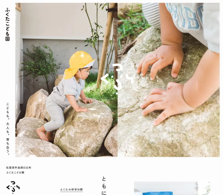
On mobile, the photograph panels stack inside a 306 × 750px frame. The current capture pairs a child climbing onto a rock with a close view of the child's hands. The seam is around y422, with the emblem centered across it. The horizontal wordmark sits at the bottom left and slightly overlaps the photograph frame's lower region.
Four overlapping anchors with the same geometry point to /#contentsFrame. This supports multiple opening-link layers, but does not establish their switching logic. The captured states do not prove automatic playback, interval length, or transition style. A reusable implementation should start with one accessible current pair and add state changes only when required.
Desktop Navigation Rail
Role: identity and direct access to the institution's main information pages.
The recorded rail is 253px wide with padding 32px 37px 39px. A two-line location and institution label appears at the top, followed by a separate black emblem around 81 × 77px. Near the lower portion are the Instagram icon and five navigation links:
お知らせ→/news園のこと→/about保育のこと→/hoiku入園案内→/admissionお問い合わせ→/contact
Link boxes have a 17px text line and begin at 36px vertical intervals. The links remain visually unboxed, without a colored rail background or enclosing border.
The rail's placement in scrolled captures is consistent with navigation pinned within the main content region and released before the footer. Its actual positioning property and activation threshold were not supplied. The Quick Start uses a bounded sticky rail as a recommended approximation.
Mobile Identity and Menu Affordance
Role: keeps identity and navigation accessible without retaining the desktop rail.
The opening capture places the wordmark at the lower left and a three-line menu icon at the lower right. In the page-ending capture, the menu icon is near the upper right. This is evidence of different scroll-related placements, not a permanently bottom-fixed mobile toolbar.
The menu's open state, item arrangement, backdrop, focus behavior, and transition are unverified. Do not invent a full-screen menu treatment as an observed component.
Educational Goal Introduction
Role: explains the institution's purpose before the practical sections.
The section combines a small eyebrow, the vertical statement ともに育む, a green headline, two gray paragraphs, and the link 新!ふくたこども園.
At desktop width, the section is a 900px flex container with a 433px paragraph column. The vertical statement is 33px with 9.9px tracking. The headline uses two lines at approximately 27 / 45.9px.
At mobile width, the paragraph column is 316px wide. The vertical statement remains prominent on the right, while the green headline breaks into three lines: あなたも、, わたしも、, and みんなが主役。. This is a meaningful change in composition, not proportional desktop scaling.
Exact introductory image bounds were not included in the supplied element records. Do not derive that media arrangement from unrelated imagery.
Image-Led Chapter
Role: introduces a major relationship: the institution with the local community, then the institution with its children and carers.
The repeated structure is a large photograph, a green chapter title, a substantially indented green subheading, a gray paragraph, and an underlined destination link.
The current desktop content capture shows children and carers playing in the garden, with the building and planting behind them. Below it, the phrase 園のみんな has a rectangular green outline, followed by と、ともに。 without a fill. The outline emphasizes a fragment of the sentence rather than behaving as a tag or filter.
At desktop width, the chapter title begins 49px inside the 980px section. The subheading starts another 350px to the right. This creates a broad left-hand area of white space beneath the title. At mobile width, the title begins at x22, while the subheading and paragraph begin at x116 and occupy only 236px.
Retain this unequal alignment when adapting the design. It is one of the page's strongest recurring characteristics.
Editorial Destination Link
Role: leads from a short explanation to a fuller information page.
Use green emphasized text, a thin underline beneath the text, and a separate filled circular arrow at the right. The desktop circle is visually about 25px across; that dimension is an estimate.
The source link padding is 3px 35px 6px 0 on desktop and 6px 28px 6px 0 on mobile. Type changes from 17px to 15px. Preserve the distinction between this light editorial treatment and the filled contact/archive buttons.
The childcare link also changes its visible wording: desktop shows ふくたこども園が行う保育の特徴, while mobile shows ふくたこども園の保育. The combined DOM text contains both alternatives; a reproduction should expose only the appropriate visible and accessible label.
Numbered Childcare Feature
Role: explains three concrete aspects of care: 少人数クラス, まことの保育, and 園内調理.
Desktop rows combine a narrow numbered label, a photograph, and explanatory copy. The supplied first-row screenshot places the photograph at approximately x492–838, giving an estimated width of 346px. The label cell is measured at 71px wide, including 37px right padding. The copy begins at x888.
Numbered label cells are roughly 260px tall, and the three desktop rows begin at 320px intervals. These are row-geometry measurements; they do not independently establish every image's intrinsic dimensions.
On mobile, the feature labels become horizontal blocks. Paragraphs use a 308px column at x41, with 14px type and 26.6px leading. The detailed mobile photo rectangles were not supplied. The recommended starter stacks media, label, and copy while preserving this reading width.
Organization and Contact Information
Role: supplies the practical information parents and local residents need.
The homepage includes the institution type and name, address, telephone/fax number, response hours, leadership, operating organization, staffing, classes, and links to institutional documents. The rendered page explicitly identifies 社会福祉法人白石福祉会 as the operating organization.
Desktop identity and contact details sit in adjacent blocks. The contact link is a compact green rectangle, measured at approximately 146 × 42px. On mobile, the address occupies a 330px column, and the contact action appears later as a 340 × 52px full-width button.
The mobile institution-name box is tall and narrow, approximately 48 × 159px, consistent with a vertical treatment; that portion was not shown in the supplied screenshots, so its exact visual arrangement is not independently confirmed.
A map attribution strip is visible immediately above the news area in the mobile ending capture. The map's full appearance, controls, and interactions were not inspected. Document destinations are present in the DOM, but their contents were not opened.
News List
Role: surfaces timely institutional notices without competing with the photographic narrative.
The section begins with the small spaced label (おしらせ). Each item is one link containing a date, title, and category. Three entries are present in the evidence.
Desktop rows use a horizontal flex layout. The title starts 100px after the row's left edge and occupies 570px of the 795px row. Category text occupies the right-hand area. Recorded rows are 66.5px high, with 10px top and 25px bottom padding.
Mobile rows become blocks with 12px 1px padding and fine dotted separators. The title comes first; a green date and gray category sit beneath it. Two longer titles occupy two lines and produce approximately 98.94px rows. The shorter third entry produces approximately 76.97px.
The DOM contains duplicate date text associated with responsive layouts. Preserve the visible information once in a semantic implementation rather than duplicating announcements for assistive technology.
Filled Action
Role: provides clear access to contact and the complete news archive.
The archive action すべてのおしらせ fills the news column. Its height stays close to 52px at both inspected widths. Use Garden Green, Page White text, 2px corners, and generous letter spacing. It has no icon, gradient, or visible shadow.
The contact variant shares the palette and corner treatment but is compact on desktop and full width on mobile.
Photographic Footer
Role: closes the page with the real place and its daily life.
The footer breaks out of the main-column alignment and spans the entire viewport. It shows a long, low timber building with children, tricycles, and open sky. Copyright sits quietly over the light ground near the lower left.
The root measures approximately 1440 × 691px on desktop and 390 × 292px on mobile. The mobile image treatment retains more height relative to its width, so simply scaling the desktop rectangle down would not match it.
The visible copyright inset is approximately 53px on desktop and 20px on mobile. These are visual placements, not the footer root's padding values; a child may be positioned independently.
Tokens — Motion & Interaction
| Treatment | Evidence | Implementation implication |
|---|---|---|
| Desktop link transitions | Sampled anchors report 0.15s ease-out |
A short transition is established; the changed property and resulting hover appearance are not |
| Mobile link transitions | Records report all without a nonzero duration |
Do not assume the desktop timing is active on mobile |
| Opening link | Four overlapping anchors target /#contentsFrame |
Destination is verified; click result and smooth-scroll behavior are not |
| Opening photograph states | Different paired subjects appear in the desktop and mobile captures | Multiple states or responsive selection are plausible; autoplay, ordering, and synchronization remain unverified |
| Sampled CSS animations | Sampled elements report animation: none |
Does not rule out JavaScript, unsampled image wrappers, pseudo-elements, or other animation systems |
| Desktop rail | Stable left-side placement across content captures, with partial departure near the ending | Consistent with bounded pinning; exact implementation is unknown |
| Mobile menu placement | Lower-right opening position and upper-right scrolled position | A state-dependent placement exists; threshold and movement are unknown |
| News and destination links | Original-page hrefs are supplied | Destinations are known; linked-page appearance was not inspected |
| Expanded menu, map, keyboard and hover states | No exercised-state evidence | Treat their behavior as an implementation requirement, not an observed design specification |
The capture process allowed at least five seconds of initial observation and waited for specified layout, animation, and image-readiness conditions. It temporarily paused perpetual animations during readiness checks. Settled screenshots therefore do not establish that the site is motionless or reveal a reliable slideshow duration.
For a new implementation, restrained 150ms ease-out color or opacity feedback is compatible with the measured desktop transition. Any slideshow, menu animation, or scroll reveal needs a separately defined and clearly recommended behavior.
Surfaces
| Layer | Appearance | Function |
|---|---|---|
| Page canvas | Solid #FCFCFC |
Continuous background through the opening margins, rail, and content |
| Navigation rail | Same canvas, dark artwork and gray text | Persistent identity without a contrasting sidebar panel |
| Editorial content | Unboxed text and photographs | Hierarchy through alignment, space, and typography |
| Outlined phrase | Transparent interior, fine green rectangle | Local emphasis inside a chapter title |
| Filled action | Green rectangle, near-white text, 2px corners |
Stronger navigation priority |
| News list | Canvas with dotted mobile separators | Compact, scannable updates |
| Photographic closing | Full-width image with small overlaid copyright | Returns attention to the physical institution |
No general shadow, glass, textured-paper, or gradient surface system is visible. The warmth comes from people, daylight, wood, and the brand drawing.
Imagery
Photography is the primary expressive material. The supplied current captures show soil, plants, rocks, grass, wooden architecture, children at play, and adults participating at the children's level. Faces are often incidental to the action; hands, tools, posture, and surroundings carry the story.
The paired opening creates a useful photographic grammar: an activity or environmental view beside a close tactile detail. The garden chapter broadens that into a shared scene. The footer broadens it again into an architectural panorama with ongoing activity.
Keep natural colors and daylight. Bright hats and toys can provide local contrast, but the images should still feel candid and connected to the real institution. Do not apply a global green tint simply because the interface uses green.
Observed Asset References
Image URLs, original filenames, formats, and intrinsic sizes were not included in the supplied evidence. These references identify visible subjects rather than inventing asset paths.
| Visual reference | Current-page evidence | Use |
|---|---|---|
| Children working in soil | Desktop opening capture | Left half of the opening pair |
| Child holding a planted container | Desktop opening capture | Right half of the opening pair |
| Child climbing a rock | Mobile opening capture | Upper half of the opening pair |
| Hands against the rock | Mobile opening capture | Lower half of the opening pair |
| Children and carers in the garden | Desktop content capture | Large chapter photograph |
| Building, playground, and tricycles | Desktop and mobile ending captures | Full-width photographic footer |
| Dark and white brand forms | Current opening and navigation captures | Identity and central seam emblem |
Use authorized photographs and brand assets. The layout can be recreated with CSS; the actual institution's identity and documentary character depend on its imagery.
Layout & Responsive Behavior
Desktop Structure
The opening occupies the first viewport. The main region begins at y1000, with a 253px rail to the left. The main root has a 56px left padding and ends 25px before the viewport's right edge.
Inside that region, several centered widths coexist: 980px chapters, a 900px goal section, an 880px organization section, and a 795px news section. They share a horizontal center around x862, but their internal text often shifts further right.
This is not a single centered text column. The chapter title, chapter copy, feature label, feature photograph, and feature paragraph each have a distinct alignment. Repeating those relationships gives the long page its rhythm.
Mobile Structure
The main begins at y844. The desktop rail disappears from the visible layout, and the main root becomes full width without its desktop padding.
The opening changes from side-by-side photographs to stacked photographs. The vertical opening slogan is absent from the visible mobile text. The wordmark becomes horizontal and moves below the image seam to the opening's lower edge.
Content uses several different inset systems:
- Goal paragraphs:
37pxmargins and316pxreading width. - Chapter titles: left
22px, with a330pxbox. - Chapter explanations: left
116px, right38px, leaving236pxfor text. - Feature paragraphs: approximately
41pxmargins and308pxwidth. - News:
35pxmargins and320pxwidth. - Contact action:
25pxmargins and340pxwidth.
Retaining the chapter's 116px starting position is especially important at the inspected mobile size. It keeps the desktop's offset composition recognizable, although narrower devices may need a readability adjustment.
News changes information order, feature labels change orientation, and contact changes width. These are structural adaptations rather than a uniform reduction of desktop dimensions.
Breakpoints and Unverified Sizes
The exact source breakpoints and viewport formulas were not supplied. The Quick Start uses 900px as a recommended layout switch, not a measured breakpoint. Its additional small-screen adjustment is also a recommendation.
Only the two supplied viewports establish correspondence. Tablet, landscape, enlarged text, browser chrome changes, and safe-area behavior require validation in an implementation.
Do’s and Don’ts
Do
- Use
#FCFCFCfor the continuous page canvas and#227B22for editorial emphasis and filled actions. - Let candid photographs occupy substantial space and retain their natural colors.
- Pair a broader activity view with a close detail in the opening.
- Preserve the seam-overlapping white emblem and the separate dark identity artwork.
- Use the measured Japanese Gothic stacks, wide tracking, and generous paragraph leading.
- Keep the desktop rail visually part of the same canvas as the content.
- Retain the unequal alignment between chapter titles and explanatory copy.
- Preserve vertical short phrases where observed and horizontal mobile feature labels.
- Use square photographs, fine outlines, underlined links, and nearly square buttons.
- Allow the footer photograph to span the full viewport width.
Don’t
- Don’t turn the institution homepage into a generic conversion page with a large slogan and repeated promotional buttons.
- Don’t replace the editorial sequence with a uniform rounded-card grid.
- Don’t center every mobile paragraph or force every section into identical side margins.
- Don’t use WordPress preset gradients and shadows merely because their variables exist.
- Don’t assign Poppins or Darumadrop One to visible components without confirming their actual use.
- Don’t synthesize the logo from the H1's computed font size.
- Don’t treat a clipped chapter photograph as its complete image ratio.
- Don’t claim a particular autoplay interval, crossfade, menu overlay, or scroll animation from settled screenshots.
- Don’t duplicate responsive text alternatives in the accessible reading order.
- Don’t scale the desktop footer mechanically if it loses the mobile capture's taller composition.
Recommended Implementation Additions
These recommendations are not verified features of the original website:
- Give the opening's image link a descriptive accessible name and avoid focusable hidden slide duplicates.
- Use a real button for the mobile menu, with
aria-expanded, an associated navigation region, a visible focus state, and an approximately44 × 44pxtarget. - If the menu becomes modal, implement focus management, Escape dismissal, and focus return.
- Keep article titles, dates, and categories in one semantic reading order. Use CSS layout instead of duplicate accessible date text.
- Provide reduced-motion handling and a pause mechanism if automatic image changes are introduced.
- Preserve photographic focal points with per-image crop settings. Do not assume one
object-positionworks for every panel and viewport. - Prioritize opening imagery and reserve dimensions for later images to reduce layout shifts.
- Keep long text readable when users enlarge text. On very narrow screens, relax the chapter indentation before shrinking the body type below the observed
14px. - Give meaningful image alternatives, or empty alternatives where a second detail photograph adds no additional information.
- Keep document links descriptive and provide a usable address alongside any embedded map.
Agent Prompt Guide
Quick Color Reference
- Main canvas and reversed action text:
#FCFCFC. - Section headings, editorial links, and filled actions:
#227B22. - Navigation, feature copy, and news titles:
#424242. - Longer chapter and goal paragraphs:
#666666. - Declared pale border token:
#EDEDED; do not assume it is the dotted news-rule color. - Photography: natural daylight and unfiltered subject colors.
- Logo: authorized dark and white artwork, not ordinary heading text.
Overall Prompt
“Create a Japanese childcare institution homepage inspired by Fukuta Kodomoen. Use a near-white #FCFCFC canvas, green #227B22 headings and actions, gray Japanese Gothic text, generous line spacing, and candid natural-color photography. Open with two touching photographs: an activity view and a tactile detail, with a white brand emblem across their seam. Place vertical identity and a short vertical slogan in a narrow desktop strip. Below the opening, use a quiet left navigation rail and spacious editorial sections with large photographs, partially outlined green titles, and copy offset far to the right. On mobile, stack the opening photographs, move the wordmark to the lower left, and preserve selective text indentation. Finish with a compact news list and a full-width photograph of the building and children at play. Use square image corners, subtle rules, and small-radius green buttons.”
Example Component Prompts
- Opening: “Design a 1440 × 1000 opening with a photograph frame at approximately x92, y17, width1328, height966. Divide it into equal touching panels showing an outdoor activity and a close detail. Place authorized white emblem artwork across the seam. Keep the left strip near-white with a vertical dark wordmark and vertical Japanese slogan. At 390 × 844, stack the pair inside a 306 × 750 frame with 42px side margins.”
- Chapter: “Create an unboxed 980px-wide editorial chapter with a large garden photograph. Below it, place a green 26px heading with only the introductory phrase outlined. Indent the explanatory copy 350px beyond the title's starting position. Use a 24px green subheading, 16px gray paragraph with 36px leading, and an underlined green link ending in a small circular arrow.”
- Mobile chapter: “At a 390px viewport, place the chapter title at x22 and explanatory copy at x116 with a 236px width. Use 22px title text, an 18px subheading, and 14px body text with 28px leading. Keep the surrounding canvas empty and let the asymmetry provide the structure.”
- News: “Build a flat news list on
#FCFCFC. Desktop rows contain date, title, and category horizontally in a 795px column. Mobile rows occupy 320px, place the title above a green date and gray category, and use fine dotted separators. End with a full-width green button around52px high, labeledすべてのおしらせ, with2px corners.” - Footer: “Close the page with a full-width, natural-color photograph of a low timber childcare building, open sky, and children using the playground. Overlay only a small gray copyright line near the lower left. Use a taller proportional crop on mobile and preserve visible activity.”
Quick Start
CSS Custom Properties
This is a recommended implementation scaffold, not extracted source CSS. It encodes the measured palette, typography, opening frame, content widths, chapter offsets, and action geometry. Class names are adaptation names.
Use .hero-window for a link containing two images and a .hero-mark image. Supply authorized vertical and horizontal wordmark variants inside .hero-home. Place .site-rail and .site-main inside .content-frame; place .photo-footer after that frame. The application supplies menu behavior and any image sequencing.
The 900px breakpoint is recommended. The chapter-photo ratio of 98 / 69 is an estimate informed by section-to-heading offsets; image element dimensions were not supplied. Footer ratios reproduce the measured root proportions, while crop positions must be checked against the actual assets. Small metadata type, dotted-rule color, hover feedback, and focus styling below are recommendations.
:root {
  /* Measured source palette */
  --color-bg: #fcfcfc;
  --color-text: #424242;
  --color-muted: #666666;
  --color-green: #227b22;
  --color-border: #ededed;

  /* Visual approximations for artwork and fine utility details */
  --color-emblem: #fff;
  --color-dotted-rule: #888;

  /* Declared source families; provide licensed files separately */
  --font-gothic: '秀英角ゴシック銀 M', '游ゴシック Medium',
    'Yu Gothic Medium', '游ゴシック体', YuGothic, 'Hiragino Sans',
    'ヒラギノ角ゴ ProN', 'Hiragino Kaku Gothic ProN',
    'メイリオ', Meiryo, sans-serif;
  --font-gothic-b: '秀英角ゴシック銀 B', '游ゴシック Medium',
    'Yu Gothic Medium', '游ゴシック体', YuGothic, 'Hiragino Sans',
    'ヒラギノ角ゴ ProN', 'Hiragino Kaku Gothic ProN',
    'メイリオ', Meiryo, sans-serif;

  --rail-width: 253px;
  --main-inset: 56px;
  --chapter-width: 980px;
  --goal-width: 900px;
  --organization-width: 880px;
  --news-width: 795px;
  --radius-action: 2px;
  --motion-link: 150ms ease-out;
}

* { box-sizing: border-box; }

.fukuta-page {
  margin: 0;
  background: var(--color-bg);
  color: var(--color-text);
  font-family: var(--font-gothic);
  font-size: 14px;
  font-weight: 400;
  line-height: 1.9;
}

.fukuta-page img { display: block; max-width: 100%; }
.fukuta-page a { color: inherit; }
.fukuta-page button { font: inherit; }

.hero {
  position: relative;
  height: 100vh;
  height: 100svh;
}

.hero-window {
  position: absolute;
  inset: 17px 20px 17px 92px;
  display: grid;
  grid-template-columns: repeat(2, minmax(0, 1fr));
  overflow: hidden;
}

.hero-window > .hero-photo {
  width: 100%;
  height: 100%;
  min-width: 0;
  min-height: 0;
  object-fit: cover;
  object-position: var(--focal-point, 50% 50%);
}

.hero-window > .hero-mark {
  position: absolute;
  left: 50%;
  top: 50%;
  width: 200px;
  height: auto;
  transform: translate(-50%, -50%);
  pointer-events: none;
}

.hero-home {
  position: absolute;
  top: 48px;
  left: 32px;
  width: 26px;
  height: 200px;
}

.hero-home img { width: 100%; height: 100%; object-fit: contain; }
.hero-home .brand-horizontal { display: none; }

.hero-tagline {
  position: absolute;
  left: 28px;
  bottom: 14px;
  margin: 0;
  writing-mode: vertical-rl;
  font-family: var(--font-gothic-b);
  font-size: 19px;
  line-height: 36.1px;
  letter-spacing: 4.56px;
}

.content-frame {
  display: grid;
  grid-template-columns: var(--rail-width) minmax(0, 1fr);
  padding-right: 25px;
}

.site-rail {
  position: sticky;
  top: 0;
  align-self: start;
  display: flex;
  flex-direction: column;
  height: 100vh;
  padding: 32px 37px 39px;
}

.rail-identity {
  margin: 0;
  font-family: var(--font-gothic-b);
  font-size: 15px;
  line-height: 28.5px;
  letter-spacing: 2.1px;
}

.rail-emblem { width: 81px; height: 77px; margin-top: 38px; }
.rail-bottom { margin-top: auto; }
.rail-social { display: inline-block; margin-bottom: 30px; }

.rail-nav a {
  display: block;
  padding-block: 9.5px;
  text-decoration: none;
  font-family: var(--font-gothic-b);
  font-size: 17px;
  line-height: 17px;
  letter-spacing: 2.04px;
}

.site-menu-toggle { display: none; }
.site-main { min-width: 0; padding: 8px 0 0 var(--main-inset); }

.goal {
  width: 100%;
  max-width: var(--goal-width);
  margin: 117px auto 156px;
}

.goal-title {
  color: var(--color-green);
  font-family: var(--font-gothic-b);
  font-size: 27px;
  font-weight: 400;
  line-height: 45.9px;
  letter-spacing: 4.05px;
}

.goal-copy {
  max-width: 433px;
  color: var(--color-muted);
  font-size: 16px;
  line-height: 32.96px;
  letter-spacing: 2.24px;
}

.vertical-phrase {
  writing-mode: vertical-rl;
  font-family: var(--font-gothic-b);
  font-size: 33px;
  line-height: 42.9px;
  letter-spacing: 9.9px;
}

.story {
  width: 100%;
  max-width: var(--chapter-width);
  margin: 0 auto 120px;
}

.story-photo {
  width: 100%;
  aspect-ratio: 98 / 69;
  object-fit: cover;
  object-position: var(--focal-point, 50% 50%);
}

.story-title {
  margin: 40px 5% 0;
  color: var(--color-green);
  font-family: var(--font-gothic-b);
  font-size: 26px;
  font-weight: 400;
  line-height: 1;
  letter-spacing: 5.2px;
}

.outlined-word {
  display: inline-block;
  border: 1px solid currentColor;
  padding: 5px 7px;
}

.story-copy { margin: 55px 5% 0 calc(5% + 350px); }

.story-copy h3 {
  margin: 0;
  color: var(--color-green);
  font-family: var(--font-gothic-b);
  font-size: 24px;
  font-weight: 400;
  line-height: 43.92px;
  letter-spacing: 4.08px;
}

.story-copy > p {
  max-width: 460px;
  margin: 20px 0 0;
  color: var(--color-muted);
  font-size: 16px;
  line-height: 36px;
  letter-spacing: 1.28px;
}

.editorial-link {
  display: inline-flex;
  align-items: center;
  gap: 10px;
  margin-top: 22px;
  padding-block: 3px 6px;
  color: var(--color-green) !important;
  font-family: var(--font-gothic-b);
  font-size: 17px;
  line-height: 32.3px;
  letter-spacing: 3.06px;
  text-decoration: none;
}

.editorial-link > .label {
  text-decoration: underline;
  text-underline-offset: 7px;
  text-decoration-thickness: 1px;
}

.editorial-link > .arrow {
  display: grid;
  flex: 0 0 25px;
  place-items: center;
  width: 25px;
  height: 25px;
  border-radius: 50%;
  background: var(--color-green);
  color: var(--color-bg);
  line-height: 1;
  letter-spacing: 0;
}

.feature {
  display: grid;
  grid-template-columns: 71px 346px minmax(0, 1fr);
  margin: 0 5% 60px;
}

.feature-label {
  margin: 0;
  padding-right: 37px;
  font-family: var(--font-gothic-b);
  font-size: 16.38px;
  font-weight: 400;
}

.feature-number { display: block; margin-bottom: 18px; }
.feature-name { writing-mode: vertical-rl; }
.feature-photo { width: 100%; aspect-ratio: 346 / 260; object-fit: cover; }
.feature-copy { min-width: 0; margin-left: 50px; }

.feature-copy p {
  margin: 0 0 8px;
  font-size: 15px;
  line-height: 30px;
  letter-spacing: 1.35px;
}

.organization { max-width: var(--organization-width); margin-inline: auto; }
.news { max-width: var(--news-width); margin-inline: auto; }

.news-heading {
  margin: 0 0 19px;
  font-size: 16px;
  font-weight: 400;
  line-height: 40px;
  letter-spacing: 4.32px;
}

.news-row {
  display: grid;
  grid-template-columns: 100px minmax(0, 1fr) 125px;
  align-items: baseline;
  padding: 10px 0 25px;
  text-decoration: none;
}

.news-title {
  margin: 0;
  font-size: 15px;
  font-weight: 400;
  line-height: 31.5px;
  letter-spacing: 1.95px;
}

.news-date, .news-category {
  font-size: 11px;
  line-height: 1.8;
  letter-spacing: 0.08em;
}

.news-category { text-align: right; }

.solid-link {
  display: block;
  width: 100%;
  padding: 13px 20px;
  border-radius: var(--radius-action);
  background: var(--color-green);
  color: var(--color-bg) !important;
  text-align: center;
  text-decoration: none;
  font-family: var(--font-gothic-b);
  font-size: 15px;
  line-height: 25.95px;
  letter-spacing: 2.7px;
}

.solid-link--compact { width: fit-content; padding: 8px 20px; }
.news > .solid-link { margin-top: 10px; }

.photo-footer {
  position: relative;
  width: 100%;
  aspect-ratio: 1440 / 691.28;
  margin-top: 194px;
}

.photo-footer > img {
  position: absolute;
  inset: 0;
  width: 100%;
  height: 100%;
  object-fit: cover;
  object-position: var(--footer-focal-point, 50% 50%);
}

.copyright {
  position: absolute;
  left: 53px;
  bottom: 25px;
  margin: 0;
  font-size: 10px;
  line-height: 1.5;
  letter-spacing: 0.15em;
}

/* Recommended feedback; original hover endpoints were not recorded. */
@media (hover: hover) {
  .fukuta-page a { transition: opacity var(--motion-link); }
  .fukuta-page a:hover { opacity: 0.8; }
}

.fukuta-page :focus-visible {
  outline: 2px solid var(--color-green);
  outline-offset: 4px;
}

/* Recommended breakpoint, not an extracted source value. */
@media (max-width: 900px) {
  .hero-window {
    inset: 47px 42px;
    grid-template-columns: minmax(0, 1fr);
    grid-template-rows: repeat(2, minmax(0, 1fr));
  }

  .hero-window > .hero-mark { width: 100px; }
  .hero-tagline, .hero-home .brand-vertical { display: none; }
  .hero-home .brand-horizontal { display: block; }

  .hero-home {
    top: auto;
    bottom: 14px;
    left: 18px;
    width: 185px;
    height: 41px;
  }

  .content-frame { display: block; padding: 0; }
  .site-rail { display: none; }
  .site-main { padding: 0; }

  .site-menu-toggle {
    position: absolute;
    right: 15px;
    bottom: 10px;
    z-index: 10;
    display: grid;
    place-content: center;
    gap: 5px;
    width: 44px;
    height: 44px;
    border: 0;
    background: transparent;
    color: var(--color-text);
    cursor: pointer;
  }

  .site-menu-toggle > span {
    display: block;
    width: 26px;
    height: 3px;
    border-radius: 1px;
    background: currentColor;
  }

  /* Application-controlled state; the source threshold is unknown. */
  .has-entered-content .site-menu-toggle {
    position: fixed;
    top: calc(24px + env(safe-area-inset-top, 0px));
    bottom: auto;
  }

  .goal { margin: 0 auto 80px; padding: 60px 37px 0; }
  .goal-title { font-size: 22px; line-height: 40.04px; letter-spacing: 2.86px; }
  .goal-copy { max-width: none; font-size: 14px; line-height: 29.96px; letter-spacing: 1.4px; }
  .vertical-phrase { font-size: 30px; line-height: 39px; letter-spacing: 8.4px; }

  .story { max-width: none; margin-bottom: 80px; }
  .story-title { margin: 22px 38px 0 22px; font-size: 22px; letter-spacing: 3.96px; }
  .outlined-word { padding: 4px 6px; }
  .story-copy { margin: 56px 38px 0 116px; }
  .story-copy h3 { font-size: 18px; line-height: 34.92px; letter-spacing: 2.52px; }
  .story-copy > p { margin-top: 14px; font-size: 14px; line-height: 28px; letter-spacing: 0.56px; }

  .editorial-link { margin-top: 18px; padding-block: 6px; font-size: 15px; line-height: 28.5px; letter-spacing: 2.25px; }
  .editorial-link > .arrow { flex-basis: 20px; width: 20px; height: 20px; }

  .feature { display: flex; flex-direction: column; margin: 0 41px 80px; }
  .feature-photo { order: 0; }
  .feature-label { order: 1; display: flex; gap: 8px; margin-top: 20px; padding: 0; }
  .feature-number { margin: 0; }
  .feature-name { writing-mode: horizontal-tb; }
  .feature-copy { order: 2; margin: 20px 0 0; }
  .feature-copy p { margin-bottom: 14px; font-size: 14px; line-height: 26.6px; letter-spacing: 1.12px; }

  .organization { margin-inline: 25px; }
  .news { max-width: none; margin-inline: 35px; }
  .news-heading { margin-bottom: 14px; font-size: 14px; line-height: 39.2px; letter-spacing: 2.52px; }

  .news-row {
    grid-template-columns: max-content minmax(0, 1fr);
    gap: 6px 10px;
    padding: 12px 1px;
    border-top: 1px dotted var(--color-dotted-rule);
  }

  .news-title { grid-column: 1 / -1; grid-row: 1; font-size: 14px; line-height: 21.98px; letter-spacing: 1.4px; }
  .news-date { grid-column: 1; grid-row: 2; color: var(--color-green); }
  .news-category { grid-column: 2; grid-row: 2; text-align: left; }

  .solid-link, .solid-link--compact {
    width: 100%;
    padding: 13px 5px;
    font-size: 14px;
    line-height: 26.04px;
    letter-spacing: 1.68px;
  }

  .news > .solid-link { margin-top: 20px; }
  .photo-footer { margin-top: 70px; aspect-ratio: 390 / 292.23; }
  .copyright { left: 20px; bottom: 20px; font-size: 8px; }
}

/* Recommended readability adjustment outside the inspected mobile width. */
@media (max-width: 359px) {
  .story-copy { margin-inline: 35px; }
  .feature { margin-inline: 30px; }
}

@media (prefers-reduced-motion: reduce) {
  .fukuta-page a { transition: none; }
}
The scaffold does not position every element of the goal introduction or organization information, implement a menu panel, or animate the opening. Those require additional markup, authorized assets, and interaction decisions. The .has-entered-content class is an application state hook, not an observed source class.
Tailwind v4 Token Mapping
Optional aliases for a project that already uses Tailwind v4. This is not evidence that the original website uses Tailwind. Define the custom properties above first.
@theme inline {
  --color-page: var(--color-bg);
  --color-ink: var(--color-text);
  --color-reading: var(--color-muted);
  --color-garden: var(--color-green);
  --color-rule: var(--color-border);

  --font-body: var(--font-gothic);
  --font-emphasis: var(--font-gothic-b);

  --text-body-mobile: 14px;
  --text-body-desktop: 16px;
  --text-chapter-mobile: 22px;
  --text-chapter-desktop: 26px;

  --spacing-rail: 253px;
  --spacing-main-inset: 56px;
  --spacing-section-mobile: 80px;
  --spacing-section-desktop: 120px;

  --radius-action: 2px;
}
Sources & Evidence
- Inspected original and final website: Fukuta Kodomoen. The supplied browser report records HTTP
200and the same original and final URL. - Capture timestamp:
2026-09-12T19:38:43.542Z, equivalent to September 13, 2026, 04:38:43.542 JST. - Desktop evidence: three current-page screenshots at
1440 × 1000, showing the opening, a scrolled childcare section, and the page ending; supplied rendered DOM, link destinations, custom properties, and computed element measurements. - Mobile evidence: two current-page screenshots at
390 × 844, showing the opening and the news/footer region; supplied rendered DOM, link destinations, custom properties, and computed element measurements. - Verified scope of interaction evidence: captured scroll positions and visible responsive states. Link destinations are recorded, but clicks, menu expansion, hover endpoints, keyboard behavior, map operation, and image-sequence timing were not demonstrated.
- Inspection limitations: the capture process used readiness waits and temporarily paused perpetual animations during checks; shared and service workers were disabled. The records do not establish complete delayed behavior. Image URLs, font-file loading, source media queries, and full stylesheets were not supplied.
This reference analyzes the supplied current-page evidence. No additional browsing, command execution, local-file inspection, or linked-document retrieval was performed. Measured values, visual estimates, and recommended adaptations are distinguished throughout.
# Fukuta Kodomoen — Style Reference

> Everyday childhood, framed by quiet white space and garden green.

**Website:** [fukutakodomo.com](https://fukutakodomo.com/)
**Original URL:** https://fukutakodomo.com/
**Final URL:** https://fukutakodomo.com/
**Theme:** light; near-white canvas, gray text, green editorial accents, and natural-color photography.
**Inspected:** September 13, 2026, 04:38 JST. Supplied retrieval timestamp: `2026-09-12T19:38:43.542Z`.
**Viewports:** 1440 × 1000 desktop and 390 × 844 mobile, in CSS pixels.
**Scope:** the current institution homepage: photographic opening, navigation, educational goals, community and childcare sections, three childcare features, organization and contact information, news, and photographic footer. Visual evidence covers the opening, a desktop content segment, and the page ending; rendered DOM and computed styles cover additional sections. Linked pages and expanded navigation were not inspected.

Fukuta Kodomoen presents a childcare institution through candid scenes of children exploring, gardening, and playing with carers. The opening pairs an activity view with a close detail, placing a small white brand emblem across the seam. A narrow strip of identity and vertical Japanese copy lets the photographs occupy almost the entire desktop viewport.

Below the opening, the page becomes a spacious institutional website with persistent-looking left navigation and an offset editorial column. Green headings, short outlined phrases, vertical labels, and widely spaced Japanese text provide structure without enclosing everything in cards. The final photograph expands across the entire page, showing the building as a lived-in place.

Mobile preserves this composition deliberately. The opening photographs stack, the wordmark moves to the lower left, and the menu symbol changes position between the opening and scrolled captures. Within the content, some text remains strongly indented instead of becoming a uniformly centered column.

## How to Read This Reference

- **Measured values** come from the supplied rendered DOM, computed styles, and element rectangles. Coordinates describe the recorded layout, not necessarily authored CSS offsets.
- **Visual estimates** describe features visible in the current-page screenshots whose computed properties were not supplied. They are labeled as estimates.
- **Calculated values** are arithmetic derived from measured rectangles. They do not establish the source's responsive formulas.
- **Recommendations** and the Quick Start are implementation adaptations, not claims about the original code.
- Font-family records establish declared stacks, not which font file rendered every glyph. Image paths, intrinsic dimensions, and font-loading records were not included.
- Only two viewport sizes were supplied. Intermediate breakpoints, landscape behavior, menu interaction, hover results, and slideshow timing remain unverified.

## Tokens — Colors

### Default Palette

| Name | Value | Source or reference token | Role and evidence |
| --- | --- | --- | --- |
| Page White | `#FCFCFC` | Source `--color-bg` | Measured body background at both viewports; also measured text color on green buttons |
| Garden Green | `#227B22` | Source `--color-green` | Measured section headings, editorial links, contact button, and news archive button |
| Main Gray | `#424242` | Source `--color-text` | Measured body, navigation, feature paragraphs, and news titles |
| Reading Gray | `#666666` | Reference `--color-muted` | Measured introductory and chapter paragraphs, plus document links |
| Pale Rule | `#EDEDED` | Source `--color-border` | Declared border token; its exact application is not identified in the supplied element records |
| Emblem White | Approximately `#FFFFFF` | Reference `--color-emblem` | Visual estimate for the white brand emblem over photography |
| Brand Dark | Near black | No exact token established | Visible wordmark and emblem artwork; do not equate the surrounding H1's computed text color with the artwork's own fill |
| Social Pink | Pink | No exact token established | Small Instagram circle in the desktop navigation; visually isolated from the main green system |

The dominant interface palette is Page White, Main Gray, and Garden Green. Soil, timber, foliage, sky blue, and the children's bright hats belong to the photographs rather than a larger UI accent system.

The supplied document also contains numerous WordPress preset colors, gradients, shadows, and spacing variables. Their presence does not demonstrate their use on this page. Do not incorporate those presets into the design palette without element-level evidence.

### Color Hierarchy

Green emphasizes meaning and navigation: section titles, explanatory headings, underlined destination links, and the two filled action styles. Gray carries longer reading passages. The near-white background continues through the rail and content, keeping the page visually continuous.

The small social icon is the only conspicuous interface accent outside this hierarchy. It should remain a recognizable service icon rather than becoming a secondary site-wide action color.

## Tokens — Typography

### Japanese Gothic — Body and Editorial Headings

The source declares two related family stacks:

- **Body:** `--font-gothic`, beginning with `'秀英角ゴシック銀 M'`.
- **Emphasis:** `--font-gothic-b`, beginning with `'秀英角ゴシック銀 B'`.
- **Shared fallbacks:** `'游ゴシック Medium'`, `'Yu Gothic Medium'`, `'游ゴシック体'`, `YuGothic`, `'Hiragino Sans'`, `'ヒラギノ角ゴ ProN'`, `'Hiragino Kaku Gothic ProN'`, `'メイリオ'`, `Meiryo`, and `sans-serif`.

The sampled headings and navigation use the B family while their computed `font-weight` remains `400`. This is a family-based distinction, not evidence for applying `font-weight: 700` globally. A reproduction should use appropriately licensed fonts or explicitly accept the supplied system fallbacks.

The typography is modest in size but generous in tracking and line spacing. Paragraphs often approach double leading. Headings use green, line breaks, and their position on the page to create hierarchy without a very large display scale.

### Declared Auxiliary Families

`--font-sans` declares `'Poppins', sans-serif`, and `--font-sans-time` declares `'Darumadrop One', sans-serif`. None of the supplied sampled elements establishes their visible assignment. In particular, do not identify news dates, copyright, or the logo as either family from this evidence.

### Brand Artwork and Vertical Copy

The wordmark and central emblem have irregular, soft forms that differ from the running text. Their exact asset format is unknown. Preserve authorized brand artwork instead of approximating it with a generic rounded typeface.

Vertical writing appears in the desktop opening slogan, the short goal statement `ともに育む`, and desktop feature labels. The mobile goal statement remains vertical. Feature labels become horizontal on mobile.

The H1's computed `28px` font size describes its element styling. The visible wordmark occupies an artwork-shaped box, so that number should not be treated as the glyph size required to redraw the logo.

### Type Scale

Values below are measured. Each entry gives **font size / line height / letter spacing**.

| Role | Desktop | Mobile | Family treatment |
| --- | --- | --- | --- |
| Body base | `14 / 14px / normal` | Same | M stack; component paragraphs override the tight base leading |
| Opening slogan | `19 / 36.1px / 4.56px` | Not visible | B stack, vertical |
| Rail identity | `15 / 28.5px / 2.1px` | Desktop rail not visible | B stack |
| Rail navigation | `17 / 17px / 2.04px` | Replaced by menu affordance | B stack |
| Goal eyebrow | `15 / 25.5px / 2.85px` | `15 / 15px / 2.85px` | B stack |
| Vertical goal statement | `33 / 42.9px / 9.9px` | `30 / 39px / 8.4px` | B stack |
| Goal headline | `27 / 45.9px / 4.05px` | `22 / 40.04px / 2.86px` | B stack, green |
| Goal paragraphs | `16 / 32.96px / 2.24px` | `14 / 29.96px / 1.4px` | M stack, Reading Gray |
| Chapter title | `26 / 26px / 5.2px` | `22 / 22px / 3.96px` | B stack, green; outlined phrase increases overall box height |
| Chapter subheading | `24 / 43.92px / 4.08px` | `18 / 34.92px / 2.52px` | B stack, green |
| Chapter paragraph | `16 / 36px / 1.28px` | `14 / 28px / 0.56px` | M stack, Reading Gray |
| Feature paragraphs | `15 / 30px / 1.35px` | `14 / 26.6px / 1.12px` | M stack, Main Gray |
| Editorial destination link | `17 / 32.3px / 3.06px` | `15 / 28.5px / 2.25px` | B stack, green |
| Filled action | `15 / 25.95px / 2.7px` | `14 / 26.04px / 1.68px` | B stack, reversed |
| News section label | `16 / 40px / 4.32px` | `14 / 39.2px / 2.52px` | M stack |
| News title | `15 / 31.5px / 1.95px` | `14 / 21.98px / 1.4px` | M stack |

The small date and copyright lettering is visible but not separately measured. Any numerical styling for those elements in the Quick Start is an approximation.

## Tokens — Spacing & Shapes

**Spacing character:** generous section separation, narrow reading columns, and deliberately unequal horizontal offsets.

The supplied measurements do not establish a universal spacing unit. Preserve the relationships between image width, heading inset, and copy offset instead of forcing all dimensions onto a single grid increment.

### Measured Spacing

| Relationship | Desktop | Mobile |
| --- | --- | --- |
| Opening photograph frame | Top/bottom `17px`; left `92px`; right `20px` | Top/bottom `47px`; left/right `42px` |
| Main root padding | `8px 0 0 56px` | `0` |
| Chapter title to subheading | `55px` after title box | `56px` after title box |
| Chapter subheading to paragraph | `20px` | `14px` |
| Chapter paragraph to link wrapper | `22px` | `18px` |
| Community section to childcare section | `120px` | `80px` |
| Desktop feature-row start interval | `320px` | Rows reflow and become substantially taller |
| Main ending to footer beginning | `194px`, calculated from rectangles | `70px`, calculated from rectangles |
| Archive button padding | `13px 20px` | `13px 5px` |
| Compact contact button padding | `8px 20px` | Becomes full width with `13px 5px` |

### Shapes and Rules

| Element | Treatment | Evidence |
| --- | --- | --- |
| Photographs | Square corners | Visible throughout the current captures |
| Content sections | Unboxed | Continuous canvas; no general card boundary |
| Filled buttons | `2px` radius | Measured at both viewports |
| Highlighted chapter phrase | Thin rectangular green outline | Visible; approximately `1px` stroke, not independently measured |
| Editorial link | Underlined text with circular arrow at right | Visible in the desktop content capture |
| Mobile news separators | Fine dotted horizontal rules | Visible; exact rule color and dot spacing were not supplied |
| Menu symbol | Three gray horizontal strokes | Visible; approximately `26px` wide |
| General elevation | No visible shadow system | Screenshots show flat surfaces and image edges |

### Layout Measurements

| Element | Desktop at 1440 × 1000 | Mobile at 390 × 844 |
| --- | --- | --- |
| Document height | About `7674.58px` | About `7783.22px` |
| Main content start | `y = 1000px` | `y = 844px` |
| Opening photograph link | `x92, y17, 1328 × 966px` | `x42, y47, 306 × 750px` |
| Each opening panel | Approximately `664 × 966px`, calculated from equal visible halves | Approximately `306 × 375px`, calculated from equal visible halves |
| Opening wordmark box | `x32, y48, 26 × 200px` | `x18, y789, 185 × 41px` |
| Desktop rail | `253px` wide; recorded height `1000px` | Not present in visible navigation |
| Main root | `x253`, width `1162px` | Full `390px` width |
| Goal section | `x412`, width `900px` | Full-width section; paragraph column `316px` at `x37` |
| Major chapter section | `x372`, width `980px` | Full `390px` width |
| Chapter title | `x421`, width `882px` | `x22`, width `330px` |
| Chapter subheading | `x771`, width `532px` | `x116`, width `236px` |
| Chapter paragraph | `x771`, width `460px` | `x116`, width `236px` |
| Feature paragraph column | Approximately `380–402px` in sampled paragraphs | `308px` at `x41` |
| Organization section | `880px` wide at `x422` | Full-width section with varying inner insets |
| News section | `795px` wide at `x464.5` | `320px` wide at `x35` |
| News archive button | `795 × 51.94px` | `320 × 52.03px` |
| Footer root | `1440 × 691.28px` | `390 × 292.23px` |

The desktop content screenshot shows only the lower portion of the large garden photograph at its top edge. Its visible `980 × approximately 475px` slice is not the image's complete aspect ratio.

## Components

### Photographic Opening

**Role:** establishes identity through everyday activity before introducing institutional information.

On desktop, a narrow identity strip sits left of a large paired photograph. The photograph frame begins at `x92` and nearly fills the viewport height. Two equally wide panels meet without a gutter. In the supplied desktop state, the left shows children working in soil and the right shows a child holding a planted container.

The vertical wordmark sits near the upper left. The phrase `こどもも。大人も。育ち合う。` runs vertically near the lower left. A white emblem overlaps the seam between the photographs; its visual extent is approximately `200px` wide, an estimate rather than a DOM measurement.

On mobile, the photograph panels stack inside a `306 × 750px` frame. The current capture pairs a child climbing onto a rock with a close view of the child's hands. The seam is around `y422`, with the emblem centered across it. The horizontal wordmark sits at the bottom left and slightly overlaps the photograph frame's lower region.

Four overlapping anchors with the same geometry point to `/#contentsFrame`. This supports multiple opening-link layers, but does not establish their switching logic. The captured states do not prove automatic playback, interval length, or transition style. A reusable implementation should start with one accessible current pair and add state changes only when required.

### Desktop Navigation Rail

**Role:** identity and direct access to the institution's main information pages.

The recorded rail is `253px` wide with padding `32px 37px 39px`. A two-line location and institution label appears at the top, followed by a separate black emblem around `81 × 77px`. Near the lower portion are the Instagram icon and five navigation links:

- `お知らせ` → `/news`
- `園のこと` → `/about`
- `保育のこと` → `/hoiku`
- `入園案内` → `/admission`
- `お問い合わせ` → `/contact`

Link boxes have a `17px` text line and begin at `36px` vertical intervals. The links remain visually unboxed, without a colored rail background or enclosing border.

The rail's placement in scrolled captures is consistent with navigation pinned within the main content region and released before the footer. Its actual positioning property and activation threshold were not supplied. The Quick Start uses a bounded sticky rail as a recommended approximation.

### Mobile Identity and Menu Affordance

**Role:** keeps identity and navigation accessible without retaining the desktop rail.

The opening capture places the wordmark at the lower left and a three-line menu icon at the lower right. In the page-ending capture, the menu icon is near the upper right. This is evidence of different scroll-related placements, not a permanently bottom-fixed mobile toolbar.

The menu's open state, item arrangement, backdrop, focus behavior, and transition are unverified. Do not invent a full-screen menu treatment as an observed component.

### Educational Goal Introduction

**Role:** explains the institution's purpose before the practical sections.

The section combines a small eyebrow, the vertical statement `ともに育む`, a green headline, two gray paragraphs, and the link `新!ふくたこども園`.

At desktop width, the section is a `900px` flex container with a `433px` paragraph column. The vertical statement is `33px` with `9.9px` tracking. The headline uses two lines at approximately `27 / 45.9px`.

At mobile width, the paragraph column is `316px` wide. The vertical statement remains prominent on the right, while the green headline breaks into three lines: `あなたも、`, `わたしも、`, and `みんなが主役。`. This is a meaningful change in composition, not proportional desktop scaling.

Exact introductory image bounds were not included in the supplied element records. Do not derive that media arrangement from unrelated imagery.

### Image-Led Chapter

**Role:** introduces a major relationship: the institution with the local community, then the institution with its children and carers.

The repeated structure is a large photograph, a green chapter title, a substantially indented green subheading, a gray paragraph, and an underlined destination link.

The current desktop content capture shows children and carers playing in the garden, with the building and planting behind them. Below it, the phrase `園のみんな` has a rectangular green outline, followed by `と、ともに。` without a fill. The outline emphasizes a fragment of the sentence rather than behaving as a tag or filter.

At desktop width, the chapter title begins `49px` inside the `980px` section. The subheading starts another `350px` to the right. This creates a broad left-hand area of white space beneath the title. At mobile width, the title begins at `x22`, while the subheading and paragraph begin at `x116` and occupy only `236px`.

Retain this unequal alignment when adapting the design. It is one of the page's strongest recurring characteristics.

### Editorial Destination Link

**Role:** leads from a short explanation to a fuller information page.

Use green emphasized text, a thin underline beneath the text, and a separate filled circular arrow at the right. The desktop circle is visually about `25px` across; that dimension is an estimate.

The source link padding is `3px 35px 6px 0` on desktop and `6px 28px 6px 0` on mobile. Type changes from `17px` to `15px`. Preserve the distinction between this light editorial treatment and the filled contact/archive buttons.

The childcare link also changes its visible wording: desktop shows `ふくたこども園が行う保育の特徴`, while mobile shows `ふくたこども園の保育`. The combined DOM text contains both alternatives; a reproduction should expose only the appropriate visible and accessible label.

### Numbered Childcare Feature

**Role:** explains three concrete aspects of care: `少人数クラス`, `まことの保育`, and `園内調理`.

Desktop rows combine a narrow numbered label, a photograph, and explanatory copy. The supplied first-row screenshot places the photograph at approximately `x492–838`, giving an estimated width of `346px`. The label cell is measured at `71px` wide, including `37px` right padding. The copy begins at `x888`.

Numbered label cells are roughly `260px` tall, and the three desktop rows begin at `320px` intervals. These are row-geometry measurements; they do not independently establish every image's intrinsic dimensions.

On mobile, the feature labels become horizontal blocks. Paragraphs use a `308px` column at `x41`, with `14px` type and `26.6px` leading. The detailed mobile photo rectangles were not supplied. The recommended starter stacks media, label, and copy while preserving this reading width.

### Organization and Contact Information

**Role:** supplies the practical information parents and local residents need.

The homepage includes the institution type and name, address, telephone/fax number, response hours, leadership, operating organization, staffing, classes, and links to institutional documents. The rendered page explicitly identifies `社会福祉法人白石福祉会` as the operating organization.

Desktop identity and contact details sit in adjacent blocks. The contact link is a compact green rectangle, measured at approximately `146 × 42px`. On mobile, the address occupies a `330px` column, and the contact action appears later as a `340 × 52px` full-width button.

The mobile institution-name box is tall and narrow, approximately `48 × 159px`, consistent with a vertical treatment; that portion was not shown in the supplied screenshots, so its exact visual arrangement is not independently confirmed.

A map attribution strip is visible immediately above the news area in the mobile ending capture. The map's full appearance, controls, and interactions were not inspected. Document destinations are present in the DOM, but their contents were not opened.

### News List

**Role:** surfaces timely institutional notices without competing with the photographic narrative.

The section begins with the small spaced label `(おしらせ)`. Each item is one link containing a date, title, and category. Three entries are present in the evidence.

Desktop rows use a horizontal flex layout. The title starts `100px` after the row's left edge and occupies `570px` of the `795px` row. Category text occupies the right-hand area. Recorded rows are `66.5px` high, with `10px` top and `25px` bottom padding.

Mobile rows become blocks with `12px 1px` padding and fine dotted separators. The title comes first; a green date and gray category sit beneath it. Two longer titles occupy two lines and produce approximately `98.94px` rows. The shorter third entry produces approximately `76.97px`.

The DOM contains duplicate date text associated with responsive layouts. Preserve the visible information once in a semantic implementation rather than duplicating announcements for assistive technology.

### Filled Action

**Role:** provides clear access to contact and the complete news archive.

The archive action `すべてのおしらせ` fills the news column. Its height stays close to `52px` at both inspected widths. Use Garden Green, Page White text, `2px` corners, and generous letter spacing. It has no icon, gradient, or visible shadow.

The contact variant shares the palette and corner treatment but is compact on desktop and full width on mobile.

### Photographic Footer

**Role:** closes the page with the real place and its daily life.

The footer breaks out of the main-column alignment and spans the entire viewport. It shows a long, low timber building with children, tricycles, and open sky. Copyright sits quietly over the light ground near the lower left.

The root measures approximately `1440 × 691px` on desktop and `390 × 292px` on mobile. The mobile image treatment retains more height relative to its width, so simply scaling the desktop rectangle down would not match it.

The visible copyright inset is approximately `53px` on desktop and `20px` on mobile. These are visual placements, not the footer root's padding values; a child may be positioned independently.

## Tokens — Motion & Interaction

| Treatment | Evidence | Implementation implication |
| --- | --- | --- |
| Desktop link transitions | Sampled anchors report `0.15s ease-out` | A short transition is established; the changed property and resulting hover appearance are not |
| Mobile link transitions | Records report `all` without a nonzero duration | Do not assume the desktop timing is active on mobile |
| Opening link | Four overlapping anchors target `/#contentsFrame` | Destination is verified; click result and smooth-scroll behavior are not |
| Opening photograph states | Different paired subjects appear in the desktop and mobile captures | Multiple states or responsive selection are plausible; autoplay, ordering, and synchronization remain unverified |
| Sampled CSS animations | Sampled elements report `animation: none` | Does not rule out JavaScript, unsampled image wrappers, pseudo-elements, or other animation systems |
| Desktop rail | Stable left-side placement across content captures, with partial departure near the ending | Consistent with bounded pinning; exact implementation is unknown |
| Mobile menu placement | Lower-right opening position and upper-right scrolled position | A state-dependent placement exists; threshold and movement are unknown |
| News and destination links | Original-page hrefs are supplied | Destinations are known; linked-page appearance was not inspected |
| Expanded menu, map, keyboard and hover states | No exercised-state evidence | Treat their behavior as an implementation requirement, not an observed design specification |

The capture process allowed at least five seconds of initial observation and waited for specified layout, animation, and image-readiness conditions. It temporarily paused perpetual animations during readiness checks. Settled screenshots therefore do not establish that the site is motionless or reveal a reliable slideshow duration.

For a new implementation, restrained `150ms ease-out` color or opacity feedback is compatible with the measured desktop transition. Any slideshow, menu animation, or scroll reveal needs a separately defined and clearly recommended behavior.

## Surfaces

| Layer | Appearance | Function |
| --- | --- | --- |
| Page canvas | Solid `#FCFCFC` | Continuous background through the opening margins, rail, and content |
| Navigation rail | Same canvas, dark artwork and gray text | Persistent identity without a contrasting sidebar panel |
| Editorial content | Unboxed text and photographs | Hierarchy through alignment, space, and typography |
| Outlined phrase | Transparent interior, fine green rectangle | Local emphasis inside a chapter title |
| Filled action | Green rectangle, near-white text, `2px` corners | Stronger navigation priority |
| News list | Canvas with dotted mobile separators | Compact, scannable updates |
| Photographic closing | Full-width image with small overlaid copyright | Returns attention to the physical institution |

No general shadow, glass, textured-paper, or gradient surface system is visible. The warmth comes from people, daylight, wood, and the brand drawing.

## Imagery

Photography is the primary expressive material. The supplied current captures show soil, plants, rocks, grass, wooden architecture, children at play, and adults participating at the children's level. Faces are often incidental to the action; hands, tools, posture, and surroundings carry the story.

The paired opening creates a useful photographic grammar: an activity or environmental view beside a close tactile detail. The garden chapter broadens that into a shared scene. The footer broadens it again into an architectural panorama with ongoing activity.

Keep natural colors and daylight. Bright hats and toys can provide local contrast, but the images should still feel candid and connected to the real institution. Do not apply a global green tint simply because the interface uses green.

### Observed Asset References

Image URLs, original filenames, formats, and intrinsic sizes were not included in the supplied evidence. These references identify visible subjects rather than inventing asset paths.

| Visual reference | Current-page evidence | Use |
| --- | --- | --- |
| Children working in soil | Desktop opening capture | Left half of the opening pair |
| Child holding a planted container | Desktop opening capture | Right half of the opening pair |
| Child climbing a rock | Mobile opening capture | Upper half of the opening pair |
| Hands against the rock | Mobile opening capture | Lower half of the opening pair |
| Children and carers in the garden | Desktop content capture | Large chapter photograph |
| Building, playground, and tricycles | Desktop and mobile ending captures | Full-width photographic footer |
| Dark and white brand forms | Current opening and navigation captures | Identity and central seam emblem |

Use authorized photographs and brand assets. The layout can be recreated with CSS; the actual institution's identity and documentary character depend on its imagery.

## Layout & Responsive Behavior

### Desktop Structure

The opening occupies the first viewport. The main region begins at `y1000`, with a `253px` rail to the left. The main root has a `56px` left padding and ends `25px` before the viewport's right edge.

Inside that region, several centered widths coexist: `980px` chapters, a `900px` goal section, an `880px` organization section, and a `795px` news section. They share a horizontal center around `x862`, but their internal text often shifts further right.

This is not a single centered text column. The chapter title, chapter copy, feature label, feature photograph, and feature paragraph each have a distinct alignment. Repeating those relationships gives the long page its rhythm.

### Mobile Structure

The main begins at `y844`. The desktop rail disappears from the visible layout, and the main root becomes full width without its desktop padding.

The opening changes from side-by-side photographs to stacked photographs. The vertical opening slogan is absent from the visible mobile text. The wordmark becomes horizontal and moves below the image seam to the opening's lower edge.

Content uses several different inset systems:

- Goal paragraphs: `37px` margins and `316px` reading width.
- Chapter titles: left `22px`, with a `330px` box.
- Chapter explanations: left `116px`, right `38px`, leaving `236px` for text.
- Feature paragraphs: approximately `41px` margins and `308px` width.
- News: `35px` margins and `320px` width.
- Contact action: `25px` margins and `340px` width.

Retaining the chapter's `116px` starting position is especially important at the inspected mobile size. It keeps the desktop's offset composition recognizable, although narrower devices may need a readability adjustment.

News changes information order, feature labels change orientation, and contact changes width. These are structural adaptations rather than a uniform reduction of desktop dimensions.

### Breakpoints and Unverified Sizes

The exact source breakpoints and viewport formulas were not supplied. The Quick Start uses `900px` as a recommended layout switch, not a measured breakpoint. Its additional small-screen adjustment is also a recommendation.

Only the two supplied viewports establish correspondence. Tablet, landscape, enlarged text, browser chrome changes, and safe-area behavior require validation in an implementation.

## Do’s and Don’ts

### Do

- Use `#FCFCFC` for the continuous page canvas and `#227B22` for editorial emphasis and filled actions.
- Let candid photographs occupy substantial space and retain their natural colors.
- Pair a broader activity view with a close detail in the opening.
- Preserve the seam-overlapping white emblem and the separate dark identity artwork.
- Use the measured Japanese Gothic stacks, wide tracking, and generous paragraph leading.
- Keep the desktop rail visually part of the same canvas as the content.
- Retain the unequal alignment between chapter titles and explanatory copy.
- Preserve vertical short phrases where observed and horizontal mobile feature labels.
- Use square photographs, fine outlines, underlined links, and nearly square buttons.
- Allow the footer photograph to span the full viewport width.

### Don’t

- Don’t turn the institution homepage into a generic conversion page with a large slogan and repeated promotional buttons.
- Don’t replace the editorial sequence with a uniform rounded-card grid.
- Don’t center every mobile paragraph or force every section into identical side margins.
- Don’t use WordPress preset gradients and shadows merely because their variables exist.
- Don’t assign Poppins or Darumadrop One to visible components without confirming their actual use.
- Don’t synthesize the logo from the H1's computed font size.
- Don’t treat a clipped chapter photograph as its complete image ratio.
- Don’t claim a particular autoplay interval, crossfade, menu overlay, or scroll animation from settled screenshots.
- Don’t duplicate responsive text alternatives in the accessible reading order.
- Don’t scale the desktop footer mechanically if it loses the mobile capture's taller composition.

## Recommended Implementation Additions

These recommendations are not verified features of the original website:

- Give the opening's image link a descriptive accessible name and avoid focusable hidden slide duplicates.
- Use a real button for the mobile menu, with `aria-expanded`, an associated navigation region, a visible focus state, and an approximately `44 × 44px` target.
- If the menu becomes modal, implement focus management, Escape dismissal, and focus return.
- Keep article titles, dates, and categories in one semantic reading order. Use CSS layout instead of duplicate accessible date text.
- Provide reduced-motion handling and a pause mechanism if automatic image changes are introduced.
- Preserve photographic focal points with per-image crop settings. Do not assume one `object-position` works for every panel and viewport.
- Prioritize opening imagery and reserve dimensions for later images to reduce layout shifts.
- Keep long text readable when users enlarge text. On very narrow screens, relax the chapter indentation before shrinking the body type below the observed `14px`.
- Give meaningful image alternatives, or empty alternatives where a second detail photograph adds no additional information.
- Keep document links descriptive and provide a usable address alongside any embedded map.

## Agent Prompt Guide

### Quick Color Reference

- Main canvas and reversed action text: `#FCFCFC`.
- Section headings, editorial links, and filled actions: `#227B22`.
- Navigation, feature copy, and news titles: `#424242`.
- Longer chapter and goal paragraphs: `#666666`.
- Declared pale border token: `#EDEDED`; do not assume it is the dotted news-rule color.
- Photography: natural daylight and unfiltered subject colors.
- Logo: authorized dark and white artwork, not ordinary heading text.

### Overall Prompt

“Create a Japanese childcare institution homepage inspired by Fukuta Kodomoen. Use a near-white `#FCFCFC` canvas, green `#227B22` headings and actions, gray Japanese Gothic text, generous line spacing, and candid natural-color photography. Open with two touching photographs: an activity view and a tactile detail, with a white brand emblem across their seam. Place vertical identity and a short vertical slogan in a narrow desktop strip. Below the opening, use a quiet left navigation rail and spacious editorial sections with large photographs, partially outlined green titles, and copy offset far to the right. On mobile, stack the opening photographs, move the wordmark to the lower left, and preserve selective text indentation. Finish with a compact news list and a full-width photograph of the building and children at play. Use square image corners, subtle rules, and small-radius green buttons.”

### Example Component Prompts

1. **Opening:** “Design a 1440 × 1000 opening with a photograph frame at approximately x92, y17, width1328, height966. Divide it into equal touching panels showing an outdoor activity and a close detail. Place authorized white emblem artwork across the seam. Keep the left strip near-white with a vertical dark wordmark and vertical Japanese slogan. At 390 × 844, stack the pair inside a 306 × 750 frame with 42px side margins.”
2. **Chapter:** “Create an unboxed 980px-wide editorial chapter with a large garden photograph. Below it, place a green 26px heading with only the introductory phrase outlined. Indent the explanatory copy 350px beyond the title's starting position. Use a 24px green subheading, 16px gray paragraph with 36px leading, and an underlined green link ending in a small circular arrow.”
3. **Mobile chapter:** “At a 390px viewport, place the chapter title at x22 and explanatory copy at x116 with a 236px width. Use 22px title text, an 18px subheading, and 14px body text with 28px leading. Keep the surrounding canvas empty and let the asymmetry provide the structure.”
4. **News:** “Build a flat news list on `#FCFCFC`. Desktop rows contain date, title, and category horizontally in a 795px column. Mobile rows occupy 320px, place the title above a green date and gray category, and use fine dotted separators. End with a full-width green button around52px high, labeled `すべてのおしらせ`, with2px corners.”
5. **Footer:** “Close the page with a full-width, natural-color photograph of a low timber childcare building, open sky, and children using the playground. Overlay only a small gray copyright line near the lower left. Use a taller proportional crop on mobile and preserve visible activity.”

## Quick Start

### CSS Custom Properties

This is a recommended implementation scaffold, not extracted source CSS. It encodes the measured palette, typography, opening frame, content widths, chapter offsets, and action geometry. Class names are adaptation names.

Use `.hero-window` for a link containing two images and a `.hero-mark` image. Supply authorized vertical and horizontal wordmark variants inside `.hero-home`. Place `.site-rail` and `.site-main` inside `.content-frame`; place `.photo-footer` after that frame. The application supplies menu behavior and any image sequencing.

The `900px` breakpoint is recommended. The chapter-photo ratio of `98 / 69` is an estimate informed by section-to-heading offsets; image element dimensions were not supplied. Footer ratios reproduce the measured root proportions, while crop positions must be checked against the actual assets. Small metadata type, dotted-rule color, hover feedback, and focus styling below are recommendations.

```css
:root {
  /* Measured source palette */
  --color-bg: #fcfcfc;
  --color-text: #424242;
  --color-muted: #666666;
  --color-green: #227b22;
  --color-border: #ededed;

  /* Visual approximations for artwork and fine utility details */
  --color-emblem: #fff;
  --color-dotted-rule: #888;

  /* Declared source families; provide licensed files separately */
  --font-gothic: '秀英角ゴシック銀 M', '游ゴシック Medium',
    'Yu Gothic Medium', '游ゴシック体', YuGothic, 'Hiragino Sans',
    'ヒラギノ角ゴ ProN', 'Hiragino Kaku Gothic ProN',
    'メイリオ', Meiryo, sans-serif;
  --font-gothic-b: '秀英角ゴシック銀 B', '游ゴシック Medium',
    'Yu Gothic Medium', '游ゴシック体', YuGothic, 'Hiragino Sans',
    'ヒラギノ角ゴ ProN', 'Hiragino Kaku Gothic ProN',
    'メイリオ', Meiryo, sans-serif;

  --rail-width: 253px;
  --main-inset: 56px;
  --chapter-width: 980px;
  --goal-width: 900px;
  --organization-width: 880px;
  --news-width: 795px;
  --radius-action: 2px;
  --motion-link: 150ms ease-out;
}

* { box-sizing: border-box; }

.fukuta-page {
  margin: 0;
  background: var(--color-bg);
  color: var(--color-text);
  font-family: var(--font-gothic);
  font-size: 14px;
  font-weight: 400;
  line-height: 1.9;
}

.fukuta-page img { display: block; max-width: 100%; }
.fukuta-page a { color: inherit; }
.fukuta-page button { font: inherit; }

.hero {
  position: relative;
  height: 100vh;
  height: 100svh;
}

.hero-window {
  position: absolute;
  inset: 17px 20px 17px 92px;
  display: grid;
  grid-template-columns: repeat(2, minmax(0, 1fr));
  overflow: hidden;
}

.hero-window > .hero-photo {
  width: 100%;
  height: 100%;
  min-width: 0;
  min-height: 0;
  object-fit: cover;
  object-position: var(--focal-point, 50% 50%);
}

.hero-window > .hero-mark {
  position: absolute;
  left: 50%;
  top: 50%;
  width: 200px;
  height: auto;
  transform: translate(-50%, -50%);
  pointer-events: none;
}

.hero-home {
  position: absolute;
  top: 48px;
  left: 32px;
  width: 26px;
  height: 200px;
}

.hero-home img { width: 100%; height: 100%; object-fit: contain; }
.hero-home .brand-horizontal { display: none; }

.hero-tagline {
  position: absolute;
  left: 28px;
  bottom: 14px;
  margin: 0;
  writing-mode: vertical-rl;
  font-family: var(--font-gothic-b);
  font-size: 19px;
  line-height: 36.1px;
  letter-spacing: 4.56px;
}

.content-frame {
  display: grid;
  grid-template-columns: var(--rail-width) minmax(0, 1fr);
  padding-right: 25px;
}

.site-rail {
  position: sticky;
  top: 0;
  align-self: start;
  display: flex;
  flex-direction: column;
  height: 100vh;
  padding: 32px 37px 39px;
}

.rail-identity {
  margin: 0;
  font-family: var(--font-gothic-b);
  font-size: 15px;
  line-height: 28.5px;
  letter-spacing: 2.1px;
}

.rail-emblem { width: 81px; height: 77px; margin-top: 38px; }
.rail-bottom { margin-top: auto; }
.rail-social { display: inline-block; margin-bottom: 30px; }

.rail-nav a {
  display: block;
  padding-block: 9.5px;
  text-decoration: none;
  font-family: var(--font-gothic-b);
  font-size: 17px;
  line-height: 17px;
  letter-spacing: 2.04px;
}

.site-menu-toggle { display: none; }
.site-main { min-width: 0; padding: 8px 0 0 var(--main-inset); }

.goal {
  width: 100%;
  max-width: var(--goal-width);
  margin: 117px auto 156px;
}

.goal-title {
  color: var(--color-green);
  font-family: var(--font-gothic-b);
  font-size: 27px;
  font-weight: 400;
  line-height: 45.9px;
  letter-spacing: 4.05px;
}

.goal-copy {
  max-width: 433px;
  color: var(--color-muted);
  font-size: 16px;
  line-height: 32.96px;
  letter-spacing: 2.24px;
}

.vertical-phrase {
  writing-mode: vertical-rl;
  font-family: var(--font-gothic-b);
  font-size: 33px;
  line-height: 42.9px;
  letter-spacing: 9.9px;
}

.story {
  width: 100%;
  max-width: var(--chapter-width);
  margin: 0 auto 120px;
}

.story-photo {
  width: 100%;
  aspect-ratio: 98 / 69;
  object-fit: cover;
  object-position: var(--focal-point, 50% 50%);
}

.story-title {
  margin: 40px 5% 0;
  color: var(--color-green);
  font-family: var(--font-gothic-b);
  font-size: 26px;
  font-weight: 400;
  line-height: 1;
  letter-spacing: 5.2px;
}

.outlined-word {
  display: inline-block;
  border: 1px solid currentColor;
  padding: 5px 7px;
}

.story-copy { margin: 55px 5% 0 calc(5% + 350px); }

.story-copy h3 {
  margin: 0;
  color: var(--color-green);
  font-family: var(--font-gothic-b);
  font-size: 24px;
  font-weight: 400;
  line-height: 43.92px;
  letter-spacing: 4.08px;
}

.story-copy > p {
  max-width: 460px;
  margin: 20px 0 0;
  color: var(--color-muted);
  font-size: 16px;
  line-height: 36px;
  letter-spacing: 1.28px;
}

.editorial-link {
  display: inline-flex;
  align-items: center;
  gap: 10px;
  margin-top: 22px;
  padding-block: 3px 6px;
  color: var(--color-green) !important;
  font-family: var(--font-gothic-b);
  font-size: 17px;
  line-height: 32.3px;
  letter-spacing: 3.06px;
  text-decoration: none;
}

.editorial-link > .label {
  text-decoration: underline;
  text-underline-offset: 7px;
  text-decoration-thickness: 1px;
}

.editorial-link > .arrow {
  display: grid;
  flex: 0 0 25px;
  place-items: center;
  width: 25px;
  height: 25px;
  border-radius: 50%;
  background: var(--color-green);
  color: var(--color-bg);
  line-height: 1;
  letter-spacing: 0;
}

.feature {
  display: grid;
  grid-template-columns: 71px 346px minmax(0, 1fr);
  margin: 0 5% 60px;
}

.feature-label {
  margin: 0;
  padding-right: 37px;
  font-family: var(--font-gothic-b);
  font-size: 16.38px;
  font-weight: 400;
}

.feature-number { display: block; margin-bottom: 18px; }
.feature-name { writing-mode: vertical-rl; }
.feature-photo { width: 100%; aspect-ratio: 346 / 260; object-fit: cover; }
.feature-copy { min-width: 0; margin-left: 50px; }

.feature-copy p {
  margin: 0 0 8px;
  font-size: 15px;
  line-height: 30px;
  letter-spacing: 1.35px;
}

.organization { max-width: var(--organization-width); margin-inline: auto; }
.news { max-width: var(--news-width); margin-inline: auto; }

.news-heading {
  margin: 0 0 19px;
  font-size: 16px;
  font-weight: 400;
  line-height: 40px;
  letter-spacing: 4.32px;
}

.news-row {
  display: grid;
  grid-template-columns: 100px minmax(0, 1fr) 125px;
  align-items: baseline;
  padding: 10px 0 25px;
  text-decoration: none;
}

.news-title {
  margin: 0;
  font-size: 15px;
  font-weight: 400;
  line-height: 31.5px;
  letter-spacing: 1.95px;
}

.news-date, .news-category {
  font-size: 11px;
  line-height: 1.8;
  letter-spacing: 0.08em;
}

.news-category { text-align: right; }

.solid-link {
  display: block;
  width: 100%;
  padding: 13px 20px;
  border-radius: var(--radius-action);
  background: var(--color-green);
  color: var(--color-bg) !important;
  text-align: center;
  text-decoration: none;
  font-family: var(--font-gothic-b);
  font-size: 15px;
  line-height: 25.95px;
  letter-spacing: 2.7px;
}

.solid-link--compact { width: fit-content; padding: 8px 20px; }
.news > .solid-link { margin-top: 10px; }

.photo-footer {
  position: relative;
  width: 100%;
  aspect-ratio: 1440 / 691.28;
  margin-top: 194px;
}

.photo-footer > img {
  position: absolute;
  inset: 0;
  width: 100%;
  height: 100%;
  object-fit: cover;
  object-position: var(--footer-focal-point, 50% 50%);
}

.copyright {
  position: absolute;
  left: 53px;
  bottom: 25px;
  margin: 0;
  font-size: 10px;
  line-height: 1.5;
  letter-spacing: 0.15em;
}

/* Recommended feedback; original hover endpoints were not recorded. */
@media (hover: hover) {
  .fukuta-page a { transition: opacity var(--motion-link); }
  .fukuta-page a:hover { opacity: 0.8; }
}

.fukuta-page :focus-visible {
  outline: 2px solid var(--color-green);
  outline-offset: 4px;
}

/* Recommended breakpoint, not an extracted source value. */
@media (max-width: 900px) {
  .hero-window {
    inset: 47px 42px;
    grid-template-columns: minmax(0, 1fr);
    grid-template-rows: repeat(2, minmax(0, 1fr));
  }

  .hero-window > .hero-mark { width: 100px; }
  .hero-tagline, .hero-home .brand-vertical { display: none; }
  .hero-home .brand-horizontal { display: block; }

  .hero-home {
    top: auto;
    bottom: 14px;
    left: 18px;
    width: 185px;
    height: 41px;
  }

  .content-frame { display: block; padding: 0; }
  .site-rail { display: none; }
  .site-main { padding: 0; }

  .site-menu-toggle {
    position: absolute;
    right: 15px;
    bottom: 10px;
    z-index: 10;
    display: grid;
    place-content: center;
    gap: 5px;
    width: 44px;
    height: 44px;
    border: 0;
    background: transparent;
    color: var(--color-text);
    cursor: pointer;
  }

  .site-menu-toggle > span {
    display: block;
    width: 26px;
    height: 3px;
    border-radius: 1px;
    background: currentColor;
  }

  /* Application-controlled state; the source threshold is unknown. */
  .has-entered-content .site-menu-toggle {
    position: fixed;
    top: calc(24px + env(safe-area-inset-top, 0px));
    bottom: auto;
  }

  .goal { margin: 0 auto 80px; padding: 60px 37px 0; }
  .goal-title { font-size: 22px; line-height: 40.04px; letter-spacing: 2.86px; }
  .goal-copy { max-width: none; font-size: 14px; line-height: 29.96px; letter-spacing: 1.4px; }
  .vertical-phrase { font-size: 30px; line-height: 39px; letter-spacing: 8.4px; }

  .story { max-width: none; margin-bottom: 80px; }
  .story-title { margin: 22px 38px 0 22px; font-size: 22px; letter-spacing: 3.96px; }
  .outlined-word { padding: 4px 6px; }
  .story-copy { margin: 56px 38px 0 116px; }
  .story-copy h3 { font-size: 18px; line-height: 34.92px; letter-spacing: 2.52px; }
  .story-copy > p { margin-top: 14px; font-size: 14px; line-height: 28px; letter-spacing: 0.56px; }

  .editorial-link { margin-top: 18px; padding-block: 6px; font-size: 15px; line-height: 28.5px; letter-spacing: 2.25px; }
  .editorial-link > .arrow { flex-basis: 20px; width: 20px; height: 20px; }

  .feature { display: flex; flex-direction: column; margin: 0 41px 80px; }
  .feature-photo { order: 0; }
  .feature-label { order: 1; display: flex; gap: 8px; margin-top: 20px; padding: 0; }
  .feature-number { margin: 0; }
  .feature-name { writing-mode: horizontal-tb; }
  .feature-copy { order: 2; margin: 20px 0 0; }
  .feature-copy p { margin-bottom: 14px; font-size: 14px; line-height: 26.6px; letter-spacing: 1.12px; }

  .organization { margin-inline: 25px; }
  .news { max-width: none; margin-inline: 35px; }
  .news-heading { margin-bottom: 14px; font-size: 14px; line-height: 39.2px; letter-spacing: 2.52px; }

  .news-row {
    grid-template-columns: max-content minmax(0, 1fr);
    gap: 6px 10px;
    padding: 12px 1px;
    border-top: 1px dotted var(--color-dotted-rule);
  }

  .news-title { grid-column: 1 / -1; grid-row: 1; font-size: 14px; line-height: 21.98px; letter-spacing: 1.4px; }
  .news-date { grid-column: 1; grid-row: 2; color: var(--color-green); }
  .news-category { grid-column: 2; grid-row: 2; text-align: left; }

  .solid-link, .solid-link--compact {
    width: 100%;
    padding: 13px 5px;
    font-size: 14px;
    line-height: 26.04px;
    letter-spacing: 1.68px;
  }

  .news > .solid-link { margin-top: 20px; }
  .photo-footer { margin-top: 70px; aspect-ratio: 390 / 292.23; }
  .copyright { left: 20px; bottom: 20px; font-size: 8px; }
}

/* Recommended readability adjustment outside the inspected mobile width. */
@media (max-width: 359px) {
  .story-copy { margin-inline: 35px; }
  .feature { margin-inline: 30px; }
}

@media (prefers-reduced-motion: reduce) {
  .fukuta-page a { transition: none; }
}
```

The scaffold does not position every element of the goal introduction or organization information, implement a menu panel, or animate the opening. Those require additional markup, authorized assets, and interaction decisions. The `.has-entered-content` class is an application state hook, not an observed source class.

### Tailwind v4 Token Mapping

Optional aliases for a project that already uses Tailwind v4. This is not evidence that the original website uses Tailwind. Define the custom properties above first.

```css
@theme inline {
  --color-page: var(--color-bg);
  --color-ink: var(--color-text);
  --color-reading: var(--color-muted);
  --color-garden: var(--color-green);
  --color-rule: var(--color-border);

  --font-body: var(--font-gothic);
  --font-emphasis: var(--font-gothic-b);

  --text-body-mobile: 14px;
  --text-body-desktop: 16px;
  --text-chapter-mobile: 22px;
  --text-chapter-desktop: 26px;

  --spacing-rail: 253px;
  --spacing-main-inset: 56px;
  --spacing-section-mobile: 80px;
  --spacing-section-desktop: 120px;

  --radius-action: 2px;
}
```

## Sources & Evidence

- **Inspected original and final website:** [Fukuta Kodomoen](https://fukutakodomo.com/). The supplied browser report records HTTP `200` and the same original and final URL.
- **Capture timestamp:** `2026-09-12T19:38:43.542Z`, equivalent to September 13, 2026, 04:38:43.542 JST.
- **Desktop evidence:** three current-page screenshots at `1440 × 1000`, showing the opening, a scrolled childcare section, and the page ending; supplied rendered DOM, link destinations, custom properties, and computed element measurements.
- **Mobile evidence:** two current-page screenshots at `390 × 844`, showing the opening and the news/footer region; supplied rendered DOM, link destinations, custom properties, and computed element measurements.
- **Verified scope of interaction evidence:** captured scroll positions and visible responsive states. Link destinations are recorded, but clicks, menu expansion, hover endpoints, keyboard behavior, map operation, and image-sequence timing were not demonstrated.
- **Inspection limitations:** the capture process used readiness waits and temporarily paused perpetual animations during checks; shared and service workers were disabled. The records do not establish complete delayed behavior. Image URLs, font-file loading, source media queries, and full stylesheets were not supplied.

This reference analyzes the supplied current-page evidence. No additional browsing, command execution, local-file inspection, or linked-document retrieval was performed. Measured values, visual estimates, and recommended adaptations are distinguished throughout.