摂食症ともの会 — Style Reference
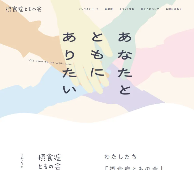
Pastel hands meet behind a quiet promise, followed by spacious pages for shared experiences and support.
Website / Original URL: s-tomo.org Final URL: https://s-tomo.org/ Theme: light, with warm cream and white surfaces Inspected: September 12, 2026, 05:23:48 JST; supplied capture timestamp: September 11, 2026, 20:23:48.614 UTC Viewports: desktop 1440 × 1000 CSS px; mobile 390 × 844 CSS px Scope: the current organization homepage, using three desktop captures, two mobile captures, rendered page text, link destinations, and sampled computed styles. Screenshots cover the opening composition, desktop event section, and desktop/mobile footer. DOM evidence additionally documents the introduction, online talk, story collection, events, and organizational information. Linked pages and interactive open states were not inspected.
The homepage introduces an eating-disorder self-help group and provides several routes into its work: recurring online conversations, personal stories, event reports, organizational information, research, and contact. Its visual identity comes from six overlapping pastel hand silhouettes, a large vertical Japanese message, light Gothic typography, and broad waves between cream and white regions.
The page alternates an expressive opening with deliberately slow reading rhythms. Small navigation labels have generous tracking; introductory paragraphs use unusually open line spacing; story cards form an offset desktop arrangement. Dark slate pills provide a consistent action shape. On mobile, the illustration is recomposed around the central message, stories become a single column, and the footer becomes a centered sequence of contact, resources, identity, and social links.
How to Read This Reference
- Measured values come from the supplied rendered DOM and computed-style records. Decimal dimensions are rounded for readability unless precision explains a relationship.
- Calculated values are arithmetic relationships between recorded boxes, such as column gaps or image-slot widths. They are not recovered stylesheet declarations.
- Estimated values describe visible details without corresponding style records, including several artwork colors, footer dimensions, and wave contours.
- Recommended values belong to the reusable implementation. Proposed breakpoints, accessibility changes, hover endpoints, and replacement geometry are explicitly identified.
- Token names are implementation aliases. The evidence returned an empty custom-property collection; it did not supply original design-token names.
- Text extraction includes concealed interface content. Mobile navigation entries and online-talk detail content appearing in the DOM do not establish that those interfaces were visibly open.
- Desktop and mobile are independently observed endpoints. Intermediate widths, exact breakpoint rules, and font-file loading details remain unverified.
Tokens — Colors
Default Palette
These colors are measured computed values. The four pastel colors below are confirmed on the online-talk fact circles; their exact equivalence to the illustration fills is unverified.
| Name | Value | Suggested token | Confirmed role |
|---|---|---|---|
| Warm Cream | #FDF6ED |
--color-cream |
Main element background; visible warm regions between white sections |
| White | #FFFFFF |
--color-white |
Body canvas, online-talk and event sections, story-card surfaces, reversed button text |
| Slate Ink | #404253 |
--color-ink |
Main text, navigation, filled action buttons, mobile menu circle |
| Link Blue | #5377B5 |
--color-link |
Default anchor color in sampled records; blue resource links are visible in the footer |
| Soft Mint | #D8E7DF |
--color-mint |
Monthly schedule circle |
| Pale Yellow | #F6F1D5 |
--color-yellow |
Free-participation circle |
| Soft Peach | #F1D6B5 |
--color-peach |
Online-format circle |
| Powder Blue | #D7EAF6 |
--color-blue |
Eligibility circle |
| Finished Gray | #A7A7A7 |
--color-status |
Background of the event label 終了しました |
Artwork and Detail Estimates
These are usable visual approximations, not sampled source colors.
| Name | Approximation | Suggested token | Visible use |
|---|---|---|---|
| Pale Pink | #FBE2E8 |
--color-pink-estimate |
Hand entering from the right |
| Pale Lavender | #DED9EB |
--color-lavender-estimate |
Hand entering from the lower right |
| Muted Slate | #747587 |
--color-arrow-estimate |
Circular end cap on the contact button |
| Fine Lavender Rule | #DDDAE9 |
--color-rule-estimate |
Thin horizontal divider above the desktop event entries |
Slate carries readable information and action emphasis. The pastels occupy large, quiet shapes rather than becoming a system of brightly colored controls. Blue is reserved primarily for conventional links in the visible footer.
Theme Behavior
The supplied captures show one light appearance. No alternate theme, theme selector, or dark-mode behavior was verified. White and cream are distinct structural surfaces: replacing both with a single beige background would remove much of the section rhythm.
Tokens — Typography
Light Japanese Gothic — Reading and Large Headings
- Recorded family:
MFW-PA1GothicStdN-Light, sans-serif. - Recorded weight:
400, including large introductory and online-talk headings. - Roles: body copy, introductory statements, story excerpts, and several section wrappers.
- Character: fine strokes, generous internal space, and a restrained, approachable tone.
- Implementation alias:
--font-light.
Regular Japanese Gothic — Navigation and Metadata
- Recorded family:
MFW-PA1GothicStdN-Regular, sans-serif. - Recorded weight:
400. - Roles: navigation, story names and titles, fact-circle labels, event titles, status labels, and primary actions.
- Implementation alias:
--font-regular.
The source distinguishes Light and Regular through family names while both report weight 400. Preserve that distinction when the licensed fonts are available. A generic font-weight: 300 substitution is not evidence of the original implementation.
Graphic Lettering
The opening message reads あなたと / ともに / ありたい in three vertical columns, read from right to left. Its strokes are much heavier and more irregular than the surrounding UI. The organization wordmark also has a distinct drawn character.
The corresponding heading wrappers have empty extracted text and a computed 16px inherited size. That value does not describe the visible lettering. The exact font, asset format, and construction of these graphics were not supplied.
The English lines We want to be with you., Since 2022, and Event & Report are thin and widely spaced. The first follows a slight downward angle; the latter two use vertical placement. Their font family is unverified.
Type Scale
Values are measured unless a row explicitly says otherwise. Each size pair is font size / line height, in CSS pixels.
| Role | Desktop | Mobile | Tracking |
|---|---|---|---|
| Body element default | 16 / 16 |
16 / 16 |
0.64px |
| Navigation | 15 / 15 |
15 / 15 in the concealed menu records |
3px, or 0.2em |
| Introductory statement | 40 / 80 |
24 / 48 |
0.2em |
| Introduction supporting copy | 18 / 45 |
16 / 40 |
0.15em |
| Online-talk eyebrow | 18 / 18 |
14 / 29.96 |
0.18em |
| Online-talk title | 80 / 80 |
40 / 60 |
0.1em |
| Fact-circle label | 16 / 24.96 |
10 / 15.6 |
0.15em |
| Online-talk description | 18 / 45 |
14 / 29.96 |
0.15em |
| Story contributor name | 25 / 25 |
25 / 25 |
3.75px, or 0.15em |
| Contributor descriptor | 14 / 14 |
14 / 14 |
2.1px, or 0.15em |
| Story topic tags | 12 / 21 |
12 / 21 |
0.64px |
| Story title | 20 / 35 |
16 / 28 |
0.15em |
| Story excerpt | 16 / 32 |
14 / 28 |
0.15em |
| Story reading cue | 16 / 20 |
14 / 17 |
0.64px |
| Story qualification notes | 14 / 23.94 |
11 / 18.81 |
0.64px |
| Standard pill action | 18 / 60 |
14 / 48 |
0.08em |
| Event title | 20 / 35 |
16 / 28 |
0.18em |
| Event date | 15 / 26.25 |
12 / 18 |
Desktop 0.15em; mobile 0.1em |
| Finished-event label | 14 / 32 |
12 / 28 |
0.64px |
The body element's 16px line height is a baseline declaration, not the paragraph rhythm. Actual reading blocks explicitly expand to roughly 1.75–2.5 times the font size.
The HTML root reports 10px and Times, while the body overrides its family and size. Times is not evidence of a serif design system. The Quick Start uses explicit pixel dimensions with a conventional surrounding document root.
Graphic Dimensions
| Element | Desktop | Mobile | Evidence |
|---|---|---|---|
| Header wordmark box | 230 × 35.38px |
165 × 25.38px |
Measured heading/home-link boxes |
| Hero message box | 520 × 450.47px |
237.89 × 206.05px |
Measured graphic-bearing heading wrapper |
| Hero message position | x: 460px; y: 232.27px |
x: 76.05px; y: 185.56px |
Measured at the opening viewport |
| Visible event display lettering | Approximately 64–72px high type |
Not visually captured | Desktop screenshot estimate; wrapper typography is not representative |
| Footer wordmark width | Approximately 260px |
Approximately 195px |
Screenshot estimates |
Tokens — Spacing & Shapes
The spacing system has several scales: small tracked labels, generous component padding, and very large section intervals. A 5px implementation increment is convenient, but no original base-unit declaration was supplied.
Spacing Scale
| Use | Desktop | Mobile | Status |
|---|---|---|---|
| Header top position / inset | 40px |
15px padding |
Measured |
| Header left inset | 43.19px |
11.69px |
Measured; approximately 3% of viewport width |
| Navigation item separation | 40px |
Not visibly tested | Calculated between consecutive desktop link boxes |
| Common section top padding | 100px |
50px |
Measured on talk, stories, and events |
| Talk bottom padding | 85px |
60px |
Measured |
| Story-section bottom padding | 400px |
70px |
Measured |
| Story-card padding | 50px 50px 45px |
50px 36.27px 45px |
Measured |
| Story-card gap on mobile | — | 25px |
Calculated between consecutive cards |
| Desktop story-column vertical offset | 60px |
Removed | Calculated from paired card positions |
| Event image-to-text gap | 30px |
20px |
Measured |
| Event-row vertical interval after each item | About 101px |
About 61px |
Calculated from row starts and heights |
| Pill label left padding | 25px |
25px |
Measured |
| Pill reserved right padding | 85px |
70px |
Measured |
Border Radius and Contours
| Element | Shape | Evidence |
|---|---|---|
| Standard action | Fully rounded pill; 9999px radius |
Computed |
| Mobile menu control | Circle; 50% radius |
Computed |
| Online-talk facts | Circles; 50% radius |
Computed |
| Story-card boxes | 0px border radius |
Computed; corner clipping was not sampled |
| Event status label | Square rectangle; 0px radius |
Computed |
| Section boundaries | Broad, asymmetric waves | Visible in supplied captures; exact paths unavailable |
| Lower information panel | Small diagonal cut at the lower-right corner | Visible only in the cropped mobile footer lead-in; approximately 10–12px |
Do not generalize the single visible clipped corner into an unverified treatment for every card.
Layout Measurements
| Element | Desktop | Mobile |
|---|---|---|
| Entire recorded document | Approximately 16,032px tall |
Approximately 18,826px tall |
| Common content width | 1100px, beginning at x: 170px |
Varies by section |
| Wider story layout envelope | Approximately 1200px, from x: 120px to 1320px |
358.80px, beginning at x: 15.59px |
| Introductory statement | 500.5px wide, aligned to the right of the common content region |
308.80px wide, beginning at x: 65.59px |
| Story card | 500px wide; sampled heights 557–627px |
358.80px wide; sampled heights 658–717px |
| Story excerpt column | 400px |
286.27px |
| Event entry | 486 × 210px |
338.13 × 154.11px |
| Event image slot | 170 × 210px |
Approximately 124.77 × 154.11px |
| Event text column | 286px |
193.36px |
| Standard pill | 250 × 60px |
200 × 48px |
| Contact pill | Approximately 300 × 60px |
Approximately 240 × 48px |
| Mobile menu circle | — | 40 × 40px |
Event image widths are calculated from the entry box, text position, and recorded gap; image-node measurements were not supplied. Contact-pill sizes are screenshot estimates.
Components
Organization Header
Role: identify the group and expose its main destinations.
The desktop header sits directly over the hero artwork, without a separate opaque bar. A home-linked wordmark occupies the left side. Five navigation links sit to the right: オンライントーク, 体験談, イベント情報, 私たちについて, and お問い合わせ.
The header's recorded desktop box starts at approximately (43, 40) and is 1325px wide. The wordmark is 230px wide. Navigation uses the Regular family at 15px with 3px tracking and calculated 40px gaps.
At 390px, the header is a 70px-high region with 15px vertical padding. The wordmark becomes 165px wide, and a 40px slate circle containing three fine horizontal strokes appears at the upper right. The opening screenshot shows the menu closed. The DOM retains the navigation and social destinations, but its open appearance and behavior were not exercised.
The evidence does not establish sticky or fixed header behavior.
Illustrated Hero
Role: express companionship before presenting detailed information.
The hero combines four visible layers:
- A warm cream field.
- Six flat pastel arm-and-hand silhouettes entering from different edges and overlapping around the center.
- The slate message
あなたと / ともに / ありたい, arranged in three vertical columns. - A small, angled English line and a broad white wave at the lower boundary.
Read the message from the rightmost column. Its columns contain four, three, and four characters respectively; the center column ends earlier. This uneven silhouette is part of the composition.
At desktop size, the lettering occupies a measured 520 × 450px box centered horizontally. The English line appears left of center, crossing the open area beside the hands. On mobile, the message remains prominent at 61% of viewport width, while the English line moves below it. The hands extend beyond the viewport edges, preserving a sense of people reaching inward.
The screenshot's lower white boundary varies approximately from y=760 to y=895 on desktop and y=560 to y=600 on mobile. These are contour estimates, not measured hero-element heights.
Use authorized artwork for the hands and lettering. Separate their layout only when separate assets are available; avoid adding another headline over lettering already embedded in an illustration.
Introductory Statement
Role: explain the organization in a short, readable statement.
The source statement begins わたしたち and identifies the group as a self-help group. Desktop typography is 40px with 80px line height, 8px tracking, and four lines. Its 500.5px-wide box sits toward the right of the content region. A narrow vertical Since 2022 marker occupies the opposite side.
On mobile, the statement becomes 24px with 48px line height. It begins about 66px from the left edge, leaving a distinct rail for the small vertical marker near x=16px. The heading begins at y=634px, so the first mobile viewport includes the hero and the beginning of the introduction.
Supporting copy uses 18/45px on desktop and 16/40px on mobile. Preserve the generous line spacing and purposeful line breaks. The mobile text should retain its reading pace even when the surrounding layout becomes narrower.
Online-Talk Overview
Role: explain a recurring opportunity to participate.
A white section contains an eyebrow, a large オンライントーク heading, four pastel fact circles, explanatory copy, and a dark 詳しく見る pill. The title is one line on desktop and explicitly breaks into two lines on mobile.
The fact circles communicate schedule, price, format, and eligibility. They are paragraph elements in the evidence, rather than independent controls. Their desktop diameter is 150px. Neighboring circles overlap by approximately 10–15px and sit at uneven vertical positions: the second is 48px below the first, and the fourth is 38px below it.
At 390px, each circle is approximately 95.8px across. The row still contains all four circles, with roughly 8px overlaps and vertical offsets of 29px and 25px. Their type drops to 10px. This preserves the playful group silhouette but is a candidate for a readability improvement in a new implementation.
Online-Talk Detail Content
Role: provide participation details and a registration destination.
The DOM includes a second talk heading, two 閉じる controls, labeled information for schedule, audience, format, capacity, and cost, a registration-form link, and explanatory paragraphs.
The associated container records are approximately 1px wide and produce implausibly narrow text boxes. Treat them as concealed-state measurements. They do not describe an open panel or establish a visible layout defect.
The 詳しく見る and 閉じる links point to #, which suggests scripted state changes. No click sequence, panel dimensions, backdrop, focus handling, or close animation was supplied. For a new implementation, use a semantic disclosure or dialog with an explicit control relationship; that is a recommendation, not an observed interaction.
Story Collection
Role: present individual experiences as substantial reading material.
The rendered collection contains twelve linked entries, including an editorial conversation. Each card is a full anchor containing contributor information, a story title, an excerpt, and the reading cue 体験談を読む.
Measured text anatomy:
- Contributor name: 25px Regular, retained at the same size on mobile.
- Descriptor: 14px Regular, such as an age group or member designation.
- Optional topic tags: 12px text with a 12px gap; no filtering behavior was verified.
- Story title: 20/35px desktop, 16/28px mobile.
- Excerpt: 16/32px desktop, 14/28px mobile.
- Reading cue: aligned toward the right on desktop and centered on mobile.
Desktop cards are white, 500px wide, and use 50px side padding. Their 400px reading columns sit within a staggered two-column arrangement. The right card in each pair starts 60px lower. Alternating pairs also shift horizontally by about 50px, creating a gentle side-to-side rhythm.
Mobile cards share a single x-position, retain 50px top padding and 45px bottom padding, and have 25px gaps. Contributor information moves into a centered block above the title and excerpt. Paragraphs remain left aligned.
The records leave substantial space around the contributor region, especially on mobile, but corresponding media elements were not included. The content, dimensions, and treatment of any accompanying illustrations or portraits are unverified. Do not fill this gap with invented claims about source photography.
Two qualification paragraphs follow the collection. They explain that names are pseudonyms and that the experiences are individual accounts. Their source type is 14px on desktop and 11px on mobile; keep this information readable in an adaptation.
Event and Activity-Report Section
Role: link to dated announcements and past activities.
The desktop capture shows a large, two-line Japanese heading toward the left and a thin Event & Report label running vertically near the right. A large open interval separates the heading from the listings. A fine pale rule spans the content region before the first row.
Each event entry is one linked horizontal unit:
- A portrait flyer slot at the left.
- A square gray
終了しましたlabel at the upper right. - A Regular Gothic title below the status.
- A date row beneath the title.
The desktop layout has two 486px-wide entries per row, separated by a calculated 128px gap. Within an entry, a 170px image slot and 286px text column are separated by 30px. Titles wrap naturally.
Mobile changes the outer collection to one column while retaining the image-left/text-right anatomy. Each entry is approximately 338px wide, with a 125px image slot, a 20px gap, and a 193px text column. This is a different responsive transformation from the story cards.
The gray label communicates that an event has ended; it does not make the entire entry disabled. The entries retain individual event-page URLs. A centered 全て見る pill links to the event archive.
Instagram Updates
Role: provide another route to ongoing announcements.
The DOM records the heading お知らせなどはインスタで and links to individual Instagram posts. Sampled desktop post links have 150 × 187.5px boxes, a 4:5 proportion, and the first two begin 202px apart.
Ten post links appear in the desktop text evidence and six in the mobile evidence. The reason for that difference is unverified; it does not establish a carousel, pagination, or permanent device-specific limit. The supplied screenshots do not show the feed's imagery or full arrangement.
Organization and Resource Information
Role: establish identity and make the group's work accessible.
Rendered page text contains an organization overview, establishment date, representative, location, annual reports, vision, mission, representative message, research reports, media coverage, and grant history. The current organization name is independently stated on the inspected homepage.
The supplied computed-style records do not cover the detailed layouts of these subsections. A small portion of the final information panel is visible above the mobile footer: a white block on cream with a clipped lower-right corner.
For a new implementation, use semantic definition lists for organization facts and ordinary text-link lists for reports. Match the established reading typography and blue-link treatment. These structural choices are recommendations where the source layout is not documented.
Contact Pill
Role: make the contact destination easy to recognize without overwhelming the surrounding information.
The visible button combines a slate pill body, white text, and a lighter slate circular cap at the right. A small white chevron sits in that cap. The contact label is お問い合わせフォーム.
Screenshot estimates give a 300 × 60px desktop button and a 240 × 48px mobile button. The right cap is approximately the same diameter as the button's height. Standard talk and archive pills are measured separately at 250 × 60px and 200 × 48px.
The contact and registration destinations are external Google Forms links. New-tab behavior and successful form loading were not tested. Keep the label and arrow inside one anchor rather than making the arrow a separate target.
Footer
Role: close with practical help and repeat the message of companionship.
A broad cream-to-white wave introduces the footer. The desktop layout has two loose groups: contact and educational links on the left; the vertical slogan, wordmark, social icons, and copyright on the right. The absence of a dense navigation matrix leaves substantial white space between them.
On mobile, the order becomes a centered vertical sequence:
- Contact heading, short explanation, and contact pill.
- Educational-resource heading and two blue links with external-link symbols.
- The three-column vertical slogan.
- Organization wordmark.
- Instagram, X, and YouTube icons.
- Small tracked copyright text.
The social glyphs retain their recognizable platform shapes in slate. The resource links point to an eating-disorder information portal and a Fukuoka support center. These are educational destinations, not website-production credits.
The footer's detailed typography and spacing were not sampled. Its geometry in this reference is estimated from the screenshots.
Tokens — Motion & Interaction
| Element | Recorded evidence | What can be concluded |
|---|---|---|
| Hero message wrapper | transition: opacity 3s 7s on both viewports |
A 3-second opacity transition with a 7-second delay is declared; its trigger and full sequence were not captured |
| Navigation links | transition: opacity 0.5s |
Opacity changes have a half-second transition; the endpoint and activating state were not tested |
| Story reading cues | transition: color 0.5s |
A half-second color transition is declared; the destination color is unverified |
| Many sampled elements | transition: all |
The record provides no nonzero timing for these elements; it does not establish visible motion |
| Sampled animation fields | animation: none |
No keyframe animation is declared on those particular sampled elements |
| Section navigation | Links to #s_talk, #s_story, and #s_about |
In-page destinations are present; smooth scrolling and offset behavior are unverified |
| Mobile navigation | Closed circular control visible; menu links remain in DOM | An alternate navigation state is implied but was not opened |
| Talk detail controls | 詳しく見る and 閉じる point to # |
Scripted disclosure is suggested; exact behavior is unverified |
| Story and event entries | Full-entry anchors with individual URLs | They are navigation targets; destination-page behavior was not inspected |
The capture process waited for finite motion and layout stability within bounded time limits. It also temporarily paused perpetual animations during readiness checks. This supports analysis of the settled screenshots, but does not establish that the whole page is static or reveal a complete animation timeline.
There is no supplied evidence for hand-entry sequencing, parallax, cursor effects, a looping wave, automatic scrolling, or a spring-based menu. Avoid adding these as claims about the original.
Recommended adaptation: keep essential content visible immediately, retain restrained opacity/color feedback, and provide a reduced-motion mode. Reproducing a seven-second headline delay should be a deliberate product decision.
Surfaces
| Layer | Appearance | Structural purpose |
|---|---|---|
| Warm base | Solid cream | Connects the illustration and quieter content regions |
| White section | Flat white, often introduced by a wave | Separates major content groups without a hard rectangular edge |
| Story surface | White with measured square border-radius geometry | Creates an individual reading area within the warmer collection |
| Fact circle | Solid pastel with slate text | Groups practical information into a friendly cluster |
| Primary action | Slate pill with white text | Provides a consistent route to more information or contact |
| Action end cap | Lighter slate circle, estimated color | Gives the chevron a distinct place inside the action |
| Event status | Flat gray rectangle with white text | Communicates an ended event |
| External resource link | Blue text and small external-link symbol | Distinguishes linked information from surrounding prose |
The visible design does not rely on gradients, glass blur, or elevated interface panels. Surface separation comes primarily from white versus cream, the scale of open space, and the wave contours. Box-shadow values were not included in the style records, so a universal source-level no-shadow rule cannot be asserted.
Imagery
The opening illustration uses flat silhouettes with soft, irregular contours. Peach, pale yellow, mint, blue, pink, and lavender hands converge from the viewport edges. There are no visible outlines, realistic skin textures, or modeled lighting in this composition. Overlap supplies depth.
The hands communicate mutual support while leaving enough contrast for the slate message. Preserve their central meeting point when cropping. Mobile requires a closer composition: simply reducing the entire desktop image to 390px wide would make the message and fingers too small.
The wave dividers use broad changes of direction with unequal peaks and troughs. They are not repeated scallops. Their large scale lets the page remain calm despite its organic geometry.
The visible event flyers contain their own dense typography and peach framing. Treat that detail as document artwork. The surrounding UI stays sparse, with status, title, and date outside the flyer.
Observed Asset References
No image-source URLs or original asset filenames were included in the evidence. The following inventory identifies visible or measured uses without inventing paths.
| Asset or graphic | Evidence | Reuse guidance |
|---|---|---|
| Organization wordmark | Desktop/mobile header and footer screenshots | Preserve its drawn proportions; use an authorized supplied asset |
| Hero hand composition | Desktop and mobile opening screenshots | Maintain flat fills, central overlap, and responsive edge cropping |
| Vertical Japanese message | Opening and footer screenshots; measured hero wrapper | Preserve reading order and the shorter middle column |
| English hero line | Visible in both opening captures | Match its light strokes, tracking, and gentle angle |
| Vertical section labels | Since 2022 and Event & Report visible |
Preserve orientation; exact font and asset construction are unknown |
| Event flyers | Visible portions of the first desktop event row; image slots calculable from DOM | Keep the portrait proportion and legible external metadata |
| Story-associated media | Not shown in supplied screenshots or media records | Content and visual treatment remain unverified |
| Instagram post imagery | Link boxes and destinations recorded | Aspect ratio is measurable for sampled desktop entries; content is unverified |
| Social and external-link symbols | Visible in footer captures | Use recognizable platform silhouettes and restrained outline symbols |
Layout & Responsive Behavior
Desktop Composition
The homepage is a long scrolling document. A full-width illustrated opening leads into constrained content regions. Talk and event content commonly use a 1100px width, while the story arrangement occupies an approximately 1200px envelope.
The introduction is asymmetric: the large Japanese statement sits on the right while a small vertical marker sits toward the left. Story cards continue this asymmetry through alternating horizontal shifts and 60px vertical offsets. Events return to a more regular two-column arrangement.
The event screenshot shows especially generous separation between its wave boundary, bilingual heading treatment, divider, and entry row. Preserve this hierarchy of intervals rather than compressing every section to identical padding.
Mobile Transformations
| Component | Observed transformation |
|---|---|
| Header | Five visible desktop links are replaced by a circular menu control; wordmark changes from 230px to 165px |
| Hero | Message becomes approximately 238px wide; English line moves beneath it; hands are cropped around a closer central composition |
| Introduction | Heading changes from 40/80px to 24/48px; left rail remains distinct |
| Online talk | Title breaks into two lines; four overlapping fact circles remain in one row |
| Story collection | Two offset columns become one aligned column with 25px gaps |
| Story hierarchy | Contributor name remains 25px while title and excerpt become smaller; metadata and reading cue are centered |
| Event collection | Outer layout becomes one column; each entry keeps its flyer beside its text |
| Standard actions | Change from 250 × 60px to 200 × 48px |
| Footer | Two separated desktop groups become a centered vertical sequence |
The mobile page is approximately 2794px taller than the desktop page, calculated from the recorded document heights. The story section alone grows from approximately 5451px to 9350px as its cards stack. Other regions become more compact, so total page height is not a simple multiple of the desktop layout.
Implementation Boundaries
No tablet viewport or breakpoint stylesheet was supplied. The Quick Start proposes 960px for the main layout change and 1200px for the full story offsets. These are adaptation choices.
Do not interpret concealed menu coordinates or approximately 1px-wide detail containers as visible mobile geometry. Neither overflow behavior nor focus containment was tested for those states.
Do’s and Don’ts
Do
- Build the page around cream
#FDF6ED, white, and slate#404253. - Use large pastel shapes for atmosphere and slate for readable information.
- Preserve the meeting point of the hands and the right-to-left order of the vertical message.
- Keep Light and Regular typography distinct without making all headings bold.
- Retain wide tracking and the measured 2–2.5 line-height rhythm in introductory copy.
- Use offset desktop story cards and an aligned mobile reading column.
- Keep event flyers beside their status, title, and date on mobile.
- Reserve fully rounded geometry for pills and circular facts; preserve the quieter rectangular reading surfaces.
- Repeat the slogan in the footer as a smaller identity element.
- Separate source measurements, screenshot estimates, and implementation recommendations.
Don’t
- Don't replace the hand illustration with generic clinical stock photography.
- Don't shrink the whole desktop hero proportionally until the mobile message loses its presence.
- Don't turn the story excerpts into short testimonial tiles with star ratings.
- Don't treat the topic hashtags as verified filtering controls.
- Don't interpret the event status as a disabled link.
- Don't add gradients, raised card stacks, or decorative shadows to every component.
- Don't use the empty hero wrapper's inherited 16px size as the display-lettering size.
- Don't apply one global spacing reduction to mobile; some large internal card padding and contributor type are retained.
- Don't infer a visible modal layout from concealed-state measurements.
- Don't present untested hover colors, menu animation, or hand motion as original behavior.
Recommended Implementation Additions
These are recommendations for a new implementation, not verified source features.
- Give the graphic wordmark and hero message meaningful accessible names. If the message is supplied as artwork, provide one complete text equivalent and avoid duplicate announcements.
- Use a real button for the mobile menu, with
aria-expandedandaria-controls. Ensure concealed navigation cannot receive keyboard focus. - Implement talk details with an accessible disclosure or dialog. If modal, support Escape, focus containment, and focus restoration.
- Retain visible focus outlines on whole-card links and pill actions. Keep the chevron within the same interactive element as its label.
- Increase the effective menu and social-link hit areas to at least 44px while preserving the smaller visible glyphs.
- Consider increasing the 10px mobile fact labels and 11px qualification notes. Preserve their information rather than hiding it to save space.
- Improve status-label contrast: white on the measured
#A7A7A7is approximately 2.4:1, calculated from the recorded colors. A darker gray such as#737373is a recommended alternative. - Underline resource links on focus and hover, and verify contrast for blue text at its actual size.
- Give flyers useful alternative text while keeping event titles, dates, and status in ordinary HTML.
- Keep the hero readable without animation or JavaScript. Respect reduced-motion preferences without leaving opacity-gated content invisible.
- Allow text resizing to expand cards naturally. The observed card heights describe the captured content and should not become fixed-height clipping constraints.
Agent Prompt Guide
Quick Color Reference
- Main warm surface:
#FDF6ED. - White sections and story cards:
#FFFFFF. - Main text and primary pills:
#404253. - Resource links:
#5377B5. - Confirmed fact colors:
#D8E7DF,#F6F1D5,#F1D6B5,#D7EAF6. - Additional illustration approximations: pink
#FBE2E8, lavender#DED9EB. - Circular button cap approximation:
#747587. - Source event status:
#A7A7A7; recommended accessible alternative:#737373.
Overall Prompt
“Create a Japanese self-help organization homepage with a warm cream and white canvas, slate text, light Gothic reading typography, and generous tracked headings. Open with six overlapping pastel hands entering from the screen edges around the vertical message あなたと / ともに / ありたい. Place a small angled English line nearby and use broad asymmetric white waves between sections. Include recurring online-talk information in four overlapping pastel circles, substantial linked personal-story cards, dated event entries with portrait flyers, organization information, reports, and a calm contact footer. At desktop widths, offset the story cards in two columns; on mobile, align them in one column while preserving readable excerpts. Use dark pill actions with a lighter circular chevron cap. Keep unverified animation out of the specification.”
Example Component Prompts
- Hero: “Use a cream background and flat peach, yellow, mint, blue, pink, and lavender hands meeting behind a slate vertical Japanese message. Preserve three right-to-left text columns with the middle column shorter. Recompose the crop on mobile and place the thin English supporting line below the message.”
- Participation facts: “Create four overlapping circles for schedule, cost, format, and eligibility. Use measured pastel fills, slate text, and uneven vertical offsets. Keep them as informational labels, followed by a single dark pill for details.”
- Story collection: “Create white reading cards with contributor name, descriptor, optional plain topic tags, a substantial title, a multi-line excerpt, and a quiet reading cue. Use 500px cards with 50px side padding at wide desktop sizes. On mobile use a 92%-width single column, centered contributor metadata, left-aligned excerpts, and 25px gaps.”
- Event entry: “Place a portrait event flyer at left and a square gray finished-event label, title, and date at right. Keep this horizontal anatomy on phones while changing the outer collection from two columns to one. Use thin pale rules and generous spacing.”
- Footer: “Introduce a white footer with a broad cream wave. On desktop separate contact and educational links from the vertical slogan and wordmark. On mobile center these groups in sequence, with a 240 × 48px contact pill, blue resource links, slate social icons, and a small copyright line.”
- Responsive implementation: “Use the supplied 1440 × 1000 and 390 × 844 observations as endpoints. Treat intermediate breakpoints as implementation choices. Preserve the 25px contributor names, the different story/event stacking behaviors, and the hero's prominent mobile lettering.”
Quick Start
CSS Custom Properties
This is a source-informed adaptation, not a recovered stylesheet. Measured typography, colors, and component sizes are retained where practical. Hero height, wave path, footer details, breakpoint rules, and hover endpoints are recommendations or estimates. Asset URLs and licensed font loading must be supplied by the implementation.
The story CSS provides the measured text hierarchy and outer arrangement. Accompanying media can be added once its intended content is known; the example does not fabricate source portraits or reserve fixed card heights for them.
:root {
  /* Measured interface colors */
  --color-cream: #fdf6ed;
  --color-white: #ffffff;
  --color-ink: #404253;
  --color-link: #5377b5;
  --color-mint: #d8e7df;
  --color-yellow: #f6f1d5;
  --color-peach: #f1d6b5;
  --color-blue: #d7eaf6;
  --color-status: #a7a7a7;

  /* Screenshot approximations */
  --color-pink-estimate: #fbe2e8;
  --color-lavender-estimate: #ded9eb;
  --color-arrow-estimate: #747587;
  --color-rule-estimate: #dddae9;

  /* Recorded family names; font files are not supplied here */
  --font-light: 'MFW-PA1GothicStdN-Light', sans-serif;
  --font-regular: 'MFW-PA1GothicStdN-Regular', sans-serif;
  --tracking-body: 0.15em;
  --tracking-display: 0.2em;
  --tracking-nav: 0.2em;

  /* Mobile defaults */
  --content-max: 1100px;
  --content-wide: 1200px;
  --text-intro: 24px;
  --leading-intro: 48px;
  --text-story: 14px;
  --leading-story: 28px;
  --text-story-title: 16px;
  --leading-story-title: 28px;
  --text-action: 14px;
  --action-height: 48px;
  --action-width: 200px;
  --contact-width: 240px;
  --action-end-space: 70px;
  --radius-pill: 9999px;

  /* Duration is recorded; easing and state endpoints are recommended */
  --motion-feedback: 500ms ease;
}

.tomo-site,
.tomo-site * {
  box-sizing: border-box;
}

.tomo-site {
  color: var(--color-ink);
  background: var(--color-cream);
  font-family: var(--font-light);
  font-size: 16px;
  font-weight: 400;
  line-height: 2;
  letter-spacing: 0.04em;
}

.tomo-site :where(h1, h2, h3, p) {
  margin: 0;
  font-weight: 400;
}

.tomo-site img {
  display: block;
  max-width: 100%;
  height: auto;
}

.tomo-site a {
  color: var(--color-link);
}

.tomo-frame {
  width: min(92%, var(--content-max));
  margin-inline: auto;
}

.tomo-frame--wide {
  max-width: var(--content-wide);
  width: 92%;
}

/* Header placement approximates the supplied opening captures. */
.tomo-header {
  position: absolute;
  z-index: 10;
  inset: 0 0 auto;
  display: flex;
  align-items: center;
  justify-content: space-between;
  min-height: 70px;
  padding: 15px 3%;
}

.tomo-logo {
  display: block;
  width: 165px;
}

.tomo-nav {
  display: none;
  align-items: center;
  gap: 40px;
}

.tomo-nav a {
  color: var(--color-ink);
  font-family: var(--font-regular);
  font-size: 15px;
  line-height: 1;
  letter-spacing: var(--tracking-nav);
  text-decoration: none;
  transition: opacity var(--motion-feedback);
}

/* Recommended hit area around the observed 40px visual circle. */
.tomo-menu-toggle {
  display: grid;
  place-items: center;
  width: 44px;
  height: 44px;
  padding: 2px;
  border: 0;
  background: transparent;
  cursor: pointer;
}

.tomo-menu-disc {
  display: grid;
  place-items: center;
  width: 40px;
  height: 40px;
  border-radius: 50%;
  color: var(--color-white);
  background: var(--color-ink);
}

/* Estimated canvas height; message width and position are measured. */
.tomo-hero {
  position: relative;
  min-height: 600px;
  overflow: hidden;
  background: var(--color-cream);
}

.tomo-hero-art {
  position: absolute;
  inset: 0;
}

.tomo-hero-art img {
  width: 100%;
  height: 100%;
  object-fit: cover;
  object-position: center;
}

.tomo-hero-title {
  position: absolute;
  z-index: 1;
  top: 185.56px;
  left: 50%;
  width: 61%;
  transform: translateX(-50%);
  opacity: 1;
}

.tomo-hero-title img {
  width: 100%;
}

/* Caption typography and angle are visual approximations. */
.tomo-hero-caption {
  position: absolute;
  z-index: 1;
  top: 435px;
  left: 22%;
  font-size: 13px;
  letter-spacing: 0.16em;
  line-height: 1.4;
  transform: rotate(5deg);
}

.section-wave {
  position: absolute;
  inset: auto 0 -1px;
  display: block;
  width: 100%;
  height: 90px;
  color: var(--color-white);
  pointer-events: none;
}

.tomo-intro {
  padding-block: 34px 60px;
  background: var(--color-white);
}

.tomo-intro-copy {
  width: calc(100% - 50px);
  margin-left: 50px;
}

.tomo-intro h2 {
  font-size: var(--text-intro);
  line-height: var(--leading-intro);
  letter-spacing: var(--tracking-display);
}

.tomo-intro p {
  margin-top: 56px;
  font-size: 16px;
  line-height: 40px;
  letter-spacing: var(--tracking-body);
}

.tomo-talk {
  padding-block: 50px 60px;
  background: var(--color-white);
}

.tomo-talk-eyebrow {
  font-family: var(--font-regular);
  font-size: 14px;
  line-height: 2.14;
  letter-spacing: 0.18em;
}

.tomo-talk-title {
  margin-top: 15px !important;
  font-size: 40px;
  line-height: 60px;
  letter-spacing: 0.1em;
}

.tomo-facts {
  display: flex;
  width: 100%;
  max-width: 560px;
  margin-block: 32px 49px;
}

.tomo-fact {
  display: flex;
  flex: 0 0 26.7%;
  align-items: center;
  justify-content: center;
  aspect-ratio: 1;
  border-radius: 50%;
  font-family: var(--font-regular);
  font-size: 10px;
  line-height: 1.56;
  letter-spacing: 0.15em;
  text-align: center;
}

.tomo-fact + .tomo-fact { margin-left: -2.3%; }
.tomo-fact:nth-child(1) { background: var(--color-mint); }
.tomo-fact:nth-child(2) {
  background: var(--color-yellow);
  transform: translateY(29px);
}
.tomo-fact:nth-child(3) { background: var(--color-peach); }
.tomo-fact:nth-child(4) {
  margin-left: -2.2%;
  background: var(--color-blue);
  transform: translateY(25px);
}

.tomo-talk-description {
  font-size: 14px;
  line-height: 2.14;
  letter-spacing: 0.15em;
}

.tomo-site .pill-cta {
  position: relative;
  display: inline-flex;
  align-items: center;
  min-width: var(--action-width);
  min-height: var(--action-height);
  max-width: 100%;
  padding: 10px var(--action-end-space) 10px 25px;
  border-radius: var(--radius-pill);
  color: var(--color-white);
  background: var(--color-ink);
  font-family: var(--font-regular);
  font-size: var(--text-action);
  line-height: 1.5;
  letter-spacing: 0.08em;
  text-decoration: none;
}

.pill-cta--contact {
  width: var(--contact-width);
}

.pill-cta__arrow {
  position: absolute;
  top: 50%;
  right: 0;
  display: grid;
  place-items: center;
  width: var(--action-height);
  height: var(--action-height);
  border-radius: 50%;
  background: var(--color-arrow-estimate);
  transform: translateY(-50%);
}

.tomo-stories {
  padding-block: 50px 70px;
  background: var(--color-cream);
}

.story-grid {
  display: grid;
  grid-template-columns: minmax(0, 1fr);
  gap: 25px;
}

.tomo-site .story-card {
  display: flex;
  flex-direction: column;
  min-width: 0;
  padding: 50px clamp(24px, 9.3vw, 50px) 45px;
  border-radius: 0;
  color: var(--color-ink);
  background: var(--color-white);
  text-decoration: none;
}

.story-meta {
  align-self: center;
  margin-bottom: 30px;
  text-align: center;
}

.story-name {
  font-family: var(--font-regular);
  font-size: 25px;
  line-height: 25px;
  letter-spacing: 0.15em;
}

.story-descriptor {
  margin-top: 20px !important;
  font-family: var(--font-regular);
  font-size: 14px;
  line-height: 1;
  letter-spacing: 0.15em;
}

.story-tags {
  display: flex;
  flex-wrap: wrap;
  justify-content: center;
  gap: 12px;
  margin-top: 10px;
  font-size: 12px;
  line-height: 21px;
}

.story-title {
  font-family: var(--font-regular);
  font-size: var(--text-story-title);
  line-height: var(--leading-story-title);
  letter-spacing: 0.15em;
}

.story-excerpt {
  margin-top: 15px !important;
  font-size: var(--text-story);
  line-height: var(--leading-story);
  letter-spacing: 0.15em;
}

.story-read {
  align-self: center;
  margin-top: 25px !important;
  font-family: var(--font-regular);
  font-size: 14px;
  line-height: 17px;
  transition: color var(--motion-feedback);
}

.tomo-events {
  padding-block: 50px 40px;
  background: var(--color-white);
}

.event-frame {
  width: min(86.7%, var(--content-max));
  margin-inline: auto;
}

.event-grid {
  display: grid;
  gap: 60px;
  padding-top: 50px;
  border-top: 1px solid var(--color-rule-estimate);
}

.tomo-site .event-entry {
  display: grid;
  grid-template-columns: 36.9% minmax(0, 1fr);
  align-items: start;
  gap: 20px;
  color: var(--color-ink);
  text-decoration: none;
}

.event-flyer {
  width: 100%;
  aspect-ratio: 17 / 21;
  object-fit: contain;
  object-position: top;
}

.event-status {
  display: inline-block;
  padding-inline: 10px;
  color: var(--color-white);
  background: var(--color-status);
  font-family: var(--font-regular);
  font-size: 12px;
  line-height: 28px;
}

/* Optional accessible alternative to the recorded gray. */
.event-status--accessible { background: #737373; }

.event-title {
  margin-top: 10px !important;
  font-family: var(--font-regular);
  font-size: 16px;
  line-height: 28px;
  letter-spacing: 0.18em;
}

.event-date {
  margin-top: 15px !important;
  font-family: var(--font-regular);
  font-size: 12px;
  line-height: 18px;
  letter-spacing: 0.1em;
}

/* Footer measurements below are screenshot-based approximations. */
.tomo-footer {
  padding-block: 55px 30px;
  background: var(--color-white);
}

.tomo-footer-inner {
  display: grid;
  gap: 60px;
  width: 92%;
  margin-inline: auto;
  text-align: center;
}

.tomo-footer-help { margin-top: 60px; }
.tomo-footer-links { display: grid; gap: 12px; }
.tomo-footer-slogan { width: 125px; margin-inline: auto; }
.tomo-footer-logo { width: 195px; margin: 40px auto 0; }

.tomo-socials {
  display: flex;
  justify-content: center;
  gap: 8px;
  margin-top: 16px;
}

.tomo-socials a {
  display: grid;
  place-items: center;
  min-width: 44px;
  min-height: 44px;
  color: var(--color-ink);
}

.tomo-copyright {
  margin-top: 20px !important;
  font-size: 10px;
  line-height: 1.6;
  letter-spacing: 0.1em;
}

/* Recommended breakpoints; original media-query values are unknown. */
@media (min-width: 960px) {
  :root {
    --text-intro: 40px;
    --leading-intro: 80px;
    --text-story: 16px;
    --leading-story: 32px;
    --text-story-title: 20px;
    --leading-story-title: 35px;
    --text-action: 18px;
    --action-height: 60px;
    --action-width: 250px;
    --contact-width: 300px;
    --action-end-space: 85px;
  }

  .tomo-header { padding: 40px 5% 0 3%; }
  .tomo-logo { width: 230px; }
  .tomo-nav { display: flex; gap: clamp(18px, 2.78vw, 40px); }
  .tomo-menu-toggle { display: none; }
  .tomo-hero { min-height: 915px; }
  .tomo-hero-title { top: 232.27px; width: 520px; }
  .tomo-hero-caption { top: 425px; left: 15.8%; font-size: 18px; }
  .section-wave { height: 155px; }
  .tomo-intro { padding-block: 150px 76px; }
  .tomo-intro-copy { width: 45.5%; margin-left: auto; }
  .tomo-intro p { font-size: 18px; line-height: 45px; }
  .tomo-talk { padding-block: 100px 85px; }
  .tomo-talk-eyebrow { font-size: 18px; line-height: 1; }
  .tomo-talk-title { margin-top: 50px !important; font-size: 80px; line-height: 80px; }
  .tomo-fact { flex-basis: 150px; font-size: 16px; }
  .tomo-fact + .tomo-fact { margin-left: -15px; }
  .tomo-fact:nth-child(2) { transform: translateY(48px); }
  .tomo-fact:nth-child(4) { margin-left: -10px; transform: translateY(38px); }
  .tomo-talk-description { font-size: 18px; line-height: 45px; }
  .tomo-stories { padding-block: 100px 400px; }
  .story-grid { grid-template-columns: repeat(2, minmax(0, 1fr)); gap: 100px 50px; }
  .tomo-site .story-card { padding: 50px 50px 45px; }
  .story-meta { align-self: flex-end; text-align: left; }
  .story-tags { justify-content: flex-start; }
  .story-read { align-self: flex-end; font-size: 16px; line-height: 20px; }
  .tomo-events { padding-block: 100px 65px; }
  .event-frame { width: min(92%, var(--content-max)); }
  .event-grid { grid-template-columns: repeat(2, minmax(0, 486px)); justify-content: space-between; gap: 100px 40px; }
  .tomo-site .event-entry { grid-template-columns: 170px minmax(0, 1fr); gap: 30px; }
  .event-status { font-size: 14px; line-height: 32px; }
  .event-title { margin-top: 22px !important; font-size: 20px; line-height: 35px; }
  .event-date { font-size: 15px; line-height: 26.25px; letter-spacing: 0.15em; }
  .tomo-footer-inner { grid-template-columns: 1fr 1fr; width: min(85.6%, 1234px); text-align: left; }
  .tomo-footer-help { margin-top: 100px; }
  .tomo-footer-brand { text-align: right; }
  .tomo-footer-slogan { width: 190px; margin-inline: auto 0; }
  .tomo-footer-logo { width: 260px; margin: 110px 0 0 auto; }
  .tomo-socials { justify-content: flex-end; }
}

@media (min-width: 1200px) {
  .story-grid {
    grid-template-columns: repeat(2, 500px);
    justify-content: space-between;
    column-gap: 0;
  }
  .story-card:nth-child(4n + 1) { transform: translateX(50.4px); }
  .story-card:nth-child(4n + 2) { transform: translateY(60px); }
  .story-card:nth-child(4n + 4) { transform: translate(-50.4px, 60px); }
}

/* Recommended state endpoints; only the source durations are known. */
@media (hover: hover) {
  .tomo-nav a:hover { opacity: 0.72; }
  .story-card:hover .story-read { color: var(--color-link); }
  .tomo-footer-links a:hover { text-decoration: underline; }
}

.tomo-site :focus-visible {
  outline: 2px solid var(--color-ink);
  outline-offset: 4px;
}

@media (prefers-reduced-motion: reduce) {
  .tomo-nav a,
  .story-read,
  .tomo-hero-title {
    transition: none;
  }
  .tomo-hero-title { opacity: 1; }
}
Component Markup Notes
Use one anchor for a pill action, with a decorative arrow inside it. Use the actual destination supplied by the page data; a same-page anchor is shown here as a working example.
<a class='pill-cta' href='#s_talk'>
  <span>詳しく見る</span>
  <span class='pill-cta__arrow' aria-hidden='true'>›</span>
</a>
The following wave is an approximate reusable contour, not the original path. Place it inside a positioned cream section whose next region is white. Reverse its fill or placement as needed for another surface transition.
<svg class='section-wave'
     viewBox='0 0 1440 160'
     preserveAspectRatio='none'
     aria-hidden='true'
     focusable='false'>
  <path fill='currentColor'
        d='M0 100 C180 20 260 20 440 75 C620 130 680 145 880 75 C1090 0 1180 0 1320 65 C1380 90 1410 100 1440 110 V160 H0 Z' />
</svg>
Tailwind v4 Token Mapping
Optional aliases for a project already using Tailwind v4. This does not imply that the inspected website uses Tailwind. Define the properties above first.
@theme inline {
  --color-cream: #fdf6ed;
  --color-ink: #404253;
  --color-link: #5377b5;
  --color-mint: #d8e7df;
  --color-soft-yellow: #f6f1d5;
  --color-peach: #f1d6b5;
  --color-powder-blue: #d7eaf6;

  --font-reading: 'MFW-PA1GothicStdN-Light', sans-serif;
  --font-label: 'MFW-PA1GothicStdN-Regular', sans-serif;

  --text-introduction: var(--text-intro);
  --text-story-body: var(--text-story);
  --text-story-heading: var(--text-story-title);
  --text-contributor: 25px;
  --text-action-label: var(--text-action);

  --spacing-action-height: var(--action-height);
  --spacing-action-width: var(--action-width);
  --spacing-story-card: 500px;
  --radius-action: 9999px;
}
Sources & Evidence
- Inspected original and final page: https://s-tomo.org/. The supplied browser record reports HTTP 200 and no URL change.
- Capture timestamp:
2026-09-11T20:23:48.614Z, equivalent to September 12, 2026, 05:23:48.614 JST. - Desktop evidence: 1440 × 1000 CSS-pixel viewport; opening, event-section, and footer screenshots; approximately 16,032px document height. Sampled styles cover the header, hero wrapper, introduction, online-talk content, story cards, events, and the beginning of the Instagram region.
- Mobile evidence: 390 × 844 CSS-pixel viewport; opening and footer screenshots; approximately 18,826px document height. Sampled styles cover navigation records, the hero wrapper, introduction, online-talk content, stories, and events.
- Original-page identity: the rendered organization overview at the About anchor identifies
摂食症ともの会. No production-credit claim is supported independently by the supplied original-page evidence. - Link evidence: section anchors, story and event destinations, external contact and registration forms, report links, educational resources, and social destinations were extracted from the homepage. Their presence establishes destinations, not the contents or behavior of those linked pages.
- Interaction limits: no supplied click or hover sequence demonstrates an open mobile menu, open talk-details interface, form submission, keyboard navigation, or destination-page transition. Recorded transition declarations are distinguished from observed playback.
- Capture limits: readiness checks waited for document load, bounded finite motion, layout/text stability, and image decoding. Those checks do not establish semantic completeness. Detailed image-source paths, complete stylesheet rules, intermediate breakpoints, and media associated with story cards were not supplied.
This reference describes the current homepage represented by the supplied captures and DOM evidence. The CSS and prompts translate its measured relationships into a reusable implementation while identifying the portions that require approximation.
# 摂食症ともの会 — Style Reference

> Pastel hands meet behind a quiet promise, followed by spacious pages for shared experiences and support.

**Website / Original URL:** [s-tomo.org](https://s-tomo.org/)
**Final URL:** [https://s-tomo.org/](https://s-tomo.org/)
**Theme:** light, with warm cream and white surfaces
**Inspected:** September 12, 2026, 05:23:48 JST; supplied capture timestamp: September 11, 2026, 20:23:48.614 UTC
**Viewports:** desktop 1440 × 1000 CSS px; mobile 390 × 844 CSS px
**Scope:** the current organization homepage, using three desktop captures, two mobile captures, rendered page text, link destinations, and sampled computed styles. Screenshots cover the opening composition, desktop event section, and desktop/mobile footer. DOM evidence additionally documents the introduction, online talk, story collection, events, and organizational information. Linked pages and interactive open states were not inspected.

The homepage introduces an eating-disorder self-help group and provides several routes into its work: recurring online conversations, personal stories, event reports, organizational information, research, and contact. Its visual identity comes from six overlapping pastel hand silhouettes, a large vertical Japanese message, light Gothic typography, and broad waves between cream and white regions.

The page alternates an expressive opening with deliberately slow reading rhythms. Small navigation labels have generous tracking; introductory paragraphs use unusually open line spacing; story cards form an offset desktop arrangement. Dark slate pills provide a consistent action shape. On mobile, the illustration is recomposed around the central message, stories become a single column, and the footer becomes a centered sequence of contact, resources, identity, and social links.

## How to Read This Reference

- **Measured** values come from the supplied rendered DOM and computed-style records. Decimal dimensions are rounded for readability unless precision explains a relationship.
- **Calculated** values are arithmetic relationships between recorded boxes, such as column gaps or image-slot widths. They are not recovered stylesheet declarations.
- **Estimated** values describe visible details without corresponding style records, including several artwork colors, footer dimensions, and wave contours.
- **Recommended** values belong to the reusable implementation. Proposed breakpoints, accessibility changes, hover endpoints, and replacement geometry are explicitly identified.
- Token names are implementation aliases. The evidence returned an empty custom-property collection; it did not supply original design-token names.
- Text extraction includes concealed interface content. Mobile navigation entries and online-talk detail content appearing in the DOM do not establish that those interfaces were visibly open.
- Desktop and mobile are independently observed endpoints. Intermediate widths, exact breakpoint rules, and font-file loading details remain unverified.

## Tokens — Colors

### Default Palette

These colors are measured computed values. The four pastel colors below are confirmed on the online-talk fact circles; their exact equivalence to the illustration fills is unverified.

| Name | Value | Suggested token | Confirmed role |
| --- | --- | --- | --- |
| Warm Cream | `#FDF6ED` | `--color-cream` | Main element background; visible warm regions between white sections |
| White | `#FFFFFF` | `--color-white` | Body canvas, online-talk and event sections, story-card surfaces, reversed button text |
| Slate Ink | `#404253` | `--color-ink` | Main text, navigation, filled action buttons, mobile menu circle |
| Link Blue | `#5377B5` | `--color-link` | Default anchor color in sampled records; blue resource links are visible in the footer |
| Soft Mint | `#D8E7DF` | `--color-mint` | Monthly schedule circle |
| Pale Yellow | `#F6F1D5` | `--color-yellow` | Free-participation circle |
| Soft Peach | `#F1D6B5` | `--color-peach` | Online-format circle |
| Powder Blue | `#D7EAF6` | `--color-blue` | Eligibility circle |
| Finished Gray | `#A7A7A7` | `--color-status` | Background of the event label `終了しました` |

### Artwork and Detail Estimates

These are usable visual approximations, not sampled source colors.

| Name | Approximation | Suggested token | Visible use |
| --- | --- | --- | --- |
| Pale Pink | `#FBE2E8` | `--color-pink-estimate` | Hand entering from the right |
| Pale Lavender | `#DED9EB` | `--color-lavender-estimate` | Hand entering from the lower right |
| Muted Slate | `#747587` | `--color-arrow-estimate` | Circular end cap on the contact button |
| Fine Lavender Rule | `#DDDAE9` | `--color-rule-estimate` | Thin horizontal divider above the desktop event entries |

Slate carries readable information and action emphasis. The pastels occupy large, quiet shapes rather than becoming a system of brightly colored controls. Blue is reserved primarily for conventional links in the visible footer.

### Theme Behavior

The supplied captures show one light appearance. No alternate theme, theme selector, or dark-mode behavior was verified. White and cream are distinct structural surfaces: replacing both with a single beige background would remove much of the section rhythm.

## Tokens — Typography

### Light Japanese Gothic — Reading and Large Headings

- **Recorded family:** `MFW-PA1GothicStdN-Light, sans-serif`.
- **Recorded weight:** `400`, including large introductory and online-talk headings.
- **Roles:** body copy, introductory statements, story excerpts, and several section wrappers.
- **Character:** fine strokes, generous internal space, and a restrained, approachable tone.
- **Implementation alias:** `--font-light`.

### Regular Japanese Gothic — Navigation and Metadata

- **Recorded family:** `MFW-PA1GothicStdN-Regular, sans-serif`.
- **Recorded weight:** `400`.
- **Roles:** navigation, story names and titles, fact-circle labels, event titles, status labels, and primary actions.
- **Implementation alias:** `--font-regular`.

The source distinguishes Light and Regular through family names while both report weight 400. Preserve that distinction when the licensed fonts are available. A generic `font-weight: 300` substitution is not evidence of the original implementation.

### Graphic Lettering

The opening message reads `あなたと / ともに / ありたい` in three vertical columns, read from right to left. Its strokes are much heavier and more irregular than the surrounding UI. The organization wordmark also has a distinct drawn character.

The corresponding heading wrappers have empty extracted text and a computed 16px inherited size. That value does not describe the visible lettering. The exact font, asset format, and construction of these graphics were not supplied.

The English lines `We want to be with you.`, `Since 2022`, and `Event & Report` are thin and widely spaced. The first follows a slight downward angle; the latter two use vertical placement. Their font family is unverified.

### Type Scale

Values are measured unless a row explicitly says otherwise. Each size pair is **font size / line height**, in CSS pixels.

| Role | Desktop | Mobile | Tracking |
| --- | --- | --- | --- |
| Body element default | `16 / 16` | `16 / 16` | `0.64px` |
| Navigation | `15 / 15` | `15 / 15` in the concealed menu records | `3px`, or `0.2em` |
| Introductory statement | `40 / 80` | `24 / 48` | `0.2em` |
| Introduction supporting copy | `18 / 45` | `16 / 40` | `0.15em` |
| Online-talk eyebrow | `18 / 18` | `14 / 29.96` | `0.18em` |
| Online-talk title | `80 / 80` | `40 / 60` | `0.1em` |
| Fact-circle label | `16 / 24.96` | `10 / 15.6` | `0.15em` |
| Online-talk description | `18 / 45` | `14 / 29.96` | `0.15em` |
| Story contributor name | `25 / 25` | `25 / 25` | `3.75px`, or `0.15em` |
| Contributor descriptor | `14 / 14` | `14 / 14` | `2.1px`, or `0.15em` |
| Story topic tags | `12 / 21` | `12 / 21` | `0.64px` |
| Story title | `20 / 35` | `16 / 28` | `0.15em` |
| Story excerpt | `16 / 32` | `14 / 28` | `0.15em` |
| Story reading cue | `16 / 20` | `14 / 17` | `0.64px` |
| Story qualification notes | `14 / 23.94` | `11 / 18.81` | `0.64px` |
| Standard pill action | `18 / 60` | `14 / 48` | `0.08em` |
| Event title | `20 / 35` | `16 / 28` | `0.18em` |
| Event date | `15 / 26.25` | `12 / 18` | Desktop `0.15em`; mobile `0.1em` |
| Finished-event label | `14 / 32` | `12 / 28` | `0.64px` |

The body element's 16px line height is a baseline declaration, not the paragraph rhythm. Actual reading blocks explicitly expand to roughly 1.75–2.5 times the font size.

The HTML root reports 10px and Times, while the body overrides its family and size. Times is not evidence of a serif design system. The Quick Start uses explicit pixel dimensions with a conventional surrounding document root.

### Graphic Dimensions

| Element | Desktop | Mobile | Evidence |
| --- | --- | --- | --- |
| Header wordmark box | `230 × 35.38px` | `165 × 25.38px` | Measured heading/home-link boxes |
| Hero message box | `520 × 450.47px` | `237.89 × 206.05px` | Measured graphic-bearing heading wrapper |
| Hero message position | `x: 460px; y: 232.27px` | `x: 76.05px; y: 185.56px` | Measured at the opening viewport |
| Visible event display lettering | Approximately `64–72px` high type | Not visually captured | Desktop screenshot estimate; wrapper typography is not representative |
| Footer wordmark width | Approximately `260px` | Approximately `195px` | Screenshot estimates |

## Tokens — Spacing & Shapes

The spacing system has several scales: small tracked labels, generous component padding, and very large section intervals. A 5px implementation increment is convenient, but no original base-unit declaration was supplied.

### Spacing Scale

| Use | Desktop | Mobile | Status |
| --- | --- | --- | --- |
| Header top position / inset | `40px` | `15px` padding | Measured |
| Header left inset | `43.19px` | `11.69px` | Measured; approximately 3% of viewport width |
| Navigation item separation | `40px` | Not visibly tested | Calculated between consecutive desktop link boxes |
| Common section top padding | `100px` | `50px` | Measured on talk, stories, and events |
| Talk bottom padding | `85px` | `60px` | Measured |
| Story-section bottom padding | `400px` | `70px` | Measured |
| Story-card padding | `50px 50px 45px` | `50px 36.27px 45px` | Measured |
| Story-card gap on mobile | — | `25px` | Calculated between consecutive cards |
| Desktop story-column vertical offset | `60px` | Removed | Calculated from paired card positions |
| Event image-to-text gap | `30px` | `20px` | Measured |
| Event-row vertical interval after each item | About `101px` | About `61px` | Calculated from row starts and heights |
| Pill label left padding | `25px` | `25px` | Measured |
| Pill reserved right padding | `85px` | `70px` | Measured |

### Border Radius and Contours

| Element | Shape | Evidence |
| --- | --- | --- |
| Standard action | Fully rounded pill; `9999px` radius | Computed |
| Mobile menu control | Circle; `50%` radius | Computed |
| Online-talk facts | Circles; `50%` radius | Computed |
| Story-card boxes | `0px` border radius | Computed; corner clipping was not sampled |
| Event status label | Square rectangle; `0px` radius | Computed |
| Section boundaries | Broad, asymmetric waves | Visible in supplied captures; exact paths unavailable |
| Lower information panel | Small diagonal cut at the lower-right corner | Visible only in the cropped mobile footer lead-in; approximately 10–12px |

Do not generalize the single visible clipped corner into an unverified treatment for every card.

### Layout Measurements

| Element | Desktop | Mobile |
| --- | --- | --- |
| Entire recorded document | Approximately `16,032px` tall | Approximately `18,826px` tall |
| Common content width | `1100px`, beginning at `x: 170px` | Varies by section |
| Wider story layout envelope | Approximately `1200px`, from `x: 120px` to `1320px` | `358.80px`, beginning at `x: 15.59px` |
| Introductory statement | `500.5px` wide, aligned to the right of the common content region | `308.80px` wide, beginning at `x: 65.59px` |
| Story card | `500px` wide; sampled heights `557–627px` | `358.80px` wide; sampled heights `658–717px` |
| Story excerpt column | `400px` | `286.27px` |
| Event entry | `486 × 210px` | `338.13 × 154.11px` |
| Event image slot | `170 × 210px` | Approximately `124.77 × 154.11px` |
| Event text column | `286px` | `193.36px` |
| Standard pill | `250 × 60px` | `200 × 48px` |
| Contact pill | Approximately `300 × 60px` | Approximately `240 × 48px` |
| Mobile menu circle | — | `40 × 40px` |

Event image widths are calculated from the entry box, text position, and recorded gap; image-node measurements were not supplied. Contact-pill sizes are screenshot estimates.

## Components

### Organization Header

**Role:** identify the group and expose its main destinations.

The desktop header sits directly over the hero artwork, without a separate opaque bar. A home-linked wordmark occupies the left side. Five navigation links sit to the right: `オンライントーク`, `体験談`, `イベント情報`, `私たちについて`, and `お問い合わせ`.

The header's recorded desktop box starts at approximately `(43, 40)` and is 1325px wide. The wordmark is 230px wide. Navigation uses the Regular family at 15px with 3px tracking and calculated 40px gaps.

At 390px, the header is a 70px-high region with 15px vertical padding. The wordmark becomes 165px wide, and a 40px slate circle containing three fine horizontal strokes appears at the upper right. The opening screenshot shows the menu closed. The DOM retains the navigation and social destinations, but its open appearance and behavior were not exercised.

The evidence does not establish sticky or fixed header behavior.

### Illustrated Hero

**Role:** express companionship before presenting detailed information.

The hero combines four visible layers:

1. A warm cream field.
2. Six flat pastel arm-and-hand silhouettes entering from different edges and overlapping around the center.
3. The slate message `あなたと / ともに / ありたい`, arranged in three vertical columns.
4. A small, angled English line and a broad white wave at the lower boundary.

Read the message from the rightmost column. Its columns contain four, three, and four characters respectively; the center column ends earlier. This uneven silhouette is part of the composition.

At desktop size, the lettering occupies a measured 520 × 450px box centered horizontally. The English line appears left of center, crossing the open area beside the hands. On mobile, the message remains prominent at 61% of viewport width, while the English line moves below it. The hands extend beyond the viewport edges, preserving a sense of people reaching inward.

The screenshot's lower white boundary varies approximately from y=760 to y=895 on desktop and y=560 to y=600 on mobile. These are contour estimates, not measured hero-element heights.

Use authorized artwork for the hands and lettering. Separate their layout only when separate assets are available; avoid adding another headline over lettering already embedded in an illustration.

### Introductory Statement

**Role:** explain the organization in a short, readable statement.

The source statement begins `わたしたち` and identifies the group as a self-help group. Desktop typography is 40px with 80px line height, 8px tracking, and four lines. Its 500.5px-wide box sits toward the right of the content region. A narrow vertical `Since 2022` marker occupies the opposite side.

On mobile, the statement becomes 24px with 48px line height. It begins about 66px from the left edge, leaving a distinct rail for the small vertical marker near x=16px. The heading begins at y=634px, so the first mobile viewport includes the hero and the beginning of the introduction.

Supporting copy uses 18/45px on desktop and 16/40px on mobile. Preserve the generous line spacing and purposeful line breaks. The mobile text should retain its reading pace even when the surrounding layout becomes narrower.

### Online-Talk Overview

**Role:** explain a recurring opportunity to participate.

A white section contains an eyebrow, a large `オンライントーク` heading, four pastel fact circles, explanatory copy, and a dark `詳しく見る` pill. The title is one line on desktop and explicitly breaks into two lines on mobile.

The fact circles communicate schedule, price, format, and eligibility. They are paragraph elements in the evidence, rather than independent controls. Their desktop diameter is 150px. Neighboring circles overlap by approximately 10–15px and sit at uneven vertical positions: the second is 48px below the first, and the fourth is 38px below it.

At 390px, each circle is approximately 95.8px across. The row still contains all four circles, with roughly 8px overlaps and vertical offsets of 29px and 25px. Their type drops to 10px. This preserves the playful group silhouette but is a candidate for a readability improvement in a new implementation.

### Online-Talk Detail Content

**Role:** provide participation details and a registration destination.

The DOM includes a second talk heading, two `閉じる` controls, labeled information for schedule, audience, format, capacity, and cost, a registration-form link, and explanatory paragraphs.

The associated container records are approximately 1px wide and produce implausibly narrow text boxes. Treat them as concealed-state measurements. They do not describe an open panel or establish a visible layout defect.

The `詳しく見る` and `閉じる` links point to `#`, which suggests scripted state changes. No click sequence, panel dimensions, backdrop, focus handling, or close animation was supplied. For a new implementation, use a semantic disclosure or dialog with an explicit control relationship; that is a recommendation, not an observed interaction.

### Story Collection

**Role:** present individual experiences as substantial reading material.

The rendered collection contains twelve linked entries, including an editorial conversation. Each card is a full anchor containing contributor information, a story title, an excerpt, and the reading cue `体験談を読む`.

**Measured text anatomy:**

- Contributor name: 25px Regular, retained at the same size on mobile.
- Descriptor: 14px Regular, such as an age group or member designation.
- Optional topic tags: 12px text with a 12px gap; no filtering behavior was verified.
- Story title: 20/35px desktop, 16/28px mobile.
- Excerpt: 16/32px desktop, 14/28px mobile.
- Reading cue: aligned toward the right on desktop and centered on mobile.

Desktop cards are white, 500px wide, and use 50px side padding. Their 400px reading columns sit within a staggered two-column arrangement. The right card in each pair starts 60px lower. Alternating pairs also shift horizontally by about 50px, creating a gentle side-to-side rhythm.

Mobile cards share a single x-position, retain 50px top padding and 45px bottom padding, and have 25px gaps. Contributor information moves into a centered block above the title and excerpt. Paragraphs remain left aligned.

The records leave substantial space around the contributor region, especially on mobile, but corresponding media elements were not included. The content, dimensions, and treatment of any accompanying illustrations or portraits are unverified. Do not fill this gap with invented claims about source photography.

Two qualification paragraphs follow the collection. They explain that names are pseudonyms and that the experiences are individual accounts. Their source type is 14px on desktop and 11px on mobile; keep this information readable in an adaptation.

### Event and Activity-Report Section

**Role:** link to dated announcements and past activities.

The desktop capture shows a large, two-line Japanese heading toward the left and a thin `Event & Report` label running vertically near the right. A large open interval separates the heading from the listings. A fine pale rule spans the content region before the first row.

Each event entry is one linked horizontal unit:

1. A portrait flyer slot at the left.
2. A square gray `終了しました` label at the upper right.
3. A Regular Gothic title below the status.
4. A date row beneath the title.

The desktop layout has two 486px-wide entries per row, separated by a calculated 128px gap. Within an entry, a 170px image slot and 286px text column are separated by 30px. Titles wrap naturally.

Mobile changes the outer collection to one column while retaining the image-left/text-right anatomy. Each entry is approximately 338px wide, with a 125px image slot, a 20px gap, and a 193px text column. This is a different responsive transformation from the story cards.

The gray label communicates that an event has ended; it does not make the entire entry disabled. The entries retain individual event-page URLs. A centered `全て見る` pill links to the event archive.

### Instagram Updates

**Role:** provide another route to ongoing announcements.

The DOM records the heading `お知らせなどはインスタで` and links to individual Instagram posts. Sampled desktop post links have 150 × 187.5px boxes, a 4:5 proportion, and the first two begin 202px apart.

Ten post links appear in the desktop text evidence and six in the mobile evidence. The reason for that difference is unverified; it does not establish a carousel, pagination, or permanent device-specific limit. The supplied screenshots do not show the feed's imagery or full arrangement.

### Organization and Resource Information

**Role:** establish identity and make the group's work accessible.

Rendered page text contains an organization overview, establishment date, representative, location, annual reports, vision, mission, representative message, research reports, media coverage, and grant history. The current organization name is independently stated on the inspected homepage.

The supplied computed-style records do not cover the detailed layouts of these subsections. A small portion of the final information panel is visible above the mobile footer: a white block on cream with a clipped lower-right corner.

For a new implementation, use semantic definition lists for organization facts and ordinary text-link lists for reports. Match the established reading typography and blue-link treatment. These structural choices are recommendations where the source layout is not documented.

### Contact Pill

**Role:** make the contact destination easy to recognize without overwhelming the surrounding information.

The visible button combines a slate pill body, white text, and a lighter slate circular cap at the right. A small white chevron sits in that cap. The contact label is `お問い合わせフォーム`.

Screenshot estimates give a 300 × 60px desktop button and a 240 × 48px mobile button. The right cap is approximately the same diameter as the button's height. Standard talk and archive pills are measured separately at 250 × 60px and 200 × 48px.

The contact and registration destinations are external Google Forms links. New-tab behavior and successful form loading were not tested. Keep the label and arrow inside one anchor rather than making the arrow a separate target.

### Footer

**Role:** close with practical help and repeat the message of companionship.

A broad cream-to-white wave introduces the footer. The desktop layout has two loose groups: contact and educational links on the left; the vertical slogan, wordmark, social icons, and copyright on the right. The absence of a dense navigation matrix leaves substantial white space between them.

On mobile, the order becomes a centered vertical sequence:

1. Contact heading, short explanation, and contact pill.
2. Educational-resource heading and two blue links with external-link symbols.
3. The three-column vertical slogan.
4. Organization wordmark.
5. Instagram, X, and YouTube icons.
6. Small tracked copyright text.

The social glyphs retain their recognizable platform shapes in slate. The resource links point to an eating-disorder information portal and a Fukuoka support center. These are educational destinations, not website-production credits.

The footer's detailed typography and spacing were not sampled. Its geometry in this reference is estimated from the screenshots.

## Tokens — Motion & Interaction

| Element | Recorded evidence | What can be concluded |
| --- | --- | --- |
| Hero message wrapper | `transition: opacity 3s 7s` on both viewports | A 3-second opacity transition with a 7-second delay is declared; its trigger and full sequence were not captured |
| Navigation links | `transition: opacity 0.5s` | Opacity changes have a half-second transition; the endpoint and activating state were not tested |
| Story reading cues | `transition: color 0.5s` | A half-second color transition is declared; the destination color is unverified |
| Many sampled elements | `transition: all` | The record provides no nonzero timing for these elements; it does not establish visible motion |
| Sampled animation fields | `animation: none` | No keyframe animation is declared on those particular sampled elements |
| Section navigation | Links to `#s_talk`, `#s_story`, and `#s_about` | In-page destinations are present; smooth scrolling and offset behavior are unverified |
| Mobile navigation | Closed circular control visible; menu links remain in DOM | An alternate navigation state is implied but was not opened |
| Talk detail controls | `詳しく見る` and `閉じる` point to `#` | Scripted disclosure is suggested; exact behavior is unverified |
| Story and event entries | Full-entry anchors with individual URLs | They are navigation targets; destination-page behavior was not inspected |

The capture process waited for finite motion and layout stability within bounded time limits. It also temporarily paused perpetual animations during readiness checks. This supports analysis of the settled screenshots, but does not establish that the whole page is static or reveal a complete animation timeline.

There is no supplied evidence for hand-entry sequencing, parallax, cursor effects, a looping wave, automatic scrolling, or a spring-based menu. Avoid adding these as claims about the original.

**Recommended adaptation:** keep essential content visible immediately, retain restrained opacity/color feedback, and provide a reduced-motion mode. Reproducing a seven-second headline delay should be a deliberate product decision.

## Surfaces

| Layer | Appearance | Structural purpose |
| --- | --- | --- |
| Warm base | Solid cream | Connects the illustration and quieter content regions |
| White section | Flat white, often introduced by a wave | Separates major content groups without a hard rectangular edge |
| Story surface | White with measured square border-radius geometry | Creates an individual reading area within the warmer collection |
| Fact circle | Solid pastel with slate text | Groups practical information into a friendly cluster |
| Primary action | Slate pill with white text | Provides a consistent route to more information or contact |
| Action end cap | Lighter slate circle, estimated color | Gives the chevron a distinct place inside the action |
| Event status | Flat gray rectangle with white text | Communicates an ended event |
| External resource link | Blue text and small external-link symbol | Distinguishes linked information from surrounding prose |

The visible design does not rely on gradients, glass blur, or elevated interface panels. Surface separation comes primarily from white versus cream, the scale of open space, and the wave contours. Box-shadow values were not included in the style records, so a universal source-level no-shadow rule cannot be asserted.

## Imagery

The opening illustration uses flat silhouettes with soft, irregular contours. Peach, pale yellow, mint, blue, pink, and lavender hands converge from the viewport edges. There are no visible outlines, realistic skin textures, or modeled lighting in this composition. Overlap supplies depth.

The hands communicate mutual support while leaving enough contrast for the slate message. Preserve their central meeting point when cropping. Mobile requires a closer composition: simply reducing the entire desktop image to 390px wide would make the message and fingers too small.

The wave dividers use broad changes of direction with unequal peaks and troughs. They are not repeated scallops. Their large scale lets the page remain calm despite its organic geometry.

The visible event flyers contain their own dense typography and peach framing. Treat that detail as document artwork. The surrounding UI stays sparse, with status, title, and date outside the flyer.

### Observed Asset References

No image-source URLs or original asset filenames were included in the evidence. The following inventory identifies visible or measured uses without inventing paths.

| Asset or graphic | Evidence | Reuse guidance |
| --- | --- | --- |
| Organization wordmark | Desktop/mobile header and footer screenshots | Preserve its drawn proportions; use an authorized supplied asset |
| Hero hand composition | Desktop and mobile opening screenshots | Maintain flat fills, central overlap, and responsive edge cropping |
| Vertical Japanese message | Opening and footer screenshots; measured hero wrapper | Preserve reading order and the shorter middle column |
| English hero line | Visible in both opening captures | Match its light strokes, tracking, and gentle angle |
| Vertical section labels | `Since 2022` and `Event & Report` visible | Preserve orientation; exact font and asset construction are unknown |
| Event flyers | Visible portions of the first desktop event row; image slots calculable from DOM | Keep the portrait proportion and legible external metadata |
| Story-associated media | Not shown in supplied screenshots or media records | Content and visual treatment remain unverified |
| Instagram post imagery | Link boxes and destinations recorded | Aspect ratio is measurable for sampled desktop entries; content is unverified |
| Social and external-link symbols | Visible in footer captures | Use recognizable platform silhouettes and restrained outline symbols |

## Layout & Responsive Behavior

### Desktop Composition

The homepage is a long scrolling document. A full-width illustrated opening leads into constrained content regions. Talk and event content commonly use a 1100px width, while the story arrangement occupies an approximately 1200px envelope.

The introduction is asymmetric: the large Japanese statement sits on the right while a small vertical marker sits toward the left. Story cards continue this asymmetry through alternating horizontal shifts and 60px vertical offsets. Events return to a more regular two-column arrangement.

The event screenshot shows especially generous separation between its wave boundary, bilingual heading treatment, divider, and entry row. Preserve this hierarchy of intervals rather than compressing every section to identical padding.

### Mobile Transformations

| Component | Observed transformation |
| --- | --- |
| Header | Five visible desktop links are replaced by a circular menu control; wordmark changes from 230px to 165px |
| Hero | Message becomes approximately 238px wide; English line moves beneath it; hands are cropped around a closer central composition |
| Introduction | Heading changes from 40/80px to 24/48px; left rail remains distinct |
| Online talk | Title breaks into two lines; four overlapping fact circles remain in one row |
| Story collection | Two offset columns become one aligned column with 25px gaps |
| Story hierarchy | Contributor name remains 25px while title and excerpt become smaller; metadata and reading cue are centered |
| Event collection | Outer layout becomes one column; each entry keeps its flyer beside its text |
| Standard actions | Change from 250 × 60px to 200 × 48px |
| Footer | Two separated desktop groups become a centered vertical sequence |

The mobile page is approximately 2794px taller than the desktop page, calculated from the recorded document heights. The story section alone grows from approximately 5451px to 9350px as its cards stack. Other regions become more compact, so total page height is not a simple multiple of the desktop layout.

### Implementation Boundaries

No tablet viewport or breakpoint stylesheet was supplied. The Quick Start proposes 960px for the main layout change and 1200px for the full story offsets. These are adaptation choices.

Do not interpret concealed menu coordinates or approximately 1px-wide detail containers as visible mobile geometry. Neither overflow behavior nor focus containment was tested for those states.

## Do’s and Don’ts

### Do

- Build the page around cream `#FDF6ED`, white, and slate `#404253`.
- Use large pastel shapes for atmosphere and slate for readable information.
- Preserve the meeting point of the hands and the right-to-left order of the vertical message.
- Keep Light and Regular typography distinct without making all headings bold.
- Retain wide tracking and the measured 2–2.5 line-height rhythm in introductory copy.
- Use offset desktop story cards and an aligned mobile reading column.
- Keep event flyers beside their status, title, and date on mobile.
- Reserve fully rounded geometry for pills and circular facts; preserve the quieter rectangular reading surfaces.
- Repeat the slogan in the footer as a smaller identity element.
- Separate source measurements, screenshot estimates, and implementation recommendations.

### Don’t

- Don't replace the hand illustration with generic clinical stock photography.
- Don't shrink the whole desktop hero proportionally until the mobile message loses its presence.
- Don't turn the story excerpts into short testimonial tiles with star ratings.
- Don't treat the topic hashtags as verified filtering controls.
- Don't interpret the event status as a disabled link.
- Don't add gradients, raised card stacks, or decorative shadows to every component.
- Don't use the empty hero wrapper's inherited 16px size as the display-lettering size.
- Don't apply one global spacing reduction to mobile; some large internal card padding and contributor type are retained.
- Don't infer a visible modal layout from concealed-state measurements.
- Don't present untested hover colors, menu animation, or hand motion as original behavior.

## Recommended Implementation Additions

These are recommendations for a new implementation, not verified source features.

- Give the graphic wordmark and hero message meaningful accessible names. If the message is supplied as artwork, provide one complete text equivalent and avoid duplicate announcements.
- Use a real button for the mobile menu, with `aria-expanded` and `aria-controls`. Ensure concealed navigation cannot receive keyboard focus.
- Implement talk details with an accessible disclosure or dialog. If modal, support Escape, focus containment, and focus restoration.
- Retain visible focus outlines on whole-card links and pill actions. Keep the chevron within the same interactive element as its label.
- Increase the effective menu and social-link hit areas to at least 44px while preserving the smaller visible glyphs.
- Consider increasing the 10px mobile fact labels and 11px qualification notes. Preserve their information rather than hiding it to save space.
- Improve status-label contrast: white on the measured `#A7A7A7` is approximately 2.4:1, calculated from the recorded colors. A darker gray such as `#737373` is a recommended alternative.
- Underline resource links on focus and hover, and verify contrast for blue text at its actual size.
- Give flyers useful alternative text while keeping event titles, dates, and status in ordinary HTML.
- Keep the hero readable without animation or JavaScript. Respect reduced-motion preferences without leaving opacity-gated content invisible.
- Allow text resizing to expand cards naturally. The observed card heights describe the captured content and should not become fixed-height clipping constraints.

## Agent Prompt Guide

### Quick Color Reference

- Main warm surface: `#FDF6ED`.
- White sections and story cards: `#FFFFFF`.
- Main text and primary pills: `#404253`.
- Resource links: `#5377B5`.
- Confirmed fact colors: `#D8E7DF`, `#F6F1D5`, `#F1D6B5`, `#D7EAF6`.
- Additional illustration approximations: pink `#FBE2E8`, lavender `#DED9EB`.
- Circular button cap approximation: `#747587`.
- Source event status: `#A7A7A7`; recommended accessible alternative: `#737373`.

### Overall Prompt

“Create a Japanese self-help organization homepage with a warm cream and white canvas, slate text, light Gothic reading typography, and generous tracked headings. Open with six overlapping pastel hands entering from the screen edges around the vertical message `あなたと / ともに / ありたい`. Place a small angled English line nearby and use broad asymmetric white waves between sections. Include recurring online-talk information in four overlapping pastel circles, substantial linked personal-story cards, dated event entries with portrait flyers, organization information, reports, and a calm contact footer. At desktop widths, offset the story cards in two columns; on mobile, align them in one column while preserving readable excerpts. Use dark pill actions with a lighter circular chevron cap. Keep unverified animation out of the specification.”

### Example Component Prompts

1. **Hero:** “Use a cream background and flat peach, yellow, mint, blue, pink, and lavender hands meeting behind a slate vertical Japanese message. Preserve three right-to-left text columns with the middle column shorter. Recompose the crop on mobile and place the thin English supporting line below the message.”
2. **Participation facts:** “Create four overlapping circles for schedule, cost, format, and eligibility. Use measured pastel fills, slate text, and uneven vertical offsets. Keep them as informational labels, followed by a single dark pill for details.”
3. **Story collection:** “Create white reading cards with contributor name, descriptor, optional plain topic tags, a substantial title, a multi-line excerpt, and a quiet reading cue. Use 500px cards with 50px side padding at wide desktop sizes. On mobile use a 92%-width single column, centered contributor metadata, left-aligned excerpts, and 25px gaps.”
4. **Event entry:** “Place a portrait event flyer at left and a square gray finished-event label, title, and date at right. Keep this horizontal anatomy on phones while changing the outer collection from two columns to one. Use thin pale rules and generous spacing.”
5. **Footer:** “Introduce a white footer with a broad cream wave. On desktop separate contact and educational links from the vertical slogan and wordmark. On mobile center these groups in sequence, with a 240 × 48px contact pill, blue resource links, slate social icons, and a small copyright line.”
6. **Responsive implementation:** “Use the supplied 1440 × 1000 and 390 × 844 observations as endpoints. Treat intermediate breakpoints as implementation choices. Preserve the 25px contributor names, the different story/event stacking behaviors, and the hero's prominent mobile lettering.”

## Quick Start

### CSS Custom Properties

This is a source-informed adaptation, not a recovered stylesheet. Measured typography, colors, and component sizes are retained where practical. Hero height, wave path, footer details, breakpoint rules, and hover endpoints are recommendations or estimates. Asset URLs and licensed font loading must be supplied by the implementation.

The story CSS provides the measured text hierarchy and outer arrangement. Accompanying media can be added once its intended content is known; the example does not fabricate source portraits or reserve fixed card heights for them.

```css
:root {
  /* Measured interface colors */
  --color-cream: #fdf6ed;
  --color-white: #ffffff;
  --color-ink: #404253;
  --color-link: #5377b5;
  --color-mint: #d8e7df;
  --color-yellow: #f6f1d5;
  --color-peach: #f1d6b5;
  --color-blue: #d7eaf6;
  --color-status: #a7a7a7;

  /* Screenshot approximations */
  --color-pink-estimate: #fbe2e8;
  --color-lavender-estimate: #ded9eb;
  --color-arrow-estimate: #747587;
  --color-rule-estimate: #dddae9;

  /* Recorded family names; font files are not supplied here */
  --font-light: 'MFW-PA1GothicStdN-Light', sans-serif;
  --font-regular: 'MFW-PA1GothicStdN-Regular', sans-serif;
  --tracking-body: 0.15em;
  --tracking-display: 0.2em;
  --tracking-nav: 0.2em;

  /* Mobile defaults */
  --content-max: 1100px;
  --content-wide: 1200px;
  --text-intro: 24px;
  --leading-intro: 48px;
  --text-story: 14px;
  --leading-story: 28px;
  --text-story-title: 16px;
  --leading-story-title: 28px;
  --text-action: 14px;
  --action-height: 48px;
  --action-width: 200px;
  --contact-width: 240px;
  --action-end-space: 70px;
  --radius-pill: 9999px;

  /* Duration is recorded; easing and state endpoints are recommended */
  --motion-feedback: 500ms ease;
}

.tomo-site,
.tomo-site * {
  box-sizing: border-box;
}

.tomo-site {
  color: var(--color-ink);
  background: var(--color-cream);
  font-family: var(--font-light);
  font-size: 16px;
  font-weight: 400;
  line-height: 2;
  letter-spacing: 0.04em;
}

.tomo-site :where(h1, h2, h3, p) {
  margin: 0;
  font-weight: 400;
}

.tomo-site img {
  display: block;
  max-width: 100%;
  height: auto;
}

.tomo-site a {
  color: var(--color-link);
}

.tomo-frame {
  width: min(92%, var(--content-max));
  margin-inline: auto;
}

.tomo-frame--wide {
  max-width: var(--content-wide);
  width: 92%;
}

/* Header placement approximates the supplied opening captures. */
.tomo-header {
  position: absolute;
  z-index: 10;
  inset: 0 0 auto;
  display: flex;
  align-items: center;
  justify-content: space-between;
  min-height: 70px;
  padding: 15px 3%;
}

.tomo-logo {
  display: block;
  width: 165px;
}

.tomo-nav {
  display: none;
  align-items: center;
  gap: 40px;
}

.tomo-nav a {
  color: var(--color-ink);
  font-family: var(--font-regular);
  font-size: 15px;
  line-height: 1;
  letter-spacing: var(--tracking-nav);
  text-decoration: none;
  transition: opacity var(--motion-feedback);
}

/* Recommended hit area around the observed 40px visual circle. */
.tomo-menu-toggle {
  display: grid;
  place-items: center;
  width: 44px;
  height: 44px;
  padding: 2px;
  border: 0;
  background: transparent;
  cursor: pointer;
}

.tomo-menu-disc {
  display: grid;
  place-items: center;
  width: 40px;
  height: 40px;
  border-radius: 50%;
  color: var(--color-white);
  background: var(--color-ink);
}

/* Estimated canvas height; message width and position are measured. */
.tomo-hero {
  position: relative;
  min-height: 600px;
  overflow: hidden;
  background: var(--color-cream);
}

.tomo-hero-art {
  position: absolute;
  inset: 0;
}

.tomo-hero-art img {
  width: 100%;
  height: 100%;
  object-fit: cover;
  object-position: center;
}

.tomo-hero-title {
  position: absolute;
  z-index: 1;
  top: 185.56px;
  left: 50%;
  width: 61%;
  transform: translateX(-50%);
  opacity: 1;
}

.tomo-hero-title img {
  width: 100%;
}

/* Caption typography and angle are visual approximations. */
.tomo-hero-caption {
  position: absolute;
  z-index: 1;
  top: 435px;
  left: 22%;
  font-size: 13px;
  letter-spacing: 0.16em;
  line-height: 1.4;
  transform: rotate(5deg);
}

.section-wave {
  position: absolute;
  inset: auto 0 -1px;
  display: block;
  width: 100%;
  height: 90px;
  color: var(--color-white);
  pointer-events: none;
}

.tomo-intro {
  padding-block: 34px 60px;
  background: var(--color-white);
}

.tomo-intro-copy {
  width: calc(100% - 50px);
  margin-left: 50px;
}

.tomo-intro h2 {
  font-size: var(--text-intro);
  line-height: var(--leading-intro);
  letter-spacing: var(--tracking-display);
}

.tomo-intro p {
  margin-top: 56px;
  font-size: 16px;
  line-height: 40px;
  letter-spacing: var(--tracking-body);
}

.tomo-talk {
  padding-block: 50px 60px;
  background: var(--color-white);
}

.tomo-talk-eyebrow {
  font-family: var(--font-regular);
  font-size: 14px;
  line-height: 2.14;
  letter-spacing: 0.18em;
}

.tomo-talk-title {
  margin-top: 15px !important;
  font-size: 40px;
  line-height: 60px;
  letter-spacing: 0.1em;
}

.tomo-facts {
  display: flex;
  width: 100%;
  max-width: 560px;
  margin-block: 32px 49px;
}

.tomo-fact {
  display: flex;
  flex: 0 0 26.7%;
  align-items: center;
  justify-content: center;
  aspect-ratio: 1;
  border-radius: 50%;
  font-family: var(--font-regular);
  font-size: 10px;
  line-height: 1.56;
  letter-spacing: 0.15em;
  text-align: center;
}

.tomo-fact + .tomo-fact { margin-left: -2.3%; }
.tomo-fact:nth-child(1) { background: var(--color-mint); }
.tomo-fact:nth-child(2) {
  background: var(--color-yellow);
  transform: translateY(29px);
}
.tomo-fact:nth-child(3) { background: var(--color-peach); }
.tomo-fact:nth-child(4) {
  margin-left: -2.2%;
  background: var(--color-blue);
  transform: translateY(25px);
}

.tomo-talk-description {
  font-size: 14px;
  line-height: 2.14;
  letter-spacing: 0.15em;
}

.tomo-site .pill-cta {
  position: relative;
  display: inline-flex;
  align-items: center;
  min-width: var(--action-width);
  min-height: var(--action-height);
  max-width: 100%;
  padding: 10px var(--action-end-space) 10px 25px;
  border-radius: var(--radius-pill);
  color: var(--color-white);
  background: var(--color-ink);
  font-family: var(--font-regular);
  font-size: var(--text-action);
  line-height: 1.5;
  letter-spacing: 0.08em;
  text-decoration: none;
}

.pill-cta--contact {
  width: var(--contact-width);
}

.pill-cta__arrow {
  position: absolute;
  top: 50%;
  right: 0;
  display: grid;
  place-items: center;
  width: var(--action-height);
  height: var(--action-height);
  border-radius: 50%;
  background: var(--color-arrow-estimate);
  transform: translateY(-50%);
}

.tomo-stories {
  padding-block: 50px 70px;
  background: var(--color-cream);
}

.story-grid {
  display: grid;
  grid-template-columns: minmax(0, 1fr);
  gap: 25px;
}

.tomo-site .story-card {
  display: flex;
  flex-direction: column;
  min-width: 0;
  padding: 50px clamp(24px, 9.3vw, 50px) 45px;
  border-radius: 0;
  color: var(--color-ink);
  background: var(--color-white);
  text-decoration: none;
}

.story-meta {
  align-self: center;
  margin-bottom: 30px;
  text-align: center;
}

.story-name {
  font-family: var(--font-regular);
  font-size: 25px;
  line-height: 25px;
  letter-spacing: 0.15em;
}

.story-descriptor {
  margin-top: 20px !important;
  font-family: var(--font-regular);
  font-size: 14px;
  line-height: 1;
  letter-spacing: 0.15em;
}

.story-tags {
  display: flex;
  flex-wrap: wrap;
  justify-content: center;
  gap: 12px;
  margin-top: 10px;
  font-size: 12px;
  line-height: 21px;
}

.story-title {
  font-family: var(--font-regular);
  font-size: var(--text-story-title);
  line-height: var(--leading-story-title);
  letter-spacing: 0.15em;
}

.story-excerpt {
  margin-top: 15px !important;
  font-size: var(--text-story);
  line-height: var(--leading-story);
  letter-spacing: 0.15em;
}

.story-read {
  align-self: center;
  margin-top: 25px !important;
  font-family: var(--font-regular);
  font-size: 14px;
  line-height: 17px;
  transition: color var(--motion-feedback);
}

.tomo-events {
  padding-block: 50px 40px;
  background: var(--color-white);
}

.event-frame {
  width: min(86.7%, var(--content-max));
  margin-inline: auto;
}

.event-grid {
  display: grid;
  gap: 60px;
  padding-top: 50px;
  border-top: 1px solid var(--color-rule-estimate);
}

.tomo-site .event-entry {
  display: grid;
  grid-template-columns: 36.9% minmax(0, 1fr);
  align-items: start;
  gap: 20px;
  color: var(--color-ink);
  text-decoration: none;
}

.event-flyer {
  width: 100%;
  aspect-ratio: 17 / 21;
  object-fit: contain;
  object-position: top;
}

.event-status {
  display: inline-block;
  padding-inline: 10px;
  color: var(--color-white);
  background: var(--color-status);
  font-family: var(--font-regular);
  font-size: 12px;
  line-height: 28px;
}

/* Optional accessible alternative to the recorded gray. */
.event-status--accessible { background: #737373; }

.event-title {
  margin-top: 10px !important;
  font-family: var(--font-regular);
  font-size: 16px;
  line-height: 28px;
  letter-spacing: 0.18em;
}

.event-date {
  margin-top: 15px !important;
  font-family: var(--font-regular);
  font-size: 12px;
  line-height: 18px;
  letter-spacing: 0.1em;
}

/* Footer measurements below are screenshot-based approximations. */
.tomo-footer {
  padding-block: 55px 30px;
  background: var(--color-white);
}

.tomo-footer-inner {
  display: grid;
  gap: 60px;
  width: 92%;
  margin-inline: auto;
  text-align: center;
}

.tomo-footer-help { margin-top: 60px; }
.tomo-footer-links { display: grid; gap: 12px; }
.tomo-footer-slogan { width: 125px; margin-inline: auto; }
.tomo-footer-logo { width: 195px; margin: 40px auto 0; }

.tomo-socials {
  display: flex;
  justify-content: center;
  gap: 8px;
  margin-top: 16px;
}

.tomo-socials a {
  display: grid;
  place-items: center;
  min-width: 44px;
  min-height: 44px;
  color: var(--color-ink);
}

.tomo-copyright {
  margin-top: 20px !important;
  font-size: 10px;
  line-height: 1.6;
  letter-spacing: 0.1em;
}

/* Recommended breakpoints; original media-query values are unknown. */
@media (min-width: 960px) {
  :root {
    --text-intro: 40px;
    --leading-intro: 80px;
    --text-story: 16px;
    --leading-story: 32px;
    --text-story-title: 20px;
    --leading-story-title: 35px;
    --text-action: 18px;
    --action-height: 60px;
    --action-width: 250px;
    --contact-width: 300px;
    --action-end-space: 85px;
  }

  .tomo-header { padding: 40px 5% 0 3%; }
  .tomo-logo { width: 230px; }
  .tomo-nav { display: flex; gap: clamp(18px, 2.78vw, 40px); }
  .tomo-menu-toggle { display: none; }
  .tomo-hero { min-height: 915px; }
  .tomo-hero-title { top: 232.27px; width: 520px; }
  .tomo-hero-caption { top: 425px; left: 15.8%; font-size: 18px; }
  .section-wave { height: 155px; }
  .tomo-intro { padding-block: 150px 76px; }
  .tomo-intro-copy { width: 45.5%; margin-left: auto; }
  .tomo-intro p { font-size: 18px; line-height: 45px; }
  .tomo-talk { padding-block: 100px 85px; }
  .tomo-talk-eyebrow { font-size: 18px; line-height: 1; }
  .tomo-talk-title { margin-top: 50px !important; font-size: 80px; line-height: 80px; }
  .tomo-fact { flex-basis: 150px; font-size: 16px; }
  .tomo-fact + .tomo-fact { margin-left: -15px; }
  .tomo-fact:nth-child(2) { transform: translateY(48px); }
  .tomo-fact:nth-child(4) { margin-left: -10px; transform: translateY(38px); }
  .tomo-talk-description { font-size: 18px; line-height: 45px; }
  .tomo-stories { padding-block: 100px 400px; }
  .story-grid { grid-template-columns: repeat(2, minmax(0, 1fr)); gap: 100px 50px; }
  .tomo-site .story-card { padding: 50px 50px 45px; }
  .story-meta { align-self: flex-end; text-align: left; }
  .story-tags { justify-content: flex-start; }
  .story-read { align-self: flex-end; font-size: 16px; line-height: 20px; }
  .tomo-events { padding-block: 100px 65px; }
  .event-frame { width: min(92%, var(--content-max)); }
  .event-grid { grid-template-columns: repeat(2, minmax(0, 486px)); justify-content: space-between; gap: 100px 40px; }
  .tomo-site .event-entry { grid-template-columns: 170px minmax(0, 1fr); gap: 30px; }
  .event-status { font-size: 14px; line-height: 32px; }
  .event-title { margin-top: 22px !important; font-size: 20px; line-height: 35px; }
  .event-date { font-size: 15px; line-height: 26.25px; letter-spacing: 0.15em; }
  .tomo-footer-inner { grid-template-columns: 1fr 1fr; width: min(85.6%, 1234px); text-align: left; }
  .tomo-footer-help { margin-top: 100px; }
  .tomo-footer-brand { text-align: right; }
  .tomo-footer-slogan { width: 190px; margin-inline: auto 0; }
  .tomo-footer-logo { width: 260px; margin: 110px 0 0 auto; }
  .tomo-socials { justify-content: flex-end; }
}

@media (min-width: 1200px) {
  .story-grid {
    grid-template-columns: repeat(2, 500px);
    justify-content: space-between;
    column-gap: 0;
  }
  .story-card:nth-child(4n + 1) { transform: translateX(50.4px); }
  .story-card:nth-child(4n + 2) { transform: translateY(60px); }
  .story-card:nth-child(4n + 4) { transform: translate(-50.4px, 60px); }
}

/* Recommended state endpoints; only the source durations are known. */
@media (hover: hover) {
  .tomo-nav a:hover { opacity: 0.72; }
  .story-card:hover .story-read { color: var(--color-link); }
  .tomo-footer-links a:hover { text-decoration: underline; }
}

.tomo-site :focus-visible {
  outline: 2px solid var(--color-ink);
  outline-offset: 4px;
}

@media (prefers-reduced-motion: reduce) {
  .tomo-nav a,
  .story-read,
  .tomo-hero-title {
    transition: none;
  }
  .tomo-hero-title { opacity: 1; }
}
```

### Component Markup Notes

Use one anchor for a pill action, with a decorative arrow inside it. Use the actual destination supplied by the page data; a same-page anchor is shown here as a working example.

```html
<a class='pill-cta' href='#s_talk'>
  <span>詳しく見る</span>
  <span class='pill-cta__arrow' aria-hidden='true'>›</span>
</a>
```

The following wave is an approximate reusable contour, not the original path. Place it inside a positioned cream section whose next region is white. Reverse its fill or placement as needed for another surface transition.

```html
<svg class='section-wave'
     viewBox='0 0 1440 160'
     preserveAspectRatio='none'
     aria-hidden='true'
     focusable='false'>
  <path fill='currentColor'
        d='M0 100 C180 20 260 20 440 75 C620 130 680 145 880 75 C1090 0 1180 0 1320 65 C1380 90 1410 100 1440 110 V160 H0 Z' />
</svg>
```

### Tailwind v4 Token Mapping

Optional aliases for a project already using Tailwind v4. This does not imply that the inspected website uses Tailwind. Define the properties above first.

```css
@theme inline {
  --color-cream: #fdf6ed;
  --color-ink: #404253;
  --color-link: #5377b5;
  --color-mint: #d8e7df;
  --color-soft-yellow: #f6f1d5;
  --color-peach: #f1d6b5;
  --color-powder-blue: #d7eaf6;

  --font-reading: 'MFW-PA1GothicStdN-Light', sans-serif;
  --font-label: 'MFW-PA1GothicStdN-Regular', sans-serif;

  --text-introduction: var(--text-intro);
  --text-story-body: var(--text-story);
  --text-story-heading: var(--text-story-title);
  --text-contributor: 25px;
  --text-action-label: var(--text-action);

  --spacing-action-height: var(--action-height);
  --spacing-action-width: var(--action-width);
  --spacing-story-card: 500px;
  --radius-action: 9999px;
}
```

## Sources & Evidence

- **Inspected original and final page:** [https://s-tomo.org/](https://s-tomo.org/). The supplied browser record reports HTTP 200 and no URL change.
- **Capture timestamp:** `2026-09-11T20:23:48.614Z`, equivalent to September 12, 2026, 05:23:48.614 JST.
- **Desktop evidence:** 1440 × 1000 CSS-pixel viewport; opening, event-section, and footer screenshots; approximately 16,032px document height. Sampled styles cover the header, hero wrapper, introduction, online-talk content, story cards, events, and the beginning of the Instagram region.
- **Mobile evidence:** 390 × 844 CSS-pixel viewport; opening and footer screenshots; approximately 18,826px document height. Sampled styles cover navigation records, the hero wrapper, introduction, online-talk content, stories, and events.
- **Original-page identity:** the rendered organization overview at [the About anchor](https://s-tomo.org/#s_about) identifies `摂食症ともの会`. No production-credit claim is supported independently by the supplied original-page evidence.
- **Link evidence:** section anchors, story and event destinations, external contact and registration forms, report links, educational resources, and social destinations were extracted from the homepage. Their presence establishes destinations, not the contents or behavior of those linked pages.
- **Interaction limits:** no supplied click or hover sequence demonstrates an open mobile menu, open talk-details interface, form submission, keyboard navigation, or destination-page transition. Recorded transition declarations are distinguished from observed playback.
- **Capture limits:** readiness checks waited for document load, bounded finite motion, layout/text stability, and image decoding. Those checks do not establish semantic completeness. Detailed image-source paths, complete stylesheet rules, intermediate breakpoints, and media associated with story cards were not supplied.

This reference describes the current homepage represented by the supplied captures and DOM evidence. The CSS and prompts translate its measured relationships into a reusable implementation while identifying the portions that require approximation.