
DESIGN REFERENCE
sukima|余白と手描きイラストが印象的な映像制作会社サイト
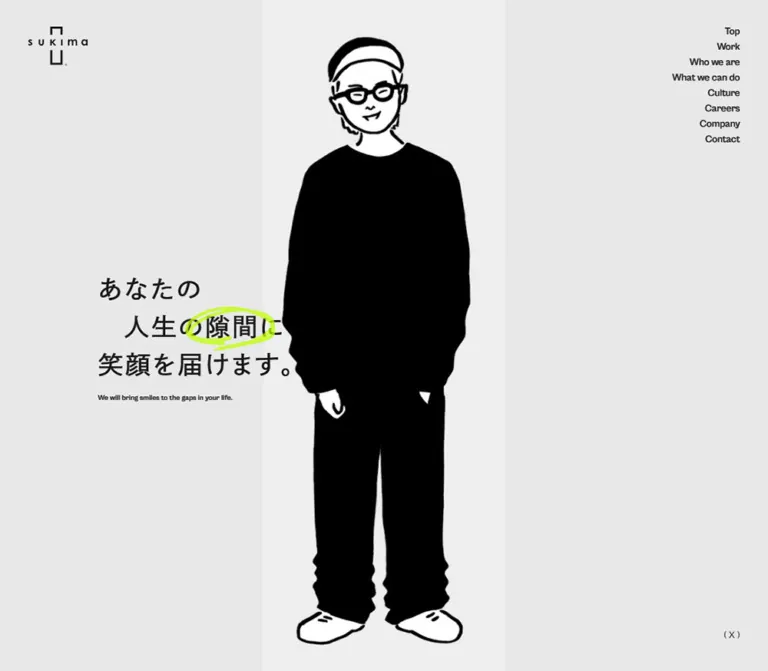
淡いグレーと白の余白に、モノクロの人物イラストと蛍光グリーンの書き込みを組み合わせたコーポレートサイト。控えめなナビゲーションと日英の文字組みで、制作実績・企業文化・採用情報を紹介しています。
オリジナルサイトを見るsukima — Style Reference
Generous gray space, a hand-drawn figure, and a quick stroke of fluorescent lime.
Website / original URL: sukima.tokyo.jp Final URL: https://sukima.tokyo.jp/ Theme: pale gray opening, light and dark content treatments, and a white contact/footer area. No selectable theme was established. Inspected: September 12, 2026; supplied inspection retrieved at 13:14:41 UTC / 22:14:41 JST. Viewports: desktop 1440 × 1000 CSS pixels; mobile 390 × 844 CSS pixels. Scope: the current corporate homepage, including its portfolio preview, company introduction, capabilities, culture, members, careers, company information, and contact/footer. Visual evidence covers the opening, a full-screen architectural illustration, and the closing contact/footer. Intermediate sections are documented primarily through the supplied rendered DOM and computed styles. Destination pages and opened control states were not inspected.
sukima presents a video-production company through quiet editorial structure and small, playful interruptions. A black-and-white illustrated figure occupies a pale vertical opening in the hero. Three lines of Japanese copy sit to its left and cross the artwork on mobile. A rough lime circle emphasizes the word “隙間,” turning the company's idea of a gap into a visual device. The compact logo and right-aligned navigation leave most of the viewport open.
The longer page combines large English section headings with smaller Japanese introductions, offset text columns, work and member grids, and substantial pauses between sections. Parentheses repeatedly frame captions and actions. The closing contact section returns to white, with a small illustrated face, an informal underline, and an unusually spacious text-only contact link. Preserve this relationship between restraint, asymmetry, and hand-drawn marks when adapting the design.
How to Read This Reference
- Measured means supplied computed CSS or rendered element bounds. Measurements are CSS pixels unless stated otherwise.
- Calculated means arithmetic using those measurements, such as column gaps or line-height ratios.
- Estimated means a visual approximation from the current desktop/mobile captures. These estimates are not pixel samples or recovered source declarations.
- Source tokens retain their supplied custom-property names. Other token names and all Quick Start class names are implementation aliases.
- Recommended means guidance for a new implementation. Breakpoints, accessible enhancements, and the demonstration compositing treatment are recommendations.
- Screenshots establish visible appearance; computed styles establish declarations. Several white text declarations render dark over pale backgrounds, and some offscreen bounds are displaced. Those differences require caution when reconstructing layers or spacing.
Tokens — Colors
Default Palette
| Name | Value | Source token / reuse alias | Role and evidence |
|---|---|---|---|
| Hero Gray | #e8e8e8 |
--color-gray-secondary / --surface-hero |
Measured hero-section background at both viewports |
| Page Gray | #efefef |
--color-gray-primary / --surface-page |
Measured body background; the lighter central hero strip is visually consistent with this family, but its own style was not supplied |
| Charcoal | #262626 |
--color-black / --ink |
Measured body and footer text; visually consistent with the dark field above the contact area |
| White | #ffffff |
--color-white / --surface-contact |
Measured contact/footer backgrounds and white text declarations in darker content sections |
| Fluorescent Lime | #bfff00 |
--color-highlight / --accent |
Source-defined highlight color; visible in the hero circle, closing underline, and small freehand marks |
| Secondary Gray | #b2b1b1 |
--color-gray-tertiary |
Declared token; a specific visible component role was not established |
| Alert Red | #e1433f |
--color-alert |
Declared token only; no alert or validation state was inspected |
| Artwork Black | Approximately #000000 |
Recommended --art-ink |
Visual estimate for the character's dense black clothing and linework; distinct from the measured charcoal UI color |
Lime is an annotation color. In the supplied captures, it occupies thin, irregular strokes rather than large panels or filled buttons. Most of the visual area remains neutral.
Declared Color Versus Visible Color
The hero heading, English subtitle, desktop navigation, and mobile menu button report white text in the DOM. In the screenshots, those elements appear dark over pale areas; the mobile heading becomes light where it crosses the black figure. This supports a composited or context-sensitive color treatment, but the supplied evidence does not identify its exact blend mode or implementation.
Do not copy white declarations onto the gray background without recreating legibility. The Quick Start uses a local difference blend as an explicitly recommended approximation for the hero copy. Lime annotations remain outside that blended group so their color stays predictable.
The architectural capture contains muted blue-gray and gray areas. No exact tokens for those illustrated colors were supplied; do not promote estimated media colors into the primary UI palette.
Tokens — Typography
Japanese Text
- Measured family stack:
dnp-shuei-gothic-gin-std, 'DNP ShueiGoGinStd M', sans-serif. - Typical measured weight:
500. - Role: Japanese statements, descriptive paragraphs, work titles, member information, company details, and several action wrappers.
- Character: open, moderately spaced Japanese gothic text. Large statements rely on regular-looking strokes and line spacing instead of heavy display weights.
- Limitation: the computed family stack is known; the supplied evidence does not independently identify the font file or prove which fallback rendered every glyph.
English Text
- Measured family:
CabinetGrotesk, sans-serif. - Source variable:
--font-family-en. - Typical measured weight:
500. - Role: section titles, desktop navigation, the English hero subtitle, footer navigation, and legal text.
- Character: straightforward sans-serif labels and headings. English section titles are substantially larger than their Japanese introductory captions.
The logo is artwork, not a heading set in either text family. Preserve its spaced lowercase wordmark and vertically arranged open geometric forms using an authorized asset.
Type Scale
| Role | Desktop size / line height | Mobile size / line height | Tracking | Evidence |
|---|---|---|---|---|
| Base body | 16 / 24px |
16 / 24px |
Normal | Measured body style |
| Hero heading | 36 / 54px |
26 / 39px |
0.08em |
Measured; three lines |
| Hero English subtitle | 10 / 10px |
9 / 9px |
0.02em |
Measured |
| Main English section heading | 56 / 56px |
36 / 36px |
Normal | Measured |
| Featured Members heading | 40 / 40px |
28 / 28px |
Normal | Measured |
| Company-introduction statement | 34 / 61.2px |
24 / 43.2px |
0.08em |
Measured |
| Contact statement | 34 / 61.2px |
24 / 43.2px |
0.08em |
Measured |
| Culture / careers subheading | 26 / 46.8px |
18 / 32.4px |
0.08em |
Measured |
| Company-information subheading | 20 / 20px |
14 / 14px |
0.08em |
Measured |
| Editorial body paragraph | 14 / 25.2px |
12 / 21.6px |
0.08em |
Measured |
| Japanese section introduction | 14 / 21px |
12 / 18px |
1.12px at both widths |
Measured; mobile tracking is not exactly 0.08em |
| Work title | 14 / 21px |
12 / 18px |
1.6px at both widths |
Measured |
| Member role | 12 / 12px |
10 / 10px |
0.08em |
Measured |
| Member name | 14 / 21px |
12 / 18px |
0.08em |
Measured |
| Desktop navigation | 14 / 14px |
Hidden in closed mobile state | Normal | Measured; 4px vertical padding |
| Mobile menu wrapper | Not visible | 16 / 24px |
Normal | Measured; Japanese family stack |
| Footer navigation | 16 / 16px |
14 / 14px |
Normal | Measured; 4px vertical padding |
| Footer legal text | 14 / 14px |
12 / 12px |
Normal | Measured |
| Contact-action wrapper | 34 / 51px |
34 / 51px |
2.72px |
Measured parent style; not the smaller inner label size |
The large contact parentheses and small central label form a composite control. The label appears approximately 14–16px on desktop and 12–14px on mobile; its child-level computed size was not supplied. Do not render the entire phrase at the wrapper's 34px size.
The small English subtitle and member-role labels are part of the observed scale. For new essential text, a larger minimum is recommended rather than automatically reproducing 9–10px text.
Tokens — Spacing & Shapes
Density: large open surfaces around compact labels and controls. Geometry: square component bounds, unboxed text, and irregular illustrative curves. Spacing system: recurring pixel values are measurable, but a single underlying source spacing formula was not supplied.
Spacing Scale
| Value | Observed use | Status |
|---|---|---|
4px |
Navigation vertical padding; mobile member role-to-name separation | Measured / calculated |
8px |
Vacancy-button internal gap; desktop member role-to-name separation | Measured / calculated |
14px |
Mobile member-grid horizontal gap | Calculated from item bounds |
16px |
Work-grid horizontal gap; work/member internal flex gap; hero heading-to-subtitle gap | Measured / calculated |
20px |
Mobile page gutter and header inset | Measured |
32px |
Mobile work/member row gaps; footer navigation column gap | Calculated |
40px |
Desktop header side inset; footer top padding | Measured |
48px |
Mobile Work heading-to-card gap; mobile introduction heading-to-body gap; contact top inset | Calculated |
56px |
Desktop member-grid row gap | Calculated |
64px |
Desktop introduction heading-to-body gap; mobile capabilities flex gap | Measured / calculated |
80px |
Desktop page gutter; desktop member-grid column gap; desktop contact top inset | Measured / calculated |
96px |
Mobile hero-to-Work separation | Calculated |
160px |
Desktop hero-to-Work separation | Calculated |
Treat the longer spaces as composition-specific pauses. The source does not establish that every section uses the same vertical interval.
Layout Measurements
| Element | Desktop 1440 × 1000 | Mobile 390 × 844 | Evidence |
|---|---|---|---|
| Document height | About 11071.08px |
About 8877.33px |
Measured capture state |
| Hero | 1440 × 1000px |
390 × 844px |
Measured; one inspected viewport high |
| Standard content width | 1280px |
350px |
Calculated after gutters |
| Header origin | 40px, 34px |
20px, 20px |
Measured |
| Header logo link | 85 × 64px |
73 × 56.09px |
Measured clickable box, including padding |
| Hero heading origin | 210px, 406px |
20px, 351px |
Measured |
| Hero heading height | 162px |
117px |
Measured |
| Hero heading-to-subtitle gap | 16px |
16px |
Calculated |
| Visible central strip | About 127px, centered |
About 188px, centered |
Screenshot estimate; capture-specific |
| Work columns | Three at 416px |
Two at 167px |
Measured |
| Member columns | Three at about 373.33px |
Two at 168px |
Measured |
| Introduction paragraph | 640px wide at x=720px |
350px wide at x=20px |
Measured |
| Culture paragraphs | 520px wide at x=840px |
290px wide at x=80px |
Measured |
| Contact section height | About 484.61px |
About 440.61px |
Measured |
| Contact-action box | 306 × 51px |
178 × 51px |
Measured |
| Footer height | 268px |
312px |
Measured |
Borders, Corners, and Depth
Sampled section, link, and button bounds report border-radius: 0. The supplied screenshots show no general shadow-based elevation system. Separation comes from background changes, generous spacing, artwork boundaries, and typographic placement.
The rough circle and underline are illustration, not evidence of rounded cards or pill-shaped buttons. Likewise, contact parentheses are independent graphic punctuation, not a continuous outlined capsule.
Measurement Caution
Some desktop Work children extend beyond their recorded section bounds. Several Japanese introductory-caption boxes are only about 20px wide despite containing longer text, and unopened detail headings have displaced coordinates. Transforms, clipping, or reveal states may affect these records. Use the reliable column widths, text styles, and visible captures; do not reproduce anomalous bounds as deliberate overlaps or fixed empty spacers.
Components
Persistent Header and Identity
Role: quiet orientation without a full-width navigation bar.
The desktop header places the logo link at x=40px, y=34px, with an eight-link stack against the right inset. The navigation occupies approximately 96.52 × 176px. Each link has a 14px line height plus 4px padding above and below, producing a 22px row.
The observed order is Top, Work, Who we are, What we can do, Culture, Careers, Company, and Contact. Work and Contact lead to separate paths; the company-story links point to homepage anchors.
At mobile width, the desktop stack is absent from the closed state. A parenthesized Menu button occupies approximately 62.25 × 32px at the top right. The DOM contains Close text, but the opened menu was not captured. Do not infer its panel layout or animation.
The right navigation and mobile Menu remain visible in later supplied captures. The header logo is not visibly present there; its exact visibility rule is unverified. A source transform transition exists on the logo link.
Hero: Figure, Gap, and Statement
Role: turn the company's name and promise into a simple spatial image.
The hero is exactly one inspected viewport high. Its background is #e8e8e8. A slightly lighter vertical strip runs down the center, containing a black-and-white figure with a cap, glasses, dark loose clothing, and white shoes.
In the desktop capture, the strip is very narrow—approximately x=656–783px—and clips much of the figure. In the mobile capture it occupies approximately x=101–289px, showing nearly the entire body. These are captured appearances, not proof of a static width rule or a particular animation phase.
The Japanese heading uses three deliberate lines:
あなたの
人生の隙間に
笑顔を届けます。
The second line is visually indented by about one character. A rough lime oval emphasizes “隙間.” The heading is positioned left of center on desktop and begins at the standard 20px gutter on mobile. On mobile, its right portion overlaps the figure, making the text's light/dark response important.
The English subtitle sits 16px below the heading block. Its text is “We will bring smiles to the gaps in your life.” A small parenthesized X link appears near the desktop hero's bottom-right corner. It is absent from the supplied mobile hero, while the footer retains the social link.
Bilingual Section Heading
Role: combine English wayfinding with a conversational Japanese introduction.
A small parenthesized Japanese caption sits above a much larger English heading. The caption is horizontally offset rather than uniformly aligned with the heading's left edge. Its position varies by section.
The principal English heading uses CabinetGrotesk at 56px / 1 on desktop and 36px / 1 on mobile. The Japanese line uses 14 / 21px and 12 / 18px. Keep the parenthetical caption visually subordinate and preserve the two-language hierarchy.
Featured Members is a related variant: a smaller English heading followed by Japanese explanatory text below it.
Work Preview Item and Grid
Role: provide direct access to six production examples.
Each recorded item is an anchor containing a media area, a parenthesized organization or rights line, and an h3 work title. The anchor uses a 16px internal gap and square bounds. The current examples include “架空OL日記,” “渡辺直美 (20) in 東京ドーム,” and “デスキスゲーム.”
Desktop bounds establish three 416px columns separated by 16px. Mobile uses two 167px columns with the same horizontal gap and approximately 32px between rows. Titles reduce from 14 / 21px to 12 / 18px; longer mobile titles wrap to two lines.
A centered parenthesized View All link leads to /works. Its source wrapper uses weight 700, unlike the prevailing 500 text.
The actual project thumbnails are not visible in the supplied current-page screenshots. Their crop, color treatment, media type, and aspect ratios are therefore unverified. Do not force them into a uniform poster ratio based on the total link height.
Company Introduction and Capabilities
Role: explain the company's work through a large statement followed by practical services.
The Who we are statement occupies the right half of the desktop content area: x=720px, width=640px. Its 34px Japanese type has a generous 61.2px line height. At mobile width it spans the full 350px content width and becomes 24 / 43.2px.
The copy describes planning, directing, and producing comedy-centered video across film, drama, variety, documentary, advertising, and live formats. The following capabilities section lists four areas, including video planning/production, live-event video, character development, and AI business.
The capabilities section reports a flex gap of 80px on desktop and 64px on mobile. Its full item-level visual styling was not supplied. Preserve the distinction between a large expressive statement and a more functional service list without inventing icons or service cards.
Architectural Illustration Scene
Role: a large visual interruption within the supplied desktop experience.
One desktop capture is filled by a low-angle drawing of buildings. Uneven black outlines describe windows, walls, and foreground railings; the sky is muted blue-gray and the overall scene appears subdued. The right-side navigation remains visible over it.
The capture does not establish this scene's exact document location, whether it is a still image or media frame, or how it relates to scrolling. Record it as a full-bleed illustrated scene. Do not assign it a parallax speed, video duration, or section transition without additional evidence.
Culture Text Blocks
Role: communicate philosophy in a more intimate reading column.
The two observed blocks pair Japanese subheadings with compact paragraphs. Desktop body content begins at x=840px and occupies 520px, leaving substantial space to the left. Mobile retains asymmetry: the text begins at x=80px, leaving a 60px inset inside the standard gutter, and occupies 290px.
Subheadings use 26 / 46.8px on desktop and 18 / 32.4px on mobile. Paragraphs use 14 / 25.2px and 12 / 21.6px. Both use approximately 0.08em tracking.
The supplied styles report white text in this section. Its complete backdrop composition was not visually captured, so use the white-text evidence without inventing a detailed background treatment.
Featured Member Button
Role: introduce team members through compact selectable entries.
Five entries are recorded as buttons. Each groups an upper media area, a parenthesized role, and a name heading. The media-to-information gap is 16px; role-to-name separation is approximately 8px on desktop and 4px on mobile.
Desktop entries are approximately 373.33px wide, arranged in three columns with 80px horizontal gaps and 56px row gaps. Mobile entries are 168px wide, arranged in two columns with 14px horizontal gaps and 32px row gaps.
Button semantics suggest an available action, but its result was not exercised. Do not describe a member modal, biography animation, or portrait treatment as observed. The current screenshots do not show the member media.
Careers and Vacancy Controls
Role: describe working culture and expose recruitment actions.
The DOM separates the section into parenthesized 01 and 02 groups. The first contains a subheading and paragraph. The second lists four role buttons, each combining the role name with “募集要項” and an 8px internal gap.
The compact vacancy rows use 14 / 25.2px desktop text and 12 / 21.6px mobile text. A larger parenthesized “応募はこちら” anchor leads to /contact. A separate related-company recruitment anchor contains explanatory copy and View More.
White text is declared for the sampled careers content. Offscreen job-detail headings exist in the DOM, but opened content, dismissal controls, focus behavior, and panel geometry were not verified. Treat those as implementation tasks, not documented interaction behavior.
Company Information
Role: make the business identity and office information explicit.
The current original-page Company section identifies the operator as 株式会社sukima. Desktop content splits company details and office information into two neighboring groups within the right side of the page. Their headings begin near x=720px and x=1005px.
On mobile, those groups stack at x=80px, with a 290px content width. Company subheadings reduce from 20px to 14px; address text reduces from 14 / 25.2px to 12 / 21.6px.
The telephone is a tel: anchor, and the map label is an external link framed by parentheses. The provided closing screenshots show the lower company region as a charcoal field above the white contact section.
Contact Invitation
Role: close the page with a friendly, low-pressure invitation.
A white full-width section contains a three-line Japanese statement at the left. A small illustrated face precedes the second line, and two loose lime strokes underline the final invitation. The face and marks are visual accents within the sentence composition, not separate feature illustrations.
Desktop measurements place the heading 80px below the section top, with a 390px width and 34 / 61.2px text. Mobile uses a 48px top inset, 280px heading width, and 24 / 43.2px text.
The contact anchor sits far to the right on desktop and remains right aligned on mobile. Its box changes from 306 × 51px to 178 × 51px. Large parentheses sit at its edges with a much smaller centered “お問い合わせ” label. A few lime dashes appear to its left; their exact shape and meaning are not established.
Keep the large empty interval below this action. The observed contact section is approximately 484.61px high on desktop and 440.61px on mobile.
Footer
Role: repeat navigation and legal information with generous white space.
The desktop footer places the logo near x=80px, navigation columns near x=249px and x=399.30px, and the X link immediately beside them. The two navigation columns contain four links each. Privacy Policy and the copyright line sit beneath the navigation, rather than across the full viewport width.
On mobile, the logo occupies its own first row. Navigation begins below it at x=20px and x=148.52px, with X at x=245.03px. The legal row follows after approximately 40px. The copyright reads “©sukima Co,.Ltd.”
Desktop footer padding is 40px top and 60px bottom; mobile uses 40px at both ends. The footer logo appears approximately 85 × 56px in both closing captures; this is an image estimate, not a supplied element measurement.
Tokens — Motion & Interaction
Source-Defined Transitions
| Target | Supplied transition | What is established |
|---|---|---|
| Main easing | cubic-bezier(.25, 1, .5, 1) |
Source token used by several transitions |
| Exit easing | cubic-bezier(.5, 0, .75, 0) |
Source token exists; a specific exit action was not inspected |
| Desktop navigation | Opacity 0.3s, main easing |
Transition declaration; triggering event and endpoint opacity unverified |
| Header logo link | Transform 0.8s, main easing |
Declaration only; exact displacement and visibility rule unverified |
| Hero English subtitle | Opacity 0.2s, transform 0.8s, both delayed 0.6s |
Declaration verified; movement distance unverified |
| Work item | Opacity 0.3s, transform 0.9s |
Declaration verified; likely reveal-related behavior is not independently confirmed |
| Work item delays | Desktop 0 / 0.1 / 0.2s; mobile 0 / 0.1s across columns |
Measured delay pattern changes with column count |
| Company headings and address | Opacity 0.3s, transform 0.6s |
Declaration verified |
| Google Map link | Same 0.3s / 0.6s transitions with 0.15s delay |
Declaration verified |
| Mobile vacancy heading | Opacity 0.4s, transform 0.6s |
Measured for the supplied mobile state |
The observed easing supports a quick departure followed by a gentle settling movement. For an adaptation, keep ordinary feedback brief and reserve longer transforms for entrances or larger artwork changes.
Evidence and Limitations
The supplied browser procedure waited for finite motion, text/layout stability, and image decoding within bounded time limits. It temporarily paused perpetual animations during readiness checks, then resumed them. This does not prove that every media frame, delayed reveal, or script-driven state was captured in a final condition.
The screenshots establish different visible compositions, but they do not establish a timeline connecting the narrow hero opening, mobile figure, and architectural scene. No reliable duration, autoplay behavior, scroll-scrub relationship, or illustration-loop count can be assigned.
Recorded links establish destinations. Click results, hover appearance, opened mobile navigation, member actions, job-detail controls, and keyboard behavior were not exercised. Sampled animation: none values do not prove the whole page is static.
Surfaces
| Surface | Appearance | Role / confidence |
|---|---|---|
| Hero canvas | Flat #e8e8e8 |
Measured opening background |
| General document | #efefef body background |
Measured base; individual wrappers may overlay it |
| Central illustration strip | Slightly lighter gray than hero | Visible; exact strip background and mask implementation unverified |
| Dark content field | Charcoal with pale text | Visible above contact; white text declarations also occur in Culture and Careers |
| Contact and footer | Flat #ffffff |
Measured backgrounds; continuous white closing area |
| Architectural scene | Edge-to-edge hand-drawn media with muted colors | Visually observed; exact underlying media format unverified |
| Action surfaces | Mostly transparent, framed by text or parentheses | Visible contact/menu treatment and sampled transparent link/button backgrounds |
There is no visible need for a general card-elevation system. Avoid introducing shadows and panel outlines simply to fill the open areas.
Imagery
The opening character uses irregular black outlines and large black clothing shapes, with white facial and shoe areas. Its humanity comes from the uneven drawing and relaxed stance. Retain those edges; do not replace the figure with a polished three-dimensional mascot or stock portrait.
The architectural scene uses a related loose drawing language at environmental scale. Perspective and oversized building edges supply depth without conventional UI elevation. The closing face illustration brings the human motif back at a much smaller scale.
Lime marks should look quickly drawn: overlapping oval strokes, a slightly slanted underline, and a short trail of dashes. Their irregularity matters more than exact geometric symmetry. Do not apply pixelated image rendering; the supplied artwork is hand-drawn, not demonstrated pixel art.
Observed Asset References
No original image, SVG, video, or font-file URLs were included in the supplied evidence. The references below identify observed material without inventing paths.
| Material | Evidence | Reuse guidance |
|---|---|---|
| sukima logo | Current desktop/mobile hero and closing captures | Use an authorized original asset; preserve the compact vertical mark |
| Full-body character | Current desktop and mobile hero captures | Preserve aspect ratio; clip with a wrapper rather than stretching the figure |
| Building illustration | Separate current desktop capture | Use authorized artwork; do not assume it is a static image or video |
| Small contact face | Current desktop/mobile contact captures | Keep small and aligned with the text line; do not identify the person without evidence |
| Lime oval and underline | Current hero/contact captures and highlight token | Prefer custom irregular SVG paths or supplied artwork |
| Work media | Media-bearing entries inferred from DOM anatomy | Actual imagery, ratios, and crops are unverified |
| Member media | Upper media space in button anatomy | Actual photographs or illustrations are unverified |
Layout & Responsive Behavior
The homepage remains a long editorial document at both sizes. Mobile changes composition rather than merely shrinking the desktop canvas.
| Relationship | Desktop observation | Mobile observation |
|---|---|---|
| Main gutter | 80px |
20px |
| Header side inset | 40px |
20px |
| Navigation | Eight-link vertical stack | Parenthesized Menu button |
| Hero copy | Starts at x=210px |
Starts at x=20px and overlaps the figure |
| Hero artwork opening | Narrow central crop in supplied frame | Wider central opening in supplied frame |
| Work grid | Three columns | Two columns |
| Member grid | Three columns | Two columns |
| Who we are paragraph | Right-half column | Full content width |
| Culture body | Narrow right-side column | Retains 60px inset within content gutter |
| Company details | Two neighboring information groups | Stacked groups, still indented |
| Contact action | Right aligned, 306px wide |
Right aligned, 178px wide |
| Footer logo | Beside navigation | Above navigation |
The hero heading and subtitle together occupy 188px vertically on desktop and 142px on mobile. Their supplied positions center that group within the hero: (1000 − 188) / 2 = 406px and (844 − 142) / 2 = 351px. This is a reliable calculated relationship for reuse.
Grid arithmetic is equally clear:
- Desktop Work:
(1440 − 2 × 80 − 2 × 16) / 3 = 416px. - Mobile Work:
(390 − 2 × 20 − 16) / 2 = 167px. - Desktop members:
(1280 − 2 × 80) / 3 ≈ 373.33px. - Mobile members:
(350 − 14) / 2 = 168px.
Only two viewport widths were inspected. The actual source breakpoint and intermediate interpolation rules are unknown. The Quick Start uses 900px as a recommended breakpoint, not a recovered source value.
The source exposes --app-height: 100vh, and both measured heroes match the inspected viewport height. Mobile browser-chrome changes, landscape layouts, safe-area handling, and live resize behavior remain unverified.
Do’s and Don’ts
Do
- Keep
#e8e8e8,#efefef, white, and charcoal as the dominant surfaces. - Reserve
#bfff00for small expressive marks and emphasis. - Preserve the three-line hero statement and its relationship to the central figure.
- Pair the supplied Japanese family stack with CabinetGrotesk for English text when those fonts are available and authorized.
- Use medium-weight type, generous Japanese leading, and compact utility labels.
- Retain three-to-two-column changes for Work and Featured Members.
- Preserve mobile asymmetry in Culture and Company instead of aligning every paragraph to the page edge.
- Build actions from readable labels and separate parentheses, leaving open space around them.
- Keep the footer sparse and reproduce its mobile logo-above-navigation arrangement.
- Separate confirmed geometry from capture-dependent transformed bounds.
Don’t
- Don’t turn this corporate homepage into a generic conversion page with repeated filled CTA buttons.
- Don’t use lime as the background for every action or content block.
- Don’t replace the illustration's uneven lines with smooth geometric mascot art.
- Don’t make every item a rounded, shadowed card.
- Don’t render hero text white on pale gray without a tested contrast treatment.
- Don’t apply blending to the lime marks if it changes their intended color.
- Don’t interpret the contact wrapper's 34px font size as the inner label size.
- Don’t force uninspected work media into a guessed fixed aspect ratio.
- Don’t infer parallax, hover endpoints, modal design, or animation timing from still captures.
- Don’t reproduce clipped caption bounds or offscreen detail coordinates as normal layout dimensions.
Recommended Implementation Additions
These are recommendations for a new implementation, not verified original-site features:
- Give the logo link an accessible name. Make decorative faces, parentheses, and marker strokes nonessential to the accessible text.
- Give Menu a real button with
aria-expandedandaria-controls; support Escape and focus return if an overlay is implemented. - Preserve visible focus indicators on links and buttons. Increase compact control hit areas toward
44pxwithout enlarging all visible labels. - If member or vacancy buttons open dialogs, implement dialog naming, focus containment, dismissal, and background inertness explicitly.
- Keep content visible when scripts fail or reduced motion is requested. Avoid making readability depend on completing an entrance animation.
- Test hero text contrast over every artwork frame. A dedicated text layer or explicit contrasting treatment may be more predictable than blending.
- Raise essential mobile captions above the observed 9–10px sizes where possible. Check Japanese wrapping and browser zoom before preserving narrow insets.
- Reserve intrinsic media dimensions to reduce layout movement, and provide a static fallback if moving illustration assets are used.
Agent Prompt Guide
Quick Color Reference
- Hero:
#e8e8e8. - General pale surface:
#efefef. - Main UI ink and dark fields:
#262626. - Contact/footer and reversed text:
#ffffff. - Hand-drawn emphasis:
#bfff00. - Artwork: high-contrast black and white; do not recolor the entire figure lime.
- Action treatment: transparent text framed by parentheses.
Overall Prompt
“Create a Japanese video-production company homepage inspired by sukima's current visual language. Use pale gray surfaces, charcoal text, extensive whitespace, and sparse fluorescent-lime hand-drawn marks. Open with a viewport-height composition containing an authorized black-and-white character illustration in a centered vertical opening. Place a three-line Japanese statement left of center, with a tiny English subtitle and a rough lime oval around one key phrase. Use a compact logo at top left and an eight-link vertical navigation at top right, replaced by a parenthesized Menu control on mobile. Continue with bilingual section headings, a three-column work preview that becomes two columns on mobile, offset company-story text, member entries, recruitment information, and a spacious white contact/footer. Preserve medium-weight typography and avoid rounded cards, shadows, and large filled buttons. Treat illustration motion and opened controls as separately specified behavior.”
Example Component Prompts
- Hero: “A light-gray viewport with a slightly lighter central slit containing a relaxed black-and-white illustrated figure. Place three lines of Japanese copy at the left, indent the middle line, and circle a key word with two imperfect lime strokes. On mobile, let the copy overlap the figure while remaining readable.”
- Section heading: “A large CabinetGrotesk English heading at 56px desktop and 36px mobile, paired with a much smaller parenthesized Japanese introduction offset above it. Use charcoal on a pale surface, no divider or enclosing card.”
- Work grid: “Six unboxed production links in three desktop columns and two mobile columns, with 16px horizontal gaps. Group authorized media, a parenthesized organization line, and a small tracked Japanese title. Preserve each image's appropriate aspect ratio.”
- Culture column: “A wide composition with compact Japanese philosophy text concentrated on the right. At 390px width, retain a 60px inset inside the 20px page gutter. Use 18px subheadings and 12px body copy with 1.8 line height; verify readability.”
- Contact invitation: “A white section with a three-line Japanese invitation, a small hand-drawn face at the beginning of the second line, and a loose lime underline beneath the final phrase. Place a small contact label between oversized parentheses on the right, with generous empty space below.”
- Footer: “A white footer with a compact illustrated wordmark, two short columns of plain English navigation, and a small parenthesized X link. Keep privacy and copyright below the navigation. On mobile, move the logo above the link groups and retain 20px side gutters.”
Quick Start
CSS Custom Properties
This is a recommended static scaffold using measured typography, colors, and endpoint layouts. The 900px breakpoint, fluid slit-width formulas, and local hero blend are adaptations. The character and logo require authorized assets; no original asset URLs were supplied. This code does not implement unverified menus, dialogs, or scroll-linked media.
:root {
  /* Source-derived palette */
  --surface-page: #efefef;
  --surface-hero: #e8e8e8;
  --surface-contact: #ffffff;
  --ink: #262626;
  --accent: #bfff00;

  /* Supplied family names; load authorized fonts separately */
  --font-ja: dnp-shuei-gothic-gin-std, 'DNP ShueiGoGinStd M', sans-serif;
  --font-en: 'CabinetGrotesk', sans-serif;
  --weight-main: 500;

  /* Mobile endpoint measurements */
  --page-gutter: 20px;
  --header-side: 20px;
  --header-top: 20px;
  --logo-width: 73px;
  --text-hero: 26px;
  --text-caption: 9px;
  --text-section: 36px;
  --text-members: 28px;
  --text-lead: 24px;
  --text-subheading: 18px;
  --text-body: 12px;
  --text-kicker: 12px;
  --text-work: 12px;
  --text-role: 10px;
  --text-footer: 14px;
  --text-legal: 12px;
  --section-gap: 96px;

  /* Estimated static hero geometry, not source formulas */
  --hero-copy-left: 20px;
  --hero-slit: 48.2vw;
  --hero-copy-height: calc(4.5 * var(--text-hero) + 16px + var(--text-caption));

  /* Source-defined easing and durations */
  --ease-main: cubic-bezier(.25, 1, .5, 1);
  --ease-exit: cubic-bezier(.5, 0, .75, 0);
  --duration-feedback: 300ms;
  --duration-reveal: 900ms;
}

* { box-sizing: border-box; }

body {
  margin: 0;
  background: var(--surface-page);
  color: var(--ink);
  font-family: var(--font-ja);
  font-size: 16px;
  font-weight: var(--weight-main);
  line-height: 1.5;
}

a { color: inherit; }
button { font: inherit; color: inherit; }
img { display: block; max-inline-size: 100%; }

.site-header {
  position: fixed;
  z-index: 20;
  inset-block-start: var(--header-top);
  inset-inline: var(--header-side);
  display: flex;
  align-items: flex-start;
  justify-content: space-between;
  pointer-events: none;
}

.site-header > * { pointer-events: auto; }
.site-logo { display: block; inline-size: var(--logo-width); padding-block: 4px; }
.site-nav { display: none; }

.menu-toggle {
  border: 0;
  padding: 4px 0;
  background: transparent;
  font-size: 16px;
  line-height: 24px;
  cursor: pointer;
}

/* Recommended explicit contrast state; update it in application logic. */
.site-header[data-on-dark='true'] { color: #fff; }

.hero {
  position: relative;
  isolation: isolate;
  min-block-size: 100vh;
  min-block-size: 100svh;
  overflow: hidden;
  background: var(--surface-hero);
}

.hero-art-mask {
  position: absolute;
  inset-block: 0;
  inset-inline-start: 50%;
  inline-size: var(--hero-slit);
  transform: translateX(-50%);
  overflow: hidden;
  background: var(--surface-page);
}

.hero-art-mask img {
  position: absolute;
  inset-block-start: 5.4%;
  inset-inline-start: 50%;
  block-size: 90.6%;
  inline-size: auto;
  max-inline-size: none;
  transform: translateX(-50%);
}

.hero-copy {
  position: absolute;
  inset-block-start: 50%;
  inset-inline-start: var(--hero-copy-left);
  inset-inline-end: var(--page-gutter);
  transform: translateY(-50%);
  color: #fff;
  mix-blend-mode: difference;
}

.hero-title {
  margin: 0;
  font-size: var(--text-hero);
  font-weight: 500;
  line-height: 1.5;
  letter-spacing: .08em;
}

.hero-title > span { display: block; }
.hero-title .indent { margin-inline-start: 1em; }

.hero-caption {
  margin: 16px 0 0;
  font-family: var(--font-en);
  font-size: var(--text-caption);
  line-height: 1;
  letter-spacing: .02em;
}

/* Keep the lime SVG outside the blended copy group. */
.hero-annotation {
  position: absolute;
  inset-inline-start: calc(var(--hero-copy-left) + 3.5 * var(--text-hero));
  inset-block-start: calc(50% - var(--hero-copy-height) / 2 + 1.5 * var(--text-hero));
  inline-size: 3.5em;
  block-size: 1.6em;
  font-size: var(--text-hero);
  fill: none;
  stroke: var(--accent);
  stroke-width: 5;
  stroke-linecap: round;
  pointer-events: none;
}

.page-section {
  margin-block: var(--section-gap);
  padding-inline: var(--page-gutter);
}

.section-kicker {
  margin: 0 0 0 var(--kicker-offset, 3em);
  font-size: var(--text-kicker);
  line-height: 1.5;
  letter-spacing: 1.12px;
}

.section-title {
  margin: 0;
  font-family: var(--font-en);
  font-size: var(--text-section);
  font-weight: 500;
  line-height: 1;
}

.section-title--members { font-size: var(--text-members); }

.lead-copy {
  margin: 48px 0 0;
  font-size: var(--text-lead);
  line-height: 1.8;
  letter-spacing: .08em;
}

.editorial-copy {
  margin-inline-start: 60px;
  font-size: var(--text-body);
  line-height: 1.8;
  letter-spacing: .08em;
}

.editorial-copy h3 {
  font-size: var(--text-subheading);
  font-weight: 500;
  line-height: 1.8;
}

.dark-surface { background: var(--ink); color: #fff; }

.work-grid,
.member-grid {
  display: grid;
  grid-template-columns: repeat(2, minmax(0, 1fr));
  gap: 32px 16px;
  margin-block-start: 48px;
}

.member-grid { column-gap: 14px; }

.work-item,
.member-item {
  display: flex;
  flex-direction: column;
  gap: 16px;
  min-inline-size: 0;
  padding: 0;
  border: 0;
  border-radius: 0;
  background: transparent;
  text-align: start;
  text-decoration: none;
}

/* Retain intrinsic media proportions until each asset is specified. */
.work-item img,
.member-item img { inline-size: 100%; block-size: auto; }

.work-item h3 {
  margin: 0;
  font-size: var(--text-work);
  font-weight: 500;
  line-height: 1.5;
  letter-spacing: 1.6px;
}

.member-role {
  margin: 0;
  font-size: var(--text-role);
  line-height: 1;
  letter-spacing: .08em;
}

.member-name {
  margin: 4px 0 0;
  font-size: var(--text-work);
  font-weight: 500;
  line-height: 1.5;
  letter-spacing: .08em;
}

.contact {
  padding: 48px var(--page-gutter) 154px;
  background: var(--surface-contact);
}

.contact-heading {
  max-inline-size: 280px;
  margin: 0;
  font-size: var(--text-lead);
  font-weight: 500;
  line-height: 1.8;
  letter-spacing: .08em;
}

.contact-action {
  display: flex;
  align-items: center;
  justify-content: space-between;
  inline-size: 178px;
  min-block-size: 51px;
  margin: 58px 0 0 auto;
  font-size: 34px;
  line-height: 1.5;
  text-decoration: none;
}

/* Inner label size is a visual approximation. */
.contact-action-label { font-size: 12px; letter-spacing: .08em; }

.site-footer {
  padding: 40px var(--page-gutter);
  background: var(--surface-contact);
}

.footer-main { display: flex; flex-direction: column; gap: 28px; }
.footer-logo { inline-size: 85px; }
.footer-group { display: flex; align-items: flex-start; }

.footer-links {
  display: grid;
  grid-template-columns: repeat(2, 96.52px);
  column-gap: 32px;
}

.footer-links a,
.footer-social,
.footer-legal > * {
  display: block;
  padding-block: 4px;
  font-family: var(--font-en);
  line-height: 1;
}

.footer-links a { font-size: var(--text-footer); text-decoration: none; }
.footer-social { font-size: 12px; text-decoration: none; }

.footer-legal {
  display: grid;
  grid-template-columns: 128.5px auto;
  margin-block-start: 40px;
  font-size: var(--text-legal);
}

.footer-legal p { margin: 0; }

/* Recommended breakpoint; only the two endpoint layouts were inspected. */
@media (min-width: 900px) {
  :root {
    --page-gutter: 80px;
    --header-side: 40px;
    --header-top: 34px;
    --logo-width: 85px;
    --text-hero: 36px;
    --text-caption: 10px;
    --text-section: 56px;
    --text-members: 40px;
    --text-lead: 34px;
    --text-subheading: 26px;
    --text-body: 14px;
    --text-kicker: 14px;
    --text-work: 14px;
    --text-role: 12px;
    --text-footer: 16px;
    --text-legal: 14px;
    --section-gap: 160px;
    --hero-copy-left: 14.583333%;
    --hero-slit: 8.82vw;
  }

  .menu-toggle { display: none; }
  .site-nav { display: flex; flex-direction: column; text-align: end; }
  .site-nav a {
    padding-block: 4px;
    font-family: var(--font-en);
    font-size: 14px;
    line-height: 14px;
    text-decoration: none;
    transition: opacity var(--duration-feedback) var(--ease-main);
  }

  .lead-copy { inline-size: 50%; margin: 64px 0 0 auto; }
  .editorial-copy { inline-size: calc(50% - 120px); margin-inline-start: auto; }
  .work-grid, .member-grid { grid-template-columns: repeat(3, minmax(0, 1fr)); }
  .member-grid { gap: 56px 80px; }
  .member-name { margin-block-start: 8px; }

  .contact { padding-block: 80px 170px; }
  .contact-heading { max-inline-size: 390px; }
  .contact-action { inline-size: 306px; margin-block-start: 0; }
  .contact-action-label { font-size: 14px; }

  .site-footer { padding-block-end: 60px; }
  .footer-main { flex-direction: row; gap: 84px; }
  .footer-links { grid-template-columns: repeat(2, 110.3px); column-gap: 40px; }
  .footer-social { font-size: 14px; }
  .footer-legal {
    grid-template-columns: 150.3px auto;
    margin-block-start: 50px;
    margin-inline-start: 169px;
  }
}

/* Recommended accessibility and optional feedback. */
:where(a, button):focus-visible {
  outline: 2px solid currentColor;
  outline-offset: 5px;
}

@media (hover: hover) {
  .site-nav a:hover { opacity: .65; }
}

@media (prefers-reduced-motion: reduce) {
  .site-nav a { transition: none; }
}
The hover opacity endpoint above is recommended; only its transition duration and easing were supplied. Content remains visible by default. If entrance animations are added, opt into them only after JavaScript is ready and keep a reduced-motion path.
Minimal Hero Markup
The empty artwork container is intentional: insert an authorized character image with an appropriate text alternative. The sample SVG is newly specified approximation geometry, not an extracted original asset. Keep it outside .hero-copy to avoid blending the lime color.
<section class='hero' aria-labelledby='hero-title'>
  <div class='hero-art-mask'>
    <!-- Insert the authorized character image here. -->
  </div>

  <div class='hero-copy'>
    <h1 class='hero-title' id='hero-title' lang='ja'>
      <span>あなたの</span>
      <span class='indent'>人生の隙間に</span>
      <span>笑顔を届けます。</span>
    </h1>
    <p class='hero-caption' lang='en'>
      We will bring smiles to the gaps in your life.
    </p>
  </div>

  <svg class='hero-annotation' viewBox='0 0 140 62' aria-hidden='true'>
    <path d='M10 34C12 10 62 3 105 12C140 20 138 43 103 50C61 59 18 55 10 34Z'/>
    <path d='M16 39C23 15 67 6 113 18C135 25 130 44 100 53L48 59'/>
  </svg>
</section>
For a contact action, use a real link and separate decorative punctuation from its accessible label:
<a class='contact-action' href='/contact'>
  <span aria-hidden='true'>(</span>
  <span class='contact-action-label' lang='ja'>お問い合わせ</span>
  <span aria-hidden='true'>)</span>
</a>
The footer CSS expects a .footer-main containing the logo and a .footer-group; that group contains .footer-links and .footer-social. Place .footer-legal afterward. Put navigation links in row order: Top/Culture, Work/Careers, Who we are/Company, What we can do/Contact.
Tailwind v4 Token Mapping
Optional aliases for a project already using Tailwind v4. This does not imply that the original website uses Tailwind. Define the preceding custom properties first.
@theme inline {
  --color-page: var(--surface-page);
  --color-hero: var(--surface-hero);
  --color-contact: var(--surface-contact);
  --color-charcoal: var(--ink);
  --color-lime-mark: var(--accent);

  --font-japanese: var(--font-ja);
  --font-english: var(--font-en);

  --text-hero-copy: var(--text-hero);
  --text-section-heading: var(--text-section);
  --text-statement: var(--text-lead);
  --text-editorial: var(--text-body);

  --spacing-page-gutter: var(--page-gutter);
  --spacing-section-pause: var(--section-gap);
  --ease-sukima: var(--ease-main);
}
Sources & Evidence
- Inspected original and final page: https://sukima.tokyo.jp/. The supplied browser record reports HTTP
200and identical original/final URLs. - Capture date: September 12, 2026. The shared inspection retrieval timestamp is
2026-09-12T13:14:41.386Z; individual screenshot timestamps were not supplied. - Desktop evidence: 1440 × 1000 CSS-pixel viewport; current hero, architectural scene, and closing contact/footer captures, plus rendered page text, links, element bounds, and computed styles.
- Mobile evidence: 390 × 844 CSS-pixel viewport; current hero and closing contact/footer captures, plus the corresponding rendered DOM and computed styles.
- Original-page identity evidence: the Company anchor contains the company name; the rendered footer includes its copyright text. No website-production credits were independently established from the inspected original page.
- Inspection method: the supplied browser waited for document load, bounded finite-motion completion, sampled layout/text stability, and visible image decoding. It traversed intermediate scroll positions; these checks do not establish every delayed or interactive state.
- Limits: no further browsing or file access was performed for this reference. No opened menu, member detail, job-detail state, destination page, hover endpoint, asset URL, animation timeline, or intermediate responsive breakpoint was independently verified.
This document describes the supplied current homepage evidence. The Quick Start is a reusable adaptation, and all estimated geometry or recommended behavior is identified separately from measured source values.
# sukima — Style Reference

> Generous gray space, a hand-drawn figure, and a quick stroke of fluorescent lime.

**Website / original URL:** [sukima.tokyo.jp](https://sukima.tokyo.jp/)
**Final URL:** [https://sukima.tokyo.jp/](https://sukima.tokyo.jp/)
**Theme:** pale gray opening, light and dark content treatments, and a white contact/footer area. No selectable theme was established.
**Inspected:** September 12, 2026; supplied inspection retrieved at 13:14:41 UTC / 22:14:41 JST.
**Viewports:** desktop 1440 × 1000 CSS pixels; mobile 390 × 844 CSS pixels.
**Scope:** the current corporate homepage, including its portfolio preview, company introduction, capabilities, culture, members, careers, company information, and contact/footer. Visual evidence covers the opening, a full-screen architectural illustration, and the closing contact/footer. Intermediate sections are documented primarily through the supplied rendered DOM and computed styles. Destination pages and opened control states were not inspected.

sukima presents a video-production company through quiet editorial structure and small, playful interruptions. A black-and-white illustrated figure occupies a pale vertical opening in the hero. Three lines of Japanese copy sit to its left and cross the artwork on mobile. A rough lime circle emphasizes the word “隙間,” turning the company's idea of a gap into a visual device. The compact logo and right-aligned navigation leave most of the viewport open.

The longer page combines large English section headings with smaller Japanese introductions, offset text columns, work and member grids, and substantial pauses between sections. Parentheses repeatedly frame captions and actions. The closing contact section returns to white, with a small illustrated face, an informal underline, and an unusually spacious text-only contact link. Preserve this relationship between restraint, asymmetry, and hand-drawn marks when adapting the design.

## How to Read This Reference

- **Measured** means supplied computed CSS or rendered element bounds. Measurements are CSS pixels unless stated otherwise.
- **Calculated** means arithmetic using those measurements, such as column gaps or line-height ratios.
- **Estimated** means a visual approximation from the current desktop/mobile captures. These estimates are not pixel samples or recovered source declarations.
- **Source tokens** retain their supplied custom-property names. Other token names and all Quick Start class names are implementation aliases.
- **Recommended** means guidance for a new implementation. Breakpoints, accessible enhancements, and the demonstration compositing treatment are recommendations.
- Screenshots establish visible appearance; computed styles establish declarations. Several white text declarations render dark over pale backgrounds, and some offscreen bounds are displaced. Those differences require caution when reconstructing layers or spacing.

## Tokens — Colors

### Default Palette

| Name | Value | Source token / reuse alias | Role and evidence |
| --- | --- | --- | --- |
| Hero Gray | `#e8e8e8` | `--color-gray-secondary` / `--surface-hero` | Measured hero-section background at both viewports |
| Page Gray | `#efefef` | `--color-gray-primary` / `--surface-page` | Measured body background; the lighter central hero strip is visually consistent with this family, but its own style was not supplied |
| Charcoal | `#262626` | `--color-black` / `--ink` | Measured body and footer text; visually consistent with the dark field above the contact area |
| White | `#ffffff` | `--color-white` / `--surface-contact` | Measured contact/footer backgrounds and white text declarations in darker content sections |
| Fluorescent Lime | `#bfff00` | `--color-highlight` / `--accent` | Source-defined highlight color; visible in the hero circle, closing underline, and small freehand marks |
| Secondary Gray | `#b2b1b1` | `--color-gray-tertiary` | Declared token; a specific visible component role was not established |
| Alert Red | `#e1433f` | `--color-alert` | Declared token only; no alert or validation state was inspected |
| Artwork Black | Approximately `#000000` | Recommended `--art-ink` | Visual estimate for the character's dense black clothing and linework; distinct from the measured charcoal UI color |

Lime is an annotation color. In the supplied captures, it occupies thin, irregular strokes rather than large panels or filled buttons. Most of the visual area remains neutral.

### Declared Color Versus Visible Color

The hero heading, English subtitle, desktop navigation, and mobile menu button report white text in the DOM. In the screenshots, those elements appear dark over pale areas; the mobile heading becomes light where it crosses the black figure. This supports a composited or context-sensitive color treatment, but the supplied evidence does not identify its exact blend mode or implementation.

Do not copy white declarations onto the gray background without recreating legibility. The Quick Start uses a local `difference` blend as an explicitly recommended approximation for the hero copy. Lime annotations remain outside that blended group so their color stays predictable.

The architectural capture contains muted blue-gray and gray areas. No exact tokens for those illustrated colors were supplied; do not promote estimated media colors into the primary UI palette.

## Tokens — Typography

### Japanese Text

- **Measured family stack:** `dnp-shuei-gothic-gin-std, 'DNP ShueiGoGinStd M', sans-serif`.
- **Typical measured weight:** `500`.
- **Role:** Japanese statements, descriptive paragraphs, work titles, member information, company details, and several action wrappers.
- **Character:** open, moderately spaced Japanese gothic text. Large statements rely on regular-looking strokes and line spacing instead of heavy display weights.
- **Limitation:** the computed family stack is known; the supplied evidence does not independently identify the font file or prove which fallback rendered every glyph.

### English Text

- **Measured family:** `CabinetGrotesk, sans-serif`.
- **Source variable:** `--font-family-en`.
- **Typical measured weight:** `500`.
- **Role:** section titles, desktop navigation, the English hero subtitle, footer navigation, and legal text.
- **Character:** straightforward sans-serif labels and headings. English section titles are substantially larger than their Japanese introductory captions.

The logo is artwork, not a heading set in either text family. Preserve its spaced lowercase wordmark and vertically arranged open geometric forms using an authorized asset.

### Type Scale

| Role | Desktop size / line height | Mobile size / line height | Tracking | Evidence |
| --- | --- | --- | --- | --- |
| Base body | `16 / 24px` | `16 / 24px` | Normal | Measured body style |
| Hero heading | `36 / 54px` | `26 / 39px` | `0.08em` | Measured; three lines |
| Hero English subtitle | `10 / 10px` | `9 / 9px` | `0.02em` | Measured |
| Main English section heading | `56 / 56px` | `36 / 36px` | Normal | Measured |
| Featured Members heading | `40 / 40px` | `28 / 28px` | Normal | Measured |
| Company-introduction statement | `34 / 61.2px` | `24 / 43.2px` | `0.08em` | Measured |
| Contact statement | `34 / 61.2px` | `24 / 43.2px` | `0.08em` | Measured |
| Culture / careers subheading | `26 / 46.8px` | `18 / 32.4px` | `0.08em` | Measured |
| Company-information subheading | `20 / 20px` | `14 / 14px` | `0.08em` | Measured |
| Editorial body paragraph | `14 / 25.2px` | `12 / 21.6px` | `0.08em` | Measured |
| Japanese section introduction | `14 / 21px` | `12 / 18px` | `1.12px` at both widths | Measured; mobile tracking is not exactly `0.08em` |
| Work title | `14 / 21px` | `12 / 18px` | `1.6px` at both widths | Measured |
| Member role | `12 / 12px` | `10 / 10px` | `0.08em` | Measured |
| Member name | `14 / 21px` | `12 / 18px` | `0.08em` | Measured |
| Desktop navigation | `14 / 14px` | Hidden in closed mobile state | Normal | Measured; `4px` vertical padding |
| Mobile menu wrapper | Not visible | `16 / 24px` | Normal | Measured; Japanese family stack |
| Footer navigation | `16 / 16px` | `14 / 14px` | Normal | Measured; `4px` vertical padding |
| Footer legal text | `14 / 14px` | `12 / 12px` | Normal | Measured |
| Contact-action wrapper | `34 / 51px` | `34 / 51px` | `2.72px` | Measured parent style; not the smaller inner label size |

The large contact parentheses and small central label form a composite control. The label appears approximately 14–16px on desktop and 12–14px on mobile; its child-level computed size was not supplied. Do not render the entire phrase at the wrapper's 34px size.

The small English subtitle and member-role labels are part of the observed scale. For new essential text, a larger minimum is recommended rather than automatically reproducing 9–10px text.

## Tokens — Spacing & Shapes

**Density:** large open surfaces around compact labels and controls.
**Geometry:** square component bounds, unboxed text, and irregular illustrative curves.
**Spacing system:** recurring pixel values are measurable, but a single underlying source spacing formula was not supplied.

### Spacing Scale

| Value | Observed use | Status |
| --- | --- | --- |
| `4px` | Navigation vertical padding; mobile member role-to-name separation | Measured / calculated |
| `8px` | Vacancy-button internal gap; desktop member role-to-name separation | Measured / calculated |
| `14px` | Mobile member-grid horizontal gap | Calculated from item bounds |
| `16px` | Work-grid horizontal gap; work/member internal flex gap; hero heading-to-subtitle gap | Measured / calculated |
| `20px` | Mobile page gutter and header inset | Measured |
| `32px` | Mobile work/member row gaps; footer navigation column gap | Calculated |
| `40px` | Desktop header side inset; footer top padding | Measured |
| `48px` | Mobile Work heading-to-card gap; mobile introduction heading-to-body gap; contact top inset | Calculated |
| `56px` | Desktop member-grid row gap | Calculated |
| `64px` | Desktop introduction heading-to-body gap; mobile capabilities flex gap | Measured / calculated |
| `80px` | Desktop page gutter; desktop member-grid column gap; desktop contact top inset | Measured / calculated |
| `96px` | Mobile hero-to-Work separation | Calculated |
| `160px` | Desktop hero-to-Work separation | Calculated |

Treat the longer spaces as composition-specific pauses. The source does not establish that every section uses the same vertical interval.

### Layout Measurements

| Element | Desktop 1440 × 1000 | Mobile 390 × 844 | Evidence |
| --- | --- | --- | --- |
| Document height | About `11071.08px` | About `8877.33px` | Measured capture state |
| Hero | `1440 × 1000px` | `390 × 844px` | Measured; one inspected viewport high |
| Standard content width | `1280px` | `350px` | Calculated after gutters |
| Header origin | `40px, 34px` | `20px, 20px` | Measured |
| Header logo link | `85 × 64px` | `73 × 56.09px` | Measured clickable box, including padding |
| Hero heading origin | `210px, 406px` | `20px, 351px` | Measured |
| Hero heading height | `162px` | `117px` | Measured |
| Hero heading-to-subtitle gap | `16px` | `16px` | Calculated |
| Visible central strip | About `127px`, centered | About `188px`, centered | Screenshot estimate; capture-specific |
| Work columns | Three at `416px` | Two at `167px` | Measured |
| Member columns | Three at about `373.33px` | Two at `168px` | Measured |
| Introduction paragraph | `640px` wide at x=`720px` | `350px` wide at x=`20px` | Measured |
| Culture paragraphs | `520px` wide at x=`840px` | `290px` wide at x=`80px` | Measured |
| Contact section height | About `484.61px` | About `440.61px` | Measured |
| Contact-action box | `306 × 51px` | `178 × 51px` | Measured |
| Footer height | `268px` | `312px` | Measured |

### Borders, Corners, and Depth

Sampled section, link, and button bounds report `border-radius: 0`. The supplied screenshots show no general shadow-based elevation system. Separation comes from background changes, generous spacing, artwork boundaries, and typographic placement.

The rough circle and underline are illustration, not evidence of rounded cards or pill-shaped buttons. Likewise, contact parentheses are independent graphic punctuation, not a continuous outlined capsule.

### Measurement Caution

Some desktop Work children extend beyond their recorded section bounds. Several Japanese introductory-caption boxes are only about 20px wide despite containing longer text, and unopened detail headings have displaced coordinates. Transforms, clipping, or reveal states may affect these records. Use the reliable column widths, text styles, and visible captures; do not reproduce anomalous bounds as deliberate overlaps or fixed empty spacers.

## Components

### Persistent Header and Identity

**Role:** quiet orientation without a full-width navigation bar.

The desktop header places the logo link at x=`40px`, y=`34px`, with an eight-link stack against the right inset. The navigation occupies approximately `96.52 × 176px`. Each link has a `14px` line height plus `4px` padding above and below, producing a `22px` row.

The observed order is Top, Work, Who we are, What we can do, Culture, Careers, Company, and Contact. Work and Contact lead to separate paths; the company-story links point to homepage anchors.

At mobile width, the desktop stack is absent from the closed state. A parenthesized Menu button occupies approximately `62.25 × 32px` at the top right. The DOM contains Close text, but the opened menu was not captured. Do not infer its panel layout or animation.

The right navigation and mobile Menu remain visible in later supplied captures. The header logo is not visibly present there; its exact visibility rule is unverified. A source transform transition exists on the logo link.

### Hero: Figure, Gap, and Statement

**Role:** turn the company's name and promise into a simple spatial image.

The hero is exactly one inspected viewport high. Its background is `#e8e8e8`. A slightly lighter vertical strip runs down the center, containing a black-and-white figure with a cap, glasses, dark loose clothing, and white shoes.

In the desktop capture, the strip is very narrow—approximately x=`656–783px`—and clips much of the figure. In the mobile capture it occupies approximately x=`101–289px`, showing nearly the entire body. These are captured appearances, not proof of a static width rule or a particular animation phase.

The Japanese heading uses three deliberate lines:

> あなたの
> 人生の隙間に
> 笑顔を届けます。

The second line is visually indented by about one character. A rough lime oval emphasizes “隙間.” The heading is positioned left of center on desktop and begins at the standard `20px` gutter on mobile. On mobile, its right portion overlaps the figure, making the text's light/dark response important.

The English subtitle sits `16px` below the heading block. Its text is “We will bring smiles to the gaps in your life.” A small parenthesized X link appears near the desktop hero's bottom-right corner. It is absent from the supplied mobile hero, while the footer retains the social link.

### Bilingual Section Heading

**Role:** combine English wayfinding with a conversational Japanese introduction.

A small parenthesized Japanese caption sits above a much larger English heading. The caption is horizontally offset rather than uniformly aligned with the heading's left edge. Its position varies by section.

The principal English heading uses CabinetGrotesk at `56px / 1` on desktop and `36px / 1` on mobile. The Japanese line uses `14 / 21px` and `12 / 18px`. Keep the parenthetical caption visually subordinate and preserve the two-language hierarchy.

Featured Members is a related variant: a smaller English heading followed by Japanese explanatory text below it.

### Work Preview Item and Grid

**Role:** provide direct access to six production examples.

Each recorded item is an anchor containing a media area, a parenthesized organization or rights line, and an `h3` work title. The anchor uses a `16px` internal gap and square bounds. The current examples include “架空OL日記,” “渡辺直美 (20) in 東京ドーム,” and “デスキスゲーム.”

Desktop bounds establish three `416px` columns separated by `16px`. Mobile uses two `167px` columns with the same horizontal gap and approximately `32px` between rows. Titles reduce from `14 / 21px` to `12 / 18px`; longer mobile titles wrap to two lines.

A centered parenthesized View All link leads to `/works`. Its source wrapper uses weight `700`, unlike the prevailing `500` text.

The actual project thumbnails are not visible in the supplied current-page screenshots. Their crop, color treatment, media type, and aspect ratios are therefore unverified. Do not force them into a uniform poster ratio based on the total link height.

### Company Introduction and Capabilities

**Role:** explain the company's work through a large statement followed by practical services.

The Who we are statement occupies the right half of the desktop content area: x=`720px`, width=`640px`. Its `34px` Japanese type has a generous `61.2px` line height. At mobile width it spans the full `350px` content width and becomes `24 / 43.2px`.

The copy describes planning, directing, and producing comedy-centered video across film, drama, variety, documentary, advertising, and live formats. The following capabilities section lists four areas, including video planning/production, live-event video, character development, and AI business.

The capabilities section reports a flex gap of `80px` on desktop and `64px` on mobile. Its full item-level visual styling was not supplied. Preserve the distinction between a large expressive statement and a more functional service list without inventing icons or service cards.

### Architectural Illustration Scene

**Role:** a large visual interruption within the supplied desktop experience.

One desktop capture is filled by a low-angle drawing of buildings. Uneven black outlines describe windows, walls, and foreground railings; the sky is muted blue-gray and the overall scene appears subdued. The right-side navigation remains visible over it.

The capture does not establish this scene's exact document location, whether it is a still image or media frame, or how it relates to scrolling. Record it as a full-bleed illustrated scene. Do not assign it a parallax speed, video duration, or section transition without additional evidence.

### Culture Text Blocks

**Role:** communicate philosophy in a more intimate reading column.

The two observed blocks pair Japanese subheadings with compact paragraphs. Desktop body content begins at x=`840px` and occupies `520px`, leaving substantial space to the left. Mobile retains asymmetry: the text begins at x=`80px`, leaving a `60px` inset inside the standard gutter, and occupies `290px`.

Subheadings use `26 / 46.8px` on desktop and `18 / 32.4px` on mobile. Paragraphs use `14 / 25.2px` and `12 / 21.6px`. Both use approximately `0.08em` tracking.

The supplied styles report white text in this section. Its complete backdrop composition was not visually captured, so use the white-text evidence without inventing a detailed background treatment.

### Featured Member Button

**Role:** introduce team members through compact selectable entries.

Five entries are recorded as buttons. Each groups an upper media area, a parenthesized role, and a name heading. The media-to-information gap is `16px`; role-to-name separation is approximately `8px` on desktop and `4px` on mobile.

Desktop entries are approximately `373.33px` wide, arranged in three columns with `80px` horizontal gaps and `56px` row gaps. Mobile entries are `168px` wide, arranged in two columns with `14px` horizontal gaps and `32px` row gaps.

Button semantics suggest an available action, but its result was not exercised. Do not describe a member modal, biography animation, or portrait treatment as observed. The current screenshots do not show the member media.

### Careers and Vacancy Controls

**Role:** describe working culture and expose recruitment actions.

The DOM separates the section into parenthesized 01 and 02 groups. The first contains a subheading and paragraph. The second lists four role buttons, each combining the role name with “募集要項” and an `8px` internal gap.

The compact vacancy rows use `14 / 25.2px` desktop text and `12 / 21.6px` mobile text. A larger parenthesized “応募はこちら” anchor leads to `/contact`. A separate related-company recruitment anchor contains explanatory copy and View More.

White text is declared for the sampled careers content. Offscreen job-detail headings exist in the DOM, but opened content, dismissal controls, focus behavior, and panel geometry were not verified. Treat those as implementation tasks, not documented interaction behavior.

### Company Information

**Role:** make the business identity and office information explicit.

The current original-page Company section identifies the operator as 株式会社sukima. Desktop content splits company details and office information into two neighboring groups within the right side of the page. Their headings begin near x=`720px` and x=`1005px`.

On mobile, those groups stack at x=`80px`, with a `290px` content width. Company subheadings reduce from `20px` to `14px`; address text reduces from `14 / 25.2px` to `12 / 21.6px`.

The telephone is a `tel:` anchor, and the map label is an external link framed by parentheses. The provided closing screenshots show the lower company region as a charcoal field above the white contact section.

### Contact Invitation

**Role:** close the page with a friendly, low-pressure invitation.

A white full-width section contains a three-line Japanese statement at the left. A small illustrated face precedes the second line, and two loose lime strokes underline the final invitation. The face and marks are visual accents within the sentence composition, not separate feature illustrations.

Desktop measurements place the heading `80px` below the section top, with a `390px` width and `34 / 61.2px` text. Mobile uses a `48px` top inset, `280px` heading width, and `24 / 43.2px` text.

The contact anchor sits far to the right on desktop and remains right aligned on mobile. Its box changes from `306 × 51px` to `178 × 51px`. Large parentheses sit at its edges with a much smaller centered “お問い合わせ” label. A few lime dashes appear to its left; their exact shape and meaning are not established.

Keep the large empty interval below this action. The observed contact section is approximately `484.61px` high on desktop and `440.61px` on mobile.

### Footer

**Role:** repeat navigation and legal information with generous white space.

The desktop footer places the logo near x=`80px`, navigation columns near x=`249px` and x=`399.30px`, and the X link immediately beside them. The two navigation columns contain four links each. Privacy Policy and the copyright line sit beneath the navigation, rather than across the full viewport width.

On mobile, the logo occupies its own first row. Navigation begins below it at x=`20px` and x=`148.52px`, with X at x=`245.03px`. The legal row follows after approximately `40px`. The copyright reads “©sukima Co,.Ltd.”

Desktop footer padding is `40px` top and `60px` bottom; mobile uses `40px` at both ends. The footer logo appears approximately `85 × 56px` in both closing captures; this is an image estimate, not a supplied element measurement.

## Tokens — Motion & Interaction

### Source-Defined Transitions

| Target | Supplied transition | What is established |
| --- | --- | --- |
| Main easing | `cubic-bezier(.25, 1, .5, 1)` | Source token used by several transitions |
| Exit easing | `cubic-bezier(.5, 0, .75, 0)` | Source token exists; a specific exit action was not inspected |
| Desktop navigation | Opacity `0.3s`, main easing | Transition declaration; triggering event and endpoint opacity unverified |
| Header logo link | Transform `0.8s`, main easing | Declaration only; exact displacement and visibility rule unverified |
| Hero English subtitle | Opacity `0.2s`, transform `0.8s`, both delayed `0.6s` | Declaration verified; movement distance unverified |
| Work item | Opacity `0.3s`, transform `0.9s` | Declaration verified; likely reveal-related behavior is not independently confirmed |
| Work item delays | Desktop `0 / 0.1 / 0.2s`; mobile `0 / 0.1s` across columns | Measured delay pattern changes with column count |
| Company headings and address | Opacity `0.3s`, transform `0.6s` | Declaration verified |
| Google Map link | Same `0.3s / 0.6s` transitions with `0.15s` delay | Declaration verified |
| Mobile vacancy heading | Opacity `0.4s`, transform `0.6s` | Measured for the supplied mobile state |

The observed easing supports a quick departure followed by a gentle settling movement. For an adaptation, keep ordinary feedback brief and reserve longer transforms for entrances or larger artwork changes.

### Evidence and Limitations

The supplied browser procedure waited for finite motion, text/layout stability, and image decoding within bounded time limits. It temporarily paused perpetual animations during readiness checks, then resumed them. This does not prove that every media frame, delayed reveal, or script-driven state was captured in a final condition.

The screenshots establish different visible compositions, but they do not establish a timeline connecting the narrow hero opening, mobile figure, and architectural scene. No reliable duration, autoplay behavior, scroll-scrub relationship, or illustration-loop count can be assigned.

Recorded links establish destinations. Click results, hover appearance, opened mobile navigation, member actions, job-detail controls, and keyboard behavior were not exercised. Sampled `animation: none` values do not prove the whole page is static.

## Surfaces

| Surface | Appearance | Role / confidence |
| --- | --- | --- |
| Hero canvas | Flat `#e8e8e8` | Measured opening background |
| General document | `#efefef` body background | Measured base; individual wrappers may overlay it |
| Central illustration strip | Slightly lighter gray than hero | Visible; exact strip background and mask implementation unverified |
| Dark content field | Charcoal with pale text | Visible above contact; white text declarations also occur in Culture and Careers |
| Contact and footer | Flat `#ffffff` | Measured backgrounds; continuous white closing area |
| Architectural scene | Edge-to-edge hand-drawn media with muted colors | Visually observed; exact underlying media format unverified |
| Action surfaces | Mostly transparent, framed by text or parentheses | Visible contact/menu treatment and sampled transparent link/button backgrounds |

There is no visible need for a general card-elevation system. Avoid introducing shadows and panel outlines simply to fill the open areas.

## Imagery

The opening character uses irregular black outlines and large black clothing shapes, with white facial and shoe areas. Its humanity comes from the uneven drawing and relaxed stance. Retain those edges; do not replace the figure with a polished three-dimensional mascot or stock portrait.

The architectural scene uses a related loose drawing language at environmental scale. Perspective and oversized building edges supply depth without conventional UI elevation. The closing face illustration brings the human motif back at a much smaller scale.

Lime marks should look quickly drawn: overlapping oval strokes, a slightly slanted underline, and a short trail of dashes. Their irregularity matters more than exact geometric symmetry. Do not apply pixelated image rendering; the supplied artwork is hand-drawn, not demonstrated pixel art.

### Observed Asset References

No original image, SVG, video, or font-file URLs were included in the supplied evidence. The references below identify observed material without inventing paths.

| Material | Evidence | Reuse guidance |
| --- | --- | --- |
| sukima logo | Current desktop/mobile hero and closing captures | Use an authorized original asset; preserve the compact vertical mark |
| Full-body character | Current desktop and mobile hero captures | Preserve aspect ratio; clip with a wrapper rather than stretching the figure |
| Building illustration | Separate current desktop capture | Use authorized artwork; do not assume it is a static image or video |
| Small contact face | Current desktop/mobile contact captures | Keep small and aligned with the text line; do not identify the person without evidence |
| Lime oval and underline | Current hero/contact captures and highlight token | Prefer custom irregular SVG paths or supplied artwork |
| Work media | Media-bearing entries inferred from DOM anatomy | Actual imagery, ratios, and crops are unverified |
| Member media | Upper media space in button anatomy | Actual photographs or illustrations are unverified |

## Layout & Responsive Behavior

The homepage remains a long editorial document at both sizes. Mobile changes composition rather than merely shrinking the desktop canvas.

| Relationship | Desktop observation | Mobile observation |
| --- | --- | --- |
| Main gutter | `80px` | `20px` |
| Header side inset | `40px` | `20px` |
| Navigation | Eight-link vertical stack | Parenthesized Menu button |
| Hero copy | Starts at x=`210px` | Starts at x=`20px` and overlaps the figure |
| Hero artwork opening | Narrow central crop in supplied frame | Wider central opening in supplied frame |
| Work grid | Three columns | Two columns |
| Member grid | Three columns | Two columns |
| Who we are paragraph | Right-half column | Full content width |
| Culture body | Narrow right-side column | Retains `60px` inset within content gutter |
| Company details | Two neighboring information groups | Stacked groups, still indented |
| Contact action | Right aligned, `306px` wide | Right aligned, `178px` wide |
| Footer logo | Beside navigation | Above navigation |

The hero heading and subtitle together occupy `188px` vertically on desktop and `142px` on mobile. Their supplied positions center that group within the hero: `(1000 − 188) / 2 = 406px` and `(844 − 142) / 2 = 351px`. This is a reliable calculated relationship for reuse.

Grid arithmetic is equally clear:

- Desktop Work: `(1440 − 2 × 80 − 2 × 16) / 3 = 416px`.
- Mobile Work: `(390 − 2 × 20 − 16) / 2 = 167px`.
- Desktop members: `(1280 − 2 × 80) / 3 ≈ 373.33px`.
- Mobile members: `(350 − 14) / 2 = 168px`.

Only two viewport widths were inspected. The actual source breakpoint and intermediate interpolation rules are unknown. The Quick Start uses `900px` as a recommended breakpoint, not a recovered source value.

The source exposes `--app-height: 100vh`, and both measured heroes match the inspected viewport height. Mobile browser-chrome changes, landscape layouts, safe-area handling, and live resize behavior remain unverified.

## Do’s and Don’ts

### Do

- Keep `#e8e8e8`, `#efefef`, white, and charcoal as the dominant surfaces.
- Reserve `#bfff00` for small expressive marks and emphasis.
- Preserve the three-line hero statement and its relationship to the central figure.
- Pair the supplied Japanese family stack with CabinetGrotesk for English text when those fonts are available and authorized.
- Use medium-weight type, generous Japanese leading, and compact utility labels.
- Retain three-to-two-column changes for Work and Featured Members.
- Preserve mobile asymmetry in Culture and Company instead of aligning every paragraph to the page edge.
- Build actions from readable labels and separate parentheses, leaving open space around them.
- Keep the footer sparse and reproduce its mobile logo-above-navigation arrangement.
- Separate confirmed geometry from capture-dependent transformed bounds.

### Don’t

- Don’t turn this corporate homepage into a generic conversion page with repeated filled CTA buttons.
- Don’t use lime as the background for every action or content block.
- Don’t replace the illustration's uneven lines with smooth geometric mascot art.
- Don’t make every item a rounded, shadowed card.
- Don’t render hero text white on pale gray without a tested contrast treatment.
- Don’t apply blending to the lime marks if it changes their intended color.
- Don’t interpret the contact wrapper's 34px font size as the inner label size.
- Don’t force uninspected work media into a guessed fixed aspect ratio.
- Don’t infer parallax, hover endpoints, modal design, or animation timing from still captures.
- Don’t reproduce clipped caption bounds or offscreen detail coordinates as normal layout dimensions.

## Recommended Implementation Additions

These are recommendations for a new implementation, not verified original-site features:

- Give the logo link an accessible name. Make decorative faces, parentheses, and marker strokes nonessential to the accessible text.
- Give Menu a real button with `aria-expanded` and `aria-controls`; support Escape and focus return if an overlay is implemented.
- Preserve visible focus indicators on links and buttons. Increase compact control hit areas toward `44px` without enlarging all visible labels.
- If member or vacancy buttons open dialogs, implement dialog naming, focus containment, dismissal, and background inertness explicitly.
- Keep content visible when scripts fail or reduced motion is requested. Avoid making readability depend on completing an entrance animation.
- Test hero text contrast over every artwork frame. A dedicated text layer or explicit contrasting treatment may be more predictable than blending.
- Raise essential mobile captions above the observed 9–10px sizes where possible. Check Japanese wrapping and browser zoom before preserving narrow insets.
- Reserve intrinsic media dimensions to reduce layout movement, and provide a static fallback if moving illustration assets are used.

## Agent Prompt Guide

### Quick Color Reference

- Hero: `#e8e8e8`.
- General pale surface: `#efefef`.
- Main UI ink and dark fields: `#262626`.
- Contact/footer and reversed text: `#ffffff`.
- Hand-drawn emphasis: `#bfff00`.
- Artwork: high-contrast black and white; do not recolor the entire figure lime.
- Action treatment: transparent text framed by parentheses.

### Overall Prompt

“Create a Japanese video-production company homepage inspired by sukima's current visual language. Use pale gray surfaces, charcoal text, extensive whitespace, and sparse fluorescent-lime hand-drawn marks. Open with a viewport-height composition containing an authorized black-and-white character illustration in a centered vertical opening. Place a three-line Japanese statement left of center, with a tiny English subtitle and a rough lime oval around one key phrase. Use a compact logo at top left and an eight-link vertical navigation at top right, replaced by a parenthesized Menu control on mobile. Continue with bilingual section headings, a three-column work preview that becomes two columns on mobile, offset company-story text, member entries, recruitment information, and a spacious white contact/footer. Preserve medium-weight typography and avoid rounded cards, shadows, and large filled buttons. Treat illustration motion and opened controls as separately specified behavior.”

### Example Component Prompts

1. **Hero:** “A light-gray viewport with a slightly lighter central slit containing a relaxed black-and-white illustrated figure. Place three lines of Japanese copy at the left, indent the middle line, and circle a key word with two imperfect lime strokes. On mobile, let the copy overlap the figure while remaining readable.”
2. **Section heading:** “A large CabinetGrotesk English heading at 56px desktop and 36px mobile, paired with a much smaller parenthesized Japanese introduction offset above it. Use charcoal on a pale surface, no divider or enclosing card.”
3. **Work grid:** “Six unboxed production links in three desktop columns and two mobile columns, with 16px horizontal gaps. Group authorized media, a parenthesized organization line, and a small tracked Japanese title. Preserve each image's appropriate aspect ratio.”
4. **Culture column:** “A wide composition with compact Japanese philosophy text concentrated on the right. At 390px width, retain a 60px inset inside the 20px page gutter. Use 18px subheadings and 12px body copy with 1.8 line height; verify readability.”
5. **Contact invitation:** “A white section with a three-line Japanese invitation, a small hand-drawn face at the beginning of the second line, and a loose lime underline beneath the final phrase. Place a small contact label between oversized parentheses on the right, with generous empty space below.”
6. **Footer:** “A white footer with a compact illustrated wordmark, two short columns of plain English navigation, and a small parenthesized X link. Keep privacy and copyright below the navigation. On mobile, move the logo above the link groups and retain 20px side gutters.”

## Quick Start

### CSS Custom Properties

This is a recommended static scaffold using measured typography, colors, and endpoint layouts. The `900px` breakpoint, fluid slit-width formulas, and local hero blend are adaptations. The character and logo require authorized assets; no original asset URLs were supplied. This code does not implement unverified menus, dialogs, or scroll-linked media.

```css
:root {
  /* Source-derived palette */
  --surface-page: #efefef;
  --surface-hero: #e8e8e8;
  --surface-contact: #ffffff;
  --ink: #262626;
  --accent: #bfff00;

  /* Supplied family names; load authorized fonts separately */
  --font-ja: dnp-shuei-gothic-gin-std, 'DNP ShueiGoGinStd M', sans-serif;
  --font-en: 'CabinetGrotesk', sans-serif;
  --weight-main: 500;

  /* Mobile endpoint measurements */
  --page-gutter: 20px;
  --header-side: 20px;
  --header-top: 20px;
  --logo-width: 73px;
  --text-hero: 26px;
  --text-caption: 9px;
  --text-section: 36px;
  --text-members: 28px;
  --text-lead: 24px;
  --text-subheading: 18px;
  --text-body: 12px;
  --text-kicker: 12px;
  --text-work: 12px;
  --text-role: 10px;
  --text-footer: 14px;
  --text-legal: 12px;
  --section-gap: 96px;

  /* Estimated static hero geometry, not source formulas */
  --hero-copy-left: 20px;
  --hero-slit: 48.2vw;
  --hero-copy-height: calc(4.5 * var(--text-hero) + 16px + var(--text-caption));

  /* Source-defined easing and durations */
  --ease-main: cubic-bezier(.25, 1, .5, 1);
  --ease-exit: cubic-bezier(.5, 0, .75, 0);
  --duration-feedback: 300ms;
  --duration-reveal: 900ms;
}

* { box-sizing: border-box; }

body {
  margin: 0;
  background: var(--surface-page);
  color: var(--ink);
  font-family: var(--font-ja);
  font-size: 16px;
  font-weight: var(--weight-main);
  line-height: 1.5;
}

a { color: inherit; }
button { font: inherit; color: inherit; }
img { display: block; max-inline-size: 100%; }

.site-header {
  position: fixed;
  z-index: 20;
  inset-block-start: var(--header-top);
  inset-inline: var(--header-side);
  display: flex;
  align-items: flex-start;
  justify-content: space-between;
  pointer-events: none;
}

.site-header > * { pointer-events: auto; }
.site-logo { display: block; inline-size: var(--logo-width); padding-block: 4px; }
.site-nav { display: none; }

.menu-toggle {
  border: 0;
  padding: 4px 0;
  background: transparent;
  font-size: 16px;
  line-height: 24px;
  cursor: pointer;
}

/* Recommended explicit contrast state; update it in application logic. */
.site-header[data-on-dark='true'] { color: #fff; }

.hero {
  position: relative;
  isolation: isolate;
  min-block-size: 100vh;
  min-block-size: 100svh;
  overflow: hidden;
  background: var(--surface-hero);
}

.hero-art-mask {
  position: absolute;
  inset-block: 0;
  inset-inline-start: 50%;
  inline-size: var(--hero-slit);
  transform: translateX(-50%);
  overflow: hidden;
  background: var(--surface-page);
}

.hero-art-mask img {
  position: absolute;
  inset-block-start: 5.4%;
  inset-inline-start: 50%;
  block-size: 90.6%;
  inline-size: auto;
  max-inline-size: none;
  transform: translateX(-50%);
}

.hero-copy {
  position: absolute;
  inset-block-start: 50%;
  inset-inline-start: var(--hero-copy-left);
  inset-inline-end: var(--page-gutter);
  transform: translateY(-50%);
  color: #fff;
  mix-blend-mode: difference;
}

.hero-title {
  margin: 0;
  font-size: var(--text-hero);
  font-weight: 500;
  line-height: 1.5;
  letter-spacing: .08em;
}

.hero-title > span { display: block; }
.hero-title .indent { margin-inline-start: 1em; }

.hero-caption {
  margin: 16px 0 0;
  font-family: var(--font-en);
  font-size: var(--text-caption);
  line-height: 1;
  letter-spacing: .02em;
}

/* Keep the lime SVG outside the blended copy group. */
.hero-annotation {
  position: absolute;
  inset-inline-start: calc(var(--hero-copy-left) + 3.5 * var(--text-hero));
  inset-block-start: calc(50% - var(--hero-copy-height) / 2 + 1.5 * var(--text-hero));
  inline-size: 3.5em;
  block-size: 1.6em;
  font-size: var(--text-hero);
  fill: none;
  stroke: var(--accent);
  stroke-width: 5;
  stroke-linecap: round;
  pointer-events: none;
}

.page-section {
  margin-block: var(--section-gap);
  padding-inline: var(--page-gutter);
}

.section-kicker {
  margin: 0 0 0 var(--kicker-offset, 3em);
  font-size: var(--text-kicker);
  line-height: 1.5;
  letter-spacing: 1.12px;
}

.section-title {
  margin: 0;
  font-family: var(--font-en);
  font-size: var(--text-section);
  font-weight: 500;
  line-height: 1;
}

.section-title--members { font-size: var(--text-members); }

.lead-copy {
  margin: 48px 0 0;
  font-size: var(--text-lead);
  line-height: 1.8;
  letter-spacing: .08em;
}

.editorial-copy {
  margin-inline-start: 60px;
  font-size: var(--text-body);
  line-height: 1.8;
  letter-spacing: .08em;
}

.editorial-copy h3 {
  font-size: var(--text-subheading);
  font-weight: 500;
  line-height: 1.8;
}

.dark-surface { background: var(--ink); color: #fff; }

.work-grid,
.member-grid {
  display: grid;
  grid-template-columns: repeat(2, minmax(0, 1fr));
  gap: 32px 16px;
  margin-block-start: 48px;
}

.member-grid { column-gap: 14px; }

.work-item,
.member-item {
  display: flex;
  flex-direction: column;
  gap: 16px;
  min-inline-size: 0;
  padding: 0;
  border: 0;
  border-radius: 0;
  background: transparent;
  text-align: start;
  text-decoration: none;
}

/* Retain intrinsic media proportions until each asset is specified. */
.work-item img,
.member-item img { inline-size: 100%; block-size: auto; }

.work-item h3 {
  margin: 0;
  font-size: var(--text-work);
  font-weight: 500;
  line-height: 1.5;
  letter-spacing: 1.6px;
}

.member-role {
  margin: 0;
  font-size: var(--text-role);
  line-height: 1;
  letter-spacing: .08em;
}

.member-name {
  margin: 4px 0 0;
  font-size: var(--text-work);
  font-weight: 500;
  line-height: 1.5;
  letter-spacing: .08em;
}

.contact {
  padding: 48px var(--page-gutter) 154px;
  background: var(--surface-contact);
}

.contact-heading {
  max-inline-size: 280px;
  margin: 0;
  font-size: var(--text-lead);
  font-weight: 500;
  line-height: 1.8;
  letter-spacing: .08em;
}

.contact-action {
  display: flex;
  align-items: center;
  justify-content: space-between;
  inline-size: 178px;
  min-block-size: 51px;
  margin: 58px 0 0 auto;
  font-size: 34px;
  line-height: 1.5;
  text-decoration: none;
}

/* Inner label size is a visual approximation. */
.contact-action-label { font-size: 12px; letter-spacing: .08em; }

.site-footer {
  padding: 40px var(--page-gutter);
  background: var(--surface-contact);
}

.footer-main { display: flex; flex-direction: column; gap: 28px; }
.footer-logo { inline-size: 85px; }
.footer-group { display: flex; align-items: flex-start; }

.footer-links {
  display: grid;
  grid-template-columns: repeat(2, 96.52px);
  column-gap: 32px;
}

.footer-links a,
.footer-social,
.footer-legal > * {
  display: block;
  padding-block: 4px;
  font-family: var(--font-en);
  line-height: 1;
}

.footer-links a { font-size: var(--text-footer); text-decoration: none; }
.footer-social { font-size: 12px; text-decoration: none; }

.footer-legal {
  display: grid;
  grid-template-columns: 128.5px auto;
  margin-block-start: 40px;
  font-size: var(--text-legal);
}

.footer-legal p { margin: 0; }

/* Recommended breakpoint; only the two endpoint layouts were inspected. */
@media (min-width: 900px) {
  :root {
    --page-gutter: 80px;
    --header-side: 40px;
    --header-top: 34px;
    --logo-width: 85px;
    --text-hero: 36px;
    --text-caption: 10px;
    --text-section: 56px;
    --text-members: 40px;
    --text-lead: 34px;
    --text-subheading: 26px;
    --text-body: 14px;
    --text-kicker: 14px;
    --text-work: 14px;
    --text-role: 12px;
    --text-footer: 16px;
    --text-legal: 14px;
    --section-gap: 160px;
    --hero-copy-left: 14.583333%;
    --hero-slit: 8.82vw;
  }

  .menu-toggle { display: none; }
  .site-nav { display: flex; flex-direction: column; text-align: end; }
  .site-nav a {
    padding-block: 4px;
    font-family: var(--font-en);
    font-size: 14px;
    line-height: 14px;
    text-decoration: none;
    transition: opacity var(--duration-feedback) var(--ease-main);
  }

  .lead-copy { inline-size: 50%; margin: 64px 0 0 auto; }
  .editorial-copy { inline-size: calc(50% - 120px); margin-inline-start: auto; }
  .work-grid, .member-grid { grid-template-columns: repeat(3, minmax(0, 1fr)); }
  .member-grid { gap: 56px 80px; }
  .member-name { margin-block-start: 8px; }

  .contact { padding-block: 80px 170px; }
  .contact-heading { max-inline-size: 390px; }
  .contact-action { inline-size: 306px; margin-block-start: 0; }
  .contact-action-label { font-size: 14px; }

  .site-footer { padding-block-end: 60px; }
  .footer-main { flex-direction: row; gap: 84px; }
  .footer-links { grid-template-columns: repeat(2, 110.3px); column-gap: 40px; }
  .footer-social { font-size: 14px; }
  .footer-legal {
    grid-template-columns: 150.3px auto;
    margin-block-start: 50px;
    margin-inline-start: 169px;
  }
}

/* Recommended accessibility and optional feedback. */
:where(a, button):focus-visible {
  outline: 2px solid currentColor;
  outline-offset: 5px;
}

@media (hover: hover) {
  .site-nav a:hover { opacity: .65; }
}

@media (prefers-reduced-motion: reduce) {
  .site-nav a { transition: none; }
}
```

The hover opacity endpoint above is recommended; only its transition duration and easing were supplied. Content remains visible by default. If entrance animations are added, opt into them only after JavaScript is ready and keep a reduced-motion path.

### Minimal Hero Markup

The empty artwork container is intentional: insert an authorized character image with an appropriate text alternative. The sample SVG is newly specified approximation geometry, not an extracted original asset. Keep it outside `.hero-copy` to avoid blending the lime color.

```html
<section class='hero' aria-labelledby='hero-title'>
  <div class='hero-art-mask'>
    <!-- Insert the authorized character image here. -->
  </div>

  <div class='hero-copy'>
    <h1 class='hero-title' id='hero-title' lang='ja'>
      <span>あなたの</span>
      <span class='indent'>人生の隙間に</span>
      <span>笑顔を届けます。</span>
    </h1>
    <p class='hero-caption' lang='en'>
      We will bring smiles to the gaps in your life.
    </p>
  </div>

  <svg class='hero-annotation' viewBox='0 0 140 62' aria-hidden='true'>
    <path d='M10 34C12 10 62 3 105 12C140 20 138 43 103 50C61 59 18 55 10 34Z'/>
    <path d='M16 39C23 15 67 6 113 18C135 25 130 44 100 53L48 59'/>
  </svg>
</section>
```

For a contact action, use a real link and separate decorative punctuation from its accessible label:

```html
<a class='contact-action' href='/contact'>
  <span aria-hidden='true'>(</span>
  <span class='contact-action-label' lang='ja'>お問い合わせ</span>
  <span aria-hidden='true'>)</span>
</a>
```

The footer CSS expects a `.footer-main` containing the logo and a `.footer-group`; that group contains `.footer-links` and `.footer-social`. Place `.footer-legal` afterward. Put navigation links in row order: Top/Culture, Work/Careers, Who we are/Company, What we can do/Contact.

### Tailwind v4 Token Mapping

Optional aliases for a project already using Tailwind v4. This does not imply that the original website uses Tailwind. Define the preceding custom properties first.

```css
@theme inline {
  --color-page: var(--surface-page);
  --color-hero: var(--surface-hero);
  --color-contact: var(--surface-contact);
  --color-charcoal: var(--ink);
  --color-lime-mark: var(--accent);

  --font-japanese: var(--font-ja);
  --font-english: var(--font-en);

  --text-hero-copy: var(--text-hero);
  --text-section-heading: var(--text-section);
  --text-statement: var(--text-lead);
  --text-editorial: var(--text-body);

  --spacing-page-gutter: var(--page-gutter);
  --spacing-section-pause: var(--section-gap);
  --ease-sukima: var(--ease-main);
}
```

## Sources & Evidence

- **Inspected original and final page:** [https://sukima.tokyo.jp/](https://sukima.tokyo.jp/). The supplied browser record reports HTTP `200` and identical original/final URLs.
- **Capture date:** September 12, 2026. The shared inspection retrieval timestamp is `2026-09-12T13:14:41.386Z`; individual screenshot timestamps were not supplied.
- **Desktop evidence:** 1440 × 1000 CSS-pixel viewport; current hero, architectural scene, and closing contact/footer captures, plus rendered page text, links, element bounds, and computed styles.
- **Mobile evidence:** 390 × 844 CSS-pixel viewport; current hero and closing contact/footer captures, plus the corresponding rendered DOM and computed styles.
- **Original-page identity evidence:** the [Company anchor](https://sukima.tokyo.jp/#company) contains the company name; the rendered footer includes its copyright text. No website-production credits were independently established from the inspected original page.
- **Inspection method:** the supplied browser waited for document load, bounded finite-motion completion, sampled layout/text stability, and visible image decoding. It traversed intermediate scroll positions; these checks do not establish every delayed or interactive state.
- **Limits:** no further browsing or file access was performed for this reference. No opened menu, member detail, job-detail state, destination page, hover endpoint, asset URL, animation timeline, or intermediate responsive breakpoint was independently verified.

This document describes the supplied current homepage evidence. The Quick Start is a reusable adaptation, and all estimated geometry or recommended behavior is identified separately from measured source values.