DESIGN REFERENCE
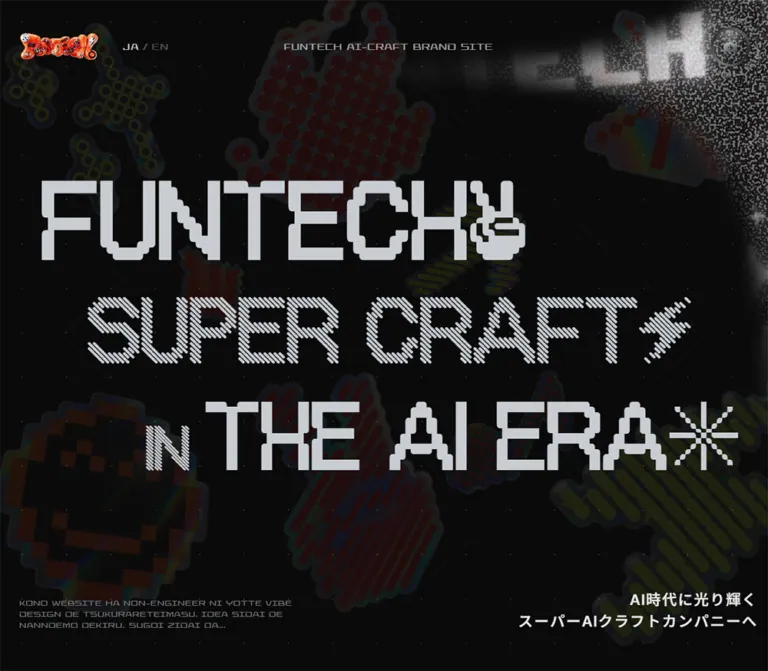
ファンテックのAIクラフト|FUNTECH IN THE AI ERA
黒い空間に多彩なピクセル書体、メタリックな3Dモチーフ、粒子表現を重ねたブランドサイト。理念、サービス、AIツール、制作実績を長いスクロールで展開する。
オリジナルサイトを見るFUNTECH IN THE AI ERA — Style Reference
A black digital stage filled with patterned lettering, chrome toys, electric accents, and clouds of grain.
Original URL: ai.funtech.inc Final URL: ai.funtech.inc/en Theme: dark in both inspected viewports; no theme selector was evidenced. Inspected: September 12, 2026. Supplied browser evidence was retrieved at 07:03:36.292 UTC / 16:03:36.292 JST; individual screenshot timestamps were not supplied. Viewports: desktop 1440 × 1000 CSS pixels; mobile 390 × 844 CSS pixels. Scope: the current English-language brand experience: opening scene, manifesto, solutions, core values, AI tool groups, work examples, gallery invitation, company stance, and closing scene. Visual captures cover the desktop opening, an essence card, and the closing scene, plus mobile opening and closing scenes. Other sections are documented from rendered text, element geometry, and computed styles.
FunTech presents its AI craft practice as a long, expressive brand website. Huge silver lettering occupies a nearly black stage populated by dim, glossy stickers. The typography changes construction within the same visual vocabulary: solid blocks, diagonal strokes, rings, dots, and decorative symbols. Bright red, orange, and acidic yellow-green appear selectively in labels, links, and artwork.
The contrast between materials defines the page. Display type is deliberately coarse and modular; paragraph text is compact and smooth; illustrations resemble polished metal, inflated foil, and collectible toys. A granular white field supplies atmospheric depth in the desktop opening and middle capture. The closing scene returns to monumental lettering and introduces chrome stars and a headphone-wearing character.
The document is approximately 20,279px tall on desktop and 14,885px on mobile. Its sequence combines company positioning, service explanations, tools, and work rather than following a conventional conversion funnel. Preserve that content progression and the alternation between dense information and large visual intervals.
How to Read This Reference
- Measured means a value appears in the supplied computed styles, custom properties, or element rectangles. Measurements describe the captured state, not every possible scroll position.
- Estimated means a dimension, color, or material treatment was judged from the supplied screenshots. Estimated values are explicitly identified.
- Calculated means arithmetic applied to measured values, such as expressing a desktop font size as a percentage of viewport width. This does not establish the original CSS formula.
- Recommended means an implementation choice for a new project. Suggested breakpoints, accessibility improvements, and Quick Start code are adaptations.
- Named tokens are descriptive aliases unless marked as source custom properties.
- Computed font sizes, line boxes, transformed rectangles, and visible glyph bounds are different measurements. Some sampled elements extend outside their section or viewport; their rectangles should not be copied as permanent layout positions.
- Static captures establish appearance. Computed animation declarations establish named effects and timings, but do not reveal every keyframe, JavaScript effect, interaction trigger, or completed state.
The original URL resolves to an English-language route with consistent FunTech identity. The Japanese-language state and the language-switch action were not inspected.
Tokens — Colors
Default Palette
| Name | Value | Token | Role and evidence |
|---|---|---|---|
| Stage Black | #0A0A0A |
--ft-stage |
Measured body background; the principal page canvas |
| Display Silver | #C8CDD2 |
--ft-silver |
Measured opening headlines, most section titles, manifesto text, and work titles |
| Reading White | #E8E8E8 |
--ft-text |
Measured default body color, service headings, and stance copy |
| Muted Gray | #909090 |
--ft-muted |
Measured service and essence descriptions |
| Supporting Gray | #BDBDBD |
--ft-support |
Measured tool and work introduction text |
| Footer Gray | #8B8E92 |
--ft-footer |
Measured back-to-top link and closing identification |
| Control Gray | #9DA0A4 |
--ft-control-ink |
Measured camera-button text color |
| Control Black | #111111 |
--ft-control-bg |
Measured inner sound-button background; a similar card fill is only visually estimated |
| Electric Red | #FF2929 |
source --c-red |
Source accent variable; also measured on the Thinking tool label |
| Signal Orange | #FF481B |
source --c-orange |
Source accent variable; also measured on the Building tool label |
| Acid Yellow | #DFFE38 |
source --c-yellow |
Source accent variable; also measured on Visuals and Videos labels |
| Gallery White | #FFFFFF |
--ft-gallery-white |
Measured gallery heading color |
The principal reading contrast is silver or light gray against black. The colorful background stickers are much darker than the main text in the supplied captures; their saturation should not become competing foreground contrast.
Accent Behavior
Essence labels and several outbound links declare a 2s linear infinite color-cycle. Intermediate computed colors include rgb(255, 50, 37) and several orange/yellow mixtures. Treat these as sampled animation states, not additional permanent brand tokens.
The desktop closing links appear yellow in the screenshot, while the mobile closing links appear red. Both declare the same color-cycle animation. Those screenshots therefore do not establish separate desktop and mobile link palettes.
No alternate page themes or user-selectable color presets were evidenced.
Tokens — Typography
OffBit — Display System
The supplied computed styles explicitly name several OffBit families. Their variation is central to the design rather than a collection of unrelated typefaces.
| Declared family | Evidenced role |
|---|---|
"OffBit 101" |
Opening first and third headline elements, section headings, service titles |
"OffBit Tilt" |
Opening SUPER CRAFT line and Videos category |
OffBit |
Work titles and large outbound links |
"OffBit Up" |
Sense value label |
"OffBit Plus" |
Orchestration value label |
"OffBit Star" |
Obsession value label |
"OffBit Ring" |
Thinking category, back-to-top link, closing identification |
"OffBit Line" |
Visuals category |
"OffBit Dot" |
Building category |
Most display elements use weight 700. Large headlines commonly use -0.02em tracking and line heights below 1, producing tight architectural blocks.
The screenshots also show mixed glyph treatments within larger heading compositions. A parent element’s computed font family does not necessarily describe every descendant character or symbol.
Elevon — Brand Utilities
Declared stack: elevon, "Inter Tight", sans-serif, with an additional system fallback on the body.
Elevon appears in the computed stacks for the language control, small brand text, and essence subtitles. The visible utility lettering is wide, angular, and technological. Essence subtitles have a nominal computed size of 13px; their visible capital shapes should not be estimated by substituting an ordinary sans-serif at that size.
The default body declaration is 16px, weight 400, with 0.96px tracking. Reading paragraphs override this with their own family, weight, and tighter tracking.
Inter Tight — Reading Copy
Declared stack: "Inter Tight", "Noto Sans JP", "Hiragino Sans", sans-serif.
Paragraphs generally use weight 500 and -0.02em tracking. Long-form copy is smoother and more conventional than the display system, which keeps dense service descriptions readable. The stance subheading uses Inter Tight at weight 600.
Font names above come from computed declarations. Font-file URLs and per-glyph fallback resolution were not supplied.
Type Scale
Values below are measured computed sizes. Line heights are included where supplied.
| Role | Desktop | Mobile | Family / notes |
|---|---|---|---|
Opening FUNTECH |
208.8px / 177.48px |
79.95px / 65.559px |
OffBit 101; tracking -0.02em |
Opening SUPER CRAFT |
172.8px / 146.88px |
54.21px / 44.4522px |
OffBit Tilt; tracking -0.02em |
Opening IN THE AI ERA |
180px / 153px |
54.21px / 44.4522px |
Parent declares OffBit 101 |
| Main section heading | 129.6px / 116.64px |
Usually 39–42.9px; section-dependent |
OffBit 101 |
| Gallery heading | 129.6px / 116.64px |
56px / 50.4px |
White; mobile breaks into two lines |
| Service title | 66px / 60.72px |
48px / 44.16px |
Long mobile AI-native titles use 40px / 36.8px |
| Manifesto paragraph | 28px / 45.36px |
18px / 29.16px |
Inter Tight, weight 500 |
| Service description | 16px / 28px |
14px / 28px |
Muted gray |
| Essence value label | 32px, normal line height |
33.15px / 30.498px |
Different OffBit variant per value |
| Essence subtitle | 13px, normal line height |
13px, normal line height |
Elevon stack, weight 700 |
| Essence description | 15px / 24px |
14px / 25.9px |
Inter Tight |
| Tool category | 24.48px / 24.48px |
22px / 22px |
Category-specific OffBit variant |
| Tool/work introduction | 16px / 28px |
12px / 21px |
Supporting gray |
| Work title | 93.6px / 93.6px |
29.25px / 29.25px |
OffBit; tracking -0.01em |
| Stance subheading | 72px / 100.8px |
29.25px / 40.95px |
Inter Tight, weight 600 |
| Stance paragraph | 24px / 38.4px |
16px / 27.2px |
Inter Tight |
| Gallery outbound link | 43.2px, normal line height |
20px, normal line height |
OffBit; tracking 0.02em |
| Stance outbound link | 54.72px, normal line height |
27.3px, normal line height |
OffBit |
| Closing outbound links | 43.2px, normal line height |
18px, normal line height |
OffBit |
| Back to top | 37.44px, normal line height |
16px, normal line height |
OffBit Ring; tracking 0.08em |
| Closing identification | 46.08px, normal line height |
16px, normal line height |
OffBit Ring; tracking 0.04em |
| Language control | 15px |
14px |
Elevon stack, weight 700 |
Calculated viewport relationships: the three desktop opening sizes equal 14.5vw, 12vw, and 12.5vw at 1440px. Mobile sizes equal 20.5vw, 13.9vw, and 13.9vw at 390px. The common desktop section size equals 9vw. These relationships are useful adaptation targets, not verified source formulas.
Closing-heading caveat: its parent H2 reports 24px in both viewports, but the screenshot clearly contains much larger descendant lettering. The parent size is not a usable measurement for the visible composition. Estimated visible line heights are roughly 110–125px on desktop and 40–45px on mobile.
Tokens — Spacing & Shapes
The inspected root font size is a conventional 16px. There is no evidence of a tiny custom rem system. Layout instead combines viewport-related dimensions, ordinary pixel values, and substantial scroll space.
Spacing Scale
| Use | Desktop | Mobile | Evidence |
|---|---|---|---|
| Standard section side inset | 115.2px |
23.4px |
Computed padding; calculated as 8vw and 6vw |
| Closing section side inset | 86.4px |
19.5px |
Computed padding; 6vw and 5vw |
| Opening first-line left edge | 72px |
22.22px |
Element rectangles |
| Manifesto paragraph separation | About 40px |
About 20px |
Calculated from adjacent paragraph rectangles |
| Section-header gap | Often 8px |
Often 8px |
Computed flex gap |
| Outbound link icon gap | 18px |
10px |
Computed flex gap |
| Essence mobile inner inset | — | 24px |
Difference between section and inner text edges |
| Essence mobile text separation | — | 14px |
Calculated between label, subtitle, and paragraph rectangles |
| Language-control padding | 12px |
8px 0 8px 16px |
Computed padding |
| Work section top/bottom padding | 240px / 200px |
80px / 120px |
Computed padding |
| Stance section top padding | 1500px |
80px |
Computed padding; not a recommended universal spacing token |
The unusually large desktop intervals support the staged composition. Do not turn 1500px into a reusable section-padding default.
Border Radius
| Element | Value | Evidence |
|---|---|---|
| General sections and text boxes | 0 |
Computed |
| Camera and sound button elements | 50% |
Computed |
| Essence card | Approximately 7–9px |
Screenshot estimate |
| Essence artwork window | Approximately 7–9px |
Screenshot estimate |
| Sticker silhouettes | Asset-defined | Visually irregular, inflated contours |
Layout Measurements
| Element | Desktop | Mobile |
|---|---|---|
| Document height | 20,279.36px |
14,884.98px |
| Opening section height | 1000px |
1000px despite an 844px viewport |
| Standard inner section width | About 1209.6px |
About 343.2px |
| Manifesto reading column | About 529.4px, right aligned |
About 343.2px, full inner width |
| Stance paragraph column | 840px, centered |
About 343.2px |
| Gallery paragraph column | 720px, centered |
About 343.2px |
| Camera button rectangle | 58 × 58px |
52 × 52px |
| Sampled inner sound button | About 35.2 × 35.2px |
About 30.8 × 30.8px |
The visible circular control assembly is larger than the sampled inner sound button. Its metallic rim and circular lettering occupy roughly 100–110px on desktop and 90–100px on mobile, estimated from screenshots. The supplied rectangles do not establish the complete hit area.
Components
Atmospheric Page Stage
Role: gives otherwise separate content sections a shared spatial identity.
The supplied opening, essence, and closing captures repeat a nearly black field with sparse dots and oversized sticker motifs. Dots appear approximately 1–2px across on a roughly 72px repeating interval; these are screenshot estimates. Extremely faint diagonal lines create a loose diamond or wireframe structure behind the content.
The sticker vocabulary includes ring-built crosses, checkerboard forms, diagonal bars, arrows, stars, and music-related shapes. Their edges have soft, glossy highlights, while their interiors remain dark enough to sit behind the silver text.
A granular white formation occupies the center of the desktop opening and becomes a much broader field in the middle capture. Treat its appearance as evidenced, while leaving its rendering method unspecified. The supplied data does not establish whether it uses canvas, shaders, video, or another technique.
Recommended layer order: black canvas → faint dots and linework → dark stickers → particle atmosphere → content → selected foreground artwork and utility controls. Decorative layers should not intercept input.
Identity Bar and Language Control
Role: small persistent brand cues within a very large opening composition.
The desktop capture places a glossy, irregular logo near the upper-left corner, the JA / EN control beside it, and FUNTECH AI-CRAFT BRAND SITE near the horizontal center. The logo is approximately 120px wide in the desktop image and 100px wide on mobile; these are visual estimates.
On mobile, the logo, a two-line descriptor, and the language control share the top row. The descriptor becomes FUNTECH AI-CRAFT over BRAND SITE. The English label is visibly brighter than the Japanese label in these English-route captures.
The language control is a button, with measured padding and a 0.55s ease-out opacity transition. Its action, destination, persistence, and keyboard behavior were not exercised. No conventional multi-link primary navigation is visible in the supplied opening captures.
Opening Typographic Scene
Role: establishes the brand’s scale, craft vocabulary, and visual rhythm.
Three silver headline rows read FUNTECH, SUPER CRAFT, and IN THE AI ERA, each ending with a large symbolic glyph. The first and third headline elements declare OffBit 101; the second declares OffBit Tilt. Solid, striped, and dotted treatments also appear within the composition.
Desktop alignment deliberately steps across the viewport:
| Row | Measured left edge | Measured top | Measured width |
|---|---|---|---|
| FUNTECH | 72px |
219.19px |
902.47px |
| SUPER CRAFT | 158.39px |
435.19px |
1120.81px |
| IN THE AI ERA | 267.84px |
628.16px |
1100.16px |
The final row ends approximately 72px from the right edge. This is an offset composition rather than one uniformly centered text block.
On mobile, all three rows occupy nearly the full width and form a compact group. Their measured top positions are 168px, 242px, and 294px, with left edges around 19–22px. The remaining opening area is predominantly atmospheric space.
A two-line positioning statement sits near the lower-right on desktop. A small romanized process note sits at the lower-left, beginning KONO WEBSITE HA NON-ENGINEER NI YOTTE VIBE DESIGN.... Mobile moves these elements toward a centered lower region; the positioning statement visibly clips horizontally in the supplied capture.
The source samples contain three H1 elements. A recommended implementation can retain three visual rows inside one semantic H1.
Manifesto Sequence
Role: turns the opening claim into a reading experience.
The rendered content introduces five thematic phrases, including WHAT WE SEE, HOW WE THINK, and WHAT WE CRAFT, followed by eight short paragraph groups. These headings appear in desktop visible-text evidence but are absent from the mobile visible-text extraction, although their text remains in the sampled section subtree. Their complete mobile presentation is therefore uncertain.
Desktop prose occupies a right-side column approximately 529px wide, starting around x = 795px within a 1440px page. Paragraphs use 28px / 45.36px silver Inter Tight. Mobile prose expands to the 343px inner width and uses 18px / 29.16px.
The copy is organized into deliberate short lines and separated thoughts. Preserve those reading groups rather than combining them into a single dense paragraph. The measured opacity and transform transitions support paragraph reveal effects, but the exact triggers were not supplied.
Repeated Craft Phrase
Role: introduces a rhythmic bridge between manifesto and services.
The rendered text includes ten copies of TO THE PEAK OF SUPER CRAFTS. Repetition is directly evidenced; its complete visual geometry and movement are not shown in the supplied screenshots. A continuously moving marquee, direction, speed, and interaction behavior cannot be confirmed.
For an adaptation, use a repeated typographic band only if it serves the section transition. Keep repeated decorative copies out of the accessibility reading order.
Solutions Sequence
Role: explains five distinct service models.
Each service follows a consistent information anatomy: symbolic marker → compact discipline label → large service title → explanatory paragraph.
The five measured entries are HUMAN-LED DIRECTION, HYBRID CRAFT, VIBE CRAFT, AI-NATIVE BX DESIGN PARTNER, and AI-NATIVE PRODUCT & BX DESIGN. Desktop titles use OffBit 101 at 66px; descriptions use muted gray Inter Tight at 16px / 28px.
Hybrid and Vibe share the same sampled desktop vertical position, while other entries occupy separate stages. Some desktop rectangles are horizontally displaced, including a negative x coordinate. This supports a spatially staged arrangement but does not establish a permanent two-column grid or its settled transforms.
Mobile entries occur sequentially with approximately 301px-wide sampled text rectangles. Titles use 48px, reduced to 40px for the longer AI-native names; descriptions use 14px / 28px.
Service container borders, artwork, and hover states are not established by the available screenshots. Do not automatically apply the visible essence-card surface to every service.
Essence Card
Role: makes an abstract value tangible through collectible-looking artwork.
The middle desktop screenshot provides the clearest card anatomy. The visible Obsession card occupies approximately 402 × 522px, with a near-black fill, a fine light border, small rounded corners, and a restrained luminous edge. Its artwork is approximately 319px square.
Inside the card:
- A square black artwork window contains inflated yellow lightning shapes with silver and iridescent edges.
- A narrow right-side rail carries the vertical
OBSESSIONlabel and lightning symbol. - A wide angular subtitle,
CRAFT & DRIVE, sits below the image. - A short muted paragraph explains the value.
Estimated card padding is roughly 20–28px, with a 12px interval between the image and vertical label. These dimensions come from the screenshot, not a supplied container rule.
The three values are Sense, Orchestration, and Obsession. Their desktop text rectangles alternate left, right, and left. The value labels use different OffBit families and phase-shifted color cycles.
Mobile changes the labels to horizontal elements within the reading column. The measured label width becomes approximately 295px rather than the narrow desktop rail, and the font size increases slightly to 33.15px. Mobile card imagery and full surface treatment were not visually captured.
Tool Orchestration Groups
Role: explains the tool categories behind the practice.
Four groups are present: Thinking, Visuals, Videos, and Building. Each has a patterned category title, a symbol, and a tool-name list. The source assigns red to Thinking, yellow-green to Visuals and Videos, and orange to Building.
The desktop sample includes matching category headers and footers. Their transformed rectangles overlap near the center of the section rather than appearing as four settled columns. A source property named --tool-spread is present, but its animation range and final layout are not supplied.
Mobile presents the four group headers sequentially, with approximately 299px-wide header regions. The duplicate footer labels are absent from the mobile visible-text extraction. The section title changes from the desktop wording TOOL ORCHESTRATION to the mobile two-line ORCHESTRATING / AI TOOLS.
The mobile introduction is visibly shortened in the supplied text evidence. Its omitted middle wording should not be interpreted as proof that all desktop copy remains visually available on mobile.
Work Entries
Role: gives concrete examples of AI-supported craft.
The rendered section lists ANRI INC., PENGUIN CAPITAL INC., and FUNTECH INC. Each entry combines a large centered name, a compact work-type label, a stated AI-craft percentage, and tool names.
The percentages are page-authored claims: 30%, 40%, and 60%. They are content, not independently measured production metrics.
Desktop names use 93.6px OffBit, while mobile names use 29.25px. Their DOM text is split into individual characters, but the flex headings have horizontal rectangles; do not reproduce the extraction’s character-by-character line breaks as a vertical layout.
The headings declare a 0.4s color transition. No destination anchors for these entries appear in the supplied link evidence, so click-through case studies and preview interactions remain unverified. Work-image composition is also outside the supplied visual coverage.
Gallery Invitation
Role: provides a distinct exit to the experimental craft gallery.
A large white AI CRAFT GALLERY heading sits above a centered explanatory paragraph and a colored text link to generation.funtech.inc. The desktop section is measured at 1000px tall, with a 720px paragraph column and a 43.2px outbound link.
Mobile breaks the heading into two lines at 56px and reduces the link to 20px. The section measures approximately 640px tall, with 140px vertical padding.
The desktop heading declares 3.2s linear infinite alGlowFlicker; the mobile heading declares no CSS animation. The keyframe intensity and full glow appearance are not included in the evidence.
Company Stance
Role: closes the explanatory narrative with a more personal statement.
OUR STANCE retains the OffBit section-title system, but Play Hard, Shine Bright switches to a large Inter Tight subheading. This creates a deliberate typographic change without introducing a new surface or palette.
Desktop body copy is centered in an 840px column at 24px / 38.4px. Mobile uses the standard 343px inner width at 16px / 27.2px. A colored text link leads to ci.funtech.inc.
The desktop section has an unusually large 1500px top padding. Mobile uses 80px, but the supplied section rectangles also leave an approximately 620px interval between the gallery section and stance section. The elements accounting for that interval were not supplied; do not remove or assign it a purpose without further evidence.
Closing Scene
Role: repeats the opening vocabulary as a memorable ending and link hub.
Four giant rows read LET’S EXPLORE, THE SUPER CRAFT, IN THE AI ERA, and WITH FUNTECH. Desktop rows alternate their horizontal starting points, mixing solid and patterned lettering. Chrome four-point stars overlap the center, and a glossy black character rises from the bottom with headphones, lightning-shaped eyes, a toothy mouth, and orange footwear.
Three outbound links form a large left-aligned stack near the desktop bottom. Back to top, AI-CRAFT BRAND SITE, and © FUNTECH INC. form a right-aligned group. The footer’s identity text independently supports the FunTech brand attribution.
Mobile centers the heading rows and both link groups. The closing links are 18px; identification is 16px. A large empty interval separates the upper heading from the lower links. The chrome stars and character are not visible in the mobile closing capture; the evidence does not distinguish intentional omission from a state or loading difference.
The back-to-top anchor points to https://ai.funtech.inc/en#. Its activation and scroll behavior were not tested.
Camera and Sound Controls
Role: expose optional experiential modes through tactile, hardware-like controls.
The camera control has a dark circular center, a camera icon, a metallic-looking rim, and circular CAMERA & SQUEEZE lettering. It sits near the upper-right on desktop and the lower-right in the mobile opening.
The sound control uses a wave symbol and circular SOUND & DANCING lettering. It appears near the lower-right in the desktop middle/closing captures and mobile closing capture. Both controls exist in the DOM, and their mobile sampled rectangles occupy the same general corner.
Their visible treatments establish affordances, not completed functionality. Camera access, squeeze behavior, sound playback, dance mode, permission handling, and state transitions were not exercised. The additional DOM label SOUND & DANCE MODE does not establish the appearance of an opened panel.
Circular lettering should be treated as observed ornament. Its rotation is not verified by these static captures.
Tokens — Motion & Interaction
| Treatment | Measured declaration | Evidence boundary |
|---|---|---|
| Language control | opacity 0.55s ease-out |
Trigger and completion not exercised |
| Manifesto paragraph | opacity 0.7s ease-out |
Declared transition |
| Manifesto paragraph movement | transform 0.8s cubic-bezier(0.22, 1, 0.36, 1) |
Distance and trigger not supplied |
| Essence heading | opacity 0.45s |
Declared transition |
| Essence label color | 2s linear infinite color-cycle |
Keyframes not supplied |
| Value-label phase offsets | 0s, -0.66s, -1.33s |
Different phases for the three values |
| Outbound link color | 2s linear infinite color-cycle |
Screenshots show different sampled hues |
| Work title color | color 0.4s |
Hover or other trigger unverified |
| Desktop gallery heading | 3.2s linear infinite alGlowFlicker |
Mobile sample reports animation: none |
| Desktop camera entrance | opacity 0.8s 1.4s, color 0.25s |
Delayed opacity declaration |
| Mobile camera entrance | 0.7s cubic-bezier(0.34, 1.45, 0.5, 1) 0.3s both btnAppear |
Keyframes not supplied |
| Mobile camera changes | opacity 0.35s, scale 0.4s, color 0.25s |
Declared transitions |
| Sound-control appearance | opacity 0.45s 0.25s |
Declared transition |
| Sound-control scale | scale 0.5s cubic-bezier(0.34, 1.56, 0.64, 1) 0.25s |
Overshooting easing; scale endpoints unknown |
| Back-to-top color | color 0.2s |
Activation not tested |
The motion vocabulary combines eased reveals, overshooting control entrances, and continuous color cycling. Pixel-like typography does not imply stepped animation; no stepped timing function appears in the supplied declarations above.
Source properties include --orb-size, --orb-scale, --orb-progress, --scroll-vel, --scroll-glow, and --tool-spread. At the captured samples, the orb size is 520px in both viewports and several progress values are zero or near zero. These are state values, not sufficient specifications for reconstructing the effects.
Likewise, --mx and --my are present, but their names and values do not prove a particular pointer-follow interaction. A section reporting animation: none does not rule out animation on descendants or through JavaScript.
Surfaces
| Layer | Appearance | Purpose |
|---|---|---|
| Page canvas | Almost black, uninterrupted across sections | Establishes a continuous visual stage |
| Environmental graphics | Dim glossy stickers, sparse dots, faint diagonal lines | Adds identity without competing with copy |
| Particle atmosphere | Pale, densely granular formation | Gives selected desktop scenes depth and scale |
| Essence card | Near-black panel, fine bright edge, small radius, soft edge glow | Separates compact values from the busy atmosphere |
| Artwork window | Black square with rounded corners | Frames vivid metallic imagery |
| Utility control | Dark circular face, metallic rim, curved microtype | Gives optional modes a tactile presence |
| Outbound link | Unboxed patterned text and diagonal arrow | Creates emphasis through type and color |
There is no evidenced universal elevation scale. The visible essence card has a luminous boundary, while most page content sits directly on the stage. Do not infer backdrop blur from the card’s dark translucent-looking appearance; its blur properties were not supplied.
Imagery
The imagery combines a toy-like sense of scale with synthetic material detail. Use inflated forms, rounded seams, sharp reflections, black chrome, pearlescent silver, and saturated yellow or orange accents. The composition works because these smooth objects sit beside deliberately modular lettering and coarse grain.
The desktop opening and footer use dark background decals as environmental motifs. Foreground assets have much stronger highlights: the yellow lightning image in the essence card, chrome stars in the closing scene, and the black/orange character.
Keep these material systems distinct. A global image-rendering: pixelated rule would damage the smooth metallic artwork. Pixel construction belongs to the display glyphs and selected patterns, not every image.
Observed Asset References
No asset filenames, image URLs, font-file URLs, or downloadable media manifest were supplied. The following inventory identifies visible assets without inventing paths.
| Asset | Capture evidence | Reusable direction |
|---|---|---|
| Glossy irregular logo | Desktop and mobile opening | Compact inflated lettering with reflective highlights; material/color differs between captured states |
| Dark sticker field | All five captures | Large cropped symbols with dim colored interiors and reflective contours |
| Granular white formation | Desktop opening and essence capture | Dense monochrome noise with a soft large-scale silhouette |
| Yellow lightning artwork | Desktop essence card | Inflated lightning shapes on black, with iridescent edging |
| Chrome star cluster | Desktop closing | Rounded four-point metallic stars at several scales |
| Headphone character | Desktop closing | Glossy black figure, electric eyes, bright teeth, orange details |
| Camera and sound assemblies | Opening, middle, and closing captures | Dark circular faces, reflective rims, simple central icons, circular labels |
Use authorized artwork where available. The supplied page’s AI-related copy does not establish the generation method, model, or authorship of each visible asset.
Layout & Responsive Behavior
Section Rhythm
These are measured section heights in the supplied DOM snapshots, rounded to two decimals. They describe the captured document, not required heights for a new implementation.
| Section | Desktop height | Mobile height |
|---|---|---|
| Opening | 1000px |
1000px |
| Manifesto | 3392.23px |
2211.86px |
| Solutions | 2926.22px |
3283.64px |
| Essence | 3762.81px |
2309.20px |
| Tool orchestration | 3000px |
1518.14px |
| Work | 1647.59px |
1558.63px |
| Gallery | 1000px |
639.55px |
| Stance | 2550.50px |
830.17px |
| Closing | 1000px |
893.80px |
Mobile reduces many staging intervals while making the service sequence taller through narrower wrapping and vertical arrangement. The work section remains almost as tall despite much smaller titles. This is a selective responsive redesign rather than uniform scaling.
Observed Reflow
| Desktop | Mobile |
|---|---|
| Opening lines step progressively right | Three nearly full-width lines form one compact group |
| Brand descriptor stays on one line | Descriptor breaks into two lines |
| Camera control occupies upper-right | Camera appears in lower-right opening corner |
| Manifesto prose occupies right column | Prose uses full inner width |
| Value labels form vertical rails | Value labels become horizontal |
| Tool rectangles overlap in sampled stage | Four groups occur sequentially |
| Large single-line tool/work/gallery headings | Several headings switch wording or explicit line breaks |
| Closing links left, identification right | Both groups centered |
| Foreground particle/character artwork visible in selected scenes | Corresponding artwork absent from supplied opening/closing captures |
Viewport-Height Limitation
The mobile evidence reports --app-vh: 10px, the same value as desktop, and a 1000px opening section in an 844px viewport. The snapshots do not reveal whether this results from resize handling, capture state, or a deliberate height rule. Do not describe the inspected mobile opening as exactly one viewport tall.
The mobile positioning statement is also visibly clipped at the horizontal edges. For an adaptation, retain the spacious atmosphere while allowing important copy to wrap and using a viewport-height strategy that updates correctly. 100svh or a correctly maintained height variable is a recommendation, not the measured source rule.
Only two widths were supplied. Exact breakpoints, tablet layouts, landscape behavior, safe-area handling, and browser differences remain unverified.
Do’s and Don’ts
Do
- Build the main contrast around
#0A0A0Aand#C8CDD2. - Use related patterned display variants to create variety within one typographic identity.
- Pair expressive display lettering with compact Inter Tight reading copy.
- Keep background stickers dark and foreground metallic objects selectively bright.
- Preserve the opening’s offset desktop rows and compact mobile regrouping.
- Treat the essence card as a specific image-plus-label composition, including its vertical desktop rail.
- Use unboxed text links with diagonal arrows for major outbound destinations.
- Retain large visual intervals where they support the narrative.
- Distinguish continuous color cycling from fixed category colors.
- Give mobile its own hierarchy, wrapping, and content arrangement.
Don’t
- Don’t replace the page sequence with a generic hero, feature grid, and contact form.
- Don’t set every headline in one smooth geometric sans-serif.
- Don’t apply pixelated image rendering to the chrome and inflated artwork.
- Don’t make every section a glowing card or add a universal glass surface.
- Don’t turn the dim sticker field into a bright wallpaper that obscures reading.
- Don’t treat a captured red or yellow link state as a separate responsive palette.
- Don’t copy transformed offscreen rectangles as permanent layout coordinates.
- Don’t use the closing H2’s inherited 24px value as its visible display size.
- Don’t claim working camera, sound, pointer, or dance interactions from labels alone.
- Don’t reproduce clipped essential mobile text or a stale viewport-height value as design requirements.
Recommended Implementation Additions
These are recommendations for a new implementation, not verified features of the original:
- Use one semantic H1 with three display-row spans. Keep section titles, service titles, and value labels in a coherent heading hierarchy.
- Give the language switch an explicit accessible name and expose the current language. Avoid relying only on label brightness.
- Make circular controls keyboard operable with at least a 44px target and a visible focus ring. The decorative lettering need not define the hit area.
- Request camera access only after an explicit camera action, and provide a usable unavailable or declined state. Start audible playback through a clear user action.
- Keep text and links usable if decorative rendering fails. Decorative stickers, repeated phrases, and particle layers should not duplicate accessible content.
- Respect reduced-motion preferences in both CSS and JavaScript. Stop color cycling, glow flicker, large spatial motion, and decorative particle movement while keeping content visible.
- Review the measured 12–14px mobile explanatory text at real device size. Increasing essential reading copy toward 16px may improve readability, with additional section height as needed.
- Make essential opening copy wrap inside the mobile viewport. Reserve control clearance so the lower-right assembly does not cover text.
- Cap decorative rendering resolution and pause unnecessary offscreen work. The supplied evidence does not establish the current renderer or its performance.
- Validate font loading before measuring the large headline rows; fallback metrics can materially change their fit.
Agent Prompt Guide
Quick Color Reference
- Canvas:
#0A0A0A. - Main display text:
#C8CDD2. - Reading text:
#E8E8E8; muted descriptions:#909090. - Supporting introductions:
#BDBDBD; closing identification:#8B8E92. - Accent anchors: red
#FF2929, orange#FF481B, yellow-green#DFFE38. - Card fill: near
#111111as a visual approximation, with a fine pale edge. - Material highlights: silver and iridescent reflections carried primarily by artwork.
Overall Prompt
“Create a long creative-company brand experience inspired by FunTech’s AI-craft site. Use a nearly black canvas, huge silver patterned display lettering, smooth compact body copy, dim glossy sticker motifs, and selective red, orange, and acid-yellow accents. Structure the page as an opening statement, manifesto, five service models, three illustrated values, four tool groups, work examples, a gallery invitation, company stance, and an oversized closing scene. Offset the desktop headline rows; regroup them tightly on mobile. Use collectible-looking metallic artwork, sparse luminous card edges, and circular hardware-like utility controls. Keep the source’s expressive typography and generous atmospheric space while making all essential content readable without motion.”
Example Component Prompts
- Opening scene: “Build three silver headline rows on black: a solid modular brand row, a diagonally patterned craft row, and an era statement with a large star symbol. At 1440px, target approximately 209px, 173px, and 180px type and progressively offset the rows to the right. At 390px, regroup them into a compact near-full-width stack. Add dim glossy stickers and a granular desktop focal formation behind the type.”
- Essence card: “Create a near-black card approximately 402px wide with a fine pale border, an 8px estimated radius, and a restrained edge glow. Place square inflated-lightning artwork beside a narrow vertical value label, then add an angular subtitle and muted paragraph. On mobile, move the value label into a horizontal reading order.”
- Tool groups: “Present Thinking, Visuals, Videos, and Building as four typographic tool groups. Assign red ring-built lettering to Thinking, yellow-green line lettering to Visuals, yellow-green diagonal lettering to Videos, and orange dotted lettering to Building. Use a readable sequential mobile layout. Treat any desktop spreading animation as an optional enhancement with a static fallback.”
- Closing scene: “Echo the opening with four large staggered silver lines, chrome stars, and a glossy black/orange character rising from the bottom. Place animated-color text links at lower-left and muted ring-built identification at lower-right. On mobile, center the text groups, preserve breathing room, and avoid covering links with utility controls.”
- Circular utility: “Design a dark tactile circular sound control with a wave icon, reflective rim, and circular microtype. Preserve a generous real button target, visible keyboard focus, and an explicit state label. Treat audio behavior separately from its decorative appearance.”
Quick Start
CSS Custom Properties
This is a usable visual foundation, not recovered source code. It preserves measured colors, declared font families, and selected proportions. Card geometry, background-dot styling, the 767px breakpoint, and color-cycle keyframe stops are recommended approximations. The two-second cycle duration comes from the supplied declarations.
Load authorized font files under the observed family names before judging visual fidelity. No font or artwork URLs are invented here. The stylesheet provides a static, readable default; particle rendering, scroll choreography, language changes, camera access, and sound require separate implementation.
Component anatomy expected by the CSS: .hero-copy is one H1 containing three .hero-line spans; .essence-media contains an image followed by .essence-tag; .closing-bottom contains the outbound-link group and identification group. The mobile opening uses a viewport-aware minimum height as an intentional improvement over the sampled 1000px section.
:root {
  /* Measured colors */
  --ft-stage: #0a0a0a;
  --ft-silver: #c8cdd2;
  --ft-text: #e8e8e8;
  --ft-muted: #909090;
  --ft-support: #bdbdbd;
  --ft-footer: #8b8e92;
  --c-red: #ff2929;
  --c-orange: #ff481b;
  --c-yellow: #dffe38;

  /* Estimated surface and environmental treatment */
  --ft-card: #111111;
  --ft-dot: rgb(200 205 210 / 16%);
  --ft-radius-card: 8px;
  --ft-card-glow: 0 0 14px rgb(200 205 210 / 14%);

  /* Declared source families; font files must be supplied separately */
  --ft-display: 'OffBit 101', elevon, sans-serif;
  --ft-tilt: 'OffBit Tilt', elevon, sans-serif;
  --ft-link: OffBit, elevon, sans-serif;
  --ft-ring: 'OffBit Ring', elevon, sans-serif;
  --ft-utility: elevon, 'Inter Tight', sans-serif;
  --ft-body: 'Inter Tight', 'Noto Sans JP', 'Hiragino Sans', sans-serif;

  --ft-gutter: 8vw;
  --ft-section-size: 9vw;
  --ft-reading-size: 16px;
  --ft-manifesto-size: 28px;
  --ft-reveal-ease: cubic-bezier(0.22, 1, 0.36, 1);
}

* { box-sizing: border-box; }

body {
  margin: 0;
  color: var(--ft-text);
  background: var(--ft-stage);
  font-family: var(--ft-body);
}

button, a { -webkit-tap-highlight-color: transparent; }
button { font: inherit; }

.brand-page {
  position: relative;
  isolation: isolate;
  min-height: 100svh;
  background: var(--ft-stage);
}

/* Estimated 72px dot field; keep it behind readable content. */
.brand-page::before {
  content: '';
  position: fixed;
  inset: 0;
  z-index: -1;
  pointer-events: none;
  background-image: radial-gradient(
    circle at center, var(--ft-dot) 1px, transparent 1px
  );
  background-size: 72px 72px;
}

/* Insert authorized decorative assets into this separate layer. */
.ambient-art {
  position: fixed;
  inset: 0;
  z-index: -1;
  overflow: clip;
  pointer-events: none;
}

.ambient-art img { display: block; }

.brand-header {
  position: absolute;
  z-index: 5;
  inset: 40px 36px auto;
  display: flex;
  align-items: center;
  gap: 28px;
}

.brand-mark img {
  display: block;
  width: 120px;
  height: auto;
}

.brand-caption {
  position: absolute;
  left: 50%;
  transform: translateX(-50%);
  margin: 0;
  font: 700 14px/1.1 var(--ft-utility);
  text-align: center;
  white-space: nowrap;
}

.language-switch {
  display: flex;
  align-items: center;
  gap: 5.25px;
  padding: 12px;
  border: 0;
  color: var(--ft-silver);
  background: transparent;
  font: 700 15px/1 var(--ft-utility);
  letter-spacing: 0.12em;
  cursor: pointer;
}

.hero {
  position: relative;
  min-height: 100svh;
}

.hero-copy {
  position: absolute;
  inset: 21.9svh 5vw auto;
  display: flex;
  flex-direction: column;
  margin: 0;
  color: var(--ft-silver);
  font-family: var(--ft-display);
  font-weight: 700;
  line-height: 0.85;
  letter-spacing: -0.02em;
}

.hero-line {
  display: block;
  width: max-content;
  max-width: 100%;
}

.hero-line--brand { font-size: 14.5vw; }

.hero-line--craft {
  margin-top: 2.675vw;
  margin-left: 6vw;
  font-family: var(--ft-tilt);
  font-size: 12vw;
}

.hero-line--era {
  align-self: flex-end;
  margin-top: 3.2vw;
  font-size: 12.5vw;
}

.hero-statement {
  position: absolute;
  right: 2.5vw;
  bottom: 6svh;
  max-width: 46vw;
  margin: 0;
  font: 700 24px/1.35 var(--ft-utility);
  text-align: right;
}

.hero-note {
  position: absolute;
  left: 2.5vw;
  bottom: 6svh;
  max-width: 32vw;
  margin: 0;
  color: var(--ft-footer);
  font: 700 12px/1.5 var(--ft-utility);
}

.brand-section { padding: 120px var(--ft-gutter) 100px; }

.section-title {
  margin: 0 0 42px;
  color: var(--ft-silver);
  font: 700 var(--ft-section-size)/0.9 var(--ft-display);
  letter-spacing: -0.02em;
}

.reading-copy {
  font: 500 var(--ft-reading-size)/1.75 var(--ft-body);
  letter-spacing: -0.02em;
}

.manifesto-copy {
  width: min(100%, 529.4px);
  margin-left: auto;
  color: var(--ft-silver);
  font: 500 var(--ft-manifesto-size)/1.62 var(--ft-body);
  letter-spacing: -0.02em;
}

.manifesto-copy p {
  margin: 0 0 40px;
  transition:
    opacity 700ms ease-out,
    transform 800ms var(--ft-reveal-ease);
}

/* Content remains visible until a separate enhancement controls it. */
.reveal-item { opacity: 1; transform: none; }

.solution-title {
  margin: 0 0 28px;
  font: 700 66px/0.92 var(--ft-display);
}

.solution-copy {
  margin: 0;
  color: var(--ft-muted);
  font: 500 16px/28px var(--ft-body);
  letter-spacing: -0.02em;
}

/* Static alternating fallback; not a reconstruction of scroll transforms. */
.essence-list {
  display: grid;
  gap: clamp(80px, 16vw, 230px);
}

.essence-card {
  width: min(100%, 402px);
  padding: 26px 20px 28px;
  border: 1px solid rgb(200 205 210 / 85%);
  border-radius: var(--ft-radius-card);
  background: var(--ft-card);
  box-shadow: var(--ft-card-glow);
}

.essence-card:nth-child(even) { justify-self: end; }

.essence-media {
  display: grid;
  grid-template-columns: minmax(0, 1fr) 28px;
  gap: 12px;
}

.essence-media img {
  display: block;
  width: 100%;
  aspect-ratio: 1;
  object-fit: cover;
  border-radius: var(--ft-radius-card);
  background: #000;
}

.essence-tag {
  margin: 0;
  color: var(--c-yellow);
  font: 700 32px/1 'OffBit Star', elevon, sans-serif;
  letter-spacing: 0.08em;
  writing-mode: vertical-rl;
}

.essence-card[data-value='sense'] .essence-tag {
  font-family: 'OffBit Up', elevon, sans-serif;
}

.essence-card[data-value='orchestration'] .essence-tag {
  font-family: 'OffBit Plus', elevon, sans-serif;
}

.essence-subtitle {
  margin: 16px 0 8px;
  color: var(--ft-silver);
  font: 700 13px/normal var(--ft-utility);
  letter-spacing: -0.02em;
  text-transform: uppercase;
}

.essence-description {
  margin: 0;
  color: var(--ft-muted);
  font: 500 15px/1.6 var(--ft-body);
  letter-spacing: -0.02em;
}

.text-link {
  display: inline-flex;
  align-items: baseline;
  gap: 18px;
  width: fit-content;
  max-width: 100%;
  color: var(--c-red);
  font: 700 43.2px/1.1 var(--ft-link);
  letter-spacing: 0.02em;
  text-decoration: none;
  overflow-wrap: anywhere;
}

/* Illustrative stops; the source keyframe definitions were not supplied. */
.cycle-accent { animation: accent-cycle 2s linear infinite; }
.phase-two { animation-delay: -0.66s; }
.phase-three { animation-delay: -1.33s; }

@keyframes accent-cycle {
  0%, 100% { color: var(--c-red); }
  33% { color: var(--c-orange); }
  67% { color: var(--c-yellow); }
}

.closing {
  min-height: 100svh;
  display: flex;
  flex-direction: column;
  justify-content: space-between;
  gap: 120px;
  padding: 100px 6vw 30px;
}

/* Estimated descendant scale; the measured parent size was only 24px. */
.closing-title {
  margin: 0;
  color: var(--ft-silver);
  font: 700 clamp(48px, 8.8vw, 128px)/0.98 var(--ft-display);
  letter-spacing: -0.02em;
}

.closing-line { display: block; }
.closing-line:nth-child(even) { text-align: right; }

.closing-bottom {
  display: flex;
  justify-content: space-between;
  align-items: flex-end;
  gap: 40px;
}

.closing-links { display: grid; gap: 4px; }

.closing-meta {
  color: var(--ft-footer);
  font: 700 46.08px/1.15 var(--ft-ring);
  letter-spacing: 0.04em;
  text-align: right;
}

.closing-meta p { margin: 8px 0 0; }

.back-to-top {
  color: inherit;
  font-size: 37.44px;
  letter-spacing: 0.08em;
  text-decoration: none;
  transition: color 200ms;
}

/* Recommended complete target size, not the measured inner button size. */
.scene-control {
  position: fixed;
  z-index: 20;
  right: max(28px, env(safe-area-inset-right, 0px));
  bottom: max(36px, env(safe-area-inset-bottom, 0px));
  display: grid;
  place-items: center;
  width: 72px;
  aspect-ratio: 1;
  padding: 0;
  border: 3px solid #777a7e;
  border-radius: 50%;
  color: var(--ft-silver);
  background: radial-gradient(circle at 42% 25%, #45474a, #111 68%);
  cursor: pointer;
}

:where(a, button):focus-visible {
  outline: 2px solid var(--c-yellow);
  outline-offset: 5px;
}

/* Recommended breakpoint; the actual source breakpoint was not supplied. */
@media (max-width: 767px) {
  :root {
    --ft-gutter: 6vw;
    --ft-section-size: 11vw;
    --ft-manifesto-size: 18px;
  }

  .brand-header {
    inset: 30px 4vw auto;
    display: grid;
    grid-template-columns: 100px minmax(0, 1fr) auto;
    gap: 8px;
  }

  .brand-mark img { width: 100px; }

  .brand-caption {
    position: static;
    transform: none;
    font-size: 10px;
    white-space: normal;
  }

  .language-switch {
    gap: 4.9px;
    padding: 8px 0 8px 16px;
    font-size: 14px;
    letter-spacing: 0.14em;
  }

  .hero-copy {
    inset: 20svh 4.5vw auto;
    align-items: center;
    gap: 8px;
    line-height: 0.82;
  }

  .hero-line--brand { font-size: 20.5vw; }

  .hero-line--craft,
  .hero-line--era {
    align-self: auto;
    margin: 0;
    font-size: 13.9vw;
  }

  .hero-statement {
    inset: auto 6vw 120px;
    max-width: none;
    font-size: 17px;
    text-align: center;
  }

  .hero-note {
    inset: auto 6vw 24px;
    max-width: none;
    padding-right: 78px;
    font-size: 10px;
  }

  .brand-section { padding-block: 80px 120px; }
  .section-title { margin-bottom: 24px; line-height: 0.95; }
  .manifesto-copy p { margin-bottom: 20px; }
  .solution-title { font-size: 48px; }
  .solution-title--long { font-size: 40px; }
  .solution-copy { font-size: 14px; }

  .essence-card,
  .essence-card:nth-child(even) {
    justify-self: stretch;
    width: 100%;
    padding: 24px;
  }

  .essence-media {
    grid-template-columns: minmax(0, 1fr);
    gap: 14px;
  }

  .essence-tag {
    writing-mode: horizontal-tb;
    font-size: 8.5vw;
    line-height: 0.92;
    letter-spacing: normal;
  }

  .essence-subtitle { margin-block: 14px; }
  .essence-description { font-size: 14px; line-height: 1.85; }
  .text-link { gap: 10px; font-size: 20px; }

  .closing { padding: 100px 5vw 40px; }
  .closing-title { font-size: 10.5vw; line-height: 1.05; }
  .closing-line,
  .closing-line:nth-child(even) { text-align: center; }

  .closing-bottom {
    flex-direction: column;
    align-items: center;
    gap: 36px;
    padding-bottom: 70px;
  }

  .closing-links { justify-items: center; gap: 6px; }
  .closing-links .text-link { font-size: 18px; }
  .closing-meta { font-size: 16px; text-align: center; }
  .back-to-top { font-size: 16px; }
  .scene-control { width: 64px; right: 20px; bottom: 24px; }
}

@media (prefers-reduced-motion: reduce) {
  .brand-page *,
  .brand-page *::before,
  .brand-page *::after {
    animation: none !important;
    transition: none !important;
    scroll-behavior: auto !important;
  }

  .reveal-item { opacity: 1 !important; transform: none !important; }
}
The reduced-motion CSS does not stop a separately implemented canvas, video, or JavaScript animation loop. Connect the same preference to those systems. The circular button styling also requires real accessible labels and application state; it does not implement sound or camera behavior.
Tailwind v4 Token Mapping
Optional aliases for a project already using Tailwind v4. This is an implementation convenience, not a claim about the original site’s styling framework. Define the custom properties above first.
@theme inline {
  --color-stage: var(--ft-stage);
  --color-silver: var(--ft-silver);
  --color-reading: var(--ft-text);
  --color-muted: var(--ft-muted);
  --color-support: var(--ft-support);
  --color-electric-red: var(--c-red);
  --color-signal-orange: var(--c-orange);
  --color-acid-yellow: var(--c-yellow);

  --font-display: var(--ft-display);
  --font-display-tilt: var(--ft-tilt);
  --font-display-ring: var(--ft-ring);
  --font-utility: var(--ft-utility);
  --font-copy: var(--ft-body);

  --text-section: var(--ft-section-size);
  --spacing-page-gutter: var(--ft-gutter);
  --radius-essence: var(--ft-radius-card);
}
Sources & Evidence
- Original website: https://ai.funtech.inc/. The supplied browser record reports HTTP 200 with final URL https://ai.funtech.inc/en and title
FUNTECH IN THE AI ERA — FunTech’s AI Craft. - Capture date and dimensions: September 12, 2026; evidence retrieved at 07:03:36.292 UTC. Desktop viewport 1440 × 1000; mobile viewport 390 × 844. Document heights were approximately 20,279.36px and 14,884.98px respectively.
- Visual coverage: three original-page desktop captures showing the opening, an essence-card stage, and the closing scene; two mobile captures showing the opening and closing scene.
- Rendered evidence: page text, outbound links, selected element rectangles, computed typography, colors, padding, gaps, radii, transitions, animation declarations, and sampled custom properties for both viewports.
- Inspection procedure supplied with the evidence: an initial observation of at least five seconds, bounded readiness checks for layout/text stability and image decoding, and traversal through intermediate scroll positions. Perpetual animations were paused during readiness checks and resumed afterward. SharedWorkers and service workers were disabled.
- Limitations: the readiness checks do not prove semantic completeness or successful rendering of every delayed effect. No full stylesheet, asset manifest, font binaries, interaction recordings, or camera/audio results were supplied. Middle-section appearance is partly documented through DOM data rather than screenshots. The English route is the inspected language state.
This reference describes the current supplied page evidence. Measured declarations, screenshot estimates, calculated proportions, and implementation recommendations remain distinct throughout.
# FUNTECH IN THE AI ERA — Style Reference

> A black digital stage filled with patterned lettering, chrome toys, electric accents, and clouds of grain.

**Original URL:** [ai.funtech.inc](https://ai.funtech.inc/)
**Final URL:** [ai.funtech.inc/en](https://ai.funtech.inc/en)
**Theme:** dark in both inspected viewports; no theme selector was evidenced.
**Inspected:** September 12, 2026. Supplied browser evidence was retrieved at 07:03:36.292 UTC / 16:03:36.292 JST; individual screenshot timestamps were not supplied.
**Viewports:** desktop 1440 × 1000 CSS pixels; mobile 390 × 844 CSS pixels.
**Scope:** the current English-language brand experience: opening scene, manifesto, solutions, core values, AI tool groups, work examples, gallery invitation, company stance, and closing scene. Visual captures cover the desktop opening, an essence card, and the closing scene, plus mobile opening and closing scenes. Other sections are documented from rendered text, element geometry, and computed styles.

FunTech presents its AI craft practice as a long, expressive brand website. Huge silver lettering occupies a nearly black stage populated by dim, glossy stickers. The typography changes construction within the same visual vocabulary: solid blocks, diagonal strokes, rings, dots, and decorative symbols. Bright red, orange, and acidic yellow-green appear selectively in labels, links, and artwork.

The contrast between materials defines the page. Display type is deliberately coarse and modular; paragraph text is compact and smooth; illustrations resemble polished metal, inflated foil, and collectible toys. A granular white field supplies atmospheric depth in the desktop opening and middle capture. The closing scene returns to monumental lettering and introduces chrome stars and a headphone-wearing character.

The document is approximately 20,279px tall on desktop and 14,885px on mobile. Its sequence combines company positioning, service explanations, tools, and work rather than following a conventional conversion funnel. Preserve that content progression and the alternation between dense information and large visual intervals.

## How to Read This Reference

- **Measured** means a value appears in the supplied computed styles, custom properties, or element rectangles. Measurements describe the captured state, not every possible scroll position.
- **Estimated** means a dimension, color, or material treatment was judged from the supplied screenshots. Estimated values are explicitly identified.
- **Calculated** means arithmetic applied to measured values, such as expressing a desktop font size as a percentage of viewport width. This does not establish the original CSS formula.
- **Recommended** means an implementation choice for a new project. Suggested breakpoints, accessibility improvements, and Quick Start code are adaptations.
- **Named tokens** are descriptive aliases unless marked as source custom properties.
- Computed font sizes, line boxes, transformed rectangles, and visible glyph bounds are different measurements. Some sampled elements extend outside their section or viewport; their rectangles should not be copied as permanent layout positions.
- Static captures establish appearance. Computed animation declarations establish named effects and timings, but do not reveal every keyframe, JavaScript effect, interaction trigger, or completed state.

The original URL resolves to an English-language route with consistent FunTech identity. The Japanese-language state and the language-switch action were not inspected.

## Tokens — Colors

### Default Palette

| Name | Value | Token | Role and evidence |
| --- | --- | --- | --- |
| Stage Black | `#0A0A0A` | `--ft-stage` | Measured body background; the principal page canvas |
| Display Silver | `#C8CDD2` | `--ft-silver` | Measured opening headlines, most section titles, manifesto text, and work titles |
| Reading White | `#E8E8E8` | `--ft-text` | Measured default body color, service headings, and stance copy |
| Muted Gray | `#909090` | `--ft-muted` | Measured service and essence descriptions |
| Supporting Gray | `#BDBDBD` | `--ft-support` | Measured tool and work introduction text |
| Footer Gray | `#8B8E92` | `--ft-footer` | Measured back-to-top link and closing identification |
| Control Gray | `#9DA0A4` | `--ft-control-ink` | Measured camera-button text color |
| Control Black | `#111111` | `--ft-control-bg` | Measured inner sound-button background; a similar card fill is only visually estimated |
| Electric Red | `#FF2929` | source `--c-red` | Source accent variable; also measured on the Thinking tool label |
| Signal Orange | `#FF481B` | source `--c-orange` | Source accent variable; also measured on the Building tool label |
| Acid Yellow | `#DFFE38` | source `--c-yellow` | Source accent variable; also measured on Visuals and Videos labels |
| Gallery White | `#FFFFFF` | `--ft-gallery-white` | Measured gallery heading color |

The principal reading contrast is silver or light gray against black. The colorful background stickers are much darker than the main text in the supplied captures; their saturation should not become competing foreground contrast.

### Accent Behavior

Essence labels and several outbound links declare a `2s linear infinite color-cycle`. Intermediate computed colors include `rgb(255, 50, 37)` and several orange/yellow mixtures. Treat these as sampled animation states, not additional permanent brand tokens.

The desktop closing links appear yellow in the screenshot, while the mobile closing links appear red. Both declare the same color-cycle animation. Those screenshots therefore do not establish separate desktop and mobile link palettes.

No alternate page themes or user-selectable color presets were evidenced.

## Tokens — Typography

### OffBit — Display System

The supplied computed styles explicitly name several OffBit families. Their variation is central to the design rather than a collection of unrelated typefaces.

| Declared family | Evidenced role |
| --- | --- |
| `"OffBit 101"` | Opening first and third headline elements, section headings, service titles |
| `"OffBit Tilt"` | Opening `SUPER CRAFT` line and Videos category |
| `OffBit` | Work titles and large outbound links |
| `"OffBit Up"` | Sense value label |
| `"OffBit Plus"` | Orchestration value label |
| `"OffBit Star"` | Obsession value label |
| `"OffBit Ring"` | Thinking category, back-to-top link, closing identification |
| `"OffBit Line"` | Visuals category |
| `"OffBit Dot"` | Building category |

Most display elements use weight `700`. Large headlines commonly use `-0.02em` tracking and line heights below `1`, producing tight architectural blocks.

The screenshots also show mixed glyph treatments within larger heading compositions. A parent element’s computed font family does not necessarily describe every descendant character or symbol.

### Elevon — Brand Utilities

**Declared stack:** `elevon, "Inter Tight", sans-serif`, with an additional system fallback on the body.

Elevon appears in the computed stacks for the language control, small brand text, and essence subtitles. The visible utility lettering is wide, angular, and technological. Essence subtitles have a nominal computed size of `13px`; their visible capital shapes should not be estimated by substituting an ordinary sans-serif at that size.

The default body declaration is `16px`, weight `400`, with `0.96px` tracking. Reading paragraphs override this with their own family, weight, and tighter tracking.

### Inter Tight — Reading Copy

**Declared stack:** `"Inter Tight", "Noto Sans JP", "Hiragino Sans", sans-serif`.

Paragraphs generally use weight `500` and `-0.02em` tracking. Long-form copy is smoother and more conventional than the display system, which keeps dense service descriptions readable. The stance subheading uses Inter Tight at weight `600`.

Font names above come from computed declarations. Font-file URLs and per-glyph fallback resolution were not supplied.

### Type Scale

Values below are measured computed sizes. Line heights are included where supplied.

| Role | Desktop | Mobile | Family / notes |
| --- | --- | --- | --- |
| Opening `FUNTECH` | `208.8px / 177.48px` | `79.95px / 65.559px` | OffBit 101; tracking `-0.02em` |
| Opening `SUPER CRAFT` | `172.8px / 146.88px` | `54.21px / 44.4522px` | OffBit Tilt; tracking `-0.02em` |
| Opening `IN THE AI ERA` | `180px / 153px` | `54.21px / 44.4522px` | Parent declares OffBit 101 |
| Main section heading | `129.6px / 116.64px` | Usually `39–42.9px`; section-dependent | OffBit 101 |
| Gallery heading | `129.6px / 116.64px` | `56px / 50.4px` | White; mobile breaks into two lines |
| Service title | `66px / 60.72px` | `48px / 44.16px` | Long mobile AI-native titles use `40px / 36.8px` |
| Manifesto paragraph | `28px / 45.36px` | `18px / 29.16px` | Inter Tight, weight 500 |
| Service description | `16px / 28px` | `14px / 28px` | Muted gray |
| Essence value label | `32px`, normal line height | `33.15px / 30.498px` | Different OffBit variant per value |
| Essence subtitle | `13px`, normal line height | `13px`, normal line height | Elevon stack, weight 700 |
| Essence description | `15px / 24px` | `14px / 25.9px` | Inter Tight |
| Tool category | `24.48px / 24.48px` | `22px / 22px` | Category-specific OffBit variant |
| Tool/work introduction | `16px / 28px` | `12px / 21px` | Supporting gray |
| Work title | `93.6px / 93.6px` | `29.25px / 29.25px` | OffBit; tracking `-0.01em` |
| Stance subheading | `72px / 100.8px` | `29.25px / 40.95px` | Inter Tight, weight 600 |
| Stance paragraph | `24px / 38.4px` | `16px / 27.2px` | Inter Tight |
| Gallery outbound link | `43.2px`, normal line height | `20px`, normal line height | OffBit; tracking `0.02em` |
| Stance outbound link | `54.72px`, normal line height | `27.3px`, normal line height | OffBit |
| Closing outbound links | `43.2px`, normal line height | `18px`, normal line height | OffBit |
| Back to top | `37.44px`, normal line height | `16px`, normal line height | OffBit Ring; tracking `0.08em` |
| Closing identification | `46.08px`, normal line height | `16px`, normal line height | OffBit Ring; tracking `0.04em` |
| Language control | `15px` | `14px` | Elevon stack, weight 700 |

**Calculated viewport relationships:** the three desktop opening sizes equal `14.5vw`, `12vw`, and `12.5vw` at 1440px. Mobile sizes equal `20.5vw`, `13.9vw`, and `13.9vw` at 390px. The common desktop section size equals `9vw`. These relationships are useful adaptation targets, not verified source formulas.

**Closing-heading caveat:** its parent H2 reports `24px` in both viewports, but the screenshot clearly contains much larger descendant lettering. The parent size is not a usable measurement for the visible composition. Estimated visible line heights are roughly 110–125px on desktop and 40–45px on mobile.

## Tokens — Spacing & Shapes

The inspected root font size is a conventional `16px`. There is no evidence of a tiny custom rem system. Layout instead combines viewport-related dimensions, ordinary pixel values, and substantial scroll space.

### Spacing Scale

| Use | Desktop | Mobile | Evidence |
| --- | --- | --- | --- |
| Standard section side inset | `115.2px` | `23.4px` | Computed padding; calculated as `8vw` and `6vw` |
| Closing section side inset | `86.4px` | `19.5px` | Computed padding; `6vw` and `5vw` |
| Opening first-line left edge | `72px` | `22.22px` | Element rectangles |
| Manifesto paragraph separation | About `40px` | About `20px` | Calculated from adjacent paragraph rectangles |
| Section-header gap | Often `8px` | Often `8px` | Computed flex gap |
| Outbound link icon gap | `18px` | `10px` | Computed flex gap |
| Essence mobile inner inset | — | `24px` | Difference between section and inner text edges |
| Essence mobile text separation | — | `14px` | Calculated between label, subtitle, and paragraph rectangles |
| Language-control padding | `12px` | `8px 0 8px 16px` | Computed padding |
| Work section top/bottom padding | `240px / 200px` | `80px / 120px` | Computed padding |
| Stance section top padding | `1500px` | `80px` | Computed padding; not a recommended universal spacing token |

The unusually large desktop intervals support the staged composition. Do not turn `1500px` into a reusable section-padding default.

### Border Radius

| Element | Value | Evidence |
| --- | --- | --- |
| General sections and text boxes | `0` | Computed |
| Camera and sound button elements | `50%` | Computed |
| Essence card | Approximately `7–9px` | Screenshot estimate |
| Essence artwork window | Approximately `7–9px` | Screenshot estimate |
| Sticker silhouettes | Asset-defined | Visually irregular, inflated contours |

### Layout Measurements

| Element | Desktop | Mobile |
| --- | --- | --- |
| Document height | `20,279.36px` | `14,884.98px` |
| Opening section height | `1000px` | `1000px` despite an `844px` viewport |
| Standard inner section width | About `1209.6px` | About `343.2px` |
| Manifesto reading column | About `529.4px`, right aligned | About `343.2px`, full inner width |
| Stance paragraph column | `840px`, centered | About `343.2px` |
| Gallery paragraph column | `720px`, centered | About `343.2px` |
| Camera button rectangle | `58 × 58px` | `52 × 52px` |
| Sampled inner sound button | About `35.2 × 35.2px` | About `30.8 × 30.8px` |

The visible circular control assembly is larger than the sampled inner sound button. Its metallic rim and circular lettering occupy roughly 100–110px on desktop and 90–100px on mobile, estimated from screenshots. The supplied rectangles do not establish the complete hit area.

## Components

### Atmospheric Page Stage

**Role:** gives otherwise separate content sections a shared spatial identity.

The supplied opening, essence, and closing captures repeat a nearly black field with sparse dots and oversized sticker motifs. Dots appear approximately 1–2px across on a roughly 72px repeating interval; these are screenshot estimates. Extremely faint diagonal lines create a loose diamond or wireframe structure behind the content.

The sticker vocabulary includes ring-built crosses, checkerboard forms, diagonal bars, arrows, stars, and music-related shapes. Their edges have soft, glossy highlights, while their interiors remain dark enough to sit behind the silver text.

A granular white formation occupies the center of the desktop opening and becomes a much broader field in the middle capture. Treat its appearance as evidenced, while leaving its rendering method unspecified. The supplied data does not establish whether it uses canvas, shaders, video, or another technique.

**Recommended layer order:** black canvas → faint dots and linework → dark stickers → particle atmosphere → content → selected foreground artwork and utility controls. Decorative layers should not intercept input.

### Identity Bar and Language Control

**Role:** small persistent brand cues within a very large opening composition.

The desktop capture places a glossy, irregular logo near the upper-left corner, the `JA / EN` control beside it, and `FUNTECH AI-CRAFT BRAND SITE` near the horizontal center. The logo is approximately 120px wide in the desktop image and 100px wide on mobile; these are visual estimates.

On mobile, the logo, a two-line descriptor, and the language control share the top row. The descriptor becomes `FUNTECH AI-CRAFT` over `BRAND SITE`. The English label is visibly brighter than the Japanese label in these English-route captures.

The language control is a button, with measured padding and a `0.55s ease-out` opacity transition. Its action, destination, persistence, and keyboard behavior were not exercised. No conventional multi-link primary navigation is visible in the supplied opening captures.

### Opening Typographic Scene

**Role:** establishes the brand’s scale, craft vocabulary, and visual rhythm.

Three silver headline rows read `FUNTECH`, `SUPER CRAFT`, and `IN THE AI ERA`, each ending with a large symbolic glyph. The first and third headline elements declare OffBit 101; the second declares OffBit Tilt. Solid, striped, and dotted treatments also appear within the composition.

Desktop alignment deliberately steps across the viewport:

| Row | Measured left edge | Measured top | Measured width |
| --- | --- | --- | --- |
| FUNTECH | `72px` | `219.19px` | `902.47px` |
| SUPER CRAFT | `158.39px` | `435.19px` | `1120.81px` |
| IN THE AI ERA | `267.84px` | `628.16px` | `1100.16px` |

The final row ends approximately 72px from the right edge. This is an offset composition rather than one uniformly centered text block.

On mobile, all three rows occupy nearly the full width and form a compact group. Their measured top positions are `168px`, `242px`, and `294px`, with left edges around 19–22px. The remaining opening area is predominantly atmospheric space.

A two-line positioning statement sits near the lower-right on desktop. A small romanized process note sits at the lower-left, beginning `KONO WEBSITE HA NON-ENGINEER NI YOTTE VIBE DESIGN...`. Mobile moves these elements toward a centered lower region; the positioning statement visibly clips horizontally in the supplied capture.

The source samples contain three H1 elements. A recommended implementation can retain three visual rows inside one semantic H1.

### Manifesto Sequence

**Role:** turns the opening claim into a reading experience.

The rendered content introduces five thematic phrases, including `WHAT WE SEE`, `HOW WE THINK`, and `WHAT WE CRAFT`, followed by eight short paragraph groups. These headings appear in desktop visible-text evidence but are absent from the mobile visible-text extraction, although their text remains in the sampled section subtree. Their complete mobile presentation is therefore uncertain.

Desktop prose occupies a right-side column approximately 529px wide, starting around x = 795px within a 1440px page. Paragraphs use `28px / 45.36px` silver Inter Tight. Mobile prose expands to the 343px inner width and uses `18px / 29.16px`.

The copy is organized into deliberate short lines and separated thoughts. Preserve those reading groups rather than combining them into a single dense paragraph. The measured opacity and transform transitions support paragraph reveal effects, but the exact triggers were not supplied.

### Repeated Craft Phrase

**Role:** introduces a rhythmic bridge between manifesto and services.

The rendered text includes ten copies of `TO THE PEAK OF SUPER CRAFTS`. Repetition is directly evidenced; its complete visual geometry and movement are not shown in the supplied screenshots. A continuously moving marquee, direction, speed, and interaction behavior cannot be confirmed.

For an adaptation, use a repeated typographic band only if it serves the section transition. Keep repeated decorative copies out of the accessibility reading order.

### Solutions Sequence

**Role:** explains five distinct service models.

Each service follows a consistent information anatomy: symbolic marker → compact discipline label → large service title → explanatory paragraph.

The five measured entries are `HUMAN-LED DIRECTION`, `HYBRID CRAFT`, `VIBE CRAFT`, `AI-NATIVE BX DESIGN PARTNER`, and `AI-NATIVE PRODUCT & BX DESIGN`. Desktop titles use OffBit 101 at `66px`; descriptions use muted gray Inter Tight at `16px / 28px`.

Hybrid and Vibe share the same sampled desktop vertical position, while other entries occupy separate stages. Some desktop rectangles are horizontally displaced, including a negative x coordinate. This supports a spatially staged arrangement but does not establish a permanent two-column grid or its settled transforms.

Mobile entries occur sequentially with approximately 301px-wide sampled text rectangles. Titles use 48px, reduced to 40px for the longer AI-native names; descriptions use `14px / 28px`.

Service container borders, artwork, and hover states are not established by the available screenshots. Do not automatically apply the visible essence-card surface to every service.

### Essence Card

**Role:** makes an abstract value tangible through collectible-looking artwork.

The middle desktop screenshot provides the clearest card anatomy. The visible Obsession card occupies approximately 402 × 522px, with a near-black fill, a fine light border, small rounded corners, and a restrained luminous edge. Its artwork is approximately 319px square.

Inside the card:

1. A square black artwork window contains inflated yellow lightning shapes with silver and iridescent edges.
2. A narrow right-side rail carries the vertical `OBSESSION` label and lightning symbol.
3. A wide angular subtitle, `CRAFT & DRIVE`, sits below the image.
4. A short muted paragraph explains the value.

Estimated card padding is roughly 20–28px, with a 12px interval between the image and vertical label. These dimensions come from the screenshot, not a supplied container rule.

The three values are Sense, Orchestration, and Obsession. Their desktop text rectangles alternate left, right, and left. The value labels use different OffBit families and phase-shifted color cycles.

Mobile changes the labels to horizontal elements within the reading column. The measured label width becomes approximately 295px rather than the narrow desktop rail, and the font size increases slightly to 33.15px. Mobile card imagery and full surface treatment were not visually captured.

### Tool Orchestration Groups

**Role:** explains the tool categories behind the practice.

Four groups are present: Thinking, Visuals, Videos, and Building. Each has a patterned category title, a symbol, and a tool-name list. The source assigns red to Thinking, yellow-green to Visuals and Videos, and orange to Building.

The desktop sample includes matching category headers and footers. Their transformed rectangles overlap near the center of the section rather than appearing as four settled columns. A source property named `--tool-spread` is present, but its animation range and final layout are not supplied.

Mobile presents the four group headers sequentially, with approximately 299px-wide header regions. The duplicate footer labels are absent from the mobile visible-text extraction. The section title changes from the desktop wording `TOOL ORCHESTRATION` to the mobile two-line `ORCHESTRATING / AI TOOLS`.

The mobile introduction is visibly shortened in the supplied text evidence. Its omitted middle wording should not be interpreted as proof that all desktop copy remains visually available on mobile.

### Work Entries

**Role:** gives concrete examples of AI-supported craft.

The rendered section lists ANRI INC., PENGUIN CAPITAL INC., and FUNTECH INC. Each entry combines a large centered name, a compact work-type label, a stated AI-craft percentage, and tool names.

The percentages are page-authored claims: 30%, 40%, and 60%. They are content, not independently measured production metrics.

Desktop names use `93.6px` OffBit, while mobile names use `29.25px`. Their DOM text is split into individual characters, but the flex headings have horizontal rectangles; do not reproduce the extraction’s character-by-character line breaks as a vertical layout.

The headings declare a `0.4s` color transition. No destination anchors for these entries appear in the supplied link evidence, so click-through case studies and preview interactions remain unverified. Work-image composition is also outside the supplied visual coverage.

### Gallery Invitation

**Role:** provides a distinct exit to the experimental craft gallery.

A large white `AI CRAFT GALLERY` heading sits above a centered explanatory paragraph and a colored text link to [generation.funtech.inc](https://generation.funtech.inc/). The desktop section is measured at 1000px tall, with a 720px paragraph column and a 43.2px outbound link.

Mobile breaks the heading into two lines at 56px and reduces the link to 20px. The section measures approximately 640px tall, with 140px vertical padding.

The desktop heading declares `3.2s linear infinite alGlowFlicker`; the mobile heading declares no CSS animation. The keyframe intensity and full glow appearance are not included in the evidence.

### Company Stance

**Role:** closes the explanatory narrative with a more personal statement.

`OUR STANCE` retains the OffBit section-title system, but `Play Hard, Shine Bright` switches to a large Inter Tight subheading. This creates a deliberate typographic change without introducing a new surface or palette.

Desktop body copy is centered in an 840px column at `24px / 38.4px`. Mobile uses the standard 343px inner width at `16px / 27.2px`. A colored text link leads to [ci.funtech.inc](https://ci.funtech.inc/).

The desktop section has an unusually large 1500px top padding. Mobile uses 80px, but the supplied section rectangles also leave an approximately 620px interval between the gallery section and stance section. The elements accounting for that interval were not supplied; do not remove or assign it a purpose without further evidence.

### Closing Scene

**Role:** repeats the opening vocabulary as a memorable ending and link hub.

Four giant rows read `LET’S EXPLORE`, `THE SUPER CRAFT`, `IN THE AI ERA`, and `WITH FUNTECH`. Desktop rows alternate their horizontal starting points, mixing solid and patterned lettering. Chrome four-point stars overlap the center, and a glossy black character rises from the bottom with headphones, lightning-shaped eyes, a toothy mouth, and orange footwear.

Three outbound links form a large left-aligned stack near the desktop bottom. Back to top, `AI-CRAFT BRAND SITE`, and `© FUNTECH INC.` form a right-aligned group. The footer’s identity text independently supports the FunTech brand attribution.

Mobile centers the heading rows and both link groups. The closing links are 18px; identification is 16px. A large empty interval separates the upper heading from the lower links. The chrome stars and character are not visible in the mobile closing capture; the evidence does not distinguish intentional omission from a state or loading difference.

The back-to-top anchor points to `https://ai.funtech.inc/en#`. Its activation and scroll behavior were not tested.

### Camera and Sound Controls

**Role:** expose optional experiential modes through tactile, hardware-like controls.

The camera control has a dark circular center, a camera icon, a metallic-looking rim, and circular `CAMERA & SQUEEZE` lettering. It sits near the upper-right on desktop and the lower-right in the mobile opening.

The sound control uses a wave symbol and circular `SOUND & DANCING` lettering. It appears near the lower-right in the desktop middle/closing captures and mobile closing capture. Both controls exist in the DOM, and their mobile sampled rectangles occupy the same general corner.

Their visible treatments establish affordances, not completed functionality. Camera access, squeeze behavior, sound playback, dance mode, permission handling, and state transitions were not exercised. The additional DOM label `SOUND & DANCE MODE` does not establish the appearance of an opened panel.

Circular lettering should be treated as observed ornament. Its rotation is not verified by these static captures.

## Tokens — Motion & Interaction

| Treatment | Measured declaration | Evidence boundary |
| --- | --- | --- |
| Language control | `opacity 0.55s ease-out` | Trigger and completion not exercised |
| Manifesto paragraph | `opacity 0.7s ease-out` | Declared transition |
| Manifesto paragraph movement | `transform 0.8s cubic-bezier(0.22, 1, 0.36, 1)` | Distance and trigger not supplied |
| Essence heading | `opacity 0.45s` | Declared transition |
| Essence label color | `2s linear infinite color-cycle` | Keyframes not supplied |
| Value-label phase offsets | `0s`, `-0.66s`, `-1.33s` | Different phases for the three values |
| Outbound link color | `2s linear infinite color-cycle` | Screenshots show different sampled hues |
| Work title color | `color 0.4s` | Hover or other trigger unverified |
| Desktop gallery heading | `3.2s linear infinite alGlowFlicker` | Mobile sample reports `animation: none` |
| Desktop camera entrance | `opacity 0.8s 1.4s`, `color 0.25s` | Delayed opacity declaration |
| Mobile camera entrance | `0.7s cubic-bezier(0.34, 1.45, 0.5, 1) 0.3s both btnAppear` | Keyframes not supplied |
| Mobile camera changes | `opacity 0.35s`, `scale 0.4s`, `color 0.25s` | Declared transitions |
| Sound-control appearance | `opacity 0.45s 0.25s` | Declared transition |
| Sound-control scale | `scale 0.5s cubic-bezier(0.34, 1.56, 0.64, 1) 0.25s` | Overshooting easing; scale endpoints unknown |
| Back-to-top color | `color 0.2s` | Activation not tested |

The motion vocabulary combines eased reveals, overshooting control entrances, and continuous color cycling. Pixel-like typography does not imply stepped animation; no stepped timing function appears in the supplied declarations above.

Source properties include `--orb-size`, `--orb-scale`, `--orb-progress`, `--scroll-vel`, `--scroll-glow`, and `--tool-spread`. At the captured samples, the orb size is 520px in both viewports and several progress values are zero or near zero. These are state values, not sufficient specifications for reconstructing the effects.

Likewise, `--mx` and `--my` are present, but their names and values do not prove a particular pointer-follow interaction. A section reporting `animation: none` does not rule out animation on descendants or through JavaScript.

## Surfaces

| Layer | Appearance | Purpose |
| --- | --- | --- |
| Page canvas | Almost black, uninterrupted across sections | Establishes a continuous visual stage |
| Environmental graphics | Dim glossy stickers, sparse dots, faint diagonal lines | Adds identity without competing with copy |
| Particle atmosphere | Pale, densely granular formation | Gives selected desktop scenes depth and scale |
| Essence card | Near-black panel, fine bright edge, small radius, soft edge glow | Separates compact values from the busy atmosphere |
| Artwork window | Black square with rounded corners | Frames vivid metallic imagery |
| Utility control | Dark circular face, metallic rim, curved microtype | Gives optional modes a tactile presence |
| Outbound link | Unboxed patterned text and diagonal arrow | Creates emphasis through type and color |

There is no evidenced universal elevation scale. The visible essence card has a luminous boundary, while most page content sits directly on the stage. Do not infer backdrop blur from the card’s dark translucent-looking appearance; its blur properties were not supplied.

## Imagery

The imagery combines a toy-like sense of scale with synthetic material detail. Use inflated forms, rounded seams, sharp reflections, black chrome, pearlescent silver, and saturated yellow or orange accents. The composition works because these smooth objects sit beside deliberately modular lettering and coarse grain.

The desktop opening and footer use dark background decals as environmental motifs. Foreground assets have much stronger highlights: the yellow lightning image in the essence card, chrome stars in the closing scene, and the black/orange character.

Keep these material systems distinct. A global `image-rendering: pixelated` rule would damage the smooth metallic artwork. Pixel construction belongs to the display glyphs and selected patterns, not every image.

### Observed Asset References

No asset filenames, image URLs, font-file URLs, or downloadable media manifest were supplied. The following inventory identifies visible assets without inventing paths.

| Asset | Capture evidence | Reusable direction |
| --- | --- | --- |
| Glossy irregular logo | Desktop and mobile opening | Compact inflated lettering with reflective highlights; material/color differs between captured states |
| Dark sticker field | All five captures | Large cropped symbols with dim colored interiors and reflective contours |
| Granular white formation | Desktop opening and essence capture | Dense monochrome noise with a soft large-scale silhouette |
| Yellow lightning artwork | Desktop essence card | Inflated lightning shapes on black, with iridescent edging |
| Chrome star cluster | Desktop closing | Rounded four-point metallic stars at several scales |
| Headphone character | Desktop closing | Glossy black figure, electric eyes, bright teeth, orange details |
| Camera and sound assemblies | Opening, middle, and closing captures | Dark circular faces, reflective rims, simple central icons, circular labels |

Use authorized artwork where available. The supplied page’s AI-related copy does not establish the generation method, model, or authorship of each visible asset.

## Layout & Responsive Behavior

### Section Rhythm

These are measured section heights in the supplied DOM snapshots, rounded to two decimals. They describe the captured document, not required heights for a new implementation.

| Section | Desktop height | Mobile height |
| --- | --- | --- |
| Opening | `1000px` | `1000px` |
| Manifesto | `3392.23px` | `2211.86px` |
| Solutions | `2926.22px` | `3283.64px` |
| Essence | `3762.81px` | `2309.20px` |
| Tool orchestration | `3000px` | `1518.14px` |
| Work | `1647.59px` | `1558.63px` |
| Gallery | `1000px` | `639.55px` |
| Stance | `2550.50px` | `830.17px` |
| Closing | `1000px` | `893.80px` |

Mobile reduces many staging intervals while making the service sequence taller through narrower wrapping and vertical arrangement. The work section remains almost as tall despite much smaller titles. This is a selective responsive redesign rather than uniform scaling.

### Observed Reflow

| Desktop | Mobile |
| --- | --- |
| Opening lines step progressively right | Three nearly full-width lines form one compact group |
| Brand descriptor stays on one line | Descriptor breaks into two lines |
| Camera control occupies upper-right | Camera appears in lower-right opening corner |
| Manifesto prose occupies right column | Prose uses full inner width |
| Value labels form vertical rails | Value labels become horizontal |
| Tool rectangles overlap in sampled stage | Four groups occur sequentially |
| Large single-line tool/work/gallery headings | Several headings switch wording or explicit line breaks |
| Closing links left, identification right | Both groups centered |
| Foreground particle/character artwork visible in selected scenes | Corresponding artwork absent from supplied opening/closing captures |

### Viewport-Height Limitation

The mobile evidence reports `--app-vh: 10px`, the same value as desktop, and a 1000px opening section in an 844px viewport. The snapshots do not reveal whether this results from resize handling, capture state, or a deliberate height rule. Do not describe the inspected mobile opening as exactly one viewport tall.

The mobile positioning statement is also visibly clipped at the horizontal edges. For an adaptation, retain the spacious atmosphere while allowing important copy to wrap and using a viewport-height strategy that updates correctly. `100svh` or a correctly maintained height variable is a recommendation, not the measured source rule.

Only two widths were supplied. Exact breakpoints, tablet layouts, landscape behavior, safe-area handling, and browser differences remain unverified.

## Do’s and Don’ts

### Do

- Build the main contrast around `#0A0A0A` and `#C8CDD2`.
- Use related patterned display variants to create variety within one typographic identity.
- Pair expressive display lettering with compact Inter Tight reading copy.
- Keep background stickers dark and foreground metallic objects selectively bright.
- Preserve the opening’s offset desktop rows and compact mobile regrouping.
- Treat the essence card as a specific image-plus-label composition, including its vertical desktop rail.
- Use unboxed text links with diagonal arrows for major outbound destinations.
- Retain large visual intervals where they support the narrative.
- Distinguish continuous color cycling from fixed category colors.
- Give mobile its own hierarchy, wrapping, and content arrangement.

### Don’t

- Don’t replace the page sequence with a generic hero, feature grid, and contact form.
- Don’t set every headline in one smooth geometric sans-serif.
- Don’t apply pixelated image rendering to the chrome and inflated artwork.
- Don’t make every section a glowing card or add a universal glass surface.
- Don’t turn the dim sticker field into a bright wallpaper that obscures reading.
- Don’t treat a captured red or yellow link state as a separate responsive palette.
- Don’t copy transformed offscreen rectangles as permanent layout coordinates.
- Don’t use the closing H2’s inherited 24px value as its visible display size.
- Don’t claim working camera, sound, pointer, or dance interactions from labels alone.
- Don’t reproduce clipped essential mobile text or a stale viewport-height value as design requirements.

## Recommended Implementation Additions

These are recommendations for a new implementation, not verified features of the original:

- Use one semantic H1 with three display-row spans. Keep section titles, service titles, and value labels in a coherent heading hierarchy.
- Give the language switch an explicit accessible name and expose the current language. Avoid relying only on label brightness.
- Make circular controls keyboard operable with at least a 44px target and a visible focus ring. The decorative lettering need not define the hit area.
- Request camera access only after an explicit camera action, and provide a usable unavailable or declined state. Start audible playback through a clear user action.
- Keep text and links usable if decorative rendering fails. Decorative stickers, repeated phrases, and particle layers should not duplicate accessible content.
- Respect reduced-motion preferences in both CSS and JavaScript. Stop color cycling, glow flicker, large spatial motion, and decorative particle movement while keeping content visible.
- Review the measured 12–14px mobile explanatory text at real device size. Increasing essential reading copy toward 16px may improve readability, with additional section height as needed.
- Make essential opening copy wrap inside the mobile viewport. Reserve control clearance so the lower-right assembly does not cover text.
- Cap decorative rendering resolution and pause unnecessary offscreen work. The supplied evidence does not establish the current renderer or its performance.
- Validate font loading before measuring the large headline rows; fallback metrics can materially change their fit.

## Agent Prompt Guide

### Quick Color Reference

- Canvas: `#0A0A0A`.
- Main display text: `#C8CDD2`.
- Reading text: `#E8E8E8`; muted descriptions: `#909090`.
- Supporting introductions: `#BDBDBD`; closing identification: `#8B8E92`.
- Accent anchors: red `#FF2929`, orange `#FF481B`, yellow-green `#DFFE38`.
- Card fill: near `#111111` as a visual approximation, with a fine pale edge.
- Material highlights: silver and iridescent reflections carried primarily by artwork.

### Overall Prompt

“Create a long creative-company brand experience inspired by FunTech’s AI-craft site. Use a nearly black canvas, huge silver patterned display lettering, smooth compact body copy, dim glossy sticker motifs, and selective red, orange, and acid-yellow accents. Structure the page as an opening statement, manifesto, five service models, three illustrated values, four tool groups, work examples, a gallery invitation, company stance, and an oversized closing scene. Offset the desktop headline rows; regroup them tightly on mobile. Use collectible-looking metallic artwork, sparse luminous card edges, and circular hardware-like utility controls. Keep the source’s expressive typography and generous atmospheric space while making all essential content readable without motion.”

### Example Component Prompts

1. **Opening scene:** “Build three silver headline rows on black: a solid modular brand row, a diagonally patterned craft row, and an era statement with a large star symbol. At 1440px, target approximately 209px, 173px, and 180px type and progressively offset the rows to the right. At 390px, regroup them into a compact near-full-width stack. Add dim glossy stickers and a granular desktop focal formation behind the type.”
2. **Essence card:** “Create a near-black card approximately 402px wide with a fine pale border, an 8px estimated radius, and a restrained edge glow. Place square inflated-lightning artwork beside a narrow vertical value label, then add an angular subtitle and muted paragraph. On mobile, move the value label into a horizontal reading order.”
3. **Tool groups:** “Present Thinking, Visuals, Videos, and Building as four typographic tool groups. Assign red ring-built lettering to Thinking, yellow-green line lettering to Visuals, yellow-green diagonal lettering to Videos, and orange dotted lettering to Building. Use a readable sequential mobile layout. Treat any desktop spreading animation as an optional enhancement with a static fallback.”
4. **Closing scene:** “Echo the opening with four large staggered silver lines, chrome stars, and a glossy black/orange character rising from the bottom. Place animated-color text links at lower-left and muted ring-built identification at lower-right. On mobile, center the text groups, preserve breathing room, and avoid covering links with utility controls.”
5. **Circular utility:** “Design a dark tactile circular sound control with a wave icon, reflective rim, and circular microtype. Preserve a generous real button target, visible keyboard focus, and an explicit state label. Treat audio behavior separately from its decorative appearance.”

## Quick Start

### CSS Custom Properties

This is a usable visual foundation, not recovered source code. It preserves measured colors, declared font families, and selected proportions. Card geometry, background-dot styling, the 767px breakpoint, and color-cycle keyframe stops are recommended approximations. The two-second cycle duration comes from the supplied declarations.

Load authorized font files under the observed family names before judging visual fidelity. No font or artwork URLs are invented here. The stylesheet provides a static, readable default; particle rendering, scroll choreography, language changes, camera access, and sound require separate implementation.

Component anatomy expected by the CSS: `.hero-copy` is one H1 containing three `.hero-line` spans; `.essence-media` contains an image followed by `.essence-tag`; `.closing-bottom` contains the outbound-link group and identification group. The mobile opening uses a viewport-aware minimum height as an intentional improvement over the sampled 1000px section.

```css
:root {
  /* Measured colors */
  --ft-stage: #0a0a0a;
  --ft-silver: #c8cdd2;
  --ft-text: #e8e8e8;
  --ft-muted: #909090;
  --ft-support: #bdbdbd;
  --ft-footer: #8b8e92;
  --c-red: #ff2929;
  --c-orange: #ff481b;
  --c-yellow: #dffe38;

  /* Estimated surface and environmental treatment */
  --ft-card: #111111;
  --ft-dot: rgb(200 205 210 / 16%);
  --ft-radius-card: 8px;
  --ft-card-glow: 0 0 14px rgb(200 205 210 / 14%);

  /* Declared source families; font files must be supplied separately */
  --ft-display: 'OffBit 101', elevon, sans-serif;
  --ft-tilt: 'OffBit Tilt', elevon, sans-serif;
  --ft-link: OffBit, elevon, sans-serif;
  --ft-ring: 'OffBit Ring', elevon, sans-serif;
  --ft-utility: elevon, 'Inter Tight', sans-serif;
  --ft-body: 'Inter Tight', 'Noto Sans JP', 'Hiragino Sans', sans-serif;

  --ft-gutter: 8vw;
  --ft-section-size: 9vw;
  --ft-reading-size: 16px;
  --ft-manifesto-size: 28px;
  --ft-reveal-ease: cubic-bezier(0.22, 1, 0.36, 1);
}

* { box-sizing: border-box; }

body {
  margin: 0;
  color: var(--ft-text);
  background: var(--ft-stage);
  font-family: var(--ft-body);
}

button, a { -webkit-tap-highlight-color: transparent; }
button { font: inherit; }

.brand-page {
  position: relative;
  isolation: isolate;
  min-height: 100svh;
  background: var(--ft-stage);
}

/* Estimated 72px dot field; keep it behind readable content. */
.brand-page::before {
  content: '';
  position: fixed;
  inset: 0;
  z-index: -1;
  pointer-events: none;
  background-image: radial-gradient(
    circle at center, var(--ft-dot) 1px, transparent 1px
  );
  background-size: 72px 72px;
}

/* Insert authorized decorative assets into this separate layer. */
.ambient-art {
  position: fixed;
  inset: 0;
  z-index: -1;
  overflow: clip;
  pointer-events: none;
}

.ambient-art img { display: block; }

.brand-header {
  position: absolute;
  z-index: 5;
  inset: 40px 36px auto;
  display: flex;
  align-items: center;
  gap: 28px;
}

.brand-mark img {
  display: block;
  width: 120px;
  height: auto;
}

.brand-caption {
  position: absolute;
  left: 50%;
  transform: translateX(-50%);
  margin: 0;
  font: 700 14px/1.1 var(--ft-utility);
  text-align: center;
  white-space: nowrap;
}

.language-switch {
  display: flex;
  align-items: center;
  gap: 5.25px;
  padding: 12px;
  border: 0;
  color: var(--ft-silver);
  background: transparent;
  font: 700 15px/1 var(--ft-utility);
  letter-spacing: 0.12em;
  cursor: pointer;
}

.hero {
  position: relative;
  min-height: 100svh;
}

.hero-copy {
  position: absolute;
  inset: 21.9svh 5vw auto;
  display: flex;
  flex-direction: column;
  margin: 0;
  color: var(--ft-silver);
  font-family: var(--ft-display);
  font-weight: 700;
  line-height: 0.85;
  letter-spacing: -0.02em;
}

.hero-line {
  display: block;
  width: max-content;
  max-width: 100%;
}

.hero-line--brand { font-size: 14.5vw; }

.hero-line--craft {
  margin-top: 2.675vw;
  margin-left: 6vw;
  font-family: var(--ft-tilt);
  font-size: 12vw;
}

.hero-line--era {
  align-self: flex-end;
  margin-top: 3.2vw;
  font-size: 12.5vw;
}

.hero-statement {
  position: absolute;
  right: 2.5vw;
  bottom: 6svh;
  max-width: 46vw;
  margin: 0;
  font: 700 24px/1.35 var(--ft-utility);
  text-align: right;
}

.hero-note {
  position: absolute;
  left: 2.5vw;
  bottom: 6svh;
  max-width: 32vw;
  margin: 0;
  color: var(--ft-footer);
  font: 700 12px/1.5 var(--ft-utility);
}

.brand-section { padding: 120px var(--ft-gutter) 100px; }

.section-title {
  margin: 0 0 42px;
  color: var(--ft-silver);
  font: 700 var(--ft-section-size)/0.9 var(--ft-display);
  letter-spacing: -0.02em;
}

.reading-copy {
  font: 500 var(--ft-reading-size)/1.75 var(--ft-body);
  letter-spacing: -0.02em;
}

.manifesto-copy {
  width: min(100%, 529.4px);
  margin-left: auto;
  color: var(--ft-silver);
  font: 500 var(--ft-manifesto-size)/1.62 var(--ft-body);
  letter-spacing: -0.02em;
}

.manifesto-copy p {
  margin: 0 0 40px;
  transition:
    opacity 700ms ease-out,
    transform 800ms var(--ft-reveal-ease);
}

/* Content remains visible until a separate enhancement controls it. */
.reveal-item { opacity: 1; transform: none; }

.solution-title {
  margin: 0 0 28px;
  font: 700 66px/0.92 var(--ft-display);
}

.solution-copy {
  margin: 0;
  color: var(--ft-muted);
  font: 500 16px/28px var(--ft-body);
  letter-spacing: -0.02em;
}

/* Static alternating fallback; not a reconstruction of scroll transforms. */
.essence-list {
  display: grid;
  gap: clamp(80px, 16vw, 230px);
}

.essence-card {
  width: min(100%, 402px);
  padding: 26px 20px 28px;
  border: 1px solid rgb(200 205 210 / 85%);
  border-radius: var(--ft-radius-card);
  background: var(--ft-card);
  box-shadow: var(--ft-card-glow);
}

.essence-card:nth-child(even) { justify-self: end; }

.essence-media {
  display: grid;
  grid-template-columns: minmax(0, 1fr) 28px;
  gap: 12px;
}

.essence-media img {
  display: block;
  width: 100%;
  aspect-ratio: 1;
  object-fit: cover;
  border-radius: var(--ft-radius-card);
  background: #000;
}

.essence-tag {
  margin: 0;
  color: var(--c-yellow);
  font: 700 32px/1 'OffBit Star', elevon, sans-serif;
  letter-spacing: 0.08em;
  writing-mode: vertical-rl;
}

.essence-card[data-value='sense'] .essence-tag {
  font-family: 'OffBit Up', elevon, sans-serif;
}

.essence-card[data-value='orchestration'] .essence-tag {
  font-family: 'OffBit Plus', elevon, sans-serif;
}

.essence-subtitle {
  margin: 16px 0 8px;
  color: var(--ft-silver);
  font: 700 13px/normal var(--ft-utility);
  letter-spacing: -0.02em;
  text-transform: uppercase;
}

.essence-description {
  margin: 0;
  color: var(--ft-muted);
  font: 500 15px/1.6 var(--ft-body);
  letter-spacing: -0.02em;
}

.text-link {
  display: inline-flex;
  align-items: baseline;
  gap: 18px;
  width: fit-content;
  max-width: 100%;
  color: var(--c-red);
  font: 700 43.2px/1.1 var(--ft-link);
  letter-spacing: 0.02em;
  text-decoration: none;
  overflow-wrap: anywhere;
}

/* Illustrative stops; the source keyframe definitions were not supplied. */
.cycle-accent { animation: accent-cycle 2s linear infinite; }
.phase-two { animation-delay: -0.66s; }
.phase-three { animation-delay: -1.33s; }

@keyframes accent-cycle {
  0%, 100% { color: var(--c-red); }
  33% { color: var(--c-orange); }
  67% { color: var(--c-yellow); }
}

.closing {
  min-height: 100svh;
  display: flex;
  flex-direction: column;
  justify-content: space-between;
  gap: 120px;
  padding: 100px 6vw 30px;
}

/* Estimated descendant scale; the measured parent size was only 24px. */
.closing-title {
  margin: 0;
  color: var(--ft-silver);
  font: 700 clamp(48px, 8.8vw, 128px)/0.98 var(--ft-display);
  letter-spacing: -0.02em;
}

.closing-line { display: block; }
.closing-line:nth-child(even) { text-align: right; }

.closing-bottom {
  display: flex;
  justify-content: space-between;
  align-items: flex-end;
  gap: 40px;
}

.closing-links { display: grid; gap: 4px; }

.closing-meta {
  color: var(--ft-footer);
  font: 700 46.08px/1.15 var(--ft-ring);
  letter-spacing: 0.04em;
  text-align: right;
}

.closing-meta p { margin: 8px 0 0; }

.back-to-top {
  color: inherit;
  font-size: 37.44px;
  letter-spacing: 0.08em;
  text-decoration: none;
  transition: color 200ms;
}

/* Recommended complete target size, not the measured inner button size. */
.scene-control {
  position: fixed;
  z-index: 20;
  right: max(28px, env(safe-area-inset-right, 0px));
  bottom: max(36px, env(safe-area-inset-bottom, 0px));
  display: grid;
  place-items: center;
  width: 72px;
  aspect-ratio: 1;
  padding: 0;
  border: 3px solid #777a7e;
  border-radius: 50%;
  color: var(--ft-silver);
  background: radial-gradient(circle at 42% 25%, #45474a, #111 68%);
  cursor: pointer;
}

:where(a, button):focus-visible {
  outline: 2px solid var(--c-yellow);
  outline-offset: 5px;
}

/* Recommended breakpoint; the actual source breakpoint was not supplied. */
@media (max-width: 767px) {
  :root {
    --ft-gutter: 6vw;
    --ft-section-size: 11vw;
    --ft-manifesto-size: 18px;
  }

  .brand-header {
    inset: 30px 4vw auto;
    display: grid;
    grid-template-columns: 100px minmax(0, 1fr) auto;
    gap: 8px;
  }

  .brand-mark img { width: 100px; }

  .brand-caption {
    position: static;
    transform: none;
    font-size: 10px;
    white-space: normal;
  }

  .language-switch {
    gap: 4.9px;
    padding: 8px 0 8px 16px;
    font-size: 14px;
    letter-spacing: 0.14em;
  }

  .hero-copy {
    inset: 20svh 4.5vw auto;
    align-items: center;
    gap: 8px;
    line-height: 0.82;
  }

  .hero-line--brand { font-size: 20.5vw; }

  .hero-line--craft,
  .hero-line--era {
    align-self: auto;
    margin: 0;
    font-size: 13.9vw;
  }

  .hero-statement {
    inset: auto 6vw 120px;
    max-width: none;
    font-size: 17px;
    text-align: center;
  }

  .hero-note {
    inset: auto 6vw 24px;
    max-width: none;
    padding-right: 78px;
    font-size: 10px;
  }

  .brand-section { padding-block: 80px 120px; }
  .section-title { margin-bottom: 24px; line-height: 0.95; }
  .manifesto-copy p { margin-bottom: 20px; }
  .solution-title { font-size: 48px; }
  .solution-title--long { font-size: 40px; }
  .solution-copy { font-size: 14px; }

  .essence-card,
  .essence-card:nth-child(even) {
    justify-self: stretch;
    width: 100%;
    padding: 24px;
  }

  .essence-media {
    grid-template-columns: minmax(0, 1fr);
    gap: 14px;
  }

  .essence-tag {
    writing-mode: horizontal-tb;
    font-size: 8.5vw;
    line-height: 0.92;
    letter-spacing: normal;
  }

  .essence-subtitle { margin-block: 14px; }
  .essence-description { font-size: 14px; line-height: 1.85; }
  .text-link { gap: 10px; font-size: 20px; }

  .closing { padding: 100px 5vw 40px; }
  .closing-title { font-size: 10.5vw; line-height: 1.05; }
  .closing-line,
  .closing-line:nth-child(even) { text-align: center; }

  .closing-bottom {
    flex-direction: column;
    align-items: center;
    gap: 36px;
    padding-bottom: 70px;
  }

  .closing-links { justify-items: center; gap: 6px; }
  .closing-links .text-link { font-size: 18px; }
  .closing-meta { font-size: 16px; text-align: center; }
  .back-to-top { font-size: 16px; }
  .scene-control { width: 64px; right: 20px; bottom: 24px; }
}

@media (prefers-reduced-motion: reduce) {
  .brand-page *,
  .brand-page *::before,
  .brand-page *::after {
    animation: none !important;
    transition: none !important;
    scroll-behavior: auto !important;
  }

  .reveal-item { opacity: 1 !important; transform: none !important; }
}
```

The reduced-motion CSS does not stop a separately implemented canvas, video, or JavaScript animation loop. Connect the same preference to those systems. The circular button styling also requires real accessible labels and application state; it does not implement sound or camera behavior.

### Tailwind v4 Token Mapping

Optional aliases for a project already using Tailwind v4. This is an implementation convenience, not a claim about the original site’s styling framework. Define the custom properties above first.

```css
@theme inline {
  --color-stage: var(--ft-stage);
  --color-silver: var(--ft-silver);
  --color-reading: var(--ft-text);
  --color-muted: var(--ft-muted);
  --color-support: var(--ft-support);
  --color-electric-red: var(--c-red);
  --color-signal-orange: var(--c-orange);
  --color-acid-yellow: var(--c-yellow);

  --font-display: var(--ft-display);
  --font-display-tilt: var(--ft-tilt);
  --font-display-ring: var(--ft-ring);
  --font-utility: var(--ft-utility);
  --font-copy: var(--ft-body);

  --text-section: var(--ft-section-size);
  --spacing-page-gutter: var(--ft-gutter);
  --radius-essence: var(--ft-radius-card);
}
```

## Sources & Evidence

- **Original website:** [https://ai.funtech.inc/](https://ai.funtech.inc/). The supplied browser record reports HTTP 200 with final URL [https://ai.funtech.inc/en](https://ai.funtech.inc/en) and title `FUNTECH IN THE AI ERA — FunTech’s AI Craft`.
- **Capture date and dimensions:** September 12, 2026; evidence retrieved at 07:03:36.292 UTC. Desktop viewport 1440 × 1000; mobile viewport 390 × 844. Document heights were approximately 20,279.36px and 14,884.98px respectively.
- **Visual coverage:** three original-page desktop captures showing the opening, an essence-card stage, and the closing scene; two mobile captures showing the opening and closing scene.
- **Rendered evidence:** page text, outbound links, selected element rectangles, computed typography, colors, padding, gaps, radii, transitions, animation declarations, and sampled custom properties for both viewports.
- **Inspection procedure supplied with the evidence:** an initial observation of at least five seconds, bounded readiness checks for layout/text stability and image decoding, and traversal through intermediate scroll positions. Perpetual animations were paused during readiness checks and resumed afterward. SharedWorkers and service workers were disabled.
- **Limitations:** the readiness checks do not prove semantic completeness or successful rendering of every delayed effect. No full stylesheet, asset manifest, font binaries, interaction recordings, or camera/audio results were supplied. Middle-section appearance is partly documented through DOM data rather than screenshots. The English route is the inspected language state.

This reference describes the current supplied page evidence. Measured declarations, screenshot estimates, calculated proportions, and implementation recommendations remain distinct throughout.