DESIGN REFERENCE
arinomama Professional|カーコーティング比較・専門店検索
深い黒とクールグレーを基調に、施工写真、明朝体、余白を組み合わせたカーコーティング情報サイト。交互配置のブランド紹介と、施工店検索・相談への継続的な導線が特徴。
オリジナルサイトを見るarinomama Professional — Style Reference
Reflective automotive surfaces, quiet serif typography, and the measured spacing of a specialist showroom.
Website: arinomama Professional Original URL: https://pro.arinomama.co.jp/ Final URL: https://pro.arinomama.co.jp/ Inspected: September 12, 2026; supplied retrieval timestamp 14:25:18.041 UTC / 23:25:18.041 JST. Viewports: 1440 × 1000 and 390 × 844 CSS pixels. Theme: cool gray content canvas with dark editorial sections, white article sections, and a dark footer. No selectable theme was demonstrated. Scope: the current homepage: photographic opening, concept narrative, six coating chapters, FAQ, contact and shop links, columns, interviews, About content, news, desktop utilities, mobile action bar, and footer. Visual evidence consists of three desktop captures and two mobile captures, supplemented by rendered text, links, rectangles, and computed styles. Linked destination pages were not inspected.
arinomama Professional is a coating information and specialist-shop discovery website. Its homepage combines an atmospheric introduction with substantial product explanations and an editorial content index. The information architecture includes six brand or application chapters, educational articles, professional interviews, and repeated routes to consultation and shop discovery.
The visual identity comes from a restrained relationship between materials and typography. Close views of polished paint, a gloved hand, water, and workshop lighting supply texture and color. The interface uses blue-black, cool gray, white, thin rules, and square controls. Japanese Mincho headings convey care and refinement; readable sans-serif paragraphs carry technical explanations. English serif labels mark destinations and section changes.
Desktop layouts alternate their emphasis across the page. Brand names and statements occupy narrower columns; explanations use wider reading columns; photographs sometimes extend beyond the standard text boundary. Mobile keeps the same content sequence while changing those relationships into vertical compositions. The result remains an extensive editorial website, with conversion routes distributed through the reading experience.
How to Read This Reference
- Measured means a value appears in the supplied computed styles or element rectangles. Values refer to the stated viewport and captured state.
- Derived means simple arithmetic using those measurements, such as converting a pixel size to its equivalent at the measured root size.
- Estimated means an approximate visual measurement from a supplied current-page screenshot. These values are not recovered CSS declarations.
- Recommended means an implementation choice for reuse, including the breakpoint, accessibility additions, and unobserved interaction endpoints in the Quick Start.
- Token aliases are descriptive implementation names. Original custom properties are identified explicitly.
- A computed font stack identifies the declared family order; it does not establish the actual font used for every glyph.
- Some hidden navigation and disclosure content retains measurable rectangles. Its presence in the DOM does not establish that it was visible or opened.
Tokens — Colors
Default Palette
| Name | Value | Source property | Role and evidence |
|---|---|---|---|
| Blue Black | #0f151a |
--colorBlack |
Measured body text, filled product links, and concept background; visually consistent with the footer |
| Cool Gray | #d9dde0 |
--colorLghtGray |
Measured body background; visible across the product and news areas |
| White | #ffffff |
--colorWhite |
Measured reversed text and Column section background |
| Dark Slate | #242c33 |
--colorDarkGray |
Measured FAQ section background |
| Utility Navy | #3a4b5d |
--colorNavy |
Declared token; visually consistent with the two buttons in the desktop consultation panel |
| Mid Gray | #6d7073 |
--colorGray |
Declared secondary neutral; appropriate for subdued metadata, although individual news-date colors were not sampled |
The teal visible in the opening belongs to the photographic material. It is not an evidenced action-color token. Keep the interface neutral so the reflected paint and water remain the strongest chromatic elements.
Transparency and Rules
| Source properties | Measured values | Interpretation |
|---|---|---|
--colorWhite30 |
rgba(255,255,255,0.3) |
Available light separator color; a close visual match for footer rules |
--colorWhite70, --colorWhite80 |
White at 0.7 and 0.8 alpha |
Available softened white treatments; their complete selector usage was not supplied |
--colorBlack20, --colorBlack30 |
Blue Black at 0.2 and 0.3 alpha |
Available subtle dark rules and secondary treatments |
--colorBlack50, --colorBlack90 |
Blue Black at 0.5 and 0.9 alpha |
Available stronger translucent treatments; do not assume they are the hero overlay values |
Recommended mapping: use Black 20% for rules on Cool Gray and White 30% for rules on Blue Black. These assignments reproduce the visible contrast hierarchy without claiming a recovered border selector.
Theme Presets
No user-controlled theme presets are evidenced. The palette changes by section. A transparent element with white text may depend on an underlying layer that was not included in the element sample; do not automatically assign it a white background.
The registered --swiper-theme-color: #007aff is a library variable. The supplied captures do not establish bright blue as part of the visible design or demonstrate a carousel.
Tokens — Typography
Shippori Mincho — Japanese Editorial Text
Declared stack: 'Shippori Mincho', serif.
Used by the hero heading, concept statements, concept prose, brand headings, product positioning statements, article titles, and interview headings. Most promotional statements use weight 400; brand headings and article titles use 600; concept prose uses 500.
Tracking is slightly negative: generally -0.01em for headings and -0.02em for concept prose. Line height is generous, especially in the narrative passages. Preserve this quiet scale: the desktop hero is only 30px despite occupying a full-screen visual field.
Noto Sans JP — Reading and Navigation
Declared leading family: 'Noto Sans JP', followed by Japanese system fallbacks including Yu Gothic, YuGothic, Meiryo, and Hiragino families, then additional system sans-serif fallbacks.
Used for product explanations, small navigation, FAQ answers, and many link containers. Main paragraphs use 2 line height with 0.04em tracking. Supporting disclosure text uses 1.8 line height and 0.02em tracking.
The BODY itself has a measured line height of 1; paragraph selectors provide the readable line spacing. Copying the BODY line height into article text would lose an essential part of this design.
Cormorant Garamond — English Section and Destination Labels
Declared stack: 'Cormorant Garamond', serif.
Measured on small English section labels, the hidden navigation inventory, and large in-body destination labels such as Contact Us. Section labels use 600; in-body destination labels use 500; menu links use 400. Tracking is 0.04em.
The footer visibly uses a similar English serif treatment, but its individual heading styles were not included in the computed sample. Footer sizes below are estimates, and the Quick Start reuses this evidenced family as an adaptation.
Jost — Utility Links
Declared stack: Jost, sans-serif on the desktop shop and consultation utility links.
Those sampled containers use 13px type, weight 400, and a 19.5px line height. Their Japanese labels may use fallback glyphs. The wordmark is separate artwork; there is no evidence that it is typeset in Jost.
Type Scale
Sizes and line heights below are measured unless marked estimated. Mobile values are rounded for readability.
| Role | Family | Desktop size / line height | Mobile size / line height | Weight | Tracking |
|---|---|---|---|---|---|
| Hero headline | Shippori Mincho | 30 / 45px |
22.823 / 34.234px |
400 |
-0.01em |
| Concept heading and brand statement | Shippori Mincho | 26 / 41.6px |
20.748 / 33.197px |
400 |
-0.01em |
| Concept prose | Shippori Mincho | 18 / 36px |
16.598 / 33.197px |
500 |
-0.02em |
| Brand heading container | Shippori Mincho | 36 / 54px |
29.047 / 43.571px |
600 |
-0.01em |
| Product explanation | Noto Sans JP stack | 15 / 30px |
14.524 / 29.047px |
400 |
0.04em |
| Disclosure and FAQ answer | Noto Sans JP stack | 13 / 23.4px |
13.486 / 24.275px |
400 |
0.02em |
| English section label | Cormorant Garamond | 20 / 20px |
20.748 / 20.748px |
600 |
0.04em |
| Brand index link | Shippori Mincho | 16 / 24px |
15.561 / 23.342px |
600 |
-0.01em |
| Column article title | Shippori Mincho | 20 / 30px |
18.673 / 28.010px |
600 |
-0.01em |
| Interview heading | Shippori Mincho | 26 / 41.6px |
20.748 / 33.197px |
400 |
-0.01em |
| In-body Contact Us label | Cormorant Garamond | 42 / 42px |
37.346 / 37.346px |
500 |
0.04em |
| Secondary product link | Noto Sans JP stack | 14 / 21px |
13.486 / 20.229px |
400 |
0.05em |
| Desktop primary navigation | Noto Sans JP stack | 12 / 14.4px |
Not visible in the mobile opening | 400 |
0.04em |
| Hidden menu link | Cormorant Garamond | 28 / 28px |
29.047 / 29.047px |
400 |
0.04em |
| Footer English destination | Serif, visually observed | Approximately 32px |
Approximately 29px |
Not sampled | Not sampled |
The product-model line in the Nanolex capture appears approximately 22px, with serif styling. Its exact computed style was not supplied. Child spans, including parenthetical brand readings, may differ from their sampled heading container.
Source weight variables include 400, 500, 600, 700, and 900. Their declaration alone does not establish that all five weights are visibly used in the inspected components.
Tokens — Spacing & Shapes
Responsive Unit
The measured HTML root is 10px on desktop and 10.374px at 390px width. The original responsive formula and breakpoint declarations were not supplied.
Arithmetic equivalents illustrate the role-specific adaptation:
| Role | Desktop equivalent at 10px root | Mobile equivalent at 10.374px root |
|---|---|---|
| Hero heading | 3rem |
2.2rem |
| Brand heading | 3.6rem |
2.8rem |
| Main body | 1.5rem |
1.4rem |
| Supporting body | 1.3rem |
1.3rem |
| Standard mobile inset | — | 2rem |
These are derived equivalents, not recovered source declarations. The mobile root is slightly larger, while several role multipliers are smaller. Do not scale the entire desktop composition by one universal factor.
Spacing Scale
| Use | Desktop | Mobile | Evidence |
|---|---|---|---|
| Logo position | 30px from left and top for H1 box |
Approximately 15.55px left, 20.73px top |
Measured rectangles |
| Standard reading inset | 209px from either viewport edge |
Approximately 20.74px |
Measured rectangles |
| Main reading width | 1022px |
Approximately 348.53px |
Measured rectangles |
| Header utility icon gap | 8px |
Not sampled | Computed gap |
| Primary button column gap | 15px |
15.561px |
Computed gap |
| Primary button padding | 24px 13px |
16.598px 13.486px |
Computed padding |
| Secondary links gap | 28px |
Approximately 29.05px |
Derived from link rectangles |
| Button-to-secondary-links clearance | 28px |
Approximately 29.05px |
Derived from rectangles |
| Brand index row | 60px high |
Approximately 60.67px high |
Measured rectangles |
| Disclosure horizontal content inset | 8px |
Approximately 8.30px |
Derived from text positions |
| Column row padding | 40px 20px |
Bottom padding approximately 41.50px |
Computed padding |
| Major FAQ, Column, Interview padding | 200px top and bottom |
Approximately 124.49px top and bottom |
Computed padding |
| Desktop interview item clearance | 160px |
Approximately 157.67px between the first two measured item boxes |
Derived from rectangles |
Border Radius
| Element | Treatment | Evidence |
|---|---|---|
| Product and archive buttons | 0 |
Measured |
| Brand index and article links | 0 |
Measured |
| Product photographs | Square corners | Screenshot observation |
| Footer destination rows | Unboxed, separated by rules | Screenshot observation |
| Floating consultation panel | Rectangular | Screenshot observation |
The visible interface does not use a general rounded-card or shadow elevation system. Fine lines, broad spacing, and changes of background establish hierarchy.
Layout Measurements
| Element | Desktop | Mobile | Interpretation |
|---|---|---|---|
| Document height | 22808.688px |
25314.656px |
Measured captured document states |
| Opening section extent | 2000px |
1688px |
Exactly twice each viewport height; scroll mechanism unverified |
| Hero heading block | y:439.203, height 121.594px |
y:372, height 100px |
Block includes headline and subtitle; centered at viewport mid-height |
| Concept text region | Starts at x:604; heading width 430px |
Starts at x:51.859; width 300.844px |
An inset narrative column rather than full-width body prose |
| Product reading column | 592px |
348.531px |
Main explanatory text and button width |
| Brand statement column | Usually 420px |
Varies by brand, approximately 239.53–348.53px |
Mobile headings retain content-specific composition |
| Product button | 592 × 72.5px |
348.531 × 56.984px |
Measured link rectangle |
| Column archive button | 320 × 72.5px |
348.531 × 56.984px |
Narrow centered desktop action becomes full reading width |
| Footer content span | Approximately 1194px, from x:123 to 1317 |
Approximately 348px |
Screenshot estimate; wider desktop grid than standard reading content |
| Visible mobile bottom bar | — | Approximately 390 × 52px |
Screenshot estimate; occupies the bottom of the opening capture |
Components
Header and Persistent Utilities
Role: establish identity and maintain access to navigation, shop discovery, and consultation.
The desktop opening places the white wordmark at the upper left. Six small Japanese navigation links form two columns and three rows near the upper right of the identity region. The left column contains concept, brand, and FAQ links; the right column contains columns, interviews, and news. Their measured row starts are approximately 30, 58.39, and 86.78px.
A separate utility group contains a storefront outline, 施工店一覧, an envelope outline, and フォームで相談. A two-line menu control sits farther right. The menu button measures 40 × 20px at approximately x:1364, y:34 on desktop. Its two visible strokes have unequal lengths.
In the supplied desktop product and footer captures, the utility controls remain near the top right while the opening logo and six-link navigation are no longer visible. This supports a persistent utility treatment, although the exact positioning rules and visibility thresholds were not supplied.
At 390px width, the opening shows the logo and menu control, with the shop and consultation actions moved to the bottom bar. The menu button rectangle is approximately 41.48 × 33.19px. The visible symbol can remain slim while a new implementation provides a larger interaction target.
The DOM contains another navigation inventory with English serif labels and contact destinations. It was not visibly opened in the supplied captures. Do not use its measured rectangles as proof of an open menu layout or transition.
Photographic Opening
Role: communicate precision and the tactile result of coating work before introducing dense information.
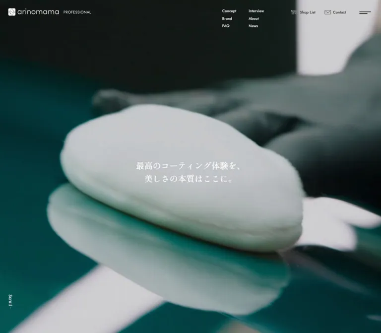
The desktop image fills the viewport with a close view of a white application pad, a dark glove, and reflected workshop lighting on glossy teal paint. The crop gives the material far more space than the text. The mobile opening shows a different close view of the same working context, with the glove and paint filling a tall composition.
Center the two-line Japanese statement:
最高のコーティング体験を、
美しさの本質はここに。
The measured headline is Shippori Mincho at 30px / 45px on desktop and approximately 22.823px / 34.234px on mobile. A small sans-serif subtitle, カーコーティング比較 × 専門店検索サイト, sits below between two short horizontal rules. Its visible size is approximately 12–13px; its individual computed style was not supplied.
A vertical Scroll label and thin descending line occupy the lower left. The opening contains no central filled button; shop and consultation routes remain in the surrounding utility controls.
The outer section occupies two viewport heights, while the initial composition fills one viewport. This suggests additional scroll staging, but sticky behavior, media scrubbing, and pinning are not established. Different stills also do not establish video duration, autoplay, looping, or audio behavior.
Concept Narrative
Role: connect the sensory opening with the comparison and shop-selection service.
The concept section has a measured Blue Black background and white text. Desktop text begins around x:604, creating a substantial empty region to its left. The heading and closing statement use 26px Mincho; three narrative paragraphs use 18px / 36px at weight 500.
On mobile, the text begins around 51.86px from the left, farther inward than the standard 20.74px content gutter. The column is approximately 300.84px wide, with paragraph right padding of 20.748px. Paragraphs use 16.598px / 33.197px. This additional inset gives the narrative a distinct pace within the long page.
The unusually large section extent and computed top padding appear associated with staged positioning. A heading declares opacity, visibility, and transform transitions, but the complete sequence was not supplied. For reuse, keep all narrative content available in normal flow before adding a separately verified scroll presentation.
Brand Introduction and Index
Role: explain the selection criteria and provide direct entry to six chapters.
The introduction combines a small English Brand label, a Japanese Mincho heading, three substantial sans-serif paragraphs, and six numbered links. Desktop paragraphs and links occupy a 592px column beginning at x:639. Mobile uses the standard 348.53px reading width.
Index rows measure 60px high on desktop and approximately 60.67px on mobile. Each contains a two-digit number followed by a brand or application name. Their source padding is asymmetric: 16px 16px 20px 8px on desktop. Keep these as a calm vertical index with generous row targets.
White text is measured throughout this introduction. Its complete underlying visual layer is not visible in the supplied stills, so the exact background composition remains unverified.
| Number | Chapter | Featured product in rendered content |
|---|---|---|
| 01 | GTECHNIQ | CRYSTAL SERUM BLACK |
| 02 | servFaces | Coat Ultima - HSH - Technology |
| 03 | Ultracoat | Magnite |
| 04 | Nanolex | Si3D Cerabide HD |
| 05 | geist. leather coating | Repel |
| 06 | PPF coating | HALO |
The index links target corresponding homepage fragments. The evidence does not demonstrate animated anchor scrolling.
Alternating Brand Chapter
Role: give each coating a substantial, comparable presentation without flattening the page into identical cards.
The rendered content establishes this anatomy: chapter number and origin label; brand name; short feature labels; a Mincho positioning statement; a featured-product label and model; explanatory paragraphs; a user-suitability disclosure; and a three-link action cluster.
Desktop alternation is measurable. GTECHNIQ, Ultracoat, and geist. headings start at x:209, with product prose beginning at x:639. servFaces, Nanolex, and PPF headings start at x:811, with product prose at x:209. Headings typically occupy 420px; prose occupies 592px. These elements occur at different vertical stages within each chapter, so this is more elaborate than a single two-column row.
The Nanolex still shows the later product-information stage: text on the left, two overlapping photographs on the right, and a broad area of open gray beneath. A long section divider near the bottom includes a heavier starting segment; a small origin label and flag accompany the following chapter boundary.
On mobile, all sampled product explanations align to the standard left gutter. Brand heading and statement widths vary, preserving intentional short lines. Do not force every title to the same line count or apply desktop line breaks to all phone widths.
Overlapping Product Photography
Role: connect a broad view of professional work with a close detail of the coated surface.
In the Nanolex desktop capture, a landscape photograph of a vehicle being sprayed occupies approximately 420 × 277px, starting near x:897, y:127. A portrait detail of water on dark paint occupies approximately 248 × 331px, starting near x:983, y:363.
The portrait overlaps the landscape by approximately 41px vertically and is inset about 86px from its left edge. The combined stack is about 567px tall. Both images have square corners and no visible shadow or decorative frame.
The landscape extends to approximately x:1317, beyond the standard reading boundary at x:1231. Preserve this controlled extension on wide screens. The mobile arrangement of this particular image pair was not supplied; the Quick Start recommends a contained proportional stack.
Product Action Cluster
Role: separate detailed product research, shop discovery, and reference material.
The primary product link is a Blue Black rectangle with white text and a small diagonal-square destination icon at the right. At desktop it measures 592 × 72.5px, with 24px 13px padding. Its three-column grid is 16px 502px 16px with 15px gaps. The matching left and right tracks keep the label visually centered.
At mobile it measures approximately 348.53 × 56.98px; the outer icon tracks become approximately 16.59px, with 15.561px gaps. The source container weight is 400; individual nested label weights were not sampled.
Two underlined text links sit centered underneath: 施工店を探す and カタログ(PDF)を見る. They are separated by approximately 28px on desktop and 29.05px on mobile. The gap below the primary button is similar.
Observed shop links include a brand query, such as /shoplist/?shoplist_cat=nanolex. Product-detail destinations vary between the professional site and the related shop domain. The diagonal-square symbol does not, by itself, establish whether a link opens another tab. Document links were identified in the rendered page but not opened.
User-Suitability Disclosure
Role: keep detailed buyer guidance close to the product explanation while limiting the visible chapter length.
The Nanolex screenshot shows こんなユーザー様におすすめ on the left of an unboxed row, a small plus on the right, and a fine bottom rule. Its answer is not visibly expanded.
The supplied DOM includes detailed answer paragraphs with measured 13px / 23.4px desktop typography and approximately 13.486px / 24.275px mobile typography. Some answer rectangles extend into the positions of later controls, demonstrating why their geometry should not be treated as a fully expanded page state.
The trigger is visually evidenced; click behavior, height animation, plus-to-minus transformation, and multiple-open policy are unverified. A native disclosure is an appropriate recommended implementation.
FAQ Section
Role: provide practical explanations before the consultation route.
The FAQ uses a measured Dark Slate background with white section and answer text. Six numbered question-and-answer pairs appear in the rendered content. Desktop section padding is 200px above and below; mobile padding is approximately 124.49px.
The desktop FAQ label begins at x:209, while sampled answer text begins around x:519–521 and has roughly 696–698px of width. On mobile, the label returns to the standard gutter and answer text begins around x:79–81, leaving a clear gutter for the question or answer marker.
Answer styles match the supporting product prose. The content inventory establishes the six questions, but no supplied FAQ screenshot or click recording establishes all visible row details, initial open states, or accordion transitions. Reuse the hierarchy and measured typography while treating the exact trigger styling as an implementation recommendation.
Column Article List
Role: surface current educational articles as an editorial list.
The Column section has a measured white background. At desktop, article links are 1022px wide and 247px tall, with 40px 20px padding. The grid has three tracks: 124px 524px 334px. The date occupies the first track and the title/read-link group occupies the middle. The remaining track accommodates the article's media area; its actual image node and subject were not included in the sample.
The middle title is measured at 20px / 30px, weight 600, in Shippori Mincho. The read label sits beneath at 14px. Row starts are 248px apart, consistent with a one-pixel separation between 247px boxes.
Mobile article links use a single 348.53px column and measure approximately 362.47px high in the captured content. Titles reduce to 18.673px / 28.010px; the read label aligns to the right. The archive button changes from a centered 320px desktop width to the full mobile reading width.
Interview Features
Role: connect coating brands with named specialists and their working experience.
Three interview links are present. Each combines a number, brand name, interview headline, shop/location identification, and a read label. The first two measured desktop link boxes are 1022 × 334px, separated by 160px. Their heading groups alternate between right and left positions, continuing the brand-chapter rhythm.
Mobile retains a deliberate left gutter: item boxes start around x:78.80 and are approximately 290.47px wide. Heading groups begin around x:99.53, with approximately 269.72px width. This is distinct from the full-width Column list. The measured items grow with content, including a taller third interview.
Preserve the relationship between the number gutter, imagery area, and inset text. The supplied evidence does not establish carousel controls or horizontal swiping.
In-Body Destination Panels
Role: provide substantial transitions from research to contact or shop discovery.
The Contact Us link measures 1022 × 240.5px on desktop, with 84px vertical padding. Its English label uses Cormorant Garamond at 42px, with a Japanese secondary line in a two-row group separated by 8px.
At mobile, Contact Us and Shop List links measure approximately 348.53 × 208.5px. The English label uses approximately 37.35px type and the vertical padding is approximately 70.54px.
The label text is white, but the supplied computed container background is transparent. The underlying panel imagery or compositing was not included in the stills. Keep the destination hierarchy and dimensions; verify the backing visual before reproducing an exact panel appearance.
About and News
Role: explain the service context and keep the homepage connected to current activity.
The rendered About content includes a Japanese editorial statement, explanatory prose, a related select-shop link, LINE access, and social links. Its mobile section label uses the same approximately 20.75px Cormorant Garamond treatment as other English section labels. The supplied sample does not establish the full desktop About composition.
The desktop end capture shows the news area on Cool Gray above the footer. Dates occupy a narrow left column and article titles appear as underlined text links to their right. A news-index link aligns toward the reading area's right edge. Keep the news treatment light and typographic rather than turning it into prominent promotional cards.
Footer Destination Directory
Role: act as a final service directory with the same prominence as the content above.
The desktop footer occupies a broad Blue Black field. Its visible inner region runs approximately from x:123 to x:1317, wider than the standard 1022px reading grid. The left area contains the white wordmark, two columns of Japanese links, and Instagram/X icons. The right area starts near x:639 and contains four destination rows:
| English label | Supporting UI label | Visible icon |
|---|---|---|
| Contact Us | お問い合わせ |
Thin horizontal arrow |
| Shop List | 施工店一覧 |
Diagonal arrow in an open square |
| Select Shop | 海外洗車用品セレクトショップ arinomama |
Diagonal arrow in an open square |
| Official Line | Coupon and official-LINE copy | Diagonal arrow in an open square |
English serif labels appear approximately 32px on desktop. Supporting Japanese text occupies a second aligned column, beginning around x:858. Fine muted-white rules separate the rows. The fourth row is taller to accommodate additional copy.
On mobile, the footer becomes a vertical directory with approximately 21px side margins. Each destination places the English label above its Japanese explanation, with the icon aligned on the right. Rows grow to accommodate two-line descriptions. The English labels appear approximately 29px.
The small copyright line sits at the bottom left. A Page Top link with an upward chevron sits at the bottom right. The mobile end capture shows the scrolled footer, not an opened navigation menu. The Page Top destination is #top; scrolling speed and easing were not verified.
Desktop Consultation Panel and Mobile Action Bar
Role: keep the two practical next steps available during a long reading session.
The desktop product capture shows a small consultation panel at the lower right. Its estimated outer size is 312 × 85px, with approximately 32px right clearance and 26px bottom clearance. A light surface holds one short centered invitation above two adjacent navy buttons. The buttons are approximately 140px wide and 36px high, with an 8px gap.
The mobile opening instead shows a dark bottom bar approximately 52px high. It has two equal-width links separated by a thin vertical rule. Each combines an outline icon and a Japanese label: shop list on the left, consultation on the right.
The desktop panel is absent from the opening and end captures, and the mobile bar is absent from the footer capture. These visible states support contextual visibility, but the exact thresholds and mechanism are unknown. A new implementation can suppress the floating controls when equivalent footer destinations are visible.
Tokens — Motion & Interaction
The evidence contains transition declarations, not a complete interaction recording. Distinguish an available transition from a demonstrated state change.
| Element or behavior | Measured declaration or evidence | What remains unverified |
|---|---|---|
| Ordinary links | opacity 0.35s cubic-bezier(0.39,0.575,0.565,1) |
Hover opacity endpoint and keyboard equivalence |
| Filled product/archive links | Color, border, and background each transition over 0.35s with the same easing |
Exact hover colors and border treatment |
| Header wrappers | Opacity and visibility transition over 0.9s cubic-bezier(0.25,0.46,0.45,0.94) |
Scroll thresholds and direction-dependent behavior |
| Concept heading | Opacity, visibility, and transform transition over 0.9s with the same easing |
Initial transform, trigger, and narrative sequence |
| Hero media | Different photographic views in supplied stills; no media element attributes supplied | Video versus other media delivery, loop duration, playback, audio, and controls |
| Product disclosure | Plus-marked collapsed-looking row in the Nanolex capture | Toggle behavior, timing, and open-state styling |
| FAQ | Question and answer content in DOM | Initial open state, trigger details, and transition |
| Fragment links | Brand anchors and #top destinations |
Smooth scrolling, offsets, and focus movement |
| Menu | Button and hidden navigation inventory | Open/close animation, backdrop, focus management, and scroll locking |
The sampled animation: none values do not prove that the site has no motion. JavaScript, media playback, descendants, or unsampled layers may be responsible for movement.
For reuse, keep ordinary feedback restrained and use the measured 350ms and 900ms timings where appropriate. Any added hover endpoint, disclosure animation, or reveal distance must be identified as an adaptation. Avoid forcing visitors through the long introductory staging to reach product information.
Surfaces
| Surface | Appearance | Function |
|---|---|---|
| Opening | Full-bleed automotive imagery with reversed text | Sensory introduction |
| Concept | Blue Black with white Mincho text | Slow narrative pacing |
| Product chapters | Cool Gray with dark type and rectangular photography | Detailed comparison and product research |
| FAQ | Dark Slate with white text | Separate practical guidance from product chapters |
| Column | White with dark editorial type | Clear educational index |
| News | Cool Gray, understated dates and underlined titles | Lightweight updates |
| Footer | Blue Black, white serif destinations, translucent rules | Final service directory |
| Desktop floating controls | Light rectangular panel with navy buttons | Compact consultation access |
| Mobile floating controls | Blue Black strip with white icon/label pairs | Persistent two-action navigation |
The opening and in-body panels should be evaluated as composed layers. A transparent computed background does not describe the final visible surface by itself.
Imagery
The strongest imagery is close, practical, and material-focused. The opening emphasizes contact between a gloved hand, an application pad, and polished paint. Reflections create long light shapes; shallow focus softens the surrounding workshop. Teal and near-black tones arise naturally within that subject.
The Nanolex pair combines a wider vehicle-and-water scene with a vertical water-detail image. It connects professional application with visible surface behavior. Retain the contrast between broad context and close texture instead of using two interchangeable car portraits.
Images are rectangular and borderless. Their overlap supplies depth without interface shadows. Desktop crops may extend beyond the reading grid, while text remains carefully aligned. Mobile art direction should protect a recognizable working detail and leave a stable region for the white headline.
Icons are slender outlines: storefront, envelope, plus, horizontal arrow, diagonal-square destination mark, and upward chevron. Instagram and X retain their recognizable marks. Exact SVG paths and stroke declarations were not supplied; approximately 1px strokes are a visual estimate.
Observed Asset References
| Visible asset | Evidence | Asset URL availability |
|---|---|---|
| White arinomama Professional wordmark | Desktop/mobile opening and desktop footer | Image or vector path not supplied |
| Coating application close view | Desktop and mobile opening captures | Media URL and format not supplied |
| Vehicle being sprayed | Desktop Nanolex product capture | Image path not supplied |
| Water on dark paint | Desktop Nanolex product capture | Image path not supplied |
| Utility and destination icons | Header, product controls, bottom bar, and footer | Individual asset paths not supplied |
No image or video source paths can be recovered reliably from the supplied evidence. Supply authorized brand artwork and photographic assets separately. CSS can reproduce the composition but cannot replace the identity carried by those materials.
Layout & Responsive Behavior
Desktop Composition
The standard reading region is centered at 1022px wide, with 209px margins at 1440px. Brand statements, product explanations, photographs, and footer columns use different widths within or around that system. This controlled variation is central to the page's rhythm.
The measured 420px statement width and 592px reading width do not imply that every brand chapter uses a single fixed two-column grid. The Nanolex detail screenshot, for example, pairs the 592px reading column with a 420px image beginning 96px farther right, extending beyond the standard text boundary.
The Column section uses a more regular three-track list. Interviews return to alternation and numbered composition. The footer widens again. Preserve these differences when building reusable layout primitives.
Mobile Composition
| Pattern | Observed adaptation at 390px |
|---|---|
| Header | Logo and menu remain; six small desktop links disappear |
| Utility actions | Two equal-width links occupy a bottom strip in the opening capture |
| Hero | Same two-line statement, smaller Mincho scale, tall photographic crop |
| Standard prose | Approximately 348.53px wide with 20.74px side gutters |
| Concept | Additional left inset around 51.86px; narrower narrative measure |
| Brand chapters | Explanations align to one column; heading widths remain content-sensitive |
| Product buttons | Reading-width rectangles approximately 56.98px high |
| Secondary product links | Remain beside each other in the measured viewport |
| Column | Single-column article blocks; read links align right |
| Interview | Preserves a large left numbering gutter and inset text |
| Footer | Destination labels and descriptions stack; rules span the reading width |
The source breakpoint and intermediate widths were not supplied. Recommended breakpoint: use 64rem as an initial transition to the single-column layout, then test the actual content between 390px and 1440px. This is a starting point, not a recovered original rule.
The opening's measured outer extent is two viewport heights at both sizes. The Quick Start supplies a static one-viewport opening; recreating the additional scroll staging requires verified motion logic. Do not copy the large concept padding into a static layout, where it could create empty space or hide essential content.
Header samples include partial-width wrappers, zero-height wrappers, and measurable hidden links. Their rectangles are not suitable as standalone layout specifications. Use the visible captures to interpret which controls belong to the current state.
Do’s and Don’ts
Do
- Keep Blue Black
#0f151a, Cool Gray#d9dde0, and White as the main structural palette. - Pair Japanese Mincho statements with sans-serif product explanations.
- Keep the hero headline modest and let the material imagery occupy most of the screen.
- Preserve numbered brand chapters and alternate desktop emphasis across the page.
- Use square, overlapping photographs with distinct context and detail roles.
- Center primary button labels using balanced icon tracks.
- Keep product details, shop discovery, and document access as separate links.
- Retain generous paragraph line height and major section spacing.
- Give Column, Interview, and footer content their distinct layout patterns.
- Preserve the mobile footer's large serif destinations and stacked Japanese descriptions.
Don’t
- Don't turn the six long brand chapters into a uniform rounded-card grid.
- Don't promote the hero's teal photography into an unsupported universal CTA color.
- Don't use the registered library blue as an evidenced brand accent.
- Don't replace the wordmark with an assumed font treatment.
- Don't apply the sampled BODY line height of
1to reading paragraphs. - Don't infer open menu or expanded FAQ states from hidden DOM rectangles.
- Don't invent parallax, video controls, autoplay settings, or smooth-scroll behavior.
- Don't treat every diagonal-square icon as proof of an external domain or new tab.
- Don't crop every mobile heading and image to identical dimensions.
- Don't reproduce large scroll-staging dimensions without ensuring the content remains reachable.
Recommended Implementation Additions
These are recommendations for a new implementation, not verified original features:
- Provide at least 44 × 44px interaction targets for the menu, disclosure controls, and icon-only links while retaining their slim visible marks.
- Give the wordmark link, menu, social icons, and destination icons meaningful accessible names; rendered empty text alone does not establish whether the original lacks those names.
- Use native disclosures or buttons with accurate expanded states. Keep hidden navigation and closed answers out of the keyboard sequence.
- Maintain visible focus indicators on light and dark sections. Check the white hero text over every relevant media frame.
- Offer a still-image fallback and reduced-motion mode for any implemented motion. If moving background media is used, provide appropriate pause behavior and keep audio opt-in.
- Keep all concept and product content readable when scripts fail or motion is reduced.
- Add safe-area clearance to the mobile bar and enough document clearance for focused links above it.
- Suppress floating actions when their footer equivalents are visible, using an explicit visibility rule tested at both viewport sizes.
- Load appropriately sized photography, reserve image space, and defer below-fold assets. Avoid loading full desktop media solely to crop it into a narrow phone viewport.
- Load the evidenced font families deliberately and verify Japanese fallbacks. A larger body size, such as 16px, can be adopted if reading tests justify it.
Agent Prompt Guide
Quick Color Reference
- Main canvas:
#d9dde0. - Main text and filled product links:
#0f151a. - Reversed text and Column background:
#ffffff. - FAQ background:
#242c33. - Compact desktop utility buttons:
#3a4b5d. - Fine separators: Blue Black at 20% on light surfaces; White at 30% on dark surfaces as recommended mappings.
- Teal: photographic color, without a fixed UI token.
Overall Prompt
“Create an extensive Japanese automotive-coating information homepage inspired by arinomama Professional. Use a full-viewport close photograph of careful coating work, a modest centered two-line Shippori Mincho statement, a white wordmark, and sparse outline utilities. Continue through a dark concept narrative, a numbered six-brand index, and substantial alternating brand chapters on cool gray #d9dde0. Pair 420px desktop statement columns with 592px reading columns and square overlapping photographs. Use Noto Sans JP for explanations, Cormorant Garamond for English section labels, and blue-black #0f151a for filled rectangular product links. Include a white article list, inset numbered interviews, and a broad dark footer with four large service destinations. At phone widths, stack the content, preserve the interview number gutter, and provide a two-action bottom bar. Treat motion, breakpoints, and accessibility improvements as implementation choices requiring verification.”
Example Component Prompts
- Opening: “Build a full-screen coating-work photograph with white Japanese Mincho text at 30px desktop and approximately 23px mobile. Place a small sans-serif service descriptor between short horizontal rules beneath it. Keep a vertical Scroll indicator at the lower left and route consultation through surrounding utilities.”
- Product detail: “Place a 592px explanatory column beside a 420px photographic composition on cool gray. Use a landscape workshop photograph with a narrower portrait surface-detail image overlapping its lower edge. Add a thin-rule suitability disclosure, a square dark product button, and two underlined research links below.”
- Product button: “Create a 72.5px desktop-height blue-black link with white Japanese text, square corners, and a 16px destination icon at the right. Reserve an equal empty track at the left so the label remains centered. Reduce the height to approximately 57px on mobile.”
- Column list: “Create a white editorial section with a small English serif label. Use wide desktop rows with a date track, a Mincho title and read-link track, and a media track. Stack each row on mobile and align the read label right. Separate rows with fine rules.”
- Footer: “Build a blue-black footer with a white wordmark, compact Japanese navigation, social marks, and four ruled destination rows. Pair approximately 32px English serif labels with Japanese descriptions on desktop; stack each pair on mobile. Place thin arrows at the right and a small Page Top link at the bottom.”
- Responsive utilities: “Provide a small light desktop consultation panel with two navy buttons during content reading. On mobile, use a dark bottom strip with equal shop and consultation links, outline icons, and a vertical separator. Hide floating actions when the equivalent footer links are visible; implement this as an explicit recommended behavior.”
Quick Start
CSS Custom Properties
This is an adaptation using measured colors, typography, and representative dimensions. It keeps a conventional root font size. The 64rem breakpoint, static hero, mobile photo arrangement, hover endpoints, focus styles, and footer-visibility hook are recommendations. Fonts and authorized media must be supplied separately.
The component classes assume that .brand-detail contains .brand-copy and .brand-visual; the latter contains .brand-photo and .brand-detail-photo. A .footer-link contains .footer-link-title, .footer-link-description, and an icon. The CSS does not implement the original unverified scroll staging or menu behavior.
:root {
  /* Measured source palette */
  --color-canvas: #d9dde0;
  --color-ink: #0f151a;
  --color-white: #fff;
  --color-slate: #242c33;
  --color-navy: #3a4b5d;
  --color-muted: #6d7073;

  /* Recommended semantic rule assignments */
  --rule-light: rgba(15, 21, 26, 0.2);
  --rule-dark: rgba(255, 255, 255, 0.3);

  /* Evidenced leading families with shortened fallback stacks */
  --font-body: 'Noto Sans JP', 'Yu Gothic', Meiryo, sans-serif;
  --font-jp-editorial: 'Shippori Mincho', serif;
  --font-en-editorial: 'Cormorant Garamond', serif;
  --font-utility: Jost, sans-serif;

  --text-body: 15px;
  --text-small: 13px;
  --text-link: 14px;
  --text-hero: 30px;
  --text-brand: 36px;
  --text-statement: 26px;
  --text-section: 20px;
  --text-article: 20px;
  --text-footer: 32px; /* Screenshot estimate */
  --leading-body: 2;
  --leading-small: 1.8;

  --content-width: 1022px;
  --footer-width: 1194px; /* Screenshot estimate */
  --gutter: 30px;
  --section-space: 200px;
  --button-height: 72.5px;
  --button-pad-y: 24px;
  --button-pad-x: 13px;
  --button-icon: 16px;
  --button-gap: 15px;
  --link-gap: 28px;
  --dock-height: 52px; /* Screenshot estimate */

  --ease-link: cubic-bezier(0.39, 0.575, 0.565, 1);
  --ease-reveal: cubic-bezier(0.25, 0.46, 0.45, 0.94);
  --motion-link: 350ms var(--ease-link);
  --motion-reveal: 900ms var(--ease-reveal);
  --safe-bottom: env(safe-area-inset-bottom, 0px);
}

* { box-sizing: border-box; }
html { font-size: 100%; }
body {
  margin: 0;
  color: var(--color-ink);
  background: var(--color-canvas);
  font-family: var(--font-body);
  font-size: var(--text-body);
  line-height: var(--leading-body);
  letter-spacing: 0.04em;
}
img, video { display: block; max-width: 100%; }
button, input, textarea { font: inherit; }
a { color: inherit; }
button { cursor: pointer; }
[hidden] { display: none !important; }

.container {
  width: min(calc(100% - 2 * var(--gutter)), var(--content-width));
  margin-inline: auto;
}
.section { padding-block: var(--section-space); }
.section--white { background: var(--color-white); }
.section--dark {
  color: var(--color-white);
  background: var(--color-ink);
}
.section--faq {
  color: var(--color-white);
  background: var(--color-slate);
}
.section-label {
  margin: 0 0 100px;
  font: 600 var(--text-section) / 1 var(--font-en-editorial);
  letter-spacing: 0.04em;
}
.brand-title, .statement, .article-title {
  margin: 0;
  font-family: var(--font-jp-editorial);
  letter-spacing: -0.01em;
}
.brand-title { font-size: var(--text-brand); line-height: 1.5; font-weight: 600; }
.statement { font-size: var(--text-statement); line-height: 1.6; font-weight: 400; }
.article-title { font-size: var(--text-article); line-height: 1.5; font-weight: 600; }

/* Static opening fallback; extra source scroll extent is not reproduced. */
.hero {
  position: relative;
  min-height: 100vh;
  min-height: 100svh;
  display: grid;
  place-items: center;
  overflow: hidden;
  isolation: isolate;
  color: var(--color-white);
  background: var(--color-ink);
}
.hero-media {
  position: absolute;
  inset: 0;
  width: 100%;
  height: 100%;
  object-fit: cover;
  object-position: var(--hero-position, center);
  z-index: -2;
}
.hero::before {
  /* Recommended contrast layer; opacity was not measured. */
  content: '';
  position: absolute;
  inset: 0;
  background: rgba(15, 21, 26, 0.24);
  z-index: -1;
}
.hero-copy { width: 100%; padding-inline: 20px; text-align: center; }
.hero-title {
  margin: 0;
  font: 400 var(--text-hero) / 1.5 var(--font-jp-editorial);
  letter-spacing: -0.01em;
}
.hero-subtitle {
  display: flex;
  align-items: center;
  justify-content: center;
  gap: 12px;
  margin: 16px 0 0;
  font-size: 12px; /* Screenshot-based approximation */
  line-height: 1.5;
  letter-spacing: 0;
}
.hero-subtitle::before, .hero-subtitle::after {
  content: '';
  width: 32px;
  height: 1px;
  background: currentColor;
  flex: 0 0 auto;
}
.scroll-cue {
  position: absolute;
  left: 30px;
  bottom: 30px;
  display: flex;
  align-items: center;
  gap: 8px;
  writing-mode: vertical-rl;
  font: 500 15px / 1 var(--font-utility);
}
.scroll-cue::after { content: ''; width: 1px; height: 60px; background: currentColor; }

/* A representative detail-stage layout with controlled desktop overflow. */
.brand-detail {
  display: grid;
  grid-template-columns: minmax(0, 592fr) minmax(0, 334fr);
  gap: 96px;
  align-items: start;
}
.brand-copy { min-width: 0; }
.brand-copy p { margin: 0 0 28px; }
.product-title {
  margin: 0 0 24px;
  font: 600 22px / 1.5 var(--font-jp-editorial);
  letter-spacing: -0.01em;
}
.brand-visual { width: 420px; max-width: none; }
.brand-photo { width: 100%; aspect-ratio: 420 / 277; object-fit: cover; }
.brand-detail-photo {
  position: relative;
  width: 59.05%;
  aspect-ratio: 248 / 331;
  object-fit: cover;
  margin-top: -9.76%;
  margin-left: 20.48%;
}

.product-link {
  display: grid;
  grid-template-columns: var(--button-icon) minmax(0, 1fr) var(--button-icon);
  align-items: center;
  gap: var(--button-gap);
  min-height: var(--button-height);
  padding: var(--button-pad-y) var(--button-pad-x);
  border: 1px solid var(--color-ink);
  border-radius: 0;
  color: var(--color-white);
  background: var(--color-ink);
  font-size: var(--text-body);
  font-weight: 400;
  line-height: 1.5;
  text-align: center;
  text-decoration: none;
  transition: color var(--motion-link), background var(--motion-link), border-color var(--motion-link);
}
.product-link-label { grid-column: 2; }
.product-link-icon { grid-column: 3; width: var(--button-icon); height: var(--button-icon); }
.secondary-links {
  display: flex;
  flex-wrap: wrap;
  justify-content: center;
  gap: 12px var(--link-gap);
  margin-top: var(--link-gap);
}
.secondary-links a {
  padding-bottom: 5px;
  font-size: var(--text-link);
  line-height: 1.5;
  letter-spacing: 0.05em;
  text-decoration: none;
  border-bottom: 1px solid currentColor;
}
.archive-link { width: min(100%, 320px); margin: 80px auto 0; }

/* Recommended native disclosure; source interaction was not tested. */
.suitability { margin: 32px 0 56px; border-bottom: 1px solid var(--rule-light); }
.suitability summary {
  display: flex;
  align-items: center;
  justify-content: space-between;
  gap: 20px;
  min-height: 60px;
  padding: 16px 8px;
  list-style: none;
  cursor: pointer;
  font-family: var(--font-jp-editorial);
}
.suitability summary::-webkit-details-marker { display: none; }
.disclosure-mark { position: relative; width: 16px; height: 16px; flex: 0 0 16px; }
.disclosure-mark::before, .disclosure-mark::after {
  content: '';
  position: absolute;
  inset: 7.5px 0 auto;
  height: 1px;
  background: currentColor;
}
.disclosure-mark::after { transform: rotate(90deg); }
.suitability[open] .disclosure-mark::after { display: none; }
.disclosure-body { padding: 0 8px 24px; font-size: var(--text-small); line-height: var(--leading-small); letter-spacing: 0.02em; }

.column-item {
  display: grid;
  grid-template-columns: minmax(0, 124fr) minmax(0, 524fr) minmax(0, 334fr);
  align-items: center;
  padding: 40px 20px;
  border-bottom: 1px solid var(--rule-light);
  text-decoration: none;
}
.column-item-copy { padding-right: 56px; }
.column-item-media { width: 100%; aspect-ratio: 2; object-fit: cover; }
.read-label { display: inline-block; margin-top: 20px; font-size: var(--text-link); text-decoration: underline; text-underline-offset: 5px; }

/* Footer sizes and track choices adapt the supplied screenshots. */
.site-footer { color: var(--color-white); background: var(--color-ink); padding: 120px 0 30px; }
.footer-grid {
  display: grid;
  grid-template-columns: minmax(0, 420fr) minmax(0, 678fr);
  gap: 96px;
  width: min(calc(100% - 2 * var(--gutter)), var(--footer-width));
  margin-inline: auto;
}
.footer-link {
  display: grid;
  grid-template-columns: 196px minmax(0, 1fr) 26px;
  gap: 23px;
  align-items: center;
  padding: 36px 0;
  border-bottom: 1px solid var(--rule-dark);
  text-decoration: none;
}
.footer-link-title { font: 400 var(--text-footer) / 1.15 var(--font-en-editorial); letter-spacing: 0; }
.footer-link-description { font-size: var(--text-body); line-height: 2; }
.footer-bottom { display: flex; justify-content: space-between; align-items: end; gap: 24px; padding: 140px 30px 0; font-size: 13px; }

.consult-panel {
  position: fixed;
  right: 32px;
  bottom: 26px;
  z-index: 30;
  width: 312px;
  padding: 8px 12px 12px;
  background: rgba(255, 255, 255, 0.85);
  text-align: center;
}
.consult-panel p { margin: 0 0 6px; font-size: 12px; line-height: 1.5; }
.consult-actions { display: grid; grid-template-columns: 1fr 1fr; gap: 8px; }
.consult-actions a { padding: 8px 4px; color: #fff; background: var(--color-navy); font-size: 13px; line-height: 1.5; text-decoration: none; }
.mobile-actions { display: none; }

/* Apply these hooks through explicit application state. */
.is-footer-visible .consult-panel,
.is-footer-visible .mobile-actions,
.is-at-opening .consult-panel { display: none; }

@media (hover: hover) {
  /* Recommended endpoints; only transition declarations were measured. */
  .product-link:hover { color: var(--color-ink); background: transparent; }
  .secondary-links a:hover, .footer-link:hover { opacity: 0.7; }
}
.secondary-links a, .footer-link { transition: opacity var(--motion-link); }
:where(a, button, summary):focus-visible { outline: 2px solid currentColor; outline-offset: 5px; }

/* Recommended breakpoint; values approximate the measured phone state. */
@media (max-width: 64rem) {
  :root {
    --gutter: 20.748px;
    --section-space: 124.488px;
    --text-body: 14.5236px;
    --text-small: 13.4862px;
    --text-link: 13.4862px;
    --text-hero: 22.8228px;
    --text-brand: 29.0472px;
    --text-statement: 20.748px;
    --text-section: 20.748px;
    --text-article: 18.6732px;
    --text-footer: 29px;
    --button-height: 56.984px;
    --button-pad-y: 16.5984px;
    --button-pad-x: 13.4862px;
    --button-icon: 16.5984px;
    --button-gap: 15.561px;
    --link-gap: 29.0472px;
  }
  html { scroll-padding-bottom: calc(var(--dock-height) + var(--safe-bottom) + 24px); }
  .has-mobile-actions { padding-bottom: calc(var(--dock-height) + var(--safe-bottom)); }
  .section-label { margin-bottom: 58px; }
  .hero-copy { padding-inline: 16px; }
  .hero-subtitle { gap: 8px; font-size: 12px; }
  .hero-subtitle::before, .hero-subtitle::after { width: 26px; }
  .scroll-cue { left: 21px; bottom: calc(var(--dock-height) + var(--safe-bottom) + 30px); }
  .brand-detail { grid-template-columns: minmax(0, 1fr); gap: 48px; }
  .brand-visual { width: 100%; max-width: 420px; margin-inline: auto; }
  .product-title { font-size: 20px; }
  .archive-link { width: 100%; margin-top: 42px; }
  .column-item { grid-template-columns: minmax(0, 1fr); gap: 16px; padding: 0 0 41.496px; margin-bottom: 41.496px; }
  .column-item-copy { padding: 0; }
  .column-item-media { grid-row: 1; }
  .read-label { display: block; text-align: right; }
  .footer-grid { grid-template-columns: minmax(0, 1fr); gap: 64px; }
  .footer-link { grid-template-columns: minmax(0, 1fr) 26px; gap: 8px 20px; padding-block: 32px; }
  .footer-link-title { grid-column: 1; }
  .footer-link-description { grid-column: 1; line-height: 1.5; }
  .footer-link > svg { grid-column: 2; grid-row: 1 / span 2; }
  .footer-bottom { padding: 52px var(--gutter) 0; }
  .consult-panel { display: none; }
  .mobile-actions {
    position: fixed;
    inset: auto 0 0;
    z-index: 30;
    display: grid;
    grid-template-columns: 1fr 1fr;
    padding-bottom: var(--safe-bottom);
    color: #fff;
    background: var(--color-ink);
  }
  .mobile-actions a { display: flex; align-items: center; justify-content: center; gap: 16px; min-height: var(--dock-height); padding: 8px; font-weight: 600; line-height: 1.5; text-decoration: none; }
  .mobile-actions a + a { border-left: 1px solid var(--rule-dark); }
  .mobile-actions svg { width: 24px; height: 20px; flex: 0 0 auto; }
}

@media (prefers-reduced-motion: reduce) {
  .product-link, .secondary-links a, .footer-link { transition: none; }
  .motion-reveal { opacity: 1; visibility: visible; transform: none; transition: none; }
  /* Pause any implemented moving media separately and expose its poster. */
}
Example Component Markup
This native disclosure and link cluster demonstrate the CSS anatomy. The text is a short implementation example; it is not a replacement for the original product explanation. The destination icon is an approximate reusable SVG, not a recovered original asset.
<details class='suitability'>
  <summary>
    <span lang='ja'>こんなユーザー様におすすめ</span>
    <span class='disclosure-mark' aria-hidden='true'></span>
  </summary>
  <div class='disclosure-body'>
    <p>Insert the verified product suitability guidance here.</p>
  </div>
</details>

<a class='product-link' href='https://arinomama.co.jp/pages/nanolex-coating'>
  <span class='product-link-label' lang='ja'>詳しい製品情報はこちら</span>
  <svg class='product-link-icon' viewBox='0 0 16 16' fill='none' aria-hidden='true'>
    <path d='M9 1H15V7M15 1L6 10M6 2H1V15H14V10'
      stroke='currentColor' stroke-width='1'/>
  </svg>
</a>
<div class='secondary-links'>
  <a href='https://pro.arinomama.co.jp/shoplist/?shoplist_cat=nanolex' lang='ja'>施工店を探す</a>
  <a href='https://pro.arinomama.co.jp/img/top/Nanolex_catalog.pdf' lang='ja'>カタログ(PDF)を見る</a>
</div>
Tailwind v4 Token Mapping
Optional mapping for a project already using Tailwind v4. Define the custom properties above first. These aliases do not imply that the original website uses Tailwind.
@theme inline {
  --color-canvas: #d9dde0;
  --color-ink: #0f151a;
  --color-slate: #242c33;
  --color-navy: #3a4b5d;
  --color-muted: #6d7073;

  --font-body: 'Noto Sans JP', 'Yu Gothic', Meiryo, sans-serif;
  --font-editorial-jp: 'Shippori Mincho', serif;
  --font-editorial-en: 'Cormorant Garamond', serif;
  --font-utility: Jost, sans-serif;

  --text-reading: var(--text-body);
  --text-supporting: var(--text-small);
  --text-hero-heading: var(--text-hero);
  --text-brand-heading: var(--text-brand);
  --text-editorial-statement: var(--text-statement);
  --spacing-page-gutter: var(--gutter);
  --spacing-section-block: var(--section-space);
  --spacing-reading-width: var(--content-width);
  --radius-square: 0px;
}
Sources & Evidence
- Original and final inspected page: https://pro.arinomama.co.jp/. The supplied browser record reports HTTP 200 and identical original/final URLs.
- Capture session: September 12, 2026, retrieval timestamp
2026-09-12T14:25:18.041Z. Desktop viewport: 1440 × 1000 CSS pixels. Mobile viewport: 390 × 844 CSS pixels. - Current-page visual evidence: desktop opening, Nanolex product detail, and news/footer captures; mobile opening and footer-end captures. These establish visible imagery, composition, icon appearance, and selected responsive states.
- Rendered DOM and computed styles: paired desktop/mobile text and link inventories, source custom properties, element rectangles, declared font stacks, typography, grid tracks, padding, radius, and transition strings. Some elements were hidden or clipped in the corresponding visual state.
- Observed navigation structure: homepage fragments for concept, brand, FAQ, About, individual brands, and Page Top; destination links for contact, shop discovery, product details, articles, interviews, news, and related services. Destination pages and documents were not opened for this reference.
- Inspection limitations: the supplied capture process waited for loading, finite motion, layout/text stability, and image decoding within bounded time limits. Perpetual animations were temporarily paused during readiness checks and resumed afterward. These checks do not establish complete delayed content, a full motion timeline, or behavior of unexercised controls. No menu click, disclosure toggle, hover endpoint, form submission, or media-control interaction is documented.
This reference describes the supplied current homepage evidence. Screenshot estimates, derived measurements, and recommended implementation choices are explicitly distinguished from measured source values.
# arinomama Professional — Style Reference

> Reflective automotive surfaces, quiet serif typography, and the measured spacing of a specialist showroom.

**Website:** [arinomama Professional](https://pro.arinomama.co.jp/)
**Original URL:** https://pro.arinomama.co.jp/
**Final URL:** https://pro.arinomama.co.jp/
**Inspected:** September 12, 2026; supplied retrieval timestamp 14:25:18.041 UTC / 23:25:18.041 JST.
**Viewports:** 1440 × 1000 and 390 × 844 CSS pixels.
**Theme:** cool gray content canvas with dark editorial sections, white article sections, and a dark footer. No selectable theme was demonstrated.
**Scope:** the current homepage: photographic opening, concept narrative, six coating chapters, FAQ, contact and shop links, columns, interviews, About content, news, desktop utilities, mobile action bar, and footer. Visual evidence consists of three desktop captures and two mobile captures, supplemented by rendered text, links, rectangles, and computed styles. Linked destination pages were not inspected.

arinomama Professional is a coating information and specialist-shop discovery website. Its homepage combines an atmospheric introduction with substantial product explanations and an editorial content index. The information architecture includes six brand or application chapters, educational articles, professional interviews, and repeated routes to consultation and shop discovery.

The visual identity comes from a restrained relationship between materials and typography. Close views of polished paint, a gloved hand, water, and workshop lighting supply texture and color. The interface uses blue-black, cool gray, white, thin rules, and square controls. Japanese Mincho headings convey care and refinement; readable sans-serif paragraphs carry technical explanations. English serif labels mark destinations and section changes.

Desktop layouts alternate their emphasis across the page. Brand names and statements occupy narrower columns; explanations use wider reading columns; photographs sometimes extend beyond the standard text boundary. Mobile keeps the same content sequence while changing those relationships into vertical compositions. The result remains an extensive editorial website, with conversion routes distributed through the reading experience.

## How to Read This Reference

- **Measured** means a value appears in the supplied computed styles or element rectangles. Values refer to the stated viewport and captured state.
- **Derived** means simple arithmetic using those measurements, such as converting a pixel size to its equivalent at the measured root size.
- **Estimated** means an approximate visual measurement from a supplied current-page screenshot. These values are not recovered CSS declarations.
- **Recommended** means an implementation choice for reuse, including the breakpoint, accessibility additions, and unobserved interaction endpoints in the Quick Start.
- Token aliases are descriptive implementation names. Original custom properties are identified explicitly.
- A computed font stack identifies the declared family order; it does not establish the actual font used for every glyph.
- Some hidden navigation and disclosure content retains measurable rectangles. Its presence in the DOM does not establish that it was visible or opened.

## Tokens — Colors

### Default Palette

| Name | Value | Source property | Role and evidence |
| --- | --- | --- | --- |
| Blue Black | `#0f151a` | `--colorBlack` | Measured body text, filled product links, and concept background; visually consistent with the footer |
| Cool Gray | `#d9dde0` | `--colorLghtGray` | Measured body background; visible across the product and news areas |
| White | `#ffffff` | `--colorWhite` | Measured reversed text and Column section background |
| Dark Slate | `#242c33` | `--colorDarkGray` | Measured FAQ section background |
| Utility Navy | `#3a4b5d` | `--colorNavy` | Declared token; visually consistent with the two buttons in the desktop consultation panel |
| Mid Gray | `#6d7073` | `--colorGray` | Declared secondary neutral; appropriate for subdued metadata, although individual news-date colors were not sampled |

The teal visible in the opening belongs to the photographic material. It is not an evidenced action-color token. Keep the interface neutral so the reflected paint and water remain the strongest chromatic elements.

### Transparency and Rules

| Source properties | Measured values | Interpretation |
| --- | --- | --- |
| `--colorWhite30` | `rgba(255,255,255,0.3)` | Available light separator color; a close visual match for footer rules |
| `--colorWhite70`, `--colorWhite80` | White at `0.7` and `0.8` alpha | Available softened white treatments; their complete selector usage was not supplied |
| `--colorBlack20`, `--colorBlack30` | Blue Black at `0.2` and `0.3` alpha | Available subtle dark rules and secondary treatments |
| `--colorBlack50`, `--colorBlack90` | Blue Black at `0.5` and `0.9` alpha | Available stronger translucent treatments; do not assume they are the hero overlay values |

**Recommended mapping:** use Black 20% for rules on Cool Gray and White 30% for rules on Blue Black. These assignments reproduce the visible contrast hierarchy without claiming a recovered border selector.

### Theme Presets

No user-controlled theme presets are evidenced. The palette changes by section. A transparent element with white text may depend on an underlying layer that was not included in the element sample; do not automatically assign it a white background.

The registered `--swiper-theme-color: #007aff` is a library variable. The supplied captures do not establish bright blue as part of the visible design or demonstrate a carousel.

## Tokens — Typography

### Shippori Mincho — Japanese Editorial Text

**Declared stack:** `'Shippori Mincho', serif`.

Used by the hero heading, concept statements, concept prose, brand headings, product positioning statements, article titles, and interview headings. Most promotional statements use weight `400`; brand headings and article titles use `600`; concept prose uses `500`.

Tracking is slightly negative: generally `-0.01em` for headings and `-0.02em` for concept prose. Line height is generous, especially in the narrative passages. Preserve this quiet scale: the desktop hero is only 30px despite occupying a full-screen visual field.

### Noto Sans JP — Reading and Navigation

**Declared leading family:** `'Noto Sans JP'`, followed by Japanese system fallbacks including Yu Gothic, YuGothic, Meiryo, and Hiragino families, then additional system sans-serif fallbacks.

Used for product explanations, small navigation, FAQ answers, and many link containers. Main paragraphs use `2` line height with `0.04em` tracking. Supporting disclosure text uses `1.8` line height and `0.02em` tracking.

The BODY itself has a measured line height of `1`; paragraph selectors provide the readable line spacing. Copying the BODY line height into article text would lose an essential part of this design.

### Cormorant Garamond — English Section and Destination Labels

**Declared stack:** `'Cormorant Garamond', serif`.

Measured on small English section labels, the hidden navigation inventory, and large in-body destination labels such as Contact Us. Section labels use `600`; in-body destination labels use `500`; menu links use `400`. Tracking is `0.04em`.

The footer visibly uses a similar English serif treatment, but its individual heading styles were not included in the computed sample. Footer sizes below are estimates, and the Quick Start reuses this evidenced family as an adaptation.

### Jost — Utility Links

**Declared stack:** `Jost, sans-serif` on the desktop shop and consultation utility links.

Those sampled containers use 13px type, weight `400`, and a 19.5px line height. Their Japanese labels may use fallback glyphs. The wordmark is separate artwork; there is no evidence that it is typeset in Jost.

### Type Scale

Sizes and line heights below are measured unless marked estimated. Mobile values are rounded for readability.

| Role | Family | Desktop size / line height | Mobile size / line height | Weight | Tracking |
| --- | --- | --- | --- | --- | --- |
| Hero headline | Shippori Mincho | `30 / 45px` | `22.823 / 34.234px` | `400` | `-0.01em` |
| Concept heading and brand statement | Shippori Mincho | `26 / 41.6px` | `20.748 / 33.197px` | `400` | `-0.01em` |
| Concept prose | Shippori Mincho | `18 / 36px` | `16.598 / 33.197px` | `500` | `-0.02em` |
| Brand heading container | Shippori Mincho | `36 / 54px` | `29.047 / 43.571px` | `600` | `-0.01em` |
| Product explanation | Noto Sans JP stack | `15 / 30px` | `14.524 / 29.047px` | `400` | `0.04em` |
| Disclosure and FAQ answer | Noto Sans JP stack | `13 / 23.4px` | `13.486 / 24.275px` | `400` | `0.02em` |
| English section label | Cormorant Garamond | `20 / 20px` | `20.748 / 20.748px` | `600` | `0.04em` |
| Brand index link | Shippori Mincho | `16 / 24px` | `15.561 / 23.342px` | `600` | `-0.01em` |
| Column article title | Shippori Mincho | `20 / 30px` | `18.673 / 28.010px` | `600` | `-0.01em` |
| Interview heading | Shippori Mincho | `26 / 41.6px` | `20.748 / 33.197px` | `400` | `-0.01em` |
| In-body Contact Us label | Cormorant Garamond | `42 / 42px` | `37.346 / 37.346px` | `500` | `0.04em` |
| Secondary product link | Noto Sans JP stack | `14 / 21px` | `13.486 / 20.229px` | `400` | `0.05em` |
| Desktop primary navigation | Noto Sans JP stack | `12 / 14.4px` | Not visible in the mobile opening | `400` | `0.04em` |
| Hidden menu link | Cormorant Garamond | `28 / 28px` | `29.047 / 29.047px` | `400` | `0.04em` |
| Footer English destination | Serif, visually observed | Approximately `32px` | Approximately `29px` | Not sampled | Not sampled |

The product-model line in the Nanolex capture appears approximately 22px, with serif styling. Its exact computed style was not supplied. Child spans, including parenthetical brand readings, may differ from their sampled heading container.

Source weight variables include `400`, `500`, `600`, `700`, and `900`. Their declaration alone does not establish that all five weights are visibly used in the inspected components.

## Tokens — Spacing & Shapes

### Responsive Unit

The measured HTML root is `10px` on desktop and `10.374px` at 390px width. The original responsive formula and breakpoint declarations were not supplied.

Arithmetic equivalents illustrate the role-specific adaptation:

| Role | Desktop equivalent at 10px root | Mobile equivalent at 10.374px root |
| --- | --- | --- |
| Hero heading | `3rem` | `2.2rem` |
| Brand heading | `3.6rem` | `2.8rem` |
| Main body | `1.5rem` | `1.4rem` |
| Supporting body | `1.3rem` | `1.3rem` |
| Standard mobile inset | — | `2rem` |

These are derived equivalents, not recovered source declarations. The mobile root is slightly larger, while several role multipliers are smaller. Do not scale the entire desktop composition by one universal factor.

### Spacing Scale

| Use | Desktop | Mobile | Evidence |
| --- | --- | --- | --- |
| Logo position | `30px` from left and top for H1 box | Approximately `15.55px` left, `20.73px` top | Measured rectangles |
| Standard reading inset | `209px` from either viewport edge | Approximately `20.74px` | Measured rectangles |
| Main reading width | `1022px` | Approximately `348.53px` | Measured rectangles |
| Header utility icon gap | `8px` | Not sampled | Computed gap |
| Primary button column gap | `15px` | `15.561px` | Computed gap |
| Primary button padding | `24px 13px` | `16.598px 13.486px` | Computed padding |
| Secondary links gap | `28px` | Approximately `29.05px` | Derived from link rectangles |
| Button-to-secondary-links clearance | `28px` | Approximately `29.05px` | Derived from rectangles |
| Brand index row | `60px` high | Approximately `60.67px` high | Measured rectangles |
| Disclosure horizontal content inset | `8px` | Approximately `8.30px` | Derived from text positions |
| Column row padding | `40px 20px` | Bottom padding approximately `41.50px` | Computed padding |
| Major FAQ, Column, Interview padding | `200px` top and bottom | Approximately `124.49px` top and bottom | Computed padding |
| Desktop interview item clearance | `160px` | Approximately `157.67px` between the first two measured item boxes | Derived from rectangles |

### Border Radius

| Element | Treatment | Evidence |
| --- | --- | --- |
| Product and archive buttons | `0` | Measured |
| Brand index and article links | `0` | Measured |
| Product photographs | Square corners | Screenshot observation |
| Footer destination rows | Unboxed, separated by rules | Screenshot observation |
| Floating consultation panel | Rectangular | Screenshot observation |

The visible interface does not use a general rounded-card or shadow elevation system. Fine lines, broad spacing, and changes of background establish hierarchy.

### Layout Measurements

| Element | Desktop | Mobile | Interpretation |
| --- | --- | --- | --- |
| Document height | `22808.688px` | `25314.656px` | Measured captured document states |
| Opening section extent | `2000px` | `1688px` | Exactly twice each viewport height; scroll mechanism unverified |
| Hero heading block | `y:439.203`, height `121.594px` | `y:372`, height `100px` | Block includes headline and subtitle; centered at viewport mid-height |
| Concept text region | Starts at `x:604`; heading width `430px` | Starts at `x:51.859`; width `300.844px` | An inset narrative column rather than full-width body prose |
| Product reading column | `592px` | `348.531px` | Main explanatory text and button width |
| Brand statement column | Usually `420px` | Varies by brand, approximately `239.53–348.53px` | Mobile headings retain content-specific composition |
| Product button | `592 × 72.5px` | `348.531 × 56.984px` | Measured link rectangle |
| Column archive button | `320 × 72.5px` | `348.531 × 56.984px` | Narrow centered desktop action becomes full reading width |
| Footer content span | Approximately `1194px`, from `x:123` to `1317` | Approximately `348px` | Screenshot estimate; wider desktop grid than standard reading content |
| Visible mobile bottom bar | — | Approximately `390 × 52px` | Screenshot estimate; occupies the bottom of the opening capture |

## Components

### Header and Persistent Utilities

**Role:** establish identity and maintain access to navigation, shop discovery, and consultation.

The desktop opening places the white wordmark at the upper left. Six small Japanese navigation links form two columns and three rows near the upper right of the identity region. The left column contains concept, brand, and FAQ links; the right column contains columns, interviews, and news. Their measured row starts are approximately 30, 58.39, and 86.78px.

A separate utility group contains a storefront outline, `施工店一覧`, an envelope outline, and `フォームで相談`. A two-line menu control sits farther right. The menu button measures `40 × 20px` at approximately `x:1364, y:34` on desktop. Its two visible strokes have unequal lengths.

In the supplied desktop product and footer captures, the utility controls remain near the top right while the opening logo and six-link navigation are no longer visible. This supports a persistent utility treatment, although the exact positioning rules and visibility thresholds were not supplied.

At 390px width, the opening shows the logo and menu control, with the shop and consultation actions moved to the bottom bar. The menu button rectangle is approximately `41.48 × 33.19px`. The visible symbol can remain slim while a new implementation provides a larger interaction target.

The DOM contains another navigation inventory with English serif labels and contact destinations. It was not visibly opened in the supplied captures. Do not use its measured rectangles as proof of an open menu layout or transition.

### Photographic Opening

**Role:** communicate precision and the tactile result of coating work before introducing dense information.

The desktop image fills the viewport with a close view of a white application pad, a dark glove, and reflected workshop lighting on glossy teal paint. The crop gives the material far more space than the text. The mobile opening shows a different close view of the same working context, with the glove and paint filling a tall composition.

Center the two-line Japanese statement:

> 最高のコーティング体験を、
> 美しさの本質はここに。

The measured headline is Shippori Mincho at `30px / 45px` on desktop and approximately `22.823px / 34.234px` on mobile. A small sans-serif subtitle, `カーコーティング比較 × 専門店検索サイト`, sits below between two short horizontal rules. Its visible size is approximately 12–13px; its individual computed style was not supplied.

A vertical Scroll label and thin descending line occupy the lower left. The opening contains no central filled button; shop and consultation routes remain in the surrounding utility controls.

The outer section occupies two viewport heights, while the initial composition fills one viewport. This suggests additional scroll staging, but sticky behavior, media scrubbing, and pinning are not established. Different stills also do not establish video duration, autoplay, looping, or audio behavior.

### Concept Narrative

**Role:** connect the sensory opening with the comparison and shop-selection service.

The concept section has a measured Blue Black background and white text. Desktop text begins around `x:604`, creating a substantial empty region to its left. The heading and closing statement use 26px Mincho; three narrative paragraphs use `18px / 36px` at weight `500`.

On mobile, the text begins around `51.86px` from the left, farther inward than the standard `20.74px` content gutter. The column is approximately 300.84px wide, with paragraph right padding of 20.748px. Paragraphs use `16.598px / 33.197px`. This additional inset gives the narrative a distinct pace within the long page.

The unusually large section extent and computed top padding appear associated with staged positioning. A heading declares opacity, visibility, and transform transitions, but the complete sequence was not supplied. For reuse, keep all narrative content available in normal flow before adding a separately verified scroll presentation.

### Brand Introduction and Index

**Role:** explain the selection criteria and provide direct entry to six chapters.

The introduction combines a small English Brand label, a Japanese Mincho heading, three substantial sans-serif paragraphs, and six numbered links. Desktop paragraphs and links occupy a 592px column beginning at `x:639`. Mobile uses the standard 348.53px reading width.

Index rows measure 60px high on desktop and approximately 60.67px on mobile. Each contains a two-digit number followed by a brand or application name. Their source padding is asymmetric: `16px 16px 20px 8px` on desktop. Keep these as a calm vertical index with generous row targets.

White text is measured throughout this introduction. Its complete underlying visual layer is not visible in the supplied stills, so the exact background composition remains unverified.

| Number | Chapter | Featured product in rendered content |
| --- | --- | --- |
| 01 | GTECHNIQ | CRYSTAL SERUM BLACK |
| 02 | servFaces | Coat Ultima - HSH - Technology |
| 03 | Ultracoat | Magnite |
| 04 | Nanolex | Si3D Cerabide HD |
| 05 | geist. leather coating | Repel |
| 06 | PPF coating | HALO |

The index links target corresponding homepage fragments. The evidence does not demonstrate animated anchor scrolling.

### Alternating Brand Chapter

**Role:** give each coating a substantial, comparable presentation without flattening the page into identical cards.

The rendered content establishes this anatomy: chapter number and origin label; brand name; short feature labels; a Mincho positioning statement; a featured-product label and model; explanatory paragraphs; a user-suitability disclosure; and a three-link action cluster.

Desktop alternation is measurable. GTECHNIQ, Ultracoat, and geist. headings start at `x:209`, with product prose beginning at `x:639`. servFaces, Nanolex, and PPF headings start at `x:811`, with product prose at `x:209`. Headings typically occupy 420px; prose occupies 592px. These elements occur at different vertical stages within each chapter, so this is more elaborate than a single two-column row.

The Nanolex still shows the later product-information stage: text on the left, two overlapping photographs on the right, and a broad area of open gray beneath. A long section divider near the bottom includes a heavier starting segment; a small origin label and flag accompany the following chapter boundary.

On mobile, all sampled product explanations align to the standard left gutter. Brand heading and statement widths vary, preserving intentional short lines. Do not force every title to the same line count or apply desktop line breaks to all phone widths.

### Overlapping Product Photography

**Role:** connect a broad view of professional work with a close detail of the coated surface.

In the Nanolex desktop capture, a landscape photograph of a vehicle being sprayed occupies approximately `420 × 277px`, starting near `x:897, y:127`. A portrait detail of water on dark paint occupies approximately `248 × 331px`, starting near `x:983, y:363`.

The portrait overlaps the landscape by approximately 41px vertically and is inset about 86px from its left edge. The combined stack is about 567px tall. Both images have square corners and no visible shadow or decorative frame.

The landscape extends to approximately `x:1317`, beyond the standard reading boundary at `x:1231`. Preserve this controlled extension on wide screens. The mobile arrangement of this particular image pair was not supplied; the Quick Start recommends a contained proportional stack.

### Product Action Cluster

**Role:** separate detailed product research, shop discovery, and reference material.

The primary product link is a Blue Black rectangle with white text and a small diagonal-square destination icon at the right. At desktop it measures `592 × 72.5px`, with `24px 13px` padding. Its three-column grid is `16px 502px 16px` with 15px gaps. The matching left and right tracks keep the label visually centered.

At mobile it measures approximately `348.53 × 56.98px`; the outer icon tracks become approximately 16.59px, with 15.561px gaps. The source container weight is `400`; individual nested label weights were not sampled.

Two underlined text links sit centered underneath: `施工店を探す` and `カタログ(PDF)を見る`. They are separated by approximately 28px on desktop and 29.05px on mobile. The gap below the primary button is similar.

Observed shop links include a brand query, such as `/shoplist/?shoplist_cat=nanolex`. Product-detail destinations vary between the professional site and the related shop domain. The diagonal-square symbol does not, by itself, establish whether a link opens another tab. Document links were identified in the rendered page but not opened.

### User-Suitability Disclosure

**Role:** keep detailed buyer guidance close to the product explanation while limiting the visible chapter length.

The Nanolex screenshot shows `こんなユーザー様におすすめ` on the left of an unboxed row, a small plus on the right, and a fine bottom rule. Its answer is not visibly expanded.

The supplied DOM includes detailed answer paragraphs with measured `13px / 23.4px` desktop typography and approximately `13.486px / 24.275px` mobile typography. Some answer rectangles extend into the positions of later controls, demonstrating why their geometry should not be treated as a fully expanded page state.

The trigger is visually evidenced; click behavior, height animation, plus-to-minus transformation, and multiple-open policy are unverified. A native disclosure is an appropriate recommended implementation.

### FAQ Section

**Role:** provide practical explanations before the consultation route.

The FAQ uses a measured Dark Slate background with white section and answer text. Six numbered question-and-answer pairs appear in the rendered content. Desktop section padding is 200px above and below; mobile padding is approximately 124.49px.

The desktop FAQ label begins at `x:209`, while sampled answer text begins around `x:519–521` and has roughly 696–698px of width. On mobile, the label returns to the standard gutter and answer text begins around `x:79–81`, leaving a clear gutter for the question or answer marker.

Answer styles match the supporting product prose. The content inventory establishes the six questions, but no supplied FAQ screenshot or click recording establishes all visible row details, initial open states, or accordion transitions. Reuse the hierarchy and measured typography while treating the exact trigger styling as an implementation recommendation.

### Column Article List

**Role:** surface current educational articles as an editorial list.

The Column section has a measured white background. At desktop, article links are 1022px wide and 247px tall, with `40px 20px` padding. The grid has three tracks: `124px 524px 334px`. The date occupies the first track and the title/read-link group occupies the middle. The remaining track accommodates the article's media area; its actual image node and subject were not included in the sample.

The middle title is measured at `20px / 30px`, weight `600`, in Shippori Mincho. The read label sits beneath at 14px. Row starts are 248px apart, consistent with a one-pixel separation between 247px boxes.

Mobile article links use a single 348.53px column and measure approximately 362.47px high in the captured content. Titles reduce to `18.673px / 28.010px`; the read label aligns to the right. The archive button changes from a centered 320px desktop width to the full mobile reading width.

### Interview Features

**Role:** connect coating brands with named specialists and their working experience.

Three interview links are present. Each combines a number, brand name, interview headline, shop/location identification, and a read label. The first two measured desktop link boxes are `1022 × 334px`, separated by 160px. Their heading groups alternate between right and left positions, continuing the brand-chapter rhythm.

Mobile retains a deliberate left gutter: item boxes start around `x:78.80` and are approximately 290.47px wide. Heading groups begin around `x:99.53`, with approximately 269.72px width. This is distinct from the full-width Column list. The measured items grow with content, including a taller third interview.

Preserve the relationship between the number gutter, imagery area, and inset text. The supplied evidence does not establish carousel controls or horizontal swiping.

### In-Body Destination Panels

**Role:** provide substantial transitions from research to contact or shop discovery.

The Contact Us link measures `1022 × 240.5px` on desktop, with 84px vertical padding. Its English label uses Cormorant Garamond at `42px`, with a Japanese secondary line in a two-row group separated by 8px.

At mobile, Contact Us and Shop List links measure approximately `348.53 × 208.5px`. The English label uses approximately 37.35px type and the vertical padding is approximately 70.54px.

The label text is white, but the supplied computed container background is transparent. The underlying panel imagery or compositing was not included in the stills. Keep the destination hierarchy and dimensions; verify the backing visual before reproducing an exact panel appearance.

### About and News

**Role:** explain the service context and keep the homepage connected to current activity.

The rendered About content includes a Japanese editorial statement, explanatory prose, a related select-shop link, LINE access, and social links. Its mobile section label uses the same approximately 20.75px Cormorant Garamond treatment as other English section labels. The supplied sample does not establish the full desktop About composition.

The desktop end capture shows the news area on Cool Gray above the footer. Dates occupy a narrow left column and article titles appear as underlined text links to their right. A news-index link aligns toward the reading area's right edge. Keep the news treatment light and typographic rather than turning it into prominent promotional cards.

### Footer Destination Directory

**Role:** act as a final service directory with the same prominence as the content above.

The desktop footer occupies a broad Blue Black field. Its visible inner region runs approximately from `x:123` to `x:1317`, wider than the standard 1022px reading grid. The left area contains the white wordmark, two columns of Japanese links, and Instagram/X icons. The right area starts near `x:639` and contains four destination rows:

| English label | Supporting UI label | Visible icon |
| --- | --- | --- |
| Contact Us | `お問い合わせ` | Thin horizontal arrow |
| Shop List | `施工店一覧` | Diagonal arrow in an open square |
| Select Shop | `海外洗車用品セレクトショップ arinomama` | Diagonal arrow in an open square |
| Official Line | Coupon and official-LINE copy | Diagonal arrow in an open square |

English serif labels appear approximately 32px on desktop. Supporting Japanese text occupies a second aligned column, beginning around `x:858`. Fine muted-white rules separate the rows. The fourth row is taller to accommodate additional copy.

On mobile, the footer becomes a vertical directory with approximately 21px side margins. Each destination places the English label above its Japanese explanation, with the icon aligned on the right. Rows grow to accommodate two-line descriptions. The English labels appear approximately 29px.

The small copyright line sits at the bottom left. A Page Top link with an upward chevron sits at the bottom right. The mobile end capture shows the scrolled footer, not an opened navigation menu. The Page Top destination is `#top`; scrolling speed and easing were not verified.

### Desktop Consultation Panel and Mobile Action Bar

**Role:** keep the two practical next steps available during a long reading session.

The desktop product capture shows a small consultation panel at the lower right. Its estimated outer size is `312 × 85px`, with approximately 32px right clearance and 26px bottom clearance. A light surface holds one short centered invitation above two adjacent navy buttons. The buttons are approximately 140px wide and 36px high, with an 8px gap.

The mobile opening instead shows a dark bottom bar approximately 52px high. It has two equal-width links separated by a thin vertical rule. Each combines an outline icon and a Japanese label: shop list on the left, consultation on the right.

The desktop panel is absent from the opening and end captures, and the mobile bar is absent from the footer capture. These visible states support contextual visibility, but the exact thresholds and mechanism are unknown. A new implementation can suppress the floating controls when equivalent footer destinations are visible.

## Tokens — Motion & Interaction

The evidence contains transition declarations, not a complete interaction recording. Distinguish an available transition from a demonstrated state change.

| Element or behavior | Measured declaration or evidence | What remains unverified |
| --- | --- | --- |
| Ordinary links | `opacity 0.35s cubic-bezier(0.39,0.575,0.565,1)` | Hover opacity endpoint and keyboard equivalence |
| Filled product/archive links | Color, border, and background each transition over `0.35s` with the same easing | Exact hover colors and border treatment |
| Header wrappers | Opacity and visibility transition over `0.9s cubic-bezier(0.25,0.46,0.45,0.94)` | Scroll thresholds and direction-dependent behavior |
| Concept heading | Opacity, visibility, and transform transition over `0.9s` with the same easing | Initial transform, trigger, and narrative sequence |
| Hero media | Different photographic views in supplied stills; no media element attributes supplied | Video versus other media delivery, loop duration, playback, audio, and controls |
| Product disclosure | Plus-marked collapsed-looking row in the Nanolex capture | Toggle behavior, timing, and open-state styling |
| FAQ | Question and answer content in DOM | Initial open state, trigger details, and transition |
| Fragment links | Brand anchors and `#top` destinations | Smooth scrolling, offsets, and focus movement |
| Menu | Button and hidden navigation inventory | Open/close animation, backdrop, focus management, and scroll locking |

The sampled `animation: none` values do not prove that the site has no motion. JavaScript, media playback, descendants, or unsampled layers may be responsible for movement.

For reuse, keep ordinary feedback restrained and use the measured 350ms and 900ms timings where appropriate. Any added hover endpoint, disclosure animation, or reveal distance must be identified as an adaptation. Avoid forcing visitors through the long introductory staging to reach product information.

## Surfaces

| Surface | Appearance | Function |
| --- | --- | --- |
| Opening | Full-bleed automotive imagery with reversed text | Sensory introduction |
| Concept | Blue Black with white Mincho text | Slow narrative pacing |
| Product chapters | Cool Gray with dark type and rectangular photography | Detailed comparison and product research |
| FAQ | Dark Slate with white text | Separate practical guidance from product chapters |
| Column | White with dark editorial type | Clear educational index |
| News | Cool Gray, understated dates and underlined titles | Lightweight updates |
| Footer | Blue Black, white serif destinations, translucent rules | Final service directory |
| Desktop floating controls | Light rectangular panel with navy buttons | Compact consultation access |
| Mobile floating controls | Blue Black strip with white icon/label pairs | Persistent two-action navigation |

The opening and in-body panels should be evaluated as composed layers. A transparent computed background does not describe the final visible surface by itself.

## Imagery

The strongest imagery is close, practical, and material-focused. The opening emphasizes contact between a gloved hand, an application pad, and polished paint. Reflections create long light shapes; shallow focus softens the surrounding workshop. Teal and near-black tones arise naturally within that subject.

The Nanolex pair combines a wider vehicle-and-water scene with a vertical water-detail image. It connects professional application with visible surface behavior. Retain the contrast between broad context and close texture instead of using two interchangeable car portraits.

Images are rectangular and borderless. Their overlap supplies depth without interface shadows. Desktop crops may extend beyond the reading grid, while text remains carefully aligned. Mobile art direction should protect a recognizable working detail and leave a stable region for the white headline.

Icons are slender outlines: storefront, envelope, plus, horizontal arrow, diagonal-square destination mark, and upward chevron. Instagram and X retain their recognizable marks. Exact SVG paths and stroke declarations were not supplied; approximately 1px strokes are a visual estimate.

### Observed Asset References

| Visible asset | Evidence | Asset URL availability |
| --- | --- | --- |
| White arinomama Professional wordmark | Desktop/mobile opening and desktop footer | Image or vector path not supplied |
| Coating application close view | Desktop and mobile opening captures | Media URL and format not supplied |
| Vehicle being sprayed | Desktop Nanolex product capture | Image path not supplied |
| Water on dark paint | Desktop Nanolex product capture | Image path not supplied |
| Utility and destination icons | Header, product controls, bottom bar, and footer | Individual asset paths not supplied |

No image or video source paths can be recovered reliably from the supplied evidence. Supply authorized brand artwork and photographic assets separately. CSS can reproduce the composition but cannot replace the identity carried by those materials.

## Layout & Responsive Behavior

### Desktop Composition

The standard reading region is centered at 1022px wide, with 209px margins at 1440px. Brand statements, product explanations, photographs, and footer columns use different widths within or around that system. This controlled variation is central to the page's rhythm.

The measured 420px statement width and 592px reading width do not imply that every brand chapter uses a single fixed two-column grid. The Nanolex detail screenshot, for example, pairs the 592px reading column with a 420px image beginning 96px farther right, extending beyond the standard text boundary.

The Column section uses a more regular three-track list. Interviews return to alternation and numbered composition. The footer widens again. Preserve these differences when building reusable layout primitives.

### Mobile Composition

| Pattern | Observed adaptation at 390px |
| --- | --- |
| Header | Logo and menu remain; six small desktop links disappear |
| Utility actions | Two equal-width links occupy a bottom strip in the opening capture |
| Hero | Same two-line statement, smaller Mincho scale, tall photographic crop |
| Standard prose | Approximately 348.53px wide with 20.74px side gutters |
| Concept | Additional left inset around 51.86px; narrower narrative measure |
| Brand chapters | Explanations align to one column; heading widths remain content-sensitive |
| Product buttons | Reading-width rectangles approximately 56.98px high |
| Secondary product links | Remain beside each other in the measured viewport |
| Column | Single-column article blocks; read links align right |
| Interview | Preserves a large left numbering gutter and inset text |
| Footer | Destination labels and descriptions stack; rules span the reading width |

The source breakpoint and intermediate widths were not supplied. **Recommended breakpoint:** use 64rem as an initial transition to the single-column layout, then test the actual content between 390px and 1440px. This is a starting point, not a recovered original rule.

The opening's measured outer extent is two viewport heights at both sizes. The Quick Start supplies a static one-viewport opening; recreating the additional scroll staging requires verified motion logic. Do not copy the large concept padding into a static layout, where it could create empty space or hide essential content.

Header samples include partial-width wrappers, zero-height wrappers, and measurable hidden links. Their rectangles are not suitable as standalone layout specifications. Use the visible captures to interpret which controls belong to the current state.

## Do’s and Don’ts

### Do

- Keep Blue Black `#0f151a`, Cool Gray `#d9dde0`, and White as the main structural palette.
- Pair Japanese Mincho statements with sans-serif product explanations.
- Keep the hero headline modest and let the material imagery occupy most of the screen.
- Preserve numbered brand chapters and alternate desktop emphasis across the page.
- Use square, overlapping photographs with distinct context and detail roles.
- Center primary button labels using balanced icon tracks.
- Keep product details, shop discovery, and document access as separate links.
- Retain generous paragraph line height and major section spacing.
- Give Column, Interview, and footer content their distinct layout patterns.
- Preserve the mobile footer's large serif destinations and stacked Japanese descriptions.

### Don’t

- Don't turn the six long brand chapters into a uniform rounded-card grid.
- Don't promote the hero's teal photography into an unsupported universal CTA color.
- Don't use the registered library blue as an evidenced brand accent.
- Don't replace the wordmark with an assumed font treatment.
- Don't apply the sampled BODY line height of `1` to reading paragraphs.
- Don't infer open menu or expanded FAQ states from hidden DOM rectangles.
- Don't invent parallax, video controls, autoplay settings, or smooth-scroll behavior.
- Don't treat every diagonal-square icon as proof of an external domain or new tab.
- Don't crop every mobile heading and image to identical dimensions.
- Don't reproduce large scroll-staging dimensions without ensuring the content remains reachable.

## Recommended Implementation Additions

These are recommendations for a new implementation, not verified original features:

- Provide at least 44 × 44px interaction targets for the menu, disclosure controls, and icon-only links while retaining their slim visible marks.
- Give the wordmark link, menu, social icons, and destination icons meaningful accessible names; rendered empty text alone does not establish whether the original lacks those names.
- Use native disclosures or buttons with accurate expanded states. Keep hidden navigation and closed answers out of the keyboard sequence.
- Maintain visible focus indicators on light and dark sections. Check the white hero text over every relevant media frame.
- Offer a still-image fallback and reduced-motion mode for any implemented motion. If moving background media is used, provide appropriate pause behavior and keep audio opt-in.
- Keep all concept and product content readable when scripts fail or motion is reduced.
- Add safe-area clearance to the mobile bar and enough document clearance for focused links above it.
- Suppress floating actions when their footer equivalents are visible, using an explicit visibility rule tested at both viewport sizes.
- Load appropriately sized photography, reserve image space, and defer below-fold assets. Avoid loading full desktop media solely to crop it into a narrow phone viewport.
- Load the evidenced font families deliberately and verify Japanese fallbacks. A larger body size, such as 16px, can be adopted if reading tests justify it.

## Agent Prompt Guide

### Quick Color Reference

- Main canvas: `#d9dde0`.
- Main text and filled product links: `#0f151a`.
- Reversed text and Column background: `#ffffff`.
- FAQ background: `#242c33`.
- Compact desktop utility buttons: `#3a4b5d`.
- Fine separators: Blue Black at 20% on light surfaces; White at 30% on dark surfaces as recommended mappings.
- Teal: photographic color, without a fixed UI token.

### Overall Prompt

“Create an extensive Japanese automotive-coating information homepage inspired by arinomama Professional. Use a full-viewport close photograph of careful coating work, a modest centered two-line Shippori Mincho statement, a white wordmark, and sparse outline utilities. Continue through a dark concept narrative, a numbered six-brand index, and substantial alternating brand chapters on cool gray #d9dde0. Pair 420px desktop statement columns with 592px reading columns and square overlapping photographs. Use Noto Sans JP for explanations, Cormorant Garamond for English section labels, and blue-black #0f151a for filled rectangular product links. Include a white article list, inset numbered interviews, and a broad dark footer with four large service destinations. At phone widths, stack the content, preserve the interview number gutter, and provide a two-action bottom bar. Treat motion, breakpoints, and accessibility improvements as implementation choices requiring verification.”

### Example Component Prompts

1. **Opening:** “Build a full-screen coating-work photograph with white Japanese Mincho text at 30px desktop and approximately 23px mobile. Place a small sans-serif service descriptor between short horizontal rules beneath it. Keep a vertical Scroll indicator at the lower left and route consultation through surrounding utilities.”
2. **Product detail:** “Place a 592px explanatory column beside a 420px photographic composition on cool gray. Use a landscape workshop photograph with a narrower portrait surface-detail image overlapping its lower edge. Add a thin-rule suitability disclosure, a square dark product button, and two underlined research links below.”
3. **Product button:** “Create a 72.5px desktop-height blue-black link with white Japanese text, square corners, and a 16px destination icon at the right. Reserve an equal empty track at the left so the label remains centered. Reduce the height to approximately 57px on mobile.”
4. **Column list:** “Create a white editorial section with a small English serif label. Use wide desktop rows with a date track, a Mincho title and read-link track, and a media track. Stack each row on mobile and align the read label right. Separate rows with fine rules.”
5. **Footer:** “Build a blue-black footer with a white wordmark, compact Japanese navigation, social marks, and four ruled destination rows. Pair approximately 32px English serif labels with Japanese descriptions on desktop; stack each pair on mobile. Place thin arrows at the right and a small Page Top link at the bottom.”
6. **Responsive utilities:** “Provide a small light desktop consultation panel with two navy buttons during content reading. On mobile, use a dark bottom strip with equal shop and consultation links, outline icons, and a vertical separator. Hide floating actions when the equivalent footer links are visible; implement this as an explicit recommended behavior.”

## Quick Start

### CSS Custom Properties

This is an adaptation using measured colors, typography, and representative dimensions. It keeps a conventional root font size. The 64rem breakpoint, static hero, mobile photo arrangement, hover endpoints, focus styles, and footer-visibility hook are recommendations. Fonts and authorized media must be supplied separately.

The component classes assume that `.brand-detail` contains `.brand-copy` and `.brand-visual`; the latter contains `.brand-photo` and `.brand-detail-photo`. A `.footer-link` contains `.footer-link-title`, `.footer-link-description`, and an icon. The CSS does not implement the original unverified scroll staging or menu behavior.

```css
:root {
  /* Measured source palette */
  --color-canvas: #d9dde0;
  --color-ink: #0f151a;
  --color-white: #fff;
  --color-slate: #242c33;
  --color-navy: #3a4b5d;
  --color-muted: #6d7073;

  /* Recommended semantic rule assignments */
  --rule-light: rgba(15, 21, 26, 0.2);
  --rule-dark: rgba(255, 255, 255, 0.3);

  /* Evidenced leading families with shortened fallback stacks */
  --font-body: 'Noto Sans JP', 'Yu Gothic', Meiryo, sans-serif;
  --font-jp-editorial: 'Shippori Mincho', serif;
  --font-en-editorial: 'Cormorant Garamond', serif;
  --font-utility: Jost, sans-serif;

  --text-body: 15px;
  --text-small: 13px;
  --text-link: 14px;
  --text-hero: 30px;
  --text-brand: 36px;
  --text-statement: 26px;
  --text-section: 20px;
  --text-article: 20px;
  --text-footer: 32px; /* Screenshot estimate */
  --leading-body: 2;
  --leading-small: 1.8;

  --content-width: 1022px;
  --footer-width: 1194px; /* Screenshot estimate */
  --gutter: 30px;
  --section-space: 200px;
  --button-height: 72.5px;
  --button-pad-y: 24px;
  --button-pad-x: 13px;
  --button-icon: 16px;
  --button-gap: 15px;
  --link-gap: 28px;
  --dock-height: 52px; /* Screenshot estimate */

  --ease-link: cubic-bezier(0.39, 0.575, 0.565, 1);
  --ease-reveal: cubic-bezier(0.25, 0.46, 0.45, 0.94);
  --motion-link: 350ms var(--ease-link);
  --motion-reveal: 900ms var(--ease-reveal);
  --safe-bottom: env(safe-area-inset-bottom, 0px);
}

* { box-sizing: border-box; }
html { font-size: 100%; }
body {
  margin: 0;
  color: var(--color-ink);
  background: var(--color-canvas);
  font-family: var(--font-body);
  font-size: var(--text-body);
  line-height: var(--leading-body);
  letter-spacing: 0.04em;
}
img, video { display: block; max-width: 100%; }
button, input, textarea { font: inherit; }
a { color: inherit; }
button { cursor: pointer; }
[hidden] { display: none !important; }

.container {
  width: min(calc(100% - 2 * var(--gutter)), var(--content-width));
  margin-inline: auto;
}
.section { padding-block: var(--section-space); }
.section--white { background: var(--color-white); }
.section--dark {
  color: var(--color-white);
  background: var(--color-ink);
}
.section--faq {
  color: var(--color-white);
  background: var(--color-slate);
}
.section-label {
  margin: 0 0 100px;
  font: 600 var(--text-section) / 1 var(--font-en-editorial);
  letter-spacing: 0.04em;
}
.brand-title, .statement, .article-title {
  margin: 0;
  font-family: var(--font-jp-editorial);
  letter-spacing: -0.01em;
}
.brand-title { font-size: var(--text-brand); line-height: 1.5; font-weight: 600; }
.statement { font-size: var(--text-statement); line-height: 1.6; font-weight: 400; }
.article-title { font-size: var(--text-article); line-height: 1.5; font-weight: 600; }

/* Static opening fallback; extra source scroll extent is not reproduced. */
.hero {
  position: relative;
  min-height: 100vh;
  min-height: 100svh;
  display: grid;
  place-items: center;
  overflow: hidden;
  isolation: isolate;
  color: var(--color-white);
  background: var(--color-ink);
}
.hero-media {
  position: absolute;
  inset: 0;
  width: 100%;
  height: 100%;
  object-fit: cover;
  object-position: var(--hero-position, center);
  z-index: -2;
}
.hero::before {
  /* Recommended contrast layer; opacity was not measured. */
  content: '';
  position: absolute;
  inset: 0;
  background: rgba(15, 21, 26, 0.24);
  z-index: -1;
}
.hero-copy { width: 100%; padding-inline: 20px; text-align: center; }
.hero-title {
  margin: 0;
  font: 400 var(--text-hero) / 1.5 var(--font-jp-editorial);
  letter-spacing: -0.01em;
}
.hero-subtitle {
  display: flex;
  align-items: center;
  justify-content: center;
  gap: 12px;
  margin: 16px 0 0;
  font-size: 12px; /* Screenshot-based approximation */
  line-height: 1.5;
  letter-spacing: 0;
}
.hero-subtitle::before, .hero-subtitle::after {
  content: '';
  width: 32px;
  height: 1px;
  background: currentColor;
  flex: 0 0 auto;
}
.scroll-cue {
  position: absolute;
  left: 30px;
  bottom: 30px;
  display: flex;
  align-items: center;
  gap: 8px;
  writing-mode: vertical-rl;
  font: 500 15px / 1 var(--font-utility);
}
.scroll-cue::after { content: ''; width: 1px; height: 60px; background: currentColor; }

/* A representative detail-stage layout with controlled desktop overflow. */
.brand-detail {
  display: grid;
  grid-template-columns: minmax(0, 592fr) minmax(0, 334fr);
  gap: 96px;
  align-items: start;
}
.brand-copy { min-width: 0; }
.brand-copy p { margin: 0 0 28px; }
.product-title {
  margin: 0 0 24px;
  font: 600 22px / 1.5 var(--font-jp-editorial);
  letter-spacing: -0.01em;
}
.brand-visual { width: 420px; max-width: none; }
.brand-photo { width: 100%; aspect-ratio: 420 / 277; object-fit: cover; }
.brand-detail-photo {
  position: relative;
  width: 59.05%;
  aspect-ratio: 248 / 331;
  object-fit: cover;
  margin-top: -9.76%;
  margin-left: 20.48%;
}

.product-link {
  display: grid;
  grid-template-columns: var(--button-icon) minmax(0, 1fr) var(--button-icon);
  align-items: center;
  gap: var(--button-gap);
  min-height: var(--button-height);
  padding: var(--button-pad-y) var(--button-pad-x);
  border: 1px solid var(--color-ink);
  border-radius: 0;
  color: var(--color-white);
  background: var(--color-ink);
  font-size: var(--text-body);
  font-weight: 400;
  line-height: 1.5;
  text-align: center;
  text-decoration: none;
  transition: color var(--motion-link), background var(--motion-link), border-color var(--motion-link);
}
.product-link-label { grid-column: 2; }
.product-link-icon { grid-column: 3; width: var(--button-icon); height: var(--button-icon); }
.secondary-links {
  display: flex;
  flex-wrap: wrap;
  justify-content: center;
  gap: 12px var(--link-gap);
  margin-top: var(--link-gap);
}
.secondary-links a {
  padding-bottom: 5px;
  font-size: var(--text-link);
  line-height: 1.5;
  letter-spacing: 0.05em;
  text-decoration: none;
  border-bottom: 1px solid currentColor;
}
.archive-link { width: min(100%, 320px); margin: 80px auto 0; }

/* Recommended native disclosure; source interaction was not tested. */
.suitability { margin: 32px 0 56px; border-bottom: 1px solid var(--rule-light); }
.suitability summary {
  display: flex;
  align-items: center;
  justify-content: space-between;
  gap: 20px;
  min-height: 60px;
  padding: 16px 8px;
  list-style: none;
  cursor: pointer;
  font-family: var(--font-jp-editorial);
}
.suitability summary::-webkit-details-marker { display: none; }
.disclosure-mark { position: relative; width: 16px; height: 16px; flex: 0 0 16px; }
.disclosure-mark::before, .disclosure-mark::after {
  content: '';
  position: absolute;
  inset: 7.5px 0 auto;
  height: 1px;
  background: currentColor;
}
.disclosure-mark::after { transform: rotate(90deg); }
.suitability[open] .disclosure-mark::after { display: none; }
.disclosure-body { padding: 0 8px 24px; font-size: var(--text-small); line-height: var(--leading-small); letter-spacing: 0.02em; }

.column-item {
  display: grid;
  grid-template-columns: minmax(0, 124fr) minmax(0, 524fr) minmax(0, 334fr);
  align-items: center;
  padding: 40px 20px;
  border-bottom: 1px solid var(--rule-light);
  text-decoration: none;
}
.column-item-copy { padding-right: 56px; }
.column-item-media { width: 100%; aspect-ratio: 2; object-fit: cover; }
.read-label { display: inline-block; margin-top: 20px; font-size: var(--text-link); text-decoration: underline; text-underline-offset: 5px; }

/* Footer sizes and track choices adapt the supplied screenshots. */
.site-footer { color: var(--color-white); background: var(--color-ink); padding: 120px 0 30px; }
.footer-grid {
  display: grid;
  grid-template-columns: minmax(0, 420fr) minmax(0, 678fr);
  gap: 96px;
  width: min(calc(100% - 2 * var(--gutter)), var(--footer-width));
  margin-inline: auto;
}
.footer-link {
  display: grid;
  grid-template-columns: 196px minmax(0, 1fr) 26px;
  gap: 23px;
  align-items: center;
  padding: 36px 0;
  border-bottom: 1px solid var(--rule-dark);
  text-decoration: none;
}
.footer-link-title { font: 400 var(--text-footer) / 1.15 var(--font-en-editorial); letter-spacing: 0; }
.footer-link-description { font-size: var(--text-body); line-height: 2; }
.footer-bottom { display: flex; justify-content: space-between; align-items: end; gap: 24px; padding: 140px 30px 0; font-size: 13px; }

.consult-panel {
  position: fixed;
  right: 32px;
  bottom: 26px;
  z-index: 30;
  width: 312px;
  padding: 8px 12px 12px;
  background: rgba(255, 255, 255, 0.85);
  text-align: center;
}
.consult-panel p { margin: 0 0 6px; font-size: 12px; line-height: 1.5; }
.consult-actions { display: grid; grid-template-columns: 1fr 1fr; gap: 8px; }
.consult-actions a { padding: 8px 4px; color: #fff; background: var(--color-navy); font-size: 13px; line-height: 1.5; text-decoration: none; }
.mobile-actions { display: none; }

/* Apply these hooks through explicit application state. */
.is-footer-visible .consult-panel,
.is-footer-visible .mobile-actions,
.is-at-opening .consult-panel { display: none; }

@media (hover: hover) {
  /* Recommended endpoints; only transition declarations were measured. */
  .product-link:hover { color: var(--color-ink); background: transparent; }
  .secondary-links a:hover, .footer-link:hover { opacity: 0.7; }
}
.secondary-links a, .footer-link { transition: opacity var(--motion-link); }
:where(a, button, summary):focus-visible { outline: 2px solid currentColor; outline-offset: 5px; }

/* Recommended breakpoint; values approximate the measured phone state. */
@media (max-width: 64rem) {
  :root {
    --gutter: 20.748px;
    --section-space: 124.488px;
    --text-body: 14.5236px;
    --text-small: 13.4862px;
    --text-link: 13.4862px;
    --text-hero: 22.8228px;
    --text-brand: 29.0472px;
    --text-statement: 20.748px;
    --text-section: 20.748px;
    --text-article: 18.6732px;
    --text-footer: 29px;
    --button-height: 56.984px;
    --button-pad-y: 16.5984px;
    --button-pad-x: 13.4862px;
    --button-icon: 16.5984px;
    --button-gap: 15.561px;
    --link-gap: 29.0472px;
  }
  html { scroll-padding-bottom: calc(var(--dock-height) + var(--safe-bottom) + 24px); }
  .has-mobile-actions { padding-bottom: calc(var(--dock-height) + var(--safe-bottom)); }
  .section-label { margin-bottom: 58px; }
  .hero-copy { padding-inline: 16px; }
  .hero-subtitle { gap: 8px; font-size: 12px; }
  .hero-subtitle::before, .hero-subtitle::after { width: 26px; }
  .scroll-cue { left: 21px; bottom: calc(var(--dock-height) + var(--safe-bottom) + 30px); }
  .brand-detail { grid-template-columns: minmax(0, 1fr); gap: 48px; }
  .brand-visual { width: 100%; max-width: 420px; margin-inline: auto; }
  .product-title { font-size: 20px; }
  .archive-link { width: 100%; margin-top: 42px; }
  .column-item { grid-template-columns: minmax(0, 1fr); gap: 16px; padding: 0 0 41.496px; margin-bottom: 41.496px; }
  .column-item-copy { padding: 0; }
  .column-item-media { grid-row: 1; }
  .read-label { display: block; text-align: right; }
  .footer-grid { grid-template-columns: minmax(0, 1fr); gap: 64px; }
  .footer-link { grid-template-columns: minmax(0, 1fr) 26px; gap: 8px 20px; padding-block: 32px; }
  .footer-link-title { grid-column: 1; }
  .footer-link-description { grid-column: 1; line-height: 1.5; }
  .footer-link > svg { grid-column: 2; grid-row: 1 / span 2; }
  .footer-bottom { padding: 52px var(--gutter) 0; }
  .consult-panel { display: none; }
  .mobile-actions {
    position: fixed;
    inset: auto 0 0;
    z-index: 30;
    display: grid;
    grid-template-columns: 1fr 1fr;
    padding-bottom: var(--safe-bottom);
    color: #fff;
    background: var(--color-ink);
  }
  .mobile-actions a { display: flex; align-items: center; justify-content: center; gap: 16px; min-height: var(--dock-height); padding: 8px; font-weight: 600; line-height: 1.5; text-decoration: none; }
  .mobile-actions a + a { border-left: 1px solid var(--rule-dark); }
  .mobile-actions svg { width: 24px; height: 20px; flex: 0 0 auto; }
}

@media (prefers-reduced-motion: reduce) {
  .product-link, .secondary-links a, .footer-link { transition: none; }
  .motion-reveal { opacity: 1; visibility: visible; transform: none; transition: none; }
  /* Pause any implemented moving media separately and expose its poster. */
}
```

### Example Component Markup

This native disclosure and link cluster demonstrate the CSS anatomy. The text is a short implementation example; it is not a replacement for the original product explanation. The destination icon is an approximate reusable SVG, not a recovered original asset.

```html
<details class='suitability'>
  <summary>
    <span lang='ja'>こんなユーザー様におすすめ</span>
    <span class='disclosure-mark' aria-hidden='true'></span>
  </summary>
  <div class='disclosure-body'>
    <p>Insert the verified product suitability guidance here.</p>
  </div>
</details>

<a class='product-link' href='https://arinomama.co.jp/pages/nanolex-coating'>
  <span class='product-link-label' lang='ja'>詳しい製品情報はこちら</span>
  <svg class='product-link-icon' viewBox='0 0 16 16' fill='none' aria-hidden='true'>
    <path d='M9 1H15V7M15 1L6 10M6 2H1V15H14V10'
      stroke='currentColor' stroke-width='1'/>
  </svg>
</a>
<div class='secondary-links'>
  <a href='https://pro.arinomama.co.jp/shoplist/?shoplist_cat=nanolex' lang='ja'>施工店を探す</a>
  <a href='https://pro.arinomama.co.jp/img/top/Nanolex_catalog.pdf' lang='ja'>カタログ(PDF)を見る</a>
</div>
```

### Tailwind v4 Token Mapping

Optional mapping for a project already using Tailwind v4. Define the custom properties above first. These aliases do not imply that the original website uses Tailwind.

```css
@theme inline {
  --color-canvas: #d9dde0;
  --color-ink: #0f151a;
  --color-slate: #242c33;
  --color-navy: #3a4b5d;
  --color-muted: #6d7073;

  --font-body: 'Noto Sans JP', 'Yu Gothic', Meiryo, sans-serif;
  --font-editorial-jp: 'Shippori Mincho', serif;
  --font-editorial-en: 'Cormorant Garamond', serif;
  --font-utility: Jost, sans-serif;

  --text-reading: var(--text-body);
  --text-supporting: var(--text-small);
  --text-hero-heading: var(--text-hero);
  --text-brand-heading: var(--text-brand);
  --text-editorial-statement: var(--text-statement);
  --spacing-page-gutter: var(--gutter);
  --spacing-section-block: var(--section-space);
  --spacing-reading-width: var(--content-width);
  --radius-square: 0px;
}
```

## Sources & Evidence

- **Original and final inspected page:** [https://pro.arinomama.co.jp/](https://pro.arinomama.co.jp/). The supplied browser record reports HTTP 200 and identical original/final URLs.
- **Capture session:** September 12, 2026, retrieval timestamp `2026-09-12T14:25:18.041Z`. Desktop viewport: 1440 × 1000 CSS pixels. Mobile viewport: 390 × 844 CSS pixels.
- **Current-page visual evidence:** desktop opening, Nanolex product detail, and news/footer captures; mobile opening and footer-end captures. These establish visible imagery, composition, icon appearance, and selected responsive states.
- **Rendered DOM and computed styles:** paired desktop/mobile text and link inventories, source custom properties, element rectangles, declared font stacks, typography, grid tracks, padding, radius, and transition strings. Some elements were hidden or clipped in the corresponding visual state.
- **Observed navigation structure:** homepage fragments for concept, brand, FAQ, About, individual brands, and Page Top; destination links for contact, shop discovery, product details, articles, interviews, news, and related services. Destination pages and documents were not opened for this reference.
- **Inspection limitations:** the supplied capture process waited for loading, finite motion, layout/text stability, and image decoding within bounded time limits. Perpetual animations were temporarily paused during readiness checks and resumed afterward. These checks do not establish complete delayed content, a full motion timeline, or behavior of unexercised controls. No menu click, disclosure toggle, hover endpoint, form submission, or media-control interaction is documented.

This reference describes the supplied current homepage evidence. Screenshot estimates, derived measurements, and recommended implementation choices are explicitly distinguished from measured source values.