DESIGN REFERENCE
心拍|共農共杯の滞在と文化を伝える公式サイト
兵庫県三木市の心拍。田園写真と縦書きの明朝体、欧文セリフ、暖かなグレーの余白で、米づくり・日本酒・宿泊を伝える日英併記のサイト。
オリジナルサイトを見るShinpaku — Style Reference
Expansive rice fields, small serif voices, and vertical Japanese passages on warm gray paper.
Website / Original URL: shinpaku.co Final URL: https://shinpaku.co/ Theme: warm light canvas with photographic sections and pale reversed lettering; no theme selector was inspected. Inspected: September 12, 2026, through the supplied browser evidence, retrieved at 14:44:44.508 UTC / 23:44:44.508 JST. Viewports: desktop 1440 × 1000 and mobile 390 × 844, in CSS pixels. Scope: the current homepage. Visual captures cover the desktop opening, a middle Receive passage, and the footer, plus the mobile opening and footer. Rendered text and computed element measurements cover additional homepage sections. Linked pages, the open menu, reservation checkout, and shop were not inspected.
Shinpaku presents a place where rice cultivation, sake, community, and overnight stays belong to the same experience. The homepage develops this through a long bilingual narrative, with routes to About, Story, News, Access, Faq, and Contact, and external reservation and shopping destinations. Its structure combines a brand introduction, an illustrated account of activities, editorial content, and practical visitor information.
The visual identity depends on a striking difference in scale: enormous photographic landscapes and scattered display characters surround tiny, carefully positioned text. Japanese runs vertically through the page, while English appears in narrow horizontal paragraphs, italic labels, and occasional sideways phrases. Warm gray backgrounds provide long pauses between images. Alignment repeatedly returns to the centerline, then deliberately steps away from it.
How to Read This Reference
- Measured means a value appears in the supplied computed styles or element rectangles. Values are rounded for readability unless a decimal helps explain responsive behavior.
- Calculated means arithmetic applied to those measurements, such as the space remaining below the main element.
- Estimated means a visual judgment from an original-page capture. This applies to the visible oversized slogan, some image boundaries, and footer alignment details.
- Recommended means guidance for a new implementation. Breakpoints, replacement layout formulas, accessible target sizes, and unspecified animation endpoints belong to this category.
- Token names are implementation aliases unless explicitly identified as source custom properties.
- Computed font families establish declared stacks, not independent verification that every glyph came from the first named font file.
- Several semantic headings and paragraphs have 1 × 1px offscreen rectangles, with separately rendered visual counterparts. Their inherited 15px or 14.625px font sizes do not measure the large visible lettering. Repeated extracted text also does not establish repeated visible paragraphs.
Tokens — Colors
Default Palette
| Name | Value | Token / source | Evidence and role |
|---|---|---|---|
| Warm Paper | #E4DFD9 |
--color-paper; source --color-white |
Measured body background. Visually forms the broad editorial and footer surfaces. Also used for lettering in later photographic sections. |
| Charcoal Ink | #1F1F1F |
--color-ink; source --color-black |
Measured body text and reservation capsule fill. Provides nearly all interface contrast on paper. |
| Opening Ivory | #FBF5EE |
--color-on-hero |
Measured opening logo-link, navigation, location text, and Menu foreground: rgb(251, 245, 238). No corresponding named source variable was supplied. |
| Warm Gray | #BDB9B4 |
--color-muted; source --color-gray |
Source variable present at both viewports. Its precise visible component assignments were not established by the supplied samples. |
| Muted Text Gray | #9F9C97 |
--color-muted-text; source --color-gray-text |
Source variable present at both viewports. Treat use for secondary text as a recommendation unless checking the particular element. |
Palette Behavior
The green that dominates the opening belongs to the rice-field imagery. It is not evidence of a green button, link, or navigation token. Similarly, the brown and near-black tones above the footer come from imagery rather than a documented alternative application theme.
Keep the two pale colors distinct. The body canvas is #E4DFD9; opening navigation uses the slightly lighter and warmer #FBF5EE. Replacing both with pure white would flatten this distinction.
The supplied paper sections appear flat. Photographic texture carries the natural material quality; there is no evidence that a visible grain overlay covers the entire interface. Utility defaults in the custom-property dump are not automatically authored brand colors.
Tokens — Typography
Japanese Editorial Serif
Source regular stack:
'FOT-筑紫B明朝 Pr6 D', 'Hiragino Mincho Pro',
'HiraMinProN-W3', 'MS PMincho', 'Yu Mincho', YuMincho, serif
This stack is supplied by --font-serif. The measured body uses weight 500, with a 15px font size and 22.5px line height on desktop. At the inspected mobile width, these become 14.625px and 21.9375px.
The Japanese text gives the page its formal, literary character. Vertical columns are particularly important in chapter headings, activity captions, and bilingual navigation links. Preserve the relationship between character size and column spacing rather than rotating an entire horizontal Japanese paragraph.
Japanese Bold Serif
Source bold stack:
'FOT-筑紫B明朝 Pr6 B', 'Hiragino Mincho Pro',
'HiraMinProN-W3', 'MS PMincho', 'Yu Mincho', YuMincho, serif
This stack is supplied by --font-serif-bold. Measured uses include activity captions, story titles, news titles, and reservation headings, generally at weight 700. The bold family is separately named; it should not be replaced with a generic heavy sans-serif.
English Editorial Serif
Measured family: Louize, serif.
Louize appears in the navigation, location line, English narrative, article translations, dates, and English labels. Measured weight is generally 500. Its small size and compact proportions let English act as a second compositional voice without overwhelming the Japanese columns.
The opening Shinpaku label and portions of the slogans visibly use italic styling. The supplied element list does not include every nested text run, so italic appearance should not be generalized to all English copy.
Menu and Identity Artwork
The Menu button reports the Japanese serif stack at the button level, despite its italic-looking Latin presentation. A nested run may differ; that run was not measured separately.
The outlined Japanese brand mark is artwork. The widely spaced opening characters also have visible geometry that is not represented by the sampled hidden text nodes. Preserve the supplied artwork when available and authorized; ordinary text is only an approximation of those visual elements.
Type Scale
| Role | Desktop measured size / line height | Mobile measured size / line height | Notes |
|---|---|---|---|
| Base Japanese text | 15 / 22.5px |
14.625 / 21.9375px |
Weight 500 |
| English narrative | 15 / 23.1px |
14.625 / 22.5225px |
Louize, weight 500 |
| Activity introduction English | 15 / 22.95px |
14.625 / 22.3762px |
Includes indented continuation paragraphs |
| Opening navigation | 15 / 20.1px |
Hidden in opening | Mobile footer links remain visible, but their computed styles were not included |
| Opening Shinpaku label | 15.9984 / 21.4379px |
Hidden in opening | Visually italic |
| Location and time | 11.9952 / 11.9952px |
Hidden | Tracking -0.359856px, approximately -0.03em |
| English manifesto lead | 19.9872 / 19.9872px |
19.5 / 19.5px |
Two separately positioned lines |
| Chapter heading | 19.9872 / 29.9808px |
20 / 30px |
Near-constant size across the two viewports |
| Japanese activity caption | 13.9968 / 21.695px |
13.65 / 21.1575px |
Bold; vertical composition |
| English activity caption | 13.9968 / 20.9952px |
13.65 / 20.475px |
Regular Louize |
| Reservation heading | 23.9904 / 31.1875px |
24 / 31.2px |
Bold; two vertical columns |
| Reservation conditions | 15.9984 / 28.7971px |
16 / 28.8px |
Japanese bold |
| Reservation capsule label | 11.9952 / 11.9952px |
11.7 / 11.7px |
Bold; tracking 0.06em |
| Featured story title | 31.9968 / 44.7955px |
17.55 / 24.57px |
Japanese bold |
| Other story titles | 23.9904 / 33.5866px |
15.6 / 21.84px |
Japanese bold |
| Featured story English | 18 / 25.2px |
12.675 / 17.745px |
Louize |
| Other story English | 13.9968 / 19.5955px |
12.675 / 17.745px |
Louize |
| Story dates | Approximately 11–12px |
10.725–11.7px |
Size depends on article prominence |
| News title | 15 / 21px |
14.625 / 20.475px |
Japanese bold |
| Opening display characters | Estimated 80–90px |
Estimated 48–54px |
Visual estimate only; not the hidden paragraph's font size |
The source root remains 16px at both inspected widths. Do not reinterpret these measurements using a tiny custom rem unit. Many mobile values are 97.5% of their desktop counterparts, but other headings remain effectively fixed or change substantially. A single global scaling factor would not reproduce the page.
Tokens — Spacing & Shapes
Spacing Scale
| Use | Desktop measurement | Mobile measurement | Interpretation |
|---|---|---|---|
| External-link internal gap | 3.9888px |
3.9px |
Small arrow-to-label separation |
| Menu padding | 5.9904px 9.9936px |
6.825px 15.6px |
Mobile increases horizontal breathing room |
| General editorial side inset | 19.9872px |
15.6px |
Not universal: story section uses a different inset |
| Story section side padding | 19.9872px |
9.75px |
Article bounds have additional internal offsets |
| Opening logo top | 19.9844px |
19.5px |
Approximately 20px at both widths |
| English continuation indent, Receive | 234.994px |
60.45px |
Deliberately changes instead of scaling uniformly |
| Experience section bottom padding | 200.995px |
98.475px |
Long pauses are reduced on mobile |
| Reservation section vertical padding | 149.99px |
58.5px |
Strong mobile compression |
| News section bottom padding | 167.99px |
95.55px |
Keeps a pause before the closing invitation |
| Closing section bottom padding | 499.997px |
117px |
Especially large desktop reduction |
This is not a consistent eight-pixel grid. Fine offsets and large content-dependent spaces coexist. For reuse, establish a small practical spacing scale, then preserve the measured large relationships in the key compositions.
Border Radius and Elevation
| Element | Evidence | Treatment |
|---|---|---|
| Photographic blocks | Square in supplied captures | Preserve rectangular edges |
| Navigation and article containers | Sampled radius 0px |
Unboxed text and media |
| Reservation capsule | Measured radius 9999px |
A small, fully rounded exception |
| Menu control | Measured radius 0px, transparent background |
No visible button container |
| Paper sections and footer | No visible shadow in supplied captures | Separate through whitespace and image boundaries |
Do not convert the capsule's rounding into a site-wide rounded-card system.
Layout Measurements
| Element | Desktop | Mobile | Evidence status |
|---|---|---|---|
| Document height | About 28,286px |
About 20,351px |
Reported document heights |
| Introductory section | 4,120.78px high |
3,601.30px high |
Measured parent section; includes more than the opening viewport |
| Create section | 7,670.64px high |
5,167.72px high |
Measured |
| Receive section | 8,022.20px high |
5,484.86px high |
Measured |
| Opening logo link | 90 × 90px, x 675 |
97.5 × 97.5px, x 146.25 |
Measured link box, not visible stroke bounds |
| Menu button | 62.72 × 35.97px |
72.91 × 37.02px |
Measured |
| Manifesto English column | x 561, width 317.98px |
x 45.83, width 298.34px |
Measured |
| Receive English introduction | x 784.03, width 635.98px |
x 45.84, width 328.56px |
Measured paragraph boxes |
| About bilingual vertical link | 65.94 × 141px |
64.75 × 138.27px |
Measured |
| Reservation text block | x 490, width 459.98px |
x 29.25, width 331.5px |
Measured |
| Reservation capsule | 141.11 × 19.97px |
137.73 × 19.55px |
Measured visible anchor box |
| Footer span | About 764.72px |
About 731.16px |
Calculated as document height minus main height; agrees with captures |
The opening image fills the first captured viewport. Its enclosing introductory section is much longer. Do not assign the full 4,120.78px desktop parent height to the opening image itself.
Components
Persistent Menu Control
Role: access to navigation while moving through a long page.
A small : Menu treatment sits at the upper-right edge. Its measured button rectangle starts at y 0; the label is inset through padding. There is no visible header bar, card, or filled control background. The sampled header has zero layout height.
The control occupies the same upper-right position in the opening, middle, and footer captures, supporting a persistent viewport placement. Exact positioning CSS was not supplied. Its opening color is #FBF5EE, and it remains visible over the dark imagery at the top of the lower captures.
Interaction limitation: the button was not opened. Menu-panel geometry, animation, close controls, keyboard behavior, and expanded-state colors are unknown.
Opening Landscape and Identity
Role: establish place before explaining the offering.
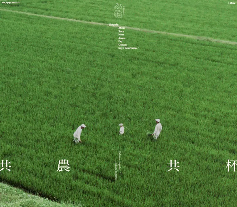
The opening is an edge-to-edge rice-field view with small white-clad people working near the lower portion. Broad stretches of green occupy most of the screen. The photograph carries the scale and atmosphere; there is no conventional centered marketing paragraph or large filled booking button in this view.
Place the outlined brand mark near the top center. The desktop link box is 90px square at approximately 20px from the top. On mobile it becomes 97.5px square while retaining almost the same top inset. The drawn mark occupies only part of its box.
Desktop adds a tiny upper-left place/time line, Miki, Hyogo, JPN 23:44, and an offset navigation cluster below the logo. Both the place/time line and this navigation cluster are absent from the mobile opening. The logo and Menu remain.
The displayed time is an observed value. Its refresh interval and clock implementation were not tested.
Offset Identity Navigation
Role: compact site directory, used in the desktop opening and echoed in the footer.
The desktop opening label Shinpaku starts at x 662.66, while the links begin at x 719.64, almost exactly on the viewport centerline. This produces a roughly 57px outdent for the brand label.
The link order is About, Story, News, Access, Faq, Contact, and Stay / Reservation. Links use Louize at 15px / 20.1px; the label is approximately 16px / 21.44px. Stack the entries tightly without bullets, boxes, or equal-width button backgrounds.
The reservation link combines a text label and small diagonal external-link arrow. Its DOM also contains offscreen Japanese and English new-tab notices. These notices are not additional visible navigation rows.
Distributed Opening Slogan
Role: give the landscape a memorable typographic structure.
The characters in 共農共杯 are spread across the full width, with a large central interval. The outer characters meet or cross the viewport edges. The English phrase Cultivate Together, Celebrate Together occupies two slim sideways lines close to the center.
In the desktop capture, the Japanese lettering sits around the lower quarter of the viewport. On mobile it appears nearer two-thirds down the screen, with the English beginning above it. These are capture-based position estimates, not recovered CSS formulas.
Keep the character distribution and English/Japanese crossing relationship. Replacing this with a single centered horizontal heading would lose one of the page's most distinctive structures.
Manifesto and Bilingual Vertical Link
Role: explain the relationship between farming, culture, and staying at Shinpaku.
The introductory section contains a Japanese statement and narrative, an English lead broken into two offset lines, a narrow English reading column, and a vertical About link.
The English lead demonstrates the site's stepped alignment: on desktop the first line begins at x 19.98, and the second at x 173.98. On mobile the corresponding starts are x 15.59 and 163.17. The offset remains substantial even though the viewport narrows.
Long English prose is centered in a column about 318px wide on desktop and 298px on mobile. It does not expand to fill a large desktop content container.
The About link is a roughly 66px-wide vertical composition combining English, Japanese, and a directional element. Its English text measures 15px, while the Japanese text uses the bold family at approximately 14px. Similar vertical links lead to Story and News elsewhere on the homepage.
Create and Receive Chapter Introductions
Role: divide the experience into making and receiving.
The paired chapters use 共農 / つくること / Create and 共杯 / いただくこと / Receive. Measured Japanese chapter headings remain approximately 20px / 30px at both viewports and occupy narrow vertical boxes at the centerline.
English chapter labels appear slightly left of center, followed by a short description in a roughly 100px-wide column beginning at the centerline. This repeats the opening navigation's offset relationship in another form.
Chapter lettering is measured in #E4DFD9. The supplied middle capture shows the lower edge of a dark photographic chapter area before the paper narrative begins. Full chapter imagery, any pinning behavior, and transitions between media states were not separately captured.
Asymmetric Activity Spread
Role: describe individual acts of farming, cooking, resting, and sharing.
The supplied Receive capture shows the clearest anatomy:
- A dark photographic section ends across the full width.
- A warm paper section begins with Japanese vertical prose near its upper-left corner.
- A large open area separates that prose from the English introduction on the right.
- The English first line starts at the left edge of a 636px column; its continuation is indented approximately 235px within the same box.
- A square-cornered photograph of a hand gathering produce starts below that English introduction and aligns with the column's outside edges.
In this capture, the paper boundary is near y 150, the English begins around y 475, and the photograph begins around y 588. These are approximate screenshot coordinates, not document scroll positions. The image width is visually about 636px; its full height is not visible.
Other activity captions are supported by DOM measurements: Japanese h3 labels form narrow vertical groups, while English captions sit at varying horizontal offsets. The page moves between left, right, and more expansive placements. It does not use a repeated equal-width feature-card grid.
On mobile, vertical Japanese captions remain. Their widths stay approximately 42px for two columns or 63px for three columns, while the English captions reposition and narrow according to the activity.
Reservation Section
Role: present the practical stay conditions and booking destination.
The section contains a vertical Japanese heading, a separate sideways English label, Japanese conditions, an English translation, a small dark capsule, and an English reservation link beneath it.
The source states one group per day, one night with two meals, and reservation required. The Japanese heading remains approximately 24px on both viewports. The conditions remain approximately 16px with generous 28.8px line height.
The visible capsule is unusually small: about 141 × 20px on desktop and 138 × 19.5px on mobile. It uses charcoal fill, paper lettering, a fully rounded radius, approximately 3px vertical and 11px horizontal padding, and a small external arrow. The inner Japanese label is approximately 12px bold with 0.06em tracking.
The destination is Shinpaku's reservation URL, as recorded in the original page's links. The booking interface and actual new-tab behavior were not exercised.
Story Collection
Role: connect the place to current reporting and longer editorial work.
The three sampled entries have date/category metadata, Japanese titles, and English translations. Their computed bounds establish an intentionally unequal arrangement:
| Entry position | Desktop bounds | Mobile bounds |
|---|---|---|
| Featured entry, upper right | x 740.98, width 658.05px |
x 205.75, width 163.75px |
| Second entry, upper left | x 40.97, width 450px |
x 20.5, width 164.75px |
| Third entry, lower right | x 1135.05, width 263.98px |
x 205.75, width 163.75px |
The first two entries share a top coordinate at each viewport. The third sits substantially lower on the right. Mobile therefore retains two narrow columns and asymmetric placement, rather than collapsing every article into one full-width row.
The first two desktop anchors use flex layout, with title blocks occupying about 333px and 225px respectively. On mobile the anchors become block layout. The supplied captures do not directly show these article media regions, so image subjects, crop ratios, and hover imagery cannot be specified from this evidence.
Use article prominence to control typography: the featured Japanese title drops from approximately 32px to 17.55px; other titles drop from 24px to 15.6px. Dates and category labels remain very small and unboxed.
Access, Faq, and Contact Links
Role: provide practical paths after the narrative and stories.
Each sampled link combines a Japanese heading, an English label positioned toward the opposite side, and a smaller Japanese explanatory paragraph. The measured foreground is paper-colored, indicating placement on a darker underlying visual surface; the section's complete background was not supplied as a direct capture.
Desktop link blocks are 518px wide and aligned approximately 20px from the left. Mobile blocks span 358.81px within 15.6px side insets. Explanatory text remains narrower: approximately 284px on desktop and 277px on mobile.
The spacing stays editorial rather than dense. Japanese descriptions use about 12px type with a line height close to 24px.
News List
Role: provide a compact chronological record of announcements.
The section begins with an English News label and a centered vertical Japanese heading. Each announcement is a full-width link with a small date and a Japanese title; an English translation appears where present in the source content.
Desktop rows span about 1400px inside 20px margins. Dates begin at the far left, while title blocks begin at x 750, creating a large empty interval. Rows measure approximately 121px high, with about 1px between their sampled bounds. Border styling itself was not included in the measured fields.
On mobile, rows switch from flex to block layout. The date begins at x 15.59; the title begins at x 106.25 and occupies about 268px. Rows become approximately 143px high, or 155px when the sampled translation adds content. Preserve this indentation instead of aligning every text element flush left.
Closing Invitation and Testimonials
Role: return to the shared cultivation/celebration theme and offer another reservation path.
The final main section repeats the slogan, a bilingual invitation, and a tall vertical reservation link. The supplied footer captures show the tail of dark, straw-like imagery above the paper footer, with large cropped characters at the outer edges.
The mobile reservation link measures approximately 57.5 × 219.25px, with English and Japanese arranged in narrow vertical elements. It uses pale text without the filled capsule treatment of the earlier booking section.
The DOM includes several testimonial passages followed by names and affiliations. Some mobile author rectangles extend beyond the viewport horizontally. This suggests a horizontal arrangement, but does not establish a working carousel, swipe gesture, automatic rotation, or its controls. Those behaviors must remain unspecified.
Footer Directory
Role: provide a quiet, complete ending and recover the site's main routes.
The footer returns to warm paper and charcoal ink. A centered outlined mark appears above an offset Shinpaku label and a narrow link column. The links repeat the main navigation and add Online Shop. Instagram and Line form a separate group, followed by Privacy Policy, bilingual address text, and copyright.
Desktop visual estimates place the mark about 100px below the footer boundary. Mobile reduces this gap to about 68px. The link column begins near x 720 on desktop and x 172 on mobile. The mobile logo remains centered near x 195, so the directory does not share exactly the same axis as the mark.
The Shinpaku label is outdented approximately 55–57px from the links. Social links and legal information are separated by broad gaps rather than rules.
Address alignment repeats the offset idea: the Japanese line ends around the navigation axis, while the English address starts there on the following line. The mobile English address wraps to two lines. The visible source address is 兵庫県三木市久留美408 / 408 Kurumi, Miki-shi, Hyogo, Japan, followed by © Shinpaku.
Tokens — Motion & Interaction
| Treatment | Supplied computed value | What is established |
|---|---|---|
| Body entrance | 0.6s both fadeIn |
A named entrance animation is applied to the body |
| Opening logo entrance | 2s cubic-bezier(0.16, 1, 0.3, 1) both fadeIn |
Measured at desktop and mobile |
| Desktop location entrance | 2s cubic-bezier(0.16, 1, 0.3, 1) both fadeIn |
Measured on the visible desktop location paragraph |
| Desktop navigation entrance | 1.2s cubic-bezier(0.33, 1, 0.68, 1) … both fadeInSlide |
Each sampled link has the same duration and easing |
| Navigation stagger | Delays 0.9s through 1.5s, in 0.1s increments |
About appears first in the sequence; reservation last |
| Menu and capsule colors | 0.8s cubic-bezier(0.16, 1, 0.3, 1) |
Color-related transitions are declared; changed-state colors were not sampled |
| Selected English link decoration | background-size 0.8s cubic-bezier(0.16, 1, 0.3, 1) |
A decoration-related transition exists; hover endpoints were not supplied |
| Shared easing | Source --base-ease: cubic-bezier(.16,1,.3,1) |
Reusable source token |
| Slide easing | Source --slide-ease: cubic-bezier(0.33,1,0.68,1) |
Reusable source token |
The motion vocabulary documented here is gradual entrance and eased property changes. The keyframe bodies were not supplied, so fadeInSlide does not reveal the exact travel distance or direction. A generic computed transition: all without a nonzero duration is not proof of a visible animation.
Source variables named --mask-img and --mask-img-vertical contain embedded image data. Their existence does not establish where masks are applied or what a transition looks like. Do not infer a page-wide dissolve from those variable names alone.
Unverified: background-video playback, autoplay, audio, camera movement, parallax, scroll-linked transformations, menu opening, hover appearance, and testimonial interaction. Static captures show photographic compositions but do not establish whether a particular media region is a still image or moving footage.
For reuse, retain the measured timing tokens. If adding a slide distance or hover underline, label those choices as implementation decisions and provide a reduced-motion state with fully visible content.
Surfaces
| Surface | Appearance | Purpose |
|---|---|---|
| Opening landscape | Full-bleed rice-field imagery with ivory lettering | Establish scale, landscape, and identity |
| Editorial canvas | Flat #E4DFD9 with charcoal text |
Carry long bilingual passages and irregularly placed images |
| Dark photographic passage | Low-light imagery with pale text | Provide a tonal pause between narrative sections |
| Article and news content | Transparent sampled containers on the underlying canvas | Organize information through position and typography |
| Reservation capsule | Charcoal fill, paper text, fully rounded outline | A small, focused booking action |
| Footer | Uninterrupted warm paper | Present a compact directory within generous space |
There is no observed general elevation system. Image edges, changing background luminance, typography, and large empty areas do most of the structural work.
Imagery
The directly visible imagery is documentary and grounded in physical work: an expansive rice field containing small human figures, a close-up hand gathering produce, a narrow strip of dark interior imagery, and dark straw-like texture near the ending.
Use landscape scale and close physical detail together. The field establishes the wider setting; the hand and plant photograph brings the narrative down to touch, light, and material. Preserve natural green variation, imperfect vegetation, and light falling across skin. Avoid replacing this relationship with uniformly staged hospitality interiors or generic smiling portraits.
On mobile, the opening crop remains immersive. People can be partly cut by the left and right edges. This is consistent with a composition that prioritizes the field and central lettering rather than keeping every figure fully visible. Exact crop coordinates and media fitting rules were not supplied.
The logo's irregular outlined strokes should remain crisp. Do not apply pixelated image rendering to the photography or simulate the logo by placing a generic font inside a border.
Observed Asset References
| Visual | Original-page evidence | Asset limitation |
|---|---|---|
| Opening rice field | Desktop and mobile opening captures | No file URL, native dimensions, or media type supplied |
| Outlined brand mark | Opening and footer captures | No asset path or vector markup supplied |
| Hand gathering produce | Desktop Receive capture | Only the upper portion of the image is visible |
| Dark interior strip | Top of the Receive capture | Full composition and media type unknown |
| Dark straw-like ending | Desktop and mobile footer captures | Only the ending segment is visible |
No original asset filenames can be recovered from this evidence. Any filenames in the Quick Start are explicitly illustrative replacements, not discovered source paths.
Layout & Responsive Behavior
The homepage remains a long document at both viewports. Its broad order is opening and manifesto, Create, Receive, reservation, stories, visitor information, news, closing invitation/testimonials, and footer. The sampled heights correspond to about 28.3 desktop screens and 24.1 mobile screens; these are calculated reading-length indicators, not recommended fixed page heights.
Confirmed Responsive Changes
| Relationship | Desktop observation | Mobile observation |
|---|---|---|
| Opening utilities | Location/time and central navigation visible | Both omitted; logo and Menu retained |
| Opening logo | 90px link box | 97.5px link box |
| Body typography | 15px | 14.625px |
| Chapter headings | Approximately 20px | 20px |
| Japanese writing direction | Vertical headings and activity captions | Vertical forms retained |
| English manifesto | Centered, approximately 318px wide | Approximately 298px wide with 46px side offsets |
| Receive introduction | Right-aligned 636px box with 235px continuation indent | 329px box with 60.45px continuation indent |
| Story collection | Unequal article widths and mixed internal layouts | Two narrow columns; article internals become block layout |
| News rows | Date far left, title near the right half | Date above, title indented about 91px within the row |
| Visitor links | 518px-wide group | Nearly full width inside 15.6px margins |
| Footer | Central navigation axis | Navigation shifts left of the centered logo |
The mobile layout preserves compositional asymmetry. It changes widths, offsets, article internals, and section spacing individually. A blanket rule that stacks every section and removes all indentation would miss the observed design.
No tablet or landscape-phone capture was supplied, and the actual media-query thresholds were not included. The breakpoint in the Quick Start is a recommendation. The source includes --win-height: 100vh; this alone does not establish how every media section handles browser chrome or safe areas.
For a new implementation, use content-driven section heights and test intermediate widths. Keep vertical Japanese passages readable, let English translations wrap naturally, and ensure that deliberate artwork cropping does not create document-wide horizontal scrolling.
Do’s and Don’ts
Do
- Keep the exact paper and ink pair:
#E4DFD9and#1F1F1F. - Use the lighter
#FBF5EEfor the opening's reversed identity and navigation. - Let agricultural imagery provide green, texture, and visual scale.
- Preserve Japanese Mincho typography alongside Louize or an appropriately tested serif fallback.
- Retain vertical Japanese passages and the stepped alignment of English copy.
- Position the desktop navigation links near the centerline, with Shinpaku outdented to the left.
- Keep the large slogan distributed across the landscape, including its edge cropping.
- Preserve asymmetric activity spreads and mobile story columns.
- Treat the compact booking capsule as a specific component exception.
- Keep enough empty paper between images and text for each composition to register.
- Use source timing values where documented and identify any added motion behavior.
Don’t
- Don’t compress the homepage into a generic hero, three feature cards, and a single booking strip.
- Don’t replace all serif text with a modern sans-serif.
- Don’t treat the rice-field green as an automatic CTA color.
- Don’t convert every image into a rounded card with a shadow.
- Don’t mistake offscreen 1px semantic text for the size of visible display lettering.
- Don’t flatten every mobile section into a centered, full-width stack.
- Don’t remove all English indents simply because the screen is narrow.
- Don’t spread footer navigation across a conventional multi-column sitemap.
- Don’t claim background video, parallax, or a testimonial carousel without additional evidence.
- Don’t reproduce the source's very small booking target without considering a larger accessible hit area.
Recommended Implementation Additions
These are recommendations for a new implementation, not verified original-site features:
- Give the Menu control an accessible expanded state and controlled-panel relationship. Implement Escape handling and focus restoration if it opens an overlay.
- Preserve the small visible reservation capsule inside a target at least 44px high. Avoid overlapping enlarged hit areas in tightly stacked navigation.
- Provide visible focus indicators on text links, vertical links, and image/article anchors.
- Mark Japanese and English content with appropriate
langattributes. Preserve logical reading order independently of visual placement. - Keep one accessible copy of decorative slogans. Hide redundant visual copies from assistive technology only when a complete equivalent is available.
- Load licensed font files explicitly and test the fallback stacks. Family declarations alone do not supply the fonts.
- Check text contrast against the actual image crop at every breakpoint. If moving media is used, check multiple frames and provide an appropriate static alternative.
- Reserve image dimensions, provide responsive sources, and defer below-fold media without delaying the opening image.
- Keep essential content visible when animation or scripting is unavailable. Under reduced motion, remove decorative translation and reveal delays.
- Test very narrow screens and text enlargement; allow a simpler story layout if the observed two-column arrangement becomes unreadable.
- Reconcile bilingual practical information before reuse. The supplied access text gives different Kobe travel times in Japanese and English, so neither should be copied as a verified travel estimate.
Agent Prompt Guide
Quick Color Reference
- Main canvas and footer:
#E4DFD9. - Main text and capsule fill:
#1F1F1F. - Opening identity and navigation:
#FBF5EE. - Available source grays:
#BDB9B4and#9F9C97; specific use requires verification. - Green and brown: supplied by photography, without a required flat UI swatch.
- Surface separation: image boundaries and whitespace; minimal boxing.
Overall Prompt
“Create a bilingual homepage for an agricultural stay and cultural project inspired by Shinpaku's current composition. Begin with an immersive rice-field image, a small outlined mark near the top center, a discreet upper-right Menu control, and widely distributed Japanese display characters near the lower portion of the image. On desktop, add tiny location information at upper left and a narrow serif navigation list near the centerline, with its brand label outdented left. Continue on warm paper #E4DFD9 with charcoal #1F1F1F, Japanese Mincho typography, Louize-style English serif text, vertical Japanese passages, offset English paragraphs, and irregularly positioned rectangular photographs. Include distinct Create and Receive narratives, a small reservation capsule, asymmetrical story entries, indented news rows, and a compact offset footer directory. Preserve selected asymmetries on mobile. Treat unspecified media playback and interactions as separate implementation decisions.”
Example Component Prompts
- Opening identity: “Use a full-viewport rice-field photograph with small people working in the lower area. Place a 90px-square outlined logo link about 20px from the top center. Set ivory serif links at 15px/20.1px beneath it, beginning at the centerline, with the Shinpaku label approximately 57px to their left. Hide this link list and the location line in the mobile opening.”
- Receive spread: “Build a warm gray editorial section with vertical Japanese prose at the upper left, a long interval of empty paper, and a 636px-wide English-and-image group aligned to the right on a 1440px canvas. Indent the continuation paragraph 235px within that group. On a 390px screen, reduce the group to about 329px and its continuation indent to about 60px.”
- Reservation action: “Use a small charcoal capsule with paper-colored 12px bold Japanese lettering, 0.06em tracking, and a tiny external arrow. Keep the visible capsule near 140px by 20px, but place it inside a keyboard-focusable link with a larger hit area. Add a quiet English reservation link below.”
- Story collection: “Arrange three bilingual editorial entries with unequal desktop widths: a large feature at upper right, a smaller entry at upper left, and another narrow entry lower on the right. At 390px, preserve two approximately 164px columns and stack each entry's internal content. Use small dates, bold Mincho Japanese titles, and smaller serif translations.”
- Footer: “Place an outlined mark in the center of a broad warm-paper footer. Beneath it, use a small italic Shinpaku label outdented left of a narrow navigation column. Separate social links, privacy, bilingual address, and copyright with whitespace. On mobile, let the link column begin slightly left of the logo's axis.”
Quick Start
CSS Custom Properties
This is an implementation scaffold, not recovered source CSS. It uses measured colors, families, type sizes, and timing values, with rounded spacing for practical reuse. The 767px breakpoint, opening slogan geometry, editorial section padding, footer formulas, slide distance, and hover endpoints are recommendations.
The root remains conventional. Load the named fonts separately if licensed and available. The scaffold uses a static image for the opening; it does not assume the original media type or reproduce unverified menu and scrolling behavior.
:root {
  /* Measured palette */
  --color-paper: #e4dfd9;
  --color-ink: #1f1f1f;
  --color-on-hero: #fbf5ee;
  --color-muted: #bdb9b4;
  --color-muted-text: #9f9c97;

  /* Source family declarations; font files must be loaded separately */
  --font-ja: 'FOT-筑紫B明朝 Pr6 D', 'Hiragino Mincho Pro',
    'HiraMinProN-W3', 'MS PMincho', 'Yu Mincho', YuMincho, serif;
  --font-ja-bold: 'FOT-筑紫B明朝 Pr6 B', 'Hiragino Mincho Pro',
    'HiraMinProN-W3', 'MS PMincho', 'Yu Mincho', YuMincho, serif;
  --font-en: Louize, serif;

  --text-body: 15px;
  --text-caption: 14px;
  --text-small: 12px;
  --text-chapter: 20px;
  --text-reservation: 24px;
  --text-story: 24px;
  --text-story-feature: 32px;
  --leading-body: 1.5;
  --leading-en: 1.54;
  --leading-navigation: 1.34;

  /* Rounded layout measurements and adaptation aliases */
  --gutter: 20px;
  --logo-size: 90px;
  --nav-outdent: 57px;
  --reading-width: 318px;
  --editorial-width: min(44.167vw, 636px);
  --continuation-indent: 235px;
  --footer-axis: 50vw;
  --radius-pill: 9999px;

  /* Measured source timing tokens */
  --duration-base: 0.8s;
  --ease-base: cubic-bezier(0.16, 1, 0.3, 1);
  --ease-slide: cubic-bezier(0.33, 1, 0.68, 1);
}

* { box-sizing: border-box; }
html { font-size: 16px; }
body { margin: 0; }

.shinpaku-page {
  color: var(--color-ink);
  background: var(--color-paper);
  font: 500 var(--text-body) / var(--leading-body) var(--font-ja);
}

.shinpaku-page :where(h1, h2, h3, p, figure) { margin: 0; }
.shinpaku-page a { color: inherit; }
.shinpaku-page img { display: block; max-width: 100%; }
.en { font-family: var(--font-en); }
.ja-bold { font-family: var(--font-ja-bold); font-weight: 700; }

.sr-only {
  position: absolute;
  width: 1px;
  height: 1px;
  padding: 0;
  margin: -1px;
  overflow: hidden;
  clip-path: inset(50%);
  white-space: nowrap;
  border: 0;
}

.menu-trigger {
  position: fixed;
  z-index: 30;
  top: env(safe-area-inset-top, 0px);
  right: env(safe-area-inset-right, 0px);
  min-height: 44px; /* Recommended target enlargement */
  padding: 6px 10px;
  border: 0;
  border-radius: 0;
  color: var(--color-on-hero);
  background: transparent;
  font: inherit;
  font-style: italic;
  cursor: pointer;
  transition: color var(--duration-base) var(--ease-base);
}

.menu-trigger::before { content: ': '; }
.menu-trigger.on-paper { color: var(--color-ink); }

.hero {
  position: relative;
  min-height: 100vh;
  min-height: 100svh;
  overflow: hidden; /* Crop artwork locally, not the whole document */
  color: var(--color-on-hero);
  background: var(--color-ink);
}

.hero-media {
  position: absolute;
  inset: 0;
  width: 100%;
  height: 100%;
  object-fit: cover;
  object-position: 50% 50%; /* Recommended starting crop */
}

.hero-logo {
  position: absolute;
  top: 20px;
  left: 50%;
  width: var(--logo-size);
  height: var(--logo-size);
  transform: translateX(-50%);
}

.hero-logo img { width: 100%; height: 100%; object-fit: contain; }

.local-time {
  position: absolute;
  top: 11px;
  left: 10px;
  font: italic 500 12px / 1 var(--font-en);
  letter-spacing: -0.03em;
}

.identity-nav {
  position: absolute;
  top: 137px;
  left: calc(50% - var(--nav-outdent));
  width: 182px;
  font: 500 15px / var(--leading-navigation) var(--font-en);
}

.identity-label { font-size: 16px; font-style: italic; }

.identity-nav ul,
.footer-nav ul {
  list-style: none;
  padding: 0;
  margin: 0 0 0 var(--nav-outdent);
}

.identity-nav a,
.footer-nav a { text-decoration: none; }

.external-link {
  display: inline-flex;
  align-items: baseline;
  gap: 4px;
}

/* Recommended geometry approximating the captured display artwork */
.hero-motto {
  position: absolute;
  top: 71%;
  left: -12.5%;
  width: 125%;
  display: grid;
  grid-template-columns: repeat(5, 1fr);
  text-align: center;
  font-size: 80px;
  line-height: 1;
}

.hero-slogan {
  position: absolute;
  top: 66%;
  left: 50%;
  display: flex;
  flex-direction: row-reverse;
  gap: 5px;
  transform: translateX(-50%);
  font: 500 16px / 1.3 var(--font-en);
}

.hero-slogan span { writing-mode: vertical-rl; white-space: nowrap; }
.hero-slogan span + span { margin-top: 60px; }

.manifesto-copy {
  width: min(var(--reading-width), calc(100% - 32px));
  margin-inline: auto;
  font-family: var(--font-en);
  line-height: var(--leading-en);
}

.manifesto-copy p + p { margin-top: 1.54em; }

.vertical-ja {
  writing-mode: vertical-rl;
  text-orientation: mixed;
}

.chapter-title {
  width: max-content;
  margin-inline: auto;
  font-size: var(--text-chapter);
  line-height: 1.5;
  writing-mode: vertical-rl;
}

.editorial-intro {
  position: relative;
  padding: 320px var(--gutter) 200px;
}

.editorial-poem {
  position: absolute;
  top: 20px;
  left: var(--gutter);
  inline-size: 190px;
  writing-mode: vertical-rl;
  font-size: 18px; /* Visual approximation of the captured passage */
  line-height: 1.45;
}

.editorial-copy {
  width: var(--editorial-width);
  margin-left: auto;
  font-family: var(--font-en);
  line-height: 1.53;
}

.editorial-copy .continuation {
  margin-top: 4px;
  padding-left: var(--continuation-indent);
}

.editorial-copy figure { margin-top: 20px; }
.editorial-copy img { width: 100%; height: auto; border-radius: 0; }

.bilingual-link {
  display: flex;
  align-items: flex-start;
  gap: 6px;
  width: max-content;
  margin-inline: auto;
  padding: 4px;
  text-decoration: none;
}

.bilingual-link .en,
.bilingual-link .ja {
  writing-mode: vertical-rl;
  line-height: 1;
}

.bilingual-link .en { margin-top: 12px; }
.bilingual-link .ja {
  font: 700 var(--text-caption) / 1 var(--font-ja-bold);
}

.reservation {
  padding: 150px var(--gutter);
  text-align: center;
}

.reservation h2 {
  width: max-content;
  margin: 0 auto 150px;
  writing-mode: vertical-rl;
  font: 700 var(--text-reservation) / 1.3 var(--font-ja-bold);
}

.reservation-copy { max-width: 460px; margin-inline: auto; }
.reservation-copy .ja { font: 700 16px / 1.8 var(--font-ja-bold); }
.reservation-copy .en { margin-top: 9px; font-size: 14px; line-height: 1.5; }

.reservation-link {
  display: inline-flex;
  align-items: center;
  justify-content: center;
  min-height: 44px;
  margin-top: 20px;
  text-decoration: none;
}

.reservation-pill {
  display: inline-flex;
  align-items: center;
  gap: 4px;
  padding: 3px 11px;
  border: 1px solid var(--color-ink);
  border-radius: var(--radius-pill);
  color: var(--color-paper);
  background: var(--color-ink);
  font: 700 var(--text-small) / 1 var(--font-ja-bold);
  letter-spacing: 0.06em;
  transition: color var(--duration-base) var(--ease-base),
    background-color var(--duration-base) var(--ease-base);
}

.news-list { margin-inline: var(--gutter); }
.news-row {
  display: grid;
  grid-template-columns: 52.14% minmax(0, 1fr);
  min-height: 121px;
  padding: 14px 0 20px;
  text-decoration: none;
}

/* Recommended separator; exact source border styling was not supplied */
.news-row + .news-row { border-top: 1px solid var(--color-muted); }
.news-date { font: 500 var(--text-small) / 1 var(--font-en); }
.news-title { font: 700 var(--text-body) / 1.4 var(--font-ja-bold); }
.news-translation { margin-top: 7px; font-size: var(--text-caption); }

.site-footer { padding: 100px var(--gutter) 96px; }
.footer-logo { display: block; width: 90px; margin-inline: auto; }
.footer-logo img { width: 100%; height: 90px; object-fit: contain; }

.footer-nav {
  width: min(240px, 100%);
  margin-top: 40px;
  margin-left: calc(var(--footer-axis) - var(--gutter) - var(--nav-outdent));
  font: 500 var(--text-body) / 1.4 var(--font-en);
}

.footer-nav .social-links { margin-top: 34px; }
.footer-nav .privacy-link {
  display: block;
  margin: 36px 0 0 var(--nav-outdent);
  font-size: var(--text-small);
}

.footer-address {
  display: grid;
  grid-template-columns: calc(var(--footer-axis) - var(--gutter)) minmax(0, 1fr);
  margin-top: 56px;
  font-size: var(--text-small);
  font-style: normal;
}

.footer-address .ja { grid-column: 1; text-align: right; }
.footer-address .en { grid-column: 2; margin-top: 8px; max-width: 220px; }
.footer-copyright {
  margin-top: 16px;
  margin-left: calc(var(--footer-axis) - var(--gutter));
  font: 500 var(--text-small) / 1.5 var(--font-en);
}

/* Recommended state endpoints */
@media (hover: hover) {
  .identity-nav a:hover,
  .footer-nav a:hover { text-decoration: underline; text-underline-offset: 3px; }
  .reservation-link:hover .reservation-pill {
    color: var(--color-ink);
    background: var(--color-paper);
  }
}

.shinpaku-page :focus-visible {
  outline: 2px solid currentColor;
  outline-offset: 4px;
}

/* Recommended entrance implementation; travel distance is not measured */
@media (prefers-reduced-motion: no-preference) {
  .hero-logo { animation: reference-fade 2s var(--ease-base) both; }
  .local-time { animation: reference-fade 2s var(--ease-base) both; }
  .identity-nav li {
    animation: reference-enter 1.2s var(--ease-slide) both;
    animation-delay: calc(0.9s + var(--i, 0) * 0.1s);
  }
}

@keyframes reference-fade {
  from { opacity: 0; }
  to { opacity: 1; }
}

@keyframes reference-enter {
  from { opacity: 0; transform: translateY(8px); }
  to { opacity: 1; transform: translateY(0); }
}

/* Recommended breakpoint; mobile values match the inspected 390px state */
@media (max-width: 767px) {
  :root {
    --text-body: 14.625px;
    --text-caption: 13.65px;
    --text-small: 11.7px;
    --text-story: 15.6px;
    --text-story-feature: 17.55px;
    --gutter: 15.6px;
    --logo-size: 97.5px;
    --nav-outdent: 55px;
    --reading-width: 298.34px;
    --editorial-width: calc(100% - 30.25px);
    --continuation-indent: 60.45px;
    --footer-axis: 44vw;
  }

  .menu-trigger { padding: 6.825px 15.6px; }
  .hero-logo { top: 19.5px; }
  .local-time, .identity-nav { display: none; }
  .hero-motto { top: 65%; font-size: 50px; }
  .hero-slogan { top: 57.5%; font-size: 15.6px; }
  .editorial-intro { padding-top: 272px; padding-bottom: 98.475px; }
  .reservation { padding-block: 58.5px; }
  .reservation-copy { max-width: 331.5px; }
  .news-row { display: block; min-height: 143px; padding: 13.65px 0 29.25px; }
  .news-content { margin-top: 13.65px; margin-left: 25.27%; }
  .site-footer { padding-top: 68px; padding-bottom: 64px; }
  .footer-nav { width: calc(100% - 101px); }
  .footer-address .en { max-width: 160px; }
}

@media (prefers-reduced-motion: reduce) {
  .shinpaku-page *,
  .shinpaku-page *::before,
  .shinpaku-page *::after {
    animation: none !important;
    transition: none !important;
    scroll-behavior: auto !important;
  }
}
Minimal Markup
The following shows the class relationships for the opening and booking action. your-field-image.jpg and your-outline-mark.svg are replacement filenames for authorized assets, not original-site URLs. Use the appropriate pale mark on imagery. The Menu button requires a separately implemented panel and state handling; do not present it as functional until that behavior exists.
<div class='shinpaku-page'>
  <button class='menu-trigger' type='button'>Menu</button>

  <main>
    <section class='hero' aria-labelledby='page-title'>
      <h1 id='page-title' class='sr-only'>心拍 Shinpaku</h1>
      <img class='hero-media' src='your-field-image.jpg' alt=''>
      <p class='local-time'>Miki, Hyogo, JPN <time>23:44</time></p>

      <a class='hero-logo' href='/' aria-label='Shinpaku home'>
        <img src='your-outline-mark.svg' alt=''>
      </a>

      <nav class='identity-nav' aria-label='Primary navigation'>
        <p class='identity-label'>Shinpaku</p>
        <ul>
          <li style='--i:0'><a href='/about/'>About</a></li>
          <li style='--i:1'><a href='/story/'>Story</a></li>
          <li style='--i:2'><a href='/news/'>News</a></li>
          <li style='--i:3'><a href='/access/'>Access</a></li>
          <li style='--i:4'><a href='/faq/'>Faq</a></li>
          <li style='--i:5'><a href='/contact/'>Contact</a></li>
          <li style='--i:6'>
            <a class='external-link' href='https://shinpaku.booking.chillnn.com/'>
              Stay / Reservation <span aria-hidden='true'>↗</span>
            </a>
          </li>
        </ul>
      </nav>

      <div class='hero-motto' aria-hidden='true'>
        <span>共</span><span>農</span><span></span><span>共</span><span>杯</span>
      </div>
      <p class='sr-only' lang='ja'>共農共杯</p>
      <p class='hero-slogan' lang='en'>
        <span><em>Cultivate</em> Together,</span>
        <span><em>Celebrate</em> Together</span>
      </p>
    </section>

    <section class='reservation' aria-labelledby='reservation-title'>
      <h2 id='reservation-title' lang='ja'>心拍の<br>宿泊ご予約</h2>
      <div class='reservation-copy'>
        <p class='ja' lang='ja'>1日1組<br>1泊2食付完全予約制です。</p>
        <p class='en' lang='en'>One group per day.<br>One night with two meals included.<br>Reservation required.</p>
        <a class='reservation-link' href='https://shinpaku.booking.chillnn.com/'>
          <span class='reservation-pill' lang='ja'>
            心拍の宿泊予約へ <span aria-hidden='true'>↗</span>
          </span>
        </a>
      </div>
    </section>
  </main>
</div>
This abbreviated markup omits the intervening narrative, stories, news, and footer. It demonstrates component anatomy, not the complete homepage or an implemented booking flow. Replace the static time with suitable content or an actual clock implementation if needed.
Tailwind v4 Token Mapping
Optional aliases for a project already using Tailwind v4. This does not identify the original site's framework. Define the preceding custom properties first.
@theme inline {
  --color-paper: var(--color-paper);
  --color-ink: var(--color-ink);
  --color-ivory: var(--color-on-hero);
  --color-warm-gray: var(--color-muted);

  --font-japanese: var(--font-ja);
  --font-japanese-bold: var(--font-ja-bold);
  --font-editorial: var(--font-en);

  --text-copy: var(--text-body);
  --text-photo-caption: var(--text-caption);
  --text-utility: var(--text-small);
  --text-section-title: var(--text-chapter);
  --text-article: var(--text-story);
  --text-article-feature: var(--text-story-feature);

  --spacing-page-inset: var(--gutter);
  --spacing-brand-mark: var(--logo-size);
  --radius-booking: var(--radius-pill);
}
For color aliases that share a name with a root property, a direct literal mapping is also suitable, for example --color-paper: #e4dfd9 and --color-ink: #1f1f1f. Use those literals if your build tool emits self-referential declarations instead of inlining the values.
Sources & Evidence
- Original website: https://shinpaku.co/.
- Final website URL: https://shinpaku.co/, unchanged; supplied HTTP status 200.
- Capture timestamp: September 12, 2026,
2026-09-12T14:44:44.508Z, equivalent to 23:44:44.508 JST. - Desktop evidence: 1440 × 1000 CSS pixels; three supplied captures show the opening, a Receive editorial passage, and the footer. Rendered DOM includes measured typography, navigation, activity captions, reservation content, stories, visitor links, and news.
- Mobile evidence: 390 × 844 CSS pixels; two supplied captures show the opening and footer. Rendered DOM provides additional responsive measurements throughout the homepage.
- Style evidence: supplied custom properties and computed element records, including font stacks, color values, text sizes, line heights, padding, bounding rectangles, selected transitions, and named animations. Full stylesheet rules, media-query thresholds, asset URLs, and keyframe definitions were not provided.
- Interaction evidence: the capture process traversed scroll positions and recorded settled views. No menu activation, link navigation, hover sequence, playback test, or testimonial gesture was supplied.
- Readiness limits: the supplied process observed the opening for at least five seconds and used bounded load, animation, layout-stability, and image-decoding checks. Perpetual animations were temporarily paused during readiness checks and resumed. These checks do not prove delayed-content completeness or establish the behavior of unexercised interactions. SharedWorkers and service workers were disabled during inspection.
This reference describes the current homepage represented by those original-page captures and measurements. Visual estimates and recommended CSS remain explicitly separate from measured source values. Linked destinations are recorded from the homepage, not independently inspected.
# Shinpaku — Style Reference

> Expansive rice fields, small serif voices, and vertical Japanese passages on warm gray paper.

**Website / Original URL:** [shinpaku.co](https://shinpaku.co/)
**Final URL:** [https://shinpaku.co/](https://shinpaku.co/)
**Theme:** warm light canvas with photographic sections and pale reversed lettering; no theme selector was inspected.
**Inspected:** September 12, 2026, through the supplied browser evidence, retrieved at 14:44:44.508 UTC / 23:44:44.508 JST.
**Viewports:** desktop **1440 × 1000** and mobile **390 × 844**, in CSS pixels.
**Scope:** the current homepage. Visual captures cover the desktop opening, a middle Receive passage, and the footer, plus the mobile opening and footer. Rendered text and computed element measurements cover additional homepage sections. Linked pages, the open menu, reservation checkout, and shop were not inspected.

Shinpaku presents a place where rice cultivation, sake, community, and overnight stays belong to the same experience. The homepage develops this through a long bilingual narrative, with routes to About, Story, News, Access, Faq, and Contact, and external reservation and shopping destinations. Its structure combines a brand introduction, an illustrated account of activities, editorial content, and practical visitor information.

The visual identity depends on a striking difference in scale: enormous photographic landscapes and scattered display characters surround tiny, carefully positioned text. Japanese runs vertically through the page, while English appears in narrow horizontal paragraphs, italic labels, and occasional sideways phrases. Warm gray backgrounds provide long pauses between images. Alignment repeatedly returns to the centerline, then deliberately steps away from it.

## How to Read This Reference

- **Measured** means a value appears in the supplied computed styles or element rectangles. Values are rounded for readability unless a decimal helps explain responsive behavior.
- **Calculated** means arithmetic applied to those measurements, such as the space remaining below the main element.
- **Estimated** means a visual judgment from an original-page capture. This applies to the visible oversized slogan, some image boundaries, and footer alignment details.
- **Recommended** means guidance for a new implementation. Breakpoints, replacement layout formulas, accessible target sizes, and unspecified animation endpoints belong to this category.
- **Token names** are implementation aliases unless explicitly identified as source custom properties.
- **Computed font families** establish declared stacks, not independent verification that every glyph came from the first named font file.
- Several semantic headings and paragraphs have **1 × 1px offscreen rectangles**, with separately rendered visual counterparts. Their inherited 15px or 14.625px font sizes do not measure the large visible lettering. Repeated extracted text also does not establish repeated visible paragraphs.

## Tokens — Colors

### Default Palette

| Name | Value | Token / source | Evidence and role |
| --- | --- | --- | --- |
| Warm Paper | `#E4DFD9` | `--color-paper`; source `--color-white` | Measured body background. Visually forms the broad editorial and footer surfaces. Also used for lettering in later photographic sections. |
| Charcoal Ink | `#1F1F1F` | `--color-ink`; source `--color-black` | Measured body text and reservation capsule fill. Provides nearly all interface contrast on paper. |
| Opening Ivory | `#FBF5EE` | `--color-on-hero` | Measured opening logo-link, navigation, location text, and Menu foreground: `rgb(251, 245, 238)`. No corresponding named source variable was supplied. |
| Warm Gray | `#BDB9B4` | `--color-muted`; source `--color-gray` | Source variable present at both viewports. Its precise visible component assignments were not established by the supplied samples. |
| Muted Text Gray | `#9F9C97` | `--color-muted-text`; source `--color-gray-text` | Source variable present at both viewports. Treat use for secondary text as a recommendation unless checking the particular element. |

### Palette Behavior

The green that dominates the opening belongs to the rice-field imagery. It is not evidence of a green button, link, or navigation token. Similarly, the brown and near-black tones above the footer come from imagery rather than a documented alternative application theme.

Keep the two pale colors distinct. The body canvas is `#E4DFD9`; opening navigation uses the slightly lighter and warmer `#FBF5EE`. Replacing both with pure white would flatten this distinction.

The supplied paper sections appear flat. Photographic texture carries the natural material quality; there is no evidence that a visible grain overlay covers the entire interface. Utility defaults in the custom-property dump are not automatically authored brand colors.

## Tokens — Typography

### Japanese Editorial Serif

**Source regular stack:**

```css
'FOT-筑紫B明朝 Pr6 D', 'Hiragino Mincho Pro',
'HiraMinProN-W3', 'MS PMincho', 'Yu Mincho', YuMincho, serif
```

This stack is supplied by `--font-serif`. The measured body uses weight **500**, with a 15px font size and 22.5px line height on desktop. At the inspected mobile width, these become 14.625px and 21.9375px.

The Japanese text gives the page its formal, literary character. Vertical columns are particularly important in chapter headings, activity captions, and bilingual navigation links. Preserve the relationship between character size and column spacing rather than rotating an entire horizontal Japanese paragraph.

### Japanese Bold Serif

**Source bold stack:**

```css
'FOT-筑紫B明朝 Pr6 B', 'Hiragino Mincho Pro',
'HiraMinProN-W3', 'MS PMincho', 'Yu Mincho', YuMincho, serif
```

This stack is supplied by `--font-serif-bold`. Measured uses include activity captions, story titles, news titles, and reservation headings, generally at weight **700**. The bold family is separately named; it should not be replaced with a generic heavy sans-serif.

### English Editorial Serif

**Measured family:** `Louize, serif`.

Louize appears in the navigation, location line, English narrative, article translations, dates, and English labels. Measured weight is generally **500**. Its small size and compact proportions let English act as a second compositional voice without overwhelming the Japanese columns.

The opening Shinpaku label and portions of the slogans visibly use italic styling. The supplied element list does not include every nested text run, so italic appearance should not be generalized to all English copy.

### Menu and Identity Artwork

The Menu button reports the Japanese serif stack at the button level, despite its italic-looking Latin presentation. A nested run may differ; that run was not measured separately.

The outlined Japanese brand mark is artwork. The widely spaced opening characters also have visible geometry that is not represented by the sampled hidden text nodes. Preserve the supplied artwork when available and authorized; ordinary text is only an approximation of those visual elements.

### Type Scale

| Role | Desktop measured size / line height | Mobile measured size / line height | Notes |
| --- | --- | --- | --- |
| Base Japanese text | `15 / 22.5px` | `14.625 / 21.9375px` | Weight 500 |
| English narrative | `15 / 23.1px` | `14.625 / 22.5225px` | Louize, weight 500 |
| Activity introduction English | `15 / 22.95px` | `14.625 / 22.3762px` | Includes indented continuation paragraphs |
| Opening navigation | `15 / 20.1px` | Hidden in opening | Mobile footer links remain visible, but their computed styles were not included |
| Opening Shinpaku label | `15.9984 / 21.4379px` | Hidden in opening | Visually italic |
| Location and time | `11.9952 / 11.9952px` | Hidden | Tracking `-0.359856px`, approximately `-0.03em` |
| English manifesto lead | `19.9872 / 19.9872px` | `19.5 / 19.5px` | Two separately positioned lines |
| Chapter heading | `19.9872 / 29.9808px` | `20 / 30px` | Near-constant size across the two viewports |
| Japanese activity caption | `13.9968 / 21.695px` | `13.65 / 21.1575px` | Bold; vertical composition |
| English activity caption | `13.9968 / 20.9952px` | `13.65 / 20.475px` | Regular Louize |
| Reservation heading | `23.9904 / 31.1875px` | `24 / 31.2px` | Bold; two vertical columns |
| Reservation conditions | `15.9984 / 28.7971px` | `16 / 28.8px` | Japanese bold |
| Reservation capsule label | `11.9952 / 11.9952px` | `11.7 / 11.7px` | Bold; tracking `0.06em` |
| Featured story title | `31.9968 / 44.7955px` | `17.55 / 24.57px` | Japanese bold |
| Other story titles | `23.9904 / 33.5866px` | `15.6 / 21.84px` | Japanese bold |
| Featured story English | `18 / 25.2px` | `12.675 / 17.745px` | Louize |
| Other story English | `13.9968 / 19.5955px` | `12.675 / 17.745px` | Louize |
| Story dates | Approximately `11–12px` | `10.725–11.7px` | Size depends on article prominence |
| News title | `15 / 21px` | `14.625 / 20.475px` | Japanese bold |
| Opening display characters | Estimated `80–90px` | Estimated `48–54px` | Visual estimate only; not the hidden paragraph's font size |

The source root remains **16px** at both inspected widths. Do not reinterpret these measurements using a tiny custom rem unit. Many mobile values are 97.5% of their desktop counterparts, but other headings remain effectively fixed or change substantially. A single global scaling factor would not reproduce the page.

## Tokens — Spacing & Shapes

### Spacing Scale

| Use | Desktop measurement | Mobile measurement | Interpretation |
| --- | --- | --- | --- |
| External-link internal gap | `3.9888px` | `3.9px` | Small arrow-to-label separation |
| Menu padding | `5.9904px 9.9936px` | `6.825px 15.6px` | Mobile increases horizontal breathing room |
| General editorial side inset | `19.9872px` | `15.6px` | Not universal: story section uses a different inset |
| Story section side padding | `19.9872px` | `9.75px` | Article bounds have additional internal offsets |
| Opening logo top | `19.9844px` | `19.5px` | Approximately 20px at both widths |
| English continuation indent, Receive | `234.994px` | `60.45px` | Deliberately changes instead of scaling uniformly |
| Experience section bottom padding | `200.995px` | `98.475px` | Long pauses are reduced on mobile |
| Reservation section vertical padding | `149.99px` | `58.5px` | Strong mobile compression |
| News section bottom padding | `167.99px` | `95.55px` | Keeps a pause before the closing invitation |
| Closing section bottom padding | `499.997px` | `117px` | Especially large desktop reduction |

This is not a consistent eight-pixel grid. Fine offsets and large content-dependent spaces coexist. For reuse, establish a small practical spacing scale, then preserve the measured large relationships in the key compositions.

### Border Radius and Elevation

| Element | Evidence | Treatment |
| --- | --- | --- |
| Photographic blocks | Square in supplied captures | Preserve rectangular edges |
| Navigation and article containers | Sampled radius `0px` | Unboxed text and media |
| Reservation capsule | Measured radius `9999px` | A small, fully rounded exception |
| Menu control | Measured radius `0px`, transparent background | No visible button container |
| Paper sections and footer | No visible shadow in supplied captures | Separate through whitespace and image boundaries |

Do not convert the capsule's rounding into a site-wide rounded-card system.

### Layout Measurements

| Element | Desktop | Mobile | Evidence status |
| --- | --- | --- | --- |
| Document height | About `28,286px` | About `20,351px` | Reported document heights |
| Introductory section | `4,120.78px` high | `3,601.30px` high | Measured parent section; includes more than the opening viewport |
| Create section | `7,670.64px` high | `5,167.72px` high | Measured |
| Receive section | `8,022.20px` high | `5,484.86px` high | Measured |
| Opening logo link | `90 × 90px`, x `675` | `97.5 × 97.5px`, x `146.25` | Measured link box, not visible stroke bounds |
| Menu button | `62.72 × 35.97px` | `72.91 × 37.02px` | Measured |
| Manifesto English column | x `561`, width `317.98px` | x `45.83`, width `298.34px` | Measured |
| Receive English introduction | x `784.03`, width `635.98px` | x `45.84`, width `328.56px` | Measured paragraph boxes |
| About bilingual vertical link | `65.94 × 141px` | `64.75 × 138.27px` | Measured |
| Reservation text block | x `490`, width `459.98px` | x `29.25`, width `331.5px` | Measured |
| Reservation capsule | `141.11 × 19.97px` | `137.73 × 19.55px` | Measured visible anchor box |
| Footer span | About `764.72px` | About `731.16px` | Calculated as document height minus main height; agrees with captures |

The opening image fills the first captured viewport. Its enclosing introductory section is much longer. Do not assign the full 4,120.78px desktop parent height to the opening image itself.

## Components

### Persistent Menu Control

**Role:** access to navigation while moving through a long page.

A small `: Menu` treatment sits at the upper-right edge. Its measured button rectangle starts at y `0`; the label is inset through padding. There is no visible header bar, card, or filled control background. The sampled header has zero layout height.

The control occupies the same upper-right position in the opening, middle, and footer captures, supporting a persistent viewport placement. Exact positioning CSS was not supplied. Its opening color is `#FBF5EE`, and it remains visible over the dark imagery at the top of the lower captures.

**Interaction limitation:** the button was not opened. Menu-panel geometry, animation, close controls, keyboard behavior, and expanded-state colors are unknown.

### Opening Landscape and Identity

**Role:** establish place before explaining the offering.

The opening is an edge-to-edge rice-field view with small white-clad people working near the lower portion. Broad stretches of green occupy most of the screen. The photograph carries the scale and atmosphere; there is no conventional centered marketing paragraph or large filled booking button in this view.

Place the outlined brand mark near the top center. The desktop link box is 90px square at approximately 20px from the top. On mobile it becomes 97.5px square while retaining almost the same top inset. The drawn mark occupies only part of its box.

Desktop adds a tiny upper-left place/time line, `Miki, Hyogo, JPN 23:44`, and an offset navigation cluster below the logo. Both the place/time line and this navigation cluster are absent from the mobile opening. The logo and Menu remain.

The displayed time is an observed value. Its refresh interval and clock implementation were not tested.

### Offset Identity Navigation

**Role:** compact site directory, used in the desktop opening and echoed in the footer.

The desktop opening label `Shinpaku` starts at x `662.66`, while the links begin at x `719.64`, almost exactly on the viewport centerline. This produces a roughly **57px outdent** for the brand label.

The link order is About, Story, News, Access, Faq, Contact, and Stay / Reservation. Links use Louize at `15px / 20.1px`; the label is approximately `16px / 21.44px`. Stack the entries tightly without bullets, boxes, or equal-width button backgrounds.

The reservation link combines a text label and small diagonal external-link arrow. Its DOM also contains offscreen Japanese and English new-tab notices. These notices are not additional visible navigation rows.

### Distributed Opening Slogan

**Role:** give the landscape a memorable typographic structure.

The characters in `共農共杯` are spread across the full width, with a large central interval. The outer characters meet or cross the viewport edges. The English phrase `Cultivate Together, Celebrate Together` occupies two slim sideways lines close to the center.

In the desktop capture, the Japanese lettering sits around the lower quarter of the viewport. On mobile it appears nearer two-thirds down the screen, with the English beginning above it. These are capture-based position estimates, not recovered CSS formulas.

Keep the character distribution and English/Japanese crossing relationship. Replacing this with a single centered horizontal heading would lose one of the page's most distinctive structures.

### Manifesto and Bilingual Vertical Link

**Role:** explain the relationship between farming, culture, and staying at Shinpaku.

The introductory section contains a Japanese statement and narrative, an English lead broken into two offset lines, a narrow English reading column, and a vertical About link.

The English lead demonstrates the site's stepped alignment: on desktop the first line begins at x `19.98`, and the second at x `173.98`. On mobile the corresponding starts are x `15.59` and `163.17`. The offset remains substantial even though the viewport narrows.

Long English prose is centered in a column about 318px wide on desktop and 298px on mobile. It does not expand to fill a large desktop content container.

The About link is a roughly 66px-wide vertical composition combining English, Japanese, and a directional element. Its English text measures 15px, while the Japanese text uses the bold family at approximately 14px. Similar vertical links lead to Story and News elsewhere on the homepage.

### Create and Receive Chapter Introductions

**Role:** divide the experience into making and receiving.

The paired chapters use `共農` / `つくること` / Create and `共杯` / `いただくこと` / Receive. Measured Japanese chapter headings remain approximately `20px / 30px` at both viewports and occupy narrow vertical boxes at the centerline.

English chapter labels appear slightly left of center, followed by a short description in a roughly 100px-wide column beginning at the centerline. This repeats the opening navigation's offset relationship in another form.

Chapter lettering is measured in `#E4DFD9`. The supplied middle capture shows the lower edge of a dark photographic chapter area before the paper narrative begins. Full chapter imagery, any pinning behavior, and transitions between media states were not separately captured.

### Asymmetric Activity Spread

**Role:** describe individual acts of farming, cooking, resting, and sharing.

The supplied Receive capture shows the clearest anatomy:

1. A dark photographic section ends across the full width.
2. A warm paper section begins with Japanese vertical prose near its upper-left corner.
3. A large open area separates that prose from the English introduction on the right.
4. The English first line starts at the left edge of a 636px column; its continuation is indented approximately 235px within the same box.
5. A square-cornered photograph of a hand gathering produce starts below that English introduction and aligns with the column's outside edges.

In this capture, the paper boundary is near y `150`, the English begins around y `475`, and the photograph begins around y `588`. These are approximate screenshot coordinates, not document scroll positions. The image width is visually about 636px; its full height is not visible.

Other activity captions are supported by DOM measurements: Japanese h3 labels form narrow vertical groups, while English captions sit at varying horizontal offsets. The page moves between left, right, and more expansive placements. It does not use a repeated equal-width feature-card grid.

On mobile, vertical Japanese captions remain. Their widths stay approximately 42px for two columns or 63px for three columns, while the English captions reposition and narrow according to the activity.

### Reservation Section

**Role:** present the practical stay conditions and booking destination.

The section contains a vertical Japanese heading, a separate sideways English label, Japanese conditions, an English translation, a small dark capsule, and an English reservation link beneath it.

The source states one group per day, one night with two meals, and reservation required. The Japanese heading remains approximately 24px on both viewports. The conditions remain approximately 16px with generous 28.8px line height.

The visible capsule is unusually small: about **141 × 20px** on desktop and **138 × 19.5px** on mobile. It uses charcoal fill, paper lettering, a fully rounded radius, approximately 3px vertical and 11px horizontal padding, and a small external arrow. The inner Japanese label is approximately 12px bold with `0.06em` tracking.

The destination is [Shinpaku's reservation URL](https://shinpaku.booking.chillnn.com/), as recorded in the original page's links. The booking interface and actual new-tab behavior were not exercised.

### Story Collection

**Role:** connect the place to current reporting and longer editorial work.

The three sampled entries have date/category metadata, Japanese titles, and English translations. Their computed bounds establish an intentionally unequal arrangement:

| Entry position | Desktop bounds | Mobile bounds |
| --- | --- | --- |
| Featured entry, upper right | x `740.98`, width `658.05px` | x `205.75`, width `163.75px` |
| Second entry, upper left | x `40.97`, width `450px` | x `20.5`, width `164.75px` |
| Third entry, lower right | x `1135.05`, width `263.98px` | x `205.75`, width `163.75px` |

The first two entries share a top coordinate at each viewport. The third sits substantially lower on the right. Mobile therefore retains **two narrow columns and asymmetric placement**, rather than collapsing every article into one full-width row.

The first two desktop anchors use flex layout, with title blocks occupying about 333px and 225px respectively. On mobile the anchors become block layout. The supplied captures do not directly show these article media regions, so image subjects, crop ratios, and hover imagery cannot be specified from this evidence.

Use article prominence to control typography: the featured Japanese title drops from approximately 32px to 17.55px; other titles drop from 24px to 15.6px. Dates and category labels remain very small and unboxed.

### Access, Faq, and Contact Links

**Role:** provide practical paths after the narrative and stories.

Each sampled link combines a Japanese heading, an English label positioned toward the opposite side, and a smaller Japanese explanatory paragraph. The measured foreground is paper-colored, indicating placement on a darker underlying visual surface; the section's complete background was not supplied as a direct capture.

Desktop link blocks are 518px wide and aligned approximately 20px from the left. Mobile blocks span 358.81px within 15.6px side insets. Explanatory text remains narrower: approximately 284px on desktop and 277px on mobile.

The spacing stays editorial rather than dense. Japanese descriptions use about 12px type with a line height close to 24px.

### News List

**Role:** provide a compact chronological record of announcements.

The section begins with an English News label and a centered vertical Japanese heading. Each announcement is a full-width link with a small date and a Japanese title; an English translation appears where present in the source content.

Desktop rows span about 1400px inside 20px margins. Dates begin at the far left, while title blocks begin at x `750`, creating a large empty interval. Rows measure approximately 121px high, with about 1px between their sampled bounds. Border styling itself was not included in the measured fields.

On mobile, rows switch from flex to block layout. The date begins at x `15.59`; the title begins at x `106.25` and occupies about 268px. Rows become approximately 143px high, or 155px when the sampled translation adds content. Preserve this indentation instead of aligning every text element flush left.

### Closing Invitation and Testimonials

**Role:** return to the shared cultivation/celebration theme and offer another reservation path.

The final main section repeats the slogan, a bilingual invitation, and a tall vertical reservation link. The supplied footer captures show the tail of dark, straw-like imagery above the paper footer, with large cropped characters at the outer edges.

The mobile reservation link measures approximately `57.5 × 219.25px`, with English and Japanese arranged in narrow vertical elements. It uses pale text without the filled capsule treatment of the earlier booking section.

The DOM includes several testimonial passages followed by names and affiliations. Some mobile author rectangles extend beyond the viewport horizontally. This suggests a horizontal arrangement, but does not establish a working carousel, swipe gesture, automatic rotation, or its controls. Those behaviors must remain unspecified.

### Footer Directory

**Role:** provide a quiet, complete ending and recover the site's main routes.

The footer returns to warm paper and charcoal ink. A centered outlined mark appears above an offset Shinpaku label and a narrow link column. The links repeat the main navigation and add Online Shop. Instagram and Line form a separate group, followed by Privacy Policy, bilingual address text, and copyright.

Desktop visual estimates place the mark about 100px below the footer boundary. Mobile reduces this gap to about 68px. The link column begins near x `720` on desktop and x `172` on mobile. The mobile logo remains centered near x `195`, so the directory does **not** share exactly the same axis as the mark.

The Shinpaku label is outdented approximately 55–57px from the links. Social links and legal information are separated by broad gaps rather than rules.

Address alignment repeats the offset idea: the Japanese line ends around the navigation axis, while the English address starts there on the following line. The mobile English address wraps to two lines. The visible source address is `兵庫県三木市久留美408` / `408 Kurumi, Miki-shi, Hyogo, Japan`, followed by `© Shinpaku`.

## Tokens — Motion & Interaction

| Treatment | Supplied computed value | What is established |
| --- | --- | --- |
| Body entrance | `0.6s both fadeIn` | A named entrance animation is applied to the body |
| Opening logo entrance | `2s cubic-bezier(0.16, 1, 0.3, 1) both fadeIn` | Measured at desktop and mobile |
| Desktop location entrance | `2s cubic-bezier(0.16, 1, 0.3, 1) both fadeIn` | Measured on the visible desktop location paragraph |
| Desktop navigation entrance | `1.2s cubic-bezier(0.33, 1, 0.68, 1) … both fadeInSlide` | Each sampled link has the same duration and easing |
| Navigation stagger | Delays `0.9s` through `1.5s`, in `0.1s` increments | About appears first in the sequence; reservation last |
| Menu and capsule colors | `0.8s cubic-bezier(0.16, 1, 0.3, 1)` | Color-related transitions are declared; changed-state colors were not sampled |
| Selected English link decoration | `background-size 0.8s cubic-bezier(0.16, 1, 0.3, 1)` | A decoration-related transition exists; hover endpoints were not supplied |
| Shared easing | Source `--base-ease: cubic-bezier(.16,1,.3,1)` | Reusable source token |
| Slide easing | Source `--slide-ease: cubic-bezier(0.33,1,0.68,1)` | Reusable source token |

The motion vocabulary documented here is gradual entrance and eased property changes. The keyframe bodies were not supplied, so `fadeInSlide` does not reveal the exact travel distance or direction. A generic computed `transition: all` without a nonzero duration is not proof of a visible animation.

Source variables named `--mask-img` and `--mask-img-vertical` contain embedded image data. Their existence does not establish where masks are applied or what a transition looks like. Do not infer a page-wide dissolve from those variable names alone.

**Unverified:** background-video playback, autoplay, audio, camera movement, parallax, scroll-linked transformations, menu opening, hover appearance, and testimonial interaction. Static captures show photographic compositions but do not establish whether a particular media region is a still image or moving footage.

For reuse, retain the measured timing tokens. If adding a slide distance or hover underline, label those choices as implementation decisions and provide a reduced-motion state with fully visible content.

## Surfaces

| Surface | Appearance | Purpose |
| --- | --- | --- |
| Opening landscape | Full-bleed rice-field imagery with ivory lettering | Establish scale, landscape, and identity |
| Editorial canvas | Flat `#E4DFD9` with charcoal text | Carry long bilingual passages and irregularly placed images |
| Dark photographic passage | Low-light imagery with pale text | Provide a tonal pause between narrative sections |
| Article and news content | Transparent sampled containers on the underlying canvas | Organize information through position and typography |
| Reservation capsule | Charcoal fill, paper text, fully rounded outline | A small, focused booking action |
| Footer | Uninterrupted warm paper | Present a compact directory within generous space |

There is no observed general elevation system. Image edges, changing background luminance, typography, and large empty areas do most of the structural work.

## Imagery

The directly visible imagery is documentary and grounded in physical work: an expansive rice field containing small human figures, a close-up hand gathering produce, a narrow strip of dark interior imagery, and dark straw-like texture near the ending.

Use landscape scale and close physical detail together. The field establishes the wider setting; the hand and plant photograph brings the narrative down to touch, light, and material. Preserve natural green variation, imperfect vegetation, and light falling across skin. Avoid replacing this relationship with uniformly staged hospitality interiors or generic smiling portraits.

On mobile, the opening crop remains immersive. People can be partly cut by the left and right edges. This is consistent with a composition that prioritizes the field and central lettering rather than keeping every figure fully visible. Exact crop coordinates and media fitting rules were not supplied.

The logo's irregular outlined strokes should remain crisp. Do not apply pixelated image rendering to the photography or simulate the logo by placing a generic font inside a border.

### Observed Asset References

| Visual | Original-page evidence | Asset limitation |
| --- | --- | --- |
| Opening rice field | Desktop and mobile opening captures | No file URL, native dimensions, or media type supplied |
| Outlined brand mark | Opening and footer captures | No asset path or vector markup supplied |
| Hand gathering produce | Desktop Receive capture | Only the upper portion of the image is visible |
| Dark interior strip | Top of the Receive capture | Full composition and media type unknown |
| Dark straw-like ending | Desktop and mobile footer captures | Only the ending segment is visible |

No original asset filenames can be recovered from this evidence. Any filenames in the Quick Start are explicitly illustrative replacements, not discovered source paths.

## Layout & Responsive Behavior

The homepage remains a long document at both viewports. Its broad order is opening and manifesto, Create, Receive, reservation, stories, visitor information, news, closing invitation/testimonials, and footer. The sampled heights correspond to about 28.3 desktop screens and 24.1 mobile screens; these are calculated reading-length indicators, not recommended fixed page heights.

### Confirmed Responsive Changes

| Relationship | Desktop observation | Mobile observation |
| --- | --- | --- |
| Opening utilities | Location/time and central navigation visible | Both omitted; logo and Menu retained |
| Opening logo | 90px link box | 97.5px link box |
| Body typography | 15px | 14.625px |
| Chapter headings | Approximately 20px | 20px |
| Japanese writing direction | Vertical headings and activity captions | Vertical forms retained |
| English manifesto | Centered, approximately 318px wide | Approximately 298px wide with 46px side offsets |
| Receive introduction | Right-aligned 636px box with 235px continuation indent | 329px box with 60.45px continuation indent |
| Story collection | Unequal article widths and mixed internal layouts | Two narrow columns; article internals become block layout |
| News rows | Date far left, title near the right half | Date above, title indented about 91px within the row |
| Visitor links | 518px-wide group | Nearly full width inside 15.6px margins |
| Footer | Central navigation axis | Navigation shifts left of the centered logo |

The mobile layout preserves compositional asymmetry. It changes widths, offsets, article internals, and section spacing individually. A blanket rule that stacks every section and removes all indentation would miss the observed design.

No tablet or landscape-phone capture was supplied, and the actual media-query thresholds were not included. The breakpoint in the Quick Start is a recommendation. The source includes `--win-height: 100vh`; this alone does not establish how every media section handles browser chrome or safe areas.

For a new implementation, use content-driven section heights and test intermediate widths. Keep vertical Japanese passages readable, let English translations wrap naturally, and ensure that deliberate artwork cropping does not create document-wide horizontal scrolling.

## Do’s and Don’ts

### Do

- Keep the exact paper and ink pair: `#E4DFD9` and `#1F1F1F`.
- Use the lighter `#FBF5EE` for the opening's reversed identity and navigation.
- Let agricultural imagery provide green, texture, and visual scale.
- Preserve Japanese Mincho typography alongside Louize or an appropriately tested serif fallback.
- Retain vertical Japanese passages and the stepped alignment of English copy.
- Position the desktop navigation links near the centerline, with Shinpaku outdented to the left.
- Keep the large slogan distributed across the landscape, including its edge cropping.
- Preserve asymmetric activity spreads and mobile story columns.
- Treat the compact booking capsule as a specific component exception.
- Keep enough empty paper between images and text for each composition to register.
- Use source timing values where documented and identify any added motion behavior.

### Don’t

- Don’t compress the homepage into a generic hero, three feature cards, and a single booking strip.
- Don’t replace all serif text with a modern sans-serif.
- Don’t treat the rice-field green as an automatic CTA color.
- Don’t convert every image into a rounded card with a shadow.
- Don’t mistake offscreen 1px semantic text for the size of visible display lettering.
- Don’t flatten every mobile section into a centered, full-width stack.
- Don’t remove all English indents simply because the screen is narrow.
- Don’t spread footer navigation across a conventional multi-column sitemap.
- Don’t claim background video, parallax, or a testimonial carousel without additional evidence.
- Don’t reproduce the source's very small booking target without considering a larger accessible hit area.

## Recommended Implementation Additions

These are recommendations for a new implementation, not verified original-site features:

- Give the Menu control an accessible expanded state and controlled-panel relationship. Implement Escape handling and focus restoration if it opens an overlay.
- Preserve the small visible reservation capsule inside a target at least 44px high. Avoid overlapping enlarged hit areas in tightly stacked navigation.
- Provide visible focus indicators on text links, vertical links, and image/article anchors.
- Mark Japanese and English content with appropriate `lang` attributes. Preserve logical reading order independently of visual placement.
- Keep one accessible copy of decorative slogans. Hide redundant visual copies from assistive technology only when a complete equivalent is available.
- Load licensed font files explicitly and test the fallback stacks. Family declarations alone do not supply the fonts.
- Check text contrast against the actual image crop at every breakpoint. If moving media is used, check multiple frames and provide an appropriate static alternative.
- Reserve image dimensions, provide responsive sources, and defer below-fold media without delaying the opening image.
- Keep essential content visible when animation or scripting is unavailable. Under reduced motion, remove decorative translation and reveal delays.
- Test very narrow screens and text enlargement; allow a simpler story layout if the observed two-column arrangement becomes unreadable.
- Reconcile bilingual practical information before reuse. The supplied access text gives different Kobe travel times in Japanese and English, so neither should be copied as a verified travel estimate.

## Agent Prompt Guide

### Quick Color Reference

- Main canvas and footer: `#E4DFD9`.
- Main text and capsule fill: `#1F1F1F`.
- Opening identity and navigation: `#FBF5EE`.
- Available source grays: `#BDB9B4` and `#9F9C97`; specific use requires verification.
- Green and brown: supplied by photography, without a required flat UI swatch.
- Surface separation: image boundaries and whitespace; minimal boxing.

### Overall Prompt

“Create a bilingual homepage for an agricultural stay and cultural project inspired by Shinpaku's current composition. Begin with an immersive rice-field image, a small outlined mark near the top center, a discreet upper-right Menu control, and widely distributed Japanese display characters near the lower portion of the image. On desktop, add tiny location information at upper left and a narrow serif navigation list near the centerline, with its brand label outdented left. Continue on warm paper `#E4DFD9` with charcoal `#1F1F1F`, Japanese Mincho typography, Louize-style English serif text, vertical Japanese passages, offset English paragraphs, and irregularly positioned rectangular photographs. Include distinct Create and Receive narratives, a small reservation capsule, asymmetrical story entries, indented news rows, and a compact offset footer directory. Preserve selected asymmetries on mobile. Treat unspecified media playback and interactions as separate implementation decisions.”

### Example Component Prompts

1. **Opening identity:** “Use a full-viewport rice-field photograph with small people working in the lower area. Place a 90px-square outlined logo link about 20px from the top center. Set ivory serif links at 15px/20.1px beneath it, beginning at the centerline, with the Shinpaku label approximately 57px to their left. Hide this link list and the location line in the mobile opening.”
2. **Receive spread:** “Build a warm gray editorial section with vertical Japanese prose at the upper left, a long interval of empty paper, and a 636px-wide English-and-image group aligned to the right on a 1440px canvas. Indent the continuation paragraph 235px within that group. On a 390px screen, reduce the group to about 329px and its continuation indent to about 60px.”
3. **Reservation action:** “Use a small charcoal capsule with paper-colored 12px bold Japanese lettering, 0.06em tracking, and a tiny external arrow. Keep the visible capsule near 140px by 20px, but place it inside a keyboard-focusable link with a larger hit area. Add a quiet English reservation link below.”
4. **Story collection:** “Arrange three bilingual editorial entries with unequal desktop widths: a large feature at upper right, a smaller entry at upper left, and another narrow entry lower on the right. At 390px, preserve two approximately 164px columns and stack each entry's internal content. Use small dates, bold Mincho Japanese titles, and smaller serif translations.”
5. **Footer:** “Place an outlined mark in the center of a broad warm-paper footer. Beneath it, use a small italic Shinpaku label outdented left of a narrow navigation column. Separate social links, privacy, bilingual address, and copyright with whitespace. On mobile, let the link column begin slightly left of the logo's axis.”

## Quick Start

### CSS Custom Properties

This is an implementation scaffold, not recovered source CSS. It uses measured colors, families, type sizes, and timing values, with rounded spacing for practical reuse. The **767px breakpoint**, opening slogan geometry, editorial section padding, footer formulas, slide distance, and hover endpoints are recommendations.

The root remains conventional. Load the named fonts separately if licensed and available. The scaffold uses a static image for the opening; it does not assume the original media type or reproduce unverified menu and scrolling behavior.

```css
:root {
  /* Measured palette */
  --color-paper: #e4dfd9;
  --color-ink: #1f1f1f;
  --color-on-hero: #fbf5ee;
  --color-muted: #bdb9b4;
  --color-muted-text: #9f9c97;

  /* Source family declarations; font files must be loaded separately */
  --font-ja: 'FOT-筑紫B明朝 Pr6 D', 'Hiragino Mincho Pro',
    'HiraMinProN-W3', 'MS PMincho', 'Yu Mincho', YuMincho, serif;
  --font-ja-bold: 'FOT-筑紫B明朝 Pr6 B', 'Hiragino Mincho Pro',
    'HiraMinProN-W3', 'MS PMincho', 'Yu Mincho', YuMincho, serif;
  --font-en: Louize, serif;

  --text-body: 15px;
  --text-caption: 14px;
  --text-small: 12px;
  --text-chapter: 20px;
  --text-reservation: 24px;
  --text-story: 24px;
  --text-story-feature: 32px;
  --leading-body: 1.5;
  --leading-en: 1.54;
  --leading-navigation: 1.34;

  /* Rounded layout measurements and adaptation aliases */
  --gutter: 20px;
  --logo-size: 90px;
  --nav-outdent: 57px;
  --reading-width: 318px;
  --editorial-width: min(44.167vw, 636px);
  --continuation-indent: 235px;
  --footer-axis: 50vw;
  --radius-pill: 9999px;

  /* Measured source timing tokens */
  --duration-base: 0.8s;
  --ease-base: cubic-bezier(0.16, 1, 0.3, 1);
  --ease-slide: cubic-bezier(0.33, 1, 0.68, 1);
}

* { box-sizing: border-box; }
html { font-size: 16px; }
body { margin: 0; }

.shinpaku-page {
  color: var(--color-ink);
  background: var(--color-paper);
  font: 500 var(--text-body) / var(--leading-body) var(--font-ja);
}

.shinpaku-page :where(h1, h2, h3, p, figure) { margin: 0; }
.shinpaku-page a { color: inherit; }
.shinpaku-page img { display: block; max-width: 100%; }
.en { font-family: var(--font-en); }
.ja-bold { font-family: var(--font-ja-bold); font-weight: 700; }

.sr-only {
  position: absolute;
  width: 1px;
  height: 1px;
  padding: 0;
  margin: -1px;
  overflow: hidden;
  clip-path: inset(50%);
  white-space: nowrap;
  border: 0;
}

.menu-trigger {
  position: fixed;
  z-index: 30;
  top: env(safe-area-inset-top, 0px);
  right: env(safe-area-inset-right, 0px);
  min-height: 44px; /* Recommended target enlargement */
  padding: 6px 10px;
  border: 0;
  border-radius: 0;
  color: var(--color-on-hero);
  background: transparent;
  font: inherit;
  font-style: italic;
  cursor: pointer;
  transition: color var(--duration-base) var(--ease-base);
}

.menu-trigger::before { content: ': '; }
.menu-trigger.on-paper { color: var(--color-ink); }

.hero {
  position: relative;
  min-height: 100vh;
  min-height: 100svh;
  overflow: hidden; /* Crop artwork locally, not the whole document */
  color: var(--color-on-hero);
  background: var(--color-ink);
}

.hero-media {
  position: absolute;
  inset: 0;
  width: 100%;
  height: 100%;
  object-fit: cover;
  object-position: 50% 50%; /* Recommended starting crop */
}

.hero-logo {
  position: absolute;
  top: 20px;
  left: 50%;
  width: var(--logo-size);
  height: var(--logo-size);
  transform: translateX(-50%);
}

.hero-logo img { width: 100%; height: 100%; object-fit: contain; }

.local-time {
  position: absolute;
  top: 11px;
  left: 10px;
  font: italic 500 12px / 1 var(--font-en);
  letter-spacing: -0.03em;
}

.identity-nav {
  position: absolute;
  top: 137px;
  left: calc(50% - var(--nav-outdent));
  width: 182px;
  font: 500 15px / var(--leading-navigation) var(--font-en);
}

.identity-label { font-size: 16px; font-style: italic; }

.identity-nav ul,
.footer-nav ul {
  list-style: none;
  padding: 0;
  margin: 0 0 0 var(--nav-outdent);
}

.identity-nav a,
.footer-nav a { text-decoration: none; }

.external-link {
  display: inline-flex;
  align-items: baseline;
  gap: 4px;
}

/* Recommended geometry approximating the captured display artwork */
.hero-motto {
  position: absolute;
  top: 71%;
  left: -12.5%;
  width: 125%;
  display: grid;
  grid-template-columns: repeat(5, 1fr);
  text-align: center;
  font-size: 80px;
  line-height: 1;
}

.hero-slogan {
  position: absolute;
  top: 66%;
  left: 50%;
  display: flex;
  flex-direction: row-reverse;
  gap: 5px;
  transform: translateX(-50%);
  font: 500 16px / 1.3 var(--font-en);
}

.hero-slogan span { writing-mode: vertical-rl; white-space: nowrap; }
.hero-slogan span + span { margin-top: 60px; }

.manifesto-copy {
  width: min(var(--reading-width), calc(100% - 32px));
  margin-inline: auto;
  font-family: var(--font-en);
  line-height: var(--leading-en);
}

.manifesto-copy p + p { margin-top: 1.54em; }

.vertical-ja {
  writing-mode: vertical-rl;
  text-orientation: mixed;
}

.chapter-title {
  width: max-content;
  margin-inline: auto;
  font-size: var(--text-chapter);
  line-height: 1.5;
  writing-mode: vertical-rl;
}

.editorial-intro {
  position: relative;
  padding: 320px var(--gutter) 200px;
}

.editorial-poem {
  position: absolute;
  top: 20px;
  left: var(--gutter);
  inline-size: 190px;
  writing-mode: vertical-rl;
  font-size: 18px; /* Visual approximation of the captured passage */
  line-height: 1.45;
}

.editorial-copy {
  width: var(--editorial-width);
  margin-left: auto;
  font-family: var(--font-en);
  line-height: 1.53;
}

.editorial-copy .continuation {
  margin-top: 4px;
  padding-left: var(--continuation-indent);
}

.editorial-copy figure { margin-top: 20px; }
.editorial-copy img { width: 100%; height: auto; border-radius: 0; }

.bilingual-link {
  display: flex;
  align-items: flex-start;
  gap: 6px;
  width: max-content;
  margin-inline: auto;
  padding: 4px;
  text-decoration: none;
}

.bilingual-link .en,
.bilingual-link .ja {
  writing-mode: vertical-rl;
  line-height: 1;
}

.bilingual-link .en { margin-top: 12px; }
.bilingual-link .ja {
  font: 700 var(--text-caption) / 1 var(--font-ja-bold);
}

.reservation {
  padding: 150px var(--gutter);
  text-align: center;
}

.reservation h2 {
  width: max-content;
  margin: 0 auto 150px;
  writing-mode: vertical-rl;
  font: 700 var(--text-reservation) / 1.3 var(--font-ja-bold);
}

.reservation-copy { max-width: 460px; margin-inline: auto; }
.reservation-copy .ja { font: 700 16px / 1.8 var(--font-ja-bold); }
.reservation-copy .en { margin-top: 9px; font-size: 14px; line-height: 1.5; }

.reservation-link {
  display: inline-flex;
  align-items: center;
  justify-content: center;
  min-height: 44px;
  margin-top: 20px;
  text-decoration: none;
}

.reservation-pill {
  display: inline-flex;
  align-items: center;
  gap: 4px;
  padding: 3px 11px;
  border: 1px solid var(--color-ink);
  border-radius: var(--radius-pill);
  color: var(--color-paper);
  background: var(--color-ink);
  font: 700 var(--text-small) / 1 var(--font-ja-bold);
  letter-spacing: 0.06em;
  transition: color var(--duration-base) var(--ease-base),
    background-color var(--duration-base) var(--ease-base);
}

.news-list { margin-inline: var(--gutter); }
.news-row {
  display: grid;
  grid-template-columns: 52.14% minmax(0, 1fr);
  min-height: 121px;
  padding: 14px 0 20px;
  text-decoration: none;
}

/* Recommended separator; exact source border styling was not supplied */
.news-row + .news-row { border-top: 1px solid var(--color-muted); }
.news-date { font: 500 var(--text-small) / 1 var(--font-en); }
.news-title { font: 700 var(--text-body) / 1.4 var(--font-ja-bold); }
.news-translation { margin-top: 7px; font-size: var(--text-caption); }

.site-footer { padding: 100px var(--gutter) 96px; }
.footer-logo { display: block; width: 90px; margin-inline: auto; }
.footer-logo img { width: 100%; height: 90px; object-fit: contain; }

.footer-nav {
  width: min(240px, 100%);
  margin-top: 40px;
  margin-left: calc(var(--footer-axis) - var(--gutter) - var(--nav-outdent));
  font: 500 var(--text-body) / 1.4 var(--font-en);
}

.footer-nav .social-links { margin-top: 34px; }
.footer-nav .privacy-link {
  display: block;
  margin: 36px 0 0 var(--nav-outdent);
  font-size: var(--text-small);
}

.footer-address {
  display: grid;
  grid-template-columns: calc(var(--footer-axis) - var(--gutter)) minmax(0, 1fr);
  margin-top: 56px;
  font-size: var(--text-small);
  font-style: normal;
}

.footer-address .ja { grid-column: 1; text-align: right; }
.footer-address .en { grid-column: 2; margin-top: 8px; max-width: 220px; }
.footer-copyright {
  margin-top: 16px;
  margin-left: calc(var(--footer-axis) - var(--gutter));
  font: 500 var(--text-small) / 1.5 var(--font-en);
}

/* Recommended state endpoints */
@media (hover: hover) {
  .identity-nav a:hover,
  .footer-nav a:hover { text-decoration: underline; text-underline-offset: 3px; }
  .reservation-link:hover .reservation-pill {
    color: var(--color-ink);
    background: var(--color-paper);
  }
}

.shinpaku-page :focus-visible {
  outline: 2px solid currentColor;
  outline-offset: 4px;
}

/* Recommended entrance implementation; travel distance is not measured */
@media (prefers-reduced-motion: no-preference) {
  .hero-logo { animation: reference-fade 2s var(--ease-base) both; }
  .local-time { animation: reference-fade 2s var(--ease-base) both; }
  .identity-nav li {
    animation: reference-enter 1.2s var(--ease-slide) both;
    animation-delay: calc(0.9s + var(--i, 0) * 0.1s);
  }
}

@keyframes reference-fade {
  from { opacity: 0; }
  to { opacity: 1; }
}

@keyframes reference-enter {
  from { opacity: 0; transform: translateY(8px); }
  to { opacity: 1; transform: translateY(0); }
}

/* Recommended breakpoint; mobile values match the inspected 390px state */
@media (max-width: 767px) {
  :root {
    --text-body: 14.625px;
    --text-caption: 13.65px;
    --text-small: 11.7px;
    --text-story: 15.6px;
    --text-story-feature: 17.55px;
    --gutter: 15.6px;
    --logo-size: 97.5px;
    --nav-outdent: 55px;
    --reading-width: 298.34px;
    --editorial-width: calc(100% - 30.25px);
    --continuation-indent: 60.45px;
    --footer-axis: 44vw;
  }

  .menu-trigger { padding: 6.825px 15.6px; }
  .hero-logo { top: 19.5px; }
  .local-time, .identity-nav { display: none; }
  .hero-motto { top: 65%; font-size: 50px; }
  .hero-slogan { top: 57.5%; font-size: 15.6px; }
  .editorial-intro { padding-top: 272px; padding-bottom: 98.475px; }
  .reservation { padding-block: 58.5px; }
  .reservation-copy { max-width: 331.5px; }
  .news-row { display: block; min-height: 143px; padding: 13.65px 0 29.25px; }
  .news-content { margin-top: 13.65px; margin-left: 25.27%; }
  .site-footer { padding-top: 68px; padding-bottom: 64px; }
  .footer-nav { width: calc(100% - 101px); }
  .footer-address .en { max-width: 160px; }
}

@media (prefers-reduced-motion: reduce) {
  .shinpaku-page *,
  .shinpaku-page *::before,
  .shinpaku-page *::after {
    animation: none !important;
    transition: none !important;
    scroll-behavior: auto !important;
  }
}
```

### Minimal Markup

The following shows the class relationships for the opening and booking action. `your-field-image.jpg` and `your-outline-mark.svg` are replacement filenames for authorized assets, not original-site URLs. Use the appropriate pale mark on imagery. The Menu button requires a separately implemented panel and state handling; do not present it as functional until that behavior exists.

```html
<div class='shinpaku-page'>
  <button class='menu-trigger' type='button'>Menu</button>

  <main>
    <section class='hero' aria-labelledby='page-title'>
      <h1 id='page-title' class='sr-only'>心拍 Shinpaku</h1>
      <img class='hero-media' src='your-field-image.jpg' alt=''>
      <p class='local-time'>Miki, Hyogo, JPN <time>23:44</time></p>

      <a class='hero-logo' href='/' aria-label='Shinpaku home'>
        <img src='your-outline-mark.svg' alt=''>
      </a>

      <nav class='identity-nav' aria-label='Primary navigation'>
        <p class='identity-label'>Shinpaku</p>
        <ul>
          <li style='--i:0'><a href='/about/'>About</a></li>
          <li style='--i:1'><a href='/story/'>Story</a></li>
          <li style='--i:2'><a href='/news/'>News</a></li>
          <li style='--i:3'><a href='/access/'>Access</a></li>
          <li style='--i:4'><a href='/faq/'>Faq</a></li>
          <li style='--i:5'><a href='/contact/'>Contact</a></li>
          <li style='--i:6'>
            <a class='external-link' href='https://shinpaku.booking.chillnn.com/'>
              Stay / Reservation <span aria-hidden='true'>↗</span>
            </a>
          </li>
        </ul>
      </nav>

      <div class='hero-motto' aria-hidden='true'>
        <span>共</span><span>農</span><span></span><span>共</span><span>杯</span>
      </div>
      <p class='sr-only' lang='ja'>共農共杯</p>
      <p class='hero-slogan' lang='en'>
        <span><em>Cultivate</em> Together,</span>
        <span><em>Celebrate</em> Together</span>
      </p>
    </section>

    <section class='reservation' aria-labelledby='reservation-title'>
      <h2 id='reservation-title' lang='ja'>心拍の<br>宿泊ご予約</h2>
      <div class='reservation-copy'>
        <p class='ja' lang='ja'>1日1組<br>1泊2食付完全予約制です。</p>
        <p class='en' lang='en'>One group per day.<br>One night with two meals included.<br>Reservation required.</p>
        <a class='reservation-link' href='https://shinpaku.booking.chillnn.com/'>
          <span class='reservation-pill' lang='ja'>
            心拍の宿泊予約へ <span aria-hidden='true'>↗</span>
          </span>
        </a>
      </div>
    </section>
  </main>
</div>
```

This abbreviated markup omits the intervening narrative, stories, news, and footer. It demonstrates component anatomy, not the complete homepage or an implemented booking flow. Replace the static time with suitable content or an actual clock implementation if needed.

### Tailwind v4 Token Mapping

Optional aliases for a project already using Tailwind v4. This does not identify the original site's framework. Define the preceding custom properties first.

```css
@theme inline {
  --color-paper: var(--color-paper);
  --color-ink: var(--color-ink);
  --color-ivory: var(--color-on-hero);
  --color-warm-gray: var(--color-muted);

  --font-japanese: var(--font-ja);
  --font-japanese-bold: var(--font-ja-bold);
  --font-editorial: var(--font-en);

  --text-copy: var(--text-body);
  --text-photo-caption: var(--text-caption);
  --text-utility: var(--text-small);
  --text-section-title: var(--text-chapter);
  --text-article: var(--text-story);
  --text-article-feature: var(--text-story-feature);

  --spacing-page-inset: var(--gutter);
  --spacing-brand-mark: var(--logo-size);
  --radius-booking: var(--radius-pill);
}
```

For color aliases that share a name with a root property, a direct literal mapping is also suitable, for example `--color-paper: #e4dfd9` and `--color-ink: #1f1f1f`. Use those literals if your build tool emits self-referential declarations instead of inlining the values.

## Sources & Evidence

- **Original website:** [https://shinpaku.co/](https://shinpaku.co/).
- **Final website URL:** [https://shinpaku.co/](https://shinpaku.co/), unchanged; supplied HTTP status **200**.
- **Capture timestamp:** September 12, 2026, `2026-09-12T14:44:44.508Z`, equivalent to 23:44:44.508 JST.
- **Desktop evidence:** 1440 × 1000 CSS pixels; three supplied captures show the opening, a Receive editorial passage, and the footer. Rendered DOM includes measured typography, navigation, activity captions, reservation content, stories, visitor links, and news.
- **Mobile evidence:** 390 × 844 CSS pixels; two supplied captures show the opening and footer. Rendered DOM provides additional responsive measurements throughout the homepage.
- **Style evidence:** supplied custom properties and computed element records, including font stacks, color values, text sizes, line heights, padding, bounding rectangles, selected transitions, and named animations. Full stylesheet rules, media-query thresholds, asset URLs, and keyframe definitions were not provided.
- **Interaction evidence:** the capture process traversed scroll positions and recorded settled views. No menu activation, link navigation, hover sequence, playback test, or testimonial gesture was supplied.
- **Readiness limits:** the supplied process observed the opening for at least five seconds and used bounded load, animation, layout-stability, and image-decoding checks. Perpetual animations were temporarily paused during readiness checks and resumed. These checks do not prove delayed-content completeness or establish the behavior of unexercised interactions. SharedWorkers and service workers were disabled during inspection.

This reference describes the current homepage represented by those original-page captures and measurements. Visual estimates and recommended CSS remain explicitly separate from measured source values. Linked destinations are recorded from the homepage, not independently inspected.