DESIGN REFERENCE
代替屋|柴田祐輔+Token Art Center
渋谷の野食と食のパフォーマンスを紹介するアートプロジェクトサイト。生成りの地図背景、鮮烈な黄緑、標本のような写真、朱色のレシピ印を組み合わせ、縦書きナビと大胆な余白で図鑑らしく構成。
オリジナルサイトを見る代替屋 / Daitaiya — Style Reference
A field guide to urban food, set between warm map paper and an electric yellow-green ground.
Original URL: https://daitai-ya.com/ Final URL: https://daitai-ya.com/ Theme: light main canvas, vivid yellow-green fields, and a near-black footer; no theme selector was observed. Inspected: September 13, 2026, Japan Standard Time. Supplied retrieval timestamp: September 12, 2026, at 18:46:35.434 UTC. Viewports: desktop 1440 × 1000 CSS pixels; mobile 390 × 844 CSS pixels. Scope: the current homepage, including its opening identity, specimen catalog, message invitation, exhibition link, editorial previews, and footer. Visual evidence includes desktop opening, middle, and footer captures plus mobile opening and footer captures. The supplied DOM also contains recipe content and mobile navigation that were not visibly opened.
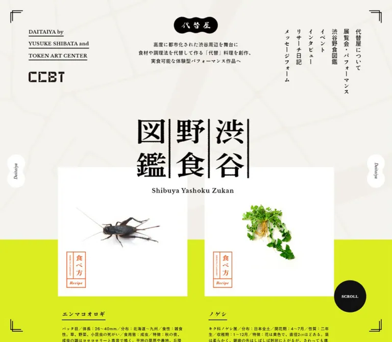
Daitaiya presents an art project through the visual language of a specimen book. A small, lobed black identity mark sits above restrained introductory copy. Below it, the much larger Japanese title, “渋谷野食図鑑,” overlaps white photographic plates. A cricket and an uprooted plant receive the isolation and generous margins of museum specimens. Small orange recipe stamps connect that documentary presentation to cooking.
The composition combines several scales: tiny English annotations, ordinary Japanese reading text, a large irregular title, and an enormous outlined “MESSAGE” word. Pale street-map linework, paired corner marks, vertical navigation, and narrow ornamental side badges tie those scales together. The homepage continues into event reports, an interview, research diaries, and a substantial black footer. Its organizing model is a project publication with a field guide and archive.
How to Read This Reference
- Measured means a value is explicitly present in the supplied rendered-element or computed-style evidence. Measurements are CSS pixels unless stated otherwise.
- Calculated means arithmetic based on those measurements, such as converting the source variable
--glid: 4.34vwinto pixels. - Estimated means a visual approximation from the current desktop or mobile captures. Exact lime, orange, map-line colors, and several artwork dimensions were not supplied as computed styles.
- Recommended identifies implementation choices for reuse. The CSS below is an adaptation, with a proposed breakpoint and accessibility treatments.
- Element rectangles describe layout boxes. They do not always describe painted artwork, and a nonzero rectangle does not prove that an element was visible. This distinction is especially relevant to the mobile navigation and recipe trees.
- The evidence supports the homepage at two viewport sizes. Linked pages, opened recipes, the expanded mobile menu, hover endpoints, and keyboard behavior were not inspected.
Tokens — Colors
Default Palette
The token names below are implementation aliases, not original source variable names.
| Name | Value | Token | Role and evidence |
|---|---|---|---|
| Warm Paper | #f5f3ee |
--color-paper |
Measured body background: rgb(245, 243, 238). Visible behind the opening map and message region. |
| Near-black Ink | #111111 |
--color-ink |
Measured body text, message-button fill, exhibition-link background, and footer background. |
| White | #ffffff |
--color-white |
Measured message-button and footer-link foreground. Specimen plates and side badges also appear white, although their fills were not separately measured. |
| Electric Lime | Approximately #dcef19 |
--color-lime |
Estimated reproduction value for the broad, saturated yellow-green field. Its exact CSS color is unavailable. |
| Recipe Orange | Approximately #ff4b1a |
--color-recipe |
Estimated reproduction value for the outlined recipe stamps. Confine this accent to recipe identification. |
| Map Line | Approximately #efede6 |
--color-map |
Estimated low-contrast street-map linework against Warm Paper. |
The lime is a major surface color, not a small button accent. Orange has the opposite role: a compact annotation inside otherwise white photographic plates. Black provides text, identity artwork, fine rules, the circular scroll cue, and the large footer field.
The computed-style export includes many WordPress preset colors, gradients, and shadows. Their presence does not establish visible use. They are excluded from this palette because the supplied captures do not demonstrate them as part of the design.
Theme Presets
No selectable palette or dark-mode interaction was observed. The black footer is a section treatment within the same page. It should not be interpreted as evidence of a separate dark theme.
Tokens — Typography
Japanese Reading Text — Shippori Antique B1
- Measured stack:
'Shippori Antique B1', serif. - Roles: body copy, specimen descriptions, navigation, article titles, excerpts, and footer navigation.
- Measured weights:
400for the body default and many headings;500for descriptive paragraphs. - Tracking: body and paragraph samples usually use
0.05em; heading samples commonly use0.08em. - Character: compact Japanese text with a slightly irregular, printed presence. Preserve the measured named family when available rather than choosing a replacement solely from its generic
seriffallback.
Computed weights describe the requested CSS weight. The supplied evidence does not establish which font files or synthesized weights produced every glyph.
English Project Byline — Libre Baskerville
- Measured stack:
'Libre Baskerville', serif. - Measured desktop treatment:
16px, weight700,28pxline height,0.8pxtracking. - Content: the three-line “DAITAIYA by / YUSUKE SHIBATA and / TOKEN ART CENTER” attribution.
- Visual treatment: each line is underlined, producing a compact block of editorial credit text in the upper-left corner.
- Mobile limitation: a
14px / 24.5pxversion exists in the DOM but is absent from the closed-menu opening capture.
The English field-guide subtitle looks serif and is approximately 20–22px on desktop and 12–13px on mobile. Its own computed font family was not supplied; the measured Libre Baskerville byline should not be treated as proof of the subtitle’s font.
Rounded Display and Action Text — Zen Maru Gothic
- Measured stack:
'Zen Maru Gothic', serif. - Weight:
700. - Roles: major editorial category headings, the message-button label, and recipe headings present in the DOM.
- Hierarchy: category headings are
64pxon desktop and32pxon mobile. Recipe headings are smaller, at32pxand24pxrespectively.
This creates a softer secondary voice around the more irregular field-guide title.
Artwork Lettering
The Japanese field-guide title has uneven, ink-like strokes and vertical dividing rules. Treat its visible drawing as identity artwork. The enclosing H2 reports a 16px font size, but its desktop box is approximately 406 × 271px; that small computed font size plainly does not describe the large painted Japanese lettering.
The black brand plaque contains small white Japanese lettering. Preserve its silhouette and lettering together when authorized artwork is available. Exact asset formats and paths were not supplied.
The outlined “MESSAGE” word is a separate decorative scale. It spans beyond both sides of the desktop viewport, with a transparent interior and thin dark outline. A display size around 300–330px is a visual estimate, not a measured font token.
Type Scale
| Role | Desktop size / line height | Mobile size / line height | Weight | Evidence |
|---|---|---|---|---|
| Body default | 16 / 24px |
14 / 21px |
400 | Measured |
| Opening statement | 17.28 / 30.24px |
11.7 / 20.475px |
500 | Measured |
| Primary navigation | 18 / 27px |
18 / 27px |
400 | Measured; mobile state not visibly opened |
| English project byline | 16 / 28px |
14 / 24.5px |
700 | Measured; mobile block not visible in opening capture |
| Specimen name | 16 / 24px |
16 / 24px |
400 | Measured H3; heading box is 33px high |
| Specimen description | 16 / 28px |
14 / 24.5px |
500 | Measured |
| Message invitation | 20 / 30px |
18 / 27px |
400 | Measured |
| Message-button label | 14 / 21px |
14 / 21px |
700 | Measured |
| Editorial category | 64 / 96px |
32 / 48px |
700 | Measured |
| Event/interview title | 20 / 30px |
20 / 30px |
400 | Measured |
| Editorial excerpt | 14 / 24.5px |
14 / 24.5px |
500 | Measured |
| Diary title | 16 / 24px |
16 / 24px |
400 | Measured |
| Footer navigation | 14 / 21px |
14 / 21px |
400 | Measured |
| Copyright | 12 / 21px |
11 / 19.25px |
500 | Measured |
| Recipe heading | 32 / 48px |
24 / 36px |
700 | Measured DOM content; opened presentation unverified |
| Recipe introduction | 20 / 35px |
16 / 28px |
500 | Measured DOM content; opened presentation unverified |
The source root font size is 10px at both inspected widths. The Quick Start uses explicit pixels and viewport units so it can coexist with a conventional application root size.
Tokens — Spacing & Shapes
Density: generous outer space, large isolated images, and compact annotations. Structural contrast: rectangular image plates and editorial blocks against circular or lobed utility marks.
Responsive Unit
The exported custom property is spelled:
--glid: 4.34vw;
This evaluates to 62.496px at 1440px and 16.926px at 390px.
Several desktop widths closely match multiples of this value: article previews are approximately 5 × --glid, diary previews 3 × --glid, and category-heading regions 7 × --glid. These are calculated correspondences. The supplied evidence does not include the selectors needed to prove that each width was authored using those formulas.
Mobile changes its layout substantially. Applying the desktop multiples unchanged would not reproduce the observed phone layout.
Spacing Scale
| Use | Desktop | Mobile | Status |
|---|---|---|---|
| Corner-mark distance from viewport edge | About 37px | About 16px | Screenshot estimate |
| Masthead logo top | 60.47px |
44.84px |
Measured |
| Main title top | 413.61px |
245.09px |
Measured |
| Gap between first specimen columns | About 62.5px | Single column | Screenshot estimate consistent with source unit |
| Specimen text inset from plate edge | About 14.4px | About 19.5px | Estimated from image edge and measured text rectangle |
| Plate-to-specimen-heading gap | About 43px | About 22px | Screenshot estimate |
| Message warning to button | 100px |
About 46.8px |
Calculated from measured boxes |
| Message-button padding | 35px 15px |
30px 10px |
Measured |
| Footer padding | 93.744px |
23.4px 23.4px 31.2px |
Measured |
| Typical footer navigation row pitch | About 41px | About 36.6px, expanded by wrapping | Calculated from measured link positions |
Border Radius
| Element | Treatment | Evidence |
|---|---|---|
| Specimen plates | Square corners | Visible |
| Editorial links and exhibition block | Rectangular, no general rounded-card treatment | Visible where captured; measured link radius 0 |
| Message CTA | Full capsule | Measured radius 1440px desktop and 844px mobile |
| Scroll cue | Circle, about 90px diameter | Screenshot estimate |
| Mobile menu control | Circle, about 50px diameter | Screenshot estimate |
| Brand plaque | Horizontal organic lobed silhouette | Visible artwork |
| Side badges | Vertical paired-lobe silhouette, about 50 × 94px | Screenshot estimate |
The large measured CTA radius simply forces a capsule. A reusable 999px token achieves the same geometry without tying the radius to viewport dimensions.
Layout Measurements
| Element | Desktop 1440 × 1000 | Mobile 390 × 844 | Evidence |
|---|---|---|---|
| Brand H1 box | 159.97 × 61.89px |
104.91 × 40.58px |
Measured |
| Field-guide H2 box | 406.22 × 271.08px |
241.80 × 164.14px |
Measured; includes subtitle area |
| First specimen plate | About 438 × 438px, top about 584px |
About 328 × 328px, top about 362px |
Estimated from captures |
| Specimen text column | 408.69px |
288.59px |
Measured |
| Message CTA | 312.47 × 91px |
312 × 81px |
Measured |
| Exhibition-link block | 1152 × 600px |
343.19 × 585px |
Measured |
| Event/interview link | 312.47 × 573.27px |
358.81 × 460.81px |
Measured content-dependent boxes |
| Diary link | 187.48 × 318.28px |
358.81 × 125.58px |
Measured |
| Footer | 1440 × 677.66px |
390 × 546.58px |
Measured |
| Document height | 8537px |
9664px |
Supplied document measurement |
Article and footer heights reflect the current content. Preserve their spacing relationships while allowing future text to determine height.
Components
Project Masthead and Primary Navigation
Role: introduce the project and provide access to its publication sections.
The desktop masthead distributes three independent groups across a wide opening canvas:
- The underlined English byline and CCBT mark sit at the upper left, starting around
x = 103.67px. - A centered black brand plaque begins around
y = 60.47px. Three centered lines of Japanese introductory copy begin aty = 146.11px. - Seven narrow vertical navigation links sit at the upper right, beginning around
y = 103.67px.
The vertical navigation reads from the rightmost “代替屋について” toward the leftmost “メッセージフォーム.” Links have measured boxes approximately 29px wide, with a 36px horizontal pitch. Use Japanese vertical writing for a reproduction; do not rotate an ordinary horizontal sentence as a single strip.
The links point to About, Exhibition, the Field Guide, Events, Interviews, Research Diaries, and Contact. They are separate page destinations, rather than evidence of a single-page anchor menu.
The desktop header itself has a measured height of zero despite its visible children. This indicates that its box height is not a useful measure of the occupied masthead region. On mobile, the header has a measured height of 122.25px and the centered identity remains visible. The byline and navigation are absent from the opening image even though their DOM rectangles remain present.
Viewport Frame and Utility Marks
Role: make the long page feel like a framed printed object.
Each viewport corner contains two thin, offset right-angle marks. They are approximately 30px long on desktop and 20px on mobile, with a small separation between the paired strokes. Their positions remain consistent across the supplied scroll captures.
Desktop also shows a white paired-lobe badge halfway down each side, carrying a small rotated “Daitaiya” label. These remain visible in opening, middle, and footer captures. Their appearance supports a viewport-anchored treatment; the actual positioning declarations were not included.
The opening desktop image includes a black circular “SCROLL” cue near the lower right. Its activation and scrolling destination were not tested. It is absent from the mobile opening image.
Mobile instead shows a black circular hamburger control at the bottom center, approximately 50px across. The white bars remain visible against the black footer, where the circle’s edge naturally blends into the surrounding surface. There is no evidence that its fill changes there.
Field-guide Title
Role: establish the catalog as the page’s central feature.
The large “渋谷野食図鑑” title uses three vertical pairs of characters separated by heavy irregular rules. Its width is about 406px on desktop and 242px on mobile. The English subtitle sits below with generous tracking and a restrained serif appearance.
The title is layered over the upper edges of the first white specimen plates. Desktop places the artwork around y = 414px and the plates around y = 584px. Mobile places the artwork around y = 245px and the first plate around y = 362px.
Preserve that overlap. A title followed by an ordinary block margin would lose the connection between the printed heading and the photographic catalog.
Specimen Entry
Role: introduce a plant or insect through an image, identification, and culinary commentary.
The component has four main parts:
- A large square white image plate.
- A small orange recipe stamp near its lower-left corner.
- A Japanese specimen name with a short underline beneath it.
- Compact biological facts followed by a more spacious explanatory paragraph.
The opening desktop row pairs “エンマコオロギ” with “ノゲシ.” The cricket is shown intact, with its legs and antennae surrounded by ample white space. The plant includes leaves and exposed roots. Both images read as specimens rather than tightly cropped food photography.
Desktop uses two columns, with text slightly inset from each plate. On mobile, each complete entry precedes the next one in a single column. The plate occupies approximately 84% of the viewport width; the text occupies approximately 74%.
The DOM lists seven specimens in order. This confirms the catalog’s content structure, although the supplied images do not visually expose every specimen photograph.
Recipe Stamp
Role: mark the cooking-related affordance within a specimen plate.
The stamp is a narrow orange outlined rectangle. It contains a small vertical English annotation, larger vertical “食べ方” lettering, and an italic “Recipe” footer separated by a horizontal rule. Approximate outer dimensions are 64 × 123px on desktop and 48 × 91px on mobile.
Its placement is deliberately low and left, leaving the specimen itself clear. Use thin orange divisions and a white interior. A large filled orange button would change the hierarchy.
The stamp suggests access to recipe details, and corresponding recipe content exists in the DOM. No click result was supplied, so its actual trigger element, opening behavior, or destination is unverified.
Message Invitation and Caution
Role: invite contributions after the specimen catalog.
A centered heading invites reports and supportive messages. It occupies two lines at 20px / 30px on desktop and three lines at 18px / 27px on mobile.
Below it, the source’s caution about wild plants and insects appears with an underlined “参考文献” link. Desktop places skull-and-crossbones line drawings on both sides of the warning block. The measured paragraph has 60px horizontal padding. Mobile switches to top padding of 46.8px and a narrower four-line text arrangement; the exact mobile icon arrangement is not shown in a supplied image.
The principal action is a centered near-black capsule with a small arrow and the label “メッセージフォーム.” It links to /contact/. Its width stays almost unchanged between the two inspected viewports, while its height decreases from 91px to 81px.
Behind the button, an enormous outlined “MESSAGE” word extends beyond the viewport. Treat this as decorative lettering. Its clipping is visible; movement is not established.
Exhibition Feature Link
Role: bridge the field guide and the project’s exhibition material.
The measured desktop link is a broad 1152 × 600px rectangle centered with 144px side margins. The supplied middle capture reveals a black left portion and the upper part of a human portrait on the right. The portrait includes a brimmed hat and an interior setting; the person’s identity is not established by that image alone.
At mobile width, the link measures approximately 343 × 585px. This change from a wide to a tall box indicates substantial reflow. The internal mobile arrangement was not visually captured, so a precise stacked composition should not be claimed.
The entire measured block links to /exhibition/.
Editorial Preview Groups
Role: provide routes into events, an interview, and research diaries.
Desktop event previews occupy two 312.47px-wide columns, starting at approximately x = 126.30px and x = 563.77px. A large category-heading region sits to their right. The interview reverses the broader balance: its heading region sits left, with the article preview nearer the center.
Each event or interview link contains an image region, a 20px / 30px title, a 14px / 24.5px excerpt, and an “記事を読む” action line. The title and excerpt share the card width on desktop. On mobile, the link expands to about 359px while the text receives approximately 31px of horizontal inset.
Category headings use measured white Zen Maru Gothic text. Desktop heading boxes are much larger than the glyphs they contain. The intermediate category artwork is not visible in the supplied captures; its exact surrounding shape or fill cannot be recovered from the H2 text color alone.
Research diaries use a distinct, smaller format. Desktop shows three narrow previews, each approximately 187.48px wide. Mobile changes them into horizontal rows: a roughly 126px image region at left and title/action information at right. This is a component change, not merely a reduction in column count.
The underlined “一覧へ” link is approximately 187.48px wide on desktop, aligned toward the right, and 195px wide on mobile, centered. It remains an open text-and-rule treatment.
Footer
Role: close the page with navigation, external project links, and copyright.
The footer is a large #111111 field with white details and generous empty space. Desktop uses roughly 94px of padding. A 30px Instagram icon appears near its upper-left area; navigation sits well below it in two columns.
The bottom identity row contains linked marks for CCBT, YUSUKE SHIBATA, and Token Art Center. These displayed links are supported by the original-page evidence. Their presence alone does not establish website-production roles.
On mobile, the footer retains two navigation columns but stacks the three marks vertically. The Instagram icon becomes 40px and moves to the lower right. Copyright moves to the lower left. The long exhibition label wraps into two lines, increasing that navigation row’s height.
The footer’s apparent spaciousness comes from deliberate internal gaps, not card borders or decorative separators.
Recipe Content — DOM Evidence Only
Role: provide a detailed cooking treatment for each specimen.
Seven recipe trees appear in the supplied DOM. Each includes a recipe title, duration, introductory paragraph, “材料” heading, ingredient text, preparation steps, and a concluding “ポイント” note.
Measured desktop title and introduction columns are approximately 690px wide. Ingredient and note text use a narrower approximately 621px column. On mobile those widths become approximately 343px and 310px respectively.
Several recipe trees share identical coordinates even though none is visible in the supplied opening image. These boxes therefore should not be interpreted as seven simultaneously displayed sections below the footer. The evidence does not establish the panel surface, overlay, close control, focus behavior, or scrolling model.
For a new implementation, use a semantic recipe article within a verified navigation or dialog pattern. Keep this recommendation separate from claims about the original interaction.
Tokens — Motion & Interaction
| Treatment | Evidence | What can be concluded |
|---|---|---|
| Link transition | Sampled links report 0.4s ease-in-out |
A 400ms eased transition is defined. Changed properties and hover endpoints were not supplied. |
| Sampled element animation | Reported as none |
No named CSS animation was recorded on those sampled elements. This does not cover every descendant, pseudo-element, or script-driven effect. |
| Other transition entries | Some elements report only all |
This alone does not establish a nonzero animation duration. |
| Viewport corner marks | Same screen positions in multiple scroll captures | Persistent framing is visually supported. |
| Desktop side badges | Visible at the viewport’s sides at multiple scroll positions | Persistent placement is supported; click behavior is unverified. |
| Map-to-lime boundary | Near y = 829px in both opening and middle desktop captures |
Suggests a viewport-related backdrop. Exact positioning and activation logic are unavailable. |
| Mobile backdrop boundary | Near y = 591px in the opening capture |
Approximately 70% of the 844px viewport height; source formula is unverified. |
| Mobile menu | Closed control is visible | Opening, closing, transition, and focus handling were not tested. |
| Recipe affordance | Stamps visible; recipe text present in DOM | The relationship is plausible, but the actual action was not exercised. |
| Outlined “MESSAGE” | Large clipped lettering visible | No marquee or continuous movement can be inferred from a still capture. |
The supplied capture process waited for initial content and finite motion to settle, temporarily paused perpetual animations during readiness checks, and traversed scroll positions. It was not an interaction audit or a recording of every transition.
For reuse, retain the measured 400ms ease as an optional timing token. Apply it to explicit properties after defining and testing the desired states. Avoid adding parallax, image zoom, smooth scrolling, or animated lettering solely because the composition appears expressive.
Surfaces
| Layer | Appearance | Purpose |
|---|---|---|
| Map canvas | Warm paper with barely darker street linework | Connects the catalog to its urban setting without competing with text |
| Lime field | Flat, saturated yellow-green | Creates the page’s strongest color identity and supports visible lower content |
| Specimen plate | Unshadowed white square | Isolates the subject and preserves its silhouette |
| Recipe stamp | White interior with orange rules and lettering | Adds a small practical annotation |
| Message action | Near-black capsule with white text | Concentrates action emphasis into one clear target |
| Exhibition link | Broad near-black block with photography | Introduces a different image scale and project context |
| Footer | Near-black field with white navigation and logos | Creates a decisive visual ending |
| Frame decoration | Thin near-black marks; white side badges | Holds a consistent visual boundary around the page |
There is no visible general elevation system. Use spacing, flat contrast, image boundaries, and linework to distinguish components. Shadows listed among generic platform presets are not evidence of an active card-shadow style.
Imagery
Specimen photography is the strongest reusable image principle. Show the entire subject against clean white, preserve delicate appendages and roots, and leave generous breathing room. The object occupies only part of the square plate. Its silhouette, small natural shadow, and biological detail create interest without a decorative image frame.
The first two visible subjects offer a useful contrast: a dark, horizontally oriented cricket and a green plant with dangling roots. Their shapes are irregular, but the containing plates are rigorously square.
The map background works at the opposite scale. It consists of enlarged, faint street shapes extending beyond the viewport. It has no visible labels, pins, legend, or interactive map controls. A reproduction should treat it as decorative geographic linework rather than inventing a mapping interface.
Other visible imagery includes a partial human portrait in the exhibition feature and a cropped photographic thumbnail near the mobile diary/footer transition. These demonstrate an editorial photography role, but the supplied images do not establish every article’s crop or color processing.
Observed Asset References
Actual image URLs and filenames were not included in the supplied original-page evidence. The following inventory identifies observed artwork without inventing paths.
| Asset | Verified appearance | Implementation guidance |
|---|---|---|
| Daitaiya identity | White Japanese lettering inside a black lobed plaque | Use authorized identity artwork; preserve its complete silhouette |
| Field-guide title | Irregular black Japanese lettering with vertical dividers | Preserve the original lettering as artwork when available |
| Cricket photograph | Whole insect on a white square | Keep antennae and legs uncropped |
| Plant photograph | Green leaves and exposed roots on white | Keep the full specimen visible |
| Map linework | Pale enlarged road network | Use an authorized decorative image or a newly drawn equivalent |
| Recipe stamp | Orange divided vertical label | Reproduce with artwork or carefully structured HTML/CSS |
| Skull symbols | Fine black caution illustrations beside desktop text | Preserve their small scale; keep the warning readable as text |
| Footer marks | CCBT, YUSUKE SHIBATA, Token Art Center | Use authorized marks with their observed relative proportions |
| Instagram icon | White outlined symbol | Supply a recognizable icon with an accessible link name |
CSS can reproduce the plates, rules, circles, and broad layout. The distinctive lettering and specimen photographs require suitable assets.
Layout & Responsive Behavior
The desktop opening relies on a wide canvas. The small identity and introductory statement occupy the upper band, while the field-guide title begins much lower. At 1440px width, the first specimen pair spans approximately 938px and is centered with about 251px outer margins.
At 390px, the page retains the centered identity and overlapping field-guide heading, while removing the visible desktop side groups. The first specimen plate expands to about 328px, leaving roughly 31px on either side. Its descriptive text is narrower, with approximately 51px outer margins.
| Relationship | Desktop observation | Mobile observation |
|---|---|---|
| Main navigation | Vertical links at upper right | Absent from closed capture; bottom-center menu control visible |
| Project byline | Upper-left block | Not visible in opening capture |
| Specimens | Two columns | One complete entry per row |
| Field-guide title | About 406px wide | About 242px wide |
| Message invitation | Two lines | Three lines |
| Message CTA | About 312px wide | Remains about 312px wide |
| Event/interview previews | Narrow vertical cards in asymmetric groups | Wide stacked previews with inset text |
| Diary previews | Three narrow vertical cards | Three horizontal image/text rows |
| Category headings | 64px, large side regions |
32px, full-width heading boxes |
| Footer marks | One horizontal row | Vertical stack |
| Upper-left footer region | Lower-right footer region | |
| Frame | Corner marks plus side badges | Corner marks retained; side badges absent |
The repeated desktop map boundary at the same viewport height is a particularly important observation. It should not automatically be modeled as the bottom of a conventional static hero section. The Quick Start offers a sticky backdrop within the field-guide region as a recommended approximation; the original mechanism remains unknown.
Only the two supplied widths were inspected. The exact breakpoint, tablet behavior, landscape layout, and browser safe-area handling are unverified.
Do’s and Don’ts
Do
- Keep the measured paper and ink values:
#f5f3eeand#111111. - Use the lime as a substantial background field and recipe orange as a small annotation.
- Preserve large white specimen plates with intact insects, roots, and leaves.
- Maintain the title’s overlap with the first photographic row.
- Retain the separate roles of Japanese reading text, rounded category headings, and English serif annotations.
- Use vertical Japanese navigation on wide screens and a purposeful compact navigation pattern on phones.
- Keep specimen descriptions narrower than their image plates.
- Preserve distinct mobile treatments for long editorial previews and compact diary rows.
- Give the footer enough empty space to function as a strong closing field.
- Treat corner marks, side badges, and the map as a coordinated framing system.
Don’t
- Don’t turn the field guide into a row of interchangeable promotional feature cards.
- Don’t crop specimens tightly or remove their delicate extremities to fill a square.
- Don’t apply rounded corners and shadows to every photographic plate.
- Don’t expand orange into a general button and background color.
- Don’t replace the hand-rendered title with a large ordinary body-font heading.
- Don’t make the map dark enough to compete with copy or introduce invented map controls.
- Don’t identify hidden recipe trees or mobile navigation as visibly open from their DOM rectangles alone.
- Don’t infer hover transformations, parallax, marquee motion, or modal behavior from still images.
- Don’t copy generic WordPress preset gradients and shadows into the site’s visual system.
- Don’t force the mobile diary rows to use the same vertical layout as event previews.
Recommended Implementation Additions
These are recommendations for a new implementation, not verified features of the inspected page:
- Give the brand link, recipe controls, Instagram link, and menu control explicit accessible names. Give the title artwork a meaningful text alternative.
- Keep decorative map imagery, corner marks, and the large background word out of the accessibility tree. They should not intercept pointer events.
- Preserve a visible keyboard focus indicator on both paper and black surfaces. Small glyphs can sit inside larger, at least 44px interactive targets.
- Implement hidden navigation and recipe content so it cannot receive focus while closed. If recipes use dialogs, provide a labeled close control, Escape handling, initial focus, and focus restoration.
- Consider increasing the mobile opening statement above its observed 11.7px size. Preserve the three-line intent with responsive wrapping rather than allowing illegibly small copy.
- Retain the source’s caution and reference link in readable text alongside the visual symbols. Avoid copying the supplied recipes as unreviewed demonstration content.
- Respect reduced-motion preferences when adding transitions. A working static page should remain available without decorative movement.
- Preserve image aspect ratios with width and height attributes, and keep meaningful content available when optional JavaScript is unavailable.
Agent Prompt Guide
Quick Color Reference
- Measured page paper:
#f5f3ee. - Measured text, principal dark fills, and footer:
#111111. - Measured reversed text:
#ffffff; white specimen surfaces are visually supported. - Estimated lime reproduction color:
#dcef19. - Estimated recipe-stamp orange:
#ff4b1a. - Estimated map line:
#efede6. - Surface language: flat color, crisp rules, isolated photography, and large empty areas.
Overall Prompt
“Create an art-project publication and urban field guide inspired by Daitaiya. Use warm paper #f5f3ee, near-black #111111, white specimen plates, and a broad electric yellow-green field. Use #dcef19 and recipe orange #ff4b1a as approximate reproduction values. Place a small lobed identity mark above a centered three-line project statement, then a large irregular Japanese field-guide title overlapping the first row of square specimen photographs. Use Shippori Antique B1 for Japanese reading text, Libre Baskerville for the English project byline, and Zen Maru Gothic for category headings and the message CTA. Frame desktop with thin paired corner marks, vertical navigation, and small white side badges. Continue into a centered message invitation, an exhibition feature, editorial previews, and a generous black footer. At phone width, use one specimen column, horizontal diary rows, stacked footer marks, and a bottom-center menu control. Keep unverified motion and recipe behavior out of the visual specification until implemented and tested.”
Example Component Prompts
- Specimen entry: “Build a square white specimen plate with an intact cricket centered in generous white space. Place a small orange vertical ‘食べ方’ stamp at the lower left. Below the plate, inset a 16px Japanese specimen heading with a short rule, compact identification facts, and a readable descriptive paragraph. Use square corners and no shadow.”
- Desktop masthead: “Distribute a three-line underlined English byline at the upper left, a centered black lobed identity mark with a compact Japanese introduction, and seven vertical Japanese navigation links at the upper right. Keep the opening airy and leave space before the large field-guide artwork.”
- Message region: “Center a two-line invitation on warm map paper. Place the caution text below with small line-drawn skull symbols and an underlined reference link. Add a roughly 312px-wide black capsule with white ‘メッセージフォーム’ text. Behind it, clip a very large outlined ‘MESSAGE’ word beyond the viewport edges. Keep the lettering static unless motion is separately specified.”
- Mobile diary row: “Create a roughly 359px-wide horizontal article row with an approximately 126px square image at left and a 16px Japanese title plus ‘記事を読む’ at right. Use a compact gap and flat styling. Stack three rows, followed by a centered underlined ‘一覧へ’ link.”
- Footer: “Create a spacious near-black footer with white 14px Japanese navigation in two columns. On desktop, put three project marks in a horizontal row near the bottom; on mobile, stack them at the left and place a 40px Instagram icon at the lower right. Retain the page’s fine corner framing.”
Quick Start
CSS Custom Properties
This recommended CSS shell reproduces the measured type hierarchy and the principal desktop/mobile proportions. The 900px breakpoint, desktop width caps, sticky backdrop, hover treatment, and focus rules are implementation choices. Lime, orange, and map-line colors remain estimates.
Place .stage-backdrop first inside .guide-stage, followed by the masthead, title, specimen grid, message region, and exhibition link. Place editorial content and the footer after that stage. Supply authorized artwork in .brand-mark img and .guide-title img. Set --map-image only when a suitable asset is available; no original asset path is assumed.
The font stacks require the corresponding fonts to be loaded separately. Menu and recipe controls require working behavior before they are exposed as actions. Mark decorative elements with aria-hidden='true' in the HTML.
:root {
  /* Measured colors */
  --color-paper: #f5f3ee;
  --color-ink: #111111;
  --color-white: #ffffff;

  /* Estimated reproduction colors */
  --color-lime: #dcef19;
  --color-recipe: #ff4b1a;
  --color-map: #efede6;

  /* Measured font stacks */
  --font-reading: 'Shippori Antique B1', serif;
  --font-latin: 'Libre Baskerville', serif;
  --font-rounded: 'Zen Maru Gothic', serif;

  --text-body: 16px;
  --text-specimen: 16px;
  --text-article: 20px;
  --text-category: 64px;
  --leading-body: 1.75;
  --tracking-body: 0.05em;
  --tracking-heading: 0.08em;

  /* Source-unit alias and recommended layout tokens */
  --grid-unit: 4.34vw;
  --guide-width: min(65.1vw, 1120px);
  --guide-gap: var(--grid-unit);
  --frame-inset: 2.6vw;
  --corner-size: 30px;
  --backdrop-height: 82.9vh;
  --map-image: none;
  --radius-pill: 999px;
  --motion-link: 400ms ease-in-out;
}

* {
  box-sizing: border-box;
}

body {
  margin: 0;
  color: var(--color-ink);
  background: var(--color-lime);
  font-family: var(--font-reading);
  font-size: var(--text-body);
  line-height: 1.5;
  letter-spacing: var(--tracking-body);
}

a {
  color: inherit;
  text-underline-offset: 0.3em;
}

button {
  font: inherit;
}

img {
  display: block;
  max-width: 100%;
}

[hidden] {
  display: none !important;
}

.guide-stage {
  position: relative;
  isolation: isolate;
}

/* Recommended approximation of the persistent map field. */
.stage-backdrop {
  position: sticky;
  top: 0;
  z-index: -1;
  height: var(--backdrop-height);
  margin-bottom: calc(-1 * var(--backdrop-height));
  background-color: var(--color-paper);
  background-image: var(--map-image);
  background-position: center top;
  background-size: cover;
  pointer-events: none;
}

.site-masthead {
  position: relative;
  height: 28.723vw;
  min-height: 260px;
}

.brand-mark {
  position: absolute;
  top: 4.2vw;
  left: 50%;
  width: min(11.11vw, 190px);
  margin: 0;
  transform: translateX(-50%);
}

.brand-mark img {
  width: 100%;
  height: auto;
}

.project-intro {
  position: absolute;
  top: 10.146vw;
  width: 100%;
  margin: 0;
  padding-inline: 20px;
  text-align: center;
  font-size: 1.2vw;
  font-weight: 500;
  line-height: 1.75;
}

.project-byline {
  position: absolute;
  top: 6.9vw;
  left: 7.2vw;
  width: 188px;
  font-family: var(--font-latin);
  font-size: 16px;
  font-weight: 700;
  line-height: 28px;
}

.project-byline span {
  display: table;
  border-bottom: 1px solid currentColor;
}

.primary-nav {
  position: absolute;
  top: 7.2vw;
  right: 7.2vw;
  display: flex;
  flex-direction: row-reverse;
  align-items: flex-start;
  gap: 7px;
}

.primary-nav a {
  writing-mode: vertical-rl;
  padding-right: 2px;
  font-size: 18px;
  line-height: 27px;
  text-decoration: none;
}

.guide-title {
  position: relative;
  z-index: 2;
  width: min(28.21vw, 480px);
  margin: 0 auto -101px;
  text-align: center;
}

.guide-title img {
  width: 100%;
  height: auto;
}

.guide-title__caption {
  display: block;
  margin-top: 24px;
  font-family: var(--font-latin);
  font-size: 20px;
  font-weight: 700;
  line-height: 1.5;
  letter-spacing: 0.05em;
}

.specimen-grid {
  display: grid;
  grid-template-columns: repeat(2, minmax(0, 1fr));
  gap: 88px var(--guide-gap);
  width: var(--guide-width);
  margin-inline: auto;
}

.specimen-plate {
  position: relative;
  margin: 0;
  aspect-ratio: 1;
  background: var(--color-white);
}

.specimen-plate > img {
  width: 100%;
  height: 100%;
  object-fit: contain;
}

.specimen-copy {
  margin-top: 43px;
  padding-inline: 1vw;
}

.specimen-name {
  display: table;
  margin: 0 0 18px;
  padding-bottom: 8px;
  border-bottom: 1px solid currentColor;
  font-size: var(--text-specimen);
  font-weight: 400;
  line-height: 24px;
  letter-spacing: var(--tracking-heading);
}

.specimen-facts {
  margin: 0 0 18px;
  font-size: 12px;
  line-height: 1.5;
}

.specimen-description {
  margin: 0;
  font-weight: 500;
  line-height: var(--leading-body);
}

/* Recommended HTML/CSS interpretation of the visual stamp. */
.recipe-stamp {
  position: absolute;
  bottom: 30px;
  left: 30px;
  display: grid;
  grid-template-columns: 20px 1fr;
  grid-template-rows: 1fr 30px;
  width: 64px;
  height: 123px;
  padding: 0;
  border: 1px solid var(--color-recipe);
  color: var(--color-recipe);
  background: var(--color-white);
}

.recipe-stamp__micro {
  display: grid;
  place-items: center;
  border-right: 1px solid currentColor;
  writing-mode: vertical-rl;
  font-family: serif;
  font-size: 6px;
}

.recipe-stamp__jp {
  justify-self: center;
  align-self: center;
  writing-mode: vertical-rl;
  font-family: serif;
  font-size: 24px;
  letter-spacing: 0.1em;
}

.recipe-stamp__en {
  grid-column: 1 / -1;
  display: grid;
  place-items: center;
  border-top: 1px solid currentColor;
  font-family: serif;
  font-size: 13px;
  font-style: italic;
}

.message-region {
  position: relative;
  isolation: isolate;
  overflow: clip;
  padding: 160px 24px 250px;
  text-align: center;
}

.message-region h3 {
  margin: 0 0 30px;
  font-size: 20px;
  font-weight: 400;
  line-height: 1.5;
  letter-spacing: var(--tracking-heading);
}

.message-warning {
  max-width: 742px;
  margin: 0 auto 100px;
  padding-inline: 60px;
  font-weight: 500;
  line-height: 1.75;
}

.message-backword {
  position: absolute;
  top: 340px;
  left: 50%;
  z-index: -1;
  transform: translateX(-50%);
  color: transparent;
  font-family: serif;
  font-size: clamp(160px, 23vw, 400px);
  line-height: 1;
  white-space: nowrap;
  -webkit-text-stroke: 1px var(--color-ink);
  pointer-events: none;
}

.message-cta {
  display: flex;
  justify-content: center;
  align-items: center;
  gap: 16px;
  width: min(312.47px, 100%);
  min-height: 91px;
  margin-inline: auto;
  padding: 35px 15px;
  border-radius: var(--radius-pill);
  color: var(--color-white);
  background: var(--color-ink);
  font-family: var(--font-rounded);
  font-size: 14px;
  font-weight: 700;
  line-height: 21px;
  text-decoration: none;
}

.exhibition-feature {
  display: block;
  width: 80%;
  min-height: 600px;
  margin-inline: auto;
  background: var(--color-ink);
}

.editorial-section {
  width: 82.46%;
  margin: 160px auto;
}

.editorial-title {
  color: var(--color-white);
  font-family: var(--font-rounded);
  font-size: var(--text-category);
  font-weight: 700;
  line-height: 1.5;
  letter-spacing: var(--tracking-heading);
}

.story-grid {
  display: grid;
  grid-template-columns: repeat(2, minmax(0, 1fr));
  gap: calc(2 * var(--grid-unit));
  width: calc(12 * var(--grid-unit));
  max-width: 100%;
}

.story-card,
.diary-row {
  display: block;
  color: inherit;
  text-decoration: none;
}

.story-copy h3 {
  margin: 24px 0 20px;
  font-size: 20px;
  font-weight: 400;
  line-height: 30px;
  letter-spacing: var(--tracking-heading);
}

.story-copy p {
  margin: 0 0 20px;
  font-size: 14px;
  font-weight: 500;
  line-height: 24.5px;
}

.diary-grid {
  display: grid;
  grid-template-columns: repeat(3, minmax(0, 1fr));
  gap: calc(1.5 * var(--grid-unit));
  width: calc(12 * var(--grid-unit));
  max-width: 100%;
}

.diary-row h3 {
  font-size: 16px;
  font-weight: 400;
  line-height: 24px;
  letter-spacing: var(--tracking-heading);
}

.archive-link {
  display: block;
  width: 187.5px;
  margin: 60px 0 0 auto;
  padding: 20px 0 20px 35px;
  border-bottom: 1px solid currentColor;
  font-size: 18px;
  line-height: 27px;
  text-decoration: none;
}

.site-footer {
  position: relative;
  padding: calc(1.5 * var(--grid-unit));
  color: var(--color-white);
  background: var(--color-ink);
}

.footer-social {
  display: block;
  width: 30px;
  height: 30px;
}

.footer-nav {
  display: grid;
  grid-template-columns: repeat(2, max-content);
  gap: 20px 28px;
  margin-top: 200px;
  font-size: 14px;
  line-height: 21px;
}

.footer-nav a {
  text-decoration: none;
}

.footer-marks {
  display: flex;
  align-items: center;
  gap: 40px;
  margin-top: 80px;
}

.footer-mark--ccbt { width: 128px; }
.footer-mark--artist { width: 228px; }
.footer-mark--center { width: 180px; }

.footer-copyright {
  margin: 0;
  text-align: right;
  font-size: 12px;
  line-height: 21px;
}

.corner {
  position: fixed;
  top: var(--frame-inset);
  left: var(--frame-inset);
  z-index: 50;
  width: var(--corner-size);
  height: var(--corner-size);
  border-top: 1px solid var(--color-ink);
  border-left: 1px solid var(--color-ink);
  pointer-events: none;
}

.corner::after {
  content: '';
  position: absolute;
  inset: 4px auto auto 4px;
  width: 100%;
  height: 100%;
  border-top: inherit;
  border-left: inherit;
}

.corner--tr {
  right: var(--frame-inset);
  left: auto;
  transform: rotate(90deg);
}

.corner--br {
  inset: auto var(--frame-inset) var(--frame-inset) auto;
  transform: rotate(180deg);
}

.corner--bl {
  top: auto;
  bottom: var(--frame-inset);
  transform: rotate(270deg);
}

.menu-toggle {
  display: none;
}

/* Recommended feedback; original hover endpoints are unknown. */
a,
button {
  transition: opacity var(--motion-link);
}

@media (hover: hover) {
  a:hover,
  button:hover {
    opacity: 0.75;
  }
}

:where(a, button, summary):focus-visible {
  outline: 2px solid currentColor;
  outline-offset: 5px;
}

@media (max-width: 900px) {
  :root {
    --text-body: 14px;
    --text-category: 32px;
    --guide-width: 84vw;
    --frame-inset: 4vw;
    --corner-size: 20px;
    --backdrop-height: 70vh;
  }

  .site-masthead {
    height: clamp(245px, 62.845vw, 340px);
    min-height: 0;
  }

  .brand-mark {
    top: clamp(44.85px, 11.5vw, 60px);
    width: clamp(104.9px, 26.9vw, 160px);
  }

  .project-intro {
    top: clamp(105.69px, 27.1vw, 146px);
    padding-inline: 12px;
    font-size: clamp(11.7px, 3vw, 17.28px);
  }

  /* Use these closed-state rules with a working mobile menu. */
  .project-byline,
  .primary-nav,
  .side-badge,
  .scroll-cue {
    display: none;
  }

  .guide-title {
    width: min(62vw, 406px);
    margin-bottom: -47px;
  }

  .guide-title__caption {
    margin-top: 18px;
    font-size: 12px;
    line-height: 18px;
  }

  .specimen-grid {
    grid-template-columns: minmax(0, 1fr);
    row-gap: 60px;
  }

  .specimen-copy {
    margin-top: 22px;
    padding-inline: 5vw;
  }

  .recipe-stamp {
    bottom: 22px;
    left: 20px;
    width: 48px;
    height: 91px;
    grid-template-columns: 15px 1fr;
    grid-template-rows: 1fr 23px;
  }

  .recipe-stamp__jp { font-size: 20px; }
  .recipe-stamp__en { font-size: 11px; }

  .message-region {
    padding: 86px 10vw 166px;
  }

  .message-region h3 {
    font-size: 18px;
    line-height: 27px;
  }

  .message-warning {
    margin-bottom: 46.8px;
    padding: 46.8px 0 0;
  }

  .message-backword {
    top: 350px;
  }

  .message-cta {
    min-height: 81px;
    padding: 30px 10px;
  }

  .exhibition-feature {
    width: 88%;
    min-height: 585px;
  }

  .editorial-section {
    width: 92%;
    margin-block: 96px;
  }

  .editorial-title {
    text-align: center;
  }

  .story-grid,
  .diary-grid {
    grid-template-columns: minmax(0, 1fr);
    width: 100%;
  }

  .story-grid { gap: 78px; }
  .diary-grid { gap: 15.6px; }

  .story-copy {
    padding-inline: 8vw;
  }

  .diary-row {
    display: grid;
    grid-template-columns: 35% minmax(0, 1fr);
    align-items: center;
    gap: 4vw;
  }

  .diary-row > img {
    width: 100%;
    aspect-ratio: 1;
    object-fit: cover;
  }

  .archive-link {
    width: 50vw;
    margin-inline: auto;
    padding-inline: 0;
    text-align: center;
  }

  .site-footer {
    padding: 6vw 6vw 8vw;
  }

  .footer-nav {
    grid-template-columns: repeat(2, minmax(0, 1fr));
    gap: 15.6px 12px;
    margin-top: 116px;
  }

  .footer-marks {
    flex-direction: column;
    align-items: flex-start;
    gap: 24px;
    margin-top: 48px;
  }

  .footer-mark--ccbt { width: 100px; }

  .footer-social {
    position: absolute;
    right: 6vw;
    bottom: 6vw;
    width: 40px;
    height: 40px;
  }

  .footer-copyright {
    margin-top: 30px;
    text-align: left;
    font-size: 11px;
    line-height: 19.25px;
  }

  .menu-toggle {
    position: fixed;
    bottom: max(12px, env(safe-area-inset-bottom, 0px));
    left: 50%;
    z-index: 60;
    display: grid;
    place-items: center;
    width: 50px;
    height: 50px;
    padding: 0;
    border: 0;
    border-radius: 50%;
    color: var(--color-white);
    background: var(--color-ink);
    transform: translateX(-50%);
  }
}

@media (prefers-reduced-motion: reduce) {
  a,
  button {
    transition: none;
  }
}
The specimen-image rule assumes that the image already contains its intended white margins, as in the supplied captures. If an asset is a tightly trimmed transparent cutout, add deliberate inner spacing while retaining its full silhouette.
The CSS leaves category-heading artwork, side-badge artwork, recipe behavior, and the exhibition’s internal composition to separately supplied assets and components. The measured editorial dimensions above should guide their final alignment.
Tailwind v4 Token Mapping
Optional aliases for a project already using Tailwind v4. This does not establish that the original site uses Tailwind. Define the preceding custom properties first.
@theme inline {
  --color-paper: #f5f3ee;
  --color-ink: #111111;
  --color-plate: #ffffff;

  /* Estimated reproduction values */
  --color-lime: #dcef19;
  --color-recipe: #ff4b1a;
  --color-map: #efede6;

  --font-reading: 'Shippori Antique B1', serif;
  --font-latin: 'Libre Baskerville', serif;
  --font-rounded: 'Zen Maru Gothic', serif;

  --text-reading: var(--text-body);
  --text-specimen-name: 16px;
  --text-story-title: 20px;
  --text-section-title: var(--text-category);
  --text-utility: 14px;

  --spacing-source-grid: var(--grid-unit);
  --spacing-frame: var(--frame-inset);
  --radius-capsule: 999px;
}
Sources & Evidence
- Inspected original and final page: https://daitai-ya.com/. The supplied browser observation reports HTTP 200 with no URL change and the document title “代替屋|柴田祐輔+Token Art Center.”
- Capture timing: supplied retrieval at
2026-09-12T18:46:35.434Z, equivalent to September 13, 2026, at 03:46:35.434 JST. Individual image timestamps were not separately supplied. - Desktop evidence: 1440 × 1000 viewport; opening, middle message/exhibition transition, and footer captures; rendered text, links, element rectangles, computed styles, and a reported document height of 8537px.
- Mobile evidence: 390 × 844 viewport; opening and footer captures; rendered text, links, element rectangles, computed styles, and a reported document height of 9664px.
- Observed destinations: original-page links include
/about/,/about/#bunken,/exhibition/,/zukan/,/event/,/interview/,/diary/, and/contact/. Their presence and labels were observed; their destination-page designs were not inspected. - Interaction scope: initial readiness checks and scrolling through the page were supplied. No recipe activation, expanded mobile menu, form submission, hover endpoint, or keyboard interaction was documented.
- Inspection limitations: image asset URLs, full stylesheet selectors, pseudo-element styles, resolved font-file details, and a motion recording were unavailable. Some unshown content retained measurable DOM boxes. Exact accent colors and screenshot-derived geometry are labeled as estimates throughout.
This reference describes the current homepage represented by the supplied original-page evidence. The CSS, breakpoint, backdrop strategy, and accessibility additions are reusable recommendations rather than a claim to reproduce undocumented source behavior.
# 代替屋 / Daitaiya — Style Reference

> A field guide to urban food, set between warm map paper and an electric yellow-green ground.

**Original URL:** [https://daitai-ya.com/](https://daitai-ya.com/)
**Final URL:** [https://daitai-ya.com/](https://daitai-ya.com/)
**Theme:** light main canvas, vivid yellow-green fields, and a near-black footer; no theme selector was observed.
**Inspected:** September 13, 2026, Japan Standard Time. Supplied retrieval timestamp: September 12, 2026, at 18:46:35.434 UTC.
**Viewports:** desktop 1440 × 1000 CSS pixels; mobile 390 × 844 CSS pixels.
**Scope:** the current homepage, including its opening identity, specimen catalog, message invitation, exhibition link, editorial previews, and footer. Visual evidence includes desktop opening, middle, and footer captures plus mobile opening and footer captures. The supplied DOM also contains recipe content and mobile navigation that were not visibly opened.

Daitaiya presents an art project through the visual language of a specimen book. A small, lobed black identity mark sits above restrained introductory copy. Below it, the much larger Japanese title, “渋谷野食図鑑,” overlaps white photographic plates. A cricket and an uprooted plant receive the isolation and generous margins of museum specimens. Small orange recipe stamps connect that documentary presentation to cooking.

The composition combines several scales: tiny English annotations, ordinary Japanese reading text, a large irregular title, and an enormous outlined “MESSAGE” word. Pale street-map linework, paired corner marks, vertical navigation, and narrow ornamental side badges tie those scales together. The homepage continues into event reports, an interview, research diaries, and a substantial black footer. Its organizing model is a project publication with a field guide and archive.

## How to Read This Reference

- **Measured** means a value is explicitly present in the supplied rendered-element or computed-style evidence. Measurements are CSS pixels unless stated otherwise.
- **Calculated** means arithmetic based on those measurements, such as converting the source variable `--glid: 4.34vw` into pixels.
- **Estimated** means a visual approximation from the current desktop or mobile captures. Exact lime, orange, map-line colors, and several artwork dimensions were not supplied as computed styles.
- **Recommended** identifies implementation choices for reuse. The CSS below is an adaptation, with a proposed breakpoint and accessibility treatments.
- Element rectangles describe layout boxes. They do not always describe painted artwork, and a nonzero rectangle does not prove that an element was visible. This distinction is especially relevant to the mobile navigation and recipe trees.
- The evidence supports the homepage at two viewport sizes. Linked pages, opened recipes, the expanded mobile menu, hover endpoints, and keyboard behavior were not inspected.

## Tokens — Colors

### Default Palette

The token names below are implementation aliases, not original source variable names.

| Name | Value | Token | Role and evidence |
| --- | --- | --- | --- |
| Warm Paper | `#f5f3ee` | `--color-paper` | Measured body background: `rgb(245, 243, 238)`. Visible behind the opening map and message region. |
| Near-black Ink | `#111111` | `--color-ink` | Measured body text, message-button fill, exhibition-link background, and footer background. |
| White | `#ffffff` | `--color-white` | Measured message-button and footer-link foreground. Specimen plates and side badges also appear white, although their fills were not separately measured. |
| Electric Lime | Approximately `#dcef19` | `--color-lime` | Estimated reproduction value for the broad, saturated yellow-green field. Its exact CSS color is unavailable. |
| Recipe Orange | Approximately `#ff4b1a` | `--color-recipe` | Estimated reproduction value for the outlined recipe stamps. Confine this accent to recipe identification. |
| Map Line | Approximately `#efede6` | `--color-map` | Estimated low-contrast street-map linework against Warm Paper. |

The lime is a major surface color, not a small button accent. Orange has the opposite role: a compact annotation inside otherwise white photographic plates. Black provides text, identity artwork, fine rules, the circular scroll cue, and the large footer field.

The computed-style export includes many WordPress preset colors, gradients, and shadows. Their presence does not establish visible use. They are excluded from this palette because the supplied captures do not demonstrate them as part of the design.

### Theme Presets

No selectable palette or dark-mode interaction was observed. The black footer is a section treatment within the same page. It should not be interpreted as evidence of a separate dark theme.

## Tokens — Typography

### Japanese Reading Text — Shippori Antique B1

- **Measured stack:** `'Shippori Antique B1', serif`.
- **Roles:** body copy, specimen descriptions, navigation, article titles, excerpts, and footer navigation.
- **Measured weights:** `400` for the body default and many headings; `500` for descriptive paragraphs.
- **Tracking:** body and paragraph samples usually use `0.05em`; heading samples commonly use `0.08em`.
- **Character:** compact Japanese text with a slightly irregular, printed presence. Preserve the measured named family when available rather than choosing a replacement solely from its generic `serif` fallback.

Computed weights describe the requested CSS weight. The supplied evidence does not establish which font files or synthesized weights produced every glyph.

### English Project Byline — Libre Baskerville

- **Measured stack:** `'Libre Baskerville', serif`.
- **Measured desktop treatment:** `16px`, weight `700`, `28px` line height, `0.8px` tracking.
- **Content:** the three-line “DAITAIYA by / YUSUKE SHIBATA and / TOKEN ART CENTER” attribution.
- **Visual treatment:** each line is underlined, producing a compact block of editorial credit text in the upper-left corner.
- **Mobile limitation:** a `14px / 24.5px` version exists in the DOM but is absent from the closed-menu opening capture.

The English field-guide subtitle looks serif and is approximately 20–22px on desktop and 12–13px on mobile. Its own computed font family was not supplied; the measured Libre Baskerville byline should not be treated as proof of the subtitle’s font.

### Rounded Display and Action Text — Zen Maru Gothic

- **Measured stack:** `'Zen Maru Gothic', serif`.
- **Weight:** `700`.
- **Roles:** major editorial category headings, the message-button label, and recipe headings present in the DOM.
- **Hierarchy:** category headings are `64px` on desktop and `32px` on mobile. Recipe headings are smaller, at `32px` and `24px` respectively.

This creates a softer secondary voice around the more irregular field-guide title.

### Artwork Lettering

The Japanese field-guide title has uneven, ink-like strokes and vertical dividing rules. Treat its visible drawing as identity artwork. The enclosing H2 reports a `16px` font size, but its desktop box is approximately 406 × 271px; that small computed font size plainly does not describe the large painted Japanese lettering.

The black brand plaque contains small white Japanese lettering. Preserve its silhouette and lettering together when authorized artwork is available. Exact asset formats and paths were not supplied.

The outlined “MESSAGE” word is a separate decorative scale. It spans beyond both sides of the desktop viewport, with a transparent interior and thin dark outline. A display size around 300–330px is a visual estimate, not a measured font token.

### Type Scale

| Role | Desktop size / line height | Mobile size / line height | Weight | Evidence |
| --- | --- | --- | --- | --- |
| Body default | `16 / 24px` | `14 / 21px` | 400 | Measured |
| Opening statement | `17.28 / 30.24px` | `11.7 / 20.475px` | 500 | Measured |
| Primary navigation | `18 / 27px` | `18 / 27px` | 400 | Measured; mobile state not visibly opened |
| English project byline | `16 / 28px` | `14 / 24.5px` | 700 | Measured; mobile block not visible in opening capture |
| Specimen name | `16 / 24px` | `16 / 24px` | 400 | Measured H3; heading box is 33px high |
| Specimen description | `16 / 28px` | `14 / 24.5px` | 500 | Measured |
| Message invitation | `20 / 30px` | `18 / 27px` | 400 | Measured |
| Message-button label | `14 / 21px` | `14 / 21px` | 700 | Measured |
| Editorial category | `64 / 96px` | `32 / 48px` | 700 | Measured |
| Event/interview title | `20 / 30px` | `20 / 30px` | 400 | Measured |
| Editorial excerpt | `14 / 24.5px` | `14 / 24.5px` | 500 | Measured |
| Diary title | `16 / 24px` | `16 / 24px` | 400 | Measured |
| Footer navigation | `14 / 21px` | `14 / 21px` | 400 | Measured |
| Copyright | `12 / 21px` | `11 / 19.25px` | 500 | Measured |
| Recipe heading | `32 / 48px` | `24 / 36px` | 700 | Measured DOM content; opened presentation unverified |
| Recipe introduction | `20 / 35px` | `16 / 28px` | 500 | Measured DOM content; opened presentation unverified |

The source root font size is `10px` at both inspected widths. The Quick Start uses explicit pixels and viewport units so it can coexist with a conventional application root size.

## Tokens — Spacing & Shapes

**Density:** generous outer space, large isolated images, and compact annotations.
**Structural contrast:** rectangular image plates and editorial blocks against circular or lobed utility marks.

### Responsive Unit

The exported custom property is spelled:

```css
--glid: 4.34vw;
```

This evaluates to **62.496px at 1440px** and **16.926px at 390px**.

Several desktop widths closely match multiples of this value: article previews are approximately `5 × --glid`, diary previews `3 × --glid`, and category-heading regions `7 × --glid`. These are calculated correspondences. The supplied evidence does not include the selectors needed to prove that each width was authored using those formulas.

Mobile changes its layout substantially. Applying the desktop multiples unchanged would not reproduce the observed phone layout.

### Spacing Scale

| Use | Desktop | Mobile | Status |
| --- | --- | --- | --- |
| Corner-mark distance from viewport edge | About 37px | About 16px | Screenshot estimate |
| Masthead logo top | `60.47px` | `44.84px` | Measured |
| Main title top | `413.61px` | `245.09px` | Measured |
| Gap between first specimen columns | About 62.5px | Single column | Screenshot estimate consistent with source unit |
| Specimen text inset from plate edge | About 14.4px | About 19.5px | Estimated from image edge and measured text rectangle |
| Plate-to-specimen-heading gap | About 43px | About 22px | Screenshot estimate |
| Message warning to button | `100px` | About `46.8px` | Calculated from measured boxes |
| Message-button padding | `35px 15px` | `30px 10px` | Measured |
| Footer padding | `93.744px` | `23.4px 23.4px 31.2px` | Measured |
| Typical footer navigation row pitch | About 41px | About 36.6px, expanded by wrapping | Calculated from measured link positions |

### Border Radius

| Element | Treatment | Evidence |
| --- | --- | --- |
| Specimen plates | Square corners | Visible |
| Editorial links and exhibition block | Rectangular, no general rounded-card treatment | Visible where captured; measured link radius `0` |
| Message CTA | Full capsule | Measured radius `1440px` desktop and `844px` mobile |
| Scroll cue | Circle, about 90px diameter | Screenshot estimate |
| Mobile menu control | Circle, about 50px diameter | Screenshot estimate |
| Brand plaque | Horizontal organic lobed silhouette | Visible artwork |
| Side badges | Vertical paired-lobe silhouette, about 50 × 94px | Screenshot estimate |

The large measured CTA radius simply forces a capsule. A reusable `999px` token achieves the same geometry without tying the radius to viewport dimensions.

### Layout Measurements

| Element | Desktop 1440 × 1000 | Mobile 390 × 844 | Evidence |
| --- | --- | --- | --- |
| Brand H1 box | `159.97 × 61.89px` | `104.91 × 40.58px` | Measured |
| Field-guide H2 box | `406.22 × 271.08px` | `241.80 × 164.14px` | Measured; includes subtitle area |
| First specimen plate | About `438 × 438px`, top about `584px` | About `328 × 328px`, top about `362px` | Estimated from captures |
| Specimen text column | `408.69px` | `288.59px` | Measured |
| Message CTA | `312.47 × 91px` | `312 × 81px` | Measured |
| Exhibition-link block | `1152 × 600px` | `343.19 × 585px` | Measured |
| Event/interview link | `312.47 × 573.27px` | `358.81 × 460.81px` | Measured content-dependent boxes |
| Diary link | `187.48 × 318.28px` | `358.81 × 125.58px` | Measured |
| Footer | `1440 × 677.66px` | `390 × 546.58px` | Measured |
| Document height | `8537px` | `9664px` | Supplied document measurement |

Article and footer heights reflect the current content. Preserve their spacing relationships while allowing future text to determine height.

## Components

### Project Masthead and Primary Navigation

**Role:** introduce the project and provide access to its publication sections.

The desktop masthead distributes three independent groups across a wide opening canvas:

1. The underlined English byline and CCBT mark sit at the upper left, starting around `x = 103.67px`.
2. A centered black brand plaque begins around `y = 60.47px`. Three centered lines of Japanese introductory copy begin at `y = 146.11px`.
3. Seven narrow vertical navigation links sit at the upper right, beginning around `y = 103.67px`.

The vertical navigation reads from the rightmost “代替屋について” toward the leftmost “メッセージフォーム.” Links have measured boxes approximately 29px wide, with a 36px horizontal pitch. Use Japanese vertical writing for a reproduction; do not rotate an ordinary horizontal sentence as a single strip.

The links point to About, Exhibition, the Field Guide, Events, Interviews, Research Diaries, and Contact. They are separate page destinations, rather than evidence of a single-page anchor menu.

The desktop header itself has a measured height of zero despite its visible children. This indicates that its box height is not a useful measure of the occupied masthead region. On mobile, the header has a measured height of 122.25px and the centered identity remains visible. The byline and navigation are absent from the opening image even though their DOM rectangles remain present.

### Viewport Frame and Utility Marks

**Role:** make the long page feel like a framed printed object.

Each viewport corner contains two thin, offset right-angle marks. They are approximately 30px long on desktop and 20px on mobile, with a small separation between the paired strokes. Their positions remain consistent across the supplied scroll captures.

Desktop also shows a white paired-lobe badge halfway down each side, carrying a small rotated “Daitaiya” label. These remain visible in opening, middle, and footer captures. Their appearance supports a viewport-anchored treatment; the actual positioning declarations were not included.

The opening desktop image includes a black circular “SCROLL” cue near the lower right. Its activation and scrolling destination were not tested. It is absent from the mobile opening image.

Mobile instead shows a black circular hamburger control at the bottom center, approximately 50px across. The white bars remain visible against the black footer, where the circle’s edge naturally blends into the surrounding surface. There is no evidence that its fill changes there.

### Field-guide Title

**Role:** establish the catalog as the page’s central feature.

The large “渋谷野食図鑑” title uses three vertical pairs of characters separated by heavy irregular rules. Its width is about 406px on desktop and 242px on mobile. The English subtitle sits below with generous tracking and a restrained serif appearance.

The title is layered over the upper edges of the first white specimen plates. Desktop places the artwork around `y = 414px` and the plates around `y = 584px`. Mobile places the artwork around `y = 245px` and the first plate around `y = 362px`.

Preserve that overlap. A title followed by an ordinary block margin would lose the connection between the printed heading and the photographic catalog.

### Specimen Entry

**Role:** introduce a plant or insect through an image, identification, and culinary commentary.

The component has four main parts:

1. A large square white image plate.
2. A small orange recipe stamp near its lower-left corner.
3. A Japanese specimen name with a short underline beneath it.
4. Compact biological facts followed by a more spacious explanatory paragraph.

The opening desktop row pairs “エンマコオロギ” with “ノゲシ.” The cricket is shown intact, with its legs and antennae surrounded by ample white space. The plant includes leaves and exposed roots. Both images read as specimens rather than tightly cropped food photography.

Desktop uses two columns, with text slightly inset from each plate. On mobile, each complete entry precedes the next one in a single column. The plate occupies approximately 84% of the viewport width; the text occupies approximately 74%.

The DOM lists seven specimens in order. This confirms the catalog’s content structure, although the supplied images do not visually expose every specimen photograph.

### Recipe Stamp

**Role:** mark the cooking-related affordance within a specimen plate.

The stamp is a narrow orange outlined rectangle. It contains a small vertical English annotation, larger vertical “食べ方” lettering, and an italic “Recipe” footer separated by a horizontal rule. Approximate outer dimensions are 64 × 123px on desktop and 48 × 91px on mobile.

Its placement is deliberately low and left, leaving the specimen itself clear. Use thin orange divisions and a white interior. A large filled orange button would change the hierarchy.

The stamp suggests access to recipe details, and corresponding recipe content exists in the DOM. No click result was supplied, so its actual trigger element, opening behavior, or destination is unverified.

### Message Invitation and Caution

**Role:** invite contributions after the specimen catalog.

A centered heading invites reports and supportive messages. It occupies two lines at `20px / 30px` on desktop and three lines at `18px / 27px` on mobile.

Below it, the source’s caution about wild plants and insects appears with an underlined “参考文献” link. Desktop places skull-and-crossbones line drawings on both sides of the warning block. The measured paragraph has 60px horizontal padding. Mobile switches to top padding of 46.8px and a narrower four-line text arrangement; the exact mobile icon arrangement is not shown in a supplied image.

The principal action is a centered near-black capsule with a small arrow and the label “メッセージフォーム.” It links to `/contact/`. Its width stays almost unchanged between the two inspected viewports, while its height decreases from 91px to 81px.

Behind the button, an enormous outlined “MESSAGE” word extends beyond the viewport. Treat this as decorative lettering. Its clipping is visible; movement is not established.

### Exhibition Feature Link

**Role:** bridge the field guide and the project’s exhibition material.

The measured desktop link is a broad 1152 × 600px rectangle centered with 144px side margins. The supplied middle capture reveals a black left portion and the upper part of a human portrait on the right. The portrait includes a brimmed hat and an interior setting; the person’s identity is not established by that image alone.

At mobile width, the link measures approximately 343 × 585px. This change from a wide to a tall box indicates substantial reflow. The internal mobile arrangement was not visually captured, so a precise stacked composition should not be claimed.

The entire measured block links to `/exhibition/`.

### Editorial Preview Groups

**Role:** provide routes into events, an interview, and research diaries.

Desktop event previews occupy two 312.47px-wide columns, starting at approximately `x = 126.30px` and `x = 563.77px`. A large category-heading region sits to their right. The interview reverses the broader balance: its heading region sits left, with the article preview nearer the center.

Each event or interview link contains an image region, a `20px / 30px` title, a `14px / 24.5px` excerpt, and an “記事を読む” action line. The title and excerpt share the card width on desktop. On mobile, the link expands to about 359px while the text receives approximately 31px of horizontal inset.

Category headings use measured white Zen Maru Gothic text. Desktop heading boxes are much larger than the glyphs they contain. The intermediate category artwork is not visible in the supplied captures; its exact surrounding shape or fill cannot be recovered from the H2 text color alone.

Research diaries use a distinct, smaller format. Desktop shows three narrow previews, each approximately 187.48px wide. Mobile changes them into horizontal rows: a roughly 126px image region at left and title/action information at right. This is a component change, not merely a reduction in column count.

The underlined “一覧へ” link is approximately 187.48px wide on desktop, aligned toward the right, and 195px wide on mobile, centered. It remains an open text-and-rule treatment.

### Footer

**Role:** close the page with navigation, external project links, and copyright.

The footer is a large `#111111` field with white details and generous empty space. Desktop uses roughly 94px of padding. A 30px Instagram icon appears near its upper-left area; navigation sits well below it in two columns.

The bottom identity row contains linked marks for CCBT, YUSUKE SHIBATA, and Token Art Center. These displayed links are supported by the original-page evidence. Their presence alone does not establish website-production roles.

On mobile, the footer retains two navigation columns but stacks the three marks vertically. The Instagram icon becomes 40px and moves to the lower right. Copyright moves to the lower left. The long exhibition label wraps into two lines, increasing that navigation row’s height.

The footer’s apparent spaciousness comes from deliberate internal gaps, not card borders or decorative separators.

### Recipe Content — DOM Evidence Only

**Role:** provide a detailed cooking treatment for each specimen.

Seven recipe trees appear in the supplied DOM. Each includes a recipe title, duration, introductory paragraph, “材料” heading, ingredient text, preparation steps, and a concluding “ポイント” note.

Measured desktop title and introduction columns are approximately 690px wide. Ingredient and note text use a narrower approximately 621px column. On mobile those widths become approximately 343px and 310px respectively.

Several recipe trees share identical coordinates even though none is visible in the supplied opening image. These boxes therefore should not be interpreted as seven simultaneously displayed sections below the footer. The evidence does not establish the panel surface, overlay, close control, focus behavior, or scrolling model.

For a new implementation, use a semantic recipe article within a verified navigation or dialog pattern. Keep this recommendation separate from claims about the original interaction.

## Tokens — Motion & Interaction

| Treatment | Evidence | What can be concluded |
| --- | --- | --- |
| Link transition | Sampled links report `0.4s ease-in-out` | A 400ms eased transition is defined. Changed properties and hover endpoints were not supplied. |
| Sampled element animation | Reported as `none` | No named CSS animation was recorded on those sampled elements. This does not cover every descendant, pseudo-element, or script-driven effect. |
| Other transition entries | Some elements report only `all` | This alone does not establish a nonzero animation duration. |
| Viewport corner marks | Same screen positions in multiple scroll captures | Persistent framing is visually supported. |
| Desktop side badges | Visible at the viewport’s sides at multiple scroll positions | Persistent placement is supported; click behavior is unverified. |
| Map-to-lime boundary | Near `y = 829px` in both opening and middle desktop captures | Suggests a viewport-related backdrop. Exact positioning and activation logic are unavailable. |
| Mobile backdrop boundary | Near `y = 591px` in the opening capture | Approximately 70% of the 844px viewport height; source formula is unverified. |
| Mobile menu | Closed control is visible | Opening, closing, transition, and focus handling were not tested. |
| Recipe affordance | Stamps visible; recipe text present in DOM | The relationship is plausible, but the actual action was not exercised. |
| Outlined “MESSAGE” | Large clipped lettering visible | No marquee or continuous movement can be inferred from a still capture. |

The supplied capture process waited for initial content and finite motion to settle, temporarily paused perpetual animations during readiness checks, and traversed scroll positions. It was not an interaction audit or a recording of every transition.

For reuse, retain the measured 400ms ease as an optional timing token. Apply it to explicit properties after defining and testing the desired states. Avoid adding parallax, image zoom, smooth scrolling, or animated lettering solely because the composition appears expressive.

## Surfaces

| Layer | Appearance | Purpose |
| --- | --- | --- |
| Map canvas | Warm paper with barely darker street linework | Connects the catalog to its urban setting without competing with text |
| Lime field | Flat, saturated yellow-green | Creates the page’s strongest color identity and supports visible lower content |
| Specimen plate | Unshadowed white square | Isolates the subject and preserves its silhouette |
| Recipe stamp | White interior with orange rules and lettering | Adds a small practical annotation |
| Message action | Near-black capsule with white text | Concentrates action emphasis into one clear target |
| Exhibition link | Broad near-black block with photography | Introduces a different image scale and project context |
| Footer | Near-black field with white navigation and logos | Creates a decisive visual ending |
| Frame decoration | Thin near-black marks; white side badges | Holds a consistent visual boundary around the page |

There is no visible general elevation system. Use spacing, flat contrast, image boundaries, and linework to distinguish components. Shadows listed among generic platform presets are not evidence of an active card-shadow style.

## Imagery

Specimen photography is the strongest reusable image principle. Show the entire subject against clean white, preserve delicate appendages and roots, and leave generous breathing room. The object occupies only part of the square plate. Its silhouette, small natural shadow, and biological detail create interest without a decorative image frame.

The first two visible subjects offer a useful contrast: a dark, horizontally oriented cricket and a green plant with dangling roots. Their shapes are irregular, but the containing plates are rigorously square.

The map background works at the opposite scale. It consists of enlarged, faint street shapes extending beyond the viewport. It has no visible labels, pins, legend, or interactive map controls. A reproduction should treat it as decorative geographic linework rather than inventing a mapping interface.

Other visible imagery includes a partial human portrait in the exhibition feature and a cropped photographic thumbnail near the mobile diary/footer transition. These demonstrate an editorial photography role, but the supplied images do not establish every article’s crop or color processing.

### Observed Asset References

Actual image URLs and filenames were not included in the supplied original-page evidence. The following inventory identifies observed artwork without inventing paths.

| Asset | Verified appearance | Implementation guidance |
| --- | --- | --- |
| Daitaiya identity | White Japanese lettering inside a black lobed plaque | Use authorized identity artwork; preserve its complete silhouette |
| Field-guide title | Irregular black Japanese lettering with vertical dividers | Preserve the original lettering as artwork when available |
| Cricket photograph | Whole insect on a white square | Keep antennae and legs uncropped |
| Plant photograph | Green leaves and exposed roots on white | Keep the full specimen visible |
| Map linework | Pale enlarged road network | Use an authorized decorative image or a newly drawn equivalent |
| Recipe stamp | Orange divided vertical label | Reproduce with artwork or carefully structured HTML/CSS |
| Skull symbols | Fine black caution illustrations beside desktop text | Preserve their small scale; keep the warning readable as text |
| Footer marks | CCBT, YUSUKE SHIBATA, Token Art Center | Use authorized marks with their observed relative proportions |
| Instagram icon | White outlined symbol | Supply a recognizable icon with an accessible link name |

CSS can reproduce the plates, rules, circles, and broad layout. The distinctive lettering and specimen photographs require suitable assets.

## Layout & Responsive Behavior

The desktop opening relies on a wide canvas. The small identity and introductory statement occupy the upper band, while the field-guide title begins much lower. At 1440px width, the first specimen pair spans approximately 938px and is centered with about 251px outer margins.

At 390px, the page retains the centered identity and overlapping field-guide heading, while removing the visible desktop side groups. The first specimen plate expands to about 328px, leaving roughly 31px on either side. Its descriptive text is narrower, with approximately 51px outer margins.

| Relationship | Desktop observation | Mobile observation |
| --- | --- | --- |
| Main navigation | Vertical links at upper right | Absent from closed capture; bottom-center menu control visible |
| Project byline | Upper-left block | Not visible in opening capture |
| Specimens | Two columns | One complete entry per row |
| Field-guide title | About 406px wide | About 242px wide |
| Message invitation | Two lines | Three lines |
| Message CTA | About 312px wide | Remains about 312px wide |
| Event/interview previews | Narrow vertical cards in asymmetric groups | Wide stacked previews with inset text |
| Diary previews | Three narrow vertical cards | Three horizontal image/text rows |
| Category headings | `64px`, large side regions | `32px`, full-width heading boxes |
| Footer marks | One horizontal row | Vertical stack |
| Instagram | Upper-left footer region | Lower-right footer region |
| Frame | Corner marks plus side badges | Corner marks retained; side badges absent |

The repeated desktop map boundary at the same viewport height is a particularly important observation. It should not automatically be modeled as the bottom of a conventional static hero section. The Quick Start offers a sticky backdrop within the field-guide region as a recommended approximation; the original mechanism remains unknown.

Only the two supplied widths were inspected. The exact breakpoint, tablet behavior, landscape layout, and browser safe-area handling are unverified.

## Do’s and Don’ts

### Do

- Keep the measured paper and ink values: `#f5f3ee` and `#111111`.
- Use the lime as a substantial background field and recipe orange as a small annotation.
- Preserve large white specimen plates with intact insects, roots, and leaves.
- Maintain the title’s overlap with the first photographic row.
- Retain the separate roles of Japanese reading text, rounded category headings, and English serif annotations.
- Use vertical Japanese navigation on wide screens and a purposeful compact navigation pattern on phones.
- Keep specimen descriptions narrower than their image plates.
- Preserve distinct mobile treatments for long editorial previews and compact diary rows.
- Give the footer enough empty space to function as a strong closing field.
- Treat corner marks, side badges, and the map as a coordinated framing system.

### Don’t

- Don’t turn the field guide into a row of interchangeable promotional feature cards.
- Don’t crop specimens tightly or remove their delicate extremities to fill a square.
- Don’t apply rounded corners and shadows to every photographic plate.
- Don’t expand orange into a general button and background color.
- Don’t replace the hand-rendered title with a large ordinary body-font heading.
- Don’t make the map dark enough to compete with copy or introduce invented map controls.
- Don’t identify hidden recipe trees or mobile navigation as visibly open from their DOM rectangles alone.
- Don’t infer hover transformations, parallax, marquee motion, or modal behavior from still images.
- Don’t copy generic WordPress preset gradients and shadows into the site’s visual system.
- Don’t force the mobile diary rows to use the same vertical layout as event previews.

## Recommended Implementation Additions

These are recommendations for a new implementation, not verified features of the inspected page:

- Give the brand link, recipe controls, Instagram link, and menu control explicit accessible names. Give the title artwork a meaningful text alternative.
- Keep decorative map imagery, corner marks, and the large background word out of the accessibility tree. They should not intercept pointer events.
- Preserve a visible keyboard focus indicator on both paper and black surfaces. Small glyphs can sit inside larger, at least 44px interactive targets.
- Implement hidden navigation and recipe content so it cannot receive focus while closed. If recipes use dialogs, provide a labeled close control, Escape handling, initial focus, and focus restoration.
- Consider increasing the mobile opening statement above its observed 11.7px size. Preserve the three-line intent with responsive wrapping rather than allowing illegibly small copy.
- Retain the source’s caution and reference link in readable text alongside the visual symbols. Avoid copying the supplied recipes as unreviewed demonstration content.
- Respect reduced-motion preferences when adding transitions. A working static page should remain available without decorative movement.
- Preserve image aspect ratios with width and height attributes, and keep meaningful content available when optional JavaScript is unavailable.

## Agent Prompt Guide

### Quick Color Reference

- Measured page paper: `#f5f3ee`.
- Measured text, principal dark fills, and footer: `#111111`.
- Measured reversed text: `#ffffff`; white specimen surfaces are visually supported.
- Estimated lime reproduction color: `#dcef19`.
- Estimated recipe-stamp orange: `#ff4b1a`.
- Estimated map line: `#efede6`.
- Surface language: flat color, crisp rules, isolated photography, and large empty areas.

### Overall Prompt

“Create an art-project publication and urban field guide inspired by Daitaiya. Use warm paper `#f5f3ee`, near-black `#111111`, white specimen plates, and a broad electric yellow-green field. Use `#dcef19` and recipe orange `#ff4b1a` as approximate reproduction values. Place a small lobed identity mark above a centered three-line project statement, then a large irregular Japanese field-guide title overlapping the first row of square specimen photographs. Use Shippori Antique B1 for Japanese reading text, Libre Baskerville for the English project byline, and Zen Maru Gothic for category headings and the message CTA. Frame desktop with thin paired corner marks, vertical navigation, and small white side badges. Continue into a centered message invitation, an exhibition feature, editorial previews, and a generous black footer. At phone width, use one specimen column, horizontal diary rows, stacked footer marks, and a bottom-center menu control. Keep unverified motion and recipe behavior out of the visual specification until implemented and tested.”

### Example Component Prompts

1. **Specimen entry:** “Build a square white specimen plate with an intact cricket centered in generous white space. Place a small orange vertical ‘食べ方’ stamp at the lower left. Below the plate, inset a 16px Japanese specimen heading with a short rule, compact identification facts, and a readable descriptive paragraph. Use square corners and no shadow.”
2. **Desktop masthead:** “Distribute a three-line underlined English byline at the upper left, a centered black lobed identity mark with a compact Japanese introduction, and seven vertical Japanese navigation links at the upper right. Keep the opening airy and leave space before the large field-guide artwork.”
3. **Message region:** “Center a two-line invitation on warm map paper. Place the caution text below with small line-drawn skull symbols and an underlined reference link. Add a roughly 312px-wide black capsule with white ‘メッセージフォーム’ text. Behind it, clip a very large outlined ‘MESSAGE’ word beyond the viewport edges. Keep the lettering static unless motion is separately specified.”
4. **Mobile diary row:** “Create a roughly 359px-wide horizontal article row with an approximately 126px square image at left and a 16px Japanese title plus ‘記事を読む’ at right. Use a compact gap and flat styling. Stack three rows, followed by a centered underlined ‘一覧へ’ link.”
5. **Footer:** “Create a spacious near-black footer with white 14px Japanese navigation in two columns. On desktop, put three project marks in a horizontal row near the bottom; on mobile, stack them at the left and place a 40px Instagram icon at the lower right. Retain the page’s fine corner framing.”

## Quick Start

### CSS Custom Properties

This recommended CSS shell reproduces the measured type hierarchy and the principal desktop/mobile proportions. The `900px` breakpoint, desktop width caps, sticky backdrop, hover treatment, and focus rules are implementation choices. Lime, orange, and map-line colors remain estimates.

Place `.stage-backdrop` first inside `.guide-stage`, followed by the masthead, title, specimen grid, message region, and exhibition link. Place editorial content and the footer after that stage. Supply authorized artwork in `.brand-mark img` and `.guide-title img`. Set `--map-image` only when a suitable asset is available; no original asset path is assumed.

The font stacks require the corresponding fonts to be loaded separately. Menu and recipe controls require working behavior before they are exposed as actions. Mark decorative elements with `aria-hidden='true'` in the HTML.

```css
:root {
  /* Measured colors */
  --color-paper: #f5f3ee;
  --color-ink: #111111;
  --color-white: #ffffff;

  /* Estimated reproduction colors */
  --color-lime: #dcef19;
  --color-recipe: #ff4b1a;
  --color-map: #efede6;

  /* Measured font stacks */
  --font-reading: 'Shippori Antique B1', serif;
  --font-latin: 'Libre Baskerville', serif;
  --font-rounded: 'Zen Maru Gothic', serif;

  --text-body: 16px;
  --text-specimen: 16px;
  --text-article: 20px;
  --text-category: 64px;
  --leading-body: 1.75;
  --tracking-body: 0.05em;
  --tracking-heading: 0.08em;

  /* Source-unit alias and recommended layout tokens */
  --grid-unit: 4.34vw;
  --guide-width: min(65.1vw, 1120px);
  --guide-gap: var(--grid-unit);
  --frame-inset: 2.6vw;
  --corner-size: 30px;
  --backdrop-height: 82.9vh;
  --map-image: none;
  --radius-pill: 999px;
  --motion-link: 400ms ease-in-out;
}

* {
  box-sizing: border-box;
}

body {
  margin: 0;
  color: var(--color-ink);
  background: var(--color-lime);
  font-family: var(--font-reading);
  font-size: var(--text-body);
  line-height: 1.5;
  letter-spacing: var(--tracking-body);
}

a {
  color: inherit;
  text-underline-offset: 0.3em;
}

button {
  font: inherit;
}

img {
  display: block;
  max-width: 100%;
}

[hidden] {
  display: none !important;
}

.guide-stage {
  position: relative;
  isolation: isolate;
}

/* Recommended approximation of the persistent map field. */
.stage-backdrop {
  position: sticky;
  top: 0;
  z-index: -1;
  height: var(--backdrop-height);
  margin-bottom: calc(-1 * var(--backdrop-height));
  background-color: var(--color-paper);
  background-image: var(--map-image);
  background-position: center top;
  background-size: cover;
  pointer-events: none;
}

.site-masthead {
  position: relative;
  height: 28.723vw;
  min-height: 260px;
}

.brand-mark {
  position: absolute;
  top: 4.2vw;
  left: 50%;
  width: min(11.11vw, 190px);
  margin: 0;
  transform: translateX(-50%);
}

.brand-mark img {
  width: 100%;
  height: auto;
}

.project-intro {
  position: absolute;
  top: 10.146vw;
  width: 100%;
  margin: 0;
  padding-inline: 20px;
  text-align: center;
  font-size: 1.2vw;
  font-weight: 500;
  line-height: 1.75;
}

.project-byline {
  position: absolute;
  top: 6.9vw;
  left: 7.2vw;
  width: 188px;
  font-family: var(--font-latin);
  font-size: 16px;
  font-weight: 700;
  line-height: 28px;
}

.project-byline span {
  display: table;
  border-bottom: 1px solid currentColor;
}

.primary-nav {
  position: absolute;
  top: 7.2vw;
  right: 7.2vw;
  display: flex;
  flex-direction: row-reverse;
  align-items: flex-start;
  gap: 7px;
}

.primary-nav a {
  writing-mode: vertical-rl;
  padding-right: 2px;
  font-size: 18px;
  line-height: 27px;
  text-decoration: none;
}

.guide-title {
  position: relative;
  z-index: 2;
  width: min(28.21vw, 480px);
  margin: 0 auto -101px;
  text-align: center;
}

.guide-title img {
  width: 100%;
  height: auto;
}

.guide-title__caption {
  display: block;
  margin-top: 24px;
  font-family: var(--font-latin);
  font-size: 20px;
  font-weight: 700;
  line-height: 1.5;
  letter-spacing: 0.05em;
}

.specimen-grid {
  display: grid;
  grid-template-columns: repeat(2, minmax(0, 1fr));
  gap: 88px var(--guide-gap);
  width: var(--guide-width);
  margin-inline: auto;
}

.specimen-plate {
  position: relative;
  margin: 0;
  aspect-ratio: 1;
  background: var(--color-white);
}

.specimen-plate > img {
  width: 100%;
  height: 100%;
  object-fit: contain;
}

.specimen-copy {
  margin-top: 43px;
  padding-inline: 1vw;
}

.specimen-name {
  display: table;
  margin: 0 0 18px;
  padding-bottom: 8px;
  border-bottom: 1px solid currentColor;
  font-size: var(--text-specimen);
  font-weight: 400;
  line-height: 24px;
  letter-spacing: var(--tracking-heading);
}

.specimen-facts {
  margin: 0 0 18px;
  font-size: 12px;
  line-height: 1.5;
}

.specimen-description {
  margin: 0;
  font-weight: 500;
  line-height: var(--leading-body);
}

/* Recommended HTML/CSS interpretation of the visual stamp. */
.recipe-stamp {
  position: absolute;
  bottom: 30px;
  left: 30px;
  display: grid;
  grid-template-columns: 20px 1fr;
  grid-template-rows: 1fr 30px;
  width: 64px;
  height: 123px;
  padding: 0;
  border: 1px solid var(--color-recipe);
  color: var(--color-recipe);
  background: var(--color-white);
}

.recipe-stamp__micro {
  display: grid;
  place-items: center;
  border-right: 1px solid currentColor;
  writing-mode: vertical-rl;
  font-family: serif;
  font-size: 6px;
}

.recipe-stamp__jp {
  justify-self: center;
  align-self: center;
  writing-mode: vertical-rl;
  font-family: serif;
  font-size: 24px;
  letter-spacing: 0.1em;
}

.recipe-stamp__en {
  grid-column: 1 / -1;
  display: grid;
  place-items: center;
  border-top: 1px solid currentColor;
  font-family: serif;
  font-size: 13px;
  font-style: italic;
}

.message-region {
  position: relative;
  isolation: isolate;
  overflow: clip;
  padding: 160px 24px 250px;
  text-align: center;
}

.message-region h3 {
  margin: 0 0 30px;
  font-size: 20px;
  font-weight: 400;
  line-height: 1.5;
  letter-spacing: var(--tracking-heading);
}

.message-warning {
  max-width: 742px;
  margin: 0 auto 100px;
  padding-inline: 60px;
  font-weight: 500;
  line-height: 1.75;
}

.message-backword {
  position: absolute;
  top: 340px;
  left: 50%;
  z-index: -1;
  transform: translateX(-50%);
  color: transparent;
  font-family: serif;
  font-size: clamp(160px, 23vw, 400px);
  line-height: 1;
  white-space: nowrap;
  -webkit-text-stroke: 1px var(--color-ink);
  pointer-events: none;
}

.message-cta {
  display: flex;
  justify-content: center;
  align-items: center;
  gap: 16px;
  width: min(312.47px, 100%);
  min-height: 91px;
  margin-inline: auto;
  padding: 35px 15px;
  border-radius: var(--radius-pill);
  color: var(--color-white);
  background: var(--color-ink);
  font-family: var(--font-rounded);
  font-size: 14px;
  font-weight: 700;
  line-height: 21px;
  text-decoration: none;
}

.exhibition-feature {
  display: block;
  width: 80%;
  min-height: 600px;
  margin-inline: auto;
  background: var(--color-ink);
}

.editorial-section {
  width: 82.46%;
  margin: 160px auto;
}

.editorial-title {
  color: var(--color-white);
  font-family: var(--font-rounded);
  font-size: var(--text-category);
  font-weight: 700;
  line-height: 1.5;
  letter-spacing: var(--tracking-heading);
}

.story-grid {
  display: grid;
  grid-template-columns: repeat(2, minmax(0, 1fr));
  gap: calc(2 * var(--grid-unit));
  width: calc(12 * var(--grid-unit));
  max-width: 100%;
}

.story-card,
.diary-row {
  display: block;
  color: inherit;
  text-decoration: none;
}

.story-copy h3 {
  margin: 24px 0 20px;
  font-size: 20px;
  font-weight: 400;
  line-height: 30px;
  letter-spacing: var(--tracking-heading);
}

.story-copy p {
  margin: 0 0 20px;
  font-size: 14px;
  font-weight: 500;
  line-height: 24.5px;
}

.diary-grid {
  display: grid;
  grid-template-columns: repeat(3, minmax(0, 1fr));
  gap: calc(1.5 * var(--grid-unit));
  width: calc(12 * var(--grid-unit));
  max-width: 100%;
}

.diary-row h3 {
  font-size: 16px;
  font-weight: 400;
  line-height: 24px;
  letter-spacing: var(--tracking-heading);
}

.archive-link {
  display: block;
  width: 187.5px;
  margin: 60px 0 0 auto;
  padding: 20px 0 20px 35px;
  border-bottom: 1px solid currentColor;
  font-size: 18px;
  line-height: 27px;
  text-decoration: none;
}

.site-footer {
  position: relative;
  padding: calc(1.5 * var(--grid-unit));
  color: var(--color-white);
  background: var(--color-ink);
}

.footer-social {
  display: block;
  width: 30px;
  height: 30px;
}

.footer-nav {
  display: grid;
  grid-template-columns: repeat(2, max-content);
  gap: 20px 28px;
  margin-top: 200px;
  font-size: 14px;
  line-height: 21px;
}

.footer-nav a {
  text-decoration: none;
}

.footer-marks {
  display: flex;
  align-items: center;
  gap: 40px;
  margin-top: 80px;
}

.footer-mark--ccbt { width: 128px; }
.footer-mark--artist { width: 228px; }
.footer-mark--center { width: 180px; }

.footer-copyright {
  margin: 0;
  text-align: right;
  font-size: 12px;
  line-height: 21px;
}

.corner {
  position: fixed;
  top: var(--frame-inset);
  left: var(--frame-inset);
  z-index: 50;
  width: var(--corner-size);
  height: var(--corner-size);
  border-top: 1px solid var(--color-ink);
  border-left: 1px solid var(--color-ink);
  pointer-events: none;
}

.corner::after {
  content: '';
  position: absolute;
  inset: 4px auto auto 4px;
  width: 100%;
  height: 100%;
  border-top: inherit;
  border-left: inherit;
}

.corner--tr {
  right: var(--frame-inset);
  left: auto;
  transform: rotate(90deg);
}

.corner--br {
  inset: auto var(--frame-inset) var(--frame-inset) auto;
  transform: rotate(180deg);
}

.corner--bl {
  top: auto;
  bottom: var(--frame-inset);
  transform: rotate(270deg);
}

.menu-toggle {
  display: none;
}

/* Recommended feedback; original hover endpoints are unknown. */
a,
button {
  transition: opacity var(--motion-link);
}

@media (hover: hover) {
  a:hover,
  button:hover {
    opacity: 0.75;
  }
}

:where(a, button, summary):focus-visible {
  outline: 2px solid currentColor;
  outline-offset: 5px;
}

@media (max-width: 900px) {
  :root {
    --text-body: 14px;
    --text-category: 32px;
    --guide-width: 84vw;
    --frame-inset: 4vw;
    --corner-size: 20px;
    --backdrop-height: 70vh;
  }

  .site-masthead {
    height: clamp(245px, 62.845vw, 340px);
    min-height: 0;
  }

  .brand-mark {
    top: clamp(44.85px, 11.5vw, 60px);
    width: clamp(104.9px, 26.9vw, 160px);
  }

  .project-intro {
    top: clamp(105.69px, 27.1vw, 146px);
    padding-inline: 12px;
    font-size: clamp(11.7px, 3vw, 17.28px);
  }

  /* Use these closed-state rules with a working mobile menu. */
  .project-byline,
  .primary-nav,
  .side-badge,
  .scroll-cue {
    display: none;
  }

  .guide-title {
    width: min(62vw, 406px);
    margin-bottom: -47px;
  }

  .guide-title__caption {
    margin-top: 18px;
    font-size: 12px;
    line-height: 18px;
  }

  .specimen-grid {
    grid-template-columns: minmax(0, 1fr);
    row-gap: 60px;
  }

  .specimen-copy {
    margin-top: 22px;
    padding-inline: 5vw;
  }

  .recipe-stamp {
    bottom: 22px;
    left: 20px;
    width: 48px;
    height: 91px;
    grid-template-columns: 15px 1fr;
    grid-template-rows: 1fr 23px;
  }

  .recipe-stamp__jp { font-size: 20px; }
  .recipe-stamp__en { font-size: 11px; }

  .message-region {
    padding: 86px 10vw 166px;
  }

  .message-region h3 {
    font-size: 18px;
    line-height: 27px;
  }

  .message-warning {
    margin-bottom: 46.8px;
    padding: 46.8px 0 0;
  }

  .message-backword {
    top: 350px;
  }

  .message-cta {
    min-height: 81px;
    padding: 30px 10px;
  }

  .exhibition-feature {
    width: 88%;
    min-height: 585px;
  }

  .editorial-section {
    width: 92%;
    margin-block: 96px;
  }

  .editorial-title {
    text-align: center;
  }

  .story-grid,
  .diary-grid {
    grid-template-columns: minmax(0, 1fr);
    width: 100%;
  }

  .story-grid { gap: 78px; }
  .diary-grid { gap: 15.6px; }

  .story-copy {
    padding-inline: 8vw;
  }

  .diary-row {
    display: grid;
    grid-template-columns: 35% minmax(0, 1fr);
    align-items: center;
    gap: 4vw;
  }

  .diary-row > img {
    width: 100%;
    aspect-ratio: 1;
    object-fit: cover;
  }

  .archive-link {
    width: 50vw;
    margin-inline: auto;
    padding-inline: 0;
    text-align: center;
  }

  .site-footer {
    padding: 6vw 6vw 8vw;
  }

  .footer-nav {
    grid-template-columns: repeat(2, minmax(0, 1fr));
    gap: 15.6px 12px;
    margin-top: 116px;
  }

  .footer-marks {
    flex-direction: column;
    align-items: flex-start;
    gap: 24px;
    margin-top: 48px;
  }

  .footer-mark--ccbt { width: 100px; }

  .footer-social {
    position: absolute;
    right: 6vw;
    bottom: 6vw;
    width: 40px;
    height: 40px;
  }

  .footer-copyright {
    margin-top: 30px;
    text-align: left;
    font-size: 11px;
    line-height: 19.25px;
  }

  .menu-toggle {
    position: fixed;
    bottom: max(12px, env(safe-area-inset-bottom, 0px));
    left: 50%;
    z-index: 60;
    display: grid;
    place-items: center;
    width: 50px;
    height: 50px;
    padding: 0;
    border: 0;
    border-radius: 50%;
    color: var(--color-white);
    background: var(--color-ink);
    transform: translateX(-50%);
  }
}

@media (prefers-reduced-motion: reduce) {
  a,
  button {
    transition: none;
  }
}
```

The specimen-image rule assumes that the image already contains its intended white margins, as in the supplied captures. If an asset is a tightly trimmed transparent cutout, add deliberate inner spacing while retaining its full silhouette.

The CSS leaves category-heading artwork, side-badge artwork, recipe behavior, and the exhibition’s internal composition to separately supplied assets and components. The measured editorial dimensions above should guide their final alignment.

### Tailwind v4 Token Mapping

Optional aliases for a project already using Tailwind v4. This does not establish that the original site uses Tailwind. Define the preceding custom properties first.

```css
@theme inline {
  --color-paper: #f5f3ee;
  --color-ink: #111111;
  --color-plate: #ffffff;

  /* Estimated reproduction values */
  --color-lime: #dcef19;
  --color-recipe: #ff4b1a;
  --color-map: #efede6;

  --font-reading: 'Shippori Antique B1', serif;
  --font-latin: 'Libre Baskerville', serif;
  --font-rounded: 'Zen Maru Gothic', serif;

  --text-reading: var(--text-body);
  --text-specimen-name: 16px;
  --text-story-title: 20px;
  --text-section-title: var(--text-category);
  --text-utility: 14px;

  --spacing-source-grid: var(--grid-unit);
  --spacing-frame: var(--frame-inset);
  --radius-capsule: 999px;
}
```

## Sources & Evidence

- **Inspected original and final page:** [https://daitai-ya.com/](https://daitai-ya.com/). The supplied browser observation reports HTTP 200 with no URL change and the document title “代替屋|柴田祐輔+Token Art Center.”
- **Capture timing:** supplied retrieval at `2026-09-12T18:46:35.434Z`, equivalent to September 13, 2026, at 03:46:35.434 JST. Individual image timestamps were not separately supplied.
- **Desktop evidence:** 1440 × 1000 viewport; opening, middle message/exhibition transition, and footer captures; rendered text, links, element rectangles, computed styles, and a reported document height of 8537px.
- **Mobile evidence:** 390 × 844 viewport; opening and footer captures; rendered text, links, element rectangles, computed styles, and a reported document height of 9664px.
- **Observed destinations:** original-page links include `/about/`, `/about/#bunken`, `/exhibition/`, `/zukan/`, `/event/`, `/interview/`, `/diary/`, and `/contact/`. Their presence and labels were observed; their destination-page designs were not inspected.
- **Interaction scope:** initial readiness checks and scrolling through the page were supplied. No recipe activation, expanded mobile menu, form submission, hover endpoint, or keyboard interaction was documented.
- **Inspection limitations:** image asset URLs, full stylesheet selectors, pseudo-element styles, resolved font-file details, and a motion recording were unavailable. Some unshown content retained measurable DOM boxes. Exact accent colors and screenshot-derived geometry are labeled as estimates throughout.

This reference describes the current homepage represented by the supplied original-page evidence. The CSS, breakpoint, backdrop strategy, and accessibility additions are reusable recommendations rather than a claim to reproduce undocumented source behavior.