
DESIGN REFERENCE
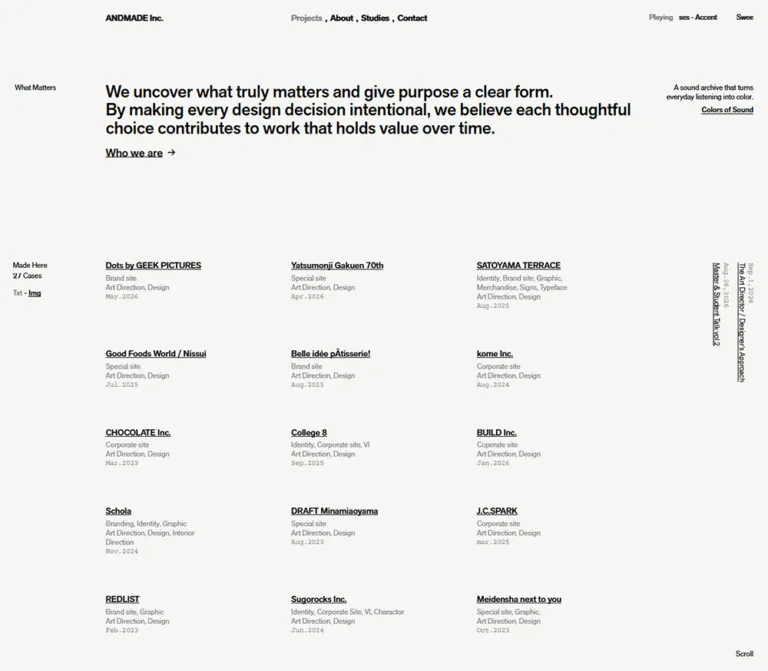
ANDMADE Inc.|デザインスタジオの実績サイト
生成りに近い白と黒を基調に、端正な文字組みと大きな余白で27件の実績を紹介。デスクトップの3列構成を、モバイルでは縦向きの補助情報を伴う1列構成へ展開しています。
オリジナルサイトを見るANDMADE Inc. — Style Reference
A design studio’s project index organized through precise typography, asymmetric margins, and generous empty space.
Original URL: https://andmade.jp/ Final URL: https://andmade.jp/ Page title: ANDMADE Inc. Theme: light canvas; black mobile navigation and footer surfaces Inspected: September 12, 2026, at 01:53 JST, using the supplied browser evidence. Retrieval timestamp: September 11, 2026, at 16:53:28.784 UTC. Viewports: 1440 × 1000 desktop and 390 × 844 mobile, in CSS pixels. Document heights: approximately 2057px desktop and 3958px mobile in the supplied DOM snapshots. Scope: the current homepage’s introduction, 27-project index, auxiliary news links, sound-archive entry, desktop footer, mobile Menu control, and mobile footer/navigation panel. Desktop captures cover the opening, middle, and bottom; mobile captures cover the opening and bottom. Destination pages and expanded interactive states were not inspected.
ANDMADE presents its studio identity through a restrained project catalog. A small wordmark and comma-separated navigation sit above a medium-sized statement of purpose. Below, underlined project names, service descriptions, and dates form an open three-column index. Small labels occupy the far left, while rotated news items sit at the far right. The alignment system gives these sparse elements a clear relationship without enclosing them in cards.
The mobile version retains the offset composition rather than simply centering everything. Main content begins two columns into a twelve-column grid. Project entries become a single list, the catalog controls turn vertically, and a black Menu pill appears near the bottom edge. At the end of the page, a rounded black panel gathers navigation, contact details, copyright, the circular studio mark, and a white return button.
This is a studio homepage and portfolio index. Its defining elements are the catalog, typography, and spatial organization; a conventional sales funnel is not part of the observed structure.
How to Read This Reference
- Measured means a value appears in the supplied computed styles, custom properties, or element rectangles. No additional browsing or file inspection was performed.
- Calculated means a value follows arithmetically from those measurements. The mobile grid is particularly well supported.
- Estimated means a dimension or treatment is judged from the original-page screenshots. Desktop statement sizing, project-title sizing, and the mobile panel’s outer radius fall into this category.
- Recommended means implementation guidance for a new site. The Quick Start is an adaptation, not recovered source code.
- Font-family values establish the declared stacks. They do not independently establish which font file supplied every rendered glyph.
- Several text rectangles are shorter than their computed line heights. Some mobile introduction rectangles overlap even though the screenshot shows normally stacked text. Use the screenshots to understand visible composition; do not reconstruct paragraph flow from those rectangles alone.
- The final attached image is a listing thumbnail. It is used only for correspondence comparison, never for current-design measurements or interpretation.
- The captures were collected after readiness checks, but delayed content, pointer behavior, playback, and unopened controls remain unverified.
Tokens — Colors
Default Palette
| Name | Value | Evidence / reusable alias | Role |
|---|---|---|---|
| Soft Paper | #f6f6f4 |
Measured: --color-background, --background, and body background; alias --paper |
Continuous page canvas |
| Black Ink | #000000 |
Measured: --color-black and body text; alias --ink |
Primary text, underlines, visible marks, and mobile black surfaces |
| Muted Ink | Black at 50% opacity | Measured: oklab(0 0 0 / 0.5) on project metadata and several utilities; alias --muted |
Secondary descriptions, dates, and subdued controls |
| Reverse White | #ffffff |
Measured: --color-white, mobile panel text, and return-button fill; alias --reverse |
Text on black and the mobile Back to Top button |
| Muted Reverse | White at approximately 50% opacity | Measured on mobile contact captions | Secondary labels inside the black panel |
Calculated direct-color approximation: ordinary 50% black compositing over #f6f6f4 produces approximately #7b7b7a. This is useful when an opaque text color is required. It is not a separate measured source token.
The paper is subtly warm, but the overall interface reads as monochrome. There is no observed accent hue, gradient system, colored category badge, or photographic background in these captured states.
Computed Color Versus Visible Color
Some sampled header links report white text, and the root exposes --foreground: #fff, while the screenshots show dark header lettering against the light page. The evidence does not include enough ancestor or compositing information to explain that difference conclusively.
For a direct-color reconstruction, use the visible black header treatment. Do not apply the root foreground variable indiscriminately to the light canvas, and do not claim a specific blend mode without further evidence.
Theme Presets
No theme selector or alternate page palette was inspected. The black mobile panel is a local surface treatment, not evidence of a selectable dark theme.
Tokens — Typography
Primary Grotesk
Measured source stack:
font-family: 'akzidenz-grotesk-next-pro', 'Helvetica Neue',
  Helvetica, Arial, 'Gen Interface JP', sans-serif;
The declared first family is Akzidenz Grotesk Next Pro. The visual character is compact, direct, and editorial: neutral letterforms, modest sizes, and little decorative tracking.
Most measured emphasis uses weight 500, not 700. This includes the wordmark, primary navigation, introduction link, and several controls. Metadata and section labels use 400. Avoid replacing the medium weight with a heavy display bold throughout the interface.
Gen Interface JP appears in the fallback stack. The supplied visible homepage text is predominantly English, so Japanese glyph rendering was not separately demonstrated.
Courier Utility Text
Measured source stack:
font-family: 'Courier Prime', 'Courier Prime Fallback',
  'Courier New', monospace;
Courier Prime is explicitly measured on news dates and footer captions such as Inquiries and Social. These small monospaced details introduce an archival quality without changing the overall sans-serif identity.
News dates and desktop footer captions use -0.6px letter spacing. Mobile panel captions use -0.7px. Project dates also look monospaced in the screenshots, but their individual computed font styles were not included in the sampled elements.
Type Scale
| Role | Desktop | Mobile | Status and interpretation |
|---|---|---|---|
| Root/body defaults | 16px / 24px, 400 |
Same | Measured defaults; most visible content overrides them |
| Header wordmark | 14px / 21px, 500 |
15px / 22.5px, 500 |
Measured |
| Desktop navigation | 14px / 21px, 500 |
Not visible in the opening header | Measured |
| Main statement | Approximately 28px / 29–30px |
22px / 23.1px, 500 |
Desktop estimated; mobile measured |
| Statement tracking | Not sampled | -0.22px, or -0.01em |
Mobile measured |
| Who we are | 18px / 27px, 500 |
15px / 22.5px, 500 |
Measured; arrow gap is 8px |
| Section labels | 12px / 18px, 400 |
13px / 19.5px, 400 |
Measured |
| Project titles | Approximately 14px, medium | Approximately 15px, medium | Estimated from screenshots; title elements were not individually sampled |
| Project metadata | 12px / 15px, 400 |
13px / 16.25px, 400 |
Measured |
| Sound-archive description | 12px / 14.4px, 400 |
13px / 15.6px, 400 |
Measured |
| Sound-archive button | 12px / 14.4px, 500 |
13px / 15.6px, 500 |
Measured |
| News titles and dates | 12px / 18px, 400 |
Same | Measured; visually rotated |
| Copyright and footer wordmark | 30px / 31.5px, 500 |
22px / 23.1px, 500 |
Measured |
| Footer contact labels and links | 12px / 16.8px |
Same | Measured; labels 400, links/buttons 500 |
| Mobile panel navigation | — | 20px / 21px, 500 |
Measured styles, with arrangement confirmed by the bottom capture |
| Mobile Menu label | — | 12px / 18px, 500 |
Measured |
Small text becomes slightly larger on mobile: project metadata rises from 12px to 13px, and the wordmark from 14px to 15px. Responsive design here includes deliberate type adjustments rather than uniform shrinking.
Line Breaking
The desktop statement occupies three visible lines. On mobile, the same copy occupies six lines within an approximately 312px-wide region. The mobile source separates the first sentence from the following statement; visually they form one continuous typographic block without a large paragraph gap.
Preserve that compact rhythm. At other widths, allow natural reflow or use tested width-specific breaks. Do not force the desktop line breaks onto a phone.
Tokens — Spacing & Shapes
Source Variables and Their Limits
| Source property | Supplied value | Interpretation |
|---|---|---|
--content-width |
1218px |
Desktop content-shell reference width |
--scale-breakpoint |
1440px |
Scaling reference; not proof of the mobile layout breakpoint |
--scale-damping |
.7 |
Part of the source scaling system |
--grid-scale |
1 desktop; approximately .711111 mobile |
Sampled variable values; mobile uses additional layout rules |
--sp-grid-margin |
8px |
Mobile outside margin |
--sp-grid-columns |
12 |
Mobile grid column count |
--sp-grid-column-width |
calc((100vw - 8px * 2) / 12) |
Directly usable mobile column formula |
--spacing |
.25rem |
Resolves to 4px at the measured root; does not prove every gap follows a 4px scale |
--font-cap / --font-ad-half |
.72em / .27em |
Typography-related source variables; their complete application was not supplied |
At the desktop viewport, --content-width-fluid evaluates to 1218px. The same custom property still contains a 1218px minimum in the mobile sample, despite the visible mobile layout fitting the screen. It therefore cannot be treated as the universal width of every rendered section.
Mobile Grid Calculations
At 390px wide:
Available width = 390 - 8 - 8 = 374px
One column = 374 / 12 = 31.1667px
Main content start = 8 + 2 columns = 70.3333px
Introduction width = 10 columns = 311.6667px
Long project metadata width = 6 columns = 187px
Menu pill width = 8 columns = 249.3333px
These calculations closely match the supplied rectangles. The offset is part of the design: the main column does not begin at the outside page margin.
Layout Measurements
| Element | Desktop | Mobile | Evidence |
|---|---|---|---|
| Outside utility margin | 24px | 8px | Measured |
| Main content start | x = 198px | x ≈ 70.33px | Measured |
| Header shell | 1218px wide, starting at y = 24px | Wordmark ink begins around y = 50px | Desktop rectangle; mobile padding and screenshot |
| Project column starts | x = 198, 546, 894px | x ≈ 70.33px for every item | Measured metadata positions |
| Desktop column pitch | 348px | — | Calculated from column starts |
| Long metadata width | 232px | 187px | Measured |
| Gap between desktop text-width allocations | 116px | — | Calculated: 348 − 232 |
| What Matters label | y = 138px | y ≈ 140.59px | Measured |
| Mobile statement start | — | y ≈ 189.77px | Measured, with screenshot confirming visible flow |
| Made Here label | y ≈ 425.55px | y ≈ 515.13px | Measured |
| First project metadata | y ≈ 446.55px | y ≈ 587.13px | Measured |
| Menu pill | — | x ≈ 70.34px, y = 804px, 249.33 × 30px | Measured |
| Footer circular mark | 52 × 52px | 40 × 40px | Measured link rectangles; visible mark confirmed |
| Desktop footer | x = 198px, y ≈ 1977.41px, width 1218px | — | Measured |
| Mobile footer panel | — | Approximately x = 8px, width 374px, height 260px | Estimated from bottom screenshot |
Vertical Rhythm
The project index does not use one fixed row height. Common desktop row-start intervals are approximately 138.47px, increasing to 153.47px where metadata adds a line. Another observed interval is approximately 162.47px, so a single universal row-gap value would not explain every position.
On mobile, common item intervals are approximately 101.67px, increasing to 117.92px for additional metadata lines. An additional larger interval also appears in the DOM. Keep entries content-responsive instead of forcing every item into a fixed-height tile.
The desktop DOM leaves approximately 317px between the last metadata rectangle and the footer’s top. The mobile bottom screenshot likewise shows roughly 300px of empty canvas between the last date and the black panel. This substantial ending pause is an intentional-looking part of the captured composition; its exact responsive formula is unknown.
Shapes
| Element | Treatment | Status |
|---|---|---|
| Project entries | Unboxed, no visible radius | Observed |
| Ordinary text controls | Transparent, square geometry | Measured on sampled controls |
| Mobile Menu | Black pill, approximately 15px radius | Shape estimated from a measured 30px height |
| Mobile footer panel | Black surface, approximately 22px outer radius | Screenshot estimate |
| Mobile Back to Top | White pill, 15px radius, 30px height | Measured |
| Footer mark | Circular outline containing angular linework | Observed; original asset path unavailable |
| Top-edge black rule | Approximately 3px high in scrolled captures | Screenshot estimate |
There is no visible card-shadow or elevation system.
Components
Desktop Header
Role: identity, primary navigation, and ambient audio status.
The wordmark begins at x = 198px. Navigation begins around x = 546px, aligning with the second project column rather than the center of the viewport. The sound status ends at the right inset of 24px.
The navigation reads Projects , About , Studies , Contact. Commas are visible separators. Projects appears subdued while the other labels appear black. That appearance alone does not establish whether the subdued item is disabled or represented by a particular accessibility state.
The header has no visible enclosing border, filled toolbar, or shadow. It is absent from the supplied scrolled desktop frames; persistent-header behavior should not be inferred from duplicate header nodes in the DOM.
Mobile Header
Role: a quiet identity anchor before the introduction.
Only the wordmark is visible at the top. It shares the main content offset at approximately x = 70.33px and sits around 50px below the viewport’s top. The desktop navigation and music status are not visible in this opening mobile state.
Keep the generous top spacing. Moving the logo into an ordinary 16px-inset app bar would remove an important alignment relationship.
Introduction / What Matters
Role: state the studio’s design position before the project catalog.
The section consists of a small outside label, a medium-weight statement, and an underlined Who we are link with a right arrow. The link destination is directly evidenced as https://andmade.jp/about/.
On desktop, the label occupies the far-left utility margin while the statement begins with the project grid. On mobile, the label stays at x = 8px, then the statement begins approximately 49px lower at x = 70.33px.
The headline feels prominent because of its contrast with surrounding small text and empty space. It does not need an oversized display scale, background image, or filled call-to-action button.
Colors of Sound Entry
Role: introduce an ancillary sound archive.
A right-aligned, two-line description sits above the underlined Colors of Sound button. On desktop it occupies a narrow region near the upper-right edge, alongside the statement. On mobile it moves below the introduction and remains aligned to the 8px right margin.
The original control is a button. No destination URL, archive panel, playback sequence, or visualizer was supplied. The desktop status reads No music playing. in the current capture; this does not establish autoplay policy or playback behavior after interaction.
Project Index Controls
Role: identify the catalog and expose its text/image controls.
The desktop stack contains Made Here, the visible count 27 Cases, and Txt - Img. Txt is muted; Img is black and underlined. Nevertheless, the captured entries are text-only. Do not assume that the underlined label proves a selected image mode; it may represent an available action or another state convention.
The extracted text includes many repeated digits belonging to the count’s internal structure. The screenshot’s visible result is simply 27 Cases. Those internal digit sequences are not additional page content.
On mobile, Made Here remains horizontal above the list. The count and mode controls form a vertical strip near the left edge, with a thin approximately 50px separator between Txt and Img. The strip remains visible near the top in the bottom capture, consistent with sticky positioning during the catalog scroll. Exact thresholds and containment rules were not supplied.
Project Entry
Role: present a work’s name, category, studio services, and date.
Each entry contains:
- An underlined, medium-weight project title.
- One or more muted category lines.
- A muted service line, commonly
Art Direction, Design. - A compact date that visually uses monospaced lettering.
Examples include Dots by GEEK PICTURES, SATOYAMA TERRACE, College 8, and The Breakthrough Company GO. Longer descriptions wrap inside a narrower metadata region without changing the project’s left alignment.
The desktop sequence runs across each three-item row. Mobile preserves that order as one vertical list: Dots, Yatsumonji Gakuen 70th, SATOYAMA TERRACE, and then Good Foods World / Nissui.
These are spatial groups, not visible cards. There are no enclosing borders, background rectangles, badges, or repeated project images in the supplied states. Project-title destinations and interaction semantics were not included in the extracted link list; the underlined appearance should not be used to invent URL patterns.
News Rail
Role: provide a small editorial layer beside the project index.
Two date-and-title pairs use sideways Latin text. Dates are gray Courier Prime; titles are black and underlined. On desktop, the pairs sit next to one another at the far right. On mobile, they stack vertically in a single narrow right-edge rail, with the second beginning approximately 223.48px after the first.
Directly evidenced items are:
The Art Director / Designer’s Approach, datedSep.1,2026, linking tohttps://www.amazon.co.jp/dp/4295209074.Master & Student Talk vol.2, datedAug.26,2026, linking tohttps://idid.team/articles/other/school-004/.
These links are homepage content, not production-credit evidence. Their destinations were not inspected.
Scroll Cues
Role: signal that the sparse opening continues below the viewport.
A small Scroll label sits near the desktop lower-right corner. Scrolled captures also show a thin black rule along the top edge: partial width in the middle desktop frame and full width near the end. This is consistent with a scroll-progress treatment, but its exact mapping and implementation are unverified.
Keep any reconstruction visually subordinate. A large scrollbar replacement or animated progress badge is not supported by the evidence.
Desktop Footer
Role: close the catalog with identity and practical contact routes.
The footer remains on the paper canvas. Its two-line copyright/wordmark block aligns at x = 198px. Inquiries begins at x = 546px, Social at x = 678px, and Back to top at x = 894px. A 52px circular studio mark sits at the far right.
Small Courier captions sit above underlined contact controls. The email is exposed as a button in the DOM, so copying, mail-client launching, and confirmation feedback are all unverified. Instagram and X are ordinary evidenced links.
The footer’s visual weight comes from its larger 30px identity block and the preceding empty space, not from a contrasting background.
Mobile Menu Pill
Role: offer compact access to mobile navigation.
A black pill approximately 249.33px wide and 30px high is centered horizontally at y = 804px in the opening 844px-tall viewport, leaving 10px below. Its width equals eight mobile grid columns. The label is white, 12px, and medium weight.
The DOM also reports a surrounding 50px-high button rectangle. That does not conclusively establish the final hit target or event wiring. Opening the Menu was not captured.
Mobile Footer / Navigation Panel
Role: combine navigation, contact, identity, and return navigation at the end of the page.
The bottom capture shows a black rounded panel with an 8px outside margin. Inside, content is inset approximately one mobile grid column, or 31px. Its anatomy is:
- A 20px comma-separated navigation row.
- A two-sided contact row with gray Courier captions and white underlined controls.
- A 22px copyright/wordmark block opposite a 40px white circular mark.
- A white, full-width inner pill labeled
Back to Top.
The panel is visibly present at the document’s end, but the evidence does not establish whether it shares an animated container with the Menu pill. Treat that relationship as unverified. Some opening-snapshot panel rectangles are offscreen and offset; use the bottom screenshot for visible placement instead of copying those coordinates.
Tokens — Motion & Interaction
The evidence includes computed transition declarations, not an interaction recording. A declared transition establishes available timing but does not prove that a particular trigger was exercised.
| Element / treatment | Supplied declaration | Evidence boundary |
|---|---|---|
| Wordmark and desktop music status | opacity 0.5s cubic-bezier(0, 0, 0.2, 1) |
Fade timing is measured; trigger unverified |
| What Matters label | translate 0.5s and opacity 0.5s, same ease-out curve |
Translation and opacity properties measured; distance unverified |
| Mobile Made Here label | Same 500ms transitions with a 750ms delay | Declared delayed transition, not a recorded reveal sequence |
| Navigation and mode controls | Color-related transitions, 0.15s cubic-bezier(0.4, 0, 0.2, 1) |
End-state colors and hover behavior not separately exercised |
| Colors of Sound | Desktop opacity 150ms; mobile opacity 300ms | Different declared durations by viewport |
| Scroll label | opacity 0.3s cubic-bezier(0, 0, 0.2, 1) 0.75s |
Fade timing and delay measured |
| Additional desktop header layer | opacity 0.3s ease-out |
Layer purpose and activation unverified |
| Mobile Menu | 300ms ease-out transition with 300ms delay | Changed property is not identified in the supplied shorthand |
| Back to Top | Opacity/transform transition properties appear in mobile evidence | No nonzero duration is supplied; smooth scrolling is not established |
| Case count | Repeated digit strips in DOM; settled visible value 27 | Suggests a count-animation structure; timing and progression unknown |
All sampled animation fields report none. This does not establish that the entire site lacks JavaScript animation or animation on unsampled elements.
For an adaptation, short opacity and color transitions fit the measured vocabulary. Avoid adding parallax, spring-driven cards, image-following cursors, animated audio graphics, or a pill-to-panel morph as though they were verified original behavior.
Surfaces
| Layer | Appearance | Purpose |
|---|---|---|
| Main canvas | Continuous #f6f6f4 |
Connects header, statement, catalog, and desktop footer |
| Project groups | Transparent, unboxed text | Separates works through alignment and spacing |
| Utility rails | Text and fine rules directly on paper | Holds counts, view controls, and editorial links |
| Mobile Menu | Compact black pill | A concentrated navigation affordance |
| Mobile footer panel | Black with rounded corners | Consolidates end-of-page navigation and contact |
| Mobile return control | White pill inside black | Creates a clear final action |
Reserve rounded filled surfaces for the mobile navigation/footer system. Applying the same treatment to every project would erase the contrast between open catalog content and compact controls.
Imagery
The inspected homepage states contain no visible project photography, project thumbnails, full-bleed video, or decorative illustration. The existence of Txt and Img controls does not reveal what an alternate image presentation looks like.
The visible graphic vocabulary consists of a small right arrow, underlines, fine rules, and the circular studio mark. The mark contains angular linework and appears in black on desktop and white in the mobile panel. Its 52px and 40px presentation sizes are measured, but its path, file format, and source URL were not supplied.
The project titles and categories should not be mined for imagined visual treatments. For example, the presence of identity or graphic-design projects does not establish a particular homepage image style.
Observed Asset References
| Asset or resource | Available evidence | Reuse guidance |
|---|---|---|
| Circular studio mark | Visible desktop/mobile mark and home-link rectangles | Use an authorized original asset if supplied; do not invent a download path |
| Who we are arrow | Visible right-pointing mark; measured 8px text-to-arrow gap | A simple text or vector arrow is a reasonable adaptation |
| Primary font | Declared akzidenz-grotesk-next-pro stack |
Supply a licensed font or allow the evidenced fallbacks |
| Courier utility font | Declared Courier Prime stack | Use an available authorized font resource; no font URL was provided |
| Project imagery | Not visible in the supplied current states | Alternate-mode art direction remains unknown |
Layout & Responsive Behavior
Desktop: An Offset Index
At 1440px, the main shell runs from x = 198px to x = 1416px. The far-left labels sit at x = 24px, leaving a distinct 174px interval between the utility margin and main content.
Project columns begin 348px apart, while longer metadata is limited to 232px. This produces broad empty intervals inside the index. Navigation and footer groups reuse project-column alignments, creating continuity from top to bottom.
A useful reconstruction divides the 1218px shell into 21 equal 58px tracks: project starts fall at tracks 1, 7, and 13, and 232px metadata occupies four tracks. This is a calculated implementation model, not a recovered source grid declaration.
Mobile: Twelve Columns, One Project List
The measured twelve-column grid has an 8px outer margin. The statement uses ten columns after a two-column offset; long project metadata uses six columns at that same start. This leaves breathing room toward the right-hand news rail.
The desktop three-column order becomes one vertical sequence. Typography remains comfortably present: titles are approximately 15px and metadata is measured at 13px. The sound-archive entry moves below the statement, and mobile navigation becomes a bottom pill plus an end-of-page panel.
Scrolling and End States
The project-control rail remains visible in scrolled captures, while the header and introduction leave the frame. The desktop news items also move out of view. The supplied screenshots support sticky-like catalog controls, but not a universally fixed set of page furniture.
The mobile footer panel is not visible in the opening frame; only the Menu pill is. At the bottom, the panel is visible and the standalone pill is absent. Exact visibility thresholds, transitions, and whether these elements share state remain unknown.
Untested Widths
Only 1440px and 390px layouts were supplied. Tablet behavior, intermediate column counts, landscape handling, ultrawide scaling, zoom behavior, and safe-area rules were not tested.
The Quick Start uses 1024px as a recommended adaptation breakpoint. It must not be described as an observed source breakpoint. Retain content-driven wrapping and verify the rails at intermediate widths.
Do’s and Don’ts
Do
- Use the measured paper color
#f6f6f4with black primary text. - Preserve the distinction between medium-weight titles and regular metadata.
- Align the wordmark, statement, first project column, and footer identity.
- Keep the left utility margin separate from the main content start.
- Preserve three desktop project columns and the observed single mobile sequence.
- Use compact underlined titles with restrained gray descriptions and dates.
- Keep sideways news text as a narrow edge detail.
- Preserve the generous blank space before the footer.
- Restrict black rounded surfaces to the observed mobile navigation/footer vocabulary.
- Distinguish source timing declarations from interactions that were actually tested.
Don’t
- Don’t replace the project index with a generic hero, feature-card sequence, and repeated conversion buttons.
- Don’t add images to the captured text presentation based on the listing thumbnail or untested Img control.
- Don’t center every mobile component or reduce its main inset to a conventional 16px.
- Don’t use 700-weight text for every title when measured emphasis is usually 500.
- Don’t add shadows, gradients, glass surfaces, or colored project badges.
- Don’t force equal item heights when descriptions wrap to different lengths.
- Don’t interpret every internal counter digit as visible content.
- Don’t copy white computed header text onto the paper without accounting for the visible result.
- Don’t invent project routes, email behavior, sound playback, or an expanded menu animation.
- Don’t treat portfolio service labels as credits for producing the current homepage.
Recommended Implementation Additions
These are recommendations for a new implementation, not verified original features:
- Use a semantic project list and real destination links where URLs are known. Use buttons only for implemented actions.
- Give Txt and Img explicit accessible names and expose their actual state. Do not rely solely on gray text versus an underline.
- Announce the count once as 27 projects; hide any decorative digit strips from assistive technology.
- Keep controls keyboard-operable with a visible focus outline. Preserve underlines for recognizable navigation.
- Enlarge mobile hit areas without necessarily enlarging the visible 30px pills. A minimum 44px target is a useful implementation goal.
- Check small muted text against the chosen canvas. If needed, darken secondary ink toward
#6b6b69while preserving the hierarchy; this is an accessibility adjustment, not the source color. - Keep rotated news text in a logical DOM reading order. At widths where rails collide with content, move secondary news below the list instead of shrinking it further.
- If Menu opens a dialog, implement a label, expanded state, focus management, and Escape handling. Choose those semantics after defining the actual interaction.
- Make the email button’s action explicit and provide feedback if it copies an address.
- Respect reduced-motion preferences and require a clear user action for audible playback.
- Account for mobile safe areas and ensure the fixed Menu does not obscure the last usable content.
Agent Prompt Guide
Quick Color Reference
- Canvas:
#f6f6f4. - Main text and visible linework:
#000000. - Secondary text: black at 50%; approximately
#7b7b7awhen flattened onto the canvas. - Mobile Menu and footer panel: black.
- Reversed labels and mobile return-button fill: white.
- No observed accent-color system, gradients, or shadows.
Overall Prompt
“Create a design-studio homepage inspired by the supplied current ANDMADE reference. Use a warm near-white canvas, black medium-weight grotesk typography, small gray metadata, Courier-style utility dates, and generous negative space. Place the desktop main content noticeably right of a narrow left utility margin. Align a small wordmark, a compact three-line statement, a three-column text-only project index, and the footer to the same grid. Keep project titles underlined and entries unboxed. Add small sideways news links at the far right. On mobile, use an eight-pixel outer margin and a twelve-column grid, starting the main content two columns in. Collapse projects into one ordered list, keep narrow vertical catalog controls, and use a black bottom Menu pill plus a rounded black end panel. Treat unverified sound and image controls as separate implementation work.”
Example Component Prompts
- Project entry: “Create an unboxed portfolio entry with an underlined medium-weight grotesk title around 14px, followed by 12px gray category and service lines and a compact monospaced date. On mobile, use approximately 15px titles and 13px metadata. Let longer descriptions increase the entry height. Do not invent project URLs.”
- Introduction: “Place a small What Matters label in the far-left margin and a compact medium-weight statement in the offset main column. Use approximately 28px type on desktop and measured 22px/23.1px type on mobile. Add an underlined Who we are link with an eight-pixel arrow gap. Keep the surface plain.”
- News rail: “Build two quiet date-and-title pairs using sideways Latin text. Use 12px Courier-style gray dates and 12px black underlined titles. Place the pairs side by side at the desktop right edge and stack them down the mobile right edge.”
- Mobile footer: “Create a black rounded panel with an eight-pixel outside margin and roughly 31px inner horizontal padding at 390px width. Include a 20px comma-separated navigation row, two-sided contact details, a 22px copyright and wordmark block, a 40px authorized studio mark, and a 30px-high white Back to Top pill.”
- Interaction adaptation: “Use short opacity and color transitions consistent with measured 150–500ms timings. Add accessible focus states and reduced-motion handling. Do not introduce a Menu morph, cursor-following imagery, or sound visualization unless separately specified and implemented.”
Quick Start
CSS Custom Properties
This CSS provides a usable layout vocabulary for the captured presentation. Font stacks and core colors come from the evidence. The desktop statement size, normal-line-box spacing, 1024px breakpoint, and mobile panel radius are adaptations or estimates.
The expected structure uses a .content-shell inside the header and introduction. A .project-index contains its section label, .project-controls, a .project-grid.content-shell, and .news-rail. Each .project contains a title control, metadata, and a date. Footer classes describe the contact group, wordmark, mark, and return control. Supply real content, authorized assets, and working actions separately.
The code uses ordinary line boxes rather than attempting to reproduce the source’s unexplained compact text rectangles. Small vertical differences from the screenshots are therefore expected.
:root {
  /* Measured colors and declared font stacks */
  --paper: #f6f6f4;
  --ink: #000;
  --muted: rgb(0 0 0 / 50%);
  --reverse: #fff;
  --muted-reverse: rgb(255 255 255 / 50%);
  --studio-sans: 'akzidenz-grotesk-next-pro', 'Helvetica Neue',
    Helvetica, Arial, 'Gen Interface JP', sans-serif;
  --studio-mono: 'Courier Prime', 'Courier Prime Fallback',
    'Courier New', monospace;
  --weight-regular: 400;
  --weight-medium: 500;

  /* Measured mobile grid formula */
  --edge: 8px;
  --mobile-column: calc((100vw - 16px) / 12);
  --content-start: calc(8px + 2 * var(--mobile-column));
  --shell-width: calc(100vw - var(--content-start) - var(--edge));
  --project-copy-width: calc(6 * var(--mobile-column));

  /* Mobile measurements; project-title size is estimated */
  --text-caption: 13px;
  --text-project: 15px;
  --text-statement: 22px;
  --text-footer-brand: 22px;
  --radius-pill: 15px;
  --radius-panel: 22px;

  /* Measured timing vocabulary */
  --ease-out: cubic-bezier(0, 0, 0.2, 1);
  --ease-in-out: cubic-bezier(0.4, 0, 0.2, 1);
  --motion-color: 150ms var(--ease-in-out);
  --motion-fade: 500ms var(--ease-out);
}

* { box-sizing: border-box; }

body {
  margin: 0;
  background: var(--paper);
  color: var(--ink);
  font-family: var(--studio-sans);
  font-size: 16px;
  font-weight: var(--weight-regular);
  line-height: 1.5;
}

a { color: inherit; }

button {
  border: 0;
  border-radius: 0;
  padding: 0;
  color: inherit;
  background: transparent;
  font: inherit;
  cursor: pointer;
}

.content-shell {
  width: var(--shell-width);
  margin-left: var(--content-start);
}

.text-link {
  text-decoration: underline;
  text-decoration-thickness: 1px;
  text-underline-offset: 1px;
}

.site-header { padding-top: 50px; }
.header-grid { position: relative; }

.brand {
  font-size: 15px;
  font-weight: var(--weight-medium);
  line-height: 1.5;
  text-decoration: none;
}

.desktop-nav,
.music-status { display: none; }

.introduction {
  position: relative;
  margin-top: 80px;
}

.section-label {
  position: absolute;
  top: 0;
  left: var(--edge);
  margin: 0;
  font-size: var(--text-caption);
  font-weight: var(--weight-regular);
  line-height: 1.5;
}

.intro-content { padding-top: 49px; }

.statement {
  font-size: var(--text-statement);
  font-weight: var(--weight-medium);
  line-height: 1.05;
  letter-spacing: -0.01em;
}

.statement p { margin: 0; }

.who-link {
  display: inline-flex;
  align-items: baseline;
  gap: 8px;
  margin-top: 16px;
  font-size: 15px;
  font-weight: var(--weight-medium);
  line-height: 1.5;
}

.sound-note {
  margin: 36px var(--edge) 0;
  text-align: right;
  font-size: var(--text-caption);
  line-height: 1.2;
}

.sound-note p { margin: 0; }
.sound-note button {
  margin-top: 10px;
  font-weight: var(--weight-medium);
}

.project-index {
  position: relative;
  margin-top: 75px;
}

/* Recommended sticky reconstruction, not recovered source CSS */
.project-controls {
  position: sticky;
  top: 0;
  z-index: 2;
  display: flex;
  gap: 40px;
  width: 20px;
  height: 0;
  margin-left: var(--edge);
  transform: translateY(50px);
  writing-mode: vertical-rl;
  text-orientation: sideways;
  font-size: var(--text-caption);
  line-height: 1.5;
}

.project-count { margin: 0; white-space: nowrap; }
.view-switch { display: flex; align-items: center; gap: 10px; }
.view-switch button { font-weight: var(--weight-medium); }
.view-switch .is-muted { color: var(--muted); }
.switch-rule { width: 1px; height: 50px; background: var(--muted); }

.project-grid {
  display: grid;
  grid-template-columns: minmax(0, 1fr);
  row-gap: 31px;
  margin-block: 0;
  padding: 50px 0 0;
  list-style: none;
}

.project { min-width: 0; }

.project-title {
  display: block;
  width: fit-content;
  max-width: calc(8 * var(--mobile-column));
  margin: 0 0 7px;
  text-align: left;
  font-size: var(--text-project);
  font-weight: var(--weight-medium);
  line-height: 1;
  overflow-wrap: anywhere;
}

.project-meta {
  max-width: var(--project-copy-width);
  margin: 0;
  color: var(--muted);
  font-size: var(--text-caption);
  line-height: 1.25;
}

/* Project-date sizing is a visual approximation */
.project-date {
  display: block;
  font-family: var(--studio-mono);
  font-size: 12px;
  line-height: 15px;
}

.news-rail {
  position: absolute;
  top: 0;
  right: var(--edge);
  display: flex;
  flex-direction: column;
  gap: 30px;
  font-size: 12px;
  line-height: 18px;
}

.news-item {
  writing-mode: vertical-rl;
  text-orientation: sideways;
}

.news-date {
  margin: 0;
  margin-block-end: 6px;
  color: var(--muted);
  font-family: var(--studio-mono);
  letter-spacing: -0.6px;
}

.news-link { display: block; }

.menu-trigger {
  position: fixed;
  z-index: 10;
  left: var(--content-start);
  bottom: calc(10px + env(safe-area-inset-bottom, 0px));
  display: grid;
  place-items: center;
  width: calc(8 * var(--mobile-column));
  height: 30px;
  border-radius: var(--radius-pill);
  color: var(--reverse);
  background: var(--ink);
  font-size: 12px;
  font-weight: var(--weight-medium);
}

/* Recommended larger hit area around the measured visual pill */
.menu-trigger::before {
  content: '';
  position: absolute;
  inset: -7px 0;
}

.site-footer {
  display: grid;
  grid-template-columns: minmax(0, 1fr) auto;
  align-items: end;
  gap: 32px;
  margin: 300px 8px 10px;
  padding: 30px var(--mobile-column) 6px;
  border-radius: var(--radius-panel);
  color: var(--reverse);
  background: var(--ink);
}

.footer-nav {
  grid-column: 1 / -1;
  display: flex;
  flex-wrap: wrap;
  gap: 0 5px;
  font-size: 20px;
  font-weight: var(--weight-medium);
  line-height: 1.05;
}

.footer-nav a { text-decoration: none; }
.footer-nav .is-muted { color: var(--muted-reverse); }

.footer-contact-group {
  grid-column: 1 / -1;
  display: flex;
  justify-content: space-between;
  gap: 24px;
  font-size: 12px;
  line-height: 1.4;
}

.footer-contact-group p { margin: 0 0 8px; }
.footer-contact-group > :last-child { text-align: right; }

.footer-caption {
  color: var(--muted-reverse);
  font-family: var(--studio-mono);
  letter-spacing: -0.7px;
}

.footer-brand {
  font-size: var(--text-footer-brand);
  font-weight: var(--weight-medium);
  line-height: 1.05;
}

.footer-brand p { margin: 0; }
.footer-mark { display: block; width: 40px; height: 40px; }
.footer-mark > :is(img, svg) { display: block; width: 100%; height: 100%; }

.back-to-top {
  grid-column: 1 / -1;
  display: grid;
  place-items: center;
  height: 30px;
  border-radius: var(--radius-pill);
  color: var(--ink);
  background: var(--reverse);
  font-size: 12px;
  font-weight: var(--weight-medium);
}

/* Recommended breakpoint; only 390px and 1440px were inspected */
@media (min-width: 1024px) {
  :root {
    --edge: clamp(16px, 1.666667vw, 24px);
    --content-start: clamp(140px, 13.75vw, 198px);
    --project-copy-width: calc(var(--shell-width) * 4 / 21);
    --text-caption: 12px;
    --text-project: 14px;
    --text-statement: 28px;
    --text-footer-brand: 30px;
  }

  .site-header { padding-top: 24px; }
  .header-grid { display: grid; grid-template-columns: repeat(7, minmax(0, 1fr)); }
  .brand { grid-column: 1 / 3; font-size: 14px; line-height: 1; }
  .desktop-nav { display: flex; grid-column: 3 / 6; gap: 5px; font-size: 14px; line-height: 1; font-weight: 500; }
  .desktop-nav a { text-decoration: none; }
  .desktop-nav .is-muted { color: var(--muted); }
  .music-status { display: block; grid-column: 6 / 8; margin: 0; text-align: right; color: var(--muted); font-size: 12px; line-height: 1; }

  .introduction { margin-top: 100px; }
  .intro-content { padding-top: 0; }
  .statement { max-width: calc(var(--shell-width) * 16 / 21); }
  .who-link { font-size: 18px; line-height: 1; }
  .sound-note { position: absolute; top: 0; right: var(--edge); width: 150px; margin: 0; }

  .project-index { margin-top: 166px; }
  .project-controls { top: 24px; display: block; width: 100px; transform: translateY(18px); writing-mode: horizontal-tb; }
  .view-switch { margin-top: 10px; gap: 5px; }
  .switch-rule { width: 5px; height: 1px; }
  .project-grid { width: calc(var(--shell-width) * 6 / 7); grid-template-columns: repeat(3, minmax(0, 1fr)); row-gap: 72px; padding-top: 0; }
  .project-title { max-width: calc(var(--shell-width) * 4 / 21); }
  .news-rail { flex-direction: row-reverse; gap: 16px; }
  .menu-trigger { display: none; }

  .site-footer { width: var(--shell-width); grid-template-columns: repeat(7, minmax(0, 1fr)); gap: 0; margin: 317px 0 28px var(--content-start); padding: 0; border-radius: 0; color: var(--ink); background: transparent; }
  .footer-nav { display: none; }
  .footer-brand { grid-column: 1 / 3; grid-row: 1; }
  .footer-contact-group { grid-column: 3 / 5; grid-row: 1; justify-content: flex-start; gap: 40px; }
  .footer-contact-group > :last-child { text-align: left; }
  .footer-caption { color: var(--muted); letter-spacing: -0.6px; }
  .footer-mark { grid-column: 7 / 8; grid-row: 1; justify-self: end; width: 52px; height: 52px; }
  .back-to-top { grid-column: 5 / 6; grid-row: 1; justify-self: start; display: block; height: auto; border-radius: 0; background: transparent; text-decoration: underline; }
}

/* Recommended accessibility and interaction additions */
:where(a, button):focus-visible {
  outline: 2px solid currentColor;
  outline-offset: 4px;
}

:where(a, button) { transition: opacity var(--motion-color); }

@media (hover: hover) {
  :where(a, button):hover { opacity: 0.7; }
}

@media (prefers-reduced-motion: reduce) {
  :where(a, button) { transition: none; }
}
The global hover-opacity treatment above is a recommendation, not a verified original hover state. Likewise, the Menu’s visibility near the footer, actual mode switching, audio behavior, count animation, and return-to-top behavior require application logic. Avoid assigning fabricated destinations or leaving apparent controls without working actions in a finished implementation.
Tailwind v4 Token Mapping
Optional aliases for a project already using Tailwind v4. The evidence contains utility-style custom properties, but this mapping does not establish the original framework version. Define the preceding custom properties first.
@theme inline {
  --color-paper: var(--paper);
  --color-ink: var(--ink);
  --color-secondary-ink: var(--muted);
  --color-reverse: var(--reverse);
  --font-sans: var(--studio-sans);
  --font-mono: var(--studio-mono);
  --text-caption: var(--text-caption);
  --text-project-title: var(--text-project);
  --text-studio-statement: var(--text-statement);
  --spacing-mobile-column: var(--mobile-column);
  --spacing-content-start: var(--content-start);
  --radius-studio-pill: var(--radius-pill);
  --radius-studio-panel: var(--radius-panel);
}
For the caption mapping, use a distinct backing variable in a real Tailwind stylesheet to avoid a self-reference—for example, rename the ordinary root property to --studio-caption-size and map --text-caption: var(--studio-caption-size).
Sources & Evidence
- ANDMADE Inc. homepage: authority for the current design. Supplied evidence includes HTTP 200, unchanged original/final URL, desktop and mobile screenshots, rendered text, link destinations, custom properties, and computed element samples. No independent visit was made for this document.
- Original-page captures 1–3: desktop opening, middle, and bottom at 1440 × 1000. Used for visible layout, typography, rails, project grouping, and footer composition.
- Original-page captures 4–5: mobile opening and bottom at 390 × 844. Used for the one-column catalog, grid offsets, Menu pill, and black end panel.
- The final attached listing thumbnail corresponds to the current page’s identity, statement, project order, and broad composition. Its differing music-status text and framing do not prevent a correspondence match. It was excluded from design analysis.
- The user-supplied Kindolphin reference supplies the document organization only. Its visual tokens, interactions, and implementation details were not transferred to ANDMADE.
Attribution boundary: the current homepage directly supports ANDMADE Inc. as the site identity/operator. Current-site designer, developer, and other production roles are not separately established. Project-level service descriptions refer to portfolio work and must not be promoted into homepage production credits.
This reference describes the supplied current homepage evidence. It does not reconstruct an earlier design or claim to document unvisited pages and unopened interface states.
# ANDMADE Inc. — Style Reference

> A design studio’s project index organized through precise typography, asymmetric margins, and generous empty space.

**Original URL:** [https://andmade.jp/](https://andmade.jp/)
**Final URL:** [https://andmade.jp/](https://andmade.jp/)
**Page title:** ANDMADE Inc.
**Theme:** light canvas; black mobile navigation and footer surfaces
**Inspected:** September 12, 2026, at 01:53 JST, using the supplied browser evidence. Retrieval timestamp: September 11, 2026, at 16:53:28.784 UTC.
**Viewports:** 1440 × 1000 desktop and 390 × 844 mobile, in CSS pixels.
**Document heights:** approximately 2057px desktop and 3958px mobile in the supplied DOM snapshots.
**Scope:** the current homepage’s introduction, 27-project index, auxiliary news links, sound-archive entry, desktop footer, mobile Menu control, and mobile footer/navigation panel. Desktop captures cover the opening, middle, and bottom; mobile captures cover the opening and bottom. Destination pages and expanded interactive states were not inspected.

ANDMADE presents its studio identity through a restrained project catalog. A small wordmark and comma-separated navigation sit above a medium-sized statement of purpose. Below, underlined project names, service descriptions, and dates form an open three-column index. Small labels occupy the far left, while rotated news items sit at the far right. The alignment system gives these sparse elements a clear relationship without enclosing them in cards.

The mobile version retains the offset composition rather than simply centering everything. Main content begins two columns into a twelve-column grid. Project entries become a single list, the catalog controls turn vertically, and a black Menu pill appears near the bottom edge. At the end of the page, a rounded black panel gathers navigation, contact details, copyright, the circular studio mark, and a white return button.

This is a studio homepage and portfolio index. Its defining elements are the catalog, typography, and spatial organization; a conventional sales funnel is not part of the observed structure.

## How to Read This Reference

- **Measured** means a value appears in the supplied computed styles, custom properties, or element rectangles. No additional browsing or file inspection was performed.
- **Calculated** means a value follows arithmetically from those measurements. The mobile grid is particularly well supported.
- **Estimated** means a dimension or treatment is judged from the original-page screenshots. Desktop statement sizing, project-title sizing, and the mobile panel’s outer radius fall into this category.
- **Recommended** means implementation guidance for a new site. The Quick Start is an adaptation, not recovered source code.
- Font-family values establish the declared stacks. They do not independently establish which font file supplied every rendered glyph.
- Several text rectangles are shorter than their computed line heights. Some mobile introduction rectangles overlap even though the screenshot shows normally stacked text. Use the screenshots to understand visible composition; do not reconstruct paragraph flow from those rectangles alone.
- The final attached image is a listing thumbnail. It is used only for correspondence comparison, never for current-design measurements or interpretation.
- The captures were collected after readiness checks, but delayed content, pointer behavior, playback, and unopened controls remain unverified.

## Tokens — Colors

### Default Palette

| Name | Value | Evidence / reusable alias | Role |
| --- | --- | --- | --- |
| Soft Paper | `#f6f6f4` | Measured: `--color-background`, `--background`, and body background; alias `--paper` | Continuous page canvas |
| Black Ink | `#000000` | Measured: `--color-black` and body text; alias `--ink` | Primary text, underlines, visible marks, and mobile black surfaces |
| Muted Ink | Black at 50% opacity | Measured: `oklab(0 0 0 / 0.5)` on project metadata and several utilities; alias `--muted` | Secondary descriptions, dates, and subdued controls |
| Reverse White | `#ffffff` | Measured: `--color-white`, mobile panel text, and return-button fill; alias `--reverse` | Text on black and the mobile Back to Top button |
| Muted Reverse | White at approximately 50% opacity | Measured on mobile contact captions | Secondary labels inside the black panel |

**Calculated direct-color approximation:** ordinary 50% black compositing over `#f6f6f4` produces approximately `#7b7b7a`. This is useful when an opaque text color is required. It is not a separate measured source token.

The paper is subtly warm, but the overall interface reads as monochrome. There is no observed accent hue, gradient system, colored category badge, or photographic background in these captured states.

### Computed Color Versus Visible Color

Some sampled header links report white text, and the root exposes `--foreground: #fff`, while the screenshots show dark header lettering against the light page. The evidence does not include enough ancestor or compositing information to explain that difference conclusively.

For a direct-color reconstruction, use the visible black header treatment. Do not apply the root foreground variable indiscriminately to the light canvas, and do not claim a specific blend mode without further evidence.

### Theme Presets

No theme selector or alternate page palette was inspected. The black mobile panel is a local surface treatment, not evidence of a selectable dark theme.

## Tokens — Typography

### Primary Grotesk

**Measured source stack:**

```css
font-family: 'akzidenz-grotesk-next-pro', 'Helvetica Neue',
  Helvetica, Arial, 'Gen Interface JP', sans-serif;
```

The declared first family is Akzidenz Grotesk Next Pro. The visual character is compact, direct, and editorial: neutral letterforms, modest sizes, and little decorative tracking.

Most measured emphasis uses **weight 500**, not 700. This includes the wordmark, primary navigation, introduction link, and several controls. Metadata and section labels use 400. Avoid replacing the medium weight with a heavy display bold throughout the interface.

`Gen Interface JP` appears in the fallback stack. The supplied visible homepage text is predominantly English, so Japanese glyph rendering was not separately demonstrated.

### Courier Utility Text

**Measured source stack:**

```css
font-family: 'Courier Prime', 'Courier Prime Fallback',
  'Courier New', monospace;
```

Courier Prime is explicitly measured on news dates and footer captions such as `Inquiries` and `Social`. These small monospaced details introduce an archival quality without changing the overall sans-serif identity.

News dates and desktop footer captions use `-0.6px` letter spacing. Mobile panel captions use `-0.7px`. Project dates also look monospaced in the screenshots, but their individual computed font styles were not included in the sampled elements.

### Type Scale

| Role | Desktop | Mobile | Status and interpretation |
| --- | --- | --- | --- |
| Root/body defaults | `16px / 24px`, 400 | Same | Measured defaults; most visible content overrides them |
| Header wordmark | `14px / 21px`, 500 | `15px / 22.5px`, 500 | Measured |
| Desktop navigation | `14px / 21px`, 500 | Not visible in the opening header | Measured |
| Main statement | Approximately `28px / 29–30px` | `22px / 23.1px`, 500 | Desktop estimated; mobile measured |
| Statement tracking | Not sampled | `-0.22px`, or `-0.01em` | Mobile measured |
| Who we are | `18px / 27px`, 500 | `15px / 22.5px`, 500 | Measured; arrow gap is 8px |
| Section labels | `12px / 18px`, 400 | `13px / 19.5px`, 400 | Measured |
| Project titles | Approximately 14px, medium | Approximately 15px, medium | Estimated from screenshots; title elements were not individually sampled |
| Project metadata | `12px / 15px`, 400 | `13px / 16.25px`, 400 | Measured |
| Sound-archive description | `12px / 14.4px`, 400 | `13px / 15.6px`, 400 | Measured |
| Sound-archive button | `12px / 14.4px`, 500 | `13px / 15.6px`, 500 | Measured |
| News titles and dates | `12px / 18px`, 400 | Same | Measured; visually rotated |
| Copyright and footer wordmark | `30px / 31.5px`, 500 | `22px / 23.1px`, 500 | Measured |
| Footer contact labels and links | `12px / 16.8px` | Same | Measured; labels 400, links/buttons 500 |
| Mobile panel navigation | — | `20px / 21px`, 500 | Measured styles, with arrangement confirmed by the bottom capture |
| Mobile Menu label | — | `12px / 18px`, 500 | Measured |

Small text becomes slightly larger on mobile: project metadata rises from 12px to 13px, and the wordmark from 14px to 15px. Responsive design here includes deliberate type adjustments rather than uniform shrinking.

### Line Breaking

The desktop statement occupies three visible lines. On mobile, the same copy occupies six lines within an approximately 312px-wide region. The mobile source separates the first sentence from the following statement; visually they form one continuous typographic block without a large paragraph gap.

Preserve that compact rhythm. At other widths, allow natural reflow or use tested width-specific breaks. Do not force the desktop line breaks onto a phone.

## Tokens — Spacing & Shapes

### Source Variables and Their Limits

| Source property | Supplied value | Interpretation |
| --- | --- | --- |
| `--content-width` | `1218px` | Desktop content-shell reference width |
| `--scale-breakpoint` | `1440px` | Scaling reference; not proof of the mobile layout breakpoint |
| `--scale-damping` | `.7` | Part of the source scaling system |
| `--grid-scale` | `1` desktop; approximately `.711111` mobile | Sampled variable values; mobile uses additional layout rules |
| `--sp-grid-margin` | `8px` | Mobile outside margin |
| `--sp-grid-columns` | `12` | Mobile grid column count |
| `--sp-grid-column-width` | `calc((100vw - 8px * 2) / 12)` | Directly usable mobile column formula |
| `--spacing` | `.25rem` | Resolves to 4px at the measured root; does not prove every gap follows a 4px scale |
| `--font-cap` / `--font-ad-half` | `.72em` / `.27em` | Typography-related source variables; their complete application was not supplied |

At the desktop viewport, `--content-width-fluid` evaluates to 1218px. The same custom property still contains a 1218px minimum in the mobile sample, despite the visible mobile layout fitting the screen. It therefore cannot be treated as the universal width of every rendered section.

### Mobile Grid Calculations

At 390px wide:

```text
Available width = 390 - 8 - 8 = 374px
One column = 374 / 12 = 31.1667px
Main content start = 8 + 2 columns = 70.3333px
Introduction width = 10 columns = 311.6667px
Long project metadata width = 6 columns = 187px
Menu pill width = 8 columns = 249.3333px
```

These calculations closely match the supplied rectangles. The offset is part of the design: the main column does not begin at the outside page margin.

### Layout Measurements

| Element | Desktop | Mobile | Evidence |
| --- | --- | --- | --- |
| Outside utility margin | 24px | 8px | Measured |
| Main content start | x = 198px | x ≈ 70.33px | Measured |
| Header shell | 1218px wide, starting at y = 24px | Wordmark ink begins around y = 50px | Desktop rectangle; mobile padding and screenshot |
| Project column starts | x = 198, 546, 894px | x ≈ 70.33px for every item | Measured metadata positions |
| Desktop column pitch | 348px | — | Calculated from column starts |
| Long metadata width | 232px | 187px | Measured |
| Gap between desktop text-width allocations | 116px | — | Calculated: 348 − 232 |
| What Matters label | y = 138px | y ≈ 140.59px | Measured |
| Mobile statement start | — | y ≈ 189.77px | Measured, with screenshot confirming visible flow |
| Made Here label | y ≈ 425.55px | y ≈ 515.13px | Measured |
| First project metadata | y ≈ 446.55px | y ≈ 587.13px | Measured |
| Menu pill | — | x ≈ 70.34px, y = 804px, 249.33 × 30px | Measured |
| Footer circular mark | 52 × 52px | 40 × 40px | Measured link rectangles; visible mark confirmed |
| Desktop footer | x = 198px, y ≈ 1977.41px, width 1218px | — | Measured |
| Mobile footer panel | — | Approximately x = 8px, width 374px, height 260px | Estimated from bottom screenshot |

### Vertical Rhythm

The project index does not use one fixed row height. Common desktop row-start intervals are approximately **138.47px**, increasing to **153.47px** where metadata adds a line. Another observed interval is approximately **162.47px**, so a single universal row-gap value would not explain every position.

On mobile, common item intervals are approximately **101.67px**, increasing to **117.92px** for additional metadata lines. An additional larger interval also appears in the DOM. Keep entries content-responsive instead of forcing every item into a fixed-height tile.

The desktop DOM leaves approximately **317px** between the last metadata rectangle and the footer’s top. The mobile bottom screenshot likewise shows roughly **300px** of empty canvas between the last date and the black panel. This substantial ending pause is an intentional-looking part of the captured composition; its exact responsive formula is unknown.

### Shapes

| Element | Treatment | Status |
| --- | --- | --- |
| Project entries | Unboxed, no visible radius | Observed |
| Ordinary text controls | Transparent, square geometry | Measured on sampled controls |
| Mobile Menu | Black pill, approximately 15px radius | Shape estimated from a measured 30px height |
| Mobile footer panel | Black surface, approximately 22px outer radius | Screenshot estimate |
| Mobile Back to Top | White pill, 15px radius, 30px height | Measured |
| Footer mark | Circular outline containing angular linework | Observed; original asset path unavailable |
| Top-edge black rule | Approximately 3px high in scrolled captures | Screenshot estimate |

There is no visible card-shadow or elevation system.

## Components

### Desktop Header

**Role:** identity, primary navigation, and ambient audio status.

The wordmark begins at x = 198px. Navigation begins around x = 546px, aligning with the second project column rather than the center of the viewport. The sound status ends at the right inset of 24px.

The navigation reads `Projects , About , Studies , Contact`. Commas are visible separators. `Projects` appears subdued while the other labels appear black. That appearance alone does not establish whether the subdued item is disabled or represented by a particular accessibility state.

The header has no visible enclosing border, filled toolbar, or shadow. It is absent from the supplied scrolled desktop frames; persistent-header behavior should not be inferred from duplicate header nodes in the DOM.

### Mobile Header

**Role:** a quiet identity anchor before the introduction.

Only the wordmark is visible at the top. It shares the main content offset at approximately x = 70.33px and sits around 50px below the viewport’s top. The desktop navigation and music status are not visible in this opening mobile state.

Keep the generous top spacing. Moving the logo into an ordinary 16px-inset app bar would remove an important alignment relationship.

### Introduction / What Matters

**Role:** state the studio’s design position before the project catalog.

The section consists of a small outside label, a medium-weight statement, and an underlined `Who we are` link with a right arrow. The link destination is directly evidenced as `https://andmade.jp/about/`.

On desktop, the label occupies the far-left utility margin while the statement begins with the project grid. On mobile, the label stays at x = 8px, then the statement begins approximately 49px lower at x = 70.33px.

The headline feels prominent because of its contrast with surrounding small text and empty space. It does not need an oversized display scale, background image, or filled call-to-action button.

### Colors of Sound Entry

**Role:** introduce an ancillary sound archive.

A right-aligned, two-line description sits above the underlined `Colors of Sound` button. On desktop it occupies a narrow region near the upper-right edge, alongside the statement. On mobile it moves below the introduction and remains aligned to the 8px right margin.

The original control is a button. No destination URL, archive panel, playback sequence, or visualizer was supplied. The desktop status reads `No music playing.` in the current capture; this does not establish autoplay policy or playback behavior after interaction.

### Project Index Controls

**Role:** identify the catalog and expose its text/image controls.

The desktop stack contains `Made Here`, the visible count `27 Cases`, and `Txt - Img`. `Txt` is muted; `Img` is black and underlined. Nevertheless, the captured entries are text-only. Do not assume that the underlined label proves a selected image mode; it may represent an available action or another state convention.

The extracted text includes many repeated digits belonging to the count’s internal structure. The screenshot’s visible result is simply **27 Cases**. Those internal digit sequences are not additional page content.

On mobile, `Made Here` remains horizontal above the list. The count and mode controls form a vertical strip near the left edge, with a thin approximately 50px separator between `Txt` and `Img`. The strip remains visible near the top in the bottom capture, consistent with sticky positioning during the catalog scroll. Exact thresholds and containment rules were not supplied.

### Project Entry

**Role:** present a work’s name, category, studio services, and date.

Each entry contains:

1. An underlined, medium-weight project title.
2. One or more muted category lines.
3. A muted service line, commonly `Art Direction, Design`.
4. A compact date that visually uses monospaced lettering.

Examples include `Dots by GEEK PICTURES`, `SATOYAMA TERRACE`, `College 8`, and `The Breakthrough Company GO`. Longer descriptions wrap inside a narrower metadata region without changing the project’s left alignment.

The desktop sequence runs across each three-item row. Mobile preserves that order as one vertical list: Dots, Yatsumonji Gakuen 70th, SATOYAMA TERRACE, and then Good Foods World / Nissui.

These are spatial groups, not visible cards. There are no enclosing borders, background rectangles, badges, or repeated project images in the supplied states. Project-title destinations and interaction semantics were not included in the extracted link list; the underlined appearance should not be used to invent URL patterns.

### News Rail

**Role:** provide a small editorial layer beside the project index.

Two date-and-title pairs use sideways Latin text. Dates are gray Courier Prime; titles are black and underlined. On desktop, the pairs sit next to one another at the far right. On mobile, they stack vertically in a single narrow right-edge rail, with the second beginning approximately 223.48px after the first.

Directly evidenced items are:

- `The Art Director / Designer’s Approach`, dated `Sep.1,2026`, linking to `https://www.amazon.co.jp/dp/4295209074`.
- `Master & Student Talk vol.2`, dated `Aug.26,2026`, linking to `https://idid.team/articles/other/school-004/`.

These links are homepage content, not production-credit evidence. Their destinations were not inspected.

### Scroll Cues

**Role:** signal that the sparse opening continues below the viewport.

A small `Scroll` label sits near the desktop lower-right corner. Scrolled captures also show a thin black rule along the top edge: partial width in the middle desktop frame and full width near the end. This is consistent with a scroll-progress treatment, but its exact mapping and implementation are unverified.

Keep any reconstruction visually subordinate. A large scrollbar replacement or animated progress badge is not supported by the evidence.

### Desktop Footer

**Role:** close the catalog with identity and practical contact routes.

The footer remains on the paper canvas. Its two-line copyright/wordmark block aligns at x = 198px. `Inquiries` begins at x = 546px, `Social` at x = 678px, and `Back to top` at x = 894px. A 52px circular studio mark sits at the far right.

Small Courier captions sit above underlined contact controls. The email is exposed as a **button** in the DOM, so copying, mail-client launching, and confirmation feedback are all unverified. Instagram and X are ordinary evidenced links.

The footer’s visual weight comes from its larger 30px identity block and the preceding empty space, not from a contrasting background.

### Mobile Menu Pill

**Role:** offer compact access to mobile navigation.

A black pill approximately 249.33px wide and 30px high is centered horizontally at y = 804px in the opening 844px-tall viewport, leaving 10px below. Its width equals eight mobile grid columns. The label is white, 12px, and medium weight.

The DOM also reports a surrounding 50px-high button rectangle. That does not conclusively establish the final hit target or event wiring. Opening the Menu was not captured.

### Mobile Footer / Navigation Panel

**Role:** combine navigation, contact, identity, and return navigation at the end of the page.

The bottom capture shows a black rounded panel with an 8px outside margin. Inside, content is inset approximately one mobile grid column, or 31px. Its anatomy is:

1. A 20px comma-separated navigation row.
2. A two-sided contact row with gray Courier captions and white underlined controls.
3. A 22px copyright/wordmark block opposite a 40px white circular mark.
4. A white, full-width inner pill labeled `Back to Top`.

The panel is visibly present at the document’s end, but the evidence does not establish whether it shares an animated container with the Menu pill. Treat that relationship as unverified. Some opening-snapshot panel rectangles are offscreen and offset; use the bottom screenshot for visible placement instead of copying those coordinates.

## Tokens — Motion & Interaction

The evidence includes computed transition declarations, not an interaction recording. A declared transition establishes available timing but does not prove that a particular trigger was exercised.

| Element / treatment | Supplied declaration | Evidence boundary |
| --- | --- | --- |
| Wordmark and desktop music status | `opacity 0.5s cubic-bezier(0, 0, 0.2, 1)` | Fade timing is measured; trigger unverified |
| What Matters label | `translate 0.5s` and `opacity 0.5s`, same ease-out curve | Translation and opacity properties measured; distance unverified |
| Mobile Made Here label | Same 500ms transitions with a 750ms delay | Declared delayed transition, not a recorded reveal sequence |
| Navigation and mode controls | Color-related transitions, `0.15s cubic-bezier(0.4, 0, 0.2, 1)` | End-state colors and hover behavior not separately exercised |
| Colors of Sound | Desktop opacity 150ms; mobile opacity 300ms | Different declared durations by viewport |
| Scroll label | `opacity 0.3s cubic-bezier(0, 0, 0.2, 1) 0.75s` | Fade timing and delay measured |
| Additional desktop header layer | `opacity 0.3s ease-out` | Layer purpose and activation unverified |
| Mobile Menu | 300ms ease-out transition with 300ms delay | Changed property is not identified in the supplied shorthand |
| Back to Top | Opacity/transform transition properties appear in mobile evidence | No nonzero duration is supplied; smooth scrolling is not established |
| Case count | Repeated digit strips in DOM; settled visible value 27 | Suggests a count-animation structure; timing and progression unknown |

All sampled `animation` fields report `none`. This does not establish that the entire site lacks JavaScript animation or animation on unsampled elements.

For an adaptation, short opacity and color transitions fit the measured vocabulary. Avoid adding parallax, spring-driven cards, image-following cursors, animated audio graphics, or a pill-to-panel morph as though they were verified original behavior.

## Surfaces

| Layer | Appearance | Purpose |
| --- | --- | --- |
| Main canvas | Continuous `#f6f6f4` | Connects header, statement, catalog, and desktop footer |
| Project groups | Transparent, unboxed text | Separates works through alignment and spacing |
| Utility rails | Text and fine rules directly on paper | Holds counts, view controls, and editorial links |
| Mobile Menu | Compact black pill | A concentrated navigation affordance |
| Mobile footer panel | Black with rounded corners | Consolidates end-of-page navigation and contact |
| Mobile return control | White pill inside black | Creates a clear final action |

Reserve rounded filled surfaces for the mobile navigation/footer system. Applying the same treatment to every project would erase the contrast between open catalog content and compact controls.

## Imagery

The inspected homepage states contain no visible project photography, project thumbnails, full-bleed video, or decorative illustration. The existence of `Txt` and `Img` controls does not reveal what an alternate image presentation looks like.

The visible graphic vocabulary consists of a small right arrow, underlines, fine rules, and the circular studio mark. The mark contains angular linework and appears in black on desktop and white in the mobile panel. Its 52px and 40px presentation sizes are measured, but its path, file format, and source URL were not supplied.

The project titles and categories should not be mined for imagined visual treatments. For example, the presence of identity or graphic-design projects does not establish a particular homepage image style.

### Observed Asset References

| Asset or resource | Available evidence | Reuse guidance |
| --- | --- | --- |
| Circular studio mark | Visible desktop/mobile mark and home-link rectangles | Use an authorized original asset if supplied; do not invent a download path |
| Who we are arrow | Visible right-pointing mark; measured 8px text-to-arrow gap | A simple text or vector arrow is a reasonable adaptation |
| Primary font | Declared `akzidenz-grotesk-next-pro` stack | Supply a licensed font or allow the evidenced fallbacks |
| Courier utility font | Declared Courier Prime stack | Use an available authorized font resource; no font URL was provided |
| Project imagery | Not visible in the supplied current states | Alternate-mode art direction remains unknown |

## Layout & Responsive Behavior

### Desktop: An Offset Index

At 1440px, the main shell runs from x = 198px to x = 1416px. The far-left labels sit at x = 24px, leaving a distinct 174px interval between the utility margin and main content.

Project columns begin 348px apart, while longer metadata is limited to 232px. This produces broad empty intervals inside the index. Navigation and footer groups reuse project-column alignments, creating continuity from top to bottom.

A useful reconstruction divides the 1218px shell into 21 equal 58px tracks: project starts fall at tracks 1, 7, and 13, and 232px metadata occupies four tracks. This is a **calculated implementation model**, not a recovered source grid declaration.

### Mobile: Twelve Columns, One Project List

The measured twelve-column grid has an 8px outer margin. The statement uses ten columns after a two-column offset; long project metadata uses six columns at that same start. This leaves breathing room toward the right-hand news rail.

The desktop three-column order becomes one vertical sequence. Typography remains comfortably present: titles are approximately 15px and metadata is measured at 13px. The sound-archive entry moves below the statement, and mobile navigation becomes a bottom pill plus an end-of-page panel.

### Scrolling and End States

The project-control rail remains visible in scrolled captures, while the header and introduction leave the frame. The desktop news items also move out of view. The supplied screenshots support sticky-like catalog controls, but not a universally fixed set of page furniture.

The mobile footer panel is not visible in the opening frame; only the Menu pill is. At the bottom, the panel is visible and the standalone pill is absent. Exact visibility thresholds, transitions, and whether these elements share state remain unknown.

### Untested Widths

Only 1440px and 390px layouts were supplied. Tablet behavior, intermediate column counts, landscape handling, ultrawide scaling, zoom behavior, and safe-area rules were not tested.

The Quick Start uses 1024px as a **recommended adaptation breakpoint**. It must not be described as an observed source breakpoint. Retain content-driven wrapping and verify the rails at intermediate widths.

## Do’s and Don’ts

### Do

- Use the measured paper color `#f6f6f4` with black primary text.
- Preserve the distinction between medium-weight titles and regular metadata.
- Align the wordmark, statement, first project column, and footer identity.
- Keep the left utility margin separate from the main content start.
- Preserve three desktop project columns and the observed single mobile sequence.
- Use compact underlined titles with restrained gray descriptions and dates.
- Keep sideways news text as a narrow edge detail.
- Preserve the generous blank space before the footer.
- Restrict black rounded surfaces to the observed mobile navigation/footer vocabulary.
- Distinguish source timing declarations from interactions that were actually tested.

### Don’t

- Don’t replace the project index with a generic hero, feature-card sequence, and repeated conversion buttons.
- Don’t add images to the captured text presentation based on the listing thumbnail or untested Img control.
- Don’t center every mobile component or reduce its main inset to a conventional 16px.
- Don’t use 700-weight text for every title when measured emphasis is usually 500.
- Don’t add shadows, gradients, glass surfaces, or colored project badges.
- Don’t force equal item heights when descriptions wrap to different lengths.
- Don’t interpret every internal counter digit as visible content.
- Don’t copy white computed header text onto the paper without accounting for the visible result.
- Don’t invent project routes, email behavior, sound playback, or an expanded menu animation.
- Don’t treat portfolio service labels as credits for producing the current homepage.

## Recommended Implementation Additions

These are recommendations for a new implementation, not verified original features:

- Use a semantic project list and real destination links where URLs are known. Use buttons only for implemented actions.
- Give Txt and Img explicit accessible names and expose their actual state. Do not rely solely on gray text versus an underline.
- Announce the count once as 27 projects; hide any decorative digit strips from assistive technology.
- Keep controls keyboard-operable with a visible focus outline. Preserve underlines for recognizable navigation.
- Enlarge mobile hit areas without necessarily enlarging the visible 30px pills. A minimum 44px target is a useful implementation goal.
- Check small muted text against the chosen canvas. If needed, darken secondary ink toward `#6b6b69` while preserving the hierarchy; this is an accessibility adjustment, not the source color.
- Keep rotated news text in a logical DOM reading order. At widths where rails collide with content, move secondary news below the list instead of shrinking it further.
- If Menu opens a dialog, implement a label, expanded state, focus management, and Escape handling. Choose those semantics after defining the actual interaction.
- Make the email button’s action explicit and provide feedback if it copies an address.
- Respect reduced-motion preferences and require a clear user action for audible playback.
- Account for mobile safe areas and ensure the fixed Menu does not obscure the last usable content.

## Agent Prompt Guide

### Quick Color Reference

- Canvas: `#f6f6f4`.
- Main text and visible linework: `#000000`.
- Secondary text: black at 50%; approximately `#7b7b7a` when flattened onto the canvas.
- Mobile Menu and footer panel: black.
- Reversed labels and mobile return-button fill: white.
- No observed accent-color system, gradients, or shadows.

### Overall Prompt

“Create a design-studio homepage inspired by the supplied current ANDMADE reference. Use a warm near-white canvas, black medium-weight grotesk typography, small gray metadata, Courier-style utility dates, and generous negative space. Place the desktop main content noticeably right of a narrow left utility margin. Align a small wordmark, a compact three-line statement, a three-column text-only project index, and the footer to the same grid. Keep project titles underlined and entries unboxed. Add small sideways news links at the far right. On mobile, use an eight-pixel outer margin and a twelve-column grid, starting the main content two columns in. Collapse projects into one ordered list, keep narrow vertical catalog controls, and use a black bottom Menu pill plus a rounded black end panel. Treat unverified sound and image controls as separate implementation work.”

### Example Component Prompts

1. **Project entry:** “Create an unboxed portfolio entry with an underlined medium-weight grotesk title around 14px, followed by 12px gray category and service lines and a compact monospaced date. On mobile, use approximately 15px titles and 13px metadata. Let longer descriptions increase the entry height. Do not invent project URLs.”
2. **Introduction:** “Place a small What Matters label in the far-left margin and a compact medium-weight statement in the offset main column. Use approximately 28px type on desktop and measured 22px/23.1px type on mobile. Add an underlined Who we are link with an eight-pixel arrow gap. Keep the surface plain.”
3. **News rail:** “Build two quiet date-and-title pairs using sideways Latin text. Use 12px Courier-style gray dates and 12px black underlined titles. Place the pairs side by side at the desktop right edge and stack them down the mobile right edge.”
4. **Mobile footer:** “Create a black rounded panel with an eight-pixel outside margin and roughly 31px inner horizontal padding at 390px width. Include a 20px comma-separated navigation row, two-sided contact details, a 22px copyright and wordmark block, a 40px authorized studio mark, and a 30px-high white Back to Top pill.”
5. **Interaction adaptation:** “Use short opacity and color transitions consistent with measured 150–500ms timings. Add accessible focus states and reduced-motion handling. Do not introduce a Menu morph, cursor-following imagery, or sound visualization unless separately specified and implemented.”

## Quick Start

### CSS Custom Properties

This CSS provides a usable layout vocabulary for the captured presentation. Font stacks and core colors come from the evidence. The desktop statement size, normal-line-box spacing, 1024px breakpoint, and mobile panel radius are adaptations or estimates.

The expected structure uses a `.content-shell` inside the header and introduction. A `.project-index` contains its section label, `.project-controls`, a `.project-grid.content-shell`, and `.news-rail`. Each `.project` contains a title control, metadata, and a date. Footer classes describe the contact group, wordmark, mark, and return control. Supply real content, authorized assets, and working actions separately.

The code uses ordinary line boxes rather than attempting to reproduce the source’s unexplained compact text rectangles. Small vertical differences from the screenshots are therefore expected.

```css
:root {
  /* Measured colors and declared font stacks */
  --paper: #f6f6f4;
  --ink: #000;
  --muted: rgb(0 0 0 / 50%);
  --reverse: #fff;
  --muted-reverse: rgb(255 255 255 / 50%);
  --studio-sans: 'akzidenz-grotesk-next-pro', 'Helvetica Neue',
    Helvetica, Arial, 'Gen Interface JP', sans-serif;
  --studio-mono: 'Courier Prime', 'Courier Prime Fallback',
    'Courier New', monospace;
  --weight-regular: 400;
  --weight-medium: 500;

  /* Measured mobile grid formula */
  --edge: 8px;
  --mobile-column: calc((100vw - 16px) / 12);
  --content-start: calc(8px + 2 * var(--mobile-column));
  --shell-width: calc(100vw - var(--content-start) - var(--edge));
  --project-copy-width: calc(6 * var(--mobile-column));

  /* Mobile measurements; project-title size is estimated */
  --text-caption: 13px;
  --text-project: 15px;
  --text-statement: 22px;
  --text-footer-brand: 22px;
  --radius-pill: 15px;
  --radius-panel: 22px;

  /* Measured timing vocabulary */
  --ease-out: cubic-bezier(0, 0, 0.2, 1);
  --ease-in-out: cubic-bezier(0.4, 0, 0.2, 1);
  --motion-color: 150ms var(--ease-in-out);
  --motion-fade: 500ms var(--ease-out);
}

* { box-sizing: border-box; }

body {
  margin: 0;
  background: var(--paper);
  color: var(--ink);
  font-family: var(--studio-sans);
  font-size: 16px;
  font-weight: var(--weight-regular);
  line-height: 1.5;
}

a { color: inherit; }

button {
  border: 0;
  border-radius: 0;
  padding: 0;
  color: inherit;
  background: transparent;
  font: inherit;
  cursor: pointer;
}

.content-shell {
  width: var(--shell-width);
  margin-left: var(--content-start);
}

.text-link {
  text-decoration: underline;
  text-decoration-thickness: 1px;
  text-underline-offset: 1px;
}

.site-header { padding-top: 50px; }
.header-grid { position: relative; }

.brand {
  font-size: 15px;
  font-weight: var(--weight-medium);
  line-height: 1.5;
  text-decoration: none;
}

.desktop-nav,
.music-status { display: none; }

.introduction {
  position: relative;
  margin-top: 80px;
}

.section-label {
  position: absolute;
  top: 0;
  left: var(--edge);
  margin: 0;
  font-size: var(--text-caption);
  font-weight: var(--weight-regular);
  line-height: 1.5;
}

.intro-content { padding-top: 49px; }

.statement {
  font-size: var(--text-statement);
  font-weight: var(--weight-medium);
  line-height: 1.05;
  letter-spacing: -0.01em;
}

.statement p { margin: 0; }

.who-link {
  display: inline-flex;
  align-items: baseline;
  gap: 8px;
  margin-top: 16px;
  font-size: 15px;
  font-weight: var(--weight-medium);
  line-height: 1.5;
}

.sound-note {
  margin: 36px var(--edge) 0;
  text-align: right;
  font-size: var(--text-caption);
  line-height: 1.2;
}

.sound-note p { margin: 0; }
.sound-note button {
  margin-top: 10px;
  font-weight: var(--weight-medium);
}

.project-index {
  position: relative;
  margin-top: 75px;
}

/* Recommended sticky reconstruction, not recovered source CSS */
.project-controls {
  position: sticky;
  top: 0;
  z-index: 2;
  display: flex;
  gap: 40px;
  width: 20px;
  height: 0;
  margin-left: var(--edge);
  transform: translateY(50px);
  writing-mode: vertical-rl;
  text-orientation: sideways;
  font-size: var(--text-caption);
  line-height: 1.5;
}

.project-count { margin: 0; white-space: nowrap; }
.view-switch { display: flex; align-items: center; gap: 10px; }
.view-switch button { font-weight: var(--weight-medium); }
.view-switch .is-muted { color: var(--muted); }
.switch-rule { width: 1px; height: 50px; background: var(--muted); }

.project-grid {
  display: grid;
  grid-template-columns: minmax(0, 1fr);
  row-gap: 31px;
  margin-block: 0;
  padding: 50px 0 0;
  list-style: none;
}

.project { min-width: 0; }

.project-title {
  display: block;
  width: fit-content;
  max-width: calc(8 * var(--mobile-column));
  margin: 0 0 7px;
  text-align: left;
  font-size: var(--text-project);
  font-weight: var(--weight-medium);
  line-height: 1;
  overflow-wrap: anywhere;
}

.project-meta {
  max-width: var(--project-copy-width);
  margin: 0;
  color: var(--muted);
  font-size: var(--text-caption);
  line-height: 1.25;
}

/* Project-date sizing is a visual approximation */
.project-date {
  display: block;
  font-family: var(--studio-mono);
  font-size: 12px;
  line-height: 15px;
}

.news-rail {
  position: absolute;
  top: 0;
  right: var(--edge);
  display: flex;
  flex-direction: column;
  gap: 30px;
  font-size: 12px;
  line-height: 18px;
}

.news-item {
  writing-mode: vertical-rl;
  text-orientation: sideways;
}

.news-date {
  margin: 0;
  margin-block-end: 6px;
  color: var(--muted);
  font-family: var(--studio-mono);
  letter-spacing: -0.6px;
}

.news-link { display: block; }

.menu-trigger {
  position: fixed;
  z-index: 10;
  left: var(--content-start);
  bottom: calc(10px + env(safe-area-inset-bottom, 0px));
  display: grid;
  place-items: center;
  width: calc(8 * var(--mobile-column));
  height: 30px;
  border-radius: var(--radius-pill);
  color: var(--reverse);
  background: var(--ink);
  font-size: 12px;
  font-weight: var(--weight-medium);
}

/* Recommended larger hit area around the measured visual pill */
.menu-trigger::before {
  content: '';
  position: absolute;
  inset: -7px 0;
}

.site-footer {
  display: grid;
  grid-template-columns: minmax(0, 1fr) auto;
  align-items: end;
  gap: 32px;
  margin: 300px 8px 10px;
  padding: 30px var(--mobile-column) 6px;
  border-radius: var(--radius-panel);
  color: var(--reverse);
  background: var(--ink);
}

.footer-nav {
  grid-column: 1 / -1;
  display: flex;
  flex-wrap: wrap;
  gap: 0 5px;
  font-size: 20px;
  font-weight: var(--weight-medium);
  line-height: 1.05;
}

.footer-nav a { text-decoration: none; }
.footer-nav .is-muted { color: var(--muted-reverse); }

.footer-contact-group {
  grid-column: 1 / -1;
  display: flex;
  justify-content: space-between;
  gap: 24px;
  font-size: 12px;
  line-height: 1.4;
}

.footer-contact-group p { margin: 0 0 8px; }
.footer-contact-group > :last-child { text-align: right; }

.footer-caption {
  color: var(--muted-reverse);
  font-family: var(--studio-mono);
  letter-spacing: -0.7px;
}

.footer-brand {
  font-size: var(--text-footer-brand);
  font-weight: var(--weight-medium);
  line-height: 1.05;
}

.footer-brand p { margin: 0; }
.footer-mark { display: block; width: 40px; height: 40px; }
.footer-mark > :is(img, svg) { display: block; width: 100%; height: 100%; }

.back-to-top {
  grid-column: 1 / -1;
  display: grid;
  place-items: center;
  height: 30px;
  border-radius: var(--radius-pill);
  color: var(--ink);
  background: var(--reverse);
  font-size: 12px;
  font-weight: var(--weight-medium);
}

/* Recommended breakpoint; only 390px and 1440px were inspected */
@media (min-width: 1024px) {
  :root {
    --edge: clamp(16px, 1.666667vw, 24px);
    --content-start: clamp(140px, 13.75vw, 198px);
    --project-copy-width: calc(var(--shell-width) * 4 / 21);
    --text-caption: 12px;
    --text-project: 14px;
    --text-statement: 28px;
    --text-footer-brand: 30px;
  }

  .site-header { padding-top: 24px; }
  .header-grid { display: grid; grid-template-columns: repeat(7, minmax(0, 1fr)); }
  .brand { grid-column: 1 / 3; font-size: 14px; line-height: 1; }
  .desktop-nav { display: flex; grid-column: 3 / 6; gap: 5px; font-size: 14px; line-height: 1; font-weight: 500; }
  .desktop-nav a { text-decoration: none; }
  .desktop-nav .is-muted { color: var(--muted); }
  .music-status { display: block; grid-column: 6 / 8; margin: 0; text-align: right; color: var(--muted); font-size: 12px; line-height: 1; }

  .introduction { margin-top: 100px; }
  .intro-content { padding-top: 0; }
  .statement { max-width: calc(var(--shell-width) * 16 / 21); }
  .who-link { font-size: 18px; line-height: 1; }
  .sound-note { position: absolute; top: 0; right: var(--edge); width: 150px; margin: 0; }

  .project-index { margin-top: 166px; }
  .project-controls { top: 24px; display: block; width: 100px; transform: translateY(18px); writing-mode: horizontal-tb; }
  .view-switch { margin-top: 10px; gap: 5px; }
  .switch-rule { width: 5px; height: 1px; }
  .project-grid { width: calc(var(--shell-width) * 6 / 7); grid-template-columns: repeat(3, minmax(0, 1fr)); row-gap: 72px; padding-top: 0; }
  .project-title { max-width: calc(var(--shell-width) * 4 / 21); }
  .news-rail { flex-direction: row-reverse; gap: 16px; }
  .menu-trigger { display: none; }

  .site-footer { width: var(--shell-width); grid-template-columns: repeat(7, minmax(0, 1fr)); gap: 0; margin: 317px 0 28px var(--content-start); padding: 0; border-radius: 0; color: var(--ink); background: transparent; }
  .footer-nav { display: none; }
  .footer-brand { grid-column: 1 / 3; grid-row: 1; }
  .footer-contact-group { grid-column: 3 / 5; grid-row: 1; justify-content: flex-start; gap: 40px; }
  .footer-contact-group > :last-child { text-align: left; }
  .footer-caption { color: var(--muted); letter-spacing: -0.6px; }
  .footer-mark { grid-column: 7 / 8; grid-row: 1; justify-self: end; width: 52px; height: 52px; }
  .back-to-top { grid-column: 5 / 6; grid-row: 1; justify-self: start; display: block; height: auto; border-radius: 0; background: transparent; text-decoration: underline; }
}

/* Recommended accessibility and interaction additions */
:where(a, button):focus-visible {
  outline: 2px solid currentColor;
  outline-offset: 4px;
}

:where(a, button) { transition: opacity var(--motion-color); }

@media (hover: hover) {
  :where(a, button):hover { opacity: 0.7; }
}

@media (prefers-reduced-motion: reduce) {
  :where(a, button) { transition: none; }
}
```

The global hover-opacity treatment above is a recommendation, not a verified original hover state. Likewise, the Menu’s visibility near the footer, actual mode switching, audio behavior, count animation, and return-to-top behavior require application logic. Avoid assigning fabricated destinations or leaving apparent controls without working actions in a finished implementation.

### Tailwind v4 Token Mapping

Optional aliases for a project already using Tailwind v4. The evidence contains utility-style custom properties, but this mapping does not establish the original framework version. Define the preceding custom properties first.

```css
@theme inline {
  --color-paper: var(--paper);
  --color-ink: var(--ink);
  --color-secondary-ink: var(--muted);
  --color-reverse: var(--reverse);
  --font-sans: var(--studio-sans);
  --font-mono: var(--studio-mono);
  --text-caption: var(--text-caption);
  --text-project-title: var(--text-project);
  --text-studio-statement: var(--text-statement);
  --spacing-mobile-column: var(--mobile-column);
  --spacing-content-start: var(--content-start);
  --radius-studio-pill: var(--radius-pill);
  --radius-studio-panel: var(--radius-panel);
}
```

For the caption mapping, use a distinct backing variable in a real Tailwind stylesheet to avoid a self-reference—for example, rename the ordinary root property to `--studio-caption-size` and map `--text-caption: var(--studio-caption-size)`.

## Sources & Evidence

- [ANDMADE Inc. homepage](https://andmade.jp/): authority for the current design. Supplied evidence includes HTTP 200, unchanged original/final URL, desktop and mobile screenshots, rendered text, link destinations, custom properties, and computed element samples. No independent visit was made for this document.
- Original-page captures 1–3: desktop opening, middle, and bottom at 1440 × 1000. Used for visible layout, typography, rails, project grouping, and footer composition.
- Original-page captures 4–5: mobile opening and bottom at 390 × 844. Used for the one-column catalog, grid offsets, Menu pill, and black end panel.
- The final attached listing thumbnail corresponds to the current page’s identity, statement, project order, and broad composition. Its differing music-status text and framing do not prevent a correspondence match. It was excluded from design analysis.
- The user-supplied Kindolphin reference supplies the document organization only. Its visual tokens, interactions, and implementation details were not transferred to ANDMADE.

**Attribution boundary:** the current homepage directly supports ANDMADE Inc. as the site identity/operator. Current-site designer, developer, and other production roles are not separately established. Project-level service descriptions refer to portfolio work and must not be promoted into homepage production credits.

This reference describes the supplied current homepage evidence. It does not reconstruct an earlier design or claim to document unvisited pages and unopened interface states.