DESIGN REFERENCE
ANRI — 浮遊する立体ロゴとモノトーンのコーポレートサイト
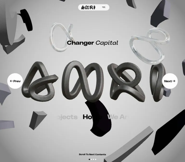
ベンチャーキャピタルANRIの日本語ホーム。立体ロゴとグレーのオブジェクトが浮遊する画面に、白いカプセル型ヘッダー、円形リンク、大きな英字ナビゲーションを重ねたデザイン。
オリジナルサイトを見るANRI / Changer Capital — Style Reference
A monochrome sculpture garden used as a corporate navigation interface.
Website: ANRI — Changer Capital Original URL: https://anri.vc/ja Final URL: https://anri.vc/ja Theme: light gray spatial scene, black typography, and white navigation surfaces. Inspected: September 13, 2026, 00:03 JST; supplied retrieval timestamp: September 12, 2026, 15:03:00.932 UTC. Viewports: 1440 × 1000 desktop and 390 × 844 mobile, in CSS pixels. Three desktop frames and two mobile frames were supplied. Scope: the current Japanese home page, its visible navigation scene, and the supplied rendered DOM and computed styles. Destination pages, the open menu, and completed navigation transitions were not inspected.
ANRI presents its home page as an animated spatial identity. A large sculptural ANRI wordmark sits among floating fragments, charcoal curves, gray extrusions, and transparent glass-like loops. Black, wide sans-serif lettering supplies the interface: “Changer” is heavy and upright, while “Capital” is visibly oblique. White circles and a compact white capsule keep navigation recognizable inside the moving composition.
This is a corporate home page organized around navigation between Home, We Are, Team, and Projects. The captured document occupies one viewport at both sizes. Its defining relationship is between a dense three-dimensional scene and a small number of flat, legible controls. Preserve that relationship when adapting the design; the scene is the main identity carrier, while the interface provides orientation.
How to Read This Reference
- Measured values come from the supplied element rectangles, computed styles, and custom properties. They are measurements at the two recorded viewports, not proof of a universal layout formula.
- Visual estimates describe the supplied current-page screenshots. Estimated colors are reference approximations, not exact pixel samples or recovered material settings.
- Calculated values are arithmetic relationships derived from those measurements.
- Recommended values and behaviors are implementation guidance. They are not claims about features already present on the site.
- DOM-only identifies elements that have recorded geometry or styles but are not visibly exposed in the captures. A nonzero rectangle does not establish visibility.
- Token names introduced here are descriptive aliases unless explicitly identified as source custom properties.
Tokens — Colors
Interface Palette
| Name | Value | Suggested token | Evidence and role |
|---|---|---|---|
| Interface Black | #000000 |
--color-ink |
Measured on the heading, active Home link, and active pagination dot |
| Page White | #fcfcfc |
--color-page |
Measured body background and inactive pagination-dot fill; also a suitable approximation for the visible circular controls |
| Inactive Rail Gray | #bababa |
--color-muted |
Measured color of We Are, Team, and Projects in the large section rail |
| Menu Text Gray | #e6e6e6 |
--color-menu-text |
Measured on DOM-only menu links; the open menu background and final appearance were not captured |
| Capsule White | approximately #f4f4f4 |
--color-capsule |
Visual estimate of the header capsule; the measured HEADER itself is transparent |
| Story Frame Gray | approximately #d9d9d9 |
--color-story-rule |
Visual estimate of the thin rectangular border around the changing company name |
The body’s measured white background is not the dominant visible scene color. Most of the viewport is covered by the gray spatial artwork. Likewise, the Prev and Next anchors have transparent computed backgrounds even though white discs are visible. Their appearance belongs to a descendant, pseudo-element, or other visual layer that was not separately measured.
Inactive desktop header links appear pale gray, although their recorded text color is black. An opacity or ancestor treatment may account for this; the responsible value is not present in the evidence. Do not substitute the rail’s measured #bababa and describe it as a measured header color.
Scene Palette
| Material or field | Approximate appearance | Suggested reference | Status |
|---|---|---|---|
| Environment | Light gray, brighter toward the central field | #cccccc |
Visual estimate |
| Dark wordmark | Granular graphite with broad highlights and dark inner curves | roughly #343434 to #777777 |
Visual estimate; lighting-dependent |
| Gray fragments | Muted gray with a slight violet cast | #808088 |
Visual estimate |
| Black fragments | Nearly black faces with restrained shading | near #080808 |
Visual estimate |
| Transparent loops | Pale translucent edges and reflected gray surroundings | No single flat color | Visual observation |
The changing story label supplies small blue, green, and pink accents across desktop frames. These belong to the displayed company names. They do not establish a general colored-button system.
Tokens — Typography
Declared Brand Stack
The computed body stack is:
font-family:
  polySansWide,
  'polySansWide Fallback',
  'IBM Plex Sans JP',
  'IBM Plex Sans JP Fallback';
The source also exposes --font-polysans and --font-ibm-plex-sans-jp. These names are directly supported by the evidence. Font-file URLs and per-glyph font resolution were not supplied.
The visible English interface uses broad, heavy letterforms with compact line boxes. The Japanese family is declared in the stack, but the opening scene does not provide a substantial Japanese text sample from which to assess its visible rendering.
Heading Treatment
“Changer Capital” is the semantic H1. Desktop places the phrase on one line. Mobile places “Changer” above “Capital” while maintaining almost the same nominal font size.
“Capital” is visibly oblique and appears less heavy than “Changer.” The supplied measurements describe the H1, not the internal character spans, so the exact inner font weight and italic declaration remain unverified.
The extracted heading text repeats words and individual letters four times. The screenshots display one readable phrase. Treat these copies as part of the presentation structure; do not reproduce them as visible copy or duplicate accessible headings.
Measured Type Scale
| Role | Desktop | Mobile | Weight and line-height evidence |
|---|---|---|---|
| Body default | 16px |
16.64px |
400; line-height equals font size |
| Header language links | 13px |
13.52px, not visibly exposed |
700; line-height equals font size |
| Header primary links | 14px |
14.56px, not visibly exposed |
700; line-height equals font size |
| Story link | 16px |
16.64px, not visibly exposed |
700; company-name descendants not separately measured |
| H1 | 44px |
45.76px |
H1 weight 700; desktop line-height 44px; mobile parent line-height 0px |
| Prev / Next anchor | 22px |
13.52px |
Anchor weight 400; visible inner lettering looks heavier, but its style is unreported |
| Active and adjacent section names | 48px |
33.28px |
700; line-height equals font size |
| Scroll instruction | 16px |
12.48px |
700; line-height equals font size |
| DOM-only View button | 16px |
13.52px |
500; line-height equals font size |
Normal letter spacing is reported for these sampled elements. The wide character of the typography comes from the declared family rather than a measured positive tracking value.
Do not copy the mobile H1’s line-height: 0 into an ordinary text heading. Its child layout produces a measured 118.97px two-line block. For a simpler implementation, a line-height around 1.3 is a reasonable visual approximation: 45.76 × 1.3 × 2 ≈ 118.98px.
DOM-Only Menu Type
| Link group | Desktop size | Mobile size | Recorded color |
|---|---|---|---|
| Home, We Are, Team, Projects, Story | 80px |
37.44px |
#e6e6e6 |
| Careers, Portfolio, News, Contact | 40px |
18.72px |
#e6e6e6 |
| Policy and anniversary links | 20px |
12.48px |
#e6e6e6 |
| Language links | 16px |
16.64px |
#e6e6e6 |
All sampled menu links use weight 700. This establishes a DOM-level hierarchy, not a verified open-menu composition.
Tokens — Spacing & Shapes
Source Scaling
The root is unusually small:
/* Recorded desktop custom property */
--liquid-htmlroot: calc(100vw / 1440);

/* Recorded mobile custom property */
--liquid-htmlroot: calc(100vw / 375);

/* Recorded at both sizes */
--liquid-bodyroot: 16rem;
The measured HTML font size is 1px at 1440px viewport width and 1.04px at 390px. In this document, 1u means one source rem at the inspected viewport.
Source variables also name design ratios of 1440, 750, and 375. The exact media-query boundaries and intermediate layout behavior were not supplied. Their names alone do not prove breakpoint locations.
Spacing Scale
| Use | Desktop | Mobile | Interpretation |
|---|---|---|---|
| Header top offset | 32px |
33.27px |
Consistent with 32u |
| Header height | 48px |
49.91px |
Consistent with 48u |
| Desktop primary-link gaps | 24px |
Not visibly applicable | Calculated from adjacent anchor rectangles |
| Story link internal gap | 8px |
8.32px, DOM-only |
Measured |
| Menu-button internal gap | 4px |
4.16px |
Measured |
| Side-control inset | 56px |
12.47px |
Desktop 56u; mobile approximately 12u |
| Section-link padding | 16px 20px |
16.64px on all sides |
Measured |
| Pagination visual gap | 8px |
approximately 8.31px |
Calculated from dot rectangles |
| Pagination bottom clearance | 16px |
approximately 16.63px |
Calculated from viewport and dot bounds |
Shape Vocabulary
| Element | Shape | Evidence |
|---|---|---|
| Header capsule | Fully rounded horizontal pill | Visual observation; outer capsule radius not separately measured |
| Prev / Next | Circle | Measured border-radius: 50% |
| Pagination marks | Circle | Measured border-radius: 50% |
| Story company window | Small, nearly square-cornered rectangle | Visual observation |
| DOM-only View button | Small rounded rectangle | Measured radius 4px desktop and 4.16px mobile |
| Scene forms | Thick curved extrusions, loops, cut segments | Visual observation |
The visible interface does not use a repeated card grid or a general shadow-elevation system. Its main surface contrast is white controls against the gray scene.
Layout Measurements
| Element | Desktop: 1440 × 1000 | Mobile: 390 × 844 | Evidence |
|---|---|---|---|
| HTML/body width | 1425px |
375px |
Measured; 15px narrower than the nominal viewport |
| Document height | 1000px |
844px |
Measured; equals viewport height |
| Header element | x 0, y 32, w 1440, h 48 |
x 0, y 33.27, w 390, h 49.91 |
Measured |
| Visible capsule | approximately x 373, w 694 |
approximately x 70, w 250 |
Screenshot estimate |
| Mobile logo anchor | Not visibly exposed in desktop header | x 95.16, w 111.27, h 49.91 |
Measured anchor; artwork ink occupies less height |
| H1 | x 516.75, y 240, w 391.5, h 57.19 |
x 79.5, y 168.80, w 216, h 118.97 |
Measured |
| Prev circle | x 56, y 440, 120 × 120 |
x 12.47, y 468.95, 74.88 × 74.88 |
Measured |
| Next circle | x 1249, y 440, 120 × 120 |
x 287.66, y 300.16, 74.88 × 74.88 |
Measured |
| Home section-link box | x 618, y 684, 189 × 80 |
x 119, y 616.38, 136.56 × 66.53 |
Measured |
| Scroll instruction | y 931.20, h 20.80 |
y 781.02, h 16.22 |
Measured |
| Pagination dots | 8 × 8, y 976 |
approximately 5.19 × 5.19, y 822.19 |
Measured |
The header is centered against the nominal viewport, whereas the H1, section rail, and pagination align around the narrower body center. This produces a 7.5px center difference in both records. It is a capture-specific geometry detail, not a recommended fixed white strip for a new implementation.
Components
Floating Header Capsule
Role: compact global navigation over the spatial scene.
On desktop, the capsule contains a language group, four primary links, a thin divider, a story teaser, and a two-line menu icon. It is approximately 694px wide and 48px high, with a 32px top offset. The surrounding HEADER is full-width and transparent.
The content sequence is:
- JA / EN language links.
- Home, We Are, Team, Projects, separated by 24px gaps.
- A narrow vertical separator.
- An oblique “story of” label and a framed company-name window.
- The menu button.
Home is black and underlined in the desktop captures; the other primary labels are visibly subdued. The capsule’s apparent horizontal inset is approximately 24px.
On mobile, only the sculptural ANRI logo and menu icon are visible inside a capsule approximately 250px wide. Desktop navigation remains represented in the DOM, including offscreen rectangles, but should not be described as visibly overflowing across the mobile header.
The capture does not establish whether the header uses fixed or absolute positioning during navigation. A new implementation can anchor it to the viewport-sized scene.
Story Teaser
Role: a compact entry into the story section without adding a separate promotional card.
The desktop link measures approximately 181.89 × 24px, with an 8px internal gap. The italic introductory phrase is followed by a thin outlined window and a small circular arrow icon at its right edge.
Different desktop frames expose Not A Hotel, UPSIDER, and LUUP. A partially clipped company label is also visible during a change. This supports a changing, clipped label treatment. Its interval, animation duration, and trigger are not established.
The entire recorded link points to /ja/story; the evidence does not identify three separate company destinations within this header control.
Changer Capital Heading
Role: concise positioning statement above the main identity object.
Desktop shows a single centered phrase at y 240px. Mobile moves it to y 168.80px and breaks it into two centered lines. These positions correspond to approximately 24% and 20% of the respective viewport heights; the underlying positioning formulas were not supplied.
Use the visual opposition between upright heavy “Changer” and oblique “Capital.” The heading is relatively restrained compared with the large artwork. It has no supporting paragraph, badge, or conventional conversion button in the visible Home state.
Sculptural Identity Scene
Role: the primary brand image and source of motion.
The central ANRI lettering is constructed from thick, rounded, looping forms with graphite-like texture. Across desktop frames, its approximate visible footprint is x 270–1170 and y 380–650, varying with motion. Gray and black fragments float around and sometimes in front of the wordmark; translucent loops provide a different material response without introducing much color.
The scene extends to every edge. Large cropped fragments near the corners create depth beyond the viewport. Mobile preserves that scale and crops the main wordmark instead of reducing the entire composition to a small centered illustration.
The screenshots establish a rendered three-dimensional appearance. They do not identify the rendering engine, model format, material implementation, or whether any portion is prerendered.
Previous and Next Links
Role: immediate access to adjacent primary sections.
These are anchors with verified destinations:
| Control in Home state | Destination |
|---|---|
| Prev | /ja/projects |
| Next | /ja/about |
Desktop uses 120px white circles aligned on the same horizontal axis at 50% viewport height. Their horizontal insets are 56px from the narrower body edges. Arrow and text sit together at the center.
Mobile uses approximately 74.88px circles with 12.47px side insets. Next is centered near 40% viewport height, and Prev near 60%. The resulting diagonal arrangement is a key responsive change, not an incidental misalignment.
The destinations are supported by DOM links. Click outcomes, transition choreography, and hover effects were not exercised in the supplied record.
Large Section Rail
Role: show the current section together with neighboring destinations.
Home is centered in black. Projects appears partially visible to the left, and We Are to the right. Neighboring text fades or clips toward the visible rail edges. Team is present in the DOM farther along the rail, but it is not a fourth fully visible item in the captured composition.
Desktop labels use 48px / 48px bold type with 16px 20px padding. Mobile labels use 33.28px / 33.28px with 16.64px padding. The active link’s box measures 189px wide on desktop and approximately 136.56px on mobile.
Keep the active item centered independently of neighboring label widths. Centering an entire unequal-width flex row would shift Home away from the scene axis.
The links establish a four-section navigation model. A draggable carousel, swipe gesture, automatic section change, or keyboard-arrow behavior is not proven by the evidence.
Scroll Instruction and Pagination
Role: reinforce the invitation to move beyond Home and show its position among four sections.
“Scroll To Next Contents” appears near the lower edge, centered above four dots. The active Home dot is black; the remaining dots use measured #fcfcfc. The dots themselves are anchors for Home, We Are, Team, and Projects.
Desktop dots are 8px circles separated by 8px. Mobile dots shrink to approximately 5.19px, with an approximately 8.31px gap. Both groups sit about 16 source units above the viewport bottom.
The instruction is a paragraph in the supplied DOM, not a confirmed button. Its wording suggests scroll-driven progression, but no recorded wheel or touch outcome establishes that behavior. Document height alone does not prove either normal page scrolling or scroll interception.
Menu Content — DOM Evidence Only
Role: broader navigation represented in the page structure.
The DOM contains primary links for Home, We Are, Team, Projects, and Story; secondary links for Careers, Portfolio, News, and Contact; policy links; an anniversary link; and language controls. Portfolio and News include the point-in-time counts 272 and 409.
Desktop primary menu entries have 80px bold type, followed by 40px secondary entries and 20px policy text. Mobile reduces these groups to 37.44px, 18.72px, and 12.48px. The sampled mobile secondary entries occupy two rows, consistent with a more compact arrangement.
The open-menu state was not visually captured. Do not infer its backdrop, reveal animation, scrolling, focus behavior, or final contrast from these inactive DOM measurements.
View Button — DOM Evidence Only
A black button with white text and a small radius exists below the section rail. Its extracted label includes “View [” and the section names We Are, Team, and Projects. Desktop bounds are approximately 230.13 × 49.66px; mobile bounds are 194.70 × 45.27px.
It is not visible in the supplied Home frames. Its geometry is useful evidence of a conditional control, but it should not be added as an always-visible Home CTA. The condition that reveals it was not verified.
Tokens — Motion & Interaction
Recorded CSS Transitions
| Element or treatment | Recorded transition | Evidence limit |
|---|---|---|
| Desktop primary navigation | opacity 0.3s cubic-bezier(0.25, 1, 0.5, 1) |
Declaration measured; triggering interaction untested |
| Header logo | Opacity, visibility, and scale over 0.3s with the same easing |
Mobile record includes a 0.3s delay |
| Menu button | Width, height, border color, and background color over 0.3s with the same easing |
Open and close states not captured |
| Large section labels | color 0.3s cubic-bezier(0.25, 1, 0.5, 1) |
Declaration measured |
| Prev / Next | opacity 0.5s cubic-bezier(0.76, 0, 0.24, 1) |
Declaration measured |
| Scroll instruction | Opacity and translate over 0.5s cubic-bezier(0.76, 0, 0.24, 1) |
Declaration measured |
| Pagination dots | Opacity and background color over 0.5s cubic-bezier(0.76, 0, 0.24, 1) |
Declaration measured |
Reusable aliases:
--ease-ui: cubic-bezier(0.25, 1, 0.5, 1);
--ease-scene-ui: cubic-bezier(0.76, 0, 0.24, 1);
--duration-ui: 300ms;
--duration-scene-ui: 500ms;
These names are adaptation tokens, not recovered source variable names.
Visible Motion Evidence
The supplied frames show changed positions and orientations of the surrounding objects, changes in overlap around the central wordmark, and different company names inside the story window. Core interface elements remain in the same layout positions within each viewport series.
Several sampled DOM elements report animation: none. This does not establish a static page: the animated visual layer and its runtime were not included in those measurements.
The following remain unverified: frame rate, loop duration, camera path, pointer response, scroll-to-route behavior, text-transition sequence, loading animation, audio, and reduced-motion support. Do not assign a specific animation library or render technology based on appearance alone.
Surfaces
| Layer | Appearance | Function |
|---|---|---|
| Underlying page | Measured off-white #fcfcfc |
Base document surface |
| Spatial environment | Soft light-gray field with tonal variation | Holds the sculptural identity |
| Central wordmark | Rough dark material with rounded volume | Main brand recognition |
| Floating fragments | Gray, nearly black, and translucent materials | Depth, motion, and edge framing |
| Header capsule | Flat off-white pill | Stable navigation container |
| Previous / next controls | Flat white circles | Readable directional links |
| Section rail | Unboxed type over the scene | Current-section orientation |
| Story window | Thin outlined rectangle | Small changing content cue |
The interface capsule is visually opaque rather than blurred glass. The transparent glass-like treatment belongs to objects inside the scene. Do not apply backdrop blur to every navigation surface merely because the artwork contains transparent forms.
Source z-index variables place the header at 9999, the menu at 10000, the menu button at 10001, and a story-video view at 10002. These are recorded layer priorities. They do not demonstrate that a story-video overlay was opened or inspected.
Imagery
The visual vocabulary is sculptural typography, cut geometry, and contrasting materials. The ANRI forms have thick tubing, uneven curvature, rounded ends, dark internal cavities, and visible grain. Surrounding pieces are simpler: broad curved slices, chunky extrusions, small blocks, and transparent loops.
Lighting is soft enough to keep the scene largely monochrome, but directional shading makes the thickness of each object legible. Preserve the distinction between rough graphite, matte gray, deep black, and clear material. Uniform chrome, uniformly glossy plastic, or perfectly smooth torus primitives would substantially change the result.
Composition depends on cropping. Desktop leaves room around the complete central identity while allowing large peripheral pieces to cross the frame. Mobile lets the identity itself extend beyond the narrow scene. The original mobile artwork is not simply a desktop composition scaled down until every object fits.
Some dark foreground objects temporarily cross the heading or bottom instruction area. This is an observed consequence of the composition. For an accessible adaptation, maintain protected text zones while retaining overlap among the decorative objects.
Asset Evidence and Limits
| Visual asset | What is established | What is unavailable |
|---|---|---|
| Large sculptural ANRI wordmark | Visible in all current-page frames | Model URL, geometry file, texture maps, and rendering settings |
| Compact ANRI header identity | Visible on mobile | Asset URL and file format |
| Gray and black fragments | Visible positions and material appearance vary across frames | Object inventory, animation data, and source files |
| Transparent loops | Visible translucent appearance | Refraction settings and asset source |
| Story company labels | Names visible in desktop frames and DOM | Whether each label uses text, a graphic, or mixed descendants |
No scene asset paths were supplied. Do not invent model filenames, image URLs, or font downloads. The CSS shell below requires authorized artwork or a separately implemented scene; CSS alone does not reproduce the identity.
Layout & Responsive Behavior
Desktop
The composition fills the recorded 1000px document height. A narrow capsule occupies the upper center, the H1 sits around the upper quarter, and the large wordmark spans the middle. Prev and Next form a symmetric horizontal pair. The section rail sits below the wordmark, followed by a large breathing space before the lower instruction and pagination.
The scene’s visible depth comes from varying object size and overlap, not from multiple interface panels. There are no captured home-page article rows, service cards, or conventional footer columns below this scene.
Mobile
The 390 × 844 record changes hierarchy rather than shrinking everything proportionally:
- The header replaces the visible language, primary links, and story teaser with a compact logo and menu button.
- The H1 becomes two lines and measures 45.76px, slightly larger than the desktop’s 44px nominal size.
- The central artwork remains large and is cropped horizontally.
- Next moves above the artwork’s midpoint and Prev below it, producing a diagonal pair.
- Section labels decrease to 33.28px while keeping the active item centered and neighbors clipped.
- The scroll instruction decreases to 12.48px and the dots to approximately 5.19px.
The records contain a 15px difference between nominal viewport width and body width at both sizes. Do not implement a hardcoded 15px right gutter as a design requirement. Use consistent layout coordinates in a new implementation and test actual scrollbar behavior.
Unverified Responsive Conditions
No tablet, landscape-phone, short-window, browser-toolbar transition, or standalone-app capture was supplied. The source defines stable svh and lvh variables, but the records do not identify every consumer. The actual breakpoint thresholds and safe-area handling remain unverified.
For a new implementation, use a viewport-height scene with a minimum usable height, protect controls against device insets, and test short screens independently. These are recommendations, not recovered original behavior.
Do’s and Don’ts
Do
- Make the sculptural identity the dominant visual object.
- Keep flat interface elements primarily black and off-white.
- Preserve the upright “Changer” and oblique “Capital” relationship.
- Use a compact pill header, large circular directional links, and an unboxed section rail.
- Keep the active section centered independently of its neighbors’ widths.
- Preserve large cropped artwork on mobile instead of fitting every object inside the screen.
- Reproduce the diagonal mobile Prev / Next arrangement when adapting this composition.
- Keep the story teaser small and subordinate to global navigation.
- Separate measured CSS transitions from unmeasured scene motion.
- Treat navigation links as usable navigation even when decorative rendering is unavailable.
Don’t
- Don’t turn the captured home scene into a generic sequence of hero, feature cards, testimonials, and conversion blocks.
- Don’t replace the rough wordmark with ordinary outlined text and call it equivalent artwork.
- Don’t make the gray scene uniformly metallic or introduce a saturated background gradient.
- Don’t apply glass blur to the header and circles; transparency belongs mainly to the scene objects.
- Don’t reproduce repeated DOM text as four visible headings or four accessible announcements.
- Don’t expose the View button or menu contents as permanent Home elements merely because they have DOM rectangles.
- Don’t claim drag, swipe, pointer parallax, or scroll interception without testing them.
- Don’t copy source rem numbers into a conventional 16px root without converting the scale.
- Don’t treat the capture’s right-side width difference as intentional page padding.
- Don’t rely on pale neighboring labels or tiny dots as the only accessible navigation.
Recommended Implementation Additions
These are recommendations for an adaptation, not verified original features:
- Keep the H1, navigation links, and active-page state in semantic HTML independently of the scene renderer.
- Hide decorative text clones from assistive technology and expose the heading once.
- Give the logo link, menu button, and pagination links explicit accessible names. Use
aria-currenton current-page links. - Provide visible keyboard focus. When implementing the menu, manage focus, Escape dismissal, and its expanded state.
- Increase the contrast of inactive navigation where it is needed for reading. The measured pale rail color is a visual reference, not an accessibility endorsement.
- Enlarge pagination hit areas and menu-button hit areas. Their measured visual dimensions do not establish adequate interactive target sizes.
- Honor reduced motion in both CSS and the scene runtime. Use a composed static frame when animation is disabled.
- Preserve text-safe regions so moving dark fragments cannot obscure essential labels.
- Supply a static scene fallback and keep HTML navigation available while visual assets load or fail.
- Test mobile cropping, frame cost, and device-pixel-ratio limits before choosing scene quality settings.
- Verify ordinary links first, then add animated route changes without making navigation dependent on a completed effect.
Agent Prompt Guide
Quick Color Reference
- Main text and current state: measured
#000000. - Base page and inactive dots: measured
#fcfcfc. - Inactive large section labels: measured
#bababa. - Capsule: approximately
#f4f4f4. - Scene environment: approximately
#cccccc, with lighting variation. - Secondary gray fragments: approximately
#808088. - Company-name accents: small localized blue, green, or pink details.
Overall Prompt
“Create a viewport-sized corporate home page inspired by ANRI’s Changer Capital composition. Build a light-gray spatial scene around a large, rough graphite sculptural wordmark, surrounded by matte gray extrusions, black curved fragments, and a few clear loops. Overlay wide black sans-serif typography and flat off-white navigation. Use a compact centered pill header, a heavy upright first heading word followed by an oblique second word, large circular Prev and Next links, and a centered section-name rail with faded neighboring labels. On mobile, show a logo-and-menu capsule, split the heading into two lines, crop the large artwork across the screen edges, and stagger Next above Prev. Keep artwork motion separate from accessible HTML navigation. Treat exact scene assets and animation timing as separate production work.”
Example Component Prompts
- Header: “Build an approximately 694 × 48px off-white capsule at the top center of a 1440px desktop layout. Arrange language links, four bold 14px navigation links, a divider, a compact story teaser, and a two-line menu icon with 24px spacing. At the mobile layout, replace the visible desktop groups with a sculptural logo and menu icon inside an approximately 250px capsule.”
- Heading: “Set ‘Changer Capital’ in the declared polySansWide stack, using a heavy upright first word and visually oblique second word. Match a 44px desktop heading and a two-line 45.76px heading at 390px width. Keep one semantic heading even if character clones are used for effects.”
- Directional navigation: “Use flat off-white circles with black arrow-and-label content. Desktop circles are 120px and share a 50%-height axis. At the inspected mobile proportions, use approximately 75px circles, placing Next near 40% height on the right and Prev near 60% on the left.”
- Section rail: “Center the active Home link independently of label widths. Show a clipped Projects neighbor on the left and We Are on the right. Use 48px bold desktop type, 33.28px mobile type, black current text, and pale gray neighboring text. Preserve real route links and add accessible focus.”
- Scene artwork: “Compose thick, irregular looping letterforms in granular graphite, with clear negative spaces and softly lit curved surfaces. Surround them with cropped charcoal slices, muted violet-gray extrusions, and transparent loops. Keep the palette restrained and reserve clear regions for heading and navigation. Do not replace the typography sculpture with generic chrome rings.”
Quick Start
CSS Custom Properties
This is an adaptation of the visible shell, not extracted site source. It keeps a conventional root font size and expresses source proportions through --u.
The 800px breakpoint and the scale caps below are recommendations; the original breakpoint thresholds are unknown. The shell uses one consistent full-width coordinate system instead of reproducing the recorded 15px gutter. Its scene layer sits beneath text to protect readability. Pagination hit areas are deliberately wider than the original visual dot spacing.
Load authorized font files separately. Insert an authorized scene render or initialize a renderer inside .scene-art; no asset URL is assumed. Menu behavior and animated route transitions require separate implementation.
:root {
  /* Measured interface colors */
  --color-ink: #000000;
  --color-page: #fcfcfc;
  --color-muted: #bababa;

  /* Visual approximations */
  --color-capsule: #f4f4f4;
  --color-scene: #cccccc;
  --color-scene-edge: #aaaaaa;
  --color-story-rule: #d9d9d9;

  --font-brand: 'polySansWide', 'polySansWide Fallback',
    'IBM Plex Sans JP', 'IBM Plex Sans JP Fallback',
    Arial, sans-serif;

  /* Recommended caps around the observed desktop scale */
  --u: clamp(0.85px, calc(100vw / 1440), 1.25px);
  --text-heading: calc(44 * var(--u));
  --text-rail: calc(48 * var(--u));
  --text-nav: calc(14 * var(--u));
  --text-language: calc(13 * var(--u));
  --text-caption: calc(16 * var(--u));
  --text-step: calc(22 * var(--u));

  --header-height: calc(48 * var(--u));
  --header-top: calc(32 * var(--u));
  --step-size: calc(120 * var(--u));
  --step-inset: calc(56 * var(--u));
  --dot-size: calc(8 * var(--u));
  --rail-padding-y: calc(16 * var(--u));
  --rail-padding-x: calc(20 * var(--u));
  --caption-bottom: calc(48 * var(--u));
  --dot-bottom: calc(16 * var(--u));

  --ease-ui: cubic-bezier(0.25, 1, 0.5, 1);
  --ease-scene-ui: cubic-bezier(0.76, 0, 0.24, 1);
  --duration-ui: 300ms;
  --duration-scene-ui: 500ms;
}

* {
  box-sizing: border-box;
}

body {
  margin: 0;
  background: var(--color-page);
}

.anri-home {
  position: relative;
  isolation: isolate;
  height: 100vh;
  height: 100svh;
  min-height: 36rem;
  overflow: clip;
  color: var(--color-ink);
  background: var(--color-scene);
  font-family: var(--font-brand);
  font-size: calc(16 * var(--u));
}

.anri-home a {
  color: inherit;
  text-decoration: none;
}

.scene-art {
  position: absolute;
  inset: 0;
  z-index: 0;
  pointer-events: none;
  /* Fallback environment approximation, not source CSS */
  background: radial-gradient(
    ellipse at 50% 45%,
    #d8d8d8 0%,
    var(--color-scene) 60%,
    var(--color-scene-edge) 100%
  );
}

.scene-art > img,
.scene-art > canvas {
  display: block;
  width: 100%;
  height: 100%;
  object-fit: cover;
}

.anri-header {
  position: absolute;
  top: max(var(--header-top), env(safe-area-inset-top, 0px));
  inset-inline: 0;
  z-index: 10;
  display: flex;
  justify-content: center;
}

.nav-pill {
  display: flex;
  align-items: center;
  gap: calc(24 * var(--u));
  min-height: var(--header-height);
  max-width: calc(100% - 24px);
  padding-inline: calc(24 * var(--u));
  border-radius: 999px;
  background: var(--color-capsule);
}

.desktop-nav,
.primary-links,
.language-links {
  display: flex;
  align-items: center;
}

.desktop-nav,
.primary-links {
  gap: calc(24 * var(--u));
}

.language-links {
  gap: calc(2 * var(--u));
  font-size: var(--text-language);
  font-weight: 700;
  line-height: 1;
}

.primary-links {
  font-size: var(--text-nav);
  font-weight: 700;
  line-height: 1;
  white-space: nowrap;
}

.primary-links a {
  transition: opacity var(--duration-ui) var(--ease-ui);
}

.primary-links a[aria-current='page'] {
  text-decoration: underline;
  text-underline-offset: 0.08em;
}

/* Recommended readable inactive header treatment */
.primary-links a:not([aria-current='page']),
.language-links a:not([aria-current='page']) {
  color: #666666;
}

.nav-divider {
  width: 1px;
  height: calc(16 * var(--u));
  background: #888888;
}

.story-link {
  display: flex;
  align-items: center;
  gap: calc(8 * var(--u));
  font-size: calc(16 * var(--u));
  font-weight: 700;
  white-space: nowrap;
}

.story-name {
  display: flex;
  align-items: center;
  justify-content: space-between;
  width: calc(104 * var(--u));
  height: calc(24 * var(--u));
  overflow: hidden;
  padding-inline: calc(4 * var(--u));
  border: 1px solid var(--color-story-rule);
  font-size: calc(12 * var(--u));
}

.compact-logo {
  display: none;
}

.menu-toggle {
  display: grid;
  place-content: center;
  gap: calc(4 * var(--u));
  width: max(44px, calc(40 * var(--u)));
  min-height: 44px;
  padding: 0;
  border: 0;
  border-radius: 999px;
  color: var(--color-ink);
  background: transparent;
  cursor: pointer;
}

.menu-toggle::before,
.menu-toggle::after {
  content: '';
  display: block;
  width: calc(24 * var(--u));
  height: 2px;
  background: currentColor;
}

.hero-title {
  position: absolute;
  z-index: 2;
  top: 24%;
  left: 50%;
  transform: translateX(-50%);
  margin: 0;
  font-size: var(--text-heading);
  font-weight: 700;
  line-height: 1.3;
  white-space: nowrap;
  text-align: center;
}

.hero-title em {
  /* Visual approximation of the unmeasured inner span */
  font-weight: 400;
  font-style: italic;
}

.step-link {
  position: absolute;
  z-index: 3;
  top: 50%;
  transform: translateY(-50%);
  display: grid;
  place-items: center;
  width: var(--step-size);
  height: var(--step-size);
  border-radius: 50%;
  background: var(--color-page);
  font-size: var(--text-step);
  font-weight: 700;
  line-height: 1;
  transition: opacity var(--duration-scene-ui) var(--ease-scene-ui);
}

.step-link--prev {
  left: max(var(--step-inset), env(safe-area-inset-left, 0px));
}

.step-link--next {
  right: max(var(--step-inset), env(safe-area-inset-right, 0px));
}

.section-rail {
  position: absolute;
  z-index: 2;
  top: 68.4%;
  left: 50%;
  transform: translateX(-50%);
  width: min(100%, calc(600 * var(--u)));
  overflow: hidden;
  mask-image: linear-gradient(
    to right,
    transparent,
    #000 14%,
    #000 86%,
    transparent
  );
}

/* Three visible links: previous, current, next */
.section-track {
  display: grid;
  grid-template-columns: minmax(0, 1fr) auto minmax(0, 1fr);
  align-items: center;
}

.section-track a {
  width: max-content;
  padding: var(--rail-padding-y) var(--rail-padding-x);
  font-size: var(--text-rail);
  font-weight: 700;
  line-height: 1;
  white-space: nowrap;
  transition: color var(--duration-ui) var(--ease-ui);
}

.section-track a:first-child {
  justify-self: end;
}

.section-track a:last-child {
  justify-self: start;
}

.section-track a:not([aria-current='page']) {
  color: var(--color-muted);
}

.scroll-cue {
  position: absolute;
  z-index: 2;
  bottom: max(var(--caption-bottom), env(safe-area-inset-bottom, 0px));
  left: 50%;
  transform: translateX(-50%);
  margin: 0;
  font-size: var(--text-caption);
  font-weight: 700;
  line-height: 1.3;
  white-space: nowrap;
}

.pagination {
  position: absolute;
  z-index: 3;
  left: 50%;
  bottom: max(0px, env(safe-area-inset-bottom, 0px));
  transform: translateX(-50%);
  display: flex;
  height: 44px;
}

/* Larger hit areas deliberately widen the observed dot row */
.pagination a {
  display: grid;
  justify-items: center;
  align-content: end;
  width: 28px;
  height: 44px;
  padding-bottom: var(--dot-bottom);
}

.pagination a::before {
  content: '';
  width: var(--dot-size);
  height: var(--dot-size);
  border-radius: 50%;
  background: var(--color-page);
  transition: background-color var(--duration-scene-ui) var(--ease-scene-ui);
}

.pagination a[aria-current='page']::before {
  background: var(--color-ink);
}

/* Optional stronger contrast for an accessible adaptation */
.anri-home[data-strong-contrast] {
  --color-muted: #595959;
}

.anri-home :focus-visible {
  outline: 2px solid var(--color-ink);
  outline-offset: 4px;
}

/* Avoid clipping a keyboard focus indicator at the rail edges */
.section-rail:focus-within {
  overflow: visible;
  mask-image: none;
}

@media (max-width: 800px) {
  :root {
    --u: clamp(1px, calc(100vw / 375), 1.2px);
    --text-rail: calc(32 * var(--u));
    --text-caption: calc(12 * var(--u));
    --text-step: calc(13 * var(--u));
    --step-size: calc(72 * var(--u));
    --step-inset: calc(12 * var(--u));
    --dot-size: calc(5 * var(--u));
    --rail-padding-x: calc(16 * var(--u));
    --caption-bottom: calc(45 * var(--u));
  }

  .nav-pill {
    justify-content: space-between;
    width: calc(240 * var(--u));
  }

  .desktop-nav {
    display: none;
  }

  .compact-logo {
    display: flex;
    align-items: center;
    width: calc(107 * var(--u));
    height: var(--header-height);
    font-weight: 700;
  }

  .compact-logo img {
    display: block;
    width: 100%;
    max-height: 100%;
    object-fit: contain;
  }

  .hero-title {
    top: 20%;
  }

  .hero-title em {
    display: block;
  }

  .step-link--next {
    top: 40%;
  }

  .step-link--prev {
    top: 60%;
  }

  .section-rail {
    top: 73.03%;
    width: 100%;
  }
}

@media (prefers-reduced-motion: reduce) {
  .anri-home *,
  .anri-home *::before,
  .anri-home *::after {
    animation: none !important;
    transition: none !important;
  }
  /* A canvas or video runtime must honor this preference separately. */
}
Minimal Scene Markup
This markup demonstrates the initial Home composition. The plain ANRI link is a functional placeholder for authorized logo artwork. The menu button needs a controller, an expanded state, and an implemented menu before production use. The story label is static here; no rotation interval is inferred.
<main class="anri-home" aria-label="ANRI home">
  <div class="scene-art" aria-hidden="true">
    <!-- Insert authorized scene artwork or an initialized renderer. -->
  </div>

  <header class="anri-header">
    <div class="nav-pill">
      <a class="compact-logo" href="/ja" aria-label="ANRI home">ANRI</a>
      <div class="desktop-nav">
        <div class="language-links" aria-label="Language">
          <a href="/ja" lang="ja" aria-current="page">JA</a>
          <span aria-hidden="true">/</span>
          <a href="/en" lang="en">EN</a>
        </div>
        <nav class="primary-links" aria-label="Primary">
          <a href="/ja" aria-current="page">Home</a>
          <a href="/ja/about">We Are</a>
          <a href="/ja/team">Team</a>
          <a href="/ja/projects">Projects</a>
        </nav>
        <span class="nav-divider" aria-hidden="true"></span>
        <a class="story-link" href="/ja/story">
          <em>story of</em>
          <span class="story-name">UPSIDER <span aria-hidden="true">→</span></span>
        </a>
      </div>
      <button class="menu-toggle" type="button" aria-label="Open navigation"></button>
    </div>
  </header>

  <h1 class="hero-title">Changer <em>Capital</em></h1>
  <a class="step-link step-link--prev" href="/ja/projects">← Prev</a>
  <a class="step-link step-link--next" href="/ja/about">Next →</a>

  <nav class="section-rail" aria-label="Adjacent sections">
    <div class="section-track">
      <a href="/ja/projects">Projects</a>
      <a href="/ja" aria-current="page">Home</a>
      <a href="/ja/about">We Are</a>
    </div>
  </nav>

  <p class="scroll-cue">Scroll To Next Contents</p>
  <nav class="pagination" aria-label="Sections">
    <a href="/ja" aria-label="Home" aria-current="page"></a>
    <a href="/ja/about" aria-label="We Are"></a>
    <a href="/ja/team" aria-label="Team"></a>
    <a href="/ja/projects" aria-label="Projects"></a>
  </nav>
</main>
The route paths above reproduce destinations found in the supplied DOM. Adapt them to the application’s actual routes. The scroll instruction alone does not implement scroll-driven navigation; connect it to verified behavior or revise the instruction before release.
Tailwind v4 Token Mapping
Optional aliases for a project already using Tailwind v4. This does not identify the original site’s styling framework. Define the custom properties above first.
@theme inline {
  --color-ink: #000000;
  --color-page: #fcfcfc;
  --color-muted: #bababa;
  --color-capsule: #f4f4f4;
  --color-scene: #cccccc;

  --font-brand: 'polySansWide', 'IBM Plex Sans JP', Arial, sans-serif;

  --text-scene-heading: var(--text-heading);
  --text-section: var(--text-rail);
  --text-navigation: var(--text-nav);
  --text-scene-caption: var(--text-caption);

  --spacing-unit: var(--u);
  --spacing-nav-gap: calc(24 * var(--u));
  --spacing-step: var(--step-size);
  --radius-capsule: 999px;
}
Sources & Evidence
- Original and final website: https://anri.vc/ja. The supplied browser record reports HTTP 200 and the title “Changer Capital ANRI,” with no URL change.
- Capture time:
2026-09-12T15:03:00.932Z, equivalent to September 13, 2026, 00:03:00.932 JST. - Current-page visual evidence: three desktop captures at 1440 × 1000 and two mobile captures at 390 × 844. These support composition, visible materials, cropping, responsive changes, and differences between motion frames.
- Rendered DOM and computed styles: two viewport records provide element bounds, text, link destinations, font stacks, colors, padding, radii, transition declarations, root scaling, and selected custom properties.
- Observed changes: object positions and orientations differ between supplied frames; the desktop story window displays different company names. Exact timing and triggers are not supplied.
- Inspection boundaries: no additional pages were opened for this analysis. The open menu, conditional View control, destination-page appearance, hover responses, route completion, wheel/touch behavior, scene engine, asset URLs, loading fallback, and accessibility behavior remain unverified.
- Capture-process limits: the supplied process waited for document loading, sampled stability, relevant finite motion, and visible image decoding within stated limits. Perpetual animation was paused during readiness checks and then resumed. These checks do not prove that every delayed state or interaction was exposed. SharedWorkers and service workers were disabled during inspection.
This reference describes the current supplied home-page evidence. Estimated material colors, normalized layout choices, accessibility changes, the CSS shell, and agent prompts are explicitly reusable interpretations rather than additional original-page findings.
# ANRI / Changer Capital — Style Reference

> A monochrome sculpture garden used as a corporate navigation interface.

**Website:** [ANRI — Changer Capital](https://anri.vc/ja)
**Original URL:** https://anri.vc/ja
**Final URL:** https://anri.vc/ja
**Theme:** light gray spatial scene, black typography, and white navigation surfaces.
**Inspected:** September 13, 2026, 00:03 JST; supplied retrieval timestamp: September 12, 2026, 15:03:00.932 UTC.
**Viewports:** 1440 × 1000 desktop and 390 × 844 mobile, in CSS pixels. Three desktop frames and two mobile frames were supplied.
**Scope:** the current Japanese home page, its visible navigation scene, and the supplied rendered DOM and computed styles. Destination pages, the open menu, and completed navigation transitions were not inspected.

ANRI presents its home page as an animated spatial identity. A large sculptural ANRI wordmark sits among floating fragments, charcoal curves, gray extrusions, and transparent glass-like loops. Black, wide sans-serif lettering supplies the interface: “Changer” is heavy and upright, while “Capital” is visibly oblique. White circles and a compact white capsule keep navigation recognizable inside the moving composition.

This is a corporate home page organized around navigation between Home, We Are, Team, and Projects. The captured document occupies one viewport at both sizes. Its defining relationship is between a dense three-dimensional scene and a small number of flat, legible controls. Preserve that relationship when adapting the design; the scene is the main identity carrier, while the interface provides orientation.

## How to Read This Reference

- **Measured** values come from the supplied element rectangles, computed styles, and custom properties. They are measurements at the two recorded viewports, not proof of a universal layout formula.
- **Visual estimates** describe the supplied current-page screenshots. Estimated colors are reference approximations, not exact pixel samples or recovered material settings.
- **Calculated** values are arithmetic relationships derived from those measurements.
- **Recommended** values and behaviors are implementation guidance. They are not claims about features already present on the site.
- **DOM-only** identifies elements that have recorded geometry or styles but are not visibly exposed in the captures. A nonzero rectangle does not establish visibility.
- Token names introduced here are descriptive aliases unless explicitly identified as source custom properties.

## Tokens — Colors

### Interface Palette

| Name | Value | Suggested token | Evidence and role |
| --- | --- | --- | --- |
| Interface Black | `#000000` | `--color-ink` | Measured on the heading, active Home link, and active pagination dot |
| Page White | `#fcfcfc` | `--color-page` | Measured body background and inactive pagination-dot fill; also a suitable approximation for the visible circular controls |
| Inactive Rail Gray | `#bababa` | `--color-muted` | Measured color of We Are, Team, and Projects in the large section rail |
| Menu Text Gray | `#e6e6e6` | `--color-menu-text` | Measured on DOM-only menu links; the open menu background and final appearance were not captured |
| Capsule White | approximately `#f4f4f4` | `--color-capsule` | Visual estimate of the header capsule; the measured HEADER itself is transparent |
| Story Frame Gray | approximately `#d9d9d9` | `--color-story-rule` | Visual estimate of the thin rectangular border around the changing company name |

The body’s measured white background is not the dominant visible scene color. Most of the viewport is covered by the gray spatial artwork. Likewise, the Prev and Next anchors have transparent computed backgrounds even though white discs are visible. Their appearance belongs to a descendant, pseudo-element, or other visual layer that was not separately measured.

Inactive desktop header links appear pale gray, although their recorded text color is black. An opacity or ancestor treatment may account for this; the responsible value is not present in the evidence. Do not substitute the rail’s measured `#bababa` and describe it as a measured header color.

### Scene Palette

| Material or field | Approximate appearance | Suggested reference | Status |
| --- | --- | --- | --- |
| Environment | Light gray, brighter toward the central field | `#cccccc` | Visual estimate |
| Dark wordmark | Granular graphite with broad highlights and dark inner curves | roughly `#343434` to `#777777` | Visual estimate; lighting-dependent |
| Gray fragments | Muted gray with a slight violet cast | `#808088` | Visual estimate |
| Black fragments | Nearly black faces with restrained shading | near `#080808` | Visual estimate |
| Transparent loops | Pale translucent edges and reflected gray surroundings | No single flat color | Visual observation |

The changing story label supplies small blue, green, and pink accents across desktop frames. These belong to the displayed company names. They do not establish a general colored-button system.

## Tokens — Typography

### Declared Brand Stack

The computed body stack is:

```css
font-family:
  polySansWide,
  'polySansWide Fallback',
  'IBM Plex Sans JP',
  'IBM Plex Sans JP Fallback';
```

The source also exposes `--font-polysans` and `--font-ibm-plex-sans-jp`. These names are directly supported by the evidence. Font-file URLs and per-glyph font resolution were not supplied.

The visible English interface uses broad, heavy letterforms with compact line boxes. The Japanese family is declared in the stack, but the opening scene does not provide a substantial Japanese text sample from which to assess its visible rendering.

### Heading Treatment

“Changer Capital” is the semantic H1. Desktop places the phrase on one line. Mobile places “Changer” above “Capital” while maintaining almost the same nominal font size.

“Capital” is visibly oblique and appears less heavy than “Changer.” The supplied measurements describe the H1, not the internal character spans, so the exact inner font weight and italic declaration remain unverified.

The extracted heading text repeats words and individual letters four times. The screenshots display one readable phrase. Treat these copies as part of the presentation structure; do not reproduce them as visible copy or duplicate accessible headings.

### Measured Type Scale

| Role | Desktop | Mobile | Weight and line-height evidence |
| --- | --- | --- | --- |
| Body default | `16px` | `16.64px` | `400`; line-height equals font size |
| Header language links | `13px` | `13.52px`, not visibly exposed | `700`; line-height equals font size |
| Header primary links | `14px` | `14.56px`, not visibly exposed | `700`; line-height equals font size |
| Story link | `16px` | `16.64px`, not visibly exposed | `700`; company-name descendants not separately measured |
| H1 | `44px` | `45.76px` | H1 weight `700`; desktop line-height `44px`; mobile parent line-height `0px` |
| Prev / Next anchor | `22px` | `13.52px` | Anchor weight `400`; visible inner lettering looks heavier, but its style is unreported |
| Active and adjacent section names | `48px` | `33.28px` | `700`; line-height equals font size |
| Scroll instruction | `16px` | `12.48px` | `700`; line-height equals font size |
| DOM-only View button | `16px` | `13.52px` | `500`; line-height equals font size |

Normal letter spacing is reported for these sampled elements. The wide character of the typography comes from the declared family rather than a measured positive tracking value.

**Do not copy the mobile H1’s `line-height: 0` into an ordinary text heading.** Its child layout produces a measured 118.97px two-line block. For a simpler implementation, a line-height around `1.3` is a reasonable visual approximation: `45.76 × 1.3 × 2 ≈ 118.98px`.

### DOM-Only Menu Type

| Link group | Desktop size | Mobile size | Recorded color |
| --- | --- | --- | --- |
| Home, We Are, Team, Projects, Story | `80px` | `37.44px` | `#e6e6e6` |
| Careers, Portfolio, News, Contact | `40px` | `18.72px` | `#e6e6e6` |
| Policy and anniversary links | `20px` | `12.48px` | `#e6e6e6` |
| Language links | `16px` | `16.64px` | `#e6e6e6` |

All sampled menu links use weight `700`. This establishes a DOM-level hierarchy, not a verified open-menu composition.

## Tokens — Spacing & Shapes

### Source Scaling

The root is unusually small:

```css
/* Recorded desktop custom property */
--liquid-htmlroot: calc(100vw / 1440);

/* Recorded mobile custom property */
--liquid-htmlroot: calc(100vw / 375);

/* Recorded at both sizes */
--liquid-bodyroot: 16rem;
```

The measured HTML font size is `1px` at 1440px viewport width and `1.04px` at 390px. In this document, **1u means one source rem** at the inspected viewport.

Source variables also name design ratios of 1440, 750, and 375. The exact media-query boundaries and intermediate layout behavior were not supplied. Their names alone do not prove breakpoint locations.

### Spacing Scale

| Use | Desktop | Mobile | Interpretation |
| --- | --- | --- | --- |
| Header top offset | `32px` | `33.27px` | Consistent with `32u` |
| Header height | `48px` | `49.91px` | Consistent with `48u` |
| Desktop primary-link gaps | `24px` | Not visibly applicable | Calculated from adjacent anchor rectangles |
| Story link internal gap | `8px` | `8.32px`, DOM-only | Measured |
| Menu-button internal gap | `4px` | `4.16px` | Measured |
| Side-control inset | `56px` | `12.47px` | Desktop `56u`; mobile approximately `12u` |
| Section-link padding | `16px 20px` | `16.64px` on all sides | Measured |
| Pagination visual gap | `8px` | approximately `8.31px` | Calculated from dot rectangles |
| Pagination bottom clearance | `16px` | approximately `16.63px` | Calculated from viewport and dot bounds |

### Shape Vocabulary

| Element | Shape | Evidence |
| --- | --- | --- |
| Header capsule | Fully rounded horizontal pill | Visual observation; outer capsule radius not separately measured |
| Prev / Next | Circle | Measured `border-radius: 50%` |
| Pagination marks | Circle | Measured `border-radius: 50%` |
| Story company window | Small, nearly square-cornered rectangle | Visual observation |
| DOM-only View button | Small rounded rectangle | Measured radius `4px` desktop and `4.16px` mobile |
| Scene forms | Thick curved extrusions, loops, cut segments | Visual observation |

The visible interface does not use a repeated card grid or a general shadow-elevation system. Its main surface contrast is white controls against the gray scene.

### Layout Measurements

| Element | Desktop: 1440 × 1000 | Mobile: 390 × 844 | Evidence |
| --- | --- | --- | --- |
| HTML/body width | `1425px` | `375px` | Measured; 15px narrower than the nominal viewport |
| Document height | `1000px` | `844px` | Measured; equals viewport height |
| Header element | x `0`, y `32`, w `1440`, h `48` | x `0`, y `33.27`, w `390`, h `49.91` | Measured |
| Visible capsule | approximately x `373`, w `694` | approximately x `70`, w `250` | Screenshot estimate |
| Mobile logo anchor | Not visibly exposed in desktop header | x `95.16`, w `111.27`, h `49.91` | Measured anchor; artwork ink occupies less height |
| H1 | x `516.75`, y `240`, w `391.5`, h `57.19` | x `79.5`, y `168.80`, w `216`, h `118.97` | Measured |
| Prev circle | x `56`, y `440`, `120 × 120` | x `12.47`, y `468.95`, `74.88 × 74.88` | Measured |
| Next circle | x `1249`, y `440`, `120 × 120` | x `287.66`, y `300.16`, `74.88 × 74.88` | Measured |
| Home section-link box | x `618`, y `684`, `189 × 80` | x `119`, y `616.38`, `136.56 × 66.53` | Measured |
| Scroll instruction | y `931.20`, h `20.80` | y `781.02`, h `16.22` | Measured |
| Pagination dots | `8 × 8`, y `976` | approximately `5.19 × 5.19`, y `822.19` | Measured |

The header is centered against the nominal viewport, whereas the H1, section rail, and pagination align around the narrower body center. This produces a 7.5px center difference in both records. It is a capture-specific geometry detail, not a recommended fixed white strip for a new implementation.

## Components

### Floating Header Capsule

**Role:** compact global navigation over the spatial scene.

On desktop, the capsule contains a language group, four primary links, a thin divider, a story teaser, and a two-line menu icon. It is approximately 694px wide and 48px high, with a 32px top offset. The surrounding HEADER is full-width and transparent.

The content sequence is:

1. JA / EN language links.
2. Home, We Are, Team, Projects, separated by 24px gaps.
3. A narrow vertical separator.
4. An oblique “story of” label and a framed company-name window.
5. The menu button.

Home is black and underlined in the desktop captures; the other primary labels are visibly subdued. The capsule’s apparent horizontal inset is approximately 24px.

On mobile, only the sculptural ANRI logo and menu icon are visible inside a capsule approximately 250px wide. Desktop navigation remains represented in the DOM, including offscreen rectangles, but should not be described as visibly overflowing across the mobile header.

The capture does not establish whether the header uses fixed or absolute positioning during navigation. A new implementation can anchor it to the viewport-sized scene.

### Story Teaser

**Role:** a compact entry into the story section without adding a separate promotional card.

The desktop link measures approximately `181.89 × 24px`, with an 8px internal gap. The italic introductory phrase is followed by a thin outlined window and a small circular arrow icon at its right edge.

Different desktop frames expose Not A Hotel, UPSIDER, and LUUP. A partially clipped company label is also visible during a change. This supports a changing, clipped label treatment. Its interval, animation duration, and trigger are not established.

The entire recorded link points to `/ja/story`; the evidence does not identify three separate company destinations within this header control.

### Changer Capital Heading

**Role:** concise positioning statement above the main identity object.

Desktop shows a single centered phrase at y `240px`. Mobile moves it to y `168.80px` and breaks it into two centered lines. These positions correspond to approximately 24% and 20% of the respective viewport heights; the underlying positioning formulas were not supplied.

Use the visual opposition between upright heavy “Changer” and oblique “Capital.” The heading is relatively restrained compared with the large artwork. It has no supporting paragraph, badge, or conventional conversion button in the visible Home state.

### Sculptural Identity Scene

**Role:** the primary brand image and source of motion.

The central ANRI lettering is constructed from thick, rounded, looping forms with graphite-like texture. Across desktop frames, its approximate visible footprint is x `270–1170` and y `380–650`, varying with motion. Gray and black fragments float around and sometimes in front of the wordmark; translucent loops provide a different material response without introducing much color.

The scene extends to every edge. Large cropped fragments near the corners create depth beyond the viewport. Mobile preserves that scale and crops the main wordmark instead of reducing the entire composition to a small centered illustration.

The screenshots establish a rendered three-dimensional appearance. They do not identify the rendering engine, model format, material implementation, or whether any portion is prerendered.

### Previous and Next Links

**Role:** immediate access to adjacent primary sections.

These are anchors with verified destinations:

| Control in Home state | Destination |
| --- | --- |
| Prev | `/ja/projects` |
| Next | `/ja/about` |

Desktop uses 120px white circles aligned on the same horizontal axis at 50% viewport height. Their horizontal insets are 56px from the narrower body edges. Arrow and text sit together at the center.

Mobile uses approximately 74.88px circles with 12.47px side insets. Next is centered near 40% viewport height, and Prev near 60%. The resulting diagonal arrangement is a key responsive change, not an incidental misalignment.

The destinations are supported by DOM links. Click outcomes, transition choreography, and hover effects were not exercised in the supplied record.

### Large Section Rail

**Role:** show the current section together with neighboring destinations.

Home is centered in black. Projects appears partially visible to the left, and We Are to the right. Neighboring text fades or clips toward the visible rail edges. Team is present in the DOM farther along the rail, but it is not a fourth fully visible item in the captured composition.

Desktop labels use `48px / 48px` bold type with `16px 20px` padding. Mobile labels use `33.28px / 33.28px` with `16.64px` padding. The active link’s box measures 189px wide on desktop and approximately 136.56px on mobile.

Keep the active item centered independently of neighboring label widths. Centering an entire unequal-width flex row would shift Home away from the scene axis.

The links establish a four-section navigation model. A draggable carousel, swipe gesture, automatic section change, or keyboard-arrow behavior is not proven by the evidence.

### Scroll Instruction and Pagination

**Role:** reinforce the invitation to move beyond Home and show its position among four sections.

“Scroll To Next Contents” appears near the lower edge, centered above four dots. The active Home dot is black; the remaining dots use measured `#fcfcfc`. The dots themselves are anchors for Home, We Are, Team, and Projects.

Desktop dots are 8px circles separated by 8px. Mobile dots shrink to approximately 5.19px, with an approximately 8.31px gap. Both groups sit about 16 source units above the viewport bottom.

The instruction is a paragraph in the supplied DOM, not a confirmed button. Its wording suggests scroll-driven progression, but no recorded wheel or touch outcome establishes that behavior. Document height alone does not prove either normal page scrolling or scroll interception.

### Menu Content — DOM Evidence Only

**Role:** broader navigation represented in the page structure.

The DOM contains primary links for Home, We Are, Team, Projects, and Story; secondary links for Careers, Portfolio, News, and Contact; policy links; an anniversary link; and language controls. Portfolio and News include the point-in-time counts 272 and 409.

Desktop primary menu entries have 80px bold type, followed by 40px secondary entries and 20px policy text. Mobile reduces these groups to 37.44px, 18.72px, and 12.48px. The sampled mobile secondary entries occupy two rows, consistent with a more compact arrangement.

The open-menu state was not visually captured. Do not infer its backdrop, reveal animation, scrolling, focus behavior, or final contrast from these inactive DOM measurements.

### View Button — DOM Evidence Only

A black button with white text and a small radius exists below the section rail. Its extracted label includes “View [” and the section names We Are, Team, and Projects. Desktop bounds are approximately `230.13 × 49.66px`; mobile bounds are `194.70 × 45.27px`.

It is not visible in the supplied Home frames. Its geometry is useful evidence of a conditional control, but it should not be added as an always-visible Home CTA. The condition that reveals it was not verified.

## Tokens — Motion & Interaction

### Recorded CSS Transitions

| Element or treatment | Recorded transition | Evidence limit |
| --- | --- | --- |
| Desktop primary navigation | `opacity 0.3s cubic-bezier(0.25, 1, 0.5, 1)` | Declaration measured; triggering interaction untested |
| Header logo | Opacity, visibility, and scale over `0.3s` with the same easing | Mobile record includes a `0.3s` delay |
| Menu button | Width, height, border color, and background color over `0.3s` with the same easing | Open and close states not captured |
| Large section labels | `color 0.3s cubic-bezier(0.25, 1, 0.5, 1)` | Declaration measured |
| Prev / Next | `opacity 0.5s cubic-bezier(0.76, 0, 0.24, 1)` | Declaration measured |
| Scroll instruction | Opacity and translate over `0.5s cubic-bezier(0.76, 0, 0.24, 1)` | Declaration measured |
| Pagination dots | Opacity and background color over `0.5s cubic-bezier(0.76, 0, 0.24, 1)` | Declaration measured |

Reusable aliases:

```css
--ease-ui: cubic-bezier(0.25, 1, 0.5, 1);
--ease-scene-ui: cubic-bezier(0.76, 0, 0.24, 1);
--duration-ui: 300ms;
--duration-scene-ui: 500ms;
```

These names are adaptation tokens, not recovered source variable names.

### Visible Motion Evidence

The supplied frames show changed positions and orientations of the surrounding objects, changes in overlap around the central wordmark, and different company names inside the story window. Core interface elements remain in the same layout positions within each viewport series.

Several sampled DOM elements report `animation: none`. This does not establish a static page: the animated visual layer and its runtime were not included in those measurements.

The following remain unverified: frame rate, loop duration, camera path, pointer response, scroll-to-route behavior, text-transition sequence, loading animation, audio, and reduced-motion support. Do not assign a specific animation library or render technology based on appearance alone.

## Surfaces

| Layer | Appearance | Function |
| --- | --- | --- |
| Underlying page | Measured off-white `#fcfcfc` | Base document surface |
| Spatial environment | Soft light-gray field with tonal variation | Holds the sculptural identity |
| Central wordmark | Rough dark material with rounded volume | Main brand recognition |
| Floating fragments | Gray, nearly black, and translucent materials | Depth, motion, and edge framing |
| Header capsule | Flat off-white pill | Stable navigation container |
| Previous / next controls | Flat white circles | Readable directional links |
| Section rail | Unboxed type over the scene | Current-section orientation |
| Story window | Thin outlined rectangle | Small changing content cue |

The interface capsule is visually opaque rather than blurred glass. The transparent glass-like treatment belongs to objects inside the scene. Do not apply backdrop blur to every navigation surface merely because the artwork contains transparent forms.

Source z-index variables place the header at `9999`, the menu at `10000`, the menu button at `10001`, and a story-video view at `10002`. These are recorded layer priorities. They do not demonstrate that a story-video overlay was opened or inspected.

## Imagery

The visual vocabulary is sculptural typography, cut geometry, and contrasting materials. The ANRI forms have thick tubing, uneven curvature, rounded ends, dark internal cavities, and visible grain. Surrounding pieces are simpler: broad curved slices, chunky extrusions, small blocks, and transparent loops.

Lighting is soft enough to keep the scene largely monochrome, but directional shading makes the thickness of each object legible. Preserve the distinction between rough graphite, matte gray, deep black, and clear material. Uniform chrome, uniformly glossy plastic, or perfectly smooth torus primitives would substantially change the result.

Composition depends on cropping. Desktop leaves room around the complete central identity while allowing large peripheral pieces to cross the frame. Mobile lets the identity itself extend beyond the narrow scene. The original mobile artwork is not simply a desktop composition scaled down until every object fits.

Some dark foreground objects temporarily cross the heading or bottom instruction area. This is an observed consequence of the composition. For an accessible adaptation, maintain protected text zones while retaining overlap among the decorative objects.

### Asset Evidence and Limits

| Visual asset | What is established | What is unavailable |
| --- | --- | --- |
| Large sculptural ANRI wordmark | Visible in all current-page frames | Model URL, geometry file, texture maps, and rendering settings |
| Compact ANRI header identity | Visible on mobile | Asset URL and file format |
| Gray and black fragments | Visible positions and material appearance vary across frames | Object inventory, animation data, and source files |
| Transparent loops | Visible translucent appearance | Refraction settings and asset source |
| Story company labels | Names visible in desktop frames and DOM | Whether each label uses text, a graphic, or mixed descendants |

No scene asset paths were supplied. Do not invent model filenames, image URLs, or font downloads. The CSS shell below requires authorized artwork or a separately implemented scene; CSS alone does not reproduce the identity.

## Layout & Responsive Behavior

### Desktop

The composition fills the recorded 1000px document height. A narrow capsule occupies the upper center, the H1 sits around the upper quarter, and the large wordmark spans the middle. Prev and Next form a symmetric horizontal pair. The section rail sits below the wordmark, followed by a large breathing space before the lower instruction and pagination.

The scene’s visible depth comes from varying object size and overlap, not from multiple interface panels. There are no captured home-page article rows, service cards, or conventional footer columns below this scene.

### Mobile

The 390 × 844 record changes hierarchy rather than shrinking everything proportionally:

- The header replaces the visible language, primary links, and story teaser with a compact logo and menu button.
- The H1 becomes two lines and measures 45.76px, slightly larger than the desktop’s 44px nominal size.
- The central artwork remains large and is cropped horizontally.
- Next moves above the artwork’s midpoint and Prev below it, producing a diagonal pair.
- Section labels decrease to 33.28px while keeping the active item centered and neighbors clipped.
- The scroll instruction decreases to 12.48px and the dots to approximately 5.19px.

The records contain a 15px difference between nominal viewport width and body width at both sizes. Do not implement a hardcoded 15px right gutter as a design requirement. Use consistent layout coordinates in a new implementation and test actual scrollbar behavior.

### Unverified Responsive Conditions

No tablet, landscape-phone, short-window, browser-toolbar transition, or standalone-app capture was supplied. The source defines stable `svh` and `lvh` variables, but the records do not identify every consumer. The actual breakpoint thresholds and safe-area handling remain unverified.

For a new implementation, use a viewport-height scene with a minimum usable height, protect controls against device insets, and test short screens independently. These are recommendations, not recovered original behavior.

## Do’s and Don’ts

### Do

- Make the sculptural identity the dominant visual object.
- Keep flat interface elements primarily black and off-white.
- Preserve the upright “Changer” and oblique “Capital” relationship.
- Use a compact pill header, large circular directional links, and an unboxed section rail.
- Keep the active section centered independently of its neighbors’ widths.
- Preserve large cropped artwork on mobile instead of fitting every object inside the screen.
- Reproduce the diagonal mobile Prev / Next arrangement when adapting this composition.
- Keep the story teaser small and subordinate to global navigation.
- Separate measured CSS transitions from unmeasured scene motion.
- Treat navigation links as usable navigation even when decorative rendering is unavailable.

### Don’t

- Don’t turn the captured home scene into a generic sequence of hero, feature cards, testimonials, and conversion blocks.
- Don’t replace the rough wordmark with ordinary outlined text and call it equivalent artwork.
- Don’t make the gray scene uniformly metallic or introduce a saturated background gradient.
- Don’t apply glass blur to the header and circles; transparency belongs mainly to the scene objects.
- Don’t reproduce repeated DOM text as four visible headings or four accessible announcements.
- Don’t expose the View button or menu contents as permanent Home elements merely because they have DOM rectangles.
- Don’t claim drag, swipe, pointer parallax, or scroll interception without testing them.
- Don’t copy source rem numbers into a conventional 16px root without converting the scale.
- Don’t treat the capture’s right-side width difference as intentional page padding.
- Don’t rely on pale neighboring labels or tiny dots as the only accessible navigation.

## Recommended Implementation Additions

These are recommendations for an adaptation, not verified original features:

- Keep the H1, navigation links, and active-page state in semantic HTML independently of the scene renderer.
- Hide decorative text clones from assistive technology and expose the heading once.
- Give the logo link, menu button, and pagination links explicit accessible names. Use `aria-current` on current-page links.
- Provide visible keyboard focus. When implementing the menu, manage focus, Escape dismissal, and its expanded state.
- Increase the contrast of inactive navigation where it is needed for reading. The measured pale rail color is a visual reference, not an accessibility endorsement.
- Enlarge pagination hit areas and menu-button hit areas. Their measured visual dimensions do not establish adequate interactive target sizes.
- Honor reduced motion in both CSS and the scene runtime. Use a composed static frame when animation is disabled.
- Preserve text-safe regions so moving dark fragments cannot obscure essential labels.
- Supply a static scene fallback and keep HTML navigation available while visual assets load or fail.
- Test mobile cropping, frame cost, and device-pixel-ratio limits before choosing scene quality settings.
- Verify ordinary links first, then add animated route changes without making navigation dependent on a completed effect.

## Agent Prompt Guide

### Quick Color Reference

- Main text and current state: measured `#000000`.
- Base page and inactive dots: measured `#fcfcfc`.
- Inactive large section labels: measured `#bababa`.
- Capsule: approximately `#f4f4f4`.
- Scene environment: approximately `#cccccc`, with lighting variation.
- Secondary gray fragments: approximately `#808088`.
- Company-name accents: small localized blue, green, or pink details.

### Overall Prompt

“Create a viewport-sized corporate home page inspired by ANRI’s Changer Capital composition. Build a light-gray spatial scene around a large, rough graphite sculptural wordmark, surrounded by matte gray extrusions, black curved fragments, and a few clear loops. Overlay wide black sans-serif typography and flat off-white navigation. Use a compact centered pill header, a heavy upright first heading word followed by an oblique second word, large circular Prev and Next links, and a centered section-name rail with faded neighboring labels. On mobile, show a logo-and-menu capsule, split the heading into two lines, crop the large artwork across the screen edges, and stagger Next above Prev. Keep artwork motion separate from accessible HTML navigation. Treat exact scene assets and animation timing as separate production work.”

### Example Component Prompts

1. **Header:** “Build an approximately 694 × 48px off-white capsule at the top center of a 1440px desktop layout. Arrange language links, four bold 14px navigation links, a divider, a compact story teaser, and a two-line menu icon with 24px spacing. At the mobile layout, replace the visible desktop groups with a sculptural logo and menu icon inside an approximately 250px capsule.”
2. **Heading:** “Set ‘Changer Capital’ in the declared polySansWide stack, using a heavy upright first word and visually oblique second word. Match a 44px desktop heading and a two-line 45.76px heading at 390px width. Keep one semantic heading even if character clones are used for effects.”
3. **Directional navigation:** “Use flat off-white circles with black arrow-and-label content. Desktop circles are 120px and share a 50%-height axis. At the inspected mobile proportions, use approximately 75px circles, placing Next near 40% height on the right and Prev near 60% on the left.”
4. **Section rail:** “Center the active Home link independently of label widths. Show a clipped Projects neighbor on the left and We Are on the right. Use 48px bold desktop type, 33.28px mobile type, black current text, and pale gray neighboring text. Preserve real route links and add accessible focus.”
5. **Scene artwork:** “Compose thick, irregular looping letterforms in granular graphite, with clear negative spaces and softly lit curved surfaces. Surround them with cropped charcoal slices, muted violet-gray extrusions, and transparent loops. Keep the palette restrained and reserve clear regions for heading and navigation. Do not replace the typography sculpture with generic chrome rings.”

## Quick Start

### CSS Custom Properties

This is an adaptation of the visible shell, not extracted site source. It keeps a conventional root font size and expresses source proportions through `--u`.

The 800px breakpoint and the scale caps below are recommendations; the original breakpoint thresholds are unknown. The shell uses one consistent full-width coordinate system instead of reproducing the recorded 15px gutter. Its scene layer sits beneath text to protect readability. Pagination hit areas are deliberately wider than the original visual dot spacing.

Load authorized font files separately. Insert an authorized scene render or initialize a renderer inside `.scene-art`; no asset URL is assumed. Menu behavior and animated route transitions require separate implementation.

```css
:root {
  /* Measured interface colors */
  --color-ink: #000000;
  --color-page: #fcfcfc;
  --color-muted: #bababa;

  /* Visual approximations */
  --color-capsule: #f4f4f4;
  --color-scene: #cccccc;
  --color-scene-edge: #aaaaaa;
  --color-story-rule: #d9d9d9;

  --font-brand: 'polySansWide', 'polySansWide Fallback',
    'IBM Plex Sans JP', 'IBM Plex Sans JP Fallback',
    Arial, sans-serif;

  /* Recommended caps around the observed desktop scale */
  --u: clamp(0.85px, calc(100vw / 1440), 1.25px);
  --text-heading: calc(44 * var(--u));
  --text-rail: calc(48 * var(--u));
  --text-nav: calc(14 * var(--u));
  --text-language: calc(13 * var(--u));
  --text-caption: calc(16 * var(--u));
  --text-step: calc(22 * var(--u));

  --header-height: calc(48 * var(--u));
  --header-top: calc(32 * var(--u));
  --step-size: calc(120 * var(--u));
  --step-inset: calc(56 * var(--u));
  --dot-size: calc(8 * var(--u));
  --rail-padding-y: calc(16 * var(--u));
  --rail-padding-x: calc(20 * var(--u));
  --caption-bottom: calc(48 * var(--u));
  --dot-bottom: calc(16 * var(--u));

  --ease-ui: cubic-bezier(0.25, 1, 0.5, 1);
  --ease-scene-ui: cubic-bezier(0.76, 0, 0.24, 1);
  --duration-ui: 300ms;
  --duration-scene-ui: 500ms;
}

* {
  box-sizing: border-box;
}

body {
  margin: 0;
  background: var(--color-page);
}

.anri-home {
  position: relative;
  isolation: isolate;
  height: 100vh;
  height: 100svh;
  min-height: 36rem;
  overflow: clip;
  color: var(--color-ink);
  background: var(--color-scene);
  font-family: var(--font-brand);
  font-size: calc(16 * var(--u));
}

.anri-home a {
  color: inherit;
  text-decoration: none;
}

.scene-art {
  position: absolute;
  inset: 0;
  z-index: 0;
  pointer-events: none;
  /* Fallback environment approximation, not source CSS */
  background: radial-gradient(
    ellipse at 50% 45%,
    #d8d8d8 0%,
    var(--color-scene) 60%,
    var(--color-scene-edge) 100%
  );
}

.scene-art > img,
.scene-art > canvas {
  display: block;
  width: 100%;
  height: 100%;
  object-fit: cover;
}

.anri-header {
  position: absolute;
  top: max(var(--header-top), env(safe-area-inset-top, 0px));
  inset-inline: 0;
  z-index: 10;
  display: flex;
  justify-content: center;
}

.nav-pill {
  display: flex;
  align-items: center;
  gap: calc(24 * var(--u));
  min-height: var(--header-height);
  max-width: calc(100% - 24px);
  padding-inline: calc(24 * var(--u));
  border-radius: 999px;
  background: var(--color-capsule);
}

.desktop-nav,
.primary-links,
.language-links {
  display: flex;
  align-items: center;
}

.desktop-nav,
.primary-links {
  gap: calc(24 * var(--u));
}

.language-links {
  gap: calc(2 * var(--u));
  font-size: var(--text-language);
  font-weight: 700;
  line-height: 1;
}

.primary-links {
  font-size: var(--text-nav);
  font-weight: 700;
  line-height: 1;
  white-space: nowrap;
}

.primary-links a {
  transition: opacity var(--duration-ui) var(--ease-ui);
}

.primary-links a[aria-current='page'] {
  text-decoration: underline;
  text-underline-offset: 0.08em;
}

/* Recommended readable inactive header treatment */
.primary-links a:not([aria-current='page']),
.language-links a:not([aria-current='page']) {
  color: #666666;
}

.nav-divider {
  width: 1px;
  height: calc(16 * var(--u));
  background: #888888;
}

.story-link {
  display: flex;
  align-items: center;
  gap: calc(8 * var(--u));
  font-size: calc(16 * var(--u));
  font-weight: 700;
  white-space: nowrap;
}

.story-name {
  display: flex;
  align-items: center;
  justify-content: space-between;
  width: calc(104 * var(--u));
  height: calc(24 * var(--u));
  overflow: hidden;
  padding-inline: calc(4 * var(--u));
  border: 1px solid var(--color-story-rule);
  font-size: calc(12 * var(--u));
}

.compact-logo {
  display: none;
}

.menu-toggle {
  display: grid;
  place-content: center;
  gap: calc(4 * var(--u));
  width: max(44px, calc(40 * var(--u)));
  min-height: 44px;
  padding: 0;
  border: 0;
  border-radius: 999px;
  color: var(--color-ink);
  background: transparent;
  cursor: pointer;
}

.menu-toggle::before,
.menu-toggle::after {
  content: '';
  display: block;
  width: calc(24 * var(--u));
  height: 2px;
  background: currentColor;
}

.hero-title {
  position: absolute;
  z-index: 2;
  top: 24%;
  left: 50%;
  transform: translateX(-50%);
  margin: 0;
  font-size: var(--text-heading);
  font-weight: 700;
  line-height: 1.3;
  white-space: nowrap;
  text-align: center;
}

.hero-title em {
  /* Visual approximation of the unmeasured inner span */
  font-weight: 400;
  font-style: italic;
}

.step-link {
  position: absolute;
  z-index: 3;
  top: 50%;
  transform: translateY(-50%);
  display: grid;
  place-items: center;
  width: var(--step-size);
  height: var(--step-size);
  border-radius: 50%;
  background: var(--color-page);
  font-size: var(--text-step);
  font-weight: 700;
  line-height: 1;
  transition: opacity var(--duration-scene-ui) var(--ease-scene-ui);
}

.step-link--prev {
  left: max(var(--step-inset), env(safe-area-inset-left, 0px));
}

.step-link--next {
  right: max(var(--step-inset), env(safe-area-inset-right, 0px));
}

.section-rail {
  position: absolute;
  z-index: 2;
  top: 68.4%;
  left: 50%;
  transform: translateX(-50%);
  width: min(100%, calc(600 * var(--u)));
  overflow: hidden;
  mask-image: linear-gradient(
    to right,
    transparent,
    #000 14%,
    #000 86%,
    transparent
  );
}

/* Three visible links: previous, current, next */
.section-track {
  display: grid;
  grid-template-columns: minmax(0, 1fr) auto minmax(0, 1fr);
  align-items: center;
}

.section-track a {
  width: max-content;
  padding: var(--rail-padding-y) var(--rail-padding-x);
  font-size: var(--text-rail);
  font-weight: 700;
  line-height: 1;
  white-space: nowrap;
  transition: color var(--duration-ui) var(--ease-ui);
}

.section-track a:first-child {
  justify-self: end;
}

.section-track a:last-child {
  justify-self: start;
}

.section-track a:not([aria-current='page']) {
  color: var(--color-muted);
}

.scroll-cue {
  position: absolute;
  z-index: 2;
  bottom: max(var(--caption-bottom), env(safe-area-inset-bottom, 0px));
  left: 50%;
  transform: translateX(-50%);
  margin: 0;
  font-size: var(--text-caption);
  font-weight: 700;
  line-height: 1.3;
  white-space: nowrap;
}

.pagination {
  position: absolute;
  z-index: 3;
  left: 50%;
  bottom: max(0px, env(safe-area-inset-bottom, 0px));
  transform: translateX(-50%);
  display: flex;
  height: 44px;
}

/* Larger hit areas deliberately widen the observed dot row */
.pagination a {
  display: grid;
  justify-items: center;
  align-content: end;
  width: 28px;
  height: 44px;
  padding-bottom: var(--dot-bottom);
}

.pagination a::before {
  content: '';
  width: var(--dot-size);
  height: var(--dot-size);
  border-radius: 50%;
  background: var(--color-page);
  transition: background-color var(--duration-scene-ui) var(--ease-scene-ui);
}

.pagination a[aria-current='page']::before {
  background: var(--color-ink);
}

/* Optional stronger contrast for an accessible adaptation */
.anri-home[data-strong-contrast] {
  --color-muted: #595959;
}

.anri-home :focus-visible {
  outline: 2px solid var(--color-ink);
  outline-offset: 4px;
}

/* Avoid clipping a keyboard focus indicator at the rail edges */
.section-rail:focus-within {
  overflow: visible;
  mask-image: none;
}

@media (max-width: 800px) {
  :root {
    --u: clamp(1px, calc(100vw / 375), 1.2px);
    --text-rail: calc(32 * var(--u));
    --text-caption: calc(12 * var(--u));
    --text-step: calc(13 * var(--u));
    --step-size: calc(72 * var(--u));
    --step-inset: calc(12 * var(--u));
    --dot-size: calc(5 * var(--u));
    --rail-padding-x: calc(16 * var(--u));
    --caption-bottom: calc(45 * var(--u));
  }

  .nav-pill {
    justify-content: space-between;
    width: calc(240 * var(--u));
  }

  .desktop-nav {
    display: none;
  }

  .compact-logo {
    display: flex;
    align-items: center;
    width: calc(107 * var(--u));
    height: var(--header-height);
    font-weight: 700;
  }

  .compact-logo img {
    display: block;
    width: 100%;
    max-height: 100%;
    object-fit: contain;
  }

  .hero-title {
    top: 20%;
  }

  .hero-title em {
    display: block;
  }

  .step-link--next {
    top: 40%;
  }

  .step-link--prev {
    top: 60%;
  }

  .section-rail {
    top: 73.03%;
    width: 100%;
  }
}

@media (prefers-reduced-motion: reduce) {
  .anri-home *,
  .anri-home *::before,
  .anri-home *::after {
    animation: none !important;
    transition: none !important;
  }
  /* A canvas or video runtime must honor this preference separately. */
}
```

### Minimal Scene Markup

This markup demonstrates the initial Home composition. The plain ANRI link is a functional placeholder for authorized logo artwork. The menu button needs a controller, an expanded state, and an implemented menu before production use. The story label is static here; no rotation interval is inferred.

```html
<main class="anri-home" aria-label="ANRI home">
  <div class="scene-art" aria-hidden="true">
    <!-- Insert authorized scene artwork or an initialized renderer. -->
  </div>

  <header class="anri-header">
    <div class="nav-pill">
      <a class="compact-logo" href="/ja" aria-label="ANRI home">ANRI</a>
      <div class="desktop-nav">
        <div class="language-links" aria-label="Language">
          <a href="/ja" lang="ja" aria-current="page">JA</a>
          <span aria-hidden="true">/</span>
          <a href="/en" lang="en">EN</a>
        </div>
        <nav class="primary-links" aria-label="Primary">
          <a href="/ja" aria-current="page">Home</a>
          <a href="/ja/about">We Are</a>
          <a href="/ja/team">Team</a>
          <a href="/ja/projects">Projects</a>
        </nav>
        <span class="nav-divider" aria-hidden="true"></span>
        <a class="story-link" href="/ja/story">
          <em>story of</em>
          <span class="story-name">UPSIDER <span aria-hidden="true">→</span></span>
        </a>
      </div>
      <button class="menu-toggle" type="button" aria-label="Open navigation"></button>
    </div>
  </header>

  <h1 class="hero-title">Changer <em>Capital</em></h1>
  <a class="step-link step-link--prev" href="/ja/projects">← Prev</a>
  <a class="step-link step-link--next" href="/ja/about">Next →</a>

  <nav class="section-rail" aria-label="Adjacent sections">
    <div class="section-track">
      <a href="/ja/projects">Projects</a>
      <a href="/ja" aria-current="page">Home</a>
      <a href="/ja/about">We Are</a>
    </div>
  </nav>

  <p class="scroll-cue">Scroll To Next Contents</p>
  <nav class="pagination" aria-label="Sections">
    <a href="/ja" aria-label="Home" aria-current="page"></a>
    <a href="/ja/about" aria-label="We Are"></a>
    <a href="/ja/team" aria-label="Team"></a>
    <a href="/ja/projects" aria-label="Projects"></a>
  </nav>
</main>
```

The route paths above reproduce destinations found in the supplied DOM. Adapt them to the application’s actual routes. The scroll instruction alone does not implement scroll-driven navigation; connect it to verified behavior or revise the instruction before release.

### Tailwind v4 Token Mapping

Optional aliases for a project already using Tailwind v4. This does not identify the original site’s styling framework. Define the custom properties above first.

```css
@theme inline {
  --color-ink: #000000;
  --color-page: #fcfcfc;
  --color-muted: #bababa;
  --color-capsule: #f4f4f4;
  --color-scene: #cccccc;

  --font-brand: 'polySansWide', 'IBM Plex Sans JP', Arial, sans-serif;

  --text-scene-heading: var(--text-heading);
  --text-section: var(--text-rail);
  --text-navigation: var(--text-nav);
  --text-scene-caption: var(--text-caption);

  --spacing-unit: var(--u);
  --spacing-nav-gap: calc(24 * var(--u));
  --spacing-step: var(--step-size);
  --radius-capsule: 999px;
}
```

## Sources & Evidence

- **Original and final website:** [https://anri.vc/ja](https://anri.vc/ja). The supplied browser record reports HTTP 200 and the title “Changer Capital ANRI,” with no URL change.
- **Capture time:** `2026-09-12T15:03:00.932Z`, equivalent to September 13, 2026, 00:03:00.932 JST.
- **Current-page visual evidence:** three desktop captures at 1440 × 1000 and two mobile captures at 390 × 844. These support composition, visible materials, cropping, responsive changes, and differences between motion frames.
- **Rendered DOM and computed styles:** two viewport records provide element bounds, text, link destinations, font stacks, colors, padding, radii, transition declarations, root scaling, and selected custom properties.
- **Observed changes:** object positions and orientations differ between supplied frames; the desktop story window displays different company names. Exact timing and triggers are not supplied.
- **Inspection boundaries:** no additional pages were opened for this analysis. The open menu, conditional View control, destination-page appearance, hover responses, route completion, wheel/touch behavior, scene engine, asset URLs, loading fallback, and accessibility behavior remain unverified.
- **Capture-process limits:** the supplied process waited for document loading, sampled stability, relevant finite motion, and visible image decoding within stated limits. Perpetual animation was paused during readiness checks and then resumed. These checks do not prove that every delayed state or interaction was exposed. SharedWorkers and service workers were disabled during inspection.

This reference describes the current supplied home-page evidence. Estimated material colors, normalized layout choices, accessibility changes, the CSS shell, and agent prompts are explicitly reusable interpretations rather than additional original-page findings.