DESIGN REFERENCE
富永省吾|映像が主役のポートフォリオ
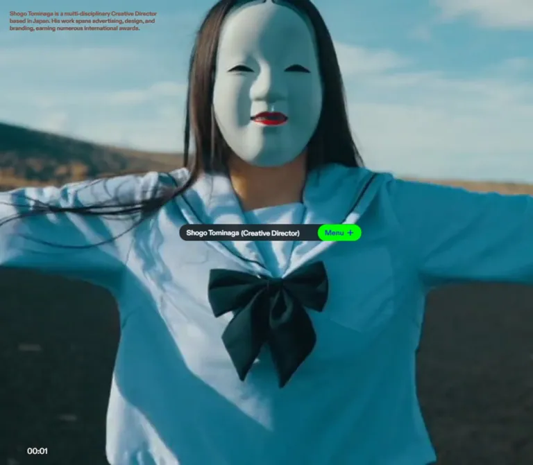
全画面の映像に、小さな紹介文と中央のカプセル型ナビゲーションを重ねたポートフォリオ。蛍光グリーンのメニューボタンとコンパクトな文字組みが特徴。
オリジナルサイトを見るShogo Tominaga — Style Reference
A full-screen portfolio reel with a small identity capsule at its center and a neon green entry into navigation.
Original URL: shogotominaga.com
Final URL: shogotominaga.com
Theme: moving photographic imagery, a dark identity capsule, white identity text, and a neon green button with blue details. No selectable theme was observed.
Inspected: September 13, 2026, at approximately 03:23 JST. The supplied browser evidence is timestamped 2026-09-12T18:23:04.851Z.
Viewports: desktop 1440 × 1000 and mobile 390 × 844 CSS pixels.
Scope: the current root portfolio page, including its introductory reel, English introduction, centered identity/menu capsule, timecode, and DOM-present navigation and biography. The supplied original-page images show three desktop frames and two mobile frames. An opened menu, revealed biography, destination pages, and playback-control interactions were not visually inspected.
Shogo Tominaga’s portfolio gives almost the entire viewport to moving work. The interface is deliberately small: a three-line introduction sits near the upper-left corner, a narrow capsule occupies the exact center, and a timecode appears near the bottom. The capsule’s green button remains conspicuous as the footage changes between bright street scenes, a nighttime performance, and pale imagery containing a bird and a handler’s glove.
This is a portfolio entrance with an application-like, full-viewport composition. The inspected document height equals the viewport height at both sizes. It does not establish a conventional sequence of vertically stacked marketing sections. Its identity comes from the contrast between expansive, changing footage and compact, stable interface geometry.
How to Read This Reference
- Measured values come from the supplied rendered DOM, computed styles, custom properties, and element rectangles.
- Visual estimates describe the supplied original-page screenshots. They are not pixel-sampled colors or recovered stylesheet declarations.
- Calculated values are arithmetic derived from measured rectangles, such as centering offsets and remaining column widths.
- Recommendations describe a reusable implementation. They do not establish behavior or styling on the original site.
- DOM-present content is distinguished from visibly exposed content. The navigation and biography have measurable boxes but are absent from the supplied closed-menu images; their open-state appearance cannot be reconstructed from those boxes alone.
- Token names in this document are implementation aliases unless explicitly identified as source custom properties. Font-family declarations identify computed stacks, not independently verified font-file loading.
Tokens — Colors
Default Palette
| Name | Value | Evidence | Role |
|---|---|---|---|
| Signal Green | #00ff00 |
Measured source --c-green |
Corresponds to the vivid green menu capsule visible in every current-page capture |
| Electric Blue | #2f1eff |
Measured source --c-blue |
Corresponds to the blue Menu label and plus sign; the colored child elements were not separately sampled |
| Source White | #ffffff |
Measured source --c-text; sampled text color |
Identity text and declared foreground color for many elements |
| Base White | #ffffff |
Measured source --c-bg and body background |
Underlying document canvas, largely covered by media |
| Capsule Shade | rgb(0 0 0 / 70%) |
Recommended approximation | Recreates the visually dark, slightly background-dependent identity surface; original fill and opacity are unknown |
| Dark Scene Ink | #111111 |
Recommended approximation | Optional foreground for introduction/timecode over bright footage; the exact visible dark color was not measured |
The stable accent pairing is green and blue. Orange signage, red clothing, dark architecture, and pale backgrounds belong to the footage. They are not additional interface themes or brand tokens.
The introduction’s computed color is white at both viewports, but its rendered appearance is dark over the bright mobile scene and pale over the dark desktop scene. The timecode also changes apparent color. This establishes a difference between computed text color and final appearance, but does not identify a blend mode, filter, or scene-selection algorithm. Do not assume mix-blend-mode: difference without further evidence.
The sampled header, heading, and button wrappers report transparent backgrounds and zero border radius, even though the screenshot clearly contains rounded filled shapes. The visible decoration therefore cannot be reproduced by copying only those wrapper styles. Its owning descendants or pseudo-elements were not supplied.
The source also exposes --viewall: 0. Its purpose was not established; it is not treated as a color, spacing, or motion token.
Tokens — Typography
Latin Interface — ABCDiatype
- Computed stack:
ABCDiatype, sans-serif. - Primary interface weight:
700. - Character: compact, direct sans-serif lettering with little hierarchy by size.
- Uses: introduction, identity, menu labels, navigation, and the English biography role.
- Tracking: the header and navigation use
-0.3px; the menu button uses normal tracking.
The page does not use an oversized name or headline to compete with the reel. The identity heading is only 15px, while the introduction is 12px.
Japanese Biography — Tazugane Gothic
- Name heading stack:
TazuganeGothicStdN-Medium, sans-serif. - Biography stack:
ABCDiatype, TazuganeGothicStdN-Medium, sans-serif. - Weight:
500. - Paragraph leading:
26.25pxon15pxtype, equivalent to1.75.
These are measured styles for DOM-present biography content. They do not prove the appearance of an opened biography panel.
Type Scale
| Role | Size | Weight | Line height | Tracking | Evidence |
|---|---|---|---|---|---|
| Root element | 16px |
400 |
16px |
Normal | Measured; its Times family is not the visible interface family |
| Body default | 16px |
700 |
16px |
Normal | Measured |
| Upper-left introduction | 12px |
700 |
15px |
Normal | Measured at both viewports |
| Identity heading | 15px |
700 |
15px |
-0.3px |
Measured at both viewports |
| Menu button | 15px |
700 |
15px |
Normal | Measured at both viewports |
| Navigation links | 15px |
700 |
15px |
-0.3px |
Measured, not visibly exposed |
| Biography name | 21px |
500 |
21px |
Normal | Measured, not visibly exposed |
| Biography role and paragraphs | 15px |
500 |
26.25px |
Normal | Measured, not visibly exposed |
| Bottom timecode | Approximately 16px |
Visually medium/bold | Not measured | Not measured | Screenshot estimate only |
The timecode looks like a compact sans-serif utility label. No computed style establishes a monospaced font. Tabular numerals are a useful implementation recommendation, not a verified source feature.
Tokens — Spacing & Shapes
Density: very compact controls over an otherwise uninterrupted media field. Scaling: the sampled interface dimensions stay constant between desktop and mobile. No viewport-derived root scale was supplied. Shape language: one elongated capsule and one smaller capsule, with no visible decorative card system.
Spacing Scale
| Use | Value | Status |
|---|---|---|
| Desktop introduction top/left inset | 20px |
Measured |
| Mobile introduction top/left inset | 15px |
Measured |
| Mobile capsule side clearance | 7.5px |
Calculated from (390 − 375) / 2 |
| Identity text left inset | Approximately 15px |
Visual estimate |
| Navigation inset from each capsule edge | 35px |
Calculated from link rectangles |
| Navigation inter-link gap | Approximately 16.8px |
Calculated from adjacent link rectangles |
| Navigation top below header bottom | 10.125px |
Calculated; DOM-only position |
| Biography column inset within capsule width | 20px |
Calculated |
| Biography name-to-role gap | 7.5px |
Calculated from element rectangles |
| Biography paragraph separation | 26.25px |
Calculated; equals one paragraph line |
| Timecode bottom clearance | Approximately 20px desktop, 15px mobile |
Visual estimate; line-box bounds unavailable |
These recurring values do not establish an authored spacing scale. Use them as component measurements rather than inventing a global grid.
Border Radius
| Element | Visible geometry | Implementation guidance |
|---|---|---|
| Overall identity capsule | Fully rounded ends on a 35px-high bar |
Use border-radius: 999px; effective end radius is approximately 17.5px |
| Green menu control | Independently rounded 90 × 35px capsule |
Use the same pill radius |
| Media field | Extends to viewport edges | No card radius |
| Biography/menu container | Not visibly inspected | Do not infer a panel radius from the closed capsule |
The pill radius is a visual reconstruction, not a measured declaration on the sampled wrappers.
Layout Measurements
| Element | Desktop 1440 × 1000 |
Mobile 390 × 844 |
Interpretation |
|---|---|---|---|
| Document | 1440 × 1000px |
390 × 844px |
Document height equals viewport height |
| Introduction | x:20, y:20, w:330, h:45 |
x:15, y:15, w:360, h:45 |
Three lines at both sizes, with different wrapping |
| Header capsule | x:532.5, y:482.5, w:375, h:35 |
x:7.5, y:404.5, w:375, h:35 |
Exactly centered on both axes |
| Identity heading box | 285 × 35px |
285 × 35px |
Fixed remaining width beside the button |
| Menu button | x:817.5, y:482.5, w:90, h:35 |
x:292.5, y:404.5, w:90, h:35 |
Same size and relationship at both widths |
| Navigation link span | x:567.5 through 872.5 |
x:42.5 through 347.5 |
A 305px span, DOM-only |
| Biography column | x:552.5, w:335 |
x:27.5, w:335 |
Same width, centered relative to capsule |
The exact centering relationships are:
header.x = (viewport.width - 375) / 2
header.y = (viewport.height - 35) / 2
identity.width = 375 - 90 = 285
biography.width = 375 - 2 × 20 = 335
These equations describe the measured result. The original positioning declarations were not included.
Components
Full-Viewport Reel
Role: displays the work and establishes the page’s atmosphere.
The moving imagery fills the entire visible viewport without an outer frame, card, or letterboxed player treatment. The interface overlays the footage. No conventional hero headline, summary card, or large conversion button interrupts it.
Use a viewport-sized media layer beneath the interface. object-fit: cover is a practical reconstruction of the visible fill, but the supplied DOM does not identify the original media element, intrinsic aspect ratio, object positioning, or rendering technology.
The source captures show changing imagery and advancing timecodes. The precise media URL, format, duration, loop point, audio state, and playback controls were not supplied.
Upper-Left Introduction
Role: explains the person’s practice without taking attention away from the reel.
The observed copy is: “Shogo Tominaga is a multi-disciplinary Creative Director based in Japan. His work spans advertising, design, and branding, earning numerous international awards.”
Set it as an unboxed paragraph in 12px / 15px, weight 700. On desktop, use a 330px box with 20px top and left offsets. On the inspected phone, the box expands to 360px, leaving 15px on each side.
Its three-line height remains 45px. The desktop text wraps after “Creative Director” on the first line, while the wider mobile text box accommodates “based in” before wrapping. Mobile does not simply scale down the desktop introduction.
Foreground appearance varies with the footage. Preserve legibility in an adaptation, while treating the original contrast mechanism as unknown.
Identity and Menu Capsule
Role: persistent personal identity and the apparent entry point into navigation.
The measured outer header is a flex container, 375 × 35px, centered in the viewport. Its first child is an h1 occupying 285 × 35px; its second is a real button occupying 90 × 35px.
The visible anatomy is:
- A dark, fully rounded horizontal surface.
- White identity text beginning approximately
15pxinside the left edge. - A parenthesized role immediately following the name.
- A green capsule occupying the final
90px. - A blue Menu label and a simple blue plus sign inside that capsule.
There is no visible gap between the identity region and the menu region. The menu’s left edge is rounded as well as its right edge. A common implementation is a dark outer capsule with a separately rounded button laid over its right end; this is a reconstruction, not recovered source markup.
The role is not constant across the evidence. Desktop images include (C) and (Cinematographer). The mobile images show parentheses without a readable role. Do not hardcode the mobile role as permanently hidden: a transient update, clipping, or another presentation state remains possible.
Navigation Links — DOM Evidence Only
Role: routes to the portfolio’s main areas.
| Source label | Observed destination |
|---|---|
| About | https://shogotominaga.com/ |
| Featured | https://shogotominaga.com/featured/ |
| Works | https://shogotominaga.com/works/ |
| Media | https://shogotominaga.com/media/ |
| Contact | https://shogotominaga.com/contact/ |
The five link rectangles form a horizontal span of 305px, inset 35px from the capsule’s sides. Their measured type is 15px / 15px, weight 700, with -0.3px tracking.
Both Menu and Close are present in the button’s extracted text. This suggests alternate control labels, but the supplied images show only Menu and the plus sign. No click sequence establishes the expanded layout, backdrop, animation, active-link appearance, or closing behavior.
The link rectangles exist just below the capsule in the DOM measurements, but the links are not visible in the screenshots. Do not display them permanently merely because they have nonzero bounds.
Biography Content — DOM Evidence Only
Role: provides a longer professional profile.
The biography contains the Japanese name 富永省吾, the English role “Creative Director,” and Japanese paragraphs covering creative practice, career, awards, and affiliations. Its measured column is 335px wide at both viewports.
The name uses 21px / 21px Japanese sans-serif type at weight 500. The role follows after 7.5px. Paragraphs use 15px / 26.25px type and 26.25px separations.
The first heading starts at y:927.75px on desktop and y:849.75px on mobile. Both positions are 445.25px below their respective header tops. This is a measured relationship in the captured state, not a recommendation to insert a large blank gap into an opened profile.
The biography is not visibly exposed in the supplied frames. Its container surface, reveal mechanism, scrolling behavior, and relationship to the reel remain unverified.
Bottom Timecode
Role: provides a small visible indication of reel time.
The desktop frames show 00:07, 00:09, and 00:10; the mobile frames show 00:12 and 00:13. The label is near the bottom edge rather than attached to the central capsule.
Its horizontal position also changes: approximately x:328, 413, and 453px on desktop, and 137 and 145px on mobile. These are visual estimates of the text’s left edge. The movement is consistent with playback-position feedback, but an exact mapping to media duration is not established.
No visible seek track or playback button appears in the supplied frames. The timecode’s presence does not establish that it can be dragged or clicked.
Tokens — Motion & Interaction
| Treatment | Evidence | What remains unknown |
|---|---|---|
| Reel playback | Changing subjects and poses across frames; advancing timecodes | Duration, loop behavior, frame rate, audio, and implementation |
| Timecode updates | 00:07, 00:09, 00:10, 00:12, 00:13 in supplied images |
Update cadence and synchronization details |
| Timecode horizontal movement | Different bottom positions in successive captures | Position formula, easing, and seekability |
| Role-label changes | Partial and complete desktop labels; unreadable role in mobile frames | Typing, masking, replacement, timing, and relationship to footage |
| Menu affordance | Visible Menu/plus; actual button; Close text in DOM | Click result, transition, focus handling, and open-state appearance |
| Scroll-related text | Raw body extraction contains “Works With A HorizontalVertical Scroll” | Whether an orientation control or scroll interaction is exposed on this page |
The sampled elements report animation: none and a serialized transition value of all. These records do not provide useful durations or easing curves, and they do not exclude animation in media, descendants, pseudo-elements, or JavaScript.
The capture process waited for layout/text stability and certain finite animations, briefly pausing perpetual animations during readiness checks before resuming them. This helps explain why the supplied views are settled, but it does not prove that every delayed state or interaction was captured.
For an adaptation, keep motion concentrated in the reel and changing identity details. Additional panel transitions should be specified as new behavior. There is no evidence supporting a particular spring, fade duration, typing interval, or plus-to-close rotation.
Surfaces
| Layer | Appearance | Evidence and purpose |
|---|---|---|
| Document base | White | Measured body background; mostly covered by imagery |
| Media field | Edge-to-edge moving photography | Visible primary content surface |
| Introduction/timecode | Text directly over footage | No visible enclosing cards |
| Identity capsule | Dark rounded surface with white text | Visible; precise fill and opacity unmeasured |
| Menu capsule | Green fill with blue label and plus | Visible; matching source color tokens supplied |
| Expanded navigation/profile surface | Unknown | DOM content exists, but no open-state image establishes its styling |
There is no visible general elevation system in the inspected shell. Separation comes from the capsule’s dark fill, the green control, and their rounded silhouettes. Avoid inventing decorative shadows, glass blur, gradients, or borders as original-site features.
Imagery
The inspected reel uses photographic work with strongly different lighting and composition:
- Daytime street scene: pedestrians cross in front of a large orange-and-red graphic display at WAKO. Architectural edges and oversized lettering fill much of the frame.
- Nighttime performance: a performer in a red suit appears before an illuminated traditional gate. Warm architectural light contrasts with a nearly black sky.
- Pale mobile scene: a bird, a handler’s arm, and a dark glove appear against a light background. The narrow viewport cuts off much of the moving subject at the right edge.
These scenes supply visual density, color, texture, and motion. The interface does not need additional illustration, large typography, or decorative patterns to create impact.
The mobile images demonstrate substantial subject cropping, but there is no matched-time desktop/mobile pair. A shared media source, exact focal point, and breakpoint-specific crop cannot be proven. A reconstruction should allow per-clip focal positions and verify them in portrait orientation.
Use photographic media without pixelation or an imposed site-wide duotone. Preserve each work’s own lighting and color treatment. Keep the green menu control stable across the changing imagery.
Observed Asset References
| Asset category | Available evidence | Implementation consequence |
|---|---|---|
| Reel footage | Visible original-page frames; no media URL supplied | Obtain the actual authorized media separately; do not invent an observed filename or format |
| Poster/fallback image | No asset URL or dedicated fallback state supplied | A poster is a recommended addition |
| Interface fonts | Computed ABCDiatype and TazuganeGothicStdN-Medium family names | Load available font files separately; exact file mapping was not established |
| Menu plus | Visible simple blue cross | CSS strokes can approximate it; original SVG/font/pseudo-element implementation is unknown |
Layout & Responsive Behavior
The most distinctive responsive choice is the fixed-size center capsule. It remains 375 × 35px on both the 1440px desktop and the 390px phone. Its center is (720, 500) on desktop and (195, 422) on mobile. The button and identity regions also keep their dimensions and type sizes.
On desktop, this leaves broad areas of footage around the small interface. On the phone, the same capsule nearly spans the screen, leaving only 7.5px on each side. The page’s proportions change through available space, not through proportional shrinking of the controls.
The introduction follows a different rule. Its desktop box is 330px wide with 20px offsets, while the mobile box uses the available width between 15px side insets. The narrower screen therefore has a slightly wider introduction text box than the desktop layout.
The sampled navigation and biography dimensions are also unchanged: 305px for the navigation span and 335px for the biography column. Their visibility and scrolling arrangements cannot be inferred from those dimensions.
At both sizes, the document height equals the viewport height. Although biography rectangles extend below the viewport, this does not establish ordinary document scrolling or reachability. Internal scrolling, clipping, transforms, and state-dependent visibility were not individually tested.
Recommended extension below the inspected phone width: constrain the capsule to min(375px, viewport width − 15px), retain the 90px button, and let the identity region shrink. Ellipsis or a deliberate shorter role is preferable to horizontal overflow. This behavior is not measured on the original site.
Unverified responsive conditions: widths below 390px, intermediate breakpoints, landscape phones, safe-area handling, browser chrome changes, zoom, and enlarged text. The Quick Start uses a recommended 600px introduction breakpoint and dynamic viewport units; neither is a recovered source rule.
Do’s and Don’ts
Do
- Make the reel the dominant visual content and let it reach the viewport edges.
- Preserve the
375 × 35pxcentered capsule at the two measured viewport sizes. - Keep the identity/menu split at
285px / 90pxwhere space permits. - Use the exact measured green
#00ff00and blue#2f1effas the persistent accent pair. - Keep the introduction compact at
12px / 15pxand the identity at15px / 15px. - Preserve the mobile introduction’s
15pxinsets and changed wrapping. - Treat biography and navigation measurements as DOM evidence, separate from their unobserved reveal state.
- Allow footage, subject position, and lighting to provide variation.
- Check text contrast and portrait cropping across the full reel.
Don’t
- Don’t turn the root view into a conventional marketing page with feature cards and a large headline.
- Don’t move the identity into a standard top navigation bar or bottom dock.
- Don’t enlarge the capsule on desktop just because there is more space.
- Don’t convert the footage’s orange, red, or pale tones into permanent interface themes.
- Don’t infer an exact blend mode from white computed text that renders dark.
- Don’t interpret blank mobile parentheses as proof that roles are always hidden on phones.
- Don’t present DOM-only navigation and biography as verified visible components.
- Don’t infer seeking, horizontal scrolling, audio behavior, or menu animation from labels alone.
- Don’t add ornate icons, large shadows, or decorative imagery that competes with the work.
Recommended Implementation Additions
These are improvements for a new implementation, not verified original-site features:
- Preserve the menu’s
35pxvisual height while providing an approximately44pxtouch target, for example through an expanded transparent hit area. - Give the menu a clear accessible name, maintain
aria-expanded, connect it to its controlled region, and remove concealed links from keyboard navigation. - Choose focus behavior appropriate to the actual opened container. If it is modal, manage focus and Escape dismissal; if it is disclosure navigation, preserve normal document navigation.
- Provide a pause control and a still-image option for reduced-motion preferences. CSS animation rules alone do not pause video playback.
- Keep audio subject to an explicit playback policy and user control. The original audio state is unknown.
- Use a readable poster/fallback state while media loads or fails, with introduction contrast appropriate to that image.
- Provide text context for meaningful portfolio footage, plus captions or transcripts where speech or audio carries information.
- Reserve stable space for changing role text so the name and menu do not move. Avoid announcing every intermediate role fragment to assistive technology.
- Test smaller phones, zoom, safe areas, and portrait focal points rather than relying only on the measured
390pxviewport.
Agent Prompt Guide
Quick Color Reference
- Menu fill:
#00ff00, measured source token. - Menu label and plus: blue appearance corresponding to measured
#2f1eff. - Identity text: white.
- Identity surface: dark translucent-looking capsule;
rgb(0 0 0 / 70%)is an approximation. - Underlying canvas: measured white, normally covered by footage.
- Introduction/timecode: choose a legible scene foreground in a new implementation; the source compositing method is unknown.
- Footage colors: content-dependent, not a fixed interface palette.
Overall Prompt
“Create a full-viewport creative portfolio entrance based on the measured Shogo Tominaga root-page composition. Let photographic reel footage cover the screen. Place a compact three-line English introduction at the upper left in 12px/15px bold sans-serif. Center a 375px-wide, 35px-high dark capsule on both axes. Its 285px identity area contains a small white name and parenthesized role; its 90px button is a separate neon green pill with a blue Menu label and plus sign. Use #00ff00 and #2f1eff for those accents. Keep the same capsule dimensions at 1440×1000 and 390×844. On mobile, give the introduction 15px side insets. Add a small bottom timecode. Treat media behavior, role transitions, and opened navigation as separately specified interactions because their exact implementation was not observed.”
Example Component Prompts
- Identity capsule: “Build a centered 375×35px flex header with a 285px identity region and a 90px menu button. Use 15px bold sans-serif, −0.3px tracking on the identity, and normal tracking on the button. Keep the name inset about 15px. Use a dark pill surface, white identity text, a #00ff00 button, and #2f1eff Menu/plus details. The rounded geometry is visually reconstructed.”
- Introduction: “Set a short professional introduction in a 330px-wide, 45px-high text box at 20px from the desktop top and left edges. Use 12px/15px bold sans-serif. At a 390px viewport, use 15px offsets and a 360px text box. Preserve the different wrapping rather than shrinking the font.”
- Reel composition: “Use full-screen photographic portfolio footage with no card frame or letterboxing. Keep the interface sparse and stable as the scene changes. Provide portrait focal-point controls and a poster. Do not impose a global tint or add unrelated illustration.”
- Timecode adaptation: “Place a small sans-serif timecode near the bottom edge, approximately 20px above desktop bounds and 15px above mobile bounds. If implementing horizontal progress tracking, drive it from currentTime/duration and identify that mapping as new behavior. Do not imply seeking without an actual accessible control.”
- Biography typography: “Style a 335px-wide biography column using a 21px/21px medium Japanese name heading, a 7.5px gap to the English role, and 15px/26.25px medium paragraphs separated by 26.25px. Treat the surrounding panel, reveal, and scrolling arrangement as a new design decision.”
Quick Start
CSS Custom Properties
This CSS reconstructs the verified closed-shell composition and supplies reusable typography for DOM-present content. It does not recover the original stylesheet. Dark-surface opacity, the small-screen fallback, scene foreground selection, plus geometry, focus treatment, and touch-target expansion are recommendations.
Use .portfolio-shell as the viewport container; .reel-media for an image or video; .intro for the introduction; and .identity-capsule for a header containing .identity and .menu-toggle. Put the identity text inside .identity-text and a .menu-plus span inside the button. Use .reel-time for the timecode.
The navigation and profile classes provide widths and type styles. Their open-state container and positioning require a separate implementation because that presentation was not observed. Font files and media assets must be supplied separately.
:root {
  /* Exact values from supplied source custom properties. */
  --color-page: #ffffff;
  --color-text: #ffffff;
  --color-green: #00ff00;
  --color-blue: #2f1eff;

  /* Recommended approximations, not recovered source colors. */
  --color-capsule: rgb(0 0 0 / 70%);
  --color-dark-ink: #111111;

  /* Computed font stacks; load available font assets separately. */
  --font-latin: 'ABCDiatype', sans-serif;
  --font-japanese: 'TazuganeGothicStdN-Medium', sans-serif;
  --font-mixed: 'ABCDiatype', 'TazuganeGothicStdN-Medium', sans-serif;

  --text-intro: 12px;
  --text-interface: 15px;
  --text-profile-name: 21px;
  --text-timecode: 16px; /* Visual estimate. */
  --leading-intro: 15px;
  --leading-interface: 15px;
  --leading-profile: 26.25px;
  --tracking-interface: -0.3px;

  /* Measured component geometry. */
  --capsule-width: 375px;
  --capsule-height: 35px;
  --menu-width: 90px;
  --navigation-width: 305px;
  --profile-width: 335px;
  --intro-width: 330px;
  --intro-inset: 20px;

  /* Visual reconstruction and recommended utility values. */
  --radius-pill: 999px;
  --identity-inset: 15px;
  --timecode-inset: 20px;
  --progress: 0;
}

* {
  box-sizing: border-box;
}

html,
body {
  margin: 0;
}

.portfolio-shell {
  --scene-ink: var(--color-dark-ink);
  --edge-left: max(var(--intro-inset), env(safe-area-inset-left, 0px));
  --edge-right: max(var(--intro-inset), env(safe-area-inset-right, 0px));
  --edge-top: max(var(--intro-inset), env(safe-area-inset-top, 0px));

  position: fixed;
  inset: 0;
  height: 100vh;
  height: 100dvh;
  overflow: hidden;
  isolation: isolate;
  background: var(--color-page);
  color: var(--color-text);
  font-family: var(--font-latin);
  font-size: 16px;
  font-weight: 700;
  line-height: 1;
}

/* Recommended explicit scene tone; original compositing is unknown. */
.portfolio-shell[data-ui-tone='light'] {
  --scene-ink: var(--color-text);
}

.reel-media {
  position: absolute;
  inset: 0;
  z-index: 0;
  display: block;
  width: 100%;
  height: 100%;
  object-fit: cover;
  object-position: var(--focal-point, 50% 50%);
}

.intro {
  position: absolute;
  z-index: 1;
  top: var(--edge-top);
  left: var(--edge-left);
  width: min(
    var(--intro-width),
    calc(100% - var(--edge-left) - var(--edge-right))
  );
  margin: 0;
  color: var(--scene-ink);
  font-size: var(--text-intro);
  font-weight: 700;
  line-height: var(--leading-intro);
  letter-spacing: normal;
}

.identity-capsule {
  position: absolute;
  z-index: 3;
  top: 50%;
  left: 50%;
  transform: translate(-50%, -50%);
  display: flex;
  align-items: center;
  width: min(var(--capsule-width), calc(100% - 15px));
  height: var(--capsule-height);
  border-radius: var(--radius-pill);
  background: var(--color-capsule);
  color: var(--color-text);
  font-size: var(--text-interface);
  font-weight: 700;
  line-height: var(--leading-interface);
  letter-spacing: var(--tracking-interface);
}

.identity {
  display: flex;
  flex: 1 1 auto;
  align-items: center;
  min-width: 0;
  height: 100%;
  margin: 0;
  padding-inline: var(--identity-inset);
  font: inherit;
  letter-spacing: inherit;
}

.identity-text {
  display: block;
  min-width: 0;
  overflow: hidden;
  white-space: nowrap;
  text-overflow: ellipsis;
}

.menu-toggle {
  position: relative;
  display: inline-flex;
  flex: 0 0 var(--menu-width);
  align-items: center;
  justify-content: center;
  gap: 8px; /* Visual approximation. */
  height: var(--capsule-height);
  padding: 0;
  appearance: none;
  border: 0;
  border-radius: var(--radius-pill);
  background: var(--color-green);
  color: var(--color-blue);
  font: inherit;
  letter-spacing: normal;
  cursor: pointer;
}

/* Recommended 44px hit height while retaining a 35px visual pill. */
.menu-toggle::before {
  content: '';
  position: absolute;
  inset: -4.5px 0;
  border-radius: inherit;
}

/* Reconstructed icon geometry; the original icon source is unknown. */
.menu-plus {
  position: relative;
  display: block;
  flex: 0 0 12px;
  width: 12px;
  height: 12px;
}

.menu-plus::before,
.menu-plus::after {
  content: '';
  position: absolute;
  top: 50%;
  left: 50%;
  width: 12px;
  height: 1.5px;
  background: currentColor;
  transform: translate(-50%, -50%);
}

.menu-plus::after {
  transform: translate(-50%, -50%) rotate(90deg);
}

.reel-time {
  position: absolute;
  z-index: 1;
  bottom: max(var(--timecode-inset), env(safe-area-inset-bottom, 0px));
  left: clamp(24px, calc(var(--progress) * 100%), calc(100% - 24px));
  transform: translateX(-50%);
  color: var(--scene-ink);
  font-size: var(--text-timecode);
  line-height: 1;
  font-variant-numeric: tabular-nums; /* Recommended. */
  white-space: nowrap;
}

/* DOM-derived dimensions and type; open-state positioning is unspecified. */
.portfolio-nav {
  display: flex;
  flex-wrap: wrap; /* Recommended fallback for enlarged text. */
  align-items: center;
  justify-content: space-between;
  gap: 12px 8px;
  width: min(var(--navigation-width), calc(100% - 70px));
  margin-inline: auto;
  font-size: var(--text-interface);
  font-weight: 700;
  line-height: var(--leading-interface);
  letter-spacing: var(--tracking-interface);
}

.portfolio-nav a {
  color: inherit;
  text-decoration: none; /* Adaptation choice for the unobserved open state. */
}

.profile-copy {
  width: min(var(--profile-width), calc(100% - 40px));
  margin-inline: auto;
  font-family: var(--font-mixed);
  font-size: var(--text-interface);
  font-weight: 500;
  line-height: var(--leading-profile);
}

.profile-copy h2 {
  margin: 0 0 7.5px;
  font-family: var(--font-japanese);
  font-size: var(--text-profile-name);
  font-weight: 500;
  line-height: 21px;
}

.profile-copy p {
  margin: 0 0 26.25px;
}

.profile-copy .profile-role {
  font-family: var(--font-latin);
}

.portfolio-shell [hidden] {
  display: none !important;
}

/* Recommended keyboard focus treatment. */
.portfolio-shell :focus-visible {
  outline: 2px solid var(--color-blue);
  outline-offset: 4px;
}

/* Recommended breakpoint; only the two supplied viewports were measured. */
@media (max-width: 600px) {
  :root {
    --intro-inset: 15px;
    --intro-width: calc(100vw - 30px);
    --timecode-inset: 15px;
  }
}
Integration notes: update the displayed time from the actual media clock. The optional --progress value is a fraction from 0 to 1; using currentTime / duration is a recommended implementation of the observed horizontal movement, not a recovered formula. Choose data-ui-tone and focal points against the real footage. Implement the menu’s state, labels, keyboard behavior, and revealed container separately. A reduced-motion handler must pause video or select a still image; CSS alone does not provide that behavior.
Tailwind v4 Token Mapping
Optional aliases for a project already using Tailwind v4. This does not imply that the original website uses Tailwind. Define the custom properties above first.
@theme inline {
  --color-portfolio-green: var(--color-green);
  --color-portfolio-blue: var(--color-blue);
  --color-portfolio-white: var(--color-text);
  --color-portfolio-capsule: var(--color-capsule);

  --font-interface: var(--font-latin);
  --font-profile: var(--font-mixed);

  --text-micro: var(--text-intro);
  --text-control: var(--text-interface);
  --text-profile-heading: var(--text-profile-name);

  --spacing-capsule: var(--capsule-width);
  --spacing-capsule-height: var(--capsule-height);
  --spacing-menu: var(--menu-width);
  --spacing-profile: var(--profile-width);

  --radius-capsule: var(--radius-pill);
}
Sources & Evidence
- Shogo Tominaga — original and final root URL: supplied browser result reports HTTP
200and the title “Shogo Tominaga | 富永省吾.” Original and final URLs are identical. - Capture timestamp: supplied retrieval timestamp
2026-09-12T18:23:04.851Z, corresponding to September 13, 2026, 03:23:04.851 JST. Individual screenshot timestamps were not separately supplied. - Desktop evidence: three original-page frames at
1440 × 1000, with visible timecodes00:07,00:09, and00:10; one accompanying DOM/computed-style snapshot. - Mobile evidence: two original-page frames at
390 × 844, with visible timecodes00:12and00:13; one accompanying DOM/computed-style snapshot. - Measured evidence: source custom properties, body and text styles, exact introduction/header/heading/button rectangles, navigation destinations and rectangles, biography typography and rectangles, and viewport/document dimensions.
- Inspection limits: no opened menu or biography presentation, destination-page visit, hover/focus test, playback-control action, audio check, matched-time responsive comparison, complete stylesheet, or media asset URL was supplied. SharedWorkers and service workers were disabled during the browser inspection. Readiness checks do not establish completeness of delayed or unexercised states.
This reference describes the current supplied root-page evidence. Visual estimates and implementation additions remain explicitly separate from measured source values.
# Shogo Tominaga — Style Reference

> A full-screen portfolio reel with a small identity capsule at its center and a neon green entry into navigation.

**Original URL:** [shogotominaga.com](https://shogotominaga.com/)
**Final URL:** [shogotominaga.com](https://shogotominaga.com/)
**Theme:** moving photographic imagery, a dark identity capsule, white identity text, and a neon green button with blue details. No selectable theme was observed.
**Inspected:** September 13, 2026, at approximately 03:23 JST. The supplied browser evidence is timestamped `2026-09-12T18:23:04.851Z`.
**Viewports:** desktop `1440 × 1000` and mobile `390 × 844` CSS pixels.
**Scope:** the current root portfolio page, including its introductory reel, English introduction, centered identity/menu capsule, timecode, and DOM-present navigation and biography. The supplied original-page images show three desktop frames and two mobile frames. An opened menu, revealed biography, destination pages, and playback-control interactions were not visually inspected.

Shogo Tominaga’s portfolio gives almost the entire viewport to moving work. The interface is deliberately small: a three-line introduction sits near the upper-left corner, a narrow capsule occupies the exact center, and a timecode appears near the bottom. The capsule’s green button remains conspicuous as the footage changes between bright street scenes, a nighttime performance, and pale imagery containing a bird and a handler’s glove.

This is a portfolio entrance with an application-like, full-viewport composition. The inspected document height equals the viewport height at both sizes. It does not establish a conventional sequence of vertically stacked marketing sections. Its identity comes from the contrast between expansive, changing footage and compact, stable interface geometry.

## How to Read This Reference

- **Measured** values come from the supplied rendered DOM, computed styles, custom properties, and element rectangles.
- **Visual estimates** describe the supplied original-page screenshots. They are not pixel-sampled colors or recovered stylesheet declarations.
- **Calculated** values are arithmetic derived from measured rectangles, such as centering offsets and remaining column widths.
- **Recommendations** describe a reusable implementation. They do not establish behavior or styling on the original site.
- **DOM-present content** is distinguished from visibly exposed content. The navigation and biography have measurable boxes but are absent from the supplied closed-menu images; their open-state appearance cannot be reconstructed from those boxes alone.
- Token names in this document are implementation aliases unless explicitly identified as source custom properties. Font-family declarations identify computed stacks, not independently verified font-file loading.

## Tokens — Colors

### Default Palette

| Name | Value | Evidence | Role |
| --- | --- | --- | --- |
| Signal Green | `#00ff00` | Measured source `--c-green` | Corresponds to the vivid green menu capsule visible in every current-page capture |
| Electric Blue | `#2f1eff` | Measured source `--c-blue` | Corresponds to the blue Menu label and plus sign; the colored child elements were not separately sampled |
| Source White | `#ffffff` | Measured source `--c-text`; sampled text color | Identity text and declared foreground color for many elements |
| Base White | `#ffffff` | Measured source `--c-bg` and body background | Underlying document canvas, largely covered by media |
| Capsule Shade | `rgb(0 0 0 / 70%)` | Recommended approximation | Recreates the visually dark, slightly background-dependent identity surface; original fill and opacity are unknown |
| Dark Scene Ink | `#111111` | Recommended approximation | Optional foreground for introduction/timecode over bright footage; the exact visible dark color was not measured |

The stable accent pairing is green and blue. Orange signage, red clothing, dark architecture, and pale backgrounds belong to the footage. They are not additional interface themes or brand tokens.

The introduction’s computed color is white at both viewports, but its rendered appearance is dark over the bright mobile scene and pale over the dark desktop scene. The timecode also changes apparent color. This establishes a difference between computed text color and final appearance, but does not identify a blend mode, filter, or scene-selection algorithm. Do not assume `mix-blend-mode: difference` without further evidence.

The sampled header, heading, and button wrappers report transparent backgrounds and zero border radius, even though the screenshot clearly contains rounded filled shapes. The visible decoration therefore cannot be reproduced by copying only those wrapper styles. Its owning descendants or pseudo-elements were not supplied.

The source also exposes `--viewall: 0`. Its purpose was not established; it is not treated as a color, spacing, or motion token.

## Tokens — Typography

### Latin Interface — ABCDiatype

- **Computed stack:** `ABCDiatype, sans-serif`.
- **Primary interface weight:** `700`.
- **Character:** compact, direct sans-serif lettering with little hierarchy by size.
- **Uses:** introduction, identity, menu labels, navigation, and the English biography role.
- **Tracking:** the header and navigation use `-0.3px`; the menu button uses normal tracking.

The page does not use an oversized name or headline to compete with the reel. The identity heading is only `15px`, while the introduction is `12px`.

### Japanese Biography — Tazugane Gothic

- **Name heading stack:** `TazuganeGothicStdN-Medium, sans-serif`.
- **Biography stack:** `ABCDiatype, TazuganeGothicStdN-Medium, sans-serif`.
- **Weight:** `500`.
- **Paragraph leading:** `26.25px` on `15px` type, equivalent to `1.75`.

These are measured styles for DOM-present biography content. They do not prove the appearance of an opened biography panel.

### Type Scale

| Role | Size | Weight | Line height | Tracking | Evidence |
| --- | --- | --- | --- | --- | --- |
| Root element | `16px` | `400` | `16px` | Normal | Measured; its Times family is not the visible interface family |
| Body default | `16px` | `700` | `16px` | Normal | Measured |
| Upper-left introduction | `12px` | `700` | `15px` | Normal | Measured at both viewports |
| Identity heading | `15px` | `700` | `15px` | `-0.3px` | Measured at both viewports |
| Menu button | `15px` | `700` | `15px` | Normal | Measured at both viewports |
| Navigation links | `15px` | `700` | `15px` | `-0.3px` | Measured, not visibly exposed |
| Biography name | `21px` | `500` | `21px` | Normal | Measured, not visibly exposed |
| Biography role and paragraphs | `15px` | `500` | `26.25px` | Normal | Measured, not visibly exposed |
| Bottom timecode | Approximately `16px` | Visually medium/bold | Not measured | Not measured | Screenshot estimate only |

The timecode looks like a compact sans-serif utility label. No computed style establishes a monospaced font. Tabular numerals are a useful implementation recommendation, not a verified source feature.

## Tokens — Spacing & Shapes

**Density:** very compact controls over an otherwise uninterrupted media field.
**Scaling:** the sampled interface dimensions stay constant between desktop and mobile. No viewport-derived root scale was supplied.
**Shape language:** one elongated capsule and one smaller capsule, with no visible decorative card system.

### Spacing Scale

| Use | Value | Status |
| --- | --- | --- |
| Desktop introduction top/left inset | `20px` | Measured |
| Mobile introduction top/left inset | `15px` | Measured |
| Mobile capsule side clearance | `7.5px` | Calculated from `(390 − 375) / 2` |
| Identity text left inset | Approximately `15px` | Visual estimate |
| Navigation inset from each capsule edge | `35px` | Calculated from link rectangles |
| Navigation inter-link gap | Approximately `16.8px` | Calculated from adjacent link rectangles |
| Navigation top below header bottom | `10.125px` | Calculated; DOM-only position |
| Biography column inset within capsule width | `20px` | Calculated |
| Biography name-to-role gap | `7.5px` | Calculated from element rectangles |
| Biography paragraph separation | `26.25px` | Calculated; equals one paragraph line |
| Timecode bottom clearance | Approximately `20px` desktop, `15px` mobile | Visual estimate; line-box bounds unavailable |

These recurring values do not establish an authored spacing scale. Use them as component measurements rather than inventing a global grid.

### Border Radius

| Element | Visible geometry | Implementation guidance |
| --- | --- | --- |
| Overall identity capsule | Fully rounded ends on a `35px`-high bar | Use `border-radius: 999px`; effective end radius is approximately `17.5px` |
| Green menu control | Independently rounded `90 × 35px` capsule | Use the same pill radius |
| Media field | Extends to viewport edges | No card radius |
| Biography/menu container | Not visibly inspected | Do not infer a panel radius from the closed capsule |

The pill radius is a visual reconstruction, not a measured declaration on the sampled wrappers.

### Layout Measurements

| Element | Desktop `1440 × 1000` | Mobile `390 × 844` | Interpretation |
| --- | --- | --- | --- |
| Document | `1440 × 1000px` | `390 × 844px` | Document height equals viewport height |
| Introduction | `x:20, y:20, w:330, h:45` | `x:15, y:15, w:360, h:45` | Three lines at both sizes, with different wrapping |
| Header capsule | `x:532.5, y:482.5, w:375, h:35` | `x:7.5, y:404.5, w:375, h:35` | Exactly centered on both axes |
| Identity heading box | `285 × 35px` | `285 × 35px` | Fixed remaining width beside the button |
| Menu button | `x:817.5, y:482.5, w:90, h:35` | `x:292.5, y:404.5, w:90, h:35` | Same size and relationship at both widths |
| Navigation link span | `x:567.5` through `872.5` | `x:42.5` through `347.5` | A `305px` span, DOM-only |
| Biography column | `x:552.5, w:335` | `x:27.5, w:335` | Same width, centered relative to capsule |

The exact centering relationships are:

```text
header.x = (viewport.width - 375) / 2
header.y = (viewport.height - 35) / 2
identity.width = 375 - 90 = 285
biography.width = 375 - 2 × 20 = 335
```

These equations describe the measured result. The original positioning declarations were not included.

## Components

### Full-Viewport Reel

**Role:** displays the work and establishes the page’s atmosphere.

The moving imagery fills the entire visible viewport without an outer frame, card, or letterboxed player treatment. The interface overlays the footage. No conventional hero headline, summary card, or large conversion button interrupts it.

Use a viewport-sized media layer beneath the interface. `object-fit: cover` is a practical reconstruction of the visible fill, but the supplied DOM does not identify the original media element, intrinsic aspect ratio, object positioning, or rendering technology.

The source captures show changing imagery and advancing timecodes. The precise media URL, format, duration, loop point, audio state, and playback controls were not supplied.

### Upper-Left Introduction

**Role:** explains the person’s practice without taking attention away from the reel.

The observed copy is: “Shogo Tominaga is a multi-disciplinary Creative Director based in Japan. His work spans advertising, design, and branding, earning numerous international awards.”

Set it as an unboxed paragraph in `12px / 15px`, weight `700`. On desktop, use a `330px` box with `20px` top and left offsets. On the inspected phone, the box expands to `360px`, leaving `15px` on each side.

Its three-line height remains `45px`. The desktop text wraps after “Creative Director” on the first line, while the wider mobile text box accommodates “based in” before wrapping. Mobile does not simply scale down the desktop introduction.

Foreground appearance varies with the footage. Preserve legibility in an adaptation, while treating the original contrast mechanism as unknown.

### Identity and Menu Capsule

**Role:** persistent personal identity and the apparent entry point into navigation.

The measured outer header is a flex container, `375 × 35px`, centered in the viewport. Its first child is an `h1` occupying `285 × 35px`; its second is a real `button` occupying `90 × 35px`.

The visible anatomy is:

1. A dark, fully rounded horizontal surface.
2. White identity text beginning approximately `15px` inside the left edge.
3. A parenthesized role immediately following the name.
4. A green capsule occupying the final `90px`.
5. A blue Menu label and a simple blue plus sign inside that capsule.

There is no visible gap between the identity region and the menu region. The menu’s left edge is rounded as well as its right edge. A common implementation is a dark outer capsule with a separately rounded button laid over its right end; this is a reconstruction, not recovered source markup.

The role is not constant across the evidence. Desktop images include `(C)` and `(Cinematographer)`. The mobile images show parentheses without a readable role. Do not hardcode the mobile role as permanently hidden: a transient update, clipping, or another presentation state remains possible.

### Navigation Links — DOM Evidence Only

**Role:** routes to the portfolio’s main areas.

| Source label | Observed destination |
| --- | --- |
| About | `https://shogotominaga.com/` |
| Featured | `https://shogotominaga.com/featured/` |
| Works | `https://shogotominaga.com/works/` |
| Media | `https://shogotominaga.com/media/` |
| Contact | `https://shogotominaga.com/contact/` |

The five link rectangles form a horizontal span of `305px`, inset `35px` from the capsule’s sides. Their measured type is `15px / 15px`, weight `700`, with `-0.3px` tracking.

Both Menu and Close are present in the button’s extracted text. This suggests alternate control labels, but the supplied images show only Menu and the plus sign. No click sequence establishes the expanded layout, backdrop, animation, active-link appearance, or closing behavior.

The link rectangles exist just below the capsule in the DOM measurements, but the links are not visible in the screenshots. Do not display them permanently merely because they have nonzero bounds.

### Biography Content — DOM Evidence Only

**Role:** provides a longer professional profile.

The biography contains the Japanese name `富永省吾`, the English role “Creative Director,” and Japanese paragraphs covering creative practice, career, awards, and affiliations. Its measured column is `335px` wide at both viewports.

The name uses `21px / 21px` Japanese sans-serif type at weight `500`. The role follows after `7.5px`. Paragraphs use `15px / 26.25px` type and `26.25px` separations.

The first heading starts at `y:927.75px` on desktop and `y:849.75px` on mobile. Both positions are `445.25px` below their respective header tops. This is a measured relationship in the captured state, not a recommendation to insert a large blank gap into an opened profile.

The biography is not visibly exposed in the supplied frames. Its container surface, reveal mechanism, scrolling behavior, and relationship to the reel remain unverified.

### Bottom Timecode

**Role:** provides a small visible indication of reel time.

The desktop frames show `00:07`, `00:09`, and `00:10`; the mobile frames show `00:12` and `00:13`. The label is near the bottom edge rather than attached to the central capsule.

Its horizontal position also changes: approximately `x:328`, `413`, and `453px` on desktop, and `137` and `145px` on mobile. These are visual estimates of the text’s left edge. The movement is consistent with playback-position feedback, but an exact mapping to media duration is not established.

No visible seek track or playback button appears in the supplied frames. The timecode’s presence does not establish that it can be dragged or clicked.

## Tokens — Motion & Interaction

| Treatment | Evidence | What remains unknown |
| --- | --- | --- |
| Reel playback | Changing subjects and poses across frames; advancing timecodes | Duration, loop behavior, frame rate, audio, and implementation |
| Timecode updates | `00:07`, `00:09`, `00:10`, `00:12`, `00:13` in supplied images | Update cadence and synchronization details |
| Timecode horizontal movement | Different bottom positions in successive captures | Position formula, easing, and seekability |
| Role-label changes | Partial and complete desktop labels; unreadable role in mobile frames | Typing, masking, replacement, timing, and relationship to footage |
| Menu affordance | Visible Menu/plus; actual button; Close text in DOM | Click result, transition, focus handling, and open-state appearance |
| Scroll-related text | Raw body extraction contains “Works With A HorizontalVertical Scroll” | Whether an orientation control or scroll interaction is exposed on this page |

The sampled elements report `animation: none` and a serialized transition value of `all`. These records do not provide useful durations or easing curves, and they do not exclude animation in media, descendants, pseudo-elements, or JavaScript.

The capture process waited for layout/text stability and certain finite animations, briefly pausing perpetual animations during readiness checks before resuming them. This helps explain why the supplied views are settled, but it does not prove that every delayed state or interaction was captured.

For an adaptation, keep motion concentrated in the reel and changing identity details. Additional panel transitions should be specified as new behavior. There is no evidence supporting a particular spring, fade duration, typing interval, or plus-to-close rotation.

## Surfaces

| Layer | Appearance | Evidence and purpose |
| --- | --- | --- |
| Document base | White | Measured body background; mostly covered by imagery |
| Media field | Edge-to-edge moving photography | Visible primary content surface |
| Introduction/timecode | Text directly over footage | No visible enclosing cards |
| Identity capsule | Dark rounded surface with white text | Visible; precise fill and opacity unmeasured |
| Menu capsule | Green fill with blue label and plus | Visible; matching source color tokens supplied |
| Expanded navigation/profile surface | Unknown | DOM content exists, but no open-state image establishes its styling |

There is no visible general elevation system in the inspected shell. Separation comes from the capsule’s dark fill, the green control, and their rounded silhouettes. Avoid inventing decorative shadows, glass blur, gradients, or borders as original-site features.

## Imagery

The inspected reel uses photographic work with strongly different lighting and composition:

- **Daytime street scene:** pedestrians cross in front of a large orange-and-red graphic display at WAKO. Architectural edges and oversized lettering fill much of the frame.
- **Nighttime performance:** a performer in a red suit appears before an illuminated traditional gate. Warm architectural light contrasts with a nearly black sky.
- **Pale mobile scene:** a bird, a handler’s arm, and a dark glove appear against a light background. The narrow viewport cuts off much of the moving subject at the right edge.

These scenes supply visual density, color, texture, and motion. The interface does not need additional illustration, large typography, or decorative patterns to create impact.

The mobile images demonstrate substantial subject cropping, but there is no matched-time desktop/mobile pair. A shared media source, exact focal point, and breakpoint-specific crop cannot be proven. A reconstruction should allow per-clip focal positions and verify them in portrait orientation.

Use photographic media without pixelation or an imposed site-wide duotone. Preserve each work’s own lighting and color treatment. Keep the green menu control stable across the changing imagery.

### Observed Asset References

| Asset category | Available evidence | Implementation consequence |
| --- | --- | --- |
| Reel footage | Visible original-page frames; no media URL supplied | Obtain the actual authorized media separately; do not invent an observed filename or format |
| Poster/fallback image | No asset URL or dedicated fallback state supplied | A poster is a recommended addition |
| Interface fonts | Computed ABCDiatype and TazuganeGothicStdN-Medium family names | Load available font files separately; exact file mapping was not established |
| Menu plus | Visible simple blue cross | CSS strokes can approximate it; original SVG/font/pseudo-element implementation is unknown |

## Layout & Responsive Behavior

The most distinctive responsive choice is the fixed-size center capsule. It remains `375 × 35px` on both the `1440px` desktop and the `390px` phone. Its center is `(720, 500)` on desktop and `(195, 422)` on mobile. The button and identity regions also keep their dimensions and type sizes.

On desktop, this leaves broad areas of footage around the small interface. On the phone, the same capsule nearly spans the screen, leaving only `7.5px` on each side. The page’s proportions change through available space, not through proportional shrinking of the controls.

The introduction follows a different rule. Its desktop box is `330px` wide with `20px` offsets, while the mobile box uses the available width between `15px` side insets. The narrower screen therefore has a slightly wider introduction text box than the desktop layout.

The sampled navigation and biography dimensions are also unchanged: `305px` for the navigation span and `335px` for the biography column. Their visibility and scrolling arrangements cannot be inferred from those dimensions.

At both sizes, the document height equals the viewport height. Although biography rectangles extend below the viewport, this does not establish ordinary document scrolling or reachability. Internal scrolling, clipping, transforms, and state-dependent visibility were not individually tested.

**Recommended extension below the inspected phone width:** constrain the capsule to `min(375px, viewport width − 15px)`, retain the `90px` button, and let the identity region shrink. Ellipsis or a deliberate shorter role is preferable to horizontal overflow. This behavior is not measured on the original site.

**Unverified responsive conditions:** widths below `390px`, intermediate breakpoints, landscape phones, safe-area handling, browser chrome changes, zoom, and enlarged text. The Quick Start uses a recommended `600px` introduction breakpoint and dynamic viewport units; neither is a recovered source rule.

## Do’s and Don’ts

### Do

- Make the reel the dominant visual content and let it reach the viewport edges.
- Preserve the `375 × 35px` centered capsule at the two measured viewport sizes.
- Keep the identity/menu split at `285px / 90px` where space permits.
- Use the exact measured green `#00ff00` and blue `#2f1eff` as the persistent accent pair.
- Keep the introduction compact at `12px / 15px` and the identity at `15px / 15px`.
- Preserve the mobile introduction’s `15px` insets and changed wrapping.
- Treat biography and navigation measurements as DOM evidence, separate from their unobserved reveal state.
- Allow footage, subject position, and lighting to provide variation.
- Check text contrast and portrait cropping across the full reel.

### Don’t

- Don’t turn the root view into a conventional marketing page with feature cards and a large headline.
- Don’t move the identity into a standard top navigation bar or bottom dock.
- Don’t enlarge the capsule on desktop just because there is more space.
- Don’t convert the footage’s orange, red, or pale tones into permanent interface themes.
- Don’t infer an exact blend mode from white computed text that renders dark.
- Don’t interpret blank mobile parentheses as proof that roles are always hidden on phones.
- Don’t present DOM-only navigation and biography as verified visible components.
- Don’t infer seeking, horizontal scrolling, audio behavior, or menu animation from labels alone.
- Don’t add ornate icons, large shadows, or decorative imagery that competes with the work.

## Recommended Implementation Additions

These are improvements for a new implementation, not verified original-site features:

- Preserve the menu’s `35px` visual height while providing an approximately `44px` touch target, for example through an expanded transparent hit area.
- Give the menu a clear accessible name, maintain `aria-expanded`, connect it to its controlled region, and remove concealed links from keyboard navigation.
- Choose focus behavior appropriate to the actual opened container. If it is modal, manage focus and Escape dismissal; if it is disclosure navigation, preserve normal document navigation.
- Provide a pause control and a still-image option for reduced-motion preferences. CSS animation rules alone do not pause video playback.
- Keep audio subject to an explicit playback policy and user control. The original audio state is unknown.
- Use a readable poster/fallback state while media loads or fails, with introduction contrast appropriate to that image.
- Provide text context for meaningful portfolio footage, plus captions or transcripts where speech or audio carries information.
- Reserve stable space for changing role text so the name and menu do not move. Avoid announcing every intermediate role fragment to assistive technology.
- Test smaller phones, zoom, safe areas, and portrait focal points rather than relying only on the measured `390px` viewport.

## Agent Prompt Guide

### Quick Color Reference

- Menu fill: `#00ff00`, measured source token.
- Menu label and plus: blue appearance corresponding to measured `#2f1eff`.
- Identity text: white.
- Identity surface: dark translucent-looking capsule; `rgb(0 0 0 / 70%)` is an approximation.
- Underlying canvas: measured white, normally covered by footage.
- Introduction/timecode: choose a legible scene foreground in a new implementation; the source compositing method is unknown.
- Footage colors: content-dependent, not a fixed interface palette.

### Overall Prompt

“Create a full-viewport creative portfolio entrance based on the measured Shogo Tominaga root-page composition. Let photographic reel footage cover the screen. Place a compact three-line English introduction at the upper left in 12px/15px bold sans-serif. Center a 375px-wide, 35px-high dark capsule on both axes. Its 285px identity area contains a small white name and parenthesized role; its 90px button is a separate neon green pill with a blue Menu label and plus sign. Use #00ff00 and #2f1eff for those accents. Keep the same capsule dimensions at 1440×1000 and 390×844. On mobile, give the introduction 15px side insets. Add a small bottom timecode. Treat media behavior, role transitions, and opened navigation as separately specified interactions because their exact implementation was not observed.”

### Example Component Prompts

1. **Identity capsule:** “Build a centered 375×35px flex header with a 285px identity region and a 90px menu button. Use 15px bold sans-serif, −0.3px tracking on the identity, and normal tracking on the button. Keep the name inset about 15px. Use a dark pill surface, white identity text, a #00ff00 button, and #2f1eff Menu/plus details. The rounded geometry is visually reconstructed.”
2. **Introduction:** “Set a short professional introduction in a 330px-wide, 45px-high text box at 20px from the desktop top and left edges. Use 12px/15px bold sans-serif. At a 390px viewport, use 15px offsets and a 360px text box. Preserve the different wrapping rather than shrinking the font.”
3. **Reel composition:** “Use full-screen photographic portfolio footage with no card frame or letterboxing. Keep the interface sparse and stable as the scene changes. Provide portrait focal-point controls and a poster. Do not impose a global tint or add unrelated illustration.”
4. **Timecode adaptation:** “Place a small sans-serif timecode near the bottom edge, approximately 20px above desktop bounds and 15px above mobile bounds. If implementing horizontal progress tracking, drive it from currentTime/duration and identify that mapping as new behavior. Do not imply seeking without an actual accessible control.”
5. **Biography typography:** “Style a 335px-wide biography column using a 21px/21px medium Japanese name heading, a 7.5px gap to the English role, and 15px/26.25px medium paragraphs separated by 26.25px. Treat the surrounding panel, reveal, and scrolling arrangement as a new design decision.”

## Quick Start

### CSS Custom Properties

This CSS reconstructs the verified closed-shell composition and supplies reusable typography for DOM-present content. It does not recover the original stylesheet. Dark-surface opacity, the small-screen fallback, scene foreground selection, plus geometry, focus treatment, and touch-target expansion are recommendations.

Use `.portfolio-shell` as the viewport container; `.reel-media` for an image or video; `.intro` for the introduction; and `.identity-capsule` for a header containing `.identity` and `.menu-toggle`. Put the identity text inside `.identity-text` and a `.menu-plus` span inside the button. Use `.reel-time` for the timecode.

The navigation and profile classes provide widths and type styles. Their open-state container and positioning require a separate implementation because that presentation was not observed. Font files and media assets must be supplied separately.

```css
:root {
  /* Exact values from supplied source custom properties. */
  --color-page: #ffffff;
  --color-text: #ffffff;
  --color-green: #00ff00;
  --color-blue: #2f1eff;

  /* Recommended approximations, not recovered source colors. */
  --color-capsule: rgb(0 0 0 / 70%);
  --color-dark-ink: #111111;

  /* Computed font stacks; load available font assets separately. */
  --font-latin: 'ABCDiatype', sans-serif;
  --font-japanese: 'TazuganeGothicStdN-Medium', sans-serif;
  --font-mixed: 'ABCDiatype', 'TazuganeGothicStdN-Medium', sans-serif;

  --text-intro: 12px;
  --text-interface: 15px;
  --text-profile-name: 21px;
  --text-timecode: 16px; /* Visual estimate. */
  --leading-intro: 15px;
  --leading-interface: 15px;
  --leading-profile: 26.25px;
  --tracking-interface: -0.3px;

  /* Measured component geometry. */
  --capsule-width: 375px;
  --capsule-height: 35px;
  --menu-width: 90px;
  --navigation-width: 305px;
  --profile-width: 335px;
  --intro-width: 330px;
  --intro-inset: 20px;

  /* Visual reconstruction and recommended utility values. */
  --radius-pill: 999px;
  --identity-inset: 15px;
  --timecode-inset: 20px;
  --progress: 0;
}

* {
  box-sizing: border-box;
}

html,
body {
  margin: 0;
}

.portfolio-shell {
  --scene-ink: var(--color-dark-ink);
  --edge-left: max(var(--intro-inset), env(safe-area-inset-left, 0px));
  --edge-right: max(var(--intro-inset), env(safe-area-inset-right, 0px));
  --edge-top: max(var(--intro-inset), env(safe-area-inset-top, 0px));

  position: fixed;
  inset: 0;
  height: 100vh;
  height: 100dvh;
  overflow: hidden;
  isolation: isolate;
  background: var(--color-page);
  color: var(--color-text);
  font-family: var(--font-latin);
  font-size: 16px;
  font-weight: 700;
  line-height: 1;
}

/* Recommended explicit scene tone; original compositing is unknown. */
.portfolio-shell[data-ui-tone='light'] {
  --scene-ink: var(--color-text);
}

.reel-media {
  position: absolute;
  inset: 0;
  z-index: 0;
  display: block;
  width: 100%;
  height: 100%;
  object-fit: cover;
  object-position: var(--focal-point, 50% 50%);
}

.intro {
  position: absolute;
  z-index: 1;
  top: var(--edge-top);
  left: var(--edge-left);
  width: min(
    var(--intro-width),
    calc(100% - var(--edge-left) - var(--edge-right))
  );
  margin: 0;
  color: var(--scene-ink);
  font-size: var(--text-intro);
  font-weight: 700;
  line-height: var(--leading-intro);
  letter-spacing: normal;
}

.identity-capsule {
  position: absolute;
  z-index: 3;
  top: 50%;
  left: 50%;
  transform: translate(-50%, -50%);
  display: flex;
  align-items: center;
  width: min(var(--capsule-width), calc(100% - 15px));
  height: var(--capsule-height);
  border-radius: var(--radius-pill);
  background: var(--color-capsule);
  color: var(--color-text);
  font-size: var(--text-interface);
  font-weight: 700;
  line-height: var(--leading-interface);
  letter-spacing: var(--tracking-interface);
}

.identity {
  display: flex;
  flex: 1 1 auto;
  align-items: center;
  min-width: 0;
  height: 100%;
  margin: 0;
  padding-inline: var(--identity-inset);
  font: inherit;
  letter-spacing: inherit;
}

.identity-text {
  display: block;
  min-width: 0;
  overflow: hidden;
  white-space: nowrap;
  text-overflow: ellipsis;
}

.menu-toggle {
  position: relative;
  display: inline-flex;
  flex: 0 0 var(--menu-width);
  align-items: center;
  justify-content: center;
  gap: 8px; /* Visual approximation. */
  height: var(--capsule-height);
  padding: 0;
  appearance: none;
  border: 0;
  border-radius: var(--radius-pill);
  background: var(--color-green);
  color: var(--color-blue);
  font: inherit;
  letter-spacing: normal;
  cursor: pointer;
}

/* Recommended 44px hit height while retaining a 35px visual pill. */
.menu-toggle::before {
  content: '';
  position: absolute;
  inset: -4.5px 0;
  border-radius: inherit;
}

/* Reconstructed icon geometry; the original icon source is unknown. */
.menu-plus {
  position: relative;
  display: block;
  flex: 0 0 12px;
  width: 12px;
  height: 12px;
}

.menu-plus::before,
.menu-plus::after {
  content: '';
  position: absolute;
  top: 50%;
  left: 50%;
  width: 12px;
  height: 1.5px;
  background: currentColor;
  transform: translate(-50%, -50%);
}

.menu-plus::after {
  transform: translate(-50%, -50%) rotate(90deg);
}

.reel-time {
  position: absolute;
  z-index: 1;
  bottom: max(var(--timecode-inset), env(safe-area-inset-bottom, 0px));
  left: clamp(24px, calc(var(--progress) * 100%), calc(100% - 24px));
  transform: translateX(-50%);
  color: var(--scene-ink);
  font-size: var(--text-timecode);
  line-height: 1;
  font-variant-numeric: tabular-nums; /* Recommended. */
  white-space: nowrap;
}

/* DOM-derived dimensions and type; open-state positioning is unspecified. */
.portfolio-nav {
  display: flex;
  flex-wrap: wrap; /* Recommended fallback for enlarged text. */
  align-items: center;
  justify-content: space-between;
  gap: 12px 8px;
  width: min(var(--navigation-width), calc(100% - 70px));
  margin-inline: auto;
  font-size: var(--text-interface);
  font-weight: 700;
  line-height: var(--leading-interface);
  letter-spacing: var(--tracking-interface);
}

.portfolio-nav a {
  color: inherit;
  text-decoration: none; /* Adaptation choice for the unobserved open state. */
}

.profile-copy {
  width: min(var(--profile-width), calc(100% - 40px));
  margin-inline: auto;
  font-family: var(--font-mixed);
  font-size: var(--text-interface);
  font-weight: 500;
  line-height: var(--leading-profile);
}

.profile-copy h2 {
  margin: 0 0 7.5px;
  font-family: var(--font-japanese);
  font-size: var(--text-profile-name);
  font-weight: 500;
  line-height: 21px;
}

.profile-copy p {
  margin: 0 0 26.25px;
}

.profile-copy .profile-role {
  font-family: var(--font-latin);
}

.portfolio-shell [hidden] {
  display: none !important;
}

/* Recommended keyboard focus treatment. */
.portfolio-shell :focus-visible {
  outline: 2px solid var(--color-blue);
  outline-offset: 4px;
}

/* Recommended breakpoint; only the two supplied viewports were measured. */
@media (max-width: 600px) {
  :root {
    --intro-inset: 15px;
    --intro-width: calc(100vw - 30px);
    --timecode-inset: 15px;
  }
}
```

**Integration notes:** update the displayed time from the actual media clock. The optional `--progress` value is a fraction from `0` to `1`; using `currentTime / duration` is a recommended implementation of the observed horizontal movement, not a recovered formula. Choose `data-ui-tone` and focal points against the real footage. Implement the menu’s state, labels, keyboard behavior, and revealed container separately. A reduced-motion handler must pause video or select a still image; CSS alone does not provide that behavior.

### Tailwind v4 Token Mapping

Optional aliases for a project already using Tailwind v4. This does not imply that the original website uses Tailwind. Define the custom properties above first.

```css
@theme inline {
  --color-portfolio-green: var(--color-green);
  --color-portfolio-blue: var(--color-blue);
  --color-portfolio-white: var(--color-text);
  --color-portfolio-capsule: var(--color-capsule);

  --font-interface: var(--font-latin);
  --font-profile: var(--font-mixed);

  --text-micro: var(--text-intro);
  --text-control: var(--text-interface);
  --text-profile-heading: var(--text-profile-name);

  --spacing-capsule: var(--capsule-width);
  --spacing-capsule-height: var(--capsule-height);
  --spacing-menu: var(--menu-width);
  --spacing-profile: var(--profile-width);

  --radius-capsule: var(--radius-pill);
}
```

## Sources & Evidence

- [Shogo Tominaga — original and final root URL](https://shogotominaga.com/): supplied browser result reports HTTP `200` and the title “Shogo Tominaga | 富永省吾.” Original and final URLs are identical.
- **Capture timestamp:** supplied retrieval timestamp `2026-09-12T18:23:04.851Z`, corresponding to September 13, 2026, 03:23:04.851 JST. Individual screenshot timestamps were not separately supplied.
- **Desktop evidence:** three original-page frames at `1440 × 1000`, with visible timecodes `00:07`, `00:09`, and `00:10`; one accompanying DOM/computed-style snapshot.
- **Mobile evidence:** two original-page frames at `390 × 844`, with visible timecodes `00:12` and `00:13`; one accompanying DOM/computed-style snapshot.
- **Measured evidence:** source custom properties, body and text styles, exact introduction/header/heading/button rectangles, navigation destinations and rectangles, biography typography and rectangles, and viewport/document dimensions.
- **Inspection limits:** no opened menu or biography presentation, destination-page visit, hover/focus test, playback-control action, audio check, matched-time responsive comparison, complete stylesheet, or media asset URL was supplied. SharedWorkers and service workers were disabled during the browser inspection. Readiness checks do not establish completeness of delayed or unexercised states.

This reference describes the current supplied root-page evidence. Visual estimates and implementation additions remain explicitly separate from measured source values.