DESIGN REFERENCE
幾田りら × COACH|The Fashion Post 特集
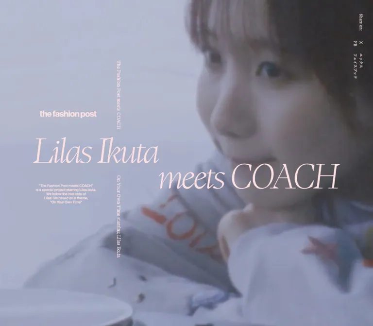
淡いピンクの大きなセリフ体と縦方向の補助文を、青みがかった映像に重ねたファッション特集。インタビューとルック紹介へ続く編集的な構成。
オリジナルサイトを見るLilas Ikuta meets COACH — Style Reference
Pale pink editorial lettering across a cool, intimate moving portrait.
Original URL: fashionpost.jp/special/coach/
Final URL: fashionpost.jp/special/coach/ — unchanged; supplied HTTP status 200.
Theme: photographic opening with blush typography; near-black text in subsequent content; a measured white footer.
Inspected: September 13, 2026, at 03:13 JST. The supplied retrieval timestamp is 2026-09-12T18:13:03.435Z.
Viewports: desktop 1440 × 1000 and mobile 390 × 844, in CSS pixels.
Scope: supplied opening-screen captures at both sizes, plus rendered DOM and computed-style records for the introduction, movie invitation, three-part interview, looks, profile, and footer. Later sections are documented from DOM evidence, not from visually inspected screenshots of those sections.
This is a fashion editorial special connecting a featured artist, a campaign film, an interview, and clothing stories. Its opening works like a magazine cover laid over moving footage: a small publication masthead, a very large staggered italic title, two narrow vertical captions, and a tiny centered explanatory paragraph. All foreground lettering shares the same pale pink. Cool daylight, soft photographic detail, and close framing supply the atmosphere.
The composition depends on unequal scale and deliberately separated positions. The publication logo and explanatory copy occupy a small left-hand area; the title reaches across the screen; vertical annotations interrupt the horizontal reading direction. On mobile, these elements are individually repositioned rather than reduced as one desktop canvas. The current page retains Spring 2025 campaign copy; that content date does not indicate that the supplied page is discontinued or that this document reconstructs an earlier version.
How to Read This Reference
- Measured means a value appears in the supplied rendered DOM or computed styles. Coordinates refer to the recorded state.
- Visual estimate means an approximate size, position, or color inferred from the original-page captures. It is not an extracted CSS declaration or calibrated pixel sample.
- Calculated means simple arithmetic using measured values, such as the combined height of five caption lines.
- Recommended means an implementation choice for reuse, including the CSS adaptation below. It is not a claim about the original source.
- Only
--padwas supplied as an original custom property. Other token names in this document are descriptive aliases. - Font-family records establish declared stacks, not the actual font file used for every glyph. The oversized title and publication logo have no corresponding font measurements in the supplied records.
The opening is visually well supported. Later element boxes include negative horizontal positions, expanded bounds, and coordinates far outside the viewport. These are state-dependent measurements and may include ancestor transforms. They are useful evidence of content and computed typography, but they are not a reliable blueprint for a settled article layout.
Tokens — Colors
Default Palette
| Name | Value | Suggested token | Evidence and role |
|---|---|---|---|
| Blush lettering | #FFE1E1 |
--color-blush |
Measured: rgb(255, 225, 225) on opening captions, share links, introduction copy, and the movie button. Visually consistent with the large title and masthead. |
| Editorial ink | #111111 |
--color-ink |
Measured: rgb(17, 17, 17) on interview, look, profile, and footer text. |
| Footer white | #FFFFFF |
--color-white |
Measured: solid footer background at both viewports. |
| Window haze | Approximately #AEB7C9 |
--color-film-light |
Visual estimate: pale blue-gray areas of the opening footage. An image color, not a verified UI fill. |
| Muted slate | Approximately #65758C |
--color-film-mid |
Visual estimate: clothing and middle-tone photographic areas. Useful only as a media-loading fallback. |
| Deep blue-gray | Approximately #303B4E |
--color-film-dark |
Visual estimate: dark hair and shadow areas. Not an additional text token. |
Blush is the opening's common foreground color, not a separate action accent. The hero title, supporting copy, and utilities differ through size and placement rather than color changes.
The photography contains a broad, changing tonal range. Do not reduce it to a three-color illustration or treat the estimated photographic colors as exact brand specifications. No source filter, overlay opacity, blend mode, or video color-grading recipe was supplied.
Most sampled text elements have transparent backgrounds. The white footer is confirmed; the background behind every interview and look section is not. A continuous white reading surface is a reasonable adaptation, but it must be labeled as such.
Theme Presets
No theme selector or alternate user-selectable palette is evidenced. The blush opening and dark article typography are content treatments, not verified light/dark modes.
Tokens — Typography
Editorial Serif
- Measured stack:
SuisseWorks, 'Noto Serif JP', serif. - Measured weight:
400throughout the sampled editorial text, including section headings. - Measured tracking:
normal. - Roles: vertical opening annotations, Japanese introduction, interview headings and answers, look captions, and profile text.
- Character: literary and restrained, with hierarchy created primarily through scale and generous leading.
Utility Sans Serif
- Measured stack for the opening explanation:
SuisseIntl, sans-serif. - Measured stack for footer credits:
SuisseIntl, 'Noto Serif JP', sans-serif. - Roles: the five-line opening explanation, production information, contact details, copyright, and the back-to-top label.
- Measured weight:
400.
The compact sans-serif explanation provides a useful counterpoint to the large italic title and the serif annotations. Preserve this distinction.
Hero Display Lettering and Masthead
The title is visibly a fine, high-contrast italic serif. Its first phrase, Lilas Ikuta, sits left and above meets COACH. The publication masthead is a compact, visibly heavier sans-serif wordmark.
Neither element has a supplied computed font-size or confirmed asset type. Do not identify the title as a particular font solely because surrounding text declares SuisseWorks. It could use a separate face or graphic asset. For reuse, choose a licensed display face by visual comparison, or use authorized title artwork when available.
Visual estimates: the desktop title has roughly 95–105px of visible letter height per phrase; mobile has roughly 30–34px. A starting CSS font size around 130–145px on desktop and 40–45px on mobile is an approximation, not a source measurement.
Type Scale
Values below are measured font size / line height unless marked otherwise.
| Role | Desktop | Mobile | Family or qualification |
|---|---|---|---|
| Hero display title | Approximately 130–145px |
Approximately 40–45px |
Recommended starting sizes; exact font and line height unverified |
| Opening explanation | 10 / 12px |
10 / 12px |
SuisseIntl stack |
| Vertical opening annotations | 13 / 13px |
10 / 10px |
Editorial serif |
| Share links | 11 / 11px |
10 / 10px |
Editorial serif |
| Japanese introduction | 17 / 34px |
13 / 26px |
Editorial serif |
| English chapter statement | 48 / 57.6px |
24 / 28.8px |
Editorial serif |
| Secondary English statement | 36 / 43.2px |
18 / 21.6px |
Editorial serif |
| Chapter label and topic index | 14 / 14px |
12 / 12px |
Editorial serif |
| Large Japanese chapter lead | 32 / 56px |
16 / 28px |
Editorial serif |
| Interview subsection heading | 24 / 36px |
21 / 36.75px |
Editorial serif |
| Interview questions and answers | 16 / 32px |
14 / 28px |
Editorial serif |
| Look captions and inline brand links | 12 / 24px |
10 / 20px |
Editorial serif |
| Profile label | 11 / 11px |
10 / 10px |
Editorial serif |
| Profile name and biography | 13 / 26px |
12 / 24px |
Editorial serif |
| Footer production credits | 13 / 24.05px |
10 / 18.5px |
Utility sans serif |
| Footer contact details | 13 / 24.05px |
11 / 20.35px |
Utility sans serif |
| Back-to-top label | 14 / 14px |
12 / 12px |
SuisseIntl stack |
| Copyright | 11 / 20.35px |
11 / 20.35px |
SuisseIntl stack |
The article repeatedly uses 2 as its line-height ratio. Keep this open reading rhythm when adapting the Japanese content. Mobile body copy shrinks moderately, while large chapter statements shrink by half.
The sampled HTML root is 16px; the body is 10px. A 10px body declaration does not make one rem equal to 10px. The Quick Start uses explicit tokens with a conventional root size.
Tokens — Spacing & Shapes
Spacing Scale
The evidence supports role-specific spacing rather than a universal eight-pixel grid.
| Use | Desktop | Mobile | Evidence |
|---|---|---|---|
| Page inset | 30px |
16px |
Original custom property --pad |
| Opening explanation line spacing | 12px |
12px |
Computed line height |
| Share-link internal gap | 16px |
Not retained in the same form | Desktop link is flex; mobile link is block |
| Interview heading bottom padding | 60px |
48px |
Computed padding |
| Answer left indent | 57px |
45px |
Computed padding |
| Answer bottom padding | 60px |
48px |
Computed padding |
| Look caption left padding | 4px |
4px |
Computed padding |
| Look caption bottom padding | 145px |
72px |
Computed padding |
| Look caption right padding | 0px |
16px |
Computed padding |
| Mobile introduction bottom padding | — | 43px |
Computed padding |
| Profile label-to-name gap | 16px |
12px |
Calculated from adjacent DOM boxes |
| Gap between footer credit blocks | 24px |
24px |
Calculated from adjacent DOM boxes |
Border Radius
The sampled text elements and movie button report 0px radius. The opening shows no cards, rounded panels, filled pills, or elevation shadows. Its structure comes from image coverage and typographic alignment.
A zero radius on the sampled movie button does not establish the shape of any unsampled icon or decorative child inside it.
Layout Measurements
| Element | Desktop 1440 × 1000 |
Mobile 390 × 844 |
Status |
|---|---|---|---|
| Opening coverage | Full viewport | Full viewport | Visually observed |
| Explanation block | x 168.31, y 560, width 177.20px |
x 29.80, y 478.66, width 177.20px |
Measured |
| Explanation total height | 60px |
60px |
Calculated: five 12px lines |
| Upper vertical annotation | x 450.5, y 173.05, 13 × 201.5px |
x 276, y 238, 10 × 155px |
Measured |
| Lower vertical annotation | x 450.5, y 535, 13 × 240.98px |
x 276, y 494.66, 10 × 185.38px |
Measured |
| X link box | x 1399, y 120.03, 11 × 111.58px |
x 364, y 71.48, 10 × 11.63px |
Measured |
| First title phrase | About x 95, y 400 |
About x 16, y 391 |
Visual estimate of visible lettering |
| Second title phrase | About x 642, y 500 |
About x 141, y 423 |
Visual estimate of visible lettering |
| Masthead | About 167 × 20px, near x 179, y 320 |
About 114 × 13px, near x 69, y 346 |
Visual estimate |
| Footer profile column | 370px wide |
358px wide at x 16 |
Measured, offscreen |
| Footer credit paragraph | 312px wide |
253px wide |
Measured, offscreen |
These measurements describe the two captured sizes. They do not reveal the original breakpoint or a continuous positioning formula.
Components
Full-Viewport Editorial Opening
Role: establish the collaboration and campaign mood before the longer editorial content.
The visible opening contains six parts:
- A photographic background covering the entire viewport.
- A small publication masthead.
- A two-phrase, staggered display title.
- A five-line explanatory block.
- Two separated vertical annotations.
- A share utility at the upper-right edge.
There is no visible conventional header bar, card container, or large filled CTA in these captures. The title and annotations sit directly on the image without individual backing panels.
The DOM contains later content even though the reported document height equals the viewport height. Do not implement the entire experience as a permanently clipped single screen merely because of that reported height.
Staggered Display Title
Role: carry the strongest identity and visual scale.
Keep Lilas Ikuta and meets COACH as distinct visual phrases. On desktop, the first occupies the left portion around the screen's vertical middle, and the second begins much farther right, approximately one visible-letter-height lower. On mobile, the first begins near the left inset and the second begins around 36% of the viewport width.
The title crosses the photographic subject rather than reserving a separate text panel. Its very thin strokes, long italic forms, and pale color are central to the design.
Recommended anatomy: one semantic h1 containing two independently positioned spans. This preserves a coherent accessible title while allowing the asymmetric visual arrangement. This markup is an adaptation; the original title markup was not supplied.
Publication Masthead and Explanation
Role: identify the publication and explain the collaboration quietly.
The masthead sits above the first title phrase. The explanation sits below it, centered within a narrow block. Its source wording is arranged as five lines:
“The Fashion Post meets COACH”
is a special project starring Lilas Ikuta.
We follow the real side of
Lilas’ life based on a theme,
“On Your Own Time”
The explanation remains 177.20px wide with 10px type at both tested sizes. It is repositioned on mobile rather than proportionally scaled. Preserve the short lines and quiet density when substituting equivalent copy.
Vertical Annotations
Role: introduce a second reading direction and connect the collaboration with its theme.
The upper annotation reads The Fashion Post meets COACH; the lower reads On Your Own Time starring Lilas Ikuta. They share a single horizontal anchor but are separated by the title region.
On desktop, their left edge is around 31.3% of the viewport width. On mobile, it moves to around 70.8%. Their font size changes from 13px to 10px.
The screenshots show sideways Latin text reading down the page. The source records do not identify whether this is implemented with writing mode or a transform. writing-mode: vertical-rl is a useful reproduction technique, not a verified original declaration.
Share Rail
Role: provide low-emphasis sharing links without disrupting the image.
Desktop shows Share on: and narrow vertical link treatments for X and Facebook, including the Japanese names エックス and フェイスブック. The two link columns sit close to the right edge. Mobile keeps the compact X, and FB labels while the Japanese expansions are not visible in the captured layout.
The supplied destinations are a Twitter/X intent URL and a Facebook sharer URL, each containing the original feature URL. Link activation, popup behavior, and focus appearance were not tested.
The measured link boxes are very small. A new implementation should provide larger, non-overlapping touch targets or an accessible share menu. Enlarging hit areas must not create overlapping invisible controls.
Chapter Index, Introduction, and Movie Invitation
Evidence level: rendered DOM; not visible in the supplied opening screenshots.
The chapter index contains #0 Introdcution, #1 Movie, #2 Interview, and #3 Look. Introdcution is the source spelling. The records establish these labels, but not their control semantics, active state, or navigation behavior.
The Japanese introduction provides the editorial context in serif text with double leading: 17 / 34px on desktop and 13 / 26px on mobile.
The movie invitation contains #1 Special Movie, the feature title, a 動画を見る button, publication credit, and Directed by Akari Eda. The button is a transparent flex element with a measured box of approximately 172.8 × 79px on desktop and 85 × 94.14px on mobile. Its sampled base font is 10px; that does not establish every child label's appearance.
No playback activation, player surface, modal, sound behavior, or close control is evidenced. Preserve the invitation as a real button in an adaptation, but specify the player interaction separately.
Interview Chapter Opening
Evidence level: rendered DOM and computed typography; settled visual composition unverified.
The interview opening combines a large English statement, a smaller English follow-up, a #2 Interview label, three numbered Japanese topics, and a larger Japanese lead.
This is a strong editorial hierarchy: a broad English statement introduces the mood, while the numbered Japanese topics make the long article navigable. Computed sizes range from 48px for the desktop English statement to 14px for the topic index. On mobile those become 24px and 12px respectively.
The recorded boxes are displaced and expanded. Do not turn their negative coordinates into permanent clipping or infer a specific rotation angle, parallax effect, or entrance sequence.
Interview Questions and Answers
Role: deliver the main reading experience through three numbered sections.
The article uses regular serif headings, questions introduced with a dash, and indented answers. A representative source heading is 1 自然と向き合い、自らのリズムを思い出す.
Questions and answers share the same type size and line height. Their distinction comes from the question marker and answer indentation rather than bold weight, colored bubbles, or separate cards.
Desktop answers have 57px left padding and 60px bottom padding. Mobile answers use 45px and 48px. Keep these proportions recognizable, but allow a smaller indent at exceptionally narrow widths or high text zoom if it prevents an impractically narrow reading column.
Look Chapter and Product Captions
Evidence level: text and computed styles; product-image arrangement unverified.
The look chapter contains an English introductory statement, #3 Look, two numbered outfit labels, a Japanese lead, and descriptive product captions. The copy discusses a sketch-print sweatshirt, denim styling, a Tabby bag, and Soho sneakers.
Captions mix descriptive prose with prices, item qualifications, and inline COACH(コーチ) links. Those links point to the women's new-arrivals category. This is editorial product information; the supplied evidence does not show a cart or purchasing controls within the feature.
Captions use 12 / 24px serif type on desktop and 10 / 20px on mobile. Their substantial bottom padding contributes to a spacious editorial rhythm.
No item-image sizes, gallery controls, zoom behavior, or carousel structure were supplied. Pairing an authorized photograph with its corresponding caption is a recommended component structure, not a verified gallery anatomy.
Profile and Footer
Evidence level: rendered DOM and computed styles.
The footer has a confirmed white background and near-black text. It contains the feature title, a profile label, the artist's name and biography, production information, brand contact details, a publication-home link, copyright, and (Back to top).
The profile occupies a 370px desktop column. On mobile it becomes 358px, matching the viewport minus two 16px insets. The production-credit paragraph stays narrower: 312px desktop and 253px mobile. This creates a denser, inset credit block distinct from the biography.
The original-page excerpt explicitly names movie director Akari Eda and photographer Shota KONO, among other editorial contributors. The excerpt ends partway through a later credit, so missing names cannot be reconstructed. These editorial credits do not establish web design or development authorship.
The footer includes © 2025 Weekday, Inc. All rights reserved. The back-to-top wording is present, but the sampled element is a paragraph; a working control and its scroll behavior were not demonstrated.
Tokens — Motion & Interaction
| Treatment | Evidence | Implementation consequence |
|---|---|---|
| Changing photographic background | Desktop and mobile captures show different subject poses and framing behind the same opening overlay | Preserve a moving-image role when authorized footage is available; a particular media element, loop, duration, and frame rate are unverified |
| Stable foreground composition | Title, captions, and share utility retain their positions across the supplied frames at each viewport | Keep editorial typography separate from the changing media layer |
| Opening entrance animation | No timing sequence or intermediate title state supplied | Do not assign a source fade, stagger, or reveal duration |
| Displaced later content | Offscreen DOM boxes include negative x positions and unusual bounds | Inspect settled states before reproducing transforms or scroll choreography |
| Chapter navigation | Numbered labels exist | Clickability, scrolling destination, active state, and keyboard behavior are unverified |
| Movie invitation | A native button with 動画を見る is recorded |
Activation and player behavior require separate implementation or inspection |
| Sharing | Two concrete share destinations are recorded | Native link destinations are supported; popup details are not |
| Back to top | Label appears in footer DOM | Interaction and scrolling duration are unverified |
| Hover and focus | No exercised states supplied | Define accessible states as recommendations |
Sampled elements report animation: none and transition: all. These records do not supply a useful transition duration, nor do they rule out motion in media, ancestor elements, or JavaScript-controlled composition.
Recommended motion approach: let the footage provide most of the movement. Keep reading text stable once presented. If adding a small control-state transition, a restrained 120–180ms opacity change is a reasonable adaptation, not a measured source token. Avoid adding automatic text drift or large scroll rotations without stronger evidence.
Surfaces
| Layer | Appearance | Confidence |
|---|---|---|
| Opening media | Full-bleed, softly detailed, cool photographic field | Visually observed |
| Opening title and annotations | Pale pink foreground on transparent local backgrounds | Captures plus measured supporting text colors |
| Opening utilities | Small text directly over the image | Visually observed |
| Interview and look text | Near-black serif hierarchy | Computed styles; background treatment not fully established |
| Footer | White surface with near-black serif and sans-serif information | Measured |
| Movie player or overlays | Not established | No activated state supplied |
There is no evidenced general card-elevation system. Avoid introducing shadows, rounded containers, or translucent glass panels around content that currently relies on image coverage and typography.
Imagery
The opening uses close, informal portraiture in a daylight interior. Original-page captures show a profile near a window, a loose pale garment with colored sketch-like marks, hands near the body, and a record player visible toward the lower-left in some desktop frames. The light is diffuse and the image is softly detailed rather than crisp studio product photography.
The blue-gray atmosphere makes the blush lettering feel warmer without introducing a saturated accent. Framing changes between a tighter portrait and a wider seated view. The mobile image fills the tall viewport and crops much of the surrounding room, making the figure more dominant.
A cover-style crop is consistent with the captures, but the original object-fit, source aspect ratio, focal-point values, and possible device-specific media sources were not supplied. Select focal points by checking both tested viewports instead of assuming centered cropping will always work.
Do not add artificial blur or a blue overlay by default. The appearance may already be present in the footage. Applying extra grading can reduce text contrast and erase useful garment detail.
Observed Asset References
| Asset role | Supplied evidence | Reuse guidance |
|---|---|---|
| Opening moving imagery | Three desktop and two mobile original-page captures | Use authorized footage and a carefully chosen poster frame |
| Publication masthead | Visible in the opening captures | Preserve the authorized wordmark; a typed substitute is only an approximation |
| Large feature title | Visible in the opening captures | Confirm whether the original is live type or artwork before matching it exactly |
| Interview and look imagery | No image-element measurements or later screenshots supplied | Do not infer image arrangement from the article text alone |
No original media, logo, title-artwork, or font-file URLs were included in the supplied evidence. File paths in the Quick Start are replacement placeholders, not discovered source assets.
Layout & Responsive Behavior
Opening Composition
The desktop design spreads its elements across a landscape canvas. The main title begins near the left edge but its second phrase reaches almost to the right utility rail. The small explanation stays beneath the first phrase, while the annotations share a separate vertical axis.
Mobile preserves the same parts and the same staggered title relationship. It does not convert the opening into a conventional centered heading followed by a large button. The masthead shifts toward the left-center; the explanation remains on the left; the annotation axis moves into the right third.
| Relationship | Desktop | Mobile |
|---|---|---|
| First phrase left edge | About 6.6vw |
About 4.1vw |
| Second phrase left edge | About 44.6vw |
About 36.2vw |
| Annotation left edge | Measured 31.3vw |
Measured 70.8vw |
| Explanation width | Fixed measured 177.20px |
Same measured width |
| Explanation font | 10px |
10px |
| Right utility inset | 30px |
16px |
| Share names | Abbreviations plus Japanese expansions | Compact abbreviations visible |
The nonuniform changes show why scaling a single desktop wrapper would be inaccurate. Use independently adjustable anchors.
Later Content
The measured article typography adapts by role: body text changes from 16px to 14px, subsection headings from 24px to 21px, and large English chapter statements from 48px to 24px. Leading remains generous. Footer columns become narrow-screen blocks, while production credits remain more compact than the profile.
There is also a recorded positional difference in the introduction/movie area: on desktop, the introduction paragraph begins at y 1420 and the movie button at y 1877; on mobile, the movie button begins near y 1219.56 and the introduction paragraph at y 1385. This suggests responsive rearrangement in the recorded composition, but it does not prove settled visual order or navigation order.
Scroll and Geometry Limitations
The reported document height is 1000px on desktop and 844px on mobile, yet footer rectangles occur roughly 22,876px and 18,980px below the recorded origin. The evidence therefore does not describe an ordinary document whose scroll height can be read directly from these values.
An internal or transformed presentation is plausible, but its mechanism is unverified. Do not report those footer coordinates as the user's actual scroll distance, and do not copy negative article offsets as permanent layout rules.
For a new implementation, normal document flow below a full-height opening is a practical baseline. Add any custom scroll choreography only after confirming that content remains reachable by keyboard, touch, browser search, and reduced-motion navigation. The 48rem breakpoint in the Quick Start is a recommendation; the original breakpoint is unknown.
Do’s and Don’ts
Do
- Keep the opening foreground consistently blush
#FFE1E1. - Preserve the two staggered title phrases and their large scale difference from supporting copy.
- Retain the small sans-serif explanation alongside serif annotations.
- Reposition mobile elements independently, especially the vertical annotation axis.
- Keep the original footage's soft daylight and intimate framing when authorized assets are available.
- Preserve double leading and indented answers in the interview.
- Treat prices and brand links as editorial captions.
- Distinguish confirmed footer styling from unverified article backgrounds.
- Keep offscreen geometry separate from reliable typography measurements.
Don’t
- Don’t replace the opening with a centered headline, card grid, and oversized filled CTA.
- Don’t identify the display font or logo format without supporting evidence.
- Don’t shrink the entire desktop composition to fit a phone.
- Don’t give every content block a rounded card or shadow.
- Don’t invent carousel controls, player modals, hover zoom, or scroll snapping.
- Don’t reproduce negative offscreen coordinates as static reading positions.
- Don’t add a blue filter automatically to footage that is already graded.
- Don’t interpret the campaign year as the inspection date.
- Don’t treat tiny visible link boxes as adequate mobile touch targets.
Recommended Implementation Additions
These are recommendations for reuse, not verified original features:
- Use one accessible
h1for the two title phrases and a logical heading hierarchy for chapters and interview topics. - Give chapter navigation real anchors and stable destinations in normal reading order.
- Provide a visible pause control for persistent background motion and a static poster for reduced-motion users. Hiding a video with CSS does not stop playback; pause it or avoid loading it in media logic.
- Check blush-text contrast over multiple footage frames. If needed, choose a safer crop or apply the lightest effective local treatment rather than assuming one frame represents the entire film.
- Provide clear keyboard focus and adequately spaced touch controls. Keep expanded hit areas from overlapping.
- Make the movie invitation operable with keyboard input and provide captions and appropriate playback controls for the activated film.
- Allow text resizing and short landscape viewports without trapping text inside a clipped hero.
- Keep essential content available if custom motion or media loading fails.
Agent Prompt Guide
Quick Color Reference
- Opening type and utilities: measured
#FFE1E1. - Article and footer text: measured
#111111. - Footer background: measured
#FFFFFF. - Photographic atmosphere: estimated pale blue-gray
#AEB7C9and slate#65758C; these are media references, not source CSS fills. - Surface separation: composition and whitespace; no evidenced general shadow system.
- Display face: fine italic serif; exact title font unverified.
Overall Prompt
“Create a fashion editorial special with a full-viewport moving portrait opening. Use cool, softly detailed daylight imagery and pale blush #FFE1E1 lettering. Place a small publication masthead above the first half of a very large, fine italic serif title. Stagger the second title phrase lower and far to the right. Add a tiny centered five-line sans-serif explanation, two separated vertical serif annotations, and a discreet share rail at the upper-right. On mobile, keep the staggered title but move the annotation axis into the right third. Continue into a numbered interview and look editorial using regular serif typography, double leading, indented answers, and restrained product captions. Use a white information footer. Do not invent unverified scroll choreography or player behavior.”
Example Component Prompts
- Opening title: “Arrange one accessible title as two visual phrases over a full-bleed portrait. Place the first toward the left and the second lower and farther right. Use fine italic serif forms in pale blush, without a panel, outline, or shadow.”
- Vertical annotations: “Place two short English serif captions on one vertical axis, separated by the main title region. Use
13pxon desktop and10pxon mobile. Reposition the axis from about 31% to about 71% of viewport width.” - Interview: “Build a regular-serif Japanese interview with numbered subsection headings, dash-led questions, and indented answers. Use desktop
16px/32pxreading text with a57pxanswer indent; adapt to14px/28pxand45pxon mobile. Avoid chat bubbles and card containers.” - Look caption: “Create a compact serif fashion caption combining descriptive prose, item prices, qualifications, and an inline brand link. Use
12px/24pxon desktop and10px/20pxon mobile, with substantial space after the caption. Choose image placement separately because the original gallery layout is unverified.” - Footer: “Create a white editorial footer with near-black text, a serif profile block, and a narrower sans-serif production-credit block. Use a
370pxdesktop biography column and full available width inside16pxmobile insets.”
Quick Start
CSS Custom Properties
This is a recommended visual adaptation, not recovered source code. Measured colors, body typography, insets, and interview spacing are retained. Hero font sizing, percentage anchors, reading-surface composition, and the breakpoint approximate the supplied evidence.
The example starts with a static poster. Replace the placeholder asset with authorized media and add controlled video playback separately. The display family remains generic because the original title face is not established. Declaring Suisse families does not provide their font files or a license.
:root {
  /* Measured foreground and footer colors */
  --color-blush: #ffe1e1;
  --color-ink: #111111;
  --color-white: #ffffff;

  /* Estimated photographic fallback, not a source UI fill */
  --color-film-mid: #65758c;

  /* Measured editorial stacks; display face remains unverified */
  --font-editorial: SuisseWorks, 'Noto Serif JP', serif;
  --font-utility: SuisseIntl, 'Noto Serif JP', sans-serif;
  --font-display: serif;

  /* The original --pad values are known at two viewports */
  --pad: 30px;
  --text-deck: 10px;
  --leading-deck: 12px;
  --text-rail: 13px;
  --text-share: 11px;
  --text-chapter: 48px;
  --text-heading: 24px;
  --leading-heading: 36px;
  --text-body: 16px;
  --leading-body: 32px;
  --text-caption: 12px;
  --leading-caption: 24px;
  --answer-indent: 57px;
  --answer-space: 60px;
  --caption-space: 145px;

  /* Recommended display scaling */
  --text-hero: clamp(64px, 9.5vw, 152px);
}

* {
  box-sizing: border-box;
}

body {
  margin: 0;
  color: var(--color-ink);
  background: var(--color-white);
  font-family: var(--font-editorial);
}

.editorial-hero {
  position: relative;
  isolation: isolate;
  min-height: 100svh;
  overflow: clip;
  color: var(--color-blush);
  background: var(--color-film-mid);
}

.hero-media {
  position: absolute;
  inset: 0;
  z-index: -1;
}

.hero-media > :is(img, video) {
  display: block;
  width: 100%;
  height: 100%;
  object-fit: cover;
  object-position: var(--hero-focal-point, 50% 50%);
}

.hero-brand {
  position: absolute;
  top: 32%;
  left: 12.5%;
  margin: 0;
  font: 700 22px/1 var(--font-utility);
}

.hero-title {
  position: absolute;
  inset: 0;
  margin: 0;
  font-family: var(--font-display);
  font-size: var(--text-hero);
  font-style: italic;
  font-weight: 400;
  line-height: 0.95;
}

.hero-title > span {
  position: absolute;
  white-space: nowrap;
}

.hero-title-first {
  top: 38.5%;
  left: 6.6%;
}

.hero-title-second {
  top: 48.5%;
  left: 44.6%;
}

.hero-deck {
  position: absolute;
  top: 56%;
  left: 11.688%;
  width: 177.203px;
  margin: 0;
  text-align: center;
  font: 400 var(--text-deck)/var(--leading-deck)
    var(--font-utility);
}

.hero-deck > span {
  display: block;
}

.hero-rail {
  position: absolute;
  left: 31.2847%;
  margin: 0;
  writing-mode: vertical-rl;
  text-orientation: mixed;
  white-space: nowrap;
  font: 400 var(--text-rail)/1 var(--font-editorial);
}

.hero-rail-top {
  top: 17.3047%;
}

.hero-rail-bottom {
  top: 53.5%;
}

.share-rail {
  position: absolute;
  top: 40px;
  right: var(--pad);
  font: 400 var(--text-share)/1 var(--font-editorial);
}

.share-caption {
  display: block;
  width: 1em;
  margin-left: auto;
  writing-mode: vertical-rl;
}

.share-links {
  display: flex;
  flex-direction: row-reverse;
  gap: 6px;
  margin-top: 28px;
}

.share-links a {
  display: flex;
  align-items: center;
  gap: 16px;
  color: inherit;
  text-decoration: none;
  writing-mode: vertical-rl;
}

/* Recommended normal-flow reading surface */
.editorial-reading {
  padding: clamp(64px, 10vw, 160px) var(--pad);
  color: var(--color-ink);
  background: var(--color-white);
}

.chapter-heading {
  margin: 0 0 64px;
  font: 400 var(--text-chapter)/1.2 var(--font-editorial);
}

.interview-copy {
  max-width: 710px;
  margin-left: auto;
  font-size: var(--text-body);
  line-height: var(--leading-body);
  overflow-wrap: break-word;
}

.interview-copy h2 {
  margin: 0;
  padding-bottom: var(--answer-space);
  font-size: var(--text-heading);
  font-weight: 400;
  line-height: var(--leading-heading);
}

.interview-question,
.interview-answer {
  margin: 0;
}

.interview-answer {
  padding-left: var(--answer-indent);
  padding-bottom: var(--answer-space);
}

.look-caption {
  max-width: 360px;
  margin: 0;
  padding: 0 0 var(--caption-space) 4px;
  font-size: var(--text-caption);
  line-height: var(--leading-caption);
}

.look-caption a {
  color: inherit;
  text-underline-offset: 0.2em;
}

/* Simplified footer composition using measured column widths */
.editorial-footer {
  display: grid;
  grid-template-columns: minmax(0, 1fr) 370px;
  gap: 64px;
  padding: 96px var(--pad) var(--pad);
  color: var(--color-ink);
  background: var(--color-white);
}

.footer-profile {
  grid-column: 2;
  font: 400 13px/26px var(--font-editorial);
}

.footer-credits {
  grid-column: 2;
  max-width: 312px;
  margin-left: auto;
  font: 400 13px/1.85 var(--font-utility);
}

/* Recommended focus treatment; source focus states were not supplied */
a:focus-visible,
button:focus-visible {
  outline: 2px solid currentColor;
  outline-offset: 5px;
}

/* Recommended breakpoint, not a recovered source media query */
@media (max-width: 48rem) {
  :root {
    --pad: 16px;
    --text-rail: 10px;
    --text-share: 10px;
    --text-chapter: 24px;
    --text-heading: 21px;
    --leading-heading: 36.75px;
    --text-body: 14px;
    --leading-body: 28px;
    --text-caption: 10px;
    --leading-caption: 20px;
    --answer-indent: 45px;
    --answer-space: 48px;
    --caption-space: 72px;
    --text-hero: clamp(32px, 11vw, 72px);
  }

  .hero-brand {
    top: 41%;
    left: 17.7%;
    font-size: 16px;
  }

  .hero-title-first {
    top: 45.7%;
    left: 4.1%;
  }

  .hero-title-second {
    top: 49.5%;
    left: 36.2%;
  }

  .hero-deck {
    top: 56.713%;
    left: 7.64%;
  }

  .hero-rail {
    left: 70.769%;
  }

  .hero-rail-top {
    top: 28.199%;
  }

  .hero-rail-bottom {
    top: 58.609%;
  }

  .share-rail {
    top: 16px;
  }

  .share-links {
    flex-direction: column;
    gap: 10px;
    margin-top: 12px;
  }

  .share-links a {
    display: block;
  }

  .share-name {
    display: none;
  }

  .interview-copy {
    max-width: none;
  }

  .look-caption {
    max-width: none;
    padding-right: 16px;
  }

  .editorial-footer {
    grid-template-columns: minmax(0, 1fr);
  }

  .footer-profile,
  .footer-credits {
    grid-column: 1;
  }

  .footer-profile {
    font-size: 12px;
    line-height: 24px;
  }

  .footer-credits {
    max-width: 253px;
    font-size: 10px;
    line-height: 18.5px;
  }
}

/* Recommended minimum composition height for short landscape screens */
@media (max-height: 36rem) and (min-width: 48rem) {
  .editorial-hero {
    min-height: 640px;
  }
}

/* Visual fallback only: media logic must also pause or omit video */
@media (prefers-reduced-motion: reduce) {
  .hero-media video {
    display: none;
  }
}
The following markup demonstrates the opening structure. The typed masthead is an approximation; replace it with an authorized wordmark for closer fidelity. The small share links reproduce visual proportions only; production touch-target treatment should follow the recommendations above.
<section class="editorial-hero" aria-labelledby="feature-title">
  <div class="hero-media" aria-hidden="true">
    <!-- Replace this placeholder with an authorized poster asset. -->
    <img src="/media/editorial-poster.jpg" alt="" fetchpriority="high">
  </div>

  <p class="hero-brand">the fashion post</p>

  <h1 class="hero-title" id="feature-title">
    <span class="hero-title-first">Lilas Ikuta</span>
    <span class="hero-title-second">meets COACH</span>
  </h1>

  <p class="hero-deck">
    <span>“The Fashion Post meets COACH”</span>
    <span>is a special project starring Lilas Ikuta.</span>
    <span>We follow the real side of</span>
    <span>Lilas’ life based on a theme,</span>
    <span>“On Your Own Time”</span>
  </p>

  <p class="hero-rail hero-rail-top">The Fashion Post meets COACH</p>
  <p class="hero-rail hero-rail-bottom">On Your Own Time starring Lilas Ikuta</p>

  <nav class="share-rail" aria-label="Share this feature">
    <span class="share-caption">Share on:</span>
    <div class="share-links">
      <a href="https://twitter.com/intent/tweet?url=https://fashionpost.jp/special/coach/"
         aria-label="Share on X">
        X <span class="share-name">エックス</span>
      </a>
      <a href="https://www.facebook.com/sharer/sharer.php?u=https://fashionpost.jp/special/coach/"
         aria-label="Share on Facebook">
        FB <span class="share-name">フェイスブック</span>
      </a>
    </div>
  </nav>
</section>

<!-- Demonstration copy and normal-flow layout, not recovered markup. -->
<section class="editorial-reading" aria-labelledby="interview-title">
  <p class="chapter-heading">#2 Interview</p>
  <div class="interview-copy">
    <h2 id="interview-title">1 Find your own rhythm</h2>
    <p class="interview-question">— Place an interview question here.</p>
    <p class="interview-answer">The answer uses an indent, regular serif type, and generous leading.</p>
  </div>
</section>
Tune the display font and title anchors together after loading the real face. Font metrics will change phrase widths substantially. Verify both supplied viewports and intermediate widths rather than forcing text to fit with horizontal distortion.
Tailwind v4 Token Mapping
Optional aliases for a project already using Tailwind v4. The original site's framework was not established. Define the custom properties above first.
@theme inline {
  --color-feature-blush: var(--color-blush);
  --color-feature-ink: var(--color-ink);
  --color-feature-white: var(--color-white);
  --color-feature-film: var(--color-film-mid);

  --font-feature-serif: var(--font-editorial);
  --font-feature-sans: var(--font-utility);
  --font-feature-display: var(--font-display);

  --text-feature-hero: var(--text-hero);
  --text-feature-chapter: var(--text-chapter);
  --text-feature-heading: var(--text-heading);
  --text-feature-body: var(--text-body);
  --text-feature-caption: var(--text-caption);

  --spacing-feature-page: var(--pad);
  --spacing-feature-answer: var(--answer-indent);
  --spacing-feature-answer-gap: var(--answer-space);
  --spacing-feature-caption-gap: var(--caption-space);
}
Sources & Evidence
- Lilas Ikuta meets COACH — original and final page: supplied current-page response, title, rendered text, links, element rectangles, computed styles, and
--padvalues. - Capture date: September 13, 2026, JST; supplied retrieval timestamp
2026-09-12T18:13:03.435Z. - Visual evidence: three original-page desktop opening captures at
1440 × 1000and two mobile opening captures at390 × 844. - DOM scope: introduction, movie invitation, interview index and three interview sections, look captions and brand links, profile, footer, copyright, and a partial production-credit excerpt.
- Collection conditions: the supplied process observed the initial page for at least five seconds and performed readiness checks for layout, text, animations, and image decoding. Perpetual animations were temporarily paused during readiness checks and resumed. These conditions do not establish every delayed state or interaction.
- Limits: no additional navigation was performed for this reference. Later sections lack corresponding visual captures; media URLs, title font, original breakpoints, transform values, transition durations, movie activation, share activation, and back-to-top behavior remain unverified. SharedWorkers and service workers were disabled during the supplied inspection.
This reference documents the currently supplied page evidence. Exact tokens are distinguished from visual estimates, and the reusable code supplies a practical adaptation where the original implementation is unknown.
# Lilas Ikuta meets COACH — Style Reference

> Pale pink editorial lettering across a cool, intimate moving portrait.

**Original URL:** [fashionpost.jp/special/coach/](https://fashionpost.jp/special/coach/)
**Final URL:** [fashionpost.jp/special/coach/](https://fashionpost.jp/special/coach/) — unchanged; supplied HTTP status `200`.
**Theme:** photographic opening with blush typography; near-black text in subsequent content; a measured white footer.
**Inspected:** September 13, 2026, at 03:13 JST. The supplied retrieval timestamp is `2026-09-12T18:13:03.435Z`.
**Viewports:** desktop `1440 × 1000` and mobile `390 × 844`, in CSS pixels.
**Scope:** supplied opening-screen captures at both sizes, plus rendered DOM and computed-style records for the introduction, movie invitation, three-part interview, looks, profile, and footer. Later sections are documented from DOM evidence, not from visually inspected screenshots of those sections.

This is a fashion editorial special connecting a featured artist, a campaign film, an interview, and clothing stories. Its opening works like a magazine cover laid over moving footage: a small publication masthead, a very large staggered italic title, two narrow vertical captions, and a tiny centered explanatory paragraph. All foreground lettering shares the same pale pink. Cool daylight, soft photographic detail, and close framing supply the atmosphere.

The composition depends on unequal scale and deliberately separated positions. The publication logo and explanatory copy occupy a small left-hand area; the title reaches across the screen; vertical annotations interrupt the horizontal reading direction. On mobile, these elements are individually repositioned rather than reduced as one desktop canvas. The current page retains Spring 2025 campaign copy; that content date does not indicate that the supplied page is discontinued or that this document reconstructs an earlier version.

## How to Read This Reference

- **Measured** means a value appears in the supplied rendered DOM or computed styles. Coordinates refer to the recorded state.
- **Visual estimate** means an approximate size, position, or color inferred from the original-page captures. It is not an extracted CSS declaration or calibrated pixel sample.
- **Calculated** means simple arithmetic using measured values, such as the combined height of five caption lines.
- **Recommended** means an implementation choice for reuse, including the CSS adaptation below. It is not a claim about the original source.
- Only `--pad` was supplied as an original custom property. Other token names in this document are descriptive aliases.
- Font-family records establish declared stacks, not the actual font file used for every glyph. The oversized title and publication logo have no corresponding font measurements in the supplied records.

The opening is visually well supported. Later element boxes include negative horizontal positions, expanded bounds, and coordinates far outside the viewport. These are state-dependent measurements and may include ancestor transforms. They are useful evidence of content and computed typography, but they are not a reliable blueprint for a settled article layout.

## Tokens — Colors

### Default Palette

| Name | Value | Suggested token | Evidence and role |
| --- | --- | --- | --- |
| Blush lettering | `#FFE1E1` | `--color-blush` | **Measured:** `rgb(255, 225, 225)` on opening captions, share links, introduction copy, and the movie button. Visually consistent with the large title and masthead. |
| Editorial ink | `#111111` | `--color-ink` | **Measured:** `rgb(17, 17, 17)` on interview, look, profile, and footer text. |
| Footer white | `#FFFFFF` | `--color-white` | **Measured:** solid footer background at both viewports. |
| Window haze | Approximately `#AEB7C9` | `--color-film-light` | **Visual estimate:** pale blue-gray areas of the opening footage. An image color, not a verified UI fill. |
| Muted slate | Approximately `#65758C` | `--color-film-mid` | **Visual estimate:** clothing and middle-tone photographic areas. Useful only as a media-loading fallback. |
| Deep blue-gray | Approximately `#303B4E` | `--color-film-dark` | **Visual estimate:** dark hair and shadow areas. Not an additional text token. |

Blush is the opening's common foreground color, not a separate action accent. The hero title, supporting copy, and utilities differ through size and placement rather than color changes.

The photography contains a broad, changing tonal range. Do not reduce it to a three-color illustration or treat the estimated photographic colors as exact brand specifications. No source filter, overlay opacity, blend mode, or video color-grading recipe was supplied.

Most sampled text elements have transparent backgrounds. The white footer is confirmed; the background behind every interview and look section is not. A continuous white reading surface is a reasonable adaptation, but it must be labeled as such.

### Theme Presets

No theme selector or alternate user-selectable palette is evidenced. The blush opening and dark article typography are content treatments, not verified light/dark modes.

## Tokens — Typography

### Editorial Serif

- **Measured stack:** `SuisseWorks, 'Noto Serif JP', serif`.
- **Measured weight:** `400` throughout the sampled editorial text, including section headings.
- **Measured tracking:** `normal`.
- **Roles:** vertical opening annotations, Japanese introduction, interview headings and answers, look captions, and profile text.
- **Character:** literary and restrained, with hierarchy created primarily through scale and generous leading.

### Utility Sans Serif

- **Measured stack for the opening explanation:** `SuisseIntl, sans-serif`.
- **Measured stack for footer credits:** `SuisseIntl, 'Noto Serif JP', sans-serif`.
- **Roles:** the five-line opening explanation, production information, contact details, copyright, and the back-to-top label.
- **Measured weight:** `400`.

The compact sans-serif explanation provides a useful counterpoint to the large italic title and the serif annotations. Preserve this distinction.

### Hero Display Lettering and Masthead

The title is visibly a fine, high-contrast italic serif. Its first phrase, `Lilas Ikuta`, sits left and above `meets COACH`. The publication masthead is a compact, visibly heavier sans-serif wordmark.

Neither element has a supplied computed font-size or confirmed asset type. Do not identify the title as a particular font solely because surrounding text declares SuisseWorks. It could use a separate face or graphic asset. For reuse, choose a licensed display face by visual comparison, or use authorized title artwork when available.

**Visual estimates:** the desktop title has roughly `95–105px` of visible letter height per phrase; mobile has roughly `30–34px`. A starting CSS font size around `130–145px` on desktop and `40–45px` on mobile is an approximation, not a source measurement.

### Type Scale

Values below are **measured font size / line height** unless marked otherwise.

| Role | Desktop | Mobile | Family or qualification |
| --- | --- | --- | --- |
| Hero display title | Approximately `130–145px` | Approximately `40–45px` | Recommended starting sizes; exact font and line height unverified |
| Opening explanation | `10 / 12px` | `10 / 12px` | SuisseIntl stack |
| Vertical opening annotations | `13 / 13px` | `10 / 10px` | Editorial serif |
| Share links | `11 / 11px` | `10 / 10px` | Editorial serif |
| Japanese introduction | `17 / 34px` | `13 / 26px` | Editorial serif |
| English chapter statement | `48 / 57.6px` | `24 / 28.8px` | Editorial serif |
| Secondary English statement | `36 / 43.2px` | `18 / 21.6px` | Editorial serif |
| Chapter label and topic index | `14 / 14px` | `12 / 12px` | Editorial serif |
| Large Japanese chapter lead | `32 / 56px` | `16 / 28px` | Editorial serif |
| Interview subsection heading | `24 / 36px` | `21 / 36.75px` | Editorial serif |
| Interview questions and answers | `16 / 32px` | `14 / 28px` | Editorial serif |
| Look captions and inline brand links | `12 / 24px` | `10 / 20px` | Editorial serif |
| Profile label | `11 / 11px` | `10 / 10px` | Editorial serif |
| Profile name and biography | `13 / 26px` | `12 / 24px` | Editorial serif |
| Footer production credits | `13 / 24.05px` | `10 / 18.5px` | Utility sans serif |
| Footer contact details | `13 / 24.05px` | `11 / 20.35px` | Utility sans serif |
| Back-to-top label | `14 / 14px` | `12 / 12px` | SuisseIntl stack |
| Copyright | `11 / 20.35px` | `11 / 20.35px` | SuisseIntl stack |

The article repeatedly uses `2` as its line-height ratio. Keep this open reading rhythm when adapting the Japanese content. Mobile body copy shrinks moderately, while large chapter statements shrink by half.

The sampled HTML root is `16px`; the body is `10px`. A `10px` body declaration does **not** make one `rem` equal to `10px`. The Quick Start uses explicit tokens with a conventional root size.

## Tokens — Spacing & Shapes

### Spacing Scale

The evidence supports role-specific spacing rather than a universal eight-pixel grid.

| Use | Desktop | Mobile | Evidence |
| --- | --- | --- | --- |
| Page inset | `30px` | `16px` | Original custom property `--pad` |
| Opening explanation line spacing | `12px` | `12px` | Computed line height |
| Share-link internal gap | `16px` | Not retained in the same form | Desktop link is flex; mobile link is block |
| Interview heading bottom padding | `60px` | `48px` | Computed padding |
| Answer left indent | `57px` | `45px` | Computed padding |
| Answer bottom padding | `60px` | `48px` | Computed padding |
| Look caption left padding | `4px` | `4px` | Computed padding |
| Look caption bottom padding | `145px` | `72px` | Computed padding |
| Look caption right padding | `0px` | `16px` | Computed padding |
| Mobile introduction bottom padding | — | `43px` | Computed padding |
| Profile label-to-name gap | `16px` | `12px` | Calculated from adjacent DOM boxes |
| Gap between footer credit blocks | `24px` | `24px` | Calculated from adjacent DOM boxes |

### Border Radius

The sampled text elements and movie button report `0px` radius. The opening shows no cards, rounded panels, filled pills, or elevation shadows. Its structure comes from image coverage and typographic alignment.

A zero radius on the sampled movie button does not establish the shape of any unsampled icon or decorative child inside it.

### Layout Measurements

| Element | Desktop `1440 × 1000` | Mobile `390 × 844` | Status |
| --- | --- | --- | --- |
| Opening coverage | Full viewport | Full viewport | Visually observed |
| Explanation block | `x 168.31`, `y 560`, width `177.20px` | `x 29.80`, `y 478.66`, width `177.20px` | Measured |
| Explanation total height | `60px` | `60px` | Calculated: five `12px` lines |
| Upper vertical annotation | `x 450.5`, `y 173.05`, `13 × 201.5px` | `x 276`, `y 238`, `10 × 155px` | Measured |
| Lower vertical annotation | `x 450.5`, `y 535`, `13 × 240.98px` | `x 276`, `y 494.66`, `10 × 185.38px` | Measured |
| X link box | `x 1399`, `y 120.03`, `11 × 111.58px` | `x 364`, `y 71.48`, `10 × 11.63px` | Measured |
| First title phrase | About `x 95`, `y 400` | About `x 16`, `y 391` | Visual estimate of visible lettering |
| Second title phrase | About `x 642`, `y 500` | About `x 141`, `y 423` | Visual estimate of visible lettering |
| Masthead | About `167 × 20px`, near `x 179`, `y 320` | About `114 × 13px`, near `x 69`, `y 346` | Visual estimate |
| Footer profile column | `370px` wide | `358px` wide at `x 16` | Measured, offscreen |
| Footer credit paragraph | `312px` wide | `253px` wide | Measured, offscreen |

These measurements describe the two captured sizes. They do not reveal the original breakpoint or a continuous positioning formula.

## Components

### Full-Viewport Editorial Opening

**Role:** establish the collaboration and campaign mood before the longer editorial content.

The visible opening contains six parts:

1. A photographic background covering the entire viewport.
2. A small publication masthead.
3. A two-phrase, staggered display title.
4. A five-line explanatory block.
5. Two separated vertical annotations.
6. A share utility at the upper-right edge.

There is no visible conventional header bar, card container, or large filled CTA in these captures. The title and annotations sit directly on the image without individual backing panels.

The DOM contains later content even though the reported document height equals the viewport height. Do not implement the entire experience as a permanently clipped single screen merely because of that reported height.

### Staggered Display Title

**Role:** carry the strongest identity and visual scale.

Keep `Lilas Ikuta` and `meets COACH` as distinct visual phrases. On desktop, the first occupies the left portion around the screen's vertical middle, and the second begins much farther right, approximately one visible-letter-height lower. On mobile, the first begins near the left inset and the second begins around `36%` of the viewport width.

The title crosses the photographic subject rather than reserving a separate text panel. Its very thin strokes, long italic forms, and pale color are central to the design.

**Recommended anatomy:** one semantic `h1` containing two independently positioned spans. This preserves a coherent accessible title while allowing the asymmetric visual arrangement. This markup is an adaptation; the original title markup was not supplied.

### Publication Masthead and Explanation

**Role:** identify the publication and explain the collaboration quietly.

The masthead sits above the first title phrase. The explanation sits below it, centered within a narrow block. Its source wording is arranged as five lines:

> “The Fashion Post meets COACH”
> is a special project starring Lilas Ikuta.
> We follow the real side of
> Lilas’ life based on a theme,
> “On Your Own Time”

The explanation remains `177.20px` wide with `10px` type at both tested sizes. It is repositioned on mobile rather than proportionally scaled. Preserve the short lines and quiet density when substituting equivalent copy.

### Vertical Annotations

**Role:** introduce a second reading direction and connect the collaboration with its theme.

The upper annotation reads `The Fashion Post meets COACH`; the lower reads `On Your Own Time starring Lilas Ikuta`. They share a single horizontal anchor but are separated by the title region.

On desktop, their left edge is around `31.3%` of the viewport width. On mobile, it moves to around `70.8%`. Their font size changes from `13px` to `10px`.

The screenshots show sideways Latin text reading down the page. The source records do not identify whether this is implemented with writing mode or a transform. `writing-mode: vertical-rl` is a useful reproduction technique, not a verified original declaration.

### Share Rail

**Role:** provide low-emphasis sharing links without disrupting the image.

Desktop shows `Share on:` and narrow vertical link treatments for X and Facebook, including the Japanese names `エックス` and `フェイスブック`. The two link columns sit close to the right edge. Mobile keeps the compact `X,` and `FB` labels while the Japanese expansions are not visible in the captured layout.

The supplied destinations are a Twitter/X intent URL and a Facebook sharer URL, each containing the original feature URL. Link activation, popup behavior, and focus appearance were not tested.

The measured link boxes are very small. A new implementation should provide larger, non-overlapping touch targets or an accessible share menu. Enlarging hit areas must not create overlapping invisible controls.

### Chapter Index, Introduction, and Movie Invitation

**Evidence level:** rendered DOM; not visible in the supplied opening screenshots.

The chapter index contains `#0 Introdcution`, `#1 Movie`, `#2 Interview`, and `#3 Look`. `Introdcution` is the source spelling. The records establish these labels, but not their control semantics, active state, or navigation behavior.

The Japanese introduction provides the editorial context in serif text with double leading: `17 / 34px` on desktop and `13 / 26px` on mobile.

The movie invitation contains `#1 Special Movie`, the feature title, a `動画を見る` button, publication credit, and `Directed by Akari Eda`. The button is a transparent flex element with a measured box of approximately `172.8 × 79px` on desktop and `85 × 94.14px` on mobile. Its sampled base font is `10px`; that does not establish every child label's appearance.

No playback activation, player surface, modal, sound behavior, or close control is evidenced. Preserve the invitation as a real button in an adaptation, but specify the player interaction separately.

### Interview Chapter Opening

**Evidence level:** rendered DOM and computed typography; settled visual composition unverified.

The interview opening combines a large English statement, a smaller English follow-up, a `#2 Interview` label, three numbered Japanese topics, and a larger Japanese lead.

This is a strong editorial hierarchy: a broad English statement introduces the mood, while the numbered Japanese topics make the long article navigable. Computed sizes range from `48px` for the desktop English statement to `14px` for the topic index. On mobile those become `24px` and `12px` respectively.

The recorded boxes are displaced and expanded. Do not turn their negative coordinates into permanent clipping or infer a specific rotation angle, parallax effect, or entrance sequence.

### Interview Questions and Answers

**Role:** deliver the main reading experience through three numbered sections.

The article uses regular serif headings, questions introduced with a dash, and indented answers. A representative source heading is `1   自然と向き合い、自らのリズムを思い出す`.

Questions and answers share the same type size and line height. Their distinction comes from the question marker and answer indentation rather than bold weight, colored bubbles, or separate cards.

Desktop answers have `57px` left padding and `60px` bottom padding. Mobile answers use `45px` and `48px`. Keep these proportions recognizable, but allow a smaller indent at exceptionally narrow widths or high text zoom if it prevents an impractically narrow reading column.

### Look Chapter and Product Captions

**Evidence level:** text and computed styles; product-image arrangement unverified.

The look chapter contains an English introductory statement, `#3 Look`, two numbered outfit labels, a Japanese lead, and descriptive product captions. The copy discusses a sketch-print sweatshirt, denim styling, a Tabby bag, and Soho sneakers.

Captions mix descriptive prose with prices, item qualifications, and inline `COACH(コーチ)` links. Those links point to the women's new-arrivals category. This is editorial product information; the supplied evidence does not show a cart or purchasing controls within the feature.

Captions use `12 / 24px` serif type on desktop and `10 / 20px` on mobile. Their substantial bottom padding contributes to a spacious editorial rhythm.

No item-image sizes, gallery controls, zoom behavior, or carousel structure were supplied. Pairing an authorized photograph with its corresponding caption is a recommended component structure, not a verified gallery anatomy.

### Profile and Footer

**Evidence level:** rendered DOM and computed styles.

The footer has a confirmed white background and near-black text. It contains the feature title, a profile label, the artist's name and biography, production information, brand contact details, a publication-home link, copyright, and `(Back to top)`.

The profile occupies a `370px` desktop column. On mobile it becomes `358px`, matching the viewport minus two `16px` insets. The production-credit paragraph stays narrower: `312px` desktop and `253px` mobile. This creates a denser, inset credit block distinct from the biography.

The original-page excerpt explicitly names movie director Akari Eda and photographer Shota KONO, among other editorial contributors. The excerpt ends partway through a later credit, so missing names cannot be reconstructed. These editorial credits do not establish web design or development authorship.

The footer includes `© 2025 Weekday, Inc. All rights reserved.` The back-to-top wording is present, but the sampled element is a paragraph; a working control and its scroll behavior were not demonstrated.

## Tokens — Motion & Interaction

| Treatment | Evidence | Implementation consequence |
| --- | --- | --- |
| Changing photographic background | Desktop and mobile captures show different subject poses and framing behind the same opening overlay | Preserve a moving-image role when authorized footage is available; a particular media element, loop, duration, and frame rate are unverified |
| Stable foreground composition | Title, captions, and share utility retain their positions across the supplied frames at each viewport | Keep editorial typography separate from the changing media layer |
| Opening entrance animation | No timing sequence or intermediate title state supplied | Do not assign a source fade, stagger, or reveal duration |
| Displaced later content | Offscreen DOM boxes include negative x positions and unusual bounds | Inspect settled states before reproducing transforms or scroll choreography |
| Chapter navigation | Numbered labels exist | Clickability, scrolling destination, active state, and keyboard behavior are unverified |
| Movie invitation | A native button with `動画を見る` is recorded | Activation and player behavior require separate implementation or inspection |
| Sharing | Two concrete share destinations are recorded | Native link destinations are supported; popup details are not |
| Back to top | Label appears in footer DOM | Interaction and scrolling duration are unverified |
| Hover and focus | No exercised states supplied | Define accessible states as recommendations |

Sampled elements report `animation: none` and `transition: all`. These records do not supply a useful transition duration, nor do they rule out motion in media, ancestor elements, or JavaScript-controlled composition.

**Recommended motion approach:** let the footage provide most of the movement. Keep reading text stable once presented. If adding a small control-state transition, a restrained `120–180ms` opacity change is a reasonable adaptation, not a measured source token. Avoid adding automatic text drift or large scroll rotations without stronger evidence.

## Surfaces

| Layer | Appearance | Confidence |
| --- | --- | --- |
| Opening media | Full-bleed, softly detailed, cool photographic field | Visually observed |
| Opening title and annotations | Pale pink foreground on transparent local backgrounds | Captures plus measured supporting text colors |
| Opening utilities | Small text directly over the image | Visually observed |
| Interview and look text | Near-black serif hierarchy | Computed styles; background treatment not fully established |
| Footer | White surface with near-black serif and sans-serif information | Measured |
| Movie player or overlays | Not established | No activated state supplied |

There is no evidenced general card-elevation system. Avoid introducing shadows, rounded containers, or translucent glass panels around content that currently relies on image coverage and typography.

## Imagery

The opening uses close, informal portraiture in a daylight interior. Original-page captures show a profile near a window, a loose pale garment with colored sketch-like marks, hands near the body, and a record player visible toward the lower-left in some desktop frames. The light is diffuse and the image is softly detailed rather than crisp studio product photography.

The blue-gray atmosphere makes the blush lettering feel warmer without introducing a saturated accent. Framing changes between a tighter portrait and a wider seated view. The mobile image fills the tall viewport and crops much of the surrounding room, making the figure more dominant.

A cover-style crop is consistent with the captures, but the original `object-fit`, source aspect ratio, focal-point values, and possible device-specific media sources were not supplied. Select focal points by checking both tested viewports instead of assuming centered cropping will always work.

Do not add artificial blur or a blue overlay by default. The appearance may already be present in the footage. Applying extra grading can reduce text contrast and erase useful garment detail.

### Observed Asset References

| Asset role | Supplied evidence | Reuse guidance |
| --- | --- | --- |
| Opening moving imagery | Three desktop and two mobile original-page captures | Use authorized footage and a carefully chosen poster frame |
| Publication masthead | Visible in the opening captures | Preserve the authorized wordmark; a typed substitute is only an approximation |
| Large feature title | Visible in the opening captures | Confirm whether the original is live type or artwork before matching it exactly |
| Interview and look imagery | No image-element measurements or later screenshots supplied | Do not infer image arrangement from the article text alone |

No original media, logo, title-artwork, or font-file URLs were included in the supplied evidence. File paths in the Quick Start are replacement placeholders, not discovered source assets.

## Layout & Responsive Behavior

### Opening Composition

The desktop design spreads its elements across a landscape canvas. The main title begins near the left edge but its second phrase reaches almost to the right utility rail. The small explanation stays beneath the first phrase, while the annotations share a separate vertical axis.

Mobile preserves the same parts and the same staggered title relationship. It does not convert the opening into a conventional centered heading followed by a large button. The masthead shifts toward the left-center; the explanation remains on the left; the annotation axis moves into the right third.

| Relationship | Desktop | Mobile |
| --- | --- | --- |
| First phrase left edge | About `6.6vw` | About `4.1vw` |
| Second phrase left edge | About `44.6vw` | About `36.2vw` |
| Annotation left edge | Measured `31.3vw` | Measured `70.8vw` |
| Explanation width | Fixed measured `177.20px` | Same measured width |
| Explanation font | `10px` | `10px` |
| Right utility inset | `30px` | `16px` |
| Share names | Abbreviations plus Japanese expansions | Compact abbreviations visible |

The nonuniform changes show why scaling a single desktop wrapper would be inaccurate. Use independently adjustable anchors.

### Later Content

The measured article typography adapts by role: body text changes from `16px` to `14px`, subsection headings from `24px` to `21px`, and large English chapter statements from `48px` to `24px`. Leading remains generous. Footer columns become narrow-screen blocks, while production credits remain more compact than the profile.

There is also a recorded positional difference in the introduction/movie area: on desktop, the introduction paragraph begins at `y 1420` and the movie button at `y 1877`; on mobile, the movie button begins near `y 1219.56` and the introduction paragraph at `y 1385`. This suggests responsive rearrangement in the recorded composition, but it does not prove settled visual order or navigation order.

### Scroll and Geometry Limitations

The reported document height is `1000px` on desktop and `844px` on mobile, yet footer rectangles occur roughly `22,876px` and `18,980px` below the recorded origin. The evidence therefore does not describe an ordinary document whose scroll height can be read directly from these values.

An internal or transformed presentation is plausible, but its mechanism is unverified. Do not report those footer coordinates as the user's actual scroll distance, and do not copy negative article offsets as permanent layout rules.

For a new implementation, normal document flow below a full-height opening is a practical baseline. Add any custom scroll choreography only after confirming that content remains reachable by keyboard, touch, browser search, and reduced-motion navigation. The `48rem` breakpoint in the Quick Start is a recommendation; the original breakpoint is unknown.

## Do’s and Don’ts

### Do

- Keep the opening foreground consistently blush `#FFE1E1`.
- Preserve the two staggered title phrases and their large scale difference from supporting copy.
- Retain the small sans-serif explanation alongside serif annotations.
- Reposition mobile elements independently, especially the vertical annotation axis.
- Keep the original footage's soft daylight and intimate framing when authorized assets are available.
- Preserve double leading and indented answers in the interview.
- Treat prices and brand links as editorial captions.
- Distinguish confirmed footer styling from unverified article backgrounds.
- Keep offscreen geometry separate from reliable typography measurements.

### Don’t

- Don’t replace the opening with a centered headline, card grid, and oversized filled CTA.
- Don’t identify the display font or logo format without supporting evidence.
- Don’t shrink the entire desktop composition to fit a phone.
- Don’t give every content block a rounded card or shadow.
- Don’t invent carousel controls, player modals, hover zoom, or scroll snapping.
- Don’t reproduce negative offscreen coordinates as static reading positions.
- Don’t add a blue filter automatically to footage that is already graded.
- Don’t interpret the campaign year as the inspection date.
- Don’t treat tiny visible link boxes as adequate mobile touch targets.

## Recommended Implementation Additions

These are recommendations for reuse, not verified original features:

- Use one accessible `h1` for the two title phrases and a logical heading hierarchy for chapters and interview topics.
- Give chapter navigation real anchors and stable destinations in normal reading order.
- Provide a visible pause control for persistent background motion and a static poster for reduced-motion users. Hiding a video with CSS does not stop playback; pause it or avoid loading it in media logic.
- Check blush-text contrast over multiple footage frames. If needed, choose a safer crop or apply the lightest effective local treatment rather than assuming one frame represents the entire film.
- Provide clear keyboard focus and adequately spaced touch controls. Keep expanded hit areas from overlapping.
- Make the movie invitation operable with keyboard input and provide captions and appropriate playback controls for the activated film.
- Allow text resizing and short landscape viewports without trapping text inside a clipped hero.
- Keep essential content available if custom motion or media loading fails.

## Agent Prompt Guide

### Quick Color Reference

- Opening type and utilities: measured `#FFE1E1`.
- Article and footer text: measured `#111111`.
- Footer background: measured `#FFFFFF`.
- Photographic atmosphere: estimated pale blue-gray `#AEB7C9` and slate `#65758C`; these are media references, not source CSS fills.
- Surface separation: composition and whitespace; no evidenced general shadow system.
- Display face: fine italic serif; exact title font unverified.

### Overall Prompt

“Create a fashion editorial special with a full-viewport moving portrait opening. Use cool, softly detailed daylight imagery and pale blush `#FFE1E1` lettering. Place a small publication masthead above the first half of a very large, fine italic serif title. Stagger the second title phrase lower and far to the right. Add a tiny centered five-line sans-serif explanation, two separated vertical serif annotations, and a discreet share rail at the upper-right. On mobile, keep the staggered title but move the annotation axis into the right third. Continue into a numbered interview and look editorial using regular serif typography, double leading, indented answers, and restrained product captions. Use a white information footer. Do not invent unverified scroll choreography or player behavior.”

### Example Component Prompts

1. **Opening title:** “Arrange one accessible title as two visual phrases over a full-bleed portrait. Place the first toward the left and the second lower and farther right. Use fine italic serif forms in pale blush, without a panel, outline, or shadow.”
2. **Vertical annotations:** “Place two short English serif captions on one vertical axis, separated by the main title region. Use `13px` on desktop and `10px` on mobile. Reposition the axis from about 31% to about 71% of viewport width.”
3. **Interview:** “Build a regular-serif Japanese interview with numbered subsection headings, dash-led questions, and indented answers. Use desktop `16px/32px` reading text with a `57px` answer indent; adapt to `14px/28px` and `45px` on mobile. Avoid chat bubbles and card containers.”
4. **Look caption:** “Create a compact serif fashion caption combining descriptive prose, item prices, qualifications, and an inline brand link. Use `12px/24px` on desktop and `10px/20px` on mobile, with substantial space after the caption. Choose image placement separately because the original gallery layout is unverified.”
5. **Footer:** “Create a white editorial footer with near-black text, a serif profile block, and a narrower sans-serif production-credit block. Use a `370px` desktop biography column and full available width inside `16px` mobile insets.”

## Quick Start

### CSS Custom Properties

This is a **recommended visual adaptation**, not recovered source code. Measured colors, body typography, insets, and interview spacing are retained. Hero font sizing, percentage anchors, reading-surface composition, and the breakpoint approximate the supplied evidence.

The example starts with a static poster. Replace the placeholder asset with authorized media and add controlled video playback separately. The display family remains generic because the original title face is not established. Declaring Suisse families does not provide their font files or a license.

```css
:root {
  /* Measured foreground and footer colors */
  --color-blush: #ffe1e1;
  --color-ink: #111111;
  --color-white: #ffffff;

  /* Estimated photographic fallback, not a source UI fill */
  --color-film-mid: #65758c;

  /* Measured editorial stacks; display face remains unverified */
  --font-editorial: SuisseWorks, 'Noto Serif JP', serif;
  --font-utility: SuisseIntl, 'Noto Serif JP', sans-serif;
  --font-display: serif;

  /* The original --pad values are known at two viewports */
  --pad: 30px;
  --text-deck: 10px;
  --leading-deck: 12px;
  --text-rail: 13px;
  --text-share: 11px;
  --text-chapter: 48px;
  --text-heading: 24px;
  --leading-heading: 36px;
  --text-body: 16px;
  --leading-body: 32px;
  --text-caption: 12px;
  --leading-caption: 24px;
  --answer-indent: 57px;
  --answer-space: 60px;
  --caption-space: 145px;

  /* Recommended display scaling */
  --text-hero: clamp(64px, 9.5vw, 152px);
}

* {
  box-sizing: border-box;
}

body {
  margin: 0;
  color: var(--color-ink);
  background: var(--color-white);
  font-family: var(--font-editorial);
}

.editorial-hero {
  position: relative;
  isolation: isolate;
  min-height: 100svh;
  overflow: clip;
  color: var(--color-blush);
  background: var(--color-film-mid);
}

.hero-media {
  position: absolute;
  inset: 0;
  z-index: -1;
}

.hero-media > :is(img, video) {
  display: block;
  width: 100%;
  height: 100%;
  object-fit: cover;
  object-position: var(--hero-focal-point, 50% 50%);
}

.hero-brand {
  position: absolute;
  top: 32%;
  left: 12.5%;
  margin: 0;
  font: 700 22px/1 var(--font-utility);
}

.hero-title {
  position: absolute;
  inset: 0;
  margin: 0;
  font-family: var(--font-display);
  font-size: var(--text-hero);
  font-style: italic;
  font-weight: 400;
  line-height: 0.95;
}

.hero-title > span {
  position: absolute;
  white-space: nowrap;
}

.hero-title-first {
  top: 38.5%;
  left: 6.6%;
}

.hero-title-second {
  top: 48.5%;
  left: 44.6%;
}

.hero-deck {
  position: absolute;
  top: 56%;
  left: 11.688%;
  width: 177.203px;
  margin: 0;
  text-align: center;
  font: 400 var(--text-deck)/var(--leading-deck)
    var(--font-utility);
}

.hero-deck > span {
  display: block;
}

.hero-rail {
  position: absolute;
  left: 31.2847%;
  margin: 0;
  writing-mode: vertical-rl;
  text-orientation: mixed;
  white-space: nowrap;
  font: 400 var(--text-rail)/1 var(--font-editorial);
}

.hero-rail-top {
  top: 17.3047%;
}

.hero-rail-bottom {
  top: 53.5%;
}

.share-rail {
  position: absolute;
  top: 40px;
  right: var(--pad);
  font: 400 var(--text-share)/1 var(--font-editorial);
}

.share-caption {
  display: block;
  width: 1em;
  margin-left: auto;
  writing-mode: vertical-rl;
}

.share-links {
  display: flex;
  flex-direction: row-reverse;
  gap: 6px;
  margin-top: 28px;
}

.share-links a {
  display: flex;
  align-items: center;
  gap: 16px;
  color: inherit;
  text-decoration: none;
  writing-mode: vertical-rl;
}

/* Recommended normal-flow reading surface */
.editorial-reading {
  padding: clamp(64px, 10vw, 160px) var(--pad);
  color: var(--color-ink);
  background: var(--color-white);
}

.chapter-heading {
  margin: 0 0 64px;
  font: 400 var(--text-chapter)/1.2 var(--font-editorial);
}

.interview-copy {
  max-width: 710px;
  margin-left: auto;
  font-size: var(--text-body);
  line-height: var(--leading-body);
  overflow-wrap: break-word;
}

.interview-copy h2 {
  margin: 0;
  padding-bottom: var(--answer-space);
  font-size: var(--text-heading);
  font-weight: 400;
  line-height: var(--leading-heading);
}

.interview-question,
.interview-answer {
  margin: 0;
}

.interview-answer {
  padding-left: var(--answer-indent);
  padding-bottom: var(--answer-space);
}

.look-caption {
  max-width: 360px;
  margin: 0;
  padding: 0 0 var(--caption-space) 4px;
  font-size: var(--text-caption);
  line-height: var(--leading-caption);
}

.look-caption a {
  color: inherit;
  text-underline-offset: 0.2em;
}

/* Simplified footer composition using measured column widths */
.editorial-footer {
  display: grid;
  grid-template-columns: minmax(0, 1fr) 370px;
  gap: 64px;
  padding: 96px var(--pad) var(--pad);
  color: var(--color-ink);
  background: var(--color-white);
}

.footer-profile {
  grid-column: 2;
  font: 400 13px/26px var(--font-editorial);
}

.footer-credits {
  grid-column: 2;
  max-width: 312px;
  margin-left: auto;
  font: 400 13px/1.85 var(--font-utility);
}

/* Recommended focus treatment; source focus states were not supplied */
a:focus-visible,
button:focus-visible {
  outline: 2px solid currentColor;
  outline-offset: 5px;
}

/* Recommended breakpoint, not a recovered source media query */
@media (max-width: 48rem) {
  :root {
    --pad: 16px;
    --text-rail: 10px;
    --text-share: 10px;
    --text-chapter: 24px;
    --text-heading: 21px;
    --leading-heading: 36.75px;
    --text-body: 14px;
    --leading-body: 28px;
    --text-caption: 10px;
    --leading-caption: 20px;
    --answer-indent: 45px;
    --answer-space: 48px;
    --caption-space: 72px;
    --text-hero: clamp(32px, 11vw, 72px);
  }

  .hero-brand {
    top: 41%;
    left: 17.7%;
    font-size: 16px;
  }

  .hero-title-first {
    top: 45.7%;
    left: 4.1%;
  }

  .hero-title-second {
    top: 49.5%;
    left: 36.2%;
  }

  .hero-deck {
    top: 56.713%;
    left: 7.64%;
  }

  .hero-rail {
    left: 70.769%;
  }

  .hero-rail-top {
    top: 28.199%;
  }

  .hero-rail-bottom {
    top: 58.609%;
  }

  .share-rail {
    top: 16px;
  }

  .share-links {
    flex-direction: column;
    gap: 10px;
    margin-top: 12px;
  }

  .share-links a {
    display: block;
  }

  .share-name {
    display: none;
  }

  .interview-copy {
    max-width: none;
  }

  .look-caption {
    max-width: none;
    padding-right: 16px;
  }

  .editorial-footer {
    grid-template-columns: minmax(0, 1fr);
  }

  .footer-profile,
  .footer-credits {
    grid-column: 1;
  }

  .footer-profile {
    font-size: 12px;
    line-height: 24px;
  }

  .footer-credits {
    max-width: 253px;
    font-size: 10px;
    line-height: 18.5px;
  }
}

/* Recommended minimum composition height for short landscape screens */
@media (max-height: 36rem) and (min-width: 48rem) {
  .editorial-hero {
    min-height: 640px;
  }
}

/* Visual fallback only: media logic must also pause or omit video */
@media (prefers-reduced-motion: reduce) {
  .hero-media video {
    display: none;
  }
}
```

The following markup demonstrates the opening structure. The typed masthead is an approximation; replace it with an authorized wordmark for closer fidelity. The small share links reproduce visual proportions only; production touch-target treatment should follow the recommendations above.

```html
<section class="editorial-hero" aria-labelledby="feature-title">
  <div class="hero-media" aria-hidden="true">
    <!-- Replace this placeholder with an authorized poster asset. -->
    <img src="/media/editorial-poster.jpg" alt="" fetchpriority="high">
  </div>

  <p class="hero-brand">the fashion post</p>

  <h1 class="hero-title" id="feature-title">
    <span class="hero-title-first">Lilas Ikuta</span>
    <span class="hero-title-second">meets COACH</span>
  </h1>

  <p class="hero-deck">
    <span>“The Fashion Post meets COACH”</span>
    <span>is a special project starring Lilas Ikuta.</span>
    <span>We follow the real side of</span>
    <span>Lilas’ life based on a theme,</span>
    <span>“On Your Own Time”</span>
  </p>

  <p class="hero-rail hero-rail-top">The Fashion Post meets COACH</p>
  <p class="hero-rail hero-rail-bottom">On Your Own Time starring Lilas Ikuta</p>

  <nav class="share-rail" aria-label="Share this feature">
    <span class="share-caption">Share on:</span>
    <div class="share-links">
      <a href="https://twitter.com/intent/tweet?url=https://fashionpost.jp/special/coach/"
         aria-label="Share on X">
        X <span class="share-name">エックス</span>
      </a>
      <a href="https://www.facebook.com/sharer/sharer.php?u=https://fashionpost.jp/special/coach/"
         aria-label="Share on Facebook">
        FB <span class="share-name">フェイスブック</span>
      </a>
    </div>
  </nav>
</section>

<!-- Demonstration copy and normal-flow layout, not recovered markup. -->
<section class="editorial-reading" aria-labelledby="interview-title">
  <p class="chapter-heading">#2 Interview</p>
  <div class="interview-copy">
    <h2 id="interview-title">1 Find your own rhythm</h2>
    <p class="interview-question">— Place an interview question here.</p>
    <p class="interview-answer">The answer uses an indent, regular serif type, and generous leading.</p>
  </div>
</section>
```

Tune the display font and title anchors together after loading the real face. Font metrics will change phrase widths substantially. Verify both supplied viewports and intermediate widths rather than forcing text to fit with horizontal distortion.

### Tailwind v4 Token Mapping

Optional aliases for a project already using Tailwind v4. The original site's framework was not established. Define the custom properties above first.

```css
@theme inline {
  --color-feature-blush: var(--color-blush);
  --color-feature-ink: var(--color-ink);
  --color-feature-white: var(--color-white);
  --color-feature-film: var(--color-film-mid);

  --font-feature-serif: var(--font-editorial);
  --font-feature-sans: var(--font-utility);
  --font-feature-display: var(--font-display);

  --text-feature-hero: var(--text-hero);
  --text-feature-chapter: var(--text-chapter);
  --text-feature-heading: var(--text-heading);
  --text-feature-body: var(--text-body);
  --text-feature-caption: var(--text-caption);

  --spacing-feature-page: var(--pad);
  --spacing-feature-answer: var(--answer-indent);
  --spacing-feature-answer-gap: var(--answer-space);
  --spacing-feature-caption-gap: var(--caption-space);
}
```

## Sources & Evidence

- [Lilas Ikuta meets COACH — original and final page](https://fashionpost.jp/special/coach/): supplied current-page response, title, rendered text, links, element rectangles, computed styles, and `--pad` values.
- **Capture date:** September 13, 2026, JST; supplied retrieval timestamp `2026-09-12T18:13:03.435Z`.
- **Visual evidence:** three original-page desktop opening captures at `1440 × 1000` and two mobile opening captures at `390 × 844`.
- **DOM scope:** introduction, movie invitation, interview index and three interview sections, look captions and brand links, profile, footer, copyright, and a partial production-credit excerpt.
- **Collection conditions:** the supplied process observed the initial page for at least five seconds and performed readiness checks for layout, text, animations, and image decoding. Perpetual animations were temporarily paused during readiness checks and resumed. These conditions do not establish every delayed state or interaction.
- **Limits:** no additional navigation was performed for this reference. Later sections lack corresponding visual captures; media URLs, title font, original breakpoints, transform values, transition durations, movie activation, share activation, and back-to-top behavior remain unverified. SharedWorkers and service workers were disabled during the supplied inspection.

This reference documents the currently supplied page evidence. Exact tokens are distinguished from visual estimates, and the reusable code supplies a practical adaptation where the original implementation is unknown.