DESIGN REFERENCE
Toyota Woven City|ウーブン・シティ 日本語公式サイト
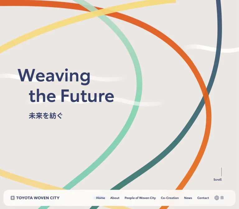
温かなグレージュと紺を基調に、多色の曲線がページを横断。大きな英字見出し、丸角のナビゲーション、建築写真のカルーセルで実証都市の未来像を伝える公式サイト。
オリジナルサイトを見るToyota Woven City — Style Reference
Broad colored threads connect a warm canvas, confident typography, and photographs of a city taking shape.
Website: Toyota Woven City — Japanese Home
Original URL: https://www.woven-city.global/jpn/
Final URL: https://www.woven-city.global/jpn/
Theme: light canvas, navy typography, multicolored decorative threads, and a dark footer.
Inspected: September 13, 2026, Japan Standard Time. The supplied evidence bundle was retrieved at 2026-09-12T18:51:33.774Z, equivalent to 2026-09-13 03:51:33.774 JST.
Viewports: desktop 1440 × 1000; mobile 390 × 844 CSS pixels. Measured document widths were 1425px and 375px, respectively.
Scope: the current Japanese corporate/project homepage: opening hero, navigation, introduction, Updates, Gallery, participating organizations, supporter strip, footer, and the visible cookie-consent interface. Three desktop and two mobile original-page captures were supplied, together with rendered DOM text and selected computed styles. Linked pages and control activation were not inspected.
Toyota Woven City expresses its weaving metaphor through large, smooth strands that curve beyond the viewport and continue through the page. Orange, mint, yellow, teal, blue, and pale pink sit against a warm greige background. Navy holds the functional hierarchy together: oversized English headings, Japanese explanatory copy, thin arrow icons, and compact navigation labels.
The composition is spacious and deliberately asymmetric. Headings occupy different horizontal positions from section to section; narrow text blocks sit within much wider page regions. White rounded surfaces organize news and company marks without turning every section into a conventional card grid. The gallery supplies a more tangible counterpoint: architectural photography, a prominent central image, and smaller neighboring frames.
This is a multi-section homepage with routes into project information, participation, news, and media resources. Preserve that information architecture when reusing the design. Its identity comes from the relationship between continuous thread artwork, restrained interface colors, offset typography, and real-world imagery.
How to Read This Reference
- Measured values come directly from the supplied computed styles or element rectangles. They describe the sampled elements, not necessarily their children or pseudo-elements.
- Calculated values are arithmetic relationships between supplied measurements, such as image ratios or gaps between rectangles.
- Estimated values describe visible appearance in the original screenshots. Approximate thread colors, gradient endpoints, and image clipping radii are not recovered CSS declarations.
- Recommended values are implementation choices for a reusable adaptation. Breakpoints, accessible target sizes, and the Quick Start layout formulas belong to this category unless stated otherwise.
- All custom-property names below are reference aliases. No original custom-property definitions were supplied.
- The cookie panel remains open in every original capture. It covers roughly the bottom quarter of the desktop viewport and most of the mobile viewport. Mobile page geometry is therefore often DOM-supported rather than visually confirmed.
- The screenshots and DOM are separate samples of a dynamic page. Use their dimensions and structural relationships without treating every recorded coordinate as an immutable layout rule.
Tokens — Colors
Default Palette
| Name | Value | Reference token | Evidence and role |
|---|---|---|---|
| Warm Greige | #ede7e4 |
--wc-canvas |
Measured: body background, rgb(237, 231, 228) |
| Woven Navy | #333f69 |
--wc-ink |
Measured: body text, headings, navigation, and desktop gallery arrow backgrounds |
| Interface White | #f9fafc |
--wc-on-ink |
Measured: CTA and footer link text; mobile gallery arrow backgrounds |
| Pale Periwinkle | #c9d1ed |
--wc-muted-on-ink |
Measured: footer cookie-consent utility text |
| Deep Utility Overlay | rgba(37, 45, 76, 0.65) |
--wc-utility-overlay |
Measured: back-to-top control background |
| Panel White | approximately #ffffff |
--wc-panel |
Visual estimate: organization panel and supporter strip |
| Soft Navy Endpoint | approximately #747b93 |
--wc-gradient-end |
Recommended approximation: lighter end of the visible CTA gradient |
The palette separates content from decoration. Navy is the principal text and action color. The bright strands provide movement and variety without becoming a collection of competing CTA colors.
Several sampled elements report a transparent background-color even though they appear filled in the screenshots. This applies to CTA links, news rows, and the footer. Their visible appearance may involve background images, pseudo-elements, or other layers that the supplied extraction does not describe. A transparent computed background is not evidence that the visible surface should be omitted.
Only this light presentation was supplied. The dark footer is a local surface, and the Motion control is not a theme selector.
Decorative Thread Palette
These are visual estimates for reuse, not sampled or source-declared colors. Transparency and overlapping strands change the visible result.
| Thread | Approximate value | Role |
|---|---|---|
| Orange | #e86a23 |
Strong sweeping strand in the hero |
| Mint | #89cfb5 |
Softer curved strand crossing the hero and lower page |
| Pale Yellow | #f7d978 |
Bright, translucent-looking arc across the canvas |
| Deep Teal | #467b7c |
Darker counterweight to the orange strand |
| Medium Blue | #6599da |
Visible through lower sections |
| Pale Salmon | #efafa4 |
Warm secondary strand near the organization area |
| Soft White | approximately #ffffff with reduced opacity |
Low-contrast horizontal waves |
Do not assign these decorative hues to categories, status messages, or navigation states without a separate content reason. Their observed purpose is compositional.
Consent Interface Colors
The cookie interface has its own visual system. Keep these values separate from the website’s brand tokens.
| Role | Measured value |
|---|---|
| Consent action background | #cccccc |
| Primary consent action text | #000000 |
| Other consent text and controls | #141414 |
| Policy and details links | #a80014 |
| Panel surface | Visually white; no panel background declaration supplied |
The gray buttons and red links belong to the consent widget. They are not evidence for gray primary CTAs or red navigation throughout the site.
Tokens — Typography
Source Family
The visible site elements declare:
font-family: 'Toyota Type W02', 'Noto Sans JP', sans-serif;
This stack is directly supported by computed styles. Font files, licensing details, and actual per-glyph font selection were not supplied. Preserve the named family only when the appropriate font asset is available; otherwise allow the documented fallback stack to operate.
The Latin typography is clean, substantial, and relatively compact. Japanese paragraphs use generous line spacing and very slightly negative tracking. Most section headings and navigation labels use weight 600; the H1 wrapper uses 700.
The root HTML element reports Times, but the body and visible site components override it. Times is not the visual heading family of this page.
Type Scale
| Role | Desktop | Mobile | Weight and tracking | Evidence |
|---|---|---|---|---|
| Base body size | 18px |
16px |
400, normal tracking |
Measured; body line height is reported as normal |
| Section heading | 64px / 71.68px |
36px / 40.32px |
600, normal tracking |
Measured H2 values; line-height ratio 1.12 |
| Intro subheading | 22px / 33px |
18px / 27px |
600; -0.22px / -0.18px |
Measured |
| Intro paragraph | 18px / 31.5px |
16px / 28px |
400; -0.225px / -0.2px |
Measured; line-height ratio 1.75 |
| Inventors paragraph | 18px / 31.5px |
15px / 27px |
400; -0.225px / -0.1875px |
Measured; mobile ratio 1.8 |
| Update row inherited text | 16px / 28px |
16px / 28px |
400, -0.16px |
Measured on row anchors; child labels may differ |
| Primary navigation | 14px, normal line height |
Offscreen menu links: 18px / 27px |
Desktop 600; mobile Home 600, other sampled items 400 |
Measured; mobile open state not shown |
| Standard CTA label | 18px, normal line height |
16px, normal line height |
400 |
Measured |
| Media Kits CTA label | 18px |
14px |
400 |
Measured exception |
| Footer links | 14px / 21px |
14px / 21px |
600 |
Measured |
| Footer consent utility | 14px / 28px |
14px / 28px |
400 |
Measured |
| Consent widget | 15px / 24px |
15px / 24px |
Sans-serif; controls and links 600 |
Measured, separate from branded typography |
Hero Headline Caveat
The H1 wrapper reports 36px / 36px on desktop and 32px / 32px on mobile. Those values do not explain the much larger visible English lettering in the desktop screenshot. Nested text, artwork, or transforms were not included in the selected style records.
- Desktop visual estimate: approximately
88–92pxfor the large English words, with roughly104pxbetween line starts. - Desktop visual estimate: approximately
32pxfor the Japanese supporting phrase,未来を紡ぐ. - Measured heading-group bounds: approximately
1265 × 272.19pxon desktop and327 × 140.67pxon mobile. - Mobile limitation: the consent panel covers the headline. The visible mobile display size cannot be independently verified from the original captures.
- Recommended adaptation: start with a
90pxdesktop display size and a48pxmobile size, then validate wrapping with the actual font. These are reconstruction choices, not recovered source declarations.
Keep the two-line English arrangement and its desktop indentation. Do not render the repeated wording in the flattened DOM as two visible headlines.
Tokens — Spacing & Shapes
The geometry favors large fields, compact utility controls, and a recurring 24px corner radius. There is no evidence of a single original spacing variable system; the following scale consolidates measured uses.
Spacing Scale
| Value | Observed use |
|---|---|
4px |
Calculated vertical gap between successive update rows; Motion label/icon gap |
8px |
Mobile outer navigation/footer inset; footer link icon gap |
12px |
Calculated gap between ordinary footer link lines; mobile intro subheading bottom padding |
16px |
Main mobile section gutter; desktop outer shell inset; CTA vertical padding |
20px |
Mobile news horizontal padding; desktop intro subheading bottom padding |
24px |
CTA horizontal padding; desktop news internal gap; mobile footer horizontal padding |
32px |
Effective mobile intro text inset from the document edge |
40px |
Desktop news horizontal padding; calculated desktop navigation link gaps; mobile organization-logo vertical gaps |
48px |
Desktop footer top and horizontal padding |
64px |
Calculated mobile gap between the end of the main region and footer start |
80px |
Desktop main section gutter |
96px |
Mobile footer top padding |
120px |
Calculated Gallery-to-organization-section gap at both measured sizes |
Border Radius
| Element | Value | Evidence |
|---|---|---|
| Standard CTA | 24px |
Measured |
| Update row | 24px |
Measured |
| Footer | 24px 24px 0 0 |
Measured |
| Motion control | 8px |
Measured |
| Back-to-top control | 8px |
Measured |
| Gallery arrows | 50% |
Measured |
| Gallery image clipping | Approximately 24px |
Screenshot estimate; sampled outer image buttons report 0px |
| Floating navigation | Approximately 24px |
Screenshot estimate; container styles not supplied |
| Consent buttons | 3.75px |
Measured |
| Mobile consent panel | Approximately 8px |
Screenshot estimate |
A 24px radius on a 68px CTA creates a rounded rectangle, not a full capsule. Retain that distinction.
Layout Measurements
| Element | Desktop | Mobile | Status |
|---|---|---|---|
| Document layout width | 1425px |
375px |
Measured within wider capture viewports |
| Reported document height | About 5144px |
About 6956px |
Supplied document-height values |
| Hero section | 1425 × 896px |
375 × 700px |
Measured |
| Hero section padding | 40px 80px 0 |
16px 16px 0 |
Measured |
| Standard section interior | 1265px wide |
343px wide |
Calculated from measured gutters |
| Intro paragraph width | 488.98px |
311px |
Measured |
| Header brand link | 225 × 20px |
180 × 16px |
Measured link rectangle |
| Navigation surface | About 1393 × 77px |
About 359 × 72px |
Screenshot estimate |
| Standard CTA | 240 × 68px |
208 × 68px |
Measured |
| Media Kits CTA | 290 × 68px |
290 × 68px |
Measured |
| Update row | 1265 × 76px |
343 × 118.5px |
Measured for supplied content |
| Active gallery item | 814.09 × 457.92px |
294.5 × 165.66px |
Measured |
| Neighbor gallery item | 712.33 × 400.67px |
229.70 × 129.20px |
Measured |
| Gallery arrow | 48 × 48px |
50 × 50px |
Measured |
| Footer | 1393 × 441px |
359 × 944px |
Measured rectangle |
The 15px difference between capture and layout widths is consistent with reserved scrollbar space in this browser environment. Do not reproduce it as a hardcoded page margin.
Components
Continuous Thread Field
Role: carries the weaving metaphor across otherwise restrained content sections.
Large curved bands enter and leave the viewport rather than stopping at card boundaries. The hero combines orange, mint, pale yellow, deep teal, and soft white strands. Lower captures introduce blue and salmon. Intersections visibly mix or soften colors, creating a sense of overlapping material without heavy shading.
Visual estimate: prominent desktop strands are roughly 20–26px thick. Their turning radius is much larger than the viewport’s small interface elements. Avoid tight curls, many thin hairlines, or a dense mesh behind paragraph text.
The supplied evidence does not identify the artwork’s rendering technology. SVG Bézier paths are a practical implementation recommendation, not a finding that the original uses SVG. Preserve smooth edges, generous curves, controlled transparency, and clipping beyond the page boundary.
Opening Hero
Role: introduces the project through a brief bilingual statement and the thread motif.
The observed hero is 896px high on desktop and 700px high on mobile. Its desktop heading group begins around x=80, y=310. The visible English text reads Weaving and the Future; the second line is indented by approximately 80px. The Japanese phrase aligns with that second line.
The composition leaves substantial open space to the right. It does not center all text inside a conventional promotional container. The DOM also includes a Scroll cue, but its visual treatment is obscured in the original opening captures.
The mobile heading-group rectangle starts at approximately x=24, y=246. Its wording is available in the DOM, but the panel prevents a reliable visual assessment of mobile line spacing and exact display size.
Motion Control
Role: offers a visible motion-related utility in the hero.
A small outlined rounded rectangle sits at the top right, with the label Motion and a pause-shaped icon. Its measured box is approximately 101.41 × 33px at both sizes. Padding is 3.5px 12px, gap 4px, and radius 8px.
The control is 16px from the top. It is approximately 16px from the desktop document edge and 8px from the mobile document edge. A 170ms background-color transition is declared.
No activation was supplied. Whether it pauses all moving artwork, changes its icon, persists a preference, or responds to system motion settings remains unverified.
Floating Navigation
Role: maintains project identity and access to the primary site sections.
A broad, inset, white-to-translucent rounded bar follows the opening hero. In later desktop and mobile captures it sits near the top of the viewport. This supports a persistent navigation behavior, but the exact sticky/fixed implementation and threshold were not supplied.
Desktop anatomy:
- Woven City symbol and wordmark at the left.
- Six text links: Home, About, People of Woven City, Co-Creation, News, and Contact.
- A thin globe icon at the right.
- A faint pale highlight behind the active Home item in the screenshot.
The measured desktop brand link is 225 × 20px. Navigation labels use 14px, weight 600, and calculated 40px gaps. The globe button’s measured box is 24 × 24px.
On mobile, the brand link becomes 180 × 16px and a 24 × 24px hamburger control replaces the visible desktop link row. The bar has approximately 8px outer side insets.
The mobile DOM includes navigation links positioned beyond the right edge of the document. This establishes an offscreen menu structure, not a verified open-menu appearance. The dark links visible behind the consent panel in the bottom mobile capture belong to the footer; they should not be treated as an opened navigation drawer.
Project Introduction
Role: explains Woven City as a mobility test course and leads to the About page.
The desktop H2, What is Woven City?, occupies the upper-left region. The Japanese subheading and paragraph sit farther right, beginning near x=776, with a measured width of approximately 489px. The CTA is right aligned with that copy block.
The subheading uses 22px / 33px, weight 600, followed by a paragraph at 18px / 31.5px. The text describes creating and testing products and services through the movement of people, goods, information, and energy.
Mobile changes the H2 to two lines at 36px / 40.32px. The copy occupies a 311px column at x=32, with 16px / 28px body text. The CTA remains aligned to the copy’s right edge.
The supplied screenshots do not expose the introduction’s full media area. Do not invent a particular image, video, or aspect ratio for the open region preceding the mobile copy.
Updates List
Role: presents current announcements as scannable routes to internal and external news.
Four linked rows appear in the supplied DOM. Their dates range from July 17 to September 3, 2026. Some include a category label such as Press Release or Toyota Times; others have no category label.
Desktop row anatomy:
- Date at the left.
- Optional compact, pale outlined category label.
- Flexible Japanese headline.
- Thin circled right arrow at the far edge.
Each measured row is 1265 × 76px, with 20px 40px padding, a 24px internal gap, and 24px corners. Successive rows have a calculated 4px separation. The screenshots show softly white surfaces over the thread field; their exact fill construction was not extracted.
Mobile rows are 343px wide and 118.5px high for this content, with 16px 20px padding. These heights establish increased wrapping, but the individual child rectangles were not supplied. A metadata line above the headline is a sensible adaptation, not a verified child-layout rule.
The Updates heading is offset to the right on desktop and mobile. Its following 詳しく知る CTA sits toward the left on desktop and toward the right on mobile. Preserve this variation in alignment instead of centering every section.
Rounded Arrow CTA
Role: connects summary content to deeper pages.
Use a rounded navy-to-muted-blue field, white text, and a fine outlined arrow circle at the right. The visible gradient is a screenshot observation; its exact stops were not supplied.
Measured anatomy:
- Desktop standard width:
240px. - Mobile standard width:
208px. - Height:
68pxat both sizes. - Padding:
16px 24px. - Radius:
24px. - Gap:
24pxdesktop;16pxmobile. - Label:
18pxdesktop; usually16pxmobile. - Text color:
#f9fafc. - Declared background transition:
170ms.
The outlined arrow circle appears about 36px across. This is a visual estimate consistent with the available height after vertical padding, not a supplied child measurement.
The Media Kits variant remains 290px wide on mobile and reduces its label to 14px. Do not force every CTA to share the standard mobile width.
Gallery
Role: makes the built environment tangible through a sequence of architectural photographs.
The current image is larger, brighter, and visually centered, with smaller, muted neighbors visible at the viewport edges. The screenshot shows a blue-sky exterior with industrial structural detail, while neighboring frames include planted architecture and a glass-and-steel interior.
The supplied DOM represents eight image buttons. Desktop text includes 1/8; that counter is absent from the mobile text extraction. This does not establish the exact counter-hiding rule.
Calculated geometry:
- All sampled image rectangles are approximately
16:9. - Desktop neighbor width is
87.5%of the active width. - Mobile neighbor width is approximately
78%of the active width.
The active desktop image measures approximately 814 × 458px; mobile measures 294.5 × 165.66px. Clip the visible image with approximately 24px corners. The sampled outer buttons themselves have a zero radius, so clipping may belong to an inner element.
Desktop arrows are navy 48px circles positioned over the side regions. Mobile arrows become near-white 50px circles below the images, grouped toward the left with a calculated 16px gap.
A white magnifying-glass control appears at the active image’s upper-right corner. It suggests enlargement, but no expanded-image state was supplied. Swiping, autoplay, looping behavior, keyboard interaction, and click results remain unverified.
The desktop screenshot places the active image near x=306, while the DOM sample records approximately x=405.5. This difference is a reason to preserve the centered visual relationship without copying the sampled x-coordinate into a fixed layout.
Inventors and Participating Organizations
Role: explains participation and shows the organizations associated with the project.
Desktop pairs an explanatory block on the left with a tall white rounded logo panel on the right. The explanatory paragraph is approximately 394px wide. The panel contains varied arrangements of two or three marks across its rows, preserving each logo’s own proportions and colors.
The supplied roster includes 24 linked organization marks, ending with Toyota and Woven by Toyota. These links are participation evidence, not website production credits.
Mobile changes the roster to a centered single column. Individual logo links share an approximate center at x=187.5, and successive marks have measured 40px clear vertical gaps. Their widths remain individually adjusted; they are not identical square tiles.
The mobile explanatory paragraph uses 15px / 27px within a 279px column. The much longer stacked roster contributes substantially to the mobile document’s increased height.
Several logo links have empty extracted link text. The supplied records do not include image alternative text or resolved accessible names, so those cannot be audited from this evidence.
Supported by Strip
Role: gives a separate, concise acknowledgement to supporting organizations.
The desktop screenshot shows a broad white rounded strip with a Supported by label followed by ENEOS, NTT, and Rinnai marks. It spans the standard desktop content width and appears approximately 73px high.
Keep the label smaller than the logos, preserve the marks’ brand colors, and provide generous horizontal separation. The strip’s mobile arrangement and individual logo asset URLs were not exposed by the supplied captures or element records.
Footer
Role: consolidates the sitemap, policy links, corporate destinations, social links, and consent access.
The footer is a large inset navy field with subtly varied tone and thread shapes visible within it. Its top corners are rounded; its lower corners are square in the measured styles.
Desktop geometry is 1393px wide with 48px 48px 4px padding. The layout shows a white vertical brand mark, followed by site-navigation, policy/corporate, and social-link columns. Small external-link symbols accompany appropriate destinations. A 40 × 40px back-to-top control sits near the upper-right corner.
Mobile uses 359px width, 96px 24px 24px padding, and a measured height of 944px. The primary sitemap is split into two columns; later policy, corporate, and social groups stack vertically. Link typography stays 14px / 21px rather than shrinking further.
The original footer text reads Woven by Toyota, Inc. © 2025 and includes a corporate link to Woven by Toyota. The displayed copyright year is not the inspection date. No website design or development credit was identified in the supplied original-page evidence.
Cookie-Consent Interface
Role: presents consent choices before ordinary browsing.
On desktop, a white bottom overlay occupies approximately the last 240px of the 1000px capture. It contains vendor branding at the lower left, explanatory text in the center, a details link, three stacked gray actions at the right, and a close icon near the upper-right edge.
On mobile, it becomes a tall centered white panel, approximately 359 × 601px, beginning near x=8, y=122. Its visible structure is:
- Vendor logo and close icon in a separated top row.
- Bold heading and explanatory paragraph.
- Policy link embedded in the paragraph.
- A separated Show details region.
- Accept all, Customize, and Reject all buttons stacked vertically.
Measured action sizes are 286 × 58px on desktop and 329 × 58px on mobile, with 15px padding and 3.75px corners. Screenshot outlines differ slightly from these DOM dimensions; retain the source measurements as element measurements rather than claiming pixel-identical raster bounds.
The mobile panel has a broad soft shadow. Its backdrop implementation was not supplied. No dismissal, customization, consent persistence, or focus behavior was exercised. Analyze this overlay as a separate interface layer, not as the homepage’s dominant design language.
Tokens — Motion & Interaction
| Treatment | Supplied declaration or evidence | What it establishes |
|---|---|---|
| Motion control feedback | background-color 0.17s |
A short color transition is defined; activated state unknown |
| CTA feedback | background 0.17s |
Background changes can transition; target appearance unknown |
| Update row feedback | background 0.17s |
Same short transition family as CTAs |
| Section heading reveal | opacity 0.5s |
Opacity transition exists; trigger and initial state unknown |
| Gallery image buttons | transition: 0.67s |
A 670ms transition is supplied; exact changing properties and runtime easing not established |
| Footer links | opacity 0.17s |
Short opacity feedback is defined |
| Skip link | opacity 0.33s, transform 0.33s cubic-bezier(0.73, 0, 0.83, 1) |
Explicit opacity and transform transition |
| Navigation persistence | Bar follows the hero initially and appears near the top after scrolling | Position behavior observed across captures; implementation mechanism unknown |
| Thread animation | Motion label and pause-shaped icon are visible | Motion affordance exists; speed, path changes, and scroll linkage were not observed directly |
The selected element records report no named keyframe animation. This does not prove the decorative field is static: its rendering elements and pseudo-elements were not included in those records.
Entries that only report transition: all do not provide a meaningful animation duration. Do not assign them invented timing values.
The capture process waited for document readiness, finite animation completion, text/layout stability, and visible image decoding within bounded time limits. It temporarily paused perpetual animations during readiness checks and resumed them afterward. These procedures improve capture stability but do not establish a complete motion sequence or prove that every delayed component appeared.
Recommended motion character: preserve the measured short UI feedback and longer gallery transition. If adding thread animation, keep it gentle and independently pausable. Its speed should be selected and tested as a new implementation decision.
Surfaces
| Layer | Appearance | Function and evidence |
|---|---|---|
| Page canvas | Solid warm greige | Measured body background |
| Thread field | Smooth colored curves with overlapping transparency | Visible decorative continuity; implementation unknown |
| Navigation | White-to-translucent rounded bar | Screenshot observation; opacity and blur values not supplied |
| News rows | Soft white rounded bands | Screenshot observation with measured row geometry |
| CTA | Navy-to-muted-blue rounded field | Visible gradient; exact stops unknown |
| Gallery | Photographs with rounded image clipping | Active image emphasized through size and clarity |
| Organization panel | White rounded field | Groups differently proportioned brand marks |
| Footer | Navy with subtle tonal variation and thread shapes | Strong closing surface with light text |
| Consent layer | White panel, gray actions, red links, mobile shadow | Independent consent interface |
The main site does not rely on a heavy shadow hierarchy. Separation primarily comes from light surfaces, large spacing, rounded boundaries, and the contrast between the canvas and footer. A glass-like appearance is visible in navigation, but no specific backdrop-filter declaration was supplied.
Imagery
The primary artwork is abstract and continuous; the primary photography is architectural and documentary. These two image families serve different purposes and should remain visually distinct.
Thread artwork provides a metaphor for connection. It has clean edges, broad arcs, and translucent intersections. It is not a background texture to repeat at a small scale.
The gallery photographs show the physical environment: bright sky, exposed structure, glass, interior volume, planting, and circulation space. Preserve clear skies and natural material colors. The active photo should retain its contrast while neighboring frames become quieter. Do not flatten every photograph under the same navy tint.
Organization marks retain their original aspect ratios and multicolored branding. Use containment rather than cropping. The footer’s white brand lockup is a distinct visible variant from the horizontal navy navigation identity.
Observed Asset References
The supplied evidence identifies subjects and destinations but contains no original image src paths. Do not invent filenames or download locations.
| Asset group | Original-page evidence | Implementation guidance |
|---|---|---|
| Horizontal Woven City identity | Navigation screenshots and measured brand-link boxes | Use an authorized horizontal asset at the observed proportions |
| White vertical identity | Desktop footer screenshot | Use a separate approved reversed lockup |
| Thread artwork | Hero, gallery-region, and footer-region screenshots | Use authored vector artwork or equivalent smooth rendering; source technology unknown |
| Gallery photographs | Eight image buttons in DOM; several architectural subjects visible | Preserve 16:9 framing and provide suitable resolutions |
| Organization marks | Linked roster and visible Toyota/Woven marks | Preserve individual proportions and colors |
| Supporter marks | ENEOS, NTT, and Rinnai visible in the supporter strip | Asset URLs and mobile arrangement not supplied |
| Utility symbols | Arrows, globe, hamburger, pause, magnifier, external-link symbols | Match the thin, restrained linework; no icon library was identified |
Layout & Responsive Behavior
The observed desktop and mobile layouts share the same major content order. The page does not become a separate abbreviated mobile experience.
| Concern | Desktop observation | Mobile observation |
|---|---|---|
| Outer navigation/footer inset | 16px |
8px |
| Main section gutter | 80px |
16px |
| Hero height | 896px |
700px |
| Navigation | Brand, six links, globe | Brand and hamburger; menu entries are offscreen in DOM |
| H2 scale | 64px / 1.12 |
36px / 1.12 |
| Intro | Narrow copy block on the right | 311px copy column below the heading region |
| Update rows | Wide, shallow bands | Narrower, taller rows with wrapped content |
| Standard CTA | 240px wide |
208px wide; same 68px height |
| Gallery | Large central frame; arrows over side regions | Smaller central frame; pale arrows underneath |
| Organization roster | Several logos across each row | One centered logo per row |
| Footer sitemap | Part of a broad multi-column footer | Two initial columns, followed by stacked groups |
| Consent | Bottom overlay | Tall centered panel covering most content |
No breakpoint declarations were supplied. The CSS Quick Start uses a recommended breakpoint rather than claiming to recover the original responsive rules.
Do not derive a universal hero-height formula from two measurements. The observed heights happen to be 104px and 144px shorter than their capture viewports, respectively; the original calculation could involve other constraints.
The mobile document is approximately 1812px taller than the desktop document. The vertically stacked organization roster is an important contributor. Avoid compressing it into an unobserved miniature logo grid simply to reduce page length.
Do’s and Don’ts
Do
- Keep
#ede7e4and#333f69as the central canvas/text pair. - Use large, smooth strands that continue beyond section and viewport boundaries.
- Preserve offset section headings and the desktop hero’s second-line indentation.
- Use the measured
64pxdesktop and36pxmobile section-heading sizes. - Maintain generous Japanese paragraph leading:
1.75for the main introduction. - Repeat
24pxcorners across CTAs, update rows, and large panel treatments. - Keep the gallery’s central image larger and clearer than its neighbors.
- Move mobile gallery controls below the images and retain their lighter surface.
- Preserve individual organization-logo proportions and the mobile single-column roster.
- Keep the consent widget’s typography and colors separate from the branded page.
Don’t
- Don’t reduce the whole homepage to a centered hero and uniform feature-card grid.
- Don’t treat the H1 wrapper’s
36pxvalue as the visible desktop display size. - Don’t introduce a bright orange CTA system merely because orange appears in the artwork.
- Don’t use small, repeated squiggles in place of the broad thread composition.
- Don’t crop company marks into uniform square tiles.
- Don’t replace the architectural imagery with unsupported futuristic city renders.
- Don’t infer an open mobile menu from footer links visible behind the consent panel.
- Don’t claim autoplay, swipe support, image enlargement, or a particular motion engine without interaction evidence.
- Don’t hardcode the browser’s
15pxlayout-width difference into the design. - Don’t copy the consent widget’s obstruction as a desirable reading experience.
Recommended Implementation Additions
These are recommendations for a new implementation, not verified features of the original page:
- Preserve the existing skip-link concept and test that focus makes it visible and moves users to the main content.
- Give the globe, menu, motion, gallery, magnifier, and back-to-top controls explicit accessible names.
- Keep small icons visually close to the source while expanding their interactive target to at least
44 × 44pxwhere practical. - Implement a real paused state for decorative motion, respect
prefers-reduced-motion, and pause JavaScript-driven animation separately from CSS animation. - If gallery enlargement is implemented, add keyboard navigation, Escape handling, focus containment, and focus restoration.
- Give gallery images descriptive alternatives and organization links meaningful accessible names. The supplied extraction is insufficient to assess the originals.
- Keep closed mobile navigation out of the tab order; offscreen positioning alone is insufficient.
- Let news rows grow for translated copy and larger text settings instead of enforcing the sampled heights as maximums.
- Preserve a readable fallback if translucent surfaces or custom fonts are unavailable.
- Test the page both with consent visible and after a choice, including short mobile screens where the panel must remain scrollable.
Agent Prompt Guide
Quick Color Reference
- Canvas: measured
#ede7e4. - Text, primary icons, and desktop gallery arrows: measured
#333f69. - Text on navy: measured
#f9fafc. - Footer secondary utility text: measured
#c9d1ed. - Panel white: approximately
#ffffff. - Decorative estimates: orange
#e86a23, mint#89cfb5, pale yellow#f7d978, teal#467b7c, blue#6599da, salmon#efafa4. - CTA treatment: navy-to-muted-blue gradient,
24pxcorners, thin outlined arrow circle. - Consent gray and red belong to a separate interface layer.
Overall Prompt
“Create a Japanese mobility-project homepage inspired by the supplied Toyota Woven City reference. Use a warm greige canvas #ede7e4, navy text #333f69, and broad translucent colored strands that curve across the page. Place a large two-line English statement toward the left of the opening hero, indent its second line on desktop, and add a short Japanese supporting phrase. Follow the hero with an inset rounded navigation bar that remains accessible while scrolling. Use offset English section headings, narrow Japanese text columns, shallow rounded announcement rows, navy gradient arrow CTAs, and a 16:9 architectural gallery with a larger central image and muted neighbors. Finish with a white organization-logo panel, a separate supporter strip, and a navy multi-column footer. On mobile, reduce section headings from 64px to 36px, collapse navigation, place gallery arrows below the imagery, and stack participating logos individually. Treat the thread colors and gradient endpoints as visual approximations, and implement reduced motion explicitly.”
Example Component Prompts
- Hero: “A warm greige, nearly viewport-height introduction with broad orange, mint, pale-yellow, and teal arcs crossing behind navy text. Use
Weavingabove an indentedthe Future, with未来を紡ぐunderneath. Keep abundant open space on the right. Use an approximately 90px desktop display size as an estimate, not the 36px H1 wrapper measurement.” - Navigation: “An inset white-to-translucent navigation bar with approximately 24px corners, a horizontal brand asset on the left, six restrained 14px semibold links, and a thin globe symbol. On mobile, retain the brand and show a hamburger within the same rounded bar.”
- Update row: “A soft white rounded announcement band over the thread artwork, with a date, optional pale outlined category tag, Japanese headline, and thin circled arrow. Desktop geometry is 76px high with 20px by 40px padding and 24px corners. Allow the mobile row to grow with wrapped text.”
- Gallery: “A bright architectural photograph in a large rounded 16:9 frame, with smaller muted photographs peeking from both sides. Desktop neighbors are approximately 87.5% of the active image size; mobile neighbors approximately 78%. Use dark circular arrows at the desktop sides and pale circular arrows underneath on mobile.”
- Organization roster: “A spacious white rounded panel containing brand marks at their individual proportions and original colors. Use varied two- and three-mark rows on desktop and a centered single column with 40px vertical clear gaps on mobile. Avoid individual logo cards and image cropping.”
Quick Start
CSS Custom Properties
This is a recommended appearance scaffold, not recovered source code. It uses measured core colors, type sizes, radii, and control dimensions, together with explicitly estimated headline and gradient values. Its 64rem breakpoint and viewport-based hero formulas are adaptation choices fitted to the two supplied sizes.
Apply these classes to semantic sections, navigation, links, buttons, and images. Supply authorized font and image assets separately. The thread field expects authored decorative artwork marked aria-hidden="true". Native horizontal scrolling is provided as a gallery fallback; application code must manage current-slide state, arrow actions, mobile navigation, Motion, and any enlargement dialog. Consent requires its own working integration.
:root {
  /* Measured brand colors */
  --wc-canvas: #ede7e4;
  --wc-ink: #333f69;
  --wc-on-ink: #f9fafc;
  --wc-muted-on-ink: #c9d1ed;
  --wc-utility-overlay: rgb(37 45 76 / 65%);

  /* Visual approximations */
  --wc-panel: #ffffff;
  --wc-gradient-end: #747b93;
  --wc-thread-orange: #e86a23;
  --wc-thread-mint: #89cfb5;
  --wc-thread-yellow: #f7d978;
  --wc-thread-teal: #467b7c;
  --wc-thread-blue: #6599da;
  --wc-thread-salmon: #efafa4;

  /* Measured font stack and section scale */
  --wc-font: 'Toyota Type W02', 'Noto Sans JP', sans-serif;
  --wc-body-size: 18px;
  --wc-heading-size: 64px;
  --wc-body-leading: 1.75;
  --wc-heading-leading: 1.12;

  /* Estimated visible hero size */
  --wc-display-size: 90px;

  /* Measured geometry */
  --wc-gutter: 80px;
  --wc-shell-inset: 16px;
  --wc-radius: 24px;
  --wc-radius-small: 8px;
  --wc-cta-width: 240px;
  --wc-cta-height: 68px;

  /* Supplied transition durations */
  --wc-fast: 170ms;
  --wc-reveal: 500ms;
  --wc-gallery-duration: 670ms;
}

body {
  margin: 0;
}

.woven-page,
.woven-page * {
  box-sizing: border-box;
}

.woven-page {
  position: relative;
  isolation: isolate;
  min-height: 100vh;
  color: var(--wc-ink);
  background: var(--wc-canvas);
  font-family: var(--wc-font);
  font-size: var(--wc-body-size);
  font-weight: 400;
  line-height: var(--wc-body-leading);
}

.woven-page button {
  font: inherit;
}

.woven-page img {
  display: block;
  max-width: 100%;
}

.page-section {
  padding-inline: var(--wc-gutter);
  margin-block: 120px;
}

.section-title {
  margin: 0 0 56px;
  font-size: var(--wc-heading-size);
  font-weight: 600;
  line-height: var(--wc-heading-leading);
  transition: opacity var(--wc-reveal);
}

.thread-field {
  position: absolute;
  inset: 0;
  z-index: -1;
  overflow: clip;
  pointer-events: none;
}

.thread-field svg {
  display: block;
  width: 100%;
  height: 100%;
}

.thread-field path {
  fill: none;
  stroke-width: 24px;
  vector-effect: non-scaling-stroke;
}

/* Recommended hero geometry; original formulas were not supplied. */
.hero {
  position: relative;
  display: grid;
  align-items: center;
  min-height: calc(100svh - 104px);
  padding: 40px var(--wc-gutter) 0;
}

.hero-title {
  margin: 0;
  font-size: var(--wc-display-size);
  font-weight: 700;
  line-height: 1.15;
}

.hero-title__line {
  display: block;
}

.hero-title__line + .hero-title__line,
.hero-subtitle {
  margin-inline-start: 80px;
}

.hero-subtitle {
  margin-block: 28px 0;
  font-size: 32px;
  font-weight: 700;
  line-height: 1.5;
}

.motion-toggle {
  position: absolute;
  inset-block-start: 16px;
  inset-inline-end: var(--wc-shell-inset);
  display: inline-flex;
  align-items: center;
  gap: 4px;
  min-height: 33px;
  padding: 3.5px 12px;
  border: 1px solid #a3add3;
  border-radius: var(--wc-radius-small);
  color: var(--wc-ink);
  background: transparent;
  cursor: pointer;
  transition: background-color var(--wc-fast);
}

/* Sticky positioning approximates the supplied scroll states. */
.site-nav {
  position: sticky;
  top: 16px;
  z-index: 20;
  display: flex;
  align-items: center;
  gap: 40px;
  min-height: 77px;
  margin: 16px var(--wc-shell-inset) 0;
  padding: 16px 32px;
  border-radius: var(--wc-radius);
  background: linear-gradient(
    110deg,
    rgb(249 250 252 / 97%),
    rgb(249 250 252 / 88%)
  );
}

.site-brand {
  flex: 0 0 225px;
  color: var(--wc-ink);
  text-decoration: none;
}

.site-brand img {
  width: 225px;
  height: auto;
}

.site-nav__links {
  display: flex;
  align-items: center;
  gap: 40px;
  margin-inline-start: auto;
}

.site-nav__links a {
  color: var(--wc-ink);
  font-size: 14px;
  font-weight: 600;
  line-height: 1.3;
  text-decoration: none;
}

/* Recommended larger hit area around a 24px visual icon. */
.icon-control {
  display: grid;
  place-items: center;
  flex: 0 0 44px;
  width: 44px;
  height: 44px;
  padding: 10px;
  border: 0;
  color: var(--wc-ink);
  background: transparent;
  cursor: pointer;
}

.icon-control svg {
  width: 24px;
  height: 24px;
}

.menu-toggle {
  display: none;
}

.intro-copy {
  max-width: 489px;
  margin-inline-start: auto;
  margin-inline-end: 80px;
}

.intro-copy h3 {
  margin: 0;
  padding-bottom: 20px;
  font-size: 22px;
  font-weight: 600;
  line-height: 1.5;
  letter-spacing: -0.01em;
}

.intro-copy p {
  margin: 0;
  line-height: 1.75;
  letter-spacing: -0.0125em;
}

.action-link {
  display: flex;
  align-items: center;
  justify-content: space-between;
  gap: 24px;
  width: var(--wc-cta-width);
  max-width: 100%;
  min-height: var(--wc-cta-height);
  padding: 16px 24px;
  border: 0;
  border-radius: var(--wc-radius);
  color: var(--wc-on-ink);
  background: linear-gradient(
    105deg,
    var(--wc-ink),
    var(--wc-gradient-end)
  );
  font-size: 18px;
  line-height: 1.5;
  text-decoration: none;
  transition: background var(--wc-fast);
}

.action-link__arrow {
  display: grid;
  place-items: center;
  flex: 0 0 36px;
  width: 36px;
  height: 36px;
  border: 1px solid currentColor;
  border-radius: 50%;
}

.action-link--media {
  width: 290px;
}

.intro-copy .action-link {
  margin-block-start: 24px;
  margin-inline-start: auto;
}

.updates-title {
  width: max-content;
  margin-inline-start: auto;
  margin-inline-end: 8%;
}

.updates-list {
  display: grid;
  gap: 4px;
}

/* Grid is an adaptation; the sampled original row uses flex. */
.update-row {
  display: grid;
  grid-template-columns: auto minmax(0, 1fr) 36px;
  align-items: center;
  gap: 24px;
  min-height: 76px;
  padding: 20px 40px;
  border-radius: var(--wc-radius);
  color: var(--wc-ink);
  background: rgb(255 255 255 / 76%);
  font-size: 16px;
  line-height: 1.75;
  letter-spacing: -0.01em;
  text-decoration: none;
  transition: background var(--wc-fast);
}

.update-meta {
  display: flex;
  align-items: center;
  flex-wrap: wrap;
  gap: 16px;
}

.update-badge {
  padding: 1px 7px;
  border: 1px solid #c9d1ed;
  border-radius: 4px;
  background: #edf0fa;
  font-size: 14px;
  line-height: 1.4;
}

.update-arrow {
  display: grid;
  place-items: center;
  width: 36px;
  height: 36px;
  border: 1px solid currentColor;
  border-radius: 50%;
}

/* Native scrolling is a fallback, not a recovered carousel engine. */
.gallery {
  --slide-width: min(814px, 57.13vw);
  --neighbor-scale: 0.875;
  margin-block: 120px;
}

.gallery .section-title {
  margin-inline: 12.7% var(--wc-gutter);
}

.gallery-stage {
  position: relative;
}

.gallery-track {
  display: flex;
  align-items: center;
  gap: 40px;
  overflow-x: auto;
  scroll-snap-type: x mandatory;
  padding-inline: max(16px, calc((100% - var(--slide-width)) / 2));
}

.gallery-slide {
  flex: 0 0 var(--slide-width);
  padding: 0;
  border: 0;
  background: transparent;
  scroll-snap-align: center;
  opacity: 0.5;
  transform: scale(var(--neighbor-scale));
  transition:
    transform var(--wc-gallery-duration),
    opacity var(--wc-gallery-duration);
}

.gallery-slide.is-current {
  opacity: 1;
  transform: scale(1);
}

.gallery-slide img {
  width: 100%;
  aspect-ratio: 16 / 9;
  object-fit: cover;
  border-radius: var(--wc-radius);
}

.gallery-controls {
  position: absolute;
  inset: 50% 9.6% auto;
  display: flex;
  justify-content: space-between;
  transform: translateY(-50%);
  pointer-events: none;
}

.gallery-arrow {
  display: grid;
  place-items: center;
  width: 48px;
  height: 48px;
  padding: 0;
  border: 0;
  border-radius: 50%;
  color: var(--wc-on-ink);
  background: var(--wc-ink);
  cursor: pointer;
  pointer-events: auto;
}

.organization-layout {
  display: grid;
  grid-template-columns: minmax(0, 1fr) minmax(0, 1.4fr);
  align-items: start;
  gap: 40px;
}

.organization-copy {
  max-width: 394px;
  margin-inline: auto;
}

.organization-panel {
  display: flex;
  justify-content: center;
  align-items: center;
  flex-wrap: wrap;
  gap: 64px 40px;
  padding: 64px 40px;
  border-radius: var(--wc-radius);
  background: var(--wc-panel);
}

.organization-panel img {
  width: var(--logo-width, 180px);
  max-width: 100%;
  height: auto;
  object-fit: contain;
}

.support-strip {
  display: flex;
  align-items: center;
  flex-wrap: wrap;
  gap: 32px 64px;
  margin-block-start: 120px;
  padding: 20px 40px;
  border-radius: var(--wc-radius);
  background: var(--wc-panel);
}

.site-footer {
  display: grid;
  grid-template-columns: 0.9fr repeat(3, minmax(0, 1fr));
  gap: 40px;
  margin-inline: var(--wc-shell-inset);
  padding: 48px 48px 24px;
  border-radius: 24px 24px 0 0;
  color: var(--wc-on-ink);
  background: linear-gradient(110deg, var(--wc-ink), #59617f);
}

.footer-links {
  display: grid;
  align-content: start;
  gap: 12px;
}

.footer-links a {
  color: inherit;
  font-size: 14px;
  font-weight: 600;
  line-height: 21px;
  text-decoration: none;
  transition: opacity var(--wc-fast);
}

.footer-utilities {
  grid-column: 1 / -1;
  color: var(--wc-muted-on-ink);
  font-size: 14px;
  line-height: 28px;
}

/* Recommended keyboard and hover feedback. */
.woven-page :focus-visible {
  outline: 2px solid currentColor;
  outline-offset: 4px;
}

@media (hover: hover) {
  .update-row:hover {
    background: #ffffff;
  }

  .site-nav__links a:hover,
  .footer-links a:hover {
    text-decoration: underline;
    text-underline-offset: 4px;
  }
}

/* Recommended breakpoint; the original breakpoint is unknown. */
@media (max-width: 64rem) {
  :root {
    --wc-body-size: 16px;
    --wc-heading-size: 36px;
    --wc-display-size: 48px;
    --wc-gutter: 16px;
    --wc-shell-inset: 8px;
    --wc-cta-width: 208px;
  }

  .hero {
    min-height: calc(100svh - 144px);
    padding: 16px 24px 0;
  }

  .hero-title__line + .hero-title__line,
  .hero-subtitle {
    margin-inline-start: 0;
  }

  .hero-subtitle {
    margin-block-start: 20px;
    font-size: 22px;
  }

  .site-nav {
    min-height: 72px;
    padding: 14px 16px;
    gap: 16px;
  }

  .site-brand {
    flex-basis: 180px;
    margin-inline-end: auto;
  }

  .site-brand img {
    width: 180px;
  }

  .site-nav__links,
  .language-button {
    display: none;
  }

  .menu-toggle {
    display: grid;
  }

  .section-title {
    margin-bottom: 36px;
  }

  .intro-copy {
    max-width: none;
    margin-inline: 16px;
  }

  .intro-copy h3 {
    padding-bottom: 12px;
    font-size: 18px;
  }

  .action-link {
    gap: 16px;
    font-size: 16px;
  }

  .action-link--media {
    font-size: 14px;
  }

  .update-row {
    grid-template-columns: minmax(0, 1fr) 36px;
    gap: 8px 16px;
    min-height: 118.5px;
    padding: 16px 20px;
  }

  .update-meta {
    grid-column: 1 / -1;
  }

  .update-arrow {
    grid-column: 2;
    grid-row: 2;
  }

  .gallery {
    --slide-width: min(294.5px, calc(100vw - 80px));
    --neighbor-scale: 0.78;
  }

  .gallery .section-title {
    margin-inline: 32px 16px;
  }

  .gallery-track {
    gap: 12px;
  }

  .gallery-controls {
    position: static;
    justify-content: flex-start;
    gap: 16px;
    margin: 24px 40px;
    transform: none;
  }

  .gallery-arrow {
    width: 50px;
    height: 50px;
    color: var(--wc-ink);
    background: var(--wc-on-ink);
  }

  .organization-layout {
    grid-template-columns: minmax(0, 1fr);
    gap: 64px;
  }

  .organization-copy {
    max-width: 279px;
    font-size: 15px;
    line-height: 1.8;
  }

  .organization-panel {
    flex-direction: column;
    flex-wrap: nowrap;
    gap: 40px;
    padding: 48px 32px;
  }

  .organization-panel img {
    max-width: min(100%, 212px);
  }

  .support-strip {
    padding: 24px;
    gap: 24px;
  }

  .site-footer {
    grid-template-columns: minmax(0, 1fr);
    padding: 96px 24px 24px;
  }

  .footer-links--primary {
    grid-template-columns: repeat(2, minmax(0, 1fr));
    grid-template-rows: repeat(4, auto);
    grid-auto-flow: column;
    column-gap: 24px;
  }
}

/* Application code must also pause any JavaScript animation. */
.woven-page[data-motion='paused'] .thread-field * {
  animation-play-state: paused !important;
}

@media (prefers-reduced-motion: reduce) {
  .woven-page *,
  .woven-page *::before,
  .woven-page *::after {
    animation: none !important;
    transition: none !important;
    scroll-behavior: auto !important;
  }
}
Tailwind v4 Token Mapping
Optional mapping for a project already using Tailwind v4. This does not imply that the original site uses Tailwind. Define the custom properties above first.
@theme inline {
  --color-canvas: var(--wc-canvas);
  --color-ink: var(--wc-ink);
  --color-on-ink: var(--wc-on-ink);
  --color-muted-on-ink: var(--wc-muted-on-ink);
  --color-panel: var(--wc-panel);

  --color-thread-orange: var(--wc-thread-orange);
  --color-thread-mint: var(--wc-thread-mint);
  --color-thread-yellow: var(--wc-thread-yellow);
  --color-thread-teal: var(--wc-thread-teal);

  --font-sans: var(--wc-font);
  --text-body: var(--wc-body-size);
  --text-section: var(--wc-heading-size);
  --text-display: var(--wc-display-size);

  --spacing-page: var(--wc-gutter);
  --spacing-shell: var(--wc-shell-inset);
  --radius-panel: var(--wc-radius);
  --radius-control: var(--wc-radius-small);
}
Sources & Evidence
- Original and final page: Toyota Woven City — Japanese Home. The supplied response status is
200; the original and final URLs are identical. - Capture date: evidence bundle retrieved at
2026-09-12T18:51:33.774Z, or September 13, 2026 at03:51:33.774 JST. Individual screenshot timestamps were not supplied separately. - Desktop evidence: three original-page captures at
1440 × 1000, showing the hero, gallery region, and lower organization/footer region. The rendered document width is1425px; reported document height is approximately5144px. - Mobile evidence: two original-page captures at
390 × 844, showing opening and footer states with consent visible. The rendered document width is375px; reported document height is approximately6956px. - Rendered DOM and computed styles: supplied body colors, declared font stacks, selected typography, element rectangles, padding, gaps, radii, transition strings, text, and link destinations. No source stylesheet files, font files, pseudo-element styles, image source paths, or complete component trees were supplied.
- Observed state changes: scroll-position captures show the navigation near the top in later states. No click, hover, keyboard, menu-opening, image-enlargement, motion-toggle, or consent-choice outcome was supplied.
- Inspection limitations: consent obscures substantial content, especially on mobile. Readiness checks have finite limits and do not prove semantic completeness. SharedWorkers and service workers were disabled during inspection. No linked destination was visited for this reference.
This reference describes the current supplied homepage evidence. Visual estimates and the reusable CSS are labeled adaptations; unexercised interactions remain unverified.
# Toyota Woven City — Style Reference

> Broad colored threads connect a warm canvas, confident typography, and photographs of a city taking shape.

**Website:** [Toyota Woven City — Japanese Home](https://www.woven-city.global/jpn/)
**Original URL:** https://www.woven-city.global/jpn/
**Final URL:** https://www.woven-city.global/jpn/
**Theme:** light canvas, navy typography, multicolored decorative threads, and a dark footer.
**Inspected:** September 13, 2026, Japan Standard Time. The supplied evidence bundle was retrieved at `2026-09-12T18:51:33.774Z`, equivalent to `2026-09-13 03:51:33.774 JST`.
**Viewports:** desktop `1440 × 1000`; mobile `390 × 844` CSS pixels. Measured document widths were `1425px` and `375px`, respectively.
**Scope:** the current Japanese corporate/project homepage: opening hero, navigation, introduction, Updates, Gallery, participating organizations, supporter strip, footer, and the visible cookie-consent interface. Three desktop and two mobile original-page captures were supplied, together with rendered DOM text and selected computed styles. Linked pages and control activation were not inspected.

Toyota Woven City expresses its weaving metaphor through large, smooth strands that curve beyond the viewport and continue through the page. Orange, mint, yellow, teal, blue, and pale pink sit against a warm greige background. Navy holds the functional hierarchy together: oversized English headings, Japanese explanatory copy, thin arrow icons, and compact navigation labels.

The composition is spacious and deliberately asymmetric. Headings occupy different horizontal positions from section to section; narrow text blocks sit within much wider page regions. White rounded surfaces organize news and company marks without turning every section into a conventional card grid. The gallery supplies a more tangible counterpoint: architectural photography, a prominent central image, and smaller neighboring frames.

This is a multi-section homepage with routes into project information, participation, news, and media resources. Preserve that information architecture when reusing the design. Its identity comes from the relationship between continuous thread artwork, restrained interface colors, offset typography, and real-world imagery.

## How to Read This Reference

- **Measured** values come directly from the supplied computed styles or element rectangles. They describe the sampled elements, not necessarily their children or pseudo-elements.
- **Calculated** values are arithmetic relationships between supplied measurements, such as image ratios or gaps between rectangles.
- **Estimated** values describe visible appearance in the original screenshots. Approximate thread colors, gradient endpoints, and image clipping radii are not recovered CSS declarations.
- **Recommended** values are implementation choices for a reusable adaptation. Breakpoints, accessible target sizes, and the Quick Start layout formulas belong to this category unless stated otherwise.
- All custom-property names below are reference aliases. No original custom-property definitions were supplied.
- The cookie panel remains open in every original capture. It covers roughly the bottom quarter of the desktop viewport and most of the mobile viewport. Mobile page geometry is therefore often DOM-supported rather than visually confirmed.
- The screenshots and DOM are separate samples of a dynamic page. Use their dimensions and structural relationships without treating every recorded coordinate as an immutable layout rule.

## Tokens — Colors

### Default Palette

| Name | Value | Reference token | Evidence and role |
| --- | --- | --- | --- |
| Warm Greige | `#ede7e4` | `--wc-canvas` | **Measured:** body background, `rgb(237, 231, 228)` |
| Woven Navy | `#333f69` | `--wc-ink` | **Measured:** body text, headings, navigation, and desktop gallery arrow backgrounds |
| Interface White | `#f9fafc` | `--wc-on-ink` | **Measured:** CTA and footer link text; mobile gallery arrow backgrounds |
| Pale Periwinkle | `#c9d1ed` | `--wc-muted-on-ink` | **Measured:** footer cookie-consent utility text |
| Deep Utility Overlay | `rgba(37, 45, 76, 0.65)` | `--wc-utility-overlay` | **Measured:** back-to-top control background |
| Panel White | approximately `#ffffff` | `--wc-panel` | **Visual estimate:** organization panel and supporter strip |
| Soft Navy Endpoint | approximately `#747b93` | `--wc-gradient-end` | **Recommended approximation:** lighter end of the visible CTA gradient |

The palette separates content from decoration. Navy is the principal text and action color. The bright strands provide movement and variety without becoming a collection of competing CTA colors.

Several sampled elements report a transparent `background-color` even though they appear filled in the screenshots. This applies to CTA links, news rows, and the footer. Their visible appearance may involve background images, pseudo-elements, or other layers that the supplied extraction does not describe. A transparent computed background is not evidence that the visible surface should be omitted.

Only this light presentation was supplied. The dark footer is a local surface, and the Motion control is not a theme selector.

### Decorative Thread Palette

These are **visual estimates for reuse**, not sampled or source-declared colors. Transparency and overlapping strands change the visible result.

| Thread | Approximate value | Role |
| --- | --- | --- |
| Orange | `#e86a23` | Strong sweeping strand in the hero |
| Mint | `#89cfb5` | Softer curved strand crossing the hero and lower page |
| Pale Yellow | `#f7d978` | Bright, translucent-looking arc across the canvas |
| Deep Teal | `#467b7c` | Darker counterweight to the orange strand |
| Medium Blue | `#6599da` | Visible through lower sections |
| Pale Salmon | `#efafa4` | Warm secondary strand near the organization area |
| Soft White | approximately `#ffffff` with reduced opacity | Low-contrast horizontal waves |

Do not assign these decorative hues to categories, status messages, or navigation states without a separate content reason. Their observed purpose is compositional.

### Consent Interface Colors

The cookie interface has its own visual system. Keep these values separate from the website’s brand tokens.

| Role | Measured value |
| --- | --- |
| Consent action background | `#cccccc` |
| Primary consent action text | `#000000` |
| Other consent text and controls | `#141414` |
| Policy and details links | `#a80014` |
| Panel surface | Visually white; no panel background declaration supplied |

The gray buttons and red links belong to the consent widget. They are not evidence for gray primary CTAs or red navigation throughout the site.

## Tokens — Typography

### Source Family

The visible site elements declare:

```css
font-family: 'Toyota Type W02', 'Noto Sans JP', sans-serif;
```

This stack is directly supported by computed styles. Font files, licensing details, and actual per-glyph font selection were not supplied. Preserve the named family only when the appropriate font asset is available; otherwise allow the documented fallback stack to operate.

The Latin typography is clean, substantial, and relatively compact. Japanese paragraphs use generous line spacing and very slightly negative tracking. Most section headings and navigation labels use weight `600`; the H1 wrapper uses `700`.

The root HTML element reports Times, but the body and visible site components override it. Times is not the visual heading family of this page.

### Type Scale

| Role | Desktop | Mobile | Weight and tracking | Evidence |
| --- | --- | --- | --- | --- |
| Base body size | `18px` | `16px` | `400`, normal tracking | Measured; body line height is reported as normal |
| Section heading | `64px / 71.68px` | `36px / 40.32px` | `600`, normal tracking | Measured H2 values; line-height ratio `1.12` |
| Intro subheading | `22px / 33px` | `18px / 27px` | `600`; `-0.22px` / `-0.18px` | Measured |
| Intro paragraph | `18px / 31.5px` | `16px / 28px` | `400`; `-0.225px` / `-0.2px` | Measured; line-height ratio `1.75` |
| Inventors paragraph | `18px / 31.5px` | `15px / 27px` | `400`; `-0.225px` / `-0.1875px` | Measured; mobile ratio `1.8` |
| Update row inherited text | `16px / 28px` | `16px / 28px` | `400`, `-0.16px` | Measured on row anchors; child labels may differ |
| Primary navigation | `14px`, normal line height | Offscreen menu links: `18px / 27px` | Desktop `600`; mobile Home `600`, other sampled items `400` | Measured; mobile open state not shown |
| Standard CTA label | `18px`, normal line height | `16px`, normal line height | `400` | Measured |
| Media Kits CTA label | `18px` | `14px` | `400` | Measured exception |
| Footer links | `14px / 21px` | `14px / 21px` | `600` | Measured |
| Footer consent utility | `14px / 28px` | `14px / 28px` | `400` | Measured |
| Consent widget | `15px / 24px` | `15px / 24px` | Sans-serif; controls and links `600` | Measured, separate from branded typography |

### Hero Headline Caveat

The H1 wrapper reports `36px / 36px` on desktop and `32px / 32px` on mobile. Those values do **not** explain the much larger visible English lettering in the desktop screenshot. Nested text, artwork, or transforms were not included in the selected style records.

- **Desktop visual estimate:** approximately `88–92px` for the large English words, with roughly `104px` between line starts.
- **Desktop visual estimate:** approximately `32px` for the Japanese supporting phrase, `未来を紡ぐ`.
- **Measured heading-group bounds:** approximately `1265 × 272.19px` on desktop and `327 × 140.67px` on mobile.
- **Mobile limitation:** the consent panel covers the headline. The visible mobile display size cannot be independently verified from the original captures.
- **Recommended adaptation:** start with a `90px` desktop display size and a `48px` mobile size, then validate wrapping with the actual font. These are reconstruction choices, not recovered source declarations.

Keep the two-line English arrangement and its desktop indentation. Do not render the repeated wording in the flattened DOM as two visible headlines.

## Tokens — Spacing & Shapes

The geometry favors large fields, compact utility controls, and a recurring `24px` corner radius. There is no evidence of a single original spacing variable system; the following scale consolidates measured uses.

### Spacing Scale

| Value | Observed use |
| --- | --- |
| `4px` | Calculated vertical gap between successive update rows; Motion label/icon gap |
| `8px` | Mobile outer navigation/footer inset; footer link icon gap |
| `12px` | Calculated gap between ordinary footer link lines; mobile intro subheading bottom padding |
| `16px` | Main mobile section gutter; desktop outer shell inset; CTA vertical padding |
| `20px` | Mobile news horizontal padding; desktop intro subheading bottom padding |
| `24px` | CTA horizontal padding; desktop news internal gap; mobile footer horizontal padding |
| `32px` | Effective mobile intro text inset from the document edge |
| `40px` | Desktop news horizontal padding; calculated desktop navigation link gaps; mobile organization-logo vertical gaps |
| `48px` | Desktop footer top and horizontal padding |
| `64px` | Calculated mobile gap between the end of the main region and footer start |
| `80px` | Desktop main section gutter |
| `96px` | Mobile footer top padding |
| `120px` | Calculated Gallery-to-organization-section gap at both measured sizes |

### Border Radius

| Element | Value | Evidence |
| --- | --- | --- |
| Standard CTA | `24px` | Measured |
| Update row | `24px` | Measured |
| Footer | `24px 24px 0 0` | Measured |
| Motion control | `8px` | Measured |
| Back-to-top control | `8px` | Measured |
| Gallery arrows | `50%` | Measured |
| Gallery image clipping | Approximately `24px` | Screenshot estimate; sampled outer image buttons report `0px` |
| Floating navigation | Approximately `24px` | Screenshot estimate; container styles not supplied |
| Consent buttons | `3.75px` | Measured |
| Mobile consent panel | Approximately `8px` | Screenshot estimate |

A `24px` radius on a `68px` CTA creates a rounded rectangle, not a full capsule. Retain that distinction.

### Layout Measurements

| Element | Desktop | Mobile | Status |
| --- | --- | --- | --- |
| Document layout width | `1425px` | `375px` | Measured within wider capture viewports |
| Reported document height | About `5144px` | About `6956px` | Supplied document-height values |
| Hero section | `1425 × 896px` | `375 × 700px` | Measured |
| Hero section padding | `40px 80px 0` | `16px 16px 0` | Measured |
| Standard section interior | `1265px` wide | `343px` wide | Calculated from measured gutters |
| Intro paragraph width | `488.98px` | `311px` | Measured |
| Header brand link | `225 × 20px` | `180 × 16px` | Measured link rectangle |
| Navigation surface | About `1393 × 77px` | About `359 × 72px` | Screenshot estimate |
| Standard CTA | `240 × 68px` | `208 × 68px` | Measured |
| Media Kits CTA | `290 × 68px` | `290 × 68px` | Measured |
| Update row | `1265 × 76px` | `343 × 118.5px` | Measured for supplied content |
| Active gallery item | `814.09 × 457.92px` | `294.5 × 165.66px` | Measured |
| Neighbor gallery item | `712.33 × 400.67px` | `229.70 × 129.20px` | Measured |
| Gallery arrow | `48 × 48px` | `50 × 50px` | Measured |
| Footer | `1393 × 441px` | `359 × 944px` | Measured rectangle |

The `15px` difference between capture and layout widths is consistent with reserved scrollbar space in this browser environment. Do not reproduce it as a hardcoded page margin.

## Components

### Continuous Thread Field

**Role:** carries the weaving metaphor across otherwise restrained content sections.

Large curved bands enter and leave the viewport rather than stopping at card boundaries. The hero combines orange, mint, pale yellow, deep teal, and soft white strands. Lower captures introduce blue and salmon. Intersections visibly mix or soften colors, creating a sense of overlapping material without heavy shading.

**Visual estimate:** prominent desktop strands are roughly `20–26px` thick. Their turning radius is much larger than the viewport’s small interface elements. Avoid tight curls, many thin hairlines, or a dense mesh behind paragraph text.

The supplied evidence does not identify the artwork’s rendering technology. SVG Bézier paths are a practical implementation recommendation, not a finding that the original uses SVG. Preserve smooth edges, generous curves, controlled transparency, and clipping beyond the page boundary.

### Opening Hero

**Role:** introduces the project through a brief bilingual statement and the thread motif.

The observed hero is `896px` high on desktop and `700px` high on mobile. Its desktop heading group begins around `x=80`, `y=310`. The visible English text reads `Weaving` and `the Future`; the second line is indented by approximately `80px`. The Japanese phrase aligns with that second line.

The composition leaves substantial open space to the right. It does not center all text inside a conventional promotional container. The DOM also includes a Scroll cue, but its visual treatment is obscured in the original opening captures.

The mobile heading-group rectangle starts at approximately `x=24`, `y=246`. Its wording is available in the DOM, but the panel prevents a reliable visual assessment of mobile line spacing and exact display size.

### Motion Control

**Role:** offers a visible motion-related utility in the hero.

A small outlined rounded rectangle sits at the top right, with the label Motion and a pause-shaped icon. Its measured box is approximately `101.41 × 33px` at both sizes. Padding is `3.5px 12px`, gap `4px`, and radius `8px`.

The control is `16px` from the top. It is approximately `16px` from the desktop document edge and `8px` from the mobile document edge. A `170ms` background-color transition is declared.

No activation was supplied. Whether it pauses all moving artwork, changes its icon, persists a preference, or responds to system motion settings remains unverified.

### Floating Navigation

**Role:** maintains project identity and access to the primary site sections.

A broad, inset, white-to-translucent rounded bar follows the opening hero. In later desktop and mobile captures it sits near the top of the viewport. This supports a persistent navigation behavior, but the exact sticky/fixed implementation and threshold were not supplied.

Desktop anatomy:

1. Woven City symbol and wordmark at the left.
2. Six text links: Home, About, People of Woven City, Co-Creation, News, and Contact.
3. A thin globe icon at the right.
4. A faint pale highlight behind the active Home item in the screenshot.

The measured desktop brand link is `225 × 20px`. Navigation labels use `14px`, weight `600`, and calculated `40px` gaps. The globe button’s measured box is `24 × 24px`.

On mobile, the brand link becomes `180 × 16px` and a `24 × 24px` hamburger control replaces the visible desktop link row. The bar has approximately `8px` outer side insets.

The mobile DOM includes navigation links positioned beyond the right edge of the document. This establishes an offscreen menu structure, not a verified open-menu appearance. The dark links visible behind the consent panel in the bottom mobile capture belong to the footer; they should not be treated as an opened navigation drawer.

### Project Introduction

**Role:** explains Woven City as a mobility test course and leads to the About page.

The desktop H2, What is Woven City?, occupies the upper-left region. The Japanese subheading and paragraph sit farther right, beginning near `x=776`, with a measured width of approximately `489px`. The CTA is right aligned with that copy block.

The subheading uses `22px / 33px`, weight `600`, followed by a paragraph at `18px / 31.5px`. The text describes creating and testing products and services through the movement of people, goods, information, and energy.

Mobile changes the H2 to two lines at `36px / 40.32px`. The copy occupies a `311px` column at `x=32`, with `16px / 28px` body text. The CTA remains aligned to the copy’s right edge.

The supplied screenshots do not expose the introduction’s full media area. Do not invent a particular image, video, or aspect ratio for the open region preceding the mobile copy.

### Updates List

**Role:** presents current announcements as scannable routes to internal and external news.

Four linked rows appear in the supplied DOM. Their dates range from July 17 to September 3, 2026. Some include a category label such as Press Release or Toyota Times; others have no category label.

Desktop row anatomy:

- Date at the left.
- Optional compact, pale outlined category label.
- Flexible Japanese headline.
- Thin circled right arrow at the far edge.

Each measured row is `1265 × 76px`, with `20px 40px` padding, a `24px` internal gap, and `24px` corners. Successive rows have a calculated `4px` separation. The screenshots show softly white surfaces over the thread field; their exact fill construction was not extracted.

Mobile rows are `343px` wide and `118.5px` high for this content, with `16px 20px` padding. These heights establish increased wrapping, but the individual child rectangles were not supplied. A metadata line above the headline is a sensible adaptation, not a verified child-layout rule.

The Updates heading is offset to the right on desktop and mobile. Its following `詳しく知る` CTA sits toward the left on desktop and toward the right on mobile. Preserve this variation in alignment instead of centering every section.

### Rounded Arrow CTA

**Role:** connects summary content to deeper pages.

Use a rounded navy-to-muted-blue field, white text, and a fine outlined arrow circle at the right. The visible gradient is a screenshot observation; its exact stops were not supplied.

Measured anatomy:

- Desktop standard width: `240px`.
- Mobile standard width: `208px`.
- Height: `68px` at both sizes.
- Padding: `16px 24px`.
- Radius: `24px`.
- Gap: `24px` desktop; `16px` mobile.
- Label: `18px` desktop; usually `16px` mobile.
- Text color: `#f9fafc`.
- Declared background transition: `170ms`.

The outlined arrow circle appears about `36px` across. This is a visual estimate consistent with the available height after vertical padding, not a supplied child measurement.

The Media Kits variant remains `290px` wide on mobile and reduces its label to `14px`. Do not force every CTA to share the standard mobile width.

### Gallery

**Role:** makes the built environment tangible through a sequence of architectural photographs.

The current image is larger, brighter, and visually centered, with smaller, muted neighbors visible at the viewport edges. The screenshot shows a blue-sky exterior with industrial structural detail, while neighboring frames include planted architecture and a glass-and-steel interior.

The supplied DOM represents eight image buttons. Desktop text includes `1/8`; that counter is absent from the mobile text extraction. This does not establish the exact counter-hiding rule.

**Calculated geometry:**

- All sampled image rectangles are approximately `16:9`.
- Desktop neighbor width is `87.5%` of the active width.
- Mobile neighbor width is approximately `78%` of the active width.

The active desktop image measures approximately `814 × 458px`; mobile measures `294.5 × 165.66px`. Clip the visible image with approximately `24px` corners. The sampled outer buttons themselves have a zero radius, so clipping may belong to an inner element.

Desktop arrows are navy `48px` circles positioned over the side regions. Mobile arrows become near-white `50px` circles below the images, grouped toward the left with a calculated `16px` gap.

A white magnifying-glass control appears at the active image’s upper-right corner. It suggests enlargement, but no expanded-image state was supplied. Swiping, autoplay, looping behavior, keyboard interaction, and click results remain unverified.

The desktop screenshot places the active image near `x=306`, while the DOM sample records approximately `x=405.5`. This difference is a reason to preserve the centered visual relationship without copying the sampled x-coordinate into a fixed layout.

### Inventors and Participating Organizations

**Role:** explains participation and shows the organizations associated with the project.

Desktop pairs an explanatory block on the left with a tall white rounded logo panel on the right. The explanatory paragraph is approximately `394px` wide. The panel contains varied arrangements of two or three marks across its rows, preserving each logo’s own proportions and colors.

The supplied roster includes 24 linked organization marks, ending with Toyota and Woven by Toyota. These links are participation evidence, not website production credits.

Mobile changes the roster to a centered single column. Individual logo links share an approximate center at `x=187.5`, and successive marks have measured `40px` clear vertical gaps. Their widths remain individually adjusted; they are not identical square tiles.

The mobile explanatory paragraph uses `15px / 27px` within a `279px` column. The much longer stacked roster contributes substantially to the mobile document’s increased height.

Several logo links have empty extracted link text. The supplied records do not include image alternative text or resolved accessible names, so those cannot be audited from this evidence.

### Supported by Strip

**Role:** gives a separate, concise acknowledgement to supporting organizations.

The desktop screenshot shows a broad white rounded strip with a Supported by label followed by ENEOS, NTT, and Rinnai marks. It spans the standard desktop content width and appears approximately `73px` high.

Keep the label smaller than the logos, preserve the marks’ brand colors, and provide generous horizontal separation. The strip’s mobile arrangement and individual logo asset URLs were not exposed by the supplied captures or element records.

### Footer

**Role:** consolidates the sitemap, policy links, corporate destinations, social links, and consent access.

The footer is a large inset navy field with subtly varied tone and thread shapes visible within it. Its top corners are rounded; its lower corners are square in the measured styles.

Desktop geometry is `1393px` wide with `48px 48px 4px` padding. The layout shows a white vertical brand mark, followed by site-navigation, policy/corporate, and social-link columns. Small external-link symbols accompany appropriate destinations. A `40 × 40px` back-to-top control sits near the upper-right corner.

Mobile uses `359px` width, `96px 24px 24px` padding, and a measured height of `944px`. The primary sitemap is split into two columns; later policy, corporate, and social groups stack vertically. Link typography stays `14px / 21px` rather than shrinking further.

The original footer text reads `Woven by Toyota, Inc. © 2025` and includes a corporate link to [Woven by Toyota](https://woven.toyota/jp/). The displayed copyright year is not the inspection date. No website design or development credit was identified in the supplied original-page evidence.

### Cookie-Consent Interface

**Role:** presents consent choices before ordinary browsing.

On desktop, a white bottom overlay occupies approximately the last `240px` of the `1000px` capture. It contains vendor branding at the lower left, explanatory text in the center, a details link, three stacked gray actions at the right, and a close icon near the upper-right edge.

On mobile, it becomes a tall centered white panel, approximately `359 × 601px`, beginning near `x=8`, `y=122`. Its visible structure is:

1. Vendor logo and close icon in a separated top row.
2. Bold heading and explanatory paragraph.
3. Policy link embedded in the paragraph.
4. A separated Show details region.
5. Accept all, Customize, and Reject all buttons stacked vertically.

Measured action sizes are `286 × 58px` on desktop and `329 × 58px` on mobile, with `15px` padding and `3.75px` corners. Screenshot outlines differ slightly from these DOM dimensions; retain the source measurements as element measurements rather than claiming pixel-identical raster bounds.

The mobile panel has a broad soft shadow. Its backdrop implementation was not supplied. No dismissal, customization, consent persistence, or focus behavior was exercised. Analyze this overlay as a separate interface layer, not as the homepage’s dominant design language.

## Tokens — Motion & Interaction

| Treatment | Supplied declaration or evidence | What it establishes |
| --- | --- | --- |
| Motion control feedback | `background-color 0.17s` | A short color transition is defined; activated state unknown |
| CTA feedback | `background 0.17s` | Background changes can transition; target appearance unknown |
| Update row feedback | `background 0.17s` | Same short transition family as CTAs |
| Section heading reveal | `opacity 0.5s` | Opacity transition exists; trigger and initial state unknown |
| Gallery image buttons | `transition: 0.67s` | A 670ms transition is supplied; exact changing properties and runtime easing not established |
| Footer links | `opacity 0.17s` | Short opacity feedback is defined |
| Skip link | `opacity 0.33s, transform 0.33s cubic-bezier(0.73, 0, 0.83, 1)` | Explicit opacity and transform transition |
| Navigation persistence | Bar follows the hero initially and appears near the top after scrolling | Position behavior observed across captures; implementation mechanism unknown |
| Thread animation | Motion label and pause-shaped icon are visible | Motion affordance exists; speed, path changes, and scroll linkage were not observed directly |

The selected element records report no named keyframe animation. This does not prove the decorative field is static: its rendering elements and pseudo-elements were not included in those records.

Entries that only report `transition: all` do not provide a meaningful animation duration. Do not assign them invented timing values.

The capture process waited for document readiness, finite animation completion, text/layout stability, and visible image decoding within bounded time limits. It temporarily paused perpetual animations during readiness checks and resumed them afterward. These procedures improve capture stability but do not establish a complete motion sequence or prove that every delayed component appeared.

**Recommended motion character:** preserve the measured short UI feedback and longer gallery transition. If adding thread animation, keep it gentle and independently pausable. Its speed should be selected and tested as a new implementation decision.

## Surfaces

| Layer | Appearance | Function and evidence |
| --- | --- | --- |
| Page canvas | Solid warm greige | Measured body background |
| Thread field | Smooth colored curves with overlapping transparency | Visible decorative continuity; implementation unknown |
| Navigation | White-to-translucent rounded bar | Screenshot observation; opacity and blur values not supplied |
| News rows | Soft white rounded bands | Screenshot observation with measured row geometry |
| CTA | Navy-to-muted-blue rounded field | Visible gradient; exact stops unknown |
| Gallery | Photographs with rounded image clipping | Active image emphasized through size and clarity |
| Organization panel | White rounded field | Groups differently proportioned brand marks |
| Footer | Navy with subtle tonal variation and thread shapes | Strong closing surface with light text |
| Consent layer | White panel, gray actions, red links, mobile shadow | Independent consent interface |

The main site does not rely on a heavy shadow hierarchy. Separation primarily comes from light surfaces, large spacing, rounded boundaries, and the contrast between the canvas and footer. A glass-like appearance is visible in navigation, but no specific `backdrop-filter` declaration was supplied.

## Imagery

The primary artwork is abstract and continuous; the primary photography is architectural and documentary. These two image families serve different purposes and should remain visually distinct.

Thread artwork provides a metaphor for connection. It has clean edges, broad arcs, and translucent intersections. It is not a background texture to repeat at a small scale.

The gallery photographs show the physical environment: bright sky, exposed structure, glass, interior volume, planting, and circulation space. Preserve clear skies and natural material colors. The active photo should retain its contrast while neighboring frames become quieter. Do not flatten every photograph under the same navy tint.

Organization marks retain their original aspect ratios and multicolored branding. Use containment rather than cropping. The footer’s white brand lockup is a distinct visible variant from the horizontal navy navigation identity.

### Observed Asset References

The supplied evidence identifies subjects and destinations but contains no original image `src` paths. Do not invent filenames or download locations.

| Asset group | Original-page evidence | Implementation guidance |
| --- | --- | --- |
| Horizontal Woven City identity | Navigation screenshots and measured brand-link boxes | Use an authorized horizontal asset at the observed proportions |
| White vertical identity | Desktop footer screenshot | Use a separate approved reversed lockup |
| Thread artwork | Hero, gallery-region, and footer-region screenshots | Use authored vector artwork or equivalent smooth rendering; source technology unknown |
| Gallery photographs | Eight image buttons in DOM; several architectural subjects visible | Preserve `16:9` framing and provide suitable resolutions |
| Organization marks | Linked roster and visible Toyota/Woven marks | Preserve individual proportions and colors |
| Supporter marks | ENEOS, NTT, and Rinnai visible in the supporter strip | Asset URLs and mobile arrangement not supplied |
| Utility symbols | Arrows, globe, hamburger, pause, magnifier, external-link symbols | Match the thin, restrained linework; no icon library was identified |

## Layout & Responsive Behavior

The observed desktop and mobile layouts share the same major content order. The page does not become a separate abbreviated mobile experience.

| Concern | Desktop observation | Mobile observation |
| --- | --- | --- |
| Outer navigation/footer inset | `16px` | `8px` |
| Main section gutter | `80px` | `16px` |
| Hero height | `896px` | `700px` |
| Navigation | Brand, six links, globe | Brand and hamburger; menu entries are offscreen in DOM |
| H2 scale | `64px / 1.12` | `36px / 1.12` |
| Intro | Narrow copy block on the right | `311px` copy column below the heading region |
| Update rows | Wide, shallow bands | Narrower, taller rows with wrapped content |
| Standard CTA | `240px` wide | `208px` wide; same `68px` height |
| Gallery | Large central frame; arrows over side regions | Smaller central frame; pale arrows underneath |
| Organization roster | Several logos across each row | One centered logo per row |
| Footer sitemap | Part of a broad multi-column footer | Two initial columns, followed by stacked groups |
| Consent | Bottom overlay | Tall centered panel covering most content |

No breakpoint declarations were supplied. The CSS Quick Start uses a recommended breakpoint rather than claiming to recover the original responsive rules.

Do not derive a universal hero-height formula from two measurements. The observed heights happen to be `104px` and `144px` shorter than their capture viewports, respectively; the original calculation could involve other constraints.

The mobile document is approximately `1812px` taller than the desktop document. The vertically stacked organization roster is an important contributor. Avoid compressing it into an unobserved miniature logo grid simply to reduce page length.

## Do’s and Don’ts

### Do

- Keep `#ede7e4` and `#333f69` as the central canvas/text pair.
- Use large, smooth strands that continue beyond section and viewport boundaries.
- Preserve offset section headings and the desktop hero’s second-line indentation.
- Use the measured `64px` desktop and `36px` mobile section-heading sizes.
- Maintain generous Japanese paragraph leading: `1.75` for the main introduction.
- Repeat `24px` corners across CTAs, update rows, and large panel treatments.
- Keep the gallery’s central image larger and clearer than its neighbors.
- Move mobile gallery controls below the images and retain their lighter surface.
- Preserve individual organization-logo proportions and the mobile single-column roster.
- Keep the consent widget’s typography and colors separate from the branded page.

### Don’t

- Don’t reduce the whole homepage to a centered hero and uniform feature-card grid.
- Don’t treat the H1 wrapper’s `36px` value as the visible desktop display size.
- Don’t introduce a bright orange CTA system merely because orange appears in the artwork.
- Don’t use small, repeated squiggles in place of the broad thread composition.
- Don’t crop company marks into uniform square tiles.
- Don’t replace the architectural imagery with unsupported futuristic city renders.
- Don’t infer an open mobile menu from footer links visible behind the consent panel.
- Don’t claim autoplay, swipe support, image enlargement, or a particular motion engine without interaction evidence.
- Don’t hardcode the browser’s `15px` layout-width difference into the design.
- Don’t copy the consent widget’s obstruction as a desirable reading experience.

## Recommended Implementation Additions

These are recommendations for a new implementation, not verified features of the original page:

- Preserve the existing skip-link concept and test that focus makes it visible and moves users to the main content.
- Give the globe, menu, motion, gallery, magnifier, and back-to-top controls explicit accessible names.
- Keep small icons visually close to the source while expanding their interactive target to at least `44 × 44px` where practical.
- Implement a real paused state for decorative motion, respect `prefers-reduced-motion`, and pause JavaScript-driven animation separately from CSS animation.
- If gallery enlargement is implemented, add keyboard navigation, Escape handling, focus containment, and focus restoration.
- Give gallery images descriptive alternatives and organization links meaningful accessible names. The supplied extraction is insufficient to assess the originals.
- Keep closed mobile navigation out of the tab order; offscreen positioning alone is insufficient.
- Let news rows grow for translated copy and larger text settings instead of enforcing the sampled heights as maximums.
- Preserve a readable fallback if translucent surfaces or custom fonts are unavailable.
- Test the page both with consent visible and after a choice, including short mobile screens where the panel must remain scrollable.

## Agent Prompt Guide

### Quick Color Reference

- Canvas: measured `#ede7e4`.
- Text, primary icons, and desktop gallery arrows: measured `#333f69`.
- Text on navy: measured `#f9fafc`.
- Footer secondary utility text: measured `#c9d1ed`.
- Panel white: approximately `#ffffff`.
- Decorative estimates: orange `#e86a23`, mint `#89cfb5`, pale yellow `#f7d978`, teal `#467b7c`, blue `#6599da`, salmon `#efafa4`.
- CTA treatment: navy-to-muted-blue gradient, `24px` corners, thin outlined arrow circle.
- Consent gray and red belong to a separate interface layer.

### Overall Prompt

“Create a Japanese mobility-project homepage inspired by the supplied Toyota Woven City reference. Use a warm greige canvas `#ede7e4`, navy text `#333f69`, and broad translucent colored strands that curve across the page. Place a large two-line English statement toward the left of the opening hero, indent its second line on desktop, and add a short Japanese supporting phrase. Follow the hero with an inset rounded navigation bar that remains accessible while scrolling. Use offset English section headings, narrow Japanese text columns, shallow rounded announcement rows, navy gradient arrow CTAs, and a `16:9` architectural gallery with a larger central image and muted neighbors. Finish with a white organization-logo panel, a separate supporter strip, and a navy multi-column footer. On mobile, reduce section headings from 64px to 36px, collapse navigation, place gallery arrows below the imagery, and stack participating logos individually. Treat the thread colors and gradient endpoints as visual approximations, and implement reduced motion explicitly.”

### Example Component Prompts

1. **Hero:** “A warm greige, nearly viewport-height introduction with broad orange, mint, pale-yellow, and teal arcs crossing behind navy text. Use `Weaving` above an indented `the Future`, with `未来を紡ぐ` underneath. Keep abundant open space on the right. Use an approximately 90px desktop display size as an estimate, not the 36px H1 wrapper measurement.”
2. **Navigation:** “An inset white-to-translucent navigation bar with approximately 24px corners, a horizontal brand asset on the left, six restrained 14px semibold links, and a thin globe symbol. On mobile, retain the brand and show a hamburger within the same rounded bar.”
3. **Update row:** “A soft white rounded announcement band over the thread artwork, with a date, optional pale outlined category tag, Japanese headline, and thin circled arrow. Desktop geometry is 76px high with 20px by 40px padding and 24px corners. Allow the mobile row to grow with wrapped text.”
4. **Gallery:** “A bright architectural photograph in a large rounded 16:9 frame, with smaller muted photographs peeking from both sides. Desktop neighbors are approximately 87.5% of the active image size; mobile neighbors approximately 78%. Use dark circular arrows at the desktop sides and pale circular arrows underneath on mobile.”
5. **Organization roster:** “A spacious white rounded panel containing brand marks at their individual proportions and original colors. Use varied two- and three-mark rows on desktop and a centered single column with 40px vertical clear gaps on mobile. Avoid individual logo cards and image cropping.”

## Quick Start

### CSS Custom Properties

This is a **recommended appearance scaffold**, not recovered source code. It uses measured core colors, type sizes, radii, and control dimensions, together with explicitly estimated headline and gradient values. Its `64rem` breakpoint and viewport-based hero formulas are adaptation choices fitted to the two supplied sizes.

Apply these classes to semantic sections, navigation, links, buttons, and images. Supply authorized font and image assets separately. The thread field expects authored decorative artwork marked `aria-hidden="true"`. Native horizontal scrolling is provided as a gallery fallback; application code must manage current-slide state, arrow actions, mobile navigation, Motion, and any enlargement dialog. Consent requires its own working integration.

```css
:root {
  /* Measured brand colors */
  --wc-canvas: #ede7e4;
  --wc-ink: #333f69;
  --wc-on-ink: #f9fafc;
  --wc-muted-on-ink: #c9d1ed;
  --wc-utility-overlay: rgb(37 45 76 / 65%);

  /* Visual approximations */
  --wc-panel: #ffffff;
  --wc-gradient-end: #747b93;
  --wc-thread-orange: #e86a23;
  --wc-thread-mint: #89cfb5;
  --wc-thread-yellow: #f7d978;
  --wc-thread-teal: #467b7c;
  --wc-thread-blue: #6599da;
  --wc-thread-salmon: #efafa4;

  /* Measured font stack and section scale */
  --wc-font: 'Toyota Type W02', 'Noto Sans JP', sans-serif;
  --wc-body-size: 18px;
  --wc-heading-size: 64px;
  --wc-body-leading: 1.75;
  --wc-heading-leading: 1.12;

  /* Estimated visible hero size */
  --wc-display-size: 90px;

  /* Measured geometry */
  --wc-gutter: 80px;
  --wc-shell-inset: 16px;
  --wc-radius: 24px;
  --wc-radius-small: 8px;
  --wc-cta-width: 240px;
  --wc-cta-height: 68px;

  /* Supplied transition durations */
  --wc-fast: 170ms;
  --wc-reveal: 500ms;
  --wc-gallery-duration: 670ms;
}

body {
  margin: 0;
}

.woven-page,
.woven-page * {
  box-sizing: border-box;
}

.woven-page {
  position: relative;
  isolation: isolate;
  min-height: 100vh;
  color: var(--wc-ink);
  background: var(--wc-canvas);
  font-family: var(--wc-font);
  font-size: var(--wc-body-size);
  font-weight: 400;
  line-height: var(--wc-body-leading);
}

.woven-page button {
  font: inherit;
}

.woven-page img {
  display: block;
  max-width: 100%;
}

.page-section {
  padding-inline: var(--wc-gutter);
  margin-block: 120px;
}

.section-title {
  margin: 0 0 56px;
  font-size: var(--wc-heading-size);
  font-weight: 600;
  line-height: var(--wc-heading-leading);
  transition: opacity var(--wc-reveal);
}

.thread-field {
  position: absolute;
  inset: 0;
  z-index: -1;
  overflow: clip;
  pointer-events: none;
}

.thread-field svg {
  display: block;
  width: 100%;
  height: 100%;
}

.thread-field path {
  fill: none;
  stroke-width: 24px;
  vector-effect: non-scaling-stroke;
}

/* Recommended hero geometry; original formulas were not supplied. */
.hero {
  position: relative;
  display: grid;
  align-items: center;
  min-height: calc(100svh - 104px);
  padding: 40px var(--wc-gutter) 0;
}

.hero-title {
  margin: 0;
  font-size: var(--wc-display-size);
  font-weight: 700;
  line-height: 1.15;
}

.hero-title__line {
  display: block;
}

.hero-title__line + .hero-title__line,
.hero-subtitle {
  margin-inline-start: 80px;
}

.hero-subtitle {
  margin-block: 28px 0;
  font-size: 32px;
  font-weight: 700;
  line-height: 1.5;
}

.motion-toggle {
  position: absolute;
  inset-block-start: 16px;
  inset-inline-end: var(--wc-shell-inset);
  display: inline-flex;
  align-items: center;
  gap: 4px;
  min-height: 33px;
  padding: 3.5px 12px;
  border: 1px solid #a3add3;
  border-radius: var(--wc-radius-small);
  color: var(--wc-ink);
  background: transparent;
  cursor: pointer;
  transition: background-color var(--wc-fast);
}

/* Sticky positioning approximates the supplied scroll states. */
.site-nav {
  position: sticky;
  top: 16px;
  z-index: 20;
  display: flex;
  align-items: center;
  gap: 40px;
  min-height: 77px;
  margin: 16px var(--wc-shell-inset) 0;
  padding: 16px 32px;
  border-radius: var(--wc-radius);
  background: linear-gradient(
    110deg,
    rgb(249 250 252 / 97%),
    rgb(249 250 252 / 88%)
  );
}

.site-brand {
  flex: 0 0 225px;
  color: var(--wc-ink);
  text-decoration: none;
}

.site-brand img {
  width: 225px;
  height: auto;
}

.site-nav__links {
  display: flex;
  align-items: center;
  gap: 40px;
  margin-inline-start: auto;
}

.site-nav__links a {
  color: var(--wc-ink);
  font-size: 14px;
  font-weight: 600;
  line-height: 1.3;
  text-decoration: none;
}

/* Recommended larger hit area around a 24px visual icon. */
.icon-control {
  display: grid;
  place-items: center;
  flex: 0 0 44px;
  width: 44px;
  height: 44px;
  padding: 10px;
  border: 0;
  color: var(--wc-ink);
  background: transparent;
  cursor: pointer;
}

.icon-control svg {
  width: 24px;
  height: 24px;
}

.menu-toggle {
  display: none;
}

.intro-copy {
  max-width: 489px;
  margin-inline-start: auto;
  margin-inline-end: 80px;
}

.intro-copy h3 {
  margin: 0;
  padding-bottom: 20px;
  font-size: 22px;
  font-weight: 600;
  line-height: 1.5;
  letter-spacing: -0.01em;
}

.intro-copy p {
  margin: 0;
  line-height: 1.75;
  letter-spacing: -0.0125em;
}

.action-link {
  display: flex;
  align-items: center;
  justify-content: space-between;
  gap: 24px;
  width: var(--wc-cta-width);
  max-width: 100%;
  min-height: var(--wc-cta-height);
  padding: 16px 24px;
  border: 0;
  border-radius: var(--wc-radius);
  color: var(--wc-on-ink);
  background: linear-gradient(
    105deg,
    var(--wc-ink),
    var(--wc-gradient-end)
  );
  font-size: 18px;
  line-height: 1.5;
  text-decoration: none;
  transition: background var(--wc-fast);
}

.action-link__arrow {
  display: grid;
  place-items: center;
  flex: 0 0 36px;
  width: 36px;
  height: 36px;
  border: 1px solid currentColor;
  border-radius: 50%;
}

.action-link--media {
  width: 290px;
}

.intro-copy .action-link {
  margin-block-start: 24px;
  margin-inline-start: auto;
}

.updates-title {
  width: max-content;
  margin-inline-start: auto;
  margin-inline-end: 8%;
}

.updates-list {
  display: grid;
  gap: 4px;
}

/* Grid is an adaptation; the sampled original row uses flex. */
.update-row {
  display: grid;
  grid-template-columns: auto minmax(0, 1fr) 36px;
  align-items: center;
  gap: 24px;
  min-height: 76px;
  padding: 20px 40px;
  border-radius: var(--wc-radius);
  color: var(--wc-ink);
  background: rgb(255 255 255 / 76%);
  font-size: 16px;
  line-height: 1.75;
  letter-spacing: -0.01em;
  text-decoration: none;
  transition: background var(--wc-fast);
}

.update-meta {
  display: flex;
  align-items: center;
  flex-wrap: wrap;
  gap: 16px;
}

.update-badge {
  padding: 1px 7px;
  border: 1px solid #c9d1ed;
  border-radius: 4px;
  background: #edf0fa;
  font-size: 14px;
  line-height: 1.4;
}

.update-arrow {
  display: grid;
  place-items: center;
  width: 36px;
  height: 36px;
  border: 1px solid currentColor;
  border-radius: 50%;
}

/* Native scrolling is a fallback, not a recovered carousel engine. */
.gallery {
  --slide-width: min(814px, 57.13vw);
  --neighbor-scale: 0.875;
  margin-block: 120px;
}

.gallery .section-title {
  margin-inline: 12.7% var(--wc-gutter);
}

.gallery-stage {
  position: relative;
}

.gallery-track {
  display: flex;
  align-items: center;
  gap: 40px;
  overflow-x: auto;
  scroll-snap-type: x mandatory;
  padding-inline: max(16px, calc((100% - var(--slide-width)) / 2));
}

.gallery-slide {
  flex: 0 0 var(--slide-width);
  padding: 0;
  border: 0;
  background: transparent;
  scroll-snap-align: center;
  opacity: 0.5;
  transform: scale(var(--neighbor-scale));
  transition:
    transform var(--wc-gallery-duration),
    opacity var(--wc-gallery-duration);
}

.gallery-slide.is-current {
  opacity: 1;
  transform: scale(1);
}

.gallery-slide img {
  width: 100%;
  aspect-ratio: 16 / 9;
  object-fit: cover;
  border-radius: var(--wc-radius);
}

.gallery-controls {
  position: absolute;
  inset: 50% 9.6% auto;
  display: flex;
  justify-content: space-between;
  transform: translateY(-50%);
  pointer-events: none;
}

.gallery-arrow {
  display: grid;
  place-items: center;
  width: 48px;
  height: 48px;
  padding: 0;
  border: 0;
  border-radius: 50%;
  color: var(--wc-on-ink);
  background: var(--wc-ink);
  cursor: pointer;
  pointer-events: auto;
}

.organization-layout {
  display: grid;
  grid-template-columns: minmax(0, 1fr) minmax(0, 1.4fr);
  align-items: start;
  gap: 40px;
}

.organization-copy {
  max-width: 394px;
  margin-inline: auto;
}

.organization-panel {
  display: flex;
  justify-content: center;
  align-items: center;
  flex-wrap: wrap;
  gap: 64px 40px;
  padding: 64px 40px;
  border-radius: var(--wc-radius);
  background: var(--wc-panel);
}

.organization-panel img {
  width: var(--logo-width, 180px);
  max-width: 100%;
  height: auto;
  object-fit: contain;
}

.support-strip {
  display: flex;
  align-items: center;
  flex-wrap: wrap;
  gap: 32px 64px;
  margin-block-start: 120px;
  padding: 20px 40px;
  border-radius: var(--wc-radius);
  background: var(--wc-panel);
}

.site-footer {
  display: grid;
  grid-template-columns: 0.9fr repeat(3, minmax(0, 1fr));
  gap: 40px;
  margin-inline: var(--wc-shell-inset);
  padding: 48px 48px 24px;
  border-radius: 24px 24px 0 0;
  color: var(--wc-on-ink);
  background: linear-gradient(110deg, var(--wc-ink), #59617f);
}

.footer-links {
  display: grid;
  align-content: start;
  gap: 12px;
}

.footer-links a {
  color: inherit;
  font-size: 14px;
  font-weight: 600;
  line-height: 21px;
  text-decoration: none;
  transition: opacity var(--wc-fast);
}

.footer-utilities {
  grid-column: 1 / -1;
  color: var(--wc-muted-on-ink);
  font-size: 14px;
  line-height: 28px;
}

/* Recommended keyboard and hover feedback. */
.woven-page :focus-visible {
  outline: 2px solid currentColor;
  outline-offset: 4px;
}

@media (hover: hover) {
  .update-row:hover {
    background: #ffffff;
  }

  .site-nav__links a:hover,
  .footer-links a:hover {
    text-decoration: underline;
    text-underline-offset: 4px;
  }
}

/* Recommended breakpoint; the original breakpoint is unknown. */
@media (max-width: 64rem) {
  :root {
    --wc-body-size: 16px;
    --wc-heading-size: 36px;
    --wc-display-size: 48px;
    --wc-gutter: 16px;
    --wc-shell-inset: 8px;
    --wc-cta-width: 208px;
  }

  .hero {
    min-height: calc(100svh - 144px);
    padding: 16px 24px 0;
  }

  .hero-title__line + .hero-title__line,
  .hero-subtitle {
    margin-inline-start: 0;
  }

  .hero-subtitle {
    margin-block-start: 20px;
    font-size: 22px;
  }

  .site-nav {
    min-height: 72px;
    padding: 14px 16px;
    gap: 16px;
  }

  .site-brand {
    flex-basis: 180px;
    margin-inline-end: auto;
  }

  .site-brand img {
    width: 180px;
  }

  .site-nav__links,
  .language-button {
    display: none;
  }

  .menu-toggle {
    display: grid;
  }

  .section-title {
    margin-bottom: 36px;
  }

  .intro-copy {
    max-width: none;
    margin-inline: 16px;
  }

  .intro-copy h3 {
    padding-bottom: 12px;
    font-size: 18px;
  }

  .action-link {
    gap: 16px;
    font-size: 16px;
  }

  .action-link--media {
    font-size: 14px;
  }

  .update-row {
    grid-template-columns: minmax(0, 1fr) 36px;
    gap: 8px 16px;
    min-height: 118.5px;
    padding: 16px 20px;
  }

  .update-meta {
    grid-column: 1 / -1;
  }

  .update-arrow {
    grid-column: 2;
    grid-row: 2;
  }

  .gallery {
    --slide-width: min(294.5px, calc(100vw - 80px));
    --neighbor-scale: 0.78;
  }

  .gallery .section-title {
    margin-inline: 32px 16px;
  }

  .gallery-track {
    gap: 12px;
  }

  .gallery-controls {
    position: static;
    justify-content: flex-start;
    gap: 16px;
    margin: 24px 40px;
    transform: none;
  }

  .gallery-arrow {
    width: 50px;
    height: 50px;
    color: var(--wc-ink);
    background: var(--wc-on-ink);
  }

  .organization-layout {
    grid-template-columns: minmax(0, 1fr);
    gap: 64px;
  }

  .organization-copy {
    max-width: 279px;
    font-size: 15px;
    line-height: 1.8;
  }

  .organization-panel {
    flex-direction: column;
    flex-wrap: nowrap;
    gap: 40px;
    padding: 48px 32px;
  }

  .organization-panel img {
    max-width: min(100%, 212px);
  }

  .support-strip {
    padding: 24px;
    gap: 24px;
  }

  .site-footer {
    grid-template-columns: minmax(0, 1fr);
    padding: 96px 24px 24px;
  }

  .footer-links--primary {
    grid-template-columns: repeat(2, minmax(0, 1fr));
    grid-template-rows: repeat(4, auto);
    grid-auto-flow: column;
    column-gap: 24px;
  }
}

/* Application code must also pause any JavaScript animation. */
.woven-page[data-motion='paused'] .thread-field * {
  animation-play-state: paused !important;
}

@media (prefers-reduced-motion: reduce) {
  .woven-page *,
  .woven-page *::before,
  .woven-page *::after {
    animation: none !important;
    transition: none !important;
    scroll-behavior: auto !important;
  }
}
```

### Tailwind v4 Token Mapping

Optional mapping for a project already using Tailwind v4. This does not imply that the original site uses Tailwind. Define the custom properties above first.

```css
@theme inline {
  --color-canvas: var(--wc-canvas);
  --color-ink: var(--wc-ink);
  --color-on-ink: var(--wc-on-ink);
  --color-muted-on-ink: var(--wc-muted-on-ink);
  --color-panel: var(--wc-panel);

  --color-thread-orange: var(--wc-thread-orange);
  --color-thread-mint: var(--wc-thread-mint);
  --color-thread-yellow: var(--wc-thread-yellow);
  --color-thread-teal: var(--wc-thread-teal);

  --font-sans: var(--wc-font);
  --text-body: var(--wc-body-size);
  --text-section: var(--wc-heading-size);
  --text-display: var(--wc-display-size);

  --spacing-page: var(--wc-gutter);
  --spacing-shell: var(--wc-shell-inset);
  --radius-panel: var(--wc-radius);
  --radius-control: var(--wc-radius-small);
}
```

## Sources & Evidence

- **Original and final page:** [Toyota Woven City — Japanese Home](https://www.woven-city.global/jpn/). The supplied response status is `200`; the original and final URLs are identical.
- **Capture date:** evidence bundle retrieved at `2026-09-12T18:51:33.774Z`, or September 13, 2026 at `03:51:33.774 JST`. Individual screenshot timestamps were not supplied separately.
- **Desktop evidence:** three original-page captures at `1440 × 1000`, showing the hero, gallery region, and lower organization/footer region. The rendered document width is `1425px`; reported document height is approximately `5144px`.
- **Mobile evidence:** two original-page captures at `390 × 844`, showing opening and footer states with consent visible. The rendered document width is `375px`; reported document height is approximately `6956px`.
- **Rendered DOM and computed styles:** supplied body colors, declared font stacks, selected typography, element rectangles, padding, gaps, radii, transition strings, text, and link destinations. No source stylesheet files, font files, pseudo-element styles, image source paths, or complete component trees were supplied.
- **Observed state changes:** scroll-position captures show the navigation near the top in later states. No click, hover, keyboard, menu-opening, image-enlargement, motion-toggle, or consent-choice outcome was supplied.
- **Inspection limitations:** consent obscures substantial content, especially on mobile. Readiness checks have finite limits and do not prove semantic completeness. SharedWorkers and service workers were disabled during inspection. No linked destination was visited for this reference.

This reference describes the current supplied homepage evidence. Visual estimates and the reusable CSS are labeled adaptations; unexercised interactions remain unverified.