DESIGN REFERENCE
みんなの暮らし方不動産
東海のユニークな物件とローカルな暮らしを紹介するWebメディア。大きな建築写真、罫線で区切った事例一覧、モバイルの多彩な配色が特徴。
オリジナルサイトを見るMinkura / みんなの暮らし方不動産 — Style Reference
A neighborhood property journal with generous photographs, fine architectural rules, and playful lettering at the edges.
Website: min-kura.com
Original URL: https://min-kura.com/
Final URL: https://min-kura.com/
Theme: a white and charcoal desktop shell, with individual color pairs visible on mobile property cards.
Inspected evidence: September 13, 2026, 04:02 JST; supplied retrieval timestamp 2026-09-12T19:02:12.682Z.
Viewports: desktop 1440 × 1000 and mobile 390 × 844 CSS pixels.
Scope: the current homepage: featured-property carousel presentation, twelve archive entries, archive-directory link, About introduction, closed menu control, and footer. Three desktop captures and two mobile captures support the visual observations. Linked article pages and the open navigation panel were not inspected.
Minkura presents distinctive homes, renovated buildings, shared spaces, and local ways of living through an editorial property archive. A large photograph introduces a selected story; location, a descriptive Japanese title, and lifestyle tags provide the entry point. The homepage then becomes a substantial directory of stories before explaining the publication and offering navigation and social links.
Its identity comes from the relationship between orderly boundaries and irregular visual emphasis. Thin rules divide the desktop archive into equal columns. Small circular rental or sale stamps sit near the edges. Oversized fragments of the brand lettering extend beyond the viewport, while a tabbed information panel overlaps the featured photograph. Most desktop interface elements remain black and white, allowing inhabited interiors, weathered timber, gardens, and building facades to carry the color.
Mobile introduces a significant change: archive entries have individual background and text color pairs, and the featured image has much larger rounded corners. Preserve these differences when adapting the design. A scaled-down monochrome desktop grid would miss a substantial part of the observed mobile experience.
How to Read This Reference
- Measured means supplied computed styles or rendered element bounds. Values refer to the recorded viewport and state, not an inferred universal CSS formula.
- Visual estimate means an approximate dimension, color, or shape read from the current-page captures. No independent pixel-sampling tool was used.
- Calculated means arithmetic based on supplied measurements, such as the content width remaining after horizontal padding.
- Recommended means guidance for a new implementation. Breakpoints, accessible control behavior, and the CSS adaptation are explicitly recommendations where source rules are unavailable.
- Token names are implementation aliases created for this document. They are not claimed to be original source variables.
- Capture differences matter: the desktop photograph appears approximately
660 × 440px, while its sampled linked-image bounds are approximately673.19 × 448.80px. The mobile capture and linked-image bounds also differ slightly. Treat these as separate observations; transforms or capture timing may contribute, but their cause is unverified. - DOM bounds do not always describe the painted surface: the featured information links have sampled inline heights of only
16px, despite visibly enclosing much taller panels. The panel anatomy therefore relies on the screenshots.
Tokens — Colors
Default Palette
| Name | Value | Suggested token | Evidence and role |
|---|---|---|---|
| White canvas | #ffffff |
--color-paper |
Explicit desktop archive-card background and footer text color; the surrounding canvas also appears white |
| Charcoal ink | #222222 |
--color-ink |
Measured body text, archive band, and footer background |
| Black brand artwork | Approximately #000000 |
--color-brand |
Visual estimate for the oversized cropped lettering and header wordmark |
| Pale background lettering | Approximately #f7f6f4 |
--color-ghost |
Visual estimate for large decorative letterforms and pale shapes behind content |
| Muted reversed text | rgba(255,255,255,0.62) |
--color-muted-on-ink |
Measured Instagram-link text color |
| Muted composite | Approximately #ababab |
Optional direct-color alias | Calculated appearance of the preceding alpha color over #222222 |
| Dark tag fill | Approximately #222222–#262626 |
Reuse --color-ink |
Visual estimate; individual tag computed colors were not supplied |
The page does not have a general gradient or shadow system in the supplied visual evidence. Numerous WordPress preset gradients, colors, and shadows appear in the custom-property dump, but their presence does not establish their use on this page. Likewise, the exposed default Swiper blue is not evidence that the visible charcoal carousel controls are blue.
Observed Card Palettes
These pairs are measured from mobile archive-card backgrounds and their location/title text. Descriptive names below are aliases, not visible theme names. No user-operated theme selector was observed.
| Palette alias | Background | Text | Recorded mobile examples |
|---|---|---|---|
| Chalk and indigo | #ebebdf |
#292c4b |
The opening Okazaki share-house entry; archive 005 |
| Deep teal and blush | #07374d |
#f2c4c2 |
Archives 015 and 003; the family renovation entry |
| Forest and pale pink | #214b3d |
#f7d1d1 |
Archive 014 |
| Rust and sky | #d35a36 |
#b7eeff |
Archive 013 |
| Sand and navy | #f4dbbb |
#0b2444 |
Archives 012 and 008 |
| Brown and mint | #504341 |
#abe6e0 |
Archive 009 |
| Lime and cobalt | #c5dd47 |
#0946b7 |
Archive 007 |
| Powder blue and umber | #aac4e7 |
#4e340f |
Archive 006 |
The mobile featured panel visibly uses deep teal with blush lettering and blush tags containing teal text. That appearance corresponds to a measured archive pair, although the featured panel's own painted-color properties were not included in the sampled elements.
All sampled desktop archive entries have white backgrounds and charcoal title/location text. Their styles declare color and background transitions, but the inspection does not establish which desktop interaction activates a colored state. Treat the mobile palettes as confirmed mobile evidence; do not describe them as verified desktop hover outcomes.
Tokens — Typography
Japanese Reading Text
The measured body stack is:
YakuHanJP, '游ゴシック', YuGothic, 'Yu Gothic Medium', 'Yu Gothic',
'Hiragino Kaku Gothic ProN', 'Hiragino Kaku Gothic Pro',
'メイリオ', Meiryo, 'MS ゴシック', sans-serif
The body uses 16px, weight 400, 24px line height, and 0.48px tracking at both inspected widths. Property titles, location labels, and the About introduction use weight 700. This gives the content a firm, readable Japanese sans-serif texture without making every utility label equally heavy.
The supplied --main-font-family and --sub-font-family values contain the literal string global.$baseFontFamilly. That is not an identifiable font family. Use the actual computed stack above as the evidence.
English Utility Text
"Work Sans", sans-serif is directly recorded for the Instagram handle, at 14px / 32px, weight 400, with 0.7px tracking.
Other English labels include Pickup 01, archive 009, Read more, Index, SNS, RENT, and SALE. They appear as compact sans-serif utilities. Their individual font-family declarations were not supplied, so Work Sans should not be attributed to all of them as a verified fact. Using it for additional Latin utilities is a reasonable adaptation if the font is available.
Brand Lettering
The Japanese wordmark and the oversized edge fragments are artwork-led elements. The header H1 and its home link contain no extracted text, while the screenshot shows a distinctive narrow wordmark. Their inherited font declarations do not identify the face used to draw that artwork.
Preserve the supplied identity artwork when authorized. Its tall, narrow character, uneven internal rhythm, and relationship to the tiny min and kura labels should not be approximated by naming an unsupported display font.
Type Scale
All entries below are measured unless marked as estimates.
| Role | Desktop | Mobile | Weight | Tracking |
|---|---|---|---|---|
| Base body | 16px / 24px |
Same | 400 |
0.48px |
| Archive location | 15px / 32px |
Same | 700 |
0.6px |
| Archive title | 20px / 33px |
18px / 28px |
700 |
0.6px desktop; 0.18px mobile |
| About introduction | 24px / 40px |
16px / 26.6667px |
700 |
0.24px desktop; 0.16px mobile |
| About link | 22px / 33px |
16px / 24px |
700 |
0.66px desktop; 0.48px mobile |
| Archive-directory link | 20px / 30px |
18px / 27px |
700 |
0.48px |
| Footer navigation | 18px / 19.8px |
14px / 15.4px |
400 |
0.9px desktop; 0.7px mobile |
| Instagram handle | 14px / 32px |
Same | 400 |
0.7px |
| Lifestyle tag, estimated | About 13–14px |
About 14px |
Visually bold | Not measured |
| Featured title, estimated | About 22px |
About 20px / 28px |
Visually bold | Not measured |
| Archive number / transaction stamp, estimated | About 13–14px |
Similar compact scale | Visually regular to medium | Not measured |
| Read-more label, estimated | About 16px |
Not separately visible in supplied mobile crops | Visually medium | Slight positive tracking |
Artwork Dimensions
| Element | Desktop bounds | Mobile bounds | Interpretation |
|---|---|---|---|
| Header wordmark link | 378 × 37px |
224.75 × 22px |
Measured rendered box; not a font-size claim |
| Footer wordmark link | 265.61 × 26px |
265.61 × 26px |
Same measured size at both widths |
| Header H1 inherited type | 34px / 47px |
22px / 34px |
Computed container typography; insufficient to identify the artwork lettering |
The HTML root is measured at 10px. The Quick Start uses ordinary pixel values and a conventional root size so that source-scale assumptions do not leak into a new project.
Tokens — Spacing & Shapes
Density: large photographic areas and broad section spacing, with tightly grouped labels and tags.
Structural principle: outer metadata sits near a card's boundary; the photograph, title, and tags occupy a more deeply inset inner column.
Spacing Scale
| Use | Desktop | Mobile | Evidence |
|---|---|---|---|
| Header top padding | 59px |
44px |
Measured |
| Featured-section top padding | 198px |
122px |
Measured section padding; painted frame placement differs |
| Archive location left inset | 25px |
20px |
Measured bounds |
| Archive title horizontal inset | 70px |
46px |
Measured padding |
| Archive title inner width | 340px |
298px |
Calculated from card width minus title padding |
| About horizontal section padding | Approximately 200.57px per side |
0px |
Measured; mobile copy has a separate inner inset |
| Mobile About copy inset | — | 52px per side |
Measured paragraph bounds |
| About top / bottom padding | 98px / 227px |
74px / 108px |
Measured |
| About paragraph-to-link gap | 56px |
35px |
Calculated from measured element bounds |
| Footer padding | 135.77px 115.2px 150.17px 122.4px |
60px 40px 135px |
Measured, top/right/bottom/left |
| Tag-to-tag gap | About 8px |
About 8px |
Visual estimate |
| Featured information inset | About 18–20px |
About 18–20px |
Visual estimate |
There is no evidence of a single source spacing unit. Reusable values such as 8, 16, 20, 24, 40, 48, and 70px are useful implementation aliases, but should not be presented as a discovered original scale.
Border Radius
| Element | Value | Evidence |
|---|---|---|
| Archive card outer box | 0px in sampled states |
Measured at both widths |
| Footer upper corners | 20px 20px 0 0 |
Measured |
| Desktop archive photographs | About 10px |
Visual estimate |
| Desktop featured photograph | About 10px |
Visual estimate |
| Featured information panel | About 10px |
Visual estimate |
| Lifestyle tags | About 4px |
Visual estimate |
| Mobile featured photograph | About 70–80px |
Visual estimate; substantially rounder than desktop |
| Menu, arrows, transaction stamps, pagination marks | Circular | Visible geometry |
| Frame corner turns | About 10–14px |
Visual estimate |
The source declares archive-card border-radius transitions, but the supplied card containers remain square. Do not infer a particular animated corner shape from that declaration alone.
Layout Measurements
| Element | Desktop 1440 × 1000 |
Mobile 390 × 844 |
Evidence |
|---|---|---|---|
| Document height | 5180.66px |
8961.98px |
Measured |
| Featured section height | 891px |
700.59px |
Measured |
| Featured image link | 673.19 × 448.80px |
332.52 × 224.39px |
Measured linked-image bounds |
| Visible featured image | About 660 × 440px |
About 326 × 219px |
Screenshot estimate |
| Desktop bracket frame | About 760 × 530px |
— | Screenshot estimate |
| Mobile frame width | — | About 360px |
Screenshot estimate; approximately 15px outer margins |
| Featured information width | About 527px |
360px |
Desktop estimate supported by link width; mobile link width measured |
| Archive band height | 59.59px |
47.59px |
Measured |
| Archive columns | Three, each 480px |
One, 390px |
Measured card positions and widths |
| Archive card heights | 668px; last row 710px |
541.25, 583.25, or 625.25px |
Measured content-dependent heights |
| Archive photographs | About 340 × 227px |
Full geometry not visible in supplied mobile crops | Desktop screenshot estimate |
| About section height | 915.59px |
723.02px |
Measured |
| About copy width | 471.88px |
286px |
Measured |
| Footer height | 458.55px |
585.78px |
Measured |
Components
Identity Header and Persistent Menu Control
Role: identify the publication and provide access to site navigation.
The wordmark is centered on the viewport. Its measured desktop position is x: 531px, y: 59px; mobile is x: 82.625px, y: 44px. The header has no visible horizontal navigation row in the closed state.
A charcoal circle with three small white dots sits at the upper right. Its painted diameter is approximately 64px on desktop and 48px on mobile. The sampled button itself measures 40 × 40px at both widths. These are different measurements: the visible circle may involve a wrapper or decorative layer whose geometry was not supplied. The complete pointer target cannot be established from the selected element alone.
The menu circle remains near the same viewport corner in the scrolled captures, supporting a persistent fixed-control presentation. The full wordmark is not present in those scrolled views.
The rendered DOM contains links for トップ, わたしたちについて, みんくら事例, お問い合わせ, and Instagram. Their presence establishes navigation destinations, but does not reveal the panel's opening animation, overlay shape, focus handling, or closing behavior.
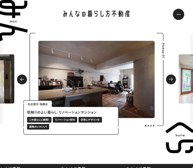
Featured-Property Stage
Role: introduce selected archive stories through large photographs.
The desktop composition has six visible layers:
- A centered landscape photograph, approximately
3:2. - Cropped neighboring photographs at the left and right viewport edges.
- A thin bracket-like frame around the central image area, with open portions rather than a continuous rectangular box.
- A vertically oriented
Pickup 01label interrupting the right side of the frame. - Circular previous and next arrows outside the frame.
- A tabbed information panel overlapping the lower-left part of the photograph, with four small pagination marks near the lower right.
The central photograph is visually around x: 390px, y: 230px in the desktop capture. The frame begins around x: 340px, y: 185px. Each arrow is approximately 56px in diameter, centered around the photograph's vertical midpoint.
Large black brand fragments occupy the far upper-left and lower-right edges. They are deliberately cropped and partially separated from the central content. Pale background shapes provide a quieter secondary layer.
The DOM contains four featured stories. The desktop capture shows Pickup 01; the mobile capture shows Pickup 02. This confirms different captured carousel states, but does not establish whether the change resulted from autoplay, initial state, or another trigger.
Featured Information Panel
Role: connect the photograph to a location, story title, and lifestyle vocabulary.
The panel resembles a labeled folder. A small location tab projects above the upper-left edge of a larger outlined body. The tab and body share their fill and ink colors. Thin borders and rounded corners define the shape; no elevation shadow is visible.
On desktop, the panel begins roughly 95px to the left of the photograph and extends below it. Its visual bounds are approximately 527px wide and 197px tall including the location tab. The body contains a bold title followed by wrapping dark tags with white lettering.
On mobile, the panel spans approximately 360px, leaving 15px viewport margins. The location tab overlaps the photograph around y: 328px; the main body begins around y: 361px. The pictured deep-teal panel uses blush text and reverses that pair inside the tags. Its title wraps naturally to two lines.
The mobile featured-content extraction exposes at most four tags per story, compared with up to six in the desktop extraction. Archive entries retain their longer tag lists. The evidence does not establish whether this preview limit is implemented through CSS visibility or different rendering.
Archive Section Band
Role: mark the transition from featured stories into the archive.
A full-width charcoal band repeats the Japanese archive label and minkura archives horizontally. White lettering, generous spacing between repetitions, and clipping at the viewport edges create a ticker-like appearance.
Its measured height is about 60px on desktop and 48px on mobile. It begins at approximately y: 909.5px in the desktop screenshot state and y: 700.59px on mobile.
The repeated composition is visible. Its movement, direction, speed, and pause behavior are not established by the supplied evidence.
Archive Property Card
Role: provide a complete, linked preview of one property story.
The desktop archive is an edge-to-edge three-column matrix. Thin vertical and horizontal rules define each cell; there are no gutters between cards. The card itself is a link, confirmed by its article destination in the DOM.
The anatomy is consistent:
- Upper metadata row: a bold location at the left and an outlined
RENTorSALEcircle at the right, when supplied by the content. - Photograph block: a landscape image inset more deeply than the metadata row.
- Archive identifier: a small rotated Latin label beside the image's left edge, such as
archive 009. - Story title: bold Japanese text, aligned with the photograph and allowed to wrap.
- Lifestyle tags: several compact filled rectangles arranged in wrapping rows.
- Reading cue: one visible
Read morelabel aligned toward the lower right.
In the desktop middle capture, a 480px card contains a photograph approximately 340px wide, centered with 70px insets. The title uses the same horizontal insets. The card location starts only 25px from the outer edge, creating a deliberate distinction between catalog metadata and the editorial body.
Most measured desktop cards are 668px tall. The final row is 710px; mobile heights differ in 42px increments. These observations are consistent with content and tag wrapping affecting height, rather than every entry having a single immutable height.
The twelve visible entries occupy four desktop rows and twelve mobile rows. One entry has no visible rental/sale label in the extracted content. Do not manufacture a transaction stamp for every story.
Lifestyle Tags
Role: describe interests and ways of living, rather than technical property specifications alone.
Examples include 古いのが好き, ローカルにかかわる, リノベーション好き, 地域の交流, and シェアハウス.
Tags are small rounded rectangles with bold Japanese lettering, compact horizontal padding, and approximately 8px gaps. The desktop appearance is a dark fill with white text. The mobile featured panel visibly reverses its card pair inside the tags.
The supplied links establish the containing article as interactive. They do not establish independent tag-filter destinations. In a reproduction, use non-interactive tag elements inside the article link unless separate filter behavior is deliberately added.
Transaction Stamp and Archive Identifier
Role: make the archive feel catalogued without turning it into a dense property-search table.
The transaction stamp is an outlined circle of approximately 48px diameter, containing small uppercase text. It sits near the card's top-right edge and remains visually separate from the lifestyle tags.
The archive identifier runs vertically beside the photograph. Its typography is small and restrained. The content includes two different entries labeled archive 016, so the displayed number should not be assumed to be a unique database key. Use the article URL or another actual unique identifier when implementing the data model.
Archive-Directory Link
Role: continue browsing beyond the homepage selection.
The centered みんくら事例一覧 link follows the twelve-entry grid and points to /archives/. It uses bold type: 20px / 30px on desktop and 18px / 27px on mobile. Its measured link box is approximately 203px wide on desktop and 174px on mobile.
Keep this transition compact. The archive already provides the page's main content; the directory link is a continuation of reading rather than a large conversion banner.
About Introduction
Role: explain the publication's editorial scope.
The source copy describes a web medium introducing unique properties, local ways of living, and people in the region. This is the clearest on-page explanation of the site's purpose.
On desktop, a large interior photograph sits to the left and a bold paragraph sits to the right. The photograph has rounded corners, a slight clockwise tilt, and white brand artwork layered over it. A small vertical about minkura label appears near the left edge. Very pale, oversized lettering extends behind the section.
The paragraph occupies approximately 472px, uses 24px / 40px, and is followed after 56px by a right-aligned About link with a small filled circular arrow.
On mobile, the paragraph occupies a measured 286px column with 52px side insets. It uses 16px / 26.6667px, followed by the About link after 35px. The supplied mobile footer capture shows the lower text area, not the full image arrangement above it. A stacked media-and-copy layout is a reasonable adaptation, but the complete mobile image composition is not visually verified.
Footer
Role: close the editorial page with identity, a small directory, and social access.
The footer is a full-width charcoal surface with measured 20px upper corner radii. Desktop distributes the white wordmark, Index group, and SNS group across the width. The copyright line sits lower in the brand area.
Index and SNS appear inside small white outlined labels with a downward notch, approximately 100 × 34px. Their unusual outlined shape continues the tabbed and framed language of the featured story.
The Index contains four links arranged in two columns. The SNS area pairs an outlined Instagram icon with the muted @minkura_gram handle. Only the handle's Work Sans declaration is directly verified.
Mobile stacks the wordmark, Index group, and SNS group vertically while retaining two columns within the Index links. The wordmark remains approximately 265.61px wide and becomes centered. The copyright is centered near the bottom. The surface is approximately 586px tall in the supplied measurement.
Tokens — Motion & Interaction
Measured Transition Declarations
| Element / property | Recorded value | What this establishes |
|---|---|---|
| Archive-card background | 0.61s cubic-bezier(0.19, 1, 0.22, 1) |
A background-color transition is defined |
| Archive-card outer radius | 0.61s cubic-bezier(0.19, 1, 0.22, 1) |
A radius transition is defined; endpoint shape and trigger are unverified |
| Archive location and title color | 0.61s cubic-bezier(0.19, 1, 0.22, 1) |
Text-color changes share the card timing |
| Footer Instagram opacity | 0.88s cubic-bezier(0.19, 1, 0.22, 1) |
An opacity transition is defined; target opacity was not exercised |
Use --motion-card: 610ms cubic-bezier(0.19, 1, 0.22, 1) and --motion-social: 880ms cubic-bezier(0.19, 1, 0.22, 1) as source-derived aliases. These timings describe specific declarations, not a universal animation duration.
Observed Affordances and Limits
| Feature | Evidence | Unverified behavior |
|---|---|---|
| Featured carousel | Four stories, four marks, desktop arrows, differing captured Pickup numbers | Autoplay interval, transition duration, drag/swipe support, keyboard controls, looping |
| Archive cards | Actual article links and one visible reading cue per card | Hover endpoints and image transformations |
| Repeated archive band | Repeated and clipped lettering in screenshots | Whether and how it continuously moves |
| Menu | Persistent three-dot control and navigation links in DOM | Open-state design, animation, focus management, dismissal |
| Repeated link text | Duplicate navigation text and multiple Read-more strings in extraction | Whether copies exist for animation, masking, or another implementation detail |
| Page traversal | Supplied captures cover opening, archive, and footer regions | Scroll-triggered effects beyond the captured appearances |
Several sampled elements report animation: none. This applies only to those elements at sampling time; it does not prove that descendants, pseudo-elements, or JavaScript-managed layers are static.
The capture process waited for document readiness, visible image decoding, and selected finite motion, and temporarily paused perpetual animations during readiness checks. Static frames therefore do not establish the complete motion system.
Surfaces
| Surface | Appearance | Function |
|---|---|---|
| Main canvas | White | Spacious field around feature photography and About content |
| Decorative background | Extremely pale oversized lettering and shapes | Adds identity without competing with body text |
| Desktop archive cell | White with thin dark dividers | Creates a continuous catalog matrix |
| Mobile archive cell | One of eight measured color pairs | Gives individual stories a stronger visual identity |
| Featured information panel | Outlined tabbed shape; white on desktop, teal/blush in the shown mobile state | Joins metadata and imagery through overlap |
| Lifestyle tag | Compact inverse-color rectangle | Groups descriptive vocabulary |
| Menu / arrow | Filled charcoal circle with white symbol | Compact navigation affordance |
| Archive band | Full-width charcoal with white repeated lettering | Strong section boundary |
| Footer | Charcoal with white and muted-white details | Closes the page and organizes secondary navigation |
Depth is communicated through overlap, clipping, and the large contrast change at the footer. The captures do not show a general soft-shadow elevation system.
Imagery
The photography is specific, inhabited, and architectural. The opening desktop feature shows a timber share house with a small deck, folding chairs, greenery, an adjoining street, and a utility pole. The mobile feature shows a lived-in renovated apartment with a dining/work area and a person seated near the window. Archive images include a tactile kitchen interior, a traditional room looking into a garden, and a converted building facade.
These images carry useful irregularities: visible wiring, old materials, mixed furniture, daily-use objects, changing daylight, and surrounding neighborhood context. Preserve those qualities. A uniform collection of empty luxury interiors would alter the editorial voice.
Most visible property images use landscape proportions close to 3:2. Desktop corners are modestly rounded. The mobile featured photograph uses a conspicuously larger corner radius. The About image has a separate treatment: a slight tilt and white brand lettering layered over the photo.
Observed Asset References
Original image URLs and asset filenames were not included in the supplied evidence. The following table identifies visible asset roles without inventing paths.
| Asset role | Current-page evidence | Reuse guidance |
|---|---|---|
| Header wordmark | Centered Japanese identity in both opening captures | Use authorized artwork; preserve its proportions |
| Oversized brand fragments | Black cropped forms at feature edges; pale forms around About | Treat as decorative and contain intentional overflow |
| Opening desktop feature | Exterior of the Okazaki share-house story | Keep building and street context visible |
| Opening mobile feature | Interior of the family renovation story | Preserve the lived-in scene and natural color |
| Archive 009 photograph | Kitchen and living interior in the desktop archive | Landscape crop; retain material texture |
| Archive 008 photograph | Traditional room and garden view | Retain the dark interior / bright garden contrast |
| Archive 007 photograph | Converted building facade | Preserve the architectural front and surrounding ground |
| About photograph | Interior with a yellow sofa and white overlaid lettering | Use its own composition; the native aspect ratio was not supplied |
| Instagram icon | Small outline icon in the footer | Keep visually subordinate to the navigation groups |
The identity graphics should remain separate from readable content. Recommended implementations should hide decorative copies from assistive technology and provide useful alternatives for editorial photographs.
Layout & Responsive Behavior
Desktop at 1440 × 1000
The opening stage occupies most of the first viewport. The archive band starts near the bottom, and only the beginning of the grid appears below it. This gives the feature photograph room while still signaling that more stories follow.
The grid uses all 1440px, divided into three 480px columns. Its first card row starts at approximately y: 969.09px. The final row ends at approximately y: 3683.09px. A compact directory link follows, and the About section begins at approximately y: 3806.52px.
The About section replaces the rigid archive grid with an inset composition. The footer begins at approximately y: 4722.11px and completes the roughly 5181px document.
Mobile at 390 × 844
The opening composition is reorganized around one central image and a nearly full-width information panel. The Pickup label moves from the right edge to a horizontal position near the frame's upper left. Neighboring photographs and desktop arrows are not visible. The four pagination marks move beneath the panel and become centered.
The photograph occupies approximately 326px of the 390px width, while the information panel spans approximately 360px. Oversized brand fragments remain cropped at the viewport edges. The visible photo's corners become much larger.
The archive band begins at y: 700.59px, and the first card begins at y: 748.19px. Cards are full-width, individually colored, and arranged in a single sequence. Title padding changes from 70px to 46px, while location padding changes from 25px to 20px. Title typography becomes 18px / 28px.
The archive section extends to approximately y: 7653.19px, followed by About and then the footer at y: 8376.20px. The resulting document is roughly 8962px tall.
Responsive Rules That Remain Unknown
Only two viewport widths are evidenced. The exact breakpoint, tablet column count, landscape layout, and scaling formulas were not supplied. The Quick Start uses recommended breakpoints at 48rem and 64rem, including a two-column intermediate arrangement; that intermediate layout is not an observation of the original.
Keep decorative clipping local to the feature or artwork wrapper. Avoid hiding horizontal overflow on every content container, which can conceal focus indicators or long text. Ensure the persistent menu control remains clear of essential copy when its fixed placement overlaps scrolled content.
Do’s and Don’ts
Do
- Lead with a real property photograph and a concise story title.
- Preserve the tabbed information panel and its overlap with the featured photograph.
- Keep the desktop archive continuous, with equal columns and thin shared boundaries.
- Distinguish the shallow metadata inset from the deeper photograph/title inset.
- Preserve the measured mobile card palettes as coordinated background/text pairs.
- Use bold Japanese sans-serif titles and smaller, quieter Latin metadata.
- Keep rental/sale stamps circular and visually separate from lifestyle tags.
- Allow title wrapping and content-dependent card heights.
- Preserve the contrast between small image corners on desktop and large feature corners on mobile.
- Use authentic local buildings and inhabited interiors with material detail.
- Retain the oversized cropped brand artwork and the calmer pale version near About.
- End with the large charcoal footer and its small notched section labels.
Don’t
- Don’t replace the editorial archive with a generic promotional sequence of benefits and conversion panels.
- Don’t turn the desktop grid into detached cards with wide gutters and soft shadows.
- Don’t describe the entire current site as monochrome; the mobile evidence contains substantial color.
- Don’t use the mobile color pairs randomly or separate their intended foreground/background relationship.
- Don’t infer desktop hover results from a transition declaration alone.
- Don’t assign an unsupported font name to the wordmark.
- Don’t use unused framework palette variables as evidence of visible design colors.
- Don’t duplicate the extracted Read-more strings in the visible interface.
- Don’t make lifestyle tags behave as filters without an explicit implementation decision.
- Don’t use archive numbers as unique identifiers when the recorded content contains duplicates.
- Don’t invent asset paths, carousel timing, menu animation, or mobile image behavior beyond the captures.
Recommended Implementation Additions
These are recommendations for a new implementation, not verified features of the original page:
- Give the three-dot menu, carousel arrows, and pagination controls explicit accessible names and visible focus states. Expose selected pagination state programmatically.
- If the carousel advances automatically, provide pause behavior and respect reduced-motion preferences. Keep a useful static first item when motion is disabled.
- Make hidden carousel slides and any decorative duplicate link text unavailable to keyboard focus and assistive technology.
- Use a real article link for each archive card. Keep descriptive tags non-interactive inside that link unless the structure is redesigned to support independent destinations.
- Verify contrast for each card pair at the actual text size, particularly rust and sky. Record any accessible color adjustment as an adaptation rather than silently changing the measured palette.
- Preserve all essential story information in the destination when limiting the mobile featured preview to four tags.
- Add intrinsic image dimensions and responsive sources to keep the photographic layout stable. Prioritize the first visible feature image and defer offscreen archive images.
- Keep content height flexible under text enlargement. Use the measured card heights as comparison targets, not clipping constraints.
- Treat oversized lettering as decorative, with pointer events disabled and no duplicate accessible announcement.
Agent Prompt Guide
Quick Color Reference
- Main page: white
#ffffff. - Primary text, rules, controls, archive band, and footer: charcoal
#222222. - First mobile archive pair: chalk
#ebebdfwith indigo#292c4b. - Shown mobile feature pair: deep teal
#07374dwith blush#f2c4c2. - Additional measured pairs: forest/pink, rust/sky, sand/navy, brown/mint, lime/cobalt, and powder-blue/umber from the palette table.
- Footer secondary text:
rgba(255,255,255,0.62). - Pale decorative lettering: approximately
#f7f6f4; this is a visual estimate.
Overall Prompt
“Create an editorial homepage for a Japanese local-property publication inspired by Minkura. Center a narrow Japanese wordmark above a large landscape property photograph. Surround the photograph with open bracket-like rules, a small Pickup label, circular arrows, and an overlapping folder-shaped information panel containing location, a bold Japanese story title, and compact lifestyle tags. Place oversized cropped identity artwork at the viewport edges. Follow with a charcoal repeated archive band and a full-width three-column property archive divided by thin rules. Each entry has a location, optional circular RENT or SALE stamp, landscape photo, vertical archive number, bold title, wrapping tags, and a lower-right Read more cue. On mobile, use a single column, individual measured color pairs, a wider information panel, strongly rounded feature photography, and centered pagination. Finish with an inset About composition and a charcoal footer with rounded upper corners and notched Index and SNS labels. Use only evidenced interactions or explicitly identify new behavior as an implementation choice.”
Example Component Prompts
- Desktop featured story: “Build a white photographic stage with a roughly 660 × 440 landscape image inside a 760px-wide open bracket frame. Place a vertically oriented Pickup label along the right rule and 56px charcoal arrow circles outside the frame. Overlap the image's lower-left edge with a white outlined folder panel containing a projecting location tab, bold Japanese title, and dark rectangular tags.”
- Archive card: “Create a 480px-wide cell in an edge-to-edge ruled archive. Put the location 25px from the left boundary and an outlined 48px transaction circle near the right. Inset the photograph and editorial text by 70px. Use a vertical archive identifier beside the image, a 20px bold title with 33px leading, wrapping dark tags, and a quiet Read more cue near the bottom right.”
- Mobile featured story: “At 390px viewport width, place a roughly 328px landscape photograph inside a 360px frame with about 80px image corner radii. Put the Pickup label horizontally at the upper left. Overlap the lower image with a deep-teal #07374d folder panel, blush #f2c4c2 text, and reversed blush tags. Keep the title at about 20px, show a compact tag preview, and center four pagination marks below.”
- Mobile archive: “Use full-width single-column article cells with per-story background/text pairs from the supplied palette. Keep the location inset at 20px and the title/content inset at 46px. Titles are 18px/28px bold Japanese sans-serif. Allow the cell height to grow with tags; preserve every archive tag.”
- Footer: “Create a #222222 footer with 20px upper corner radii, a white Japanese wordmark, and small outlined Index and SNS labels with downward notches. On desktop, distribute identity, two-column navigation, and Instagram across the width. On mobile, center the wordmark and stack the groups while retaining two navigation columns.”
- Motion specification: “Use 610ms cubic-bezier(0.19,1,0.22,1) for explicitly implemented card background, text-color, and radius changes, and 880ms with the same easing for the social-link opacity transition. Specify carousel and menu behavior separately because their timing and interaction outcomes are not established by the reference.”
Quick Start
CSS Custom Properties
This is a recommended static shell, not extracted source code. It covers the closed header, one featured item, archive cards, About layout, and footer. Add the actual authorized brand artwork and photographs separately. Carousel state management, adjacent-slide rendering, menu behavior, and any moving archive band require their own implementation.
Measured colors, typography, and transition timings are retained. Estimated radii and photograph geometry are rounded to practical values. The two-column intermediate breakpoint is a recommendation. Mobile pagination uses 24px button boxes around 8px marks, intentionally providing more target area than the small visible marks alone.
Use a real link for .archive-card, with .card-meta, .card-media, .card-title, .tag-list, and .read-more children. The media wrapper contains the photograph and .archive-id. Apply a palette class to the card or featured section. The feature frame contains the photo, index label, information panel, arrows, and pagination.
:root {
  /* Measured core colors */
  --color-paper: #ffffff;
  --color-ink: #222222;
  --color-muted-on-ink: rgb(255 255 255 / 62%);

  /* Visual estimates */
  --color-brand: #000000;
  --color-ghost: #f7f6f4;
  --rule: 2px;
  --radius-photo: 10px;
  --radius-panel: 10px;
  --radius-tag: 4px;
  --radius-mobile-feature: 80px;

  /* Measured footer geometry */
  --radius-footer: 20px;

  /* Recorded Japanese stack; Latin utility use is an adaptation */
  --font-body: YakuHanJP, '游ゴシック', YuGothic,
    'Yu Gothic Medium', 'Yu Gothic', 'Hiragino Kaku Gothic ProN',
    'Hiragino Kaku Gothic Pro', 'メイリオ', Meiryo,
    'MS ゴシック', sans-serif;
  --font-utility: 'Work Sans', sans-serif;

  --text-body: 16px;
  --text-location: 15px;
  --text-card: 20px;
  --leading-card: 33px;
  --card-inset: 70px;

  /* Measured transition declarations */
  --motion-card: 610ms cubic-bezier(0.19, 1, 0.22, 1);
  --motion-social: 880ms cubic-bezier(0.19, 1, 0.22, 1);

  /* Default per-story pair */
  --pair-paper: #ebebdf;
  --pair-ink: #292c4b;
}

.palette-chalk { --pair-paper: #ebebdf; --pair-ink: #292c4b; }
.palette-teal { --pair-paper: #07374d; --pair-ink: #f2c4c2; }
.palette-forest { --pair-paper: #214b3d; --pair-ink: #f7d1d1; }
.palette-rust { --pair-paper: #d35a36; --pair-ink: #b7eeff; }
.palette-sand { --pair-paper: #f4dbbb; --pair-ink: #0b2444; }
.palette-brown { --pair-paper: #504341; --pair-ink: #abe6e0; }
.palette-lime { --pair-paper: #c5dd47; --pair-ink: #0946b7; }
.palette-blue { --pair-paper: #aac4e7; --pair-ink: #4e340f; }

* { box-sizing: border-box; }
html { font-size: 100%; }
body {
  margin: 0;
  color: var(--color-ink);
  background: var(--color-paper);
  font: 400 var(--text-body)/24px var(--font-body);
  letter-spacing: 0.48px;
}
img { display: block; max-width: 100%; }
a { color: inherit; }
button { font: inherit; cursor: pointer; }

.site-header {
  position: absolute;
  inset: 59px 0 auto;
  z-index: 5;
  display: flex;
  justify-content: center;
}
.site-wordmark {
  display: block;
  width: 378px;
  max-width: calc(100% - 120px);
}
.menu-button {
  position: fixed;
  top: 50px;
  right: 50px;
  z-index: 20;
  display: grid;
  place-items: center;
  width: 64px;
  height: 64px;
  border: 0;
  border-radius: 50%;
  color: white;
  background: var(--color-ink);
}

/* A single featured state; supply carousel behavior separately. */
.feature {
  position: relative;
  min-height: 891px;
  padding: 185px 0 176px;
  overflow: clip;
}
.feature-frame {
  position: relative;
  width: min(760px, calc(100% - 200px));
  min-height: 530px;
  margin-inline: auto;
  padding: 45px 50px;
}
.feature-frame::before,
.feature-frame::after {
  content: '';
  position: absolute;
  top: 0;
  bottom: 0;
  width: 34px;
  border-block: var(--rule) solid var(--color-ink);
  pointer-events: none;
}
.feature-frame::before {
  left: 0;
  border-left: var(--rule) solid var(--color-ink);
  border-radius: 12px 0 0 12px;
}
.feature-frame::after {
  right: 0;
  border-right: var(--rule) solid var(--color-ink);
  border-radius: 0 12px 12px 0;
}
.feature-photo {
  width: 100%;
  aspect-ratio: 3 / 2;
  object-fit: cover;
  border-radius: var(--radius-photo);
}
.feature-index {
  position: absolute;
  z-index: 3;
  top: 44px;
  right: -10px;
  padding-block: 12px;
  background: var(--color-paper);
  font: 600 14px/20px var(--font-utility);
  letter-spacing: 1px;
  writing-mode: vertical-rl;
}
.feature-info {
  --surface: var(--color-paper);
  --ink: var(--color-ink);
  position: absolute;
  z-index: 2;
  top: 420px;
  left: -45px;
  width: 527px;
  padding: 16px 18px 24px;
  border: var(--rule) solid var(--color-ink);
  border-radius: var(--radius-panel);
  color: var(--ink);
  background: var(--surface);
  text-decoration: none;
}
.feature-location {
  position: absolute;
  left: calc(-1 * var(--rule));
  top: -37px;
  padding: 7px 20px;
  border: var(--rule) solid var(--color-ink);
  border-bottom: 0;
  border-radius: 6px 6px 0 0;
  background: var(--surface);
  font-size: 15px;
  font-weight: 700;
}
.feature-title {
  margin: 0 0 14px;
  font-size: 22px;
  line-height: 33px;
  font-weight: 700;
}
.feature-arrow {
  position: absolute;
  top: 237px;
  width: 56px;
  height: 56px;
  border: 0;
  border-radius: 50%;
  color: white;
  background: var(--color-ink);
}
.feature-arrow[data-direction='previous'] { left: -84px; }
.feature-arrow[data-direction='next'] { right: -84px; }
.feature-dots {
  position: absolute;
  right: 42px;
  bottom: -12px;
  display: flex;
}
.feature-dots button {
  display: grid;
  place-items: center;
  width: 24px;
  height: 24px;
  padding: 0;
  border: 0;
  background: var(--color-paper);
}
.feature-dots button::before {
  content: '';
  width: 8px;
  height: 8px;
  border: 2px solid var(--color-ink);
  border-radius: 50%;
}
.feature-dots button[aria-current='true']::before {
  background: var(--color-ink);
}

.archive-band {
  display: flex;
  align-items: center;
  gap: 44px;
  height: 60px;
  margin-top: 18px;
  overflow: clip;
  white-space: nowrap;
  color: white;
  background: var(--color-ink);
}
.archive-grid {
  display: grid;
  grid-template-columns: repeat(3, minmax(0, 1fr));
}
.archive-card {
  --surface: var(--color-paper);
  --ink: var(--color-ink);
  position: relative;
  display: flex;
  flex-direction: column;
  min-width: 0;
  min-height: 668px;
  color: var(--ink);
  background: var(--surface);
  text-decoration: none;
  transition: background-color var(--motion-card),
    border-radius var(--motion-card);
}
/* Shared rules without changing the 480px desktop column width. */
.archive-card::after {
  content: '';
  position: absolute;
  inset: 0;
  border-right: var(--rule) solid var(--color-ink);
  border-bottom: var(--rule) solid var(--color-ink);
  pointer-events: none;
}
.card-meta {
  display: flex;
  justify-content: space-between;
  align-items: center;
  min-height: 48px;
  margin: 20px 20px 0 25px;
  gap: 12px;
}
.card-location {
  margin: 0;
  font-size: 15px;
  line-height: 32px;
  font-weight: 700;
  letter-spacing: 0.6px;
  transition: color var(--motion-card);
}
.transaction-stamp {
  display: grid;
  place-items: center;
  flex: 0 0 48px;
  width: 48px;
  height: 48px;
  border: 1.5px solid currentColor;
  border-radius: 50%;
  font: 400 13px/1 var(--font-utility);
}
.card-media {
  position: relative;
  margin: 24px var(--card-inset) 0;
}
.card-media img {
  width: 100%;
  aspect-ratio: 3 / 2;
  object-fit: cover;
  border-radius: var(--radius-photo);
}
.archive-id {
  position: absolute;
  top: 50%;
  left: -42px;
  transform: translateY(-50%) rotate(180deg);
  writing-mode: vertical-rl;
  font: 400 13px/18px var(--font-utility);
  letter-spacing: 0.6px;
}
.card-title {
  margin: 20px var(--card-inset) 0;
  font-size: var(--text-card);
  line-height: var(--leading-card);
  font-weight: 700;
  letter-spacing: 0.6px;
  transition: color var(--motion-card);
}
.tag-list {
  display: flex;
  flex-wrap: wrap;
  gap: 8px;
  padding: 0;
  margin: 0;
  list-style: none;
}
.archive-card > .tag-list {
  margin: 24px var(--card-inset) 0;
}
.tag {
  display: inline-block;
  padding: 6px 10px;
  border-radius: var(--radius-tag);
  color: var(--surface);
  background: var(--ink);
  font-size: 14px;
  font-weight: 700;
  line-height: 20px;
  letter-spacing: 0;
}
.read-more {
  align-self: flex-end;
  margin: auto 25px 48px;
  padding-top: 44px;
  font: 500 16px/24px var(--font-utility);
  letter-spacing: 0.6px;
}
.archive-directory {
  display: flex;
  justify-content: center;
  padding: 44px 20px 48px;
  font-size: 20px;
  line-height: 30px;
  font-weight: 700;
}

.about {
  position: relative;
  padding: 98px 13.93% 227px;
}
.about-layout {
  display: grid;
  grid-template-columns: repeat(2, minmax(0, 1fr));
  align-items: center;
  gap: 95px;
  margin-top: 70px;
}
.about-photo {
  width: 100%;
  border-radius: 20px;
  transform: rotate(5deg);
}
.about-copy {
  margin: 0;
  font-size: 24px;
  line-height: 40px;
  font-weight: 700;
  letter-spacing: 0.24px;
}
.about-link {
  display: flex;
  align-items: center;
  justify-content: flex-end;
  gap: 16px;
  margin-top: 56px;
  font-size: 22px;
  line-height: 33px;
  font-weight: 700;
  text-decoration: none;
}

.site-footer {
  position: relative;
  display: grid;
  grid-template-columns: 1.25fr 1.6fr 0.8fr;
  align-items: start;
  gap: 80px;
  min-height: 459px;
  padding: 136px 8% 150px 8.5%;
  border-radius: var(--radius-footer) var(--radius-footer) 0 0;
  color: white;
  background: var(--color-ink);
}
.footer-wordmark { width: 265.61px; }
.footer-label {
  position: relative;
  display: grid;
  place-items: center;
  width: 100px;
  height: 34px;
  border: 2px solid white;
  border-radius: 8px;
  font: 500 16px/1 var(--font-utility);
  letter-spacing: 1px;
}
/* Approximation of the observed small notched label. */
.footer-label::after {
  content: '';
  position: absolute;
  bottom: -5px;
  left: calc(50% - 4px);
  width: 8px;
  height: 8px;
  border-right: 2px solid white;
  border-bottom: 2px solid white;
  background: var(--color-ink);
  transform: rotate(45deg);
}
.footer-nav {
  display: grid;
  grid-template-columns: max-content max-content;
  gap: 32px 86px;
  margin-top: 44px;
}
.footer-nav a {
  font-size: 18px;
  line-height: 19.8px;
  letter-spacing: 0.9px;
  text-decoration: none;
}
.footer-social-link {
  display: flex;
  align-items: center;
  gap: 16px;
  min-height: 44px;
  margin-top: 36px;
  color: var(--color-muted-on-ink);
  font: 400 14px/32px var(--font-utility);
  letter-spacing: 0.7px;
  text-decoration: none;
  transition: opacity var(--motion-social);
}
.footer-copyright {
  position: absolute;
  left: 8.5%;
  bottom: 150px;
  margin: 0;
  color: var(--color-muted-on-ink);
  font-size: 12px;
  line-height: 18px;
}

/* Recommended intermediate layout; not an inspected original state. */
@media (48rem <= width < 64rem) {
  .archive-grid { grid-template-columns: repeat(2, minmax(0, 1fr)); }
  .archive-card { --card-inset: 46px; }
  .feature-info { left: 0; max-width: 100%; }
  .about { padding-inline: 8%; }
  .about-layout { gap: 48px; }
  .site-footer { grid-template-columns: 1fr 1fr; gap: 48px; }
  .footer-nav { gap: 32px; }
}

@media (width < 48rem) {
  :root {
    --text-card: 18px;
    --leading-card: 28px;
    --card-inset: 46px;
  }
  .site-header { top: 44px; }
  .site-wordmark { width: 224.75px; }
  .menu-button {
    top: 13px;
    right: 12px;
    width: 48px;
    height: 48px;
  }
  .feature {
    min-height: 701px;
    padding: 126px 15px 143px;
  }
  .feature-frame {
    width: 100%;
    min-height: 432px;
    padding: 16px;
  }
  .feature-photo { border-radius: var(--radius-mobile-feature); }
  .feature-index {
    top: -10px;
    right: auto;
    left: 20px;
    padding: 0 7px;
    writing-mode: horizontal-tb;
    font-size: 13px;
  }
  .feature-info {
    --surface: var(--pair-paper);
    --ink: var(--pair-ink);
    top: 235px;
    left: 0;
    width: 100%;
    padding: 18px 18px 26px;
  }
  .feature-title {
    margin-bottom: 20px;
    font-size: 20px;
    line-height: 28px;
  }
  /* Preview limit only; retain all tags in archive entries. */
  .feature-info .tag-list > :nth-child(n + 5) { display: none; }
  .feature-arrow { display: none; }
  .feature-dots {
    right: 50%;
    bottom: -81px;
    transform: translateX(50%);
  }
  .archive-band { height: 48px; margin-top: 0; }
  .archive-grid { grid-template-columns: minmax(0, 1fr); }
  .archive-card {
    --surface: var(--pair-paper);
    --ink: var(--pair-ink);
    min-height: 0;
  }
  .card-meta { margin-inline: 20px 10px; }
  .card-media { margin-top: 12px; }
  .archive-id { left: -30px; }
  .card-title { letter-spacing: 0.18px; }
  .read-more {
    margin-right: 20px;
    margin-bottom: 40px;
    padding-top: 24px;
  }
  .archive-directory {
    padding: 24px 20px;
    font-size: 18px;
    line-height: 27px;
  }
  .about { padding: 74px 0 108px; }
  .about-layout {
    grid-template-columns: minmax(0, 1fr);
    gap: 48px;
    margin: 48px 52px 0;
  }
  .about-copy {
    font-size: 16px;
    line-height: 26.6667px;
    letter-spacing: 0.16px;
  }
  .about-link {
    margin-top: 35px;
    font-size: 16px;
    line-height: 24px;
  }
  .site-footer {
    display: block;
    min-height: 586px;
    padding: 60px 40px 135px;
  }
  .footer-wordmark { margin-inline: auto; }
  .footer-index { margin-top: 52px; }
  .footer-nav {
    grid-template-columns: 1fr 1fr;
    gap: 30px 24px;
    margin-top: 32px;
  }
  .footer-nav a {
    font-size: 14px;
    line-height: 15.4px;
    letter-spacing: 0.7px;
  }
  .footer-social { margin-top: 68px; }
  .footer-copyright {
    right: 40px;
    bottom: 70px;
    left: 40px;
    text-align: center;
  }
}

/* Recommended keyboard and reduced-motion additions. */
a:focus-visible,
button:focus-visible {
  outline: 3px solid currentColor;
  outline-offset: 4px;
}
.archive-card:focus-visible { outline-offset: -6px; }
@media (prefers-reduced-motion: reduce) {
  .archive-card,
  .card-location,
  .card-title,
  .footer-social-link {
    transition: none;
  }
}
The About image rotation, folder border construction, and footer-notch construction are approximations. Use the original authorized artwork for visual accuracy. The archive card structure permits growth with content; it deliberately avoids setting a fixed mobile height or clipping titles.
Tailwind v4 Token Mapping
Optional aliases for a project already using Tailwind v4. This does not identify the original site's implementation framework. Define the preceding custom properties first.
@theme inline {
  --color-paper: var(--color-paper);
  --color-ink: var(--color-ink);
  --color-story-paper: var(--pair-paper);
  --color-story-ink: var(--pair-ink);
  --font-editorial: var(--font-body);
  --font-utility-text: var(--font-utility);
  --text-card-title: var(--text-card);
  --text-card-title--line-height: var(--leading-card);
  --spacing-card-inset: var(--card-inset);
  --radius-property: var(--radius-photo);
  --radius-story-panel: var(--radius-panel);
  --radius-site-footer: var(--radius-footer);
}
For production use, avoid self-referential theme aliases if a build pipeline rewrites the underlying variables. A straightforward alternative is to name the mapped utilities --color-site-paper: #ffffff and --color-site-ink: #222222 while retaining the ordinary CSS variables above.
Sources & Evidence
- Inspected original and final page: https://min-kura.com/. The supplied observation records HTTP
200, matching original/final URLs, the Japanese page title, rendered homepage content, and article/navigation destinations. - Capture date: September 13, 2026, approximately 04:02 JST, corresponding to the supplied UTC retrieval timestamp
2026-09-12T19:02:12.682Z. - Desktop evidence: three current-page captures at
1440 × 1000, covering the opening feature, middle archive, and lower About/footer area; supplied document height approximately5180.66px. - Mobile evidence: two current-page captures at
390 × 844, covering the opening feature and lower About/footer area; supplied document height approximately8961.98px. - Rendered DOM and computed styles: source for the measured font stacks, text metrics, card dimensions, section padding, footer geometry, mobile color pairs, transition declarations, and observed link destinations.
- Original-site destinations visible in the DOM:
/archives/,/about/,/contact/, and individual archive URLs including/archives/008/,/archives/007/,/archives/006/,/archives/005/, and/archives/003/. Their linked page designs were not inspected. - Inspection limits: this reference analyzes the supplied evidence without additional browsing or command execution. Open-menu behavior, carousel controls, hover endpoints, full mobile archive imagery, tablet layouts, image asset URLs, and detailed animation sequences remain unverified. Static captures and readiness checks do not prove the completeness of delayed or unexercised behavior.
This document describes the current supplied homepage evidence. Measured values, visual estimates, and recommended implementation choices are identified separately throughout.
# Minkura / みんなの暮らし方不動産 — Style Reference

> A neighborhood property journal with generous photographs, fine architectural rules, and playful lettering at the edges.

**Website:** [min-kura.com](https://min-kura.com/)
**Original URL:** https://min-kura.com/
**Final URL:** https://min-kura.com/
**Theme:** a white and charcoal desktop shell, with individual color pairs visible on mobile property cards.
**Inspected evidence:** September 13, 2026, 04:02 JST; supplied retrieval timestamp `2026-09-12T19:02:12.682Z`.
**Viewports:** desktop `1440 × 1000` and mobile `390 × 844` CSS pixels.
**Scope:** the current homepage: featured-property carousel presentation, twelve archive entries, archive-directory link, About introduction, closed menu control, and footer. Three desktop captures and two mobile captures support the visual observations. Linked article pages and the open navigation panel were not inspected.

Minkura presents distinctive homes, renovated buildings, shared spaces, and local ways of living through an editorial property archive. A large photograph introduces a selected story; location, a descriptive Japanese title, and lifestyle tags provide the entry point. The homepage then becomes a substantial directory of stories before explaining the publication and offering navigation and social links.

Its identity comes from the relationship between orderly boundaries and irregular visual emphasis. Thin rules divide the desktop archive into equal columns. Small circular rental or sale stamps sit near the edges. Oversized fragments of the brand lettering extend beyond the viewport, while a tabbed information panel overlaps the featured photograph. Most desktop interface elements remain black and white, allowing inhabited interiors, weathered timber, gardens, and building facades to carry the color.

Mobile introduces a significant change: archive entries have individual background and text color pairs, and the featured image has much larger rounded corners. Preserve these differences when adapting the design. A scaled-down monochrome desktop grid would miss a substantial part of the observed mobile experience.

## How to Read This Reference

- **Measured** means supplied computed styles or rendered element bounds. Values refer to the recorded viewport and state, not an inferred universal CSS formula.
- **Visual estimate** means an approximate dimension, color, or shape read from the current-page captures. No independent pixel-sampling tool was used.
- **Calculated** means arithmetic based on supplied measurements, such as the content width remaining after horizontal padding.
- **Recommended** means guidance for a new implementation. Breakpoints, accessible control behavior, and the CSS adaptation are explicitly recommendations where source rules are unavailable.
- **Token names** are implementation aliases created for this document. They are not claimed to be original source variables.
- **Capture differences matter:** the desktop photograph appears approximately `660 × 440px`, while its sampled linked-image bounds are approximately `673.19 × 448.80px`. The mobile capture and linked-image bounds also differ slightly. Treat these as separate observations; transforms or capture timing may contribute, but their cause is unverified.
- **DOM bounds do not always describe the painted surface:** the featured information links have sampled inline heights of only `16px`, despite visibly enclosing much taller panels. The panel anatomy therefore relies on the screenshots.

## Tokens — Colors

### Default Palette

| Name | Value | Suggested token | Evidence and role |
| --- | --- | --- | --- |
| White canvas | `#ffffff` | `--color-paper` | Explicit desktop archive-card background and footer text color; the surrounding canvas also appears white |
| Charcoal ink | `#222222` | `--color-ink` | Measured body text, archive band, and footer background |
| Black brand artwork | Approximately `#000000` | `--color-brand` | Visual estimate for the oversized cropped lettering and header wordmark |
| Pale background lettering | Approximately `#f7f6f4` | `--color-ghost` | Visual estimate for large decorative letterforms and pale shapes behind content |
| Muted reversed text | `rgba(255,255,255,0.62)` | `--color-muted-on-ink` | Measured Instagram-link text color |
| Muted composite | Approximately `#ababab` | Optional direct-color alias | Calculated appearance of the preceding alpha color over `#222222` |
| Dark tag fill | Approximately `#222222–#262626` | Reuse `--color-ink` | Visual estimate; individual tag computed colors were not supplied |

The page does not have a general gradient or shadow system in the supplied visual evidence. Numerous WordPress preset gradients, colors, and shadows appear in the custom-property dump, but their presence does not establish their use on this page. Likewise, the exposed default Swiper blue is not evidence that the visible charcoal carousel controls are blue.

### Observed Card Palettes

These pairs are measured from mobile archive-card backgrounds and their location/title text. Descriptive names below are aliases, not visible theme names. No user-operated theme selector was observed.

| Palette alias | Background | Text | Recorded mobile examples |
| --- | --- | --- | --- |
| Chalk and indigo | `#ebebdf` | `#292c4b` | The opening Okazaki share-house entry; archive 005 |
| Deep teal and blush | `#07374d` | `#f2c4c2` | Archives 015 and 003; the family renovation entry |
| Forest and pale pink | `#214b3d` | `#f7d1d1` | Archive 014 |
| Rust and sky | `#d35a36` | `#b7eeff` | Archive 013 |
| Sand and navy | `#f4dbbb` | `#0b2444` | Archives 012 and 008 |
| Brown and mint | `#504341` | `#abe6e0` | Archive 009 |
| Lime and cobalt | `#c5dd47` | `#0946b7` | Archive 007 |
| Powder blue and umber | `#aac4e7` | `#4e340f` | Archive 006 |

The mobile featured panel visibly uses deep teal with blush lettering and blush tags containing teal text. That appearance corresponds to a measured archive pair, although the featured panel's own painted-color properties were not included in the sampled elements.

All sampled desktop archive entries have white backgrounds and charcoal title/location text. Their styles declare color and background transitions, but the inspection does not establish which desktop interaction activates a colored state. Treat the mobile palettes as confirmed mobile evidence; do not describe them as verified desktop hover outcomes.

## Tokens — Typography

### Japanese Reading Text

The measured body stack is:

```css
YakuHanJP, '游ゴシック', YuGothic, 'Yu Gothic Medium', 'Yu Gothic',
'Hiragino Kaku Gothic ProN', 'Hiragino Kaku Gothic Pro',
'メイリオ', Meiryo, 'MS ゴシック', sans-serif
```

The body uses `16px`, weight `400`, `24px` line height, and `0.48px` tracking at both inspected widths. Property titles, location labels, and the About introduction use weight `700`. This gives the content a firm, readable Japanese sans-serif texture without making every utility label equally heavy.

The supplied `--main-font-family` and `--sub-font-family` values contain the literal string `global.$baseFontFamilly`. That is not an identifiable font family. Use the actual computed stack above as the evidence.

### English Utility Text

`"Work Sans", sans-serif` is directly recorded for the Instagram handle, at `14px / 32px`, weight `400`, with `0.7px` tracking.

Other English labels include `Pickup 01`, `archive 009`, `Read more`, `Index`, `SNS`, `RENT`, and `SALE`. They appear as compact sans-serif utilities. Their individual font-family declarations were not supplied, so Work Sans should not be attributed to all of them as a verified fact. Using it for additional Latin utilities is a reasonable adaptation if the font is available.

### Brand Lettering

The Japanese wordmark and the oversized edge fragments are artwork-led elements. The header H1 and its home link contain no extracted text, while the screenshot shows a distinctive narrow wordmark. Their inherited font declarations do not identify the face used to draw that artwork.

Preserve the supplied identity artwork when authorized. Its tall, narrow character, uneven internal rhythm, and relationship to the tiny `min` and `kura` labels should not be approximated by naming an unsupported display font.

### Type Scale

All entries below are measured unless marked as estimates.

| Role | Desktop | Mobile | Weight | Tracking |
| --- | --- | --- | --- | --- |
| Base body | `16px / 24px` | Same | `400` | `0.48px` |
| Archive location | `15px / 32px` | Same | `700` | `0.6px` |
| Archive title | `20px / 33px` | `18px / 28px` | `700` | `0.6px` desktop; `0.18px` mobile |
| About introduction | `24px / 40px` | `16px / 26.6667px` | `700` | `0.24px` desktop; `0.16px` mobile |
| About link | `22px / 33px` | `16px / 24px` | `700` | `0.66px` desktop; `0.48px` mobile |
| Archive-directory link | `20px / 30px` | `18px / 27px` | `700` | `0.48px` |
| Footer navigation | `18px / 19.8px` | `14px / 15.4px` | `400` | `0.9px` desktop; `0.7px` mobile |
| Instagram handle | `14px / 32px` | Same | `400` | `0.7px` |
| Lifestyle tag, estimated | About `13–14px` | About `14px` | Visually bold | Not measured |
| Featured title, estimated | About `22px` | About `20px / 28px` | Visually bold | Not measured |
| Archive number / transaction stamp, estimated | About `13–14px` | Similar compact scale | Visually regular to medium | Not measured |
| Read-more label, estimated | About `16px` | Not separately visible in supplied mobile crops | Visually medium | Slight positive tracking |

### Artwork Dimensions

| Element | Desktop bounds | Mobile bounds | Interpretation |
| --- | --- | --- | --- |
| Header wordmark link | `378 × 37px` | `224.75 × 22px` | Measured rendered box; not a font-size claim |
| Footer wordmark link | `265.61 × 26px` | `265.61 × 26px` | Same measured size at both widths |
| Header H1 inherited type | `34px / 47px` | `22px / 34px` | Computed container typography; insufficient to identify the artwork lettering |

The HTML root is measured at `10px`. The Quick Start uses ordinary pixel values and a conventional root size so that source-scale assumptions do not leak into a new project.

## Tokens — Spacing & Shapes

**Density:** large photographic areas and broad section spacing, with tightly grouped labels and tags.

**Structural principle:** outer metadata sits near a card's boundary; the photograph, title, and tags occupy a more deeply inset inner column.

### Spacing Scale

| Use | Desktop | Mobile | Evidence |
| --- | --- | --- | --- |
| Header top padding | `59px` | `44px` | Measured |
| Featured-section top padding | `198px` | `122px` | Measured section padding; painted frame placement differs |
| Archive location left inset | `25px` | `20px` | Measured bounds |
| Archive title horizontal inset | `70px` | `46px` | Measured padding |
| Archive title inner width | `340px` | `298px` | Calculated from card width minus title padding |
| About horizontal section padding | Approximately `200.57px` per side | `0px` | Measured; mobile copy has a separate inner inset |
| Mobile About copy inset | — | `52px` per side | Measured paragraph bounds |
| About top / bottom padding | `98px / 227px` | `74px / 108px` | Measured |
| About paragraph-to-link gap | `56px` | `35px` | Calculated from measured element bounds |
| Footer padding | `135.77px 115.2px 150.17px 122.4px` | `60px 40px 135px` | Measured, top/right/bottom/left |
| Tag-to-tag gap | About `8px` | About `8px` | Visual estimate |
| Featured information inset | About `18–20px` | About `18–20px` | Visual estimate |

There is no evidence of a single source spacing unit. Reusable values such as `8`, `16`, `20`, `24`, `40`, `48`, and `70px` are useful implementation aliases, but should not be presented as a discovered original scale.

### Border Radius

| Element | Value | Evidence |
| --- | --- | --- |
| Archive card outer box | `0px` in sampled states | Measured at both widths |
| Footer upper corners | `20px 20px 0 0` | Measured |
| Desktop archive photographs | About `10px` | Visual estimate |
| Desktop featured photograph | About `10px` | Visual estimate |
| Featured information panel | About `10px` | Visual estimate |
| Lifestyle tags | About `4px` | Visual estimate |
| Mobile featured photograph | About `70–80px` | Visual estimate; substantially rounder than desktop |
| Menu, arrows, transaction stamps, pagination marks | Circular | Visible geometry |
| Frame corner turns | About `10–14px` | Visual estimate |

The source declares archive-card border-radius transitions, but the supplied card containers remain square. Do not infer a particular animated corner shape from that declaration alone.

### Layout Measurements

| Element | Desktop `1440 × 1000` | Mobile `390 × 844` | Evidence |
| --- | --- | --- | --- |
| Document height | `5180.66px` | `8961.98px` | Measured |
| Featured section height | `891px` | `700.59px` | Measured |
| Featured image link | `673.19 × 448.80px` | `332.52 × 224.39px` | Measured linked-image bounds |
| Visible featured image | About `660 × 440px` | About `326 × 219px` | Screenshot estimate |
| Desktop bracket frame | About `760 × 530px` | — | Screenshot estimate |
| Mobile frame width | — | About `360px` | Screenshot estimate; approximately `15px` outer margins |
| Featured information width | About `527px` | `360px` | Desktop estimate supported by link width; mobile link width measured |
| Archive band height | `59.59px` | `47.59px` | Measured |
| Archive columns | Three, each `480px` | One, `390px` | Measured card positions and widths |
| Archive card heights | `668px`; last row `710px` | `541.25`, `583.25`, or `625.25px` | Measured content-dependent heights |
| Archive photographs | About `340 × 227px` | Full geometry not visible in supplied mobile crops | Desktop screenshot estimate |
| About section height | `915.59px` | `723.02px` | Measured |
| About copy width | `471.88px` | `286px` | Measured |
| Footer height | `458.55px` | `585.78px` | Measured |

## Components

### Identity Header and Persistent Menu Control

**Role:** identify the publication and provide access to site navigation.

The wordmark is centered on the viewport. Its measured desktop position is `x: 531px, y: 59px`; mobile is `x: 82.625px, y: 44px`. The header has no visible horizontal navigation row in the closed state.

A charcoal circle with three small white dots sits at the upper right. Its painted diameter is approximately `64px` on desktop and `48px` on mobile. The sampled button itself measures `40 × 40px` at both widths. These are different measurements: the visible circle may involve a wrapper or decorative layer whose geometry was not supplied. The complete pointer target cannot be established from the selected element alone.

The menu circle remains near the same viewport corner in the scrolled captures, supporting a persistent fixed-control presentation. The full wordmark is not present in those scrolled views.

The rendered DOM contains links for `トップ`, `わたしたちについて`, `みんくら事例`, `お問い合わせ`, and Instagram. Their presence establishes navigation destinations, but does not reveal the panel's opening animation, overlay shape, focus handling, or closing behavior.

### Featured-Property Stage

**Role:** introduce selected archive stories through large photographs.

The desktop composition has six visible layers:

1. A centered landscape photograph, approximately `3:2`.
2. Cropped neighboring photographs at the left and right viewport edges.
3. A thin bracket-like frame around the central image area, with open portions rather than a continuous rectangular box.
4. A vertically oriented `Pickup 01` label interrupting the right side of the frame.
5. Circular previous and next arrows outside the frame.
6. A tabbed information panel overlapping the lower-left part of the photograph, with four small pagination marks near the lower right.

The central photograph is visually around `x: 390px, y: 230px` in the desktop capture. The frame begins around `x: 340px, y: 185px`. Each arrow is approximately `56px` in diameter, centered around the photograph's vertical midpoint.

Large black brand fragments occupy the far upper-left and lower-right edges. They are deliberately cropped and partially separated from the central content. Pale background shapes provide a quieter secondary layer.

The DOM contains four featured stories. The desktop capture shows `Pickup 01`; the mobile capture shows `Pickup 02`. This confirms different captured carousel states, but does not establish whether the change resulted from autoplay, initial state, or another trigger.

### Featured Information Panel

**Role:** connect the photograph to a location, story title, and lifestyle vocabulary.

The panel resembles a labeled folder. A small location tab projects above the upper-left edge of a larger outlined body. The tab and body share their fill and ink colors. Thin borders and rounded corners define the shape; no elevation shadow is visible.

On desktop, the panel begins roughly `95px` to the left of the photograph and extends below it. Its visual bounds are approximately `527px` wide and `197px` tall including the location tab. The body contains a bold title followed by wrapping dark tags with white lettering.

On mobile, the panel spans approximately `360px`, leaving `15px` viewport margins. The location tab overlaps the photograph around `y: 328px`; the main body begins around `y: 361px`. The pictured deep-teal panel uses blush text and reverses that pair inside the tags. Its title wraps naturally to two lines.

The mobile featured-content extraction exposes at most four tags per story, compared with up to six in the desktop extraction. Archive entries retain their longer tag lists. The evidence does not establish whether this preview limit is implemented through CSS visibility or different rendering.

### Archive Section Band

**Role:** mark the transition from featured stories into the archive.

A full-width charcoal band repeats the Japanese archive label and `minkura archives` horizontally. White lettering, generous spacing between repetitions, and clipping at the viewport edges create a ticker-like appearance.

Its measured height is about `60px` on desktop and `48px` on mobile. It begins at approximately `y: 909.5px` in the desktop screenshot state and `y: 700.59px` on mobile.

The repeated composition is visible. Its movement, direction, speed, and pause behavior are not established by the supplied evidence.

### Archive Property Card

**Role:** provide a complete, linked preview of one property story.

The desktop archive is an edge-to-edge three-column matrix. Thin vertical and horizontal rules define each cell; there are no gutters between cards. The card itself is a link, confirmed by its article destination in the DOM.

The anatomy is consistent:

- **Upper metadata row:** a bold location at the left and an outlined `RENT` or `SALE` circle at the right, when supplied by the content.
- **Photograph block:** a landscape image inset more deeply than the metadata row.
- **Archive identifier:** a small rotated Latin label beside the image's left edge, such as `archive 009`.
- **Story title:** bold Japanese text, aligned with the photograph and allowed to wrap.
- **Lifestyle tags:** several compact filled rectangles arranged in wrapping rows.
- **Reading cue:** one visible `Read more` label aligned toward the lower right.

In the desktop middle capture, a `480px` card contains a photograph approximately `340px` wide, centered with `70px` insets. The title uses the same horizontal insets. The card location starts only `25px` from the outer edge, creating a deliberate distinction between catalog metadata and the editorial body.

Most measured desktop cards are `668px` tall. The final row is `710px`; mobile heights differ in `42px` increments. These observations are consistent with content and tag wrapping affecting height, rather than every entry having a single immutable height.

The twelve visible entries occupy four desktop rows and twelve mobile rows. One entry has no visible rental/sale label in the extracted content. Do not manufacture a transaction stamp for every story.

### Lifestyle Tags

**Role:** describe interests and ways of living, rather than technical property specifications alone.

Examples include `古いのが好き`, `ローカルにかかわる`, `リノベーション好き`, `地域の交流`, and `シェアハウス`.

Tags are small rounded rectangles with bold Japanese lettering, compact horizontal padding, and approximately `8px` gaps. The desktop appearance is a dark fill with white text. The mobile featured panel visibly reverses its card pair inside the tags.

The supplied links establish the containing article as interactive. They do not establish independent tag-filter destinations. In a reproduction, use non-interactive tag elements inside the article link unless separate filter behavior is deliberately added.

### Transaction Stamp and Archive Identifier

**Role:** make the archive feel catalogued without turning it into a dense property-search table.

The transaction stamp is an outlined circle of approximately `48px` diameter, containing small uppercase text. It sits near the card's top-right edge and remains visually separate from the lifestyle tags.

The archive identifier runs vertically beside the photograph. Its typography is small and restrained. The content includes two different entries labeled archive 016, so the displayed number should not be assumed to be a unique database key. Use the article URL or another actual unique identifier when implementing the data model.

### Archive-Directory Link

**Role:** continue browsing beyond the homepage selection.

The centered `みんくら事例一覧` link follows the twelve-entry grid and points to `/archives/`. It uses bold type: `20px / 30px` on desktop and `18px / 27px` on mobile. Its measured link box is approximately `203px` wide on desktop and `174px` on mobile.

Keep this transition compact. The archive already provides the page's main content; the directory link is a continuation of reading rather than a large conversion banner.

### About Introduction

**Role:** explain the publication's editorial scope.

The source copy describes a web medium introducing unique properties, local ways of living, and people in the region. This is the clearest on-page explanation of the site's purpose.

On desktop, a large interior photograph sits to the left and a bold paragraph sits to the right. The photograph has rounded corners, a slight clockwise tilt, and white brand artwork layered over it. A small vertical `about minkura` label appears near the left edge. Very pale, oversized lettering extends behind the section.

The paragraph occupies approximately `472px`, uses `24px / 40px`, and is followed after `56px` by a right-aligned About link with a small filled circular arrow.

On mobile, the paragraph occupies a measured `286px` column with `52px` side insets. It uses `16px / 26.6667px`, followed by the About link after `35px`. The supplied mobile footer capture shows the lower text area, not the full image arrangement above it. A stacked media-and-copy layout is a reasonable adaptation, but the complete mobile image composition is not visually verified.

### Footer

**Role:** close the editorial page with identity, a small directory, and social access.

The footer is a full-width charcoal surface with measured `20px` upper corner radii. Desktop distributes the white wordmark, Index group, and SNS group across the width. The copyright line sits lower in the brand area.

`Index` and `SNS` appear inside small white outlined labels with a downward notch, approximately `100 × 34px`. Their unusual outlined shape continues the tabbed and framed language of the featured story.

The Index contains four links arranged in two columns. The SNS area pairs an outlined Instagram icon with the muted `@minkura_gram` handle. Only the handle's Work Sans declaration is directly verified.

Mobile stacks the wordmark, Index group, and SNS group vertically while retaining two columns within the Index links. The wordmark remains approximately `265.61px` wide and becomes centered. The copyright is centered near the bottom. The surface is approximately `586px` tall in the supplied measurement.

## Tokens — Motion & Interaction

### Measured Transition Declarations

| Element / property | Recorded value | What this establishes |
| --- | --- | --- |
| Archive-card background | `0.61s cubic-bezier(0.19, 1, 0.22, 1)` | A background-color transition is defined |
| Archive-card outer radius | `0.61s cubic-bezier(0.19, 1, 0.22, 1)` | A radius transition is defined; endpoint shape and trigger are unverified |
| Archive location and title color | `0.61s cubic-bezier(0.19, 1, 0.22, 1)` | Text-color changes share the card timing |
| Footer Instagram opacity | `0.88s cubic-bezier(0.19, 1, 0.22, 1)` | An opacity transition is defined; target opacity was not exercised |

Use `--motion-card: 610ms cubic-bezier(0.19, 1, 0.22, 1)` and `--motion-social: 880ms cubic-bezier(0.19, 1, 0.22, 1)` as source-derived aliases. These timings describe specific declarations, not a universal animation duration.

### Observed Affordances and Limits

| Feature | Evidence | Unverified behavior |
| --- | --- | --- |
| Featured carousel | Four stories, four marks, desktop arrows, differing captured Pickup numbers | Autoplay interval, transition duration, drag/swipe support, keyboard controls, looping |
| Archive cards | Actual article links and one visible reading cue per card | Hover endpoints and image transformations |
| Repeated archive band | Repeated and clipped lettering in screenshots | Whether and how it continuously moves |
| Menu | Persistent three-dot control and navigation links in DOM | Open-state design, animation, focus management, dismissal |
| Repeated link text | Duplicate navigation text and multiple Read-more strings in extraction | Whether copies exist for animation, masking, or another implementation detail |
| Page traversal | Supplied captures cover opening, archive, and footer regions | Scroll-triggered effects beyond the captured appearances |

Several sampled elements report `animation: none`. This applies only to those elements at sampling time; it does not prove that descendants, pseudo-elements, or JavaScript-managed layers are static.

The capture process waited for document readiness, visible image decoding, and selected finite motion, and temporarily paused perpetual animations during readiness checks. Static frames therefore do not establish the complete motion system.

## Surfaces

| Surface | Appearance | Function |
| --- | --- | --- |
| Main canvas | White | Spacious field around feature photography and About content |
| Decorative background | Extremely pale oversized lettering and shapes | Adds identity without competing with body text |
| Desktop archive cell | White with thin dark dividers | Creates a continuous catalog matrix |
| Mobile archive cell | One of eight measured color pairs | Gives individual stories a stronger visual identity |
| Featured information panel | Outlined tabbed shape; white on desktop, teal/blush in the shown mobile state | Joins metadata and imagery through overlap |
| Lifestyle tag | Compact inverse-color rectangle | Groups descriptive vocabulary |
| Menu / arrow | Filled charcoal circle with white symbol | Compact navigation affordance |
| Archive band | Full-width charcoal with white repeated lettering | Strong section boundary |
| Footer | Charcoal with white and muted-white details | Closes the page and organizes secondary navigation |

Depth is communicated through overlap, clipping, and the large contrast change at the footer. The captures do not show a general soft-shadow elevation system.

## Imagery

The photography is specific, inhabited, and architectural. The opening desktop feature shows a timber share house with a small deck, folding chairs, greenery, an adjoining street, and a utility pole. The mobile feature shows a lived-in renovated apartment with a dining/work area and a person seated near the window. Archive images include a tactile kitchen interior, a traditional room looking into a garden, and a converted building facade.

These images carry useful irregularities: visible wiring, old materials, mixed furniture, daily-use objects, changing daylight, and surrounding neighborhood context. Preserve those qualities. A uniform collection of empty luxury interiors would alter the editorial voice.

Most visible property images use landscape proportions close to `3:2`. Desktop corners are modestly rounded. The mobile featured photograph uses a conspicuously larger corner radius. The About image has a separate treatment: a slight tilt and white brand lettering layered over the photo.

### Observed Asset References

Original image URLs and asset filenames were not included in the supplied evidence. The following table identifies visible asset roles without inventing paths.

| Asset role | Current-page evidence | Reuse guidance |
| --- | --- | --- |
| Header wordmark | Centered Japanese identity in both opening captures | Use authorized artwork; preserve its proportions |
| Oversized brand fragments | Black cropped forms at feature edges; pale forms around About | Treat as decorative and contain intentional overflow |
| Opening desktop feature | Exterior of the Okazaki share-house story | Keep building and street context visible |
| Opening mobile feature | Interior of the family renovation story | Preserve the lived-in scene and natural color |
| Archive 009 photograph | Kitchen and living interior in the desktop archive | Landscape crop; retain material texture |
| Archive 008 photograph | Traditional room and garden view | Retain the dark interior / bright garden contrast |
| Archive 007 photograph | Converted building facade | Preserve the architectural front and surrounding ground |
| About photograph | Interior with a yellow sofa and white overlaid lettering | Use its own composition; the native aspect ratio was not supplied |
| Instagram icon | Small outline icon in the footer | Keep visually subordinate to the navigation groups |

The identity graphics should remain separate from readable content. Recommended implementations should hide decorative copies from assistive technology and provide useful alternatives for editorial photographs.

## Layout & Responsive Behavior

### Desktop at 1440 × 1000

The opening stage occupies most of the first viewport. The archive band starts near the bottom, and only the beginning of the grid appears below it. This gives the feature photograph room while still signaling that more stories follow.

The grid uses all `1440px`, divided into three `480px` columns. Its first card row starts at approximately `y: 969.09px`. The final row ends at approximately `y: 3683.09px`. A compact directory link follows, and the About section begins at approximately `y: 3806.52px`.

The About section replaces the rigid archive grid with an inset composition. The footer begins at approximately `y: 4722.11px` and completes the roughly `5181px` document.

### Mobile at 390 × 844

The opening composition is reorganized around one central image and a nearly full-width information panel. The Pickup label moves from the right edge to a horizontal position near the frame's upper left. Neighboring photographs and desktop arrows are not visible. The four pagination marks move beneath the panel and become centered.

The photograph occupies approximately `326px` of the `390px` width, while the information panel spans approximately `360px`. Oversized brand fragments remain cropped at the viewport edges. The visible photo's corners become much larger.

The archive band begins at `y: 700.59px`, and the first card begins at `y: 748.19px`. Cards are full-width, individually colored, and arranged in a single sequence. Title padding changes from `70px` to `46px`, while location padding changes from `25px` to `20px`. Title typography becomes `18px / 28px`.

The archive section extends to approximately `y: 7653.19px`, followed by About and then the footer at `y: 8376.20px`. The resulting document is roughly `8962px` tall.

### Responsive Rules That Remain Unknown

Only two viewport widths are evidenced. The exact breakpoint, tablet column count, landscape layout, and scaling formulas were not supplied. The Quick Start uses recommended breakpoints at `48rem` and `64rem`, including a two-column intermediate arrangement; that intermediate layout is not an observation of the original.

Keep decorative clipping local to the feature or artwork wrapper. Avoid hiding horizontal overflow on every content container, which can conceal focus indicators or long text. Ensure the persistent menu control remains clear of essential copy when its fixed placement overlaps scrolled content.

## Do’s and Don’ts

### Do

- Lead with a real property photograph and a concise story title.
- Preserve the tabbed information panel and its overlap with the featured photograph.
- Keep the desktop archive continuous, with equal columns and thin shared boundaries.
- Distinguish the shallow metadata inset from the deeper photograph/title inset.
- Preserve the measured mobile card palettes as coordinated background/text pairs.
- Use bold Japanese sans-serif titles and smaller, quieter Latin metadata.
- Keep rental/sale stamps circular and visually separate from lifestyle tags.
- Allow title wrapping and content-dependent card heights.
- Preserve the contrast between small image corners on desktop and large feature corners on mobile.
- Use authentic local buildings and inhabited interiors with material detail.
- Retain the oversized cropped brand artwork and the calmer pale version near About.
- End with the large charcoal footer and its small notched section labels.

### Don’t

- Don’t replace the editorial archive with a generic promotional sequence of benefits and conversion panels.
- Don’t turn the desktop grid into detached cards with wide gutters and soft shadows.
- Don’t describe the entire current site as monochrome; the mobile evidence contains substantial color.
- Don’t use the mobile color pairs randomly or separate their intended foreground/background relationship.
- Don’t infer desktop hover results from a transition declaration alone.
- Don’t assign an unsupported font name to the wordmark.
- Don’t use unused framework palette variables as evidence of visible design colors.
- Don’t duplicate the extracted Read-more strings in the visible interface.
- Don’t make lifestyle tags behave as filters without an explicit implementation decision.
- Don’t use archive numbers as unique identifiers when the recorded content contains duplicates.
- Don’t invent asset paths, carousel timing, menu animation, or mobile image behavior beyond the captures.

## Recommended Implementation Additions

These are recommendations for a new implementation, not verified features of the original page:

- Give the three-dot menu, carousel arrows, and pagination controls explicit accessible names and visible focus states. Expose selected pagination state programmatically.
- If the carousel advances automatically, provide pause behavior and respect reduced-motion preferences. Keep a useful static first item when motion is disabled.
- Make hidden carousel slides and any decorative duplicate link text unavailable to keyboard focus and assistive technology.
- Use a real article link for each archive card. Keep descriptive tags non-interactive inside that link unless the structure is redesigned to support independent destinations.
- Verify contrast for each card pair at the actual text size, particularly rust and sky. Record any accessible color adjustment as an adaptation rather than silently changing the measured palette.
- Preserve all essential story information in the destination when limiting the mobile featured preview to four tags.
- Add intrinsic image dimensions and responsive sources to keep the photographic layout stable. Prioritize the first visible feature image and defer offscreen archive images.
- Keep content height flexible under text enlargement. Use the measured card heights as comparison targets, not clipping constraints.
- Treat oversized lettering as decorative, with pointer events disabled and no duplicate accessible announcement.

## Agent Prompt Guide

### Quick Color Reference

- Main page: white `#ffffff`.
- Primary text, rules, controls, archive band, and footer: charcoal `#222222`.
- First mobile archive pair: chalk `#ebebdf` with indigo `#292c4b`.
- Shown mobile feature pair: deep teal `#07374d` with blush `#f2c4c2`.
- Additional measured pairs: forest/pink, rust/sky, sand/navy, brown/mint, lime/cobalt, and powder-blue/umber from the palette table.
- Footer secondary text: `rgba(255,255,255,0.62)`.
- Pale decorative lettering: approximately `#f7f6f4`; this is a visual estimate.

### Overall Prompt

“Create an editorial homepage for a Japanese local-property publication inspired by Minkura. Center a narrow Japanese wordmark above a large landscape property photograph. Surround the photograph with open bracket-like rules, a small Pickup label, circular arrows, and an overlapping folder-shaped information panel containing location, a bold Japanese story title, and compact lifestyle tags. Place oversized cropped identity artwork at the viewport edges. Follow with a charcoal repeated archive band and a full-width three-column property archive divided by thin rules. Each entry has a location, optional circular RENT or SALE stamp, landscape photo, vertical archive number, bold title, wrapping tags, and a lower-right Read more cue. On mobile, use a single column, individual measured color pairs, a wider information panel, strongly rounded feature photography, and centered pagination. Finish with an inset About composition and a charcoal footer with rounded upper corners and notched Index and SNS labels. Use only evidenced interactions or explicitly identify new behavior as an implementation choice.”

### Example Component Prompts

1. **Desktop featured story:** “Build a white photographic stage with a roughly 660 × 440 landscape image inside a 760px-wide open bracket frame. Place a vertically oriented Pickup label along the right rule and 56px charcoal arrow circles outside the frame. Overlap the image's lower-left edge with a white outlined folder panel containing a projecting location tab, bold Japanese title, and dark rectangular tags.”
2. **Archive card:** “Create a 480px-wide cell in an edge-to-edge ruled archive. Put the location 25px from the left boundary and an outlined 48px transaction circle near the right. Inset the photograph and editorial text by 70px. Use a vertical archive identifier beside the image, a 20px bold title with 33px leading, wrapping dark tags, and a quiet Read more cue near the bottom right.”
3. **Mobile featured story:** “At 390px viewport width, place a roughly 328px landscape photograph inside a 360px frame with about 80px image corner radii. Put the Pickup label horizontally at the upper left. Overlap the lower image with a deep-teal #07374d folder panel, blush #f2c4c2 text, and reversed blush tags. Keep the title at about 20px, show a compact tag preview, and center four pagination marks below.”
4. **Mobile archive:** “Use full-width single-column article cells with per-story background/text pairs from the supplied palette. Keep the location inset at 20px and the title/content inset at 46px. Titles are 18px/28px bold Japanese sans-serif. Allow the cell height to grow with tags; preserve every archive tag.”
5. **Footer:** “Create a #222222 footer with 20px upper corner radii, a white Japanese wordmark, and small outlined Index and SNS labels with downward notches. On desktop, distribute identity, two-column navigation, and Instagram across the width. On mobile, center the wordmark and stack the groups while retaining two navigation columns.”
6. **Motion specification:** “Use 610ms cubic-bezier(0.19,1,0.22,1) for explicitly implemented card background, text-color, and radius changes, and 880ms with the same easing for the social-link opacity transition. Specify carousel and menu behavior separately because their timing and interaction outcomes are not established by the reference.”

## Quick Start

### CSS Custom Properties

This is a recommended static shell, not extracted source code. It covers the closed header, one featured item, archive cards, About layout, and footer. Add the actual authorized brand artwork and photographs separately. Carousel state management, adjacent-slide rendering, menu behavior, and any moving archive band require their own implementation.

Measured colors, typography, and transition timings are retained. Estimated radii and photograph geometry are rounded to practical values. The two-column intermediate breakpoint is a recommendation. Mobile pagination uses 24px button boxes around 8px marks, intentionally providing more target area than the small visible marks alone.

Use a real link for `.archive-card`, with `.card-meta`, `.card-media`, `.card-title`, `.tag-list`, and `.read-more` children. The media wrapper contains the photograph and `.archive-id`. Apply a palette class to the card or featured section. The feature frame contains the photo, index label, information panel, arrows, and pagination.

```css
:root {
  /* Measured core colors */
  --color-paper: #ffffff;
  --color-ink: #222222;
  --color-muted-on-ink: rgb(255 255 255 / 62%);

  /* Visual estimates */
  --color-brand: #000000;
  --color-ghost: #f7f6f4;
  --rule: 2px;
  --radius-photo: 10px;
  --radius-panel: 10px;
  --radius-tag: 4px;
  --radius-mobile-feature: 80px;

  /* Measured footer geometry */
  --radius-footer: 20px;

  /* Recorded Japanese stack; Latin utility use is an adaptation */
  --font-body: YakuHanJP, '游ゴシック', YuGothic,
    'Yu Gothic Medium', 'Yu Gothic', 'Hiragino Kaku Gothic ProN',
    'Hiragino Kaku Gothic Pro', 'メイリオ', Meiryo,
    'MS ゴシック', sans-serif;
  --font-utility: 'Work Sans', sans-serif;

  --text-body: 16px;
  --text-location: 15px;
  --text-card: 20px;
  --leading-card: 33px;
  --card-inset: 70px;

  /* Measured transition declarations */
  --motion-card: 610ms cubic-bezier(0.19, 1, 0.22, 1);
  --motion-social: 880ms cubic-bezier(0.19, 1, 0.22, 1);

  /* Default per-story pair */
  --pair-paper: #ebebdf;
  --pair-ink: #292c4b;
}

.palette-chalk { --pair-paper: #ebebdf; --pair-ink: #292c4b; }
.palette-teal { --pair-paper: #07374d; --pair-ink: #f2c4c2; }
.palette-forest { --pair-paper: #214b3d; --pair-ink: #f7d1d1; }
.palette-rust { --pair-paper: #d35a36; --pair-ink: #b7eeff; }
.palette-sand { --pair-paper: #f4dbbb; --pair-ink: #0b2444; }
.palette-brown { --pair-paper: #504341; --pair-ink: #abe6e0; }
.palette-lime { --pair-paper: #c5dd47; --pair-ink: #0946b7; }
.palette-blue { --pair-paper: #aac4e7; --pair-ink: #4e340f; }

* { box-sizing: border-box; }
html { font-size: 100%; }
body {
  margin: 0;
  color: var(--color-ink);
  background: var(--color-paper);
  font: 400 var(--text-body)/24px var(--font-body);
  letter-spacing: 0.48px;
}
img { display: block; max-width: 100%; }
a { color: inherit; }
button { font: inherit; cursor: pointer; }

.site-header {
  position: absolute;
  inset: 59px 0 auto;
  z-index: 5;
  display: flex;
  justify-content: center;
}
.site-wordmark {
  display: block;
  width: 378px;
  max-width: calc(100% - 120px);
}
.menu-button {
  position: fixed;
  top: 50px;
  right: 50px;
  z-index: 20;
  display: grid;
  place-items: center;
  width: 64px;
  height: 64px;
  border: 0;
  border-radius: 50%;
  color: white;
  background: var(--color-ink);
}

/* A single featured state; supply carousel behavior separately. */
.feature {
  position: relative;
  min-height: 891px;
  padding: 185px 0 176px;
  overflow: clip;
}
.feature-frame {
  position: relative;
  width: min(760px, calc(100% - 200px));
  min-height: 530px;
  margin-inline: auto;
  padding: 45px 50px;
}
.feature-frame::before,
.feature-frame::after {
  content: '';
  position: absolute;
  top: 0;
  bottom: 0;
  width: 34px;
  border-block: var(--rule) solid var(--color-ink);
  pointer-events: none;
}
.feature-frame::before {
  left: 0;
  border-left: var(--rule) solid var(--color-ink);
  border-radius: 12px 0 0 12px;
}
.feature-frame::after {
  right: 0;
  border-right: var(--rule) solid var(--color-ink);
  border-radius: 0 12px 12px 0;
}
.feature-photo {
  width: 100%;
  aspect-ratio: 3 / 2;
  object-fit: cover;
  border-radius: var(--radius-photo);
}
.feature-index {
  position: absolute;
  z-index: 3;
  top: 44px;
  right: -10px;
  padding-block: 12px;
  background: var(--color-paper);
  font: 600 14px/20px var(--font-utility);
  letter-spacing: 1px;
  writing-mode: vertical-rl;
}
.feature-info {
  --surface: var(--color-paper);
  --ink: var(--color-ink);
  position: absolute;
  z-index: 2;
  top: 420px;
  left: -45px;
  width: 527px;
  padding: 16px 18px 24px;
  border: var(--rule) solid var(--color-ink);
  border-radius: var(--radius-panel);
  color: var(--ink);
  background: var(--surface);
  text-decoration: none;
}
.feature-location {
  position: absolute;
  left: calc(-1 * var(--rule));
  top: -37px;
  padding: 7px 20px;
  border: var(--rule) solid var(--color-ink);
  border-bottom: 0;
  border-radius: 6px 6px 0 0;
  background: var(--surface);
  font-size: 15px;
  font-weight: 700;
}
.feature-title {
  margin: 0 0 14px;
  font-size: 22px;
  line-height: 33px;
  font-weight: 700;
}
.feature-arrow {
  position: absolute;
  top: 237px;
  width: 56px;
  height: 56px;
  border: 0;
  border-radius: 50%;
  color: white;
  background: var(--color-ink);
}
.feature-arrow[data-direction='previous'] { left: -84px; }
.feature-arrow[data-direction='next'] { right: -84px; }
.feature-dots {
  position: absolute;
  right: 42px;
  bottom: -12px;
  display: flex;
}
.feature-dots button {
  display: grid;
  place-items: center;
  width: 24px;
  height: 24px;
  padding: 0;
  border: 0;
  background: var(--color-paper);
}
.feature-dots button::before {
  content: '';
  width: 8px;
  height: 8px;
  border: 2px solid var(--color-ink);
  border-radius: 50%;
}
.feature-dots button[aria-current='true']::before {
  background: var(--color-ink);
}

.archive-band {
  display: flex;
  align-items: center;
  gap: 44px;
  height: 60px;
  margin-top: 18px;
  overflow: clip;
  white-space: nowrap;
  color: white;
  background: var(--color-ink);
}
.archive-grid {
  display: grid;
  grid-template-columns: repeat(3, minmax(0, 1fr));
}
.archive-card {
  --surface: var(--color-paper);
  --ink: var(--color-ink);
  position: relative;
  display: flex;
  flex-direction: column;
  min-width: 0;
  min-height: 668px;
  color: var(--ink);
  background: var(--surface);
  text-decoration: none;
  transition: background-color var(--motion-card),
    border-radius var(--motion-card);
}
/* Shared rules without changing the 480px desktop column width. */
.archive-card::after {
  content: '';
  position: absolute;
  inset: 0;
  border-right: var(--rule) solid var(--color-ink);
  border-bottom: var(--rule) solid var(--color-ink);
  pointer-events: none;
}
.card-meta {
  display: flex;
  justify-content: space-between;
  align-items: center;
  min-height: 48px;
  margin: 20px 20px 0 25px;
  gap: 12px;
}
.card-location {
  margin: 0;
  font-size: 15px;
  line-height: 32px;
  font-weight: 700;
  letter-spacing: 0.6px;
  transition: color var(--motion-card);
}
.transaction-stamp {
  display: grid;
  place-items: center;
  flex: 0 0 48px;
  width: 48px;
  height: 48px;
  border: 1.5px solid currentColor;
  border-radius: 50%;
  font: 400 13px/1 var(--font-utility);
}
.card-media {
  position: relative;
  margin: 24px var(--card-inset) 0;
}
.card-media img {
  width: 100%;
  aspect-ratio: 3 / 2;
  object-fit: cover;
  border-radius: var(--radius-photo);
}
.archive-id {
  position: absolute;
  top: 50%;
  left: -42px;
  transform: translateY(-50%) rotate(180deg);
  writing-mode: vertical-rl;
  font: 400 13px/18px var(--font-utility);
  letter-spacing: 0.6px;
}
.card-title {
  margin: 20px var(--card-inset) 0;
  font-size: var(--text-card);
  line-height: var(--leading-card);
  font-weight: 700;
  letter-spacing: 0.6px;
  transition: color var(--motion-card);
}
.tag-list {
  display: flex;
  flex-wrap: wrap;
  gap: 8px;
  padding: 0;
  margin: 0;
  list-style: none;
}
.archive-card > .tag-list {
  margin: 24px var(--card-inset) 0;
}
.tag {
  display: inline-block;
  padding: 6px 10px;
  border-radius: var(--radius-tag);
  color: var(--surface);
  background: var(--ink);
  font-size: 14px;
  font-weight: 700;
  line-height: 20px;
  letter-spacing: 0;
}
.read-more {
  align-self: flex-end;
  margin: auto 25px 48px;
  padding-top: 44px;
  font: 500 16px/24px var(--font-utility);
  letter-spacing: 0.6px;
}
.archive-directory {
  display: flex;
  justify-content: center;
  padding: 44px 20px 48px;
  font-size: 20px;
  line-height: 30px;
  font-weight: 700;
}

.about {
  position: relative;
  padding: 98px 13.93% 227px;
}
.about-layout {
  display: grid;
  grid-template-columns: repeat(2, minmax(0, 1fr));
  align-items: center;
  gap: 95px;
  margin-top: 70px;
}
.about-photo {
  width: 100%;
  border-radius: 20px;
  transform: rotate(5deg);
}
.about-copy {
  margin: 0;
  font-size: 24px;
  line-height: 40px;
  font-weight: 700;
  letter-spacing: 0.24px;
}
.about-link {
  display: flex;
  align-items: center;
  justify-content: flex-end;
  gap: 16px;
  margin-top: 56px;
  font-size: 22px;
  line-height: 33px;
  font-weight: 700;
  text-decoration: none;
}

.site-footer {
  position: relative;
  display: grid;
  grid-template-columns: 1.25fr 1.6fr 0.8fr;
  align-items: start;
  gap: 80px;
  min-height: 459px;
  padding: 136px 8% 150px 8.5%;
  border-radius: var(--radius-footer) var(--radius-footer) 0 0;
  color: white;
  background: var(--color-ink);
}
.footer-wordmark { width: 265.61px; }
.footer-label {
  position: relative;
  display: grid;
  place-items: center;
  width: 100px;
  height: 34px;
  border: 2px solid white;
  border-radius: 8px;
  font: 500 16px/1 var(--font-utility);
  letter-spacing: 1px;
}
/* Approximation of the observed small notched label. */
.footer-label::after {
  content: '';
  position: absolute;
  bottom: -5px;
  left: calc(50% - 4px);
  width: 8px;
  height: 8px;
  border-right: 2px solid white;
  border-bottom: 2px solid white;
  background: var(--color-ink);
  transform: rotate(45deg);
}
.footer-nav {
  display: grid;
  grid-template-columns: max-content max-content;
  gap: 32px 86px;
  margin-top: 44px;
}
.footer-nav a {
  font-size: 18px;
  line-height: 19.8px;
  letter-spacing: 0.9px;
  text-decoration: none;
}
.footer-social-link {
  display: flex;
  align-items: center;
  gap: 16px;
  min-height: 44px;
  margin-top: 36px;
  color: var(--color-muted-on-ink);
  font: 400 14px/32px var(--font-utility);
  letter-spacing: 0.7px;
  text-decoration: none;
  transition: opacity var(--motion-social);
}
.footer-copyright {
  position: absolute;
  left: 8.5%;
  bottom: 150px;
  margin: 0;
  color: var(--color-muted-on-ink);
  font-size: 12px;
  line-height: 18px;
}

/* Recommended intermediate layout; not an inspected original state. */
@media (48rem <= width < 64rem) {
  .archive-grid { grid-template-columns: repeat(2, minmax(0, 1fr)); }
  .archive-card { --card-inset: 46px; }
  .feature-info { left: 0; max-width: 100%; }
  .about { padding-inline: 8%; }
  .about-layout { gap: 48px; }
  .site-footer { grid-template-columns: 1fr 1fr; gap: 48px; }
  .footer-nav { gap: 32px; }
}

@media (width < 48rem) {
  :root {
    --text-card: 18px;
    --leading-card: 28px;
    --card-inset: 46px;
  }
  .site-header { top: 44px; }
  .site-wordmark { width: 224.75px; }
  .menu-button {
    top: 13px;
    right: 12px;
    width: 48px;
    height: 48px;
  }
  .feature {
    min-height: 701px;
    padding: 126px 15px 143px;
  }
  .feature-frame {
    width: 100%;
    min-height: 432px;
    padding: 16px;
  }
  .feature-photo { border-radius: var(--radius-mobile-feature); }
  .feature-index {
    top: -10px;
    right: auto;
    left: 20px;
    padding: 0 7px;
    writing-mode: horizontal-tb;
    font-size: 13px;
  }
  .feature-info {
    --surface: var(--pair-paper);
    --ink: var(--pair-ink);
    top: 235px;
    left: 0;
    width: 100%;
    padding: 18px 18px 26px;
  }
  .feature-title {
    margin-bottom: 20px;
    font-size: 20px;
    line-height: 28px;
  }
  /* Preview limit only; retain all tags in archive entries. */
  .feature-info .tag-list > :nth-child(n + 5) { display: none; }
  .feature-arrow { display: none; }
  .feature-dots {
    right: 50%;
    bottom: -81px;
    transform: translateX(50%);
  }
  .archive-band { height: 48px; margin-top: 0; }
  .archive-grid { grid-template-columns: minmax(0, 1fr); }
  .archive-card {
    --surface: var(--pair-paper);
    --ink: var(--pair-ink);
    min-height: 0;
  }
  .card-meta { margin-inline: 20px 10px; }
  .card-media { margin-top: 12px; }
  .archive-id { left: -30px; }
  .card-title { letter-spacing: 0.18px; }
  .read-more {
    margin-right: 20px;
    margin-bottom: 40px;
    padding-top: 24px;
  }
  .archive-directory {
    padding: 24px 20px;
    font-size: 18px;
    line-height: 27px;
  }
  .about { padding: 74px 0 108px; }
  .about-layout {
    grid-template-columns: minmax(0, 1fr);
    gap: 48px;
    margin: 48px 52px 0;
  }
  .about-copy {
    font-size: 16px;
    line-height: 26.6667px;
    letter-spacing: 0.16px;
  }
  .about-link {
    margin-top: 35px;
    font-size: 16px;
    line-height: 24px;
  }
  .site-footer {
    display: block;
    min-height: 586px;
    padding: 60px 40px 135px;
  }
  .footer-wordmark { margin-inline: auto; }
  .footer-index { margin-top: 52px; }
  .footer-nav {
    grid-template-columns: 1fr 1fr;
    gap: 30px 24px;
    margin-top: 32px;
  }
  .footer-nav a {
    font-size: 14px;
    line-height: 15.4px;
    letter-spacing: 0.7px;
  }
  .footer-social { margin-top: 68px; }
  .footer-copyright {
    right: 40px;
    bottom: 70px;
    left: 40px;
    text-align: center;
  }
}

/* Recommended keyboard and reduced-motion additions. */
a:focus-visible,
button:focus-visible {
  outline: 3px solid currentColor;
  outline-offset: 4px;
}
.archive-card:focus-visible { outline-offset: -6px; }
@media (prefers-reduced-motion: reduce) {
  .archive-card,
  .card-location,
  .card-title,
  .footer-social-link {
    transition: none;
  }
}
```

The About image rotation, folder border construction, and footer-notch construction are approximations. Use the original authorized artwork for visual accuracy. The archive card structure permits growth with content; it deliberately avoids setting a fixed mobile height or clipping titles.

### Tailwind v4 Token Mapping

Optional aliases for a project already using Tailwind v4. This does not identify the original site's implementation framework. Define the preceding custom properties first.

```css
@theme inline {
  --color-paper: var(--color-paper);
  --color-ink: var(--color-ink);
  --color-story-paper: var(--pair-paper);
  --color-story-ink: var(--pair-ink);
  --font-editorial: var(--font-body);
  --font-utility-text: var(--font-utility);
  --text-card-title: var(--text-card);
  --text-card-title--line-height: var(--leading-card);
  --spacing-card-inset: var(--card-inset);
  --radius-property: var(--radius-photo);
  --radius-story-panel: var(--radius-panel);
  --radius-site-footer: var(--radius-footer);
}
```

For production use, avoid self-referential theme aliases if a build pipeline rewrites the underlying variables. A straightforward alternative is to name the mapped utilities `--color-site-paper: #ffffff` and `--color-site-ink: #222222` while retaining the ordinary CSS variables above.

## Sources & Evidence

- **Inspected original and final page:** [https://min-kura.com/](https://min-kura.com/). The supplied observation records HTTP `200`, matching original/final URLs, the Japanese page title, rendered homepage content, and article/navigation destinations.
- **Capture date:** September 13, 2026, approximately 04:02 JST, corresponding to the supplied UTC retrieval timestamp `2026-09-12T19:02:12.682Z`.
- **Desktop evidence:** three current-page captures at `1440 × 1000`, covering the opening feature, middle archive, and lower About/footer area; supplied document height approximately `5180.66px`.
- **Mobile evidence:** two current-page captures at `390 × 844`, covering the opening feature and lower About/footer area; supplied document height approximately `8961.98px`.
- **Rendered DOM and computed styles:** source for the measured font stacks, text metrics, card dimensions, section padding, footer geometry, mobile color pairs, transition declarations, and observed link destinations.
- **Original-site destinations visible in the DOM:** `/archives/`, `/about/`, `/contact/`, and individual archive URLs including `/archives/008/`, `/archives/007/`, `/archives/006/`, `/archives/005/`, and `/archives/003/`. Their linked page designs were not inspected.
- **Inspection limits:** this reference analyzes the supplied evidence without additional browsing or command execution. Open-menu behavior, carousel controls, hover endpoints, full mobile archive imagery, tablet layouts, image asset URLs, and detailed animation sequences remain unverified. Static captures and readiness checks do not prove the completeness of delayed or unexercised behavior.

This document describes the current supplied homepage evidence. Measured values, visual estimates, and recommended implementation choices are identified separately throughout.