DESIGN REFERENCE
株式会社永井製作所
チャコールグレーの縦グリッドに、大きな括弧付きコピーと鉄の質感を組み合わせた企業サイト。施工実績の左右非対称レイアウトと白いフッターが特徴。
オリジナルサイトを見るNagai Steel Works / 株式会社永井製作所 — Style Reference
A steel-colored structural grid, monumental bracketed lettering, and close-up industrial imagery, ending in a spacious white company directory.
Website: nagai-steel.co.jp Original URL: https://nagai-steel.co.jp/ Final URL: https://nagai-steel.co.jp/ Theme: dark main content with a white footer; no selectable theme was evidenced. Inspected: September 13, 2026, at 02:44 JST. The supplied retrieval timestamp is September 12, 2026, at 17:44:01.689 UTC. Viewports: 1440 × 1000 desktop and 390 × 844 mobile, in CSS pixels. Scope: the current corporate homepage: header, opening composition, company introduction, featured projects, blog rail, press releases, footer navigation, company locations, and external banners. Visual evidence includes three desktop captures and two mobile captures. Intermediate sections also have rendered text, link destinations, computed styles, and element bounds. Linked pages and menu-open states were not inspected.
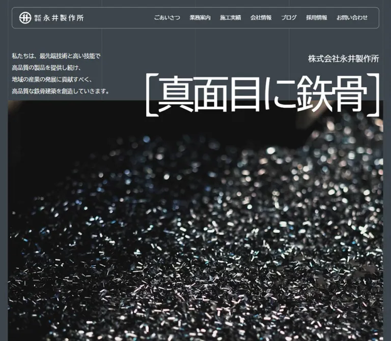
The homepage presents steel fabrication through material texture and structural order. A charcoal canvas carries faint vertical guides, white Japanese text, and an inset outlined header. The opening phrase, 真面目に鉃骨, is set at an exceptional scale between large bracket forms. On desktop, it crosses the boundary between the text area and a dark industrial image. The modest introductory paragraph sits opposite it, giving the composition an intentionally unequal balance.
The same alignment system continues through the company narrative, project records, blog entries, and dated announcements. Projects occupy broad, square-edged gray bands, with photographs concentrated in the right half on desktop. The footer changes the entire surface to white and reorganizes the company into navigation, addresses, recruitment banners, and institutional marks. Its authority comes from spacing, typography, and recognizable industrial imagery.
How to Read This Reference
- Measured means a supplied computed style, custom property, or rendered element rectangle. These values describe the recorded state, not necessarily every scroll position.
- Visually estimated means an approximation from the original-page captures. Hero lettering, fine-rule colors, and some small labels were not included in the computed-style samples.
- Calculated means arithmetic using supplied measurements. For example, adjacent blog-card positions reveal their horizontal gap.
- Recommended means a reusable implementation choice. The CSS classes, unrecorded breakpoints, accessibility additions, and replacement media dimensions below belong to this category.
- The font stack was recorded, but the actual font file used for each character was not established.
- Screenshots and DOM rectangles represent different sampled states. Some offscreen rectangles are displaced, and project geometry changes between the initial measurements and the scrolled capture. Do not convert every reported offset into permanent spacing.
- This reference uses the supplied evidence only. No additional browsing, command execution, or file inspection was performed.
Tokens — Colors
Default Palette
| Name | Value | Source or implementation token | Role and evidence |
|---|---|---|---|
| Steel Canvas | #3c454b |
Source --background-color; alias --color-steel |
Measured source token matching the dark page treatment; also measured as footer text color |
| Raised Steel | #4c5459 |
Source --background-bright-color; alias --color-panel |
Measured project-row background: rgb(76, 84, 89) |
| Lighter Steel | #535b61 |
Source --background-bright-hover-color; alias --color-panel-hover |
Measured token; its exact assignment to hovered components was not exercised |
| White | #ffffff |
Source --text-color: rgba(255,255,255,1); alias --color-white |
Measured main text and footer background |
| Announcement Wash | rgba(255,255,255,0.08) |
Alias --color-announcement |
Measured press-row background |
| Dark Border Token | rgba(0,0,0,0.1) |
Source --border-color |
Token exists; its use on the visible vertical guides was not established |
| Body Underlay | rgba(0,0,0,0.8) |
Computed body background | An underlying declaration, not a substitute for the visible steel-colored canvas |
Calculated relationship: compositing the 8% white announcement wash over #3c454b produces approximately #4c5459. Project and press surfaces can therefore appear closely related even though one is an opaque color and the other is an overlay.
The supplied properties also include --swiper-theme-color: #007aff. This is a library token, not evidence of a blue interface accent. The bright cyan, purple, and multicolor details visible in the footer belong to external banner and emblem artwork.
Recommended Rule and Badge Aliases
These values approximate the screenshots; their exact source declarations were not supplied.
| Alias | Recommended value | Use |
|---|---|---|
--color-grid |
rgba(255,255,255,0.10) |
Quiet vertical guides over the dark canvas |
--color-header-rule |
rgba(255,255,255,0.45) |
Fine outline around the header |
--color-footer-rule |
rgba(60,69,75,0.45) |
Divider above the footer contact area |
--color-chip |
rgba(255,255,255,0.10) |
Slightly lighter project category pill |
Keep the guides subordinate to text and photographs. They should suggest structure without making the page look like a visible spreadsheet. The footer is a section-level inversion; there is no evidence of a user-controlled light/dark switch.
Tokens — Typography
Recorded Font Stack
The sampled interface consistently declares:
font-family: Arial, 'BIZ UDGothic', 'メイリオ', 'MS Pゴシック', sans-serif;
This is the recorded stack, not proof that every named face was downloaded or used. The design combines ordinary sans-serif interface text with unusually large display text. Most sampled content uses weight 400, normal letter spacing, and generous paragraph leading.
Section headings use weight 500. Avoid making all headings heavily bold: scale and placement carry much of the hierarchy.
Wordmark and Hero Lettering
The header home link occupies a 180 × 34.5px logo box on desktop and a 150 × 28.75px box on mobile. Its containing H1 has an inherited 32px / 700 declaration, but that declaration does not establish the typography of the visible logo artwork.
The hero phrase is exposed as six separate characters in the DOM. This confirms text segmentation, but does not establish an animated letter sequence. Its exact font size and weight were not sampled. The captures support an estimated display size of roughly 120px on desktop and 48px on mobile.
Type Scale
Sizes are measured unless marked otherwise. Values separated by a slash are font size and line height.
| Role | Desktop | Mobile | Weight or limitation |
|---|---|---|---|
| Base text | 16 / 28.8px |
16 / 28.8px |
400 |
| Desktop navigation | 15 / 27px |
Replaced visually by menu icon | 400; link box is 36px high |
| Mobile navigation entries | Not applicable | 24 / 36px |
Measured in menu-related DOM; open appearance unverified |
| Hero company label | Approximately 24px |
Approximately 16px |
Visual estimate |
| Bracketed hero phrase | Approximately 120px |
Approximately 48px |
Visual estimate; exact face and weight unrecorded |
| Hero introductory paragraph | 16 / 28.8px |
Absent from the captured hero | 400; screenshot line spacing appears larger than nominal leading |
| Company narrative | 24 / 43.2px |
16 / 28.8px |
400 |
| Main Japanese section heading | 64 / 64px |
36 / 36px |
500 |
| Project title | Approximately 24px |
Not individually sampled | Desktop visual estimate; allow mobile wrapping |
| Blog title | 20 / 36px |
16 / 28.8px |
400 |
| Press announcement title | 20 / 36px |
16 / 28.8px |
400 |
| Section archive link | 24 / 38.4px |
20 / 32px |
400 |
| Footer directory link | 20 / 36px |
Main directory groups not visible | 400 |
| Footer policy and address text | 13 / 23.4px |
13 / 23.4px |
400 |
| Location heading | 15 / 27px |
15 / 27px |
400 |
| Footer group caption | Approximately 12px |
Not established | Visual estimate |
| Copyright | Approximately 11px |
Approximately 11px |
Visual estimate |
The English markers Company, Project, Blog, and Press Release appear in the rendered text. Their individual typography and bounds were not supplied, so their display treatment should not be reconstructed from assumed conventions.
Tokens — Spacing & Shapes
Base: a conventional 16px root font size, with a mixture of viewport-relative and fixed spacing.
Density: compact navigation and metadata inside an unusually spacious page framework.
Responsive Unit
The exact supplied spacing property is:
--inner-padding: max(1vw, 10px);
It resolves to 14.4px at the desktop viewport and 10px on mobile. Main content edges sit at 28.8px and 20px, respectively. The formula max(2vw, 20px) reproduces those outer gutters, but that formula itself was not supplied.
Nested alignment matters: desktop content at approximately 43.2px combines the 28.8px outer gutter with the 14.4px inner inset. Mobile text at 30px similarly combines 20px + 10px.
Spacing Scale
| Use | Desktop | Mobile | Evidence |
|---|---|---|---|
| Inner alignment inset | 14.4px |
10px |
Exact source formula |
| Main outer gutter | 28.8px |
20px |
Computed main padding |
| Header internal horizontal padding | 20px |
20px |
Computed |
| Header top clearance | 20px |
10px |
Measured rectangle |
| Main top padding | 72px |
60px |
Computed |
| Main child gap | 144px |
80px |
Computed; not the entire distance between every visible section |
| Section layout gap | 40px |
20px |
Computed |
| Company paragraph to company link | 72px |
40px |
Calculated from bounds |
| Link label to secondary slot | 20px |
20px |
Computed flex gap |
| Project-row separation | 6px |
2px |
Calculated from adjacent bounds |
| Press-row separation | 4px |
2px |
Calculated from adjacent bounds |
| Blog-card separation | Approximately 29.78px |
40px |
Calculated from adjacent bounds |
| Blog-card internal gap | 20px |
20px |
Computed |
| Main bottom padding | 216px |
120px |
Computed |
| Footer outer horizontal padding | 28.8px |
7.8px |
Computed |
| Mobile footer vertical padding | Not equivalent | 80px |
Computed |
Border Radius
| Element | Desktop | Mobile | Status |
|---|---|---|---|
| Header | 10px |
5px |
Measured |
| Desktop navigation links | 5px |
Not applicable | Measured |
| Project, blog, and press containers | 0 |
0 |
Measured |
| Project category chip | Small capsule | Not visually inspected | Desktop appearance only; exact radius unknown |
| Industrial photographs | Square corners | Square hero corners | Observed |
Layout Measurements
| Element | Desktop | Mobile |
|---|---|---|
| Header | 1353.59 × 60px, at x 43.19px |
330 × 50px, at x 30px |
| Main usable width | 1382.41px |
350px |
| Desktop section grid | Two columns of 691.20px |
Sections switch to flex layout |
| Company paragraph | 661.92px wide, at x 734.89px |
330px wide, at x 30px |
| Project link, initial sample | 1382.41 × 590.88px |
350 × 383.39px for shorter titles; 419.39px high for longer titles |
| Blog link | 315.97 × 485.36px |
206.66 × 390.44px |
| Press link | 1382.41 × 76px |
350 × 120.98px |
| Footer | 1440 × 763.17px |
390 × 902.36px |
| Footer logo | 240 × 46px |
200 × 38.33px |
| Recruitment banner link | 150 × 46.14px |
150 × 46.14px |
| Document height | Approximately 8610px |
Approximately 6748px |
Document and card heights are inspection results, not fixed-height recommendations. Text length, media, scroll state, and rendering can change them.
Components
Persistent Header
Role: company identity and access to the main corporate sections.
The desktop header is a long, inset enclosure with a thin light border, 10px corners, a white logo on the left, and seven text links on the right. Its measured height is 60px. The logo begins at approximately x 64.19px, after the header border and 20px internal padding.
The navigation contains ごあいさつ, 業務案内, 施工実績, 会社情報, ブログ, 採用情報, and お問い合わせ. Links use 15px regular text, 36px-high boxes, horizontal padding of 14.4px, and 5px corners. Neighboring link boxes are separated by approximately 5px.
On mobile, the header becomes a 330 × 50px enclosure with 5px corners. The logo shrinks to 150px wide. A three-line menu symbol occupies a 24px visual slot at the right; the measured header grid declares 150px 24px columns.
The header remains at the same top location across the desktop scroll captures. This establishes visual persistence, although its exact position declaration was not supplied. The computed header background is transparent; the effective surface behind it should not be described as verified glass or backdrop blur.
Mobile Navigation Structure
Role: preserves the larger corporate directory when the horizontal navigation no longer fits.
The mobile DOM includes Contents and Press groups, the principal corporate destinations, and policy links. Main entries are measured at 24px with 36px leading; policy entries use 13px with 19.5px leading in this navigation structure.
The opening screenshot shows the closed menu icon, not the expanded navigation. No opening gesture, overlay appearance, focus behavior, close control, or transition was recorded. DOM presence and link rectangles alone do not establish that the menu was visible.
For reuse, keep the grouped destination structure. A native disclosure or an accessible dialog is an implementation recommendation, not an observed description of the original mechanism.
Opening Hero
Role: introduces the company through a concise statement and the physical character of steel production.
The desktop composition has three coordinated layers:
- A short introductory text block at the left, measured at about 489px wide.
- The company name and very large bracketed phrase aligned toward the right.
- A wide industrial image extending from approximately x
29pxto1411px, beginning near y360px.
The large bracket forms continue down to approximately y 412px, overlapping the image by roughly 50px. This boundary-crossing typography is a defining detail. The text does not sit inside a separate opaque card.
The desktop image shows reflective metal shavings against deep black areas and soft highlights. The mobile capture instead shows a tightly cropped industrial machine. These are different observed images or frames; the evidence does not establish whether the source is video, a changing image sequence, or responsive asset selection.
At 390px wide, the company label and phrase align left at approximately x 30px. The phrase remains on one line at an estimated 48px size. The media starts near y 240px, spans 350px, and extends to about y 831px in the capture. The desktop introductory paragraph is absent from this mobile hero state.
Keep the bracketed statement as readable text with decorative brackets. The DOM’s character-by-character segmentation should not become six separately announced fragments in a new implementation.
Company Introduction
Role: explains the company’s manufacturing identity and links to company information.
The DOM includes a Company marker, a three-line Japanese statement beginning 最高の技術者が, a narrative paragraph, and a 会社情報 link. The paragraph is positioned in the right half on desktop: x 734.89px, width 661.92px, with 24px text and 43.2px leading.
On mobile, the narrative becomes a 330px-wide block at x 30px, with 16px text and 28.8px leading. The following company link decreases from 24px to 20px and sits 40px below the paragraph bounds, compared with 72px on desktop.
The source text maintains a calm, explanatory rhythm. Preserve generous leading and a clear measure. The company heading’s exact type size and the surrounding imagery were not visually captured, so they are not specified as observed components here.
Section Heading and Archive Link
Role: names a content collection and provides a route to the full index.
Desktop project, blog, and press sections use a two-column grid with equal 691.20px columns. Their Japanese H2 headings use 64px / 64px, weight 500, and 14.4px horizontal padding. The archive link aligns toward the right within the same heading region.
Mobile sections switch to a vertical flex layout. H2 text becomes 36px / 36px, with 10px horizontal padding. Archive links move below their content and are horizontally centered. The measured project and press archive links are 196px wide; the blog archive link is 156px wide.
The project heading also exposes a count of 33. Four featured project links appear on this homepage. Treat the count as collection data, not as part of a permanently hardcoded heading string. Its separate visual styling was not sampled.
Project Record
Role: connects a construction name, category, year, and project photograph to one project detail page.
Each record is an entire anchor with a #4c5459 background and square corners. The desktop capture shows the project name at the left, a small category pill around the central alignment, and a right-aligned year preceded by a small white dot. Names have a fine underline that appears dotted in the screenshot.
Photographs occupy the right half beneath the metadata band. The left half remains largely empty below the title. This asymmetry gives the list its character: broad horizontal structure, a clear reading edge, and substantial visual weight on the right.
Visible examples include the restoration work at 熊本城天守閣復旧整備工事, photographed with cranes and scaffolding, and 熊本県公共関与管理型最終処分場(エコアくまもと), represented by an aerial facility view. The linked project destinations are confirmed in the homepage DOM.
The initial desktop DOM reports equal 590.88px-tall records. The scrolled screenshot shows a compact title band for one project and shorter visible regions for following photographs. These differing states do not establish an accordion, a click-to-expand action, or a fixed compact-row height.
On mobile, project anchors become 350px-wide flex containers with 20px 10px padding and a 20px internal gap. The first two measure 383.39px high; the longer titles produce 419.39px records. This supports content-dependent wrapping. Internal image and metadata positions were not individually sampled on mobile, so a vertical title–metadata–image stack is a practical adaptation rather than an exact extracted specification.
Blog Rail
Role: exposes recent company articles in a horizontal sequence.
Eight linked articles appear in the DOM. At desktop width, the first four start at approximately x 43.19, 388.94, 734.69, and 1080.44px. Each is about 315.97px wide, with a calculated 29.78px gap. Subsequent entries continue beyond the viewport.
On mobile, cards are approximately 206.66px wide with 40px gaps. The first begins at x 30px and the next at x 276.66px, leaving part of the next item within the viewport. Preserve this visible continuation when adapting the component.
The card structure is a media region, title, and category/date information, with a measured 20px internal gap. A square media allocation is strongly suggested by geometry: the title begins one card-width plus 20px below the card top at both viewports. Actual blog image content was not included in the supplied screenshots.
Titles use 20px text with 36px leading on desktop and 16px with 28.8px leading on mobile. Containers are transparent and square-edged. Horizontal overflow is evidenced; dragging, autoplay, navigation arrows, and snap behavior were not tested.
Press Release Row
Role: presents dated company announcements in a compact text list.
Five linked announcements appear in the inspected page. Desktop rows have a measured 76px height, 20px vertical padding, and an 8% white background wash. Their grid contains four equal columns with 1px gaps: the date occupies the first quarter and the title spans the remaining three quarters.
Announcement titles use 20px text with 36px leading and 14.4px horizontal padding. Rows are separated by a calculated 4px gap.
On mobile, each row becomes a vertical flex layout approximately 120.98px high. The date precedes the title, the title uses 16px text with 28.8px leading, horizontal text padding becomes 10px, and rows are separated by 2px. Keep height content-driven in a new implementation.
The sampled row declares a 250ms transition, but its before/after appearance was not recorded.
Archive and Company Links
Role: secondary navigation within the content hierarchy.
Links such as 会社情報, 施工実績一覧, 記事一覧, and リリース一覧 use regular text rather than a strongly colored filled button. Their measured flex gap is 20px. Text decreases from 24px on desktop to 20px on mobile.
The rectangles include space beyond the text, but the additional icon or decorative element was not individually captured. Preserve a clear link affordance without claiming a particular original arrow shape or animation.
Footer Directory
Role: provides a spacious overview of the site before the contact details.
The entire footer uses white with #3c454b text. Desktop navigation is organized into Contents, Press, and Other groups, positioned around the first, second, and fourth columns of the underlying framework. The third column remains open.
Main links use 20px regular text with 36px leading. Their measured positions advance by 46px, producing approximately 10px between line boxes. Policy links are smaller at 13px. Group captions appear around 12px and are displayed with light bracket notation in the capture.
The desktop footer screenshot begins with a broad white field, places the directory well below its top edge, and leaves substantial space before the horizontal contact divider. The directory occupies a major part of the footer rather than a narrow utility strip.
On mobile, the full Contents and Press directory groups are absent from the visible footer layout. Two policy links remain in the DOM before the contact divider. Their presence in the separate mobile navigation structure should not be confused with their visibility in the footer.
Footer Identity, Locations, and Banners
Role: makes the company’s physical locations and external destinations easy to find.
The desktop contact area places the 240px-wide dark wordmark at the left, followed by separate headquarters/factory and Yatsushiro factory blocks. Location headings use 15px text; addresses, telephone numbers, and fax numbers use 13px text. Small pin symbols precede the location headings, and the address links are underlined.
At the right, two recruitment banners stack vertically in 150 × 46.14px link boxes. Their visible labels are マイナビ2028 and マイナビ2027. A regional-company emblem and a Kumamon SDGs graphic sit beside them. These are visible linked marks; the inspection did not independently verify certification status or the content of their external destinations.
On mobile, the logo is centered at 200px wide. Both location blocks follow in a centered stack. Recruitment banners remain 150px wide and are separated vertically by 40px. The two institutional graphics form a centered horizontal pair below them, followed by the copyright line.
The persistent light header mark is very faint over the white footer in the supplied mobile capture. Whether this is transient or stable is unknown. A contrast-safe persistent header is recommended when reproducing this layout.
Tokens — Motion & Interaction
| Treatment | Evidence | Safe conclusion |
|---|---|---|
| Desktop navigation feedback | transition: background-color 0.25s |
A 250ms background-color transition is defined; hovered colors were not observed |
| Press-row feedback | Computed transition serialized as 0.25s |
A 250ms transition is defined; exact changing properties and visual endpoints remain unverified |
| Lighter panel state | --background-bright-hover-color: #535b61 |
A hover-oriented color token exists; component assignment was not established |
| Persistent header | Same top placement in multiple scrolled captures | Header remains visually present; exact positioning code is unknown |
| Blog continuation | Card rectangles extend horizontally beyond the viewport | A horizontal rail exists; input methods and automatic movement are unverified |
| Hero imagery | Different industrial subjects appear in desktop and mobile captures | Image/frame variation is observed; video playback, autoplay, looping, and sound are unverified |
| Hero character segmentation | Six separate characters in rendered text | Segmentation exists; stagger timing and entrance behavior are unverified |
| Project geometry | Initial rectangles and scrolled appearance differ | Do not infer an accordion or a specific scroll-linked transformation |
| Other sampled nodes | Generally animation: none; many show only transition: all |
This does not supply a timed animation specification or exclude descendant, pseudo-element, media, or script-driven motion |
The collection waited for document load, image decoding, and sampled stability, with bounded animation waits. Perpetual animations were paused during readiness checks and then resumed. These procedures improve capture stability but do not establish a complete motion specification.
For reuse, the directly supported timing reference is 250ms for simple link feedback. Any media controls, entrance effects, scroll transforms, or carousel behavior must be implemented and documented separately.
Surfaces
| Layer | Appearance | Purpose |
|---|---|---|
| Main canvas | Dark steel with faint vertical guides | Connects sections through one structural framework |
| Header | Thin light enclosure; transparent computed background | Persistent identity and navigation |
| Project record | Opaque lighter steel, square corners | Groups the complete project link |
| Press record | Subtle white wash over dark canvas | Separates text announcements without heavy borders |
| Blog card | Transparent container and rectangular media allocation | Lets imagery and text define the item |
| Category chip | Small, slightly lighter capsule | Low-emphasis project classification |
| Footer | White with steel-colored text and a fine divider | Distinct directory and contact area |
| External banners | Original multicolor artwork on white | Identifies recruitment and institutional destinations |
No general shadow-based elevation system is evidenced. Structural separation comes from tone changes, alignment, rules, and image boundaries. Rounded geometry is concentrated in the header, navigation hit areas, and small category labels.
Imagery
The opening desktop image emphasizes material rather than a finished building: dense metal fragments, reflective edges, shallow focus, and large dark regions. The mobile opening image brings machinery close to the viewer, retaining dark surfaces and cropped industrial detail. Both support the company’s manufacturing identity without relying on a brightly lit corporate stock-photo treatment.
Project imagery changes scale. The restoration photograph shows cranes and scaffolding around a recognizable structure; the facility photograph provides an aerial overview. Keep this progression from material detail to construction scale. Preserve useful architectural context when cropping project images.
The desktop project photographs are large but concentrated in the right half. Hero imagery spans the main content width. Footer logos and banners retain their intrinsic proportions and colors. Do not apply the industrial image treatment to the external marks.
Observed Asset References
No image src, video source, poster URL, srcset, or asset filename was supplied. The destinations below identify the associated page or component; they are not downloadable image URLs, and linked detail pages were not opened.
| Asset or allocation | Observed association | What is established |
|---|---|---|
| Light and dark company wordmarks | Homepage home links | Appearance and rendered logo boxes are evidenced; asset URL and format are unknown |
| Opening industrial media | Homepage hero | Metal shavings on desktop; machinery on mobile; delivery mechanism unknown |
| Castle restoration photograph | /project/229/ |
Cranes and scaffolding visible in the project capture |
| Aerial facility photograph | /project/225/ |
Facility and surrounding terrain visible in the project capture |
| Blog media regions | Homepage blog links | Square allocation inferred from bounds; image subjects not visually inspected |
| Recruitment banners | Homepage footer | Two year-specific banners, each in a 150px-wide link box |
| Regional emblem and SDGs graphic | Homepage footer | Visible artwork and link boxes; source asset paths unavailable |
Use actual, appropriate industrial assets when available. CSS can reproduce the framing and hierarchy; it cannot supply the particular material texture or company marks visible in the captures.
Layout & Responsive Behavior
The desktop page uses a nearly full-width framework with 28.8px outer gutters. Faint guides divide the dark region into four approximately equal columns. The mobile capture reduces the visible framework to two columns between x 20px, 195px, and 370px.
The framework accommodates different content structures: a right-weighted hero, a right-column company paragraph, asymmetric project records, a horizontally overflowing blog rail, and quarter/three-quarter announcement rows. The footer retains the alignment logic while changing its surface and distribution.
| Area | At 1440 × 1000 | At 390 × 844 |
|---|---|---|
| Main content edges | 28.8px gutters | 20px gutters |
| Nested text alignment | About x 43.2px | x 30px |
| Header | Logo plus seven horizontal links | Smaller logo plus menu icon |
| Hero text | Introductory copy left; bracketed phrase right, overlapping media | Introductory copy absent; label and phrase left-aligned above media |
| Company narrative | Right half, 24px text | Full inner width, 16px text |
| Japanese section headings | 64px | 36px |
| Archive navigation | Beside section heading | Centered below the section content |
| Projects | Wide gray bands with photographs on the right | 350px flex containers with internal padding and wrapping |
| Blog | Approximately four full cards across | One full card and a partial following card |
| Press | Date in first quarter, title across three quarters | Date above title |
| Footer directory | Three groups across a four-column framework | Main directory groups removed from visible footer |
| Footer contacts | Horizontal layout | Centered vertical layout |
The exact breakpoint rules were not supplied. A 64rem breakpoint in the Quick Start is a recommendation for managing navigation and layout density, not a recovered source value.
Preserve ordinary document scrolling. The measured page is approximately 8610px tall on desktop and 6748px on mobile; these are not targets to enforce with fixed heights. Likewise, offscreen element offsets should not be used to create unexplained gaps or deliberate card staggering.
Do’s and Don’ts
Do
- Keep
#3c454b,#4c5459, and white as the main color relationship. - Align text through the combined outer gutter and inner inset.
- Preserve the bracketed hero phrase and its desktop overlap with the media.
- Keep the mobile phrase on one line at the inspected width while allowing a smaller size on narrower screens.
- Use regular sans-serif text and large scale differences rather than uniformly heavy weights.
- Keep desktop project imagery concentrated in the right half.
- Preserve square project, blog, and announcement geometry.
- Let project titles and announcement text determine mobile height.
- Maintain visible horizontal continuation in the blog rail.
- Treat the white footer as a spacious content area, with accurate logo proportions and clearly grouped addresses.
Don’t
- Don’t replace the corporate information hierarchy with a single conversion funnel.
- Don’t turn every content block into a rounded, floating card.
- Don’t promote library blue or recruitment-banner cyan into an assumed site action color.
- Don’t convert the project list into a uniform desktop thumbnail grid.
- Don’t infer a video specification from two different captured industrial frames.
- Don’t invent menu animations, carousel autoplay, or project expansion behavior.
- Don’t use the logo container’s font declaration as the wordmark font specification.
- Don’t hardcode the sampled document height or every initial project rectangle.
- Don’t grayscale or distort the footer’s external artwork.
- Don’t allow a persistent white logo to become unreadable over the white footer in a new implementation.
Recommended Implementation Additions
These are recommendations, not verified original-site features:
- Give the mobile menu an explicit accessible name, expanded state, and keyboard-operable close behavior. Keep its 24px visual symbol inside a target of at least 44 × 44px.
- Give the logo home link a meaningful accessible name. Keep decorative grid lines and bracket shapes out of the accessibility tree.
- Expose the hero phrase as one readable text string even if its visual treatment uses separate character elements.
- Add visible focus indicators to project records, article cards, navigation links, and footer destinations.
- Keep the blog rail keyboard-reachable and horizontally scrollable without relying on a drag gesture alone.
- If looping media is introduced, provide a poster, appropriate playback controls, and a reduced-motion alternative. Do not assume an audio track is appropriate.
- Make content visible without entrance-animation scripts and preserve a contrast-safe header over both page surfaces.
- Reserve image space and provide meaningful alternatives for project imagery. Use restrained loading behavior that does not rearrange the structural grid.
Agent Prompt Guide
Quick Color Reference
- Main canvas:
#3c454b. - Project panels:
#4c5459. - Available lighter panel token:
#535b61; original hover assignment unverified. - Main text: white.
- Press surfaces:
rgba(255,255,255,0.08)over the steel canvas. - Footer: white with
#3c454btext. - Vertical guides and header outline: low-contrast light rules; exact alpha values require approximation.
- External banner colors remain within their artwork.
Overall Prompt
“Create a Japanese steel-fabrication corporate homepage inspired by the current Nagai Steel Works composition. Use a charcoal steel canvas #3c454b, white sans-serif text, faint vertical guides, and an inset outlined header. Pair a very large bracketed statement such as the source phrase 真面目に鉃骨 with dark industrial close-up imagery. On desktop, put introductory copy on the left and let the statement overlap the top of the media on the right. Continue with a company narrative, broad square-edged project records with right-half photographs, a horizontal blog rail, and dated press rows. Finish with a spacious white directory and contact footer. At mobile width, use 20px outer gutters, 36px section headings, stacked content, a compact menu header, and centered footer details. Preserve the measured palette and hierarchy; treat media behavior and breakpoint selection as separate implementation decisions.”
Example Component Prompts
- Header and hero: “Build a 60px-high desktop header with a fine light outline, 10px corners, a 180px-wide logo, and seven 15px navigation links. Below it, place a large white bracketed Japanese phrase over the boundary between a charcoal text area and industrial imagery. At 390px, use a 50px-high header, a 150px logo, and left-aligned hero text above the media.”
- Project record: “Create a full-width
#4c5459project link with square corners. Put an underlined project name in the left half, a muted category capsule near the center, and a small year at the far right. Place a large construction photograph below the metadata in the right half, leaving open space below the title. Stack the content on mobile and let long titles increase height.” - Blog rail: “Create transparent article cards with square media allocations, regular sans-serif titles, and compact category/date information. Show about four 316px cards across the desktop content width. At 390px, use approximately 207px cards with 40px gaps and a visible partial next card. Add accessible native scrolling as an implementation choice.”
- Press list: “Create low-contrast steel announcement bands with 20px vertical padding. On desktop, place the date in the first quarter and the title across the remaining three quarters. On mobile, stack date above 16px body text. Use square corners and thin gaps between rows.”
- Footer: “Create a white corporate footer with steel-colored text. Arrange Contents, Press, and Other groups across a four-column framework, leaving one column open. Below a fine divider, place the company logo, two factory address blocks, two stacked recruitment banners, and institutional marks. On mobile, center and stack the contact area while retaining the banners’ intrinsic proportions.”
Quick Start
CSS Custom Properties
This is a reusable adaptation, not the original stylesheet. The palette, font stack, header sizes, heading sizes, and inner-padding formula follow measured evidence. The outer-gutter formula is inferred from the two viewports. The 64rem breakpoint, hero size estimates, 70svh media height, project image ratio, rule opacity, opaque fixed header, native disclosure menu, and native blog scrolling are recommendations.
Class names describe the component anatomy above. Media URLs and logo artwork must be supplied separately. This starter does not implement unverified scroll transformations, video playback, or automatic carousel behavior.
:root {
  /* Measured palette and font stack */
  --color-steel: #3c454b;
  --color-panel: #4c5459;
  --color-panel-hover: #535b61;
  --color-white: #ffffff;
  --color-announcement: rgb(255 255 255 / 8%);
  --font-site: Arial, 'BIZ UDGothic', 'メイリオ',
    'MS Pゴシック', sans-serif;

  /* Exact inner formula; inferred outer formula */
  --inner-padding: max(1vw, 10px);
  --page-gutter: max(2vw, 20px);

  /* Recommended interpolation between measured endpoints */
  --section-space: max(10vw, 80px);
  --text-section: 64px;
  --text-narrative: 24px;
  --text-article: 20px;
  --text-link: 24px;
  --text-hero: 120px;

  /* Recommended visual approximations */
  --color-grid: rgb(255 255 255 / 10%);
  --color-header-rule: rgb(255 255 255 / 45%);
  --color-footer-rule: rgb(60 69 75 / 45%);
  --color-chip: rgb(255 255 255 / 10%);
  --feedback-duration: 250ms;
}

* { box-sizing: border-box; }

body.steel-page {
  margin: 0;
  color: var(--color-white);
  background: var(--color-steel);
  font-family: var(--font-site);
  font-size: 16px;
  font-weight: 400;
  line-height: 1.8;
}

.steel-page a { color: inherit; }
.steel-page img { display: block; max-width: 100%; }
.steel-page :focus-visible {
  outline: 2px solid currentColor;
  outline-offset: 4px;
}

.site-main {
  position: relative;
  display: flex;
  flex-direction: column;
  gap: var(--section-space);
  padding: max(5vw, 60px) var(--page-gutter) max(15vw, 120px);
}

/* Recommended decorative four-column framework */
.site-main::before {
  content: '';
  position: absolute;
  inset: 0 var(--page-gutter);
  border-right: 1px solid var(--color-grid);
  background-image: linear-gradient(
    to right, var(--color-grid) 1px, transparent 1px
  );
  background-size: 25% 100%;
  pointer-events: none;
}

.site-main > * { position: relative; min-width: 0; }

/* Opaque backing is a recommended contrast safeguard */
.site-header {
  position: fixed;
  z-index: 100;
  top: 20px;
  left: calc(var(--page-gutter) + var(--inner-padding));
  right: calc(var(--page-gutter) + var(--inner-padding));
  display: flex;
  align-items: center;
  justify-content: space-between;
  height: 60px;
  padding-inline: 20px;
  border: 1px solid var(--color-header-rule);
  border-radius: 10px;
  color: var(--color-white);
  background: var(--color-steel);
}

.site-brand { display: block; width: 180px; flex-shrink: 0; }
.site-brand img { width: 100%; height: auto; }
.desktop-nav { display: flex; gap: 5px; }
.desktop-nav a {
  display: flex;
  align-items: center;
  min-height: 36px;
  padding-inline: var(--inner-padding);
  border-radius: 5px;
  font-size: 15px;
  line-height: 27px;
  text-decoration: none;
  transition: background-color var(--feedback-duration);
}

.mobile-menu { display: none; }
.mobile-menu summary {
  display: grid;
  place-items: center;
  width: 44px;
  height: 44px;
  list-style: none;
  cursor: pointer;
}
.mobile-menu summary::-webkit-details-marker { display: none; }
.menu-lines {
  position: relative;
  display: block;
  width: 24px;
  height: 10px;
  border-block: 1px solid currentColor;
}
.menu-lines::after {
  content: '';
  position: absolute;
  top: 50%;
  left: 0;
  right: 0;
  height: 1px;
  background: currentColor;
}
.mobile-menu nav {
  position: fixed;
  inset: 70px 30px 20px;
  display: grid;
  align-content: start;
  gap: 16px;
  overflow-y: auto;
  padding: 24px;
  border: 1px solid var(--color-header-rule);
  background: var(--color-steel);
  font-size: 24px;
  line-height: 1.5;
}
.mobile-menu:not([open]) nav { display: none; }

/* Hero geometry approximates the supplied screenshots */
.hero-intro {
  display: grid;
  grid-template-columns: 40% 60%;
  align-items: end;
  min-height: 288px;
  padding-inline: var(--inner-padding);
}
.hero-copy {
  grid-column: 1;
  grid-row: 1;
  max-width: 489px;
  padding-bottom: var(--inner-padding);
}
.hero-copy p { margin: 0; }
.hero-identity {
  position: relative;
  z-index: 1;
  grid-column: 2;
  grid-row: 1;
  text-align: right;
  transform: translateY(50px);
}
.hero-label { margin: 0 0 20px; font-size: 24px; }
.hero-title {
  display: flex;
  align-items: stretch;
  justify-content: flex-end;
  gap: 0.05em;
  margin: 0;
  font-size: var(--text-hero);
  font-weight: 400;
  line-height: 1.1;
  white-space: nowrap;
}
.hero-title::before,
.hero-title::after {
  content: '';
  flex: 0 0 0.28em;
  border: 0.07em solid currentColor;
}
.hero-title::before {
  border-right: 0;
  border-radius: 0.07em 0 0 0.07em;
}
.hero-title::after {
  border-left: 0;
  border-radius: 0 0.07em 0.07em 0;
}
.hero-media {
  width: 100%;
  height: 70svh;
  object-fit: cover;
}

.company-layout {
  display: grid;
  grid-template-columns: repeat(2, minmax(0, 1fr));
}
.company-copy {
  grid-column: 2;
  padding-inline: var(--inner-padding);
  font-size: var(--text-narrative);
  line-height: 1.8;
}
.company-copy p { margin: 0; }
.company-copy .section-more { margin-top: max(5vw, 40px); }

.content-section {
  display: grid;
  grid-template-columns: repeat(2, minmax(0, 1fr));
  gap: 40px 0;
  min-width: 0;
}
.section-title {
  grid-column: 1;
  margin: 0;
  padding-inline: var(--inner-padding);
  font-size: var(--text-section);
  font-weight: 500;
  line-height: 1;
}
.section-more {
  display: inline-flex;
  align-items: center;
  gap: 20px;
  font-size: var(--text-link);
  line-height: 1.6;
  text-underline-offset: 0.2em;
}
.content-section > .section-more {
  grid-column: 2;
  grid-row: 1;
  justify-self: end;
  margin-right: var(--inner-padding);
}
.section-body { grid-column: 1 / -1; min-width: 0; }

.project-list { display: grid; gap: 6px; }
.project-card {
  display: grid;
  grid-template-columns: repeat(2, minmax(0, 1fr));
  background: var(--color-panel);
  text-decoration: none;
}
.project-title {
  margin: 0;
  padding: 32px var(--inner-padding);
  font-size: 24px;
  font-weight: 400;
  line-height: 1.5;
  text-decoration: underline dotted;
  text-underline-offset: 0.18em;
}
.project-meta {
  display: flex;
  align-items: center;
  justify-content: space-between;
  gap: 12px;
  padding: 32px var(--inner-padding);
  font-size: 13px;
}
.project-chip {
  padding: 1px 10px;
  border-radius: 999px;
  background: var(--color-chip);
}
.project-year::before {
  content: '';
  display: inline-block;
  width: 6px;
  height: 6px;
  margin-right: 5px;
  border-radius: 50%;
  background: currentColor;
  vertical-align: middle;
}
.project-media {
  grid-column: 2;
  margin: 0 var(--inner-padding) 0 0;
}
.project-media img {
  width: 100%;
  aspect-ratio: 16 / 9;
  object-fit: cover;
}

/* Native scrolling is an adaptation, not an observed input model */
.blog-track {
  display: grid;
  grid-auto-flow: column;
  grid-auto-columns: calc((100% - 90px) / 4);
  gap: 30px;
  overflow-x: auto;
  padding: 0 var(--inner-padding) 8px;
}
.blog-card {
  display: flex;
  flex-direction: column;
  gap: 20px;
  min-width: 0;
  text-decoration: none;
}
.blog-card img { width: 100%; aspect-ratio: 1; object-fit: cover; }
.blog-title {
  margin: 0;
  font-size: var(--text-article);
  font-weight: 400;
  line-height: 1.8;
}
.blog-meta { font-size: 13px; }

.press-list { display: grid; gap: 4px; }
.press-row {
  display: grid;
  grid-template-columns: repeat(4, minmax(0, 1fr));
  gap: 1px;
  padding-block: 20px;
  background: var(--color-announcement);
  text-decoration: none;
  transition: background-color var(--feedback-duration);
}
.press-date { padding-inline: var(--inner-padding); font-size: 13px; }
.press-title {
  grid-column: 2 / -1;
  margin: 0;
  padding-inline: var(--inner-padding);
  font-size: var(--text-article);
  line-height: 1.8;
}

.site-footer {
  padding-inline: 2vw;
  color: var(--color-steel);
  background: var(--color-white);
}
.footer-directory {
  display: grid;
  grid-template-columns: repeat(4, minmax(0, 1fr));
  padding-block: 144px;
}
.footer-group { padding-inline: 20px; }
.footer-group--other { grid-column: 4; }
.footer-caption { margin: 0 0 8px; font-size: 12px; }
.footer-links { display: grid; gap: 10px; }
.footer-links a { font-size: 20px; line-height: 1.8; text-decoration: none; }
.footer-group--other a { font-size: 13px; }
.footer-bottom {
  display: flex;
  align-items: flex-start;
  flex-wrap: wrap;
  gap: 40px;
  padding: 40px 20px;
  border-top: 1px solid var(--color-footer-rule);
}
.footer-logo { width: 240px; height: auto; }
.footer-address { font-size: 13px; font-style: normal; line-height: 1.8; }
.footer-address h3 { margin: 0 0 10px; font-size: 15px; font-weight: 400; }
.footer-address p { margin: 0; }
.recruit-banners { display: grid; gap: 10px; }
.recruit-banners img { width: 150px; height: auto; }
.institutional-marks { display: flex; align-items: center; gap: 40px; }
.institutional-marks img { width: auto; height: 80px; }
.copyright { font-size: 11px; }

/* Recommended hover assignment using the observed color token */
@media (hover: hover) {
  .desktop-nav a:hover,
  .press-row:hover { background: var(--color-panel-hover); }
}

/* Recommended breakpoint; original breakpoint was not supplied */
@media (max-width: 64rem) {
  :root {
    --page-gutter: 20px;
    --section-space: 80px;
    --text-section: 36px;
    --text-narrative: 16px;
    --text-article: 16px;
    --text-link: 20px;
    --text-hero: clamp(32px, 12.31vw, 48px);
  }
  .site-main { padding: 60px var(--page-gutter) 120px; }
  .site-main::before { background-size: 50% 100%; }
  .site-header { top: 10px; height: 50px; border-radius: 5px; }
  .site-brand { width: 150px; }
  .desktop-nav { display: none; }
  .mobile-menu { display: block; }
  .hero-intro {
    display: flex;
    align-items: flex-end;
    min-height: 180px;
    padding-bottom: 12px;
  }
  .hero-copy { display: none; }
  .hero-identity { text-align: left; transform: none; }
  .hero-label { margin-bottom: 12px; font-size: 16px; }
  .hero-title { justify-content: flex-start; }
  .company-layout { grid-template-columns: minmax(0, 1fr); }
  .company-copy { grid-column: 1; }
  .content-section { display: flex; flex-direction: column; gap: 20px; }
  .content-section > .section-more {
    order: 3;
    align-self: center;
    margin: 50px 0 0;
  }
  .project-list { gap: 2px; }
  .project-card {
    grid-template-columns: minmax(0, 1fr);
    gap: 20px;
    padding: 20px var(--inner-padding);
  }
  .project-title { padding: 0; font-size: 20px; line-height: 1.8; }
  .project-meta { padding: 0; }
  .project-media { grid-column: 1; margin: 0; }
  .blog-track { grid-auto-columns: calc((100% - 20px) / 1.5); gap: 40px; }
  .press-list { gap: 2px; }
  .press-row { display: flex; flex-direction: column; gap: 0; }
  .site-footer { padding-block: 80px; }
  .footer-directory { display: block; padding: 0 0 40px; }
  .footer-group:not(.footer-group--other) { display: none; }
  .footer-group--other .footer-caption { display: none; }
  .footer-group--other .footer-links {
    display: flex;
    justify-content: center;
    flex-wrap: wrap;
    gap: 20px 40px;
  }
  .footer-bottom {
    flex-direction: column;
    align-items: center;
    text-align: center;
    padding-bottom: 0;
  }
  .footer-logo { width: 200px; }
  .recruit-banners { gap: 40px; }
  .institutional-marks { margin-top: 20px; }
}

/* Recommended reduced-motion treatment for this adaptation */
@media (prefers-reduced-motion: reduce) {
  .desktop-nav a,
  .press-row { transition: none; }
}
Minimal Component Markup
This example demonstrates the project-card anatomy. PROJECT_IMAGE_URL is a replacement placeholder, not an observed asset path. The project destination and Japanese title come from the inspected homepage.
<a class='project-card' href='https://nagai-steel.co.jp/project/229/'>
  <h3 class='project-title'>熊本城天守閣復旧整備工事</h3>
  <div class='project-meta'>
    <span class='project-chip'>その他</span>
    <time class='project-year' datetime='2020'>2020</time>
  </div>
  <figure class='project-media'>
    <img
      src='PROJECT_IMAGE_URL'
      alt='Cranes and scaffolding surrounding the castle restoration work'
      loading='lazy'
      decoding='async'
    >
  </figure>
</a>
Use .content-section with a .section-title, a .section-body, and a .section-more link. The CSS places the archive link beside the heading on desktop and after the content on mobile. Use .mobile-menu on a native details element with a named summary and a child nav; that disclosure behavior is a recommended alternative, not a claim about the original menu.
Tailwind v4 Token Mapping
Optional aliases for a project already using Tailwind v4. This does not imply that the original site uses Tailwind. Define the custom properties above first.
@theme inline {
  --color-steel: #3c454b;
  --color-panel: #4c5459;
  --color-panel-hover: #535b61;
  --color-paper: #ffffff;

  --font-industrial: Arial, 'BIZ UDGothic', 'メイリオ',
    'MS Pゴシック', sans-serif;

  --text-section-heading: var(--text-section);
  --text-narrative-copy: var(--text-narrative);
  --text-article-title: var(--text-article);
  --text-archive-link: var(--text-link);
  --text-hero-display: var(--text-hero);

  --spacing-inner: var(--inner-padding);
  --spacing-page: var(--page-gutter);
  --spacing-section: var(--section-space);

  --radius-header-desktop: 10px;
  --radius-header-mobile: 5px;
}
Sources & Evidence
- Current Nagai Steel Works homepage: original and final URL, HTTP 200, page title, visible company identity, homepage content, and rendered link destinations. No redirect was recorded.
- Capture date: supplied retrieval timestamp
2026-09-12T17:44:01.689Z, equivalent to September 13, 2026, at 02:44 JST. - Desktop evidence: 1440 × 1000 viewport; opening hero, scrolled project area, and footer captures; rendered document height approximately 8610px; supplied computed styles and element rectangles for the wider homepage.
- Mobile evidence: 390 × 844 viewport; opening hero and bottom footer captures; rendered document height approximately 6748px; supplied responsive element rectangles, text, and link data.
- Style evidence: recorded color custom properties, font-family declarations, font sizes, leading, weights, padding, gaps, radii, grid columns, backgrounds, and selected transition declarations. Not every component or pseudo-element was sampled.
- Interaction scope: page loading and scrolling were represented in the supplied collection. Menu opening, hover endpoints, blog navigation, media controls, and linked pages were not exercised in the evidence available here.
This document describes the current homepage represented by those captures and DOM samples. Missing asset paths, unmeasured hero typography, changing project geometry, and untested interactions remain explicit limits. CSS interpolation, accessibility additions, and component implementations are recommendations.
# Nagai Steel Works / 株式会社永井製作所 — Style Reference

> A steel-colored structural grid, monumental bracketed lettering, and close-up industrial imagery, ending in a spacious white company directory.

**Website:** [nagai-steel.co.jp](https://nagai-steel.co.jp/)
**Original URL:** https://nagai-steel.co.jp/
**Final URL:** https://nagai-steel.co.jp/
**Theme:** dark main content with a white footer; no selectable theme was evidenced.
**Inspected:** September 13, 2026, at 02:44 JST. The supplied retrieval timestamp is September 12, 2026, at 17:44:01.689 UTC.
**Viewports:** 1440 × 1000 desktop and 390 × 844 mobile, in CSS pixels.
**Scope:** the current corporate homepage: header, opening composition, company introduction, featured projects, blog rail, press releases, footer navigation, company locations, and external banners. Visual evidence includes three desktop captures and two mobile captures. Intermediate sections also have rendered text, link destinations, computed styles, and element bounds. Linked pages and menu-open states were not inspected.

The homepage presents steel fabrication through material texture and structural order. A charcoal canvas carries faint vertical guides, white Japanese text, and an inset outlined header. The opening phrase, `真面目に鉃骨`, is set at an exceptional scale between large bracket forms. On desktop, it crosses the boundary between the text area and a dark industrial image. The modest introductory paragraph sits opposite it, giving the composition an intentionally unequal balance.

The same alignment system continues through the company narrative, project records, blog entries, and dated announcements. Projects occupy broad, square-edged gray bands, with photographs concentrated in the right half on desktop. The footer changes the entire surface to white and reorganizes the company into navigation, addresses, recruitment banners, and institutional marks. Its authority comes from spacing, typography, and recognizable industrial imagery.

## How to Read This Reference

- **Measured** means a supplied computed style, custom property, or rendered element rectangle. These values describe the recorded state, not necessarily every scroll position.
- **Visually estimated** means an approximation from the original-page captures. Hero lettering, fine-rule colors, and some small labels were not included in the computed-style samples.
- **Calculated** means arithmetic using supplied measurements. For example, adjacent blog-card positions reveal their horizontal gap.
- **Recommended** means a reusable implementation choice. The CSS classes, unrecorded breakpoints, accessibility additions, and replacement media dimensions below belong to this category.
- The font stack was recorded, but the actual font file used for each character was not established.
- Screenshots and DOM rectangles represent different sampled states. Some offscreen rectangles are displaced, and project geometry changes between the initial measurements and the scrolled capture. Do not convert every reported offset into permanent spacing.
- This reference uses the supplied evidence only. No additional browsing, command execution, or file inspection was performed.

## Tokens — Colors

### Default Palette

| Name | Value | Source or implementation token | Role and evidence |
| --- | --- | --- | --- |
| Steel Canvas | `#3c454b` | Source `--background-color`; alias `--color-steel` | Measured source token matching the dark page treatment; also measured as footer text color |
| Raised Steel | `#4c5459` | Source `--background-bright-color`; alias `--color-panel` | Measured project-row background: `rgb(76, 84, 89)` |
| Lighter Steel | `#535b61` | Source `--background-bright-hover-color`; alias `--color-panel-hover` | Measured token; its exact assignment to hovered components was not exercised |
| White | `#ffffff` | Source `--text-color: rgba(255,255,255,1)`; alias `--color-white` | Measured main text and footer background |
| Announcement Wash | `rgba(255,255,255,0.08)` | Alias `--color-announcement` | Measured press-row background |
| Dark Border Token | `rgba(0,0,0,0.1)` | Source `--border-color` | Token exists; its use on the visible vertical guides was not established |
| Body Underlay | `rgba(0,0,0,0.8)` | Computed body background | An underlying declaration, not a substitute for the visible steel-colored canvas |

**Calculated relationship:** compositing the 8% white announcement wash over `#3c454b` produces approximately `#4c5459`. Project and press surfaces can therefore appear closely related even though one is an opaque color and the other is an overlay.

The supplied properties also include `--swiper-theme-color: #007aff`. This is a library token, not evidence of a blue interface accent. The bright cyan, purple, and multicolor details visible in the footer belong to external banner and emblem artwork.

### Recommended Rule and Badge Aliases

These values approximate the screenshots; their exact source declarations were not supplied.

| Alias | Recommended value | Use |
| --- | --- | --- |
| `--color-grid` | `rgba(255,255,255,0.10)` | Quiet vertical guides over the dark canvas |
| `--color-header-rule` | `rgba(255,255,255,0.45)` | Fine outline around the header |
| `--color-footer-rule` | `rgba(60,69,75,0.45)` | Divider above the footer contact area |
| `--color-chip` | `rgba(255,255,255,0.10)` | Slightly lighter project category pill |

Keep the guides subordinate to text and photographs. They should suggest structure without making the page look like a visible spreadsheet. The footer is a section-level inversion; there is no evidence of a user-controlled light/dark switch.

## Tokens — Typography

### Recorded Font Stack

The sampled interface consistently declares:

```css
font-family: Arial, 'BIZ UDGothic', 'メイリオ', 'MS Pゴシック', sans-serif;
```

This is the recorded stack, not proof that every named face was downloaded or used. The design combines ordinary sans-serif interface text with unusually large display text. Most sampled content uses weight `400`, normal letter spacing, and generous paragraph leading.

Section headings use weight `500`. Avoid making all headings heavily bold: scale and placement carry much of the hierarchy.

### Wordmark and Hero Lettering

The header home link occupies a `180 × 34.5px` logo box on desktop and a `150 × 28.75px` box on mobile. Its containing H1 has an inherited `32px / 700` declaration, but that declaration does not establish the typography of the visible logo artwork.

The hero phrase is exposed as six separate characters in the DOM. This confirms text segmentation, but does not establish an animated letter sequence. Its exact font size and weight were not sampled. The captures support an estimated display size of roughly `120px` on desktop and `48px` on mobile.

### Type Scale

Sizes are measured unless marked otherwise. Values separated by a slash are font size and line height.

| Role | Desktop | Mobile | Weight or limitation |
| --- | --- | --- | --- |
| Base text | `16 / 28.8px` | `16 / 28.8px` | `400` |
| Desktop navigation | `15 / 27px` | Replaced visually by menu icon | `400`; link box is 36px high |
| Mobile navigation entries | Not applicable | `24 / 36px` | Measured in menu-related DOM; open appearance unverified |
| Hero company label | Approximately `24px` | Approximately `16px` | Visual estimate |
| Bracketed hero phrase | Approximately `120px` | Approximately `48px` | Visual estimate; exact face and weight unrecorded |
| Hero introductory paragraph | `16 / 28.8px` | Absent from the captured hero | `400`; screenshot line spacing appears larger than nominal leading |
| Company narrative | `24 / 43.2px` | `16 / 28.8px` | `400` |
| Main Japanese section heading | `64 / 64px` | `36 / 36px` | `500` |
| Project title | Approximately `24px` | Not individually sampled | Desktop visual estimate; allow mobile wrapping |
| Blog title | `20 / 36px` | `16 / 28.8px` | `400` |
| Press announcement title | `20 / 36px` | `16 / 28.8px` | `400` |
| Section archive link | `24 / 38.4px` | `20 / 32px` | `400` |
| Footer directory link | `20 / 36px` | Main directory groups not visible | `400` |
| Footer policy and address text | `13 / 23.4px` | `13 / 23.4px` | `400` |
| Location heading | `15 / 27px` | `15 / 27px` | `400` |
| Footer group caption | Approximately `12px` | Not established | Visual estimate |
| Copyright | Approximately `11px` | Approximately `11px` | Visual estimate |

The English markers `Company`, `Project`, `Blog`, and `Press Release` appear in the rendered text. Their individual typography and bounds were not supplied, so their display treatment should not be reconstructed from assumed conventions.

## Tokens — Spacing & Shapes

**Base:** a conventional `16px` root font size, with a mixture of viewport-relative and fixed spacing.
**Density:** compact navigation and metadata inside an unusually spacious page framework.

### Responsive Unit

The exact supplied spacing property is:

```css
--inner-padding: max(1vw, 10px);
```

It resolves to `14.4px` at the desktop viewport and `10px` on mobile. Main content edges sit at `28.8px` and `20px`, respectively. The formula `max(2vw, 20px)` reproduces those outer gutters, but that formula itself was not supplied.

Nested alignment matters: desktop content at approximately `43.2px` combines the `28.8px` outer gutter with the `14.4px` inner inset. Mobile text at `30px` similarly combines `20px + 10px`.

### Spacing Scale

| Use | Desktop | Mobile | Evidence |
| --- | --- | --- | --- |
| Inner alignment inset | `14.4px` | `10px` | Exact source formula |
| Main outer gutter | `28.8px` | `20px` | Computed main padding |
| Header internal horizontal padding | `20px` | `20px` | Computed |
| Header top clearance | `20px` | `10px` | Measured rectangle |
| Main top padding | `72px` | `60px` | Computed |
| Main child gap | `144px` | `80px` | Computed; not the entire distance between every visible section |
| Section layout gap | `40px` | `20px` | Computed |
| Company paragraph to company link | `72px` | `40px` | Calculated from bounds |
| Link label to secondary slot | `20px` | `20px` | Computed flex gap |
| Project-row separation | `6px` | `2px` | Calculated from adjacent bounds |
| Press-row separation | `4px` | `2px` | Calculated from adjacent bounds |
| Blog-card separation | Approximately `29.78px` | `40px` | Calculated from adjacent bounds |
| Blog-card internal gap | `20px` | `20px` | Computed |
| Main bottom padding | `216px` | `120px` | Computed |
| Footer outer horizontal padding | `28.8px` | `7.8px` | Computed |
| Mobile footer vertical padding | Not equivalent | `80px` | Computed |

### Border Radius

| Element | Desktop | Mobile | Status |
| --- | --- | --- | --- |
| Header | `10px` | `5px` | Measured |
| Desktop navigation links | `5px` | Not applicable | Measured |
| Project, blog, and press containers | `0` | `0` | Measured |
| Project category chip | Small capsule | Not visually inspected | Desktop appearance only; exact radius unknown |
| Industrial photographs | Square corners | Square hero corners | Observed |

### Layout Measurements

| Element | Desktop | Mobile |
| --- | --- | --- |
| Header | `1353.59 × 60px`, at x `43.19px` | `330 × 50px`, at x `30px` |
| Main usable width | `1382.41px` | `350px` |
| Desktop section grid | Two columns of `691.20px` | Sections switch to flex layout |
| Company paragraph | `661.92px` wide, at x `734.89px` | `330px` wide, at x `30px` |
| Project link, initial sample | `1382.41 × 590.88px` | `350 × 383.39px` for shorter titles; `419.39px` high for longer titles |
| Blog link | `315.97 × 485.36px` | `206.66 × 390.44px` |
| Press link | `1382.41 × 76px` | `350 × 120.98px` |
| Footer | `1440 × 763.17px` | `390 × 902.36px` |
| Footer logo | `240 × 46px` | `200 × 38.33px` |
| Recruitment banner link | `150 × 46.14px` | `150 × 46.14px` |
| Document height | Approximately `8610px` | Approximately `6748px` |

Document and card heights are inspection results, not fixed-height recommendations. Text length, media, scroll state, and rendering can change them.

## Components

### Persistent Header

**Role:** company identity and access to the main corporate sections.

The desktop header is a long, inset enclosure with a thin light border, 10px corners, a white logo on the left, and seven text links on the right. Its measured height is 60px. The logo begins at approximately x `64.19px`, after the header border and 20px internal padding.

The navigation contains `ごあいさつ`, `業務案内`, `施工実績`, `会社情報`, `ブログ`, `採用情報`, and `お問い合わせ`. Links use 15px regular text, 36px-high boxes, horizontal padding of 14.4px, and 5px corners. Neighboring link boxes are separated by approximately 5px.

On mobile, the header becomes a 330 × 50px enclosure with 5px corners. The logo shrinks to 150px wide. A three-line menu symbol occupies a 24px visual slot at the right; the measured header grid declares `150px 24px` columns.

The header remains at the same top location across the desktop scroll captures. This establishes visual persistence, although its exact `position` declaration was not supplied. The computed header background is transparent; the effective surface behind it should not be described as verified glass or backdrop blur.

### Mobile Navigation Structure

**Role:** preserves the larger corporate directory when the horizontal navigation no longer fits.

The mobile DOM includes `Contents` and `Press` groups, the principal corporate destinations, and policy links. Main entries are measured at 24px with 36px leading; policy entries use 13px with 19.5px leading in this navigation structure.

The opening screenshot shows the closed menu icon, not the expanded navigation. No opening gesture, overlay appearance, focus behavior, close control, or transition was recorded. DOM presence and link rectangles alone do not establish that the menu was visible.

For reuse, keep the grouped destination structure. A native disclosure or an accessible dialog is an implementation recommendation, not an observed description of the original mechanism.

### Opening Hero

**Role:** introduces the company through a concise statement and the physical character of steel production.

The desktop composition has three coordinated layers:

1. A short introductory text block at the left, measured at about 489px wide.
2. The company name and very large bracketed phrase aligned toward the right.
3. A wide industrial image extending from approximately x `29px` to `1411px`, beginning near y `360px`.

The large bracket forms continue down to approximately y `412px`, overlapping the image by roughly 50px. This boundary-crossing typography is a defining detail. The text does not sit inside a separate opaque card.

The desktop image shows reflective metal shavings against deep black areas and soft highlights. The mobile capture instead shows a tightly cropped industrial machine. These are different observed images or frames; the evidence does not establish whether the source is video, a changing image sequence, or responsive asset selection.

At 390px wide, the company label and phrase align left at approximately x `30px`. The phrase remains on one line at an estimated 48px size. The media starts near y `240px`, spans 350px, and extends to about y `831px` in the capture. The desktop introductory paragraph is absent from this mobile hero state.

Keep the bracketed statement as readable text with decorative brackets. The DOM’s character-by-character segmentation should not become six separately announced fragments in a new implementation.

### Company Introduction

**Role:** explains the company’s manufacturing identity and links to company information.

The DOM includes a `Company` marker, a three-line Japanese statement beginning `最高の技術者が`, a narrative paragraph, and a `会社情報` link. The paragraph is positioned in the right half on desktop: x `734.89px`, width `661.92px`, with 24px text and 43.2px leading.

On mobile, the narrative becomes a 330px-wide block at x `30px`, with 16px text and 28.8px leading. The following company link decreases from 24px to 20px and sits 40px below the paragraph bounds, compared with 72px on desktop.

The source text maintains a calm, explanatory rhythm. Preserve generous leading and a clear measure. The company heading’s exact type size and the surrounding imagery were not visually captured, so they are not specified as observed components here.

### Section Heading and Archive Link

**Role:** names a content collection and provides a route to the full index.

Desktop project, blog, and press sections use a two-column grid with equal 691.20px columns. Their Japanese H2 headings use `64px / 64px`, weight `500`, and 14.4px horizontal padding. The archive link aligns toward the right within the same heading region.

Mobile sections switch to a vertical flex layout. H2 text becomes `36px / 36px`, with 10px horizontal padding. Archive links move below their content and are horizontally centered. The measured project and press archive links are 196px wide; the blog archive link is 156px wide.

The project heading also exposes a count of `33`. Four featured project links appear on this homepage. Treat the count as collection data, not as part of a permanently hardcoded heading string. Its separate visual styling was not sampled.

### Project Record

**Role:** connects a construction name, category, year, and project photograph to one project detail page.

Each record is an entire anchor with a `#4c5459` background and square corners. The desktop capture shows the project name at the left, a small category pill around the central alignment, and a right-aligned year preceded by a small white dot. Names have a fine underline that appears dotted in the screenshot.

Photographs occupy the right half beneath the metadata band. The left half remains largely empty below the title. This asymmetry gives the list its character: broad horizontal structure, a clear reading edge, and substantial visual weight on the right.

Visible examples include the restoration work at `熊本城天守閣復旧整備工事`, photographed with cranes and scaffolding, and `熊本県公共関与管理型最終処分場(エコアくまもと)`, represented by an aerial facility view. The linked project destinations are confirmed in the homepage DOM.

The initial desktop DOM reports equal 590.88px-tall records. The scrolled screenshot shows a compact title band for one project and shorter visible regions for following photographs. These differing states do not establish an accordion, a click-to-expand action, or a fixed compact-row height.

On mobile, project anchors become 350px-wide flex containers with `20px 10px` padding and a 20px internal gap. The first two measure 383.39px high; the longer titles produce 419.39px records. This supports content-dependent wrapping. Internal image and metadata positions were not individually sampled on mobile, so a vertical title–metadata–image stack is a practical adaptation rather than an exact extracted specification.

### Blog Rail

**Role:** exposes recent company articles in a horizontal sequence.

Eight linked articles appear in the DOM. At desktop width, the first four start at approximately x `43.19`, `388.94`, `734.69`, and `1080.44px`. Each is about 315.97px wide, with a calculated 29.78px gap. Subsequent entries continue beyond the viewport.

On mobile, cards are approximately 206.66px wide with 40px gaps. The first begins at x `30px` and the next at x `276.66px`, leaving part of the next item within the viewport. Preserve this visible continuation when adapting the component.

The card structure is a media region, title, and category/date information, with a measured 20px internal gap. A square media allocation is strongly suggested by geometry: the title begins one card-width plus 20px below the card top at both viewports. Actual blog image content was not included in the supplied screenshots.

Titles use 20px text with 36px leading on desktop and 16px with 28.8px leading on mobile. Containers are transparent and square-edged. Horizontal overflow is evidenced; dragging, autoplay, navigation arrows, and snap behavior were not tested.

### Press Release Row

**Role:** presents dated company announcements in a compact text list.

Five linked announcements appear in the inspected page. Desktop rows have a measured 76px height, 20px vertical padding, and an 8% white background wash. Their grid contains four equal columns with 1px gaps: the date occupies the first quarter and the title spans the remaining three quarters.

Announcement titles use 20px text with 36px leading and 14.4px horizontal padding. Rows are separated by a calculated 4px gap.

On mobile, each row becomes a vertical flex layout approximately 120.98px high. The date precedes the title, the title uses 16px text with 28.8px leading, horizontal text padding becomes 10px, and rows are separated by 2px. Keep height content-driven in a new implementation.

The sampled row declares a 250ms transition, but its before/after appearance was not recorded.

### Archive and Company Links

**Role:** secondary navigation within the content hierarchy.

Links such as `会社情報`, `施工実績一覧`, `記事一覧`, and `リリース一覧` use regular text rather than a strongly colored filled button. Their measured flex gap is 20px. Text decreases from 24px on desktop to 20px on mobile.

The rectangles include space beyond the text, but the additional icon or decorative element was not individually captured. Preserve a clear link affordance without claiming a particular original arrow shape or animation.

### Footer Directory

**Role:** provides a spacious overview of the site before the contact details.

The entire footer uses white with `#3c454b` text. Desktop navigation is organized into `Contents`, `Press`, and `Other` groups, positioned around the first, second, and fourth columns of the underlying framework. The third column remains open.

Main links use 20px regular text with 36px leading. Their measured positions advance by 46px, producing approximately 10px between line boxes. Policy links are smaller at 13px. Group captions appear around 12px and are displayed with light bracket notation in the capture.

The desktop footer screenshot begins with a broad white field, places the directory well below its top edge, and leaves substantial space before the horizontal contact divider. The directory occupies a major part of the footer rather than a narrow utility strip.

On mobile, the full `Contents` and `Press` directory groups are absent from the visible footer layout. Two policy links remain in the DOM before the contact divider. Their presence in the separate mobile navigation structure should not be confused with their visibility in the footer.

### Footer Identity, Locations, and Banners

**Role:** makes the company’s physical locations and external destinations easy to find.

The desktop contact area places the 240px-wide dark wordmark at the left, followed by separate headquarters/factory and Yatsushiro factory blocks. Location headings use 15px text; addresses, telephone numbers, and fax numbers use 13px text. Small pin symbols precede the location headings, and the address links are underlined.

At the right, two recruitment banners stack vertically in 150 × 46.14px link boxes. Their visible labels are `マイナビ2028` and `マイナビ2027`. A regional-company emblem and a Kumamon SDGs graphic sit beside them. These are visible linked marks; the inspection did not independently verify certification status or the content of their external destinations.

On mobile, the logo is centered at 200px wide. Both location blocks follow in a centered stack. Recruitment banners remain 150px wide and are separated vertically by 40px. The two institutional graphics form a centered horizontal pair below them, followed by the copyright line.

The persistent light header mark is very faint over the white footer in the supplied mobile capture. Whether this is transient or stable is unknown. A contrast-safe persistent header is recommended when reproducing this layout.

## Tokens — Motion & Interaction

| Treatment | Evidence | Safe conclusion |
| --- | --- | --- |
| Desktop navigation feedback | `transition: background-color 0.25s` | A 250ms background-color transition is defined; hovered colors were not observed |
| Press-row feedback | Computed transition serialized as `0.25s` | A 250ms transition is defined; exact changing properties and visual endpoints remain unverified |
| Lighter panel state | `--background-bright-hover-color: #535b61` | A hover-oriented color token exists; component assignment was not established |
| Persistent header | Same top placement in multiple scrolled captures | Header remains visually present; exact positioning code is unknown |
| Blog continuation | Card rectangles extend horizontally beyond the viewport | A horizontal rail exists; input methods and automatic movement are unverified |
| Hero imagery | Different industrial subjects appear in desktop and mobile captures | Image/frame variation is observed; video playback, autoplay, looping, and sound are unverified |
| Hero character segmentation | Six separate characters in rendered text | Segmentation exists; stagger timing and entrance behavior are unverified |
| Project geometry | Initial rectangles and scrolled appearance differ | Do not infer an accordion or a specific scroll-linked transformation |
| Other sampled nodes | Generally `animation: none`; many show only `transition: all` | This does not supply a timed animation specification or exclude descendant, pseudo-element, media, or script-driven motion |

The collection waited for document load, image decoding, and sampled stability, with bounded animation waits. Perpetual animations were paused during readiness checks and then resumed. These procedures improve capture stability but do not establish a complete motion specification.

For reuse, the directly supported timing reference is 250ms for simple link feedback. Any media controls, entrance effects, scroll transforms, or carousel behavior must be implemented and documented separately.

## Surfaces

| Layer | Appearance | Purpose |
| --- | --- | --- |
| Main canvas | Dark steel with faint vertical guides | Connects sections through one structural framework |
| Header | Thin light enclosure; transparent computed background | Persistent identity and navigation |
| Project record | Opaque lighter steel, square corners | Groups the complete project link |
| Press record | Subtle white wash over dark canvas | Separates text announcements without heavy borders |
| Blog card | Transparent container and rectangular media allocation | Lets imagery and text define the item |
| Category chip | Small, slightly lighter capsule | Low-emphasis project classification |
| Footer | White with steel-colored text and a fine divider | Distinct directory and contact area |
| External banners | Original multicolor artwork on white | Identifies recruitment and institutional destinations |

No general shadow-based elevation system is evidenced. Structural separation comes from tone changes, alignment, rules, and image boundaries. Rounded geometry is concentrated in the header, navigation hit areas, and small category labels.

## Imagery

The opening desktop image emphasizes material rather than a finished building: dense metal fragments, reflective edges, shallow focus, and large dark regions. The mobile opening image brings machinery close to the viewer, retaining dark surfaces and cropped industrial detail. Both support the company’s manufacturing identity without relying on a brightly lit corporate stock-photo treatment.

Project imagery changes scale. The restoration photograph shows cranes and scaffolding around a recognizable structure; the facility photograph provides an aerial overview. Keep this progression from material detail to construction scale. Preserve useful architectural context when cropping project images.

The desktop project photographs are large but concentrated in the right half. Hero imagery spans the main content width. Footer logos and banners retain their intrinsic proportions and colors. Do not apply the industrial image treatment to the external marks.

### Observed Asset References

No image `src`, video source, poster URL, `srcset`, or asset filename was supplied. The destinations below identify the associated page or component; they are not downloadable image URLs, and linked detail pages were not opened.

| Asset or allocation | Observed association | What is established |
| --- | --- | --- |
| Light and dark company wordmarks | Homepage home links | Appearance and rendered logo boxes are evidenced; asset URL and format are unknown |
| Opening industrial media | Homepage hero | Metal shavings on desktop; machinery on mobile; delivery mechanism unknown |
| Castle restoration photograph | `/project/229/` | Cranes and scaffolding visible in the project capture |
| Aerial facility photograph | `/project/225/` | Facility and surrounding terrain visible in the project capture |
| Blog media regions | Homepage blog links | Square allocation inferred from bounds; image subjects not visually inspected |
| Recruitment banners | Homepage footer | Two year-specific banners, each in a 150px-wide link box |
| Regional emblem and SDGs graphic | Homepage footer | Visible artwork and link boxes; source asset paths unavailable |

Use actual, appropriate industrial assets when available. CSS can reproduce the framing and hierarchy; it cannot supply the particular material texture or company marks visible in the captures.

## Layout & Responsive Behavior

The desktop page uses a nearly full-width framework with 28.8px outer gutters. Faint guides divide the dark region into four approximately equal columns. The mobile capture reduces the visible framework to two columns between x `20px`, `195px`, and `370px`.

The framework accommodates different content structures: a right-weighted hero, a right-column company paragraph, asymmetric project records, a horizontally overflowing blog rail, and quarter/three-quarter announcement rows. The footer retains the alignment logic while changing its surface and distribution.

| Area | At 1440 × 1000 | At 390 × 844 |
| --- | --- | --- |
| Main content edges | 28.8px gutters | 20px gutters |
| Nested text alignment | About x 43.2px | x 30px |
| Header | Logo plus seven horizontal links | Smaller logo plus menu icon |
| Hero text | Introductory copy left; bracketed phrase right, overlapping media | Introductory copy absent; label and phrase left-aligned above media |
| Company narrative | Right half, 24px text | Full inner width, 16px text |
| Japanese section headings | 64px | 36px |
| Archive navigation | Beside section heading | Centered below the section content |
| Projects | Wide gray bands with photographs on the right | 350px flex containers with internal padding and wrapping |
| Blog | Approximately four full cards across | One full card and a partial following card |
| Press | Date in first quarter, title across three quarters | Date above title |
| Footer directory | Three groups across a four-column framework | Main directory groups removed from visible footer |
| Footer contacts | Horizontal layout | Centered vertical layout |

The exact breakpoint rules were not supplied. A `64rem` breakpoint in the Quick Start is a recommendation for managing navigation and layout density, not a recovered source value.

Preserve ordinary document scrolling. The measured page is approximately 8610px tall on desktop and 6748px on mobile; these are not targets to enforce with fixed heights. Likewise, offscreen element offsets should not be used to create unexplained gaps or deliberate card staggering.

## Do’s and Don’ts

### Do

- Keep `#3c454b`, `#4c5459`, and white as the main color relationship.
- Align text through the combined outer gutter and inner inset.
- Preserve the bracketed hero phrase and its desktop overlap with the media.
- Keep the mobile phrase on one line at the inspected width while allowing a smaller size on narrower screens.
- Use regular sans-serif text and large scale differences rather than uniformly heavy weights.
- Keep desktop project imagery concentrated in the right half.
- Preserve square project, blog, and announcement geometry.
- Let project titles and announcement text determine mobile height.
- Maintain visible horizontal continuation in the blog rail.
- Treat the white footer as a spacious content area, with accurate logo proportions and clearly grouped addresses.

### Don’t

- Don’t replace the corporate information hierarchy with a single conversion funnel.
- Don’t turn every content block into a rounded, floating card.
- Don’t promote library blue or recruitment-banner cyan into an assumed site action color.
- Don’t convert the project list into a uniform desktop thumbnail grid.
- Don’t infer a video specification from two different captured industrial frames.
- Don’t invent menu animations, carousel autoplay, or project expansion behavior.
- Don’t use the logo container’s font declaration as the wordmark font specification.
- Don’t hardcode the sampled document height or every initial project rectangle.
- Don’t grayscale or distort the footer’s external artwork.
- Don’t allow a persistent white logo to become unreadable over the white footer in a new implementation.

## Recommended Implementation Additions

These are recommendations, not verified original-site features:

- Give the mobile menu an explicit accessible name, expanded state, and keyboard-operable close behavior. Keep its 24px visual symbol inside a target of at least 44 × 44px.
- Give the logo home link a meaningful accessible name. Keep decorative grid lines and bracket shapes out of the accessibility tree.
- Expose the hero phrase as one readable text string even if its visual treatment uses separate character elements.
- Add visible focus indicators to project records, article cards, navigation links, and footer destinations.
- Keep the blog rail keyboard-reachable and horizontally scrollable without relying on a drag gesture alone.
- If looping media is introduced, provide a poster, appropriate playback controls, and a reduced-motion alternative. Do not assume an audio track is appropriate.
- Make content visible without entrance-animation scripts and preserve a contrast-safe header over both page surfaces.
- Reserve image space and provide meaningful alternatives for project imagery. Use restrained loading behavior that does not rearrange the structural grid.

## Agent Prompt Guide

### Quick Color Reference

- Main canvas: `#3c454b`.
- Project panels: `#4c5459`.
- Available lighter panel token: `#535b61`; original hover assignment unverified.
- Main text: white.
- Press surfaces: `rgba(255,255,255,0.08)` over the steel canvas.
- Footer: white with `#3c454b` text.
- Vertical guides and header outline: low-contrast light rules; exact alpha values require approximation.
- External banner colors remain within their artwork.

### Overall Prompt

“Create a Japanese steel-fabrication corporate homepage inspired by the current Nagai Steel Works composition. Use a charcoal steel canvas `#3c454b`, white sans-serif text, faint vertical guides, and an inset outlined header. Pair a very large bracketed statement such as the source phrase `真面目に鉃骨` with dark industrial close-up imagery. On desktop, put introductory copy on the left and let the statement overlap the top of the media on the right. Continue with a company narrative, broad square-edged project records with right-half photographs, a horizontal blog rail, and dated press rows. Finish with a spacious white directory and contact footer. At mobile width, use 20px outer gutters, 36px section headings, stacked content, a compact menu header, and centered footer details. Preserve the measured palette and hierarchy; treat media behavior and breakpoint selection as separate implementation decisions.”

### Example Component Prompts

1. **Header and hero:** “Build a 60px-high desktop header with a fine light outline, 10px corners, a 180px-wide logo, and seven 15px navigation links. Below it, place a large white bracketed Japanese phrase over the boundary between a charcoal text area and industrial imagery. At 390px, use a 50px-high header, a 150px logo, and left-aligned hero text above the media.”
2. **Project record:** “Create a full-width `#4c5459` project link with square corners. Put an underlined project name in the left half, a muted category capsule near the center, and a small year at the far right. Place a large construction photograph below the metadata in the right half, leaving open space below the title. Stack the content on mobile and let long titles increase height.”
3. **Blog rail:** “Create transparent article cards with square media allocations, regular sans-serif titles, and compact category/date information. Show about four 316px cards across the desktop content width. At 390px, use approximately 207px cards with 40px gaps and a visible partial next card. Add accessible native scrolling as an implementation choice.”
4. **Press list:** “Create low-contrast steel announcement bands with 20px vertical padding. On desktop, place the date in the first quarter and the title across the remaining three quarters. On mobile, stack date above 16px body text. Use square corners and thin gaps between rows.”
5. **Footer:** “Create a white corporate footer with steel-colored text. Arrange Contents, Press, and Other groups across a four-column framework, leaving one column open. Below a fine divider, place the company logo, two factory address blocks, two stacked recruitment banners, and institutional marks. On mobile, center and stack the contact area while retaining the banners’ intrinsic proportions.”

## Quick Start

### CSS Custom Properties

This is a reusable adaptation, not the original stylesheet. The palette, font stack, header sizes, heading sizes, and inner-padding formula follow measured evidence. The outer-gutter formula is inferred from the two viewports. The `64rem` breakpoint, hero size estimates, `70svh` media height, project image ratio, rule opacity, opaque fixed header, native disclosure menu, and native blog scrolling are recommendations.

Class names describe the component anatomy above. Media URLs and logo artwork must be supplied separately. This starter does not implement unverified scroll transformations, video playback, or automatic carousel behavior.

```css
:root {
  /* Measured palette and font stack */
  --color-steel: #3c454b;
  --color-panel: #4c5459;
  --color-panel-hover: #535b61;
  --color-white: #ffffff;
  --color-announcement: rgb(255 255 255 / 8%);
  --font-site: Arial, 'BIZ UDGothic', 'メイリオ',
    'MS Pゴシック', sans-serif;

  /* Exact inner formula; inferred outer formula */
  --inner-padding: max(1vw, 10px);
  --page-gutter: max(2vw, 20px);

  /* Recommended interpolation between measured endpoints */
  --section-space: max(10vw, 80px);
  --text-section: 64px;
  --text-narrative: 24px;
  --text-article: 20px;
  --text-link: 24px;
  --text-hero: 120px;

  /* Recommended visual approximations */
  --color-grid: rgb(255 255 255 / 10%);
  --color-header-rule: rgb(255 255 255 / 45%);
  --color-footer-rule: rgb(60 69 75 / 45%);
  --color-chip: rgb(255 255 255 / 10%);
  --feedback-duration: 250ms;
}

* { box-sizing: border-box; }

body.steel-page {
  margin: 0;
  color: var(--color-white);
  background: var(--color-steel);
  font-family: var(--font-site);
  font-size: 16px;
  font-weight: 400;
  line-height: 1.8;
}

.steel-page a { color: inherit; }
.steel-page img { display: block; max-width: 100%; }
.steel-page :focus-visible {
  outline: 2px solid currentColor;
  outline-offset: 4px;
}

.site-main {
  position: relative;
  display: flex;
  flex-direction: column;
  gap: var(--section-space);
  padding: max(5vw, 60px) var(--page-gutter) max(15vw, 120px);
}

/* Recommended decorative four-column framework */
.site-main::before {
  content: '';
  position: absolute;
  inset: 0 var(--page-gutter);
  border-right: 1px solid var(--color-grid);
  background-image: linear-gradient(
    to right, var(--color-grid) 1px, transparent 1px
  );
  background-size: 25% 100%;
  pointer-events: none;
}

.site-main > * { position: relative; min-width: 0; }

/* Opaque backing is a recommended contrast safeguard */
.site-header {
  position: fixed;
  z-index: 100;
  top: 20px;
  left: calc(var(--page-gutter) + var(--inner-padding));
  right: calc(var(--page-gutter) + var(--inner-padding));
  display: flex;
  align-items: center;
  justify-content: space-between;
  height: 60px;
  padding-inline: 20px;
  border: 1px solid var(--color-header-rule);
  border-radius: 10px;
  color: var(--color-white);
  background: var(--color-steel);
}

.site-brand { display: block; width: 180px; flex-shrink: 0; }
.site-brand img { width: 100%; height: auto; }
.desktop-nav { display: flex; gap: 5px; }
.desktop-nav a {
  display: flex;
  align-items: center;
  min-height: 36px;
  padding-inline: var(--inner-padding);
  border-radius: 5px;
  font-size: 15px;
  line-height: 27px;
  text-decoration: none;
  transition: background-color var(--feedback-duration);
}

.mobile-menu { display: none; }
.mobile-menu summary {
  display: grid;
  place-items: center;
  width: 44px;
  height: 44px;
  list-style: none;
  cursor: pointer;
}
.mobile-menu summary::-webkit-details-marker { display: none; }
.menu-lines {
  position: relative;
  display: block;
  width: 24px;
  height: 10px;
  border-block: 1px solid currentColor;
}
.menu-lines::after {
  content: '';
  position: absolute;
  top: 50%;
  left: 0;
  right: 0;
  height: 1px;
  background: currentColor;
}
.mobile-menu nav {
  position: fixed;
  inset: 70px 30px 20px;
  display: grid;
  align-content: start;
  gap: 16px;
  overflow-y: auto;
  padding: 24px;
  border: 1px solid var(--color-header-rule);
  background: var(--color-steel);
  font-size: 24px;
  line-height: 1.5;
}
.mobile-menu:not([open]) nav { display: none; }

/* Hero geometry approximates the supplied screenshots */
.hero-intro {
  display: grid;
  grid-template-columns: 40% 60%;
  align-items: end;
  min-height: 288px;
  padding-inline: var(--inner-padding);
}
.hero-copy {
  grid-column: 1;
  grid-row: 1;
  max-width: 489px;
  padding-bottom: var(--inner-padding);
}
.hero-copy p { margin: 0; }
.hero-identity {
  position: relative;
  z-index: 1;
  grid-column: 2;
  grid-row: 1;
  text-align: right;
  transform: translateY(50px);
}
.hero-label { margin: 0 0 20px; font-size: 24px; }
.hero-title {
  display: flex;
  align-items: stretch;
  justify-content: flex-end;
  gap: 0.05em;
  margin: 0;
  font-size: var(--text-hero);
  font-weight: 400;
  line-height: 1.1;
  white-space: nowrap;
}
.hero-title::before,
.hero-title::after {
  content: '';
  flex: 0 0 0.28em;
  border: 0.07em solid currentColor;
}
.hero-title::before {
  border-right: 0;
  border-radius: 0.07em 0 0 0.07em;
}
.hero-title::after {
  border-left: 0;
  border-radius: 0 0.07em 0.07em 0;
}
.hero-media {
  width: 100%;
  height: 70svh;
  object-fit: cover;
}

.company-layout {
  display: grid;
  grid-template-columns: repeat(2, minmax(0, 1fr));
}
.company-copy {
  grid-column: 2;
  padding-inline: var(--inner-padding);
  font-size: var(--text-narrative);
  line-height: 1.8;
}
.company-copy p { margin: 0; }
.company-copy .section-more { margin-top: max(5vw, 40px); }

.content-section {
  display: grid;
  grid-template-columns: repeat(2, minmax(0, 1fr));
  gap: 40px 0;
  min-width: 0;
}
.section-title {
  grid-column: 1;
  margin: 0;
  padding-inline: var(--inner-padding);
  font-size: var(--text-section);
  font-weight: 500;
  line-height: 1;
}
.section-more {
  display: inline-flex;
  align-items: center;
  gap: 20px;
  font-size: var(--text-link);
  line-height: 1.6;
  text-underline-offset: 0.2em;
}
.content-section > .section-more {
  grid-column: 2;
  grid-row: 1;
  justify-self: end;
  margin-right: var(--inner-padding);
}
.section-body { grid-column: 1 / -1; min-width: 0; }

.project-list { display: grid; gap: 6px; }
.project-card {
  display: grid;
  grid-template-columns: repeat(2, minmax(0, 1fr));
  background: var(--color-panel);
  text-decoration: none;
}
.project-title {
  margin: 0;
  padding: 32px var(--inner-padding);
  font-size: 24px;
  font-weight: 400;
  line-height: 1.5;
  text-decoration: underline dotted;
  text-underline-offset: 0.18em;
}
.project-meta {
  display: flex;
  align-items: center;
  justify-content: space-between;
  gap: 12px;
  padding: 32px var(--inner-padding);
  font-size: 13px;
}
.project-chip {
  padding: 1px 10px;
  border-radius: 999px;
  background: var(--color-chip);
}
.project-year::before {
  content: '';
  display: inline-block;
  width: 6px;
  height: 6px;
  margin-right: 5px;
  border-radius: 50%;
  background: currentColor;
  vertical-align: middle;
}
.project-media {
  grid-column: 2;
  margin: 0 var(--inner-padding) 0 0;
}
.project-media img {
  width: 100%;
  aspect-ratio: 16 / 9;
  object-fit: cover;
}

/* Native scrolling is an adaptation, not an observed input model */
.blog-track {
  display: grid;
  grid-auto-flow: column;
  grid-auto-columns: calc((100% - 90px) / 4);
  gap: 30px;
  overflow-x: auto;
  padding: 0 var(--inner-padding) 8px;
}
.blog-card {
  display: flex;
  flex-direction: column;
  gap: 20px;
  min-width: 0;
  text-decoration: none;
}
.blog-card img { width: 100%; aspect-ratio: 1; object-fit: cover; }
.blog-title {
  margin: 0;
  font-size: var(--text-article);
  font-weight: 400;
  line-height: 1.8;
}
.blog-meta { font-size: 13px; }

.press-list { display: grid; gap: 4px; }
.press-row {
  display: grid;
  grid-template-columns: repeat(4, minmax(0, 1fr));
  gap: 1px;
  padding-block: 20px;
  background: var(--color-announcement);
  text-decoration: none;
  transition: background-color var(--feedback-duration);
}
.press-date { padding-inline: var(--inner-padding); font-size: 13px; }
.press-title {
  grid-column: 2 / -1;
  margin: 0;
  padding-inline: var(--inner-padding);
  font-size: var(--text-article);
  line-height: 1.8;
}

.site-footer {
  padding-inline: 2vw;
  color: var(--color-steel);
  background: var(--color-white);
}
.footer-directory {
  display: grid;
  grid-template-columns: repeat(4, minmax(0, 1fr));
  padding-block: 144px;
}
.footer-group { padding-inline: 20px; }
.footer-group--other { grid-column: 4; }
.footer-caption { margin: 0 0 8px; font-size: 12px; }
.footer-links { display: grid; gap: 10px; }
.footer-links a { font-size: 20px; line-height: 1.8; text-decoration: none; }
.footer-group--other a { font-size: 13px; }
.footer-bottom {
  display: flex;
  align-items: flex-start;
  flex-wrap: wrap;
  gap: 40px;
  padding: 40px 20px;
  border-top: 1px solid var(--color-footer-rule);
}
.footer-logo { width: 240px; height: auto; }
.footer-address { font-size: 13px; font-style: normal; line-height: 1.8; }
.footer-address h3 { margin: 0 0 10px; font-size: 15px; font-weight: 400; }
.footer-address p { margin: 0; }
.recruit-banners { display: grid; gap: 10px; }
.recruit-banners img { width: 150px; height: auto; }
.institutional-marks { display: flex; align-items: center; gap: 40px; }
.institutional-marks img { width: auto; height: 80px; }
.copyright { font-size: 11px; }

/* Recommended hover assignment using the observed color token */
@media (hover: hover) {
  .desktop-nav a:hover,
  .press-row:hover { background: var(--color-panel-hover); }
}

/* Recommended breakpoint; original breakpoint was not supplied */
@media (max-width: 64rem) {
  :root {
    --page-gutter: 20px;
    --section-space: 80px;
    --text-section: 36px;
    --text-narrative: 16px;
    --text-article: 16px;
    --text-link: 20px;
    --text-hero: clamp(32px, 12.31vw, 48px);
  }
  .site-main { padding: 60px var(--page-gutter) 120px; }
  .site-main::before { background-size: 50% 100%; }
  .site-header { top: 10px; height: 50px; border-radius: 5px; }
  .site-brand { width: 150px; }
  .desktop-nav { display: none; }
  .mobile-menu { display: block; }
  .hero-intro {
    display: flex;
    align-items: flex-end;
    min-height: 180px;
    padding-bottom: 12px;
  }
  .hero-copy { display: none; }
  .hero-identity { text-align: left; transform: none; }
  .hero-label { margin-bottom: 12px; font-size: 16px; }
  .hero-title { justify-content: flex-start; }
  .company-layout { grid-template-columns: minmax(0, 1fr); }
  .company-copy { grid-column: 1; }
  .content-section { display: flex; flex-direction: column; gap: 20px; }
  .content-section > .section-more {
    order: 3;
    align-self: center;
    margin: 50px 0 0;
  }
  .project-list { gap: 2px; }
  .project-card {
    grid-template-columns: minmax(0, 1fr);
    gap: 20px;
    padding: 20px var(--inner-padding);
  }
  .project-title { padding: 0; font-size: 20px; line-height: 1.8; }
  .project-meta { padding: 0; }
  .project-media { grid-column: 1; margin: 0; }
  .blog-track { grid-auto-columns: calc((100% - 20px) / 1.5); gap: 40px; }
  .press-list { gap: 2px; }
  .press-row { display: flex; flex-direction: column; gap: 0; }
  .site-footer { padding-block: 80px; }
  .footer-directory { display: block; padding: 0 0 40px; }
  .footer-group:not(.footer-group--other) { display: none; }
  .footer-group--other .footer-caption { display: none; }
  .footer-group--other .footer-links {
    display: flex;
    justify-content: center;
    flex-wrap: wrap;
    gap: 20px 40px;
  }
  .footer-bottom {
    flex-direction: column;
    align-items: center;
    text-align: center;
    padding-bottom: 0;
  }
  .footer-logo { width: 200px; }
  .recruit-banners { gap: 40px; }
  .institutional-marks { margin-top: 20px; }
}

/* Recommended reduced-motion treatment for this adaptation */
@media (prefers-reduced-motion: reduce) {
  .desktop-nav a,
  .press-row { transition: none; }
}
```

### Minimal Component Markup

This example demonstrates the project-card anatomy. `PROJECT_IMAGE_URL` is a replacement placeholder, not an observed asset path. The project destination and Japanese title come from the inspected homepage.

```html
<a class='project-card' href='https://nagai-steel.co.jp/project/229/'>
  <h3 class='project-title'>熊本城天守閣復旧整備工事</h3>
  <div class='project-meta'>
    <span class='project-chip'>その他</span>
    <time class='project-year' datetime='2020'>2020</time>
  </div>
  <figure class='project-media'>
    <img
      src='PROJECT_IMAGE_URL'
      alt='Cranes and scaffolding surrounding the castle restoration work'
      loading='lazy'
      decoding='async'
    >
  </figure>
</a>
```

Use `.content-section` with a `.section-title`, a `.section-body`, and a `.section-more` link. The CSS places the archive link beside the heading on desktop and after the content on mobile. Use `.mobile-menu` on a native `details` element with a named `summary` and a child `nav`; that disclosure behavior is a recommended alternative, not a claim about the original menu.

### Tailwind v4 Token Mapping

Optional aliases for a project already using Tailwind v4. This does not imply that the original site uses Tailwind. Define the custom properties above first.

```css
@theme inline {
  --color-steel: #3c454b;
  --color-panel: #4c5459;
  --color-panel-hover: #535b61;
  --color-paper: #ffffff;

  --font-industrial: Arial, 'BIZ UDGothic', 'メイリオ',
    'MS Pゴシック', sans-serif;

  --text-section-heading: var(--text-section);
  --text-narrative-copy: var(--text-narrative);
  --text-article-title: var(--text-article);
  --text-archive-link: var(--text-link);
  --text-hero-display: var(--text-hero);

  --spacing-inner: var(--inner-padding);
  --spacing-page: var(--page-gutter);
  --spacing-section: var(--section-space);

  --radius-header-desktop: 10px;
  --radius-header-mobile: 5px;
}
```

## Sources & Evidence

- [Current Nagai Steel Works homepage](https://nagai-steel.co.jp/): original and final URL, HTTP 200, page title, visible company identity, homepage content, and rendered link destinations. No redirect was recorded.
- **Capture date:** supplied retrieval timestamp `2026-09-12T17:44:01.689Z`, equivalent to September 13, 2026, at 02:44 JST.
- **Desktop evidence:** 1440 × 1000 viewport; opening hero, scrolled project area, and footer captures; rendered document height approximately 8610px; supplied computed styles and element rectangles for the wider homepage.
- **Mobile evidence:** 390 × 844 viewport; opening hero and bottom footer captures; rendered document height approximately 6748px; supplied responsive element rectangles, text, and link data.
- **Style evidence:** recorded color custom properties, font-family declarations, font sizes, leading, weights, padding, gaps, radii, grid columns, backgrounds, and selected transition declarations. Not every component or pseudo-element was sampled.
- **Interaction scope:** page loading and scrolling were represented in the supplied collection. Menu opening, hover endpoints, blog navigation, media controls, and linked pages were not exercised in the evidence available here.

This document describes the current homepage represented by those captures and DOM samples. Missing asset paths, unmeasured hero typography, changing project geometry, and untested interactions remain explicit limits. CSS interpolation, accessibility additions, and component implementations are recommendations.