
DESIGN REFERENCE
poporpop|「想像を超えるポップ」をつくるコンテンツ制作会社
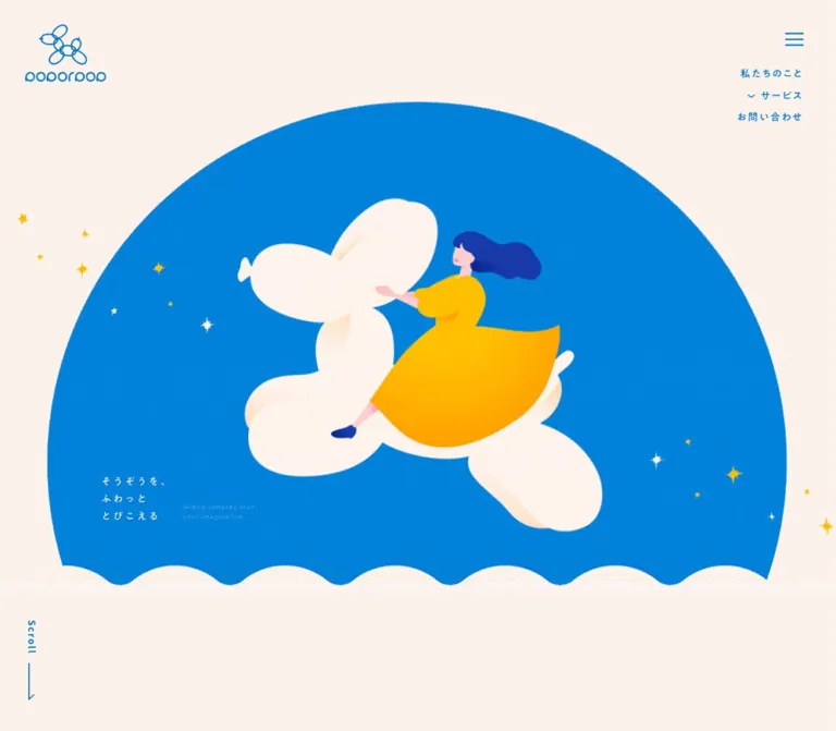
鮮やかな青と温かなクリーム色を基調に、バルーンや月に乗る人物のイラストで世界観を伝える企業サイト。大きな円弧、波形の境界、縦書きの事業見出し、ゆったりした余白が特徴です。
オリジナルサイトを見るpoporpop — Style Reference
A small illustrated universe of blue skies, cream balloons, and yellow dresses, framed by warm paper.
Website: poporpop.com
Original URL: https://poporpop.com/
Final URL: https://poporpop.com/
Theme: warm light canvas with an extensive blue service landscape; no selectable theme was evidenced.
Inspected: September 12, 2026. The supplied browser record is timestamped 2026-09-12T14:17:05.649Z, equivalent to 23:17:05.649 JST.
Viewports: desktop 1440 × 1000 and mobile 390 × 844 CSS pixels.
Scope: the current corporate homepage: opening illustration, introduction text and geometry, three service summaries, contact form structure, privacy-policy inset, and footer. The desktop service capture visually shows portions of the board-game and live-streaming scenes. The character-business illustration, intermediate transition scenes, linked detail pages, and opened navigation states are outside the supplied visual coverage.
poporpop gives a content-production company the atmosphere of an illustrated storybook. Saturated blue supplies both the interface ink and the expansive environment around the artwork. A warm cream canvas softens that intensity, while yellow clothing, stars, and a crescent moon establish the principal illustrative accent. The typography is small and widely tracked; oversized organic shapes carry the visual impact.
The homepage unfolds vertically from a large blue dome into company information, a blue landscape containing three business introductions, and a quiet peach contact panel. Persistent corner branding and navigation leave the middle of the screen available for illustration. Service descriptions occupy narrow columns, with tall vertical title ornaments to their right. The same relationship survives on mobile, where the illustration and surrounding space are recomposed rather than uniformly reduced.
How to Read This Reference
- Measured values come from the supplied rendered DOM, computed styles, and element rectangles. They describe the recorded browser state.
- Derived values are calculations from those measurements, such as the gap between two text boxes.
- Visual estimates describe the supplied original-page captures. Approximate colors are appearance targets, not sampled pixels or recovered source declarations.
- Recommendations describe a new implementation. The Quick Start uses measured tokens where available and explicitly approximate geometry elsewhere.
- Token names are descriptive aliases unless a source custom property is identified.
- Element rectangles alone do not establish visibility. The desktop DOM includes submenu links that are not visible in the opening screenshot, and the privacy inset contains descendants extending beyond its visible bounds.
- Static screenshots and transition declarations do not establish a complete animation sequence, hover result, or working form submission.
Tokens — Colors
Default Palette
| Name | Value | Evidence | Suggested token | Role |
|---|---|---|---|---|
| Warm Paper | #FCF2EB |
Measured; source --s-color-80908771: #fcf2ebff and body background |
--paper |
Page canvas, introduction, footer, and reversed service text |
| Brand Blue | #0077D0 |
Measured; source --s-color-fd80a26d: #0077d0ff and visible text styles |
--blue |
Navigation, body copy, contact headings, rules, and submit fill |
| Required Peach | #F19466 |
Measured; rgb(241, 148, 102) on required asterisks |
--required |
Small required-field markers |
| Button White | #FFFFFF |
Measured on the mobile submit label | --white |
Text inside the filled submit button |
| Sky Blue | Approximately #0088D8 |
Visual estimate | --sky-estimate |
Brighter blue appearance of the opening illustrated field |
| Soft Peach | Approximately #F9E7D9 |
Visual estimate | --peach-estimate |
Large contact-panel surface |
| Golden Yellow | Approximately #FFC400 |
Visual estimate; artwork contains shading | --yellow-estimate |
Dresses, crescent moon, and selected stars |
| Deep Cobalt | Approximately #193AAF |
Visual estimate | --cobalt-estimate |
Hair, shoes, and illustrated cards |
The two exact brand colors anchor the interface. Preserve their distinction from colors embedded in artwork: the blue sky has visible grain and tonal variation, and the yellow dress moves through warmer and lighter shades. A single flat yellow token cannot reproduce that shading.
The service section appears as an extensive blue environment with cream text. Its sampled section wrapper has a fully transparent background, so its visible blue cannot be attributed to that wrapper's background declaration. Likewise, transparent red-tinted RGBA values in the evidence do not establish a visible red surface.
Color Distribution
Use cream as the resting canvas and blue as the primary text color. Give blue a much larger area in the illustrated opening and service region. Keep yellow concentrated in the imagery; the actual submit button remains blue. The small peach asterisks are functional marks, separate from the yellow visual storytelling.
No general rainbow category system, dark-mode control, or theme selector was evidenced.
Tokens — Typography
Japanese Narrative Text
- Measured family:
'A1ゴシック R JIS2004'. - Source variable:
--s-font-e88ad0d2. - Measured weight:
500on the introduction, service descriptions, and section leads. - Character: gentle Japanese gothic forms with unusually open tracking and generous line spacing.
- Role: supports the airy illustrated world without competing with it.
Retain the source family name and numeric weight as separate facts. The R in the family name does not justify changing the measured CSS weight to 400.
Navigation and Action Labels
- Measured family:
'A1ゴシック M JIS2004'. - Source variable:
--s-font-3694a7a5. - Measured weights:
600for navigation and More labels;700for form labels. - Typical tracking:
0.15em.
The English word More uses this Japanese font family in the sampled text node. It does not use the same font as the English section headings.
English Section Headings
- Measured family:
Outfitthrough--s-font-0ab9d7ed. - Measured weight:
500. - Line height:
1.1. - Tracking:
0.15em. - Roles:
ServiceandContact.
These headings are modest, rounded, and open. Their hierarchy depends on placement, color, and surrounding space as much as size.
Policy Text and Required Marks
The policy paragraphs and mobile consent sentence declare 'Gothic A1', which is a different family name from the Japanese A1 Gothic faces above. Policy body text uses 12px / 19.2px, weight 500, and 0.1em tracking. Policy article headings use 14px / 22.4px, weight 700.
Required asterisks use Lato, 15px / 21px, weight 700. Although the submit-button wrapper also declares Lato, its visible nested label uses A1 Gothic M and white text. Style the visible label according to that child, not the wrapper's inherited blue color.
Type Scale
Unless marked as a visual estimate, the following values are measured.
| Role | Desktop size / line height | Mobile size / line height | Weight | Tracking |
|---|---|---|---|---|
| Main navigation | 13px / 27.3px |
Not visible in closed mobile header | 600 |
1.95px |
| Service submenu links | 11px / 26.73px |
Not visually inspected | 600 |
1.65px |
| Introduction statement | 24px / 43.2px |
18px / 32.4px |
500 |
0.2em |
| Introduction body | 14px / 29.82px |
14px / 29.82px |
500 |
2.1px |
| Introduction More | 17px / 36.21px |
16px / 34.08px |
600 |
0.15em |
| Service heading | 32px / 35.2px |
24px / 26.4px |
500 |
0.15em |
| Service section lead | 14px / 28px |
14px / 28px |
500 |
2.1px |
| Individual service description | 14px / 29.82px |
13px / 27.69px |
500 |
0.15em |
| Service More | 17px / 36.21px |
14px / 29.82px |
600 |
0.15em |
| Contact heading | 24px / 26.4px |
22px / 24.2px |
500 |
0.15em |
| Contact lead | 14px / 28px |
13px / 26px |
500 |
2.1px desktop; 1.3px mobile |
| Form label | 14px / 19.6px |
14px / 19.6px |
700 |
2.1px |
| Policy body | 12px / 19.2px |
12px / 19.2px |
500 |
1.2px |
| Policy article heading | 14px / 22.4px |
14px / 22.4px |
700 |
1.4px |
| Consent sentence | Approximately 12px, visual estimate |
12px / 16.8px |
Mobile 700 |
Mobile 1.8px |
| Submit label | Approximately 18px, visual estimate |
16px / 16px |
Mobile 600 |
Mobile 2.4px |
The opening Japanese slogan has a delicate, calligraphic appearance, and its English translation is tiny and serif-like. Neither has a corresponding measured text node in the supplied excerpt. Their exact font families and whether they are live text or graphic lettering remain unverified. The same limitation applies to lettering within the vertical service ornaments.
Other font names occur in custom properties without an established role in the inspected elements. Do not assign them to components merely because they are declared. The root's Times declaration is also not the font used by the measured branded text.
Tokens — Spacing & Shapes
Density: small text and controls surrounded by very large illustrated and empty areas. Shape language: circles, inflated lobes, waves, and large rounded panel corners, balanced by hairline rules. Base unit: no single source spacing unit was established. Reuse semantic distances rather than forcing every measurement into an eight-pixel scale.
Spacing Scale
| Use | Value | Evidence |
|---|---|---|
| Hamburger bar gap | 5px |
Measured button gap |
| Mobile header inset | 16px |
Measured header padding |
| Policy text inset | 18px horizontally |
Derived from panel and text positions on both viewports |
| Contact heading to lead | 20px |
Derived on both viewports |
| Service heading to lead | 26px |
Derived on both viewports |
| Service paragraph to More | 26px |
Derived on both viewports |
| Mobile narrative gutter | 30px |
Measured introduction position and service padding |
| Desktop header inset | 32px |
Measured header padding |
| Mobile introduction text gaps | 39px |
Derived between statement, body, and More |
| Desktop introduction text gaps | 50px |
Derived between statement, body, and More |
| Mobile service-section gap | 60px |
Measured section gap |
| Introduction top inset | 70px desktop; 80px mobile |
Derived from section and statement rectangles |
| Form row cadence | About 104px desktop; 101px mobile |
Derived between successive required-field labels |
| Submit to panel bottom | About 120px desktop; 80px mobile |
Visual estimate |
Border Radius
| Element | Value | Evidence and interpretation |
|---|---|---|
| Submit button | 35px |
Measured on the mobile 230 × 60px button; renders as a pill |
| Policy inset | About 8px |
Visual estimate |
| Message field upper corners | About 10px |
Visual estimate |
| Contact-panel lower corners | About 110px desktop; 50px mobile |
Visual estimate |
| Opening blue field | Circular geometry, cropped at its lower edge | Visual observation; original mask implementation unknown |
| Service title ornament | Custom open, lobed contour | Artwork geometry; ordinary border radius is insufficient |
Several transparent text nodes report an 8px radius. This is not evidence that every heading sits inside a visible rounded badge.
Layout Measurements
| Element | Desktop | Mobile | Evidence |
|---|---|---|---|
| Header logo link | 106 × 75.48px at (32, 32) |
69 × 49.14px at (16, 16) |
Measured |
| Menu button | 55 × 55px at (1357, 24) |
50 × 50px at (324, 16) |
Measured |
| Opening region before introduction | 1000px |
659.5px |
Derived from introduction section origin |
| Introduction body width | 392.30px |
330px |
Measured |
| Service description width | 231px |
198px |
Measured |
| First two service heading wrappers | 212.05 × 327.39px |
115.5 × 254.41px |
Measured; wrapper size, not glyph size |
| Desktop service composition span | About 922px, from x=259 to x=1181 |
330px available between narrative gutters |
Derived |
| Contact-panel width | About 900px |
About 350px |
Visual estimate |
| Form/policy outer width | About 500px |
About 310px |
Visual estimate, corroborated by policy text widths and insets |
| Policy paragraph width | 464px |
274px |
Measured |
| Submit button | About 230 × 60px |
230 × 60px |
Desktop visual estimate; mobile measured |
| Document height | 6878.55px |
6202.91px |
Measured HTML rectangle; record rounds to 6879px and 6203px |
Components
Persistent Corner Header
Role: keeps identity and navigation available without occupying the center of the composition.
The left corner contains a thin blue balloon-animal mark above a rounded wordmark. Use the supplied identity artwork when available, preserving its intrinsic proportions. The measured home-link boxes are 106 × 75.48px on desktop and 69 × 49.14px on mobile.
At the right, three thin blue horizontal strokes sit inside a substantially larger button target. Desktop adds a short right-aligned navigation stack beneath the button: 私たちのこと, サービス, and お問い合わせ. The service entry is a button, and the DOM contains three business links beneath it. Those links are not visibly expanded in the opening capture.
The logo and menu remain in the same viewport corners across the supplied scroll captures, supporting a persistent overlay treatment. The exact positioning property was not included in the computed-style sample. The reported header rectangle height of 32px or 16px should not be mistaken for a conventional full-height header bar.
On the blue service capture, the menu has a visible cream circular backing, while the logo and small navigation appear faint against the blue. The mechanism or trigger for that surface change was not observed. Mobile displays the logo and hamburger without the desktop text stack.
Opening Illustrated Dome
Role: introduces the company's imaginative personality before detailed business information.
The opening scene has five visually distinct parts:
- A warm cream surrounding canvas.
- An enormous blue circular field, cropped across its lower portion.
- A central cream balloon animal carrying a figure in a yellow dress, with deep-blue hair and shoes.
- Sparse stars and sparkles distributed around the figure and beyond the blue boundary.
- A cream wave edge and a small bilingual slogan near the lower left.
At desktop size, the visible blue field begins around y=100px and spans roughly x=152–1286px. The central figure and balloon occupy approximately 548 × 500px of visible artwork. These are visual estimates, not image-element measurements.
The Japanese slogan reads そうぞうを、ふわっととびこえる, arranged in three short lines. Its English companion reads Gently jumping over your imagination. On desktop, the English sits to the right and lower than the Japanese. On mobile, it moves underneath.
The desktop bottom-left margin also carries a vertical Scroll label and a fine downward line with a small angled end. No click behavior is established for this cue. There is no large filled action button in the captured opening scene.
Company Introduction
Role: translates the illustration's mood into a concise company statement and a route to further information.
The introduction uses blue text on cream. The opening statement is three lines, with 24px type on desktop and 18px on mobile, 1.8 line height, and 0.2em tracking. Follow it with a smaller paragraph and the restrained More link.
Desktop text starts at approximately x=258.8px. The body is only 392.3px wide, allowing the composition to retain substantial surrounding space. On mobile, the text starts at x=30px and expands to a 330px body column. The statement retains its three-line arrangement in the supplied measurements.
The measured section is taller on mobile, but its complete illustration arrangement is not shown. Preserve the verified text rhythm without inventing an unseen image for the remaining area.
Service Section Header
Role: introduces the three business areas inside the blue illustrated landscape.
Center the Outfit heading Service, followed by a compact two-line Japanese lead. Desktop uses 32px for the heading; mobile uses 24px. The lead stays 14px / 28px with 2.1px tracking and a measured width of approximately 267.23px on both viewports.
In the desktop service capture, the heading sits near the viewport top among illustrated cards and balloons. A darker blue area is visible behind the lead, but the sampled lead node itself is transparent. Neither a separate filled card nor sticky positioning can be established from that frame alone.
Illustrated Service Stage
Role: gives each business a distinct scene while maintaining one continuous visual world.
The desktop anatomy is a narrow description on the left, a large central illustration, and a vertical title ornament on the right. A fine diagonal cream rule separates neighboring scenes. Planets, orbit lines, stars, and occasional streaks extend into the surrounding blue space.
| Business | Verified content | Visible illustration coverage | More destination |
|---|---|---|---|
ボードゲーム事業 |
Planning and production of board games | Partial figure, cream balloon animal, and blue cards with yellow stars in the desktop service capture | /boardgame |
ライブ配信事業 |
Operation and support of the be sunny creator community |
Figure seated on a yellow crescent moon, holding a cream megaphone | /besunny |
キャラクター事業 |
Character planning, merchandise, and social-media support | Text and heading-wrapper geometry available; illustration not visible in supplied captures | /character |
Descriptions use 14px / 29.82px in a 231px column on desktop. Mobile changes them to 13px / 27.69px in a 198px column. Keep these readable text blocks narrow enough to feel integrated with the illustrations.
Do not interpret the stages as independent elevated cards. Their common blue background and decorations create continuity across the section.
Vertical Service Title Ornament
Role: identifies a business through an illustrated sign rather than a conventional horizontal heading.
The visible ornament consists of a thin cream open contour with several inflated lobes. Japanese lettering runs vertically inside it, with a much smaller English companion aligned along the vertical direction. A small plus appears near its lower end.
The desktop wrapper measures approximately 212 × 327px; mobile measures 115.5 × 254.4px. This is not uniform scaling: width contracts more than height. The mobile layout therefore preserves a tall, narrow sign beside the description.
The sampled H2 elements contain no extracted text. Their inherited 24px sans-serif style does not identify the lettering visible in the artwork. In a new implementation, use an SVG contour with a semantic live-text heading where practical. The contour, lettering, and plus should be treated as separate layers. A plus in the artwork does not prove that the heading expands an accordion.
More Link
Role: a quiet route from a short introduction to its detail page.
An approximately 87px-wide link contains a tracked label above a fine horizontal rule. A small plus sits at the rule's right end. It has no filled container or shadow.
Desktop link bounds are approximately 87 × 45.88px. Mobile retains the width while the introduction version measures 43.77px high and the service version 39.5px high. The service variant reverses to cream on blue; the introduction variant stays blue on cream.
The visible label is a nested text node. Preserve its A1 Gothic M family and 0.15em tracking. Link destinations are present in the DOM, but hover effects and destination-page designs were not inspected.
Contact Panel and Field Stack
Role: supports work, media, and other business inquiries within the same gentle visual language.
The contact region returns to cream and blue. Its main surface is a broad pale-peach panel with very large rounded lower corners. The desktop panel is approximately 900px wide, with a centered 500px form column. On mobile, it occupies about 350px of the 390px viewport, with an approximately 310px inner column.
Center Contact and its two-line explanatory lead above the fields. Keep the fields themselves left aligned. The source form labels are 14px, weight 700, with 2.1px tracking; required marks are small peach asterisks immediately beside them.
The rendered text establishes the following field inventory. Control types in the last column are recommended semantic implementations; the supplied element sample does not include all underlying input and select nodes.
| Source label | Meaning | Required marker observed | Recommended control |
|---|---|---|---|
お名前 |
Name | Yes | Text input |
ふりがな |
Phonetic name | Yes | Text input |
会社名 |
Company | No | Text input |
メールアドレス |
Email address | Yes | Email input |
弊社をどちらで知りましたか? |
Referral source | Yes | Select |
ご用件について |
Inquiry category | Yes | Select |
お問い合わせ内容 |
Message | Yes | Textarea |
The referral field exposes five option labels in the rendered evidence: SNS, 紹介, WEB検索, PR TIMES, and その他. The inquiry category exposes three: 案件のご相談, 取材・講演のご相談, and 営業のご相談. Downward-arrow glyph names also occur in the text extraction. Opened option lists, selection behavior, and whether these are native or custom controls remain unverified.
The desktop message field is visually about 500 × 160px, with a cream fill, gently rounded upper corners, and a thin blue bottom rule. The visible styling favors a bottom edge over a heavy enclosing border. Other field heights are not directly measured.
Privacy Inset, Consent, and Submit
Role: places policy information and consent immediately before sending an inquiry.
A small cream policy surface sits beneath the message field. Its visible desktop dimensions are approximately 500 × 180px. Text is inset 18px horizontally, resulting in the measured 464px paragraph width; mobile narrows that text width to 274px.
The inset visibly crops the long legal text after its opening paragraphs. This supports a constrained reading region, but internal scrolling was not separately tested. The presence of later policy paragraphs in the DOM is not evidence that all of them are visible on the page at once.
Place the checkbox and 個人情報の取り扱いについて同意します。 directly below the inset. The mobile consent sentence is measured at 12px / 16.8px, weight 700, with 1.8px tracking.
The submit control reads 送信する. It is a blue 230 × 60px pill with white text and a measured 35px radius on mobile. Its width appears unchanged on desktop. A substantial gap separates consent from the button, and generous padding remains below the button before the panel's rounded end.
No validation, disabled-state logic, confirmation page, submission result, or checkbox requirement was exercised. Those behaviors must be implemented and verified independently.
Footer
Role: closes the page with a compact site directory and repeated identity.
The footer uses the main cream canvas with blue line art and text. On desktop, the logo sits left of several compact link groups: home/about, the three services, privacy, and a distinct contact link with the familiar rule-and-plus treatment. A very small centered copyright line sits lower down.
On mobile, the logo moves to the center above two navigation columns. Home and about form the left column; the three businesses form the right. The contact link gets its own centered row, followed by the privacy link and copyright. The visible footer logo is approximately 90px wide on mobile and 114px on desktop; these are visual estimates.
The privacy destinations differ in the supplied DOM: desktop uses /#policyprivacy, while mobile uses /#pp. Their navigation results were not tested. The footer displays ©2025 poporpop llc.; that is displayed copyright text, not the inspection date.
Tokens — Motion & Interaction
Evidenced Declarations
| Element or treatment | Recorded value | What the evidence supports |
|---|---|---|
| Body background | 0.5s cubic-bezier(0.4, 0.4, 0, 1) |
A background transition is declared; its trigger and complete color sequence are unknown |
| Many text, link, and wrapper nodes | 0.3s cubic-bezier(0.4, 0.4, 0, 1) |
Shared transition timing; this does not establish a particular hover or reveal effect |
| Desktop service disclosure button | 0.4s cubic-bezier(0.4, 0.4, 0, 1) |
Transition declaration on the service navigation button |
| Mobile submit button | 0.4s cubic-bezier(0.4, 0.4, 0, 1) |
Transition declaration; no before/after interaction state supplied |
| Desktop service heading wrappers | 0.8s duration with 0.3s delay |
A longer delayed transition exists on the graphical heading wrappers |
| Mobile service heading wrappers | 0.3s cubic-bezier(0.4, 0.4, 0, 1) |
The sampled mobile timing differs from desktop |
Partial floatMotion keyframes |
0%: translate(0px, 0px); 25%: translate(3px, -5px) |
Small translation keyframes exist; target, duration, remaining frames, and repetition are not supplied |
Many sampled elements report animation: none. The sample does not cover every illustrated descendant or pseudo-element, so this does not establish that the entire page is static.
The browser record describes load waits, finite-animation readiness checks, image decoding, and scroll traversal. It also describes temporarily pausing any perpetual animations encountered during readiness checks. This capture protocol does not provide a continuous motion recording or prove that delayed content is complete.
Interaction Boundaries
Verified affordances include a hamburger button, a service disclosure button, More links, in-page contact links, choice fields, a checkbox, and a submit button. Open-menu composition, keyboard behavior, hover feedback, smooth-anchor scrolling, policy scrolling, validation, and submission were not demonstrated.
For an adaptation, restrained drift can reinforce the buoyant artwork. A suggested treatment is a 3–5px translation over roughly 6s, applied only to decorative layers. This is a recommendation, not the recovered timing of floatMotion. Avoid inventing scroll-scrubbed flight paths, cursor-following effects, or elaborate page transitions from the screenshots alone.
Surfaces
| Layer | Appearance | Purpose |
|---|---|---|
| Main canvas | Exact warm cream #FCF2EB |
Resting environment around the illustrations and footer |
| Opening sky | Large blue circular field with visible fine grain | Establishes scale and frames the central character |
| Service landscape | Extensive blue field with planets, stars, and orbit-like lines | Connects the business stages into one environment |
| Contact panel | Slightly deeper warm peach, very large corner curves | Groups a long form without heavy borders |
| Fields and policy inset | Cream fill, subtle rounding; blue bottom rule on the visible message field | Defines editable and reading regions |
| Submit | Solid blue pill with white lettering | Strongest filled action in the inspected page |
| Menu backing over service scene | Cream circle in the supplied desktop frame | Separates the hamburger from blue artwork |
No general shadow-based elevation system is visible. Separation comes from changes in large color areas, rounded boundaries, thin lines, and empty space. Keep the utility surfaces quieter than the illustrations.
Imagery
The artwork combines broad, smooth silhouettes with fine grain and soft internal shading. Cream inflated forms have pale peach shadows, while yellow clothing and the crescent moon carry warmer tonal shifts. Figures have simplified profiles and flowing dark-blue hair. Stars vary in size and color, with a mixture of pointed sparkles and smaller distant marks.
The opening illustration is the focal object, not a background behind a large typographic campaign. In the services, the same visual vocabulary becomes contextual: cards for board games and a moon-seated figure with a megaphone for live streaming. Preserve the generous blue space between objects.
The blue logo is a thin-line balloon-animal mark. Its line quality relates to the service contours and understated navigation rules, while the much larger filled illustrations supply volume and warmth.
Observed Asset References
No image URLs, filenames, native dimensions, or format inventory were provided. The following references identify artwork by its location in the supplied original-page captures; they are not downloadable asset paths.
| Visual asset | Observed location | Implementation guidance |
|---|---|---|
| Balloon-animal logo and wordmark | Desktop/mobile header and footer | Preserve the complete artwork and intrinsic ratio |
| Figure riding a cream balloon animal | Desktop/mobile opening scene | Use a transparent asset or equivalent layered artwork; avoid cropping the figure |
| Blue dome and cream wave boundary | Opening scene | Keep the large circular silhouette and a separately controlled lower edge |
| Stars and sparkles | Opening and desktop service scene | Use sparse, varied placement with clear space around text |
| Starred cards and balloon imagery | Board-game portion of desktop service capture | Retain as scene-specific illustrations |
| Figure on a yellow crescent with megaphone | Live-streaming portion of desktop service capture | Preserve the moon silhouette and full seated pose |
| Vertical title ornaments | Desktop service capture; mobile wrapper measurements | Use custom contours; do not stretch desktop graphics indiscriminately |
| Planets, orbit curves, and streaks | Desktop service background | Keep subordinate to the foreground figures and readable copy |
The inspected captures do not establish photography elsewhere on the site. Artwork file formats are also unverified: a vector-like silhouette does not prove an SVG source. Preserve smooth edges and texture; image-rendering: pixelated would be inappropriate here.
Layout & Responsive Behavior
Desktop Composition
The opening region occupies the first 1000px before the introduction begins in the recorded desktop DOM. Its blue field leaves broad cream margins and sits beneath the corner header. The slogan stays small relative to the illustration.
The introduction and service descriptions share an approximate left alignment at x=259px. Service title wrappers extend to approximately x=1181px, defining a composition about 922px wide inside the full-width blue landscape. The contact form is narrower and centered, inside a broader panel.
The initial DOM places the service section at approximately y=2563.13px, with a measured height of 2226.72px. These are recorded element positions, not a recovered formula for section padding or a scroll-animation timeline. The intervening visual transitions are not fully shown in the supplied captures.
Mobile Composition
At 390 × 844, the blue dome begins around y=70px and extends beyond both horizontal viewport edges. The central illustration remains fully recognizable, approximately 285–290px wide by visual estimate. The cream wave edge lies around y=615–634px, followed by space before the introduction statement becomes visible near the bottom of the opening capture.
The introduction starts at document y=659.5px, so the opening region is shorter than one full mobile viewport. Do not force it to 100vh on phones merely because the desktop introduction starts at the viewport boundary.
The service layout retains a side-by-side text/title relationship. Inside the 330px available width, the description occupies 198px, or 60%; the title wrapper occupies 115.5px, or 35%; the remaining 16.5px is a 5% separation. Those percentages are derived from the measured positions, not recovered CSS declarations.
The mobile service illustrations are not shown in a dedicated screenshot, so their exact placement should be checked during implementation. The measured text/title arrangement is sufficiently clear to avoid an automatic full-width stack for every element.
Responsive Comparison
| Treatment | Desktop | Mobile |
|---|---|---|
| Corner inset | 32px |
16px |
| Header text navigation | Visible short stack | Hidden in captured closed state |
| Opening circle | Broad cream side margins | Circle crosses both viewport edges |
| Slogan translation | Beside the Japanese copy | Below the Japanese copy |
| Introduction statement | 24px, wide tracking |
18px, wide tracking preserved |
| Introduction body | 14px, 392.3px column |
14px, 330px column |
| Service heading | 32px |
24px |
| Service description | 14px, 231px column |
13px, 198px column |
| Service title wrapper | Broad and tall | Much narrower, still tall |
| Contact lead | 14px, 0.15em tracking |
13px, 0.1em tracking |
| Form labels | 14px |
14px retained |
| Form surface | About 900px wide |
About 350px wide |
| Submit | About 230 × 60px |
Measured 230 × 60px |
| Footer | Horizontal logo and link groups | Centered logo, two link columns, separate contact and legal rows |
A partial source excerpt exposes a max-width: 1280px rule for responsive line breaks. It does not reveal the complete breakpoint system or the threshold that hides navigation. The Quick Start's 768px breakpoint is a recommendation.
Do’s and Don’ts
Do
- Anchor text and interface controls in exact blue
#0077D0and cream#FCF2EB. - Let the oversized illustrated dome provide the opening hierarchy.
- Preserve yellow as a concentrated artwork accent.
- Keep Japanese body copy widely tracked with approximately double line spacing.
- Use Outfit specifically for the measured English section headings.
- Retain narrow service descriptions and tall vertical title ornaments.
- Carry the blue illustrated environment across service stages.
- Use fine rules, small plus marks, and open contours for secondary navigation.
- Keep the contact form in one clear column with a large calm panel around it.
- Recompose the dome, bilingual slogan, and footer for mobile.
Don’t
- Do not replace the opening figure with stock photography or a generic abstract gradient.
- Do not enlarge the slogan into a heavy headline that dominates the illustration.
- Do not turn the service stages into a uniform grid of rounded cards.
- Do not use yellow as the submit-button fill; the observed action is blue.
- Do not remove tracking and generous leading from Japanese text.
- Do not stretch the desktop service ornament to fit its narrower mobile wrapper.
- Do not infer an accordion from a decorative plus sign.
- Do not treat a transition declaration as proof of a specific interactive animation.
- Do not count clipped policy descendants as visible full-page content.
- Do not introduce glossy shadows, glass panels, or pixelated rendering into the illustrated world.
Recommended Implementation Additions
These are recommendations for a new implementation, not verified features of the original.
- Give the hamburger an accessible name and synchronize its expanded state with a keyboard-operable navigation panel.
- Keep the logo and navigation readable over blue scenes. The supplied service frame shows weak separation for some blue header elements; a cream backing or suitable reversed artwork can preserve the identity while improving visibility.
- Provide semantic text equivalents for the opening slogan and graphical service headings. Mark stars, contours, and purely decorative artwork as decorative.
- Expand small More and footer links to comfortable touch targets without enlarging their visible line treatment.
- Associate every form label with its control, use actual required attributes where appropriate, and provide descriptive field errors and a submission status.
- Use at least
16pxfor editable input text on mobile as an adaptation choice; the supplied evidence does not establish input text sizes. - Make the policy region keyboard-scrollable and ensure its full text remains reachable. Use one consistent privacy target across responsive layouts.
- Verify contrast for tiny English captions, pale scene details, required markers, and header variants against their actual backgrounds.
- Keep optional ambient animation on decorative layers, respect reduced-motion preferences, and ensure content remains visible when motion is disabled.
- Reserve artwork dimensions before loading so the long page does not shift around the contact anchor.
Agent Prompt Guide
Quick Color Reference
- Main canvas and reversed service text: exact
#FCF2EB. - Interface text, rules, and primary action: exact
#0077D0. - Submit lettering: exact
#FFFFFF. - Required-field asterisks: exact
#F19466. - Opening sky approximation:
#0088D8, with subtle artwork grain. - Contact-panel approximation:
#F9E7D9. - Illustration accents: approximate golden yellow
#FFC400and deep cobalt#193AAF.
Overall Prompt
“Create an illustrated Japanese content-company homepage inspired by the current poporpop reference. Use warm cream #FCF2EB, blue interface ink #0077D0, and yellow accents concentrated in commissioned artwork. Place a thin-line logo in the upper-left corner and a small hamburger with a compact desktop navigation stack at upper right. Open with an enormous blue circular sky, a floating figure and cream inflated forms, sparse stars, a small bilingual slogan, and a cream wave edge. Continue with narrow, widely tracked Japanese copy, then three spacious business scenes across a blue landscape. Pair each scene with a left description and a tall vertical title ornament on the right. Finish with a centered peach contact panel, cream fields with blue rules, an inset policy region, consent checkbox, blue pill submit button, and an airy responsive footer. Preserve the mobile text/title relationship. Label any invented motion and breakpoint choices as implementation decisions.”
Example Component Prompts
- Opening scene: “Build a warm-cream opening scene with a large blue circular field beginning below the corner logo. Center a fully visible illustrated figure riding cream balloon forms. Add sparse yellow and cream stars and a low cream wave edge. Keep the Japanese slogan small at lower left, with its English translation beside it on desktop and beneath it on mobile. Let the circle extend beyond the phone's edges.”
- Service stage: “Compose a blue business scene with a
231pxdesktop description column, central illustration, and approximately212 × 327pxvertical title wrapper. Use cream14pxJapanese text with2.13line height and0.15emtracking. Add a diagonal hairline separator. At390px, retain a198pxdescription and115.5pxtitle wrapper separated by16.5px.” - More link: “Create a quiet
87px-wide text link: tracked A1 Gothic M label above a thin line ending beside a small plus. Use blue on cream or cream on blue. Preserve a generous invisible hit area and add a visible keyboard focus state.” - Contact panel: “Create a pale-peach form panel approximately
900pxwide on desktop with a centered500pxfield column. On a390pxscreen, use20pxoutside margins and20pxinside padding. Use blue14pxlabels, peach required marks, cream fields, and a blue230 × 60pxpill labeled送信する. Place the inset policy and consent before the button.” - Footer: “Use a cream footer with a blue balloon-animal logo, small tracked blue links, and a fine rule-and-plus contact link. On desktop, arrange compact groups horizontally. On mobile, center the logo above two link columns, then place contact, privacy, and copyright on separate centered rows.”
Quick Start
CSS Custom Properties
This is a practical adaptation, not the original stylesheet. Exact colors and measured typography are retained. The peach and sky colors, dome geometry, wave path, input dimensions, footer grid, and 768px breakpoint are reconstruction choices. The snippet uses a static blue service surface rather than assuming an unverified scroll-driven background mechanism.
Load the named fonts through an appropriately licensed setup; these declarations do not load font files. Provide authorized artwork in the image elements. No original asset filenames were available. Menu state management, form validation, and submission require separate implementation.
:root {
  /* Measured interface colors */
  --paper: #fcf2eb;
  --blue: #0077d0;
  --required: #f19466;
  --white: #ffffff;

  /* Visual approximations for adaptation */
  --sky-estimate: #0088d8;
  --peach-estimate: #f9e7d9;
  --yellow-estimate: #ffc400;
  --cobalt-estimate: #193aaf;

  /* Measured families; fallbacks are recommendations */
  --font-jp-body: 'A1ゴシック R JIS2004', sans-serif;
  --font-jp-ui: 'A1ゴシック M JIS2004', sans-serif;
  --font-en: 'Outfit', sans-serif;
  --font-policy: 'Gothic A1', sans-serif;
  --font-marker: 'Lato', sans-serif;

  --text-body: 14px;
  --text-statement: 24px;
  --text-service-heading: 32px;
  --text-contact-heading: 24px;
  --text-more: 17px;
  --leading-body: 2.13;
  --tracking-body: 0.15em;
  --tracking-statement: 0.2em;

  --header-inset: 32px;
  --narrative-gutter: 30px;
  --stage-width: 922px;
  --form-width: 500px;
  --panel-width: 900px;
  --radius-panel: 110px;
  --radius-field: 10px;
  --radius-policy: 8px;
  --radius-submit: 35px;
  --rule: 1px;

  /* Timing drawn from recorded declarations */
  --ease-soft: cubic-bezier(0.4, 0.4, 0, 1);
  --motion-ui: 300ms;
  --motion-control: 400ms;
  --motion-background: 500ms;
}

* { box-sizing: border-box; }

body {
  margin: 0;
  color: var(--blue);
  background: var(--paper);
  font-family: var(--font-jp-body);
  font-size: var(--text-body);
  font-weight: 500;
  line-height: var(--leading-body);
  letter-spacing: var(--tracking-body);
}

img { display: block; max-inline-size: 100%; }
a { color: inherit; }
button, input, select, textarea { font: inherit; }
button { cursor: pointer; }

:where(a, button, input, select, textarea, [tabindex]):focus-visible {
  outline: 2px solid currentColor;
  outline-offset: 5px;
}

/* Persistent closed-header composition */
.site-header {
  position: fixed;
  inset: 0 0 auto;
  z-index: 20;
  pointer-events: none;
}

.site-header > * { pointer-events: auto; }

.brand-link {
  position: absolute;
  inset-block-start: var(--header-inset);
  inset-inline-start: var(--header-inset);
  inline-size: 106px;
}

.brand-link img { inline-size: 100%; block-size: auto; }

.menu-button {
  position: absolute;
  inset-block-start: 24px;
  inset-inline-end: 28px;
  display: flex;
  flex-direction: column;
  align-items: center;
  justify-content: center;
  gap: 5px;
  inline-size: 55px;
  block-size: 55px;
  padding: 0;
  border: 0;
  border-radius: 50%;
  color: var(--blue);
  background: transparent;
}

.menu-button span {
  inline-size: 24px;
  block-size: 2px;
  background: currentColor;
}

/* Explicit surface variant; its activation is application logic */
.menu-button.is-backed { background: var(--paper); }

.header-nav {
  position: absolute;
  inset-block-start: 84px;
  inset-inline-end: 44px;
  display: grid;
  justify-items: end;
  font-family: var(--font-jp-ui);
  font-size: 13px;
  font-weight: 600;
  line-height: 2.1;
  letter-spacing: 0.15em;
}

.header-nav a { text-decoration: none; }

/* Approximate opening geometry at the supplied desktop viewport */
.hero {
  position: relative;
  min-block-size: 100svh;
  padding-block-start: 10svh;
  overflow: clip;
}

.hero-stage {
  position: relative;
  inline-size: min(78.75vw, 1134px);
  block-size: min(74svh, 740px);
  margin-inline: auto;
  isolation: isolate;
}

.hero-sky {
  position: absolute;
  inset: 0;
  z-index: -1;
  overflow: hidden;
}

.hero-sky::before {
  content: '';
  position: absolute;
  inset-block-start: 0;
  inset-inline-start: 0;
  inline-size: 100%;
  aspect-ratio: 1;
  border-radius: 50%;
  background: var(--sky-estimate);
}

.hero-art {
  position: absolute;
  inset-block-start: 20.5%;
  inset-inline-start: 26%;
  inline-size: 49%;
  block-size: auto;
  object-fit: contain;
}

.hero-copy {
  position: absolute;
  inset-inline-start: 7.4%;
  inset-block-end: 94px;
  display: flex;
  align-items: end;
  gap: 24px;
  color: var(--paper);
}

/* Live-text substitutes; original slogan fonts were not identified */
.hero-copy p { margin: 0; }
.hero-copy-ja { font-size: 14px; line-height: 1.8; }
.hero-copy-en {
  max-inline-size: 145px;
  font-family: serif;
  font-size: 12px;
  line-height: 1.5;
  letter-spacing: 0.12em;
}

/* Newly drawn approximation, not an original asset reference */
.hero-wave {
  position: absolute;
  inset: auto 0 0;
  block-size: 40px;
  background-image: url("data:image/svg+xml,%3Csvg xmlns='http://www.w3.org/2000/svg' viewBox='0 0 170 40'%3E%3Cpath fill='%23fcf2eb' d='M0 30C28 30 28 0 85 0S142 30 170 30V40H0Z'/%3E%3C/svg%3E");
  background-size: 170px 40px;
  background-repeat: repeat-x;
  pointer-events: none;
}

.content-width {
  inline-size: min(var(--stage-width), calc(100% - 60px));
  margin-inline: auto;
}

.intro { padding-block: 70px 80px; }
.intro-copy { max-inline-size: 393px; }

.intro-statement {
  margin: 0 0 50px;
  font-size: var(--text-statement);
  font-weight: 500;
  line-height: 1.8;
  letter-spacing: var(--tracking-statement);
}

.intro-body { margin: 0 0 50px; }

.more-link {
  display: block;
  inline-size: 87px;
  color: inherit;
  font-family: var(--font-jp-ui);
  font-size: var(--text-more);
  font-weight: 600;
  line-height: 2.13;
  letter-spacing: 0.15em;
  text-decoration: none;
}

.more-rule {
  position: relative;
  display: block;
  block-size: 10px;
}

.more-rule::before {
  content: '';
  position: absolute;
  inset: 0 12px auto 0;
  block-size: var(--rule);
  background: currentColor;
}

.more-rule::after {
  content: '+';
  position: absolute;
  inset-block-start: -7px;
  inset-inline-end: 0;
  font-size: 12px;
  line-height: 14px;
}

.services {
  padding: 100px 30px;
  color: var(--paper);
  background: var(--blue);
}

.section-heading {
  margin: 0;
  font-family: var(--font-en);
  font-size: var(--text-service-heading);
  font-weight: 500;
  line-height: 1.1;
  letter-spacing: 0.15em;
  text-align: center;
}

.section-lead {
  max-inline-size: 310px;
  margin: 26px auto 0;
  line-height: 2;
  text-align: center;
}

.service-list {
  inline-size: min(100%, var(--stage-width));
  margin: 70px auto 0;
}

.service-stage {
  position: relative;
  display: grid;
  grid-template-columns: 231px minmax(0, 1fr) 212px;
  grid-template-areas: 'copy art emblem';
  align-items: center;
  gap: 32px;
  min-block-size: 680px;
  padding-block: 48px 96px;
}

.service-stage:not(:last-child)::after {
  content: '';
  position: absolute;
  inset: auto 0 30px;
  block-size: var(--rule);
  background: currentColor;
  transform: rotate(-10deg);
  pointer-events: none;
}

.service-copy { grid-area: copy; align-self: end; }
.service-copy p { margin: 0 0 26px; }
.service-art { grid-area: art; inline-size: 100%; block-size: auto; }

.service-emblem {
  grid-area: emblem;
  position: relative;
  display: grid;
  place-items: center;
  inline-size: 212px;
  min-block-size: 327px;
  margin: 0;
}

/* Supply a custom open contour as decorative SVG */
.service-emblem svg {
  position: absolute;
  inset: 0;
  inline-size: 100%;
  block-size: 100%;
  fill: none;
  stroke: currentColor;
  stroke-width: 1;
  pointer-events: none;
}

.service-emblem-text {
  position: relative;
  writing-mode: vertical-rl;
  font-family: serif;
  font-size: 20px;
  font-weight: 400;
  line-height: 1.6;
  letter-spacing: 0.2em;
}

/* Contact geometry follows the visible panel and inner column */
.contact { padding-block: 120px 0; }
.contact-panel {
  inline-size: min(var(--panel-width), calc(100% - 40px));
  margin-inline: auto;
  padding: 80px 20px 120px;
  border-radius: var(--radius-panel);
  background: var(--peach-estimate);
}

.contact .section-heading { font-size: var(--text-contact-heading); }
.contact .section-lead { margin-block-start: 20px; }

.contact-form {
  max-inline-size: var(--form-width);
  margin: 54px auto 0;
}

.field { display: grid; gap: 12px; margin-block-end: 24px; }
.field-label {
  font-family: var(--font-jp-ui);
  font-size: 14px;
  font-weight: 700;
  line-height: 1.4;
  letter-spacing: 0.15em;
}

.required-mark {
  margin-inline-start: 1px;
  color: var(--required);
  font-family: var(--font-marker);
  font-size: 15px;
  font-weight: 700;
}

.field-control {
  inline-size: 100%;
  min-inline-size: 0;
  min-block-size: 48px;
  padding: 12px 16px;
  border: 0;
  border-bottom: var(--rule) solid var(--blue);
  border-radius: var(--radius-field) var(--radius-field) 0 0;
  color: var(--blue);
  background: var(--paper);
  font-size: 16px;
  line-height: 1.5;
  letter-spacing: 0.05em;
}

textarea.field-control { min-block-size: 160px; resize: vertical; }

.policy-box {
  block-size: 180px;
  margin-block-start: 30px;
  padding: 18px;
  overflow-y: auto;
  overflow-wrap: anywhere;
  border-radius: var(--radius-policy);
  background: var(--paper);
  font-family: var(--font-policy);
  font-size: 12px;
  line-height: 1.6;
  letter-spacing: 0.1em;
}

.policy-box h3 { font-size: 14px; font-weight: 700; }

.consent {
  display: flex;
  align-items: center;
  gap: 10px;
  min-block-size: 44px;
  margin-block-start: 8px;
  font-family: var(--font-policy);
  font-size: 12px;
  font-weight: 700;
  line-height: 1.4;
  letter-spacing: 0.15em;
}

.consent input {
  flex: none;
  inline-size: 19px;
  block-size: 19px;
  margin: 0;
  accent-color: var(--blue);
}

.submit-button {
  display: block;
  inline-size: min(230px, 100%);
  min-block-size: 60px;
  margin: 44px auto 0;
  padding: 16px 24px;
  border: var(--rule) solid var(--blue);
  border-radius: var(--radius-submit);
  color: var(--white);
  background: var(--blue);
  font-family: var(--font-jp-ui);
  font-size: 16px;
  font-weight: 600;
  line-height: 1;
  letter-spacing: 0.15em;
  transition: background-color var(--motion-control) var(--ease-soft);
}

.submit-button:focus-visible { outline-color: var(--blue); }

/* Recommended hover feedback; not a verified original state */
@media (hover: hover) {
  .submit-button:hover { background: #0067b5; }
  .header-nav a:hover { text-decoration: underline; text-underline-offset: 5px; }
}

.site-footer { padding: 96px 0 20px; }
.footer-main {
  display: grid;
  grid-template-columns: 114px repeat(4, minmax(0, 1fr));
  grid-template-areas: 'brand pages services privacy contact';
  gap: 40px;
  inline-size: min(752px, calc(100% - 80px));
  margin-inline: auto;
  font-size: 12px;
}

.footer-brand { grid-area: brand; inline-size: 114px; }
.footer-pages { grid-area: pages; }
.footer-services { grid-area: services; }
.footer-privacy { grid-area: privacy; }
.footer-contact { grid-area: contact; align-self: end; }
.footer-group { display: grid; align-content: start; gap: 8px; }
.footer-main a { text-decoration: none; }
.footer-copyright { margin: 80px 20px 0; font-size: 10px; text-align: center; }

/* Recommended breakpoint; the source threshold was not established */
@media (max-width: 768px) {
  :root {
    --header-inset: 16px;
    --text-statement: 18px;
    --text-service-heading: 24px;
    --text-contact-heading: 22px;
    --text-more: 16px;
    --radius-panel: 50px;
  }

  .brand-link { inline-size: 69px; }
  .menu-button { inset-block-start: 16px; inset-inline-end: 16px; inline-size: 50px; block-size: 50px; }
  .header-nav { display: none; }

  .hero { min-block-size: 659.5px; padding-block-start: 70px; }
  .hero-stage { inline-size: 100%; block-size: 564px; }
  .hero-sky::before { inline-size: 640px; inset-inline-start: calc(50% - 320px); }
  .hero-art { inline-size: 74%; inset-inline-start: 13%; inset-block-start: 150px; }
  .hero-copy { display: block; inset-inline-start: 32px; inset-block-end: 44px; }
  .hero-copy-ja { font-size: 13px; }
  .hero-copy-en { margin-block-start: 12px; }
  .hero-wave { block-size: 26px; background-size: 100px 26px; }

  .intro { padding-block-start: 80px; }
  .intro-statement, .intro-body { margin-block-end: 39px; }
  .services { padding-block: 50px 80px; }
  .service-list { display: grid; gap: 60px; }
  .service-stage {
    grid-template-columns: 60% 35%;
    grid-template-areas: 'art art' 'copy emblem';
    column-gap: 5%;
    row-gap: 30px;
    min-block-size: 535px;
    padding-block: 0 30px;
  }
  .service-art { inline-size: 85%; max-block-size: 300px; object-fit: contain; justify-self: center; }
  .service-copy { font-size: 13px; }
  .service-copy .more-link { font-size: 14px; }
  .service-emblem { inline-size: 100%; min-block-size: 254px; }
  .service-emblem-text { font-size: 18px; }
  .service-stage:not(:last-child)::after { inset-block-end: 0; transform: rotate(-6deg); }

  .contact-panel { padding: 60px 20px 80px; }
  .contact .section-lead { font-size: 13px; letter-spacing: 0.1em; }
  .contact-form { margin-block-start: 49px; }

  .site-footer { padding-block-start: 120px; }
  .footer-main {
    grid-template-columns: 1fr 1fr;
    grid-template-areas: 'brand brand' 'pages services' 'contact contact' 'privacy privacy';
    gap: 44px 32px;
    font-size: 14px;
  }
  .footer-brand { inline-size: 90px; justify-self: center; }
  .footer-group { gap: 16px; }
  .footer-contact, .footer-privacy { justify-self: center; }
  .footer-privacy { font-size: 10px; }
  .footer-copyright { margin-block-start: 16px; }
}

/* Optional suggested drift, independent of artwork placement transforms */
@keyframes suggested-drift {
  0%, 100% { transform: translate(0, 0); }
  50% { transform: translate(3px, -5px); }
}

@media (prefers-reduced-motion: no-preference) {
  .ambient-drift { animation: suggested-drift 6s ease-in-out infinite; }
}

@media (prefers-reduced-motion: reduce) {
  .ambient-drift { animation: none; }
  .submit-button { transition: none; }
}
The mobile artwork row in this adaptation is a recommended composition because the supplied mobile service screenshot is absent. Check it against actual artwork rather than treating its 300px height cap as measured. Similarly, keep text containers content-driven; the recorded document heights are reference measurements, not targets to force with empty spacers.
Use markup such as the following for the line-and-plus link and labeled field. The Japanese text here quotes source UI labels. The decorative rule is hidden from assistive technology.
<a class="more-link" href="/boardgame" aria-label="More about the board-game business">
  More
  <span class="more-rule" aria-hidden="true"></span>
</a>

<div class="field">
  <label class="field-label" for="contact-name">
    お名前<span class="required-mark" aria-hidden="true">*</span>
  </label>
  <input
    class="field-control"
    id="contact-name"
    name="name"
    type="text"
    autocomplete="name"
    required
  >
</div>
Tailwind v4 Token Mapping
Optional mapping for projects already using Tailwind v4. This is an adaptation interface, not evidence of the original site's framework. Define the preceding custom properties first and retain the component-specific responsive rules.
@theme inline {
  --color-paper: var(--paper);
  --color-brand: var(--blue);
  --color-required: var(--required);
  --color-panel: var(--peach-estimate);
  --color-sky: var(--sky-estimate);
  --color-art-yellow: var(--yellow-estimate);

  --font-body: var(--font-jp-body);
  --font-ui: var(--font-jp-ui);
  --font-display: var(--font-en);
  --font-legal: var(--font-policy);

  --text-body: 14px;
  --text-statement: 24px;
  --text-section: 32px;
  --text-legal: 12px;

  --spacing-stage: 922px;
  --spacing-form: 500px;
  --spacing-panel: 900px;
  --radius-panel: 110px;
  --radius-submit: 35px;
}
Sources & Evidence
- Current poporpop homepage: original and final URL in the supplied browser record; reported HTTP status
200. - Capture session: September 12, 2026, record timestamp
2026-09-12T14:17:05.649Z. Original-page visual evidence consists of three desktop captures at1440 × 1000and two mobile captures at390 × 844. - Rendered DOM and computed styles: supplied snapshots at both viewports establish exact brand colors, measured font families and type values, text-column geometry, link destinations, form-label inventory, document heights, transition declarations, and a partial
floatMotiondefinition. - In-page destinations: contact links point to the contact anchor. Privacy links point to the desktop privacy anchor and the mobile privacy anchor. These destinations were recorded in links; their resulting scroll behavior was not tested.
- Identity evidence: the homepage's rendered privacy policy names
poporpop合同会社. No named production credits were established by the supplied original-page evidence. - Inspection limits: no independent browsing or file access was performed for this reference. The supplied browser performed load/readiness waits and scroll traversal, but no opened menus, hover sequences, form submissions, continuous motion recording, or detail-page inspections were provided. Image URLs and the complete stylesheet were unavailable. Visual estimates and new implementation choices are labeled throughout.
# poporpop — Style Reference

> A small illustrated universe of blue skies, cream balloons, and yellow dresses, framed by warm paper.

**Website:** [poporpop.com](https://poporpop.com/)
**Original URL:** https://poporpop.com/
**Final URL:** https://poporpop.com/
**Theme:** warm light canvas with an extensive blue service landscape; no selectable theme was evidenced.
**Inspected:** September 12, 2026. The supplied browser record is timestamped `2026-09-12T14:17:05.649Z`, equivalent to 23:17:05.649 JST.
**Viewports:** desktop `1440 × 1000` and mobile `390 × 844` CSS pixels.
**Scope:** the current corporate homepage: opening illustration, introduction text and geometry, three service summaries, contact form structure, privacy-policy inset, and footer. The desktop service capture visually shows portions of the board-game and live-streaming scenes. The character-business illustration, intermediate transition scenes, linked detail pages, and opened navigation states are outside the supplied visual coverage.

poporpop gives a content-production company the atmosphere of an illustrated storybook. Saturated blue supplies both the interface ink and the expansive environment around the artwork. A warm cream canvas softens that intensity, while yellow clothing, stars, and a crescent moon establish the principal illustrative accent. The typography is small and widely tracked; oversized organic shapes carry the visual impact.

The homepage unfolds vertically from a large blue dome into company information, a blue landscape containing three business introductions, and a quiet peach contact panel. Persistent corner branding and navigation leave the middle of the screen available for illustration. Service descriptions occupy narrow columns, with tall vertical title ornaments to their right. The same relationship survives on mobile, where the illustration and surrounding space are recomposed rather than uniformly reduced.

## How to Read This Reference

- **Measured** values come from the supplied rendered DOM, computed styles, and element rectangles. They describe the recorded browser state.
- **Derived** values are calculations from those measurements, such as the gap between two text boxes.
- **Visual estimates** describe the supplied original-page captures. Approximate colors are appearance targets, not sampled pixels or recovered source declarations.
- **Recommendations** describe a new implementation. The Quick Start uses measured tokens where available and explicitly approximate geometry elsewhere.
- **Token names** are descriptive aliases unless a source custom property is identified.
- Element rectangles alone do not establish visibility. The desktop DOM includes submenu links that are not visible in the opening screenshot, and the privacy inset contains descendants extending beyond its visible bounds.
- Static screenshots and transition declarations do not establish a complete animation sequence, hover result, or working form submission.

## Tokens — Colors

### Default Palette

| Name | Value | Evidence | Suggested token | Role |
| --- | --- | --- | --- | --- |
| Warm Paper | `#FCF2EB` | Measured; source `--s-color-80908771: #fcf2ebff` and body background | `--paper` | Page canvas, introduction, footer, and reversed service text |
| Brand Blue | `#0077D0` | Measured; source `--s-color-fd80a26d: #0077d0ff` and visible text styles | `--blue` | Navigation, body copy, contact headings, rules, and submit fill |
| Required Peach | `#F19466` | Measured; `rgb(241, 148, 102)` on required asterisks | `--required` | Small required-field markers |
| Button White | `#FFFFFF` | Measured on the mobile submit label | `--white` | Text inside the filled submit button |
| Sky Blue | Approximately `#0088D8` | Visual estimate | `--sky-estimate` | Brighter blue appearance of the opening illustrated field |
| Soft Peach | Approximately `#F9E7D9` | Visual estimate | `--peach-estimate` | Large contact-panel surface |
| Golden Yellow | Approximately `#FFC400` | Visual estimate; artwork contains shading | `--yellow-estimate` | Dresses, crescent moon, and selected stars |
| Deep Cobalt | Approximately `#193AAF` | Visual estimate | `--cobalt-estimate` | Hair, shoes, and illustrated cards |

The two exact brand colors anchor the interface. Preserve their distinction from colors embedded in artwork: the blue sky has visible grain and tonal variation, and the yellow dress moves through warmer and lighter shades. A single flat yellow token cannot reproduce that shading.

The service section appears as an extensive blue environment with cream text. Its sampled section wrapper has a fully transparent background, so its visible blue cannot be attributed to that wrapper's background declaration. Likewise, transparent red-tinted RGBA values in the evidence do not establish a visible red surface.

### Color Distribution

Use cream as the resting canvas and blue as the primary text color. Give blue a much larger area in the illustrated opening and service region. Keep yellow concentrated in the imagery; the actual submit button remains blue. The small peach asterisks are functional marks, separate from the yellow visual storytelling.

No general rainbow category system, dark-mode control, or theme selector was evidenced.

## Tokens — Typography

### Japanese Narrative Text

- **Measured family:** `'A1ゴシック R JIS2004'`.
- **Source variable:** `--s-font-e88ad0d2`.
- **Measured weight:** `500` on the introduction, service descriptions, and section leads.
- **Character:** gentle Japanese gothic forms with unusually open tracking and generous line spacing.
- **Role:** supports the airy illustrated world without competing with it.

Retain the source family name and numeric weight as separate facts. The `R` in the family name does not justify changing the measured CSS weight to `400`.

### Navigation and Action Labels

- **Measured family:** `'A1ゴシック M JIS2004'`.
- **Source variable:** `--s-font-3694a7a5`.
- **Measured weights:** `600` for navigation and More labels; `700` for form labels.
- **Typical tracking:** `0.15em`.

The English word `More` uses this Japanese font family in the sampled text node. It does not use the same font as the English section headings.

### English Section Headings

- **Measured family:** `Outfit` through `--s-font-0ab9d7ed`.
- **Measured weight:** `500`.
- **Line height:** `1.1`.
- **Tracking:** `0.15em`.
- **Roles:** `Service` and `Contact`.

These headings are modest, rounded, and open. Their hierarchy depends on placement, color, and surrounding space as much as size.

### Policy Text and Required Marks

The policy paragraphs and mobile consent sentence declare `'Gothic A1'`, which is a different family name from the Japanese A1 Gothic faces above. Policy body text uses `12px / 19.2px`, weight `500`, and `0.1em` tracking. Policy article headings use `14px / 22.4px`, weight `700`.

Required asterisks use `Lato`, `15px / 21px`, weight `700`. Although the submit-button wrapper also declares Lato, its visible nested label uses A1 Gothic M and white text. Style the visible label according to that child, not the wrapper's inherited blue color.

### Type Scale

Unless marked as a visual estimate, the following values are measured.

| Role | Desktop size / line height | Mobile size / line height | Weight | Tracking |
| --- | --- | --- | --- | --- |
| Main navigation | `13px / 27.3px` | Not visible in closed mobile header | `600` | `1.95px` |
| Service submenu links | `11px / 26.73px` | Not visually inspected | `600` | `1.65px` |
| Introduction statement | `24px / 43.2px` | `18px / 32.4px` | `500` | `0.2em` |
| Introduction body | `14px / 29.82px` | `14px / 29.82px` | `500` | `2.1px` |
| Introduction More | `17px / 36.21px` | `16px / 34.08px` | `600` | `0.15em` |
| Service heading | `32px / 35.2px` | `24px / 26.4px` | `500` | `0.15em` |
| Service section lead | `14px / 28px` | `14px / 28px` | `500` | `2.1px` |
| Individual service description | `14px / 29.82px` | `13px / 27.69px` | `500` | `0.15em` |
| Service More | `17px / 36.21px` | `14px / 29.82px` | `600` | `0.15em` |
| Contact heading | `24px / 26.4px` | `22px / 24.2px` | `500` | `0.15em` |
| Contact lead | `14px / 28px` | `13px / 26px` | `500` | `2.1px` desktop; `1.3px` mobile |
| Form label | `14px / 19.6px` | `14px / 19.6px` | `700` | `2.1px` |
| Policy body | `12px / 19.2px` | `12px / 19.2px` | `500` | `1.2px` |
| Policy article heading | `14px / 22.4px` | `14px / 22.4px` | `700` | `1.4px` |
| Consent sentence | Approximately `12px`, visual estimate | `12px / 16.8px` | Mobile `700` | Mobile `1.8px` |
| Submit label | Approximately `18px`, visual estimate | `16px / 16px` | Mobile `600` | Mobile `2.4px` |

The opening Japanese slogan has a delicate, calligraphic appearance, and its English translation is tiny and serif-like. Neither has a corresponding measured text node in the supplied excerpt. Their exact font families and whether they are live text or graphic lettering remain unverified. The same limitation applies to lettering within the vertical service ornaments.

Other font names occur in custom properties without an established role in the inspected elements. Do not assign them to components merely because they are declared. The root's Times declaration is also not the font used by the measured branded text.

## Tokens — Spacing & Shapes

**Density:** small text and controls surrounded by very large illustrated and empty areas.
**Shape language:** circles, inflated lobes, waves, and large rounded panel corners, balanced by hairline rules.
**Base unit:** no single source spacing unit was established. Reuse semantic distances rather than forcing every measurement into an eight-pixel scale.

### Spacing Scale

| Use | Value | Evidence |
| --- | --- | --- |
| Hamburger bar gap | `5px` | Measured button gap |
| Mobile header inset | `16px` | Measured header padding |
| Policy text inset | `18px` horizontally | Derived from panel and text positions on both viewports |
| Contact heading to lead | `20px` | Derived on both viewports |
| Service heading to lead | `26px` | Derived on both viewports |
| Service paragraph to More | `26px` | Derived on both viewports |
| Mobile narrative gutter | `30px` | Measured introduction position and service padding |
| Desktop header inset | `32px` | Measured header padding |
| Mobile introduction text gaps | `39px` | Derived between statement, body, and More |
| Desktop introduction text gaps | `50px` | Derived between statement, body, and More |
| Mobile service-section gap | `60px` | Measured section gap |
| Introduction top inset | `70px` desktop; `80px` mobile | Derived from section and statement rectangles |
| Form row cadence | About `104px` desktop; `101px` mobile | Derived between successive required-field labels |
| Submit to panel bottom | About `120px` desktop; `80px` mobile | Visual estimate |

### Border Radius

| Element | Value | Evidence and interpretation |
| --- | --- | --- |
| Submit button | `35px` | Measured on the mobile `230 × 60px` button; renders as a pill |
| Policy inset | About `8px` | Visual estimate |
| Message field upper corners | About `10px` | Visual estimate |
| Contact-panel lower corners | About `110px` desktop; `50px` mobile | Visual estimate |
| Opening blue field | Circular geometry, cropped at its lower edge | Visual observation; original mask implementation unknown |
| Service title ornament | Custom open, lobed contour | Artwork geometry; ordinary border radius is insufficient |

Several transparent text nodes report an `8px` radius. This is not evidence that every heading sits inside a visible rounded badge.

### Layout Measurements

| Element | Desktop | Mobile | Evidence |
| --- | --- | --- | --- |
| Header logo link | `106 × 75.48px` at `(32, 32)` | `69 × 49.14px` at `(16, 16)` | Measured |
| Menu button | `55 × 55px` at `(1357, 24)` | `50 × 50px` at `(324, 16)` | Measured |
| Opening region before introduction | `1000px` | `659.5px` | Derived from introduction section origin |
| Introduction body width | `392.30px` | `330px` | Measured |
| Service description width | `231px` | `198px` | Measured |
| First two service heading wrappers | `212.05 × 327.39px` | `115.5 × 254.41px` | Measured; wrapper size, not glyph size |
| Desktop service composition span | About `922px`, from `x=259` to `x=1181` | `330px` available between narrative gutters | Derived |
| Contact-panel width | About `900px` | About `350px` | Visual estimate |
| Form/policy outer width | About `500px` | About `310px` | Visual estimate, corroborated by policy text widths and insets |
| Policy paragraph width | `464px` | `274px` | Measured |
| Submit button | About `230 × 60px` | `230 × 60px` | Desktop visual estimate; mobile measured |
| Document height | `6878.55px` | `6202.91px` | Measured HTML rectangle; record rounds to `6879px` and `6203px` |

## Components

### Persistent Corner Header

**Role:** keeps identity and navigation available without occupying the center of the composition.

The left corner contains a thin blue balloon-animal mark above a rounded wordmark. Use the supplied identity artwork when available, preserving its intrinsic proportions. The measured home-link boxes are `106 × 75.48px` on desktop and `69 × 49.14px` on mobile.

At the right, three thin blue horizontal strokes sit inside a substantially larger button target. Desktop adds a short right-aligned navigation stack beneath the button: `私たちのこと`, `サービス`, and `お問い合わせ`. The service entry is a button, and the DOM contains three business links beneath it. Those links are not visibly expanded in the opening capture.

The logo and menu remain in the same viewport corners across the supplied scroll captures, supporting a persistent overlay treatment. The exact positioning property was not included in the computed-style sample. The reported header rectangle height of `32px` or `16px` should not be mistaken for a conventional full-height header bar.

On the blue service capture, the menu has a visible cream circular backing, while the logo and small navigation appear faint against the blue. The mechanism or trigger for that surface change was not observed. Mobile displays the logo and hamburger without the desktop text stack.

### Opening Illustrated Dome

**Role:** introduces the company's imaginative personality before detailed business information.

The opening scene has five visually distinct parts:

1. A warm cream surrounding canvas.
2. An enormous blue circular field, cropped across its lower portion.
3. A central cream balloon animal carrying a figure in a yellow dress, with deep-blue hair and shoes.
4. Sparse stars and sparkles distributed around the figure and beyond the blue boundary.
5. A cream wave edge and a small bilingual slogan near the lower left.

At desktop size, the visible blue field begins around `y=100px` and spans roughly `x=152–1286px`. The central figure and balloon occupy approximately `548 × 500px` of visible artwork. These are visual estimates, not image-element measurements.

The Japanese slogan reads `そうぞうを、ふわっととびこえる`, arranged in three short lines. Its English companion reads `Gently jumping over your imagination.` On desktop, the English sits to the right and lower than the Japanese. On mobile, it moves underneath.

The desktop bottom-left margin also carries a vertical `Scroll` label and a fine downward line with a small angled end. No click behavior is established for this cue. There is no large filled action button in the captured opening scene.

### Company Introduction

**Role:** translates the illustration's mood into a concise company statement and a route to further information.

The introduction uses blue text on cream. The opening statement is three lines, with `24px` type on desktop and `18px` on mobile, `1.8` line height, and `0.2em` tracking. Follow it with a smaller paragraph and the restrained More link.

Desktop text starts at approximately `x=258.8px`. The body is only `392.3px` wide, allowing the composition to retain substantial surrounding space. On mobile, the text starts at `x=30px` and expands to a `330px` body column. The statement retains its three-line arrangement in the supplied measurements.

The measured section is taller on mobile, but its complete illustration arrangement is not shown. Preserve the verified text rhythm without inventing an unseen image for the remaining area.

### Service Section Header

**Role:** introduces the three business areas inside the blue illustrated landscape.

Center the Outfit heading `Service`, followed by a compact two-line Japanese lead. Desktop uses `32px` for the heading; mobile uses `24px`. The lead stays `14px / 28px` with `2.1px` tracking and a measured width of approximately `267.23px` on both viewports.

In the desktop service capture, the heading sits near the viewport top among illustrated cards and balloons. A darker blue area is visible behind the lead, but the sampled lead node itself is transparent. Neither a separate filled card nor sticky positioning can be established from that frame alone.

### Illustrated Service Stage

**Role:** gives each business a distinct scene while maintaining one continuous visual world.

The desktop anatomy is a narrow description on the left, a large central illustration, and a vertical title ornament on the right. A fine diagonal cream rule separates neighboring scenes. Planets, orbit lines, stars, and occasional streaks extend into the surrounding blue space.

| Business | Verified content | Visible illustration coverage | More destination |
| --- | --- | --- | --- |
| `ボードゲーム事業` | Planning and production of board games | Partial figure, cream balloon animal, and blue cards with yellow stars in the desktop service capture | `/boardgame` |
| `ライブ配信事業` | Operation and support of the `be sunny` creator community | Figure seated on a yellow crescent moon, holding a cream megaphone | `/besunny` |
| `キャラクター事業` | Character planning, merchandise, and social-media support | Text and heading-wrapper geometry available; illustration not visible in supplied captures | `/character` |

Descriptions use `14px / 29.82px` in a `231px` column on desktop. Mobile changes them to `13px / 27.69px` in a `198px` column. Keep these readable text blocks narrow enough to feel integrated with the illustrations.

Do not interpret the stages as independent elevated cards. Their common blue background and decorations create continuity across the section.

### Vertical Service Title Ornament

**Role:** identifies a business through an illustrated sign rather than a conventional horizontal heading.

The visible ornament consists of a thin cream open contour with several inflated lobes. Japanese lettering runs vertically inside it, with a much smaller English companion aligned along the vertical direction. A small plus appears near its lower end.

The desktop wrapper measures approximately `212 × 327px`; mobile measures `115.5 × 254.4px`. This is not uniform scaling: width contracts more than height. The mobile layout therefore preserves a tall, narrow sign beside the description.

The sampled H2 elements contain no extracted text. Their inherited `24px` sans-serif style does not identify the lettering visible in the artwork. In a new implementation, use an SVG contour with a semantic live-text heading where practical. The contour, lettering, and plus should be treated as separate layers. A plus in the artwork does not prove that the heading expands an accordion.

### More Link

**Role:** a quiet route from a short introduction to its detail page.

An approximately `87px`-wide link contains a tracked label above a fine horizontal rule. A small plus sits at the rule's right end. It has no filled container or shadow.

Desktop link bounds are approximately `87 × 45.88px`. Mobile retains the width while the introduction version measures `43.77px` high and the service version `39.5px` high. The service variant reverses to cream on blue; the introduction variant stays blue on cream.

The visible label is a nested text node. Preserve its A1 Gothic M family and `0.15em` tracking. Link destinations are present in the DOM, but hover effects and destination-page designs were not inspected.

### Contact Panel and Field Stack

**Role:** supports work, media, and other business inquiries within the same gentle visual language.

The contact region returns to cream and blue. Its main surface is a broad pale-peach panel with very large rounded lower corners. The desktop panel is approximately `900px` wide, with a centered `500px` form column. On mobile, it occupies about `350px` of the `390px` viewport, with an approximately `310px` inner column.

Center `Contact` and its two-line explanatory lead above the fields. Keep the fields themselves left aligned. The source form labels are `14px`, weight `700`, with `2.1px` tracking; required marks are small peach asterisks immediately beside them.

The rendered text establishes the following field inventory. Control types in the last column are recommended semantic implementations; the supplied element sample does not include all underlying input and select nodes.

| Source label | Meaning | Required marker observed | Recommended control |
| --- | --- | --- | --- |
| `お名前` | Name | Yes | Text input |
| `ふりがな` | Phonetic name | Yes | Text input |
| `会社名` | Company | No | Text input |
| `メールアドレス` | Email address | Yes | Email input |
| `弊社をどちらで知りましたか?` | Referral source | Yes | Select |
| `ご用件について` | Inquiry category | Yes | Select |
| `お問い合わせ内容` | Message | Yes | Textarea |

The referral field exposes five option labels in the rendered evidence: `SNS`, `紹介`, `WEB検索`, `PR TIMES`, and `その他`. The inquiry category exposes three: `案件のご相談`, `取材・講演のご相談`, and `営業のご相談`. Downward-arrow glyph names also occur in the text extraction. Opened option lists, selection behavior, and whether these are native or custom controls remain unverified.

The desktop message field is visually about `500 × 160px`, with a cream fill, gently rounded upper corners, and a thin blue bottom rule. The visible styling favors a bottom edge over a heavy enclosing border. Other field heights are not directly measured.

### Privacy Inset, Consent, and Submit

**Role:** places policy information and consent immediately before sending an inquiry.

A small cream policy surface sits beneath the message field. Its visible desktop dimensions are approximately `500 × 180px`. Text is inset `18px` horizontally, resulting in the measured `464px` paragraph width; mobile narrows that text width to `274px`.

The inset visibly crops the long legal text after its opening paragraphs. This supports a constrained reading region, but internal scrolling was not separately tested. The presence of later policy paragraphs in the DOM is not evidence that all of them are visible on the page at once.

Place the checkbox and `個人情報の取り扱いについて同意します。` directly below the inset. The mobile consent sentence is measured at `12px / 16.8px`, weight `700`, with `1.8px` tracking.

The submit control reads `送信する`. It is a blue `230 × 60px` pill with white text and a measured `35px` radius on mobile. Its width appears unchanged on desktop. A substantial gap separates consent from the button, and generous padding remains below the button before the panel's rounded end.

No validation, disabled-state logic, confirmation page, submission result, or checkbox requirement was exercised. Those behaviors must be implemented and verified independently.

### Footer

**Role:** closes the page with a compact site directory and repeated identity.

The footer uses the main cream canvas with blue line art and text. On desktop, the logo sits left of several compact link groups: home/about, the three services, privacy, and a distinct contact link with the familiar rule-and-plus treatment. A very small centered copyright line sits lower down.

On mobile, the logo moves to the center above two navigation columns. Home and about form the left column; the three businesses form the right. The contact link gets its own centered row, followed by the privacy link and copyright. The visible footer logo is approximately `90px` wide on mobile and `114px` on desktop; these are visual estimates.

The privacy destinations differ in the supplied DOM: desktop uses `/#policyprivacy`, while mobile uses `/#pp`. Their navigation results were not tested. The footer displays `©2025 poporpop llc.`; that is displayed copyright text, not the inspection date.

## Tokens — Motion & Interaction

### Evidenced Declarations

| Element or treatment | Recorded value | What the evidence supports |
| --- | --- | --- |
| Body background | `0.5s cubic-bezier(0.4, 0.4, 0, 1)` | A background transition is declared; its trigger and complete color sequence are unknown |
| Many text, link, and wrapper nodes | `0.3s cubic-bezier(0.4, 0.4, 0, 1)` | Shared transition timing; this does not establish a particular hover or reveal effect |
| Desktop service disclosure button | `0.4s cubic-bezier(0.4, 0.4, 0, 1)` | Transition declaration on the service navigation button |
| Mobile submit button | `0.4s cubic-bezier(0.4, 0.4, 0, 1)` | Transition declaration; no before/after interaction state supplied |
| Desktop service heading wrappers | `0.8s` duration with `0.3s` delay | A longer delayed transition exists on the graphical heading wrappers |
| Mobile service heading wrappers | `0.3s cubic-bezier(0.4, 0.4, 0, 1)` | The sampled mobile timing differs from desktop |
| Partial `floatMotion` keyframes | `0%: translate(0px, 0px)`; `25%: translate(3px, -5px)` | Small translation keyframes exist; target, duration, remaining frames, and repetition are not supplied |

Many sampled elements report `animation: none`. The sample does not cover every illustrated descendant or pseudo-element, so this does not establish that the entire page is static.

The browser record describes load waits, finite-animation readiness checks, image decoding, and scroll traversal. It also describes temporarily pausing any perpetual animations encountered during readiness checks. This capture protocol does not provide a continuous motion recording or prove that delayed content is complete.

### Interaction Boundaries

Verified affordances include a hamburger button, a service disclosure button, More links, in-page contact links, choice fields, a checkbox, and a submit button. Open-menu composition, keyboard behavior, hover feedback, smooth-anchor scrolling, policy scrolling, validation, and submission were not demonstrated.

For an adaptation, restrained drift can reinforce the buoyant artwork. A suggested treatment is a `3–5px` translation over roughly `6s`, applied only to decorative layers. This is a recommendation, not the recovered timing of `floatMotion`. Avoid inventing scroll-scrubbed flight paths, cursor-following effects, or elaborate page transitions from the screenshots alone.

## Surfaces

| Layer | Appearance | Purpose |
| --- | --- | --- |
| Main canvas | Exact warm cream `#FCF2EB` | Resting environment around the illustrations and footer |
| Opening sky | Large blue circular field with visible fine grain | Establishes scale and frames the central character |
| Service landscape | Extensive blue field with planets, stars, and orbit-like lines | Connects the business stages into one environment |
| Contact panel | Slightly deeper warm peach, very large corner curves | Groups a long form without heavy borders |
| Fields and policy inset | Cream fill, subtle rounding; blue bottom rule on the visible message field | Defines editable and reading regions |
| Submit | Solid blue pill with white lettering | Strongest filled action in the inspected page |
| Menu backing over service scene | Cream circle in the supplied desktop frame | Separates the hamburger from blue artwork |

No general shadow-based elevation system is visible. Separation comes from changes in large color areas, rounded boundaries, thin lines, and empty space. Keep the utility surfaces quieter than the illustrations.

## Imagery

The artwork combines broad, smooth silhouettes with fine grain and soft internal shading. Cream inflated forms have pale peach shadows, while yellow clothing and the crescent moon carry warmer tonal shifts. Figures have simplified profiles and flowing dark-blue hair. Stars vary in size and color, with a mixture of pointed sparkles and smaller distant marks.

The opening illustration is the focal object, not a background behind a large typographic campaign. In the services, the same visual vocabulary becomes contextual: cards for board games and a moon-seated figure with a megaphone for live streaming. Preserve the generous blue space between objects.

The blue logo is a thin-line balloon-animal mark. Its line quality relates to the service contours and understated navigation rules, while the much larger filled illustrations supply volume and warmth.

### Observed Asset References

No image URLs, filenames, native dimensions, or format inventory were provided. The following references identify artwork by its location in the supplied original-page captures; they are not downloadable asset paths.

| Visual asset | Observed location | Implementation guidance |
| --- | --- | --- |
| Balloon-animal logo and wordmark | Desktop/mobile header and footer | Preserve the complete artwork and intrinsic ratio |
| Figure riding a cream balloon animal | Desktop/mobile opening scene | Use a transparent asset or equivalent layered artwork; avoid cropping the figure |
| Blue dome and cream wave boundary | Opening scene | Keep the large circular silhouette and a separately controlled lower edge |
| Stars and sparkles | Opening and desktop service scene | Use sparse, varied placement with clear space around text |
| Starred cards and balloon imagery | Board-game portion of desktop service capture | Retain as scene-specific illustrations |
| Figure on a yellow crescent with megaphone | Live-streaming portion of desktop service capture | Preserve the moon silhouette and full seated pose |
| Vertical title ornaments | Desktop service capture; mobile wrapper measurements | Use custom contours; do not stretch desktop graphics indiscriminately |
| Planets, orbit curves, and streaks | Desktop service background | Keep subordinate to the foreground figures and readable copy |

The inspected captures do not establish photography elsewhere on the site. Artwork file formats are also unverified: a vector-like silhouette does not prove an SVG source. Preserve smooth edges and texture; `image-rendering: pixelated` would be inappropriate here.

## Layout & Responsive Behavior

### Desktop Composition

The opening region occupies the first `1000px` before the introduction begins in the recorded desktop DOM. Its blue field leaves broad cream margins and sits beneath the corner header. The slogan stays small relative to the illustration.

The introduction and service descriptions share an approximate left alignment at `x=259px`. Service title wrappers extend to approximately `x=1181px`, defining a composition about `922px` wide inside the full-width blue landscape. The contact form is narrower and centered, inside a broader panel.

The initial DOM places the service section at approximately `y=2563.13px`, with a measured height of `2226.72px`. These are recorded element positions, not a recovered formula for section padding or a scroll-animation timeline. The intervening visual transitions are not fully shown in the supplied captures.

### Mobile Composition

At `390 × 844`, the blue dome begins around `y=70px` and extends beyond both horizontal viewport edges. The central illustration remains fully recognizable, approximately `285–290px` wide by visual estimate. The cream wave edge lies around `y=615–634px`, followed by space before the introduction statement becomes visible near the bottom of the opening capture.

The introduction starts at document `y=659.5px`, so the opening region is shorter than one full mobile viewport. Do not force it to `100vh` on phones merely because the desktop introduction starts at the viewport boundary.

The service layout retains a side-by-side text/title relationship. Inside the `330px` available width, the description occupies `198px`, or `60%`; the title wrapper occupies `115.5px`, or `35%`; the remaining `16.5px` is a `5%` separation. Those percentages are derived from the measured positions, not recovered CSS declarations.

The mobile service illustrations are not shown in a dedicated screenshot, so their exact placement should be checked during implementation. The measured text/title arrangement is sufficiently clear to avoid an automatic full-width stack for every element.

### Responsive Comparison

| Treatment | Desktop | Mobile |
| --- | --- | --- |
| Corner inset | `32px` | `16px` |
| Header text navigation | Visible short stack | Hidden in captured closed state |
| Opening circle | Broad cream side margins | Circle crosses both viewport edges |
| Slogan translation | Beside the Japanese copy | Below the Japanese copy |
| Introduction statement | `24px`, wide tracking | `18px`, wide tracking preserved |
| Introduction body | `14px`, `392.3px` column | `14px`, `330px` column |
| Service heading | `32px` | `24px` |
| Service description | `14px`, `231px` column | `13px`, `198px` column |
| Service title wrapper | Broad and tall | Much narrower, still tall |
| Contact lead | `14px`, `0.15em` tracking | `13px`, `0.1em` tracking |
| Form labels | `14px` | `14px` retained |
| Form surface | About `900px` wide | About `350px` wide |
| Submit | About `230 × 60px` | Measured `230 × 60px` |
| Footer | Horizontal logo and link groups | Centered logo, two link columns, separate contact and legal rows |

A partial source excerpt exposes a `max-width: 1280px` rule for responsive line breaks. It does not reveal the complete breakpoint system or the threshold that hides navigation. The Quick Start's `768px` breakpoint is a recommendation.

## Do’s and Don’ts

### Do

- Anchor text and interface controls in exact blue `#0077D0` and cream `#FCF2EB`.
- Let the oversized illustrated dome provide the opening hierarchy.
- Preserve yellow as a concentrated artwork accent.
- Keep Japanese body copy widely tracked with approximately double line spacing.
- Use Outfit specifically for the measured English section headings.
- Retain narrow service descriptions and tall vertical title ornaments.
- Carry the blue illustrated environment across service stages.
- Use fine rules, small plus marks, and open contours for secondary navigation.
- Keep the contact form in one clear column with a large calm panel around it.
- Recompose the dome, bilingual slogan, and footer for mobile.

### Don’t

- Do not replace the opening figure with stock photography or a generic abstract gradient.
- Do not enlarge the slogan into a heavy headline that dominates the illustration.
- Do not turn the service stages into a uniform grid of rounded cards.
- Do not use yellow as the submit-button fill; the observed action is blue.
- Do not remove tracking and generous leading from Japanese text.
- Do not stretch the desktop service ornament to fit its narrower mobile wrapper.
- Do not infer an accordion from a decorative plus sign.
- Do not treat a transition declaration as proof of a specific interactive animation.
- Do not count clipped policy descendants as visible full-page content.
- Do not introduce glossy shadows, glass panels, or pixelated rendering into the illustrated world.

## Recommended Implementation Additions

These are recommendations for a new implementation, not verified features of the original.

- Give the hamburger an accessible name and synchronize its expanded state with a keyboard-operable navigation panel.
- Keep the logo and navigation readable over blue scenes. The supplied service frame shows weak separation for some blue header elements; a cream backing or suitable reversed artwork can preserve the identity while improving visibility.
- Provide semantic text equivalents for the opening slogan and graphical service headings. Mark stars, contours, and purely decorative artwork as decorative.
- Expand small More and footer links to comfortable touch targets without enlarging their visible line treatment.
- Associate every form label with its control, use actual required attributes where appropriate, and provide descriptive field errors and a submission status.
- Use at least `16px` for editable input text on mobile as an adaptation choice; the supplied evidence does not establish input text sizes.
- Make the policy region keyboard-scrollable and ensure its full text remains reachable. Use one consistent privacy target across responsive layouts.
- Verify contrast for tiny English captions, pale scene details, required markers, and header variants against their actual backgrounds.
- Keep optional ambient animation on decorative layers, respect reduced-motion preferences, and ensure content remains visible when motion is disabled.
- Reserve artwork dimensions before loading so the long page does not shift around the contact anchor.

## Agent Prompt Guide

### Quick Color Reference

- Main canvas and reversed service text: exact `#FCF2EB`.
- Interface text, rules, and primary action: exact `#0077D0`.
- Submit lettering: exact `#FFFFFF`.
- Required-field asterisks: exact `#F19466`.
- Opening sky approximation: `#0088D8`, with subtle artwork grain.
- Contact-panel approximation: `#F9E7D9`.
- Illustration accents: approximate golden yellow `#FFC400` and deep cobalt `#193AAF`.

### Overall Prompt

“Create an illustrated Japanese content-company homepage inspired by the current poporpop reference. Use warm cream `#FCF2EB`, blue interface ink `#0077D0`, and yellow accents concentrated in commissioned artwork. Place a thin-line logo in the upper-left corner and a small hamburger with a compact desktop navigation stack at upper right. Open with an enormous blue circular sky, a floating figure and cream inflated forms, sparse stars, a small bilingual slogan, and a cream wave edge. Continue with narrow, widely tracked Japanese copy, then three spacious business scenes across a blue landscape. Pair each scene with a left description and a tall vertical title ornament on the right. Finish with a centered peach contact panel, cream fields with blue rules, an inset policy region, consent checkbox, blue pill submit button, and an airy responsive footer. Preserve the mobile text/title relationship. Label any invented motion and breakpoint choices as implementation decisions.”

### Example Component Prompts

1. **Opening scene:** “Build a warm-cream opening scene with a large blue circular field beginning below the corner logo. Center a fully visible illustrated figure riding cream balloon forms. Add sparse yellow and cream stars and a low cream wave edge. Keep the Japanese slogan small at lower left, with its English translation beside it on desktop and beneath it on mobile. Let the circle extend beyond the phone's edges.”
2. **Service stage:** “Compose a blue business scene with a `231px` desktop description column, central illustration, and approximately `212 × 327px` vertical title wrapper. Use cream `14px` Japanese text with `2.13` line height and `0.15em` tracking. Add a diagonal hairline separator. At `390px`, retain a `198px` description and `115.5px` title wrapper separated by `16.5px`.”
3. **More link:** “Create a quiet `87px`-wide text link: tracked A1 Gothic M label above a thin line ending beside a small plus. Use blue on cream or cream on blue. Preserve a generous invisible hit area and add a visible keyboard focus state.”
4. **Contact panel:** “Create a pale-peach form panel approximately `900px` wide on desktop with a centered `500px` field column. On a `390px` screen, use `20px` outside margins and `20px` inside padding. Use blue `14px` labels, peach required marks, cream fields, and a blue `230 × 60px` pill labeled `送信する`. Place the inset policy and consent before the button.”
5. **Footer:** “Use a cream footer with a blue balloon-animal logo, small tracked blue links, and a fine rule-and-plus contact link. On desktop, arrange compact groups horizontally. On mobile, center the logo above two link columns, then place contact, privacy, and copyright on separate centered rows.”

## Quick Start

### CSS Custom Properties

This is a practical adaptation, not the original stylesheet. Exact colors and measured typography are retained. The peach and sky colors, dome geometry, wave path, input dimensions, footer grid, and `768px` breakpoint are reconstruction choices. The snippet uses a static blue service surface rather than assuming an unverified scroll-driven background mechanism.

Load the named fonts through an appropriately licensed setup; these declarations do not load font files. Provide authorized artwork in the image elements. No original asset filenames were available. Menu state management, form validation, and submission require separate implementation.

```css
:root {
  /* Measured interface colors */
  --paper: #fcf2eb;
  --blue: #0077d0;
  --required: #f19466;
  --white: #ffffff;

  /* Visual approximations for adaptation */
  --sky-estimate: #0088d8;
  --peach-estimate: #f9e7d9;
  --yellow-estimate: #ffc400;
  --cobalt-estimate: #193aaf;

  /* Measured families; fallbacks are recommendations */
  --font-jp-body: 'A1ゴシック R JIS2004', sans-serif;
  --font-jp-ui: 'A1ゴシック M JIS2004', sans-serif;
  --font-en: 'Outfit', sans-serif;
  --font-policy: 'Gothic A1', sans-serif;
  --font-marker: 'Lato', sans-serif;

  --text-body: 14px;
  --text-statement: 24px;
  --text-service-heading: 32px;
  --text-contact-heading: 24px;
  --text-more: 17px;
  --leading-body: 2.13;
  --tracking-body: 0.15em;
  --tracking-statement: 0.2em;

  --header-inset: 32px;
  --narrative-gutter: 30px;
  --stage-width: 922px;
  --form-width: 500px;
  --panel-width: 900px;
  --radius-panel: 110px;
  --radius-field: 10px;
  --radius-policy: 8px;
  --radius-submit: 35px;
  --rule: 1px;

  /* Timing drawn from recorded declarations */
  --ease-soft: cubic-bezier(0.4, 0.4, 0, 1);
  --motion-ui: 300ms;
  --motion-control: 400ms;
  --motion-background: 500ms;
}

* { box-sizing: border-box; }

body {
  margin: 0;
  color: var(--blue);
  background: var(--paper);
  font-family: var(--font-jp-body);
  font-size: var(--text-body);
  font-weight: 500;
  line-height: var(--leading-body);
  letter-spacing: var(--tracking-body);
}

img { display: block; max-inline-size: 100%; }
a { color: inherit; }
button, input, select, textarea { font: inherit; }
button { cursor: pointer; }

:where(a, button, input, select, textarea, [tabindex]):focus-visible {
  outline: 2px solid currentColor;
  outline-offset: 5px;
}

/* Persistent closed-header composition */
.site-header {
  position: fixed;
  inset: 0 0 auto;
  z-index: 20;
  pointer-events: none;
}

.site-header > * { pointer-events: auto; }

.brand-link {
  position: absolute;
  inset-block-start: var(--header-inset);
  inset-inline-start: var(--header-inset);
  inline-size: 106px;
}

.brand-link img { inline-size: 100%; block-size: auto; }

.menu-button {
  position: absolute;
  inset-block-start: 24px;
  inset-inline-end: 28px;
  display: flex;
  flex-direction: column;
  align-items: center;
  justify-content: center;
  gap: 5px;
  inline-size: 55px;
  block-size: 55px;
  padding: 0;
  border: 0;
  border-radius: 50%;
  color: var(--blue);
  background: transparent;
}

.menu-button span {
  inline-size: 24px;
  block-size: 2px;
  background: currentColor;
}

/* Explicit surface variant; its activation is application logic */
.menu-button.is-backed { background: var(--paper); }

.header-nav {
  position: absolute;
  inset-block-start: 84px;
  inset-inline-end: 44px;
  display: grid;
  justify-items: end;
  font-family: var(--font-jp-ui);
  font-size: 13px;
  font-weight: 600;
  line-height: 2.1;
  letter-spacing: 0.15em;
}

.header-nav a { text-decoration: none; }

/* Approximate opening geometry at the supplied desktop viewport */
.hero {
  position: relative;
  min-block-size: 100svh;
  padding-block-start: 10svh;
  overflow: clip;
}

.hero-stage {
  position: relative;
  inline-size: min(78.75vw, 1134px);
  block-size: min(74svh, 740px);
  margin-inline: auto;
  isolation: isolate;
}

.hero-sky {
  position: absolute;
  inset: 0;
  z-index: -1;
  overflow: hidden;
}

.hero-sky::before {
  content: '';
  position: absolute;
  inset-block-start: 0;
  inset-inline-start: 0;
  inline-size: 100%;
  aspect-ratio: 1;
  border-radius: 50%;
  background: var(--sky-estimate);
}

.hero-art {
  position: absolute;
  inset-block-start: 20.5%;
  inset-inline-start: 26%;
  inline-size: 49%;
  block-size: auto;
  object-fit: contain;
}

.hero-copy {
  position: absolute;
  inset-inline-start: 7.4%;
  inset-block-end: 94px;
  display: flex;
  align-items: end;
  gap: 24px;
  color: var(--paper);
}

/* Live-text substitutes; original slogan fonts were not identified */
.hero-copy p { margin: 0; }
.hero-copy-ja { font-size: 14px; line-height: 1.8; }
.hero-copy-en {
  max-inline-size: 145px;
  font-family: serif;
  font-size: 12px;
  line-height: 1.5;
  letter-spacing: 0.12em;
}

/* Newly drawn approximation, not an original asset reference */
.hero-wave {
  position: absolute;
  inset: auto 0 0;
  block-size: 40px;
  background-image: url("data:image/svg+xml,%3Csvg xmlns='http://www.w3.org/2000/svg' viewBox='0 0 170 40'%3E%3Cpath fill='%23fcf2eb' d='M0 30C28 30 28 0 85 0S142 30 170 30V40H0Z'/%3E%3C/svg%3E");
  background-size: 170px 40px;
  background-repeat: repeat-x;
  pointer-events: none;
}

.content-width {
  inline-size: min(var(--stage-width), calc(100% - 60px));
  margin-inline: auto;
}

.intro { padding-block: 70px 80px; }
.intro-copy { max-inline-size: 393px; }

.intro-statement {
  margin: 0 0 50px;
  font-size: var(--text-statement);
  font-weight: 500;
  line-height: 1.8;
  letter-spacing: var(--tracking-statement);
}

.intro-body { margin: 0 0 50px; }

.more-link {
  display: block;
  inline-size: 87px;
  color: inherit;
  font-family: var(--font-jp-ui);
  font-size: var(--text-more);
  font-weight: 600;
  line-height: 2.13;
  letter-spacing: 0.15em;
  text-decoration: none;
}

.more-rule {
  position: relative;
  display: block;
  block-size: 10px;
}

.more-rule::before {
  content: '';
  position: absolute;
  inset: 0 12px auto 0;
  block-size: var(--rule);
  background: currentColor;
}

.more-rule::after {
  content: '+';
  position: absolute;
  inset-block-start: -7px;
  inset-inline-end: 0;
  font-size: 12px;
  line-height: 14px;
}

.services {
  padding: 100px 30px;
  color: var(--paper);
  background: var(--blue);
}

.section-heading {
  margin: 0;
  font-family: var(--font-en);
  font-size: var(--text-service-heading);
  font-weight: 500;
  line-height: 1.1;
  letter-spacing: 0.15em;
  text-align: center;
}

.section-lead {
  max-inline-size: 310px;
  margin: 26px auto 0;
  line-height: 2;
  text-align: center;
}

.service-list {
  inline-size: min(100%, var(--stage-width));
  margin: 70px auto 0;
}

.service-stage {
  position: relative;
  display: grid;
  grid-template-columns: 231px minmax(0, 1fr) 212px;
  grid-template-areas: 'copy art emblem';
  align-items: center;
  gap: 32px;
  min-block-size: 680px;
  padding-block: 48px 96px;
}

.service-stage:not(:last-child)::after {
  content: '';
  position: absolute;
  inset: auto 0 30px;
  block-size: var(--rule);
  background: currentColor;
  transform: rotate(-10deg);
  pointer-events: none;
}

.service-copy { grid-area: copy; align-self: end; }
.service-copy p { margin: 0 0 26px; }
.service-art { grid-area: art; inline-size: 100%; block-size: auto; }

.service-emblem {
  grid-area: emblem;
  position: relative;
  display: grid;
  place-items: center;
  inline-size: 212px;
  min-block-size: 327px;
  margin: 0;
}

/* Supply a custom open contour as decorative SVG */
.service-emblem svg {
  position: absolute;
  inset: 0;
  inline-size: 100%;
  block-size: 100%;
  fill: none;
  stroke: currentColor;
  stroke-width: 1;
  pointer-events: none;
}

.service-emblem-text {
  position: relative;
  writing-mode: vertical-rl;
  font-family: serif;
  font-size: 20px;
  font-weight: 400;
  line-height: 1.6;
  letter-spacing: 0.2em;
}

/* Contact geometry follows the visible panel and inner column */
.contact { padding-block: 120px 0; }
.contact-panel {
  inline-size: min(var(--panel-width), calc(100% - 40px));
  margin-inline: auto;
  padding: 80px 20px 120px;
  border-radius: var(--radius-panel);
  background: var(--peach-estimate);
}

.contact .section-heading { font-size: var(--text-contact-heading); }
.contact .section-lead { margin-block-start: 20px; }

.contact-form {
  max-inline-size: var(--form-width);
  margin: 54px auto 0;
}

.field { display: grid; gap: 12px; margin-block-end: 24px; }
.field-label {
  font-family: var(--font-jp-ui);
  font-size: 14px;
  font-weight: 700;
  line-height: 1.4;
  letter-spacing: 0.15em;
}

.required-mark {
  margin-inline-start: 1px;
  color: var(--required);
  font-family: var(--font-marker);
  font-size: 15px;
  font-weight: 700;
}

.field-control {
  inline-size: 100%;
  min-inline-size: 0;
  min-block-size: 48px;
  padding: 12px 16px;
  border: 0;
  border-bottom: var(--rule) solid var(--blue);
  border-radius: var(--radius-field) var(--radius-field) 0 0;
  color: var(--blue);
  background: var(--paper);
  font-size: 16px;
  line-height: 1.5;
  letter-spacing: 0.05em;
}

textarea.field-control { min-block-size: 160px; resize: vertical; }

.policy-box {
  block-size: 180px;
  margin-block-start: 30px;
  padding: 18px;
  overflow-y: auto;
  overflow-wrap: anywhere;
  border-radius: var(--radius-policy);
  background: var(--paper);
  font-family: var(--font-policy);
  font-size: 12px;
  line-height: 1.6;
  letter-spacing: 0.1em;
}

.policy-box h3 { font-size: 14px; font-weight: 700; }

.consent {
  display: flex;
  align-items: center;
  gap: 10px;
  min-block-size: 44px;
  margin-block-start: 8px;
  font-family: var(--font-policy);
  font-size: 12px;
  font-weight: 700;
  line-height: 1.4;
  letter-spacing: 0.15em;
}

.consent input {
  flex: none;
  inline-size: 19px;
  block-size: 19px;
  margin: 0;
  accent-color: var(--blue);
}

.submit-button {
  display: block;
  inline-size: min(230px, 100%);
  min-block-size: 60px;
  margin: 44px auto 0;
  padding: 16px 24px;
  border: var(--rule) solid var(--blue);
  border-radius: var(--radius-submit);
  color: var(--white);
  background: var(--blue);
  font-family: var(--font-jp-ui);
  font-size: 16px;
  font-weight: 600;
  line-height: 1;
  letter-spacing: 0.15em;
  transition: background-color var(--motion-control) var(--ease-soft);
}

.submit-button:focus-visible { outline-color: var(--blue); }

/* Recommended hover feedback; not a verified original state */
@media (hover: hover) {
  .submit-button:hover { background: #0067b5; }
  .header-nav a:hover { text-decoration: underline; text-underline-offset: 5px; }
}

.site-footer { padding: 96px 0 20px; }
.footer-main {
  display: grid;
  grid-template-columns: 114px repeat(4, minmax(0, 1fr));
  grid-template-areas: 'brand pages services privacy contact';
  gap: 40px;
  inline-size: min(752px, calc(100% - 80px));
  margin-inline: auto;
  font-size: 12px;
}

.footer-brand { grid-area: brand; inline-size: 114px; }
.footer-pages { grid-area: pages; }
.footer-services { grid-area: services; }
.footer-privacy { grid-area: privacy; }
.footer-contact { grid-area: contact; align-self: end; }
.footer-group { display: grid; align-content: start; gap: 8px; }
.footer-main a { text-decoration: none; }
.footer-copyright { margin: 80px 20px 0; font-size: 10px; text-align: center; }

/* Recommended breakpoint; the source threshold was not established */
@media (max-width: 768px) {
  :root {
    --header-inset: 16px;
    --text-statement: 18px;
    --text-service-heading: 24px;
    --text-contact-heading: 22px;
    --text-more: 16px;
    --radius-panel: 50px;
  }

  .brand-link { inline-size: 69px; }
  .menu-button { inset-block-start: 16px; inset-inline-end: 16px; inline-size: 50px; block-size: 50px; }
  .header-nav { display: none; }

  .hero { min-block-size: 659.5px; padding-block-start: 70px; }
  .hero-stage { inline-size: 100%; block-size: 564px; }
  .hero-sky::before { inline-size: 640px; inset-inline-start: calc(50% - 320px); }
  .hero-art { inline-size: 74%; inset-inline-start: 13%; inset-block-start: 150px; }
  .hero-copy { display: block; inset-inline-start: 32px; inset-block-end: 44px; }
  .hero-copy-ja { font-size: 13px; }
  .hero-copy-en { margin-block-start: 12px; }
  .hero-wave { block-size: 26px; background-size: 100px 26px; }

  .intro { padding-block-start: 80px; }
  .intro-statement, .intro-body { margin-block-end: 39px; }
  .services { padding-block: 50px 80px; }
  .service-list { display: grid; gap: 60px; }
  .service-stage {
    grid-template-columns: 60% 35%;
    grid-template-areas: 'art art' 'copy emblem';
    column-gap: 5%;
    row-gap: 30px;
    min-block-size: 535px;
    padding-block: 0 30px;
  }
  .service-art { inline-size: 85%; max-block-size: 300px; object-fit: contain; justify-self: center; }
  .service-copy { font-size: 13px; }
  .service-copy .more-link { font-size: 14px; }
  .service-emblem { inline-size: 100%; min-block-size: 254px; }
  .service-emblem-text { font-size: 18px; }
  .service-stage:not(:last-child)::after { inset-block-end: 0; transform: rotate(-6deg); }

  .contact-panel { padding: 60px 20px 80px; }
  .contact .section-lead { font-size: 13px; letter-spacing: 0.1em; }
  .contact-form { margin-block-start: 49px; }

  .site-footer { padding-block-start: 120px; }
  .footer-main {
    grid-template-columns: 1fr 1fr;
    grid-template-areas: 'brand brand' 'pages services' 'contact contact' 'privacy privacy';
    gap: 44px 32px;
    font-size: 14px;
  }
  .footer-brand { inline-size: 90px; justify-self: center; }
  .footer-group { gap: 16px; }
  .footer-contact, .footer-privacy { justify-self: center; }
  .footer-privacy { font-size: 10px; }
  .footer-copyright { margin-block-start: 16px; }
}

/* Optional suggested drift, independent of artwork placement transforms */
@keyframes suggested-drift {
  0%, 100% { transform: translate(0, 0); }
  50% { transform: translate(3px, -5px); }
}

@media (prefers-reduced-motion: no-preference) {
  .ambient-drift { animation: suggested-drift 6s ease-in-out infinite; }
}

@media (prefers-reduced-motion: reduce) {
  .ambient-drift { animation: none; }
  .submit-button { transition: none; }
}
```

The mobile artwork row in this adaptation is a recommended composition because the supplied mobile service screenshot is absent. Check it against actual artwork rather than treating its `300px` height cap as measured. Similarly, keep text containers content-driven; the recorded document heights are reference measurements, not targets to force with empty spacers.

Use markup such as the following for the line-and-plus link and labeled field. The Japanese text here quotes source UI labels. The decorative rule is hidden from assistive technology.

```html
<a class="more-link" href="/boardgame" aria-label="More about the board-game business">
  More
  <span class="more-rule" aria-hidden="true"></span>
</a>

<div class="field">
  <label class="field-label" for="contact-name">
    お名前<span class="required-mark" aria-hidden="true">*</span>
  </label>
  <input
    class="field-control"
    id="contact-name"
    name="name"
    type="text"
    autocomplete="name"
    required
  >
</div>
```

### Tailwind v4 Token Mapping

Optional mapping for projects already using Tailwind v4. This is an adaptation interface, not evidence of the original site's framework. Define the preceding custom properties first and retain the component-specific responsive rules.

```css
@theme inline {
  --color-paper: var(--paper);
  --color-brand: var(--blue);
  --color-required: var(--required);
  --color-panel: var(--peach-estimate);
  --color-sky: var(--sky-estimate);
  --color-art-yellow: var(--yellow-estimate);

  --font-body: var(--font-jp-body);
  --font-ui: var(--font-jp-ui);
  --font-display: var(--font-en);
  --font-legal: var(--font-policy);

  --text-body: 14px;
  --text-statement: 24px;
  --text-section: 32px;
  --text-legal: 12px;

  --spacing-stage: 922px;
  --spacing-form: 500px;
  --spacing-panel: 900px;
  --radius-panel: 110px;
  --radius-submit: 35px;
}
```

## Sources & Evidence

- [Current poporpop homepage](https://poporpop.com/): original and final URL in the supplied browser record; reported HTTP status `200`.
- **Capture session:** September 12, 2026, record timestamp `2026-09-12T14:17:05.649Z`. Original-page visual evidence consists of three desktop captures at `1440 × 1000` and two mobile captures at `390 × 844`.
- **Rendered DOM and computed styles:** supplied snapshots at both viewports establish exact brand colors, measured font families and type values, text-column geometry, link destinations, form-label inventory, document heights, transition declarations, and a partial `floatMotion` definition.
- **In-page destinations:** contact links point to [the contact anchor](https://poporpop.com/#contact). Privacy links point to [the desktop privacy anchor](https://poporpop.com/#policyprivacy) and [the mobile privacy anchor](https://poporpop.com/#pp). These destinations were recorded in links; their resulting scroll behavior was not tested.
- **Identity evidence:** the homepage's rendered privacy policy names `poporpop合同会社`. No named production credits were established by the supplied original-page evidence.
- **Inspection limits:** no independent browsing or file access was performed for this reference. The supplied browser performed load/readiness waits and scroll traversal, but no opened menus, hover sequences, form submissions, continuous motion recording, or detail-page inspections were provided. Image URLs and the complete stylesheet were unavailable. Visual estimates and new implementation choices are labeled throughout.