
DESIGN REFERENCE
山本写真機店|写真を主役にした余白のある店舗サイト
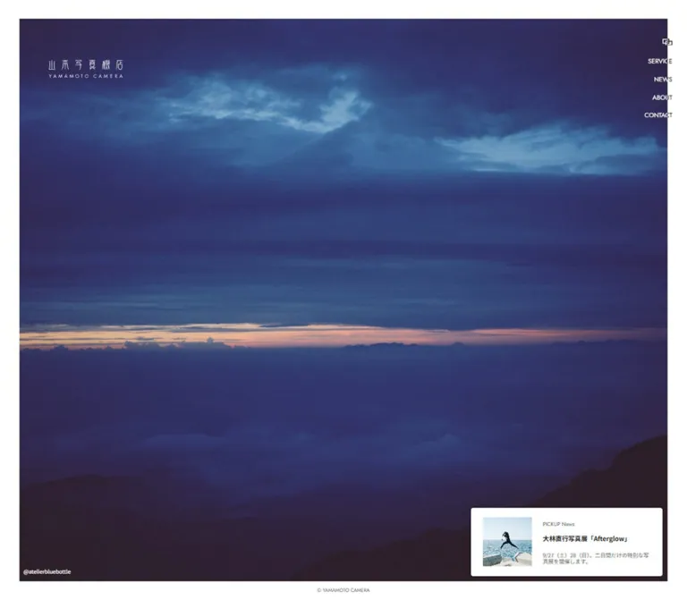
大きな写真と細身のロゴ、控えめな縦ナビゲーションで構成。デスクトップでは白い額縁の内側に情報を重ね、モバイルでは写真・ロゴ・記事リンクを縦に配置する写真店のサイト。
オリジナルサイトを見る山本写真機店 / YAMAMOTO CAMERA — Style Reference
A photograph displayed inside a white frame, with the interface kept at its edges.
Original URL: https://yamamotocamera.jp/ Final URL: https://yamamotocamera.jp/ Theme: white canvas, dark utility text, and reversed details over photography; no theme selector was observed. Inspected: September 12, 2026, at 14:05:10.997 UTC / 23:05:10.997 JST, according to the supplied browser evidence. Viewports: 1440 × 1000 desktop and 390 × 844 mobile, in CSS pixels. Scope: the current homepage in its settled resting state, including the photograph, wordmark, navigation controls, photographer link, featured article, and desktop copyright. Offscreen navigation content is documented only where supported by the rendered DOM. Open menus, destination pages, hover states, and timed image changes were not demonstrated.
Yamamoto Camera presents its photography and film-processing business through a single prominent image. The inspected photograph shows hands holding a transparent tray containing a large horned beetle. Diffuse light, soft focus, subdued color, and visible photographic texture supply nearly all the visual richness. The interface contributes a white frame, a delicate bilingual wordmark, small navigation labels, and one compact article link.
Desktop and mobile use different compositions. Desktop places the identity and utilities over a photograph that almost fills the viewport. Mobile starts with a full-width photograph, then gives the black wordmark a substantial white area before the article link. This is a photography-led business homepage with service and editorial entry points. Its reference value lies in the relationship between imagery, restrained information, and responsive placement.
How to Read This Reference
- Measured means a value supplied by the rendered DOM or computed-style evidence. Decimal coordinates are browser layout measurements, not manual screenshot measurements.
- Visual estimate means a proportion, color, or dimension estimated from the current-page captures. These values are approximate.
- Derived means arithmetic based on measured values. It does not establish the original CSS formula.
- Recommended identifies implementation choices for a new build, including the breakpoint, accessibility additions, and starter CSS.
- Named custom properties are implementation aliases. The evidence did not expose an authored design-token system for the visible homepage.
- The three supplied desktop captures and two mobile captures show the same resting composition. Their repetition does not establish an animation sequence.
Tokens — Colors
Default Palette
| Name | Value | Evidence | Suggested token | Role |
|---|---|---|---|---|
| Frame White | #ffffff |
Measured on the body and article link | --color-canvas |
Outer frame, mobile identity area, and article surface |
| Utility Ink | #222222 |
Measured on visible link and button containers | --color-ink |
Article text and navigation container text |
| Photo Credit White | #ffffff |
Measured on the photographer link | --color-on-photo |
Small attribution over the photograph; the desktop wordmark also appears white |
| Secondary Gray | Approximately #666666 |
Visual estimate | --color-muted |
Article eyebrow and understated copyright |
| Arrow Wash | Approximately #f7f7f7 |
Visual estimate | --color-arrow-surface |
Very pale rectangular arrow area on mobile |
The warm beige, charcoal, and muted blue-gray areas belong to the photograph. The yellow in the article thumbnail belongs to its exhibition artwork. Neither establishes a permanent interface accent color.
Computed color is not always final visible color. Desktop navigation button containers report #222222, while parts of the lettering appear pale over the image and darker at the outer white edge. The supplied evidence does not include the child styling, masks, or compositing rules needed to explain that treatment. Preserve the observed distinction without claiming a particular blend mode.
The DOM also exposes numerous generic WordPress colors, gradients, and shadow presets, plus Swiper variables. Their presence does not establish use in the visible design. Blue controls, purple accents, and preset shadows should not be imported into this reference.
Tokens — Typography
Japanese Interface Text
- Measured family stack:
'Noto Sans JP', -apple-system, sans-serif, system-ui. - Measured regular weight:
400on inspected link and button containers. - Role: Japanese article content, photographer attribution, and navigation content found in the DOM.
- Limitation: a computed family stack establishes the requested family, not the particular font file or fallback face that rendered each glyph.
The featured article title appears bold, but its child element was not included in the computed-style sample. A weight near 700 is a visual estimate and a suitable implementation starting point.
Desktop Navigation
- Measured family:
Jost. - Measured size and line height:
13.3714px / 13.3714px. - Measured weight:
400. - Measured tracking:
normal. - Labels:
SERVICE,NEWS,ABOUT, andCONTACT.
These are compact uppercase utilities. They do not function visually as large section headings.
Wordmark
The visible identity combines narrow, distinctive Japanese lettering with a small, widely spaced YAMAMOTO CAMERA line. Treat it as a graphic asset. The font stack on the surrounding home link does not identify the lettering used to draw the logo.
The desktop wordmark is white over the photo. The mobile wordmark is black and centered in its own white area. Do not replace it with ordinary spaced text and claim an exact reproduction.
Type Scale
| Role | Desktop | Mobile | Status |
|---|---|---|---|
| Root size | 10.2857px |
10.4px |
Measured on HTML |
| General inspected UI container | 15.4286px / 30.8571px |
13.52px / 27.04px |
Measured; child text can override these values |
| Desktop navigation | 13.3714px / 13.3714px, weight 400 |
Not visible as a label stack | Measured desktop buttons |
| Photographer link | 11.3143px / 22.6286px |
11.44px / 22.88px |
Measured |
| Article eyebrow | Approximately 10–11px |
Approximately 10–11px |
Visual estimate |
| Article title | Approximately 13–14px, bold |
Approximately 13–14px, bold |
Visual estimate; child styles unavailable |
| Copyright | Approximately 9–10px |
Not visible | Visual estimate |
| Offscreen major navigation links | Not sampled | 31.2px / 46.8px, weight 300 |
DOM only; not an inspected open-menu state |
| Offscreen navigation detail links | Not sampled | 15.6px / 31.2px, weight 400 |
DOM only |
The root and body report Times, but the visible sampled interface elements override that family. This is not evidence for a serif-led design.
The page title includes the source phrase 最高の写真をあなたへ。; it is not displayed as an oversized headline in the inspected homepage composition.
Tokens — Spacing & Shapes
Scaling Interpretation
For comparison, this document uses u to mean the measured root size at each inspected viewport:
- Desktop:
1u = 10.2857px. - Mobile:
1u = 10.4px.
Several measurements align closely with simple multiples of this unit. For example, the desktop article padding is 2u 2.4u, and the mobile article’s horizontal inset is approximately 2u. These relationships are useful for reconstruction, but the original stylesheet formulas and breakpoints were not supplied.
Spacing Scale
| Use | Desktop | Mobile | Evidence |
|---|---|---|---|
| Photograph outer frame | Approximately 41px on each side |
0px |
Visual estimate; desktop aligns with 4u |
| Photographer left inset within photograph | Approximately 8.2px |
8.31px from viewport left |
Desktop derived from estimated frame; mobile measured |
| Navigation row pitch | 38.05px |
Not applicable to resting view | Derived from measured button positions |
| Gap between desktop navigation text boxes | Approximately 24.67px |
Not applicable | Derived |
| Article internal padding | 20.5714px 24.6857px |
0px |
Measured |
| Article radius | 5.14286px |
0px |
Measured |
| Article horizontal viewport inset | 51.45px from right |
Approximately 20.80px on both sides |
Derived from measured bounds |
| Article bottom viewport clearance | 51.42px |
70.72px |
Derived from measured bounds |
| Thumbnail-to-copy gap | Approximately 22–23px |
Approximately 31px |
Visual estimate |
| Main bottom padding | 0px |
104px |
Measured on MAIN; not equivalent to visible article clearance |
Layout Measurements
| Element | Desktop at 1440 × 1000 | Mobile at 390 × 844 | Evidence |
|---|---|---|---|
| Document height | 1000px |
844px |
Measured |
| Main rectangle | 1440 × 1000px |
390 × 844px |
Measured |
| Photograph | Approximately (41, 41), 1358 × 918px |
Approximately (0, 0), 390 × 422px |
Visual estimate |
| Desktop home-logo link | (102.84, 100), 154.28 × 47.41px |
Visible central logo not separately sampled | Measured desktop anchor |
| Visible mobile logo artwork | Not applicable | Approximately (125, 540), 140 × 35px |
Visual estimate |
| Small menu-control box | (1388.59, 82.28), 20.56 × 14.39px |
(352.58, 16.63), 20.80 × 14.55px |
Measured |
| Photographer link | (49.36, 928), 65.34 × 22.63px |
(8.31, 394.97), 66.09 × 22.88px |
Measured |
| Article link | (987.44, 804.61), 401.11 × 143.97px |
(20.80, 690.09), 348.39 × 83.19px |
Measured |
| Article thumbnail | Approximately 103 × 103px |
Approximately 83 × 83px |
Visual estimate |
| Mobile arrow area | Not visibly distinguished | Approximately 21 × 83px |
Visual estimate |
The photograph occupies roughly 87% of the desktop viewport area. Its mobile height is approximately half the inspected viewport height. These are descriptions of the captured layouts, not verified global CSS rules.
Shape Language
Photography, logo artwork, and thumbnails have square boundaries. The desktop article has a small radius of approximately 5px; mobile removes that enclosing rounded-card treatment. There are no visible pills, decorative borders, or general shadow-elevation layers.
Components
Framed Photograph
Role: establishes the homepage’s identity and visual atmosphere.
On desktop, the image sits approximately 41px inside every viewport edge. The white perimeter reads like a photographic print border. The image itself remains uninterrupted by a large heading or central action.
The wordmark occupies the upper-left region. Navigation sits at the far right, partly beyond the image boundary. The photographer link anchors the lower left; the article link anchors the lower right.
On mobile, the frame disappears and the photograph runs edge to edge across the top 422px. The crop retains the hands, beetle, and clear tray while revealing a taller portion of the scene. Asset dimensions and source-selection rules are unavailable, so separate image files versus responsive cropping cannot be determined.
Implementation guidance: use a positioned image region with explicit responsive geometry. Inspect the authorized source photograph at both sizes before choosing object-fit, object-position, or a separate mobile crop.
Bilingual Wordmark
Role: identifies the business without competing with the photograph.
The desktop home link begins at x = 102.84px, y = 100px. Its clickable box measures 154.28 × 47.41px; that box should not be confused with the exact visible ink bounds.
The mobile screenshot places a smaller black wordmark around the horizontal center of the page, near y = 540px. It is surrounded by white space rather than attached to a conventional header bar.
The mobile DOM also contains a home-link rectangle beginning at x = 421.19px, outside the 390px viewport. That offscreen link is not the central visible logo and must not be used to position it.
Desktop Edge Navigation
Role: compact access to the site’s principal information areas.
Four right-aligned buttons form a vertical stack. Their measured top positions are 123.42, 161.47, 199.52, and 237.56px. All end near x = 1409.16px, approximately 30.84px from the viewport edge.
The source semantics are buttons, not direct destination anchors. The evidence does not establish whether they open panels, reveal submenus, or perform another action.
Each label appears twice in extracted text, such as SERVICESERVICE, while the screenshot presents one visual navigation item. This supports the presence of duplicated label content, but does not prove a particular hover animation. A new implementation should expose only one accessible name per control.
Small Menu Control
Role: apparent site-navigation control; its behavior was not exercised.
A tiny overlapping-rectangle symbol appears above the desktop label stack and at the upper right of the mobile photograph. It has no visible text caption. Its approximately 21 × 15px measured button box is much smaller than a recommended touch target.
On mobile, this symbol is the only clearly visible navigation control in the resting capture. The open state, close affordance, backdrop, focus handling, and scroll behavior remain unverified.
Navigation Content in the DOM
The mobile evidence includes links for TOP PAGE, SERVICE, TOPICS, ABOUT, and CONTACT, with more specific destinations for film orders, pricing simulation, printing, news categories, company information, FAQs, and related products.
Many of these elements lie to the right of the viewport or far below it, while the measured document height remains 844px. Their narrow, unusually tall text rectangles describe an offscreen layout state. They are not evidence that the visible mobile navigation deliberately uses one-character columns or thousands of pixels of scrolling.
Use these links as evidence of information architecture only. A faithful open-menu reference requires an actual open-menu capture.
Photographer Link
Role: credits the displayed photograph and provides a related external destination.
The visible label is @bmtm_life, linked in the supplied DOM to https://www.instagram.com/bmtm_life/. It uses white Noto Sans JP-stack text at approximately 11.3–11.4px, with a line height close to twice the font size.
Desktop positions it just inside the photograph’s bottom-left corner. Mobile retains the same relationship, approximately 8px from the left edge and just above the bottom of the image.
The handle is image attribution. It does not establish a personal legal name or website-production role.
Featured Article Link
Role: introduces current editorial or event content without turning the homepage into a news feed.
The entire component is an anchor. Its observed content is:
- Eyebrow:
PICK UP Article. - Title:
cheeeese!!CLUB 20周年記念写真展 「GOLDEN」. - Image: a square display of predominantly yellow exhibition artwork with a photographic collage.
On desktop, the link is a white panel measuring 401.11 × 143.97px, placed approximately one additional u inside the photograph’s lower-right boundary. The measured container uses display: flex, 20.57px vertical padding, 24.69px horizontal padding, and a 5.14px radius.
Its anatomy is a square thumbnail on the left and a two-level text stack on the right. The eyebrow is small and regular; the title is darker and visually bold, wrapping across two lines. No separate filled call-to-action is visible.
On mobile, the component becomes a flat row on the white page. It measures 348.39 × 83.19px, starts approximately 21px from the left, and has no container padding or radius. The smaller thumbnail remains on the left. The title wraps beside it, and a narrow pale arrow region appears at the far right.
Preserve this change in containment: desktop needs an opaque panel to separate text from the photograph; mobile already provides a white background.
Mobile Identity Area
Role: gives the brand a quiet visual pause between the photograph and the article.
The photograph ends around y = 422px, while the article begins at y = 690.09px. Between them is approximately 268px of white space containing the centered wordmark. The logo’s visible artwork sits roughly midway through this interval.
This space is a defining part of the mobile composition. Filling it with promotional copy, badges, or another card would materially change the hierarchy.
Desktop Copyright
Role: understated ownership label in the white perimeter.
©︎ YAMAMOTO CAMERA is centered near the bottom of the desktop viewport in very small gray text. It does not appear in the mobile screenshot.
The sampled FOOTER element is empty and has zero height in both viewports, while the copyright text occurs within the extracted main content. Its visual location should not be mistaken for evidence of a particular semantic footer implementation.
Tokens — Motion & Interaction
| Evidence | What can be established | What remains unverified |
|---|---|---|
| Repeated settled captures | The same photo and article are visible in the supplied resting states | Image rotation, autoplay, random image selection, or slide order |
Sampled elements report animation: none |
No CSS animation is reported on those sampled elements at capture | Descendant animations, pseudo-elements, or JavaScript-driven motion |
Sampled transition field reads all |
A transition-property-related value is present | Duration, easing, animated properties in practice, and visible effect |
| Initial style text includes a body opacity declaration | Startup styling exists in the document text | A fade-in duration, loading sequence, or observed reveal animation |
| Navigation text appears twice | Duplicate text content exists | Hover rolls, split lettering, wipes, or other specific treatments |
| Swiper custom properties exist | Slider-related variables are available in the page environment | An active homepage carousel or its controls |
| Photographer and article anchors have destinations | These are link elements with known URLs | Destination-page behavior and navigation transitions |
| Main navigation uses buttons | Controls can invoke an action | The action and its open/active state |
No numeric motion token can be recovered responsibly from this evidence. The starter below reproduces the resting composition and does not invent autoplay, parallax, or menu animation.
Recommended additions: if a new implementation introduces a menu transition, keep it brief and restrained, such as a 150–200ms opacity change. This is a recommendation, not a source value. Support reduced motion and provide pause controls if automatic image changes are introduced.
Surfaces
| Layer | Appearance | Purpose |
|---|---|---|
| Page canvas | Solid white | Frames desktop photography and supplies the mobile lower area |
| Photograph | Full-color image with square boundaries | Primary visual content |
| Over-image identity | Small white wordmark and photographer text | Establishes identity with minimal obstruction |
| Desktop article | Opaque white, approximately 5px radius |
Keeps editorial text readable over the image |
| Mobile article | Flat white row without an enclosing radius | Integrates with the page background |
| Mobile arrow region | Very pale gray rectangle | Small directional affordance |
| Desktop copyright | Small gray text directly on white | Quiet peripheral information |
There is no visible general-purpose card grid, tinted section system, or shadow hierarchy. The image boundary and the desktop article’s white surface provide the main separation.
Imagery
The current photograph feels observational and tactile. Hands and a clear plastic tray create an everyday point of contact; the beetle supplies a strong dark focal shape. Diffuse highlights, shallow focus, and muted warm and cool tones keep the image expressive without looking like polished product advertising.
Preserve natural photographic texture. Avoid artificial sharpening, excessive saturation, decorative gradients, or image-wide color overlays introduced only to match a fashionable palette.
The article artwork has a different job. Its saturated yellow and dense collage signal an exhibition announcement. It should remain a small content image, with its own lettering embedded in the artwork. Do not turn its yellow into the page’s action color.
Observed Asset References
| Visible asset | Confirmed information | Unavailable information |
|---|---|---|
| Main photograph | Same beetle-and-tray scene in desktop and mobile captures; adjacent @bmtm_life link |
Image URL, intrinsic dimensions, file format, and responsive source rules |
| Wordmark | Japanese identity above YAMAMOTO CAMERA; white desktop and black mobile presentation |
Original asset URL, vector markup, and lettering construction |
| Article thumbnail | Yellow exhibition artwork associated with the displayed article | Image URL, native aspect ratio, and export dimensions |
| Menu symbol | Small overlapping rectangular outlines | Original SVG, raster asset, or CSS construction |
| Mobile arrow | Small right-pointing arrow inside a pale vertical area | Exact icon source and stroke specification |
No asset paths were supplied. The filenames in the starter markup are explicitly project-local placeholders, not discovered website assets. Use authorized imagery and logo files when implementing this composition.
Layout & Responsive Behavior
Desktop: One Framed Composition
At 1440 × 1000, the measured document fits the viewport. The photograph occupies the inset central area, and small independent elements anchor to its corners or the surrounding edge.
The logo is farther inside the image than the navigation: its left edge is about 103px from the viewport, while navigation ends about 31px from the right. This asymmetry gives the photo a spacious left identity area and a tightly aligned right utility edge.
The article is approximately 401px wide and remains subordinate to the photograph. The copyright uses the lower white frame rather than a substantial footer section.
Mobile: Photo, Identity, Article
At 390 × 844, the photograph occupies approximately the top half of the viewport. Navigation labels disappear from the visible resting composition, leaving the small upper-right symbol.
Below the photograph, the black logo sits within a large white interval. The article follows at approximately y = 690px, using nearly the full width minus 21px side insets. Its thumbnail, title, and arrow remain in one horizontal row.
This is a change in document composition, not uniform scaling. The logo moves outside the image; the article loses its padded card surface; the outer photographic frame disappears; and the visible copyright is omitted.
Responsive Limits
Only the two supplied viewport sizes were inspected. The original breakpoint, tablet arrangement, landscape-phone behavior, and browser-toolbar resizing rules are unknown.
The mobile root size is slightly larger than the desktop root size despite the much narrower viewport. A single desktop width-scaling formula should therefore not be assumed for all screen sizes.
The starter uses a recommended 48rem breakpoint and viewport-relative dimensions calibrated to the two captures. Permit vertical growth for longer article titles, larger text settings, and short screens. The captured 844px document height is not a reason to clip content in an adaptation.
Do’s and Don’ts
Do
- Make the photograph the dominant content and preserve its natural texture.
- Keep the desktop white frame approximately
41pxat the inspected width. - Use the actual wordmark asset, with white presentation over the desktop image and black presentation in the mobile identity area.
- Keep desktop navigation small, right aligned, and vertically spaced.
- Preserve the photographer link close to the photograph’s lower-left edge.
- Use one featured article with a square thumbnail and a modest two-line title.
- Retain the desktop article’s opaque white surface and subtle radius.
- Recompose mobile into photograph, generous logo area, and flat article row.
- Separate measured container typography from estimated child typography.
- Keep unobserved interactions explicitly unverified.
Don’t
- Don’t add a large marketing headline over the central subject.
- Don’t fill the mobile logo area with extra promotional content.
- Don’t convert the single article into a repeated card grid.
- Don’t apply the exhibition thumbnail’s yellow as a global brand accent.
- Don’t import generic CMS gradients, blue controls, or shadow presets into the visible palette.
- Don’t identify the custom wordmark lettering as Jost or Noto Sans JP.
- Don’t treat duplicated navigation text as proof of a specific animation.
- Don’t reconstruct an open menu from offscreen text rectangles.
- Don’t infer autoplay from slider variables alone.
- Don’t hardcode a viewport-height shell that clips enlarged text or longer article titles.
Recommended Implementation Additions
These are recommendations for a new implementation, not verified features of the original:
- Give the icon-only navigation button a clear accessible name and an effective target of at least
44 × 44pxwhile preserving the small visible symbol. - Add visible keyboard focus to the logo link, navigation controls, photographer link, and article anchor.
- If the menu is a disclosure, implement
aria-expandedandaria-controls; if it is modal, provide appropriate focus handling, Escape behavior, and focus restoration. - Keep closed navigation content out of the tab order and accessibility tree. Offscreen positioning alone is insufficient.
- Verify white over-image details against each photograph. Use a localized backing or alternate text treatment when contrast requires it.
- Give the main image a meaningful description. Use empty thumbnail alt text when its information is already conveyed by the adjacent linked title.
- Keep the article arrow decorative inside the existing article anchor rather than creating a second, tiny link.
- Reserve image dimensions to limit layout shift. Prioritize the main photograph and avoid unnecessarily loading hidden full-resolution alternatives.
- Validate the composition at
200%text zoom, on a short landscape viewport, and with a longer Japanese title.
Agent Prompt Guide
Quick Color Reference
- Canvas and desktop article: measured
#ffffff. - Main utility text: measured
#222222on inspected containers. - Photographer link: measured
#ffffff. - Secondary gray: approximately
#666666, an implementation estimate. - Mobile arrow surface: approximately
#f7f7f7, an implementation estimate. - Photographic colors and the article poster’s yellow are content colors, not permanent interface tokens.
Overall Prompt
“Create a photography-led homepage inspired by the current Yamamoto Camera composition. On desktop, place one large, natural photograph inside a white frame approximately 41px wide at a 1440px viewport. Position a small white bilingual logo near the upper left, compact Jost navigation labels in a right-aligned vertical stack, a white photographer credit at the lower left, and one small white article panel at the lower right. Use Noto Sans JP for Japanese interface text, restrained type sizes, square imagery, and almost no decorative treatment. On mobile, remove the photo frame, show the image across roughly the upper half of the viewport, move a black logo into a spacious centered white area, and render the article as a flat thumbnail–text–arrow row. Preserve the resting layout without inventing unverified slideshow or menu behavior.”
Example Component Prompts
- Desktop image stage: “At 1440 × 1000, create a photograph region approximately 1358 × 918px with a 41px white perimeter. Keep the center unobstructed. Place identity and utility details at the edges rather than adding a central headline.”
- Article panel: “Create a white article link approximately 401 × 144px with 21px vertical and 25px horizontal padding, a 5px radius, a 103px square exhibition thumbnail, a small
PICK UP Articleeyebrow, and a compact bold Japanese title. Use no visible shadow.” - Mobile composition: “At 390 × 844, show a full-width photo about 422px high, followed by a white identity area about 268px high with a small centered black logo. Place a 348px-wide article row below, using an 83px thumbnail and a narrow pale arrow area.”
- Navigation implementation: “Keep the visible navigation symbol about 21 × 15px but provide a 44px effective hit target. Use single accessible labels even if decorative text copies are added. Implement menu behavior separately because only the resting state is documented.”
- Photographic direction: “Use an observational photograph with diffuse light, shallow focus, subdued color, and tactile detail. Compose hands and an everyday object as the focal subject. Avoid glossy product lighting, artificial color grading, and decorative overlays.”
Quick Start
CSS Custom Properties
This is a recommended reconstruction scaffold, not the original stylesheet. It keeps a conventional browser root size and introduces --u for the source-like proportions.
The two unit formulas match the supplied root sizes at the inspected widths. Their clamps and the 48rem breakpoint are recommended choices. The article uses CSS Grid for convenient anatomy even though its measured source container uses Flexbox. Secondary colors and article-child typography remain estimates.
Load the named fonts through an authorized font source if available. Font files and original image assets are not bundled here.
:root {
  --color-canvas: #ffffff;
  --color-ink: #222222;
  --color-on-photo: #ffffff;
  --color-muted: #666666; /* Visual estimate. */
  --color-arrow-surface: #f7f7f7; /* Visual estimate. */

  --font-ui: 'Noto Sans JP', -apple-system, sans-serif, system-ui;
  --font-nav: 'Jost', sans-serif;

  /* Recommended scaling, calibrated to the desktop capture. */
  --u: clamp(9px, calc(100vw / 140), 12px);
  --frame: calc(4 * var(--u));
  --article-width: calc(39 * var(--u));
  --article-radius: calc(0.5 * var(--u));
  --text-nav: calc(1.3 * var(--u));
  --text-credit: calc(1.1 * var(--u));
  --text-eyebrow: var(--u);
  --text-article: calc(1.3 * var(--u));

  /* Tune against the actual authorized image. */
  --photo-position-desktop: 50% 50%;
  --photo-position-mobile: 50% 50%;
}

* { box-sizing: border-box; }
body { margin: 0; }
button { font: inherit; }

.camera-home {
  position: relative;
  min-height: 100svh;
  color: var(--color-ink);
  background: var(--color-canvas);
  font-family: var(--font-ui);
  font-size: calc(1.5 * var(--u));
  line-height: 2;
}

.photo-stage {
  position: absolute;
  inset: var(--frame);
  margin: 0;
}

.photo-stage__image {
  display: block;
  width: 100%;
  height: 100%;
  object-fit: cover;
  object-position: var(--photo-position-desktop);
}

.photo-credit {
  position: absolute;
  left: calc(0.8 * var(--u));
  bottom: calc(0.8 * var(--u));
  margin: 0;
  font-size: var(--text-credit);
  line-height: 2;
}

.photo-credit a {
  color: var(--color-on-photo);
  text-decoration: none;
}

.brand {
  position: absolute;
  top: 10svh;
  left: calc(10 * var(--u));
  width: calc(15 * var(--u));
}

.brand img {
  display: block;
  width: 100%;
  height: auto;
  /* Assumes the placeholder is a black monochrome wordmark. */
  filter: brightness(0) invert(1);
}

.site-tools {
  position: absolute;
  z-index: 3;
  top: calc(8 * var(--u));
  right: calc(3 * var(--u));
  display: grid;
  justify-items: end;
  gap: calc(2.6 * var(--u));
}

.menu-toggle {
  position: relative;
  width: calc(2 * var(--u));
  height: calc(1.4 * var(--u));
  padding: 0;
  border: 0;
  color: var(--color-on-photo);
  background: transparent;
  cursor: pointer;
}

.menu-toggle svg {
  display: block;
  width: 100%;
  height: 100%;
}

/* Recommended larger target around the small visible icon. */
.menu-toggle::before {
  content: '';
  position: absolute;
  top: 50%;
  left: 50%;
  width: 44px;
  height: 44px;
  transform: translate(-50%, -50%);
}

.section-controls {
  display: grid;
  justify-items: end;
  gap: calc(2.4 * var(--u));
}

.section-controls button {
  padding: 0;
  border: 0;
  color: var(--color-ink);
  background: transparent;
  font-family: var(--font-nav);
  font-size: var(--text-nav);
  font-weight: 400;
  line-height: 1;
  cursor: pointer;
}

.pickup {
  position: absolute;
  z-index: 2;
  right: calc(5 * var(--u));
  bottom: calc(5 * var(--u));
  display: grid;
  grid-template-columns: calc(10 * var(--u)) minmax(0, 1fr);
  align-items: center;
  gap: calc(2.2 * var(--u));
  width: var(--article-width);
  padding: calc(2 * var(--u)) calc(2.4 * var(--u));
  border-radius: var(--article-radius);
  color: var(--color-ink);
  background: var(--color-canvas);
  text-decoration: none;
}

.pickup__image {
  display: block;
  width: 100%;
  aspect-ratio: 1;
  object-fit: cover;
}

.pickup__copy { min-width: 0; }

.pickup__eyebrow {
  display: block;
  margin-bottom: calc(0.8 * var(--u));
  color: var(--color-muted);
  font-size: var(--text-eyebrow);
  font-weight: 400;
  line-height: 1.5;
}

.pickup__title {
  margin: 0;
  font-size: var(--text-article);
  font-weight: 700; /* Visual estimate. */
  line-height: 1.5; /* Recommended starting point. */
  overflow-wrap: anywhere;
}

.pickup__arrow { display: none; }

.copyright {
  position: absolute;
  right: 0;
  bottom: calc(1.3 * var(--u));
  left: 0;
  margin: 0;
  color: var(--color-muted);
  font-size: calc(0.9 * var(--u));
  line-height: 1.5;
  text-align: center;
}

/* Recommended focus treatment; not observed in the captures. */
.camera-home :focus-visible {
  outline: 2px solid currentColor;
  outline-offset: 5px;
}

@media (max-width: 48rem) {
  :root {
    /* Calibrated to 10.4px at a 390px viewport. */
    --u: clamp(9px, calc(100vw / 37.5), 11px);
  }

  .camera-home {
    display: grid;
    grid-template-areas: 'photo' 'brand' 'article';
    grid-template-rows: 50svh minmax(200px, 1fr) auto;
    min-height: 100svh;
    padding-bottom: clamp(40px, 8.38svh, 80px);
    font-size: calc(1.3 * var(--u));
  }

  .photo-stage {
    position: relative;
    inset: auto;
    grid-area: photo;
    min-width: 0;
    min-height: 0;
  }

  .photo-stage__image {
    object-position: var(--photo-position-mobile);
  }

  .photo-credit { bottom: calc(0.4 * var(--u)); }

  .brand {
    position: static;
    grid-area: brand;
    align-self: center;
    justify-self: center;
    width: calc(13.5 * var(--u));
  }

  .brand img { filter: none; }

  .site-tools {
    top: calc(1.6 * var(--u));
    right: calc(1.6 * var(--u));
  }

  .section-controls { display: none; }

  .pickup {
    position: static;
    grid-area: article;
    justify-self: center;
    grid-template-columns:
      calc(8 * var(--u)) minmax(0, 1fr) calc(2 * var(--u));
    gap: calc(2 * var(--u));
    width: calc(100% - 4 * var(--u));
    padding: 0;
    border-radius: 0;
  }

  .pickup__copy { padding-left: var(--u); }

  .pickup__arrow {
    display: grid;
    align-self: stretch;
    place-items: center;
    min-height: calc(8 * var(--u));
    color: var(--color-muted);
    background: var(--color-arrow-surface);
    font-size: var(--u);
  }

  .copyright { display: none; }
}
Minimal Markup
The image filenames below are placeholders. Supply authorized assets, including a black monochrome wordmark. The simplified menu symbol is an approximation. Connect the buttons to real navigation behavior before publishing; this snippet implements the resting layout only.
<main class='camera-home'>
  <figure class='photo-stage'>
    <img
      class='photo-stage__image'
      src='photo.jpg'
      alt='Hands holding a clear tray containing a large horned beetle'
      fetchpriority='high'
    >
    <figcaption class='photo-credit'>
      <a href='https://www.instagram.com/bmtm_life/'>@bmtm_life</a>
    </figcaption>
  </figure>

  <a class='brand' href='https://yamamotocamera.jp/'>
    <img src='wordmark.svg' alt='山本写真機店 — YAMAMOTO CAMERA'>
  </a>

  <div class='site-tools'>
    <button
      class='menu-toggle'
      type='button'
      aria-label='Open site navigation'
    >
      <svg viewBox='0 0 20 14' fill='none' aria-hidden='true'>
        <rect x='1' y='1' width='11' height='8' stroke='currentColor'/>
        <rect x='7' y='5' width='11' height='8' stroke='currentColor'/>
      </svg>
    </button>
    <nav class='section-controls' aria-label='Main sections'>
      <button type='button'>SERVICE</button>
      <button type='button'>NEWS</button>
      <button type='button'>ABOUT</button>
      <button type='button'>CONTACT</button>
    </nav>
  </div>

  <a
    class='pickup'
    href='https://yamamotocamera.jp/news/cheeeeseclub-20%e5%91%a8%e5%b9%b4%e8%a8%98%e5%bf%b5%e5%86%99%e7%9c%9f%e5%b1%95-%e3%80%8cgolden%e3%80%8d/'
  >
    <img class='pickup__image' src='article-poster.jpg' alt=''>
    <div class='pickup__copy'>
      <span class='pickup__eyebrow'>PICK UP Article</span>
      <h2 class='pickup__title'>cheeeese!!CLUB 20周年記念写真展 「GOLDEN」</h2>
    </div>
    <span class='pickup__arrow' aria-hidden='true'>→</span>
  </a>

  <p class='copyright'>©︎ YAMAMOTO CAMERA</p>
</main>
The CSS follows the measured dark navigation-container color. It does not reproduce the unexplained pale/dark label compositing visible at the desktop image edge. The original mobile 104px main padding is also not copied literally: the adaptation models the visible composition with grid rows and bottom clearance instead of assuming an unavailable flex-layout calculation.
Tailwind v4 Token Mapping
Optional aliases for an implementation that already uses Tailwind v4. This is not evidence that the original site uses Tailwind. Define the custom properties above first.
@theme inline {
  --color-canvas: #ffffff;
  --color-ink: #222222;
  --color-on-photo: #ffffff;
  --color-muted: #666666;
  --color-arrow-surface: #f7f7f7;

  --font-ui: 'Noto Sans JP', -apple-system, sans-serif, system-ui;
  --font-nav: 'Jost', sans-serif;

  --text-nav: calc(1.3 * var(--u));
  --text-credit: calc(1.1 * var(--u));
  --text-eyebrow: var(--u);
  --text-article: calc(1.3 * var(--u));

  --spacing-frame: calc(4 * var(--u));
  --spacing-article: calc(39 * var(--u));
  --radius-article: calc(0.5 * var(--u));
}
Sources & Evidence
- Inspected original and final page: https://yamamotocamera.jp/. The supplied inspection reports HTTP
200with no URL change and the document title山本写真機店|最高の写真をあなたへ。. - Capture record: September 12, 2026,
14:05:10.997 UTC, equivalent to23:05:10.997 JST. - Desktop evidence: three supplied current-page captures at
1440 × 1000; the corresponding DOM reports a1000pxdocument height. - Mobile evidence: two supplied current-page captures at
390 × 844; the corresponding DOM reports an844pxdocument height. - Rendered measurements: element rectangles, computed font stacks, colors, line heights, padding, radii, display values, link destinations, and extracted text. Image rectangles and article-child styles were not separately supplied.
- Readiness context: the browser record describes at least five seconds of initial observation, bounded waits for loading, image decoding and finite motion, and layout/text stability checks. Perpetual animations were paused during readiness checks and resumed afterward. These checks do not establish semantic completeness or prove that all motion was observed.
- Interaction limits: no demonstrated menu opening, hover, keyboard focus, article navigation, photographer-link navigation, image change, or independent scrolling result was supplied. Offscreen menu content is treated as DOM evidence, not a visible interaction state.
- Implementation limits: no original image URLs, font-file URLs, full stylesheets, responsive breakpoints, or complete transition definitions were provided. The starter code is a reasoned adaptation and was not executed or visually tested for this document.
This reference uses the supplied current-page screenshots and rendered evidence. It does not claim an independent browser inspection, reconstruct earlier page states, or establish production authorship beyond what the original page itself demonstrates.
# 山本写真機店 / YAMAMOTO CAMERA — Style Reference

> A photograph displayed inside a white frame, with the interface kept at its edges.

**Original URL:** [https://yamamotocamera.jp/](https://yamamotocamera.jp/)
**Final URL:** [https://yamamotocamera.jp/](https://yamamotocamera.jp/)
**Theme:** white canvas, dark utility text, and reversed details over photography; no theme selector was observed.
**Inspected:** September 12, 2026, at 14:05:10.997 UTC / 23:05:10.997 JST, according to the supplied browser evidence.
**Viewports:** 1440 × 1000 desktop and 390 × 844 mobile, in CSS pixels.
**Scope:** the current homepage in its settled resting state, including the photograph, wordmark, navigation controls, photographer link, featured article, and desktop copyright. Offscreen navigation content is documented only where supported by the rendered DOM. Open menus, destination pages, hover states, and timed image changes were not demonstrated.

Yamamoto Camera presents its photography and film-processing business through a single prominent image. The inspected photograph shows hands holding a transparent tray containing a large horned beetle. Diffuse light, soft focus, subdued color, and visible photographic texture supply nearly all the visual richness. The interface contributes a white frame, a delicate bilingual wordmark, small navigation labels, and one compact article link.

Desktop and mobile use different compositions. Desktop places the identity and utilities over a photograph that almost fills the viewport. Mobile starts with a full-width photograph, then gives the black wordmark a substantial white area before the article link. This is a photography-led business homepage with service and editorial entry points. Its reference value lies in the relationship between imagery, restrained information, and responsive placement.

## How to Read This Reference

- **Measured** means a value supplied by the rendered DOM or computed-style evidence. Decimal coordinates are browser layout measurements, not manual screenshot measurements.
- **Visual estimate** means a proportion, color, or dimension estimated from the current-page captures. These values are approximate.
- **Derived** means arithmetic based on measured values. It does not establish the original CSS formula.
- **Recommended** identifies implementation choices for a new build, including the breakpoint, accessibility additions, and starter CSS.
- Named custom properties are implementation aliases. The evidence did not expose an authored design-token system for the visible homepage.
- The three supplied desktop captures and two mobile captures show the same resting composition. Their repetition does not establish an animation sequence.

## Tokens — Colors

### Default Palette

| Name | Value | Evidence | Suggested token | Role |
| --- | --- | --- | --- | --- |
| Frame White | `#ffffff` | Measured on the body and article link | `--color-canvas` | Outer frame, mobile identity area, and article surface |
| Utility Ink | `#222222` | Measured on visible link and button containers | `--color-ink` | Article text and navigation container text |
| Photo Credit White | `#ffffff` | Measured on the photographer link | `--color-on-photo` | Small attribution over the photograph; the desktop wordmark also appears white |
| Secondary Gray | Approximately `#666666` | Visual estimate | `--color-muted` | Article eyebrow and understated copyright |
| Arrow Wash | Approximately `#f7f7f7` | Visual estimate | `--color-arrow-surface` | Very pale rectangular arrow area on mobile |

The warm beige, charcoal, and muted blue-gray areas belong to the photograph. The yellow in the article thumbnail belongs to its exhibition artwork. Neither establishes a permanent interface accent color.

**Computed color is not always final visible color.** Desktop navigation button containers report `#222222`, while parts of the lettering appear pale over the image and darker at the outer white edge. The supplied evidence does not include the child styling, masks, or compositing rules needed to explain that treatment. Preserve the observed distinction without claiming a particular blend mode.

The DOM also exposes numerous generic WordPress colors, gradients, and shadow presets, plus Swiper variables. Their presence does not establish use in the visible design. Blue controls, purple accents, and preset shadows should not be imported into this reference.

## Tokens — Typography

### Japanese Interface Text

- **Measured family stack:** `'Noto Sans JP', -apple-system, sans-serif, system-ui`.
- **Measured regular weight:** `400` on inspected link and button containers.
- **Role:** Japanese article content, photographer attribution, and navigation content found in the DOM.
- **Limitation:** a computed family stack establishes the requested family, not the particular font file or fallback face that rendered each glyph.

The featured article title appears bold, but its child element was not included in the computed-style sample. A weight near `700` is a visual estimate and a suitable implementation starting point.

### Desktop Navigation

- **Measured family:** `Jost`.
- **Measured size and line height:** `13.3714px / 13.3714px`.
- **Measured weight:** `400`.
- **Measured tracking:** `normal`.
- **Labels:** `SERVICE`, `NEWS`, `ABOUT`, and `CONTACT`.

These are compact uppercase utilities. They do not function visually as large section headings.

### Wordmark

The visible identity combines narrow, distinctive Japanese lettering with a small, widely spaced `YAMAMOTO CAMERA` line. Treat it as a graphic asset. The font stack on the surrounding home link does not identify the lettering used to draw the logo.

The desktop wordmark is white over the photo. The mobile wordmark is black and centered in its own white area. Do not replace it with ordinary spaced text and claim an exact reproduction.

### Type Scale

| Role | Desktop | Mobile | Status |
| --- | --- | --- | --- |
| Root size | `10.2857px` | `10.4px` | Measured on `HTML` |
| General inspected UI container | `15.4286px / 30.8571px` | `13.52px / 27.04px` | Measured; child text can override these values |
| Desktop navigation | `13.3714px / 13.3714px`, weight `400` | Not visible as a label stack | Measured desktop buttons |
| Photographer link | `11.3143px / 22.6286px` | `11.44px / 22.88px` | Measured |
| Article eyebrow | Approximately `10–11px` | Approximately `10–11px` | Visual estimate |
| Article title | Approximately `13–14px`, bold | Approximately `13–14px`, bold | Visual estimate; child styles unavailable |
| Copyright | Approximately `9–10px` | Not visible | Visual estimate |
| Offscreen major navigation links | Not sampled | `31.2px / 46.8px`, weight `300` | DOM only; not an inspected open-menu state |
| Offscreen navigation detail links | Not sampled | `15.6px / 31.2px`, weight `400` | DOM only |

The root and body report `Times`, but the visible sampled interface elements override that family. This is not evidence for a serif-led design.

The page title includes the source phrase `最高の写真をあなたへ。`; it is not displayed as an oversized headline in the inspected homepage composition.

## Tokens — Spacing & Shapes

### Scaling Interpretation

For comparison, this document uses **u** to mean the measured root size at each inspected viewport:

- Desktop: `1u = 10.2857px`.
- Mobile: `1u = 10.4px`.

Several measurements align closely with simple multiples of this unit. For example, the desktop article padding is `2u 2.4u`, and the mobile article’s horizontal inset is approximately `2u`. These relationships are useful for reconstruction, but the original stylesheet formulas and breakpoints were not supplied.

### Spacing Scale

| Use | Desktop | Mobile | Evidence |
| --- | --- | --- | --- |
| Photograph outer frame | Approximately `41px` on each side | `0px` | Visual estimate; desktop aligns with `4u` |
| Photographer left inset within photograph | Approximately `8.2px` | `8.31px` from viewport left | Desktop derived from estimated frame; mobile measured |
| Navigation row pitch | `38.05px` | Not applicable to resting view | Derived from measured button positions |
| Gap between desktop navigation text boxes | Approximately `24.67px` | Not applicable | Derived |
| Article internal padding | `20.5714px 24.6857px` | `0px` | Measured |
| Article radius | `5.14286px` | `0px` | Measured |
| Article horizontal viewport inset | `51.45px` from right | Approximately `20.80px` on both sides | Derived from measured bounds |
| Article bottom viewport clearance | `51.42px` | `70.72px` | Derived from measured bounds |
| Thumbnail-to-copy gap | Approximately `22–23px` | Approximately `31px` | Visual estimate |
| Main bottom padding | `0px` | `104px` | Measured on `MAIN`; not equivalent to visible article clearance |

### Layout Measurements

| Element | Desktop at 1440 × 1000 | Mobile at 390 × 844 | Evidence |
| --- | --- | --- | --- |
| Document height | `1000px` | `844px` | Measured |
| Main rectangle | `1440 × 1000px` | `390 × 844px` | Measured |
| Photograph | Approximately `(41, 41)`, `1358 × 918px` | Approximately `(0, 0)`, `390 × 422px` | Visual estimate |
| Desktop home-logo link | `(102.84, 100)`, `154.28 × 47.41px` | Visible central logo not separately sampled | Measured desktop anchor |
| Visible mobile logo artwork | Not applicable | Approximately `(125, 540)`, `140 × 35px` | Visual estimate |
| Small menu-control box | `(1388.59, 82.28)`, `20.56 × 14.39px` | `(352.58, 16.63)`, `20.80 × 14.55px` | Measured |
| Photographer link | `(49.36, 928)`, `65.34 × 22.63px` | `(8.31, 394.97)`, `66.09 × 22.88px` | Measured |
| Article link | `(987.44, 804.61)`, `401.11 × 143.97px` | `(20.80, 690.09)`, `348.39 × 83.19px` | Measured |
| Article thumbnail | Approximately `103 × 103px` | Approximately `83 × 83px` | Visual estimate |
| Mobile arrow area | Not visibly distinguished | Approximately `21 × 83px` | Visual estimate |

The photograph occupies roughly 87% of the desktop viewport area. Its mobile height is approximately half the inspected viewport height. These are descriptions of the captured layouts, not verified global CSS rules.

### Shape Language

Photography, logo artwork, and thumbnails have square boundaries. The desktop article has a small radius of approximately `5px`; mobile removes that enclosing rounded-card treatment. There are no visible pills, decorative borders, or general shadow-elevation layers.

## Components

### Framed Photograph

**Role:** establishes the homepage’s identity and visual atmosphere.

On desktop, the image sits approximately `41px` inside every viewport edge. The white perimeter reads like a photographic print border. The image itself remains uninterrupted by a large heading or central action.

The wordmark occupies the upper-left region. Navigation sits at the far right, partly beyond the image boundary. The photographer link anchors the lower left; the article link anchors the lower right.

On mobile, the frame disappears and the photograph runs edge to edge across the top `422px`. The crop retains the hands, beetle, and clear tray while revealing a taller portion of the scene. Asset dimensions and source-selection rules are unavailable, so separate image files versus responsive cropping cannot be determined.

**Implementation guidance:** use a positioned image region with explicit responsive geometry. Inspect the authorized source photograph at both sizes before choosing `object-fit`, `object-position`, or a separate mobile crop.

### Bilingual Wordmark

**Role:** identifies the business without competing with the photograph.

The desktop home link begins at `x = 102.84px`, `y = 100px`. Its clickable box measures `154.28 × 47.41px`; that box should not be confused with the exact visible ink bounds.

The mobile screenshot places a smaller black wordmark around the horizontal center of the page, near `y = 540px`. It is surrounded by white space rather than attached to a conventional header bar.

The mobile DOM also contains a home-link rectangle beginning at `x = 421.19px`, outside the `390px` viewport. That offscreen link is not the central visible logo and must not be used to position it.

### Desktop Edge Navigation

**Role:** compact access to the site’s principal information areas.

Four right-aligned buttons form a vertical stack. Their measured top positions are `123.42`, `161.47`, `199.52`, and `237.56px`. All end near `x = 1409.16px`, approximately `30.84px` from the viewport edge.

The source semantics are buttons, not direct destination anchors. The evidence does not establish whether they open panels, reveal submenus, or perform another action.

Each label appears twice in extracted text, such as `SERVICESERVICE`, while the screenshot presents one visual navigation item. This supports the presence of duplicated label content, but does not prove a particular hover animation. A new implementation should expose only one accessible name per control.

### Small Menu Control

**Role:** apparent site-navigation control; its behavior was not exercised.

A tiny overlapping-rectangle symbol appears above the desktop label stack and at the upper right of the mobile photograph. It has no visible text caption. Its approximately `21 × 15px` measured button box is much smaller than a recommended touch target.

On mobile, this symbol is the only clearly visible navigation control in the resting capture. The open state, close affordance, backdrop, focus handling, and scroll behavior remain unverified.

### Navigation Content in the DOM

The mobile evidence includes links for `TOP PAGE`, `SERVICE`, `TOPICS`, `ABOUT`, and `CONTACT`, with more specific destinations for film orders, pricing simulation, printing, news categories, company information, FAQs, and related products.

Many of these elements lie to the right of the viewport or far below it, while the measured document height remains `844px`. Their narrow, unusually tall text rectangles describe an offscreen layout state. They are not evidence that the visible mobile navigation deliberately uses one-character columns or thousands of pixels of scrolling.

Use these links as evidence of information architecture only. A faithful open-menu reference requires an actual open-menu capture.

### Photographer Link

**Role:** credits the displayed photograph and provides a related external destination.

The visible label is `@bmtm_life`, linked in the supplied DOM to `https://www.instagram.com/bmtm_life/`. It uses white Noto Sans JP-stack text at approximately `11.3–11.4px`, with a line height close to twice the font size.

Desktop positions it just inside the photograph’s bottom-left corner. Mobile retains the same relationship, approximately `8px` from the left edge and just above the bottom of the image.

The handle is image attribution. It does not establish a personal legal name or website-production role.

### Featured Article Link

**Role:** introduces current editorial or event content without turning the homepage into a news feed.

The entire component is an anchor. Its observed content is:

- Eyebrow: `PICK UP Article`.
- Title: `cheeeese!!CLUB 20周年記念写真展 「GOLDEN」`.
- Image: a square display of predominantly yellow exhibition artwork with a photographic collage.

On desktop, the link is a white panel measuring `401.11 × 143.97px`, placed approximately one additional `u` inside the photograph’s lower-right boundary. The measured container uses `display: flex`, `20.57px` vertical padding, `24.69px` horizontal padding, and a `5.14px` radius.

Its anatomy is a square thumbnail on the left and a two-level text stack on the right. The eyebrow is small and regular; the title is darker and visually bold, wrapping across two lines. No separate filled call-to-action is visible.

On mobile, the component becomes a flat row on the white page. It measures `348.39 × 83.19px`, starts approximately `21px` from the left, and has no container padding or radius. The smaller thumbnail remains on the left. The title wraps beside it, and a narrow pale arrow region appears at the far right.

Preserve this change in containment: desktop needs an opaque panel to separate text from the photograph; mobile already provides a white background.

### Mobile Identity Area

**Role:** gives the brand a quiet visual pause between the photograph and the article.

The photograph ends around `y = 422px`, while the article begins at `y = 690.09px`. Between them is approximately `268px` of white space containing the centered wordmark. The logo’s visible artwork sits roughly midway through this interval.

This space is a defining part of the mobile composition. Filling it with promotional copy, badges, or another card would materially change the hierarchy.

### Desktop Copyright

**Role:** understated ownership label in the white perimeter.

`©︎ YAMAMOTO CAMERA` is centered near the bottom of the desktop viewport in very small gray text. It does not appear in the mobile screenshot.

The sampled `FOOTER` element is empty and has zero height in both viewports, while the copyright text occurs within the extracted main content. Its visual location should not be mistaken for evidence of a particular semantic footer implementation.

## Tokens — Motion & Interaction

| Evidence | What can be established | What remains unverified |
| --- | --- | --- |
| Repeated settled captures | The same photo and article are visible in the supplied resting states | Image rotation, autoplay, random image selection, or slide order |
| Sampled elements report `animation: none` | No CSS animation is reported on those sampled elements at capture | Descendant animations, pseudo-elements, or JavaScript-driven motion |
| Sampled transition field reads `all` | A transition-property-related value is present | Duration, easing, animated properties in practice, and visible effect |
| Initial style text includes a body opacity declaration | Startup styling exists in the document text | A fade-in duration, loading sequence, or observed reveal animation |
| Navigation text appears twice | Duplicate text content exists | Hover rolls, split lettering, wipes, or other specific treatments |
| Swiper custom properties exist | Slider-related variables are available in the page environment | An active homepage carousel or its controls |
| Photographer and article anchors have destinations | These are link elements with known URLs | Destination-page behavior and navigation transitions |
| Main navigation uses buttons | Controls can invoke an action | The action and its open/active state |

No numeric motion token can be recovered responsibly from this evidence. The starter below reproduces the resting composition and does not invent autoplay, parallax, or menu animation.

**Recommended additions:** if a new implementation introduces a menu transition, keep it brief and restrained, such as a `150–200ms` opacity change. This is a recommendation, not a source value. Support reduced motion and provide pause controls if automatic image changes are introduced.

## Surfaces

| Layer | Appearance | Purpose |
| --- | --- | --- |
| Page canvas | Solid white | Frames desktop photography and supplies the mobile lower area |
| Photograph | Full-color image with square boundaries | Primary visual content |
| Over-image identity | Small white wordmark and photographer text | Establishes identity with minimal obstruction |
| Desktop article | Opaque white, approximately `5px` radius | Keeps editorial text readable over the image |
| Mobile article | Flat white row without an enclosing radius | Integrates with the page background |
| Mobile arrow region | Very pale gray rectangle | Small directional affordance |
| Desktop copyright | Small gray text directly on white | Quiet peripheral information |

There is no visible general-purpose card grid, tinted section system, or shadow hierarchy. The image boundary and the desktop article’s white surface provide the main separation.

## Imagery

The current photograph feels observational and tactile. Hands and a clear plastic tray create an everyday point of contact; the beetle supplies a strong dark focal shape. Diffuse highlights, shallow focus, and muted warm and cool tones keep the image expressive without looking like polished product advertising.

Preserve natural photographic texture. Avoid artificial sharpening, excessive saturation, decorative gradients, or image-wide color overlays introduced only to match a fashionable palette.

The article artwork has a different job. Its saturated yellow and dense collage signal an exhibition announcement. It should remain a small content image, with its own lettering embedded in the artwork. Do not turn its yellow into the page’s action color.

### Observed Asset References

| Visible asset | Confirmed information | Unavailable information |
| --- | --- | --- |
| Main photograph | Same beetle-and-tray scene in desktop and mobile captures; adjacent `@bmtm_life` link | Image URL, intrinsic dimensions, file format, and responsive source rules |
| Wordmark | Japanese identity above `YAMAMOTO CAMERA`; white desktop and black mobile presentation | Original asset URL, vector markup, and lettering construction |
| Article thumbnail | Yellow exhibition artwork associated with the displayed article | Image URL, native aspect ratio, and export dimensions |
| Menu symbol | Small overlapping rectangular outlines | Original SVG, raster asset, or CSS construction |
| Mobile arrow | Small right-pointing arrow inside a pale vertical area | Exact icon source and stroke specification |

No asset paths were supplied. The filenames in the starter markup are explicitly project-local placeholders, not discovered website assets. Use authorized imagery and logo files when implementing this composition.

## Layout & Responsive Behavior

### Desktop: One Framed Composition

At `1440 × 1000`, the measured document fits the viewport. The photograph occupies the inset central area, and small independent elements anchor to its corners or the surrounding edge.

The logo is farther inside the image than the navigation: its left edge is about `103px` from the viewport, while navigation ends about `31px` from the right. This asymmetry gives the photo a spacious left identity area and a tightly aligned right utility edge.

The article is approximately `401px` wide and remains subordinate to the photograph. The copyright uses the lower white frame rather than a substantial footer section.

### Mobile: Photo, Identity, Article

At `390 × 844`, the photograph occupies approximately the top half of the viewport. Navigation labels disappear from the visible resting composition, leaving the small upper-right symbol.

Below the photograph, the black logo sits within a large white interval. The article follows at approximately `y = 690px`, using nearly the full width minus `21px` side insets. Its thumbnail, title, and arrow remain in one horizontal row.

This is a change in document composition, not uniform scaling. The logo moves outside the image; the article loses its padded card surface; the outer photographic frame disappears; and the visible copyright is omitted.

### Responsive Limits

Only the two supplied viewport sizes were inspected. The original breakpoint, tablet arrangement, landscape-phone behavior, and browser-toolbar resizing rules are unknown.

The mobile root size is slightly larger than the desktop root size despite the much narrower viewport. A single desktop width-scaling formula should therefore not be assumed for all screen sizes.

The starter uses a recommended `48rem` breakpoint and viewport-relative dimensions calibrated to the two captures. Permit vertical growth for longer article titles, larger text settings, and short screens. The captured `844px` document height is not a reason to clip content in an adaptation.

## Do’s and Don’ts

### Do

- Make the photograph the dominant content and preserve its natural texture.
- Keep the desktop white frame approximately `41px` at the inspected width.
- Use the actual wordmark asset, with white presentation over the desktop image and black presentation in the mobile identity area.
- Keep desktop navigation small, right aligned, and vertically spaced.
- Preserve the photographer link close to the photograph’s lower-left edge.
- Use one featured article with a square thumbnail and a modest two-line title.
- Retain the desktop article’s opaque white surface and subtle radius.
- Recompose mobile into photograph, generous logo area, and flat article row.
- Separate measured container typography from estimated child typography.
- Keep unobserved interactions explicitly unverified.

### Don’t

- Don’t add a large marketing headline over the central subject.
- Don’t fill the mobile logo area with extra promotional content.
- Don’t convert the single article into a repeated card grid.
- Don’t apply the exhibition thumbnail’s yellow as a global brand accent.
- Don’t import generic CMS gradients, blue controls, or shadow presets into the visible palette.
- Don’t identify the custom wordmark lettering as Jost or Noto Sans JP.
- Don’t treat duplicated navigation text as proof of a specific animation.
- Don’t reconstruct an open menu from offscreen text rectangles.
- Don’t infer autoplay from slider variables alone.
- Don’t hardcode a viewport-height shell that clips enlarged text or longer article titles.

## Recommended Implementation Additions

These are recommendations for a new implementation, not verified features of the original:

- Give the icon-only navigation button a clear accessible name and an effective target of at least `44 × 44px` while preserving the small visible symbol.
- Add visible keyboard focus to the logo link, navigation controls, photographer link, and article anchor.
- If the menu is a disclosure, implement `aria-expanded` and `aria-controls`; if it is modal, provide appropriate focus handling, Escape behavior, and focus restoration.
- Keep closed navigation content out of the tab order and accessibility tree. Offscreen positioning alone is insufficient.
- Verify white over-image details against each photograph. Use a localized backing or alternate text treatment when contrast requires it.
- Give the main image a meaningful description. Use empty thumbnail alt text when its information is already conveyed by the adjacent linked title.
- Keep the article arrow decorative inside the existing article anchor rather than creating a second, tiny link.
- Reserve image dimensions to limit layout shift. Prioritize the main photograph and avoid unnecessarily loading hidden full-resolution alternatives.
- Validate the composition at `200%` text zoom, on a short landscape viewport, and with a longer Japanese title.

## Agent Prompt Guide

### Quick Color Reference

- Canvas and desktop article: measured `#ffffff`.
- Main utility text: measured `#222222` on inspected containers.
- Photographer link: measured `#ffffff`.
- Secondary gray: approximately `#666666`, an implementation estimate.
- Mobile arrow surface: approximately `#f7f7f7`, an implementation estimate.
- Photographic colors and the article poster’s yellow are content colors, not permanent interface tokens.

### Overall Prompt

“Create a photography-led homepage inspired by the current Yamamoto Camera composition. On desktop, place one large, natural photograph inside a white frame approximately 41px wide at a 1440px viewport. Position a small white bilingual logo near the upper left, compact Jost navigation labels in a right-aligned vertical stack, a white photographer credit at the lower left, and one small white article panel at the lower right. Use Noto Sans JP for Japanese interface text, restrained type sizes, square imagery, and almost no decorative treatment. On mobile, remove the photo frame, show the image across roughly the upper half of the viewport, move a black logo into a spacious centered white area, and render the article as a flat thumbnail–text–arrow row. Preserve the resting layout without inventing unverified slideshow or menu behavior.”

### Example Component Prompts

1. **Desktop image stage:** “At 1440 × 1000, create a photograph region approximately 1358 × 918px with a 41px white perimeter. Keep the center unobstructed. Place identity and utility details at the edges rather than adding a central headline.”
2. **Article panel:** “Create a white article link approximately 401 × 144px with 21px vertical and 25px horizontal padding, a 5px radius, a 103px square exhibition thumbnail, a small `PICK UP Article` eyebrow, and a compact bold Japanese title. Use no visible shadow.”
3. **Mobile composition:** “At 390 × 844, show a full-width photo about 422px high, followed by a white identity area about 268px high with a small centered black logo. Place a 348px-wide article row below, using an 83px thumbnail and a narrow pale arrow area.”
4. **Navigation implementation:** “Keep the visible navigation symbol about 21 × 15px but provide a 44px effective hit target. Use single accessible labels even if decorative text copies are added. Implement menu behavior separately because only the resting state is documented.”
5. **Photographic direction:** “Use an observational photograph with diffuse light, shallow focus, subdued color, and tactile detail. Compose hands and an everyday object as the focal subject. Avoid glossy product lighting, artificial color grading, and decorative overlays.”

## Quick Start

### CSS Custom Properties

This is a recommended reconstruction scaffold, not the original stylesheet. It keeps a conventional browser root size and introduces `--u` for the source-like proportions.

The two unit formulas match the supplied root sizes at the inspected widths. Their clamps and the `48rem` breakpoint are recommended choices. The article uses CSS Grid for convenient anatomy even though its measured source container uses Flexbox. Secondary colors and article-child typography remain estimates.

Load the named fonts through an authorized font source if available. Font files and original image assets are not bundled here.

```css
:root {
  --color-canvas: #ffffff;
  --color-ink: #222222;
  --color-on-photo: #ffffff;
  --color-muted: #666666; /* Visual estimate. */
  --color-arrow-surface: #f7f7f7; /* Visual estimate. */

  --font-ui: 'Noto Sans JP', -apple-system, sans-serif, system-ui;
  --font-nav: 'Jost', sans-serif;

  /* Recommended scaling, calibrated to the desktop capture. */
  --u: clamp(9px, calc(100vw / 140), 12px);
  --frame: calc(4 * var(--u));
  --article-width: calc(39 * var(--u));
  --article-radius: calc(0.5 * var(--u));
  --text-nav: calc(1.3 * var(--u));
  --text-credit: calc(1.1 * var(--u));
  --text-eyebrow: var(--u);
  --text-article: calc(1.3 * var(--u));

  /* Tune against the actual authorized image. */
  --photo-position-desktop: 50% 50%;
  --photo-position-mobile: 50% 50%;
}

* { box-sizing: border-box; }
body { margin: 0; }
button { font: inherit; }

.camera-home {
  position: relative;
  min-height: 100svh;
  color: var(--color-ink);
  background: var(--color-canvas);
  font-family: var(--font-ui);
  font-size: calc(1.5 * var(--u));
  line-height: 2;
}

.photo-stage {
  position: absolute;
  inset: var(--frame);
  margin: 0;
}

.photo-stage__image {
  display: block;
  width: 100%;
  height: 100%;
  object-fit: cover;
  object-position: var(--photo-position-desktop);
}

.photo-credit {
  position: absolute;
  left: calc(0.8 * var(--u));
  bottom: calc(0.8 * var(--u));
  margin: 0;
  font-size: var(--text-credit);
  line-height: 2;
}

.photo-credit a {
  color: var(--color-on-photo);
  text-decoration: none;
}

.brand {
  position: absolute;
  top: 10svh;
  left: calc(10 * var(--u));
  width: calc(15 * var(--u));
}

.brand img {
  display: block;
  width: 100%;
  height: auto;
  /* Assumes the placeholder is a black monochrome wordmark. */
  filter: brightness(0) invert(1);
}

.site-tools {
  position: absolute;
  z-index: 3;
  top: calc(8 * var(--u));
  right: calc(3 * var(--u));
  display: grid;
  justify-items: end;
  gap: calc(2.6 * var(--u));
}

.menu-toggle {
  position: relative;
  width: calc(2 * var(--u));
  height: calc(1.4 * var(--u));
  padding: 0;
  border: 0;
  color: var(--color-on-photo);
  background: transparent;
  cursor: pointer;
}

.menu-toggle svg {
  display: block;
  width: 100%;
  height: 100%;
}

/* Recommended larger target around the small visible icon. */
.menu-toggle::before {
  content: '';
  position: absolute;
  top: 50%;
  left: 50%;
  width: 44px;
  height: 44px;
  transform: translate(-50%, -50%);
}

.section-controls {
  display: grid;
  justify-items: end;
  gap: calc(2.4 * var(--u));
}

.section-controls button {
  padding: 0;
  border: 0;
  color: var(--color-ink);
  background: transparent;
  font-family: var(--font-nav);
  font-size: var(--text-nav);
  font-weight: 400;
  line-height: 1;
  cursor: pointer;
}

.pickup {
  position: absolute;
  z-index: 2;
  right: calc(5 * var(--u));
  bottom: calc(5 * var(--u));
  display: grid;
  grid-template-columns: calc(10 * var(--u)) minmax(0, 1fr);
  align-items: center;
  gap: calc(2.2 * var(--u));
  width: var(--article-width);
  padding: calc(2 * var(--u)) calc(2.4 * var(--u));
  border-radius: var(--article-radius);
  color: var(--color-ink);
  background: var(--color-canvas);
  text-decoration: none;
}

.pickup__image {
  display: block;
  width: 100%;
  aspect-ratio: 1;
  object-fit: cover;
}

.pickup__copy { min-width: 0; }

.pickup__eyebrow {
  display: block;
  margin-bottom: calc(0.8 * var(--u));
  color: var(--color-muted);
  font-size: var(--text-eyebrow);
  font-weight: 400;
  line-height: 1.5;
}

.pickup__title {
  margin: 0;
  font-size: var(--text-article);
  font-weight: 700; /* Visual estimate. */
  line-height: 1.5; /* Recommended starting point. */
  overflow-wrap: anywhere;
}

.pickup__arrow { display: none; }

.copyright {
  position: absolute;
  right: 0;
  bottom: calc(1.3 * var(--u));
  left: 0;
  margin: 0;
  color: var(--color-muted);
  font-size: calc(0.9 * var(--u));
  line-height: 1.5;
  text-align: center;
}

/* Recommended focus treatment; not observed in the captures. */
.camera-home :focus-visible {
  outline: 2px solid currentColor;
  outline-offset: 5px;
}

@media (max-width: 48rem) {
  :root {
    /* Calibrated to 10.4px at a 390px viewport. */
    --u: clamp(9px, calc(100vw / 37.5), 11px);
  }

  .camera-home {
    display: grid;
    grid-template-areas: 'photo' 'brand' 'article';
    grid-template-rows: 50svh minmax(200px, 1fr) auto;
    min-height: 100svh;
    padding-bottom: clamp(40px, 8.38svh, 80px);
    font-size: calc(1.3 * var(--u));
  }

  .photo-stage {
    position: relative;
    inset: auto;
    grid-area: photo;
    min-width: 0;
    min-height: 0;
  }

  .photo-stage__image {
    object-position: var(--photo-position-mobile);
  }

  .photo-credit { bottom: calc(0.4 * var(--u)); }

  .brand {
    position: static;
    grid-area: brand;
    align-self: center;
    justify-self: center;
    width: calc(13.5 * var(--u));
  }

  .brand img { filter: none; }

  .site-tools {
    top: calc(1.6 * var(--u));
    right: calc(1.6 * var(--u));
  }

  .section-controls { display: none; }

  .pickup {
    position: static;
    grid-area: article;
    justify-self: center;
    grid-template-columns:
      calc(8 * var(--u)) minmax(0, 1fr) calc(2 * var(--u));
    gap: calc(2 * var(--u));
    width: calc(100% - 4 * var(--u));
    padding: 0;
    border-radius: 0;
  }

  .pickup__copy { padding-left: var(--u); }

  .pickup__arrow {
    display: grid;
    align-self: stretch;
    place-items: center;
    min-height: calc(8 * var(--u));
    color: var(--color-muted);
    background: var(--color-arrow-surface);
    font-size: var(--u);
  }

  .copyright { display: none; }
}
```

### Minimal Markup

The image filenames below are placeholders. Supply authorized assets, including a black monochrome wordmark. The simplified menu symbol is an approximation. Connect the buttons to real navigation behavior before publishing; this snippet implements the resting layout only.

```html
<main class='camera-home'>
  <figure class='photo-stage'>
    <img
      class='photo-stage__image'
      src='photo.jpg'
      alt='Hands holding a clear tray containing a large horned beetle'
      fetchpriority='high'
    >
    <figcaption class='photo-credit'>
      <a href='https://www.instagram.com/bmtm_life/'>@bmtm_life</a>
    </figcaption>
  </figure>

  <a class='brand' href='https://yamamotocamera.jp/'>
    <img src='wordmark.svg' alt='山本写真機店 — YAMAMOTO CAMERA'>
  </a>

  <div class='site-tools'>
    <button
      class='menu-toggle'
      type='button'
      aria-label='Open site navigation'
    >
      <svg viewBox='0 0 20 14' fill='none' aria-hidden='true'>
        <rect x='1' y='1' width='11' height='8' stroke='currentColor'/>
        <rect x='7' y='5' width='11' height='8' stroke='currentColor'/>
      </svg>
    </button>
    <nav class='section-controls' aria-label='Main sections'>
      <button type='button'>SERVICE</button>
      <button type='button'>NEWS</button>
      <button type='button'>ABOUT</button>
      <button type='button'>CONTACT</button>
    </nav>
  </div>

  <a
    class='pickup'
    href='https://yamamotocamera.jp/news/cheeeeseclub-20%e5%91%a8%e5%b9%b4%e8%a8%98%e5%bf%b5%e5%86%99%e7%9c%9f%e5%b1%95-%e3%80%8cgolden%e3%80%8d/'
  >
    <img class='pickup__image' src='article-poster.jpg' alt=''>
    <div class='pickup__copy'>
      <span class='pickup__eyebrow'>PICK UP Article</span>
      <h2 class='pickup__title'>cheeeese!!CLUB 20周年記念写真展 「GOLDEN」</h2>
    </div>
    <span class='pickup__arrow' aria-hidden='true'>→</span>
  </a>

  <p class='copyright'>©︎ YAMAMOTO CAMERA</p>
</main>
```

The CSS follows the measured dark navigation-container color. It does not reproduce the unexplained pale/dark label compositing visible at the desktop image edge. The original mobile `104px` main padding is also not copied literally: the adaptation models the visible composition with grid rows and bottom clearance instead of assuming an unavailable flex-layout calculation.

### Tailwind v4 Token Mapping

Optional aliases for an implementation that already uses Tailwind v4. This is not evidence that the original site uses Tailwind. Define the custom properties above first.

```css
@theme inline {
  --color-canvas: #ffffff;
  --color-ink: #222222;
  --color-on-photo: #ffffff;
  --color-muted: #666666;
  --color-arrow-surface: #f7f7f7;

  --font-ui: 'Noto Sans JP', -apple-system, sans-serif, system-ui;
  --font-nav: 'Jost', sans-serif;

  --text-nav: calc(1.3 * var(--u));
  --text-credit: calc(1.1 * var(--u));
  --text-eyebrow: var(--u);
  --text-article: calc(1.3 * var(--u));

  --spacing-frame: calc(4 * var(--u));
  --spacing-article: calc(39 * var(--u));
  --radius-article: calc(0.5 * var(--u));
}
```

## Sources & Evidence

- **Inspected original and final page:** [https://yamamotocamera.jp/](https://yamamotocamera.jp/). The supplied inspection reports HTTP `200` with no URL change and the document title `山本写真機店|最高の写真をあなたへ。`.
- **Capture record:** September 12, 2026, `14:05:10.997 UTC`, equivalent to `23:05:10.997 JST`.
- **Desktop evidence:** three supplied current-page captures at `1440 × 1000`; the corresponding DOM reports a `1000px` document height.
- **Mobile evidence:** two supplied current-page captures at `390 × 844`; the corresponding DOM reports an `844px` document height.
- **Rendered measurements:** element rectangles, computed font stacks, colors, line heights, padding, radii, display values, link destinations, and extracted text. Image rectangles and article-child styles were not separately supplied.
- **Readiness context:** the browser record describes at least five seconds of initial observation, bounded waits for loading, image decoding and finite motion, and layout/text stability checks. Perpetual animations were paused during readiness checks and resumed afterward. These checks do not establish semantic completeness or prove that all motion was observed.
- **Interaction limits:** no demonstrated menu opening, hover, keyboard focus, article navigation, photographer-link navigation, image change, or independent scrolling result was supplied. Offscreen menu content is treated as DOM evidence, not a visible interaction state.
- **Implementation limits:** no original image URLs, font-file URLs, full stylesheets, responsive breakpoints, or complete transition definitions were provided. The starter code is a reasoned adaptation and was not executed or visually tested for this document.

This reference uses the supplied current-page screenshots and rendered evidence. It does not claim an independent browser inspection, reconstruct earlier page states, or establish production authorship beyond what the original page itself demonstrates.