DESIGN REFERENCE
池本茂貴|公式サイト
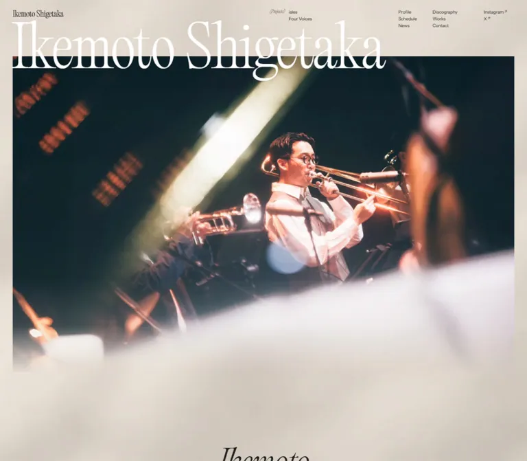
大きなセリフ体と演奏写真を重ね、柔らかなベージュの背景と広い余白で構成した音楽家の公式サイト。プロフィール、公演予定、プロジェクト、ニュース、映像、作品情報を非対称のレイアウトで紹介しています。
オリジナルサイトを見るIkemoto Shigetaka — Style Reference
A musician’s editorial archive, framed by pale atmospheric surfaces, expansive serif lettering, and intimate performance photography.
Original URL: ikemotoshigetaka.com
Final URL: ikemotoshigetaka.com
Page title: Shigetaka Ikemoto Official Website
Theme: predominantly light in the supplied captures; warm beige across the project and footer views, with a cooler neutral surface around the mobile hero.
Inspected: September 12, 2026. Supplied inspection timestamp: 2026-09-12T08:00:57.521Z, equivalent to 17:00:57.521 JST.
Viewports: desktop 1440 × 1000 CSS pixels; mobile 390 × 844 CSS pixels.
Scope: the current homepage: identity header, photographic hero, profile introduction, schedule, projects, news, video index, discography, and footer. Visual evidence covers three desktop positions and two mobile positions; rendered DOM measurements cover additional homepage sections. Linked pages and external destinations were not opened.
The homepage introduces trombonist, composer, arranger, and producer Shigetaka Ikemoto, identified in the page copy as 池本茂貴. It functions as an artist’s public information hub: visitors can discover ensembles, find performances, read updates, and access recordings. Its structure is an editorial homepage with several destinations and content indexes.
The strongest visual relationship is between exceptionally light serif type and large, unframed photographs. The opening name overlaps the upper edge of a concert image. Later, the Four Voices project places a square group portrait between a large title on the left and a compact Japanese description on the right. The layout gives these elements different scales and vertical positions, producing a composed, spacious rhythm.
A softly mottled beige field connects the sections. Thin rules, small parenthetical labels, compact navigation, and understated arrows provide structure. Most elements have square corners and transparent backgrounds. Small filter pills are a deliberate exception to this otherwise largely unboxed interface.
How to Read This Reference
- Measured values come from the supplied rendered DOM and computed-style records at the stated viewports. Decimal values are rounded for readability.
- Visual estimates describe the five original-page captures. Estimated colors and image boundaries were not obtained through pixel-sampling tools.
- Calculated values are arithmetic relationships between supplied measurements. They do not establish the original CSS expression.
- Recommended values and implementation choices are adaptations for reuse. The Quick Start is usable reconstruction CSS, not recovered source code.
- Element rectangles can include transforms and alternative content groups. Repeated records at the same coordinates do not prove that all those elements were visible together.
- A declared font family identifies the computed CSS stack. Font files, licensing, exact fallback resolution, and font-loading success were not independently inspected.
- The supplied evidence records scrolling and settled captures. Menu activation, filter selection, hover endpoints, keyboard behavior, and playback were not exercised.
Tokens — Colors
Default Palette
| Name | Value | Evidence level | Role |
|---|---|---|---|
| Main Ink | #202020 |
Measured text color and active filter background | Body text, editorial headings, navigation, active filter fill |
| Reversed White | #FFFFFF |
Measured hero heading and active filter text | Oversized opening name and reversed utility text |
| Source Beige | #C7BAAB |
Declared source variable --beige-lv1 |
A confirmed palette ingredient; its exact contribution to the visible background is not established |
| Atmospheric Canvas | Approximately #E7DDCF |
Visual estimate | Practical base for the pale, warm surface in desktop project and footer captures |
| Mobile Hero Neutral | Approximately #DAD9D5 |
Visual estimate | Cooler light gray surrounding the mobile opening photograph |
| Navy Underlay | #0B1725 |
Measured body background | Underlying body color in both DOM snapshots; it does not describe the visible beige surface by itself |
| Fine Rule | rgba(32, 32, 32, 0.16) |
Recommended approximation | Low-contrast dividers matching the visual weight of the footer and discography rules |
The visible surface and the body background must remain distinct. The body computes to dark navy while the supplied captures show light, softly varying surfaces. Additional rendering layers or assets therefore affect the final appearance. Their implementation was not supplied. Setting the entire page to the measured body navy would not reproduce these captures.
The beige surface contains broad, diffuse variations in tone. It has no clearly repeated small pattern and no hard gradient boundary. Treat #E7DDCF as an estimated base, not an exact source background declaration. The mobile hero is visibly cooler than the mobile footer; the evidence does not establish whether this difference is driven by section state, an overlay, or another mechanism.
Declared Colors With Unconfirmed Visible Roles
The source also declares --green-lv1: #C1CDBD, --black-lv1: #000, and --black-lv3: #303030. Their presence does not establish a green theme or a visible multi-gray system. Numerous CMS palette and gradient presets also appear in the export; they are not evidence that those colors are used in this homepage’s design.
There is no verified user-facing theme selector. The saturated reds, brass highlights, dark blue-green shadows, and multicolored album graphics belong primarily to the imagery.
Tokens — Typography
Editorial Display
- Computed family:
PpEditorialOld, serif. - Source variable:
--font-editorial: "PpEditorialOld", serif. - Measured weight:
200on the hero, profile heading, section headings, project titles, video titles, and release titles. - Character: narrow proportions, pronounced stroke contrast, fine serifs, and long, elegant curves.
- Role: carries identity and hierarchy without heavy weights or decorative containers.
The small parenthetical navigation labels have an italic appearance in the captures. Their measured family is the editorial serif; the export does not include a font-style field or identify an italic font file.
The small header and large footer wordmarks visually belong to the same typographic world. Their exact rendering mechanism is not supplied. The home-link measurement is an empty-text anchor, so its dimensions should not be treated as proof that the wordmark is ordinary text in the inherited font.
Japanese Body and Navigation Containers
- Computed family:
"Zen Kaku Gothic New", sans-serif. - Measured weight:
400. - Role: Japanese biography and project copy, inherited page text, and navigation/link wrappers.
- Body-copy rhythm:
1.7line height with-0.04emtracking in measured biography and project paragraphs.
The root HTML font size is 16px at both inspected widths. The body computes to 16px on desktop and 14.56px on mobile. Individual content sizes are explicitly different from that inherited body size.
News Titles and Utility Metadata
- News titles:
Inter, sans-serif, weight400. - Filters, dates, and news categories:
"Instrument Sans", sans-serif, weight400. - Declared but not established as the primary body face:
"Noto Sans JP", sans-serif.
Do not collapse these roles into one sans-serif merely because the navigation appears compact. Equally, do not assign a font to an unmeasured inner label from its wrapper alone.
Type Scale
Values below are computed font sizes and line heights unless explicitly marked as estimates.
| Role | Desktop | Mobile | Weight / tracking | Notes |
|---|---|---|---|---|
| Hero name | 152.47px / 152.47px |
83.2px / 74.88px |
200; desktop -0.02em, mobile -0.01em |
One line on desktop; two lines on mobile |
| Profile name heading | 88.09px / 92.50px |
70.72px / 74.26px |
200, -0.02em |
Two-line heading block |
| Section heading | 91.48px / 91.48px |
66.56px / 66.56px |
200, normal tracking |
Schedule, Projects, News, Video, Discography |
| Project title | 91.48px / 91.48px |
66.56px / 66.56px |
200 |
Four Voices occupies two desktop lines and one measured mobile line |
| Profile role line | 22.02px / 33.04px |
17.68px / 26.52px |
200 |
Trombonist / Composer / Arranger / Producer |
| Japanese personal name | 22.02px / 22.02px |
20.8px / 20.8px |
400 |
Introduction to the biography |
| Japanese paragraph | 12.71px / 21.6px |
13.52px / 22.98px |
400, -0.04em |
Mobile copy is slightly larger, not proportionally reduced |
| Project index | 16.94px / 15.25px |
14.56px / 13.10px |
200 |
Small 01/ and 02/ markers |
| Video title | 67.76px / 67.76px |
41.6px / 41.6px |
200 |
Long titles wrap without changing style |
| Video artist / year | 16.94px / 16.94px |
12.48px / 12.48px |
200 |
Flanking metadata on desktop |
| Release title | 33.88px / 33.88px |
31.2px / 31.2px |
200 |
Remains relatively large on mobile |
| Release artist | 16.94px / 16.94px |
14.56px / 14.56px |
200 |
Paired with the release index |
| Release index | 10.16px / 10.16px |
10.4px / 10.4px |
200 |
Parenthesized numbering |
| Filter text | 14.4px / 14.4px |
13.52px / 13.52px |
400 |
Instrument Sans |
| News date / category | 11.01px / 11.01px |
12.48px / 12.48px |
400 |
Instrument Sans; transformed bounds can be smaller |
| News title | 14.4px / 24.48px |
15.6px / 26.52px |
Desktop 0.04em; mobile normal |
Inter stack |
| Header parenthetical label | 11.01px / 11.01px |
Mobile menu-group label: 15.6px, normal line height |
200; desktop 0.02em |
Different header and menu contexts |
Navigation measurement caveat: desktop anchors inherit 16px, but their measured line boxes are approximately 11.86px high and their visible labels look around 11–12px. The inner text styling was not included. The visible View more treatment similarly looks like an approximately 22px editorial label, while its anchor wrapper inherits the body stack. Use the wrapper measurements for hit-area geometry and the screenshot for appearance; do not claim the wrapper font describes every descendant.
Tokens — Spacing & Shapes
Density: very sparse section composition, compact navigation and metadata. Geometry: square photographs and content surfaces, fine rules, a small dot, slim arrows, and occasional pill controls.
Spacing Scale
| Use | Desktop measurement | Mobile measurement | Interpretation |
|---|---|---|---|
| Main horizontal inset | 33.88px |
20.8px |
Shared alignment for hero and most sections |
| Header top inset | 27.11px |
16.64px |
Identity sits close to the top edge |
| Hero top inset | 67.76px |
49.92px |
Starting position of the H1 box |
| Navigation link left padding | 8.47px |
10.4px in mobile menu records |
Wrapper padding; transformed positions also occur |
| Filter vertical / horizontal padding | 3.39px / 6.78px |
4.16px / 8.32px |
Compact visual pill |
| News card internal gap | 16.94px |
Not recorded as a flex gap | Desktop metadata follows media |
| Desktop schedule column gap | 33.88px |
0px on stacked link records |
A structural change, not simple scaling |
| Project-section container gap | Not established for the stage’s inner grid | 58.24px |
Mobile project content becomes sequential |
| Video-section container gap | 60.99px |
37.44px |
Separation between major child groups |
| Profile top padding | 203.29px |
208px |
Large breathing space retained on mobile |
| News top padding | 254.12px |
166.4px |
Section rhythm remains generous |
| Discography top padding | 271.06px |
166.4px |
Large transition into the final content index |
These repeated values suggest coordinated responsive scaling, but the original breakpoint declarations and layout formulas were not supplied. They should not be reconstructed from one viewport pair as if they were verified source rules.
Border Radius
| Element | Recorded or visible treatment |
|---|---|
| Hero photograph | Square corners in both captures |
| Four Voices portrait | Square corners |
| News link wrappers | Measured 0px radius |
| Schedule and video links | Measured 0px radius |
| Filter pills | Measured 33.88px desktop and 41.6px mobile; visually fully rounded at their small heights |
| Mobile menu control | Measured 0px radius; dot-and-text presentation |
| Unidentified mobile discography button | Measured 8.32px radius; purpose unverified |
There is no visible general-purpose elevation system. Avoid introducing card shadows as a default structural device.
Layout Measurements
| Element | Desktop | Mobile | Evidence |
|---|---|---|---|
| Document height | 9375.72px |
8909.23px |
DOM measurement; content- and state-dependent |
| Header box | 1440 × 76.20px |
390 × 34.78px |
DOM measurement |
| Header home-link box | 138.06 × 22.33px |
112.31 × 18.16px |
DOM measurement |
| Main content width | 1372.25px |
348.41px |
DOM measurement |
| Hero section height | 1018.16px |
790.27px |
DOM measurement |
| Hero image upper edge | Approximately y = 152px |
Approximately y = 166px |
Screenshot estimate |
| Four Voices photograph | Approximately 576 × 576px, at x = 432px |
Not visually captured | Screenshot estimate |
| Desktop project description | 317.64px wide, at x = 1088.48px |
288.09px wide, at x = 81.11px |
DOM measurement |
| Biography paragraph | 317.64px wide, at x = 971.59px |
306.80px wide, at x = 41.59px |
DOM measurement |
| Schedule link | 669.17 × 63.23px |
288.11 × 111.48px |
Representative measured row |
| View more anchor | 135.17 × 30px |
141.08 × 31px |
Measured wrapper, not exact glyph size |
| Discography list width | 780.72px |
348.41px |
DOM measurement |
Use the document and section heights to understand pacing, not as fixed production heights. Content updates, font loading, user zoom, and different screen dimensions should be allowed to change them.
Components
Persistent Identity Header
Role: keeps the artist’s identity and key destinations available while browsing the long homepage.
The header is visually transparent and remains at the top of the supplied scrolled captures. It contains a small wordmark on the far left and compact navigation groups concentrated in the right half. There is no boxed bar, strong bottom border, or filled header panel in the captured states.
Desktop anatomy:
- Home-link wordmark at approximately
x = 33.88px,y = 27.09px. - A parenthetical Projects label beginning near
x = 736.94px, followed by isles and Four Voices. - Primary navigation divided into two compact columns: Profile / Schedule / News and Discography / Works / Contact.
- Instagram and X at the far right, with small diagonal external-link arrows visible in the image.
The unusually small navigation is essential to the scale contrast: the header remains a quiet index above the oversized name. The exact CSS positioning mode is absent from the export; a fixed header is a reasonable reconstruction choice because its persistence is visually supported.
Mobile Menu Trigger and Menu Structure
Role: replaces desktop navigation at narrow widths.
At 390px, the header shows the small wordmark at left and a dot followed by menu at right. The button’s recorded box is 40.27 × 13.52px; its internal gap is 5.2px. Its presentation is text and a dot, with no hamburger illustration or filled button shape.
Mobile navigation groups exist in the DOM: primary destinations, projects, and social links. Two measured group columns are approximately 167.97px wide, beginning around x = 20.8px and x = 201.23px.
Unverified: no menu-open action or transition was supplied. The presence of menu content in the DOM does not establish that it was visible over the hero. The supplied mobile view with a horizontal rule and large wordmark is the footer capture, not evidence of an opened menu overlay.
Photographic Hero
Role: establishes the artist through name, instrument, and live performance.
The H1 begins above the image and crosses its upper boundary. On desktop, Ikemoto Shigetaka remains on one line at 152.47px, with 200 weight and tight negative tracking. The letters do not fill the entire measured H1 container: the name ends well before the right edge of the photograph.
The image begins at approximately 152px from the top and spans the page’s inset width. It shows the trombonist within a live ensemble: warm brass reflections, dark stage shadows, a diagonal light beam, and blurred foreground instruments. The lower region blends gradually into the surrounding pale surface.
On mobile, the name breaks into two lines at 83.2px, with a tight 0.9 line height. The image begins around 166px, underneath the second line, and becomes a tall crop that keeps the performer prominent. The frame remains inset by 20.8px rather than bleeding to the screen edge.
The visible lower fade is important, but its source mechanism is unknown. It may involve image content, a mask, or an overlay. A CSS mask is a recommended reconstruction technique, not an observed implementation detail.
Profile Introduction
Role: explains the musician’s identity and professional activities.
The DOM records a two-line editorial name heading, followed by Trombonist / Composer / Arranger / Producer. Below it, a Japanese personal-name label introduces a compact biography and a View more link to the profile page.
On desktop, the biography occupies a narrow 317.64px column toward the right. The larger heading occupies a full-width block. The supplied records do not establish the heading’s exact text alignment or any associated profile imagery, so those should not be inferred from the block width.
On mobile, the biography uses a 306.80px column with approximately 41.6px side insets. Its text increases to 13.52px / 22.98px. The View more wrapper is centered in the recorded mobile geometry. Large top and bottom spaces maintain a slow transition from the performance image into biographical content.
Schedule Index
Role: exposes current performance information as structured, linked records.
The desktop heading and event list occupy the right half of the content region, beginning near x = 736.95px. Each linked record contains a date, venue, and performance title. Seven September 2026 entries are present in the supplied main list.
A representative desktop row is 669.17px wide and 63.23px high, with 13.55px top padding, 27.11px bottom padding, and a 33.88px flex gap. The layout favors compact information within a broad, otherwise sparse section.
On mobile, the heading starts at the main gutter, while the event links begin further right at x = 81.09px. Their width is 288.11px and height approximately 111.48px. The date, venue, and title occupy separate vertical positions. The DOM includes date:, place:, and title: labels, but their precise visible alignment was not captured.
Preserve the data hierarchy and rightward inset when adapting this component. Avoid turning every date or venue into a colored badge.
Project Presentation
Role: introduces the artist’s ensembles through a large photograph, a distinctive name, and a short explanation.
The Projects section includes isles and Four Voices. Each entry has a small numeric marker, an editorial title, supporting text, and a View more link. isles also has a smaller parenthetical expansion beneath its title.
The desktop Four Voices capture gives the clearest composition:
- A small
02/marker begins at the main left gutter. - Four Voices appears in two large lines, with the second line visually offset to the right.
- A square portrait sits centrally at approximately
432pxfrom the left and measures about576pxper side. - A
317.64pxdescription column sits on the right, beginning near1088.48px. - The paragraph and arrow link are positioned low, close to the lower part of the photograph.
- Broad empty areas surround all three regions; the content has no containing card.
The desktop DOM places the two projects in overlapping vertical ranges, while the screenshot displays Four Voices as a single settled stage. This supports a shared-stage composition, but does not prove a particular pinning, slider, scroll-scrubbing, or auto-advance mechanism.
The mobile records are sequential: isles begins around document y = 3480px, and Four Voices around y = 4184px. Titles precede their media/content regions, followed by right-inset descriptions and right-aligned View more links. Four Voices has a single-line measured mobile title box. Preserve a readable space in its accessible name even where serialized text appears as FourVoices.
View More Link
Role: provides a consistent route from a homepage preview to a fuller destination.
Its visible anatomy is an editorial serif label and a thin right-pointing arrow, without a filled background, outline capsule, or large surrounding panel. It appears across profile, schedule, projects, news, video, and discography.
Measured anchor bounds are approximately 135 × 30px on desktop and 141 × 31px on mobile. A 1.2s transform transition is recorded on the anchor. The actual movement distance and triggering interaction were not supplied.
For reuse, keep the arrow subordinate to the label. Give each repeated link a contextual accessible name, such as View more Four Voices, while retaining the short visible wording.
Filter Pills
Role: selects a category or artist within a homepage content index.
News exposes All, Live, Support, Media, and Release. Video and Discography expose All, isles, and Shigetaka Ikemoto Quintet.
The recorded All state uses #202020 fill with white text. Other recorded buttons have transparent backgrounds and dark text. Instrument Sans provides the compact labels. Desktop buttons are around 23.16px high; mobile buttons are around 23.83px high. Their large radius values produce pill ends.
These pills are a small functional accent within a mostly square design. They should not become the site’s general shape language.
The available buttons and alternate content groups support the intended filtering role. Actual selection, result updates, focus behavior, and state announcements remain unverified.
News Items
Role: combines editorial imagery with a date, category, and short update title.
The main desktop group contains three link wrappers with widths of approximately 326.13px, 434.83px, and 543.55px. Their relationship is approximately 3:4:5, separated by 33.88px gaps. Each wrapper is transparent, has square corners, and uses a recorded 16.94px internal gap.
The content order is media region, compact date/category metadata, then a sans-serif title. Example titles include Four Voices Sessions vol.2 feat.大島真帆 and MUSIC AWARDS JAPAN 藤井風さん『Prema』. The supplied images do not show this section, so specific thumbnail subjects and cropping must remain unspecified.
Mobile records place the main three items vertically at the same left inset. Some reported bounds are approximately 285.69px wide, while alternate groups measure 348.41px. The smaller-to-larger ratio is approximately 0.82, consistent with a transformed presentation. This is not evidence of a permanent 285.69px CSS width or a particular scroll animation.
For implementation, start with the structural stack and introduce scale effects only after verifying that they preserve readable text and stable layout.
Video Index
Role: presents linked performances as a typographic catalog.
The desktop anatomy is artist at left, large title in the middle, and year at right. A representative row spans 1372.25px, with two 200.75px metadata regions, a 936.88px title region, and 16.94px gaps.
Titles use the editorial family at 67.76px. Short rows measure about 122.97px high; the longer Crouching Start title wraps and produces a 190.73px row. Padding is 40.66px at the top and 13.55px at the bottom.
On mobile, artist and year share the upper metadata level, with the title below at 41.6px. The long title spans three measured lines. This retains the catalog hierarchy without compressing everything into one horizontal row.
The links point to external YouTube videos. An embedded player, autoplay behavior, playback overlay, and sound controls were not verified. A fine row divider would be a suitable recommended extension of the visible discography rule treatment, but video border declarations were not included in the evidence.
Discography Display
Role: connects a featured cover with a numbered release index.
The desktop capture shows a large FLIP THE SWITCH cover pane on the left and fine ruled release information on the right. The cover pane is approximately 558px wide; its top is cropped by the current scroll position, so the screenshot does not establish its complete height or intrinsic aspect ratio.
The right-side list begins near x = 625.41px and spans 780.72px. Each record combines a small parenthesized index, an artist name, and a larger editorial release title. The artist/index region is about 199.89px wide; the title region is about 546.95px, separated by 33.88px.
The main set includes FLIP THE SWITCH, Live at COTTON CLUB feat.Ema, and Oath. The Oath record has a confirmed external distribution link. The supplied export does not establish equivalent links for every release; do not make the entire list uniformly clickable without checking the underlying content model.
On mobile, metadata and release titles use the full 348.41px content width and stack vertically. The longer release title wraps to two lines at 31.2px. An empty-text button measuring approximately 31.19 × 24.95px appears in the mobile discography records. Its purpose and accessible name are unknown; it should not be identified as play, next, or expand from geometry alone.
Footer
Role: closes the page with a second identity statement and a complete navigation index.
A fine horizontal rule separates the footer from the generous blank space above it. The desktop wordmark is much larger than the header logo and sits on the left. Three small navigation groups sit on the right: primary destinations, projects, and social links.
The desktop footer is deliberately sparse. In its capture, the divider is around y = 716px, followed by the wordmark and group labels around y = 765px. These are screenshot coordinates at that scroll position, not document-level layout constants.
On mobile, the rule spans the 348px inset width. The large wordmark occupies a separate row, then primary navigation and projects form two columns. Social links appear in a later block below the left column. Footer links look approximately 18–20px, a visual estimate because footer text styles were not included in the sampled element records.
The source uses the parenthetical label Menu above both the primary and social groups. A faithful reproduction can retain that wording; an adapted implementation can use Social as a clearer group label.
Tokens — Motion & Interaction
Recorded Transition Values
| Element or property | Recorded value | What the evidence establishes |
|---|---|---|
| Body background color | 0.6s cubic-bezier(0.24, 1, 0.34, 1) |
A background-color transition is configured; its trigger and full color sequence are unknown |
| Header home link | 0.6s cubic-bezier(0.24, 1, 0.34, 1) |
Transition timing is present; a complete property/end-state pair is not supplied |
| Header parenthetical label color | 0.6s cubic-bezier(0.24, 1, 0.34, 1) |
Color interpolation is configured |
| Navigation, schedule, video, and release links | 0.6s cubic-bezier(0.24, 1, 0.34, 1) |
Shared transition timing; precise interaction response unverified |
| View more and social links | transform 1.2s cubic-bezier(0.24, 1, 0.34, 1) |
Transform interpolation is configured; direction and distance unknown |
| Filter buttons | 1.2s cubic-bezier(0.24, 1, 0.34, 1) |
Slow eased state styling is configured; selection was not exercised |
| News item wrappers | flex 1.2s cubic-bezier(0.24, 1, 0.34, 1) |
A change in flex proportions can animate; the triggering behavior is unverified |
| Release title styling | 0.6s cubic-bezier(0.24, 1, 0.34, 1) |
Timing recorded without a tested endpoint |
| Unidentified mobile discography button | 1s cubic-bezier(0.24, 1, 0.34, 1) |
Timing recorded; control purpose unknown |
The repeated easing suggests a quick departure followed by a long, gentle settle. The stylesheet evidence supports this timing character, not a claim that every element animates continuously.
Observed States and Limitations
- The header remains visible in the supplied scrolled screenshots.
- The desktop project presentation has overlapping stage geometry, while mobile projects appear in document sequence.
- Alternative filter groups and some transformed news bounds are included in the DOM export.
- Sampled elements generally report
animation: none. This does not rule out JavaScript animation, animated descendants, or other layers. - First-visit and split-letter material appears in the serialized page evidence, but no opening-sequence recording was supplied. Its appearance and timing remain unverified.
- A loose View text fragment is not sufficient evidence for a custom cursor.
- No hover endpoints, menu opening, filter changes, media playback, or reduced-motion behavior were observed.
Recommended adaptation: use the recorded easing for restrained color and small positional changes. Keep the page’s content available without entrance animations. An approximately 4px arrow translation is a reasonable new interaction, but it is not a measured source endpoint.
Surfaces
| Layer | Appearance | Implementation guidance |
|---|---|---|
| Visible page field | Light, softly mottled beige | Use an atmospheric background with broad tonal variation; avoid a sharp gradient band |
| Mobile hero surroundings | Cooler pale gray | Allow an explicit hero-surface variant when reproducing the supplied mobile state |
| Underlying body | Measured navy | Treat as an underlying source fact, not the visible page palette |
| Header | Visually transparent | Preserve continuity with the content behind it |
| Photography | Full-color, square-cornered media | Let image edges and crop create structure |
| Text/index regions | Transparent, largely unboxed | Use spacing and typography before adding containers |
| Selected filter | Ink pill with white text | Confine strong filled geometry to small state controls |
| Dividers | Fine, low-contrast rules | Separate catalog and footer regions without making a heavy grid |
The background’s softness is part of the identity, but its exact implementation is unknown. CSS radial gradients can approximate the broad tone changes. They should not be presented as the original technique or as a replacement for an authorized texture asset if one is later supplied.
Imagery
Performance Photography
The opening image is observational and cinematic: an actual musician performing within a crowded stage environment. The subject is surrounded by instruments, microphones, glare, and out-of-focus foreground forms. Those obstructions help convey participation in a live ensemble rather than a clean studio portrait.
Preserve the diagonal light beam, warm metallic reflections, deep shadows, and soft foreground blur when choosing an equivalent composition. Keep sufficient detail in the face and hands. Avoid flattening the scene into a uniform beige color grade merely to match the page surface.
Project Portraiture
The Four Voices image is a square group portrait with four people arranged at different heights. Pale clothing contrasts with darker walls, abundant foliage, and textured wooden flooring. Its formal composition balances the more spontaneous performance photograph.
The entire square frame matters. A narrow crop that removes group members would undermine the project presentation. The mobile project image itself was not supplied, so its exact responsive crop remains unverified.
Release Artwork
FLIP THE SWITCH introduces a much more forceful visual register: high-contrast black and white, expressive marks, intense color fragments, and heavy lettering contained within the cover. This is artwork typography, not a precedent for changing the surrounding interface to a bold sans-serif.
Observed Asset References
The evidence identifies these assets visually but does not provide their file URLs.
| Asset | Evidence | Reuse guidance |
|---|---|---|
| Opening performance photograph | Desktop and mobile hero captures | Use an authorized image; provide a dedicated narrow crop or adjustable focal position |
| Four Voices group portrait | Desktop project capture | Preserve the square composition and all group members |
| FLIP THE SWITCH artwork | Desktop discography/footer capture | Preserve native cover graphics and lettering |
| Small and large wordmarks | Header and footer captures | Reuse an authorized identity asset if available; text reconstruction is an approximation |
| Atmospheric background | Project and footer captures | Asset or layer mechanism unknown; static gradient approximation is acceptable for a new implementation |
| News media | Media regions implied by DOM structure | Specific subjects, paths, and crops were not supplied |
No asset paths, font-file URLs, or icon-library names can be recovered reliably from the supplied evidence. Do not invent a downloadable asset inventory.
Layout & Responsive Behavior
The desktop homepage uses the full viewport width with modest outer insets. Its visual spaciousness comes primarily from internal placement and large vertical intervals, not from a narrow centered page container.
Verified Changes Between the Two Viewports
| Feature | Desktop 1440 × 1000 |
Mobile 390 × 844 |
|---|---|---|
| Navigation | Several compact groups across the upper right | Small dot-and-menu trigger |
| Main inset | 33.88px |
20.8px |
| Hero title | One oversized line | Two oversized lines with tighter leading |
| Hero photograph | Broad stage view | Tall crop focused on the performer |
| Biography | Narrow column toward the right | Narrower-than-page column with symmetric additional insets |
| Schedule | Right-half list with horizontal information | Taller stacked records, still inset from the left |
| Projects | Shared desktop stage geometry | Sequential project blocks |
| Four Voices title | Two measured lines | One measured line |
| Project descriptions | Right-side column | Right-inset column beneath the media region |
| News | Unequal widths in the main desktop group | Vertically arranged main group |
| Video | Artist / title / year across a row | Artist and year above a larger title block |
| Discography | Cover pane beside release index | Metadata and title stacked at full content width |
| Footer | Wordmark left, three groups right | Wordmark above two navigation columns, social group below |
The responsive type scale is selective. The hero shrinks substantially, while release titles remain close to their desktop size. Japanese paragraphs and news titles actually increase in computed font size on mobile. Preserve this distinction: responsive design here rearranges hierarchy and composition rather than uniformly shrinking the page.
Only two widths were inspected. The original breakpoint, tablet layout, landscape behavior, safe-area handling, and intermediate-width transitions are unknown. The 64rem breakpoint in the Quick Start is a recommended implementation threshold.
The long page remains approximately 8,909px tall on mobile, compared with 9,376px on desktop. Large desktop stage spacing and stacked mobile content offset one another. Do not force the mobile page to become either a compressed summary or a pixel-for-pixel vertical transcription of the desktop composition.
Do’s and Don’ts
Do
- Make light editorial serif lettering the primary identity device.
- Preserve the white hero name crossing the upper edge of the performance image.
- Keep the mobile hero name large, with an intentional two-line arrangement.
- Maintain square image corners and the soft lower fade of the opening photograph.
- Use broad, quiet beige tonal variation behind the content.
- Keep project names, photographs, and descriptions at deliberately different scales.
- Preserve the desktop project’s left-title, central-image, right-description composition.
- Retain generous section spacing and the rightward inset of mobile detail copy.
- Use compact sans-serif metadata alongside larger serif catalog titles.
- Restrict pill shapes to the small category controls.
- Allow long video and release titles to wrap naturally.
- Preserve real destination types: internal pages, video links, and distribution links.
Don’t
- Don’t replace the artist homepage with a generic conversion layout of feature cards and large sales buttons.
- Don’t make every section a centered heading above an equal-width card grid.
- Don’t use heavy serif weights for the large identity typography.
- Don’t treat the navy body declaration as the visible background of the captured page.
- Don’t promote unused CMS color presets into the site palette.
- Don’t add rounded media frames, floating shadows, or glass panels.
- Don’t turn the fine arrow links into oversized pill CTAs.
- Don’t copy album-cover lettering into the interface type system.
- Don’t infer a carousel, custom cursor, autoplay video, or elaborate opening animation from incomplete records.
- Don’t treat duplicate filter-group records as additional simultaneously visible content.
- Don’t hardcode transformed news bounds as permanent mobile card widths.
- Don’t label the mobile footer capture as an open menu state.
Recommended Implementation Additions
These recommendations are for a new implementation and are not verified original-site features.
- Add visible keyboard focus to all navigation, category controls, release links, and View more links.
- Give the menu button an explicit expanded state and a relationship to its controlled navigation. Manage focus and background interaction according to whether the resulting menu is modal.
- Increase interactive target areas toward
44pxwhere possible while keeping the visible labels and pills compact. - Use meaningful accessible names for image-based home links and repeated View more links.
- Expose filter state with appropriate semantics and keep inactive results out of keyboard navigation. Maintain stable content structure when categories change.
- Keep essential content visible before motion runs and provide a reduced-motion alternative for any project staging or image transforms.
- Test the thin white hero lettering against each responsive crop. Adjust the local backdrop or crop if necessary to maintain legibility.
- Use real heading levels, list structures, and machine-readable dates. Keep artist/title/year relationships understandable outside the visual grid.
- Load licensed font files with a suitable fallback strategy. The measured family names are not font download instructions.
- Provide image dimensions, responsive sources, useful alternative text, and below-the-fold lazy loading. Prioritize the opening photograph without delaying readable content.
- Verify wrapping and navigation at intermediate widths, text zoom, and larger system font settings before introducing fixed section heights.
Agent Prompt Guide
Quick Color Reference
- Main text and selected filter:
#202020, measured. - Hero name and selected-filter text:
#FFFFFF, measured. - Source beige ingredient:
#C7BAAB, declared. - Visible warm canvas approximation:
#E7DDCF, estimated. - Mobile hero neutral approximation:
#DAD9D5, estimated. - Fine rule approximation:
rgba(32, 32, 32, 0.16), recommended. - Underlying body color:
#0B1725, measured but not representative of the visible light surface. - Strong additional colors should come from photographs and release artwork.
Overall Prompt
“Create an editorial homepage for a jazz musician, using the supplied Ikemoto Shigetaka reference. Combine a pale, softly mottled beige surface with dark ink text, exceptionally light high-contrast serif display type, and restrained sans-serif metadata. Place a small identity wordmark at the upper left and grouped text navigation at the upper right. Begin with an oversized white artist name crossing the top edge of a wide performance photograph that fades softly into the page below. Build a long sequence of biography, schedule, projects, news, video titles, and releases. Use asymmetric desktop placement, generous vertical space, square media, fine rules, and small serif arrow links. On mobile, retain a very large two-line hero name, a tall subject-aware image crop, sequential projects, stacked catalog metadata, and a compact dot-and-menu trigger. Treat unverified interactions as implementation decisions.”
Example Component Prompts
- Hero: “At 1440px, use an approximately 34px page inset and a 152px, weight-200 editorial name heading. Keep the title white and let it overlap the photograph’s upper boundary. The concert photo should contain warm brass highlights, dark stage shadows, diagonal light, and soft foreground blur. At 390px, use a 21px inset and an 83px two-line heading with 0.9 leading. Preserve the lower image fade.”
- Project stage: “Arrange a small 02/ marker and large two-line Four Voices title at left, a square group portrait approximately 576px wide in the center, and a narrow description with View more arrow at right. Align the description near the portrait’s lower edge. Use pale atmospheric beige, dark text, square corners, and no enclosing card. Stack these elements naturally on mobile; do not assume an unverified slider.”
- Schedule: “Create a right-half desktop schedule index with a large light serif heading and compact linked date, venue, and performance records. On mobile, move the heading to the main gutter while retaining a further inset for the taller stacked records. Keep decoration minimal and make the data relationships accessible.”
- News filters: “Use small Instrument Sans category pills above a media-led news group. The selected All pill is dark ink with white text; the others are transparent. On desktop, use a 3:4:5 width relationship for three items. Stack items on mobile, preserving date, category, and title order. Keep the filtering logic separate from the visual treatment.”
- Video index: “Create a typographic performance catalog with small serif artist names on the left, approximately 68px light serif titles in the middle, and years at the right. On mobile, place artist and year above a 42px title. Allow long titles to wrap. Link to the actual video destination without inventing an embedded player.”
- Footer: “Close the homepage with a fine low-contrast rule, a large editorial wordmark at left, and compact grouped navigation at right. On mobile, place the wordmark above two columns of links, then place social links in a separate lower block. Preserve generous pale space and avoid a dark filled footer panel.”
Quick Start
CSS Custom Properties
This CSS is a recommended reconstruction of the visible design. Colors marked as approximations are not exact sampled values. Desktop fluid formulas are selected to approach the supplied 1440px measurements; they are not recovered source formulas. Mobile overrides approach the supplied 390px measurements. The breakpoint, background gradients, image mask, media aspect ratios, and hover displacement are adaptation choices.
The family declarations require separately supplied, authorized font files. Generic fallbacks keep the CSS usable but will change letterforms and wrapping. Image URLs are intentionally omitted because none were supplied.
:root {
  /* Measured colors and declared source beige */
  --site-ink: #202020;
  --site-white: #ffffff;
  --site-beige: #c7baab;

  /* Estimated visible surfaces and recommended rule */
  --site-canvas: #e7ddcf;
  --site-hero-neutral: #dad9d5;
  --site-rule: rgb(32 32 32 / 16%);

  /* Computed source families; fallback choices are adaptations */
  --site-font-display: 'PpEditorialOld', Georgia, serif;
  --site-font-body: 'Zen Kaku Gothic New', sans-serif;
  --site-font-news: 'Inter', sans-serif;
  --site-font-utility: 'Instrument Sans', sans-serif;

  /* Reconstruction scale, calibrated near the desktop capture */
  --site-gutter: clamp(20.8px, 2.35294vw, 48px);
  --site-hero-size: clamp(96px, 10.58824vw, 180px);
  --site-heading-size: clamp(66.56px, 6.35294vw, 108px);
  --site-video-size: clamp(41.6px, 4.70588vw, 80px);
  --site-release-size: clamp(31.2px, 2.35294vw, 40px);
  --site-copy-size: clamp(12.7059px, 0.882353vw, 15px);
  --site-filter-size: clamp(13.52px, 1vw, 17px);
  --site-caption-size: clamp(11px, 0.764706vw, 13px);
  --site-meta-size: clamp(14.56px, 1.17647vw, 20px);
  --site-section-space: clamp(166.4px, 17.64706vw, 300px);

  /* Recorded timing; motion endpoints below are recommendations */
  --site-ease: cubic-bezier(0.24, 1, 0.34, 1);
  --site-motion-color: 600ms var(--site-ease);
  --site-motion-transform: 1200ms var(--site-ease);
}

* {
  box-sizing: border-box;
}

body.artist-site {
  margin: 0;
  color: var(--site-ink);
  background: var(--site-canvas);
  font-family: var(--site-font-body);
  font-size: 16px;
  font-weight: 400;
}

/* Static approximation of the visible atmospheric background */
.artist-site {
  background-image:
    radial-gradient(ellipse at 15% 20%,
      rgb(255 255 255 / 22%), transparent 55%),
    radial-gradient(ellipse at 80% 65%,
      rgb(199 186 171 / 38%), transparent 60%);
}

.artist-site img {
  display: block;
  max-width: 100%;
}

.artist-site a {
  color: inherit;
  text-decoration: none;
}

.artist-site button {
  color: inherit;
  font: inherit;
}

.artist-site :focus-visible {
  outline: 2px solid currentColor;
  outline-offset: 5px;
}

.page-inset {
  margin-inline: var(--site-gutter);
}

.section {
  padding-top: var(--site-section-space);
}

.editorial-title {
  margin: 0;
  font-family: var(--site-font-display);
  font-size: var(--site-heading-size);
  font-weight: 200;
  line-height: 1;
}

.body-copy {
  margin: 0;
  font-size: var(--site-copy-size);
  line-height: 1.7;
  letter-spacing: -0.04em;
}

/* Persistent positioning is a reconstruction choice */
.site-header {
  position: fixed;
  inset: 0 0 auto;
  z-index: 50;
  display: grid;
  grid-template-columns: 1fr 1fr;
  gap: var(--site-gutter);
  align-items: start;
  padding: calc(var(--site-gutter) * 0.8)
    var(--site-gutter) 0;
}

.wordmark {
  display: block;
  width: clamp(112px, 9.58767vw, 163px);
}

.desktop-nav {
  display: grid;
  grid-template-columns: 1.5fr 1fr auto;
  gap: var(--site-gutter);
  font-size: 12px;
  line-height: 1.55;
}

.nav-projects,
.nav-main {
  display: grid;
  grid-template-columns: auto auto;
  align-items: start;
  gap: 10px;
}

.nav-links {
  display: grid;
  align-content: start;
}

.group-label {
  margin: 0;
  font-family: var(--site-font-display);
  font-weight: 200;
  font-style: italic;
}

.menu-toggle {
  display: none;
  align-items: center;
  gap: 5.2px;
  padding: 0;
  border: 0;
  background: transparent;
  cursor: pointer;
}

.menu-toggle::before {
  content: '';
  width: 5px;
  aspect-ratio: 1;
  border-radius: 50%;
  background: currentColor;
}

.hero {
  padding: calc(var(--site-gutter) * 2)
    var(--site-gutter) 0;
}

.hero-title {
  position: relative;
  z-index: 1;
  margin: 0;
  color: var(--site-white);
  font-family: var(--site-font-display);
  font-size: var(--site-hero-size);
  font-weight: 200;
  line-height: 1;
  letter-spacing: -0.02em;
}

.hero-title span + span::before {
  content: ' ';
}

.hero-media {
  margin: calc(var(--site-gutter) * -2) 0 0;
  aspect-ratio: 1.585;
  -webkit-mask-image: linear-gradient(
    #000 0%, #000 72%, transparent 100%);
  mask-image: linear-gradient(
    #000 0%, #000 72%, transparent 100%);
}

.hero-media img {
  width: 100%;
  height: 100%;
  object-fit: cover;
  object-position: center;
}

.more-link {
  display: inline-flex;
  align-items: center;
  gap: 12px;
  min-height: 44px;
  font-family: var(--site-font-display);
  font-size: 22px;
  font-weight: 200;
  line-height: 1;
}

.more-link .arrow {
  display: inline-block;
  transition: transform var(--site-motion-transform);
}

.schedule-content {
  width: calc((100% - var(--site-gutter)) / 2);
  margin-left: auto;
}

.schedule-row {
  display: grid;
  grid-template-columns: auto minmax(0, 1fr) minmax(0, 1fr);
  gap: var(--site-gutter);
  padding: 13.55px 0 27.11px;
}

/* Recreates a settled project composition, without scroll pinning */
.project-stage {
  display: grid;
  grid-template-columns: minmax(0, 1fr) 40vw minmax(0, 1fr);
  gap: clamp(24px, 5.58824vw, 95px);
  align-items: center;
  min-height: 100svh;
}

.project-heading {
  display: flex;
  align-items: flex-start;
  gap: 10px;
}

.project-index {
  font-family: var(--site-font-display);
  font-size: var(--site-meta-size);
  font-weight: 200;
  line-height: 0.9;
}

.project-title-break {
  display: block;
  margin-left: 0.35em;
}

.project-portrait {
  width: 100%;
  aspect-ratio: 1;
  object-fit: cover;
}

.project-copy {
  align-self: end;
  margin-bottom: max(0px, calc((100svh - 40vw) / 2));
}

.project-copy .more-link {
  margin-top: 32px;
}

.filters {
  display: flex;
  flex-wrap: wrap;
  gap: 6.78px;
  margin-block: 32px 64px;
}

.filter {
  padding: 3.39px 6.78px;
  border: 1px solid transparent;
  border-radius: 999px;
  background: transparent;
  font-family: var(--site-font-utility);
  font-size: var(--site-filter-size);
  line-height: 1;
  cursor: pointer;
  transition:
    color var(--site-motion-color),
    background-color var(--site-motion-color);
}

.filter[aria-pressed='true'] {
  color: var(--site-white);
  background: var(--site-ink);
}

.news-list {
  display: flex;
  align-items: flex-start;
  gap: var(--site-gutter);
}

.news-card {
  display: flex;
  flex: 3 1 0;
  flex-direction: column;
  gap: 16.94px;
  min-width: 0;
}

.news-card:nth-child(2) { flex-grow: 4; }
.news-card:nth-child(3) { flex-grow: 5; }

.news-card img {
  width: 100%;
  height: auto;
}

.news-meta {
  display: flex;
  flex-wrap: wrap;
  gap: 4px;
  font-family: var(--site-font-utility);
  font-size: var(--site-caption-size);
}

.news-title {
  margin: 0;
  font-family: var(--site-font-news);
  font-size: 14.4px;
  font-weight: 400;
  line-height: 1.7;
  letter-spacing: 0.04em;
}

/* The video divider is a recommended addition */
.video-row {
  display: grid;
  grid-template-columns: 1fr 4.6667fr 1fr;
  align-items: end;
  gap: 16.94px;
  padding: 40.66px 0 13.55px;
  border-bottom: 1px solid var(--site-rule);
  font-family: var(--site-font-display);
  font-weight: 200;
}

.video-artist,
.video-year {
  margin: 0;
  font-size: var(--site-meta-size);
  line-height: 1;
}

.video-year {
  text-align: right;
}

.video-title {
  min-width: 0;
  margin: 0;
  font-size: var(--site-video-size);
  font-weight: 200;
  line-height: 1;
  overflow-wrap: anywhere;
}

.discography-layout {
  display: grid;
  grid-template-columns: 5fr 7fr;
  align-items: start;
  gap: var(--site-gutter);
}

.release-row {
  display: grid;
  grid-template-columns: minmax(0, 2fr) minmax(0, 5.47fr);
  gap: var(--site-gutter);
  padding: 23.72px 0 13.55px;
  border-bottom: 1px solid var(--site-rule);
  font-family: var(--site-font-display);
  font-weight: 200;
}

.release-title {
  margin: 0;
  font-size: var(--site-release-size);
  font-weight: 200;
  line-height: 1;
}

.site-footer {
  padding-block: var(--site-section-space) 80px;
}

.footer-inner {
  display: grid;
  grid-template-columns: minmax(0, 1fr) auto;
  gap: var(--site-gutter);
  padding-top: 46px;
  border-top: 1px solid var(--site-rule);
}

/* Text wordmark approximation; prefer an authorized identity asset */
.footer-wordmark {
  margin: 0;
  font-family: var(--site-font-display);
  font-size: clamp(44px, 4.70588vw, 80px);
  font-weight: 200;
  line-height: 1;
  letter-spacing: -0.04em;
}

.footer-nav {
  display: grid;
  grid-template-columns: repeat(3, auto);
  gap: 40px;
  font-size: 12px;
  line-height: 1.8;
}

.footer-group .group-label {
  margin-bottom: 12px;
}

@media (hover: hover) {
  /* Recommended endpoint; the source distance was not supplied */
  .more-link:hover .arrow {
    transform: translateX(4px);
  }
}

/* Recommended breakpoint, not a recovered source declaration */
@media (max-width: 64rem) {
  :root {
    --site-gutter: clamp(18px, 5.33333vw, 32px);
    --site-hero-size: clamp(64px, 21.33333vw, 120px);
    --site-heading-size: clamp(54px, 17.06667vw, 88px);
    --site-video-size: clamp(36px, 10.66667vw, 56px);
    --site-release-size: 31.2px;
    --site-copy-size: 13.52px;
    --site-filter-size: 13.52px;
    --site-caption-size: 12.48px;
    --site-meta-size: 14.56px;
    --site-section-space: 166.4px;
  }

  body.artist-site { font-size: 14.56px; }
  .desktop-nav { display: none; }

  .menu-toggle {
    display: flex;
    justify-self: end;
    font-size: 12px;
  }

  .hero {
    padding-top: calc(var(--site-gutter) * 2.4);
    background: var(--site-hero-neutral);
  }

  .hero-title {
    line-height: 0.9;
    letter-spacing: -0.01em;
  }

  .hero-title span { display: block; }
  .hero-title span + span::before { content: none; }

  .hero-media {
    margin-top: calc(var(--site-gutter) * -1.6);
    aspect-ratio: auto;
    height: clamp(520px, 73.92svh, 760px);
  }

  .hero-media img {
    /* Tune this recommended focal position to the actual photo */
    object-position: 60% center;
  }

  .schedule-content { width: 100%; }

  .schedule-row {
    grid-template-columns: minmax(0, 1fr);
    gap: 0;
    width: 82.7%;
    margin-left: auto;
    padding: 16.64px 0 24.96px;
  }

  .project-stage {
    grid-template-columns: minmax(0, 1fr);
    gap: 28px;
    min-height: 0;
    margin-top: 58.24px;
  }

  .project-title-break {
    display: inline;
    margin-left: 0;
  }

  .project-copy {
    width: 82.7%;
    margin: 0 0 0 auto;
  }

  .project-copy .more-link {
    display: flex;
    width: max-content;
    margin-left: auto;
  }

  .filters {
    gap: 4.16px;
    margin-block: 24px 58.24px;
  }

  .filter { padding: 4.16px 8.32px; }

  .news-list {
    flex-direction: column;
    gap: 48px;
  }

  .news-card { width: 100%; }

  .news-title {
    font-size: 15.6px;
    letter-spacing: normal;
  }

  .video-row {
    grid-template-columns: minmax(0, 1fr) auto;
    gap: 16.64px;
    padding: 20.8px 0 48px;
  }

  .video-artist {
    grid-area: 1 / 1;
    font-size: 12.48px;
  }

  .video-year {
    grid-area: 1 / 2;
    font-size: 12.48px;
  }

  .video-title { grid-area: 2 / 1 / 3 / -1; }
  .discography-layout { grid-template-columns: 1fr; }

  .release-row {
    grid-template-columns: minmax(0, 1fr);
    gap: 20.8px;
    padding: 16.64px 0 12.48px;
  }

  .footer-inner {
    grid-template-columns: minmax(0, 1fr);
    gap: 72px;
    padding-top: 40px;
  }

  .footer-wordmark {
    font-size: clamp(40px, 12vw, 64px);
  }

  .footer-nav {
    grid-template-columns: repeat(2, minmax(0, 1fr));
    gap: 64px 12px;
    font-size: 19px;
    line-height: 1.65;
  }

  .footer-group--social { grid-column: 1; }
  .footer-group .group-label { font-size: 16px; }
}

@media (prefers-reduced-motion: reduce) {
  .artist-site *,
  .artist-site *::before,
  .artist-site *::after {
    animation: none !important;
    transition: none !important;
    scroll-behavior: auto !important;
  }
}
Markup and Behavior Notes
- Apply
artist-siteto the body. Usepage-insetfor the main content wrappers and footer. - The header expects a wordmark, a grouped
desktop-nav, and a realmenu-togglebutton. Implement the associated mobile navigation and state management separately; the CSS does not provide menu behavior. - The hero expects one H1 containing separate spans for Ikemoto and Shigetaka, followed by a
hero-mediafigure containing the photograph. Keep a real space between the spans in the accessible text. - A project stage contains
project-heading, the portrait image, andproject-copy, in that semantic order. Keep separate mobile projects in normal document flow. - A news card contains an image,
news-meta, and a title. Preserve image proportions unless an authorized crop has been chosen. - A video link contains artist, title, and year. The CSS rearranges those parts at the recommended breakpoint.
- Filter buttons require real state and result-update logic. The
aria-pressedstyling in this adaptation is not a claim about the original implementation. - The footer expects an identity element and three navigation groups; mark the social group with
footer-group--social. - JavaScript-driven staging, background changes, image scaling, and opening sequences are intentionally outside this CSS because their original behavior was not verified.
Tailwind v4 Token Mapping
Optional aliases for a project already using Tailwind v4. Define the custom properties above first. This mapping does not imply that the original website uses Tailwind.
@theme inline {
  --color-canvas: var(--site-canvas);
  --color-ink: var(--site-ink);
  --color-paper-white: var(--site-white);
  --color-beige: var(--site-beige);
  --color-rule: var(--site-rule);

  --font-editorial: var(--site-font-display);
  --font-body: var(--site-font-body);
  --font-news: var(--site-font-news);
  --font-utility: var(--site-font-utility);

  --text-hero: var(--site-hero-size);
  --text-section: var(--site-heading-size);
  --text-video: var(--site-video-size);
  --text-release: var(--site-release-size);
  --text-copy: var(--site-copy-size);
  --text-caption: var(--site-caption-size);

  --spacing-page: var(--site-gutter);
  --spacing-section: var(--site-section-space);
}
Sources & Evidence
- Original and final homepage: https://ikemotoshigetaka.com/. The supplied inspection reports HTTP
200, the same original/final URL, and the title Shigetaka Ikemoto Official Website. - Capture date: September 12, 2026, with the supplied inspection timestamp
2026-09-12T08:00:57.521Z. Individual screenshot timestamps were not separately provided. - Desktop evidence: three original-page captures at
1440 × 1000: opening hero, Four Voices project presentation, and the lower discography/footer region. The accompanying DOM records a document height of approximately9375.72px. - Mobile evidence: two original-page captures at
390 × 844: opening hero and footer. The accompanying DOM records a document height of approximately8909.23px. - Rendered DOM and computed styles: the supplied records establish text, destination URLs, element rectangles, font stacks, type sizes, spacing, selected filter appearance, declared custom properties, and transition strings. They are the authority for values marked measured or declared.
- Capture procedure: the provided browser workflow waited for document readiness, relevant finite motion, sampled layout/text stability, and visible image decoding, subject to its stated time limits. It traversed intermediate scroll positions and accepted settled positions. This improves capture stability but does not establish every component’s semantic or interactive completeness.
- Inspection limits: no additional browsing or command execution was performed for this reference. Linked pages, font files, image URLs, loaded implementation source, hover endpoints, menu operation, filter operation, playback, and accessibility behavior were not independently inspected. SharedWorkers and service workers were disabled in the supplied inspection environment.
This reference describes the current supplied homepage evidence. Measurements, screenshot estimates, calculated relationships, and recommended reconstruction choices are labeled separately throughout.
# Ikemoto Shigetaka — Style Reference

> A musician’s editorial archive, framed by pale atmospheric surfaces, expansive serif lettering, and intimate performance photography.

**Original URL:** [ikemotoshigetaka.com](https://ikemotoshigetaka.com/)
**Final URL:** [ikemotoshigetaka.com](https://ikemotoshigetaka.com/)
**Page title:** Shigetaka Ikemoto Official Website
**Theme:** predominantly light in the supplied captures; warm beige across the project and footer views, with a cooler neutral surface around the mobile hero.
**Inspected:** September 12, 2026. Supplied inspection timestamp: `2026-09-12T08:00:57.521Z`, equivalent to 17:00:57.521 JST.
**Viewports:** desktop `1440 × 1000` CSS pixels; mobile `390 × 844` CSS pixels.
**Scope:** the current homepage: identity header, photographic hero, profile introduction, schedule, projects, news, video index, discography, and footer. Visual evidence covers three desktop positions and two mobile positions; rendered DOM measurements cover additional homepage sections. Linked pages and external destinations were not opened.

The homepage introduces trombonist, composer, arranger, and producer Shigetaka Ikemoto, identified in the page copy as 池本茂貴. It functions as an artist’s public information hub: visitors can discover ensembles, find performances, read updates, and access recordings. Its structure is an editorial homepage with several destinations and content indexes.

The strongest visual relationship is between exceptionally light serif type and large, unframed photographs. The opening name overlaps the upper edge of a concert image. Later, the Four Voices project places a square group portrait between a large title on the left and a compact Japanese description on the right. The layout gives these elements different scales and vertical positions, producing a composed, spacious rhythm.

A softly mottled beige field connects the sections. Thin rules, small parenthetical labels, compact navigation, and understated arrows provide structure. Most elements have square corners and transparent backgrounds. Small filter pills are a deliberate exception to this otherwise largely unboxed interface.

## How to Read This Reference

- **Measured** values come from the supplied rendered DOM and computed-style records at the stated viewports. Decimal values are rounded for readability.
- **Visual estimates** describe the five original-page captures. Estimated colors and image boundaries were not obtained through pixel-sampling tools.
- **Calculated** values are arithmetic relationships between supplied measurements. They do not establish the original CSS expression.
- **Recommended** values and implementation choices are adaptations for reuse. The Quick Start is usable reconstruction CSS, not recovered source code.
- Element rectangles can include transforms and alternative content groups. Repeated records at the same coordinates do not prove that all those elements were visible together.
- A declared font family identifies the computed CSS stack. Font files, licensing, exact fallback resolution, and font-loading success were not independently inspected.
- The supplied evidence records scrolling and settled captures. Menu activation, filter selection, hover endpoints, keyboard behavior, and playback were not exercised.

## Tokens — Colors

### Default Palette

| Name | Value | Evidence level | Role |
| --- | --- | --- | --- |
| Main Ink | `#202020` | Measured text color and active filter background | Body text, editorial headings, navigation, active filter fill |
| Reversed White | `#FFFFFF` | Measured hero heading and active filter text | Oversized opening name and reversed utility text |
| Source Beige | `#C7BAAB` | Declared source variable `--beige-lv1` | A confirmed palette ingredient; its exact contribution to the visible background is not established |
| Atmospheric Canvas | Approximately `#E7DDCF` | Visual estimate | Practical base for the pale, warm surface in desktop project and footer captures |
| Mobile Hero Neutral | Approximately `#DAD9D5` | Visual estimate | Cooler light gray surrounding the mobile opening photograph |
| Navy Underlay | `#0B1725` | Measured body background | Underlying body color in both DOM snapshots; it does not describe the visible beige surface by itself |
| Fine Rule | `rgba(32, 32, 32, 0.16)` | Recommended approximation | Low-contrast dividers matching the visual weight of the footer and discography rules |

**The visible surface and the body background must remain distinct.** The body computes to dark navy while the supplied captures show light, softly varying surfaces. Additional rendering layers or assets therefore affect the final appearance. Their implementation was not supplied. Setting the entire page to the measured body navy would not reproduce these captures.

The beige surface contains broad, diffuse variations in tone. It has no clearly repeated small pattern and no hard gradient boundary. Treat `#E7DDCF` as an estimated base, not an exact source background declaration. The mobile hero is visibly cooler than the mobile footer; the evidence does not establish whether this difference is driven by section state, an overlay, or another mechanism.

### Declared Colors With Unconfirmed Visible Roles

The source also declares `--green-lv1: #C1CDBD`, `--black-lv1: #000`, and `--black-lv3: #303030`. Their presence does not establish a green theme or a visible multi-gray system. Numerous CMS palette and gradient presets also appear in the export; they are not evidence that those colors are used in this homepage’s design.

There is no verified user-facing theme selector. The saturated reds, brass highlights, dark blue-green shadows, and multicolored album graphics belong primarily to the imagery.

## Tokens — Typography

### Editorial Display

- **Computed family:** `PpEditorialOld, serif`.
- **Source variable:** `--font-editorial: "PpEditorialOld", serif`.
- **Measured weight:** `200` on the hero, profile heading, section headings, project titles, video titles, and release titles.
- **Character:** narrow proportions, pronounced stroke contrast, fine serifs, and long, elegant curves.
- **Role:** carries identity and hierarchy without heavy weights or decorative containers.

The small parenthetical navigation labels have an italic appearance in the captures. Their measured family is the editorial serif; the export does not include a `font-style` field or identify an italic font file.

The small header and large footer wordmarks visually belong to the same typographic world. Their exact rendering mechanism is not supplied. The home-link measurement is an empty-text anchor, so its dimensions should not be treated as proof that the wordmark is ordinary text in the inherited font.

### Japanese Body and Navigation Containers

- **Computed family:** `"Zen Kaku Gothic New", sans-serif`.
- **Measured weight:** `400`.
- **Role:** Japanese biography and project copy, inherited page text, and navigation/link wrappers.
- **Body-copy rhythm:** `1.7` line height with `-0.04em` tracking in measured biography and project paragraphs.

The root HTML font size is `16px` at both inspected widths. The body computes to `16px` on desktop and `14.56px` on mobile. Individual content sizes are explicitly different from that inherited body size.

### News Titles and Utility Metadata

- **News titles:** `Inter, sans-serif`, weight `400`.
- **Filters, dates, and news categories:** `"Instrument Sans", sans-serif`, weight `400`.
- **Declared but not established as the primary body face:** `"Noto Sans JP", sans-serif`.

Do not collapse these roles into one sans-serif merely because the navigation appears compact. Equally, do not assign a font to an unmeasured inner label from its wrapper alone.

### Type Scale

Values below are computed font sizes and line heights unless explicitly marked as estimates.

| Role | Desktop | Mobile | Weight / tracking | Notes |
| --- | --- | --- | --- | --- |
| Hero name | `152.47px / 152.47px` | `83.2px / 74.88px` | `200`; desktop `-0.02em`, mobile `-0.01em` | One line on desktop; two lines on mobile |
| Profile name heading | `88.09px / 92.50px` | `70.72px / 74.26px` | `200`, `-0.02em` | Two-line heading block |
| Section heading | `91.48px / 91.48px` | `66.56px / 66.56px` | `200`, normal tracking | Schedule, Projects, News, Video, Discography |
| Project title | `91.48px / 91.48px` | `66.56px / 66.56px` | `200` | Four Voices occupies two desktop lines and one measured mobile line |
| Profile role line | `22.02px / 33.04px` | `17.68px / 26.52px` | `200` | Trombonist / Composer / Arranger / Producer |
| Japanese personal name | `22.02px / 22.02px` | `20.8px / 20.8px` | `400` | Introduction to the biography |
| Japanese paragraph | `12.71px / 21.6px` | `13.52px / 22.98px` | `400`, `-0.04em` | Mobile copy is slightly larger, not proportionally reduced |
| Project index | `16.94px / 15.25px` | `14.56px / 13.10px` | `200` | Small `01/` and `02/` markers |
| Video title | `67.76px / 67.76px` | `41.6px / 41.6px` | `200` | Long titles wrap without changing style |
| Video artist / year | `16.94px / 16.94px` | `12.48px / 12.48px` | `200` | Flanking metadata on desktop |
| Release title | `33.88px / 33.88px` | `31.2px / 31.2px` | `200` | Remains relatively large on mobile |
| Release artist | `16.94px / 16.94px` | `14.56px / 14.56px` | `200` | Paired with the release index |
| Release index | `10.16px / 10.16px` | `10.4px / 10.4px` | `200` | Parenthesized numbering |
| Filter text | `14.4px / 14.4px` | `13.52px / 13.52px` | `400` | Instrument Sans |
| News date / category | `11.01px / 11.01px` | `12.48px / 12.48px` | `400` | Instrument Sans; transformed bounds can be smaller |
| News title | `14.4px / 24.48px` | `15.6px / 26.52px` | Desktop `0.04em`; mobile normal | Inter stack |
| Header parenthetical label | `11.01px / 11.01px` | Mobile menu-group label: `15.6px`, normal line height | `200`; desktop `0.02em` | Different header and menu contexts |

**Navigation measurement caveat:** desktop anchors inherit `16px`, but their measured line boxes are approximately `11.86px` high and their visible labels look around `11–12px`. The inner text styling was not included. The visible View more treatment similarly looks like an approximately `22px` editorial label, while its anchor wrapper inherits the body stack. Use the wrapper measurements for hit-area geometry and the screenshot for appearance; do not claim the wrapper font describes every descendant.

## Tokens — Spacing & Shapes

**Density:** very sparse section composition, compact navigation and metadata.
**Geometry:** square photographs and content surfaces, fine rules, a small dot, slim arrows, and occasional pill controls.

### Spacing Scale

| Use | Desktop measurement | Mobile measurement | Interpretation |
| --- | --- | --- | --- |
| Main horizontal inset | `33.88px` | `20.8px` | Shared alignment for hero and most sections |
| Header top inset | `27.11px` | `16.64px` | Identity sits close to the top edge |
| Hero top inset | `67.76px` | `49.92px` | Starting position of the H1 box |
| Navigation link left padding | `8.47px` | `10.4px` in mobile menu records | Wrapper padding; transformed positions also occur |
| Filter vertical / horizontal padding | `3.39px / 6.78px` | `4.16px / 8.32px` | Compact visual pill |
| News card internal gap | `16.94px` | Not recorded as a flex gap | Desktop metadata follows media |
| Desktop schedule column gap | `33.88px` | `0px` on stacked link records | A structural change, not simple scaling |
| Project-section container gap | Not established for the stage’s inner grid | `58.24px` | Mobile project content becomes sequential |
| Video-section container gap | `60.99px` | `37.44px` | Separation between major child groups |
| Profile top padding | `203.29px` | `208px` | Large breathing space retained on mobile |
| News top padding | `254.12px` | `166.4px` | Section rhythm remains generous |
| Discography top padding | `271.06px` | `166.4px` | Large transition into the final content index |

These repeated values suggest coordinated responsive scaling, but the original breakpoint declarations and layout formulas were not supplied. They should not be reconstructed from one viewport pair as if they were verified source rules.

### Border Radius

| Element | Recorded or visible treatment |
| --- | --- |
| Hero photograph | Square corners in both captures |
| Four Voices portrait | Square corners |
| News link wrappers | Measured `0px` radius |
| Schedule and video links | Measured `0px` radius |
| Filter pills | Measured `33.88px` desktop and `41.6px` mobile; visually fully rounded at their small heights |
| Mobile menu control | Measured `0px` radius; dot-and-text presentation |
| Unidentified mobile discography button | Measured `8.32px` radius; purpose unverified |

There is no visible general-purpose elevation system. Avoid introducing card shadows as a default structural device.

### Layout Measurements

| Element | Desktop | Mobile | Evidence |
| --- | --- | --- | --- |
| Document height | `9375.72px` | `8909.23px` | DOM measurement; content- and state-dependent |
| Header box | `1440 × 76.20px` | `390 × 34.78px` | DOM measurement |
| Header home-link box | `138.06 × 22.33px` | `112.31 × 18.16px` | DOM measurement |
| Main content width | `1372.25px` | `348.41px` | DOM measurement |
| Hero section height | `1018.16px` | `790.27px` | DOM measurement |
| Hero image upper edge | Approximately `y = 152px` | Approximately `y = 166px` | Screenshot estimate |
| Four Voices photograph | Approximately `576 × 576px`, at `x = 432px` | Not visually captured | Screenshot estimate |
| Desktop project description | `317.64px` wide, at `x = 1088.48px` | `288.09px` wide, at `x = 81.11px` | DOM measurement |
| Biography paragraph | `317.64px` wide, at `x = 971.59px` | `306.80px` wide, at `x = 41.59px` | DOM measurement |
| Schedule link | `669.17 × 63.23px` | `288.11 × 111.48px` | Representative measured row |
| View more anchor | `135.17 × 30px` | `141.08 × 31px` | Measured wrapper, not exact glyph size |
| Discography list width | `780.72px` | `348.41px` | DOM measurement |

Use the document and section heights to understand pacing, not as fixed production heights. Content updates, font loading, user zoom, and different screen dimensions should be allowed to change them.

## Components

### Persistent Identity Header

**Role:** keeps the artist’s identity and key destinations available while browsing the long homepage.

The header is visually transparent and remains at the top of the supplied scrolled captures. It contains a small wordmark on the far left and compact navigation groups concentrated in the right half. There is no boxed bar, strong bottom border, or filled header panel in the captured states.

Desktop anatomy:

1. Home-link wordmark at approximately `x = 33.88px`, `y = 27.09px`.
2. A parenthetical Projects label beginning near `x = 736.94px`, followed by isles and Four Voices.
3. Primary navigation divided into two compact columns: Profile / Schedule / News and Discography / Works / Contact.
4. Instagram and X at the far right, with small diagonal external-link arrows visible in the image.

The unusually small navigation is essential to the scale contrast: the header remains a quiet index above the oversized name. The exact CSS positioning mode is absent from the export; a fixed header is a reasonable reconstruction choice because its persistence is visually supported.

### Mobile Menu Trigger and Menu Structure

**Role:** replaces desktop navigation at narrow widths.

At `390px`, the header shows the small wordmark at left and a dot followed by menu at right. The button’s recorded box is `40.27 × 13.52px`; its internal gap is `5.2px`. Its presentation is text and a dot, with no hamburger illustration or filled button shape.

Mobile navigation groups exist in the DOM: primary destinations, projects, and social links. Two measured group columns are approximately `167.97px` wide, beginning around `x = 20.8px` and `x = 201.23px`.

**Unverified:** no menu-open action or transition was supplied. The presence of menu content in the DOM does not establish that it was visible over the hero. The supplied mobile view with a horizontal rule and large wordmark is the footer capture, not evidence of an opened menu overlay.

### Photographic Hero

**Role:** establishes the artist through name, instrument, and live performance.

The H1 begins above the image and crosses its upper boundary. On desktop, Ikemoto Shigetaka remains on one line at `152.47px`, with `200` weight and tight negative tracking. The letters do not fill the entire measured H1 container: the name ends well before the right edge of the photograph.

The image begins at approximately `152px` from the top and spans the page’s inset width. It shows the trombonist within a live ensemble: warm brass reflections, dark stage shadows, a diagonal light beam, and blurred foreground instruments. The lower region blends gradually into the surrounding pale surface.

On mobile, the name breaks into two lines at `83.2px`, with a tight `0.9` line height. The image begins around `166px`, underneath the second line, and becomes a tall crop that keeps the performer prominent. The frame remains inset by `20.8px` rather than bleeding to the screen edge.

The visible lower fade is important, but its source mechanism is unknown. It may involve image content, a mask, or an overlay. A CSS mask is a recommended reconstruction technique, not an observed implementation detail.

### Profile Introduction

**Role:** explains the musician’s identity and professional activities.

The DOM records a two-line editorial name heading, followed by Trombonist / Composer / Arranger / Producer. Below it, a Japanese personal-name label introduces a compact biography and a View more link to the profile page.

On desktop, the biography occupies a narrow `317.64px` column toward the right. The larger heading occupies a full-width block. The supplied records do not establish the heading’s exact text alignment or any associated profile imagery, so those should not be inferred from the block width.

On mobile, the biography uses a `306.80px` column with approximately `41.6px` side insets. Its text increases to `13.52px / 22.98px`. The View more wrapper is centered in the recorded mobile geometry. Large top and bottom spaces maintain a slow transition from the performance image into biographical content.

### Schedule Index

**Role:** exposes current performance information as structured, linked records.

The desktop heading and event list occupy the right half of the content region, beginning near `x = 736.95px`. Each linked record contains a date, venue, and performance title. Seven September 2026 entries are present in the supplied main list.

A representative desktop row is `669.17px` wide and `63.23px` high, with `13.55px` top padding, `27.11px` bottom padding, and a `33.88px` flex gap. The layout favors compact information within a broad, otherwise sparse section.

On mobile, the heading starts at the main gutter, while the event links begin further right at `x = 81.09px`. Their width is `288.11px` and height approximately `111.48px`. The date, venue, and title occupy separate vertical positions. The DOM includes date:, place:, and title: labels, but their precise visible alignment was not captured.

Preserve the data hierarchy and rightward inset when adapting this component. Avoid turning every date or venue into a colored badge.

### Project Presentation

**Role:** introduces the artist’s ensembles through a large photograph, a distinctive name, and a short explanation.

The Projects section includes isles and Four Voices. Each entry has a small numeric marker, an editorial title, supporting text, and a View more link. isles also has a smaller parenthetical expansion beneath its title.

The desktop Four Voices capture gives the clearest composition:

- A small `02/` marker begins at the main left gutter.
- Four Voices appears in two large lines, with the second line visually offset to the right.
- A square portrait sits centrally at approximately `432px` from the left and measures about `576px` per side.
- A `317.64px` description column sits on the right, beginning near `1088.48px`.
- The paragraph and arrow link are positioned low, close to the lower part of the photograph.
- Broad empty areas surround all three regions; the content has no containing card.

The desktop DOM places the two projects in overlapping vertical ranges, while the screenshot displays Four Voices as a single settled stage. This supports a shared-stage composition, but does not prove a particular pinning, slider, scroll-scrubbing, or auto-advance mechanism.

The mobile records are sequential: isles begins around document `y = 3480px`, and Four Voices around `y = 4184px`. Titles precede their media/content regions, followed by right-inset descriptions and right-aligned View more links. Four Voices has a single-line measured mobile title box. Preserve a readable space in its accessible name even where serialized text appears as FourVoices.

### View More Link

**Role:** provides a consistent route from a homepage preview to a fuller destination.

Its visible anatomy is an editorial serif label and a thin right-pointing arrow, without a filled background, outline capsule, or large surrounding panel. It appears across profile, schedule, projects, news, video, and discography.

Measured anchor bounds are approximately `135 × 30px` on desktop and `141 × 31px` on mobile. A `1.2s` transform transition is recorded on the anchor. The actual movement distance and triggering interaction were not supplied.

For reuse, keep the arrow subordinate to the label. Give each repeated link a contextual accessible name, such as View more Four Voices, while retaining the short visible wording.

### Filter Pills

**Role:** selects a category or artist within a homepage content index.

News exposes All, Live, Support, Media, and Release. Video and Discography expose All, isles, and Shigetaka Ikemoto Quintet.

The recorded All state uses `#202020` fill with white text. Other recorded buttons have transparent backgrounds and dark text. Instrument Sans provides the compact labels. Desktop buttons are around `23.16px` high; mobile buttons are around `23.83px` high. Their large radius values produce pill ends.

These pills are a small functional accent within a mostly square design. They should not become the site’s general shape language.

The available buttons and alternate content groups support the intended filtering role. Actual selection, result updates, focus behavior, and state announcements remain unverified.

### News Items

**Role:** combines editorial imagery with a date, category, and short update title.

The main desktop group contains three link wrappers with widths of approximately `326.13px`, `434.83px`, and `543.55px`. Their relationship is approximately `3:4:5`, separated by `33.88px` gaps. Each wrapper is transparent, has square corners, and uses a recorded `16.94px` internal gap.

The content order is media region, compact date/category metadata, then a sans-serif title. Example titles include Four Voices Sessions vol.2 feat.大島真帆 and MUSIC AWARDS JAPAN 藤井風さん『Prema』. The supplied images do not show this section, so specific thumbnail subjects and cropping must remain unspecified.

Mobile records place the main three items vertically at the same left inset. Some reported bounds are approximately `285.69px` wide, while alternate groups measure `348.41px`. The smaller-to-larger ratio is approximately `0.82`, consistent with a transformed presentation. This is not evidence of a permanent `285.69px` CSS width or a particular scroll animation.

For implementation, start with the structural stack and introduce scale effects only after verifying that they preserve readable text and stable layout.

### Video Index

**Role:** presents linked performances as a typographic catalog.

The desktop anatomy is artist at left, large title in the middle, and year at right. A representative row spans `1372.25px`, with two `200.75px` metadata regions, a `936.88px` title region, and `16.94px` gaps.

Titles use the editorial family at `67.76px`. Short rows measure about `122.97px` high; the longer Crouching Start title wraps and produces a `190.73px` row. Padding is `40.66px` at the top and `13.55px` at the bottom.

On mobile, artist and year share the upper metadata level, with the title below at `41.6px`. The long title spans three measured lines. This retains the catalog hierarchy without compressing everything into one horizontal row.

The links point to external YouTube videos. An embedded player, autoplay behavior, playback overlay, and sound controls were not verified. A fine row divider would be a suitable recommended extension of the visible discography rule treatment, but video border declarations were not included in the evidence.

### Discography Display

**Role:** connects a featured cover with a numbered release index.

The desktop capture shows a large FLIP THE SWITCH cover pane on the left and fine ruled release information on the right. The cover pane is approximately `558px` wide; its top is cropped by the current scroll position, so the screenshot does not establish its complete height or intrinsic aspect ratio.

The right-side list begins near `x = 625.41px` and spans `780.72px`. Each record combines a small parenthesized index, an artist name, and a larger editorial release title. The artist/index region is about `199.89px` wide; the title region is about `546.95px`, separated by `33.88px`.

The main set includes FLIP THE SWITCH, Live at COTTON CLUB feat.Ema, and Oath. The Oath record has a confirmed external distribution link. The supplied export does not establish equivalent links for every release; do not make the entire list uniformly clickable without checking the underlying content model.

On mobile, metadata and release titles use the full `348.41px` content width and stack vertically. The longer release title wraps to two lines at `31.2px`. An empty-text button measuring approximately `31.19 × 24.95px` appears in the mobile discography records. Its purpose and accessible name are unknown; it should not be identified as play, next, or expand from geometry alone.

### Footer

**Role:** closes the page with a second identity statement and a complete navigation index.

A fine horizontal rule separates the footer from the generous blank space above it. The desktop wordmark is much larger than the header logo and sits on the left. Three small navigation groups sit on the right: primary destinations, projects, and social links.

The desktop footer is deliberately sparse. In its capture, the divider is around `y = 716px`, followed by the wordmark and group labels around `y = 765px`. These are screenshot coordinates at that scroll position, not document-level layout constants.

On mobile, the rule spans the `348px` inset width. The large wordmark occupies a separate row, then primary navigation and projects form two columns. Social links appear in a later block below the left column. Footer links look approximately `18–20px`, a visual estimate because footer text styles were not included in the sampled element records.

The source uses the parenthetical label Menu above both the primary and social groups. A faithful reproduction can retain that wording; an adapted implementation can use Social as a clearer group label.

## Tokens — Motion & Interaction

### Recorded Transition Values

| Element or property | Recorded value | What the evidence establishes |
| --- | --- | --- |
| Body background color | `0.6s cubic-bezier(0.24, 1, 0.34, 1)` | A background-color transition is configured; its trigger and full color sequence are unknown |
| Header home link | `0.6s cubic-bezier(0.24, 1, 0.34, 1)` | Transition timing is present; a complete property/end-state pair is not supplied |
| Header parenthetical label color | `0.6s cubic-bezier(0.24, 1, 0.34, 1)` | Color interpolation is configured |
| Navigation, schedule, video, and release links | `0.6s cubic-bezier(0.24, 1, 0.34, 1)` | Shared transition timing; precise interaction response unverified |
| View more and social links | `transform 1.2s cubic-bezier(0.24, 1, 0.34, 1)` | Transform interpolation is configured; direction and distance unknown |
| Filter buttons | `1.2s cubic-bezier(0.24, 1, 0.34, 1)` | Slow eased state styling is configured; selection was not exercised |
| News item wrappers | `flex 1.2s cubic-bezier(0.24, 1, 0.34, 1)` | A change in flex proportions can animate; the triggering behavior is unverified |
| Release title styling | `0.6s cubic-bezier(0.24, 1, 0.34, 1)` | Timing recorded without a tested endpoint |
| Unidentified mobile discography button | `1s cubic-bezier(0.24, 1, 0.34, 1)` | Timing recorded; control purpose unknown |

The repeated easing suggests a quick departure followed by a long, gentle settle. The stylesheet evidence supports this timing character, not a claim that every element animates continuously.

### Observed States and Limitations

- The header remains visible in the supplied scrolled screenshots.
- The desktop project presentation has overlapping stage geometry, while mobile projects appear in document sequence.
- Alternative filter groups and some transformed news bounds are included in the DOM export.
- Sampled elements generally report `animation: none`. This does not rule out JavaScript animation, animated descendants, or other layers.
- First-visit and split-letter material appears in the serialized page evidence, but no opening-sequence recording was supplied. Its appearance and timing remain unverified.
- A loose View text fragment is not sufficient evidence for a custom cursor.
- No hover endpoints, menu opening, filter changes, media playback, or reduced-motion behavior were observed.

**Recommended adaptation:** use the recorded easing for restrained color and small positional changes. Keep the page’s content available without entrance animations. An approximately `4px` arrow translation is a reasonable new interaction, but it is not a measured source endpoint.

## Surfaces

| Layer | Appearance | Implementation guidance |
| --- | --- | --- |
| Visible page field | Light, softly mottled beige | Use an atmospheric background with broad tonal variation; avoid a sharp gradient band |
| Mobile hero surroundings | Cooler pale gray | Allow an explicit hero-surface variant when reproducing the supplied mobile state |
| Underlying body | Measured navy | Treat as an underlying source fact, not the visible page palette |
| Header | Visually transparent | Preserve continuity with the content behind it |
| Photography | Full-color, square-cornered media | Let image edges and crop create structure |
| Text/index regions | Transparent, largely unboxed | Use spacing and typography before adding containers |
| Selected filter | Ink pill with white text | Confine strong filled geometry to small state controls |
| Dividers | Fine, low-contrast rules | Separate catalog and footer regions without making a heavy grid |

The background’s softness is part of the identity, but its exact implementation is unknown. CSS radial gradients can approximate the broad tone changes. They should not be presented as the original technique or as a replacement for an authorized texture asset if one is later supplied.

## Imagery

### Performance Photography

The opening image is observational and cinematic: an actual musician performing within a crowded stage environment. The subject is surrounded by instruments, microphones, glare, and out-of-focus foreground forms. Those obstructions help convey participation in a live ensemble rather than a clean studio portrait.

Preserve the diagonal light beam, warm metallic reflections, deep shadows, and soft foreground blur when choosing an equivalent composition. Keep sufficient detail in the face and hands. Avoid flattening the scene into a uniform beige color grade merely to match the page surface.

### Project Portraiture

The Four Voices image is a square group portrait with four people arranged at different heights. Pale clothing contrasts with darker walls, abundant foliage, and textured wooden flooring. Its formal composition balances the more spontaneous performance photograph.

The entire square frame matters. A narrow crop that removes group members would undermine the project presentation. The mobile project image itself was not supplied, so its exact responsive crop remains unverified.

### Release Artwork

FLIP THE SWITCH introduces a much more forceful visual register: high-contrast black and white, expressive marks, intense color fragments, and heavy lettering contained within the cover. This is artwork typography, not a precedent for changing the surrounding interface to a bold sans-serif.

### Observed Asset References

The evidence identifies these assets visually but does not provide their file URLs.

| Asset | Evidence | Reuse guidance |
| --- | --- | --- |
| Opening performance photograph | Desktop and mobile hero captures | Use an authorized image; provide a dedicated narrow crop or adjustable focal position |
| Four Voices group portrait | Desktop project capture | Preserve the square composition and all group members |
| FLIP THE SWITCH artwork | Desktop discography/footer capture | Preserve native cover graphics and lettering |
| Small and large wordmarks | Header and footer captures | Reuse an authorized identity asset if available; text reconstruction is an approximation |
| Atmospheric background | Project and footer captures | Asset or layer mechanism unknown; static gradient approximation is acceptable for a new implementation |
| News media | Media regions implied by DOM structure | Specific subjects, paths, and crops were not supplied |

No asset paths, font-file URLs, or icon-library names can be recovered reliably from the supplied evidence. Do not invent a downloadable asset inventory.

## Layout & Responsive Behavior

The desktop homepage uses the full viewport width with modest outer insets. Its visual spaciousness comes primarily from internal placement and large vertical intervals, not from a narrow centered page container.

### Verified Changes Between the Two Viewports

| Feature | Desktop `1440 × 1000` | Mobile `390 × 844` |
| --- | --- | --- |
| Navigation | Several compact groups across the upper right | Small dot-and-menu trigger |
| Main inset | `33.88px` | `20.8px` |
| Hero title | One oversized line | Two oversized lines with tighter leading |
| Hero photograph | Broad stage view | Tall crop focused on the performer |
| Biography | Narrow column toward the right | Narrower-than-page column with symmetric additional insets |
| Schedule | Right-half list with horizontal information | Taller stacked records, still inset from the left |
| Projects | Shared desktop stage geometry | Sequential project blocks |
| Four Voices title | Two measured lines | One measured line |
| Project descriptions | Right-side column | Right-inset column beneath the media region |
| News | Unequal widths in the main desktop group | Vertically arranged main group |
| Video | Artist / title / year across a row | Artist and year above a larger title block |
| Discography | Cover pane beside release index | Metadata and title stacked at full content width |
| Footer | Wordmark left, three groups right | Wordmark above two navigation columns, social group below |

The responsive type scale is selective. The hero shrinks substantially, while release titles remain close to their desktop size. Japanese paragraphs and news titles actually increase in computed font size on mobile. Preserve this distinction: responsive design here rearranges hierarchy and composition rather than uniformly shrinking the page.

Only two widths were inspected. The original breakpoint, tablet layout, landscape behavior, safe-area handling, and intermediate-width transitions are unknown. The `64rem` breakpoint in the Quick Start is a recommended implementation threshold.

The long page remains approximately `8,909px` tall on mobile, compared with `9,376px` on desktop. Large desktop stage spacing and stacked mobile content offset one another. Do not force the mobile page to become either a compressed summary or a pixel-for-pixel vertical transcription of the desktop composition.

## Do’s and Don’ts

### Do

- Make light editorial serif lettering the primary identity device.
- Preserve the white hero name crossing the upper edge of the performance image.
- Keep the mobile hero name large, with an intentional two-line arrangement.
- Maintain square image corners and the soft lower fade of the opening photograph.
- Use broad, quiet beige tonal variation behind the content.
- Keep project names, photographs, and descriptions at deliberately different scales.
- Preserve the desktop project’s left-title, central-image, right-description composition.
- Retain generous section spacing and the rightward inset of mobile detail copy.
- Use compact sans-serif metadata alongside larger serif catalog titles.
- Restrict pill shapes to the small category controls.
- Allow long video and release titles to wrap naturally.
- Preserve real destination types: internal pages, video links, and distribution links.

### Don’t

- Don’t replace the artist homepage with a generic conversion layout of feature cards and large sales buttons.
- Don’t make every section a centered heading above an equal-width card grid.
- Don’t use heavy serif weights for the large identity typography.
- Don’t treat the navy body declaration as the visible background of the captured page.
- Don’t promote unused CMS color presets into the site palette.
- Don’t add rounded media frames, floating shadows, or glass panels.
- Don’t turn the fine arrow links into oversized pill CTAs.
- Don’t copy album-cover lettering into the interface type system.
- Don’t infer a carousel, custom cursor, autoplay video, or elaborate opening animation from incomplete records.
- Don’t treat duplicate filter-group records as additional simultaneously visible content.
- Don’t hardcode transformed news bounds as permanent mobile card widths.
- Don’t label the mobile footer capture as an open menu state.

## Recommended Implementation Additions

These recommendations are for a new implementation and are not verified original-site features.

- Add visible keyboard focus to all navigation, category controls, release links, and View more links.
- Give the menu button an explicit expanded state and a relationship to its controlled navigation. Manage focus and background interaction according to whether the resulting menu is modal.
- Increase interactive target areas toward `44px` where possible while keeping the visible labels and pills compact.
- Use meaningful accessible names for image-based home links and repeated View more links.
- Expose filter state with appropriate semantics and keep inactive results out of keyboard navigation. Maintain stable content structure when categories change.
- Keep essential content visible before motion runs and provide a reduced-motion alternative for any project staging or image transforms.
- Test the thin white hero lettering against each responsive crop. Adjust the local backdrop or crop if necessary to maintain legibility.
- Use real heading levels, list structures, and machine-readable dates. Keep artist/title/year relationships understandable outside the visual grid.
- Load licensed font files with a suitable fallback strategy. The measured family names are not font download instructions.
- Provide image dimensions, responsive sources, useful alternative text, and below-the-fold lazy loading. Prioritize the opening photograph without delaying readable content.
- Verify wrapping and navigation at intermediate widths, text zoom, and larger system font settings before introducing fixed section heights.

## Agent Prompt Guide

### Quick Color Reference

- Main text and selected filter: `#202020`, measured.
- Hero name and selected-filter text: `#FFFFFF`, measured.
- Source beige ingredient: `#C7BAAB`, declared.
- Visible warm canvas approximation: `#E7DDCF`, estimated.
- Mobile hero neutral approximation: `#DAD9D5`, estimated.
- Fine rule approximation: `rgba(32, 32, 32, 0.16)`, recommended.
- Underlying body color: `#0B1725`, measured but not representative of the visible light surface.
- Strong additional colors should come from photographs and release artwork.

### Overall Prompt

“Create an editorial homepage for a jazz musician, using the supplied Ikemoto Shigetaka reference. Combine a pale, softly mottled beige surface with dark ink text, exceptionally light high-contrast serif display type, and restrained sans-serif metadata. Place a small identity wordmark at the upper left and grouped text navigation at the upper right. Begin with an oversized white artist name crossing the top edge of a wide performance photograph that fades softly into the page below. Build a long sequence of biography, schedule, projects, news, video titles, and releases. Use asymmetric desktop placement, generous vertical space, square media, fine rules, and small serif arrow links. On mobile, retain a very large two-line hero name, a tall subject-aware image crop, sequential projects, stacked catalog metadata, and a compact dot-and-menu trigger. Treat unverified interactions as implementation decisions.”

### Example Component Prompts

1. **Hero:** “At 1440px, use an approximately 34px page inset and a 152px, weight-200 editorial name heading. Keep the title white and let it overlap the photograph’s upper boundary. The concert photo should contain warm brass highlights, dark stage shadows, diagonal light, and soft foreground blur. At 390px, use a 21px inset and an 83px two-line heading with 0.9 leading. Preserve the lower image fade.”
2. **Project stage:** “Arrange a small 02/ marker and large two-line Four Voices title at left, a square group portrait approximately 576px wide in the center, and a narrow description with View more arrow at right. Align the description near the portrait’s lower edge. Use pale atmospheric beige, dark text, square corners, and no enclosing card. Stack these elements naturally on mobile; do not assume an unverified slider.”
3. **Schedule:** “Create a right-half desktop schedule index with a large light serif heading and compact linked date, venue, and performance records. On mobile, move the heading to the main gutter while retaining a further inset for the taller stacked records. Keep decoration minimal and make the data relationships accessible.”
4. **News filters:** “Use small Instrument Sans category pills above a media-led news group. The selected All pill is dark ink with white text; the others are transparent. On desktop, use a 3:4:5 width relationship for three items. Stack items on mobile, preserving date, category, and title order. Keep the filtering logic separate from the visual treatment.”
5. **Video index:** “Create a typographic performance catalog with small serif artist names on the left, approximately 68px light serif titles in the middle, and years at the right. On mobile, place artist and year above a 42px title. Allow long titles to wrap. Link to the actual video destination without inventing an embedded player.”
6. **Footer:** “Close the homepage with a fine low-contrast rule, a large editorial wordmark at left, and compact grouped navigation at right. On mobile, place the wordmark above two columns of links, then place social links in a separate lower block. Preserve generous pale space and avoid a dark filled footer panel.”

## Quick Start

### CSS Custom Properties

This CSS is a recommended reconstruction of the visible design. Colors marked as approximations are not exact sampled values. Desktop fluid formulas are selected to approach the supplied `1440px` measurements; they are not recovered source formulas. Mobile overrides approach the supplied `390px` measurements. The breakpoint, background gradients, image mask, media aspect ratios, and hover displacement are adaptation choices.

The family declarations require separately supplied, authorized font files. Generic fallbacks keep the CSS usable but will change letterforms and wrapping. Image URLs are intentionally omitted because none were supplied.

```css
:root {
  /* Measured colors and declared source beige */
  --site-ink: #202020;
  --site-white: #ffffff;
  --site-beige: #c7baab;

  /* Estimated visible surfaces and recommended rule */
  --site-canvas: #e7ddcf;
  --site-hero-neutral: #dad9d5;
  --site-rule: rgb(32 32 32 / 16%);

  /* Computed source families; fallback choices are adaptations */
  --site-font-display: 'PpEditorialOld', Georgia, serif;
  --site-font-body: 'Zen Kaku Gothic New', sans-serif;
  --site-font-news: 'Inter', sans-serif;
  --site-font-utility: 'Instrument Sans', sans-serif;

  /* Reconstruction scale, calibrated near the desktop capture */
  --site-gutter: clamp(20.8px, 2.35294vw, 48px);
  --site-hero-size: clamp(96px, 10.58824vw, 180px);
  --site-heading-size: clamp(66.56px, 6.35294vw, 108px);
  --site-video-size: clamp(41.6px, 4.70588vw, 80px);
  --site-release-size: clamp(31.2px, 2.35294vw, 40px);
  --site-copy-size: clamp(12.7059px, 0.882353vw, 15px);
  --site-filter-size: clamp(13.52px, 1vw, 17px);
  --site-caption-size: clamp(11px, 0.764706vw, 13px);
  --site-meta-size: clamp(14.56px, 1.17647vw, 20px);
  --site-section-space: clamp(166.4px, 17.64706vw, 300px);

  /* Recorded timing; motion endpoints below are recommendations */
  --site-ease: cubic-bezier(0.24, 1, 0.34, 1);
  --site-motion-color: 600ms var(--site-ease);
  --site-motion-transform: 1200ms var(--site-ease);
}

* {
  box-sizing: border-box;
}

body.artist-site {
  margin: 0;
  color: var(--site-ink);
  background: var(--site-canvas);
  font-family: var(--site-font-body);
  font-size: 16px;
  font-weight: 400;
}

/* Static approximation of the visible atmospheric background */
.artist-site {
  background-image:
    radial-gradient(ellipse at 15% 20%,
      rgb(255 255 255 / 22%), transparent 55%),
    radial-gradient(ellipse at 80% 65%,
      rgb(199 186 171 / 38%), transparent 60%);
}

.artist-site img {
  display: block;
  max-width: 100%;
}

.artist-site a {
  color: inherit;
  text-decoration: none;
}

.artist-site button {
  color: inherit;
  font: inherit;
}

.artist-site :focus-visible {
  outline: 2px solid currentColor;
  outline-offset: 5px;
}

.page-inset {
  margin-inline: var(--site-gutter);
}

.section {
  padding-top: var(--site-section-space);
}

.editorial-title {
  margin: 0;
  font-family: var(--site-font-display);
  font-size: var(--site-heading-size);
  font-weight: 200;
  line-height: 1;
}

.body-copy {
  margin: 0;
  font-size: var(--site-copy-size);
  line-height: 1.7;
  letter-spacing: -0.04em;
}

/* Persistent positioning is a reconstruction choice */
.site-header {
  position: fixed;
  inset: 0 0 auto;
  z-index: 50;
  display: grid;
  grid-template-columns: 1fr 1fr;
  gap: var(--site-gutter);
  align-items: start;
  padding: calc(var(--site-gutter) * 0.8)
    var(--site-gutter) 0;
}

.wordmark {
  display: block;
  width: clamp(112px, 9.58767vw, 163px);
}

.desktop-nav {
  display: grid;
  grid-template-columns: 1.5fr 1fr auto;
  gap: var(--site-gutter);
  font-size: 12px;
  line-height: 1.55;
}

.nav-projects,
.nav-main {
  display: grid;
  grid-template-columns: auto auto;
  align-items: start;
  gap: 10px;
}

.nav-links {
  display: grid;
  align-content: start;
}

.group-label {
  margin: 0;
  font-family: var(--site-font-display);
  font-weight: 200;
  font-style: italic;
}

.menu-toggle {
  display: none;
  align-items: center;
  gap: 5.2px;
  padding: 0;
  border: 0;
  background: transparent;
  cursor: pointer;
}

.menu-toggle::before {
  content: '';
  width: 5px;
  aspect-ratio: 1;
  border-radius: 50%;
  background: currentColor;
}

.hero {
  padding: calc(var(--site-gutter) * 2)
    var(--site-gutter) 0;
}

.hero-title {
  position: relative;
  z-index: 1;
  margin: 0;
  color: var(--site-white);
  font-family: var(--site-font-display);
  font-size: var(--site-hero-size);
  font-weight: 200;
  line-height: 1;
  letter-spacing: -0.02em;
}

.hero-title span + span::before {
  content: ' ';
}

.hero-media {
  margin: calc(var(--site-gutter) * -2) 0 0;
  aspect-ratio: 1.585;
  -webkit-mask-image: linear-gradient(
    #000 0%, #000 72%, transparent 100%);
  mask-image: linear-gradient(
    #000 0%, #000 72%, transparent 100%);
}

.hero-media img {
  width: 100%;
  height: 100%;
  object-fit: cover;
  object-position: center;
}

.more-link {
  display: inline-flex;
  align-items: center;
  gap: 12px;
  min-height: 44px;
  font-family: var(--site-font-display);
  font-size: 22px;
  font-weight: 200;
  line-height: 1;
}

.more-link .arrow {
  display: inline-block;
  transition: transform var(--site-motion-transform);
}

.schedule-content {
  width: calc((100% - var(--site-gutter)) / 2);
  margin-left: auto;
}

.schedule-row {
  display: grid;
  grid-template-columns: auto minmax(0, 1fr) minmax(0, 1fr);
  gap: var(--site-gutter);
  padding: 13.55px 0 27.11px;
}

/* Recreates a settled project composition, without scroll pinning */
.project-stage {
  display: grid;
  grid-template-columns: minmax(0, 1fr) 40vw minmax(0, 1fr);
  gap: clamp(24px, 5.58824vw, 95px);
  align-items: center;
  min-height: 100svh;
}

.project-heading {
  display: flex;
  align-items: flex-start;
  gap: 10px;
}

.project-index {
  font-family: var(--site-font-display);
  font-size: var(--site-meta-size);
  font-weight: 200;
  line-height: 0.9;
}

.project-title-break {
  display: block;
  margin-left: 0.35em;
}

.project-portrait {
  width: 100%;
  aspect-ratio: 1;
  object-fit: cover;
}

.project-copy {
  align-self: end;
  margin-bottom: max(0px, calc((100svh - 40vw) / 2));
}

.project-copy .more-link {
  margin-top: 32px;
}

.filters {
  display: flex;
  flex-wrap: wrap;
  gap: 6.78px;
  margin-block: 32px 64px;
}

.filter {
  padding: 3.39px 6.78px;
  border: 1px solid transparent;
  border-radius: 999px;
  background: transparent;
  font-family: var(--site-font-utility);
  font-size: var(--site-filter-size);
  line-height: 1;
  cursor: pointer;
  transition:
    color var(--site-motion-color),
    background-color var(--site-motion-color);
}

.filter[aria-pressed='true'] {
  color: var(--site-white);
  background: var(--site-ink);
}

.news-list {
  display: flex;
  align-items: flex-start;
  gap: var(--site-gutter);
}

.news-card {
  display: flex;
  flex: 3 1 0;
  flex-direction: column;
  gap: 16.94px;
  min-width: 0;
}

.news-card:nth-child(2) { flex-grow: 4; }
.news-card:nth-child(3) { flex-grow: 5; }

.news-card img {
  width: 100%;
  height: auto;
}

.news-meta {
  display: flex;
  flex-wrap: wrap;
  gap: 4px;
  font-family: var(--site-font-utility);
  font-size: var(--site-caption-size);
}

.news-title {
  margin: 0;
  font-family: var(--site-font-news);
  font-size: 14.4px;
  font-weight: 400;
  line-height: 1.7;
  letter-spacing: 0.04em;
}

/* The video divider is a recommended addition */
.video-row {
  display: grid;
  grid-template-columns: 1fr 4.6667fr 1fr;
  align-items: end;
  gap: 16.94px;
  padding: 40.66px 0 13.55px;
  border-bottom: 1px solid var(--site-rule);
  font-family: var(--site-font-display);
  font-weight: 200;
}

.video-artist,
.video-year {
  margin: 0;
  font-size: var(--site-meta-size);
  line-height: 1;
}

.video-year {
  text-align: right;
}

.video-title {
  min-width: 0;
  margin: 0;
  font-size: var(--site-video-size);
  font-weight: 200;
  line-height: 1;
  overflow-wrap: anywhere;
}

.discography-layout {
  display: grid;
  grid-template-columns: 5fr 7fr;
  align-items: start;
  gap: var(--site-gutter);
}

.release-row {
  display: grid;
  grid-template-columns: minmax(0, 2fr) minmax(0, 5.47fr);
  gap: var(--site-gutter);
  padding: 23.72px 0 13.55px;
  border-bottom: 1px solid var(--site-rule);
  font-family: var(--site-font-display);
  font-weight: 200;
}

.release-title {
  margin: 0;
  font-size: var(--site-release-size);
  font-weight: 200;
  line-height: 1;
}

.site-footer {
  padding-block: var(--site-section-space) 80px;
}

.footer-inner {
  display: grid;
  grid-template-columns: minmax(0, 1fr) auto;
  gap: var(--site-gutter);
  padding-top: 46px;
  border-top: 1px solid var(--site-rule);
}

/* Text wordmark approximation; prefer an authorized identity asset */
.footer-wordmark {
  margin: 0;
  font-family: var(--site-font-display);
  font-size: clamp(44px, 4.70588vw, 80px);
  font-weight: 200;
  line-height: 1;
  letter-spacing: -0.04em;
}

.footer-nav {
  display: grid;
  grid-template-columns: repeat(3, auto);
  gap: 40px;
  font-size: 12px;
  line-height: 1.8;
}

.footer-group .group-label {
  margin-bottom: 12px;
}

@media (hover: hover) {
  /* Recommended endpoint; the source distance was not supplied */
  .more-link:hover .arrow {
    transform: translateX(4px);
  }
}

/* Recommended breakpoint, not a recovered source declaration */
@media (max-width: 64rem) {
  :root {
    --site-gutter: clamp(18px, 5.33333vw, 32px);
    --site-hero-size: clamp(64px, 21.33333vw, 120px);
    --site-heading-size: clamp(54px, 17.06667vw, 88px);
    --site-video-size: clamp(36px, 10.66667vw, 56px);
    --site-release-size: 31.2px;
    --site-copy-size: 13.52px;
    --site-filter-size: 13.52px;
    --site-caption-size: 12.48px;
    --site-meta-size: 14.56px;
    --site-section-space: 166.4px;
  }

  body.artist-site { font-size: 14.56px; }
  .desktop-nav { display: none; }

  .menu-toggle {
    display: flex;
    justify-self: end;
    font-size: 12px;
  }

  .hero {
    padding-top: calc(var(--site-gutter) * 2.4);
    background: var(--site-hero-neutral);
  }

  .hero-title {
    line-height: 0.9;
    letter-spacing: -0.01em;
  }

  .hero-title span { display: block; }
  .hero-title span + span::before { content: none; }

  .hero-media {
    margin-top: calc(var(--site-gutter) * -1.6);
    aspect-ratio: auto;
    height: clamp(520px, 73.92svh, 760px);
  }

  .hero-media img {
    /* Tune this recommended focal position to the actual photo */
    object-position: 60% center;
  }

  .schedule-content { width: 100%; }

  .schedule-row {
    grid-template-columns: minmax(0, 1fr);
    gap: 0;
    width: 82.7%;
    margin-left: auto;
    padding: 16.64px 0 24.96px;
  }

  .project-stage {
    grid-template-columns: minmax(0, 1fr);
    gap: 28px;
    min-height: 0;
    margin-top: 58.24px;
  }

  .project-title-break {
    display: inline;
    margin-left: 0;
  }

  .project-copy {
    width: 82.7%;
    margin: 0 0 0 auto;
  }

  .project-copy .more-link {
    display: flex;
    width: max-content;
    margin-left: auto;
  }

  .filters {
    gap: 4.16px;
    margin-block: 24px 58.24px;
  }

  .filter { padding: 4.16px 8.32px; }

  .news-list {
    flex-direction: column;
    gap: 48px;
  }

  .news-card { width: 100%; }

  .news-title {
    font-size: 15.6px;
    letter-spacing: normal;
  }

  .video-row {
    grid-template-columns: minmax(0, 1fr) auto;
    gap: 16.64px;
    padding: 20.8px 0 48px;
  }

  .video-artist {
    grid-area: 1 / 1;
    font-size: 12.48px;
  }

  .video-year {
    grid-area: 1 / 2;
    font-size: 12.48px;
  }

  .video-title { grid-area: 2 / 1 / 3 / -1; }
  .discography-layout { grid-template-columns: 1fr; }

  .release-row {
    grid-template-columns: minmax(0, 1fr);
    gap: 20.8px;
    padding: 16.64px 0 12.48px;
  }

  .footer-inner {
    grid-template-columns: minmax(0, 1fr);
    gap: 72px;
    padding-top: 40px;
  }

  .footer-wordmark {
    font-size: clamp(40px, 12vw, 64px);
  }

  .footer-nav {
    grid-template-columns: repeat(2, minmax(0, 1fr));
    gap: 64px 12px;
    font-size: 19px;
    line-height: 1.65;
  }

  .footer-group--social { grid-column: 1; }
  .footer-group .group-label { font-size: 16px; }
}

@media (prefers-reduced-motion: reduce) {
  .artist-site *,
  .artist-site *::before,
  .artist-site *::after {
    animation: none !important;
    transition: none !important;
    scroll-behavior: auto !important;
  }
}
```

### Markup and Behavior Notes

- Apply `artist-site` to the body. Use `page-inset` for the main content wrappers and footer.
- The header expects a wordmark, a grouped `desktop-nav`, and a real `menu-toggle` button. Implement the associated mobile navigation and state management separately; the CSS does not provide menu behavior.
- The hero expects one H1 containing separate spans for Ikemoto and Shigetaka, followed by a `hero-media` figure containing the photograph. Keep a real space between the spans in the accessible text.
- A project stage contains `project-heading`, the portrait image, and `project-copy`, in that semantic order. Keep separate mobile projects in normal document flow.
- A news card contains an image, `news-meta`, and a title. Preserve image proportions unless an authorized crop has been chosen.
- A video link contains artist, title, and year. The CSS rearranges those parts at the recommended breakpoint.
- Filter buttons require real state and result-update logic. The `aria-pressed` styling in this adaptation is not a claim about the original implementation.
- The footer expects an identity element and three navigation groups; mark the social group with `footer-group--social`.
- JavaScript-driven staging, background changes, image scaling, and opening sequences are intentionally outside this CSS because their original behavior was not verified.

### Tailwind v4 Token Mapping

Optional aliases for a project already using Tailwind v4. Define the custom properties above first. This mapping does not imply that the original website uses Tailwind.

```css
@theme inline {
  --color-canvas: var(--site-canvas);
  --color-ink: var(--site-ink);
  --color-paper-white: var(--site-white);
  --color-beige: var(--site-beige);
  --color-rule: var(--site-rule);

  --font-editorial: var(--site-font-display);
  --font-body: var(--site-font-body);
  --font-news: var(--site-font-news);
  --font-utility: var(--site-font-utility);

  --text-hero: var(--site-hero-size);
  --text-section: var(--site-heading-size);
  --text-video: var(--site-video-size);
  --text-release: var(--site-release-size);
  --text-copy: var(--site-copy-size);
  --text-caption: var(--site-caption-size);

  --spacing-page: var(--site-gutter);
  --spacing-section: var(--site-section-space);
}
```

## Sources & Evidence

- **Original and final homepage:** [https://ikemotoshigetaka.com/](https://ikemotoshigetaka.com/). The supplied inspection reports HTTP `200`, the same original/final URL, and the title Shigetaka Ikemoto Official Website.
- **Capture date:** September 12, 2026, with the supplied inspection timestamp `2026-09-12T08:00:57.521Z`. Individual screenshot timestamps were not separately provided.
- **Desktop evidence:** three original-page captures at `1440 × 1000`: opening hero, Four Voices project presentation, and the lower discography/footer region. The accompanying DOM records a document height of approximately `9375.72px`.
- **Mobile evidence:** two original-page captures at `390 × 844`: opening hero and footer. The accompanying DOM records a document height of approximately `8909.23px`.
- **Rendered DOM and computed styles:** the supplied records establish text, destination URLs, element rectangles, font stacks, type sizes, spacing, selected filter appearance, declared custom properties, and transition strings. They are the authority for values marked measured or declared.
- **Capture procedure:** the provided browser workflow waited for document readiness, relevant finite motion, sampled layout/text stability, and visible image decoding, subject to its stated time limits. It traversed intermediate scroll positions and accepted settled positions. This improves capture stability but does not establish every component’s semantic or interactive completeness.
- **Inspection limits:** no additional browsing or command execution was performed for this reference. Linked pages, font files, image URLs, loaded implementation source, hover endpoints, menu operation, filter operation, playback, and accessibility behavior were not independently inspected. SharedWorkers and service workers were disabled in the supplied inspection environment.

This reference describes the current supplied homepage evidence. Measurements, screenshot estimates, calculated relationships, and recommended reconstruction choices are labeled separately throughout.