DESIGN REFERENCE
社会福祉法人グリーンコープ
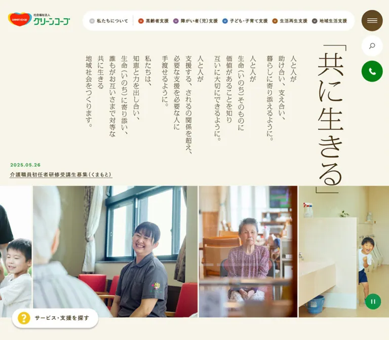
生成りの背景と深い茶色の文字に、縦書きの理念と日常の写真を組み合わせた福祉法人サイト。丸みのあるナビゲーションとサービス検索が、多様な支援への入口をつくっています。
オリジナルサイトを見るGreen Coop Social Welfare Corporation — Style Reference
A community welfare publication on warm cream paper, with a vertical statement of purpose and photographs of everyday care.
Website: 社会福祉法人グリーンコープ Original URL: https://www.fukushi-greencoop.or.jp/ Final URL: https://www.fukushi-greencoop.or.jp/ Theme: light cream, brown typography, white controls, and restrained service-category colors Inspected: September 13, 2026, at 02:03 JST; supplied retrieval timestamp: September 12, 2026, at 17:03:25.393 UTC Viewports: 1440 × 1000 desktop and 390 × 844 mobile, in CSS pixels Scope: the current homepage: opening mission composition, photographic ribbon, organizational introduction, five service categories, service-finder entry points, community articles, news, linked promotional content, closing gallery, and footer. Menu contents are represented in the DOM, but opened menus and search flows were not visually tested.
Green Coop presents welfare through ordinary relationships: conversation, cooking, childcare, handmade objects, and shared activities. The layout combines a quiet cream canvas with deep brown text, a multicolored organizational logo, and small functional accents. The opening statement, 「共に生きる」, uses slender vertical lettering and substantial surrounding space. Full-color photographs then bring people and places into the composition.
This is a corporate and service-information homepage with an active editorial layer. Its main task is to connect people with support while explaining the organization and showing daily life across its facilities. The characteristic balance is spacious at the section level and detailed within navigation, article metadata, and contact information. Preserve that balance when extending the design.
How to Read This Reference
- Measured means a value appears in the supplied computed styles or element rectangles. Coordinates refer to the initial document layout unless a screenshot location is explicitly stated.
- Calculated means simple arithmetic from measured values, such as a column gap or the distance between sections.
- Estimated means an approximation from the supplied original-page screenshots. It is not a sampled color or a recovered CSS declaration.
- Declared means a custom property exists in the supplied page evidence. Its presence does not prove that every visually similar element uses it.
- Recommended means implementation guidance for a new build. Breakpoints, fallback typography, accessible states, and the Quick Start belong to this category unless stated otherwise.
- Desktop screenshots show the opening viewport, the community-blog area, and the closing gallery/footer. Mobile screenshots show the opening viewport and closing gallery/footer. Mobile middle-page anatomy is therefore DOM-derived rather than visually inspected.
The original root font size is 10px at both inspected widths. This document expresses measurements in pixels to avoid confusing source rem values with a conventional 16px root.
Tokens — Colors
Default Palette
| Name | Value | Source or evidence | Role and confidence |
|---|---|---|---|
| Cream canvas | #F7F4E9 |
--color-bg; computed body background |
Measured main page color at both viewports |
| Deep brown ink | #453112 |
--color-black; computed body and link color |
Measured primary text color; the source name does not mean literal black |
| Secondary brown | #685C50 |
--color-text |
Declared secondary text token; ordinary body text in the sample uses Deep brown ink |
| Section beige | #EEEADD |
--color-bg-beige |
Declared supporting surface; a suitable approximation for the beige blog field, whose wrapper itself computes transparent |
| Pale surface | #FCFAF6 |
--color-bg-beige-light |
Declared lighter surface; exact use was not established |
| Neutral beige | #F1EFEA |
--color-beige |
Declared neutral surface token |
| White control | #FFFFFF |
Computed finder buttons; visible navigation capsule | Measured finder fill and visually observed navigation fill |
| Desktop archive-link fill | #F9F8F3 |
Computed desktop 「一覧をみる」 links | Measured near-white fill for compact archive links |
| Search-button yellow | #FFE479 |
Computed desktop 「検索」 button | Measured current search-control fill; distinct from the declared yellow tokens |
| Help yellow | #F2C81C |
--color-yellow |
Declared accent corresponding to the yellow help-symbol family |
| Light yellow | #FFEB85 |
--color-yellow-light |
Declared supporting accent; do not substitute it for the measured search fill |
| Service green | #008111 |
--color-green |
Declared principal green; green assistance and playback controls are visible, but their individual fills were not all measured |
| Dark green | #006F0F |
--color-green-dark |
Declared companion green |
| Terracotta | #CA4E26 |
--color-red |
Declared accent associated with arrows and the first service category |
| Terracotta text | #C54117 |
--color-red-txt; computed article from labels |
Measured small accent text |
| Fine neutral border | #DCDCD0 |
--color-border |
Declared divider token |
| Beige border | #E0E0CE |
--color-border-beige |
Declared quiet surface separation |
| Stronger beige border | #C8BCA5 |
--color-border-beige-dark |
Declared stronger neutral edge |
The page's warmth comes primarily from the cream-and-brown pair. Green, yellow, and terracotta mark useful actions; they do not replace the neutral canvas with large competing color fields.
The desktop menu disk appears medium warm brown. Its sampled button background is transparent, so the visible disk may be drawn by another layer. Its exact fill is unverified. Likewise, the visible media-control green should not automatically be equated with the source green token.
Service Category Palette
| Service | Declared base | Declared text | Observed use |
|---|---|---|---|
| 「高齢者支援」 | #CA4E26, --color-service01 |
#C54117, --color-service01-txt |
Warm red category marker and article-category text |
| 「障がい者(児)支援」 | Not supplied | #86528B, --color-service02-txt |
Purple navigation marker; text token is available, but a separate base token was not supplied |
| 「子ども・子育て支援」 | #3A77B4, --color-service03 |
#316FAD, --color-service03-txt |
Blue category marker and measured article-category text |
| 「生活再生支援」 | #8F5E30, --color-service04 |
#9C591A, --color-service04-txt |
Brown/orange category family; article-category text is measured |
| 「地域生活支援」 | #685D51, --color-service05 |
#615447, --color-service05-txt |
Muted brown category family |
Maintain the same service-to-color association across navigation and editorial metadata. The text label remains necessary: color alone does not explain the category.
Editor-related gradient and shadow presets also appear in the custom-property inventory. They are not evidence of a visible gradient or elevation system on this homepage.
Tokens — Typography
Japanese Interface Typeface
Measured family stack:
'dnp-shuei-gothic-gin-std', '秀英角ゴシック銀 M',
'游ゴシック Medium', 'Yu Gothic Medium', '游ゴシック体', YuGothic,
'Hiragino Sans', 'ヒラギノ角ゴ ProN', 'Hiragino Kaku Gothic ProN',
'メイリオ', Meiryo, sans-serif
The source aliases this stack as --font-gothic. It supplies the measured body, navigation, article titles, service headings, and contact text. Most content uses weight 500; navigation and selected utility labels use 600; major blog and news headings use 400.
The computed family declaration establishes the requested stack, not proof that every glyph came from its first family. Font-loading diagnostics were not supplied.
Latin Utility Typeface
Source stack: 'Work Sans', 'Noto Sans JP', sans-serif, through --font-sans.
This stack is directly measured on the article from labels. Desktop labels use 14px, weight 500, and 0.56px tracking. Mobile labels use 12px with 0.24px tracking. Do not assume that all dates or every English subtitle use this stack without additional element measurements.
Mission Lettering
The opening 「共に生きる」 statement and supporting mission text look like slender Japanese Mincho-style lettering. Their inspected H2 and paragraph wrappers have empty text and computed font-size: 0px.
Consequently, their visible lettering must be treated as a composed graphic treatment for this reference. The evidence does not identify its font, image format, asset path, or production technique. The wrapper's inherited Gothic family is not evidence that the visible lettering uses that family.
For an adaptation, use authorized artwork or a carefully composed serif fallback with real accessible text. A generic serif fallback is a recommendation, not an identification of the original display face.
Type Scale
| Role | Desktop measurement | Mobile measurement | Tracking / notes |
|---|---|---|---|
| Root | 10px |
10px |
Source root only |
| Body default | 14px / 14px, weight 500 |
Same | Individual paragraphs override the tight default line height |
| Main navigation | 14px / 19.6px, weight 600 |
Full navigation not visible | 0.84px, or 0.06em |
| Desktop search caption | 13px / 13px, weight 600 |
Separate office-search entry measured at 13px / 16.9px |
Desktop 1.56px; mobile entry 1.3px |
| Persistent service finder | 17px / 17px, weight 600 |
15px / 15px, weight 600 |
0.12em at both sizes |
| Organizational prose | 18px / 38.7px, weight 500 |
15px / 31.5px, weight 500 |
Desktop 0.14em; mobile 0.11em |
| Organization links | 16px / 16px, weight 500 |
16px / 22.4px, weight 500 |
0.12em |
| Service titles | 22px / 30.8px, weight 600 |
17px / 25.5px, weight 600 |
Usually 0.12em desktop; 0.08em mobile |
| Blog and news section headings | 36px / 36px, weight 400 |
24px / 24px, weight 400 |
0.14em |
| Blog introduction | 16px / 32px, weight 600 |
14px / 25.9px, weight 500 |
Desktop 0.18em; mobile 0.16em |
| Blog article titles | 16px / 26.4px, weight 500 |
Same size and leading | Tracking reduces from 0.12em to 0.08em |
| Article provider link | 14px / 21px, weight 500 |
13px / 20.8px, weight 500 |
0.06em |
| Article category | 14px / 14px, weight 600 |
12px / 12px, weight 600 |
Vertical desktop; horizontal pill on mobile |
| News article titles | 17px / 26.35px, weight 500 |
16px / 28.8px, weight 500 |
Desktop 0.12em; mobile 0.10em |
| Compact archive link | 15px / 15px, weight 600 |
16px / 16px, weight 500 |
0.12em |
| Footer organization name | Not separately sampled | 14px / 19.6px, weight 500 |
0.12em |
| Footer contact text | Not separately sampled | 14px / 24.5px, weight 500 |
0.05em |
Dates appear visually smaller than article titles, approximately 12–13px in the desktop blog capture. Their exact computed typography was not included.
The typography is airy through tracking and line spacing rather than universally large font sizes. Retain generous prose leading, while keeping article headings and utility labels compact enough to support information browsing.
Tokens — Spacing & Shapes
Spacing System
There is no verified single base-spacing formula. The measured layout combines fixed pixel dimensions, centered maximum-width regions, and mobile proportional insets.
| Use | Desktop | Mobile | Evidence |
|---|---|---|---|
| Header padding | 34px 40px 0 36px |
20px 0 0 18px |
Computed header padding |
| Floating finder clearance | Left 38px, bottom 38px |
Right 18px, bottom 38px |
Calculated from button rectangles and viewport sizes |
| Opening section to introduction | 150px |
60px |
Calculated section-to-section gap |
| Introduction to service section | 80px |
100px |
Calculated section-to-section gap |
| Service section to blog | 125px |
80px |
Calculated section-to-section gap |
| Blog internal padding | 100px top and bottom |
72px top, 38px bottom |
Computed |
| Blog to news | 120px |
80px |
Calculated |
| Desktop article-column gap | 46px |
Replaced by a list | Calculated from adjacent article rectangles |
| Service-column gap | 20px |
20px |
Calculated |
| Mobile service-row gap | — | 47px between 126px links |
Calculated |
| Mobile news horizontal inset | — | Approximately 31.19px, or 8% |
Computed |
| Mobile footer padding | — | 0 28px 35px |
Computed |
The large section intervals are part of the editorial rhythm. Avoid reducing every section to the same tight stack merely because the components themselves contain small labels.
Border Radius and Edges
| Element | Value | Confidence |
|---|---|---|
| Desktop utility buttons | 50%; 68px square boxes |
Measured menu and search geometry |
| Persistent finder | 40px |
Measured at both widths |
| Desktop guided-search bar | 120px |
Measured |
| Mobile guided-search tile | 10px |
Measured |
| Blog section wrapper | 70px desktop, 30px mobile |
Measured wrapper geometry; visible surface drawing layer not supplied |
| Archive links | 30px |
Measured |
| Mobile article-category labels | 100px |
Measured |
| Service-menu destination bars | 8px |
Measured in DOM; opened visual state not inspected |
| Article-photo corners | Approximately 3px |
Screenshot estimate |
| Large photograph edges | Square | Screenshot observation |
Rounded shapes concentrate around navigation, assistance, and broad section surfaces. Photographs remain predominantly rectangular. Article entries are not individually elevated cards.
Key Layout Measurements
| Element | Desktop: 1440 × 1000 | Mobile: 390 × 844 |
|---|---|---|
| Document height | 6420.16px |
7265.28px |
| Header element height | 98.59px |
64.61px |
| Brand-link width | 235px |
163px |
| Navigation capsule | Approximately 917.27 × 64.59px, starting at (402.73, 34) |
Not visible |
| Menu button box | 68 × 68px, at (1342, 32) |
75 × 75px, at (315, 0) |
| Opening section | 1010px high |
923px high |
| Photograph ribbon starts | Document y = 595px |
Document y = 700px |
| Ribbon allocation | 415px high |
223px high |
| Mission-title wrapper | (1184.38, 141.16), 97.23 × 475px |
(307, 120), 53 × 258.88px |
| Mission-copy wrapper | (372.77, 175), 749 × 441.16px |
(35, 180), 211 × 473px |
| Floating finder | 277.42 × 62px |
231.69 × 49px |
| Service section | 1000px wide, at x = 220px |
390px outer width with 39px side padding |
| Individual service link | 182 × 184.59px |
146 × 126px |
| Desktop blog content | 1200px across four columns |
Main article-link region 351px wide |
| Blog article width | 265.5px |
351px outer link; text begins at x = 127.5px |
| News list width | 790px |
327.63px |
| Closing gallery | Visible full-width photography; complete height not separately sampled | 390 × 211.77px |
The brand link is inline: its measured 14px line box is not the logo artwork's height. Likewise, graphic-wrapper rectangles can contain transparent margins and should not be treated as exact visible glyph bounds.
Components
Persistent Header and Service Navigation
Role: organizational identity and entry points into the five support areas.
On desktop, the logo sits at the upper left while a long white capsule occupies the upper center and right. Six top-level buttons include 「私たちについて」 followed by the five service categories. Small colored circular chevrons precede the labels. A fine vertical dotted separator follows the organizational item.
The navigation buttons are measured at 14px, weight 600, with 0.06em tracking. Their shared row is about 64.6px high. The first button is 178.72px wide; the remaining widths follow their label lengths and individual padding.
The header remains at the same viewport location in the supplied desktop opening, blog, and footer captures. This supports a persistent-header description, although its exact positioning declaration was not included.
On mobile, the full capsule disappears. The visible opening state keeps the smaller logo and three brown hamburger lines. The menu's measured target is 75 × 75px, even though the visible lines occupy roughly 50 × 14px.
The mobile DOM also includes an 「事業所検索」 button at (213, 30), approximately 82.91 × 33.78px. It is not discernible in the supplied opening screenshot. Its exact visible state should be verified before reproducing that additional header item.
Service Navigation Contents
Role: organize a broad service directory beneath the top-level categories.
The desktop DOM includes category introductions, category landing-page links, and service links. For example, the senior-support category contains care planning, home help, day services, group homes, equipment, and meal delivery.
Measured service-link blocks are 220px wide. Three adjacent blocks use a 240px horizontal pitch, implying 20px gaps. A category-wide destination bar measures 700 × 56.59px, with an 8px radius.
These measurements establish the menu's content geometry, but the supplied screenshots show the closed header. Do not infer its opening direction, overlay fill, reveal animation, hover trigger, or focus behavior from hidden content rectangles.
Right Utility Rail
Role: keep menu, site search, and telephone assistance visually available on desktop.
Three circular controls stack near the right edge. The menu and search buttons are measured at 68 × 68px, with top positions of 32px and 113px, giving a 13px gap. A green telephone symbol sits beneath them in the screenshots.
The menu is a brown disk with light horizontal lines. Search uses a magnifier above the small label 「検索」 on the measured yellow fill #FFE479. Telephone assistance uses a white receiver symbol on green.
These are separate utilities. The search panel and telephone-assistance destination were not exercised. The footer's direct telephone link is independently confirmed by a tel: URL.
Persistent Service Finder
Role: provide a clear route into support discovery from different parts of the homepage.
A white pill labeled 「サービス・支援を探す」 combines a yellow question-mark symbol with bold brown text. A modest shadow is visible beneath the pill; its blur and opacity were not measured.
Desktop anatomy:
- Outer box:
277.42 × 62px. - Position:
38pxfrom the left and bottom edges. - Padding:
22px 28px 23px 73px, leaving room for the symbol. - Text:
17px, weight600, tracking2.04px. - Radius:
40px.
Mobile anatomy:
- Outer box:
231.69 × 49px. - Position:
18pxfrom the right and38pxfrom the bottom. - Padding:
17px 24px 17px 52px. - Text:
15px, weight600, tracking1.8px.
The mobile button floats over the opening photographs. Its presence is not equally clear in the footer capture, so a universal rule for hiding or retaining it near the footer is unverified.
Opening Mission Composition
Role: communicate the organization's guiding principle before presenting service choices.
Desktop places 「共に生きる」 near the right edge, surrounded by fine corner-bracket-like rules. Supporting copy is arranged in vertical columns to its left. The composition leaves a broad quiet area toward the left edge of the viewport.
The title wrapper is 97.23px wide and 475px high. Its lower edge reaches about 21px into the photograph ribbon's vertical region. This slight overlap makes the lettering and imagery feel connected without placing the main message across a busy photograph.
The supporting graphic occupies a 749 × 441.16px wrapper, starting at y = 175px. Its actual visible lettering occupies less than the complete wrapper.
On mobile, the title remains vertical at the right, while the supporting message becomes horizontal paragraphs at the left. The copy begins at (35, 180) and ends around y = 653px; the photographs begin at y = 700px. This is a change in composition and reading direction, not a miniature desktop arrangement.
The hero's exact font and graphic assets are unidentified. Preserve the visible wording and line composition with accessible equivalents rather than deriving a font name from the empty wrappers.
Opening News Teaser
Role: expose a timely organizational notice without displacing the mission.
The desktop opening includes one dated, underlined announcement near the lower-left edge of the cream area. Its link begins around (31.67, 521) and spans approximately 522.92 × 49px. The title is 16px, weight 500, with 0.12em tracking; the date is green in the screenshot.
The corresponding teaser is absent from the mobile rendered-text list and opening screenshot, although it remains in the main element's broader text content. Treat it as not displayed in the inspected mobile presentation. The full news section remains available farther down the page.
Opening Photograph Ribbon
Role: show the people and everyday settings behind the mission.
A full-width strip of large, adjacent photographs begins below the cream composition. The desktop capture includes a smiling worker, an older person seated indoors, and a child peeking around a wall. Partial photographs continue beyond the viewport edges.
The images have different visible widths but share a common height. Narrow light gutters, approximately 4–5px by screenshot estimate, separate them. This is a continuous photographic band rather than a uniform card grid.
The desktop ribbon occupies 415px of the opening section; mobile allocates 223px. Mobile reveals a narrower portion of the sequence, preserving photographic scale rather than squeezing every scene onto the screen.
A pause-symbol control is visible at the lower right on desktop. Its measured box is 51 × 51px. The mobile equivalent is 44 × 44px at document y = 864px, below the supplied 844px-tall opening screenshot. Its absence from that screenshot does not establish that the mobile control is missing.
Organizational Introduction
Role: expand the mission into a readable explanation and organizational navigation.
The DOM identifies the section with We are Greencoop! and 「わたしたち、グリーンコープです。」. Two short paragraphs describe support across ages and circumstances, followed by links about the organization, its approach, history, and welfare workers.
Desktop prose uses 18px / 38.7px with 0.14em tracking. Mobile uses 15px / 31.5px with 0.11em tracking. The generous leading is central to the unhurried tone.
Desktop link blocks are approximately 247.66px wide, with 57px heights for single-line entries and 81px for entries with explanatory subtitles. Mobile links expand to approximately 283.22px, with heights of 54.39px and 79.98px.
A media control is present in this section's DOM, but the selected screenshots do not establish the complete imagery arrangement. Retain the measured copy and link hierarchy without inventing a specific unseen photograph or illustration.
Five Service Areas and Guided Search
Role: translate the organization's scope into concrete support categories.
The five measured links lead to senior support, disability support, child and parenting support, livelihood support, and community living support. Each includes a category name and a facility or location count.
At capture time, the counts were 141, 85, 58, 100, and 27 respectively. These are current content values, not permanent design tokens.
Desktop arranges the five links in one row. Each link measures 182 × 184.59px, with 20px between adjacent links. White service headings use 22px / 30.8px; the links reserve 56px above the heading area. The exact decorative silhouettes behind these headings are not established by the selected screenshots.
Below the row, a white guided-search bar spans 1000px and measures 69px high. It combines explanatory text with 「検索開始」.
Mobile changes the structure to two columns within 39px side margins. Each service link is 146 × 126px. The fifth category occupies the left of the third row, and the finder becomes the right-hand tile, measuring 146 × 137.78px with a 10px radius. The finder copy becomes shorter and more vertically stacked.
This desktop-bar-to-mobile-tile transformation is a defining responsive behavior. Do not place a shrunken 1000px-style banner below a cramped five-column mobile row.
Community Blog Section Header
Role: introduce frequent updates and offer category-based browsing.
The section combines a small introductory sentence, the heading 「みんなの日記」, an archive link, and the English subtitle Greencoop Community Blog. The desktop heading uses 36px, weight 400, and 0.14em tracking.
A separate light capsule holds five category links on the desktop right. These links lead to category URLs; no in-place filtering was tested.
The compact desktop 「一覧をみる」 link measures 118.13 × 39px, with a fine brown outline visible in the screenshot and a computed 30px radius. Mobile moves the archive action after the article list and expands it to approximately 327.59 × 47px.
Mobile category-link rectangles extend beyond the viewport: the fourth begins around x = 403px, and the fifth around x = 510px. This supports a single horizontal category row extending beyond the visible area. Its scroll interaction and affordance were not tested.
Community Blog Article
Role: connect a real activity, its date, its provider, and its service category.
Desktop shows eight articles in four columns and two rows. The four article widths are 265.5px, starting at x = 120, 431.5, 743, and 1054.5px. The resulting content region is 1200px wide, with 46px inter-column gaps.
Each entry contains:
- A landscape photograph, approximately
265.5 × 190pxin the screenshot. - A linked title with a small green circular arrow near the text ending.
- A compact date.
- A terracotta
fromlabel. - A separately underlined provider link.
- A category label beside the photograph.
The category label is a distinctive vertical side note. Measured examples are 14px wide, positioned 22px to the left of the article's photo edge. This leaves roughly 8px between the label box and the photograph. Category colors distinguish the service type; mixed-support labels use neutral brown in the screenshot.
Article titles use 16px / 26.4px, weight 500, with 1.92px tracking. The photographs are separated from the title by approximately 20px. There is no enclosing white card surface or card shadow. Text and images sit directly on the section field.
Mobile changes each entry into a compact list composition. The primary link is 351px wide, begins at x = 19.5px, and reserves 108px on the left before the text. Titles begin at x = 127.5px, indicating a left thumbnail region and right information column. Exact thumbnail dimensions are not present in the supplied element sample.
Provider text reduces to 13px; from reduces to 12px. The former vertical category label becomes a horizontal rounded label below the provider area, using 12px type, 3px 7px 3px 8px padding, and a 100px radius.
Keep the article link, provider link, and category link as distinct destinations. A single anchor wrapping the whole entry would lose that anatomy.
News Section
Role: provide official notices in a denser, more utilitarian format than the photographic blog.
Desktop places the section heading and archive action on the left, reserving approximately 400px before the list. The list begins at x = 525px and is 790px wide. Date and title share a horizontal row. Single-line links measure approximately 61.34px high; a longer entry measures 87.69px.
The article titles use 17px / 26.35px with 0.12em tracking. Preserve enough width for long Japanese announcements rather than forcing them into equal-height teaser cards.
Mobile stacks the heading, notices, and archive action. Each notice is approximately 327.63px wide, with 19px 10px 17px padding. The date sits above the title in the rendered content flow. Titles use 16px / 28.8px, producing row heights around 115.59–144.39px for the supplied notices.
Supporting Links and Closing Gallery
Role: provide additional routes to consultation, contact, organizational activities, and recruitment before the footer.
The mobile DOM includes linked graphical regions leading to telephone information, a named service, contact, the organizational approach, and welfare workers. Some anchors have empty extracted text, so their visible banner wording and artwork are not recoverable from this evidence.
The closing gallery is directly visible. Desktop shows a large, tightly cropped indoor portrait; mobile shows outdoor activity with a person and floating bubbles. These are different captured frames, not proof of a particular autoplay sequence.
The mobile gallery measures 390 × 211.77px. A small green segmented capsule overlaps its lower-right edge. It contains previous, pause, and next symbols with fine dotted separators. Previous and next buttons have measured 40 × 40px boxes, while the central pause button is 36 × 30px.
Footer
Role: close the page with identity, practical contact information, and organizational links.
Desktop repeats 「共に生きる」 horizontally as large, fine-stroked lettering. A row of Facebook, YouTube, and Instagram symbols appears above it. Organization name, telephone, fax, address, related-organization link, and disclosure link sit below. Two columns of organizational navigation occupy the center-right area. A small copyright line runs vertically near the right edge.
The footer independently identifies the operator as 「社会福祉法人グリーンコープ」. Its telephone link is tel:092-482-1964.
Mobile simplifies the footer to one content column with 28px side padding. Telephone and fax become separate lines; postal code and address also split across lines. Social links have measured 34 × 36px boxes with internal padding. The horizontal mission lettering is approximately 180px wide by visual estimate, inside a wider measured heading wrapper.
The desktop's additional navigation columns are absent from the mobile rendered-text list and screenshot. Privacy and external institutional links remain. The vertical copyright treatment also remains visible.
Tokens — Motion & Interaction
Measured and Visible Evidence
| Treatment | Evidence | What can be concluded |
|---|---|---|
| Ordinary desktop links | transition: 0.1s ease-out on sampled anchors |
Short transition is defined; the changed property and hover result are not established |
| Desktop search control | 0.1s ease-out |
Short feedback transition is defined |
| Desktop persistent finder | 0.15s ease-out |
Slightly longer feedback transition is defined |
| Desktop skip link | Offscreen rectangle at y = -41px; 0.1s ease-out |
A skip destination and hidden resting placement exist; focus reveal was not tested |
| Mobile sampled links and buttons | Transition field generally reports all without a duration |
This does not establish a timed animation |
| Opening and introduction media | Pause-symbol controls and measured button boxes | Playback-control affordances exist |
| Closing gallery | Previous, pause, and next controls | Manual navigation and playback affordances exist; operation was not tested |
| Header during desktop scrolling | Same viewport placement in several captures | Persistent visual placement is supported |
The sampled elements generally report animation: none. This does not prove the page is static: moving content can be controlled by scripts, descendants, transforms, or other layers absent from the sample.
Declared Easing Tokens
The supplied custom properties include:
--easeInOutQuart: cubic-bezier(0.76, 0, 0.24, 1);
--easeOutExpo: cubic-bezier(0.19, 1, 0.22, 1);
--easeOutQuint: cubic-bezier(0.23, 1, 0.32, 1);
--easeOutBack: cubic-bezier(0.175, 0.885, 0.32, 1.275);
These are available source tokens. Their assignment to a particular menu, carousel, or entrance effect is unverified.
No reliable evidence establishes carousel interval, movement direction, looping, drag support, crossfades, zoom effects, parallax, or scroll-triggered reveal timing. Do not add those claims to a reconstruction specification.
Recommended adaptation: keep utility feedback within the measured 100–150ms range, expose working media controls, and provide a static or manually advanced gallery when reduced motion is requested. Any additional entrance animation should be treated as a new design decision.
Surfaces
| Layer | Appearance | Structural purpose |
|---|---|---|
| Page canvas | Flat warm cream | Continuous background linking mission, services, news, and footer |
| Navigation | White capsule | Makes a dense group of service choices readable over cream or photography |
| Utility disks | Brown, yellow, and green | Distinguish menu, search, and telephone assistance |
| Floating finder | White pill with a modest visible shadow | Separates a persistent action from photographs and article content |
| Blog section | Broad warm beige field | Groups community activity without boxing every article |
| Article entries | Transparent structure with photographs and text | Creates an editorial grid rather than a dashboard |
| Archive actions | Pale or white rounded surfaces with fine edges | Secondary navigation with less emphasis than the finder |
| Footer | Cream, largely open | Calm endpoint for contact and institutional information |
No general glass effect, glossy gradient, or repeated card-elevation system is established. The blog wrapper's computed background is transparent despite the visible beige field; the precise underlying painting layer is not identified.
Imagery
The photographs emphasize everyday participation. People are shown helping, talking, preparing food, celebrating, making objects, or spending time in familiar rooms and outdoor spaces. Natural light, domestic materials, and imperfect everyday framing carry much of the warmth.
The opening strip uses large crops that make expressions and gestures readable. The community grid accepts more varied imagery: a meal, a group celebration, handmade keychains, kitchen assistance, crochet, dancing, and a garden portrait. These photographs act as evidence of activity rather than interchangeable decoration.
Use full color and preserve ordinary environmental details. Avoid applying a cream overlay to every image; the contrast between neutral interface and lively photographs is part of the design.
Observed Asset References
No image-file URLs were included in the supplied original-page evidence. The following are visual references, not invented asset paths.
| Asset group | Observation | Implementation implication |
|---|---|---|
| Organizational logo | Multicolored emblem with green Japanese wordmark | Use authorized brand artwork; preserve its intrinsic spacing |
| Opening mission title | Fine vertical lettering with bracket-like linework | Requires authorized artwork or a clearly labeled typographic adaptation |
| Mission explanation | Vertical desktop composition, horizontal mobile composition | Supply separate responsive compositions rather than merely shrinking one asset |
| Opening ribbon | Large adjacent scenes of workers, older people, and children | Preserve common height and deliberate crop choices |
| Blog photographs | Landscape activity images with slight corner rounding | Keep article-specific content and approximately 7:5 visible proportions on desktop |
| Closing gallery | Full-width indoor and outdoor scenes | Choose focal positions separately for desktop and mobile |
| Social symbols | Familiar platform colors and shapes | Keep them distinct from service-category colors |
| Utility symbols | Magnifier, receiver, question mark, chevrons, pause lines | Reproduce consistent weight and spacing; no icon library was identified |
Photography credits, native asset dimensions, responsive source sets, and image formats were not supplied. Do not infer them from the screenshots.
Layout & Responsive Behavior
The page uses several content widths rather than one universal container. The service section is 1000px wide on desktop, the article grid is 1200px, and the news region is 1190px with an internal left heading area. The opening and closing photographic bands span the viewport.
| Area | Desktop observation | Mobile observation |
|---|---|---|
| Header | Logo, six-item white capsule, right utility rail | Smaller logo and hamburger; extra office-search DOM entry has uncertain visibility |
| Mission | Vertical title and vertical supporting columns | Vertical title at right, horizontal paragraphs at left |
| Opening notice | Visible beside the lower mission area | Not displayed in the inspected mobile presentation |
| Photograph ribbon | 415px allocation | 223px allocation; only part of the sequence is visible |
| Floating finder | Lower-left placement, 62px high | Lower-right placement, 49px high |
| Introduction prose | 18px with 38.7px leading | 15px with 31.5px leading |
| Services | Five links in one row; finder bar below | Two columns; finder becomes the sixth tile |
| Blog | Four-column photographic grid | One list column with a reserved left thumbnail region |
| Article categories | Vertical labels outside the photo edge | Horizontal pills below provider information |
| Blog category navigation | Capsule to the right of the heading | Single row extending past the viewport |
| Archive action | Small link near section heading | Wide link after the content list |
| News | Heading at left, date/title rows at right | Heading followed by stacked notices |
| Footer | Contact block and two navigation columns | Single contact column with essential institutional links |
Only two viewport widths were inspected. Exact breakpoint values, tablet layouts, landscape-phone behavior, and browser-zoom behavior are unknown. Breakpoints in the Quick Start are recommendations and should be tested between the supplied widths.
The persistent desktop header can pass over section content during scrolling, as seen in the blog capture. New anchor targets should receive enough scroll clearance to place their headings below that chrome. On mobile, the footer capture shows a cream top band with a hamburger but no visible logo; the trigger for this state was not established.
Do’s and Don’ts
Do
- Start with the measured cream
#F7F4E9and brown#453112pair. - Preserve the asymmetry and open space around the mission statement.
- Keep the mission title vertical on mobile while reflowing its explanation horizontally.
- Use the measured Gothic stack for ordinary interface text and distinguish it from the unidentified mission lettering.
- Maintain generous leading in organizational prose and restrained weights in section headings.
- Keep the five service categories consistent across navigation and article metadata.
- Retain the prominent white finder pill and its yellow help symbol.
- Use authentic, activity-specific photographs with deliberate crops.
- Preserve separate article, provider, and category destinations.
- Recompose desktop services, articles, and archive actions for mobile instead of scaling them down uniformly.
Don’t
- Don't replace the homepage with a single conversion sequence that removes the service directory and community content.
- Don't invent a named Mincho font from the empty hero wrappers.
- Don't treat
--color-textas the measured body color; the sampled body uses#453112. - Don't replace the measured yellow search fill with a nearby declared yellow without documenting the change.
- Don't turn the blog into a collection of heavily rounded white cards with repeated shadows.
- Don't force all photographs into identical crops or replace local activity with generic institutional stock imagery.
- Don't leave five tiny service columns on a 390px-wide screen.
- Don't reproduce vertical desktop article labels on mobile, where they become horizontal pills.
- Don't infer an opened menu design or a search questionnaire from hidden DOM content alone.
- Don't add autoplay intervals, parallax, fades, or hover animations as if they were observed.
- Don't copy source rem numbers into a 16px-root project without conversion.
Recommended Implementation Additions
These are recommendations for a new implementation, not verified features of the original page.
- Provide accessible mission wording. Inspect the accessibility tree for the graphic title and explanation. If equivalent text is absent, add it without requiring users to interpret text embedded in artwork.
- Keep navigation semantics explicit. Use buttons for disclosure controls, links for destinations,
aria-expandedfor open state, and predictable Escape/focus-return behavior for any menu or search dialog. - Make the category row discoverable. If mobile categories scroll horizontally, provide a visible overflow cue and keyboard access while containing overflow within the row.
- Give small icons sufficient targets. Preserve the visual sizes while expanding social and gallery controls toward at least 44px touch targets where practical.
- Protect content from persistent controls. Include bottom clearance for the finder, safe-area handling, and scroll margins for anchored headings and focused elements.
- Implement real playback state. Pause symbols should correspond to controllable motion and expose meaningful accessible names. Respect reduced-motion preferences and avoid changing focus when slides advance.
- Keep color supplemental. Service labels must remain readable without recognizing their color. Check contrast for category text and white text over any reconstructed colored service artwork.
- Preserve image composition responsibly. Supply responsive image sources, intrinsic dimensions, and per-image focal positions. Load the opening imagery promptly and defer lower-page images where appropriate.
- Retain readable fallback typography. Confirm line wrapping when the first declared font is unavailable; long provider names and service labels should remain intact.
- Test the missing widths. Validate navigation collapse, the five-to-two-column service change, article reflow, and footer behavior at intermediate widths and enlarged text settings.
Agent Prompt Guide
Quick Color Reference
- Main canvas:
#F7F4E9. - Primary text:
#453112. - Supporting beige token:
#EEEADD; exact blog painting layer is unverified. - Finder and navigation surfaces: white.
- Measured desktop search fill:
#FFE479. - Help accent: declared
#F2C81C. - Principal declared green:
#008111; individual media-control fills are not all measured. - Terracotta text:
#C54117. - Category text colors:
#C54117,#86528B,#316FAD,#9C591A,#615447.
Overall Prompt
“Create a Japanese community-welfare corporate homepage using warm cream #F7F4E9, deep brown #453112, white navigation capsules, and small green, yellow, and terracotta utility accents. Begin with an asymmetric mission composition: the fine vertical phrase 「共に生きる」 at the right, supporting vertical columns on desktop, and a broad band of everyday care photographs beneath. On mobile, retain the vertical title but recompose its explanation as horizontal paragraphs. Use the supplied Gothic interface stack for navigation and editorial content; do not claim a specific font for the mission artwork. Include an organizational introduction, five consistent service categories, a persistent service-finder pill, a four-column community article grid, official news, and a practical contact footer. Reflow services into two mobile columns and articles into thumbnail-and-text list entries. Keep the layout warm, spacious, and useful without adding unsupported motion.”
Example Component Prompts
- Header: “Build a persistent desktop header with an authorized logo at left, a white capsule containing six brown text buttons, and small colored circular chevrons for service categories. Use 14px text, weight 600, and 0.06em tracking. Add a separate 68px utility rail at the right. Collapse the capsule on mobile and retain a large hamburger target. Open-menu appearance requires a separate specification.”
- Mission: “Compose 「共に生きる」 as a fine vertical statement with bracket-like rules, broad cream negative space, and supporting mission copy to its left. At 390px width, use a 53px-wide title composition near the right edge and horizontal supporting paragraphs in a roughly 211px-wide left region. Treat display lettering as authorized artwork or an explicitly chosen serif adaptation.”
- Service finder: “Create a white pill with a yellow question-mark symbol, brown text 「サービス・支援を探す」, a 40px radius, and a restrained shadow. Target approximately 277 × 62px on desktop and 232 × 49px on mobile. Place it lower left on desktop and lower right on mobile with appropriate content clearance.”
- Community article: “Create an unboxed article entry with a landscape activity photograph, a 16px brown title, a compact date, terracotta
from, and a separate underlined provider link. Put a small vertical category label 22px outside the photo's left edge on desktop. On mobile, use a left thumbnail region, right text column, and horizontal category pill.” - Services: “Arrange five service links across a 1000px desktop region with 20px gaps and a wide white guided-search bar below. At mobile width, use two 146px columns with 20px between them; place the finder in the sixth grid position. Keep category labels and counts readable, and do not invent the source's unobserved decorative silhouettes.”
- Footer: “Use a cream footer with social symbols, a horizontal repeat of the fine mission statement, the organization name, telephone, fax, address, and institutional links. Add two navigation columns on desktop. On mobile, use a single column with 28px side padding and separate contact lines; retain the small vertical copyright treatment.”
Quick Start
CSS Custom Properties
This is a recommended implementation scaffold, not recovered source CSS. It uses conventional rem units, with pixel equivalents assuming a 16px browser root. The original page uses a 10px root.
The header, finder, article grid, mobile list, and typography follow measured proportions. The blog fill, thumbnail ratio, shadow, breakpoints, and mobile thumbnail width are explicitly approximations or implementation choices. Mission classes expect authorized responsive graphic artwork; no asset URLs are invented here. JavaScript for menus, search, and galleries must be implemented separately.
:root {
  /* Measured colors and declared source aliases */
  --gc-paper: #f7f4e9;
  --gc-ink: #453112;
  --gc-muted: #685c50;
  --gc-beige: #eeeadd;
  --gc-white: #fff;
  --gc-search-yellow: #ffe479;
  --gc-help-yellow: #f2c81c;
  --gc-green: #008111;
  --gc-green-dark: #006f0f;
  --gc-red: #ca4e26;
  --gc-red-text: #c54117;
  --gc-border: #dcdcd0;

  --gc-senior: #c54117;
  --gc-disability: #86528b;
  --gc-child: #316fad;
  --gc-livelihood: #9c591a;
  --gc-community: #615447;

  /* Shortened source stack; font files are not bundled here */
  --gc-font-body: 'dnp-shuei-gothic-gin-std',
    'Yu Gothic Medium', YuGothic, 'Hiragino Sans', Meiryo, sans-serif;
  --gc-font-latin: 'Work Sans', 'Noto Sans JP', sans-serif;

  --gc-text-body: 0.875rem;
  --gc-text-article: 1rem;
  --gc-text-heading: 2.25rem;
  --gc-leading-article: 1.65;
  --gc-tracking-body: 0.06em;
  --gc-tracking-title: 0.14em;

  --gc-content-wide: 1200px;
  --gc-content-services: 1000px;
  --gc-column-gap: 46px;
  --gc-radius-section: 70px;
  --gc-radius-pill: 999px;
  --gc-feedback: 100ms ease-out;
  --gc-finder-feedback: 150ms ease-out;

  /* Recommended approximation of the visible finder shadow */
  --gc-shadow-finder: 0 3px 5px rgb(69 49 18 / 20%);
}

* { box-sizing: border-box; }
body { margin: 0; }
html { scroll-padding-top: 120px; }

.gc-site {
  color: var(--gc-ink);
  background: var(--gc-paper);
  font-family: var(--gc-font-body);
  font-size: var(--gc-text-body);
  font-weight: 500;
  line-height: 1.6;
}

.gc-site img { display: block; max-width: 100%; }
.gc-site a { color: inherit; text-underline-offset: 0.18em; }
.gc-site button { font: inherit; color: inherit; cursor: pointer; }
.gc-site [id] { scroll-margin-top: 120px; }

.gc-container {
  width: min(var(--gc-content-wide), calc(100% - 64px));
  margin-inline: auto;
}

.gc-header {
  position: fixed;
  inset: 0 0 auto;
  z-index: 30;
  display: flex;
  align-items: flex-start;
  gap: 24px;
  padding: 34px 120px 0 36px;
  pointer-events: none;
}

.gc-header > * { pointer-events: auto; }
.gc-logo { display: block; flex: 0 0 235px; width: 235px; }

.gc-nav {
  display: flex;
  align-items: stretch;
  min-height: 64.6px;
  margin-inline-start: auto;
  background: var(--gc-white);
  border-radius: var(--gc-radius-pill);
}

.gc-nav button {
  display: inline-flex;
  align-items: center;
  gap: 8px;
  padding: 23px 7px 22px;
  border: 0;
  background: transparent;
  white-space: nowrap;
  font-size: 0.875rem;
  font-weight: 600;
  line-height: 1.4;
  letter-spacing: 0.06em;
}

.gc-nav button:first-child { padding-inline: 30px 20px; }
.gc-nav button:last-child { padding-inline-end: 34px; }

.gc-category-dot {
  display: inline-grid;
  place-items: center;
  flex: none;
  width: 19px;
  height: 19px;
  border-radius: 50%;
  color: white;
  background: var(--category-color, var(--gc-community));
}

.gc-utilities {
  position: fixed;
  top: 32px;
  right: 30px;
  z-index: 40;
  display: grid;
  gap: 13px;
}

.gc-utility {
  display: grid;
  place-content: center;
  justify-items: center;
  width: 68px;
  height: 68px;
  padding: 0;
  border: 0;
  border-radius: 50%;
  text-decoration: none;
}

/* Source ink is used here; the original menu disk fill is unverified. */
.gc-menu { color: white; background: var(--gc-ink); }
.gc-search { background: var(--gc-search-yellow); }
.gc-phone { color: white; background: var(--gc-green); }

.gc-finder {
  position: fixed;
  left: 38px;
  bottom: calc(38px + env(safe-area-inset-bottom, 0px));
  z-index: 25;
  min-height: 62px;
  padding: 22px 28px 23px 73px;
  border: 0;
  border-radius: 40px;
  background: var(--gc-white);
  box-shadow: var(--gc-shadow-finder);
  font-size: 1.0625rem;
  font-weight: 600;
  line-height: 1;
  letter-spacing: 0.12em;
  transition: box-shadow var(--gc-finder-feedback);
}

.gc-finder-symbol {
  position: absolute;
  left: 16px;
  top: 50%;
  display: grid;
  place-items: center;
  width: 32px;
  height: 32px;
  transform: translateY(-50%);
  border-radius: 50%;
  color: white;
  background: var(--gc-help-yellow);
  font-family: sans-serif;
  font-weight: 700;
}

/* These wrappers expect different desktop and mobile copy artwork. */
.gc-hero { position: relative; padding-top: 595px; }
.gc-mission-title,
.gc-mission-copy { position: absolute; margin: 0; }

.gc-mission-title {
  top: 141.16px;
  right: 11%;
  width: clamp(53px, 6.752vw, 97.23px);
  z-index: 1;
}

.gc-mission-copy {
  top: 175px;
  right: 22.1%;
  width: min(52.014vw, 749px);
}

.gc-mission-title img,
.gc-mission-copy img { width: 100%; height: auto; }

.gc-hero-notice {
  position: absolute;
  left: 34px;
  top: 521px;
  max-width: min(523px, calc(100% - 68px));
  font-size: 1rem;
  letter-spacing: 0.12em;
}

.gc-photo-ribbon {
  display: flex;
  gap: 4px;
  height: 415px;
  overflow: hidden;
}

.gc-photo-ribbon img {
  flex: none;
  width: auto;
  max-width: none;
  height: 100%;
  object-fit: cover;
}

.gc-intro-copy {
  font-size: 1.125rem;
  line-height: 2.15;
  letter-spacing: 0.14em;
}

.gc-section-title {
  margin: 0;
  font-size: var(--gc-text-heading);
  font-weight: 400;
  line-height: 1;
  letter-spacing: var(--gc-tracking-title);
}

/* Beige assignment approximates the visible section surface. */
.gc-blog {
  padding-block: 100px;
  border-radius: var(--gc-radius-section);
  background: var(--gc-beige);
}

.gc-category-nav {
  display: flex;
  gap: 20px;
  width: max-content;
  max-width: 100%;
  padding: 22px 38px;
  border-radius: var(--gc-radius-pill);
  background: #f9f8f3;
}

.gc-category-nav a { flex: none; text-decoration: none; }

.gc-blog-grid {
  display: grid;
  grid-template-columns: repeat(4, minmax(0, 1fr));
  gap: 65px var(--gc-column-gap);
}

.gc-blog-card { position: relative; min-width: 0; }
.gc-blog-main { display: block; text-decoration: none; }

/* Ratio and small corner radius are screenshot approximations. */
.gc-blog-image {
  width: 100%;
  aspect-ratio: 7 / 5;
  object-fit: cover;
  border-radius: 3px;
}

.gc-blog-title {
  margin: 20px 0 10px;
  font-size: var(--gc-text-article);
  font-weight: 500;
  line-height: var(--gc-leading-article);
  letter-spacing: 0.12em;
}

.gc-blog-date {
  display: block;
  font-size: 0.75rem;
  letter-spacing: 0.08em;
}

.gc-blog-from {
  margin: 18px 0 6px;
  color: var(--gc-red-text);
  font-family: var(--gc-font-latin);
  font-size: 0.875rem;
  line-height: 1;
  letter-spacing: 0.04em;
}

.gc-blog-provider {
  font-size: 0.875rem;
  line-height: 1.5;
  letter-spacing: 0.06em;
  overflow-wrap: anywhere;
}

.gc-blog-category {
  position: absolute;
  top: 2px;
  left: -22px;
  writing-mode: vertical-rl;
  color: var(--category-color, var(--gc-ink));
  font-size: 0.875rem;
  font-weight: 600;
  line-height: 1;
  letter-spacing: 0.12em;
  text-decoration: none;
}

.gc-archive-link {
  display: inline-block;
  padding: 11px 16px 11px 18px;
  border: 1px solid currentColor;
  border-radius: 30px;
  background: #f9f8f3;
  font-size: 0.9375rem;
  font-weight: 600;
  line-height: 1;
  letter-spacing: 0.12em;
  text-decoration: none;
}

.gc-footer {
  position: relative;
  padding: 100px 75px 50px;
  background: var(--gc-paper);
}

.gc-footer-layout {
  display: grid;
  grid-template-columns: minmax(320px, 1.4fr) 1fr 1fr;
  gap: 48px;
}

.gc-footer-contact { line-height: 1.75; letter-spacing: 0.05em; }

/* Recommended focus treatment, not a recovered original state. */
.gc-site :focus-visible {
  outline: 2px solid var(--gc-ink);
  outline-offset: 4px;
}

/* Recommended intermediate breakpoint; source breakpoint is unknown. */
@media (max-width: 75em) {
  .gc-nav { display: none; }
}

/* Recommended mobile breakpoint; observations were made at 390px. */
@media (max-width: 48em) {
  :root { --gc-text-heading: 1.5rem; --gc-radius-section: 30px; }
  html { scroll-padding-top: 95px; }
  .gc-site [id] { scroll-margin-top: 95px; }
  .gc-container { width: 90%; }

  .gc-header { padding: 20px 95px 0 18px; }
  .gc-logo { flex-basis: 163px; width: 163px; }
  .gc-utilities { top: 0; right: 0; }
  .gc-utility:not(.gc-menu) { display: none; }
  .gc-menu {
    width: 75px;
    height: 75px;
    border-radius: 0;
    color: var(--gc-ink);
    background: transparent;
  }

  .gc-finder {
    left: auto;
    right: 18px;
    min-height: 49px;
    max-width: calc(100% - 36px);
    padding: 17px 24px 17px 52px;
    font-size: 0.9375rem;
  }
  .gc-finder-symbol { width: 24px; height: 24px; }

  .gc-hero { padding-top: 700px; }
  .gc-mission-title { top: 120px; right: 30px; width: 53px; }
  .gc-mission-copy { top: 180px; left: 35px; right: auto; width: 211px; }
  .gc-hero-notice { display: none; }
  .gc-photo-ribbon { height: 223px; }
  .gc-intro-copy { font-size: 0.9375rem; line-height: 2.1; letter-spacing: 0.11em; }

  .gc-blog { padding-block: 72px 38px; }
  .gc-category-nav {
    width: 100%;
    gap: 18px;
    padding-inline: 34px;
    overflow-x: auto;
    overscroll-behavior-inline: contain;
  }
  .gc-blog-grid { grid-template-columns: 1fr; gap: 0; }

  /* The 88px thumbnail is a recommendation within the measured 108px reserve. */
  .gc-blog-card { padding: 19px 10px 24px 108px; }
  .gc-blog-image { position: absolute; left: 0; top: 19px; width: 88px; }
  .gc-blog-title { margin-top: 0; letter-spacing: 0.08em; }
  .gc-blog-from { font-size: 0.75rem; letter-spacing: 0.02em; }
  .gc-blog-provider { font-size: 0.8125rem; line-height: 1.6; }
  .gc-blog-category {
    position: static;
    display: inline-block;
    margin-top: 12px;
    padding: 3px 7px 3px 8px;
    writing-mode: horizontal-tb;
    border: 1px solid currentColor;
    border-radius: 100px;
    font-size: 0.75rem;
    letter-spacing: 0.06em;
  }

  .gc-archive-link {
    display: block;
    width: 84%;
    margin-inline: auto;
    padding: 15px 12px 14px 15px;
    background: white;
    font-size: 1rem;
    font-weight: 500;
    text-align: center;
  }

  .gc-footer { padding: 100px 28px 100px; }
  .gc-footer-layout { display: block; }
  .gc-footer-contact { font-size: 0.875rem; }
}

/* Any gallery script must also observe this preference. */
@media (prefers-reduced-motion: reduce) {
  .gc-site *, .gc-site *::before, .gc-site *::after {
    animation: none !important;
    transition: none !important;
    scroll-behavior: auto !important;
  }
}
Component structure: use .gc-blog-card on an article container. Its .gc-blog-main link contains the image, heading, and date; the from label, provider link, and category link are siblings of that main link. Set --category-color on the article or category control. This preserves independent destinations without nested anchors.
The hero graphic wrappers should contain responsive picture elements with meaningful text alternatives or an equivalent accessible text treatment. The original asset URLs are unavailable, so this scaffold intentionally does not supply them. The photo ribbon is static until a working gallery implementation and controls are added.
Tailwind v4 Token Mapping
Optional aliases for a project already using Tailwind v4. This does not identify the original implementation framework. Define the custom properties above first.
@theme inline {
  --color-paper: var(--gc-paper);
  --color-ink: var(--gc-ink);
  --color-section-beige: var(--gc-beige);
  --color-service-green: var(--gc-green);
  --color-search-yellow: var(--gc-search-yellow);
  --color-help-yellow: var(--gc-help-yellow);
  --color-terracotta: var(--gc-red-text);

  --font-body: var(--gc-font-body);
  --font-latin: var(--gc-font-latin);

  --text-article: var(--gc-text-article);
  --text-section: var(--gc-text-heading);

  --radius-section: var(--gc-radius-section);
  --radius-capsule: 999px;
  --spacing-article-gap: 46px;
}
Sources & Evidence
- Inspected original and final page: https://www.fukushi-greencoop.or.jp/. The supplied browser record reports HTTP
200and identical original/final URLs. - Capture timestamp:
2026-09-12T17:03:25.393Z, equivalent to September 13, 2026, at 02:03:25.393 JST. This is the supplied retrieval time, not a separate browsing session performed for this document. - Desktop evidence: 1440 × 1000 viewport; opening, community-blog, and closing-gallery/footer screenshots; rendered text, links, custom properties, and sampled computed element rectangles. Measured document height: approximately
6420.16px. - Mobile evidence: 390 × 844 viewport; opening and closing-gallery/footer screenshots; rendered text, links, custom properties, and sampled computed element rectangles. Measured document height: approximately
7265.28px. - Observed inspection scope: initial page observation and scrolling through the page. The supplied capture process allowed at least five seconds for the initial observation and checked layout stability and image readiness. Those checks do not establish the completeness of delayed content or the behavior of unexercised controls.
- Interaction limits: no supplied results for menu opening, search completion, category navigation, telephone assistance, hover states, keyboard operation, or gallery-button activation. SharedWorkers and service workers were disabled during the supplied inspection.
- Asset and style limits: no original image URLs, complete stylesheets, pseudo-element styles, font-loading diagnostics, or precise responsive breakpoints were supplied. Hidden menu rectangles do not establish an opened visual state. Empty text extraction from a graphic wrapper does not establish the absence of accessible alternatives.
This reference describes the current homepage represented by those captures. Measured values, visual estimates, and recommended implementation choices remain distinct throughout.
# Green Coop Social Welfare Corporation — Style Reference

> A community welfare publication on warm cream paper, with a vertical statement of purpose and photographs of everyday care.

**Website:** [社会福祉法人グリーンコープ](https://www.fukushi-greencoop.or.jp/)
**Original URL:** https://www.fukushi-greencoop.or.jp/
**Final URL:** https://www.fukushi-greencoop.or.jp/
**Theme:** light cream, brown typography, white controls, and restrained service-category colors
**Inspected:** September 13, 2026, at 02:03 JST; supplied retrieval timestamp: September 12, 2026, at 17:03:25.393 UTC
**Viewports:** 1440 × 1000 desktop and 390 × 844 mobile, in CSS pixels
**Scope:** the current homepage: opening mission composition, photographic ribbon, organizational introduction, five service categories, service-finder entry points, community articles, news, linked promotional content, closing gallery, and footer. Menu contents are represented in the DOM, but opened menus and search flows were not visually tested.

Green Coop presents welfare through ordinary relationships: conversation, cooking, childcare, handmade objects, and shared activities. The layout combines a quiet cream canvas with deep brown text, a multicolored organizational logo, and small functional accents. The opening statement, 「共に生きる」, uses slender vertical lettering and substantial surrounding space. Full-color photographs then bring people and places into the composition.

This is a corporate and service-information homepage with an active editorial layer. Its main task is to connect people with support while explaining the organization and showing daily life across its facilities. The characteristic balance is spacious at the section level and detailed within navigation, article metadata, and contact information. Preserve that balance when extending the design.

## How to Read This Reference

- **Measured** means a value appears in the supplied computed styles or element rectangles. Coordinates refer to the initial document layout unless a screenshot location is explicitly stated.
- **Calculated** means simple arithmetic from measured values, such as a column gap or the distance between sections.
- **Estimated** means an approximation from the supplied original-page screenshots. It is not a sampled color or a recovered CSS declaration.
- **Declared** means a custom property exists in the supplied page evidence. Its presence does not prove that every visually similar element uses it.
- **Recommended** means implementation guidance for a new build. Breakpoints, fallback typography, accessible states, and the Quick Start belong to this category unless stated otherwise.
- Desktop screenshots show the opening viewport, the community-blog area, and the closing gallery/footer. Mobile screenshots show the opening viewport and closing gallery/footer. Mobile middle-page anatomy is therefore DOM-derived rather than visually inspected.

The original root font size is **10px** at both inspected widths. This document expresses measurements in pixels to avoid confusing source rem values with a conventional 16px root.

## Tokens — Colors

### Default Palette

| Name | Value | Source or evidence | Role and confidence |
| --- | --- | --- | --- |
| Cream canvas | `#F7F4E9` | `--color-bg`; computed body background | Measured main page color at both viewports |
| Deep brown ink | `#453112` | `--color-black`; computed body and link color | Measured primary text color; the source name does not mean literal black |
| Secondary brown | `#685C50` | `--color-text` | Declared secondary text token; ordinary body text in the sample uses Deep brown ink |
| Section beige | `#EEEADD` | `--color-bg-beige` | Declared supporting surface; a suitable approximation for the beige blog field, whose wrapper itself computes transparent |
| Pale surface | `#FCFAF6` | `--color-bg-beige-light` | Declared lighter surface; exact use was not established |
| Neutral beige | `#F1EFEA` | `--color-beige` | Declared neutral surface token |
| White control | `#FFFFFF` | Computed finder buttons; visible navigation capsule | Measured finder fill and visually observed navigation fill |
| Desktop archive-link fill | `#F9F8F3` | Computed desktop 「一覧をみる」 links | Measured near-white fill for compact archive links |
| Search-button yellow | `#FFE479` | Computed desktop 「検索」 button | Measured current search-control fill; distinct from the declared yellow tokens |
| Help yellow | `#F2C81C` | `--color-yellow` | Declared accent corresponding to the yellow help-symbol family |
| Light yellow | `#FFEB85` | `--color-yellow-light` | Declared supporting accent; do not substitute it for the measured search fill |
| Service green | `#008111` | `--color-green` | Declared principal green; green assistance and playback controls are visible, but their individual fills were not all measured |
| Dark green | `#006F0F` | `--color-green-dark` | Declared companion green |
| Terracotta | `#CA4E26` | `--color-red` | Declared accent associated with arrows and the first service category |
| Terracotta text | `#C54117` | `--color-red-txt`; computed article `from` labels | Measured small accent text |
| Fine neutral border | `#DCDCD0` | `--color-border` | Declared divider token |
| Beige border | `#E0E0CE` | `--color-border-beige` | Declared quiet surface separation |
| Stronger beige border | `#C8BCA5` | `--color-border-beige-dark` | Declared stronger neutral edge |

The page's warmth comes primarily from the cream-and-brown pair. Green, yellow, and terracotta mark useful actions; they do not replace the neutral canvas with large competing color fields.

The desktop menu disk appears medium warm brown. Its sampled button background is transparent, so the visible disk may be drawn by another layer. Its exact fill is unverified. Likewise, the visible media-control green should not automatically be equated with the source green token.

### Service Category Palette

| Service | Declared base | Declared text | Observed use |
| --- | --- | --- | --- |
| 「高齢者支援」 | `#CA4E26`, `--color-service01` | `#C54117`, `--color-service01-txt` | Warm red category marker and article-category text |
| 「障がい者(児)支援」 | Not supplied | `#86528B`, `--color-service02-txt` | Purple navigation marker; text token is available, but a separate base token was not supplied |
| 「子ども・子育て支援」 | `#3A77B4`, `--color-service03` | `#316FAD`, `--color-service03-txt` | Blue category marker and measured article-category text |
| 「生活再生支援」 | `#8F5E30`, `--color-service04` | `#9C591A`, `--color-service04-txt` | Brown/orange category family; article-category text is measured |
| 「地域生活支援」 | `#685D51`, `--color-service05` | `#615447`, `--color-service05-txt` | Muted brown category family |

Maintain the same service-to-color association across navigation and editorial metadata. The text label remains necessary: color alone does not explain the category.

Editor-related gradient and shadow presets also appear in the custom-property inventory. They are not evidence of a visible gradient or elevation system on this homepage.

## Tokens — Typography

### Japanese Interface Typeface

**Measured family stack:**

```css
'dnp-shuei-gothic-gin-std', '秀英角ゴシック銀 M',
'游ゴシック Medium', 'Yu Gothic Medium', '游ゴシック体', YuGothic,
'Hiragino Sans', 'ヒラギノ角ゴ ProN', 'Hiragino Kaku Gothic ProN',
'メイリオ', Meiryo, sans-serif
```

The source aliases this stack as `--font-gothic`. It supplies the measured body, navigation, article titles, service headings, and contact text. Most content uses weight **500**; navigation and selected utility labels use **600**; major blog and news headings use **400**.

The computed family declaration establishes the requested stack, not proof that every glyph came from its first family. Font-loading diagnostics were not supplied.

### Latin Utility Typeface

**Source stack:** `'Work Sans', 'Noto Sans JP', sans-serif`, through `--font-sans`.

This stack is directly measured on the article `from` labels. Desktop labels use `14px`, weight `500`, and `0.56px` tracking. Mobile labels use `12px` with `0.24px` tracking. Do not assume that all dates or every English subtitle use this stack without additional element measurements.

### Mission Lettering

The opening 「共に生きる」 statement and supporting mission text look like slender Japanese Mincho-style lettering. Their inspected H2 and paragraph wrappers have empty text and computed `font-size: 0px`.

Consequently, their visible lettering must be treated as a composed graphic treatment for this reference. The evidence does not identify its font, image format, asset path, or production technique. The wrapper's inherited Gothic family is **not** evidence that the visible lettering uses that family.

For an adaptation, use authorized artwork or a carefully composed serif fallback with real accessible text. A generic `serif` fallback is a recommendation, not an identification of the original display face.

### Type Scale

| Role | Desktop measurement | Mobile measurement | Tracking / notes |
| --- | --- | --- | --- |
| Root | `10px` | `10px` | Source root only |
| Body default | `14px / 14px`, weight 500 | Same | Individual paragraphs override the tight default line height |
| Main navigation | `14px / 19.6px`, weight 600 | Full navigation not visible | `0.84px`, or `0.06em` |
| Desktop search caption | `13px / 13px`, weight 600 | Separate office-search entry measured at `13px / 16.9px` | Desktop `1.56px`; mobile entry `1.3px` |
| Persistent service finder | `17px / 17px`, weight 600 | `15px / 15px`, weight 600 | `0.12em` at both sizes |
| Organizational prose | `18px / 38.7px`, weight 500 | `15px / 31.5px`, weight 500 | Desktop `0.14em`; mobile `0.11em` |
| Organization links | `16px / 16px`, weight 500 | `16px / 22.4px`, weight 500 | `0.12em` |
| Service titles | `22px / 30.8px`, weight 600 | `17px / 25.5px`, weight 600 | Usually `0.12em` desktop; `0.08em` mobile |
| Blog and news section headings | `36px / 36px`, weight 400 | `24px / 24px`, weight 400 | `0.14em` |
| Blog introduction | `16px / 32px`, weight 600 | `14px / 25.9px`, weight 500 | Desktop `0.18em`; mobile `0.16em` |
| Blog article titles | `16px / 26.4px`, weight 500 | Same size and leading | Tracking reduces from `0.12em` to `0.08em` |
| Article provider link | `14px / 21px`, weight 500 | `13px / 20.8px`, weight 500 | `0.06em` |
| Article category | `14px / 14px`, weight 600 | `12px / 12px`, weight 600 | Vertical desktop; horizontal pill on mobile |
| News article titles | `17px / 26.35px`, weight 500 | `16px / 28.8px`, weight 500 | Desktop `0.12em`; mobile `0.10em` |
| Compact archive link | `15px / 15px`, weight 600 | `16px / 16px`, weight 500 | `0.12em` |
| Footer organization name | Not separately sampled | `14px / 19.6px`, weight 500 | `0.12em` |
| Footer contact text | Not separately sampled | `14px / 24.5px`, weight 500 | `0.05em` |

Dates appear visually smaller than article titles, approximately **12–13px** in the desktop blog capture. Their exact computed typography was not included.

The typography is airy through tracking and line spacing rather than universally large font sizes. Retain generous prose leading, while keeping article headings and utility labels compact enough to support information browsing.

## Tokens — Spacing & Shapes

### Spacing System

There is no verified single base-spacing formula. The measured layout combines fixed pixel dimensions, centered maximum-width regions, and mobile proportional insets.

| Use | Desktop | Mobile | Evidence |
| --- | --- | --- | --- |
| Header padding | `34px 40px 0 36px` | `20px 0 0 18px` | Computed header padding |
| Floating finder clearance | Left `38px`, bottom `38px` | Right `18px`, bottom `38px` | Calculated from button rectangles and viewport sizes |
| Opening section to introduction | `150px` | `60px` | Calculated section-to-section gap |
| Introduction to service section | `80px` | `100px` | Calculated section-to-section gap |
| Service section to blog | `125px` | `80px` | Calculated section-to-section gap |
| Blog internal padding | `100px` top and bottom | `72px` top, `38px` bottom | Computed |
| Blog to news | `120px` | `80px` | Calculated |
| Desktop article-column gap | `46px` | Replaced by a list | Calculated from adjacent article rectangles |
| Service-column gap | `20px` | `20px` | Calculated |
| Mobile service-row gap | — | `47px` between 126px links | Calculated |
| Mobile news horizontal inset | — | Approximately `31.19px`, or `8%` | Computed |
| Mobile footer padding | — | `0 28px 35px` | Computed |

The large section intervals are part of the editorial rhythm. Avoid reducing every section to the same tight stack merely because the components themselves contain small labels.

### Border Radius and Edges

| Element | Value | Confidence |
| --- | --- | --- |
| Desktop utility buttons | `50%`; 68px square boxes | Measured menu and search geometry |
| Persistent finder | `40px` | Measured at both widths |
| Desktop guided-search bar | `120px` | Measured |
| Mobile guided-search tile | `10px` | Measured |
| Blog section wrapper | `70px` desktop, `30px` mobile | Measured wrapper geometry; visible surface drawing layer not supplied |
| Archive links | `30px` | Measured |
| Mobile article-category labels | `100px` | Measured |
| Service-menu destination bars | `8px` | Measured in DOM; opened visual state not inspected |
| Article-photo corners | Approximately `3px` | Screenshot estimate |
| Large photograph edges | Square | Screenshot observation |

Rounded shapes concentrate around navigation, assistance, and broad section surfaces. Photographs remain predominantly rectangular. Article entries are not individually elevated cards.

### Key Layout Measurements

| Element | Desktop: 1440 × 1000 | Mobile: 390 × 844 |
| --- | --- | --- |
| Document height | `6420.16px` | `7265.28px` |
| Header element height | `98.59px` | `64.61px` |
| Brand-link width | `235px` | `163px` |
| Navigation capsule | Approximately `917.27 × 64.59px`, starting at `(402.73, 34)` | Not visible |
| Menu button box | `68 × 68px`, at `(1342, 32)` | `75 × 75px`, at `(315, 0)` |
| Opening section | `1010px` high | `923px` high |
| Photograph ribbon starts | Document `y = 595px` | Document `y = 700px` |
| Ribbon allocation | `415px` high | `223px` high |
| Mission-title wrapper | `(1184.38, 141.16)`, `97.23 × 475px` | `(307, 120)`, `53 × 258.88px` |
| Mission-copy wrapper | `(372.77, 175)`, `749 × 441.16px` | `(35, 180)`, `211 × 473px` |
| Floating finder | `277.42 × 62px` | `231.69 × 49px` |
| Service section | `1000px` wide, at `x = 220px` | `390px` outer width with `39px` side padding |
| Individual service link | `182 × 184.59px` | `146 × 126px` |
| Desktop blog content | `1200px` across four columns | Main article-link region `351px` wide |
| Blog article width | `265.5px` | `351px` outer link; text begins at `x = 127.5px` |
| News list width | `790px` | `327.63px` |
| Closing gallery | Visible full-width photography; complete height not separately sampled | `390 × 211.77px` |

The brand link is inline: its measured 14px line box is not the logo artwork's height. Likewise, graphic-wrapper rectangles can contain transparent margins and should not be treated as exact visible glyph bounds.

## Components

### Persistent Header and Service Navigation

**Role:** organizational identity and entry points into the five support areas.

On desktop, the logo sits at the upper left while a long white capsule occupies the upper center and right. Six top-level buttons include 「私たちについて」 followed by the five service categories. Small colored circular chevrons precede the labels. A fine vertical dotted separator follows the organizational item.

The navigation buttons are measured at `14px`, weight `600`, with `0.06em` tracking. Their shared row is about `64.6px` high. The first button is `178.72px` wide; the remaining widths follow their label lengths and individual padding.

The header remains at the same viewport location in the supplied desktop opening, blog, and footer captures. This supports a persistent-header description, although its exact positioning declaration was not included.

On mobile, the full capsule disappears. The visible opening state keeps the smaller logo and three brown hamburger lines. The menu's measured target is `75 × 75px`, even though the visible lines occupy roughly `50 × 14px`.

The mobile DOM also includes an 「事業所検索」 button at `(213, 30)`, approximately `82.91 × 33.78px`. It is not discernible in the supplied opening screenshot. Its exact visible state should be verified before reproducing that additional header item.

### Service Navigation Contents

**Role:** organize a broad service directory beneath the top-level categories.

The desktop DOM includes category introductions, category landing-page links, and service links. For example, the senior-support category contains care planning, home help, day services, group homes, equipment, and meal delivery.

Measured service-link blocks are `220px` wide. Three adjacent blocks use a `240px` horizontal pitch, implying `20px` gaps. A category-wide destination bar measures `700 × 56.59px`, with an `8px` radius.

These measurements establish the menu's content geometry, but the supplied screenshots show the closed header. Do not infer its opening direction, overlay fill, reveal animation, hover trigger, or focus behavior from hidden content rectangles.

### Right Utility Rail

**Role:** keep menu, site search, and telephone assistance visually available on desktop.

Three circular controls stack near the right edge. The menu and search buttons are measured at `68 × 68px`, with top positions of `32px` and `113px`, giving a `13px` gap. A green telephone symbol sits beneath them in the screenshots.

The menu is a brown disk with light horizontal lines. Search uses a magnifier above the small label 「検索」 on the measured yellow fill `#FFE479`. Telephone assistance uses a white receiver symbol on green.

These are separate utilities. The search panel and telephone-assistance destination were not exercised. The footer's direct telephone link is independently confirmed by a `tel:` URL.

### Persistent Service Finder

**Role:** provide a clear route into support discovery from different parts of the homepage.

A white pill labeled 「サービス・支援を探す」 combines a yellow question-mark symbol with bold brown text. A modest shadow is visible beneath the pill; its blur and opacity were not measured.

Desktop anatomy:

- Outer box: `277.42 × 62px`.
- Position: `38px` from the left and bottom edges.
- Padding: `22px 28px 23px 73px`, leaving room for the symbol.
- Text: `17px`, weight `600`, tracking `2.04px`.
- Radius: `40px`.

Mobile anatomy:

- Outer box: `231.69 × 49px`.
- Position: `18px` from the right and `38px` from the bottom.
- Padding: `17px 24px 17px 52px`.
- Text: `15px`, weight `600`, tracking `1.8px`.

The mobile button floats over the opening photographs. Its presence is not equally clear in the footer capture, so a universal rule for hiding or retaining it near the footer is unverified.

### Opening Mission Composition

**Role:** communicate the organization's guiding principle before presenting service choices.

Desktop places 「共に生きる」 near the right edge, surrounded by fine corner-bracket-like rules. Supporting copy is arranged in vertical columns to its left. The composition leaves a broad quiet area toward the left edge of the viewport.

The title wrapper is `97.23px` wide and `475px` high. Its lower edge reaches about `21px` into the photograph ribbon's vertical region. This slight overlap makes the lettering and imagery feel connected without placing the main message across a busy photograph.

The supporting graphic occupies a `749 × 441.16px` wrapper, starting at `y = 175px`. Its actual visible lettering occupies less than the complete wrapper.

On mobile, the title remains vertical at the right, while the supporting message becomes horizontal paragraphs at the left. The copy begins at `(35, 180)` and ends around `y = 653px`; the photographs begin at `y = 700px`. This is a change in composition and reading direction, not a miniature desktop arrangement.

The hero's exact font and graphic assets are unidentified. Preserve the visible wording and line composition with accessible equivalents rather than deriving a font name from the empty wrappers.

### Opening News Teaser

**Role:** expose a timely organizational notice without displacing the mission.

The desktop opening includes one dated, underlined announcement near the lower-left edge of the cream area. Its link begins around `(31.67, 521)` and spans approximately `522.92 × 49px`. The title is `16px`, weight `500`, with `0.12em` tracking; the date is green in the screenshot.

The corresponding teaser is absent from the mobile rendered-text list and opening screenshot, although it remains in the main element's broader text content. Treat it as not displayed in the inspected mobile presentation. The full news section remains available farther down the page.

### Opening Photograph Ribbon

**Role:** show the people and everyday settings behind the mission.

A full-width strip of large, adjacent photographs begins below the cream composition. The desktop capture includes a smiling worker, an older person seated indoors, and a child peeking around a wall. Partial photographs continue beyond the viewport edges.

The images have different visible widths but share a common height. Narrow light gutters, approximately `4–5px` by screenshot estimate, separate them. This is a continuous photographic band rather than a uniform card grid.

The desktop ribbon occupies `415px` of the opening section; mobile allocates `223px`. Mobile reveals a narrower portion of the sequence, preserving photographic scale rather than squeezing every scene onto the screen.

A pause-symbol control is visible at the lower right on desktop. Its measured box is `51 × 51px`. The mobile equivalent is `44 × 44px` at document `y = 864px`, below the supplied 844px-tall opening screenshot. Its absence from that screenshot does not establish that the mobile control is missing.

### Organizational Introduction

**Role:** expand the mission into a readable explanation and organizational navigation.

The DOM identifies the section with `We are Greencoop!` and 「わたしたち、グリーンコープです。」. Two short paragraphs describe support across ages and circumstances, followed by links about the organization, its approach, history, and welfare workers.

Desktop prose uses `18px / 38.7px` with `0.14em` tracking. Mobile uses `15px / 31.5px` with `0.11em` tracking. The generous leading is central to the unhurried tone.

Desktop link blocks are approximately `247.66px` wide, with `57px` heights for single-line entries and `81px` for entries with explanatory subtitles. Mobile links expand to approximately `283.22px`, with heights of `54.39px` and `79.98px`.

A media control is present in this section's DOM, but the selected screenshots do not establish the complete imagery arrangement. Retain the measured copy and link hierarchy without inventing a specific unseen photograph or illustration.

### Five Service Areas and Guided Search

**Role:** translate the organization's scope into concrete support categories.

The five measured links lead to senior support, disability support, child and parenting support, livelihood support, and community living support. Each includes a category name and a facility or location count.

At capture time, the counts were **141, 85, 58, 100, and 27** respectively. These are current content values, not permanent design tokens.

Desktop arranges the five links in one row. Each link measures `182 × 184.59px`, with `20px` between adjacent links. White service headings use `22px / 30.8px`; the links reserve `56px` above the heading area. The exact decorative silhouettes behind these headings are not established by the selected screenshots.

Below the row, a white guided-search bar spans `1000px` and measures `69px` high. It combines explanatory text with 「検索開始」.

Mobile changes the structure to two columns within `39px` side margins. Each service link is `146 × 126px`. The fifth category occupies the left of the third row, and the finder becomes the right-hand tile, measuring `146 × 137.78px` with a `10px` radius. The finder copy becomes shorter and more vertically stacked.

This desktop-bar-to-mobile-tile transformation is a defining responsive behavior. Do not place a shrunken 1000px-style banner below a cramped five-column mobile row.

### Community Blog Section Header

**Role:** introduce frequent updates and offer category-based browsing.

The section combines a small introductory sentence, the heading 「みんなの日記」, an archive link, and the English subtitle `Greencoop Community Blog`. The desktop heading uses `36px`, weight `400`, and `0.14em` tracking.

A separate light capsule holds five category links on the desktop right. These links lead to category URLs; no in-place filtering was tested.

The compact desktop 「一覧をみる」 link measures `118.13 × 39px`, with a fine brown outline visible in the screenshot and a computed `30px` radius. Mobile moves the archive action after the article list and expands it to approximately `327.59 × 47px`.

Mobile category-link rectangles extend beyond the viewport: the fourth begins around `x = 403px`, and the fifth around `x = 510px`. This supports a single horizontal category row extending beyond the visible area. Its scroll interaction and affordance were not tested.

### Community Blog Article

**Role:** connect a real activity, its date, its provider, and its service category.

Desktop shows eight articles in four columns and two rows. The four article widths are `265.5px`, starting at `x = 120`, `431.5`, `743`, and `1054.5px`. The resulting content region is `1200px` wide, with `46px` inter-column gaps.

Each entry contains:

1. A landscape photograph, approximately `265.5 × 190px` in the screenshot.
2. A linked title with a small green circular arrow near the text ending.
3. A compact date.
4. A terracotta `from` label.
5. A separately underlined provider link.
6. A category label beside the photograph.

The category label is a distinctive vertical side note. Measured examples are `14px` wide, positioned `22px` to the left of the article's photo edge. This leaves roughly `8px` between the label box and the photograph. Category colors distinguish the service type; mixed-support labels use neutral brown in the screenshot.

Article titles use `16px / 26.4px`, weight `500`, with `1.92px` tracking. The photographs are separated from the title by approximately `20px`. There is no enclosing white card surface or card shadow. Text and images sit directly on the section field.

Mobile changes each entry into a compact list composition. The primary link is `351px` wide, begins at `x = 19.5px`, and reserves `108px` on the left before the text. Titles begin at `x = 127.5px`, indicating a left thumbnail region and right information column. Exact thumbnail dimensions are not present in the supplied element sample.

Provider text reduces to `13px`; `from` reduces to `12px`. The former vertical category label becomes a horizontal rounded label below the provider area, using `12px` type, `3px 7px 3px 8px` padding, and a `100px` radius.

Keep the article link, provider link, and category link as distinct destinations. A single anchor wrapping the whole entry would lose that anatomy.

### News Section

**Role:** provide official notices in a denser, more utilitarian format than the photographic blog.

Desktop places the section heading and archive action on the left, reserving approximately `400px` before the list. The list begins at `x = 525px` and is `790px` wide. Date and title share a horizontal row. Single-line links measure approximately `61.34px` high; a longer entry measures `87.69px`.

The article titles use `17px / 26.35px` with `0.12em` tracking. Preserve enough width for long Japanese announcements rather than forcing them into equal-height teaser cards.

Mobile stacks the heading, notices, and archive action. Each notice is approximately `327.63px` wide, with `19px 10px 17px` padding. The date sits above the title in the rendered content flow. Titles use `16px / 28.8px`, producing row heights around `115.59–144.39px` for the supplied notices.

### Supporting Links and Closing Gallery

**Role:** provide additional routes to consultation, contact, organizational activities, and recruitment before the footer.

The mobile DOM includes linked graphical regions leading to telephone information, a named service, contact, the organizational approach, and welfare workers. Some anchors have empty extracted text, so their visible banner wording and artwork are not recoverable from this evidence.

The closing gallery is directly visible. Desktop shows a large, tightly cropped indoor portrait; mobile shows outdoor activity with a person and floating bubbles. These are different captured frames, not proof of a particular autoplay sequence.

The mobile gallery measures `390 × 211.77px`. A small green segmented capsule overlaps its lower-right edge. It contains previous, pause, and next symbols with fine dotted separators. Previous and next buttons have measured `40 × 40px` boxes, while the central pause button is `36 × 30px`.

### Footer

**Role:** close the page with identity, practical contact information, and organizational links.

Desktop repeats 「共に生きる」 horizontally as large, fine-stroked lettering. A row of Facebook, YouTube, and Instagram symbols appears above it. Organization name, telephone, fax, address, related-organization link, and disclosure link sit below. Two columns of organizational navigation occupy the center-right area. A small copyright line runs vertically near the right edge.

The footer independently identifies the operator as 「社会福祉法人グリーンコープ」. Its telephone link is `tel:092-482-1964`.

Mobile simplifies the footer to one content column with `28px` side padding. Telephone and fax become separate lines; postal code and address also split across lines. Social links have measured `34 × 36px` boxes with internal padding. The horizontal mission lettering is approximately `180px` wide by visual estimate, inside a wider measured heading wrapper.

The desktop's additional navigation columns are absent from the mobile rendered-text list and screenshot. Privacy and external institutional links remain. The vertical copyright treatment also remains visible.

## Tokens — Motion & Interaction

### Measured and Visible Evidence

| Treatment | Evidence | What can be concluded |
| --- | --- | --- |
| Ordinary desktop links | `transition: 0.1s ease-out` on sampled anchors | Short transition is defined; the changed property and hover result are not established |
| Desktop search control | `0.1s ease-out` | Short feedback transition is defined |
| Desktop persistent finder | `0.15s ease-out` | Slightly longer feedback transition is defined |
| Desktop skip link | Offscreen rectangle at `y = -41px`; `0.1s ease-out` | A skip destination and hidden resting placement exist; focus reveal was not tested |
| Mobile sampled links and buttons | Transition field generally reports `all` without a duration | This does not establish a timed animation |
| Opening and introduction media | Pause-symbol controls and measured button boxes | Playback-control affordances exist |
| Closing gallery | Previous, pause, and next controls | Manual navigation and playback affordances exist; operation was not tested |
| Header during desktop scrolling | Same viewport placement in several captures | Persistent visual placement is supported |

The sampled elements generally report `animation: none`. This does not prove the page is static: moving content can be controlled by scripts, descendants, transforms, or other layers absent from the sample.

### Declared Easing Tokens

The supplied custom properties include:

```css
--easeInOutQuart: cubic-bezier(0.76, 0, 0.24, 1);
--easeOutExpo: cubic-bezier(0.19, 1, 0.22, 1);
--easeOutQuint: cubic-bezier(0.23, 1, 0.32, 1);
--easeOutBack: cubic-bezier(0.175, 0.885, 0.32, 1.275);
```

These are available source tokens. Their assignment to a particular menu, carousel, or entrance effect is unverified.

No reliable evidence establishes carousel interval, movement direction, looping, drag support, crossfades, zoom effects, parallax, or scroll-triggered reveal timing. Do not add those claims to a reconstruction specification.

**Recommended adaptation:** keep utility feedback within the measured `100–150ms` range, expose working media controls, and provide a static or manually advanced gallery when reduced motion is requested. Any additional entrance animation should be treated as a new design decision.

## Surfaces

| Layer | Appearance | Structural purpose |
| --- | --- | --- |
| Page canvas | Flat warm cream | Continuous background linking mission, services, news, and footer |
| Navigation | White capsule | Makes a dense group of service choices readable over cream or photography |
| Utility disks | Brown, yellow, and green | Distinguish menu, search, and telephone assistance |
| Floating finder | White pill with a modest visible shadow | Separates a persistent action from photographs and article content |
| Blog section | Broad warm beige field | Groups community activity without boxing every article |
| Article entries | Transparent structure with photographs and text | Creates an editorial grid rather than a dashboard |
| Archive actions | Pale or white rounded surfaces with fine edges | Secondary navigation with less emphasis than the finder |
| Footer | Cream, largely open | Calm endpoint for contact and institutional information |

No general glass effect, glossy gradient, or repeated card-elevation system is established. The blog wrapper's computed background is transparent despite the visible beige field; the precise underlying painting layer is not identified.

## Imagery

The photographs emphasize everyday participation. People are shown helping, talking, preparing food, celebrating, making objects, or spending time in familiar rooms and outdoor spaces. Natural light, domestic materials, and imperfect everyday framing carry much of the warmth.

The opening strip uses large crops that make expressions and gestures readable. The community grid accepts more varied imagery: a meal, a group celebration, handmade keychains, kitchen assistance, crochet, dancing, and a garden portrait. These photographs act as evidence of activity rather than interchangeable decoration.

Use full color and preserve ordinary environmental details. Avoid applying a cream overlay to every image; the contrast between neutral interface and lively photographs is part of the design.

### Observed Asset References

No image-file URLs were included in the supplied original-page evidence. The following are visual references, not invented asset paths.

| Asset group | Observation | Implementation implication |
| --- | --- | --- |
| Organizational logo | Multicolored emblem with green Japanese wordmark | Use authorized brand artwork; preserve its intrinsic spacing |
| Opening mission title | Fine vertical lettering with bracket-like linework | Requires authorized artwork or a clearly labeled typographic adaptation |
| Mission explanation | Vertical desktop composition, horizontal mobile composition | Supply separate responsive compositions rather than merely shrinking one asset |
| Opening ribbon | Large adjacent scenes of workers, older people, and children | Preserve common height and deliberate crop choices |
| Blog photographs | Landscape activity images with slight corner rounding | Keep article-specific content and approximately 7:5 visible proportions on desktop |
| Closing gallery | Full-width indoor and outdoor scenes | Choose focal positions separately for desktop and mobile |
| Social symbols | Familiar platform colors and shapes | Keep them distinct from service-category colors |
| Utility symbols | Magnifier, receiver, question mark, chevrons, pause lines | Reproduce consistent weight and spacing; no icon library was identified |

Photography credits, native asset dimensions, responsive source sets, and image formats were not supplied. Do not infer them from the screenshots.

## Layout & Responsive Behavior

The page uses several content widths rather than one universal container. The service section is `1000px` wide on desktop, the article grid is `1200px`, and the news region is `1190px` with an internal left heading area. The opening and closing photographic bands span the viewport.

| Area | Desktop observation | Mobile observation |
| --- | --- | --- |
| Header | Logo, six-item white capsule, right utility rail | Smaller logo and hamburger; extra office-search DOM entry has uncertain visibility |
| Mission | Vertical title and vertical supporting columns | Vertical title at right, horizontal paragraphs at left |
| Opening notice | Visible beside the lower mission area | Not displayed in the inspected mobile presentation |
| Photograph ribbon | 415px allocation | 223px allocation; only part of the sequence is visible |
| Floating finder | Lower-left placement, 62px high | Lower-right placement, 49px high |
| Introduction prose | 18px with 38.7px leading | 15px with 31.5px leading |
| Services | Five links in one row; finder bar below | Two columns; finder becomes the sixth tile |
| Blog | Four-column photographic grid | One list column with a reserved left thumbnail region |
| Article categories | Vertical labels outside the photo edge | Horizontal pills below provider information |
| Blog category navigation | Capsule to the right of the heading | Single row extending past the viewport |
| Archive action | Small link near section heading | Wide link after the content list |
| News | Heading at left, date/title rows at right | Heading followed by stacked notices |
| Footer | Contact block and two navigation columns | Single contact column with essential institutional links |

Only two viewport widths were inspected. Exact breakpoint values, tablet layouts, landscape-phone behavior, and browser-zoom behavior are unknown. Breakpoints in the Quick Start are recommendations and should be tested between the supplied widths.

The persistent desktop header can pass over section content during scrolling, as seen in the blog capture. New anchor targets should receive enough scroll clearance to place their headings below that chrome. On mobile, the footer capture shows a cream top band with a hamburger but no visible logo; the trigger for this state was not established.

## Do’s and Don’ts

### Do

- Start with the measured cream `#F7F4E9` and brown `#453112` pair.
- Preserve the asymmetry and open space around the mission statement.
- Keep the mission title vertical on mobile while reflowing its explanation horizontally.
- Use the measured Gothic stack for ordinary interface text and distinguish it from the unidentified mission lettering.
- Maintain generous leading in organizational prose and restrained weights in section headings.
- Keep the five service categories consistent across navigation and article metadata.
- Retain the prominent white finder pill and its yellow help symbol.
- Use authentic, activity-specific photographs with deliberate crops.
- Preserve separate article, provider, and category destinations.
- Recompose desktop services, articles, and archive actions for mobile instead of scaling them down uniformly.

### Don’t

- Don't replace the homepage with a single conversion sequence that removes the service directory and community content.
- Don't invent a named Mincho font from the empty hero wrappers.
- Don't treat `--color-text` as the measured body color; the sampled body uses `#453112`.
- Don't replace the measured yellow search fill with a nearby declared yellow without documenting the change.
- Don't turn the blog into a collection of heavily rounded white cards with repeated shadows.
- Don't force all photographs into identical crops or replace local activity with generic institutional stock imagery.
- Don't leave five tiny service columns on a 390px-wide screen.
- Don't reproduce vertical desktop article labels on mobile, where they become horizontal pills.
- Don't infer an opened menu design or a search questionnaire from hidden DOM content alone.
- Don't add autoplay intervals, parallax, fades, or hover animations as if they were observed.
- Don't copy source rem numbers into a 16px-root project without conversion.

## Recommended Implementation Additions

These are recommendations for a new implementation, not verified features of the original page.

- **Provide accessible mission wording.** Inspect the accessibility tree for the graphic title and explanation. If equivalent text is absent, add it without requiring users to interpret text embedded in artwork.
- **Keep navigation semantics explicit.** Use buttons for disclosure controls, links for destinations, `aria-expanded` for open state, and predictable Escape/focus-return behavior for any menu or search dialog.
- **Make the category row discoverable.** If mobile categories scroll horizontally, provide a visible overflow cue and keyboard access while containing overflow within the row.
- **Give small icons sufficient targets.** Preserve the visual sizes while expanding social and gallery controls toward at least 44px touch targets where practical.
- **Protect content from persistent controls.** Include bottom clearance for the finder, safe-area handling, and scroll margins for anchored headings and focused elements.
- **Implement real playback state.** Pause symbols should correspond to controllable motion and expose meaningful accessible names. Respect reduced-motion preferences and avoid changing focus when slides advance.
- **Keep color supplemental.** Service labels must remain readable without recognizing their color. Check contrast for category text and white text over any reconstructed colored service artwork.
- **Preserve image composition responsibly.** Supply responsive image sources, intrinsic dimensions, and per-image focal positions. Load the opening imagery promptly and defer lower-page images where appropriate.
- **Retain readable fallback typography.** Confirm line wrapping when the first declared font is unavailable; long provider names and service labels should remain intact.
- **Test the missing widths.** Validate navigation collapse, the five-to-two-column service change, article reflow, and footer behavior at intermediate widths and enlarged text settings.

## Agent Prompt Guide

### Quick Color Reference

- Main canvas: `#F7F4E9`.
- Primary text: `#453112`.
- Supporting beige token: `#EEEADD`; exact blog painting layer is unverified.
- Finder and navigation surfaces: white.
- Measured desktop search fill: `#FFE479`.
- Help accent: declared `#F2C81C`.
- Principal declared green: `#008111`; individual media-control fills are not all measured.
- Terracotta text: `#C54117`.
- Category text colors: `#C54117`, `#86528B`, `#316FAD`, `#9C591A`, `#615447`.

### Overall Prompt

“Create a Japanese community-welfare corporate homepage using warm cream `#F7F4E9`, deep brown `#453112`, white navigation capsules, and small green, yellow, and terracotta utility accents. Begin with an asymmetric mission composition: the fine vertical phrase 「共に生きる」 at the right, supporting vertical columns on desktop, and a broad band of everyday care photographs beneath. On mobile, retain the vertical title but recompose its explanation as horizontal paragraphs. Use the supplied Gothic interface stack for navigation and editorial content; do not claim a specific font for the mission artwork. Include an organizational introduction, five consistent service categories, a persistent service-finder pill, a four-column community article grid, official news, and a practical contact footer. Reflow services into two mobile columns and articles into thumbnail-and-text list entries. Keep the layout warm, spacious, and useful without adding unsupported motion.”

### Example Component Prompts

1. **Header:** “Build a persistent desktop header with an authorized logo at left, a white capsule containing six brown text buttons, and small colored circular chevrons for service categories. Use 14px text, weight 600, and 0.06em tracking. Add a separate 68px utility rail at the right. Collapse the capsule on mobile and retain a large hamburger target. Open-menu appearance requires a separate specification.”
2. **Mission:** “Compose 「共に生きる」 as a fine vertical statement with bracket-like rules, broad cream negative space, and supporting mission copy to its left. At 390px width, use a 53px-wide title composition near the right edge and horizontal supporting paragraphs in a roughly 211px-wide left region. Treat display lettering as authorized artwork or an explicitly chosen serif adaptation.”
3. **Service finder:** “Create a white pill with a yellow question-mark symbol, brown text 「サービス・支援を探す」, a 40px radius, and a restrained shadow. Target approximately 277 × 62px on desktop and 232 × 49px on mobile. Place it lower left on desktop and lower right on mobile with appropriate content clearance.”
4. **Community article:** “Create an unboxed article entry with a landscape activity photograph, a 16px brown title, a compact date, terracotta `from`, and a separate underlined provider link. Put a small vertical category label 22px outside the photo's left edge on desktop. On mobile, use a left thumbnail region, right text column, and horizontal category pill.”
5. **Services:** “Arrange five service links across a 1000px desktop region with 20px gaps and a wide white guided-search bar below. At mobile width, use two 146px columns with 20px between them; place the finder in the sixth grid position. Keep category labels and counts readable, and do not invent the source's unobserved decorative silhouettes.”
6. **Footer:** “Use a cream footer with social symbols, a horizontal repeat of the fine mission statement, the organization name, telephone, fax, address, and institutional links. Add two navigation columns on desktop. On mobile, use a single column with 28px side padding and separate contact lines; retain the small vertical copyright treatment.”

## Quick Start

### CSS Custom Properties

This is a **recommended implementation scaffold**, not recovered source CSS. It uses conventional rem units, with pixel equivalents assuming a 16px browser root. The original page uses a 10px root.

The header, finder, article grid, mobile list, and typography follow measured proportions. The blog fill, thumbnail ratio, shadow, breakpoints, and mobile thumbnail width are explicitly approximations or implementation choices. Mission classes expect authorized responsive graphic artwork; no asset URLs are invented here. JavaScript for menus, search, and galleries must be implemented separately.

```css
:root {
  /* Measured colors and declared source aliases */
  --gc-paper: #f7f4e9;
  --gc-ink: #453112;
  --gc-muted: #685c50;
  --gc-beige: #eeeadd;
  --gc-white: #fff;
  --gc-search-yellow: #ffe479;
  --gc-help-yellow: #f2c81c;
  --gc-green: #008111;
  --gc-green-dark: #006f0f;
  --gc-red: #ca4e26;
  --gc-red-text: #c54117;
  --gc-border: #dcdcd0;

  --gc-senior: #c54117;
  --gc-disability: #86528b;
  --gc-child: #316fad;
  --gc-livelihood: #9c591a;
  --gc-community: #615447;

  /* Shortened source stack; font files are not bundled here */
  --gc-font-body: 'dnp-shuei-gothic-gin-std',
    'Yu Gothic Medium', YuGothic, 'Hiragino Sans', Meiryo, sans-serif;
  --gc-font-latin: 'Work Sans', 'Noto Sans JP', sans-serif;

  --gc-text-body: 0.875rem;
  --gc-text-article: 1rem;
  --gc-text-heading: 2.25rem;
  --gc-leading-article: 1.65;
  --gc-tracking-body: 0.06em;
  --gc-tracking-title: 0.14em;

  --gc-content-wide: 1200px;
  --gc-content-services: 1000px;
  --gc-column-gap: 46px;
  --gc-radius-section: 70px;
  --gc-radius-pill: 999px;
  --gc-feedback: 100ms ease-out;
  --gc-finder-feedback: 150ms ease-out;

  /* Recommended approximation of the visible finder shadow */
  --gc-shadow-finder: 0 3px 5px rgb(69 49 18 / 20%);
}

* { box-sizing: border-box; }
body { margin: 0; }
html { scroll-padding-top: 120px; }

.gc-site {
  color: var(--gc-ink);
  background: var(--gc-paper);
  font-family: var(--gc-font-body);
  font-size: var(--gc-text-body);
  font-weight: 500;
  line-height: 1.6;
}

.gc-site img { display: block; max-width: 100%; }
.gc-site a { color: inherit; text-underline-offset: 0.18em; }
.gc-site button { font: inherit; color: inherit; cursor: pointer; }
.gc-site [id] { scroll-margin-top: 120px; }

.gc-container {
  width: min(var(--gc-content-wide), calc(100% - 64px));
  margin-inline: auto;
}

.gc-header {
  position: fixed;
  inset: 0 0 auto;
  z-index: 30;
  display: flex;
  align-items: flex-start;
  gap: 24px;
  padding: 34px 120px 0 36px;
  pointer-events: none;
}

.gc-header > * { pointer-events: auto; }
.gc-logo { display: block; flex: 0 0 235px; width: 235px; }

.gc-nav {
  display: flex;
  align-items: stretch;
  min-height: 64.6px;
  margin-inline-start: auto;
  background: var(--gc-white);
  border-radius: var(--gc-radius-pill);
}

.gc-nav button {
  display: inline-flex;
  align-items: center;
  gap: 8px;
  padding: 23px 7px 22px;
  border: 0;
  background: transparent;
  white-space: nowrap;
  font-size: 0.875rem;
  font-weight: 600;
  line-height: 1.4;
  letter-spacing: 0.06em;
}

.gc-nav button:first-child { padding-inline: 30px 20px; }
.gc-nav button:last-child { padding-inline-end: 34px; }

.gc-category-dot {
  display: inline-grid;
  place-items: center;
  flex: none;
  width: 19px;
  height: 19px;
  border-radius: 50%;
  color: white;
  background: var(--category-color, var(--gc-community));
}

.gc-utilities {
  position: fixed;
  top: 32px;
  right: 30px;
  z-index: 40;
  display: grid;
  gap: 13px;
}

.gc-utility {
  display: grid;
  place-content: center;
  justify-items: center;
  width: 68px;
  height: 68px;
  padding: 0;
  border: 0;
  border-radius: 50%;
  text-decoration: none;
}

/* Source ink is used here; the original menu disk fill is unverified. */
.gc-menu { color: white; background: var(--gc-ink); }
.gc-search { background: var(--gc-search-yellow); }
.gc-phone { color: white; background: var(--gc-green); }

.gc-finder {
  position: fixed;
  left: 38px;
  bottom: calc(38px + env(safe-area-inset-bottom, 0px));
  z-index: 25;
  min-height: 62px;
  padding: 22px 28px 23px 73px;
  border: 0;
  border-radius: 40px;
  background: var(--gc-white);
  box-shadow: var(--gc-shadow-finder);
  font-size: 1.0625rem;
  font-weight: 600;
  line-height: 1;
  letter-spacing: 0.12em;
  transition: box-shadow var(--gc-finder-feedback);
}

.gc-finder-symbol {
  position: absolute;
  left: 16px;
  top: 50%;
  display: grid;
  place-items: center;
  width: 32px;
  height: 32px;
  transform: translateY(-50%);
  border-radius: 50%;
  color: white;
  background: var(--gc-help-yellow);
  font-family: sans-serif;
  font-weight: 700;
}

/* These wrappers expect different desktop and mobile copy artwork. */
.gc-hero { position: relative; padding-top: 595px; }
.gc-mission-title,
.gc-mission-copy { position: absolute; margin: 0; }

.gc-mission-title {
  top: 141.16px;
  right: 11%;
  width: clamp(53px, 6.752vw, 97.23px);
  z-index: 1;
}

.gc-mission-copy {
  top: 175px;
  right: 22.1%;
  width: min(52.014vw, 749px);
}

.gc-mission-title img,
.gc-mission-copy img { width: 100%; height: auto; }

.gc-hero-notice {
  position: absolute;
  left: 34px;
  top: 521px;
  max-width: min(523px, calc(100% - 68px));
  font-size: 1rem;
  letter-spacing: 0.12em;
}

.gc-photo-ribbon {
  display: flex;
  gap: 4px;
  height: 415px;
  overflow: hidden;
}

.gc-photo-ribbon img {
  flex: none;
  width: auto;
  max-width: none;
  height: 100%;
  object-fit: cover;
}

.gc-intro-copy {
  font-size: 1.125rem;
  line-height: 2.15;
  letter-spacing: 0.14em;
}

.gc-section-title {
  margin: 0;
  font-size: var(--gc-text-heading);
  font-weight: 400;
  line-height: 1;
  letter-spacing: var(--gc-tracking-title);
}

/* Beige assignment approximates the visible section surface. */
.gc-blog {
  padding-block: 100px;
  border-radius: var(--gc-radius-section);
  background: var(--gc-beige);
}

.gc-category-nav {
  display: flex;
  gap: 20px;
  width: max-content;
  max-width: 100%;
  padding: 22px 38px;
  border-radius: var(--gc-radius-pill);
  background: #f9f8f3;
}

.gc-category-nav a { flex: none; text-decoration: none; }

.gc-blog-grid {
  display: grid;
  grid-template-columns: repeat(4, minmax(0, 1fr));
  gap: 65px var(--gc-column-gap);
}

.gc-blog-card { position: relative; min-width: 0; }
.gc-blog-main { display: block; text-decoration: none; }

/* Ratio and small corner radius are screenshot approximations. */
.gc-blog-image {
  width: 100%;
  aspect-ratio: 7 / 5;
  object-fit: cover;
  border-radius: 3px;
}

.gc-blog-title {
  margin: 20px 0 10px;
  font-size: var(--gc-text-article);
  font-weight: 500;
  line-height: var(--gc-leading-article);
  letter-spacing: 0.12em;
}

.gc-blog-date {
  display: block;
  font-size: 0.75rem;
  letter-spacing: 0.08em;
}

.gc-blog-from {
  margin: 18px 0 6px;
  color: var(--gc-red-text);
  font-family: var(--gc-font-latin);
  font-size: 0.875rem;
  line-height: 1;
  letter-spacing: 0.04em;
}

.gc-blog-provider {
  font-size: 0.875rem;
  line-height: 1.5;
  letter-spacing: 0.06em;
  overflow-wrap: anywhere;
}

.gc-blog-category {
  position: absolute;
  top: 2px;
  left: -22px;
  writing-mode: vertical-rl;
  color: var(--category-color, var(--gc-ink));
  font-size: 0.875rem;
  font-weight: 600;
  line-height: 1;
  letter-spacing: 0.12em;
  text-decoration: none;
}

.gc-archive-link {
  display: inline-block;
  padding: 11px 16px 11px 18px;
  border: 1px solid currentColor;
  border-radius: 30px;
  background: #f9f8f3;
  font-size: 0.9375rem;
  font-weight: 600;
  line-height: 1;
  letter-spacing: 0.12em;
  text-decoration: none;
}

.gc-footer {
  position: relative;
  padding: 100px 75px 50px;
  background: var(--gc-paper);
}

.gc-footer-layout {
  display: grid;
  grid-template-columns: minmax(320px, 1.4fr) 1fr 1fr;
  gap: 48px;
}

.gc-footer-contact { line-height: 1.75; letter-spacing: 0.05em; }

/* Recommended focus treatment, not a recovered original state. */
.gc-site :focus-visible {
  outline: 2px solid var(--gc-ink);
  outline-offset: 4px;
}

/* Recommended intermediate breakpoint; source breakpoint is unknown. */
@media (max-width: 75em) {
  .gc-nav { display: none; }
}

/* Recommended mobile breakpoint; observations were made at 390px. */
@media (max-width: 48em) {
  :root { --gc-text-heading: 1.5rem; --gc-radius-section: 30px; }
  html { scroll-padding-top: 95px; }
  .gc-site [id] { scroll-margin-top: 95px; }
  .gc-container { width: 90%; }

  .gc-header { padding: 20px 95px 0 18px; }
  .gc-logo { flex-basis: 163px; width: 163px; }
  .gc-utilities { top: 0; right: 0; }
  .gc-utility:not(.gc-menu) { display: none; }
  .gc-menu {
    width: 75px;
    height: 75px;
    border-radius: 0;
    color: var(--gc-ink);
    background: transparent;
  }

  .gc-finder {
    left: auto;
    right: 18px;
    min-height: 49px;
    max-width: calc(100% - 36px);
    padding: 17px 24px 17px 52px;
    font-size: 0.9375rem;
  }
  .gc-finder-symbol { width: 24px; height: 24px; }

  .gc-hero { padding-top: 700px; }
  .gc-mission-title { top: 120px; right: 30px; width: 53px; }
  .gc-mission-copy { top: 180px; left: 35px; right: auto; width: 211px; }
  .gc-hero-notice { display: none; }
  .gc-photo-ribbon { height: 223px; }
  .gc-intro-copy { font-size: 0.9375rem; line-height: 2.1; letter-spacing: 0.11em; }

  .gc-blog { padding-block: 72px 38px; }
  .gc-category-nav {
    width: 100%;
    gap: 18px;
    padding-inline: 34px;
    overflow-x: auto;
    overscroll-behavior-inline: contain;
  }
  .gc-blog-grid { grid-template-columns: 1fr; gap: 0; }

  /* The 88px thumbnail is a recommendation within the measured 108px reserve. */
  .gc-blog-card { padding: 19px 10px 24px 108px; }
  .gc-blog-image { position: absolute; left: 0; top: 19px; width: 88px; }
  .gc-blog-title { margin-top: 0; letter-spacing: 0.08em; }
  .gc-blog-from { font-size: 0.75rem; letter-spacing: 0.02em; }
  .gc-blog-provider { font-size: 0.8125rem; line-height: 1.6; }
  .gc-blog-category {
    position: static;
    display: inline-block;
    margin-top: 12px;
    padding: 3px 7px 3px 8px;
    writing-mode: horizontal-tb;
    border: 1px solid currentColor;
    border-radius: 100px;
    font-size: 0.75rem;
    letter-spacing: 0.06em;
  }

  .gc-archive-link {
    display: block;
    width: 84%;
    margin-inline: auto;
    padding: 15px 12px 14px 15px;
    background: white;
    font-size: 1rem;
    font-weight: 500;
    text-align: center;
  }

  .gc-footer { padding: 100px 28px 100px; }
  .gc-footer-layout { display: block; }
  .gc-footer-contact { font-size: 0.875rem; }
}

/* Any gallery script must also observe this preference. */
@media (prefers-reduced-motion: reduce) {
  .gc-site *, .gc-site *::before, .gc-site *::after {
    animation: none !important;
    transition: none !important;
    scroll-behavior: auto !important;
  }
}
```

**Component structure:** use `.gc-blog-card` on an article container. Its `.gc-blog-main` link contains the image, heading, and date; the `from` label, provider link, and category link are siblings of that main link. Set `--category-color` on the article or category control. This preserves independent destinations without nested anchors.

The hero graphic wrappers should contain responsive `picture` elements with meaningful text alternatives or an equivalent accessible text treatment. The original asset URLs are unavailable, so this scaffold intentionally does not supply them. The photo ribbon is static until a working gallery implementation and controls are added.

### Tailwind v4 Token Mapping

Optional aliases for a project already using Tailwind v4. This does not identify the original implementation framework. Define the custom properties above first.

```css
@theme inline {
  --color-paper: var(--gc-paper);
  --color-ink: var(--gc-ink);
  --color-section-beige: var(--gc-beige);
  --color-service-green: var(--gc-green);
  --color-search-yellow: var(--gc-search-yellow);
  --color-help-yellow: var(--gc-help-yellow);
  --color-terracotta: var(--gc-red-text);

  --font-body: var(--gc-font-body);
  --font-latin: var(--gc-font-latin);

  --text-article: var(--gc-text-article);
  --text-section: var(--gc-text-heading);

  --radius-section: var(--gc-radius-section);
  --radius-capsule: 999px;
  --spacing-article-gap: 46px;
}
```

## Sources & Evidence

- **Inspected original and final page:** [https://www.fukushi-greencoop.or.jp/](https://www.fukushi-greencoop.or.jp/). The supplied browser record reports HTTP `200` and identical original/final URLs.
- **Capture timestamp:** `2026-09-12T17:03:25.393Z`, equivalent to September 13, 2026, at 02:03:25.393 JST. This is the supplied retrieval time, not a separate browsing session performed for this document.
- **Desktop evidence:** 1440 × 1000 viewport; opening, community-blog, and closing-gallery/footer screenshots; rendered text, links, custom properties, and sampled computed element rectangles. Measured document height: approximately `6420.16px`.
- **Mobile evidence:** 390 × 844 viewport; opening and closing-gallery/footer screenshots; rendered text, links, custom properties, and sampled computed element rectangles. Measured document height: approximately `7265.28px`.
- **Observed inspection scope:** initial page observation and scrolling through the page. The supplied capture process allowed at least five seconds for the initial observation and checked layout stability and image readiness. Those checks do not establish the completeness of delayed content or the behavior of unexercised controls.
- **Interaction limits:** no supplied results for menu opening, search completion, category navigation, telephone assistance, hover states, keyboard operation, or gallery-button activation. SharedWorkers and service workers were disabled during the supplied inspection.
- **Asset and style limits:** no original image URLs, complete stylesheets, pseudo-element styles, font-loading diagnostics, or precise responsive breakpoints were supplied. Hidden menu rectangles do not establish an opened visual state. Empty text extraction from a graphic wrapper does not establish the absence of accessible alternatives.

This reference describes the current homepage represented by those captures. Measured values, visual estimates, and recommended implementation choices remain distinct throughout.