
DESIGN REFERENCE
UNIPLEX(ユニプレックス)|質感改善シャンプーの公式ブランドサイト
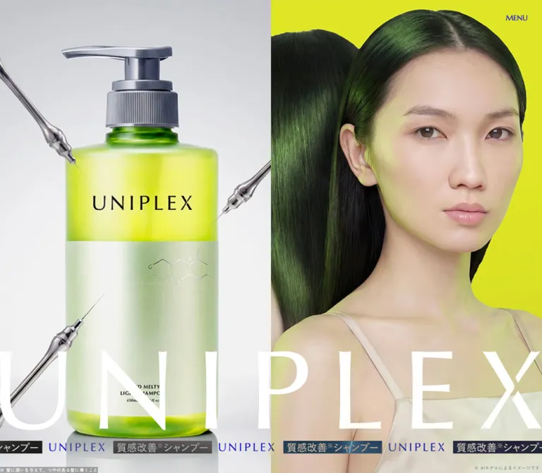
鮮烈な黄緑とシルバーの製品ビジュアル、画面幅いっぱいのロゴが印象的なヘアケアブランドサイト。PCの左右分割からスマートフォンの縦積みへ構成を変え、成分紹介・商品・販売店情報を展開しています。
オリジナルサイトを見るUNIPLEX — Style Reference
Acid yellow-green, polished silver, and a wordmark stretched across the screen.
Website: uniplex.jp Original URL: https://uniplex.jp/ Final URL: https://uniplex.jp/ Theme: bright yellow-green and photographic silver, with graphite closing surfaces Inspected: September 12, 2026; supplied session timestamp 07:14:38.518 UTC / 16:14:38.518 JST Viewports: 1440 × 1000 desktop and 390 × 844 mobile, in CSS pixels Scope: the current brand homepage, represented by three desktop captures, two mobile captures, rendered page text, links, custom properties, and sampled element styles. Visual captures cover the opening composition, an intermediate hair-finish presentation, and the footer. DOM evidence additionally covers concept copy, ingredients, media entries, products, awards, retail destinations, and topics. Linked pages were not inspected.
UNIPLEX presents hair care through a combination of beauty imagery and a laboratory-like product world. Translucent yellow-green bottles stand on reflective silver surfaces, surrounded by articulated chrome probes. A model's face and glossy dark hair occupy an equally prominent field of saturated color. Enormous, finely shaped brand lettering connects the imagery, while small navigation and annotations keep the edges relatively quiet.
This is a long brand homepage with product-detail routes, retailer links, news, and corporate utility destinations. Its structure progresses from visual identity to explanation, formulation, hair-finish imagery, media, products, awards, shopping information, and a large closing brand signature. The desktop opening divides the screen vertically; mobile puts the model above the bottle and relocates the repeated brand strip around their junction. Preserve this change in composition rather than merely reducing desktop dimensions.
How to Read This Reference
- Measured means a value supplied by computed styles or element rectangles. Dimensions are CSS pixels unless stated otherwise.
- Calculated means arithmetic from those measurements, such as the 45px desktop content gutter or the wordmark's approximately 6.737:1 aspect ratio.
- Visual estimate means an interpretation of the supplied screenshots. Estimated colors are not pixel samples.
- Declared only identifies a custom property whose use on a particular visible component was not established.
- Recommended identifies adaptation guidance, including the CSS Quick Start. It is not a claim about the original implementation.
The element sample includes offscreen navigation, dormant modal content, and transformed-looking geometry. A nonzero rectangle does not establish that an element was visible. Conversely, an empty text field on a large heading does not establish that its visible artwork was missing.
Tokens — Colors
Core Palette
The implementation aliases below are descriptive names, not recovered source variable names.
| Name | Value | Evidence | Role |
|---|---|---|---|
| Brand Acid | #e3e92a |
Measured body background: rgb(227, 233, 42); measured product-link text |
Underlying brand canvas, luminous accents, reversed action lettering; visually consistent with the footer wordmark |
| Formulation Lime | #cfdb00 |
Source --wp--preset--color--primary-500; measured formulation-section background |
Slightly deeper yellow-green for the long ingredient and treatment narrative |
| Graphite | #63666a |
Measured annotation text and banner-close background | Utility gray; also a close visual reference for the footer, whose own background style was not included |
| Black | #000000 |
Measured body text and product-action background | Main Japanese text and sharp, filled action strips |
| White | #ffffff |
Measured hero-wordmark wrapper, award text, and other reversed text | Large hero identity and details over dark surfaces |
| Visible Identity Blue | Approximately #1414c8 |
Visual estimate only | Header identity and repeated wordmarks in the captured blue states |
| Photographic Silver | Approximately #d5d8dd |
Visual estimate only | Pale image backgrounds, metallic reflections, and the hair-finish frame; not a verified CSS surface token |
Declared Supporting Color
| Source property | Value | Interpretation |
|---|---|---|
--wp--preset--color--primary-200 |
#fdffc4 |
A pale brand-related yellow is declared, but its visible component assignment was not established |
--wp--preset--color--grayscale-100-op-70 |
rgba(255, 255, 255, 0.7) |
Consistent with measured secondary product links inside the dormant navigation |
--wp--preset--color--grayscale-100-op-30 |
rgba(255, 255, 255, 0.3) |
Declared only; no specific visible surface assignment established |
Raw color and visible color are different records here. The screenshots show blue header identity in some states, while sampled logo and menu wrappers report lime and white. Opacity, blend modes, filters, and all ancestor styles were not supplied, so no exact compositing mechanism can be established. Use the screenshots to describe the visible result and retain the computed values as implementation evidence.
The many generic CMS color, gradient, and shadow presets in the property dump are not evidence that the homepage uses those treatments. Metallic gradients belong visibly to the imagery; they do not establish a general gradient-button or shadow-card system.
Tokens — Typography
Japanese Text — Zen Kaku Gothic New
- Measured family:
"Zen Kaku Gothic New", sans-serif. - Weights:
400for ordinary copy and annotations;500for concept statements, ingredient names, and product names. - Character: clean, restrained Japanese sans serif. Its modest weight lets glossy imagery and oversized Latin forms carry the visual drama.
- Tracking: body copy measures
0.04em; many prominent Japanese statements use0.02em. - Leading: commonly
1.4; the explanatory hair-data paragraph uses1.9.
Mobile does not uniformly shrink the text. The body increases from 13.5px on desktop to 15px on mobile, and the data paragraph increases from 12px to 14px. Large headlines shrink substantially while reading text stays comfortable relative to the smaller screen.
English Display and Navigation — Marcellus
- Measured family:
Marcellus, sans-serif. - Weight:
400. - Roles: primary menu links, ingredient and product numbering, date labels, large English section headings, and the dormant online-shop heading.
- Leading: usually
1. - Tracking: normal in the sampled elements.
Marcellus contributes classical, flared letterforms without a heavy headline weight. Preserve the observed source fallback when documenting the stack; a serif fallback would be an adaptation.
Brand Lettering
Treat the UNIPLEX wordmark as artwork. Its wrappers inherit ordinary body-sized text, yet their visible brand shapes span hundreds of pixels. Those inherited font declarations do not identify the logo's typeface or its construction format.
Measured wordmark boxes share a consistent proportion:
| Placement | Desktop | Mobile |
|---|---|---|
| Header identity | 214 × 31.77px |
146 × 21.67px |
| Hero identity | 1440 × 213.75px |
390 × 57.89px |
| Calculated aspect ratio | Approximately 6.737:1 |
Approximately 6.737:1 |
The thin, tapering strokes and distinctive final X matter. An ordinary tracked text heading will not reproduce them accurately. Use authorized brand artwork when available; its asset URL and file format were not supplied.
Type Scale
Values below are measured computed font sizes and line heights, not estimates of visible glyph height.
| Role | Desktop size / leading | Mobile size / leading | Weight / tracking |
|---|---|---|---|
| Body | 13.5 / 18.9px |
15 / 21px |
400, 0.04em |
| Menu-button wrapper | 19.5 / 27.3px |
11 / 15.4px |
400; inherited body tracking |
| Primary navigation links, offscreen state | 27 / 27px |
23 / 23px |
Marcellus 400, normal tracking |
| Product sublinks in navigation | 13.5 / 13.5px |
13 / 13px |
Marcellus 400 |
| Main concept statement | 49.5 / 69.3px |
32 / 44.8px |
500, 0.02em |
| Concept paragraphs | 24 / 33.6px |
19 / 26.6px |
500, 0.02em |
| Formulation and heat-treatment statements | 43.5 / 60.9px |
22 / 30.8px |
500, 0.02em |
| Supporting feature copy | 19.5 / 27.3px |
18 / 25.2px |
500, 0.02em |
| Data-panel heading | 24 / 33.6px |
21 / 29.4px |
500, 0.02em |
| Data-panel paragraph | 12 / 22.8px |
14 / 26.6px |
400 |
| Ingredient index | 24 / 24px |
21 / 21px |
Marcellus 400 |
| Ingredient name | 27 / 37.8px |
23 / 32.2px |
500, 0.02em |
| Ingredient description | 13.5 / 18.9px |
14 / 19.6px |
400 |
| Major English section-heading slot | 277.5 / 277.5px |
70 / 70px |
Marcellus 400 |
| Awards heading | 90 / 90px |
50 / 50px |
Marcellus 400 |
| Product index | 27 / 27px |
23 / 23px |
Marcellus 400 |
| Product brand eyebrow | 19.5 / 27.3px |
18 / 25.2px |
500, 0.02em |
| Product name | 34.5 / 48.3px |
26 / 36.4px |
500, 0.02em |
| Product-action wrapper | 34.5 / 48.3px |
26 / 36.4px |
400 |
| Dormant online-shop heading | 55.5 / 55.5px |
34 / 34px |
Marcellus 400 |
| Dormant retailer links | 15 / 21px |
16 / 22.4px |
500, 0.02em |
| General feature annotations | 10 / 14px |
12 / 16.8px |
400 |
The large desktop English-heading elements have empty extracted text, while mobile explicitly supplies labels such as POINT and PRODUCT. Their desktop size is a measured heading-slot style, not proof of the precise visible letter arrangement.
The hero claim definition remains 10 / 14px on both viewports. Its AI-image annotation changes from 10 / 14px to 12 / 16.8px. Award footnotes also grow independently, from 10 / 14px to 14 / 19.6px.
Tokens — Spacing & Shapes
Content and Header Insets
The source declares:
/* Observed desktop property */
--mh--contents--padding--side: min(60px, calc(100vw * 60 / 1920));

/* Observed mobile property */
--mh--contents--padding--side: 20px;
At 1440px, the desktop formula evaluates to 45px, leaving a 1350px content span. Mobile uses 20px, leaving 350px. These match sampled section headings.
The header has its own placement: 37.5px top/side insets on desktop, a logo at 15px / 15px on mobile, and a mobile menu label at 20px from the top and 15px from the right. Do not force the header onto the section-content gutter.
A separate --mh--contents--width: 1100px is declared, but many measured sections are wider. It is not a universal homepage maximum width.
Responsive Spacing Properties
| Source token | Desktop | Mobile | Status |
|---|---|---|---|
--mh--space--x5s |
4px |
2px |
Declared scale value |
--mh--space--x2s |
30px |
15px |
Declared scale value |
--mh--space--sm |
60px |
30px |
Declared scale value |
--mh--space--xl |
120px |
60px |
Declared scale value |
--mh--space--x2l |
140px |
70px |
Declared scale value |
--mh--space--x3l |
160px |
80px |
Declared scale value |
--mh--space--60-160 |
160px |
60px |
Declared responsive pair |
--mh--space--40-120 |
120px |
40px |
Declared responsive pair |
--mh--space--25-80 |
80px |
25px |
Declared responsive pair |
--mh--space--15-15 |
15px |
15px |
Fixed across supplied endpoints |
These properties describe an available scale. Their names alone do not prove which component consumes each one.
Component Geometry
| Element | Desktop | Mobile | Evidence |
|---|---|---|---|
| Opening image division | Two approximately 720px halves |
Model above product, each approximately half the viewport height | Screenshots |
| Hero wordmark top | 681.72px |
365.85px |
Measured rectangle |
| Hero strip top / height | 918.66 / 29.59px |
439.67 / 31.56px |
Measured rectangle |
| Main section-heading gap | 20px |
10px |
Measured grid gap |
| Formulation-section top padding | 100px |
50px |
Measured |
| Media-button width | 252.75px |
223.59px |
Measured |
| Media-item horizontal gap | 40px |
30px |
Calculated from adjacent positions |
| Product detail action | 321 × 46.5px |
308 × 40px |
Measured |
| Product-index overview action | 321 × 46.5px |
350 × 40px |
Measured |
| Purchase banner | 329 × 90px |
370 × 90px |
Measured layout; visible in the intermediate desktop capture |
| Banner image | 70 × 70px |
70 × 70px |
Measured grid track and banner geometry |
| Banner close button | 24 × 24px |
24 × 24px |
Measured |
| Dormant modal close box | 120 × 120px |
50 × 50px |
Measured, unopened state |
Shape Language
Sampled links, buttons, labels, sections, and wrappers have 0px border radius. The visible footer, media frame, ticker labels, and purchase banner also use square edges. Structure comes from image boundaries, large color fields, typography, and compact rectangular actions.
No general soft-shadow elevation system is established. The chrome objects and bottle reflections are part of the imagery, not UI shadows.
Components
Persistent Header
Role: retain identity and navigation access without covering the imagery with a conventional header bar.
Place the small wordmark at the upper left and the unboxed MENU label at the upper right. The controls occupy an overlay-like layer; the sampled header wrapper has zero normal-flow height. Their repeated screen positions in opening and closing captures support a persistent presentation, although the exact positioning CSS was not included.
The small wordmark is absent from the visible opening frames and present in the later captures. A 0.3s opacity transition exists on its wrapper, but the trigger and visibility timeline were not established. Do not invent a particular scroll threshold.
Navigation Structure
Role: connect the homepage narrative, product pages, shopping sections, and topics.
The supplied dormant navigation contains CONCEPT, POINT, PRODUCT, SHOP LIST, ONLINE SHOP, and TOPICS. PRODUCT contains SHAMPOO & TREATMENT and HAIR MASK sublinks.
Measured primary rows are 765px wide and 67px high on desktop, versus 310px wide and 58px high on mobile. They sit beyond the right viewport edge in the sampled state. Desktop product sublinks share one line; mobile places them on separate lines. Mobile navigation also contains social icons, a COPY control, and corporate utility links.
This establishes information architecture and responsive typography. It does not establish the open panel's surface, slide direction, backdrop, focus behavior, or closing interaction.
Opening Image Composition
Role: communicate the brand through packaging, hair texture, color, and scale before explanatory copy begins.
Desktop divides the viewport at x = 720px. The left half shows a large translucent pump bottle against a pale silver environment. Articulated chrome probes enter from the edges and point toward the packaging. The right half pairs a front-facing model with a rear hair view against a saturated yellow-green field.
The product image is deliberately close-cropped on desktop. The bottle, pump, reflections, and surrounding metal forms occupy almost the entire left panel. On mobile, the product panel reveals more of the full bottle and its surrounding composition. Use separately adjustable crops or responsive artwork; a single fixed object-position is unlikely to reproduce both views.
Mobile puts the model first, occupying approximately y = 0–422px, and the product below. This reverses the desktop left-to-right reading order. Preserve the model's face and the long dark hair silhouette as the upper focal point.
Monumental Hero Wordmark
Role: bind the two image worlds into one brand statement.
The white wordmark spans the full viewport width, without a surrounding container gutter. On desktop it crosses both image halves in the lower third. On mobile it sits along the lower edge of the model panel, immediately before the ticker and bottle composition.
Use the measured 6.737:1 artwork ratio. The glyphs nearly touch the horizontal boundaries, making the brand feel architectural. Avoid adding a pill, plaque, drop shadow, or thick backing rectangle.
Repeated Brand Strip
Role: introduce a compact, rhythmic second scale of identity.
Alternate blue UNIPLEX lettering with dark rectangular labels containing the source phrase 質感改善※シャンプー. White Japanese lettering and a compact superscript-like claim marker sit inside the dark labels. The strip extends beyond the viewport edges.
The mobile flex wrapper measures about 2220px wide at a 390px viewport. Desktop and mobile text contain repeated copies. This supports a repeated horizontal track, but does not establish its movement speed, direction, autoplay behavior, or pause rules.
Keep this strip visually close to the imagery rather than turning it into a spacious announcement bar. On mobile its top is approximately 18px below the halfway point of the viewport.
Hero Annotations
Role: qualify the image and the short product claim.
The visible source includes ※AIモデルによるイメージです and the claim definition 髪に潤いを与えて、つやのある髪に導くこと. These are small edge annotations, separate from the principal visual statement.
The mobile rectangles overlap horizontally and vertically near the bottom edge: the claim definition extends to about x = 227px, while the AI note begins around x = 207px. The screenshot also shows crowding. For a new implementation, allocate distinct lines or a dedicated annotation zone instead of reproducing this collision.
Floating Purchase Banner
Role: maintain a compact route to purchasing while the visitor reads the narrative.
The intermediate desktop capture shows a black rectangle at the lower right, with a white-backed product thumbnail at left and a short text stack at right. The first line is yellow-green; supporting availability copy and the claim note are smaller and lighter.
Measured anatomy:
- Desktop placement: 20px from the right and bottom; 329 × 90px.
- Inner grid: 70px image, 15px gap, 214px text track.
- Padding: 10px top/bottom/left and 20px right.
- Mobile layout: 10px side and bottom clearance, 370 × 90px, a 70px image track and 265px text track.
- Close control: a separate 24px gray square directly above the right edge.
The banner links to the observed Rakuten product destination. Its close button has the source label バナーを閉じる. The mobile geometry exists in the DOM, but the banner is not visibly displayed in the supplied mobile screenshots. Its appearance and dismissal rules were not tested.
Concept Statement and Data Panel
Role: move from the visual promise into explanatory Japanese copy.
The concept uses a large, medium-weight statement followed by several deliberately broken paragraphs. One source example is とろけるほど柔らかく、軽やかにまとまる髪へ. Desktop paragraphs are broad, while mobile introduces additional line breaks and uses a 350px main content span.
A smaller DATA label introduces the hair-characteristics explanation. Desktop explanatory text measures about 326px wide at x = 390px; mobile text sits at x = 40px in a 310px column. Its 1.9 line height creates a slower reading rhythm than the surrounding product language.
The desktop concept section has 1500px top padding, and the mobile sample has 1055px. Other recorded positions and overlapping section rectangles indicate that these are not safe standalone spacing recipes. Preserve the extended visual prelude, but do not paste these values into a static page without understanding the original positioning and reveal system.
Ingredient Sequence
Role: explain three formulation ingredients as a numbered editorial progression.
Each entry contains a Marcellus INGREDIENT label and two-digit index, a Japanese ingredient name, explanatory copy, and associated imagery or reserved visual space. The source names include 疑似ヒトケラチン, ジマレイン酸, and グアニルシステイン with claim markers.
Desktop entries are staggered: sampled label origins alternate around x = 662.5px and x = 737.7px. Their description columns are approximately 453px wide. Mobile aligns all three entries at x = 40px; heading tracks are 310px wide, while description rectangles are narrower, approximately 211px.
Do not flatten this into three identical rounded feature cards. Preserve numbered hierarchy, square geometry, the surrounding formulation color field, and room for the visual material. The precise middle-section image arrangement is not fully visible in the supplied captures.
Hair-Finish Presentation
Role: show hair texture as a large visual result within the heat-treatment explanation.
The DOM supplies labels for シャンプー前, ブロー後, and アイロン後, together with finish-image annotations. An intermediate desktop screenshot shows a large hair image beginning around x = 70px and y = 195px, spanning approximately 1300px and continuing below the viewport. The underlying scene and header are dimmed, and part of an AFTER label remains visible behind the foreground image.
This is evidence of a layered hair-finish presentation, not proof of a clicked lightbox. No image-opening action, comparison drag, or transition timeline was recorded. The visible X at the lower right belongs to the purchase banner; it should not be documented as the hair image's close control.
Media Rail
Role: provide three distinct video-related entries after the formulation narrative.
The repeated entries are numbered 01., 02., and 03. and refer to a brand movie, heat-triggered softness, and the bond-treatment formulation. They are button elements, approximately 253px wide on desktop and 224px on mobile. Their total heights include media and captions, so those rectangles do not establish the video's aspect ratio.
Adjacent positions establish 40px desktop gaps and 30px mobile gaps. Multiple copies extend far beyond the viewport, consistent with a repeated carousel or rail. Corresponding modal sections and close controls exist in the DOM, but playback, audio, autoplay, and modal opening were not exercised.
Product Feature Row
Role: connect the narrative to two specific product-detail pages.
The product section contains two entries rather than a dense shop grid. Each has a Marcellus product index, product artwork, a small brand eyebrow, a larger Japanese product name, price and volume, and a black LEARN MORE action.
Desktop product information begins around x = 591px and occupies a broad right-hand column. On mobile, the information sits beneath the artwork region in a 308px column starting at x = 41px. The product name wraps across multiple lines at 26px.
The observed entries are the shampoo/treatment pair and hair mask. At capture time, the displayed prices are ¥1,870 for each shampoo or treatment and ¥1,870 for the mask. These are content values, not design tokens.
The first product artwork has a supplied 1200 × 1200 image source. Keep packaging legible and proportionate; do not stretch the bottle to fill its layout box.
Rectangular Product Action
Role: supply a clear next step while retaining the page's graphic language.
Use black fill, acid-colored content, square corners, and a broad horizontal shape. The measured desktop action is 321 × 46.5px; mobile detail actions are 308 × 40px. The product-overview action spans the full 350px mobile section width.
The wrapper reports Zen Kaku Gothic New and a large font size, but rendered label internals were not sampled separately. Preserve the action's visible proportions before assuming that the wrapper font alone reproduces its lettering.
A color 0.3s transition is present. The destination color on hover was not supplied.
Awards Rail
Role: present dated recognition items with compact supporting details.
The awards section uses acid heading/date text and white explanatory text. Desktop date origins are spaced 315px apart; mobile origins are spaced 305px apart. The desktop inner text columns are 235px wide, while mobile columns are 255px wide. Both layouts extend horizontally beyond the viewport.
Each item combines a date label, a short award or ranking statement, a central content region, and smaller qualifying text. A roughly 295px outer item width is a plausible reconstruction if the visible text has symmetric 30px desktop or 20px mobile insets; that outer width is an inference, not a supplied card measurement.
Retain the date and supporting note as part of each item. The mobile footnotes grow to 14px, a useful example of improving small-screen readability without abandoning the rail.
Retail Destinations and Online-Shop Structure
Role: distinguish physical retail availability from external online purchasing.
Rendered text lists nine physical retail names and six online destinations. Homepage anchors identify separate shop-list and online-shop sections. Their complete visible styling is outside the supplied element sample, so no exact main-page retailer grid is claimed.
A separate dormant online-shop modal has measurable geometry:
| Part | Desktop | Mobile |
|---|---|---|
| Content width | 760px |
Approximately 308.39px |
| Horizontal position | x = 340px |
x ≈ 40.80px |
| Retailer arrangement | Two 365px columns, 30px gap |
One column |
| Retailer row height | 52.5px |
54px |
| Heading | Marcellus 55.5px |
Marcellus 34px |
| Close box | 120px, 50px from top/right |
50px, 10px from top/right |
These values describe the dormant modal layout. They do not confirm its backdrop, opening effect, or accessibility behavior.
Topics
Role: maintain a current editorial layer beyond the product presentation.
The supplied text contains three dated announcements followed by MORE. At least one entry has a recorded internal article link. This supports a topics preview within the homepage, but the excerpt does not provide its complete card geometry or typography. Keep a date/title hierarchy in an adaptation and verify the original arrangement before claiming an exact reproduction.
Product-Group Closing Image and Footer
Role: finish with packaging and brand identity, then provide quiet utility navigation.
A large product-group image precedes the graphite footer. Both end captures begin partway through that image, so the visible 243px desktop and 464px mobile portions are not its full rendered height.
The gray footer immediately introduces another full-width UNIPLEX wordmark, now in acid yellow-green. Its visible top clearance is approximately 40px on both screens. Desktop leaves a very large empty field below the brand before placing social controls and legal links on one low horizontal row. Copyright sits at the far right.
Mobile reorganizes the utilities into centered rows: four social/copy controls, then CONTACT, COMPANY, and PRIVACY POLICY, followed by copyright. The visible icon artwork is approximately 29px high. The fourth symbol is a link-shaped COPY button, not a fourth social destination.
The visible gray region is approximately 757px high in the desktop end capture and 380px in the mobile end capture. These are screenshot estimates, not sampled footer CSS dimensions. Keep the large empty desktop field and the deliberate mobile separation between rows.
Tokens — Motion & Interaction
| Treatment | Supplied evidence | What can be concluded |
|---|---|---|
| Header identity and menu | opacity 0.3s |
Short opacity transitions are defined; their trigger and endpoints are unverified |
| Hero wordmark | opacity 0.5s |
A half-second opacity transition is defined |
| Repeated hero strip | opacity 0.5s; duplicated content |
Reveal opacity is defined; continuous movement is not measured |
| Primary navigation | color 0.3s |
Link-color transition exists; hover colors are not supplied |
| Product actions and media buttons | color 0.3s |
Color feedback is defined without evidence of scaling or elevation |
| Finish label | opacity 0.3s |
Label opacity can transition; the finish-switching mechanism is unknown |
| Social and copy controls | opacity 0.3s in sampled mobile navigation |
Opacity feedback is defined; clipboard success feedback is unverified |
| Shared duration tokens | 0.3s, 0.5s, 0.8s |
Declared duration vocabulary; no component assignment established for every token |
| Shared easing | --mh--easing-out: ease-out |
Declared only; not proof that every transition uses this easing |
| Media and award rails | Offscreen items and repeated positions | Horizontal track structures exist; speed, dragging, and autoplay remain unverified |
Most sampled elements report animation: none. This does not rule out animation on descendants, pseudo-elements, ancestors, or JavaScript-controlled transforms.
The capture process waited for finite motion and layout stability and temporarily paused perpetual animations during readiness checks. The supplied stills cannot establish motion direction, choreography, or a complete initial sequence. A separate centered wordmark wrapper also exists in the DOM, but it is insufficient evidence for documenting a particular opening splash.
For an adaptation, use restrained 300–500ms opacity/color changes where appropriate. Treat any continuous ticker, parallax, scroll pinning, or media autoplay as a separately specified feature, with a static alternative.
Surfaces
| Layer | Appearance | Evidence and purpose |
|---|---|---|
| Base brand canvas | Solid acid yellow-green | Measured body background; holds the overall color identity |
| Formulation region | Deeper lime | Measured section background; supports the ingredient narrative |
| Product environment | Pale silver with reflections and chrome | Visible image content; gives packaging a scientific, polished setting |
| Hair-finish frame | Large pale-gray image rectangle with a dim surrounding scene | Screenshot evidence; exact overlay implementation unverified |
| Product action | Black rectangle with acid lettering | Measured foreground/background pair and zero radius |
| Purchase banner | Black rectangle with a white thumbnail field | Visible intermediate desktop state |
| Closing footer | Flat graphite with acid wordmark and white utilities | Screenshot evidence; graphite hex is a source-related approximation |
Depth comes primarily from the artwork. Keep the interface surfaces comparatively flat so the product's transparent plastic, metallic label, and chrome surroundings remain the material focus.
Imagery
The image language combines beauty-editorial framing with a synthetic laboratory atmosphere. Hair is smooth, dark, and highly reflective, with green highlights connecting it to the packaging. Skin and pale clothing soften the otherwise sharp combination of acid color and metal.
Product artwork emphasizes translucent green containers, metallic pump hardware, pale labels, fine chemical-pattern details, clean reflections, and chrome probe forms. The probes visually suggest precision and formulation. Their presence does not establish a real treatment apparatus.
The page explicitly identifies the model imagery as AI imagery through its on-page annotation. Do not attribute it to a photographer or assume a physical studio shoot. The tools, creators, and exact production techniques behind the other images were not supplied.
Cropping Rules
- Preserve the face and rear hair silhouette in the mobile upper panel.
- Allow a close product crop on desktop, while showing more of the bottle on mobile.
- Keep reflections connected to the product rather than cropping them into disconnected gray patches.
- Use the full brand-artwork ratio for large wordmarks; do not squeeze the final X.
- Let the hair-finish image dominate its frame without adding unrelated decorative controls.
- Use responsive image sources or per-breakpoint focal positions when one crop cannot preserve both compositions.
Observed Asset References
These are original-site URLs present in the supplied rendered evidence. They were not fetched separately.
| Asset | Observed path | Supplied dimensions / role |
|---|---|---|
| Purchase-banner product image | /wp-content/uploads/2026/05/img_bnr01.jpg |
140 × 140 source attributes; displayed in a 70px image track |
| First product artwork | /wp-content/uploads/2026/05/thumb_product01.png |
1200 × 1200 source attributes; first product entry |
No exact asset paths were supplied for the main model image, hero bottle composition, closing product group, hair-finish imagery, wordmarks, or social symbols. Do not invent filenames for them or treat placeholders as recovered assets.
Layout & Responsive Behavior
The homepage is a long scrolling document, measured at approximately 17,351px on desktop and 14,704px on mobile in the supplied state. These lengths include large narrative and media regions and should not become fixed implementation targets.
| Relationship | Desktop observation | Mobile observation |
|---|---|---|
| Hero order | Product left, model right | Model above, product below |
| Hero brand | Crosses both panels in lower third | Aligns with the lower edge of the model panel |
| Repeated strip | Near the viewport bottom | Around the model/product junction |
| Main content gutter | 45px at 1440px |
20px |
| Header logo | 214px wide |
146px wide |
| Main English heading scale | 277.5px heading slot |
70px |
| Body type | 13.5px |
15px |
| Ingredient entries | Staggered desktop origins | Shared left alignment with narrower descriptions |
| Product information | Right of artwork | Below artwork |
| Media rail | Approximately 253px items, 40px gaps |
Approximately 224px items, 30px gaps |
| Dormant retailer modal | Two columns | One column |
| Footer utilities | One low horizontal row | Centered, separated rows |
The source declares a 640px small breakpoint, a 1280px extra-large breakpoint, and a numeric 1920 maximum-design value. The actual media-query rules were not supplied. These declarations do not prove that the hero switches at exactly 640px.
A source --vh value equals 10px on desktop and 8.44px on mobile, matching 1% of each inspected viewport height. This supports a viewport-height vocabulary but does not identify which individual components consume it.
Some desktop section rectangles overlap, and the mobile concept heading appears much later than its section padding alone would predict. Do not add all extracted heights and offsets as if they were ordinary independent block-flow measurements. For a new build, establish the static reading order first and introduce scroll-linked staging only with explicit behavior requirements.
Tablet, landscape-phone, browser text zoom, safe-area behavior, and intermediate-width layouts were not visually inspected.
Do’s and Don’ts
Do
- Preserve the relationship between acid color, silver product environments, dark glossy hair, and fine brand lettering.
- Use both measured greens:
#e3e92afor the main identity and#cfdb00for the formulation surface. - Keep the desktop hero split evenly, then reorder it to model-first vertical panels on mobile.
- Use the actual wordmark artwork at its approximately 6.737:1 ratio.
- Pair Zen Kaku Gothic New Japanese text with Marcellus English display and numbering.
- Keep Japanese reading copy larger on mobile even as display headings become smaller.
- Preserve the numbered ingredient sequence and the two generous product presentations.
- Use black rectangular product actions with acid content and square corners.
- Maintain substantial empty space in the desktop footer.
- Keep claim markers and explanatory notes attached to the relevant content.
Don't
- Don't replace the opening imagery with a generic centered headline and a small product card.
- Don't leave the product above the model on mobile simply because it comes first on desktop.
- Don't use inherited body font sizes to reconstruct the logo artwork.
- Don't turn the page into a grid of rounded, shadowed cards.
- Don't adopt generic CMS gradients, purples, or shadow presets as brand tokens.
- Don't claim the estimated blue or silver is an exact sampled source color.
- Don't document the intermediate hair image as a tested lightbox or comparison slider.
- Don't invent carousel speed, autoplay, menu choreography, or clipboard feedback.
- Don't treat offscreen modal bounds as proof of an open visible modal.
- Don't reproduce the crowded mobile hero annotations or use 10px type for all mobile supporting text.
Recommended Implementation Additions
These are recommendations for a new implementation, not verified original features:
- Keep the visible
MENUlabel compact but provide at least a 44px interaction target. Apply the same principle to social icons and the banner's small close button. - Give the menu an explicit expanded state and ensure dormant links are removed from keyboard navigation until the panel opens.
- Implement modal focus containment, Escape dismissal, background isolation, and focus return if modal experiences are retained.
- Present the two hero annotations on separate readable lines on narrow screens.
- Provide a visible, high-contrast focus indicator across acid, graphite, and photographic backgrounds.
- Respect reduced motion, and offer pause controls for any continuously moving rail. Keep repeated decorative copies out of the accessible reading order.
- Use real links for product and retailer navigation and buttons for media opening, dismissal, and copying.
- Give the copy control a meaningful accessible name and a short confirmation message after a successful action.
- Load responsive hero assets deliberately; prioritize the opening images and defer below-fold product and media images. Reserve image dimensions to prevent layout shifts.
- Retain one accessible text identity for artwork-based headings, and use empty alternatives for redundant decorative logo copies.
Agent Prompt Guide
Quick Color Reference
- Main brand acid:
#e3e92a, measured. - Formulation lime:
#cfdb00, measured. - Text and product-action fill:
#000000, measured. - Hero wordmark and reversed details:
#ffffff, measured. - Utility graphite:
#63666a, measured on utility elements; approximate footer match. - Visible blue identity: approximately
#1414c8, visual estimate only. - Silver and chrome: image materials, not a generic UI gradient.
Overall Prompt
“Create a Japanese hair-care brand homepage inspired by the supplied UNIPLEX reference. Use acid yellow-green #e3e92a, a slightly deeper formulation field #cfdb00, silver product imagery, glossy dark hair, and a flat graphite footer. Build an edge-to-edge desktop hero with a translucent pump bottle and chrome probes on the left and model/hair imagery on the right. Place an authorized, finely drawn wordmark across the full viewport width. On mobile, show the model above the product and move the repeated brand strip to their junction. Pair Zen Kaku Gothic New Japanese copy with regular Marcellus English labels and oversized section headings. Continue with numbered formulation content, large hair imagery, a media rail, two product presentations, awards, retail destinations, topics, and a spacious branded footer. Keep actions black, rectangular, and acid-lettered. Treat unverified motion as a separate specification.”
Example Component Prompts
- Hero: “Compose a full-viewport hair-care brand opening with equal desktop image halves: silver bottle artwork at left and a saturated yellow-green model/hair composition at right. Overlay a white full-width wordmark near the lower third. On a 390 × 844 phone, stack model over bottle and align the wordmark with the model panel's lower edge. Use adjustable crops and square image boundaries.”
- Ingredient sequence: “Create three numbered formulation entries on #cfdb00. Use regular Marcellus ingredient indices, medium-weight Japanese ingredient names, restrained descriptions, and space for scientific visual material. Stagger the desktop entries and align them in one mobile column. Avoid rounded cards and decorative shadows.”
- Product row: “Build a generous product presentation with a square product-artwork source, a small Japanese brand eyebrow, a multiline product name, price and volume, and a black rectangular LEARN MORE link with acid content. Place details to the right on desktop and below the image on mobile.”
- Purchase banner: “Create a compact black purchase banner with a 70px square product thumbnail, 15px internal gap, acid first-line copy, small white availability text, and a separate gray close control above the right edge. Use a 329px desktop width and 10px phone side clearance. Enlarge the close target without enlarging its visible glyph.”
- Footer: “Place a viewport-wide acid wordmark on a flat graphite footer with approximately 40px top clearance. Leave a large empty desktop field before one low row of white social controls and legal links, with copyright at the right. On mobile, center the social controls, legal links, and copyright in separate rows.”
Quick Start
CSS Custom Properties
This is a static adaptation, not recovered source CSS. It uses measured endpoint values, an estimated visible blue, and recommended interpolation between viewports. The 640px stacking boundary is an implementation choice informed by a declared source breakpoint; the actual hero media query was not supplied.
Load Zen Kaku Gothic New and Marcellus separately from appropriate font files. Supply authorized wordmark and image assets. The CSS does not implement menu state, media playback, modal behavior, scroll staging, or continuous rail animation.
:root {
  /* Measured brand and utility colors */
  --acid: #e3e92a;
  --lime: #cfdb00;
  --ink: #000000;
  --white: #ffffff;
  --graphite: #63666a;

  /* Visual estimates used by this adaptation */
  --identity-blue: #1414c8;
  --silver: #d5d8dd;

  /* Confirmed family names; font files are not bundled */
  --font-jp: 'Zen Kaku Gothic New', sans-serif;
  --font-latin: Marcellus, sans-serif;
  --type-body: 13.5px;
  --type-concept: 49.5px;
  --type-feature: 43.5px;
  --type-product: 34.5px;
  --type-eyebrow: 19.5px;
  --type-note: 10px;
  --type-section: clamp(100px, 19.2708vw, 370px);

  /* Source-derived gutter; recommended header interpolation */
  --content-gutter: min(60px, 3.125vw);
  --header-inset: clamp(20px, 2.6042vw, 50px);
  --logo-width: 214px;
  --wordmark-ratio: 6.737;
  --section-space: 100px;
  --media-width: 252.75px;
  --media-gap: 40px;

  --motion-fast: 300ms;
  --motion-reveal: 500ms;
  --radius: 0px;
}

* {
  box-sizing: border-box;
}

body {
  margin: 0;
  color: var(--ink);
  background: var(--acid);
  font-family: var(--font-jp);
  font-size: var(--type-body);
  font-weight: 400;
  line-height: 1.4;
  letter-spacing: 0.04em;
}

button,
a {
  -webkit-tap-highlight-color: transparent;
}

button {
  font: inherit;
}

img {
  display: block;
  max-width: 100%;
}

.content {
  margin-inline: var(--content-gutter);
}

.wordmark {
  display: block;
  width: 100%;
  aspect-ratio: var(--wordmark-ratio);
}

.wordmark > img,
.wordmark > svg {
  display: block;
  width: 100%;
  height: 100%;
  object-fit: contain;
}

/* Inline wordmark artwork may use currentColor. */
.wordmark > svg {
  fill: currentColor;
}

.site-header {
  position: fixed;
  z-index: 20;
  inset: var(--header-inset) var(--header-inset) auto;
  display: flex;
  align-items: flex-start;
  justify-content: space-between;
  color: var(--identity-blue);
  pointer-events: none;
}

.site-header > * {
  pointer-events: auto;
}

.site-logo {
  width: var(--logo-width);
  color: inherit;
  transition: opacity var(--motion-fast);
}

.menu-button {
  position: relative;
  padding: 0;
  border: 0;
  border-radius: 0;
  color: inherit;
  background: transparent;
  font-size: 19.5px;
  line-height: 1;
  text-transform: uppercase;
  cursor: pointer;
}

/* Recommended larger target around the compact visible label. */
.menu-button::before {
  content: '';
  position: absolute;
  top: 50%;
  right: 0;
  width: max(100%, 44px);
  height: 44px;
  transform: translateY(-50%);
}

.hero {
  position: relative;
  isolation: isolate;
  display: grid;
  grid-template-columns: 1fr 1fr;
  grid-template-areas: 'product model';
  height: 100svh;
  overflow: clip;
}

.hero-media {
  min-width: 0;
  min-height: 0;
  margin: 0;
}

.hero-media--product {
  grid-area: product;
  background: var(--silver);
}

.hero-media--model {
  grid-area: model;
  background: var(--acid);
}

.hero-media img {
  width: 100%;
  height: 100%;
  object-fit: cover;
  object-position: var(--focal-point, 50% 50%);
}

.hero-logo {
  position: absolute;
  z-index: 2;
  inset-inline: 0;
  bottom: 10.45%;
  margin: 0;
  color: var(--white);
}

.brand-strip {
  position: absolute;
  z-index: 3;
  inset-inline: 0;
  bottom: 5.18%;
  overflow: clip;
}

.brand-strip-track {
  display: flex;
  align-items: center;
  gap: 15px;
  width: max-content;
}

/* Approximate strip typography; inner source styles were not sampled. */
.brand-strip-chip {
  padding-inline: 8px;
  color: var(--white);
  background: var(--graphite);
  font-size: 24px;
  line-height: 1.2;
  white-space: nowrap;
}

.brand-strip-logo {
  width: 130px;
  flex: none;
  color: var(--identity-blue);
}

.hero-notes {
  position: absolute;
  z-index: 4;
  inset-inline: 0;
  bottom: 0;
  display: flex;
  justify-content: space-between;
  gap: 12px;
  color: var(--graphite);
  font-size: var(--type-note);
  line-height: 1.4;
}

.hero-notes p {
  margin: 0;
}

.section {
  padding-block: var(--section-space);
}

.section--formulation {
  background: var(--lime);
}

.section-title {
  margin: 0 0 20px;
  font-family: var(--font-latin);
  font-size: var(--type-section);
  font-weight: 400;
  line-height: 1;
  letter-spacing: normal;
  text-transform: uppercase;
}

.concept-statement,
.feature-statement,
.product-name {
  font-weight: 500;
  line-height: 1.4;
  letter-spacing: 0.02em;
}

.concept-statement {
  font-size: var(--type-concept);
}

.feature-statement {
  font-size: var(--type-feature);
}

.data-copy {
  max-width: 326px;
  font-size: 12px;
  line-height: 1.9;
}

.product-row {
  display: grid;
  grid-template-columns: 37.5% minmax(0, 1fr);
  gap: 40px;
  margin-block: 80px;
}

.product-index {
  grid-column: 1 / -1;
  margin: 0;
  font-family: var(--font-latin);
  font-size: 27px;
  line-height: 1;
  letter-spacing: normal;
  text-transform: uppercase;
}

.product-media {
  align-self: center;
  margin: 0;
}

.product-media img {
  width: 100%;
  height: auto;
  object-fit: contain;
}

.product-info {
  min-width: 0;
  align-self: center;
}

.product-eyebrow {
  margin: 0;
  font-size: var(--type-eyebrow);
  font-weight: 500;
  letter-spacing: 0.02em;
}

.product-name {
  margin: 16px 0;
  font-size: var(--type-product);
}

.product-action {
  display: flex;
  align-items: center;
  justify-content: space-between;
  gap: 8px;
  width: min(321px, 100%);
  min-height: 46.5px;
  margin-top: 40px;
  padding: 3.75px 7.5px;
  border: 0;
  border-radius: 0;
  color: var(--acid);
  background: var(--ink);
  font-size: var(--type-product);
  line-height: 1.1;
  text-decoration: none;
  text-transform: uppercase;
  transition: color var(--motion-fast);
}

/* Recommended scrollable fallback; no autoplay is assumed. */
.media-rail {
  display: flex;
  gap: var(--media-gap);
  overflow-x: auto;
  padding: 8px var(--content-gutter);
}

.media-item {
  flex: 0 0 var(--media-width);
  min-width: 0;
  border: 0;
  border-radius: 0;
}

/* Geometry adapted from the dormant retailer modal. */
.retailer-panel {
  width: min(760px, calc(100% - 80px));
  margin-inline: auto;
}

.retailer-grid {
  display: grid;
  grid-template-columns: repeat(2, minmax(0, 1fr));
  column-gap: 30px;
}

.retailer-link {
  display: flex;
  align-items: center;
  min-height: 52.5px;
  padding: 15px 10px;
  color: inherit;
  font-size: 15px;
  font-weight: 500;
  letter-spacing: 0.02em;
}

.site-footer {
  display: flex;
  flex-direction: column;
  min-height: clamp(620px, 52.57vw, 900px);
  padding-block: 40px 120px;
  color: var(--white);
  background: var(--graphite);
}

.footer-logo {
  flex: none;
  color: var(--acid);
}

.footer-bottom {
  display: flex;
  align-items: center;
  gap: 50px;
  margin-top: auto;
  padding-inline: var(--content-gutter);
}

.social-links {
  display: flex;
  align-items: center;
  gap: 27px;
}

.social-control {
  position: relative;
  display: grid;
  place-items: center;
  width: 29px;
  height: 29px;
  padding: 0;
  border: 0;
  color: inherit;
  background: transparent;
}

.social-control::before {
  content: '';
  position: absolute;
  inset: -7.5px;
}

.footer-links {
  display: flex;
  flex-wrap: wrap;
  justify-content: center;
  gap: 20px;
  font-family: var(--font-latin);
  font-size: 12px;
  line-height: 1;
  letter-spacing: normal;
}

.footer-links a {
  color: inherit;
  text-decoration: none;
}

.footer-copy {
  margin: 0 0 0 auto;
  font-size: 10px;
  letter-spacing: normal;
}

/* Recommended focus treatment for mixed image and color surfaces. */
a:focus-visible,
button:focus-visible {
  outline: 2px solid var(--ink);
  outline-offset: 4px;
  box-shadow: 0 0 0 6px var(--white);
}

@media (max-width: 639.98px) {
  :root {
    --content-gutter: 20px;
    --header-inset: 15px;
    --logo-width: 146px;
    --type-body: 15px;
    --type-concept: 32px;
    --type-feature: 22px;
    --type-product: 26px;
    --type-eyebrow: 18px;
    --type-note: 12px;
    --type-section: clamp(54px, 17.9487vw, 70px);
    --section-space: 50px;
    --media-width: 223.59px;
    --media-gap: 30px;
  }

  .menu-button {
    margin-top: 5px;
    font-size: 11px;
  }

  .hero {
    grid-template-columns: 1fr;
    grid-template-rows: 1fr 1fr;
    grid-template-areas: 'model' 'product';
  }

  .hero-logo {
    bottom: 50%;
  }

  .brand-strip {
    top: calc(50% + 18px);
    bottom: auto;
  }

  .brand-strip-logo {
    width: 175px;
  }

  /* Recommended annotation separation improves the captured overlap. */
  .hero-notes {
    flex-direction: column;
    gap: 2px;
    padding: 4px;
    color: var(--ink);
    background: rgb(255 255 255 / 92%);
  }

  .data-copy {
    max-width: 310px;
    font-size: 14px;
  }

  .product-row {
    grid-template-columns: minmax(0, 1fr);
    gap: 25px;
    margin-block: 55px;
  }

  .product-index {
    font-size: 23px;
  }

  .product-info {
    margin-inline: 21px;
  }

  .product-action {
    width: 100%;
    min-height: 44px;
    margin-top: 20px;
    padding: 5px 10px;
  }

  .retailer-grid {
    grid-template-columns: minmax(0, 1fr);
  }

  .retailer-link {
    min-height: 54px;
    padding-inline: 0;
    font-size: 16px;
  }

  .site-footer {
    min-height: 380px;
    padding-block: 40px;
  }

  .footer-bottom {
    flex-direction: column;
    gap: 44px;
  }

  .footer-links {
    font-size: 14px;
  }

  .footer-copy {
    margin: 0;
    font-size: 12px;
  }
}

@media (prefers-reduced-motion: reduce) {
  .site-logo,
  .product-action {
    transition: none;
  }
}
Use .hero-media--model and .hero-media--product for the two image containers; .hero-logo should also carry .wordmark. The repeated strip expects a .brand-strip-track containing graphic wordmarks and text chips. A .product-row contains the index, artwork, and information in that order. Footer wordmark artwork sits above .footer-bottom.
The CSS deliberately uses a static rail and readable mobile annotations. The product action's 44px mobile minimum and enlarged invisible control targets are recommended improvements over the measured smaller targets. Header-logo visibility and the exact initial composition still require an explicit application state decision.
Tailwind v4 Token Mapping
Optional aliases for a project already using Tailwind v4. These do not imply that the original website uses Tailwind. Define the custom properties above first.
@theme inline {
  --color-brand-acid: var(--acid);
  --color-brand-lime: var(--lime);
  --color-brand-ink: var(--ink);
  --color-brand-graphite: var(--graphite);
  --color-brand-blue-estimate: var(--identity-blue);
  --color-brand-silver-estimate: var(--silver);

  --font-japanese: var(--font-jp);
  --font-display: var(--font-latin);

  --text-brand-body: var(--type-body);
  --text-brand-concept: var(--type-concept);
  --text-brand-feature: var(--type-feature);
  --text-brand-product: var(--type-product);
  --text-brand-section: var(--type-section);
  --text-brand-note: var(--type-note);

  --spacing-brand-gutter: var(--content-gutter);
  --spacing-brand-section: var(--section-space);
  --spacing-brand-media: var(--media-width);
  --radius-brand: 0px;
}
Sources & Evidence
- UNIPLEX current homepage: original and final URL are identical; supplied HTTP status is 200. The page title identifies the official UNIPLEX shampoo brand website.
- Supplied capture-session timestamp: September 12, 2026, 07:14:38.518 UTC / 16:14:38.518 JST. Individual screenshots were not separately timestamped in the evidence.
- 1440 × 1000 desktop: opening split-image composition, intermediate hair-finish presentation with purchase banner, and closing product-image/footer view.
- 390 × 844 mobile: opening stacked composition and closing product-image/footer view.
- Rendered text and outgoing links establish the homepage sections, two product-detail routes, retailer destinations, topics content, and utility navigation. Link destinations were recorded, not visited.
- Computed styles and rectangles establish the font-family declarations, endpoint type scales, body and formulation colors, action styling, content gutters, and sampled dormant navigation/modal geometry. Detailed element samples stop within the awards content; later sections have text/link evidence and footer screenshots rather than a complete style audit.
- Initial observation lasted at least five seconds. Capture readiness considered document load, finite animations, layout/text stability, and visible image decoding, with bounded waits. Perpetual animations were temporarily paused during readiness checks and then resumed. SharedWorkers and service workers were disabled for inspection.
- No menu opening, purchase-modal opening, video playback, banner dismissal, comparison manipulation, clipboard result, or hover-state endpoint was recorded. No additional browsing, file inspection, or historical reconstruction was performed for this reference.
This document describes the supplied current-page evidence. Exact measurements, visual estimates, dormant structures, and implementation recommendations remain explicitly separated throughout.
# UNIPLEX — Style Reference

> Acid yellow-green, polished silver, and a wordmark stretched across the screen.

**Website:** [uniplex.jp](https://uniplex.jp/)
**Original URL:** https://uniplex.jp/
**Final URL:** https://uniplex.jp/
**Theme:** bright yellow-green and photographic silver, with graphite closing surfaces
**Inspected:** September 12, 2026; supplied session timestamp 07:14:38.518 UTC / 16:14:38.518 JST
**Viewports:** 1440 × 1000 desktop and 390 × 844 mobile, in CSS pixels
**Scope:** the current brand homepage, represented by three desktop captures, two mobile captures, rendered page text, links, custom properties, and sampled element styles. Visual captures cover the opening composition, an intermediate hair-finish presentation, and the footer. DOM evidence additionally covers concept copy, ingredients, media entries, products, awards, retail destinations, and topics. Linked pages were not inspected.

UNIPLEX presents hair care through a combination of beauty imagery and a laboratory-like product world. Translucent yellow-green bottles stand on reflective silver surfaces, surrounded by articulated chrome probes. A model's face and glossy dark hair occupy an equally prominent field of saturated color. Enormous, finely shaped brand lettering connects the imagery, while small navigation and annotations keep the edges relatively quiet.

This is a long brand homepage with product-detail routes, retailer links, news, and corporate utility destinations. Its structure progresses from visual identity to explanation, formulation, hair-finish imagery, media, products, awards, shopping information, and a large closing brand signature. The desktop opening divides the screen vertically; mobile puts the model above the bottle and relocates the repeated brand strip around their junction. Preserve this change in composition rather than merely reducing desktop dimensions.

## How to Read This Reference

- **Measured** means a value supplied by computed styles or element rectangles. Dimensions are CSS pixels unless stated otherwise.
- **Calculated** means arithmetic from those measurements, such as the 45px desktop content gutter or the wordmark's approximately 6.737:1 aspect ratio.
- **Visual estimate** means an interpretation of the supplied screenshots. Estimated colors are not pixel samples.
- **Declared only** identifies a custom property whose use on a particular visible component was not established.
- **Recommended** identifies adaptation guidance, including the CSS Quick Start. It is not a claim about the original implementation.

The element sample includes offscreen navigation, dormant modal content, and transformed-looking geometry. A nonzero rectangle does not establish that an element was visible. Conversely, an empty text field on a large heading does not establish that its visible artwork was missing.

## Tokens — Colors

### Core Palette

The implementation aliases below are descriptive names, not recovered source variable names.

| Name | Value | Evidence | Role |
| --- | --- | --- | --- |
| Brand Acid | `#e3e92a` | Measured body background: `rgb(227, 233, 42)`; measured product-link text | Underlying brand canvas, luminous accents, reversed action lettering; visually consistent with the footer wordmark |
| Formulation Lime | `#cfdb00` | Source `--wp--preset--color--primary-500`; measured formulation-section background | Slightly deeper yellow-green for the long ingredient and treatment narrative |
| Graphite | `#63666a` | Measured annotation text and banner-close background | Utility gray; also a close visual reference for the footer, whose own background style was not included |
| Black | `#000000` | Measured body text and product-action background | Main Japanese text and sharp, filled action strips |
| White | `#ffffff` | Measured hero-wordmark wrapper, award text, and other reversed text | Large hero identity and details over dark surfaces |
| Visible Identity Blue | Approximately `#1414c8` | Visual estimate only | Header identity and repeated wordmarks in the captured blue states |
| Photographic Silver | Approximately `#d5d8dd` | Visual estimate only | Pale image backgrounds, metallic reflections, and the hair-finish frame; not a verified CSS surface token |

### Declared Supporting Color

| Source property | Value | Interpretation |
| --- | --- | --- |
| `--wp--preset--color--primary-200` | `#fdffc4` | A pale brand-related yellow is declared, but its visible component assignment was not established |
| `--wp--preset--color--grayscale-100-op-70` | `rgba(255, 255, 255, 0.7)` | Consistent with measured secondary product links inside the dormant navigation |
| `--wp--preset--color--grayscale-100-op-30` | `rgba(255, 255, 255, 0.3)` | Declared only; no specific visible surface assignment established |

**Raw color and visible color are different records here.** The screenshots show blue header identity in some states, while sampled logo and menu wrappers report lime and white. Opacity, blend modes, filters, and all ancestor styles were not supplied, so no exact compositing mechanism can be established. Use the screenshots to describe the visible result and retain the computed values as implementation evidence.

The many generic CMS color, gradient, and shadow presets in the property dump are not evidence that the homepage uses those treatments. Metallic gradients belong visibly to the imagery; they do not establish a general gradient-button or shadow-card system.

## Tokens — Typography

### Japanese Text — Zen Kaku Gothic New

- **Measured family:** `"Zen Kaku Gothic New", sans-serif`.
- **Weights:** `400` for ordinary copy and annotations; `500` for concept statements, ingredient names, and product names.
- **Character:** clean, restrained Japanese sans serif. Its modest weight lets glossy imagery and oversized Latin forms carry the visual drama.
- **Tracking:** body copy measures `0.04em`; many prominent Japanese statements use `0.02em`.
- **Leading:** commonly `1.4`; the explanatory hair-data paragraph uses `1.9`.

Mobile does not uniformly shrink the text. The body increases from 13.5px on desktop to 15px on mobile, and the data paragraph increases from 12px to 14px. Large headlines shrink substantially while reading text stays comfortable relative to the smaller screen.

### English Display and Navigation — Marcellus

- **Measured family:** `Marcellus, sans-serif`.
- **Weight:** `400`.
- **Roles:** primary menu links, ingredient and product numbering, date labels, large English section headings, and the dormant online-shop heading.
- **Leading:** usually `1`.
- **Tracking:** normal in the sampled elements.

Marcellus contributes classical, flared letterforms without a heavy headline weight. Preserve the observed source fallback when documenting the stack; a serif fallback would be an adaptation.

### Brand Lettering

Treat the UNIPLEX wordmark as artwork. Its wrappers inherit ordinary body-sized text, yet their visible brand shapes span hundreds of pixels. Those inherited font declarations do not identify the logo's typeface or its construction format.

Measured wordmark boxes share a consistent proportion:

| Placement | Desktop | Mobile |
| --- | --- | --- |
| Header identity | `214 × 31.77px` | `146 × 21.67px` |
| Hero identity | `1440 × 213.75px` | `390 × 57.89px` |
| Calculated aspect ratio | Approximately `6.737:1` | Approximately `6.737:1` |

The thin, tapering strokes and distinctive final X matter. An ordinary tracked text heading will not reproduce them accurately. Use authorized brand artwork when available; its asset URL and file format were not supplied.

### Type Scale

Values below are measured computed font sizes and line heights, not estimates of visible glyph height.

| Role | Desktop size / leading | Mobile size / leading | Weight / tracking |
| --- | --- | --- | --- |
| Body | `13.5 / 18.9px` | `15 / 21px` | `400`, `0.04em` |
| Menu-button wrapper | `19.5 / 27.3px` | `11 / 15.4px` | `400`; inherited body tracking |
| Primary navigation links, offscreen state | `27 / 27px` | `23 / 23px` | Marcellus `400`, normal tracking |
| Product sublinks in navigation | `13.5 / 13.5px` | `13 / 13px` | Marcellus `400` |
| Main concept statement | `49.5 / 69.3px` | `32 / 44.8px` | `500`, `0.02em` |
| Concept paragraphs | `24 / 33.6px` | `19 / 26.6px` | `500`, `0.02em` |
| Formulation and heat-treatment statements | `43.5 / 60.9px` | `22 / 30.8px` | `500`, `0.02em` |
| Supporting feature copy | `19.5 / 27.3px` | `18 / 25.2px` | `500`, `0.02em` |
| Data-panel heading | `24 / 33.6px` | `21 / 29.4px` | `500`, `0.02em` |
| Data-panel paragraph | `12 / 22.8px` | `14 / 26.6px` | `400` |
| Ingredient index | `24 / 24px` | `21 / 21px` | Marcellus `400` |
| Ingredient name | `27 / 37.8px` | `23 / 32.2px` | `500`, `0.02em` |
| Ingredient description | `13.5 / 18.9px` | `14 / 19.6px` | `400` |
| Major English section-heading slot | `277.5 / 277.5px` | `70 / 70px` | Marcellus `400` |
| Awards heading | `90 / 90px` | `50 / 50px` | Marcellus `400` |
| Product index | `27 / 27px` | `23 / 23px` | Marcellus `400` |
| Product brand eyebrow | `19.5 / 27.3px` | `18 / 25.2px` | `500`, `0.02em` |
| Product name | `34.5 / 48.3px` | `26 / 36.4px` | `500`, `0.02em` |
| Product-action wrapper | `34.5 / 48.3px` | `26 / 36.4px` | `400` |
| Dormant online-shop heading | `55.5 / 55.5px` | `34 / 34px` | Marcellus `400` |
| Dormant retailer links | `15 / 21px` | `16 / 22.4px` | `500`, `0.02em` |
| General feature annotations | `10 / 14px` | `12 / 16.8px` | `400` |

The large desktop English-heading elements have empty extracted text, while mobile explicitly supplies labels such as `POINT` and `PRODUCT`. Their desktop size is a measured heading-slot style, not proof of the precise visible letter arrangement.

The hero claim definition remains `10 / 14px` on both viewports. Its AI-image annotation changes from `10 / 14px` to `12 / 16.8px`. Award footnotes also grow independently, from `10 / 14px` to `14 / 19.6px`.

## Tokens — Spacing & Shapes

### Content and Header Insets

The source declares:

```css
/* Observed desktop property */
--mh--contents--padding--side: min(60px, calc(100vw * 60 / 1920));

/* Observed mobile property */
--mh--contents--padding--side: 20px;
```

At 1440px, the desktop formula evaluates to **45px**, leaving a **1350px** content span. Mobile uses **20px**, leaving **350px**. These match sampled section headings.

The header has its own placement: **37.5px** top/side insets on desktop, a logo at **15px / 15px** on mobile, and a mobile menu label at **20px from the top and 15px from the right**. Do not force the header onto the section-content gutter.

A separate `--mh--contents--width: 1100px` is declared, but many measured sections are wider. It is not a universal homepage maximum width.

### Responsive Spacing Properties

| Source token | Desktop | Mobile | Status |
| --- | --- | --- | --- |
| `--mh--space--x5s` | `4px` | `2px` | Declared scale value |
| `--mh--space--x2s` | `30px` | `15px` | Declared scale value |
| `--mh--space--sm` | `60px` | `30px` | Declared scale value |
| `--mh--space--xl` | `120px` | `60px` | Declared scale value |
| `--mh--space--x2l` | `140px` | `70px` | Declared scale value |
| `--mh--space--x3l` | `160px` | `80px` | Declared scale value |
| `--mh--space--60-160` | `160px` | `60px` | Declared responsive pair |
| `--mh--space--40-120` | `120px` | `40px` | Declared responsive pair |
| `--mh--space--25-80` | `80px` | `25px` | Declared responsive pair |
| `--mh--space--15-15` | `15px` | `15px` | Fixed across supplied endpoints |

These properties describe an available scale. Their names alone do not prove which component consumes each one.

### Component Geometry

| Element | Desktop | Mobile | Evidence |
| --- | --- | --- | --- |
| Opening image division | Two approximately `720px` halves | Model above product, each approximately half the viewport height | Screenshots |
| Hero wordmark top | `681.72px` | `365.85px` | Measured rectangle |
| Hero strip top / height | `918.66 / 29.59px` | `439.67 / 31.56px` | Measured rectangle |
| Main section-heading gap | `20px` | `10px` | Measured grid gap |
| Formulation-section top padding | `100px` | `50px` | Measured |
| Media-button width | `252.75px` | `223.59px` | Measured |
| Media-item horizontal gap | `40px` | `30px` | Calculated from adjacent positions |
| Product detail action | `321 × 46.5px` | `308 × 40px` | Measured |
| Product-index overview action | `321 × 46.5px` | `350 × 40px` | Measured |
| Purchase banner | `329 × 90px` | `370 × 90px` | Measured layout; visible in the intermediate desktop capture |
| Banner image | `70 × 70px` | `70 × 70px` | Measured grid track and banner geometry |
| Banner close button | `24 × 24px` | `24 × 24px` | Measured |
| Dormant modal close box | `120 × 120px` | `50 × 50px` | Measured, unopened state |

### Shape Language

Sampled links, buttons, labels, sections, and wrappers have **0px border radius**. The visible footer, media frame, ticker labels, and purchase banner also use square edges. Structure comes from image boundaries, large color fields, typography, and compact rectangular actions.

No general soft-shadow elevation system is established. The chrome objects and bottle reflections are part of the imagery, not UI shadows.

## Components

### Persistent Header

**Role:** retain identity and navigation access without covering the imagery with a conventional header bar.

Place the small wordmark at the upper left and the unboxed `MENU` label at the upper right. The controls occupy an overlay-like layer; the sampled header wrapper has zero normal-flow height. Their repeated screen positions in opening and closing captures support a persistent presentation, although the exact positioning CSS was not included.

The small wordmark is absent from the visible opening frames and present in the later captures. A `0.3s` opacity transition exists on its wrapper, but the trigger and visibility timeline were not established. Do not invent a particular scroll threshold.

### Navigation Structure

**Role:** connect the homepage narrative, product pages, shopping sections, and topics.

The supplied dormant navigation contains `CONCEPT`, `POINT`, `PRODUCT`, `SHOP LIST`, `ONLINE SHOP`, and `TOPICS`. `PRODUCT` contains `SHAMPOO & TREATMENT` and `HAIR MASK` sublinks.

Measured primary rows are 765px wide and 67px high on desktop, versus 310px wide and 58px high on mobile. They sit beyond the right viewport edge in the sampled state. Desktop product sublinks share one line; mobile places them on separate lines. Mobile navigation also contains social icons, a `COPY` control, and corporate utility links.

This establishes information architecture and responsive typography. It does not establish the open panel's surface, slide direction, backdrop, focus behavior, or closing interaction.

### Opening Image Composition

**Role:** communicate the brand through packaging, hair texture, color, and scale before explanatory copy begins.

Desktop divides the viewport at x = 720px. The left half shows a large translucent pump bottle against a pale silver environment. Articulated chrome probes enter from the edges and point toward the packaging. The right half pairs a front-facing model with a rear hair view against a saturated yellow-green field.

The product image is deliberately close-cropped on desktop. The bottle, pump, reflections, and surrounding metal forms occupy almost the entire left panel. On mobile, the product panel reveals more of the full bottle and its surrounding composition. Use separately adjustable crops or responsive artwork; a single fixed `object-position` is unlikely to reproduce both views.

Mobile puts the model first, occupying approximately y = 0–422px, and the product below. This reverses the desktop left-to-right reading order. Preserve the model's face and the long dark hair silhouette as the upper focal point.

### Monumental Hero Wordmark

**Role:** bind the two image worlds into one brand statement.

The white wordmark spans the full viewport width, without a surrounding container gutter. On desktop it crosses both image halves in the lower third. On mobile it sits along the lower edge of the model panel, immediately before the ticker and bottle composition.

Use the measured 6.737:1 artwork ratio. The glyphs nearly touch the horizontal boundaries, making the brand feel architectural. Avoid adding a pill, plaque, drop shadow, or thick backing rectangle.

### Repeated Brand Strip

**Role:** introduce a compact, rhythmic second scale of identity.

Alternate blue UNIPLEX lettering with dark rectangular labels containing the source phrase `質感改善※シャンプー`. White Japanese lettering and a compact superscript-like claim marker sit inside the dark labels. The strip extends beyond the viewport edges.

The mobile flex wrapper measures about 2220px wide at a 390px viewport. Desktop and mobile text contain repeated copies. This supports a repeated horizontal track, but does not establish its movement speed, direction, autoplay behavior, or pause rules.

Keep this strip visually close to the imagery rather than turning it into a spacious announcement bar. On mobile its top is approximately 18px below the halfway point of the viewport.

### Hero Annotations

**Role:** qualify the image and the short product claim.

The visible source includes `※AIモデルによるイメージです` and the claim definition `髪に潤いを与えて、つやのある髪に導くこと`. These are small edge annotations, separate from the principal visual statement.

The mobile rectangles overlap horizontally and vertically near the bottom edge: the claim definition extends to about x = 227px, while the AI note begins around x = 207px. The screenshot also shows crowding. For a new implementation, allocate distinct lines or a dedicated annotation zone instead of reproducing this collision.

### Floating Purchase Banner

**Role:** maintain a compact route to purchasing while the visitor reads the narrative.

The intermediate desktop capture shows a black rectangle at the lower right, with a white-backed product thumbnail at left and a short text stack at right. The first line is yellow-green; supporting availability copy and the claim note are smaller and lighter.

Measured anatomy:

- Desktop placement: 20px from the right and bottom; 329 × 90px.
- Inner grid: 70px image, 15px gap, 214px text track.
- Padding: 10px top/bottom/left and 20px right.
- Mobile layout: 10px side and bottom clearance, 370 × 90px, a 70px image track and 265px text track.
- Close control: a separate 24px gray square directly above the right edge.

The banner links to the observed Rakuten product destination. Its close button has the source label `バナーを閉じる`. The mobile geometry exists in the DOM, but the banner is not visibly displayed in the supplied mobile screenshots. Its appearance and dismissal rules were not tested.

### Concept Statement and Data Panel

**Role:** move from the visual promise into explanatory Japanese copy.

The concept uses a large, medium-weight statement followed by several deliberately broken paragraphs. One source example is `とろけるほど柔らかく、軽やかにまとまる髪へ`. Desktop paragraphs are broad, while mobile introduces additional line breaks and uses a 350px main content span.

A smaller `DATA` label introduces the hair-characteristics explanation. Desktop explanatory text measures about 326px wide at x = 390px; mobile text sits at x = 40px in a 310px column. Its 1.9 line height creates a slower reading rhythm than the surrounding product language.

The desktop concept section has 1500px top padding, and the mobile sample has 1055px. Other recorded positions and overlapping section rectangles indicate that these are not safe standalone spacing recipes. Preserve the extended visual prelude, but do not paste these values into a static page without understanding the original positioning and reveal system.

### Ingredient Sequence

**Role:** explain three formulation ingredients as a numbered editorial progression.

Each entry contains a Marcellus `INGREDIENT` label and two-digit index, a Japanese ingredient name, explanatory copy, and associated imagery or reserved visual space. The source names include `疑似ヒトケラチン`, `ジマレイン酸`, and `グアニルシステイン` with claim markers.

Desktop entries are staggered: sampled label origins alternate around x = 662.5px and x = 737.7px. Their description columns are approximately 453px wide. Mobile aligns all three entries at x = 40px; heading tracks are 310px wide, while description rectangles are narrower, approximately 211px.

Do not flatten this into three identical rounded feature cards. Preserve numbered hierarchy, square geometry, the surrounding formulation color field, and room for the visual material. The precise middle-section image arrangement is not fully visible in the supplied captures.

### Hair-Finish Presentation

**Role:** show hair texture as a large visual result within the heat-treatment explanation.

The DOM supplies labels for `シャンプー前`, `ブロー後`, and `アイロン後`, together with finish-image annotations. An intermediate desktop screenshot shows a large hair image beginning around x = 70px and y = 195px, spanning approximately 1300px and continuing below the viewport. The underlying scene and header are dimmed, and part of an `AFTER` label remains visible behind the foreground image.

This is evidence of a layered hair-finish presentation, not proof of a clicked lightbox. No image-opening action, comparison drag, or transition timeline was recorded. The visible X at the lower right belongs to the purchase banner; it should not be documented as the hair image's close control.

### Media Rail

**Role:** provide three distinct video-related entries after the formulation narrative.

The repeated entries are numbered `01.`, `02.`, and `03.` and refer to a brand movie, heat-triggered softness, and the bond-treatment formulation. They are button elements, approximately 253px wide on desktop and 224px on mobile. Their total heights include media and captions, so those rectangles do not establish the video's aspect ratio.

Adjacent positions establish 40px desktop gaps and 30px mobile gaps. Multiple copies extend far beyond the viewport, consistent with a repeated carousel or rail. Corresponding modal sections and close controls exist in the DOM, but playback, audio, autoplay, and modal opening were not exercised.

### Product Feature Row

**Role:** connect the narrative to two specific product-detail pages.

The product section contains two entries rather than a dense shop grid. Each has a Marcellus product index, product artwork, a small brand eyebrow, a larger Japanese product name, price and volume, and a black `LEARN MORE` action.

Desktop product information begins around x = 591px and occupies a broad right-hand column. On mobile, the information sits beneath the artwork region in a 308px column starting at x = 41px. The product name wraps across multiple lines at 26px.

The observed entries are the shampoo/treatment pair and hair mask. At capture time, the displayed prices are ¥1,870 for each shampoo or treatment and ¥1,870 for the mask. These are content values, not design tokens.

The first product artwork has a supplied 1200 × 1200 image source. Keep packaging legible and proportionate; do not stretch the bottle to fill its layout box.

### Rectangular Product Action

**Role:** supply a clear next step while retaining the page's graphic language.

Use black fill, acid-colored content, square corners, and a broad horizontal shape. The measured desktop action is 321 × 46.5px; mobile detail actions are 308 × 40px. The product-overview action spans the full 350px mobile section width.

The wrapper reports Zen Kaku Gothic New and a large font size, but rendered label internals were not sampled separately. Preserve the action's visible proportions before assuming that the wrapper font alone reproduces its lettering.

A `color 0.3s` transition is present. The destination color on hover was not supplied.

### Awards Rail

**Role:** present dated recognition items with compact supporting details.

The awards section uses acid heading/date text and white explanatory text. Desktop date origins are spaced 315px apart; mobile origins are spaced 305px apart. The desktop inner text columns are 235px wide, while mobile columns are 255px wide. Both layouts extend horizontally beyond the viewport.

Each item combines a date label, a short award or ranking statement, a central content region, and smaller qualifying text. A roughly 295px outer item width is a plausible reconstruction if the visible text has symmetric 30px desktop or 20px mobile insets; that outer width is an inference, not a supplied card measurement.

Retain the date and supporting note as part of each item. The mobile footnotes grow to 14px, a useful example of improving small-screen readability without abandoning the rail.

### Retail Destinations and Online-Shop Structure

**Role:** distinguish physical retail availability from external online purchasing.

Rendered text lists nine physical retail names and six online destinations. Homepage anchors identify separate shop-list and online-shop sections. Their complete visible styling is outside the supplied element sample, so no exact main-page retailer grid is claimed.

A separate dormant online-shop modal has measurable geometry:

| Part | Desktop | Mobile |
| --- | --- | --- |
| Content width | `760px` | Approximately `308.39px` |
| Horizontal position | `x = 340px` | `x ≈ 40.80px` |
| Retailer arrangement | Two `365px` columns, `30px` gap | One column |
| Retailer row height | `52.5px` | `54px` |
| Heading | Marcellus `55.5px` | Marcellus `34px` |
| Close box | `120px`, 50px from top/right | `50px`, 10px from top/right |

These values describe the dormant modal layout. They do not confirm its backdrop, opening effect, or accessibility behavior.

### Topics

**Role:** maintain a current editorial layer beyond the product presentation.

The supplied text contains three dated announcements followed by `MORE`. At least one entry has a recorded internal article link. This supports a topics preview within the homepage, but the excerpt does not provide its complete card geometry or typography. Keep a date/title hierarchy in an adaptation and verify the original arrangement before claiming an exact reproduction.

### Product-Group Closing Image and Footer

**Role:** finish with packaging and brand identity, then provide quiet utility navigation.

A large product-group image precedes the graphite footer. Both end captures begin partway through that image, so the visible 243px desktop and 464px mobile portions are not its full rendered height.

The gray footer immediately introduces another full-width UNIPLEX wordmark, now in acid yellow-green. Its visible top clearance is approximately 40px on both screens. Desktop leaves a very large empty field below the brand before placing social controls and legal links on one low horizontal row. Copyright sits at the far right.

Mobile reorganizes the utilities into centered rows: four social/copy controls, then `CONTACT`, `COMPANY`, and `PRIVACY POLICY`, followed by copyright. The visible icon artwork is approximately 29px high. The fourth symbol is a link-shaped `COPY` button, not a fourth social destination.

The visible gray region is approximately 757px high in the desktop end capture and 380px in the mobile end capture. These are screenshot estimates, not sampled footer CSS dimensions. Keep the large empty desktop field and the deliberate mobile separation between rows.

## Tokens — Motion & Interaction

| Treatment | Supplied evidence | What can be concluded |
| --- | --- | --- |
| Header identity and menu | `opacity 0.3s` | Short opacity transitions are defined; their trigger and endpoints are unverified |
| Hero wordmark | `opacity 0.5s` | A half-second opacity transition is defined |
| Repeated hero strip | `opacity 0.5s`; duplicated content | Reveal opacity is defined; continuous movement is not measured |
| Primary navigation | `color 0.3s` | Link-color transition exists; hover colors are not supplied |
| Product actions and media buttons | `color 0.3s` | Color feedback is defined without evidence of scaling or elevation |
| Finish label | `opacity 0.3s` | Label opacity can transition; the finish-switching mechanism is unknown |
| Social and copy controls | `opacity 0.3s` in sampled mobile navigation | Opacity feedback is defined; clipboard success feedback is unverified |
| Shared duration tokens | `0.3s`, `0.5s`, `0.8s` | Declared duration vocabulary; no component assignment established for every token |
| Shared easing | `--mh--easing-out: ease-out` | Declared only; not proof that every transition uses this easing |
| Media and award rails | Offscreen items and repeated positions | Horizontal track structures exist; speed, dragging, and autoplay remain unverified |

Most sampled elements report `animation: none`. This does not rule out animation on descendants, pseudo-elements, ancestors, or JavaScript-controlled transforms.

The capture process waited for finite motion and layout stability and temporarily paused perpetual animations during readiness checks. The supplied stills cannot establish motion direction, choreography, or a complete initial sequence. A separate centered wordmark wrapper also exists in the DOM, but it is insufficient evidence for documenting a particular opening splash.

For an adaptation, use restrained 300–500ms opacity/color changes where appropriate. Treat any continuous ticker, parallax, scroll pinning, or media autoplay as a separately specified feature, with a static alternative.

## Surfaces

| Layer | Appearance | Evidence and purpose |
| --- | --- | --- |
| Base brand canvas | Solid acid yellow-green | Measured body background; holds the overall color identity |
| Formulation region | Deeper lime | Measured section background; supports the ingredient narrative |
| Product environment | Pale silver with reflections and chrome | Visible image content; gives packaging a scientific, polished setting |
| Hair-finish frame | Large pale-gray image rectangle with a dim surrounding scene | Screenshot evidence; exact overlay implementation unverified |
| Product action | Black rectangle with acid lettering | Measured foreground/background pair and zero radius |
| Purchase banner | Black rectangle with a white thumbnail field | Visible intermediate desktop state |
| Closing footer | Flat graphite with acid wordmark and white utilities | Screenshot evidence; graphite hex is a source-related approximation |

Depth comes primarily from the artwork. Keep the interface surfaces comparatively flat so the product's transparent plastic, metallic label, and chrome surroundings remain the material focus.

## Imagery

The image language combines beauty-editorial framing with a synthetic laboratory atmosphere. Hair is smooth, dark, and highly reflective, with green highlights connecting it to the packaging. Skin and pale clothing soften the otherwise sharp combination of acid color and metal.

Product artwork emphasizes translucent green containers, metallic pump hardware, pale labels, fine chemical-pattern details, clean reflections, and chrome probe forms. The probes visually suggest precision and formulation. Their presence does not establish a real treatment apparatus.

The page explicitly identifies the model imagery as AI imagery through its on-page annotation. Do not attribute it to a photographer or assume a physical studio shoot. The tools, creators, and exact production techniques behind the other images were not supplied.

### Cropping Rules

- Preserve the face and rear hair silhouette in the mobile upper panel.
- Allow a close product crop on desktop, while showing more of the bottle on mobile.
- Keep reflections connected to the product rather than cropping them into disconnected gray patches.
- Use the full brand-artwork ratio for large wordmarks; do not squeeze the final X.
- Let the hair-finish image dominate its frame without adding unrelated decorative controls.
- Use responsive image sources or per-breakpoint focal positions when one crop cannot preserve both compositions.

### Observed Asset References

These are original-site URLs present in the supplied rendered evidence. They were not fetched separately.

| Asset | Observed path | Supplied dimensions / role |
| --- | --- | --- |
| Purchase-banner product image | `/wp-content/uploads/2026/05/img_bnr01.jpg` | `140 × 140` source attributes; displayed in a `70px` image track |
| First product artwork | `/wp-content/uploads/2026/05/thumb_product01.png` | `1200 × 1200` source attributes; first product entry |

No exact asset paths were supplied for the main model image, hero bottle composition, closing product group, hair-finish imagery, wordmarks, or social symbols. Do not invent filenames for them or treat placeholders as recovered assets.

## Layout & Responsive Behavior

The homepage is a long scrolling document, measured at approximately **17,351px** on desktop and **14,704px** on mobile in the supplied state. These lengths include large narrative and media regions and should not become fixed implementation targets.

| Relationship | Desktop observation | Mobile observation |
| --- | --- | --- |
| Hero order | Product left, model right | Model above, product below |
| Hero brand | Crosses both panels in lower third | Aligns with the lower edge of the model panel |
| Repeated strip | Near the viewport bottom | Around the model/product junction |
| Main content gutter | `45px` at 1440px | `20px` |
| Header logo | `214px` wide | `146px` wide |
| Main English heading scale | `277.5px` heading slot | `70px` |
| Body type | `13.5px` | `15px` |
| Ingredient entries | Staggered desktop origins | Shared left alignment with narrower descriptions |
| Product information | Right of artwork | Below artwork |
| Media rail | Approximately `253px` items, `40px` gaps | Approximately `224px` items, `30px` gaps |
| Dormant retailer modal | Two columns | One column |
| Footer utilities | One low horizontal row | Centered, separated rows |

The source declares a 640px small breakpoint, a 1280px extra-large breakpoint, and a numeric 1920 maximum-design value. The actual media-query rules were not supplied. These declarations do not prove that the hero switches at exactly 640px.

A source `--vh` value equals 10px on desktop and 8.44px on mobile, matching 1% of each inspected viewport height. This supports a viewport-height vocabulary but does not identify which individual components consume it.

Some desktop section rectangles overlap, and the mobile concept heading appears much later than its section padding alone would predict. Do not add all extracted heights and offsets as if they were ordinary independent block-flow measurements. For a new build, establish the static reading order first and introduce scroll-linked staging only with explicit behavior requirements.

Tablet, landscape-phone, browser text zoom, safe-area behavior, and intermediate-width layouts were not visually inspected.

## Do’s and Don’ts

### Do

- Preserve the relationship between acid color, silver product environments, dark glossy hair, and fine brand lettering.
- Use both measured greens: `#e3e92a` for the main identity and `#cfdb00` for the formulation surface.
- Keep the desktop hero split evenly, then reorder it to model-first vertical panels on mobile.
- Use the actual wordmark artwork at its approximately 6.737:1 ratio.
- Pair Zen Kaku Gothic New Japanese text with Marcellus English display and numbering.
- Keep Japanese reading copy larger on mobile even as display headings become smaller.
- Preserve the numbered ingredient sequence and the two generous product presentations.
- Use black rectangular product actions with acid content and square corners.
- Maintain substantial empty space in the desktop footer.
- Keep claim markers and explanatory notes attached to the relevant content.

### Don't

- Don't replace the opening imagery with a generic centered headline and a small product card.
- Don't leave the product above the model on mobile simply because it comes first on desktop.
- Don't use inherited body font sizes to reconstruct the logo artwork.
- Don't turn the page into a grid of rounded, shadowed cards.
- Don't adopt generic CMS gradients, purples, or shadow presets as brand tokens.
- Don't claim the estimated blue or silver is an exact sampled source color.
- Don't document the intermediate hair image as a tested lightbox or comparison slider.
- Don't invent carousel speed, autoplay, menu choreography, or clipboard feedback.
- Don't treat offscreen modal bounds as proof of an open visible modal.
- Don't reproduce the crowded mobile hero annotations or use 10px type for all mobile supporting text.

## Recommended Implementation Additions

These are recommendations for a new implementation, not verified original features:

- Keep the visible `MENU` label compact but provide at least a 44px interaction target. Apply the same principle to social icons and the banner's small close button.
- Give the menu an explicit expanded state and ensure dormant links are removed from keyboard navigation until the panel opens.
- Implement modal focus containment, Escape dismissal, background isolation, and focus return if modal experiences are retained.
- Present the two hero annotations on separate readable lines on narrow screens.
- Provide a visible, high-contrast focus indicator across acid, graphite, and photographic backgrounds.
- Respect reduced motion, and offer pause controls for any continuously moving rail. Keep repeated decorative copies out of the accessible reading order.
- Use real links for product and retailer navigation and buttons for media opening, dismissal, and copying.
- Give the copy control a meaningful accessible name and a short confirmation message after a successful action.
- Load responsive hero assets deliberately; prioritize the opening images and defer below-fold product and media images. Reserve image dimensions to prevent layout shifts.
- Retain one accessible text identity for artwork-based headings, and use empty alternatives for redundant decorative logo copies.

## Agent Prompt Guide

### Quick Color Reference

- Main brand acid: `#e3e92a`, measured.
- Formulation lime: `#cfdb00`, measured.
- Text and product-action fill: `#000000`, measured.
- Hero wordmark and reversed details: `#ffffff`, measured.
- Utility graphite: `#63666a`, measured on utility elements; approximate footer match.
- Visible blue identity: approximately `#1414c8`, visual estimate only.
- Silver and chrome: image materials, not a generic UI gradient.

### Overall Prompt

“Create a Japanese hair-care brand homepage inspired by the supplied UNIPLEX reference. Use acid yellow-green #e3e92a, a slightly deeper formulation field #cfdb00, silver product imagery, glossy dark hair, and a flat graphite footer. Build an edge-to-edge desktop hero with a translucent pump bottle and chrome probes on the left and model/hair imagery on the right. Place an authorized, finely drawn wordmark across the full viewport width. On mobile, show the model above the product and move the repeated brand strip to their junction. Pair Zen Kaku Gothic New Japanese copy with regular Marcellus English labels and oversized section headings. Continue with numbered formulation content, large hair imagery, a media rail, two product presentations, awards, retail destinations, topics, and a spacious branded footer. Keep actions black, rectangular, and acid-lettered. Treat unverified motion as a separate specification.”

### Example Component Prompts

1. **Hero:** “Compose a full-viewport hair-care brand opening with equal desktop image halves: silver bottle artwork at left and a saturated yellow-green model/hair composition at right. Overlay a white full-width wordmark near the lower third. On a 390 × 844 phone, stack model over bottle and align the wordmark with the model panel's lower edge. Use adjustable crops and square image boundaries.”
2. **Ingredient sequence:** “Create three numbered formulation entries on #cfdb00. Use regular Marcellus ingredient indices, medium-weight Japanese ingredient names, restrained descriptions, and space for scientific visual material. Stagger the desktop entries and align them in one mobile column. Avoid rounded cards and decorative shadows.”
3. **Product row:** “Build a generous product presentation with a square product-artwork source, a small Japanese brand eyebrow, a multiline product name, price and volume, and a black rectangular LEARN MORE link with acid content. Place details to the right on desktop and below the image on mobile.”
4. **Purchase banner:** “Create a compact black purchase banner with a 70px square product thumbnail, 15px internal gap, acid first-line copy, small white availability text, and a separate gray close control above the right edge. Use a 329px desktop width and 10px phone side clearance. Enlarge the close target without enlarging its visible glyph.”
5. **Footer:** “Place a viewport-wide acid wordmark on a flat graphite footer with approximately 40px top clearance. Leave a large empty desktop field before one low row of white social controls and legal links, with copyright at the right. On mobile, center the social controls, legal links, and copyright in separate rows.”

## Quick Start

### CSS Custom Properties

This is a static adaptation, not recovered source CSS. It uses measured endpoint values, an estimated visible blue, and recommended interpolation between viewports. The 640px stacking boundary is an implementation choice informed by a declared source breakpoint; the actual hero media query was not supplied.

Load Zen Kaku Gothic New and Marcellus separately from appropriate font files. Supply authorized wordmark and image assets. The CSS does not implement menu state, media playback, modal behavior, scroll staging, or continuous rail animation.

```css
:root {
  /* Measured brand and utility colors */
  --acid: #e3e92a;
  --lime: #cfdb00;
  --ink: #000000;
  --white: #ffffff;
  --graphite: #63666a;

  /* Visual estimates used by this adaptation */
  --identity-blue: #1414c8;
  --silver: #d5d8dd;

  /* Confirmed family names; font files are not bundled */
  --font-jp: 'Zen Kaku Gothic New', sans-serif;
  --font-latin: Marcellus, sans-serif;
  --type-body: 13.5px;
  --type-concept: 49.5px;
  --type-feature: 43.5px;
  --type-product: 34.5px;
  --type-eyebrow: 19.5px;
  --type-note: 10px;
  --type-section: clamp(100px, 19.2708vw, 370px);

  /* Source-derived gutter; recommended header interpolation */
  --content-gutter: min(60px, 3.125vw);
  --header-inset: clamp(20px, 2.6042vw, 50px);
  --logo-width: 214px;
  --wordmark-ratio: 6.737;
  --section-space: 100px;
  --media-width: 252.75px;
  --media-gap: 40px;

  --motion-fast: 300ms;
  --motion-reveal: 500ms;
  --radius: 0px;
}

* {
  box-sizing: border-box;
}

body {
  margin: 0;
  color: var(--ink);
  background: var(--acid);
  font-family: var(--font-jp);
  font-size: var(--type-body);
  font-weight: 400;
  line-height: 1.4;
  letter-spacing: 0.04em;
}

button,
a {
  -webkit-tap-highlight-color: transparent;
}

button {
  font: inherit;
}

img {
  display: block;
  max-width: 100%;
}

.content {
  margin-inline: var(--content-gutter);
}

.wordmark {
  display: block;
  width: 100%;
  aspect-ratio: var(--wordmark-ratio);
}

.wordmark > img,
.wordmark > svg {
  display: block;
  width: 100%;
  height: 100%;
  object-fit: contain;
}

/* Inline wordmark artwork may use currentColor. */
.wordmark > svg {
  fill: currentColor;
}

.site-header {
  position: fixed;
  z-index: 20;
  inset: var(--header-inset) var(--header-inset) auto;
  display: flex;
  align-items: flex-start;
  justify-content: space-between;
  color: var(--identity-blue);
  pointer-events: none;
}

.site-header > * {
  pointer-events: auto;
}

.site-logo {
  width: var(--logo-width);
  color: inherit;
  transition: opacity var(--motion-fast);
}

.menu-button {
  position: relative;
  padding: 0;
  border: 0;
  border-radius: 0;
  color: inherit;
  background: transparent;
  font-size: 19.5px;
  line-height: 1;
  text-transform: uppercase;
  cursor: pointer;
}

/* Recommended larger target around the compact visible label. */
.menu-button::before {
  content: '';
  position: absolute;
  top: 50%;
  right: 0;
  width: max(100%, 44px);
  height: 44px;
  transform: translateY(-50%);
}

.hero {
  position: relative;
  isolation: isolate;
  display: grid;
  grid-template-columns: 1fr 1fr;
  grid-template-areas: 'product model';
  height: 100svh;
  overflow: clip;
}

.hero-media {
  min-width: 0;
  min-height: 0;
  margin: 0;
}

.hero-media--product {
  grid-area: product;
  background: var(--silver);
}

.hero-media--model {
  grid-area: model;
  background: var(--acid);
}

.hero-media img {
  width: 100%;
  height: 100%;
  object-fit: cover;
  object-position: var(--focal-point, 50% 50%);
}

.hero-logo {
  position: absolute;
  z-index: 2;
  inset-inline: 0;
  bottom: 10.45%;
  margin: 0;
  color: var(--white);
}

.brand-strip {
  position: absolute;
  z-index: 3;
  inset-inline: 0;
  bottom: 5.18%;
  overflow: clip;
}

.brand-strip-track {
  display: flex;
  align-items: center;
  gap: 15px;
  width: max-content;
}

/* Approximate strip typography; inner source styles were not sampled. */
.brand-strip-chip {
  padding-inline: 8px;
  color: var(--white);
  background: var(--graphite);
  font-size: 24px;
  line-height: 1.2;
  white-space: nowrap;
}

.brand-strip-logo {
  width: 130px;
  flex: none;
  color: var(--identity-blue);
}

.hero-notes {
  position: absolute;
  z-index: 4;
  inset-inline: 0;
  bottom: 0;
  display: flex;
  justify-content: space-between;
  gap: 12px;
  color: var(--graphite);
  font-size: var(--type-note);
  line-height: 1.4;
}

.hero-notes p {
  margin: 0;
}

.section {
  padding-block: var(--section-space);
}

.section--formulation {
  background: var(--lime);
}

.section-title {
  margin: 0 0 20px;
  font-family: var(--font-latin);
  font-size: var(--type-section);
  font-weight: 400;
  line-height: 1;
  letter-spacing: normal;
  text-transform: uppercase;
}

.concept-statement,
.feature-statement,
.product-name {
  font-weight: 500;
  line-height: 1.4;
  letter-spacing: 0.02em;
}

.concept-statement {
  font-size: var(--type-concept);
}

.feature-statement {
  font-size: var(--type-feature);
}

.data-copy {
  max-width: 326px;
  font-size: 12px;
  line-height: 1.9;
}

.product-row {
  display: grid;
  grid-template-columns: 37.5% minmax(0, 1fr);
  gap: 40px;
  margin-block: 80px;
}

.product-index {
  grid-column: 1 / -1;
  margin: 0;
  font-family: var(--font-latin);
  font-size: 27px;
  line-height: 1;
  letter-spacing: normal;
  text-transform: uppercase;
}

.product-media {
  align-self: center;
  margin: 0;
}

.product-media img {
  width: 100%;
  height: auto;
  object-fit: contain;
}

.product-info {
  min-width: 0;
  align-self: center;
}

.product-eyebrow {
  margin: 0;
  font-size: var(--type-eyebrow);
  font-weight: 500;
  letter-spacing: 0.02em;
}

.product-name {
  margin: 16px 0;
  font-size: var(--type-product);
}

.product-action {
  display: flex;
  align-items: center;
  justify-content: space-between;
  gap: 8px;
  width: min(321px, 100%);
  min-height: 46.5px;
  margin-top: 40px;
  padding: 3.75px 7.5px;
  border: 0;
  border-radius: 0;
  color: var(--acid);
  background: var(--ink);
  font-size: var(--type-product);
  line-height: 1.1;
  text-decoration: none;
  text-transform: uppercase;
  transition: color var(--motion-fast);
}

/* Recommended scrollable fallback; no autoplay is assumed. */
.media-rail {
  display: flex;
  gap: var(--media-gap);
  overflow-x: auto;
  padding: 8px var(--content-gutter);
}

.media-item {
  flex: 0 0 var(--media-width);
  min-width: 0;
  border: 0;
  border-radius: 0;
}

/* Geometry adapted from the dormant retailer modal. */
.retailer-panel {
  width: min(760px, calc(100% - 80px));
  margin-inline: auto;
}

.retailer-grid {
  display: grid;
  grid-template-columns: repeat(2, minmax(0, 1fr));
  column-gap: 30px;
}

.retailer-link {
  display: flex;
  align-items: center;
  min-height: 52.5px;
  padding: 15px 10px;
  color: inherit;
  font-size: 15px;
  font-weight: 500;
  letter-spacing: 0.02em;
}

.site-footer {
  display: flex;
  flex-direction: column;
  min-height: clamp(620px, 52.57vw, 900px);
  padding-block: 40px 120px;
  color: var(--white);
  background: var(--graphite);
}

.footer-logo {
  flex: none;
  color: var(--acid);
}

.footer-bottom {
  display: flex;
  align-items: center;
  gap: 50px;
  margin-top: auto;
  padding-inline: var(--content-gutter);
}

.social-links {
  display: flex;
  align-items: center;
  gap: 27px;
}

.social-control {
  position: relative;
  display: grid;
  place-items: center;
  width: 29px;
  height: 29px;
  padding: 0;
  border: 0;
  color: inherit;
  background: transparent;
}

.social-control::before {
  content: '';
  position: absolute;
  inset: -7.5px;
}

.footer-links {
  display: flex;
  flex-wrap: wrap;
  justify-content: center;
  gap: 20px;
  font-family: var(--font-latin);
  font-size: 12px;
  line-height: 1;
  letter-spacing: normal;
}

.footer-links a {
  color: inherit;
  text-decoration: none;
}

.footer-copy {
  margin: 0 0 0 auto;
  font-size: 10px;
  letter-spacing: normal;
}

/* Recommended focus treatment for mixed image and color surfaces. */
a:focus-visible,
button:focus-visible {
  outline: 2px solid var(--ink);
  outline-offset: 4px;
  box-shadow: 0 0 0 6px var(--white);
}

@media (max-width: 639.98px) {
  :root {
    --content-gutter: 20px;
    --header-inset: 15px;
    --logo-width: 146px;
    --type-body: 15px;
    --type-concept: 32px;
    --type-feature: 22px;
    --type-product: 26px;
    --type-eyebrow: 18px;
    --type-note: 12px;
    --type-section: clamp(54px, 17.9487vw, 70px);
    --section-space: 50px;
    --media-width: 223.59px;
    --media-gap: 30px;
  }

  .menu-button {
    margin-top: 5px;
    font-size: 11px;
  }

  .hero {
    grid-template-columns: 1fr;
    grid-template-rows: 1fr 1fr;
    grid-template-areas: 'model' 'product';
  }

  .hero-logo {
    bottom: 50%;
  }

  .brand-strip {
    top: calc(50% + 18px);
    bottom: auto;
  }

  .brand-strip-logo {
    width: 175px;
  }

  /* Recommended annotation separation improves the captured overlap. */
  .hero-notes {
    flex-direction: column;
    gap: 2px;
    padding: 4px;
    color: var(--ink);
    background: rgb(255 255 255 / 92%);
  }

  .data-copy {
    max-width: 310px;
    font-size: 14px;
  }

  .product-row {
    grid-template-columns: minmax(0, 1fr);
    gap: 25px;
    margin-block: 55px;
  }

  .product-index {
    font-size: 23px;
  }

  .product-info {
    margin-inline: 21px;
  }

  .product-action {
    width: 100%;
    min-height: 44px;
    margin-top: 20px;
    padding: 5px 10px;
  }

  .retailer-grid {
    grid-template-columns: minmax(0, 1fr);
  }

  .retailer-link {
    min-height: 54px;
    padding-inline: 0;
    font-size: 16px;
  }

  .site-footer {
    min-height: 380px;
    padding-block: 40px;
  }

  .footer-bottom {
    flex-direction: column;
    gap: 44px;
  }

  .footer-links {
    font-size: 14px;
  }

  .footer-copy {
    margin: 0;
    font-size: 12px;
  }
}

@media (prefers-reduced-motion: reduce) {
  .site-logo,
  .product-action {
    transition: none;
  }
}
```

Use `.hero-media--model` and `.hero-media--product` for the two image containers; `.hero-logo` should also carry `.wordmark`. The repeated strip expects a `.brand-strip-track` containing graphic wordmarks and text chips. A `.product-row` contains the index, artwork, and information in that order. Footer wordmark artwork sits above `.footer-bottom`.

The CSS deliberately uses a static rail and readable mobile annotations. The product action's 44px mobile minimum and enlarged invisible control targets are recommended improvements over the measured smaller targets. Header-logo visibility and the exact initial composition still require an explicit application state decision.

### Tailwind v4 Token Mapping

Optional aliases for a project already using Tailwind v4. These do not imply that the original website uses Tailwind. Define the custom properties above first.

```css
@theme inline {
  --color-brand-acid: var(--acid);
  --color-brand-lime: var(--lime);
  --color-brand-ink: var(--ink);
  --color-brand-graphite: var(--graphite);
  --color-brand-blue-estimate: var(--identity-blue);
  --color-brand-silver-estimate: var(--silver);

  --font-japanese: var(--font-jp);
  --font-display: var(--font-latin);

  --text-brand-body: var(--type-body);
  --text-brand-concept: var(--type-concept);
  --text-brand-feature: var(--type-feature);
  --text-brand-product: var(--type-product);
  --text-brand-section: var(--type-section);
  --text-brand-note: var(--type-note);

  --spacing-brand-gutter: var(--content-gutter);
  --spacing-brand-section: var(--section-space);
  --spacing-brand-media: var(--media-width);
  --radius-brand: 0px;
}
```

## Sources & Evidence

- [UNIPLEX current homepage](https://uniplex.jp/): original and final URL are identical; supplied HTTP status is 200. The page title identifies the official UNIPLEX shampoo brand website.
- Supplied capture-session timestamp: **September 12, 2026, 07:14:38.518 UTC / 16:14:38.518 JST**. Individual screenshots were not separately timestamped in the evidence.
- **1440 × 1000 desktop:** opening split-image composition, intermediate hair-finish presentation with purchase banner, and closing product-image/footer view.
- **390 × 844 mobile:** opening stacked composition and closing product-image/footer view.
- Rendered text and outgoing links establish the homepage sections, two product-detail routes, retailer destinations, topics content, and utility navigation. Link destinations were recorded, not visited.
- Computed styles and rectangles establish the font-family declarations, endpoint type scales, body and formulation colors, action styling, content gutters, and sampled dormant navigation/modal geometry. Detailed element samples stop within the awards content; later sections have text/link evidence and footer screenshots rather than a complete style audit.
- Initial observation lasted at least five seconds. Capture readiness considered document load, finite animations, layout/text stability, and visible image decoding, with bounded waits. Perpetual animations were temporarily paused during readiness checks and then resumed. SharedWorkers and service workers were disabled for inspection.
- No menu opening, purchase-modal opening, video playback, banner dismissal, comparison manipulation, clipboard result, or hover-state endpoint was recorded. No additional browsing, file inspection, or historical reconstruction was performed for this reference.

This document describes the supplied current-page evidence. Exact measurements, visual estimates, dormant structures, and implementation recommendations remain explicitly separated throughout.