DESIGN REFERENCE
not-here.jp|グラフィックデザインのポートフォリオ
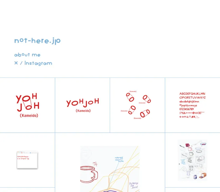
白地に水色の文字と細い罫線を配し、ロゴ・ポスター・写真・グッズを大小の正方形で並べるポートフォリオ。PCは4列、スマートフォンは2列の作品一覧。
オリジナルサイトを見るnot-here.jp — Style Reference
A white portfolio wall ruled in pale blue, with playful lettering and a mosaic of graphic work.
Website / Original URL: not-here.jp
Final URL: https://www.not-here.jp/
Theme: white canvas, pale blue identity text, fine blue divisions, and independently colored artwork
Inspected: September 12, 2026; supplied browser observation timestamp 2026-09-12T07:14:09.198Z, equivalent to 16:14:09 JST
Viewports: desktop 1440 × 1000 CSS pixels; mobile 390 × 844 CSS pixels
Scope: the current portfolio index, its opening composition, linked artwork mosaic, middle and lower desktop captures, and opening and lower mobile captures. Project detail pages, About, Live Streaming, and social destinations were not opened.
The page gives almost all of its visible area to graphic work. White space surrounds logos, typographic specimens, posters, illustrations, photographs, and merchandise. A continuous network of thin blue rules supplies the structure. The small interface uses pale blue lettering with unusual geometric forms; the projects introduce red, navy, saturated blue, orange, and other colors without changing the surrounding interface palette.
The portfolio is organized by artwork views rather than one conventional card per project. Several adjacent tiles lead to the same project, allowing a logo, its alternate arrangement, supporting symbols, and a type specimen to appear separately. Most tiles occupy one square unit, while four larger tiles occupy two columns and two rows. The supplied DOM contains 43 artwork links across 15 distinct project destinations.
Desktop begins with a generous white identity area above the grid. Mobile changes this relationship substantially: the grid begins after 200px of white space, while the identity and navigation sit over the first row and remain in approximately the same screen position in a later capture. That overlap is part of the observed current presentation and should be documented explicitly when using this reference.
How to Read This Reference
- Measured values come from the supplied rendered DOM and computed-style records. Coordinates and dimensions are CSS pixels.
- Calculated values come from those measurements, such as tile padding ratios and grid row counts.
- Visual estimates describe screenshot appearance where computed values were not supplied. They are not sampled source tokens.
- Recommendations describe a reusable implementation or an improvement. They are not claims about the original source code.
- All custom-property names below are implementation aliases. The supplied custom-property extraction was empty.
- Element rectangles describe layout boxes, which can extend beyond the visible letterforms or artwork. Image-element rectangles and intrinsic image dimensions were not supplied.
- The screenshots and DOM are the evidence for this document. No additional browsing or interaction testing was performed.
Tokens — Colors
Default Palette
| Name | Value | Suggested token | Evidence and role |
|---|---|---|---|
| Canvas White | #FFFFFF |
--page-paper |
Measured body background at both viewports; the main page and tile surroundings are white |
| Identity Blue | #77AFD6 |
--identity-ink |
Measured rgb(119, 175, 214) on the body and navigation; establishes the interface identity |
| Grid Blue | Approximately #6AAEFF |
--grid-rule |
Visual approximation for the fine blue divisions; border color was not included in the computed-style records |
| Underlying Link Blue | #2196F3 |
No primary visual token needed | Measured on image-only project anchors; does not establish the visible rule color or a filled action style |
| Utility Black | #000000 |
Utility-specific | Measured on the collapsed skip link; not the main visible navigation color |
Keep Identity Blue and Grid Blue conceptually separate. The interface text has a muted, slightly gray blue appearance; the divisions look brighter. Their exact relationship cannot be recovered from the supplied border evidence.
Only the white presentation is evidenced. No theme selector or alternate color mode appears in the captures or extracted controls.
Artwork Palette
The following are visual approximations inside the projects, not additional interface colors:
| Artwork color | Approximate value | Visible use |
|---|---|---|
| Strong red | #E11920 |
YOHJOH lettering, tubular symbols, and character specimens |
| Saturated blue | #006BB5 |
Square fields and lettering in the touch the world identity |
| Deep navy | #0B1B70 |
Identity marks and large geometric shapes in printed work |
| Orange | #F8AE3D |
A calendar sheet |
| Pale blue | #B4DDF3 |
Another calendar sheet |
| Cool near-white | #F7F9F9 |
Paper and image backgrounds within several artwork assets |
Preserve each project's own palette. The shell unifies these colors through spacing and rules; it does not recolor all work into blue.
Tokens — Typography
Navigation — VVG Stack
- Measured family declaration:
VVG, heisei-kaku-gothic-std, sans-serif. - Measured weight:
500. - Measured tracking:
normal. - Desktop size and leading:
24px / 38.4px. - Mobile size and leading:
14px / 22.4px. - Visible character: rounded geometric lettering with unconventional details, varied letter shapes, and a playful rhythm.
- Role: the main source of personality in the interface itself.
The computed family declaration does not independently prove which font file supplied every glyph. No font asset URL for VVG was provided. A faithful implementation needs the authorized font resource; copying the stack without that resource will use a fallback and change the appearance.
Site Wordmark
The visible wordmark reads not-here.jp. It is larger than the navigation and appears stylistically related to it. Its own computed font family, weight, size, and bounding rectangle were not included.
For an adaptation, begin around 32–36px on desktop and 25–28px on mobile, then compare with the captures using the actual font. These are recommended starting sizes, not measured source values. The Quick Start chooses 32px and 25px.
Underlying Body and Utility Text
The body computes to Roboto, sans-serif, 15px, weight 400. This is an underlying text style; it is not the family used by the visible navigation. The index contains very little visible body copy.
The DOM also contains a 1 × 1px heading labeled 投稿. Its computed size is 22.5px, weight 700, but it is not presented as a normal visible section heading. Do not turn it into a prominent heading when reproducing the capture.
A Damion font-face declaration appears in the extracted document text, while the HTML element itself reports Times. Neither establishes the face used by the visible identity. Use element-specific evidence rather than treating every declared font as part of the visible system.
Type Scale
| Role | Desktop | Mobile | Status |
|---|---|---|---|
| Site wordmark | Starting size 32–36px |
Starting size 25–28px |
Recommendation based on visual hierarchy; actual computed size unavailable |
| Navigation | 24px, weight 500 |
14px, weight 500 |
Measured |
| Navigation line height | 38.4px |
22.4px |
Measured; ratio 1.6 |
| Underlying body | 15px, weight 400 |
15px, weight 400 |
Measured |
| Collapsed skip-link text | 15px, 50px line height |
Same | Measured; normal visible state not captured |
| Concealed index heading | 22.5px, weight 700 |
Same | Measured inside a 1 × 1px rectangle |
| Lettering within projects | Asset-dependent | Asset-dependent | Artwork, not an interface type scale |
There are no visible project captions, category labels, dates, or descriptive paragraphs beneath the tiles. The artwork supplies its own typographic hierarchy.
Tokens — Spacing & Shapes
Primary unit: one square grid cell.
Desktop cell: 360 × 360px at a 1440px viewport.
Mobile cell: 195 × 195px at a 390px viewport.
Shape language: square, flat, precisely divided, with generous internal white space.
Spacing Scale
| Use | Desktop | Mobile | Evidence |
|---|---|---|---|
| Navigation left edge | 80px |
32px |
Measured anchor coordinates |
| Main region start | 488.765625px |
200px |
Measured main rectangle |
| First tile top | 489.765625px |
201px |
Measured; 1px below the main start |
| Standard tile padding, each side | 43.1875px |
19.5px |
Measured |
| Large tile padding, each side | 86.3906px |
39px |
Measured |
| Standard padding ratio | Approximately 12% of tile width |
10% of tile width |
Calculated |
| Large padding ratio | Approximately 12% of tile width |
10% of tile width |
Calculated |
| Navigation row step | Approximately 48.39px |
29px |
Calculated from the first two row origins |
| Space between navigation line boxes | Approximately 10px |
6.61px |
Calculated from row step minus line-box height |
| External grid gutter | Visually 0 |
Visually 0 |
Adjacent tile rectangles meet; rules provide separation |
The artwork is inset within each tile rather than separated by broad gutters between cards. Preserve this distinction: adding a 24px grid gap would break the continuous ruled surface.
Border Radius and Edges
| Element | Treatment | Evidence |
|---|---|---|
| Project anchor | 0px radius |
Measured |
| Navigation links | 0px radius, transparent background |
Measured |
| Tile divisions | Approximately 1px solid blue | Visual observation; exact border declaration unavailable |
| Artwork | Original rectangular or transparent bounds | Visible in captures; no universal rounding |
| General elevation | None visible | Structure comes from rules and whitespace |
Small shadows inside a browser-window image or product photograph belong to the artwork. They do not establish a shadow token for every tile.
Layout Measurements
| Element | At 1440 × 1000 |
At 390 × 844 |
|---|---|---|
| Grid columns | 4 | 2 |
| Standard tile | 360 × 360px |
195 × 195px |
| Large tile | 720 × 720px |
390 × 390px |
| Standard inner span before border allowance | About 273.63px |
156px |
| Large inner span before border allowance | About 547.22px |
312px |
| Main height | 5041px |
5461px |
| Document height | 5529.765625px; reported rounded height 5530 |
5661px |
| Base grid rows | 14 | 28 |
The row counts are calculated from the supplied geometry: 14 × 360 + 1 = 5041 and 28 × 195 + 1 = 5461. Forty-three tiles, including four tiles with four-cell footprints, occupy 55 cell units. Each layout has capacity for 56, leaving one unfilled cell at the end.
Components
Opening White Field and Identity
Role: establish the site identity and give the artwork a quiet starting point.
On desktop, the grid begins around 489px from the top. The wordmark sits toward the lower-left portion of this opening field, around x = 80px and visually near y = 210px. Navigation follows beneath it. The right side remains almost entirely white.
There is no visible introductory paragraph or promotional button in this region. Its scale comes from empty space, not oversized copy. The first red project then provides a sharp color change at the grid boundary.
On mobile, the structural white area ends at y = 200px. The identity is positioned below that boundary and overlaps the first project row. Avoid describing the mobile opening as a neatly separated header above the work.
Identity Navigation
Role: provide profile, streaming, and social destinations with minimal interface chrome.
The anatomy is a larger site wordmark followed by three navigation rows:
about meLive StreamingX / Instagram, containing two separate links with a slash between them
All visible navigation is pale blue. There are no surrounding button fills, pills, icons, or visible underlines in the resting captures.
The measured desktop about me box starts at (80, 289.59375) and is approximately 149.77 × 38.39px. On mobile it starts at (32, 285.796875) and measures approximately 87.38 × 22.39px.
The Live Streaming link is a block-level element whose rectangle is wider than its visible lettering. Do not interpret that rectangle as evidence of unusual letter spacing.
Observed destinations are /p/about.html, /p/live-streaming.html, https://x.com/nhew_mo, and https://www.instagram.com/nhew_mo/. Their presence establishes navigation targets, not the behavior or design of the destination pages. A streaming link does not establish an embedded player on the index.
Standard Artwork Tile
Role: expose an individual view of a project as a large image-based link.
The measured tile is an anchor with display: flex, a transparent background, square corners, and equal padding on all sides. Its full bounding box is one grid cell. The captures show artwork centered horizontally and vertically within that padded area.
Visible anatomy:
- A square linked region touching neighboring regions.
- A fine blue division at the cell edge.
- A generous white inset.
- A centered project image preserving its shape.
- No visible caption, badge, or separate action button.
Several logos occupy much less space than the available image area because their assets appear to contain substantial internal white space. Do not scale every visible mark until its ink touches the padding boundary. Distinguish the image rectangle from the visible ink inside it.
The supplied extraction reports empty text for these anchors, but it does not include their image alternatives. That is insufficient to conclude that the original links lack accessible names.
Large Artwork Tile
Role: interrupt the repeated small-cell rhythm while retaining the same geometry.
Four linked tiles measure 720 × 720px on desktop and 390 × 390px on mobile. Each occupies two columns and two rows. On desktop this can create a large central square surrounded by smaller works; on mobile it becomes a full-width square.
The large tile uses the same proportional padding system as the standard tile. Its larger footprint is not an instruction to crop the image edge to edge. Keep the image contained, with its original aspect ratio and internal whitespace.
The measured large tiles point to the breakfast, dog illustration, migrating bird, and /2026/04/blog-post.html project destinations. The destination slug alone does not establish the last project's display title.
Repeated Project Sequence
Role: present a visual identity as several related artifacts without adding explanatory UI.
The opening YOHJOH project occupies five separate links. The first desktop row shows a stacked red mark, a horizontal mark, tubular symbol arrangements, and a red character specimen. Another related image follows below. All five links share one project destination.
Further down, alternate NudgeU marks appear next to one another, as do calendar sheets, publication views, and touch the world identity variations. This repetition gives the page a contact-sheet quality. It also means that consolidating every project into one cover image would materially change the experience.
Packed Mosaic
Role: fit standard and large squares together without broad empty gaps.
The arrangement fills spaces around large tiles. Its behavior is especially clear on mobile: the sixth artwork link is a full-width square starting at y = 786px, while the following smaller link fills the earlier right-hand opening at y = 591px.
This is evidence of packing that can differ from simple row-by-row DOM order. CSS Grid with dense placement can reproduce the supplied arrangement, but the actual parent layout implementation was not included in the DOM records. Treat the Quick Start's Grid implementation as an adaptation.
The final unused cell is visible in the lower captures. It follows from the tile count; there is no evidence that it should contain an additional action or loading card.
Mobile Identity Overlay
Role: keep identity and navigation visible over the work in the supplied phone presentation.
The initial and lower mobile captures place the wordmark and navigation in approximately the same screen area. The wordmark also extends across the center division of the two-column grid. Artwork and text visibly overlap.
This strongly supports viewport-anchored behavior at the captured mobile width. The records do not include the identity container's position, top, or z-index, so the precise mechanism remains unknown.
The identity has no visible opaque panel or blurred backdrop. A faithful visual reconstruction should show the transparency and collision; a new implementation can improve readability by reserving space for the navigation, as described under recommendations.
The desktop middle and lower captures do not show a persistent identity block. Do not apply the phone's persistent overlay behavior to desktop without qualification.
Skip Link and Index Landmark
Role: provide a route to the main content outside the visual artwork navigation.
The DOM includes a link labeled スキップしてメイン コンテンツに移動 targeting #main. Its captured height is zero. A separate heading labeled 投稿 occupies a 1 × 1px rectangle inside the main region.
Retain this semantic structure in an adaptation. The original focus reveal, focus transfer, and keyboard traversal were not exercised, so their operation should be verified rather than assumed.
Tokens — Motion & Interaction
| Treatment | Evidence | Practical interpretation |
|---|---|---|
| Page scrolling | Opening, middle, and lower captures supplied | A long vertically browsed portfolio; no separate internal scroll container was established |
| Project navigation | Each tile is an anchor with a project URL | Implement real links; click results and new-tab behavior were not tested |
| Profile and social navigation | Labeled anchors with observed destinations | Preserve the simple text-link anatomy |
| Mobile identity persistence | Similar screen position in opening and lower phone captures | Viewport anchoring is strongly supported; source positioning mechanism unknown |
| Sampled CSS animation | animation: none on recorded elements |
No keyframe animation was established for those elements |
| General transition record | Many elements report transition: all |
Insufficient to claim a duration, easing curve, or visible transition |
| Skip-link transition | box-shadow 0.3s, height 0.3s, padding-top 0.3s |
A 300ms utility transition is recorded; its triggered state was not captured |
| Hover and focus feedback | No exercised states supplied | Do not invent image zoom, color inversion, or caption reveals as original behavior |
The capture process waited for document load, visible image decoding, layout and text stability, and finite animation readiness within stated time limits. Perpetual animations could be paused during readiness checks and resumed afterward. These procedures improve capture stability but do not prove that all assets are static or that delayed content cannot appear.
No original motion duration should be assigned to the portfolio tiles from this evidence. For a new implementation, simple link feedback is sufficient; any animation should be an explicitly chosen addition rather than a claimed reconstruction.
Surfaces
| Layer | Appearance | Purpose |
|---|---|---|
| Page canvas | Solid white | Gives unrelated project palettes a consistent setting |
| Opening field | Same white, with blue identity text | Establishes scale through empty space |
| Tile surface | White appearance with a transparent anchor background | Allows image paper and page paper to merge |
| Grid divisions | Fine blue straight lines | Establishes the modular structure |
| Mobile identity | Blue text without a visible backing panel | Sits over the image grid |
| Artwork paper | White or subtly cool gray within the asset | Preserves the photographed or designed object |
There is no general elevation hierarchy. Avoid treating a cool gray area inside an image as a gray card surface that should be applied to all projects.
Imagery
The portfolio combines identity systems and printed objects with illustration, photography, and merchandise. The range of work is broad, but the presentation remains consistent: complete artifacts, large white margins, centered positioning, and a square linked footprint.
Visible image types include:
- Red letterforms, tubular symbols, and an alphabet specimen for the opening identity.
- Small browser-window imagery and drawings of household objects.
- Alternate multicolor and navy NudgeU marks.
- Portrait calendar sheets in pale blue and orange.
- Geometric navy, orange, and brown printed compositions.
- Portrait photographs of buildings, presented with paper margins and small text.
- Loose, colorful dog illustrations.
- Blue-and-green touch the world marks in both white and blue fields.
- White T-shirts and a tote bag photographed against a light background.
- A poster, a compact identity mark, and paired business-card views near the end.
Preserve photographic tones and artwork colors. There is no evidence of a global monochrome filter, duotone conversion, or deliberate pixelated image rendering.
Scale and Cropping
Portrait sheets visually occupy roughly 193 × 273px inside a desktop standard tile and approximately 110 × 155px inside a phone tile. These are screenshot estimates consistent with fitting a roughly 1:√2 sheet into the available square image region.
Square blue artwork nearly fills that same inner region. Narrow wordmarks remain visibly smaller. This variation is important: use containment and respect the original image bounds rather than normalizing every object's visible silhouette to the same size.
Observed Asset References
No image src URLs, formats, intrinsic sizes, or source image-element measurements were provided. The following are observed project-link destinations associated with visible groups, not downloadable asset paths. The destination pages themselves were not inspected.
| Visible group | Observed destination |
|---|---|
| YOHJOH identity views | /2026/05/yohjoh-kameido.html |
| Breakfast-related illustration and objects | /2026/04/a-perfectionists-breakfast.html |
| NudgeU marks | /2026/04/nudgeu.html |
| Calendar sheets | /2026/04/neighby-calendar-2024.html |
| Annual publication views | /2026/04/neighby-annual-2024.html |
| Architectural photographs | /2026/04/size-b1-print-graphic-corporation.html |
| Dog illustration views | /2026/04/a-bit-of-bad-dog.html |
| touch the world identity | /2026/04/touch-world.html |
| T-shirt and tote imagery | /2026/04/redesigner-for-student-promotional-item.html |
| Poster | /2026/04/redesigner-for-student-brand-poster.html |
| Identity and business-card views | /2026/04/neighby.html |
Use authorized project assets when available. The layout can be reproduced with CSS, but substitute logos and generic stock images will change the reference substantially.
Layout & Responsive Behavior
Desktop — Measured at 1440 × 1000
The grid spans the full 1440px viewport with four 360px columns. There is no visible centered maximum-width content wrapper or outer grid padding. A tile's whitespace is internal to the cell.
The opening main boundary sits at y = 488.765625px. Tile rows then advance in exact 360px steps. Large tiles occupy 720px in both directions and allow smaller tiles to sit alongside them.
The identity starts 80px from the left. Navigation is 24px with 1.6 line height. The overall page is approximately 5530px tall, with a grid equivalent to fourteen base rows.
Mobile — Measured at 390 × 844
The grid has two 195px columns and begins at y = 200px. The first tile begins at y = 201px after the top division. Standard tile padding falls to 19.5px, so artwork receives a slightly larger fraction of the tile width than on desktop.
Large tiles retain a two-by-two footprint and become 390px squares. Smaller tiles pack into available half-width openings. The document contains twenty-eight base rows and is 5661px tall.
Navigation moves to x = 32px and decreases to 14px with 22.4px line height. It remains visibly over the work in both supplied mobile positions. No collapsed menu or hamburger control is shown; the same labeled links remain present.
Responsive Limits
The actual breakpoint, intermediate column counts, tablet behavior, and landscape layout were not provided. Do not claim a fluid type formula or a particular media query from two endpoint measurements.
The Quick Start uses 768px as a recommended adaptation breakpoint, with four columns above and two below. It reproduces the observed endpoints, not a recovered original stylesheet.
The packed arrangement also creates a potential distinction between visual order and DOM order. Keyboard focus order and assistive-technology reading order were not tested. Validate them when implementing dense placement.
Do’s and Don’ts
Do
- Keep the canvas white and the interface text at the measured pale blue
#77AFD6when matching the reference. - Separate the estimated rule color from the measured navigation color.
- Build the page around touching square cells with fine blue divisions.
- Use four columns at the captured desktop size and two at the captured phone size.
- Preserve the four large tiles as two-by-two squares.
- Apply approximately 12% tile padding on desktop and 10% on mobile.
- Center complete artwork while retaining its intrinsic proportions and internal white space.
- Let several views of one project occupy separate linked tiles.
- Preserve the distinctive navigation lettering when the authorized font is available.
- Document the mobile identity overlap honestly and decide explicitly whether a new implementation should retain it.
- Keep the final unused cell when reproducing the supplied arrangement.
Don’t
- Don’t add visible captions, badges, dates, or action buttons to every tile and describe them as original features.
- Don’t introduce broad gutters, rounded cards, or a shadow system.
- Don’t crop portrait sheets or merchandise into square cover images.
- Don’t enlarge every logo until its visible ink fills the tile.
- Don’t convert project colors into a single blue theme.
- Don’t use the computed
#2196F3anchor color as proof of the visible border color. - Don’t identify the wordmark's exact font size or font file without additional evidence.
- Don’t infer zoom effects, lightboxes, parallax, or autoplay from static captures.
- Don’t assume the desktop identity remains fixed during scrolling.
- Don’t fill the last empty cell with an invented project or call to action.
Recommended Implementation Additions
These recommendations improve a new implementation and are not verified features of the original:
- Resolve mobile text collisions when readability is the priority. Put the identity in normal flow and reserve its height, or provide a clearly bounded navigation surface. Either change should be labeled as an adaptation because the captures show overlapping transparent navigation.
- Offer stronger text contrast. The measured
#77AFD6against white has an approximate calculated contrast ratio of 2.36:1. A darker blue can serve essential navigation while the original pale blue remains in decorative rules or branding. - Verify image-link names. Give each view a useful accessible name identifying both the project and the view. Empty extracted anchor text does not establish whether the original image alternatives are missing.
- Retain and test the skip link. Ensure its focused state is visible and that
#mainreceives focus appropriately. - Review dense placement with a keyboard. Later DOM items can fill visually earlier gaps. Check traversal at both column counts rather than assuming visual and focus order agree.
- Keep tap targets usable. The observed mobile text is 14px and its line boxes are smaller than common touch-target recommendations. Increase the interactive area carefully, especially where links overlap artwork.
- Reserve image space before loading. Use known intrinsic dimensions or stable image frames. Load opening work promptly and defer lower-page images without altering the square layout.
- Provide visible focus feedback. Use a dark blue outline with sufficient separation from the thin decorative rules.
- Respect reduced motion if adding effects. The reference does not require animation to communicate its structure.
Agent Prompt Guide
Quick Color Reference
- Canvas: measured
#FFFFFF. - Identity and navigation: measured
#77AFD6. - Grid divisions: approximately
#6AAEFF; source border color unverified. - Project colors: preserve the supplied artwork independently.
- Recommended accessible focus color:
#245776, an addition rather than a source token. - Surface treatment: flat white cells, square corners, thin rules, no general shadows.
Overall Prompt
“Create an image-led graphic-design portfolio inspired by the current not-here.jp index. Use a white full-width canvas, pale blue #77AFD6 identity text, distinctive geometric display lettering, and a continuous mosaic divided by approximately 1px blue rules. At 1440px wide, use four 360px square columns; at 390px wide, use two 195px columns. Mix standard cells with selected two-column, two-row squares. Center complete logos, posters, illustrations, photographs, and merchandise within approximately 12% desktop and 10% mobile padding. Show several views of the same project as separate image links. Keep the navigation to about me, Live Streaming, and X / Instagram. Treat the observed mobile navigation overlap as an explicit fidelity choice. Label estimated font sizing and breakpoint choices as adaptations.”
Example Component Prompts
- Opening identity: “A broad white opening field above a graphic-design portfolio. Put a playful pale blue site wordmark near the lower left, aligned 80px from the desktop edge, with three plain navigation rows below. Start the full-width artwork grid around 489px from the page top. No additional introductory copy.”
- Artwork tile: “A square white image link with a thin blue shared edge and generous internal padding. Center the complete artwork using containment. Preserve internal asset whitespace and square corners. Include an accessible name without adding a visible caption.”
- Large project view: “A square portfolio image occupying two grid columns and two rows. Keep the same proportional whitespace as smaller cells. On a two-column phone layout it becomes one full-width square.”
- Identity sequence: “Present a project's stacked logo, horizontal logo, supporting symbols, and character specimen in separate neighboring square links. Each view retains its own scale and shares the same project destination.”
- Mobile fidelity: “At 390px wide, begin a two-column image grid after 200px of white space. Place the pale blue wordmark and 14px navigation over the first row, approximately 32px from the left, and retain their screen position while scrolling. Make the overlap an explicit reference behavior; also describe a normal-flow alternative for better readability.”
- Responsive packing: “Use a packed square mosaic with four columns on desktop and two on mobile. Allow small cells to fill openings beside large two-by-two tiles. Validate keyboard order because dense placement can move later links into visually earlier positions.”
Quick Start
CSS Custom Properties
This is an implementation adaptation, not recovered source CSS. It matches the measured tile sizes, padding ratios, navigation scale, and main offsets at the supplied viewports. The rule color, wordmark sizes and top positions, 768px breakpoint, and mobile positioning mechanism are explicit approximations or recommendations.
The display stack requires the actual authorized font resource for fidelity. No font-file URL is invented here. Container query units make the square rows follow the gallery's available width.
:root {
  /* Measured interface colors */
  --page-paper: #ffffff;
  --identity-ink: #77afd6;

  /* Visual approximation and recommended focus color */
  --grid-rule: #6aaeff;
  --focus-ink: #245776;
  --rule-width: 1px;

  /* Observed navigation and body stacks */
  --font-brand: 'VVG', heisei-kaku-gothic-std, sans-serif;
  --font-body: Roboto, sans-serif;
  --nav-size: 24px;
  --nav-leading: 1.6;
  --nav-row-gap: 10px;

  /* Measured offsets and calculated padding ratio */
  --index-top: 488.765625px;
  --identity-left: 80px;
  --identity-nav-top: 289.59375px;
  --columns: 4;
  --tile-inset: 12%;

  /* Wordmark approximation, not a measured source rule */
  --identity-title-top: 200px;
  --title-size: 32px;
}

* {
  box-sizing: border-box;
}

body {
  margin: 0;
  color: var(--identity-ink);
  background: var(--page-paper);
  font-family: var(--font-body);
  font-size: 15px;
  font-weight: 400;
}

.portfolio-page {
  position: relative;
  display: flow-root;
}

.identity {
  position: absolute;
  inset: 0;
  z-index: 2;
  color: var(--identity-ink);
  pointer-events: none;
}

.site-title {
  position: absolute;
  top: var(--identity-title-top);
  left: var(--identity-left);
  margin: 0;
  font-family: var(--font-brand);
  font-size: var(--title-size);
  font-weight: 500;
  line-height: 1.4;
  white-space: nowrap;
}

.site-nav {
  position: absolute;
  top: var(--identity-nav-top);
  left: var(--identity-left);
  display: grid;
  gap: var(--nav-row-gap);
  width: max-content;
  font-family: var(--font-brand);
  font-size: var(--nav-size);
  font-weight: 500;
  line-height: var(--nav-leading);
  letter-spacing: normal;
}

.site-nav a {
  color: inherit;
  text-decoration: none;
  pointer-events: auto;
}

.site-nav > a {
  justify-self: start;
}

.social-links {
  white-space: nowrap;
}

.portfolio-canvas {
  margin-block-start: var(--index-top);
  container-type: inline-size;
}

.work-grid {
  display: grid;
  grid-template-columns: repeat(var(--columns), minmax(0, 1fr));
  grid-auto-rows: calc(100cqw / var(--columns));
  grid-auto-flow: row dense;
  gap: 0;
  border-top: var(--rule-width) solid var(--grid-rule);
}

.work-tile {
  display: flex;
  align-items: center;
  justify-content: center;
  min-width: 0;
  min-height: 0;
  padding: var(--tile-inset);
  border-right: var(--rule-width) solid var(--grid-rule);
  border-bottom: var(--rule-width) solid var(--grid-rule);
  border-radius: 0;
  color: inherit;
  background: transparent;
  text-decoration: none;
}

.work-tile--large {
  grid-column: span 2;
  grid-row: span 2;
}

.work-tile img {
  display: block;
  width: 100%;
  height: 100%;
  object-fit: contain;
}

/* Recommended keyboard support; original focus states were not captured. */
a:focus-visible {
  outline: 3px solid var(--focus-ink);
  outline-offset: 3px;
}

.work-tile:focus-visible {
  outline-offset: -4px;
}

.skip-link {
  position: fixed;
  top: 0;
  left: 0;
  z-index: 10;
  padding: 12px 16px;
  transform: translateY(-120%);
  color: #000000;
  background: var(--page-paper);
}

.skip-link:focus {
  transform: translateY(0);
}

.sr-only {
  position: absolute;
  width: 1px;
  height: 1px;
  padding: 0;
  overflow: hidden;
  clip-path: inset(50%);
  white-space: nowrap;
}

/* Optional accessibility variant; changes the observed pale text color. */
.portfolio-page.use-readable-navigation .identity {
  color: var(--focus-ink);
}

/* Recommended breakpoint; the original breakpoint was not supplied. */
@media (max-width: 767px) {
  :root {
    --columns: 2;
    --tile-inset: 10%;
    --index-top: 200px;
    --identity-left: 32px;
    --identity-nav-top: 285.796875px;
    --nav-size: 14px;
    --nav-row-gap: 6.609375px;
    --identity-title-top: 224px;
    --title-size: 25px;
  }

  /* Visual model of the persistent overlay seen in both phone captures. */
  .identity {
    position: fixed;
  }
}
The identity wrapper does not intercept pointer input across the whole screen; only its links do. This is a recommended implementation detail, not a measured property of the original.
For a collision-free mobile adaptation, move the identity into normal document flow, give it enough height for the title and links, and remove the fixed overlay rule. That intentionally changes the supplied phone composition.
Minimal Component Markup
This abbreviated example demonstrates the component anatomy. The image filenames are placeholders for authorized local assets, not observed website asset paths. Render the complete ordered image dataset to reproduce the actual packing. In the supplied sequence, the first large tile follows five standard tiles.
<a class='skip-link' href='#main'>
  スキップしてメイン コンテンツに移動
</a>

<div class='portfolio-page'>
  <header class='identity'>
    <h1 class='site-title'>not-here.jp</h1>
    <nav class='site-nav' aria-label='Primary navigation'>
      <a href='/p/about.html'>about me</a>
      <a href='/p/live-streaming.html'>Live Streaming</a>
      <div class='social-links'>
        <a href='https://x.com/nhew_mo'>X</a>
        <span aria-hidden='true'> / </span>
        <a href='https://www.instagram.com/nhew_mo/'>Instagram</a>
      </div>
    </nav>
  </header>

  <main class='portfolio-canvas' id='main' tabindex='-1'>
    <h2 class='sr-only'>投稿</h2>
    <div class='work-grid'>
      <a class='work-tile' href='/2026/05/yohjoh-kameido.html'>
        <img src='/assets/project-view-01.webp'
             alt='YOHJOH (Kameido), stacked identity mark'>
      </a>
      <a class='work-tile' href='/2026/05/yohjoh-kameido.html'>
        <img src='/assets/project-view-02.webp'
             alt='YOHJOH (Kameido), horizontal identity mark'>
      </a>
      <!-- Render the remaining ordered views here. -->
      <!-- Apply work-tile--large only to the selected two-by-two views. -->
    </div>
  </main>
</div>
Before production use, supply intrinsic image dimensions, verify the actual font loading, and test focus order through the complete packed grid. The CSS provides no invented tile animation or project-opening script; anchors use normal browser navigation.
Tailwind v4 Token Mapping
Optional aliases for a project already using Tailwind v4. This is not evidence that the original site uses Tailwind. Define the reference properties above first and retain the component CSS for the packed grid and positioning.
@theme inline {
  --color-paper: var(--page-paper);
  --color-identity: var(--identity-ink);
  --color-grid-line: var(--grid-rule);
  --color-focus: var(--focus-ink);

  --font-display: var(--font-brand);
  --font-interface: var(--font-body);

  --text-navigation: var(--nav-size);
  --text-navigation--line-height: var(--nav-leading);
  --text-wordmark: var(--title-size);

  --spacing-identity-left: var(--identity-left);
  --radius-work: 0px;
}
Sources & Evidence
- Inspected original and final page: https://www.not-here.jp/. Both URLs are identical; the supplied browser record reports HTTP 200 and page title
not-here.jp. - Capture date: September 12, 2026. The supplied observation timestamp is
2026-09-12T07:14:09.198Z; separate timestamps for individual screenshots were not provided. - Desktop evidence: three supplied
1440 × 1000captures showing opening, middle, and lower content, plus rendered DOM rectangles and computed styles at that viewport. - Mobile evidence: two supplied
390 × 844captures showing opening and lower content, plus rendered DOM rectangles and computed styles at that viewport. Exact scroll offsets for the supplementary captures were not supplied. - Computed-style authority: body and link colors; navigation family declarations, sizes, weights, and leading; tile rectangles and padding; main and document dimensions; sampled transition and animation fields.
- Screenshot authority: visible artwork, fine grid divisions, white space, centered image presentation, absence of visible tile captions, and the persistent mobile identity overlap.
- Interaction limits: scrolling is represented by the supplied captures. Link activation, hover, keyboard focus, project detail pages, social pages, and streaming behavior were not exercised in the supplied evidence.
- Rendering limits: the collector used bounded readiness checks and disabled SharedWorkers and service workers. Still captures and sampled styles cannot establish all delayed content, asset animation, or unexercised states.
- Source limits: parent layout rules, identity positioning rules, exact border colors, wordmark computed styles, and image source URLs were not included. Values filling those gaps are explicitly identified as estimates or recommendations.
This reference describes the current supplied portfolio index. Its CSS is a practical adaptation of the observed geometry and appearance, with implementation choices and accessibility additions labeled separately from original-page findings.
# not-here.jp — Style Reference

> A white portfolio wall ruled in pale blue, with playful lettering and a mosaic of graphic work.

**Website / Original URL:** [not-here.jp](https://www.not-here.jp/)
**Final URL:** [https://www.not-here.jp/](https://www.not-here.jp/)
**Theme:** white canvas, pale blue identity text, fine blue divisions, and independently colored artwork
**Inspected:** September 12, 2026; supplied browser observation timestamp `2026-09-12T07:14:09.198Z`, equivalent to 16:14:09 JST
**Viewports:** desktop `1440 × 1000` CSS pixels; mobile `390 × 844` CSS pixels
**Scope:** the current portfolio index, its opening composition, linked artwork mosaic, middle and lower desktop captures, and opening and lower mobile captures. Project detail pages, About, Live Streaming, and social destinations were not opened.

The page gives almost all of its visible area to graphic work. White space surrounds logos, typographic specimens, posters, illustrations, photographs, and merchandise. A continuous network of thin blue rules supplies the structure. The small interface uses pale blue lettering with unusual geometric forms; the projects introduce red, navy, saturated blue, orange, and other colors without changing the surrounding interface palette.

The portfolio is organized by artwork views rather than one conventional card per project. Several adjacent tiles lead to the same project, allowing a logo, its alternate arrangement, supporting symbols, and a type specimen to appear separately. Most tiles occupy one square unit, while four larger tiles occupy two columns and two rows. The supplied DOM contains 43 artwork links across 15 distinct project destinations.

Desktop begins with a generous white identity area above the grid. Mobile changes this relationship substantially: the grid begins after 200px of white space, while the identity and navigation sit over the first row and remain in approximately the same screen position in a later capture. That overlap is part of the observed current presentation and should be documented explicitly when using this reference.

## How to Read This Reference

- **Measured** values come from the supplied rendered DOM and computed-style records. Coordinates and dimensions are CSS pixels.
- **Calculated** values come from those measurements, such as tile padding ratios and grid row counts.
- **Visual estimates** describe screenshot appearance where computed values were not supplied. They are not sampled source tokens.
- **Recommendations** describe a reusable implementation or an improvement. They are not claims about the original source code.
- All custom-property names below are implementation aliases. The supplied custom-property extraction was empty.
- Element rectangles describe layout boxes, which can extend beyond the visible letterforms or artwork. Image-element rectangles and intrinsic image dimensions were not supplied.
- The screenshots and DOM are the evidence for this document. No additional browsing or interaction testing was performed.

## Tokens — Colors

### Default Palette

| Name | Value | Suggested token | Evidence and role |
| --- | --- | --- | --- |
| Canvas White | `#FFFFFF` | `--page-paper` | Measured body background at both viewports; the main page and tile surroundings are white |
| Identity Blue | `#77AFD6` | `--identity-ink` | Measured `rgb(119, 175, 214)` on the body and navigation; establishes the interface identity |
| Grid Blue | Approximately `#6AAEFF` | `--grid-rule` | Visual approximation for the fine blue divisions; border color was not included in the computed-style records |
| Underlying Link Blue | `#2196F3` | No primary visual token needed | Measured on image-only project anchors; does not establish the visible rule color or a filled action style |
| Utility Black | `#000000` | Utility-specific | Measured on the collapsed skip link; not the main visible navigation color |

Keep Identity Blue and Grid Blue conceptually separate. The interface text has a muted, slightly gray blue appearance; the divisions look brighter. Their exact relationship cannot be recovered from the supplied border evidence.

Only the white presentation is evidenced. No theme selector or alternate color mode appears in the captures or extracted controls.

### Artwork Palette

The following are visual approximations inside the projects, not additional interface colors:

| Artwork color | Approximate value | Visible use |
| --- | --- | --- |
| Strong red | `#E11920` | YOHJOH lettering, tubular symbols, and character specimens |
| Saturated blue | `#006BB5` | Square fields and lettering in the touch the world identity |
| Deep navy | `#0B1B70` | Identity marks and large geometric shapes in printed work |
| Orange | `#F8AE3D` | A calendar sheet |
| Pale blue | `#B4DDF3` | Another calendar sheet |
| Cool near-white | `#F7F9F9` | Paper and image backgrounds within several artwork assets |

Preserve each project's own palette. The shell unifies these colors through spacing and rules; it does not recolor all work into blue.

## Tokens — Typography

### Navigation — VVG Stack

- **Measured family declaration:** `VVG, heisei-kaku-gothic-std, sans-serif`.
- **Measured weight:** `500`.
- **Measured tracking:** `normal`.
- **Desktop size and leading:** `24px / 38.4px`.
- **Mobile size and leading:** `14px / 22.4px`.
- **Visible character:** rounded geometric lettering with unconventional details, varied letter shapes, and a playful rhythm.
- **Role:** the main source of personality in the interface itself.

The computed family declaration does not independently prove which font file supplied every glyph. No font asset URL for VVG was provided. A faithful implementation needs the authorized font resource; copying the stack without that resource will use a fallback and change the appearance.

### Site Wordmark

The visible wordmark reads `not-here.jp`. It is larger than the navigation and appears stylistically related to it. Its own computed font family, weight, size, and bounding rectangle were not included.

For an adaptation, begin around `32–36px` on desktop and `25–28px` on mobile, then compare with the captures using the actual font. These are recommended starting sizes, not measured source values. The Quick Start chooses `32px` and `25px`.

### Underlying Body and Utility Text

The body computes to `Roboto, sans-serif`, `15px`, weight `400`. This is an underlying text style; it is not the family used by the visible navigation. The index contains very little visible body copy.

The DOM also contains a `1 × 1px` heading labeled `投稿`. Its computed size is `22.5px`, weight `700`, but it is not presented as a normal visible section heading. Do not turn it into a prominent heading when reproducing the capture.

A Damion font-face declaration appears in the extracted document text, while the HTML element itself reports Times. Neither establishes the face used by the visible identity. Use element-specific evidence rather than treating every declared font as part of the visible system.

### Type Scale

| Role | Desktop | Mobile | Status |
| --- | --- | --- | --- |
| Site wordmark | Starting size `32–36px` | Starting size `25–28px` | Recommendation based on visual hierarchy; actual computed size unavailable |
| Navigation | `24px`, weight `500` | `14px`, weight `500` | Measured |
| Navigation line height | `38.4px` | `22.4px` | Measured; ratio `1.6` |
| Underlying body | `15px`, weight `400` | `15px`, weight `400` | Measured |
| Collapsed skip-link text | `15px`, `50px` line height | Same | Measured; normal visible state not captured |
| Concealed index heading | `22.5px`, weight `700` | Same | Measured inside a `1 × 1px` rectangle |
| Lettering within projects | Asset-dependent | Asset-dependent | Artwork, not an interface type scale |

There are no visible project captions, category labels, dates, or descriptive paragraphs beneath the tiles. The artwork supplies its own typographic hierarchy.

## Tokens — Spacing & Shapes

**Primary unit:** one square grid cell.
**Desktop cell:** `360 × 360px` at a 1440px viewport.
**Mobile cell:** `195 × 195px` at a 390px viewport.
**Shape language:** square, flat, precisely divided, with generous internal white space.

### Spacing Scale

| Use | Desktop | Mobile | Evidence |
| --- | --- | --- | --- |
| Navigation left edge | `80px` | `32px` | Measured anchor coordinates |
| Main region start | `488.765625px` | `200px` | Measured main rectangle |
| First tile top | `489.765625px` | `201px` | Measured; 1px below the main start |
| Standard tile padding, each side | `43.1875px` | `19.5px` | Measured |
| Large tile padding, each side | `86.3906px` | `39px` | Measured |
| Standard padding ratio | Approximately `12%` of tile width | `10%` of tile width | Calculated |
| Large padding ratio | Approximately `12%` of tile width | `10%` of tile width | Calculated |
| Navigation row step | Approximately `48.39px` | `29px` | Calculated from the first two row origins |
| Space between navigation line boxes | Approximately `10px` | `6.61px` | Calculated from row step minus line-box height |
| External grid gutter | Visually `0` | Visually `0` | Adjacent tile rectangles meet; rules provide separation |

The artwork is inset within each tile rather than separated by broad gutters between cards. Preserve this distinction: adding a 24px grid gap would break the continuous ruled surface.

### Border Radius and Edges

| Element | Treatment | Evidence |
| --- | --- | --- |
| Project anchor | `0px` radius | Measured |
| Navigation links | `0px` radius, transparent background | Measured |
| Tile divisions | Approximately 1px solid blue | Visual observation; exact border declaration unavailable |
| Artwork | Original rectangular or transparent bounds | Visible in captures; no universal rounding |
| General elevation | None visible | Structure comes from rules and whitespace |

Small shadows inside a browser-window image or product photograph belong to the artwork. They do not establish a shadow token for every tile.

### Layout Measurements

| Element | At `1440 × 1000` | At `390 × 844` |
| --- | --- | --- |
| Grid columns | 4 | 2 |
| Standard tile | `360 × 360px` | `195 × 195px` |
| Large tile | `720 × 720px` | `390 × 390px` |
| Standard inner span before border allowance | About `273.63px` | `156px` |
| Large inner span before border allowance | About `547.22px` | `312px` |
| Main height | `5041px` | `5461px` |
| Document height | `5529.765625px`; reported rounded height 5530 | `5661px` |
| Base grid rows | 14 | 28 |

The row counts are calculated from the supplied geometry: `14 × 360 + 1 = 5041` and `28 × 195 + 1 = 5461`. Forty-three tiles, including four tiles with four-cell footprints, occupy 55 cell units. Each layout has capacity for 56, leaving one unfilled cell at the end.

## Components

### Opening White Field and Identity

**Role:** establish the site identity and give the artwork a quiet starting point.

On desktop, the grid begins around 489px from the top. The wordmark sits toward the lower-left portion of this opening field, around x = 80px and visually near y = 210px. Navigation follows beneath it. The right side remains almost entirely white.

There is no visible introductory paragraph or promotional button in this region. Its scale comes from empty space, not oversized copy. The first red project then provides a sharp color change at the grid boundary.

On mobile, the structural white area ends at y = 200px. The identity is positioned below that boundary and overlaps the first project row. Avoid describing the mobile opening as a neatly separated header above the work.

### Identity Navigation

**Role:** provide profile, streaming, and social destinations with minimal interface chrome.

The anatomy is a larger site wordmark followed by three navigation rows:

1. `about me`
2. `Live Streaming`
3. `X / Instagram`, containing two separate links with a slash between them

All visible navigation is pale blue. There are no surrounding button fills, pills, icons, or visible underlines in the resting captures.

The measured desktop `about me` box starts at `(80, 289.59375)` and is approximately `149.77 × 38.39px`. On mobile it starts at `(32, 285.796875)` and measures approximately `87.38 × 22.39px`.

The `Live Streaming` link is a block-level element whose rectangle is wider than its visible lettering. Do not interpret that rectangle as evidence of unusual letter spacing.

Observed destinations are `/p/about.html`, `/p/live-streaming.html`, `https://x.com/nhew_mo`, and `https://www.instagram.com/nhew_mo/`. Their presence establishes navigation targets, not the behavior or design of the destination pages. A streaming link does not establish an embedded player on the index.

### Standard Artwork Tile

**Role:** expose an individual view of a project as a large image-based link.

The measured tile is an anchor with `display: flex`, a transparent background, square corners, and equal padding on all sides. Its full bounding box is one grid cell. The captures show artwork centered horizontally and vertically within that padded area.

Visible anatomy:

- A square linked region touching neighboring regions.
- A fine blue division at the cell edge.
- A generous white inset.
- A centered project image preserving its shape.
- No visible caption, badge, or separate action button.

Several logos occupy much less space than the available image area because their assets appear to contain substantial internal white space. Do not scale every visible mark until its ink touches the padding boundary. Distinguish the image rectangle from the visible ink inside it.

The supplied extraction reports empty text for these anchors, but it does not include their image alternatives. That is insufficient to conclude that the original links lack accessible names.

### Large Artwork Tile

**Role:** interrupt the repeated small-cell rhythm while retaining the same geometry.

Four linked tiles measure `720 × 720px` on desktop and `390 × 390px` on mobile. Each occupies two columns and two rows. On desktop this can create a large central square surrounded by smaller works; on mobile it becomes a full-width square.

The large tile uses the same proportional padding system as the standard tile. Its larger footprint is not an instruction to crop the image edge to edge. Keep the image contained, with its original aspect ratio and internal whitespace.

The measured large tiles point to the breakfast, dog illustration, migrating bird, and `/2026/04/blog-post.html` project destinations. The destination slug alone does not establish the last project's display title.

### Repeated Project Sequence

**Role:** present a visual identity as several related artifacts without adding explanatory UI.

The opening YOHJOH project occupies five separate links. The first desktop row shows a stacked red mark, a horizontal mark, tubular symbol arrangements, and a red character specimen. Another related image follows below. All five links share one project destination.

Further down, alternate NudgeU marks appear next to one another, as do calendar sheets, publication views, and touch the world identity variations. This repetition gives the page a contact-sheet quality. It also means that consolidating every project into one cover image would materially change the experience.

### Packed Mosaic

**Role:** fit standard and large squares together without broad empty gaps.

The arrangement fills spaces around large tiles. Its behavior is especially clear on mobile: the sixth artwork link is a full-width square starting at y = 786px, while the following smaller link fills the earlier right-hand opening at y = 591px.

This is evidence of packing that can differ from simple row-by-row DOM order. CSS Grid with dense placement can reproduce the supplied arrangement, but the actual parent layout implementation was not included in the DOM records. Treat the Quick Start's Grid implementation as an adaptation.

The final unused cell is visible in the lower captures. It follows from the tile count; there is no evidence that it should contain an additional action or loading card.

### Mobile Identity Overlay

**Role:** keep identity and navigation visible over the work in the supplied phone presentation.

The initial and lower mobile captures place the wordmark and navigation in approximately the same screen area. The wordmark also extends across the center division of the two-column grid. Artwork and text visibly overlap.

This strongly supports viewport-anchored behavior at the captured mobile width. The records do not include the identity container's `position`, `top`, or `z-index`, so the precise mechanism remains unknown.

The identity has no visible opaque panel or blurred backdrop. A faithful visual reconstruction should show the transparency and collision; a new implementation can improve readability by reserving space for the navigation, as described under recommendations.

The desktop middle and lower captures do not show a persistent identity block. Do not apply the phone's persistent overlay behavior to desktop without qualification.

### Skip Link and Index Landmark

**Role:** provide a route to the main content outside the visual artwork navigation.

The DOM includes a link labeled `スキップしてメイン コンテンツに移動` targeting `#main`. Its captured height is zero. A separate heading labeled `投稿` occupies a `1 × 1px` rectangle inside the main region.

Retain this semantic structure in an adaptation. The original focus reveal, focus transfer, and keyboard traversal were not exercised, so their operation should be verified rather than assumed.

## Tokens — Motion & Interaction

| Treatment | Evidence | Practical interpretation |
| --- | --- | --- |
| Page scrolling | Opening, middle, and lower captures supplied | A long vertically browsed portfolio; no separate internal scroll container was established |
| Project navigation | Each tile is an anchor with a project URL | Implement real links; click results and new-tab behavior were not tested |
| Profile and social navigation | Labeled anchors with observed destinations | Preserve the simple text-link anatomy |
| Mobile identity persistence | Similar screen position in opening and lower phone captures | Viewport anchoring is strongly supported; source positioning mechanism unknown |
| Sampled CSS animation | `animation: none` on recorded elements | No keyframe animation was established for those elements |
| General transition record | Many elements report `transition: all` | Insufficient to claim a duration, easing curve, or visible transition |
| Skip-link transition | `box-shadow 0.3s, height 0.3s, padding-top 0.3s` | A 300ms utility transition is recorded; its triggered state was not captured |
| Hover and focus feedback | No exercised states supplied | Do not invent image zoom, color inversion, or caption reveals as original behavior |

The capture process waited for document load, visible image decoding, layout and text stability, and finite animation readiness within stated time limits. Perpetual animations could be paused during readiness checks and resumed afterward. These procedures improve capture stability but do not prove that all assets are static or that delayed content cannot appear.

No original motion duration should be assigned to the portfolio tiles from this evidence. For a new implementation, simple link feedback is sufficient; any animation should be an explicitly chosen addition rather than a claimed reconstruction.

## Surfaces

| Layer | Appearance | Purpose |
| --- | --- | --- |
| Page canvas | Solid white | Gives unrelated project palettes a consistent setting |
| Opening field | Same white, with blue identity text | Establishes scale through empty space |
| Tile surface | White appearance with a transparent anchor background | Allows image paper and page paper to merge |
| Grid divisions | Fine blue straight lines | Establishes the modular structure |
| Mobile identity | Blue text without a visible backing panel | Sits over the image grid |
| Artwork paper | White or subtly cool gray within the asset | Preserves the photographed or designed object |

There is no general elevation hierarchy. Avoid treating a cool gray area inside an image as a gray card surface that should be applied to all projects.

## Imagery

The portfolio combines identity systems and printed objects with illustration, photography, and merchandise. The range of work is broad, but the presentation remains consistent: complete artifacts, large white margins, centered positioning, and a square linked footprint.

Visible image types include:

- Red letterforms, tubular symbols, and an alphabet specimen for the opening identity.
- Small browser-window imagery and drawings of household objects.
- Alternate multicolor and navy NudgeU marks.
- Portrait calendar sheets in pale blue and orange.
- Geometric navy, orange, and brown printed compositions.
- Portrait photographs of buildings, presented with paper margins and small text.
- Loose, colorful dog illustrations.
- Blue-and-green touch the world marks in both white and blue fields.
- White T-shirts and a tote bag photographed against a light background.
- A poster, a compact identity mark, and paired business-card views near the end.

Preserve photographic tones and artwork colors. There is no evidence of a global monochrome filter, duotone conversion, or deliberate pixelated image rendering.

### Scale and Cropping

Portrait sheets visually occupy roughly `193 × 273px` inside a desktop standard tile and approximately `110 × 155px` inside a phone tile. These are screenshot estimates consistent with fitting a roughly 1:√2 sheet into the available square image region.

Square blue artwork nearly fills that same inner region. Narrow wordmarks remain visibly smaller. This variation is important: use containment and respect the original image bounds rather than normalizing every object's visible silhouette to the same size.

### Observed Asset References

No image `src` URLs, formats, intrinsic sizes, or source image-element measurements were provided. The following are observed project-link destinations associated with visible groups, not downloadable asset paths. The destination pages themselves were not inspected.

| Visible group | Observed destination |
| --- | --- |
| YOHJOH identity views | `/2026/05/yohjoh-kameido.html` |
| Breakfast-related illustration and objects | `/2026/04/a-perfectionists-breakfast.html` |
| NudgeU marks | `/2026/04/nudgeu.html` |
| Calendar sheets | `/2026/04/neighby-calendar-2024.html` |
| Annual publication views | `/2026/04/neighby-annual-2024.html` |
| Architectural photographs | `/2026/04/size-b1-print-graphic-corporation.html` |
| Dog illustration views | `/2026/04/a-bit-of-bad-dog.html` |
| touch the world identity | `/2026/04/touch-world.html` |
| T-shirt and tote imagery | `/2026/04/redesigner-for-student-promotional-item.html` |
| Poster | `/2026/04/redesigner-for-student-brand-poster.html` |
| Identity and business-card views | `/2026/04/neighby.html` |

Use authorized project assets when available. The layout can be reproduced with CSS, but substitute logos and generic stock images will change the reference substantially.

## Layout & Responsive Behavior

### Desktop — Measured at 1440 × 1000

The grid spans the full 1440px viewport with four 360px columns. There is no visible centered maximum-width content wrapper or outer grid padding. A tile's whitespace is internal to the cell.

The opening main boundary sits at y = 488.765625px. Tile rows then advance in exact 360px steps. Large tiles occupy 720px in both directions and allow smaller tiles to sit alongside them.

The identity starts 80px from the left. Navigation is 24px with 1.6 line height. The overall page is approximately 5530px tall, with a grid equivalent to fourteen base rows.

### Mobile — Measured at 390 × 844

The grid has two 195px columns and begins at y = 200px. The first tile begins at y = 201px after the top division. Standard tile padding falls to 19.5px, so artwork receives a slightly larger fraction of the tile width than on desktop.

Large tiles retain a two-by-two footprint and become 390px squares. Smaller tiles pack into available half-width openings. The document contains twenty-eight base rows and is 5661px tall.

Navigation moves to x = 32px and decreases to 14px with 22.4px line height. It remains visibly over the work in both supplied mobile positions. No collapsed menu or hamburger control is shown; the same labeled links remain present.

### Responsive Limits

The actual breakpoint, intermediate column counts, tablet behavior, and landscape layout were not provided. Do not claim a fluid type formula or a particular media query from two endpoint measurements.

The Quick Start uses 768px as a recommended adaptation breakpoint, with four columns above and two below. It reproduces the observed endpoints, not a recovered original stylesheet.

The packed arrangement also creates a potential distinction between visual order and DOM order. Keyboard focus order and assistive-technology reading order were not tested. Validate them when implementing dense placement.

## Do’s and Don’ts

### Do

- Keep the canvas white and the interface text at the measured pale blue `#77AFD6` when matching the reference.
- Separate the estimated rule color from the measured navigation color.
- Build the page around touching square cells with fine blue divisions.
- Use four columns at the captured desktop size and two at the captured phone size.
- Preserve the four large tiles as two-by-two squares.
- Apply approximately 12% tile padding on desktop and 10% on mobile.
- Center complete artwork while retaining its intrinsic proportions and internal white space.
- Let several views of one project occupy separate linked tiles.
- Preserve the distinctive navigation lettering when the authorized font is available.
- Document the mobile identity overlap honestly and decide explicitly whether a new implementation should retain it.
- Keep the final unused cell when reproducing the supplied arrangement.

### Don’t

- Don’t add visible captions, badges, dates, or action buttons to every tile and describe them as original features.
- Don’t introduce broad gutters, rounded cards, or a shadow system.
- Don’t crop portrait sheets or merchandise into square cover images.
- Don’t enlarge every logo until its visible ink fills the tile.
- Don’t convert project colors into a single blue theme.
- Don’t use the computed `#2196F3` anchor color as proof of the visible border color.
- Don’t identify the wordmark's exact font size or font file without additional evidence.
- Don’t infer zoom effects, lightboxes, parallax, or autoplay from static captures.
- Don’t assume the desktop identity remains fixed during scrolling.
- Don’t fill the last empty cell with an invented project or call to action.

## Recommended Implementation Additions

These recommendations improve a new implementation and are not verified features of the original:

- **Resolve mobile text collisions when readability is the priority.** Put the identity in normal flow and reserve its height, or provide a clearly bounded navigation surface. Either change should be labeled as an adaptation because the captures show overlapping transparent navigation.
- **Offer stronger text contrast.** The measured `#77AFD6` against white has an approximate calculated contrast ratio of 2.36:1. A darker blue can serve essential navigation while the original pale blue remains in decorative rules or branding.
- **Verify image-link names.** Give each view a useful accessible name identifying both the project and the view. Empty extracted anchor text does not establish whether the original image alternatives are missing.
- **Retain and test the skip link.** Ensure its focused state is visible and that `#main` receives focus appropriately.
- **Review dense placement with a keyboard.** Later DOM items can fill visually earlier gaps. Check traversal at both column counts rather than assuming visual and focus order agree.
- **Keep tap targets usable.** The observed mobile text is 14px and its line boxes are smaller than common touch-target recommendations. Increase the interactive area carefully, especially where links overlap artwork.
- **Reserve image space before loading.** Use known intrinsic dimensions or stable image frames. Load opening work promptly and defer lower-page images without altering the square layout.
- **Provide visible focus feedback.** Use a dark blue outline with sufficient separation from the thin decorative rules.
- **Respect reduced motion if adding effects.** The reference does not require animation to communicate its structure.

## Agent Prompt Guide

### Quick Color Reference

- Canvas: measured `#FFFFFF`.
- Identity and navigation: measured `#77AFD6`.
- Grid divisions: approximately `#6AAEFF`; source border color unverified.
- Project colors: preserve the supplied artwork independently.
- Recommended accessible focus color: `#245776`, an addition rather than a source token.
- Surface treatment: flat white cells, square corners, thin rules, no general shadows.

### Overall Prompt

“Create an image-led graphic-design portfolio inspired by the current not-here.jp index. Use a white full-width canvas, pale blue `#77AFD6` identity text, distinctive geometric display lettering, and a continuous mosaic divided by approximately 1px blue rules. At 1440px wide, use four 360px square columns; at 390px wide, use two 195px columns. Mix standard cells with selected two-column, two-row squares. Center complete logos, posters, illustrations, photographs, and merchandise within approximately 12% desktop and 10% mobile padding. Show several views of the same project as separate image links. Keep the navigation to about me, Live Streaming, and X / Instagram. Treat the observed mobile navigation overlap as an explicit fidelity choice. Label estimated font sizing and breakpoint choices as adaptations.”

### Example Component Prompts

1. **Opening identity:** “A broad white opening field above a graphic-design portfolio. Put a playful pale blue site wordmark near the lower left, aligned 80px from the desktop edge, with three plain navigation rows below. Start the full-width artwork grid around 489px from the page top. No additional introductory copy.”
2. **Artwork tile:** “A square white image link with a thin blue shared edge and generous internal padding. Center the complete artwork using containment. Preserve internal asset whitespace and square corners. Include an accessible name without adding a visible caption.”
3. **Large project view:** “A square portfolio image occupying two grid columns and two rows. Keep the same proportional whitespace as smaller cells. On a two-column phone layout it becomes one full-width square.”
4. **Identity sequence:** “Present a project's stacked logo, horizontal logo, supporting symbols, and character specimen in separate neighboring square links. Each view retains its own scale and shares the same project destination.”
5. **Mobile fidelity:** “At 390px wide, begin a two-column image grid after 200px of white space. Place the pale blue wordmark and 14px navigation over the first row, approximately 32px from the left, and retain their screen position while scrolling. Make the overlap an explicit reference behavior; also describe a normal-flow alternative for better readability.”
6. **Responsive packing:** “Use a packed square mosaic with four columns on desktop and two on mobile. Allow small cells to fill openings beside large two-by-two tiles. Validate keyboard order because dense placement can move later links into visually earlier positions.”

## Quick Start

### CSS Custom Properties

This is an implementation adaptation, not recovered source CSS. It matches the measured tile sizes, padding ratios, navigation scale, and main offsets at the supplied viewports. The rule color, wordmark sizes and top positions, 768px breakpoint, and mobile positioning mechanism are explicit approximations or recommendations.

The display stack requires the actual authorized font resource for fidelity. No font-file URL is invented here. Container query units make the square rows follow the gallery's available width.

```css
:root {
  /* Measured interface colors */
  --page-paper: #ffffff;
  --identity-ink: #77afd6;

  /* Visual approximation and recommended focus color */
  --grid-rule: #6aaeff;
  --focus-ink: #245776;
  --rule-width: 1px;

  /* Observed navigation and body stacks */
  --font-brand: 'VVG', heisei-kaku-gothic-std, sans-serif;
  --font-body: Roboto, sans-serif;
  --nav-size: 24px;
  --nav-leading: 1.6;
  --nav-row-gap: 10px;

  /* Measured offsets and calculated padding ratio */
  --index-top: 488.765625px;
  --identity-left: 80px;
  --identity-nav-top: 289.59375px;
  --columns: 4;
  --tile-inset: 12%;

  /* Wordmark approximation, not a measured source rule */
  --identity-title-top: 200px;
  --title-size: 32px;
}

* {
  box-sizing: border-box;
}

body {
  margin: 0;
  color: var(--identity-ink);
  background: var(--page-paper);
  font-family: var(--font-body);
  font-size: 15px;
  font-weight: 400;
}

.portfolio-page {
  position: relative;
  display: flow-root;
}

.identity {
  position: absolute;
  inset: 0;
  z-index: 2;
  color: var(--identity-ink);
  pointer-events: none;
}

.site-title {
  position: absolute;
  top: var(--identity-title-top);
  left: var(--identity-left);
  margin: 0;
  font-family: var(--font-brand);
  font-size: var(--title-size);
  font-weight: 500;
  line-height: 1.4;
  white-space: nowrap;
}

.site-nav {
  position: absolute;
  top: var(--identity-nav-top);
  left: var(--identity-left);
  display: grid;
  gap: var(--nav-row-gap);
  width: max-content;
  font-family: var(--font-brand);
  font-size: var(--nav-size);
  font-weight: 500;
  line-height: var(--nav-leading);
  letter-spacing: normal;
}

.site-nav a {
  color: inherit;
  text-decoration: none;
  pointer-events: auto;
}

.site-nav > a {
  justify-self: start;
}

.social-links {
  white-space: nowrap;
}

.portfolio-canvas {
  margin-block-start: var(--index-top);
  container-type: inline-size;
}

.work-grid {
  display: grid;
  grid-template-columns: repeat(var(--columns), minmax(0, 1fr));
  grid-auto-rows: calc(100cqw / var(--columns));
  grid-auto-flow: row dense;
  gap: 0;
  border-top: var(--rule-width) solid var(--grid-rule);
}

.work-tile {
  display: flex;
  align-items: center;
  justify-content: center;
  min-width: 0;
  min-height: 0;
  padding: var(--tile-inset);
  border-right: var(--rule-width) solid var(--grid-rule);
  border-bottom: var(--rule-width) solid var(--grid-rule);
  border-radius: 0;
  color: inherit;
  background: transparent;
  text-decoration: none;
}

.work-tile--large {
  grid-column: span 2;
  grid-row: span 2;
}

.work-tile img {
  display: block;
  width: 100%;
  height: 100%;
  object-fit: contain;
}

/* Recommended keyboard support; original focus states were not captured. */
a:focus-visible {
  outline: 3px solid var(--focus-ink);
  outline-offset: 3px;
}

.work-tile:focus-visible {
  outline-offset: -4px;
}

.skip-link {
  position: fixed;
  top: 0;
  left: 0;
  z-index: 10;
  padding: 12px 16px;
  transform: translateY(-120%);
  color: #000000;
  background: var(--page-paper);
}

.skip-link:focus {
  transform: translateY(0);
}

.sr-only {
  position: absolute;
  width: 1px;
  height: 1px;
  padding: 0;
  overflow: hidden;
  clip-path: inset(50%);
  white-space: nowrap;
}

/* Optional accessibility variant; changes the observed pale text color. */
.portfolio-page.use-readable-navigation .identity {
  color: var(--focus-ink);
}

/* Recommended breakpoint; the original breakpoint was not supplied. */
@media (max-width: 767px) {
  :root {
    --columns: 2;
    --tile-inset: 10%;
    --index-top: 200px;
    --identity-left: 32px;
    --identity-nav-top: 285.796875px;
    --nav-size: 14px;
    --nav-row-gap: 6.609375px;
    --identity-title-top: 224px;
    --title-size: 25px;
  }

  /* Visual model of the persistent overlay seen in both phone captures. */
  .identity {
    position: fixed;
  }
}
```

The identity wrapper does not intercept pointer input across the whole screen; only its links do. This is a recommended implementation detail, not a measured property of the original.

For a collision-free mobile adaptation, move the identity into normal document flow, give it enough height for the title and links, and remove the fixed overlay rule. That intentionally changes the supplied phone composition.

### Minimal Component Markup

This abbreviated example demonstrates the component anatomy. The image filenames are placeholders for authorized local assets, not observed website asset paths. Render the complete ordered image dataset to reproduce the actual packing. In the supplied sequence, the first large tile follows five standard tiles.

```html
<a class='skip-link' href='#main'>
  スキップしてメイン コンテンツに移動
</a>

<div class='portfolio-page'>
  <header class='identity'>
    <h1 class='site-title'>not-here.jp</h1>
    <nav class='site-nav' aria-label='Primary navigation'>
      <a href='/p/about.html'>about me</a>
      <a href='/p/live-streaming.html'>Live Streaming</a>
      <div class='social-links'>
        <a href='https://x.com/nhew_mo'>X</a>
        <span aria-hidden='true'> / </span>
        <a href='https://www.instagram.com/nhew_mo/'>Instagram</a>
      </div>
    </nav>
  </header>

  <main class='portfolio-canvas' id='main' tabindex='-1'>
    <h2 class='sr-only'>投稿</h2>
    <div class='work-grid'>
      <a class='work-tile' href='/2026/05/yohjoh-kameido.html'>
        <img src='/assets/project-view-01.webp'
             alt='YOHJOH (Kameido), stacked identity mark'>
      </a>
      <a class='work-tile' href='/2026/05/yohjoh-kameido.html'>
        <img src='/assets/project-view-02.webp'
             alt='YOHJOH (Kameido), horizontal identity mark'>
      </a>
      <!-- Render the remaining ordered views here. -->
      <!-- Apply work-tile--large only to the selected two-by-two views. -->
    </div>
  </main>
</div>
```

Before production use, supply intrinsic image dimensions, verify the actual font loading, and test focus order through the complete packed grid. The CSS provides no invented tile animation or project-opening script; anchors use normal browser navigation.

### Tailwind v4 Token Mapping

Optional aliases for a project already using Tailwind v4. This is not evidence that the original site uses Tailwind. Define the reference properties above first and retain the component CSS for the packed grid and positioning.

```css
@theme inline {
  --color-paper: var(--page-paper);
  --color-identity: var(--identity-ink);
  --color-grid-line: var(--grid-rule);
  --color-focus: var(--focus-ink);

  --font-display: var(--font-brand);
  --font-interface: var(--font-body);

  --text-navigation: var(--nav-size);
  --text-navigation--line-height: var(--nav-leading);
  --text-wordmark: var(--title-size);

  --spacing-identity-left: var(--identity-left);
  --radius-work: 0px;
}
```

## Sources & Evidence

- **Inspected original and final page:** [https://www.not-here.jp/](https://www.not-here.jp/). Both URLs are identical; the supplied browser record reports HTTP 200 and page title `not-here.jp`.
- **Capture date:** September 12, 2026. The supplied observation timestamp is `2026-09-12T07:14:09.198Z`; separate timestamps for individual screenshots were not provided.
- **Desktop evidence:** three supplied `1440 × 1000` captures showing opening, middle, and lower content, plus rendered DOM rectangles and computed styles at that viewport.
- **Mobile evidence:** two supplied `390 × 844` captures showing opening and lower content, plus rendered DOM rectangles and computed styles at that viewport. Exact scroll offsets for the supplementary captures were not supplied.
- **Computed-style authority:** body and link colors; navigation family declarations, sizes, weights, and leading; tile rectangles and padding; main and document dimensions; sampled transition and animation fields.
- **Screenshot authority:** visible artwork, fine grid divisions, white space, centered image presentation, absence of visible tile captions, and the persistent mobile identity overlap.
- **Interaction limits:** scrolling is represented by the supplied captures. Link activation, hover, keyboard focus, project detail pages, social pages, and streaming behavior were not exercised in the supplied evidence.
- **Rendering limits:** the collector used bounded readiness checks and disabled SharedWorkers and service workers. Still captures and sampled styles cannot establish all delayed content, asset animation, or unexercised states.
- **Source limits:** parent layout rules, identity positioning rules, exact border colors, wordmark computed styles, and image source URLs were not included. Values filling those gaps are explicitly identified as estimates or recommendations.

This reference describes the current supplied portfolio index. Its CSS is a practical adaptation of the observed geometry and appearance, with implementation choices and accessibility additions labeled separately from original-page findings.