
DESIGN REFERENCE
Glocally Hotel “TATEYA”|中津市のホテル・ゲストハウス
中津の街を惑星に見立てたイラストが広がるホテルサイト。青とオレンジの案内ボタン、円形の写真、ゆったりした余白、浮遊する装飾で、宿泊と地域観光への期待をつなぐデザイン。
オリジナルサイトを見るTATEYA — Style Reference
A local hotel introduces its neighborhood as a small, exuberant planet.
Website: Glocally Hotel TATEYA Original URL: https://www.glctateya.com/ Final URL: https://www.glctateya.com/ Theme: light, with warm off-white surfaces, blue and orange interface accents, and multicolored illustration. Inspected: September 12, 2026. The supplied inspection record was retrieved at 14:32:34.509 UTC / 23:32:34.509 JST. Viewports: 1440 × 1000 desktop and 390 × 844 mobile, in CSS pixels. Scope: the current hotel homepage, including its illustrated opening, brand narrative, photographic introduction, accommodation links, tourism content, concept panel, news, access information, practical notices, and footer. Visual captures cover the desktop opening, circular-photo composition, desktop footer, mobile opening, and mobile footer. Other component details come from the supplied rendered DOM and computed styles.
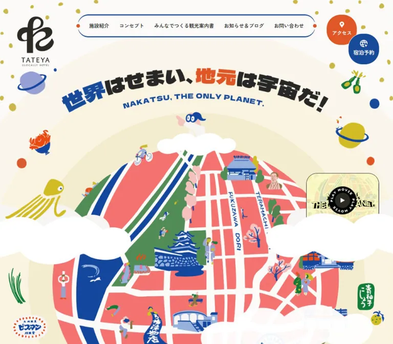
TATEYA presents accommodation as an invitation into the surrounding town. Its main visual turns streets, a river, buildings, trees, people, and local motifs into a rounded planetary map. White clouds cross the foreground; small planets, food-like characters, colored dots, and squiggles surround it. The headline, “世界はせまい、地元は宇宙だ!”, curves above the scene, with blue and orange emphasis inside dense black lettering.
The interface keeps practical navigation legible around that exuberance. Booking stays blue; access stays orange. Japanese text uses a restrained sans-serif stack, while large English section labels use broad geometric lettering. Circular photographs of staff, signage, guests, and interiors connect the imaginary planet to the real hotel. The result is a long, illustrated hotel homepage with multiple content destinations and an external booking link.
How to Read This Reference
- Measured means a value appears in the supplied computed styles or element rectangles. Values are rounded for readability unless a fractional value explains the responsive treatment.
- Calculated means arithmetic applied to those measurements, such as a percentage width or the gap between neighboring cards. It does not establish the original CSS formula.
- Visual estimate means an interpretation of the original-page captures. Estimated illustration colors were not sampled with a pixel-reading tool.
- Recommended means implementation guidance for a new project. The Quick Start is an adaptation, not recovered source code.
- Font-family declarations are available; the actual font file used for every glyph was not independently verified. The illustrated headline and logo must not be assigned a font merely because their wrappers inherit one.
- Some desktop image wrappers in the initial DOM sample report heights of only 1px or 10px. The later photographic capture visibly contains full images. Those small wrapper heights are incomplete geometric evidence, not intended image proportions.
- Static captures and animation declarations do not establish every interaction. Menu opening, media playback, carousel operation, hover appearance, and booking completion were not exercised in the supplied evidence.
Tokens — Colors
Default Palette
The six source custom properties below are identical in the desktop and mobile records. Semantic aliases are proposed for reuse.
| Name | Value | Source / suggested token | Role and evidence |
|---|---|---|---|
| Warm Canvas | #fbfaf9 |
--c_base2 / --color-canvas |
Measured body background and several main sections |
| Soft Gray | #f6f5f4 |
--c_base / --color-soft |
Measured small English accommodation-label backgrounds |
| Cream | #fcf9ef |
--c_base3 / --color-cream |
Declared warm base; visually consistent with the cream fields in the composition |
| Interface Ink | #131313 |
--c_text / --color-ink |
Measured body, navigation, and ordinary content text |
| TATEYA Blue | #184a9a |
--c_key1 / --color-blue |
Measured booking fills, English section headings, and selected decorative text |
| TATEYA Orange | #e05727 |
--c_key2 / --color-orange |
Measured access fills, tourism copy, and the circular tourism link |
| White | #ffffff |
Suggested --color-white |
Measured reversed action text, category badges, and concept-link surface; visually prominent clouds |
| Slider Blue | #9ab1d6 |
Suggested --color-slider |
Measured fill of one selected-looking accommodation pagination bar; selection behavior not tested |
Keep the functional roles consistent. Blue makes booking recognizable across header states; orange identifies access and selected tourism content. The illustrated city can use a broader palette without turning every interface control into a different color.
Illustration Palette — Visual Approximations
These are starting colors for new, compatible artwork. They are not source variables or exact asset colors.
| Name | Approximate value | Visible use |
|---|---|---|
| City Coral | #f36e70 |
Broad map districts and a small floating creature |
| Park Green | #508d55 |
Parkland, trees, and clothing |
| Mustard | #cbbb39 |
Dots, squiggles, and small accents |
| Planet Yellow | #d4c21d |
Large yellow planet and squid-like figure |
| Lavender | #9b9fd0 |
Planet, flying saucer, birds, and cloud-like forms |
| Blush | #f2c1bc |
Trees, people, and small decorative marks |
The architectural and river blues visually relate to the interface blue, but exact equality is not established. Do not recolor the complete illustration using only the six interface variables.
Tokens — Typography
Japanese Interface and Body Copy
Measured source stack: "Zen Kaku Gothic New", "Noto Sans JP", "Hiragino Kaku Gothic Pro", "ヒラギノ角ゴ Pro W3", sans-serif.
Weights are primarily 400 and 500. Navigation and practical action labels use 500; manifesto paragraphs use 400; the hotel introduction uses 500. The atmosphere comes from clear, relatively modest text surrounded by illustration and generous spacing.
The source root is 10px at both inspected widths. This is a unit convention, not the reading size: real paragraphs are 15–18px. The Quick Start retains a conventional browser root and expresses measured sizes directly.
English Section Labels and Dates
Measured source stack: "Lexend Giga", sans-serif, generally weight 400.
The large labels use negative tracking: STAY uses approximately -0.05em, and NEWS&BLOG uses -0.08em. Small dates instead use positive tracking of 0.05em. Accommodation labels use 0.04em.
This provides two English voices from the same declared family: oversized, tightly arranged section lettering and small, spacious utility text.
Logo and Hero Lettering
The logo has a distinctive black monogram and a narrow uppercase wordmark. It appears as a vertical lockup in the opening desktop header and footer, and as a horizontal lockup in the compact header and mobile header.
The hero headline is graphic lettering: heavy Japanese characters arranged on an arc, with a separate curved English line, NAKATSU, THE ONLY PLANET. Its DOM wrapper has no extracted text and inherits a 10px font size. That inherited value does not describe the visible headline. Asset format, font identity, and lettering construction were not supplied.
The mobile capture shows a deliberately recomposed two-line Japanese headline. Preserve separate desktop and mobile artwork, or create responsive lettering with equivalent composition and a meaningful text alternative.
Type Scale
All sizes below are measured computed values. Values written as size / line-height are in pixels.
| Role | Desktop | Mobile | Weight / tracking |
|---|---|---|---|
| Primary navigation | 15 / 15 |
Visible menu-link DOM: 15.6 / 15.6 |
500; mobile menu was not opened |
| Opening booking label | 17 / 17 |
12.675 / 12.675 |
500 |
| Opening access label | 16 / 16 |
Hidden from the closed mobile header | 500 |
| Compact desktop actions | 14 / 14 |
Menu action DOM: 14 / 14 |
500 |
| Manifesto paragraphs | 18 / 42 |
15 / 30 |
400 |
| Hotel introduction heading | 26 / 40 |
22 / 30 |
500 |
| Introduction and tourism paragraphs | 16 / 32 |
15 / 30 |
500 |
STAY |
140 / 140 |
68.25 / 68.25 |
400; -0.05em |
| Accommodation Japanese titles | 40 / 40 |
26.325 / 26.325 |
400 |
| Accommodation English labels | 12 / 12 |
10 / 10 |
400; 0.04em |
NEWS&BLOG |
100 / 100 |
58.5 / 53.6211 |
400; -0.08em |
| News Japanese subtitle | 17 / 17 |
12.675 / 12.675 |
500 |
| News title | 20 / 30 |
18.525 / 25.3515 |
400 |
| News category | 14 / 14 |
13 / 13 |
400 |
| News date | 15 / 15 |
14.625 / 14.625 |
400; 0.05em |
| Concept link | 20 / 20 |
16.575 / 16.575 |
500 |
An inline navigation link can have a 21px bounding rectangle despite a computed 15px line height. Do not treat every bounding-box height as a CSS line-height declaration.
Tokens — Spacing & Shapes
Density: sparse at the scene level, compact within navigation and labels. Dominant shapes: circles, rounded capsules, large curved image boundaries, cloud silhouettes, and broad arcs.
Spacing Scale
The source uses component-specific dimensions. The following are useful measured anchors, not proof of a universal spacing grid.
| Use | Desktop | Mobile | Status |
|---|---|---|---|
| Outer concept-panel inset | 70px |
19.5px |
Measured |
| Introduction-copy width | 480px |
312px |
Measured |
| Mobile prose side inset | — | 39px |
Measured; 10% of viewport |
| Opening navigation link gap | 23.75px |
— | Calculated from link rectangles |
| News card gap | 30px |
15px |
Calculated from neighboring card positions |
| News title side inset | 10px |
9.75px |
Calculated from card and title rectangles |
| Manifesto section top padding | 160px |
78px |
Measured |
| News section vertical padding | 165px |
67.275px |
Measured |
| Accommodation section bottom padding | 250px |
135px |
Measured |
| Concept action height | 70px |
58.5px |
Measured |
For reuse, a practical recommended scale is 8, 16, 24, 32, 48, 80, 120, 160px, with fluid outer gutters. Keep the more specific source dimensions where they define a recognizable component.
Border Radius
| Element | Desktop | Mobile | Evidence |
|---|---|---|---|
| Opening action | 50px on a 110 × 110px box |
Booking 45px in one header instance |
Computed; desktop is a near-circle with short straight portions |
| Compact desktop action | 32px on a 110 × 32px box |
Persistent booking instance: 32px |
Computed |
| Movie teaser | 30px |
14.625px |
Computed |
| Accommodation English label | 26px |
26px |
Computed; element height is smaller than radius |
| Tourism action | 50% |
50% |
Computed |
| Concept panel | 50px |
24.375px |
Computed |
| News image | 50px |
39.975px |
Computed |
| News category | 30px |
30px |
Computed |
| Large lower media link | 200px |
48.75px |
Computed |
| Photo crops | Circular | Square photo-wrapper geometry is present | Desktop capture confirms circular appearance; mobile middle section was not visually captured |
Layout Measurements
| Element | Desktop at 1440 × 1000 | Mobile at 390 × 844 |
|---|---|---|
| Header wrapper | 1440 × 104px |
390 × 100px |
| Opening logo wrapper | 121 × 164.34px, at 80, 46 |
Horizontal link 161.84 × 48.45px, at approximately 19.5, 23.16 |
| Opening navigation capsule | Approximately 700 × 64px, at 370, 40 |
Not visible in closed header |
| Booking action | 110 × 110px, at 1260, 108 |
107.25 × 46px, at 203.25, 26.375 |
| Access action | 110 × 110px, at 1182, 40 |
Not visible in closed header |
| Hero headline wrapper | 960 × 159px, at 240, 238 |
284.69 × 121.86px, at 52.66, 138.375 |
| Main map artwork wrapper | 1383.42 × 1002.84px, at 28.28, 509 |
655.19 × 474.94px, at -132.59, 365.53 |
| Guide-and-cloud wrapper | Approximately 281 × 155px |
Approximately 176.47 × 97.33px |
| Movie teaser | 260 × 193.25px, at approximately 1129.08, 616.28 |
146.25 × 108.92px, at approximately 234, 430.48 |
| Concept panel | 1300 × 600px |
351 × 489.45px |
| News image | 380 × 254px |
Approximately 311.98 × 208.55px |
The navigation capsule dimensions are a visual estimate; its child text positions are measured. Animated artwork coordinates describe one sampled position.
Components
Opening Desktop Header
Role: identify the hotel and expose the main destinations without covering the central illustration.
Three groups span the top: a tall black brand lockup at left, a thin blue navigation capsule in the center, and two diagonally offset actions at right. The capsule contains five Japanese links: 施設紹介, コンセプト, みんなでつくる観光案内書, お知らせ&ブログ, and お問い合わせ.
The navigation outline is approximately 3px thick, with broadly rounded ends and small orange dots at the horizontal endpoints. These dots visually connect the navigation to the scattered planetary decorations.
Each opening action combines a white pictogram above a Japanese label. Access sits higher and to the left; booking sits lower and to the right. Their measured boxes are 110px square, with 50px radii and 8px bottom padding. Preserve this asymmetry in the opening state.
The booking link points to an external Beds24 booking endpoint. Access points to /facilities/#access. These are observed destinations; their resulting pages and flows were not inspected.
Compact Header and Mobile Header
Role: keep navigation available as the visitor moves through a very long page.
The desktop collage and footer captures show a compact white bar across the top, approximately 1300px wide and 70px tall, inset 70px from each side. It has strongly rounded lower corners and a small horizontal logo. The Japanese navigation remains in one row. Booking and access become adjacent 110 × 32px capsules with icon and label arranged horizontally.
The initial DOM contains this alternate header above the visible viewport. The later screenshots confirm its visible scrolled state. The exact scroll threshold and switching mechanism were not supplied.
At 390px, the visible header has three parts: a horizontal logo, a blue 宿泊予約 capsule, and an outlined menu control. The booking action measures 107.25 × 46px; the menu wrapper measures 50 × 44px, while its visible blue outline extends beyond that inner geometry. Its three orange horizontal strokes are approximately 20px wide by visual estimate.
The menu DOM contains bilingual destination labels, an additional room link, and two full-width action capsules. Link rows measure approximately 312 × 68.22px, with 312 × 50px action rows. This establishes available content and geometry, but not the appearance or operation of an open menu.
In the supplied mobile footer capture, the persistent header overlaps the footer logo and address near the top of the viewport. Record this as visible occlusion in that captured state. A new implementation should provide a solid scrolled header surface and sufficient anchor/focus clearance.
Illustrated Hero
Role: communicate the hotel's local identity before presenting accommodation details.
Build the opening as distinct visual layers:
- A warm canvas with broad pale concentric arcs.
- Scattered dots, squiggles, planets, and local characters around the edges.
- The curved Japanese headline and curved English subtitle.
- A large rounded city-map illustration below the headline.
- A guide character on a white cloud above the map.
- Foreground clouds crossing the map and a movie teaser toward the right.
The map contains coral districts, white roads, a blue river, green land, illustrated buildings, trees, people, and small travel details. It extends below the first desktop viewport. The opening is part of a longer sequence; it should not be forced into a single screen-height banner.
Mobile preserves the scale of the world by cropping it. The map wrapper is approximately 168% of viewport width and centered beyond both edges. The headline changes to two Japanese lines, while the English line remains curved beneath it. This is a new composition at the same identity, not a uniformly reduced desktop screenshot.
Use authorized artwork as separate layers where possible. Keep decorative layers outside the reading and tab order. The headline should remain available as meaningful text even if its visible treatment is an image.
Movie Teaser
Role: offer a media entry point within the illustrated world.
The teaser is a rounded landscape panel with a thin dark outline, pale yellow artwork, and a dark circular play seal. White PLAY MOVIE lettering wraps around the seal; a white triangle marks the center. In the opening desktop view, foreground clouds cover part of the panel's lower area without covering the central play symbol.
Its measured size is 260 × 193.25px on desktop and approximately 146.25 × 108.92px on mobile. The radius decreases from 30px to 14.625px. The panel remains toward the right of the map rather than moving to a separate full-width row.
The extracted anchor points to #. That does not establish whether activation opens a dialog, starts inline playback, or invokes another scripted experience. Rotation of the play seal, sound behavior, and playback controls are unverified.
Brand Manifesto
Role: explain why the hotel treats the neighborhood as its central attraction.
The DOM shows a centered brand mark followed by two deliberate blocks of Japanese prose. Desktop paragraphs use 18px / 42px, with five and six lines in the supplied text. Mobile uses 15px / 30px and shorter line groupings across eight and nine lines.
The desktop logo wrapper measures 155 × 210.52px; the mobile version measures 102 × 138.53px. Illustration wrappers flank the text, and their computed styles include alternating floating animations.
Preserve the pause between paragraphs and the spacious leading. This section's prose is part of the site's emotional pacing, so compressing it into a dense summary would alter the experience. Mobile line breaks should be reviewed as editorial choices rather than blindly inherited from desktop.
Circular Photo Constellation
Role: ground the illustrated identity in real people and spaces.
The desktop capture shows four different circular photographs distributed across the canvas: a staff portrait, a hotel sign, a guest with luggage, and a bright reception interior. Their approximate visible diameters are 538px, 286px, 376px, and 492px. Some have much larger pale rings around them; others float without a ring.
The photographs do not form a regular grid. Large and small circles alternate between left and right, separated by substantial blank space. A coral creature, a small flying saucer, colored squiggles, and a cloud carrying illustrated travelers fill selected gaps. The photographs have warm natural light and retain ordinary interior detail.
The mobile DOM contains corresponding square image-wrapper sizes of approximately 262.27px, 139.42px, 183.30px, and 239.84px. It places them at distinct vertical positions rather than compressing the desktop arrangement into a small grid. Their mobile appearance was not included in a middle-page screenshot.
For a new implementation, keep the photos in document flow inside a responsive composition, then position decorative art around them. Reserve image dimensions before loading. This is particularly important because the initial desktop extraction contains incomplete image-wrapper heights.
Accommodation Features
Role: lead visitors to rooms and facilities.
The STAY section contains two large linked features, お部屋の紹介 / GUEST ROOM and 施設の紹介 / FACILITIES. Each includes three slide elements and three narrow pagination bars.
Desktop feature wrappers are 900px wide and staggered horizontally: the first starts at x=70, the second at x=470. The extracted desktop media heights are incomplete and should not be used to infer the final card height. The Japanese titles use 40px text, and the English labels occupy small soft-gray capsules 26px high.
At 390px, each linked feature is 370.5px wide, or 95% of the viewport. The first aligns to the left edge and the second to the right. Their image wrappers measure approximately 371 × 222.59px; the complete link boxes measure about 370.5 × 279.73px. The room title is toward the right side of its block, while the facilities title is toward the left, retaining asymmetry after stacking.
The mobile pagination bars are 10 × 1.5px, versus 20 × 3px on desktop. They are visually tiny indicators. In a new implementation, give their buttons larger transparent hit areas and accessible labels, and keep buttons outside an enclosing destination link.
Tourism and Concept Panels
Role: connect accommodation to local exploration and the hotel's point of view.
The tourism paragraph uses orange text at 16px / 32px on desktop and 15px / 30px on mobile. Its width changes from 700px to 312px. An orange circular tourism link measures 180px across on desktop and 136.5px on mobile.
A very wide decorative strip in this area has a declared 180s linear infinite horizontal-loop animation. Its exact artwork and keyframe path were not included. Describe it as an animated decorative strip, not as an interactive map.
The concept panel is a rounded 1300 × 600px desktop region, reduced and recomposed to approximately 351 × 489.45px on mobile. Its white TATEYAのコンセプト link is 460 × 70px on desktop and 292.5 × 58.5px on mobile. Additional illustration wrappers surround the content, but their full visual appearance is outside the supplied screenshot coverage.
Use the measured panel and action geometry as references. Do not invent a panel background image or carousel behavior from empty image wrappers.
News Carousel
Role: expose hotel updates, events, activities, and FAQ content.
The large blue NEWS&BLOG heading pairs with a smaller Japanese subtitle. The desktop heading occupies one horizontal line; mobile rendered text breaks into NEWS and &BLOG with approximately 53.62px line height.
A news item has four parts:
- A rounded photograph,
380 × 254pxon desktop or approximately312 × 208.55pxon mobile. - A white category capsule centered across the image's lower edge.
- A Japanese title in an inset text box beneath the badge.
- A centered date in Lexend Giga with positive tracking.
On desktop, the badge begins 20px before the image's bottom and is 36px tall. Its title begins 31px after the badge's bottom; the date follows the title by 15px. Mobile uses a 16px image overlap, a 30px badge, approximately 17px before the title, and 8px before the date. These offsets are calculated from the supplied rectangles.
The sampled desktop track has three complete 380px cards at x=120, 530, and 940, with 30px gaps. Mobile has a centered 312px card near x=38.5, a 15px gap, and neighboring cards extending beyond the viewport. Repeated links and offscreen copies are consistent with carousel infrastructure. They are not separate stories to reproduce in a content database.
A desktop Previous button is measured at 80 × 80px, with a 35px radius. Swipe behavior, automatic advancement, timing, and keyboard support were not tested. The Quick Start supplies an accessible horizontal scrolling layout as an adaptation, not a claim about the original carousel implementation.
Access and Practical Information
Role: make a playful site usable for an actual stay.
The rendered text includes an address, a Google Maps link, car and public-transport directions, check-in and check-out details, parking information, cautions, and a cancellation policy. Practical notices appear in Japanese and English.
The observed address is in Nakatsu, Oita. The footer also provides a telephone link and an Instagram link. This supports the hotel's location and contact presentation without establishing a separate legal operating entity.
No dedicated screenshot or detailed computed-style sample covers this section. Its content and links are verified; map embedding, column layout, accordion behavior, rule styling, and typography beyond inherited defaults are not. For reuse, treat this as clear informational content with restrained decoration and readable bilingual blocks.
Footer and Return to Top
Role: close the page with contact details and repeat the planetary identity.
The desktop footer places a large vertical logo at left, the address and telephone beside it, and navigation and legal links across the upper right. Instagram combines an outline icon with an underlined label. Copyright appears lower on the left.
A guide character above a lavender cloud forms the illustrated PAGE TOP control at right. The observed destination is #header; smooth scrolling was not verified. A large city-map globe rises from the bottom edge, with birds, a cyclist, squiggles, and curved English lettering around it.
On mobile, footer navigation wraps into centered rows. Legal links sit below a thin divider approximately 312px wide, followed by copyright. The map again extends beyond the viewport edges. The upper contact area is partially obscured by the persistent header in the supplied capture, so its complete settled mobile spacing cannot be measured reliably from that image.
Keep the closing illustration as a substantial final scene. It is a recurring brand motif, not a small decorative footer icon.
Tokens — Motion & Interaction
The following values are present in computed styles. Keyframe bodies and event handlers were not supplied.
| Treatment | Measured declaration | Evidence boundary |
|---|---|---|
| Header transition | 0.6s cubic-bezier(0.22, 1, 0.36, 1) 0.4s |
Property changes and trigger threshold are unknown |
| Hero headline transition | 0.6s cubic-bezier(0.22, 1, 0.36, 1) 0.6s |
Suggests delayed entrance styling; exact start state is unavailable |
| Several hero decorations | 0.8s 0.5s transition |
Changed properties are not identified |
| Main guide-and-cloud float | 1.6s cubic-bezier(0.42, 0, 0.58, 1) infinite alternate floatUp_10 |
Repeating alternate animation is declared; displacement is not exposed |
| Other floating artwork | 1.2s, 1.4s, or 1.6s, alternating indefinitely |
Some delays are 0.4s, 0.6s, or 0.8s |
| Story-decoration entrance | 1s cubic-bezier(0.22, 1, 0.36, 1) with 0.4s or 0.8s delay |
Trigger and changed properties remain unverified |
| Accommodation image fade | opacity 1s linear in the mobile sample |
Fade styling verified; autoplay and slide interval unknown |
| Tourism decorative strip | 180s linear infinite slide_loop_x |
Horizontal-loop declaration; exact distance and direction unavailable |
| Common anchors and news details | 0.3s transition |
No exercised hover or focus endpoint |
The animation names floatUp_10 and floatUp_15 should not be treated as proof of 10px and 15px motion without their keyframes. A name is not a measured displacement.
Use gentle alternating motion for a few characters and clouds. Keep text and critical actions stable. The visual identity does not require everything to rotate, bob, or react to the pointer. There is no evidence here for cursor following, scroll-linked parallax, automatic sound, or a rotating play seal.
The capture process initially observed the page for at least five seconds and waited for visible finite motion and layout stability within bounded time limits. Perpetual animations were paused during readiness checks and resumed afterward. This improves capture stability but does not establish complete runtime behavior.
Surfaces
| Layer | Appearance | Purpose |
|---|---|---|
| Main canvas | Warm near-white #fbfaf9 |
Holds the long narrative and large empty areas |
| Orbit fields | Pale cream bands with soft color differences | Extend the planetary metaphor behind the hero |
| Foreground clouds | Flat white silhouettes | Create overlap and depth without interface shadows |
| Navigation | Transparent outlined opening capsule; white compact bar | Separate persistent navigation from illustration |
| Functional actions | Solid blue or orange with white symbols and text | Make booking and access recognizable |
| Small labels | Soft-gray English capsules or white news badges | Organize content with restrained rounded shapes |
| Photography | Natural images clipped into circles or large rounded rectangles | Introduce people, rooms, and activities |
| Footer | Light field above an oversized map illustration | Give the page a recognizable closing composition |
The supplied captures do not show a general elevated-card system. Most depth comes from overlapping flat artwork, circles, image crops, and the header's distinct surface. Avoid adding broad soft shadows to every section.
Imagery
The artwork uses flat color regions, irregular silhouettes, simplified buildings, tiny people, and expressive creatures. Its streets form white channels through coral land; parks and trees provide green structure; the blue river anchors the center. This is a specific inhabited town imagined as a planet, rather than generic space-themed decoration.
Photographs are warm and approachable. The visible examples include a staff member in a light brown shirt, the hotel sign against timber, a guest carrying luggage, and a yellow-toned reception area. Circular cropping makes each photograph part of the same orbit vocabulary while preserving real-world detail.
The illustrations appear crisp and flat at the captured scale, but file formats are unknown. Do not claim SVG, canvas, or raster animation from appearance alone. Preserve sharp edges when preparing replacement assets; pixelated rendering is not part of the observed style.
Observed Asset References
No image src values or original asset paths were included in the evidence. The references below identify visible asset roles, not downloadable filenames.
| Asset role | Original-page evidence | Reuse requirement |
|---|---|---|
| Vertical brand lockup | Desktop opening and footer | Preserve monogram, wordmark, and small descriptor as one proportioned identity |
| Horizontal brand lockup | Compact desktop and mobile headers | Use an appropriate wide lockup; do not squeeze the vertical version |
| Desktop hero lettering | Single curved Japanese line with English arc | Preserve graphic composition and provide equivalent accessible text |
| Mobile hero lettering | Two-line Japanese composition with English arc | Use a dedicated responsive treatment |
| City planet | Opening and footer | Preserve the map's local detail and intentional edge cropping |
| Guide, clouds, planets, creatures | Opening and circular-photo scene | Prefer separate decorative layers where assets permit |
| Staff, sign, guest, reception photos | Desktop middle capture | Use real, warm photographs with subject-aware circular crops |
| Movie teaser | Desktop and mobile opening | Preserve the rounded panel and legible central play symbol |
| Return-to-top illustration | Desktop footer | Combine clear action labeling with the recurring guide character |
Use original imagery only when authorized and available. CSS can reproduce the layout and shapes; the custom illustration and identity still require suitable assets.
Layout & Responsive Behavior
The page uses several scales at once: small practical navigation, spacious reading sections, enormous illustration, and oversized English section labels. Responsive behavior changes their relationship rather than multiplying every dimension by one factor.
| Relationship | Desktop observation | Mobile observation |
|---|---|---|
| Header identity | Tall opening logo; wide compact logo after scrolling | Wide logo throughout captured states |
| Navigation | Five visible links plus two actions | Booking remains visible; destinations move into menu content |
| Hero headline | 960 × 159px, about 66.7% viewport width |
284.69 × 121.86px, about 73% viewport width; two-line composition |
| Planet scale | About 96.1% viewport width | About 168% viewport width, cropped symmetrically |
| Movie teaser | 260px wide | 146.25px wide, or 37.5% of viewport |
| Introduction copy | 480px wide | 312px wide, or 80% of viewport |
| Accommodation blocks | 900px wide, staggered left and right | 95% viewport width, stacked with alternating edge alignment |
| Concept panel | 1300px wide | 351px wide, or 90% of viewport |
| News presentation | Three complete cards in the sampled central area | One centered card with adjacent content partially visible |
| Footer navigation | Broad horizontal groups | Centered wrapped rows |
The desktop STAY heading has a narrow, tall measured box of approximately 140 × 404.19px at the right side of the section. Mobile has a horizontal box of approximately 197.05 × 68.25px. The extraction does not expose whether desktop rotation, writing mode, or another technique creates that geometry.
Several mobile values correspond neatly to viewport percentages: 19.5px is 5vw, 39px is 10vw, 312px is 80vw, and 68.25px is 17.5vw at 390px. These are calculated relationships, not recovered media-query declarations. No tablet width or breakpoint boundary was inspected.
The snapshot document heights are approximately 14,971px on desktop and 12,242px on mobile. The first manifesto section begins around y=3324 and y=1797 respectively in those records. These establish a long opening sequence and a long page. They should not become hardcoded production heights, particularly given incomplete initial image-wrapper dimensions.
Clip overflowing decorative scenes locally while allowing ordinary page scrolling. Do not hide horizontal layout errors by indiscriminately clipping all interactive content. Reserve image space and keep decorative layers from intercepting links.
Do’s and Don’ts
Do
- Preserve blue
#184a9afor booking and orange#e05727for access. - Use warm off-white as the dominant canvas and retain pure white clouds and selected control surfaces.
- Build a layered local-world illustration with meaningful streets, people, and buildings.
- Keep distinct vertical and horizontal logo lockups.
- Recompose the mobile headline and crop the oversized map intentionally.
- Alternate large and small circular photographs across generous empty space.
- Pair readable Japanese sans-serif copy with measured Lexend Giga section labels and dates.
- Preserve the asymmetry of accommodation links as they stack on mobile.
- Use small centered badges that overlap news-image edges.
- Make contact, directions, and practical stay information easy to find within the illustrated experience.
- Limit floating motion to selected decorative elements.
- Repeat the map and guide character in the footer to connect the opening and closing scenes.
Don’t
- Do not replace the local map with unrelated planets or generic travel icons.
- Do not reduce the entire desktop hero to fit a phone; its composition changes at mobile size.
- Do not assign a font name to the graphic headline or logo without asset-level evidence.
- Do not use the inherited 10px root size as the body-copy size.
- Do not recreate incomplete 1px or 10px image-wrapper measurements as actual media heights.
- Do not turn the circular photo constellation into uniform cards with identical sizes.
- Do not add glossy gradients, glass surfaces, or heavy card shadows to the interface.
- Do not let decoration obscure booking labels, play controls, contact information, or keyboard focus.
- Do not reproduce carousel clones as duplicate editorial content.
- Do not infer autoplay, swipe support, modal playback, or smooth scrolling from labels and hash links.
- Do not carry the captured booking link's fixed historical dates into a new reservation flow.
Recommended Implementation Additions
These recommendations are not verified features of the original site.
- Give the menu button an accessible name,
aria-expanded, and an associated navigation region. Support keyboard operation and predictable focus movement if the menu behaves as a modal overlay. - Provide accessible text for the graphic headline and meaningful alternatives for informative images. Decorative clouds, dots, creatures, and repeated lettering should be hidden from assistive technology.
- Use one semantic heading hierarchy even if multiple header variants or logo images are needed visually.
- Reserve intrinsic dimensions or aspect ratios for every photograph and illustration. Avoid layout shifting as offscreen imagery becomes ready.
- Give the mobile header an opaque scrolled surface, and set scroll padding and anchor margins to keep focused content reachable beneath it.
- Preserve the tiny visual pagination bars while enlarging their transparent hit areas. Separate slide controls from the room/facilities destination links.
- Offer a reduced-motion state and a pause mechanism for continuous decorative movement. If carousels advance automatically, pause them on interaction and provide an explicit stop control.
- Check contrast before using orange for small text or white text on orange. The source palette's presence does not establish accessibility conformance.
- Keep media silent until an explicit user action. Add captions and appropriate playback controls when implementing video.
- Generate booking parameters from the intended reservation flow. The observed link contains fixed November 2024 dates and should not be copied as a reusable booking configuration.
- Keep practical bilingual information readable with content-driven height, especially at increased text size and intermediate viewport widths.
Agent Prompt Guide
Quick Color Reference
- Canvas:
#fbfaf9. - Cream accent surface:
#fcf9ef. - Soft label surface:
#f6f5f4. - Ordinary text:
#131313. - Booking and major English headings:
#184a9a. - Access and selected tourism emphasis:
#e05727. - Reversed labels, clouds, and news badges:
#ffffff. - Broader coral, green, mustard, lavender, and blush colors belong primarily to illustration.
Overall Prompt
“Create a Japanese local-hotel homepage inspired by TATEYA's illustrated neighborhood-as-planet concept. Use warm off-white #fbfaf9, near-black text, blue #184a9a booking actions, and orange #e05727 access actions. Open with a layered city planet featuring coral districts, white roads, a blue river, green parks, local buildings, small people, white clouds, and playful peripheral creatures. Place a bold curved graphic headline above it. Use a tall desktop logo, a blue outlined navigation capsule, and two diagonally offset rounded actions. After scrolling, use a compact white header. Alternate circular real-world photographs across spacious sections; use Zen Kaku Gothic New with the observed Japanese fallbacks for copy and Lexend Giga for English section labels. Recompose the phone headline into two lines and crop the map beyond both edges. Include accommodation links, a rounded-image news track, clear directions and stay information, and a large illustrated footer.”
Example Component Prompts
- Opening header: “Arrange a vertical black hotel logo at the upper left, five compact Japanese links inside a thin blue capsule centered near the top, and two 110px rounded actions at the upper right. Put orange access above-left of blue booking. Use white icon-over-label contents, warm off-white surroundings, and small orange endpoint dots on the navigation outline.”
- Photo constellation: “Create an airy composition of four warm hotel photographs clipped into unequal circles: approximately 538px, 286px, 376px, and 492px at desktop scale. Alternate positions across the page, add pale rings to selected circles, and place a few flat illustrated travelers, squiggles, and a flying saucer in the gaps. Preserve useful photo crops and readable content order on mobile.”
- Mobile hero: “At a 390px reference width, keep a horizontal brand lockup, a roughly 107 × 46px blue booking capsule, and a 50px outlined menu control at the top. Use a roughly 285 × 122px two-line graphic headline. Center a city illustration about 655px wide so it extends beyond both edges. Place a 146px-wide movie teaser on the right and layer white clouds through the scene without covering its play control.”
- News item: “Use a 380 × 254px image with a 50px radius, a centered white category capsule overlapping the lower edge by 20px, a Japanese title below, and a small tracked Lexend Giga date. Keep the overall item unboxed. On mobile use an approximately 312 × 209px image and 40px radius, with one centered item and neighboring content visible at the edges.”
- Illustrated footer: “Place a vertical hotel logo, contact information, Instagram link, navigation, and legal links on a quiet light surface. Add a guide character on a lavender cloud as the return-to-top control. Let a large coral, blue, and green city planet rise from the bottom. Wrap the links into centered rows on phones and keep the persistent header from obscuring contact details.”
Quick Start
CSS Custom Properties
This CSS is a reusable adaptation of measured values. It assumes semantic markup using the named classes and authorized assets supplied separately. It does not load font files, reproduce every narrative scene, or implement menu, booking, video, or carousel JavaScript.
The application may add .is-compact to the header at a chosen scroll boundary. The 1100px navigation breakpoint and 700px composition breakpoint below are recommendations; the original breakpoints are unknown. The hero height covers an opening scene only, not the full measured opening sequence. Add subsequent content sections in normal flow.
:root {
  /* Exact colors from the supplied computed styles. */
  --color-canvas: #fbfaf9;
  --color-soft: #f6f5f4;
  --color-cream: #fcf9ef;
  --color-ink: #131313;
  --color-blue: #184a9a;
  --color-orange: #e05727;
  --color-white: #ffffff;
  --color-slider: #9ab1d6;

  /* Source family declarations; font loading is separate. */
  --font-ja: 'Zen Kaku Gothic New', 'Noto Sans JP',
    'Hiragino Kaku Gothic Pro', 'ヒラギノ角ゴ Pro W3', sans-serif;
  --font-en: 'Lexend Giga', sans-serif;
  --weight-regular: 400;
  --weight-medium: 500;

  --text-body: 16px;
  --leading-body: 32px;
  --text-manifesto: 18px;
  --leading-manifesto: 42px;
  --text-section: 100px;
  --text-news: 20px;
  --leading-news: 30px;
  --text-date: 15px;

  --width-content: 1300px;
  --width-prose: 480px;
  --width-news: 380px;
  --gap-news: 30px;
  --radius-panel: 50px;
  --radius-news: 50px;
  --radius-pill: 999px;
  --header-clearance: 90px;

  /* Timing is source-derived; property choices are adaptations. */
  --motion-link: 300ms ease;
  --motion-enter: 600ms cubic-bezier(0.22, 1, 0.36, 1);
  --motion-float: 1600ms cubic-bezier(0.42, 0, 0.58, 1);
}

* { box-sizing: border-box; }

html { scroll-padding-top: var(--header-clearance); }

body {
  margin: 0;
  color: var(--color-ink);
  background: var(--color-canvas);
  font-family: var(--font-ja);
  font-size: var(--text-body);
  line-height: var(--leading-body);
}

img { display: block; max-width: 100%; height: auto; }
button, a { -webkit-tap-highlight-color: transparent; }
button { font: inherit; }
a { color: inherit; }
[id] { scroll-margin-top: var(--header-clearance); }

.content-width {
  width: min(var(--width-content), 90%);
  margin-inline: auto;
}

.prose {
  max-width: var(--width-prose);
  font-weight: var(--weight-medium);
  overflow-wrap: anywhere;
}

.manifesto {
  padding: 160px 20px 100px;
  text-align: center;
  font-size: var(--text-manifesto);
  line-height: var(--leading-manifesto);
}

.manifesto p { margin: 0 0 34px; }

/* Desktop opening header. */
.site-header {
  position: absolute;
  z-index: 50;
  inset: 0 0 auto;
  height: 104px;
}

.brand-link {
  position: absolute;
  top: 46px;
  left: max(40px, calc((100% - 1280px) / 2));
  width: 121px;
}

.brand-wide { display: none; }

.main-nav {
  position: absolute;
  top: 40px;
  left: 50%;
  display: flex;
  align-items: center;
  justify-content: space-between;
  width: 700px;
  height: 64px;
  padding-inline: 37px;
  border: 3px solid var(--color-blue);
  border-radius: 40px;
  transform: translateX(-50%);
}

.main-nav::before,
.main-nav::after {
  content: '';
  position: absolute;
  top: 50%;
  width: 10px;
  height: 10px;
  border-radius: 50%;
  background: var(--color-orange);
  box-shadow: 0 0 0 4px var(--color-canvas);
  transform: translateY(-50%);
}

.main-nav::before { left: -7px; }
.main-nav::after { right: -7px; }

.main-nav a {
  font-size: 15px;
  font-weight: 500;
  line-height: 1;
  white-space: nowrap;
  text-decoration: none;
}

.header-actions {
  position: absolute;
  top: 40px;
  right: max(30px, calc((100% - 1300px) / 2));
  width: 188px;
  height: 178px;
}

.action {
  display: inline-flex;
  align-items: center;
  justify-content: center;
  gap: 8px;
  color: var(--color-white);
  font-weight: 500;
  line-height: 1;
  text-decoration: none;
  border-radius: var(--radius-pill);
}

.action--reserve { background: var(--color-blue); }
.action--access { background: var(--color-orange); }
.action svg { flex: none; width: 24px; height: 24px; }

.header-actions .action {
  position: absolute;
  flex-direction: column;
  width: 110px;
  height: 110px;
  padding-bottom: 8px;
  border-radius: 50px;
}

.header-actions .action--access {
  inset: 0 auto auto 0;
  font-size: 16px;
}

.header-actions .action--reserve {
  inset: 68px 0 auto auto;
  font-size: 17px;
}

.menu-toggle { display: none; }

/* Recommended single-header adaptation of the compact state. */
.site-header.is-compact {
  position: fixed;
  left: 50%;
  right: auto;
  width: min(1300px, calc(100% - 40px));
  height: 70px;
  border-radius: 0 0 30px 30px;
  background: var(--color-white);
  transform: translateX(-50%);
}

.is-compact .brand-link { top: 15px; left: 30px; width: 132px; }
.is-compact .brand-portrait { display: none; }
.is-compact .brand-wide { display: block; }

.is-compact .main-nav {
  top: 0;
  width: 620px;
  height: 70px;
  padding: 0;
  border: 0;
}

.is-compact .main-nav::before,
.is-compact .main-nav::after { display: none; }

.is-compact .header-actions {
  top: 19px;
  right: 30px;
  display: flex;
  gap: 5px;
  width: 225px;
  height: 32px;
}

.is-compact .header-actions .action {
  position: static;
  flex-direction: row;
  width: 110px;
  height: 32px;
  padding: 0;
  gap: 6px;
  font-size: 14px;
  border-radius: 32px;
}

.is-compact .action svg { width: 20px; height: 20px; }

/* Opening scene: assets are supplied by the implementation. */
.hero-scene {
  position: relative;
  isolation: isolate;
  min-height: 1580px;
  overflow: clip;
}

.orbit-field {
  position: absolute;
  z-index: -1;
  top: 100px;
  left: -20%;
  width: 140%;
  height: 1700px;
  border-radius: 50%;
  background: var(--color-cream);
}

.scene-title,
.scene-map,
.scene-guide {
  position: absolute;
  left: 50%;
  max-width: none;
  transform: translateX(-50%);
}

.scene-title { z-index: 3; top: 238px; width: min(960px, 67vw); }
.scene-map { z-index: 1; top: 509px; width: 96.07%; }
.scene-guide { z-index: 3; top: 400px; width: 281px; }

.scene-decoration {
  position: absolute;
  pointer-events: none;
  user-select: none;
}

.scene-movie {
  position: absolute;
  z-index: 4;
  top: 616px;
  right: 3.54%;
  width: 260px;
  aspect-ratio: 260 / 193.25;
  overflow: hidden;
  border: 1px solid var(--color-ink);
  border-radius: 30px;
}

.scene-movie img { width: 100%; height: 100%; object-fit: cover; }

.photo-orbit {
  width: var(--photo-size, 376px);
  max-width: 100%;
  aspect-ratio: 1;
  border-radius: 50%;
  overflow: hidden;
}

.photo-orbit img { width: 100%; height: 100%; object-fit: cover; }

.section-heading {
  margin: 0;
  color: var(--color-blue);
  font-family: var(--font-en);
  font-size: var(--text-section);
  font-weight: 400;
  line-height: 1;
  letter-spacing: -0.08em;
  text-transform: uppercase;
}

.concept-panel {
  padding: 80px;
  border-radius: var(--radius-panel);
  background: var(--color-cream);
}

.concept-link {
  display: flex;
  align-items: center;
  justify-content: center;
  width: min(460px, 100%);
  min-height: 70px;
  padding: 16px;
  border-radius: 50px;
  background: var(--color-white);
  font-size: 20px;
  font-weight: 500;
  text-decoration: none;
}

/* Adaptation: native scrolling, without cloned news items. */
.news-track {
  display: flex;
  gap: var(--gap-news);
  overflow-x: auto;
  padding: 24px max(20px, calc((100vw - 1200px) / 2));
  scroll-snap-type: x proximity;
  scroll-padding-inline: max(20px, calc((100vw - 1200px) / 2));
}

.news-card {
  flex: 0 0 var(--width-news);
  min-width: 0;
  color: inherit;
  text-decoration: none;
  scroll-snap-align: center;
}

.news-image {
  width: 100%;
  aspect-ratio: 380 / 254;
  object-fit: cover;
  border-radius: var(--radius-news);
}

.news-category {
  position: relative;
  display: flex;
  align-items: center;
  justify-content: center;
  width: fit-content;
  min-height: 36px;
  margin: -20px auto 0;
  padding: 0 21px 1px;
  border-radius: 30px;
  background: var(--color-white);
  font-size: 14px;
  line-height: 1;
}

.news-title {
  margin: 31px 10px 0;
  font-size: var(--text-news);
  line-height: var(--leading-news);
  font-weight: 400;
}

.news-date {
  display: block;
  margin-top: 15px;
  text-align: center;
  font-family: var(--font-en);
  font-size: var(--text-date);
  line-height: 1;
  letter-spacing: 0.05em;
}

.footer-content {
  display: grid;
  grid-template-columns: 121px 307px minmax(0, 1fr);
  gap: 47px;
  width: min(1200px, 90%);
  margin-inline: auto;
  padding-block: 80px;
}

.footer-nav { display: flex; flex-wrap: wrap; gap: 20px 30px; }
.footer-legal { font-size: 13px; line-height: 2; }

/* Recommended feedback; original hover endpoints are unverified. */
a { transition: color var(--motion-link); }
a:focus-visible, button:focus-visible {
  outline: 3px solid var(--color-blue);
  outline-offset: 5px;
}

@media (hover: hover) {
  .main-nav a:hover { text-decoration: underline; text-underline-offset: 5px; }
}

/* Apply to a child so centering transforms stay independent. */
.float-decoration {
  animation: reference-float var(--motion-float) infinite alternate;
}

@keyframes reference-float {
  /* Recommended 6px amplitude; source displacement is unknown. */
  from { transform: translateY(0); }
  to { transform: translateY(-6px); }
}

@media (max-width: 1100px) {
  :root { --header-clearance: 116px; }

  .site-header,
  .site-header.is-compact {
    position: fixed;
    inset: 0 0 auto;
    display: grid;
    grid-template-columns: minmax(0, 1fr) auto 50px;
    align-items: start;
    gap: 10px;
    width: 100%;
    height: 100px;
    padding: 24px 5% 0;
    border-radius: 0;
    background: var(--color-canvas);
    transform: none;
  }

  .site-header .brand-link {
    position: static;
    align-self: start;
    width: min(41.5vw, 180px);
    max-width: 100%;
  }

  .brand-portrait { display: none; }
  .brand-wide { display: block; }
  .main-nav { display: none; }

  .site-header .header-actions {
    position: static;
    display: block;
    width: auto;
    height: auto;
    padding-top: 2px;
  }

  .site-header .header-actions .action--access { display: none; }

  .site-header .header-actions .action--reserve {
    position: static;
    flex-direction: row;
    width: clamp(96px, 27.5vw, 110px);
    height: 46px;
    padding: 0;
    gap: 7px;
    border-radius: 45px;
    font-size: clamp(12px, 3.25vw, 14px);
  }

  .site-header .action svg { width: 20px; height: 20px; }

  .menu-toggle {
    display: grid;
    place-content: center;
    gap: 3px;
    width: 50px;
    height: 50px;
    padding: 0;
    border: 3px solid var(--color-blue);
    border-radius: 23px;
    background: var(--color-canvas);
    cursor: pointer;
  }

  .menu-toggle span {
    width: 20px;
    height: 2px;
    background: var(--color-orange);
  }
}

@media (max-width: 700px) {
  :root {
    --text-body: 15px;
    --leading-body: 30px;
    --text-manifesto: 15px;
    --leading-manifesto: 30px;
    --text-section: 15vw;
    --text-news: clamp(17px, 4.75vw, 20px);
    --leading-news: 1.3685;
    --text-date: 14.625px;
    --width-news: 80vw;
    --gap-news: 15px;
    --radius-panel: 6.25vw;
    --radius-news: 10.25vw;
  }

  .hero-scene { min-height: 900px; }
  .orbit-field { top: 175px; height: 900px; }
  .scene-title { top: 138.375px; width: 73vw; }
  .scene-map { top: 365.53px; width: 168vw; }
  .scene-guide { top: 288px; width: 45.25vw; }

  .scene-movie {
    top: 430.48px;
    left: 60vw;
    right: auto;
    width: 37.5vw;
    border-radius: 3.75vw;
  }

  .prose { width: 80%; margin-inline: auto; }
  .manifesto { padding: 78px 5% 80px; }
  .manifesto p { margin-bottom: 28.5px; }

  .section-heading { line-height: 0.9166; }
  .section-heading span { display: block; }

  .concept-panel { padding: 60px 7.5vw; }
  .concept-link { min-height: 58.5px; font-size: 16.575px; }

  .news-track { padding-inline: 10vw; scroll-padding-inline: 10vw; }
  .news-category { min-height: 30px; margin-top: -16px; font-size: 13px; }
  .news-title { margin: 17px 2.5vw 0; }
  .news-date { margin-top: 8px; }

  .footer-content {
    grid-template-columns: 80px minmax(0, 1fr);
    gap: 24px 8px;
    width: 80%;
    padding-block: 60px;
  }

  .footer-nav,
  .footer-legal { grid-column: 1 / -1; text-align: center; }
  .footer-nav { justify-content: center; gap: 12px 20px; }
  .footer-legal { padding-top: 28px; border-top: 1px solid #c7c4bc; }
}

@media (prefers-reduced-motion: reduce) {
  .float-decoration { animation: none; }
  .site-header, a, button { transition: none; }
}
The single cream orbit field is a simplified scaffold; additional bands and all illustrated clouds require assets or further explicitly authored decoration. The mobile header's solid background is an intentional recommendation addressing the captured overlap. Mobile photo placement, open-menu styling, accommodation controls, and a complete video experience require additional implementation.
Tailwind v4 Token Mapping
Optional aliases for a project already using Tailwind v4. This does not imply that the original site uses Tailwind. Define the properties above first.
@theme inline {
  --color-tateya-canvas: var(--color-canvas);
  --color-tateya-soft: var(--color-soft);
  --color-tateya-cream: var(--color-cream);
  --color-tateya-ink: var(--color-ink);
  --color-tateya-blue: var(--color-blue);
  --color-tateya-orange: var(--color-orange);
  --color-tateya-slider: var(--color-slider);

  --font-japanese: var(--font-ja);
  --font-english: var(--font-en);

  --text-story: var(--text-manifesto);
  --text-section-label: var(--text-section);
  --text-news-title: var(--text-news);
  --text-news-date: var(--text-date);

  --radius-feature: var(--radius-panel);
  --radius-news-image: var(--radius-news);
  --radius-capsule: 999px;
}
Sources & Evidence
- TATEYA — current homepage: original and final URL in the supplied browser record, HTTP 200. Page title:
Glocally Hotel “TATEYA”|中津市のホテル・ゲストハウス. - Inspection record: September 12, 2026, 14:32:34.509 UTC / 23:32:34.509 JST. Viewports were 1440 × 1000 and 390 × 844 CSS pixels. No additional browsing or command execution was used to prepare this reference.
- Desktop visual evidence: opening hero; circular-photo section with compact header; footer with compact header and city-map illustration.
- Mobile visual evidence: opening hero and footer. No middle-page mobile screenshot, open-menu capture, or playback capture was supplied. Exact scroll offsets for the scrolled screenshots were not recorded.
- Rendered DOM and computed styles: source color variables, font stacks, type sizes, line heights, tracking, element rectangles, radii, selected padding values, transitions, animation declarations, page content, and link destinations.
- Original-page links observed but not followed: rooms, facilities, concept, tourism, news, contact, privacy and terms, external booking, Google Maps, Instagram, telephone, and the
#headerreturn target. Their presence is evidence of navigation structure, not evidence of destination-page design or successful interaction. - Limitations: no complete stylesheet or keyframe bodies, no image source URLs, no verified font-file resolution, no tablet viewport, incomplete initial geometry for several desktop image wrappers, and no exercised menu, media, carousel, hover, keyboard, or booking flows. Bounded readiness checks cannot guarantee all delayed content was present.
This reference describes the current homepage represented by the supplied original-page evidence. Measured values, visual estimates, calculated proportions, and implementation recommendations are distinguished throughout.
# TATEYA — Style Reference

> A local hotel introduces its neighborhood as a small, exuberant planet.

**Website:** [Glocally Hotel TATEYA](https://www.glctateya.com/)
**Original URL:** https://www.glctateya.com/
**Final URL:** https://www.glctateya.com/
**Theme:** light, with warm off-white surfaces, blue and orange interface accents, and multicolored illustration.
**Inspected:** September 12, 2026. The supplied inspection record was retrieved at 14:32:34.509 UTC / 23:32:34.509 JST.
**Viewports:** 1440 × 1000 desktop and 390 × 844 mobile, in CSS pixels.
**Scope:** the current hotel homepage, including its illustrated opening, brand narrative, photographic introduction, accommodation links, tourism content, concept panel, news, access information, practical notices, and footer. Visual captures cover the desktop opening, circular-photo composition, desktop footer, mobile opening, and mobile footer. Other component details come from the supplied rendered DOM and computed styles.

TATEYA presents accommodation as an invitation into the surrounding town. Its main visual turns streets, a river, buildings, trees, people, and local motifs into a rounded planetary map. White clouds cross the foreground; small planets, food-like characters, colored dots, and squiggles surround it. The headline, “世界はせまい、地元は宇宙だ!”, curves above the scene, with blue and orange emphasis inside dense black lettering.

The interface keeps practical navigation legible around that exuberance. Booking stays blue; access stays orange. Japanese text uses a restrained sans-serif stack, while large English section labels use broad geometric lettering. Circular photographs of staff, signage, guests, and interiors connect the imaginary planet to the real hotel. The result is a long, illustrated hotel homepage with multiple content destinations and an external booking link.

## How to Read This Reference

- **Measured** means a value appears in the supplied computed styles or element rectangles. Values are rounded for readability unless a fractional value explains the responsive treatment.
- **Calculated** means arithmetic applied to those measurements, such as a percentage width or the gap between neighboring cards. It does not establish the original CSS formula.
- **Visual estimate** means an interpretation of the original-page captures. Estimated illustration colors were not sampled with a pixel-reading tool.
- **Recommended** means implementation guidance for a new project. The Quick Start is an adaptation, not recovered source code.
- Font-family declarations are available; the actual font file used for every glyph was not independently verified. The illustrated headline and logo must not be assigned a font merely because their wrappers inherit one.
- Some desktop image wrappers in the initial DOM sample report heights of only 1px or 10px. The later photographic capture visibly contains full images. Those small wrapper heights are incomplete geometric evidence, not intended image proportions.
- Static captures and animation declarations do not establish every interaction. Menu opening, media playback, carousel operation, hover appearance, and booking completion were not exercised in the supplied evidence.

## Tokens — Colors

### Default Palette

The six source custom properties below are identical in the desktop and mobile records. Semantic aliases are proposed for reuse.

| Name | Value | Source / suggested token | Role and evidence |
| --- | --- | --- | --- |
| Warm Canvas | `#fbfaf9` | `--c_base2` / `--color-canvas` | Measured body background and several main sections |
| Soft Gray | `#f6f5f4` | `--c_base` / `--color-soft` | Measured small English accommodation-label backgrounds |
| Cream | `#fcf9ef` | `--c_base3` / `--color-cream` | Declared warm base; visually consistent with the cream fields in the composition |
| Interface Ink | `#131313` | `--c_text` / `--color-ink` | Measured body, navigation, and ordinary content text |
| TATEYA Blue | `#184a9a` | `--c_key1` / `--color-blue` | Measured booking fills, English section headings, and selected decorative text |
| TATEYA Orange | `#e05727` | `--c_key2` / `--color-orange` | Measured access fills, tourism copy, and the circular tourism link |
| White | `#ffffff` | Suggested `--color-white` | Measured reversed action text, category badges, and concept-link surface; visually prominent clouds |
| Slider Blue | `#9ab1d6` | Suggested `--color-slider` | Measured fill of one selected-looking accommodation pagination bar; selection behavior not tested |

Keep the functional roles consistent. Blue makes booking recognizable across header states; orange identifies access and selected tourism content. The illustrated city can use a broader palette without turning every interface control into a different color.

### Illustration Palette — Visual Approximations

These are starting colors for new, compatible artwork. They are not source variables or exact asset colors.

| Name | Approximate value | Visible use |
| --- | --- | --- |
| City Coral | `#f36e70` | Broad map districts and a small floating creature |
| Park Green | `#508d55` | Parkland, trees, and clothing |
| Mustard | `#cbbb39` | Dots, squiggles, and small accents |
| Planet Yellow | `#d4c21d` | Large yellow planet and squid-like figure |
| Lavender | `#9b9fd0` | Planet, flying saucer, birds, and cloud-like forms |
| Blush | `#f2c1bc` | Trees, people, and small decorative marks |

The architectural and river blues visually relate to the interface blue, but exact equality is not established. Do not recolor the complete illustration using only the six interface variables.

## Tokens — Typography

### Japanese Interface and Body Copy

**Measured source stack:** `"Zen Kaku Gothic New", "Noto Sans JP", "Hiragino Kaku Gothic Pro", "ヒラギノ角ゴ Pro W3", sans-serif`.

Weights are primarily `400` and `500`. Navigation and practical action labels use `500`; manifesto paragraphs use `400`; the hotel introduction uses `500`. The atmosphere comes from clear, relatively modest text surrounded by illustration and generous spacing.

The source root is `10px` at both inspected widths. This is a unit convention, not the reading size: real paragraphs are 15–18px. The Quick Start retains a conventional browser root and expresses measured sizes directly.

### English Section Labels and Dates

**Measured source stack:** `"Lexend Giga", sans-serif`, generally weight `400`.

The large labels use negative tracking: `STAY` uses approximately `-0.05em`, and `NEWS&BLOG` uses `-0.08em`. Small dates instead use positive tracking of `0.05em`. Accommodation labels use `0.04em`.

This provides two English voices from the same declared family: oversized, tightly arranged section lettering and small, spacious utility text.

### Logo and Hero Lettering

The logo has a distinctive black monogram and a narrow uppercase wordmark. It appears as a vertical lockup in the opening desktop header and footer, and as a horizontal lockup in the compact header and mobile header.

The hero headline is graphic lettering: heavy Japanese characters arranged on an arc, with a separate curved English line, `NAKATSU, THE ONLY PLANET.` Its DOM wrapper has no extracted text and inherits a 10px font size. That inherited value does not describe the visible headline. Asset format, font identity, and lettering construction were not supplied.

The mobile capture shows a deliberately recomposed two-line Japanese headline. Preserve separate desktop and mobile artwork, or create responsive lettering with equivalent composition and a meaningful text alternative.

### Type Scale

All sizes below are measured computed values. Values written as `size / line-height` are in pixels.

| Role | Desktop | Mobile | Weight / tracking |
| --- | --- | --- | --- |
| Primary navigation | `15 / 15` | Visible menu-link DOM: `15.6 / 15.6` | `500`; mobile menu was not opened |
| Opening booking label | `17 / 17` | `12.675 / 12.675` | `500` |
| Opening access label | `16 / 16` | Hidden from the closed mobile header | `500` |
| Compact desktop actions | `14 / 14` | Menu action DOM: `14 / 14` | `500` |
| Manifesto paragraphs | `18 / 42` | `15 / 30` | `400` |
| Hotel introduction heading | `26 / 40` | `22 / 30` | `500` |
| Introduction and tourism paragraphs | `16 / 32` | `15 / 30` | `500` |
| `STAY` | `140 / 140` | `68.25 / 68.25` | `400`; `-0.05em` |
| Accommodation Japanese titles | `40 / 40` | `26.325 / 26.325` | `400` |
| Accommodation English labels | `12 / 12` | `10 / 10` | `400`; `0.04em` |
| `NEWS&BLOG` | `100 / 100` | `58.5 / 53.6211` | `400`; `-0.08em` |
| News Japanese subtitle | `17 / 17` | `12.675 / 12.675` | `500` |
| News title | `20 / 30` | `18.525 / 25.3515` | `400` |
| News category | `14 / 14` | `13 / 13` | `400` |
| News date | `15 / 15` | `14.625 / 14.625` | `400`; `0.05em` |
| Concept link | `20 / 20` | `16.575 / 16.575` | `500` |

An inline navigation link can have a 21px bounding rectangle despite a computed 15px line height. Do not treat every bounding-box height as a CSS line-height declaration.

## Tokens — Spacing & Shapes

**Density:** sparse at the scene level, compact within navigation and labels.
**Dominant shapes:** circles, rounded capsules, large curved image boundaries, cloud silhouettes, and broad arcs.

### Spacing Scale

The source uses component-specific dimensions. The following are useful measured anchors, not proof of a universal spacing grid.

| Use | Desktop | Mobile | Status |
| --- | --- | --- | --- |
| Outer concept-panel inset | `70px` | `19.5px` | Measured |
| Introduction-copy width | `480px` | `312px` | Measured |
| Mobile prose side inset | — | `39px` | Measured; 10% of viewport |
| Opening navigation link gap | `23.75px` | — | Calculated from link rectangles |
| News card gap | `30px` | `15px` | Calculated from neighboring card positions |
| News title side inset | `10px` | `9.75px` | Calculated from card and title rectangles |
| Manifesto section top padding | `160px` | `78px` | Measured |
| News section vertical padding | `165px` | `67.275px` | Measured |
| Accommodation section bottom padding | `250px` | `135px` | Measured |
| Concept action height | `70px` | `58.5px` | Measured |

For reuse, a practical recommended scale is `8, 16, 24, 32, 48, 80, 120, 160px`, with fluid outer gutters. Keep the more specific source dimensions where they define a recognizable component.

### Border Radius

| Element | Desktop | Mobile | Evidence |
| --- | --- | --- | --- |
| Opening action | `50px` on a `110 × 110px` box | Booking `45px` in one header instance | Computed; desktop is a near-circle with short straight portions |
| Compact desktop action | `32px` on a `110 × 32px` box | Persistent booking instance: `32px` | Computed |
| Movie teaser | `30px` | `14.625px` | Computed |
| Accommodation English label | `26px` | `26px` | Computed; element height is smaller than radius |
| Tourism action | `50%` | `50%` | Computed |
| Concept panel | `50px` | `24.375px` | Computed |
| News image | `50px` | `39.975px` | Computed |
| News category | `30px` | `30px` | Computed |
| Large lower media link | `200px` | `48.75px` | Computed |
| Photo crops | Circular | Square photo-wrapper geometry is present | Desktop capture confirms circular appearance; mobile middle section was not visually captured |

### Layout Measurements

| Element | Desktop at 1440 × 1000 | Mobile at 390 × 844 |
| --- | --- | --- |
| Header wrapper | `1440 × 104px` | `390 × 100px` |
| Opening logo wrapper | `121 × 164.34px`, at `80, 46` | Horizontal link `161.84 × 48.45px`, at approximately `19.5, 23.16` |
| Opening navigation capsule | Approximately `700 × 64px`, at `370, 40` | Not visible in closed header |
| Booking action | `110 × 110px`, at `1260, 108` | `107.25 × 46px`, at `203.25, 26.375` |
| Access action | `110 × 110px`, at `1182, 40` | Not visible in closed header |
| Hero headline wrapper | `960 × 159px`, at `240, 238` | `284.69 × 121.86px`, at `52.66, 138.375` |
| Main map artwork wrapper | `1383.42 × 1002.84px`, at `28.28, 509` | `655.19 × 474.94px`, at `-132.59, 365.53` |
| Guide-and-cloud wrapper | Approximately `281 × 155px` | Approximately `176.47 × 97.33px` |
| Movie teaser | `260 × 193.25px`, at approximately `1129.08, 616.28` | `146.25 × 108.92px`, at approximately `234, 430.48` |
| Concept panel | `1300 × 600px` | `351 × 489.45px` |
| News image | `380 × 254px` | Approximately `311.98 × 208.55px` |

The navigation capsule dimensions are a visual estimate; its child text positions are measured. Animated artwork coordinates describe one sampled position.

## Components

### Opening Desktop Header

**Role:** identify the hotel and expose the main destinations without covering the central illustration.

Three groups span the top: a tall black brand lockup at left, a thin blue navigation capsule in the center, and two diagonally offset actions at right. The capsule contains five Japanese links: `施設紹介`, `コンセプト`, `みんなでつくる観光案内書`, `お知らせ&ブログ`, and `お問い合わせ`.

The navigation outline is approximately 3px thick, with broadly rounded ends and small orange dots at the horizontal endpoints. These dots visually connect the navigation to the scattered planetary decorations.

Each opening action combines a white pictogram above a Japanese label. Access sits higher and to the left; booking sits lower and to the right. Their measured boxes are 110px square, with 50px radii and 8px bottom padding. Preserve this asymmetry in the opening state.

The booking link points to an external Beds24 booking endpoint. Access points to `/facilities/#access`. These are observed destinations; their resulting pages and flows were not inspected.

### Compact Header and Mobile Header

**Role:** keep navigation available as the visitor moves through a very long page.

The desktop collage and footer captures show a compact white bar across the top, approximately 1300px wide and 70px tall, inset 70px from each side. It has strongly rounded lower corners and a small horizontal logo. The Japanese navigation remains in one row. Booking and access become adjacent `110 × 32px` capsules with icon and label arranged horizontally.

The initial DOM contains this alternate header above the visible viewport. The later screenshots confirm its visible scrolled state. The exact scroll threshold and switching mechanism were not supplied.

At 390px, the visible header has three parts: a horizontal logo, a blue `宿泊予約` capsule, and an outlined menu control. The booking action measures `107.25 × 46px`; the menu wrapper measures `50 × 44px`, while its visible blue outline extends beyond that inner geometry. Its three orange horizontal strokes are approximately 20px wide by visual estimate.

The menu DOM contains bilingual destination labels, an additional room link, and two full-width action capsules. Link rows measure approximately `312 × 68.22px`, with `312 × 50px` action rows. This establishes available content and geometry, but not the appearance or operation of an open menu.

In the supplied mobile footer capture, the persistent header overlaps the footer logo and address near the top of the viewport. Record this as visible occlusion in that captured state. A new implementation should provide a solid scrolled header surface and sufficient anchor/focus clearance.

### Illustrated Hero

**Role:** communicate the hotel's local identity before presenting accommodation details.

Build the opening as distinct visual layers:

1. A warm canvas with broad pale concentric arcs.
2. Scattered dots, squiggles, planets, and local characters around the edges.
3. The curved Japanese headline and curved English subtitle.
4. A large rounded city-map illustration below the headline.
5. A guide character on a white cloud above the map.
6. Foreground clouds crossing the map and a movie teaser toward the right.

The map contains coral districts, white roads, a blue river, green land, illustrated buildings, trees, people, and small travel details. It extends below the first desktop viewport. The opening is part of a longer sequence; it should not be forced into a single screen-height banner.

Mobile preserves the scale of the world by cropping it. The map wrapper is approximately 168% of viewport width and centered beyond both edges. The headline changes to two Japanese lines, while the English line remains curved beneath it. This is a new composition at the same identity, not a uniformly reduced desktop screenshot.

Use authorized artwork as separate layers where possible. Keep decorative layers outside the reading and tab order. The headline should remain available as meaningful text even if its visible treatment is an image.

### Movie Teaser

**Role:** offer a media entry point within the illustrated world.

The teaser is a rounded landscape panel with a thin dark outline, pale yellow artwork, and a dark circular play seal. White `PLAY MOVIE` lettering wraps around the seal; a white triangle marks the center. In the opening desktop view, foreground clouds cover part of the panel's lower area without covering the central play symbol.

Its measured size is `260 × 193.25px` on desktop and approximately `146.25 × 108.92px` on mobile. The radius decreases from 30px to 14.625px. The panel remains toward the right of the map rather than moving to a separate full-width row.

The extracted anchor points to `#`. That does not establish whether activation opens a dialog, starts inline playback, or invokes another scripted experience. Rotation of the play seal, sound behavior, and playback controls are unverified.

### Brand Manifesto

**Role:** explain why the hotel treats the neighborhood as its central attraction.

The DOM shows a centered brand mark followed by two deliberate blocks of Japanese prose. Desktop paragraphs use `18px / 42px`, with five and six lines in the supplied text. Mobile uses `15px / 30px` and shorter line groupings across eight and nine lines.

The desktop logo wrapper measures `155 × 210.52px`; the mobile version measures `102 × 138.53px`. Illustration wrappers flank the text, and their computed styles include alternating floating animations.

Preserve the pause between paragraphs and the spacious leading. This section's prose is part of the site's emotional pacing, so compressing it into a dense summary would alter the experience. Mobile line breaks should be reviewed as editorial choices rather than blindly inherited from desktop.

### Circular Photo Constellation

**Role:** ground the illustrated identity in real people and spaces.

The desktop capture shows four different circular photographs distributed across the canvas: a staff portrait, a hotel sign, a guest with luggage, and a bright reception interior. Their approximate visible diameters are 538px, 286px, 376px, and 492px. Some have much larger pale rings around them; others float without a ring.

The photographs do not form a regular grid. Large and small circles alternate between left and right, separated by substantial blank space. A coral creature, a small flying saucer, colored squiggles, and a cloud carrying illustrated travelers fill selected gaps. The photographs have warm natural light and retain ordinary interior detail.

The mobile DOM contains corresponding square image-wrapper sizes of approximately 262.27px, 139.42px, 183.30px, and 239.84px. It places them at distinct vertical positions rather than compressing the desktop arrangement into a small grid. Their mobile appearance was not included in a middle-page screenshot.

For a new implementation, keep the photos in document flow inside a responsive composition, then position decorative art around them. Reserve image dimensions before loading. This is particularly important because the initial desktop extraction contains incomplete image-wrapper heights.

### Accommodation Features

**Role:** lead visitors to rooms and facilities.

The `STAY` section contains two large linked features, `お部屋の紹介` / `GUEST ROOM` and `施設の紹介` / `FACILITIES`. Each includes three slide elements and three narrow pagination bars.

Desktop feature wrappers are 900px wide and staggered horizontally: the first starts at x=70, the second at x=470. The extracted desktop media heights are incomplete and should not be used to infer the final card height. The Japanese titles use 40px text, and the English labels occupy small soft-gray capsules 26px high.

At 390px, each linked feature is 370.5px wide, or 95% of the viewport. The first aligns to the left edge and the second to the right. Their image wrappers measure approximately `371 × 222.59px`; the complete link boxes measure about `370.5 × 279.73px`. The room title is toward the right side of its block, while the facilities title is toward the left, retaining asymmetry after stacking.

The mobile pagination bars are `10 × 1.5px`, versus `20 × 3px` on desktop. They are visually tiny indicators. In a new implementation, give their buttons larger transparent hit areas and accessible labels, and keep buttons outside an enclosing destination link.

### Tourism and Concept Panels

**Role:** connect accommodation to local exploration and the hotel's point of view.

The tourism paragraph uses orange text at `16px / 32px` on desktop and `15px / 30px` on mobile. Its width changes from 700px to 312px. An orange circular tourism link measures 180px across on desktop and 136.5px on mobile.

A very wide decorative strip in this area has a declared `180s linear infinite` horizontal-loop animation. Its exact artwork and keyframe path were not included. Describe it as an animated decorative strip, not as an interactive map.

The concept panel is a rounded `1300 × 600px` desktop region, reduced and recomposed to approximately `351 × 489.45px` on mobile. Its white `TATEYAのコンセプト` link is `460 × 70px` on desktop and `292.5 × 58.5px` on mobile. Additional illustration wrappers surround the content, but their full visual appearance is outside the supplied screenshot coverage.

Use the measured panel and action geometry as references. Do not invent a panel background image or carousel behavior from empty image wrappers.

### News Carousel

**Role:** expose hotel updates, events, activities, and FAQ content.

The large blue `NEWS&BLOG` heading pairs with a smaller Japanese subtitle. The desktop heading occupies one horizontal line; mobile rendered text breaks into `NEWS` and `&BLOG` with approximately 53.62px line height.

A news item has four parts:

1. A rounded photograph, `380 × 254px` on desktop or approximately `312 × 208.55px` on mobile.
2. A white category capsule centered across the image's lower edge.
3. A Japanese title in an inset text box beneath the badge.
4. A centered date in Lexend Giga with positive tracking.

On desktop, the badge begins 20px before the image's bottom and is 36px tall. Its title begins 31px after the badge's bottom; the date follows the title by 15px. Mobile uses a 16px image overlap, a 30px badge, approximately 17px before the title, and 8px before the date. These offsets are calculated from the supplied rectangles.

The sampled desktop track has three complete 380px cards at x=120, 530, and 940, with 30px gaps. Mobile has a centered 312px card near x=38.5, a 15px gap, and neighboring cards extending beyond the viewport. Repeated links and offscreen copies are consistent with carousel infrastructure. They are not separate stories to reproduce in a content database.

A desktop Previous button is measured at `80 × 80px`, with a 35px radius. Swipe behavior, automatic advancement, timing, and keyboard support were not tested. The Quick Start supplies an accessible horizontal scrolling layout as an adaptation, not a claim about the original carousel implementation.

### Access and Practical Information

**Role:** make a playful site usable for an actual stay.

The rendered text includes an address, a Google Maps link, car and public-transport directions, check-in and check-out details, parking information, cautions, and a cancellation policy. Practical notices appear in Japanese and English.

The observed address is in Nakatsu, Oita. The footer also provides a telephone link and an Instagram link. This supports the hotel's location and contact presentation without establishing a separate legal operating entity.

No dedicated screenshot or detailed computed-style sample covers this section. Its content and links are verified; map embedding, column layout, accordion behavior, rule styling, and typography beyond inherited defaults are not. For reuse, treat this as clear informational content with restrained decoration and readable bilingual blocks.

### Footer and Return to Top

**Role:** close the page with contact details and repeat the planetary identity.

The desktop footer places a large vertical logo at left, the address and telephone beside it, and navigation and legal links across the upper right. Instagram combines an outline icon with an underlined label. Copyright appears lower on the left.

A guide character above a lavender cloud forms the illustrated `PAGE TOP` control at right. The observed destination is `#header`; smooth scrolling was not verified. A large city-map globe rises from the bottom edge, with birds, a cyclist, squiggles, and curved English lettering around it.

On mobile, footer navigation wraps into centered rows. Legal links sit below a thin divider approximately 312px wide, followed by copyright. The map again extends beyond the viewport edges. The upper contact area is partially obscured by the persistent header in the supplied capture, so its complete settled mobile spacing cannot be measured reliably from that image.

Keep the closing illustration as a substantial final scene. It is a recurring brand motif, not a small decorative footer icon.

## Tokens — Motion & Interaction

The following values are present in computed styles. Keyframe bodies and event handlers were not supplied.

| Treatment | Measured declaration | Evidence boundary |
| --- | --- | --- |
| Header transition | `0.6s cubic-bezier(0.22, 1, 0.36, 1) 0.4s` | Property changes and trigger threshold are unknown |
| Hero headline transition | `0.6s cubic-bezier(0.22, 1, 0.36, 1) 0.6s` | Suggests delayed entrance styling; exact start state is unavailable |
| Several hero decorations | `0.8s 0.5s` transition | Changed properties are not identified |
| Main guide-and-cloud float | `1.6s cubic-bezier(0.42, 0, 0.58, 1) infinite alternate floatUp_10` | Repeating alternate animation is declared; displacement is not exposed |
| Other floating artwork | `1.2s`, `1.4s`, or `1.6s`, alternating indefinitely | Some delays are `0.4s`, `0.6s`, or `0.8s` |
| Story-decoration entrance | `1s cubic-bezier(0.22, 1, 0.36, 1)` with `0.4s` or `0.8s` delay | Trigger and changed properties remain unverified |
| Accommodation image fade | `opacity 1s linear` in the mobile sample | Fade styling verified; autoplay and slide interval unknown |
| Tourism decorative strip | `180s linear infinite slide_loop_x` | Horizontal-loop declaration; exact distance and direction unavailable |
| Common anchors and news details | `0.3s` transition | No exercised hover or focus endpoint |

The animation names `floatUp_10` and `floatUp_15` should not be treated as proof of 10px and 15px motion without their keyframes. A name is not a measured displacement.

Use gentle alternating motion for a few characters and clouds. Keep text and critical actions stable. The visual identity does not require everything to rotate, bob, or react to the pointer. There is no evidence here for cursor following, scroll-linked parallax, automatic sound, or a rotating play seal.

The capture process initially observed the page for at least five seconds and waited for visible finite motion and layout stability within bounded time limits. Perpetual animations were paused during readiness checks and resumed afterward. This improves capture stability but does not establish complete runtime behavior.

## Surfaces

| Layer | Appearance | Purpose |
| --- | --- | --- |
| Main canvas | Warm near-white `#fbfaf9` | Holds the long narrative and large empty areas |
| Orbit fields | Pale cream bands with soft color differences | Extend the planetary metaphor behind the hero |
| Foreground clouds | Flat white silhouettes | Create overlap and depth without interface shadows |
| Navigation | Transparent outlined opening capsule; white compact bar | Separate persistent navigation from illustration |
| Functional actions | Solid blue or orange with white symbols and text | Make booking and access recognizable |
| Small labels | Soft-gray English capsules or white news badges | Organize content with restrained rounded shapes |
| Photography | Natural images clipped into circles or large rounded rectangles | Introduce people, rooms, and activities |
| Footer | Light field above an oversized map illustration | Give the page a recognizable closing composition |

The supplied captures do not show a general elevated-card system. Most depth comes from overlapping flat artwork, circles, image crops, and the header's distinct surface. Avoid adding broad soft shadows to every section.

## Imagery

The artwork uses flat color regions, irregular silhouettes, simplified buildings, tiny people, and expressive creatures. Its streets form white channels through coral land; parks and trees provide green structure; the blue river anchors the center. This is a specific inhabited town imagined as a planet, rather than generic space-themed decoration.

Photographs are warm and approachable. The visible examples include a staff member in a light brown shirt, the hotel sign against timber, a guest carrying luggage, and a yellow-toned reception area. Circular cropping makes each photograph part of the same orbit vocabulary while preserving real-world detail.

The illustrations appear crisp and flat at the captured scale, but file formats are unknown. Do not claim SVG, canvas, or raster animation from appearance alone. Preserve sharp edges when preparing replacement assets; pixelated rendering is not part of the observed style.

### Observed Asset References

No image `src` values or original asset paths were included in the evidence. The references below identify visible asset roles, not downloadable filenames.

| Asset role | Original-page evidence | Reuse requirement |
| --- | --- | --- |
| Vertical brand lockup | Desktop opening and footer | Preserve monogram, wordmark, and small descriptor as one proportioned identity |
| Horizontal brand lockup | Compact desktop and mobile headers | Use an appropriate wide lockup; do not squeeze the vertical version |
| Desktop hero lettering | Single curved Japanese line with English arc | Preserve graphic composition and provide equivalent accessible text |
| Mobile hero lettering | Two-line Japanese composition with English arc | Use a dedicated responsive treatment |
| City planet | Opening and footer | Preserve the map's local detail and intentional edge cropping |
| Guide, clouds, planets, creatures | Opening and circular-photo scene | Prefer separate decorative layers where assets permit |
| Staff, sign, guest, reception photos | Desktop middle capture | Use real, warm photographs with subject-aware circular crops |
| Movie teaser | Desktop and mobile opening | Preserve the rounded panel and legible central play symbol |
| Return-to-top illustration | Desktop footer | Combine clear action labeling with the recurring guide character |

Use original imagery only when authorized and available. CSS can reproduce the layout and shapes; the custom illustration and identity still require suitable assets.

## Layout & Responsive Behavior

The page uses several scales at once: small practical navigation, spacious reading sections, enormous illustration, and oversized English section labels. Responsive behavior changes their relationship rather than multiplying every dimension by one factor.

| Relationship | Desktop observation | Mobile observation |
| --- | --- | --- |
| Header identity | Tall opening logo; wide compact logo after scrolling | Wide logo throughout captured states |
| Navigation | Five visible links plus two actions | Booking remains visible; destinations move into menu content |
| Hero headline | `960 × 159px`, about 66.7% viewport width | `284.69 × 121.86px`, about 73% viewport width; two-line composition |
| Planet scale | About 96.1% viewport width | About 168% viewport width, cropped symmetrically |
| Movie teaser | 260px wide | 146.25px wide, or 37.5% of viewport |
| Introduction copy | 480px wide | 312px wide, or 80% of viewport |
| Accommodation blocks | 900px wide, staggered left and right | 95% viewport width, stacked with alternating edge alignment |
| Concept panel | 1300px wide | 351px wide, or 90% of viewport |
| News presentation | Three complete cards in the sampled central area | One centered card with adjacent content partially visible |
| Footer navigation | Broad horizontal groups | Centered wrapped rows |

The desktop `STAY` heading has a narrow, tall measured box of approximately `140 × 404.19px` at the right side of the section. Mobile has a horizontal box of approximately `197.05 × 68.25px`. The extraction does not expose whether desktop rotation, writing mode, or another technique creates that geometry.

Several mobile values correspond neatly to viewport percentages: 19.5px is 5vw, 39px is 10vw, 312px is 80vw, and 68.25px is 17.5vw at 390px. These are calculated relationships, not recovered media-query declarations. No tablet width or breakpoint boundary was inspected.

The snapshot document heights are approximately 14,971px on desktop and 12,242px on mobile. The first manifesto section begins around y=3324 and y=1797 respectively in those records. These establish a long opening sequence and a long page. They should not become hardcoded production heights, particularly given incomplete initial image-wrapper dimensions.

Clip overflowing decorative scenes locally while allowing ordinary page scrolling. Do not hide horizontal layout errors by indiscriminately clipping all interactive content. Reserve image space and keep decorative layers from intercepting links.

## Do’s and Don’ts

### Do

- Preserve blue `#184a9a` for booking and orange `#e05727` for access.
- Use warm off-white as the dominant canvas and retain pure white clouds and selected control surfaces.
- Build a layered local-world illustration with meaningful streets, people, and buildings.
- Keep distinct vertical and horizontal logo lockups.
- Recompose the mobile headline and crop the oversized map intentionally.
- Alternate large and small circular photographs across generous empty space.
- Pair readable Japanese sans-serif copy with measured Lexend Giga section labels and dates.
- Preserve the asymmetry of accommodation links as they stack on mobile.
- Use small centered badges that overlap news-image edges.
- Make contact, directions, and practical stay information easy to find within the illustrated experience.
- Limit floating motion to selected decorative elements.
- Repeat the map and guide character in the footer to connect the opening and closing scenes.

### Don’t

- Do not replace the local map with unrelated planets or generic travel icons.
- Do not reduce the entire desktop hero to fit a phone; its composition changes at mobile size.
- Do not assign a font name to the graphic headline or logo without asset-level evidence.
- Do not use the inherited 10px root size as the body-copy size.
- Do not recreate incomplete 1px or 10px image-wrapper measurements as actual media heights.
- Do not turn the circular photo constellation into uniform cards with identical sizes.
- Do not add glossy gradients, glass surfaces, or heavy card shadows to the interface.
- Do not let decoration obscure booking labels, play controls, contact information, or keyboard focus.
- Do not reproduce carousel clones as duplicate editorial content.
- Do not infer autoplay, swipe support, modal playback, or smooth scrolling from labels and hash links.
- Do not carry the captured booking link's fixed historical dates into a new reservation flow.

## Recommended Implementation Additions

These recommendations are not verified features of the original site.

- Give the menu button an accessible name, `aria-expanded`, and an associated navigation region. Support keyboard operation and predictable focus movement if the menu behaves as a modal overlay.
- Provide accessible text for the graphic headline and meaningful alternatives for informative images. Decorative clouds, dots, creatures, and repeated lettering should be hidden from assistive technology.
- Use one semantic heading hierarchy even if multiple header variants or logo images are needed visually.
- Reserve intrinsic dimensions or aspect ratios for every photograph and illustration. Avoid layout shifting as offscreen imagery becomes ready.
- Give the mobile header an opaque scrolled surface, and set scroll padding and anchor margins to keep focused content reachable beneath it.
- Preserve the tiny visual pagination bars while enlarging their transparent hit areas. Separate slide controls from the room/facilities destination links.
- Offer a reduced-motion state and a pause mechanism for continuous decorative movement. If carousels advance automatically, pause them on interaction and provide an explicit stop control.
- Check contrast before using orange for small text or white text on orange. The source palette's presence does not establish accessibility conformance.
- Keep media silent until an explicit user action. Add captions and appropriate playback controls when implementing video.
- Generate booking parameters from the intended reservation flow. The observed link contains fixed November 2024 dates and should not be copied as a reusable booking configuration.
- Keep practical bilingual information readable with content-driven height, especially at increased text size and intermediate viewport widths.

## Agent Prompt Guide

### Quick Color Reference

- Canvas: `#fbfaf9`.
- Cream accent surface: `#fcf9ef`.
- Soft label surface: `#f6f5f4`.
- Ordinary text: `#131313`.
- Booking and major English headings: `#184a9a`.
- Access and selected tourism emphasis: `#e05727`.
- Reversed labels, clouds, and news badges: `#ffffff`.
- Broader coral, green, mustard, lavender, and blush colors belong primarily to illustration.

### Overall Prompt

“Create a Japanese local-hotel homepage inspired by TATEYA's illustrated neighborhood-as-planet concept. Use warm off-white `#fbfaf9`, near-black text, blue `#184a9a` booking actions, and orange `#e05727` access actions. Open with a layered city planet featuring coral districts, white roads, a blue river, green parks, local buildings, small people, white clouds, and playful peripheral creatures. Place a bold curved graphic headline above it. Use a tall desktop logo, a blue outlined navigation capsule, and two diagonally offset rounded actions. After scrolling, use a compact white header. Alternate circular real-world photographs across spacious sections; use Zen Kaku Gothic New with the observed Japanese fallbacks for copy and Lexend Giga for English section labels. Recompose the phone headline into two lines and crop the map beyond both edges. Include accommodation links, a rounded-image news track, clear directions and stay information, and a large illustrated footer.”

### Example Component Prompts

1. **Opening header:** “Arrange a vertical black hotel logo at the upper left, five compact Japanese links inside a thin blue capsule centered near the top, and two 110px rounded actions at the upper right. Put orange access above-left of blue booking. Use white icon-over-label contents, warm off-white surroundings, and small orange endpoint dots on the navigation outline.”
2. **Photo constellation:** “Create an airy composition of four warm hotel photographs clipped into unequal circles: approximately 538px, 286px, 376px, and 492px at desktop scale. Alternate positions across the page, add pale rings to selected circles, and place a few flat illustrated travelers, squiggles, and a flying saucer in the gaps. Preserve useful photo crops and readable content order on mobile.”
3. **Mobile hero:** “At a 390px reference width, keep a horizontal brand lockup, a roughly 107 × 46px blue booking capsule, and a 50px outlined menu control at the top. Use a roughly 285 × 122px two-line graphic headline. Center a city illustration about 655px wide so it extends beyond both edges. Place a 146px-wide movie teaser on the right and layer white clouds through the scene without covering its play control.”
4. **News item:** “Use a 380 × 254px image with a 50px radius, a centered white category capsule overlapping the lower edge by 20px, a Japanese title below, and a small tracked Lexend Giga date. Keep the overall item unboxed. On mobile use an approximately 312 × 209px image and 40px radius, with one centered item and neighboring content visible at the edges.”
5. **Illustrated footer:** “Place a vertical hotel logo, contact information, Instagram link, navigation, and legal links on a quiet light surface. Add a guide character on a lavender cloud as the return-to-top control. Let a large coral, blue, and green city planet rise from the bottom. Wrap the links into centered rows on phones and keep the persistent header from obscuring contact details.”

## Quick Start

### CSS Custom Properties

This CSS is a reusable adaptation of measured values. It assumes semantic markup using the named classes and authorized assets supplied separately. It does not load font files, reproduce every narrative scene, or implement menu, booking, video, or carousel JavaScript.

The application may add `.is-compact` to the header at a chosen scroll boundary. The 1100px navigation breakpoint and 700px composition breakpoint below are recommendations; the original breakpoints are unknown. The hero height covers an opening scene only, not the full measured opening sequence. Add subsequent content sections in normal flow.

```css
:root {
  /* Exact colors from the supplied computed styles. */
  --color-canvas: #fbfaf9;
  --color-soft: #f6f5f4;
  --color-cream: #fcf9ef;
  --color-ink: #131313;
  --color-blue: #184a9a;
  --color-orange: #e05727;
  --color-white: #ffffff;
  --color-slider: #9ab1d6;

  /* Source family declarations; font loading is separate. */
  --font-ja: 'Zen Kaku Gothic New', 'Noto Sans JP',
    'Hiragino Kaku Gothic Pro', 'ヒラギノ角ゴ Pro W3', sans-serif;
  --font-en: 'Lexend Giga', sans-serif;
  --weight-regular: 400;
  --weight-medium: 500;

  --text-body: 16px;
  --leading-body: 32px;
  --text-manifesto: 18px;
  --leading-manifesto: 42px;
  --text-section: 100px;
  --text-news: 20px;
  --leading-news: 30px;
  --text-date: 15px;

  --width-content: 1300px;
  --width-prose: 480px;
  --width-news: 380px;
  --gap-news: 30px;
  --radius-panel: 50px;
  --radius-news: 50px;
  --radius-pill: 999px;
  --header-clearance: 90px;

  /* Timing is source-derived; property choices are adaptations. */
  --motion-link: 300ms ease;
  --motion-enter: 600ms cubic-bezier(0.22, 1, 0.36, 1);
  --motion-float: 1600ms cubic-bezier(0.42, 0, 0.58, 1);
}

* { box-sizing: border-box; }

html { scroll-padding-top: var(--header-clearance); }

body {
  margin: 0;
  color: var(--color-ink);
  background: var(--color-canvas);
  font-family: var(--font-ja);
  font-size: var(--text-body);
  line-height: var(--leading-body);
}

img { display: block; max-width: 100%; height: auto; }
button, a { -webkit-tap-highlight-color: transparent; }
button { font: inherit; }
a { color: inherit; }
[id] { scroll-margin-top: var(--header-clearance); }

.content-width {
  width: min(var(--width-content), 90%);
  margin-inline: auto;
}

.prose {
  max-width: var(--width-prose);
  font-weight: var(--weight-medium);
  overflow-wrap: anywhere;
}

.manifesto {
  padding: 160px 20px 100px;
  text-align: center;
  font-size: var(--text-manifesto);
  line-height: var(--leading-manifesto);
}

.manifesto p { margin: 0 0 34px; }

/* Desktop opening header. */
.site-header {
  position: absolute;
  z-index: 50;
  inset: 0 0 auto;
  height: 104px;
}

.brand-link {
  position: absolute;
  top: 46px;
  left: max(40px, calc((100% - 1280px) / 2));
  width: 121px;
}

.brand-wide { display: none; }

.main-nav {
  position: absolute;
  top: 40px;
  left: 50%;
  display: flex;
  align-items: center;
  justify-content: space-between;
  width: 700px;
  height: 64px;
  padding-inline: 37px;
  border: 3px solid var(--color-blue);
  border-radius: 40px;
  transform: translateX(-50%);
}

.main-nav::before,
.main-nav::after {
  content: '';
  position: absolute;
  top: 50%;
  width: 10px;
  height: 10px;
  border-radius: 50%;
  background: var(--color-orange);
  box-shadow: 0 0 0 4px var(--color-canvas);
  transform: translateY(-50%);
}

.main-nav::before { left: -7px; }
.main-nav::after { right: -7px; }

.main-nav a {
  font-size: 15px;
  font-weight: 500;
  line-height: 1;
  white-space: nowrap;
  text-decoration: none;
}

.header-actions {
  position: absolute;
  top: 40px;
  right: max(30px, calc((100% - 1300px) / 2));
  width: 188px;
  height: 178px;
}

.action {
  display: inline-flex;
  align-items: center;
  justify-content: center;
  gap: 8px;
  color: var(--color-white);
  font-weight: 500;
  line-height: 1;
  text-decoration: none;
  border-radius: var(--radius-pill);
}

.action--reserve { background: var(--color-blue); }
.action--access { background: var(--color-orange); }
.action svg { flex: none; width: 24px; height: 24px; }

.header-actions .action {
  position: absolute;
  flex-direction: column;
  width: 110px;
  height: 110px;
  padding-bottom: 8px;
  border-radius: 50px;
}

.header-actions .action--access {
  inset: 0 auto auto 0;
  font-size: 16px;
}

.header-actions .action--reserve {
  inset: 68px 0 auto auto;
  font-size: 17px;
}

.menu-toggle { display: none; }

/* Recommended single-header adaptation of the compact state. */
.site-header.is-compact {
  position: fixed;
  left: 50%;
  right: auto;
  width: min(1300px, calc(100% - 40px));
  height: 70px;
  border-radius: 0 0 30px 30px;
  background: var(--color-white);
  transform: translateX(-50%);
}

.is-compact .brand-link { top: 15px; left: 30px; width: 132px; }
.is-compact .brand-portrait { display: none; }
.is-compact .brand-wide { display: block; }

.is-compact .main-nav {
  top: 0;
  width: 620px;
  height: 70px;
  padding: 0;
  border: 0;
}

.is-compact .main-nav::before,
.is-compact .main-nav::after { display: none; }

.is-compact .header-actions {
  top: 19px;
  right: 30px;
  display: flex;
  gap: 5px;
  width: 225px;
  height: 32px;
}

.is-compact .header-actions .action {
  position: static;
  flex-direction: row;
  width: 110px;
  height: 32px;
  padding: 0;
  gap: 6px;
  font-size: 14px;
  border-radius: 32px;
}

.is-compact .action svg { width: 20px; height: 20px; }

/* Opening scene: assets are supplied by the implementation. */
.hero-scene {
  position: relative;
  isolation: isolate;
  min-height: 1580px;
  overflow: clip;
}

.orbit-field {
  position: absolute;
  z-index: -1;
  top: 100px;
  left: -20%;
  width: 140%;
  height: 1700px;
  border-radius: 50%;
  background: var(--color-cream);
}

.scene-title,
.scene-map,
.scene-guide {
  position: absolute;
  left: 50%;
  max-width: none;
  transform: translateX(-50%);
}

.scene-title { z-index: 3; top: 238px; width: min(960px, 67vw); }
.scene-map { z-index: 1; top: 509px; width: 96.07%; }
.scene-guide { z-index: 3; top: 400px; width: 281px; }

.scene-decoration {
  position: absolute;
  pointer-events: none;
  user-select: none;
}

.scene-movie {
  position: absolute;
  z-index: 4;
  top: 616px;
  right: 3.54%;
  width: 260px;
  aspect-ratio: 260 / 193.25;
  overflow: hidden;
  border: 1px solid var(--color-ink);
  border-radius: 30px;
}

.scene-movie img { width: 100%; height: 100%; object-fit: cover; }

.photo-orbit {
  width: var(--photo-size, 376px);
  max-width: 100%;
  aspect-ratio: 1;
  border-radius: 50%;
  overflow: hidden;
}

.photo-orbit img { width: 100%; height: 100%; object-fit: cover; }

.section-heading {
  margin: 0;
  color: var(--color-blue);
  font-family: var(--font-en);
  font-size: var(--text-section);
  font-weight: 400;
  line-height: 1;
  letter-spacing: -0.08em;
  text-transform: uppercase;
}

.concept-panel {
  padding: 80px;
  border-radius: var(--radius-panel);
  background: var(--color-cream);
}

.concept-link {
  display: flex;
  align-items: center;
  justify-content: center;
  width: min(460px, 100%);
  min-height: 70px;
  padding: 16px;
  border-radius: 50px;
  background: var(--color-white);
  font-size: 20px;
  font-weight: 500;
  text-decoration: none;
}

/* Adaptation: native scrolling, without cloned news items. */
.news-track {
  display: flex;
  gap: var(--gap-news);
  overflow-x: auto;
  padding: 24px max(20px, calc((100vw - 1200px) / 2));
  scroll-snap-type: x proximity;
  scroll-padding-inline: max(20px, calc((100vw - 1200px) / 2));
}

.news-card {
  flex: 0 0 var(--width-news);
  min-width: 0;
  color: inherit;
  text-decoration: none;
  scroll-snap-align: center;
}

.news-image {
  width: 100%;
  aspect-ratio: 380 / 254;
  object-fit: cover;
  border-radius: var(--radius-news);
}

.news-category {
  position: relative;
  display: flex;
  align-items: center;
  justify-content: center;
  width: fit-content;
  min-height: 36px;
  margin: -20px auto 0;
  padding: 0 21px 1px;
  border-radius: 30px;
  background: var(--color-white);
  font-size: 14px;
  line-height: 1;
}

.news-title {
  margin: 31px 10px 0;
  font-size: var(--text-news);
  line-height: var(--leading-news);
  font-weight: 400;
}

.news-date {
  display: block;
  margin-top: 15px;
  text-align: center;
  font-family: var(--font-en);
  font-size: var(--text-date);
  line-height: 1;
  letter-spacing: 0.05em;
}

.footer-content {
  display: grid;
  grid-template-columns: 121px 307px minmax(0, 1fr);
  gap: 47px;
  width: min(1200px, 90%);
  margin-inline: auto;
  padding-block: 80px;
}

.footer-nav { display: flex; flex-wrap: wrap; gap: 20px 30px; }
.footer-legal { font-size: 13px; line-height: 2; }

/* Recommended feedback; original hover endpoints are unverified. */
a { transition: color var(--motion-link); }
a:focus-visible, button:focus-visible {
  outline: 3px solid var(--color-blue);
  outline-offset: 5px;
}

@media (hover: hover) {
  .main-nav a:hover { text-decoration: underline; text-underline-offset: 5px; }
}

/* Apply to a child so centering transforms stay independent. */
.float-decoration {
  animation: reference-float var(--motion-float) infinite alternate;
}

@keyframes reference-float {
  /* Recommended 6px amplitude; source displacement is unknown. */
  from { transform: translateY(0); }
  to { transform: translateY(-6px); }
}

@media (max-width: 1100px) {
  :root { --header-clearance: 116px; }

  .site-header,
  .site-header.is-compact {
    position: fixed;
    inset: 0 0 auto;
    display: grid;
    grid-template-columns: minmax(0, 1fr) auto 50px;
    align-items: start;
    gap: 10px;
    width: 100%;
    height: 100px;
    padding: 24px 5% 0;
    border-radius: 0;
    background: var(--color-canvas);
    transform: none;
  }

  .site-header .brand-link {
    position: static;
    align-self: start;
    width: min(41.5vw, 180px);
    max-width: 100%;
  }

  .brand-portrait { display: none; }
  .brand-wide { display: block; }
  .main-nav { display: none; }

  .site-header .header-actions {
    position: static;
    display: block;
    width: auto;
    height: auto;
    padding-top: 2px;
  }

  .site-header .header-actions .action--access { display: none; }

  .site-header .header-actions .action--reserve {
    position: static;
    flex-direction: row;
    width: clamp(96px, 27.5vw, 110px);
    height: 46px;
    padding: 0;
    gap: 7px;
    border-radius: 45px;
    font-size: clamp(12px, 3.25vw, 14px);
  }

  .site-header .action svg { width: 20px; height: 20px; }

  .menu-toggle {
    display: grid;
    place-content: center;
    gap: 3px;
    width: 50px;
    height: 50px;
    padding: 0;
    border: 3px solid var(--color-blue);
    border-radius: 23px;
    background: var(--color-canvas);
    cursor: pointer;
  }

  .menu-toggle span {
    width: 20px;
    height: 2px;
    background: var(--color-orange);
  }
}

@media (max-width: 700px) {
  :root {
    --text-body: 15px;
    --leading-body: 30px;
    --text-manifesto: 15px;
    --leading-manifesto: 30px;
    --text-section: 15vw;
    --text-news: clamp(17px, 4.75vw, 20px);
    --leading-news: 1.3685;
    --text-date: 14.625px;
    --width-news: 80vw;
    --gap-news: 15px;
    --radius-panel: 6.25vw;
    --radius-news: 10.25vw;
  }

  .hero-scene { min-height: 900px; }
  .orbit-field { top: 175px; height: 900px; }
  .scene-title { top: 138.375px; width: 73vw; }
  .scene-map { top: 365.53px; width: 168vw; }
  .scene-guide { top: 288px; width: 45.25vw; }

  .scene-movie {
    top: 430.48px;
    left: 60vw;
    right: auto;
    width: 37.5vw;
    border-radius: 3.75vw;
  }

  .prose { width: 80%; margin-inline: auto; }
  .manifesto { padding: 78px 5% 80px; }
  .manifesto p { margin-bottom: 28.5px; }

  .section-heading { line-height: 0.9166; }
  .section-heading span { display: block; }

  .concept-panel { padding: 60px 7.5vw; }
  .concept-link { min-height: 58.5px; font-size: 16.575px; }

  .news-track { padding-inline: 10vw; scroll-padding-inline: 10vw; }
  .news-category { min-height: 30px; margin-top: -16px; font-size: 13px; }
  .news-title { margin: 17px 2.5vw 0; }
  .news-date { margin-top: 8px; }

  .footer-content {
    grid-template-columns: 80px minmax(0, 1fr);
    gap: 24px 8px;
    width: 80%;
    padding-block: 60px;
  }

  .footer-nav,
  .footer-legal { grid-column: 1 / -1; text-align: center; }
  .footer-nav { justify-content: center; gap: 12px 20px; }
  .footer-legal { padding-top: 28px; border-top: 1px solid #c7c4bc; }
}

@media (prefers-reduced-motion: reduce) {
  .float-decoration { animation: none; }
  .site-header, a, button { transition: none; }
}
```

The single cream orbit field is a simplified scaffold; additional bands and all illustrated clouds require assets or further explicitly authored decoration. The mobile header's solid background is an intentional recommendation addressing the captured overlap. Mobile photo placement, open-menu styling, accommodation controls, and a complete video experience require additional implementation.

### Tailwind v4 Token Mapping

Optional aliases for a project already using Tailwind v4. This does not imply that the original site uses Tailwind. Define the properties above first.

```css
@theme inline {
  --color-tateya-canvas: var(--color-canvas);
  --color-tateya-soft: var(--color-soft);
  --color-tateya-cream: var(--color-cream);
  --color-tateya-ink: var(--color-ink);
  --color-tateya-blue: var(--color-blue);
  --color-tateya-orange: var(--color-orange);
  --color-tateya-slider: var(--color-slider);

  --font-japanese: var(--font-ja);
  --font-english: var(--font-en);

  --text-story: var(--text-manifesto);
  --text-section-label: var(--text-section);
  --text-news-title: var(--text-news);
  --text-news-date: var(--text-date);

  --radius-feature: var(--radius-panel);
  --radius-news-image: var(--radius-news);
  --radius-capsule: 999px;
}
```

## Sources & Evidence

- [TATEYA — current homepage](https://www.glctateya.com/): original and final URL in the supplied browser record, HTTP 200. Page title: `Glocally Hotel “TATEYA”|中津市のホテル・ゲストハウス`.
- **Inspection record:** September 12, 2026, 14:32:34.509 UTC / 23:32:34.509 JST. Viewports were 1440 × 1000 and 390 × 844 CSS pixels. No additional browsing or command execution was used to prepare this reference.
- **Desktop visual evidence:** opening hero; circular-photo section with compact header; footer with compact header and city-map illustration.
- **Mobile visual evidence:** opening hero and footer. No middle-page mobile screenshot, open-menu capture, or playback capture was supplied. Exact scroll offsets for the scrolled screenshots were not recorded.
- **Rendered DOM and computed styles:** source color variables, font stacks, type sizes, line heights, tracking, element rectangles, radii, selected padding values, transitions, animation declarations, page content, and link destinations.
- **Original-page links observed but not followed:** rooms, facilities, concept, tourism, news, contact, privacy and terms, external booking, Google Maps, Instagram, telephone, and the `#header` return target. Their presence is evidence of navigation structure, not evidence of destination-page design or successful interaction.
- **Limitations:** no complete stylesheet or keyframe bodies, no image source URLs, no verified font-file resolution, no tablet viewport, incomplete initial geometry for several desktop image wrappers, and no exercised menu, media, carousel, hover, keyboard, or booking flows. Bounded readiness checks cannot guarantee all delayed content was present.

This reference describes the current homepage represented by the supplied original-page evidence. Measured values, visual estimates, calculated proportions, and implementation recommendations are distinguished throughout.