DESIGN REFERENCE
株式会社エンジョブ|観光×ITのコーポレート・採用サイト
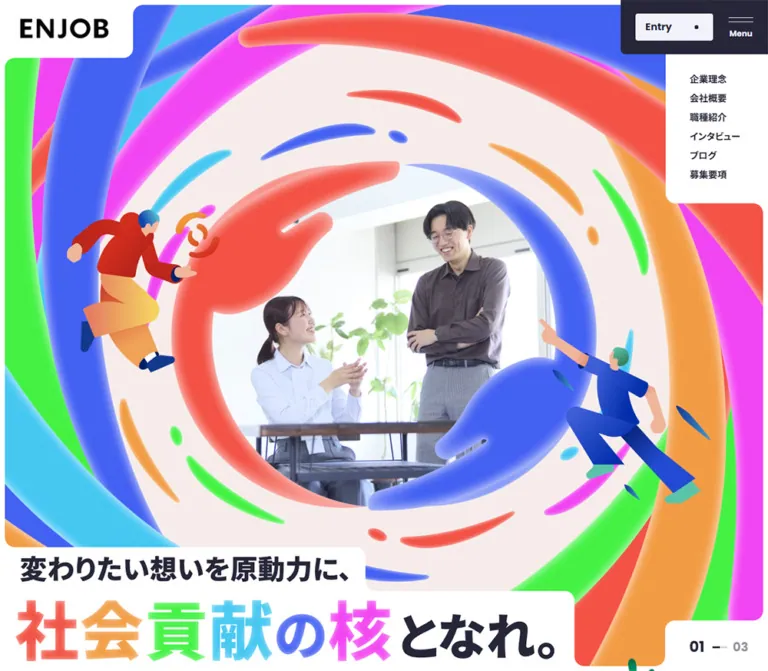
鮮やかな6色、極太の和英タイポグラフィ、写真とイラスト、角丸の切り欠きで構成する企業・採用サイト。縦書きや段差のある配置を、スマートフォンでは読みやすい一列構成へ展開。
オリジナルサイトを見るENJOB — Style Reference
A corporate directory with the energy of a recruitment poster: huge lettering, vivid color, and photographs fitted into rounded cutouts.
Website: en-job.com
Original URL: https://en-job.com/
Final URL: https://en-job.com/
Theme: predominantly white, with pale lavender and a dark Work section; no theme selector was evidenced.
Inspected: September 12, 2026. Supplied capture-batch timestamp: 2026-09-12T11:19:34.952Z, or 20:19:34.952 JST.
Viewports: desktop 1440 × 1000 and mobile 390 × 844 CSS pixels.
Scope: the current corporate homepage, including its recruitment pathways, opening hero, company introduction, About, Business, Culture, Work, Blog, Recruit, Entry, Contact, and footer. Linked destination pages were identified but not inspected.
ENJOB is the corporate website of 株式会社エンジョブ. The original page describes two businesses: creative production for regional tourism and travel planning with reservation assistance. Company information, workplace culture, editorial content, and recruitment share one long homepage. Its structure is a gateway into a larger website, with several distinct browsing goals.
The design combines dark navy typography with six vivid category colors. Poppins gives English section names a large, geometric presence; Noto Sans JP supplies unusually heavy Japanese headings and even some long introductory paragraphs. Photographs communicate everyday working relationships, while the visible mobile hero adds colorful illustrated figures and rounded, dimensional swirls. White plates interrupt image boundaries, giving the header, headline, and interview cards a recurring cutout construction.
The supplied desktop hero contains a large pale area with its media unresolved. The mobile hero shows the illustrated composition at the top, followed by a substantial gray area. These are documented capture states; they do not establish an intentionally empty hero or the complete media sequence. The rest of the supplied evidence supports a detailed reference without filling those gaps from another version.
How to Read This Reference
- Measured means a value explicitly recorded in the supplied rendered DOM, computed styles, or CSS custom properties. Decimal dimensions are rounded for readability where appropriate.
- Calculated means arithmetic derived from recorded dimensions, such as a gap or aspect ratio.
- Estimated means an approximate visual reading of an original-page screenshot. These values are not pixel-sampled colors or recovered CSS declarations.
- Recommended means implementation guidance for a new build. The Quick Start is an adaptation, not exported source code.
- Descriptive tokens such as
--color-inkare reference aliases. Source variable names are included only where supplied. - The evidence contains duplicate responsive content, repeated hero counters, and embedded CSS inside text extractions. These should not become duplicate visible UI.
- Desktop screenshots cover the hero, interview cards, and footer. Mobile screenshots cover the hero and lower footer. Other component descriptions rely on the supplied DOM measurements and are identified accordingly.
Tokens — Colors
Default Palette
The following exact values come from source custom properties or computed element colors. The source's eight-digit colors end in ff, meaning full opacity; the table uses equivalent six-digit notation.
| Name | Value | Reference alias / source | Role and evidence |
|---|---|---|---|
| White | #ffffff |
--color-page; computed body background |
Main canvas, logo plate, footer, and white lettering on colored components |
| Navy Ink | #262638 |
--color-ink / --s-color-3b816540 |
Main text, header control dock, Work background, and dark structural elements |
| Lavender Mist | #f2f2fa |
--color-mist / --s-color-aeb1890d |
Entry button, Business section background, and pale circular action surfaces |
| Coral Red | #f25244 |
--color-recruit / --s-color-01b9f5f9 |
Recruit category marker; part of the multicolor identity |
| Orange | #f29c44 |
--color-about / --s-color-06bc5444 |
About category marker |
| Bright Green | #44f244 |
--color-business / --s-color-c9816fcc |
Business category marker |
| Sky Cyan | #44c7f2 |
--color-culture / --s-color-0d91022d |
Culture marker and measured interview-card backgrounds |
| Electric Blue | #4461f2 |
--color-work / --s-color-128e380a |
Work category marker |
| Magenta | #f244f2 |
--color-blog / --s-color-3e947080 |
Blog category marker |
| President Blog Pink | #f24495 |
--color-president-blog; computed banner background |
Separate promotional banner linking to the president's blog |
| Muted Ink | rgba(38, 38, 56, 0.5) |
--color-muted-ink; computed pagination text |
Secondary 03 total beside the active hero counter |
Category Color Mapping
The desktop footer makes the six-color taxonomy especially clear: About is orange, Business green, Culture cyan, Work blue, Blog magenta, and Recruit red. These colors appear as vertical bars beside large English titles and Japanese link lists.
A category color is an identifying accent, not a requirement to fill every associated section. Business has a measured lavender background despite its green footer marker. Work uses a dark navy section background despite its blue category marker. Culture combines a white section with cyan interview cards.
Capture-Specific Neutrals
The desktop hero's pale blush field is approximately #f5ebe8, and the mobile blank field is approximately #eeeeee, based on visual estimation. Neither has a confirmed source token in the supplied evidence. Keep them out of the core palette until the media layering is verified.
The ENJOB wordmark appears black. Its precise asset color was not supplied as a computed value. Use the authorized logo asset; #000000 is a reasonable implementation fallback, not a measured logo token.
The many transparent --g-color-* variables in the DOM are not evidence of a visible page-wide gradient. The visible color system is established by semantic section colors, imagery, and dark/light surfaces.
Tokens — Typography
Poppins — English Display and Navigation
Verified family: Poppins, also declared through --s-font-e882134f.
Use weight 800 for the enormous section names and weight 700 for utility labels, card numbers, dates, and navigation actions. Section headings have -0.02em tracking and a line height of 1. This creates compact, strongly recognizable word shapes such as About, Business, Culture, Work, Blog, and Recruit.
The header Entry label remains 16px / 16px, weight 700, at both inspected widths. The interface therefore preserves a readable action label while reducing the surrounding container.
Noto Sans JP — Japanese Content
Verified family: Noto Sans JP, also declared through --s-font-258d8624.
Weight 900 dominates section subtitles, interview titles, About link titles, and the company introduction. Supporting banner paragraphs use 700. Japanese display titles commonly use 0.03em tracking. Introduction paragraphs use normal tracking and a generous line height of 2.
The heavy paragraph styling is site-specific. Preserve it in the introductory statement, but do not infer that every destination page uses the same body weight.
Declared but Unassigned Family
Zen Kaku Gothic New appears in --s-font-bdb87adc. None of the supplied sampled text elements establishes its actual role. Do not assign it to the hero or other components without additional evidence.
The root element reports Times, while content wrappers report generic sans-serif. The actual visible text samples above override those defaults. Times is not the observed visual typeface for this homepage.
Type Scale
All entries are measured unless explicitly marked estimated. A dash means the corresponding value was not supplied.
| Role | Desktop size / line height | Mobile size / line height | Weight | Tracking |
|---|---|---|---|---|
| Main English section name | 160 / 160px |
72 / 72px |
Poppins 800 |
-0.02em |
| Japanese section subtitle | 24 / 24px |
16 / 16px |
Noto Sans JP 900 |
0.03em |
| Introduction vertical headline | 56.016 / 57.136px |
32 / 32.64px |
Noto Sans JP 900 |
0.01em |
| Introduction paragraphs | 27.936 / 55.872px |
18 / 36px |
Noto Sans JP 900 |
Normal |
| About destination title | 32 / 48px |
24 / 36px |
Noto Sans JP 900 |
0.03em |
| About topic chip | 16 / 16px |
12 / 12px |
Noto Sans JP 700 |
0.05em |
| About / Business number label | 32 / 32px |
18 / 18px |
Poppins 700 |
-0.02em |
| Business destination title | 40 / 40px |
24 / 36px |
Noto Sans JP 900 |
0.03em |
| Video Library title | 72 / 72px |
24 / 24px |
Poppins 700 |
Normal |
| Cross Talk eyebrow | 18 / 18px |
13 / 13px |
Poppins 700 |
Normal |
| Cross Talk Japanese heading | 80 / 80px |
40 / 50px |
Noto Sans JP 900 |
0.03em |
| Interview card number | 60 / 60px |
40 / 40px |
Poppins 700 |
Normal |
| Interview card hash | 20 / 20px |
18 / 18px |
Poppins 700 |
Normal |
| Interview card title | 32 / 40px |
24 / 30px |
Noto Sans JP 900 |
0.03em |
| Work destination label | 28 / 29.4px, vertical |
24 / 36px, horizontal |
Noto Sans JP 900 |
0.03em |
| Blog year | 18 / 18px |
16 / 16px |
Poppins 700 |
Normal |
| Blog month and day | 40 / 40px |
32 / 32px |
Poppins 700 |
Normal |
| Blog article title | 28 / 35px |
20 / 30px |
Noto Sans JP 900 |
0.03em |
| President blog heading | 48 / 48px |
32 / 32px |
Noto Sans JP 900 |
0.03em |
| President blog paragraph | 16 / 27.2px |
16 / 27.2px |
Noto Sans JP 700 |
0.03em |
| Character speech caption | 16 / 20px |
11 / 13.75px |
Noto Sans JP 900 |
0.03em |
| View All | 28 / 28px |
20 / 20px |
Poppins 700 |
Normal |
| Header Entry | 16 / 16px |
16 / 16px |
Poppins 700 |
Normal |
| Header Menu | 13 / 13px |
12 / 12px |
Poppins 700 |
Normal |
| Desktop hero navigation | 15 / 15px |
Not displayed | Noto Sans JP 700 |
Normal |
| Footer category title | Approximately 48px, estimated |
40 / 40px |
Mobile Poppins 800 |
Mobile -0.02em |
Hero Lettering
The visible source copy reads: “変わりたい想いを原動力に、社会貢献の核となれ。” Its first phrase is a smaller dark line. The emphasized characters progress through red, orange, green, cyan, blue, and magenta, with dimensional highlights and shading. The ending returns to dark navy.
Estimated from the screenshots, the colored desktop characters are roughly 100–110px tall, while the mobile display is around 52–56px. These are visual estimates, not computed font sizes. The supplied DOM does not establish whether the treatment is an image, masked text, or another rendering technique. A flat gradient applied to ordinary text would only approximate its appearance.
Tokens — Spacing & Shapes
Rhythm: small 8–16px media insets inside large components, 24–64px structural spacing, and much larger section breathing room.
Shape language: rounded rectangles interrupted by overlapping plates, selective rounded corners, thin rules, small dots, and occasional circular arrow controls.
Spacing Scale
| Use | Desktop | Mobile | Evidence |
|---|---|---|---|
| Hero outer inset | 8px |
8px |
Measured section padding |
| Hero bottom padding | 8px |
65px |
Measured; do not confuse with a safe-area declaration |
| Common section gutter | 64px |
24px |
Measured heading and component positions |
| Introduction text left edge | Approximately 624px in its right column |
32px |
Measured |
| Introduction paragraph separation | 48px between several groups |
24px |
Calculated from rectangles |
| About section internal gap | 64px |
16px |
Computed gap |
| About link vertical padding | 32px top, 39px bottom |
24px each |
Computed padding |
| About topic-chip gap | 6px |
4px |
Calculated from chip positions |
| Business card gap | 16px horizontally |
24px vertically |
Calculated |
| Business second-card offset | 80px downward |
Removed | Measured positions |
| Interview-card gap | 15px horizontally |
15px vertically |
Calculated |
| Interview title left inset | 16px |
8px |
Calculated from card and text rectangles |
| Work card gap | 16px horizontally |
24px vertically |
Calculated |
| Header Menu internal gap | 12px |
8px |
Computed gap |
| Blog Prev/Next gap | 8px |
8px |
Calculated |
These values do not form a universal eight-pixel grid. Preserve the deliberate 15px interview spacing and the smaller chip gaps where close correspondence matters.
Border Radius
| Element | Desktop | Mobile | Status |
|---|---|---|---|
| Logo plate | Bottom-right 16px; other corners square |
Bottom-right 8px |
Measured |
| Header Entry button | 4px |
4px |
Measured |
| Business cards | 16px |
8px |
Measured |
| Culture overview and Video Library | 16px |
8px |
Measured |
| Interview cards | 16px |
8px |
Measured |
| President blog banner | 16px |
8px |
Measured |
| About topic chips | 4px |
4px |
Measured |
| Blog navigation buttons | 8px |
8px |
Measured |
| Footer Home strip | Pill-shaped | Pill-shaped appearance not separately captured | Desktop visual observation |
| Footer Entry arrow | Circle, approximately 80px diameter |
Circle, approximately 64px diameter |
Screenshot estimates |
Layout Measurements
| Element | Desktop 1440 × 1000 |
Mobile 390 × 844 |
|---|---|---|
| Document height | Approximately 12,723px |
Approximately 13,080px |
| Hero section | 1440 × 1000px |
390 × 844px |
| Header bounding box | 1440 × 94.17px |
390 × 60px |
| Logo link plate | 216 × 94.17px |
144 × 57.19px |
| Header Entry link | 126 × 44px |
88 × 44px |
| Recorded Menu button box | 40 × 33px |
40 × 28px |
| Common content span | 1312px |
342px |
| About destination row | 578.48 × 165px |
342 × 362.33px |
| Business card | 648 × 648px |
342 × 245px |
| Culture overview link | 1312 × 623px |
342 × 429.05px |
| Video Library link | 1312 × 345px |
342 × 245px |
| Interview card | 427.28 × 489.5px |
342 × 332.33px; middle card 362.33px high |
| Work destination | 320.5px wide; approximately 400–421px high |
342px wide; approximately 260px high |
| Blog article slot | 427 × 468px |
302 × 323px |
| Blog Prev / Next button | 100 × 280px |
80 × 80px |
| President blog banner | 1090 × 423px |
374 × 558.13px |
| Main Entry feature | Not included in the desktop element sample | 374 × 500px |
Document and component heights describe the inspected content and state. They should not become fixed page-length requirements.
Components
Persistent Corner Header
Role: maintain identity and an immediately available recruitment action throughout a long page.
The header is visually split between two screen corners. The left ENJOB logo sits on a white plate with a rounded bottom-right corner. The right dock is dark navy and contains a pale Entry link followed by a two-line menu symbol above the word Menu. The middle remains visually open, allowing the page imagery or white canvas to continue behind it.
The desktop logo plate uses measured padding of 30px 40px 32px 33px. Its mobile padding becomes 16px on every side. The dark right dock is approximately 239 × 88px on desktop and 176 × 60px on mobile, estimated from the screenshots and consistent with the child positions.
Entry is an anchor to /entry; Menu is a button. A small dark dot appears at the right side of the desktop Entry button and is absent in the mobile capture. The header remains at the same screen corners in the middle and footer screenshots, supporting a persistent positioning treatment. Its exact positioning declaration and opened-menu state were not supplied.
Desktop Hero Navigation Plate
Role: provide direct routes into important company and recruitment information.
A white vertical plate extends downward beneath the right dock in the desktop hero. Its six links are “企業理念”, “会社概要”, “職種紹介”, “インタビュー”, “ブログ”, and “募集要項”. Each uses 15px bold Noto Sans JP with 15px line height. Link starts are 31px apart, implying 16px of vertical separation.
The plate is approximately 166px wide and ends in a rounded lower-left corner. It is not visible in the scrolled desktop captures or the mobile hero. Treat it as a hero-local navigation element rather than assuming it follows the persistent control dock down the page.
Hero Stage and Headline Plates
Role: introduce the company through people, energetic artwork, and an assertive recruitment message.
The first section occupies exactly the inspected viewport height at both sizes, with an 8px outer inset. White plates occupy the logo corner, desktop navigation corner, lower-left headline area, and desktop pagination corner. Rounded joins make these interruptions feel part of the image silhouette.
The mobile source screenshot shows a circular composition containing two people in business clothing, surrounded by thick colored swirls and small illustrated figures. The visible artwork fills approximately the top 375px of the inset stage. A gray region occupies much of the remaining stage. The desktop capture shows the pale stage, headline, and counter without the complete main artwork.
The desktop headline occupies two white steps near the bottom-left. Mobile wraps the emphasized phrase into “社会貢献の” and “核となれ。” beneath the smaller introductory line. Preserve the hierarchy and character-color sequence without treating the gray or pale capture regions as intentional permanent content.
For a new implementation, keep the heading accessible as real text or provide an equivalent accessible heading when an authorized lettering asset is used. Supply a decoded static poster while richer media initializes.
Hero Counter
Role: identify the active state within the opening presentation.
The desktop screenshot shows 02, a short horizontal track, and a muted 03. The active number is Poppins 24px / 24px, weight 700; the total is 20px / 20px at 50% ink opacity. It sits on a white lower-right plate.
Repeated 01, 02, and 03 elements occupy the same recorded coordinates. This is consistent with a three-state presentation, not nine independent pagination items. The supplied evidence does not establish its autoplay interval, transition direction, or whether the counter itself is clickable. It is absent from the mobile visible-text snapshot.
Company Introduction
Role: explain the two businesses and connect regional contribution with employee growth.
Desktop combines narrow columns of vertical Japanese display text on the left with a broad paragraph column beginning around x = 624px. The paragraph column reaches approximately 742px wide. Text is deliberately substantial: about 28px, weight 900, with 56px leading.
Mobile retains the vertical headline treatment at 32px but moves the explanatory paragraphs below it. The body column becomes 326px wide at x = 32px, with 18px / 36px typography. Selected paragraph-group gaps shrink from 48px to 24px.
The extracted headline is incomplete between its visible phrases. Do not invent the missing word. The embedded CSS establishes floating illustration targets around this introduction, but the complete artwork arrangement is not shown in the supplied screenshots.
English Section Heading and Japanese Subtitle
Role: make each major part of the long homepage recognizable at a glance.
The recurring pair uses a 160px English name and 24px Japanese subtitle on desktop, reducing to 72px and 16px on mobile. About, Culture, and Blog start at the left desktop gutter; Business and Recruit align toward the right. Mobile puts these names at the common 24px left gutter.
For left-aligned sections, the Japanese subtitle begins 38px farther right than the English heading on desktop and 26px farther right on mobile. The mobile examples have a 5px gap between the English line box and subtitle.
The sampled source headings are paragraph elements styled as display text. A new implementation should use an appropriate semantic heading hierarchy while retaining these visual proportions.
About Directory
Role: connect visitors to company information, the representative's message, philosophy, and company data.
Desktop uses a media area on the left and four consecutive destination rows on the right. Each row is approximately 578 × 165px, with a heavy 32px Japanese title and compact topic chips below. The first row contains “企業情報”, “拠点”, and “沿革”. The destination is the entire anchor; the sampled chips are paragraph elements, not separately linked buttons.
The About 01–04 labels overlap at the same left-side coordinates in the desktop sample. Embedded :has(...:hover) CSS sets the opacity of a corresponding sibling layer to 1 when a particular destination is hovered. This supports an alternate-layer preview arrangement. The exact image changes and hover appearance were not exercised in the supplied record.
Mobile distributes the number labels inside their respective destination anchors. Each anchor becomes a tall, full-width block around 342 × 362px, with its title and chips below the upper media region. The section therefore grows from approximately 1129px high on desktop to 1697px on mobile. Do not preserve a single hover-dependent preview as the only mobile access to imagery.
Business Pair
Role: distinguish tourism services from contract creative production.
Two desktop anchors are each 648px square, separated by 16px. The second begins 80px lower, creating a deliberate stagger. A Poppins Business number label sits near the upper-left, while the Japanese service name sits near the lower-left. The enclosing section has a measured lavender-mist background.
Mobile replaces the square pair with two 342 × 245px horizontal cards separated vertically by 24px. Both begin at the same left gutter. Corner radii halve from 16px to 8px, number labels shrink from 32px to 18px, and service names become 24px / 36px.
The supplied evidence establishes the containers and labels, but not the complete desktop card artwork. Keep image content separate from the measured geometry.
Culture Overview and Video Library
Role: present workplace atmosphere before the more specific interview links.
The Culture overview is one broad anchor to /culture, measuring 1312 × 623px on desktop and 342 × 429px on mobile. Its View More label shrinks from 28px to 14px. Its mobile interior uses 40px top and horizontal padding.
Video Library is a separate anchor to /video. It changes from a wide 1312 × 345px banner to a 342 × 245px card. The desktop screenshot reveals a photographic montage with a dark wash, a cyan title plate, and a large white circular detail toward the right. Its measured outer background is navy; visible cyan belongs to the layered presentation rather than proving a cyan outer background declaration.
The label itself changes from 72px to 24px. There is no evidence that clicking this homepage banner immediately opens a modal player; the recorded semantic action is navigation.
Cross Talk Section Rule
Role: introduce the numbered interview collection within Culture.
A thin navy horizontal rule spans the content width. A small dark tab at its left contains a white dot and the English label Cross Talk. The tab has a rounded transition into the surrounding white surface.
Below it, the Japanese heading “社長×若手座談会” is 80px / 80px on desktop. Mobile changes it to 40px / 50px and explicitly breaks after “社長×”. The gap from the heading's bottom to the first card is 40px on desktop and 24px on mobile, calculated from the supplied rectangles.
The heading is the observed source label even though the three cards cover junior, mid-career, and management conversations.
Numbered Interview Card
Role: make employee conversations approachable and easy to browse.
The whole card is an anchor to one of /cross-talk1, /cross-talk2, or /cross-talk3. Its anatomy is particularly distinctive:
- A solid cyan outer body with a
16pxdesktop radius. - A photographic panel inset by approximately
8px, showing people talking in a bright workplace with windows, shelving, and sofas. - A cyan number plate overlapping the photo's upper-left. The small hash sits beside a much larger white two-digit number.
- A cyan title plate overlapping the photo's lower-left, with a rounded upper-right corner. A strip of the photograph continues farther down at the right.
- A heavy white Japanese title, followed by generous empty cyan space.
- A small white dot near the bottom-right. Its separate interaction semantics were not supplied; the enclosing card is the verified link.
Desktop uses three equal-height cards approximately 427.28 × 489.5px, separated by 15px. The measured title box is 347.28px wide, beginning 16px from the left. Titles use 32px / 40px typography. The photographs visually approximate a 3:2 rectangle before the overlapping plates obscure portions of them.
Mobile stacks the same three cards with 15px gaps. The outer radius becomes 8px; numbers become 40px; titles become 24px / 30px in a 270px text box. The first and third cards measure 332.33px high, while the middle measures 362.33px. Preserve content-driven height rather than forcing desktop equality onto the mobile stack.
Work Directory
Role: provide routes into workplace information, job categories, interviews, and career paths.
The Work section changes the page to navy with white labels. On desktop, the English heading occupies a tall narrow rectangle and the Japanese labels have vertical text geometry. Four destination anchors form a rising diagonal from left to right, each approximately 320.5px wide, with 16px horizontal gaps and 160px successive vertical offsets.
The mobile layout is materially different. The heading becomes horizontal, destination labels move into horizontal lower regions, and all four anchors stack at 342px wide with 24px gaps.
The recorded mobile visual order, established by the rectangles' vertical positions, is workplace, job categories, employee interviews, then career paths. This differs from the raw extraction order. Match visual order and keyboard reading order deliberately in a new implementation.
Blog Rail and Navigation
Role: expose recent editorial content while retaining a route to the complete blog.
The desktop DOM records article slots at 427px intervals, continuing beyond the viewport. On mobile, slots are 302px wide at 302px intervals; the first begins at x = 16px, and the second begins at x = 318px, leaving a partial next item within the viewport.
Date typography is split into a small year and a much larger month/day. Article titles are white and heavy, with measured sizes of 28px / 35px on desktop and 20px / 30px on mobile. The full image and surface treatment of these cards is not visible in the supplied screenshots.
Prev and Next are actual buttons. Their desktop boxes are unusually tall at 100 × 280px; mobile changes them to 80 × 80px controls below the article row. View All links to /blog, with a measured 80px-high desktop anchor and 64px-high mobile anchor.
The different leading articles in the two snapshots do not prove a responsive content filter or a specific autoplay behavior. No button activation, drag gesture, wraparound behavior, or progression interval was recorded.
President Blog Banner
Role: promote a separate editorial destination with a more personal voice.
The banner has a measured pink background of #f24495, distinct from the magenta Blog category marker. It links to the president's external blog. Desktop measures 1090 × 423px with a 16px radius; mobile becomes 374 × 558px with an 8px radius and only 8px of outer page clearance.
The Japanese heading is white at 48px on desktop and 32px on mobile. Supporting text remains 16px / 27.2px, weight 700, at both sizes. A small speech caption and an illustration target are present in the DOM. The supplied CSS assigns the banner illustration a 3s ease-in-out infinite alternate animation; its displacement is not available.
Recruit, Entry, and Contact
Role: carry interested visitors from company exploration into recruitment information or business contact.
Recruit links to benefits and open-position information. Desktop introductory recruitment copy is arranged in narrow vertical columns at approximately 20px; mobile uses a horizontal 16px / 28px paragraph beneath the section title.
A separate Entry feature follows. Its measured mobile anchor is 374 × 500px, has an 8px radius, and contains a centered Poppins 72px Entry title with the 16px label “エントリーへ進む”. Embedded CSS references several floating illustration targets around it. Complete artwork and desktop dimensions were not supplied.
Contact follows as a distinct information block. Mobile uses a 13px English eyebrow, a 40px / 50px Japanese heading, and 16px / 28px explanatory text with the displayed email and phone details. The evidence does not establish a homepage contact form or clickable mail/telephone anchors. Entry is the verified navigation route, not a verified submission interaction.
Footer Sitemap and Closing Brand
Role: make the site's full information architecture available at the end of the page.
A long navy pill containing “ホーム” precedes the sitemap in the desktop screenshot. Below it, five category groups occupy the first row; Recruit wraps beneath the first column. Each group has a vivid vertical bar, a large English title, and a compact list of heavy Japanese links. Bar widths are approximately 16px on desktop and 8px on mobile, estimated from the screenshots.
The lower desktop composition places an Entry link on the left and an enormous black ENJOB wordmark on the right. Entry combines a large English label, smaller Japanese subtitle, pale circular arrow, and a thin bottom rule. The wordmark occupies approximately 656px of width. Privacy and copyright sit underneath it.
Mobile turns the category groups into an expanded vertical sitemap. The visible Blog and Recruit groups retain their colored bars and full link lists. Entry spans the 342px content width; the wordmark follows below it, nearly filling the phone width. Privacy and copyright move into separate left-aligned rows. The persistent corner header is still present over the scrolled footer.
Do not replace the observed mobile sitemap with an accordion without treating that as a new interaction design.
Tokens — Motion & Interaction
The supplied screenshots are still captures. CSS declarations establish available timing and some state logic, but do not prove that every transition ran or identify its complete visual effect.
| Treatment | Recorded value or evidence | What can be concluded |
|---|---|---|
| Common element transitions | 0.3s cubic-bezier(0.4, 0.4, 0, 1) |
Shared timing appears throughout headers, labels, and components; exact changing properties and triggers are not always identified |
| Body background transition | background 0.5s cubic-bezier(0.4, 0.4, 0, 1) |
A background transition is declared; this does not establish a theme switch |
| Desktop Business first card | 1s with 0.3s delay, shared easing |
A delayed transition is configured; entry trajectory is unverified |
| Desktop Business second card | 1s with 0.6s delay, shared easing |
Staggered timing is configured |
| Desktop Work links | 1s with 0.3s delay |
Transition timing is recorded, not its movement distance |
| Mobile Business and Work links | Shared 0.3s transition |
Desktop delayed timings are not retained in these samples |
| Blog Prev / Next | 0.4s cubic-bezier(0.4, 0.4, 0, 1) |
Control-state transition timing; no click result was recorded |
| Blog article transforms | cubic-bezier(0.58, 0.21, 0.41, 0.96) |
Transform timing curve is recorded; no nonzero duration appears in the supplied shorthand |
| Introduction and several section illustrations | 2s ease-in-out infinite alternate |
Repeating alternating animation declarations are present; keyframe geometry is incomplete |
| President blog illustration | 3s ease-in-out infinite alternate |
A separate slower illustration loop is declared |
| Entry illustration target | 2s ease-in-out infinite alternate |
Repeating decorative motion is declared for a sampled target |
| About preview layers | Hover-dependent sibling opacity: 1 through :has() |
A specific hover-to-layer relationship is supported by CSS; its rendered result was not captured |
| Hero progress | Positioned, clipped ::before layer beginning at width: 0 |
Progress construction is evidenced; duration and completion sequence are unknown |
Use the shared easing and restrained floating decoration as the basis for an adaptation. Do not invent continuous hero rotation, scroll scrubbing, sound, parallax depth, or spring physics.
The capture process waited for finite visible motion and image readiness within time limits, temporarily paused perpetual animations, then resumed them. This helps stabilize observations but cannot guarantee complete media rendering. The unresolved hero remains a limitation even after those readiness checks.
Surfaces
| Surface | Appearance | Structural purpose |
|---|---|---|
| Main canvas | White | Separates highly colored sections and large display headings |
| Business background | Lavender mist | Creates a gentle full-section change behind two prominent links |
| Work background | Navy ink | Provides the strongest dark section and supports white vertical labels |
| Interview card | Flat cyan | Joins numbering, photograph, title plate, and trailing space into one link |
| President blog banner | Flat pink | Distinguishes a personal editorial destination |
| Header dock | Navy with a pale Entry rectangle | Keeps the main action readable over varied content |
| Cutout plate | White or the component's own fill | Makes labels appear integrated into the silhouette of media |
| Footer Entry control | Pale circle and thin navy rule | Creates a quiet action treatment after dense navigation |
There is no visible general-purpose elevation system in the supplied screenshots. Structure comes from color changes, geometry, overlapping plates, typography, and thin rules. Dimensional shading belongs to the hero artwork and lettering; it should not automatically become a shadow on every UI card.
Imagery
Photography
The interview photographs show informal conversations in bright interiors. Window light, shelving, sofas, visible gestures, and relaxed expressions create a workplace atmosphere. Framing usually includes two or three people and enough of the room to explain the interaction.
The images are presented as editorial scenes rather than isolated circular headshots. Preserve facial visibility when placing the number and title plates over them. The title plate deliberately obscures a lower portion of the image, so each crop needs an appropriate focal point.
Illustration and Dimensional Color
The current mobile hero independently shows thick, rounded swirls in the six-color palette, two photographed people at the center, and small stylized figures around the outside. Highlights and shading make parts of the swirl feel inflated or sculpted. The figures have simplified bodies, energetic poses, and bright clothing.
The source DOM also contains short conversational captions around major sections, such as “毎日、いい汗かいてます!”. Their measured 16px desktop and 11px mobile typography gives them a secondary, character-like voice. Specific illustration shapes outside the visible hero cannot be reconstructed from the caption text alone.
Observed Asset References
| Asset role | Evidence available | Reuse guidance |
|---|---|---|
| ENJOB wordmark | Visible in desktop/mobile headers and footers | Use an authorized original logo asset; do not assume it is ordinary Poppins text |
| Hero collage | Partially visible in the current mobile screenshot | Preserve the people-and-swirl relationship; the complete desktop composition is unverified |
| Colored hero lettering | Visible in current desktop and mobile screenshots | Use authorized lettering artwork or clearly identify a CSS approximation |
| Three interview photographs | Visible in the desktop Culture screenshot | Use scene-specific crops that keep participants clear of plates |
| Video Library montage | Partially visible in the desktop middle screenshot | Preserve the photographic montage, dark wash, and cyan title treatment |
| Culture and Entry backgrounds | Background-image references appear in DOM fragments | Complete asset URLs were not supplied; do not invent filenames |
| Section and Entry illustrations | Named animation targets and captions in embedded CSS/DOM | Their complete artwork and keyframes require separate assets |
No complete downloadable asset inventory accompanies this reference. CSS can reproduce the containers and typographic hierarchy, but the hero's identity depends on its actual artwork.
Layout & Responsive Behavior
Page-Level Structure
The content sequence is hero, company introduction, About, Business, Culture, Work, Blog, Recruit, Entry, Contact, and footer. The common content span changes from 1312px on desktop to 342px on mobile. Selected features intentionally use a smaller 8px outer gutter instead, including the hero and the mobile president-blog and Entry features.
The desktop page alternates left and right section headings, square and panoramic media, vertical typography, and staggered card positions. Mobile changes the composition rather than uniformly shrinking it.
Verified Changes
| Area | Desktop behavior | Mobile behavior |
|---|---|---|
| Header | Large logo plate and 126px Entry link |
Smaller logo plate and 88px Entry link; Entry text stays 16px |
| Hero | Viewport-height stage with visible secondary navigation and counter | Viewport-height section; secondary navigation and counter absent from visible-text snapshot |
| Introduction | Vertical headline beside broad right-side paragraphs | Vertical headline above a narrow paragraph column |
| Section names | 160px; alternating alignments |
72px; common left alignment |
| About | Shared left preview and four right-side rows | Each destination receives its own tall media-and-text block |
| Business | Two square cards with an 80px stagger |
Two horizontal cards in a single aligned stack |
| Cross Talk | Three equal-height columns | One column; height varies with text |
| Work | Diagonal arrangement and vertical labels | One column in workplace-to-career-path order, with horizontal labels |
| Blog | Wide rail and tall controls to its left | Narrow rail with partial next item and square controls below |
| Recruitment copy | Vertical columns | Horizontal paragraph |
| Footer | Multiple category groups across rows; Entry beside logo | Expanded vertical sitemap; Entry, logo, privacy, and copyright stacked |
A 1140px media-query boundary is visible in source line-break rules, and a specific illustration adjustment is defined for 1141–1366px. These fragments do not establish every component's breakpoint. The exact intermediate layouts were not captured.
Implementation Implications
Keep the standard content gutter distinct from the near-edge media gutter. Let long Japanese titles wrap without clipping or ellipsis. Preserve the desktop stagger only where space supports it, and give the mobile Work order an explicit semantic implementation.
Do not infer a universal viewport-based font formula from the two measured sizes. The Quick Start uses its own bounded scaling and a recommended breakpoint. Safe-area handling, text zoom, landscape phones, and intermediate tablet layouts remain unverified.
Do’s and Don’ts
Do
- Preserve the six category colors and their footer mapping.
- Use navy ink and white as the stable foundation beneath vivid accents.
- Retain Poppins
800section names and Noto Sans JP900Japanese display titles. - Preserve the unusual heavy introduction with double line spacing.
- Build photo cards from overlapping number and title plates, including the visible image extension at the right.
- Keep the header split into two corner plates with an open middle.
- Maintain distinct About, Business, Culture, Work, Blog, and Recruit pathways.
- Treat Work's dark surface and vertical desktop typography as a major compositional change.
- Use actual workplace scenes with visible interaction and natural interior light.
- Implement the measured mobile stacking, title reductions, and Work ordering.
- Keep a reliable static media state available while animated assets initialize.
Don't
- Don't reduce the entire homepage to a single recruitment conversion sequence.
- Don't replace every section with identical centered headings and uniform cards.
- Don't use one generic sans-serif weight for all English and Japanese content.
- Don't confuse Blog magenta
#f244f2with the separate banner pink#f24495. - Don't fill every Business component green simply because its category marker is green.
- Don't add generic glass panels, large soft shadows, or gradient button fills.
- Don't turn the small interview-card dot into an invented separately clickable control.
- Don't make mobile content depend on desktop hover previews.
- Don't hardcode document heights or equal mobile interview-card heights.
- Don't treat repeated DOM counters as nine hero slides.
- Don't reproduce the unresolved hero gaps as a deliberate minimalist design.
- Don't claim menu, carousel, video, or form behavior that was not demonstrated.
Recommended Implementation Additions
These recommendations are not verified features of the original website.
- Improve cyan-card text contrast. Calculated from the recorded colors using standard relative luminance, white on
#44c7f2is approximately1.96:1, below the usual large-text threshold. Navy ink on the same cyan is approximately7.5:1. Use navy for functional titles or introduce an appropriately dark title surface. The source uses white; the Quick Start explicitly adopts navy titles. - Increase the Menu hit area. Its recorded mobile box is only
40 × 28px. A44 × 44pxtarget can surround the same compact visual arrangement. - Use semantic headings and grouped navigation. Several source display headings are paragraph elements. Use heading elements, named navigation regions, and lists in a new build.
- Match visual and keyboard order. Work's extracted order differs from its mobile position order. Avoid relying solely on CSS reversal if it creates confusing keyboard navigation.
- Provide visible focus and a skip link. Ensure the persistent header does not obscure focused content or anchor destinations.
- Support reduced motion. Stop decorative loops, remove delays, and keep all essential content visible. Never make a reveal animation the only way to expose a link.
- Make media readiness robust. Reserve image dimensions and provide a decoded poster or fallback. The supplied hero captures demonstrate why the page should remain coherent when richer media is incomplete.
- Implement explicit carousel semantics if retaining the Blog rail. Use accessible Previous/Next names, predictable focus, and a readable static list when scripting fails. Autoplay is not required by the supplied evidence.
- Keep speech captions readable. Consider increasing the observed
11pxmobile captions where they carry useful information. - Test text expansion and zoom. The large English section names and inset Japanese card titles need checks below
390pxand at enlarged text settings.
Agent Prompt Guide
Quick Color Reference
- Canvas: white
#ffffff. - Main text and dark sections: navy
#262638. - Pale surface and Entry button:
#f2f2fa. - About: orange
#f29c44. - Business: green
#44f244. - Culture: cyan
#44c7f2. - Work: blue
#4461f2. - Blog: magenta
#f244f2. - Recruit: coral
#f25244. - President blog feature: pink
#f24495. - Source interview titles: white; recommended accessible adaptation: navy on cyan.
Overall Prompt
“Create a Japanese corporate homepage with recruitment content, inspired by ENJOB's current visual system. Use a white canvas, navy #262638 typography, and six category accents: orange for About, green for Business, cyan for Culture, blue for Work, magenta for Blog, and coral for Recruit. Pair oversized Poppins 800 English section names with Noto Sans JP 900 Japanese titles. Use a persistent white logo plate at the upper-left and a navy Entry/Menu dock at the upper-right. Build media with selective rounded corners and overlapping title plates. Include a company introduction, a directory of company pages, two staggered business cards, workplace culture content, three numbered conversation cards, a dark Work directory, a blog rail, recruitment links, and a full sitemap footer. On mobile, use 24px content gutters, 72px section names, stacked content, and horizontal Work labels. Keep media visible without animation, and use navy titles on cyan for accessible contrast.”
Example Component Prompts
- Header: “Create two persistent corner plates with an open center. Left: an authorized black wordmark on white, with only the bottom-right corner rounded. Right: a navy dock containing a pale 44px-high Entry link and a compact two-line Menu button. Mobile retains 16px Entry text and reduces the logo plate to 144px wide. Give Menu an accessible hit area.”
- Interview card: “Create a cyan editorial link card with an inset workplace conversation photo. Overlay a cyan upper-left plate containing a small hash and a large white two-digit number. Overlap the lower-left photo with a rounded title plate, leaving part of the image extending downward at the right. Use a heavy Japanese title and a small decorative dot near the bottom-right. Desktop has three equal-height columns; mobile stacks variable-height cards. Use navy title text for accessible contrast.”
- Business pair: “Place two 648px-square desktop service links on a pale lavender section, separated by 16px, with the second card 80px lower. Put a compact English number label at the upper-left and a heavy Japanese service name near the lower-left. On a 390px phone, use two 342 × 245px cards with a 24px vertical gap and 8px radii.”
- Work directory: “Create a navy section with white display typography and four editorial destination links. On desktop, arrange the links in a rising diagonal and use vertical Japanese labels. On mobile, place workplace, jobs, interviews, and career paths in that order in one column, with horizontal labels and 24px gaps. Keep reading order aligned with visual order.”
- Footer: “Build a white sitemap footer with large Poppins category names, heavy Japanese links, and a colored vertical bar per group. Use the six established category colors. On desktop, let Recruit wrap beneath the first row and place a large Entry link beside an oversized authorized wordmark. Mobile stacks every group, then Entry, wordmark, privacy, and copyright.”
- Hero art direction: “For a new, clearly identified illustration adaptation, place workplace photography inside a circular composition of thick rounded swirls in coral, orange, green, cyan, blue, and magenta, accompanied by small simplified figures. Keep the Japanese headline on white plates. Use the current mobile composition as the visual authority; the complete desktop media state is unverified. Provide a static poster and do not use empty media gaps as decoration.”
Quick Start
CSS Custom Properties
This CSS implements a reusable header, section typography, Business pair, interview cards, and footer. It uses a conventional root size. Font declarations require separately loaded font files; no font URLs were supplied.
The desktop and mobile endpoints follow measured values where available. The 1140px switch is an implementation choice informed by a source breakpoint fragment, not a recovered breakpoint for every component. Interview image proportions and overlapping plates are practical approximations of the visible construction. Hero artwork, exact masks, menu behavior, and carousel scripting remain separate work.
The card titles intentionally use navy instead of the source's white for improved contrast. The Menu target is also enlarged. Hover arrow movement is a recommended addition, not an observed source interaction.
:root {
  /* Exact colors from supplied source evidence */
  --color-page: #ffffff;
  --color-ink: #262638;
  --color-mist: #f2f2fa;
  --color-about: #f29c44;
  --color-business: #44f244;
  --color-culture: #44c7f2;
  --color-work: #4461f2;
  --color-blog: #f244f2;
  --color-recruit: #f25244;
  --color-president-blog: #f24495;

  /* Verified families; load authorized font files separately */
  --font-display: 'Poppins', sans-serif;
  --font-japanese: 'Noto Sans JP', sans-serif;
  --weight-bold: 700;
  --weight-display: 800;
  --weight-heavy: 900;

  /* Reference aliases, not original variable names */
  --gutter: 64px;
  --media-gutter: 8px;
  --radius-card: 16px;
  --radius-control: 4px;
  --space-small: 8px;
  --space-medium: 16px;
  --space-large: 24px;
  --space-section: 64px;
  --talk-gap: 15px;
  --text-section: clamp(112px, 11.111vw, 160px);
  --text-subtitle: 24px;
  --text-talk: 32px;
  --text-number: 60px;
  --circle-size: 80px;
  --ease-site: cubic-bezier(0.4, 0.4, 0, 1);
  --duration-ui: 300ms;
}

* {
  box-sizing: border-box;
}

body {
  margin: 0;
  color: var(--color-ink);
  background: var(--color-page);
  font-family: var(--font-japanese);
  font-weight: var(--weight-bold);
}

img {
  display: block;
  max-width: 100%;
}

button,
a {
  -webkit-tap-highlight-color: transparent;
}

a {
  color: inherit;
}

button {
  font: inherit;
}

.page-container {
  width: calc(100% - 2 * var(--gutter));
  margin-inline: auto;
}

/* Recommended fixed implementation of the persistent corner header */
.site-header {
  position: fixed;
  inset: 0 0 auto;
  z-index: 100;
  display: flex;
  align-items: flex-start;
  justify-content: space-between;
  pointer-events: none;
}

.site-header > * {
  pointer-events: auto;
}

.site-logo {
  display: grid;
  align-items: center;
  width: 216px;
  min-height: 94.17px;
  padding: 30px 40px 32px 33px;
  border-radius: 0 0 16px 0;
  background: var(--color-page);
}

.site-logo img {
  width: 100%;
  height: auto;
}

.header-actions {
  display: flex;
  align-items: center;
  gap: 21px;
  min-height: 88px;
  padding: 22px 24px;
  border-radius: 0 0 0 8px;
  color: var(--color-mist);
  background: var(--color-ink);
}

.entry-button {
  display: flex;
  align-items: center;
  justify-content: space-between;
  width: 126px;
  min-height: 44px;
  padding: 14px 21px 14px 16px;
  border-radius: var(--radius-control);
  color: var(--color-ink);
  background: var(--color-mist);
  font: 700 16px / 1 var(--font-display);
  text-decoration: none;
}

.entry-button::after {
  content: '';
  width: 6px;
  height: 6px;
  border-radius: 2px;
  background: currentColor;
}

/* Enlarged target; the observed mobile button box was smaller */
.menu-button {
  display: flex;
  flex-direction: column;
  align-items: center;
  justify-content: center;
  gap: 12px;
  width: 44px;
  min-height: 44px;
  padding: 0;
  border: 0;
  color: inherit;
  background: transparent;
  font: 700 13px / 1 var(--font-display);
  cursor: pointer;
}

.menu-button__lines {
  width: 40px;
  height: 8px;
  border-block: 1px solid currentColor;
}

.section-heading {
  margin: 0;
  font-family: var(--font-display);
  font-size: var(--text-section);
  font-weight: var(--weight-display);
  line-height: 1;
  letter-spacing: -0.02em;
}

.section-subtitle {
  margin: 0 0 0 38px;
  font-size: var(--text-subtitle);
  font-weight: var(--weight-heavy);
  line-height: 1;
  letter-spacing: 0.03em;
}

.section-heading-group--right {
  text-align: right;
}

.section-heading-group--right .section-subtitle {
  margin-left: 0;
}

.intro-copy {
  font-size: clamp(22px, 1.94vw, 27.936px);
  font-weight: var(--weight-heavy);
  line-height: 2;
}

.intro-copy p {
  margin: 0;
}

.intro-copy p + p {
  margin-top: 48px;
}

.business-section {
  padding-block: 80px;
  background: var(--color-mist);
}

.business-grid {
  display: grid;
  grid-template-columns: repeat(2, minmax(0, 1fr));
  gap: 16px;
  margin-top: 36px;
}

.business-card {
  position: relative;
  display: block;
  aspect-ratio: 1;
  overflow: hidden;
  border-radius: var(--radius-card);
  text-decoration: none;
}

.business-card:nth-child(2) {
  margin-top: 80px;
}

.business-card > img {
  width: 100%;
  height: 100%;
  object-fit: cover;
}

.business-card__index,
.business-card__title {
  position: absolute;
  left: 16px;
  margin: 0;
  max-width: calc(100% - 32px);
}

.business-card__index {
  top: 16px;
  font: 700 32px / 1 var(--font-display);
  letter-spacing: -0.02em;
}

.business-card__title {
  bottom: 32px;
  font-size: 40px;
  font-weight: var(--weight-heavy);
  line-height: 1;
  letter-spacing: 0.03em;
}

/* Provide an opaque label backing if the image reduces contrast */
.business-card__title > span {
  background: var(--color-mist);
  box-shadow: 8px 0 var(--color-mist), -8px 0 var(--color-mist);
}

.cross-talk-rule {
  margin-top: 80px;
  border-top: 1px solid var(--color-ink);
}

.cross-talk-rule > span {
  display: inline-flex;
  align-items: center;
  gap: 12px;
  min-height: 31px;
  padding: 6px 48px 7px 12px;
  border-radius: 0 0 16px 0;
  color: var(--color-page);
  background: var(--color-ink);
  font: 700 18px / 1 var(--font-display);
}

.cross-talk-rule > span::before {
  content: '';
  width: 6px;
  height: 6px;
  border-radius: 50%;
  background: currentColor;
}

.cross-talk-heading {
  margin: 38px 0 40px;
  font-size: 80px;
  font-weight: var(--weight-heavy);
  line-height: 1;
  letter-spacing: 0.03em;
}

.talk-grid {
  display: grid;
  grid-template-columns: repeat(3, minmax(0, 1fr));
  gap: var(--talk-gap);
}

.talk-card {
  position: relative;
  display: flex;
  flex-direction: column;
  min-width: 0;
  min-height: 489.5px;
  border-radius: var(--radius-card);
  background: var(--color-culture);
  text-decoration: none;
}

.talk-card__media {
  aspect-ratio: 3 / 2;
  margin: 8px 8px 0;
  overflow: hidden;
  border-radius: var(--radius-card);
}

.talk-card__media img {
  width: 100%;
  height: 100%;
  object-fit: cover;
  object-position: var(--image-focus, 50% 50%);
}

.talk-card__index {
  position: absolute;
  top: 0;
  left: 0;
  display: flex;
  align-items: flex-start;
  padding: 10px 32px 0 8px;
  border-radius: var(--radius-card) 0 var(--radius-card) 0;
  color: var(--color-page);
  background: var(--color-culture);
  font: 700 var(--text-number) / 1 var(--font-display);
}

.talk-card__hash {
  padding-top: 4px;
  font-size: 20px;
}

.talk-card__body {
  position: relative;
  z-index: 1;
  width: calc(100% - 48px);
  margin-top: -40px;
  padding: 16px 16px 80px;
  border-radius: 0 var(--radius-card) 0 0;
  background: var(--color-culture);
}

.talk-card__title {
  margin: 0;
  color: var(--color-ink);
  font-size: var(--text-talk);
  font-weight: var(--weight-heavy);
  line-height: 1.25;
  letter-spacing: 0.03em;
  overflow-wrap: anywhere;
}

.talk-card__dot {
  position: absolute;
  right: 40px;
  bottom: 40px;
  width: 12px;
  height: 12px;
  border-radius: 50%;
  background: var(--color-page);
}

.site-footer {
  padding-block: 80px 40px;
}

.footer-grid {
  display: grid;
  grid-template-columns: repeat(5, minmax(0, 1fr));
  align-items: start;
  gap: 40px 24px;
}

.footer-group {
  padding-left: 8px;
  border-left: 16px solid var(--category-color, var(--color-ink));
}

.footer-group h3 {
  margin: 0 0 24px;
  font: 800 48px / 1 var(--font-display);
  letter-spacing: -0.02em;
}

.footer-group ul {
  display: grid;
  gap: 16px;
  margin: 0;
  padding: 0;
  list-style: none;
}

.footer-group a {
  font-size: 16px;
  font-weight: var(--weight-heavy);
  line-height: 1.4;
  text-decoration: none;
}

.footer-bottom {
  display: grid;
  grid-template-columns: minmax(0, 0.82fr) minmax(0, 1fr);
  align-items: end;
  gap: 120px;
  margin-top: 64px;
}

.footer-entry {
  display: flex;
  align-items: center;
  justify-content: space-between;
  gap: 24px;
  padding-bottom: 40px;
  border-bottom: 1px solid var(--color-ink);
  text-decoration: none;
}

.footer-entry__title {
  display: block;
  font: 800 48px / 1 var(--font-display);
}

.footer-entry__caption {
  display: block;
  margin-top: 12px;
  font-size: 16px;
  font-weight: var(--weight-heavy);
}

.arrow-disc {
  display: grid;
  flex: 0 0 var(--circle-size);
  place-items: center;
  width: var(--circle-size);
  height: var(--circle-size);
  border-radius: 50%;
  background: var(--color-mist);
}

.arrow-disc > span {
  transition: transform var(--duration-ui) var(--ease-site);
}

.footer-wordmark {
  width: 100%;
  height: auto;
}

@media (hover: hover) {
  .footer-entry:hover .arrow-disc > span {
    transform: translateX(4px);
  }
}

/* Recommended focus and anchor clearance */
:where(a, button):focus-visible {
  outline: 3px solid var(--color-ink);
  outline-offset: 5px;
}

.header-actions :focus-visible {
  outline-color: var(--color-page);
}

section[id] {
  scroll-margin-top: 112px;
}

@media (max-width: 1140px) {
  :root {
    --gutter: 24px;
    --radius-card: 8px;
    --text-section: clamp(56px, 18.462vw, 72px);
    --text-subtitle: 16px;
    --text-talk: 24px;
    --text-number: 40px;
    --circle-size: 64px;
  }

  .site-logo {
    width: 144px;
    min-height: 57.19px;
    padding: 16px;
    border-bottom-right-radius: 8px;
  }

  .header-actions {
    gap: 12px;
    min-height: 60px;
    padding: 8px 16px;
  }

  .entry-button {
    justify-content: center;
    width: 88px;
    padding-inline: 16px;
  }

  .entry-button::after {
    display: none;
  }

  .menu-button {
    gap: 8px;
    font-size: 12px;
  }

  .section-heading-group--right {
    text-align: left;
  }

  .section-subtitle,
  .section-heading-group--right .section-subtitle {
    margin: 5px 0 0 26px;
  }

  .intro-copy {
    font-size: 18px;
    line-height: 2;
  }

  .intro-copy p + p {
    margin-top: 24px;
  }

  .business-grid {
    grid-template-columns: 1fr;
    gap: 24px;
    margin-top: 40px;
  }

  .business-card {
    aspect-ratio: 342 / 245;
  }

  .business-card:nth-child(2) {
    margin-top: 0;
  }

  .business-card__index {
    top: 12px;
    left: 9px;
    font-size: 18px;
  }

  .business-card__title {
    left: 8px;
    bottom: 8px;
    font-size: 24px;
    line-height: 1.5;
  }

  .cross-talk-rule {
    margin-top: 40px;
  }

  .cross-talk-rule > span {
    font-size: 13px;
  }

  .cross-talk-heading {
    margin: 16px 0 24px;
    font-size: 40px;
    line-height: 1.25;
  }

  .talk-grid {
    grid-template-columns: 1fr;
  }

  .talk-card {
    min-height: 0;
  }

  .talk-card__index {
    padding: 8px 24px 0 8px;
  }

  .talk-card__hash {
    font-size: 18px;
  }

  .talk-card__body {
    width: calc(100% - 56px);
    margin-top: -25px;
    padding: 8px 8px 64px;
  }

  .talk-card__dot {
    right: 24px;
    bottom: 24px;
  }

  .footer-grid,
  .footer-bottom {
    grid-template-columns: 1fr;
  }

  .footer-grid {
    gap: 24px;
  }

  .footer-group {
    border-left-width: 8px;
  }

  .footer-group h3 {
    margin-bottom: 16px;
    font-size: 40px;
  }

  .footer-bottom {
    gap: 64px;
  }

  .footer-entry {
    padding-bottom: 24px;
  }

  .footer-entry__title {
    font-size: 40px;
  }

  section[id] {
    scroll-margin-top: 76px;
  }
}

/* Optional decorative adaptation: timing is sourced; 6px travel is recommended */
@media (prefers-reduced-motion: no-preference) {
  .decorative-float {
    animation: reference-float 2s ease-in-out infinite alternate;
  }
}

@keyframes reference-float {
  from { transform: translateY(0); }
  to { transform: translateY(-6px); }
}

@media (prefers-reduced-motion: reduce) {
  .decorative-float {
    animation: none;
  }

  .arrow-disc > span {
    transition: none;
    transform: none;
  }
}
The opaque Business label backing is also a recommended contrast addition. Its zero-blur shadow extends the backing horizontally; it is not an elevation effect.
Component Markup Example
The image source below is an explicit replacement placeholder, not an original asset path. Use authorized photography. Keep the number and dot decorative when the visible title already identifies the destination.
<section class='page-container' aria-labelledby='cross-talk-title'>
  <div class='cross-talk-rule'>
    <span>Cross Talk</span>
  </div>
  <h2 id='cross-talk-title' class='cross-talk-heading' lang='ja'>
    社長×若手座談会
  </h2>

  <div class='talk-grid'>
    <a class='talk-card' href='/cross-talk1'>
      <div class='talk-card__media'>
        <img
          src='REPLACE_WITH_AUTHORIZED_PHOTO_URL'
          width='1200'
          height='800'
          alt='Colleagues talking together in a bright workplace'
          loading='lazy'
        >
      </div>
      <span class='talk-card__index' aria-hidden='true'>
        <span class='talk-card__hash'>#</span>01
      </span>
      <div class='talk-card__body'>
        <h3 class='talk-card__title' lang='ja'>
          社長×若手メンバー対談「働き方や環境について」
        </h3>
      </div>
      <span class='talk-card__dot' aria-hidden='true'></span>
    </a>
  </div>
</section>
The example reserves a recommended 3:2 source-image ratio. It does not claim an original image resolution. Repeat the anchor for the remaining two conversations and provide accurate alternative text for each chosen photograph.
Tailwind v4 Token Mapping
Optional aliases for projects already using Tailwind v4. Define the custom properties above first. This mapping does not claim that the original website uses Tailwind.
@theme inline {
  --color-enjob-ink: var(--color-ink);
  --color-enjob-mist: var(--color-mist);
  --color-enjob-about: var(--color-about);
  --color-enjob-business: var(--color-business);
  --color-enjob-culture: var(--color-culture);
  --color-enjob-work: var(--color-work);
  --color-enjob-blog: var(--color-blog);
  --color-enjob-recruit: var(--color-recruit);
  --color-enjob-president: var(--color-president-blog);
  --font-enjob-display: var(--font-display);
  --font-enjob-japanese: var(--font-japanese);
  --text-enjob-section: var(--text-section);
  --text-enjob-talk: var(--text-talk);
  --spacing-enjob-gutter: var(--gutter);
  --radius-enjob-card: var(--radius-card);
}
Sources & Evidence
- Original and final website: https://en-job.com/. The supplied inspection records HTTP
200, the same original and final URL, the company page title, homepage copy, and matching navigation identity. - Capture batch: September 12, 2026,
11:19:34.952 UTC/20:19:34.952 JST. Individual screenshot timestamps were not supplied separately. - Desktop evidence:
1440 × 1000CSS-pixel viewport; original-page screenshots of the hero, Cross Talk cards with part of Video Library, and footer; supplied document height approximately12,723px. - Mobile evidence:
390 × 844CSS-pixel viewport; original-page screenshots of the hero and lower footer; supplied document height approximately13,080px. - Technical evidence: rendered DOM text and link destinations, element rectangles, computed typography, padding, gaps, radii, backgrounds, custom properties, transition declarations, and embedded CSS fragments. Complete stylesheets, image inventories, and all keyframes were not supplied.
- Observed navigation structure: links into company information, tourism and contract services, culture, video, conversations, workplace and career information, blogs, recruitment, Entry, and privacy. These are homepage link findings; destination-page designs were not inspected.
- Interaction scope: supplied scroll-position captures show persistent header placement and different page regions. No recorded menu opening, carousel button activation, video playback, form submission, keyboard test, or hover-result capture is available.
- Rendering limits: the desktop hero media is unresolved in its supplied capture, and the mobile hero includes a large blank gray region. The capture readiness process does not establish semantic completeness. The complete hero sequence, exact media format, and static fallback behavior remain unverified.
This reference describes the current homepage represented by the supplied original-page evidence. Calculations, screenshot estimates, accessibility changes, responsive interpolation, and reusable implementation code are distinguished from measured source values.
# ENJOB — Style Reference

> A corporate directory with the energy of a recruitment poster: huge lettering, vivid color, and photographs fitted into rounded cutouts.

**Website:** [en-job.com](https://en-job.com/)
**Original URL:** https://en-job.com/
**Final URL:** https://en-job.com/
**Theme:** predominantly white, with pale lavender and a dark Work section; no theme selector was evidenced.
**Inspected:** September 12, 2026. Supplied capture-batch timestamp: `2026-09-12T11:19:34.952Z`, or 20:19:34.952 JST.
**Viewports:** desktop `1440 × 1000` and mobile `390 × 844` CSS pixels.
**Scope:** the current corporate homepage, including its recruitment pathways, opening hero, company introduction, About, Business, Culture, Work, Blog, Recruit, Entry, Contact, and footer. Linked destination pages were identified but not inspected.

ENJOB is the corporate website of 株式会社エンジョブ. The original page describes two businesses: creative production for regional tourism and travel planning with reservation assistance. Company information, workplace culture, editorial content, and recruitment share one long homepage. Its structure is a gateway into a larger website, with several distinct browsing goals.

The design combines dark navy typography with six vivid category colors. Poppins gives English section names a large, geometric presence; Noto Sans JP supplies unusually heavy Japanese headings and even some long introductory paragraphs. Photographs communicate everyday working relationships, while the visible mobile hero adds colorful illustrated figures and rounded, dimensional swirls. White plates interrupt image boundaries, giving the header, headline, and interview cards a recurring cutout construction.

The supplied desktop hero contains a large pale area with its media unresolved. The mobile hero shows the illustrated composition at the top, followed by a substantial gray area. These are documented capture states; they do not establish an intentionally empty hero or the complete media sequence. The rest of the supplied evidence supports a detailed reference without filling those gaps from another version.

## How to Read This Reference

- **Measured** means a value explicitly recorded in the supplied rendered DOM, computed styles, or CSS custom properties. Decimal dimensions are rounded for readability where appropriate.
- **Calculated** means arithmetic derived from recorded dimensions, such as a gap or aspect ratio.
- **Estimated** means an approximate visual reading of an original-page screenshot. These values are not pixel-sampled colors or recovered CSS declarations.
- **Recommended** means implementation guidance for a new build. The Quick Start is an adaptation, not exported source code.
- Descriptive tokens such as `--color-ink` are reference aliases. Source variable names are included only where supplied.
- The evidence contains duplicate responsive content, repeated hero counters, and embedded CSS inside text extractions. These should not become duplicate visible UI.
- Desktop screenshots cover the hero, interview cards, and footer. Mobile screenshots cover the hero and lower footer. Other component descriptions rely on the supplied DOM measurements and are identified accordingly.

## Tokens — Colors

### Default Palette

The following exact values come from source custom properties or computed element colors. The source's eight-digit colors end in `ff`, meaning full opacity; the table uses equivalent six-digit notation.

| Name | Value | Reference alias / source | Role and evidence |
| --- | --- | --- | --- |
| White | `#ffffff` | `--color-page`; computed body background | Main canvas, logo plate, footer, and white lettering on colored components |
| Navy Ink | `#262638` | `--color-ink` / `--s-color-3b816540` | Main text, header control dock, Work background, and dark structural elements |
| Lavender Mist | `#f2f2fa` | `--color-mist` / `--s-color-aeb1890d` | Entry button, Business section background, and pale circular action surfaces |
| Coral Red | `#f25244` | `--color-recruit` / `--s-color-01b9f5f9` | Recruit category marker; part of the multicolor identity |
| Orange | `#f29c44` | `--color-about` / `--s-color-06bc5444` | About category marker |
| Bright Green | `#44f244` | `--color-business` / `--s-color-c9816fcc` | Business category marker |
| Sky Cyan | `#44c7f2` | `--color-culture` / `--s-color-0d91022d` | Culture marker and measured interview-card backgrounds |
| Electric Blue | `#4461f2` | `--color-work` / `--s-color-128e380a` | Work category marker |
| Magenta | `#f244f2` | `--color-blog` / `--s-color-3e947080` | Blog category marker |
| President Blog Pink | `#f24495` | `--color-president-blog`; computed banner background | Separate promotional banner linking to the president's blog |
| Muted Ink | `rgba(38, 38, 56, 0.5)` | `--color-muted-ink`; computed pagination text | Secondary `03` total beside the active hero counter |

### Category Color Mapping

The desktop footer makes the six-color taxonomy especially clear: About is orange, Business green, Culture cyan, Work blue, Blog magenta, and Recruit red. These colors appear as vertical bars beside large English titles and Japanese link lists.

A category color is an identifying accent, not a requirement to fill every associated section. Business has a measured lavender background despite its green footer marker. Work uses a dark navy section background despite its blue category marker. Culture combines a white section with cyan interview cards.

### Capture-Specific Neutrals

The desktop hero's pale blush field is approximately `#f5ebe8`, and the mobile blank field is approximately `#eeeeee`, based on visual estimation. Neither has a confirmed source token in the supplied evidence. Keep them out of the core palette until the media layering is verified.

The ENJOB wordmark appears black. Its precise asset color was not supplied as a computed value. Use the authorized logo asset; `#000000` is a reasonable implementation fallback, not a measured logo token.

The many transparent `--g-color-*` variables in the DOM are not evidence of a visible page-wide gradient. The visible color system is established by semantic section colors, imagery, and dark/light surfaces.

## Tokens — Typography

### Poppins — English Display and Navigation

**Verified family:** `Poppins`, also declared through `--s-font-e882134f`.

Use weight `800` for the enormous section names and weight `700` for utility labels, card numbers, dates, and navigation actions. Section headings have `-0.02em` tracking and a line height of `1`. This creates compact, strongly recognizable word shapes such as About, Business, Culture, Work, Blog, and Recruit.

The header Entry label remains `16px / 16px`, weight `700`, at both inspected widths. The interface therefore preserves a readable action label while reducing the surrounding container.

### Noto Sans JP — Japanese Content

**Verified family:** `Noto Sans JP`, also declared through `--s-font-258d8624`.

Weight `900` dominates section subtitles, interview titles, About link titles, and the company introduction. Supporting banner paragraphs use `700`. Japanese display titles commonly use `0.03em` tracking. Introduction paragraphs use normal tracking and a generous line height of `2`.

The heavy paragraph styling is site-specific. Preserve it in the introductory statement, but do not infer that every destination page uses the same body weight.

### Declared but Unassigned Family

`Zen Kaku Gothic New` appears in `--s-font-bdb87adc`. None of the supplied sampled text elements establishes its actual role. Do not assign it to the hero or other components without additional evidence.

The root element reports Times, while content wrappers report generic sans-serif. The actual visible text samples above override those defaults. Times is not the observed visual typeface for this homepage.

### Type Scale

All entries are measured unless explicitly marked estimated. A dash means the corresponding value was not supplied.

| Role | Desktop size / line height | Mobile size / line height | Weight | Tracking |
| --- | --- | --- | --- | --- |
| Main English section name | `160 / 160px` | `72 / 72px` | Poppins `800` | `-0.02em` |
| Japanese section subtitle | `24 / 24px` | `16 / 16px` | Noto Sans JP `900` | `0.03em` |
| Introduction vertical headline | `56.016 / 57.136px` | `32 / 32.64px` | Noto Sans JP `900` | `0.01em` |
| Introduction paragraphs | `27.936 / 55.872px` | `18 / 36px` | Noto Sans JP `900` | Normal |
| About destination title | `32 / 48px` | `24 / 36px` | Noto Sans JP `900` | `0.03em` |
| About topic chip | `16 / 16px` | `12 / 12px` | Noto Sans JP `700` | `0.05em` |
| About / Business number label | `32 / 32px` | `18 / 18px` | Poppins `700` | `-0.02em` |
| Business destination title | `40 / 40px` | `24 / 36px` | Noto Sans JP `900` | `0.03em` |
| Video Library title | `72 / 72px` | `24 / 24px` | Poppins `700` | Normal |
| Cross Talk eyebrow | `18 / 18px` | `13 / 13px` | Poppins `700` | Normal |
| Cross Talk Japanese heading | `80 / 80px` | `40 / 50px` | Noto Sans JP `900` | `0.03em` |
| Interview card number | `60 / 60px` | `40 / 40px` | Poppins `700` | Normal |
| Interview card hash | `20 / 20px` | `18 / 18px` | Poppins `700` | Normal |
| Interview card title | `32 / 40px` | `24 / 30px` | Noto Sans JP `900` | `0.03em` |
| Work destination label | `28 / 29.4px`, vertical | `24 / 36px`, horizontal | Noto Sans JP `900` | `0.03em` |
| Blog year | `18 / 18px` | `16 / 16px` | Poppins `700` | Normal |
| Blog month and day | `40 / 40px` | `32 / 32px` | Poppins `700` | Normal |
| Blog article title | `28 / 35px` | `20 / 30px` | Noto Sans JP `900` | `0.03em` |
| President blog heading | `48 / 48px` | `32 / 32px` | Noto Sans JP `900` | `0.03em` |
| President blog paragraph | `16 / 27.2px` | `16 / 27.2px` | Noto Sans JP `700` | `0.03em` |
| Character speech caption | `16 / 20px` | `11 / 13.75px` | Noto Sans JP `900` | `0.03em` |
| View All | `28 / 28px` | `20 / 20px` | Poppins `700` | Normal |
| Header Entry | `16 / 16px` | `16 / 16px` | Poppins `700` | Normal |
| Header Menu | `13 / 13px` | `12 / 12px` | Poppins `700` | Normal |
| Desktop hero navigation | `15 / 15px` | Not displayed | Noto Sans JP `700` | Normal |
| Footer category title | Approximately `48px`, estimated | `40 / 40px` | Mobile Poppins `800` | Mobile `-0.02em` |

### Hero Lettering

The visible source copy reads: “変わりたい想いを原動力に、社会貢献の核となれ。” Its first phrase is a smaller dark line. The emphasized characters progress through red, orange, green, cyan, blue, and magenta, with dimensional highlights and shading. The ending returns to dark navy.

Estimated from the screenshots, the colored desktop characters are roughly `100–110px` tall, while the mobile display is around `52–56px`. These are visual estimates, not computed font sizes. The supplied DOM does not establish whether the treatment is an image, masked text, or another rendering technique. A flat gradient applied to ordinary text would only approximate its appearance.

## Tokens — Spacing & Shapes

**Rhythm:** small `8–16px` media insets inside large components, `24–64px` structural spacing, and much larger section breathing room.

**Shape language:** rounded rectangles interrupted by overlapping plates, selective rounded corners, thin rules, small dots, and occasional circular arrow controls.

### Spacing Scale

| Use | Desktop | Mobile | Evidence |
| --- | --- | --- | --- |
| Hero outer inset | `8px` | `8px` | Measured section padding |
| Hero bottom padding | `8px` | `65px` | Measured; do not confuse with a safe-area declaration |
| Common section gutter | `64px` | `24px` | Measured heading and component positions |
| Introduction text left edge | Approximately `624px` in its right column | `32px` | Measured |
| Introduction paragraph separation | `48px` between several groups | `24px` | Calculated from rectangles |
| About section internal gap | `64px` | `16px` | Computed gap |
| About link vertical padding | `32px` top, `39px` bottom | `24px` each | Computed padding |
| About topic-chip gap | `6px` | `4px` | Calculated from chip positions |
| Business card gap | `16px` horizontally | `24px` vertically | Calculated |
| Business second-card offset | `80px` downward | Removed | Measured positions |
| Interview-card gap | `15px` horizontally | `15px` vertically | Calculated |
| Interview title left inset | `16px` | `8px` | Calculated from card and text rectangles |
| Work card gap | `16px` horizontally | `24px` vertically | Calculated |
| Header Menu internal gap | `12px` | `8px` | Computed gap |
| Blog Prev/Next gap | `8px` | `8px` | Calculated |

These values do not form a universal eight-pixel grid. Preserve the deliberate `15px` interview spacing and the smaller chip gaps where close correspondence matters.

### Border Radius

| Element | Desktop | Mobile | Status |
| --- | --- | --- | --- |
| Logo plate | Bottom-right `16px`; other corners square | Bottom-right `8px` | Measured |
| Header Entry button | `4px` | `4px` | Measured |
| Business cards | `16px` | `8px` | Measured |
| Culture overview and Video Library | `16px` | `8px` | Measured |
| Interview cards | `16px` | `8px` | Measured |
| President blog banner | `16px` | `8px` | Measured |
| About topic chips | `4px` | `4px` | Measured |
| Blog navigation buttons | `8px` | `8px` | Measured |
| Footer Home strip | Pill-shaped | Pill-shaped appearance not separately captured | Desktop visual observation |
| Footer Entry arrow | Circle, approximately `80px` diameter | Circle, approximately `64px` diameter | Screenshot estimates |

### Layout Measurements

| Element | Desktop `1440 × 1000` | Mobile `390 × 844` |
| --- | --- | --- |
| Document height | Approximately `12,723px` | Approximately `13,080px` |
| Hero section | `1440 × 1000px` | `390 × 844px` |
| Header bounding box | `1440 × 94.17px` | `390 × 60px` |
| Logo link plate | `216 × 94.17px` | `144 × 57.19px` |
| Header Entry link | `126 × 44px` | `88 × 44px` |
| Recorded Menu button box | `40 × 33px` | `40 × 28px` |
| Common content span | `1312px` | `342px` |
| About destination row | `578.48 × 165px` | `342 × 362.33px` |
| Business card | `648 × 648px` | `342 × 245px` |
| Culture overview link | `1312 × 623px` | `342 × 429.05px` |
| Video Library link | `1312 × 345px` | `342 × 245px` |
| Interview card | `427.28 × 489.5px` | `342 × 332.33px`; middle card `362.33px` high |
| Work destination | `320.5px` wide; approximately `400–421px` high | `342px` wide; approximately `260px` high |
| Blog article slot | `427 × 468px` | `302 × 323px` |
| Blog Prev / Next button | `100 × 280px` | `80 × 80px` |
| President blog banner | `1090 × 423px` | `374 × 558.13px` |
| Main Entry feature | Not included in the desktop element sample | `374 × 500px` |

Document and component heights describe the inspected content and state. They should not become fixed page-length requirements.

## Components

### Persistent Corner Header

**Role:** maintain identity and an immediately available recruitment action throughout a long page.

The header is visually split between two screen corners. The left ENJOB logo sits on a white plate with a rounded bottom-right corner. The right dock is dark navy and contains a pale Entry link followed by a two-line menu symbol above the word Menu. The middle remains visually open, allowing the page imagery or white canvas to continue behind it.

The desktop logo plate uses measured padding of `30px 40px 32px 33px`. Its mobile padding becomes `16px` on every side. The dark right dock is approximately `239 × 88px` on desktop and `176 × 60px` on mobile, estimated from the screenshots and consistent with the child positions.

Entry is an anchor to `/entry`; Menu is a button. A small dark dot appears at the right side of the desktop Entry button and is absent in the mobile capture. The header remains at the same screen corners in the middle and footer screenshots, supporting a persistent positioning treatment. Its exact positioning declaration and opened-menu state were not supplied.

### Desktop Hero Navigation Plate

**Role:** provide direct routes into important company and recruitment information.

A white vertical plate extends downward beneath the right dock in the desktop hero. Its six links are “企業理念”, “会社概要”, “職種紹介”, “インタビュー”, “ブログ”, and “募集要項”. Each uses `15px` bold Noto Sans JP with `15px` line height. Link starts are `31px` apart, implying `16px` of vertical separation.

The plate is approximately `166px` wide and ends in a rounded lower-left corner. It is not visible in the scrolled desktop captures or the mobile hero. Treat it as a hero-local navigation element rather than assuming it follows the persistent control dock down the page.

### Hero Stage and Headline Plates

**Role:** introduce the company through people, energetic artwork, and an assertive recruitment message.

The first section occupies exactly the inspected viewport height at both sizes, with an `8px` outer inset. White plates occupy the logo corner, desktop navigation corner, lower-left headline area, and desktop pagination corner. Rounded joins make these interruptions feel part of the image silhouette.

The mobile source screenshot shows a circular composition containing two people in business clothing, surrounded by thick colored swirls and small illustrated figures. The visible artwork fills approximately the top `375px` of the inset stage. A gray region occupies much of the remaining stage. The desktop capture shows the pale stage, headline, and counter without the complete main artwork.

The desktop headline occupies two white steps near the bottom-left. Mobile wraps the emphasized phrase into “社会貢献の” and “核となれ。” beneath the smaller introductory line. Preserve the hierarchy and character-color sequence without treating the gray or pale capture regions as intentional permanent content.

For a new implementation, keep the heading accessible as real text or provide an equivalent accessible heading when an authorized lettering asset is used. Supply a decoded static poster while richer media initializes.

### Hero Counter

**Role:** identify the active state within the opening presentation.

The desktop screenshot shows `02`, a short horizontal track, and a muted `03`. The active number is Poppins `24px / 24px`, weight `700`; the total is `20px / 20px` at 50% ink opacity. It sits on a white lower-right plate.

Repeated `01`, `02`, and `03` elements occupy the same recorded coordinates. This is consistent with a three-state presentation, not nine independent pagination items. The supplied evidence does not establish its autoplay interval, transition direction, or whether the counter itself is clickable. It is absent from the mobile visible-text snapshot.

### Company Introduction

**Role:** explain the two businesses and connect regional contribution with employee growth.

Desktop combines narrow columns of vertical Japanese display text on the left with a broad paragraph column beginning around `x = 624px`. The paragraph column reaches approximately `742px` wide. Text is deliberately substantial: about `28px`, weight `900`, with `56px` leading.

Mobile retains the vertical headline treatment at `32px` but moves the explanatory paragraphs below it. The body column becomes `326px` wide at `x = 32px`, with `18px / 36px` typography. Selected paragraph-group gaps shrink from `48px` to `24px`.

The extracted headline is incomplete between its visible phrases. Do not invent the missing word. The embedded CSS establishes floating illustration targets around this introduction, but the complete artwork arrangement is not shown in the supplied screenshots.

### English Section Heading and Japanese Subtitle

**Role:** make each major part of the long homepage recognizable at a glance.

The recurring pair uses a `160px` English name and `24px` Japanese subtitle on desktop, reducing to `72px` and `16px` on mobile. About, Culture, and Blog start at the left desktop gutter; Business and Recruit align toward the right. Mobile puts these names at the common `24px` left gutter.

For left-aligned sections, the Japanese subtitle begins `38px` farther right than the English heading on desktop and `26px` farther right on mobile. The mobile examples have a `5px` gap between the English line box and subtitle.

The sampled source headings are paragraph elements styled as display text. A new implementation should use an appropriate semantic heading hierarchy while retaining these visual proportions.

### About Directory

**Role:** connect visitors to company information, the representative's message, philosophy, and company data.

Desktop uses a media area on the left and four consecutive destination rows on the right. Each row is approximately `578 × 165px`, with a heavy `32px` Japanese title and compact topic chips below. The first row contains “企業情報”, “拠点”, and “沿革”. The destination is the entire anchor; the sampled chips are paragraph elements, not separately linked buttons.

The `About 01–04` labels overlap at the same left-side coordinates in the desktop sample. Embedded `:has(...:hover)` CSS sets the opacity of a corresponding sibling layer to `1` when a particular destination is hovered. This supports an alternate-layer preview arrangement. The exact image changes and hover appearance were not exercised in the supplied record.

Mobile distributes the number labels inside their respective destination anchors. Each anchor becomes a tall, full-width block around `342 × 362px`, with its title and chips below the upper media region. The section therefore grows from approximately `1129px` high on desktop to `1697px` on mobile. Do not preserve a single hover-dependent preview as the only mobile access to imagery.

### Business Pair

**Role:** distinguish tourism services from contract creative production.

Two desktop anchors are each `648px` square, separated by `16px`. The second begins `80px` lower, creating a deliberate stagger. A Poppins Business number label sits near the upper-left, while the Japanese service name sits near the lower-left. The enclosing section has a measured lavender-mist background.

Mobile replaces the square pair with two `342 × 245px` horizontal cards separated vertically by `24px`. Both begin at the same left gutter. Corner radii halve from `16px` to `8px`, number labels shrink from `32px` to `18px`, and service names become `24px / 36px`.

The supplied evidence establishes the containers and labels, but not the complete desktop card artwork. Keep image content separate from the measured geometry.

### Culture Overview and Video Library

**Role:** present workplace atmosphere before the more specific interview links.

The Culture overview is one broad anchor to `/culture`, measuring `1312 × 623px` on desktop and `342 × 429px` on mobile. Its View More label shrinks from `28px` to `14px`. Its mobile interior uses `40px` top and horizontal padding.

Video Library is a separate anchor to `/video`. It changes from a wide `1312 × 345px` banner to a `342 × 245px` card. The desktop screenshot reveals a photographic montage with a dark wash, a cyan title plate, and a large white circular detail toward the right. Its measured outer background is navy; visible cyan belongs to the layered presentation rather than proving a cyan outer background declaration.

The label itself changes from `72px` to `24px`. There is no evidence that clicking this homepage banner immediately opens a modal player; the recorded semantic action is navigation.

### Cross Talk Section Rule

**Role:** introduce the numbered interview collection within Culture.

A thin navy horizontal rule spans the content width. A small dark tab at its left contains a white dot and the English label Cross Talk. The tab has a rounded transition into the surrounding white surface.

Below it, the Japanese heading “社長×若手座談会” is `80px / 80px` on desktop. Mobile changes it to `40px / 50px` and explicitly breaks after “社長×”. The gap from the heading's bottom to the first card is `40px` on desktop and `24px` on mobile, calculated from the supplied rectangles.

The heading is the observed source label even though the three cards cover junior, mid-career, and management conversations.

### Numbered Interview Card

**Role:** make employee conversations approachable and easy to browse.

The whole card is an anchor to one of `/cross-talk1`, `/cross-talk2`, or `/cross-talk3`. Its anatomy is particularly distinctive:

1. A solid cyan outer body with a `16px` desktop radius.
2. A photographic panel inset by approximately `8px`, showing people talking in a bright workplace with windows, shelving, and sofas.
3. A cyan number plate overlapping the photo's upper-left. The small hash sits beside a much larger white two-digit number.
4. A cyan title plate overlapping the photo's lower-left, with a rounded upper-right corner. A strip of the photograph continues farther down at the right.
5. A heavy white Japanese title, followed by generous empty cyan space.
6. A small white dot near the bottom-right. Its separate interaction semantics were not supplied; the enclosing card is the verified link.

Desktop uses three equal-height cards approximately `427.28 × 489.5px`, separated by `15px`. The measured title box is `347.28px` wide, beginning `16px` from the left. Titles use `32px / 40px` typography. The photographs visually approximate a `3:2` rectangle before the overlapping plates obscure portions of them.

Mobile stacks the same three cards with `15px` gaps. The outer radius becomes `8px`; numbers become `40px`; titles become `24px / 30px` in a `270px` text box. The first and third cards measure `332.33px` high, while the middle measures `362.33px`. Preserve content-driven height rather than forcing desktop equality onto the mobile stack.

### Work Directory

**Role:** provide routes into workplace information, job categories, interviews, and career paths.

The Work section changes the page to navy with white labels. On desktop, the English heading occupies a tall narrow rectangle and the Japanese labels have vertical text geometry. Four destination anchors form a rising diagonal from left to right, each approximately `320.5px` wide, with `16px` horizontal gaps and `160px` successive vertical offsets.

The mobile layout is materially different. The heading becomes horizontal, destination labels move into horizontal lower regions, and all four anchors stack at `342px` wide with `24px` gaps.

The recorded mobile visual order, established by the rectangles' vertical positions, is workplace, job categories, employee interviews, then career paths. This differs from the raw extraction order. Match visual order and keyboard reading order deliberately in a new implementation.

### Blog Rail and Navigation

**Role:** expose recent editorial content while retaining a route to the complete blog.

The desktop DOM records article slots at `427px` intervals, continuing beyond the viewport. On mobile, slots are `302px` wide at `302px` intervals; the first begins at `x = 16px`, and the second begins at `x = 318px`, leaving a partial next item within the viewport.

Date typography is split into a small year and a much larger month/day. Article titles are white and heavy, with measured sizes of `28px / 35px` on desktop and `20px / 30px` on mobile. The full image and surface treatment of these cards is not visible in the supplied screenshots.

Prev and Next are actual buttons. Their desktop boxes are unusually tall at `100 × 280px`; mobile changes them to `80 × 80px` controls below the article row. View All links to `/blog`, with a measured `80px`-high desktop anchor and `64px`-high mobile anchor.

The different leading articles in the two snapshots do not prove a responsive content filter or a specific autoplay behavior. No button activation, drag gesture, wraparound behavior, or progression interval was recorded.

### President Blog Banner

**Role:** promote a separate editorial destination with a more personal voice.

The banner has a measured pink background of `#f24495`, distinct from the magenta Blog category marker. It links to the president's external blog. Desktop measures `1090 × 423px` with a `16px` radius; mobile becomes `374 × 558px` with an `8px` radius and only `8px` of outer page clearance.

The Japanese heading is white at `48px` on desktop and `32px` on mobile. Supporting text remains `16px / 27.2px`, weight `700`, at both sizes. A small speech caption and an illustration target are present in the DOM. The supplied CSS assigns the banner illustration a `3s ease-in-out infinite alternate` animation; its displacement is not available.

### Recruit, Entry, and Contact

**Role:** carry interested visitors from company exploration into recruitment information or business contact.

Recruit links to benefits and open-position information. Desktop introductory recruitment copy is arranged in narrow vertical columns at approximately `20px`; mobile uses a horizontal `16px / 28px` paragraph beneath the section title.

A separate Entry feature follows. Its measured mobile anchor is `374 × 500px`, has an `8px` radius, and contains a centered Poppins `72px` Entry title with the `16px` label “エントリーへ進む”. Embedded CSS references several floating illustration targets around it. Complete artwork and desktop dimensions were not supplied.

Contact follows as a distinct information block. Mobile uses a `13px` English eyebrow, a `40px / 50px` Japanese heading, and `16px / 28px` explanatory text with the displayed email and phone details. The evidence does not establish a homepage contact form or clickable mail/telephone anchors. Entry is the verified navigation route, not a verified submission interaction.

### Footer Sitemap and Closing Brand

**Role:** make the site's full information architecture available at the end of the page.

A long navy pill containing “ホーム” precedes the sitemap in the desktop screenshot. Below it, five category groups occupy the first row; Recruit wraps beneath the first column. Each group has a vivid vertical bar, a large English title, and a compact list of heavy Japanese links. Bar widths are approximately `16px` on desktop and `8px` on mobile, estimated from the screenshots.

The lower desktop composition places an Entry link on the left and an enormous black ENJOB wordmark on the right. Entry combines a large English label, smaller Japanese subtitle, pale circular arrow, and a thin bottom rule. The wordmark occupies approximately `656px` of width. Privacy and copyright sit underneath it.

Mobile turns the category groups into an expanded vertical sitemap. The visible Blog and Recruit groups retain their colored bars and full link lists. Entry spans the `342px` content width; the wordmark follows below it, nearly filling the phone width. Privacy and copyright move into separate left-aligned rows. The persistent corner header is still present over the scrolled footer.

Do not replace the observed mobile sitemap with an accordion without treating that as a new interaction design.

## Tokens — Motion & Interaction

The supplied screenshots are still captures. CSS declarations establish available timing and some state logic, but do not prove that every transition ran or identify its complete visual effect.

| Treatment | Recorded value or evidence | What can be concluded |
| --- | --- | --- |
| Common element transitions | `0.3s cubic-bezier(0.4, 0.4, 0, 1)` | Shared timing appears throughout headers, labels, and components; exact changing properties and triggers are not always identified |
| Body background transition | `background 0.5s cubic-bezier(0.4, 0.4, 0, 1)` | A background transition is declared; this does not establish a theme switch |
| Desktop Business first card | `1s` with `0.3s` delay, shared easing | A delayed transition is configured; entry trajectory is unverified |
| Desktop Business second card | `1s` with `0.6s` delay, shared easing | Staggered timing is configured |
| Desktop Work links | `1s` with `0.3s` delay | Transition timing is recorded, not its movement distance |
| Mobile Business and Work links | Shared `0.3s` transition | Desktop delayed timings are not retained in these samples |
| Blog Prev / Next | `0.4s cubic-bezier(0.4, 0.4, 0, 1)` | Control-state transition timing; no click result was recorded |
| Blog article transforms | `cubic-bezier(0.58, 0.21, 0.41, 0.96)` | Transform timing curve is recorded; no nonzero duration appears in the supplied shorthand |
| Introduction and several section illustrations | `2s ease-in-out infinite alternate` | Repeating alternating animation declarations are present; keyframe geometry is incomplete |
| President blog illustration | `3s ease-in-out infinite alternate` | A separate slower illustration loop is declared |
| Entry illustration target | `2s ease-in-out infinite alternate` | Repeating decorative motion is declared for a sampled target |
| About preview layers | Hover-dependent sibling `opacity: 1` through `:has()` | A specific hover-to-layer relationship is supported by CSS; its rendered result was not captured |
| Hero progress | Positioned, clipped `::before` layer beginning at `width: 0` | Progress construction is evidenced; duration and completion sequence are unknown |

Use the shared easing and restrained floating decoration as the basis for an adaptation. Do not invent continuous hero rotation, scroll scrubbing, sound, parallax depth, or spring physics.

The capture process waited for finite visible motion and image readiness within time limits, temporarily paused perpetual animations, then resumed them. This helps stabilize observations but cannot guarantee complete media rendering. The unresolved hero remains a limitation even after those readiness checks.

## Surfaces

| Surface | Appearance | Structural purpose |
| --- | --- | --- |
| Main canvas | White | Separates highly colored sections and large display headings |
| Business background | Lavender mist | Creates a gentle full-section change behind two prominent links |
| Work background | Navy ink | Provides the strongest dark section and supports white vertical labels |
| Interview card | Flat cyan | Joins numbering, photograph, title plate, and trailing space into one link |
| President blog banner | Flat pink | Distinguishes a personal editorial destination |
| Header dock | Navy with a pale Entry rectangle | Keeps the main action readable over varied content |
| Cutout plate | White or the component's own fill | Makes labels appear integrated into the silhouette of media |
| Footer Entry control | Pale circle and thin navy rule | Creates a quiet action treatment after dense navigation |

There is no visible general-purpose elevation system in the supplied screenshots. Structure comes from color changes, geometry, overlapping plates, typography, and thin rules. Dimensional shading belongs to the hero artwork and lettering; it should not automatically become a shadow on every UI card.

## Imagery

### Photography

The interview photographs show informal conversations in bright interiors. Window light, shelving, sofas, visible gestures, and relaxed expressions create a workplace atmosphere. Framing usually includes two or three people and enough of the room to explain the interaction.

The images are presented as editorial scenes rather than isolated circular headshots. Preserve facial visibility when placing the number and title plates over them. The title plate deliberately obscures a lower portion of the image, so each crop needs an appropriate focal point.

### Illustration and Dimensional Color

The current mobile hero independently shows thick, rounded swirls in the six-color palette, two photographed people at the center, and small stylized figures around the outside. Highlights and shading make parts of the swirl feel inflated or sculpted. The figures have simplified bodies, energetic poses, and bright clothing.

The source DOM also contains short conversational captions around major sections, such as “毎日、いい汗かいてます!”. Their measured `16px` desktop and `11px` mobile typography gives them a secondary, character-like voice. Specific illustration shapes outside the visible hero cannot be reconstructed from the caption text alone.

### Observed Asset References

| Asset role | Evidence available | Reuse guidance |
| --- | --- | --- |
| ENJOB wordmark | Visible in desktop/mobile headers and footers | Use an authorized original logo asset; do not assume it is ordinary Poppins text |
| Hero collage | Partially visible in the current mobile screenshot | Preserve the people-and-swirl relationship; the complete desktop composition is unverified |
| Colored hero lettering | Visible in current desktop and mobile screenshots | Use authorized lettering artwork or clearly identify a CSS approximation |
| Three interview photographs | Visible in the desktop Culture screenshot | Use scene-specific crops that keep participants clear of plates |
| Video Library montage | Partially visible in the desktop middle screenshot | Preserve the photographic montage, dark wash, and cyan title treatment |
| Culture and Entry backgrounds | Background-image references appear in DOM fragments | Complete asset URLs were not supplied; do not invent filenames |
| Section and Entry illustrations | Named animation targets and captions in embedded CSS/DOM | Their complete artwork and keyframes require separate assets |

No complete downloadable asset inventory accompanies this reference. CSS can reproduce the containers and typographic hierarchy, but the hero's identity depends on its actual artwork.

## Layout & Responsive Behavior

### Page-Level Structure

The content sequence is hero, company introduction, About, Business, Culture, Work, Blog, Recruit, Entry, Contact, and footer. The common content span changes from `1312px` on desktop to `342px` on mobile. Selected features intentionally use a smaller `8px` outer gutter instead, including the hero and the mobile president-blog and Entry features.

The desktop page alternates left and right section headings, square and panoramic media, vertical typography, and staggered card positions. Mobile changes the composition rather than uniformly shrinking it.

### Verified Changes

| Area | Desktop behavior | Mobile behavior |
| --- | --- | --- |
| Header | Large logo plate and `126px` Entry link | Smaller logo plate and `88px` Entry link; Entry text stays `16px` |
| Hero | Viewport-height stage with visible secondary navigation and counter | Viewport-height section; secondary navigation and counter absent from visible-text snapshot |
| Introduction | Vertical headline beside broad right-side paragraphs | Vertical headline above a narrow paragraph column |
| Section names | `160px`; alternating alignments | `72px`; common left alignment |
| About | Shared left preview and four right-side rows | Each destination receives its own tall media-and-text block |
| Business | Two square cards with an `80px` stagger | Two horizontal cards in a single aligned stack |
| Cross Talk | Three equal-height columns | One column; height varies with text |
| Work | Diagonal arrangement and vertical labels | One column in workplace-to-career-path order, with horizontal labels |
| Blog | Wide rail and tall controls to its left | Narrow rail with partial next item and square controls below |
| Recruitment copy | Vertical columns | Horizontal paragraph |
| Footer | Multiple category groups across rows; Entry beside logo | Expanded vertical sitemap; Entry, logo, privacy, and copyright stacked |

A `1140px` media-query boundary is visible in source line-break rules, and a specific illustration adjustment is defined for `1141–1366px`. These fragments do not establish every component's breakpoint. The exact intermediate layouts were not captured.

### Implementation Implications

Keep the standard content gutter distinct from the near-edge media gutter. Let long Japanese titles wrap without clipping or ellipsis. Preserve the desktop stagger only where space supports it, and give the mobile Work order an explicit semantic implementation.

Do not infer a universal viewport-based font formula from the two measured sizes. The Quick Start uses its own bounded scaling and a recommended breakpoint. Safe-area handling, text zoom, landscape phones, and intermediate tablet layouts remain unverified.

## Do’s and Don’ts

### Do

- Preserve the six category colors and their footer mapping.
- Use navy ink and white as the stable foundation beneath vivid accents.
- Retain Poppins `800` section names and Noto Sans JP `900` Japanese display titles.
- Preserve the unusual heavy introduction with double line spacing.
- Build photo cards from overlapping number and title plates, including the visible image extension at the right.
- Keep the header split into two corner plates with an open middle.
- Maintain distinct About, Business, Culture, Work, Blog, and Recruit pathways.
- Treat Work's dark surface and vertical desktop typography as a major compositional change.
- Use actual workplace scenes with visible interaction and natural interior light.
- Implement the measured mobile stacking, title reductions, and Work ordering.
- Keep a reliable static media state available while animated assets initialize.

### Don't

- Don't reduce the entire homepage to a single recruitment conversion sequence.
- Don't replace every section with identical centered headings and uniform cards.
- Don't use one generic sans-serif weight for all English and Japanese content.
- Don't confuse Blog magenta `#f244f2` with the separate banner pink `#f24495`.
- Don't fill every Business component green simply because its category marker is green.
- Don't add generic glass panels, large soft shadows, or gradient button fills.
- Don't turn the small interview-card dot into an invented separately clickable control.
- Don't make mobile content depend on desktop hover previews.
- Don't hardcode document heights or equal mobile interview-card heights.
- Don't treat repeated DOM counters as nine hero slides.
- Don't reproduce the unresolved hero gaps as a deliberate minimalist design.
- Don't claim menu, carousel, video, or form behavior that was not demonstrated.

## Recommended Implementation Additions

These recommendations are not verified features of the original website.

- **Improve cyan-card text contrast.** Calculated from the recorded colors using standard relative luminance, white on `#44c7f2` is approximately `1.96:1`, below the usual large-text threshold. Navy ink on the same cyan is approximately `7.5:1`. Use navy for functional titles or introduce an appropriately dark title surface. The source uses white; the Quick Start explicitly adopts navy titles.
- **Increase the Menu hit area.** Its recorded mobile box is only `40 × 28px`. A `44 × 44px` target can surround the same compact visual arrangement.
- **Use semantic headings and grouped navigation.** Several source display headings are paragraph elements. Use heading elements, named navigation regions, and lists in a new build.
- **Match visual and keyboard order.** Work's extracted order differs from its mobile position order. Avoid relying solely on CSS reversal if it creates confusing keyboard navigation.
- **Provide visible focus and a skip link.** Ensure the persistent header does not obscure focused content or anchor destinations.
- **Support reduced motion.** Stop decorative loops, remove delays, and keep all essential content visible. Never make a reveal animation the only way to expose a link.
- **Make media readiness robust.** Reserve image dimensions and provide a decoded poster or fallback. The supplied hero captures demonstrate why the page should remain coherent when richer media is incomplete.
- **Implement explicit carousel semantics if retaining the Blog rail.** Use accessible Previous/Next names, predictable focus, and a readable static list when scripting fails. Autoplay is not required by the supplied evidence.
- **Keep speech captions readable.** Consider increasing the observed `11px` mobile captions where they carry useful information.
- **Test text expansion and zoom.** The large English section names and inset Japanese card titles need checks below `390px` and at enlarged text settings.

## Agent Prompt Guide

### Quick Color Reference

- Canvas: white `#ffffff`.
- Main text and dark sections: navy `#262638`.
- Pale surface and Entry button: `#f2f2fa`.
- About: orange `#f29c44`.
- Business: green `#44f244`.
- Culture: cyan `#44c7f2`.
- Work: blue `#4461f2`.
- Blog: magenta `#f244f2`.
- Recruit: coral `#f25244`.
- President blog feature: pink `#f24495`.
- Source interview titles: white; recommended accessible adaptation: navy on cyan.

### Overall Prompt

“Create a Japanese corporate homepage with recruitment content, inspired by ENJOB's current visual system. Use a white canvas, navy `#262638` typography, and six category accents: orange for About, green for Business, cyan for Culture, blue for Work, magenta for Blog, and coral for Recruit. Pair oversized Poppins 800 English section names with Noto Sans JP 900 Japanese titles. Use a persistent white logo plate at the upper-left and a navy Entry/Menu dock at the upper-right. Build media with selective rounded corners and overlapping title plates. Include a company introduction, a directory of company pages, two staggered business cards, workplace culture content, three numbered conversation cards, a dark Work directory, a blog rail, recruitment links, and a full sitemap footer. On mobile, use 24px content gutters, 72px section names, stacked content, and horizontal Work labels. Keep media visible without animation, and use navy titles on cyan for accessible contrast.”

### Example Component Prompts

1. **Header:** “Create two persistent corner plates with an open center. Left: an authorized black wordmark on white, with only the bottom-right corner rounded. Right: a navy dock containing a pale 44px-high Entry link and a compact two-line Menu button. Mobile retains 16px Entry text and reduces the logo plate to 144px wide. Give Menu an accessible hit area.”
2. **Interview card:** “Create a cyan editorial link card with an inset workplace conversation photo. Overlay a cyan upper-left plate containing a small hash and a large white two-digit number. Overlap the lower-left photo with a rounded title plate, leaving part of the image extending downward at the right. Use a heavy Japanese title and a small decorative dot near the bottom-right. Desktop has three equal-height columns; mobile stacks variable-height cards. Use navy title text for accessible contrast.”
3. **Business pair:** “Place two 648px-square desktop service links on a pale lavender section, separated by 16px, with the second card 80px lower. Put a compact English number label at the upper-left and a heavy Japanese service name near the lower-left. On a 390px phone, use two 342 × 245px cards with a 24px vertical gap and 8px radii.”
4. **Work directory:** “Create a navy section with white display typography and four editorial destination links. On desktop, arrange the links in a rising diagonal and use vertical Japanese labels. On mobile, place workplace, jobs, interviews, and career paths in that order in one column, with horizontal labels and 24px gaps. Keep reading order aligned with visual order.”
5. **Footer:** “Build a white sitemap footer with large Poppins category names, heavy Japanese links, and a colored vertical bar per group. Use the six established category colors. On desktop, let Recruit wrap beneath the first row and place a large Entry link beside an oversized authorized wordmark. Mobile stacks every group, then Entry, wordmark, privacy, and copyright.”
6. **Hero art direction:** “For a new, clearly identified illustration adaptation, place workplace photography inside a circular composition of thick rounded swirls in coral, orange, green, cyan, blue, and magenta, accompanied by small simplified figures. Keep the Japanese headline on white plates. Use the current mobile composition as the visual authority; the complete desktop media state is unverified. Provide a static poster and do not use empty media gaps as decoration.”

## Quick Start

### CSS Custom Properties

This CSS implements a reusable header, section typography, Business pair, interview cards, and footer. It uses a conventional root size. Font declarations require separately loaded font files; no font URLs were supplied.

The desktop and mobile endpoints follow measured values where available. The `1140px` switch is an implementation choice informed by a source breakpoint fragment, not a recovered breakpoint for every component. Interview image proportions and overlapping plates are practical approximations of the visible construction. Hero artwork, exact masks, menu behavior, and carousel scripting remain separate work.

The card titles intentionally use navy instead of the source's white for improved contrast. The Menu target is also enlarged. Hover arrow movement is a recommended addition, not an observed source interaction.

```css
:root {
  /* Exact colors from supplied source evidence */
  --color-page: #ffffff;
  --color-ink: #262638;
  --color-mist: #f2f2fa;
  --color-about: #f29c44;
  --color-business: #44f244;
  --color-culture: #44c7f2;
  --color-work: #4461f2;
  --color-blog: #f244f2;
  --color-recruit: #f25244;
  --color-president-blog: #f24495;

  /* Verified families; load authorized font files separately */
  --font-display: 'Poppins', sans-serif;
  --font-japanese: 'Noto Sans JP', sans-serif;
  --weight-bold: 700;
  --weight-display: 800;
  --weight-heavy: 900;

  /* Reference aliases, not original variable names */
  --gutter: 64px;
  --media-gutter: 8px;
  --radius-card: 16px;
  --radius-control: 4px;
  --space-small: 8px;
  --space-medium: 16px;
  --space-large: 24px;
  --space-section: 64px;
  --talk-gap: 15px;
  --text-section: clamp(112px, 11.111vw, 160px);
  --text-subtitle: 24px;
  --text-talk: 32px;
  --text-number: 60px;
  --circle-size: 80px;
  --ease-site: cubic-bezier(0.4, 0.4, 0, 1);
  --duration-ui: 300ms;
}

* {
  box-sizing: border-box;
}

body {
  margin: 0;
  color: var(--color-ink);
  background: var(--color-page);
  font-family: var(--font-japanese);
  font-weight: var(--weight-bold);
}

img {
  display: block;
  max-width: 100%;
}

button,
a {
  -webkit-tap-highlight-color: transparent;
}

a {
  color: inherit;
}

button {
  font: inherit;
}

.page-container {
  width: calc(100% - 2 * var(--gutter));
  margin-inline: auto;
}

/* Recommended fixed implementation of the persistent corner header */
.site-header {
  position: fixed;
  inset: 0 0 auto;
  z-index: 100;
  display: flex;
  align-items: flex-start;
  justify-content: space-between;
  pointer-events: none;
}

.site-header > * {
  pointer-events: auto;
}

.site-logo {
  display: grid;
  align-items: center;
  width: 216px;
  min-height: 94.17px;
  padding: 30px 40px 32px 33px;
  border-radius: 0 0 16px 0;
  background: var(--color-page);
}

.site-logo img {
  width: 100%;
  height: auto;
}

.header-actions {
  display: flex;
  align-items: center;
  gap: 21px;
  min-height: 88px;
  padding: 22px 24px;
  border-radius: 0 0 0 8px;
  color: var(--color-mist);
  background: var(--color-ink);
}

.entry-button {
  display: flex;
  align-items: center;
  justify-content: space-between;
  width: 126px;
  min-height: 44px;
  padding: 14px 21px 14px 16px;
  border-radius: var(--radius-control);
  color: var(--color-ink);
  background: var(--color-mist);
  font: 700 16px / 1 var(--font-display);
  text-decoration: none;
}

.entry-button::after {
  content: '';
  width: 6px;
  height: 6px;
  border-radius: 2px;
  background: currentColor;
}

/* Enlarged target; the observed mobile button box was smaller */
.menu-button {
  display: flex;
  flex-direction: column;
  align-items: center;
  justify-content: center;
  gap: 12px;
  width: 44px;
  min-height: 44px;
  padding: 0;
  border: 0;
  color: inherit;
  background: transparent;
  font: 700 13px / 1 var(--font-display);
  cursor: pointer;
}

.menu-button__lines {
  width: 40px;
  height: 8px;
  border-block: 1px solid currentColor;
}

.section-heading {
  margin: 0;
  font-family: var(--font-display);
  font-size: var(--text-section);
  font-weight: var(--weight-display);
  line-height: 1;
  letter-spacing: -0.02em;
}

.section-subtitle {
  margin: 0 0 0 38px;
  font-size: var(--text-subtitle);
  font-weight: var(--weight-heavy);
  line-height: 1;
  letter-spacing: 0.03em;
}

.section-heading-group--right {
  text-align: right;
}

.section-heading-group--right .section-subtitle {
  margin-left: 0;
}

.intro-copy {
  font-size: clamp(22px, 1.94vw, 27.936px);
  font-weight: var(--weight-heavy);
  line-height: 2;
}

.intro-copy p {
  margin: 0;
}

.intro-copy p + p {
  margin-top: 48px;
}

.business-section {
  padding-block: 80px;
  background: var(--color-mist);
}

.business-grid {
  display: grid;
  grid-template-columns: repeat(2, minmax(0, 1fr));
  gap: 16px;
  margin-top: 36px;
}

.business-card {
  position: relative;
  display: block;
  aspect-ratio: 1;
  overflow: hidden;
  border-radius: var(--radius-card);
  text-decoration: none;
}

.business-card:nth-child(2) {
  margin-top: 80px;
}

.business-card > img {
  width: 100%;
  height: 100%;
  object-fit: cover;
}

.business-card__index,
.business-card__title {
  position: absolute;
  left: 16px;
  margin: 0;
  max-width: calc(100% - 32px);
}

.business-card__index {
  top: 16px;
  font: 700 32px / 1 var(--font-display);
  letter-spacing: -0.02em;
}

.business-card__title {
  bottom: 32px;
  font-size: 40px;
  font-weight: var(--weight-heavy);
  line-height: 1;
  letter-spacing: 0.03em;
}

/* Provide an opaque label backing if the image reduces contrast */
.business-card__title > span {
  background: var(--color-mist);
  box-shadow: 8px 0 var(--color-mist), -8px 0 var(--color-mist);
}

.cross-talk-rule {
  margin-top: 80px;
  border-top: 1px solid var(--color-ink);
}

.cross-talk-rule > span {
  display: inline-flex;
  align-items: center;
  gap: 12px;
  min-height: 31px;
  padding: 6px 48px 7px 12px;
  border-radius: 0 0 16px 0;
  color: var(--color-page);
  background: var(--color-ink);
  font: 700 18px / 1 var(--font-display);
}

.cross-talk-rule > span::before {
  content: '';
  width: 6px;
  height: 6px;
  border-radius: 50%;
  background: currentColor;
}

.cross-talk-heading {
  margin: 38px 0 40px;
  font-size: 80px;
  font-weight: var(--weight-heavy);
  line-height: 1;
  letter-spacing: 0.03em;
}

.talk-grid {
  display: grid;
  grid-template-columns: repeat(3, minmax(0, 1fr));
  gap: var(--talk-gap);
}

.talk-card {
  position: relative;
  display: flex;
  flex-direction: column;
  min-width: 0;
  min-height: 489.5px;
  border-radius: var(--radius-card);
  background: var(--color-culture);
  text-decoration: none;
}

.talk-card__media {
  aspect-ratio: 3 / 2;
  margin: 8px 8px 0;
  overflow: hidden;
  border-radius: var(--radius-card);
}

.talk-card__media img {
  width: 100%;
  height: 100%;
  object-fit: cover;
  object-position: var(--image-focus, 50% 50%);
}

.talk-card__index {
  position: absolute;
  top: 0;
  left: 0;
  display: flex;
  align-items: flex-start;
  padding: 10px 32px 0 8px;
  border-radius: var(--radius-card) 0 var(--radius-card) 0;
  color: var(--color-page);
  background: var(--color-culture);
  font: 700 var(--text-number) / 1 var(--font-display);
}

.talk-card__hash {
  padding-top: 4px;
  font-size: 20px;
}

.talk-card__body {
  position: relative;
  z-index: 1;
  width: calc(100% - 48px);
  margin-top: -40px;
  padding: 16px 16px 80px;
  border-radius: 0 var(--radius-card) 0 0;
  background: var(--color-culture);
}

.talk-card__title {
  margin: 0;
  color: var(--color-ink);
  font-size: var(--text-talk);
  font-weight: var(--weight-heavy);
  line-height: 1.25;
  letter-spacing: 0.03em;
  overflow-wrap: anywhere;
}

.talk-card__dot {
  position: absolute;
  right: 40px;
  bottom: 40px;
  width: 12px;
  height: 12px;
  border-radius: 50%;
  background: var(--color-page);
}

.site-footer {
  padding-block: 80px 40px;
}

.footer-grid {
  display: grid;
  grid-template-columns: repeat(5, minmax(0, 1fr));
  align-items: start;
  gap: 40px 24px;
}

.footer-group {
  padding-left: 8px;
  border-left: 16px solid var(--category-color, var(--color-ink));
}

.footer-group h3 {
  margin: 0 0 24px;
  font: 800 48px / 1 var(--font-display);
  letter-spacing: -0.02em;
}

.footer-group ul {
  display: grid;
  gap: 16px;
  margin: 0;
  padding: 0;
  list-style: none;
}

.footer-group a {
  font-size: 16px;
  font-weight: var(--weight-heavy);
  line-height: 1.4;
  text-decoration: none;
}

.footer-bottom {
  display: grid;
  grid-template-columns: minmax(0, 0.82fr) minmax(0, 1fr);
  align-items: end;
  gap: 120px;
  margin-top: 64px;
}

.footer-entry {
  display: flex;
  align-items: center;
  justify-content: space-between;
  gap: 24px;
  padding-bottom: 40px;
  border-bottom: 1px solid var(--color-ink);
  text-decoration: none;
}

.footer-entry__title {
  display: block;
  font: 800 48px / 1 var(--font-display);
}

.footer-entry__caption {
  display: block;
  margin-top: 12px;
  font-size: 16px;
  font-weight: var(--weight-heavy);
}

.arrow-disc {
  display: grid;
  flex: 0 0 var(--circle-size);
  place-items: center;
  width: var(--circle-size);
  height: var(--circle-size);
  border-radius: 50%;
  background: var(--color-mist);
}

.arrow-disc > span {
  transition: transform var(--duration-ui) var(--ease-site);
}

.footer-wordmark {
  width: 100%;
  height: auto;
}

@media (hover: hover) {
  .footer-entry:hover .arrow-disc > span {
    transform: translateX(4px);
  }
}

/* Recommended focus and anchor clearance */
:where(a, button):focus-visible {
  outline: 3px solid var(--color-ink);
  outline-offset: 5px;
}

.header-actions :focus-visible {
  outline-color: var(--color-page);
}

section[id] {
  scroll-margin-top: 112px;
}

@media (max-width: 1140px) {
  :root {
    --gutter: 24px;
    --radius-card: 8px;
    --text-section: clamp(56px, 18.462vw, 72px);
    --text-subtitle: 16px;
    --text-talk: 24px;
    --text-number: 40px;
    --circle-size: 64px;
  }

  .site-logo {
    width: 144px;
    min-height: 57.19px;
    padding: 16px;
    border-bottom-right-radius: 8px;
  }

  .header-actions {
    gap: 12px;
    min-height: 60px;
    padding: 8px 16px;
  }

  .entry-button {
    justify-content: center;
    width: 88px;
    padding-inline: 16px;
  }

  .entry-button::after {
    display: none;
  }

  .menu-button {
    gap: 8px;
    font-size: 12px;
  }

  .section-heading-group--right {
    text-align: left;
  }

  .section-subtitle,
  .section-heading-group--right .section-subtitle {
    margin: 5px 0 0 26px;
  }

  .intro-copy {
    font-size: 18px;
    line-height: 2;
  }

  .intro-copy p + p {
    margin-top: 24px;
  }

  .business-grid {
    grid-template-columns: 1fr;
    gap: 24px;
    margin-top: 40px;
  }

  .business-card {
    aspect-ratio: 342 / 245;
  }

  .business-card:nth-child(2) {
    margin-top: 0;
  }

  .business-card__index {
    top: 12px;
    left: 9px;
    font-size: 18px;
  }

  .business-card__title {
    left: 8px;
    bottom: 8px;
    font-size: 24px;
    line-height: 1.5;
  }

  .cross-talk-rule {
    margin-top: 40px;
  }

  .cross-talk-rule > span {
    font-size: 13px;
  }

  .cross-talk-heading {
    margin: 16px 0 24px;
    font-size: 40px;
    line-height: 1.25;
  }

  .talk-grid {
    grid-template-columns: 1fr;
  }

  .talk-card {
    min-height: 0;
  }

  .talk-card__index {
    padding: 8px 24px 0 8px;
  }

  .talk-card__hash {
    font-size: 18px;
  }

  .talk-card__body {
    width: calc(100% - 56px);
    margin-top: -25px;
    padding: 8px 8px 64px;
  }

  .talk-card__dot {
    right: 24px;
    bottom: 24px;
  }

  .footer-grid,
  .footer-bottom {
    grid-template-columns: 1fr;
  }

  .footer-grid {
    gap: 24px;
  }

  .footer-group {
    border-left-width: 8px;
  }

  .footer-group h3 {
    margin-bottom: 16px;
    font-size: 40px;
  }

  .footer-bottom {
    gap: 64px;
  }

  .footer-entry {
    padding-bottom: 24px;
  }

  .footer-entry__title {
    font-size: 40px;
  }

  section[id] {
    scroll-margin-top: 76px;
  }
}

/* Optional decorative adaptation: timing is sourced; 6px travel is recommended */
@media (prefers-reduced-motion: no-preference) {
  .decorative-float {
    animation: reference-float 2s ease-in-out infinite alternate;
  }
}

@keyframes reference-float {
  from { transform: translateY(0); }
  to { transform: translateY(-6px); }
}

@media (prefers-reduced-motion: reduce) {
  .decorative-float {
    animation: none;
  }

  .arrow-disc > span {
    transition: none;
    transform: none;
  }
}
```

The opaque Business label backing is also a recommended contrast addition. Its zero-blur shadow extends the backing horizontally; it is not an elevation effect.

### Component Markup Example

The image source below is an explicit replacement placeholder, not an original asset path. Use authorized photography. Keep the number and dot decorative when the visible title already identifies the destination.

```html
<section class='page-container' aria-labelledby='cross-talk-title'>
  <div class='cross-talk-rule'>
    <span>Cross Talk</span>
  </div>
  <h2 id='cross-talk-title' class='cross-talk-heading' lang='ja'>
    社長×若手座談会
  </h2>

  <div class='talk-grid'>
    <a class='talk-card' href='/cross-talk1'>
      <div class='talk-card__media'>
        <img
          src='REPLACE_WITH_AUTHORIZED_PHOTO_URL'
          width='1200'
          height='800'
          alt='Colleagues talking together in a bright workplace'
          loading='lazy'
        >
      </div>
      <span class='talk-card__index' aria-hidden='true'>
        <span class='talk-card__hash'>#</span>01
      </span>
      <div class='talk-card__body'>
        <h3 class='talk-card__title' lang='ja'>
          社長×若手メンバー対談「働き方や環境について」
        </h3>
      </div>
      <span class='talk-card__dot' aria-hidden='true'></span>
    </a>
  </div>
</section>
```

The example reserves a recommended `3:2` source-image ratio. It does not claim an original image resolution. Repeat the anchor for the remaining two conversations and provide accurate alternative text for each chosen photograph.

### Tailwind v4 Token Mapping

Optional aliases for projects already using Tailwind v4. Define the custom properties above first. This mapping does not claim that the original website uses Tailwind.

```css
@theme inline {
  --color-enjob-ink: var(--color-ink);
  --color-enjob-mist: var(--color-mist);
  --color-enjob-about: var(--color-about);
  --color-enjob-business: var(--color-business);
  --color-enjob-culture: var(--color-culture);
  --color-enjob-work: var(--color-work);
  --color-enjob-blog: var(--color-blog);
  --color-enjob-recruit: var(--color-recruit);
  --color-enjob-president: var(--color-president-blog);
  --font-enjob-display: var(--font-display);
  --font-enjob-japanese: var(--font-japanese);
  --text-enjob-section: var(--text-section);
  --text-enjob-talk: var(--text-talk);
  --spacing-enjob-gutter: var(--gutter);
  --radius-enjob-card: var(--radius-card);
}
```

## Sources & Evidence

- **Original and final website:** [https://en-job.com/](https://en-job.com/). The supplied inspection records HTTP `200`, the same original and final URL, the company page title, homepage copy, and matching navigation identity.
- **Capture batch:** September 12, 2026, `11:19:34.952 UTC` / `20:19:34.952 JST`. Individual screenshot timestamps were not supplied separately.
- **Desktop evidence:** `1440 × 1000` CSS-pixel viewport; original-page screenshots of the hero, Cross Talk cards with part of Video Library, and footer; supplied document height approximately `12,723px`.
- **Mobile evidence:** `390 × 844` CSS-pixel viewport; original-page screenshots of the hero and lower footer; supplied document height approximately `13,080px`.
- **Technical evidence:** rendered DOM text and link destinations, element rectangles, computed typography, padding, gaps, radii, backgrounds, custom properties, transition declarations, and embedded CSS fragments. Complete stylesheets, image inventories, and all keyframes were not supplied.
- **Observed navigation structure:** links into company information, tourism and contract services, culture, video, conversations, workplace and career information, blogs, recruitment, Entry, and privacy. These are homepage link findings; destination-page designs were not inspected.
- **Interaction scope:** supplied scroll-position captures show persistent header placement and different page regions. No recorded menu opening, carousel button activation, video playback, form submission, keyboard test, or hover-result capture is available.
- **Rendering limits:** the desktop hero media is unresolved in its supplied capture, and the mobile hero includes a large blank gray region. The capture readiness process does not establish semantic completeness. The complete hero sequence, exact media format, and static fallback behavior remain unverified.

This reference describes the current homepage represented by the supplied original-page evidence. Calculations, screenshot estimates, accessibility changes, responsive interpolation, and reusable implementation code are distinguished from measured source values.