DESIGN REFERENCE
珈琲 占野|公式サイト・オンラインストア
黒姫の四季や珈室の写真を大きく見せる公式サイト。グレーと黒の背景、端正な欧文、和英併記、整然としたグリッドとモバイルの右寄せ本文が特徴です。
オリジナルサイトを見るCoffee Shimeno — Style Reference
Seasonal landscapes and quiet coffee rituals, framed by a precise editorial grid.
Website: coffee-shimeno.com Original URL: https://coffee-shimeno.com/ Final URL: https://coffee-shimeno.com/ Response: HTTP 200; original and final URLs are identical. Theme: neutral gray editorial sections, dark hospitality and footer sections, and white navigation over photography. Inspected: September 12, 2026, at 14:35:54 UTC / 23:35:54 JST, using the supplied browser evidence. Viewports: desktop 1440 × 1000 CSS pixels; mobile 390 × 844 CSS pixels. Scope: the current homepage, including its opening composition, store introduction and eight product entries, About section, Four Seasons section, records introduction and eight article entries, Reservation section, and photographic footer. Visual captures cover the desktop opening, a middle section boundary, desktop footer, mobile opening, and mobile footer. Other sections have rendered DOM and computed-style evidence but less visual coverage. Linked pages and transactional flows were not inspected.
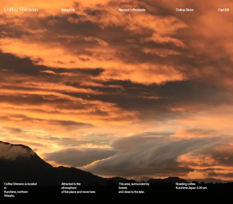
Coffee Shimeno combines a coffee shop, online store, seasonal journal, and hospitality introduction in one long homepage. Photographs carry the atmosphere: a dark tatami room overlooking snow through a circular window, a mountain covered in frost, and a warm interior opening onto fields at dusk. The interface stays restrained, with small white navigation, regular-weight typography, quiet text links, and broad areas of neutral gray.
Its organizing device is a shared set of horizontal alignments. On desktop, navigation, opening captions, catalog entries, and footer groups start on four column lines. Editorial introductions combine those columns into two wider halves. Mobile retains the deliberate asymmetry: most explanatory paragraphs occupy a narrow column against the right margin, while catalogs use two columns. Preserve these relationships alongside the photography; they are central to the site's character.
How to Read This Reference
- Measured means a value appears in the supplied rendered element geometry or computed styles. Measurements use CSS pixels unless stated otherwise.
- Declared means a value appears in a supplied source fragment or custom property. A declaration alone does not prove that a visible component uses it.
- Derived means a value is calculated from measured positions or dimensions. The calculation is identified where useful.
- Estimated means a visual approximation from a current-page capture. These values are suitable starting points, not exact source tokens.
- Recommended means implementation guidance for an adaptation. The CSS and optional Tailwind mapping use descriptive aliases and include clearly identified choices where evidence is incomplete.
The root font size is measured at 10px on both viewports. The Quick Start uses explicit pixel tokens so it can work with a conventional application root. Do not copy the site's numeric rem values into a 16px-root project without conversion.
Computed styles take precedence over unused theme defaults. For example, --font-body-family contains Assistant, sans-serif, while sampled visible text uses PP Neue Montreal or a Japanese Gothic stack. Similarly, theme grid defaults of 8px and 4px do not describe the measured custom catalog gutters.
Tokens — Colors
Default Palette
| Name | Value | Suggested token | Evidence and role |
|---|---|---|---|
| Editorial Gray | #dfdfdf |
--surface-canvas |
Measured body and light chapter backgrounds; also declared by the custom chapter CSS |
| Black Ink | #000000 |
--ink-primary |
Measured editorial paragraphs and links; also the root and opening background |
| Photo White | #ffffff |
--ink-inverse |
Measured header links, opening captions, and reservation paragraphs |
| Reservation Charcoal | #191919 |
--surface-reservation |
Measured background of chapter 05 |
| Footer Black | #121212 |
--surface-footer |
Measured footer background |
| Footer Silver | #e5e5e5 |
--ink-footer |
Measured footer text and offscreen navigation text |
The canvas is a neutral light gray. Its contrast with the photographs gives editorial sections a soft, quiet pause without introducing a cream or coffee-brown interface palette. Warm amber, muted green, and snowy blue-gray occur inside the photographs; they are not verified UI accent colors.
The body's inherited text color is rgba(0, 0, 0, 0.75), but sampled chapter paragraphs explicitly resolve to black. Preserve the component-level result instead of applying 75% opacity to all content. Footer labels appear quieter than links in the captures, although both sampled computed colors are #e5e5e5; a separate label-opacity value was not supplied.
The declared --swiper-theme-color: #007aff does not establish a visible blue accent. No selectable theme system is evidenced.
Tokens — Typography
English Interface and Editorial Text
Measured family: PP Neue Montreal, sometimes followed by sans-serif.
It appears on navigation, opening captions, English explanatory paragraphs, catalog title links, and footer content. Sampled weights are predominantly 400. Letter spacing generally resolves to −0.01em, such as −0.16px at 16px and −0.155px at 15.5px.
The effect is compact and clear without becoming heavily condensed or bold. Larger editorial titles remain visually light. Use licensed font files when available; a generic sans-serif is a fallback, not an exact replacement. Computed family declarations do not independently verify the rendered font for every glyph.
Japanese Explanatory Text
Measured source stack: "こぶりなゴシック W3 JIS2004", "Koburina Gothic W3 JIS2004", "游ゴシック Medium", "YuGothic Medium", 游ゴシック体, "Yu Gothic", sans-serif.
Desktop paragraphs use 15px, weight 300, line height 25.35px. Most sampled mobile paragraphs change to 14px, weight 500, line height 23.66px. This weight change is part of the measured responsive treatment; mobile is not simply a uniformly scaled desktop stylesheet.
Japanese section ornaments can look more calligraphic or serif-like than the body. The parenthesized label above the records explanation is visible in the desktop capture, but its font family and implementation were not sampled. Do not assign it an invented typeface.
Wordmark
The Coffee Shimeno wordmark has expressive serif letterforms, contrasting with the surrounding sans-serif navigation. Its home-link box measures 160 × 28.80px on desktop and 140 × 25.19px in the mobile header.
The link reports serif, but this does not identify the lettering's typeface or prove that the visible wordmark is ordinary text. Preserve an authorized wordmark asset when available. The mobile opening uses a larger version at the left; its visible width is approximately 200–205px, estimated from the capture.
Type Scale
| Role | Desktop | Mobile | Weight / tracking | Status |
|---|---|---|---|---|
| Inherited body | 16px / 28.8px |
15px / 27px |
400; −0.01em | Measured; overridden by many components |
| Header navigation / cart | 16px / 16px |
Cart 13px / 13px |
400; −0.01em | Measured |
| Opening captions | 14px / 18.2px |
12px / 15.6px |
400; −0.01em | Measured |
| Japanese chapter copy | 15px / 25.35px |
14px / 23.66px |
300 desktop; 500 mobile; −0.01em | Measured |
| English chapter copy | 15.5px / 23.25px |
Usually 14px / 21px |
400; −0.01em | Measured |
| Four Seasons English copy | 15.5px / 23.25px |
15.5px / 23.25px |
400; −0.01em | Measured mobile exception |
| Product / article title link | 16.5px / 18.15px |
13px / 14.3px |
400; −0.01em | Measured child link |
| Footer group label / copyright | 13px / 18.85px |
11px / 15.95px |
400; −0.01em | Measured |
| Footer links / address | 15px / 21.75px |
13px / 18.85px |
400; −0.01em | Measured |
| Records main heading | Approximately 40px |
Not visually measured | Regular appearance | Desktop screenshot estimate |
| Section index and visible action lettering | Approximately 20px |
Not visually measured | Regular appearance | Desktop screenshot estimate |
Catalog h3 wrappers declare a 1.4 line height and +0.03em tracking, while their child links override these with a 1.1 line height and −0.01em tracking. Reproduce the visible child-link styling rather than inheriting the wrapper values blindly.
An empty, zero-height catalog h2 declares 44px on desktop and 28px on mobile. Those declarations are not evidence for the visible chapter-heading sizes.
Tokens — Spacing & Shapes
The spacing system has several scales: small utility gaps, 15–20px horizontal gutters, and chapter-specific vertical pauses of 100–300px. There is no evidence that every measurement comes from one universal spacing unit.
Spacing Scale
| Use | Desktop | Mobile | Evidence |
|---|---|---|---|
| Main horizontal inset | 20px |
15px |
Measured repeated alignment |
| Product / article column gutter | 20px |
15px |
Derived from entry positions and widths |
| Footer column gutter | 20px |
20px |
Derived from measured group widths |
| Gap between footer links | Approximately 4px |
Approximately 4px |
Derived from line boxes and link positions |
| Japanese-to-English paragraph gap in chapters 01, 02, 04 | 20px |
40px |
Derived from paragraph bounds |
| Reservation language gap | 20px |
30px |
Derived from paragraph bounds |
| Chapter 01 top / bottom padding | 155px / 120px |
210px / 100px |
Measured |
| Chapter 02 bottom padding | 300px |
160px |
Measured; top padding is 0 |
| Chapter 04 top / bottom padding | 165px / 125px |
120px / 100px |
Measured |
| Chapter 05 top / bottom padding | 155px / 120px |
210px / 100px |
Measured |
| Product-grid bottom padding | 205px |
Not established | Declared desktop custom CSS fragment |
| Article-grid bottom padding | 145px |
Not established | Declared desktop custom CSS fragment |
Mobile preserves substantial whitespace. In particular, chapter 01 starts with 210px of top padding after the opening section. Reducing every chapter to a compact 48px vertical rhythm would change the pacing considerably.
Border Radius
| Element | Value / appearance | Evidence |
|---|---|---|
| Media | 0px |
Declared media radius; square visible image boundaries |
| Buttons and inputs | 0px |
Declared theme properties; transaction controls were not exercised |
| Blog and collection cards | 0rem |
Declared theme properties |
| Chapter surfaces | Square, full-width sections | Current captures |
| Circular window | Part of the photograph | Architectural subject, not an interface mask |
There is no visible general-purpose shadow or floating-card system. Product, blog, collection, and media shadow properties are disabled in the supplied theme variables.
Layout Measurements
| Element | Desktop: 1440 × 1000 | Mobile: 390 × 844 |
|---|---|---|
| Document height | 10159.45px |
11383.38px |
| Primary content width | 1400px between 20px insets |
360px between 15px insets |
| Catalog columns | Four × 335px |
Two × 172.5px |
| Catalog column starts | 20, 375, 730, 1085px |
15, 202.5px |
| Standard editorial half-column | 690px |
Replaced by the narrow reading rail |
| Main paragraph rail | Right half starts at 730px |
Starts at 108.59px; width 266.39px |
| Footer columns | Four × 335px |
Two × 170px, starting at 15px and 205px |
| Opening content layer | 1440 × 1000px |
390 × 844px |
| Hero wrapper | 1080px high |
844px high |
| First editorial section starts | Document y = 1080px |
Document y = 844px |
Derived desktop grid: (1440 − 40 − 3 × 20) / 4 = 335px.
Derived mobile catalog grid: (390 − 30 − 15) / 2 = 172.5px.
Derived mobile reading rail: the 266.39px paragraph width is approximately 74% of the 360px inner width. Its left position is 15 + 360 × 0.26 ≈ 108.6px. A 74% rail aligned to the right is therefore a useful implementation approximation; the original formula was not supplied.
Components
Desktop Header
Role: persistent identity, primary destinations, and cart access.
The wordmark starts at x = 20px and y = 33px. About Us, Record・Products, and Online Store align to x = 375px, 730px, and 1085px respectively. Cart (0) ends at the 1420px right content edge. Navigation text sits around y = 39.39px.
A practical reconstruction uses four equal columns. Put the wordmark in the first, About Us in the second, Record・Products in the third, and a flex row containing Online Store and Cart in the fourth. This preserves the same alignment lines as the catalog and opening captions.
The header is white and transparent over the photographs. Its position is retained at the top in multiple scrolled desktop captures, supporting a viewport-anchored treatment. The exact fixed-versus-sticky implementation and any color changes over light sections were not included in the computed evidence.
Mobile Header and Opening Identity
The settled mobile header has a two-line menu mark at the left, a centered 140px wordmark, and Cart (0) aligned to the right inset. The wordmark link begins at x = 125px, y = 30px; the cart begins at x = 335px, y = 36.09px.
The opening capture shows a different visible composition: a larger wordmark near x = 15px, y = 329px, followed by a short caption around y = 375px. Top navigation is not visible in that image. Header boxes nevertheless exist in the supplied DOM, and the mobile footer capture shows the settled header clearly. Treat these as distinct observed states; the trigger, timing, and transition between them are unverified.
An offscreen navigation region contains Index, Other, Address, Social Media, and Contact groups. Its two columns measure 172.5px each on mobile. This supports the existence of a separate navigation structure, but its open appearance, animation, focus management, and close behavior were not tested.
Photographic Opening
Role: introduces the place and atmosphere before the first numbered chapter.
The desktop capture fills the viewport with a dark room, a hearth and coffee utensils in the foreground, a small square window at left, and a large circular window opening onto snow at right. The brightness comes from the scene itself. The interface is sparse enough for the room's dark areas to remain useful negative space.
Four short English statements sit near the bottom on the shared column starts. Each measured text block is 217.75px wide, with two 18.2px lines. Their lower edge is y = 970px, leaving 30px below them in the opening viewport.
Mobile uses a portrait crop of the same room. The round window extends beyond the right edge, while the lantern and utensils remain visible lower in the frame. Only one caption is visible beneath the larger wordmark. All four caption groups occupy the same measured mobile coordinates, indicating layered content rather than four vertically stacked paragraphs.
The supplied source fragment declares a 108vh hero. Desktop geometry confirms a 1080px wrapper around a 1000px opening layer, while the mobile wrapper measures exactly 844px. Preserve this distinction when studying scroll geometry; do not assume every opening element has the same height.
Numbered Chapter Introduction
Role: establishes the page's editorial sequence.
The homepage has five numbered chapters: Online store, Coffee Shimeno, Four Seasons, Record・Products, and Reservation. A two-digit index and slash accompany a compact category label. Large regular-weight English statements supply the next hierarchy level.
In the captured Records introduction, the left half contains the index, Records and Products heading, and View More arrow link. The right half begins with the parenthesized source label ( 珈琲 ノ 記録と道具たち ), followed by Japanese and English paragraphs. The two halves are 690px wide with a 20px gap.
The chapter boundary uses a large gray field and whitespace. It has no surrounding card, decorative border, or filled action button.
Bilingual Reading Block
Role: provides parallel Japanese and English explanations without a language-switching control.
For chapters 01, 02, and 04, desktop places Japanese above English in the right half. Their measured separation is 20px. The text link sits beneath the left heading group.
On mobile, paragraphs align to the right-side reading rail at x ≈ 108.6px. Japanese precedes English with a 40px gap, and the action follows below the English paragraph in the same rail. This responsive relocation of the action is visible in the measured positions and text sequence.
The reading rail leaves about 94px of interior space between the 15px page inset and the paragraph start. Keep that open area as part of the composition. At very narrow widths, relaxing the rail is a recommended readability adjustment rather than a measured original rule.
Product Catalog Entry
Role: connects the editorial introduction to individual coffee products.
Eight entries are present: a Japanese introductory offering, Coffee Nagatsuki, five numbered coffees, and light roast Coffee. Price text uses the form Price: 1,200 yen; observed prices range from 1,200 to 4,500 yen.
The catalog uses four columns on desktop and two on mobile. Each entry has a linked title and a separate linked media region pointing to the same product destination. Measured title coordinates precede the media-link coordinates. Title-link typography is 16.5px on desktop and 13px on mobile.
The supplied current screenshots do not show this grid closely enough to establish packaging appearance, exact image crops, price baselines, or hover states. Several sampled media anchors have zero-height bounding boxes; that does not establish that the associated image is missing. Preserve the verified grid and title hierarchy, and inspect the actual assets before prescribing their aspect ratios.
Four Seasons Composition
Role: expands the homepage from product information into a sense of place.
Desktop English copy occupies the first 335px column at x = 20px. Japanese copy occupies the last 335px column at x = 1085px and begins lower down the page. This is an asymmetric composition rather than another ordinary two-column introduction.
On mobile, the supplied order becomes Japanese followed by English, both on the right reading rail. The English paragraph retains its desktop 15.5px size and 23.25px line height, unlike the 14px mobile English paragraphs elsewhere.
The middle desktop capture shows a full-width snowy mountain photograph immediately above the Records introduction. The photograph dominates the upper portion of the viewport. Other image positions within the full Four Seasons section were not visually documented, so avoid inventing a complete collage or scrolling choreography.
Records and Products Entry
Role: links to exhibitions, hospitality events, daily practice, and reservation information.
The eight article entries follow the same four-column desktop and two-column mobile alignment as the product catalog. Titles are compact links with a consistent reserved header area: measured link boxes are 36px high on desktop and 43px on mobile. This allows the grid to accommodate longer event titles while keeping the entry starts aligned.
One supplied title includes a literal trailing ellipsis. The evidence does not establish whether truncation is editorial or generated by CSS. Preserve meaningful complete accessible names in an adaptation.
The link labeled Reservation(ご予約方法) leads to an article, while the later Reservation action leads to an external social profile. Keep these two destinations distinct.
Reservation Section
Role: explains Koshitsu and provides the path toward arranging a visit.
Chapter 05 changes the background to #191919 and explanatory text to white. Its statement is Serve coffee like traditional tea ceremony. The bilingual copy describes coffee, seasonal sweets, contemporary artworks, antiques, and natural objects within the hospitality space.
Desktop copy measures approximately 447.11px wide at x = 40px. A source fragment declares a 32.4% / 67.6% column relationship with a 20px gap. The complete containing layout was not supplied, so the fragment should guide proportions rather than be copied as a complete working grid.
On mobile, the copy returns to the same 266.39px right-aligned rail. Japanese and English are separated by 30px. The action is a plain white text-and-arrow link.
The observed Reservation destination is https://www.instagram.com/shimeno__/?hl=ja. No booking modal, calendar, form submission, or confirmation state was inspected.
Photographic Footer and Directory
Role: closes the visual story and provides practical destinations.
A large photograph shows an amber lamp inside a dark room and an open window overlooking fields, mountains, and dusk light. It flows directly into a #121212 footer without a decorative frame.
Desktop directory groups share the four-column alignment: Address, Index, Other, and Social Media. Copyright sits lower in the first column; Contact and the underlined email sit lower in the fourth. Labels are 13px; links and address text are 15px.
Mobile reorders the groups into two columns: Index / Other first, Address / Social Media second, followed by full-width Contact and copyright. The columns are 170px wide with a 20px gap, slightly different from the 172.5px catalog columns with their 15px gap. Labels shrink to 11px and content to 13px.
The end-of-page screenshots show only the remaining portion of the preceding photograph. Their visible image heights are not the full asset or component heights. The footer directory itself is approximately 283px tall on desktop and 446px on mobile, derived from the screenshot boundary and document geometry.
Tokens — Motion & Interaction
| Treatment | Supplied evidence | Interpretation and limits |
|---|---|---|
| Navigation and footer link transitions | Computed opacity 0.3s |
Transition property and duration are established; the target opacity was not supplied |
| Wordmark link | Computed opacity 0.3s, color 0.3s |
Supports a short state transition; exact triggering conditions are unknown |
| Skip link | Computed box-shadow 0.1s; link to #MainContent |
Skip-link structure exists; focused appearance was not captured |
| General fade token | Declared fadeIn .6s cubic-bezier(0, 0, .3, 1) |
Available theme animation; not proof that each chapter uses it |
| Duration variables | Declared .2s, .5s, .75s, and 3s |
Do not assign them to specific components without further evidence |
| Hero presentation | Slider-related source naming and overlapping mobile caption positions | Supports a layered presentation; cadence, easing, controls, and swipe behavior are unverified |
| Opening / settled mobile identity | Different visible compositions in current captures | State difference is observed; its sequence and timing are not |
| Scroll-related dependencies | Supplied source text references delayed GSAP and Lenis loading | Does not independently establish active smooth scrolling, parallax, or scroll-triggered reveals |
Most sampled elements report animation: none. A computed transition summarized as all is insufficient to claim an animated effect. JavaScript-driven motion can also be absent from these computed-animation fields.
The inspection waited for loading, visible finite motion, layout stability, and image decoding under bounded time limits. Perpetual animation was temporarily paused during readiness checks and resumed. These precautions improve capture stability but do not provide a motion recording or verify delayed content.
For an adaptation, begin with native scrolling, immediate content availability, and the evidenced 300ms link transition. Add image or caption transitions only as an explicit design decision, with reduced-motion and pause behavior where appropriate.
Surfaces
| Layer | Appearance | Structural role |
|---|---|---|
| Opening | Dark edge-to-edge photograph; white interface | Establishes place and atmosphere |
| Editorial chapters | #dfdfdf with black text |
Supports bilingual reading and generous spacing |
| Product and article listings | Same neutral page surface; regular grid | Organizes entries without separate raised cards |
| Reservation | #191919 with white copy |
Distinguishes the hospitality invitation |
| Footer directory | #121212 with #e5e5e5 text |
Compact practical information after the closing photograph |
| Header over photographs | Transparent with white lettering | Maintains access while preserving the image field |
Structure comes from image boundaries, aligned text, changes of background, and whitespace. There is no evidenced need for gradients, glass blur, soft elevation, or a colorful action system.
Imagery
The current photography connects landscape and interior ritual. Snow, forest, mountain contours, tatami, small vessels, a hearth, and amber illumination communicate seasonality without explanatory badges. The images retain deep shadows and varied natural color. Avoid flattening them into a uniform brown filter.
The circular window is especially important: its bright opening acts as a visual counterweight to the dark room and sparse white captions. Preserve it as part of the photograph. A circular CSS mask around a separate landscape would alter both the architecture and the light relationship.
Mobile cropping is intentional. The opening retains the hearth and part of the round window while sacrificing the desktop's full horizontal scene. The footer photograph also becomes a tall crop. Use per-image focal positioning and inspect the result at 390 × 844; a single shared crop rule is unlikely to preserve every composition.
Fine grain is visible in the photography, but a dedicated CSS noise layer was not established. Do not invent a global texture asset from screenshot grain alone.
Observed Asset References
No original image URLs, wordmark file paths, intrinsic dimensions, or font-file URLs were included in the supplied asset evidence. The references below identify visible subjects only.
| Reference | Current observed content | Reuse guidance |
|---|---|---|
| Desktop and mobile opening | Dark tatami room, lantern, coffee utensils, snow through a circular window | Preserve shadow detail and choose the portrait crop deliberately |
| Middle desktop photograph | Snow-covered mountain above autumn woodland | Use as a broad visual interval before editorial copy |
| Desktop and mobile closing photograph | Amber interior lamp and open view onto fields and mountains at dusk | Keep the warm interior / cool exterior relationship |
| Header and mobile opening identity | Coffee Shimeno serif wordmark | Use an authorized asset; exact lettering font is unknown |
| Product and article media | Linked media regions evidenced by DOM | Subjects, source paths, and exact crops remain unverified |
Use authorized source photography when available. The layout can be reproduced in CSS; its atmosphere depends strongly on the images.
Layout & Responsive Behavior
The homepage keeps the same overall chapter sequence across both inspected viewports. It is a long document: approximately 10.16k CSS pixels on desktop and 11.38k on mobile. Its length comes from catalog content, bilingual reading, photography, and deliberate spacing.
| Relationship | Desktop observation | Mobile observation |
|---|---|---|
| Header | Four alignment lines, with store and cart sharing the rightmost region | Menu left, wordmark centered, cart right in the settled state |
| Opening identity | Header wordmark and four bottom captions | Larger left wordmark and one visible mid-frame caption |
| Editorial copy | Two wide halves | Narrow reading rail against the right margin |
| Chapter action | Below the left heading in sampled standard chapters | After bilingual copy in the right rail |
| Product and article catalogs | Four columns | Two columns |
| Four Seasons copy | Opposite outer columns, vertically offset | Japanese then English in one reading rail |
| Footer | Four groups across, contact lower right | Two-column groups, then full-width contact and copyright |
Only the endpoints at 1440px and 390px were inspected. The original breakpoint values and intermediate tablet behavior were not supplied. The 760px breakpoint in the Quick Start is a recommendation.
The theme declares --page-width: 120rem, equivalent to 1200px at its root size. The measured custom homepage nevertheless uses a 1400px inner width at 1440px, and a supplied custom fragment sets max-width: 100%. Do not impose a 1200px centered cap on this page merely because the global variable exists.
The footer and catalog use different mobile gutters. Likewise, the Four Seasons English paragraph retains a larger mobile type size than other English copy. Keep these exceptions explicit instead of forcing every component through one global responsive rule.
Do’s and Don’ts
Do
- Use
#dfdfdffor the editorial canvas and preserve the two distinct dark section colors. - Align desktop navigation, captions, catalogs, and footer groups to the same four column starts.
- Keep 20px desktop insets and 15px mobile insets.
- Preserve the mobile reading rail at approximately 74% of the inner width where space allows.
- Use regular PP Neue Montreal styling for English text and the evidenced Japanese Gothic treatment for body copy.
- Preserve the mobile Japanese weight change and the Four Seasons English-size exception.
- Keep Japanese and English copy visible together, with their measured language spacing.
- Use quiet text-and-arrow actions and square image edges.
- Select mobile image crops around the actual subjects and available dark space.
- Retain the substantial vertical pauses between the page's different kinds of content.
Don’t
- Don't replace the shop, journal, and hospitality structure with a generic conversion funnel.
- Don't add coffee-brown buttons, blue slider accents, or decorative gradients as inferred brand colors.
- Don't turn the catalogs into padded, rounded, shadowed cards.
- Don't treat the wordmark's parent
serifdeclaration as an identified logo font. - Don't use the unused Assistant variable as the primary visible typeface.
- Don't use empty heading styles as measured visible title sizes.
- Don't stack all four mobile hero captions visibly on top of one another.
- Don't treat zero-height media-link boxes as proof of missing images.
- Don't force all mobile content into a full-width paragraph column.
- Don't invent autoplay timing, parallax, menu transitions, booking dialogs, or cart behavior.
Recommended Implementation Additions
These are recommendations for an adaptation, not verified features of the original page:
- Give the menu control an accessible name, an expanded state, and a relationship to its controlled navigation region. Keep a closed drawer out of keyboard navigation.
- Preserve the skip link and provide visible focus indicators on photographs and both solid background tones.
- Increase interactive hit areas around the small cart label, menu mark, and text links without enlarging their visible typography unnecessarily.
- Mark Japanese and English passages with appropriate
langattributes, and retain a coherent reading order when actions move across breakpoints. - Keep the full accessible article title even if a visual title is shortened.
- Check white-header contrast for every photograph and light section. Any automatic color switching requires an explicit implementation; it was not verified here.
- Below very narrow widths, widen the reading rail before reducing body text further. Test text zoom and long translated content.
- If a rotating image or caption sequence is added, provide reduced-motion behavior and appropriate pause controls. Essential navigation should remain available after any bounded opening state.
- Load the opening photograph promptly, provide image dimensions to stabilize layout, and defer lower-page media. Choose responsive sources without replacing the documented focal composition.
Agent Prompt Guide
Quick Color Reference
- Editorial canvas:
#dfdfdf. - Editorial text:
#000000. - Header and opening captions over photography:
#ffffff. - Reservation surface:
#191919, with white copy. - Footer surface:
#121212, with#e5e5e5text. - Warm amber and woodland colors belong to photographs, not a separate UI accent system.
Overall Prompt
“Create an editorial homepage for a Japanese coffee roastery, online shop, seasonal journal, and intimate hospitality space. Use edge-to-edge photographs of dark interiors and seasonal landscapes, a neutral gray #dfdfdf reading canvas, black regular-weight text, and white navigation over imagery. Align desktop navigation, four short opening captions, four-column catalogs, and footer groups to shared 20px-gutter column lines. Use a serif wordmark asset with restrained sans-serif interface text. Organize the page into five numbered chapters with Japanese and English explanations. On mobile, use 15px outer insets, two-column catalogs, and a right-aligned reading rail occupying about 74% of the inner width. Finish with a dark reservation section, a dusk interior photograph, and a compact directory footer. Keep surfaces square and actions as text links with thin arrows.”
Example Component Prompts
- Opening: “Build a photograph-led opening showing a dark tatami room with coffee utensils and snow outside a circular window. On desktop, distribute four small white two-line captions along the bottom column starts. On mobile, preserve the lantern and partial window in a portrait crop, with a larger left wordmark and one short caption. Treat image rotation as unspecified.”
- Chapter introduction: “Create a neutral-gray numbered editorial introduction. Place the index, regular-weight English statement, and arrow link in the left desktop half; place a small Japanese section label and bilingual paragraphs in the right half. On mobile, position the explanatory copy and following action in a 74%-width rail aligned to the right.”
- Catalog: “Create an unboxed coffee catalog with four 335px columns at a 1440px viewport, 20px outer margins, and 20px gaps. At 390px, use two 172.5px columns with 15px margins and gaps. Keep title links compact and regular; use actual product assets and their verified image proportions.”
- Reservation: “Create chapter 05 on charcoal
#191919with white bilingual text and a plain Reservation arrow link. Keep a narrow desktop copy region within an asymmetric composition. On mobile, return the paragraphs to the shared right reading rail. Do not invent a booking form.” - Footer: “Place a dark directory directly beneath a large photograph of an amber-lit room overlooking fields at dusk. Use four desktop columns for Address, Index, Other, and Social Media, with copyright lower left and Contact lower right. Reorder mobile into Index / Other, Address / Social Media, then full-width Contact and copyright. Use square boundaries and an underlined email link.”
Quick Start
CSS Custom Properties
This is an implementation scaffold, not extracted source CSS. It reproduces measured colors, typography, column widths, and selected spacing. The 760px breakpoint, 40px/30px chapter-title scale, 48px catalog row gap, and hover opacity are recommended values. Exact asset paths and motion state logic are intentionally left for the implementation.
Apply shimeno-site to the page body. A .chapter contains .chapter__index, .chapter__kicker, .chapter__title, .chapter__copy, and .chapter__action. Mark paragraphs with lang. Catalog entries contain a title, any supplied price information, and an image. Footer groups use the named modifier classes below.
The starter keeps navigation immediately available. Reproducing the mobile header's opening visibility changes requires additional state evidence.
:root {
  /* Measured semantic colors */
  --surface-canvas: #dfdfdf;
  --surface-reservation: #191919;
  --surface-footer: #121212;
  --ink-primary: #000000;
  --ink-inverse: #ffffff;
  --ink-footer: #e5e5e5;

  /* Source families with practical fallback aliases */
  --font-latin: 'PP Neue Montreal', Arial, sans-serif;
  --font-japanese: 'Koburina Gothic W3 JIS2004',
    'YuGothic Medium', 'Yu Gothic', sans-serif;
  --tracking-body: -0.01em;
  --text-nav: 16px;
  --text-caption: 14px;
  --text-japanese: 15px;
  --text-english: 15.5px;
  --text-entry: 16.5px;
  --text-footer-label: 13px;
  --text-footer-body: 15px;
  --weight-japanese: 300;

  /* Measured spacing and derived alignment */
  --page-inset: 20px;
  --catalog-gap: 20px;
  --footer-gap: 20px;
  --language-gap: 20px;
  --mobile-rail: 74%;
  --radius-media: 0px;

  /* Recommended values where measurements are incomplete */
  --text-chapter-title: 40px;
  --catalog-row-gap: 48px;
  --hover-opacity: 0.65;
  --motion-link: 300ms ease;
}

* { box-sizing: border-box; }

body.shimeno-site {
  margin: 0;
  color: var(--ink-primary);
  background: var(--surface-canvas);
  font-family: var(--font-latin);
  font-size: 16px;
  font-weight: 400;
  letter-spacing: var(--tracking-body);
}

.shimeno-site a {
  color: inherit;
  text-decoration: none;
  transition: opacity var(--motion-link);
}

.shimeno-site img {
  display: block;
  max-width: 100%;
}

.page-grid {
  display: grid;
  grid-template-columns: repeat(4, minmax(0, 1fr));
  gap: var(--catalog-gap);
  padding-inline: var(--page-inset);
}

.site-header {
  position: fixed;
  inset: 0 0 auto;
  z-index: 30;
  align-items: center;
  padding-top: 33px;
  color: var(--ink-inverse);
  background: transparent;
  font-size: var(--text-nav);
  line-height: 1;
}

.site-header__brand {
  grid-column: 1;
  width: 160px;
  min-height: 28.8px;
  display: flex;
  align-items: center;
}

.site-header__brand img { width: 100%; height: auto; }
.site-header__about { grid-column: 2; }
.site-header__records { grid-column: 3; }
.site-header__menu { display: none; }

.site-header__utilities {
  grid-column: 4;
  display: flex;
  align-items: center;
  justify-content: space-between;
}

/* Apply explicitly when the header needs dark lettering. */
.site-header[data-tone='dark'] { color: var(--ink-primary); }

.hero {
  position: relative;
  height: 108vh;
  height: 108svh;
  overflow: hidden;
  background: #000;
  color: var(--ink-inverse);
}

.hero__image {
  position: absolute;
  inset: 0;
  width: 100%;
  height: 100%;
  object-fit: cover;
  object-position: var(--hero-focal-point, 50% 50%);
}

.hero__notes {
  position: absolute;
  inset-inline: 0;
  bottom: calc(8vh + 30px);
  bottom: calc(8svh + 30px);
}

.hero__note {
  max-width: 65%;
  font-size: var(--text-caption);
  line-height: 1.3;
}

.hero__note p { margin: 0; }
.hero__wordmark { display: none; }

.chapter {
  display: grid;
  grid-template-columns: repeat(2, minmax(0, 1fr));
  grid-template-areas:
    'index kicker'
    'title copy'
    'action copy';
  gap: 48px 20px;
  align-content: start;
  padding: 155px var(--page-inset) 120px;
  background: var(--surface-canvas);
}

.chapter__index { grid-area: index; }
.chapter__kicker { grid-area: kicker; }
.chapter__title { grid-area: title; }
.chapter__copy { grid-area: copy; min-width: 0; }
.chapter__action { grid-area: action; align-self: start; }

.chapter__index,
.chapter__kicker {
  margin: 0;
  font-size: 20px;
  line-height: 1.3;
  font-weight: 400;
}

.chapter__index {
  display: flex;
  gap: 32px;
  align-items: baseline;
}

.chapter__title {
  margin: 0;
  font-size: var(--text-chapter-title);
  font-weight: 400;
  line-height: 1.1;
  letter-spacing: -0.025em;
}

.chapter__copy p { margin: 0; }

.chapter__copy [lang='ja'] {
  font-family: var(--font-japanese);
  font-size: var(--text-japanese);
  font-weight: var(--weight-japanese);
  line-height: 1.69;
}

.chapter__copy [lang='en'] {
  font-family: var(--font-latin);
  font-size: var(--text-english);
  font-weight: 400;
  line-height: 1.5;
}

.chapter__copy p + p { margin-top: var(--language-gap); }

.text-action {
  display: inline-flex;
  align-items: center;
  gap: 4px;
  width: fit-content;
  font-size: 20px;
  line-height: 1.2;
}

.text-action svg {
  width: 20px;
  height: 20px;
  fill: none;
  stroke: currentColor;
  stroke-width: 1;
}

.chapter--about { padding-top: 0; padding-bottom: 300px; }
.chapter--records { padding-top: 165px; padding-bottom: 125px; }

.chapter--reservation {
  color: var(--ink-inverse);
  background: var(--surface-reservation);
}

.catalog {
  row-gap: var(--catalog-row-gap);
  padding-bottom: 205px;
}

.catalog--records { padding-bottom: 145px; }
.catalog__entry { min-width: 0; }

.catalog__title {
  margin: 0 0 12px;
  font-size: var(--text-entry);
  font-weight: 400;
  line-height: 1.1;
  letter-spacing: -0.01em;
}

.catalog--records .catalog__title { min-height: 36px; }

.catalog__image {
  width: 100%;
  height: auto;
  border-radius: var(--radius-media);
}

/* Preserve actual asset ratios until alternative crops are verified. */
.image-interlude img { width: 100%; height: auto; }

.site-footer {
  color: var(--ink-footer);
  background: var(--surface-footer);
}

.site-footer__content { padding: 40px var(--page-inset); }

.footer-groups {
  display: grid;
  grid-template-columns: repeat(4, minmax(0, 1fr));
  grid-template-areas: 'address index other social';
  gap: var(--footer-gap);
}

.footer-group--address { grid-area: address; }
.footer-group--index { grid-area: index; }
.footer-group--other { grid-area: other; }
.footer-group--social { grid-area: social; }

.footer-label,
.footer-copyright {
  margin: 0;
  font-size: var(--text-footer-label);
  font-weight: 400;
  line-height: 1.45;
}

.footer-label { margin-bottom: 8px; }

.footer-list {
  display: grid;
  gap: 4px;
  margin: 0;
  padding: 0;
  list-style: none;
}

.footer-list,
.footer-address,
.footer-contact a {
  font-size: var(--text-footer-body);
  line-height: 1.45;
}

.footer-address { margin: 0; font-style: normal; }

.footer-bottom {
  display: grid;
  grid-template-columns: repeat(4, minmax(0, 1fr));
  gap: 20px;
  align-items: end;
  margin-top: 54px;
}

.footer-copyright { grid-column: 1; }
.footer-contact { grid-column: 4; }
.footer-contact a { text-decoration: underline; overflow-wrap: anywhere; }

@media (max-width: 760px) {
  :root {
    --page-inset: 15px;
    --catalog-gap: 15px;
    --text-nav: 13px;
    --text-caption: 12px;
    --text-japanese: 14px;
    --text-english: 14px;
    --text-entry: 13px;
    --text-footer-label: 11px;
    --text-footer-body: 13px;
    --weight-japanese: 500;
    --language-gap: 40px;
    --text-chapter-title: 30px;
  }

  .page-grid { grid-template-columns: repeat(2, minmax(0, 1fr)); }

  .site-header {
    grid-template-columns: 1fr auto 1fr;
    gap: 0;
    padding-top: 20.6px;
  }

  .site-header__brand {
    grid-column: 2;
    grid-row: 1;
    width: 140px;
    min-height: 25.2px;
  }

  .site-header__about,
  .site-header__records,
  .site-header__store { display: none; }

  .site-header__utilities {
    grid-column: 3;
    grid-row: 1;
    justify-content: flex-end;
    min-height: 44px;
  }

  .site-header__menu {
    display: block;
    position: relative;
    grid-column: 1;
    grid-row: 1;
    width: 46px;
    height: 44px;
    padding: 0;
    border: 0;
    color: inherit;
    background: transparent;
  }

  .site-header__menu::before,
  .site-header__menu::after {
    content: '';
    position: absolute;
    inset-inline: 0;
    top: calc(50% - 3px);
    border-top: 1px solid currentColor;
  }

  .site-header__menu::after { top: calc(50% + 3px); }

  .hero { height: 100vh; height: 100svh; }

  .hero__wordmark {
    display: block;
    position: absolute;
    top: 39%;
    left: var(--page-inset);
    width: 204px;
    height: auto;
  }

  .hero__notes {
    display: block;
    top: 44.43%;
    bottom: auto;
  }

  .hero__note { width: 180px; max-width: 100%; }
  .hero__note:not(.is-active) { display: none; }

  .chapter {
    grid-template-columns: minmax(0, 1fr);
    grid-template-areas: 'index' 'title' 'kicker' 'copy' 'action';
    row-gap: 40px;
    padding-top: 210px;
    padding-bottom: 100px;
  }

  .chapter__kicker,
  .chapter__copy,
  .chapter__action {
    width: var(--mobile-rail);
    margin-left: auto;
  }

  .chapter--about { padding-top: 0; padding-bottom: 160px; }
  .chapter--records { padding-top: 120px; padding-bottom: 100px; }
  .chapter--reservation { --language-gap: 30px; }

  .chapter--seasons .chapter__copy [lang='en'] {
    font-size: 15.5px;
    line-height: 1.5;
  }

  .catalog--records .catalog__title { min-height: 43px; }
  .site-footer__content { padding-top: 60px; }

  .footer-groups {
    grid-template-columns: repeat(2, minmax(0, 1fr));
    grid-template-areas: 'index other' 'address social';
    gap: 36px 20px;
  }

  .footer-bottom {
    grid-template-columns: minmax(0, 1fr);
    gap: 50px;
    margin-top: 32px;
  }

  .footer-contact { grid-column: 1; grid-row: 1; }
  .footer-copyright { grid-column: 1; grid-row: 2; }
}

/* Recommended narrow-screen readability adjustment. */
@media (max-width: 340px) {
  :root { --mobile-rail: 86%; }
}

@media (hover: hover) {
  .shimeno-site a:hover { opacity: var(--hover-opacity); }
}

.shimeno-site :focus-visible {
  outline: 2px solid currentColor;
  outline-offset: 5px;
}

@media (prefers-reduced-motion: reduce) {
  .shimeno-site *,
  .shimeno-site *::before,
  .shimeno-site *::after {
    animation: none !important;
    transition: none !important;
    scroll-behavior: auto !important;
  }
}
Only one mobile hero note should receive .is-active in a static implementation. This selector is an implementation convention; it does not reproduce verified original state logic. If runtime animation is introduced, its reduced-motion behavior must also be handled in that runtime.
The generic chapter grid above covers the standard introductions. Four Seasons and the desktop Reservation composition require dedicated layouts using the measured relationships described earlier. Their unsampled media geometry should not be invented from this scaffold.
Tailwind v4 Token Mapping
Optional aliases for a project already using Tailwind v4. This is not evidence that the original website uses Tailwind. Define the custom properties above first.
@theme inline {
  --color-canvas: var(--surface-canvas);
  --color-reservation: var(--surface-reservation);
  --color-footer: var(--surface-footer);
  --color-ink: var(--ink-primary);
  --color-inverse: var(--ink-inverse);
  --color-silver: var(--ink-footer);
  --font-ui: var(--font-latin);
  --font-jp: var(--font-japanese);
  --text-caption: var(--text-caption-size, 14px);
  --text-product: var(--text-entry);
  --text-editorial: var(--text-chapter-title);
  --spacing-inset: var(--page-inset);
  --spacing-catalog: var(--catalog-gap);
  --radius-photo: var(--radius-media);
}
Use component-specific responsive rules for the mobile reading rail, footer reordering, and Four Seasons exception. A token mapping alone does not reproduce those relationships.
Sources & Evidence
- Coffee Shimeno — current homepage: original and final inspected URL, HTTP 200, supplied retrieval timestamp September 12, 2026 at 14:35:54.334 UTC.
- Desktop evidence: 1440 × 1000 CSS-pixel viewport; current opening, middle, and footer captures; rendered document height approximately 10159.45px; supplied element bounds, computed typography, colors, spacing, custom properties, and embedded CSS fragments.
- Mobile evidence: 390 × 844 CSS-pixel viewport; current opening and footer captures; rendered document height approximately 11383.38px; supplied element bounds and computed styles across the homepage.
- Navigation evidence: rendered links establish destinations for About, the store, product entries, records, cart, wholesale, policy pages, reservation, social profiles, and email. The linked destinations were not independently inspected.
- Interaction coverage: scrolling and bounded capture-readiness checks are documented. No supplied click trace establishes menu opening, cart changes, checkout, reservation completion, hover target values, or keyboard-focus behavior.
- Inspection limitations: original image and font asset URLs were not supplied; product and article imagery has limited visual coverage; intermediate breakpoints, delayed states, and precise motion timing remain unverified. SharedWorkers and service workers were disabled during the browser inspection.
This reference describes the supplied current-page evidence. Measurements, derived relationships, visual estimates, and recommended implementation choices are identified separately. No additional navigation or file inspection was performed.
# Coffee Shimeno — Style Reference

> Seasonal landscapes and quiet coffee rituals, framed by a precise editorial grid.

**Website:** [coffee-shimeno.com](https://coffee-shimeno.com/)
**Original URL:** https://coffee-shimeno.com/
**Final URL:** https://coffee-shimeno.com/
**Response:** HTTP 200; original and final URLs are identical.
**Theme:** neutral gray editorial sections, dark hospitality and footer sections, and white navigation over photography.
**Inspected:** September 12, 2026, at 14:35:54 UTC / 23:35:54 JST, using the supplied browser evidence.
**Viewports:** desktop 1440 × 1000 CSS pixels; mobile 390 × 844 CSS pixels.
**Scope:** the current homepage, including its opening composition, store introduction and eight product entries, About section, Four Seasons section, records introduction and eight article entries, Reservation section, and photographic footer. Visual captures cover the desktop opening, a middle section boundary, desktop footer, mobile opening, and mobile footer. Other sections have rendered DOM and computed-style evidence but less visual coverage. Linked pages and transactional flows were not inspected.

Coffee Shimeno combines a coffee shop, online store, seasonal journal, and hospitality introduction in one long homepage. Photographs carry the atmosphere: a dark tatami room overlooking snow through a circular window, a mountain covered in frost, and a warm interior opening onto fields at dusk. The interface stays restrained, with small white navigation, regular-weight typography, quiet text links, and broad areas of neutral gray.

Its organizing device is a shared set of horizontal alignments. On desktop, navigation, opening captions, catalog entries, and footer groups start on four column lines. Editorial introductions combine those columns into two wider halves. Mobile retains the deliberate asymmetry: most explanatory paragraphs occupy a narrow column against the right margin, while catalogs use two columns. Preserve these relationships alongside the photography; they are central to the site's character.

## How to Read This Reference

- **Measured** means a value appears in the supplied rendered element geometry or computed styles. Measurements use CSS pixels unless stated otherwise.
- **Declared** means a value appears in a supplied source fragment or custom property. A declaration alone does not prove that a visible component uses it.
- **Derived** means a value is calculated from measured positions or dimensions. The calculation is identified where useful.
- **Estimated** means a visual approximation from a current-page capture. These values are suitable starting points, not exact source tokens.
- **Recommended** means implementation guidance for an adaptation. The CSS and optional Tailwind mapping use descriptive aliases and include clearly identified choices where evidence is incomplete.

The root font size is measured at **10px on both viewports**. The Quick Start uses explicit pixel tokens so it can work with a conventional application root. Do not copy the site's numeric `rem` values into a 16px-root project without conversion.

Computed styles take precedence over unused theme defaults. For example, `--font-body-family` contains `Assistant, sans-serif`, while sampled visible text uses PP Neue Montreal or a Japanese Gothic stack. Similarly, theme grid defaults of 8px and 4px do not describe the measured custom catalog gutters.

## Tokens — Colors

### Default Palette

| Name | Value | Suggested token | Evidence and role |
| --- | --- | --- | --- |
| Editorial Gray | `#dfdfdf` | `--surface-canvas` | Measured body and light chapter backgrounds; also declared by the custom chapter CSS |
| Black Ink | `#000000` | `--ink-primary` | Measured editorial paragraphs and links; also the root and opening background |
| Photo White | `#ffffff` | `--ink-inverse` | Measured header links, opening captions, and reservation paragraphs |
| Reservation Charcoal | `#191919` | `--surface-reservation` | Measured background of chapter 05 |
| Footer Black | `#121212` | `--surface-footer` | Measured footer background |
| Footer Silver | `#e5e5e5` | `--ink-footer` | Measured footer text and offscreen navigation text |

The canvas is a neutral light gray. Its contrast with the photographs gives editorial sections a soft, quiet pause without introducing a cream or coffee-brown interface palette. Warm amber, muted green, and snowy blue-gray occur inside the photographs; they are not verified UI accent colors.

The body's inherited text color is `rgba(0, 0, 0, 0.75)`, but sampled chapter paragraphs explicitly resolve to black. Preserve the component-level result instead of applying 75% opacity to all content. Footer labels appear quieter than links in the captures, although both sampled computed colors are `#e5e5e5`; a separate label-opacity value was not supplied.

The declared `--swiper-theme-color: #007aff` does not establish a visible blue accent. No selectable theme system is evidenced.

## Tokens — Typography

### English Interface and Editorial Text

**Measured family:** `PP Neue Montreal`, sometimes followed by `sans-serif`.

It appears on navigation, opening captions, English explanatory paragraphs, catalog title links, and footer content. Sampled weights are predominantly `400`. Letter spacing generally resolves to **−0.01em**, such as −0.16px at 16px and −0.155px at 15.5px.

The effect is compact and clear without becoming heavily condensed or bold. Larger editorial titles remain visually light. Use licensed font files when available; a generic sans-serif is a fallback, not an exact replacement. Computed family declarations do not independently verify the rendered font for every glyph.

### Japanese Explanatory Text

**Measured source stack:** `"こぶりなゴシック W3 JIS2004", "Koburina Gothic W3 JIS2004", "游ゴシック Medium", "YuGothic Medium", 游ゴシック体, "Yu Gothic", sans-serif`.

Desktop paragraphs use **15px, weight 300, line height 25.35px**. Most sampled mobile paragraphs change to **14px, weight 500, line height 23.66px**. This weight change is part of the measured responsive treatment; mobile is not simply a uniformly scaled desktop stylesheet.

Japanese section ornaments can look more calligraphic or serif-like than the body. The parenthesized label above the records explanation is visible in the desktop capture, but its font family and implementation were not sampled. Do not assign it an invented typeface.

### Wordmark

The Coffee Shimeno wordmark has expressive serif letterforms, contrasting with the surrounding sans-serif navigation. Its home-link box measures **160 × 28.80px** on desktop and **140 × 25.19px** in the mobile header.

The link reports `serif`, but this does not identify the lettering's typeface or prove that the visible wordmark is ordinary text. Preserve an authorized wordmark asset when available. The mobile opening uses a larger version at the left; its visible width is approximately **200–205px**, estimated from the capture.

### Type Scale

| Role | Desktop | Mobile | Weight / tracking | Status |
| --- | --- | --- | --- | --- |
| Inherited body | `16px / 28.8px` | `15px / 27px` | 400; −0.01em | Measured; overridden by many components |
| Header navigation / cart | `16px / 16px` | Cart `13px / 13px` | 400; −0.01em | Measured |
| Opening captions | `14px / 18.2px` | `12px / 15.6px` | 400; −0.01em | Measured |
| Japanese chapter copy | `15px / 25.35px` | `14px / 23.66px` | 300 desktop; 500 mobile; −0.01em | Measured |
| English chapter copy | `15.5px / 23.25px` | Usually `14px / 21px` | 400; −0.01em | Measured |
| Four Seasons English copy | `15.5px / 23.25px` | `15.5px / 23.25px` | 400; −0.01em | Measured mobile exception |
| Product / article title link | `16.5px / 18.15px` | `13px / 14.3px` | 400; −0.01em | Measured child link |
| Footer group label / copyright | `13px / 18.85px` | `11px / 15.95px` | 400; −0.01em | Measured |
| Footer links / address | `15px / 21.75px` | `13px / 18.85px` | 400; −0.01em | Measured |
| Records main heading | Approximately `40px` | Not visually measured | Regular appearance | Desktop screenshot estimate |
| Section index and visible action lettering | Approximately `20px` | Not visually measured | Regular appearance | Desktop screenshot estimate |

Catalog `h3` wrappers declare a 1.4 line height and +0.03em tracking, while their child links override these with a 1.1 line height and −0.01em tracking. Reproduce the visible child-link styling rather than inheriting the wrapper values blindly.

An empty, zero-height catalog `h2` declares 44px on desktop and 28px on mobile. Those declarations are not evidence for the visible chapter-heading sizes.

## Tokens — Spacing & Shapes

The spacing system has several scales: small utility gaps, 15–20px horizontal gutters, and chapter-specific vertical pauses of 100–300px. There is no evidence that every measurement comes from one universal spacing unit.

### Spacing Scale

| Use | Desktop | Mobile | Evidence |
| --- | --- | --- | --- |
| Main horizontal inset | `20px` | `15px` | Measured repeated alignment |
| Product / article column gutter | `20px` | `15px` | Derived from entry positions and widths |
| Footer column gutter | `20px` | `20px` | Derived from measured group widths |
| Gap between footer links | Approximately `4px` | Approximately `4px` | Derived from line boxes and link positions |
| Japanese-to-English paragraph gap in chapters 01, 02, 04 | `20px` | `40px` | Derived from paragraph bounds |
| Reservation language gap | `20px` | `30px` | Derived from paragraph bounds |
| Chapter 01 top / bottom padding | `155px / 120px` | `210px / 100px` | Measured |
| Chapter 02 bottom padding | `300px` | `160px` | Measured; top padding is 0 |
| Chapter 04 top / bottom padding | `165px / 125px` | `120px / 100px` | Measured |
| Chapter 05 top / bottom padding | `155px / 120px` | `210px / 100px` | Measured |
| Product-grid bottom padding | `205px` | Not established | Declared desktop custom CSS fragment |
| Article-grid bottom padding | `145px` | Not established | Declared desktop custom CSS fragment |

Mobile preserves substantial whitespace. In particular, chapter 01 starts with 210px of top padding after the opening section. Reducing every chapter to a compact 48px vertical rhythm would change the pacing considerably.

### Border Radius

| Element | Value / appearance | Evidence |
| --- | --- | --- |
| Media | `0px` | Declared media radius; square visible image boundaries |
| Buttons and inputs | `0px` | Declared theme properties; transaction controls were not exercised |
| Blog and collection cards | `0rem` | Declared theme properties |
| Chapter surfaces | Square, full-width sections | Current captures |
| Circular window | Part of the photograph | Architectural subject, not an interface mask |

There is no visible general-purpose shadow or floating-card system. Product, blog, collection, and media shadow properties are disabled in the supplied theme variables.

### Layout Measurements

| Element | Desktop: 1440 × 1000 | Mobile: 390 × 844 |
| --- | --- | --- |
| Document height | `10159.45px` | `11383.38px` |
| Primary content width | `1400px` between 20px insets | `360px` between 15px insets |
| Catalog columns | Four × `335px` | Two × `172.5px` |
| Catalog column starts | `20, 375, 730, 1085px` | `15, 202.5px` |
| Standard editorial half-column | `690px` | Replaced by the narrow reading rail |
| Main paragraph rail | Right half starts at `730px` | Starts at `108.59px`; width `266.39px` |
| Footer columns | Four × `335px` | Two × `170px`, starting at `15px` and `205px` |
| Opening content layer | `1440 × 1000px` | `390 × 844px` |
| Hero wrapper | `1080px` high | `844px` high |
| First editorial section starts | Document y = `1080px` | Document y = `844px` |

**Derived desktop grid:** `(1440 − 40 − 3 × 20) / 4 = 335px`.

**Derived mobile catalog grid:** `(390 − 30 − 15) / 2 = 172.5px`.

**Derived mobile reading rail:** the 266.39px paragraph width is approximately **74% of the 360px inner width**. Its left position is `15 + 360 × 0.26 ≈ 108.6px`. A 74% rail aligned to the right is therefore a useful implementation approximation; the original formula was not supplied.

## Components

### Desktop Header

**Role:** persistent identity, primary destinations, and cart access.

The wordmark starts at x = 20px and y = 33px. About Us, Record・Products, and Online Store align to x = 375px, 730px, and 1085px respectively. Cart (0) ends at the 1420px right content edge. Navigation text sits around y = 39.39px.

A practical reconstruction uses four equal columns. Put the wordmark in the first, About Us in the second, Record・Products in the third, and a flex row containing Online Store and Cart in the fourth. This preserves the same alignment lines as the catalog and opening captions.

The header is white and transparent over the photographs. Its position is retained at the top in multiple scrolled desktop captures, supporting a viewport-anchored treatment. The exact fixed-versus-sticky implementation and any color changes over light sections were not included in the computed evidence.

### Mobile Header and Opening Identity

The settled mobile header has a two-line menu mark at the left, a centered 140px wordmark, and Cart (0) aligned to the right inset. The wordmark link begins at x = 125px, y = 30px; the cart begins at x = 335px, y = 36.09px.

The opening capture shows a different visible composition: a larger wordmark near x = 15px, y = 329px, followed by a short caption around y = 375px. Top navigation is not visible in that image. Header boxes nevertheless exist in the supplied DOM, and the mobile footer capture shows the settled header clearly. Treat these as distinct observed states; the trigger, timing, and transition between them are unverified.

An offscreen navigation region contains Index, Other, Address, Social Media, and Contact groups. Its two columns measure 172.5px each on mobile. This supports the existence of a separate navigation structure, but its open appearance, animation, focus management, and close behavior were not tested.

### Photographic Opening

**Role:** introduces the place and atmosphere before the first numbered chapter.

The desktop capture fills the viewport with a dark room, a hearth and coffee utensils in the foreground, a small square window at left, and a large circular window opening onto snow at right. The brightness comes from the scene itself. The interface is sparse enough for the room's dark areas to remain useful negative space.

Four short English statements sit near the bottom on the shared column starts. Each measured text block is 217.75px wide, with two 18.2px lines. Their lower edge is y = 970px, leaving 30px below them in the opening viewport.

Mobile uses a portrait crop of the same room. The round window extends beyond the right edge, while the lantern and utensils remain visible lower in the frame. Only one caption is visible beneath the larger wordmark. All four caption groups occupy the same measured mobile coordinates, indicating layered content rather than four vertically stacked paragraphs.

The supplied source fragment declares a 108vh hero. Desktop geometry confirms a 1080px wrapper around a 1000px opening layer, while the mobile wrapper measures exactly 844px. Preserve this distinction when studying scroll geometry; do not assume every opening element has the same height.

### Numbered Chapter Introduction

**Role:** establishes the page's editorial sequence.

The homepage has five numbered chapters: Online store, Coffee Shimeno, Four Seasons, Record・Products, and Reservation. A two-digit index and slash accompany a compact category label. Large regular-weight English statements supply the next hierarchy level.

In the captured Records introduction, the left half contains the index, Records and Products heading, and View More arrow link. The right half begins with the parenthesized source label `( 珈琲 ノ 記録と道具たち )`, followed by Japanese and English paragraphs. The two halves are 690px wide with a 20px gap.

The chapter boundary uses a large gray field and whitespace. It has no surrounding card, decorative border, or filled action button.

### Bilingual Reading Block

**Role:** provides parallel Japanese and English explanations without a language-switching control.

For chapters 01, 02, and 04, desktop places Japanese above English in the right half. Their measured separation is 20px. The text link sits beneath the left heading group.

On mobile, paragraphs align to the right-side reading rail at x ≈ 108.6px. Japanese precedes English with a 40px gap, and the action follows below the English paragraph in the same rail. This responsive relocation of the action is visible in the measured positions and text sequence.

The reading rail leaves about 94px of interior space between the 15px page inset and the paragraph start. Keep that open area as part of the composition. At very narrow widths, relaxing the rail is a recommended readability adjustment rather than a measured original rule.

### Product Catalog Entry

**Role:** connects the editorial introduction to individual coffee products.

Eight entries are present: a Japanese introductory offering, Coffee Nagatsuki, five numbered coffees, and light roast Coffee. Price text uses the form Price: 1,200 yen; observed prices range from 1,200 to 4,500 yen.

The catalog uses four columns on desktop and two on mobile. Each entry has a linked title and a separate linked media region pointing to the same product destination. Measured title coordinates precede the media-link coordinates. Title-link typography is 16.5px on desktop and 13px on mobile.

The supplied current screenshots do not show this grid closely enough to establish packaging appearance, exact image crops, price baselines, or hover states. Several sampled media anchors have zero-height bounding boxes; that does not establish that the associated image is missing. Preserve the verified grid and title hierarchy, and inspect the actual assets before prescribing their aspect ratios.

### Four Seasons Composition

**Role:** expands the homepage from product information into a sense of place.

Desktop English copy occupies the first 335px column at x = 20px. Japanese copy occupies the last 335px column at x = 1085px and begins lower down the page. This is an asymmetric composition rather than another ordinary two-column introduction.

On mobile, the supplied order becomes Japanese followed by English, both on the right reading rail. The English paragraph retains its desktop 15.5px size and 23.25px line height, unlike the 14px mobile English paragraphs elsewhere.

The middle desktop capture shows a full-width snowy mountain photograph immediately above the Records introduction. The photograph dominates the upper portion of the viewport. Other image positions within the full Four Seasons section were not visually documented, so avoid inventing a complete collage or scrolling choreography.

### Records and Products Entry

**Role:** links to exhibitions, hospitality events, daily practice, and reservation information.

The eight article entries follow the same four-column desktop and two-column mobile alignment as the product catalog. Titles are compact links with a consistent reserved header area: measured link boxes are 36px high on desktop and 43px on mobile. This allows the grid to accommodate longer event titles while keeping the entry starts aligned.

One supplied title includes a literal trailing ellipsis. The evidence does not establish whether truncation is editorial or generated by CSS. Preserve meaningful complete accessible names in an adaptation.

The link labeled Reservation(ご予約方法) leads to an article, while the later Reservation action leads to an external social profile. Keep these two destinations distinct.

### Reservation Section

**Role:** explains Koshitsu and provides the path toward arranging a visit.

Chapter 05 changes the background to `#191919` and explanatory text to white. Its statement is Serve coffee like traditional tea ceremony. The bilingual copy describes coffee, seasonal sweets, contemporary artworks, antiques, and natural objects within the hospitality space.

Desktop copy measures approximately 447.11px wide at x = 40px. A source fragment declares a 32.4% / 67.6% column relationship with a 20px gap. The complete containing layout was not supplied, so the fragment should guide proportions rather than be copied as a complete working grid.

On mobile, the copy returns to the same 266.39px right-aligned rail. Japanese and English are separated by 30px. The action is a plain white text-and-arrow link.

The observed Reservation destination is `https://www.instagram.com/shimeno__/?hl=ja`. No booking modal, calendar, form submission, or confirmation state was inspected.

### Photographic Footer and Directory

**Role:** closes the visual story and provides practical destinations.

A large photograph shows an amber lamp inside a dark room and an open window overlooking fields, mountains, and dusk light. It flows directly into a `#121212` footer without a decorative frame.

Desktop directory groups share the four-column alignment: Address, Index, Other, and Social Media. Copyright sits lower in the first column; Contact and the underlined email sit lower in the fourth. Labels are 13px; links and address text are 15px.

Mobile reorders the groups into two columns: Index / Other first, Address / Social Media second, followed by full-width Contact and copyright. The columns are 170px wide with a 20px gap, slightly different from the 172.5px catalog columns with their 15px gap. Labels shrink to 11px and content to 13px.

The end-of-page screenshots show only the remaining portion of the preceding photograph. Their visible image heights are not the full asset or component heights. The footer directory itself is approximately 283px tall on desktop and 446px on mobile, derived from the screenshot boundary and document geometry.

## Tokens — Motion & Interaction

| Treatment | Supplied evidence | Interpretation and limits |
| --- | --- | --- |
| Navigation and footer link transitions | Computed `opacity 0.3s` | Transition property and duration are established; the target opacity was not supplied |
| Wordmark link | Computed `opacity 0.3s, color 0.3s` | Supports a short state transition; exact triggering conditions are unknown |
| Skip link | Computed `box-shadow 0.1s`; link to `#MainContent` | Skip-link structure exists; focused appearance was not captured |
| General fade token | Declared `fadeIn .6s cubic-bezier(0, 0, .3, 1)` | Available theme animation; not proof that each chapter uses it |
| Duration variables | Declared `.2s`, `.5s`, `.75s`, and `3s` | Do not assign them to specific components without further evidence |
| Hero presentation | Slider-related source naming and overlapping mobile caption positions | Supports a layered presentation; cadence, easing, controls, and swipe behavior are unverified |
| Opening / settled mobile identity | Different visible compositions in current captures | State difference is observed; its sequence and timing are not |
| Scroll-related dependencies | Supplied source text references delayed GSAP and Lenis loading | Does not independently establish active smooth scrolling, parallax, or scroll-triggered reveals |

Most sampled elements report `animation: none`. A computed transition summarized as `all` is insufficient to claim an animated effect. JavaScript-driven motion can also be absent from these computed-animation fields.

The inspection waited for loading, visible finite motion, layout stability, and image decoding under bounded time limits. Perpetual animation was temporarily paused during readiness checks and resumed. These precautions improve capture stability but do not provide a motion recording or verify delayed content.

For an adaptation, begin with native scrolling, immediate content availability, and the evidenced 300ms link transition. Add image or caption transitions only as an explicit design decision, with reduced-motion and pause behavior where appropriate.

## Surfaces

| Layer | Appearance | Structural role |
| --- | --- | --- |
| Opening | Dark edge-to-edge photograph; white interface | Establishes place and atmosphere |
| Editorial chapters | `#dfdfdf` with black text | Supports bilingual reading and generous spacing |
| Product and article listings | Same neutral page surface; regular grid | Organizes entries without separate raised cards |
| Reservation | `#191919` with white copy | Distinguishes the hospitality invitation |
| Footer directory | `#121212` with `#e5e5e5` text | Compact practical information after the closing photograph |
| Header over photographs | Transparent with white lettering | Maintains access while preserving the image field |

Structure comes from image boundaries, aligned text, changes of background, and whitespace. There is no evidenced need for gradients, glass blur, soft elevation, or a colorful action system.

## Imagery

The current photography connects landscape and interior ritual. Snow, forest, mountain contours, tatami, small vessels, a hearth, and amber illumination communicate seasonality without explanatory badges. The images retain deep shadows and varied natural color. Avoid flattening them into a uniform brown filter.

The circular window is especially important: its bright opening acts as a visual counterweight to the dark room and sparse white captions. Preserve it as part of the photograph. A circular CSS mask around a separate landscape would alter both the architecture and the light relationship.

Mobile cropping is intentional. The opening retains the hearth and part of the round window while sacrificing the desktop's full horizontal scene. The footer photograph also becomes a tall crop. Use per-image focal positioning and inspect the result at 390 × 844; a single shared crop rule is unlikely to preserve every composition.

Fine grain is visible in the photography, but a dedicated CSS noise layer was not established. Do not invent a global texture asset from screenshot grain alone.

### Observed Asset References

No original image URLs, wordmark file paths, intrinsic dimensions, or font-file URLs were included in the supplied asset evidence. The references below identify visible subjects only.

| Reference | Current observed content | Reuse guidance |
| --- | --- | --- |
| Desktop and mobile opening | Dark tatami room, lantern, coffee utensils, snow through a circular window | Preserve shadow detail and choose the portrait crop deliberately |
| Middle desktop photograph | Snow-covered mountain above autumn woodland | Use as a broad visual interval before editorial copy |
| Desktop and mobile closing photograph | Amber interior lamp and open view onto fields and mountains at dusk | Keep the warm interior / cool exterior relationship |
| Header and mobile opening identity | Coffee Shimeno serif wordmark | Use an authorized asset; exact lettering font is unknown |
| Product and article media | Linked media regions evidenced by DOM | Subjects, source paths, and exact crops remain unverified |

Use authorized source photography when available. The layout can be reproduced in CSS; its atmosphere depends strongly on the images.

## Layout & Responsive Behavior

The homepage keeps the same overall chapter sequence across both inspected viewports. It is a long document: approximately 10.16k CSS pixels on desktop and 11.38k on mobile. Its length comes from catalog content, bilingual reading, photography, and deliberate spacing.

| Relationship | Desktop observation | Mobile observation |
| --- | --- | --- |
| Header | Four alignment lines, with store and cart sharing the rightmost region | Menu left, wordmark centered, cart right in the settled state |
| Opening identity | Header wordmark and four bottom captions | Larger left wordmark and one visible mid-frame caption |
| Editorial copy | Two wide halves | Narrow reading rail against the right margin |
| Chapter action | Below the left heading in sampled standard chapters | After bilingual copy in the right rail |
| Product and article catalogs | Four columns | Two columns |
| Four Seasons copy | Opposite outer columns, vertically offset | Japanese then English in one reading rail |
| Footer | Four groups across, contact lower right | Two-column groups, then full-width contact and copyright |

Only the endpoints at 1440px and 390px were inspected. The original breakpoint values and intermediate tablet behavior were not supplied. The 760px breakpoint in the Quick Start is a recommendation.

The theme declares `--page-width: 120rem`, equivalent to 1200px at its root size. The measured custom homepage nevertheless uses a 1400px inner width at 1440px, and a supplied custom fragment sets `max-width: 100%`. Do not impose a 1200px centered cap on this page merely because the global variable exists.

The footer and catalog use different mobile gutters. Likewise, the Four Seasons English paragraph retains a larger mobile type size than other English copy. Keep these exceptions explicit instead of forcing every component through one global responsive rule.

## Do’s and Don’ts

### Do

- Use `#dfdfdf` for the editorial canvas and preserve the two distinct dark section colors.
- Align desktop navigation, captions, catalogs, and footer groups to the same four column starts.
- Keep 20px desktop insets and 15px mobile insets.
- Preserve the mobile reading rail at approximately 74% of the inner width where space allows.
- Use regular PP Neue Montreal styling for English text and the evidenced Japanese Gothic treatment for body copy.
- Preserve the mobile Japanese weight change and the Four Seasons English-size exception.
- Keep Japanese and English copy visible together, with their measured language spacing.
- Use quiet text-and-arrow actions and square image edges.
- Select mobile image crops around the actual subjects and available dark space.
- Retain the substantial vertical pauses between the page's different kinds of content.

### Don’t

- Don't replace the shop, journal, and hospitality structure with a generic conversion funnel.
- Don't add coffee-brown buttons, blue slider accents, or decorative gradients as inferred brand colors.
- Don't turn the catalogs into padded, rounded, shadowed cards.
- Don't treat the wordmark's parent `serif` declaration as an identified logo font.
- Don't use the unused Assistant variable as the primary visible typeface.
- Don't use empty heading styles as measured visible title sizes.
- Don't stack all four mobile hero captions visibly on top of one another.
- Don't treat zero-height media-link boxes as proof of missing images.
- Don't force all mobile content into a full-width paragraph column.
- Don't invent autoplay timing, parallax, menu transitions, booking dialogs, or cart behavior.

## Recommended Implementation Additions

These are recommendations for an adaptation, not verified features of the original page:

- Give the menu control an accessible name, an expanded state, and a relationship to its controlled navigation region. Keep a closed drawer out of keyboard navigation.
- Preserve the skip link and provide visible focus indicators on photographs and both solid background tones.
- Increase interactive hit areas around the small cart label, menu mark, and text links without enlarging their visible typography unnecessarily.
- Mark Japanese and English passages with appropriate `lang` attributes, and retain a coherent reading order when actions move across breakpoints.
- Keep the full accessible article title even if a visual title is shortened.
- Check white-header contrast for every photograph and light section. Any automatic color switching requires an explicit implementation; it was not verified here.
- Below very narrow widths, widen the reading rail before reducing body text further. Test text zoom and long translated content.
- If a rotating image or caption sequence is added, provide reduced-motion behavior and appropriate pause controls. Essential navigation should remain available after any bounded opening state.
- Load the opening photograph promptly, provide image dimensions to stabilize layout, and defer lower-page media. Choose responsive sources without replacing the documented focal composition.

## Agent Prompt Guide

### Quick Color Reference

- Editorial canvas: `#dfdfdf`.
- Editorial text: `#000000`.
- Header and opening captions over photography: `#ffffff`.
- Reservation surface: `#191919`, with white copy.
- Footer surface: `#121212`, with `#e5e5e5` text.
- Warm amber and woodland colors belong to photographs, not a separate UI accent system.

### Overall Prompt

“Create an editorial homepage for a Japanese coffee roastery, online shop, seasonal journal, and intimate hospitality space. Use edge-to-edge photographs of dark interiors and seasonal landscapes, a neutral gray `#dfdfdf` reading canvas, black regular-weight text, and white navigation over imagery. Align desktop navigation, four short opening captions, four-column catalogs, and footer groups to shared 20px-gutter column lines. Use a serif wordmark asset with restrained sans-serif interface text. Organize the page into five numbered chapters with Japanese and English explanations. On mobile, use 15px outer insets, two-column catalogs, and a right-aligned reading rail occupying about 74% of the inner width. Finish with a dark reservation section, a dusk interior photograph, and a compact directory footer. Keep surfaces square and actions as text links with thin arrows.”

### Example Component Prompts

1. **Opening:** “Build a photograph-led opening showing a dark tatami room with coffee utensils and snow outside a circular window. On desktop, distribute four small white two-line captions along the bottom column starts. On mobile, preserve the lantern and partial window in a portrait crop, with a larger left wordmark and one short caption. Treat image rotation as unspecified.”
2. **Chapter introduction:** “Create a neutral-gray numbered editorial introduction. Place the index, regular-weight English statement, and arrow link in the left desktop half; place a small Japanese section label and bilingual paragraphs in the right half. On mobile, position the explanatory copy and following action in a 74%-width rail aligned to the right.”
3. **Catalog:** “Create an unboxed coffee catalog with four 335px columns at a 1440px viewport, 20px outer margins, and 20px gaps. At 390px, use two 172.5px columns with 15px margins and gaps. Keep title links compact and regular; use actual product assets and their verified image proportions.”
4. **Reservation:** “Create chapter 05 on charcoal `#191919` with white bilingual text and a plain Reservation arrow link. Keep a narrow desktop copy region within an asymmetric composition. On mobile, return the paragraphs to the shared right reading rail. Do not invent a booking form.”
5. **Footer:** “Place a dark directory directly beneath a large photograph of an amber-lit room overlooking fields at dusk. Use four desktop columns for Address, Index, Other, and Social Media, with copyright lower left and Contact lower right. Reorder mobile into Index / Other, Address / Social Media, then full-width Contact and copyright. Use square boundaries and an underlined email link.”

## Quick Start

### CSS Custom Properties

This is an implementation scaffold, not extracted source CSS. It reproduces measured colors, typography, column widths, and selected spacing. The 760px breakpoint, 40px/30px chapter-title scale, 48px catalog row gap, and hover opacity are recommended values. Exact asset paths and motion state logic are intentionally left for the implementation.

Apply `shimeno-site` to the page body. A `.chapter` contains `.chapter__index`, `.chapter__kicker`, `.chapter__title`, `.chapter__copy`, and `.chapter__action`. Mark paragraphs with `lang`. Catalog entries contain a title, any supplied price information, and an image. Footer groups use the named modifier classes below.

The starter keeps navigation immediately available. Reproducing the mobile header's opening visibility changes requires additional state evidence.

```css
:root {
  /* Measured semantic colors */
  --surface-canvas: #dfdfdf;
  --surface-reservation: #191919;
  --surface-footer: #121212;
  --ink-primary: #000000;
  --ink-inverse: #ffffff;
  --ink-footer: #e5e5e5;

  /* Source families with practical fallback aliases */
  --font-latin: 'PP Neue Montreal', Arial, sans-serif;
  --font-japanese: 'Koburina Gothic W3 JIS2004',
    'YuGothic Medium', 'Yu Gothic', sans-serif;
  --tracking-body: -0.01em;
  --text-nav: 16px;
  --text-caption: 14px;
  --text-japanese: 15px;
  --text-english: 15.5px;
  --text-entry: 16.5px;
  --text-footer-label: 13px;
  --text-footer-body: 15px;
  --weight-japanese: 300;

  /* Measured spacing and derived alignment */
  --page-inset: 20px;
  --catalog-gap: 20px;
  --footer-gap: 20px;
  --language-gap: 20px;
  --mobile-rail: 74%;
  --radius-media: 0px;

  /* Recommended values where measurements are incomplete */
  --text-chapter-title: 40px;
  --catalog-row-gap: 48px;
  --hover-opacity: 0.65;
  --motion-link: 300ms ease;
}

* { box-sizing: border-box; }

body.shimeno-site {
  margin: 0;
  color: var(--ink-primary);
  background: var(--surface-canvas);
  font-family: var(--font-latin);
  font-size: 16px;
  font-weight: 400;
  letter-spacing: var(--tracking-body);
}

.shimeno-site a {
  color: inherit;
  text-decoration: none;
  transition: opacity var(--motion-link);
}

.shimeno-site img {
  display: block;
  max-width: 100%;
}

.page-grid {
  display: grid;
  grid-template-columns: repeat(4, minmax(0, 1fr));
  gap: var(--catalog-gap);
  padding-inline: var(--page-inset);
}

.site-header {
  position: fixed;
  inset: 0 0 auto;
  z-index: 30;
  align-items: center;
  padding-top: 33px;
  color: var(--ink-inverse);
  background: transparent;
  font-size: var(--text-nav);
  line-height: 1;
}

.site-header__brand {
  grid-column: 1;
  width: 160px;
  min-height: 28.8px;
  display: flex;
  align-items: center;
}

.site-header__brand img { width: 100%; height: auto; }
.site-header__about { grid-column: 2; }
.site-header__records { grid-column: 3; }
.site-header__menu { display: none; }

.site-header__utilities {
  grid-column: 4;
  display: flex;
  align-items: center;
  justify-content: space-between;
}

/* Apply explicitly when the header needs dark lettering. */
.site-header[data-tone='dark'] { color: var(--ink-primary); }

.hero {
  position: relative;
  height: 108vh;
  height: 108svh;
  overflow: hidden;
  background: #000;
  color: var(--ink-inverse);
}

.hero__image {
  position: absolute;
  inset: 0;
  width: 100%;
  height: 100%;
  object-fit: cover;
  object-position: var(--hero-focal-point, 50% 50%);
}

.hero__notes {
  position: absolute;
  inset-inline: 0;
  bottom: calc(8vh + 30px);
  bottom: calc(8svh + 30px);
}

.hero__note {
  max-width: 65%;
  font-size: var(--text-caption);
  line-height: 1.3;
}

.hero__note p { margin: 0; }
.hero__wordmark { display: none; }

.chapter {
  display: grid;
  grid-template-columns: repeat(2, minmax(0, 1fr));
  grid-template-areas:
    'index kicker'
    'title copy'
    'action copy';
  gap: 48px 20px;
  align-content: start;
  padding: 155px var(--page-inset) 120px;
  background: var(--surface-canvas);
}

.chapter__index { grid-area: index; }
.chapter__kicker { grid-area: kicker; }
.chapter__title { grid-area: title; }
.chapter__copy { grid-area: copy; min-width: 0; }
.chapter__action { grid-area: action; align-self: start; }

.chapter__index,
.chapter__kicker {
  margin: 0;
  font-size: 20px;
  line-height: 1.3;
  font-weight: 400;
}

.chapter__index {
  display: flex;
  gap: 32px;
  align-items: baseline;
}

.chapter__title {
  margin: 0;
  font-size: var(--text-chapter-title);
  font-weight: 400;
  line-height: 1.1;
  letter-spacing: -0.025em;
}

.chapter__copy p { margin: 0; }

.chapter__copy [lang='ja'] {
  font-family: var(--font-japanese);
  font-size: var(--text-japanese);
  font-weight: var(--weight-japanese);
  line-height: 1.69;
}

.chapter__copy [lang='en'] {
  font-family: var(--font-latin);
  font-size: var(--text-english);
  font-weight: 400;
  line-height: 1.5;
}

.chapter__copy p + p { margin-top: var(--language-gap); }

.text-action {
  display: inline-flex;
  align-items: center;
  gap: 4px;
  width: fit-content;
  font-size: 20px;
  line-height: 1.2;
}

.text-action svg {
  width: 20px;
  height: 20px;
  fill: none;
  stroke: currentColor;
  stroke-width: 1;
}

.chapter--about { padding-top: 0; padding-bottom: 300px; }
.chapter--records { padding-top: 165px; padding-bottom: 125px; }

.chapter--reservation {
  color: var(--ink-inverse);
  background: var(--surface-reservation);
}

.catalog {
  row-gap: var(--catalog-row-gap);
  padding-bottom: 205px;
}

.catalog--records { padding-bottom: 145px; }
.catalog__entry { min-width: 0; }

.catalog__title {
  margin: 0 0 12px;
  font-size: var(--text-entry);
  font-weight: 400;
  line-height: 1.1;
  letter-spacing: -0.01em;
}

.catalog--records .catalog__title { min-height: 36px; }

.catalog__image {
  width: 100%;
  height: auto;
  border-radius: var(--radius-media);
}

/* Preserve actual asset ratios until alternative crops are verified. */
.image-interlude img { width: 100%; height: auto; }

.site-footer {
  color: var(--ink-footer);
  background: var(--surface-footer);
}

.site-footer__content { padding: 40px var(--page-inset); }

.footer-groups {
  display: grid;
  grid-template-columns: repeat(4, minmax(0, 1fr));
  grid-template-areas: 'address index other social';
  gap: var(--footer-gap);
}

.footer-group--address { grid-area: address; }
.footer-group--index { grid-area: index; }
.footer-group--other { grid-area: other; }
.footer-group--social { grid-area: social; }

.footer-label,
.footer-copyright {
  margin: 0;
  font-size: var(--text-footer-label);
  font-weight: 400;
  line-height: 1.45;
}

.footer-label { margin-bottom: 8px; }

.footer-list {
  display: grid;
  gap: 4px;
  margin: 0;
  padding: 0;
  list-style: none;
}

.footer-list,
.footer-address,
.footer-contact a {
  font-size: var(--text-footer-body);
  line-height: 1.45;
}

.footer-address { margin: 0; font-style: normal; }

.footer-bottom {
  display: grid;
  grid-template-columns: repeat(4, minmax(0, 1fr));
  gap: 20px;
  align-items: end;
  margin-top: 54px;
}

.footer-copyright { grid-column: 1; }
.footer-contact { grid-column: 4; }
.footer-contact a { text-decoration: underline; overflow-wrap: anywhere; }

@media (max-width: 760px) {
  :root {
    --page-inset: 15px;
    --catalog-gap: 15px;
    --text-nav: 13px;
    --text-caption: 12px;
    --text-japanese: 14px;
    --text-english: 14px;
    --text-entry: 13px;
    --text-footer-label: 11px;
    --text-footer-body: 13px;
    --weight-japanese: 500;
    --language-gap: 40px;
    --text-chapter-title: 30px;
  }

  .page-grid { grid-template-columns: repeat(2, minmax(0, 1fr)); }

  .site-header {
    grid-template-columns: 1fr auto 1fr;
    gap: 0;
    padding-top: 20.6px;
  }

  .site-header__brand {
    grid-column: 2;
    grid-row: 1;
    width: 140px;
    min-height: 25.2px;
  }

  .site-header__about,
  .site-header__records,
  .site-header__store { display: none; }

  .site-header__utilities {
    grid-column: 3;
    grid-row: 1;
    justify-content: flex-end;
    min-height: 44px;
  }

  .site-header__menu {
    display: block;
    position: relative;
    grid-column: 1;
    grid-row: 1;
    width: 46px;
    height: 44px;
    padding: 0;
    border: 0;
    color: inherit;
    background: transparent;
  }

  .site-header__menu::before,
  .site-header__menu::after {
    content: '';
    position: absolute;
    inset-inline: 0;
    top: calc(50% - 3px);
    border-top: 1px solid currentColor;
  }

  .site-header__menu::after { top: calc(50% + 3px); }

  .hero { height: 100vh; height: 100svh; }

  .hero__wordmark {
    display: block;
    position: absolute;
    top: 39%;
    left: var(--page-inset);
    width: 204px;
    height: auto;
  }

  .hero__notes {
    display: block;
    top: 44.43%;
    bottom: auto;
  }

  .hero__note { width: 180px; max-width: 100%; }
  .hero__note:not(.is-active) { display: none; }

  .chapter {
    grid-template-columns: minmax(0, 1fr);
    grid-template-areas: 'index' 'title' 'kicker' 'copy' 'action';
    row-gap: 40px;
    padding-top: 210px;
    padding-bottom: 100px;
  }

  .chapter__kicker,
  .chapter__copy,
  .chapter__action {
    width: var(--mobile-rail);
    margin-left: auto;
  }

  .chapter--about { padding-top: 0; padding-bottom: 160px; }
  .chapter--records { padding-top: 120px; padding-bottom: 100px; }
  .chapter--reservation { --language-gap: 30px; }

  .chapter--seasons .chapter__copy [lang='en'] {
    font-size: 15.5px;
    line-height: 1.5;
  }

  .catalog--records .catalog__title { min-height: 43px; }
  .site-footer__content { padding-top: 60px; }

  .footer-groups {
    grid-template-columns: repeat(2, minmax(0, 1fr));
    grid-template-areas: 'index other' 'address social';
    gap: 36px 20px;
  }

  .footer-bottom {
    grid-template-columns: minmax(0, 1fr);
    gap: 50px;
    margin-top: 32px;
  }

  .footer-contact { grid-column: 1; grid-row: 1; }
  .footer-copyright { grid-column: 1; grid-row: 2; }
}

/* Recommended narrow-screen readability adjustment. */
@media (max-width: 340px) {
  :root { --mobile-rail: 86%; }
}

@media (hover: hover) {
  .shimeno-site a:hover { opacity: var(--hover-opacity); }
}

.shimeno-site :focus-visible {
  outline: 2px solid currentColor;
  outline-offset: 5px;
}

@media (prefers-reduced-motion: reduce) {
  .shimeno-site *,
  .shimeno-site *::before,
  .shimeno-site *::after {
    animation: none !important;
    transition: none !important;
    scroll-behavior: auto !important;
  }
}
```

Only one mobile hero note should receive `.is-active` in a static implementation. This selector is an implementation convention; it does not reproduce verified original state logic. If runtime animation is introduced, its reduced-motion behavior must also be handled in that runtime.

The generic chapter grid above covers the standard introductions. Four Seasons and the desktop Reservation composition require dedicated layouts using the measured relationships described earlier. Their unsampled media geometry should not be invented from this scaffold.

### Tailwind v4 Token Mapping

Optional aliases for a project already using Tailwind v4. This is not evidence that the original website uses Tailwind. Define the custom properties above first.

```css
@theme inline {
  --color-canvas: var(--surface-canvas);
  --color-reservation: var(--surface-reservation);
  --color-footer: var(--surface-footer);
  --color-ink: var(--ink-primary);
  --color-inverse: var(--ink-inverse);
  --color-silver: var(--ink-footer);
  --font-ui: var(--font-latin);
  --font-jp: var(--font-japanese);
  --text-caption: var(--text-caption-size, 14px);
  --text-product: var(--text-entry);
  --text-editorial: var(--text-chapter-title);
  --spacing-inset: var(--page-inset);
  --spacing-catalog: var(--catalog-gap);
  --radius-photo: var(--radius-media);
}
```

Use component-specific responsive rules for the mobile reading rail, footer reordering, and Four Seasons exception. A token mapping alone does not reproduce those relationships.

## Sources & Evidence

- [Coffee Shimeno — current homepage](https://coffee-shimeno.com/): original and final inspected URL, HTTP 200, supplied retrieval timestamp September 12, 2026 at 14:35:54.334 UTC.
- **Desktop evidence:** 1440 × 1000 CSS-pixel viewport; current opening, middle, and footer captures; rendered document height approximately 10159.45px; supplied element bounds, computed typography, colors, spacing, custom properties, and embedded CSS fragments.
- **Mobile evidence:** 390 × 844 CSS-pixel viewport; current opening and footer captures; rendered document height approximately 11383.38px; supplied element bounds and computed styles across the homepage.
- **Navigation evidence:** rendered links establish destinations for About, the store, product entries, records, cart, wholesale, policy pages, reservation, social profiles, and email. The linked destinations were not independently inspected.
- **Interaction coverage:** scrolling and bounded capture-readiness checks are documented. No supplied click trace establishes menu opening, cart changes, checkout, reservation completion, hover target values, or keyboard-focus behavior.
- **Inspection limitations:** original image and font asset URLs were not supplied; product and article imagery has limited visual coverage; intermediate breakpoints, delayed states, and precise motion timing remain unverified. SharedWorkers and service workers were disabled during the browser inspection.

This reference describes the supplied current-page evidence. Measurements, derived relationships, visual estimates, and recommended implementation choices are identified separately. No additional navigation or file inspection was performed.