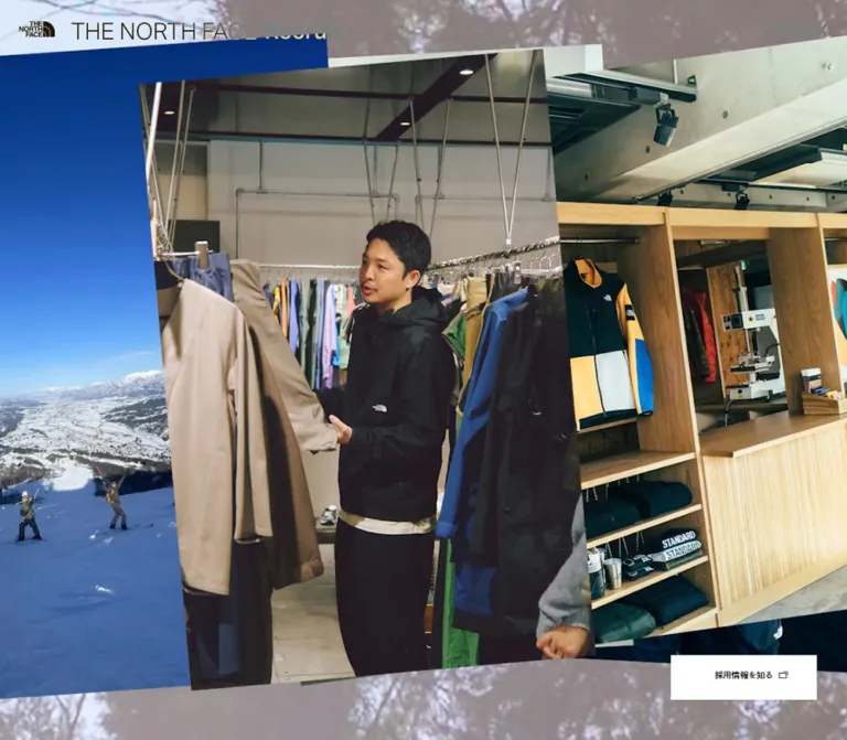
DESIGN REFERENCE
THE NORTH FACE 採用サイト
大胆な写真コラージュと大きな英字を、白黒の編集的なレイアウトで構成。スタッフ紹介やブランドカルチャーから職種別の採用情報へつなぐサイト。
オリジナルサイトを見るTHE NORTH FACE Recruit — Style Reference
An outdoor recruitment magazine with the energy of a photographic scrapbook.
Website: THE NORTH FACE Recruit Original URL: https://www.thenorthface.jp/special/recruit/ Final URL: https://www.thenorthface.jp/special/recruit/ Theme: predominantly white and black, with a charcoal recruitment section and full-color photography. Inspected: September 13, 2026, 02:29 JST; supplied retrieval timestamp: September 12, 2026, 17:29:10.348 UTC. Viewports: desktop 1440 × 1000 CSS pixels; mobile 390 × 844 CSS pixels. Scope: the current recruitment homepage, using three desktop captures, two mobile captures, rendered text, link destinations, and sampled computed styles. Visual coverage includes the opening imagery, a featured culture article, the beginning of the desktop article columns, and the recruitment/footer boundary. DOM evidence additionally covers the team message, staff profiles, article inventory, and job cards. Article pages, category results, the Index destination state, and external recruitment pages were not inspected.
The page combines documentary photography with precise editorial organization. Its desktop opening fills the viewport with overlapping photographs of outdoor products against a close-up garment background. Farther down, the interface becomes a white magazine canvas: enormous alphabet markers, restrained English titles, Japanese supporting text, thin rules, and outlined category links. A charcoal section gives the job listings a distinct destination before the generous white footer.
This is a recruitment and brand-culture hub with several reading paths. Staff profiles and alphabet-indexed stories establish the people, products, and interests behind the brand; job links provide the application route. Preserve that relationship between exploration and recruitment when adapting the design.
How to Read This Reference
- Measured values come from the supplied rendered DOM and computed-style samples. Values are CSS pixels unless stated otherwise; tables round some fractional measurements for readability.
- Calculated values are arithmetic derived from those measurements, such as column gaps or line-height ratios.
- Estimated values come from the original-page screenshots. They are explicitly identified and are not recovered CSS declarations.
- Recommended values and behavior describe a reusable implementation, including the Quick Start. They are not assertions about the original site's code.
- Token names are implementation aliases. The supplied custom-property collection was empty; no original token naming system was recovered.
- A computed font-family declaration establishes the requested stack, not which font rendered every glyph. Font binaries and per-glyph fallback were not supplied.
Geometry limitation: some sampled article bounds overlap later sections or extend beyond the reported document height, particularly on mobile. The reported document heights were approximately 7318.13px on desktop and 5049.86px on mobile, while some mobile article bounds extend past 9600px. These measurements do not establish a complete normal-flow scroll map. Use local component dimensions and the settled screenshots; do not reproduce those overlaps or infer a particular pinning, clipping, or scrolling mechanism.
Tokens — Colors
Default Palette
| Name | Value | Suggested token | Evidence and role |
|---|---|---|---|
| Page White | #ffffff |
--tnf-paper |
Measured root background; visible editorial canvas, footer, and recruitment-card surfaces |
| Interface Black | #000000 |
--tnf-ink |
Measured content text; visible rules, outlines, and footer identity |
| Message Gray | #bdbdbd |
--tnf-message-dim |
Measured duplicate message-text layer; not established as a general secondary-text color |
| Message White | #ffffff |
--tnf-message-active |
Measured overlapping message-text layer with an opacity transition |
| Recruitment Charcoal | Approximately #474747 |
--tnf-charcoal |
Screenshot estimate for the large field behind job cards; its background declaration was not sampled |
| Transparent Overlay | transparent |
— | Measured header background and many link backgrounds; underlying elements supply the visible surface |
Color Behavior
Photography supplies the chromatic range: silver-gray fabric, warm tan clothing, pale paper borders, small red product details, forest greens, and warm timber. These are image colors, not a category or action palette.
The header's sampled text color is white, but its marks appear black, gray, or blue-toned across different photographed and scrolled backgrounds. The supplied properties do not identify the compositing or state-switching mechanism. Do not invent a fixed blue brand accent or claim a specific blend mode.
Several links have transparent computed backgrounds while their visible button or card surface is white. Describe the assembled component rather than treating the anchor's background value as the entire visual result.
No theme selector or user-controlled dark mode was evidenced. The charcoal recruitment region is a section treatment.
Tokens — Typography
Main Grotesk Stack
The measured main stack is:
aktiv-grotesk, dnp-shuei-gothic-gin-std, 'ヒラギノ角ゴ ProN W3', 'Hiragino Kaku Gothic ProN', 游ゴシック, YuGothic, メイリオ, Meiryo, sans-serif
English navigation and several headings use the shorter stack aktiv-grotesk, dnp-shuei-gothic-gin-std, sans-serif. The sampled View All control uses aktiv-grotesk, sans-serif.
Regular grotesk lettering gives the interface a factual, editorial tone. Japanese supporting text becomes heavier in the message and job-description blocks. Most sampled tracking is normal.
Extended Display Face
The three-line heading “Scrapbook / of Our / Explorers” uses aktiv-grotesk-extended, sans-serif, weight 800.
Its negative tracking is consistent across the sampled viewports: -2.56px at 64px on desktop and approximately -1.985px at 49.618px on mobile, both equivalent to -0.04em. This wide, heavy face is a deliberate exception to the quieter typography elsewhere.
Identity Artwork
The header recruitment wordmark is contained in a link with an empty extracted text value and a measured artwork-sized rectangle. Its anchor inherits 10px text, which does not describe the visible wordmark. Use the authorized identity artwork; do not reconstruct its typography from that inherited value.
Type Scale
Desktop/mobile pairs below are measured unless marked as estimates.
| Role | Desktop size / line height | Mobile size / line height | Weight and notes |
|---|---|---|---|
| Root | 10 / 10px |
10 / 10px |
400; sizing infrastructure, not a readable body-text recommendation |
| Index | 30 / 30px |
15.878 / 15.878px |
Visible paragraph 300 |
| Team message | 25 / 38px |
19.847 / 30.168px |
600; approximately 1.52 leading |
| Scrapbook heading | 64 / 64px |
49.618 / 45.649px |
800; extended face, -0.04em tracking |
| A–Z section heading | 55 / 55px |
36.718 / 36.718px |
500; mobile title breaks into two lines |
| A–Z introduction | 22 / 22px |
15.878 / 25.722px |
600 |
| Alphabet markers | Approximately 150px |
Not sampled | Desktop screenshot estimate; regular-looking grotesk |
| Featured article title | Approximately 44px |
Not sampled | Desktop screenshot estimate |
| Article category tags | 12 / 12px |
11.908 / 11.908px |
400 |
| View All | 12 / 30px |
11.908 / 29.771px |
400 |
| Recruitment section label | 30 / 30px |
29.771 / 29.771px |
400 |
| English job title | 40 / 40px |
25.802 / 25.802px |
400 |
| Japanese job subtitle | 20 / 20px |
16.870 / 16.870px |
Desktop 400; mobile 500 |
| Job description | 20 / 29px |
14.886 / 22.824px |
Desktop 600; mobile 500 |
| Job-search label | 13 / 30px |
12.901 / 19.847px |
400 |
| Main recruitment CTA | 14 / 19px |
Approximately 14px |
Mobile footer estimate |
| Footer navigation | 26 / 26px |
Approximately 25–26px |
Mobile screenshot estimate |
| Footer tags | 20 / 20px |
Approximately 20px |
Mobile screenshot estimate |
| Footer external links | 18px; normal leading |
Approximately 18px |
Desktop link rectangles are 23px high |
Keep the different scales purposeful. The alphabet marker is the strongest editorial signal; category links are compact; the main recruitment CTA uses modest text inside a substantial rectangle. Avoid applying the extended display face to every heading.
Tokens — Spacing & Shapes
Spacing Scale
The evidence suggests component-specific spacing rather than one universal base unit.
| Use | Desktop | Mobile | Status |
|---|---|---|---|
| Header edge inset | 25px |
9.922px |
Measured |
| Header logo-to-wordmark gap | 20px |
Approximately 10.906px |
Calculated from bounds |
| Main article outer gutter | 50px |
14.891px |
Measured |
| Team-message side clearance | 380px |
40.695px |
Measured centered text region |
| Article-column gap | 30px |
Single column | Calculated |
| Staff-card gap | 67px |
Approximately 51.594px |
Calculated from successive cards |
| Small tag gap | 14px |
Approximately 10.906px |
Calculated from featured tags |
| Job-card gap | Approximately 29.5px |
Approximately 19.859px |
Calculated |
| Job-card top / side inset | 45 / 37px |
26.794 / 29.771px |
Measured |
| Footer top inset | 56px |
Approximately 60–63px |
Desktop measured; mobile estimated |
| Footer navigation row pitch | 52px |
Approximately 42px |
Desktop measured; mobile estimated |
| Footer tag gaps | 20px horizontal, 16px vertical |
Approximately 17px, 15px |
Desktop calculated; mobile estimated |
Border Radius
| Element | Value | Evidence |
|---|---|---|
| Photographs, recruitment cards, rectangular CTAs | 0 |
Square corners visible; corresponding sampled links also use zero radius |
| Article category tags | 26.5px desktop; 26.298px mobile |
Measured |
| Footer category tags | 30px desktop |
Measured |
| View All | 50px |
Measured |
| Rules and button outlines | Approximately 1px |
Screenshot estimate; tag box arithmetic is consistent with 1px borders |
Rounded geometry belongs to navigation pills. Photographs and job cards remain rectangular.
Layout Measurements
| Component | Desktop | Mobile |
|---|---|---|
| Header | 1440 × 80px |
390 × 62px |
| Header brand mark | 47 × 21.531px |
46.641 × 21.375px |
| Recruitment wordmark link | 350 × 23px |
186.531 × 12.063px |
| Team-message text width | 680px |
308.609px |
| Staff profile link | 300 × 445px |
Typically 287.781 × 429.953px; one longer item is about 451.781px high |
| Featured article link rectangle | 1440 × 555px |
390 × 389.984px; supporting tags occur below it |
| Standard article width | Approximately 426.667px |
360.219px |
| Job card | 427 × 500px |
277.859 × 324.484px |
| Hero recruitment CTA | 246 × 73.984px |
Absent from the supplied opening state |
| Footer recruitment CTA | 246 × 76.984px |
Approximately 238 × 78px, screenshot estimate |
| Recruitment details button | 165 × 55px |
Not measured |
| Footer logo | 153 × 70.125px |
Approximately 134 × 61px, screenshot estimate |
| Footer height | 517.125px |
Approximately 745px in the supplied final capture |
The desktop article width follows (1440 − 2 × 50 − 2 × 30) / 3 ≈ 426.67px.
Calculated mobile scaling fit: several values match nominal sizes multiplied by 390 / 393: 16px becomes 15.878px, 20px becomes 19.847px, and 50px becomes 49.618px. This suggests a 393px reference width, but the original formula and breakpoint were not supplied. It does not justify scaling every desktop measurement by one common ratio.
Components
Persistent Header
Role: maintain brand identity and access to Index throughout the page.
The header remains at the top of the supplied opening and scrolled screenshots. Its surface is transparent, with no visible separator, shadow, or opaque navigation bar. The precise positioning declaration was not supplied; a fixed header is a suitable implementation interpretation.
An independent brand-logo link sits at the left, followed by the recruitment wordmark link. Index sits at the opposite edge. On desktop, the logo starts at x=25 and the wordmark at x=92. On mobile, their starts are approximately x=9.92 and x=67.47.
The small brand mark keeps almost the same dimensions on mobile while the recruitment wordmark becomes roughly half as wide. Index also reduces from 30px to approximately 15.88px. It remains a text label rather than becoming a hamburger icon.
Index has a recorded # destination. No opened state was supplied, so its menu contents, panel geometry, dismissal behavior, and transition are unverified.
Photographic Opening
Role: establish an immediate connection between products, people, and outdoor culture.
The desktop capture is an edge-to-edge photographic composition. A large silver-gray jacket forms the background. Uneven white-bordered photographs overlap it: a pale technical vest at left, a tan jacket near the center, dark packs to the right, and a cropped product photograph above. Different scales, slight rotations, and cropped edges create the scrapbook character.
The paper edges and folds belong to the imagery. They are not evidence of a general CSS card-shadow system. Individual rotations appear to range from a few degrees to roughly ten degrees, but transform values were not supplied.
A white recruitment rectangle sits at x=1144, y≈858, leaving 50px at the right and 68px below it in the 1000px-tall desktop viewport. Its label is “採用情報を知る”, accompanied by a small overlapping-window symbol.
The mobile opening instead shows a tightly cropped group photograph in front of a timber climbing structure. The large lettering on the structure is part of the photograph, not a separate interface heading. No recruitment CTA is visible in this opening capture, and the mobile link evidence does not include the desktop opening CTA.
Different images were captured at the two sizes. The evidence cannot separate responsive art direction from changing media states, and does not identify a slideshow, video format, autoplay interval, or transition sequence.
Message from TNF Team
Role: introduce the brand's exploration philosophy and invitation to prospective colleagues.
The DOM contains a substantial Japanese message in a centered text region. Its width changes from 680px on desktop to approximately 308.61px on mobile. The typography remains prominent: 25px/38px at weight 600 on desktop and approximately 19.85px/30.17px on mobile.
Two copies of each sampled line occupy the same coordinates: a gray layer and a white layer. The white layer declares an opacity transition of 0.5s. This supports a layered text treatment, not two separate prose sections.
The message was not supplied as a dedicated screenshot. Its background, visible progression, trigger positions, and any scroll synchronization remain unverified. For reuse, keep one semantic copy of the text and make any decorative duplicate inaccessible to assistive technology.
Scrapbook of Our Explorers
Role: introduce staff stories through a horizontally arranged profile collection.
The title has three explicit lines in the extended display face. Below it, five profile links contain department information, a staff name, and View More. Each leads to a distinct /special/recruit/Scrapbook/ detail route. View All links to the OurExplorers category.
Desktop profile links are 300px wide and advance horizontally by 367px. The fourth item extends slightly beyond the right edge and the fifth lies farther offscreen. Two compact control links sit near the section's upper-right side.
On mobile, the first profile is approximately 287.78px wide and begins around x=51.61. Subsequent profiles remain arranged horizontally, rather than stacking. Control-link rectangles sit near the left and right viewport edges, approximately midway down the first profile region.
This geometry supports a horizontal rail with controls. Button operation, touch dragging, wraparound, autoplay, and active-slide behavior were not exercised. Profile-image crops and caption typography cannot be fully specified from the supplied measurements alone.
Featured Culture Article
Role: introduce the A–Z collection with one larger editorial entry.
The visible feature is “Seven Days Exploring”, marked with a large S and the subtitle “TNFで働くスタッフ 1週間”. The desktop composition combines a workplace photo montage at left with the marker, title, subtitle, and tags at right.
In the screenshot, the montage occupies approximately x=258–702, while the text starts at x≈743. That leaves about 41px between image and text and considerable outer white space. The full linked feature rectangle measures 1440 × 555px; that rectangle is not the photograph's own measured size.
The four category links form three pills on the first desktop line and one on the second. Mobile measurements place a roughly square, full-width linked region above the tags, which wrap into two pairs inside a narrower inset.
Keep article navigation and category navigation separate. An implementation should not place category anchors inside another anchor or allow a full-card link overlay to block them.
A–Z Editorial Article
Role: provide browsable entry points into the brand's culture.
Each article is organized around a thin horizontal rule, an oversized alphabet marker, a rectangular photograph, an English title, Japanese supporting text, and category pills where applicable. The visible desktop row begins A, B, C, with all three rules aligned.
The measured desktop columns are independent stacks:
| Left | Middle | Right |
|---|---|---|
| A — Athletes’ Voice | B — Boost the Vibe | C — Creative Ideas for Moving |
| F — Functions & Styles | I — Innovation Meets Sustainability | L — Lasting Support |
| M — Mt.FUJI Won’t Stop Me | Q — Questions for Our Fellow | S — Seven Days Exploring |
| T — Timeless Masterpieces | — | — |
Card heights vary substantially. Preserve that editorial variation instead of imposing one image ratio and a shared card height. The evidence establishes the arrangement, not the CSS layout technology or library responsible for it.
On mobile, the rendered article order is A, B, C, F, I, L, M, Q, S, T, with approximately 360px-wide main links and narrower tag groups around 288px wide. This differs from reading the desktop columns down one at a time.
Category Pill
Role: navigate to a category-specific listing.
The source labels are #OurExplorers, #Merchandiser, #Marketer, and #Designer. Their destinations contain list?category=..., so they are evidenced as navigation links, not verified in-place filter toggles.
Desktop article pills use 12px type, 12px line height, 12px 18px 10px padding, and a 26.5px radius. The resulting measured height is 36px. Mobile article pills keep almost the same type size but increase vertical padding, reaching approximately 39.70px high.
Footer pills are a separate, larger variant: 20px type, 15px 20px 12px padding, 30px radius, and 49px measured height on desktop. Preserve both sizes rather than applying the footer dimensions to every article.
View All
Role: offer a compact transition from a preview collection to its listing.
The measured staff-section control is a centered capsule approximately 152 × 57px on desktop and 150.84 × 55.56px on mobile. Its 12px text is intentionally small relative to the control's breathing room.
It shares the rounded navigation vocabulary with category pills but is taller and centered. It does not use the rectangular external-recruitment treatment.
Recruitment Job Card
Role: connect editorial interest to relevant open-role categories.
The recruitment region contains a white section label, three white cards on charcoal, and a centered white details button. The categories are Merchandiser, Marketer, and Designer.
Each desktop card is approximately 427 × 500px, with 45px top and 37px side insets. Stack a 40px English role title, a 20px Japanese subtitle, a heavier Japanese responsibilities paragraph, and an outlined search affordance near the lower-left corner. The description starts 60px after the measured subtitle's bottom. The large remaining space separates the description from the search action.
The entire card is a recorded anchor to an external recruitment URL. The inner search treatment should therefore be a styled label within that anchor, not a nested button or link. Its text follows the source pattern “Merchandiserで探す”. The overlapping-window icon signals an external destination; the evidence does not establish whether a new browser tab opens.
Mobile cards measure approximately 277.86 × 324.48px. The first starts at x≈39.69 and the second at x≈337.41, proving a horizontal arrangement in the sampled state. Do not turn this into a three-card vertical stack when aiming to preserve the observed mobile structure. Swiping and control behavior remain unverified.
Recruitment CTA
Role: provide a consistent route to the general recruitment listing.
The main CTA uses black 14px/19px text, a white rectangular surface, and a small external-destination symbol. Its desktop hero version is borderless in the capture; the footer version has a thin black outline and is approximately 77px tall.
The smaller “詳しく知る” button below the job cards measures 165 × 55px and uses 13px text. Both its recorded destination and the main recruitment CTA point to the same general job-category URL.
Footer
Role: provide a spacious closing directory with another recruitment entry point.
The white desktop footer places three editorial links at upper left and the recruitment CTA at upper right. Large category pills sit beneath the editorial links in two rows. The brand-site and Instagram links occupy the lower left; a much larger brand mark anchors the lower right.
Measured desktop navigation starts 56px below the footer top, uses 26px text, and advances by 52px per row. The footer's overall height is approximately 517px. It feels open because the left navigation and right recruitment action remain widely separated.
On mobile, the footer becomes a deliberate vertical sequence: editorial links, category pills, recruitment CTA, then the external links and brand mark aligned across the bottom. The CTA is left aligned rather than full width. Estimated empty gaps are approximately 113px from the last tag row to the CTA and 136px from the CTA bottom to the logo row. Preserve substantial spacing instead of compressing the footer into a dense sitemap.
The visible label thenorthface.jp points to https://www.goldwin.co.jp/tnf/; the Instagram link points to the brand's Japanese account. These destinations were recorded, not visited.
Tokens — Motion & Interaction
The supplied evidence contains transition declarations, not a recording of each transition being triggered.
| Component or property | Recorded declaration | What is established |
|---|---|---|
| Header opacity | 0.8s |
A fade is configured; trigger and endpoints unknown |
| White message-text layer | opacity 0.5s |
Layer opacity can transition; reading progression unverified |
| Profile-rail controls | opacity 0.2s, transform 0.2s |
Short feedback transitions; movement distance unknown |
| Staff cards and View All | Color and background color, 0.32s |
Color-change timing; hover endpoints not supplied |
| Article category links | Background and color, 0.35s cubic-bezier(0.19, 1, 0.22, 1) |
Eased color feedback is configured |
| Footer pills and recruitment CTA | Background color and color, 0.32s |
Shared footer feedback timing |
| Recruitment details button | opacity 0.32s |
Opacity feedback is configured |
| A–Z subtitle | Opacity and transform, 0.9s cubic-bezier(0.25, 0.46, 0.45, 0.94) |
Delay is 0.9s desktop and 1s mobile |
| Mobile Scrapbook title lines | Clip path, 1s cubic-bezier(0.165, 0.84, 0.44, 1) |
Staggered delays of 0.2s, 0.4s, and 0.6s |
| Mobile “Z about” line | Clip path, 0.6s cubic-bezier(0.25, 0.46, 0.45, 0.94) 0.25s |
A masked title reveal is configured |
| Mobile brand line in A–Z title | Clip path, 1.2s cubic-bezier(0.25, 0.46, 0.45, 0.94) 0.5s |
A longer delayed reveal is configured |
The useful distinction is between quick control feedback and slower editorial reveals. Do not give every element the same entrance animation.
Entries reported simply as transition: all provide no useful nonzero timing. Likewise, sampled animation: none does not rule out JavaScript motion, animated ancestors, or changing media.
The capture process traversed scroll positions and waited for readiness, but no supplied interaction trace demonstrates Index opening, profile advancement, category selection results, hover colors, or keyboard behavior. Hero media sequencing and reduced-motion support remain unverified.
Surfaces
| Layer | Appearance | Purpose |
|---|---|---|
| Opening media | Full-viewport color photography | Immediate atmosphere and brand context |
| Header | Transparent overlay with compact identity | Persistent orientation without a heavy navigation surface |
| Editorial canvas | White, black text, thin rules | Organize profiles and culture stories |
| Photographic paper | Uneven pale borders within the opening imagery | Give the collage a physical scrapbook quality |
| Category navigation | White or transparent interior, black outline, capsule shape | Repeatable category links |
| Recruitment field | Flat charcoal, approximately #474747 |
Mark the shift toward job discovery |
| Recruitment cards | Flat white rectangles | Separate the three role categories |
| Footer | Broad white field | Closing navigation and recruitment access |
There is no evidenced general elevation scale. Separation comes from photography, surface contrast, rules, and spacing. Do not add glossy gradients, blurred glass, or soft floating-card shadows.
Imagery
The current visual language connects technical products with real working and outdoor environments. The desktop opening highlights garment textures and gear; the mobile opening emphasizes a group of people in an outdoor setting. The culture feature shows workplace activity through a montage of office and product-development scenes.
The visible first article row includes a climber near colorful climbing holds, a wooded event setting, and a person beside graphic artwork. These subjects broaden recruitment into a view of the brand's community and creative interests.
Use natural photographic detail and varied compositions. Preserve the contrast between the irregular, overlapping opening and the straight-edged editorial photographs below. Do not rotate every article thumbnail simply because the hero is a collage.
Observed Asset References
| Asset role | Evidence in the current captures | Reuse guidance |
|---|---|---|
| Desktop opening | Garment close-up with overlapping product photographs | Use an art-directed composition with varied scales and cropped edges |
| Mobile opening | Group photograph against a timber climbing structure | Choose a vertical crop that retains faces and environmental context |
| Featured culture image | Workplace photo montage | Preserve the internal montage rather than replacing it with a generic portrait |
| Article imagery | Climbing, forest event, and creative-work scenes | Keep subject-specific aspect ratios and crops |
| Header identity | Small brand mark plus separate recruitment wordmark | Use authorized identity assets at the measured proportions |
| Footer identity | Large monochrome brand mark | Keep it visually stronger than the small header mark |
| External-destination symbol | Two small overlapping outlined rectangles | A simple CSS or SVG adaptation is suitable |
Asset URLs, filenames, original dimensions, media formats, and font-file URLs were not supplied. No asset paths are asserted here. The header and feature link rectangles must not be mistaken for intrinsic image dimensions.
Layout & Responsive Behavior
Desktop
The opening fills the viewport. Below it, the page shifts between a centered message column, a horizontal staff rail, a centered two-part featured article, three independent editorial columns, a three-card recruitment row, and a spacious footer.
The main article and recruitment regions use approximately 50px outside gutters and 30px column gaps at 1440px. The featured article has a narrower central composition and larger side margins. These distinct widths help establish hierarchy.
Mobile
The mobile layout is not a uniformly reduced desktop page:
- The brand mark remains nearly the same size, while the recruitment wordmark and Index shrink substantially.
- The opening shows a portrait-oriented photographic state without the desktop recruitment CTA.
- The message retains a comfortable approximately 309px text column and prominent 20px type.
- Staff profiles remain in a horizontal rail with one principal profile visible.
- The A–Z heading splits across lines, the featured content becomes vertically arranged, and ordinary articles form a single column.
- Article category links use slightly taller pills and narrower inset groups.
- Job cards remain horizontal, with the next card partly entering the viewport.
- The footer preserves large navigation text and generous vertical gaps, moving the recruitment CTA below the categories.
The mobile page uses several inset levels: approximately 10px for the header, 15px for broad article/footer edges, 40px for section introductions and job rails, and 51px for narrower profile or tag regions. Replacing them with one universal mobile padding would flatten the composition.
Implementation Boundaries
No tablet or landscape capture was supplied, and no breakpoint declarations were recovered. Any breakpoint in the Quick Start is a recommendation. Intermediate sizes, long translated labels, browser zoom, and mobile safe areas need separate validation.
The article coordinates cannot establish which items are initially revealed or how the complete collection becomes reachable. Do not use the reported document height as a hardcoded page height or interpret overlapping bounds as intentional visual overlap.
Do’s and Don’ts
Do
- Keep interface colors restrained and let photography carry the color.
- Combine an irregular photographic opening with precise editorial structure below.
- Use the extended, heavy face specifically for the three-line Scrapbook heading.
- Preserve large alphabet markers, thin rules, and varied article heights.
- Distinguish small article tags from larger footer tags.
- Keep main recruitment CTAs rectangular and View All controls rounded.
- Maintain horizontal staff and job-card arrangements on mobile.
- Preserve the multiple mobile inset levels and spacious footer.
- Keep article links, category links, and external recruitment links semantically distinct.
- Label inferred behavior and implementation additions explicitly.
Don’t
- Don’t replace the culture hub with a generic headline, benefits grid, and repeated application buttons.
- Don’t introduce bright category fills or use photo-derived blue as an interface accent.
- Don’t turn every content block into a rounded, shadowed card.
- Don’t force all editorial photographs into identical crops or card heights.
- Don’t recreate printed lettering inside photographs as HTML headings.
- Don’t infer visible text size from a 10px wrapper around identity artwork.
- Don’t describe category links as verified in-place filters.
- Don’t invent an Index overlay, hero autoplay timing, or carousel wraparound behavior.
- Don’t copy duplicated message text into the accessibility tree.
- Don’t reproduce inconsistent offscreen coordinates as a page layout.
Recommended Implementation Additions
These are recommendations for a new implementation, not verified original-site features.
- Use semantic headings and navigation landmarks. Preserve one accessible copy of the team message even if visual layers are duplicated.
- Give the logo links, Index control, and profile controls meaningful accessible names. If Index opens a panel, implement its expanded state, focus handling, and dismissal explicitly.
- Keep keyboard access to offscreen rail items and provide working controls. Add at least 44px hit areas around compact controls without enlarging every visible glyph.
- Preserve alphabetical reading and focus order when adapting the desktop article columns to mobile. Avoid a visual reorder that leaves keyboard navigation in an unexpected sequence.
- Verify header contrast over every photographic state. A dependable foreground treatment is preferable to assuming one color remains legible throughout changing imagery.
- Honor reduced-motion preferences, keep content visible without reveal scripts, and provide pause controls if persistent moving media is introduced.
- Reserve image dimensions and prioritize the opening media; defer lower-page images without leaving blank content indefinitely.
- Validate job cards with longer text and enlarged fonts. Use flexible minimum heights instead of reproducing unusual padding-based heights from the sampled source.
Agent Prompt Guide
Quick Color Reference
- Canvas, footer, and job cards:
#ffffff. - Main text, rules, pill outlines, and icons:
#000000. - Recruitment field: approximately
#474747, a screenshot estimate. - Layered message text: measured
#bdbdbdand#ffffff. - Accent color: supplied by photography; no separate action accent was established.
- Header: transparent, with foreground contrast selected for the actual media state.
Overall Prompt
“Create an editorial recruitment homepage inspired by THE NORTH FACE Recruit. Open with immersive documentary photography and an art-directed collage of uneven, overlapping photo prints. Keep a transparent persistent header with a small brand mark, a separate recruitment wordmark, and an Index text control. Below, use a white canvas, black grotesk typography, a three-line heavy extended Scrapbook heading, horizontal staff profiles, and an A–Z culture collection with oversized alphabet markers, thin rules, varied rectangular photographs, and small outlined category pills. Finish with three white role cards on charcoal and an expansive white footer. On mobile, keep staff and role cards horizontal, stack editorial articles, preserve several inset levels, and retain the footer's generous vertical spacing. Treat unverified menu and media behavior as implementation decisions.”
Example Component Prompts
- Opening: “Design a full-viewport photographic opening with technical clothing and gear shown through overlapping paper-edged photographs. Use different image scales and restrained rotations. Place the desktop white recruitment CTA 50px from the right and approximately 68px from the bottom. Keep the navigation visually light.”
- Staff section: “Set Scrapbook / of Our / Explorers in a heavy extended grotesk with -0.04em tracking. Follow it with a horizontal staff-profile rail using 300px-wide desktop items, department text, names, and View More. On a 390px phone, show one approximately 288px-wide profile with room for controls at the sides.”
- Culture article: “Create an unboxed white editorial entry with a thin black top rule, a very large regular grotesk alphabet marker, a square-cornered documentary photograph, bilingual article information, and 12px outlined category pills. Preserve intrinsic content height.”
- Job card: “Build a 427 × 500px white desktop recruitment card on a charcoal field. Use a 40px English role title, 20px Japanese subtitle, a heavier responsibilities paragraph, and a small outlined external-search label near the bottom. Make the whole card one link.”
- Footer: “Create a spacious white footer with three large editorial links and two rows of outlined category pills at left, a rectangular recruitment CTA at upper right, and external links opposite a large brand mark below. On mobile, move the CTA below the pills with substantial white space and retain the final links-and-logo row.”
Quick Start
CSS Custom Properties
This is a recommended static adaptation, not recovered source code. It retains a conventional root size, uses explicit component sizes, and requires authorized image and font assets. The 900px breakpoint is recommended. Mobile scaling uses the calculated 393px fit with a recommended cap and floor.
The article grid below reproduces widths and the first-row alignment but does not implement the original independent column packing. A production masonry implementation must preserve meaningful reading order. Index logic, rail controls, layered hero choreography, and scroll-triggered reveals require separate implementation; content is visible by default.
:root {
  /* Measured colors, except the estimated recruitment field. */
  --tnf-paper: #fff;
  --tnf-ink: #000;
  --tnf-message-dim: #bdbdbd;
  --tnf-charcoal: #474747;

  /* Source family names; font files must be supplied separately. */
  --tnf-font: 'aktiv-grotesk', 'dnp-shuei-gothic-gin-std',
    'Hiragino Kaku Gothic ProN', YuGothic, Meiryo, sans-serif;
  --tnf-display: 'aktiv-grotesk-extended', sans-serif;

  --gutter: 50px;
  --header-inset: 25px;
  --header-height: 80px;
  --brand-width: 47px;
  --wordmark-width: 350px;
  --brand-gap: 20px;
  --text-index: 30px;
  --text-display: 64px;
  --display-leading: 1;
  --text-section: 55px;
  --text-message: 25px;
  --message-width: 680px;
  --profile-width: 300px;
  --profile-gap: 67px;
  --rule: 1px;

  --motion-control: 320ms;
  --motion-header: 800ms;
  --motion-tag: 350ms;
  --ease-tag: cubic-bezier(0.19, 1, 0.22, 1);
  --ease-reveal: cubic-bezier(0.25, 0.46, 0.45, 0.94);
}

* { box-sizing: border-box; }

body.tnf-page {
  margin: 0;
  color: var(--tnf-ink);
  background: var(--tnf-paper);
  font: 400 16px/1.5 var(--tnf-font);
}

.tnf-page a { color: inherit; text-decoration: none; }
.tnf-page img { display: block; max-width: 100%; }
.tnf-page h1,
.tnf-page h2,
.tnf-page h3,
.tnf-page p { margin: 0; }

.page-section { padding-inline: var(--gutter); }

.site-header {
  position: fixed;
  inset: 0 0 auto;
  z-index: 30;
  display: flex;
  align-items: center;
  height: var(--header-height);
  padding-inline: var(--header-inset);
  background: transparent;
  transition: opacity var(--motion-header);
}

/* Recommended explicit contrast state; no blend mode is assumed. */
.site-header[data-tone='light'] { color: var(--tnf-paper); }
.site-header[data-tone='dark'] { color: var(--tnf-ink); }

.header-identity {
  display: flex;
  align-items: center;
  gap: var(--brand-gap);
}

.header-brand { width: var(--brand-width); }
.header-wordmark { width: var(--wordmark-width); }
.header-brand img,
.header-wordmark img { width: 100%; height: auto; }

.header-index {
  display: inline-flex;
  align-items: center;
  min-height: 44px;
  margin-left: auto;
  font-size: var(--text-index);
  font-weight: 300;
  line-height: 1;
}

.hero {
  position: relative;
  min-height: 100vh;
  min-height: 100svh;
  overflow: hidden;
}

/* Supply a composed poster or a separately art-directed media layer. */
.hero-media,
.hero-media img {
  position: absolute;
  inset: 0;
  width: 100%;
  height: 100%;
  object-fit: cover;
}

.button {
  display: inline-flex;
  align-items: center;
  justify-content: center;
  gap: 10px;
  width: 246px;
  min-height: 77px;
  padding: 18px 20px;
  border: var(--rule) solid var(--tnf-ink);
  border-radius: 0;
  color: var(--tnf-ink);
  background: var(--tnf-paper);
  font-size: 14px;
  line-height: 19px;
  transition: color var(--motion-control),
    background-color var(--motion-control);
}

.hero-cta {
  position: absolute;
  right: 50px;
  bottom: 68px;
  min-height: 74px;
  border: 0;
}

.external-mark {
  position: relative;
  flex: 0 0 14px;
  width: 14px;
  height: 12px;
}

.external-mark::before,
.external-mark::after {
  content: '';
  position: absolute;
  width: 10px;
  height: 8px;
  border: 1px solid currentColor;
}

.external-mark::before { top: 0; right: 0; }
.external-mark::after {
  bottom: 0;
  left: 0;
  background: inherit;
}

.message-copy {
  width: min(var(--message-width), calc(100% - 80px));
  margin-inline: auto;
  font-size: var(--text-message);
  font-weight: 600;
  line-height: 1.52;
}

.message-copy p + p { margin-top: 2em; }

.scrapbook-title {
  font-family: var(--tnf-display);
  font-size: var(--text-display);
  font-weight: 800;
  line-height: var(--display-leading);
  letter-spacing: -0.04em;
}

.scrapbook-title span { display: block; }

.profile-rail {
  display: flex;
  gap: var(--profile-gap);
  overflow-x: auto;
  padding: 40px var(--gutter);
}

.profile-card {
  flex: 0 0 var(--profile-width);
  min-width: 0;
}

.profile-card img { width: 100%; height: auto; }

.section-title {
  font-size: var(--text-section);
  font-weight: 500;
  line-height: 1;
}

/* Approximation of the centered desktop feature composition. */
.feature-inner {
  display: grid;
  grid-template-columns: repeat(2, minmax(0, 1fr));
  gap: 40px;
  width: min(924px, calc(100% - 2 * var(--gutter)));
  margin-inline: auto;
}

.feature-image {
  width: 100%;
  height: 555px;
  object-fit: cover;
}

.feature-title { font-size: 44px; font-weight: 400; line-height: 1.15; }
.feature-subtitle { margin-top: 14px !important; font-size: 22px; }
.feature-copy .tags { max-width: 400px; margin-top: 64px; }

.tags {
  display: flex;
  flex-wrap: wrap;
  align-items: flex-start;
  gap: 14px;
}

.tag {
  display: inline-flex;
  align-items: center;
  padding: 12px 18px 10px;
  border: var(--rule) solid currentColor;
  border-radius: 26.5px;
  font-size: 12px;
  line-height: 12px;
  white-space: nowrap;
  transition: color var(--motion-tag) var(--ease-tag),
    background-color var(--motion-tag) var(--ease-tag);
}

.tag--large {
  padding: 15px 20px 12px;
  border-radius: 30px;
  font-size: 20px;
  line-height: 20px;
}

.view-all {
  display: flex;
  align-items: center;
  justify-content: center;
  width: 152px;
  min-height: 57px;
  margin: 40px auto;
  border: var(--rule) solid currentColor;
  border-radius: 50px;
  font-size: 12px;
}

/* Baseline grid; independent column packing is not implemented here. */
.az-grid {
  display: grid;
  grid-template-columns: repeat(3, minmax(0, 1fr));
  gap: 60px 30px;
  padding-inline: var(--gutter);
}

.az-card { min-width: 0; align-self: start; border-top: 1px solid; }
.az-letter { font-size: 150px; font-weight: 400; line-height: 1; }
.az-card .az-letter { margin-top: 11px; }
.az-card img { width: 100%; height: auto; }
.az-card .tags { margin-top: 28px; }

.jobs {
  padding: 80px var(--gutter) 93px;
  color: var(--tnf-paper);
  background: var(--tnf-charcoal);
}

.jobs-title { font-size: 30px; font-weight: 400; line-height: 1; }

.jobs-grid {
  display: grid;
  grid-template-columns: repeat(3, minmax(0, 1fr));
  gap: 30px;
  margin-top: 67px;
}

.jobs .role-card {
  display: flex;
  flex-direction: column;
  min-width: 0;
  min-height: 500px;
  padding: 45px 37px 37px;
  color: var(--tnf-ink);
  background: var(--tnf-paper);
}

.role-title { font-size: clamp(26px, 2.78vw, 40px); font-weight: 400; line-height: 1; }
.role-subtitle { margin-top: 12px !important; font-size: 20px; line-height: 1; }
.role-description { margin-top: 60px !important; font-size: 20px; font-weight: 600; line-height: 1.45; }

.role-card .button {
  align-self: flex-start;
  width: auto;
  min-height: 55px;
  margin-top: auto;
  padding: 11px 20px 12px;
  font-size: 13px;
  line-height: 30px;
}

.jobs .jobs-details {
  display: flex;
  width: 165px;
  min-height: 55px;
  margin: 88px auto 0;
  border: 0;
  color: var(--tnf-ink);
  font-size: 13px;
}

.site-footer { padding: 56px var(--gutter) 46px; }

.footer-main {
  display: grid;
  grid-template-columns: minmax(0, 1fr) 246px;
  grid-template-areas: 'nav cta' 'tags cta';
}

.footer-nav {
  grid-area: nav;
  display: flex;
  flex-direction: column;
  align-items: flex-start;
  gap: 26px;
  font-size: 26px;
  line-height: 26px;
}

.footer-tags {
  grid-area: tags;
  max-width: 390px;
  margin-top: 64px;
  gap: 16px 20px;
}

.footer-cta { grid-area: cta; align-self: start; justify-self: end; }

.footer-bottom {
  display: flex;
  align-items: flex-end;
  justify-content: space-between;
  gap: 24px;
  margin-top: 37px;
}

.footer-social { display: grid; font-size: 18px; line-height: 23px; }
.footer-logo { width: 153px; height: auto; }

/* Recommended hover endpoints; source endpoints were not supplied. */
@media (hover: hover) {
  .tag:hover,
  .button:hover,
  .role-card:hover .button {
    color: var(--tnf-paper);
    background: var(--tnf-ink);
  }
}

/* Recommended visible keyboard focus. */
.tnf-page :focus-visible { outline: 2px solid currentColor; outline-offset: 4px; }
.tnf-page [id] { scroll-margin-top: calc(var(--header-height) + 20px); }

@media (max-width: 900px) {
  :root {
    /* Calculated fit at 390px; floor and cap are recommendations. */
    --m: clamp(0.9px, calc(100vw / 393), 1.1px);
    --gutter: calc(15 * var(--m));
    --header-inset: calc(10 * var(--m));
    --header-height: 62px;
    --brand-width: calc(47 * var(--m));
    --wordmark-width: calc(188 * var(--m));
    --brand-gap: calc(11 * var(--m));
    --text-index: calc(16 * var(--m));
    --text-display: calc(50 * var(--m));
    --display-leading: 0.92;
    --text-section: calc(37 * var(--m));
    --text-message: calc(20 * var(--m));
    --message-width: 79.13%;
    --profile-width: calc(290 * var(--m));
    --profile-gap: calc(52 * var(--m));
  }

  .hero-cta { display: none; }
  .message-copy { width: var(--message-width); }
  .scrapbook-title { padding-inline: calc(42.5 * var(--m)); }
  .profile-rail { padding-inline: calc((100% - var(--profile-width)) / 2); }

  .feature-inner { display: block; width: 100%; }
  .feature-image { height: auto; aspect-ratio: 1; }
  .feature-copy { padding: 24px calc(51.5 * var(--m)) 0; }
  .feature-title { font-size: 28px; }
  .feature-subtitle { font-size: 16px; }
  .feature-copy .tags { margin-top: 32px; }

  .tags { gap: calc(11 * var(--m)); }
  .tag {
    padding: calc(14 * var(--m)) calc(18 * var(--m)) calc(12 * var(--m));
    font-size: calc(12 * var(--m));
    line-height: 1;
  }

  .az-grid { grid-template-columns: minmax(0, 1fr); }
  .az-card .tags { margin-inline: calc(36.5 * var(--m)); }

  .jobs { padding-inline: 0; }
  .jobs-title { margin-inline: calc(40 * var(--m)); }
  .jobs-grid {
    display: flex;
    gap: calc(20 * var(--m));
    overflow-x: auto;
    padding-inline: calc(40 * var(--m));
  }

  .jobs .role-card {
    flex: 0 0 calc(280 * var(--m));
    min-height: calc(327 * var(--m));
    padding: calc(27 * var(--m)) calc(30 * var(--m)) calc(28 * var(--m));
  }

  .role-title { font-size: calc(26 * var(--m)); }
  .role-subtitle { margin-top: 5px !important; font-size: calc(17 * var(--m)); font-weight: 500; }
  .role-description {
    margin-top: calc(43 * var(--m)) !important;
    font-size: calc(15 * var(--m));
    font-weight: 500;
    line-height: 1.533;
  }
  .role-card .button { min-height: 50px; padding: 10px 20px; line-height: 20px; }

  /* Footer dimensions below approximate the mobile capture. */
  .site-footer { padding: 60px var(--gutter) 26px; }
  .footer-main { grid-template-columns: 1fr; grid-template-areas: 'nav' 'tags' 'cta'; }
  .footer-nav { gap: 16px; font-size: 25px; line-height: 26px; }
  .footer-tags { margin-top: 44px; gap: 15px 17px; }
  .tag--large { padding: 15px 15px 14px; font-size: 20px; line-height: 20px; }
  .footer-cta { justify-self: start; width: 238px; min-height: 78px; margin-top: 112px; }
  .footer-bottom { margin-top: 136px; }
  .footer-logo { width: 134px; }
}

@media (prefers-reduced-motion: reduce) {
  .tnf-page *,
  .tnf-page *::before,
  .tnf-page *::after {
    animation: none !important;
    transition: none !important;
    scroll-behavior: auto !important;
  }
}
Example Component Markup
This example uses the recorded Merchandiser destination and source UI copy. The card is one anchor; the outlined inner action is a span. Its icon is decorative.
<a
  class='role-card'
  href='https://hrmos.co/pages/goldwin/jobs?category=1628700711051128832,1629763457364783104'
>
  <h3 class='role-title'>Merchandiser</h3>
  <p class='role-subtitle' lang='ja'>MD担当</p>
  <p class='role-description' lang='ja'>製品企画/計数管理/販売部門連携/販売促進</p>
  <span class='button'>
    <span lang='ja'>Merchandiserで探す</span>
    <span class='external-mark' aria-hidden='true'></span>
  </span>
</a>
Tailwind v4 Token Mapping
Optional aliases for a project already using Tailwind v4. This does not imply that the original site uses Tailwind. Define the custom properties above first.
@theme inline {
  --color-paper: var(--tnf-paper);
  --color-ink: var(--tnf-ink);
  --color-charcoal: var(--tnf-charcoal);
  --color-message-dim: var(--tnf-message-dim);
  --font-editorial: var(--tnf-font);
  --font-display: var(--tnf-display);
  --text-index: var(--text-index);
  --text-scrapbook: var(--text-display);
  --text-message-copy: var(--text-message);
  --spacing-page-gutter: var(--gutter);
  --spacing-profile: var(--profile-width);
  --radius-category: 26.5px;
  --radius-footer-category: 30px;
}
Sources & Evidence
- Original recruitment homepage: original and final URL are identical; the supplied response status is HTTP 200 and the document title is TNF Recruit.
- Capture time: supplied retrieval timestamp
2026-09-12T17:29:10.348Z, corresponding to September 13, 2026, 02:29 JST. - Desktop evidence: three 1440 × 1000 captures showing the photographic opening, featured culture article and beginning of the article columns, and the recruitment/footer boundary; rendered text, links, rectangles, typography, and transition samples cover additional homepage components.
- Mobile evidence: two 390 × 844 captures showing the opening and footer; rendered DOM samples additionally describe the message, profile rail, culture content, and initial job cards. Mobile footer sizes without corresponding computed samples are screenshot estimates.
- Recorded navigation: staff-detail routes, alphabet-article routes, category-list URLs, the message anchor, external recruitment destinations, brand-site links, and Instagram. Destination pages were not inspected.
- Inspection conditions: the supplied capture process waited for document readiness, visible-image decoding, sampled text/layout stability, and applicable finite motion within bounded time limits. Perpetual animations were temporarily paused during readiness checks and resumed afterward. SharedWorkers and service workers were disabled.
- Limitations: no additional browsing, command execution, or file inspection was performed for this reference. No opened Index state, exercised rail controls, hover-state capture, media timeline, asset inventory, breakpoint source, or complete reliable document-flow map was supplied. Delayed content and unexercised behavior remain unverified.
This reference describes the current supplied homepage evidence. Measured declarations, screenshot estimates, calculated relationships, and recommended implementation choices are identified separately throughout.
# THE NORTH FACE Recruit — Style Reference

> An outdoor recruitment magazine with the energy of a photographic scrapbook.

**Website:** [THE NORTH FACE Recruit](https://www.thenorthface.jp/special/recruit/)
**Original URL:** https://www.thenorthface.jp/special/recruit/
**Final URL:** https://www.thenorthface.jp/special/recruit/
**Theme:** predominantly white and black, with a charcoal recruitment section and full-color photography.
**Inspected:** September 13, 2026, 02:29 JST; supplied retrieval timestamp: September 12, 2026, 17:29:10.348 UTC.
**Viewports:** desktop 1440 × 1000 CSS pixels; mobile 390 × 844 CSS pixels.
**Scope:** the current recruitment homepage, using three desktop captures, two mobile captures, rendered text, link destinations, and sampled computed styles. Visual coverage includes the opening imagery, a featured culture article, the beginning of the desktop article columns, and the recruitment/footer boundary. DOM evidence additionally covers the team message, staff profiles, article inventory, and job cards. Article pages, category results, the Index destination state, and external recruitment pages were not inspected.

The page combines documentary photography with precise editorial organization. Its desktop opening fills the viewport with overlapping photographs of outdoor products against a close-up garment background. Farther down, the interface becomes a white magazine canvas: enormous alphabet markers, restrained English titles, Japanese supporting text, thin rules, and outlined category links. A charcoal section gives the job listings a distinct destination before the generous white footer.

This is a recruitment and brand-culture hub with several reading paths. Staff profiles and alphabet-indexed stories establish the people, products, and interests behind the brand; job links provide the application route. Preserve that relationship between exploration and recruitment when adapting the design.

## How to Read This Reference

- **Measured** values come from the supplied rendered DOM and computed-style samples. Values are CSS pixels unless stated otherwise; tables round some fractional measurements for readability.
- **Calculated** values are arithmetic derived from those measurements, such as column gaps or line-height ratios.
- **Estimated** values come from the original-page screenshots. They are explicitly identified and are not recovered CSS declarations.
- **Recommended** values and behavior describe a reusable implementation, including the Quick Start. They are not assertions about the original site's code.
- Token names are implementation aliases. The supplied custom-property collection was empty; no original token naming system was recovered.
- A computed font-family declaration establishes the requested stack, not which font rendered every glyph. Font binaries and per-glyph fallback were not supplied.

**Geometry limitation:** some sampled article bounds overlap later sections or extend beyond the reported document height, particularly on mobile. The reported document heights were approximately 7318.13px on desktop and 5049.86px on mobile, while some mobile article bounds extend past 9600px. These measurements do not establish a complete normal-flow scroll map. Use local component dimensions and the settled screenshots; do not reproduce those overlaps or infer a particular pinning, clipping, or scrolling mechanism.

## Tokens — Colors

### Default Palette

| Name | Value | Suggested token | Evidence and role |
| --- | --- | --- | --- |
| Page White | `#ffffff` | `--tnf-paper` | Measured root background; visible editorial canvas, footer, and recruitment-card surfaces |
| Interface Black | `#000000` | `--tnf-ink` | Measured content text; visible rules, outlines, and footer identity |
| Message Gray | `#bdbdbd` | `--tnf-message-dim` | Measured duplicate message-text layer; not established as a general secondary-text color |
| Message White | `#ffffff` | `--tnf-message-active` | Measured overlapping message-text layer with an opacity transition |
| Recruitment Charcoal | Approximately `#474747` | `--tnf-charcoal` | Screenshot estimate for the large field behind job cards; its background declaration was not sampled |
| Transparent Overlay | `transparent` | — | Measured header background and many link backgrounds; underlying elements supply the visible surface |

### Color Behavior

Photography supplies the chromatic range: silver-gray fabric, warm tan clothing, pale paper borders, small red product details, forest greens, and warm timber. These are image colors, not a category or action palette.

The header's sampled text color is white, but its marks appear black, gray, or blue-toned across different photographed and scrolled backgrounds. The supplied properties do not identify the compositing or state-switching mechanism. Do not invent a fixed blue brand accent or claim a specific blend mode.

Several links have transparent computed backgrounds while their visible button or card surface is white. Describe the assembled component rather than treating the anchor's background value as the entire visual result.

No theme selector or user-controlled dark mode was evidenced. The charcoal recruitment region is a section treatment.

## Tokens — Typography

### Main Grotesk Stack

The measured main stack is:

`aktiv-grotesk, dnp-shuei-gothic-gin-std, 'ヒラギノ角ゴ ProN W3', 'Hiragino Kaku Gothic ProN', 游ゴシック, YuGothic, メイリオ, Meiryo, sans-serif`

English navigation and several headings use the shorter stack `aktiv-grotesk, dnp-shuei-gothic-gin-std, sans-serif`. The sampled View All control uses `aktiv-grotesk, sans-serif`.

Regular grotesk lettering gives the interface a factual, editorial tone. Japanese supporting text becomes heavier in the message and job-description blocks. Most sampled tracking is `normal`.

### Extended Display Face

The three-line heading “Scrapbook / of Our / Explorers” uses `aktiv-grotesk-extended, sans-serif`, weight `800`.

Its negative tracking is consistent across the sampled viewports: `-2.56px` at 64px on desktop and approximately `-1.985px` at 49.618px on mobile, both equivalent to `-0.04em`. This wide, heavy face is a deliberate exception to the quieter typography elsewhere.

### Identity Artwork

The header recruitment wordmark is contained in a link with an empty extracted text value and a measured artwork-sized rectangle. Its anchor inherits 10px text, which does not describe the visible wordmark. Use the authorized identity artwork; do not reconstruct its typography from that inherited value.

### Type Scale

Desktop/mobile pairs below are measured unless marked as estimates.

| Role | Desktop size / line height | Mobile size / line height | Weight and notes |
| --- | --- | --- | --- |
| Root | `10 / 10px` | `10 / 10px` | `400`; sizing infrastructure, not a readable body-text recommendation |
| Index | `30 / 30px` | `15.878 / 15.878px` | Visible paragraph `300` |
| Team message | `25 / 38px` | `19.847 / 30.168px` | `600`; approximately `1.52` leading |
| Scrapbook heading | `64 / 64px` | `49.618 / 45.649px` | `800`; extended face, `-0.04em` tracking |
| A–Z section heading | `55 / 55px` | `36.718 / 36.718px` | `500`; mobile title breaks into two lines |
| A–Z introduction | `22 / 22px` | `15.878 / 25.722px` | `600` |
| Alphabet markers | Approximately `150px` | Not sampled | Desktop screenshot estimate; regular-looking grotesk |
| Featured article title | Approximately `44px` | Not sampled | Desktop screenshot estimate |
| Article category tags | `12 / 12px` | `11.908 / 11.908px` | `400` |
| View All | `12 / 30px` | `11.908 / 29.771px` | `400` |
| Recruitment section label | `30 / 30px` | `29.771 / 29.771px` | `400` |
| English job title | `40 / 40px` | `25.802 / 25.802px` | `400` |
| Japanese job subtitle | `20 / 20px` | `16.870 / 16.870px` | Desktop `400`; mobile `500` |
| Job description | `20 / 29px` | `14.886 / 22.824px` | Desktop `600`; mobile `500` |
| Job-search label | `13 / 30px` | `12.901 / 19.847px` | `400` |
| Main recruitment CTA | `14 / 19px` | Approximately `14px` | Mobile footer estimate |
| Footer navigation | `26 / 26px` | Approximately `25–26px` | Mobile screenshot estimate |
| Footer tags | `20 / 20px` | Approximately `20px` | Mobile screenshot estimate |
| Footer external links | `18px`; normal leading | Approximately `18px` | Desktop link rectangles are 23px high |

Keep the different scales purposeful. The alphabet marker is the strongest editorial signal; category links are compact; the main recruitment CTA uses modest text inside a substantial rectangle. Avoid applying the extended display face to every heading.

## Tokens — Spacing & Shapes

### Spacing Scale

The evidence suggests component-specific spacing rather than one universal base unit.

| Use | Desktop | Mobile | Status |
| --- | --- | --- | --- |
| Header edge inset | `25px` | `9.922px` | Measured |
| Header logo-to-wordmark gap | `20px` | Approximately `10.906px` | Calculated from bounds |
| Main article outer gutter | `50px` | `14.891px` | Measured |
| Team-message side clearance | `380px` | `40.695px` | Measured centered text region |
| Article-column gap | `30px` | Single column | Calculated |
| Staff-card gap | `67px` | Approximately `51.594px` | Calculated from successive cards |
| Small tag gap | `14px` | Approximately `10.906px` | Calculated from featured tags |
| Job-card gap | Approximately `29.5px` | Approximately `19.859px` | Calculated |
| Job-card top / side inset | `45 / 37px` | `26.794 / 29.771px` | Measured |
| Footer top inset | `56px` | Approximately `60–63px` | Desktop measured; mobile estimated |
| Footer navigation row pitch | `52px` | Approximately `42px` | Desktop measured; mobile estimated |
| Footer tag gaps | `20px` horizontal, `16px` vertical | Approximately `17px`, `15px` | Desktop calculated; mobile estimated |

### Border Radius

| Element | Value | Evidence |
| --- | --- | --- |
| Photographs, recruitment cards, rectangular CTAs | `0` | Square corners visible; corresponding sampled links also use zero radius |
| Article category tags | `26.5px` desktop; `26.298px` mobile | Measured |
| Footer category tags | `30px` desktop | Measured |
| View All | `50px` | Measured |
| Rules and button outlines | Approximately `1px` | Screenshot estimate; tag box arithmetic is consistent with 1px borders |

Rounded geometry belongs to navigation pills. Photographs and job cards remain rectangular.

### Layout Measurements

| Component | Desktop | Mobile |
| --- | --- | --- |
| Header | `1440 × 80px` | `390 × 62px` |
| Header brand mark | `47 × 21.531px` | `46.641 × 21.375px` |
| Recruitment wordmark link | `350 × 23px` | `186.531 × 12.063px` |
| Team-message text width | `680px` | `308.609px` |
| Staff profile link | `300 × 445px` | Typically `287.781 × 429.953px`; one longer item is about 451.781px high |
| Featured article link rectangle | `1440 × 555px` | `390 × 389.984px`; supporting tags occur below it |
| Standard article width | Approximately `426.667px` | `360.219px` |
| Job card | `427 × 500px` | `277.859 × 324.484px` |
| Hero recruitment CTA | `246 × 73.984px` | Absent from the supplied opening state |
| Footer recruitment CTA | `246 × 76.984px` | Approximately `238 × 78px`, screenshot estimate |
| Recruitment details button | `165 × 55px` | Not measured |
| Footer logo | `153 × 70.125px` | Approximately `134 × 61px`, screenshot estimate |
| Footer height | `517.125px` | Approximately `745px` in the supplied final capture |

The desktop article width follows `(1440 − 2 × 50 − 2 × 30) / 3 ≈ 426.67px`.

**Calculated mobile scaling fit:** several values match nominal sizes multiplied by `390 / 393`: 16px becomes 15.878px, 20px becomes 19.847px, and 50px becomes 49.618px. This suggests a 393px reference width, but the original formula and breakpoint were not supplied. It does not justify scaling every desktop measurement by one common ratio.

## Components

### Persistent Header

**Role:** maintain brand identity and access to Index throughout the page.

The header remains at the top of the supplied opening and scrolled screenshots. Its surface is transparent, with no visible separator, shadow, or opaque navigation bar. The precise positioning declaration was not supplied; a fixed header is a suitable implementation interpretation.

An independent brand-logo link sits at the left, followed by the recruitment wordmark link. Index sits at the opposite edge. On desktop, the logo starts at x=25 and the wordmark at x=92. On mobile, their starts are approximately x=9.92 and x=67.47.

The small brand mark keeps almost the same dimensions on mobile while the recruitment wordmark becomes roughly half as wide. Index also reduces from 30px to approximately 15.88px. It remains a text label rather than becoming a hamburger icon.

Index has a recorded `#` destination. No opened state was supplied, so its menu contents, panel geometry, dismissal behavior, and transition are unverified.

### Photographic Opening

**Role:** establish an immediate connection between products, people, and outdoor culture.

The desktop capture is an edge-to-edge photographic composition. A large silver-gray jacket forms the background. Uneven white-bordered photographs overlap it: a pale technical vest at left, a tan jacket near the center, dark packs to the right, and a cropped product photograph above. Different scales, slight rotations, and cropped edges create the scrapbook character.

The paper edges and folds belong to the imagery. They are not evidence of a general CSS card-shadow system. Individual rotations appear to range from a few degrees to roughly ten degrees, but transform values were not supplied.

A white recruitment rectangle sits at x=1144, y≈858, leaving 50px at the right and 68px below it in the 1000px-tall desktop viewport. Its label is “採用情報を知る”, accompanied by a small overlapping-window symbol.

The mobile opening instead shows a tightly cropped group photograph in front of a timber climbing structure. The large lettering on the structure is part of the photograph, not a separate interface heading. No recruitment CTA is visible in this opening capture, and the mobile link evidence does not include the desktop opening CTA.

Different images were captured at the two sizes. The evidence cannot separate responsive art direction from changing media states, and does not identify a slideshow, video format, autoplay interval, or transition sequence.

### Message from TNF Team

**Role:** introduce the brand's exploration philosophy and invitation to prospective colleagues.

The DOM contains a substantial Japanese message in a centered text region. Its width changes from 680px on desktop to approximately 308.61px on mobile. The typography remains prominent: 25px/38px at weight 600 on desktop and approximately 19.85px/30.17px on mobile.

Two copies of each sampled line occupy the same coordinates: a gray layer and a white layer. The white layer declares an opacity transition of 0.5s. This supports a layered text treatment, not two separate prose sections.

The message was not supplied as a dedicated screenshot. Its background, visible progression, trigger positions, and any scroll synchronization remain unverified. For reuse, keep one semantic copy of the text and make any decorative duplicate inaccessible to assistive technology.

### Scrapbook of Our Explorers

**Role:** introduce staff stories through a horizontally arranged profile collection.

The title has three explicit lines in the extended display face. Below it, five profile links contain department information, a staff name, and View More. Each leads to a distinct `/special/recruit/Scrapbook/` detail route. View All links to the OurExplorers category.

Desktop profile links are 300px wide and advance horizontally by 367px. The fourth item extends slightly beyond the right edge and the fifth lies farther offscreen. Two compact control links sit near the section's upper-right side.

On mobile, the first profile is approximately 287.78px wide and begins around x=51.61. Subsequent profiles remain arranged horizontally, rather than stacking. Control-link rectangles sit near the left and right viewport edges, approximately midway down the first profile region.

This geometry supports a horizontal rail with controls. Button operation, touch dragging, wraparound, autoplay, and active-slide behavior were not exercised. Profile-image crops and caption typography cannot be fully specified from the supplied measurements alone.

### Featured Culture Article

**Role:** introduce the A–Z collection with one larger editorial entry.

The visible feature is “Seven Days Exploring”, marked with a large S and the subtitle “TNFで働くスタッフ 1週間”. The desktop composition combines a workplace photo montage at left with the marker, title, subtitle, and tags at right.

In the screenshot, the montage occupies approximately x=258–702, while the text starts at x≈743. That leaves about 41px between image and text and considerable outer white space. The full linked feature rectangle measures 1440 × 555px; that rectangle is not the photograph's own measured size.

The four category links form three pills on the first desktop line and one on the second. Mobile measurements place a roughly square, full-width linked region above the tags, which wrap into two pairs inside a narrower inset.

Keep article navigation and category navigation separate. An implementation should not place category anchors inside another anchor or allow a full-card link overlay to block them.

### A–Z Editorial Article

**Role:** provide browsable entry points into the brand's culture.

Each article is organized around a thin horizontal rule, an oversized alphabet marker, a rectangular photograph, an English title, Japanese supporting text, and category pills where applicable. The visible desktop row begins A, B, C, with all three rules aligned.

The measured desktop columns are independent stacks:

| Left | Middle | Right |
| --- | --- | --- |
| A — Athletes’ Voice | B — Boost the Vibe | C — Creative Ideas for Moving |
| F — Functions & Styles | I — Innovation Meets Sustainability | L — Lasting Support |
| M — Mt.FUJI Won’t Stop Me | Q — Questions for Our Fellow | S — Seven Days Exploring |
| T — Timeless Masterpieces | — | — |

Card heights vary substantially. Preserve that editorial variation instead of imposing one image ratio and a shared card height. The evidence establishes the arrangement, not the CSS layout technology or library responsible for it.

On mobile, the rendered article order is A, B, C, F, I, L, M, Q, S, T, with approximately 360px-wide main links and narrower tag groups around 288px wide. This differs from reading the desktop columns down one at a time.

### Category Pill

**Role:** navigate to a category-specific listing.

The source labels are #OurExplorers, #Merchandiser, #Marketer, and #Designer. Their destinations contain `list?category=...`, so they are evidenced as navigation links, not verified in-place filter toggles.

Desktop article pills use 12px type, 12px line height, `12px 18px 10px` padding, and a 26.5px radius. The resulting measured height is 36px. Mobile article pills keep almost the same type size but increase vertical padding, reaching approximately 39.70px high.

Footer pills are a separate, larger variant: 20px type, `15px 20px 12px` padding, 30px radius, and 49px measured height on desktop. Preserve both sizes rather than applying the footer dimensions to every article.

### View All

**Role:** offer a compact transition from a preview collection to its listing.

The measured staff-section control is a centered capsule approximately 152 × 57px on desktop and 150.84 × 55.56px on mobile. Its 12px text is intentionally small relative to the control's breathing room.

It shares the rounded navigation vocabulary with category pills but is taller and centered. It does not use the rectangular external-recruitment treatment.

### Recruitment Job Card

**Role:** connect editorial interest to relevant open-role categories.

The recruitment region contains a white section label, three white cards on charcoal, and a centered white details button. The categories are Merchandiser, Marketer, and Designer.

Each desktop card is approximately 427 × 500px, with 45px top and 37px side insets. Stack a 40px English role title, a 20px Japanese subtitle, a heavier Japanese responsibilities paragraph, and an outlined search affordance near the lower-left corner. The description starts 60px after the measured subtitle's bottom. The large remaining space separates the description from the search action.

The entire card is a recorded anchor to an external recruitment URL. The inner search treatment should therefore be a styled label within that anchor, not a nested button or link. Its text follows the source pattern “Merchandiserで探す”. The overlapping-window icon signals an external destination; the evidence does not establish whether a new browser tab opens.

Mobile cards measure approximately 277.86 × 324.48px. The first starts at x≈39.69 and the second at x≈337.41, proving a horizontal arrangement in the sampled state. Do not turn this into a three-card vertical stack when aiming to preserve the observed mobile structure. Swiping and control behavior remain unverified.

### Recruitment CTA

**Role:** provide a consistent route to the general recruitment listing.

The main CTA uses black 14px/19px text, a white rectangular surface, and a small external-destination symbol. Its desktop hero version is borderless in the capture; the footer version has a thin black outline and is approximately 77px tall.

The smaller “詳しく知る” button below the job cards measures 165 × 55px and uses 13px text. Both its recorded destination and the main recruitment CTA point to the same general job-category URL.

### Footer

**Role:** provide a spacious closing directory with another recruitment entry point.

The white desktop footer places three editorial links at upper left and the recruitment CTA at upper right. Large category pills sit beneath the editorial links in two rows. The brand-site and Instagram links occupy the lower left; a much larger brand mark anchors the lower right.

Measured desktop navigation starts 56px below the footer top, uses 26px text, and advances by 52px per row. The footer's overall height is approximately 517px. It feels open because the left navigation and right recruitment action remain widely separated.

On mobile, the footer becomes a deliberate vertical sequence: editorial links, category pills, recruitment CTA, then the external links and brand mark aligned across the bottom. The CTA is left aligned rather than full width. Estimated empty gaps are approximately 113px from the last tag row to the CTA and 136px from the CTA bottom to the logo row. Preserve substantial spacing instead of compressing the footer into a dense sitemap.

The visible label `thenorthface.jp` points to `https://www.goldwin.co.jp/tnf/`; the Instagram link points to the brand's Japanese account. These destinations were recorded, not visited.

## Tokens — Motion & Interaction

The supplied evidence contains transition declarations, not a recording of each transition being triggered.

| Component or property | Recorded declaration | What is established |
| --- | --- | --- |
| Header opacity | `0.8s` | A fade is configured; trigger and endpoints unknown |
| White message-text layer | `opacity 0.5s` | Layer opacity can transition; reading progression unverified |
| Profile-rail controls | `opacity 0.2s, transform 0.2s` | Short feedback transitions; movement distance unknown |
| Staff cards and View All | Color and background color, `0.32s` | Color-change timing; hover endpoints not supplied |
| Article category links | Background and color, `0.35s cubic-bezier(0.19, 1, 0.22, 1)` | Eased color feedback is configured |
| Footer pills and recruitment CTA | Background color and color, `0.32s` | Shared footer feedback timing |
| Recruitment details button | `opacity 0.32s` | Opacity feedback is configured |
| A–Z subtitle | Opacity and transform, `0.9s cubic-bezier(0.25, 0.46, 0.45, 0.94)` | Delay is `0.9s` desktop and `1s` mobile |
| Mobile Scrapbook title lines | Clip path, `1s cubic-bezier(0.165, 0.84, 0.44, 1)` | Staggered delays of `0.2s`, `0.4s`, and `0.6s` |
| Mobile “Z about” line | Clip path, `0.6s cubic-bezier(0.25, 0.46, 0.45, 0.94) 0.25s` | A masked title reveal is configured |
| Mobile brand line in A–Z title | Clip path, `1.2s cubic-bezier(0.25, 0.46, 0.45, 0.94) 0.5s` | A longer delayed reveal is configured |

The useful distinction is between quick control feedback and slower editorial reveals. Do not give every element the same entrance animation.

Entries reported simply as `transition: all` provide no useful nonzero timing. Likewise, sampled `animation: none` does not rule out JavaScript motion, animated ancestors, or changing media.

The capture process traversed scroll positions and waited for readiness, but no supplied interaction trace demonstrates Index opening, profile advancement, category selection results, hover colors, or keyboard behavior. Hero media sequencing and reduced-motion support remain unverified.

## Surfaces

| Layer | Appearance | Purpose |
| --- | --- | --- |
| Opening media | Full-viewport color photography | Immediate atmosphere and brand context |
| Header | Transparent overlay with compact identity | Persistent orientation without a heavy navigation surface |
| Editorial canvas | White, black text, thin rules | Organize profiles and culture stories |
| Photographic paper | Uneven pale borders within the opening imagery | Give the collage a physical scrapbook quality |
| Category navigation | White or transparent interior, black outline, capsule shape | Repeatable category links |
| Recruitment field | Flat charcoal, approximately `#474747` | Mark the shift toward job discovery |
| Recruitment cards | Flat white rectangles | Separate the three role categories |
| Footer | Broad white field | Closing navigation and recruitment access |

There is no evidenced general elevation scale. Separation comes from photography, surface contrast, rules, and spacing. Do not add glossy gradients, blurred glass, or soft floating-card shadows.

## Imagery

The current visual language connects technical products with real working and outdoor environments. The desktop opening highlights garment textures and gear; the mobile opening emphasizes a group of people in an outdoor setting. The culture feature shows workplace activity through a montage of office and product-development scenes.

The visible first article row includes a climber near colorful climbing holds, a wooded event setting, and a person beside graphic artwork. These subjects broaden recruitment into a view of the brand's community and creative interests.

Use natural photographic detail and varied compositions. Preserve the contrast between the irregular, overlapping opening and the straight-edged editorial photographs below. Do not rotate every article thumbnail simply because the hero is a collage.

### Observed Asset References

| Asset role | Evidence in the current captures | Reuse guidance |
| --- | --- | --- |
| Desktop opening | Garment close-up with overlapping product photographs | Use an art-directed composition with varied scales and cropped edges |
| Mobile opening | Group photograph against a timber climbing structure | Choose a vertical crop that retains faces and environmental context |
| Featured culture image | Workplace photo montage | Preserve the internal montage rather than replacing it with a generic portrait |
| Article imagery | Climbing, forest event, and creative-work scenes | Keep subject-specific aspect ratios and crops |
| Header identity | Small brand mark plus separate recruitment wordmark | Use authorized identity assets at the measured proportions |
| Footer identity | Large monochrome brand mark | Keep it visually stronger than the small header mark |
| External-destination symbol | Two small overlapping outlined rectangles | A simple CSS or SVG adaptation is suitable |

Asset URLs, filenames, original dimensions, media formats, and font-file URLs were not supplied. No asset paths are asserted here. The header and feature link rectangles must not be mistaken for intrinsic image dimensions.

## Layout & Responsive Behavior

### Desktop

The opening fills the viewport. Below it, the page shifts between a centered message column, a horizontal staff rail, a centered two-part featured article, three independent editorial columns, a three-card recruitment row, and a spacious footer.

The main article and recruitment regions use approximately 50px outside gutters and 30px column gaps at 1440px. The featured article has a narrower central composition and larger side margins. These distinct widths help establish hierarchy.

### Mobile

The mobile layout is not a uniformly reduced desktop page:

- The brand mark remains nearly the same size, while the recruitment wordmark and Index shrink substantially.
- The opening shows a portrait-oriented photographic state without the desktop recruitment CTA.
- The message retains a comfortable approximately 309px text column and prominent 20px type.
- Staff profiles remain in a horizontal rail with one principal profile visible.
- The A–Z heading splits across lines, the featured content becomes vertically arranged, and ordinary articles form a single column.
- Article category links use slightly taller pills and narrower inset groups.
- Job cards remain horizontal, with the next card partly entering the viewport.
- The footer preserves large navigation text and generous vertical gaps, moving the recruitment CTA below the categories.

The mobile page uses several inset levels: approximately 10px for the header, 15px for broad article/footer edges, 40px for section introductions and job rails, and 51px for narrower profile or tag regions. Replacing them with one universal mobile padding would flatten the composition.

### Implementation Boundaries

No tablet or landscape capture was supplied, and no breakpoint declarations were recovered. Any breakpoint in the Quick Start is a recommendation. Intermediate sizes, long translated labels, browser zoom, and mobile safe areas need separate validation.

The article coordinates cannot establish which items are initially revealed or how the complete collection becomes reachable. Do not use the reported document height as a hardcoded page height or interpret overlapping bounds as intentional visual overlap.

## Do’s and Don’ts

### Do

- Keep interface colors restrained and let photography carry the color.
- Combine an irregular photographic opening with precise editorial structure below.
- Use the extended, heavy face specifically for the three-line Scrapbook heading.
- Preserve large alphabet markers, thin rules, and varied article heights.
- Distinguish small article tags from larger footer tags.
- Keep main recruitment CTAs rectangular and View All controls rounded.
- Maintain horizontal staff and job-card arrangements on mobile.
- Preserve the multiple mobile inset levels and spacious footer.
- Keep article links, category links, and external recruitment links semantically distinct.
- Label inferred behavior and implementation additions explicitly.

### Don’t

- Don’t replace the culture hub with a generic headline, benefits grid, and repeated application buttons.
- Don’t introduce bright category fills or use photo-derived blue as an interface accent.
- Don’t turn every content block into a rounded, shadowed card.
- Don’t force all editorial photographs into identical crops or card heights.
- Don’t recreate printed lettering inside photographs as HTML headings.
- Don’t infer visible text size from a 10px wrapper around identity artwork.
- Don’t describe category links as verified in-place filters.
- Don’t invent an Index overlay, hero autoplay timing, or carousel wraparound behavior.
- Don’t copy duplicated message text into the accessibility tree.
- Don’t reproduce inconsistent offscreen coordinates as a page layout.

## Recommended Implementation Additions

These are recommendations for a new implementation, not verified original-site features.

- Use semantic headings and navigation landmarks. Preserve one accessible copy of the team message even if visual layers are duplicated.
- Give the logo links, Index control, and profile controls meaningful accessible names. If Index opens a panel, implement its expanded state, focus handling, and dismissal explicitly.
- Keep keyboard access to offscreen rail items and provide working controls. Add at least 44px hit areas around compact controls without enlarging every visible glyph.
- Preserve alphabetical reading and focus order when adapting the desktop article columns to mobile. Avoid a visual reorder that leaves keyboard navigation in an unexpected sequence.
- Verify header contrast over every photographic state. A dependable foreground treatment is preferable to assuming one color remains legible throughout changing imagery.
- Honor reduced-motion preferences, keep content visible without reveal scripts, and provide pause controls if persistent moving media is introduced.
- Reserve image dimensions and prioritize the opening media; defer lower-page images without leaving blank content indefinitely.
- Validate job cards with longer text and enlarged fonts. Use flexible minimum heights instead of reproducing unusual padding-based heights from the sampled source.

## Agent Prompt Guide

### Quick Color Reference

- Canvas, footer, and job cards: `#ffffff`.
- Main text, rules, pill outlines, and icons: `#000000`.
- Recruitment field: approximately `#474747`, a screenshot estimate.
- Layered message text: measured `#bdbdbd` and `#ffffff`.
- Accent color: supplied by photography; no separate action accent was established.
- Header: transparent, with foreground contrast selected for the actual media state.

### Overall Prompt

“Create an editorial recruitment homepage inspired by THE NORTH FACE Recruit. Open with immersive documentary photography and an art-directed collage of uneven, overlapping photo prints. Keep a transparent persistent header with a small brand mark, a separate recruitment wordmark, and an Index text control. Below, use a white canvas, black grotesk typography, a three-line heavy extended Scrapbook heading, horizontal staff profiles, and an A–Z culture collection with oversized alphabet markers, thin rules, varied rectangular photographs, and small outlined category pills. Finish with three white role cards on charcoal and an expansive white footer. On mobile, keep staff and role cards horizontal, stack editorial articles, preserve several inset levels, and retain the footer's generous vertical spacing. Treat unverified menu and media behavior as implementation decisions.”

### Example Component Prompts

1. **Opening:** “Design a full-viewport photographic opening with technical clothing and gear shown through overlapping paper-edged photographs. Use different image scales and restrained rotations. Place the desktop white recruitment CTA 50px from the right and approximately 68px from the bottom. Keep the navigation visually light.”
2. **Staff section:** “Set Scrapbook / of Our / Explorers in a heavy extended grotesk with -0.04em tracking. Follow it with a horizontal staff-profile rail using 300px-wide desktop items, department text, names, and View More. On a 390px phone, show one approximately 288px-wide profile with room for controls at the sides.”
3. **Culture article:** “Create an unboxed white editorial entry with a thin black top rule, a very large regular grotesk alphabet marker, a square-cornered documentary photograph, bilingual article information, and 12px outlined category pills. Preserve intrinsic content height.”
4. **Job card:** “Build a 427 × 500px white desktop recruitment card on a charcoal field. Use a 40px English role title, 20px Japanese subtitle, a heavier responsibilities paragraph, and a small outlined external-search label near the bottom. Make the whole card one link.”
5. **Footer:** “Create a spacious white footer with three large editorial links and two rows of outlined category pills at left, a rectangular recruitment CTA at upper right, and external links opposite a large brand mark below. On mobile, move the CTA below the pills with substantial white space and retain the final links-and-logo row.”

## Quick Start

### CSS Custom Properties

This is a recommended static adaptation, not recovered source code. It retains a conventional root size, uses explicit component sizes, and requires authorized image and font assets. The 900px breakpoint is recommended. Mobile scaling uses the calculated 393px fit with a recommended cap and floor.

The article grid below reproduces widths and the first-row alignment but does not implement the original independent column packing. A production masonry implementation must preserve meaningful reading order. Index logic, rail controls, layered hero choreography, and scroll-triggered reveals require separate implementation; content is visible by default.

```css
:root {
  /* Measured colors, except the estimated recruitment field. */
  --tnf-paper: #fff;
  --tnf-ink: #000;
  --tnf-message-dim: #bdbdbd;
  --tnf-charcoal: #474747;

  /* Source family names; font files must be supplied separately. */
  --tnf-font: 'aktiv-grotesk', 'dnp-shuei-gothic-gin-std',
    'Hiragino Kaku Gothic ProN', YuGothic, Meiryo, sans-serif;
  --tnf-display: 'aktiv-grotesk-extended', sans-serif;

  --gutter: 50px;
  --header-inset: 25px;
  --header-height: 80px;
  --brand-width: 47px;
  --wordmark-width: 350px;
  --brand-gap: 20px;
  --text-index: 30px;
  --text-display: 64px;
  --display-leading: 1;
  --text-section: 55px;
  --text-message: 25px;
  --message-width: 680px;
  --profile-width: 300px;
  --profile-gap: 67px;
  --rule: 1px;

  --motion-control: 320ms;
  --motion-header: 800ms;
  --motion-tag: 350ms;
  --ease-tag: cubic-bezier(0.19, 1, 0.22, 1);
  --ease-reveal: cubic-bezier(0.25, 0.46, 0.45, 0.94);
}

* { box-sizing: border-box; }

body.tnf-page {
  margin: 0;
  color: var(--tnf-ink);
  background: var(--tnf-paper);
  font: 400 16px/1.5 var(--tnf-font);
}

.tnf-page a { color: inherit; text-decoration: none; }
.tnf-page img { display: block; max-width: 100%; }
.tnf-page h1,
.tnf-page h2,
.tnf-page h3,
.tnf-page p { margin: 0; }

.page-section { padding-inline: var(--gutter); }

.site-header {
  position: fixed;
  inset: 0 0 auto;
  z-index: 30;
  display: flex;
  align-items: center;
  height: var(--header-height);
  padding-inline: var(--header-inset);
  background: transparent;
  transition: opacity var(--motion-header);
}

/* Recommended explicit contrast state; no blend mode is assumed. */
.site-header[data-tone='light'] { color: var(--tnf-paper); }
.site-header[data-tone='dark'] { color: var(--tnf-ink); }

.header-identity {
  display: flex;
  align-items: center;
  gap: var(--brand-gap);
}

.header-brand { width: var(--brand-width); }
.header-wordmark { width: var(--wordmark-width); }
.header-brand img,
.header-wordmark img { width: 100%; height: auto; }

.header-index {
  display: inline-flex;
  align-items: center;
  min-height: 44px;
  margin-left: auto;
  font-size: var(--text-index);
  font-weight: 300;
  line-height: 1;
}

.hero {
  position: relative;
  min-height: 100vh;
  min-height: 100svh;
  overflow: hidden;
}

/* Supply a composed poster or a separately art-directed media layer. */
.hero-media,
.hero-media img {
  position: absolute;
  inset: 0;
  width: 100%;
  height: 100%;
  object-fit: cover;
}

.button {
  display: inline-flex;
  align-items: center;
  justify-content: center;
  gap: 10px;
  width: 246px;
  min-height: 77px;
  padding: 18px 20px;
  border: var(--rule) solid var(--tnf-ink);
  border-radius: 0;
  color: var(--tnf-ink);
  background: var(--tnf-paper);
  font-size: 14px;
  line-height: 19px;
  transition: color var(--motion-control),
    background-color var(--motion-control);
}

.hero-cta {
  position: absolute;
  right: 50px;
  bottom: 68px;
  min-height: 74px;
  border: 0;
}

.external-mark {
  position: relative;
  flex: 0 0 14px;
  width: 14px;
  height: 12px;
}

.external-mark::before,
.external-mark::after {
  content: '';
  position: absolute;
  width: 10px;
  height: 8px;
  border: 1px solid currentColor;
}

.external-mark::before { top: 0; right: 0; }
.external-mark::after {
  bottom: 0;
  left: 0;
  background: inherit;
}

.message-copy {
  width: min(var(--message-width), calc(100% - 80px));
  margin-inline: auto;
  font-size: var(--text-message);
  font-weight: 600;
  line-height: 1.52;
}

.message-copy p + p { margin-top: 2em; }

.scrapbook-title {
  font-family: var(--tnf-display);
  font-size: var(--text-display);
  font-weight: 800;
  line-height: var(--display-leading);
  letter-spacing: -0.04em;
}

.scrapbook-title span { display: block; }

.profile-rail {
  display: flex;
  gap: var(--profile-gap);
  overflow-x: auto;
  padding: 40px var(--gutter);
}

.profile-card {
  flex: 0 0 var(--profile-width);
  min-width: 0;
}

.profile-card img { width: 100%; height: auto; }

.section-title {
  font-size: var(--text-section);
  font-weight: 500;
  line-height: 1;
}

/* Approximation of the centered desktop feature composition. */
.feature-inner {
  display: grid;
  grid-template-columns: repeat(2, minmax(0, 1fr));
  gap: 40px;
  width: min(924px, calc(100% - 2 * var(--gutter)));
  margin-inline: auto;
}

.feature-image {
  width: 100%;
  height: 555px;
  object-fit: cover;
}

.feature-title { font-size: 44px; font-weight: 400; line-height: 1.15; }
.feature-subtitle { margin-top: 14px !important; font-size: 22px; }
.feature-copy .tags { max-width: 400px; margin-top: 64px; }

.tags {
  display: flex;
  flex-wrap: wrap;
  align-items: flex-start;
  gap: 14px;
}

.tag {
  display: inline-flex;
  align-items: center;
  padding: 12px 18px 10px;
  border: var(--rule) solid currentColor;
  border-radius: 26.5px;
  font-size: 12px;
  line-height: 12px;
  white-space: nowrap;
  transition: color var(--motion-tag) var(--ease-tag),
    background-color var(--motion-tag) var(--ease-tag);
}

.tag--large {
  padding: 15px 20px 12px;
  border-radius: 30px;
  font-size: 20px;
  line-height: 20px;
}

.view-all {
  display: flex;
  align-items: center;
  justify-content: center;
  width: 152px;
  min-height: 57px;
  margin: 40px auto;
  border: var(--rule) solid currentColor;
  border-radius: 50px;
  font-size: 12px;
}

/* Baseline grid; independent column packing is not implemented here. */
.az-grid {
  display: grid;
  grid-template-columns: repeat(3, minmax(0, 1fr));
  gap: 60px 30px;
  padding-inline: var(--gutter);
}

.az-card { min-width: 0; align-self: start; border-top: 1px solid; }
.az-letter { font-size: 150px; font-weight: 400; line-height: 1; }
.az-card .az-letter { margin-top: 11px; }
.az-card img { width: 100%; height: auto; }
.az-card .tags { margin-top: 28px; }

.jobs {
  padding: 80px var(--gutter) 93px;
  color: var(--tnf-paper);
  background: var(--tnf-charcoal);
}

.jobs-title { font-size: 30px; font-weight: 400; line-height: 1; }

.jobs-grid {
  display: grid;
  grid-template-columns: repeat(3, minmax(0, 1fr));
  gap: 30px;
  margin-top: 67px;
}

.jobs .role-card {
  display: flex;
  flex-direction: column;
  min-width: 0;
  min-height: 500px;
  padding: 45px 37px 37px;
  color: var(--tnf-ink);
  background: var(--tnf-paper);
}

.role-title { font-size: clamp(26px, 2.78vw, 40px); font-weight: 400; line-height: 1; }
.role-subtitle { margin-top: 12px !important; font-size: 20px; line-height: 1; }
.role-description { margin-top: 60px !important; font-size: 20px; font-weight: 600; line-height: 1.45; }

.role-card .button {
  align-self: flex-start;
  width: auto;
  min-height: 55px;
  margin-top: auto;
  padding: 11px 20px 12px;
  font-size: 13px;
  line-height: 30px;
}

.jobs .jobs-details {
  display: flex;
  width: 165px;
  min-height: 55px;
  margin: 88px auto 0;
  border: 0;
  color: var(--tnf-ink);
  font-size: 13px;
}

.site-footer { padding: 56px var(--gutter) 46px; }

.footer-main {
  display: grid;
  grid-template-columns: minmax(0, 1fr) 246px;
  grid-template-areas: 'nav cta' 'tags cta';
}

.footer-nav {
  grid-area: nav;
  display: flex;
  flex-direction: column;
  align-items: flex-start;
  gap: 26px;
  font-size: 26px;
  line-height: 26px;
}

.footer-tags {
  grid-area: tags;
  max-width: 390px;
  margin-top: 64px;
  gap: 16px 20px;
}

.footer-cta { grid-area: cta; align-self: start; justify-self: end; }

.footer-bottom {
  display: flex;
  align-items: flex-end;
  justify-content: space-between;
  gap: 24px;
  margin-top: 37px;
}

.footer-social { display: grid; font-size: 18px; line-height: 23px; }
.footer-logo { width: 153px; height: auto; }

/* Recommended hover endpoints; source endpoints were not supplied. */
@media (hover: hover) {
  .tag:hover,
  .button:hover,
  .role-card:hover .button {
    color: var(--tnf-paper);
    background: var(--tnf-ink);
  }
}

/* Recommended visible keyboard focus. */
.tnf-page :focus-visible { outline: 2px solid currentColor; outline-offset: 4px; }
.tnf-page [id] { scroll-margin-top: calc(var(--header-height) + 20px); }

@media (max-width: 900px) {
  :root {
    /* Calculated fit at 390px; floor and cap are recommendations. */
    --m: clamp(0.9px, calc(100vw / 393), 1.1px);
    --gutter: calc(15 * var(--m));
    --header-inset: calc(10 * var(--m));
    --header-height: 62px;
    --brand-width: calc(47 * var(--m));
    --wordmark-width: calc(188 * var(--m));
    --brand-gap: calc(11 * var(--m));
    --text-index: calc(16 * var(--m));
    --text-display: calc(50 * var(--m));
    --display-leading: 0.92;
    --text-section: calc(37 * var(--m));
    --text-message: calc(20 * var(--m));
    --message-width: 79.13%;
    --profile-width: calc(290 * var(--m));
    --profile-gap: calc(52 * var(--m));
  }

  .hero-cta { display: none; }
  .message-copy { width: var(--message-width); }
  .scrapbook-title { padding-inline: calc(42.5 * var(--m)); }
  .profile-rail { padding-inline: calc((100% - var(--profile-width)) / 2); }

  .feature-inner { display: block; width: 100%; }
  .feature-image { height: auto; aspect-ratio: 1; }
  .feature-copy { padding: 24px calc(51.5 * var(--m)) 0; }
  .feature-title { font-size: 28px; }
  .feature-subtitle { font-size: 16px; }
  .feature-copy .tags { margin-top: 32px; }

  .tags { gap: calc(11 * var(--m)); }
  .tag {
    padding: calc(14 * var(--m)) calc(18 * var(--m)) calc(12 * var(--m));
    font-size: calc(12 * var(--m));
    line-height: 1;
  }

  .az-grid { grid-template-columns: minmax(0, 1fr); }
  .az-card .tags { margin-inline: calc(36.5 * var(--m)); }

  .jobs { padding-inline: 0; }
  .jobs-title { margin-inline: calc(40 * var(--m)); }
  .jobs-grid {
    display: flex;
    gap: calc(20 * var(--m));
    overflow-x: auto;
    padding-inline: calc(40 * var(--m));
  }

  .jobs .role-card {
    flex: 0 0 calc(280 * var(--m));
    min-height: calc(327 * var(--m));
    padding: calc(27 * var(--m)) calc(30 * var(--m)) calc(28 * var(--m));
  }

  .role-title { font-size: calc(26 * var(--m)); }
  .role-subtitle { margin-top: 5px !important; font-size: calc(17 * var(--m)); font-weight: 500; }
  .role-description {
    margin-top: calc(43 * var(--m)) !important;
    font-size: calc(15 * var(--m));
    font-weight: 500;
    line-height: 1.533;
  }
  .role-card .button { min-height: 50px; padding: 10px 20px; line-height: 20px; }

  /* Footer dimensions below approximate the mobile capture. */
  .site-footer { padding: 60px var(--gutter) 26px; }
  .footer-main { grid-template-columns: 1fr; grid-template-areas: 'nav' 'tags' 'cta'; }
  .footer-nav { gap: 16px; font-size: 25px; line-height: 26px; }
  .footer-tags { margin-top: 44px; gap: 15px 17px; }
  .tag--large { padding: 15px 15px 14px; font-size: 20px; line-height: 20px; }
  .footer-cta { justify-self: start; width: 238px; min-height: 78px; margin-top: 112px; }
  .footer-bottom { margin-top: 136px; }
  .footer-logo { width: 134px; }
}

@media (prefers-reduced-motion: reduce) {
  .tnf-page *,
  .tnf-page *::before,
  .tnf-page *::after {
    animation: none !important;
    transition: none !important;
    scroll-behavior: auto !important;
  }
}
```

### Example Component Markup

This example uses the recorded Merchandiser destination and source UI copy. The card is one anchor; the outlined inner action is a span. Its icon is decorative.

```html
<a
  class='role-card'
  href='https://hrmos.co/pages/goldwin/jobs?category=1628700711051128832,1629763457364783104'
>
  <h3 class='role-title'>Merchandiser</h3>
  <p class='role-subtitle' lang='ja'>MD担当</p>
  <p class='role-description' lang='ja'>製品企画/計数管理/販売部門連携/販売促進</p>
  <span class='button'>
    <span lang='ja'>Merchandiserで探す</span>
    <span class='external-mark' aria-hidden='true'></span>
  </span>
</a>
```

### Tailwind v4 Token Mapping

Optional aliases for a project already using Tailwind v4. This does not imply that the original site uses Tailwind. Define the custom properties above first.

```css
@theme inline {
  --color-paper: var(--tnf-paper);
  --color-ink: var(--tnf-ink);
  --color-charcoal: var(--tnf-charcoal);
  --color-message-dim: var(--tnf-message-dim);
  --font-editorial: var(--tnf-font);
  --font-display: var(--tnf-display);
  --text-index: var(--text-index);
  --text-scrapbook: var(--text-display);
  --text-message-copy: var(--text-message);
  --spacing-page-gutter: var(--gutter);
  --spacing-profile: var(--profile-width);
  --radius-category: 26.5px;
  --radius-footer-category: 30px;
}
```

## Sources & Evidence

- [Original recruitment homepage](https://www.thenorthface.jp/special/recruit/): original and final URL are identical; the supplied response status is HTTP 200 and the document title is TNF Recruit.
- **Capture time:** supplied retrieval timestamp `2026-09-12T17:29:10.348Z`, corresponding to September 13, 2026, 02:29 JST.
- **Desktop evidence:** three 1440 × 1000 captures showing the photographic opening, featured culture article and beginning of the article columns, and the recruitment/footer boundary; rendered text, links, rectangles, typography, and transition samples cover additional homepage components.
- **Mobile evidence:** two 390 × 844 captures showing the opening and footer; rendered DOM samples additionally describe the message, profile rail, culture content, and initial job cards. Mobile footer sizes without corresponding computed samples are screenshot estimates.
- **Recorded navigation:** staff-detail routes, alphabet-article routes, category-list URLs, the message anchor, external recruitment destinations, brand-site links, and Instagram. Destination pages were not inspected.
- **Inspection conditions:** the supplied capture process waited for document readiness, visible-image decoding, sampled text/layout stability, and applicable finite motion within bounded time limits. Perpetual animations were temporarily paused during readiness checks and resumed afterward. SharedWorkers and service workers were disabled.
- **Limitations:** no additional browsing, command execution, or file inspection was performed for this reference. No opened Index state, exercised rail controls, hover-state capture, media timeline, asset inventory, breakpoint source, or complete reliable document-flow map was supplied. Delayed content and unexercised behavior remain unverified.

This reference describes the current supplied homepage evidence. Measured declarations, screenshot estimates, calculated relationships, and recommended implementation choices are identified separately throughout.