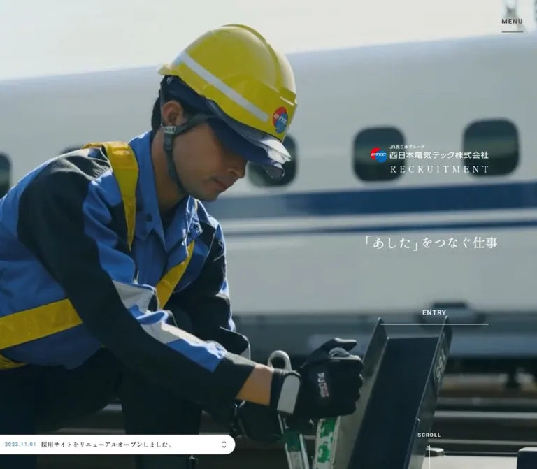
DESIGN REFERENCE
JR西日本電気テック株式会社 採用サイト
鉄道の現場映像と明朝体を軸に、余白のある編集的な構成で仕事と人を紹介する採用サイト。青灰色の背景、パステルカラーの情報パネル、落ち着いたフッターが特徴。
オリジナルサイトを見るe-TEC / JR西日本電気テック株式会社 Recruitment — Style Reference
Quiet editorial typography around the people, places, and infrastructure that keep tomorrow moving.
Website: wj-etec.co.jp/recruitment Original URL: https://www.wj-etec.co.jp/recruitment/ Final URL: https://www.wj-etec.co.jp/recruitment/ Theme: a pale blue-gray main canvas transitioning to a slate lower-page field, with pastel topic panels and selective blue entry controls. Inspected: September 13, 2026, 04:30:23 JST; supplied retrieval timestamp September 12, 2026, 19:30:23.109 UTC. Viewports: desktop 1440 × 1000 CSS pixels; mobile 390 × 844 CSS pixels. Scope: the current recruitment homepage, including its opening composition, introduction, film entry points, About links, stories, staff links, workstyle and career navigation, and recruitment footer. Menu and video-modal structures were present in the rendered evidence; their open states were not exercised.
This is a recruitment website homepage with a substantial network of editorial and practical subpages. It introduces the company through work, responsibility, and individual experience before presenting application information. Its design combines expansive railway imagery with restrained Japanese Mincho text, large serif English section names, fine underlines, and small tracked utility labels.
The most distinctive relationship is between scale and quietness. Photographs and film panels occupy large areas, while the initial company mark and entry link remain modest. Later, 80px section headings organize generous empty space. The interface becomes more informational near the bottom, where five pastel panels lead into a subdued slate footer. Preserve this progression when adapting the design.
How to Read This Reference
- Measured means a value supplied in the rendered DOM, an element rectangle, or a computed style. Measurements are CSS pixels unless stated otherwise.
- Visual estimate means a proportion, color, or detail assessed from the supplied current-page screenshots. These are not stylesheet measurements.
- Declared token means a custom property was present. Its existence does not prove every possible use of that property.
- Recommendation means implementation guidance for a new site. Recommended breakpoints, accessibility changes, media handling, and sample CSS are not claims about the original implementation.
- The three desktop captures show the hero, the second film panel and Story introduction, and the lower-page footer. The two mobile captures show the hero and footer. Other sections have detailed DOM evidence but less visual coverage.
- Sampled rectangles include offscreen and potentially transformed elements. Use widths, typography, and local relationships with confidence; do not turn every recorded document coordinate into a fixed layout specification.
- The original document root is a conventional
16px. Viewport custom properties exist, but the supplied evidence does not reveal a complete fluid-sizing formula.
Tokens — Colors
Default Palette
| Name | Value | Source / implementation alias | Role and evidence |
|---|---|---|---|
| Blue-gray canvas | #cdd8d9 |
Source --blue-gray; alias --color-canvas |
Measured body background on desktop and mobile; visible around the second film panel |
| Slate footer | #535f60 |
Source --footer-gray; alias --color-slate |
Measured footer background; visually continues the dark lower-page field |
| Entry blue | #1071bb |
Source --blue-entry; alias --color-entry |
Measured filled header entry link and offscreen menu entry control |
| Black | #000000 |
Source --black; alias --color-ink |
Measured primary body copy and card headings |
| White | #ffffff |
Source --white; alias --color-white |
Hero identity, hero entry label, movie controls, news surface, and several raw text declarations |
| Muted taupe | #aca09f |
Source --alt-blend-mode; alias --color-muted |
Measured recruitment-footer link color; close to the visible footer text and rules |
| Light neutral | #ededed |
Source --gray |
Declared neutral; a specific visible application is not established by the supplied samples |
| Dark display ink | Approximately #342e2b |
Recommended direct-color alias --color-display |
Visual estimate for the dark Story heading in the settled desktop capture |
| YouTube red | Approximately #ff0033 |
Visual estimate only | Recognizable red channel mark in the current desktop and mobile captures; its SVG fill was not supplied |
The dark display heading needs special care. The sampled STORY H2 reports white, while the screenshot shows a dark serif word with an underline. Repeated heading text is also present in the extracted DOM. This establishes a difference between an individual element's computed color and the final visible composition; it does not establish the exact blending, clipping, or duplicate-layer technique.
Likewise, --alt-blend-mode contains a color value. Its name alone is not evidence of a particular CSS blend mode. A direct-color adaptation can reproduce the visible result without claiming to reproduce the original compositing system.
Section Palettes
These source tokens organize workstyle and career destinations. The lighter values are confirmed as the corresponding link backgrounds. The darker partners are declared, but their state-specific usage was not established.
| Destination | Measured panel background | Declared darker partner | Source tokens |
|---|---|---|---|
| Crosstalk | #dee9ed |
#c2d0d1 |
--crosstalk, --crosstalk-dark |
| Workstyle | #d3d5e5 |
#b9bdd5 |
--workstyle, --workstyle-dark |
| Career design | #bfcfe2 |
#a4b5c9 |
--careerdesign, --careerdesign-dark |
| Environment | #e3e3d4 |
#ccccb5 |
--environment, --environment-dark |
| Benefits and training | #ede2df |
#ddc8c2 |
--education, --education-dark |
| Staff-related blue | #becfdb |
Not supplied | Declared --blue-staff; exact visible placement is unverified |
These are topic colors within one page. No selectable color theme was demonstrated. Keep the entry blue distinct from the quieter content-panel palette.
Tokens — Typography
Shippori Mincho — Editorial Voice
- Measured family:
'Shippori Mincho', serifon the body, Japanese prose, sampled section H2 elements, story titles, and topic headings. - Measured weights:
400for large section titles and topic headings;500for introductory paragraphs and story titles. Workstyle explanatory copy uses400. - Declared font request: the rendered evidence references Shippori Mincho weights
400,500, and600. The sampled elements do not establish a specific use of weight600. - Character: fine strokes, traditional Japanese forms, and a literary rhythm. Large English section names remain light in weight.
- Implementation alias:
--font-editorial: 'Shippori Mincho', serif.
The sampled English section titles also report Shippori Mincho. Do not substitute an invented display-font attribution based on their Latin letterforms.
Heebo — Navigation and Utility Labels
- Measured family:
Heebo, sans-serifonMENUand entry links. - Measured weight:
400. - Tracking:
0.15emon the menu and hero entry link;0.08emon the filled header entry link. - Character: small, calm uppercase text that stays subordinate to the photography and editorial headings.
- Implementation alias:
--font-utility: 'Heebo', sans-serif.
Numerals and Specialized Display Treatments
The source declares --num-font: 'Mishafi Gold Regular'. No sampled numbered descendant identifies its computed family, so this is a declared numeral-family token rather than confirmed rendering evidence. Do not use it as the assumed family for every English heading.
The visible ONE PRIDE headline has an italic serif treatment. Its child-level font family and size were not supplied. A roughly 70–80px desktop italic heading is a visual approximation, while the containing H2's computed 16px describes the parent rather than necessarily describing the large visible letters.
The hero brand occupies a measured 241 × 58px H1 box at both viewports. Its parent reports 16px, but that does not measure every letter within the logo and recruitment lockup. Preserve the actual authorized brand artwork instead of rebuilding its typography from that parent value.
Type Scale
| Role | Desktop measurement | Mobile measurement | Weight / tracking |
|---|---|---|---|
| Body default | 16px, normal line height |
Same | 400 |
| Introduction heading below hero | 25px / 30.25px |
28px / 33.88px |
400; 0.05em |
| Introduction prose | 14px / 26.88px |
16px / 30.88px |
500; desktop 0.04em, mobile 0.03em |
| About and Story descriptions | 14px / 26.88px |
Same | 500; 0.04em |
| About, Story, Person section titles | 80px / 108px |
60px / 82.8px |
400; normal tracking |
| Workstyle and Career title | 80px / 92px |
45px / 51.75px |
400; two-line composition |
| Workstyle explanatory copy | 14px / 26.88px |
Same | 400; 0.04em |
| Story overlay title | 22px / 33.88px |
18px / 29.88px |
500; 0.03em |
| First three topic titles | 31px / 39.99px |
26px / 39.78px |
400 |
| Final two topic titles | 31px / 39.99px |
23px / 35.19px |
400 |
| Hero entry link | 13px / 13px |
Same | Heebo 400; 0.15em |
| Filled header entry link | 13px / 18.46px |
14px / 19.88px, outside the captured viewport |
Heebo 400; 0.08em |
| Menu label | 13px, normal line height |
11px, normal line height |
Heebo 400; 0.15em |
| Privacy link | 14px, normal line height |
Same | Editorial 400 |
| Main menu destination text | 16px / 32px |
14px / 31.92px |
500; 0.05em; open state unverified |
Visual estimates: the hero tagline appears approximately 25px on desktop and 28px on mobile. These are separate from the measured introduction heading below the hero. Footer destination labels appear around 20px, and small captions such as VIEW MORE appear around 10px. Child-level measurements for those labels were not included.
The mobile introduction becomes larger and easier to read even as the English section titles become smaller. This is a deliberate change in hierarchy, not uniform scaling of the desktop page.
Tokens — Spacing & Shapes
Density: expansive section spacing, narrow prose, large media surfaces, compact navigation details.
Geometry: square image links and pastel panels, fine rules, circular film buttons, and one rounded news strip. There is no general rounded-card or shadow-elevation system in the inspected captures.
Viewport Tokens
| Source property | Desktop | Mobile | Interpretation |
|---|---|---|---|
--vw |
14.4px |
3.9px |
One percent of the inspected viewport width |
--vh |
10px |
8.44px |
One percent of the inspected viewport height |
--base-vw |
1366 |
375 |
Different reference-width values are selected |
| Root font size | 16px |
16px |
Conventional root; no tiny-rem system |
The values are consistent with viewport-aware sizing, but neither the complete formulas nor the media-query boundary were provided. Do not derive all dimensions from one assumed viewport / reference multiplier.
Spacing Scale
| Use | Desktop | Mobile | Evidence |
|---|---|---|---|
| Main lower-page frame inset | 100px |
30px |
Topic-panel rectangles and section padding |
| About content left edge | Approximately 122px |
30px |
Measured element positions |
| Hero identity right / side placement | Approximately 99px from right |
Centered | Measured H1 rectangles |
| Story title horizontal inset | 20px |
30px |
Measured title rectangles |
| Topic-panel gap | 6px |
5px |
Calculated from adjacent measured rectangles |
| Story-panel gap | 0px |
10px |
Calculated from adjacent measured rectangles |
| Introduction section top padding | 123px |
54px |
Computed padding; mobile heading has additional offset |
| About section top padding | 188px |
83px |
Computed padding |
| Story section top padding | 183px |
84px |
Computed padding |
| Person section top padding | 184px |
85px |
Computed padding |
| Workstyle section bottom padding | 159px |
79px |
Computed padding |
| Recruitment-link inner gap | 7px |
7px |
Computed flex gap |
| Mobile recruitment-link row gap | — | 30px |
Calculated from 79px row pitch and 49px link height |
Border Radius and Rules
| Element | Geometry | Evidence |
|---|---|---|
| Filled entry link | Square corners | Measured radius 0px |
| Story links | Square corners | Measured radius 0px |
| Topic panels | Square corners | Measured radius 0px |
| Movie buttons | Circle | Measured radius 50% |
| Desktop news strip | Rounded right end, approximately 27.5px radius |
Visual estimate from a roughly 55px-high strip |
| Mobile news strip | Full-width rectangle | Screenshot observation |
| Link and section underlines | Approximately 1–2px |
Visual estimate; border widths were not supplied |
Layout Measurements
| Element | Desktop at 1440 × 1000 | Mobile at 390 × 844 |
|---|---|---|
| Document height | Approximately 7451.23px |
Approximately 7360.47px |
| Hero section | 1440 × 1000px |
390 × 844px |
| Brand H1 | 241 × 58px, at about (1100, 312) |
241 × 58px, at (74.5, 79) |
| Hero entry link | 220 × 32px, at about (1121, 658) |
221 × 32px, at (84.5, 707) |
| Header entry link | 251 × 32px |
283.19 × 60px, sampled beyond the right edge |
| Menu button | 100 × 100px |
60 × 60px |
| YouTube link box | 52 × 52px |
60 × 60px |
| Introduction movie button | 218 × 218px |
140 × 140px |
| ONE PRIDE movie button | 161 × 161px |
140 × 140px |
| Story link | 480 × 354.56px |
390 × 319.28px |
| Staff-link rectangle | 755 × 527.03px |
333 × 497px; one item is 519px high |
| First three topic panels | Approximately 407–413 × 414–420px |
330 × 240.67px |
| Final two topic panels | 617 × 208.64px |
330 × 115.19px |
| Recruitment destination link | 249 × 49px |
249 × 49px |
| Footer | 1440 × 753.41px |
390 × 877.75px |
The second film banner appears approximately 1232 × 422px, with 104px side margins, in the desktop screenshot. This is a visual estimate of the banner surface, not a measured media-element rectangle.
Components
Persistent Utility Header
Role: keep menu, video-channel access, and recruitment entry available without a conventional full-width navigation bar.
The visible controls occupy the upper-right corner over the page. A red YouTube mark sits immediately left of MENU, whose small uppercase label has a short underline. Desktop menu and close-control boxes measure 100 × 100px; mobile equivalents measure 60 × 60px.
The desktop filled entry control is a narrow blue rectangle, 251 × 32px, with white centered text and a small exit-style symbol at its right. It appears in the middle and footer captures but is not visible in the initial desktop screenshot, even though its rectangle is present in the supplied DOM. A state-dependent visibility treatment is supported; its precise trigger was not exercised.
On mobile, the screenshot shows the YouTube and menu controls without the blue entry bar. The sampled bar starts beyond the right viewport edge. Treat this as an observed offscreen state, not proof that the entry feature is absent on mobile.
The external channel destination and application destination are present in the link evidence. Their target pages were not inspected.
Cinematic Hero
Role: introduce the company's identity and central recruitment message through infrastructure imagery.
The desktop hero fills the viewport. The captured frame is a broad waterside landscape with distant hills and faint railway imagery. Most of its width remains open; the identity, Japanese tagline, entry link, and scroll cue occupy a narrow region near the right edge.
The mobile composition changes substantially. A tall railway-crossing signal fills the image, the brand is centered near the top, the tagline crosses the middle, and the entry link sits near the bottom. The logo retains its desktop 241 × 58px box. This is an art-directed portrait composition rather than a miniature right-hand desktop column.
Component anatomy:
- Full-bleed photographic or film-media layer.
- A white brand and recruitment lockup.
- The source message
「あした」をつなぐ仕事in a restrained Mincho treatment. - A thin, underlined
ENTRYlink. - A small
SCROLLcue and line. - A white recruitment-news strip at the bottom.
The current desktop and mobile images show different scenes. The exact hero media element, asset source, playback policy, sequence, and crop configuration were not supplied. Cinematic imagery is established; a particular autoplay implementation is not.
Entry Links
Role: provide a consistent route to the external application listing.
Two visible treatments are established:
- Hero treatment: white
13pxHeebo text,0.15emtracking, a transparent background, and a thin bottom rule across approximately220px. - Header treatment: white
13pxHeebo text on entry blue, square corners, a251 × 32pxdesktop box, and a small right-side symbol.
The supplied destination is https://job.mynavi.jp/28/pc/search/corp94703/outline.html. Preserve the destination when reproducing this specific site; make it configurable in a reusable recruitment template. Do not infer the correct application URL from the year displayed in the news strip.
Recruitment News Strip
Role: expose timely recruiting updates without dominating the hero.
In the desktop capture, the white strip is approximately 480 × 55px, anchored to the left and about 15px above the viewport bottom. Its right end is rounded. A small blue date occupies the left column, a two-line Japanese notice occupies the middle, and compact previous/next controls stack vertically at the right.
The visible record is dated 2026.04.01 and mentions new-graduate recruitment and an added employee profile. The DOM also contains a 2025.04.01 record. The presence of two records and navigation buttons supports a news-switching component; automatic rotation was not verified.
On mobile, the strip becomes a full-width 55px bottom band. The image ends around y = 789px, and the strip fills the rest of the 844px hero. Only the next control is visible, measured at 30 × 30px.
The rounded desktop news strip is a localized shape exception. It does not establish a pill-shaped visual language for the rest of the page.
Introduction and First Film Entry
Role: explain the company's purpose before leading into a longer film.
The introduction uses a narrow editorial text column with several short Japanese paragraphs and intentional line breaks. Desktop paragraphs measure approximately 322–415px wide, with 14px / 26.88px type and roughly 27px paragraph separation. Mobile paragraphs occupy a consistent 330px column with 30px side margins and increase to 16px / 30.88px.
The heading repeats the hero's central message. Its source contains duplicate text fragments; reproduce a single semantic heading unless implementing a carefully hidden decorative layer.
The section also contains the first circular movie button. Its measured diameter is 218px on desktop and 140px on mobile. It has a transparent center, a white outline, a PLAY MOVIE label, and a triangular play symbol. The button's source flex gap changes from 8px to 4px on mobile.
The underlying first-film imagery is not shown clearly enough in the supplied captures to specify its composition.
About Link Group
Role: connect the emotional introduction to company information.
The group contains the large ABOUT heading, a short explanatory paragraph, and two links: MESSAGE / 採用メッセージ and WHAT'S e-TEC / What’s e-TEC, each accompanied by VIEW MORE.
Desktop links measure 306 × 49px, begin around x = 122px, and are separated by 24px. Mobile links measure 315 × 49px and begin at x = 30px.
The sampled desktop heading sits below the explanatory text and link coordinates, while mobile places it above them. The evidence therefore supports a different mobile hierarchy, but the desktop arrangement may also include transforms or decorative heading placement. Keep the text-and-link anatomy; do not use its sampled document coordinates as fixed positioning instructions.
Observed routes are /recruitment/message and /recruitment/about.
ONE PRIDE Film Banner
Role: provide a second, visually distinct film entry point before the stories.
The desktop capture shows a broad, square-cornered city photograph with luminous blue trails moving across its lower half. A large italic ONE PRIDE title and the Japanese subtitle すべては、今日と明日をつなぐために。 occupy the upper-right region. An outlined circular play button is centered over the image.
The banner sits inside generous side margins on the blue-gray canvas. Its photographed light trails supply most of the saturation; the surrounding interface remains quiet.
The play control measures 161px in diameter on desktop and 140px on mobile. The mobile title container measures approximately 300 × 79px, and its internal gap reduces from 14px to 7px. A mobile banner screenshot was not supplied, so its precise image crop and final title position remain unverified.
Story Section and Image Links
Role: introduce three editorial narratives about responsibility, new infrastructure, and listening to field staff.
The desktop section header is aligned toward the right. A short, right-aligned Japanese description sits to the left of the large underlined STORY word. The screenshot shows a broad area of empty canvas between the film banner and this heading group.
Three story links then span the entire desktop width without gutters. Each measures 480 × 354.56px. The capture reveals worker photography at the top of the links; the DOM establishes the full card titles, numbers, and destinations.
Each link contains:
- A photographic surface.
- A white Japanese title,
22px / 33.88px, with20pxhorizontal inset. - A
STORYlabel and a two-digit number. - A desktop
VIEW MOREtreatment.
On mobile, the cards stack at full viewport width with 10px vertical gaps. Each measures 390 × 319.28px; title insets increase to 30px, and titles become 18px / 29.88px. VIEW MORE is absent from the mobile visible-text extraction, although it remains in the link text evidence. Preserve the card-wide link affordance without assuming that the caption is always visible.
Observed routes are /recruitment/story01, /recruitment/story02, and /recruitment/story03.
Person and Staff Profiles
Role: connect departments and technical work to individual employees.
The section includes a large PERSON title, a directory link labeled department / AND STAFF / 部門と人, and five individual profile links. The profile information includes initials, department, equipment or work area, workplace, and joining year.
The desktop directory link measures 274 × 66px and sits alongside the section heading. On mobile it becomes a 315 × 66px row below the heading.
All five desktop profile anchors share the same sampled rectangle, approximately 755 × 527px. The mobile anchors likewise share a 333px width and common position, with heights of 497px or 519px depending on text. This suggests overlapping or state-managed profile presentation, but does not establish autoplay, swipe navigation, transition style, or which profile is active.
Do not reconstruct this as five visibly stacked desktop cards from the DOM text alone. For a new implementation, choose an accessible profile-navigation model explicitly and treat that behavior as an addition.
Workstyle and Career Navigation
Role: turn the editorial introduction into practical routes about joining and working at the company.
A large two-line WORKSTYLE AND CAREER title is paired with a short explanation. Desktop heading measurements are 560 × 184px at 80px / 92px. Mobile reduces the title to a 315 × 103.5px block at 45px / 51.75px, with the explanation below it.
Five numbered, pastel-colored destinations follow:
CROSSTALK / クロストークWORKSTYLE / 入社後の働き方CAREER DESIGN / キャリアデザインENVIRONMENT / 働く環境SYSTEM / 福利厚生・研修制度
The first three occupy approximately square panels across the desktop frame. The final two form a shallower two-column row. The frame is 1240px wide at the inspected desktop viewport, with 6px gaps. The middle panel in the first row is slightly wider than its neighbors, so equal thirds are an approximation rather than an exact source rule.
Every panel has square corners, an ordinal, English category text, a prominent Japanese title, and a restrained VIEW MORE line. The lower desktop capture shows vertical category lettering and long thin underlines within the final panels. The first three panels' complete internal imagery was not visually supplied.
Mobile uses a single 330px column with 5px gaps. The first three panels are approximately 241px high; the final two are approximately 115px high. Preserve these two densities rather than making all five panels equally tall.
Recruitment Footer
Role: provide direct access to application details and finish with the geographic scale of the railway network.
A slate field contains a rule-bounded recruitment navigation band. Desktop places the large underlined RECRUIT title at left, followed by three 249 × 49px destination links:
DATA AND FLOW / 募集要項・選考フローFAQ / よくあるご質問EVENT SCHEDULE / イベントスケジュール
Each destination combines a small tracked English caption, a larger Japanese label, and a thin underline. The link color is measured taupe #aca09f.
Below the navigation, a low-contrast aerial city and bridge photograph emerges through the slate field. The privacy link sits left and the copyright sits right on desktop. On mobile, navigation becomes a vertical list, and the privacy and copyright lines stack above the remaining photographic area.
Mobile link boxes retain their desktop 249px width and start at x = 43px, inside the broader 30px footer margin. The row pitch is 79px. The footer grows from approximately 753px high on desktop to 878px on mobile.
The visible muted treatment of the footer is established, but the exact image opacity and compositing layers are not. The privacy link reports white in computed styles while appearing muted in the capture, another reason to distinguish element declarations from final pixels.
Global Menu and Video Modal Structures
Role: provide expanded navigation and film viewing.
The supplied DOM contains a global menu with Home, About, Story, Person, Workstyle and Career, and Recruit groups. Desktop submenu links occupy multiple offscreen horizontal positions; mobile submenu links form a long offscreen vertical sequence. This supports responsive menu structure without proving the open-state panel geometry.
Two video-modal structures are described in the source text as YouTube popups. Each includes 動画を閉じる and CLOSE; close-button boxes measure 100px square on desktop and 60px square on mobile.
No opened-menu capture, film playback, modal backdrop, focus movement, dismissal action, or page-scroll lock was observed. These structures should be documented as present, with behavior pending verification.
Tokens — Motion & Interaction
Measured Transition Declarations
| Element or token | Supplied value | What is established |
|---|---|---|
| Filled desktop header entry | opacity 0.48s cubic-bezier(0.165, 0.84, 0.44, 1) |
Opacity transition is declared; trigger and endpoint are unverified |
| Mobile header entry | transform 0.48s cubic-bezier(0.165, 0.84, 0.44, 1) |
Transform transition is declared; captured state is offscreen |
| YouTube channel link | transform 0.48s cubic-bezier(0.165, 0.84, 0.44, 1) |
Transform transition exists; scale or translation amount is not supplied |
| Introduction paragraphs, desktop | Opacity and filter, 1.68s, ease-out, 0.68s delay |
Slow reveal-related properties are declared; filter endpoints are unknown |
| Introduction paragraphs, mobile | Opacity and filter, 1.68s, ease-out, 0.6s delay |
Same duration with a shorter delay |
| Desktop menu links | Opacity, 0.48s, ease-out |
Declared link feedback or state transition; visual endpoint untested |
| Desktop privacy link | Filter, 0.48s, ease-out |
Filter transition exists; filter type and amount are unknown |
Source --ease-out |
cubic-bezier(0.165, 0.84, 0.44, 1) |
Confirmed shared easing token |
Source --ease-in-out |
cubic-bezier(0.445, 0.05, 0.55, 0.95) |
Declared token; specific use not established |
Many sampled elements serialize their transition as all and their animation as none. Those entries do not establish a useful duration, nor do they prove that descendants, pseudo-elements, media, or scripts never animate.
Interaction Evidence and Limits
| Feature | Evidence | Unverified details |
|---|---|---|
| News switching | Two records and previous/next button structures | Automatic rotation, interval, looping, announcement behavior |
| Film viewing | Two movie buttons and two YouTube-modal structures | Playback, dimensions, audio policy, close behavior |
| Menu | A button and grouped offscreen navigation | Opening direction, full panel appearance, focus handling |
| Header entry visibility | Absent in initial screenshot; visible in later desktop captures | Exact scroll threshold and state logic |
| Staff presentation | Multiple profile anchors share sampled positions | Swipe, autoplay, sequence, active state, transition |
| Hero media | Different infrastructure scenes in current desktop/mobile captures | Source video, sequence, timing, device-specific assets |
| Scroll cue | Small label and line visible in both hero layouts | Whether it is an interactive anchor |
The observed timing language is smooth and restrained, with a longer opacity/filter reveal for prose. Do not invent parallax depths, zoom factors, or film-loop durations to fill the evidence gaps.
Layer Tokens
The source declares base 0, menu 100, header 101, menu button 102, YouTube overlay 103, and opening layer 104. These values provide a useful ordering reference. They do not establish an observed opening animation or modal transition.
Surfaces
| Surface | Appearance | Structural purpose |
|---|---|---|
| Main canvas | Solid blue-gray #cdd8d9 |
Gives the photographic and editorial sections a consistent atmosphere |
| Hero | Full-bleed infrastructure imagery with white details | Establishes identity through place and work |
| News strip | White, compact, rounded only at the desktop right end | Separates timely information from the cinematic background |
| Film banner | Square-cornered image with circular outlined play control | Makes media a distinct editorial destination |
| Story links | Edge-to-edge photographs with white titles | Lets people and fieldwork carry the content |
| Career destinations | Five related pastel fills, black headings, fine link rules | Groups practical information without heavy visual chrome |
| Lower-page field | Slate appearance around the final panels and footer | Slows the visual rhythm and anchors recruitment information |
| Footer photograph | Faint city and bridge image within slate | Ends on the scale and continuity of infrastructure |
The workstyle section's sampled background is transparent even though the lower-page screenshot shows a slate field around its last panels. A direct-color recreation may place slate on the section itself, but that is an implementation simplification rather than a copied source declaration.
Imagery
The imagery is grounded in railway infrastructure and the people maintaining it. Current captures show water and distant hills, a close view of railway-crossing signals, workers in protective equipment, a city crossed by luminous blue trails, and an aerial view of bridges and urban development.
Photography supplies the emotional and visual density. Text remains short, light in weight, and carefully positioned around it. The documentary scenes emphasize equipment, concentration, and place. The second film banner introduces a more expressive light-trail treatment without spreading that effect into ordinary UI surfaces.
Cropping and Treatment
- Hero: preserve substantial negative space where text sits. The desktop right-hand copy and the mobile centered copy require different focal-point decisions.
- Story links: preserve faces and meaningful work details while allowing white titles to occupy the lower part of the image.
- Film banner: retain a wide panoramic composition on desktop, with a central play circle and upper-right title group.
- Footer: use a broad aerial image with bridges and urban density, subdued enough to remain a background.
- Logo: use an authorized supplied brand asset. The measured lockup includes more than a plain text company name.
Observed Asset References
No original media src, video poster, or CSS background-image URL was supplied. The following are visual roles, not discovered asset filenames.
| Asset role | Current-page evidence | What can be reused as guidance |
|---|---|---|
| Hero landscape | Desktop hero capture | Wide horizon, open sky, subdued blue-gray atmosphere |
| Portrait hero scene | Mobile hero capture | Close railway signal crop with room for centered white identity |
| Company lockup | Desktop and mobile hero captures; H1 rectangle | A consistent 241 × 58px identity region |
| ONE PRIDE image | Desktop middle capture | Wide city view with concentrated blue light trails |
| Story photography | Top of the three desktop story panels | Worker-focused documentary imagery |
| Footer aerial | Desktop and mobile footer captures | City and bridge panorama fading into slate |
| Channel mark | Persistent desktop and mobile utility controls | Recognizable red YouTube branding |
Use licensed or authorized media with equivalent composition. CSS can establish the page structure, but suitable field photography is essential to its character.
Layout & Responsive Behavior
The content order is consistent across the two inspected widths: hero, introduction and first film, About, second film, Story, Person, Workstyle and Career, and recruitment footer. Their compositions change independently.
| Relationship | Desktop observation | Mobile observation |
|---|---|---|
| Hero identity | Narrow cluster near the right edge | Centered near the top |
| Hero tagline | Modest right-side line | Larger central line across the image |
| Hero news | Left-anchored overlay with rounded right end | Full-width bottom band |
| Scroll cue | Lower-right region | Vertical cue near the left edge |
| Header utilities | Large menu box, smaller channel-link box, visible blue entry in later captures | Two adjacent 60px utility boxes; entry sampled offscreen |
| Main prose | Narrow column near the center | 330px column with 30px margins |
| Introduction text | 14px |
Enlarges to 16px |
| Main section names | 80px |
60px; long workstyle heading uses 45px |
| Story header | Description and heading side by side toward the right | Heading above description |
| Stories | Three full-width columns with no gap | One full-width column with 10px gaps |
| Staff directory link | Alongside the heading | Below the heading |
| Career panels | Three tall panels, then two shallow panels | Five stacked panels, preserving two height groups |
| Recruitment links | Horizontal band | Vertical list retaining 249px link widths |
| Legal content | Privacy left, copyright right | Stacked, left aligned |
Desktop section breathing room is frequently around 180px; corresponding mobile top padding is around 84px. Mobile preserves large photographic surfaces and increases selected reading text rather than shrinking everything proportionally.
The near-equal total document heights do not mean that the mobile page is a scaled desktop composition. Full-width stacked stories add height while other sections become shorter or rearrange.
Exact breakpoints and intermediate-width behavior were not supplied. The Quick Start uses a recommended 48rem breakpoint and a simple tablet arrangement. Validate those choices with real copy, especially the long workstyle title and the three-column recruitment band.
Some sampled mobile film and Story coordinates overlap, and the desktop staff rectangles extend beyond their section's sampled bounds. Those measurements may reflect transforms or state-managed layers. Do not reproduce accidental overlap by hardcoding the recorded document Y positions.
Do’s and Don’ts
Do
- Build the page as a recruitment homepage with editorial depth and practical subpage navigation.
- Keep the main canvas at measured blue-gray
#cdd8d9and the footer at slate#535f60. - Reserve saturated blue for entry controls and let the film imagery carry other bright color.
- Use Shippori Mincho for the editorial voice and Heebo for compact utility controls.
- Preserve large, light-weight serif section names and small tracked English captions.
- Give photography broad uninterrupted areas and compose text around its focal points.
- Keep story cards full bleed and career panels square-cornered.
- Preserve the desktop three-plus-two career-panel hierarchy and its two mobile height groups.
- Recompose the hero for a portrait viewport while retaining the brand's scale.
- Use fine underlines and spacing to establish links and grouping.
- Treat measured transition declarations separately from untested interaction behavior.
Don’t
- Don’t compress the experience into a generic hero followed by uniform feature cards.
- Don’t replace every Japanese text role with a geometric sans-serif.
- Don’t make all buttons blue pills or give every content panel rounded corners.
- Don’t introduce a general system of drop shadows, floating white cards, or glass blur.
- Don’t turn the topic pastels into a rainbow of unrelated badges.
- Don’t force all sections onto one rigid left-aligned desktop grid.
- Don’t scale mobile prose down with the display headings; the introduction gets larger on mobile.
- Don’t assume the five staff anchors are five simultaneously visible cards.
- Don’t infer autoplay, swipe behavior, modal choreography, or hover endpoints from declarations alone.
- Don’t assign the numeral-font token to unrelated headings without descendant-level evidence.
- Don’t repeat decorative duplicate headings in the accessible reading order.
- Don’t use the footer copyright year as the inspection date or evidence of the current design's launch date.
Recommended Implementation Additions
These are recommendations for an adaptation, not verified features of the inspected website:
- Provide accessible names for the channel link, news arrows, film controls, and menu toggle. Keep visible focus indicators legible over both imagery and solid surfaces.
- Maintain approximately
44pxtouch targets even where the visible entry link or news arrow is smaller. Invisible hit-area expansion can preserve the measured visual geometry. - Test the muted footer text against slate. Use a lighter text token where needed for readable contrast while retaining the understated photographic background.
- Make menu and modal state explicit, with suitable dialog or navigation semantics, Escape handling, focus restoration, and an independently scrollable mobile menu when required.
- Keep news controls keyboard operable. If implementing automatic rotation, provide a way to pause it and avoid repeatedly announcing unchanged content.
- Provide film captions and a user-controlled audio experience. If the hero uses background video, supply a poster and a reduced-motion or paused-image alternative.
- Keep introduction copy visible when scripts fail. Add reveal effects progressively after content is available.
- Hide decorative heading duplicates from assistive technology and avoid duplicate heading IDs.
- Give any staff carousel explicit controls and expose only the appropriate interactive state. A static list is a viable fallback, but would be a deliberate adaptation.
- Tune image focal points per breakpoint and test with long Japanese titles, font-loading fallbacks, and browser zoom.
- Use stable mobile viewport units and safe-area-aware offsets for bottom news and top utility controls.
Agent Prompt Guide
Quick Color Reference
- Main canvas:
#cdd8d9. - Main copy:
#000000. - Filled recruitment action:
#1071bbwith white text. - Footer field:
#535f60. - Measured footer destination text:
#aca09f. - Crosstalk:
#dee9ed. - Workstyle:
#d3d5e5. - Career design:
#bfcfe2. - Environment:
#e3e3d4. - Benefits and training:
#ede2df. - Dark display-heading approximation:
#342e2b; this is an estimated direct-color substitute.
Overall Prompt
“Create an editorial recruitment homepage for a railway infrastructure company. Use a pale blue-gray canvas #cdd8d9, Shippori Mincho prose and large light-weight serif section headings, and small tracked Heebo utility labels. Open with full-viewport documentary infrastructure imagery, a modest white identity lockup, the Japanese message 「あした」をつなぐ仕事, a thin underlined ENTRY link, and a compact white news strip. On desktop, place the hero identity and copy near the right edge; on mobile, center them over a portrait composition. Continue through narrow introductory prose, circular film entry controls, company links, three full-bleed story photographs, staff information, and five pastel career panels arranged three above two. Finish with a slate footer, fine recruitment links, and a faint aerial bridge photograph. Keep corners square except for film circles and the desktop news-strip end. Treat media playback and staff navigation as explicit implementation choices.”
Example Component Prompts
- Hero: “Build a viewport-height recruitment hero with authorized railway imagery and white editorial text. At 1440px, keep a 241 × 58px brand region roughly 100px from the right and a 220px underlined entry link below it. At 390px, center the same-sized brand near the top, center the tagline, and reserve a 55px bottom band for news. Use separate image focal-point settings for each composition.”
- Film banner: “Create a wide, square-cornered city-image panel on a blue-gray canvas, approximately 1232 × 422px at a 1440px viewport. Add an upper-right italic serif ONE PRIDE heading, a Japanese subtitle, and a centered 161px outlined play circle. The banner proportions and display-font size are visual approximations; use 140px for the mobile play circle.”
- Story group: “Create three edge-to-edge photographic recruitment-story links across desktop, each approximately 480 × 355px. Place white Mincho titles near the bottom at 22px with 20px side insets. Stack the links at full mobile width with 10px gaps, 18px titles, and 30px text insets. Keep the entire card clickable and supply a visible keyboard focus treatment.”
- Career navigation: “Create five square-cornered pastel destination panels inside a 1240px desktop frame: three tall panels followed by two shallow panels, with 6px gaps. Use numbers, small English category labels, Japanese serif titles, and thin VIEW MORE rules. On a 390px viewport, use a 330px column with 5px gaps, keeping the first three panels about 241px tall and the last two about 115px tall.”
- Footer: “Create a slate
#535f60recruitment footer with a large underlined RECRUIT title and three bilingual destination links. Use restrained taupe text as the visual reference, testing contrast before release. Add a faint aerial city-and-bridge photograph in the lower area. Stack navigation and legal information on mobile while retaining generous empty space.” - Motion: “Use the evidenced 480ms ease-out timing for selected utility transitions and 1680ms opacity/filter timing for optional introduction reveals. Keep content visible by default. Choose and document endpoints explicitly; do not invent source hover scales or carousel timing. Provide a reduced-motion path.”
Quick Start
CSS Custom Properties
This is a practical direct-color adaptation with a conventional root font size. It preserves measured colors and important dimensions while simplifying layered headings and backgrounds. The 48rem breakpoint, intermediate-width layouts, scrim values, and some media positioning are recommendations. The code does not implement the unverified menu, news, film, or staff behavior.
Load the evidenced font families through your project's font pipeline. The CSS retains generic fallbacks. Supply authorized media through the image or video elements inside the indicated media containers; no original asset URLs were included in the evidence.
:root {
  /* Measured source colors */
  --color-canvas: #cdd8d9;
  --color-slate: #535f60;
  --color-entry: #1071bb;
  --color-ink: #000;
  --color-white: #fff;
  --color-muted: #aca09f;
  --color-crosstalk: #dee9ed;
  --color-workstyle: #d3d5e5;
  --color-career: #bfcfe2;
  --color-environment: #e3e3d4;
  --color-education: #ede2df;

  /* Visual approximation, not a measured source declaration */
  --color-display: #342e2b;

  --font-editorial: 'Shippori Mincho', serif;
  --font-utility: 'Heebo', sans-serif;
  --text-section: 80px;
  --text-workstyle: 80px;
  --text-story: 22px;
  --text-copy: 14px;
  --text-introduction: 14px;
  --leading-copy: 1.92;
  --tracking-copy: 0.04em;
  --tracking-utility: 0.15em;

  /* Recommended fluid frame, matching the inspected desktop inset */
  --page-gutter: clamp(30px, 6.944vw, 100px);
  --frame-width: 1240px;
  --section-space: 184px;
  --panel-gap: 6px;
  --news-height: 55px;
  --rule-width: 1px;
  --menu-size: 100px;
  --movie-size: 161px;

  --ease-out: cubic-bezier(0.165, 0.84, 0.44, 1);
  --ease-in-out: cubic-bezier(0.445, 0.05, 0.55, 0.95);
  --motion-utility: 480ms;
  --motion-reveal: 1680ms;
  --reveal-delay: 680ms;

  --z-menu: 100;
  --z-header: 101;
  --z-menu-button: 102;
  --z-video: 103;
  --safe-top: env(safe-area-inset-top, 0px);
  --safe-bottom: env(safe-area-inset-bottom, 0px);
}

* { box-sizing: border-box; }

body {
  margin: 0;
  color: var(--color-ink);
  background: var(--color-canvas);
  font-family: var(--font-editorial);
  font-size: 16px;
  font-weight: 400;
}

button, a { -webkit-tap-highlight-color: transparent; }
button { font: inherit; }
img, video { display: block; max-width: 100%; }

.frame {
  width: min(
    var(--frame-width),
    calc(100% - 2 * var(--page-gutter))
  );
  margin-inline: auto;
}

.utility {
  font-family: var(--font-utility);
  font-weight: 400;
  letter-spacing: var(--tracking-utility);
}

/* Header entry visibility requires a state supplied by the application. */
.site-actions {
  position: fixed;
  z-index: var(--z-header);
  top: var(--safe-top);
  right: 0;
  display: flex;
  align-items: center;
  min-height: 105px;
}

.header-entry {
  display: flex;
  align-items: center;
  justify-content: center;
  width: 251px;
  height: 32px;
  margin-right: 16px;
  color: var(--color-white);
  background: var(--color-entry);
  font: 400 13px / 1.42 var(--font-utility);
  letter-spacing: 0.08em;
  text-decoration: none;
  opacity: 0;
  visibility: hidden;
  transition: opacity var(--motion-utility) var(--ease-out);
}

.site-actions[data-entry-visible='true'] .header-entry {
  opacity: 1;
  visibility: visible;
}

.channel-link {
  display: grid;
  place-items: center;
  width: 52px;
  height: 52px;
}

.menu-toggle {
  position: relative;
  z-index: var(--z-menu-button);
  display: grid;
  place-content: center;
  gap: 12px;
  width: var(--menu-size);
  height: var(--menu-size);
  padding: 0;
  border: 0;
  color: var(--color-display);
  background: transparent;
  font: 400 13px / 1 var(--font-utility);
  letter-spacing: 0.15em;
  cursor: pointer;
}

.menu-toggle::after {
  content: '';
  width: 44px;
  border-bottom: var(--rule-width) solid currentColor;
}

.hero {
  position: relative;
  min-height: 100vh;
  min-height: 100svh;
  color: var(--color-white);
  background: var(--color-slate);
  isolation: isolate;
}

.hero-media {
  position: absolute;
  z-index: -2;
  inset: 0;
  overflow: hidden;
}

.hero-media > :is(img, video) {
  width: 100%;
  height: 100%;
  object-fit: cover;
  object-position: var(--hero-position, center);
}

/* Recommended adjustable scrim; original opacity was not supplied. */
.hero::before {
  content: '';
  position: absolute;
  z-index: -1;
  inset: 0;
  background: rgb(20 36 40 / 18%);
  pointer-events: none;
}

.hero-brand {
  position: absolute;
  top: 31.16%;
  right: var(--page-gutter);
  width: 241px;
  height: 58px;
  margin: 0;
}

.hero-brand img {
  width: 100%;
  height: 100%;
  object-fit: contain;
}

.hero-tagline {
  position: absolute;
  top: 50%;
  right: max(30px, calc(var(--page-gutter) - 20px));
  margin: 0;
  font-size: 25px;
  font-weight: 400;
  line-height: 1.4;
  letter-spacing: 0.05em;
}

.hero-entry {
  position: absolute;
  top: 65.84%;
  right: var(--page-gutter);
  width: 220px;
  height: 32px;
  padding-bottom: 17px;
  border-bottom: var(--rule-width) solid currentColor;
  color: inherit;
  font: 400 13px / 1 var(--font-utility);
  letter-spacing: 0.15em;
  text-align: center;
  text-decoration: none;
}

.news-strip {
  position: absolute;
  bottom: 15px;
  left: 0;
  display: grid;
  grid-template-columns: 64px minmax(0, 1fr) 30px;
  align-items: center;
  gap: 10px;
  width: 480px;
  min-height: var(--news-height);
  padding: 6px 8px 6px 10px;
  border-radius: 0 28px 28px 0;
  color: var(--color-ink);
  background: var(--color-white);
}

.news-date {
  color: var(--color-entry);
  font: 400 10px / 1.4 var(--font-utility);
  letter-spacing: 0.1em;
}

.news-copy {
  margin: 0;
  font-size: 12px;
  line-height: 1.4;
}

.section-title {
  margin: 0;
  color: var(--color-display);
  font-size: var(--text-section);
  font-weight: 400;
  line-height: 1.35;
  text-decoration: underline;
  text-decoration-thickness: 1px;
  text-underline-offset: 0.08em;
}

.editorial-copy {
  font-size: var(--text-copy);
  font-weight: 500;
  line-height: var(--leading-copy);
  letter-spacing: var(--tracking-copy);
}

.introduction { padding-top: 123px; }

.introduction-copy {
  width: min(420px, calc(100% - 60px));
  margin-inline: auto;
  font-size: var(--text-introduction);
}

.introduction-copy p { margin: 0 0 27px; }

.introduction-heading {
  margin: 0 0 40px;
  font-size: 25px;
  font-weight: 400;
  line-height: 1.21;
  letter-spacing: 0.05em;
}

.film-panel {
  position: relative;
  width: min(1232px, calc(100% - 2 * var(--page-gutter)));
  aspect-ratio: 1232 / 422;
  margin-inline: auto;
  overflow: hidden;
}

.film-panel > img {
  width: 100%;
  height: 100%;
  object-fit: cover;
}

.film-heading {
  position: absolute;
  top: 10%;
  right: 4%;
  margin: 0;
  font-size: clamp(48px, 5.28vw, 76px);
  font-style: italic;
  font-weight: 400;
  line-height: 1.1;
}

.movie-button {
  position: absolute;
  top: 50%;
  left: 50%;
  display: flex;
  flex-direction: column;
  align-items: center;
  justify-content: center;
  gap: 8px;
  width: var(--movie-size);
  height: var(--movie-size);
  padding: 11px 0 0 2px;
  border: 1px solid currentColor;
  border-radius: 50%;
  color: var(--color-white);
  background: transparent;
  transform: translate(-50%, -50%);
  cursor: pointer;
}

.movie-button--large { --movie-size: 218px; }

.story-intro {
  display: flex;
  align-items: center;
  justify-content: flex-end;
  gap: 39px;
  padding-top: 183px;
  padding-bottom: 36px;
}

.story-intro .editorial-copy {
  max-width: 335px;
  text-align: right;
}

.story-grid {
  display: grid;
  grid-template-columns: repeat(3, minmax(0, 1fr));
}

.story-card {
  position: relative;
  display: block;
  aspect-ratio: 480 / 354.56;
  overflow: hidden;
  color: var(--color-white);
  text-decoration: none;
  isolation: isolate;
}

.story-card > img {
  position: absolute;
  z-index: -2;
  width: 100%;
  height: 100%;
  object-fit: cover;
}

/* Recommended text protection; tune to the selected photograph. */
.story-card::before {
  content: '';
  position: absolute;
  z-index: -1;
  inset: 0;
  background: linear-gradient(transparent 35%, rgb(0 0 0 / 50%));
}

.story-card-content {
  position: absolute;
  right: 20px;
  bottom: 24px;
  left: 20px;
}

.story-card h3 {
  margin: 0 0 16px;
  font-size: var(--text-story);
  font-weight: 500;
  line-height: 1.54;
  letter-spacing: 0.03em;
}

/* Direct-color simplification of the observed lower-page field. */
.workstyle {
  padding-block: 98px 159px;
  color: var(--color-white);
  background: var(--color-slate);
}

.workstyle-header {
  display: flex;
  align-items: flex-end;
  justify-content: space-between;
  gap: 40px;
  margin-bottom: 48px;
}

.workstyle-title {
  max-width: 560px;
  margin: 0;
  font-size: var(--text-workstyle);
  font-weight: 400;
  line-height: 1.15;
}

.workstyle-header p {
  max-width: 416px;
  margin: 0;
  font-weight: 400;
}

.career-grid {
  display: grid;
  grid-template-columns: repeat(6, minmax(0, 1fr));
  gap: var(--panel-gap);
}

.career-card {
  position: relative;
  grid-column: span 2;
  aspect-ratio: 0.985;
  padding: 19px 20px;
  color: var(--color-ink);
  background: var(--panel-color);
  text-decoration: none;
}

.career-card--short {
  grid-column: span 3;
  aspect-ratio: 617 / 208.64;
}

.career-card[data-topic='crosstalk'] { --panel-color: var(--color-crosstalk); }
.career-card[data-topic='workstyle'] { --panel-color: var(--color-workstyle); }
.career-card[data-topic='career'] { --panel-color: var(--color-career); }
.career-card[data-topic='environment'] { --panel-color: var(--color-environment); }
.career-card[data-topic='education'] { --panel-color: var(--color-education); }

.career-card h3 {
  margin: 0;
  padding-left: 42px;
  font-size: 31px;
  font-weight: 400;
  line-height: 1.29;
}

.view-more {
  display: block;
  width: 150px;
  padding-bottom: 4px;
  border-bottom: 1px solid currentColor;
  font: 400 10px / 1.4 var(--font-utility);
  letter-spacing: 0.1em;
  text-align: right;
}

.career-card .view-more {
  position: absolute;
  bottom: 25px;
  left: 63px;
}

.site-footer {
  position: relative;
  min-height: 754px;
  color: var(--color-muted);
  background: var(--color-slate);
  isolation: isolate;
}

/* Recommended approximation of the faded footer photograph. */
.footer-image {
  position: absolute;
  z-index: -1;
  right: 0;
  bottom: 0;
  left: 0;
  width: 100%;
  height: 65%;
  object-fit: cover;
  opacity: 0.18;
  mask-image: linear-gradient(transparent, #000 55%);
  pointer-events: none;
}

.recruit-nav {
  display: grid;
  grid-template-columns: 300px repeat(3, minmax(0, 1fr));
  align-items: center;
  gap: 39px;
  width: min(1168px, calc(100% - 2 * var(--page-gutter)));
  margin-inline: auto;
  padding-block: 48px;
  border-block: 1px solid currentColor;
}

.recruit-title {
  margin: 0;
  font-size: 60px;
  font-weight: 400;
  line-height: 1;
  text-decoration: underline;
  text-decoration-thickness: 1px;
  text-underline-offset: 0.08em;
}

.recruit-link {
  display: flex;
  flex-direction: column;
  gap: 7px;
  min-height: 49px;
  padding: 0 0 5px;
  border-bottom: 1px solid currentColor;
  color: inherit;
  text-decoration: none;
}

.recruit-link small {
  font: 400 10px / 1.4 var(--font-utility);
  letter-spacing: 0.15em;
}

.recruit-link span {
  font-size: 20px;
  line-height: 1.3;
}

.footer-legal {
  display: flex;
  justify-content: space-between;
  gap: 24px;
  margin-top: 315px;
  font-size: 14px;
}

.footer-legal a { color: inherit; }

/* Progressive enhancement: content is visible without scripting. */
.reveal-copy {
  transition:
    opacity var(--motion-reveal) var(--ease-out) var(--reveal-delay),
    filter var(--motion-reveal) var(--ease-out) var(--reveal-delay);
}

:where(a, button):focus-visible {
  outline: 2px solid currentColor;
  outline-offset: 5px;
}

.story-card:focus-visible {
  outline-color: var(--color-white);
  outline-offset: -6px;
}

/* Recommended intermediate layout; no source breakpoint was supplied. */
@media (min-width: 48.001rem) and (max-width: 75rem) {
  .workstyle-header { flex-direction: column; align-items: flex-start; }
  .recruit-nav { grid-template-columns: repeat(2, minmax(0, 1fr)); }
}

@media (max-width: 48rem) {
  :root {
    --page-gutter: 30px;
    --text-section: 60px;
    --text-workstyle: 45px;
    --text-story: 18px;
    --text-introduction: 16px;
    --section-space: 84px;
    --panel-gap: 5px;
    --menu-size: 60px;
    --movie-size: 140px;
    --reveal-delay: 600ms;
  }

  .site-actions { min-height: 60px; }
  .header-entry { display: none; }
  .channel-link { width: 60px; height: 60px; }
  .menu-toggle { font-size: 11px; gap: 10px; }
  .menu-toggle::after { width: 36px; }

  .hero-media,
  .hero::before {
    bottom: calc(var(--news-height) + var(--safe-bottom));
  }

  .hero-brand {
    top: calc(79px + var(--safe-top));
    right: auto;
    left: 50%;
    transform: translateX(-50%);
  }

  .hero-tagline {
    top: 44.5%;
    right: 20px;
    left: 20px;
    font-size: clamp(23px, 7.18vw, 28px);
    text-align: center;
  }

  .hero-entry {
    top: auto;
    right: auto;
    bottom: calc(105px + var(--safe-bottom));
    left: 50%;
    width: 221px;
    transform: translateX(-50%);
  }

  .news-strip {
    bottom: 0;
    width: 100%;
    min-height: calc(var(--news-height) + var(--safe-bottom));
    padding-bottom: calc(6px + var(--safe-bottom));
    border-radius: 0;
  }

  .introduction { padding-top: 54px; }
  .introduction-heading { font-size: 28px; }
  .introduction-copy { line-height: 1.93; letter-spacing: 0.03em; }
  .introduction-copy p { margin-bottom: 24px; }
  .section-title { line-height: 1.38; }

  /* Mobile film geometry is a recommended composition. */
  .film-panel { width: 100%; aspect-ratio: 390 / 340; }
  .film-heading { top: 30px; right: 30px; left: 30px; font-size: 52px; }
  .movie-button { gap: 4px; padding-top: 6px; }
  .movie-button--large { --movie-size: 140px; }

  .story-intro {
    flex-direction: column;
    align-items: flex-end;
    gap: 13px;
    padding-top: 84px;
    padding-bottom: 40px;
  }

  .story-intro .section-title { order: -1; }
  .story-intro .editorial-copy { margin: 0; }
  .story-grid { grid-template-columns: 1fr; gap: 10px; }
  .story-card { aspect-ratio: 390 / 319.28; }
  .story-card-content { right: 30px; left: 30px; }
  .story-card h3 { line-height: 1.66; }

  .workstyle { padding-block: 57px 79px; }
  .workstyle-header {
    flex-direction: column;
    align-items: flex-start;
    gap: 25px;
    margin-bottom: 35px;
  }

  .workstyle-title { max-width: 315px; }
  .career-grid { grid-template-columns: 1fr; }
  .career-card {
    grid-column: auto;
    aspect-ratio: auto;
    min-height: 241px;
    padding: 37px 13px 65px;
  }

  .career-card--short { min-height: 115px; padding-top: 41px; }
  .career-card h3 { padding-left: 0; font-size: 26px; line-height: 1.53; }
  .career-card--short h3 { font-size: 23px; }
  .career-card .view-more { left: 13px; bottom: 14px; }

  .site-footer { min-height: 878px; }
  .recruit-nav {
    grid-template-columns: 1fr;
    gap: 30px;
    padding-block: 12px 30px;
  }

  .recruit-title { margin-left: 10px; font-size: 48px; }
  .recruit-link { width: min(249px, calc(100% - 13px)); margin-left: 13px; }
  .footer-legal { flex-direction: column; margin-top: 110px; }
  .footer-legal small { font-size: 10px; }
}

@media (prefers-reduced-motion: reduce) {
  .header-entry,
  .reveal-copy { transition: none; }
}
The mobile header entry is omitted in this adaptation to match the supplied visible state. The original offscreen transform behavior requires separate implementation. The footer font sizes, news child typography, scrim opacity, and direct display-ink color are approximations where descendant measurements or compositing details were unavailable.
For the CSS structure, place media inside .hero-media, the authorized lockup inside .hero-brand, and a .news-date, .news-copy, and control group inside .news-strip. Place an image and .story-card-content inside each .story-card. Use the data-topic values on career links to select their backgrounds. Provide a real link or button according to the component's action; CSS alone does not create the interaction.
Tailwind v4 Token Mapping
Optional aliases for a project already using Tailwind v4. This does not identify the original site's framework. Define the custom properties above first.
@theme inline {
  --color-canvas: #cdd8d9;
  --color-slate: #535f60;
  --color-entry: #1071bb;
  --color-muted: #aca09f;
  --color-crosstalk: #dee9ed;
  --color-workstyle: #d3d5e5;
  --color-career: #bfcfe2;
  --color-environment: #e3e3d4;
  --color-education: #ede2df;

  --font-editorial: 'Shippori Mincho', serif;
  --font-utility: 'Heebo', sans-serif;

  --text-section: var(--text-section-size, 80px);
  --text-story-title: var(--text-story);
  --text-editorial-copy: var(--text-copy);
  --spacing-page: var(--page-gutter);
  --spacing-panel: var(--panel-gap);
  --spacing-section: var(--section-space);
  --ease-editorial: cubic-bezier(0.165, 0.84, 0.44, 1);
}
When using this mapping instead of the plain CSS section-title rule, set --text-section-size: 60px in the recommended mobile media query. Keep the long workstyle heading on its separate 45px mobile scale.
Sources & Evidence
- Inspected original page: e-TEC recruitment homepage. The supplied response reports HTTP
200, with identical original and final URLs. - Capture date: September 12, 2026,
19:30:23.109 UTC, equivalent to September 13, 2026,04:30:23.109 JST. - Desktop evidence:
1440 × 1000CSS-pixel viewport; three current-page captures covering the hero, second film and Story introduction, and footer. Supplied document height is approximately7451px. - Mobile evidence:
390 × 844CSS-pixel viewport; two current-page captures covering the hero and footer. Supplied document height is approximately7360px. - Rendered evidence: page title, Japanese page text, link destinations, element rectangles, computed typography and backgrounds, transition declarations, responsive custom-property values, offscreen menu structure, and video-modal control text.
- Identity evidence: the original-page title and H1 identify JR西日本電気テック株式会社. The inspected original-page evidence does not provide a production-credit statement.
- Collection conditions: the supplied browser observation waited at least five seconds initially and checked document readiness, finite animation settling, sampled layout and viewport-text stability, and visible image decoding. Readiness used a 15-second overall limit and a five-second pending-image limit. Intermediate scrolling was traversed with up to ten seconds per position. Perpetual animation was temporarily paused for readiness checks and then resumed. SharedWorkers and service workers were disabled.
- Inspection limits: static captures and sampled DOM do not establish complete animation sequences, film playback, header thresholds, active staff state, menu interaction, hover endpoints, focus behavior, original media URLs, exact breakpoints, or intermediate-width layouts. Linked subpages and external destinations were not inspected. No additional browsing, command execution, or file access was used for this reference.
This document describes the current page represented by the supplied evidence. Measured tokens, visual estimates, and recommended implementation choices are labeled separately throughout.
# e-TEC / JR西日本電気テック株式会社 Recruitment — Style Reference

> Quiet editorial typography around the people, places, and infrastructure that keep tomorrow moving.

**Website:** [wj-etec.co.jp/recruitment](https://www.wj-etec.co.jp/recruitment/)
**Original URL:** https://www.wj-etec.co.jp/recruitment/
**Final URL:** https://www.wj-etec.co.jp/recruitment/
**Theme:** a pale blue-gray main canvas transitioning to a slate lower-page field, with pastel topic panels and selective blue entry controls.
**Inspected:** September 13, 2026, 04:30:23 JST; supplied retrieval timestamp September 12, 2026, 19:30:23.109 UTC.
**Viewports:** desktop 1440 × 1000 CSS pixels; mobile 390 × 844 CSS pixels.
**Scope:** the current recruitment homepage, including its opening composition, introduction, film entry points, About links, stories, staff links, workstyle and career navigation, and recruitment footer. Menu and video-modal structures were present in the rendered evidence; their open states were not exercised.

This is a recruitment website homepage with a substantial network of editorial and practical subpages. It introduces the company through work, responsibility, and individual experience before presenting application information. Its design combines expansive railway imagery with restrained Japanese Mincho text, large serif English section names, fine underlines, and small tracked utility labels.

The most distinctive relationship is between scale and quietness. Photographs and film panels occupy large areas, while the initial company mark and entry link remain modest. Later, 80px section headings organize generous empty space. The interface becomes more informational near the bottom, where five pastel panels lead into a subdued slate footer. Preserve this progression when adapting the design.

## How to Read This Reference

- **Measured** means a value supplied in the rendered DOM, an element rectangle, or a computed style. Measurements are CSS pixels unless stated otherwise.
- **Visual estimate** means a proportion, color, or detail assessed from the supplied current-page screenshots. These are not stylesheet measurements.
- **Declared token** means a custom property was present. Its existence does not prove every possible use of that property.
- **Recommendation** means implementation guidance for a new site. Recommended breakpoints, accessibility changes, media handling, and sample CSS are not claims about the original implementation.
- The three desktop captures show the hero, the second film panel and Story introduction, and the lower-page footer. The two mobile captures show the hero and footer. Other sections have detailed DOM evidence but less visual coverage.
- Sampled rectangles include offscreen and potentially transformed elements. Use widths, typography, and local relationships with confidence; do not turn every recorded document coordinate into a fixed layout specification.
- The original document root is a conventional `16px`. Viewport custom properties exist, but the supplied evidence does not reveal a complete fluid-sizing formula.

## Tokens — Colors

### Default Palette

| Name | Value | Source / implementation alias | Role and evidence |
| --- | --- | --- | --- |
| Blue-gray canvas | `#cdd8d9` | Source `--blue-gray`; alias `--color-canvas` | Measured body background on desktop and mobile; visible around the second film panel |
| Slate footer | `#535f60` | Source `--footer-gray`; alias `--color-slate` | Measured footer background; visually continues the dark lower-page field |
| Entry blue | `#1071bb` | Source `--blue-entry`; alias `--color-entry` | Measured filled header entry link and offscreen menu entry control |
| Black | `#000000` | Source `--black`; alias `--color-ink` | Measured primary body copy and card headings |
| White | `#ffffff` | Source `--white`; alias `--color-white` | Hero identity, hero entry label, movie controls, news surface, and several raw text declarations |
| Muted taupe | `#aca09f` | Source `--alt-blend-mode`; alias `--color-muted` | Measured recruitment-footer link color; close to the visible footer text and rules |
| Light neutral | `#ededed` | Source `--gray` | Declared neutral; a specific visible application is not established by the supplied samples |
| Dark display ink | Approximately `#342e2b` | Recommended direct-color alias `--color-display` | Visual estimate for the dark Story heading in the settled desktop capture |
| YouTube red | Approximately `#ff0033` | Visual estimate only | Recognizable red channel mark in the current desktop and mobile captures; its SVG fill was not supplied |

The dark display heading needs special care. The sampled `STORY` H2 reports white, while the screenshot shows a dark serif word with an underline. Repeated heading text is also present in the extracted DOM. This establishes a difference between an individual element's computed color and the final visible composition; it does not establish the exact blending, clipping, or duplicate-layer technique.

Likewise, `--alt-blend-mode` contains a color value. Its name alone is not evidence of a particular CSS blend mode. A direct-color adaptation can reproduce the visible result without claiming to reproduce the original compositing system.

### Section Palettes

These source tokens organize workstyle and career destinations. The lighter values are confirmed as the corresponding link backgrounds. The darker partners are declared, but their state-specific usage was not established.

| Destination | Measured panel background | Declared darker partner | Source tokens |
| --- | --- | --- | --- |
| Crosstalk | `#dee9ed` | `#c2d0d1` | `--crosstalk`, `--crosstalk-dark` |
| Workstyle | `#d3d5e5` | `#b9bdd5` | `--workstyle`, `--workstyle-dark` |
| Career design | `#bfcfe2` | `#a4b5c9` | `--careerdesign`, `--careerdesign-dark` |
| Environment | `#e3e3d4` | `#ccccb5` | `--environment`, `--environment-dark` |
| Benefits and training | `#ede2df` | `#ddc8c2` | `--education`, `--education-dark` |
| Staff-related blue | `#becfdb` | Not supplied | Declared `--blue-staff`; exact visible placement is unverified |

These are topic colors within one page. No selectable color theme was demonstrated. Keep the entry blue distinct from the quieter content-panel palette.

## Tokens — Typography

### Shippori Mincho — Editorial Voice

- **Measured family:** `'Shippori Mincho', serif` on the body, Japanese prose, sampled section H2 elements, story titles, and topic headings.
- **Measured weights:** `400` for large section titles and topic headings; `500` for introductory paragraphs and story titles. Workstyle explanatory copy uses `400`.
- **Declared font request:** the rendered evidence references Shippori Mincho weights `400`, `500`, and `600`. The sampled elements do not establish a specific use of weight `600`.
- **Character:** fine strokes, traditional Japanese forms, and a literary rhythm. Large English section names remain light in weight.
- **Implementation alias:** `--font-editorial: 'Shippori Mincho', serif`.

The sampled English section titles also report Shippori Mincho. Do not substitute an invented display-font attribution based on their Latin letterforms.

### Heebo — Navigation and Utility Labels

- **Measured family:** `Heebo, sans-serif` on `MENU` and entry links.
- **Measured weight:** `400`.
- **Tracking:** `0.15em` on the menu and hero entry link; `0.08em` on the filled header entry link.
- **Character:** small, calm uppercase text that stays subordinate to the photography and editorial headings.
- **Implementation alias:** `--font-utility: 'Heebo', sans-serif`.

### Numerals and Specialized Display Treatments

The source declares `--num-font: 'Mishafi Gold Regular'`. No sampled numbered descendant identifies its computed family, so this is a declared numeral-family token rather than confirmed rendering evidence. Do not use it as the assumed family for every English heading.

The visible `ONE PRIDE` headline has an italic serif treatment. Its child-level font family and size were not supplied. A roughly 70–80px desktop italic heading is a visual approximation, while the containing H2's computed `16px` describes the parent rather than necessarily describing the large visible letters.

The hero brand occupies a measured `241 × 58px` H1 box at both viewports. Its parent reports `16px`, but that does not measure every letter within the logo and recruitment lockup. Preserve the actual authorized brand artwork instead of rebuilding its typography from that parent value.

### Type Scale

| Role | Desktop measurement | Mobile measurement | Weight / tracking |
| --- | --- | --- | --- |
| Body default | `16px`, normal line height | Same | `400` |
| Introduction heading below hero | `25px / 30.25px` | `28px / 33.88px` | `400`; `0.05em` |
| Introduction prose | `14px / 26.88px` | `16px / 30.88px` | `500`; desktop `0.04em`, mobile `0.03em` |
| About and Story descriptions | `14px / 26.88px` | Same | `500`; `0.04em` |
| About, Story, Person section titles | `80px / 108px` | `60px / 82.8px` | `400`; normal tracking |
| Workstyle and Career title | `80px / 92px` | `45px / 51.75px` | `400`; two-line composition |
| Workstyle explanatory copy | `14px / 26.88px` | Same | `400`; `0.04em` |
| Story overlay title | `22px / 33.88px` | `18px / 29.88px` | `500`; `0.03em` |
| First three topic titles | `31px / 39.99px` | `26px / 39.78px` | `400` |
| Final two topic titles | `31px / 39.99px` | `23px / 35.19px` | `400` |
| Hero entry link | `13px / 13px` | Same | Heebo `400`; `0.15em` |
| Filled header entry link | `13px / 18.46px` | `14px / 19.88px`, outside the captured viewport | Heebo `400`; `0.08em` |
| Menu label | `13px`, normal line height | `11px`, normal line height | Heebo `400`; `0.15em` |
| Privacy link | `14px`, normal line height | Same | Editorial `400` |
| Main menu destination text | `16px / 32px` | `14px / 31.92px` | `500`; `0.05em`; open state unverified |

**Visual estimates:** the hero tagline appears approximately 25px on desktop and 28px on mobile. These are separate from the measured introduction heading below the hero. Footer destination labels appear around 20px, and small captions such as `VIEW MORE` appear around 10px. Child-level measurements for those labels were not included.

The mobile introduction becomes larger and easier to read even as the English section titles become smaller. This is a deliberate change in hierarchy, not uniform scaling of the desktop page.

## Tokens — Spacing & Shapes

**Density:** expansive section spacing, narrow prose, large media surfaces, compact navigation details.

**Geometry:** square image links and pastel panels, fine rules, circular film buttons, and one rounded news strip. There is no general rounded-card or shadow-elevation system in the inspected captures.

### Viewport Tokens

| Source property | Desktop | Mobile | Interpretation |
| --- | --- | --- | --- |
| `--vw` | `14.4px` | `3.9px` | One percent of the inspected viewport width |
| `--vh` | `10px` | `8.44px` | One percent of the inspected viewport height |
| `--base-vw` | `1366` | `375` | Different reference-width values are selected |
| Root font size | `16px` | `16px` | Conventional root; no tiny-rem system |

The values are consistent with viewport-aware sizing, but neither the complete formulas nor the media-query boundary were provided. Do not derive all dimensions from one assumed `viewport / reference` multiplier.

### Spacing Scale

| Use | Desktop | Mobile | Evidence |
| --- | --- | --- | --- |
| Main lower-page frame inset | `100px` | `30px` | Topic-panel rectangles and section padding |
| About content left edge | Approximately `122px` | `30px` | Measured element positions |
| Hero identity right / side placement | Approximately `99px` from right | Centered | Measured H1 rectangles |
| Story title horizontal inset | `20px` | `30px` | Measured title rectangles |
| Topic-panel gap | `6px` | `5px` | Calculated from adjacent measured rectangles |
| Story-panel gap | `0px` | `10px` | Calculated from adjacent measured rectangles |
| Introduction section top padding | `123px` | `54px` | Computed padding; mobile heading has additional offset |
| About section top padding | `188px` | `83px` | Computed padding |
| Story section top padding | `183px` | `84px` | Computed padding |
| Person section top padding | `184px` | `85px` | Computed padding |
| Workstyle section bottom padding | `159px` | `79px` | Computed padding |
| Recruitment-link inner gap | `7px` | `7px` | Computed flex gap |
| Mobile recruitment-link row gap | — | `30px` | Calculated from `79px` row pitch and `49px` link height |

### Border Radius and Rules

| Element | Geometry | Evidence |
| --- | --- | --- |
| Filled entry link | Square corners | Measured radius `0px` |
| Story links | Square corners | Measured radius `0px` |
| Topic panels | Square corners | Measured radius `0px` |
| Movie buttons | Circle | Measured radius `50%` |
| Desktop news strip | Rounded right end, approximately `27.5px` radius | Visual estimate from a roughly `55px`-high strip |
| Mobile news strip | Full-width rectangle | Screenshot observation |
| Link and section underlines | Approximately `1–2px` | Visual estimate; border widths were not supplied |

### Layout Measurements

| Element | Desktop at 1440 × 1000 | Mobile at 390 × 844 |
| --- | --- | --- |
| Document height | Approximately `7451.23px` | Approximately `7360.47px` |
| Hero section | `1440 × 1000px` | `390 × 844px` |
| Brand H1 | `241 × 58px`, at about `(1100, 312)` | `241 × 58px`, at `(74.5, 79)` |
| Hero entry link | `220 × 32px`, at about `(1121, 658)` | `221 × 32px`, at `(84.5, 707)` |
| Header entry link | `251 × 32px` | `283.19 × 60px`, sampled beyond the right edge |
| Menu button | `100 × 100px` | `60 × 60px` |
| YouTube link box | `52 × 52px` | `60 × 60px` |
| Introduction movie button | `218 × 218px` | `140 × 140px` |
| ONE PRIDE movie button | `161 × 161px` | `140 × 140px` |
| Story link | `480 × 354.56px` | `390 × 319.28px` |
| Staff-link rectangle | `755 × 527.03px` | `333 × 497px`; one item is `519px` high |
| First three topic panels | Approximately `407–413 × 414–420px` | `330 × 240.67px` |
| Final two topic panels | `617 × 208.64px` | `330 × 115.19px` |
| Recruitment destination link | `249 × 49px` | `249 × 49px` |
| Footer | `1440 × 753.41px` | `390 × 877.75px` |

The second film banner appears approximately `1232 × 422px`, with `104px` side margins, in the desktop screenshot. This is a visual estimate of the banner surface, not a measured media-element rectangle.

## Components

### Persistent Utility Header

**Role:** keep menu, video-channel access, and recruitment entry available without a conventional full-width navigation bar.

The visible controls occupy the upper-right corner over the page. A red YouTube mark sits immediately left of `MENU`, whose small uppercase label has a short underline. Desktop menu and close-control boxes measure `100 × 100px`; mobile equivalents measure `60 × 60px`.

The desktop filled entry control is a narrow blue rectangle, `251 × 32px`, with white centered text and a small exit-style symbol at its right. It appears in the middle and footer captures but is not visible in the initial desktop screenshot, even though its rectangle is present in the supplied DOM. A state-dependent visibility treatment is supported; its precise trigger was not exercised.

On mobile, the screenshot shows the YouTube and menu controls without the blue entry bar. The sampled bar starts beyond the right viewport edge. Treat this as an observed offscreen state, not proof that the entry feature is absent on mobile.

The external channel destination and application destination are present in the link evidence. Their target pages were not inspected.

### Cinematic Hero

**Role:** introduce the company's identity and central recruitment message through infrastructure imagery.

The desktop hero fills the viewport. The captured frame is a broad waterside landscape with distant hills and faint railway imagery. Most of its width remains open; the identity, Japanese tagline, entry link, and scroll cue occupy a narrow region near the right edge.

The mobile composition changes substantially. A tall railway-crossing signal fills the image, the brand is centered near the top, the tagline crosses the middle, and the entry link sits near the bottom. The logo retains its desktop `241 × 58px` box. This is an art-directed portrait composition rather than a miniature right-hand desktop column.

Component anatomy:

1. Full-bleed photographic or film-media layer.
2. A white brand and recruitment lockup.
3. The source message `「あした」をつなぐ仕事` in a restrained Mincho treatment.
4. A thin, underlined `ENTRY` link.
5. A small `SCROLL` cue and line.
6. A white recruitment-news strip at the bottom.

The current desktop and mobile images show different scenes. The exact hero media element, asset source, playback policy, sequence, and crop configuration were not supplied. Cinematic imagery is established; a particular autoplay implementation is not.

### Entry Links

**Role:** provide a consistent route to the external application listing.

Two visible treatments are established:

- **Hero treatment:** white `13px` Heebo text, `0.15em` tracking, a transparent background, and a thin bottom rule across approximately `220px`.
- **Header treatment:** white `13px` Heebo text on entry blue, square corners, a `251 × 32px` desktop box, and a small right-side symbol.

The supplied destination is `https://job.mynavi.jp/28/pc/search/corp94703/outline.html`. Preserve the destination when reproducing this specific site; make it configurable in a reusable recruitment template. Do not infer the correct application URL from the year displayed in the news strip.

### Recruitment News Strip

**Role:** expose timely recruiting updates without dominating the hero.

In the desktop capture, the white strip is approximately `480 × 55px`, anchored to the left and about `15px` above the viewport bottom. Its right end is rounded. A small blue date occupies the left column, a two-line Japanese notice occupies the middle, and compact previous/next controls stack vertically at the right.

The visible record is dated `2026.04.01` and mentions new-graduate recruitment and an added employee profile. The DOM also contains a `2025.04.01` record. The presence of two records and navigation buttons supports a news-switching component; automatic rotation was not verified.

On mobile, the strip becomes a full-width `55px` bottom band. The image ends around `y = 789px`, and the strip fills the rest of the `844px` hero. Only the next control is visible, measured at `30 × 30px`.

The rounded desktop news strip is a localized shape exception. It does not establish a pill-shaped visual language for the rest of the page.

### Introduction and First Film Entry

**Role:** explain the company's purpose before leading into a longer film.

The introduction uses a narrow editorial text column with several short Japanese paragraphs and intentional line breaks. Desktop paragraphs measure approximately `322–415px` wide, with `14px / 26.88px` type and roughly `27px` paragraph separation. Mobile paragraphs occupy a consistent `330px` column with `30px` side margins and increase to `16px / 30.88px`.

The heading repeats the hero's central message. Its source contains duplicate text fragments; reproduce a single semantic heading unless implementing a carefully hidden decorative layer.

The section also contains the first circular movie button. Its measured diameter is `218px` on desktop and `140px` on mobile. It has a transparent center, a white outline, a `PLAY MOVIE` label, and a triangular play symbol. The button's source flex gap changes from `8px` to `4px` on mobile.

The underlying first-film imagery is not shown clearly enough in the supplied captures to specify its composition.

### About Link Group

**Role:** connect the emotional introduction to company information.

The group contains the large `ABOUT` heading, a short explanatory paragraph, and two links: `MESSAGE / 採用メッセージ` and `WHAT'S e-TEC / What’s e-TEC`, each accompanied by `VIEW MORE`.

Desktop links measure `306 × 49px`, begin around `x = 122px`, and are separated by `24px`. Mobile links measure `315 × 49px` and begin at `x = 30px`.

The sampled desktop heading sits below the explanatory text and link coordinates, while mobile places it above them. The evidence therefore supports a different mobile hierarchy, but the desktop arrangement may also include transforms or decorative heading placement. Keep the text-and-link anatomy; do not use its sampled document coordinates as fixed positioning instructions.

Observed routes are `/recruitment/message` and `/recruitment/about`.

### ONE PRIDE Film Banner

**Role:** provide a second, visually distinct film entry point before the stories.

The desktop capture shows a broad, square-cornered city photograph with luminous blue trails moving across its lower half. A large italic `ONE PRIDE` title and the Japanese subtitle `すべては、今日と明日をつなぐために。` occupy the upper-right region. An outlined circular play button is centered over the image.

The banner sits inside generous side margins on the blue-gray canvas. Its photographed light trails supply most of the saturation; the surrounding interface remains quiet.

The play control measures `161px` in diameter on desktop and `140px` on mobile. The mobile title container measures approximately `300 × 79px`, and its internal gap reduces from `14px` to `7px`. A mobile banner screenshot was not supplied, so its precise image crop and final title position remain unverified.

### Story Section and Image Links

**Role:** introduce three editorial narratives about responsibility, new infrastructure, and listening to field staff.

The desktop section header is aligned toward the right. A short, right-aligned Japanese description sits to the left of the large underlined `STORY` word. The screenshot shows a broad area of empty canvas between the film banner and this heading group.

Three story links then span the entire desktop width without gutters. Each measures `480 × 354.56px`. The capture reveals worker photography at the top of the links; the DOM establishes the full card titles, numbers, and destinations.

Each link contains:

- A photographic surface.
- A white Japanese title, `22px / 33.88px`, with `20px` horizontal inset.
- A `STORY` label and a two-digit number.
- A desktop `VIEW MORE` treatment.

On mobile, the cards stack at full viewport width with `10px` vertical gaps. Each measures `390 × 319.28px`; title insets increase to `30px`, and titles become `18px / 29.88px`. `VIEW MORE` is absent from the mobile visible-text extraction, although it remains in the link text evidence. Preserve the card-wide link affordance without assuming that the caption is always visible.

Observed routes are `/recruitment/story01`, `/recruitment/story02`, and `/recruitment/story03`.

### Person and Staff Profiles

**Role:** connect departments and technical work to individual employees.

The section includes a large `PERSON` title, a directory link labeled `department / AND STAFF / 部門と人`, and five individual profile links. The profile information includes initials, department, equipment or work area, workplace, and joining year.

The desktop directory link measures `274 × 66px` and sits alongside the section heading. On mobile it becomes a `315 × 66px` row below the heading.

All five desktop profile anchors share the same sampled rectangle, approximately `755 × 527px`. The mobile anchors likewise share a `333px` width and common position, with heights of `497px` or `519px` depending on text. This suggests overlapping or state-managed profile presentation, but does not establish autoplay, swipe navigation, transition style, or which profile is active.

Do not reconstruct this as five visibly stacked desktop cards from the DOM text alone. For a new implementation, choose an accessible profile-navigation model explicitly and treat that behavior as an addition.

### Workstyle and Career Navigation

**Role:** turn the editorial introduction into practical routes about joining and working at the company.

A large two-line `WORKSTYLE AND CAREER` title is paired with a short explanation. Desktop heading measurements are `560 × 184px` at `80px / 92px`. Mobile reduces the title to a `315 × 103.5px` block at `45px / 51.75px`, with the explanation below it.

Five numbered, pastel-colored destinations follow:

1. `CROSSTALK / クロストーク`
2. `WORKSTYLE / 入社後の働き方`
3. `CAREER DESIGN / キャリアデザイン`
4. `ENVIRONMENT / 働く環境`
5. `SYSTEM / 福利厚生・研修制度`

The first three occupy approximately square panels across the desktop frame. The final two form a shallower two-column row. The frame is `1240px` wide at the inspected desktop viewport, with `6px` gaps. The middle panel in the first row is slightly wider than its neighbors, so equal thirds are an approximation rather than an exact source rule.

Every panel has square corners, an ordinal, English category text, a prominent Japanese title, and a restrained `VIEW MORE` line. The lower desktop capture shows vertical category lettering and long thin underlines within the final panels. The first three panels' complete internal imagery was not visually supplied.

Mobile uses a single `330px` column with `5px` gaps. The first three panels are approximately `241px` high; the final two are approximately `115px` high. Preserve these two densities rather than making all five panels equally tall.

### Recruitment Footer

**Role:** provide direct access to application details and finish with the geographic scale of the railway network.

A slate field contains a rule-bounded recruitment navigation band. Desktop places the large underlined `RECRUIT` title at left, followed by three `249 × 49px` destination links:

- `DATA AND FLOW / 募集要項・選考フロー`
- `FAQ / よくあるご質問`
- `EVENT SCHEDULE / イベントスケジュール`

Each destination combines a small tracked English caption, a larger Japanese label, and a thin underline. The link color is measured taupe `#aca09f`.

Below the navigation, a low-contrast aerial city and bridge photograph emerges through the slate field. The privacy link sits left and the copyright sits right on desktop. On mobile, navigation becomes a vertical list, and the privacy and copyright lines stack above the remaining photographic area.

Mobile link boxes retain their desktop `249px` width and start at `x = 43px`, inside the broader `30px` footer margin. The row pitch is `79px`. The footer grows from approximately `753px` high on desktop to `878px` on mobile.

The visible muted treatment of the footer is established, but the exact image opacity and compositing layers are not. The privacy link reports white in computed styles while appearing muted in the capture, another reason to distinguish element declarations from final pixels.

### Global Menu and Video Modal Structures

**Role:** provide expanded navigation and film viewing.

The supplied DOM contains a global menu with Home, About, Story, Person, Workstyle and Career, and Recruit groups. Desktop submenu links occupy multiple offscreen horizontal positions; mobile submenu links form a long offscreen vertical sequence. This supports responsive menu structure without proving the open-state panel geometry.

Two video-modal structures are described in the source text as YouTube popups. Each includes `動画を閉じる` and `CLOSE`; close-button boxes measure `100px` square on desktop and `60px` square on mobile.

No opened-menu capture, film playback, modal backdrop, focus movement, dismissal action, or page-scroll lock was observed. These structures should be documented as present, with behavior pending verification.

## Tokens — Motion & Interaction

### Measured Transition Declarations

| Element or token | Supplied value | What is established |
| --- | --- | --- |
| Filled desktop header entry | `opacity 0.48s cubic-bezier(0.165, 0.84, 0.44, 1)` | Opacity transition is declared; trigger and endpoint are unverified |
| Mobile header entry | `transform 0.48s cubic-bezier(0.165, 0.84, 0.44, 1)` | Transform transition is declared; captured state is offscreen |
| YouTube channel link | `transform 0.48s cubic-bezier(0.165, 0.84, 0.44, 1)` | Transform transition exists; scale or translation amount is not supplied |
| Introduction paragraphs, desktop | Opacity and filter, `1.68s`, ease-out, `0.68s` delay | Slow reveal-related properties are declared; filter endpoints are unknown |
| Introduction paragraphs, mobile | Opacity and filter, `1.68s`, ease-out, `0.6s` delay | Same duration with a shorter delay |
| Desktop menu links | Opacity, `0.48s`, ease-out | Declared link feedback or state transition; visual endpoint untested |
| Desktop privacy link | Filter, `0.48s`, ease-out | Filter transition exists; filter type and amount are unknown |
| Source `--ease-out` | `cubic-bezier(0.165, 0.84, 0.44, 1)` | Confirmed shared easing token |
| Source `--ease-in-out` | `cubic-bezier(0.445, 0.05, 0.55, 0.95)` | Declared token; specific use not established |

Many sampled elements serialize their transition as `all` and their animation as `none`. Those entries do not establish a useful duration, nor do they prove that descendants, pseudo-elements, media, or scripts never animate.

### Interaction Evidence and Limits

| Feature | Evidence | Unverified details |
| --- | --- | --- |
| News switching | Two records and previous/next button structures | Automatic rotation, interval, looping, announcement behavior |
| Film viewing | Two movie buttons and two YouTube-modal structures | Playback, dimensions, audio policy, close behavior |
| Menu | A button and grouped offscreen navigation | Opening direction, full panel appearance, focus handling |
| Header entry visibility | Absent in initial screenshot; visible in later desktop captures | Exact scroll threshold and state logic |
| Staff presentation | Multiple profile anchors share sampled positions | Swipe, autoplay, sequence, active state, transition |
| Hero media | Different infrastructure scenes in current desktop/mobile captures | Source video, sequence, timing, device-specific assets |
| Scroll cue | Small label and line visible in both hero layouts | Whether it is an interactive anchor |

The observed timing language is smooth and restrained, with a longer opacity/filter reveal for prose. Do not invent parallax depths, zoom factors, or film-loop durations to fill the evidence gaps.

### Layer Tokens

The source declares base `0`, menu `100`, header `101`, menu button `102`, YouTube overlay `103`, and opening layer `104`. These values provide a useful ordering reference. They do not establish an observed opening animation or modal transition.

## Surfaces

| Surface | Appearance | Structural purpose |
| --- | --- | --- |
| Main canvas | Solid blue-gray `#cdd8d9` | Gives the photographic and editorial sections a consistent atmosphere |
| Hero | Full-bleed infrastructure imagery with white details | Establishes identity through place and work |
| News strip | White, compact, rounded only at the desktop right end | Separates timely information from the cinematic background |
| Film banner | Square-cornered image with circular outlined play control | Makes media a distinct editorial destination |
| Story links | Edge-to-edge photographs with white titles | Lets people and fieldwork carry the content |
| Career destinations | Five related pastel fills, black headings, fine link rules | Groups practical information without heavy visual chrome |
| Lower-page field | Slate appearance around the final panels and footer | Slows the visual rhythm and anchors recruitment information |
| Footer photograph | Faint city and bridge image within slate | Ends on the scale and continuity of infrastructure |

The workstyle section's sampled background is transparent even though the lower-page screenshot shows a slate field around its last panels. A direct-color recreation may place slate on the section itself, but that is an implementation simplification rather than a copied source declaration.

## Imagery

The imagery is grounded in railway infrastructure and the people maintaining it. Current captures show water and distant hills, a close view of railway-crossing signals, workers in protective equipment, a city crossed by luminous blue trails, and an aerial view of bridges and urban development.

Photography supplies the emotional and visual density. Text remains short, light in weight, and carefully positioned around it. The documentary scenes emphasize equipment, concentration, and place. The second film banner introduces a more expressive light-trail treatment without spreading that effect into ordinary UI surfaces.

### Cropping and Treatment

- **Hero:** preserve substantial negative space where text sits. The desktop right-hand copy and the mobile centered copy require different focal-point decisions.
- **Story links:** preserve faces and meaningful work details while allowing white titles to occupy the lower part of the image.
- **Film banner:** retain a wide panoramic composition on desktop, with a central play circle and upper-right title group.
- **Footer:** use a broad aerial image with bridges and urban density, subdued enough to remain a background.
- **Logo:** use an authorized supplied brand asset. The measured lockup includes more than a plain text company name.

### Observed Asset References

No original media `src`, video `poster`, or CSS `background-image` URL was supplied. The following are visual roles, not discovered asset filenames.

| Asset role | Current-page evidence | What can be reused as guidance |
| --- | --- | --- |
| Hero landscape | Desktop hero capture | Wide horizon, open sky, subdued blue-gray atmosphere |
| Portrait hero scene | Mobile hero capture | Close railway signal crop with room for centered white identity |
| Company lockup | Desktop and mobile hero captures; H1 rectangle | A consistent `241 × 58px` identity region |
| ONE PRIDE image | Desktop middle capture | Wide city view with concentrated blue light trails |
| Story photography | Top of the three desktop story panels | Worker-focused documentary imagery |
| Footer aerial | Desktop and mobile footer captures | City and bridge panorama fading into slate |
| Channel mark | Persistent desktop and mobile utility controls | Recognizable red YouTube branding |

Use licensed or authorized media with equivalent composition. CSS can establish the page structure, but suitable field photography is essential to its character.

## Layout & Responsive Behavior

The content order is consistent across the two inspected widths: hero, introduction and first film, About, second film, Story, Person, Workstyle and Career, and recruitment footer. Their compositions change independently.

| Relationship | Desktop observation | Mobile observation |
| --- | --- | --- |
| Hero identity | Narrow cluster near the right edge | Centered near the top |
| Hero tagline | Modest right-side line | Larger central line across the image |
| Hero news | Left-anchored overlay with rounded right end | Full-width bottom band |
| Scroll cue | Lower-right region | Vertical cue near the left edge |
| Header utilities | Large menu box, smaller channel-link box, visible blue entry in later captures | Two adjacent `60px` utility boxes; entry sampled offscreen |
| Main prose | Narrow column near the center | `330px` column with `30px` margins |
| Introduction text | `14px` | Enlarges to `16px` |
| Main section names | `80px` | `60px`; long workstyle heading uses `45px` |
| Story header | Description and heading side by side toward the right | Heading above description |
| Stories | Three full-width columns with no gap | One full-width column with `10px` gaps |
| Staff directory link | Alongside the heading | Below the heading |
| Career panels | Three tall panels, then two shallow panels | Five stacked panels, preserving two height groups |
| Recruitment links | Horizontal band | Vertical list retaining `249px` link widths |
| Legal content | Privacy left, copyright right | Stacked, left aligned |

Desktop section breathing room is frequently around `180px`; corresponding mobile top padding is around `84px`. Mobile preserves large photographic surfaces and increases selected reading text rather than shrinking everything proportionally.

The near-equal total document heights do not mean that the mobile page is a scaled desktop composition. Full-width stacked stories add height while other sections become shorter or rearrange.

Exact breakpoints and intermediate-width behavior were not supplied. The Quick Start uses a recommended `48rem` breakpoint and a simple tablet arrangement. Validate those choices with real copy, especially the long workstyle title and the three-column recruitment band.

Some sampled mobile film and Story coordinates overlap, and the desktop staff rectangles extend beyond their section's sampled bounds. Those measurements may reflect transforms or state-managed layers. Do not reproduce accidental overlap by hardcoding the recorded document Y positions.

## Do’s and Don’ts

### Do

- Build the page as a recruitment homepage with editorial depth and practical subpage navigation.
- Keep the main canvas at measured blue-gray `#cdd8d9` and the footer at slate `#535f60`.
- Reserve saturated blue for entry controls and let the film imagery carry other bright color.
- Use Shippori Mincho for the editorial voice and Heebo for compact utility controls.
- Preserve large, light-weight serif section names and small tracked English captions.
- Give photography broad uninterrupted areas and compose text around its focal points.
- Keep story cards full bleed and career panels square-cornered.
- Preserve the desktop three-plus-two career-panel hierarchy and its two mobile height groups.
- Recompose the hero for a portrait viewport while retaining the brand's scale.
- Use fine underlines and spacing to establish links and grouping.
- Treat measured transition declarations separately from untested interaction behavior.

### Don’t

- Don’t compress the experience into a generic hero followed by uniform feature cards.
- Don’t replace every Japanese text role with a geometric sans-serif.
- Don’t make all buttons blue pills or give every content panel rounded corners.
- Don’t introduce a general system of drop shadows, floating white cards, or glass blur.
- Don’t turn the topic pastels into a rainbow of unrelated badges.
- Don’t force all sections onto one rigid left-aligned desktop grid.
- Don’t scale mobile prose down with the display headings; the introduction gets larger on mobile.
- Don’t assume the five staff anchors are five simultaneously visible cards.
- Don’t infer autoplay, swipe behavior, modal choreography, or hover endpoints from declarations alone.
- Don’t assign the numeral-font token to unrelated headings without descendant-level evidence.
- Don’t repeat decorative duplicate headings in the accessible reading order.
- Don’t use the footer copyright year as the inspection date or evidence of the current design's launch date.

## Recommended Implementation Additions

These are recommendations for an adaptation, not verified features of the inspected website:

- Provide accessible names for the channel link, news arrows, film controls, and menu toggle. Keep visible focus indicators legible over both imagery and solid surfaces.
- Maintain approximately `44px` touch targets even where the visible entry link or news arrow is smaller. Invisible hit-area expansion can preserve the measured visual geometry.
- Test the muted footer text against slate. Use a lighter text token where needed for readable contrast while retaining the understated photographic background.
- Make menu and modal state explicit, with suitable dialog or navigation semantics, Escape handling, focus restoration, and an independently scrollable mobile menu when required.
- Keep news controls keyboard operable. If implementing automatic rotation, provide a way to pause it and avoid repeatedly announcing unchanged content.
- Provide film captions and a user-controlled audio experience. If the hero uses background video, supply a poster and a reduced-motion or paused-image alternative.
- Keep introduction copy visible when scripts fail. Add reveal effects progressively after content is available.
- Hide decorative heading duplicates from assistive technology and avoid duplicate heading IDs.
- Give any staff carousel explicit controls and expose only the appropriate interactive state. A static list is a viable fallback, but would be a deliberate adaptation.
- Tune image focal points per breakpoint and test with long Japanese titles, font-loading fallbacks, and browser zoom.
- Use stable mobile viewport units and safe-area-aware offsets for bottom news and top utility controls.

## Agent Prompt Guide

### Quick Color Reference

- Main canvas: `#cdd8d9`.
- Main copy: `#000000`.
- Filled recruitment action: `#1071bb` with white text.
- Footer field: `#535f60`.
- Measured footer destination text: `#aca09f`.
- Crosstalk: `#dee9ed`.
- Workstyle: `#d3d5e5`.
- Career design: `#bfcfe2`.
- Environment: `#e3e3d4`.
- Benefits and training: `#ede2df`.
- Dark display-heading approximation: `#342e2b`; this is an estimated direct-color substitute.

### Overall Prompt

“Create an editorial recruitment homepage for a railway infrastructure company. Use a pale blue-gray canvas `#cdd8d9`, Shippori Mincho prose and large light-weight serif section headings, and small tracked Heebo utility labels. Open with full-viewport documentary infrastructure imagery, a modest white identity lockup, the Japanese message `「あした」をつなぐ仕事`, a thin underlined ENTRY link, and a compact white news strip. On desktop, place the hero identity and copy near the right edge; on mobile, center them over a portrait composition. Continue through narrow introductory prose, circular film entry controls, company links, three full-bleed story photographs, staff information, and five pastel career panels arranged three above two. Finish with a slate footer, fine recruitment links, and a faint aerial bridge photograph. Keep corners square except for film circles and the desktop news-strip end. Treat media playback and staff navigation as explicit implementation choices.”

### Example Component Prompts

1. **Hero:** “Build a viewport-height recruitment hero with authorized railway imagery and white editorial text. At 1440px, keep a 241 × 58px brand region roughly 100px from the right and a 220px underlined entry link below it. At 390px, center the same-sized brand near the top, center the tagline, and reserve a 55px bottom band for news. Use separate image focal-point settings for each composition.”
2. **Film banner:** “Create a wide, square-cornered city-image panel on a blue-gray canvas, approximately 1232 × 422px at a 1440px viewport. Add an upper-right italic serif ONE PRIDE heading, a Japanese subtitle, and a centered 161px outlined play circle. The banner proportions and display-font size are visual approximations; use 140px for the mobile play circle.”
3. **Story group:** “Create three edge-to-edge photographic recruitment-story links across desktop, each approximately 480 × 355px. Place white Mincho titles near the bottom at 22px with 20px side insets. Stack the links at full mobile width with 10px gaps, 18px titles, and 30px text insets. Keep the entire card clickable and supply a visible keyboard focus treatment.”
4. **Career navigation:** “Create five square-cornered pastel destination panels inside a 1240px desktop frame: three tall panels followed by two shallow panels, with 6px gaps. Use numbers, small English category labels, Japanese serif titles, and thin VIEW MORE rules. On a 390px viewport, use a 330px column with 5px gaps, keeping the first three panels about 241px tall and the last two about 115px tall.”
5. **Footer:** “Create a slate `#535f60` recruitment footer with a large underlined RECRUIT title and three bilingual destination links. Use restrained taupe text as the visual reference, testing contrast before release. Add a faint aerial city-and-bridge photograph in the lower area. Stack navigation and legal information on mobile while retaining generous empty space.”
6. **Motion:** “Use the evidenced 480ms ease-out timing for selected utility transitions and 1680ms opacity/filter timing for optional introduction reveals. Keep content visible by default. Choose and document endpoints explicitly; do not invent source hover scales or carousel timing. Provide a reduced-motion path.”

## Quick Start

### CSS Custom Properties

This is a practical direct-color adaptation with a conventional root font size. It preserves measured colors and important dimensions while simplifying layered headings and backgrounds. The `48rem` breakpoint, intermediate-width layouts, scrim values, and some media positioning are recommendations. The code does not implement the unverified menu, news, film, or staff behavior.

Load the evidenced font families through your project's font pipeline. The CSS retains generic fallbacks. Supply authorized media through the image or video elements inside the indicated media containers; no original asset URLs were included in the evidence.

```css
:root {
  /* Measured source colors */
  --color-canvas: #cdd8d9;
  --color-slate: #535f60;
  --color-entry: #1071bb;
  --color-ink: #000;
  --color-white: #fff;
  --color-muted: #aca09f;
  --color-crosstalk: #dee9ed;
  --color-workstyle: #d3d5e5;
  --color-career: #bfcfe2;
  --color-environment: #e3e3d4;
  --color-education: #ede2df;

  /* Visual approximation, not a measured source declaration */
  --color-display: #342e2b;

  --font-editorial: 'Shippori Mincho', serif;
  --font-utility: 'Heebo', sans-serif;
  --text-section: 80px;
  --text-workstyle: 80px;
  --text-story: 22px;
  --text-copy: 14px;
  --text-introduction: 14px;
  --leading-copy: 1.92;
  --tracking-copy: 0.04em;
  --tracking-utility: 0.15em;

  /* Recommended fluid frame, matching the inspected desktop inset */
  --page-gutter: clamp(30px, 6.944vw, 100px);
  --frame-width: 1240px;
  --section-space: 184px;
  --panel-gap: 6px;
  --news-height: 55px;
  --rule-width: 1px;
  --menu-size: 100px;
  --movie-size: 161px;

  --ease-out: cubic-bezier(0.165, 0.84, 0.44, 1);
  --ease-in-out: cubic-bezier(0.445, 0.05, 0.55, 0.95);
  --motion-utility: 480ms;
  --motion-reveal: 1680ms;
  --reveal-delay: 680ms;

  --z-menu: 100;
  --z-header: 101;
  --z-menu-button: 102;
  --z-video: 103;
  --safe-top: env(safe-area-inset-top, 0px);
  --safe-bottom: env(safe-area-inset-bottom, 0px);
}

* { box-sizing: border-box; }

body {
  margin: 0;
  color: var(--color-ink);
  background: var(--color-canvas);
  font-family: var(--font-editorial);
  font-size: 16px;
  font-weight: 400;
}

button, a { -webkit-tap-highlight-color: transparent; }
button { font: inherit; }
img, video { display: block; max-width: 100%; }

.frame {
  width: min(
    var(--frame-width),
    calc(100% - 2 * var(--page-gutter))
  );
  margin-inline: auto;
}

.utility {
  font-family: var(--font-utility);
  font-weight: 400;
  letter-spacing: var(--tracking-utility);
}

/* Header entry visibility requires a state supplied by the application. */
.site-actions {
  position: fixed;
  z-index: var(--z-header);
  top: var(--safe-top);
  right: 0;
  display: flex;
  align-items: center;
  min-height: 105px;
}

.header-entry {
  display: flex;
  align-items: center;
  justify-content: center;
  width: 251px;
  height: 32px;
  margin-right: 16px;
  color: var(--color-white);
  background: var(--color-entry);
  font: 400 13px / 1.42 var(--font-utility);
  letter-spacing: 0.08em;
  text-decoration: none;
  opacity: 0;
  visibility: hidden;
  transition: opacity var(--motion-utility) var(--ease-out);
}

.site-actions[data-entry-visible='true'] .header-entry {
  opacity: 1;
  visibility: visible;
}

.channel-link {
  display: grid;
  place-items: center;
  width: 52px;
  height: 52px;
}

.menu-toggle {
  position: relative;
  z-index: var(--z-menu-button);
  display: grid;
  place-content: center;
  gap: 12px;
  width: var(--menu-size);
  height: var(--menu-size);
  padding: 0;
  border: 0;
  color: var(--color-display);
  background: transparent;
  font: 400 13px / 1 var(--font-utility);
  letter-spacing: 0.15em;
  cursor: pointer;
}

.menu-toggle::after {
  content: '';
  width: 44px;
  border-bottom: var(--rule-width) solid currentColor;
}

.hero {
  position: relative;
  min-height: 100vh;
  min-height: 100svh;
  color: var(--color-white);
  background: var(--color-slate);
  isolation: isolate;
}

.hero-media {
  position: absolute;
  z-index: -2;
  inset: 0;
  overflow: hidden;
}

.hero-media > :is(img, video) {
  width: 100%;
  height: 100%;
  object-fit: cover;
  object-position: var(--hero-position, center);
}

/* Recommended adjustable scrim; original opacity was not supplied. */
.hero::before {
  content: '';
  position: absolute;
  z-index: -1;
  inset: 0;
  background: rgb(20 36 40 / 18%);
  pointer-events: none;
}

.hero-brand {
  position: absolute;
  top: 31.16%;
  right: var(--page-gutter);
  width: 241px;
  height: 58px;
  margin: 0;
}

.hero-brand img {
  width: 100%;
  height: 100%;
  object-fit: contain;
}

.hero-tagline {
  position: absolute;
  top: 50%;
  right: max(30px, calc(var(--page-gutter) - 20px));
  margin: 0;
  font-size: 25px;
  font-weight: 400;
  line-height: 1.4;
  letter-spacing: 0.05em;
}

.hero-entry {
  position: absolute;
  top: 65.84%;
  right: var(--page-gutter);
  width: 220px;
  height: 32px;
  padding-bottom: 17px;
  border-bottom: var(--rule-width) solid currentColor;
  color: inherit;
  font: 400 13px / 1 var(--font-utility);
  letter-spacing: 0.15em;
  text-align: center;
  text-decoration: none;
}

.news-strip {
  position: absolute;
  bottom: 15px;
  left: 0;
  display: grid;
  grid-template-columns: 64px minmax(0, 1fr) 30px;
  align-items: center;
  gap: 10px;
  width: 480px;
  min-height: var(--news-height);
  padding: 6px 8px 6px 10px;
  border-radius: 0 28px 28px 0;
  color: var(--color-ink);
  background: var(--color-white);
}

.news-date {
  color: var(--color-entry);
  font: 400 10px / 1.4 var(--font-utility);
  letter-spacing: 0.1em;
}

.news-copy {
  margin: 0;
  font-size: 12px;
  line-height: 1.4;
}

.section-title {
  margin: 0;
  color: var(--color-display);
  font-size: var(--text-section);
  font-weight: 400;
  line-height: 1.35;
  text-decoration: underline;
  text-decoration-thickness: 1px;
  text-underline-offset: 0.08em;
}

.editorial-copy {
  font-size: var(--text-copy);
  font-weight: 500;
  line-height: var(--leading-copy);
  letter-spacing: var(--tracking-copy);
}

.introduction { padding-top: 123px; }

.introduction-copy {
  width: min(420px, calc(100% - 60px));
  margin-inline: auto;
  font-size: var(--text-introduction);
}

.introduction-copy p { margin: 0 0 27px; }

.introduction-heading {
  margin: 0 0 40px;
  font-size: 25px;
  font-weight: 400;
  line-height: 1.21;
  letter-spacing: 0.05em;
}

.film-panel {
  position: relative;
  width: min(1232px, calc(100% - 2 * var(--page-gutter)));
  aspect-ratio: 1232 / 422;
  margin-inline: auto;
  overflow: hidden;
}

.film-panel > img {
  width: 100%;
  height: 100%;
  object-fit: cover;
}

.film-heading {
  position: absolute;
  top: 10%;
  right: 4%;
  margin: 0;
  font-size: clamp(48px, 5.28vw, 76px);
  font-style: italic;
  font-weight: 400;
  line-height: 1.1;
}

.movie-button {
  position: absolute;
  top: 50%;
  left: 50%;
  display: flex;
  flex-direction: column;
  align-items: center;
  justify-content: center;
  gap: 8px;
  width: var(--movie-size);
  height: var(--movie-size);
  padding: 11px 0 0 2px;
  border: 1px solid currentColor;
  border-radius: 50%;
  color: var(--color-white);
  background: transparent;
  transform: translate(-50%, -50%);
  cursor: pointer;
}

.movie-button--large { --movie-size: 218px; }

.story-intro {
  display: flex;
  align-items: center;
  justify-content: flex-end;
  gap: 39px;
  padding-top: 183px;
  padding-bottom: 36px;
}

.story-intro .editorial-copy {
  max-width: 335px;
  text-align: right;
}

.story-grid {
  display: grid;
  grid-template-columns: repeat(3, minmax(0, 1fr));
}

.story-card {
  position: relative;
  display: block;
  aspect-ratio: 480 / 354.56;
  overflow: hidden;
  color: var(--color-white);
  text-decoration: none;
  isolation: isolate;
}

.story-card > img {
  position: absolute;
  z-index: -2;
  width: 100%;
  height: 100%;
  object-fit: cover;
}

/* Recommended text protection; tune to the selected photograph. */
.story-card::before {
  content: '';
  position: absolute;
  z-index: -1;
  inset: 0;
  background: linear-gradient(transparent 35%, rgb(0 0 0 / 50%));
}

.story-card-content {
  position: absolute;
  right: 20px;
  bottom: 24px;
  left: 20px;
}

.story-card h3 {
  margin: 0 0 16px;
  font-size: var(--text-story);
  font-weight: 500;
  line-height: 1.54;
  letter-spacing: 0.03em;
}

/* Direct-color simplification of the observed lower-page field. */
.workstyle {
  padding-block: 98px 159px;
  color: var(--color-white);
  background: var(--color-slate);
}

.workstyle-header {
  display: flex;
  align-items: flex-end;
  justify-content: space-between;
  gap: 40px;
  margin-bottom: 48px;
}

.workstyle-title {
  max-width: 560px;
  margin: 0;
  font-size: var(--text-workstyle);
  font-weight: 400;
  line-height: 1.15;
}

.workstyle-header p {
  max-width: 416px;
  margin: 0;
  font-weight: 400;
}

.career-grid {
  display: grid;
  grid-template-columns: repeat(6, minmax(0, 1fr));
  gap: var(--panel-gap);
}

.career-card {
  position: relative;
  grid-column: span 2;
  aspect-ratio: 0.985;
  padding: 19px 20px;
  color: var(--color-ink);
  background: var(--panel-color);
  text-decoration: none;
}

.career-card--short {
  grid-column: span 3;
  aspect-ratio: 617 / 208.64;
}

.career-card[data-topic='crosstalk'] { --panel-color: var(--color-crosstalk); }
.career-card[data-topic='workstyle'] { --panel-color: var(--color-workstyle); }
.career-card[data-topic='career'] { --panel-color: var(--color-career); }
.career-card[data-topic='environment'] { --panel-color: var(--color-environment); }
.career-card[data-topic='education'] { --panel-color: var(--color-education); }

.career-card h3 {
  margin: 0;
  padding-left: 42px;
  font-size: 31px;
  font-weight: 400;
  line-height: 1.29;
}

.view-more {
  display: block;
  width: 150px;
  padding-bottom: 4px;
  border-bottom: 1px solid currentColor;
  font: 400 10px / 1.4 var(--font-utility);
  letter-spacing: 0.1em;
  text-align: right;
}

.career-card .view-more {
  position: absolute;
  bottom: 25px;
  left: 63px;
}

.site-footer {
  position: relative;
  min-height: 754px;
  color: var(--color-muted);
  background: var(--color-slate);
  isolation: isolate;
}

/* Recommended approximation of the faded footer photograph. */
.footer-image {
  position: absolute;
  z-index: -1;
  right: 0;
  bottom: 0;
  left: 0;
  width: 100%;
  height: 65%;
  object-fit: cover;
  opacity: 0.18;
  mask-image: linear-gradient(transparent, #000 55%);
  pointer-events: none;
}

.recruit-nav {
  display: grid;
  grid-template-columns: 300px repeat(3, minmax(0, 1fr));
  align-items: center;
  gap: 39px;
  width: min(1168px, calc(100% - 2 * var(--page-gutter)));
  margin-inline: auto;
  padding-block: 48px;
  border-block: 1px solid currentColor;
}

.recruit-title {
  margin: 0;
  font-size: 60px;
  font-weight: 400;
  line-height: 1;
  text-decoration: underline;
  text-decoration-thickness: 1px;
  text-underline-offset: 0.08em;
}

.recruit-link {
  display: flex;
  flex-direction: column;
  gap: 7px;
  min-height: 49px;
  padding: 0 0 5px;
  border-bottom: 1px solid currentColor;
  color: inherit;
  text-decoration: none;
}

.recruit-link small {
  font: 400 10px / 1.4 var(--font-utility);
  letter-spacing: 0.15em;
}

.recruit-link span {
  font-size: 20px;
  line-height: 1.3;
}

.footer-legal {
  display: flex;
  justify-content: space-between;
  gap: 24px;
  margin-top: 315px;
  font-size: 14px;
}

.footer-legal a { color: inherit; }

/* Progressive enhancement: content is visible without scripting. */
.reveal-copy {
  transition:
    opacity var(--motion-reveal) var(--ease-out) var(--reveal-delay),
    filter var(--motion-reveal) var(--ease-out) var(--reveal-delay);
}

:where(a, button):focus-visible {
  outline: 2px solid currentColor;
  outline-offset: 5px;
}

.story-card:focus-visible {
  outline-color: var(--color-white);
  outline-offset: -6px;
}

/* Recommended intermediate layout; no source breakpoint was supplied. */
@media (min-width: 48.001rem) and (max-width: 75rem) {
  .workstyle-header { flex-direction: column; align-items: flex-start; }
  .recruit-nav { grid-template-columns: repeat(2, minmax(0, 1fr)); }
}

@media (max-width: 48rem) {
  :root {
    --page-gutter: 30px;
    --text-section: 60px;
    --text-workstyle: 45px;
    --text-story: 18px;
    --text-introduction: 16px;
    --section-space: 84px;
    --panel-gap: 5px;
    --menu-size: 60px;
    --movie-size: 140px;
    --reveal-delay: 600ms;
  }

  .site-actions { min-height: 60px; }
  .header-entry { display: none; }
  .channel-link { width: 60px; height: 60px; }
  .menu-toggle { font-size: 11px; gap: 10px; }
  .menu-toggle::after { width: 36px; }

  .hero-media,
  .hero::before {
    bottom: calc(var(--news-height) + var(--safe-bottom));
  }

  .hero-brand {
    top: calc(79px + var(--safe-top));
    right: auto;
    left: 50%;
    transform: translateX(-50%);
  }

  .hero-tagline {
    top: 44.5%;
    right: 20px;
    left: 20px;
    font-size: clamp(23px, 7.18vw, 28px);
    text-align: center;
  }

  .hero-entry {
    top: auto;
    right: auto;
    bottom: calc(105px + var(--safe-bottom));
    left: 50%;
    width: 221px;
    transform: translateX(-50%);
  }

  .news-strip {
    bottom: 0;
    width: 100%;
    min-height: calc(var(--news-height) + var(--safe-bottom));
    padding-bottom: calc(6px + var(--safe-bottom));
    border-radius: 0;
  }

  .introduction { padding-top: 54px; }
  .introduction-heading { font-size: 28px; }
  .introduction-copy { line-height: 1.93; letter-spacing: 0.03em; }
  .introduction-copy p { margin-bottom: 24px; }
  .section-title { line-height: 1.38; }

  /* Mobile film geometry is a recommended composition. */
  .film-panel { width: 100%; aspect-ratio: 390 / 340; }
  .film-heading { top: 30px; right: 30px; left: 30px; font-size: 52px; }
  .movie-button { gap: 4px; padding-top: 6px; }
  .movie-button--large { --movie-size: 140px; }

  .story-intro {
    flex-direction: column;
    align-items: flex-end;
    gap: 13px;
    padding-top: 84px;
    padding-bottom: 40px;
  }

  .story-intro .section-title { order: -1; }
  .story-intro .editorial-copy { margin: 0; }
  .story-grid { grid-template-columns: 1fr; gap: 10px; }
  .story-card { aspect-ratio: 390 / 319.28; }
  .story-card-content { right: 30px; left: 30px; }
  .story-card h3 { line-height: 1.66; }

  .workstyle { padding-block: 57px 79px; }
  .workstyle-header {
    flex-direction: column;
    align-items: flex-start;
    gap: 25px;
    margin-bottom: 35px;
  }

  .workstyle-title { max-width: 315px; }
  .career-grid { grid-template-columns: 1fr; }
  .career-card {
    grid-column: auto;
    aspect-ratio: auto;
    min-height: 241px;
    padding: 37px 13px 65px;
  }

  .career-card--short { min-height: 115px; padding-top: 41px; }
  .career-card h3 { padding-left: 0; font-size: 26px; line-height: 1.53; }
  .career-card--short h3 { font-size: 23px; }
  .career-card .view-more { left: 13px; bottom: 14px; }

  .site-footer { min-height: 878px; }
  .recruit-nav {
    grid-template-columns: 1fr;
    gap: 30px;
    padding-block: 12px 30px;
  }

  .recruit-title { margin-left: 10px; font-size: 48px; }
  .recruit-link { width: min(249px, calc(100% - 13px)); margin-left: 13px; }
  .footer-legal { flex-direction: column; margin-top: 110px; }
  .footer-legal small { font-size: 10px; }
}

@media (prefers-reduced-motion: reduce) {
  .header-entry,
  .reveal-copy { transition: none; }
}
```

The mobile header entry is omitted in this adaptation to match the supplied visible state. The original offscreen transform behavior requires separate implementation. The footer font sizes, news child typography, scrim opacity, and direct display-ink color are approximations where descendant measurements or compositing details were unavailable.

For the CSS structure, place media inside `.hero-media`, the authorized lockup inside `.hero-brand`, and a `.news-date`, `.news-copy`, and control group inside `.news-strip`. Place an image and `.story-card-content` inside each `.story-card`. Use the `data-topic` values on career links to select their backgrounds. Provide a real link or button according to the component's action; CSS alone does not create the interaction.

### Tailwind v4 Token Mapping

Optional aliases for a project already using Tailwind v4. This does not identify the original site's framework. Define the custom properties above first.

```css
@theme inline {
  --color-canvas: #cdd8d9;
  --color-slate: #535f60;
  --color-entry: #1071bb;
  --color-muted: #aca09f;
  --color-crosstalk: #dee9ed;
  --color-workstyle: #d3d5e5;
  --color-career: #bfcfe2;
  --color-environment: #e3e3d4;
  --color-education: #ede2df;

  --font-editorial: 'Shippori Mincho', serif;
  --font-utility: 'Heebo', sans-serif;

  --text-section: var(--text-section-size, 80px);
  --text-story-title: var(--text-story);
  --text-editorial-copy: var(--text-copy);
  --spacing-page: var(--page-gutter);
  --spacing-panel: var(--panel-gap);
  --spacing-section: var(--section-space);
  --ease-editorial: cubic-bezier(0.165, 0.84, 0.44, 1);
}
```

When using this mapping instead of the plain CSS section-title rule, set `--text-section-size: 60px` in the recommended mobile media query. Keep the long workstyle heading on its separate `45px` mobile scale.

## Sources & Evidence

- **Inspected original page:** [e-TEC recruitment homepage](https://www.wj-etec.co.jp/recruitment/). The supplied response reports HTTP `200`, with identical original and final URLs.
- **Capture date:** September 12, 2026, `19:30:23.109 UTC`, equivalent to September 13, 2026, `04:30:23.109 JST`.
- **Desktop evidence:** `1440 × 1000` CSS-pixel viewport; three current-page captures covering the hero, second film and Story introduction, and footer. Supplied document height is approximately `7451px`.
- **Mobile evidence:** `390 × 844` CSS-pixel viewport; two current-page captures covering the hero and footer. Supplied document height is approximately `7360px`.
- **Rendered evidence:** page title, Japanese page text, link destinations, element rectangles, computed typography and backgrounds, transition declarations, responsive custom-property values, offscreen menu structure, and video-modal control text.
- **Identity evidence:** the original-page title and H1 identify JR西日本電気テック株式会社. The inspected original-page evidence does not provide a production-credit statement.
- **Collection conditions:** the supplied browser observation waited at least five seconds initially and checked document readiness, finite animation settling, sampled layout and viewport-text stability, and visible image decoding. Readiness used a 15-second overall limit and a five-second pending-image limit. Intermediate scrolling was traversed with up to ten seconds per position. Perpetual animation was temporarily paused for readiness checks and then resumed. SharedWorkers and service workers were disabled.
- **Inspection limits:** static captures and sampled DOM do not establish complete animation sequences, film playback, header thresholds, active staff state, menu interaction, hover endpoints, focus behavior, original media URLs, exact breakpoints, or intermediate-width layouts. Linked subpages and external destinations were not inspected. No additional browsing, command execution, or file access was used for this reference.

This document describes the current page represented by the supplied evidence. Measured tokens, visual estimates, and recommended implementation choices are labeled separately throughout.